

provides a platform for contributors to our monthly meetings to display the work they have shared.
Contributors have curated their own images and provided the accompanying text making this a collaborative group venture.


15th June 2024 —Meeting in person at Clements Hall, York
Chaired by Patricia Ruddle
Contributors:
Morris Gregory
Wendy North
David Leighton
Harry Silcock
Howard Fisher
Dave Couldwell
Robert Harris

The Isle of Harris has some beautiful beaches that are often almost deserted, especially out of the summer tourist season. As the tides of the shallow sea ebb and flow over the beaches so interesting and ever-changing patterns are revealed in the sand. These can be on a grand scale or equally more intimate with detail formed by receding water creating small rivulets. The patterns are often enhanced by the subtle blue and green colours of the sea and the changing light. What I have tried to capture in my photos is a personal interpretation of the fascination I have with these beaches and the effects of the sea on them.


The story of a Venetian house and how it became a focus for two of my art projects - 2014 to 2024.
2014 I remember the moment when I first photographed the house. We were walking to Fondamenta Nuove from St Mark’s Square to catch the vaporetto back to Murano and I noticed a woman with a suitcase ringing the doorbell. I stopped to take a photo and as I did, I spotted the graffiti scrawled on the wall. At the time I thought that there must be an election or political event happening, but why, I wondered, did they choose this particular house.


The fascination with the words on the wall stayed with me and when I needed a subject for a CMYK screen-printing workshop in 2017 I chose the house and one of the close-up shots of windows, doors and the slogan. It was an interesting process, which in some ways mirrored the layers effect used in Photoshop.

When recently researching the slogan, I discovered a photograph on Flickr showing `lads’ playing football in the square and further research on the internet suggested that Torino was the name of the Turin football club, and that the slogan was much more likely to be football focused than political.


We returned to Venice in 2018 (twice) and by this time the slogan had been painted over and replaced by scrawled chalk drawings of figures, which I found fascinating.
This year, 2024 I followed a project called Typographies, developed and presented by Glenys Garnett on Camversation, and remembered the photographs I’d taken of this graffiti. I needed an image I could use in a design project that made use of the `slice’ tool in Photoshop and I remembered the gritty photographs I’d produced back in 2018. So the house once again provided me with material for a different project, this time using Photoshop as my tool for creating the artwork.


I revisited the house this year, in 2024, and all traces of graffiti were gone but the artwork for the two projects remains to remind me of this one small and rather insignificant part of Venice.

During one of our Zoom meetings we discussed multiple images on a single sheet.
When I originally started photographing Bingley Little Theatre productions it was in the days of film in the late 1990’s. The prints were displayed on the publicity board, and were used for press publicity and the archives. I was restricted to using one 36 exposure roll or on a large production I added a 24 roll. It needed a lot of research and remembering of the best scenes.
Moving forward to my first digital camera I was freed from the constraints of film and could shoot as many images as I needed but then came the job of selecting and editing the images, and considering different ways of showing the work.
This was where the idea arose of producing montages of the images. The basic idea was to produce a composite image of selected photos on one sheet of either A3 or A4 paper. The background was a shot of the set with other photos over laid with the title of the play, cast list, date of the play and other relevant information.
Using Adobe Photoshop CS, which, incidentally, I still use from time to time, I taught myself by trial and error. As time moved on I discovered ways of making the composites easier to assemble such as guides to line up the photographs accurately.


Various ideas evolved over time such as a Season’s Montage of all eight plays.

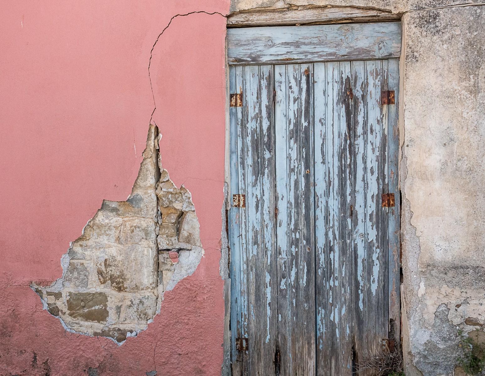
Harry Silcock ….. Images from a recent visit to the Peloponnese in Greece.


I was introduced to this process by Paul Sanders on a recent short course with him. I am currently at the start of a year-long course with Paul where he will undoubtedly produce some very interesting challenges for we participants.
The process caught my interest, and I am thinking hard about developing it in further directions. The number of prints that can be used is variable as is the size of the strips into which they are cut. I have gone for an abstract but am looking at exploring using a main subject in the final weaving.


This finished print is made from three A4 prints of plants from my garden. The prints are cut into 10mm strips using a guillotine and then interwoven to make an interesting pattern. It can be a frustrating process because the strips do keep moving around and, of course, they do need to be packed tightly to ensure no empty spaces are seen between them. I settled on using paper clips on the ends of the rows to stabilize them and reduce the amount of movement. It is, however, a very satisfying process which can be done all in one session although I tend to spread the time out over a couple or so days.
When finished I mounted the print onto board.


These three A4 prints of plants from my garden were used to create the weaving.

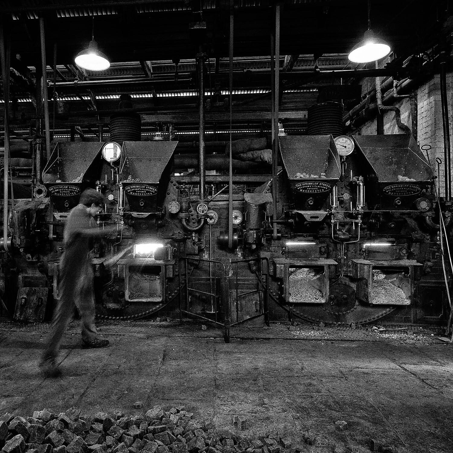
www.claymills.org.uk


While researching my project, I found this comment that summed up how I see my photography:
‘A photograph which simply records does not serve to communicate anything new unless the subject is absolutely unique. A snapshot of the Grand Canyon which records its shape is unique only the first time. Since the Grand Canyon has long since been recorded for the first time, a reason to photograph it must include a personal statement by the photographer if there is to be a viewer reaction.’ (Impact-Photography for Advertising by Kodak, 1973, p142)
My image represents a personal view of how I see the world in my mind’s eye. The shallow depth of field destroys detail in the background and focuses the attention on the detail within the foreground. The detail has been pulled out using an alternative printing process that adds texture to the image. The blacks are slightly higher than the highlights and present a unique image each time it is printed. The process requires creating a black gelatine solution with light-sensitive chemicals exposed to UV light to harden the gelatine. The print is then washed to remove the excess gelatine and transferred to art paper.
The technique has allowed me to take my photography to a more personal level. I am looking to take this further with a series of around twenty images using film to show my take on the Work of the Forest. I have been using Photoshop for fifteen years and feel I need to return to my roots when I first took up photography in the 1970s and explore the world outside Photoshop.
