VISUAL ART
MEMBERS’ PRINT EXHIBITION 2020

THE MAGAZINE OF THE ROYAL PHOTOGRAPHIC SOCIETY VISUAL ART GROUP / FOUNDED 1921


MEMBERS’ PRINT EXHIBITION 2020
Andreas Klatt ARPS (Chairman & Editor) visualart@rps.org
David J Wood ARPS (Vice Chair & Programme Secretary) wood.david.j@virgin.net
Janie Chapman LRPS (Honorary Secretary) janie.chapman13@btinternet.com
Andrew Leeming LRPS (Honorary Treasurer) andrewleeming@googlemail.com
Michael Butterworth LRPS (Group Web Editor) visualartweb@rps.org
John Cavana ARPS (Headline Event Organiser) jcavana68@gmail.com
Mark Deutsch LRPS (Membership Secretary) mrkdeutsch@aol.com
Gill Dishart ARPS (Circles Secretary) gill@dishart.plus.com
Wendy Meagher LRPS (Exhibitions Lead) wmeagher@gmail.com
Eddie Morton ARPS (Exhibition Co-ordinator) eddiemorton@gmail.com
CO-OPTED
Robert Herringshaw ARPS (Exhibition Co-ordinator) robertherringshaw@me.com
SUB-GROUP ORGANISERS
Rollright Andreas Klatt ARPS rpsva@klatt.co.uk
South West Di Wilkins ARPS diwilkins@hotmail.co.uk
If you are interested in having or organising a Visual Art Sub-Group in your area, please contact:
Andreas Klatt ARPS visualart@rps.org
4. Gold Medal Winner
6. Paul Mitchell FRPS Selector’s Award
7. Marcus Scott-Taggart Selector’s Award
8. Caroline Colegate ARPS Selector’s Award
9. Highly Commended Images
10. Commended Images
11. Accepted Images
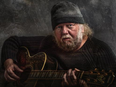
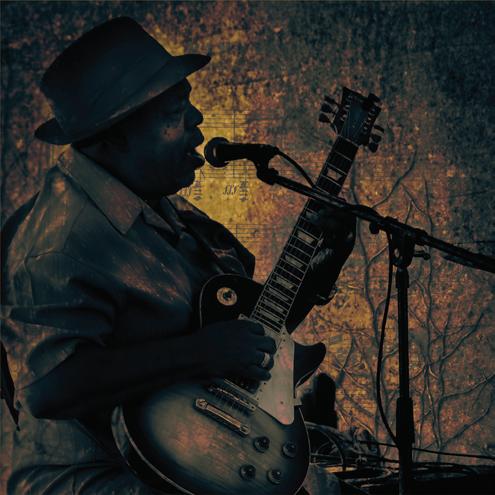
Front Cover Image: Reminiscences by Mike Kitchingman
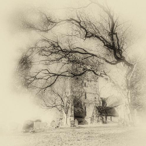
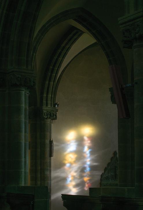
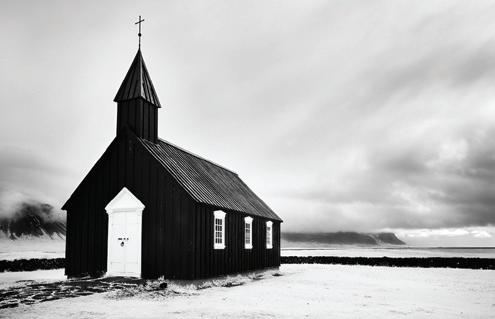
Inside Front Cover Image: The Village Church by Chris Perfect ARPS
DESIGNER: Paul Mitchell FRPS (paul@pmd-design.co.uk)
Visual Art is The Magazine of the RPS Visual Art Group and is provided as part of the annual subscription of the Group. © 2020 All rights reserved on behalf of the authors. No part of this publication may be reproduced, stored in a retrieval system or transmitted in any form or by any means, electronic, mechanical, photocopying, recording, or otherwise without the written permission of the copyright holder. Requests for such permission must be addressed to the Editor. The Royal Photographic Society, RPS Visual Art Group and the Editor accept no liability for any misuse or breach of copyright by a contributor. The views expressed in this magazine do not necessarily reflect the policies of the Royal Photographic Society or of the Visual Art Group.
Printed by Henry Ling Ltd, The Dorset Press, Dorchester. DT1 1HD

Every once in a while I see an image that makes me stop. I want to study it in more detail and I want to know more about it. My first reaction to Winter Dip was that it felt contemporary, documentary in style but also had a very visual narrative. I enjoy the muted sea/concrete colour palette, which becomes a most suitable backdrop
for the brightly attired swimmers. One also has to admire the photographer’s timing, each swimmer perfectly separated, and the subtle line created by the waiting and submerged members of the group. The lady in the foreground, adjusting her swimwear, adds a focal point and aids to break up the expanse of the promenade. The selectors do not know until the end

who has made an image, so I was pleasantly surprised when the name of the Gold Medal winner was revealed. Someone I know more for his wonderful landscape photography, than this particular style of work. A lesson and encouragement for us all to look beyond the obvious and to step out of our comfort zone every once in a while.
Marcus Scott-TaggartThe photograph is enlivened by the saturated colours of swimmers’ hats and costumes. However, the evenness of illumination and the subdued colour palette of the environment support the “Winter” of the title, yet only one of the swimmers looks as if she is struggling with the cold. All the others are relaxed, coping with the conditions and seeming not to notice the cold. Immediately, and probably without conscious thought, we take the message from the scene that these are hardy people, if perhaps a little eccentric. We are given few clues about the location of the water but the inclusion of the vertical reflections top left and the concrete on which the swimmers are standing hint at it being a harbour.
But the crowning joy of this photograph is the masterful composition: the winding trail starting with the lady central in the foreground, preparing herself for what’s to come, moving to the right at the end of the queue then down through the steps, following the three in the water to finish on the orange swimming cap. Without effort we have been carefully led through the photograph pausing on individual swimmers on the way to enjoy how each is coping with their winter dip. The complete image cleverly contains all the stages of the exercise in the same way that individual pictures in a flip book would take you through preparation; anticipation; semiimmersion; complete immersion; ending with striking out towards an unknown destination.
Caroline
Chris has obtained a simple uncluttered composition from a situation that could have been chaotic. That takes skill and patience. Compositionally, there is a lovely “s” shape formed by the swimmers and this leads me gently through the image. This gentle composition is therefore consistent with what appears to be a calm day on the ocean. The bathers are starting out with the breast stroke and therefore this adds to the overall feeling of calm. The bright colours of the bathing costumes stand out well from the muted colours of the water and pavement. These people appear to be serious swimmers because even in gloomy weather they are venturing out. The inclusion of just one pair of flip flops is the icing on the cake!
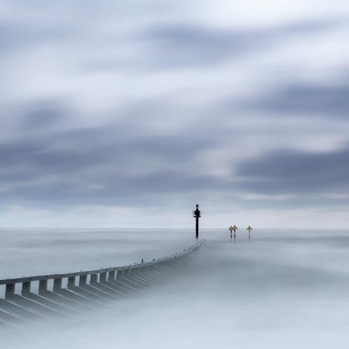
Even without the title I recognised the location straight away, having been there many times and always been rewarded by it, with my own pinhole camera, too! It will come as no surprise to those who know me that I was immediately drawn to the soft, ethereal rendition that this type of camera gives.
The very small pinhole aperture can also result in longer than normal exposure (typically 2-5 seconds) which can soften breaking waves and capture moving people in a subtle blur. I also enjoy the angle Mark has chosen, allowing the pier to point into the scene like a finger of iron. It was rather satisfying
to see that Mark had used traditional darkroom methods to produce his print. Immediately recognisable by the thick, slightly wavy baryta paper, where the image seems to be part of the paper rather than just sitting on top.

If one was to categorise this photograph it would fit comfortably into an Architectural/Engineering group but only if you called on the most basic identities of the two elements with which Wendy has created this design. The title suggests that it is the geometric, coloured rectangles of the building that caught her attention but, for me, the disproportionate scale of the streetlamp towering threateningly, or with curiosity, over the building adds a lot more opportunity for further interpretation. If I have any criticism at all, and it does not undermine my other reasons for choosing this, it is that I feel the darkening of the sky top left is a little overdone. While vignetting that corner does lend weight to the
feeling of the streetlamp leaning over the building, once noticed, it is a more dramatic effect than is needed. What the photograph does highlight is Wendy’s ability to see past the mundane and formulate a design with meaning beyond the obvious by choosing carefully her camera’s viewpoint. That is a talent, in my opinion, more valuable than technical excellence especially now as so many of the procedural demands can be supported by the equipment.

Roger’s composition has transformed an ordinary scene into something much more intriguing and exciting. I really admire the fact that the top row of sunbathers has been cropped to remove their identity. This leaves me with an opportunity to guess what they may look like. Their style of footwear suggests that they may be younger than the front row. The position of the hands of the two gentlemen in the front row is almost a surrender sign and is therefore in keeping with the title or maybe the person on the empty chair has already surrendered and left the sun deck. Perhaps the two couples in the front row have purposely left an empty chair between them in order to preserve their personal space. Who might be brave enough to bag that seat?
It’s a great image that invites all of us to weave our own narrative. There are so many interesting differences to enjoy especially in terms of clothing and what each person is doing. Conversion to monochrome has simplified the image and I can concentrate on the story without the interference of what might have been bright colours. The pleasing curves on deck also add a strong pictorial dimension.

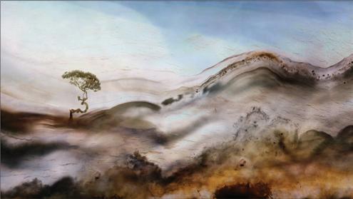
HIGHLY COMMENDED BONSAI REIMAGINED CHRISTINE ADAMS ARPS

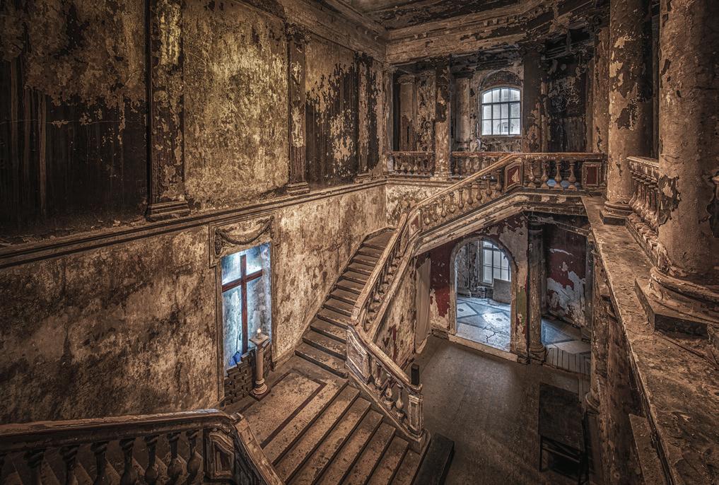
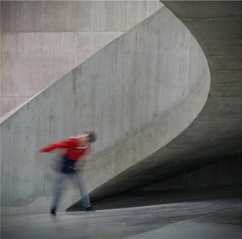
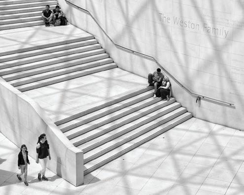
HIGHLY COMMENDED MAN ON STAIRS CAROL PAES LRPS

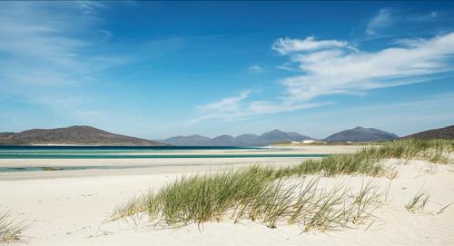
HIGHLY COMMENDED SAND DUNES AND GRASSES SUSAN BROWN FRPS

COMMENDED WHERE HAVE ALL THE TOURISTS GONE?
MICHAEL LONGHURST ARPSCOMMENDED SAPLINGS
PETER MARTIN ARPS


COMMENDED
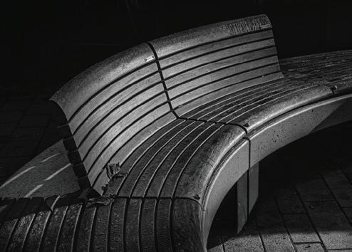
SOUTH COAST BOLLARD
WENDY MEAGHER LRPS


CLEARLY NOT CLEARLY NO. 6 • ANDREW CRAWFORD ARPS


Get even better value from your membership of the Visual Art Group: join a circle. Email circles are free to join, while print circles will cost you no more than postage. Meet new people keen to share their experience, to ask questions and to comment on your photographs. Get a different angle on your work from people who are neither fellow club members, nor your family! Members range from new recruits to very experienced photographers, from people who just want to enjoy their photography with new friends, to people working towards distinctions.
There are print and email circles and we’d welcome a few more members. Join a circle. To join or ask for more information, just email Gill Dishart ARPS (Gill@dishart.plus.com).
https://rps.org/groups/visual-art/
