VISUAL ART

THE MAGAZINE OF THE ROYAL PHOTOGRAPHIC SOCIETY VISUAL ART GROUP / FOUNDED 1921 NO. 154 / 2018 / ISSUE 2

Rollright Visual Art Group
Spring Meeting
16 June 2018
10:00 – 16.00
Village Hall, High Street, Long Compton, Warks, United Kingdom, CV36 5JS
Two presentations: ‘Aspects of Composition’ with Michael Farley LRPS and ‘Uncertain futures: from the Kasbah to Central Hall’ with Stewart Wall ARPS.
RPS/Non RPS Member £13.00
Ploughman’s Lunch £5.00
Event organiser: Andreas Klatt ARPS (rpsva@klatt.co.uk)
See more at: https://tinyurl.com/yaob8p9c
SW Visual Art Group
Members’ Day
19 August 2018
10:30 – 16.00
The Dolphin Hotel, Station Road, Bovey Tracey, United Kingdom, TQ13 9N
Another day for members to show their work. Please bring up to 10 prints for discussion purposes, but still come along if you would prefer to observe.
Event organiser: Linda Wevill FRPS (linda.wevill@btinternet.com)
See more at: https://tinyurl.com/y8solfpa
Rollright Visual Art Group
Summer Meeting
1 September 2018
10:00 – 16.00
Village Hall, High Street, Long Compton, Warks, United Kingdom, CV36 5JS
Another opportunity for you to show a selection of your work and offer it for general discussion in a friendly and relaxed atmosphere.
RPS/Non RPS Member £8.00
Ploughman’s Lunch £5.00
Event organiser: Andreas Klatt ARPS (rpsva@klatt.co.uk)
See more at: https://tinyurl.com/yaob8p9c
Visual Art Group
Autumn Weekend
05 October 2018 - 08 October 2018
Springfield Country Hotel, Grange Road, Wareham, United Kingdom, BH20 5AL
This year’s autumn residential weekend will take us to the Isle of Purbeck and the Jurassic Coast – a region famous for its enticing diversity of attractions, from an ancient castle to chocolate box villages, picturesque beaches, coves and fossils on a dramatic coastline.
Speakers will include Robert Harvey ARPS, Victoria Hillman, Pam White and Guy Martin. There will be workshops on coastal photography and autumn colours.
Event organiser: Andreas Klatt ARPS (visualart@rps.org)
See more at: https://tinyurl.com/yccayw9n
A Day with Andy Small
10 November 2018
10:30 – 16.00
The Dolphin Hotel, Station Road, Bovey Tracey, United Kingdom, TQ13 9NG
We are delighted to welcome Andy Small to show us his stunning work. He has always had a passion for macro photography and this forms the bulk of his images which he sells mainly at fairs and flower shows.
Event organiser: Linda Wevill FRPS (linda.wevill@btinternet.com)
See more at: https://tinyurl.com/ybw4mgug
Autumn Meeting: Hidden Wonders of the Night Sky
24 November 2018
10:00 – 16.00
Village Hall, High Street, Long Compton, Warks, United Kingdom, CV36 5JS
A day with the astro-photographer Dr. Lilian Hobbs LRPS and Nathan Barry who both look at places transformed by light.
RPS/Non RPS Member £13.00
Ploughman’s Lunch £5.00
Event organiser: Andreas Klatt ARPS (rpsva@klatt.co.uk)
See more at: https://tinyurl.com/y8q5apst
Andreas Klatt ARPS (Chairman) visualart@rps.org
David J Wood ARPS (Vice Chair & Programme Secretary) wood.david.j@virgin.net
Jane Chapman (Honorary Secretary) janie.chapman13@btinternet.com
Robert O Charnock (Treasurer & Exhibition Organiser) rjcharnock@hotmail.co.uk
Gill Dishart ARPS (Portfolios Secretary) gill@dishart.plus.com
Paul Mitchell FRPS (Co-ordinator of The Stephen H Tyng Foundation) paul@pmd-design.co.uk
Michael Butterworth LRPS (Group Web Editor) visualartweb@rps.org
Jay Charnock FRPS (Exhibition Organiser) jaypix@hotmail.co.uk
Eddie Morton ARPS (Exhibition Organiser) eddiemorton@gmail.com
Mark Deutsch (Membership Secretary) mrkdeutsch@aol.com
Rollright
Andreas Klatt ARPS rpsva@klatt.co.uk
South West
Linda Wevill FRPS linda.wevill@btinternet.com
If you are interested in having or organising a Visual Art Sub-Group in your area, please contact:
Andreas Klatt ARPS (Chairman) visualart@rps.org
NO. 154 / 2018 / ISSUE 2
4. A View from the Chair
Andreas Klatt ARPS
4. Editor’s Comments
Linda Wevill FRPS
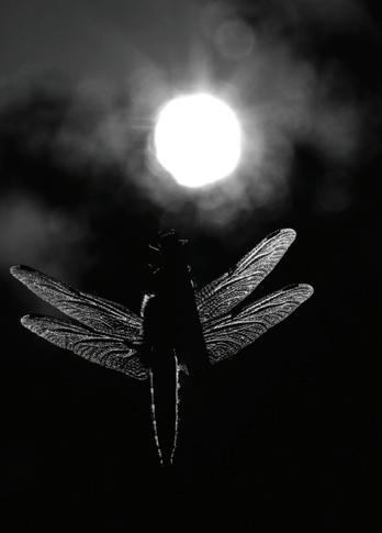
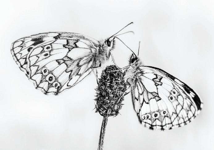
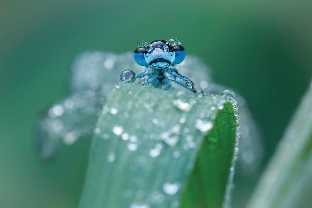
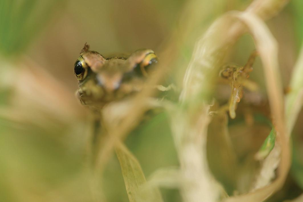
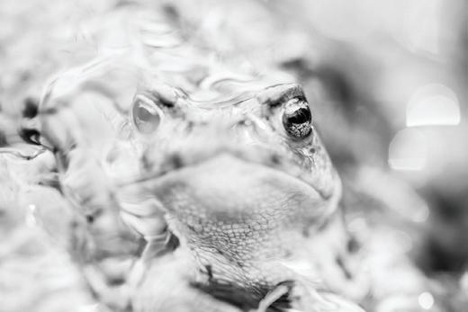
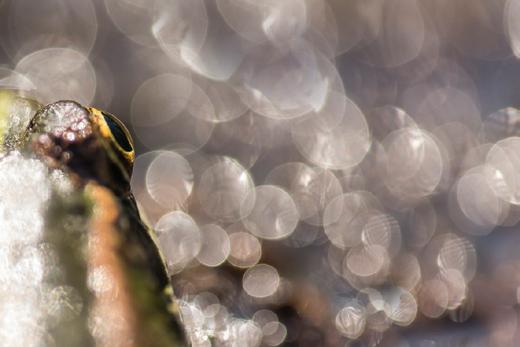
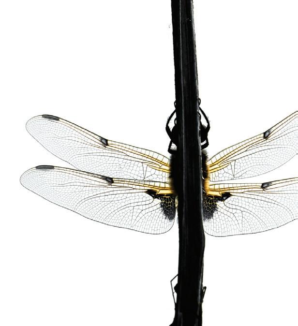
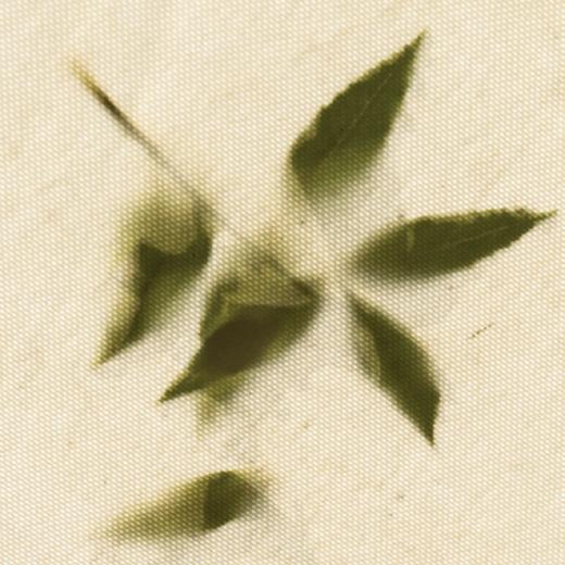
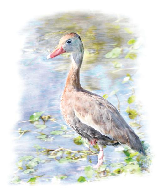
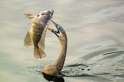
5. Forgotten Little Creatures
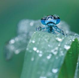
Victoria Hillman
10. My Photographic Journey
John Timbrell ARPS
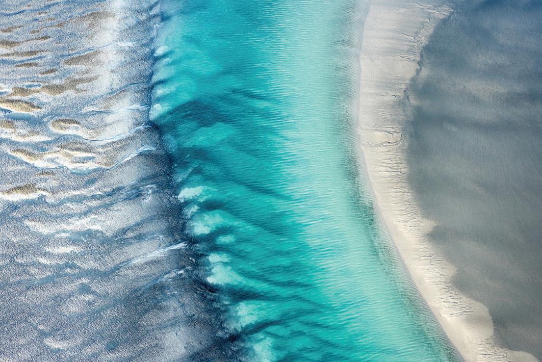
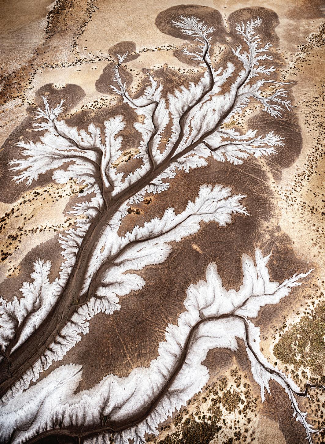
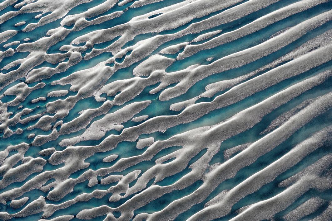
15. Abstract Aerial Photography
Mieke Boynton
20. Follow your Passion
Di Wilkins ARPS
26. Historic Aquitaine
Linda Wevill FRPS
30. Members Print Exhibition 2018
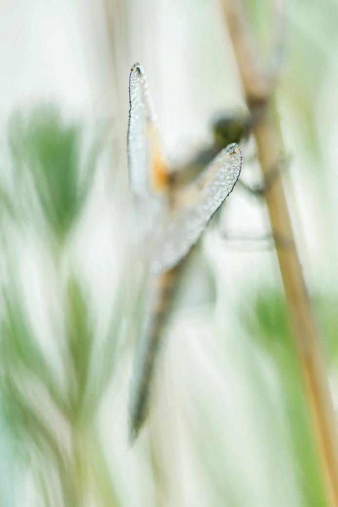
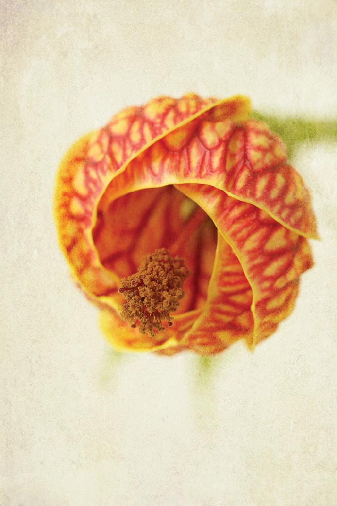
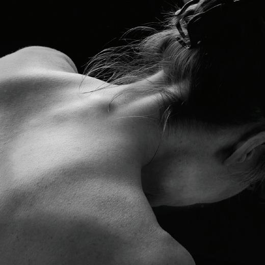
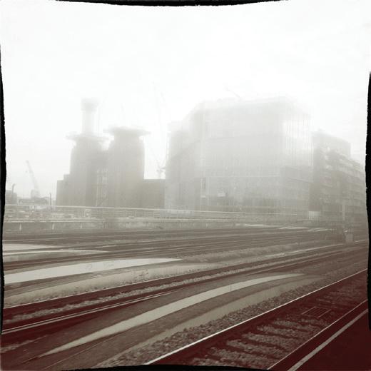
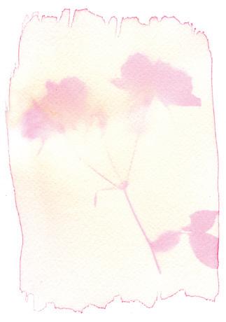
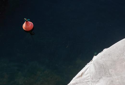
Front Cover Image: Does my nose look big in this by Victoria Hillman
EDITOR: Linda Wevill FRPS (linda.wevill@btinternet.com)
DESIGNER: Paul Mitchell FRPS (paul@pmd-design.co.uk)
Visual Art is The Magazine of the RPS Visual Art Group and is provided as part of the annual subscription of the Group. © 2018 All rights reserved on behalf of the authors. No part of this publication may be reproduced, stored in a retrieval system or transmitted in any form or by any means, electronic, mechanical, photocopying, recording, or otherwise without the written permission of the copyright holder. Requests for such permission must be addressed to the Editor. The Royal Photographic Society, RPS Visual Art Group and the Editor accept no liability for any misuse or breach of copyright by a contributor. The views expressed in this magazine do not necessarily reflect the policies of the Royal Photographic Society or of the Visual Art Group.
Printed by Henry Ling Ltd, The Dorset Press, Dorchester. DT1 1HD
How can we make your membership of the Visual Art Group more rewarding? Answers to the Committee, please, in no more than 20,000 words.
The warm, fuzzy feeling instilled by a sense of belonging is all very well, especially if it involves a high-profile special interest group in a global organisation with history and weight. But that can’t be all.
So we offer to share: a magazine admired for its quality of content and production, peer review circles, a members’ print exhibition, residential weekend meetings moving around the country. Is that enough? You tell me.
To my mind, the key is participation. We do best in areas of active involvement. On both sides. We cannot benefit if we don’t make use of what is on offer. So it was reassuring to see the positive response to the spring weekend we held in Northumberland in April, with marked interest raised by Paul Mitchell’s outdoor workshop. After all, in taking our residential events to attractive, often farflung locations we don’t want to imprison the weekenders in a conference room. Such was the feedback that our next weekend, in October, will feature two workshops, each one doubling up over two days, concentrating on a couple of perennially favourite subjects: coastal
When Andreas mentioned having three rotating Guest Editors, I thought it was a really good idea as it would keep the magazine fresh with a lot of variety and, at the same time, not be too onerous for one person. I am, therefore, delighted to be involved and I hope you enjoy the content I have gathered together in this issue. As usual, the summer edition of the magazine shows all the selected Visual Art Group Exhibition images with comments from the award winning photographers alongside those of the selectors themselves. We also have articles by photographers who are all inspirational in their field and passionate about what they do, so I was very pleased they all agreed to share their work with us.
I came across the photography of Mieke Boynton, who lives in Australia, on social media and I was fascinated to hear about her aerial landscape work. Mieke talks about losing her sense of time and place when getting involved with her
photography, even when she is battling against the elements in a helicopter or plane with the doors off. She is looking out for her compositions and becomes unaware of her surroundings. I am sure you will enjoy her graphic images as they are quite stunning.
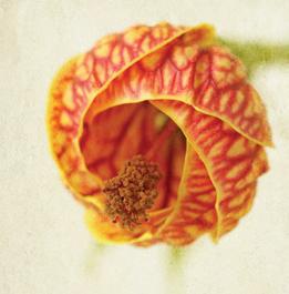
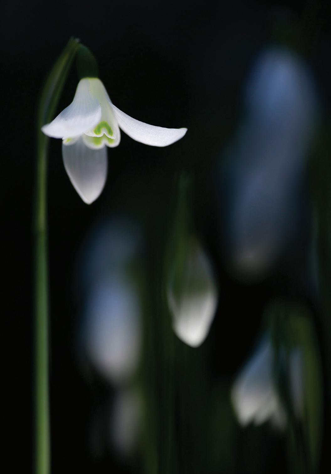
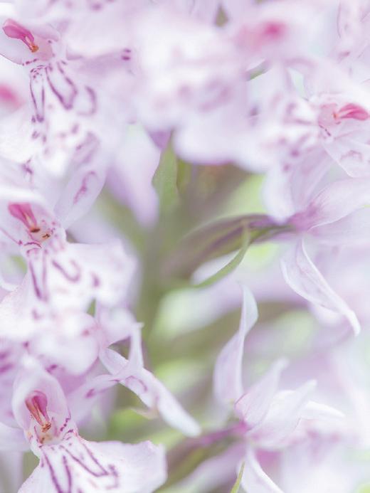
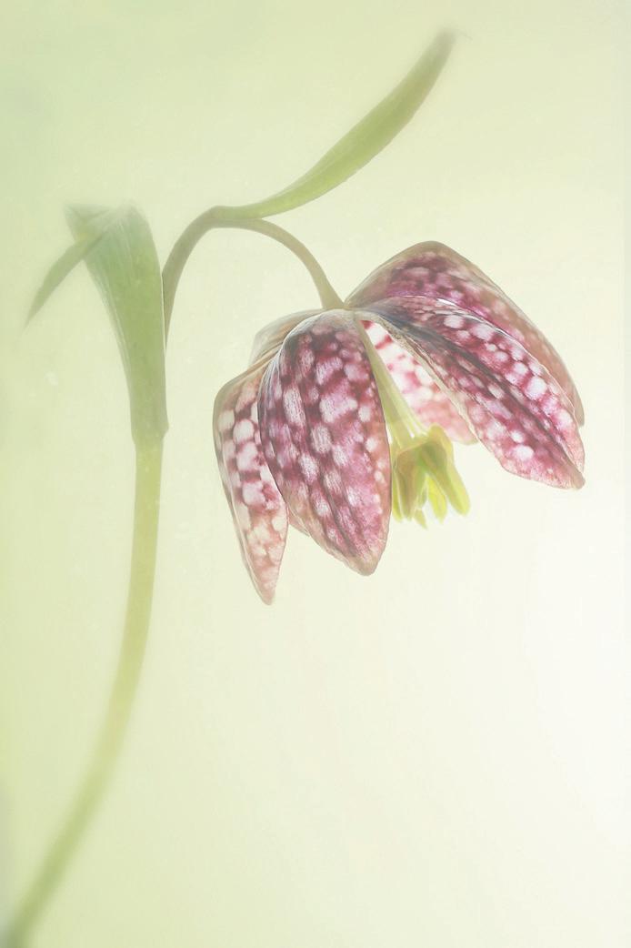
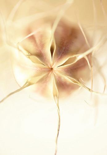
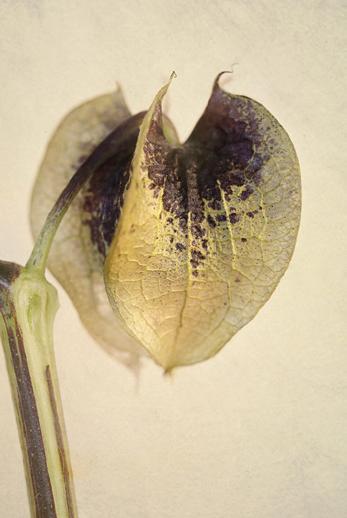
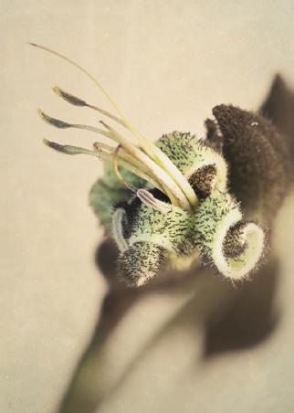
Di Wilkins has always been fascinated with flowers but initially, when working towards her Associate panel, she failed to follow advice given to her to ‘follow her passion’ as she felt there were many A panels built on flora of some kind. Eventually she came round and put together her panel and, I think you will agree, her passion comes across in her final work.
Victoria Hillman wanted to draw attention to the incredible range of wildlife and nature that we have close to home and her project was to raise greater understanding and appreciation of this. She goes through the process of researching and photographing her subject matter in an intimate and creative way, bringing this all together in a book and an exhibition. Victoria will be
photography and autumn colours. Much also depends on volunteers, the willingness of members to give freely of their time and effort. Five years of such service is a significant contribution, and we are grateful to Viveca Koh for her dedication to the cause. She will be missed. Her successor as Honorary Secretary is Jane Chapman. Welcome to the team, Janie.
You will all have your own thoughts, I’m sure. Don’t be backward in coming forward. Just please don’t use your full allowance of words.
Andreasspeaking at the Visual Art Group Autumn Meeting on the weekend of 5th-8th October 2018 so do come along and meet her.
John Timbrell has always photographed a variety of subjects and he talks about the influences on his photography and his project on capturing movement from hustle and bustle at stations to producing images with the help of his granddaughter. He says this is all part of his photographic journey.
My own contribution to this edition is one of my projects on the historical side of Aquitaine in France. After working on my distinction panels over a number of years, it seems quite natural to continue working in this way and to really get involved with the subject matter, rather than thinking in terms of individual images.
I would like to thank all the photographers for submitting their work in this edition and for allowing us to share their passion.
LindaFive years ago I had an idea for a project that arose from the lack of media coverage and, in some cases, positive media of wildlife and nature beyond birds and mammals. But it was more than that; I wanted to showcase the incredible range of nature you can find close to home in a new light, bringing out the characters and beauty and combining these images with historical and scientific facts to bring together photography and science and with it hopefully a greater understanding and appreciation of all the wildlife and nature we have.
When I started out on this project it didn’t have a title I just called it Project X and it wasn’t until I was well over a year into the project that it became Forgotten Little Creatures. Before I started taking any photographs I researched sites, all within a 40 mile radius of my home, to see what I could find and by using just a handful of local locations I could visit them again and again in different lights and at different times of year.
From when I first started to now I can see a huge change in my photography in both the way I approach it and the resulting images. Five years ago I would go out and try and photograph as much as possible in a day not really spending much time with any one species, but now I will spend weeks, and sometimes months, just observing and photographing a handful of species. The result is that I have been able to capture more intimate and creative images of these species and record some rarely seen behaviours. Alongside my greater understanding of my subjects I have developed a more ethical approach to
my photography, only photographing where I find my subjects, never gardening around them or moving them and I never use backgrounds,
instead I try to incorporate their habitat in the image to tell more of a story or shoot close-up more abstract images to highlight colours and details.
Taking an idea and making it a reality through research and photography and then eventually bringing it all together in a book and an exhibition.
It can be difficult sometimes to find an approach and style for your photography that makes you happy and when you do find it having the confidence to share it can be quite a daunting prospect especially if it is quite different. It can also be tricky to find new and different ways to photograph the
more commonly photographed species such as butterflies, dragonflies and some plants and this has been one of my greatest, but most rewarding, challenges throughout the project. To start with I wasn’t so sure about sharing the images but the response has been far more positive than I could have imagined and has encouraged me to continue to
pursue a more creative approach to my photography and to continue to push ideas and boundaries and try out new ideas, some of which will hopefully work and some of which probably won’t, but it will be an interesting learning experience.
The long term plan was always to showcase this project in an exhibition and book but until I found a publisher or printer and an exhibition venue there were no firm plans; I just kept on with the research and photography. Finally, after much searching and visiting venues, a perfect venue was found that had the right wall space, light and was more than just a gallery. Having had a couple of solo exhibitions I have now learnt that it is really important to find
a venue that suits both you and your work and if possible somewhere that is interested to have it displayed. Once the venue was found the pressure was on to find a printer or publisher, but amazingly an old school friend was keen to publish the book so it was just a matter of picking around 100 images and bringing together the stories and facts. Several months later I have a book that I cannot begin to explain how proud of it I am. The planning for the exhibition was slightly trickier in that I could pick only
30 images; I wanted some of these to be from the book and some others from the project and actually included an image that was taken just a couple of weeks before ordering the prints. The images had to be those that I felt most showcased my experiences and interactions over the duration of the project and these would end up being some of my most artistic photographs and most were taken within the last 18 months.
The exhibition has been incredibly well received and better than I could have hoped for; the images have drawn people in and they have then gone on to read the information and ask plenty of questions. Beyond this, people have wanted to help promote it and been sending friends and family along to see it and sharing it on social media. When I started this over four years ago I would not have believed the positive and encouraging response it has had.
Would I do it again?

Definitely, but it will probably be another four years at least to give me time to work on the next stage of the project to gather the information and photographs.
 JOHN TIMBRELL ARPS
I was introduced to photography by my future wife who was a keen photographer. She was a biology student and had access to the university darkroom for her project and showed me the delights of developing and printing. As a scientist I was fascinated and soon became hooked. With a second hand camera bought from a fellow student I began to learn the rudiments of photography. After a
couple of years I bought an SLR (Fujica) and started using black and white and colour transparency film. Once I had the equipment to develop the films and an enlarger to print the images, I was off and running. It was 1974 and my relationship with photography had started and has continued ever since.
I have never specialised, having always photographed a variety of subjects, including landscape, people, buildings, using a variety of viewpoints and details such as textures which I like to seek out. I have had a soft spot for black and white images throughout.
Thirty years on and with the advent of digital cameras and the ready ability to print in colour and experiment, my enthusiasm was fired afresh in new and different directions. My wife’s liking for abstract art and colour rubbed off on me so one such direction was towards abstract images and, as a consequence, my ARPS panel (visual art) was a series of reflections in water. This introduced me to the Visual Art Group and a new way of looking at the visual world. Retirement has given me the time to visit galleries in London which are increasingly exhibiting photographs. The RPS site, monthly competition and
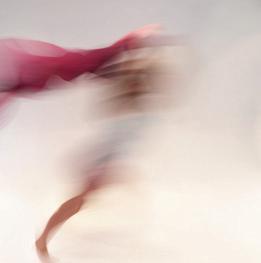
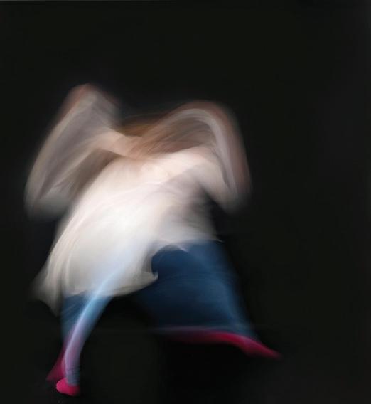
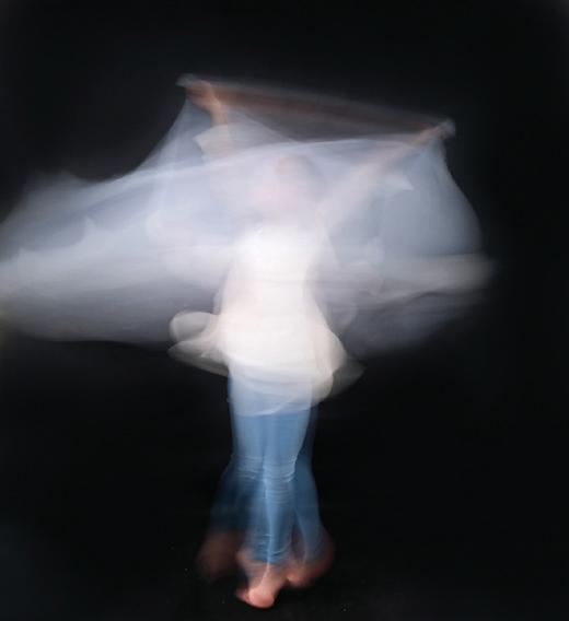
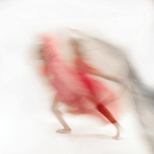
talks at the Visual Art meetings have all opened my mind to the idea of experimentation such as multiple images and intentional camera movement. It is often hard to say where an idea for an image comes from. The ideas expressed in these images probably came from a black and white photograph by Sebastao Salgado of rush hour crowds leaving a train on a Mumbai station platform taken with a slow shutter and showing a swirling blur of bodies; or perhaps a photograph my wife bought from a friend of a ballet dancer photographed with a slow shutter speed.
My influences are many as I have a sizeable collection of photography books and go to quite a lot of photography exhibitions.
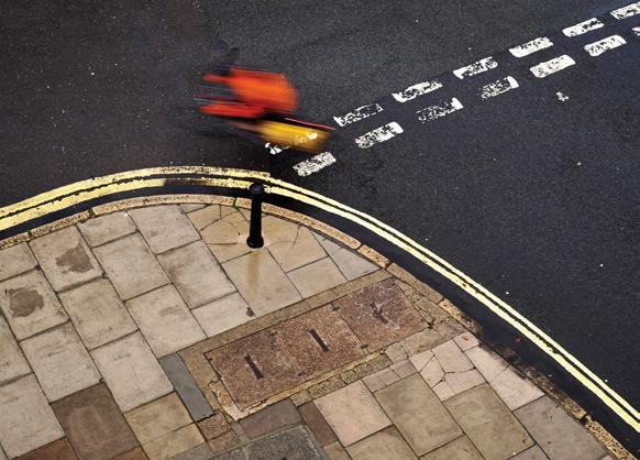
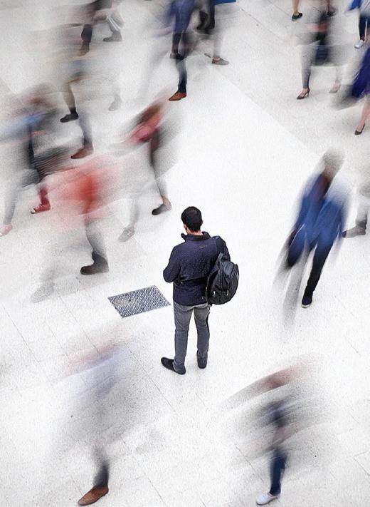
I first used this for effect with the image of a cyclist rounding a corner in Bath taken from my hotel room (Speeding cyclist) before my LRPS assessment. I liked the blurring of the colours the slow shutter produced but didn’t develop the idea for some time. Then at Waterloo station where I was looking at the selected photographs from the Landscape Photographer of the Year competition displayed on the balcony I looked down and saw the potential for slow shutter speed photography there. I took a photograph and liked the result. Waterloo station has good light, a light coloured floor and interesting details such as floor gratings.
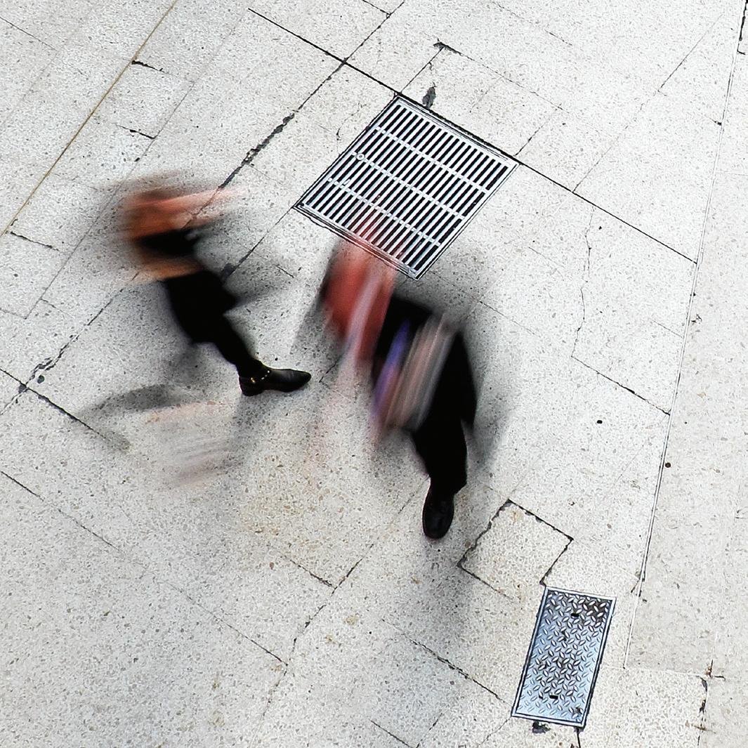
I didn’t use a tripod but braced the camera against the balcony rail. Shutter speed settings on the camera (Fuji XT1) were around 1/2 to a 1/4 depending on the light, and a 18-55mm lens. Sometimes I needed to use a neutral density filter to reduce the light sufficiently.
A number of visits followed and this is still an ongoing project, although on the fourth visit I was given the proverbial tap on the shoulder and told by a police community support officer that I needed
to have permission from Network Rail to photograph there, which I will get before the next time.
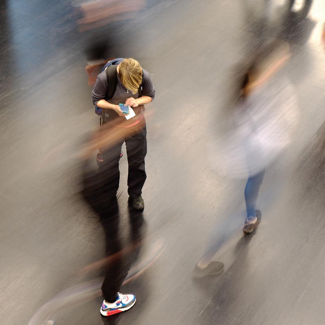
In this case my objective was for a stationary person surrounded by blurred bodies to show rush and bustle in a station in contrast to stillness. It is a bit of a hit and miss affair as having chosen a stationary traveller to focus on it is hard to predict who will appear in the frame, how many, what they will be wearing and which direction they will go. But that spontaneity and unpredictability is
what intrigues me. If I am lucky I will have someone blurred and wearing red!
I have also explored other stations and venues such as Tate Modern.
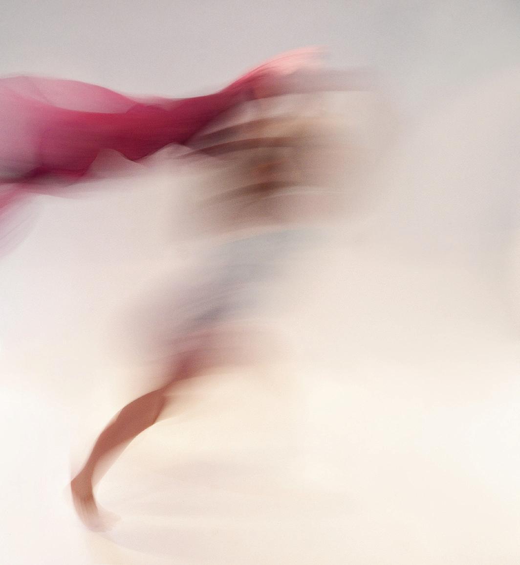
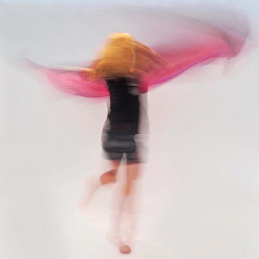
The rest of the images shown here were produced with the help of my granddaughter who was staying with us for the holidays with her brother. How to amuse them? Our grandson didn’t need attention, being plugged into his iPad most of the time. However, Emily, 11 years old at the time, wanted
to be active and involved. As she is an accomplished gymnast I had the idea for a photoshoot using slow shutter speeds to illustrate her movement. She was enthusiastic and we experimented using a pink scarf, white paper backdrop and a camera on a tripod (Fuji XT1, 10-24mm, 1/4-1/8th). The results were very encouraging with the artistic and abstract blurring I was hoping for and were repeated the next holiday and again recently. As the floor was tiled serious gymnastics was out of the question but running and jumping, cartwheels, handstands, twirling were all
possible. Shooting from above produced some interesting images too. Creating a double image in camera proved tricky and only one really worked.
As there was a mixture of natural and artificial light, the backdrop showed colouration and bands of different colours which required work in Photoshop but sometimes resulted in pale pastel shades rather than stark white which compliment the images I think. For the latest session I used a black background and LED illumination.
I was intrigued by the way one foot was always clear. The blurring of the colours and shapes give an ethereal effect but show movement. The unpredictability is what makes them fun to produce. There always seem to be new things to try and so this project is for me just another stage on a photographic journey.
 John Timbrell instagram: @johntimbrell
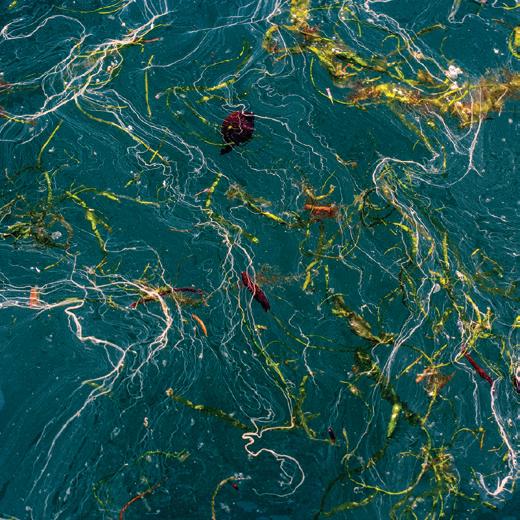
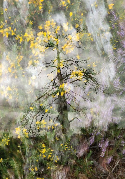
I’m a landscape photographer, but I have always been interested in Abstract Art, and in particularabstract paintings. It fascinates me how certain combinations of lines / shapes / patterns / colours applied to a two dimensional object can somehow transcend their limitations and convey emotion to the viewer. How does this occur? Why are some combinations more successful than others? What is it about certain combinations that makes a viewer say “WOW!!!” and other combinations cause viewers to walk on by?
I studied Art throughout High School and completed several Art subjects at University, and I learned a great deal about colour and abstraction and about how we interpret it. I loved studying
Fauvism and the way they were able to successfully represent figurative subjects with completely unrelated colour. I was intrigued by the work of Wassily Kandinsky and Jackson Pollock but I found their paintings to be tense and uncomfortable. I was fascinated by the work of Piet Mondrian, but I also found it clinical and emotionless. I was largely unimpressed by Henri Matisse’s late papercut work until I tried it myself and then I was absolutely in awe of his skill. The boldness and confidence and balance of many Australian Aboriginal dot-paintings tantalise me, but I know that I’m only responding to them at a superficial level, because although they usually represent the landscape from above, they also contain messages and stories that can only be interpreted by those who understand their symbolism.
When I tried my own hand at Abstract Art, it was primarily using intersecting geometric shapes, as I have always been a bit of a perfectionist myself, and there is only so much raw abandonment that I can handle!
The one thing I loved most about creating my own Art was that I could enter a special, suspended, timeless space... where there were no distractions, and the normal preoccupations about daily life simply disappeared. Sometimes it would only be for half an hour, but I remember that there were times when I worked on assignments and this “zone” would exist for hours and hours and hours.
I think that’s one reason why landscape photography has always appealed to me. There are no people, no phonecalls,
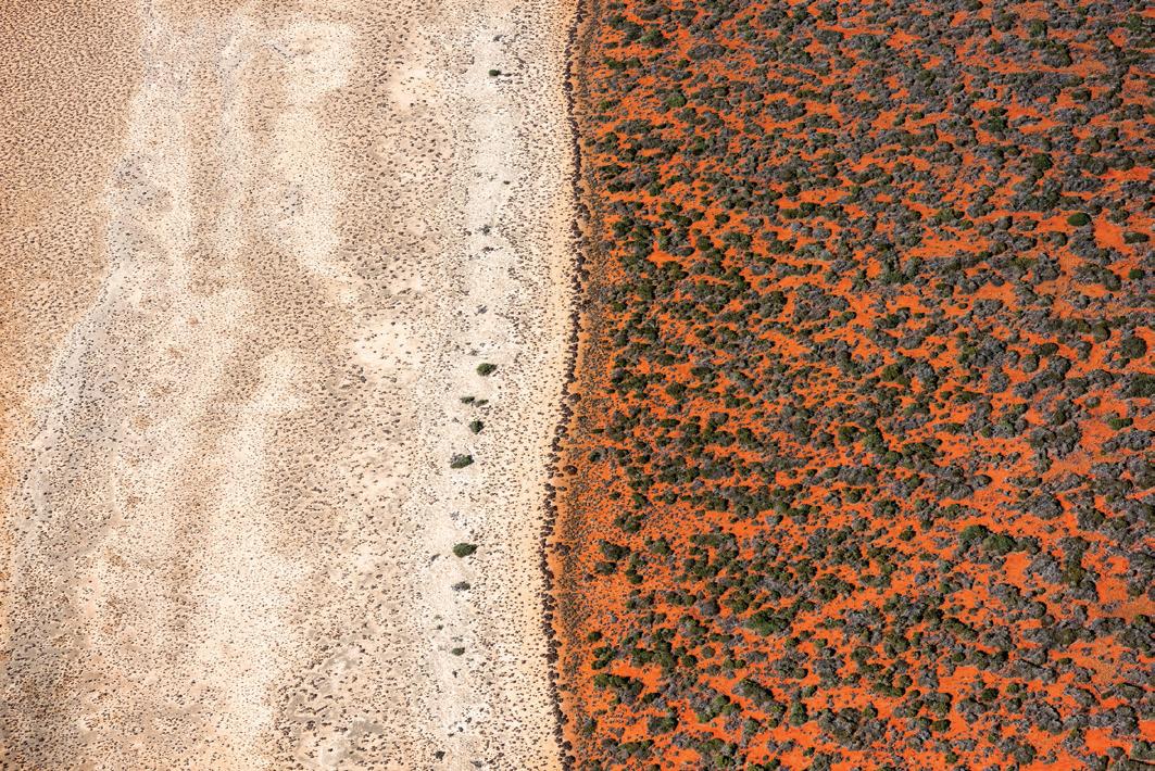
no distractions. Just you and Nature, peacefully co-existing. So it may come as a surprise that I find aerial photography an equally “zone-like” experience.
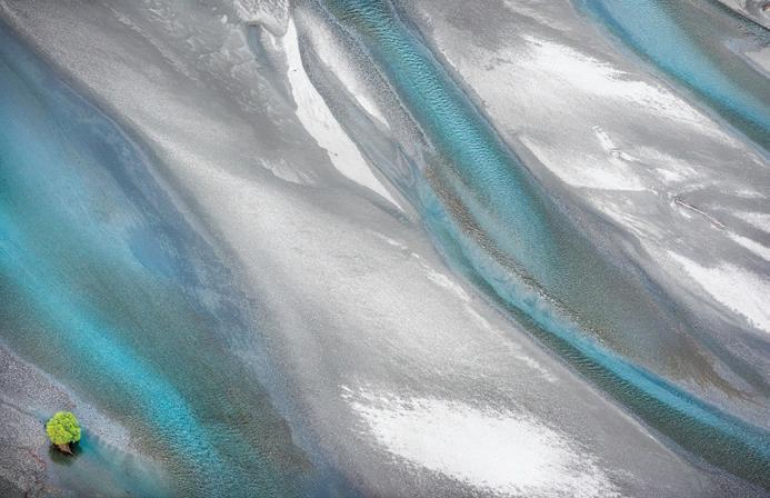
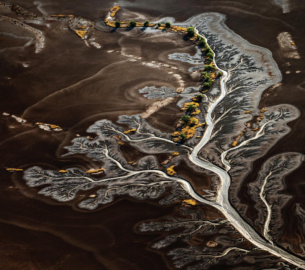
Helicopters and planes are loud. Deafeningly loud. The wind is mighty, and when the doors are off, you can find your eyes streaming tears and your hair whipping your face, and it’s a struggle to keep your camera out of the wind as you’re shooting down. It is certainly not a peaceful experience. But when I charter a light plane or a helicopter for my aerial photography and we take off, it’s like entering a whole new world. I lose my sense of time and place, and I simply exist in a mind-space where I’m looking for compositions of lines / shapes / patterns / colours / textures that communicate successfully to me,
and that will hopefully communicate successfully to my viewers. It’s so immediate and so raw and so alive!
Of course, I can only ignore the very real distractions of camera settings, wind, and location if I have done significant
preparation beforehand. I create a flightplan using Google Earth which I email to the pilot before the flight. I have to braid my hair so it’s not in my face. And I need to set my camera to Auto-ISO sensitivity, with a maximum ISO and minimum shutter-speed, so I’m not thinking about camera settings while we’re in the air. If I do all this preparation, and I explain what I will be looking for to the pilot, then once we’re airborne, I can simply search for compositions. It is a wonderful experience.
I’m often asked why I don’t use a drone. For me, photography is all about the experience and “the moment” and remembering how I felt when I captured the shot. I simply don’t think it’s possible for my photographs to convey my joy and excitement if I’m not up in the air myself and there’s not that personal connection to the camera. That’s not to say that I don’t think other photographers achieve this. But for me, I would feel that there’s a missing connection.
I love the challenge of composing the photos in a way that gives people an emotional response to them. That’s
where the skill as an artist comes in. The technical skills enable you to get a sharp shot, but it’s the artistic skills – understanding composition, colour, shape and balance – that allow the photographer to imbue the images with feeling.
Al Capp, the American cartoonist, once famously said that abstract art is
I don’t expect my work to appeal to everyone. After all, we respond most strongly to things that resonate with us and reflect our experiences in life. But it is my awe at Nature’s beauty that I hope people connect with and respond to, and if my work can successfully convey some of that awe and beauty, then I am content.
Mieke Boynton www.miekeboynton.comBut I don’t agree. Rather than bewilderment, I think my abstract photographs spark curiosity and intrigue. Removing the references to familiar subjects allows the photos to speak in the language of emotion. They convey peace, calmness, mystery, wonder, sensuality. Occasionally there is an element in the image that allows viewers to comprehend the scale of the image (like a bird or a stick or a tree), but not always. Ultimately, I want my photos to celebrate Nature’s Art. Nature is a Master Artist!
“...a product of the untalented, sold by the unprincipled to the utterly bewildered.”
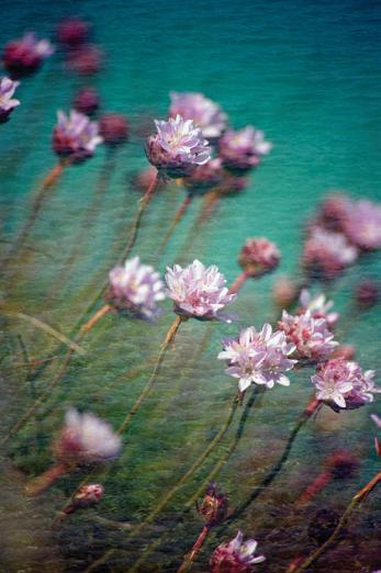
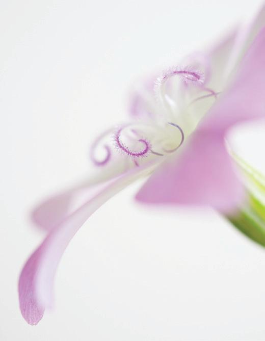
I came to photography late in life after spending many years creating images in a variety of ways from sewing to sugar craft, as well as through computer design work. Thankfully the digital revolution in photography had already occurred and this enabled me to experiment with photography and develop techniques to produce the images I wanted relatively quickly and within my budget!
I have always been fascinated by flowers in all their forms and through sugar craft I have developed an understanding of the construction of seeds, leaves and flowers whilst making many sugar bouquets for wedding cakes. I wanted, through my photography, to express
this understanding and wonder of the beauty of flowers.
When trying to plan my Associate Panel a fellow photographer advised me to create a panel around something I am passionate about. Advice I did not take and let that be a lesson to all!
I decided to create a panel around a subject I was very interested in but did not know a lot about at the time. The subject was Still Life and I wanted to create a panel based on the paintings of old Dutch Masters and other famous European still life painters of that time.
It was a steep learning curve and I spent many hours researching this genre of painting and studying the paintings. I was particularly interested
in the lighting, vanitas symbols, and creating the still life arrangements, which involved a lot of background construction and acquisition of props. After many months I proudly took my panel to an Advisory Day and was shot down at the first hurdle! They did not like my black backgrounds!
I had fallen into the trap that all my hard work would be recognised, but of course it is the final image that is being judged, quite rightly. None of the background work is taken into account when you present your panel. It is impossible to include all your background work into your statement, and anyway I now understand it is not relevant to the judges.
Feeling somewhat bruised and battered I went back to the drawing board, or rather the studio! I wanted to develop my photography to Associate level and was determined to learn from my experience to gain my distinction, no matter how many attempts I needed or how long it took.
Following the original advice I returned to my first love, flowers. I was a little apprehensive as there appears to be many A panels built on flora of some kind.
As mentioned previously, I have always been fascinated by the way each flower, seed or leaf has been uniquely designed, creating beautiful plants that attract birds, bees and other bugs to collect their nectar. Ecologists studying flowering plants believed that each flower evolved with particular sets of characteristics, i.e. colour, shape etc, in order to attract specific pollinators. However, it is now believed that they are also designed to deter unwanted pollinators. Isn’t nature clever!
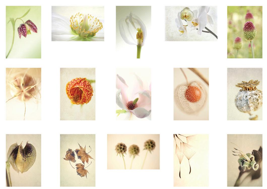
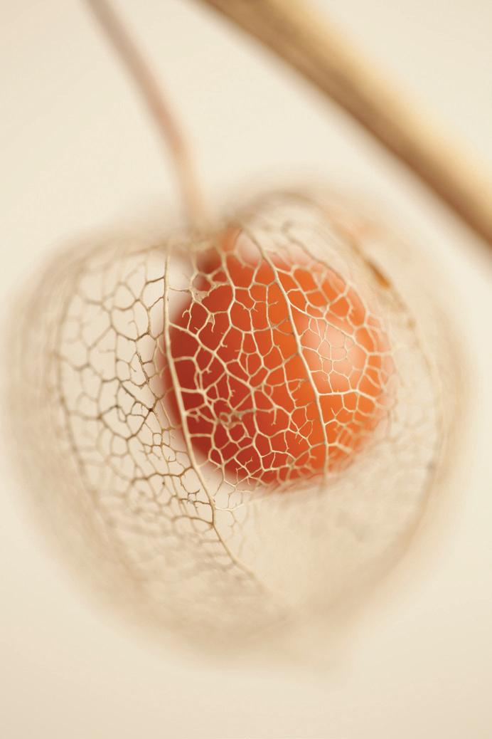
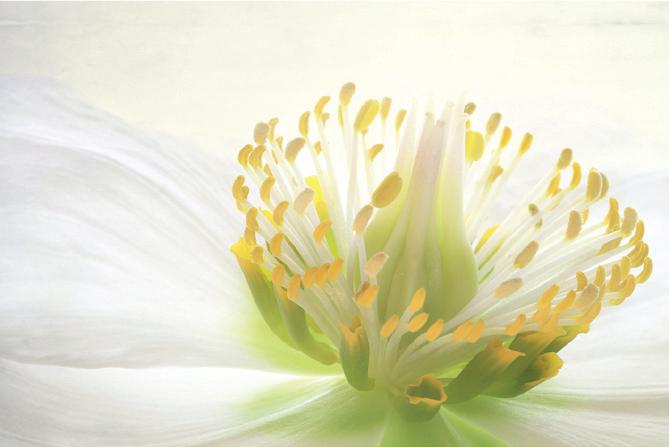
My challenge was to produce a panel of prints that showed this variety through fifteen well photographed images.
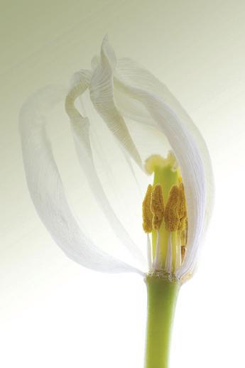
I was not in a hurry and planned that this project would be worked on over a whole growing season and maybe even more if I decided to grow the plants I wanted to photograph. I drew up a story board and started dividing it into flowers, flowers and seeds, and seeds with the odd leaf. At the same time I thought about how to co-ordinate the panel, through the shape of each image, the colours, and importantly the tones, so that the panel would hang together. Having ordered my thoughts I needed an image to be my datum point. My first image to have a place was the white tulip which was one I had taken some time before but felt it demonstrated
I have been making images of flowers since I took up photography about 15 years ago, using a variety of techniques, but I felt I needed to find a new approach.
the architecture of the bloom very well. I have to admit to guiltily having destroyed the flower to get the result I wanted, removing the front petals to display the stamens better. It was taken against a light box and formed the basis around which the panel was formed. Photographing against a light box gives the subject the purity and transparency that I was aiming for. In my view this type of lighting draws the eye to the key parts of the image.
I usually use my Canon 100mm Macro lens on my 5D Mark IV and take anything between 5 - 10 exposures between about 1/30 second to 3 seconds. I always use a tripod so that I
can stack the images if I need to and use masks to take away parts of the layer to bring through darker or lighter areas. I use variable f-stops depending on the depth of field I require.
Using a light box in a studio enables me to place it, and the flower being photographed, in a variety of positions, and through experimentation I was able to develop the shape, colour and tone needed for my panel.
During this process I added an A2 light panel with dimmer to my A4 unit, which gives more flexibility, especially when using in conjunction with a constant LED light and a reflector.
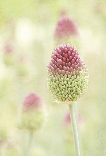
The only image not taken with a light box was the allium (top right in the panel), which was taken in situ at RHS Wisley. It is also the only image where I have used the natural setting as the background. It lent itself to the colour palette of the whole panel and fitted in well.
I like to photograph flowers against a white background. The versatility lends itself to adding textures or importing one image into another, using my images like a painter would use layers of paint.
I am grateful to everyone who gave me advice during this long process and my advice to aspiring A-panel entrants, “Follow your passion”.
Di Wilkins ARPS www.diwilkinsphotography.co.uk
After working for distinctions with the RPS for a number of years, finally gaining my Fellowship in 2013, I find that I still prefer to work in sets and small panels. I feel that images can work better arranged with others on the same topic and have a bigger impact than producing an
individual image. Sometimes this is a triptych but at other times it can be a panel of 25 or more. A recent project I worked on over the last couple of years was based on my love of France and my fascination with the historic nature of the Aquitaine region.
A few years ago, my husband and I chose to go away for a couple of months, so it had to be somewhere we could take our dogs as we did not want to put them in kennels for this length of time. We decided on France as the most convenient country to go to and we rented a house in the countryside of the Aquitaine region. We knew the area quite well as we had been to this area many times before. We went there when our children were young and we had fond memories of the children running freely around the garden that was surrounded by gently sloping vineyards, which formed beautiful lines out to the
horizon. Since that time we had been on many exotic holidays and I must admit, I had forgotten how wonderful the French countryside was. I have always loved the atmosphere and culture of France since my days of learning schoolgirl French but after travelling more widely it was a surprise to see I still felt the same way about the country. Over the past 4 years we have been back to the Aquitaine region several times and usually stay in the countryside in between Bordeaux and Bergerac, with its rolling hills and lush farmland, innumerous vineyards and wonderful restaurants. The area is steeped in
history and has some stunning medieval architecture. The cities and villages, whether that be Bordeaux or the small numerous Bastide towns/villages, are well preserved with cobblestone streets, beautiful arched doorways and attractive shuttered windows. With the Bastide towns in particular, the layout of the streets and buildings have remained virtually unchanged for over six centuries. Most are laid out on a grid pattern and the central square is generally surrounded by arcades affording shelter from the long hot summers which are characteristic of the region. Some of my favourite places
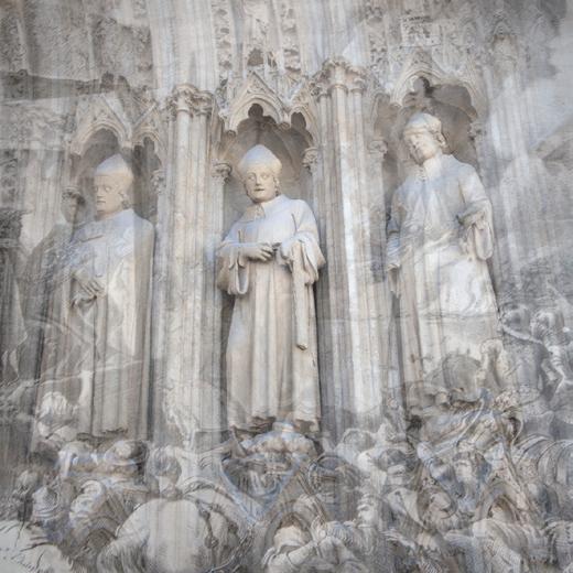
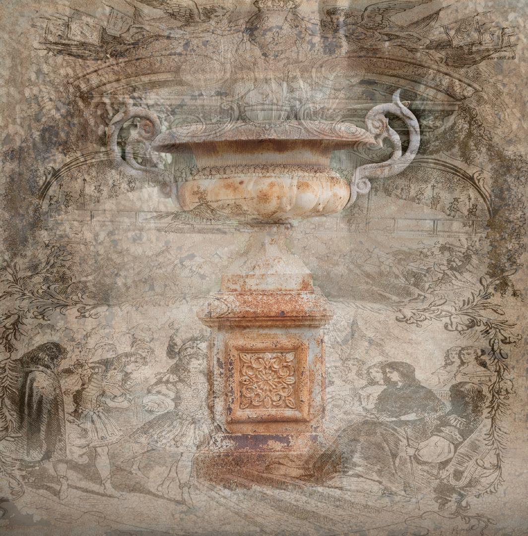
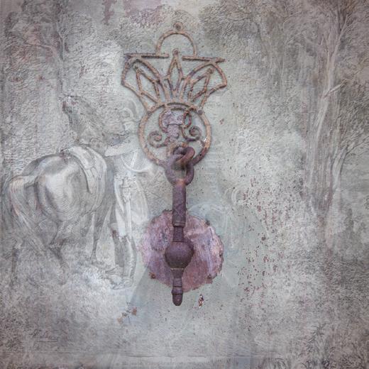
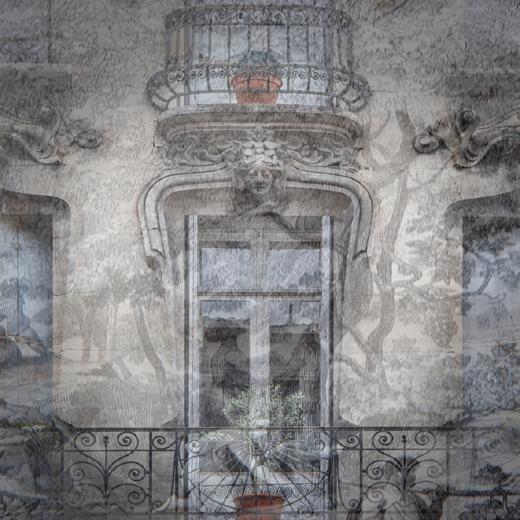
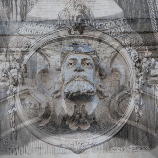
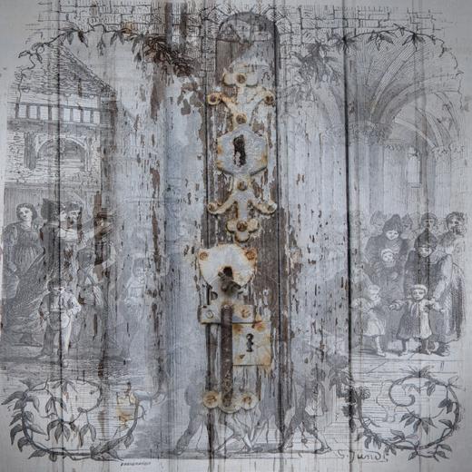
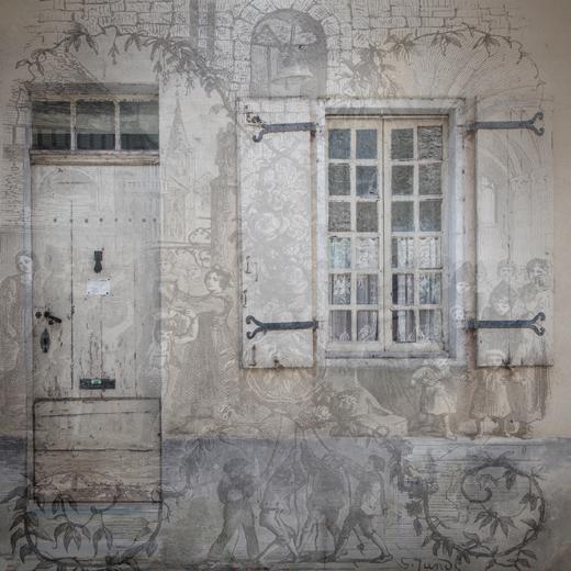
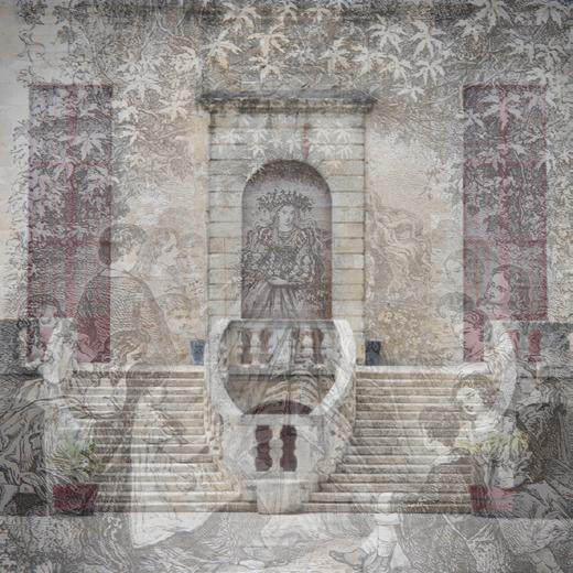
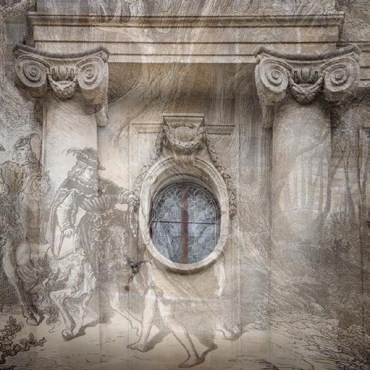
being Monsegur, Eymet, Issigeac and St Emilion. It can feel like time is frozen in some of these charming villages. I loved this historic nature of the area and I became fascinated with the old buildings and started taking images of the details, including religious sculptures, gargoyles, balconies, windows, doors and door knockers, indeed, anything that caught my attention as unusual whilst, at the same time, being typical of the region. I wanted to capture the texture in these images and for this I needed soft light, so they could be taken at any time on an overcast day, or even in the shade.
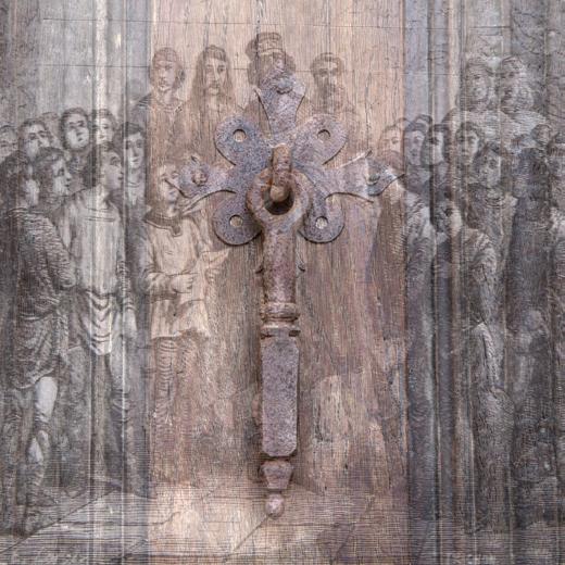
I wanted to add something to the subject matter in order to look beyond the obvious and create my own personal interpretation. I decided I needed an overlay to combine with the subject in order to add the atmosphere I was trying to convey and put it into context.
These journals contained many illustrations, some of which I photographed to use as the overlay. These images were put on top of the photo of the architecture in Photoshop with the opacity changed and, using a layer mask, I brought through what I wanted from the original image. I chose the illustration that I felt best suited the building detail that I was working on at the time. Sometimes the illustrations served as mainly texture, but sometimes I used the illustrations as part of the composition itself. I tried to keep as much of the French text in these images to maintain the atmosphere I was trying to create.
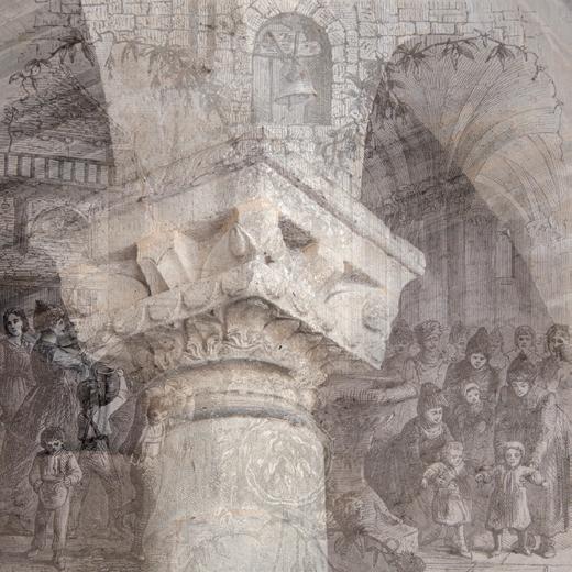
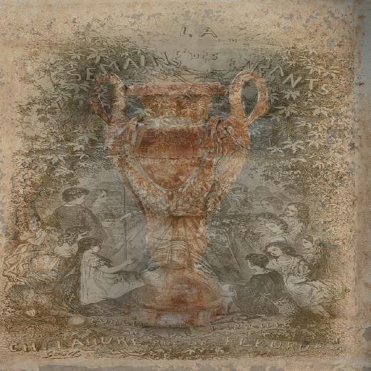
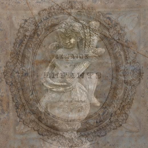
Eventually I came across some ancient books containing the weekly children’s journal from the 1850s ‘La Semaine des Enfants’.
Some of the images are shown here. The image shown top left on page 27 shows the main motif used on the front page of every issue of ‘La Semaine des Enfants’. The choice of adding this to the image of the sculpture of the child I felt suited the title of the journal and enhanced the final image.
Eventually I produced over twenty-five images on this theme and I could keep going, but this will depend on where we find ourselves in the future. Even if we are back in France, I am sure I will find another aspect of French life that I am able to communicate through my photography. I really enjoyed working on this project and it certainly gave my photography focus while in France.
 Linda Wevill FRPS www.lindawevillphotography.com
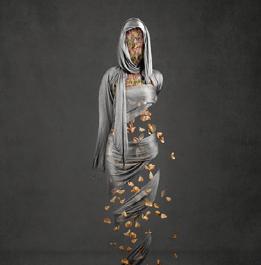
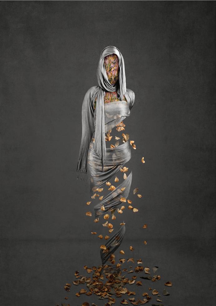
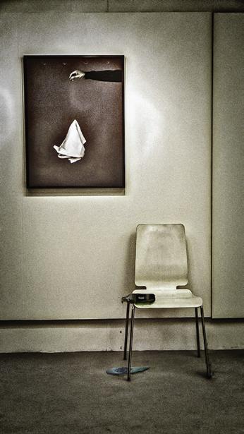
GOLD MEDAL WINNER
Kirsteen Titchener
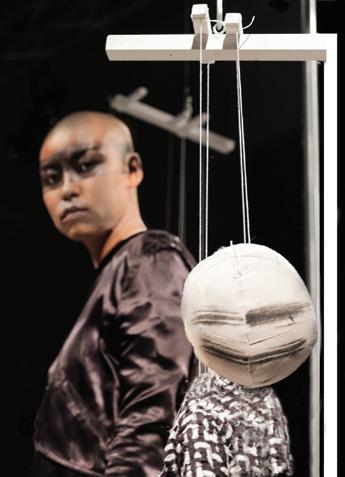
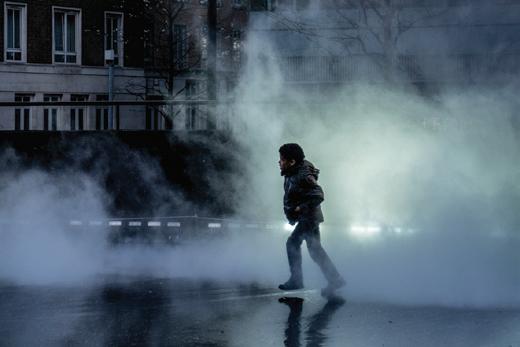
The image Autumn comes from a series of self-portrait images reflecting one aspect of being human. I wanted to create an image that reflects the multiple meanings of the word autumn when applied to our everyday lives. The figure in the image is deliberately unidentifiable to simplify
the image and encourage the viewer to engage with the main theme with minimal distractions. The image started life as a selfportrait and was the most complex image in the series being created from more than 20 different files and blended together using digital manipulation.
Linda Wevill FRPS
Unusual and intriguing image; aesthetically beautiful and yet thought provoking, giving rise to many questions, such as how the image was created and why the model is not shown. Further questions arise as to why the autumn leaves were used and what significance they have to the photographer, but the beautiful lighting and the execution of the image make it an outstanding piece of work. This image was the unanimous choice of all three judges and a welldeserved Gold Medal winner.
Chris Palmer FRPS
Whilst many VA Group members enjoy traditional styles of photography there are others that embrace the enormous potential of photo manipulation, fuelled by their own imagination. The centrally placed material ‘shroud’ possesses almost a metallic quality, perhaps implying a piece of sculpture, yet the falling leaves provide an additional element, tastefully arranged, and appearing to be falling to the ground. The limited colour, coupled with superb image quality made this print, for me, the stand out submission within the Group exhibition.
Roger Ford FRPS
This is a highly stylised image which clearly demonstrates a personal approach to Visual Art. The setting of the ‘figure’, the lighting and the colour combinations have all been selected with the final image in mind. The falling golden leaves and the artificial construction of the body shape create a sense of ambiguity which nonetheless represents the concept of Autumn. A hugely successful image which fully deserves the award of the gold medal.
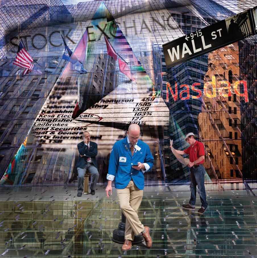
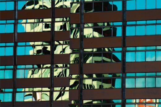
While on a vacation to New York I was very inspired by Wall Street. I wanted to create an image which reminded me of the vast glass high rise buildings, the traders while taking a break, some janitors, the American flag and a section from a financial newspaper. I made a composite image in Photoshop with up to 11 layers, using selections of some layers while blending some others within the stack. It was one of those that I would work on for a while, have a break for a day or two before coming back to it..
This is a creative image composed of simple elements which work together in a pleasing way. The shapes and colours work harmoniously and the treatment which has distorted the image into a semi abstract form suits the subject matter. The positioning of the figures facing opposing walls and the distortion of their forms produces a mysterious effect. An image which I enjoyed, deserving of its award.
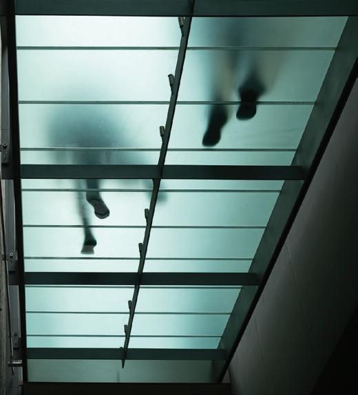
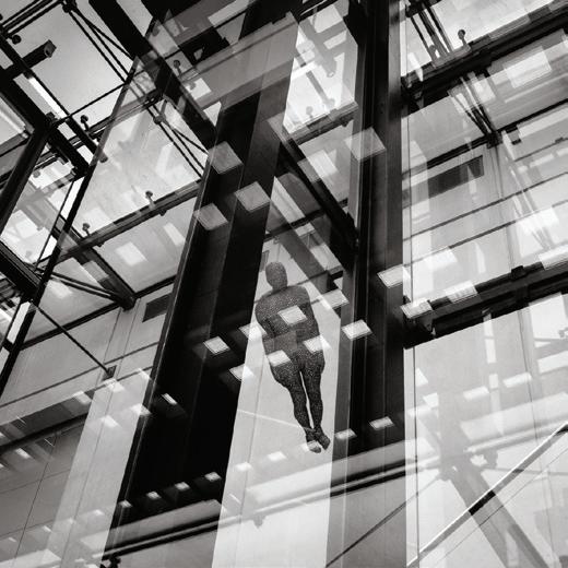
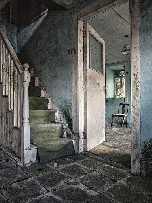
This image is one of a series of steps and stairs that I have taken over time and are one of my favourite subjects, along with all aspects of architecture.
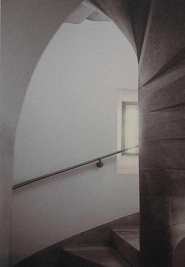
The photograph was taken on black and white film, which I processed myself, then scanned, toned and printed digitally.
An invitation to choose a Selectors Choice provides an opportunity to single out a personal favourite from all the submissions in the Group’s exhibition, and this particular print immediately appealed to me. The quiet elegance and limited tones, (despite the high contrast lighting), subtle colouration and careful composition made
for a very pleasing image. It was also presented at an appropriate size. (Notably I felt that many of the entries were over enlarged and not printed on the right surface paper.)
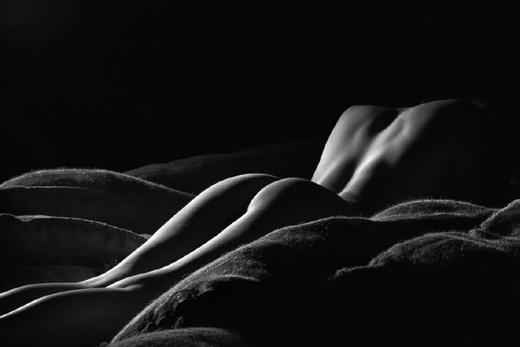
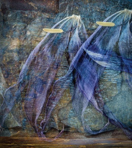
This image references the idea of failing to extend the same levels of kindness and compassion to ourselves as we might offer to friends or loved ones. Good and bad times ebb and flow through our lives requiring self compassion from time to time. This is represented by the gentle linking of the figures. I am a serial offender at being too hard on myself and
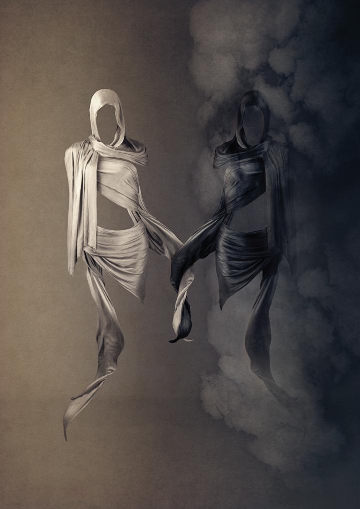
as such this image is both technically and conceptually a self portrait photographed in my home studio.
Linda Wevill FRPSA fascinating and powerful image and gives rise to the same questions as ‘Autumn’ but with the title ‘Self Compassion’, this implies an even deeper meaning, which we can only wonder about. What, for instance, is
the relevance of the mist/smoke around the darker model? Presumably this compares the dark and moody side of the personality with the light more carefree side. Although we had already chosen the Gold Medal winner, which was obviously by the same photographer, I felt this image was worthy of having my award and I really enjoyed seeing it.
CAROLE LEWIS ARPS
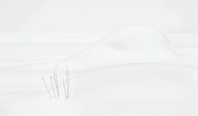
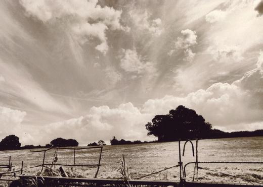
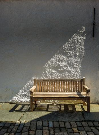
This picture was taken on a photographic trip to Yellowstone National Park in winter. We were transported around in snow coaches. One day our snow coach broke down and we were stranded for an hour until a replacement vehicle was brought for us. To pass the time while we were waiting to be rescued, I took a few photographs of small mounds of snow with grass protruding. The simple shapes and lines attracted me.
MICHAEL LONGHURST ARPS
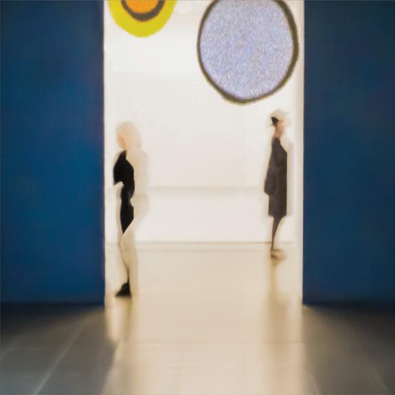
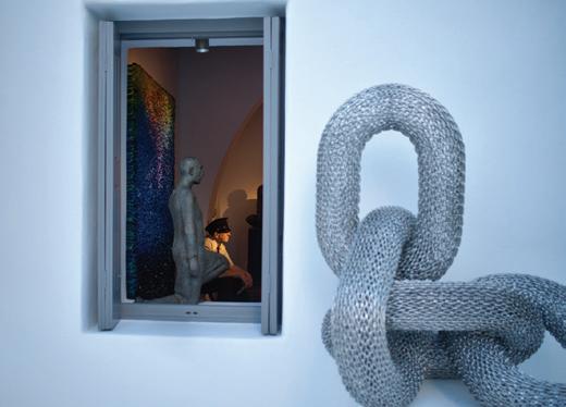
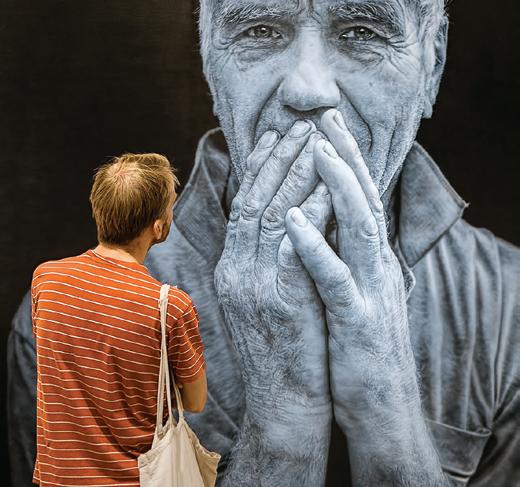
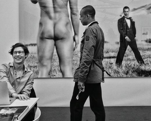
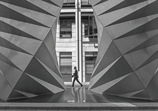
Two people, each in their own space. They are studying (out of shot) works of modern art in a London gallery. I am compulsively drawn to the photographic opportunities which art galleries present, in terms of the relationship between the spectator, the exhibited art and the usually minimalist environment. In this particular exhibition the artistic emphasis was on blocks of colour, a feature I attempted to extend to this image with the help of some heavy-handed use of a few Photoshop sliders to give a painterly feel to the figures. As they study the art, they in turn appear to be studied by the eyelike amoeba-shaped ovals which at the time of my visit were being projected on to the back wall in a continuous loop.
SUE VAINES LRPS
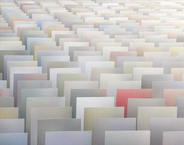
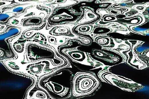
This image is a small section of a very large exhibit charting the history of the HSBC bank. I spent quite some time taking shots of it as I felt there was definitely an image there somewhere but it was not until I wandered down to one end and found that I could see along the back that I knew I had found it. It was far more interesting, photographically, than the front!
The ‘cards’ are in fact metal and the muted colours are just reflections of the pictures on the front of the exhibit. When I processed the image, I slightly increased the saturation on the red ‘card’, took out some printed text and finally rotated it ninety degrees clockwise.
PENNY ANDERSON ARPS
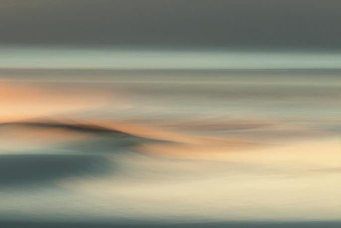
I love doing intentional camera movement and multiple exposures with my Canon 7D mk 2; the result is different every time and no image can be copied. (There are many hundreds discarded along the way though!) Getting away from sharp images is very liberating. For this image I used ICM and ME together with a slow shutter speed at sunset of a scene with water and hills. I changed the colour from blue to green to make it more interesting. I printed it on watercolour paper for a painterly look.
MICHAEL HENDRICK
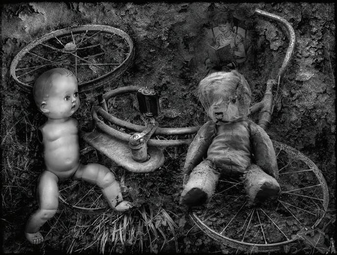
My grandson restores old cars and visits scrapyards. After one such visit he phoned me in the evening to say that he had left me a present and hoped it would give me happy memories. I found a very old dilapidated tricycle, held together with rust particles, in the centre of the garden. After a few days of a little contemplation I wondered whether, after time, memories take the form of fairy tales. I used three less dilapidated items of my middle aged childrens’ toys to produce a still life which I set up in a bush in the garden; the doll never behaved very well; every time I turned round from the camera on the tripod the doll’s legs had fallen off. In software, I used an early edition of Elements and applied a layer with the book and a layer of an image of rust. I wanted the image to convey that every thing in time goes through a process of change.
LYNDA MORRIS LRPS
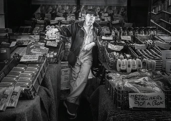
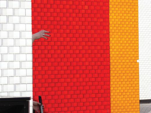
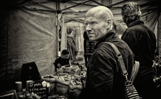
This photo came out of a summer challenge at my Camera Club at Old Coulsdon to take photos in our nearest local large town. Croydon is not generally known for its photogenic qualities! Surrey street market used to be a thriving fruit and veg market. It’s gradually becoming a ‘foodie’ market so market traders like this are becoming fewer and fewer. I liked the way this trader was leaning over forming a slight diagonal. The photo was taken quickly to get the pose. In post processing I used nik effex and darkened all but the trader to focus the attention on him.


Get even better value from your membership of the Visual Art Group: join a circle. Email Circles are free to join, while Print circles will cost you no more than postage. Meet new people keen to share their experience, to ask questions and to comment on your photographs. Get a different angle on your work from people who are neither fellow club members, nor your family! Members range from new recruits to very experienced photographers, from people who just want to enjoy their photography with new friends, to people working towards distinctions. There are print and email circles and we’d welcome a few more members. Join a circle.
To join or ask for more information, just email Gill Dishart ARPS (Gill@dishart.plus.com)