THE MILLENNIAL EYE SPACES CURATED BY THE GENERATION PAGE 26
EXCLUDING TAX
R48,70
OTHER COUNTRIES
SA R56,00
No 96
JUN/JUL 2018
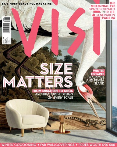
S A’ S M O S T B E A U T I F U L M A G A Z I N E
SIZE MATTERS
WINTER ESCAPES MAURITIUS AND PEMBA ISLAND
FROM MINIATURE TO MEGA ARCHITECTURE & DESIGN ON EVERY SCALE
WINTER COCOONING + FAB WALLCOVERINGS + PRIZES WORTH R90 000
DESIGN YOUR REALITY THE HOUSE OF RÉMY MARTIN X MATT W. MOORE X YOU
The House of Rémy Martin has partnered with renowned artist Matt W. Moore (MWM) on an augmented reality app that allows you to make art using your surroundings. Matt, who is known for his colourful graphic designs, has used distinctive Rémy Martin brand elements to develop the ARt app. It works with local landmarks and icons, and allows users to choose from a list of bespoke MWM designs. Then, with the augmented reality interface, you can add the animated designs to your surroundings to Matt-Moorize your reality. This graphic visual language goes beyond package design and invites you to join the next chapter of the Rémy Martin story. To celebrate this design collab, VISI is giving away five bottles of Rémy Martin VSOP. Check out how to enter this interactive competition and stand the chance to WIN A BOTTLE OF RÉMY MARTIN VSOP, VALUED AT MORE THAN R700. Winners will be announced on VISI.co.za at the end of July.
HOW TO ENTER:
ART APP
1
2
3
THE HOUSE OF RÉMY MARTIN X MATT W. MOORE X YOU
Scan the QR code to download the Rémy Martin ARt app.
Browse and choose your favourite Matt W. Moore designs.
Capture the image with the in-app screen-grab feature.
Post your image to Instagram using both #ARtbyRemyMartin and #RemyMartinSA, and tag two friends.
Go to VISI.CO.ZA for the how-toenter video tutorial.
TERMS AND CONDITIONS 1. The competition is open to all residents of South Africa aged 18 years or older. 2. Excluded from entering this competition are employees, directors, members, consultants and partners of the advertising agency and agents of the brand, and their spouses, life partners, immediate family, business partners and associates. 3. There are five prizes to be won. 4. The competition runs from 12 am on 4 June to 12 pm on 31 July 2018. 5. To enter, participants must download the Rémy Martin ARt app, “Matt-Moorize” their surroundings and capture the image with the in-app feature, post it to Instagram using both #ARtbyRemyMartin and #RemyMartinSA, and tag two friends. 6. The competition may only be entered once. 7. Prize winners will be randomly selected (using an automated system) and notified by telephone before 1 August 2018. The winners will be announced on the VISI website and Rémy Martin Facebook page. 8. The promoter’s decision is final and no correspondence will be entered into. 9. The pictures shown in the promotional materials are not an actual representation of the prize. 10. The prize cannot be transferred or exchanged for cash. 11. The promoter reserves the right to amend or terminate the competition for whatever reason it sees fit. 12. By entering this competition, entrants agree to give the promoter and its group of companies permission to keep all material and information submitted as part of their entry on electronic or hard-copy databases and filing systems for the purpose of the above-mentioned competition and, by entering this competition, agree to the promoter transferring their contact details to its promotional partners to enable the awarding of the prizes. 13. The promoter will obtain written consent from the winners should it wish to use their names, photographs and entries submitted for the purposes of unpaid publicity relating to the promotion by the promoter. 14. Entry instructions are deemed to form part of the Terms and Conditions, and by entering this competition all participants will be deemed to have accepted and be bound by the Terms and Conditions. Please retain a copy for your information.
Not for Sale to Persons Under the Age of 18
Shop Online at: www.robinsprong.com | Email: info@robinsprong.com +27 (0)21 447 9842 | R505 incl VAT | 20 Vinyl Stickers per Pack
I M A G I N E
M O R E
FURNITURE YOU KNOW YOU LOOK GOOD ON FLAUNT YOUR SOFA APPEAL Styling your home isn’t only about finding the best-looking pieces to suit your space. It is also about how they make you feel. You’re guaranteed to feel good, and look great, amongst the latest furniture styles from @home, designed to complement you.
New Furniture Catalogue available mid June. Get yours in store or view online.
SHOP IN-STORE OR ONLINE WWW.HOME.CO.ZA
PROMOTION
THE POWER THE LUXURY LEXUS RX-L NOW OFFERS EVEN MORE SPACE, FLEXIBILITY AND CONVENIENCE WITH A THIRD ROW OF SEATS.
Lovers of Lexus SUVs have spoken and Lexus has listened: The 2018 RX 350L and RX 450hL variants now have three rows to accommodate seven occupants. Retaining the model’s sleek features, Lexus has extended the body length by 110 mm at the rear and used a steeper tailgate window angle to ensure good headroom for passengers in the third row. The addition has not compromised the second row legroom either. Plus, at the touch of a button, the third-row seats fold completely flat freeing ample boot space. As well as comfort, such as the three-zone climatecontrol system so that passengers in the rear can adjust the temperature, safety remains a priority for Lexus. Airbags have been extended to the third row as well as an additional child-seat anchorage, making the Lexus RX-L the perfect all-rounder for families. • To find out more and book a test drive, visit lexus.co.za.
a Paris based design company producing furniture, lighting, accessories, rugs and wallpaper with a strong distinctive style is now brought to you by
Imported from France by ESTABLISHMENT | info@establishment.co.za | +27 21 462 6492 | www.establishment.co.za
Bryanston, Sandton. Oggie FSC European Oak Legno Herringbone finished with WOCA Denmark White Diamond Oil - 15/4 x 122 x 610mm
...handcrafted herringbone floors from sustainable forests. Cape Town: 021 510 2846 | Paarden Eiland Johannesburg: 011 262 3117 | Sandton Durban: 031 000 1000 | Umhlanga nick@oggie.co.za www.oggieflooring.com
EDITOR’S LETTER CONTRIBUTORS VISI.CO.ZA LOOKING FOR THE MILLENNIAL EYE VOICES Phumlani Pikoli VOICES Thabiso Mahlape VOICES Azad Essa VOICES Mary Watson
F
E
A
T
JOBURG FAMILY HOME CAPE TOWN APARTMENT DURBAN CORPORATE HEAD OFFICE PRINCE ALBERT WEEKEND COTTAGE SANDTON HEADQUARTERS OUDTSHOORN HERITAGE HOME LANSERIA ESTATE HOME PEMBA ISLAND RESORT
A
S
34 REASONS TO EXPLORE THE GREAT INDOORS 1. Highlights from Ambiente 2018 in Frankfurt 2. The K-IN kitchen from Eurocasa is a showstopper 3. Late Dame Zaha Hadid collaborated on a Bulgari ring 4. A winter trend for fuel-efficient, low-emission heating 5. There are two new Indigenus planter collections 6. Rémy Martin has teamed up with Matt W Moore 7. Casarredo now stocks Reflections Copenhagen 8. A hobby has turned into a full portfolio for this artist 9. In conversation with designer Cara Saven 10. Rado watches are design-focused and featherlight 11. A shared love of the Karoo led to this cool collab 12. A selection of the season’s statement wallcoverings 13. Sifiso Shange’s furniture captures African culture 14. These cabinets and headboards are one-of-a-kind 15. Ini Archibong finds inspiration in mythology 16. Designer Shelley Lee has reimagined the tote bag 17. Our picks of the top vinyl record players 18. NOVA by Work & Co is the first mobile office 19. Grohe’s touch-sensitive tap is a game changer 20. This sheepskin is hypoallergenic and homegrown 21. Melvill and Moon makes stylish safari equipment 22. Studio Stirling has made a study of hanging chairs 23. Ricardo Pinto Jorge shares his memories of Maputo 24. Skinny LaMinx has teamed up with Fechters in Knysa 25. A roundup of 10 must-have winter goodies 26. Our picks of proudly South African Pinotage 27. Studio H is having fun with its 3D food printer 28. Artvark Gallery continues to make a statement 29. This trio of tables is inspired by a love story 30. Cecil Nurse has a solution for noisy open-plan offices 31. A first-hand look at LUX* Grand Gaube in Mauritius 32. Mercedes Benz has relaunched it iconic G-Class 33. Three books for perusing in front of a fireplace 34. Win a Siemens coffee machine, worth R22 999 Smart idea
........ ........ ........ ........ ........ ........ ........ ........ ........ ........ ........ ........ ........ ........ ........ ........ ........ ........ ........ ........ ........ ........ ........ ........ ........ ........ ........ ........ ........ ........ ........ ........ ........ ........ ........
COVER PHOTO WALLCOVERING CARA SAVEN DESIGN, FURNITURE AND IMAGE BY IMAGE FLOW/SHUTTERSTOCK
PAGE 116 PAGE 122 PAGE 124 PAGE 126 PAGE 128 PAGE 130 PAGE 132 PAGE 134 PAGE 136 PAGE 138 PAGE 140 PAGE 142 PAGE 144 PAGE 146 PAGE 148 PAGE 150 PAGE 152 PAGE 154 PAGE 156 PAGE 158 PAGE 160 PAGE 162 PAGE 164 PAGE 166 PAGE 168 PAGE 170 PAGE 172 PAGE 174 PAGE 176 PAGE 178 PAGE 180 PAGE 184 PAGE 186 PAGE 188 PAGE 192
O
.................... .................... .................... .................... .................... .................... ....................
U
PAGE 17 PAGE 20 PAGE 22 PAGE 26 PAGE 37 PAGE 38 PAGE 40 PAGE 42
R
.................... .................... .................... .................... .................... .................... .................... ....................
E
N
132
176 124
130
S
PAGE 46 PAGE 56 PAGE 62 PAGE 70 PAGE 80 PAGE 88 PAGE 96 PAGE 104
138
E
152
R
....................
S
Danish design - directly to you
Harper
R 15,899,-
Showrooms in Cape Town and Johannesburg
PHOTO ANDREW MEREDITH/MOOOI
As the dire drought in the Cape dragged on, I was convinced this was the year we were going to experience that elusive endless summer… But then, at the beginning of May, I took a road trip to Prince Albert with photographer Jan Ras to photograph Jonno Sherwin and Johan Hugo’s charming cottage. As we drove through De Doorns I noticed all the vines had turned a light shade of aubergine; at Matjiesfontein there was a distinct nip in the air; and the next morning before sunrise I was longing for my warm velvet coat that was, sadly, back in Cape Town. Winter has finally arrived here in the Western Cape, and with it our focus has shifted indoors. This issue is all about playing with scale. Here at VISI HQ we fell in love with the oversized images on Cara Saven’s wallpapers. She admits to being “a little obsessed with oversized things”. These statement wall coverings, made right here in South Africa, are the easiest and quickest way (aside from paint, that is) to give any interior a totally fresh look. Deputy editor Annemarie Meintjes recently attended Salone del Mobile 2018 in Milan, and she says oversizing was one of the standout trends at the exhibition. The Moooi stand was her favourite, and she says if there was one item she could have brought back with her from Italy it would have been the dartboard Marcel Wanders designed for Moooi. Hopefully, our local exclusive Moooi stockist, Weylandts, will have it in stock soon, as well as my personal favourite, a rug with gigantic delicious monster leaves all over it. So, instead of letting winter get you down, start playing with oversized botanicals on dark backgrounds, paired with luxurious pieces upholstered in velvet. It’s this playful approach to decorating that we admire in millennials, and it is rapidly changing the way young creatives are curating their spaces based on looks and likes, which are then shared with the world via social media. Have a look at our take on this trend on page 26. The spaces featured in this issue range from a miniscule 47 m2 studio in the Cape Town CBD to Sasol’s humungous 68 000 m2 Sandton HQ… and pretty much all sizes in-between. Check out all the winners of the Corobrik SAIA Awards for Architecture on our website, and before you know it winter will be a thing of the past. – Sumien
Purveyors of Fine textiles, wallpapers, leathers and Rugs
OF MIND-BLOWING WALLPAPERS
ANYTHING GOES WITH BLUE, ESPECIALLY WITH THOSE DEEP INDIGO HUES WHICH ARE VERY MOODY . THEY WORK BRILLIANTLY IN ANY INTERIOR STYLE. INSPIRED BY DUTCH BLUE BECAUSE OF ITS ROOTS IN MANY ART MASTERPIECES CHECK OUT THE WHOLE COLLECTION FOR MORE AMAZING INDIGO HUES.
Johannesburg - 011 262 3130 | Durban - 031 312 0930 Cape Town - 021 447 1556 | Port Elizabeth - 041 373 1266 Pretoria - 012 34 63075
www.blackfabrics.co.za
EDITORIAL TEAM Editor-in-Chief Sumien Brink Deputy Editor Annemarie Meintjes Assistant Editor Tracy Greenwood Art Director Anton Pietersen Managing Editor Samantha Charles Features Editor Amelia Brown Online Editor Lindi Brownell Meiring Content Producer Mary Garner Copy Editor Kay-Ann van Rooyen Junior Advertising Designer Julia Tatos
CLINTON FRIEDMAN, DESIGNER AND PHOTOGRAPHER Are you a winter or summer person? Summer. Is there anywhere else in the world you would like to live? I’m quite happy in KwaZulu-Natal, which is where I live now. Do you have a weekend or holiday bolthole or a dream location? Mostly my garden or the sea. What’s the winter meal you make for friends? Durban curry with fresh fish. What’s on your seasonal reading list? The Tipping Point: How Little Things Can Make a Big Difference by Malcolm Gladwell. What kicked off your love of design? It was sparked when I found my true passion for creating art at the age of 11. If you were a famous building, which one would you be? Frank Lloyd Wright’s Fallingwater. What’s your favourite space in your home? My studio.
ADVERTISING & MARKETING TEAM Head of Advertising and Sales Jeanine Boshoff Business and Digital Sales Manager Diane Lubbe 021 417 1147 / 083 391 1651 Key Account Manager Eva Cookson (Cape Town) 021 417 1274 / 076 662 0785 Key Account Manager Elna Coetzer (Cape Town) 021 417 5151 / 082 971 9715 Advertising Coordinator Julian Petersen PUBLISHING TEAM Group Account Director Cat Anderson Group Managing Editor Chantel Kleinsmidt Account manager Thanaa Moosa Production Manager Shirley Quinlan ABC Manager Roxanne Holman
GRAHAM WOOD, WRITER Are you a winter or summer person? Definitely winter. Is there anywhere else in the world you would like to live? A little unimaginative, but New York. I’ve ended up reading so much about it, yet I’ve never been, so now I feel it as a real absence in my life. Do you have a weekend or holiday bolthole or a dream location? I don’t, but I have a constantly morphing vision of a modern wooden holiday cabin I’d like to build. Sometimes it’s on the beach; other times it’s in the mountains. What’s the winter meal you make for friends? I’m a latecomer to Gordon Ramsay. He has an amazing recipe for trout fillet with steamed leeks and roasted vine tomatoes, served on a pile of baby potatoes crushed with the back of a fork and drenched in vinaigrette… Insanely good and so simple. What’s on your seasonal reading list? Adam Gopnik’s new one, At the Strangers’ Gate. It’s about New York. If you were a famous building, which one would you be? Hmm… In truth, I’m probably the house I’ve lived in for the past few years: It’s not famous, but it has shaped a lot about my life and ideas. Read Graham’s story about a house on Monaghan Farm in Lanseria on page 96.
MALIBONGWE TYILO, CREATIVE AND MULTIMEDIA STORYTELLER Are you a winter or summer person? There’s so much I love about both, but if I had to choose, it would be eternal summer. Is there anywhere else in the world you would like to live? Necker Island. Do you have a weekend or holiday bolthole or a dream location? I love Hogsback in the Eastern Cape. We don’t get to go very often, but whenever we visit family, my boyfriend and I spend a couple of days there. What’s the winter meal you make for friends? I’m not allowed to cook. Don’t ask. Let’s just say no one misses the days when I did. What’s on your seasonal reading list? My attention span for books disappeared as smartphones got smarter and smarter. So now I read topical thought pieces and watch an unhealthy amount of YouTube. If you were a famous building, which one would you be? Can I be any Zaha Hadid building I want to be depending on my mood? Read Mali’s article about the work of Mozambican visual artist Ricardo Pinto Jorge on page 164. And don’t miss the videos he has been creating for VISI.co.za.
JUN/JUL 2018
020
PHOTOS ETHAN FRIEDMAN (CLINTON), MARC SHOUL (GRAHAM) AND CARLA LATSKY (MALIBONGWE)
Clinton shot RCL Foods’ new head oice in Durban for the story on page 62.
EXECUTIVE TEAM Managing Director Aileen Lamb Commercial Director Maria Tiganis Content Director Andrew Nunneley Head of Digital Kamiel Ebrahim Chief Financial Officer Mark Oaten Chief Executive Officer Bridget McCarney Executive Director John Psillos Non-Executive Director Irna van Zyl DISTRIBUTION & SUBSCRIPTIONS Distribution RNA Distribution Print Subscription Contact Centre 087 405 2005 (local), +27 21 045 1809 (international), subs@magsathome.co.za Digital Subscriptions MySubs 0861 697 827, mysubs.co.za/contact Reproduction New Media Publishing Printing Novus Print Publisher New Media Publishing (Pty) Ltd, New Media House, 19 Bree Street, Cape Town PO Box 440, Green Point, Cape Town 8051 021 417 1111, visi@visi.co.za, newmediapub.co.za
All rights reserved. Whereas precautions have been taken to ensure the accuracy of information, neither the editor, publisher nor New Media Publishing can be held liable for any inaccuracies, injury or damages that may arise. The opinions expressed in the articles may not reflect those of the publisher.
CA N ’ T WA I T F O R T H E N E X T V I S I ? G E T YO U R D A I LY D O S E AT
visi.co.za HOME
#
DECOR
R
DESIGN
E
A
ARCHITECTURE
LIFESTYLE
D
R
E
BEST BUYS
L
O
VISI EVENTS
V
E
The snaps we spotted in our feeds of you enjoying the Design Issue kept the VISI team smiling all month long. Keep tagging us on Instagram, Facebook or Twitter – we’d love to see how you snuggled up with our Autumn edition.
Me & marmalade doing some planning! @visi_mag #visimag #newhouse #interiordesign – @mandifrost101
We are extremely proud to feature in the @visi_mag with a full feature on our work with @haldanemartin “Head Turner” we couldn’t agree more. #stellenbosch #satravel #satourism #visitstellenbosch #visimag #decor #accommodation #restaurant – @kunjaniwines
Design. Inspiration. #visimagazine #entrepreneurship #lifestyle #inspiration #rainy #joburg – @linel_m
WE ASKED… If you could splurge on one item for your home, what would it be? More than 1 200 of you took your pick. A piece by an up-andcoming local artist
(30%)
A brand-new sofa
A coffee table
(48%)
(7%)
A statement pendant light or chandelier
(15%)
SA’s most beautiful magazine, in Italy. Thank you for the surprise, @arianbester :) reading about breathtaking places in SA really makes me appreciate my home country even more. See you soon bella! #visi #visimagazine #cuppuccino #coffeetime #reading #relax – @smitpaula05
This is what we call TOTAL RELAXATION – #visimagazine @creationwines #summer #deckwithaview – @abaloneguestlodge
WI N
WI T H
Inspiration… Motivation. Best design mag… #visimagazine #articles #wedesignwebuild – @trez_dcm
NOUWE N S
Say goodbye to watering the lawn for good! Nouwens Carpets, well known to the world of decor for more than 50 years, recently launched an artificial grass range in South Africa. Two lucky readers will each win R12 250 worth of naturallooking turf (including installation), plus a ceramic potjie, worth R500. Go to VISI.co.za/win to enter.
I N S T A N T I N S P I R A T I O N Follow @visi_mag on Instagram, where we share some of the best (and most beautiful) designs from around the globe.
WORDS LINDI BROWNELL MEIRING
Latest #visimagazine #visimag, @granddesignsau, and my sketch book with our home ideas and study tools. #interiordesigner #designinglife #backinthebooks #passion #bam – @_two_feet_
HUDSON Building / Strand St / De Waterkant / Cape Town TRUMPET Building / Keyes Ave / Rosebank / Johannesburg WWW.TRUEDESIGN.CO.ZA Info@truedesign.co.za
LOOKING FOR THE MILLENNIAL EYE
OUR COMPULSION TO SHARE OUR PRIVATE LIVES ON SOCIAL MEDIA HAS CHANGED THE WAY WE CURATE OUR PERSONAL SPACES. BASED ON LOOKS AND LIKES ALONE, WE ASKED TWO YOUNG CREATIVES TO SELECT THEIR FAVOURITE BEDROOM AND LOUNGE FROM ROOMSETS AT SALONE DEL MOBILE IN MILAN.
P H OTO S M A R I J K E W I L L E M S P R O D U C T I O N A N N E M A R I E M E I N TJ E S
The two young creatives who gave their input are Gerard Strydom, interior designer at &Beyond under the wing of lodge-design wizard Chris Browne; and Karabo Poppy Moletsane, graphic designer, illustrator and street artist. • andbeyond.com • behance.net/karabo_poppy
JUN/JUL 2018
B
E
D
R
GERARD: “I love minimalist design – uncluttered and devoid of colour. Here, I like the beautiful white bed with space and flow beneath it; the asymmetry of the nest of tables; and, since I love to read, the chair and modern standing lamp. I like how I look in this room: understated and elegant.”
O
O
M
KARABO: “This room speaks to the illustrator in me. I love the use of the light boxes, the concrete finish and the unconventional decor.”
027
S
LOOKING FOR THE MILLENNIAL EYE
L
O
U
GERARD: “This is the kind of room you want to show off to your friends. I appreciate the clean, uncluttered look, the subtle use of colour, and the terrazzo tiles on the floor and wall combined with the classic white wall panelling and marble fireplace.”
JUN/JUL 2018
N
G
E
S
KARABO: “The vibrant colours are amazingly contrasted against the wall-to-floor concrete background. I like the unconventional furniture, a system of modular units that add up to what you would like it to be.�
029
LOOKING FOR THE MILLENNIAL EYE
COUPLE 2.0 by Zanotta from the Zanotta Stories collection This bedroom has been designed for a couple that love to share experiences but also pursue individual interests. • zanotta.it
ESTE BED, designed by Antonio Citterio for Flexform Eye-catching and elegant, this bed is proof that good design can improve everyday living… and sleeping. • lexform.it
JUN/JUL 2018
CASA DOLCE CASA CASAMOOD ARTWORK TILE COLLECTION by Florim Tradition meets modern art: These terrazzo-look porcelain tiles in neutral colours incorporate irregular fragments with different brightness and sparkle for a surprising textural effect. • lorim.com • cappellini.it/en
MAH JONG HIRU COMPOSITION designed by Kenzō Takada for Roche Bobois Japanese-French fashion designer Kenzō Takada made the bold aesthetic choice to source inspiration from ancient kimonos to create a new version of the classic Mah Jong modular sofa system. • roche-bobois.com
031
Get unlimited, instant, pure, boiling hot and ice cold water at the touch of a button with the BIBO bar. The BIBO bar remembers your cup size and preferred temperature of water to conveniently ofer you endless and great tasting puriďŹ ed water, just the way you like it. The BIBO bar is energy efficient and environmentally friendly. Ideal for the home and office. Purchase or rental options available. Visit bibo.co.za to learn more or call 0800 00 2426.
PORTRAIT TSELISO MONAHENG BACKGROUND MAZE DESIGN IN THE ROOM 13 HOMECOMING COLLECTION
Writer PHUMLANI PIKOLI reflects on childhood shenanigans in his beloved family home.
I don’t think they were properly prepared for the pre-adolescents that invaded their space back in 2000, along with the 18-year-old preparing herself for varsity, accompanied by two parents working full time and a dog with the character of a black Lassie. (She really was black – a crossbreed Alsatian/Rottweiler whom we named Onyx). We were the second black family to move into the neighbourhood at the time, and there was a definite air of “There goes the neighbourhood” when the moving trucks pulled into what still is our driveway. We were excited, my brother, sister and I: We were each going to have our own bedroom for the first time. The house was bigger than any other we had occupied before, the garden amazing with all its space; there may have been no pool, but we could live with that at the time. We’d all abandoned swimming at school by that stage. My parents beamed with pride at the sight of their purchase; it must have been a crazy realisation for them: three kids, a dope house in the ’burbs, worthwhile cars, and a dog not named Rex. If I think about it, I can see the beam on their faces, taking a step back and being able to see their accomplishments quantified in material measurables. The beginning of a great 18-year journey for this family of five.
It didn’t take long for the complaints to begin, and I think I can lay claim to being the catalyst. I had started to take skateboarding a little more seriously a few months after we’d moved in and the driveway on an incline was a perfect place for my wheels, trucks and board to entertain the neighbourhood to the rhythms of my failed trick attempts. The acoustics from our garage ensured that every pop and bang reverberated a little further in case anyone was missing out on the lateafternoon entertainment. No matter how many times the dear old recluse from next door would come over to complain to my parents, with all the civility he could muster, the show would resume the next day like clockwork. Unfortunately for him, my parents were often away and worked late, so his
DID YOU KNOW? 1. Born in Zimbabwe to South African parents in exile, Phumlani spent a large part of his childhood moving around before the family settled in Pretoria, where he still lives. (“Sigh.”) 2. Pan Macmillan recently published Phumlani’s The Fatuous State of Severity, an anthology of short stories. 3. His favourite room at home is his bedroom. “It’s situated under the stairs, so I like to think of myself as a young Harry Potter waiting for Hagrid to spirit me off to Hogwarts.” 4. When asked if he prefers summer or winter, Phumlani says, “I used to think I was a winter kinda guy, because you get to wear all sorts of cool shit. But I was born in summer and I’ve come to realise the heat is my friend.” Like all good Starks, he says, referencing Game of Thrones, he knows when “winter is coming”, but is never fully prepared for the cold snap. 5. Game of Thrones has been the most pirated TV show for six years in a row. 6. Visit phumlanipikoli.com to find out more.
complaints fell on the ears of full cellphone mailboxes, and when my parents were finally able to listen to his drone they would have to call the house to ask me to stop. If you’re reading this, sorry, P-Money. I’ve mentioned that I had a sister starting varsity at the time, right? And that my parents were away quite often? Did I mention that the house had a Jacuzzi? I didn’t? Oh yeah, probably ’cause it never worked. Still, just to be able to tell anyone back then you had a Jacuzzi at home was enough. I mean, everyone had a pool. I won’t go into much detail here, but let’s just say my parents not being around all that often left open opportunities for the newly legal to hang out with her friends unencumbered. Meanwhile, my brother and I were very active when it came to school sport, so we used every opportunity to play games in the front garden with our friends. Fullcontact rugby, which requires quite a lot of shouting, soccer, which requires the same vocals, and regular cricket games were played. Sometimes the wrong bat and the right ball will do wonders for your relationship with your neighbour and their broken windows. (I feel like there’s a Rudy Giuliani reference to be made here, if only to build a bridge between the inner city and suburban life.) When my parents had a vision to better the house and decided we’d have to move out for the renovations, the neighbours must have thought their gods had finally answered their prayers. They were granted a reprieve of a few years and, by the time we moved back in, we were all old enough to enjoy the space with a little less noise. So here we are, back in the home I grew up in, enjoying the space like never before – which I guess would be semi-maturely.
I pulled the covers down from over my head and scrunched my eyes to look at what I found to be my father. The light in my sister’s and my room was not on, but the light from the passage was enough for me to make out his frame and a hint of the colours of his then favourite pyjamas. I glanced down to where the broken wall clock sat and saw it was not yet 5 am, the time my father would wake me up to get me ready for school on weekday mornings. I started to look back at him but before my eyes could meet his the penny dropped. I saved him the trouble of telling me, went back under the covers and wept. When my weeping had given way to faint sobbing and the heat had begun to leave the tip of my ears, I started hearing voices from the living room, among which I could make out my grandmother’s. In that moment it became official: We were in mourning; my mother had died. I was 12 years old. It was on that day that life and home as I had come to know them changed completely and for forever. Sometimes, in some parts of the house, it feels like the chill from that winter of 1996 still lingers. Since then the idea of home has been something that was never quite constant. For the first 12 years of my life home had been to me any place that Mama was. She had been the one constant thing about what home represented to me. Over the years Papa and my sisters have come, even if never in the same way, to be my idea of home. But for a while, a long while, without her all we were was a house, a widowed husband and abandoned daughters. Before Mama fell ill, home was arriving to aromas of cooked food and constant affirmation, affection and love. In the emptiness that enveloped us after Mama left, Papa fetched all the words he was unable to say and all the affection he was unable to show from the grocery isle. Feeding us was his way of offering love and affirmation, and that is how I learnt to taste home as opposed to feeling it. I taught myself how to swallow love instead of hearing it. In this house that my parents and I moved into 31 years ago in the spring of 1987, I began to lose parts of myself in pursuit of
a home. This is a truth I have been reluctant to accept: How could it have been in a safe space that I became an adult with cracks and chips? My therapist tells me no teenager knows what the sight of a breaking human looks like, especially if that human is themselves. With her help I have begun to admit most of my problems started in our house, in our home. The house I first walked into as a bubbly two-parented three-year-old. This is the house where I have felt the most loved as well as the most alone. It is in this house where loneliness started courting me, and I obliged. A stubborn kind of loneliness that I have carried with me all my life. All my attempts at drowning it have either failed or only worked temporarily. It is from the same house that I am now writing this, in the week that I am turning 34. It has been a month since I have moved back after suffering yet another depressive episode, probably the biggest to date. That’s the thing about attempting to drown your loneliness as opposed to facing it and dealing with it – it always comes back stronger. At least that’s what my therapist says. Had you asked me a year ago what my idea of home was, I may have had an answer that included a house, an area or people. Today, however, with my 34th birthday looming, I would like to begin a new way of explaining it, even if it is just for me. It is my wish to explore home as the place you go to gather the pieces of you that broke while you weren’t looking.
DID YOU KNOW? 1. Thabiso is a publisher and the founder of Blackbird Books, an imprint of Jacana Media. 2. She was born in a village in the greater area of Ga-Mashashane and raised in the township of Seshego, north-west of Polokwane. She has just moved back home to Seshego after living in Gauteng for many years. 3. Asked whether she is a summer or a winter person, Thabiso says definitely winter. 4. Her favourite space in her home is her father’s bedroom, where a huge portrait of her mother hangs on the wall. 5. She says she reads one book at a time, but when she’s reading manuscripts she can juggle three. 6. There’s now an estimated 50 million books available on Amazon, and they say a new Kindle e-book is published every 5 minutes. 7. Asked which book has had the biggest impact on her in the past year, Thabiso says she wishes she could answer this as a reader, but it is publishing Bonang Matheba’s From A to B.
PORTRAIT SAVANNAH LUCAS BACKGROUND CELLULAR DESIGN IN THE ROOM 13 HOMECOMING COLLECTION
THABISO MAHLAPE is still trying to figure out what home means to her.
SADDLE
Concrete P e n d a n t
Al Jazeera journalist AZAD ESSA tells the tale of the changing fortunes of a community in six parts. III
Today, the house on the hill wrestles for air. Pile upon piles of tree branches, bark and dry leaves clutter the driveway. At night it is dark, a ghost house. It wasn’t always like that.
As children, we lived on our skateboards and bicycles. As the sun set, we’d climb the roofs and watch the shadows consume us. When it rained, we could hear the Palmiet River gushing at the bottom of the valley. When the sky was blue and empty of fluff, we’d squint hard and try to point out the darker blue of the Indian Ocean. We were in paradise.
II Squeezed between coloured Sydenham and Sparks Estate to the east, Sherwood to the south, Westville to the west and the more illustrious Indians in Reservoir Hills to the north, Clare Estate had everything it needed to be forgotten. Indian sugar-cane farmers settled here under the stewardship of one Ralph Clarence in the late 19th century. Those who lived here subsequently moved on from indenture to build colonial-style mansions made of brick. Those less fortunate remained in shacks made of tin, plastic and broken rubble. During the week they were teachers, doctors, mechanics. On the weekend they were drunk. Hindus decorated mango and mulberry trees with trident flags. Muslims, with conspicuously undecorated trees, lived next door. When we moved into Clare Estate in the 1980s, the area had passed its peak. We lived at the very top of the Palmiet valley in a complex of 12 connected units. To reach our part of Clare Estate – a dead end – we had to climb up a semi-dirt track that ran past tin houses where some of the poorest of Clare Estate lived. Here, figures such as Mango Aunty made a living selling pickled mango, and Rakesh, known for a limp, ran a chop shop. Like so many Indians, we had moved away from the city; my grandfather lived in Clare Estate and somehow conned my father into moving there, too. We were not the only ones. The city saw a quick outflow of the middle classes, and real estate was looking for new opportunities. Our part of Clare Estate, with its abundant vacant land and proximity to the city, was declared the future.
IV As proof of his conviction, the Real Estate Mogul who had guaranteed the future built a palace here. The wide-open spaces and rustic landscape had kept property prices low. His design could exhale. Wide windows that opened up to the misty breeze of the valley. A round, wide roof that expanded like the rings of Jupiter. On the outside, grey stone plastered with Quranic inscriptions. On the inside, four bedrooms, Jacuzzis, an indooroutdoor swimming pool, a tennis court at the edge of the reserve – where antelope and iguana wandered. A rock-laden path took one on a personalised path to the river below.
DID YOU KNOW? 1. Azad is a published author and works for Al Jazeera, covering politics and development in Sub-Saharan Africa. 2. He was born in Durban and raised on many cricket grounds. He now lives besides an old cherry-wood desk in New Jersey. 3. New Jersey is the most densely populated of America’s 50 states. 4. Asked what home means to him, Azad says, “Comfort. Ground Zero. A bath.” 5. His favourite space in his home is the lounge – perfect for watching a film or reading a book. 6. Azad is neither a summer nor a winter person – he prefers the calm of autumn and the freshness of spring. 7. Follow him on Twitter @azadessa.
Apartheid was drying up. Ideas and promises flourished. The dusty path that connected Chiltern Drive to the University of Durban-Westville would become a tarred road. A new high school would be built to educate the denizens living on the periphery, we were told. The dead end would turn into a flourishing thoroughfare. The small tearooms would become supermarkets, the barbershop a salon, the petrol station a shopping complex. Clare Estate would overcome isolation.
V And just as the promises had come, they left. The dirt track to the university became an escape route for car thieves. It was sealed. The high school replaced by desperate informal settlements. The open toilets on the unkempt verges had now turned into an open gutter. The endless stream of urine and faeces has left parts of Chiltern Drive with permanent slime as its sheen. The municipality, it turns out, changed its plans and looked the other way. The disadvantaged moved in. The old moneyed Indian guard panicked and left. They took the little prestige and power of accountability with them. Those who couldn’t afford to pack up remained behind, living behind new fences and old prejudices. The economy died. The tearooms abandoned. The barber dead. The petrol station stripped of its steel roofing, now a drug den. The mango and mulberry trees became firewood. The Palmiet River succumbed too; now only a stream that screams when it floods. The disarray complete. At the palace, the parties ended. The tennis court turned into a carpet of weeds. The family fought, struggled, split. The lights went out. A lady and a pack of dogs moved in.
VI The fate of the house, the state of the promise.
PORTRAIT SORIN FURCOI BACKGROUND FIRE FISH DESIGN IN THE ROOM 13 HOMECOMING COLLECTION
I
DECORATIVE ANTIQUES, CONTEMPORARY FURNITURE & ACCESSORy STORE ANTIQUES COST MUCH THE SAME AS NEW UPMARKET FURNITURE AND INCREASE IN VALUE
Over 5000 gorgeous items to choose from
Mirrors | Tables | Chairs | Settees | Sofas | Chandeliers | Lanterns | Armoires | Chests | Cabinets | Bookcases Linen Presses | Gilded Furniture | Candlesticks | Candelabras | Crystal | Silver | Hundreds of Accessories 0114636060 | info@thecrowncollection.co.za | thecrowncollectionstore | Buy online at www.thecrowncollection.co.za 20 Ballyclare Drive (entrance in Galway Road), Bryanston, Johannesburg, Gauteng
It had been completed to builder’s finish, the wooden floors and dishwasher were in place, but there wasn’t a tile anywhere. Electric cables protruded from walls. The fireplace was a cavity where birds chimney-dived. It smelled unfinished. The grass had grown to a level where no lawnmower could cut through it. I’d fallen in love with this house even before we viewed it based on the location alone: close enough to the city yet in a quiet location near a lake and a quaint historical village. And when we first visited, I knew I’d found a forever home. One of those rare places that my restless heart, always moving, always seeking new places, would find hard to let go. But houses aren’t meant to be empty for long periods of time, and though it was a new build, there was something neglected about it. Trends had changed even before the house had been completed; the kitchen design was outdated before the house had even been lived in. It felt abandoned. It felt a little sad, in that way we project our own emotions onto things and places. We moved in to this house that seemed a little forlorn, yet so full of promise, with my then one-year-old and our second child on the way. There was more space than we needed at the time, more space than we had the furniture for. We rattled around inside that house, not quite fitting in it, which reflected my own state of mind: We had nine months earlier moved to Ireland from Cape Town. I was still getting used to motherhood, to that fundamental identity shift that happens after having a first child. I was homesick. I didn’t fit into my house. I didn’t fit in anywhere. But the house we moved into is not quite the house we live in now. We’ve been in this house nine years and it has reshaped around the family we’ve become. It no longer feels like a too big shoe. It’s no longer the echoing building we first viewed. I know it’s a matter of perception, but it feels like the walls absorb our experiences. That the house has changed, because it was there that I mourned my mother with a fierce grief after her terminal cancer. It was within those walls that I brought my second child home, that sense of promise that comes with new life consolidated by the newness of our home. And this matured into something more settled when we brought home our third child, when we celebrated birthdays, religious festivals and rites
of passage. Here we’ve lived our everyday lives, working, playing with the dog, getting frustrated, sad, laughing, just being. And it feels like the very space we live in is somehow defined by how we inhabit it. The house itself has changed: We’ve planted an orchard, reshaped the garden. I’ve discovered things, like the rookery in the field next door, which has me frequently standing down the bottom of the garden just listening and loving the noise of it. I am exasperatingly restless, seeking newness in my environment: a different feel to the same space, other things to look at. I’m constantly rearranging things, changing the colour of the walls, the decor. I move heavy furniture from one room to another. I even swap rooms around, so a bedroom becomes a study, a study a space for the family to relax. I would knock down the walls if I could. But these small constant changes reflect how the house has adjusted to us. It mirrors the small changes in my children that, added up over time, make larger changes, the way a toddler slowly becomes a preteen. Over the years, like our house, we have become something different to what we were when we started here. I often think of the day we drove out and unexpectedly saw the “For sale” sign outside. The empty house that no one had ever lived in. How we didn’t dare hope it could be ours. And 10 years later it has become ours in a way that is deeply encompassing because of the ways we’ve shaped each other.
DID YOU KNOW? 1. Mary’s most recent novel, The Wren Hunt, was recently published by Bloomsbury. Originally from Cape Town, she moved away in her 30s and now lives in Galway, Ireland. 2. The longest place name in Ireland, Muckanaghederdauhaulia, belongs to a town in County Galway. 3. Home, says Mary, “is a combination of place and people. I no longer have any ties to any physical house in Cape Town, and yet it remains home.” 4. To ready her home for winter – she prefers Cape Town winters and Irish summers – Mary says she does a couple of protection spells, but nothing too hectic! 5. Her kitchen is her favourite place at home. She says she knows it’s a cliché, but it really is the heart of her home. She also enjoys spending time in her study, because it’s the one room that’s hers alone. 6. Search for @stonemadonna to find Mary on Instagram and Twitter.
BACKGROUND MAZE DESIGN IN THE ROOM 13 HOMECOMING COLLECTION
South African writer MARY WATSON relates how she slowly fell in love with the home she lives in on the west coast of Ireland.
Hotel & Residential Bathroom Mixers The most recent addition to the Franke family of washroom products, the Franke Bathroom Mixer Range covers bath and shower mixers with a stylish and modern look. Available in three different stylish designs, the Bathroom Mixer Range is perfect for hotel or residential bathrooms.
ALSO NEW TO THE FRANKE RANGE... HOTEL & RESIDENTIAL BATHROOM ACCESSORIES The new Franke Stainless Steel Bathroom Accessories Range is ideal for hotels, offices, homes, retail or any semi-public washroom.
Cubus Double Towel Rail
Cubus Tumbler Holder
Cubus Robe Hook
Cubus Toilet Roll Holder
Wonderfully mixer warranty: 10 YEAR WARRANTY ON BODY CONSTRUCTION. 24 MONTH WARRANTY ON MIXER CARTRIDGE. T’s & C’s Apply.
slek makeitwonderful.co.za
EFFICIENT & STYLISH HEATING SOLUTIONS WITH MINIMAL ENVIRONMENTAL IMPACT
Visit www.infinitifires.co.za to view our extensive range
BRAAI & EXTRACTION SYSTEMS FOR THE HOME ENTERTAINER
Visit www.firefox.co.za to view our extensive range
JUN/JUL 2018
01
P H OT
AU X
N ALB
S ALE
R
J O B U R G FA M I LY H O M E
A 21ST-CENTURY JOHANNESBURG FAMILY HOME BRINGS TO MIND LE CORBUSIER’S OPENFLOOR-PLAN DOM-INO HOUSE DESIGN IDEA.
047
01
of several s northern g ground e projects s in which rials for his sents the oon, Greg I love the raw, pared-down visual quality of generic parking garages.” There’s wry irony in this statement, considering he houses his family in a dwelling with “parking garage” ceilings, but does not house his and his wife Caryn’s cars in the typical suburban garage. Greg and Caryn’s home has a self-assured yet unassuming presence. Its street-facing facade presents a restrained palette of materials, colours and textures. Concrete grey and the soft pinkish red of its brickwork inform the home’s overall character. A Mediterranean blue announces the front door and a punchy yellow emphasises door and window openings. It’s a fine example of the versatility permitted by a con02 crete skeleton. The house sits comfortably in the lineage of structural concrete-frame potential that Le Corbusier stimulated with his 1914 Dom-Ino House concept. Always searching for fresh uses for materials, Greg came upon an unusual bevelled brick. He used its sill-like character in a playful way for the home’s nonload-bearing walls. The result echoes the beautifully textured nature of the brick infill facades of a bygone Johannesburg era. Inside, the no-nonsense aesthetic of the parking-garage ceilings is reflected in the choice of flooring: A seamless vinyl surface in bold blue and grey bands pulls one into the dwelling. Moving from the open kitchen, one is drawn diagonally across the living and dining area, which has strong ties to the garden by way of large sliding doors. Five steps take one up a level to a play area for the Katz children and their friends. A concrete staircase leads up to the more intimate level of the home, where the flooring changes to plush wall-to-wall carpeting. Here, the pyjama lounge is the spatial knuckle that connects all the upstairs spaces. Two en-suite bathrooms have been inserted between two pairs of bedrooms respectively. The fifth bedroom, Greg and Caryn’s, with its own bathroom, occupies the north-east corner. From the upper floor we are reminded of the quiet presence of an adjacent building that houses Greg and Caryn’s workspaces. The two-storey studio is fully clad in an asphalt-coloured shingle, a material traditionally used for roofing. Down in the expansive garden, a rolling green lawn stitches together utilities like the braai and an eccentric triangular pool, and serves as a stage upon which suburban life and its attendant rituals can be performed and celebrated.
PREVIOUS SPREAD 01
Looking back at the eastern facade of the house, one gets a clear sense of how the concrete frame supports the building’s load.
THIS SPREAD 01
The studio building occupies the south-eastern corner of the property. Downstairs it houses Caryn’s studio, where she shares her enthusiasm for the Alexander Technique with her clients; upstairs is where Greg and his small team work. The building is made of a lightweight steel frame entirely clad in asphalt-coloured shingles, made of 2 mm-thick recycled rubber sheeting and finished with a silicate coating.
02
The screen-wall in the stairwell effectively diffuses the flood of light from a skylight, making for a gentle atmosphere in the family’s pyjama lounge on the other side of the wall.
• gregorykatz.co.za
049
JUN/JUL 2018
J O B U R G FA M I LY H O M E
01
The formal dining area, crowned by an elegant Flos suspension lamp, leads out onto the less formal stoep, a mediating space between the interior of the house and the garden.
02
The view from the open-plan lounge and dining area towards the kitchen shows how effectively the dynamic floor patterning and concrete ceiling grid unite the different functional and living zones on the ground floor. The simplicity of the vinyl flooring and cast-concrete ceiling also reveal Greg’s nononsense approach to architecture.
03
The kitchen cabinetry has a unifying finish of lightweight plywood that adds warmth, in contrast to the red stretcher-bond brickwork under the staircase – an understated iteration of the exterior brickwork. Sunlight spills out of the stairwell from a skylight upstairs, and lights are neatly tucked into the coffers of the concrete ceiling.
01
BOLD VINYL FLOORING UNITES THE LIVING SPACES. 02
JUN/JUL 2018
050
03
01
J O B U R G FA M I LY H O M E
In Greg and Caryn’s bedroom, a low tiled wall divides the sleeping and bathing areas. Built-in cupboards occupy the length of one wall. The austerity of the coffered concrete ceiling is offset by a palette of muted colours, such as the soft pink of the square tiles used to clad the wall behind the bath from floor to ceiling. The bath and shower share the same open-plan zone, avoiding poky enclosures and awkward differentiation of these spaces. A floating double basin unit against the sober finish of a smooth-plastered white wall gives the illusion of more space.
01– 03
04
A view from one child’s bedroom to another, with a shared bathroom in-between. All the doors on the first floor have a warm wooden finish and a matching fixed panel above them, which lends a tall, elegant quality to the doorways.
02
GREG LIKES TO USE MATERIALS IN INTERESTING WAYS. 04
03
053
JUN/JUL 2018
J O B U R G FA M I LY H O M E
01
At two years young, Joseph is already being exposed to collectibles – in this case, a midcentury rocking chair by American designercouple Ray and Charles Eames.
02
A view from one of the two shared bathrooms into Charlie’s bedroom.
03
Zackary, perched atop the high windowsill in his bedroom. Greg nudged the windows on the first floor upward to the underside of the structural concrete frame, so the treetops and the sky dominate the views. Through the yellow-framed window one can see the double-level studio that houses Greg and Caryn’s workplaces.
04
For the brickwork used as non-load-bearing infill, Greg chose a bevelled brick that was being discontinued, which he found in the course of his ongoing search for interesting building materials. He flipped the bricks this way and that to achieve the ripple effect, which gives the walls a fabric-like quality.
01
THE BRICKWORK ACTS AS AN EXPRESSIVE INFILL. 02
JUN/JUL 2018
03
054
04
JUN/JUL 2018
01
THIS INNER-CITY TRANSFORMATION WENT FROM BOXY TO BOUTIQUE ON A BUDGET. P H OTO S R U S S E L L S M I T H WO R D S A M E L I A B R OW N
02
057
o-rent market is rapidly evolving. In this , more choice has resulted in a more disntal to be noticed, nevermind occupied really stand out. in mind that Jaco Janse van Rensburg -scale renovation of a buy-to-rent 47 m2 wn CBD. His approach considered both st: himself. Jaco’s extensive creative backhic design, publishing, styling, interior ently, a growing portfolio of investment er, he set himself a stringent budget. As e challenged himself and his partner at ms, to turn the project around in three stylish end result within budget. And, as ho regularly spends the night when he’s ted comfort and touches of luxury. stroke was relooking the orientation. In e went from hotel room with kitchenstudio. With the apartment gutted, he , previously on the immediate right as kitchen, which was in the far left corner by the windows. The bed is now concealed behind a screen of built-in cupboards that abut the bathroom wall. Light was another critical element, namely filtered natural light and layered, intimate light. The concrete ceiling proved challenging when it came to chasing new light points on a budget, so Jaco created a light box recess around the room. The light trough is attached to the wall and left open at the top. LED striplights inside shine against the ceiling and the eye is tricked into seeing a more architectural and high-end raised ceiling. The optical illusion of space has been further conjured up in a surprising way thanks to the glass-walled bathroom. Jaco replaced the solid wall that divided and decreased the essentially box-shaped apartment with reasonably priced black aluminium frames to create a wet room. A separate toilet is private and concealed behind that. The on-trend wall-to-floor marble-look tiles of the bathroom, framed in glass, visually extend the apartment and seamlessly blend with its considered monochrome palette. It’s smart and edgy, and underlines the boutique hotel appeal. The attention to detail is faultless; it is clear that Jaco considered his, the guest’s, every need every step of the way, from the thread count to coat hooks. According to him, it’s these details, the“fingerprints”, as he calls them, that add character and make the space a home. “Tactility is often overlooked, especially in a rental,” he says, “but those elements are what stand out.” So what’s Jaco’s verdict as owner, designer and guest? “To use that open shower, look through the sheer curtains at sunset and see the city skyline changing, or lie on the velvet sofa at night and watch TV, it’s delicious.” • envyandco.net
JUN/JUL 2018
01
059
C A P E T O W N A PA R T M E N T
OPENING SPREAD 01 Jaco spent money on installing good-quality blockout roller
blinds and a simple recessed rail of sheer curtains with a wave track that offers a beautiful finish. PREVIOUS SPREAD 01 For continuity in a small space, Jaco kept all the cabinetry and
countertops uniform. He found the best value from Builders Warehouse and opted to spend more on quality black handles from Handles Inc. THIS SPREAD 01 The monochrome wet room visually extends the space. 02
With comfort in mind, the San José sofa by The Sofaworx Company was covered in velvet from Hertex and custom-made with dimensions that ensure you can stretch out to watch TV. The chair is from Weylandts, the twin side tables, white side table and TV stand are from MRP Home, the LED ball light and standing lamp are from Province Lighting, and the plush rug is from Hertex.
03
“My advice is to be gutsy in a small space and choose one or two things to scale up. It helps if the item is suspended, such as the bespoke pendant from Province Lighting (the only light we chased) or artwork (here, a photograph of mine printed on Perspex), so you’re not taking up floor space,” says Jaco. Peacockblue ottomans from MRP Home provide the only pop of colour.
01
THE ATTENTION TO DETAIL IS FAULTLESS. 02
JUN/JUL 2018
T E G D U B L A M I N I M , T C A P M I M U M I X A M 03
Seven tips from Jaco Janse van Rensburg on how to achieve a high-end look and feel when space, time and money are limited. 1. DRESS THE WINDOWS People think you can save money buying ready-made curtains, but you just don’t get the same effect, ever. 2. LOOK DOWN Select one floor finish throughout. There are a lot of attractive, durable and reasonably priced wood-grain vinyls to choose from nowadays. Look for end-of-range deals. 3. FINISH WELL In the bathroom, choose one finish for the walls, shower and floors. Digitally printed marble-look ceramic tiles are practical, offer the same on-trend effect, and come in at a fraction of the price. 4. INDULGE IN SOME LUXURIES Good towels and linen are essentials for me, and I chose Mungo. You’re supporting a local company, and their real linen and cotton products actually get better the more you use them. 5. PLAY WITH SCALE Don’t be afraid to be bold with proportions even in a small space. Select one or two elements for an overall result that is more bespoke and considered. 6. TEXTURISE Touch is connected to comfort, so choose fabrics and rugs that are soft and luxurious. 7. EDIT CAREFULLY Shop within a colour palette and combine lower-cost items with pricier ones by considering their function. A sofa, for instance, will get a lot of use, so spend more on that and pair it with a cheaper side table.
01
D U R B A N CO R P O R AT E H E A D O F F I C E
01
02
THE STRIKING NEW RCL FOODS HEAD OFFICE IN WESTVILLE, DURBAN, REFLECTS THE COMPANY’S PEOPLE-CENTRIC APPROACH IN MEMORABLE FASHION. P H OTO S C L I N TO N F R I E D M A N A N D K A R L B E AT H P R O D U C T I O N S U M I E N B R I N K WO R D S PAU L KOT Z E
063
JUN/JUL 2018
• Elphick Proome Architects: eparch.co.za • Novospace Interior Design: Novospace.co.za
064
A FULL-HEIGHT ATRIUM IS THE FOCAL POINT OF THE BUILDING.
lphick Proome Architects’ building for RCL Foods in Durban is all about people and connectivity in the workplace. That’s not to say all buildings should necessarily be about people, it’s just that sometimes architects and their clients forget that this is a potential need. This happens mostly when a specific aesthetic image is decided on before the project begins. This desire then drives the design to the extent that people and the way in which they interact with the built environment becomes little more than a passing concern. Such buildings might be aesthetically memorable, but they remain forever devoid of life. The RCL Foods head office represents the complete opposite of this outcome. The choice to fundamentally care for the physical and social wellbeing of people, before any other consideration was taken care of, becomes clear when the architects and designers explain the design history of the building. Construction had started and the basement parking was nearly finished when tenant RCL Foods decided the building’s design should reflect its people-centred approach. This change of heart necessitated fast, focused and well-coordinated action from the entire professional team. It also created an opportunity to come up with a unique and memorable building. y is fundamentally different from our conventional understanding more collaborative, performed by fluid groupings of various sizes that are not necessarily tied to one physical location. In this different configuration, visual interaction coupled with a measure of acoustic privacy is crucial. Moreover, 01 people want to feel at home in the workplace, seeing that they spend so much time there. The professional team achieved all of the above in spades. A full-height atrium unifies the spatial logic of the building, and two glazed facades on either end place the atrium and its users in constant contact with the direct external environment. All vertical and horizontal movement of people is associated with this space, which is filled with daylight from above and from the two sides. The most arresting element in the atrium is a staircase linked to the two sides with walkways – the open stairs and glass balustrades create a sense of wonder at how precisely the architects managed to defy gravity with the design. Glass-encased workspaces and meeting rooms of various sizes form the vertical surfaces of the atrium. Visitors to the building enter this space directly, which enables easy orientation for all concerned. There are test kitchens and dining facilities on the ground floor, so it is full of activity. Well-designed corporate messages on the walls illustrate what RCL Foods is all about. One of the most exciting aspects is the rooftop entertainment area, which affords views of the Indian Ocean and seems to float in space, suspended and removed from the realities surrounding it.
PREVIOUS SPREAD 01
Curvilinear glazed meeting pods cantilever into the lively central atrium space, animating the heart of the office building.
02
The exterior is characterised by the use of coloured aluminium solar screens as infill to a thin framed orthogonal assembly.
THIS SPREAD
02
01
The project team – architect George Elphick, interior designer Mike Long of Novospace and architect Pim Artz – on the cascading central staircase.
02
Sarnia Naidu sits in the entrance where the RCL Foods’ motto is displayed in cortensteel typography on off-shutter concrete.
COROBRIK SAIA ARCHITECTURAL AWARDS RCL Foods received a Merit Award at the Corobrik South African Institute of Architects (SAIA) awards evening in May.
01
02
RCL FOODS DECIDED THE BUILDING’S DESIGN SHOULD 03
04
05
01
Amanda Chili and Prince Bisimwa at work in the coffee shop. Its packing-crate counter base and backdrop of roughly sawn timber has a funky, informal feel.
02
A whimsical wayfinder, created by The Hardy Boys, provides visitors with an amusing start to their tour of the RCL Foods’ offices.
03
The angular exterior is composed of a palette of off-shutter concrete, timber, corten steel, stucco and brightly coloured aluminium screens.
04
Each of the 43 meeting and collab zones have been given different treatments, creating a unique collection of connecting spaces.
05
A beautiful installation of handpainted plates make up this central art wall, depicting plentiful food for all.
06
The cascading staircase that links all levels is offset in the atrium to reinforce its focal role.
07
The walls and floors of the ablution facilities feature different colours, with signage to match.
08
Pods like this one furnished by Cecil Nurse are perfect for gatherings. All the timber tables are by Homewood.
09
Three boardrooms are stacked in the centre of the atrium. A wall graphic made up of 120 000 wooden spoons spells out the RCL Foods slogan.
06
REFLECT ITS PEOPLE-CENTRED APPROACH. 07
09
08
THE ARCHITECTS MANAGED TO DEFY GRAVITY WITH THE DESIGN.
D U R B A N CO R P O R AT E H E A D O F F I C E
01
JUN/JUL 2018
068
01
Face-brick and birch ply cladding are used throughout the interior. The giant artwork is by The Hardy Boys.
02
Pause areas jutting out from connection bridges provide informal meeting opportunities and chill spaces, reinforcing RCL Foods’ emphasis on people.
02
P H OTO S JA N R A S WO R D S B I D D I R O R K E
P R I N C E A L B E R T W E E K E N D COT TAG E
A BUSY CAPE TOWN-BASED COUPLE HAS FOUND FAIRY DUST IN THE RAW, HEALING ENERGY OF THE KAROO TOWN OF PRINCE ALBERT. 070
01
JUN/JUL 2018
01
indennie than Owners Jonno Sherwin, partner in sofacompany.com and founder of the Karoo Donkey Sanctuary, and medical doctor Johan Hugo named this special home-from-home after Johan’s late nephew, Hennie. An outbuilding on the property has been converted into a simple chapel to pay tribute to the young man. And Hennie’s innocence and purity are echoed in the whitewashed, light-flooded interior of the house. “If I had to describe our Prince Albert home, I’d say it reflects pure love and light,” says Johan, who was actively involved in the renovation. “We saw the neglected building’s potential and knew that removing some of the interior walls and adding sleeper-wood lintels and clerestory windows 02 would positively change the natural flow of the interior.” The once-poky space has been opened up and transformed into an airy home featuring rustic simplicity, with chocolate-hued screed floors, built-in concrete furniture and PREVIOUS SPREAD shelves, wooden sash windows and latte 01 Traditional Karoo stoep, sash windows, ceilings. A vintage cast-iron wood-burning recycled timber schoolhouse shutters stove enjoys pride of place in the lounge. and a brakdak corrugated-iron roof – Works of art collected by Jonno and Johan a modest facade on rural Van Dyk Street. add interest and texture, and Scandi-retro sofas and armchairs from sofacompany.com THIS SPREAD create inviting seating areas. 01 In the bedroom, Madiba Smile by Bassa In the kitchen, open shelves allow for Aspinall, scarab scatter cushions by a display of turtle-green ’60s and ’70s ceClinton Friedman and a portrait etching by JP Meyer. The concrete bed base, ramic crockery, which has been in Johan’s headboard and bedside tables are family since he was a child. A retro gas stove built-in. and oversized laboratory sink are both utilitarian and stylish. 02 Jonno and Johan enjoy time off in The couple, who live in a stately Prince Albert. Australian black-wattle latte screens provide gentle privacy in Victorian home in Tamboerskloof, admit to the succulent garden. The stoep ceiling cocooning when they visit their modest is constructed using the same painted Prince Albert haven. “We found God-energy saplings and offers dappled shelter here,” says Jonno simply. from the relentless Karoo summer sun. As an integral part of their love affair with the Karoo, they bought a 20-hectare
073
farm in the area in 2012, which has since become the home of the Karoo Donkey Sanctuary (see page 79). “The Karoo vegetation, endemic wildlife and scent of raw earth worked its magic on us.” When the couple entertain, the festivities spill out onto the patio at the back, where a no-fuss concrete fireplace doubles as a braai. Latte screens and ceilings, together with a locally sourced eight-seater wooden table and teak chairs, continue the theme of basic rural style. The exterior of Hennie se Huisie has remained largely untouched. The naivety of the covered stoep with its corrugated roof sits comfortably with the basic beauty of the surroundings. “We love the fact that the facade of the house is so simple,” says Jonno. “It looks like something a child would draw.” • sofacompany.com
JUN/JUL 2018
P R I N C E A L B E R T W E E K E N D COT TAG E
JUN/JUL 2018
“IF I HAD TO DESCRIBE OUR HOME I’D SAY IT REFLECTS PURE LOVE.” 01
01
075
Danish-design sofas from sofacompany.com liven up the neutral canvas in the living room. The artworks on the wall are, from left, “Innocence” by an unknown photographer; “Cruising” by Malian photographer Seydou Keïta; Jonno’s own photograph of a Tibetan Drokpa child at Lake Namtso; a sepia print of a Tonkin girl from North Vietnam and a painting titled “Maya” by local artist KilmanyJo Liversage, who is renowned for creating a blurry boundary between fine art and graffiti.
THE EXTERIOR HAS REMAINED LARGELY UNTOUCHED.
P R I N C E A L B E R T W E E K E N D COT TAG E
01
JUN/JUL 2018
076
01
A trio of glass retro cookie jars recycled into pendant lights create a whimsical focal point in the functional farm-style kitchen. A SMEG vintage cream gas oven and hob is installed in the alcove where a wood-burning stove would have stood in Victorian times.
02
An artwork by Lionel Smit watches over the cranberry and tangerine Anne armchairs from sofacompany.com. An artisan-crafted table, clock from Habitat and organic coconut-shell chandelier complete the picture.
02
P R I N C E A L B E R T W E E K E N D COT TAG E
01
Built-in concrete shelving units provide ample storage, and Victoria + Albert saniware keeps things elegant, simple and functional.
02
An Ella Fitzgerald album cover below the clerestory window, a Drum magazine cover, pillows detailing images from the 1950s by Jürgen Schadeberg and an upcycled bamboo fishing basket from Thailand lend an eclectic cosmopolitan flair to the guest bedroom.
03
Johan and Jonno, surrounded by some of their rescued donkey mares and foals in the nursery camp at the Karoo Donkey Sanctuary in Prince Albert.
01
“THE SCENT OF NATURE WORKED ITS MAGIC ON US.”
02
JUN/JUL 2018
078
KAROO DONKEY SANCTUARY, PRINCE ALBERT When Jonno and Johan acquired a 20-hectare piece of pristine wilderness on the outskirts of Prince Albert, named Stilplaas, in 2012, Jonno realised his lifetime dream of becoming the custodian of a wild piece of Africa. What he did not factor in was that the land would soon become the largest donkey sanctuary and rescue centre in Africa. In 2016 the Karoo Donkey Sanctuary was registered as an NPO (number 171-525), enabling Jonno and Johan to crowd-source donations, volunteers and virtual adoptions. In January 2017, Jonno was alerted to what was tipped to be the largest equine auction to ever take place in South Africa, in Hartswater, Northern Cape, with more than 500 donkeys and 200 horses going under the hammer. Given the gold rush for donkey hides, the drought in North West and Limpopo, and the fact that the majority of the animals were destined for slaughter, Jonno mobilised his troops to attend the auction and, with the assistance and incredible generosity of people, they were able to rescue 236 donkeys and 30 horses. Sixteen months on, the Karoo Donkey Sanctuary team has successfully rehabilitated the mega-herd and, to date, 45 of the donkeys have been rehomed to loving retirement homes across the country, with many more prospective homes currently under a strict vetting process. What’s happening to donkeys? According to a 2017 report by Donkey Sanctuary UK, the global donkey population is estimated at 44 million, and an estimated 10 million donkeys are slaughtered per year to supply the Chinese demand for their skins. Investigations by the National Council of SPCAs have revealed that “donkeys are being rounded up, stolen and brutally slaughtered for their skins. Horrific cases of cruelty have been uncovered and criminal charges have been laid.” If you’d like to contribute, the banking details are as follows: Karoo Donkey Sanctuary, Standard Bank, Tyger Manor 05 04 10, account no. 300 874 049. • love@karoodonkeysanctuary.org.za • karoodonkeysanctuary.org.za 03
02
P H OTO S G E O F F B R OW N , L A N E T K B P H OTO G R A P H Y C O M P I L E D BY T R AC Y G R E E N WO O D
&
S A N D T O N H E A D Q UA R T E R S
WHEN A PETROCHEMICAL GIANT ELECTED TO CONSOLIDATE ITS OPERATIONS IN NEW PREMISES IN THE HEART OF SANDTON, PARAGON GROUP BROUGHT THE COMPANY’S CORPORATE DREAM TO LIFE.
081
JUN/JUL 2018
he unification of Sasol’s corporate culture was the primary driver behind the company’s decision to move its business units and activities from a scattering of locations across Johannesburg into a single purpose-built building. Paragon Group, led by principal architect Anthony Orelowitz, studied the Sasol logo closely to interpret it as a built form, and used the company structure as the departure point for the conceptual design of the building. “The concept was initially set up as a straight line linking the various units,” says Anthony. “This was, however, seen as spatially too linear, so the form evolved into something more serpentine, which generated a more interconnected space and was more easily accommodated on the site. Inspired by the notion of Sasol’s various business units surrounding a nucleus and consisting of a central core and integrated floor plate with bridges that lead to the various departments, the contemporary workplace design allows for free movement both vertically and horizontally through the building. Interestingly, the iconic S-shaped floating glass structure is also the first development that will lead the way in opening up the next new precinct on Katherine Street. The glass facades were carefully engineered to ensure this 5 Star Green Star design satisfied performance and aesthetic requirements. “The glazing is a combination of reflective glass spandrels and vision glass, which combine to form a unified crystal facade,” says Antony. “It was important to us to push boundaries in this design, which is characterised by light volumes externally and two dramatic skylights articulated with acoustic baffles internally.
The concept of open, transparent and remote workspaces is extended to include interactive facilities such as restaurants, canteens, art galleries and coffee shops.” A central core of circulation and services ties the building together, and the various areas are linked by a series of bridges. One of the main challenges was the site, which is on a curving edge of Katherine Street: The architects had to ensure a 68 000 m2 building with a capacity of 7 500 people could be accommodated and well connected both vertically and horizontally. The final product leaps the boundary of the commercial edge of Sandton to sit as a floating glass box hovering above indigenous parkland. “We provided the building with a perimeter that is almost entirely green, nestling the architecture softly in its surroundings,” says Anthony. “It is a landscape as interactive as the architecture it supports.” Winding paths guide visitors past art and sculptural elements, through vegetation displays that showcase carefully chosen indigenous trees and shrubs known for attracting birds and butterflies.
01
Planter walls rise and fall organically, containing rolling and sweeping berms and a forest of indigenous trees, creating sculptural spaces that open up to the sky and that will, with the aid of integrated lighting designs, come to life at night. • paragon.co.za
COROBRIK SAIA ARCHITECTURAL AWARDS Sasol Place received an Award for Excellence at the Corobrik South African Institute of Architects (SAIA) awards evening in May.
082
VARIOUS AREAS ARE LINKED BY A SERIES OF BRIDGES. PREVIOUS SPREAD 01
The north atrium includes the sculptural support for a bank of bridges. The gallery, which houses much of Sasol’s impressive art collection, is to the right.
02
Anthony Orelowitz.
THIS SPREAD
02
01
Ascending from the parking area, the escalators provide an entrance that increases the experience of the building as one approaches the ground level.
02
A view of the diffusing skylights and the reception area in the north atrium.
S A N D T O N H E A D Q UA R T E R S
01
The spaceship-like south atrium with its glass, steel and organic curves. Here various dining options are available to staff and visitors.
02
Internal ponds, here in the north atrium, provide tranquil, reflective touchpoints.
03
The building features a wellequipped gymnasium.
04
The food court overlooks the landscaped podium gardens, which have been established with plants that attract insects.
01
“THE FORM EVOLVED INTO SOMETHING SERPENTINE, 02
JUN/JUL 2018
03
WHICH GENERATED A MORE INTERCONNECTED SPACE.” 04
085
01
With the Joburg skyline in the background, the building rises from the ground like an azure jewel, reflecting the light.
JUN/JUL 2018
© ALL SASOL PLACE PHOTOGRAPHS COPYRIGHT SASOL LIMITED
“THE GLAZING IS A COMBINA ION OF REFLECTIVE GLASS SPANDRELS AND VISION GLASS.”
S A N D T O N H E A D Q UA R T E R S
01
087
O U D T S H O O R N H E R I TAG E H O M E
FURNISHED WITH TREASURES AND MEMORIES FROM A LIFETIME OF COLLECTING, AN INTERIOR DESIGNER’S OUDTSHOORN RETREAT IS AN INTERMINGLING OF COUNTRY CHARM AND COSMOPOLITAN FLAIR.
01
P H OTO S D O O K P R O D U C T I O N A N N E M A R I E M E I N TJ E S WO R D S L AU R I A N B R OW N
JUN/JUL 2018
088
02
I
I
,
O U D T S H O O R N H E R I TAG E H O M E
but Oudtshoorn has panache. The flamboyant spirit of the feather barons lives on in its lavish sandstone buildings with their broekielace fretwork – and in its feisty charm. Interior designer David Strauss succumbed to this charm five years ago while looking for a house to buy for once-a-month getaways from Cape Town. He found a solid old sandstone classic, built in the town’s Victorian heyday, in West Bank. No palace this: a deep stoep, a string of small rooms off a wide central passage, the only flourish a wagon-wheel precast fence. Some renovation was necessary, but the age of the house meant the exterior could not be modified and any alterations would have to be undertaken under the strict eye of the heritage authorities. “I was a bit lost to start off with because I knew nobody,” says David. “But this is such a friendly town. And everybody knows everybody else, which is very helpful. If you get stuck, you just ask somebody, anybody.” It took only a few enquiries for help to come flooding in, in the capable form of builder Seun de Jager, landscaper Henties de Villiers, and multitalented mine of local information Morkel Mulder. Their combined skills helped David to create the spacious retreat, which he has now made his home. He keeps only a 01 small pied-à-terre in Cape Town and spends as much time in Oudtshoorn as his work will allow. “Which is wonderful, because it’s quiet here; you can do all your admin, and the city is rush-rush-rush.” The main house, where his mother lives, has remained basically unchanged. “I removed two interior walls to make bigger rooms and ripped out most of the built-in cupboards, but that was about it.” His next step was to build a cottage studio for himself right next to it. “And then I thought: Why not build a summerhouse? And it’s worked so well, because it has created a courtyard. I’ve always been a courtyard person. I like places to be enclosed. It gives you a sense of being elsewhere, not in suburbia. David had more than enough furniture and art for both the main house and the summerhouse. Some of his most precious things are inherited; the rest come from a lifetime of collecting, each piece selected for its appeal and intrinsic quality, and arranged with the same unerring eye. “It’s eclectic, not typical old-house. But I wanted to respect the house and be sympathetic to its age. My furniture all seemed to fit in easily and I hope there’s harmony. “I choose things only because I like them. I can remember the day and place I bought each item, but I often can’t remember the artist or the maker. The meaning of something is much more important to me than a name or value.” • davidstrauss.co.za
JUN/JUL 2018
090
PREVIOUS SPREAD 01
With its traditional deep stoep and central passage, the main house remains virtually unchanged. The garden, a deliberately chaotic mix of hardy favourites, was redone and is only two years old.
02
The entrance to David’s new cottage studio echoes the symmetry of the main house. The extra-deep stoep serves as an outdoor living and dining room throughout the seasons.
THIS SPREAD 01
David in his summerhouse, which is furnished with a mix of collected and inherited pieces.
02
The main living room opens on to the front stoep in classic Karoo style. In David’s signature eclectic style, Indian chairs, a leather sofa, gilt-framed paintings, craft pieces, and zebra and Nguni skins are combined in a rich yet subdued mix of texture, pattern and patina.
02
O U D T S H O O R N H E R I TAG E H O M E
01
In the dressing room of the cottage, Moorish tiles line the shower, a vintage shop counter provides storage for scarves and smalls, and a lifetime’s collection of shoes is ranged on floor-to-ceiling shelves.
02
A fireplace is essential in Karoo winters, and the spacious bedsitting room of the cottage also has a large window to admit the winter sun. Come summer, the blinds are lowered and the room is kept in cool darkness. A painting by Michele Redelinghuys hangs above the fireplace and the corner screen is an assembly of works by Leon Vermeulen. Their glowing colours are reflected in the furnishings.
03
In the sleeping area of the room, colours are more monochromatic. A large German cabinet holds prized ceramics and African pieces that David began collecting in Johannesburg many years ago. Curtains of handprinted Zimbabwean fabric screen the dressing room.
04
Face to face in the living room of the main house: a leather sofa from Klooftique and a lemoenhout riempie chair. The large painting above the sofa is by Marion Geiger.
05
In the kitchen, David ripped out all the built-in cupboards and made it “very Karoo… very cosy.” He found the dresser in Oudtshoorn.
01
“I CAN REMEMBER THE DAY I BOUGHT EACH ITEM, BUT 02
JUN/JUL 2018
03
I OFTEN CAN’T REMEMBER THE ARTIST OR THE MAKER.” 04
05
093
O U D T S H O O R N H E R I TAG E H O M E
01
Built at the northern end of the property, the summerhouse looks south across a secluded courtyard to David’s studio cottage. The furnishings are a whimsical mix, largely rustic except for this antique corner chair. “Chairs are a weakness,” David says. “Whenever I see an unusual one, I buy it.”
02
The northern side of the summerhouse has unglazed, shuttered window apertures that look out on to a charming wild strip of garden that borders the street. The vast wooden counter is another Oudtshoorn find – it was made to hold ostrich feathers.
03
A number of pieces in the summerhouse, including this antique settee, wagon bed and chair, are from Graaff-Reinet and part of an inheritance.
04
The courtyard garden has a strictly formal layout, defined by low concrete walls within which an exuberant mix of practical and ornamental plants has been encouraged to riot. Herbs, fruit trees, roses and perennials are flourishing thanks to the skills of local landscaper Henties de Villiers and fifth-generation Oudtshoorner Morkel Mulder.
01
“I’VE ALWAYS BEEN A COURTYARD PERSON.” 02
JUN/JUL 2018
03
094
04
A MODERN HOME ON MONAGHAN FARM IN LANSERIA FINDS ITS SENSE OF
JUN/JUL 2018
L A N S E R I A E STAT E H O M E
01
PLACE THROUGH PARED-DOWN CONTOURS AND CONNECTION TO THE LANDSCAPE.
097
01
the evening, when the lights are on, if you glance up from the main road as you head towards Monaghan Farm there’s a house on the hill that looks like everyone first imagines a house should: an archetypal box with a pitched roof. This simple form belies the thoughtfulness with which Gillian Holl of Veld Architects designed the home. The clean-lined silhouette might represent simplicity, yet the design is anything but simple. It shows a considered response to the setting, a modern farm estate with views of the Magaliesberg, and a layered approach to meeting the needs of a family of four and linking them with the land. “People find a sense of belonging when they connect with the landscape,” says Gillian, explaining one of the main aims in her design approach. On one level, the urge to belong informed the shape of the building, which has a precedent in the farm-style houses that befit this kind of setting. “And then we tried to think about it in a new way.” The idea was for it to look appropriate in the landscape but at the same time not to 02 devolve into pastiche. The design essentially became three buildings, each with a slightly different identity. The living area, dining room and kitchen occupy one wing; the bedrooms, bathrooms and a TV lounge another. And, set slightly apart, there is a guest cottage clad entirely in corrugated iron – a “celebration of the farm shed”, as Gillian puts it. Achieving the pared-down purity of form of the roof required some out-of-thebox thinking. Monaghan Farm requires rainwater harvesting, but box gutters tend to ruin the perfect silhouette. So Gillian looked to Ancient Rome for a solution and designed a series of storm-water troughs that run like aqueducts at ground level and channel rainwater into underground tanks, leaving the clean roofline uncompromised. The purity of the silhouette is mirrored inside in the pitched ceilings, which give the interior a streamlined minimalism. But, if there’s one thing Gillian is as passionate about as architecture that connects with the landscape it is detailing. She’s layered a variety of materials and textures to create visual interest and character. The bedroom wing is bookended with off-shutter concrete, there’s painted brick, a face-brick feature wall in the living room and wood accents. Patterned steel awnings throw geometric shadows on the floor; and at the entrance small framed windows create focused views from inside and make beautiful light boxes at night from outside. It might be “a simple modern farm house”, as Gillian calls it, but through the way she’s begun with simplicity, connected the building to the landscape and then layered on the details, she’s indeed created a sense of belonging – the other archetype of home.
PREVIOUS SPREAD 01
Lots of glass lends transparency to the two wings of the house, making the most of the views to the south and allowing in sunlight from the north. By contrast, the separate guest cottage with its solid form brings to mind a farm shed. The Monaghan Farm architectural guidelines encourage a break-up of the bulk of the house into separate structures interlinked by courtyard gardens.
THIS SPREAD 01
A slatted wooden deck connects the kitchen/ dining area and the pool pavilion. Architect Gillian Holl designed the steel awning, which throws geometric shadows on the floor.
02
Sleek wooden cupboards in the master bedroom form a warm contrast to the offshutter concrete walls and screed floors.
• veldarchitects.co.za
099
JUN/JUL 2018
L A N S E R I A E STAT E H O M E
01
A small courtyard between the kitchen/dining area and the living room serves to link the two wings and connect the interior to the landscape.
02
The minimalism of the white kitchen focuses attention on the panoramic view from the dining area. The subtle Unfold pendant lamps above the kitchen island and E27 pendants above the dining table by Danish brand Muuto do not detract from the vista.
03
From this angle one can see the grassed courtyard between the two wings, which allows sunlight to flood into both sections of the house.
04
The walls of the main living room are painted dark to form a contrast with the adjoining rooms. The vistas from here are the most spectacular; windows to the west afford framed views of the valley and the Magaliesberg in the distance. The sofa is by GOET Furniture and Design.
01
“PEOPLE FIND A SENSE OF BELONGING WHEN 02
JUN/JUL 2018
03
THEY CONNECT WITH THE LANDSCAPE.” 04
101
L A N S E R I A E STAT E H O M E
01
02
JUN/JUL 2018
102
“THE IDEA WAS FOR IT TO LOOK APPROPRIATE IN THE LANDSCAPE.” 01
The spacious master bathroom also has large windows, which look out on an enclosed courtyard. The basin is cleverly placed in a freestanding unit right in front of the window to foster the indooroutdoor connection.
02
From the driveway, a randomly scattered arrangement of protruding box-like windows makes a feature of the streetfacing wall, especially at night, when they’re lit from the inside. It’s another example of the layer of detail that gives this house its sense of character.
03
The master bedroom features a large offshutter concrete wall – part of architect Gillian Holl’s exploration of materials and textures that add richness to the sleek simplicity of the design. 03
PHO
OY
-A N N
P E M B A I S L A N D RESORT
01
THE LARGEST ISLAND OF THE ZANZIBAR ARCHIPELAGO IS WIDELY KNOWN, BUT PEMBA ISLAND JUST NORTH OFÂ IT HAS SOMEHOW REMAINED UNDER THE RADAR. ONE OF ONLY A HANDFUL OF RESORTS ON PEMBA, CONSTANCE AIYANA IS AN OASIS OF SERENITY.
JUN/JUL 2018
104
02
P E M B A I S L A N D RESORT
far, far away – the fantasy vision of a tropical Indian Ocean land destination seems idyllic, but chances are you’ll run into an acquaintance there. Ever since Thomas Cook organised his rst “package tour” in the 1840s, travel has become accessible many more of us. The downside is that the “ideal” holiday estinations have become so popular that they no longer ffer solitude, personal attention, and rest for body and soul. Okay, when most of us dream of getting away from it all, we don’t really mean it in the sense of forgoing all our comforts. This is where a resort like Constance Aiyana on Pemba land pulls off a remarkable feat, offering an isolated retreat omplete with all the luxuries and the service you’d expect of five-star resort – minus the commercial trappings that tend to go with such destinations. Pemba is reachable via ferry or a small Cessna aircraft, and en it’s a 90-minute 4x4“safari”(as our driver called it), or much nger in the rainy season, to get to Aiyana on the north-west tip of the island. This trip through villages and settlements and rms and a forest reserve is absolutely worth it. It’s hard to avoid clichés to describe Aiyana’s setting: The sea really is that implausible translucent turquoise you see in hotos on the website and the beach is that white, with palm onds framing the scene. Flowers everywhere. The air sultry at he start of the rainy season. The resort with its 30 villas reflects n eclectic mix of influences: a hint of Greek island in the brilliant-white walls 01 gainst blue sky and lush vegetation, touch of Bali in the ornate doors and pa treatments, elements of Hindu onography, and Swahili fusion in the rnishings made by local carpenters nd other crafters. It took eight years build the resort, employing Pemba landers. Constance Hotels & Resorts, hich is known for its impeccable andards, took over management of Aiyana in January and has already put its stamp on the resort. There’s DStv in your air-conditioned villa, but ou feel no compulsion to turn on the TV; the each is beckoning. Or you can go snorkelling in he pristine marine reserve, or paddling through he mangroves, or have a massage at the spa… Can it be lunchtime already? Decisions, decisions: ill you have the Pemba crab soup, the seafood latter, the freshest organic fruit and vegetables… maybe chocolate cake for dessert? “This is a place for travellers, not tourists,” ays general manager Barbara Elkaz. Indeed, if ou enjoy a vibrant nightlife scene and crowded beaches and markets, you’ll find all of this at other Indian Ocean island resorts. Leave Aiyana to those of us seeking to get far away from it all. • constancehotels.com/zanzibar/aiyana
JUN/JUL 2018
PREVIOUS SPREAD 01
Constance Aiyana overlooks a marine reserve, where commercial fishing is not allowed. The water is shallow close to the shore, and then it drops off to the deep Pemba Channel, between the island and the mainland. The resort’s boat is available for guests wanting to go on an outing.
02
The 340 m2 two-bedroom Presidential Villa offers luxurious privacy at the northern end of the resort.
THIS SPREAD 01
“Aiyana” lives up to its name, which means ever-blooming. The gardens are planted with a wide variety of flowering plants and there are always fresh flowers in vases, arranged by three employees who have been trained in the art.
02
Step out of the Land Cruiser that fetched you from the airstrip and this is where you’re warmly greeted by the staff and made to feel welcome at Aiyana.
02
01
P E M B A I S L A N D RESORT
02
01
Aroma Restaurant has an undercover area and an open-air terrace.
02
Clockwise, the private outside dining area of the Presidential Villa; guest relations manager Bella Balcis, performing the hand-washing ritual before a meal; the bar area; seafood is Aiyana’s speciality; Simon Juma and Haji Hamad on Aiyana’s ngalawa, a traditional doubleoutrigger canoe; Aroma Restaurant in the evening; a sculpture made of the wood of old ngalawas and dhows; one of the ornate doors that were made by local craftspeople and some of the sculptural art pieces dotted throughout the resort.
109
JUN/JUL 2018
P E M B A I S L A N D RESORT
01
JUN/JUL 2018
01
The healing, cleansing element of water is a prominent feature at Aiyana, in the pools (like the main pool below left and the pool at the Royal Villa below right), the large bathrooms, the fountains and ponds, and especially at Maji Spa. “Maji� is Swahili for water. Set in a serene garden, the spa has five treatment rooms and a hydro. The therapists are Elisabeth Chacko and Happiness Evarister (left).
02
The furniture and even the lamps in this bedroom in the Presidential Villa were made by local craftspeople. The symbol of the sacral chakra above the bed is one of the decorative motifs used throughout the resort.
110
02
IT’S HARD TO AVOID CLICHÉS TO DESCRIBE AIYANA’S SETTING.
P E M B A I S L A N D RESORT
01
JUN/JUL 2018
112
01
The staff at Aiyana go all out to spoil guests. Special touches include lighting oil lamps in the evenings and scattering blossoms along a path to the dining tables, carried out to the beach on a balmy evening.
02
This sandbank emerges at low tide. It’s a special treat to go there by boat and have everything set up for you to enjoy a picnic.
02
% 68 - 2 2 %8 9 6 ) A fabr ic collection of elegant florals in warm, powder y tones .
Fabric sold to trade customers only. 8S ½RH ]SYV RIEVIWX WLS[VSSQ ZMWMX [[[ LIVXI\ GS ^E
REASONS TO
INDOORS AT
PHOTO ANDREW MEREDITH/MOOOI
E T R HE G O L P R X E E
D
1
E
THE WORLD’S LARGEST ANNUAL CONSUMER GOODS TRADE FAIR DELIVERED ON ALL ITS PROMISES, REPORTS VISI DEPUTY EDITOR ANNEMARIE MEINTJES. THESE PRODUCTS CAUGHT HER EYE. S
I
G
N
E
R
The Norman Foster Collection at Danish design house Stelton comprises tableware in stainless steel, porcelain and glass by the renowned British architect and founder of Foster + Partners, one of the world’s most influential architectural design firms. He has combined simple sculptural form and soft geometry in his designs for a wide range of settings, from a water carafe to coffee cups. • fosterandpartners.com • stelton.com
Le Règne Animal is a Rosenthal-meets-Versace collection that celebrates the 25th anniversary of a continued collaboration that has seen the birth of many fine porcelain collections enhanced by the addition of iconic Versace prints. The range depicts a gorilla, a lion, an eagle and a shark against backgrounds that blend the mythological and the natural worlds. • rosenthal.de • versace. com/international/en
116
34 REASONS
2018, established brands exhibited ranges edited to an exciting brand-newness, and added interest AT Ambiente by introducing collections produced in collaboration with independent designers. These include two stunning collections of decorative porcelain plates. Designed for the table, they might end up on the wall with mirrors and masks, according to the current showroom trend inspired by social media, which is about curating your personal lifestyle and sharing it with the world. Young entrepreneurs, brands and studios exhibited contemporary product ideas for a modern lifestyle in three areas at Ambiente under the name Next – and, in terms of both stand design and products, these young designers fully embraced the trends of urbanisation, globalisation and individualisation.
C
O
L
L
E
C
T
I
O
N
S
The Love Who You Want collection of porcelain plates by Christian Lacroix Maison for Vista Alegre features personalities like Jungle King and Dõna Jirafa. The illustrative designs were inspired by a game created by French Surrealists in the 1920s, where various artists imagined the continuation of a painting not knowing what had been painted previously. • christian-lacroix.com • vistaalegre.com
Jaime Hayon’s Folkifunki collection for Portuguese porcelain brand Vista Alegre comprises everything from a salad bowl to this Duck vase. Each unique piece is inspired by plants, animals, masks or folkloric characters. • hayonstudio.com • vistaalegre.com
Sebastian Herkner’s Murphy miniature porcelain sculpture for Rosenthal celebrates the Year of the Dog in the Chinese zodiac. Named for a beloved Rosenthal family pet, the figurine embodies the dog’s characteristics: straightforward, faithful and affectionate. It is available in two sizes (12,5 cm and 22 cm) and three colours (White, Brown and Black). • sebastian herkner.com • rosenthal.de
JUN/JUL 2018
34 REASONS
C
O
L
O
U
R
F
U
L
C
R
Y
S
T
A
L
Handblown Venice tumblers at Dibbern are low-stemmed, dishwasher-safe and perfect for any occasion. They are available in Azure Blue, Amber, Rosé, Green, Aqua, Clear and Bordeaux. • dibbern.de
Villeroy & Boch has upsized its Coloured Delight tealight holders in faceted crystal to double as vases or candle lanterns that create interesting light reflections. Pictured here are two examples of the vases in Gentle Lilac and Noble Rose. • villeroy-boch.com
W
A
Brabantia’s Bo Touch bin offers a new way to look at waste. A bin that doesn’t look like a bin, so you don’t feel the need to conceal it, is every design lover’s dream. The cabinet-like Bo bin balances on four elegant legs and is available in eight colours. With three inner buckets for waste separation, it is eminently practical too. • brabantia.com
S
T
E
N
O
T
The Wesco Baseboy is a series of bins fitted with an integrated dampener in the shell that ensures a soft close at all times. It is available in four sizes and nine colours. • wesco.de
E V E R
M E T A L L I C ,
The Purple Titanium fine bone china range at Dibbern comprises accessories, cups and small bowls glamorously lined with opalescent colour that shimmers between copper and violet. • dibbern.de The new Sambonet Bamboo cutlery collection features a form reminiscent of the organic designs of the 1940s. Already available in stainless steel and silver-plated versions, and with the polished PVD Copper finish, the collection will also be available in the new PVD colours Black,
Gold and Champagne. The PVD (physical vapour deposition) colour coating on the stainless steel ensures durability. • sambonet.it The Swan Lights candleholder by Daniel Debiasi and Federico Sandri for Rosenthal resembles a swan gliding through water. The elegant tapering design takes a single candle on one end and is easy to pick up by the other end. It’s made of glass with different finishes: Clear, Copper, Silver and Gold. • rosenthal.de
E V E R
I N
S T Y L E
E
A
S
Y
D
O
E
S
I
T
The Vitamix blender brand has taken many parts of the world by storm thanks to the options it offers to prepare healthy food in a flash. There are a number of blender types in the range, depending on your personal needs, how much space you have in the kitchen and what you plan to use the blender for. • vitamix.com
C
O
L
O
U
R
C
O
D
I
N
G
The Fissler SensoRed crêpe pan features a heatsensitive non-stick coating that indicates the ideal frying temperature by changing colour. Once the entire frying surface has changed to the darker colour of the speckles, the pan is hot enough to begin cooking. As the surface cools, the colour returns to its original tone. The stainless steel handle with heat buffers remains cool to the touch, and the flat edge is ideal for flipping pancakes. • fissler.com
N
O
R
D
I
C
The Eva Solo MyFlavour drinking bottle allows you to flavour your water any which way. It has a smart removable skewer, making it easy to add aromatic flavourings of your choice. It also has a practical strap so it is easy to carry. It is completely watertight and can be refilled time and time again. All parts are dishwasher-safe. • evasolo.com
JUN/JUL 2018
S
I
M
P
L
The Eva Solo fridge carafe is now available with a Botanic Green cover, which ensures it is comfortable to hold while preventing condensation on a tabletop. The carafe fits in the fridge door and is drip-free and dishwasher-safe, and the cover is machine-washable. • evasolo.com
120
I
C
I
T
Y
E C
The Mini Big Green Egg is just 43 cm tall and has a 25 cm grill diameter, making it perfect for picnics, camping or a day on a boat. The grid offers sufficient room to cook for two to four people. • biggreenegg.eu
T H E
C U LT
O F
C R A F T
A
A
I
Spiegelau has a range of craft beer glasses for every brew. Unlike Mexican beer, served with a lemon wedge to keep the flies out and drunk from the bottle, craft beer requires a glass, it seems. The classic jug when ordering beer on tap has also been pushed aside for a specialised collection. For those in the know, or wanting to know, study the shapes before you go shopping. • shop-spiegelau.com
R B
PHOTO SPIEGELAU – NACHTMANN FINE BAVARIAN CRYSTAL, THE LIFESTYLE DIVISION OF RIEDEL GLASS WORKS
U
L
T
U
R
The Höfats Beer Box could be your new best friend If you’re planning a braai at the beach where the beer is likely to flow. Made of high-quality CorTen steel, this box is both mobile and multifunctional. It holds two dozen 330 ml bottles, and a bottle opener is integrated in the design. As soon as the crate has been emptied and the beers are chilling on ice, the Beer Box can be used as a fire drum. Each box comes with a stainless steel grate with handles and a wooden board that allows the box to be turned into a seat or table. • hoefats.com
The Eva Solo box gas grill is small enough to use on a balcony or in a small garden, yet big enough for culinary creativity. It has two manually operated burners, a roomy lid, and side handles that make moving the grill easy. • evasolo.com Ambiente 2019 is on from 8 to 12 February 2019 in Frankfurt am Main, Germany • ambiente.messefrankfurt.com
2
THE SHOWSTOPPING K-IN KITCHEN BY ROSSANA, NOW AVAILABLE LOCALLY AT EUROCASA, FORMS A FOCAL POINT WORTHY OF APPLAUSE.
are extremely excited about introducing this
“WE landmark kitchen design to South Africa,” says
Richard Lurie, MD of Eurocasa Cape Town. “The K-IN kitchen sets a new standard of luxury.” Designed by Italian architect and product designer Massimo Castagna for Rossana, the K-IN is a freestanding kitchen island unit that resembles a monolith hovering above the floor. On closer inspection, it turns out to be a remarkably flexible design, featuring countertops that can slide out in two directions – creating fabulous overhangs – to reveal appliances and more work surfaces. The tops, sliding units and doors are made of lightweight natural stone and cellular aluminium, and can be combined with various wood veneers. The kitchen also comes in a more robust outdoor version, the K-OUT. • From R1,3 million · eurocasa.co.za
JUN/JUL 2018
122
WORDS MARY GARNER
34
Discover Provence. ,QVSLUHG E\ WKH ZDUP ZHOFRPLQJ ODYHQGHU åHOGV RI VRXWKHUQ )UDQFH 3URYHQFH LV D VRIW \HW VRSKLVWLFDWHG KXH /H &UHXVHWÖV ODWHVW FRORXU FROOHFWLRQ LV DYDLODEOH LQ D UDQJH RI &DVW ,URQ DQG 6WRQHZDUH IURP -XO\ 6KRS DW \RXU QHDUHVW /H &UHXVHW ERXWLTXH VWRUH RU RQOLQH DW ZZZ OHFUHXVHW FR ]D )UHH GHOLYHU\ RQ DOO RQOLQH RUGHUV
34 REASONS
3 01
02
01
The B.zero1 ‘Labyrinth’ ring (left bottom and middle) is available in white gold, rose gold or a combination, and some are set with pavé diamonds.
02
The original B.zero1’Design Legend’ has been updated with pavé diamonds; it is available in white or rose gold (seen left, top) with matching pendants.
F
F A
Bella Hadid, the face of the new B.zero1 collection, is not related to Zaha Hadid.
T
124
T
C
A
S
• Bulgari Boutique, Diamond Walk, Sandton City • 011 883 1325 • bulgari.com
WORDS AMELIA BROWN
THE LATE DAME ZAHA HADID, AN AWARD-WINNING ARCHITECT, COLLABORATED WITH BULGARI ON ITS B.ZERO1 JEWELLERY LINE.
JUN/JUL 2018
he Bulgari B.zero1 Labyrinth ring, created in 1999, became one of the most celebrated designs of the decade. It’s modelled on the Colosseum, Roman Emperor Vespasian’s architectural statement of power. Designed as an expression of strength and character with quintessential Italian flair, the ring’s innovative shape and form are purposefully architectural. In 2010, British sculptor Anish Kapoor lent his vision to the ring in a pink-gold and steel execution with a mirror-like finish. For a more recent incarnation, Bulgari joined forces with Zaha Hadid. The B.zero1 Design Legend was launched in 2016 at Design Miami. Wallpaper* described the renowned architect’s redesign as “a sumptuous, spiralling ripple of gold”. The wave-like shape of the ring creates a feeling of movement reminiscent of her architectural masterpieces, like The Serpentine Sackler Gallery in London. The ring’s intricate construction is both free-flowing and linear. The metal is given movement, dynamism and an organic feel. Like the seeming lightness and weightlessness of Zaha’s buildings, the ring appears to float on the finger. The collection, which includes Zaha’s B.zero1 Design Legend, has been reimagined in a campaign with model Bella Hadid.
T
TOUR DU MONDE
DEDON COLLECTION BRIXX Design by Lorenza Bozzoli www.dedon.de
CA N E TI M E Loop Street 路 Maitland 路 Cape Town 路 Tel: + 27 21 510 10 72 cane@canetime.com 路 www.canetime.com
“We seek out not only the warmth of fire but also the mesmerising dance of the flames.” But when it comes to new home heating installations, fewer than 5% are open brick fireplaces. They’re just too inefficient, not to mention the smell of smoke. And the days of heating a home cheaply on electricity are certainly gone. The market is now split fairly equally between closed-combustion wood stoves and flueless gas fires, says Malcolm. A closed-combustion wood stove, the cheapest form of heating available, is designed to effectively heat a large open-plan space, where you can sit around the stove and enjoy the warmth and the flames – both of which can be controlled. But what if you don’t have the time or inclination to stock up on wood
JUN/JUL 2018
4
and light a fire? And what if you have a minimalist interior and don’t like the idea of a stove and chimney? That’s where sleek flueless gas fires come in. You can still have flames but with minimal emissions, so there’s no need for a chimney and no heat is wasted. You can have warmth and ambiance at the flick of a switch. Infiniti Fires has just launched a larger version of its popular Slimline flueless gas fire, which is 2 m long!
FUELEFFICIENT HOME HEATING AND LOW EMISSIONS ARE CENTRAL TO INFINITI FIRES’ PHILOSOPHY.
01 The Symphony flueless gas fire is a sleek wall-mounted unit with a brushed stainless steel rear wall that magnifies the effect of the flames. Installation is easy; it will heat a 400 m3 space; and, being wall-hung, it’s safer with young children in the house.
126
• infinitifires.co.za
WORDS MARY GARNER
eople are drawn to flames, says
P Malcolm Sims, MD at Infiniti Fires.
Fourways : 011-691 7700
Silver Lakes : 012-809 3519
Umhlanga : 031-566 6777
34 RE
5 01
TWO NEW INDIGENUS PLANTER COLLECTIONS ARE BOTH SCULPTURAL ARTWORKS AND PRACTICAL POTS.
Andile Dyalvane’s Bhaca planters come in three shades, including fire-pit black.
eter van der Post of Indigenus has again
on two new planter collections, this time with ceramic artist Andile Dyalvane and furniture designer Laurie Wiid van Heerden. Andile’s large clay-and-concrete Bhaca planters with “scarification” detail, inspired by the traditional Xhosa practice of cutting the skin, are scaled up from smaller vessels using 3D scanning and CNC cutting. Laurie’s Terra range comprises curvy concrete planters on stands made of iroko wood – an update of the most popular Indigenus planter to date, the Soma, also by Laurie. “With the Terra,” says Peter, “I wanted to introduce a square planter and trough as an original take on the mid-century planters on stands that are so popular at the moment.” Indigenus planters are lightweight and durable, and come with an inner lining. They look as good inside as they do in the garden. 02
• indigenus.co.za
Two pots in Laurie Wiid van Heerden’s Terra range.
JUN/JUL 2018
128
WORDS MARY GARNER AND BIDDI RORKE
P collaborated with top South African creatives
“Interesting things happen when the creative impulse is cultivated with curiosity, freedom and intensity.” Saul Bass Award-winning American Designer
MONOCIBEC ONE- Gris 1200mm x 600mm. Natural Surface.
STILES - Cape Town 37 Paarden Eiland Road Cape Town, 7405 T: 021 510 8310 F: 021 510 8317 info@stiles.co.za
STILES - George 12 Commercial Close George, 6529 T: +27 44 8713222 F: +27 44 8710721 info@stiles.co.za
STILES - Mossel Bay Bolton Street Mossel Bay, 6506 T: +27 44 6951800 F: +27 44 6951877 info@stiles.co.za
www.stiles.co.za
6 ith a background in graffiti
W and action board sports,
Matt W Moore relishes applying his design principles to commercial and personal projects. Here’s what he had to say about his recent collaboration with Rémy Martin.
What is your approach when you begin work on a new project? I start with a lot of research. I really enjoy this process, asking questions, learning the history of the brand, how they do what they do, and what they have done in
JUN/JUL 2018
Matt W Moore designed this basketball court at W South Beach Hotel in Miami.
01, 03
INTERVIEW TRACY GREENWOOD
What was your brief? This project has a bunch of different components and deliverables, such as bottle and package designs, displays, videos, and the amazing augmented reality experience. My role was to translate the essence of the brand, bringing my colourful abstract graphic styles into the mix to create many design compositions for bottle, box and display. I developed a library of all the elements: grapes, leaves, vineyards, centaur, sunshine, rain, the flow and energy of Cognac. This series of illustrations comes to life in the videos and augmented reality app.
The Rémy Martin VSOP Limited Edition Cognac is sold in a beautiful gift box.
02, 04
02
FRENCH COGNAC MAKER RÉMY MARTIN TEAMED UP WITH ARTIST AND GRAPHIC DESIGNER MATT W MOORE ON SOME SERIOUSLY STRIKING INITIATIVES.
the past with their visual universe. It is also important to research the entire business sector, competitors, and where the products will be displayed and sold. I travelled to Cognac, France, to observe the entire process. Describe your signature style. Vectorfunk is the name I invented for the abstract digital artwork I create using Adobe Illustrator. Vector graphics are created by arranging points to create form, as opposed to raster graphics that are made up of pixels. Which surfaces are your favourite to work on? I enjoy working big and in highvisibility locations. Sometimes it’s a brick wall, other times a threedimensional sculpture. It was a lot of fun to design the Rémy Martin basketball court for the Art Basel Miami event at W South Beach in December. That was a dreamcome-true project for sure!
03
A
S T
F A
C
VSOP stands for Very Superior Old Pale, meaning the youngest brandy in the cognac blend has been barrel-aged for at least four years.
T
F
01
• Exclusively available at Norman Goodfellows in Cape Town, Gauteng and Durban • mwmgraphics.com • remymartin.co.za
04
131
REFLECTIONS COPENHAGEN, A DANISH COLLECTION OF CRYSTAL PIECES AND DECORATIVE MIRRORS, IS NOW AVAILABLE IN SOUTH AFRICA, EXCLUSIVE TO CASARREDO.
01
02
eflections Copenhagen is
R a range of delicate crystal
bowls, vases and other pieces and striking mirrors, designed by Danish duo Hugau/Larsson – jewellery designer Julie Hugau and interior designer Andrea Larsson. They are inspired by art and graphics, specifically the graphic expression of the Art Deco movement. Every piece is made by hand; irregularities add to the hand-crafted character and delicate beauty of the pieces. Casarredo, known for importing top international luxury brands, is the sole stockist in South Africa of the Reflections Copenhagen range.
F A
C
An expo held in Paris in 1925, Internationale des Arts Décoratifs et Industriels Modernes, gave its name to the style known as Art Deco.
JUN/JUL 2018
T
F
A
S T
WORDS TRACY GREENWOOD
• casarredo.co.za • reflections-copenhagen.com
03
132
01
Utah vase, R19 600.
02
Ohio vase, R14 200.
03
Madison bowl, R14 200.
Countertop: CALACATTA Silk I Residential Project in Ibiza (SPAIN) I Designed by Natalia Zubizarreta Interiorismo I Photography: Erlantz Bilderbost
www.neolith.com
NEOLITHÂŽ: Design, Durability, Versatility, Sustainability. Interior and Exterior applications: Countertops, Flooring, Cladding, and Furniture. Resistant to stains, chemicals, extreme temperatures. Light and 100% natural. Maximum format, minimum thickness, different finishes. More than 20 selections available.
TheSize Surfaces South Africa I www.neolith.co.za I Caroline Beyleveld hello@neolith.co.za I 076 771 6739
2017
2016
2015
8 hat began as a hobby for Alexis
W Christodoulou – winemaker at
Ambeloui Estate in Hout Bay and artist in his spare time – has turned into a portfolio of works featuring imagined architectural spaces. His renderings recently featured prominently at the Belgotex stand at Decorex Cape Town. Drawing inspiration from the digital world and a childhood spent playing video games, Alexis noticed a lack of modern aesthetics represented through this medium. He uses the buildings around him in South Africa as starting points for his pieces. “I usually get my inspiration from modern architecture or buildings that I see around Cape Town, or wherever I go,” he says. As he has gained experience, the process has become second nature. “I used to rely quite heavily on photos, but now I start with an idea and work outwards. I like to think of something I’d like to achieve, a mood, a form of lighting or a texture, and then build around it. It’s quite intuitive now.” His surreal pastel settings evoke a strong sense of escapism, featuring clean lines, curved walls, striking light, shadow and empty spaces with a prominent modernist
JUN/JUL 2018
influence. “I do enjoy modernism,” Alexis says, “but I’m not attached to it. My images lean towards modernism and minimalism, because I think they are very effective in conveying the mood I’m going for. For me, a deserted rustic farmhouse isn’t as
relaxing as an empty Brutalist building with a cold pool.” Prints are available through his website and he ships worldwide. • lektop.com
34 REASONS
PORTRAIT SHAVAN RAHIM WORDS MICHAELA STEHR
AT FIRST GLANCE THE DIGITAL RENDERINGS BY ALEXIS CHRISTODOULOU LOOK JUST LIKE PHOTOGRAPHS, BUT ON CLOSER INSPECTION IT’S OBVIOUS THEY ARE TOO PERFECT TO BE REAL.
135
9 WHAT MAKES CARA SAVEN WALL DESIGN STAND OUT IS ITS BROAD OFFERING AND SERVICE WITH A PERSONAL TOUCH. 01
Babylon, part of the Vintage range, R495/m2 (excluding VAT).
02
Blooming Fabulous, part of the Floral range, R495/m2 (excluding VAT).
previously worked as a retail H aving buyer at Woolworths, entrepreneur
Where do the designs come from? All over. Many motifs are designed from scratch, some are sourced and then given a different spin. I often see a design or photo shoot that inspires me; I then source the various components or have my designer draw them. What inspires you? Instagram (I’m an addict!), nature (I get a daily dose of it, so it’s bound to influence
JUN/JUL 2018
INTERVIEW AMELIA BROWN
Cara Saven has a well-trained eye for what works where. Her custom-designed wall art business is blooming.
34 REASONS my work) and my clients. I am a buyer by trade, so I create and design with clients in mind. What are the wallcovering trends for winter 2018? Chinoiserie – the influence of the East – is a big trend for 2018, with the use of birds and nature and people in design. Botanicals are here to stay, as are textures like marble, metal and wood. Tell us about the Cara Saven signature: large-scale designs. I’m a little obsessed with oversizing things! I especially love oversized florals and prints. They add a surprise Alice-in-Wonderlandish element to a space. Wallpaper can either be a backdrop or it can set the stage; I love my wallpapers to set the stage. Any interesting new developments in the wallcovering market? We have a new product that’s a gamechanger: seamless wallpaper. Traditional printed wallpaper comes in 1,2 m-wide panels that we join together on the wall. Seamless wallpaper allows us to print up to 3 m high and to any width we want. That’s one big piece of wallpaper. And the incredible thing is that if your wall has been primed and prepped properly, it can be reused on another wall. 03
What’s next for Cara Saven Wall Design? Last year, we completed a number of corporate head offices (Cape Union Mart, Ackermans, Shell) and saw the instant benefits that uplifting their walls had on the staff and general vibe. Our focus this year is to get to the corporates that haven’t given thought to their walls. It’s such a key element of the work environment and an easy way to uplift a space.
Hooping Crane, part of the Vintage range, R495/m2 (excluding VAT).
• carasaven.com
F O R Y
T
S
G I F
U
04
O
You could win Cara Saven Wall Design wallpaper, worth R5 000 (about 350 cm wide x 270 cm high). Enter at VISI.co.za/win.
Sunshine Club, part of the Botanical range, R495/m2 (excluding VAT).
137
JUN/JUL 2018
34 REASONS
10 DESIGNFOCUSED AND FEATHERLIGHT, RADO TRUE THINLINE NATURE COLLECTION WATCHES ARE REALLY RATHER SPECIAL. the current chaotic timeframe
“IN where everything is changing,
in the ’60s, and since then has developed ground-breaking designs that feature both matte and polished finishes and even plasma high-tech ceramic, whereby white ceramic is transformed into a material with a distinctly metallic finish without using any metal at all. The True Thinline Nature Collection incorporates elements from the natural world into a high-tech ceramic design.
Recreating the colours of nature is no mean feat, but Rado has nailed it with watches in earthy brown, foliage green and a shade of blue that’s reminiscent of the colour of the sea under a dark sky. Unsurprisingly, the Rado motto is, “If we can imagine it, we can make it.” • About R27 500 • rado.com
WORDS TRACY GREENWOOD
humans feel the need for lightness as well as light in the sense of illumination, enlightenment and serenity. The remarkable lightness encapsulated in Rado’s timepieces is derived from the use of ceramic materials, which, interestingly, are archaic and futuristic at the same time.” So says Li Edelkoort, renowned trend forecaster and one of the many luminaries in the design world that have collaborated with Rado over the years. Rado started to experiment with using ceramics as a watch-making material back
34 REASONS
Blok Huis rug, 120 cm x 180 cm, R11 880.
140
Milky Way quilt, 260 cm x 260 cm, R3 500.
WORDS AMELIA BROWN PHOTOS NADIA VON SCOTTI
G I F
We have a king-size quilt from Karu, worth R3 500, to give away. Visit VISI. co.za/win for details.
O U
02
JUN/JUL 2018
F O R
founder of the hand-woven rug company Frances V.H, reached out to Karu’s founders on Instagram. She had noticed familiar influences in Alexis Barrell and Fiona Mackay’s line of artisanal home textiles, sleepwear and clothing: a reverence for natural fibres, artisanal textile production and the evocative beauty of the Karoo. Alexis, who is Karu’s creative director, worked with Frances on the designs. The two launch designs are Patchwork, which references vintage quilting techniques, and Blok Huis, which pays homage to the simplicity of Karoo farmhouse architecture. Part of the rugs’ appeal is the entirely local supply chain. The Van Hasselt family’s angora farm in Prince Albert supports ethical, sustainable mohair practices. After the washing and combing process, the mohair is hand-spun and -woven by skilled female weavers in the Eastern Cape. Each rug takes six to eight weeks to produce. They’re made to order, and colour customisation within the existing palette is possible. • From R5 500/m2 through Karu • francesvh.com • karu.world
01
T
collaboration came about
THE when Frances van Hasselt,
S
Y
11
A SHARED LOVE OF THE KAROO LANDSCAPE HAS LED TO A COLLABORATION BETWEEN LIFESTYLE BRAND KARU AND MOHAIR RUG PRODUCER FRANCES V.H ON A SERIES OF LUXURIOUS RUGS.
SHOP THE LOOK
LIVING ROOM 2
Furniture showcases your personality, style and taste. However, planning a harmonious space isn’t always as easy as it looks. The new furniture collections from Mobelli are perfectly curated by an interior designer to create a blended, cohesive interior scheme. You can simply shop the entire look. 1. Onassis L-shape sofa R 49,795 2. Dune coffee / side tables from R 3,395 3. Large cement vase R 2,269 4. Herringbone Grey scatter cushion R 1,390 5. Boston Desk Lamp - White R 649 6. Glass pedestal standing lamp R 3,499 7. Glass pedestal table lamp R 2,299 8. Woodbed rug R 30,802
Find us on... Sea Point | Illovo | Fourways | Menlyn Piazza NEW Concept Showroom now open in Paarden Eiland
3
4 5
6
7
8
mobelli.co.za
Even Shade in Nite by Hertex, R1 220/m. • hertex.co.za
Salvador in the La Garçonnière collection by Güell Lamadrid, R1 696,25/m. • tandco.co.za
JUN/JUL 2018
PHOTO ANDREW MERDITH FOR MOO0I COMPILED BY AMELIA BROWN
12
FOR WINTER, WE’RE DREAMING OF DARK, MOODY BACKGROUNDS THAT SET THE SCENE FOR LUSH, EXOTIC FLORALS TO GROW DENSELY AND COVER OUR WALLS. THESE ELABORATE WALLCOVERINGS ARE MADE FOR THE SEASON’S STATEMENT CHAIR COVERED IN LUXURIOUS VELVET. HERE ARE VISI’S FAVOURITES.
Menagerie of Extinct Animals by Moooi, POA from Weylandts. • moooi.com
Ferns by GP & J Baker, R3 108/10 m roll (excluding VAT). • stleger.co.za Game Birds by Mulberry Home, R3 108/10 m roll (excluding VAT). • stleger.co.za
Botanical in the Room 13 Collection by Room 13 Design, R969,45/m. • tandco.co.za
34 REASONS
13 01
FURNITURE DESIGNER SIFISO SHANGE AIMS TO ACHIEVE THE PERFECT BLEND OF AFRICAN CULTURAL ELEMENTS AND CONTEMPORARY DESIGN IN HIS PIECES.
Sifiso Shange.
comes as no surprise that Joburg-
Shange was chosen as one of Design Indaba’s Emerging Creatives this year. The self-described Afri-Modern designer draws inspiration from African art and cultural heritage to tell stories of pride, honour, excellence, celebration, everyday life experiences and love. “Afri-Modern is an expressive design and art movement that aims to preserve African culture and produce items that have symbolic meaning,” he says. Sifiso’s Muhle Muhle collection, comprised of a server, cabinet and coffee table in a range of finishes, is inspired by traditional motifs found in Zulu beadwork.
02
Wooden Power server in Sifiso’s Muhle Muhle collection.
“The motifs express the essence of women through the three elements of mind, body and soul, which relate to the three points of a triangle that represent a woman,” he says. His latest piece is a server he named in tribute to Dr Esther Mahlangu, who received an honorary doctorate from the University of Johannesburg in April 2018. “The server is a prime example of Afri-Modern design and art,” says Sifiso, “as it honours and celebrates her excellence with strong Ndebele elements, together with a modern look and feel.”
03
• @sifiso_s
Mahlangu Honorary server.
JUN/JUL 2018
144
PORTRAIT KYLIE-ANNE BOWERS WORDS LINDI BROWNELL MEIRING
IT based furniture designer Sifiso
34 REASONS
14 QUIRKY, QUAINT AND UTTERLY GORGEOUS, THESE ONE-OF-AKIND CABINETS AND HEADBOARDS ARE BOUND TO UPLIFT ANY LIVING SPACE. he Painting Shed in Wellington is a treasure trove of decorative furniture pieces, and customisation is the name of the game. Owner Cornelia Linnegar merges the practical with the visual by adding eccentric beauty to regular pieces. She is inspired by the Dutch Masters’ famed 17thcentury paintings and influenced by elements of the Renaissance and Impressionist periods, but when working on a commissioned piece, she incorporates images and elements according to the brief. A small team does the groundwork for custom pieces, and Cornelia does the decorative paint finishes and final touches. “Art on a furniture piece personalises the space in which it exists, makes a statement and creates a focus,” she says. “A beautiful headboard, for example, can transform the mood of your bedroom completely.” For more information or to commission Cornelia to do a piece for you, call her on 082 621 4257.
T
JUN/JUL 2018
WORDS MARY GARNER
• facebook.com/thepaintingshed
01 An on-trend armoire with big botanicals – Martin Johnson Heade’s Passion Flowers and Hummingbirds. 02 A headboard with a replica of Vase of Flowers by still-life artist Jan Davidsz de Heem.
Panadero Onix 7.1Kw
FIRST FOR FIREPLACES
Every home needs a heart. Choose from SA’s best. .RXVSHYGMRK XLI 5EREHIVS [SSH FYVRMRK ǻVITPEGI VERKI 8LI PEXIWX EHHMXMSR XS &ƶW PEVKIWX VERKI SJ GPSWIH GSQFYWXMSR ǻVITPEGIW
.VMW ` O[
>MRG ` O[
YIVXI ` O[
MIVVE ` O[
4ZEP ` O[
:MI[ XLIWI ERH QSVI SRPMRI XSHE] ` [[[ GEPSVI GS ^E T&C | E&OE | V I E W O U R C O M P R E H E N S I V E P R O D U C T R A N G E A N D 2 2 N A T I O N W I D E S T O R E L O C A T I O N S O N L I N E .
The Circe lounge c table are two pieces in the Below the Heavens collection for Sé.
mentor, Jerry Helling, creative director of Bernhardt Design, describes Ini Archibong as “one of America’s design storytellers”. His creations, made of a mix of luxurious materials like marble, leather and glass, speak to his culturally rich upbringing and experiences living in various places around the world. Nowhere is this more evident than in his largest furniture collection yet, a 22-piece collaboration with UK brand Sé called Below the Heavens. VISI chatted to this award-winning designer when he visited Cape Town as a Design Indaba Global Graduate.
HIS
How has your journey – from growing up in California to moving to Switzerland to study art and design – influenced your work? I think how and where I grew up have a huge influence on my work. The way I see the world around me was shaped during my formative years growing up in Southern California. My philosophical perspective and spiritual grounding is a product of how my Nigerian parents raised me. And having been able to spend time in different cities and absorb the culture and experience their history keeps me continually inspired. Having had these experiences and cultural exposure, I knew I was ready to take on the next stage of my education at ÉCAL in Switzerland. My background and my experience living in Asia and travelling extensively helped me to be a more wellrounded designer, and I think it put me in a position to absorb and learn with a different perspective. Having graduated with a more thorough understanding of how to work with craft and with a more developed conceptual approach has allowed me to apply my experiences to my work in a more profound way.
PORTRAIT AND PHOTO FRANCK JUERY WORDS LINDI BROWNELL MEIRING
01
1
34 REASONS
SWITZERLAND-BASED DESIGNER INI ARCHIBONG, FOUNDER OF DESIGN BY INI, FINDS INSPIRATION IN MYTHOLOGY, LEGEND AND RELIGION.
02
Lighting from Ini’s Formentera collection.
What did you take away from your experience in Cape Town in February? Participating in Design Indaba was nothing short of life-changing. A lot of what I shared on the stage was very personal, and there were things I had never talked about publicly before. Something about the energy and the sense of community made it feel like a safe place and the right time to let people know who I am and what I stand for as a designer. It was an amazing opportunity to address such a large international audience, especially so soon after graduating. It was like a dream come true to be able to share my thoughts and philosophy with so many people. As I am of African descent, it was also exciting to finally be able to share my work on the continent, as well as to be there in the flesh to absorb South Africa’s creativity.
PHOTOS THOMAS CANET, ANDREAS ZIMMERMANN
• designbyini.com Your creations are often inspired by escapism and fantastical stories. Which one of your pieces do you feel speaks to these ideas or stories the most? These notions seem to inevitably touch on everything I work on, and I don’t think I can be the best judge of how well my approach is working. If I had to choose, however, I would highlight the pieces from my Secret Garden collection. Much of my work is predicated on a developing philosophy about personal legend/destiny, the power of mythology and religion, and the primacy of the object and environment as a means for affecting the emotional and spiritual states of those that interact with them. This collection is a response to the world we live in today. Each of the pieces has its own inspiration and story, stories about hope, perseverance, and faith in oneself as a hero and in humanity at large. Just like a fantasy story offers a chance at escape to a magical realm of infinite possibility, the objects in this collection will hopefully provide a similar escape.
03
Ini’s Galilee and Orion tables from the Secret Garden collection have coloured glass legs and solid marble tops.
149
JUN/JUL 2018
34 REASONS
he fashion accessory brand Verse is the brainchild of Shelley Lee, a Design Indaba 2018 Emerging Creative. She makes leather bags using patterns cut straight from the hides, which she sources from local tanneries – first scrutinising every hide’s texture, weight and colour. Her process involves saddle-stitching hand-punched holes with blunt needles. “The Haiku tote from my new collection is a response to having observed people’s concerns around keeping their belongings safe,” she says. “By not being precious about the traditional tote shape, I found that by simply tucking the corners, the bag is made secure.” The brand name pays homage to Shelley’s openness to adaptation and the versatility of her creations. To add a unique signature, each bag is embossed with a poem or a piece of prose. Shelley will have a stand at KAMERS/Makers in Stellenbosch and Pretoria this summer. • @verse_thelabel • versethelabel.com
JUN/JUL 2018
150
We have a Verse Haiku tote, worth R1 550, to give away. Enter at VISI. co.za/win.
O U
16
DESIGNER SHELLEY LEE HAS REIMAGINED THE TOTE BAG, AND IT’S A BEAUTY.
F O R Y
G I F
T
S
PHOTOS J’DEE ALLIN ART DIRECTOR KRISTI VLOK MODEL NYARA ABOUCH MAKE-UP ARTIST CELESTE MUNGE WORDS MARY GARNER
T
OP FOR VINYL RECORD PLAYERS AND JOIN E NEWAGE OLDSCHOOL MUSIC REVOLUTION. Rec eaming may be convenient, some sounds are just meant to be heard on vinyl. Whether you’re a fan of classic blues or just want to pump out the latest dance tracks our selection won’t disappoint
RELOOP RP-7000 MK2 PROFESSIONAL DJ TURNTABLE This is a good-looking high-performance turntable that delivers pro sound; the sturdy housing makes it resistant to vibrations. • tradelius.co.za • R9 500
PRO-JECT DEBUT CARBON TURNTABLE It’s well made and we love the sleek design – the Debut Carbon is available in six high-gloss shades, including Piano Black. Worth noting is the light yet strong carbon-fibre tonearm, usually found only on pricier turntables. • takealot.com • R9 990
THORENS TD-206 TURNTABLE The two models above and below share all the high-quality parts and materials of Thorens’ award-winning TD-309. These two only differ in shape and the TD-206’s dust cover is an optional extra. • homemation.co.za • R18 690
DENON DJ VL12 PRIME TURNTABLE This is the latest model on the high-calibre DJ turntable market. A standout design feature is the illuminated RGB LED trim around the record platter – the colour can be changed and the brightness adjusted. • vivaafrika.co.za • R13 790
JUN/JUL 2018
152
THORENS TD-209 TURNTABLE Available in a glossy red, white or black, this turntable’s shieldshaped plinth is the same as that of the iconic TD-309. • homemation.co.za • R18 690
MARY GARNER
34 REAS
34 REASONS
18 NOVA BY WORK & CO, THE FIRST MOBILE OFFICE POD IN THE COUNTRY, IS NOW AVAILABLE FOR HIRE. promote thinking out of the box, how
latest offering from Julien Verspieren and Jolize Pienaar, the duo behind Cape Town co-working office space Work & Co. Committed to offering functional yet welldesigned spaces that stimulate conversation, ideas and business, they have just launched the NOVA, a 5 m-long mobile office pod with space for six people to meet or work. Julien and Jolize spent six months on the design and build process. They designed the interior themselves, taking into account the challenge of limited space. NOVA features office essentials such as fast Wi-Fi, a smart TV, Apple TV, a printer, a whiteboard, a Nespresso machine, a stocked fridge, a charging station, plug points, a toilet and running water. Solar panels and batteries allow NOVA to function off-grid. Take your pick from one of five prime Cape Town locations, including Signal Hill and Mouille Point, or speak to the team to tailor-make your experience. The Work & Co chauffeur will collect you and your team, and transfer you to your exclusive office, where lattes and croissants await. • Bookings available for half or full day; call 021 202 6040 • workandco.co.za
JUN/JUL 2018
PHOTOS MICKEY HOYLE WORDS AMELIA BROWN
TO about getting out of one? NOVA is the
01 – 03
Office for a day in a spot with a view up the West Coast.
154
34 REASONS
19
TOUCHSCREENS HAVE CHANGED THE WAY WE INTERACT WITH TECHNOLOGY. THIS TOUCH-SENSITIVE TAP FROM GROHE IS SET TO CHANGE THE WAY WE WORK IN THE KITCHEN. Minta Touch by
lovely to look at but also a joy to use. Greasy or sticky fingers? A light touch with the back of your hand, wrist or arm is all it takes to release a flow of water thanks to EasyTouch technology. The water runs out cold, so you don’t have to worry about being scalded, or you can upgrade in order to preset the temperature if you’d prefer it warmer. The Minta Touch is available in the elegant C-shaped or contemporary L-shaped swivel spout, both with the signature ergonomic GROHE lever. The tall spouts make filling large pots or vases easy. And the GROHE StarLight chrome plating process ensures the finish retains its sparkle. Good looks mixed with invisible technology and nextlevel convenience… Now that’s kitchen couture that counts. • grohe.co.za
A
F
R
I
C
A
The Pro Tour Truck is a showroom on wheels that aims, quite literally, to deliver the latest LIXIL Africa news, products, expertise and services to audiences around Africa and to offer free expert advice and inspirational ideas for bathroom and kitchen renovations. (LIXIL, you say? LIXIL is the Japanese water, housing and urban development company that acquired a 100% shareholding in GROHE Dawn Water Technology.)
JUN/JUL 2018
’
S
F
I
R
S
T
M
The Pro Tour Truck is fitted out with a range of taps, showers, baths and toilets of the various brands: GROHE, Cobra, Isca, Vaal and Libra. Joburg-based Cube Design Innovations was tasked with building the mobile showroom. Track the truck on the GROHE Facebook and Instagram pages. • facebook.com/GROHE. Africa • instagram.com/grohe_ africa
156
O
B
I
L
E
S
H
O
W
R
O
O
M
WORDS AMELIA BROWN
THE GROHE is not only
34 REASONS
20 A FUTILE SEARCH FOR LOCAL SHEEPSKINS WITH WHICH TO DECORATE HER APARTMENT LED EMMA SHORTT TO LAUNCH THE SOUTH AFRICAN SHEEPSKIN COMPANY.
lunchtime conversation about the
Emma Shortt to embark on a journey of discovery for superb quality product and the establishment of The South African Sheepskin Company, which specialises in luxurious wool-on-skin rugs, throws and decor accessories. “I was able to find lots of rugs imported from New Zealand and Australia, but it was impossible to find local sheepskins of the quality I required,” says Emma. She turned to hide specialists Richard Kane and Company for advice. “The MD himself very kindly gave me the name of a factory that still produces wool-on sheepskins, and after I met with them they agreed to produce unshorn sheepskins for me.” The collaboration between Emma and the tannery led to the creation of a range of luxurious deep-pile sheepskins that can be used as rugs and decor accessories.
JUN/JUL 2018
“It’s my hope that by growing the awareness of this fabulous product we can help to sustain and grow the local sheepskin industry. Who knows? Perhaps we can even reverse the trend of importing sheepskins from overseas, not to mention the sale of so many synthetic rugs and blankets that ultimately contribute to plastic pollution.” • facebook.com/TheSAsheepskinCo
158
MATTER OF FACT • Each SA Sheepskin Company sheepskin – a byproduct of the meat industry – is hand-selected and has a unique number on the reverse. • Sheepskin is a sustainable material. Unlike synthetic materials, these rugs will naturally degrade and will not add to either sea or landfill pollution. • Sheepskin is naturally hypoallergenic.
PHOTO THE SOUTH AFRICAN SHEEPSKIN COMPANY
A shortage of local sheepskins led
1 VERSATILITY AND EXQUISITE DESIGN DETAILS TYPIFY THE MELVILL & MOON BRAND.
DJINN BAR Designed in the style of campaign furniture (pieces made for travel), this drinks cabinet consists of separate parts that can be used individually – the removable base is also a tray; and the leg stand, which has leather straps at the top, is a handy luggage rack. • R14 150
JUN/JUL 2018
160
F A
C
The term “campaign furniture” refers to pieces that British army officers, during the expansion of the Empire, could pack up and transport easily.
WORDS MICHAELA STEHR
A
S T
T
GROGAN BACKPACK Inspired by the rucksacks of early mountaineers, the Grogan is a classic design with a modern twist. It is made of washable canvas with leather trim and brass buckles. The two zipped side pockets are large enough for water bottles or food, and the front pocket is handy for a bunch of keys, wallet, phone, notebook and map. An adjustable webbing strap connected to a metal frame keeps the carrier’s back cool on a long hike.
F
For more than two decades, family-owned brand Melvill & Moon has been making safari equipment such as canvas seat covers, luggage and accessories right here in South Africa. These are two of the VISI team’s must-haves from its latest collection. • melvillandmoon.com
01
2
ding creative solutions comes naturally; it’s one of the reasons she has garnered international praise and accolades for her work as a creative director. It’s this spirit of enquiry and innovation that has led her into the next phase of exploration as an entrepreneur: In search of a hanging chair, Joanina quickly assessed that the South African market offered either low-end and massproduced or high-end and imported options, so she decided to design her own. 02
She worked with a metal artist on her first designs, and this hands-on process would remain even as the business grew. Prototypes are still made by hand. The physical designs then get refined, remade and tested for different body types before 3D drawings are produced. “We’re really passionate about the hand-made aspect,” says Joanina. “It allows for each piece to have individualism. The structure, form and ergonomics are the same, but no two are alike.” The range currently includes hanging chairs and daybeds, made of steel and
available in different colour finishes, as well as swings and custom options. “Our chairs facilitate relaxation. When people sit in them, I see them change physically and mentally. They relax. Their moods change. It’s awesome to observe.” Joanina takes inspiration from her surroundings, especially nature, the city, people and experiences. “We like to think of ourselves as South African-inspired and globally relevant,” she says. • studiostirling.com
03 01
Nest Egg, R13 727.
02
Bubble, R13 134.
03
Leaf, R14 558.
162
We have one Bubble hanging chair, worth R13 134, to give away. Visit VISI.co.za/win for details.
O U
JUN/JUL 2018
F O R Y
G I F
T
S
PHOTOS DAVID PASTOLL WORDS AMELIA BROWN
FO
STUDIO STIRLING’S HANGING CHAIRS AND DAYBEDS ARE A TESTAMENT TO SOUTH AFRICAN INGENUITY AND CRAFTSMANSHIP.
When is a bed more than a bed? When it’s la différence! Neither words nor pictures can adequately describe what it’s like to lie on a la différence bed, because you have to feel the difference to believe la différence!
An incomparable la différence experience awaits at a quality Sealy stockist near you.
ESSENSUAL LUXURY
19249
M A D E B Y S E A LY
www.sealy.co.za
01
ronically,” says artist and airline pilot
“I Ricardo Pinto Jorge, “flying keeps
me grounded.” The 29-year-old has been a commercial pilot for five years, but he has been an artist for a great deal longer. “As a child I would record my favourite cartoons and then replay them, pressing pause and tracing images straight from the TV screen.” His most recent exhibition, Bits of Maputo, is “an audio-visual project that includes a soundtrack by some of Maputo’s finest musicians and a catalogue of a wide array of texts by a diverse set of people”. This kaleidoscopic series of photographic and video works inspired by his childhood memories of Maputo architecture surged organically, says Ricardo. “I never meant for Bits Of Maputo to be a project until a very close friend suggested it.” As a child, Ricardo would lie in the back of his parents’ car as they drove through the city, from where he could see the tops of buildings. A few years ago, he began taking pictures of the tops of Maputo buildings using his cellphone camera. “After a while I had more than 200 photos with recurrent framing and composition, so I started looking into what I could do to get more out of these photos.” That’s when he started using apps to manipulate the images, eventually creating kaleidoscopes. “I realised what I was doing was an attempt to revisit the sensations and feelings I had when I was a kid inside my parents’ car, and the kaleidoscopes had that effect.” Fast-forward to 2017, and Ricardo revisited the same buildings armed with a professional camera and an understanding of editing software beyond those initial cellphone apps, and so Bits of Maputo was born. • @ricardopintojorge
JUN/JUL 2018
Amor de Mãe.
34 REASONS
THE WORK OF MOZAMBICAN VISUAL ARTIST RICARDO PINTO JORGE SPANS PAINTING, VIDEO, PHOTOGRAPHY AND KALEIDOSCOPIC IMAGES FILLED WITH NOSTALGIA FOR THE MAPUTO ARCHITECTURE OF HIS YOUTH.
WORDS MALIBONGWE TYILO
02
03
04
24 de Julho + Albert Luthuli.
05
Entre O Franco E O Tunduro.
06
Rua da Mesquita.
Xapazine.
Recolha.
165
34 REASONS
24
SKINNY LAMINX NOT ONLY DESIGNS AND PRODUCES FABRIC COLLECTIONS BUT IS ALSO INVOLVED IN AN EXCITING NEW COLLABORATION WITH FECHTERS FURNITURE MANUFACTURERS. kinny laMinx has teamed
S up with Fechters of
Knysna, one of the country’s oldest and most trusted furnisher manufacturers, to create three chairs upholstered in a variety of Skinny laMinx fabrics. “This partnership is not only about a shared aesthetic, but also about shared values: Both Fechters and Skinny laMinx are proud to be made in South Africa, we prioritise quality materials and construction, and we value the people who work with us,” says Skinny laMinx owner Heather Moore. Order your chair in any Skinny laMinx fabric online or in-store. Manufacture takes up to six weeks and chairs are delivered countrywide. • fechters.co.za • skinnylaminx.com
166
We have an Oslo chair from the Skinny laMinx Fechters range, worth R7 250, to give away. Visit VISI.co. za/win for details.
WORDS TRACY GREENWOOD
O U
JUN/JUL 2018
Oslo chair (R7 250, excluding delivery), upholstered in Breeze Concrete; the pattern is screenprinted with waterbased ink on a cotton/linenblend cloth.
F O R Y
01
G I F
T
S
25 I
N
T
H
E
K
I
T
C
H
E
N
1
The KitchenAid Artisan Cook Processor boils, fries, steams, stews, roasts, purées, emulsifies, whips, flips and stirs, and even has its own smart app and microsite. • R17 999 • kitchenaidafrica.com
Retro Espresso coffee machine, now stocked by Woolworths. • R6 599 • woolworths. co.za
How fabulously loony are these Croc Moonlight wooden place mats from Ardmore? • R600 per pair – you can win a pair • Shop 17, Hyde Park Square Centre, JHB • ardmore-design.com
WIN
3 This Ant espresso set of two cups and saucers embodies warm minimalism. • R476 for a set of two – you can win a set • lovemilo.com
JUN/JUL 2018
WIN
D
5
100% cotton bed linen from The T-Shirt Bed Co never needs ironing. • From R2 040 (double duvet cover set and fitted sheet) – you can win a set in the size of your choice • tshirtbed.com
7
G I F
Dermalogica’s new Sound Sleep Cocoon aids the overnight repair and recovery of the skin. • R1 295 • dermalogica.co.za
E
WIN
We have a selection of items on this page, worth more than R7 000, to give away. Visit VISI.co.za/win for details.
O U
HOME IS THE ONLY PLACE TO BE WHEN THE WEATHER TURNS FOUL. HERE’S OUR ROUNDUP OF 10 MUST-HAVE WINTER GOODIES THAT WILL MAKE YOU RELISH TIME SPENT INDOORS.
F O R Y
T
S
R E
WIN
Gavin Rajah Soy Wax Geisha candle. • R399 • home.co.za
9
V
Coral fleece blankets to snuggle under. • R159 • mrphome.co.za
E
COMPILED BY TRACY GREENWOOD
I
Y
N
W
H
E
R
B
E
!
8
The A Whole Lot of Lovely candle is housed in a ceramic pot. • R180 • poetry.co.za
169
0
Fragonard Pistache Cèdre Diffuser with 10 sticks. • R1 195 – you can win one • thebeautiful lifestore.co.za
34 REASONS
SPIER 21 GABLES PINOTAGE 2013 Spier has been making wine for more than 300 years. The Spier 21 Gables range of single-varietal Pinotage carries flavours of black cherry, chocolate and spices. Enjoy it with springbok pie or a robust risotto. • R260 • spierwines. co.za
NEETHLINGSHOF THE OWL POST PINOTAGE 2015 A rich and velvety dark-red wine with vanilla and ripe fruit flavours, this wine can be enjoyed now or left to mature for another 10 years. Enjoy it with a rich red meat casserole or venison. • R200 • neethlingshof. co.za
26 HOMEGROWN PINOTAGE IS A PROUDLY SOUTH AFRICAN VARIETAL THAT DESERVES OUR UNDIVIDED ATTENTION THIS WINTER.
G I F
T
S
F O R
Two readers will win a hamper of some of the wines featured on this page, worth more than R1 200 each.
O U
JUN/JUL 2018
In the 1920s, a professor of viticulture at Stellenbosch University (and a chemist by training), Abraham Perold, got it into his head to cross Pinot Noir and Cinsaut (then known in South Africa as Hermitage). And that’s how the Pinotage varietal was created. Here are a few of our favourite Pinotage wines.
Y
ANGELS TEARS LE CHOCOLAT PINOTAGE 2017 This smooth, easydrinking mediumbodied wine has toasty notes and a ripe fruitiness enhanced by hints of chocolate. Have a glass or two with freshly caught game fish or a bowl of ratatouille. • R70 • grandeprovence. co.za
DELHEIM PINOTAGE 2015 This elegant wine with its deep red, almost purple, hue and notes of clove and berries spent 15 months in French oak. Enjoy it with marinated lamb around the braai fire. • R140 • delheim.com
34 REASONS
27 ith the use of their 3D food printer,
W Studio H aims to find solutions
around challenges in the food system, or at least create a buzz around certain pressing topics. In the near future, 3D food printing could allow us to print food with customised nutritional content. So, instead of eating something mass-produced, you could soon consume something designed for your particular dietary needs and preferences, on demand. Imagine the next ready-to-eat meals as cartridges of food printed into shapes determined by downloadable designs. “3D printing could be the perfect vehicle to reduce food waste,” says Studio H founder Hannerie Visser. “To experiment with the medium, we designed Salad 2.0. We cooked down a batch of unconventional-looking fruit and veg, which would normally have gone to waste, into purées and added gelatine so we could print the concentrate into colourful three-dimensional jelly shapes high in nutritional content. Imagine serving these to picky children?” Read about Salad 2.0 in Studio H’s online food and culture magazine Chips! and watch a video on the Studio H and VISI websites.
WITH THE DROUGHT WE’RE EXPERIENCING IN CAPE TOWN, POSSIBLE FOOD SHORTAGES ARE TOP OF MIND. THE FOODDESIGN COLLECTIVE STUDIO H HAS BEEN THINKING ABOUT SOLUTIONS TO TRANSFORM “UGLY” FRUIT AND VEGETABLES INTO SOMETHING DESIRABLE.
• chipsonline.co.za • studio-h.co.za
These flapjack faces were designed for a breakfast presentation at the Cape Town office of M&C Saatchi Abel. The agency’s glasses-shaped logo was printed, and everyone had fun creating their own faces.
JUN/JUL 2018
PHOTOS JAN RAS
01
172
*HWL ;V^U ! /PNO^H` 7HYR 5VY[ONH[L ,Z[H[L Â&#x2039; ;LS! 4PKYHUK! 6SK 7YL[VYPH 9VHK /HSM^H` /V\ZL Â&#x2039; ;LS! :HUK[VU 9HUKI\YN! 9OVKLZ :[YLL[ Â&#x2039; ;LS! <TOSHUNH! <YIHU 7HYR /V[LS 4LYPKPHU +YP]L Â&#x2039; ;LS! +\YIHU! :V\[O *VHZ[ 9K 4VILUP Â&#x2039; ;LS! 7PUL[V^U! *UY 6SK 4HPU 9K :[ 1VOU»Z (]LU\L Â&#x2039; ;LS! .OHUH! :WPU[L_ 9K (JJYH Â&#x2039; ;LS!
34 REASONS
ARTVARK GALLERY HAS BEEN MAKING A QUIRKY STATEMENT ON KALK BAY’S MAIN ROAD FOR 20 YEARS. WE CHATTED TO OWNER AND CURATOR THERESA JO WESSELS.
01
How did you decide on the name? When CP and I were looking for a name for our cutlery brand in 1991, we didn’t think much of all the pseudo-French names in South Africa, so we coined the name Artvark. What prompted your move to Cape Town and opening a gallery? It was at an exhibition of our cutlery range in Nantes, France, in 1998 when I first heard of an old house and gallery in Kalk Bay for sale. Buying the property gave us the opportunity to relocate to this beautiful village on the Cape Peninsula from the centre of Joburg with our two young daughters. How has the gallery changed over the years? In the beginning, Artvark’s emphasis was on craft. We have always worked with street
JUN/JUL 2018
03
PORTRAIT JAC DE VILLIERS FOR CRAFT ART IN SOUTH AFRICA INTERVIEW TRACY GREENWOOD
known for a c Artvark Cutlery, which was our bus when my husband CP and I still lived in Johannesburg, was inspired by an implement from West Africa used to measure gold. The initial basic sugar spoon developed into a complete dinner set. We had outlets all over, including the MoMA gallery shop in New York. Paloma Picasso owns an olive spoon and Donna Karan has a complete set.
02
artists, and still do. Today, Artvark is a fine-art gallery with paintings, ceramics, steelwork, jewellery and textiles, as well as crafts. I now focus on printmaking and CP manufactures larger-than-life steel art. • artvark.org
174
01
Theresa was inspired by her children’s drawings to make this silver leopard brooch.
02
Theresa and CP in front of their creations.
03
Paintings by MJ Lourens, Karin Daymond, Hennie Niemann and Joshua Miles, and a wire sculpture by Simon Wojciechowski.
WORDS MARY GARNER
34 REASONS
• insidherland.com
JUN/JUL 2018
176
F
F A
Marquetry, or decorative wood inlay, became popular in Europe in the 17th century.
T
It was her parents’ steady love for each other that inspired Joana Santos Barbosa, the founder and creative director of Portuguese luxury brand Insidherland, to create the Three Rocks collection of coffee and side tables. The original iteration comprised three wooden tables featuring leaves inlaid in the wood by skilled marquetry craftsmen to represent an autumnal landscape. The collection has since been extended to include tables with various finishes, such as a black gloss veneer (above) and gold- or copper-leaf veneers (left and right). “These pieces can be customised with almost 30 finishes, glass and mirror,” says Joana, so they can be adapted to virtually any decor scheme.
A
T
C
29
A LOVE STORY INSPIRED THE DESIGN OF THE THREE ROCKS TABLE COLLECTION BY INSIDHERLAND.
S
F
F A
C
Open-plan offices, developed in the USA in the 1940s, were originally called “American plan”.
T
30
A
S T
soundproof rooms that can be slotted into almost any workspace has been designed for hosting small meetings or video conferences, taking phone calls, or simply as an escape from noise. The acoustic room creates a sound-protected haven inside an open-plan office for meetings and other situations requiring privacy and focus. Four modules in different sizes create soundproof islands, protected from the surrounding work environment or from busy areas with high foot traffic. The walls are fitted with sound-absorbing mineral wool and fire-resistant wooden slats, and the exterior is finished with vertical melamine or fabriccovered panels. Doors are made of insulated glass, helping to further soundproof the cubicles.
ver the years, rows of boxy
O offices have given way
to informal huddle rooms and sardine-like work hubs, making confidentiality and the ability to concentrate more than a little bit challenging. “Offices are often designed as beautiful workspaces without enough consideration given to the needs of users or people working within them – resulting in employees working with headphones, isolating themselves from workplace noise and distractions around them to improve individual productivity,” says Cecil Nurse CEO Herbert Meyer. “People should have the right to ‘turn up the volume’. On the flip side, employees should also have the right to work in silence. At Cecil Nurse, we believe these two options can coexist.” The Cecil Nurse range of
JUN/JUL 2018
• cecilnurse.co.za
178
WORDS TRACY GREENWOOD
NOISE CAN BE A HUGE DISTRACTION, ESPECIALLY IN AN OPENPLAN OFFICE, WHICH IS WHY WE’RE SO IMPRESSED WITH CECIL NURSE’S GOOD-LOOKING SOLUTION.
31 01
uilt around a sheltered private cove that faces north onto the Indian Ocean, LUX* Grand Gaube in Mauritius is a place of generous proportions â&#x20AC;&#x201C; it is ultra-sophisticated yet blissfully informal. I say the resort has been reimagined rather than revamped because (literally) no stone was left unturned by architect Jean-Francois Adam â&#x20AC;&#x201C; a UCT graduate, no less â&#x20AC;&#x201C; who was tasked with designing a contemporary space that paid homage to the comfortable tropical setting while preserving the natural setting. Known for designing spaces with generous volumes, precise lines and an unpretentious feel, Jean-Francois is of the belief that architecture has a heart and a soul, an ethos that is evident in the way the resort hugs the sheltered cove,
B
JUN/JUL 2018
02
34 REASONS
THERE ARE MANY REASONS TO LOVE THE NEWLY IMAGINED LUX* HOTELS AND RESORTS GRAND GAUBE ON THE NORTH TIP OF MAURITIUS, AS ASSISTANT EDITOR TRACY GREENWOOD DISCOVERED FIRSTHAND.
03
04
01
Interior designer Kelly Hoppen.
02
The impressive vaulted lobby was furnished by Mavinci Designs.
03
Many of the pieces in the public areas were sourced from local designers such as Meubles Meunier and Yuni Furniture & Lifestyle.
04
Inspired by the flavours of Peru and Argentina, Inti is one of six restaurants at the resort.
34 REASONS
dipping in and out between lush pockets of horticultural magic created by renowned British landscaper Stephen Woodhams. “Jean-Francois’s artistic talent and rational mind bring life to his designs,” says interiors maestro Kelly Hoppen, whose job it was to dress the interiors. The Cape Town-born interior designer, who works out of London, is known for her love of tactile design and appreciation of understated glamour, concepts she included in the overall look of the resort by the bucketload. “The natural setting and the incredible vast space were extremely inspiring. Wherever you sit, at any angle, it has to be perfect; the ergonomics are just as important as the aesthetics,” she says. By gently layering, Kelly’s designs breathe uplifting style and soul into each space. “I tried to fuse the Eastern principles of simplicity with the Western taste for sumptuous textures and luxurious finishes. I always start with a neutral base then complement this with accents of colour.”
01 01
All the suites, which open on views of a private cove, have been decorated with barefoot luxury in mind. 02
• airmauritius.com • jfa.archi • luxresorts.com Tracy Greenwood would like to thank Air Mauritius and LUX* Grande Gaube for their hospitality.
03
Loungers and tables from the DALA Collection by Stephen Burks for Dedon adorn the terrace outside Inti restaurant.
JUN/JUL 2018
02
The LUX* Me Spa is another area that heroes natural and organic materials and textures.
03
32 01
ercedes-Benz couldn’t have chosen
M a better guy to unveil the brand-new
G-Class. In a derelict theatre in the most neglected part of Detroit, flanked by Daimler CEO Dr Dieter Zetsche, Arnold Schwarzenegger (above) presented the new G-Wagen to the world. The car is so Schwarzenegger. It is vehicular primary rock. Around for decades and still going strong. And at first glance the new one looks very much like the old one. Despite being a completely new car. Apparently only the door handles of the previous model were reused. That definitely wasn’t an easy task for the Mercedes-Benz design team; it would have been much easier to just develop a new car instead of reinventing a legend. Mercedes-Benz did the almost impossible… It saved the iconic signature G design elements: the boxy Bauhaus style; the characteristic door handles; visible hinges; spare wheel mounted on the rear door;
JUN/JUL 2018
02
The new Mercedes-Benz G-Class SUV features reshaped headlights.
The silver buttons to engage the three diff locks are still clearly visible on the dashboard.
34 REASONS
WHEN MERCEDES-BENZ ANNOUNCED A REPLACEMENT TO ITS ICONIC G-WAGEN AFTER 38 YEARS OF MANUFACTURE, SHOCK WAVES RIPPLED THROUGH THE BRAND’S FAN BASE. EVEN OUR INTREPID MOTORING WRITER WAS CONCERNED ABOUT THE FATE OF HIS FAVOURITE RIDE, UNTIL HE SAW THE NEW ONE.
The G-class has shed 170 kg thanks to a new mix of materials – the doors and bonnet are aluminium, and the body is made of various grades of steel. The new G is still made in Graz, Austria (Arnold Schwarzenegger’s hometown), at the Magna Steyr plant, where the 300 000th G-Wagen was manufactured in the summer of 2017. The first available model will be the G 500, which features a new bi-turbo 4.0-litre V8 engine, followed by the even more ballistic G 63 AMG. Diesel models – G 350d and G 400d – will be available from early 2019. The success story of the workhorseturned-lifestyle-object-of-desire will continue. Mercedes-Benz has managed to bring the legend into the here and now without compromising its unique character. I am very much looking forward to taking the new one on a trip into the bush.
WORDS DIETER LOSSKARN
03
Ground clearance is 241 mm.
• mercedes-benz.co.za
protruding turn signals; and the unique sound the door makes when thrown shut – like the safe door in a Swiss bank vault. The engineers’ motto was clear: “The new G stays a G, only better.” Their challenge and chance was to advance the icon technologically. The new G is longer and wider than its predecessor, thus gaining even more presence, as well as comfort for driver and passengers, including the ones in the back. Surprisingly (and the biggest relief for all G-Wagen fans), the off-road performance is even better than before. And on-road this G finally drives in a straight line – the new electro-mechanical steering is precise, something nobody ever expected from the old one. It still has all three 100% diff locks and low-range gears. There are five driving programmes in Dynamic Select: Comfort, Sport, Eco, Individual and (the new) G Select for off-road use. 04
The new G-Class is 53 mm longer and 121 mm wider than its forerunner.
34 REASONS
JUN/JUL 2018
186
G I F
DIGITAL HANDMADE Craftsmanship in the New Industrial Revolution by Lucy Johnston, new edition, Thames & Hudson, R482 Advances in technologies like computeraided design (CAD), laser-cutting and 3D-printing have opened up a world of possibilities for creatives, as illustrated by the collection of beautiful objects by 80 artists and artisans featured in this book. It is fascinating and inspiring to see the results of the meeting of creativity and high tech, such as clothes made using digital knitting and embroidery and incorporating circuit boards and organic solar cells. Fashion design, woodcraft, goldsmithing, ceramics, furniture design… In every creative field we are seeing the integration of technology and tradition, or seeing technology being used “to take our craft beyond the traditional and create the extraordinary,” as Australian ceramicist Valissa Butterworth says. Extraordinary, indeed.
PHOTOS SHAVAN RAHIM WORDS KAY-ANN VAN ROOYEN
Handpicked Vacation Rentals, Cool Escapes and Avedition, R865 This coffee-table book by the founders of the Cool Escapes Boutique Homes brand is for world travellers looking for vacation rentals that are cool, stylish and sophisticated, with all the amenities of modern living. The idea is that you download the interactive app by the same name on your phone, so you can point your smartphone camera at any page in the book showing a home and the app will connect you to the property page to watch videos, look at extended galleries, listen to soundtracks and visit related websites. The book features a collection of about 60 homes for rent, sorted into the chapters Seaside, Country Living, Cabins, Extra Large and Urban. They include a renovated 18th-century tower-house in Greece; new apartments in Porto, Portugal; a modern glass house on the island of Tasmania; and a retreat in Baja, Mexico.
We have a copy of each of these books to give away. Visit VISI.co.za/ win for details.
O U
BOUTIQUE HOMES
HIDE AND SEEK The Architecture of Cabins and Hide-Outs, Gestalten, R857 Who hasn’t fantasised about having access to a log cabin in the woods or a cottage by the sea? The proliferation of hashtags and Pinterest pins about rustic cabins is one of the signs of the growing trend among city dwellers towards experiencing a simpler life and being closer to nature. Long on photographs and short on text, Hide and Seek offers mostly visual inspiration for those who dream of escape and tranquillity, if only for a weekend. It showcases 80 cabins, cottages, summer houses and other shelters across the world, organised into chapters according to their location in nature: from places at the water’s edge to dwellings hidden among trees. Some are refurbished structures and some are mobile, and in-between there are a couple of saunas, a few pavilions, a photographer’s studio and a tree tent. The interiors are mostly minimalist, focusing attention on the architecture.
T
F O R Y
33
WINTER MAKES US THINK OF COSY CABINS AND TIME TO BROWSE THROUGH BOOKS ON ESCAPES, ARCHITECTURE AND DESIGN.
S
SHOPPING DIRECTORY
C O N T E M P O R A RY A N D CLASSIC HANDCRAFTED K I TC H E N S A N D F U R N I T U R E TO S U I T YO U R L I F E S T Y L E
info@sybaris.co.za | www.sybaris.co.za | +27(0)44 382 2866 | Unit B1 Delmeer Factories, Knysna.
4
Siemens EQ.9
THE s500 coffee
machine with its stainless steel body is a covetable addition to any caffeine connoisseur’s kitchen. A number of features stand out, among them the sensoFlow System, which ensures a constant brewing temperature; and the fact that the milk system is automatically steam-cleaned every time it’s been used. Two notable settings are oneTouch DoubleCup, which allows you to fill two cups simultaneously, picking your coffee and milk preferences with the help of just one button; and baristaMode, which allows finer and individual calibration of aspects like coffee strength and the coffee/milk ratio. Better still, the superSilent setting makes this design the quietest fully automatic espresso maker in the Siemens range.
ONE LUCKY VISI READER WILL WIN A SIEMENS EQ.9 S500 24-INCH BUILT-IN FULLY AUTOMATIC COFFEE MACHINE, WORTH R22 999.
• siemens-home. bsh-group.com/za
F A
In Forbes business magazine’s first-ever ranking of Top Regarded Companies in 2017, Siemens was ranked No 1.
T
F
T
C
A
S
VISI COMPETITION RULES • VISI competitions are open to all South African residents excluding employees of New Media Publishing, employees of the companies supplying the prizes, associated companies and advertising and promotion agencies, and their immediate family members. • The winner will be chosen at the sole discretion of the judges, whose decision will be final. No correspondence will be entered into. • Winners will not be eligible for other prizes for three months after winning a competition. • The prize is not transferable or redeemable for cash. • Neither New Media Publishing nor any of its partners can be held responsible for disputes in connection with prizes or for any loss, damage or injury that may be suffered or incurred by prize winners. • Entrants will be deemed to have accepted these rules and agree to be bound by them when entering VISI competitions. • Data collected may be shared with the prize sponsor company, but will not be sold or passed on to third parties. • New Media Publishing reserves the right to cancel, modify or amend competitions at any time if deemed necessary.
To stand a chance to win this fabulous prize, go to VISI.co.za/win to enter. JUN/JUL 2018
188
SHOPPING DIRECTORY
6LQJOH &RDW 2LO %DVHG :RRG 6WDLQ
Escape... and indulge in the finest the Midlands has to offer.
THE CHAIR COLLECTION
3URWHFWV QRXULVKHV DQG FRORXUV ZRRG LQ RQH HDV\ DSSOLFDWLRQ
www.melvillandmoon.com
&DQ EH XVHG RQ DOO W\SHV RI XQWUHDWHG ZRRG IRU ERWK LQWHULRU DQG H[WHULRU DSSOLFDWLRQ (DV\ WR DSSO\ LQ RQH VLQJOH FRDW OLWUH FRYHUV XS WR Pò 3URXGO\ PDGH LQ 6RXWK $IULFD /RZ 92&·V :LGH FRORXU UDQJH ZLWK RYHU FRORXUV WR FKRRVH IURP *RRG VWRFN OHYHOV DQG TXLFN WXUQ DURXQG WLPH &RPSHWLWLYHO\ SULFHG *UHDW TXDOLW\ SURGXFW *UHDW VHUYLFH
ZZZ MD[ROHXP FR ]D LQIR#MD[ROHXP FR ]D &RQQHFW ZLWK XV
www.fordoun.com
SMART IDEA
BE SEATED P H OTO M A R I J K E W I L L E M S P R O D U C T I O N & WO R D S A N N E M A R I E M E I N TJ E S
Humble benches and utility stools can be great finds, but their honest lines are often spoilt by a lunch guest’s demand for a cushion – which often ends up on the floor anyway! A quick fix is to use Sellotape Hook & Loop, a length of hook-and-loop fastening tape that comes in a handy dispenser – it will keep the cushion from slipping to the floor and can be removed after the meal. It does the job and it looks good. We bought Sellotape Hook & Loop (20 mm x 2 m) for R55 at Builders Warehouse and the utility stool is from Amatuli (R880).
sa852018/58/e
MURA a new generation of crafted carpets Proudly manufactured in Harrismith, South Africa | Head Office 058 623 2805
monn.co.za