O R T F O L I O Richard Pinch

O R T F O L I O Richard Pinch

42°20’30.7”N, 71°05’22.0”W
40°56’47.3”N, 4°06’60.0”W
In collaboration with: Thomas de Campos, Valentina Ortiz, Wyatt Waters
Design Excellence Award 2023-2024 Recipient
42°21’02.5”N, 71°03’35.7”W
42°20’58.8”N, 71°03’39.0”W
42°20’44.2”N, 71°05’35.3”W
In collaboration with: Malakhi Oliver, Sydney Singh, Sarah Wong
4°48’41.6”N, 1°56’12.0”W
In collaboration with: Ryan Chan, Christine Cho, Callum Tinkler
Various Projects and Locations
In collaboration with: Bechtel, Frank, Erickson Architects team
Various Locations

Hello! I’m Richard, a fourth-year architecture student at Northeastern University born and raised in Massachusetts. Previously pursuing a degree in environmental studies and international affairs, I changed paths to architecture to fulfill my passion for making things. However, I have not left those interests behind, as I strive for my architecture to always be sustainable and look to the traditional building techniques of the world’s diverse cultures for inspiration.
Outside of architecture, most of my time is occupied by geography quizzes, competitive shooters, and keeping up to date with computer components.
Email me!
School: pinch.r@northeastern.edu
Personal: richard@rzpinch.com

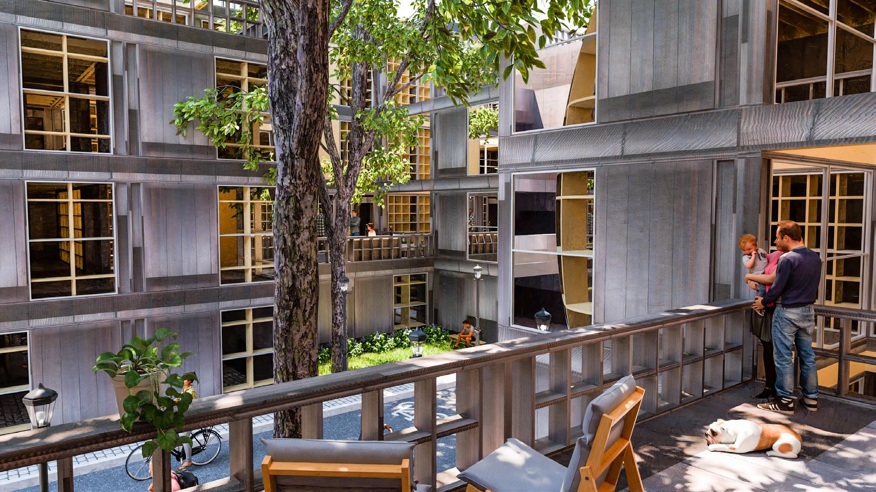
New housing developments are increasingly made from prefabricated units due to their low cost and ease of installation. However, these housing developments are often boring and monotonous, creating spaces that are cold and unwelcoming. Jarvis Place, an undeveloped parking lot nestled between rowhouses, provides an opportunity to develop a new and inventive housing scheme that will offer affordablerate housing for both graduate students and citizens of Boston.
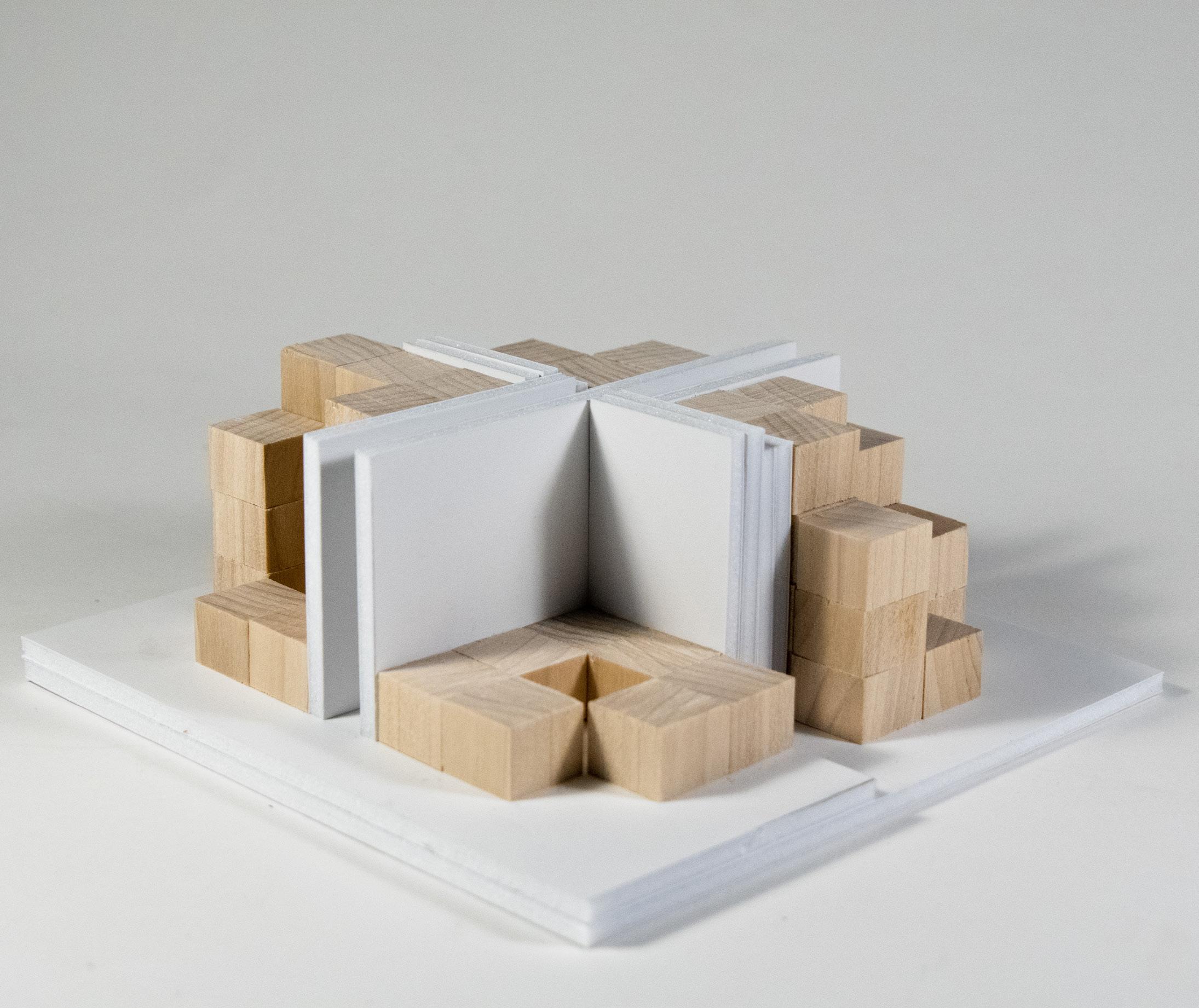
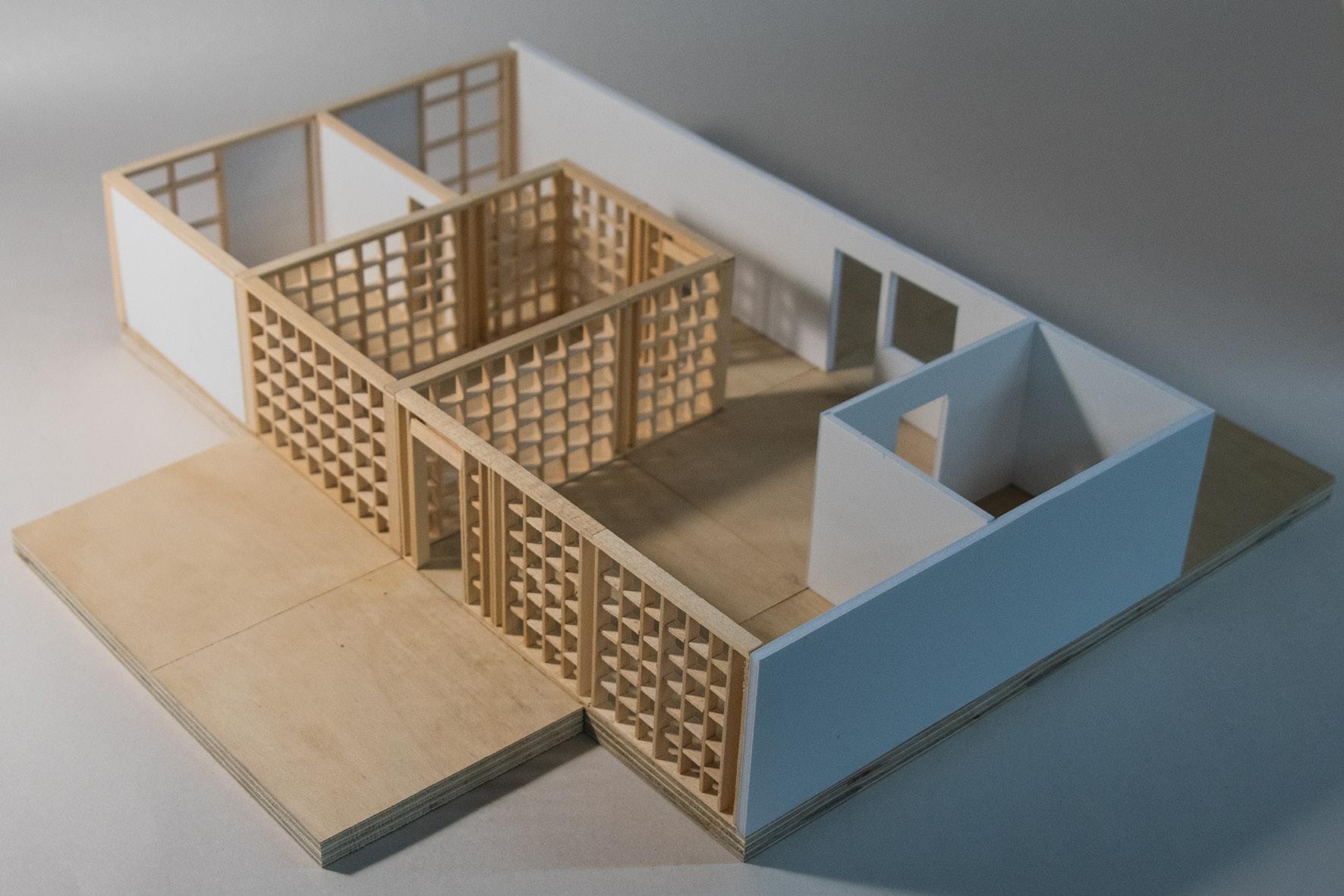
Twelve X Twelve reintroduces the human element back into the highly modular prefabricated housing scheme through its use of warm wooden materials, extensive shared outdoor spaces, and connectivity between the units of each aggregated module.

This project is organized around a grid system which begins at the street level. Beginning at the urban scale, a bike lane cuts through the center of the site - the primary line of circulation.
Branching off from this central artery are the circulation cores of the housing complex. Within these cores lie staircases for vertical circulation as well shared spaces to foster interactions between tenants.
Extending from the circulation cores are the service cores which house the kitchens and bathrooms of each unit.
In between the grid of circulation and service cores are shared green spaces. These courtyards and terraces bring light deep inside of each unit while providing a multitude of spaces for tenants to interact with each other.
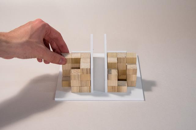
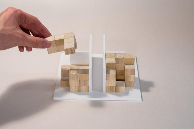
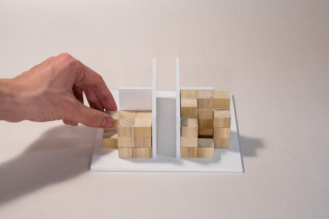

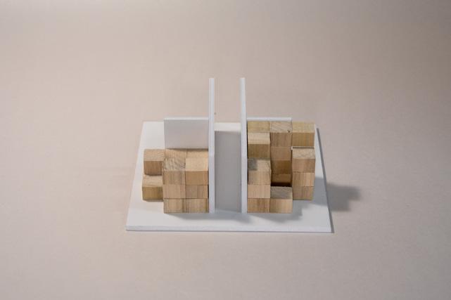
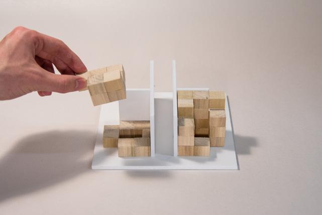

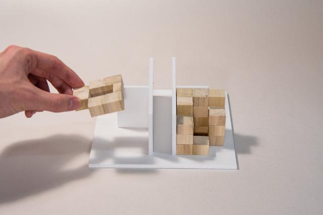
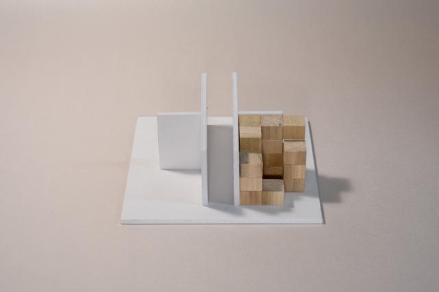
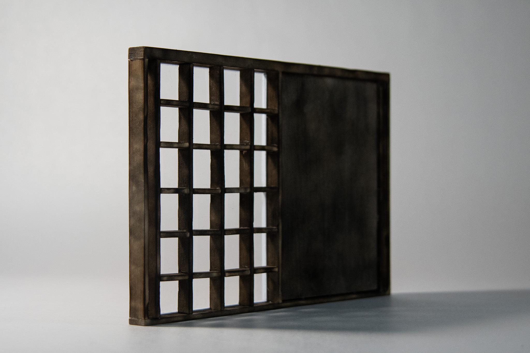
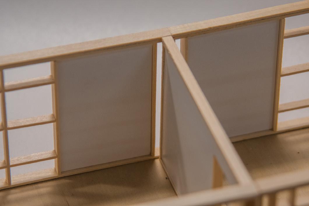
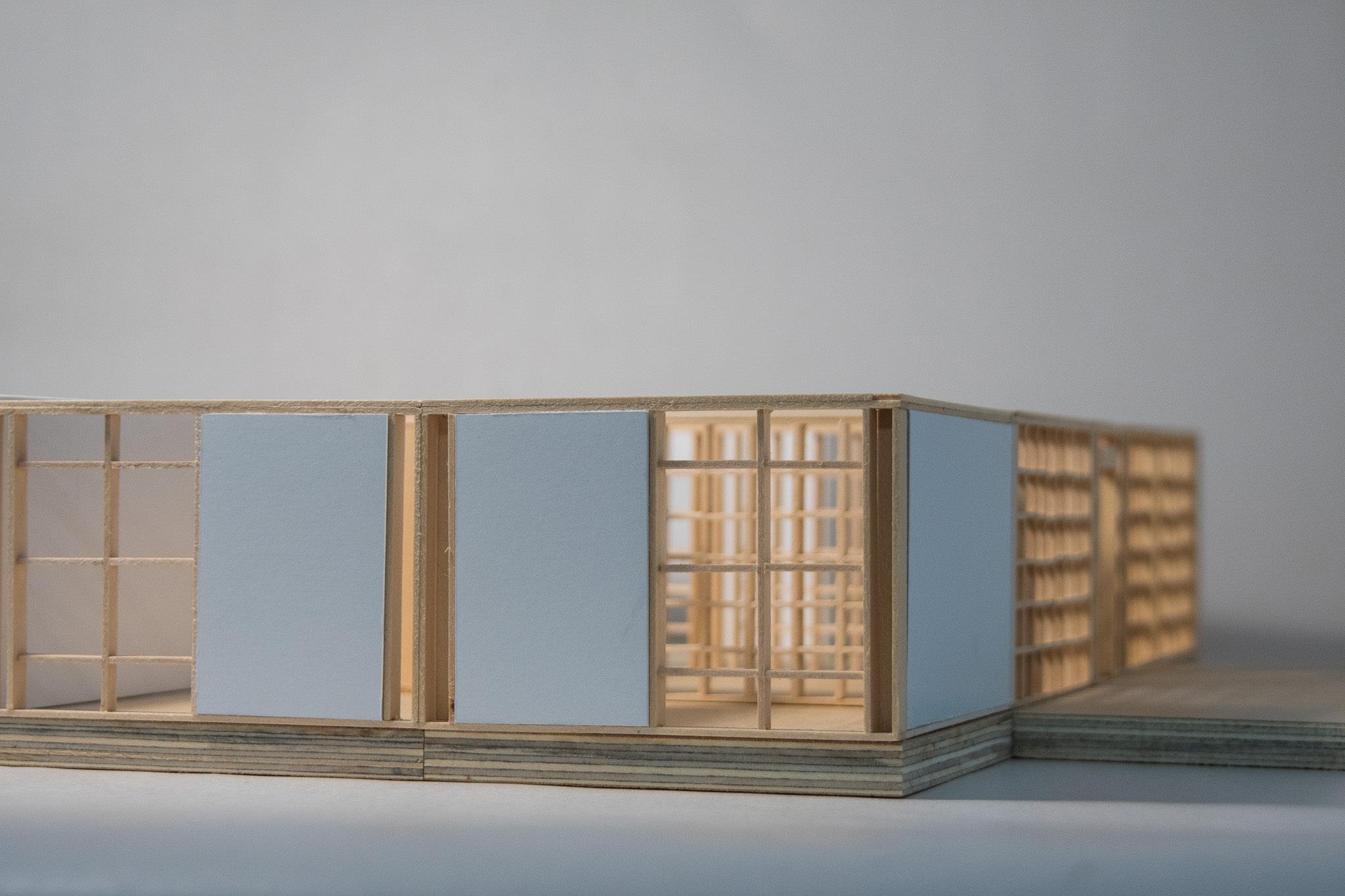
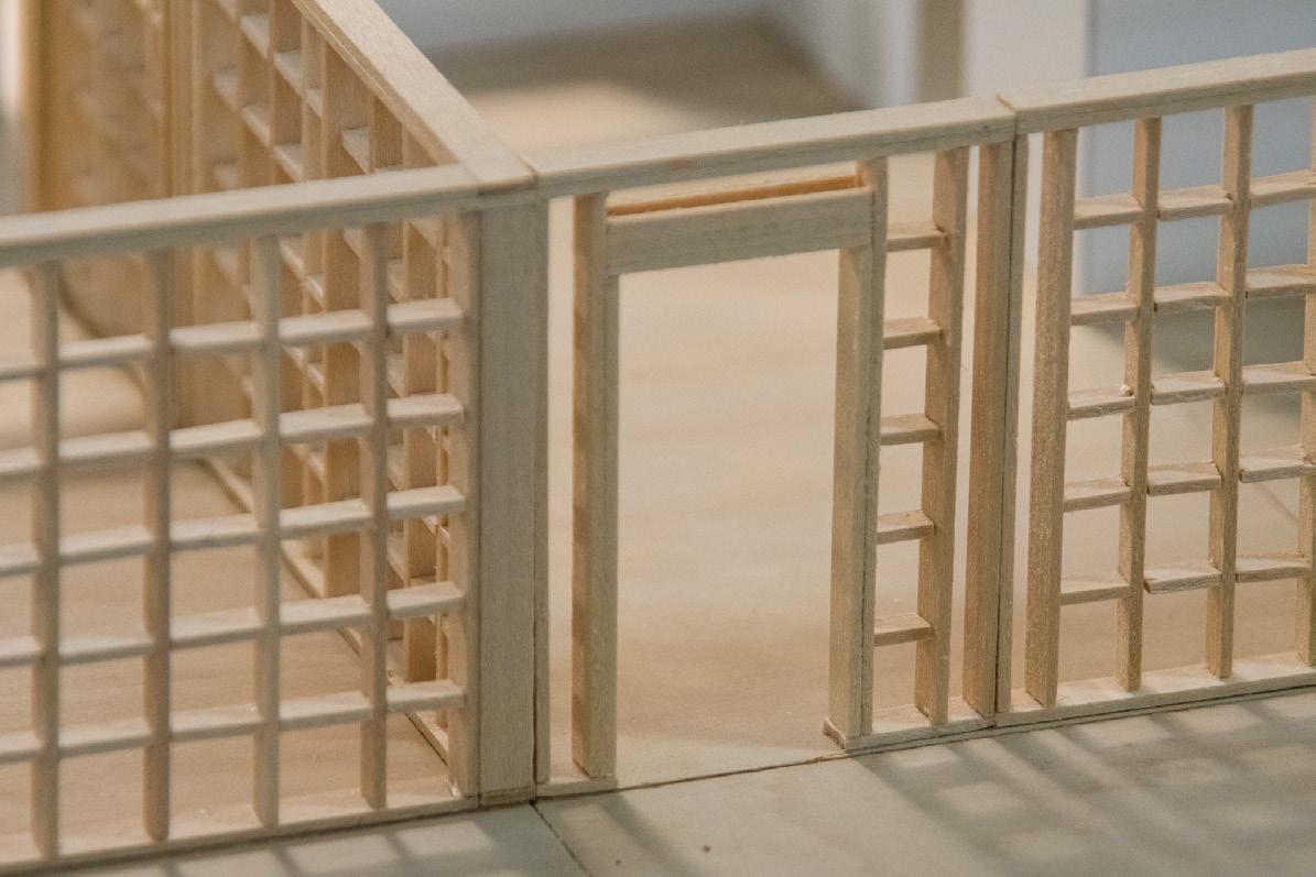
Each unit is built from a kit of wooden walls and floors with dimensions defined by the 12’ by 12’ grid in which they lie. Kit of Parts

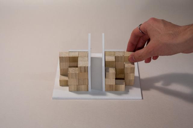
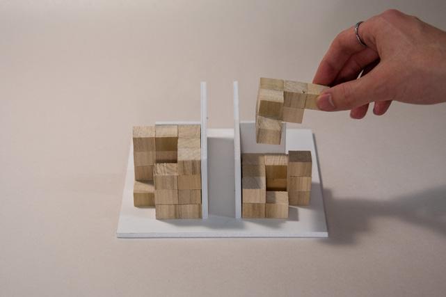
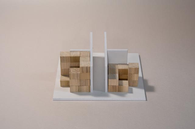


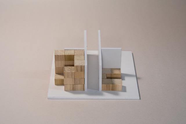
Each piece in this wooden kit of parts is treated using the Japanese burning technique shou sugi ban which protects the wood from insects and weathering. The walls facing towards the public street and shared green spaces are half window and half wall to provide privacy while walls facing private terraces are fully glazed to bring in light and provide shelf space for tenants.

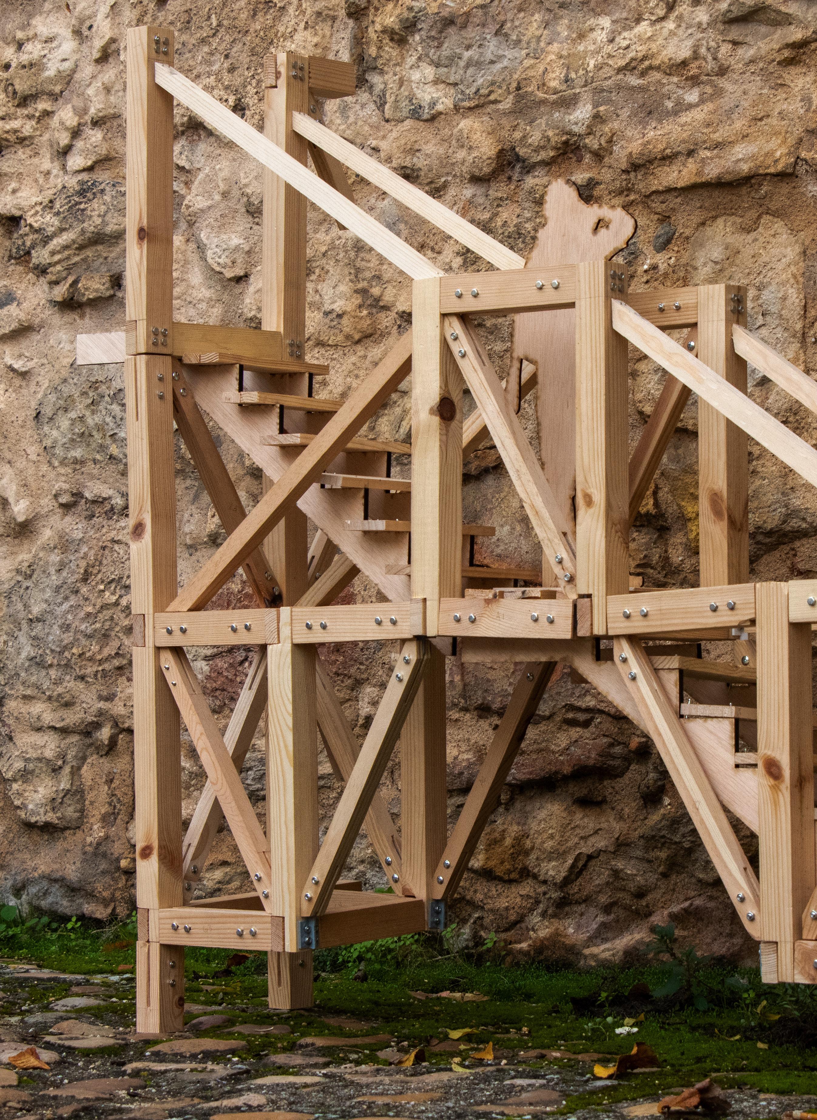

Every year, thousands of temporary wooden structures are built across the world for festivals and events. With a growing need for sustainable construction methods and an inability to cut down on the number of cultural events to be celebrated, a potential solution is identified: recycling of these structures.
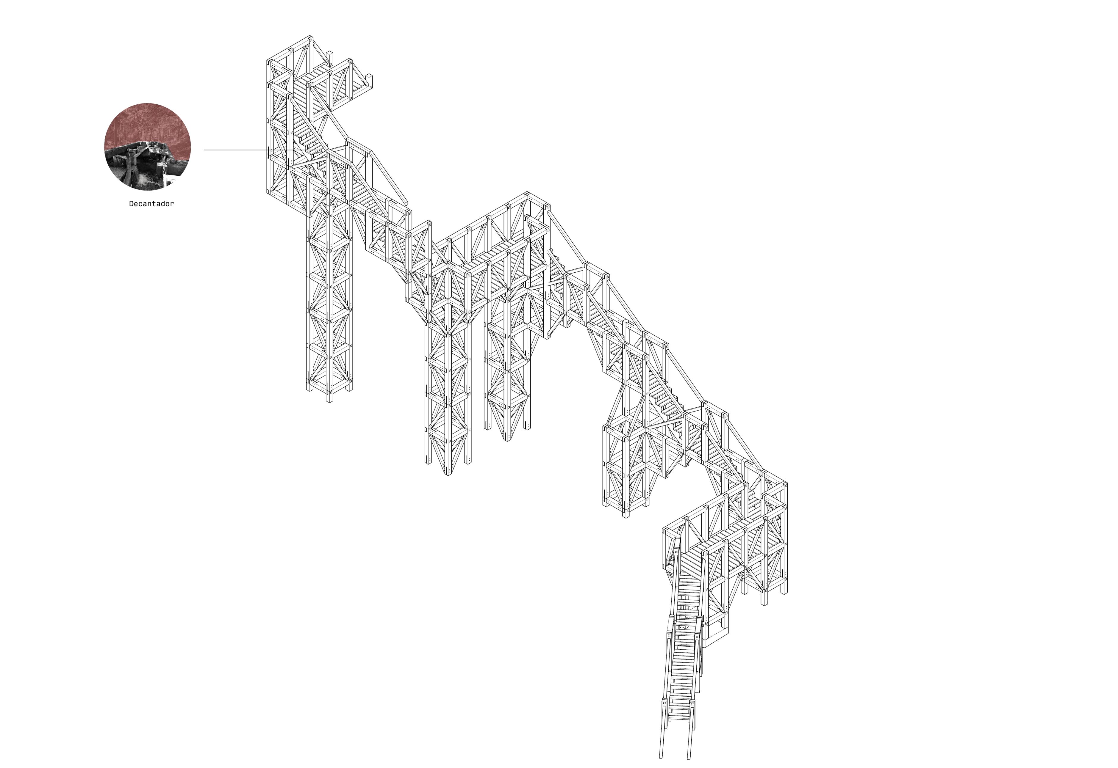
This project began with selecting a case study of a wooden structureMerola’s Tower - and dissecting it into its pieces. From this catalogue of parts, an infinite number of new structures can be constructed at an infinite number of sites.
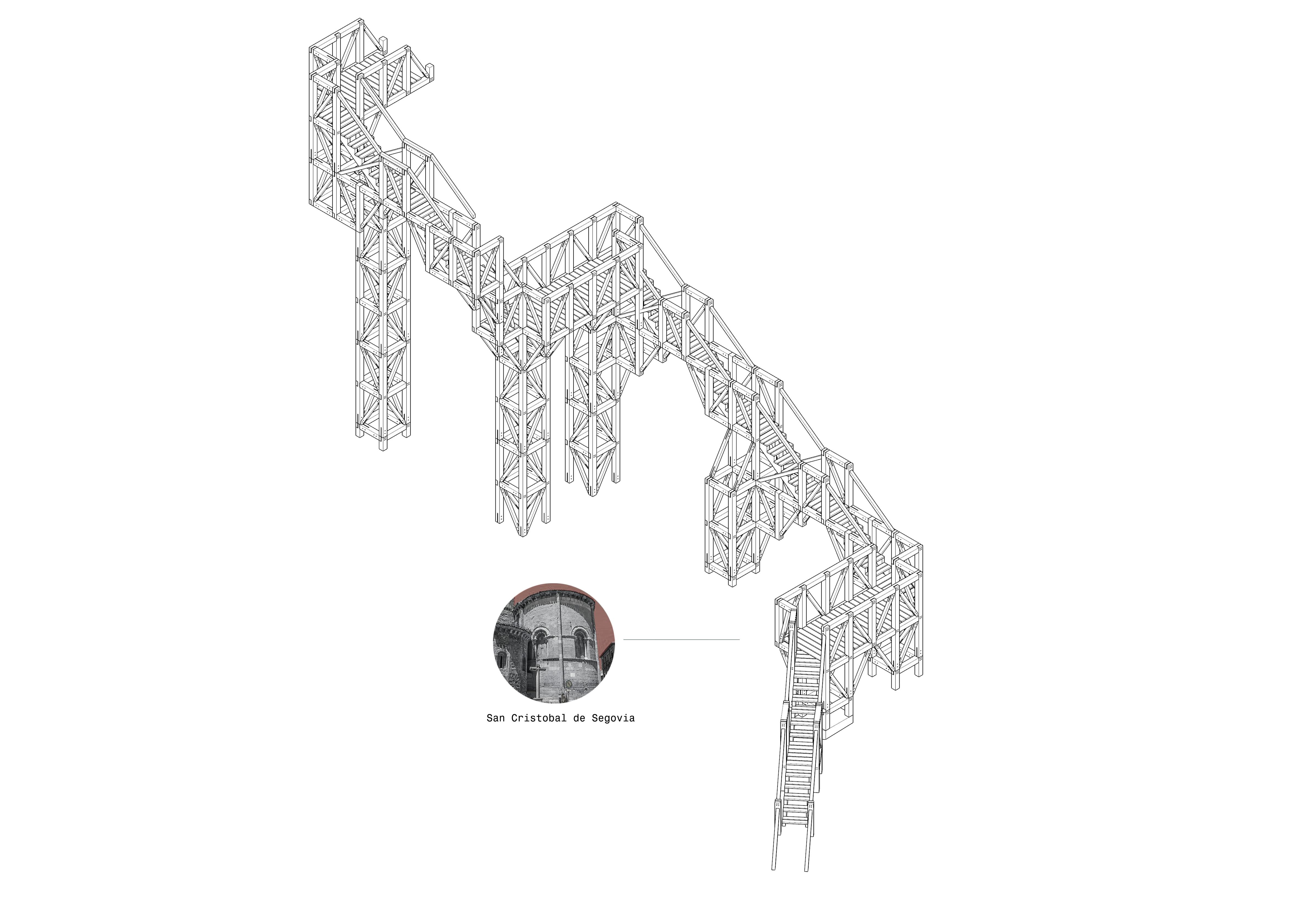
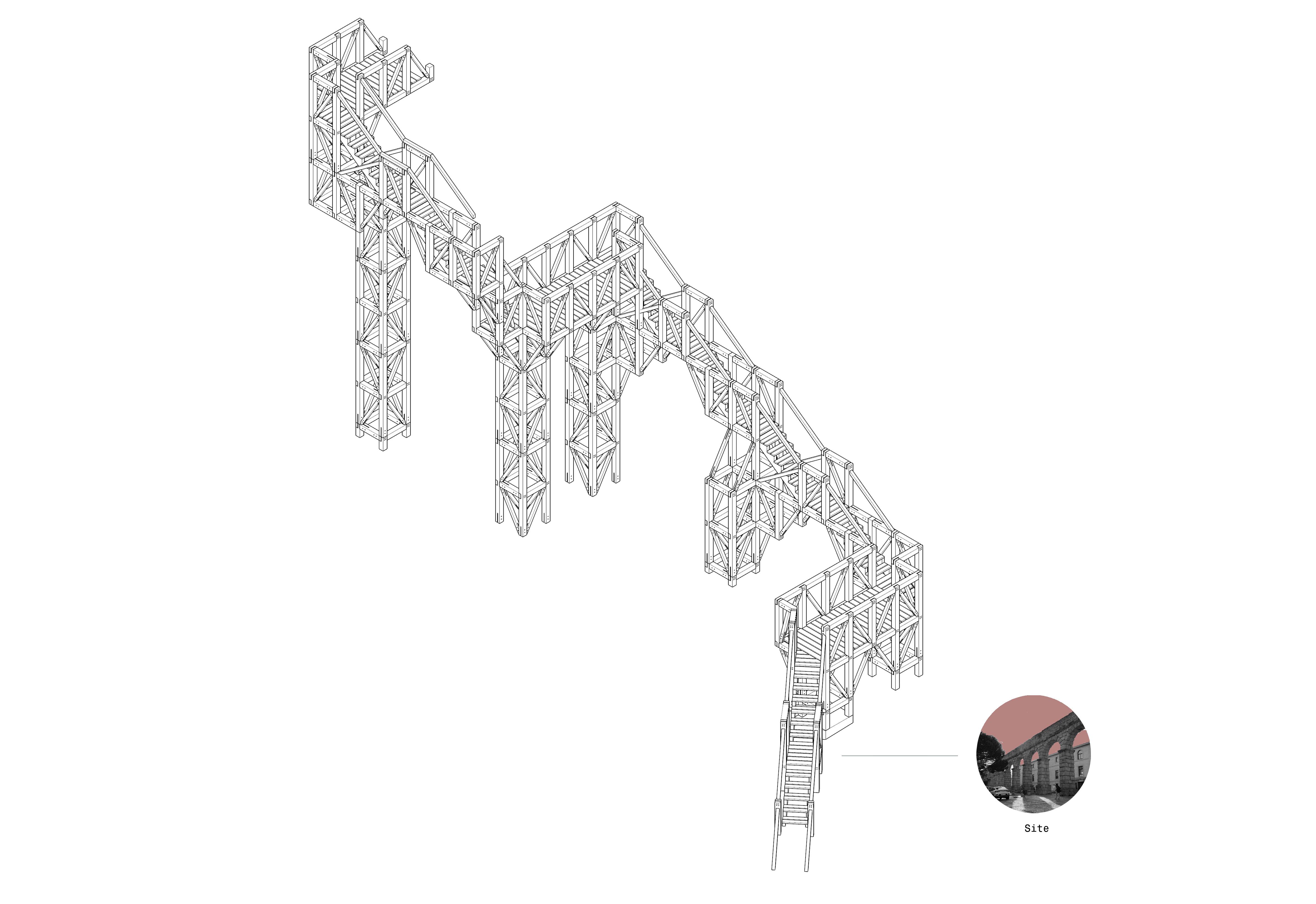
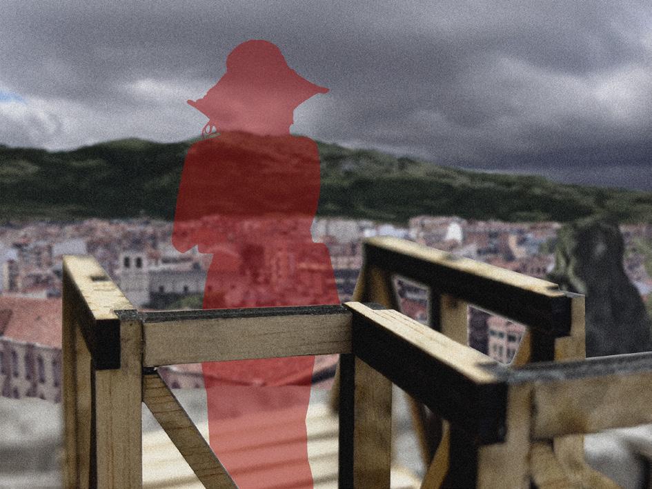
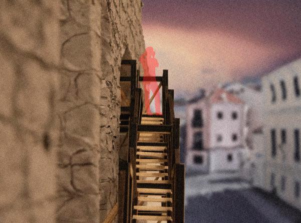
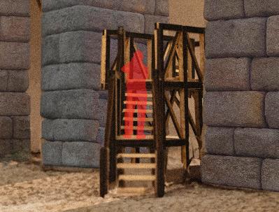
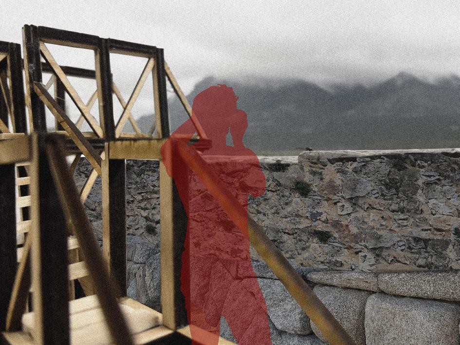
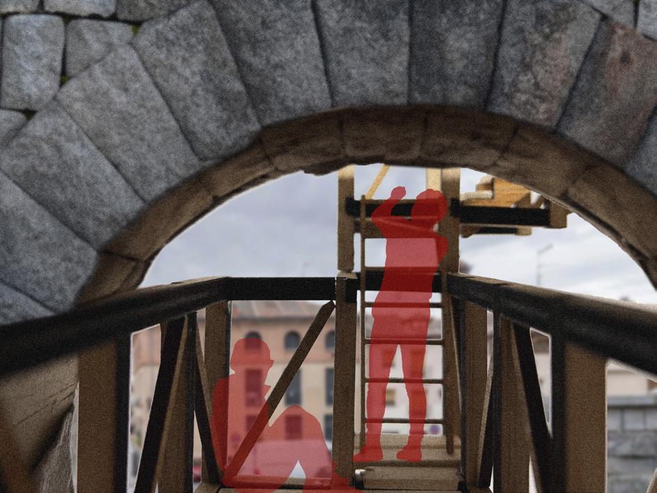
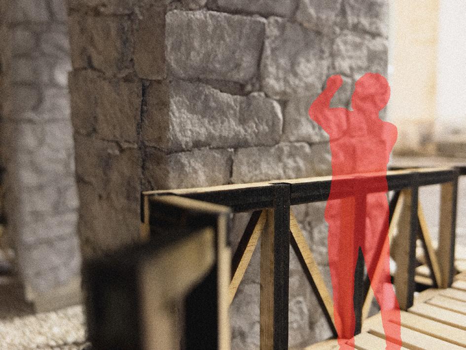
Our configuration centers around the aqueduct of Segovia. To revisit the history of the aqueduct and expose it to festival goers, our project weaves a wooden scaffolding structure through the legs of the aqueduct - coming close but never touching, inviting visitors to be the one to bridge the gap between past and present. As visitors travel up the structure, a variety of encounters meant to evoke moments along the path of the aqueduct are created, culminating with a view of the city and a close encounter with the channel of the aqueduct that allowed for Segovia to grow into the city it is today.
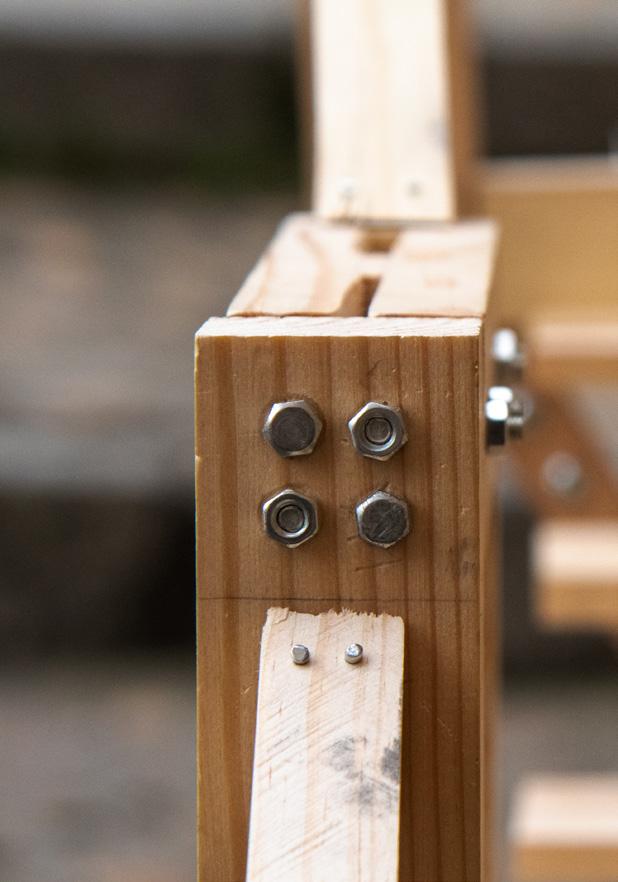
Carles Enrich Studio’s Merola’s Tower in Puig-Reig, Spain is a beautiful case study in wooden construction techniques. In collaboration with my group members, we redrew the tower and reconstructed a portion of it at a 1:4 scale to better understand the seamless wood structure made possible by the collection of steel knife plates found at each connection point.
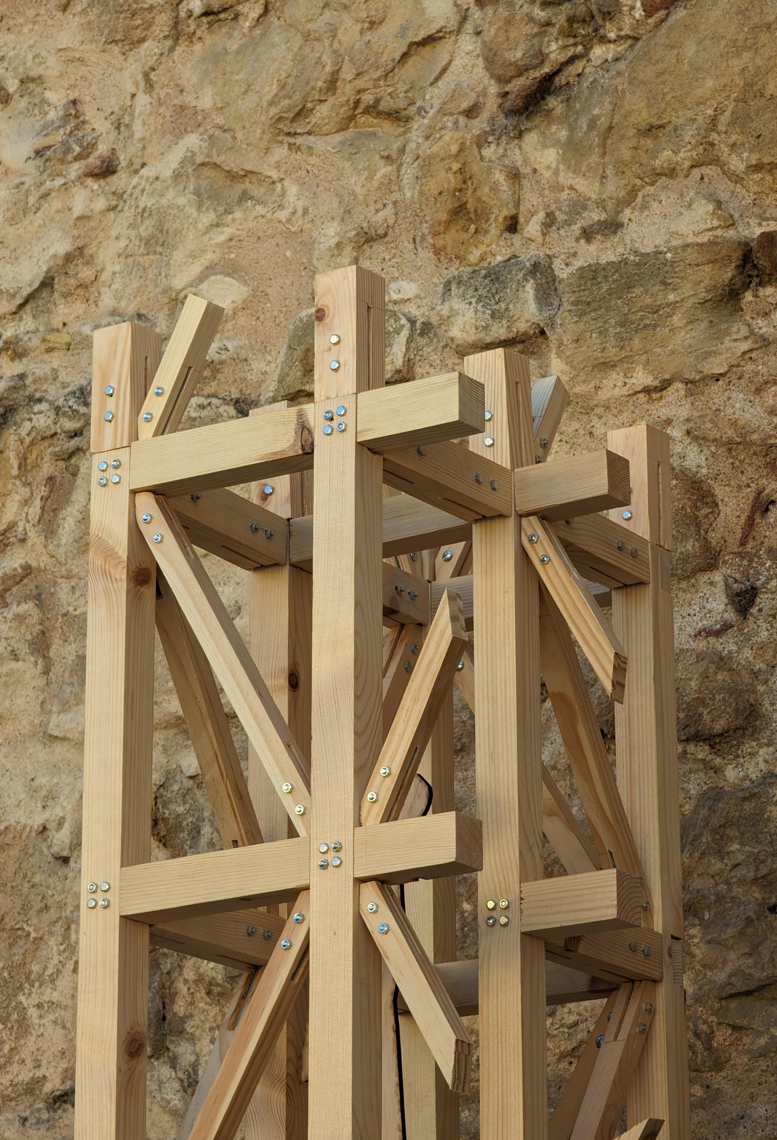
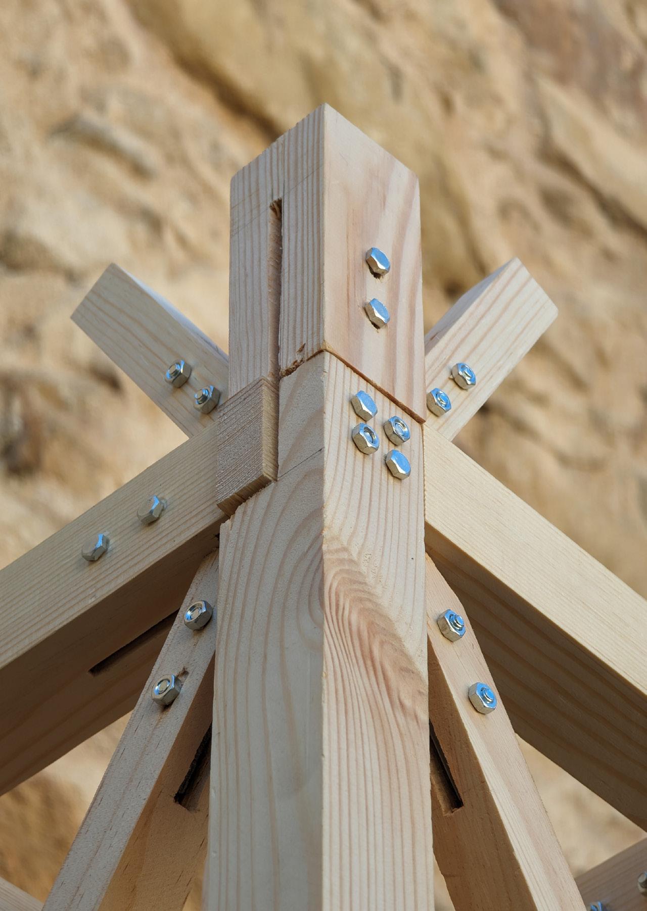
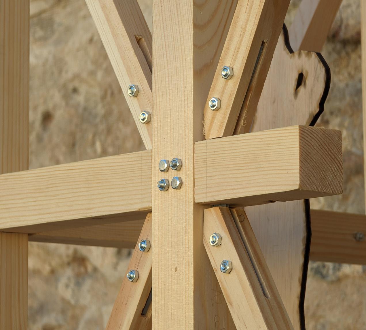

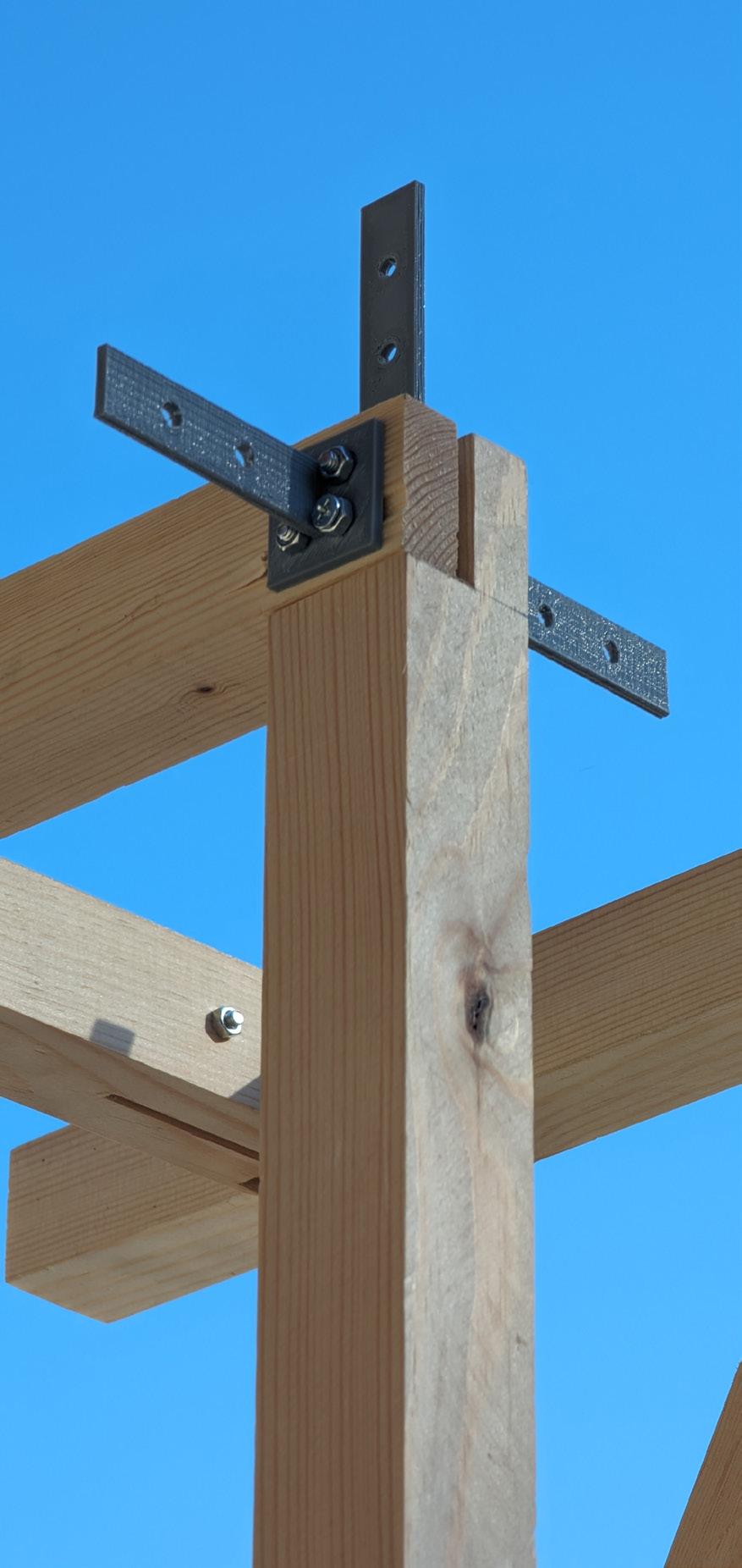
To decide on a new site, we focused on Merola’s Tower’s interaction with its crumbling stone wall it supports and the history that wall represents. Limited to the borders of Segovia, we focused in on the most historical part of the city: the aqueduct. While the aqueduct itself is an extremely visual piece of history, there are still many hidden elements which we wanted to help visitors rediscover, just as Merola’s Tower reestablishes historical views from its tower which have been lost for centuries.
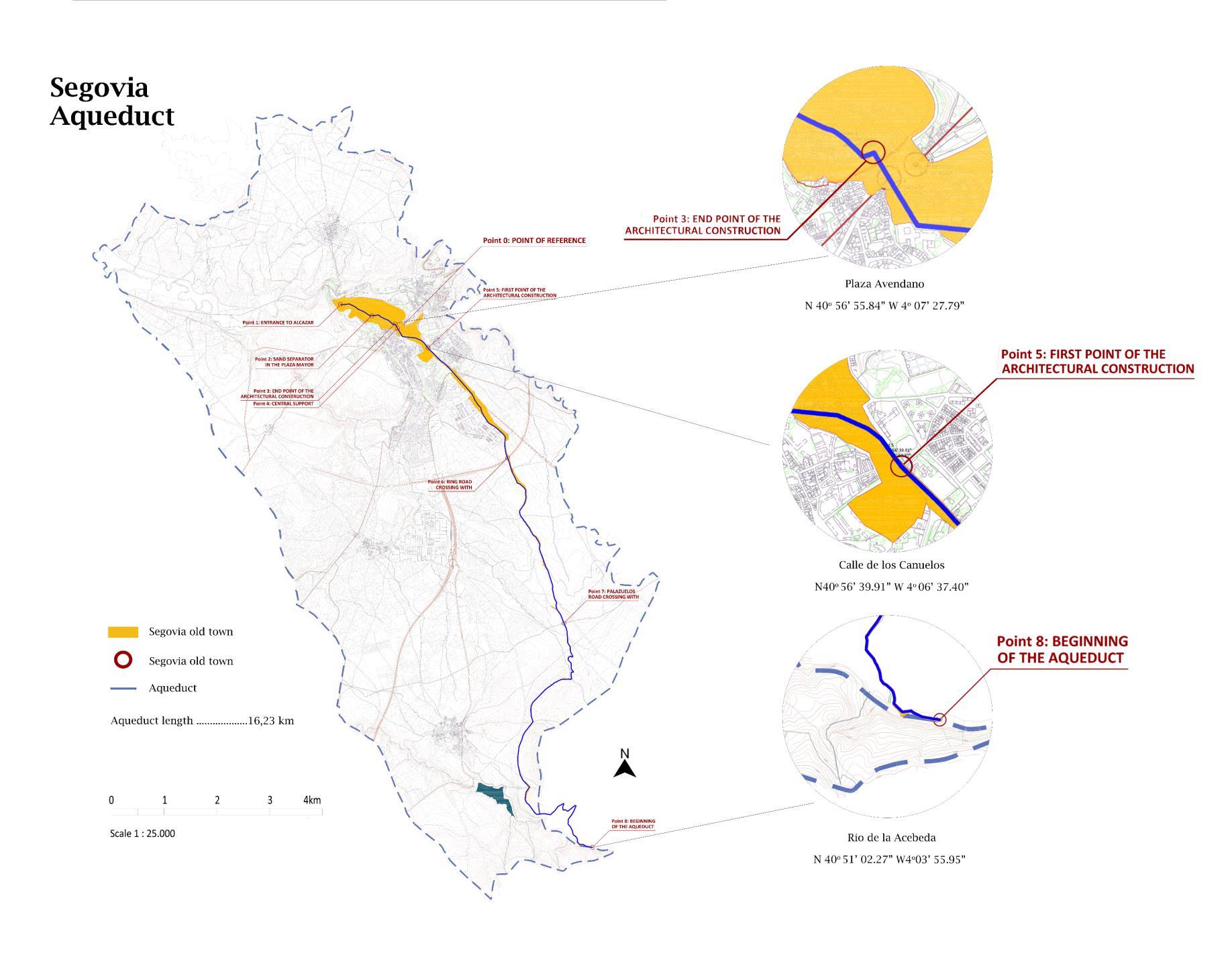

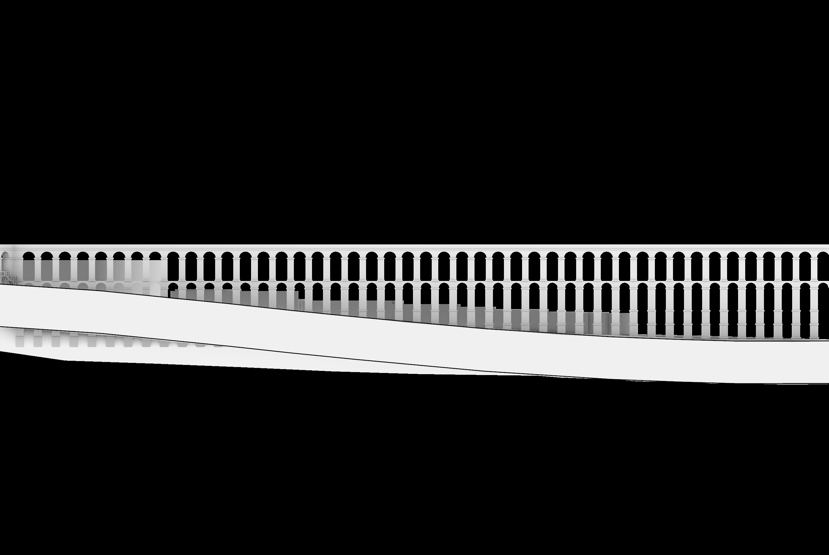


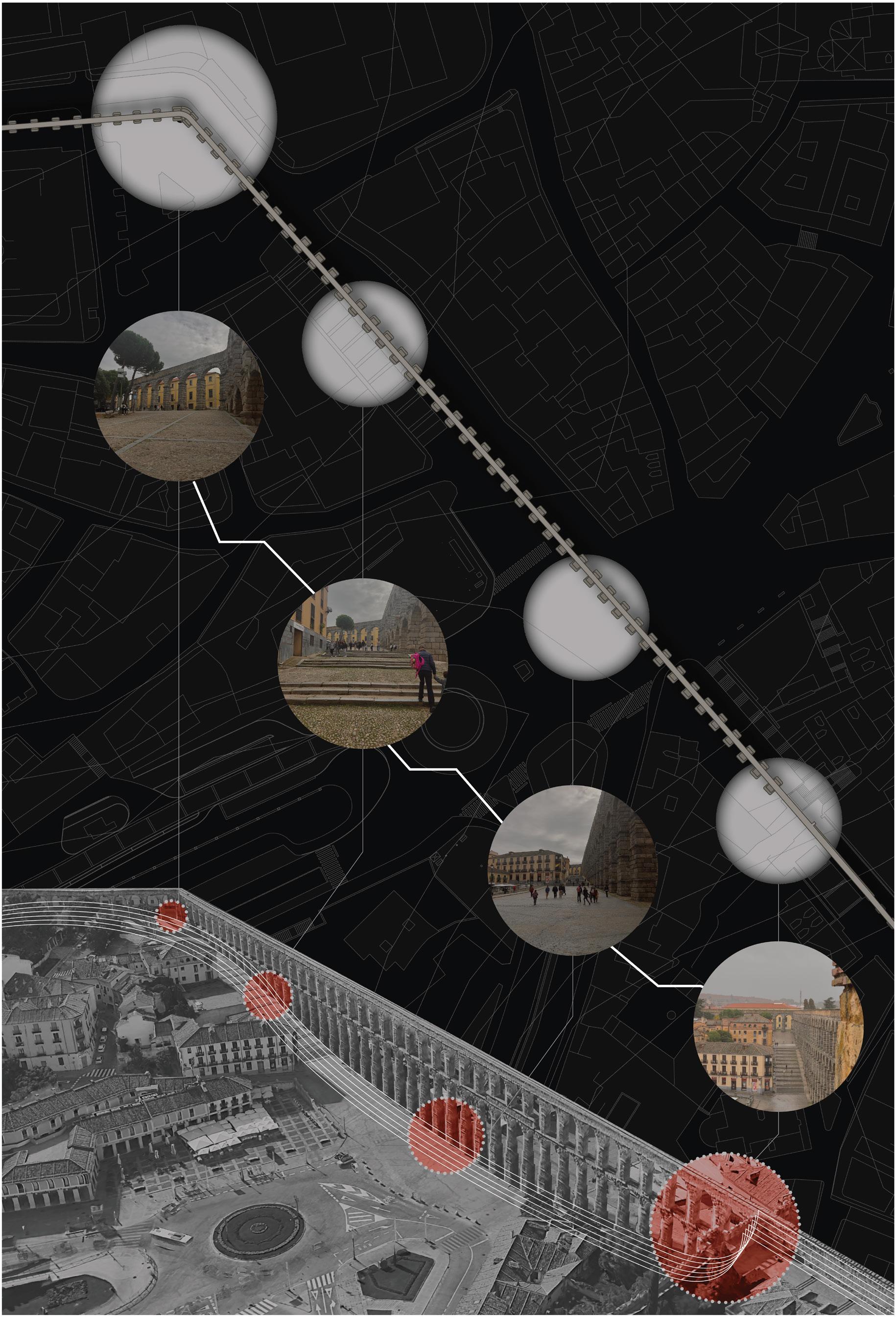
To reactivate the aqueduct’s history, we chose a section that is traditionally unvisited for our site. This invites visitors to explore the city more than usual and draws them up a gradual slope, preparing them for the uphill journey they are about to embark on.
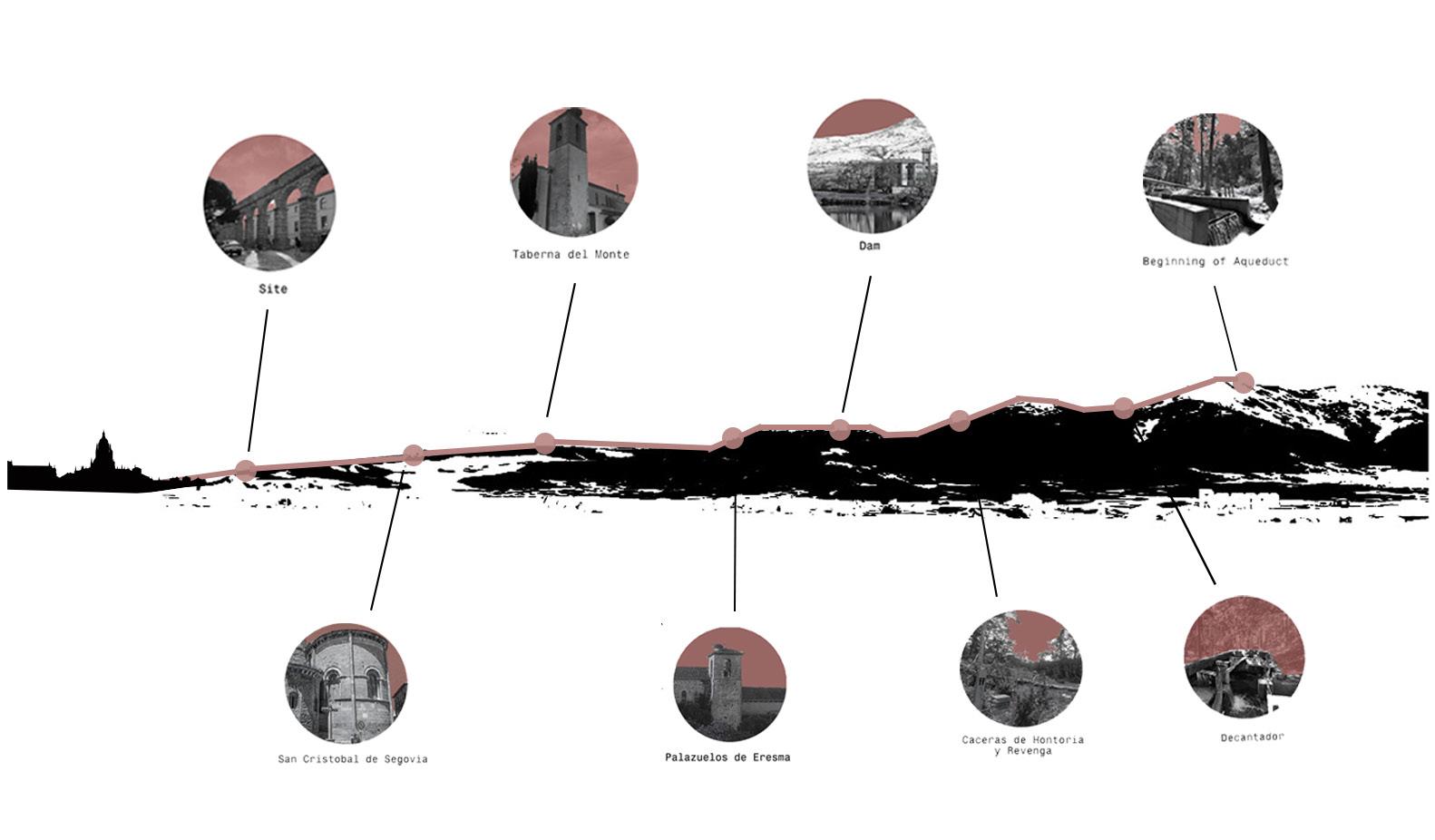
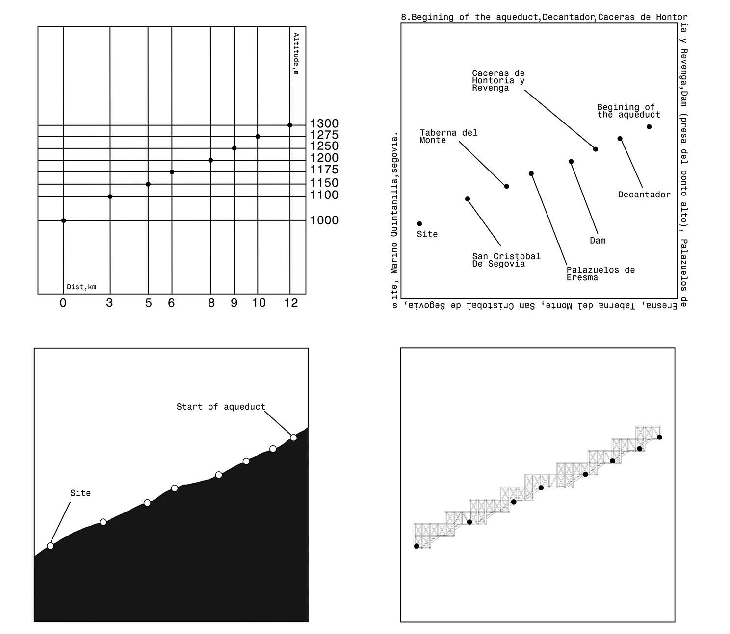
Major points the water of the aqueduct has to flow through to reach the city center defined
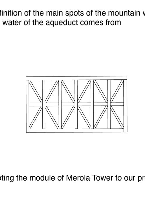
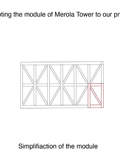
Modules of Merola’s Tower dissected into their smallest units
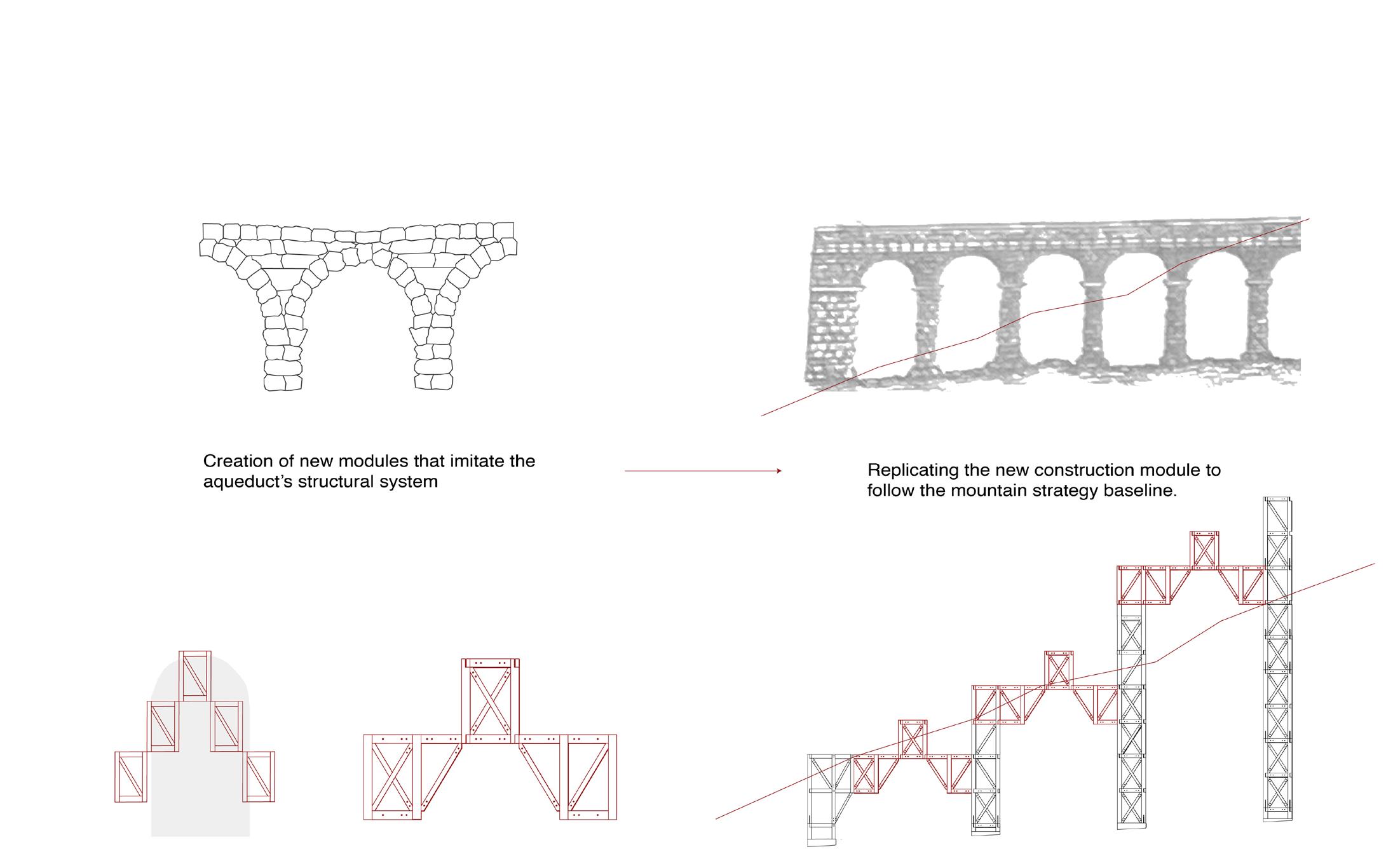
Units are combined into arch modules that match the structure of the aqueduct.
Modules are then connected together to follow the path of the aqueduct.
Our new arch module was then altered to include stairs and railings that double as additional truss support members. The shape of the module creates an upward slope, drawing the eye up to each platform and pushing visitors up their journey.
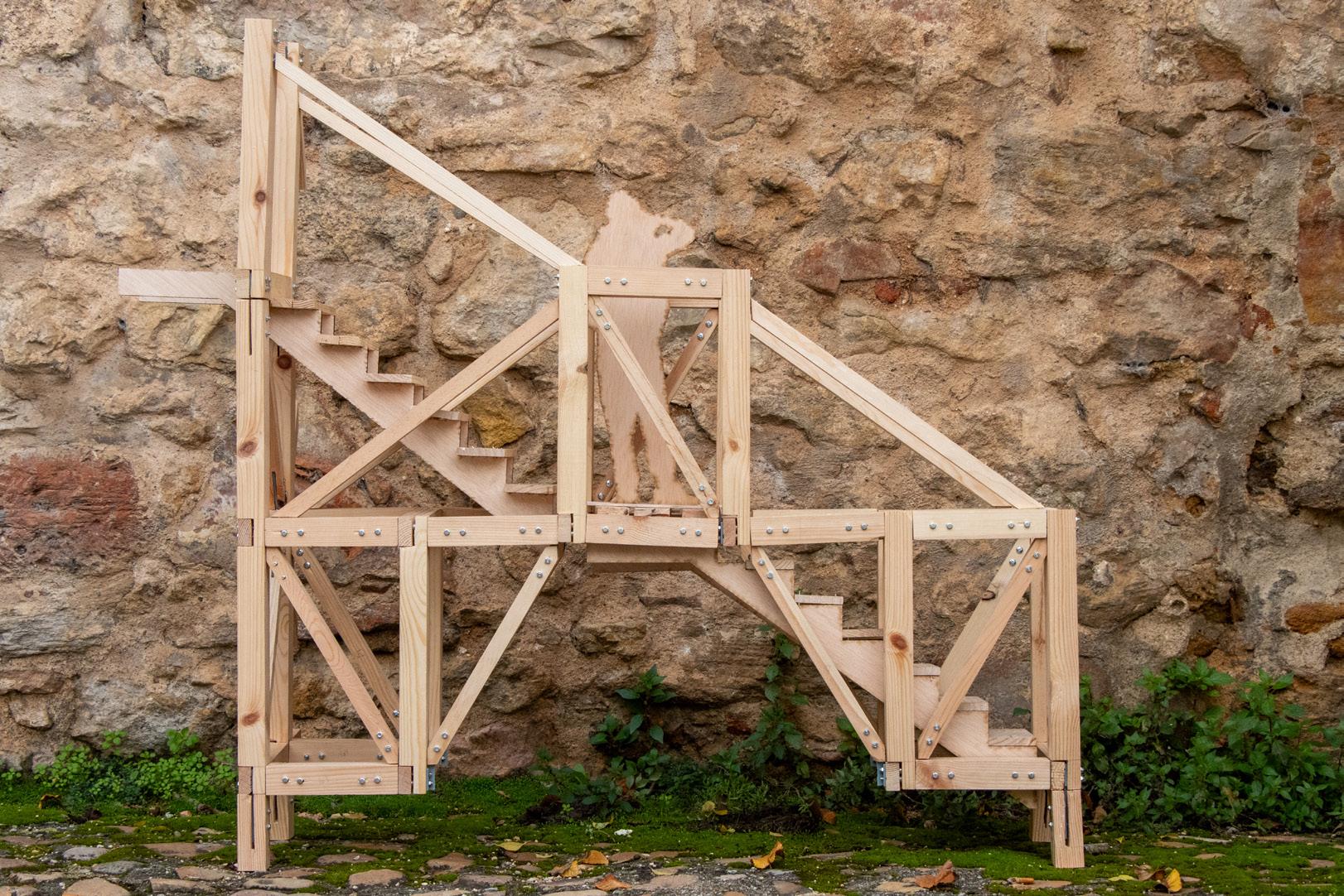
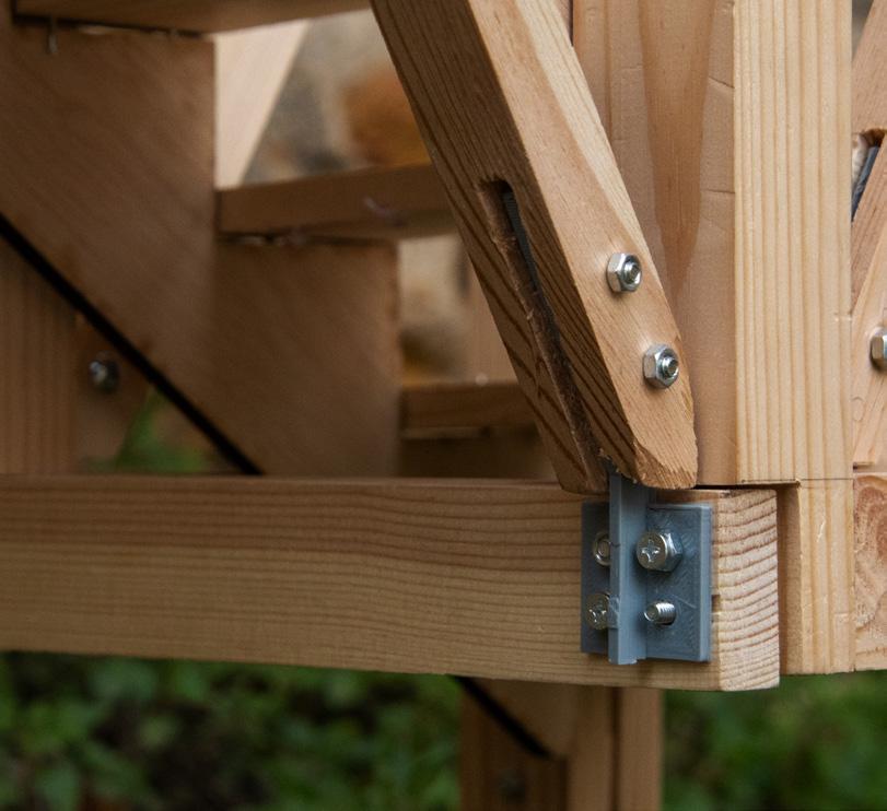
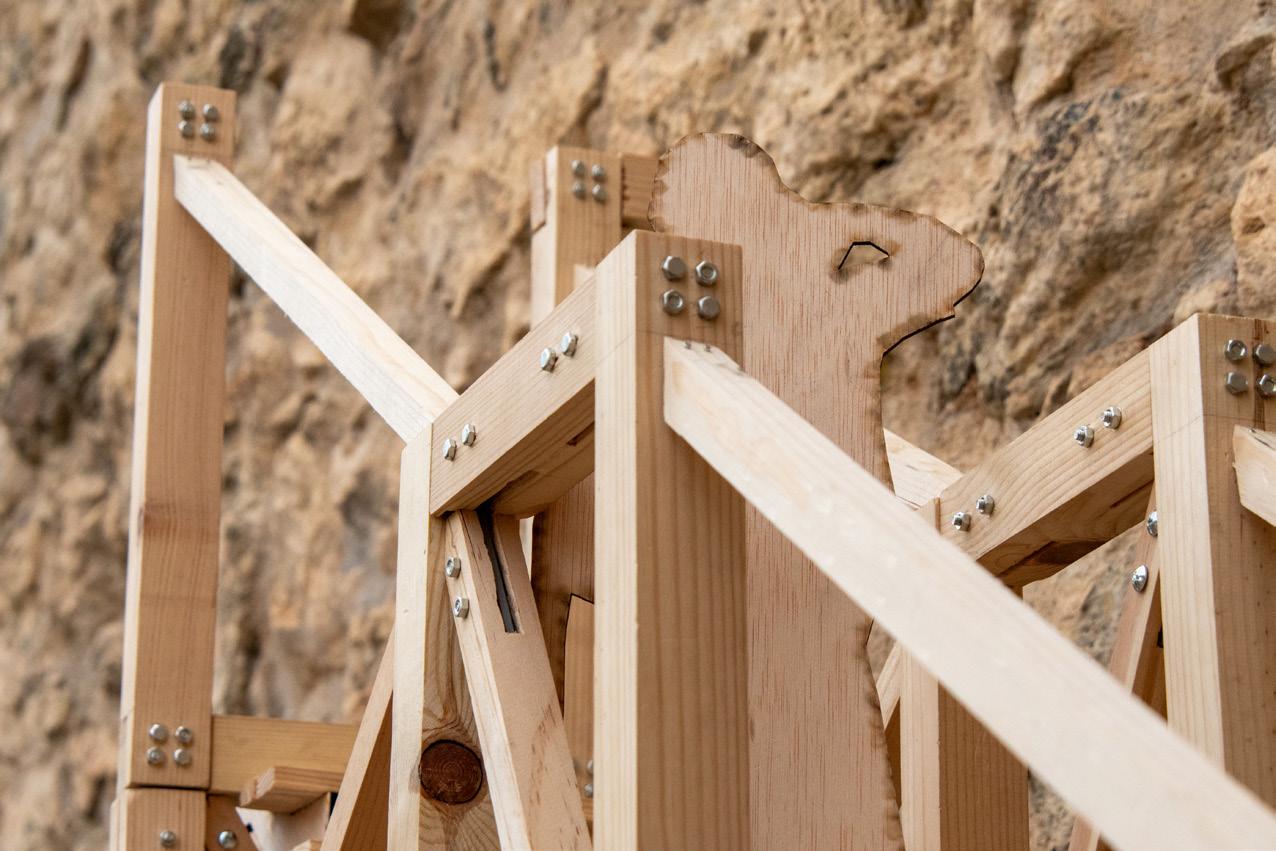
This system was periodically to accommodate the odd elements of our structure, such as the angled entry and ladder section.
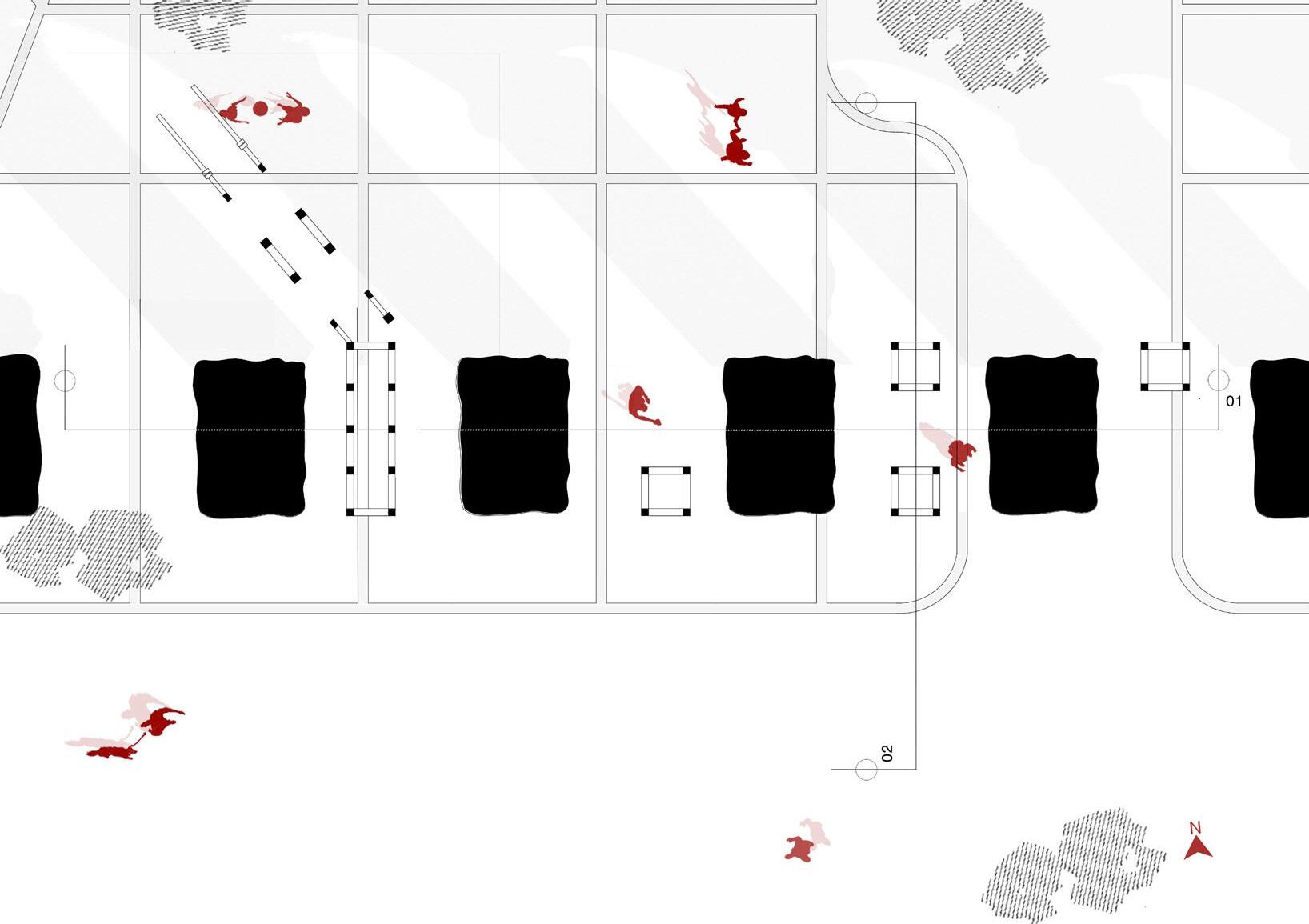
At the entry, the stairway turns away from the established grid just as the aqueduct turns to make its final approach to the city center. This allows us to meet the foot traffic climbing the site’s gradual slope, creating a continuous journey from the city center.
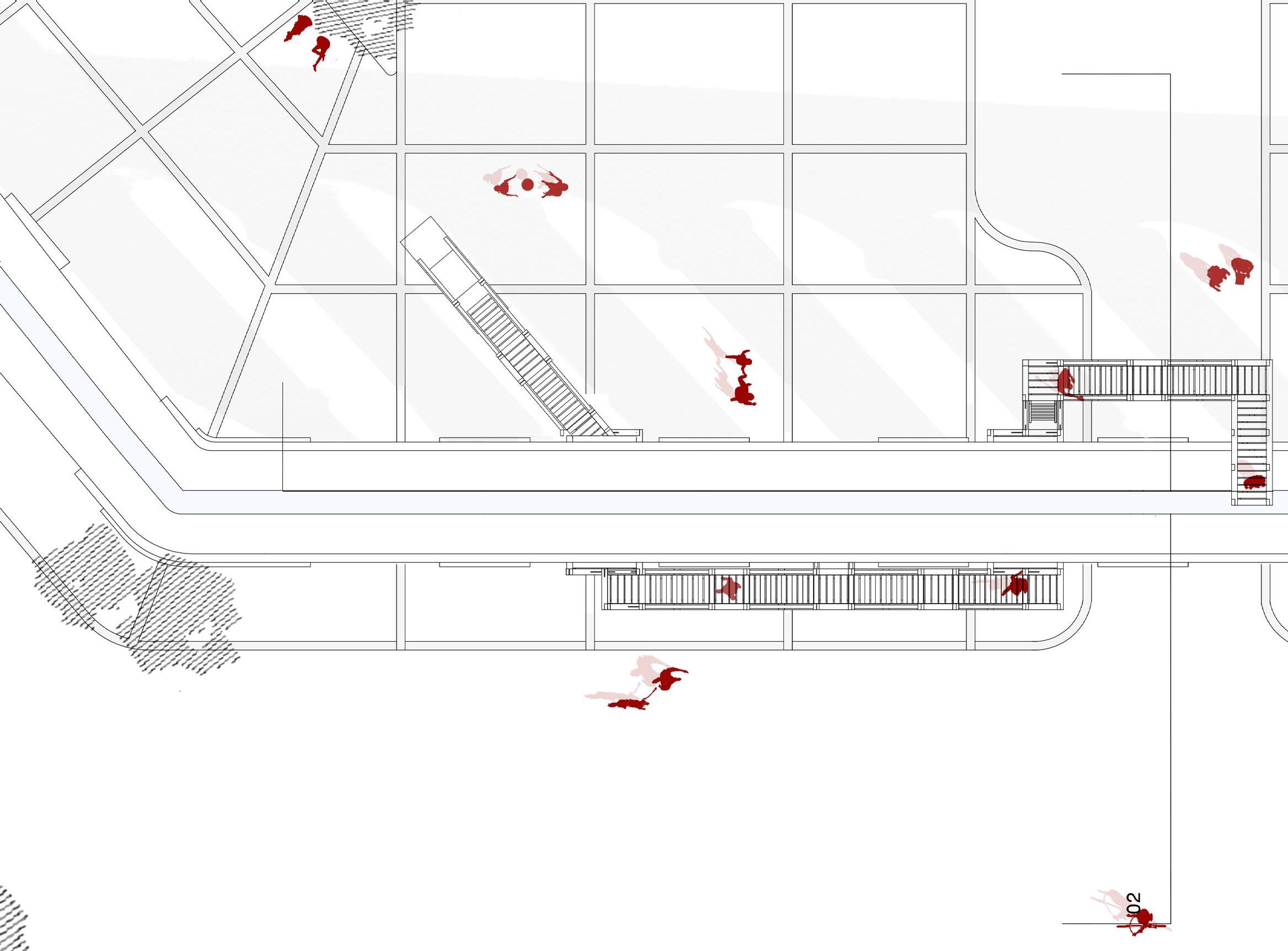
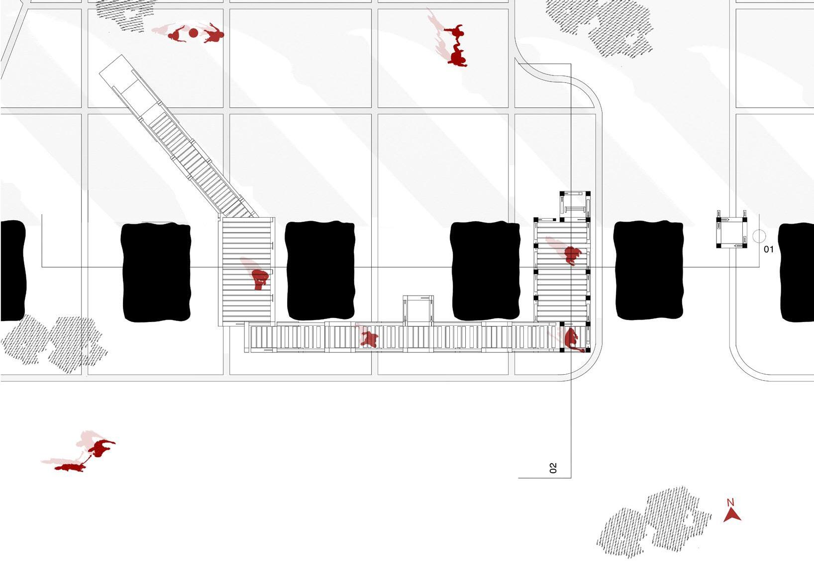
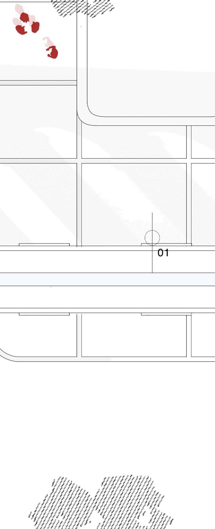
Second Platform Plan
Our structure winds through the aqueduct, bringing visitors close enough to touch the stones of the aqueduct without touching the aqueduct itself.
Beginning of Aqueduct
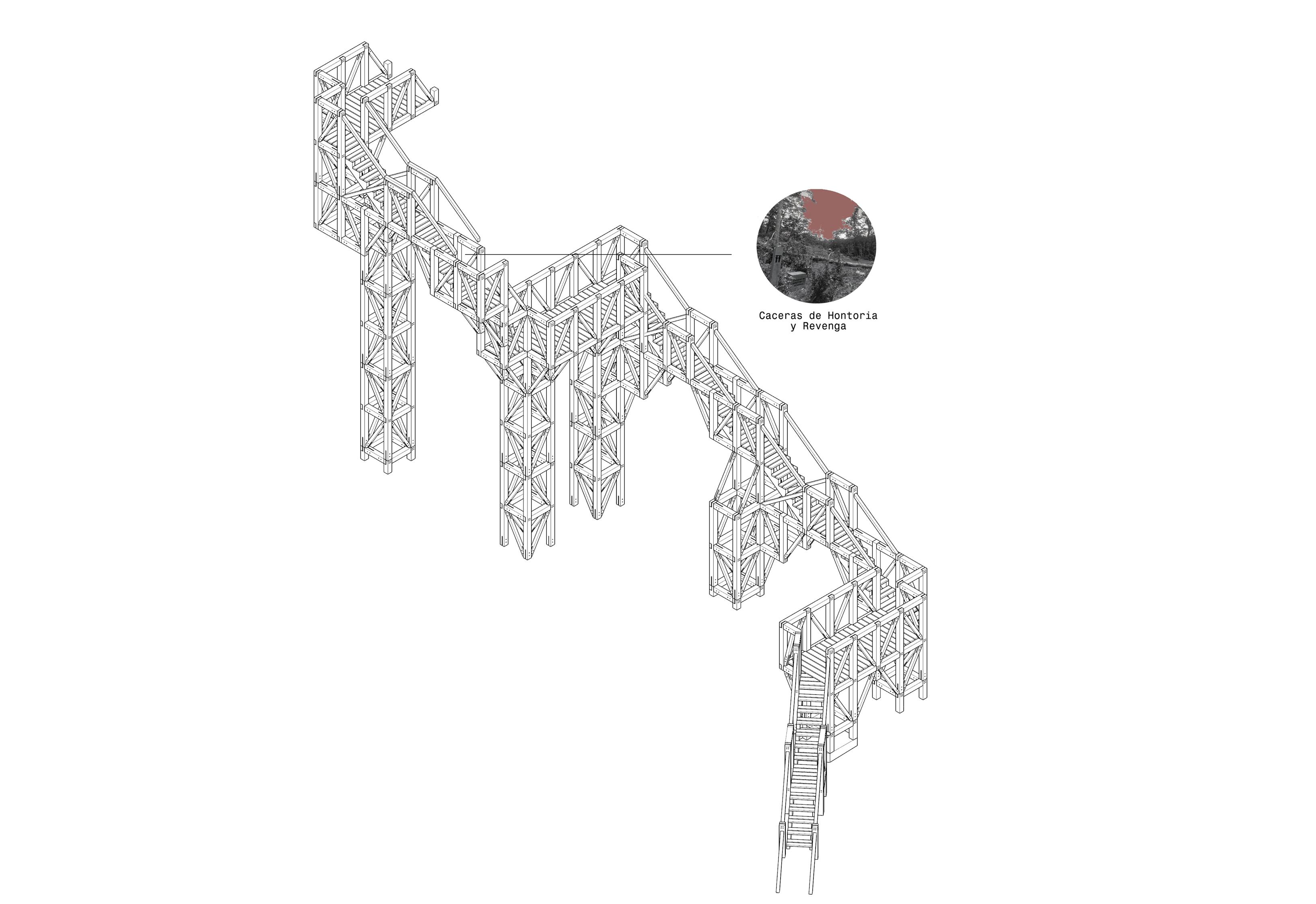
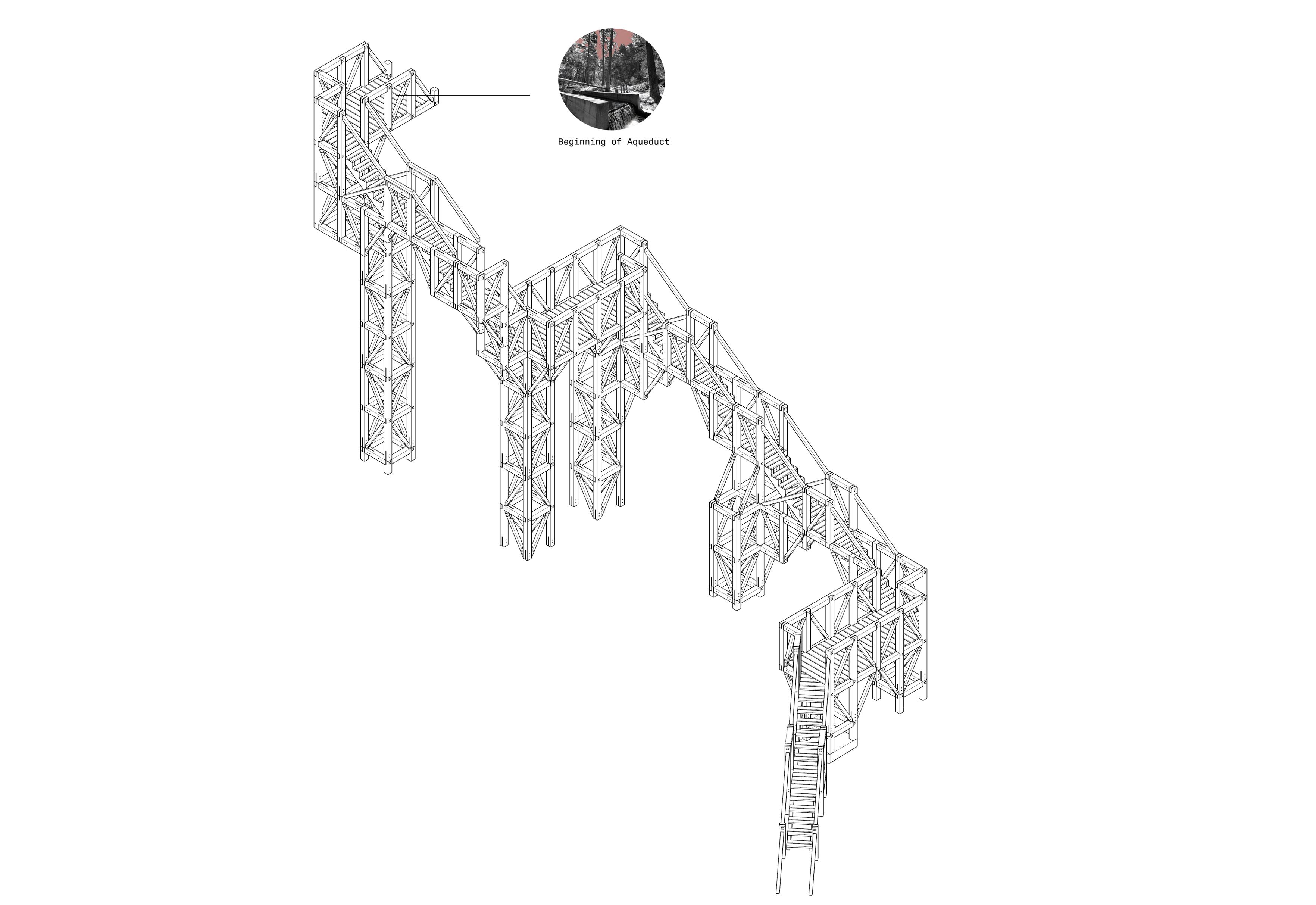
Experiencing the Aqueduct



Boston’s Chinatown neighborhood is one of many facing the constant threat of urban renewal. This trend of redevelopment claimed the lives of the row houses which once inhabited the parcels of 6, 8, 10, and 12 Hudson St. Not only were four buildings torn down, but their histories as housing for the Chinatown community were erased as well.

This rest stop is an attempt to ensure the history of Boston’s Chinatown can continue to survive, even in the face of urban renewal. The walls of this pavilion serve as a framework to hold the stories told by the neighborhood’s rubble; those of destruction, restoration, and rebuilding.

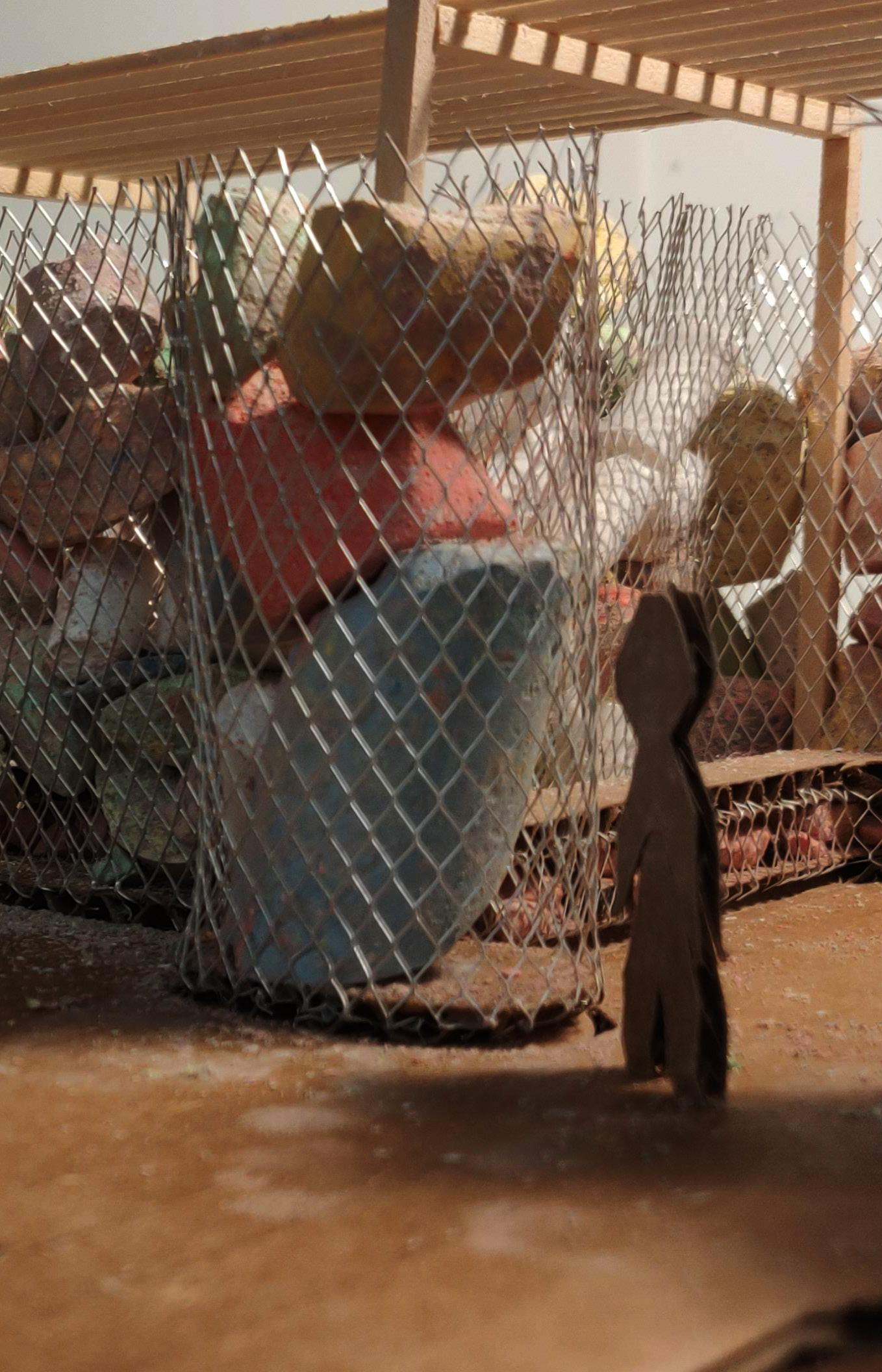
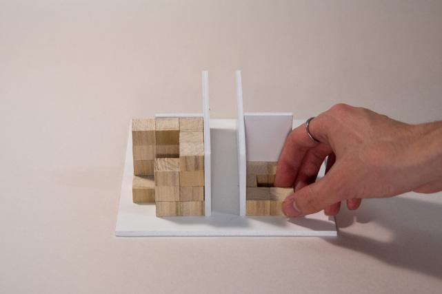
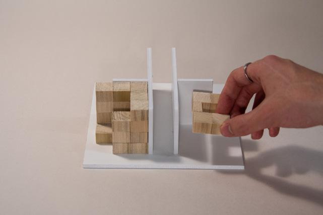
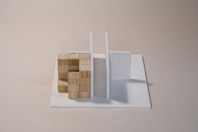
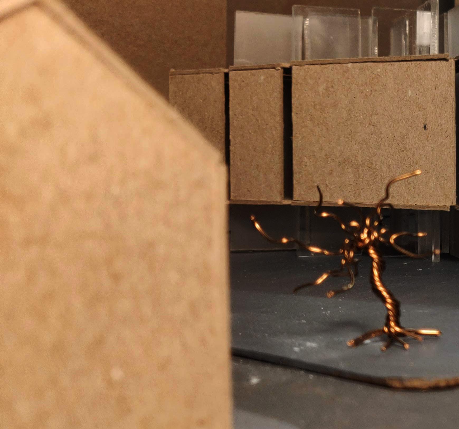
This project began by examining SOM’s Beinecke Rare Book & Manuscript Library made for Yale University. What stands out most about this library, and what was carried forward into the Chinatown Cathedral, was its transparent walls. Using thin slabs of marble, the Beinecke Library is able to have a solid, monolithic exterior that still allows light in, animating the walls.
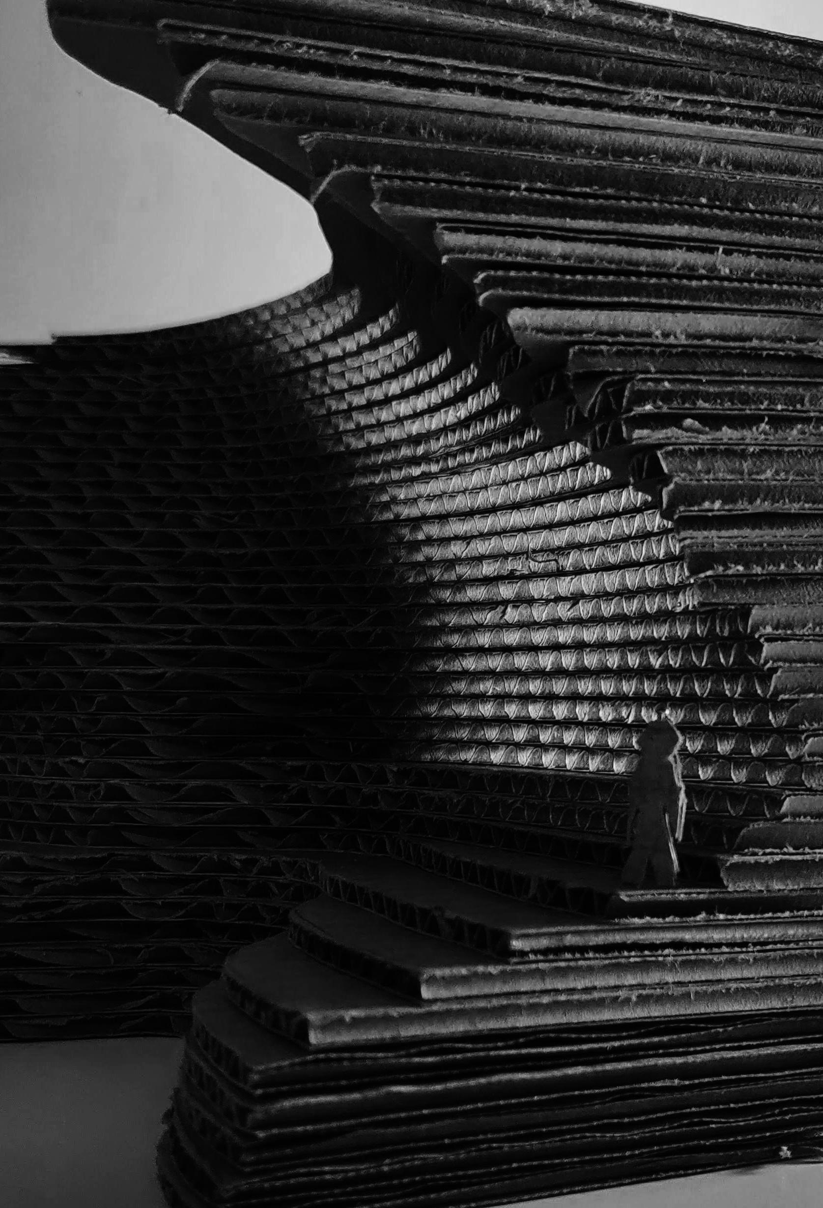
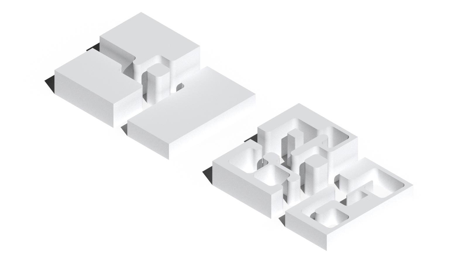
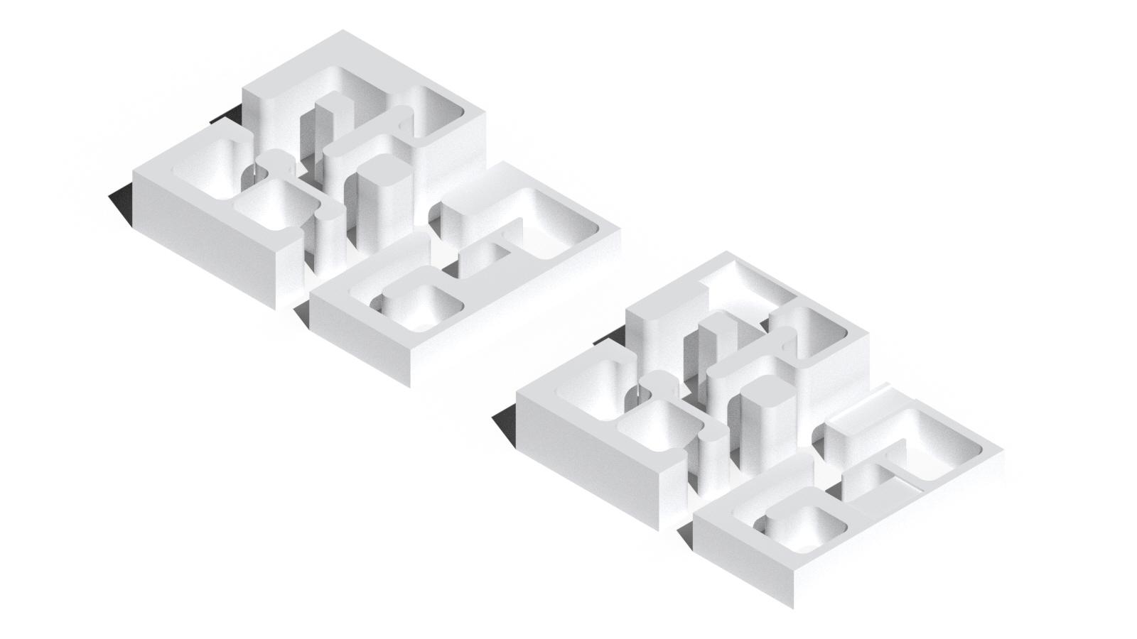
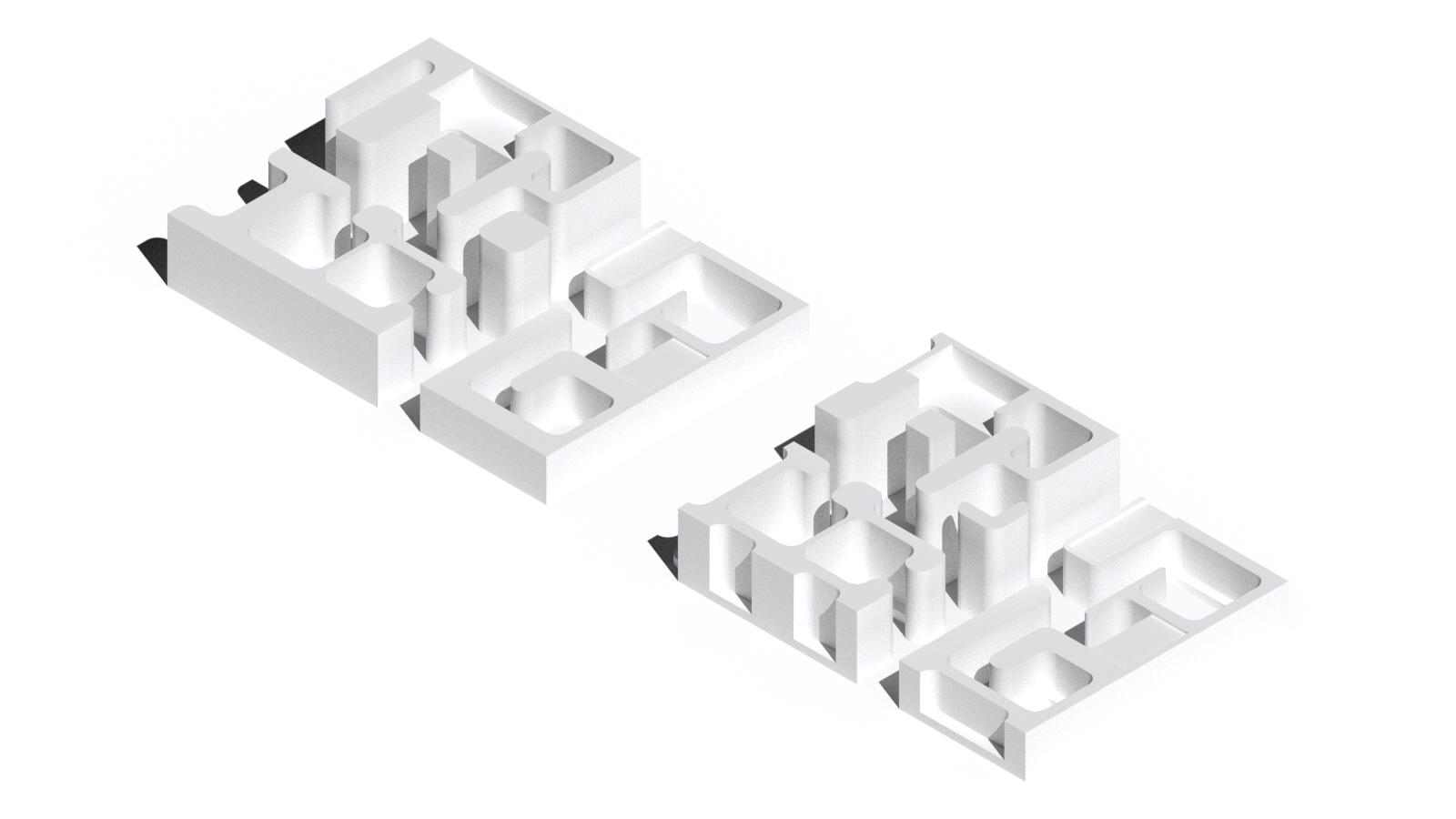
This transparency was studied through a diagrammatic model: a large block of cardboard with voids carved away from it. As the smooth carves get closer to the exterior, they create varying levels of thickness and thus transparency, a theme that will carry forward.

Longitudinal Section
Despite being one of Boston’s most central neighborhoods, Chinatown has been without a branch location of the Boston Public Library for the past 6 decades. This has deprived the community of not just books and media, but also spaces for gathering and support structures. This Project imagines what a library branch for Chinatown would look like and its role as social infrastructure for an underserved community.
This project aims to revere the idea of a library and the community spaces a library provides through references to church architecture. The building’s interior forms and programmatic arrangements are defined by how the sun hits the site, yet they are all hidden behind a porous brick curtain. Only once the visitor enters the library are these spaces revealed.
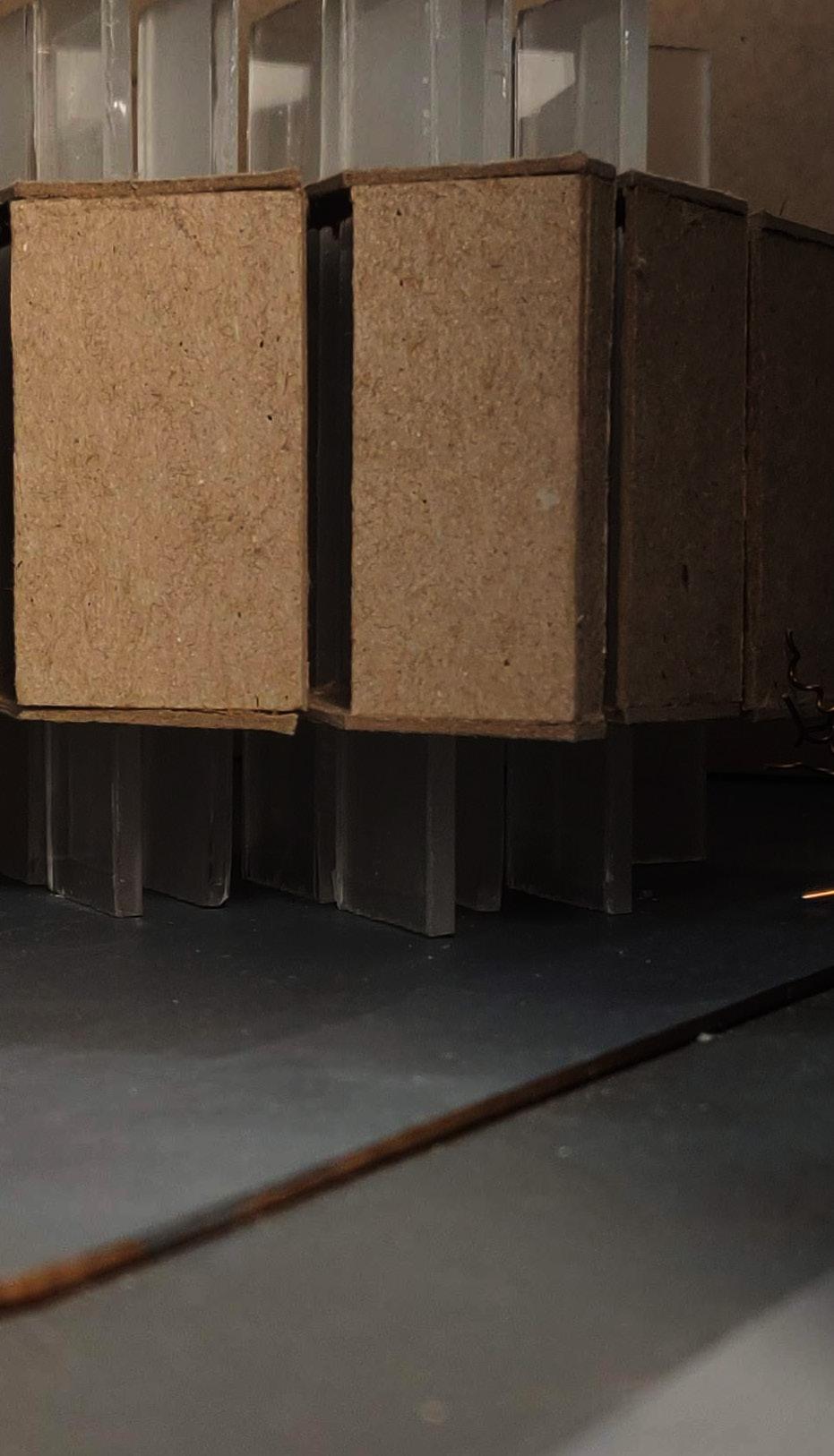
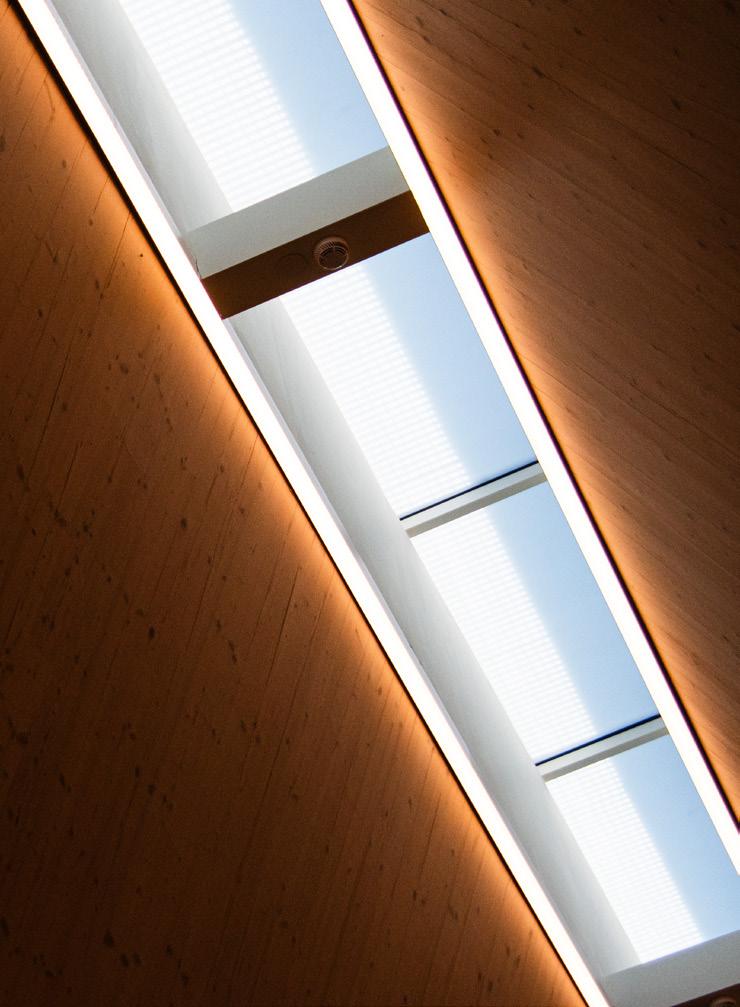
The interior of the Chinatown Cathedral is created by light, carving a cruciform shape through a large solid mass which sits on the site. These beams of light create the primary circulation corridors for the building with the programmatic cores segmented onto the four sides of the rectangular plan.
Horizontal Circulation Carved
Programmatic Cores Defined
Vertical Circulation Nestled
Exterior gathering spaces are carved out of the solid brick box on the ground and roof, alternating sides of the building. These exterior voids express the primary interior programs, the stacks and the lecture hall, which also alternate the side of the building they are located.
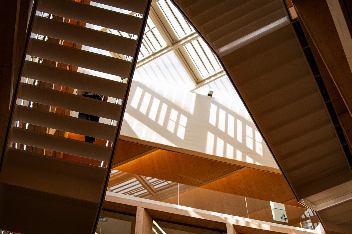
In the middle of the library is a light well which gradually shrinks as it goes down in level. This brings light into the darker center of the building, while also creating an ethereal experience that draws the visitor further up into the library.
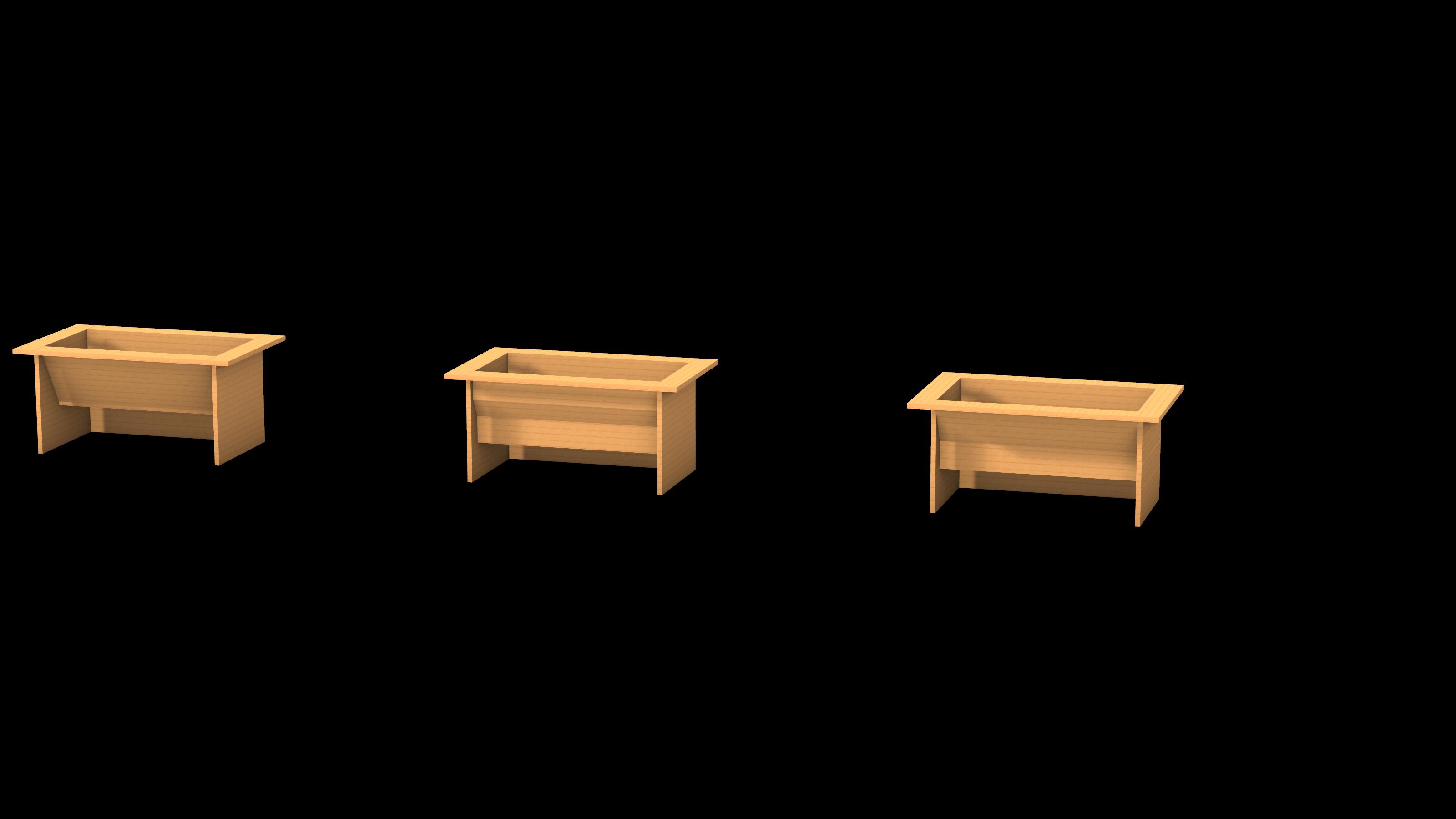
Our group began by looking at different bed typologies to decide which we believed would be the most accessible and provide an equal experience to everyone who visits the garden. This process led us to decide on the desk style of raised beds, as they are ideal for access to those in a wheelchair.
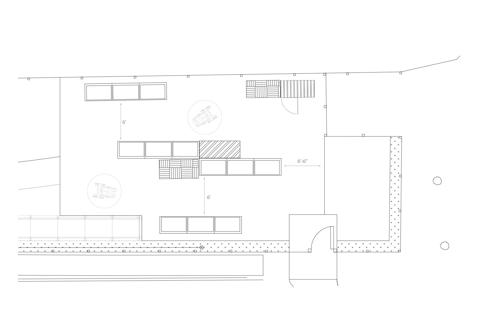
We eventually decided on the second of the three initial designs shown above. This design with a mix of diagonal and straight pieces of wood allowed for a large volume of soil while maximizing ease of accessibility to all areas of the bed while seated.
In 1998, NU ASCE Community Service designed and built the Accessible Garden in the Fenway Victory Gardens, a 3200 square-foot plot for individuals with mobility impairments to use. The current renovation project aims to install 300 feet of new perimeter fence, a new ADA-compliant compacted gravel surface, and a set of new wheelchair-accessible raised garden beds.
For the designs of the new wheelchair-accessible beds, NU ASCE Community Service is holding a design-build challenge for the 2022-2023 academic year. In diverse teams of 3-4 members, drawn from Northeastern’s student chapters of the American Society of Civil Engineers, American Institute of Architects, and American Society of Landscape Architects, as well as the Northeastern University Gardening Club, students will design and arrange 3-4 beds totaling 100-120 square feet of gardening area with self-watering systems that follow ADA accessibility regulations for mobility impaired individuals.
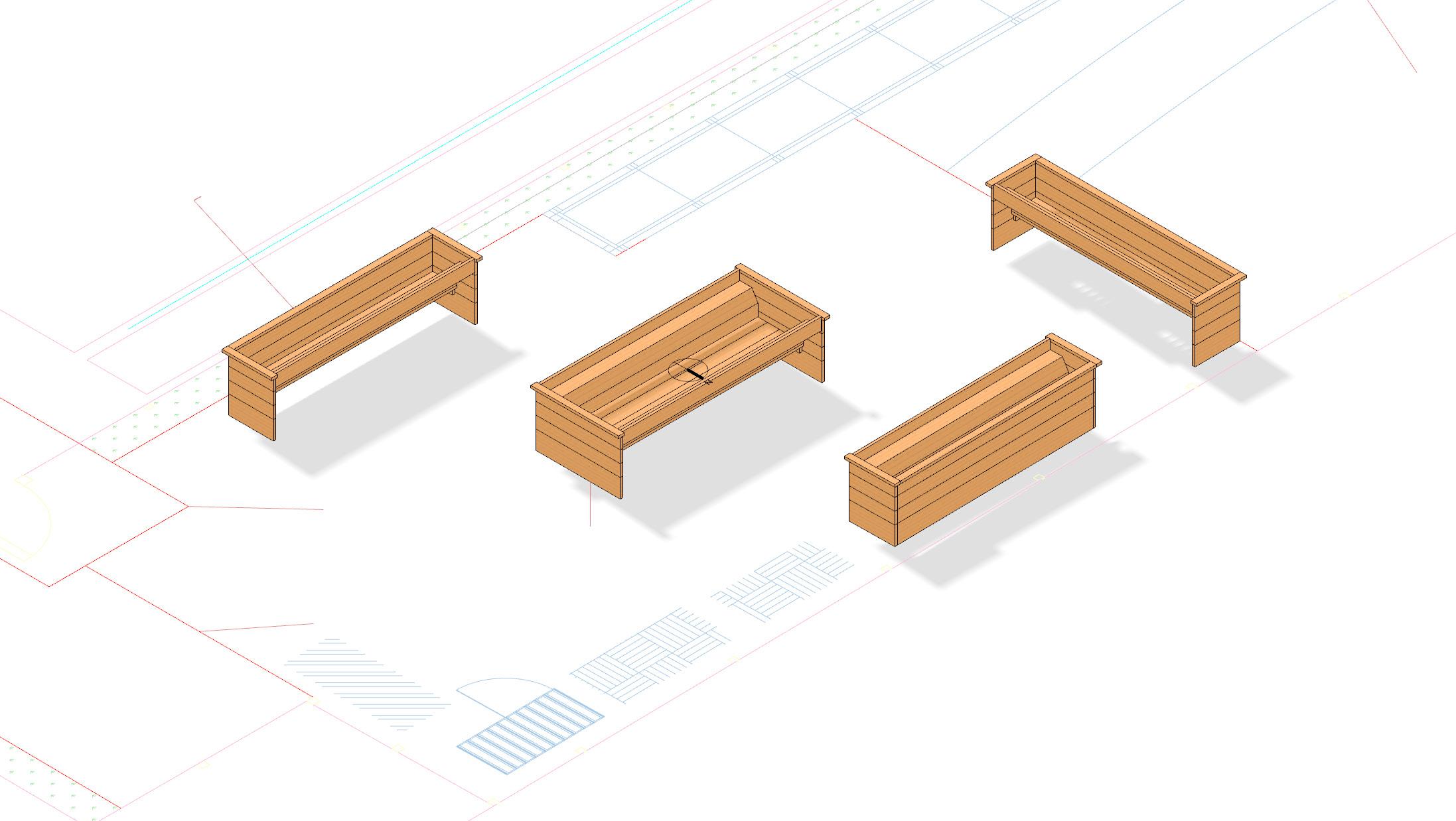
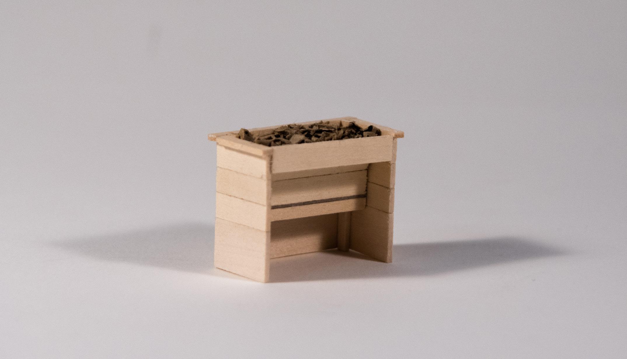
After an receiving feedback, we discovered that the bed would require more structural elements to support the amount of soil and the self-watering system. To resolve this problem, we made three major changes:
1. The wood at the bottom of the bed was replaced with a plywood sheet to give it more lateral strength.
2. Another joist was added to support the front end of the plywood to prevent the bed from splitting open under the weight of the soil.
3. 2x4s were added to the inside edges to provide nailing surfaces to hold the bed together.
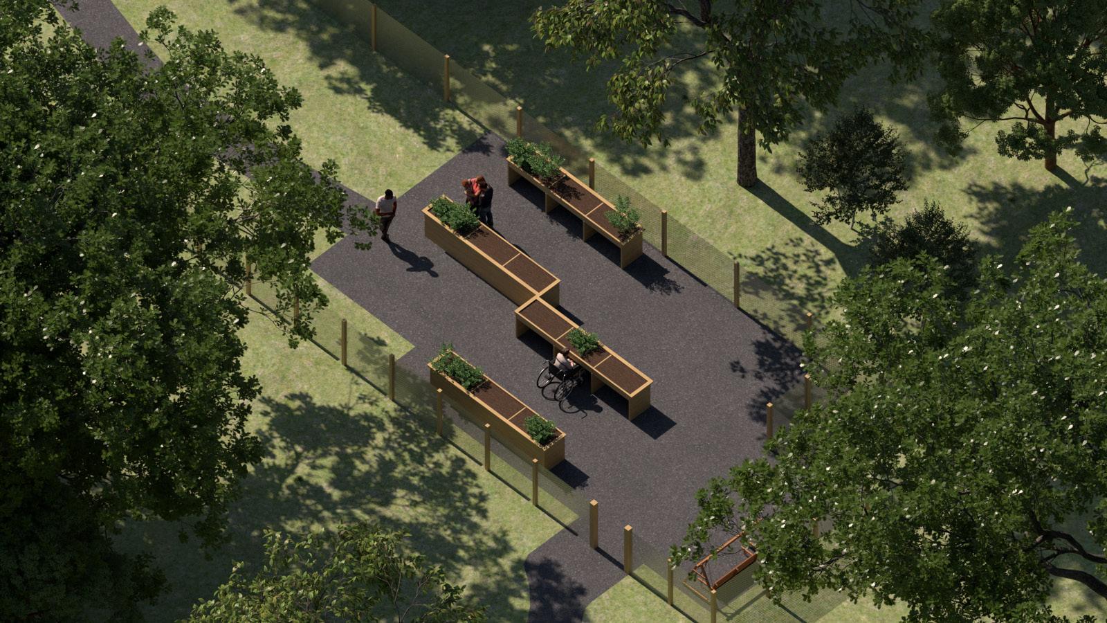
It was also determined that the middle two beds being back-to-back would potentially prevent plants in the rear bed from getting adequate sunlight if taller plants were placed in the front bed. To resolve this issue, the two middle beds are now staggered. This also allows for more gardeners to be working as now both sides of each planter will now be accessible, as opposed to before when only one side of each was able to be in use.
Teach on the Beach, a non-profit NGO based in Ghana has been devoted to educating and empowering young people and has been rapidly expanding. Having outgrown their rented apartment, the group has decided to build its own facilities in Busua to support a larger group of students.
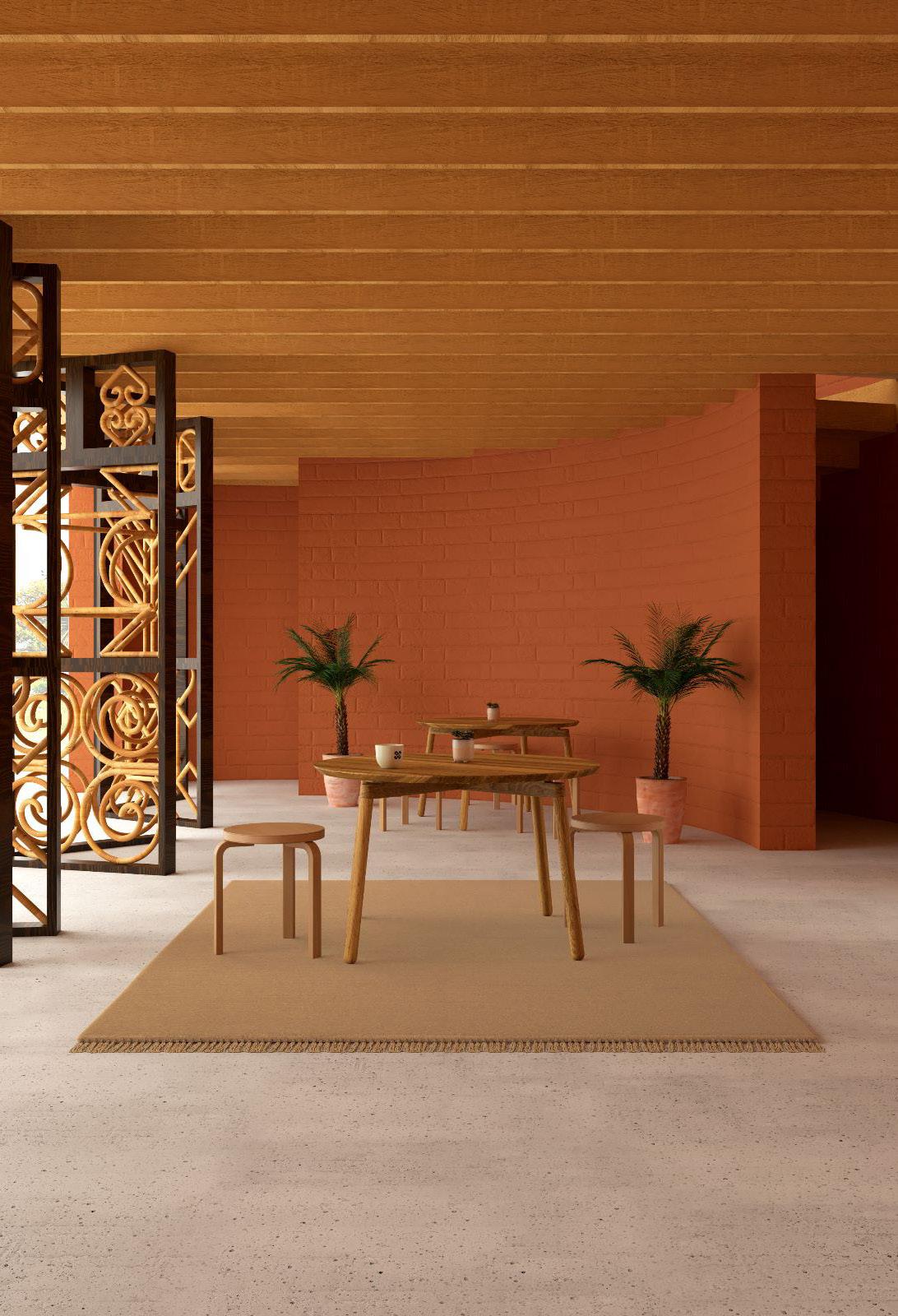
Their site already has one classroom, designed by a previous volunteer for the organization. Our group decided to use that building as a precedent for the rest of the site. The facilities we designed follow the rounded pill-shape and utilize the same rammed earth walls and thatch roofing - speaking to the traditional sustainable techniques of Ghanian construction.
To support airflow within the buildings, we used a collection of screens throughout the project, bringing cool air inside and ensuring a comfortable interior. These designs embedded into each screen frame are modeled after the Adinkra symbols of Ghanian tradition, with each symbol tied to an idea Teach on the Beach strives to instill in its students, from life-long learning to a strong sense of community.

A New Deck for Chestnut Park





pinch.r@northeastern.edu