


The SAQA definition of an art quilt is “a creative visual work that is layered and stitched or that references this form of stitched, layered structure.” While most art quilts consist exclusively of woven or felted textiles and other fibrous elements, a few artists work in quilt mode by incorporating other materials into their quilt-like creations. For some, the concept of repurposing discarded objects plays a significant part in their artistic purpose. Unorthodox materials and objects in art quilts have included 35mm slides, wood, shells, Mylar, mirrors, bras, toy cars, matchsticks, microfilm, condoms, grommets, zippers, and much more. In this and the next two issues of Art Quilt Quarterly we are showcasing three makers who use unexpected materials: Ross Palmer Beecher, John Lefelhocz, and Arturo Alonzo Sandoval. Their work explores the boundaries of quilt aesthetics, expanding our assumptions concerning quilt texture and opening our eyes to new directions.
Issue 9 also brings our readers an in-depth interview with Penelope McMorris, an important voice in the art quilt movement who has championed all aspects of innovative quilt making, advising collectors for three decades.
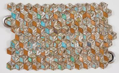
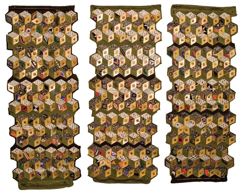
Dr. Sandra Sider, EditorCover: Ross Palmer Beecher, Tumbling Block Quilt II 36 x 60 x 1.5 inches, 2008
Studio Art Quilt Associates, Inc. (SAQA) is a nonprofit organization whose mission is to promote the art quilt through education, exhibitions, professional development, documentation, and publications.
©2017 Studio Art Quilt Associates, Inc. All rights reserved. Reproduction without permission is strictly prohibited.
SAQA Art Quilt Quarterly is published by Studio Art Quilt Associates, Inc., a nonprofit educational organization.
Publications Office: P.O. Box 141, Hebron, CT 06248.
ISSN 2379-9439 (print)
ISSN 2379-9455 (online)
Editor: Sandra Sider
Managing editor: Martha Sielman
Artists to watch contributing editor: Diane Howell
Designer: Deidre Adams
Subscription is $29.95 for four issues.
Outside USA: add $12.00
Subscribe online: SAQA.com/AQQ
Buying art is not the same as collecting art. People buy art for many reasons, including needing something that matches the sofa to hang in the living room. Collecting art is a more focused and purposeful endeavor that you intend to approach seriously for an extended period.
Almost all collections of art quilts start in a similar manner: A particular piece captures your attention. How do you then use this initial experience as a basis for further acquisitions and the development of a collection that is more significant than its individual art quilts?
In Opinion: A Collector’s View (www.saqa.com/ resources.php?ID=405), John M. (“Jack”) Walsh III says, “A number of years before I ever thought of collecting quilts, I was walking past the Bernice Steinbaum Gallery in Manhattan. I glanced in the window, and there on the back wall was a Joan Lintault quilt depicting autumn leaves. It literally stopped me in my tracks. I made an abrupt right face and walked to the back of the gallery where I stood for the longest time admiring it. To this day that visual image stands out in my mind. I remember thinking, ‘I wish I were an art collector so I could enjoy a work like that every day.’”
The John M. Walsh III Collection of Contemporary Art Quilts is now one of the largest privately-owned fiber art collections in the country, but when Walsh began purchasing quilts in 1992 he lacked direction, knowledge, and focus. “I had absolutely no idea what I was doing,” he says. The benefits of working with an art consultant would soon become clear to him.
Renowned quilt collectors Ardis and Robert James had been collaborating with Penelope (“Penny”) McMorris, a curator and quilt scholar, after being introduced to her by quilt expert Michael Kile. McMorris was assisting the Jameses in selecting and adding contemporary quilts to their extensive quilt collection.
In the 1990s, the circle of serious art quilt collectors was small. The Jameses became friends with Walsh and subsequently introduced him to McMorris at a quilt event at which she was speaking.
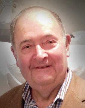
“When I met Jack, I wasn’t sure how serious he was,” McMorris recalls. “Then we spent an entire day looking at images of work from 15 quilt artists I respected and believed were doing excellent, innovative work. We looked at the development of the individual artist, and the development of the quilt
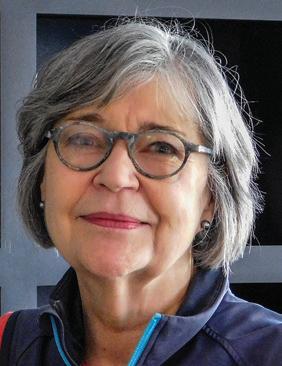
Penny McMorris and Jack Walsh discuss the fine points of collecting
art quiltsby Cynthia Wenslow photos by Cynthia Wenslow
as an art form. It was immediately obvious that Jack seriously intended to learn about art quilts.
“I think it’s important that if you see current work and like it, before adding it to your collection you should see the work that led up to it, so you have the context and can see the development of the artist and where that person might be going,” McMorris continues. “For example, I love it when I go to Quilt National and see the work of artists I’ve followed and they are still doing wonderful work and not repeating what they’ve done before. That’s just fascinating.
“That’s not to say that it should be totally unrecognizable. Nancy Crow has a voice, an aesthetic, that she’s never wavered from. I’ve always looked for artists who have settled down to doing their own work, and I love it when they can still surprise me.”
Walsh rapidly began to educate himself about art that intrigued him, including traveling to visit artists in their studios to view and discuss their work. Walsh
and McMorris continued to collaborate, searching out the best art quilts by the best artists, always keeping an eye out for innovative work.
McMorris recalls how Walsh decided to start commissioning quilts for his collection. “He would find an artist who was doing exciting work and was at a place in which a commission would allow freedom to explore new directions. Jack would then make a genuine connection with the artist.”

Walsh has specific goals for commissions. “I want the artists to be free to push the envelope either in creative direction or with new materials. If they know the quilt is already sold, it removes a lot of pressure. My only requirement is that the quilt’s theme should be about water.”
Part of what makes Walsh stand out as an art collector is his concern for relationships. McMorris says, “Unlike many in the art world, it’s not about him. It’s important to Jack that he is promoting the artist
and the art quilt. He wants to support the artist and share his love of the quilts. And that means making connections. Quilting has always been about community. Organizations like SAQA and collectors like Jack celebrate that.”
Collecting art quilts can be a deeply rewarding and satisfying pursuit. Whether you’re just starting to collect or are interested in expanding and deepening your existing collection, here are some tips to help.
• Define the goal of the collection. Is it an investment, for personal enjoyment, or some of each?
• Decide on a size, technique, theme, or social issue you are passionate about to give your collection cohesion.
• Plan a realistic budget, either for annual acquisitions or for each art quilt.
• View as much art as possible in person, in print, and online. Learn to articulate what speaks to you and why.
• Seek out artists whose work you enjoy. Attend their gallery openings and follow their careers online.
• Consider working with an art advisor. Ask several gallerists whom they would recommend. Interview candidates and use due diligence.
• Get involved in your local art scene and get to know other collectors. These connections will add knowledge and enjoyment to your collection activities.
• Learn as much about art quilts as you can. Visit SAQA.com for online resources to educate and inspire you!
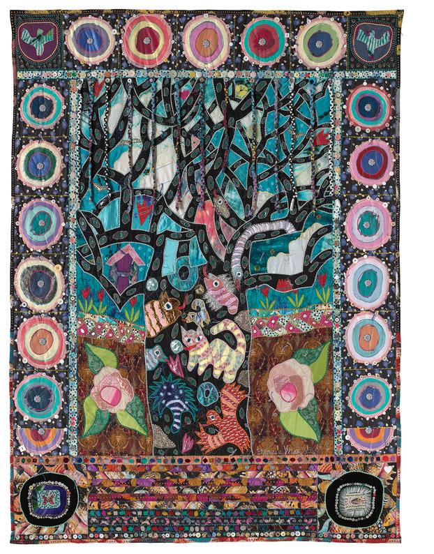

opposite:
Double Mexican Wedding Rings IV
Nancy Crow
70 x 68 inches, 1990
top right:
American Heritage Flea Market
Terrie Hancock Mangat
84 x 70 inches, 1986
bottom right:
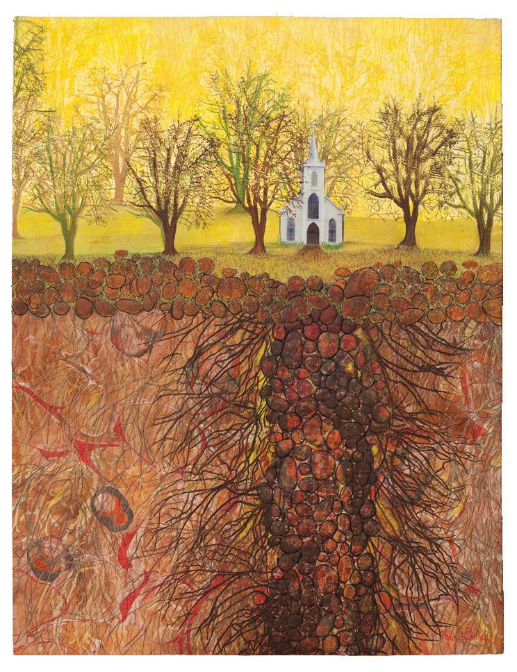
Pregnant Winter Tree
Therese May
95 x 40 inches, 1993
 by Suzanne Smith Arney
The National Quilt Museum’s guidepost is “Honoring Today’s Quilter.” This motto is the impetus behind every quilt, object, and exhibition claiming space within the galleries. These words over the building’s entrance even apply to visitors, who may find their attitudes toward quilts changed.
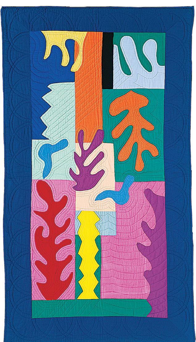
The museum’s foundation collection begins with two quilts from 1980: Lancaster County Rose (not pictured), by Irene Goodrich, and Virginia Avery’s Move Over Matisse I. Both are handmade of appli-
quéd cotton blocks surrounded by a solid-color border. However, they could not be more different. Lancaster County Rose is a bed-size quilt based on the traditional Rose of Sharon pattern, while Move Over Matisse I, with its wiggly forms and elongated proportions, dances with vibrant shapes inspired by Matisse’s legacy of paper cutouts. Long and narrow as a window, it avoids any reference to a bed cover. The two quilts embody the split between traditional and art quilts—as well as the overlap. Judy Schwender, the
NQM’s former curator, says “Liberating the quilt from the bed was a watershed moment. Now, instead of quilters saying ‘I’m going to make an art quilt,’ we have artists who say, ‘I choose to work in the quilt medium.’ It’s a whole different ball game.”
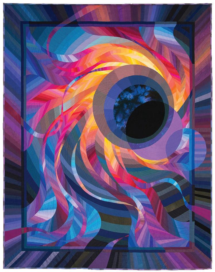
Caryl Bryer Fallert-Gentry’s Corona II: Solar Eclipse is definitely playing in that new ball game. It was the first machine-quilted object to win the American Quilter’s Society Best of Show Award (1989) and is included in the book The Twentieth Century’s Best American Quilts
The three quilts mentioned so far are part of the National Quilt Museum’s “Founders Collection,” the founders being entrepreneurs Meredith and the late Bill Schroeder. Their enthusiasm for quilts developed from their interest in antiques and grew from there. They created the quilt business empire American Quilter’s Society (AQS) in 1984. Its holdings include publications, quilt shows and contests, appraisal certification, product development, and more. In 1991, they founded the Museum of the American Quilter’s Society in their hometown of Paducah, Kentucky, officially designated The National Quilt Museum of the United States in 2008. When she was inducted into The Quilters Hall of Fame in 2013, Todd Ford, writing in Paducah Life, described Meredith Schroeder as “a rock star in textile arts.”
The museum’s other collections include:
• Oh Wow! Miniature Quilts
• Footies Collection by Dorris Jane McManis
• Pat Campbell’s Jacobean quilts
• The Paul D. Pilgrim Collection (a quilter and collector whose ideas contributed to the interior design of the museum.)
• SAQA 25th Anniversary Trunk Show Collection
To see all the museum’s quilts, visit www.quiltindex.org
Of the 170 quilts in the Founders Collection, about 20 percent would fit the Studio Art Quilt Associates (SAQA) definition of art quilt: “a creative visual work that is layered and stitched or that references this form of stitched layered structure.” The museum has mounted several SAQA exhibitions, including H2Oh!,
a water-themed show that was on view this year. Earlier this year, fifty quilts from the SAQA 25th Anniversary Trunk Show, selected by jurors B. J. Adams and Trudi Van Dyke, became part of the permanent collection.
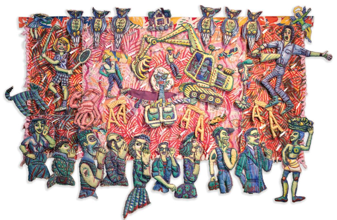
The museum’s Collection Committee accepts one or two individual quilts each year from fifteen or so proposed donations. A recent acquisition, Rumors and Hard Times by Susan Shie, came about when the owner was faced with a move. The committee was delighted to acquire the work of an artist of Shie’s talent and influence, and the previous owner has the satisfaction of knowing that the piece will receive proper care and attention, and be available to a world of viewers.
To act on its vision of honoring today’s quilters, “the museum collects, exhibits, and advocates for the best of what quilters are making today,” says CEO Frank
Bennett. Style covers the spectrum from traditional to the most innovative. The museum mounts eight to ten exhibitions and averages 40,000 visitors per year. Education is a priority for the museum, with every visit an occasion for learning. More directly, the museum offers workshops for all ages and even has a Junior Quilters & Textile Artists Club for children aged 10-17. Education Director Becky Glasby believes that participants gain a broader understanding of creative expression and an awareness of fiber’s potential.
That awareness has affected all of Paducah, now recognized as a UNESCO Creative City in Crafts & Folk Art. The biannual AQS Paducah Quilt Show is bliss for quilt aficionados. Yeiser Art Center and shops like Paper Pieces offer fiber finds, and Paducah School of Art and Design, a division of West Kentucky Community and Technical College, includes a recently installed fiber studio.
In addition to H2Oh!, this year the museum will feature quilts from the Pilgrim/Roy Collection in an exhibition titled Serenity.
Schwender explained the process of organizing an exhibition: “Curating an exhibit isn’t simply picking 33 quilts that are pretty. Exhibitions tell a story. Each quilt must support that story and make it come alive. In two recent exhibits, Art Quilts of the Midwest and Here and There: Works by the Manhattan Quilters Guild, each exhibit took visitors on a journey introducing them to, perhaps, a place they had never been before. After researching the topic, selecting quilts, arranging for loans and shipping, developing individual gallery labels and overall supporting text, and obtaining images for promotion, the unpacking and installation of the quilts is almost anticlimactic. But if the visitor understands the story and is moved by it, the exhibit is a success. For information on submitting an exhibit proposal to the National Quilt Museum, see www.quiltmuseum.org/ documents/exhibit_proposal.pdf
Quilts of all kinds, from serene to scandalous, can be found at The National Quilt Museum. Look for the stories and be open to an attitude shift. You might find yourself exclaiming, “Oh, wow!”
54 x 90 inches, 1989
 by Sandra Sider
“Ross Palmer Beecher is one of the most unique, talented, and innovative mixed-media artists currently working in the Pacific Northwest. Over the past thirty-five years, she has developed a highly personalized iconography based on American history, folk tales, colonial American art, and American pop culture. Drawing on her New England roots, a restless and questioning mind, a fascination with found objects, and good old Yankee ingenuity, Ross has created a powerful body of work over the past four decades that is innovative, thought-provoking, celebratory, and fun.”
John Olbrantz Maribeth Collins Director,Ifirst came across the metallic quilts of Ross Palmer Beecher last year via the Greg Kucera Gallery (www.gregkucera.com) in Seattle, which handles her work. Kucera pointed me to John Olbrantz, the Maribeth Collins Director of the Hallie Ford Museum of Art at Willamette University in Salem, Oregon. On May 6, Beecher spent some time with me via telephone to talk candidly about her career and her unique quilts.

Please tell our readers a bit about your background.
I grew up in Greenwich, Connecticut, benefitting from the excellent public school system with its art programs at the time. I sold my first work in the sixth grade, when my teacher purchased a clay bunny for five dollars! I became seriously interested in making art while in Greenwich High School, influenced by my older sister Yvonne. She and I both attended the Rhode Island School of Design, and today she is a graphic artist. After studying painting, printmaking, and illustration for three years at RISD,
opposite:
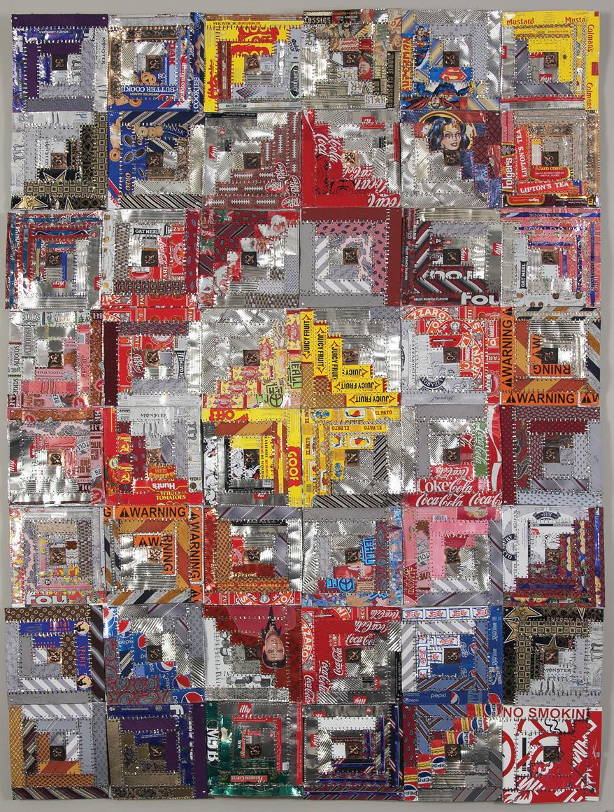
Tin and Tie Log Cabin Quilt
87 x 65 inches, 2016
right:
Heart Shaped Box (Homage to Kurt Cobain)
48 x 30 inches, 2014
I was not finding my direction in art so I moved to Seattle to take a year off. I never returned to finish my degree as I became involved in my art career.
Was there someone who inspired you to become an artist? And how did you begin making quilts?

Yes, that would be my sister. When I was around twelve years old, she went to New York City and brought back a slide pack from a quilt show at the Whitney Museum in 1971 that really impressed me. [Ed. note: that famous exhibition, which touched numerous artists, was Abstract Design in American Quilts.]
I had a paper route during those years, riding my bicycle around the neighborhood. When my customers paid me, I asked them for any fabric scraps they might have. This is how I gathered a lot of random fabrics for my first two pieced quilts, which I stuffed with old comforters, tied, and used on the twin beds in my bedroom. I made a few fabric quilts after moving to Seattle, but I detested using a sewing machine
and eventually changed my way of working. Today I make my quilts completely by hand, like the antique Amish quilts.
How did you develop your personal style?
In 1983, I lived close to the University of Washington in Seattle, where I noticed La Tienda, a store selling Mexican shrines constructed of tin. I really liked the use of materials and the idea of recycling. My neighbor, a painter, was using Hershey’s Syrup tin cans for his paints and brushes, and he gave me several. I created my first tin quilt by placing a small orange reflector in the center of each square, like the red fabric squares in antique Log Cabin quilts. I taught myself to perforate holes with a nail and hammer, then sew the pieces together with wire. I also use a Whitney punch (like a paper hole puncher but for metal) and cut tiny strips of metal, folding them into staples. Then I join the pieces together with these staples like a surgeon does for a surgery.
In addition to my quilts, I make found-object assemblages and the occasional oil painting. What excites you about working in quilt mode?
I like repeating patterns, shape, and form. Quiltmaking gives me focus in my day-to-day life, and you might say that I make quilts instead of doing yoga. I work part-time as an art therapist, and making art in a modular mode allows me to carry a project with me. My clients like to see my work in progress and sometimes they bring me materials.
How do your ideas come to you?
My ideas derive from the materials at hand, which I often use to make socio-political statements.
Do you work from sketches and drawings, or do you work spontaneously and instinctively?
As a very tactile person, I just begin assembling, working from individual units. Since I often have
repetitive shapes, occasionally I make templates. But I don’t sketch my quilt designs.
Do you have any pieces that you consider pivotal?
Yes, Tumbling Dice Quilt. I am a cancer survivor and that quilt was sort of my battlefield during chemo. It’s my first quilt using both metal and fabric, an important new direction for me.
How do you recharge your creative batteries?
I ride my bicycle to get the endorphins flowing. My neighborhood in Seattle is a great place for biking. Finally, what is the best piece of advice you have ever been given as an artist?
My mother, who just turned 100, told me long ago: “It’s all about letting go.” I think that this advice applies to life as well as art.
My exciting adventure began with a totally unexpected phone call from a friend’s husband, D’Arcy Luxton. I already knew him to be a generous patron of the arts but was surprised when he approached me with his request. Mr. Luxton explained that he had been watching my art for a number of years and asked if I’d be willing to design and create a commission. He wanted it to be donated somewhere in the Niagara area, on behalf of himself and his wife Anne, because he grew up there. I was flattered, but I must admit that a few butterflies in my stomach initially tempered my excitement. Nevertheless, it did not take me long to decide that I would accept his generous offer.
Within a couple of months, Mr. Luxton had contacted a friend from law school who was then chairman of the Niagara Regional Government. We attended a preliminary meeting with him, hoping that he’d be able to suggest some venues within the region where a commission could be donated and displayed. We learned that the Regional Headquarters would be delighted to install the art in its own building, where a wide audience would appreciate it. We were offered several locations within the building to consider—the main entrance, the council meeting chambers, several hallways and the atrium of a new extension to the headquarters.
The main floor of the atrium is used for regional workshops, meetings, award ceremonies, New Years’ celebrations, and other special events. I could tell by the look on Mr. Luxton’s face that this was the location he favored. I agreed that it was an exciting space but will admit that an inner voice was asking,
“What am I getting myself into?” I knew immediately that this site would require the largest piece I had ever attempted. We both agreed that, given the venue, the subject matter of my work should pertain to imagery of the Niagara Peninsula. Otherwise, I had complete control of whatever I wanted to design.
My initial challenge was to get comfortable with the size of the atrium. It’s a large open space, three stories high with a vaulted ceiling and overhead skylights. I began by taking numerous photos of the entire atrium. My first observations were that the space was large, rather stark, and completely white. I felt that it was crying out for a colorful focal point. The atrium is also filled with architectural angles and lines (windows, steel railings, staircases, skylights), which I felt that I should somehow echo.
Typically, the first glimpse of this installation would be seen from a doorway more than fifty feet away. I wanted my work to be large and bold, to catch the eye of viewers and draw them into the space for a better look. I decided to install my work on the knee-wall of the second story corridor, situated about fifteen feet above the atrium floor. I soon realized that viewers would not be able to stand close enough to examine small details. I cut out black squares of paper of various sizes, taped them to cardboard and hung them over the railing so my husband could photograph them for me from across the floor. I needed to visualize what scale was going to work— there was no point wasting my time on small details that could never be appreciated.
My own artistic preference is abstract, but I decided that this space would need recognizable imagery. I
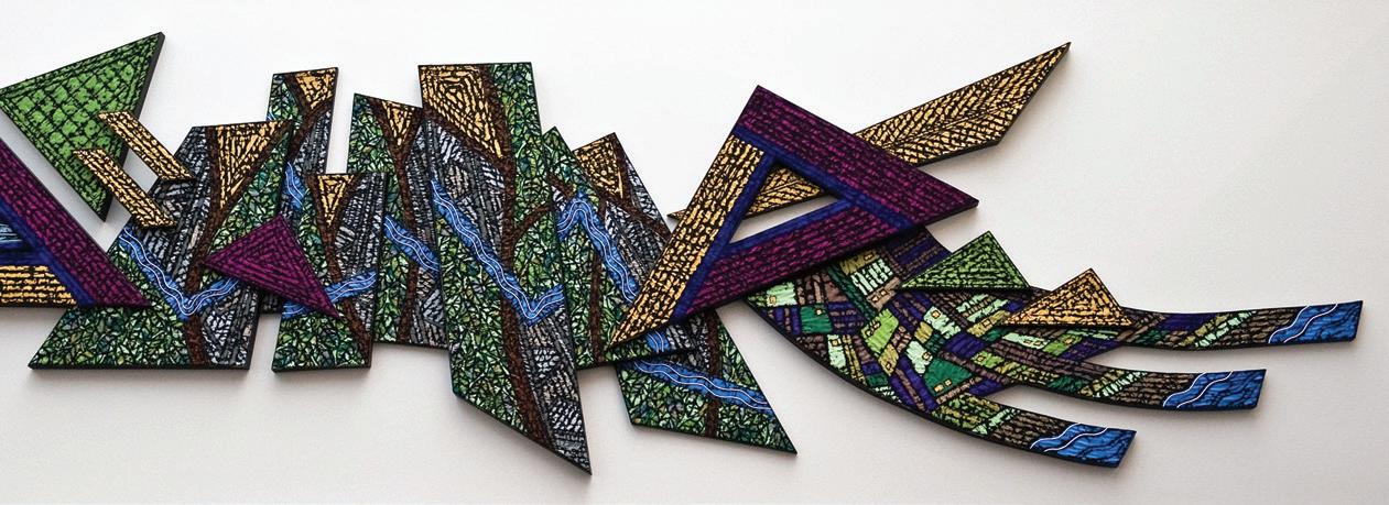
wanted to use subjects inclusive to most of the twelve municipalities of the region and settled on four easily recognized features: the Niagara Escarpment, the Welland Canal, Niagara Falls, and the agricultural benchland known for its vineyards and tender fruit production.
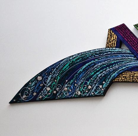
Because I have a passion for textures, I played with bold shapes mounted off the wall at varying depths, creating shadows and dimensionality. My husband constructed the wooden support panels following my paper patterns. Together, we steam-bent an outward curve on the Niagara Falls panel and decided to balance that with a recessive curve on the benchland panel on the opposite end. After we completed the support panels, I was able to begin working in fabric. My panels were collaged in silks, layered with a dark, polyester sheer, machine stitched, then distressed with a heat gun to expose the vivid hues of the silk.
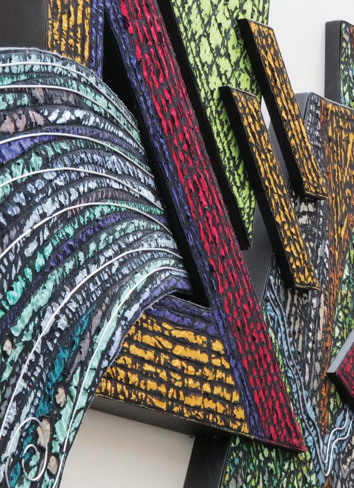
Luckily I had no major problems along the way, but one of the difficulties was never being able to see Continuum in its 24-foot entirety while I was working on it. At one point I laid the panels out on the driveway and looked down from a second-story window, to make an evaluation. So you can imagine my nervousness on the day of the installation. Four workers, using a jack lift, positioned the panels under my direction. I had made a giant paper pattern with all of the holes for the bolts indicated on it, and that was taped to the wall. We were able to install the bolts, tear away the paper, and hang the panels. It all worked perfectly!
Florida artist Barbara W. Watler was born in Youngstown, Ohio, during the Great Depression. Her mother, an accomplished seamstress who “could and did sew everything,” taught her the basics of sewing and a love of fabric. At the age of twelve, Watler began oil painting, and during her teenage years took classes in watercolor and pastels. In 1960 she married, moving to her husband’s home in Florida, where she earned a degree in advertising art at the Art Institute of Fort Lauderdale. In 1978, after achieving success at the Art Institute as an illustrator specializing in soft sculpture, she began producing artwork to the exclusion of other sewing projects.
Three years later she completed a commission in soft sculpture for an interactive exhibition at the Discovery Center in Fort Lauderdale (now the Museum of Discovery and Science), an institution featuring Watler’s three-dimensional fiber art for more than fifteen years. During the same period, she had several commissions from the Young at Art Children’s Museum in Fort Lauderdale, including interactive quilted wall murals. By the late 1990s, Watler was focusing more on graphic abstraction, following her instinct for filling the pictorial space with rhythmic forms. The artist’s Fingerprint series uses linear whorls
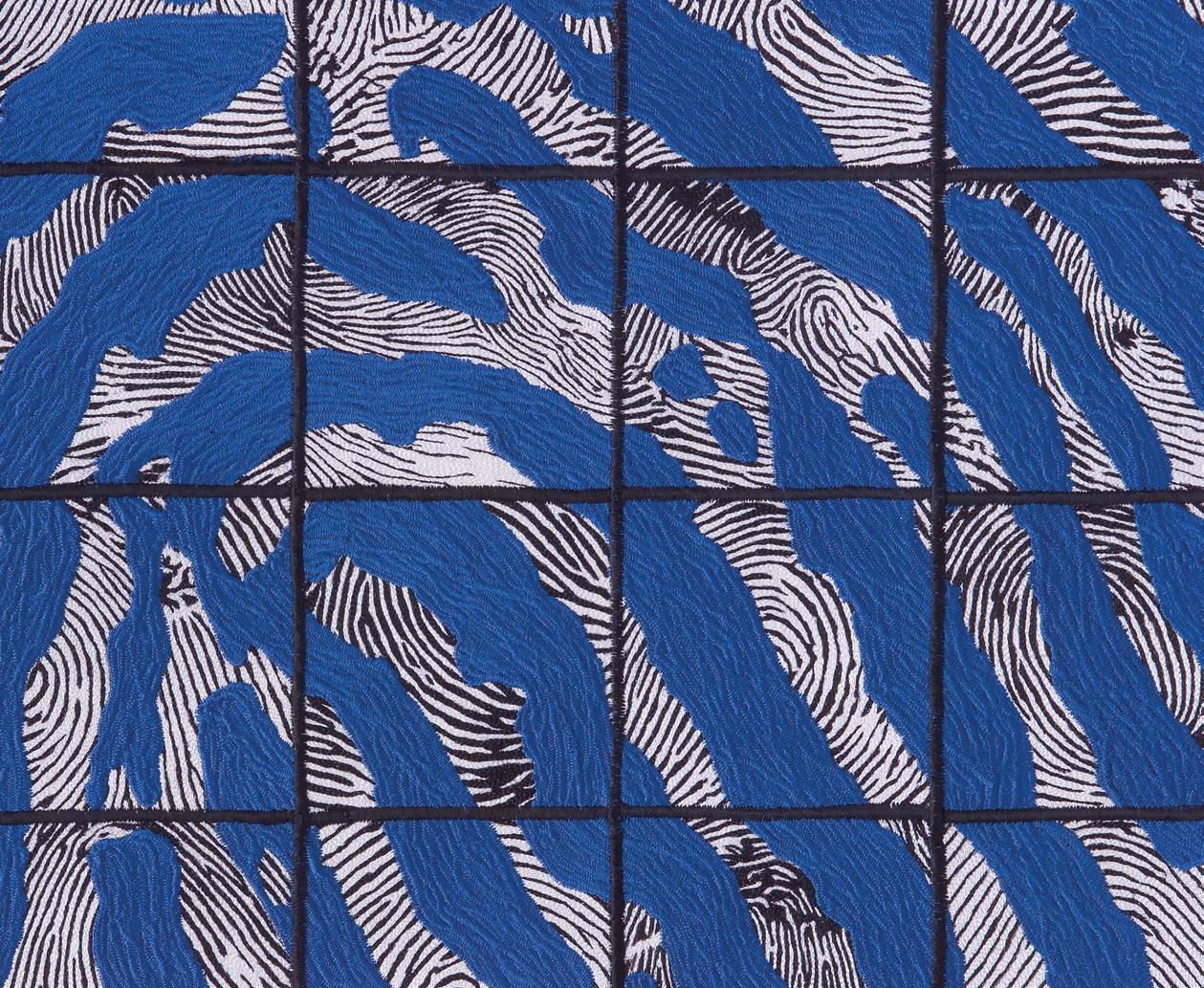
“All for one and one for all”
as Watler explores the theme of identity. In Fingerprint #50: Unity the detail view reveals the artist’s densely textured thread painting which creates mass and line. Beginning in 2005, she executes her thread painting with straight stitching rather than zigzag stitches.
Watler’s commission Fingerprint #50: Unity for the Coral Springs Museum of Art came about because Watler had previously worked with the director when she was in charge of the Discovery Center in Fort Lauderdale. The Coral Springs commission required that the quilt fit into an alcove in the main gallery near the museum entrance. For the quilt’s concept to be approved by the board, Watler was required
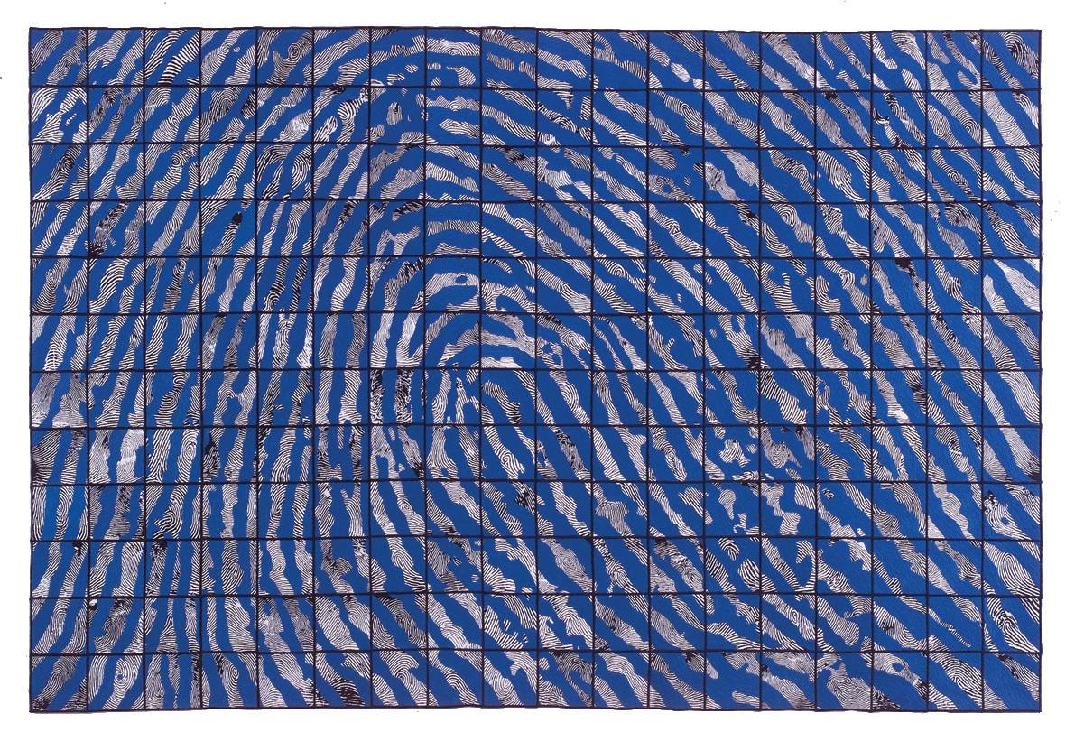
Fingerprint
to submit a color maqette, a current resume, and references from other museums with which she had been involved on art projects. As part of the commission project, the artist spent two days a week for three months in the main gallery with her sewing machines, tools, and other equipment. Visitors were invited to leave their unidentified fingerprints, contributing to Watler’s emphasis on community.
Watler has enjoyed working on commissions, saying, “The structure of meeting qualifications and deadlines has always appealed to me. I think this is reflected in the intricacy and accuracy of many of my works.”
[Ed. note: Barbara Watler is now in the process of retiring and has no commissions planned for the future.]
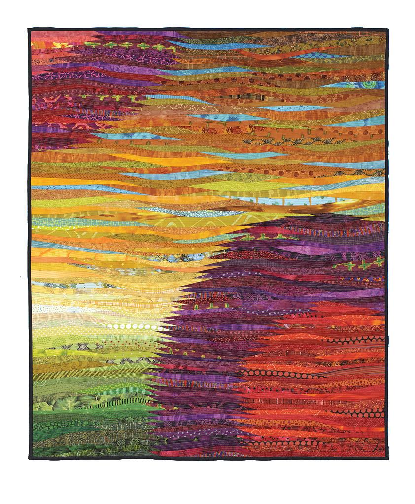
Ann Brauer has supported herself as a quilt artist for more than three decades. She has a clear goal for her abstract landscape art quilts: to communicate something new, fresh, and approachable.
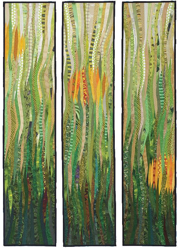
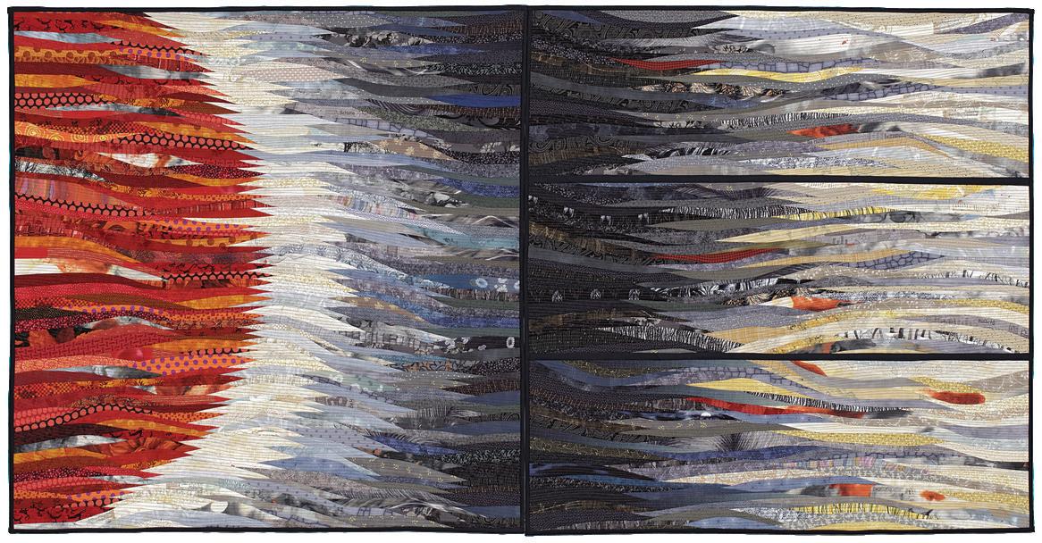
Even a glimpse at Brauer’s work reveals her accomplishments. She pieces and sews thin strips of fabric through cotton batting onto a background, blending myriad fabrics into an inviting natural world that is hers alone. The shimmering surfaces of her art quilts create a springboard for viewers.
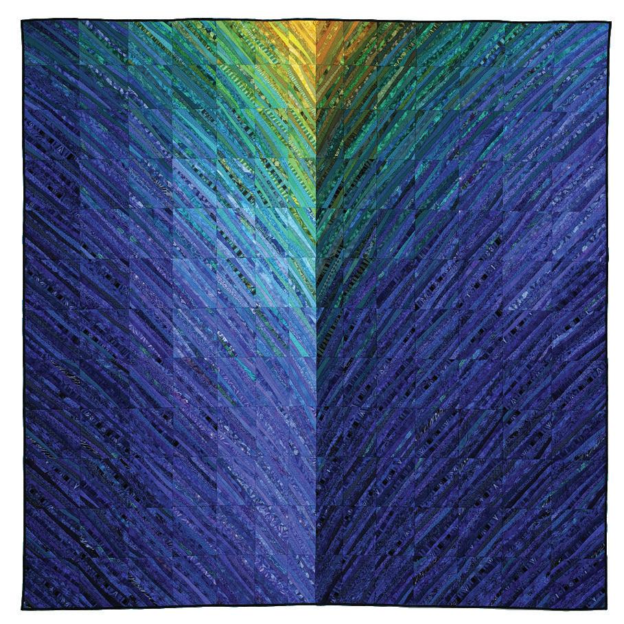
right: two suns
47 x 37 inches, 2016
below left: blue hills
96 x 96 inches, 2011
I grew up on a farm in Illinois surrounded by quilts. My grandmother made a postage-stamp quilt for me out of feedsack cloth. I constantly found something new and different among all the fabrics. My mother also made traditional quilts.
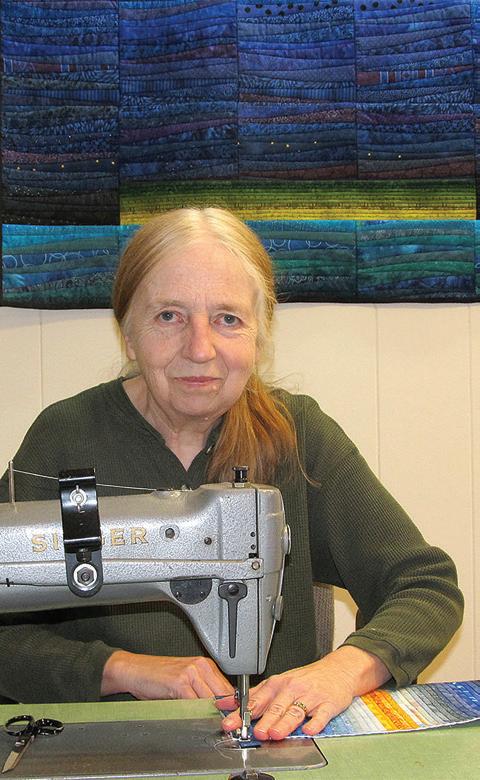
From the time I was 5, I loved to sew, although I never thought that I could make a quilt. I made my clothes, costumes for school musicals, and even complex doll dresses. Eventually I
realized that I didn’t wear the clothes I liked to make, and I quit sewing.
After college, one of my roommates made quilts, and I realized that if I made quilts, I could buy fabric. My first quilt was made by hand, and I loved the patterns a simple geometric design could create. I fell in love with how many layers of perspective were presented by the Log Cabin pattern. Soon I was making and selling quilts.
My quilts went through many phases, from simple color studies of the Log Cabin pattern to intricately pieced works in silk and wool to yield complex designs. I wanted to create a space or vision in my mind and to communicate to the viewer something new and different through the medium of the quilt.
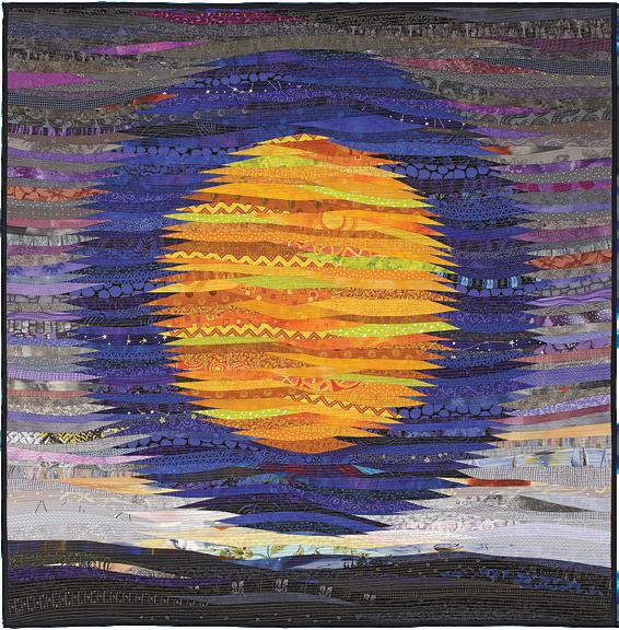
I see my quilts as simultaneously meditative and complex. They are about feelings and a sense of place,
40 x 40 inches, 2016
below left: marsh moon
60 x 36 inches, 2017
whether it is the “light” in the center of the Log Cabin pattern or the distant horizon in a simple yet complex landscape.
I don’t know where the inspiration for my quilts arises. Frequently I like the idea of the relationship of two circles interacting maybe even dancing with each other across a joyous landscape. When I’m planning a quilt, it is this tension, one I cannot put into words, that I try to convey.
I love to look at the work of different artists. I return to the landscapes of Georgia O’Keeffe with their complex colors and that light! I love to study the carefully controlled colors of Josef Albers and learn from their interactions. One concept I ponder is how to use something familiar like commercial cotton fabric to create the feeling of light, space, and color achieved by painters. Paint by its very nature holds the viewer at a distance. The surface is often flat even though the hand of the artist can be seen in the brushstrokes and layers of the painting. Fabric, on the other hand, is friendly and familiar. These are its strengths, but they also present a challenge when trying to convey a larger message and to create a complex space using familiar materials.
In August 2011, while I was away at the American Craft Exposition in Evanston, Illinois, the Deerfield River, next to my studio in Massachussetts, overflowed its banks as a result of Tropical Storm Irene and my studio floated downstream. It was hard to realize my beloved workspace with my fabric and half my quilts was destroyed. After I returned, I was lucky to rent a space across the river from where my studio had been. It took several weeks, with the help of the community and many quiltmakers, artisans, and well-wishers across the country, to re-establish
a working studio. I gave myself a year to decide if I wanted to rebuild. I had to be sure that I had quilts I wanted to make that would justify both the cost in money and the emotional stress to build a new space.
I decided I wanted a space to reflect the seriousness of my quilts and to push me every day to communicate my vision.
When my studio was across the river, my view was of a geometric iron bridge and a lovely brick building. I had a small glimpse of the sky. My quilts became linear and I re-explored the log cabin pattern. Now I have large expansive windows that look across the Deerfield River to views of nearby mountains and the sweep of the sky. My work has become freer, with large horizons and organic shapes.
Unless I’m doing a craft show, my day usually begins about 6 a.m. with work on the Internet. I might write a blog post or add a listing on Etsy, where I sell art quilts plus smaller items such as handmade purses, pillows, and tea cozies. I spend time planning what I want to get done for that day. Tuesday is my day off. The other days I open the studio by 10 a.m.
Depending on what I’m working on and what I need to make, I may be designing a quilt, sewing, or
doing finish work. If customers are in my studio, I am available to answer questions while they browse.
My day ends at 5 p.m., although I may do some work on the Internet in the evening. One trick I have learned is to always have something to do. When I find myself at the end of a project, I may make a smaller item. If I leave the studio for a period of time, I try to have something to do when I return. Fretting over what to do next makes me nervous and wastes time.
I want to make more large quilts that allow the viewer to be absorbed into the work while also examining the complex designs of the different fabrics. In addition, I have started to mount quilts on stretcher frames to make a more formal presentation.
When growing up, I never imagined that I would support myself by making the quilts I want to make to communicate my view of life and the landscape. I know that my quilts are slightly out of the mainstream of the current art world. This doesn’t bother me, since I want to make work that is true to myself and that has a bit of a surprise and freshness.
www.annbrauer.com
Zephyr Cove, Nevada
Paula Chung’s large-scale floral quilts bring inspiring beauty to her viewers. But it is her pieces on the inner workings of the body that invite a human connection with her work and a conversation about life’s journey.
Today, Chung works in two directions. One path continues a solo career and one employs a productive collaboration with artist Karen Rips. The partnership is the source of a constantly updated traveling exhibition titled A View Within . Both artistic journeys richly reward viewers.
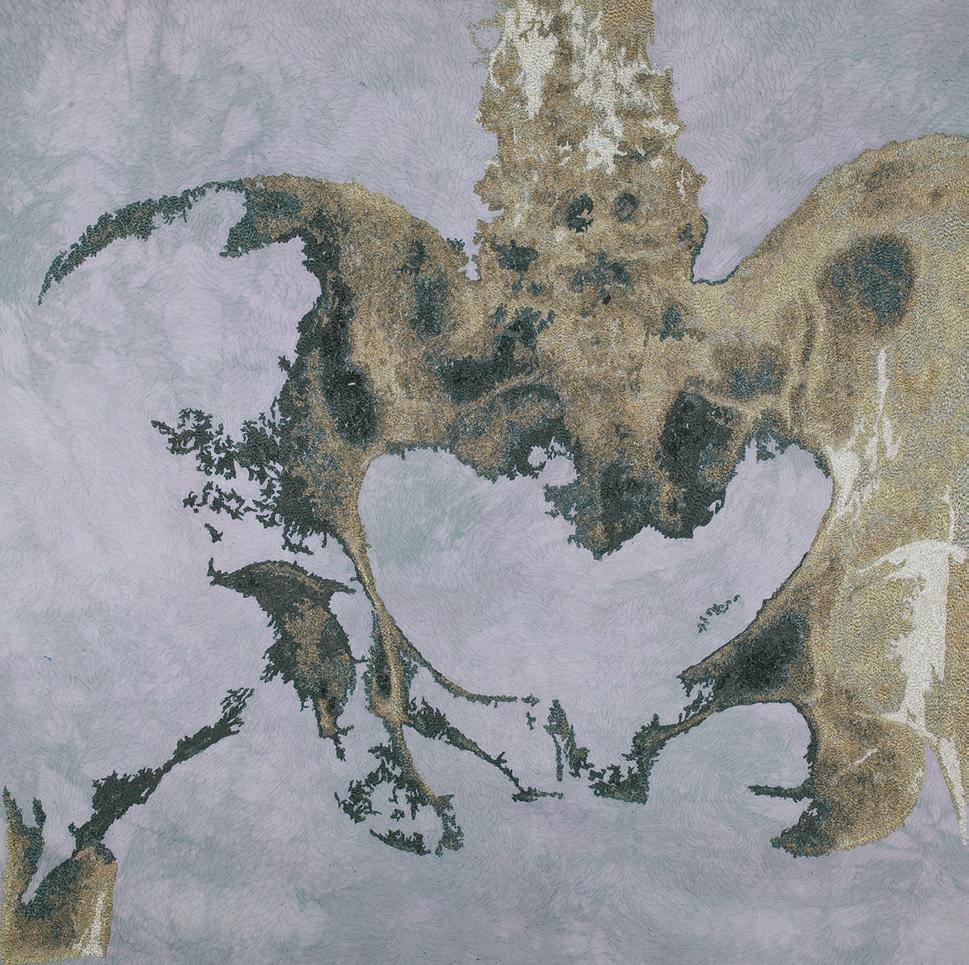
As with many textile artists, my first experience with fiber was sewing clothing. I began quilting with traditional methods but experimented with new techniques and materials. I knew I wanted to create art. I just didn’t have a clue as to how.
Upon retirement, I began to take art classes. A direction was emerging, first through sculpture. However, I knew that carving stone and creating bronze works was a young person’s calling, so I tried to take those forms and flatten them. This brought me to floral art quilts. These large pieces were made from hand-dyed silk, then machine appliquéd and machine stitched.
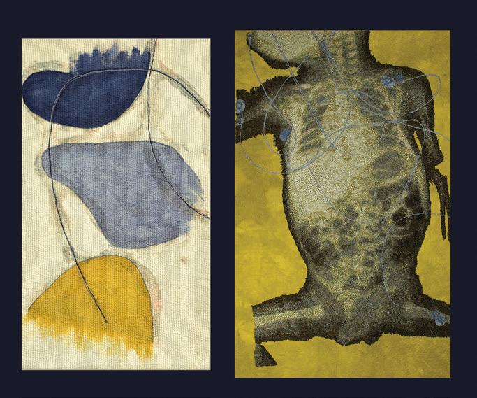
Although I enjoyed creating those beautiful forms, I realized I needed to find deeper meaning in my work. I was subconsciously seeking meaning when I discovered my friend’s medical imaging. It virtually slapped me in the face. There was such beauty and meaning right there in a simple X-ray. Finding subject matter that others can relate to and that is innately beautiful draws viewers to the work.
My partnership with Karen Rips provides a second artistic direction. In our traveling exhibition A View

Within, we examine the body at the cellular and process level. Cellular images, as well as the medical imagery of MRIs, X-rays and scans, are incredibly exciting and challenging.
Karen and I have collaborated for several years. Our combined efforts began when we shared a glass of wine and talked about where we wanted our work to go. We concurred that collaborating would be an exciting endeavor, and it continues to be just that. Individually, our work has become stronger, and our combined pieces create a more interesting conversation for the viewer. As our collaboration continues, we strive for new approaches, new fields of study, and new ways to present our interpretations.
A View Within combines works that are abstract and reality-based to create a dialogue among the pieces. That dialogue in turn is communicated to our audiences. It inspires viewers to open up about their own experiences with life and death, allowing a discussion about subjects such as illness and disease that are otherwise unpalatable. Our textile works expose viewers to the inner beauty found within their own bodies and
Paula Chung (left) and Karen Rips (right) Baby Blues Karen Ripschallenge them to embrace change and find common ground.
These images are universal. They cross religious, cultural, and political beliefs, socioeconomic status, race, and often gender. We all share similar beginnings, journeys, and endings. Some of us are fortunate to be born in a developed nation, but others are not. Some of us experience some form of prejudice racial, gender identification, sexuality, national/tribal destruction, religion, age, weight, wealth, education and some do not. Some of us develop diseases, experience accidents, fight in wars, and others do not. What we share is our humanity. Maybe these images can help build a bridge across the gaps of experience, fortune, or misfortune to remind us of our commonalities.
We initially approached fiber-friendly venues with a history of presenting textile exhibitions. Then we focused on venues where we wanted more exposure
and that might be receptive to the theme. Karen and her husband, Ted Rips, created professional portfolio packets with our logo. We have sent out two groups of packets so far; the latest one emphasizes our new work. Ted Rips also created an online catalog that is updated regularly to show currently available pieces. For my individual shows, I’m fortunate to have mentors recommend me to venues and curators. These contacts result in opportunities for solo shows.

Nature remains my biggest inspiration. Living in the beautiful environment of Lake Tahoe allows me to see splendor every day, even if I just look outside my window while I stitch. I also find the human body so beautiful and captivating that medical imagery has become exciting for me. Other inspirations are great visual art, writing, and music.
In my solo work, I continue to try new substrates to add to a body of work to be shown in Spring 2019. The subject matter will be medical imagery, but with some twists. I’m working with paper, using the paper from used tea bags and other papers. I’d like to try to make substrates like kombucha fabric, or purchase new, innovative materials. New forms of textiles are being developed all the time. I just need to learn about them and have a chance to use them.
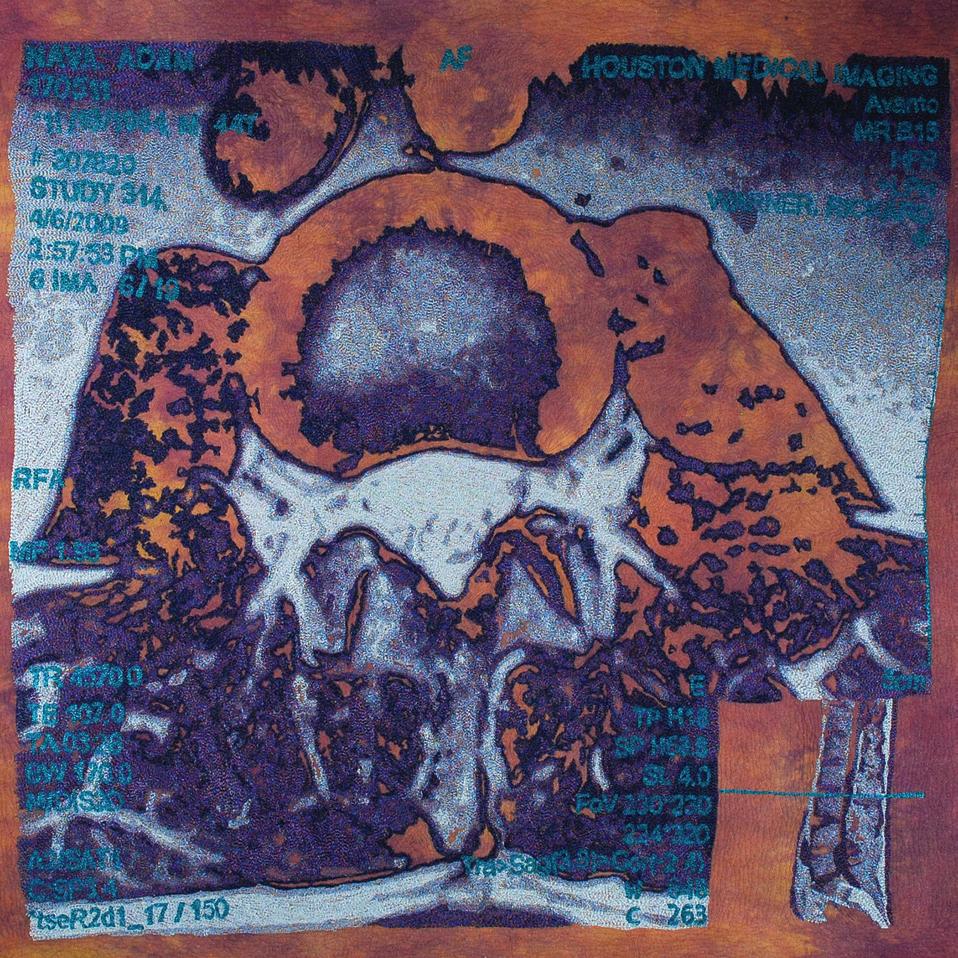
In our joint work, Karen and I plan to focus on several new levels. One aspect will be to look at the
cellular level of our bodies. The other will be to examine the progression that disease may take within our bodies. We are constantly seeking imagery for process examination.
I want others to see and experience the beauty we all share in these images. In times of strife and turmoil, we can take solace in our shared experiences. They allow us to see, above all, that we are more alike than dissimilar. Perhaps they will help generate a deeper understanding and empathy that is needed to bring us closer together.
www.paulachung.com
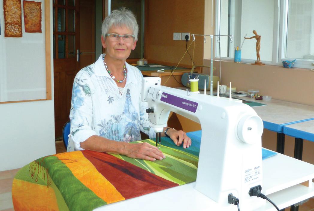
Joke (pronounced Yoka) Buursma, born and raised in the Netherlands, has always loved fabric, a passion that was passed from mother to daughter. But it was not until she moved to Ireland in 1996 that she began to make art quilts. She finds inspiration in the history of her new homeland and in places she has visited. From interpretations of Old Celtic script to adobe mosques in Africa, Buursma’s artworks convey a loving respect for history and nature.
We lived in the eastern part of the Netherlands where it is less overpopulated, but we needed more breathing space. We fell in love with Ireland while on a holiday on horseback. The country has a beautiful landscape, lovely villages, and so much space. After a second Irish holiday, we bought an 11-acre site in the southeast region and moved.
Fabric
My love for fabric comes from my mother. She could tell whether a fabric was cotton, linen, silk, or artificial fiber by touching it. She taught me and my sister how to sew clothes and sent us to dressmaking classes. I wanted to attend art school after secondary school and become an art teacher. The only art academy that trained teachers at that time was in Amsterdam, and my parents did not want someone so young to live
right: The Zebra
24 x 35 inches, 2005
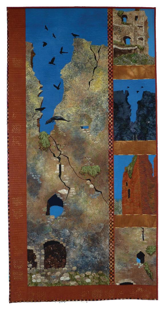
bottom right: Out of Repair
79 x 40 inches, 2012
in such a “dangerous” city. My second choice was to become a librarian; that option allowed me to study at an academy in my hometown.
When my husband and I moved to Ireland, I hoped for a second chance to attend textile art school. The only opportunity was a full-time, four-year course. I decided to take a patchwork course instead. Unhindered by tradition, I soon began creating my own designs.
I joined the Irish Patchwork Society (IPS), through which I organized a one-year textile art course for our quilting group. The teacher was the late Ally Kay, a multimedia artist and a teacher for City & Guilds (an educational program that offers a host of artistic and vocational courses). I also started teaching patchwork and quilting from home, an activity I still do one day a week.
My work references a sense of place derived from locations that have affected me. In the last couple of years, I have worked on pieces that allude to the adobe architecture in Mali, nature in South Africa, and the history of France, Spain, and Syria.
The social and cultural history of Ireland inspires me, too. This inspiration can be seen in my Ogham series, an interpretation of old Celtic script. This same cultural interest also is apparent in my works Irish Famine Graveyard and Out of Repair, a piece that was purchased by the Office of Public Works, which includes the Heritage Services division.
Another fascinating subject for me is the stripe pattern of zebras. In my first zebra quilt, I studied whether they would still be zebras if I left out their black stripes. I found that they became see-through zebras. In my next zebra piece, I left out the white stripes, and in my following zebra quilts I experimented with different African backgrounds and stitching techniques.
For me, color and shape are the most important design elements. Surface design also plays an important role. I mainly use a mix of self-dyed and commercially printed cotton fabrics, but occasionally I use

silk, linen, and synthetic material. I work with various surface techniques: piecing, appliqué, dyeing, painting, stamping, and discharge.
I often make work especially for an exhibition. The theme must appeal to me, and I look for exhibitions in line with my artistic goals. I was twice invited to create a piece for National Quilting Week in Ireland. For the theme “Wild Atlantic Way,” I made A Place of Constant Change. For the theme “Freedom,” I created Will We Ever Be Free?
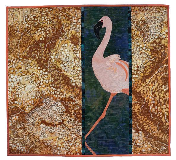
I have participated in two themed exhibitions organized by the Taiwan Art Quilt Society, which selects themes that relate to environmental protection. For these opportunities, I made Saline Water, Favorite
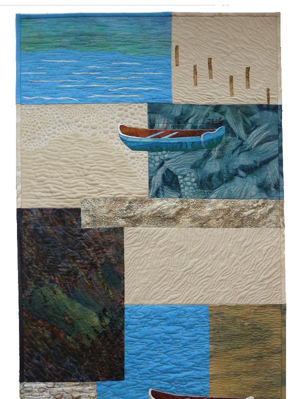
top left: A Place of Constant Change
48 x 24 inches, 2015
left:
Saline Water, Favorite Breeding Place Of Flamingos
26 x 30 inches, 2011
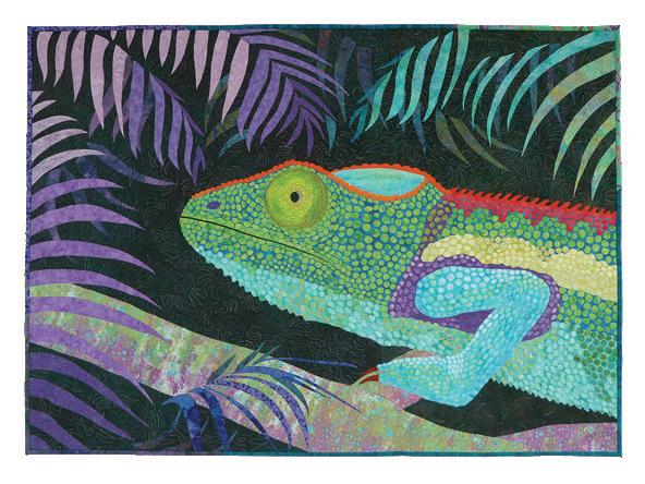
below: The Chameleon
39 x 54 inches, 2011
Breeding Place of Flamingos, and My Space ...Your Space ... Our Space).
The Chameleon was created for a 2011 IPS exhibition at the Botanical Gardens in Dublin. I wanted this piece to stand out in subject choice, color, and size. The Chameleon also won second prize at another exhibition, the prestigious annual RDS (The Royal Dublin Society) Craft Competition.
My style is contemplative and reflective. I want the viewer to see my meaning in my work. The shapes I use are recognizable and refer to a location or a past time. The colors create an atmosphere. In My Space ... Your Space ... Our Space, the city is lifeless in a grey-blue hue, but the leaves that burst through the

V-shape are a happy green. Other works are based on Irish and African landscapes. After I work on a dark piece, I like to make a brighter piece. I love earthy tones, but sometimes I need to work with really strong colors. I learned a lot about the use of color by reading Ghost Layers & Color Washes by Katie Pasquini Masopust, Color Play by Joen Wolfrom, and The Art of Color by Johannes Itten.
I will continue to exhibit my works and seek out interesting competitions. My two-person exhibition in Ennistymon, County Clare, Ireland, ran from May 20–June 24, 2017. There were three sales of my nature pieces from that exhibition: Almost in Perfect Unison, Camouflaged Zebras, and When The Leaves Are Falling.
My recent works include less complicated images than those from a couple of years ago. I would like to continue in that direction. My latest two pieces are part of my Ogham series. I like the simple horizontal and slanted strokes that form the symbols of the script. There is much more to tell about this script; for example, its alphabet is related to tree names. I also keep an open mind for completely new ideas.
www.jokebuursma.weebly.com
By turns, Ruth Powers is a quilt artist, pattern developer, and retired teacher whose fans are drawn to her artworks of the landscapes and wildlife of America’s heartland. A move in 1989 from New England to Kansas gave rise to Ruth Powers’ nature-inspired art quilts. Powers’ new home needed a piece of art to hang on a large wall, and she decided a wall hanging would just the thing. From that first design sprang a style that incorporates intricately pieced fabrics. Her works feature everything from birds of the region to the Flint Hills and beyond.
I had done a lot of paintings, drawings, and needlework pieces for walls through the years, but one large wall seemed to be calling for something bigger, more dramatic!
Magazines at the time featured quilts on the walls. I thought that was a good idea but was unsure how to make one. I did not expect to enjoy the process, but I thought I could stand to make just one if it was not too big. Library books provided inspiration and instruction, and soon I had designed my own wall hanging using a combination of traditional patterns from a book about Kansas blocks and a pieced background scene I sketched of the Flint Hills.
From that first quilt, I learned that the way you color a block can give unexpected results. I was more
surprised than anyone that I totally enjoyed the process. When the top was finished, I hand quilted it and started looking for my next project I was hooked! The whole process proved to be artistically satisfying as well as challenging.
In the beginning, my work was grounded in traditional designs but with artistic elements. I began to exhibit, compete, and enjoy success. Soon I was asked for patterns of my designs. In 1994, I established INNOVATIONS, my pattern company, which features both traditional and artistically innovative designs. This led to speaking and teaching engagements. For many years, I enjoyed travel and interaction with quilters here and abroad. My most popular talk was called Where Do The Ideas Come From? because that was one of the most often-asked questions.
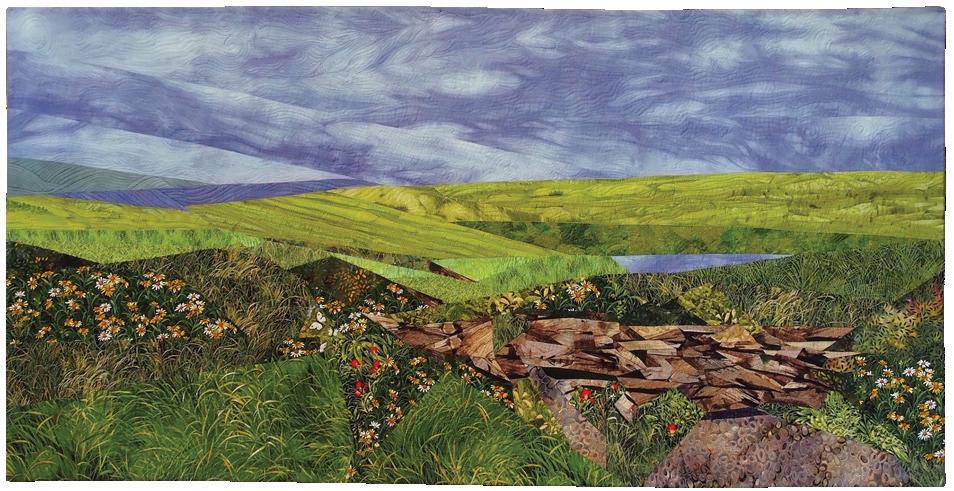
So where do ideas come from? Some of the best ideas are found where they are least expected: in architectural forms, scrolls and tile work, and in books and newspapers. They are not necessarily found in quilting books, and not necessarily in the pictures. Sometimes the printed words in a book, poem, or song will inspire a vision for a wonderful new quilt. Of course,
there’s a wealth of inspiration in traditional blocks waiting to be used in new ways.
Today’s technology has given us so many choices. Digital cameras and computers make it easy to have instant images to use. Fabric is another source of inspiration for me, and challenges and contest themes can often jump-start my imagination. Much of my inspiration comes directly from nature, both for subject matter and for color combinations.
I am currently best known for pieced pictorial wall hangings. My first wall hanging incorporated the same type of picture-piecing technique I still use today, though it has evolved to be more complex and more skillfully done. Many of my pieces have won awards in major competitions. People seem amazed that they are so intricately pieced from bits of fabric and often exclaim: “I thought, from across the room, that it was a painting. How did you DO that?”
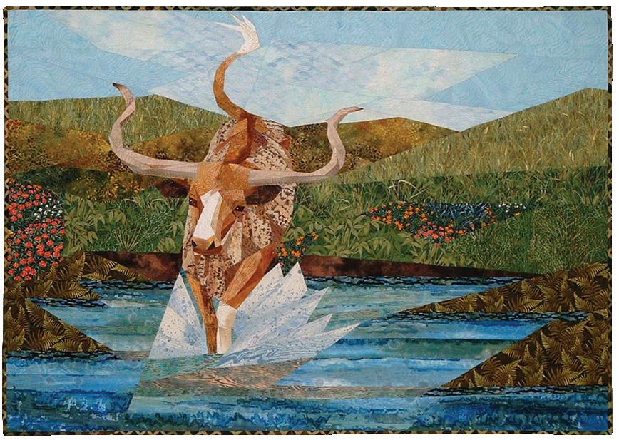
When I design for my pattern company, I always try to keep in mind ease of construction. However,
you may notice that while the basic block is easy to put together, the way I place the colors causes optical illusions. You may not readily see where one block stops and the next begins, so the surface can look more difficult than it actually is.
The process is so much fun. First I must get an idea, but that’s the easy part. I am inspired by nature landscapes, flowers, animals, or people. Working from a photo, an original sketch, or a combination of the two, I develop a working drawing from which I figure out the sewing lines required to accomplish it. These lines must be broken down into easyto-sew sections. I find it most comfortable to work at this stage in an 8.5 x 11-inch format. I then enlarge the composition to my desired working size with an overhead projector. This approach makes it easy to enlarge the design and also creates a mirror image. The image is then transferred to freezer paper, which, when ironed, will stick to fabric. Each piece of freezer paper is a template that will be ironed to the wrong
above left:
Tranquil Dawn
52 x 40 inches, 2016
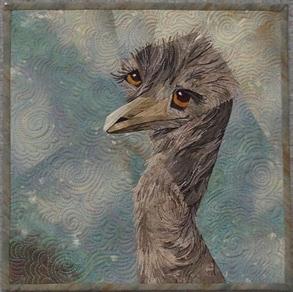
above: Emu, I See You!
12 x 12 inches, 2017
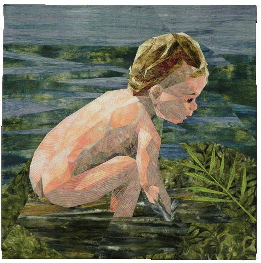
below: Splash
40 x 40 inches, 2014
side of the chosen fabric, which is why the mirror image is key. The template may be reused many times in case I decide during the fabric auditioning process to make a change for something that will work better. I have a wonderful stash of fabrics to choose from. When I shop for fabrics, I’m always on the lookout for fabrics that look like or imply sky, grass, trees, fur, feathers, etc. I love to use commercial prints. To find just the right fabric is part of the challenge, part of the fun. I absolutely love to work with batiks, as they lend themselves to portraying sunlight and shadow effects and the subtle nuances of nature.
Today I am retired from teaching but remain active in the studio, turning ideas into finished artworks. INNOVATIONS now offers 57 patterns that can be viewed on my website. Two of my most recent works, Emu, I See You! and Tranquil Dawn, were exhibited at the 2017 International Quilt Festival in Houston as part of the Quilts: A World of Beauty exhibition. www.ruthpowersartquilts.com
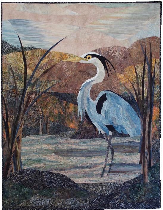
connection, memories, and exploration of this area of California’s Sierra Nevada range. The pages are filled with vibrant inspirational images, as well as professional photographs of the quilts, with overall and detail views, and in some instances, the perfection of the reverse side.
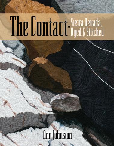 by Ann Johnston
ISBN 978-0-9656776-6-0
146 pages, paperback
$35.00
Reviewed by Patricia Kennedy-ZafredOver the past six years, Ann Johnston, a highly regarded quilt artist, instructor, and prolific author, has created a series of 32 quilts inspired by the mining land held by her family since the early 1800s. Johnston’s love of and connection to the exquisite beauty of this area is expressed in grand scale and subtle detail throughout this lavishly illustrated catalog.
“Contact” refers to a place where geologic units touch each other, but also relates to the human influence on the landscape. Johnston’s process for creating the work involved both looking at what exists on the land and also attempting to imagine unseen events.
Although certainly a book relevant to any artist working in the quilt medium, this catalog also conveys the personal story of Johnston’s
The gallery pages of the book are as compelling as the pages of Johnston’s process, with images of surface design, layout, construction, and technique. Although not a how-to book, the publication includes images that would inspire any artist: Johnston at work painting, dyeing, and assembling these seven-foot works. Photos of Johnston on ladders arranging cloth on design walls, or piecing and quilting the work, reinforce the physical challenge this series demanded and the artist’s unwavering determination throughout its development.
Creating the colors of the rock, patterns, and detailed tones and textures required Johnston to expand her highly developed surface design skills. Each piece of fabric is a unique combination of techniques, including monoprinting, resist dyeing, and hand painting, all on voluminous pieces of cloth and silk, some resulting in whole-cloth works. The quilts of The Contact, although abstract, thoughtfully represent clearly recognizable geographic areas occasionally mixed with pieces that are more imaginative remembrances of light and color.
Johnston has previously published several books that continue to guide quilt makers in their endeavor to expand artistic boundaries, including Color by Accident: Low-Water Immersion Dyeing (1997), The Quilter’s Book of Design, 2nd Edition (2008), Color by Design: Paint and Print with Dye (2001), and her recent DVD, Color By Accident: Low Water Immersion Dyeing (2013). All are available through her website, www.annjohnston.net.
 by Anne Lee and E. Ashley Rooney
224 pp
ISBN 9780764353048
224 pages, hard cover
$34.99
www.schifferbooks.com/artistry-in-fibervol-1-wall-art-6213.html
Fiber artists today explore a multitude of materials, natural and synthetic, traditional and unexpected. They combine different fiber techniques together in a single piece, push technical processes, and cross-pollinate mediums. They explore social, political, economic, and environmental issues.
Excited by these trends, we suggested to Schiffer Publishing that we compile a book on contemporary fiber art. We came to the task with different strengths but together had a deep understanding of the contemporary art field. Yet we quickly realized what an enormous and potentially daunting project we had undertaken. One book could not begin to showcase adequately the amazing creative energy of fiber artists and the fascinating directions in which they are pushing the medium. Ultimately, we proposed three books— Wall Art, Sculpture, and Art to Wear and thus our two-year journey began.
Our intention was to take a fresh look at the magical and insightful ways in which today’s fiber artists have interpreted life in this century, examining fiber art through a multifaceted contemporary lens. We wanted to include those who would bring strength, excitement, passion, and variety to this series. Wall Art ended up the largest of the three volumes, consisting of more than 600 photographs and personal statements from 100 of today’s estab-
lished and emerging artists. We invited two writers to discuss the ever-evolving world of wall art today: Marcia Young, editor-in-chief of Fiber Art Now magazine, and Meredith Re’ Grimsley, a fiber artist herself and professor of fabric design at Bloomsburg University of Pennsylvania. Given their years of experience, both offered not only insights but also asked us the sometimes difficult questions we needed to answer in our selection process.
We explored the fiber work of artists from the Americas, Europe, Australia, Africa, and Asia. To find them, we talked to gallery owners and museum curators and visited many of the exhibitions they had organized. We read fiber magazines and books, researched textile societies and organizations, and attended conferences. Probably the best resource was the artists themselves, who were quite willing to suggest (sometimes insist) that we contact others in this close-knit field. In all, we explored either literally or digitally the fiber art of almost 500 artists.
Once we knew whom we wanted, we dug deeper into those artists’ websites seeking recent, varied images and up-to-date contact information. We then invited artists to participate, requesting a sample of high-resolution images with captions, a concise first-person statement, a self-portrait, and signed permission forms from the photographers, without which we could not publish images. Dividing the artists into one (or more) of the three books led to some lively discussions between us, as the lines between twoand three-dimensionality blurred. Once we had selected the 100 artists for Wall Art, we needed to organize them in the book. Again, not surprisingly, we found very few traditional definitions. Instead,
they referred to themselves as “a portrait artist working in fabric” or “an artist making narrative embroidery.”
Dividing by material or technique was equally problematic: Where would we place knitted glass? Artificial hair bound with metal wire? Animal membranes pinned with rusty nails? Following advice from our Schiffer editor, we decided to place the artists alphabetically, creating a completely random page-by-page visual conversation.
In today’s art world, traditional methods, processes, and materials are evolving in fascinating, dynamic, and sometimes challenging directions and the resurgence of fiber art and handwork beautifully illustrates these trends. Recognizing that these fiber artists are pushing the boundaries with techniques, processes, and materials, Schiffer Publishing selected Ann Harwell’s Interacting Galaxies for the cover. How very appropriate to have a space-age image!
E. Ashley Rooney, author of more than 50 books, has an outstanding reputation for designing and preparing books on contemporary art and architecture (earooney27@gmail.com). As research director at Vose Galleries, Anne Lee has researched and written more than 20 exhibition catalogs (anjamlee@aol.com). Lee and Rooney have collaborated on several books and magazine articles.
Studio Art Quilt Associates (SAQA) is pleased to present our Portfolio gallery. Each issue of Art Quilt Quarterly will feature a selection of artwork by juried artist members of SAQA, the world’s largest organization devoted to art quilts. We hope you enjoy this opportunity to immerse yourself in these pages of wonderfully innovative artwork merging the tactile, technological, and traditional aspects of quilted art.
Founded in 1989, SAQA is a nonprofit organization whose mission is to promote the art quilt. Now composed of more than 3,400 members in 39 countries, SAQA promotes the art quilt through exhibitions, publications, and professional development opportunities. We host an annual conference, publish a quarterly Journal, and sponsor multiple exhibitions each year.
In 2017, exhibitions of SAQA member work traveled to Australia, Canada, China, England, France, Germany, Italy, the Netherlands, Spain, and fourteen states across the U.S. They were displayed in 10 museums and 23 major quilt festivals and were seen by several hundred thousand visitors. Information about SAQA and these exhibitions is available at www.saqa.com. Full-color catalogs of many of the exhibitions are also available.
14 x 23 inches (36 x 58 cm) | 2016
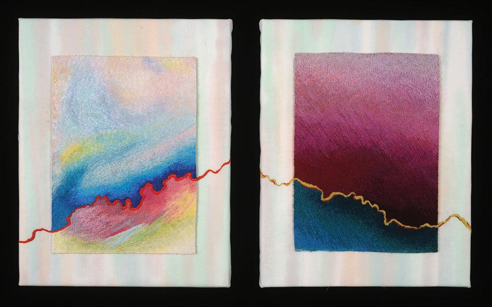
82 x 80 inches (208 x 203 cm) | 2015
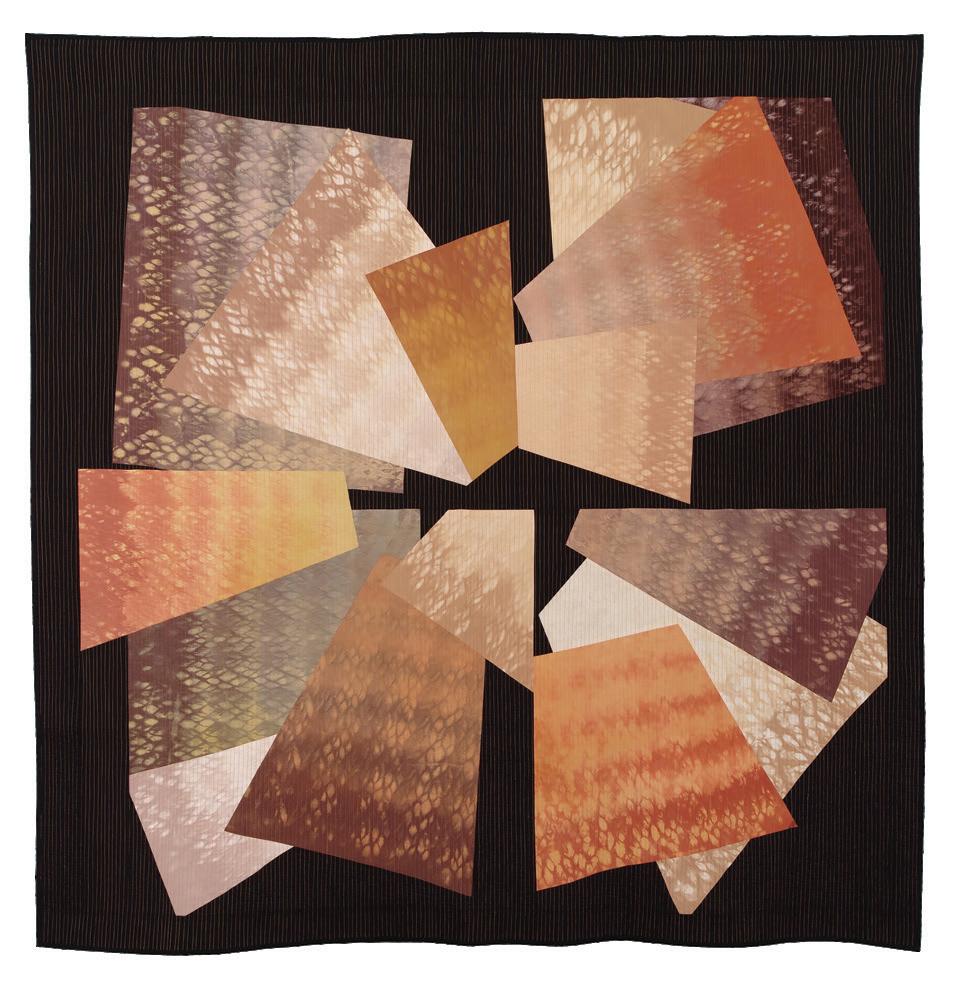
Pontivy, France
www.attinger-art-textile.odexpo.com
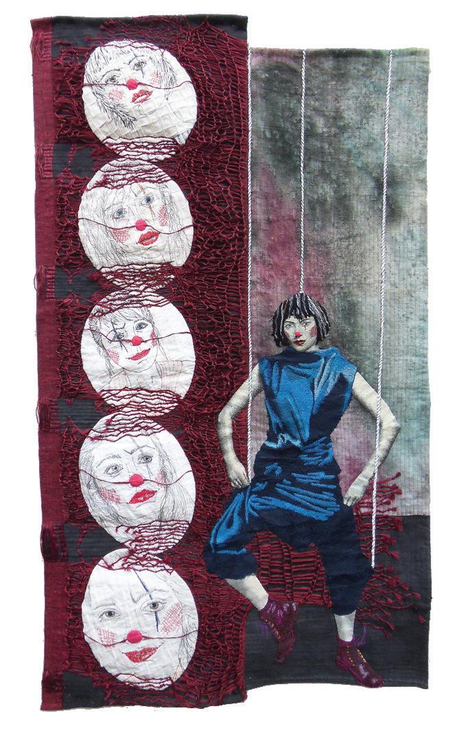
Intermittentes
52 x 30 inches (132 x 76 cm) | 2015
Kathie Briggs
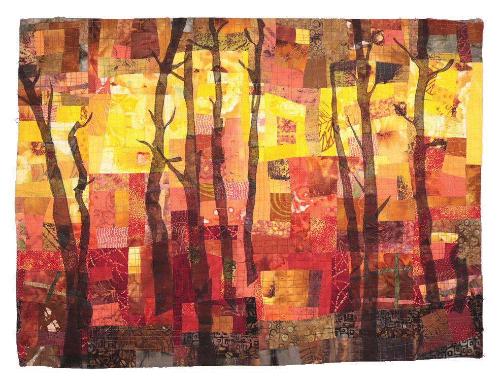
Asheville, North Carolina, USA kathiebriggs.com
Fire!
20 x 27 inches (51 x 69 cm) | 2016

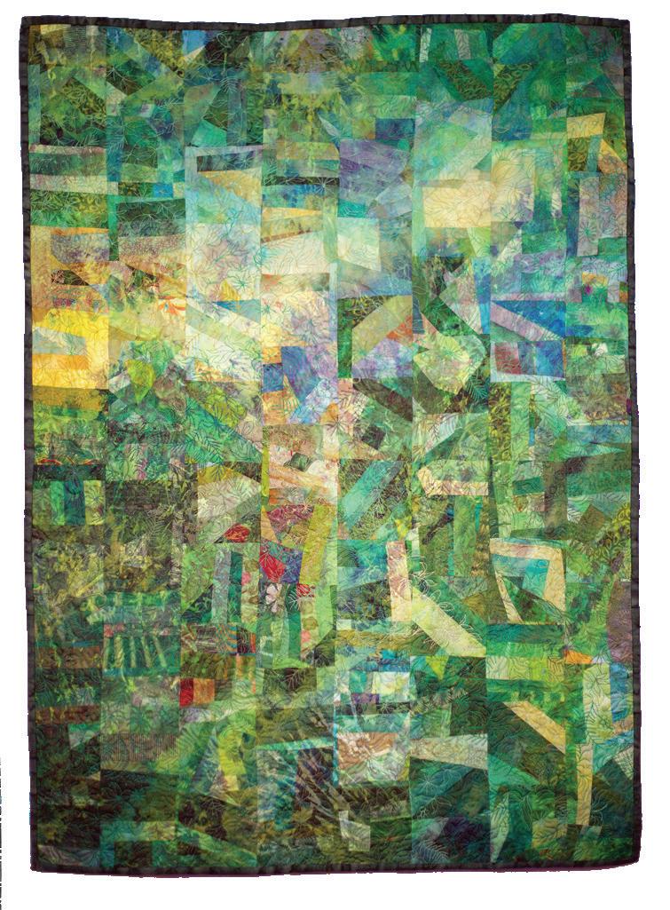
McPherson, Kansas, USA www.shinheechin.com
Late Autumn
38 x 39 inches (95 x 99 cm) | 2016
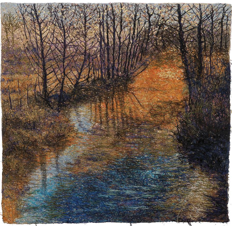
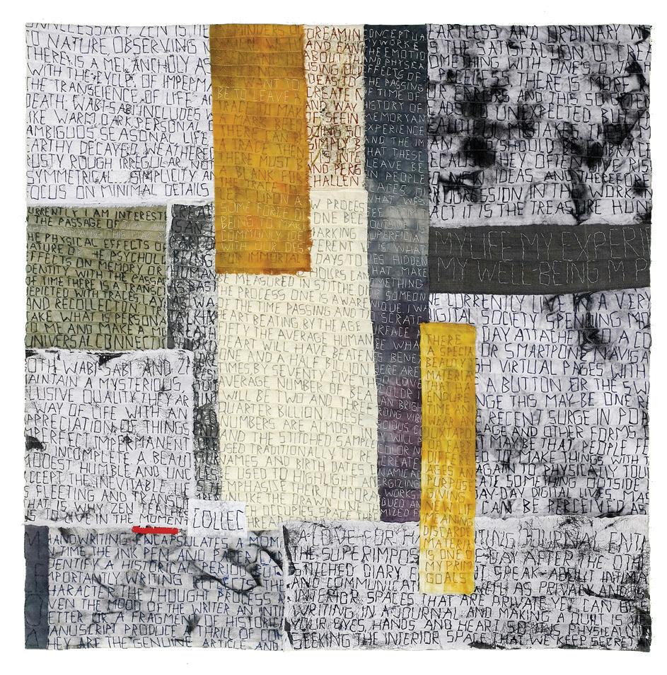
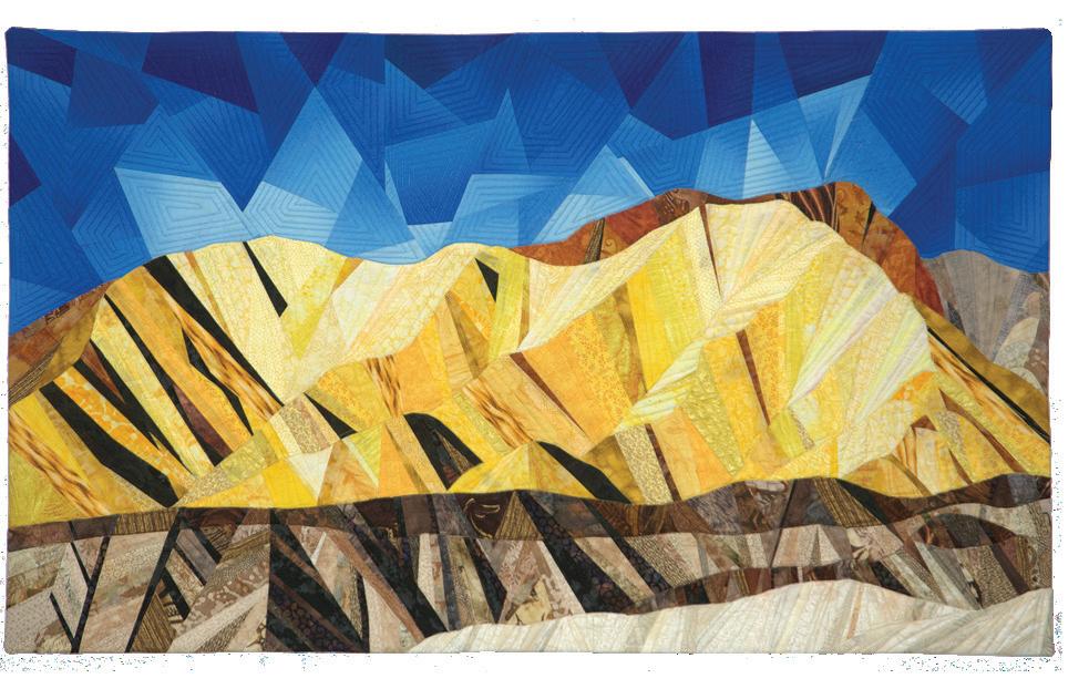
Ruidoso Downs, New Mexico, USA
www.vicki-conley.com
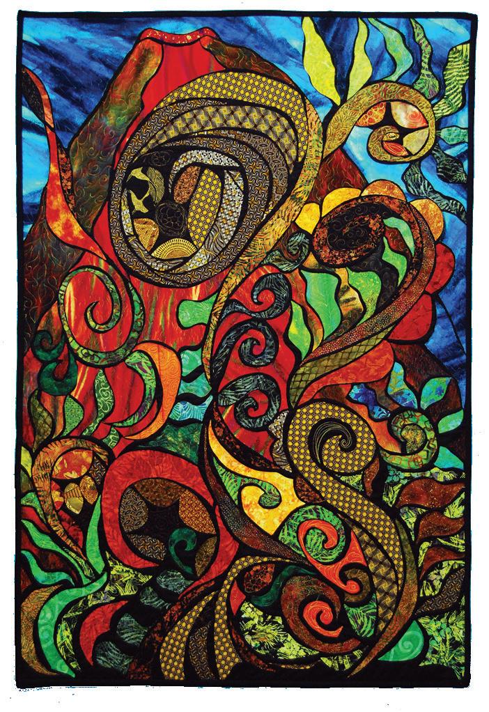
Greensboro, Vermont, USA
www.judydales.com
Water 12 x 12 inches (31 x 31 cm) | 2016
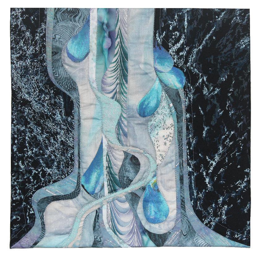
Palmyra, New York, USA
www.marciadecamp.com
Doormats #2
50 x 72 inches (127 x 183 cm) | 2016
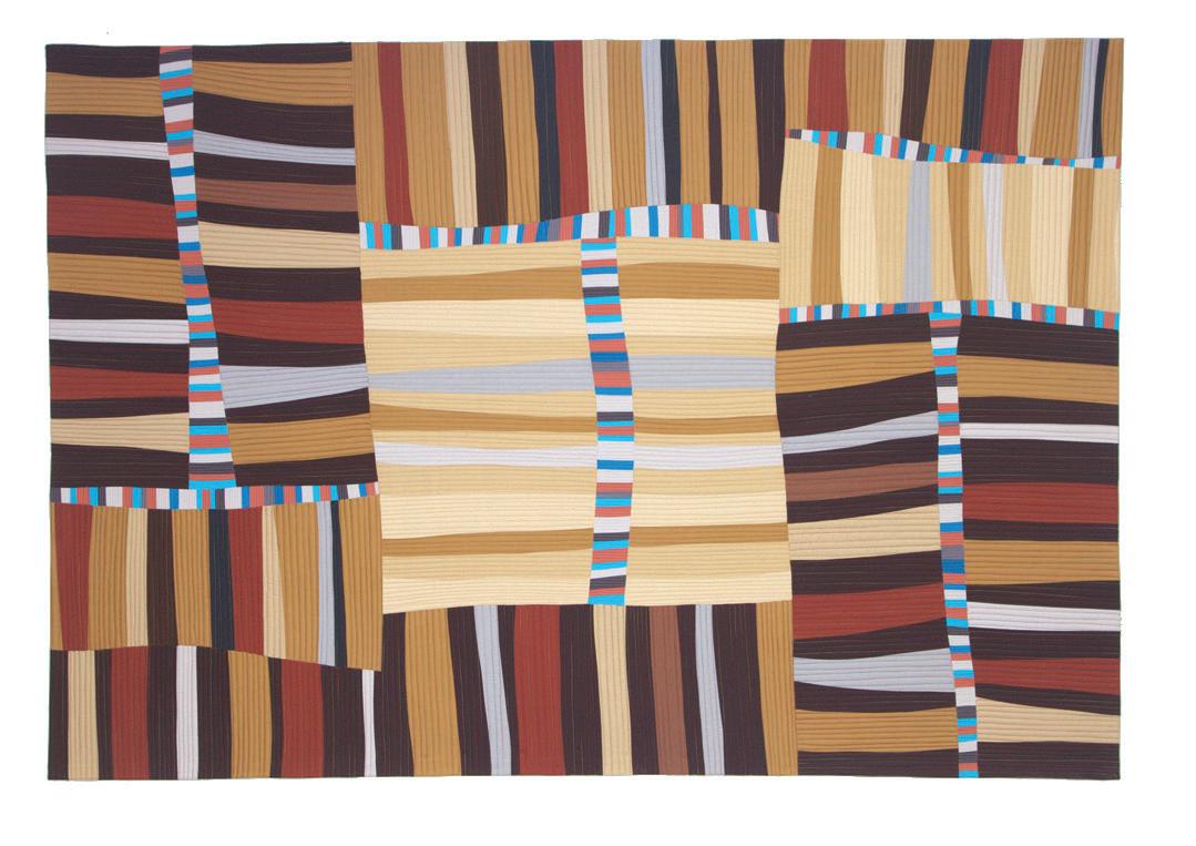
Kawasaki-shi, Kanagawa-ken, Japan chiakidoshoart.com

Urbana, Illinois, USA
www.deborahfell.com
Passage of Time: Braunschweig 35 70 x 41 inches (178 x 104 cm) | 2016
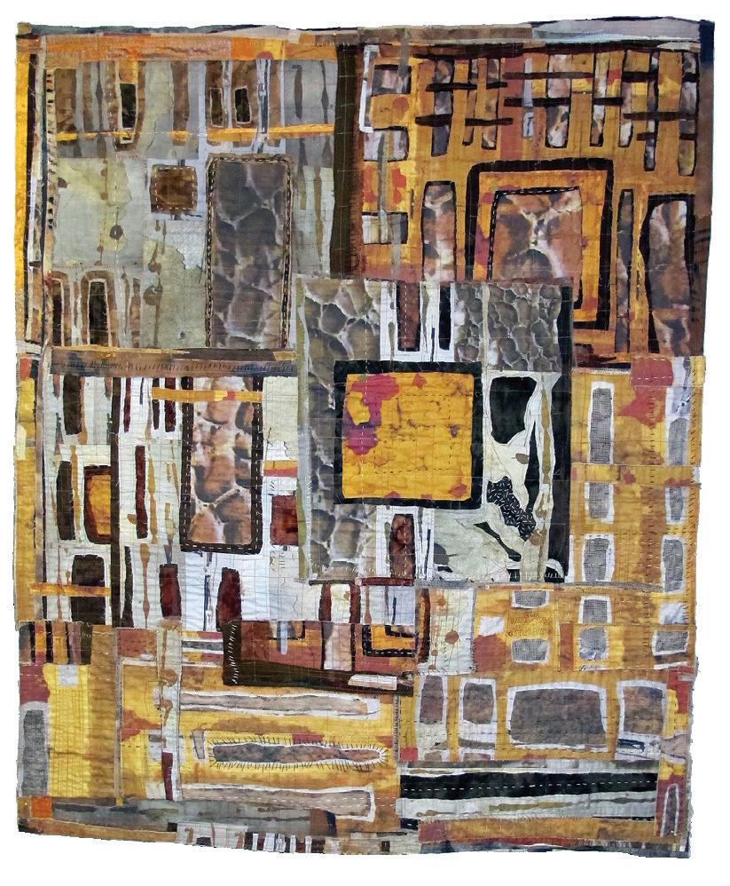
Canberra, ACT, Australia
Erosion
39 x 16 inches (100 x 40 cm) | 2016

Boise, Idaho, USA
www.lisaflowersross.net
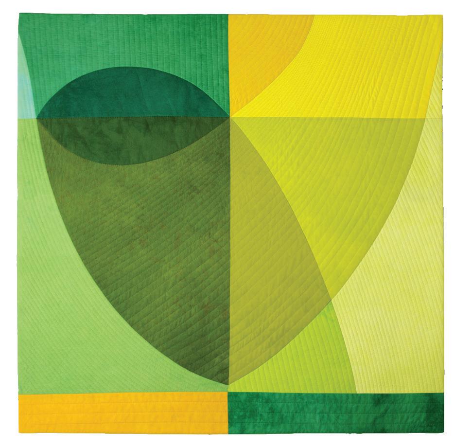
Durango, Colorado, USA
TIME LINE V
8 x 36 inches (19 x 91 cm) | 2015

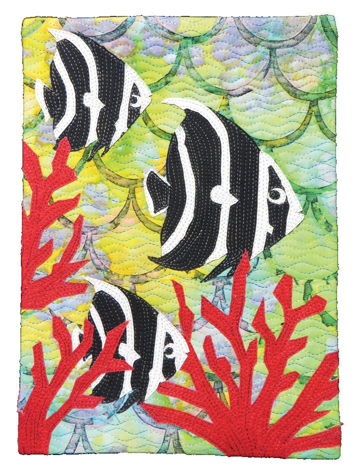
Toronto, Ontario, Canada
www.colourvie.com


Denver, Colorado, USA
www.jeanherman.com

Mallride
30 x 40 inches (76 x 102 cm) | 2016
Guernsey,
www.suehotchkis.com

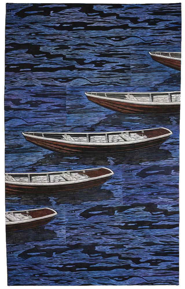

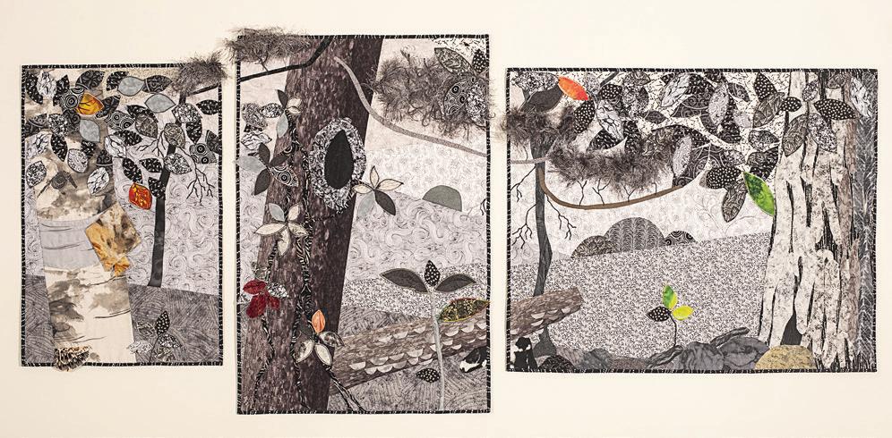
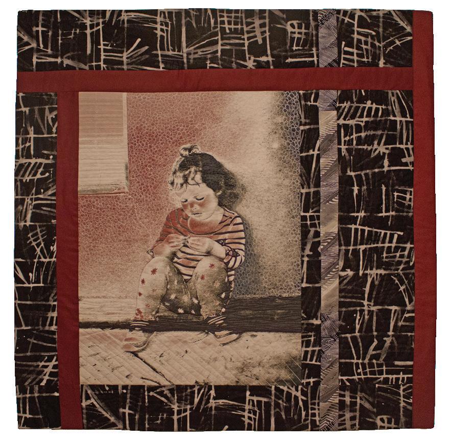
Pacific Palisades, California, USA sherrykleinman.com
Genevieve
40 x 40 inches (102 x 102 cm) | 2016
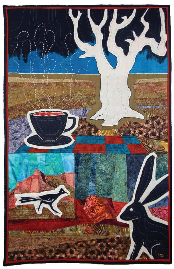
Paulette Landers
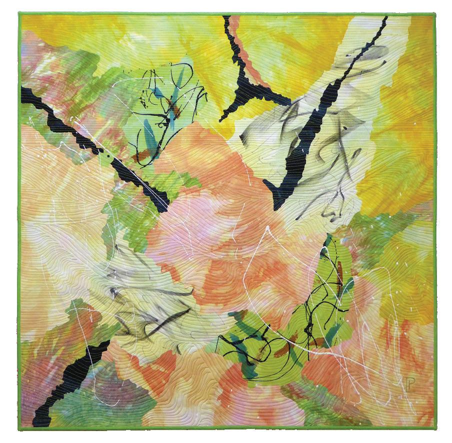
Rainier, Oregon, USA
www.paulettelanders.com
Gramma’s Dreams
40 x 40 inches (102 x 102 cm) | 2015
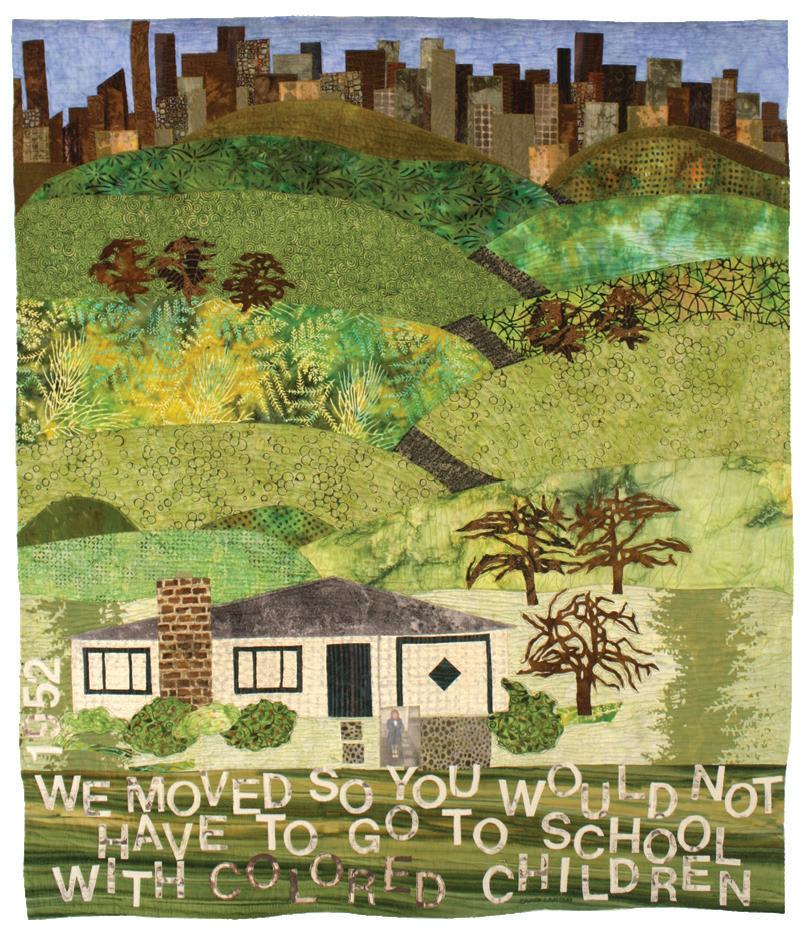
Toronto, Ontario, Canada
www.traceylawko.com
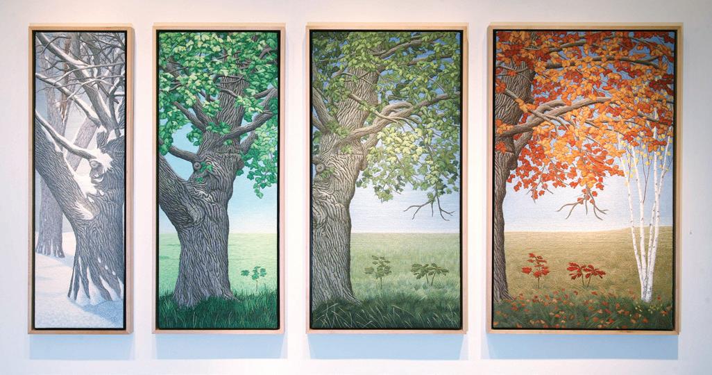
Tainan City, Taiwan
www.linhsinchen.idv.tw
Contagious
40 x 24 inches (102 x 61 cm) | 2015
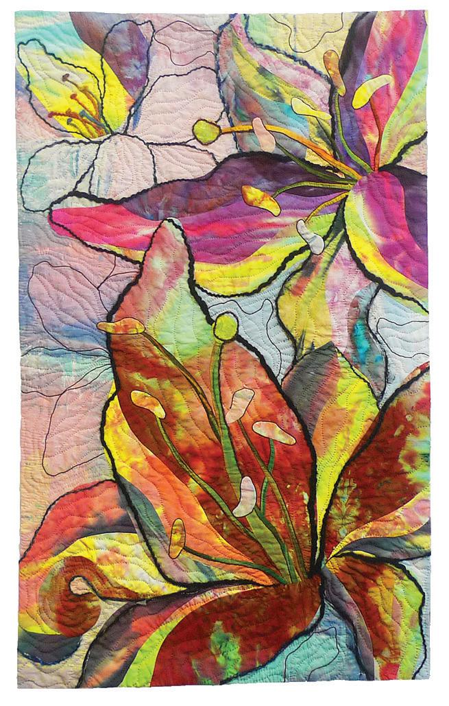
Susan Roberts Mathews

Ocean Grove, Victoria, Australia
www.susanmathews.info
Ode To Banksias 5
40 x 72 inches (102 x 184 cm) | 2016
Lakeway, Texas, USA
www.sherrilipmanmccauley.blogspot.com
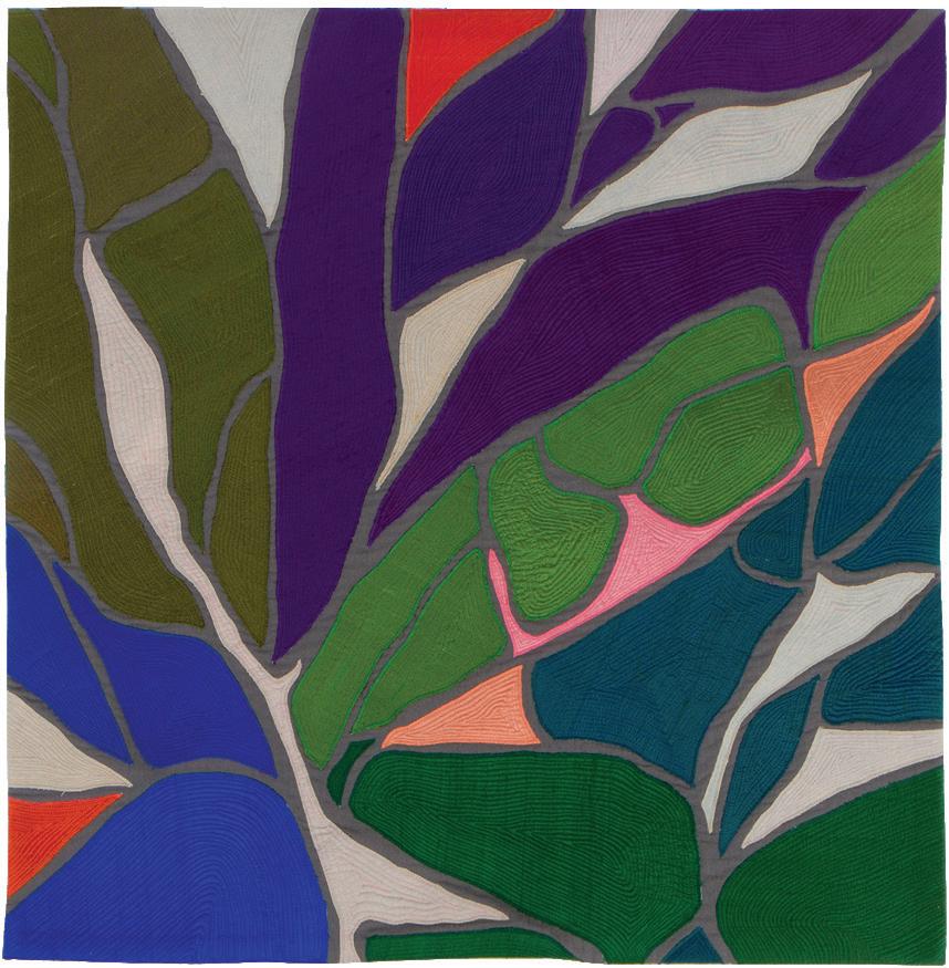
Branches Red
52 x 27 inches (132 x 69 cm) | 2015
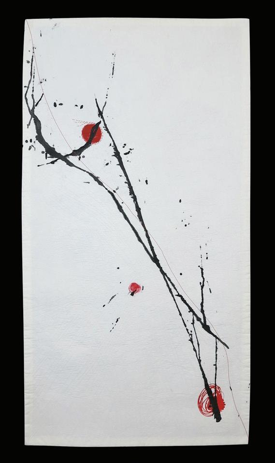
Anchorage, Alaska, USA
www.dianemelms.com
Watermelon Dreams 34 x 36 inches (86 x 91) | 2015
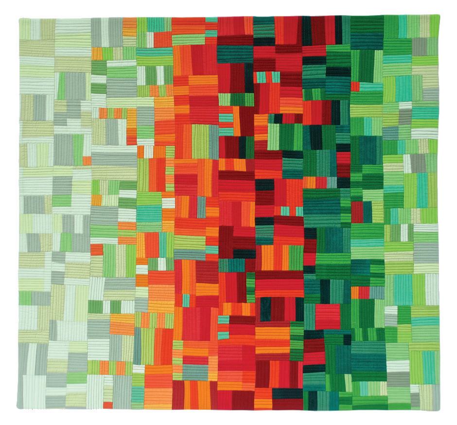
Le Châble, Valais, Switzerland
www.elizabeth-michellod-dutheil.ch
Tumulte
47 x 37 inches (120 x 95 cm) | 2016
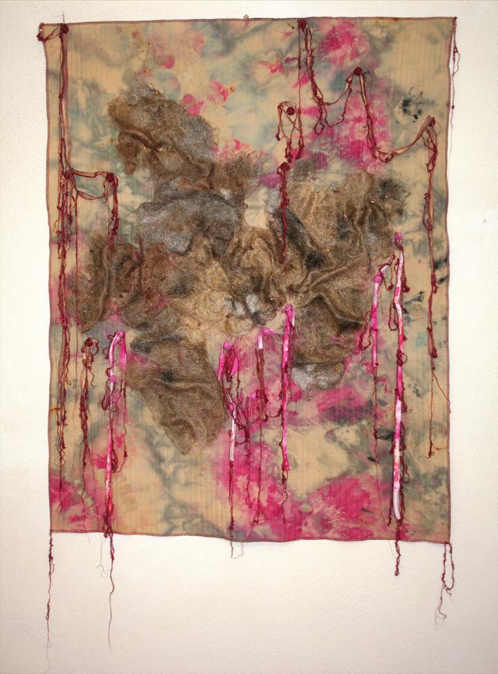

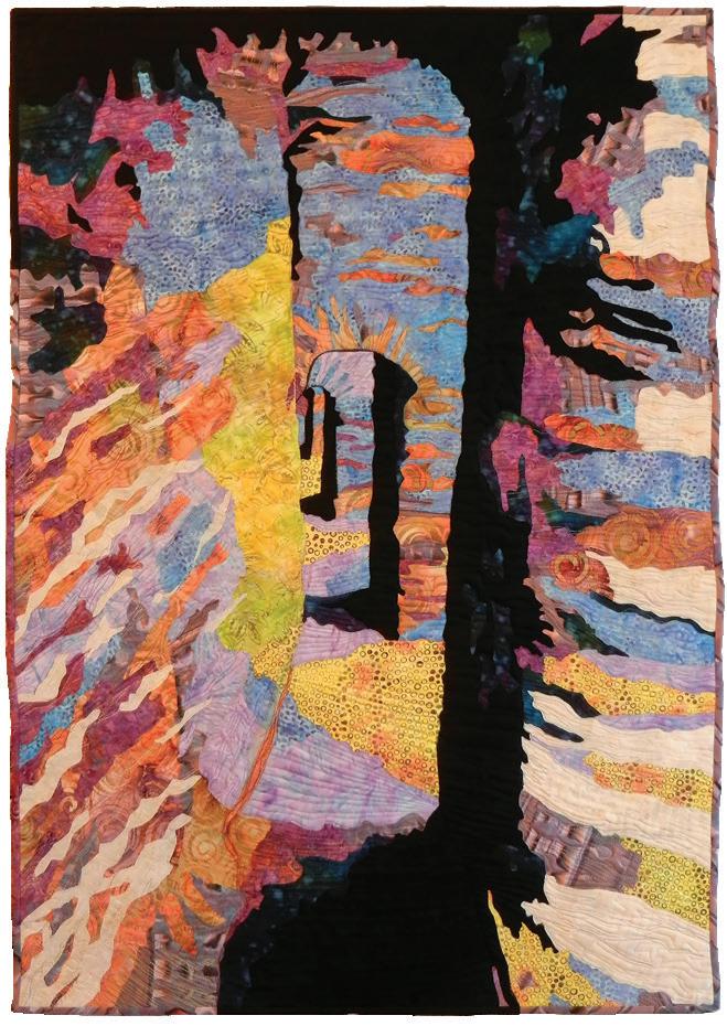
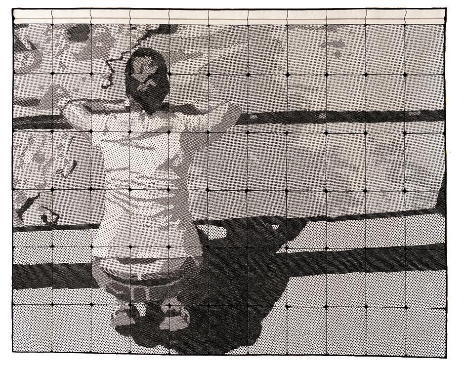
Sant Feliu de Guíxols, Girona, Spain
www.olgagonzalezangulo.com
Captivated by Nature
64 x 80 inches (165 x 205 cm) | 2016

Houghton,
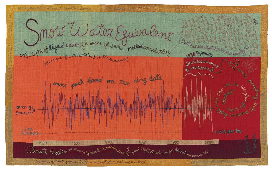
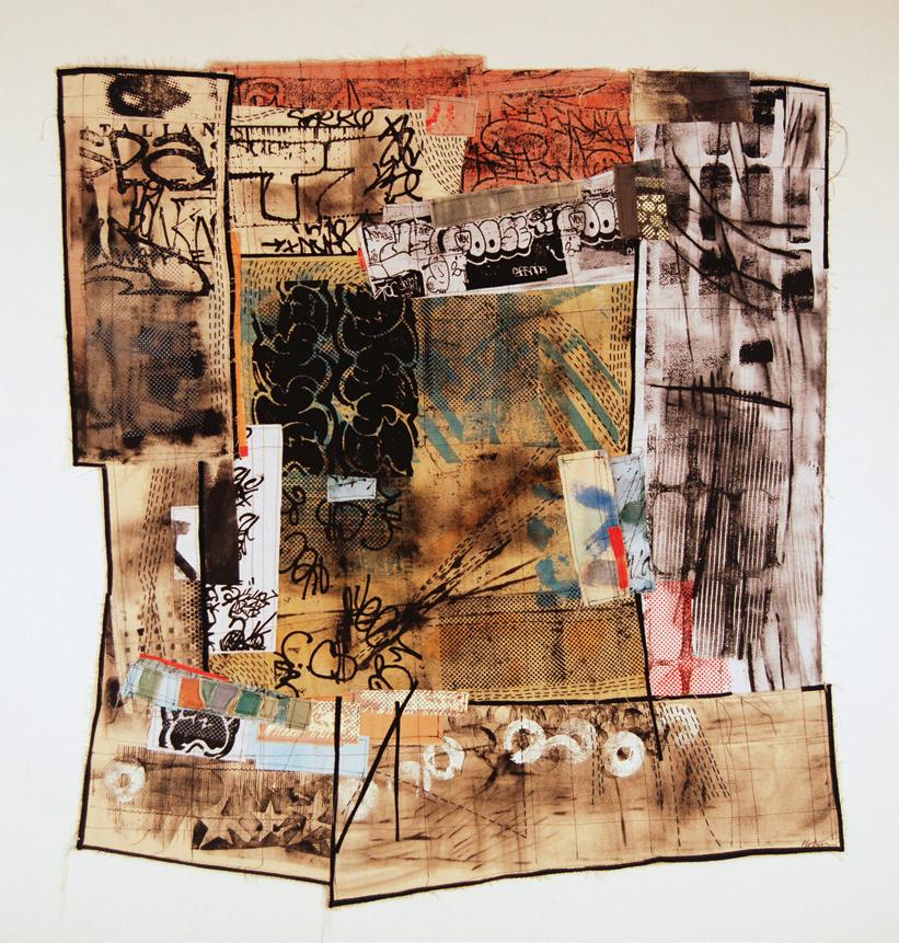
Gloversville, New York, USA www.judithplotner.com
45 x 42 inches (114 x 107 cm) | 2016
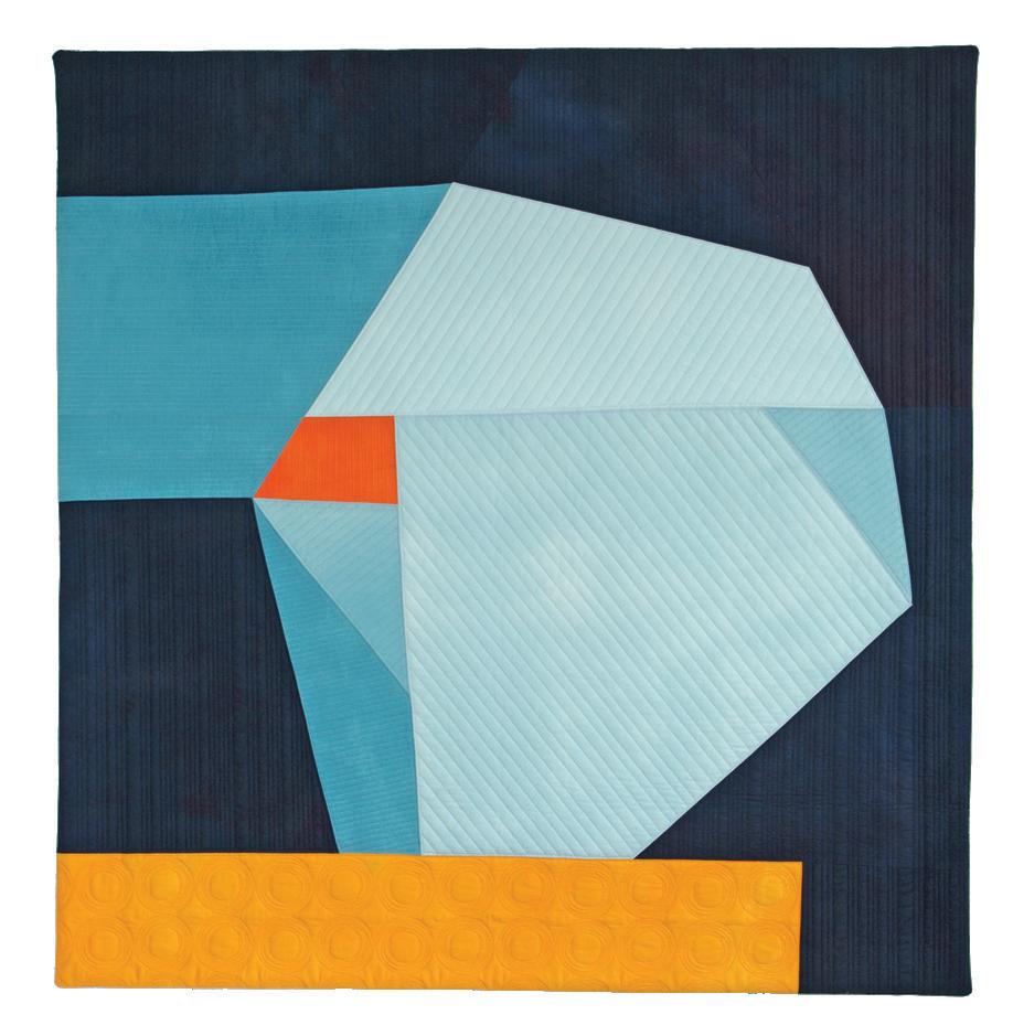
Columbia, Pennsylvania, USA
www.suereno.com
Luminosity
60 x 74 inches (152 x 188 cm) | 2017

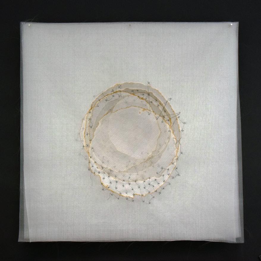
Austin, Texas, USA
www.sarasharp.com
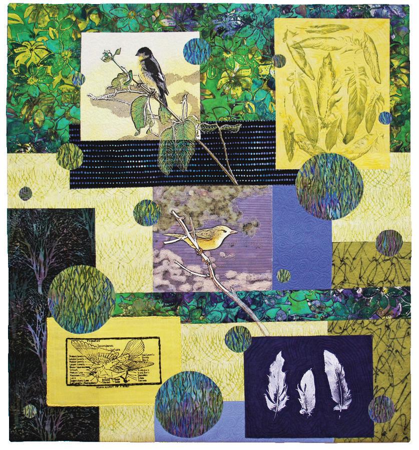
Birding at Quiet Hill
32 x 29 inches (81 x 74 cm) | 2015
www.judysimmonsfiberart.com
30 x 24 inches (76 x 61 cm) | 2016

Gillette, Wyoming, USA
www.joansowada.com
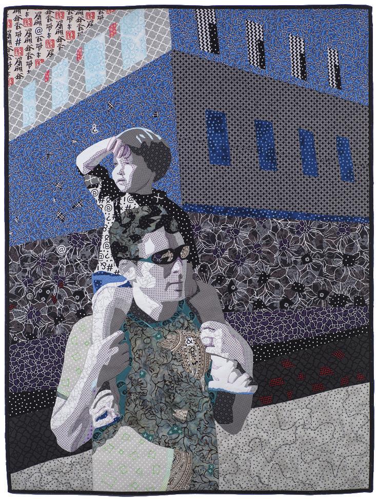
Vigevano, Pavia, Italy
www.tizianatateo.it
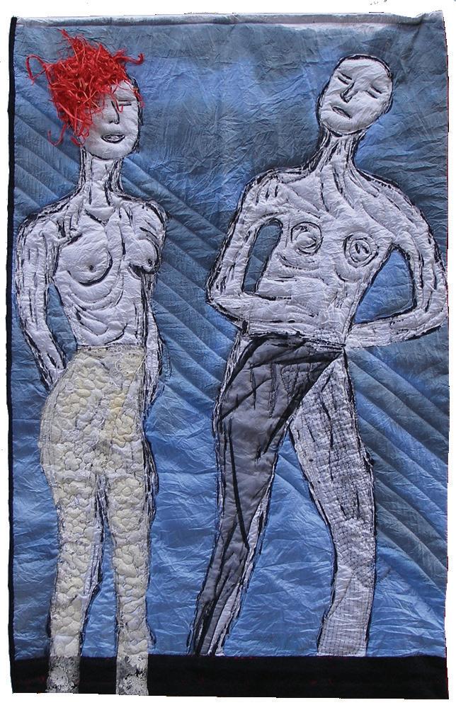
Mannequins
51 x 32 inches (130 x 81 cm) | 2016
Denver, Colorado, USA valeriecwhite.com
Unchanging Grace 40 x 30 inches (102 x 76 cm) | 2016
Cedar Point, North Carolina, USA
www.eileenfiberartquilts.com

Charlotte Ziebarth
Boulder, Colorado, USA
www.charlotteziebarth.com
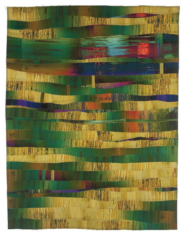
Shifting Sands
53 x 41 inches (135 x 104 cm) | 2016
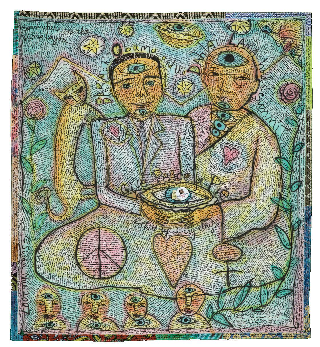 Susan Shie
Olama: Two Guys and a Pie 57 x 51 inches, 2007