
PORTFOLIO
BRANDING & IDENTITY
Branding and identity are two important concepts in graphic design that are crucial for any business or organization looking to establish a strong visual presence and connect with their target audience.
My goals for these projects were to create unique and recognizable branding for businesses and their products, including logos, color schemes, and typography. A strong visual identity helps to reinforce the brand’s message and values, and ensures that all communications are consistent and cohesive.
05
POPPY
Poppy is a farm-to-table bistro that I created a brand identity for. It consists of a main logo, submark, color palette, mockups, and a brand pattern.
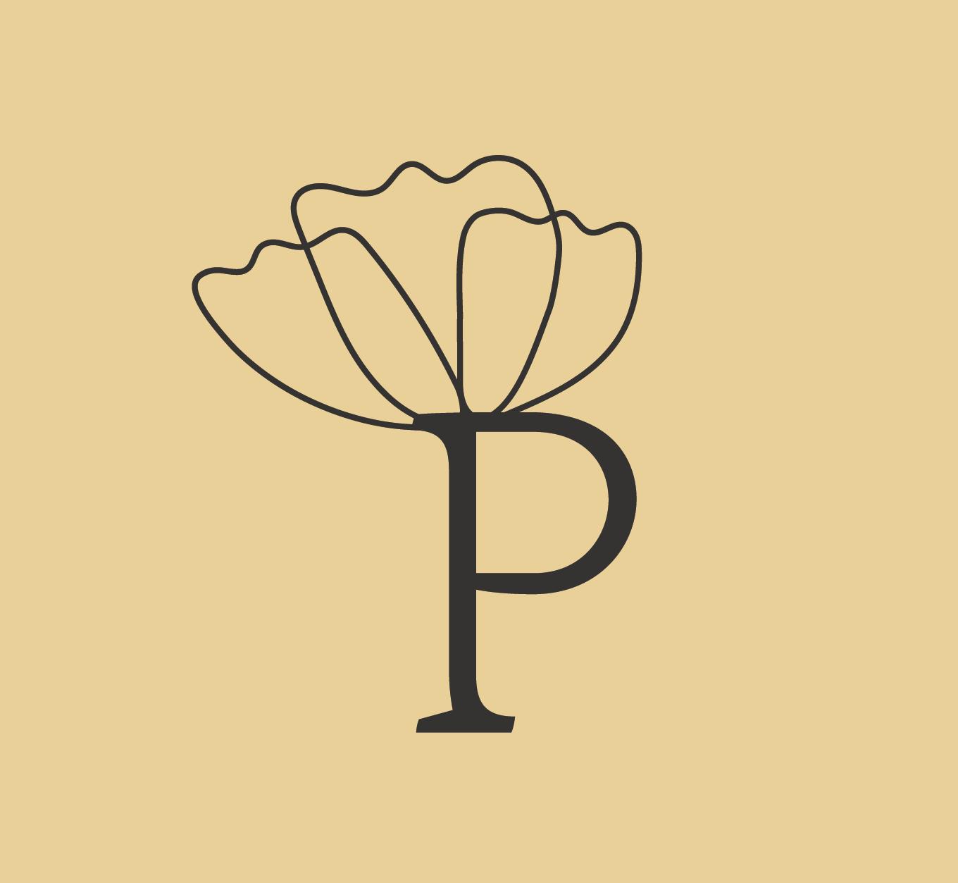
My goals for this fictional company were to create branding that represents the values of a farm-to-table restaurant. Poppy believes that great food should be beautiful, delicious, and sustainable.
The logo reflects these values, and serves as a visual representation of Poppy’s commitment to providing customers with a dining experience that is both satisfying and environmentally responsible. Its use of warm, earthy colors and simple, organic shapes evokes the natural beauty and simplicity of farm-to-table cuisine and conveys a sense of comfort and authenticity.


07
Brand color palette, mockups of different flavored honeys, a tin cup, and storefront window signage.


BRANDING & IDENTITY
POPPY


09
SEDONA
S edona is a luxury spa and salon that I created a brand identity for. It consists of a main logo, submark, color palette, mood images, and product mockups.

My objective for this fictional spa and salon was to create branding that reflected the importance of beauty and wellness at Sedona. The branding acts as a visual representation of the commitment to providing clients with the highest quality spa services in an environment that promotes healing, relaxation, and self-care.
The Sedona logo reflects these values through its use of soothing colors and simple, elegant typography. The soft, flowing lines of the logo evoke a sense of calm and relaxation, while the use of warm, earthy colors conveys a sense of comfort and natural beauty.

11
Comparison of original typeface to my adjustments, brand color palette, mockups of sea salt scrub and spa services menu.

SEDONA
BRANDING & IDENTITY


13
cool beans
Cool Beans is a fun and funky coffee shop that I created a brand identity for. Included is the main logo, alternate marks, color palette, and product mockups.

Cool Beans is a fictional coffee shop geared towards college students and young adults who appreciate coffee that is sustainably sourced from the finest beans and roasted to perfection. Cool Beans believes that coffee should be both delicious and fun.
The logo reflects these values, and serves as a visual representation of the commitment to providing customers with a fun and vibrant coffee shop experience—perfect for studying, socializing, or simply enjoying a delicious beverage. The use of bright, eye-catching colors conveys a sense of energy and excitement, while the playful typography adds a fun and lighthearted touch.

15

Mockup of whole bean coffee tin, brand color palette, and sticker options.
COOL BEANS
BRANDING & IDENTITY


17
Packaging design
Packaging design involves the creation of a unique and visually appealing package that not only functions to protect the product, but also differentiate it from competitors and capture the attention of potential customers.
When designing these products, I made many considerations about size and shape, materials, colors, typography, and overall visual appeal. Aside from the visual and tactile components, I ensured that the packages conveyed all neccessary information about the products inside.
19
PANTONE
This product line extension for the color brand Pantone involved the design and creation of packaging for various cosmetics and hair products.

My objective was to create beautiful, simple, eye-catching packaging for a Pantone line of beauty products in order to capture the brand’s essence of the importance of color, color trends, and color psychology. I chose cosmetics and hair products in hopes of infusing daily life with intentional color. These prodcuts include eyeshadow, blush, nail polish, lip gloss, and hair dye.
This project is a celebration of Pantone’s modern design aesthetic and bold use of color. Through the application of Pantone’s core ideas to makeup and hair products, people are encouraged to express themselves through color. Pantone’s message is to help people and businesses use color in an effective way to portray a feeling, an identity, and specific values. When these values are applied to cosmetics, Pantone reinforces their brand values to a wider audience.

21

Physical products and their packaging featuring the Pantone branding, including hair dye, cream blush, lip gloss, and an eyeshadow palette which I designed to look and function like a Pantone color swatch book.
PANTONE
PACKAGING DESIGN


23
CHOCOLOVE
This is a re-design of the chocolate bar brand, Chocolove, where I designed a new logo, selected new colors and typefaces, and constructed the packaging for the chocolate bars.

My goals for this re-design were to give Chocolove a more up-to-date logo while maintaining the brand’s vision of love, happiness, and quality. An updated typeface was needed to introduce a modern and luxurious feel while still portraying the values of the brand. I wanted to reuse the existing “xoxox” motif to continue the brand’s passion for love with a modern twist.
Chocolove’s products are all about affordable luxury and emphasize the importance of ingredients—their cocoa beans are traceable to the farmer, and their ingredients are non-GMO verified. I wanted to make sure the new packaging highlighted these important qualities of the chocolate to reach audiences that value these sustainable practices.


CHOCO LOVE
ALMONDS & SEA SALT IN STRONG DARK CHOCOLATE
70% Coco a

WT. 3.2 oz (90g)


ALMONDS & SEA SALT IN STRONG DARK CHOCOLATE
70% Coco a Dairy and Gluten free Belgian Chocolat e
Nutrition Fact s
Serving
Servings
Ingredients
Dark Chocolate (Cocoa Liquor**, Sugar, Cocoa Butter**, Soy Lecithin, Vanilla), Peppermint Oil.
Strong Belgian dark chocolate with whole dry roasted almonds and a touch of sea salt crystals 70% Cocoa
Strong Belgian chocolate
Whole dry roasted almonds and sea salt


25
NET.
Size: 1/3 bar (30g)
Calories Total Fat
Fat Trans Fat Cholesterol Sodium Total Carbohydrate Dietary Fiber Sugars Protein Vitamin D Calcium Iron Potassium
per Package: 3
Saturated
150 11g 6g 0g 0mg 0mg 17g 2g 13g 2g 0.5mcg 10mg 3.7mg 160mg 14% 30% 0% 0% 6% 7% 26% 2% 0% 20% 4% Per serving %DV
LOT No. 123456 PULL DATE: 12/1/21 EXP: 6/30/22

CHOCO LOVE
RASPBERRIES IN DARK CHOCOLATE
55% Cocoa
CHOCO LOVE
PEPPERMINT IN DARK CHOCOLATE
55% Cocoa
Physical mockups of three different chocolate bars— raspberries in dark chocolate, peppermint dark chocolate, and almonds and sea salt in strong dark chocolate.
CHOCOLOVE
PACKAGING DESIGN
NET. WT. 3.2 oz (90g)
NET. WT. 3.2 oz (90g)


27
PUBLIC RELATIONS & MARKETING
Through an internship with Pacific Union College’s PR and Marketing Department, I had the opportunity to create several graphics, logos, t-shirts, stickers, and other print and digital marketing and promotional materials for the college.
The main goals of my designs were to engage current and prospective students in campus-wide events, including sports tournaments, college fairs, and recruitment activities.
29
REcruitment t-shirt
I designed the annual Pacific Union College t-shirt for faculty and new students.

Each year, a new shirt is made for recruiting new students and is given to students, faculty, and staff each fall.
For this year’s design, I wanted to incorporate a topographic map of Angwin, CA where the campus is located. I found a map online, then printed it, traced with sharpie, and vectorized the map in Illustrator. I also incorporated the coordinates of our campus and a redwood tree on the front of the shirt in recognition and appreciation of the scenery around PUC.


31

Topographic map design process, color palette options, front of shirt logo, and back of shirt design.

t-shirts PR & MARKETING
RECruitment


pacific quest
I was responsible for re-designing the Pacific Quest and PQ Rise logos for Pacific Union College. Logos are used on the Pacific Quest webpage, social media, and annual t-shirts.

Pacific Quest and PQ Rise are week-long summer programs at PUC for students who are inquisitive, motivated, and enjoy STEM subjects. Students participate in daily academic programming, recreational opportunities, team-building exercises, and evening activities.
The theme for Summer 2023 is “4th of July,” where students learn about the principles of energy and its release, the history of explosions, the art of the American Revolution, and the music and sound effects associated with explosions. I took inspiration from these themes to design the new logos.


35
BASKETBALL & VOLLEYBALL TOURNAMENT
I designed the 2023-24 artwork for the Pioneers Invitational Academy Basketball and Volleyball Tournaments.

Basketball and Volleyball Tournaments for high schoolers. PUC created this opportunity for high school students to broaden their skills and interests in a Christian atmosphere, allowing students to make connections and experience PUC’s college environment.
I created this artwork for use on t-shirts and social media, keeping in mind the high school audience and the active sports setting in which the art will be used.

39


T-shirt mockups and a close look at the volleyball tournament artwork.
BASKETBALL & VOLLEYBALL TOURNAMENTS
PR & MARKETING

41
Mental health campaign
I designed the mental health posters and business cards for the Wellness Center at Pacific Union College.

My goals for this project were to create a soothing and friendly poster that gives students a clear understanding of their mental health resources on campus.
The previous poster was quite chaotic, and used phrases like “pain,” “anxiety,” “depression,” and “panic attacks.” This phrasing, along with the harsh black and red text on a stark white page induced negative feelings and achieved the opposite effect that PUC wants students to have regarding their well-being.
To combat this, I chose soothing shades of blue, and a softer shade of red for the heart. I chose the imagery of “helping hands”—which reach out of the darkness into the light—to convey that PUC has the resources to help students who may be in need of counseling or support.

43


Close-ups and mockups of business cards.
mental health campaign

PR & MARKETING

TYPOGRAPHY
Typography and letterforms are my favorite part of every design. From making logos to setting paragraphs of text, typography plays an important role in the way we view brand marks and read bodies of text.
I can spend multiple hours looking for the perfect typeface for a project, and I find so much joy in discovering new typefaces and font pairings.
47
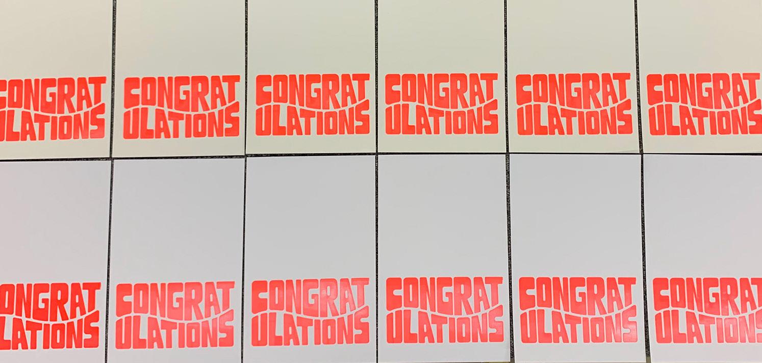
LETTERPRESS CARDS
I designed the graphic art for the photopolymer plate and hand-set the lead type pieces to create these congratulatory letterpressed cards.

To create the fun and funky lettering for the “Congratulations” on the front of the card, I used Adobe Illustrator. I started sketching the block letters that lined up with the wave shape. I then vectorized my sketch using basic rectanlge shapes that I edited with the pen tool. Each letter started out as a rectangle, and took their form using other shapes and the shape builder tool to subtract the negative (white) space. From this digital design, a photopolymer plate was created to be used on the letterpress with flourescent red-orange ink.
The inside of the card reads, “you did that thing!” It was created using traditional letterpress methods—hand-setting lead type pieces in a composing stick which was set in a form with furniture (wood blocks) to be printed on the letterpress.

49
26 DAYS OF TYPE
I designed each letter of the alphabet over the course of 26 days.

The 26 days of type challenge is an annual creative challenge that invites artists, designers, and creatives from around the world to experiment with typography and lettering. During the challenge, people are to create one letter per day to complete the entire alphabet.
I was challenged to create unique and original designs using a variety of styles and techniques. All of my letters were created using Adobe Illustrator. The challenge was a great opportunity for me to think creatively and experiment with new techniques in Illustrator.


TYPOGRAPHY View
26 Days of TYPE
all 26 letters at sarahbelledesign.com


53