5 minute read
Colours of the Year
Ultimate gray and illUminating
by: kArin MeLberg sChwier
Photos: PAntone CoLor institute
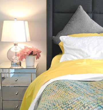
Pantone, the ‘global authority and provider of professional color language standards and digital solutions for the design community,’ has been choosing the “it” colour of the year that influences all manner of industries for over two decades. This year, for only the second time in its 22-year history, two colours are taking centre stage. The self-explanatory Ultimate Gray and Illuminating, a vibrant yellow, step forward as an expression of positive optimism grounded in stability.
Fortitude and Hope
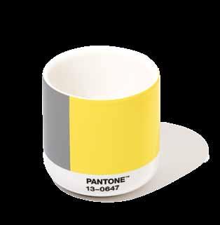
According to Pantone, its selections PANTONE 17-5104 Ultimate Gray and PANTONE 13-0647 Illuminating, were paired to create “a marriage of color conveying a message of strength and hopefulness that is both enduring and uplifting.” Rather than a “harmonious blend” like the only other duo Pantone has ever selected—the 2016 choice of Rose Quartz and Serenity—this year’s choice are independent shades that can make it on their own while complementing one another. It’s also a first in that Ultimate Gray is an achromatic shade (a colour without colour, if that makes it clear.)
In Saskatchewan where wheat and canola
is ubiquitous, people understand yellow. And as the sunniest province in the country with well over 300 sunshiny days each year, the choice of Illuminating makes sense.
But gray? As a Colour of the Year? Absolutely, says Leatrice Eiseman, Executive Director of the Pantone Color Institute. Lee has been called an international colour guru. She speaks annually with Saskatoon HOME from her office on Bainbridge Island near Seattle about what’s behind the Colour of the Year selection or, in this case, Colours.
One would think that living on the ‘Wet Coast’ on an island in the Puget Sound that can receive over 1,000 millimeters of precipitation a year, a colour expert’s least appealing hue would be gray. But not so.
“Practical and rock solid but at the same time warming and optimistic, this is a color combination that gives us resilience and hope,” Lee explains.
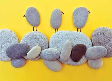
While gray can be associated with dreary days, gloom and sadness, it also offers a sense of stability, reminiscent of pebbles on the shoreline and weathered boulders in the landscape that can stand the test of time. Pairing that grit and fortitude with a sanguine sunshine yellow “encourages and uplifts us,” Lee

Building Design & Drafting services

CuStom Home/CAbin DeSign ADDitionS & RenovAtionS 3D LASeR SCAnning (AS-buiLtS) LigHt CommeRCiAL

www.cadvantagedesign.com Phone: (306) 373-3805
insists. “It’s essential to the human spirit.”
The pairing also suggests the importance of moving ahead together rather than merely as a sole entity.
“Although each of the selected colors can stand on their own,” Lee says, “it is the linkage of the hues that symbolizes the connection that must exist between each of us so we can move together to the future.”
A Splash of Colour is Big Business
The Colour of the Year selection process requires “thoughtful consideration and trend analysis,” Pantone explains to anxious audiences awaiting the news each year. To arrive at the selection, colour experts at the Pantone Color Institute comb the world looking for new colour influences. This can include the entertainment industry and films in production, traveling art collections and new artists, fashion, all areas of design, popular travel destinations, as well as new lifestyles and socio-economic conditions. Influences may also stem from new technologies, materials, and textures that affect colour, relevant social media platforms and even up-coming sporting events that capture worldwide attention.
The annual choice also drives product development and purchasing decisions in many industries, including fashion, home furnishings, décor and industrial design, as well as product packaging, graphic design and social media. As soon as the 2021 Colours of the Year were announced in late 2020, and even before the official vote was declared, these colours were already infiltrating various industries, marketing campaigns, interior design, décor and fashion.
emerging from 2020
The union of an enduring Ultimate Gray with the vibrant yellow Illuminating “expresses a message of positivity supported by fortitude,” says Lee. “We’ve come through an extraordinarily chaotic, frightening and worrisome year and we’re not out of the woods yet.” As people look


PAST CoLouRS oF THe YeAR
2020 2019 2018 2017 2016-1 2016-2 2015 2014 2013
PAnTOne®
19-4052 Classic Blue
PAnTOne®
16-1546 Living Coral
PAnTOne®
18-3838 Ultra Violet
PAnTOne®
15-0343 Greenery
PAnTOne®
13-1520 Rose Quartz
PAnTOne®
15-3919 Serenity
PAnTOne®
18-1438 Marsala
PAnTOne®
18-3224 Radiant Orchid
PAnTOne®
17-5641 Emerald


for ways to fortify themselves with energy, clarity and hope to overcome the continuing uncertainty, she adds, spirited and emboldening shades satisfy our quest for vitality.
“Although gray might seem a rather sober choice, this particular Ultimate Gray is a lighter, easier tone evoking more pleasant associations such as encountering pebbles or weathered driftwood on a much-needed beach walk,” she adds. “These are grounded tones that can bring thoughts of quiet, restoring experiences.” As 2020 becomes a memory, people want to believe their feet are firmly planted on solid ground as a turbulent year is left behind. Ultimate Gray is emblematic of dependability. “We can also look up and look ahead to a better year,” Lee adds. “Illuminating is a bright and cheerful yellow sparkling with vivacity, a warming yellow shade imbued with solar power.”
Karin Melberg Schwier

Whether it’s breathing new life into tired homes, or building your dream home from the ground up. Bella Vista’s experienced team does it all in record time, with minimum disruption, by strongly connecting with your vision.
NEW HOMES & INFILLS | CUSTOM KITCHENS | RENOVATIONS | 9 - 3342 MILLAR AVE, SASKATOON | 306-979-9944 | BUILDBELLAVISTA.COM


