4 minute read
Early Design Process


Getting Started
Right away I knew I would have to do action and horror for my chosen genres. They are easily two of the most popular movie genres and often times there are scenes that give a completely different feeling from action or horror, as movies can be completely horrific or action packed! Choosing the third one was a little tricky, as I have a love for animation and a distaste for their posters, but animation isn’t a genre, but an art-form. Romance and comedy came to mind, but I’m actually not the biggest fan of pure romance movies, and I have to be in a specific mood for comedy. So, naturally, I went with the genre I always lean towards: drama.
Advertisement
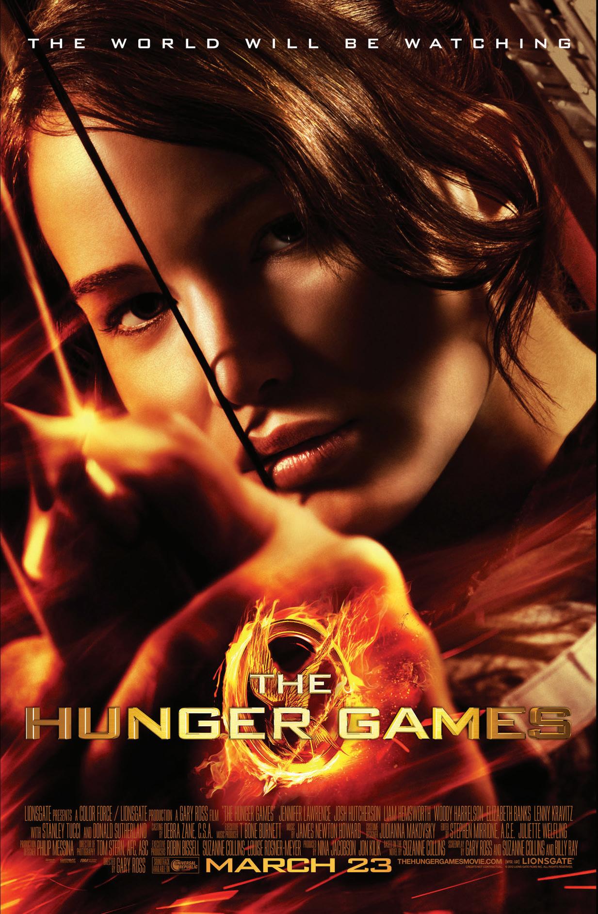
With my three genres finally narrowed down and research done, I had to choose my movies. I ended up choosing movies I was either familiar with or was open to doing a lot of research for. For action, I chose The Hunger Games from 2012. I’ve seen that movie too many times to count and I still enjoy it to this day, but its poster certainly speaks for the time of its release. I thought it would be incredibly fun to redesign the poster because of this! As for drama, I chose The King’s Speech. This is a movie my dad really enjoys and one he and I are able to connect to it to a certain degree. He has a form of stutter and I inherited it to a much lesser degree but it’s still there and, as someone with stage fright despite having a profession that requires me to talk in front of people to explain my work, the movie really touches us both in certain ways. That said, most of the posters for this movie–save one that I personally really enjoy–aren’t the best for the film, and they fail to capture the emotional heart that can be found in The King’s Speech. Finally, I decided to go with A Quiet Place for my horror movie poster redesign. I hadn’t seen the movie yet but I’ve heard nothing but good things about it, so I was surprised by the poster design. It’s not that it’s bad, but that I found myself not entirely enjoying it, so I thought this would be a fun challenge to take a movie I hadn’t seen until now and try to capture its best frights in its poster.
(The Hunger Games, 2012)
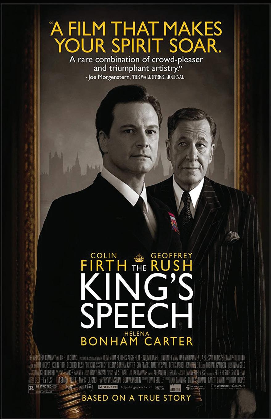
(The King’s Speech, 2011) (A Quiet Place, 2018)

With those movies lined up, it was time to start designing. I had to start by collecting screenshots from the movies in order to use them in my posters, but was immediately hit with everyone’s favorite barrier: copyright. I couldn’t actually take screenshots from streaming websites as they have measures in place to prevent this, which I understand but still, come on. At first, I found websites like movie-screencaps.com and ShotDeck (I would actually recommend this one, it’s pretty interesting!), but finding high resolution images was still proving difficult. Finally, I found a Google Chrome extension called FireShort Capture that overrides the measures put in place by streaming sites and I was back in business!
Early Design Process
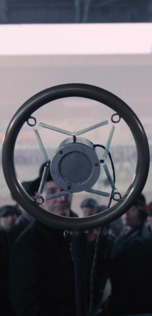
My first bout of screenshots were less than desirable to say the least. They came from a mix of screenshot websites, YouTube clips, and even me looking at GIFs frame by frame. Below are some examples of what I was trying to work with; many of the images are either low resolution, feature motion blur, or are simply too small work with comfortably. The first two belong to The Hunger Games, the next two to The King’s Speech, and the final on page 45 is from A Quiet Place.
And trust me, while these may look okay at this scale, they did not size up well in the end. This is due to two factors, the first being many of these screenshots are in the widescreen proportions seen on actual movie screens. Their width is very long while the height doesn’t match up, forcing me to scale more than I would’ve liked to on my computer screen. The second is the scale I originally wanted to work at, being half the size of a regular movie poster, so 13.5x20”.


Now, movie posters are huge. Like 27x40 inches kinda huge. So, at first I decided to work at half that scale because I was not going to print posters that big, my wallet was crying just thinking about it (hey imagine back in ye olde times when they did it by hand!). But 13.5x20 is still fairly big and sizing up images to fit this frame was still challenging. This, along with the fact that I was printing out about 12 posters in total for my final project, I decided to work at a 9x12” scale, which ended up working out in the long run even though scaling up my pictures was my biggest obstacle by far.


