The colour theme for this issue is inspired by the principles of Josef Albers, a renowned artist and educator widely regarded as one of the most influential art teachers of the 20th century in the United States. In his seminal work, ‘Interaction of Colour’, Albers delves into the concept of simultaneous contrast - a phenomenon where the interaction of colours alters or enhances their visual perception. The chosen colour combination for this issue not only reflects Albers' influence but also echoes the palettes found in numerous paintings in modern art, including works by artists like Mark Rothko and Robyn Denny.
CONTENTS
INTRODUCTION:
CONTRAST AND JUXTAPOSITION
Alistair Brierley
HEAD OF DESIGN RESEARCH UNIT
DESIGN PROCESS:
WORKING WITH CONTOURS - DESIGNING FOR STEEP TERRAIN
Claire Devanney
ARCHITECT
WITH PERSPECTIVE PIECE:
Alistair Brierley
HEAD OF DESIGN RESEARCH UNIT
DETAIL:
CONTRASTING LANDSCAPES - A REFLECTION OF STRUCTURAL JUXTAPOSITION
Massimiliano Martinenghi
PROJECT DIRECTOR
PURE RESEARCH:
UNVEILING THE HIDDEN IDENTITIES OF KING’S CROSS THROUGH DISRUPTION
Dominica Piatek
PART II ARCHITECTURAL ASSISTANT
DESIGN PROCESS:
THE ISLAND - LEARNING THROUGH CONTRAST AND JUXTAPOSITION
Helen Taylor
DIRECTOR OF PRACTICE
RETROSPECTIVE:
HAS COLOUR GONE OUT OF FASHION?
Laurence Orsini
PROJECT DIRECTOR
BUILDING STUDY:
ADELAIDE HOUSE - A STORY OF FIRE, WATER, EARTH, AIR AND METAL
The juxtaposing of two or more things, places, or people offers the potential for dialogue, exchange and reciprocation, something dynamic and potentially meaningful, a relationship. Contrasts may be extreme or subtle, and there are degrees of variation within this spectrum.
By its very nature a site, a place, a series of global coordinates will have a unique identity and character based on multiple variables. Whether embedded within a tight urban framework, or placed in relative isolation in terms of adjacent developments there will always be a juxtaposition, but not necessarily a contrast.
Here, Head of Design Research Unit Alistair Brierley introduces the articles within this latest edition of iA, each shining a different light on contrast and juxtaposition; two of the central components of any architectural or masterplanning proposition.
The simplistic but often irrefutable truth that ‘opposites attract’ is well known and highlights the dynamism that can be brought about through both contrast and juxtaposition. Considering one without the other can only take us so far but is a useful starting point. When looking at a city or a neighbourhood, within that place there will always be a complex and intense visual conversation in play, where light and shade, high and low, wide, and narrow, ornate, and simple are on show. All these selected variables offer an infinitely diverse and interconnected web of relationships that blend, coalesce, and exist through their own relationships with associated neighbours.
The antithesis of this multilayered and complex system of components, (as seen in the denser more central areas of
typical towns and cities) can be found on the periphery of such settlements and conurbations. The growth of the suburb, and the development of the low-density housing model that took off with innovation in transport systems, from trains in the nineteenth century, through to the motor car in the middle of the twentieth century brought with them a form of bland monoculture. A thin veneer of personality shaped by regular plot sizes and grids of service roads and parking lots was the primary offer. The introduction of integrated social facilities such as schools, retail outlets and leisure activities helped to reinforce the town planning model or strategy that had developed and allowed families and citizens to identify and associate themselves with a
particular place and time. Metrolandi, as described by John Betjeman, is an early example of this typology.
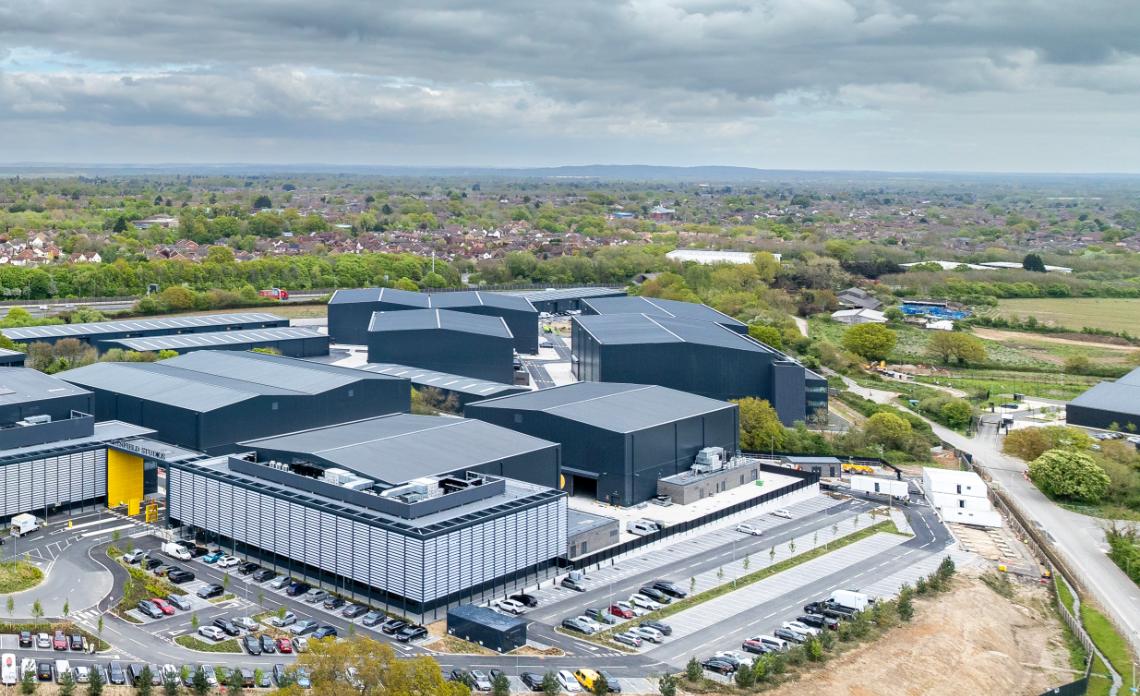
The suburb is seen as a direct contrast to the urban centre or fulcrum of a city, and the relationship and hierarchy between the two is clear. Two consciously different environments, the latter often involving the rapid imposition of a planning strategy for a growing settlement. Beyond suburbia, and on the edges of conurbations we find ourselves developing and designing typologies that are deemed appropriate in terms of scale, density, and operational specialisms. The film studios that Scott Brownrigg have recently completed at Shinfield are referenced in this edition and are considered to have occupied what is described by Dagmar Binsted as ‘liminal’
space; - a ‘location or destination between places, and without a strong urban identity of its own.’ Largely introverted big boxes set within a ‘lot’ or campus, the arrangement and positioning of these super-sheds are carefully considered to allow the significant logistical complexities of film making to flourish.
In a physical sense these linking or transitional spaces can occupy positions on either one side or both sides of a boundary. The word derives from the Latin vocabulary ‘limen’ which means threshold. The fascination with these places, or states of mind can occupy time and space referencing and connecting the past the present and the ABOVE
future both physically, emotionally, and metaphorically. The association with transition means that such locations may be unsettling for some as there may be a sense of disorientation and a loss of a sense of place owing to a lack of clear boundaries. The author compares how three different projects have reacted to a diverse set of circumstances and contexts.
Offering a change of physical context, the tensions of the immediate and abrupt physical adjacencies as described in the article by Rachel Hain about the reimagining of Adelaide House in the City of London may not be as apparent as at Shinfield Studios. Described by some as an early ‘skyscraper’ set on the north side of London Bridge, the design of Adelaide House needed to responsibly address both context and juxtaposition simultaneously. Positioned directly on the water, flanking the eastern boundary of the bridge, the heavily modelled and interlocking vertical and horizontal rhythms of the facades emphasise the notion of threshold and progression up and down river. Although ‘neo-classical’ in nature, the architecture risks, and benefits from, dynamic asymmetries on the southern elevation overlooking the water, and it is this inherently modern and abstracted slippage of the stone piers and heavy cornices that demonstrate an intense and
meaningful interpretation of the rules of the classical genre. These compositional devices have offered an architecture that moves beyond pastiche by juxtaposing contrasting geometries at very particular moments within the proportions and elements of the façade.
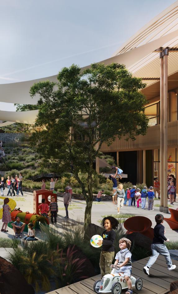
In contrast to both Shinfield and Adelaide House, the piece on The Island School in Limassol highlights a rich and complex set of contrasts and juxtapositions. The broad and wide-ranging education that is on offer at this ‘through school’ (five to eighteen age group) meant that the team had to unlock the three-dimensional puzzle of multiple age groups and pedagogies in proximity on one site. Helen Taylor explains the organisational equation that had to be incorporated into the extraordinary steep and rocky Cypriot mountain side site that the school will occupy. The potential for both positive juxtaposition and problematic contradictions was in evidence from inception, and strong and clear attitudes to the terrain, and the organisation of the buildings on it, needed to be investigated and solved through multiple design iterations.
It was important for the design team that the school campus offered a place of variety and contrast, where discernible places, spaces and destinations were both legible and available to all staff and pupils. Light and shade,
high and low, soft, and hard, and open and closed were all used as complementary design attitudes to offer a lively and dynamic learning environment overlaid with a coherent design language and architectural expression. The biggest physical contrast that needed to be managed through the design process was the control of strong sunshine, and therefore places of both light and shade. The complexity of the multilayering of this school was embraced by the overriding need for diversity and inclusion, as well as the energetic and interactive lessons undertaken by teachers and pupils alike. The design ethos acknowledged the mountain as the dominant presence with this site, and it was the considered relationship or juxtaposition of buildings in relationship to landscape that provided the road map for a coherent narrative from concept through to detailed spatial design.
Whilst The Island School is the principal component of a wider masterplan designed by Scott Brownrigg, the brief also comprises a variety of neighbourhoods and civic
spaces. Claire Devanney describes the processes and strategies adopted here when designing a range of residential typologies on an undulating and steeply sloping escarpment. The positioning and morphology of the central village square, where the educational offer faces outwards to interface with the wider public realm is also addressed. The complexities and challenges of working within this environment are described and explained with the objective of balancing and minimising cut and fill central to the design thesis.
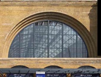
Transitioning back into a more civic and northern European context, the article by Domenica Piatek set within the context of Kings Cross St Pancras in central London provides one of the most potent, evocative, and historic relationships seen in civic terms. The fascination here is the architectural dialogue between the two railway stations, and particularly their polarised architectural expression. From a functional point of view both operate as railway termini, providing points of departure and arrival into the city. The
ebullience of the strong gothic spires and pointed arches of the St Pancras hotel entirely mask the functionality of the gigantic arched railway shed to the rear, whilst the clearly expressed double arches of the Kings Cross station frontage clearly represent the dual vaults of the engine sheds that abut this double portico. This is clear honest and entirely logical, demonstrating form and function in harness. The approaching passenger can understand the workings of the station from outside.
The extreme stylistic gradient between these two behemoths is entirely positive, and their inherent differences reinforce their individual personalities. The hinterland behind the gigantic engine sheds brings an entirely different juxtaposition into view with the linked double arches of Kings Cross and the singular span of St Pancras. A complementary duality is in play here and reinforces the argument that there is a place for strong contrasts in adjacent buildings within their wider setting. Domenica’s installation that is described in her piece demonstrate a multi
layered understanding of this dynamic location and is described through the themes of rhythm, form, and flow. Although less obviously dramatic, another example of contrast and juxtaposition is explained by Massimiliano Martinenghi in his discussion on the development of a second terminal at Medina airport. The original building, designed by Scott Brownrigg in 2012, references the palm tree as the sacred and symbolic icon for pilgrims arriving and departing the terminal. The structural supports were envisaged to resemble and represent a grove of palm trees, with the individual trunks and fronds synthesised and assembled to offer an elegant yet abstracted representation of the place where the prophet was visited. All members of the individual palms were structurally integrated and loadbearing and captured an emotional response to this stage of a significant and resonant journey for pilgrims on Hajj. Now an adjacent domestic terminal is underway and the design attitude to the relationship between the two structures has been carefully developed. Intrinsically the representations of the palm in each terminal are different in terms of precise aesthetics, and the structural transfer of loading. The narrative in the piece explains how the latest version of the palm tree was developed, and why it was important that a variant and not a facsimile of the original version was implemented.
Turning another page on the contrast and juxtaposition discussion, Laurence Orsini addresses colour, and how its tonal variations have informed design narratives and the resultant atmospheres and coding of surfaces within the built environment. The concern expressed here is that much of what is offered by way of a colour palette has become restricted, bland, and ubiquitous. Such homogeneity can bring relative monotony and a lack of contrast. Where appropriate and handled skilfully, such atonality can offer a visual and calm pause in a noisy visual collage but the risks and rewards of bold experimentation with colour should not be forgotten.
The simplistic but often irrefutable truth that ‘opposites attract’ is well known and highlights the dynamism that can be brought about through both contrast and juxtaposition.
This edition of iA created the opportunity for us to examine, disseminate and compare how our architectural processes and attitudes adapt and respond to context, alongside the juxtapositions that a variety of settings will bring forward in terms of design development. Context provides friction and traction for a design team, and solutions are seldom ubiquitous; rather tailor made, refined and considered to respond to what will be a unique set of physical, cultural, and sociological relationships. The juxtaposition and order of the individual articles may or may not be of significance depending on which order they are read in. The choice is yours �
i Metro-Land (1973 film) | Wikipedia | (https://en.wikipedia.org/wiki/ Metro-Land_(1973_film))
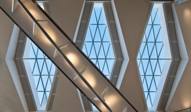
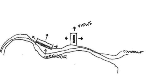
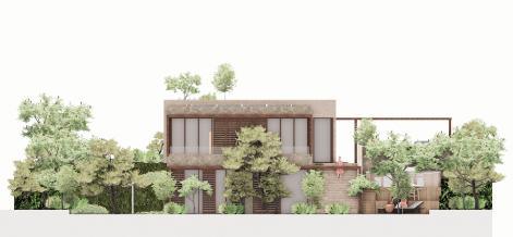
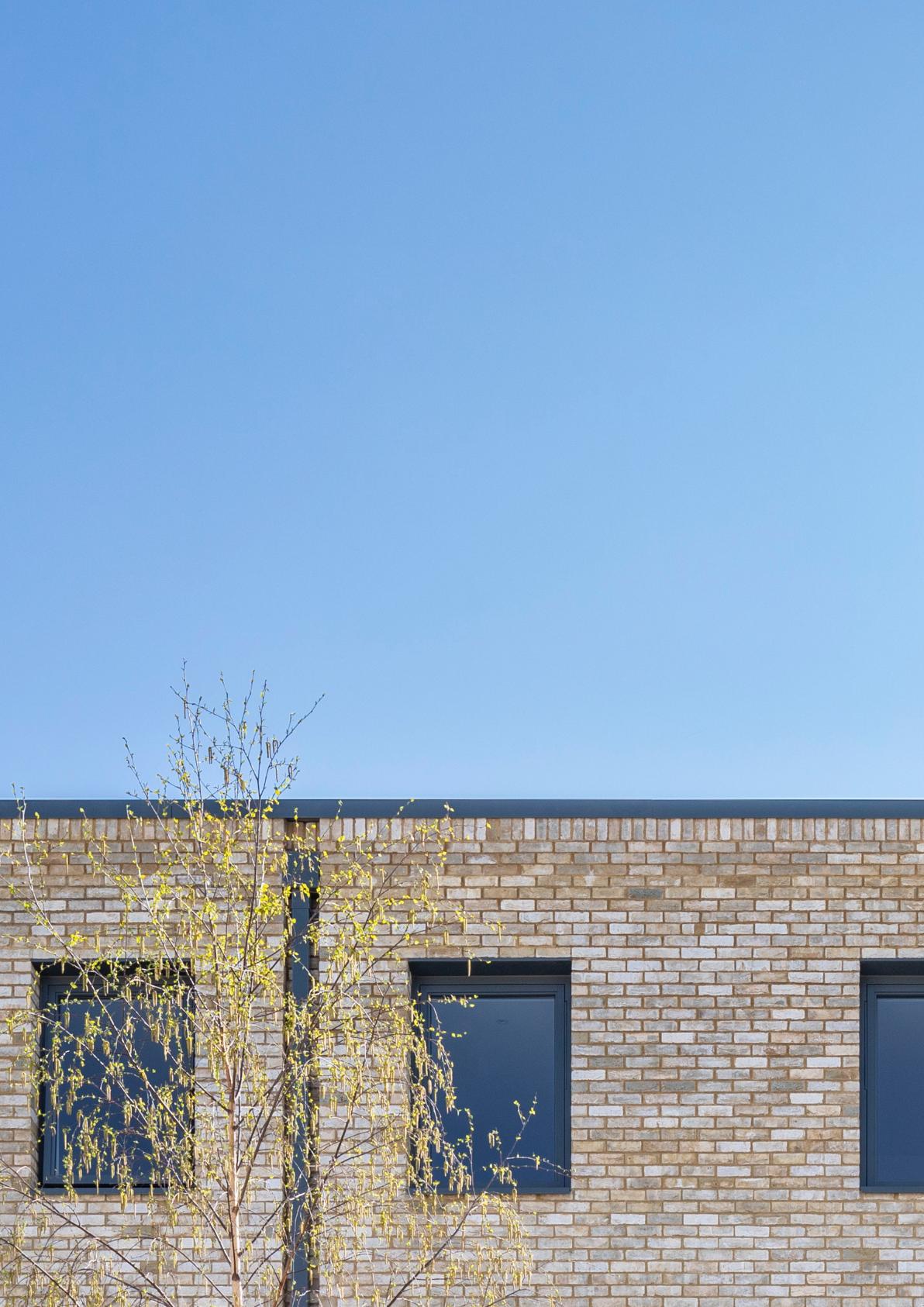
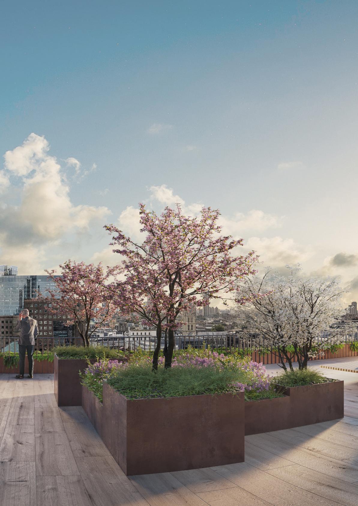
Working with contours - designing for steep terrain
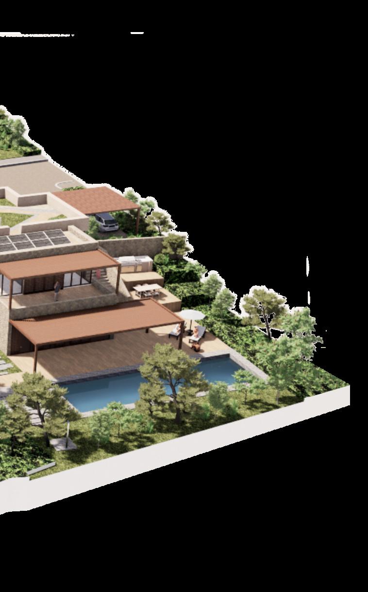
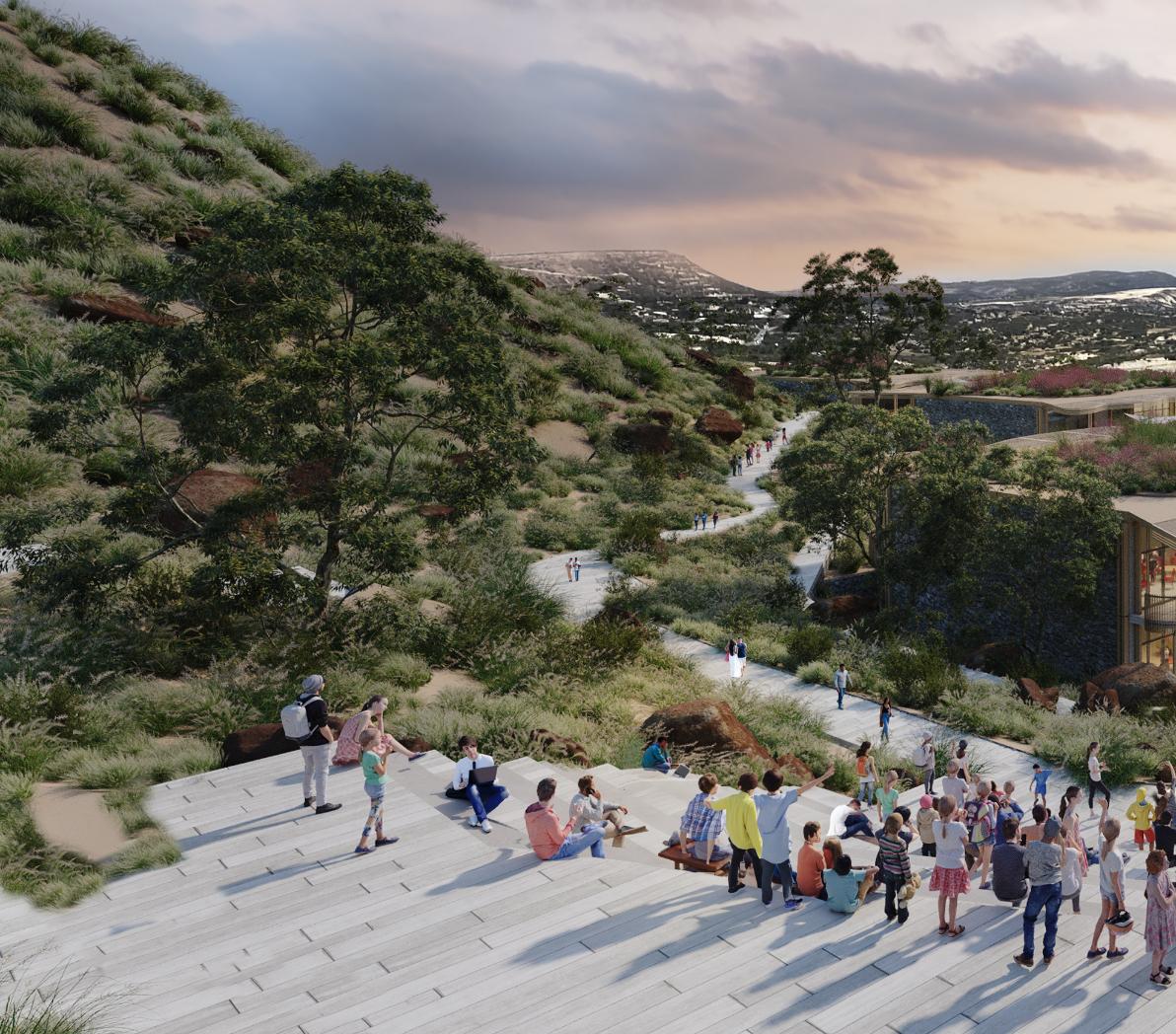
How does one navigate the complexities that contours present when designing on steep terrain? Using The Island Masterplan as an example, Architect Claire Devanney describes the key principles used to overcome the challenges of creating a new community and destination on a steep site in Cyprus.
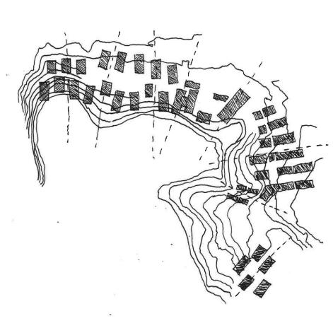
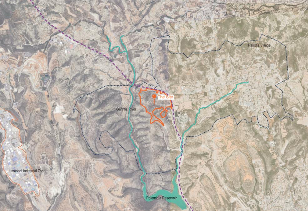
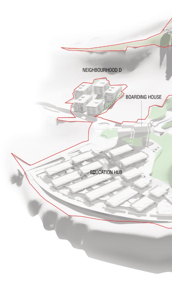
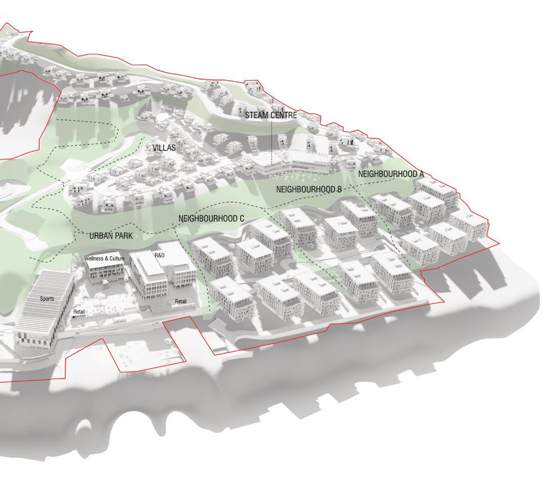
The Island Masterplan introduces a new private school with associated boarding houses, residential neighbourhoods, and a research and development hub to a 33-hectare site in Palodia Village in Limassol, Cyprus. The steeply sloping hillsides of the site offer incredible views towards the surrounding mountains and valleys and have informed the overarching masterplanning principles. The relationship between buildings, landscape and contour lines has evolved throughout the design process. One of the core design principles has been the creation of buildings that lightly touch the ground by stepping down the site on shifted planes, perpendicular to the contours.
THE SLOPING SITE
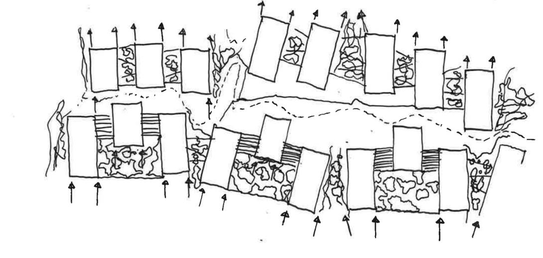
The main challenge of this rural site is immediately presented by the complex sloping terrain which varies in steepness. A digital ‘grasshopper’ script was used to determine the steepest areas of the site, and areas with a shallower gradient. With upwards of 100m vertical gain across the site, the contrast between red and green areas highlights the variation in gradient of the hillside terrain. Carefully chosen section cuts (drawn perpendicular to the direction of the contour lines) indicate that the gradient of the slope is 29 degrees at the steepest location.
Through this analysis, the team were able to determine the most viable places to build. The ambition for the proposals was to maintain the natural topography where possible, and to minimise the amount of cut and fill required; - an earthmoving technique used to provide level access on steep slopes. Buildings within the masterplan are therefore primarily located in areas with a shallower gradient, whilst landscaped zones are created in areas with steeper gradients. The landscaping and steeply sloping existing terrain is used to define public and private zones and extends and flows between buildings to establish strong connections between sequential indoor and outdoor spaces.
A comparative study was undertaken for the potential urban grain by overlaying plans of existing successful examples of established European piazzas onto the site. This highlighted the contrasts in scale and informed initial urban design explorations.
DESIGNING PERPENDICULAR TO THE CONTOURS
Designing perpendicular to the contours maximises the amount of building façade that can be exposed on a steep site. As the downward slope on the site is north facing, orientating residential blocks perpendicular to the contours creates the optimum plan form for east-to-west facing apartments whilst increasing the opportunity for natural light and ventilation, and improves efficiency in terms of minimising ‘cut and fill’.
In all the locations with steep terrain, residential apartments and villas, the school, and boarding houses were designed to step down the hill. The buildings were orientated to follow individual axes running perpendicular to the contours on the steeper ground. These axes form a radial grid that spans around the northern sector of the site, towards the foot of the local escarpment. Buildings that follow the same axis are grouped together to form a neighbourhood, each with a unique character reflected in the façade strategy, materiality and landscaping. The juxtaposition of variable and contrasting materiality between neighbourhoods highlights their individual identity and enhances a sense of ‘place’ for residents.
The ‘push and pull’ of building boundaries helps to define the edges of the interstitial landscaped spaces. Within each residential neighbourhood, buildings sit parallel to each other with subtle shifts in positioning to minimise overlooking and enclose courtyards. The courtyards are further defined by the edges of terraced steps offering private and shaded spaces for residents. These adjacencies result in divergence and convergence of individual buildings within neighbourhoods, where the existing landscape is
allowed cascade and flow between the buildings, juxtaposing the parallel terraced courtyards.
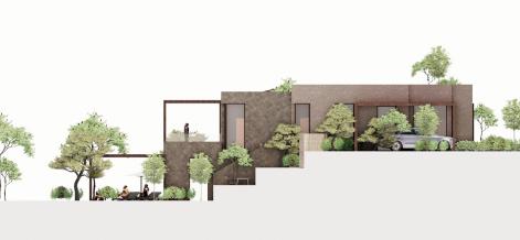
Buildings are positioned at the optimum level on site to minimise impact on the existing landscape, whilst maintaining level access. In response to the sloping terrain, floor levels step down the hill on a sequence of shifted planes, allowing the roof of the offset level below to be used as a terrace. The stair cores are located at specific points on the floor plan serving each of the shifted floor planes. The section highlights the necessary contrast between the straight floor plane lines, and the organic naturalistic contours of the adjacent slope.
In the urban park (and some of the residential neighbourhoods), the basement levels sits below the urban piazza and the central landscaped spine that runs between the buildings. This important space is accessed at ground level from the lower part of the site at the foot of the hill and contains the parking facilities and services.
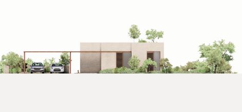
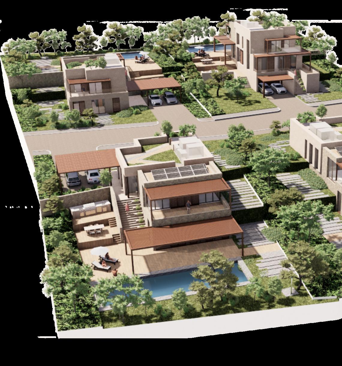
UPHILL AND DOWNHILL VILLAS
Villas are located at the highest levels of the site for privacy, and then cascade down the contours. Each dwelling sits on an individual plot and is positioned with the longer axis spanning the slope to maximise the potential for a shift in the stepped floor planes, and to optimise the opportunity for natural lighting, heating and cooling. This strategy, together with the offset between villas, preserves long unobstructed views for the villas behind.
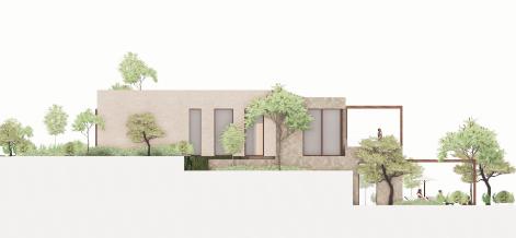
'Uphill' and 'downhill' villa typologies follow the principle of stepped levels to conform to the direction of the slope of the terrain. Inside, staircases are positioned deep into the floor plan on the entrance level to allow for the required uphill or downhill step. The extent of the offset of each level can be adapted further to respond to individual plot topography.
Living, dining and kitchen spaces are located where the building meets the terrain, allowing these spaces to open out towards the garden and pool areas. In downhill villas, the entrance is located on the upper floor alongside bedrooms. The layout has been carefully designed to provide the required level of separation between private and public spaces. In the smaller ‘uphill’ villas, the floorplan is
reversed with the main entrance and bedrooms located on the ground floor with living spaces above.
The villas are made of locally available materials including stone, mud-brick and timber, and are in many cases partially built into the earth. This earth-sheltered design maximises use of the natural insulating properties of the soil, and further increases the protective thermal mass. Gardens are positioned to maximise the optimum aspect and sun path whilst terraced to respond to the sloping topography defined by different zones within the contoured sequence, helping to prevent soil erosion by reducing rainwater runoff. The material palette, landscaping and partial embedding of villas into the ground, allows for the buildings to blend harmoniously with their surroundings.
The design uses the natural gradients of the slope to partially embed buildings to integrate and blend with their surroundings. “
CONCLUSION
Although a site with steep terrain presents challenges, The Island utilises the constraint of the slope to create partially embedded buildings that integrate with their surroundings. Designing buildings that sit perpendicular to the contours, with shifted floor planes that step down the slope is a common theme for many of the building typologies within the masterplan. This design principle reduces the requirement for cut and fill whilst offering a greater connection between outdoor and indoor spaces. Throughout the masterplan, movement up or down the hill is supported by shifted floor plans within buildings. The careful positioning and shifting of building footprints maximises long unobstructed views of the hillside site, whilst enclosing landscaped zones that respond to their adjacent buildings.
A key design principle is utilising orientation along contrasting axes to define each neighbourhood. At the
moments of divergence and convergence between separate neighbourhoods, a juxtaposition is created where the natural landscape spills through, in contrast to terraced neighbourhood courtyards. In addition to orientation, contrasting façade materiality strategies are used to further define individual neighbourhoods, with varied material colour palettes that reference the earthy tones of the site. The uphill and downhill villas names directly reference the strategy used in response to their contrasting plot slope directions.
As a result, The Island masterplan design process has unveiled a series of masterplanning principles that could be adopted and applied to the future development of sites located on steep terrain
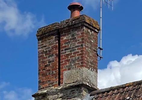
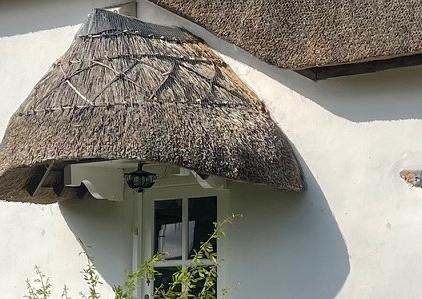
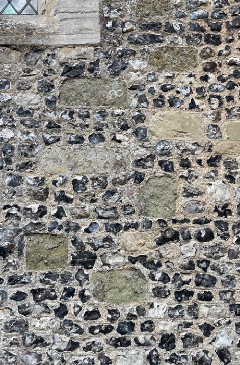
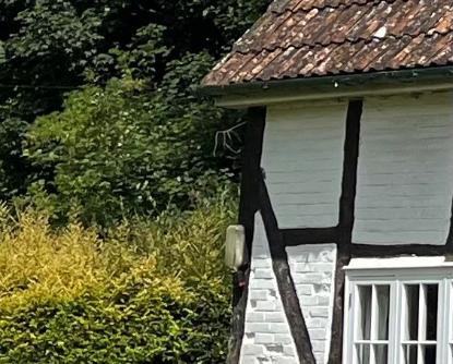
The assembly and characteristics of a local vernacular architecture is founded on a range of specific variables and site specific factors that inform and provide the material palette for construction.
Illustrated here, the abstracted collage of historic domestic architecture (in a rural setting) is striking as demonstrated in the multitude of materials in play, and their specific relationships with each other.
Brick and flint, linear timber weatherboarding, lime mortar panels subdivided by dark timber struts, and red brick for chimney stacks and other parts of the montage codify and express the functionality of the built enclosure.
It is the complex and sophisticated sequence of contrasts and juxtapositions here that are both intriguing and endearing, and speak of the accretion of time as a building has evolved, as well as the use of locally available materials arranged in a picturesque relationship to each other.
The open question here is would we design like this knowingly when addressing a new build in a similar context or is the varied tactility of a complex palette such as this dependent on the passing of time? �
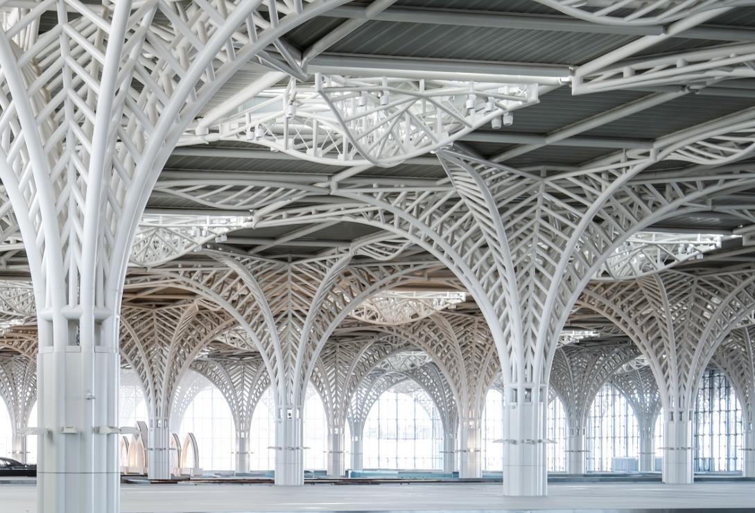
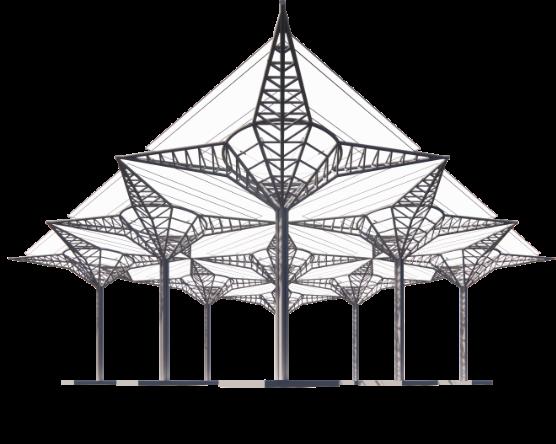
Contrasting Landscapes: A reflection of structural juxtaposition
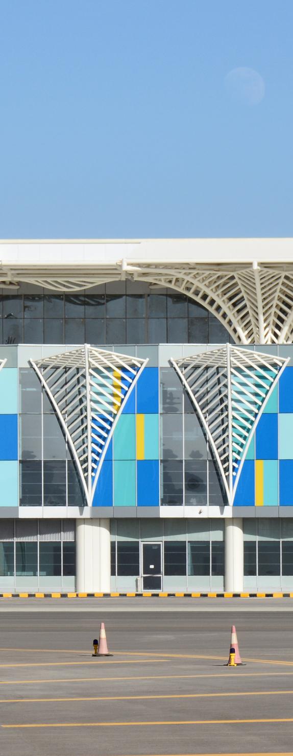
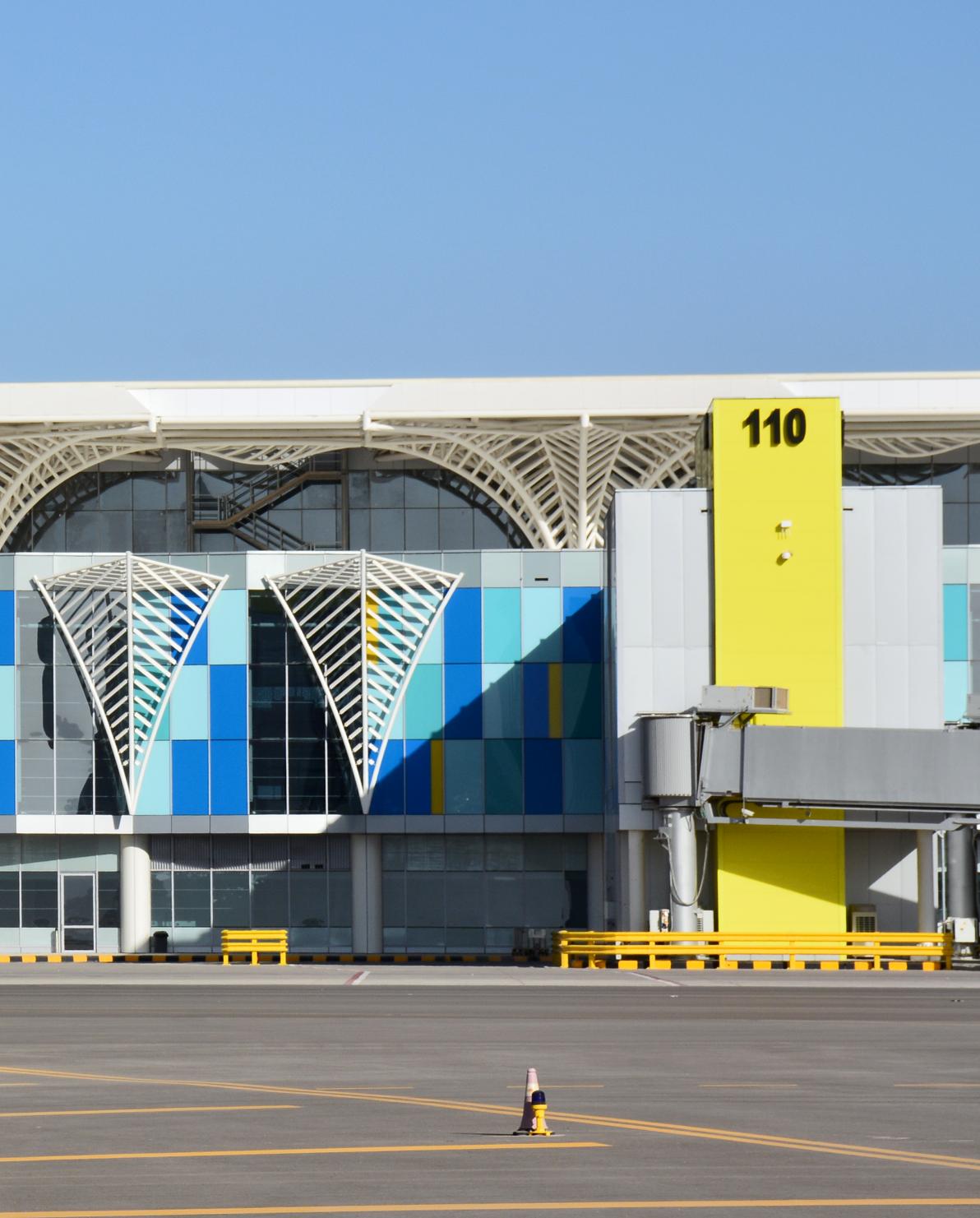
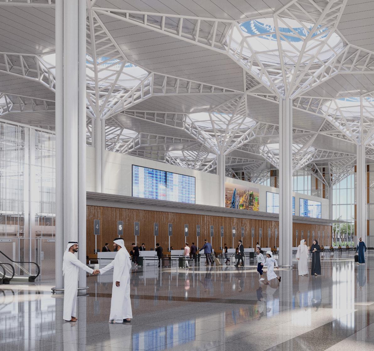
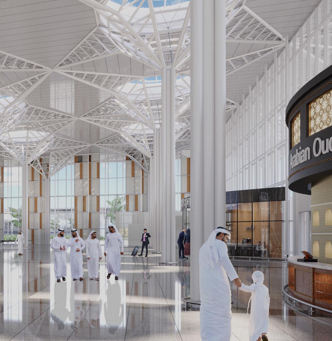
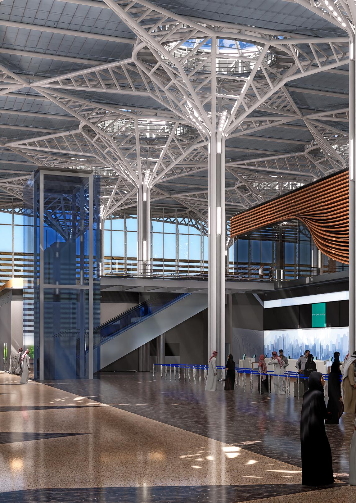
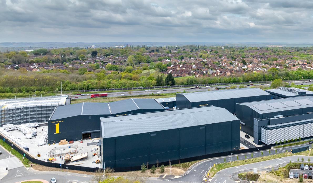
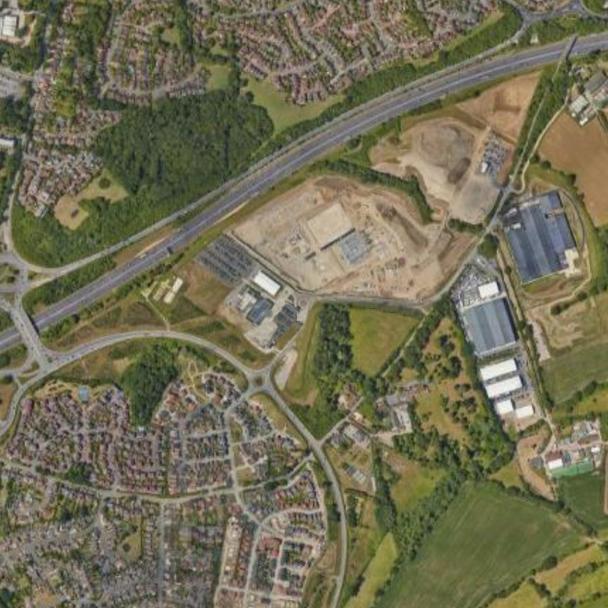
Designs for the expansion of Prince Mohammad Bin Abdulaziz International Airport (Madinah Airport), and in particular the new Terminal 2, feature distinctive modular steel palm tree shaped columns that symbolise peace and prosperity, echoing the architectural identity of the existing Terminal. Here, Project Director Massimiliano Martinenghi compares the structural steel frame of Terminal 1 with the proposed Terminal 2 building, a key element of the design which has evolved to provide a more efficient solution.
Scott Brownrigg’s designs for the expansion of Prince Mohammad Bin Abdulaziz International Airport (Madinah Airport) will enhance the passenger experience and accommodate an increase of up to 17 million passengers per year by 2028, in line with Saudi Arabia’s Vision 2030 to attract more international visitors to the Kingdom.
The existing Terminal 1 building, designed and delivered by Scott Brownrigg in 2014, will be converted into a dedicated international airport with a newly renovated terminal to cater for Hajj and Umrah charter flights. The airport’s domestic operation will be relocated to a new 40,000 sqm terminal, connected to Terminal 1 via a new pier.
The overarching design philosophy integrates the key principles of Islamic art and architecture, emphasising geometric patterns, light, and space, thus encapsulating both prevailing aesthetic and spiritual dimensions of the region. Distinctive modular steel palm tree columns are a key element of the original design which have evolved to provide a more modern and efficient solution for the expansion. The two terminals highlight an architectural evolution from rich cultural symbolism to sleek modern design, both creating two cohesive yet distinct airport environments.
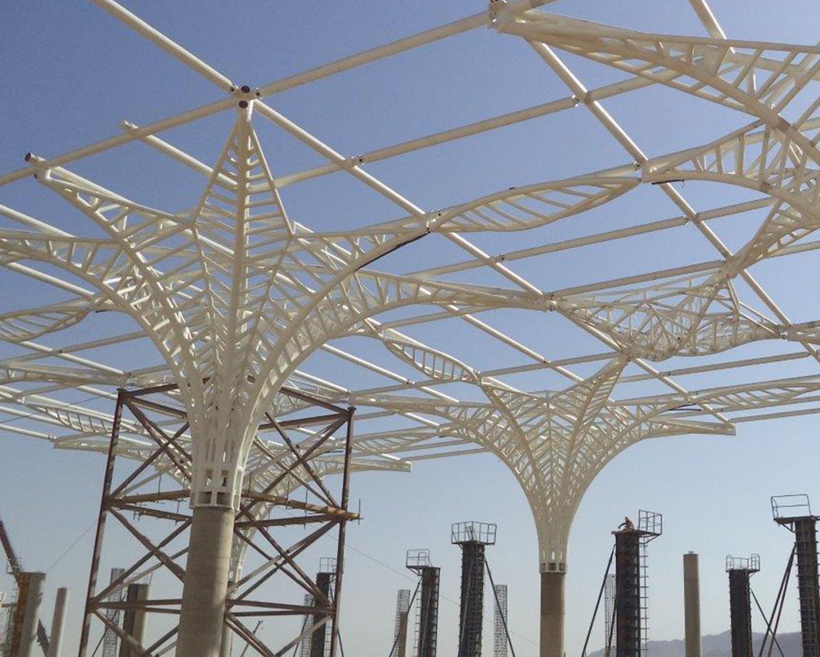
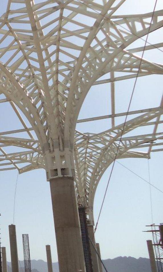
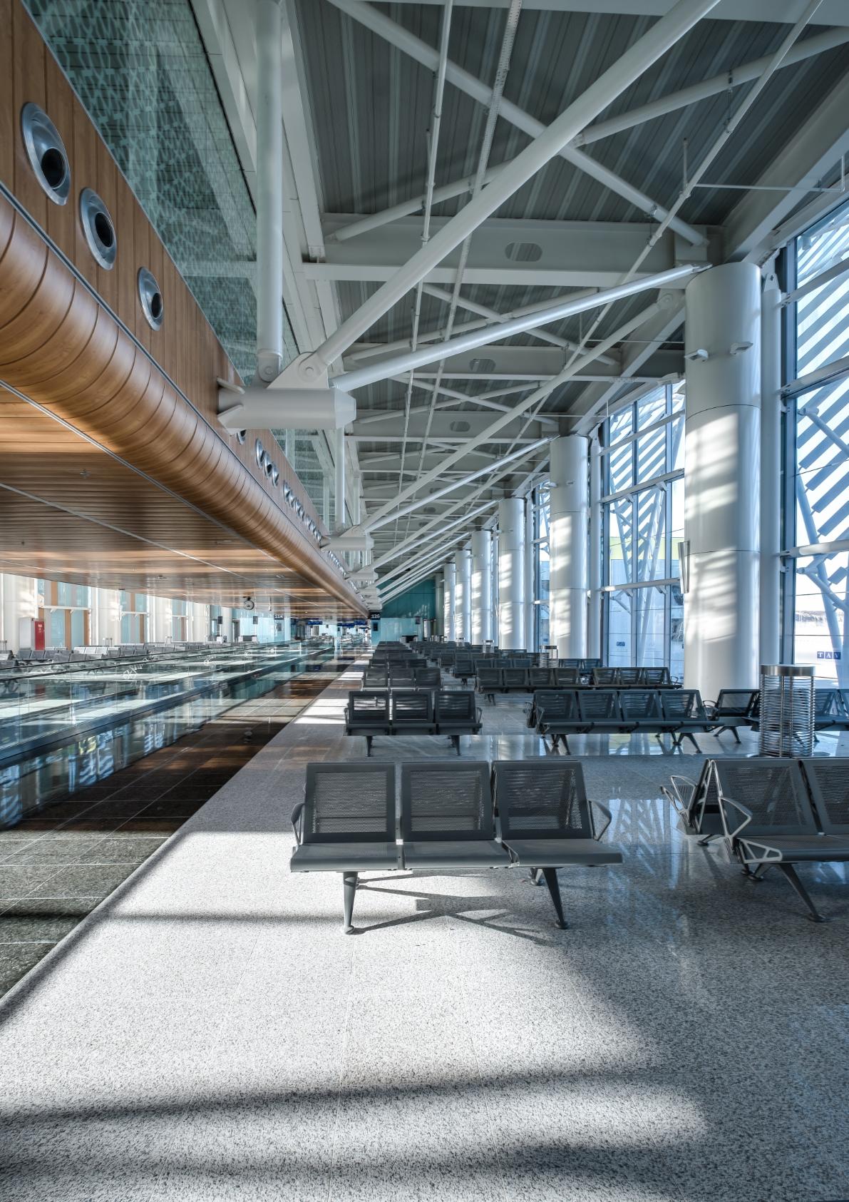
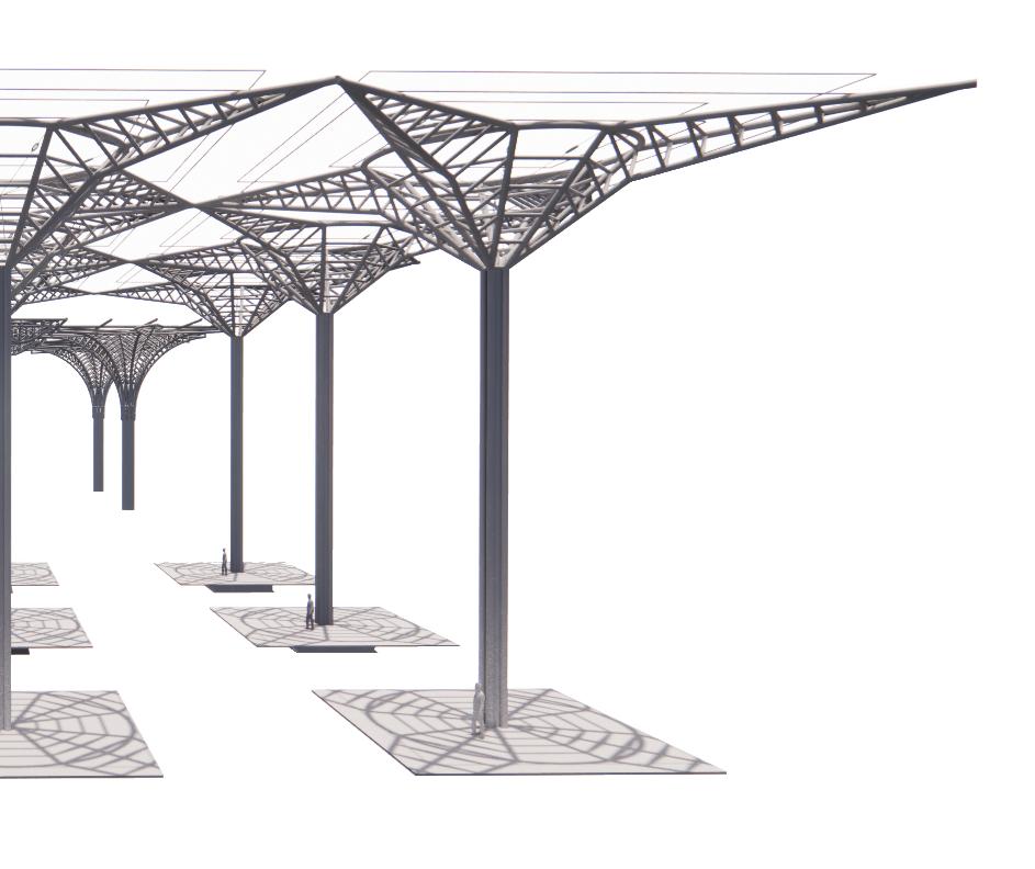
The original design of Madinah Airport Terminal 1 draws inspiration from the palm tree, with a structural expression that mimics the geometry of this natural form. The interpretation of the palm frond provides a pragmatic and efficient structural steel support, while reducing the amount of material required for the build.
A robust steel framework spanning 27 meters between steel palm columns facilitates a spacious and open-plan layout with a clear height of 18 meters in the main departure and arrivals hall. This macro grid allows for increased capacity and smooth passenger flows, whilst enhancing the sense of openness and wayfinding transparency within the terminal.
The palm structure creates a visually striking and culturally resonant architectural feature, enhancing the overall aesthetic of the terminal. The design highlights shared characteristics between structural and aesthetic elements, particularly those seen in Arabic architecture, although there are gothic reminiscences reflected in this multilayered and complex design. The terminal's structural
iconography is simultaneously bold and prominent, commanding attention with its substantial presence. It conveys a clear sense of hovering mass and volume, exuding an unmovable, static, and dominant spatial character.
Latticed patterns created by the steel frame not only provide structural integrity, but also enhance the terminal's beauty by allowing natural light to filter through, creating dynamic light and shadow play throughout the building’s interior.
The architectural proposition offers a surrounding enclosure, allowing travellers to feel embraced and protected by the terminal's simple but well-proportioned volumetrics. This imposing architectural language is designed to be visually striking and robust, reinforcing its importance, permanence and symbolic resonance for pilgrims.
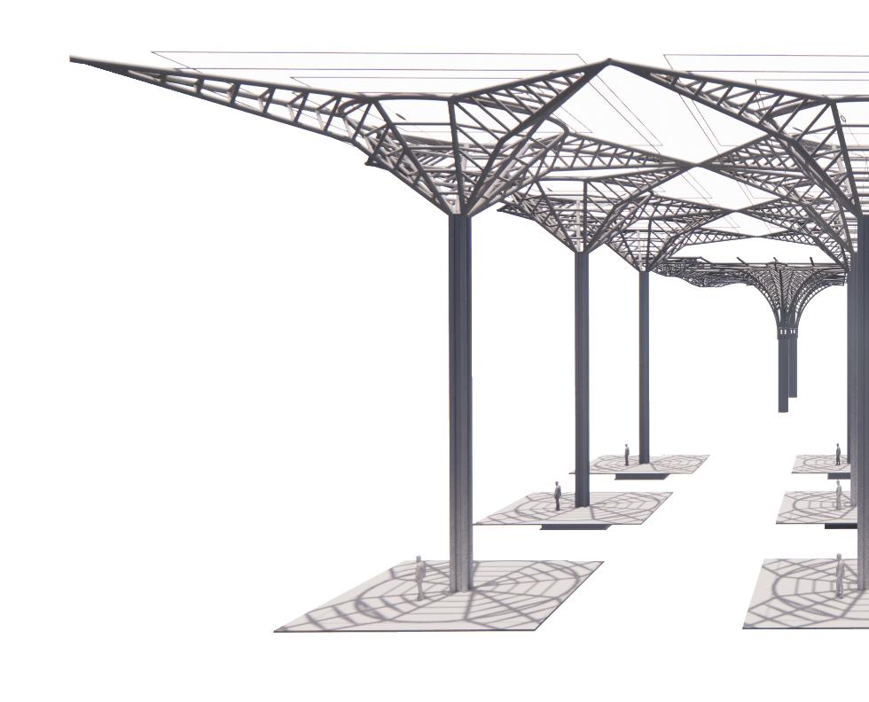
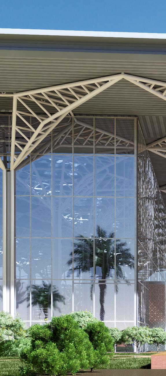
The design behind Terminal 2, a key component of the airport’s expansion project, focuses on efficiency and modernity. The structural steel system evokes the geometric aesthetics of Terminal 1, with straightened elements and reduced column spans to facilitate a more straightforward and rapid construction process, and a more materially efficient solution.
The decision to eliminate curved structural elements streamlined the assembly process, reducing both construction costs and timelines, whilst maintaining the
architectural integrity and visual coherence with Terminal 1. It also enabled the continuous operation of Terminal 1 with minimal disruption throughout the construction and expansion process.
Unlike Terminal 1, Terminal 2 features an 18-meter span supported by slender steel columns. The differences can be identified in the terminal size and capacity. While Terminal 1 will serve up to 14MPPA, Terminal 2 has been designed to serve 4MPPA of domestic passengers in the initial phase with expansion potential similar to that of Terminal 1.
The modern design of Terminal 2 not only achieves a sleek and efficient appearance, it also enhances the overall structural efficiency. By utilising straight elements and reducing the span between columns, the space is both functional and aesthetically pleasing, with a clear emphasis on modernity and simplicity. The use of minimal material underscores a commitment to sustainability whilst ensuring that Terminal 2 is economically viable.
The palm tree structures in Terminal 1 function as independent elements, built upside-down before being rotated on site for assembly. The structural design for Terminal T1 utilises welded systems, known for their rigidity and ability to provide strong and stable connections capable of bearing higher tensile loads without significant deformation. A strong column supporting a steel roof acts as a solid, unyielding element, effectively distributing loads throughout the structure.
In contrast, the structure of Terminal 2 operates as a cohesive whole where both loads and forces are shared, and tensions are evenly distributed. All structural elements are fully connected, illustrating a collaborative engineering approach that ensures stability and strength through unity. Use of bolted connections offers greater flexibility, allowing for movement and adjustment under tensile loads. The ability of hinged and bolted connections to pivot and move enables them to dissipate energy more effectively. Hinged systems can absorb and redistribute forces across the structure, minimising the impact on any single point, and increasing the overall durability of the structure.
While Terminal 1 expresses structural independence, Terminal 2 expresses structural co-dependency. The use of welded and bolted connection demonstrates a balance between structural rigidity and flexibility, ensuring durability and adaptability.
DESIGN AND CONSTRUCTION: Welded joints: Provides strong, load path.
Curved elements: Allows for solution. Requires precise
STRENGTH AND STABILITY: Rigidity: Welded connections withstanding heavy loads and
Durability: Welded structures dynamic loads.
FOUNDATION AND SUPPORT: Strong Foundation: Needs base to support the rigid structure.
Load Transfer: Effective in connections to the foundation.
strong, rigid connections creating a continuous for a more complex and aesthetically pleasing fabrication techniques.
connections create a stiff structure capable of and resisting bending and shear forces. structures are generally more durable under heavy and
Needs a robust foundation like a concrete column structure.
transferring loads directly through the welded foundation.
2
DESIGN AND CONSTRUCTION: Bolted Connections: Provide strong load transfer and movement / flexibility where required.
Straight Elements: Simpler linear design, easier to fabricate and assemble on-site.
Flexibility: Allows for slight rotations and movements, accommodating dynamic loads like wind and minor seismic activity.
Strength: Needs rigidity for diaphragm action to counter act bending stresses.
Load Distribution: Requires careful design to ensure loads are effectively distributed from the roof trusses to the foundation.
Foundation: Require control against lateral deflections otherwise simpler solution. 18,000 24,000
SINGLE ELEMENT VS A SERIES. THE ONE VS THE COLLECTIVE
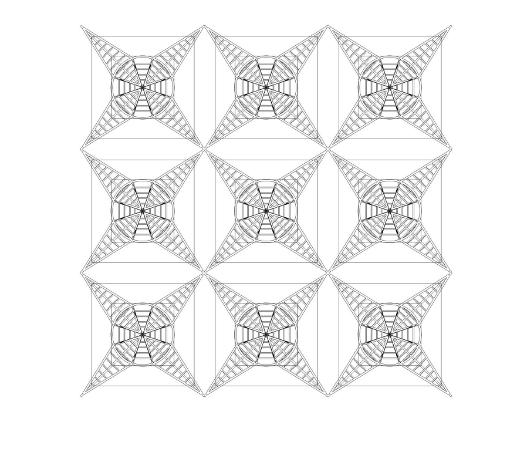
Islamic art has historically focused on geometric patterns, calligraphy, and arabesques. Over centuries, geometry in Islamic art became a profound medium to express deep spiritual and symbolic meanings. These intricate, repeating patterns reflect both divine order and harmony, illustrating the principles of unity and multiplicity in Islamic religion.
Geometric patterns in Islamic art often start with a single element, such as a circle or star, and expand into complex, interwoven designs. The singularity appears as a multiplicity in creation, each part reflecting the whole, much like the geometric patterns that evolve from a single, simple shape into a vast, intricate composition such as the roofs of both Terminal 1 and Terminal 2.
For example, the grid of structural palm trees creates a sequence of repeating vaults, a prominent feature in Islamic architecture. The dome, symbolising the ’vault of heaven’, encapsulates the concept of the ’divine canopy’. The vast, open interior space beneath the vaults is designed to inspire awe and reverence, encouraging worshippers to contemplate the grandeur and majesty of the space.
The interplay of light and shade within these vaults further enhances this effect, with light filtering through intricately designed skylights, creating dynamic patterns that shift with the time of day. This continuous play of light and shadow provides visual and spiritual representation and omnipresence.
In Islamic architecture, space and emptiness are not merely physical attributes but are imbued with deep spiritual and symbolic meanings. They serve to evoke contemplation by creating environments that foster tranquillity, focus, and introspection. Through the thoughtful use of open spaces, emptiness, light, and minimalistic design, the empty representation of the space acquires more importance than their solid counterparts.
The positive tensions and dialogue created between the individual palm tree structures of both terminals are a clear expression of the positive contribution of meaningful contrast and juxtaposition in architectural design. These calculated differences in approach will be experienced by passengers when they use and pass through the dual facility. It is the fundamental differences and contrasts in the architectural expression of the co- existing palm groves that will offer gentle and ambient resonance for passengers on their way through either or both spaces. Were both structural solutions to be identical, the homogeneity of such an approach would have diminished the journey through these significant and elegant spaces.
The architectural juxtaposition of Terminals 1 and 2 at Madinah Airport serves as a striking example of how traditional and modern design philosophies can co-exist, complementing each other whilst meeting the functional demands of a contemporary airport. Terminal 1’s palm treeinspired structure not only pays homage to the cultural and natural heritage of Saudi Arabia, but also introduces an open, inviting space that enhances passenger flow and comfort. The curved, organic forms of 1, meticulously designed to reflect the fluidity of Arabesque architecture, create a dynamic and elegant environment that resonate with the intricate patterns found in traditional Islamic art.
On the other hand, Terminal 2, (designed to cater specifically to the needs of domestic passengers), adopts a more streamlined and rational approach. The use of straight structural elements and reduced column spans simplifies construction, significantly reducing costs and timelines while maintaining architectural integrity. This pragmatic design ensures that Terminal 2 is both functional and aesthetically pleasing, embodying a modern aesthetic that aligns with sustainability and cost-effectiveness goals.
The contrast between the welded and hinged structural systems further underscores the thoughtful design choices made for each terminal. Welded systems, with their rigidity and high load-bearing capacity, provide the stability needed for the expansive and open spaces of Terminal T1. In contrast, the hinged systems used in Terminal T2 offer greater flexibility, allowing for movement and adjustment under dynamic loads.
Islamic art and architecture principles are intricately woven into the design of both terminals. The use of
geometric patterns and the thoughtful interplay of light and shadow create spaces that are not only visually stunning but also imbued with deep symbolic meaning. These design elements reflect the divine order and harmony, encouraging contemplation and reverence among travellers. The open spaces and minimalistic design in Islamic architecture foster tranquillity and introspection, transforming the airport environment into a place of both physical and spiritual transition.
In conclusion, the design and construction of Terminals 1 and 2 at Madinah Airport exemplify a successful marriage of tradition and modernity. Terminal 1 stands as a cultural and aesthetic beacon, celebrating Saudi heritage through its biophilic design and intricate structural elements. Terminal 2, meanwhile, embodies modern efficiency and simplicity, ensuring practicality without sacrificing visual appeal.
Together, these terminals provide a unified yet diverse experience for passengers, reflecting the broader
architectural narrative of Madinah Airport—a narrative that honours the past while embracing the future. This harmonious blend of old and new not only enhances the airport’s functionality but also enriches the travel experience, making Madinah Airport a true architectural landmark �
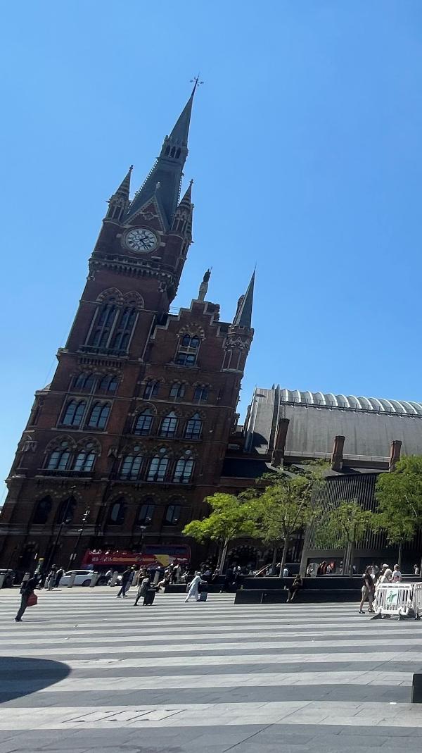
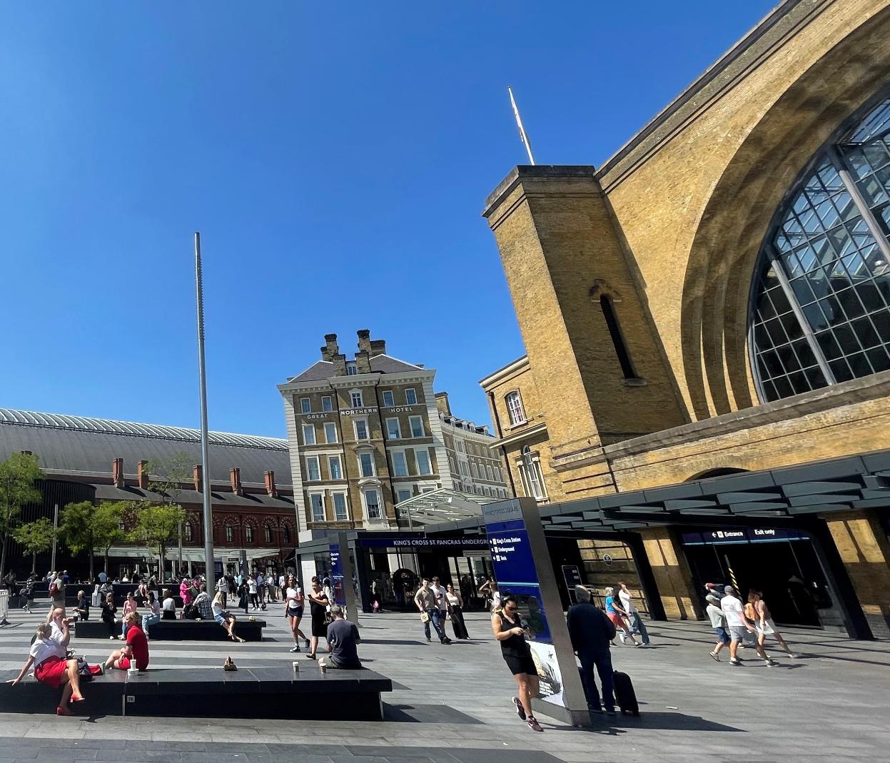
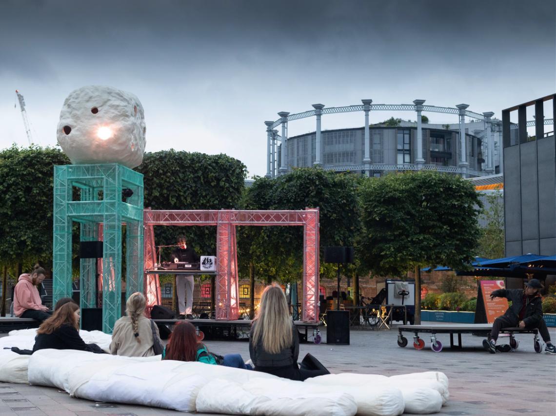
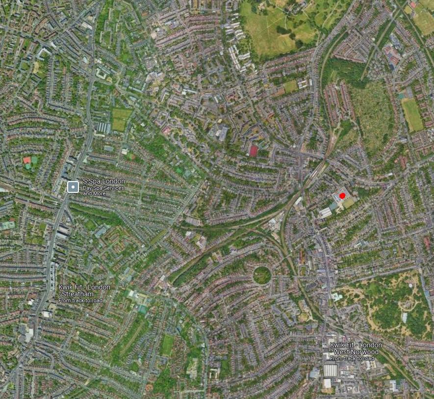
Unveiling the hidden identities of King’s Cross through disruption: A study of contrasting flows and rhythms
The once industrial hinterland behind King's Cross-St Pancras has undergone significant redevelopment, transforming it into a vibrant district filled with cultural institutions, businesses, and linked public spaces. Here, Part 2 Architectural Assistant Dominica Piatek discusses how a temporary public installation tells the tale of the dynamic evolution of Kings Cross, a place where the past and present co-exist.
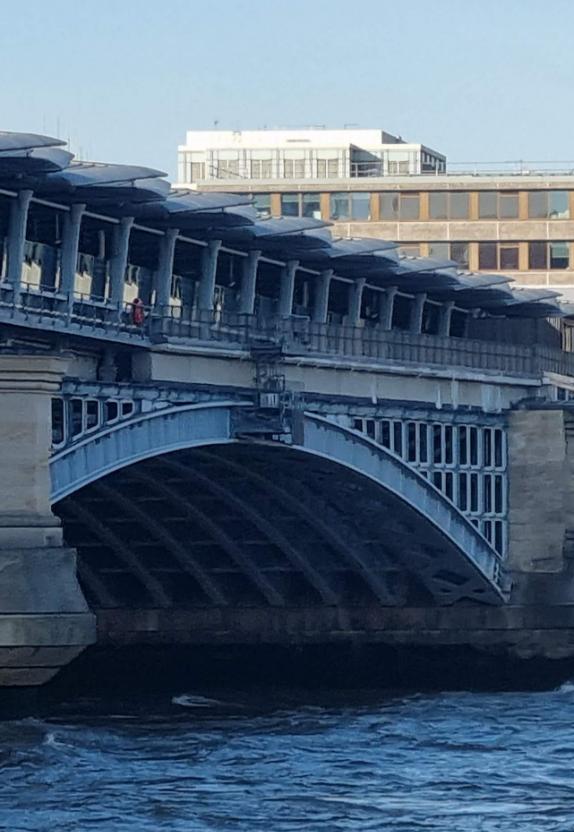
Two iconic 19th century railway stations located in the heart of London sit alongside each other, with Pancras Road dividing them. King’s Cross came first and is a true demonstration of Neo-Classical functionalism. St Pancras followed with its pointed arches, ribbed stone detailing and flying buttressesi. Dating back to a rivalry between the Great Northern Railway and the Midland Railway, the stations ‘clash’, producing an extraordinary juxtaposition of dual architectural attitudes, flows and rhythms.
Together they offer a contrasting yet robust frontage to the wider area, almost acting like a defensive fort that both encompasses and screens the many complex histories and layers that the area has to offer. They stand as monuments to a bygone era of railway grandeur and competition. Upon leaving these buildings, the fundamental characteristics of the urban landscape slowly and incrementally reveal themselves.
The once industrial and neglected region around the King's Cross station has evolved and metamorphosised over time. During the 1980’s and 1990’s, King’s Cross emerged as a vibrant hub for the production of cutting-edge sounds, creativity, and free parties; - an era that would leave an indelible mark on the cultural landscape of the area. It has since undergone significant redevelopment, transforming it into a vibrant district filled with cultural
institutions, businesses, and public spaces. The marked contrast between the historic stations and the contemporary developments around them highlights the dynamic evolution of this part of London, where the past and present co-exist.
To those who take the time to observe carefully, King’s Cross displays a character of its own, and subtly displays its personality, and moods through a 24-hour cycle. It is more like a person than a place with a varied and complex character. Through its worn yet polished exterior, it subtly shares stories of its long past with those who are willing to listen as they pass through onward to their chosen destinations.
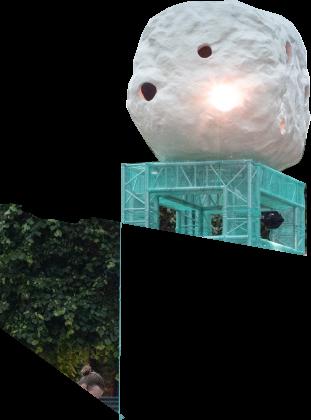
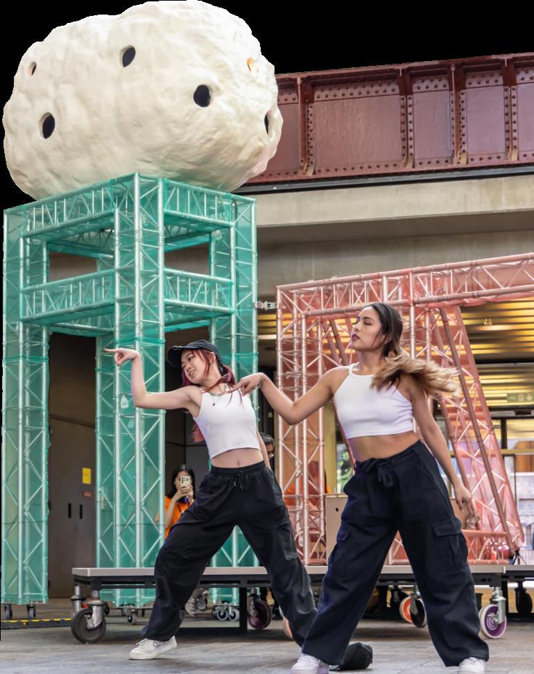
A temporary public installation designed in collaboration with artist-in-residence The Decorators, whilst in partnership with Central Saint Martins (CSM) and developer Argent aimed to revive and celebrate the hidden artistic stories of King’s Cross capturing the dynamic and diverse communities that have helped to shape it. The installation draws on historical references of the 1990s honouring the rebellious spirit that once defined the area. In considering the current dynamics, we aimed to preserve these influences while providing opportunities for young people to shape the future. The design took on an anthropomorphic appearance drawing on these references
but also channelling a fun and weird presence; confused without a clear identity, almost a bit like being a teenager beginning to navigate society. We wanted to take that feeling of being misunderstood at that age that we have all experienced. The installation provided a space for performance and creative expression, engaging local youth with a programme put together by Fishtank to showcase their passions and talents.
As I collected these materials overtime, I constructed a heap of my own as our workspace became filled with plastics and fabric. The arms gave a new lease of life to materials that would have otherwise been discarded, just like the Victorian scavengers did with The Dust Heap. As people crossed through Granary Square, they took time to veer from their channel of flow to explore the arms. Some lounged, others napped, kids jumped up and down.
A multitude of flows traverse through King’s Cross, all at different speeds and amplitudes. The area has served as an intersection of exchange and networks for centuries. To this day it acts as a central hub within the city, housing and incorporating these many sinuous and interconnected’ flows’.
King’s Cross is never stationary, the flows that pass through collect a piece of the fabric and disperse it in many directions and to various destinations. The way in which King’s Cross operates today appears seamless to the outsider. However, the unseen daily processes and flows keep the area alive and dynamic, allowing it to continuously evolve.
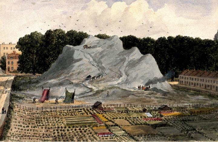
Before the construction of King’s Cross station, the site was graced by a miniature mountain range known as the ‘Great Dust Heap’. This heap was an eyesore for some, and an opportunity for others. Scavengers and sorters scrambled up the sides looking to make a living from these screes of waste. They collected metals, linens, cinder dust and even bones, transforming the materials into objects they could sell onii. In 1848 the ‘mountain’ was moved, and supposedly exported to Russia to make way for the station. The Great Dust Heap was sold for around £20,000 and the ash mixed with clay to produce the bricks
that rebuilt Moscow after 1812. The city was burnt down (allegedly by the Russians themselves) to hinder the ambitions of Napoleon Bonaparte in conquering the cityiii
A crucial reference for the project was the Mutoid Waste Company, an avant-garde movement that thrived in the 1980s. This group was renowned for producing unconventional events, art, and installations, often using discarded materials to create something new and provocative. They operated out of a disused coach station in King’s Cross, transforming it into a space for artistic expression and rebellion. By incorporating historical references into the design of the installation, we honoured the rebellious spirit that once defined the area and created opportunities for young people to curate and shape its future.
The proposed seating installation engages with these ‘flows’ and the dynamically evolving space syntax that informs multiple desire lines and circulation routes. The huge arm pillows were constructed from a variety of waste materials collected from King’s Cross waste management, and an organisation that was set up in the area providing used fabrics that would otherwise go to waste.
The essence of King’s Cross has been carefully crafted through a collection of specific contrasts and juxtapositions built over time, so much so that it has developed a personality and language of its own.
RHYTHMS
The rhythms of King’s Cross are in flux and evolving constantly. There are a multitude of cycles that overlap, clash, protrude and reveal themselves. As dancers perform, music echoes around the tall space, filling the void between the weathered brick walls. The beat oscillates, temporarily transporting us to the bleak expanse of the old transit shed. The intricate details hidden in each brick reveal the histories of this place; the numbers indicating the bays within which wheat was stored. The rhythmic clattering of trolleys echoes, transporting wheat, and feeding the population of London.
These walls have witnessed multiple tenants and activities and have facilitated a range of ‘rhythms’ that ‘flow’ through the space, all operating on unique timescales. In the 1990s the abandoned coal shed transformed into an accidental nightclub. Bagley's would become the epicentre of innovation, a test bed for fresh ideas, groundbreaking music, art and self-expression. Dirt still coated the walls, mixed with sweat and the buzz of the music. The space was kept alive and became immortalized in the makeup of the materials themselvesiv
As the magical moments lost in smoke and grit faded, a new identity emerged, jolting the ‘rhythm’ into the new tempo. A smooth, pristine landscape with perfect symmetry emerges, setting a new trajectory for King’s Cross. The rhythm of the day has become well established, the fountains are composed to the highest degree of precision welcoming the commuters pouring in and settling down to begin their day. As lunch comes round the next tidal flow emerges, a formation of hungry masses searching for sustenance in unison.
CONCLUSION
The essence of King’s Cross has been carefully crafted through a collection of specific contrasts and juxtapositions built over time, so much so that it has developed a personality and language of its own. It is what gives the area its unique energy, shaped by various flows and rhythms to create this vibrant urban tapestry.
The juxtaposition and immediate adjacency of the neo classical King's Cross station with the Gothic extravagance of St Pancras truly captures an element of the unique character of this area and shares it with the many people who travel through on a daily basis. Today the stations stand together in unison, acting as custodians of an urban landscape that continues to transform and evolve.
The collective installation aimed to reveal and share the hidden stories of King’s Cross past, shining a spotlight on the area’s unique characteristics and diverse history. However, it also created moments for young people to leave their mark and weave their stories into the fabric of the area, ensuring that the spirit of innovation and self-expression remains integral to King's Cross in the future �
i Shokur, A. (2011). St Pancras Station, Layers of London. Available at: https://www.layersoflondon.org/map/records/st-pancras-station65c77697-8f2f-4bec-a5fd-f812cb618cc8
ii Turner, C. (2011). Dirt – an exhibition of our fear of filth, The Guardian. Available at: https://www.theguardian.com/artanddesign/ 2011/mar/18/dirt-paintings-posters-exhibition
iii Cox, A. et al. (2017) London’s Dust Mountains and Bricks to Rebuild Moscow after 1812, British Brick Society. Available at: http:// britishbricksoc.co.uk/wp-content/uploads/2018/05/BBS_137_2017_ Nov.pdf
iv Elvery, M 2022, The lost London rave venue that was so grimy your clothes went black, MyLondon. Available at: https://www.mylondon. news/news/nostalgia/remembering-bagleys-lost-kings-cross-24006224
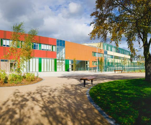
The Island School - learning through contrast and juxtaposition
Cyprus is a small island with a rich and turbulent historyi. It’s currently undergoing a further transformation as a result of its location - at the crossroads of three continents, during a period of political and climate driven upheaval. While old ways of life, customs and traditions are preserved in rural villages and UNESCO World Heritage Sites, international communities are settling and accelerating change and development, including new educational environments. Here Director of Practice Helen Taylor discusses how The Island School offers a journey of learning through contrast and juxtaposition.
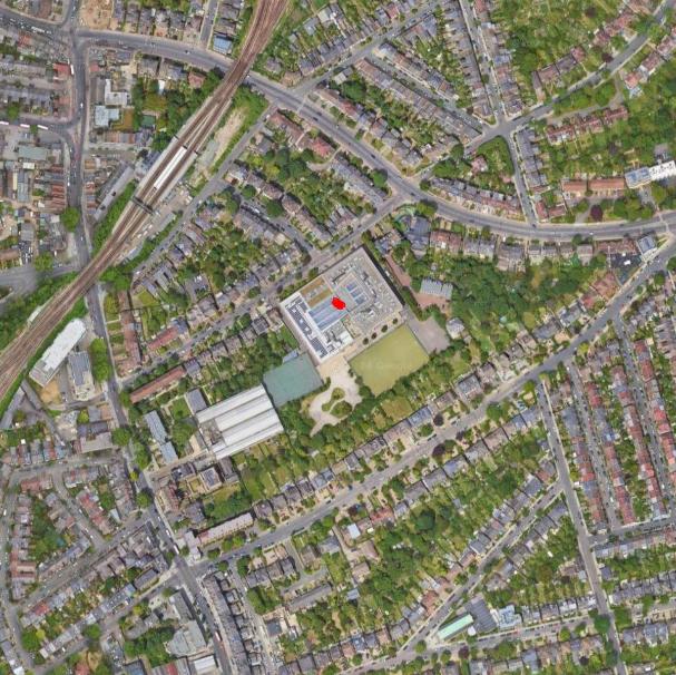
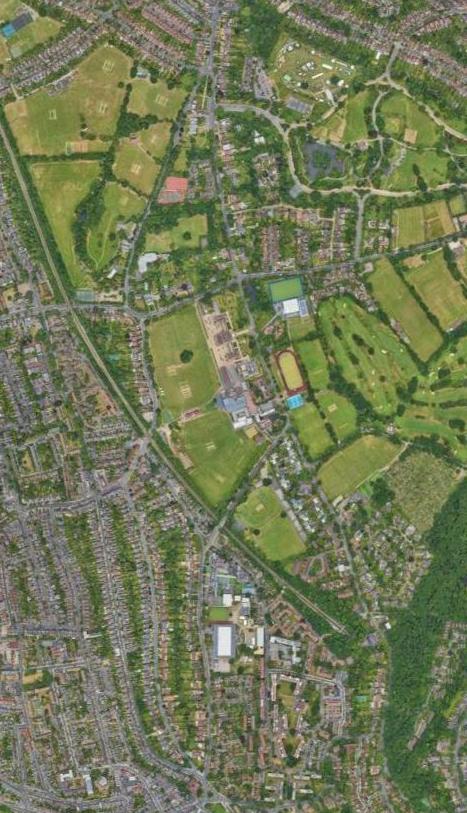
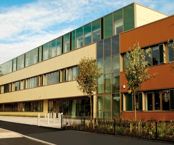
Every school is unique, and every school environment is an outward expression of its curriculum. When the curriculum is poly-systemic i.e. it follows many learning paths, and the cohort is multi-age i.e. it encompasses kindergarten, primary and secondary education. This offers a challenge for the architect to create a sense of simultaneous connectivity and separation within a built environment which typically needs to be flexible and adaptable. A consistent response is needed to adapt to the changing needs of teachers and students. It must be clearly defined and secure to maintain government regulatory standards and required levels of safeguarding for young people. These challenges are multiplied further in the context of The Island School which will be located on a steeply sloping picturesque, dry hillside situated within the foothills of the protected Troodos Mountains.
The new school building will be integrated and blended into the heart of a newly envisaged neighbourhood. It will play a crucial role in knitting together the new community
Schools have always been complex organisations. Their buildings have never simply been about delivering the curriculum and filling young people with knowledge. At their heart is the need to be inclusive, catering for all children as they grow and develop into young adults ready to make a valuable contribution to the world. They are also workplaces, civic assets and hubs for their communities.
whilst providing facilities for the sequence of newly formed neighbourhoods. The school is described as an ‘education hub’. Whilst the masterplan introduces the concept of an island within an island’, the education hub will feel like a ‘village within a village’ so that it echoes and complements the wider development.
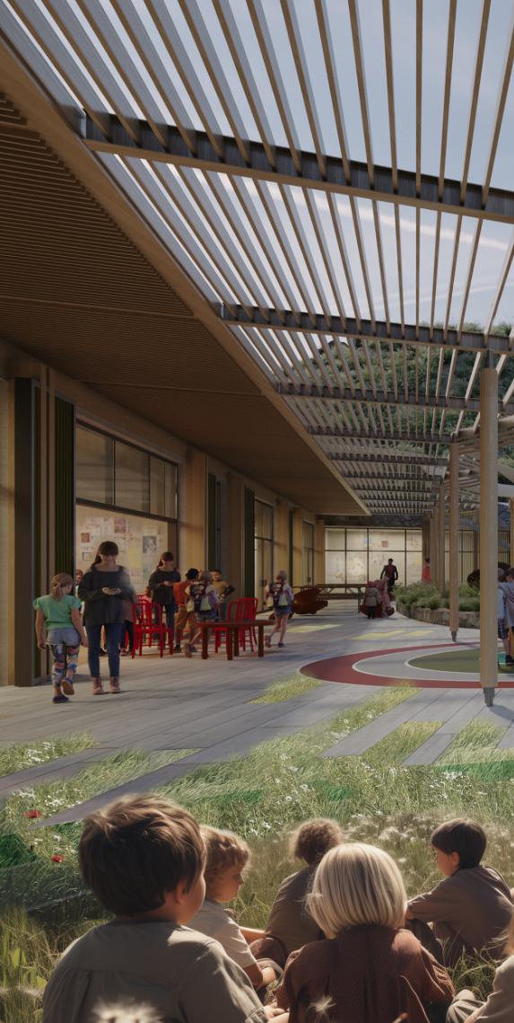
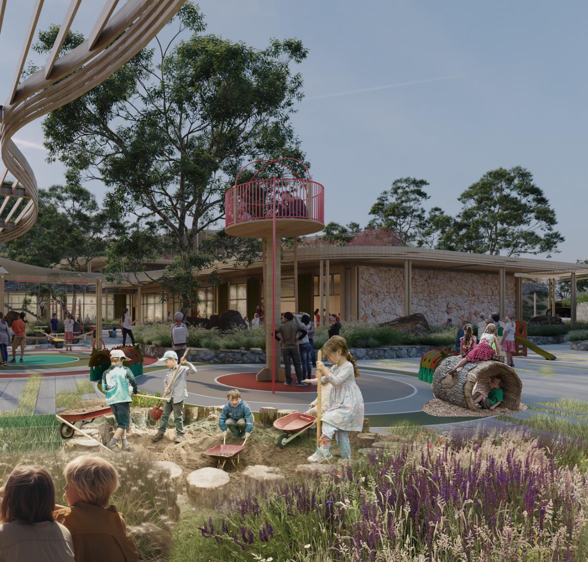
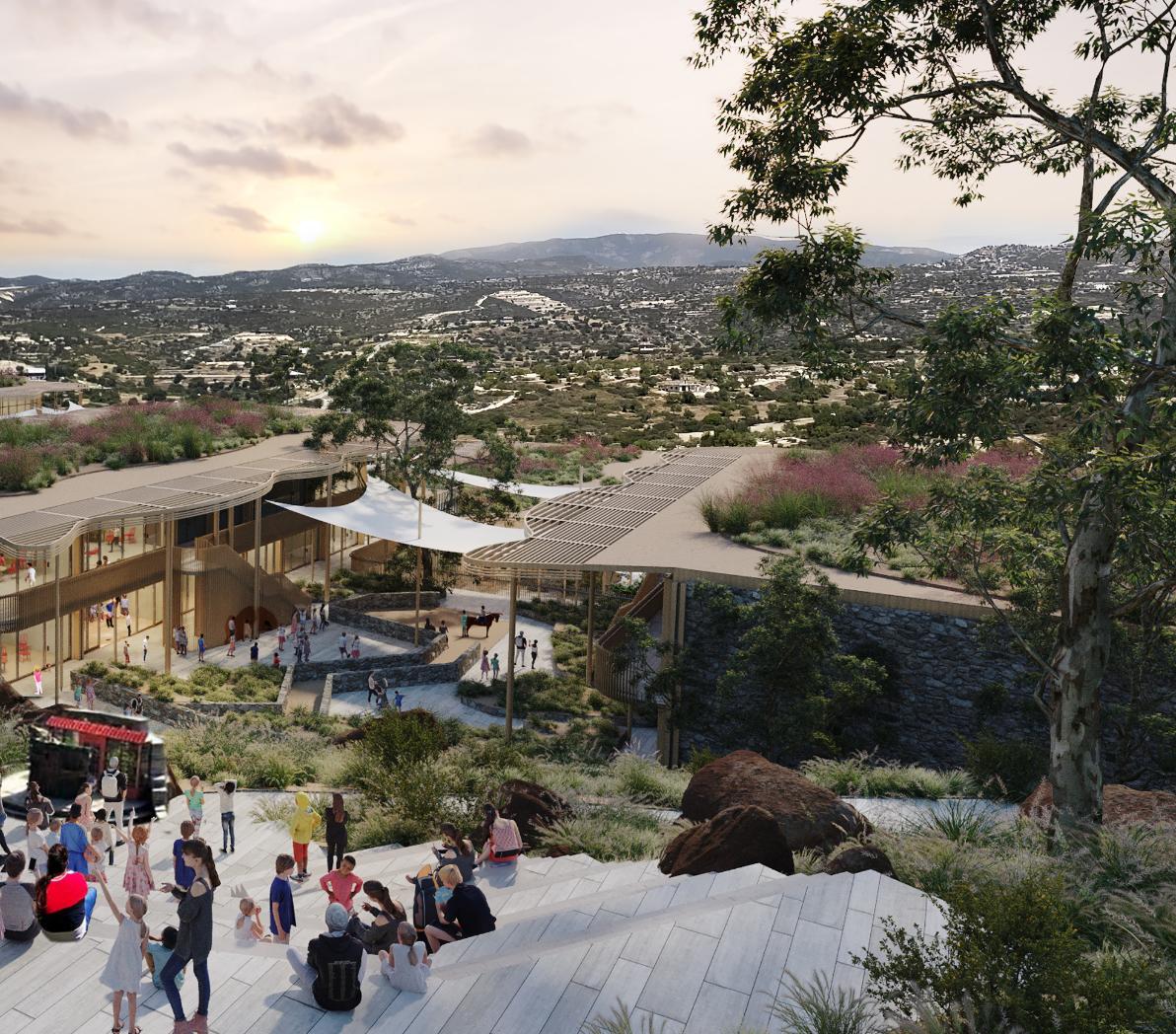
Located at the gateway to the new settlement, on some of the gentler slopes of a natural bowl, the education hub is arranged across the hillside in a series of interconnected, tiered buildings that follow, and seek to work with, the natural topography. The design aims to create a symbiotic relationship between indoor learning spaces and the natural environment, promoting a strong connection with nature and enhancing the learning experience for students.
The design of the school is landscape-led, and incorporates natural materials such as stone and wood, biodiverse green roofs, and planting to help insulate and shade the buildings and blend them into the surrounding
Community Schools: Designing for Sustainability, Wellbeing and Inclusion” RIBA Publishing 2023ii
landscape. In the context of the prevailing Cypriot climate, shade is a vital and fundamental requirement.
School circulation is primarily placed outdoors, with the school landscaping strategy including outdoor classrooms, sport facilities and play areas to encourage ‘hands-on learning’ and direct interaction with nature. As much of the natural landscape as possible will be retained and celebrated. In line with the wider masterplan, these green external spaces are interconnected, fostering a sense of community and healthy living. They also serve as verdant naturalistic corridors, ensuring the preservation of local ecosystems.
The complex functional requirements of the education hub blend into a simple vision for an education community that provides a nurturing learning and development environment from pre-primary to adulthood. To meet the local ministry of education requirements, all three stages (pre-primary, primary and secondary) must be clearly separated and have their own playgrounds. However each
stage is further divided up into a number of parallel areas of teaching: International Baccalaureate (IB) and Waldorf pedagogies, with Montessori, Reggio Emilia and White Box for the younger age groups. Each pedagogy and age group has its own recognisable external space. However, the kindergarten and primary school blocks are also arranged and designed consistently so that it is possible to vary capacity as and when required.
The education hub will be fully accessible, and opportunities for out of hours use, future flexibility and extension are important. At the heart of the education hub is the ‘village square’ providing a place for gathering, showcasing, celebrations and interaction for the whole school community, connected through a central ‘street’ to other shared managed spaces such as a library and associated sports facilities. These spatial opportunities come together and form the bond that will create meaningful and legible relationships across the wide spectrum of
inhabitants both within and beyond the boundary of the school.
Multiplicity of the education environment:
The Island School balances consistency and commonality with flexibility and uniqueness. It is a bold approach on how we think about, and deliver our contemporary school buildings- as secure and comfortable learning environments that will have a critical impact on our communities and ultimately on our values in relation to education within wider society �
i Discover Cyprus | Culture (https://www.visitcyprus.com/index.php/ en/discovercyprus/culture)
ii Community Schools: Designing for sustainability, wellbeing and inclusion | RIBA Books (https://www.ribabooks.com/CommunitySchools-Designing-for-sustainability-wellbeing-and-inclusion_ 9781914124372)
Colour is evocative. It can excite us, elevate our mood or calm us down. So, why is it that there is an almost complete lack of colour in so many of the inside and outside environments we see today? Has colour gone out of fashion? In this article, Project Director and Interior Designer Laurence Orsini explores some of the potential reasons for this, and through projects highlights where colour can add another dimension, enhancing both our perception and enjoyment of spaces.
I have always been fascinated and excited by the bold use colour. From my earliest memory, a turquoise baby cot, fast forward 25 years to my first visit to the Schröder House in Utrecht Holland in all of its primary colour glory. To now, where I ensure that my route to work takes me past a yellow painted staircase on the South Bank. This appreciation is elevated further when colour is in juxtaposition with, or ‘pops’ against, a neutral background.
WHY THE NEUTRALITY?
It would be wide of the mark to propose that bright colour is right in every situation. There are so many beautiful examples of where a combination of light, subtle shifts in material, self-colour, and texture are enough to create the desired atmosphere. However, it is worth considering the reasons why we seem to have seen the trend move away from colour over recent years. The first, I believe, is a tendency towards using tried and trusted palettes of self-finished materials that in the corporate world are often associated with sophistication and kudos. Phrases such as ‘honesty of materials’, ‘creating a timeless design’ or ‘let the people and furniture add colour’
enable designers to shy away from the riskier use of bright colour.
Another reason colour seems to be avoided in design could be to do with the poor associations of its use that spring to mind. These include some post-modern architecture. Here colour was embraced, but sometimes to excess, creating visual confusion and lack of harmony. The use of colour is associated with institutional buildings such as hospitals and schools, particularly pastel colours, where it becomes an inexpensive way to add interest through painted walls. Both have in someways, devalued the currency of colour.
On the contrary, we have all probably experienced environments where too many colours have been applied together at the same time, especially in retail where colours compete to attract our attention, resulting in a sensory overload. A literal nightmare for the neurodivergent who tend to prefer muted and pastel hues and neutral tones. In my own experience, applying more than two bold colours together can be problematic and therefore could present another reason for opting for a more neutral and easier colour palette to work with. It will be interesting to see how a greater understanding of designing for neurodiversity, combined with the reuse and recycling of materials will impact future utilisation and application of colour.
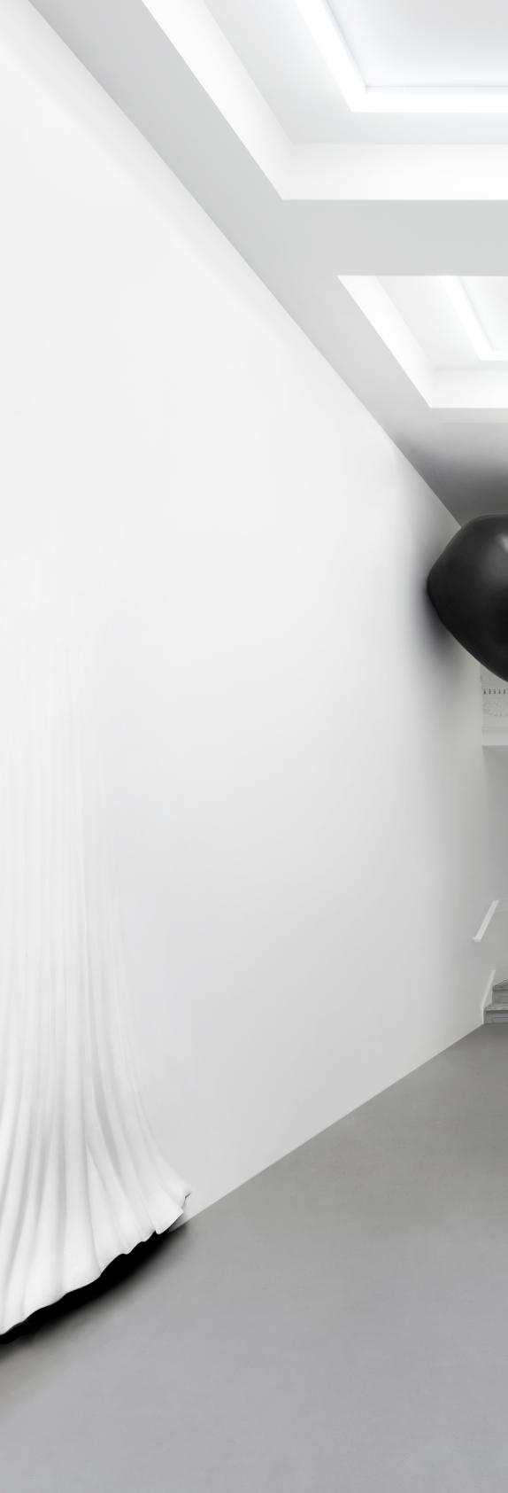
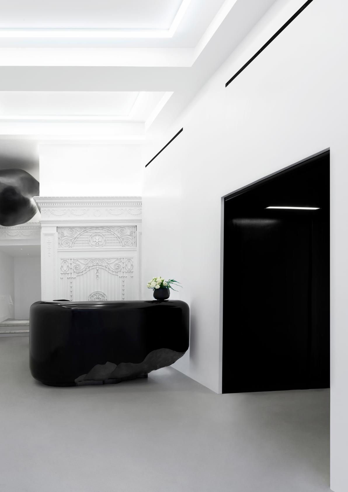
Potentially the biggest reason for this reluctance to design with a freedom of colour expression, is that we have simply been following a trend. Fortunately, we appear to be slowly coming out of this phase, as we did with ‘post modernism’ and ‘minimalism’ and other isms. ‘Non-colourism’ is a less obvious trend but is non-the-less a fashion that we will hopefully look back on. Maybe as designers and architects we have become over obsessed by the ‘Scandi’ aesthetic, beautiful in its own way, but not the only kid on the block. Of course, there are always exceptions so by contrast, there are times when the intentional and total removal of colour can become an exciting proposition in itself. As the deliberately ‘super monochrome’ environment of high
contrast, courtesy of the New York design Studio Snarkitecture who worked with our US Partners, Crown Architecture on the refurbishment of 530 Broadway. Where like a black and white photograph, the concept emphasises form, shadow and texture, bringing delight without use of colour at all (previous page).
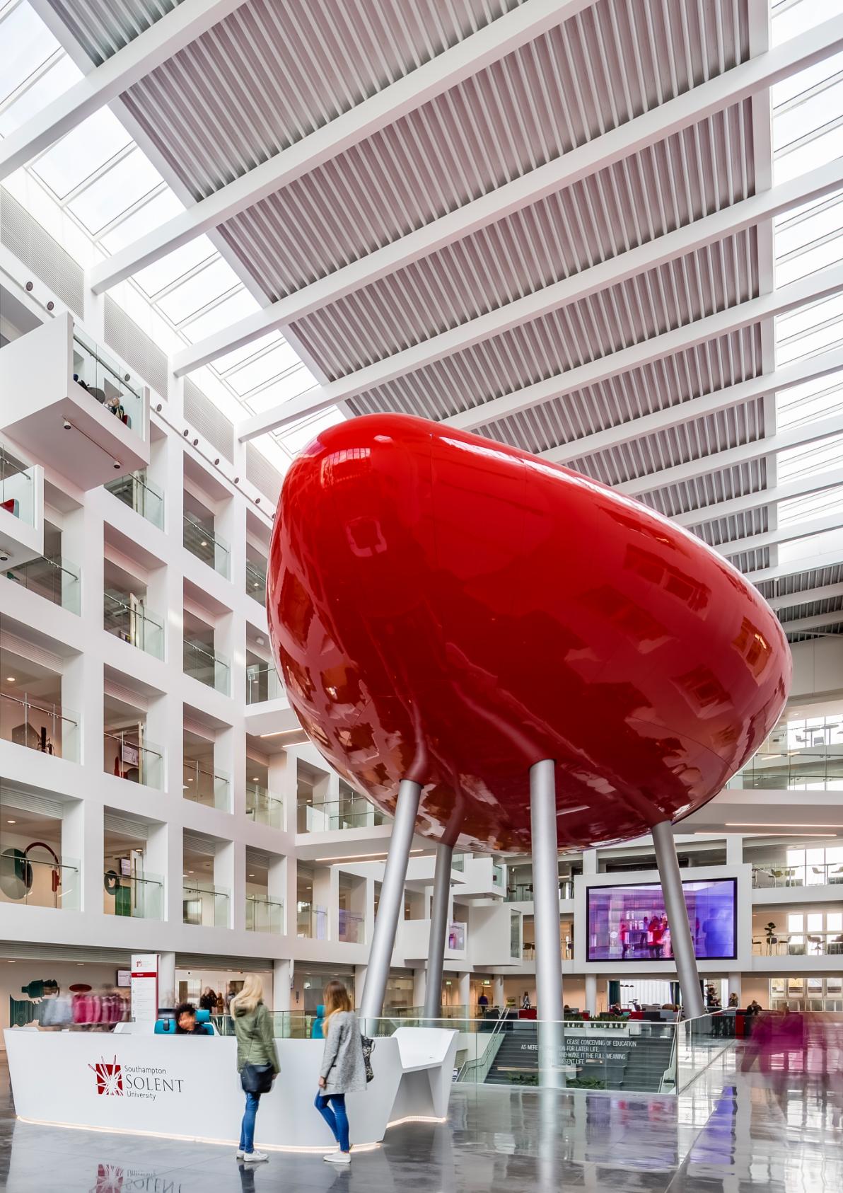
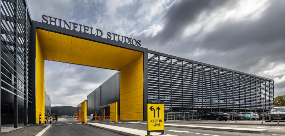
Fortunately, I am part of a practice that looks beyond stylistic trends and embraces colour both internally and externally, as demonstrated in projects such as Solent University, Shinfield Studios, and offices in Gdynia. In each it is the juxtaposition of a single bold colour against a neutral or natural background that creates the most impactful, dynamic and uplifting environments.
RED: At the heart of the atrium in Southampton Solent University’s Spark building, sits a red structure approachable by bridges and known as ‘The Pod’. This not only houses a presentation suite, collaboration spaces (within and on top), but has become an emblem that emphaisises the University’s innovative thinking. Red is used to create a central focus and symbolises the heart of the building complex. Set against articulated white atrium walls, the Pod’s deep red colour is further emphasised by a highly polished surface that reflects its surroundings. Here, colour creates a memorable destination, sense of place, and orientation for the students, staff and visitors.
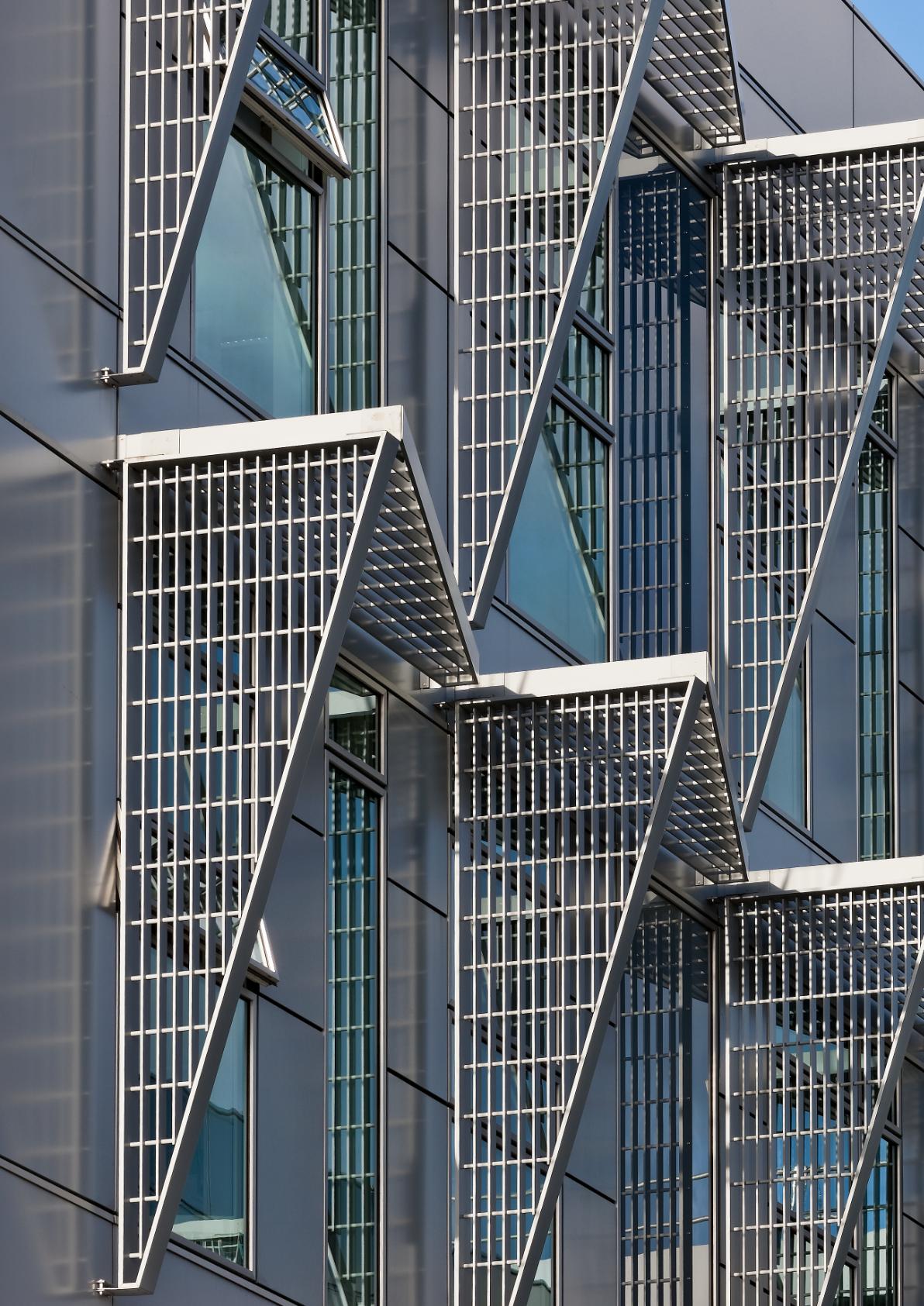
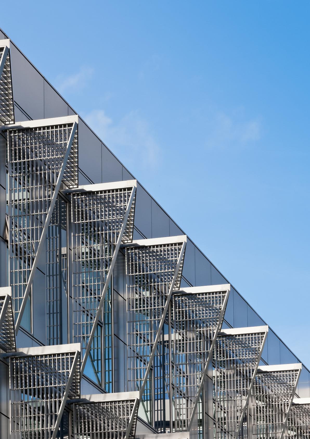
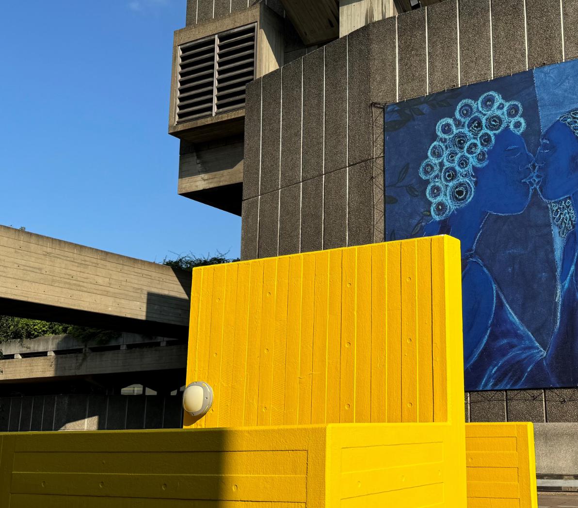
YELLOW: Shinfield studios is a one million sq.ft film and TV studio facility, where dark grey exteriors have been used to limit the developments impact within its context. On approach a bold yellow portico contrasts with the rest of the buildings, creating a striking set of wayfinding devices that draws the eye and helps to navigate one million square feet of studio space. Scale and boldness of colour therefore enhance the character of the building, while providing a functional clarity to an otherwise potentially overwhelming complex.
BLUE: The Gdynia Offices were designed for a historic financial institution as their satellite space in Poland. The interior design was developed to optimise features of the inherited building, exposing the internal fare-faced concrete walls and most of the concrete soffit, in parallel utilising natural materials for the majority of the internal palette. This all provided the perfect backdrop for a single blast of colour, in this case a sprayed blue soffit and services. Often a soffit is sprayed black with the intention of disguising the services, however, here the sculptural form of the services are highlighted and celebrated. A colourful intervention loved by staff, this helped to reinvigorate and revitalise a workforce that had lost some of its positive culture through the separation and stresses resulting from the covid pandemic lock-down.
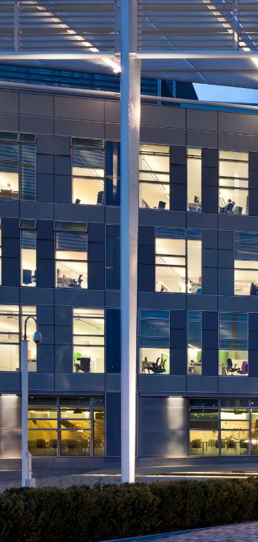
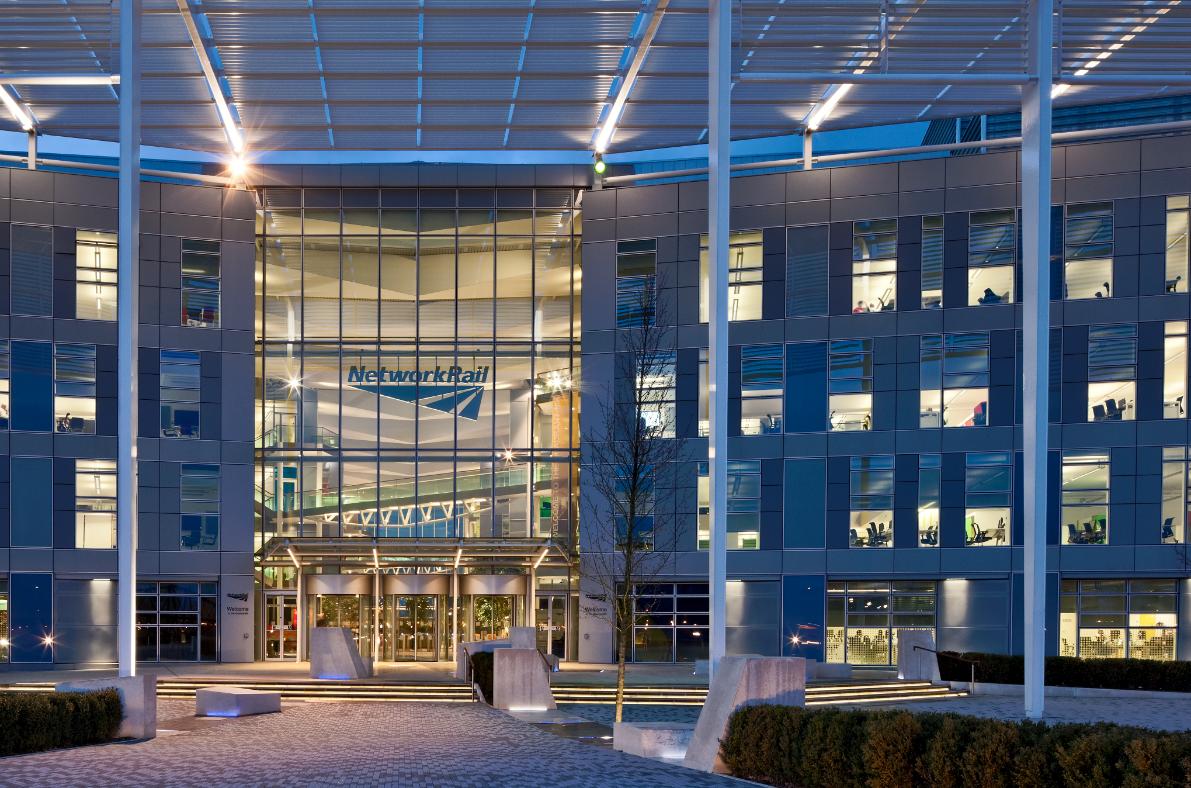
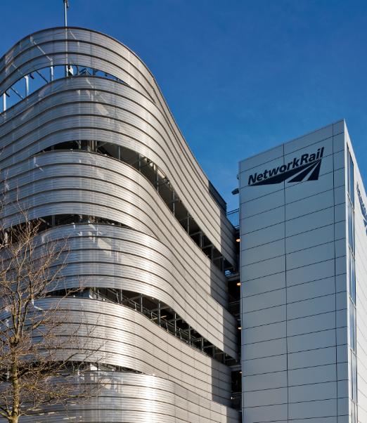
While this article does not delve into the extensive subject of colour theory, the aspect of how colours interact is fascinating, with our perceptions changing when one colour is set next to another colour. At Network Rail’s National Centre – The Quadrant, a population of 3,000 staff are housed across four buildings set either side of an internal street. Here, colour contrasts against the external natural finishes of street, but this time in multiple transparent colours. This brings a separate but unified identity to each of the four buildings. With the introduction of coloured film applied to the glazing; a red, blue, yellow and green building appears to visitors and staff, offering simple and intuitive wayfinding across the expansive complex. Here, colour not only provides vibrancy, but also helps to create a sense of
place and aids orientation. The transparency of the optically clear coloured glass means there is also opportunity to view the street through colour from the other side, like rose or blue tinted glasses.
On the other hand, a colourful art installation located in the centre of the entrance hall at 280 High Holborn draws focus away from the reception desk. Creating an impactful first impression, greeting the visitor with a multicoloured display, inspired by the tree canopies of Lincon’s Inn Fields behind the building. Appearing as a giant hearth with a playful array of subtly combined colours; when viewed from a distance these show as multicoloured flames. However when close up, the art piece, by Studio Waller Hewett actually comprises over a thousand individual brightly
contrasts
coloured felt balls. The impact and vibrancy of the coloured balls is highted by the contrast to the surrounding polished concrete frame and natural finishes of the entrance hall. So again, it is colour against a counterpoint neutral and natural that makes the colours sing.
Returning to Schröder House on a sunny day, natural light reflects off the primary colours onto white and grey walls, producing a subtle set of diffused additional colours. This is a magical effect, that I have not seen replicated even by the most sophisticated artificial lighting system, proving that the natural light spectrum of colours offers another palette and dimension ready for us to dive into.
CONCLUSION
This article only scratches the surface of the vast subject of colour use in our environments. Whilst there appears to be many potential reasons to steer away from the bold use of colour rather than embracing it, colour could be back on the agenda this year. 2024 interior design award judges are favouring projects with bold colour, used to great effect, recognising the rewards that colour can bring to our lives.
Let me end with a provocative question; -when you look around…are you getting your colour fix? �
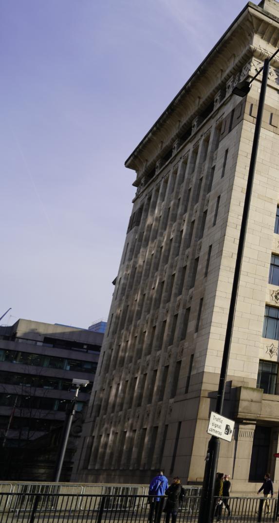
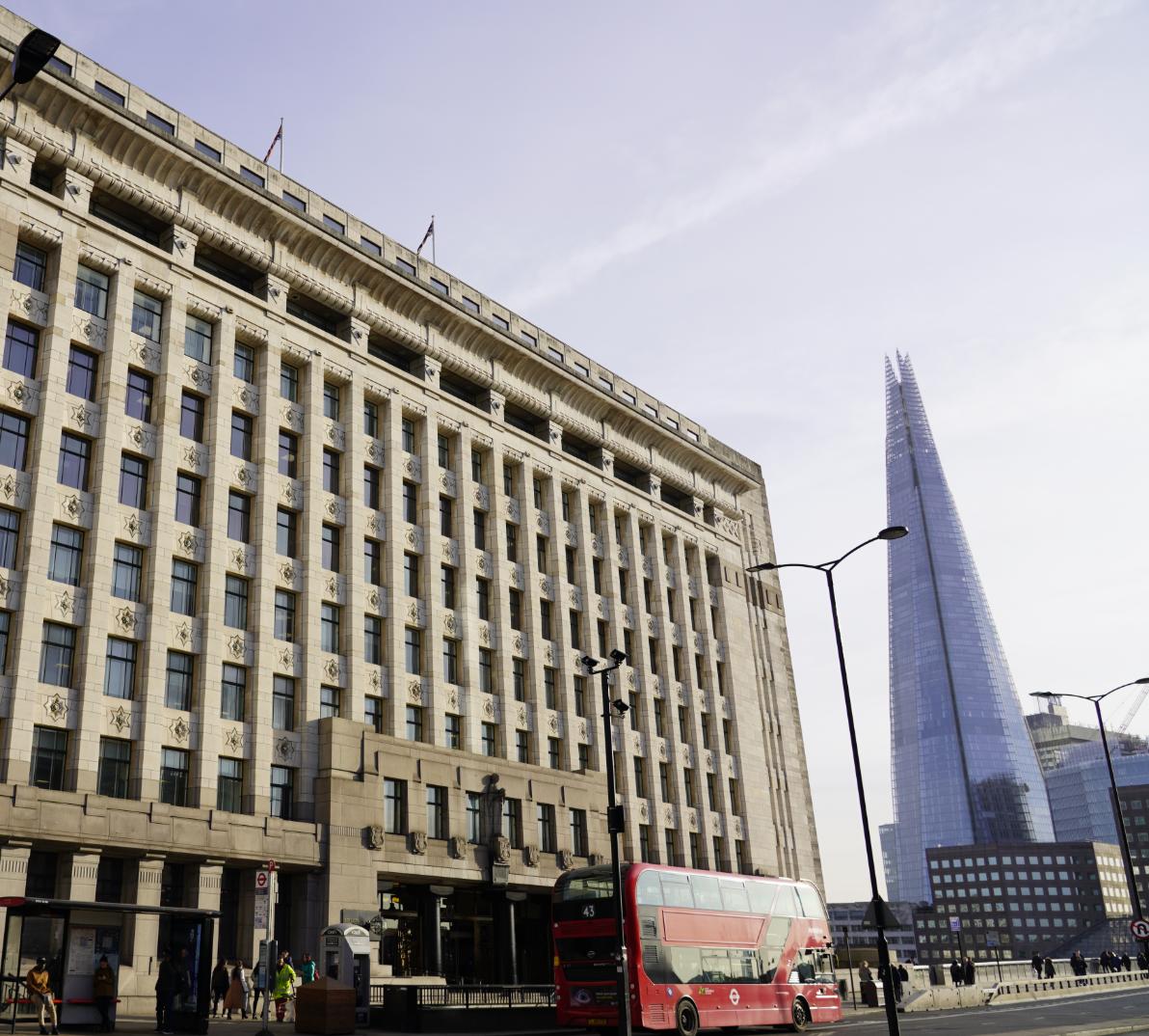
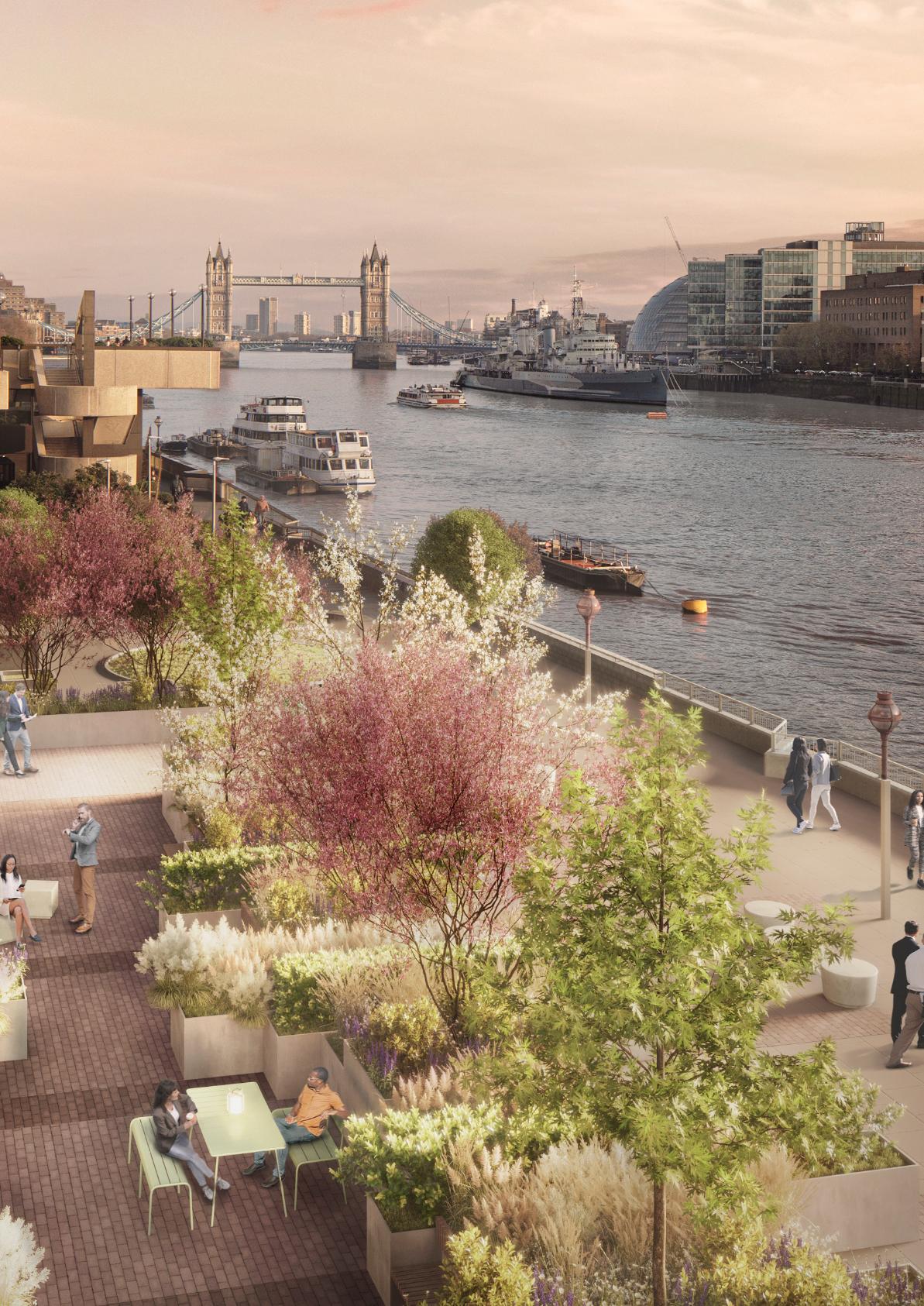
Adelaide House; a story of fire, water, earth, air and metal
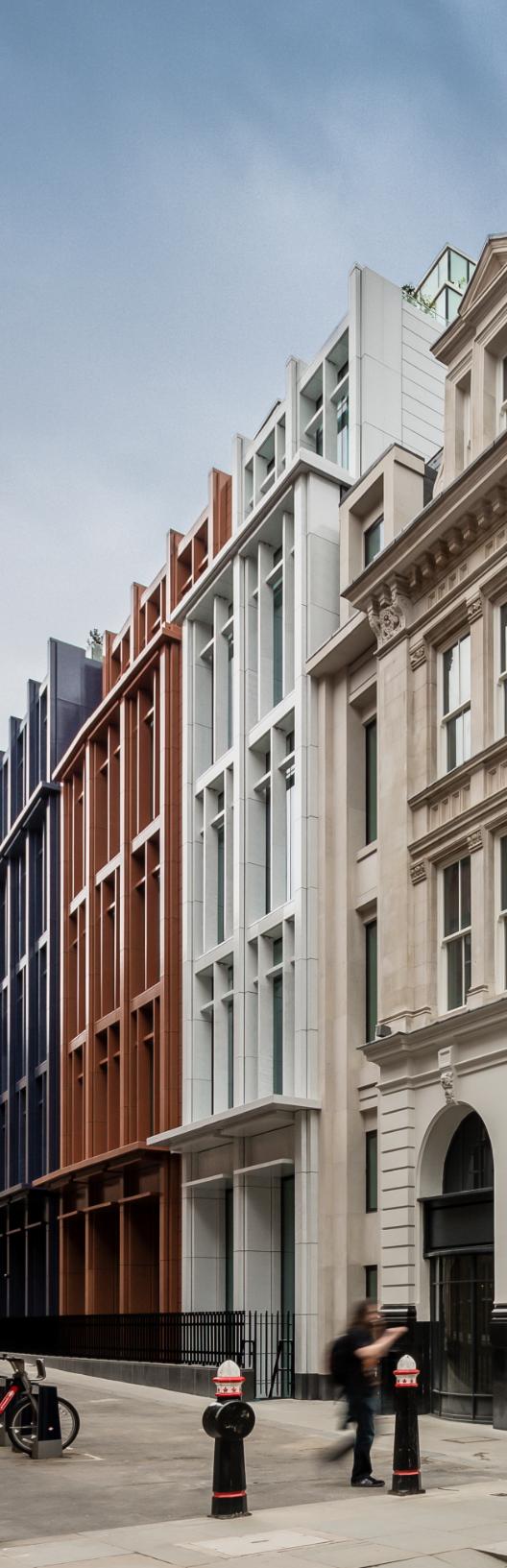
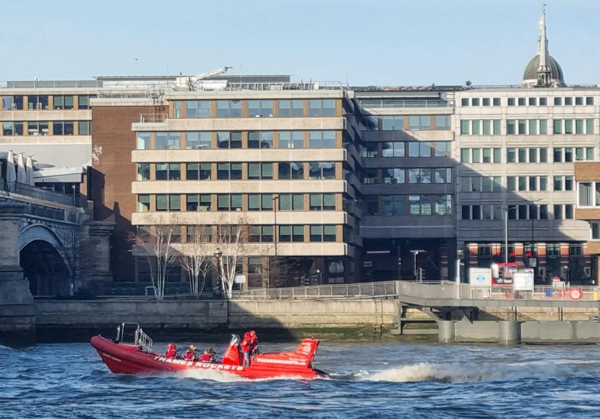
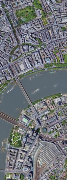
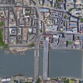
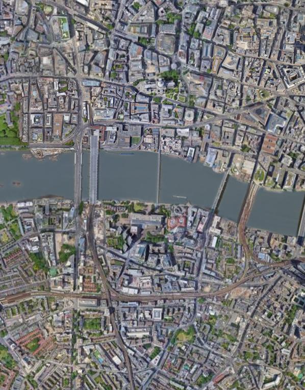
Adelaide House, once the tallest commercial office building in the City of London, is positioned with the River Thames directly to the south and the adjacent London Bridge immediately to the west. As Scott Brownrigg embark on the restoration of this unique Grade II Listed building, Associate Architect and Conservation Registrant Rachel Hain explores the historic relationships with the bridge and river and how these have shaped the existing building and influenced proposals for the future.
Adelaide House is Grade II listedi and is understood to have been the first building in the city to utilise a steel frame, giving it the accolade of being the first framed ‘skyscraper’ to be built in the City of Londonii. It was designed in the Art Deco style by Sir John Burnet and Thomas S. Tait, with a range of Egyptian influences seen in the architectural expression of the façade. Such details were popular at the time largely in response to a number of exciting archaeological findings, including the discovery of Tutankhamun’s tomb.
Adelaide House currently stands beside the River Thames, ten stories above King William Street which leads onto London Bridge, with a further three storeys placed below street level. Extensive renovation and remedial works are currently progressing on site to provide the high quality of services and interiors required to keep the building in continued use as office space. New end of trip facilities will bring its specification up to required, contemporary standards, and improvements to its immediate riverside context will minimise future cumulative changes to the simple and elegant form of the current building.
Situated on the threshold of the City of London, on the north bank of the Thames, Adelaide House is juxtaposed
with the river to the south, and London Bridge immediately to the west. The site does not lie within a Conservation Area, but is in the vicinity of numerous heritage assets, including the Grade I listed Church of St Magnus the Martyr to the east and Grade II* listed Fishmongers Hall located directly to the west on the opposite side of London Bridge. The site is also located within the London View Management Framework Area, sitting within a landmark-viewing corridor from St Paul’s Cathedral, and within views from The Monument under the protection of the Monument Views Policy Area.
As the in-depth renovation and remedial works for this important heritage asset progressed, research into its history revealed the unique story of Adelaide House and its connection to fire, water, earth, air and metal.
FIRE
Centuries before Adelaide House was built, the northern half of the site bounded directly onto the Thames. Timber
buildings that stood on the site during the medieval period were razed to the ground during the catastrophic Great Fire of London of 1666. They were located just southwest of Pudding Lane, a street which is infamous as the starting point for the blaze that would go on to destroy most of London in just four days.
To prevent a repeat of the disastrous event, King Charles II passed the 1667 Rebuilding Act, to protect people and property in the event of another fire, stipulating that all buildings in London were to be built using brick or stone. This was in great contrast to the mainly timber city from before the fire. Adelaide House complied with these regulations, constructed in fire-resistant encased steel, with a distinctive stone and brick façade that characterises the building we see today.
WATER
Adelaide House has always had a strong connection to water. The solidity of its impressive Art Deco-detailed, heavy
Portland and granite stone clad form has stood in contrast to the flowing waters of the River Thames since its construction 100 years ago.
However, the connection with the river runs deeper than this. The southern part of the site was reclaimed from the river during Medieval times as part of the wider reclamation of land to create wharves, a vital function of the working river. The juxtaposition of Adelaide House to the Thames originally served as an important function - providing a direct link to London Bridge Wharf, the only privately owned wharf in the City of London during this time.
Enormous industrial cranes were positioned on a timber pier over the north bank of the river, one of which towered over the roof of Adelaide House. Drawings and photographs from the 1920s show goods being transported along the Thames and loaded onto the northern riverbank, using a cartway running through the site from Lower Thames Street. Large openings at the middle basement level of Adelaide House were used to transport goods in and out of the
building via a steep ramp. The wharf function eventually ceased and the riverside area was used as a car park in recent years, prior to refurbishment.
EARTH
Not only is Adelaide House partially constructed on land, (which was formerly the river), but more significantly it is situated on the site of the old London Bridge. This iconic structure was sold and replaced in 1973 with the London Bridge we see today.
The northern end of the old Medieval bridge, (and Roman bridge before that), landed on the north bank underneath what would become a cartway running through the basement level of Adelaide House. This linked the riverside terrace with Lower Thames Street in the 1920s and is now used as a service access road. There are few surviving remnants of old London Bridge. The archway under the tower of St Magnus the Martyr’s Church on Lower Thames Street is one of the most important. This arch used to form the bridge head and is now the entrance to the a forementioned church.
Adelaide House is also physically linked to the current London Bridge, with its main entrance frontage off King William Street which leads to the northern end of the bridge. Part of the bridge’s heavily quoined foundations are also visible in the basement of Adelaide House. As a result, the site’s history is entrenched and closely associated with that of London Bridge.
METAL
When Adelaide House was completed in 1925, it was the tallest commercial office building in London at 43 metres in height; constructed with a steel frame and reinforced concrete. It is understood to have been the first building in the city to utilise the steel frame building technique pioneered in New York and Chicago in the early 20th century. Giving it the accolade of being the first steel framed skyscraper in the City of London. The steel frame is therefore of primary historic significance.
AIR
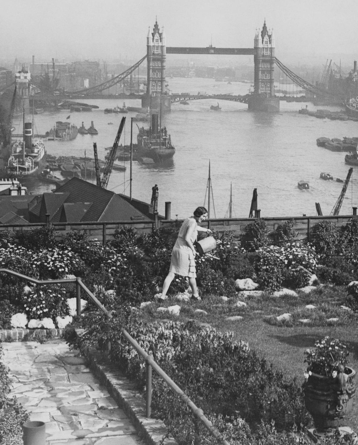
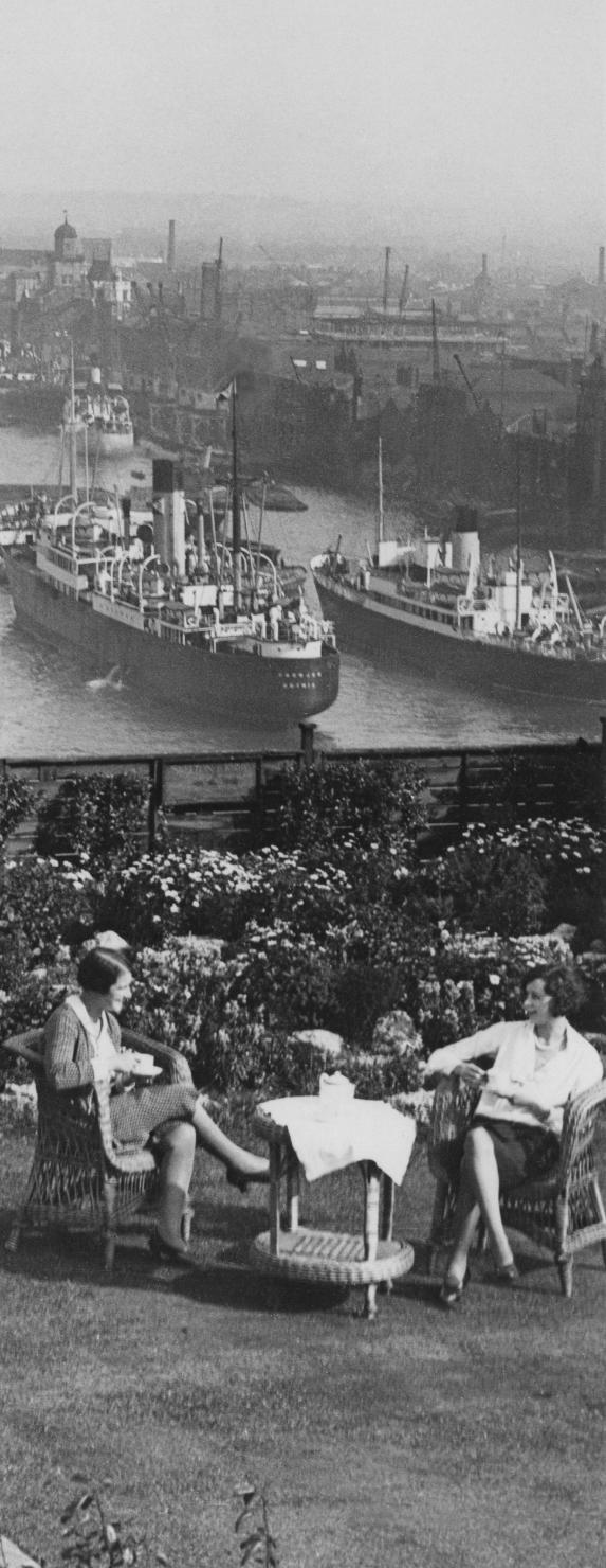
From the mid-1920s, after the completion of Adelaide House, the building’s rooftop garden offered a unique space where abundant and varied planting was used to create a lush and verdant escape from the working city for its staff and occupants. Up here there was a fruit and flower garden, bee hives, and an 18-hole mini golf course. It was also the first office block in Great Britain to have cutting-edge central ventilation, as well as telephones and electricity connections to every floor. An equivalent to Google Headquarters in its day.
Over the years, building alterations including the addition of another floor in the mid 20th century, resulted in the loss of this green amenity overlooking the Thames. The current rooftop now houses plant for the building’s servicing requirements.
The more recent roof level fabric is of low significance to the value of the building overall and the use for mechanical services alone precluded the appreciation of the surrounding city views from the rooftop to the surrounding city by the building’s users.
A NEW CHAPTER
Adelaide House’s unique and historic connections to the River Thames and London Bridge have shaped the building we see today and have greatly influenced Scott Brownrigg’s vision for the building’s future. As part of the renovation works, much of the existing structure of the building is being carefully restored and reinstated where necessary, whilst weaving in and incorporating the contemporary services and facilities expected by City of London tenants.
Elements of primary significance (both externally and internally) are being celebrated, including the marble and terrazzo clad main entrance hall and staircase, external Chicago-style fire escape stairs, internal columns and fenestration patterns, and the original open office floorplates reinstated.
Original office areas had plastered soffits. Over time, these original ceilings have been removed and replaced with modern suspended ceilings at a lower level to conceal services.
The de-casing of many of the surviving (historically important) steel beams and columns celebrates the history of the building, as well as helping to extend its useful life as an office, with the new interior juxtaposed and inserted within the historic shell.
Following the initial test exposure of one beam and column, partially exposing and showcasing the original steelwork with its various stiffening plates, riveted construction and makers marks were retained to add interest and character to the building.
Exposing the steel structure has enhanced the evidential value and cognitive understanding of the structure, allowing a clear visual connection with the load bearing composition of the building. This design strategy has led to an enhanced appreciation of the heritage asset whilst creating an opportunity to clean and protect the original steelwork with an intumescent finish to safeguard the integrity of the structure for the future.
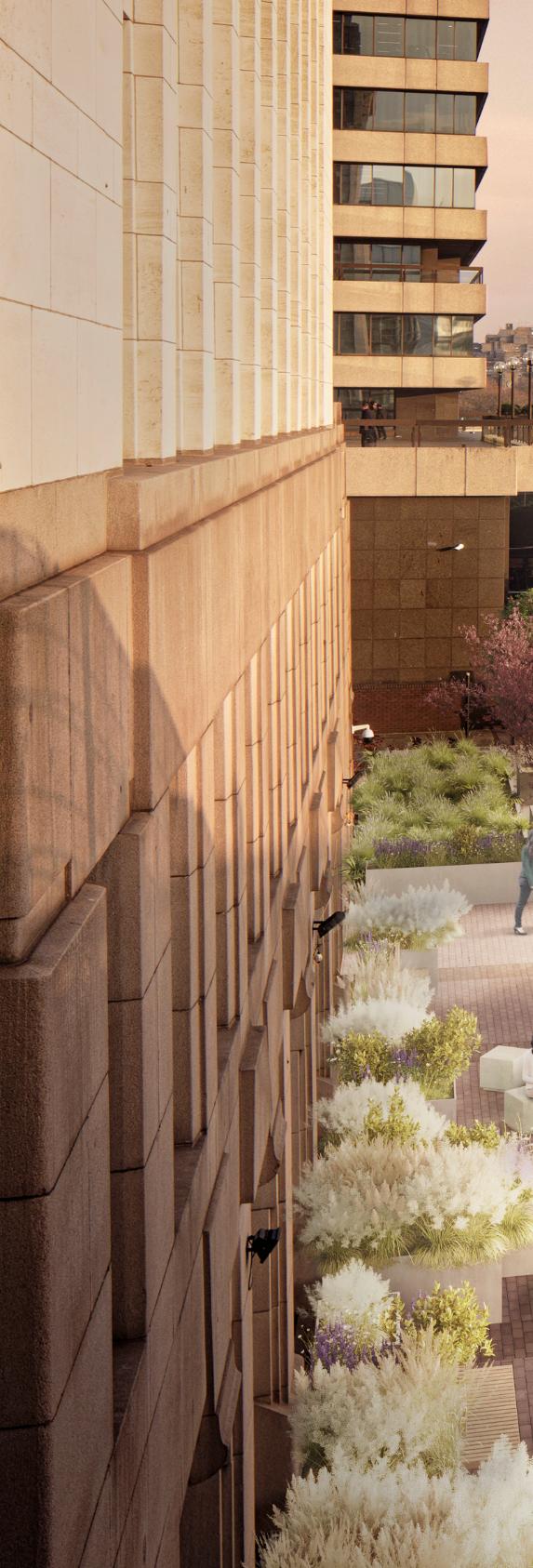
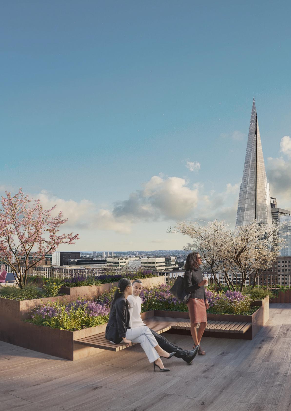
The renovation works will also green and return the use of much of the rooftop back into well-being amenity facilities for occupants. Rooftop plant constructed after the listing of Adelaide House in 1972 is being replaced with a smaller building services enclosure which will enlarge the usable external rooftop area around it. This creates opportunities to reduce carbon emissions and improve energy performance in accordance with the London Plan Energy Assessment Guidance, while a new with planted green walls opening onto a landscaped rooftop pavillion will reinstate the original use of the roof as a garden.
A tiered approach to planting creates interest at different levels, with flowering ground cover interspersed with raised planters of shrubs and fruiting and flowering trees in pots. The roof of the amenity space will also host a flowering sedum and wildflower roof. More formal planting to the south will blend into a wilder, more natural feel to the quieter northern end, where flowering herbs and honeybees help to create a calm space with seasonal interest. This landscaping strategy celebrates the bee hives which were
originally located on the roof and increases the desirability of the refurbished building to encourage its continued use.
A similar approach will transform the riverside terrace, creating a valuable amenity space for building users, whilst widening the Thames Path for use by everyone.
Landscaping proposals align with the City of London’s ‘riverside park’ concept; - an aspiration to create as much publicly accessible space along the river as possibleiii. The public realm will be improved through creation of a green, visually attractive and flexible space. With grouped seating and communal tables providing opportunities for socialising, and sheltered seating offering the chance to read a book and relax next to the river. Boundaries to the terrace will be greened and kept low to promote views along the river, and
to improve and strengthen the relationship of the building with the riverfront. All these moves will help to increase the social value of the scheme by promoting well-being and an inclusive and equitable environment.
Proposed landscaping works also create opportunities to celebrate the sites’ history and connection with old London Bridge. Earthworks and excavation have been purposefully avoided to preserve archaeology beneath the site, including the historic timber piles of London Bridge Wharf. To help to visually communicate the location of old London Bridge and significance of the sites’ setting, the footprint of the old bridge will be celebrated in new proposals for the riverside terrace, with metal lines used to
mark the route of the old bridge, contrasting with the new stone paving along the widened Thames path.
The repair and renovation works celebrate the importance of the building’s setting and its history as London’s first steel-framed ‘skyscraper’, together with ensuring it is fit for purpose as a 21st century office, will help maximise the lifespan and appreciation of the heritage asset. Ensuring it can be enjoyed by many generations to come. These important factors need to be viewed simultaneously with the critical tensions and relationships that the building has with its immediate surroundings and its volumetric response to adjacent constraints and opportunities. The close relationship with the bridge, the water and the flaming gold sphere on top of The Monument
all add to the potency of the original architectural response of this well executed and sophisticated building to both adjacent air and water �
i Is this London's Oldest Skyscraper? | Londonist | https://londonist. com/london/history/londons-oldest-skyscraper
ii Adelaide House by Anne Hutchings | Layers of London | https:// www.layersoflondon.org/map/records/adelaide-house
iii Riverside Strategy | City of London | https://www.cityoflondon.gov. uk/assets/Services-Environment/city-of-london-riverside-strategy.pdf
Liminal space in architecture –complexity and contradictions of building at the edge
Derived from the Latin word limen, liminal is defined in the Oxford Dictionary as a place occupying a position at, or on both sides of, a boundary or thresholdi. Liminal space could therefore be described as the ‘space between’, a space of transition or uncertainty, but also as an opportunity to explore, express and connect juxtaposed and confluent elements.
In this article, Associate Architect Dagmar Binsted explores the opportunities and complexities associated with liminal space within and around the context of London, using three Scott Brownrigg projects as examples.
As architects we work within a range of multilayered and varied contextual backgrounds. We are trained to recognise these layers, and to identify opportunities and create spaces where there were none before. This process often brings us into the realm and influence of liminal space – space located on or between boundaries or left behind without a definitive set of boundaries or parameters.
The development of these transitional spaces can create opportunities to repair and stitch together the surrounding context, bringing communities together, whilst simultaneously establishing positive amenity and connectivity that can contribute to local and wider socioeconomic growth.
Liminal space is the uncertain transition between where you've been and where you're going physically, emotionally, or metaphorically. To be in a liminal space means to be on the precipice of something new but not quite there yet.ii
Theodora Blanchfield
Liminal space
Transitional
LIMINAL SPACE IN THE URBAN CONTEXT
Designed by Richard Seifert in the 1970’s, One Puddle Dock is a modernist office building on the periphery of the City of London where the city meets the river Thames. The building sits in a historically significant and prominent location above Blackfriars Railway Station on land once occupied by one of London’s many riverside wharfs. It is directly adjacent to the new Blackfriars Bridge to the south, and above Blackfriars station, nodes of arrival and departure, while the enduring landmarks of St Paul’s Cathedral and Fleet Street (a memory of the old river Fleet) sit nearby to the North. Architecture in a location such as this is always in flux, changing with the demands of the evolving city and the people within it.
The brief – to provide accessible and modern workplace facilities for a wide range of tenants, whilst harnessing opportunities to bring life and energy back to the waterfront, was intrinsically tied to the local context and history of this building and site, with challenges posed by complex interlocking building levels, relationship with the operational mainline and underground stations beneath, and height restrictions informed and controlled by the St. Paul’s View Framework.
During the refurbishment (completed in 2017), a series of enclosed transitional (liminal) spaces at ground and lower ground floor levels of the building were uncovered, acting as time capsules of the building’s history- for the most part left untouched to maintain vibration separation between the building and the transport hub below it. However, elsewhere, remodelling was key to extending its useful life, enhancing user experience, and to creating opportunities for transparency and connection to enhance the streetscape.
The façade was updated, and the floorplan reconfigured, to facilitate the creation of open plan office space, flexible enough to allow subdivision into separate tenancies, embedding the concept of change. Resolving the building levels enabled the creation of an active frontage to the northern side of the building along the busy thoroughfare of Queen Victoria Street.
Visible from across the river and from passing trains, the public can now observe the activation of the site as a hive of activity as people flow in and out of the building and the surrounding streets and alleyways- breaking down visual, physical and perceptional barriers.
LIMINAL SPACE IN THE SUBURBAN CONTEXT
Located within a quiet and leafy residential area on the threshold of two London Boroughs (Lambeth and Southwark), The Elmgreen School was designed to meet local demand for a secondary school, accommodating 1,100 students aged from 11 – 18 years of ageiii. The project was achieved through a strong collaboration between the Local Authority, teachers, parents, contractors and designers, and would become the first parent-run school in the UK- perhaps a concept specifically generated by such a location
The school sits at the intersection of the urban and suburban, on a constrained site in an area that used to be
part of a series of villages situated between Tulse Hill, Herne Hill, Dulwich Village and West Norwood. The industrial revolution and its many technological marvels, not least the relocated and extended Crystal Palace set on the nearby heights of Sydenham Hill, brought work and people into the area which quickly grew into a new part of London. The legacy of these villages, and in particular the Dulwich Estate, have had a profound impact on the identity of the neighbourhood surrounding the school, shaping both the built and social fabric of the area.
The two main drivers behind the design of the school were to promote and maximise outdoor learning spaces
within this quiet residential area, and to repair the streetscape. The design concept creates a three-storey street frontage to Elmcourt Road, matching neighbouring buildings in height, and incorporates a central 'market square' which acts as an outdoor social learning and assembly space suitable for community events.
Developing a “unnoticed” (liminal)site, such as this, in a quiet and tucked away location, created opportunities to provide an enhanced learning environment for children whilst bringing local communities together. What was once overlooked space, now acts as a focal point for the community – a place that now comes to life as parents and
children congregate in the mornings and afternoon. It is through partnerships like these that forgotten spaces can be activated and included in the local community as an asset and a source of pride.
Developing under-valued (liminal) land on the periphery of cities and towns, where infrastructure often dominates the landscape, can create opportunities to provide much needed local jobs and amenities that can serve the wider community and economy.
Shinfield Studios, a brand-new film studio complex located on the outer edge of Reading, is situated on a site between the busy M4 motorway and the village of Shinfield –at the boundary of suburban and rural environments. The site was identified as a viable location for the new film studios due to available site area and proximity to both Reading and London. An opportunity to boost the creative industry in the UK and build on its global reputation for content production was another key driver for the choice of this location.
The one million sq. ft. studio facility, (for US-based independent film and television studio platform Shadowbox Studios), features 18 sound stages, 38 workshops, a nineacre filming backlot and over 130,000 sq. ft. of contemporary office space, making it the largest new-build film and TV studio campus in the UK.
The film studio buildings themselves are a manifestation of a liminal space. Existing purely to facilitate the creation of something new, and often yet to be imagined. However, the physical spaces between the studios are as important as the studios themselves, acting as outdoor studio space. The positioning and relationships of the buildings, as well as the adjacencies of the supporting functions like workshops and offices, was therefore key.
The design was driven by the needs of the industry and the ambition to create a high-quality place for work connecting to the surrounding area, providing ease of
access for future employees as well as transient film crew communities. Now complete, Shinfield Studios is expected to make a significant contribution to both the local community in Berkshire and wider UK creative industry, bringing with it substantial and a diverse range of employment opportunities.
CONCLUSION
Liminal space is often where the new happensperhaps helped by the uncertainty of the “in- between”. Stepping into these spaces inherently means moving, choosing a direction, or resting and experiencing the movement passing by. The energy flowing these spaces is influenced and shaped by new buildings and insertions, folding the space into new possibilities.
Architecture and place making can resolve the complexities and contradictions associated with the availability of land and space, resources, user needs and client needs to elevate human experience. Harnessing the unique characteristics and development potential of liminal space allows us to create new experiences and generate new opportunities that can benefit and unite adjacent communities �
i Liminal | Oxford English Dictionary | https://www.oed.com/ dictionary/liminal_adj?tl=true
ii The Psychology Behind Liminal Space | Verywell Mind | https://www. verywellmind.com/the-impact-of-liminal-space-on-your-mental-health5204371#:~:text=Liminal%20space%20is%20the%20uncertain, limen%2C%E2%80%9D%20which%20means%20threshold
iii First ever parent-run school opens doors | Your Local Guardian | https://www.yourlocalguardian.co.uk/news/1678925.first-ever-parentrun-school-opens-doors/
COLLABORATIVE DYNAMICS:
Contrast and juxtaposition in architectural practice and process
Here, Head of Design Research Unit Alistair Brierley explores how contrasting and juxtaposed relationships have informed and defined the growth and development of Scott Brownrigg and initiated rich and varied architectural collaborations.
Diversity is good. Not only the concept, but also the reality. Communication of this idea, and its promotion has been around for a long while, but recently it has been more obviously adopted and promoted. Within an architectural bureau or atelier there is always the potential for multiple iterations of both contrasting and juxtaposed methodologies and resultant styles. How far this ideology or attitude is present within a group of individuals is something that can be calibrated and curated. For instance, will there be stringent rules around a ‘house style’ influencing a clearly recognizable DNA in the product brought about thorough processes and decisions? If so, these may infuse and permeate within the community of thinkers and designers influencing outcomes and solutions.
The multiple sectors that Scott Brownrigg offers, paired with the range of locations in distinct parts of the UK and globally make for a culture that is driven by both contrast and juxtaposition. In this instance, both operate simultaneously. Whether in advanced technologies or aviation, residential and mixed use, or life sciences and business space, there are multiple vectors and trajectories that intersect and mesh together to offer the reality of serendipitous creativity. Specialism is inherent to the processes that inform and refine design in each individual sector. This commodity is highly valued in the marketplace, but also within the actual teams of architects that work within the practice. Here there is always the possibility of a positively disruptive suggestion or slant on problem solving to aid and facilitate the strongest and most considered outcomes.
Consciously mixing up design narratives can pose risks, but equally surprising and unexpected rewards. It is the polarisation of areas of knowledge and expertise that occasionally form overlaps in the Venn diagrams that are indicative of exchange and discussion. The fact that desk layouts and seating are not entirely static in terms of occupation, means that on one day a colleague may be estranged from the known values and relative safety of a sector specific enclave, and it is here that an immediate and investigative discussion can offer a ‘step change’ and a new and original slant on problem solving.
So here we have a dynamic and shifting series of adjacencies and contrasts. Beyond the boundaries of the physical office space, individual teams are now juxtaposed next to a specialist consultant or client, engaged in real time design investigation, and investigation and discovery that can take place remotely. The curation of specific contrasts promotes steep learning curves and provides traction where
there may have been none. In terms of Newtonian physics, it is scientifically proven that for every action there will be an equal and opposite reaction. On one level this balance offers only stasis and the crystallisation of fluidity and dynamism, but on the other a harmonious and logical sequence of steps towards a solution.
Upon receipt of an architectural brief, the task is to answer the programmatic requirements of the quantifiable components from an internal perspective, whilst considering how a sequence of interconnected spaces and places may coalesce into a three-dimensional object. It is here that process and methodology work hand in hand to optimise juxtaposed elements, both within and outside the site boundary. Ratios of nett to gross area are inherently juxtaposed within an architectural plan, with the overarching ambition to reach a specific and universal efficiency and arrangement for a particular typology. This broad figure does little to explain all the fine detail and multiple
contrasting variables that operate together to provide an optimised spatial and volumetric solution. Taking this one stage further, it is not just the broad mathematical ratios thrown up by a given configuration, but also the functional characteristics of these contrasting and juxtaposed spaces. A corridor in a school will serve multiple teaching spaces, whilst a core in a commercial office development will be placed adjacent to the open plan office spaces it serves. Contrast is central to the architectural conceit of the series of interlocking volumes that are utilised when planning across the entire range of sectors that are part of the Scott Brownrigg oeuvre.
“
Fitting the pieces of the jigsaw together involves a considered approach to juxtaposition and contrast.
In what may be viewed as a counterintuitive move, the evolution and diversification of the business model has seen a wider range of typologies offered to the market, but all under the overarching banner of Scott Brownrigg. The lateral connectivity that this cultural mindset has helped to engender, means that teams and individuals are able to develop prototypical design solutions for specific problems within their distinct sectors, but often reach out to other areas of expertise across different studios. The recent introduction of a more focused and strategic masterplanning atelier has enabled complex and hyperscale masterplans to be undertaken in Saudi Arabia, Cyprus, and Azerbaijan. Much of the work undertaken benefits from inherent knowledge sharing and downloading of expertise across teams in multiple locations.
As such the broadening and diversification of specialisms has meant that strategic positioning and arrangement of zones or districts within the three-dimensional tapestry that has been woven is always informed and rational. For instance, synergies between the distribution of waste heat from a data centre facility into a vertical farming proposition have then blended into academic and industrial research on a higher education campus with an associated residential component. The requisite accommodation can then be picked up and developed by our specialist teams who understand a range of relevant typologies and strategies to create meaningful and safe neighbourhoods. The masterplanning and placemaking exercises that have been undertaken in Saudi Arabia, Cyprus and Baku have been enabled by the diversity of disruptive propositional thinking on offer in the business.
This type of architectural thinking needs cultural awareness and assimilation, which adds another layer to a rich and varied sequence of problem-solving exercises. The moving parts of a strategic masterplan should represent a diversification of possibilities for residents and their families. Fitting the pieces of the jigsaw together involves a considered approach to juxtaposition and contrast, and it is only through the creation of a complex and resilient
ecosystem that the expansion of a city or a re -imagined district or quarter can be envisaged and implemented. Using the process of the masterplanning discipline as an example of interpreting and understanding the positive benefits of contrast and juxtaposition within groups and teams is a useful way of illustrating how positively disruptive a blend and curated mix of shared expertise can be. The possibility of unexpected outcomes is always present. The cerebral adjacencies of business space expertise combined with, for example a residential focus means that an increasingly complex matrix of three-dimensional vectors can be analysed and understood, with potential synergies between the typologies optimised.
The physical proximity of shared space within a typical Scott Brownrigg studio offers an immediacy that comes via unexpected encounters that can on occasion inspire immediacy and curiosity. The ability to share and download ideas in real time and space drives and enhances discovery, whilst maintaining the possibility of contemplative thought when a time and space may become available for reflection. This may be on a journey home, or a walk when away from the shared conversation of a larger group. To some this may be defined as daydreaming or imagining harder. The juxtaposition of inexperience (naivety) and expertise also has its place in a design conversation. Unconventional and occasionally radical thinking may be valued particularly
when least expected. This may happen in a research situation, where thought leadership can be addressed in a practical sense by a diverse combination of consultant expertise. Place this alongside an imaginative architectural team driving and focusing on the proposition, and a range of potential outcomes may never be out of reach. Whether in the form of unlocking theoretical design solutions and cultural attitudes in a fast-changing world, or conversely developing a prototypical building or typology, both investigative vectors are equally valid. Rapidly changing processes are emerging daily, and these may turbocharge the speed of tectonic and stylistic investigation by creating a dynamic that is on the one hand unpredictable and eccentric, and on the other leading towards bland homogeneity. For instance, the dexterity and power of parametric modelling programmes used in conjunction with rendering tools and visualisation techniques is now readily available, and a linear sequence of words formed into a sentence or paragraph can offer an operator a glimpse into an encyclopaedic pattern book. Be aware that this binary prompted imagery cannot be interrogated in too much detail. Issues have already arisen whereby overcomplex double curvatures and splines intersecting at multiple vertices can be resolved in model space, but have proven difficult to capture, control and construct from real materials when making a building. Modularity, varied dimensional relationships, and splayed and indented cladding panels come at a cost, and sometimes wont dovetail and interlock as ‘virtual model space’ suggested they would. This is not to say that such complexities cannot and should not be resolved, but it is here that the physical juxtaposition of components must be evaluated over and again. Differential movement, expansion joints and chemical reactions all play a part in the longevity and tight resolution of a system of architectural components, and it is here that the polarities or contrasting disciplines within the business come into play.
The full range of process driven problem-solving benefits from positive contrasts and the creative friction that this
generates. Whether the contrast and juxtaposition under scrutiny is simply the sequence of a pilaster to a half column, to a full column, or the relationship and pace of void to solid, architectural punctuation and separation of volumes is intrinsic to composition, and the mathematical relationships that inform it.
A long unadorned wall offers less moments of contrast than an articulated one, and this metaphor of abstracted simplicity plays well against the more articulated version punctuated by the columns and pilasters referenced earlier. There is a human equivalent to the example of walls and their articulation and juxtaposition that has been brought to bear within Scott Brownrigg, and this dynamic sequence of three-dimensional relationships can be compared to the identity and character that individuals bring to the table across all our studios. Simultaneously discrete and interwoven, the conversation and its resonance has built
and been shared across space and time by all staff, and its value is there to be seen in the progression of design quality and the widening reach of the Scott Brownrigg brand. The architectural journey that the Scott Brownrigg architectural teams have undertaken can be directly compared to a sequence of places and spaces connected by a web of intersections and interstitial connectors that push forward in parallel into new territories. In terms of contrast and juxtaposition it is what is around the corner ready to be revealed that keeps the impetus and momentum going �