BRAND GUIDELINES 2023
V2/7.17.23
INTRODUCTION Our Mission & Vision 3 Our Future ......................................................................... 5 BRAND STRATEGY Brand Position 6 Our Husky Experience 8 Living the Husky Life ....................................................... 9 Our Approach (BOLD | INNOVATIVE | FOCUSED ) ................. 10 Voice & Tone.................................................................... 12 How It All Connects ......................................................... 14 TABLE OF CONTENTS VISUAL IDENTITY One University 18 Campaign Elements ....................................................... 20 Logotype ......................................................................... 26 Logos and Seal ............................................................... 30 Color Palette ................................................................... 36 Typography ..................................................................... 38 Photography 40 Creative Examples 42 Stationery and Email Signature .................................... 46 ATHLETICS Our rallying call .............................................................. 48 Athletics brand ............................................................... 50 RESOURCES Requirements ................................................................. 54 Contacts .......................................................................... 55
MISSION
We prepare our Students for life, work, and citizenship in the 21st century.
VISION

Through active discovery, applied knowledge, and creative interaction, we transform the lives of our students and the communities where they live and work.

Our vision defined
St. Cloud State University makes a positive, long-term impact on the lives of our students. We provide rigorous and relevant academic experiences with engaged, active learning opportunities in an intellectually vibrant, inclusive and diverse campus community. Our graduates are well-prepared to act as responsible global citizens and professionals who remain actively connected with our university.
3 INTRODUCTION
THIS IS AN EXCITING TIME FOR ST. CLOUD STATE UNIVERSITY

4 INTRODUCTION
OUR FUTURE
Our vision is focused by It’s Time - St. Cloud State University’s strategic framework for a bright future. Building on our strengths SCSU is investing in market relevant fields in education, engineering and applied sciences, holistic health and wellness, and leadership. Our students discover new things, solve problems and innovate in more than 100,000 square feet of state-ofthe-art facilities.
We thrive together in a diverse community of bold thinkers and a broad range of human experiences. Learning flourishes alongside expert faculty and industry experts and game changers. Our graduates are prepared to launch into a profession, to advance their career, and to make a difference.

5 INTRODUCTION
BRAND POSITION
Our position articulates how we stand out from other universities and represents the foundation for everything we do. It is the synthesis of our Brand Story and all our Beliefs.
WHAT:
We are an educational institution of choice with a history of more than 150 years of positively impacting the lives of people and communities, in the region, across the nation and around the globe.

HOW:
We support a diverse and inclusive community of thought leaders and change makers that bring innovation to the learning experience of our students.
WHY:
We are focused on the success of our students in their future professions, current careers, and in life.
6 BRAND STRATEGY
We are redefining what it means to be a university. Our Huskies are changing the world, as they contribute to our inclusive community, and make a bold impact on their communities and their professions.
ST. CLOUD STATE UNIVERSITY UNLOCKS HUMAN POTENTIAL TO SHAPE A BRIGHT FUTURE FOR PEOPLE HERE, AND AROUND THE GLOBE.

7 BRAND STRATEGY
OUR HUSKY EXPERIENCE
As a Husky, your education is about learning alongside expert faculty and networking with leaders in your field of interest. You’ll make bold discoveries in state-the-art facilities and make a difference with research or projects in the service of others. That’s what sets SCSU apart from other universities.

We are all in when it comes to your success.
Our Husky Experience begins with the warm reception of Admissions staff and campus leaders. Our focus on you carries through into advising and mentoring support and learning opportunities that will shape who you are as a citizen and as a professional. Our Huskies have an advantage and you’ll be prepared to succeed as a responsible, global citizen and professional. Your future starts here.
8 BRAND STRATEGY
Living the Husky Life

Living the Husky Life is a state of mind and a lifestyle that’s shaped by campus traditions, community connections, and confidence-building adventures. As a Husky, you are part of an inclusive community of diverse perspectives. We celebrate our differences and our shared connections. Traditions bring us together to define our purpose and explore new human experiences. Our time together makes for life-long friendships. We bring out the best in each other and rally in support of each other’s accomplishments.


9 BRAND STRATEGY
Together we shout, “Go Huskies!” to show our pride in each other and SCSU.
OUR APPROACH

Welcome to our new campaign — an approach that is intended to refresh, re-energize and inspire us. So much more than just logos, fonts and colors, we have compelling, vibrant and forward-thinking stories to share. While we will continue to roll out updates along the way, this guide tells you everything you need to know to create pieces that reflect bold, innovative, and focused along with other key themes that should be present in all communications.
While there are many different internal and external audiences, the examples shared here are intended to be experience.
10 BRAND STRATEGY
BOLD | INNOVATIVE | FOCUSED
We are all ambassadors. We all have a voice.

11 BRAND STRATEGY
BRAND VOICE & TONE
If our SCSU brand were a person, this is what they would sound like.
Our growing University, it’s departments, faculty, staff, students and our community is much like people, each having a purpose, a personality, and a voice all its own but unified under the same foundation.
We speak clearly, simply... We’re confident, enthusiastic yet down-to earth and personal. Skip the lofty institutional or overly authoritative voice. That’s just not us. We’re comfortable with who we are, how we have evolved and continue to grow. We feel at home, our legacy and deep historical roots help us stay balanced and purposeful.
Worldly yes, but we’re grounded. We understand and delight in the greater world around us, but our strength is our ability to focus, being here and now, diligent and in the moment.
Our story is shared from a variety of viewpoints, and with that in mind, our campaign embraces these different perspectives to communicate more efficiently and authentically.
We are the real deal. We don’t know strangers. We look you in the eyes with a smile. We welcome you to the table to share our stories and yes, we have good stories to tell. And because of this, you always want to hear more.
Our voice is vibrant, smart, bold (powerful), and authentic.
12 BRAND STRATEGY
MANY VOICES. ONE VISION.
STUDENTS VOICE
Uplift | Inspire | Thrive
FACULTY & STAFF VOICE
Empower | Nurture | Relationships
ATHLETIC VOICE


Power | Confidence
ALUMNI & COMMUNITY VOICE
Support | Connect | Participate


INSTITUTION & LEADERSHIP VOICE

Unify | Invite | Lead

STUDENTS
ATHLETICS FACULTY&STAFF
ALUMNI&
13 BRAND STRATEGY
INSTITUTION &LEADERSHIP
COMMUNITY
HOW IT ALL CONNECTS ON A GREATER SCALE.
Anyone at SCSU who communicates on the university’s behalf should find this book a helpful and inspiring resource. Department leaders specifically can use this as a platform to guide their initiatives and communications. This is everyones chance to explore and share what makes them unique and demonstrate how we are all united under the brand.

14 BRAND
It’s a feeling, an emotion, it’s our drum beat, it’s the tune that propels us forward together.
STRATEGY
COMBINING WORDS TO DRIVE ACTION
As you craft communications, think of these words as the foundation to how we all feel, think, and act. Use these words as inspiration for your overall message and direction, but also consider word combinations for even stronger meaning and relatability to the specific entities/initiatives or audiences. Word combinations can be used in headlines and/or body copy describing SCSU initiatives, or a specific department.
INNOVATIVE ideas. BOLD steps.
Watch out world.
Connecting with thought leaders and experts who will help me take on the world.
Bold thinking.
Bold changes.
Bold ventures.
Bold impact.
Bold leadership.
Bold adventures.
Begin with BOLD.
Driving change.
You’re at home in a community of extraordinary, immersed and centered individuals.
Innovative directions.
Innovative mindset
Innovative ideas.
Innovative solutions.
Innovative directions. Be innovative. Future innovations.
Future FOCUSED. My ideas matter.
Join our bold leaders, innovative and inspired thinkers, to guide your future.

Focused energy.
Focused journey.
Focused pathway.
Focused on me.
Focused on success.
Focused on my future.
Focused energy.
In many instances when a word combination does not work, bold, innovative and focused can be used as a simple tagline. See Creative Examples.
BOLD | INNOVATIVE | FOCUSED
15 BRAND STRATEGY
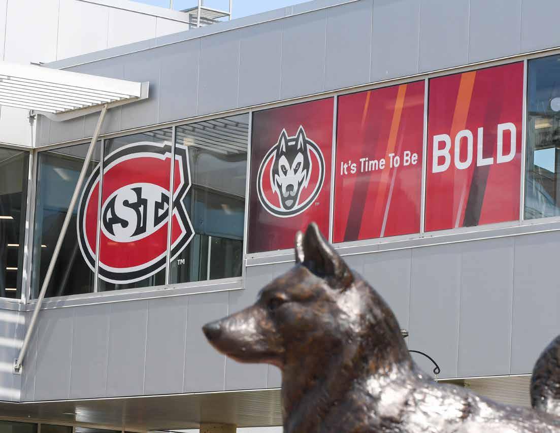
It’s Time to be BOLD
SCSU is creating a new vision for what it means to be a university. We call this It’s Time – our framework for the future. We are taking steps to address challenges facing higher education. We are determining new ways to extend our reach and provide access to a high-quality education to students in Minnesota, around the country and the globe. Our teacher-scholars are learning alongside students and connecting them to industry experts and area leaders. All of this happens with a portfolio of offerings in fields that are in high demand and build Minnesota’s workforce.
In 2019, we declared that the time had come to make changes at St. Cloud State University. And synergizing with this campaign, our call to action is It’s Time to be BOLD.
We stand together to take bolds steps into a future for SCSU that is built on investments that will grow the university in new ways. We are breaking the mold. We are trying new things and innovating to improve the work that we do. Our work focuses on students and their futures.
Together we are BOLD | INNOVATIVE | FOCUSED
16 BRAND STRATEGY
THE SIGN OF THE HUSKY
The Husky is intelligent and free spirited. We are agile and resilient in new environments. We are driven and will hunker down to take on new challenges, discover something new, or create a solution. We are welcoming and enjoy the diversity of the members of our pack. We work together as a community but support each other as we show our unique strengths and become leaders in our professions and our communities.
We know our campus offers a special experience for all of its members, and we encourage everyone to proudly display the sign of the Husky.


17 BRAND STRATEGY
ONE UNIVERSITY
Harnessing our Shared Strengths
Maintaining unwavering consistency in how we promote St. Cloud State University will not only shape global perception but amplify the impact of each and every message.

18 VISUAL IDENTITY

19 VISUAL IDENTITY
CAMPAIGN ELEMENTS


Introducing patterns and a new secondary color


20 VISUAL IDENTITY
+

21 VISUAL IDENTITY
CAMPAIGN ELEMENTS
Beams
*Lines are 15° and/or -15° angles


22 VISUAL IDENTITY
Glimmer
Kinetic
Use texture patterns as backgrounds. The gray patterns should remain gray and not be altered to one of the other colors in our palette.
23 VISUAL IDENTITY Waves
Connection
Prism
CAMPAIGN ELEMENTS
It’s Time to be BOLD
BOLD |
INNOVATIVE | FOCUSED
Use It's Time to be BOLD as a call to action. Do not substitute any other words for BOLD or italicize the statement when displaying. Do not try to recreate art, instead use available artwork. Plain text formatting is okay when using in body copy.
Use BOLD | INNOVATIVE FOCUSED as shown in stacked or one line format. Do not try to recreate art, instead use available artwork.
24 VISUAL IDENTITY
BE BOLD. BE YOU. BE A HUSKY.
“Be Bold. Be You. Be a Husky." artwork is available for large display instances. Plain text formatting is okay when used in body copy.
SCSU
Owning our acronym, it's our SCSU
REFERRING TO OUR UNIVERSITY
After an initial mention of St. Cloud State University, it is acceptable to use the informal “SCSU” in subsequent references. Use SCSU only in a familiar context where the reader will know who we are. In running text, capitalize the word “University” when used alone to refer specifically to St. Cloud State University. When using “university” in a general sense, it is lower case in running text.
Example:
The University encourages students to be bold thinkers who innovate and are focused on their future. We are one of the largest universities in Minnesota.
25 VISUAL IDENTITY
SCSU LOGOTYPE
The SCSU logotype – Center is the primary mark of the St. Cloud State University identity system and the preferred visual representation of the university to display.
–Do not alter in any way
–Ensure the outer white line remains on the ‘St. C’ in all instances –Do not attempt to manually build the logotype
–The one-color versions should never print Spirit Red.
All black or all white are the only one-color options. –Review additional logotype restrictions under usage guide
SCSU Logotype – Center – Full Color
SCSU Logotype – Horizontal – Full Color
26 VISUAL IDENTITY
SCSU Logotype – Extreme Horizontal – Full Color
LOGOTYPE
Reverse Color Versions
One-color Versions
SCSU WORDMARK
When the elements of the logotype are separated, the portion shown below is referred to as the wordmark. The wordmark will have limited use. Before using the wordmark on its own, contact University Communications for approval.
SCSU Wordmark –Horizontal – One-color versions
SCSU Wordmark –Extreme Horizontal – One-color versions
27 VISUAL IDENTITY
UNIT LOGOTYPES
UNIT LOGOTYPE
The unit logotype option gives the name of academic units a higher level of attention and can be used when it is extremely important that the school, college or department be the main focus.
To ensure brand consistency, subunits should use the signature of their largest umbrella unit or the university primary mark.
–University Communications must create all signatures
–Individual units may not alter, modify or redraw signatures in any way (the unit cannot drop the St. Cloud State University line)
–Units cannot add additional text or unit taglines to the unit logotype lockup
–The one-color versions should never print Spirit Red. All black or all white are the only one-color options.
* Moving forward, we have simplified the unit logotype offerings to a centered and left aligned unit logotype. When requests are made for a units logotype, only the centered and left aligned options (full-color and one-color versions) will be provided.
28 VISUAL IDENTITY
Full-color version
29 VISUAL IDENTITY Reverse version One-color version
‘ST. C’ PRIMARY LOGO
The “St. C” primary logo is part of the logotype. It is also available to use separately as a decorative or design element. Included are samples of proper use. The “St. C” is the primary graphic logo for the University and athletics. Athletics also has a secondary Huskies logo.
The “St. C” is presented here in the preferred three-color (full) representation.
The “St. C” should never be slanted, rotated or flipped. This symbol should never be used in place of the letter “c” in words, headlines, or copy. Review additional restrictions under usage guide.
HUSKIES SECONDARY LOGO
St. Cloud State’s secondary Huskies logo is primarily reserved for athletics purposes. It also can be used as a spirit mark by other departments and units. The “St. C” remains the primary St. Cloud State logo. When used, the Huskies logo should take a secondary position away from the “St. C.”
The Huskies logo should never replace the “St. C” in university or unit logotypes.
The Huskies logo is presented here in the preferred four-color (full) representation.
30 VISUAL IDENTITY LOGOS AND SEAL
UNIVERSITY SEAL
The St. Cloud State University seal, introduced in 2001, has very limited use. Primarily it is used for formal university applications such as diplomas and administrative stationery.
The university seal is a stand-alone mark of the University, which may not be combined with the logotype or “St. C”symbol as one mark.
The preferred two-color representation is shown above.
Black only and Spirit Red only versions are available.
TAGLINE INDIVIDUAL USAGE
The “Education for Life.” tagline is used as part of the St. Cloud State University logotype. In some cases, it may be used apart from the logotype.
If the tagline is being used apart from the logotype, it should be used as an anchoring element to the piece in proximity to the wordmark or logotype.
Uses of the tagline on its own should be approved by University Communications.
31 VISUAL IDENTITY

32 VISUAL IDENTITY
Black-only logo over photo
White-only logo over photo
USAGE ‘St. C’ and Huskies Secondary
Both the ‘St. C’ and Huskies Secondary logos must retain their outer white outline on all applications.
• Light backgrounds: Full-color and black-only options of the logos are acceptable.
• Medium/dark backgrounds: Full-color or one-color white only logos are acceptable. The logos must include the outer white border around the perimeter when used on any medium to dark background color to clearly define the black edge of the logo.

–The TM mark on the ‘St. C’ should print white when used on a red or black background
–The TM mark on the Huskies secondary logo always remains gray/ PMS 429
• Pattern/photo backgrounds: Ensure enough contrast to keep the TM symbol legible.
SPECIAL TREATMENTS
• Ghosted logos: The ghosted ‘St. C’ and Huskies secondary logo can be used as a graphic or background element. Always use the black-only versions and multiply or screen to achieve ghosted affect.
–Full-color and white-only logos should never be ghosted or cropped –Do not screen over red background in order to avoid a tint of red ‘St. C’ –Do not rotate the logos
–Clear space is not required
• Metallic inks: Use the black-only versions of the logos when printing metallic ink.
33 VISUAL IDENTITY
Ghosted (screened) logo over photo; Do not ghost full-color logos
Ghosted (multiplied) logo over Spirit Red; Do not screen logo over Spirit Red
USAGE
For brand success, it is important that logotypes and their elements are displayed correctly. Always use the correct fonts, color, relative positioning and size of all elements.
All requests for variations of any University marks should be approved by University Communications.
The following logos and images are outdated and should not be used at any time, including any representations of the former Blizzard secondary logo.
Never distort any portion of the logos, logotype or signature. e.g. squish or distort – transform proportionately
Never tilt or rotate the logotype or logos
Never add a drop shadow or other Photoshop effects to logos and logotypes
There are no Spirit Red only versions of the logotype or logos. There are no two-color variations (e.g., black and white, red and white, red and black)
Never remove or add graphics/text to the logos or logotype
Never change the color of logo and logotype elements e.g., the ‘St. C’ logo is never Spirit Red
34 VISUAL IDENTITY
CLEAR SPACE REQUIREMENTS
A minimum clear space around the logotype is required to prevent the logotype from being crowded by other elements or the edge of the page. The clear space requirement may need modification in very large or very small formats.
Contact University Communications with questions about exceptions.
For use of the logotype on merchandise, please contact University Communications for approval on clear space and minimum size requirements.
All St. Cloud State logotypes follow the clear space requirements below
All unit logotypes follow the clear space requirements below
Clear space amount is determined approximately by multiple heights/widths of the letter “S” at the beginning of St. Cloud State wordmark within the logotype.
Clear space for print and electronic use are the same as shown.
There is no set minimum clear space for the “St. C” and Huskies logo when used alone, however please keep visual relief around the logos and don’t overlap any text or other graphic elements on top.
35 VISUAL IDENTITY
COLOR PALETTE
PRIMARY COLOR PALETTE
Spirit Red
PMS: 200
CMYK:
C 0 M 100 Y 65 K 12
RGB: R 211 G 18 B 27
HTML: CD041
Madiera: 1147
Blizzard White
CMYK:
C 0 M 0 Y 0 K 0
RGB:
R 255 G 255 B 255
HTML: FFFFFF
Madiera: 1000
SECONDARY COLOR PALETTE
Silver Gray
PMS: 429
CMYK:
C 6 M 0 Y 0 K 34
RGB:
R 167 G 177 B 183
HTML: A6BOB7
Madiera: 1011
Bold Orange
PMS: 165
CMYK:
C 0 M 60 Y 100 K 0
RGB:
R 245 G 130 B 32
Glacier Blue
CMYK:
C 24 M 0 Y 0 K 48
RGB:
R 113 G 140 B 154
Our primary palette will always include
Granite Black
CMYK:
C 0 M 0 Y 0 K 100
RGB:
R 35 G 31 B 32
HTML: 000000
Madiera: 1002
Our SCSU color palette has two layers: primary and secondary (supportive colors). Think of Spirit Red and Granite Black as historic, foundational, and timeless. All communications must contain our two primary colors.
Spirit Red & Granite Black
with supportive colors Blizzard White and Silver Grey used as neutrals. The inclusion of white in the color palette is intentional as the use of “white space” helps emphasize the logo, text and messaging. Accents of grey in layouts enhances the brilliance of our two primary colors.
,
Blizzard White
36 VISUAL IDENTITY
Spirit Red
Hello Bold Orange.
We welcome a new color that evokes the vibrancy of the sun, the boldness of our character and the excitement for our future. Unique and exciting color palettes can be created using our new bold orange to add a punch of energy to materials.
Glacier blue represents the calmness and consistency of the Mississippi river. Glacier blue is a grounded color, it’s nurturing, yet driven, it’s intellectual, yet it’s reflection of who we are and our impact (or influence) on the world around us.
WHILE OUR COLOR PALETTE IS FLEXIBLE, PLEASE USE RESTRAINT WHEN USING OUR SECONDARY COLORS.
Silver Gray Granite Black
Use as accents to help convey mood, emotion, tone or action. Our secondary color palette should never be used without our primary colors.
Bold Orange
Glacier Blue
37 VISUAL IDENTITY
TYPOGRAPHY
BOLD | INNOVATIVE | FOCUSED
CAMPAIGN FONT
Headlines:
All caps and modified italics
Modified Italics:
Medium and Bold
Body Copy:
Upper and lower case
*Replace capital E with horizontal Elipsis Glyph when using Bold Italic
CONDUIT
Light
ABCDEFGHIJKLMNOPQRSTUVWXYZ abcdefghijklmnopqrstuvwxyz
Light Italic
ABCDEFGHIJKLMNOPQRSTUVWXYZ abcdefghijklmnopqrstuvwxyz
Medium
ABCDEFGHIJKLMNOPQRSTUVWXYZ abcdefghijklmnopqrstuvwxyz
Medium Italic
ABCDEFGHIJKLMNOPQRSTUVWXYZ abcdefghijklmnopqrstuvwxyz
Bold
ABCDEFGHIJKLMNOPQRSTUVWXYZ abcdefghijklmnopqrstuvwxyz
Bold Italic
ABCDEFGHIJKLMNOPQRSTUVWXYZ abcdefghijklmnopqrstuvwxyz
ROBOTO Web Use / Alternative
Light
ABCDEFGHIJKLMNOPQRSTUVWXYZ abcdefghijklmnopqrstuvwxyz
Light Italic
ABCDEFGHIJKLMNOPQRSTUVWXYZ abcdefghijklmnopqrstuvwxyz
Regular
ABCDEFGHIJKLMNOPQRSTUVWXYZ abcdefghijklmnopqrstuvwxyz
Regular Italic
ABCDEFGHIJKLMNOPQRSTUVWXYZ abcdefghijklmnopqrstuvwxyz
Medium
ABCDEFGHIJKLMNOPQRSTUVWXYZ abcdefghijklmnopqrstuvwxyz
Medium Italic
ABCDEFGHIJKLMNOPQRSTUVWXYZ abcdefghijklmnopqrstuvwxyz
Bold
ABCDEFGHIJKLMNOPQRSTUVWXYZ abcdefghijklmnopqrstuvwxyz
Bold Italic
ABCDEFGHIJKLMNOPQRSTUVWXYZ abcdefghijklmnopqrstuvwxyz
38 VISUAL IDENTITY
ADOBE GARAMOND PRO
Regular
ABCDEFGHIJKLMNOPQRSTUVWXYZ abcdefghijklmnopqrstuvwxyz
Italic
ABCDEFGHIJKLMNOPQRSTUVWXYZ abcdefghijklmnopqrstuvwxyz
Semibold
ABCDEFGHIJKLMNOPQRSTUVWXYZ abcdefghijklmnopqrstuvwxyz
Semibold Italic
ABCDEFGHIJKLMNOPQRSTUVWXYZ abcdefghijklmnopqrstuvwxyz
Bold
ABCDEFGHIJKLMNOPQRSTUVWXYZ abcdefghijklmnopqrstuvwxyz
Bold Italic
ABCDEFGHIJKLMNOPQRSTUVWXYZ abcdefghijklmnopqrstuvwxyz
TIMES NEW ROMAN Garamond Alternative
Regular
ABCDEFGHIJKLMNOPQRSTUVWXYZ abcdefghijklmnopqrstuvwxyz
Regular Italic
ABCDEFGHIJKLMNOPQRSTUVWXYZ abcdefghijklmnopqrstuvwxyz
Bold
ABCDEFGHIJKLMNOPQRSTUVWXYZ abcdefghijklmnopqrstuvwxyz
Bold Italic
ABCDEFGHIJKLMNOPQRSTUVWXYZ abcdefghijklmnopqrstuvwxyz
PRIMARY FONTS
Conduit (Roboto), Adobe Garamond Pro (Times New Roman), and Berkeley are St. Cloud State University’s primary fonts.
Roboto and Times New Roman are alternatives for Conduit and Adobe Garamond Pro. Roboto is a Google font that can be downloaded for free.
Berkeley is the official typeface for the logotype, signature and wordmark and is also used for commencement bulletins, diplomas, and other stationery.
BERKELEY Used for SCSU wordmark only
Regular
ABCDEFGHIJKLMNOPQRSTUVWXYZ abcdefghijklmnopqrstuvwxyz
Regular Italic
ABCDEFGHIJKLMNOPQRSTUVWXYZ abcdefghijklmnopqrstuvwxyz
Bold
ABCDEFGHIJKLMNOPQRSTUVWXYZ abcdefghijklmnopqrstuvwxyz
Bold Italic
ABCDEFGHIJKLMNOPQRSTUVWXYZ abcdefghijklmnopqrstuvwxyz
39 VISUAL IDENTITY
PHOTOGRAPHY
WHEN AND HOW TO USE
As we go in a new direction, capturing the right moments is important in sharing the energy and vibrancy that represents SCSU. Sharing these moments in the right way helps to convey what BOLD, INNOVATIVE and FOCUSED really means.

Images are selected to show dynamic interactions between students, facility, and leadership while on campus, out in the community or attending events.
• Relationship Focused
• Faculty and student relationship
• Engaged in campus activities
• Lifestyle /campus life
• Specialized major focused
• Sports program focused
• Graduate program focused
• Engagement Focused
• Engaging with community
• Engaged off campus: special programs, International programs, internships

40 VISUAL IDENTITY


41 VISUAL IDENTITY
CREATIVE EXAMPLES


42 APPLYING THE BRAND


43 APPLYING THE BRAND
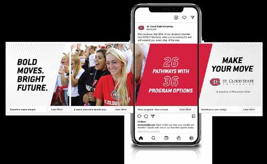
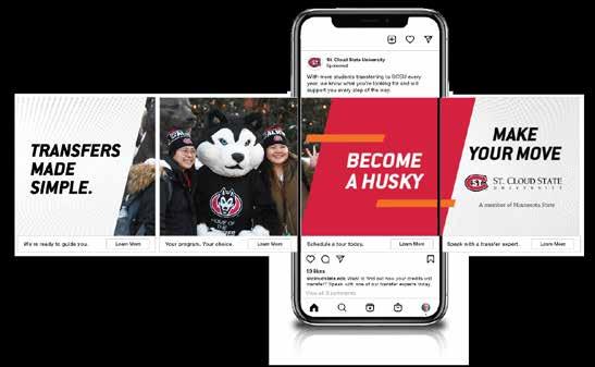
CREATIVE EXAMPLES BE
BOLD. BE YOU. BE A HUSKY.
WE’RE FOCUSED ON YOUR FUTURE.

44 APPLYING THE BRAND


45 APPLYING THE BRAND
St. Cloud State University does not discriminate on the basis of race, sex, color, creed, religion, age, national origin, disability, marital status, status with regards to public assistance, sexual orientation, gender identity, gender expression, or status as U.S. veteran. For additional information, contact the Office for Institutional Equity & Access, (320) 308-5123, Admin. Services Bldg. Rm 121. Contact the sponsoring department/agency listed above. A member of Minnesota State Department 720 4th Ave S, St. Cloud, MN 56301-4498 T 320.308.0000 / F 320.308.0000 stcloudstate.edu/dept STATIONERY
are samples of the official University letterhead and business cards. Letterhead and business cards can be ordered
Printing Services;
information
Official letterhead - Not shown actual size Business card, front – Actual size Business card, back, option 1 – Actual size Additional back options available 46 STATIONERY Your Name Here Your Title Here T 320.308.0000 / C 320.000.0000 F 320.308.0000 YourName@stcloudstate.edu Financial Aid Office Administrative Services 106 720 4th Ave S St. Cloud, MN 56301-4498 stcloudstate.edu
Shown
through
see contact
on the resources page in this book.
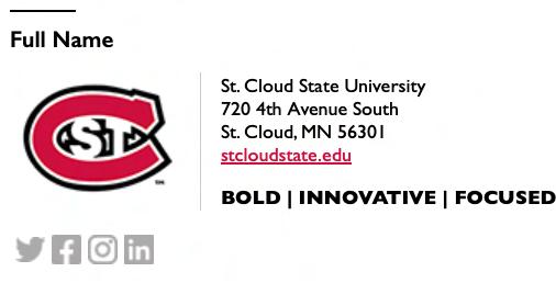
EMAIL SIGNATURE
Visit
https://www.stcloudstate.edu/ucomm/design-services/signature-maker.aspx to create your SCSU email signature

Use of an institutional signature in email correspondence reinforces your professional affiliation with St. Cloud State University while providing consistency for external audiences.
GUIDELINES
–Personal pronouns available
–Unique graphics are not allowed
–Inspirational quotes are better suited for personal emails
–Keeping formatting as provided allows recipients to easily find similar contact details when receiving messages from multiple people at SCSU
47 EMAIL SIGNATURE
LET’S GO HUSKIES!
Our Rallying Call
Whether celebrating a winning score or the conclusion of convocation or commencement, “Let’s Go Huskies!” is a show of encouragement, excitement, and recognition that we are all part of vibrant campus community, whether a current student or alumni, an employee or member of the community.

48 ATHLETICS

49 ATHLETICS
ATHLETICS BRAND
ATHLETICS LOGOTYPES
St. Cloud State’s Huskies Athletics is visually represented by a series of closely related logos and logotypes: the primary “St. C” logo and the Huskies secondary logo along with the associated wordmarks without and with sport identification. These marks make up the Huskies Athletics brand identity which ensures consistent use of the department’s logos, logotypes, color and typography.
Guidelines listed here are for general university and apparel uses as they relate to St. Cloud State Huskies Athletics. For uniform, team and other athletics specific uses, contact @stcloudstate.edu for the complete Athletics Graphic Standards Guide.
‘St. C’ logo with St. Cloud State athletics wordmark
50 ATHLETICS
Huskies logo with St. Cloud State athletics wordmark
‘St. C’ logo with St. Cloud State athletics wordmark + specific sport identification
Huskies logo with Huskies Athletics wordmark + specific sport identification
ATHLETICS WORDMARKS
Custom St. Cloud State and Huskies wordmarks have been created specifically for St. Cloud State athletics uses. These wordmarks are reserved to represent Huskies Athletics and cannot be used for unit logotypes.
SPORT SPECIFIC LOGOTYPES
(St. C or Huskies logo + sport specific wordmark)
Athletics logotypes consist of the primary “St. C” logo and the secondary Huskies logo along with associated wordmarks and sport identification. These logotype applications are reserved to represent Huskies Athletics and cannot be used for unit logotypes.
Huskies Athletic wordmark
St. Cloud State Athletics wordmark
51 ATHLETICS
ATHLETICS BRAND
UNACCEPTABLE USES OF ATHLETICS LOGOS AND LOGOTYPES
For brand success, it is extremely important that logotypes and their elements are displayed correctly. This includes always using the correct fonts, color, relative positioning and size of all elements.
Never rotate the ‘St. C’ logo
Never rotate the Huskies logo
Never add unapproved typography
Never alter the placement of the type
ATHLETICS FONT
Eurostile has been specified for support applications and collateral materials related to Huskies
Athletics, e.g., website, schedule cards, posters, banners, communications and more.

Never add special effects, e.g., drop shadow
Never separate or modify the Huskies logo
Never use unit titles outside of athletics
Athletics-specific wordmark elements with university wordmark elements are not allowed
Eurostile Used for SCSU Athletics only
Regular
ABCDEFGHIJKLMNOPQRSTUVWXYZ
abcdefghijklmnopqrstuvwxyz
Bold
ABCDEFGHIJKLMNOPQRSTUVWXYZ
abcdefghijklmnopqrstuvwxyz
52 ATHLETICS

53 ATHLETICS
REQUIREMENTS
MINNESOTA STATE
St. Cloud State University is a member of Minnesota State, a system of colleges and universities united to provide an extraordinary education that is affordable, accessible, enhances quality of life, and ensures prosperous communities.
The Minnesota State member logo or statement is required on all SCSU publications, website, advertising and stationery.
AFFIRMATIVE ACTION STATEMENT OF NONDISCRIMINATION
All university publications must carry a form of the Statement of Nondiscrimination. The complete text of the statement must always be used on all major publications used for the purposes of recruitment. A shortened version may be used in certain circumstances listed below. Requests for other exceptions should be submitted to University Communications.
The complete text of the official university nondiscrimination statement meets the minimum requirements of the regulations enforced by the U.S. Department of Education Office for Civil Rights. It must not be modified, changed or edited.
St. Cloud State University does not discriminate on the basis of race, sex, color, creed, religion, age, national origin, disability, marital status, status with regards to public assistance, sexual orientation, gender identity, gender expression, or status as a U.S. veteran. For additional information, contact the Office for Institutional Equity & Access, (320) 3085123, Admin. Services Bldg. Rm 121.
St. Cloud State University is committed to legal affirmative action, equal opportunity, access and diversity of its campus community.
(http://scsu.mn/scsuoea)
Small recruitment materials (postcards, direct mail pieces, posters, etc.) X
Large recruitment materials (viewbooks, first contact piece, etc.)
General advertising (print ads, posters, fliers, etc.) X
Official Reports (Business Plan, Profile, Annual Reports, Board of Regents materials, etc.) X
Admission materials (applications, financial aid materials, checklists, etc.)
54 RESOURCES
Minnesota State Logo Minnesota State - text only Full statement Short statement
PUBLICATION SHORT FULL
X
X Employment packets X Website X Employment ads X
CONTACTS FOR ASSISTANCE, APPROVALS AND GRAPHICS
FACULTY AND STAFF
➔ BRAND AUTHORITY
Contact: University Communications
320-308-3151
ucomm@stcloudstate.edu
University Communications is the authority on the university’s visual identity system and responds to questions regarding its application, including:
–Requests for unit logotypes for departments or units
–Clarification of subjects in this manual
– Requests for exceptions under certain limited circumstances
➔ TRADEMARK LICENSING
Contact: University Communications
320-308-3151
tmlicensing@stcloudstate.edu
All uses of the university name, wordmark, seal, logos and mascots are covered by federal trademark laws. All university organizations and departments are required to follow the guidelines in this manual when purchasing or producing items bearing university identification, including apparel, coffee mugs, giveaways, caps and portfolios.
➔ PUR CHASING STATIONERY PRODUCTS
Contact: Printing Services
320-308-2105
printingservices@stcloudstate.edu
➔ SIGNAGE, WAYFINDING AND ENVIRONMENTAL GRAPHICS
Contact: Facilities Management
320-308-3166
facilitiesmgmt@stcloudstate.edu
STUDENTS
Registered student groups may use the St. Cloud State visual identity if they follow the guidelines in this manual. These groups may use the complete unit logotype, but are not required to. If using the complete unit logotype, contact University Communications to have it created. Students may not alter or redraw graphic elements and must ensure the marks meet the size and clear space requirements.
Registered student groups must get permission from University Communications to use any element of the visual identity on commercial goods and specialty items, such as apparel, coffee mugs, caps and portfolios.
ALUMNI
Individual alumni may not use the university’s marks, including the logo, signature, seal or “St. C” symbol.
Alumni groups may use the St. Cloud State visual identity system with approval from University Communications.
INDIVIDUALS EXTERNAL TO THE UNIVERSITY
This manual applies mainly to the St. Cloud State University community. Individuals, groups or companies outside of the University may contact University Communications for information about the St. Cloud State visual identity.
55 RESOURCES
LET’S GO HUSKIES!


