CURRICULUM VITAE
S e r g e i a n c h e n k o
PROFILE CONTACTS
I am a 24-year-old architecture student pursuing a master’s degree from Politecnico di Torino (PoliTo). Before arriving in Italy, I had been studying for a bachelor’s degree at one of the best architectural schools in Russia, SPSUACE, There, in St Petersburg, I got my first work experience during 3. Since the beginning of my academic career, I have been participating in architectural competitions to test and increase my creative skills. Here, in Italy during the first year of the master’s degree, I completed the internship at Atelier(s) Alfonso Femia (AF517) in Genova.

Adres: Via Bertrando Spaventa, 9-6B, 10134,Torino
E-mail: serjyanchi@gmail.com Phone: +39 351 5360091, +7 950 0348594
EDUCATION
Politecnico di Torino (PoliTo) Program: Architecture construction city. Turin, Italy
Saint Petersburg State University of Architecture and Civil Engineering (SPSUACE), Progtam: Architecture
St Petersburg, Russia
WORK EXPERIENCE
Atelier(s) Alfonso Femia (AF517)
Genova, Italy
MLA+ SpB
St Petersburg, Russia
Ёzh_team
St Petersburg, Russia
North-Western Design Workshops
St Petersburg, Russia
Master’s degree
Bachelor’s degree
2021-2023
2016-2021
Internship
Internship Freelance
Internship
ARCHITECTECT COMPETITIONS
Challenge Polito EGEA Energy for homes, a home for energy
AAG. Architecture workshop of Mendelson (team: 1st place)
#DUBLINCALL Dublin Cultural Center (the 3r d place)
Coziness Valley
LafarageHolcim Awards 2019/2020 (Qualifying stage)
#STOCKHOLMCALL Wood workshop
2019 Timber in the city Competition ACSA
#OSLOCALL Cultural Center for norwegian waterfront
#TURINCALL: Food laboratories for a new city museum
Affordable Housing Design Challenge in Phnom Penh
SOFTWARE COMPETENCES
Jul 2022Oct 2022
Jul 2020Sep 2020
Mar 2020Jun 2020
Jun 2019Feb 2020
Jan 2022
Aug 2021
Jul 2021
Nov 2020
Feb 2020
Dec 2019
May 2019
Apr 2019
Nov 2018
Aug 2018
Modeling soft: Revit, Rhinoceros + Grasshopper, ARCHICAD, SketchUP, Rhinoceros, AutoCAD;
Rendering soft: Lumion, Corona + 3Dmax;
Post-proсessing: Adobe PhotoShop, Adobe InDesign, Adobe Illustrator.
LANGUAGES

Tower, Bridge, and The View Platfrom in Nanking 21-28
CONTENTS


Ireland Cultural Centre 5 - 10 (ВDublin)
Sports Centre Parahovoi 27 - 32 (Murmansk)
Ireland Cultural Centre 11 - 18 (Turin)
EGEA Headquarter 33 - 38 (Alba, Piedmont)

Tower 2Where? 21 - 22 (Nanking)
Flying buttress Wing it! 23 - 24 (Nanking)


Park Coziness Valley 39 - 42 (Murmansk)
Landscape design in the Residence 5 Continent 43 - 48 (Izhevsk)
Belvedere Bellaozoid 25 - 26 (Nanking)

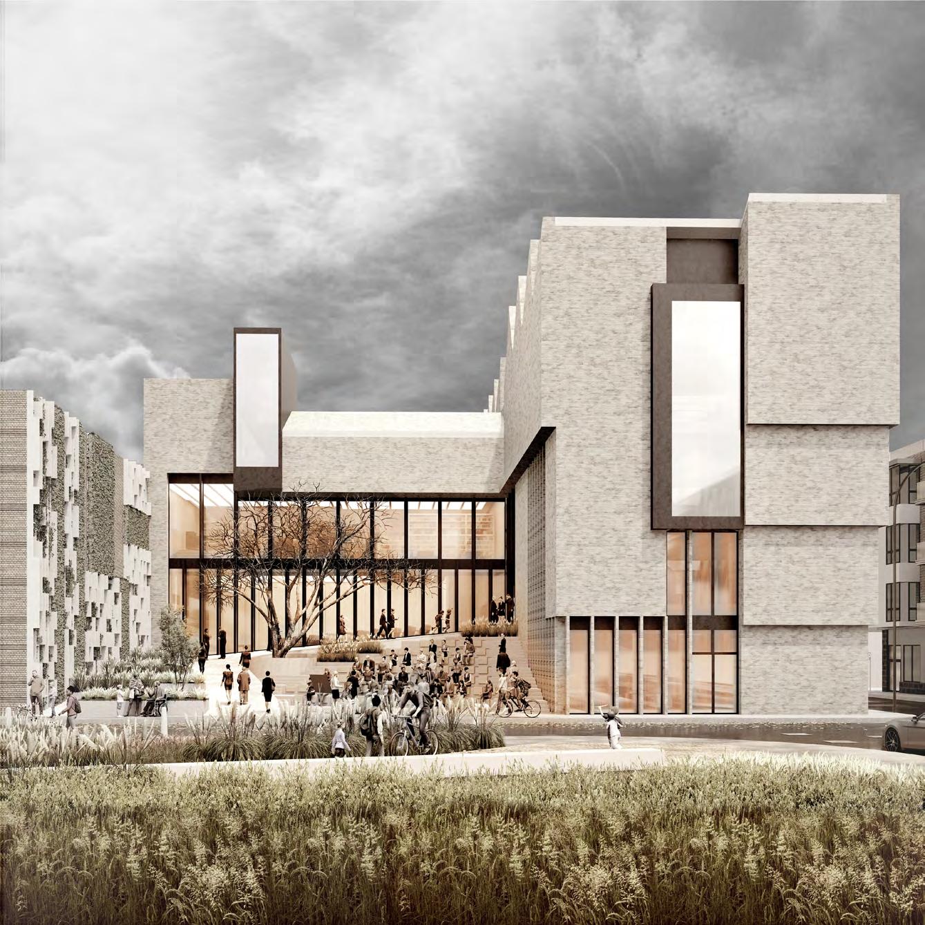
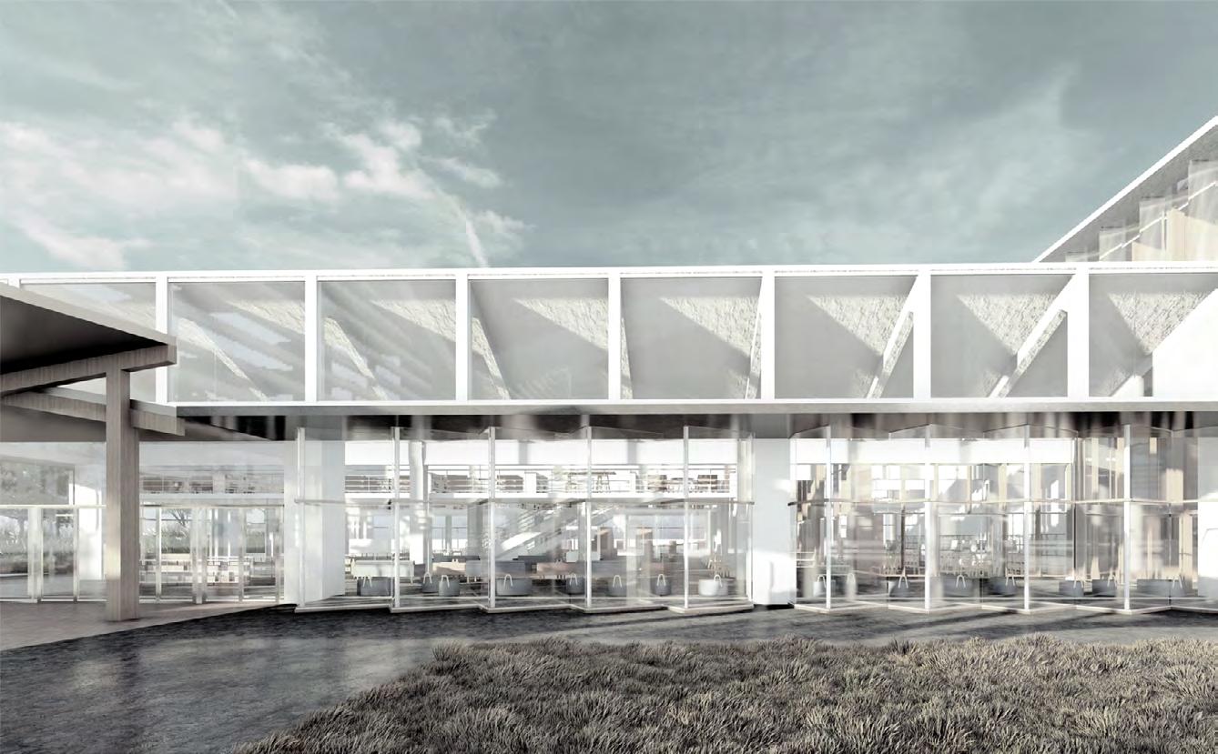
The urban fabric of the Ushers district of Dublin, the place where should host the new Ireland Cultural Center, can be marked by the crossing industrial past represented in the old factories and by the post-industrial present which was embodied in the new residencies, and public spaces. At the same time, the small yard beyond the main entrance is the continues of the park, which is located in front of the museum. At the same time, the small yard beyond the main entrance is the link between the museum and the public park, which is located on the front of the Cultural Center. Playing the role of the outdoor auditorium, it should transform the abounded area into the point of attention.
Given the shape of the angle, the building forms not only the cozy garden along the side of the street with the park but also an accent on the street corner, which allows to male the visual axes with the ancient church on the other side of the street. The functional program of the Cultural Center suggests for visitors such areas as a library with coworking, the auditorium for 200 seeds, and the cafeteria. All zones of the museum are grouped around the central lobby with the round staircase, which unites 4 levels of the Cultural Center. The abundance of the upper light on the last level makes it possible to maximize the use of the natural uniform light for the exhibition.


3 floor

Exposition space 1
Exposition space 2
Exposition space 3
Exposition space 4
2 floor
Library + Coworking
Workshop spaces (photography)
Workshop spaces (painting)
1 floor
Auditorium
Workshop spaces (architecture)
Workshop spaces (sculpture)
0 floor
Maintenance equipment storage
Technical room (water / electricity)
Public toilets
Hall
Staff offices
Open auditorium
Cafe area
-1 floor
Mechanical car parking


The cross section of the building 1-1


The cross section of the building 2-2
The cross section of the building 3-3


MID-RISE RESIDENTIAL BUILDING IN TORINO JÖRMUNGANDR
The project Jörmungandr acts more as an experiment with parametric architecture tools than as a traditional residential project. The purpose was set to build an apartment building using the set of given apartments from famous architectural projects. The conceptual part of the project was designed in the Grasshopper: from the general shape to the random placement of the blocks and development of the distribution system and finally, the model was adjusted in the Rhinoscense. The use of parametric tools made it possible to link the General conceptual form and the Random placement of blocks by the algorithm, thus, once adopting the General shape, the Final model changes.
Jörmungandr named after the great serpent from the Scandinavian mythology that encircles the planet is a complex housing project taking place in the north of Torino which unites two separated land plots into one live organism. It’s a composition of fourteen different units combined in the most optimal way to maximize the general function of the building. completing the design with the complex circulation elements, the ground floor is completely assigned for open public use, however, the rest of the levels are exclusively for residential use only. The diverse configuration of the apartments required the creation of a wide distribution system which was transformed into a common space


GRASSHOPPER ALGORITHM TO BUILD A GENERAL FORM
Blocks construction
Extrusion
1_SITE
2_PIXELIZATION
Dividing the site into equal square modules with dimensions of 3x3x3m.


Vector of the bridge

Courtyard 6A outline
The line of the horizontal distribution system
3_EXTRUSION
Extruding the surface of the plot area on 8 levels (26.4 m)

Points culling
Courtyard 6A enterance
Courtyard 6B outline
Tunnel profile
4_COURTYARD
Creating 2 open courtyards by carving out the central part of the building mass


5_TUNNEL
Linking by pedestrian route the park and the square
Terraces curving surface
Points culling
Points culling
6_TERRACING
Carving out terraces with the views on the river and park
Arcs curving surface
Points culling
7_ARCS
Arcs carving in the facades make the plot passable
STEPS OF THE GRASSHOPPER ALGORITHM TO ASSEMBLE THE BLOCKS

1_CONSTRUCTED GENERAL FORM
PROJECTS OF WHICH APARTMENTS WERE USED
1_MRVDV, Wozoco, 1997
2_ALIGNING LINES AND POINTS OF THE FIXATION

2_MRVDV, Mirador, 2005
3_RANDOMLY PLACED APARTMENTS
3_Amann Canova Marui, 2009
4_Bruther, Maison julievictoiredaubie, 2018
5_Michael maltzan, Star apartments, 2013
6_LAN Architecture, 40 housing units, 2014




7_MRVDV, Silodam, 2003
8_BIG, Mountane dwilling, 2008
9_Aldo Rossi, Monte Amiata, 1974
10_MAIO, 110 rooms, 2016
11_Bruther, 50 housing, Units 2013
OPTION_ 1
General form 1
The aligning lines and the fixation points

Blocks layout 1_1


TYPES OF THE COMPOSITION PATTERNS, USED IN GRASSHOPPER TO ASSEMBLE THE FACADES


Linear pattern
Stock pattern

Chess pattern
Blocks layout 1_N


General form N
OPTION_ N
Blocks layout N_1


BRIDGE, TOWER, AND THE VIEW PLATFORM IN NANJING
CONTEXT
The projected area was located in the historical city Nanjing which is famous as the South capital of China, in the heart of the historical district Hehua Tang. This part of the city is notable for the preserved traditional Chinese urban fabric. The southern border of the district is shaped by the Nanjing city wall near which the projected land plot was placed. Thus, the territory is shadowed by the 15 m height solid structure which is the main disadvantage of the project. However, from the top of the wall, one can see the panoramic view of the city, which motivates people to climb on it. To make it by 3 options became the task of the project.
THE EXERCISE
It was suggested to design three ways for people of going up on the Wall to provide them with a different experience of climbing. The first option could become the Tower, a traditional type of structure that hosts a staircase inside which embodies a directed vertical motion of human up. In contrast, the second one has named a Flying buttress and it should transfer people by the arc trajectory. The last type of structure had to get people not on but above the City wall, on the view platform, which has been called a Belvedere, as an architecture classical element. It should make it possible for people to come under the platform..


2WHERE? I EXERCISE - TOWER


For the exercise of the tower the main concern was to stay as much in touch with the context as it is possible. The inner courtyard, shaped by a double spiraling staircase, and a tower with side platforms, refers the traditional housing in Nanjing. The idea with paired stairs was integrated in the project to balance
out the monotonous ascent on the city wall and to offer vivisitors some options for climbing. The rectangle modular structure of The Tower which consists of timber beams and columns, respescts the local urban fabric consisting of traditional chinese houses.

WING IT! II EXERCISE - FLYING BUTTRESS

As in the previous task, the staircase, supported by cables, was designed to get people on the city wall. However, in this case, the space under the stairways was liberated from the columns to minimize the footprint of the structure on the land plot and preserve the potential of the territory as a public space. The idea of crossing two axes to give visitors a sense of choice of the climbing way


and the inner courtyards’ element came from a previous project. A large pillar is fixed to the ground to hold the structure with cables. This big pillar is designed and structurally wise the stable core that gives the rest of the structure the possibility to fly. It is almost a flying buttress that is being held instead of holding. The connection to the wall remains subtle.

BELLAOZOID III EXERCISE - BELVEDERE


The structure is aimed to take visitors above and beyond the city wall. To solve the question of going up of people on the level of the wall the double helix staircase was added to the project. The idea of the staircases, inspired by Bramante and Palladio, is to just get from point A to B but to try and make this experience as interesting as it can be possible. It is held by the three eclipse cages,
shaping three courtyards, which refers to the morphology of the traditional Chinese houses. The belvedere itself sits above the wall, offering the viewers a 360 panorama of Nanjing. The elliptical roundness of the stairs is articulated at the belvedere too, making the structure seem like a peaceful organism that just exists in the given surroundings.

SPORTS CENTER IN SAINT PETERSBURG PARAHOVOI
MISSION
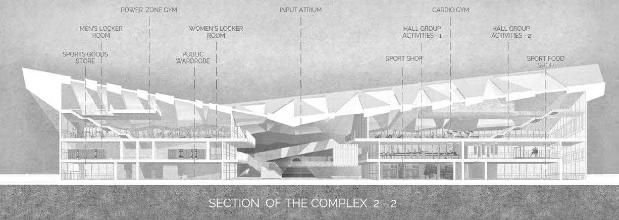
Located in the projected residential quarter in the ex-industrial territory, Parahavoi, a sports complex, aimed to become the new neighborhood’s center of sports life and promote connecting the community through the sport. The functional program of the complex includes such activities as the hockey arena, sports school, the gym, restaurants, and commercial areas. Due to the use of the glass as the border between functional zones instead of the solid walls, visitors of the restaurants, for instance, have an opportunity, to watch people doing karate in the sports school or training on the hockey in the rink, what should motivate people in doing sport.
DESIGN

1 Transparency Using glass instead the walls helps to create an effect of a single space and the presence of people who is different activities in one room. In this way, it will be possible to strengthen the local community though the sport.
2 Uper natural lighting Considering the large dimension of the complex, the upper natural light should become the main light source for the most crowded part of the building where the gym and commercial areas were hosted.
3 Centric layout This traditional kind of space makes navigation inside the building easier for visitors and sportsmen.


SECURITY OF THE COMPLEX
WARDROBE FOR STUFF AND SPORTSMANS
HOCKEY EQUIPMENT WEARHOUSE
CONFERENCE HALL - 1
BASKETBALL HALL
CONFERENCE HALL - 2
LOCKER ROOM FOR STUFF OF THE CAFE
PRODUCT STORAGE
HOCKEY ARENA
KITCHEN CAFE FOR COLD DISHES
KITCHEN CAFE FOR HOT DISHES
RESTAURANT LEVEL 1
TECHNICAL ROOM
LOCKER ROOM FOR VISITORS OF ICE RINK
PUBLIC TOILET
BLOCK OF STORAGE AND STUFF ROOM
SPORTS GOODS STORAGE
SPORTS SHOP
PUBLIC WARDROBE
STORAGE OF THE SHOP
Plan of the ground floor


MEDICAL BLOCK


SYNTHETIC ICE HALL
BLOCK OF TOILETS AND SHOWERS
STORAGE OF SPORTS EQUIPMENT
STORAGE OF SPORTS EQUIPMENT
LOCKER ROOM FOR TRAINERS
BLOCK OF TRAINERS
ADMINISTRATION BLOCK
CONFERENCE ROOM
LOCKER ROOM FOR STUFF OF THE BAR
PRODUCT STORAGE


KITCHEN OF THE BAR
SIDE ENTRANCE
SMALL SHOP
MAIN ATRIUM
SPORT CLOTHING SHOP
STORAGE OF THE SHOP
FOOD SHOP
SPORT SHOP
Plan of the second floor

SPORTS HALL FOR YOGA - 1 MASSAGE BLOCK
GYM FOR MARTIAL ARTS - 1
CHILDREN’S MALES’ LOCKER ROOM
CHILDREN’S FEMALES’ LOCKER ROOM
GYM FOR MARTIAL ARTS - 2
CAFE HALL
PUBLIC TOILET
CAFE STORAGE
RECEPTION DIRTY COOKWARE
FOOD DELIVERY
TRIBUNES FOR 750 PEOPLE
SOUVENIR STORAGE - 2
SOUVENIR STORAGE - 1
LOBBY OF THE GYM
FEMALES’ TRAINING LOCKER ROOM
MALES’ TRAINING LOCKER ROOM
FEMALES’GYM LOCKER ROOM
MALES’ GYM LOCKER ROOM
FOOD DELIVERY
TRANSLATOR ROOM - 1


TRANSLATOR ROOM - 2
STORAGE OF SPORTS EQUIPMENT
PUBLIC TOILET
HALL FOR GROUP ACTIVITY - 3
HALL FOR GROUP ACTIVITY - 2
HALL FOR GROUP ACTIVITY - 1




THE ENERGY COMPANY’S HEADQUARTER
THE CONTEXT
The goal of the workshop organized by Politecnico di Torino was to merge architecture and engineering students in the work on the project of the real energetic company’s headquarters. The projected area is located in Alba, a small but historical town in the Piedmont region of Italy. Alba is famous for two things: the first Nutella factory and the beautiful hills landscape under UNESCO protection. At that moment the EGEA company had its headquarters in Alba, but it was going to expand and needed the renovation of its main office building. The headquarters’ land plot hosted several buildings: a former power station, an old warehouse, and a new office building.
THE DESIGN
The objective of the project suggested by our team reflected our slogan: Sustainability through renovation. Following that goal, all existing buildings were preserved and reused. Removing all fences and arranging the public space inside with a restaurant, park, and library aimed to attract more people to the territory and return this land plot to the town community. This step should present the EGEA as an open and customer-oriented company. The heart of the project has to become the client-service hall which was placed in the refurbishment building of the warehouse: this open hall which hosts meeting places, a library, and the EGEA museum could become the point of the attraction.

Masterplan of the headquarter

OFFICE LAYOUT


When planning the office, great attention was paid to common areas such as meeting, resting, and dining zones to stimulate employees to communicate and share their ideas. The two different layouts of the 2nd and the 3rd floor represent the different approaches to arranging inside the workspace: the orthogonal and the irregular. The second floor is a rethought traditional open-space office. However, to correct the main disadvantage of this office type
noisiness, every desk was isolated by the 1.5m high board from 3 sides. The space between the groups of the tables was occupied by the transparent meeting rooms or lounge zones. In contrast, the third floor was focused to create more private space. It consists of transparent rooms placed in irregular order. Every room hosts desks for 4-7 workers, or manager room, or a meeting room. Between the glass rooms, there are rest zones.




URBAN PARK COZINESS VALLEY IN POLAR CITY MURMANSK

COMPETITION OBJECTIVES
Murmansk, the biggest city located above the Arctic circle, today, is a depressing city. Cold and long winters, the poor infrastructure in the region, and the inadequate connection between the Kola Peninsula with mainland Russia have made this city uncomfortable for living. To solve these troubles, the city’s administration decided to improve the urban environment. The chosen land plot for the future park is located among the Soviet residential quarters and near the huge sports complex ‘Cozzy Valley’. It represents a square territory with the site nearly 0.5 km. The main goal of the project was to create a park with minimum disruptions to nature.
THE KOLA PENINSULA
Located in the far north of Russia, the Kola peninsula is a sparsely populated region that has access to the Arctic Ocean. Bordering Norway and Finland, the Kola Peninsula has always been a strategic region. It was the main reason to found the port Murmansk here at the end of the XIXth century. For centuries the Kola peninsula has been the ancient motherland for indigenous nations, such as the Sami, a small Finland tribe that lived in this region for thousand years. The long history of the region is represented in the cultural heritage of the region. In the Kola Peninsula, one can find the ancient maze or sacred places of the local’s tribes.


1 BBQ ZONE - SAMI SACRAL PLACES IN SEYDOZERO (900 BC)
The Barbeque zone is hidden in the forest, with the choice of an open space area or a glass pavilion that will provide warmth and comfort on long polar nights. In the design, the motives of the Seydozero landscape, a sacral place of the local Sami tribes. Such attributes as stone steles and fireplaces refer to the shaman temple and should create a mysterious but calm atmosphere.


The timber viewing tower was placed on the western side of the park to make possible the panoramic observation of the park itself and the adjoining forest hills. The shape of the tower was inspired by one of the oldest timber churches in the Kola Peninsula.

3 SEAFOOD MARKER - PORT OF MURMANSK ( XIX CENT)
Nowadays Murmansk is famous due to its seafood. And everybody who would like to taste local delicacies is invited to the food court market for a complete immersion into the atmosphere of the city port. The two buildings covered by gable roofs play the role of the south-western park gates.
The severe image of Teriberka, famous for the scenery lying on the shipwrescks of the ships which were used in the popular Russian movie Lyphiafan, serves as a parkour area for Thrill-seekers.

All-season sports equipment rental provides service to lovers of freestyle skiing, snowboards, scooters, or roller skates. And steep ramps for skiing refer to the terraced slopes of the mines of Kirovsk
The central amphitheater, which plays the role of a meeting point of the active and calm zones, serves as a Stage for performances in summer and of a well-equipped skating rink to brighten up the long polar winter nights. It amphitheater represents the future of the strong city Murmansk community.


LANDSCAPE DESIGN IN IZHEVSK RESIDENCE 5 CONTINENTS
CONTEXT
Foundedat the end of the XVIII century as a center of metal production in the Ural region, the Izhevsk has always played the role of the symbol of Russian heavy industry. And since the construction of the weapon factory in 1807, the city also has become an important part of the military-industrial complex of the country. Thus, the most produced AK-47 assault rifle was invented and sent into production in Izhevsk. However, even being the important industrial center of the region, the city had a poor quality of the city environment. The situation has started to change only in the last decade when the new master plan was introduced.
IDEA
The new quarter in the city center which includes the residential complex of Five continents aimed to become the representation of the modern standards of living. However, after the construction of the first two of five buildings, it become clear that the developer had made some mistakes on the urban scale. The St Petersburg office of MLA+ was asked to draft the rest of the residential complex together with the landscape design. Given the name of the complex, the idea of the project consists of creating 5 spaces, including 4 yards and one park, where every space symbolizes the nature subject or zone of the planet.

South Rock (was built before)
South sea
CONCEPT
South Rock (was built before)
River
Gemini Rocks
Ice сontinent
Yogo garden
Backwater
South Yard
North Yard
Green garden
Equator Ice Yard

Iceberg
Ice floe
NORTH YARD
The largest inner space of the residential complex Northen yard refers to the esthetic of nordic nature and embodies it in the cold muted colors. of the vegetation and street furniture. The yard has a relief landscape and literly consists of two planes. Its landscape is complemented by a small reservoir that fills up when it rains.


ICE TERRACE


Small and cozy, the Ice terrace is a private place created especially for inhabitants of the Iceberg house. It overlooks the Green garden, providing a picturesque view of the boulevard perspective. The whitestone pathway and sloping lawns represent ice shards, floating in a blue river of pebbles.

EQUATOR

Located right in the center of the residence, the space called “Equator” got its name not only as a meeting place for residents of the Noth and South courtyards, but also because of the dense park, reminiscent of tropical forests. First of all, the space plays the role of the rest zone, where people can chill on the fireline or read a book on the pergola in the shadow of the spruce. Obviously, considering the climatic reasons, the atmosphere of the rained jungles is reached not by the tropical vegetation, but by the colors of the material, the density of the park, and ferns.


SOUTH YARD
Drafted in the color gamma of the oasis, the South yard should represent the atmosphere of the savannas. However, given the cold climate of the Ural city, it was possible to represent only by the materials and colors, but not the vegetation. Thus, for example, yellow sand was used as the ground cover on the playground, and flowers of warm colors were used in the landscape In terms of the lay out, the South park consists of two zones, division by walk road: the playground for kids and sports ground. Both of them covered with yellow sand.


