3 minute read
Prospectus
MEET BAILEY
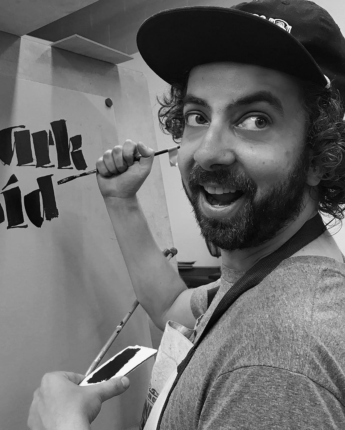
Dave Bailey is a typeface designer that is based in Oakland, California. Bailey designs fonts exclusively for Lost Type Co-op, Delve Fonts, and occasionally for local/small businesses that hire him. In his free time, Bailey practices sign painting for local clients and enjoys being hands on, which also inspires the digital typefaces that he creates. In 2016, Bailey enrolled in the year long certificate program in San Francisco, Type@Cooper West where he started collecting research, and planning out what would be the future type family of Prospectus. Bailey has currently designed and created seven complete typefaces but none of the typefaces are nearly as in-depth or expanded as Prospectus and are typically display types that don’t work for setting type.
Advertisement
The terminals of the upper and lowercase C create strong triangular shapes.
INTRODUCING PROSPECTUS
Created by Dave Bailey in 2011, Prospectus is a contemporary serif typeface with a large type family that includes optical sizes, which are type styles customized for viewing at different sizes. In total Prospectus has 48 different styles in its type family which allows the type to be used for everything from setting body text, posters, and sky banners. This versatile typeface is exclusively found and available on Lost Type Co-op.
italics
Even the italic characters maintain a fairly rigged shape that compliments the vertical stress of standard characters.
The tail of the uppercase Q is angled straight out but does not exceed the length of the descenders.
THE STORY BEHIND PROSPECTUS
Prospectus was heavily influenced by Imperial Roman letter forms that originated during the rise of the Roman Empire; these letter forms were capitals carved in stone (Cheney). Prospectus loosely translates to “look forward,” and does exactly that by drawing its triangular shaped serifs from Tarajan Column rubbing by Ed Catich, and beautifully balances its italic type with inspiration from the 20th century Czech calligrapher, Oldřich Menhart. Prospectus takes historical influences and brings them into the digital world of type with a wide range of fully functional styles that don’t deviate from its historical aesthetic. The practice of metal type setting paid close attention to minute details in a type’s design to accommodate different optical sizes. However, “as type designs were digitized, optical size compensation has sadly become uncommon. Prospectus would adhere to an attention to detail more common in the past, and more suitable for today’s typesetting,” (Cheney). With regards to being widely versatile for all type setting needs, Prospectus can support over 200 Latinbased languages so, “when the time comes, Prospectus will be there to enhance the balance and sophistication of your layouts,” (Cheney).
The lowercase Y has an arm that
crosses over the stem to create an exaggerated triangle.
The stress of the O is vertical because of its strong Roman letterform influence.
Prospectus is divided into four optical sizes: Prospectus Small, Prospectus Medium, Prospectus Large and Prospectus X-Large. Each group within the Prospectus type family has a full range in weights, as well as small caps, special ligatures, old style numerals, and italics. The Prospectus typeface has noticeable calligraphic influence, and smooth brackets that vary between the four optical sizes. All characters feature a very distinct triangular shape that plays within each character; “versatile and full of potential, this triangular form would become a core piece of this new family,” (Cheney).
The arm of the lowercase K is a perfect triangle the extends from the leg not the stem.
WHEN TO USE PROSPECTUS
Prospectus Small: functions best between 6 – 14pts, perfect for body copy and stays within the aesthetic of the Prospectus family with minimal contrast to create an easy flow while reading but with a fresh take on classic serif typefaces.
Prospectus Medium: functions best between 14 – 60pts, perfect for headers or small amounts of text that need to be emphasized to create beautiful and interesting typographic color within large areas of body copy. Prospectus Medium has slightly more contrast than Prospectus Small.
Prospectus Large: functions best between 60 – 100pts, perfect for full spread titles, posters, etc. Lots of contrast within its characters with fluctuating stroke weights seen in all crossbars, and several legs of characters.
Prospectus X-Large: built for any type above 100pts, perfect for posters, environmental design and skywritings. In this style, every interesting graphic detail is pushed to the extreme with high contrast in stroke weight and texture while maintaining its sharp crisp angles made by the repeating triangular shape.


