4 minute read
Gill Sans Nova
The Story
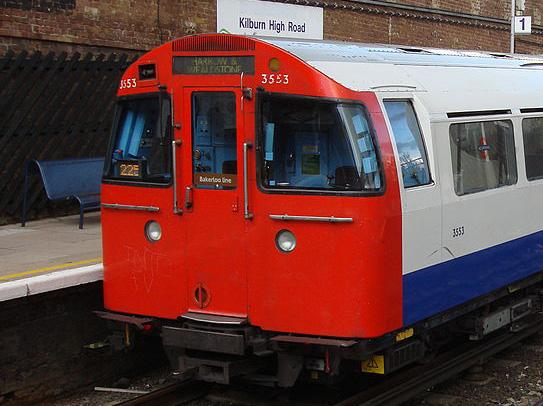
History Gill Sans Nova is an evolved version of Gill Sans. Eric Gill was inspired by his mentor Edward Johnston’s signage for the London Underground and Stanley Morison saw the possibilities for a new sans serif typeface. He commissioned Gill to design a new typeface. George Ryan created Gill Sans Nova for Monotype in 2014. The redesign was done to make a version of Gill Sans that is suitable for print and digital applications. The original was only suited for print because it was made in 1928 and the internet and UI/UX was not invented yet. Similar to Gill Sans, Gill Sans Nova is based on classic roman letterforms making it extremely legible. The typeface has more stroke contrast than its competition to make it more legible. These characteristics make it better for designers to use Gill Sans Nova for digital applications. Ryan grew the family from 18 to 43 different weights and styles, 33 of which are available on Adobe Fonts. Along with many different weights and styles, new characters and glyphs have been added that support most European languages. Opentype features provide alternatives to a variety of letters, smallcaps, ligatures, and new characters from the redesign. Essentially, Ryan evolved Gill Sans into something more useful for graphic designers today. It can be used in such a wide variety of applications because of how extensive the family is. With 43 different weights, it is easy to set anything in Gill Sans Nova.
Advertisement
George Ryan designed Gill Sans Nova. He was born in Rockville Centre, New York in 1950. Ryan got his start in his late twenties when he way an ad for “letter drawers” at Linotype. This was a start to a long and fruitful career in typography. He has done work for Linotype, Bitstream,
Description Gill Sans Nova is a redesign of the infamous Gill Sans. This typeface is a humanist sans serif, meaning it has no serifs and the letters do not have perfect form, making them more “human”. This typeface has a large family making it applicable to nearly all applications of design. Because of its versatility, Gill Sans Nova is used by designers all over the world in an unfathomable amount of ways. The redesign of Gill Sans has created a typeface that brought the original into the modern world. Gill Sans Nova is an amazing typeface that we will use for the close and distant future.

d
b

Monotype The Monotype type foundry was founded in 1887 and has produced some of the world’s most popular fonts including Times New Roman, Gill Sans, and Helvetica. Today, Monotype has over 10,00 different typefaces to its name and is partnered with Google. They release new, innovative, and beautiful typefaces each year and will continue to do so into the future.
George Ryan George Ryan was born in Rockville Centre, New York in 1950. Ryan got his start in his late twenties when he saw an ad for “letter drawers” at Linotype. This was a start to a long and fruitful career in typography. He has done work for Linotype, Bitstream, Galapagos, and currently works for Monotype.
Anatomy

Gill Sans Nova is a humanist sans serif typeface with an extremely large family. There are 43 different weights, from condensed ultralight to ultra-bold. The italic versions of Gill Sans Nova are significantly different from their upright counter-parts. As a designer, this is very useful when trying to create contrast. A great example of this would be the lowercase ‘a’. The normal version of the lowercase ‘ a’ is a double story letterform in contrast to the italic version which is a single story ‘ a’. Gill Sans Nova has a tall x-height, short ascenders and descenders, and the cap line is the same as the ascender line. This typeface has little variation of stroke contrast until you get to the bolder weights, but still has enough in the lighter weights for legibility. The terminals of this typeface are sharp. Also, the lowercase t’s crossbar and top are connected to create an interesting angle in weights from medium up.
The ultra-bold weight is when this typeface starts to become truly unique. The insanely thick strokes of this weight causes the counters to be very small and strangle looking. The tittles of the lowercase ‘j’ and ‘i’ become small and aligned to the right side. It feels like the dots are going to fall into the curved top of the letter-form and roll back and forth. This is why I love this typeface. It challenges what we can do with the dots of our letters. Type is flat and still on the page, but these letters feel like they are alive. They have personality, attitude, and movement. This is not just another anonymous sans serif, this is Gill Sans Nova. t GILL SANS NOVA 21

Charmaine Martinez “It’s like a meatball.”
j
g

g
g
g
g
g
g
g
g g
g
g
g
g
g
g
g g
g
g
g
g
g
g
g
g
Weights.


