1. ABRAHAMS, Ivor. Four Seasons (From Eighteen Small Prints)
‘Eighteen Small Prints’ is a portfolio of 18 prints in several medium. It unites the most famed British and American artists of the time, such as Ed Ruscha, David Hockney, Eduardo Paolozzi, Patrick Caulfield and others. ‘Eighteen Small Prints’ followed on from another portfolio of screenprints published the previous year by the Bernard Jacobson Gallery entitled ‘14 BIG Prints’. At this time, a number of contemporary artists had been experimenting with the medium of screenprinting. The earlier portfolio, as its title suggests, was one of the first to exploit the medium’s ability to create prints on a larger scale.
Exhibited:

Bernard Jacobson Gallery, London, Prints I Published, 13th February9th March 2019
Lithograph in colours, 1973, on wove paper, signed and dated in pencil, numbered from the edition of 100 (there were also 12 artist’s proofs), published by Bernard Jacobson Ltd., London, 21 x 59 cm. (8 x 23 in.)

[ref: 109227]

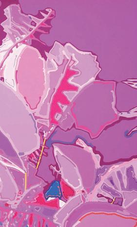
2. COHEN, Harold. Untitled # 050105 (Pink)
Exhibited:
‘Harold Cohen, Colour Rules’, exhibited 9th July - 15th August 2008, Bernard Jacobson Gallery, London.
Digital print in colours, 2005, on wove paper, signed, titled and dated in pencil, numbered from the edition 30, 147½ x 119½ cm. (58⅛ x 47 in.) [ref: 109221]


3. COHEN, Harold. Untitled # 050106 (Green)
Exhibited:
Bernard Jacobson Gallery, London, Prints I Published, 13th February -
9th March 2019
Digital print in colours, 2005, on wove paper, signed, titled and dated in pencil, numbered from the edition 30, 1471/2 x 1191/2 cm. (581/8 x 47 in.) [ref: 109218]


4. FRANCIS, Sam. Trietto 3 (SFE-076 RC)
In 1970, American Abstract artist Sam Francis established his own printing studio, The Litho Shop, in Santa Monica, California. Francis employed a full time staff of Master Printers in his studio, a notion that was practically unheard of at this time. Along with the aid of his skilled team, Francis was able to print with the same ease and immediacy

as was possible in his painting and through copious experimentation
vast aquatints such as Trietto 3 were created. Whilst best known for his brilliance of colour, it’s important to acknowledge the part his splatters and spots play in the dynamism between his forms.
It is because of these energetic, animated marks that the presence of the artist’s hand can be significantly felt, uniting both process and print.
Aquatint in colours, 1991, on Fabriano paper, signed in pencil, numbered from the standard edition of 66, printed by Valter & Eleonora Rossi at Vigna Antoniniana Stamperia d’Arte, Rome, published by 2RC Edizioni d’Arte, Rome, 971⁄5 x 1351⁄3 cm. (38¼ x 53¼ in.)
[ref: 106439]
5. FRANCIS, Sam. Trietto 4 (SFE-077 RC)
Through the relationships of colour, light and sound, Sam Francis creates a visual world in which he can explore essential forms, rhythms and lines. The rich colour palette we are presented with in Trietto 4 is a characteristic of Francis’s work, which he viewed as the result of the union of imagination and nature. His expert knowledge of colour sequencing, together with his skilful colour manipulation

during the printmaking process, creates a sense of harmony in his prints that almost seems fantastical. The art historian and former curator of modern prints at National Gallery of Art, Washington, D.C., Ruth E. Fine, says that to look at Francis’s prints is like ‘riding on a magic carpet. Voyaging in his world, his galaxies, his space, his time’.
Aquatint in colours, 1991, on Fabriano paper, signed in pencil, numbered IV/ XIV, an artist’s proof in Roman Numerals, aside from the standard edition of 66,
printed by Valter & Eleonora Rossi at Vigna Antoniniana Stamperia d’Arte, Rome, published by 2RC Edizioni d’Arte, Rome, 1351⁄3 x 1662⁄5 cm. (53¼ x 651/2 in.) [ref: 106438]6. FRANCIS, Sam. Senza Titolo III
Exhibited:
London 1989; Seattle 1989, Zurich 1989; Bernard Jacobson Gallery, London, 2015; Bernard Jacobson Gallery, London, Henri Matisse: The Goldfish Bowls and other Prints (LOPF), 1st - 28th May 2021


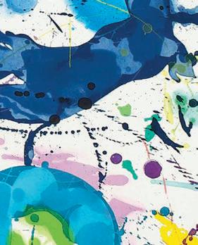


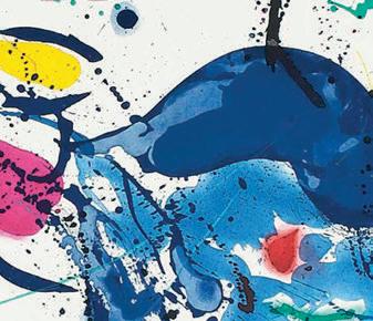
Etching and aquatint in colours, 1987, on Fabriano Rosasphina paper, signed by the artist, inscribed ‘Bon a tirer’, numbered from the edition of 76 (there were also 14 artist’s proofs), printed by Vigna Antoniniana, Rome, with their blindstamps, published by 2RC Edizioni d’Arte, Rome, 125 x 135½ cm. (49¼ x 53¼ in.) The Prints of Sam Francis: A Catalogue

Raisonne 1960-1990, by Connie W. Lembark, Intaglio Prints, Screenprints, and Posters, p.106, I.89. (SFE-066)
[ref: 109208]
7. FRIES, Pia. Schwarzwild P8
Exhibited:
‘Pia Fries: Schwarzwild’, 2 June - 2 July 2006, Bernard Jacobson Gallery, London


Provenance: The Artist; Present owner.
Oil and silkscreen in colours, 2006, on wove paper, signed and dated verso, 71 x 101 cm., (2715⁄16 x 393⁄4 in.) Pia Fries, ‘Schwartzwild’, text by Dave Hickey, Bernard Jacobson Gallery, London, 2006. [ref: 109222]

8. HODGKIN, Howard. Alexander Street
Exhibited:


‘Howard Hodgkin : prints 1977 to 1983’, Tate Britain, London, 18 September - 1 December 1985; Howard Hodgkin, Views. An exhibition of early prints’ Bernard Jacobson Graphics, 02 March02 April 2013; ‘Howard Hodgkin | Recollections’, Bernard Jacobson Gallery, London, 21 April - 14 May 2022.

Lithograph with hand colouring in watercolour and gouache, 1978, on paper, signed, dated and numbered in pencil, from the edition of 90, printed and hand coloured by Alan Cox and Don Bessant at Sky Editions, London, published by Bernard Jacobson Gallery Ltd., London, 1978, 34 x 611⁄5 cm. (13¾ x 24⅛ in.)
Pat Gilmour, ‘Howard Hodgkin’, The Print Collector’s Newsletter, vol. 12, no. 1, March-April 1981, p. 3. [ref: 109232]
9. HODGKIN, Howard. Still Life


Exhibited:
Tate Britain, London, ‘Howard Hodgkin : prints 1977 to 1983’, 18 September - 1 December 1985 Bernard Jacobson Gallery, Howard Hodgkin “Views. An exhibition of early prints” 2 March - 2 April 2013’; ‘Howard Hodgkin | Recollections’, Bernard Jacobson Gallery, London, 21 April - 14 May 2022.
Screenprint in colours, 1980, on paper, signed with initials, dated and numbered in pencil, from the edition of 100, printed by Douglas Corker at Kelpra Studio, London, with the rubber stamp, published by Bernard Jacobson Ltd., London, 80 x 72½ cm. (31½ x 28½ in.) This piece is based on Hodgkin’s piece ‘Still Life’, textile dyes on hand-made Indian paper, 1978.
Liesbeth Heenk and Nan Rosenthal, Howard Hodgkin Prints: A Catalogue Raisonné, London: Thames & Hudson, 2003, p. 222 [ref: 109230]

10. LEWITT, Sol. Bands not straight in Four Directions


Complete set of four woodcuts in colours, 1999, on wove paper, each signed in pencil, numbered from the edition of 75, 38 x 86 cm. (15 x 337/8 in.)


[ref: 109228]

11. LEWITT, Sol. Tondo Stars


Complete set of 6 linocuts in colours, 2002, on Somerset Satin 300 grams paper, each signed in pencil and numbered from the edition 100 (there were also 10 artist’s proofs), printed by Eisaku Sakane, assisted by Keigo

Takahashhi & Chie Shimizu, Watanbe Studio, New York, published by Bernard Jacobson Ltd., London, and Parasol Press Ltd, Portland, 683⁄5 x 683⁄5 cm. (27 x 27 in.)
[ref: 109229]

12. PERRY, Grayson. Reclining Artist
‘This is me, both as artist and model in my studio. I wanted to make something in the tradition of the reclining nude. I’m hoping it will be popular with educated middle-class people who might enjoy spotting the art-historical references within it. Reclining Artist is both an idealised fantasy and also the messy reality. It is perhaps me expressing my desire to be a sex object and also show off my cultural capital and boyish paraphernalia.
The sofa is draped in a test piece of my 2011 tapestry Map of Truths and Beliefs. Alan Measles, my teddy bear and metaphor for masculinity and god, appears as a sculpture, as an inflatable and on a dress hanging on the wall. The cat is called Kevin’ (Grayson Perry).
Etching in colours, 2017, on wove paper, signed by the artist and numbered on the reverse from the edition of 58, published by Paragon Press, London, 701/3 x 1023/4 cm. (277⁄10 x 402⁄5 in.)
[ref: 96985]
13. RAUSCHENBERG, Robert. Suite of Nine Prints


A goal of Robert Rauschenberg’s work was to challenge the viewer to question their understanding of the elements of their everyday lives and culture, and he did this by blending together different images to spark new dialogue. In this piece, we see imagery ranging from renaissanceera portraiture to more modern graphics that organise information.
This disparate elements that make up the composition are not immediately apparent or iconic. Their affect is more about shape or form rather than immediate symbolismthere is no JFK American eagle or spaceship here. Instead we have poetic and mysterious elements including a deep-sea diver, the arm of a record player and sunken treasure or ship’s figurehead.
Whilst Rauschenberg was a celebrated multimedia artist prior to embarking into the print world, the screenprinting technique entirely liberated Rauschenberg’s work. With both forms of printmaking, the artist discovered ways in which he could quickly and repetitively transfer his found imagery to the canvas of his paintings and Combines.
Rauschenberg believed that the printmaking technique of lithography was old-fashioned and is notorious for having stated that ‘the second half of the twentieth century is no time to start writing on rocks’. Ironically, it is Rauschenberg who became a significant figure in the resurrection of American printmaking that occurred during the 1960s. He has subsequently worked with many leading print workshops to create more than 800 published editions. Printmaking is a technique perfectly suited to his methodology of layering found images and one which gave him total control over the size and scale of each component image. It was through printmaking that Rauschenberg was able to once again blur the distinctions between media and perfectly unite his obsessive use of the photographic image with painterly techniques.

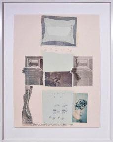


Offset lithographs with collage, 1979, each signed, dated and numbered from the edition of 100, published by Multiples, Inc., New York with the blind stamp of the printer Styria Studio, New York., 78 ×59 cm. (307⁄10 × 231⁄5 in.)

14. ROSENQUIST, James. Miles from America: The Third Century

Earning his living as a billboard painter before becoming an artist, James Rosenquist applied similar techniques of grossly enlarged and fragmented images to his work in later life including this lithograph that seemingly shows previous images, one on top of the other, torn and faded. Lithograph in colours, 1975, on wove paper, signed and dated in pencil, numbered from the edition of 200 (there were also 25 artist’s proofs), published by APC Editions, New York, 761/3 x 563/4 cm. (30 x 221/3 in.)
[ref: 97971]

SEDGLEY, Peter. Video Discs
Since the 1960s, Op artist Peter Sedgley has been producing luminous paintings of circles and optical explorations of light and kinetics. Trained as an architect at the Brixton Technical School and then serving as an assistant in architectural firms during the 1940s and ‘50s, Sedgley began to paint in 1963 and pursued his career as an artist. Along with Bridget Riley, Sedgley established S.P.A.C.E. (Space Provision, Artistic, Cultural and Educational) which administered studio space to young artists. In his work, Sedgley began experimenting with elements like video-rotors (painted disks programmed with patterns of light), and later, incorporating sound with his changing colours. In his spacerelated, environmental works, Sedgley creates art where light, prisms and projections are animated by kinetics.


Peter Sedgley is a leading figure in the Optical and Kinetic movements who came to prominence during the 1960s. Born in London, Sedgley studied architecture before devoting himself solely to visual art from 1959. Peter Sedgley’s first solo exhibitions in 1965 were held at McRoberts and Tunnard Gallery, London and Howard Wise Gallery, New York. He was included in the influential Responsive Eye exhibition at MOMA, New York in 1964 and was a prizewinner at the Tokyo Biennale in 1965.
Complete set of six kinetic screenprints, 1969, on aluminium, signed, titled, dated ‘1970’ and numbered from the edition of 100 incised verso, published by Editions Alecto, London, each disc 75 cm. (29 1/2 in.) diameter, all contained in the original black wooden box with titles on the top, lacking the motor and ultra-violet light unit, crate: 80 x 84 x 231/2 cm (311/2 x 331/8 x 9¼ in.) Only half the edition was produced.
[ref: 102183]
16. STELLA, Frank. Shards III
Frank Stella’s ‘Shards Series’ is comprised of five lithographs and four variants. Stella created these works using the leftover elements of his earlier ‘Circuits’ series of prints and paintings, as well as his ‘Polar Coordinates for Ronnie Peterson’ series. The fascinating grid systems that make-up the backdrop of ‘Shards’ were adapted from the plates of ‘Polar Coordinates’, and the various French curves and undulating lines echo the forms seen in ‘Circuits’. The use of ‘shards’ of previous works to create a series in its own right would become an increasingly employed technique for Stella, and here we can see why. There is a magnificent richness of texture and an immense depth in the prints, showcasing Stella’s creative force.

Lithograph and screenprint in colours, 1982, on Arches Cover Paper, signed and dated in pencil, numbered from the edition of 100, published by Petersburg Press, New York, 1149⁄10 x 101 cm. (45¼ x 393/4 in.) Axsom 146
[ref: 101733]

17. STELLA, Frank. Shards V
This final print of the Shards Series is a beautiful horizontal composition ruled by a green colour palette. The lines of pantograph and the textured green backdrop create a wonderful depth as they intersect, exuding a sense of three-dimensionality. In the Shards Series, Stella coalesces elements used in previous projects; Circuits series prints and paintings as well as his Polar Coordinates for Ronnie Peterson series. The use of ‘shards’ of previous works to create a series in its own right would become an increasingly employed technique for Stella, and here we can see why. There is a magnificent richness of texture and an immense depth in the prints, showcasing Stella’s creative force.


Lithograph and screenprint in colours, 1982, on Arches paper, signed and dated in pencil, numbered from the edition of 100 (there were also 20 artist’s proofs), published by Petersburg Press, New York, 1009⁄10 x 115 cm. (393/4 x 45¼ in.) Axsom 148
[ref: 106401]
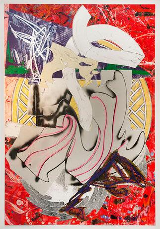
18. STELLA, Frank. Squid, from The Waves Series
Over a period of 12 years, from 1985 to 1997, Frank Stella produced a major series of works in various media that are linked to Herman Melville’s monumental novel ‘Moby-Dick’. The printed component of this project consists in four different series: The Waves, Moby Dick Engravings, Moby Dick Domes and Moby Dick Deckle Edges.


The Waves incorporates all three major motifs of the Moby Dick Project: 1) the first appearance of the wave-whale shape, the most significant shape in the Moby Dick series as a whole 2) a variety of gutter shapes that the artist would develop during the history of the project and 3) the lattice shape.
Silkscreen, lithograph, linoleum block with hand-colouring, marbling and collage, 1989, on T. H. Saunders and Somerset paper, signed, dated and numbered from the edition of 60, published by Waddington Graphics, London, 190 x 139 cm. (743/4 x543/4 in.) Axsom 188 [ref: 102306]
Screenprint, lithograph and linocut in colours with collage, marbling and hand-colouring, 1989, on T. H. Saunders and Somerset papers, signed and dated ‘88’ in pencil, numbered AP IV, an artist’s proof, aside from the standard edition of 60, published by Waddington Graphics, London, 187 x 139 cm. (731/2 x 543/4 in.) Axsom 192 [ref: 107725]

 19. STELLA, Frank. Ahab, from The Waves Series
STELLA, Frank. Atvatabar I
At the end of the 19th century and the beginning of the 20th century fantastical tales of other worlds and eras began to grip the imaginations of the public. The title Atvatabar I references the science-fiction story The Goddess of Atvatabar by William Richard Bradshaw. The story is based on the theory that the planet on which we live is a hollow shell that is one thousand miles in thickness within which are entire continents and oceans that are all lit by an interior sun. Within this fictional earth, fifty million people worship a living goddess of surpassing beauty named Atvatabar. Stella’s circular composition confines an abundance of abstract forms and structures, referencing the book’s advanced social, philosophical and religious matrix that exist within the earth’s interior walls. Given this piece is part of Stella’s Imaginary Places series, it is not surprising that Bradshaw’s book has earnt its place, praised to be one of the greatest imaginative efforts put forth by a modern writer.
Unique acrylic, resin, formed paper and fiberglass, 1995, signed and dated on the relief centre left: ‘F. Stella, 95’, 1361/2 x 1371⁄5 cm. (533/4 x 54 in.)
[ref: 107174]
 20.
20.
21. STELLA, Frank. Despairia, from Imaginary Places
Over a period of four years, Stella created a body of prints whose titles all came from ‘The Dictionary of Imaginary Places’ by Alberto Mangual and Gianni Guadalupi. Each work from this series is recognisable for its teeming compositions of twisting, colliding and knotted forms. The shapes appear to spill out of their rectangular sheet, seemingly trying to escape their frames.
Stella employed his full palette of printmaking media to create these compositions - including lithography, relief printing, etching, aquatint, engraving and screenprinting. As with many of Stella’s printed works, relief is a primary focus in the construction of ‘Despairia’ as this technique was the means in which his art could extend out of its pictorial space and into the viewers own.
Screenprint, aquatint, etching, relief, lithograph, engraving and mezzotint in colours, 1995, on white TGL handmade paper, signed and dated in pencil, numbered from the edition of 50 (there were also 16 artist’s proofs), published by Tyler Graphics, Ltd., New York, 504⁄5 x 1321⁄10 cm. (20 x 52 in.)

Axsom 231
[ref: 108030]
22. STELLA, Frank. Libertinia, from Imaginary Places
Over a period of four years, Stella created a body of prints whose titles all came from The Dictionary of Imaginary Places by Alberto Mangual and Gianni Guadalupi. Each work from this series is recognisable for its teeming compositions of twisting, colliding and knotted forms. The shapes seem to spill out of their rectangular sheet, seemingly trying to escape their frames. As he had done since the Swan Engravings, Stella employed his full palette of printmaking media, to realise these compositions - including lithography, relief printing, etching, aquatint, engraving and screenprinting.
Relief, screenprint, etching, aquatint, lithograph and engraving in colours, 1995, on TGL handmade paper, signed, dated and numbered from the edition of 50 in pencil (there were also 14 artist’s proofs), published by Tyler Graphics, Ltd., Mount Kisco, New York, with their blindstamp, 549⁄10 x 125 cm. (211/2 x 49¼ in.) Axsom 229
[ref: 105180]

23. TILLYER, William. Towards Evening, from The Interventions Series 2 2015-2016
Exhibited:
‘Object/ Subject | The Art of Still Life’, 7th July - 26th August 2022, Bernard Jacobson Gallery, London.

Watercolour and mesh collage, 2015-16, on paper, signed, titled and dated ‘Tillyer, Vase and Arrangements 2016’ verso, also signed lower right, recto, mount: 41 x 41 cm. (161/8 x 161/8 in.)
[ref: 109233]

24. TILLYER, William. The Half Vase and Arrangement in le Chambre Noir, from The Interventions Series 2
Exhibited:
‘Object/ Subject | The Art of Still Life’, 7th July - 26th August 2022, Bernard Jacobson Gallery, London.

Watercolour and mesh collage, 2016, on paper, signed, titled and dated ‘Tillyer, The Half Vase and Arrangement in le Chambre Noir, 2016’ verso, also inscribed ‘Frobisher’ and ‘Intervention’ verso, signed lower right recto, mount: 41 x 41 cm. (161/8 x 161/8 in.)
[ref: 109234]

shapero Modern
41-43 Maddox Street
London W1S 2PD
+44 (0)20 3693 2197
modern@shapero.com
www.shaperomodern.com
A member of the Scholium Group
TERMS AND CONDITIONS
All items in this catalogue are guaranteed to be complete unless otherwise stated. Please see our website for full Terms & Conditions.
Invoices will be rendered in GBP (£) sterling. The title of goods does not pass to the purchaser until the invoice is paid in full.
NB: The illustrations are not equally scaled.
Curated by Tabitha Philpott-Kent and Helen Smith

Edited by Je rey Kerr
Photography by Natasha Marshall
Design by Roddy Newlands

