7 minute read
THAT ILLUMINATING AROMA
FEATURE NAME LIGHTING
BY AUTHORBY JEFF WOOTEN
Advertisement
THAT ILLUMINATING AROMA
Brewing up a new set of illuminated signs for cozy coffee shops.
Coffee-Eats-Goodtimes.” This feel-good, welcoming sentiment also happens to be the branding slogan for Fiddleheads Coffee Co., a familyowned specialty coffee company with multiple cafés and artisan bakeries located across the state of Wisconsin. Their slogan showcases what they offer as well as what they’re passionate about—great-quality coffee, tasty baked goods, delicious entrees, friendly atmosphere, etc.
“We have been operating for almost twenty-five years with a philosophy of being part of the community and sharing special moments with our customers,” says Jovana Cubric, vice president of operations at Fiddleheads Coffee. “Like a kitchen is the heart of home, we look forward to being the heart of the community we are located in.”
The first Fiddleheads Coffee shop started up in Thiensville, Wisconsin back in 1996, and due to its popularity, the owners have expanded to several other cafés across the state since then. Each Fiddleheads Coffee location boasts a unique interior design that complements the host building and its surrounding community while portraying the shop’s brand through various details and materials.
Recently ownership made the decision to open two new locations in the state, both in pretty prominent spots.
The first of the new cafés opened up late last year in a refurbished 1920s Mediterranean storefront with a spacious outdoor patio in the historic section of Shorewood, Wisconsin. This new location gives a nod to the look and feel of an old-world coffee house.
“For a cozy and warm-feeling experience, walk inside the café where earthy tones complement the white marble tables, and our friendly baristas are serving our classic espresso drinks, small batch coffee, and fresh bakery and breakfast and lunch items,” explains Cubric.
This past February, Fiddleheads Coffee also made the move into the downtown Milwaukee scene with its new “flagship” venue located on the ground floor of the brand-new, twenty-five-story, all-glass-exterior Milwaukee BMO Tower. This premier, multi-tenant combination of office workspace and retail shops was developed by Irgens Development Partners, LLC, and is currently adding a metropolitan, big-city style to the Milwaukee skyline.
“From soft seating nooks to highend finishes, workspace areas, countertop seating, and visually intriguing design, the in-house café experience at Milwaukee BMO Tower is sure to please both office tenants and walk-in guests,” says Cubric.
While these two new locations have distinct differences, they do share similar exterior and interior signage styles—dimensional identity lettering, neon open signs, and an illuminated wall-mounted sign.
Placing an Order for Signs Bauer Sign & Lighting Company, a full-service sign company with facilities in New Berlin, Wisconsin, was selected to fabricate and install various illuminated and non-illuminated signage for these two new Fiddleheads Coffee locations. The coffee shop is one of their legacy accounts (the company already completing a variety of prior work at several of their other locations).
Dave Salkin, an account executive at Bauer Sign & Lighting, was searching through social media for possible project opportunities they could take on when he noticed Fiddleheads Coffee was posting construction updates about their two upcoming shops.
“I happened to talk to them at the right time,” remarks Salkin. “They were just starting the process of looking for a vendor to fulfill their signage needs, and
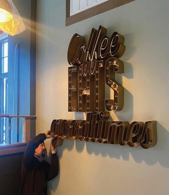
The finished “Coffee-Eats-Goodtimes” letter set features a combination of neon tubes and Edison-style light bulbs and was direct-mounted to the wall. Bauer Sign & Lighting also made a set of Fiddlehouse Coffee identity letters.
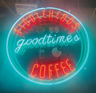
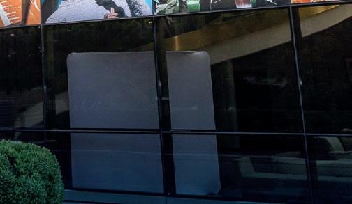
A smaller neon sign (this one circular and the other rectangular) is in the window.
when I contacted them, they felt really comfortable with the work we did for them in the past.”
Cubric agrees. “Bauer Sign & Lighting has been a great partner of ours for many years and has done a terrific job of custom projects,” she says. “Their team is very creative and responsive and has always done a great job with incorporating our idea and making the final product look exactly as we envisioned.”
Illuminating Fabrication Details The exterior “Fiddleheads Coffee” letters and two neon “open” signs were designed to closely match their other locations, yet owners wanted the illuminated interior wall sign to work off their “Coffee-Eats-Goodtimes” slogan while still giving their customers a distinctive ambience from their other locations.
Cubric informed Bauer Sign & Lighting designers that this sign would need to fit her coffeehouses’ branding and style. “We inhabit and restore historic buildings and have a strong appreciation for vintage items,” she comments. “We wanted to bring attention to this part of our branding while utilizing the softness of the antique brass color that can be found in various details throughout all our locations.”
Bauer Sign & Lighting ended up designing, fabricating, and installing a total of six signs for the two new Fiddleheads Coffee spots—four for the Milwaukee BMO Tower location and two for the Shorewood store.
The Milwaukee eatery features “Fiddleheads Coffee” white lettering above the front door, with a smaller, red-andblue “Coffee-Eats-Goodtimes” neon letter sign hand-crafted in a rectangular style underneath it. In Shorewood, this smaller neon sign features a blue circular border instead with “Fiddleheads” and “Coffee” in red and “Goodtimes” in blue in-between.
The bigger, more elaborate “CoffeeEats-Goodtimes” letters featured on a main interior wall at both new cafés ended up being a little more complex. Bauer Sign & Lighting designers ended up working on about eight different logo iterations of the proposed interior set of channel letters before Cubric approved them to proceed.
The interior “Coffee-Eats-Goodtimes” channel letter signs are actually three separate letter sets formatted in different font scripts yet attached together through wiring.
In total, the entire “Coffee-EatsGoodtimes” sign measures 64.9 inches in length and 48.2 inches in height. The top “Coffee” lettering measures 18 inches tall, the “Eats” lettering positioned partially underneath is 19 inches tall, and the “Goodtimes” letters stand 12.5 inches tall.
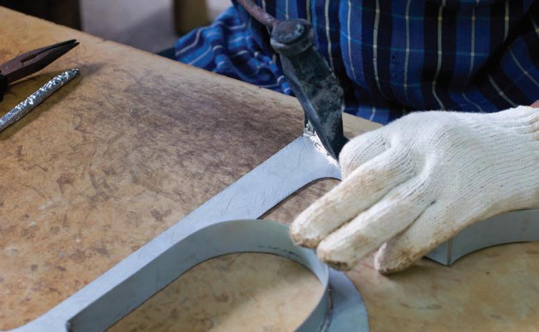
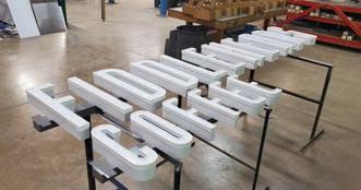
These letters started off as a sheet of .063 aluminum that was sheered into strips and then hand bent and welded to the backer panel that had been cut out on one of the company’s routers.
Both the exteriors and interiors of the three letter sets were painted using Matthews Paint MP21962 Plaque Gold Metallic paints.
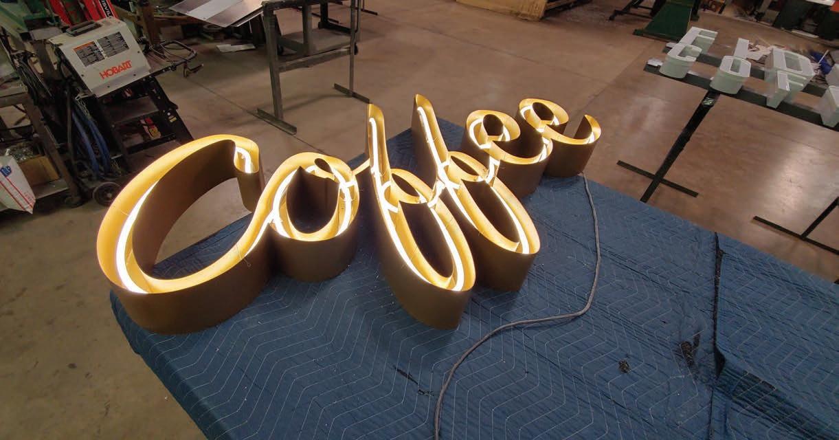
The “Coffee” letters are illuminated with single stroke Vanilla 3000 neon bent into the appropriate lettering shape. “We mounted the neon to the backer panels with standard glass standoffs,” says Jor-
dan Bauer, operations manager at Bauer Sign & Lighting.
The “Eats” and “Goodtimes” sections were illuminated with exposed, marquee-style 2W S14 LED Outdoor Edison Light Bulbs with a 2700K color temperature. None of these bulbs were available locally from their sign supply vendors, so Bauer Sign & Lighting ended up purchasing them online. (Note: The medium base sockets were purchased from Wensco.)
The light bulbs featured in the “Goodtimes” letters were intentionally under-populated to mimic the appearance of an old-fashioned sign with the lights transitioning between on and off. “This [under-population] was a little different than what we’ve done in the past,” says Salkin.
Cubric wanted this sign to provide soft lighting—which led to the idea of under-populating the bulbs for the “Goodtimes” letters. “By under-populating the bulbs in ‘Goodtimes,’ which is physically located lower on the wall, we felt that it provides a softer and warmer ambience for the customers sitting near it,” she explains.
Bauer Sign & Lighting created a second surface that is a hair smaller than the original backer piece so that they could “drop the bulbs into” the sign.
“Depending on the customer, some like this second surface sticking out farther so that the bulbs are even more exposed,” says Bauer. “We decided to hide the bulbs deeper into the letters, since the signs are located in high-traffic areas in the eatery.
“This allowed all of the sockets to get screwed on and most of the wiring to be hidden.”
Speaking of wiring, Bauer Sign & Lighting worked closely with the electricians on site in coordinating to make sure the wiring and power supplies/ transformers were accurately placed on the wall.
“The letters are actually mounted to a firewall so we were able to swing it through,” states Salkin. “We made sure measurements were correct and spoton and left a pattern up there we could use later and that no one else onsite would touch.” Conclusion The entire project took three months for Bauer Sign & Lighting to build and install once they received the go-ahead.
“There was definitely a lot of detail we had to follow to make this project successful,” says Salkin. “We had to match paints from original SherwinWilliams colors, as well as bring on the original architect to be able to match the metal mullions inside the surrounding windows.”
In the end, the message of “CoffeeEats-Goodtimes” comes across bright and clear at these two new Fiddleheads Coffee locations thanks to the ingenuity and illuminating solutions provided by Bauer Sign & Lighting.
