8 minute read
DRIVING DESIGN
FEATURE NAME SHOP MANAGEMENT
BY AUTHOR BY ASHLEY BRAY
Advertisement
DRIVING DESIGN
Cushing launches a new in-house design division.
One of the silver linings to come out of the COVID-19 pandemic is the ingenuity and creativity shown by sign shops across the industry. Over the last year, the industry has demonstrated resiliency and the ability to pivot in the face of never-before-seen challenges and change.
Chicago-based Cushing & Co., is just one example of such a sign company. In fact, you may remember our interview with them from Episode 2 of our Shop Talk Podcast (http://bit.ly/3rHn3kY) where they talked about keeping employees on, applying for the PPP loan, and pivoting to COVID-19 products.
The company didn’t stop there, however, and took advantage of the changing landscape to launch its long-planned inhouse creative division, Sepia Studio. A New Division Sepia Studio was established to address customer requests for a full-service graphic design and print experience, but it also filled a void not only in Cushing itself but the industry as a whole.
“There really isn’t a go-between option for corporate America between in-house graphics or going to a big-time agency and maybe paying more than you want or being forced to make more commitments than you want,” says Joseph X. Cushing, executive vice president at Cushing.
In addition to filling this niche, Cushing is hoping that the new division gets them a spot at the table much earlier. “To get put in front of the decision makers early is a crucial step in any business cycle,” says Cushing. “I think our best client is direct to corporate America rather than through some sort of go-between contractor or another designer.”
Managing Designer Amanda Eich and Design Director Julia Kaufman head up the all-new Sepia Studio. Eich brings over twenty years of design experience working with consumers and small businesses. Her work has appeared on the shelves of major retailers, including Target. “We love sharing a client’s story using the tools in our toolbox, which is a knowledge of good design, material applications, practical printing experience, and a track record of using marketing budgets efficiently,” said Eich, in a press release.
Kaufman has worked over seven years as a freelance graphic designer and print professional and has been working at Cushing as Graphics Supervisor for several years. “Knowledge of the print industry can
change the course of a design project for the better, and I plan to bring my print expertise to this new division,” she said, in a press release.
Prior to Sepia Studio, Cushing offered design tweaks or help with simple design set-ups of products like fliers, brochures, and business cards. With the new in-house division, Cushing is now able to offer more. “I think now more than ever, we realize that we want to offer clients a full solution from the idea in their brain to the install on their wall,” says Kaufman. “The sky’s the limit on what we can do.”
Serving Clients Sepia Studio’s initial design services include brand identity, marketing collateral, environmental graphics, and social media/ digital design.
The new division is also offering subscription design services, which enable clients with more frequent design needs to more easily allocate their requests and budgets. For clients, it will operate like having a design partner on retainer for an ease of ordering and connecting with someone who’s more of a brand partner rather than just a freelancer or an agency.
“These subscription services will allow the client to connect with us about monthly needs,” says Kaufman. “Sometimes the needs for small businesses pop up fairly often and asking someone to do something quickly for you is a lot easier when they are anticipating your needs.”
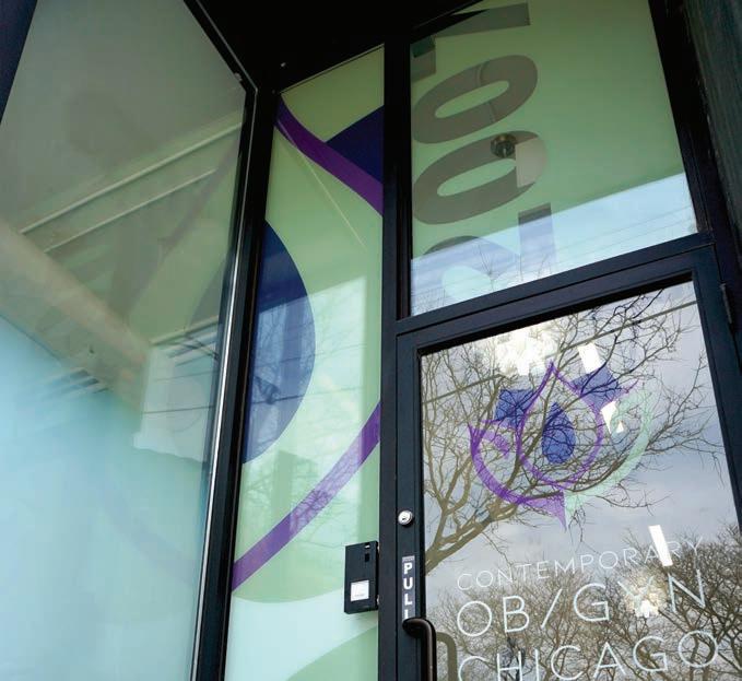
Branding a Doctor’s O ce Although Sepia Studio just got up and running at the start of the year, the division already has a number of projects under its belt, including a graphics roll-out for a new, contemporary OB/GYN office in Chicago.
The office had reached out with emailed pictures of what they had in mind, and Eich and Kaufman say this was a great example of a client thinking they know what they want. When Sepia Studio reached back out with a design based on the office’s ideas, the client was underwhelmed and told the designers they had full reign to create something bigger.
That was all Sepia Studio needed to hear. They created a larger, more in-depth design plan that included large window graphics, privacy graphics, and branding graphics in the office’s alcove.
The window graphics proved a bit challenging because they stretched across five window panels with mullions in the screen. Sepia Studio printed out a large icon of the office’s logo to stretch across the first two windows, and they printed the text element of the logo to place below that spanning three windowpanes. Additional graphics—including items like the logo, office hours, and contact information—were also provided for the door.
Sepia Studio also provided graphics to spruce up the office’s alcove, which originally only included run-of-the-mill address numbers on the wall. “We just covered this little alcove with her brand colors and this super-graphic of the address numbers,” explains Eich, who says the client loved the result because it made the office easier to spot.
All of the branded graphics were printed on 3M™ Controltac™ Graphic Film IJ180 using an Epson SureColor S80600L printer. The graphics were then contour cut and applied first surface to the windows.
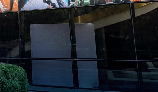
The doctor’s office also asked for privacy/shading graphics with the ability to still see out. “It was a little tricky. We did a sample with varying gradients and varying levels of transparency, we put it on acrylic, and we took it out there and showed it to her,” says Eich.
The doctor tested the visibility from outside and inside of the office before approving the film, which had a white transparency that started opaque at the bottom, faded up toward the midpoint, and was clear at the top. The privacy graphics were printed on the Epson SureColor S80600L printer using 3M™ Scotchcal™ Clear View Graphic Film IJ8150 optically clear vinyl with a 3M™ Scotchcal™ Optically Clear Overlaminate 8914 on top of it.
The installation of all of the graphics was completed in one day, but the weather made things tricky since it was January in Chicago. “We had to sit on it for a couple of weeks until the weather got just warm enough, and we had only a fourhour window,” says Eich. “We told her to crank her heat the night before, and it worked out perfectly.”
Sepia Studio covered the office’s alcove with its brand colors and a super-graphic of the address numbers.
Tips & Techniques Eich and Kaufman have plenty of tips for designing print graphics.
Design in CMYK. Kaufman says RGB is the name of the game for Web/mobile
• Very fast turn around
• Very competitive pricing


• 8 standard sheet sizes

• Any thickness to 24” • Any thickness to 24”
• Custom bonding to any size


products but that CMYK is ideal for print graphics. It’s always best to be sure you’re designing in the right format as it’s “difficult to translate something once it’s already been designed.”
Always include a bleed.“Make sure the artwork stretches past that live edge,” says Kaufman. “Unfortunately walls are never straight, and human hands are cutting the paper, so a little extra bleed in the artwork can go a long way.”
Know your medium.“You have to know what the end product is before you start designing,” says Eich, who warns that otherwise a design may not translate well on a certain medium, which could lead to a redo and an uncomfortable conversation with the client.
Spell check. A misspelling or a typo can make a design “go from 100 to 0,” says Kaufman. “And there’s no such thing as reupload or repost. It is live and physical in your hands once it’s printed.”
Eich says to ensure your clients check over the proof from the printer. “Someone told me years ago to take what you wrote and flip it upside down and read it that way because your brain dissociates what it should say, and you actually read the words individually, and you catch things that sound wrong or are misspelled,” she says.
Design for scale. Both Eich and Kaufman say to pay attention to scale— whether you’re going from your computer screen to something much larger, like a wall graphic, or much smaller, like a business card. “Resolution can be a key factor here,” says Kaufman. “Something on screen to something twenty-feet wide can be a whole different ballgame if you’ve got a high-resolution photo versus a low-resolution photo.”
Designing for the Future Above all, Sepia Studio is looking forward to improving the design experience for its clients as well as positioning Cushing for the future.
“I envision that what we will see in the market is not just Cushing printer, but Cushing the full-service brand partner that also can make the products that we’re designing and creating,” says Eich. “We want to be seen in the market as problem solvers and thought leaders who can show up in the beginning and help you work through whatever architectural or design challenge that you may have.”


