2 minute read
How to Mix Bold Colors in Your Home


When it comes to figuring out the color palette of an interior, the first inclination may be to start holding up color swatches to the walls of a living room or dining room. However, Nozawa encourages people to get out of the house and start observing what shades tend to draw them in naturally when they are out and about. “Take the time to go walk around your neighborhood and observe what colors you notice first and how they make you feel,” says Nozawa. “Understanding what hues you naturally gravitate to—or don’t gravitate to—gives a great starting for designers to work with.” Nozawa further explains that reaching out to a deco- rator, even just for color consultation, can help anyone better understand how to translate those shades seen in nature into usable colors in interiors. Once a primary shade is selected, you can then begin to think about how much space that color should occupy and what other hues it should mingle with in the room.
Use The Color Wheel
Advertisement
Nozawa advises people to rely on a little bit of color theory to find the perfect complementary shade. For example, if the designer is working with a vibrant, full color on the warmer side of the spectrum, she tends to look at the opposite side of the color wheel to pin down a just-as-bold cool shade that can balance out the room. Using the color wheel as a decorating tool can help easily inform the palette while introducing you to new shades.

However, Nozawa is also quick to note that sometimes the most thrilling color schemes come from experimenting and trusting your gut. The designer knew she wanted to use a lavender hue in her design of the sitting room at the Kips Bay Decorator Show House, but the thought to pair it with delicious olive greens and tomato reds came after she stumbled across a vivacious Soane Britain textile. “I think a lot of our most unexpected combinations truly have come by way of simple experimentation—taking physical swatches of fabrics and paint chips and laying them together to see how they feel,” says Nozawa. “It’s one of my favorite processes in the design, is just a purely curiosity-driven casual tabletop experiment.”

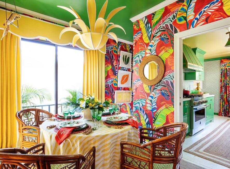
Stick to Solids
For those ready to play with bright colors, consider toning down the number of patterns used within the room. Sticking to solids is oftentimes an easier way for our brain to process what color is, instead of multiple patterns which can feel overwhelming. The goal is to find the
Push Boundaries
Some designers may recommend starting small with a few bold accent pillows or a multicolored rug, but Nozawa is a proponent of diving in headfirst with those bold shades. “If you are itching for change or for your space to feel more vibrant, I think there’s something in your gut that’s telling you to go full out.” Go ahead and lacquer those walls a delicious raspberry shade or cover the sofa in teal velvet. If you find yourself unhappy with the change, perfect balance so guests never feel too stimulated in a colorful home. On the opposite side, if you find yourself drawn to prints more, Nozawa recommends finding a pattern with a limited color story which can then inform the palette in the rest of the room. there’s always a way to make the room feel and look as you pictured it. “At the end of the day, even if you decide you don’t love it, you can influence one color’s mood by layering another color or pattern,” says Nozawa. “No color is static or immutable. You always shift the mood of what one color presents itself as being—it just takes some experimenting.”

TWR: