We are SITU, an unconventional architecture practice. We use design, research and fabrication for creative and social impact.
Office Brooklyn Navy Yard, 141 Flushing Ave Bldg 77, Suite 508, Brooklyn, NY 11205 (718) 237-5795 main design@situ.nyc
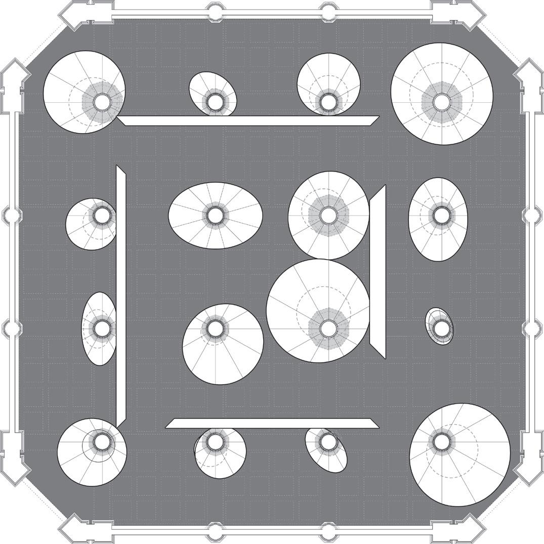
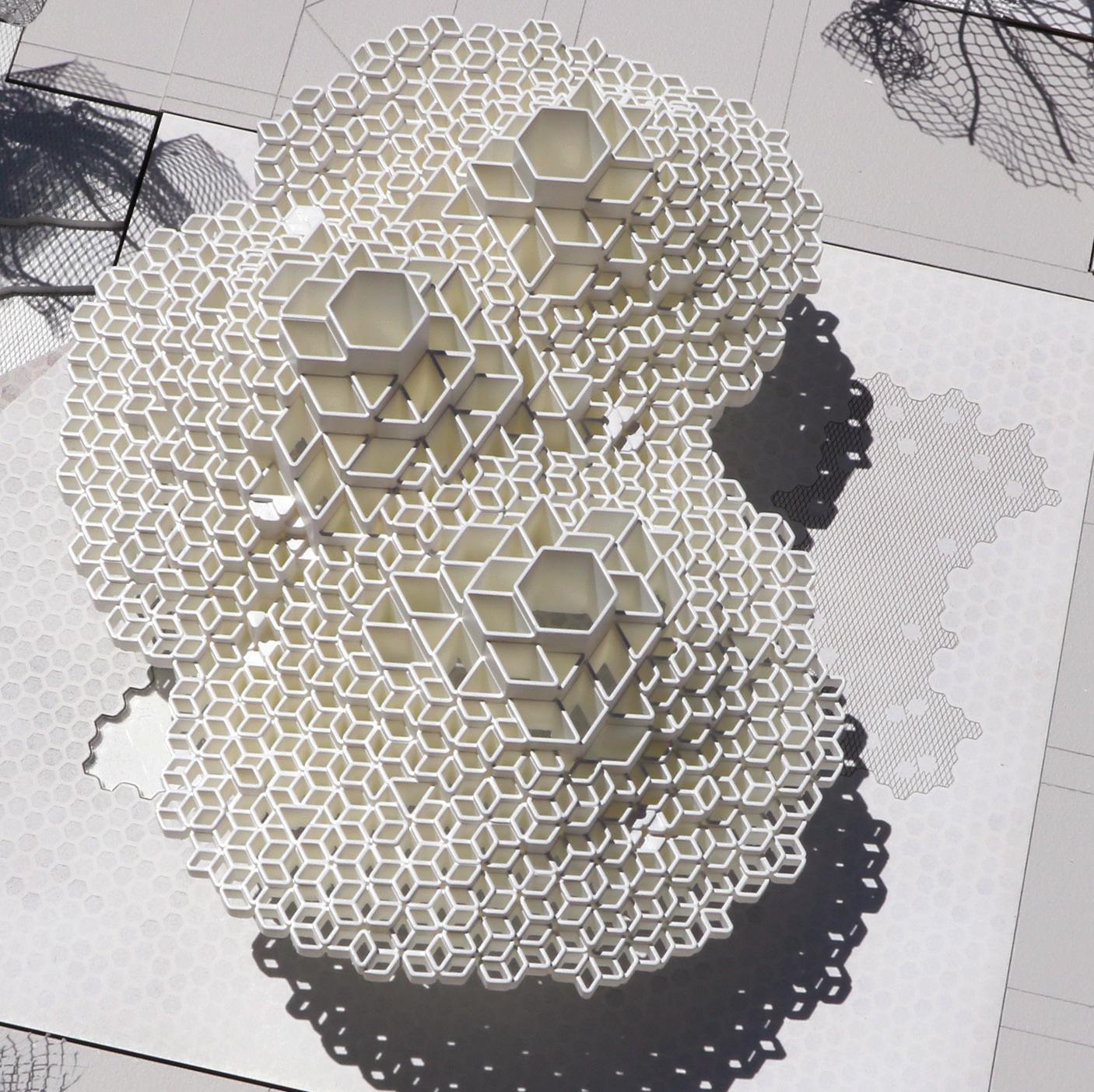
Left: Roof plan for NASA’s Jet Propulsion Laboratory’s Cloud Pavilion
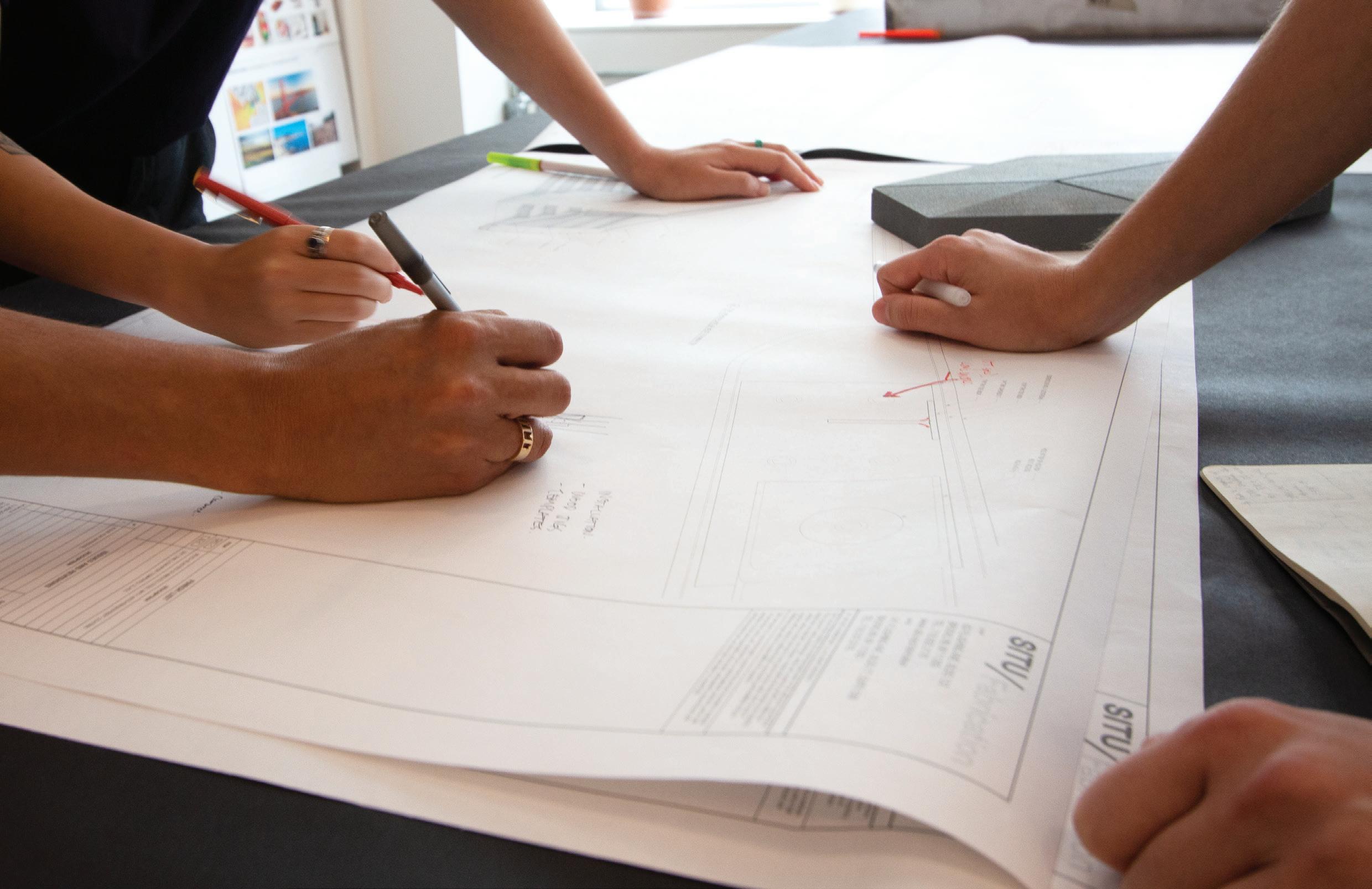
SITU was founded in 2005, in Brooklyn, New York, by four friends studying architecture at the Cooper Union. We’ve shaped our practice out of the multidisciplinary style of our education, and have grown through clients who value a progressive approach to problem-solving.
Our process is client-specific, adaptive and driven by a diversity of deep knowledge, untethered from any stylistic or formal agenda. This allows us to work out of bounds, using new tools of architecture to generate unique outcomes.
7
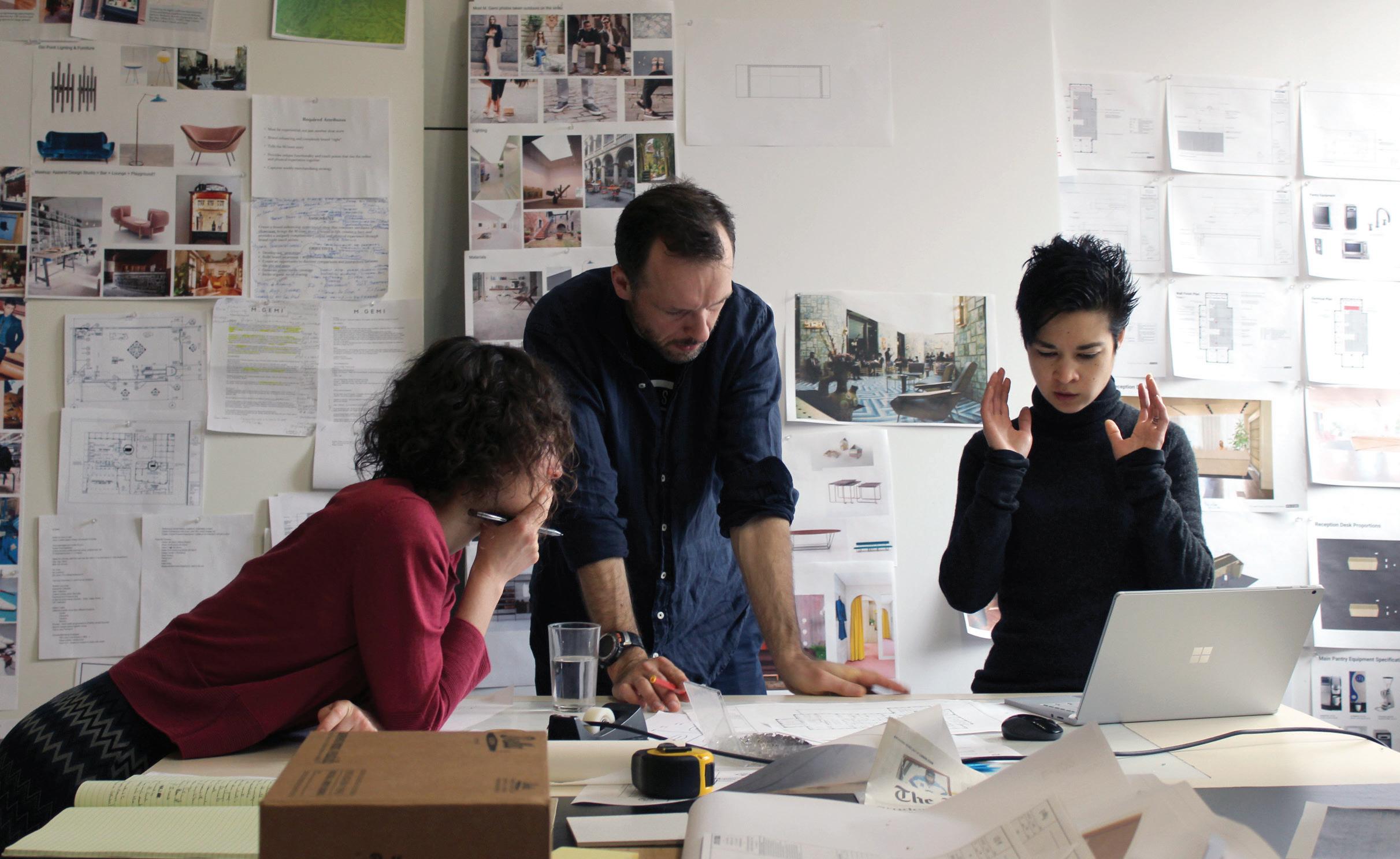
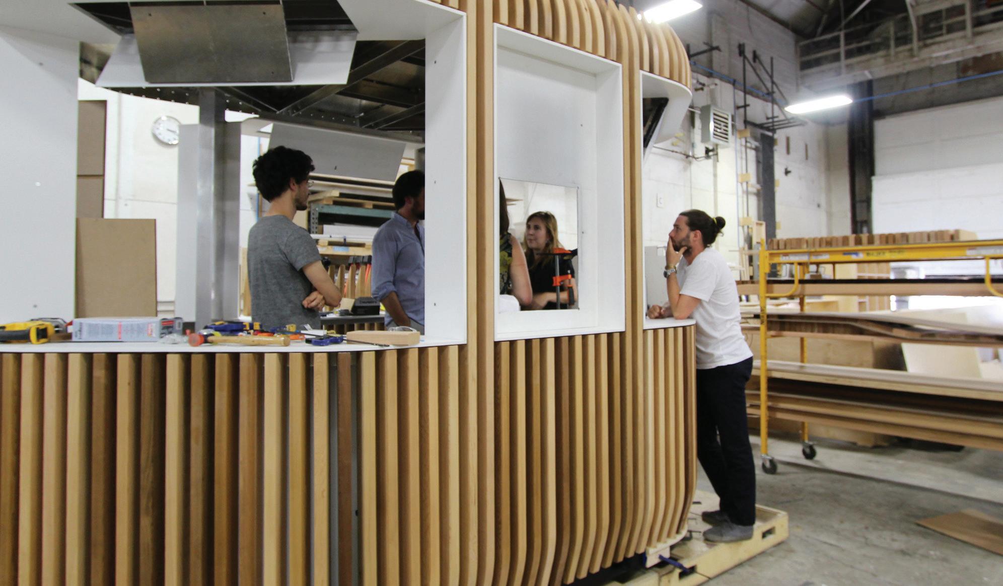
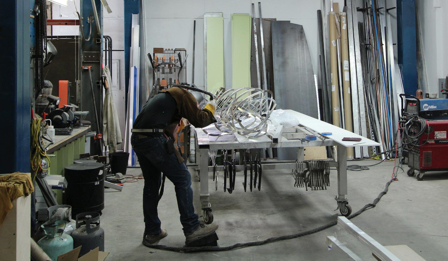
Our practice is composed of three divisions—Studio, Research and Fabrication—that work collaboratively while providing individual services. This keeps prototyping, research and development, and hands-on craft elemental to our creative process.
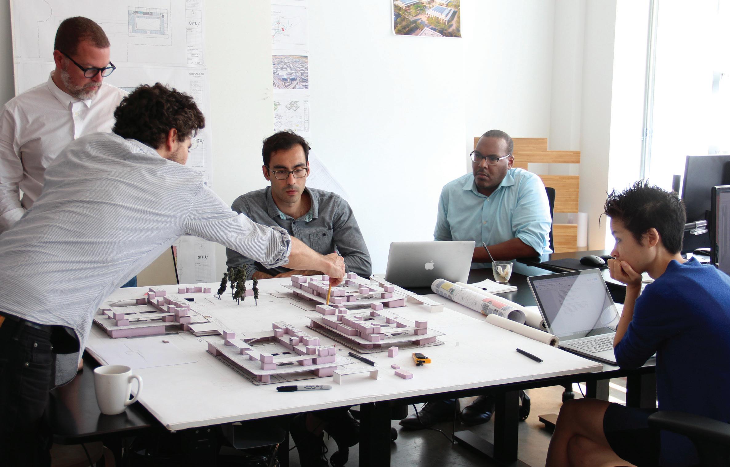
Our space is split between creative studio and workshop. This enables a unique sort of radical pragmatism— experimenting with new material possibilities as they are imagined.
9
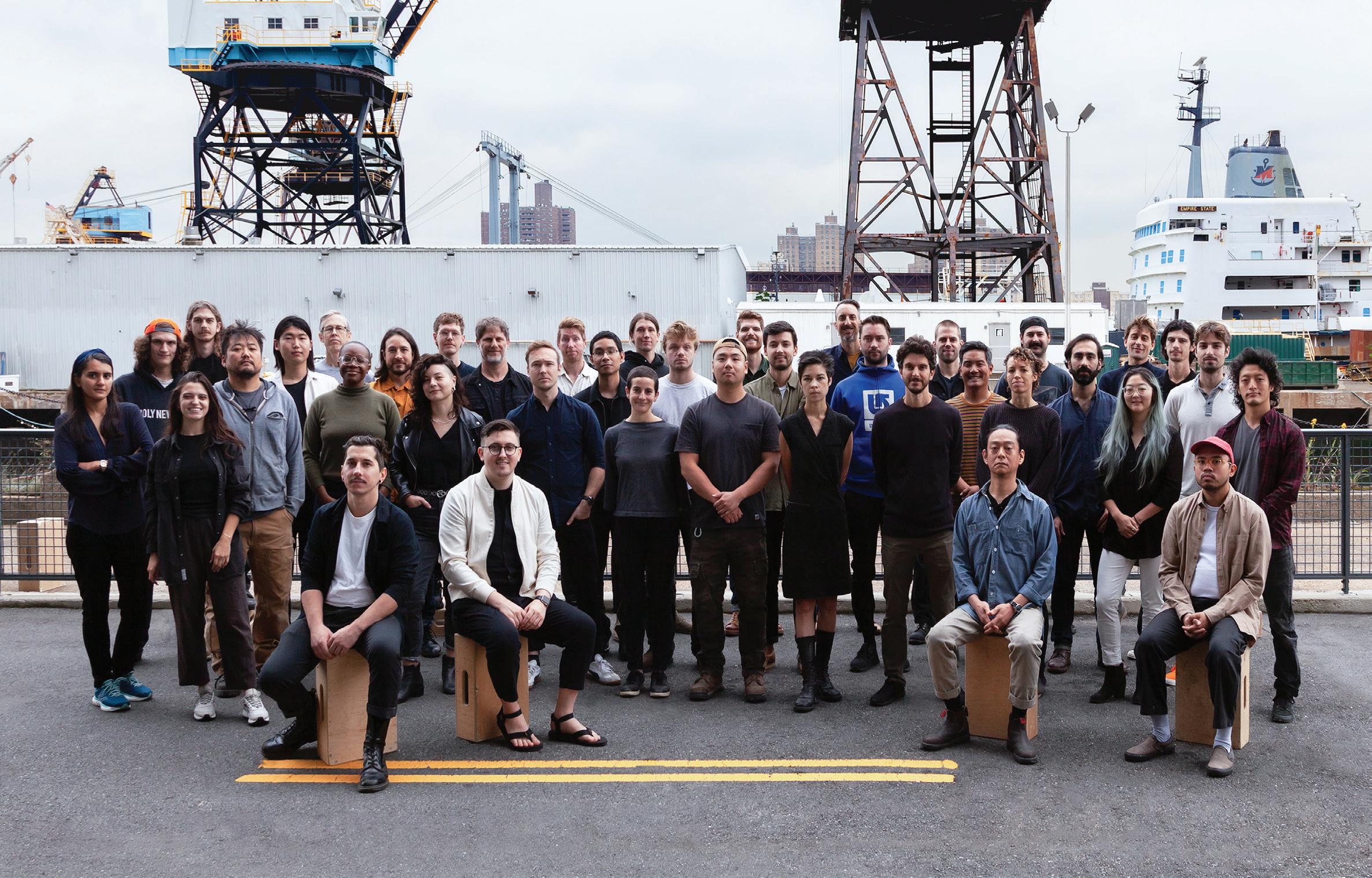
Our staff is made up of a wide range of specialists across disciplines: architecture, art, design, engineering, fabrication, geography, programming, urbanism, visualization, research and development—all dedicated to exploring and crafting spaces at multiple scales.
Our clients and collaborators come from an equally varied collection of sectors: museums, art centers and academic institutions; civic, social and professional organizations; developers, high-end commercial companies and residential clientele.
11
14 Google Humboldt Campus Google | Sunnyvale, CA 22 Graycliff Conservancy Visitor Center Expansion Graycliff Conservancy | Buffalo, NY 30 Turnout NYC Design Trust for Public Space | New York, NY 38 New York Tech Office New York tech company | New York, NY 46 Making Space Brooklyn Public Library | Brooklyn, NY 56 Cloud Pavilion NASA Jet Propulsion Lab | Pasadena, NY 62 Brooklyn Museum Visitor Experience Brooklyn Museum | Brooklyn, NY 68 The JACX Amenity Terrace Tishman Speyer | Queens, NY 74 Tenmile River: A Generational Opportunity Wassaic Community Development Partners | Wassaic, NY 82 Design Lab New York Hall of Science | New York, NY 88 Solar Canopy Brooklyn Solar Works | Brooklyn, NY 94 Urban Front Porch Brooklyn Lab Charter School | Brooklyn, NY 102 Whitby Makerspace Whitby School | Greenwich, CT 106 Turntable Lab Storefront Turntable Lab | New York, NY 112 Solar Pavilions SolarOne | Jersey City, NY 120 reOrder Brooklyn Museum | Brooklyn, NY 13
Selected Projects
Location: Sunnyvale, CA
Scope: Interior Architecture
Completion: 2022
Photography: Courtesy of Google
Collaborators: NHAS, West 8, Devcon
Base Building Architect: Parabola
Architecture
Google Humboldt Campus
Promoting collaboration and wellbeing through a high performing, adaptable, and ecological campus.
15
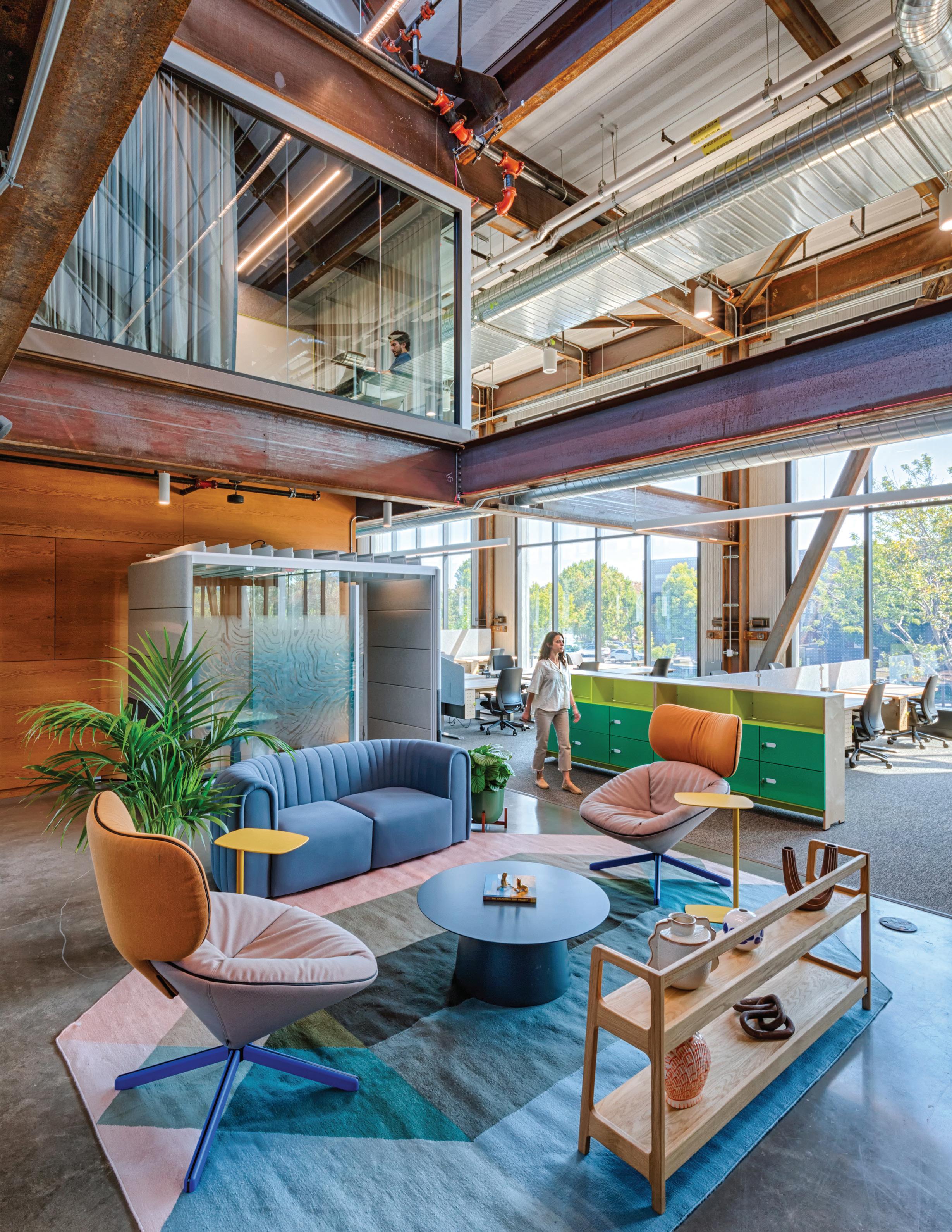
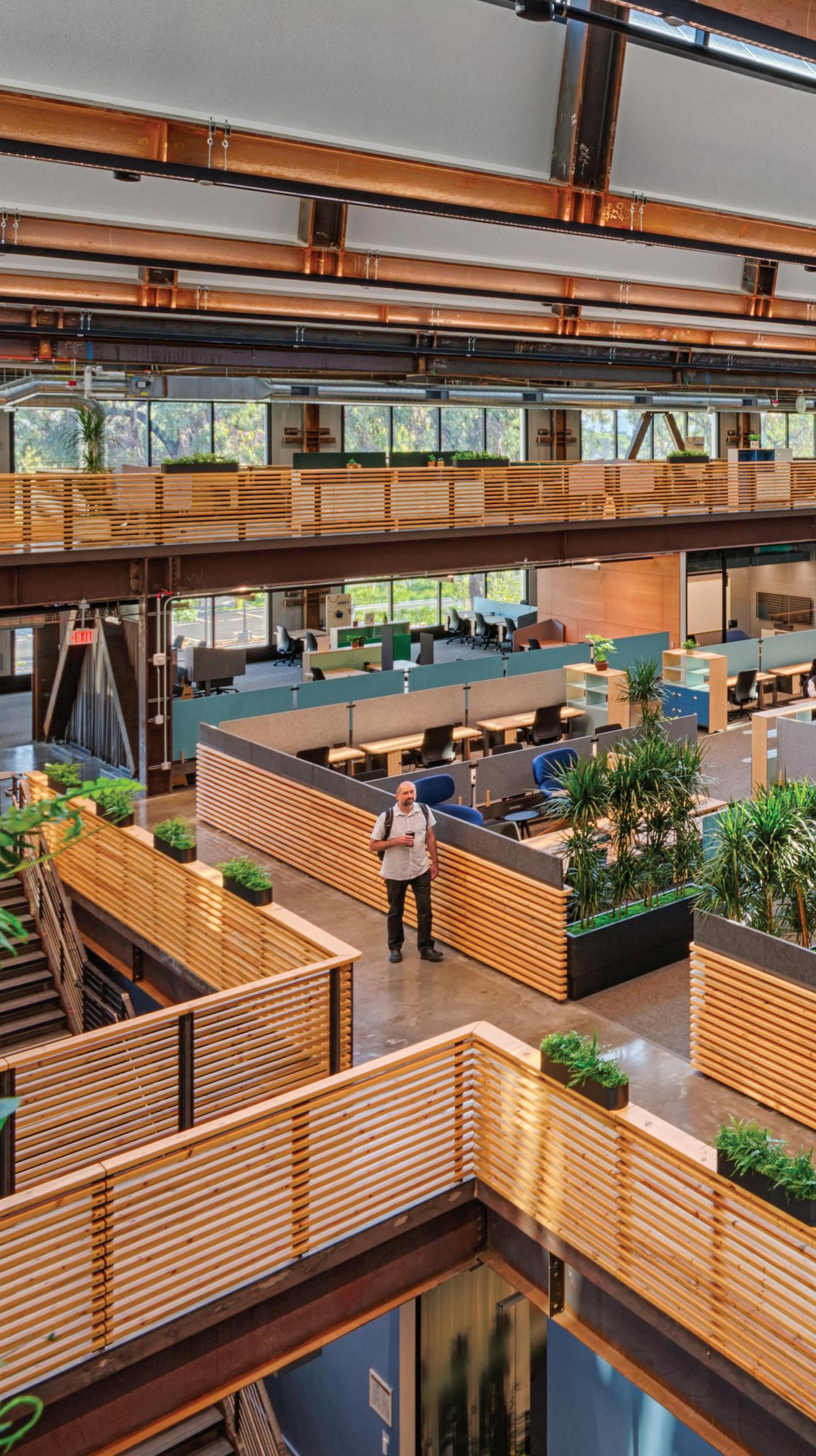
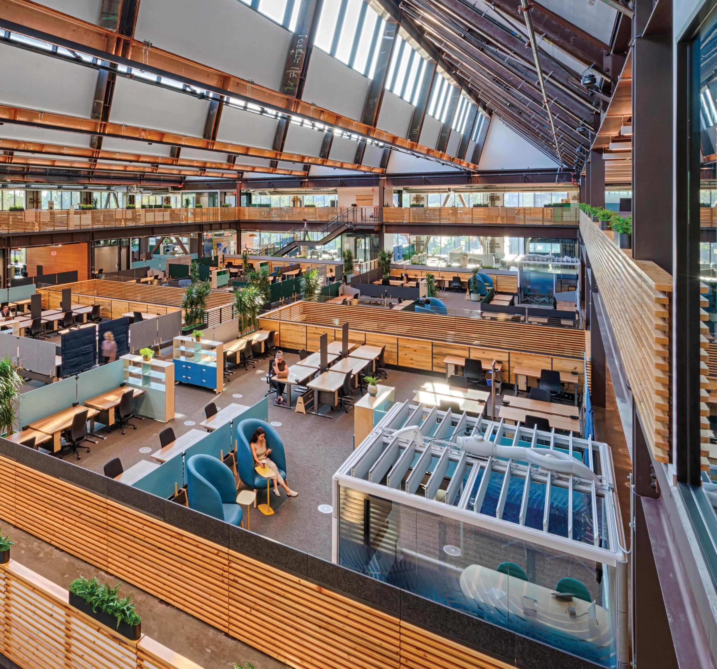
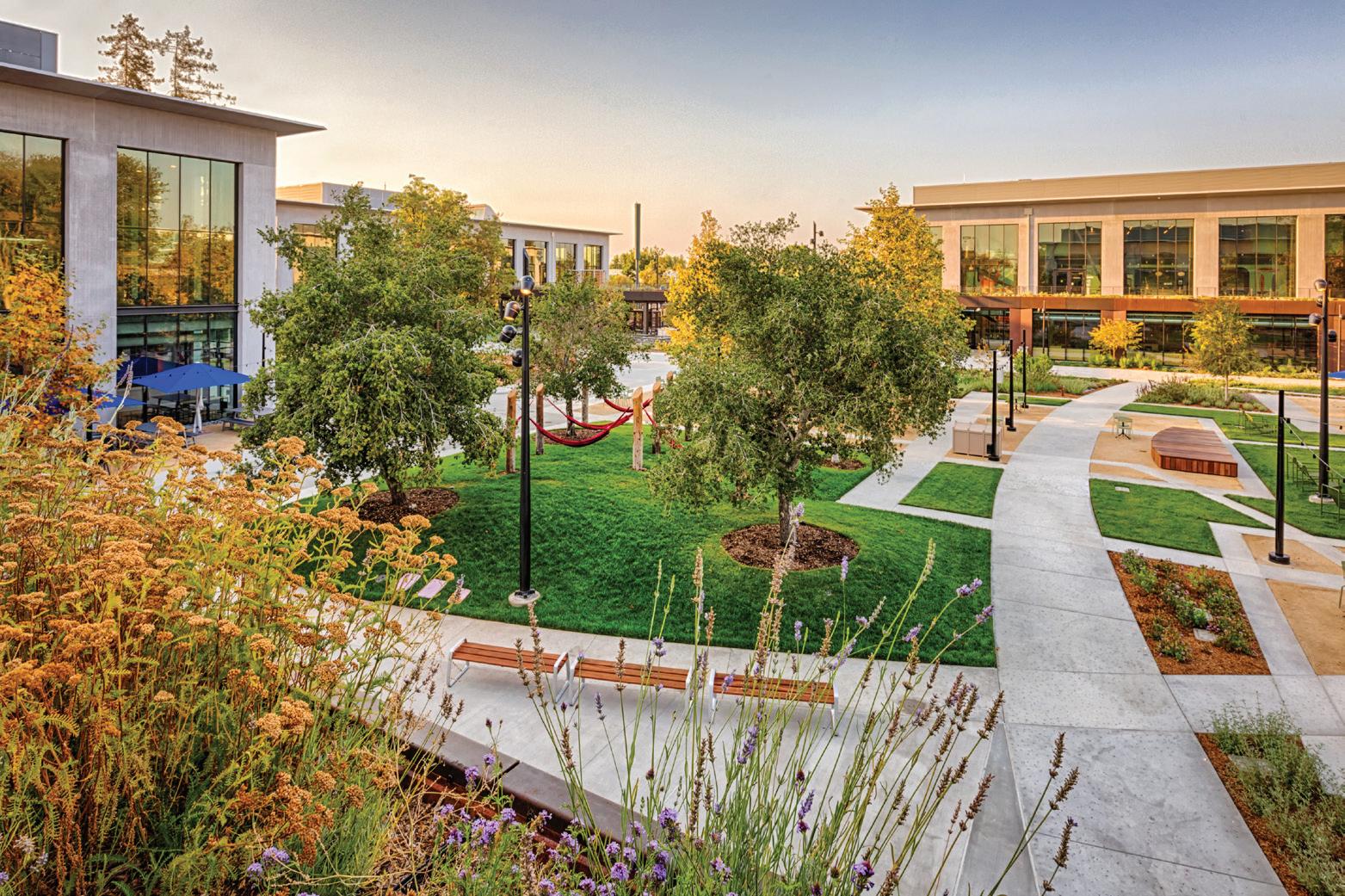
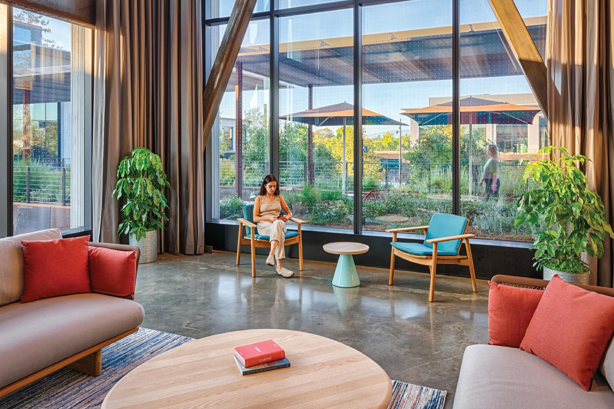
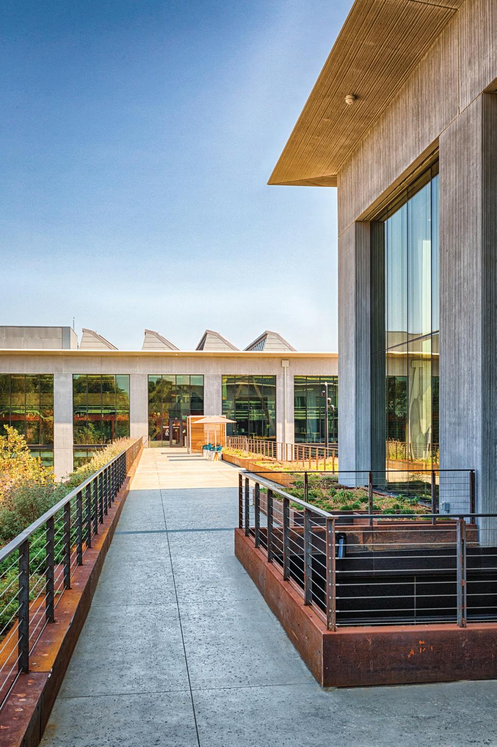
In the new Humboldt Campus set in the heart of Silicon Valley, we sought to use urban principles to encourage social connection and create a sense of place within an otherwise indistinct corporate landscape. Together with the project’s collaborators, we designed a campus of four highly adaptable and high-performance buildings organized around an active courtyard that integrates outdoor spaces into the workplace experience.
Drawing from placemaking approaches to public space, the central courtyard and interstitial exterior spaces are the main organizing features of the campus. Through a variety of both social and work-related programs integrated into the landscape design, the courtyard serves as a town plaza flanked by cafes, event spaces and meeting rooms, where the most activity is concentrated.
Google Humboldt Campus 17
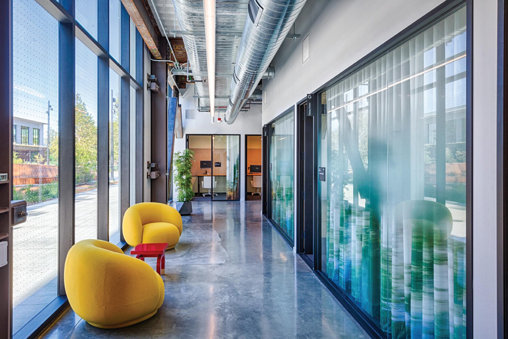
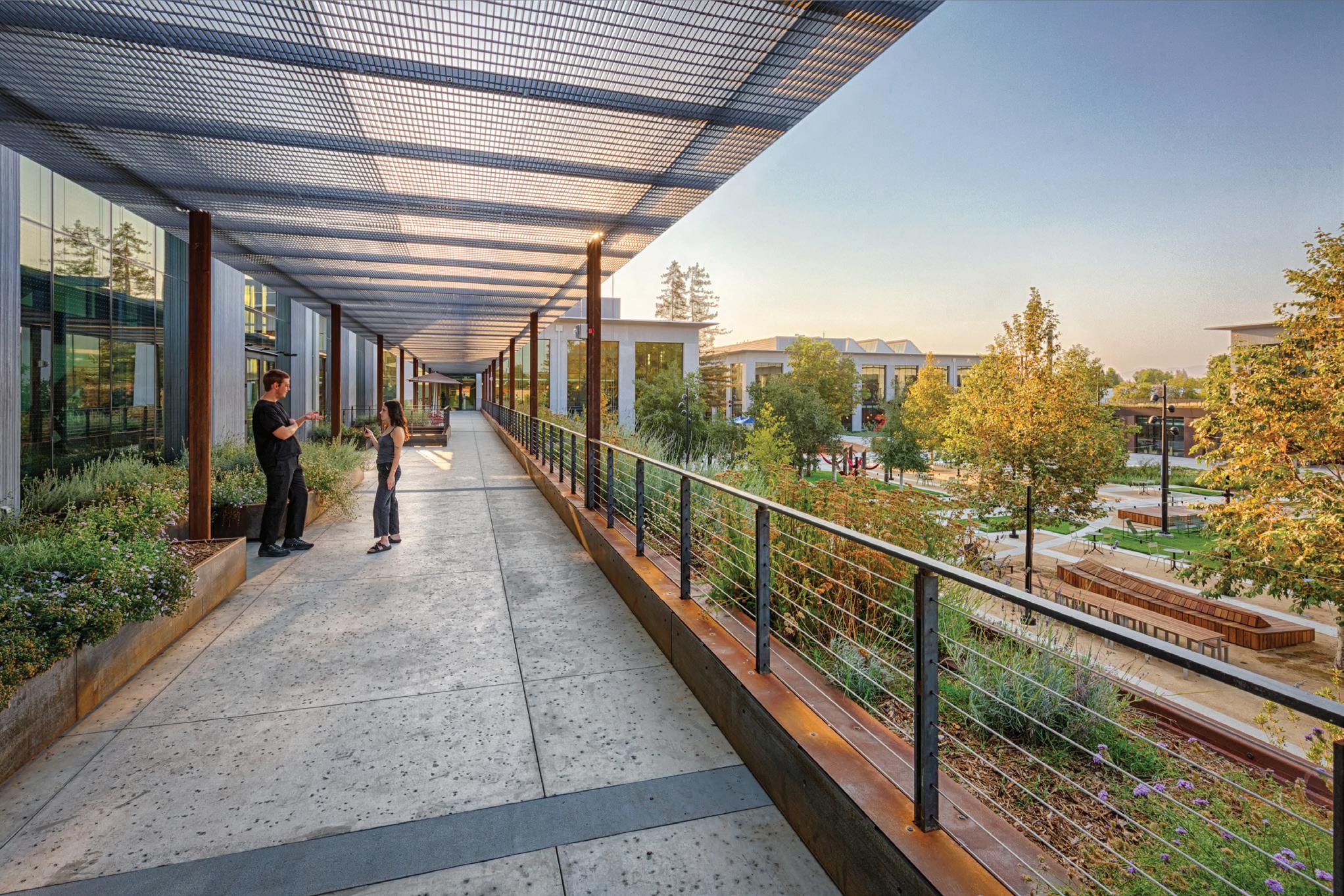
On the second floor, the buildings are interconnected via shaded walkways, creating a continuous circulation route that weaves indoors and outdoors together. This elevated “street” includes pantries, lounges and informal meeting spaces that are key elements of a new hybrid office landscape. The strategic placement of these collaboration spaces along circulation paths encourages the cross-pollination of ideas between teams and communitybuilding throughout the campus. Focused workspaces are recessed deeper within the buildings, ensuring heads-down work can be free from distraction.
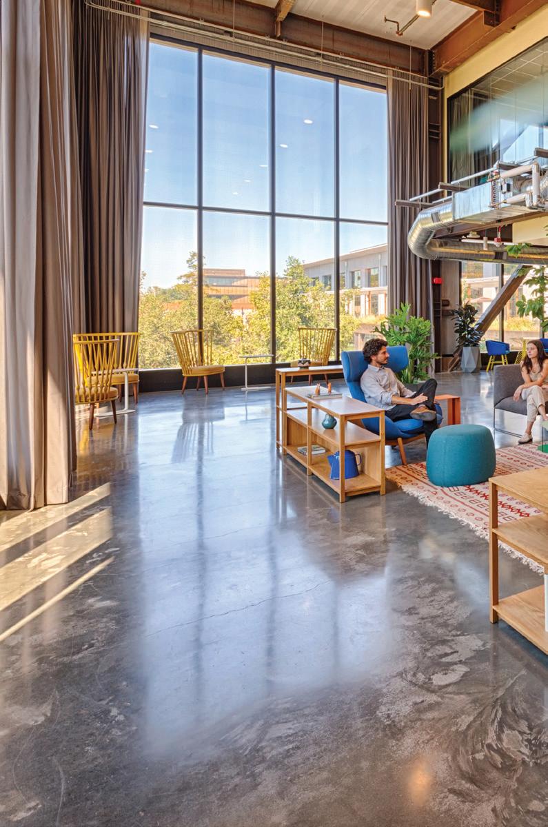
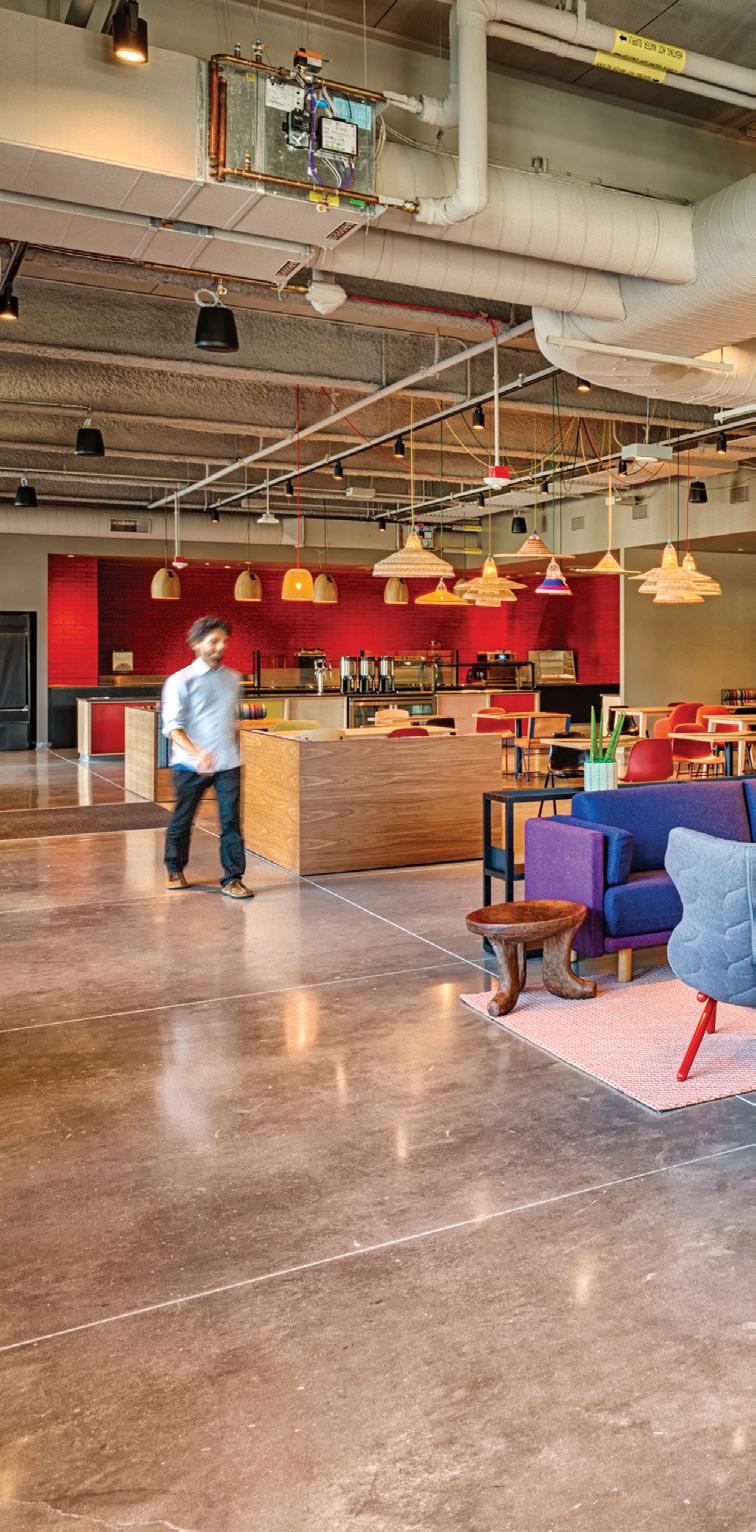
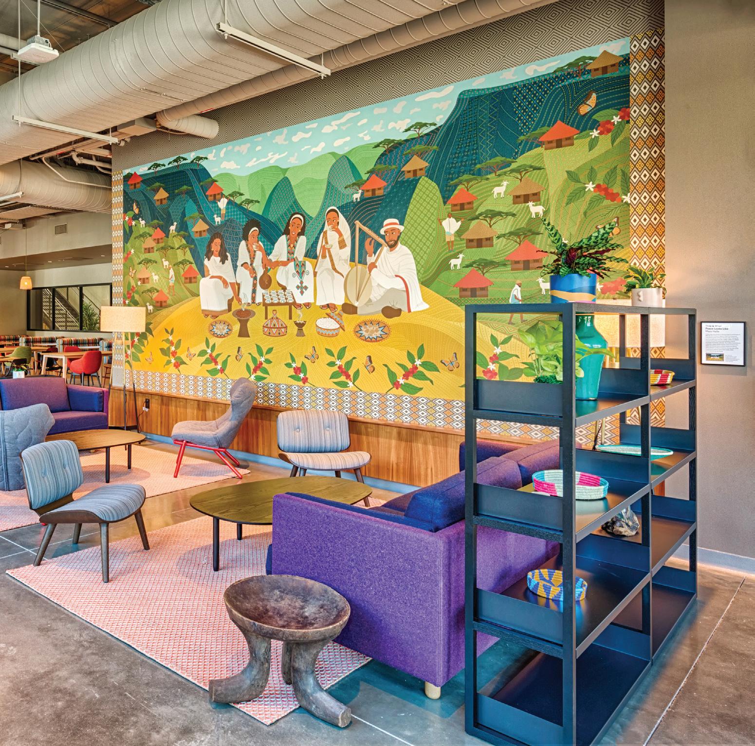
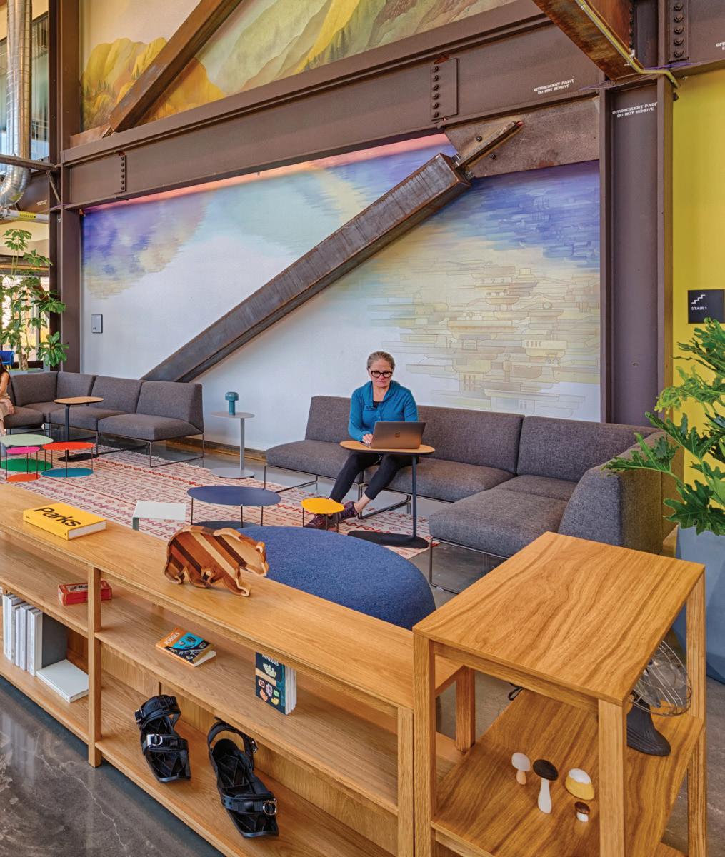
Throughout the campus, the material palette emphasizes natural materials and local makers, evoking warmth and comfort, and reinforcing the intimate scale of interaction that is important for building community. Each building maintains a distinct color identity inspired by local geographic features and enhanced via site specific artwork commissioned from local area artists.
Google Humboldt Campus
19
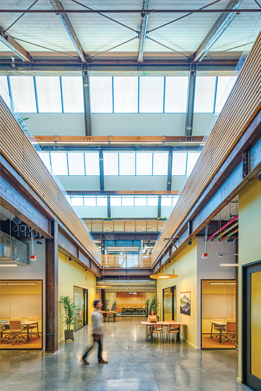
Long-term flexibility was a driving factor in developing a toolkit approach to the furniture systems. Within each team area, users can choose from a suite of huddles, pods, and other power-integrated furniture that can be combined and customized to accommodate their particular style of collaborative and focused work. In creating an adaptable system, we aimed to empower users to have agency over their environments, and offer the company a means of adapting their main focus space rather nimbly.
The LEED platinum campus utilizes rooftop solar arrays to generate 40% of its operational energy. The daylight-driven lighting strategy is complemented with active shading systems to reduce electricity consumption and mitigate solar gain.

Google Humboldt Campus
21
Graycliff Conservancy Visitor Center Expansion
Architect: A joint collaboration between HHL Architects and SITU
Client: Graycliff Conservancy
Location: Buffalo, NY
Scope: 4,400 sq ft (built project), 5.5 acres (landscape)
Completion: Expected 2021
Collaborators: Bayer Landscape Architecture
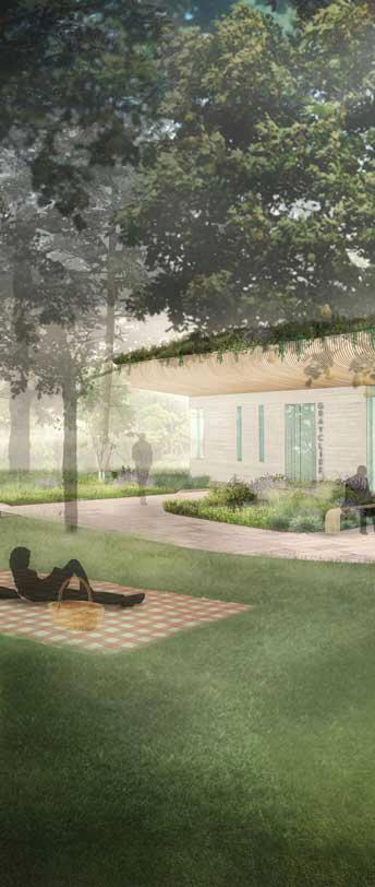
Bringing together Graycliff’s historical significance, compelling landscape and renewed vision for public engagement, this project seeks to transform a visitor center into a cultural destination for the Buffalo region.
23
This project emerges from a challenge many cultural institutions are facing—how to creatively transform their physical assets and programmatic offerings to better engage with a contemporary audience. For the Graycliff Conservancy, responding to this question required both looking back—reflecting on the unique attributes of the site’s multifaceted history—and looking ahead—creating a sustainable platform for engaging a broader community and growing the organization. The Graycliff Conservancy commissioned SITU, with HHL Architects and Bayer Landscape Architecture, to delve into these themes and produce a design concept that transforms the site into a dynamic, cultural destination.
Graycliff is located on the bluffs of Lake Erie outside Buffalo, New York. Originally created as a summer retreat for the Martin family, the house illustrates a new architectural direction for Frank Lloyd Wright—from Prairie to Usonian style—a shift that aims to integrate the building with the site and surrounding environment. To this end, the Martin family commissioned the accomplished landscape architect Ellen Biddle Shipman to work with Wright. While Graycliff is the only collaboration between Wright and Shipman, their shared vision to soften the boundaries between the building and its surroundings produced unprecedented results.
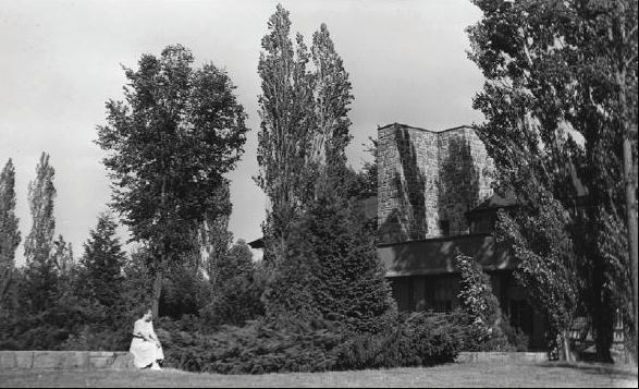 Historic photo of the house integrated into the landscape
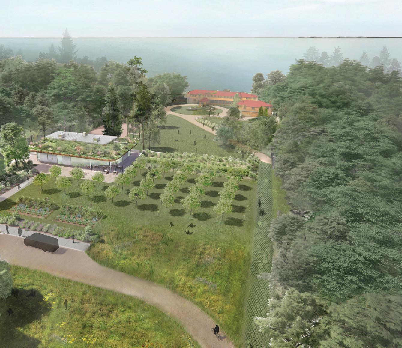
Graycliff Conservancy Visitor Center Expansion
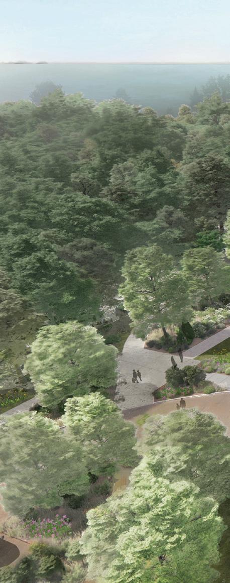
Bird’s eye view of the site, illustrating the transition created by the proposed visitor center to the historic home grounds
25
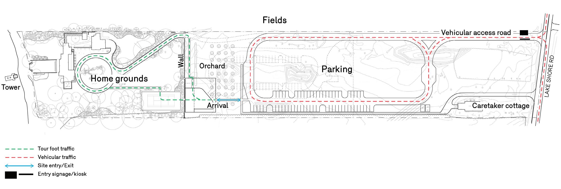
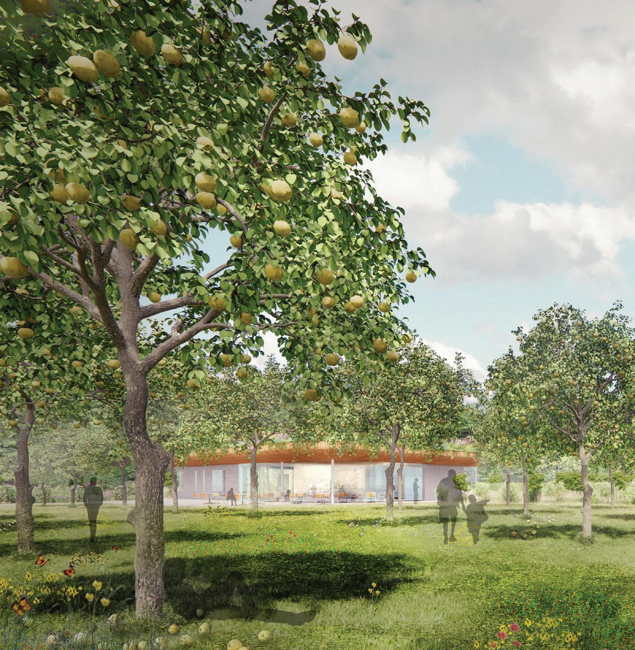
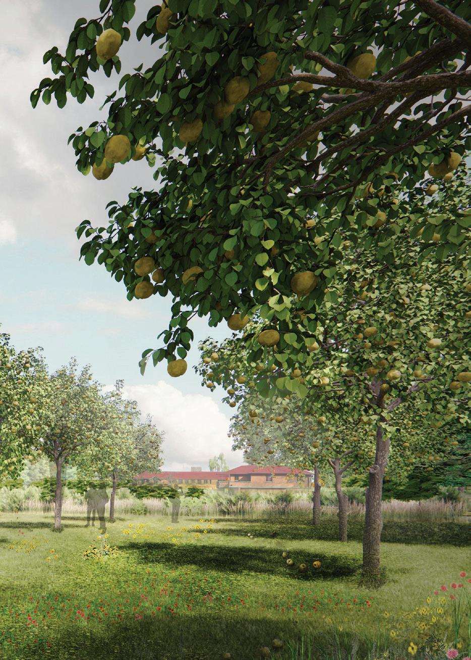
Our vision for the site rethinks the visitor circulation experience, using the addition of an orchard as a buffer between the reduced parking area and the home grounds.
Given the fundamental role the landscape played in Graycliff’s beginnings, our team began to re-imagine the parameters of the project beyond a singular building to include its surroundings—over eight acres in total. This wider lens not only reflects the original vision for Graycliff but also aligns with our team’s efforts to reshape the arrival experience and take full advantage of the site’s beautiful grounds through a re-imagined programming strategy.
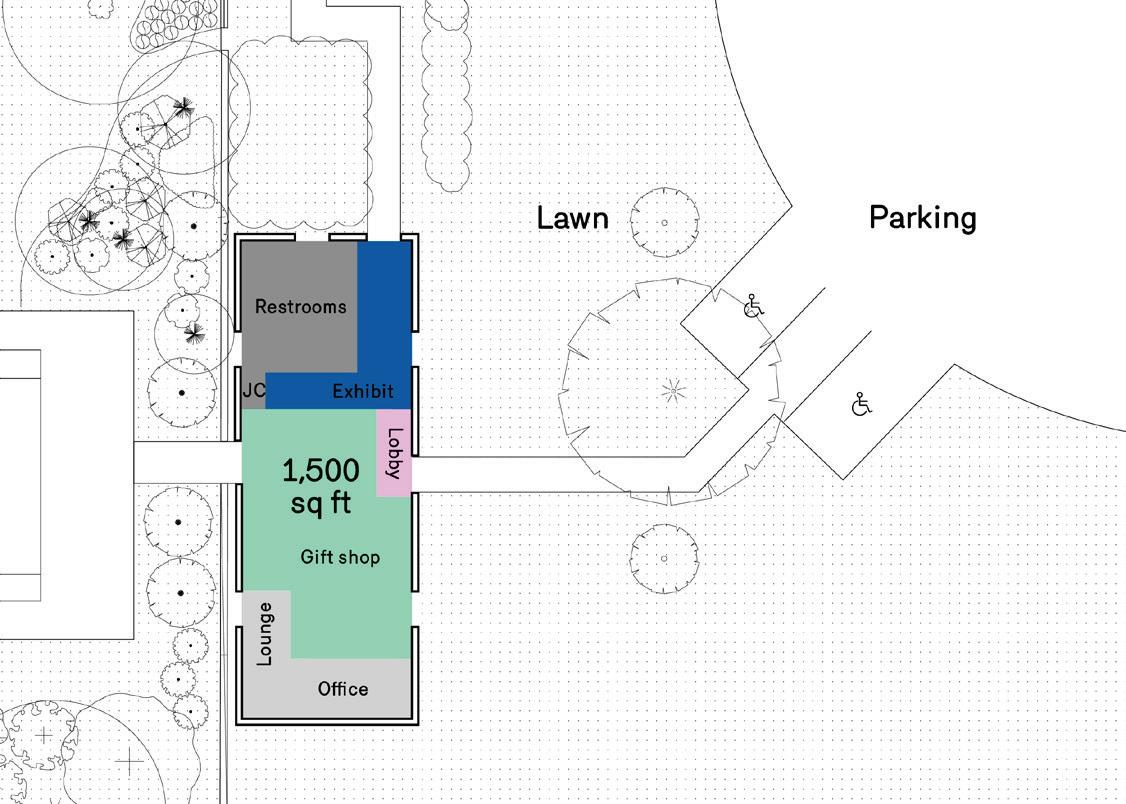
 Before: Floor plan of existing layout and entry from the parking area
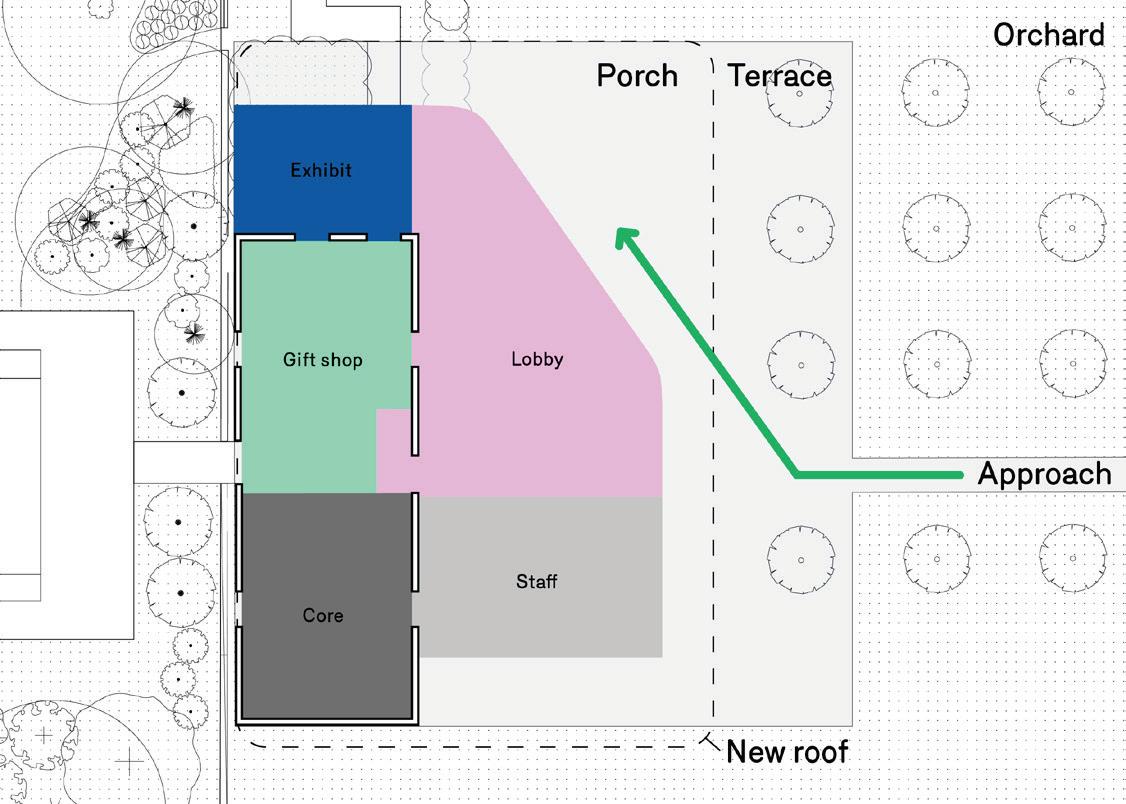
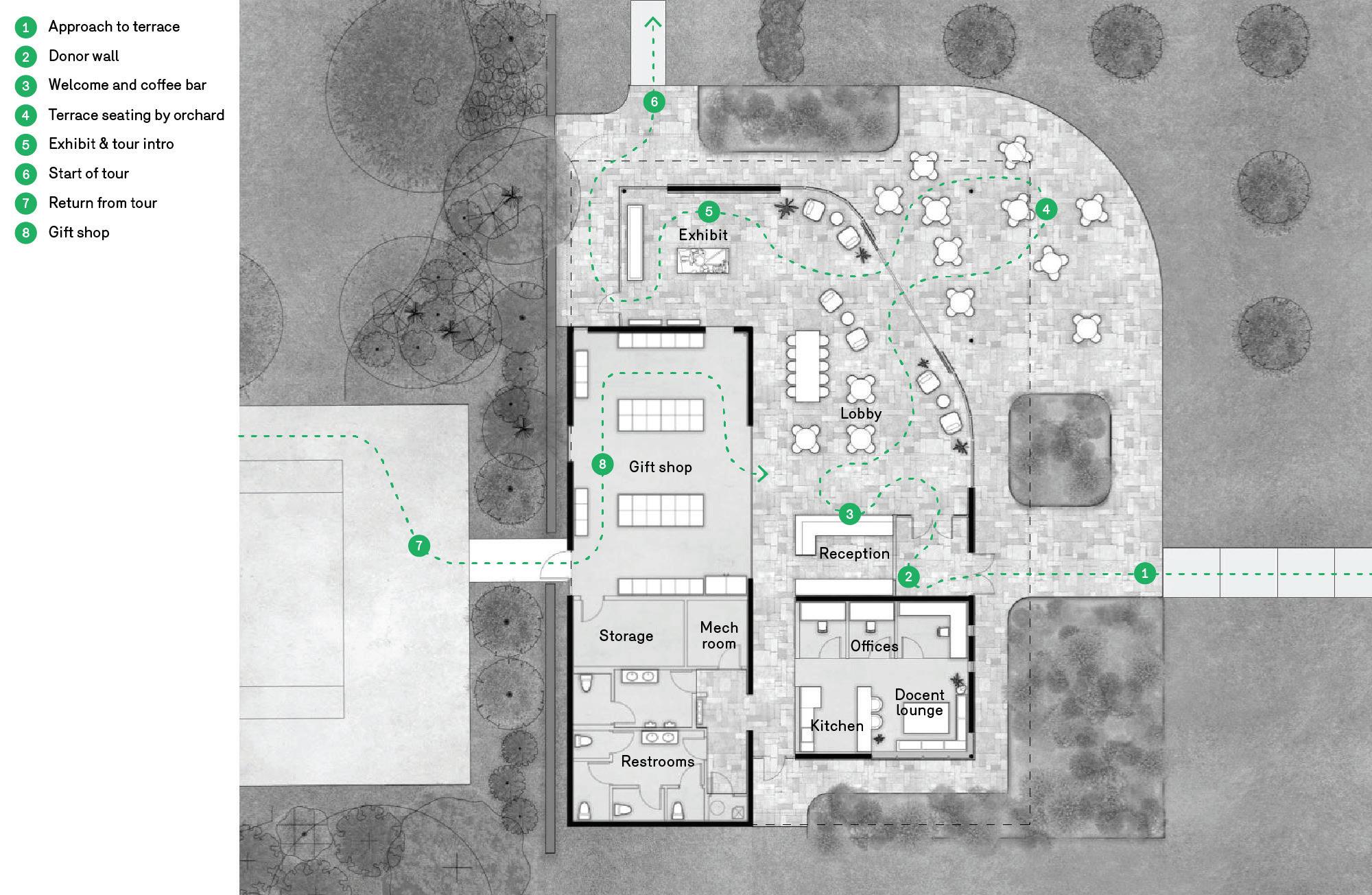
After: Floor plan of proposed visitor center, which expands the building footprint and transitions the core functions into a covered plaza space and outdoor gardens
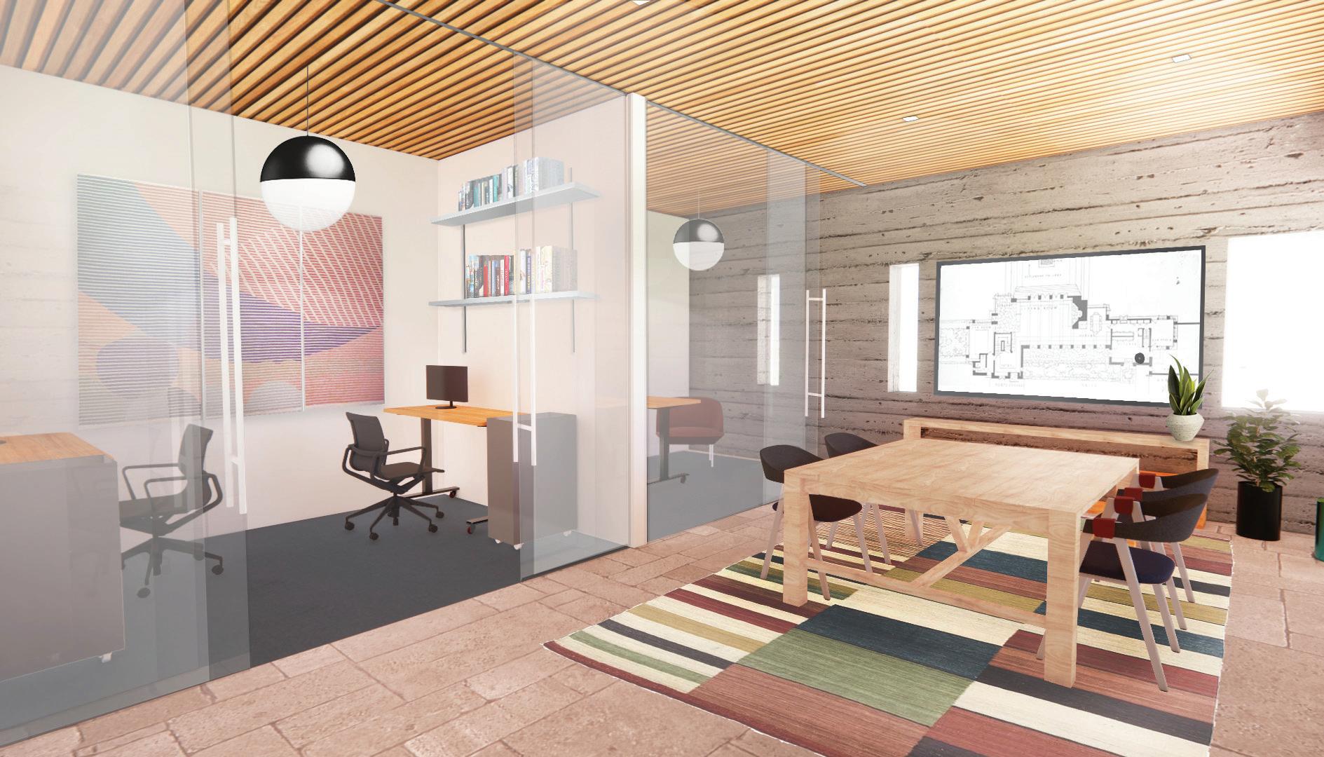
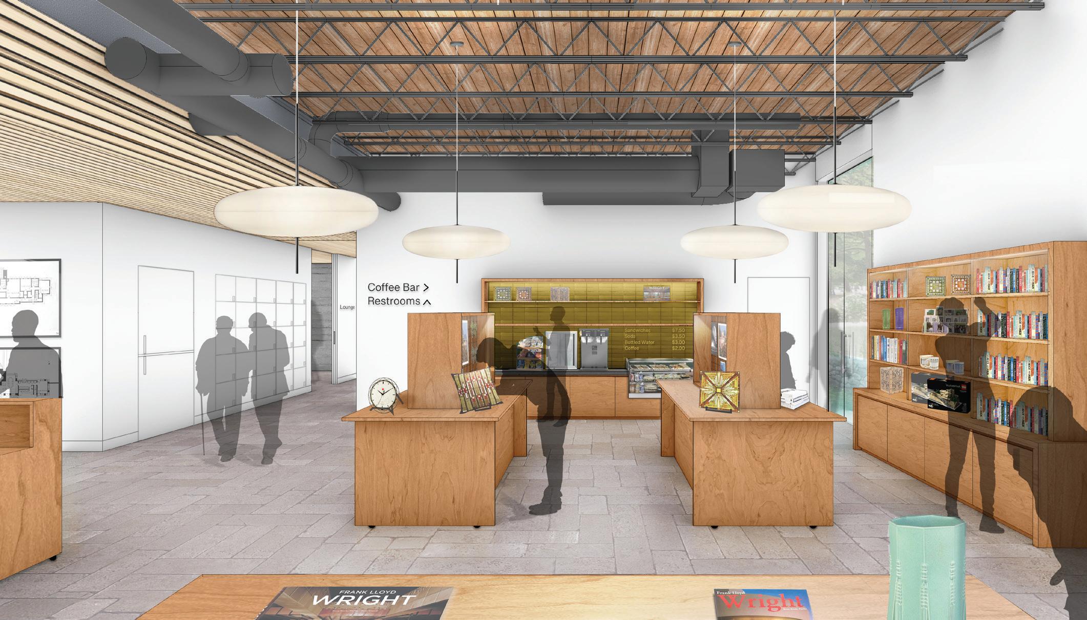
The new center will have more room for staff members, more porosity between programs and better connectivity, specifically linking the exhibition area and the historic site. The project leverages an existing concrete block gymnasium building that was built by the Piarist Fathers, who purchased the site in the 50s. The gymnasium (1,605 sq ft) serves as the current visitor center, and in the new design, it will be upgraded to house an expanded gift shop and new service facilities. Extending outward from the gym, an open, lightfilled lobby space creates a new face for the building and center of programming. Overall, the multipurpose addition (nearly 2,800 sq ft) will host new staff facilities, a reception area, cafe and exhibition space while also serving as an informal and inviting buffer space between more specific uses that allows various programs to expand or retract as activities require.
Graycliff Conservancy Visitor Center Expansion
27
Floor plan of proposed visitor center
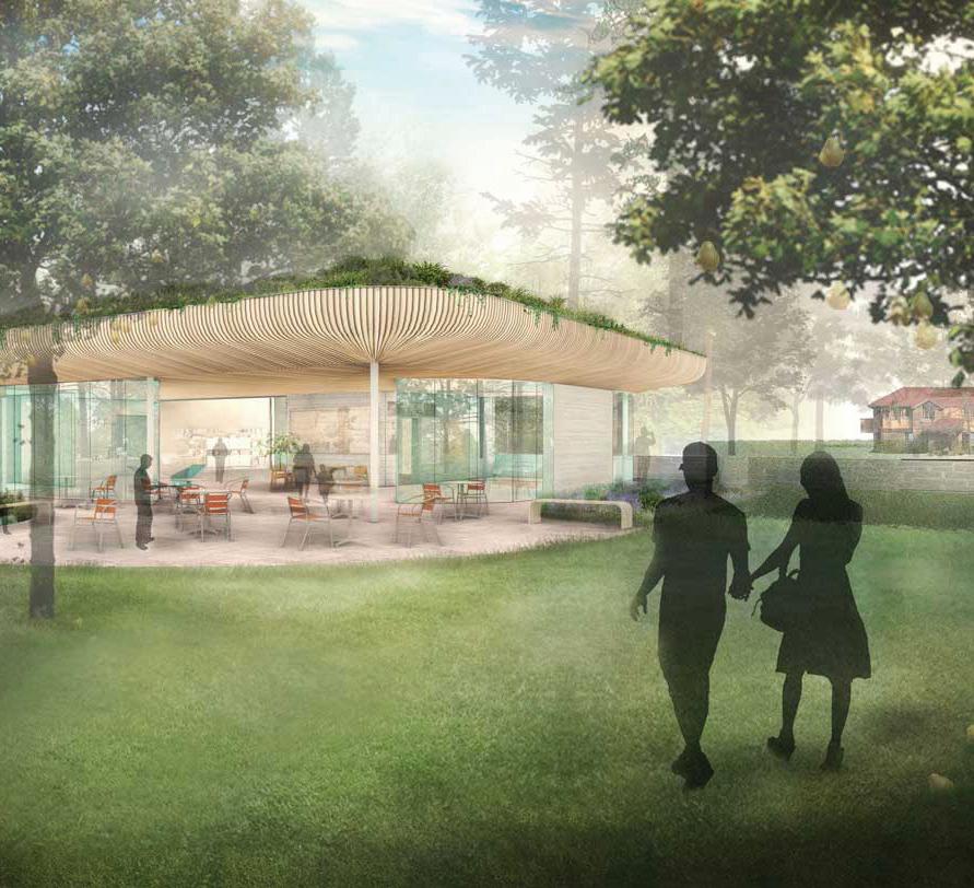
A floor-to-ceiling glass facade opens up at the terrace to seamlessly blend the lobby interior with the terrace exterior, allowing for larger events to occur such as the annual gala as well as farm-totable and other cultural activities. Much in line with Isabelle Martin’s original vision for Graycliff, the new building provides a welcoming and restful retreat for day-to-day visitors, event attendees and Graycliff’s own team.
The building is topped by an intensive green roof that cantilevers outward toward a restored fruit orchard creating an outdoor covered porch area. Clad in natural wood, this prominent roof feature seeks to bring the outside in and ensconce the new Center within the existing landscape.
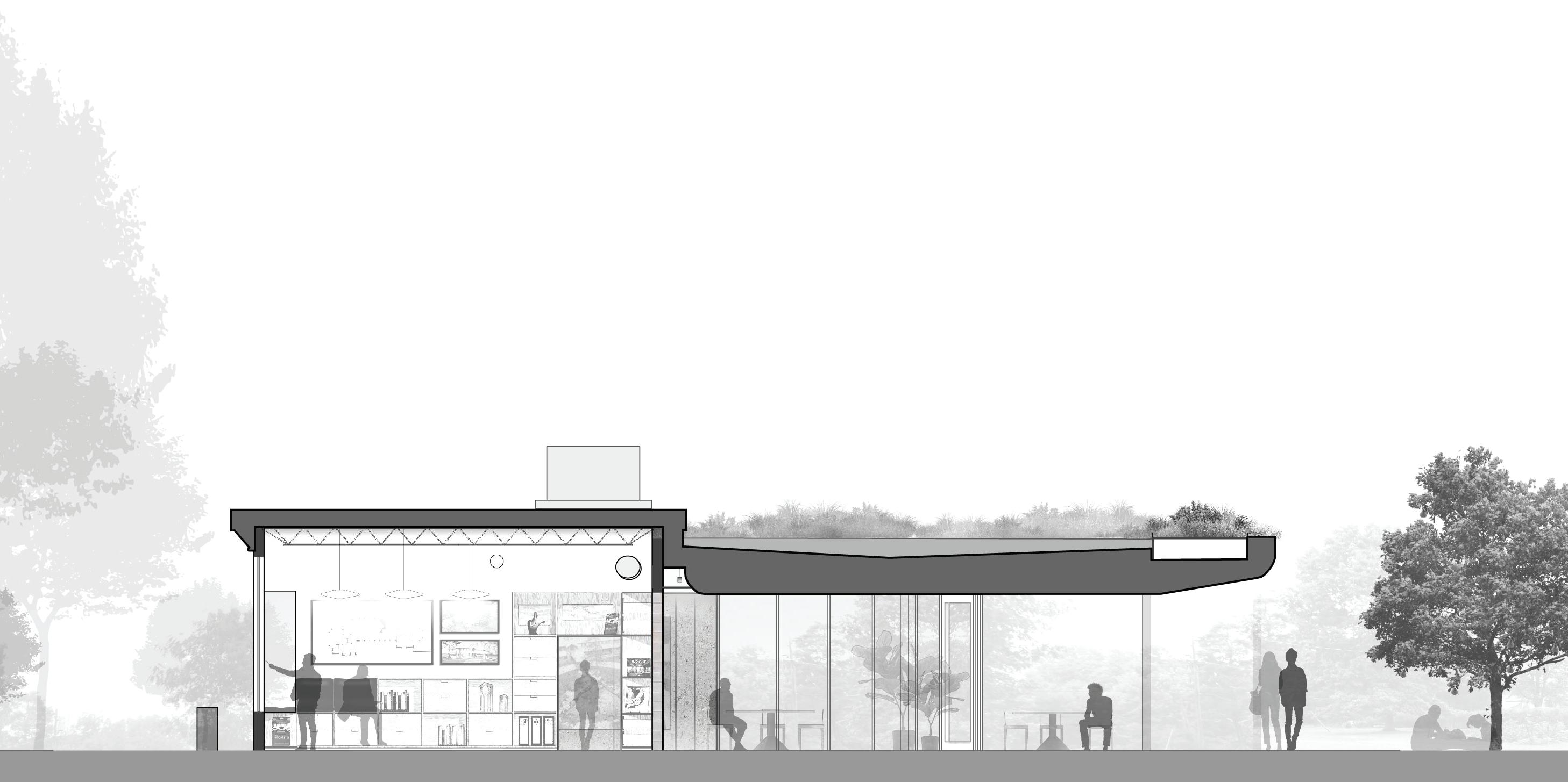 Section of the visitor center, showing the gradual transition from the interior offices to the exterior gardens
Graycliff Conservancy Visitor Center Expansion
29
Exhibition space with clear sight lines to the main house
SITU: Design, Fabrication
Collaborator: Design Trust for Public Space
Consultants: LSTN, Alfalfa
Public Space Design Advisor: J.Ember
Design
Completion: 2022
Location: New York, NY
Photography: Andre Whitehead
Turnout NYC
Transforming underutilized spaces across the city into vibrant
cultural venues.
31
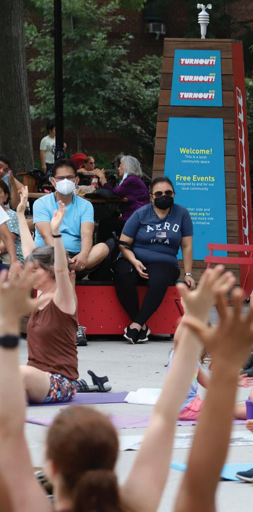
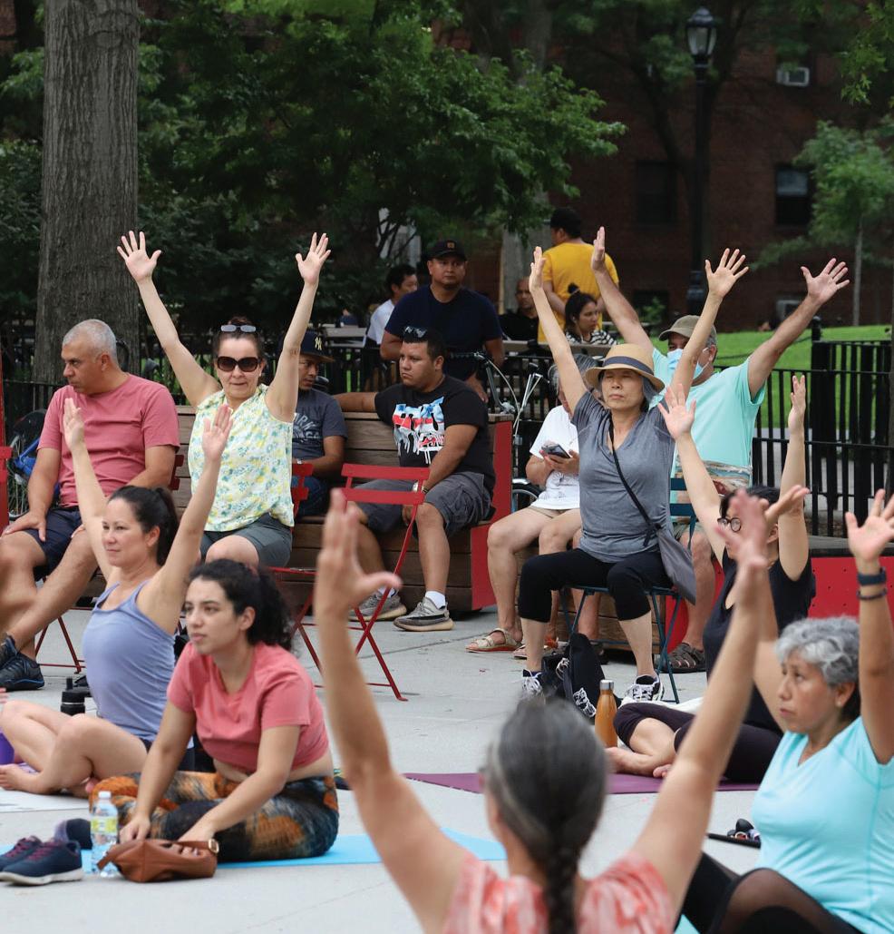
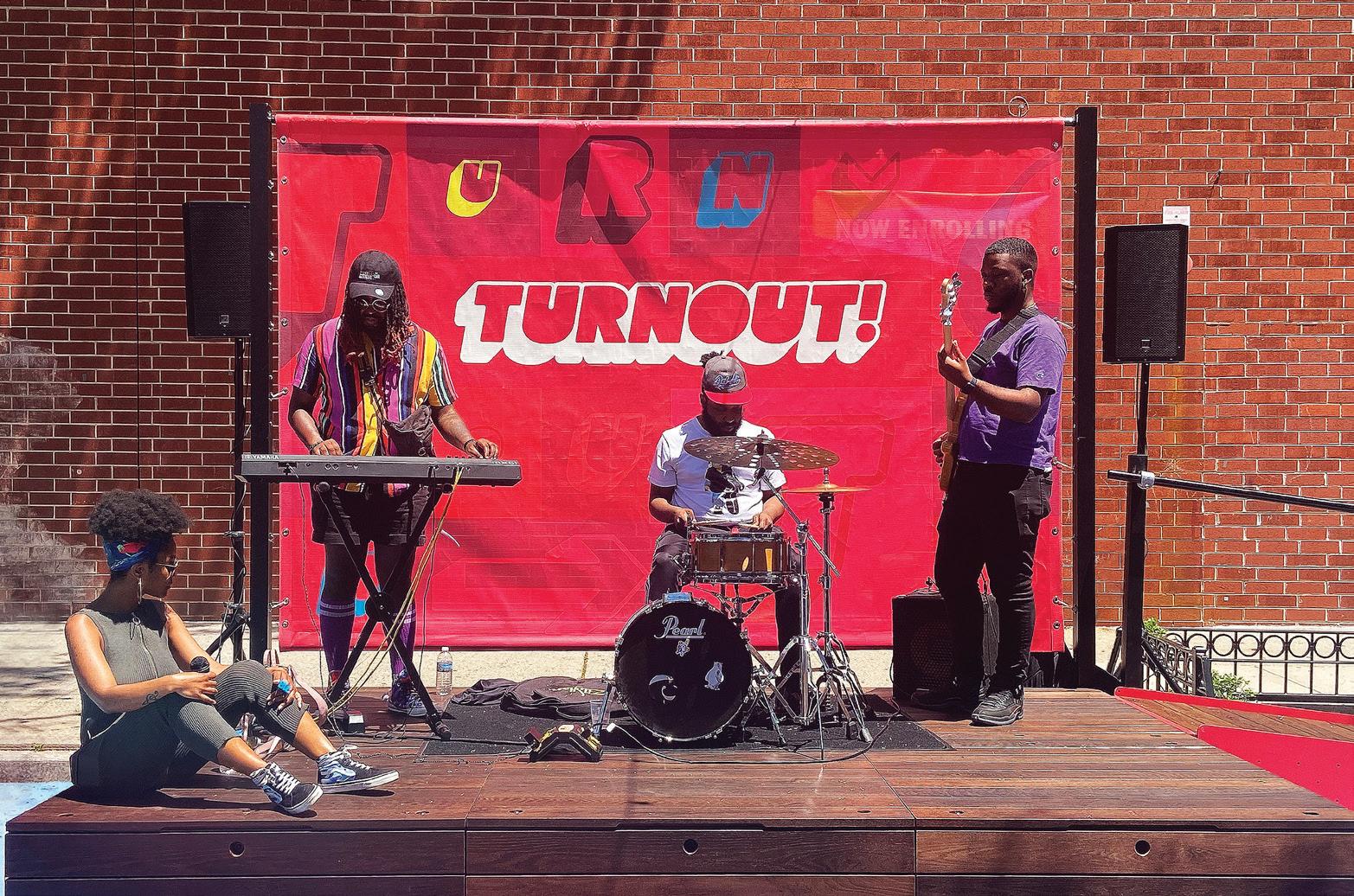
In response to the shrinking of arts and culture funding occurring in New York City and nationwide, Turnout NYC, a new initiative dedicated to activating public spaces, has created a transformational model to leverage public spaces as accessible venues for arts and culture. For Turnout NYC, SITU prototyped and developed flexible outdoor performance venues—one in each borough— in collaboration with cultural community partners. This citywide effort conducted a Summer season of free concerts, performances, workshops, and more, connecting artists to the potential of public space through new partnerships and infrastructure.
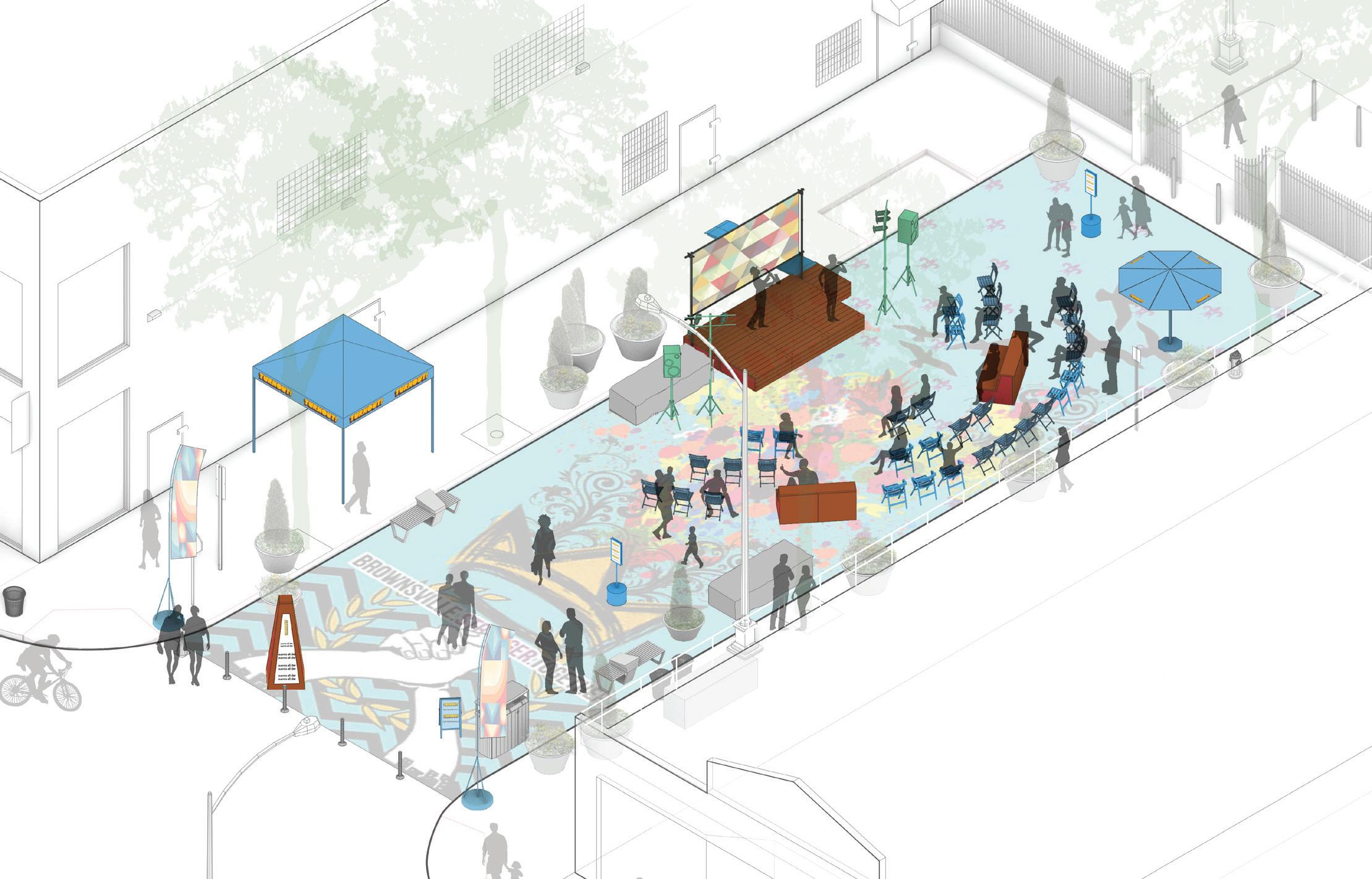
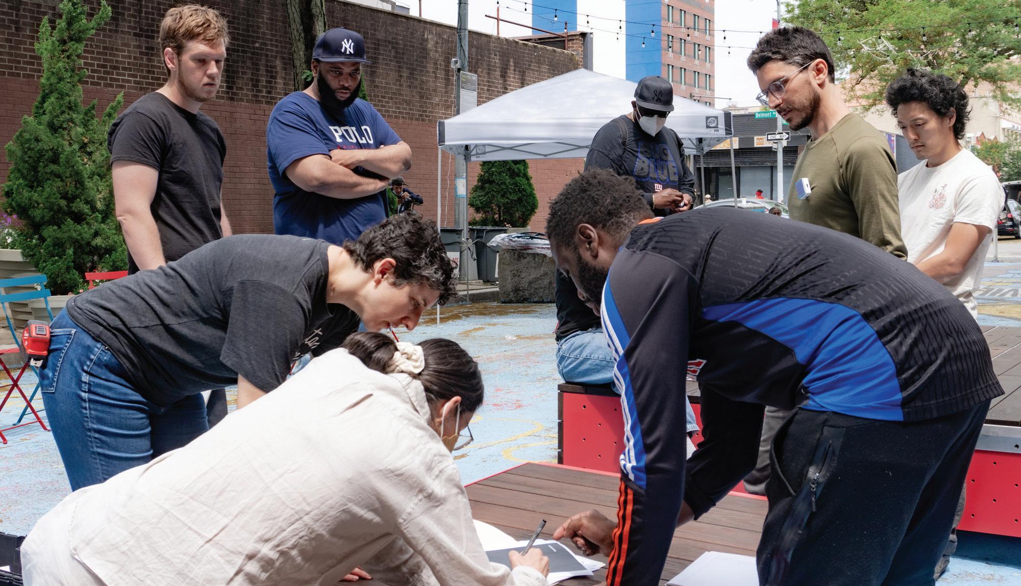
Together with a series of local partners, our team conducted a series of community workshops, site visits, and meetings to better understand the program needs and priorities at each site. Through this collaborative process, a customized kit of parts was developed.
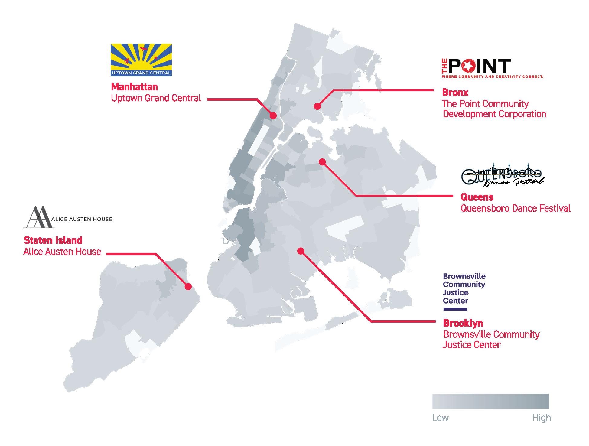
 2022 Turnout sites overlaid on a map showing the concentration of NYC cultural institutions in 2021.
The four primary elements include a modular stage, a site marker, a bench and a ramp, all of which have the ability to store within them secondary placemaking components such as folding furniture and signage.
300 Lafayette Lobby
33
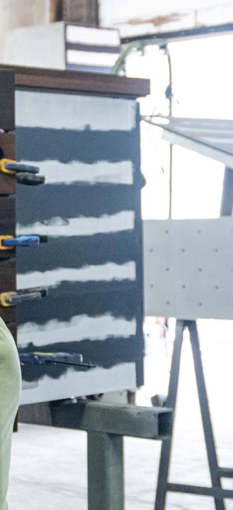
We prototyped and refined the design of the kit’s modules in-house using a full-scale mockup to ensure ease of use for local producers and incorporate community stakeholder feedback.
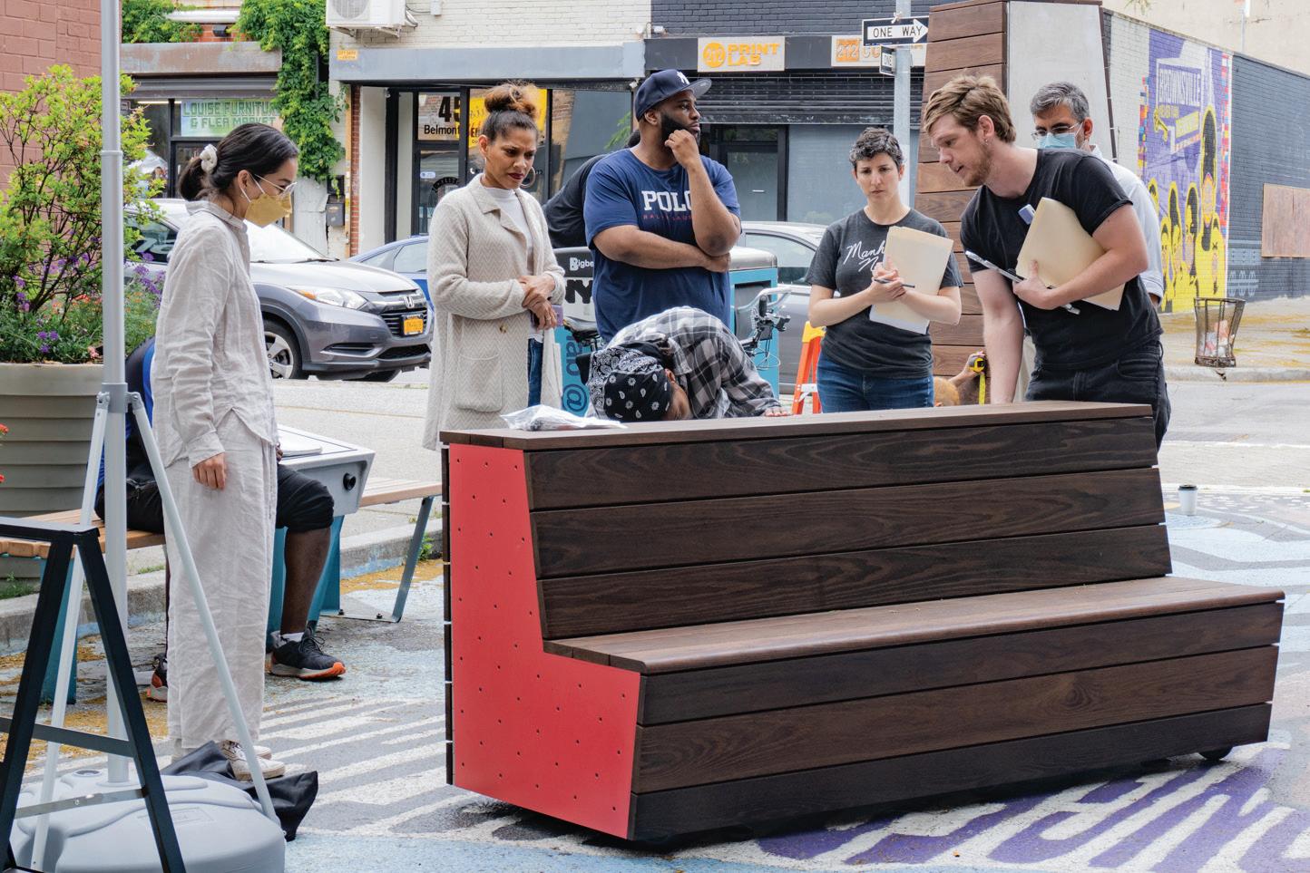
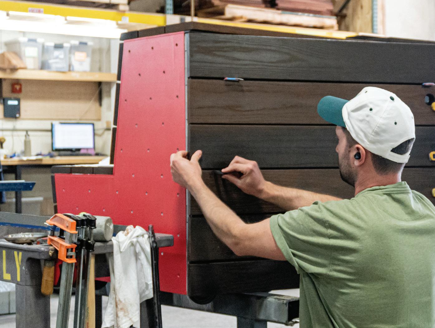
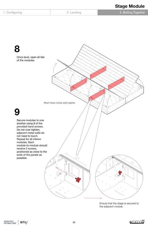
The kit-of-parts is intended to be easily reconfigurable by community members for a wide variety of programs and adaptable to a range of site conditions. When not in use for a Turnout event, the kit is designed to be left outside as plaza furniture and utilized by local community members, contributing to the activation and vibrancy of these public spaces.

300 Lafayette Lobby
35
Community partners s and local operators were provided with operation manuals for each site with site-specific sample configurations.
In total, during the 2022 summer featuring 500+ artists. Leaving producing into the future, Turnout landscape of the city, empowering expanding opportunities to experience

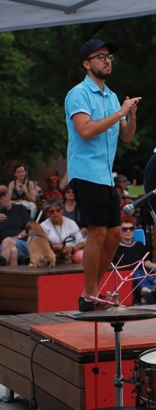 Turnout Queens featured performances
Grafitti Workshop at Turnout Bronx.
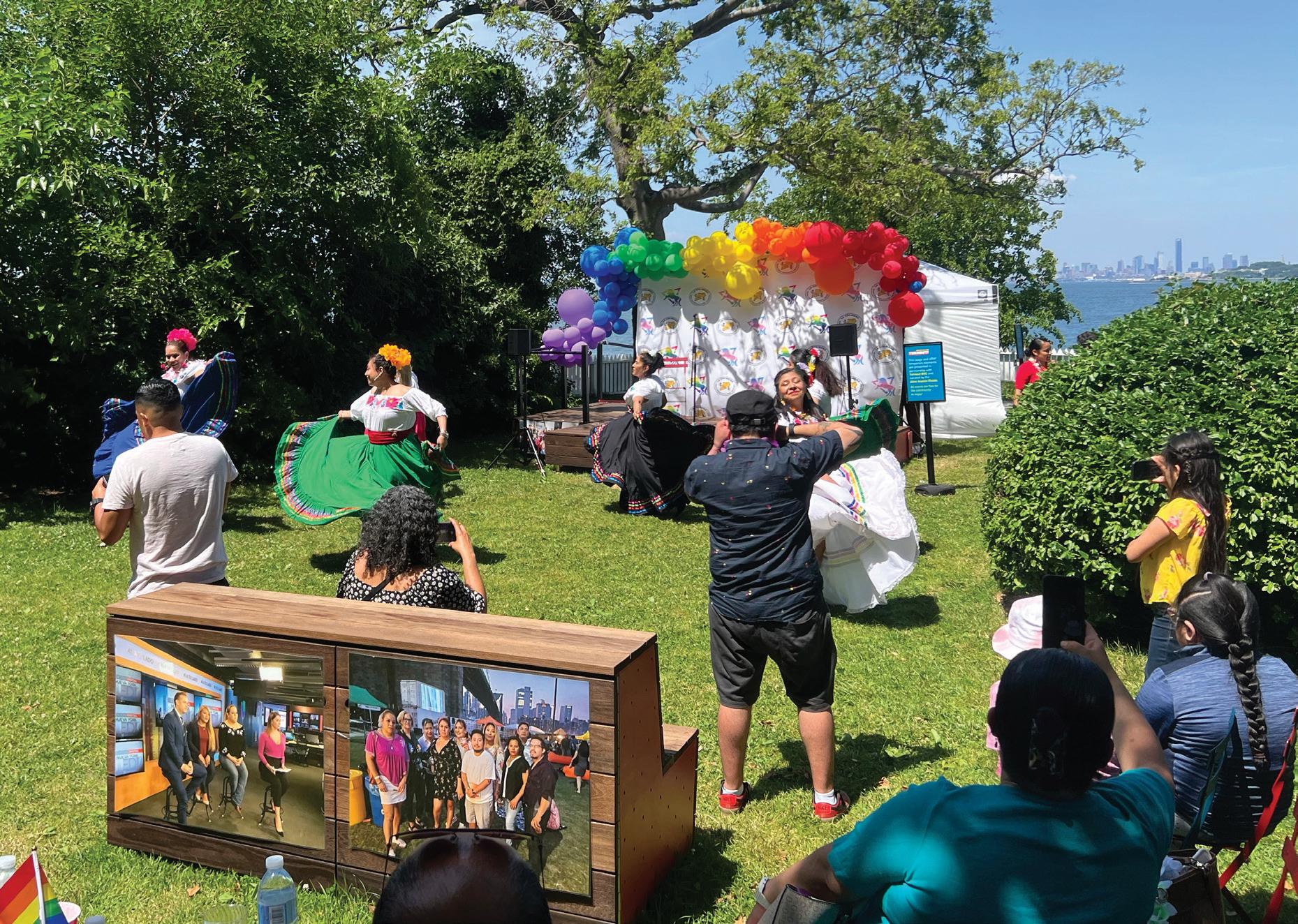
Lunicorns at Fiesta Pride at Turnout Staten Island
summer season, the traveling kit hosted over 100 events Leaving Community Partners with the tools to continue Turnout NYC will have a lasting impact on the cultural empowering historically under-resourced artists and experience arts and culture across the five boroughs.

“Having the ability to work with high level equipment and a really functional stage, was a major difference. Retaining the stage as an open platform for an entire month rather than closing it down or fencing it off between performances made it feel really welcoming. Normally, the public sees a stage set up as something not necessarily for them.”
300 Lafayette Lobby
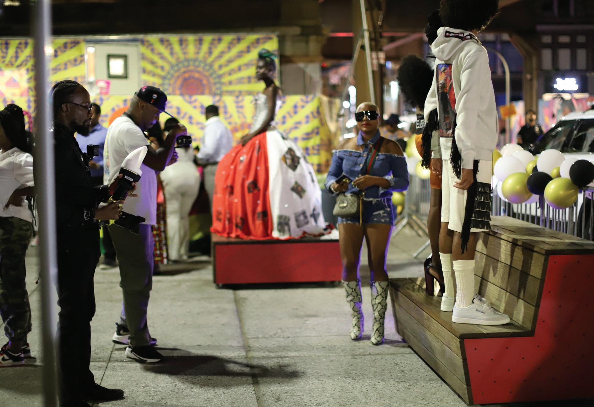
Harlem Fashion Week at Turnout Manhattan.
performances by 144 local artists.
37
Director of the Alice Austen House, Staten Island CCP
New York Tech Office
Client: New York tech office
Location: New York, NY
Scope: 40,000 sq ft
Completion: 2017
Photography: John Muggenborg
Collaborators: Renfro Design Group, Thienes and Levent, Tri-Lox, Stantec
39
The future of workspace is flexible, adaptive and changing faster than ever before.
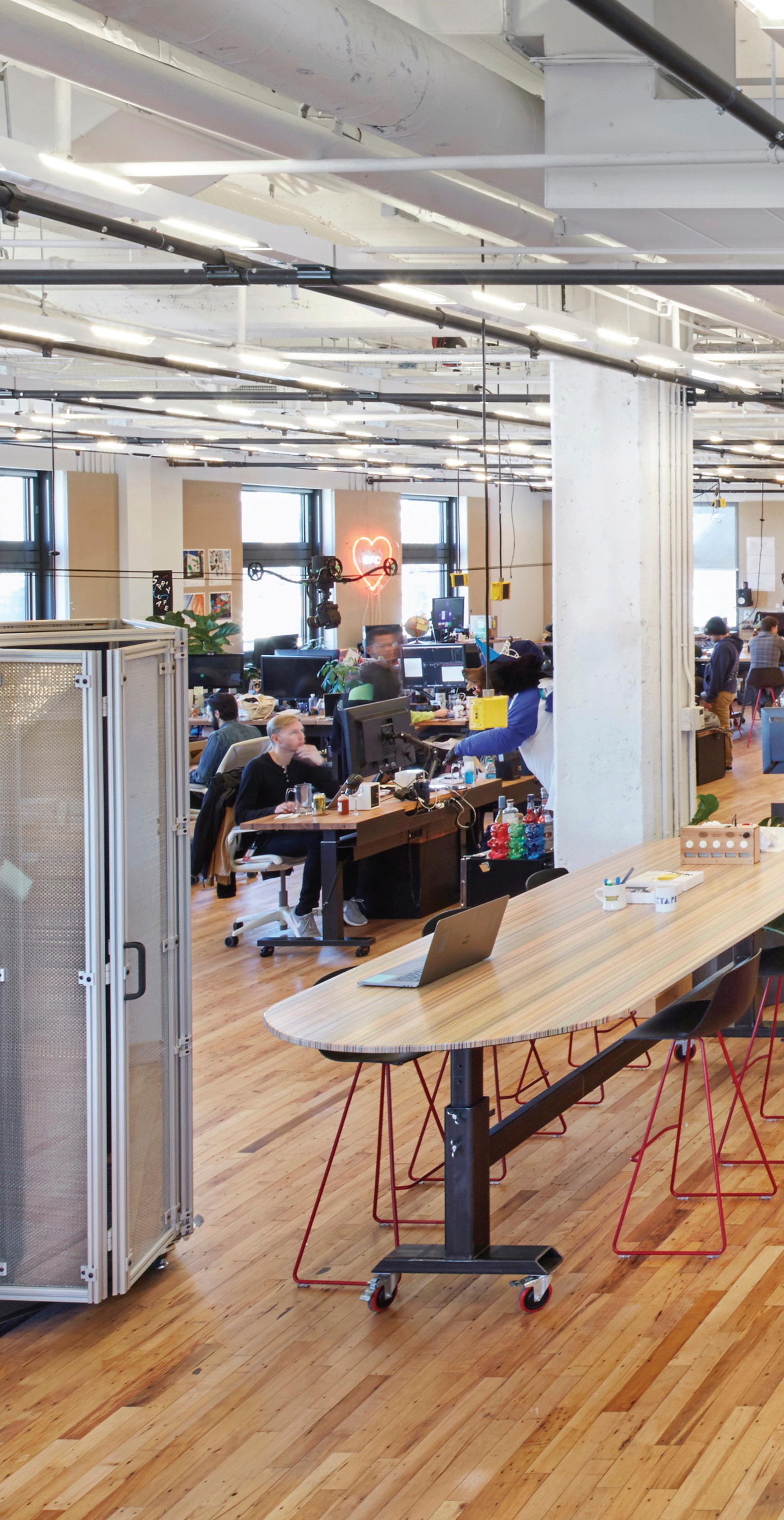
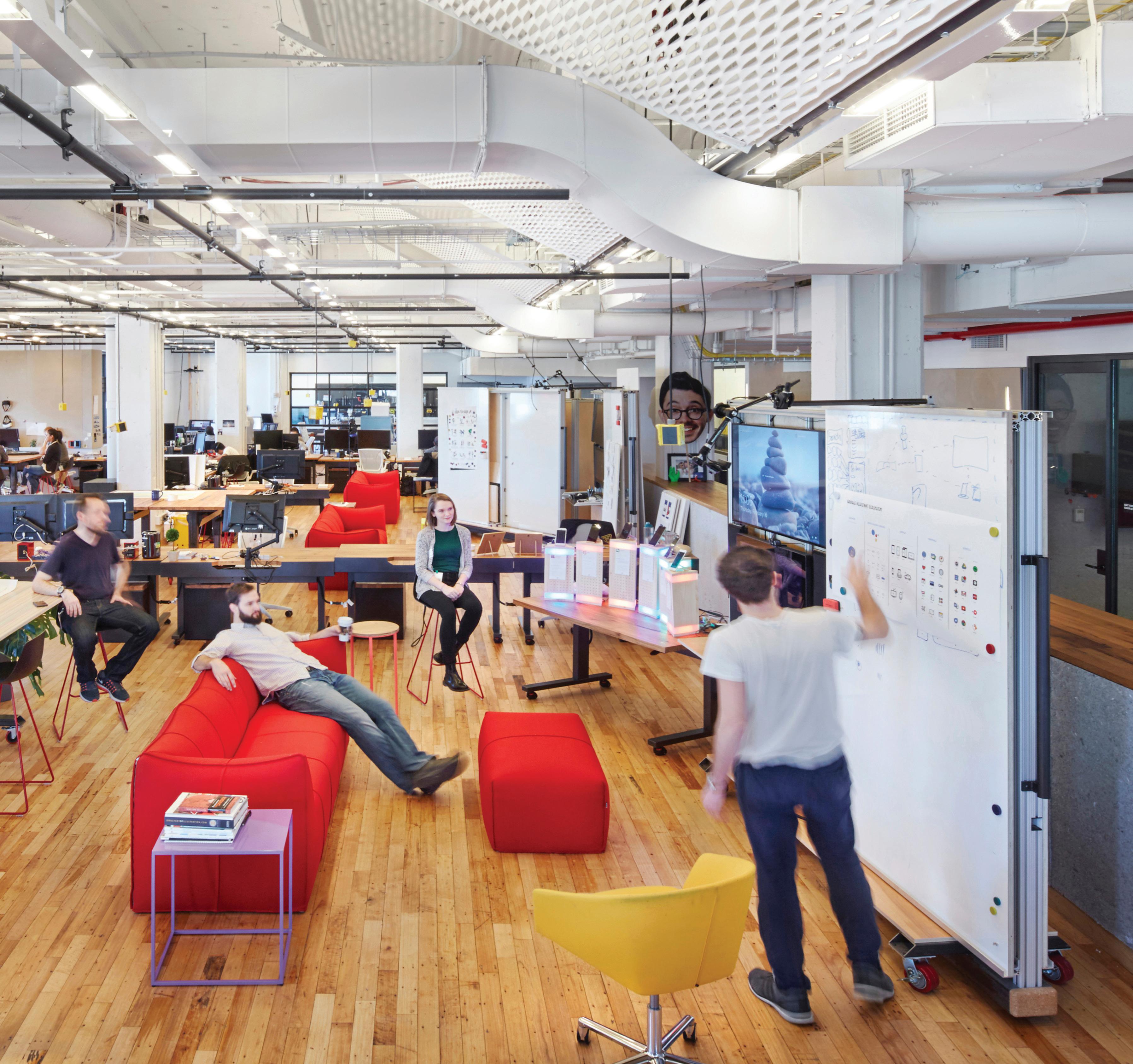
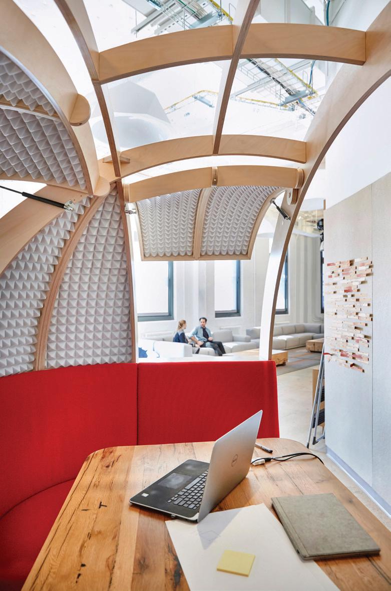
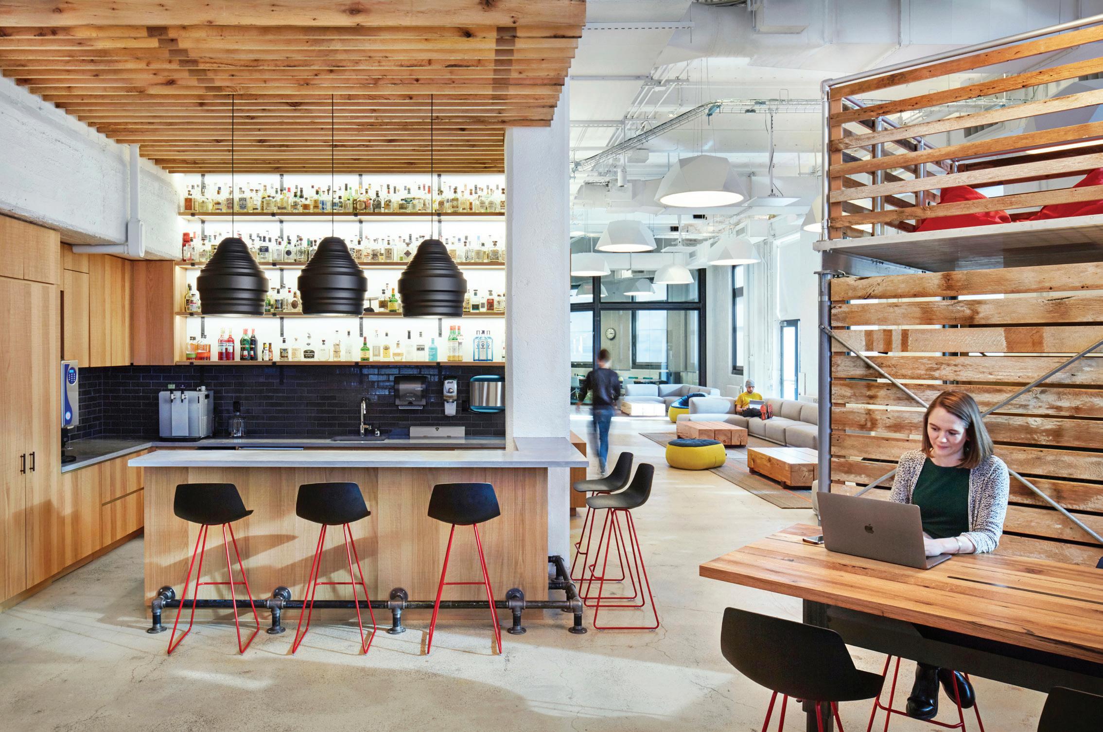
Innovative, multidisciplinary and intensely collaborative, Google’s Creative Lab is an embodiment of this trajectory. Tasked with creating a space to support the dynamic output of this group, SITU developed a hackable, modular and materially rich environment that creates a sense of place for the multitude of projects, products and ideas the Creative Lab will pursue in the coming months and years.
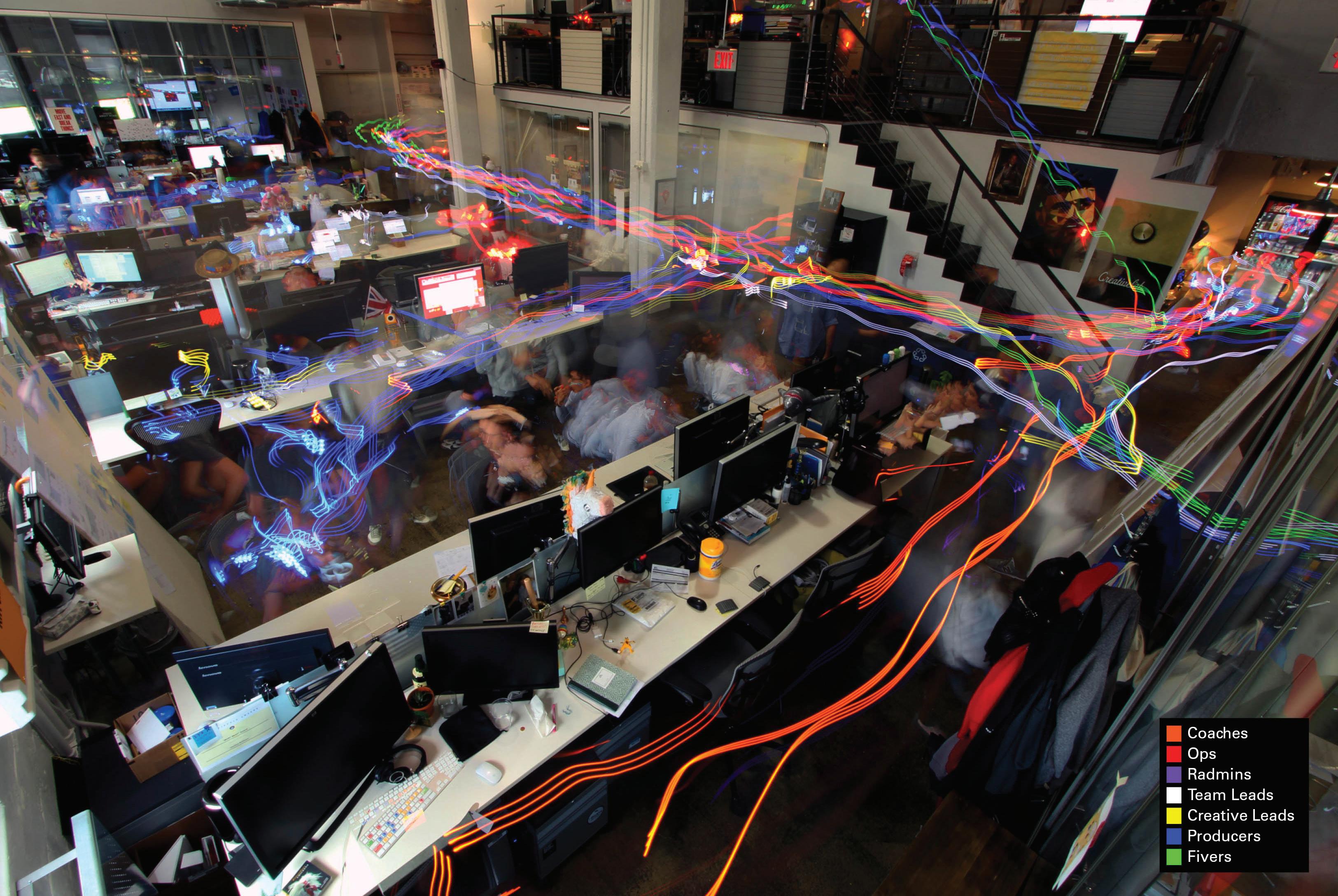
 Prior to design, SITU spent 5 weeks embedded with the Lab to observe, talk, participate in activities, document and analyze workflows and space implications, and ultimately produce concept drawings and guiding principles for the design work ahead.
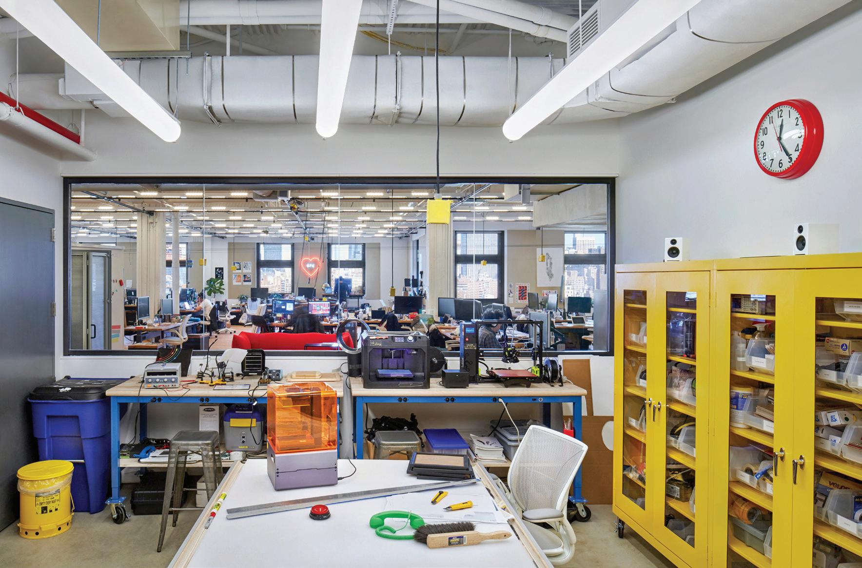
Approximately 40,000 sq ft distributed over two floors at Google’s Manhattan headquarters, SITU designed Creative Lab’s space with a balance of performance and wellbeing in mind. From creating flexible conference rooms that accommodate everything from team sprints and training workshops to developing tech-integrated infrastructure and furniture systems that enhance openplan offices and digital-physical workflows.

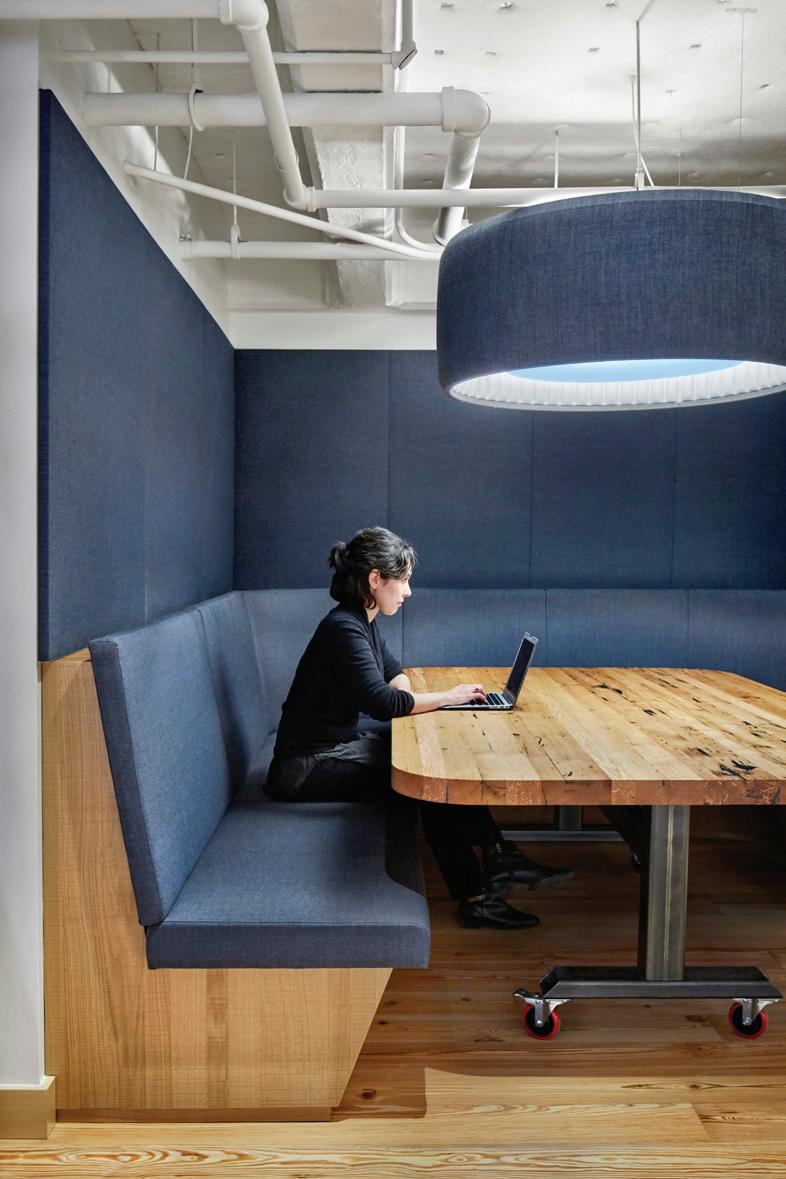
Google Creative Lab
41
Reclaimed factory flooring and an industrial pipe-grid ceiling are balanced with refined soft seating areas with mobile presentation walls placed directly within the open office environment.
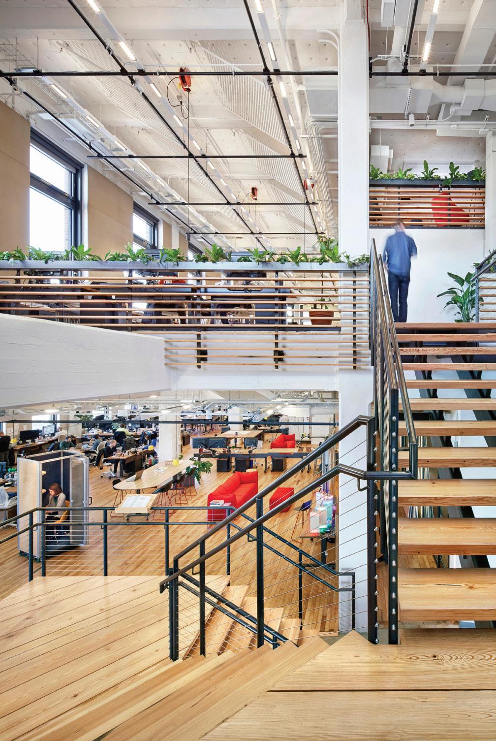
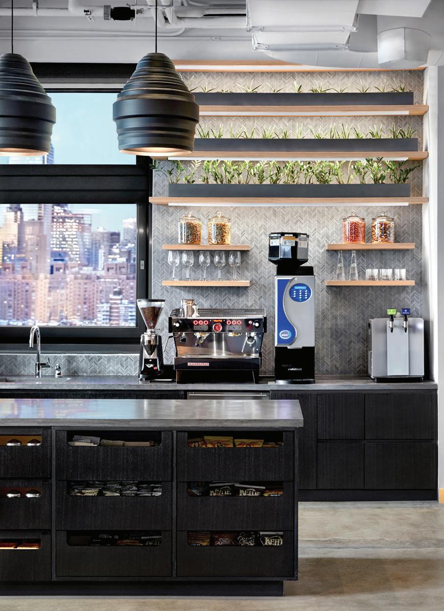
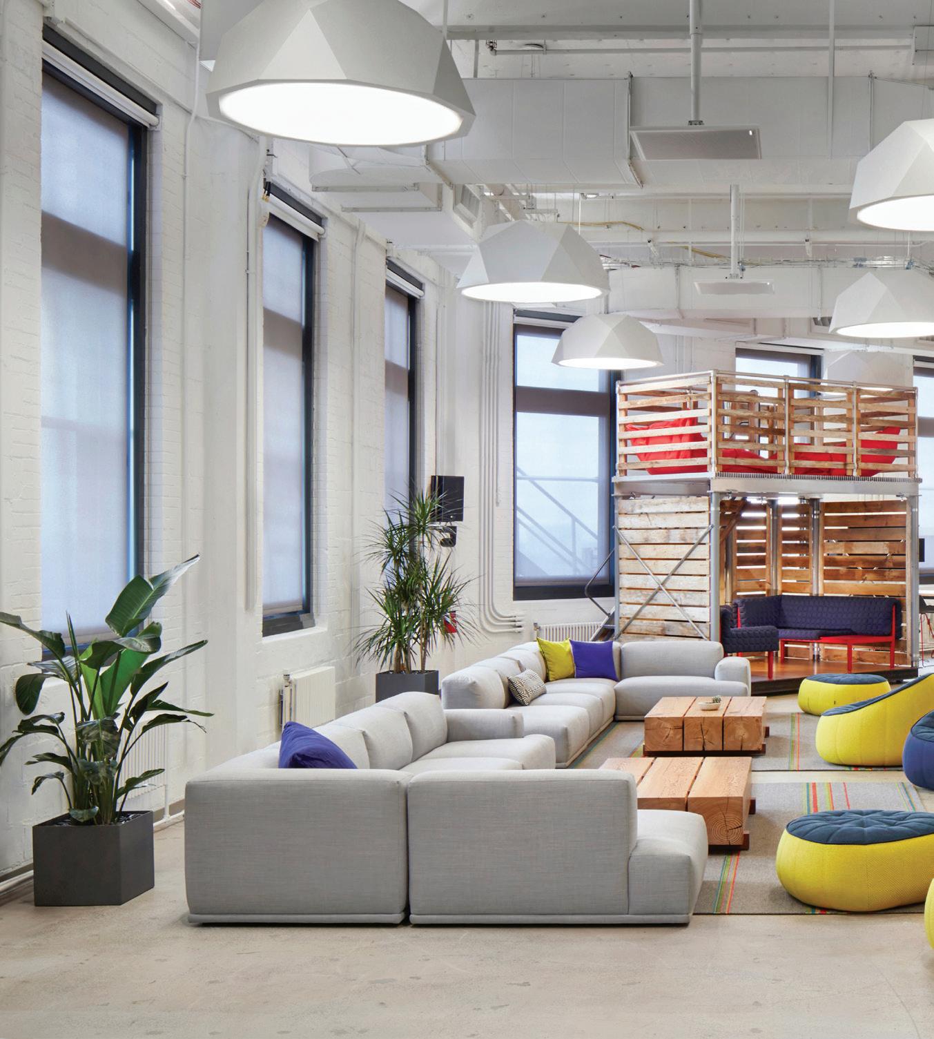 The Skylounge provides an open retreat space, as well as a gathering space for meetings and events.
Within the first week of occupying their new space, Creative Lab staff had rearranged desks, walls and pods to support the needs of a diverse array of teams and projects. The conference room became an experimental VR lounge, while the “WarHall”—a hallway of huddle spaces—transformed to host a team-wide potluck dinner. Designed to be responsive and reconfigurable, the space will continue to transform as projects take shape and the Creative Lab community continues making it their own.
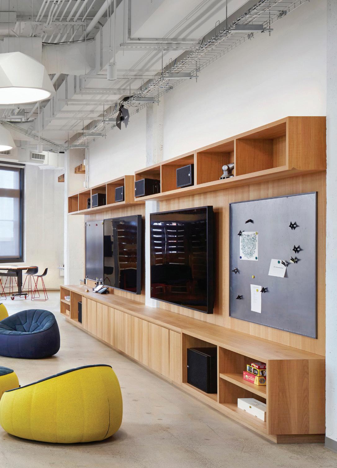
Google Creative Lab
A
43
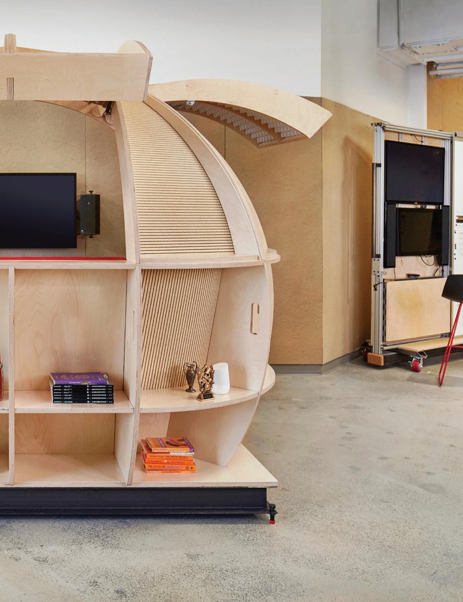
The Print Lab provides space for hands-on projects with 3D printers, vinyl cutters, plotters and soldering equipment.
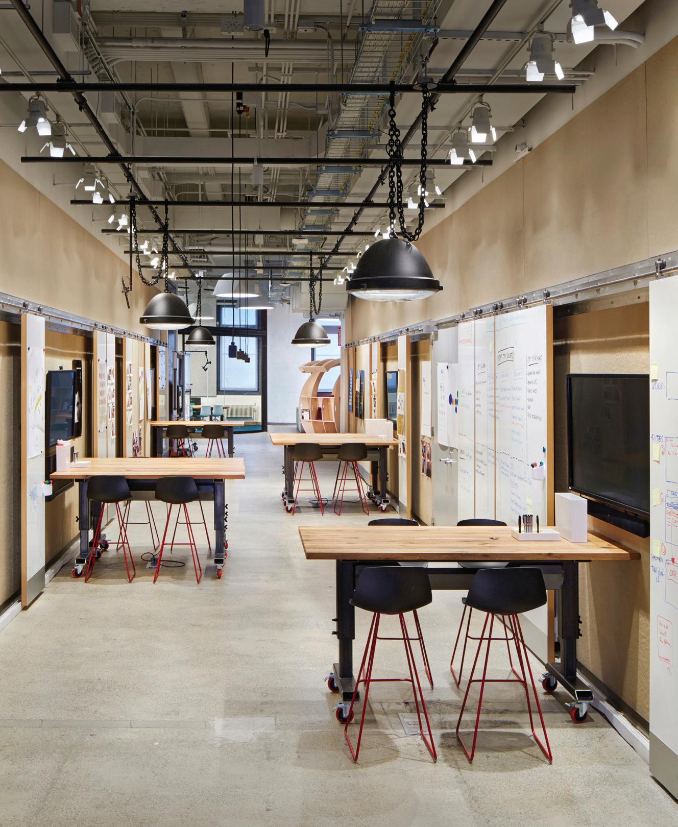
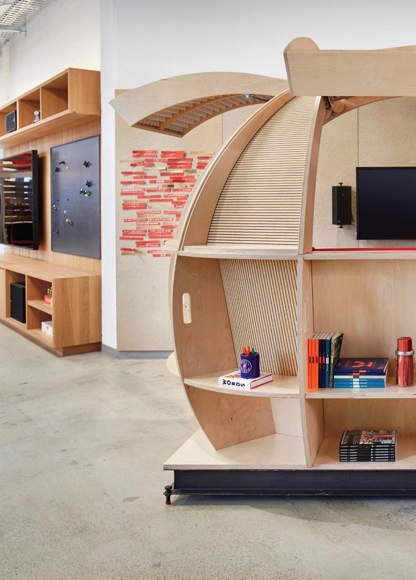 The WarHall—a hallway of dedicated huddle spaces—promotes informal work display and collaboration.
Google Creative Lab 45
The Micro Bar—adjacent to the Skylounge—helps transform the space for larger gatherings.
Making Space
Client: Brooklyn Public Library
Location: Brooklyn, NY
Scope: 1,200 sq ft
Completion: 2018
Photography: John Muggenborg
A flexible architecture for one of New York’s most vital resources, this project realigns libraries with 21st century programming.
47
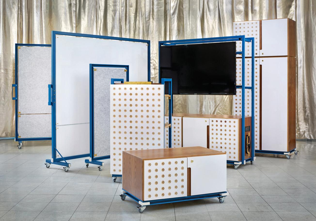
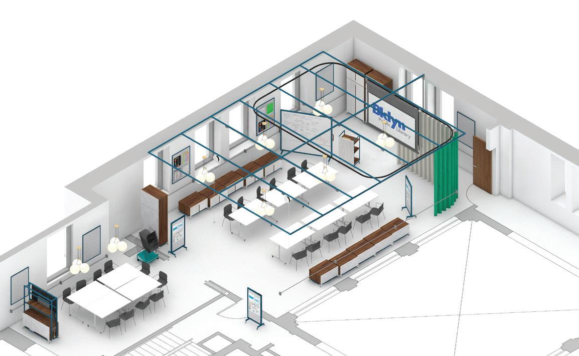
Making Space hinges on a kit-of-parts architecture that adapts the city’s aging libraries with contemporary uses. With the ability to fluctuate, flex and scale over time and across branches, the project proposes a system-wide refresh for vital community spaces in libraries throughout the borough. These re-imagined branches will better support each location’s current programming, open doors to new educational and community-driven opportunities and deepen BPL’s impact on the lives of Brooklyn residents.

At the start of the project, we collaborated with BPL to identify the Flatbush Branch as a pilot location. This branch is one of 1,689 public libraries originally funded by Andrew Carnegie, the “patron saint of libraries,” that were designed before computers or air conditioning—or even ramps—became commonplace. Now BPL faces a compound challenge: addressing the branches’ states-of-good repair needs while also updating their spatial design to support contemporary programming.
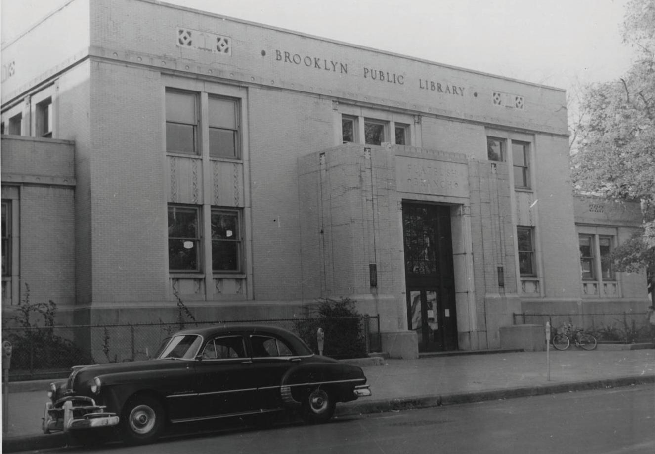
Making Space
49
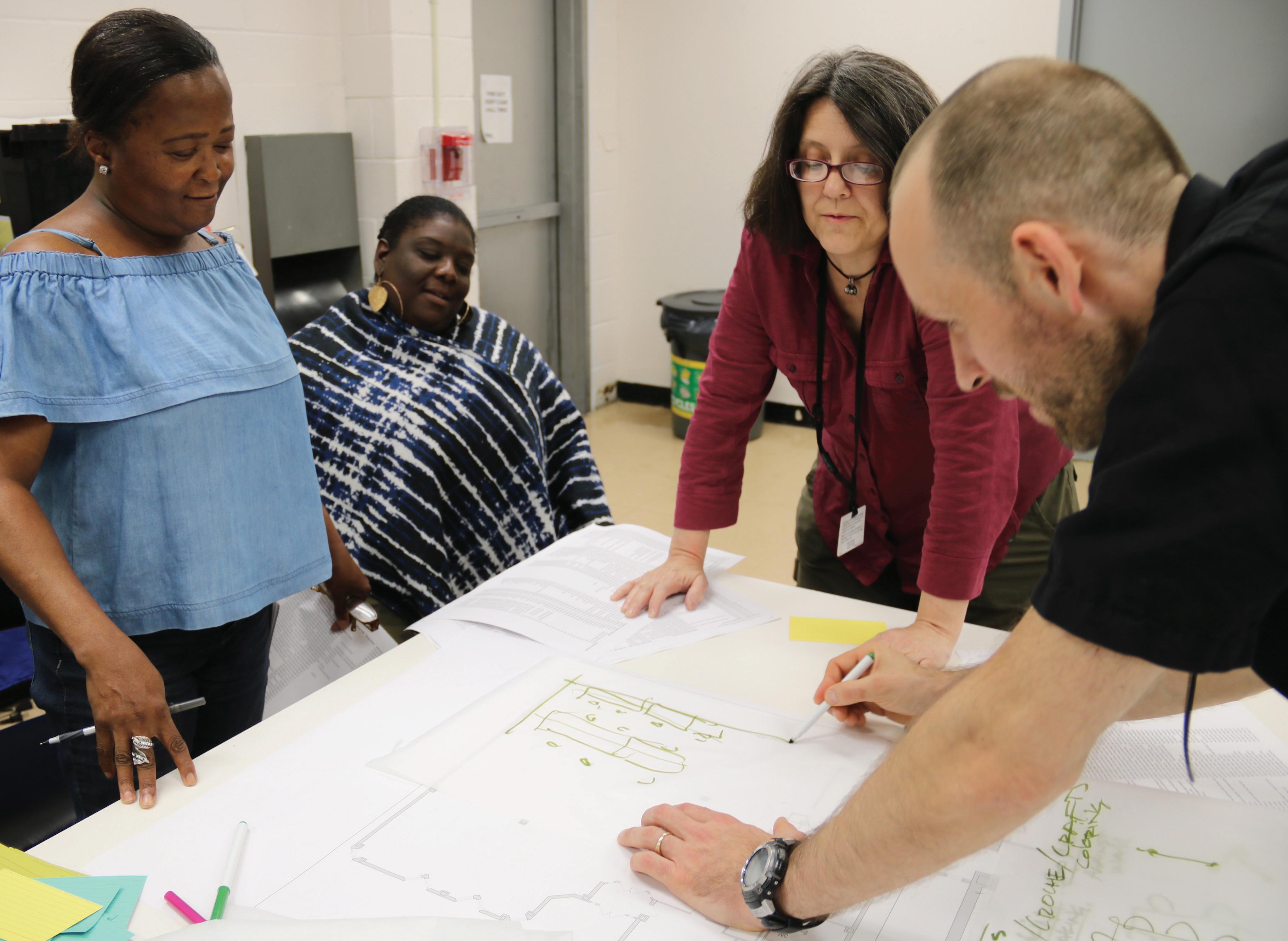
Workshops were conducted with staff from the Flatbush branch to review current spatial limitations on regularly occurring programs.
Library programming
Work & Study
Individual Work Space
Group Work Space
Reserved Group Study Spaces
Childhood Learning & Afterschool
Afterschool Classes / Programs
Homework Help
After School Safe Space
Play Space (Legos, Toys, etc.)
Free Summer Lunches
Summer Workshop Partnerships
Youth Social & Recreation
Teen Center
Teen Tech / Video Games
Teen Movie Program
Board Games
Chess
Flexible Assembly Space
Programmable Community Space
Neighborhood Gathering Space
Group Meeting Space
Teambuilding Activities
TeleStory
Event & Performance
Exhibition Space
Performance Space
Event Space
Dance Classes
Skill-Building Classes
Pre-GED / GED Prep Classes
ESOL Classes + Workshops
Adult Literacy Classes
Language Classes
Citizenship Test Classes
Computer / Digital Training
Advanced Computer Training
Online Courses / eLearning
Production
Art Classes
Arts & Crafts (For All Ages)
Maker Space
Rehearsal Space
Knitting & Crocheting
Workshops (Photography, Writing, etc.)
Animation / Green Screen Editing
Wellness
Fitness Classes
Health Insurance Enrollment Assistance
Health Fair
Health Forums
Economic Support
Job Readiness Classes
Hiring Events
Resume Help
Tax Preparation
Home Buyer Seminars
Legal Services (Legal Rights, Doc Prep)
Professional Development
To this end, this project is deeply rooted in the wide range of activities taking place within library branches, which at the Flatbush Branch adds up to about 900 programs each year. From storytimes and art classes for kids, to citizenship prep for immigrants, to robotics programs for teens and fitness classes for older adults, the system is designed to accommodate a wide range of activities for patrons of all ages.

Making Space
51
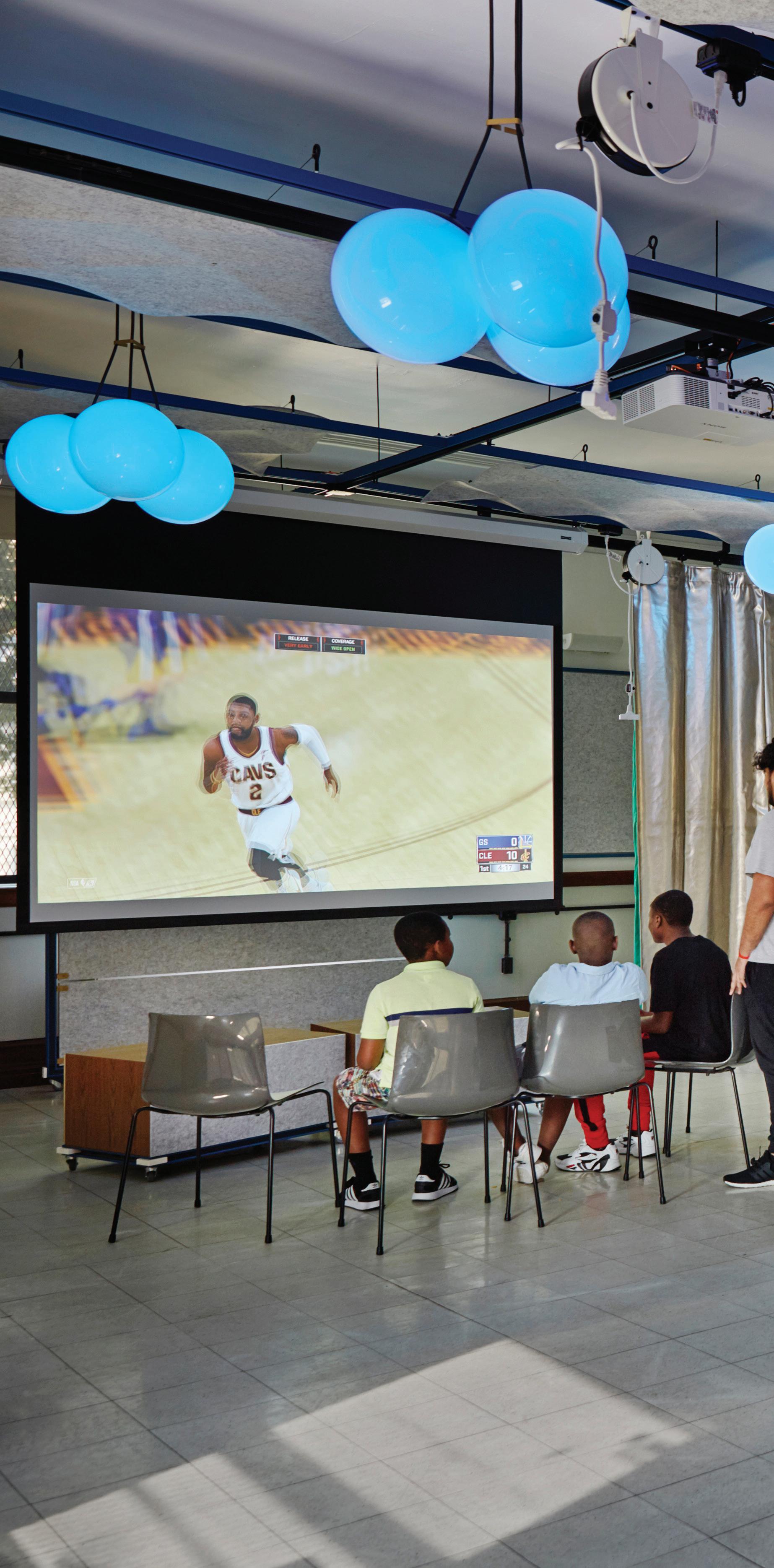
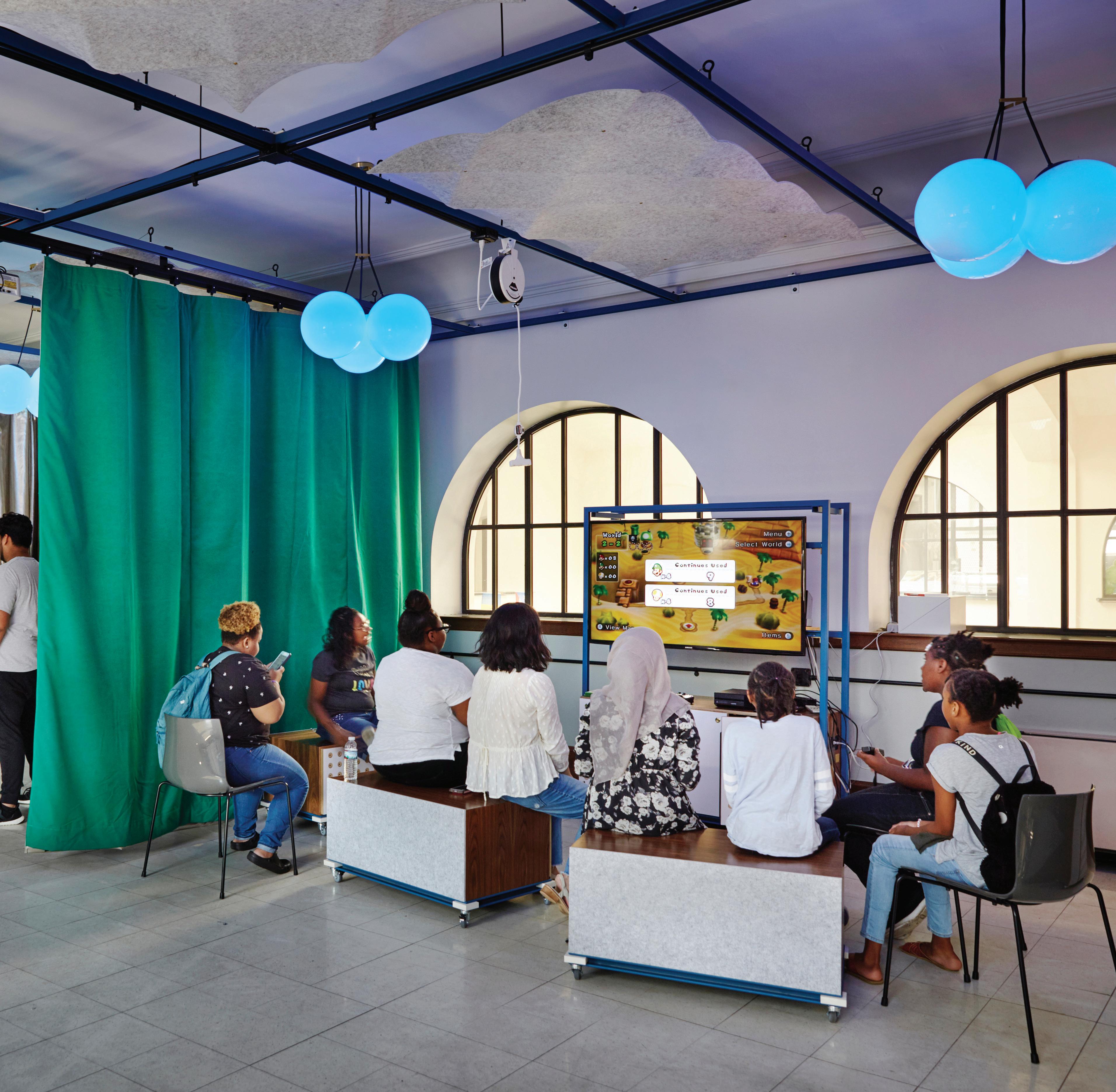
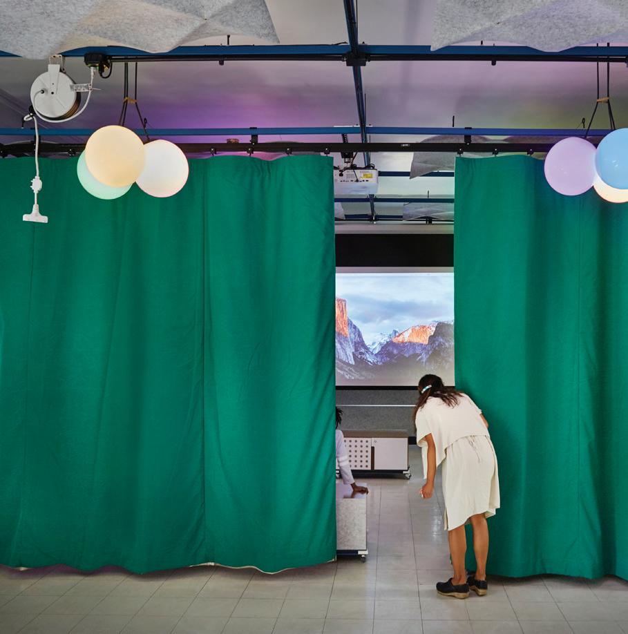
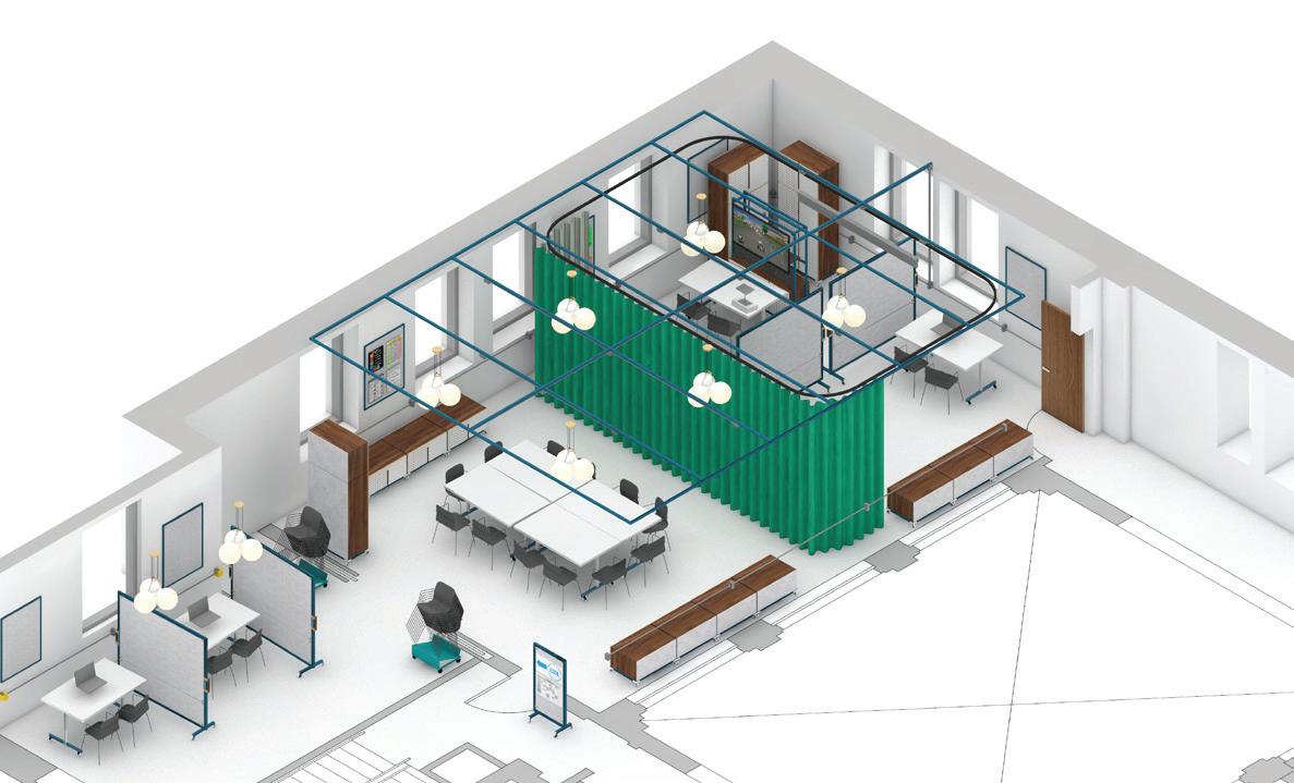
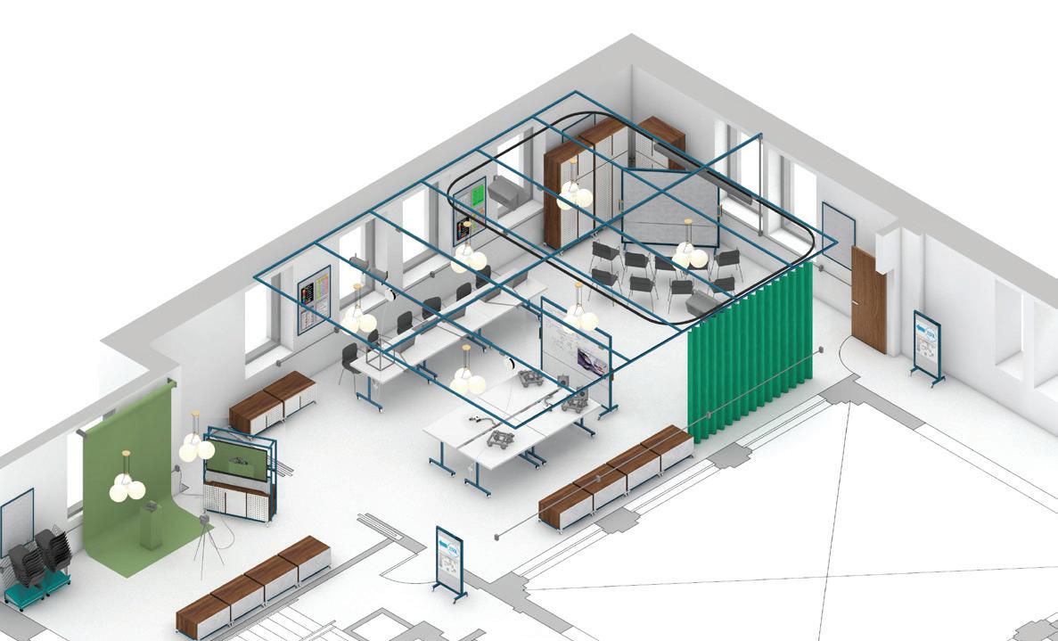
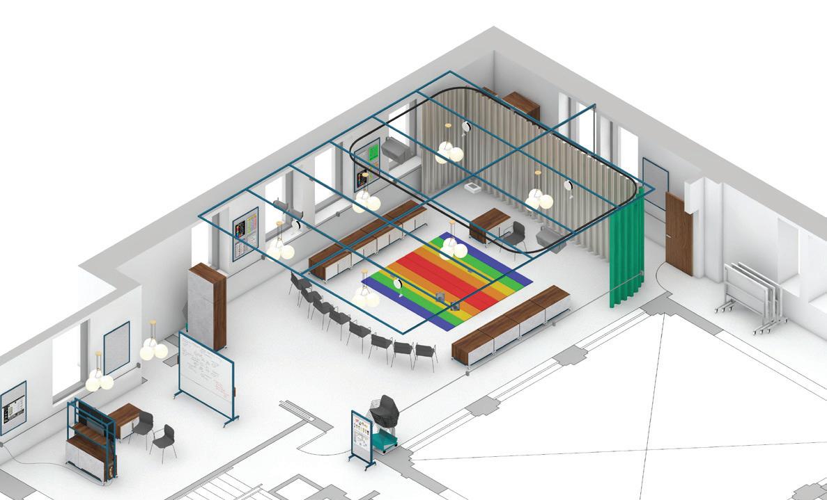
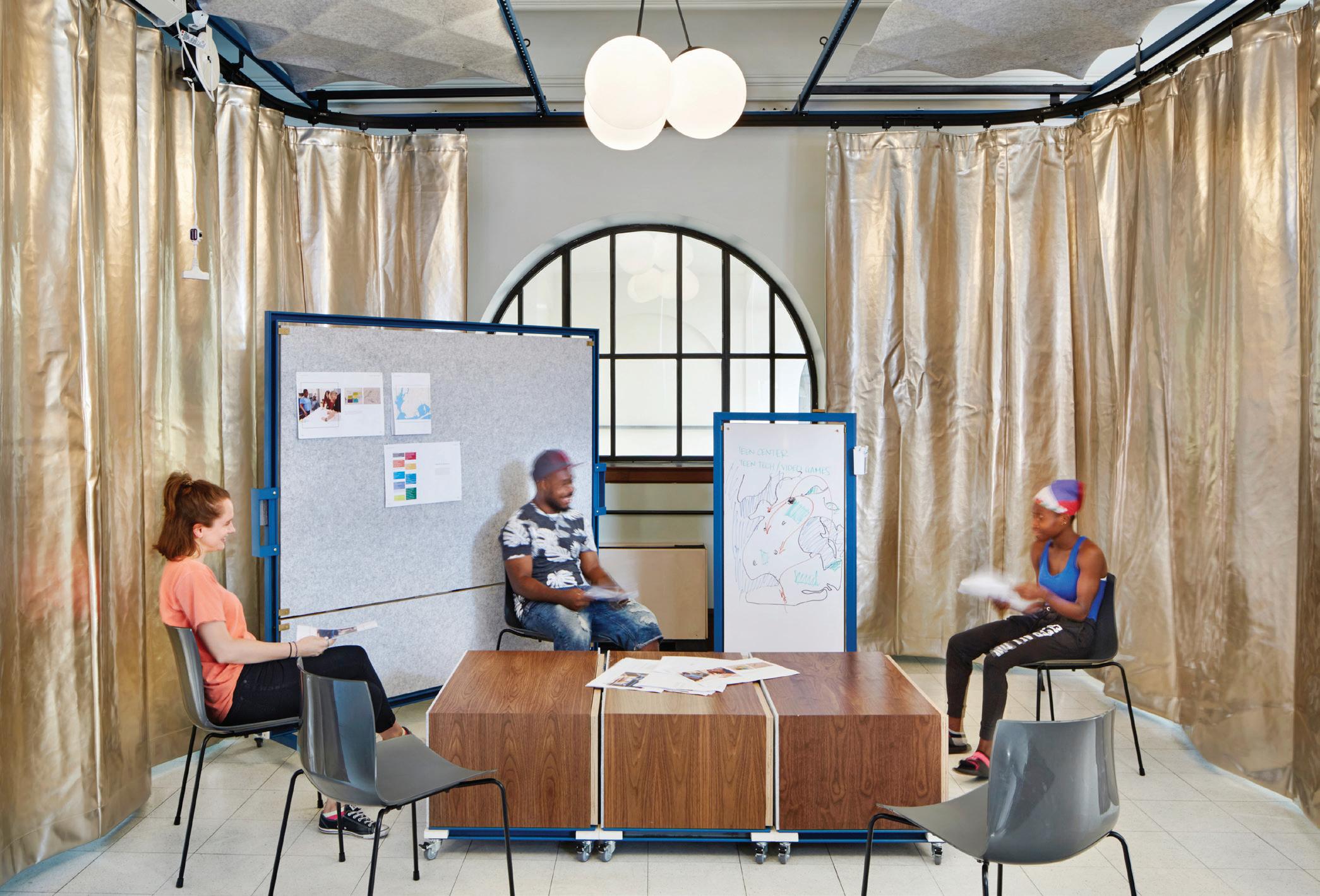
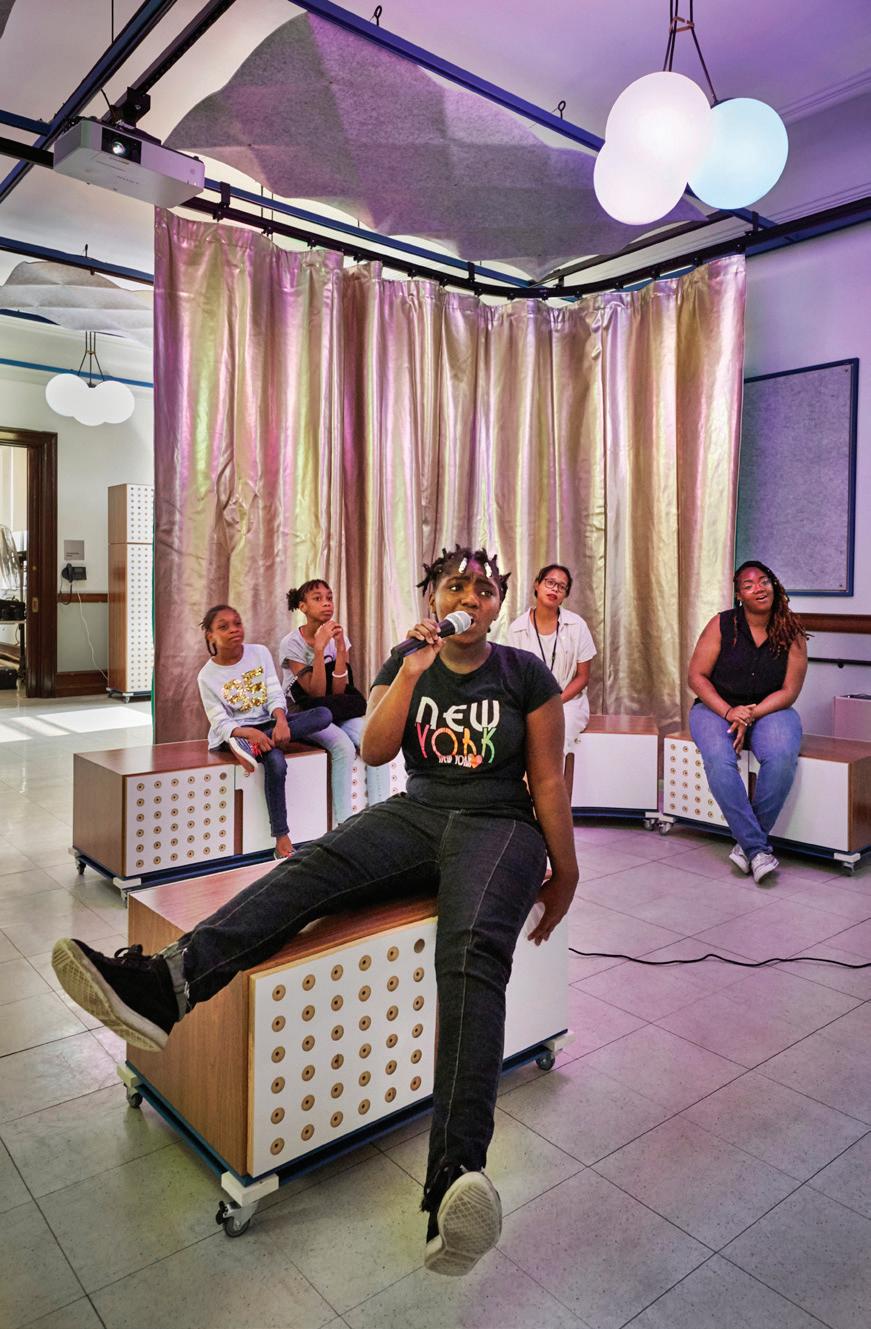
The flexible design makes it easy to customize the same spaces for different types of programming, such as photography workshops, movie screenings and karoake night.
Infrastructure is a driving factor behind our kitof-parts approach. A series of conduit tracks and dropdown power cables provides access to power and data throughout the space, without extensive electrical work. Curtains, light fixtures and projectors attach to the overhead grid, and can be easily adjusted to accommodate various programs.
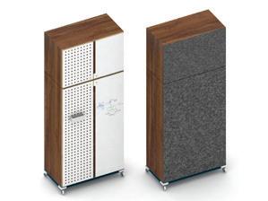
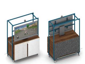
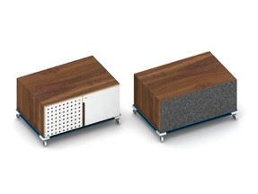
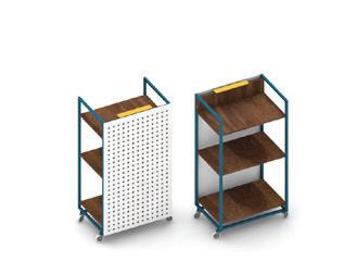
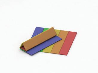
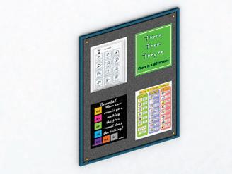
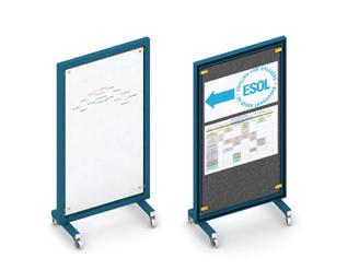
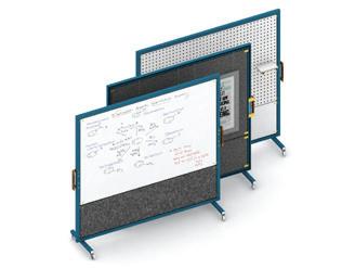
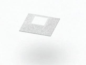
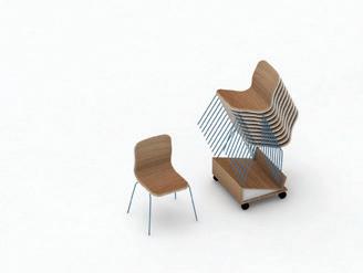
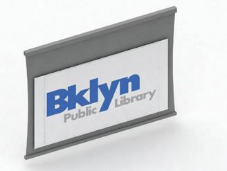

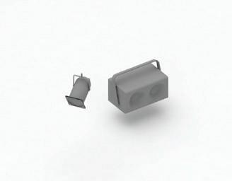

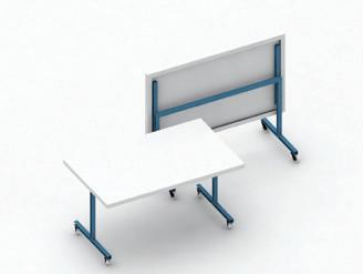

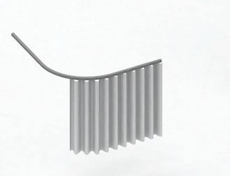

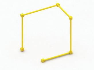
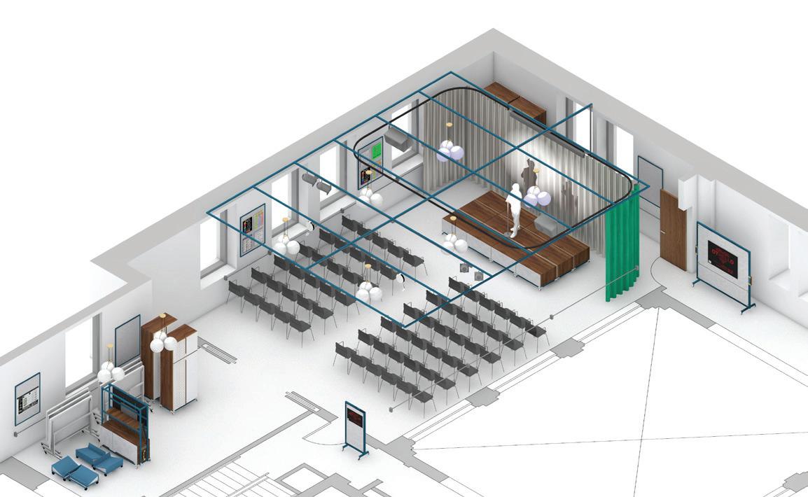 Conduit Ceiling Grid Curtain Power Cable Folding Tables
Light Fixture Stage Lights Projector
Presentation
Stacking Chairs
Ceiling Panels Mobile Wall Mobile Sign Wall Panels Rug
Mobile Lectern Low Cabinet Media Cabinet Tall Cabinet
Performance
Classroom
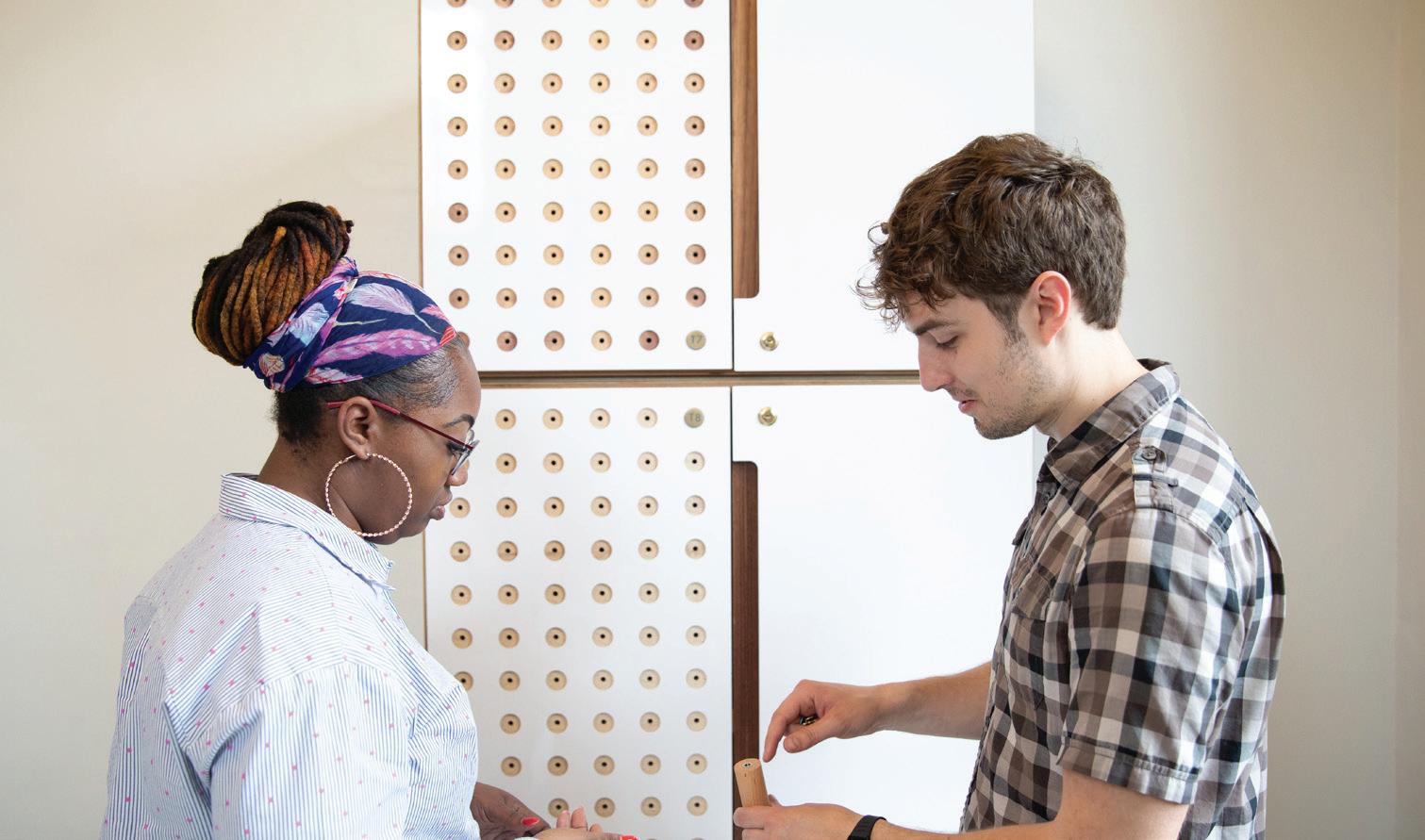
Adaptability is another key factor. From stacking chairs, modular cabinets, mobile partitions and folding tables, the design’s various components combine, collapse and consolidate to create a space that adapts to different needs. A cabinet, for example, provides storytime seating, supports a media wall and attaches together to form a stage for in-house performances.

Making Space
Storytime
Makerspace
Consultation
Multi-use
53
The Flatbush pilot location is accompanied by a handbook that explains the kit-of-parts and outlines a strategy for scaling the system to branches across the borough. With libraries constructed in a variety of historical styles over the years, our handbook responds to these particular design needs with an array of materials and finishes that can be strategically applied. Each branch can select the look and feel that aligns best with its building stock, the programs they offer and the scale of their community spaces.
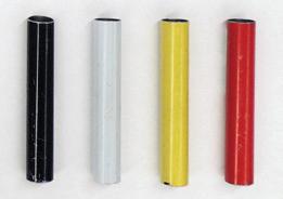
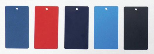


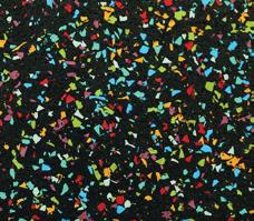
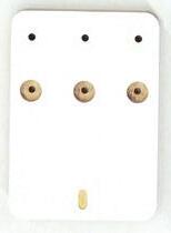


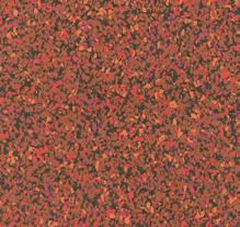
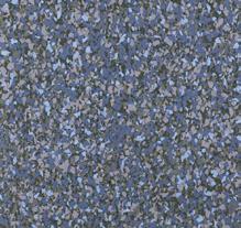
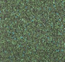 Hardware
Cabinet Edges + Doors
Pin-up + Acoustical Ceiling
Rug
Curtain Wood Veneer
Metal Frames
Electrical Conduit
Photo by Gregg Richards
Neither pop up nor permanent capital project, this type of architecture is designed for distribution, deploying easily at different scales and locations. Though the pilot begins at the Flatbush Branch, the system is flexible enough to fit any space and serve any neighborhood, from Bushwick to Coney Island.
Making Space
55
Cloud Pavilion
Client: NASA’s Jet Propulsion Laboratory
Location: Pasadena, CA
Scope: 3,000 sq ft
Completion: 2018 (Concept Design)
Renderings: Brooklyn Digital Foundry
57
This project reimagines JPL’s campus, creating a flexible and engaging space for visitors and staff members alike.
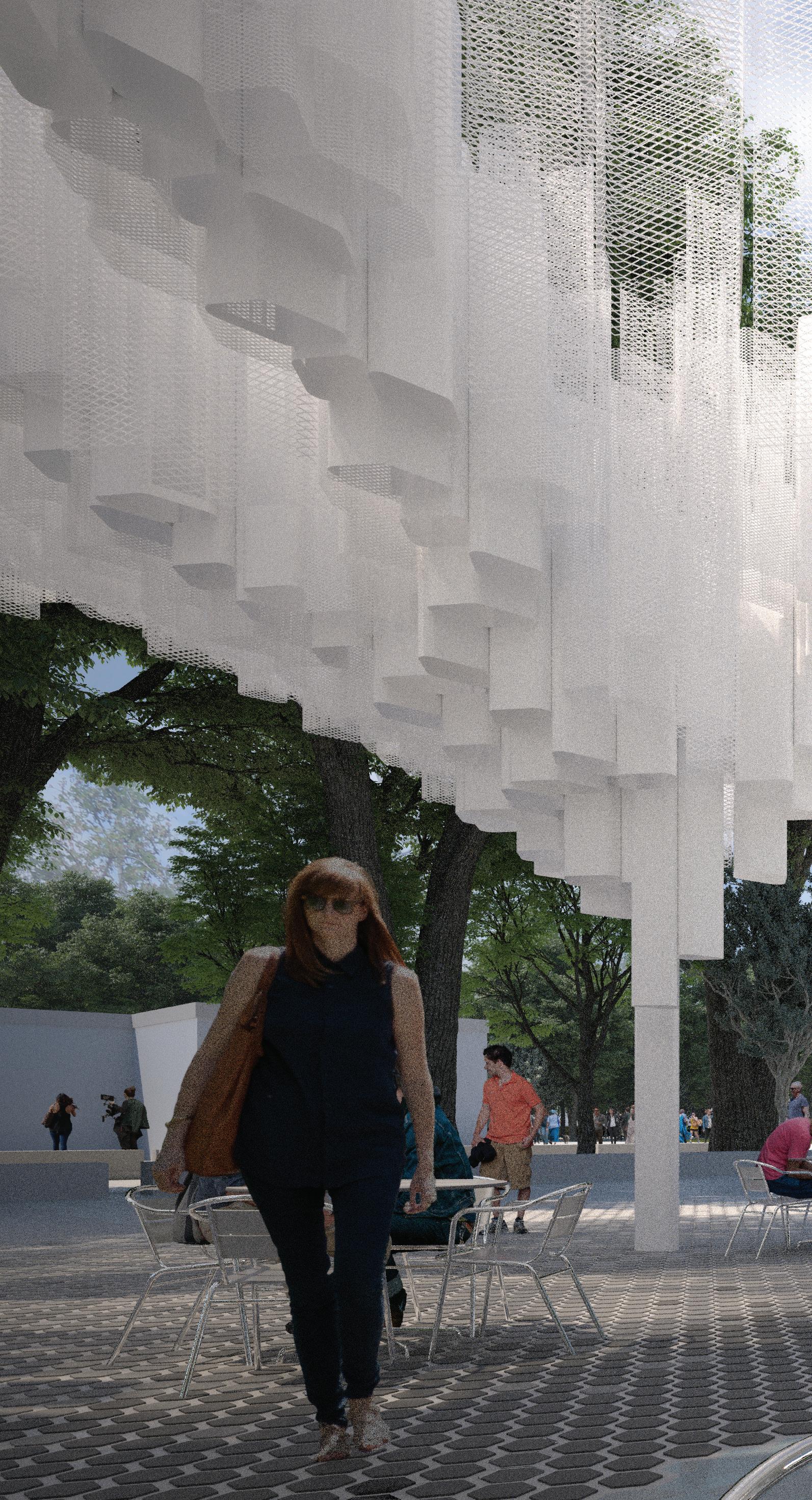
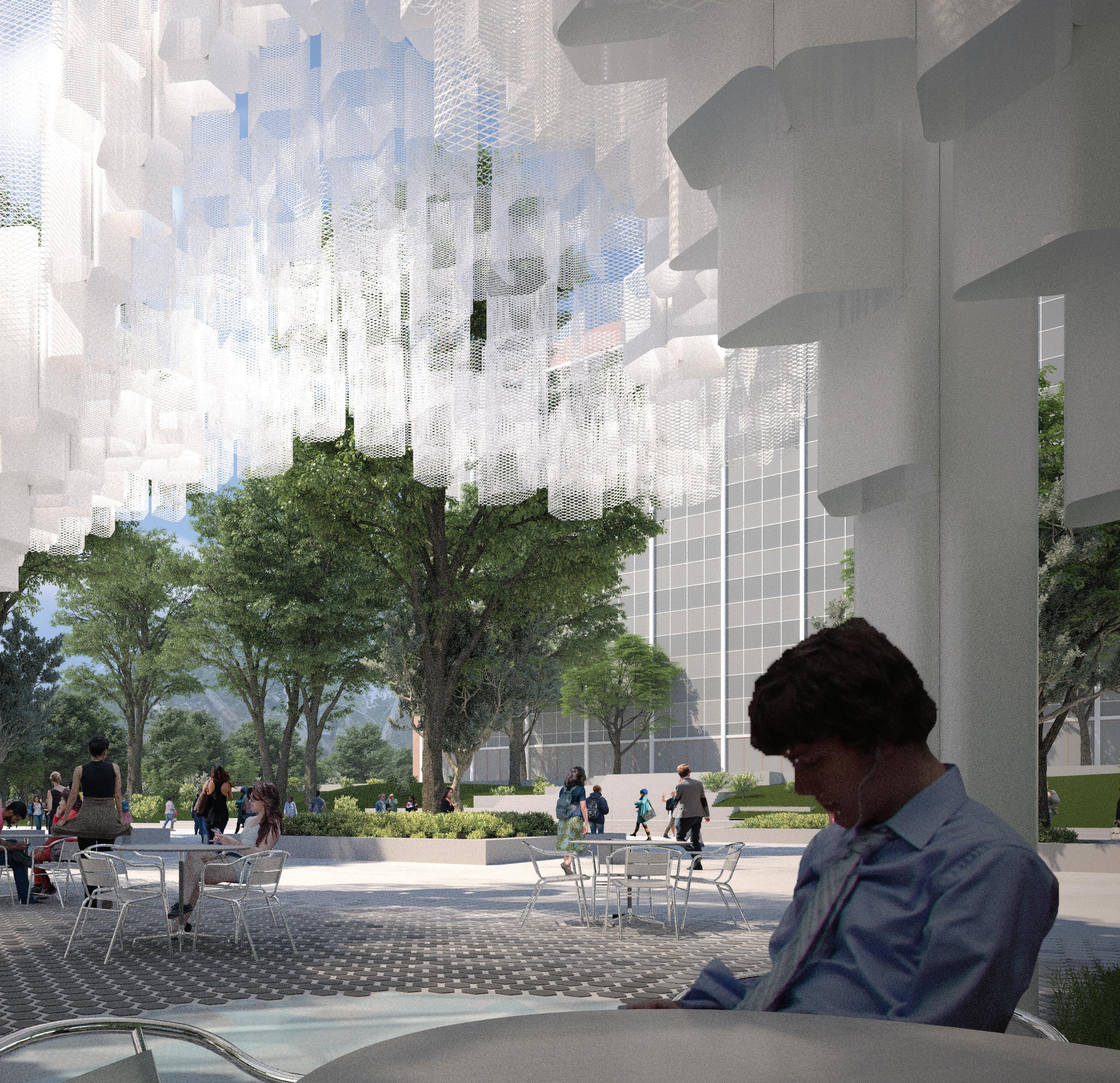
Tasked with reimagining the central gathering space of NASA’s Jet Propulsion Laboratory (JPL) campus in Pasadena, California, we developed the Cloud Pavilion and corresponding master plan. Our pavilion supports new ways of working, gathering and welcoming visitors, and JPL saw the project as an opportunity to both support and embody the innovation occurring across the campus. The pavilion is an iconic landmark, serving not only as a recognizable meeting point for the employees, but also, with its prominent location near the visitor center and entry to the campus, projecting JPL’s
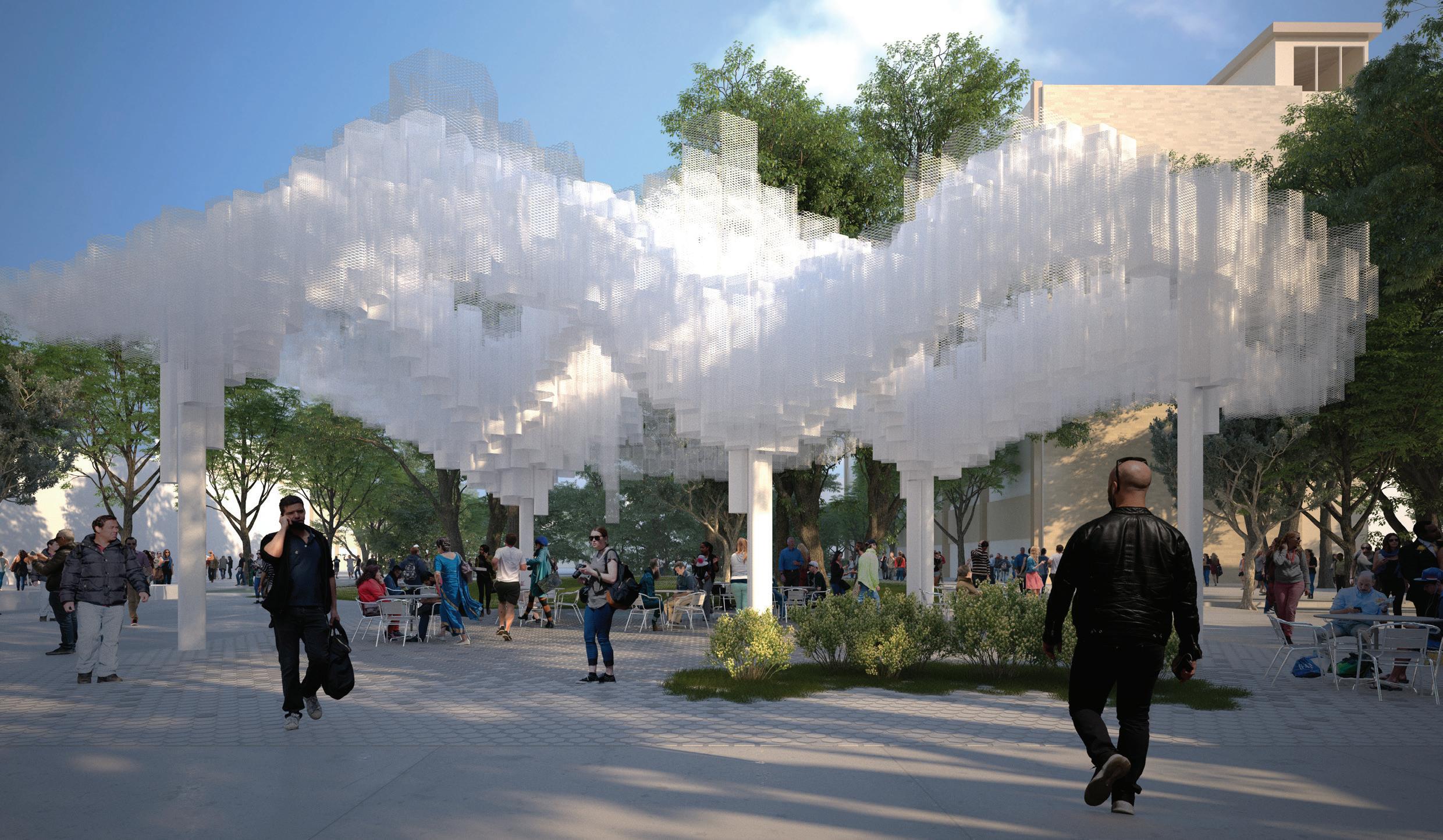 Our design combines two passive cooling systems to address the site’s arid climate, as well as solar control which minimizes heat gains and maximizes evaporative cooling.
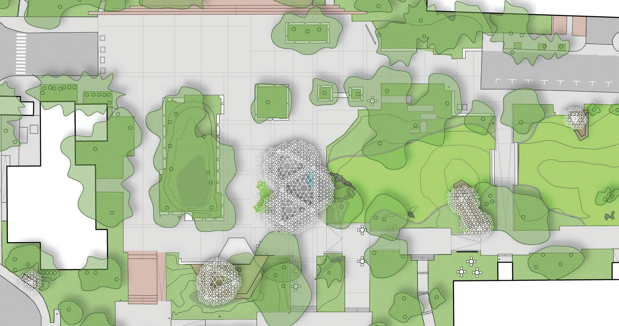
Cloud Pavilion
Bus stop
Main pavilion
Coffee stand & terrace
South dock
East dock
59
The Cloud Pavilion is the first step of a larger masterplan to re-imagine the center of JPL’s campus, creating a dynamic public gathering space that welcomes and inspires visitors while supporting employees throughout the year.
Our scope included a 3,000 sq ft main pavilion (the Cloud Pavilion) as well as a series of modular structures dispersed across the campus with various amenities, such as the shuttle bus service, cafe and other meeting areas. This tactical master plan allows for new structures to be added incrementally as funds and planned facilities work allow.
The voluminous, lightweight, cellular canopies provide cool, shaded areas to support a range of campus activities, while reflecting the atmospheric qualities that are the subject of some of JPL’s work. The Cloud Pavilion creates a central space that serves as outdoor workspace—hosting informal meetings and coffee breaks during the day. When there are events, such as poster sessions or award ceremonies, the pavilion provides a shaded gathering place for the campus of 6,000 people.
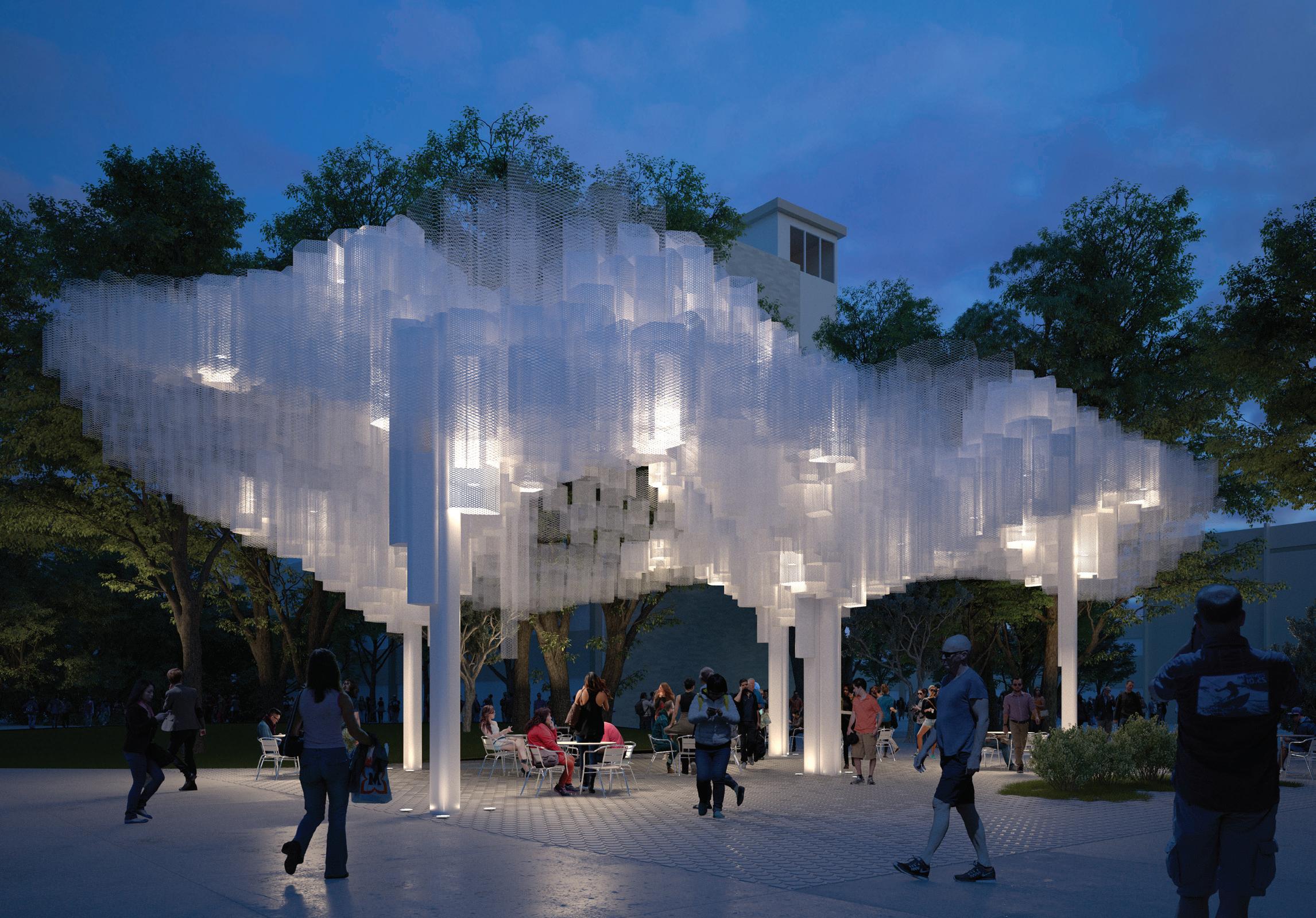 Composed of a system of interlocking cells, the modular design is outfitted to receive solar panels, which would power lighting at night.
Natural elements are also brought into the pavilion’s interior through the landscaping, a wood deck that cascades down to a lawn, the hanging gardens, and a small water feature, whose sound will provide some acoustic white noise for conversations happening nearby.
The unique form is a tessellation of folded metal mesh tubes resting on steel columns. The layers of mesh create a soft shade pattern below, offering shelter from the sun while still allowing inhabitants to feel a connection to the natural surroundings.
Cloud Pavilion Column height varies C2 3C1 C1 F1 F2 F3 4’0” 4’0” Water feature beyond 1’0” 1’0” B B.8 2’0” 4’0” A.1 Top of structure 34’ - 6” Ground oor 0 2 -
61
Client: Brooklyn Museum
Location: Brooklyn, NY
Scope: 21,000 sq ft
Completion: 2015
Photography: John Muggenborg
Collaborator: MTWTF
Brooklyn Museum Visitor Experience
Bringing the city into the museum, this project is one that dissolves the boundaries between an institution and the outside world.
63
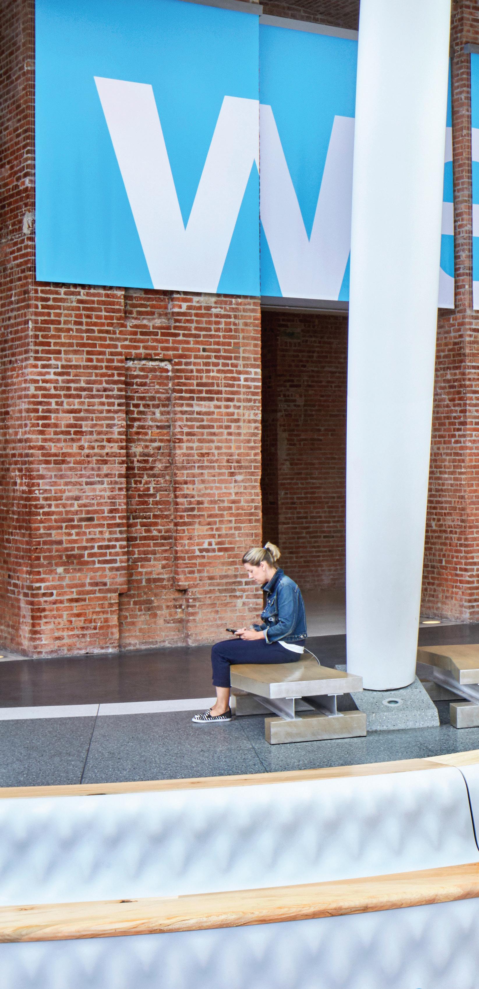
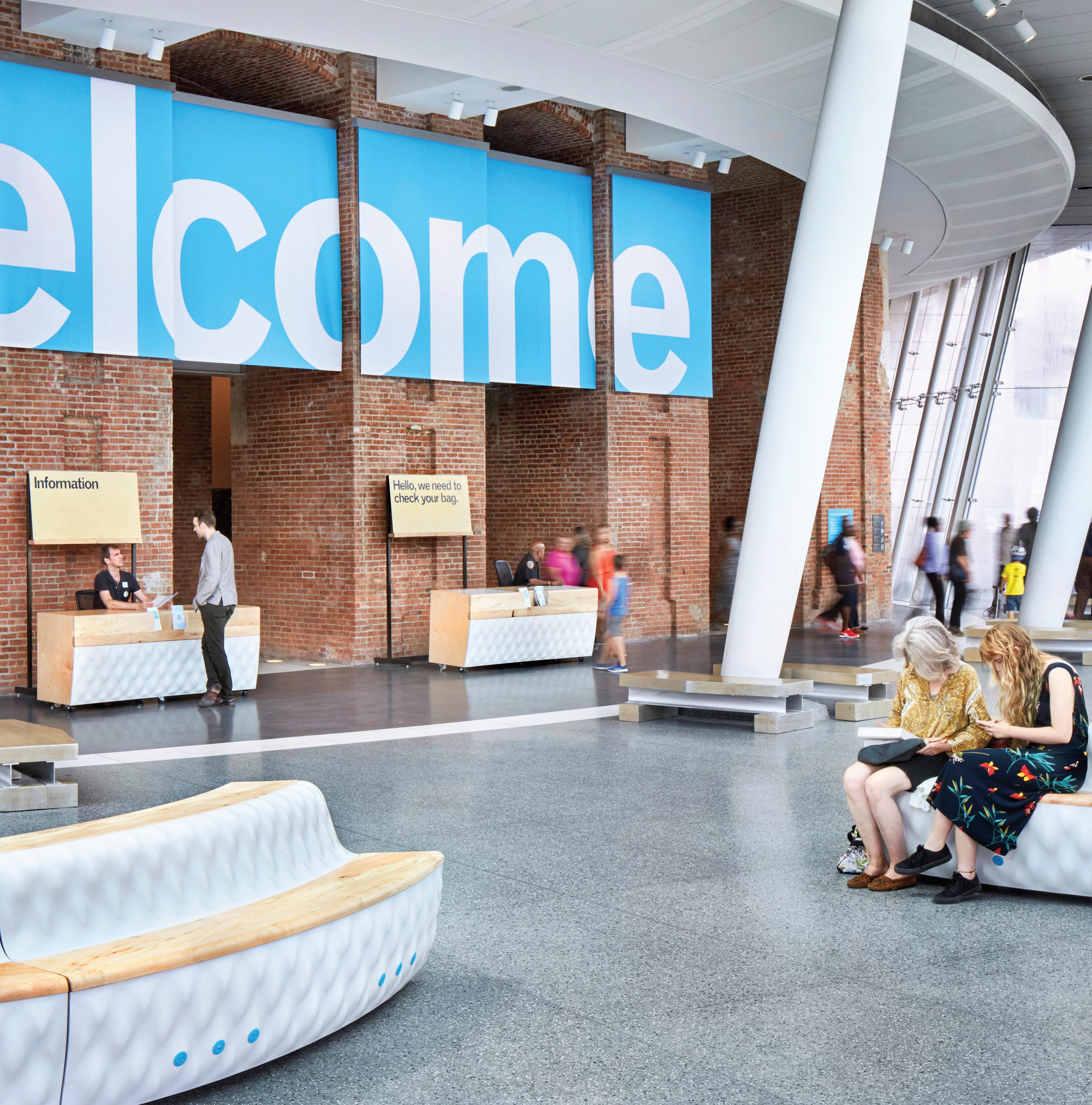
Museums across the country are focused on accessibility, rethinking their role as bastions of high culture and striving to become public spaces for engagement and cross-cultural exchange. We joined up with the Brooklyn Museum, a century-old institution located within a diverse cross-section of Brooklyn, to explore this challenge. Tasked with re-envisioning the museum’s lobby space and overall visitor experience, we sought solutions that would offer new flexibility for diverse programming, bridge digital and physical interfaces, and transform the entryway into an amenity-rich public space for the neighborhood at-large.
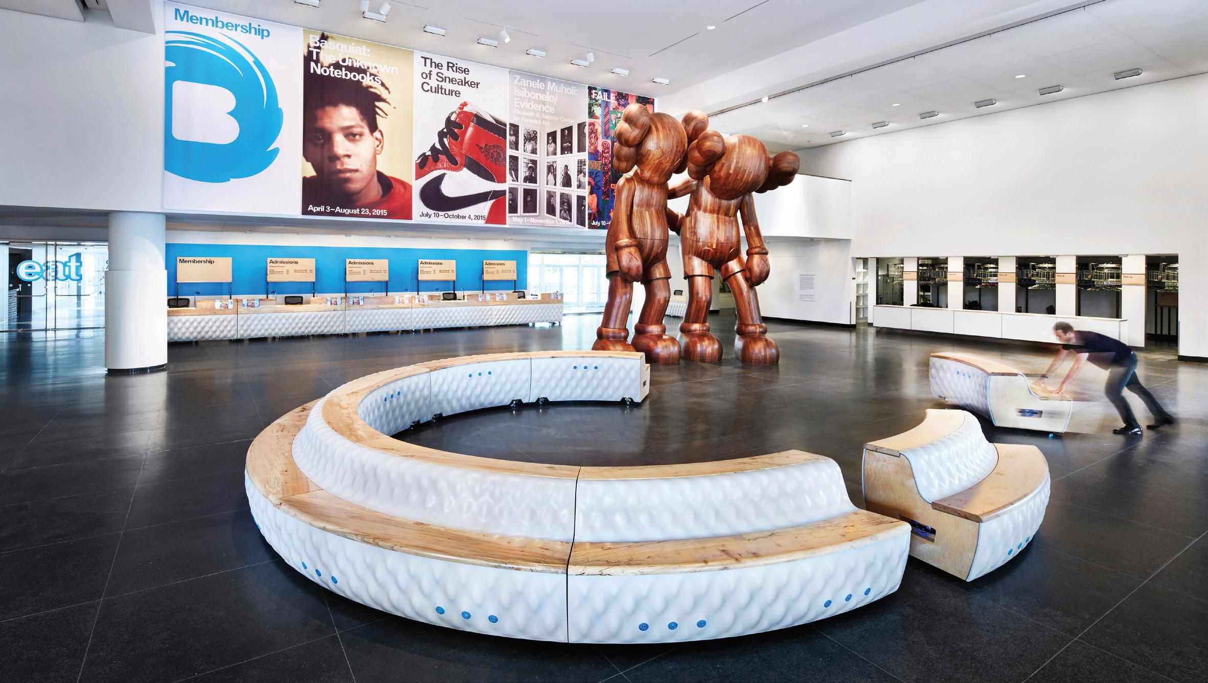
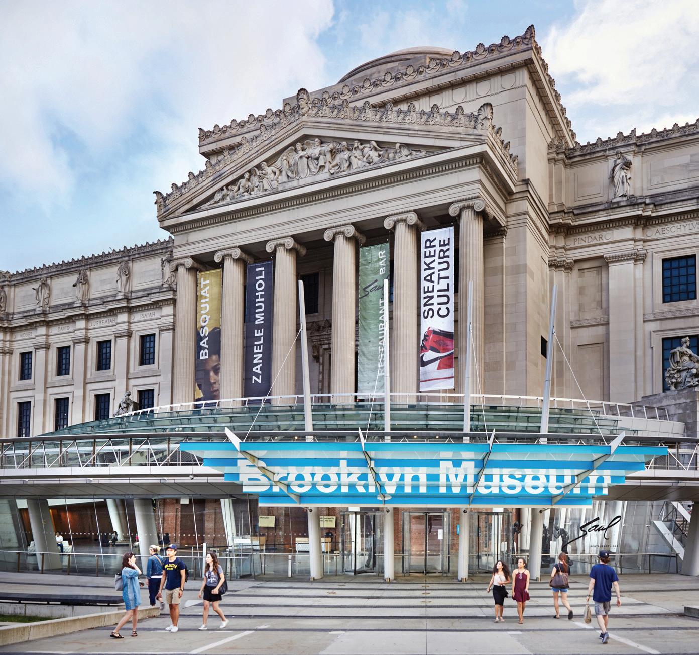
To anchor our design intervention, we developed a suite of flexible and modular components— information desks, directories, ticket bars, benches and interactive kiosks—designed to offer optimal program support for the diverse array of activities that take place within Brooklyn Museum’s lobby area. Distributed throughout the entry sequence, these pieces enable continuous reconfiguration, flexing to accommodate huge crowds and performances, as well as the slower pace of visitors trickling in throughout the week. Ticket bars and desks are no longer static objects, but instead are designed to be re-positioned rapidly in response to the museum’s evolving needs and events.

Brooklyn Museum Visitor Experience
Lobby directory Hub station Ticket bar Security desk Power bench Plan Elevation Section
The Collection
65
The kit-of-parts expresses a low touch yet powerful strategy to meet the museum’s range of programmatic demands—from creating an indoor public space for nearby residents; to hosting large-scale cultural events; to directing visitors to the museum’s offerings.
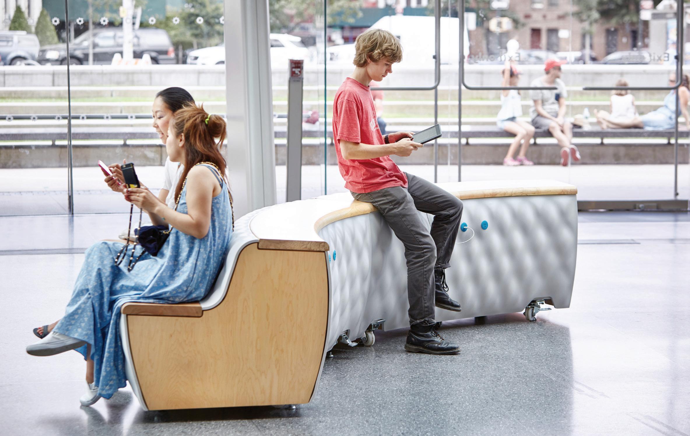
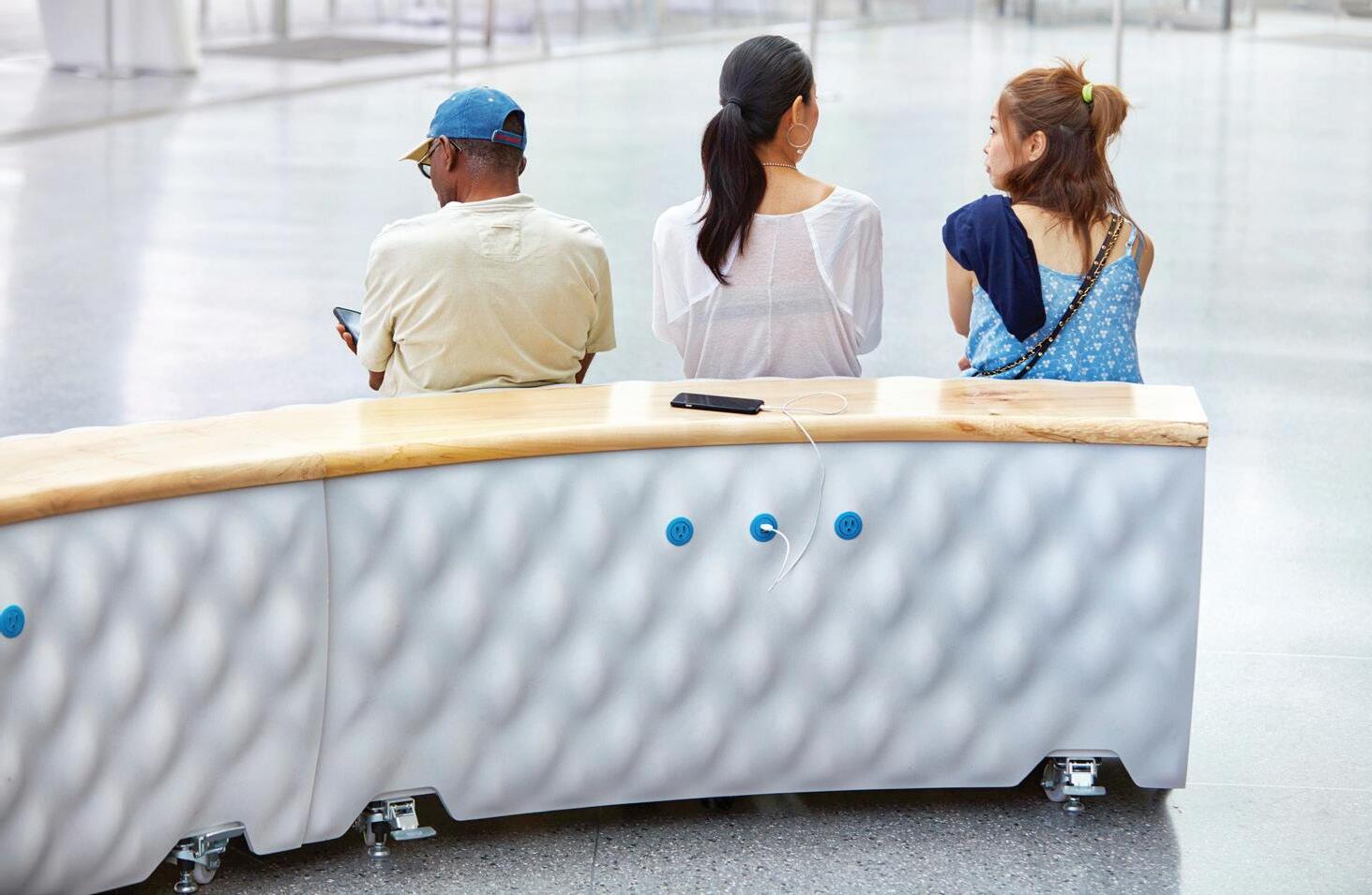
We incorporated common materials with a color palette that unifies the components and helps provide an increasingly seamless flow from the museum’s entry plaza on to the galleries beyond. A series of eight mobile benches integrate colorcoded power outlets and USB ports, encouraging visitors to charge mobile devices such as phones, cameras and tablets.
With this project, we leveraged a tactical, intervention-focused approach to transform a private space into a community resource. This theme continues to intrigue us and we’ve continued to explore it across a variety of sectors, from commercial workspace to public libraries to retail storefronts.
Brooklyn Museum Visitor Experience Museum shop Gallery WC WC Coat check Elev. 1 2 3 2 4 3 3 4 Demo area Greeting Discover Greeting Discover Security Info Greeter Directory Hub station Powered seating Ticket bar / security Art Service Arrival Orientation Preparation Gathering places 1 2 3 4
67
The JACX Amenity Terrace
Client: Tishman Speyer
Location: Queens, NY
Scope: 110,000 sq ft
Completion: 2020
Photography: Pavel Bendov
Collaborators: HMWhite, MdeAS Architects
69
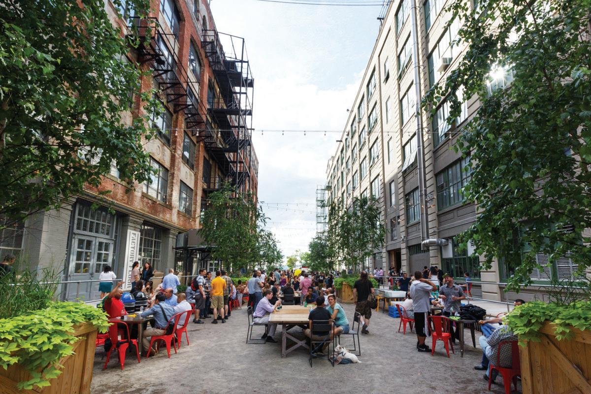
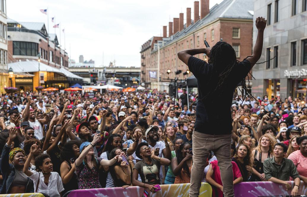
Placemaking is essential for attracting creative industries and audiences to a new location.
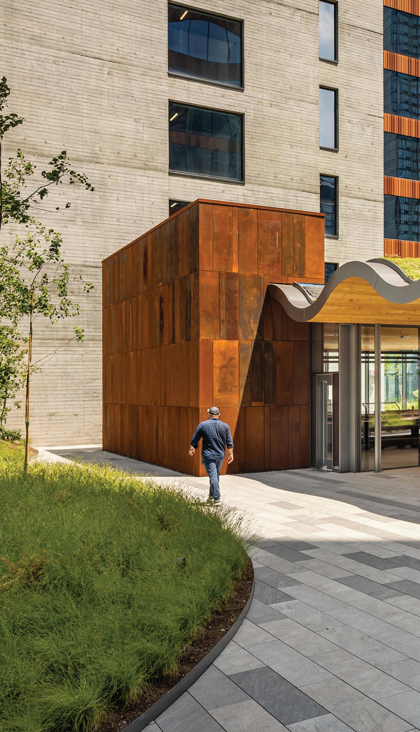
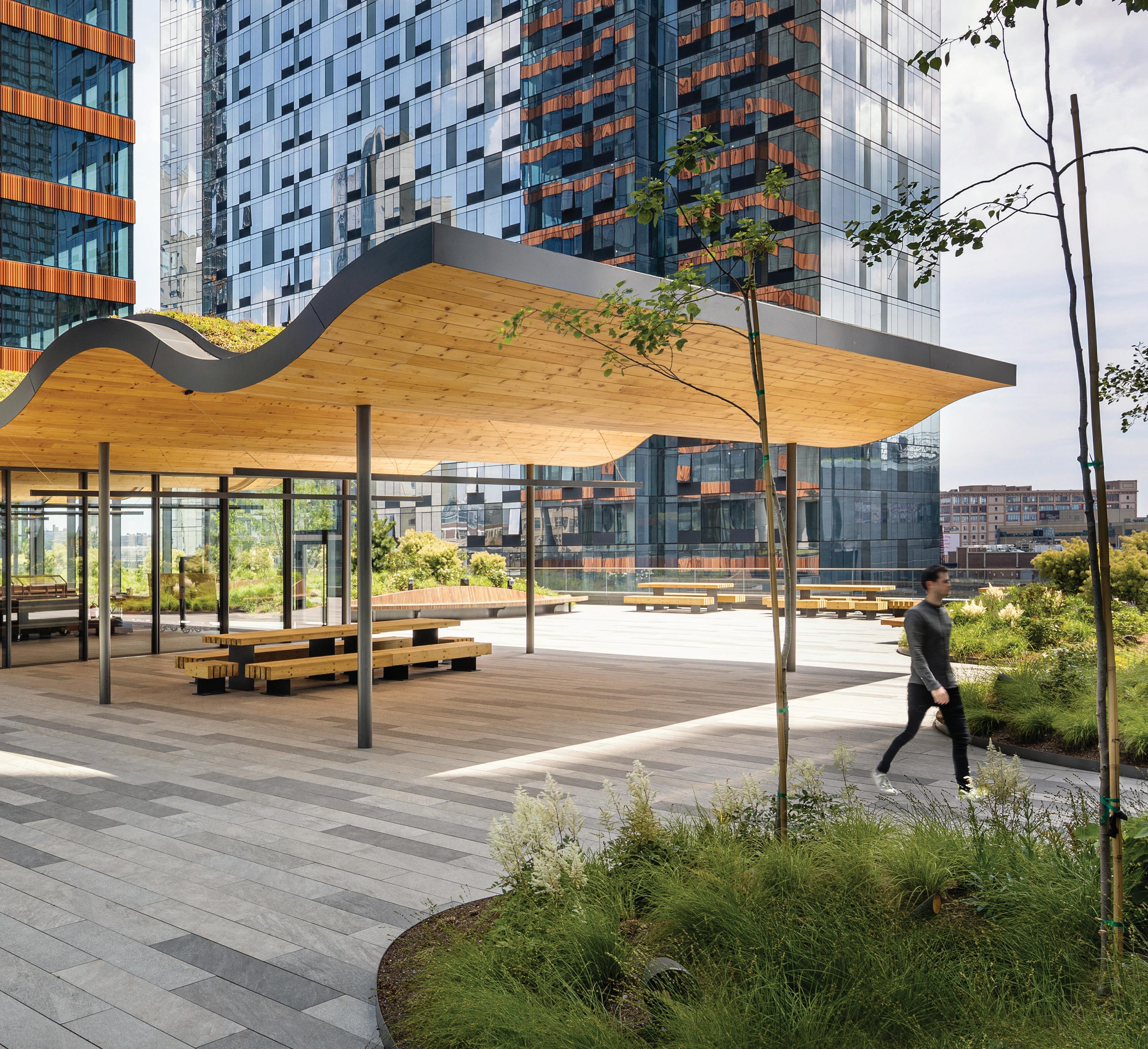
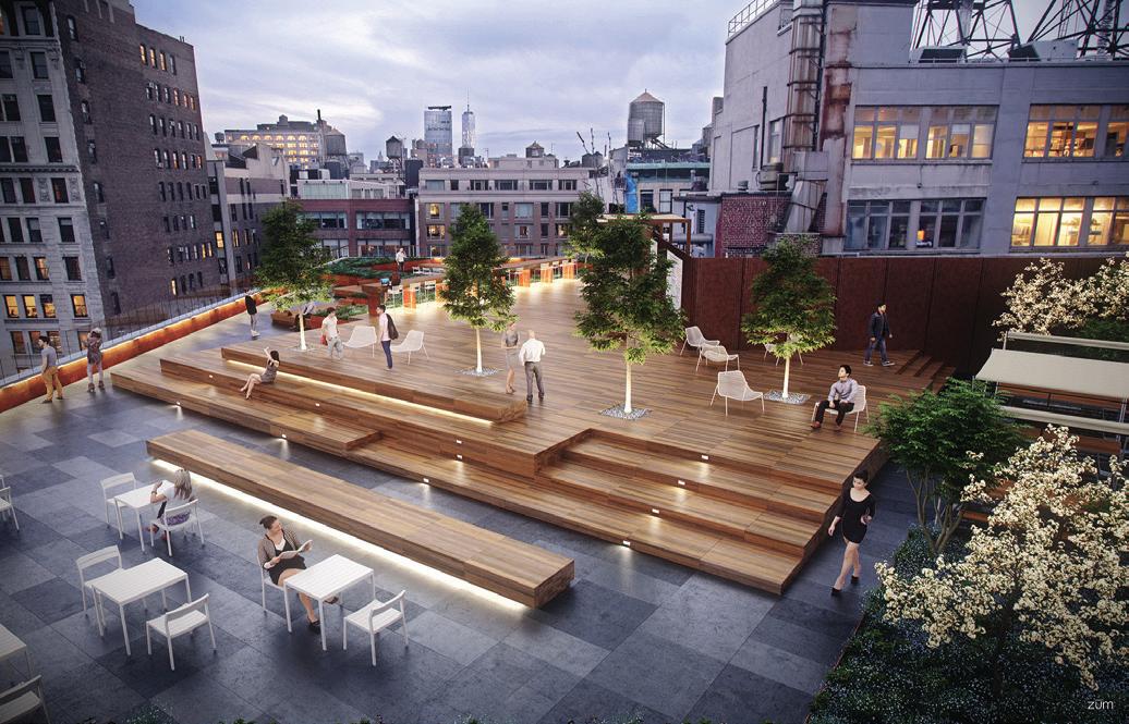
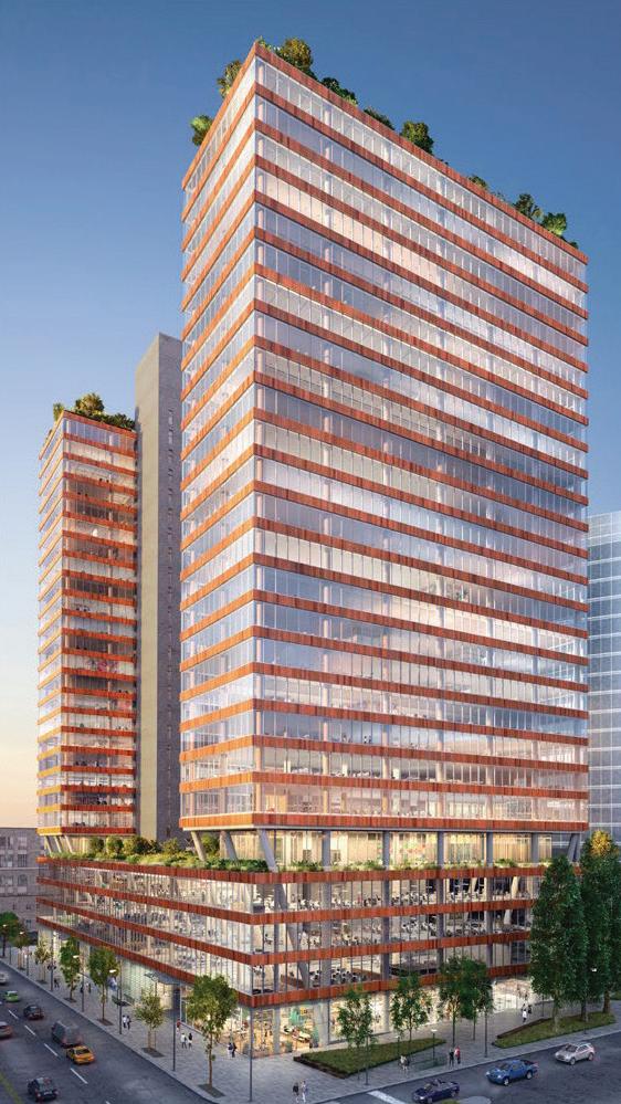
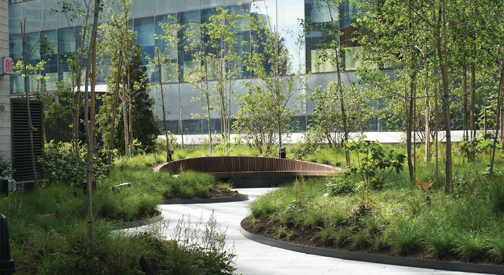
We worked with developer Tishman Speyer to design the outdoor amenity space for The JACX, a new commercial development in Long Island City, Queens. Spanning almost three acres, the terrace connects two 30-story towers that host a mix of tenants from the Technology, Advertising, Media and Information (TAMI) sectors. SITU joined the development team to create a new schematic design and corresponding placemaking strategy— transforming the terrace into a platform for a wide range of cultural programming and amenities uniquely tailored to incoming tenants.
Program strategyProgram strategy
Space/ Infrastructure Amenities/ Programming Management Pavilion as cafe Retreat spaces & features O ce alternative Quality public space Restrooms High-quality, dynamic cafe partner Art installation Leisure/ tness activities Tenant-driven events In-house management Baseline maintenance Low-tech coordination and communication with tenants Leverage exibility to accommodate new programming Create space and improve building access for small food carts Activate amphitheater Introduce new food vendor Arrange regular tness activity and outdoor lm series with in atable screen Expand/rotate art installation Hire on-site sta member and/or consultant Establish program partnerships Streamline communication of terrace activities among tenants Transform for one-o event Install temporary infrastructure, similar to a catwalk for fashion shows or equipment for tness classes Extend pavilion for winter months Create events that reach a wider public (Fashion Week, TEDx...) Connect with LIC’s local events such as Oktoberfest or LIC Arts Open Establish formal/long-term tness activity Create a marketing team Plan a yearly “season” or “lineup” Develop an external communications strategy to broadcast terrace happenings to a broader public Platform Day 1 Collaborator Day 2 Engine Day 3 Case study 50 West 23rd Street Two Trees Industry City Jamestown Properties South Street Seaport Howard Hughes Corp.
Terrace concept activity matrix
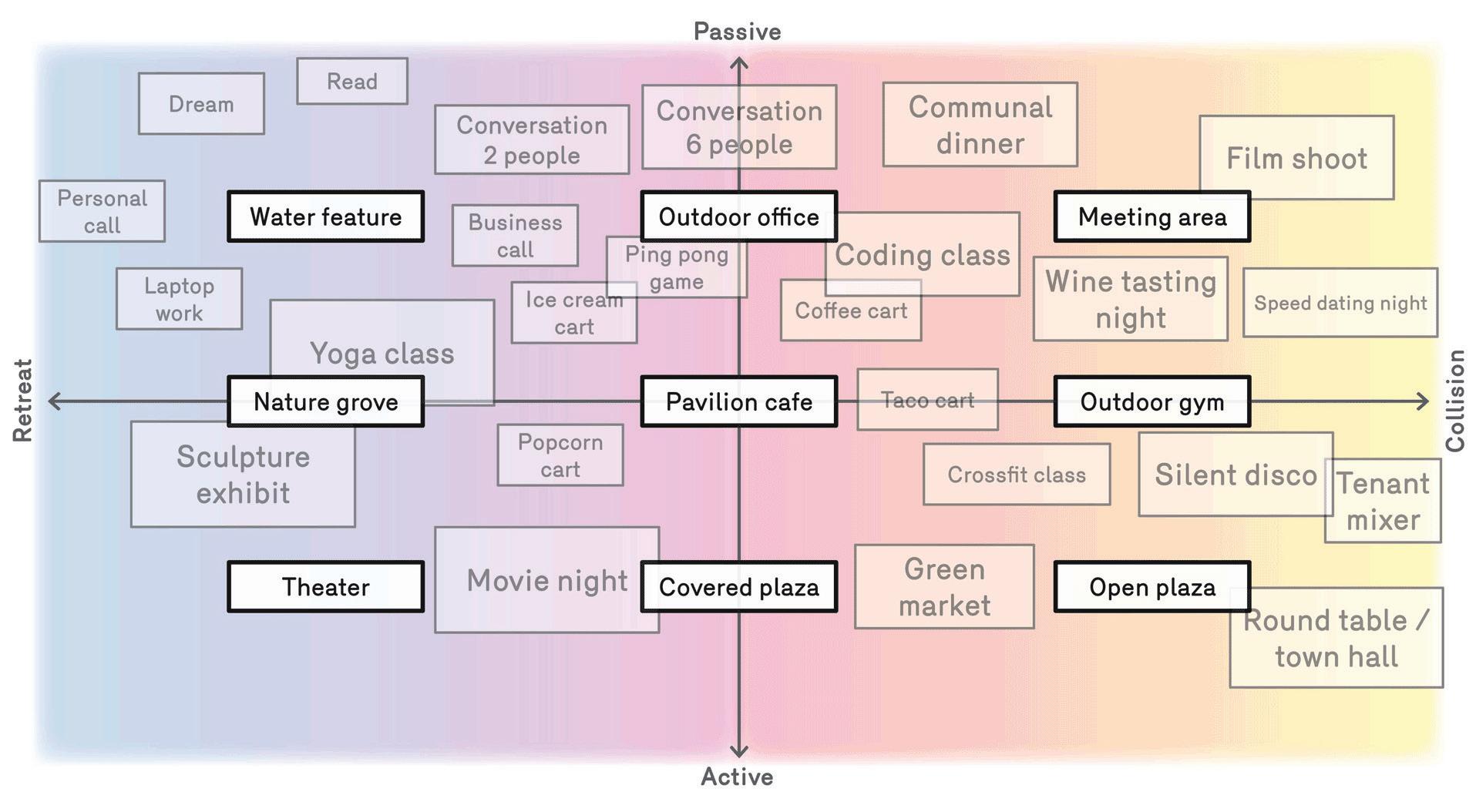
With an eye toward long-term program development, the Terrace design needed to provide a compelling environment for dayone operations as well as support future events and amenities. We developed an activity matrix to identify what infrastructure and spatial features would allow for a range of programming opportunities in the future.
The JACX Amenity Terrace
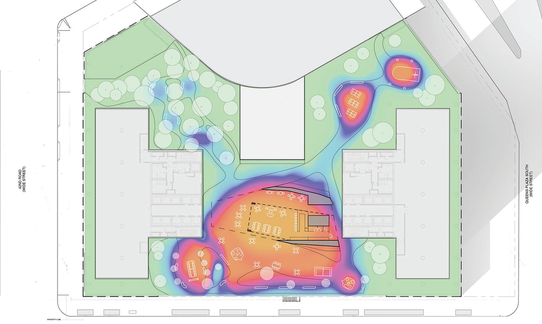
The activity matrix above establishes a “heat map” for the site’s programming that is transposed to the plan below, bridging program specifications with the terrace’s design. Programs with the most activity sit within collision spaces at the terrace’s core (indicated by the orange and red areas). Retreat activities are on the periphery (indicated by the blue and purple areas).
71
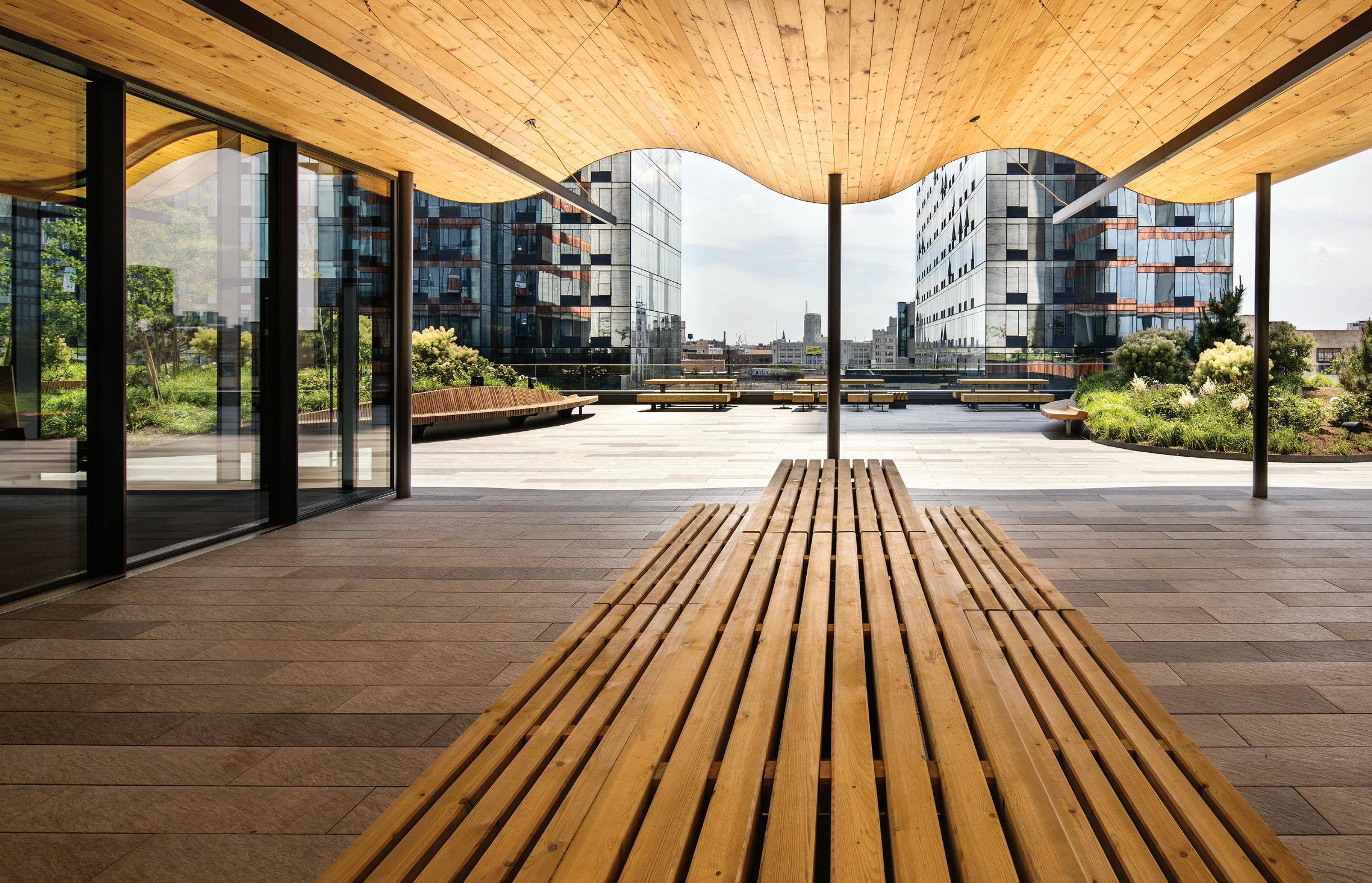
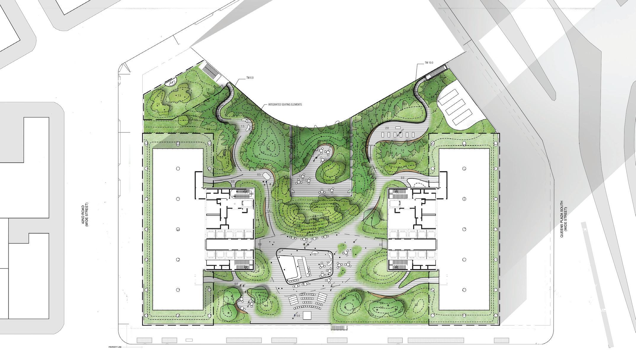 Located at Queens Plaza, the 2 1/2–acre terrace sits on the fifth floor between two 30-story commercial towers.
After this first phase of research and schematic design, we moved into conceptual design, working collaboratively with the landscape architect HMWhite as well as the executive architect Moed de Armas & Shannon Architects (MdeAS). The Terrace and amenity offerings have become a strategic marketing tool for the building overall—revealing how innovative design and placemaking are critical components for new urban developments as well as commercial properties.

The JACX Amenity Terrace
73
Tenmile River: A Generational Opportunity
Client: Wassaic Community
Development Partners
Location: Wassaic, NY
Scope: Master plan
Completion: Expected 2020
Collaborators: Brooklyn Digital Foundry, Cooper Roberson, HR&A Advisors, Hunter Roberts Construction Group, RANGE, VHB
Combining a bold vision for economic development with innovative design and placemaking, this project presents a new approach to ex-urban master planning.
75
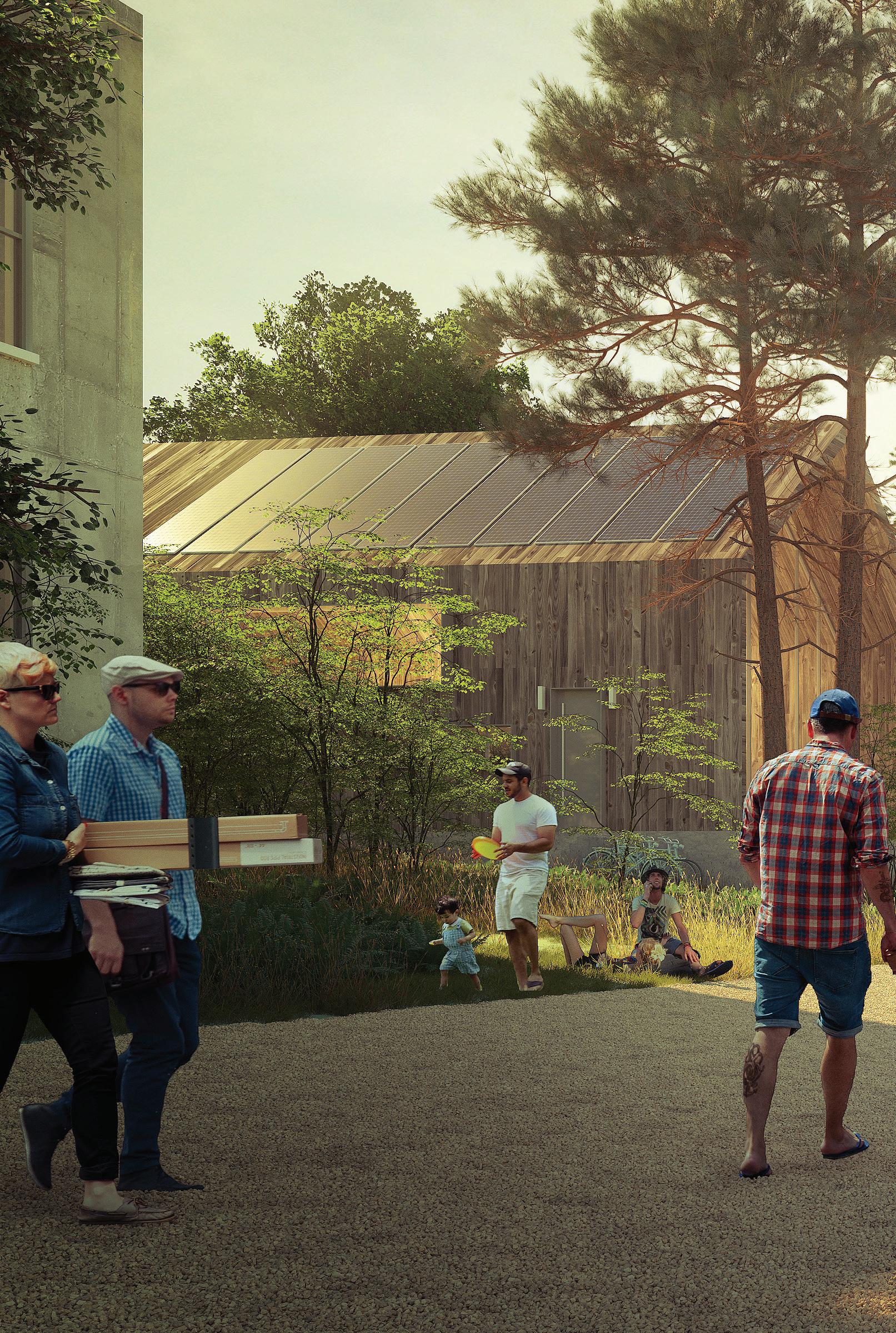
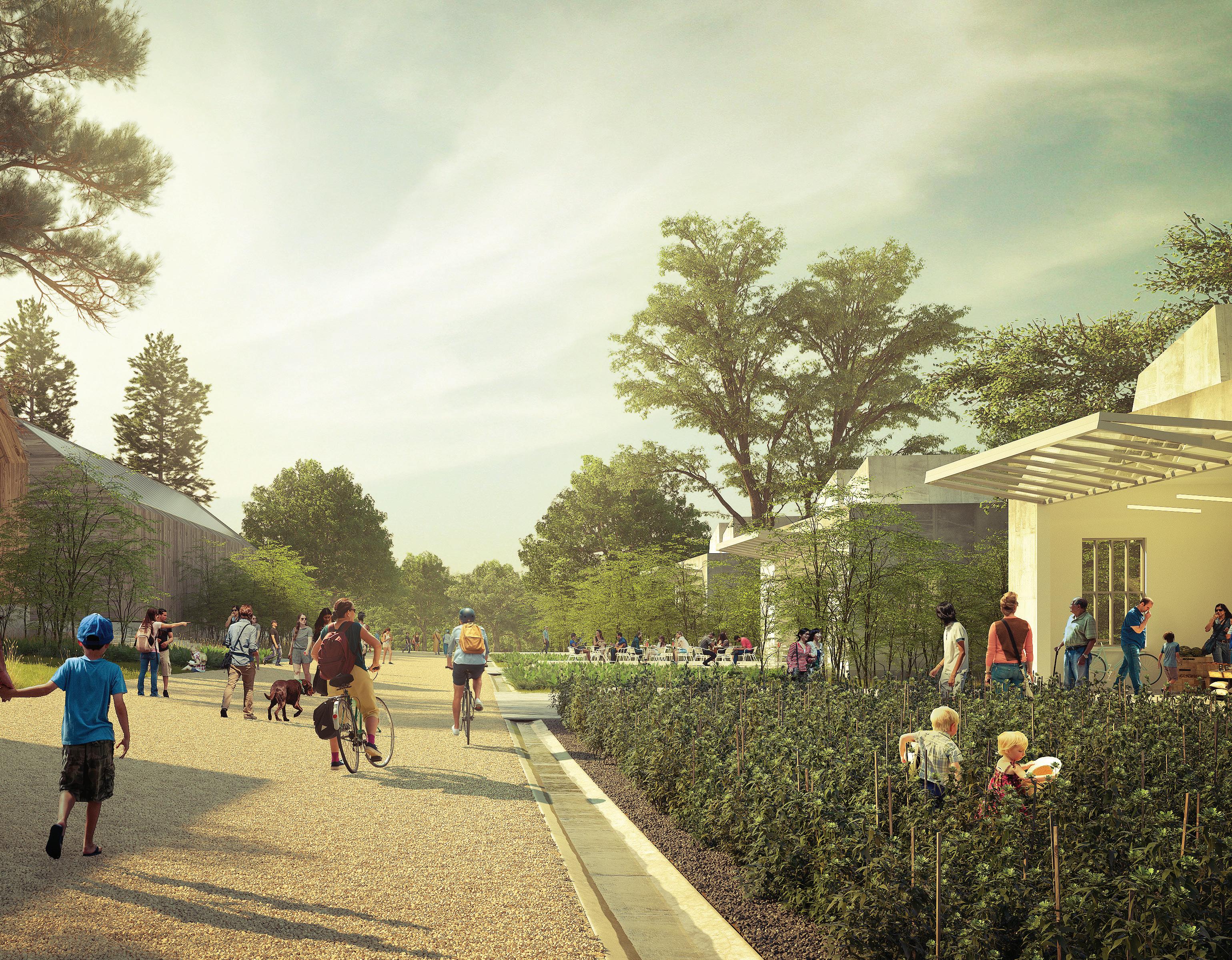
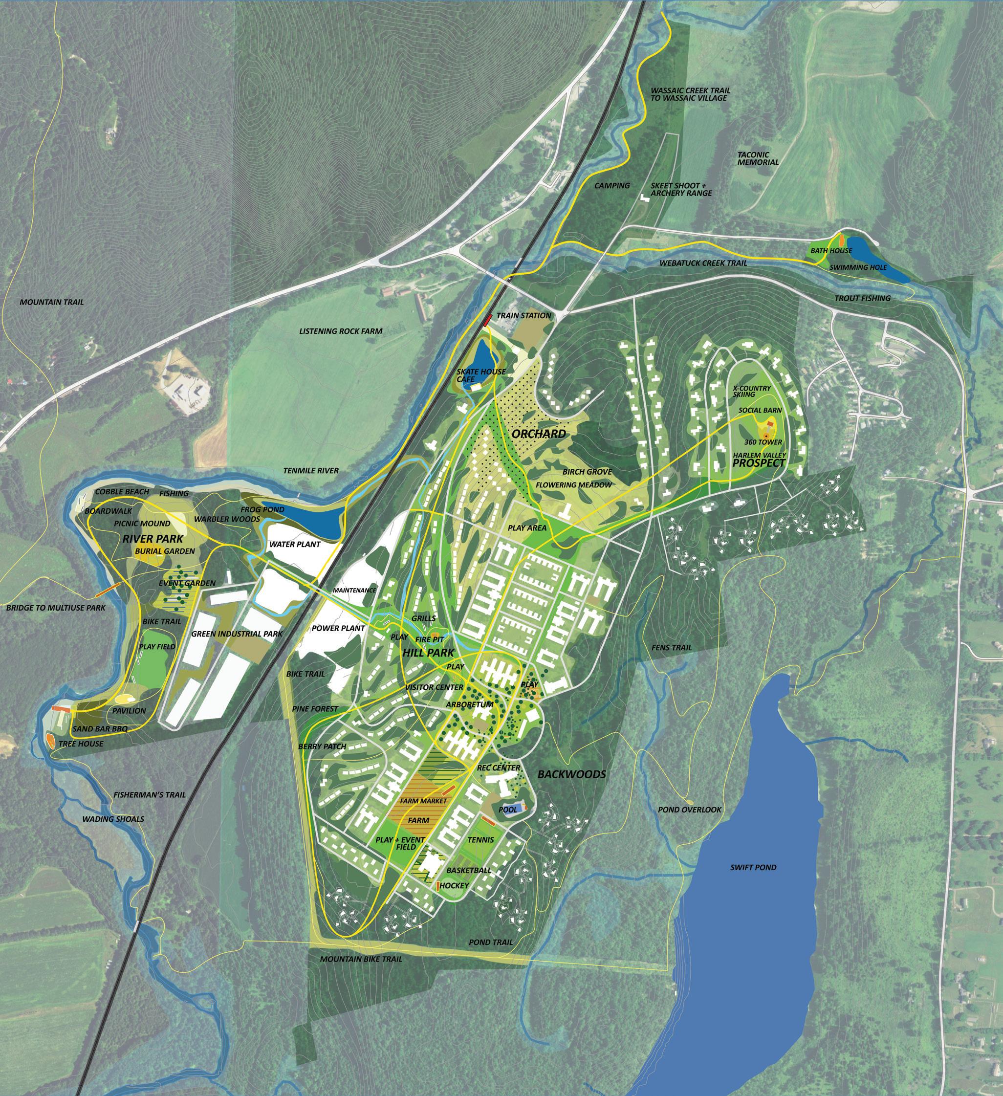
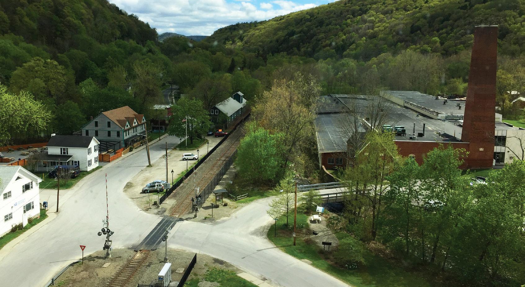
At a moment when social, economic and political forces have arguably pushed urban and rural communities further apart, the Tenmile River project reimagines the nexus of these realms. The master plan presents a vision of ex-urban, transit-oriented development that knits a landscape-forward approach together with concentrated density into a new mixed-use typology. The goal of this work is to radically refigure the rural-urban relationship—unlocking the site’s potential while supporting the wider development of the region.
Located within New York’s Hudson Valley, the site for this project spans 500 acres and includes a decommissioned state facility that once employed nearly 5,000 people. Our master plan—developed in collaboration with Cooper Robertson, HR&A and RANGE—seeks to reignite the site through economic development, cultural placemaking and diverse housing stock.
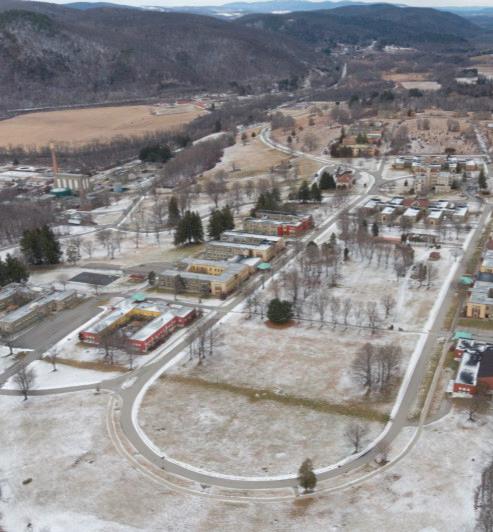
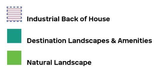
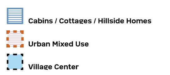
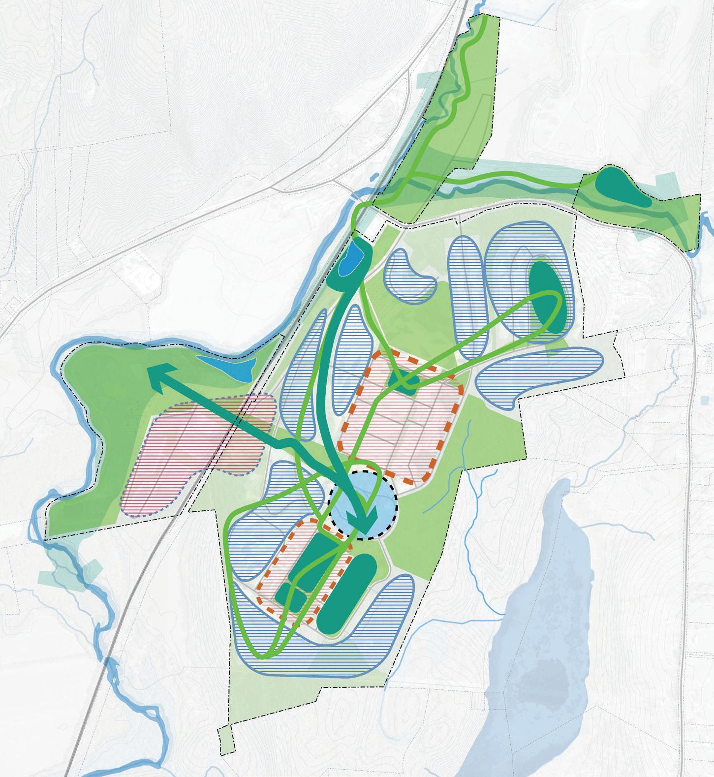
Our concept for Tenmile River re-imagines the site’s campus layout by introducing distinctive landscape features, creating nodes of mixed-use urban density around existing buildings and interweaving opportunities for new, sensitive development within the landscape. Establishing unique districts, small neighborhoods and interesting spaces in between, the concept will establish a new sense of place that builds on the site’s existing assets.
Concept Plan

Landscape Framework
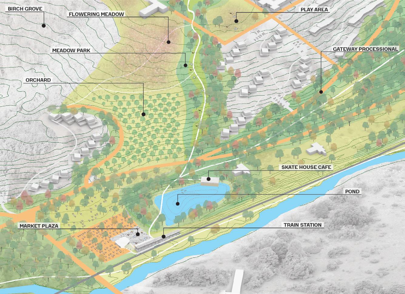
The landscape is an essential asset of the site, and a critical component to our team’s vision for Tenmile. Our concept envisions the landscape as the connective tissue between every aspect of the program, integrating the urban districts, residential areas, industrial zones and cultural amenities. Beyond connecting the site, the natural environment provides some of the concept’s most distinctive and desirable amenities. These features include a community farm and orchard, a swimming hole and over 18 miles of hiking, biking and crosscountry skiing trails—all of which present increased access to Hudson Valley’s best during all four seasons.

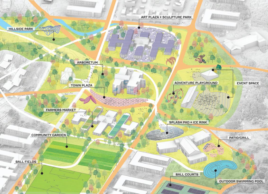
The plan includes a 59-acre riverfront park situated alongside the Tenmile River and spanning across the site’s most low-lying areas and floodplain. This park connects to a rambling hillside promenade and another park that leads up to the cultural core of the site. There, a series of landscaped public spaces will support a variety of cultural programs like outdoor performances, farmers markets and other community events.
Tenmile River: A Generational Opportunity
77
These spaces surround and support the Village Center, a dynamic, mixed-use district at the heart of Tenmile. Designed to be both a local and regional destination, the district’s program includes a hotel and event space, a host of food and beverage offerings, studios for artists and cultural tenants, a revitalized recreational center at Berkshire Hall and a visitors center. As the site develops over time, this center of activity will extend outward with a dense mix of cultural buildings, housing, and attractive landscapes that line the current loop road. These repurposed buildings, enlivened open space and sensitive infill development will create a distinctively urban space amidst the rural hillsides.
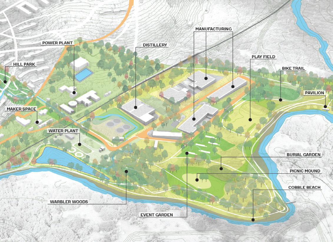
The Eco-Industrial District takes up the western portion of the site, where former operational facilities of the campus will be transformed into a contemporary manufacturing and distribution center. This district will include small-scale maker and artist spaces, maintenance facilities and larger-scale industrial development.

 The Village Center
The Eco-Industrial District
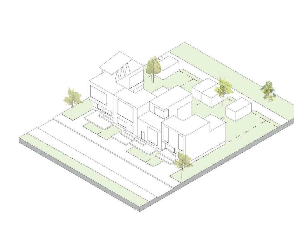
Cabins
Townhomes
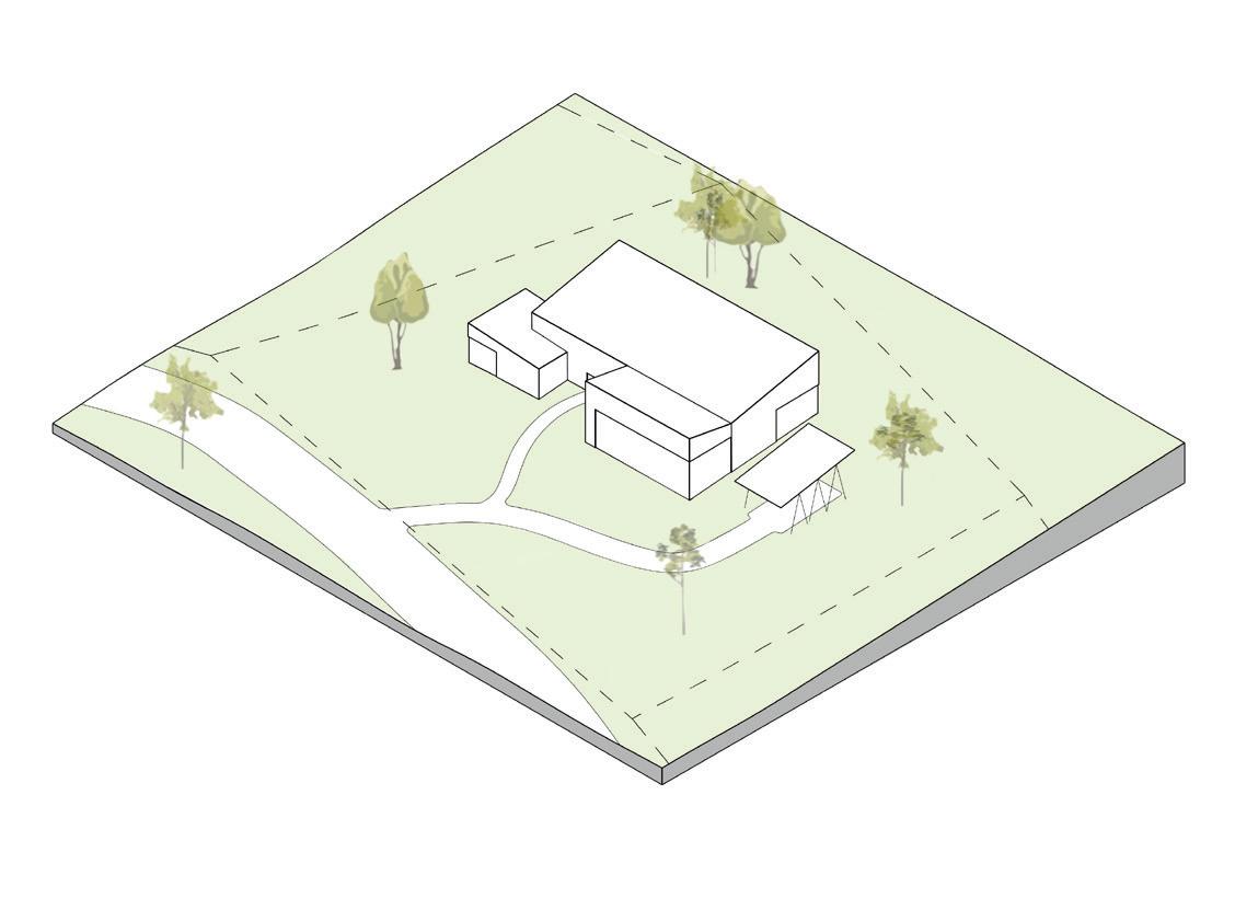
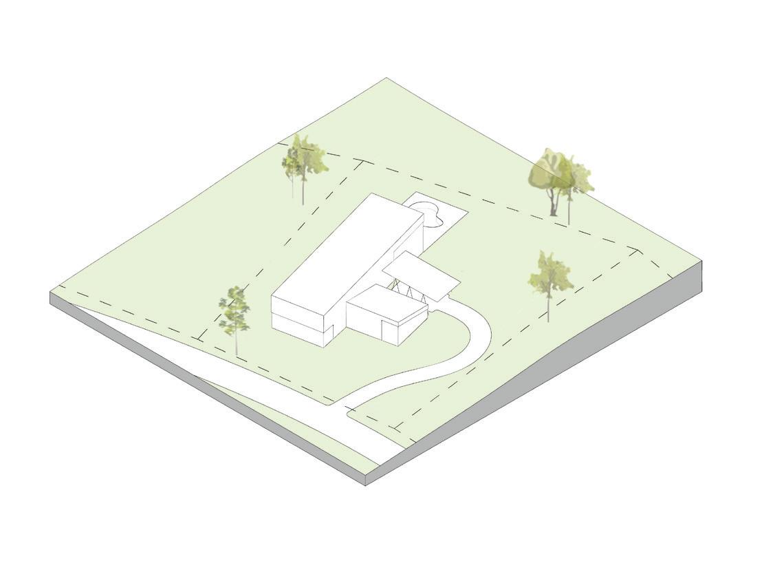
Inventive residential development will help increase density across the site as well as support the projects financial plan. Potential houses are selected from an ensemble of building typologies—a kit-of-parts—that present a range of options for incoming residents. This approach seeks to provide a certain level of visual cohesion across the site while at the same time attracting residents with diverse demographic and socioeconomic backgrounds.

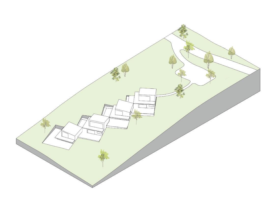
Another important strategy pertains to the concentration and combination of these typologies across the site’s districts. This approach acknowledges both the individual and collective experience of Tenmile and will foster communities within communities.

 Cottages
Hillside homes
Family homes (smaller)
A Generational Opportunity
Family homes (larger)
Tenmile River:
79
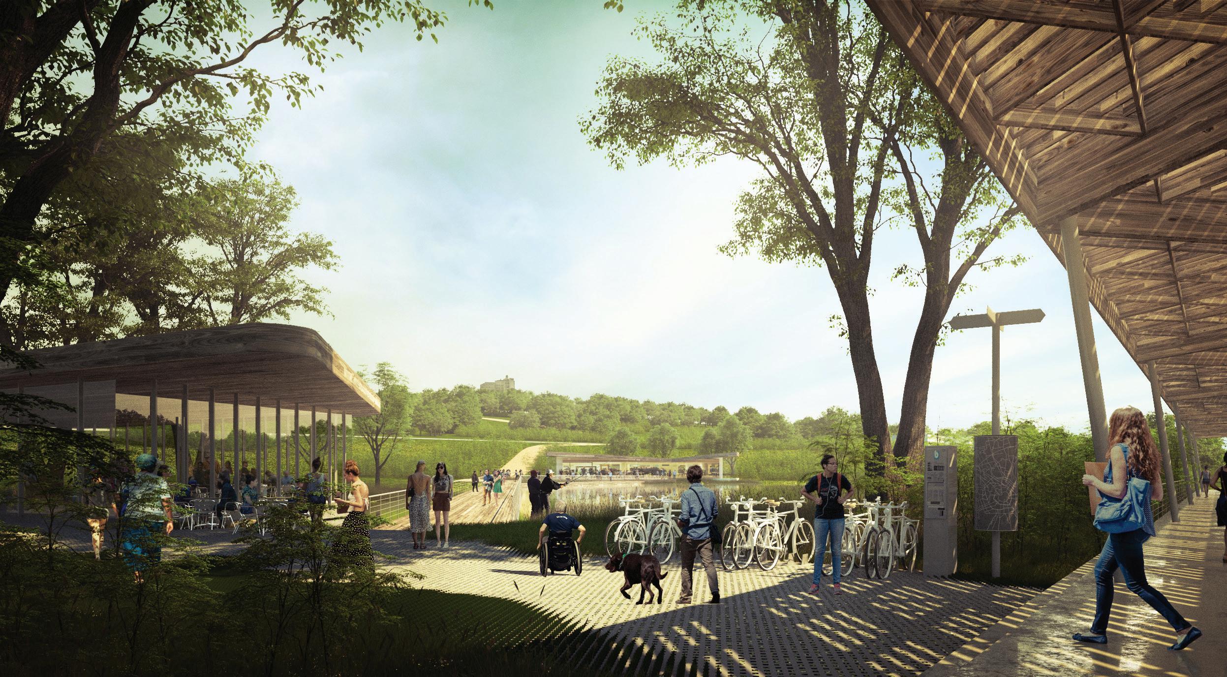
The Station District embodies the approach of transit-oriented development and will serve as a gateway to Tenmile. Similar in density and amenities to the Village Center, this district will provide a gathering place for residents while welcoming visitors from across the region. Some of these key features include a marketplace for local goods, a restaurant overlooking a new pond and a park studded with creative installations. For commuters and visitors arriving by rail, car, or bike, this central experience will anchor the community with its sense of place.


Tenmile River: A Generational Opportunity
81
The Station District
Design Lab
Client: NYSCI
Location: Corona, NY
Scope: 10,000 sq ft
Completion: 2014
Photography: John Muggenborg
How can space support the different ways in which kids learn?
83
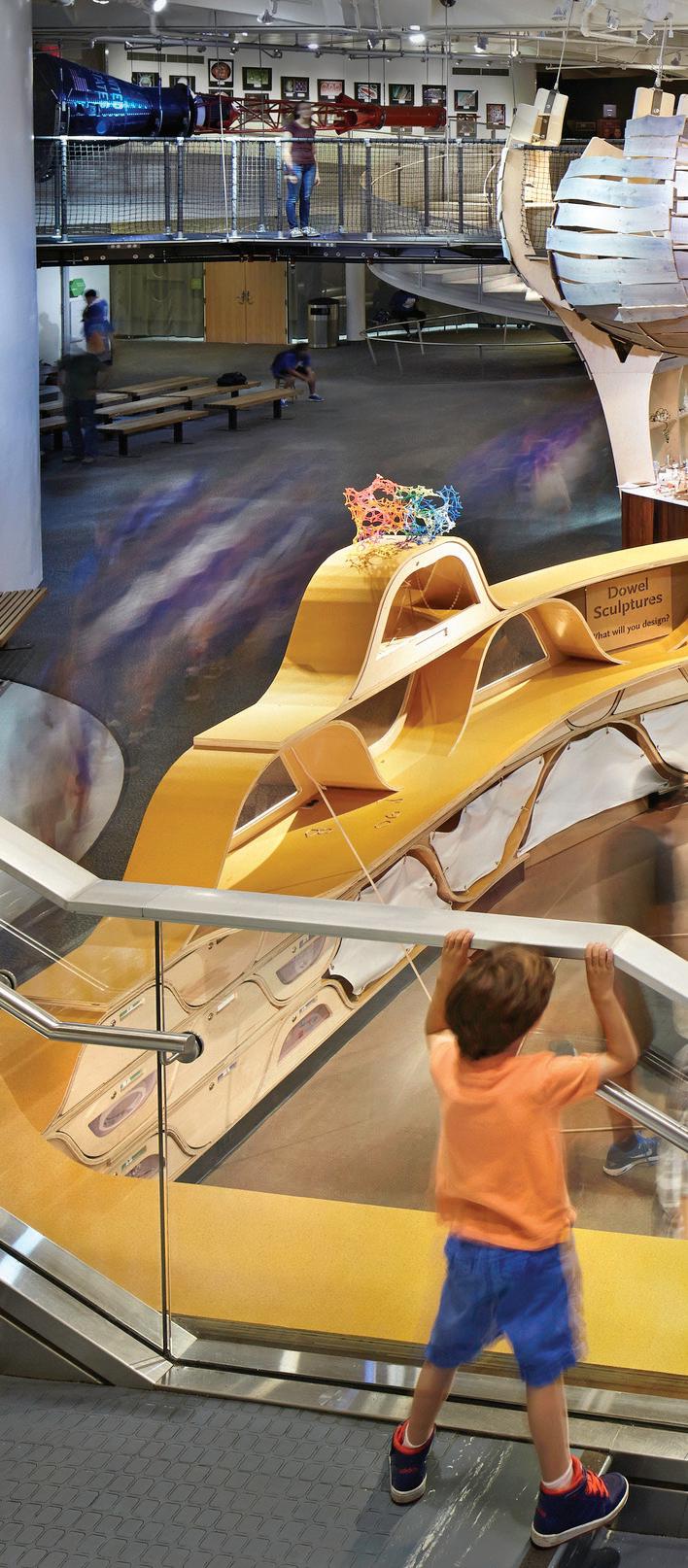
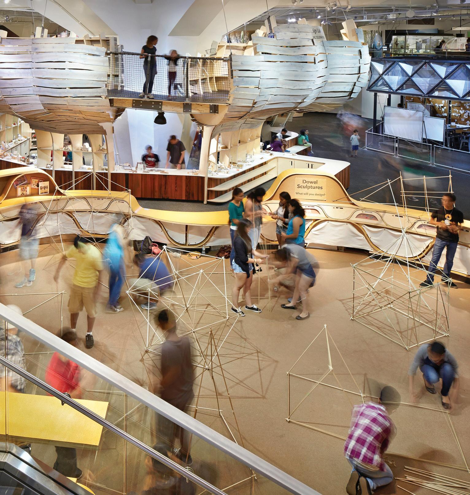
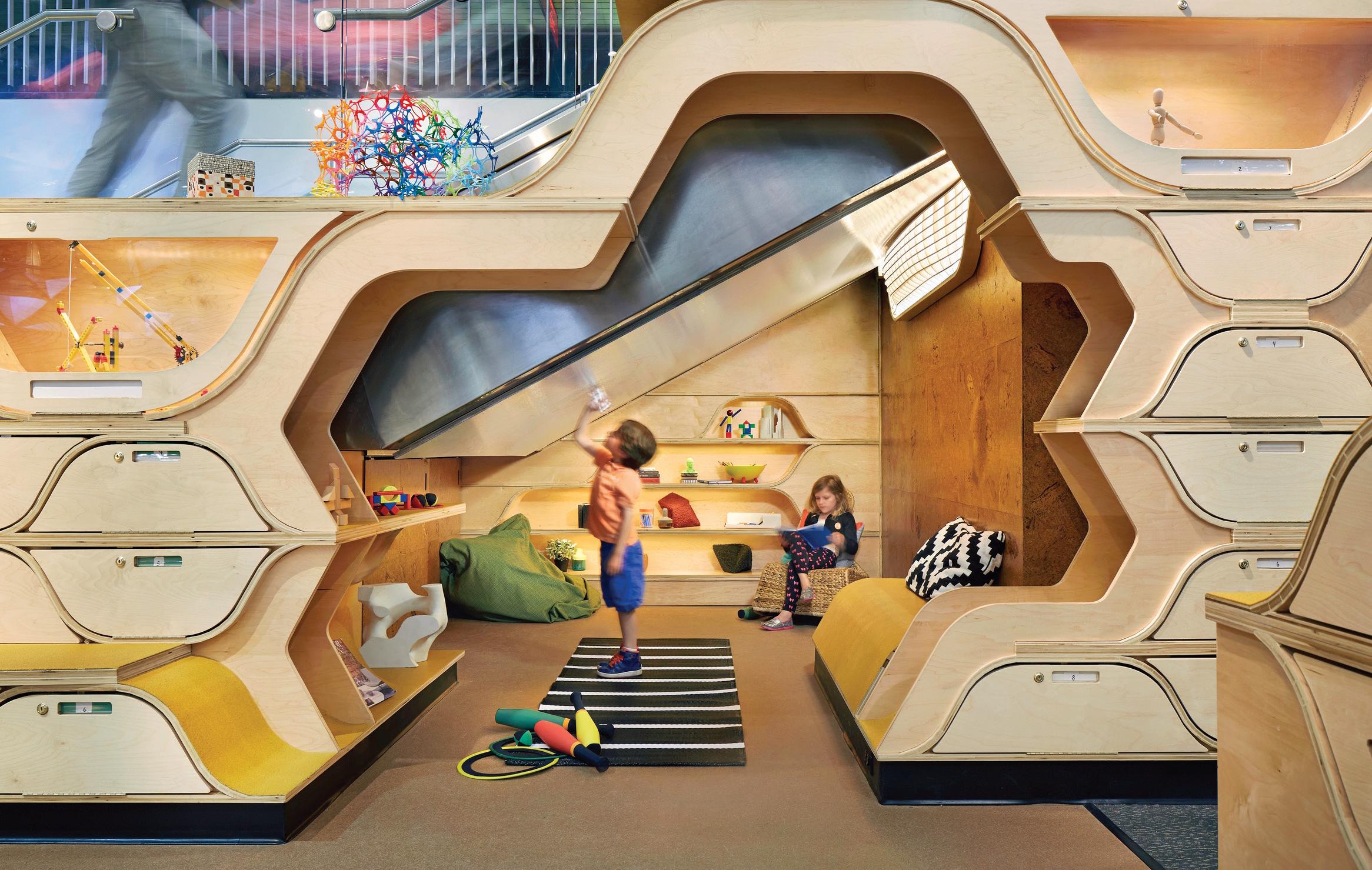
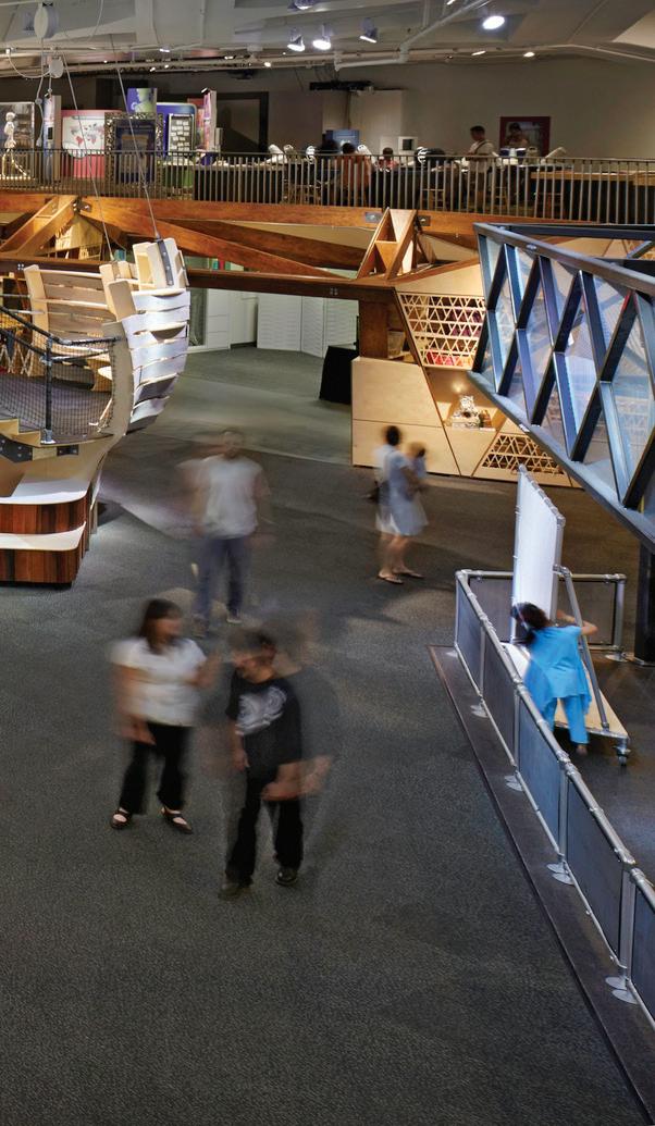
Kids learn in very different ways. From tinkering and testing to creating and performing to working collaboratively or by themselves, the future of science education is moving beyond the classroom and into scientific principles grounded in familiar and relevant concepts. Together with the New York Hall of Science (NYSCI), we created a multi-faceted laboratory where learners of all ages, backgrounds and skillsets get hands-on with science principles and walk away more knowledgeable, confident and curious.
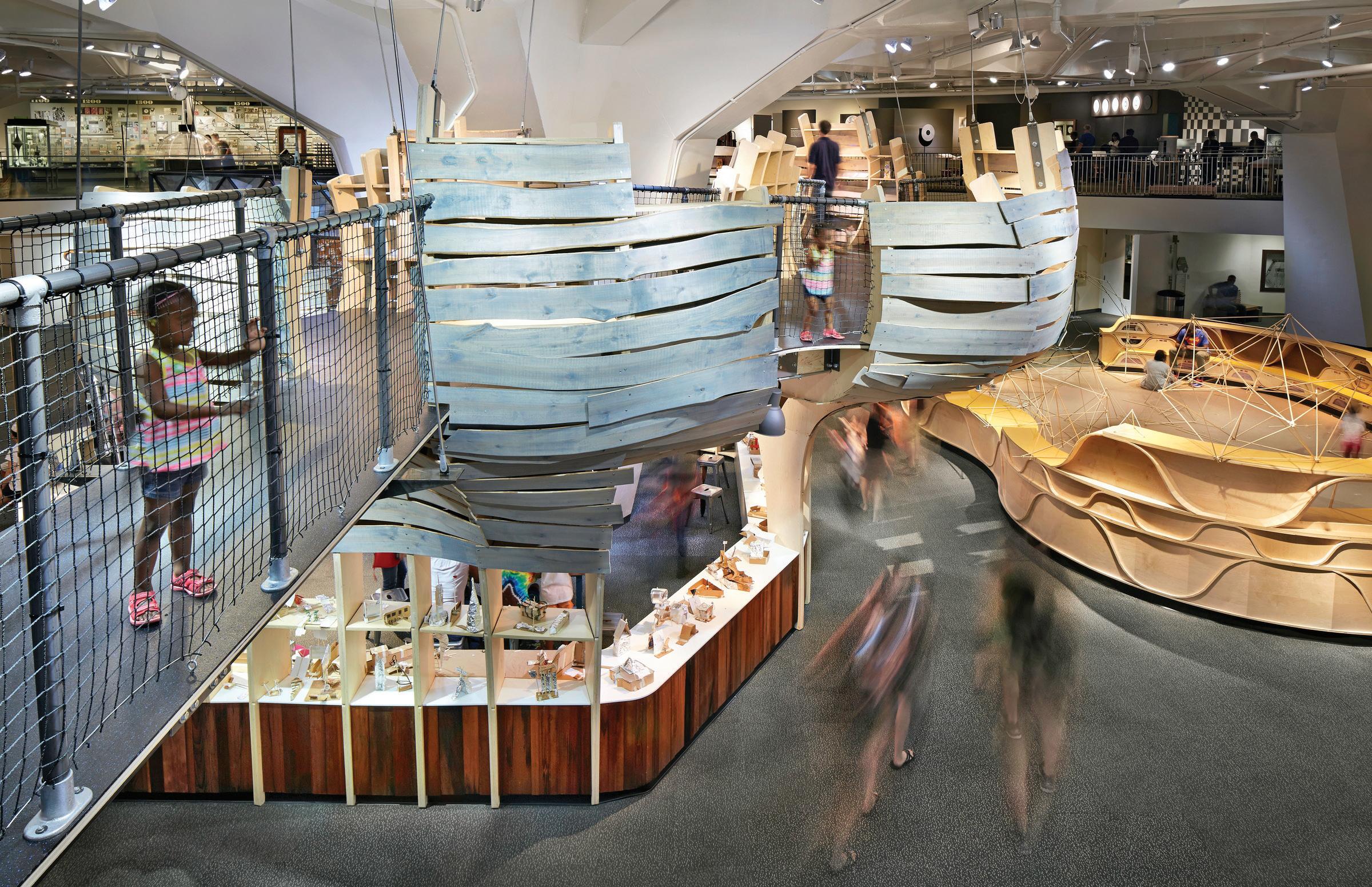
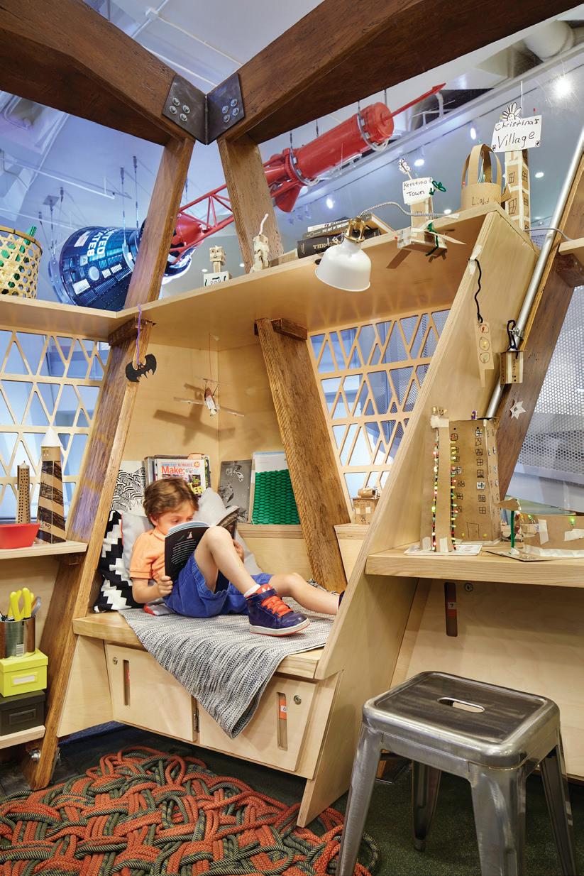 At the Treehouse, visitors explore gravity, shape and air resistance.
Occupying approximately 10,000 sq ft of NYSCI’s main pavilion, Design Lab has five activity areas that host a diverse array of STEM and project-based learning activities. We crafted each area—Sandbox, Backstage, Studio, Treehouse, and Maker Space— as an alternative universe for kids to explore and experience. Exposing structure, materials, hardware and assembly systems, we use design to celebrate the act of making and illustrate the STEM principles driving Design Lab‘s activities.
Design Lab
85
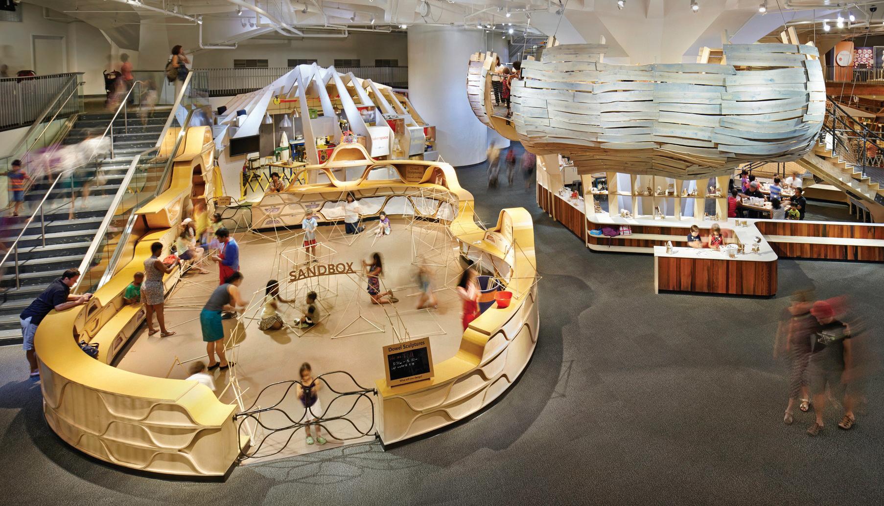
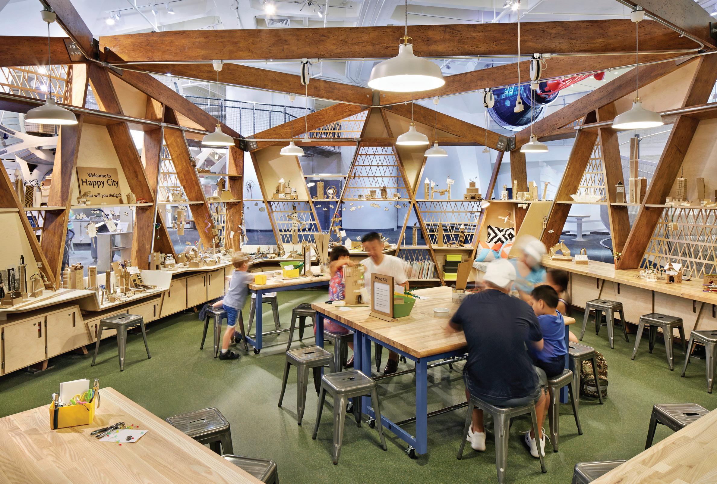 The Studio hosts a collaborative design activity called Happy City, where visitors learn to construct circuits while building a model city.
Each year, Design Lab attracts thousands of visitors, trains teachers from schools across the city and leads STEM-based classes for students of all ages. Since the project launched in 2014, it has become an international touchstone for nontraditional learning and maker spaces.
87
The Sandbox invites visitors to build large, sturdy structures that you can stand inside.
Solar Canopy
Client: Brooklyn SolarWorks
Completion: 2016
Photography: Marvel Vision, courtesy of Brooklyn SolarWorks
Collaborator: Laufs Engineering Design
Integrating solar panels on New York City’s building stock is harder than it looks.
89
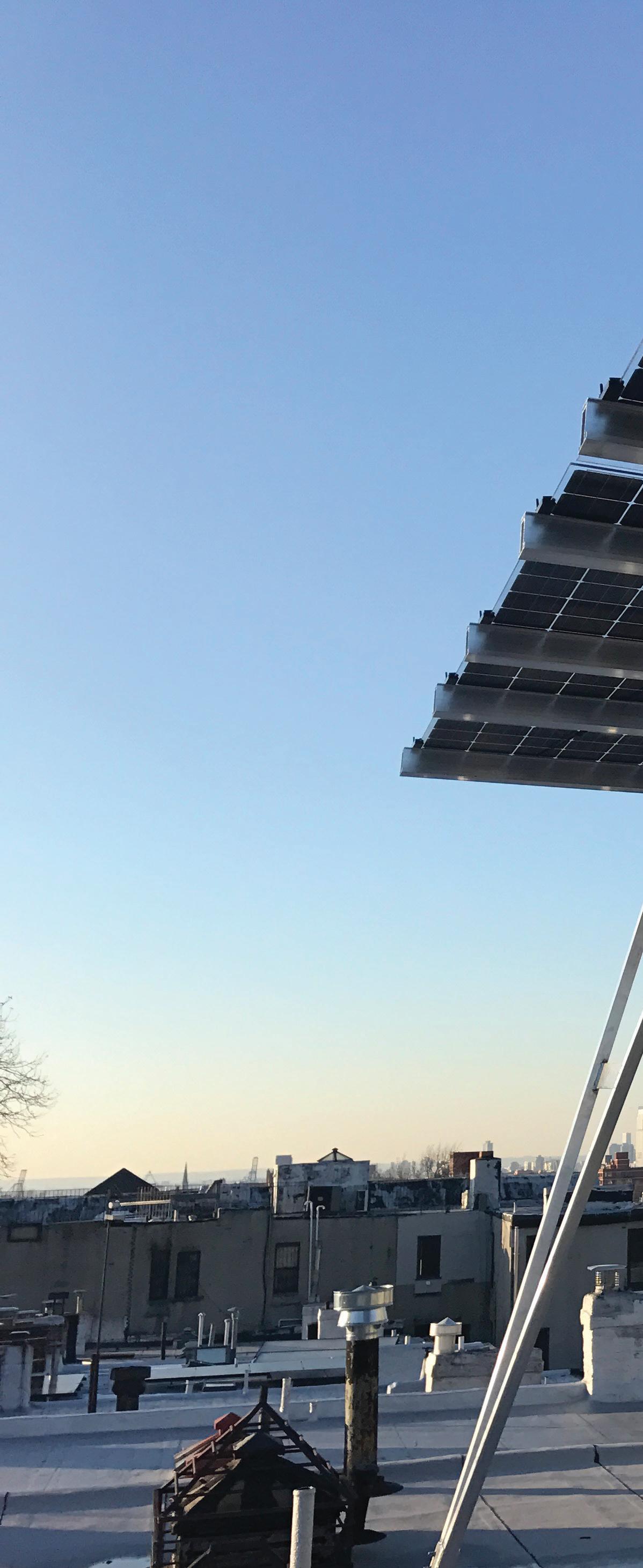
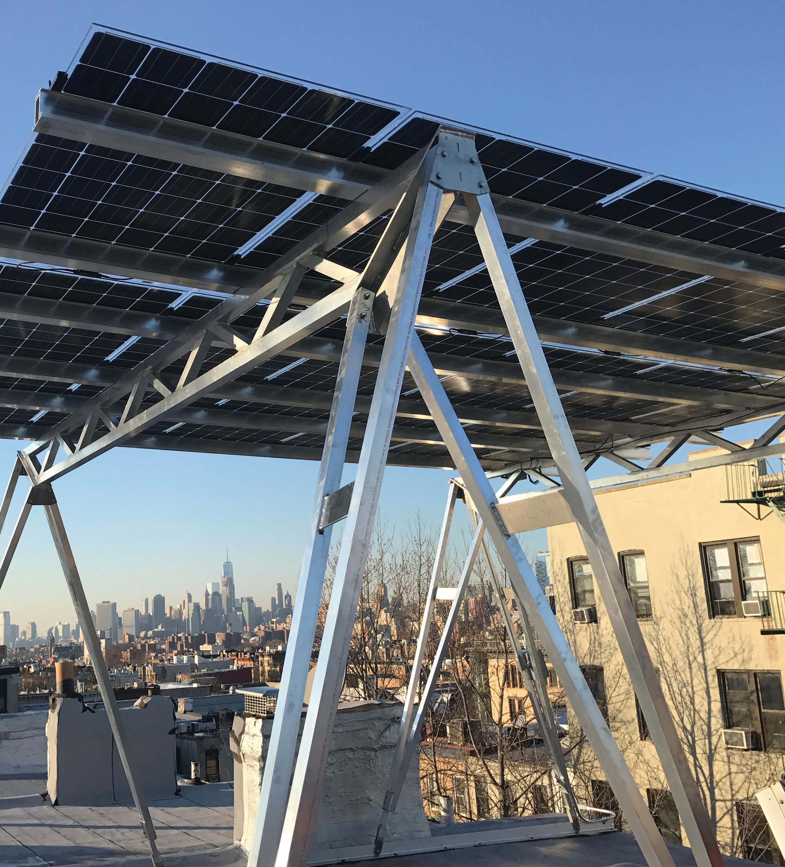
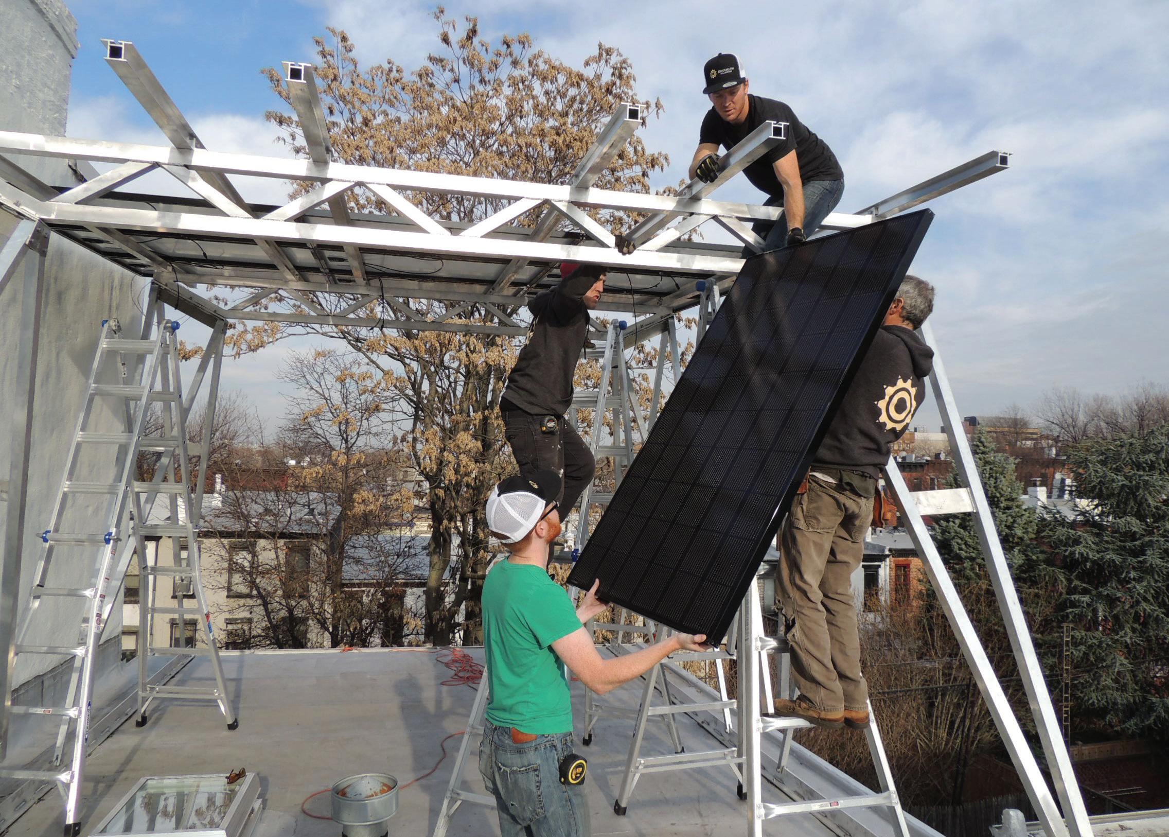
Integrating solar panels on New York City’s building stock is harder than it looks. The challenges range from fire code regulations to limits on rooftop obstructions and wind load requirements—all of which pose significant barriers for implementing solar panels across the five boroughs. In a project for Brooklyn SolarWorks, we created a new system specifically designed to tackle these problems: the solar canopy.
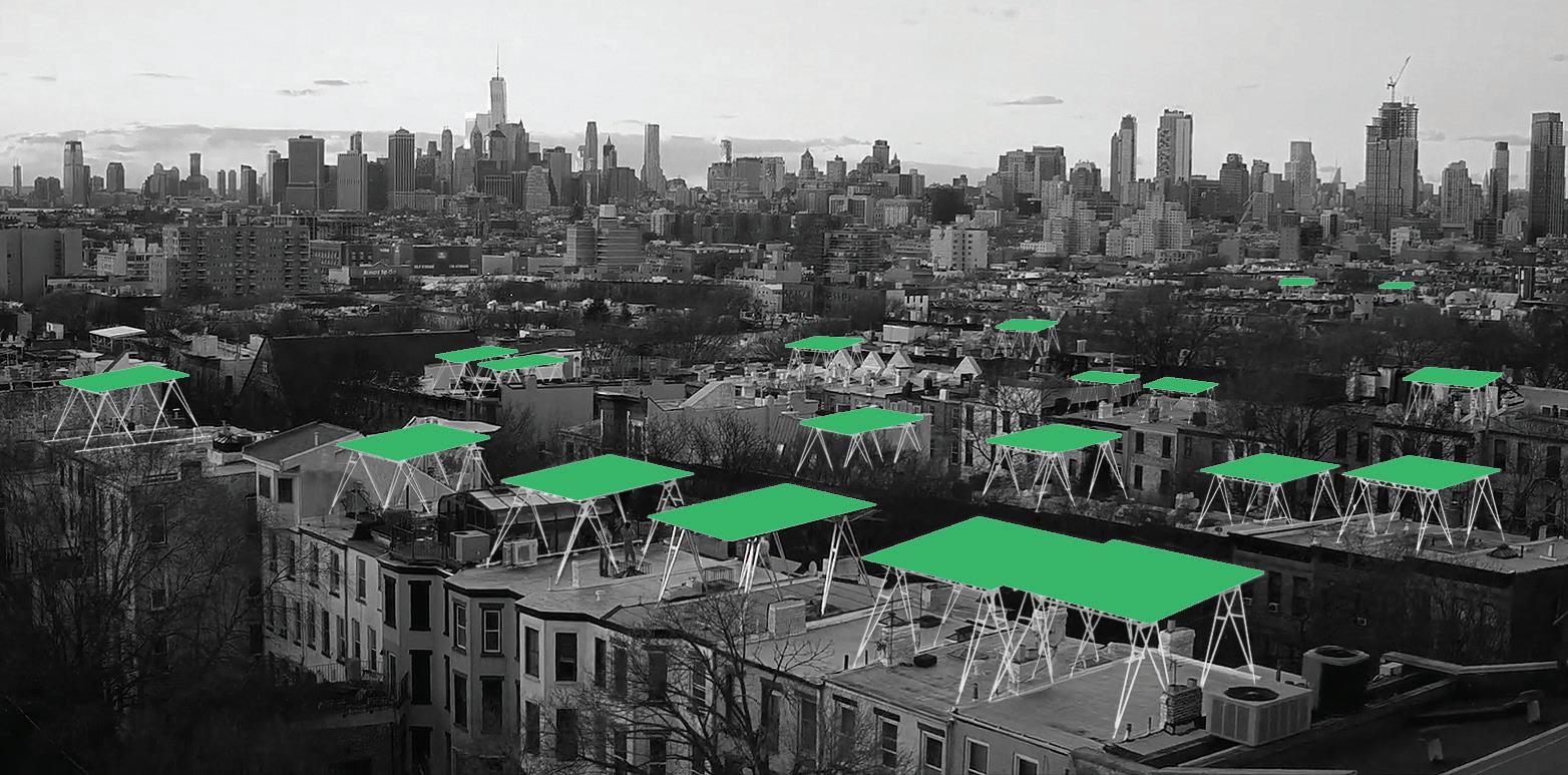 More than a one-off solution to eco-friendly property owners, the canopy was envisioned as a pathway to extend solar power across New York City’s neighborhoods.
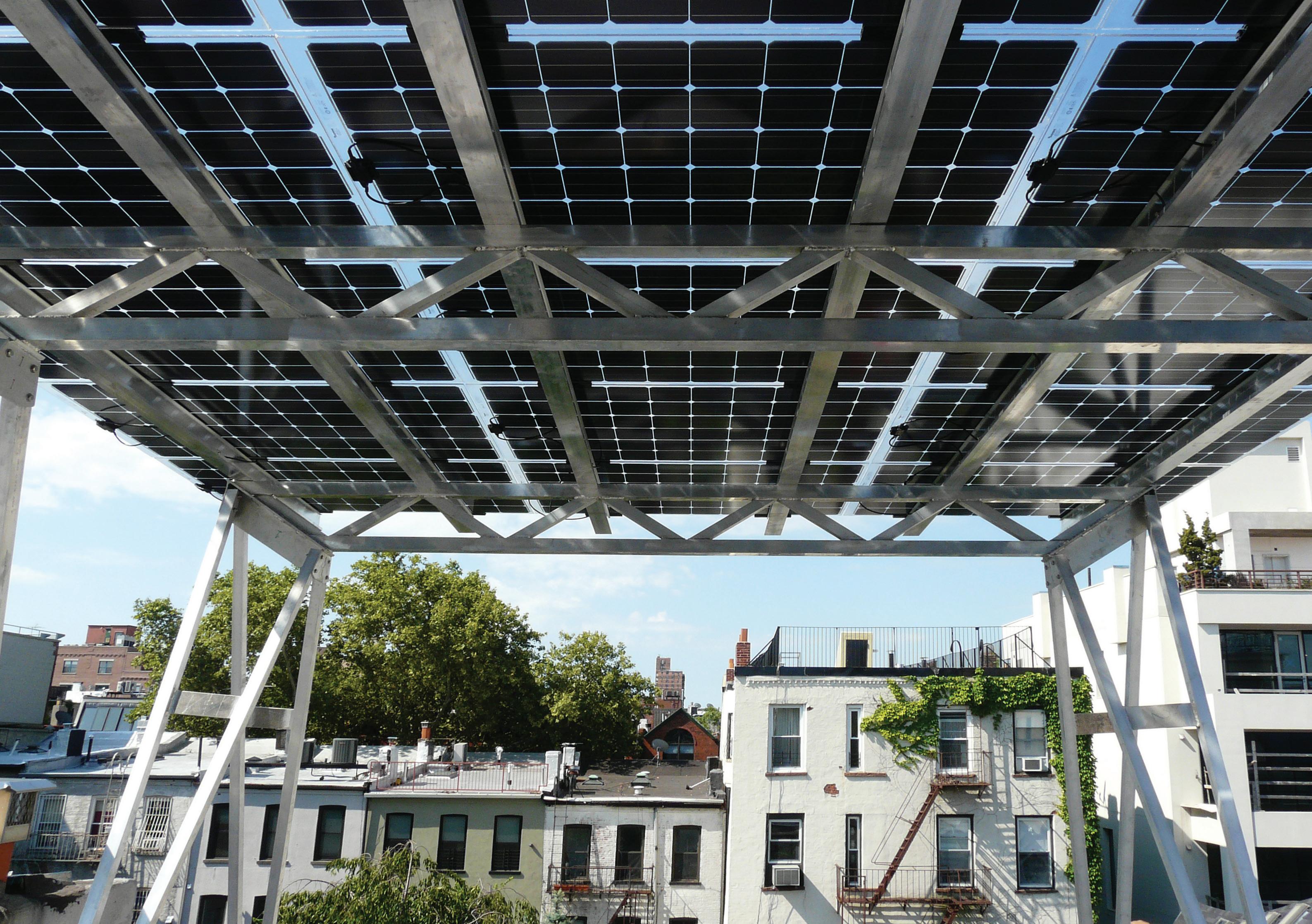
Combining our expertise in architecture, engineering and fabrication, the canopy’s design factors in a wide range of external variables, such as adjacent structures, foliage, roof penetrations, roof access and maximum wind and snow loads. The final product is a modular rooftop structure with PV solar panels affixed to a lightweight, adjustable aluminum frame. Created as a prefabrication model, the canopy is easily replicated and customized according to roof size, structure and the particular solar capacities of the site.
Solar Canopy
91
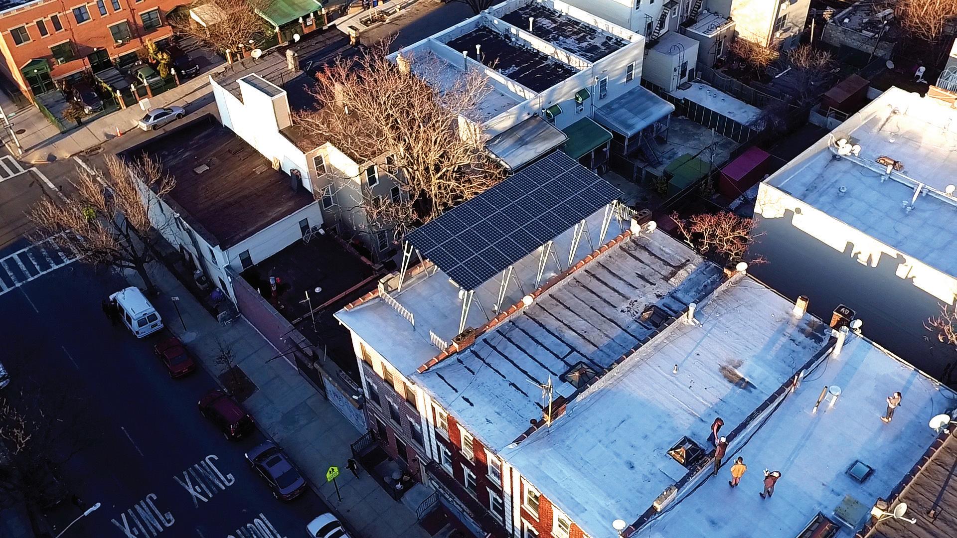
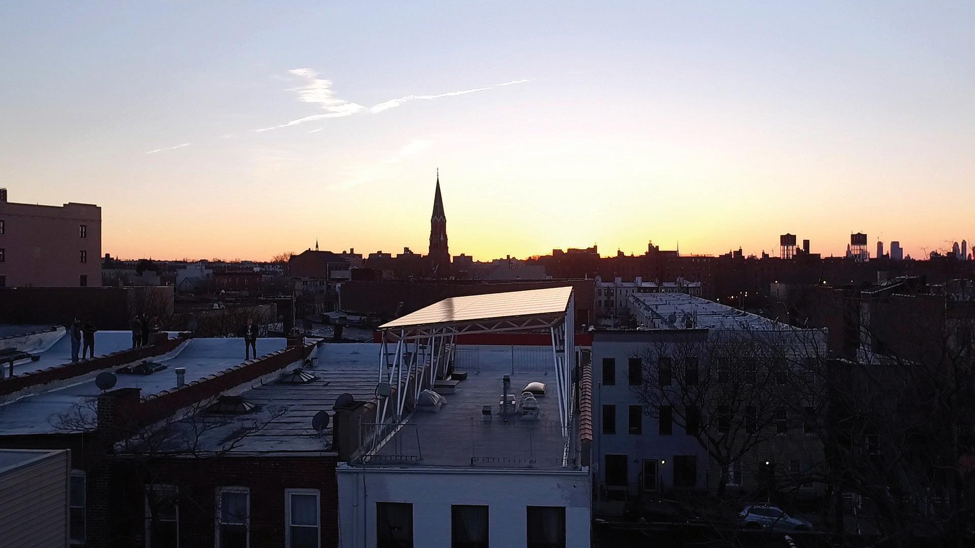
Compared to surface panels, the canopy increases a rooftop’s capacity for generating solar power by 200 percent. And the product uptake is impressive— nearly one hundred have been installed in the first two years across Brooklyn and Queens. With the capacity to power entire buildings and dramatically reduce utility costs, this project is rooted in urban innovation, with the potential to transform solar for residents in New York, as well as other cities nationwide.
Solar Canopy
93
Urban Front Porch
Client: Brooklyn Lab Charter School
Location: Brooklyn, NY
Completion: 2020
Collaborators: Urban Projects Collaborative, WXY, Urban Umbrella
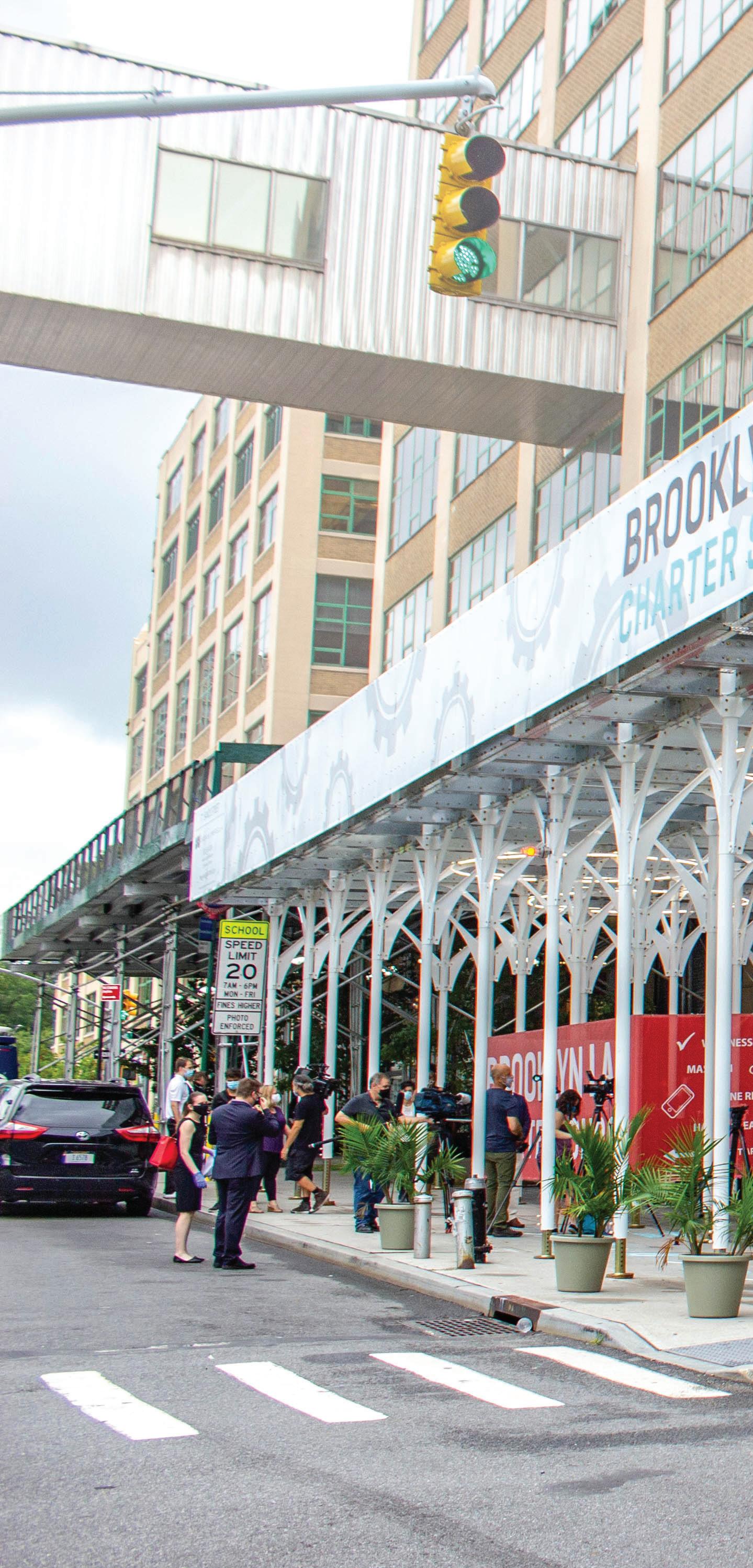
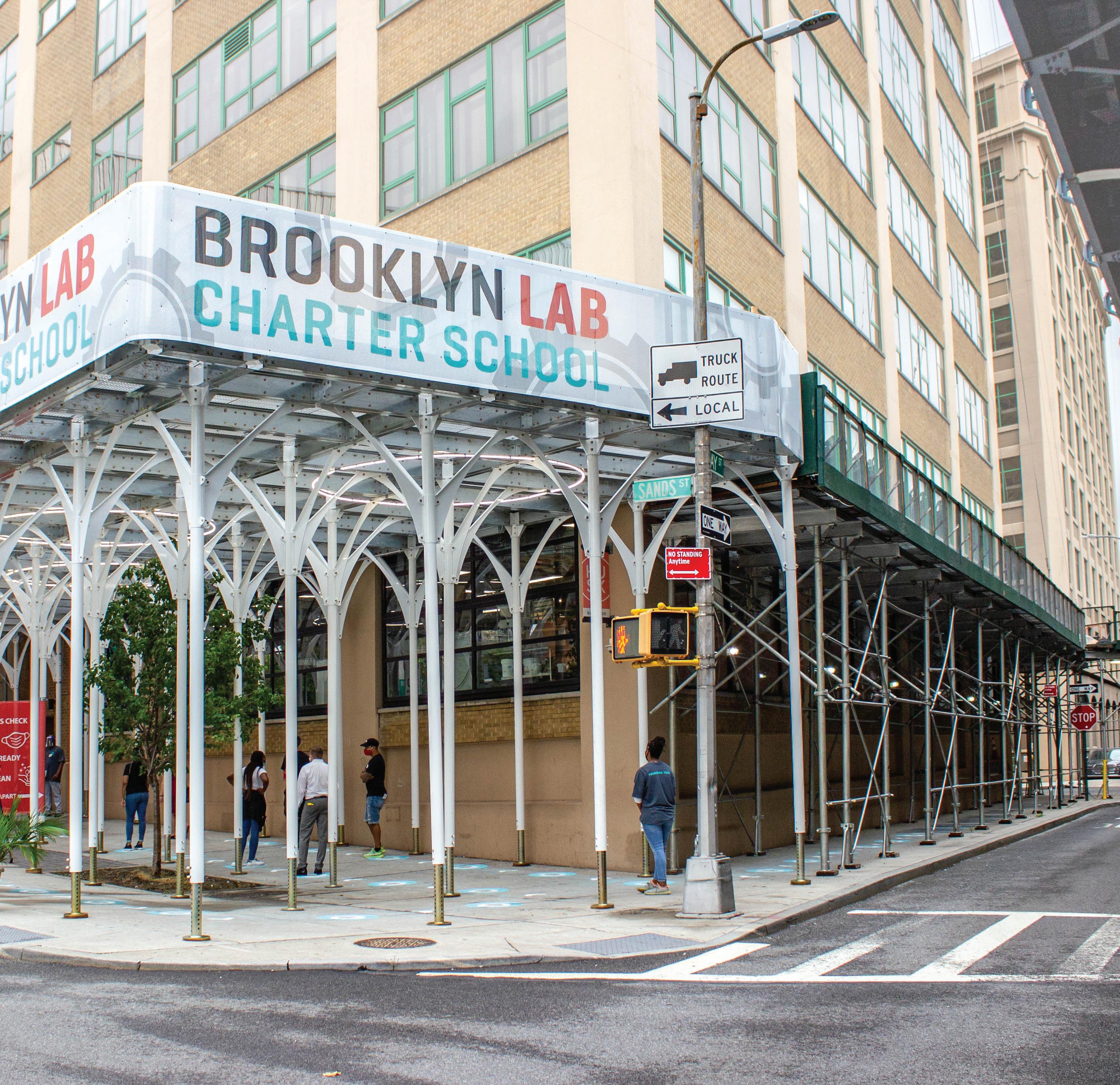
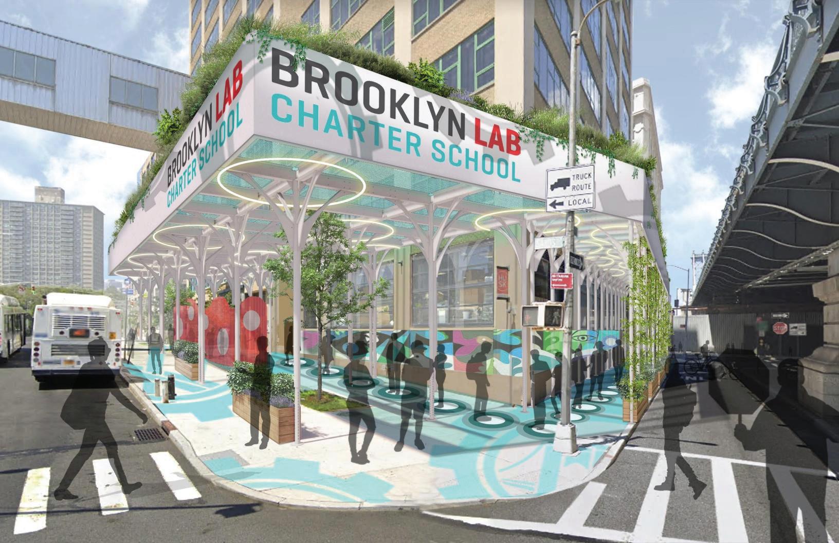
With the spatial limitations of schools in urban environments in mind, this project leverages sidewalk infrastructure to re-imagine a safer entry experience.
95
As COVID-19 began to fully emerge in the US, schools around the country were confronted with a colossal disruption: moving from physical spaces to an online environment. While the education community quickly transitioned to full-time digital learning, what is less certain now is how to safely reopen the schools. Social distancing remains a key strategy for preventing the spread of the coronavirus, and yet most schools are not designed for keeping students, staff and teachers six feet apart from each other. For many, making space for this strategy may seem impossible.
Many of New York’s schools, for example, are in multistory buildings and—even before COVID-19—have been challenged with limited points of entry, shortage of space and overcrowding of classrooms. Given the nature of COVID-19 and how it spreads, these existing challenges pose an even greater risk today. And thus, schools need new spatial solutions to implement safety protocols and safely re-open.
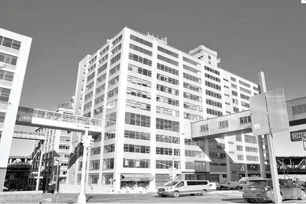
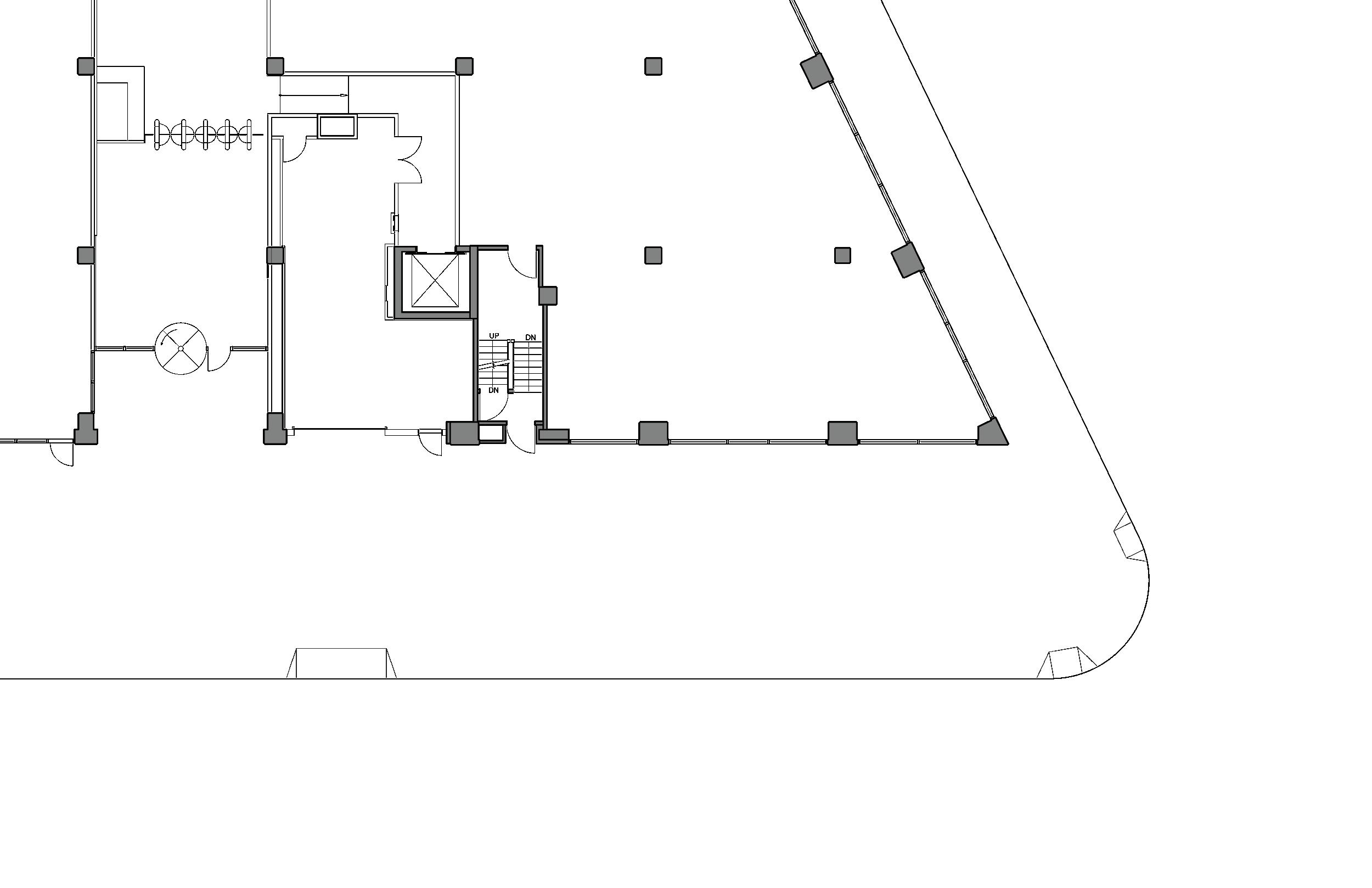
 The school occupies floors 2-7 accessed via stairs on the ground level. The building is shared with other tenants, including commercial offices and restaurants.
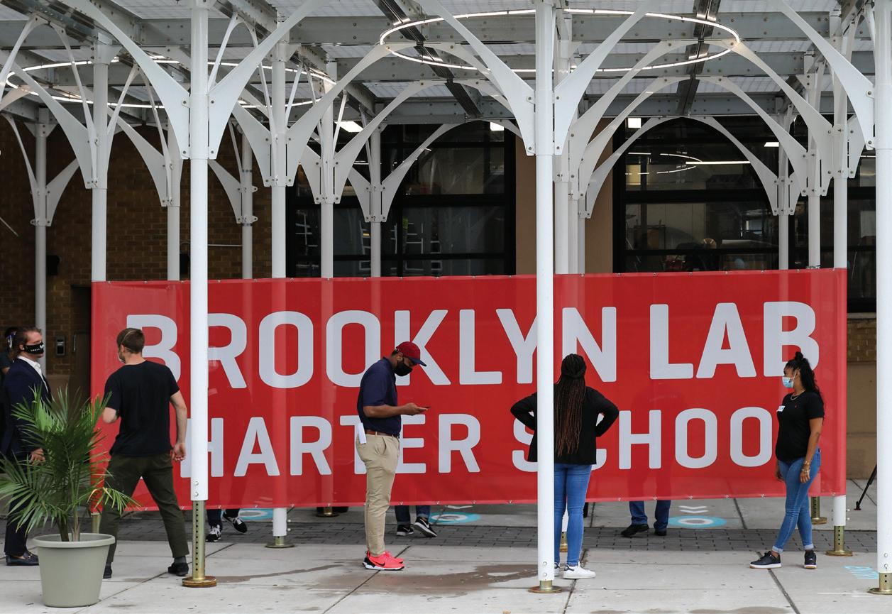
We partnered with Brooklyn Lab Charter School (BLCS) to explore how schools in such environments can adapt their facilities to serve these new priorities. For BLCS, getting upwards of 1000 students into the building while maintaining social distancing and introducing temperature checks would result in long lines and delayed start times. From these constraints emerged the design brief—how can we make spaces for new safety measures in a way that works with BLCS’s school day but also carefully considers the impact on the surrounding community & public realm?
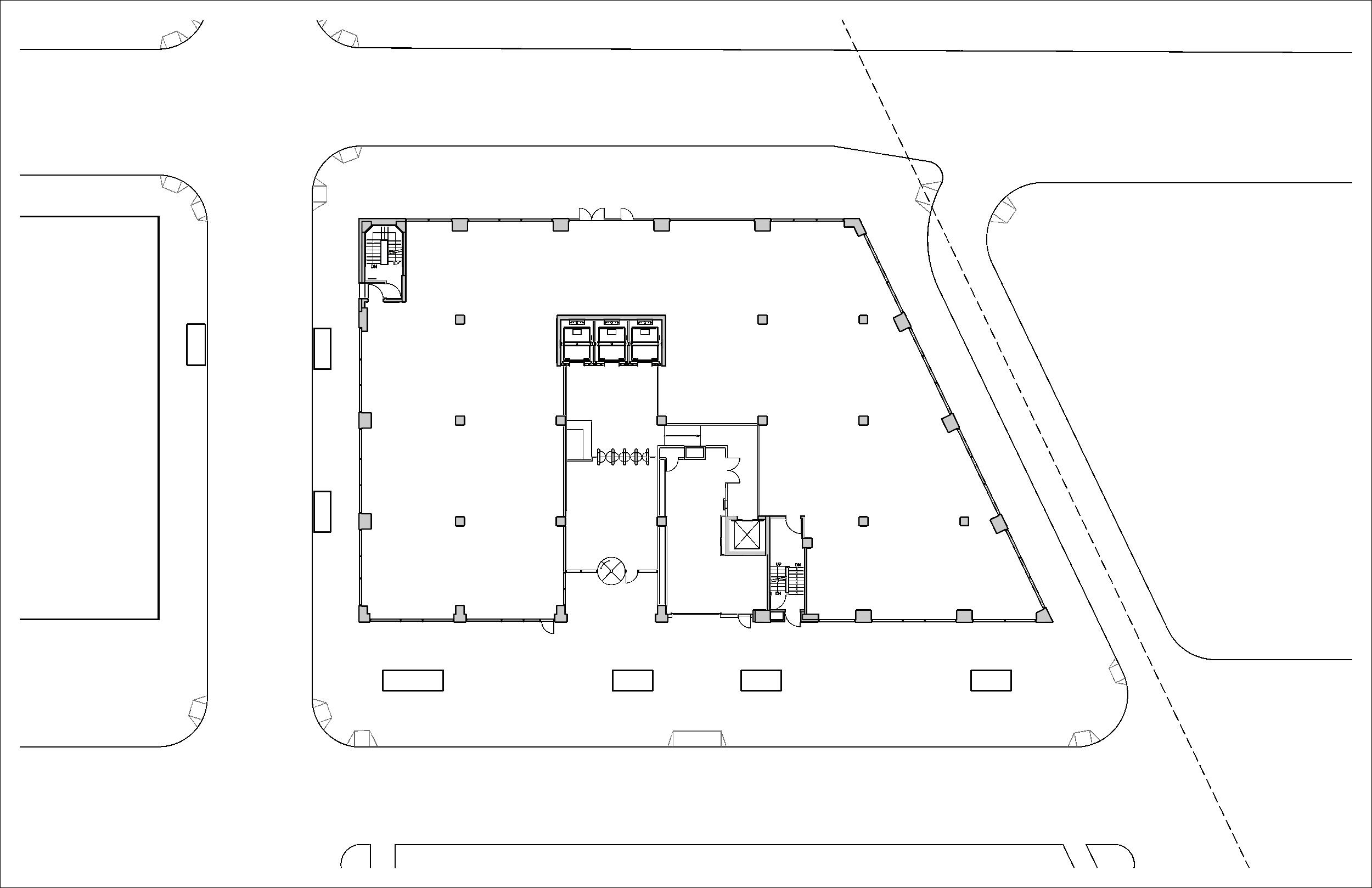
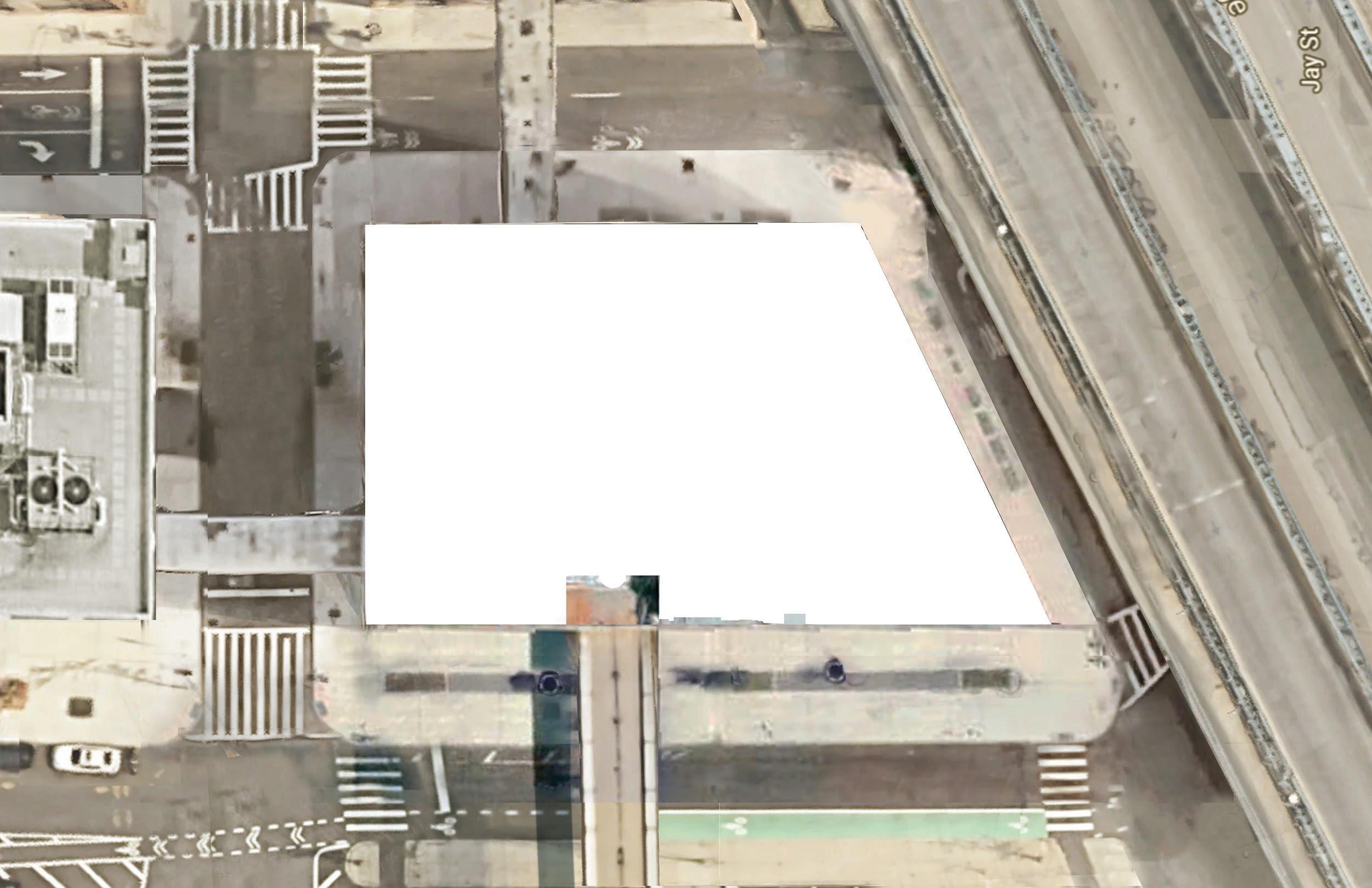
Our approach, informed by health specialist Nadine Cohen, MD, focused on preventing the spread of coronavirus, particularly during the arrival and dismissal periods. Keeping transmission down means students and staff should spend less time in close proximity with others, especially avoiding mixing with different groups of people. With this risk in mind, we proposed using the second egress stair as a separate entry for middle school students, thereby limiting interactions between middle and high school groups.
Canopy Student (6’ distance) Sta (6’ distance)


Special needs route Student entry

Urban Front Porch
97
*assuming 15 seconds per person for temperature check


Along the same lines, staggering students’ arrival and departure times will help limit who students have contact with each day. Scheduling tactics could also include having students attend on alternate days and more expansively staggering class times throughout the day. Our goal is to enable a full offering of classes to every student while achieving a 50% reduction in the total number of people on-site at one time. This will also help reduce the queue for entering the building. With multiple entrances and staggered schedules in place, we anticipate that the entry queues can be reduced to groups of approximately 10-30 students.
200 students arriving 10 min. apart 50 min. total*
300 students arriving 10 min. apart 75 min. total*
1000 students arriving at once 250 min. total*
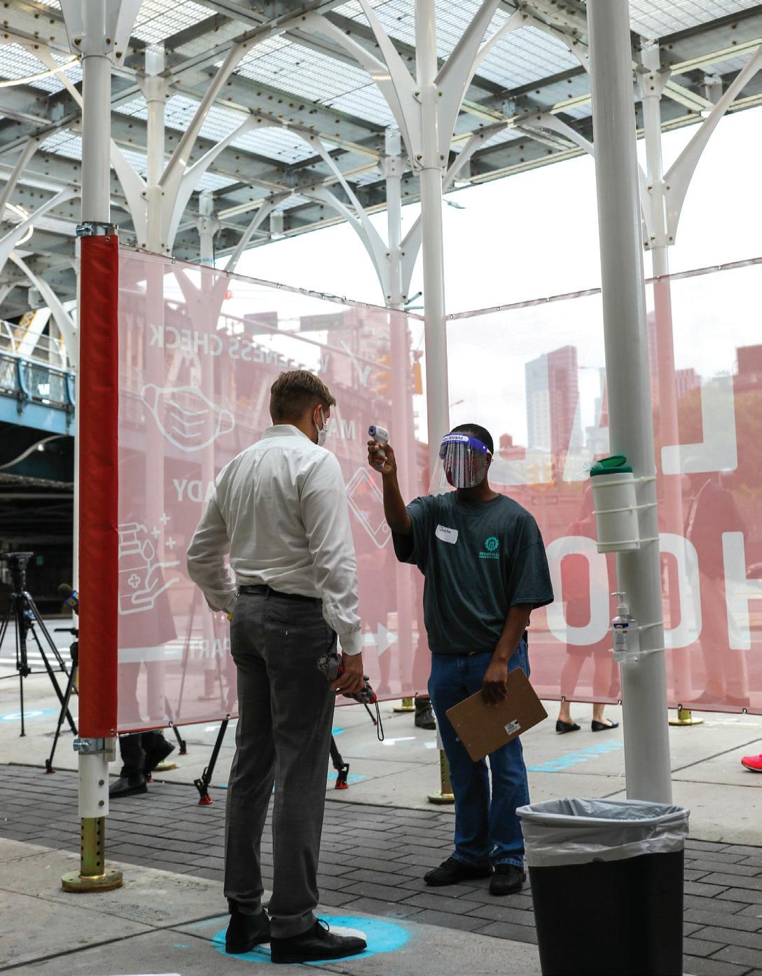
The greeting and health check station from our run-through with school staff to get feedback on the overall process
Comparing arrival volumes with social distancing
shelter from the elements, privacy during health checks and clear wayfinding?
design parameters also emerged—like the need for clear signage, effective lighting and acoustic solutions.

Urban Front Porch
Hand sanitizer stations placed along queue
Temperature check station behind privacy wall
Use of hand sanitizer enforced prior to entering
Planters used as tra c barriers and queue management structures
Sta queue manager
99
Queuing plan at the Sands Street entrance
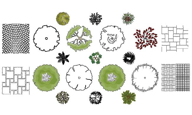
Using these design parameters, we developed a kit-ofparts that brings together a range of design solutions to transform this new exterior space into a more inviting, legible and light-filled exterior entryway for schools. Designed for flexibility, the kit can be reconfigured to fit different sites, allowing schools to choose the design elements necessary for their existing conditions. For example, some schools may want to deploy an exterior stair system, introducing new vertical circulation routes to help with social distancing. Others may need more partitions and wayfinding to organize students’ arrival.


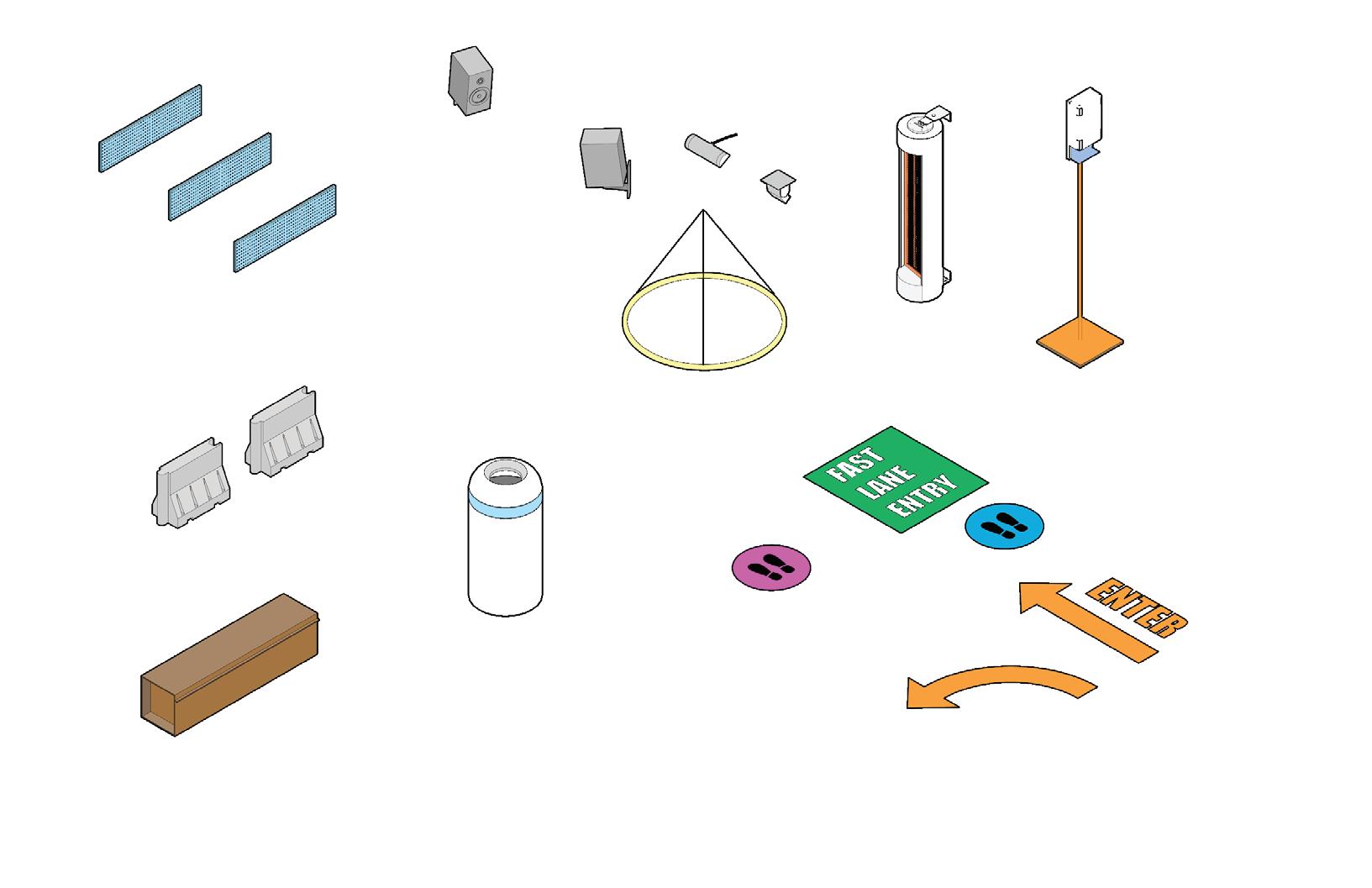
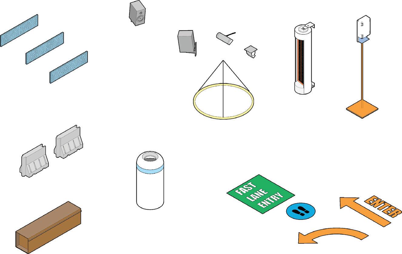

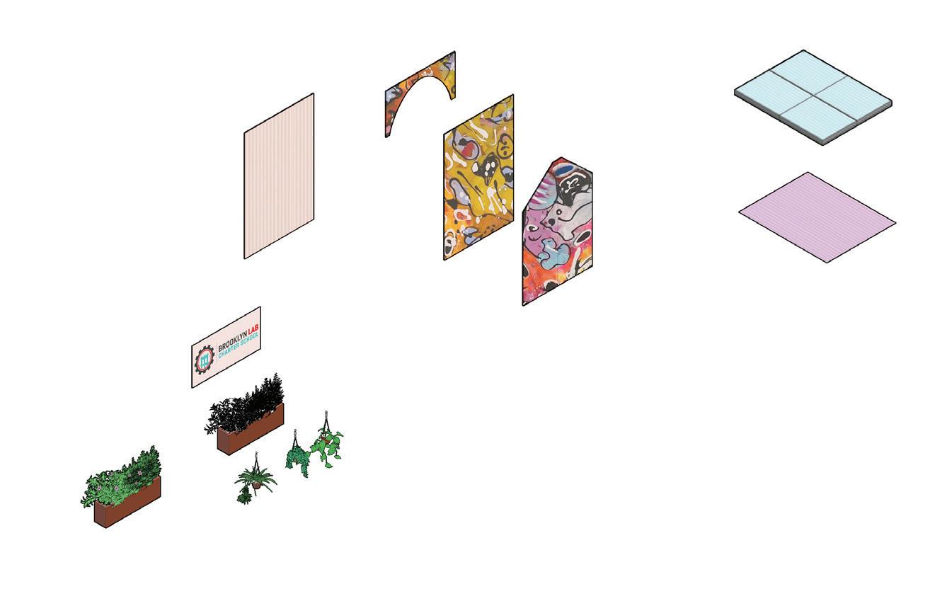


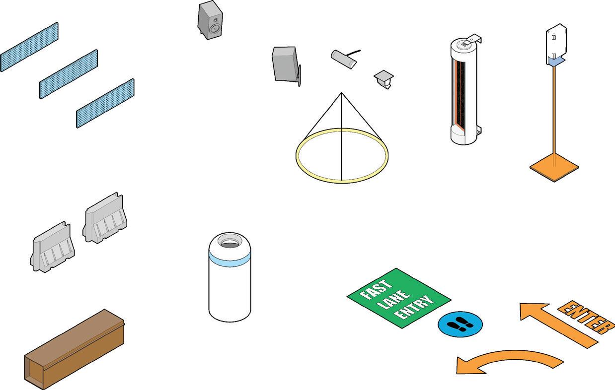


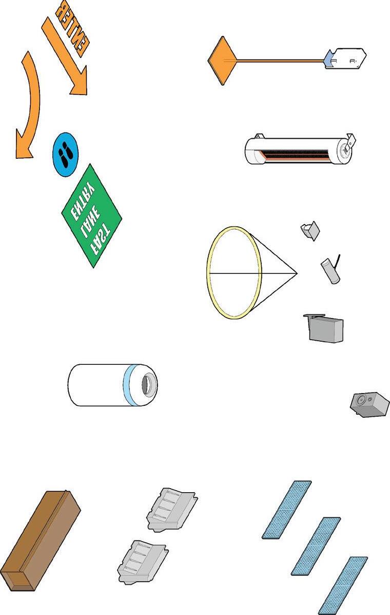


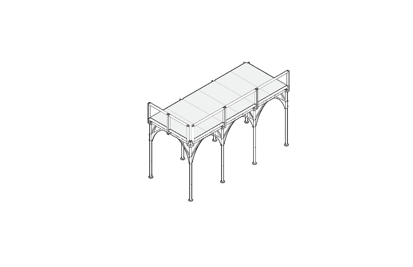
Planter barriers


School identity signage


Lighting
Greeting station
Sanitation stations

Given the agility of this kit-of-parts system, the possibilities for impact go beyond BLCS’s site in Downtown Brooklyn. In fact, BLCS has launched a “back to school facility tool kit” so that other schools can benefit from their strategic reopening process, planning and approach. As part of the tool kit, our work is being shared with educators across the country as a resource for safe and strategic reopening. Learn more about the initiative here

Urban Front Porch 101
Section at Sands Street Front Porch. The structure provides shelter from the elements. Planters add a splash of greenery to the space while protecting students from traffic.
Client: Whitby School
Location: Greenwich, CT
Scope: 500 sq ft
Completion: 2016
Photography: Patrick Mandeville
Whitby Makerspace
How can learning spaces spur critical-thinking and problem-solving skills among students?
103
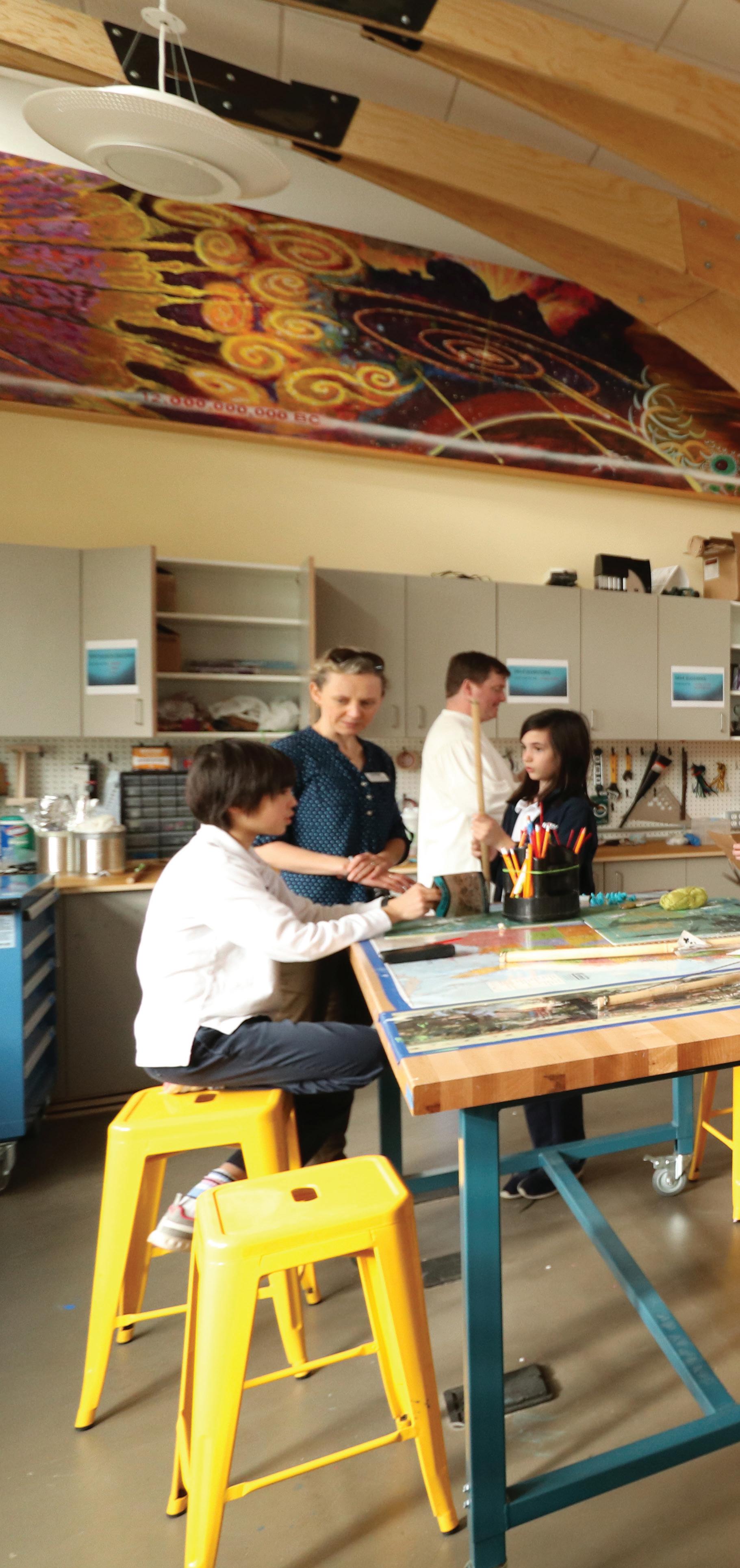
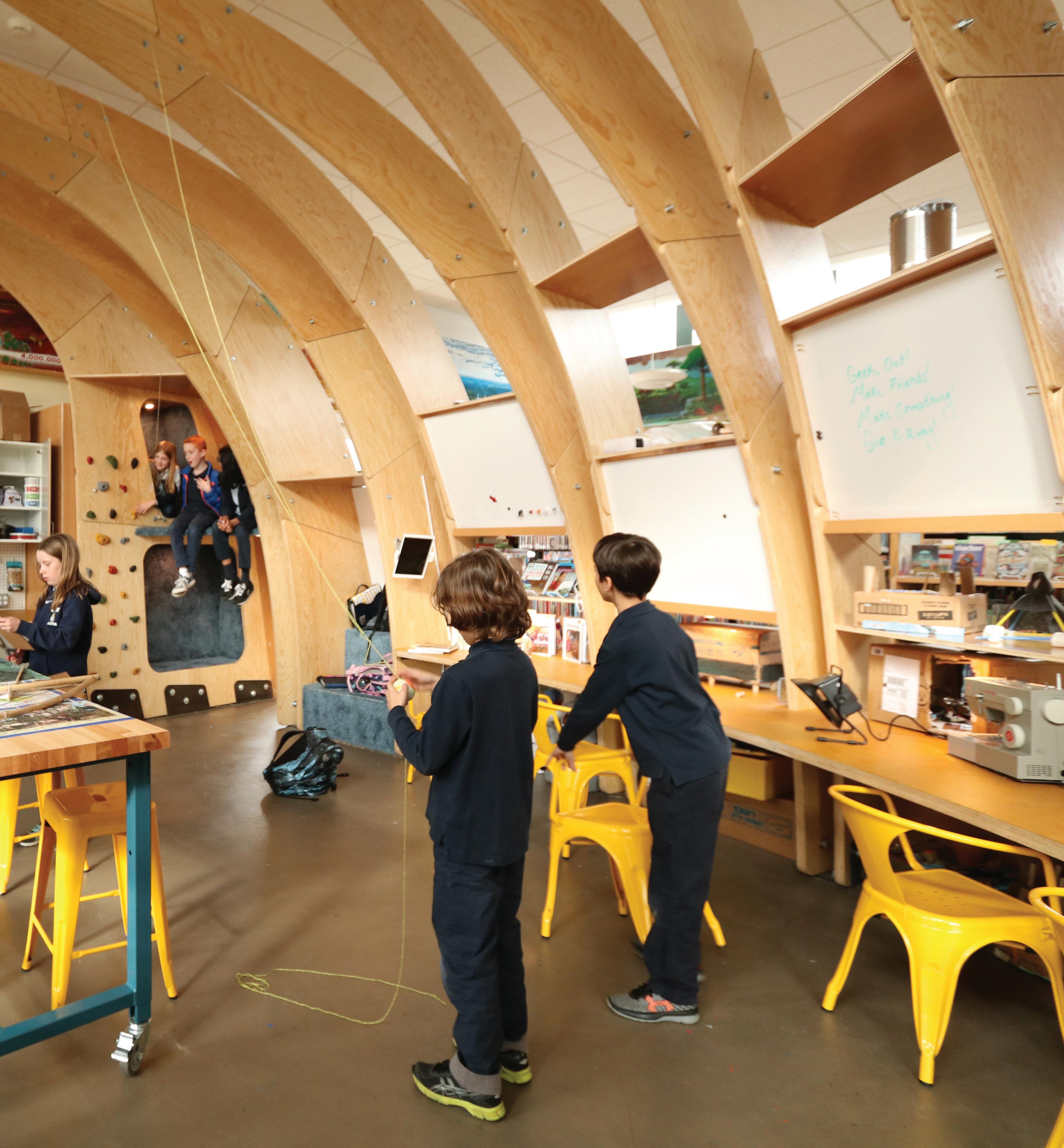
We eagerly partnered with Whitby School to explore this question and harness their vision for an open, inspiring and hands-on learning environment for kids of all ages. Embedded in the school’s library, we developed a freeflowing makerspace that would enrich the knowledge accrual process with action, and that would encourage students to tinker, experiment, learn and explore.
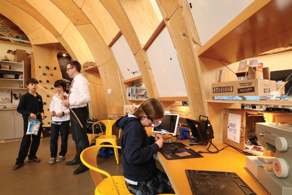
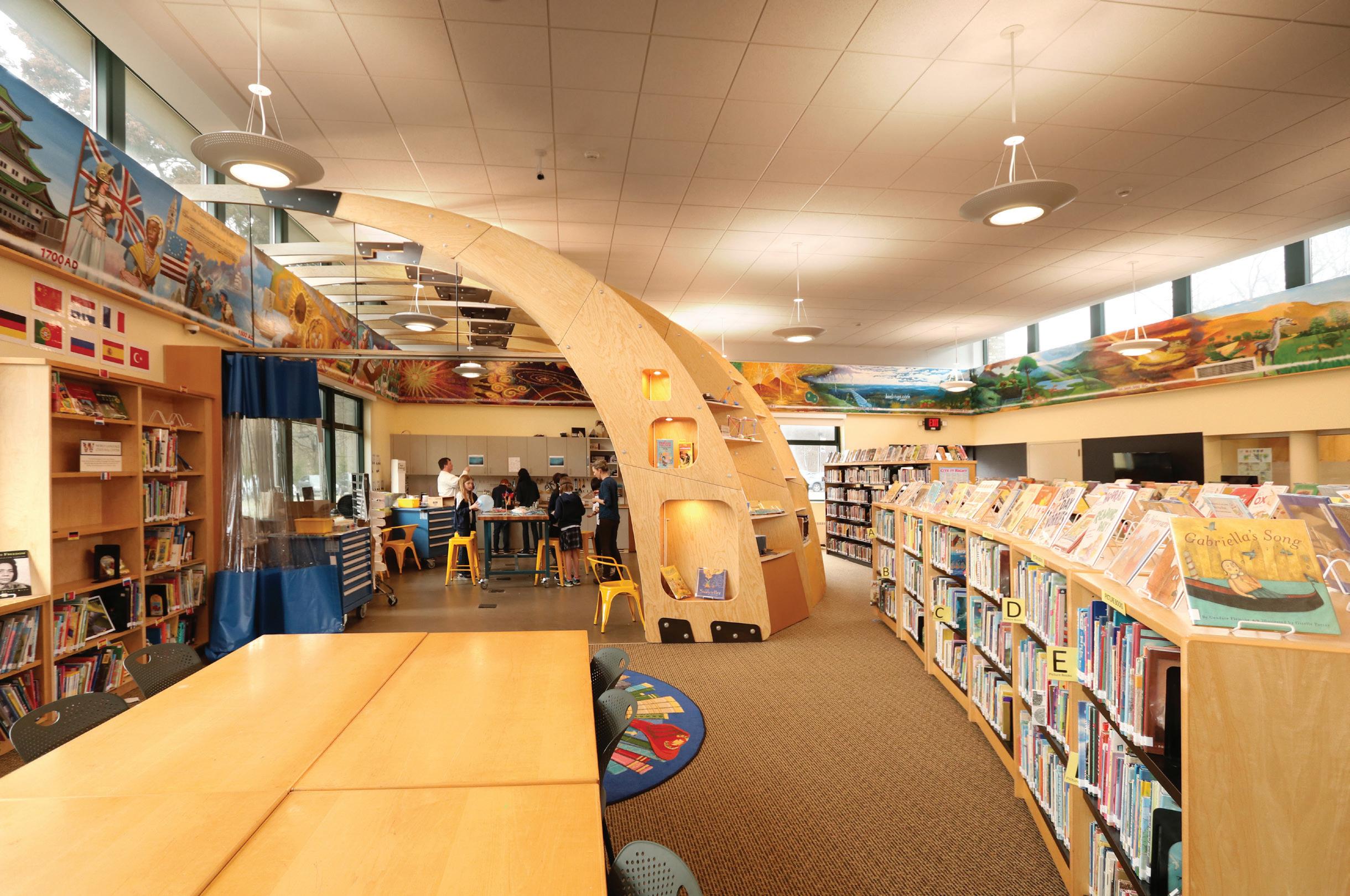
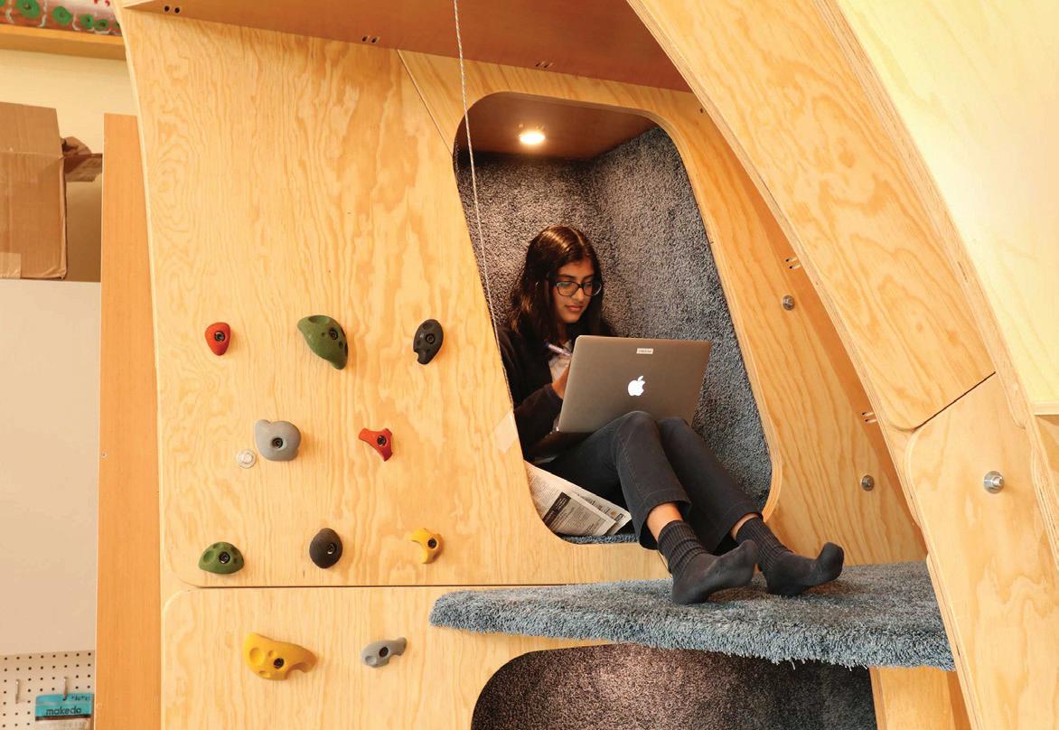
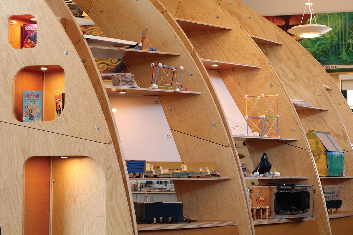
Anchored by a prehistoric-looking rib structure, our design leverages this feature to create a dialog between workspace and book stacks, while providing storage for a variety of ideation tools, such as whiteboards, an iPad, books and—importantly—student work on display. Work surfaces and mobile tables at several different heights serve students across the age spectrum. Shared spaces as well as tucked-away nooks allow kids to learn and work within their own style and at their own pace. Throughout the space, we left construction methods clearly visible, to spark inquiry as well as to inspire students as they design and build within.
Since opening in December 2016, students have made the space their own. Embarking on self-directed and independent projects, the kids have already challenged their instructors to expand their knowledge. It has also become place for a hybrid of activities, like hanging out after school, eating lunch, socializing and project work. At the boundary of work and play, this project is not only encouraging critical and creative thinking, but also empowering students to observe, inspire, and learn from one another.
Whitby Makerspace
105
Turntable Lab Storefront
Client: Turntable Lab
Location: New York, NY
Scope: 1,200 sq ft
Completion: 2017
Photography: John Muggenborg
107
Retail spaces should not only represent the brand, but also create community.
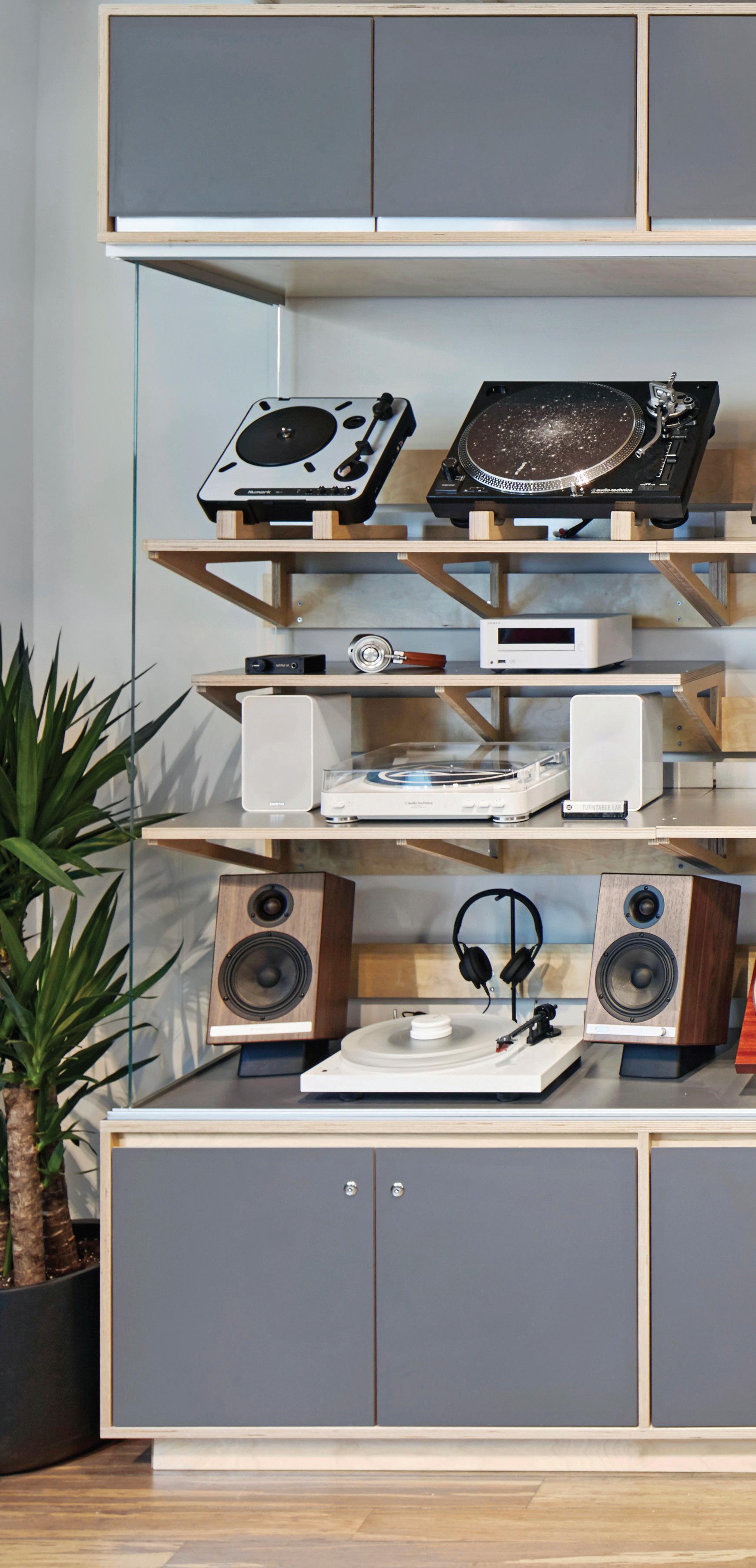
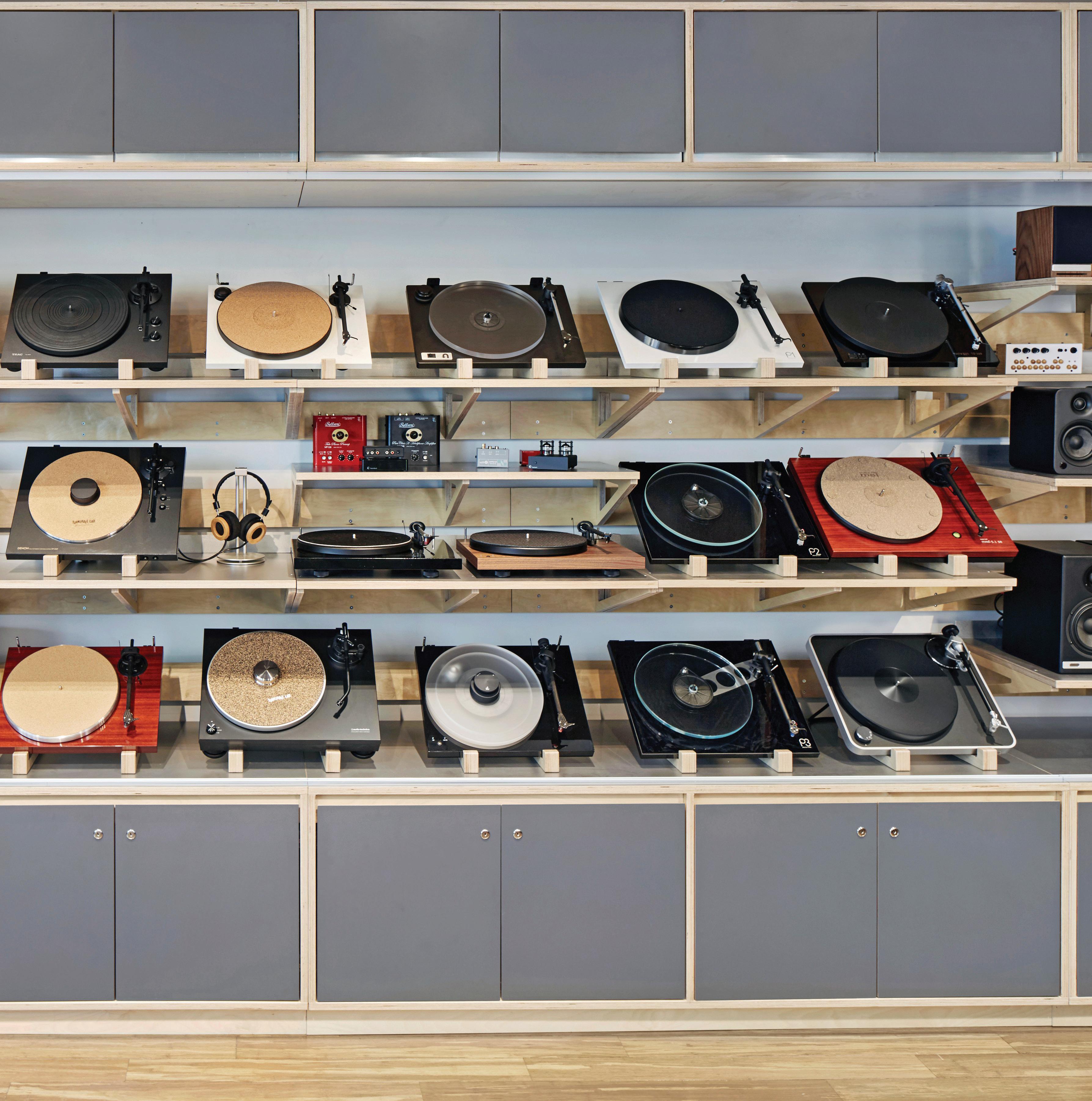
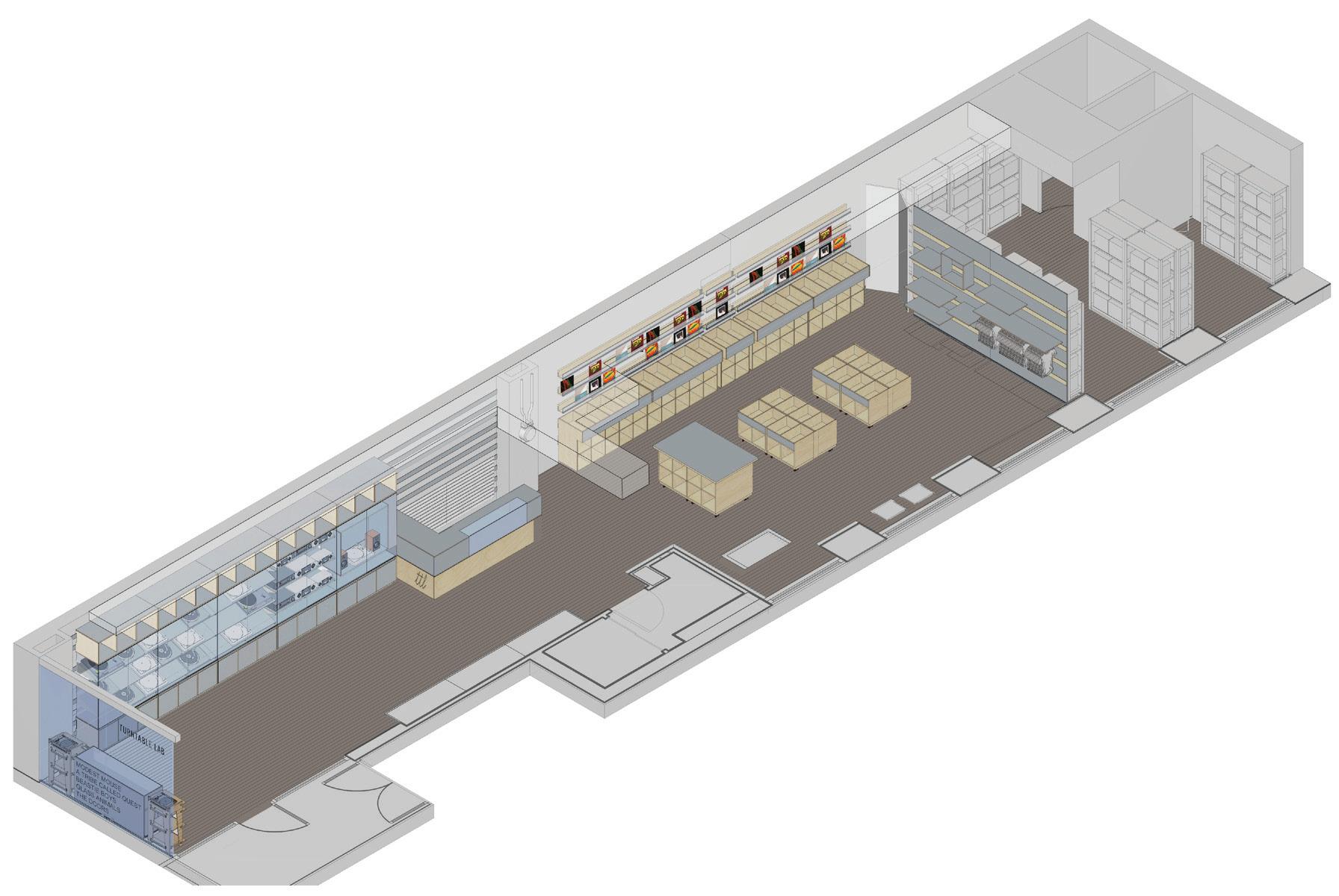
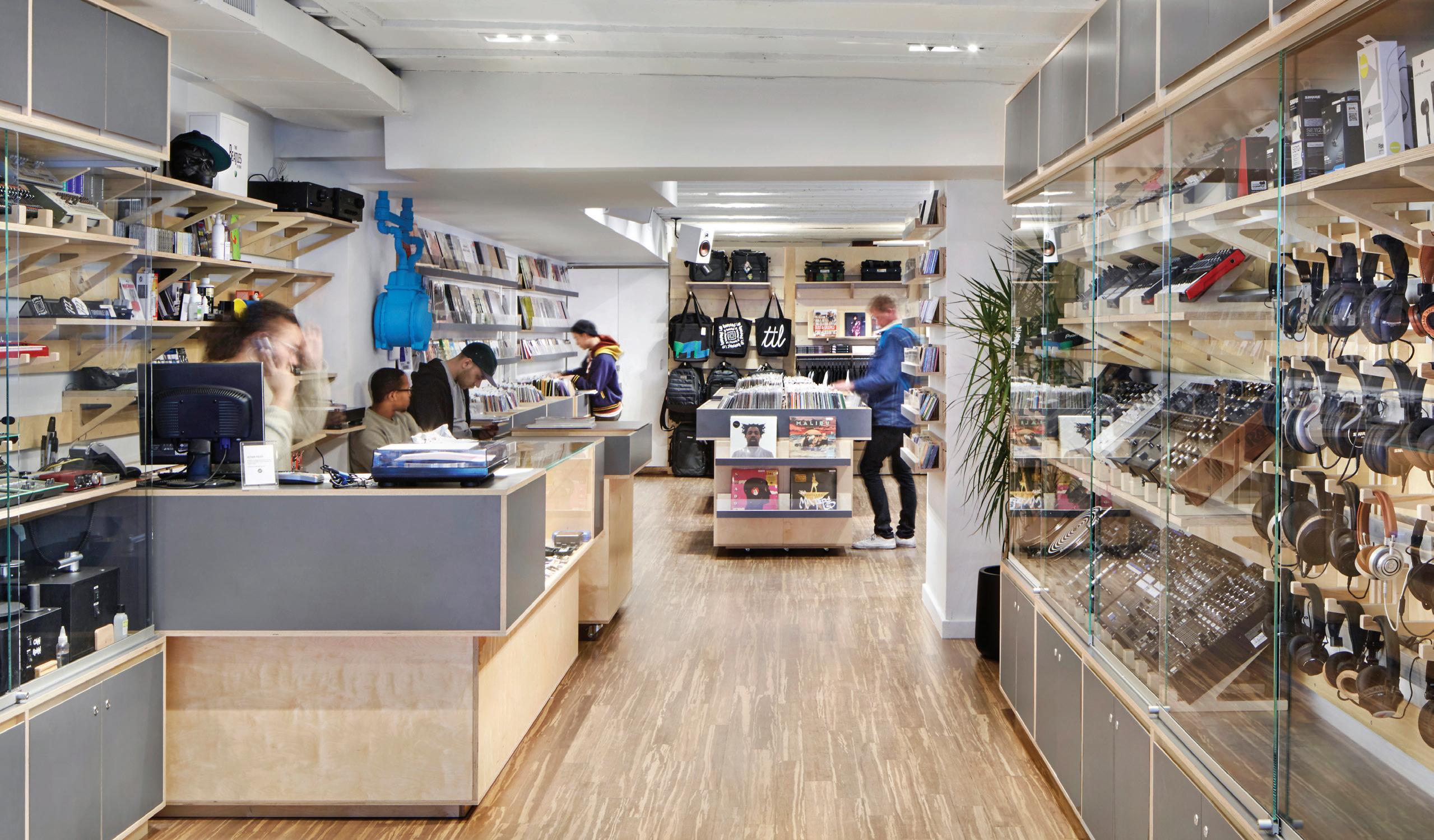
When Turntable Lab—a purveyor of music and audio equipment—outgrew its former space, we teamed up to create their retail space. Encompassing 1,200 sq ft in the East Village, the project is designed for flexibility and to unite the various aspects of the business—not only as a place to showcase high-end audio equipment, but also as a neighborhood record store and hub of DJ culture.
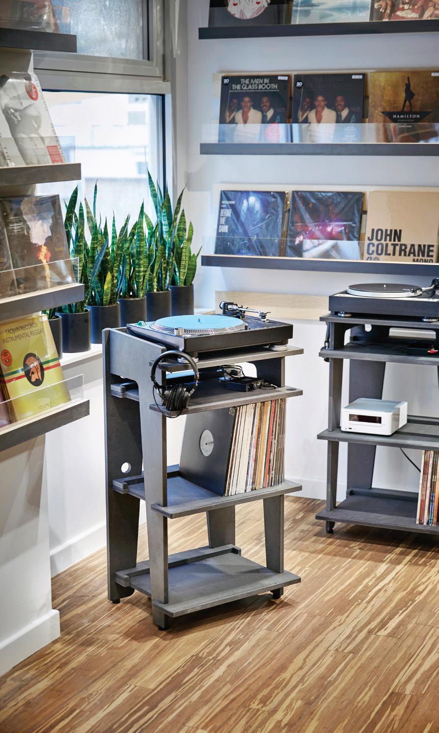
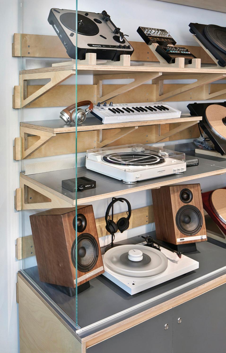

Upon entering the store, visitors find an impressive inventory of audio equipment, from a glass-fronted showcase of turntables to a cross-section of headphones and speakers to other high-performance audio accessories. Moving to the back-of-house, record shelves and browsing bins create the comfortable feel of a record shop, with records, bags, t-shirts and hats on display.
109
Kit of Parts
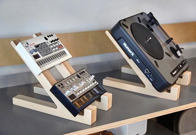
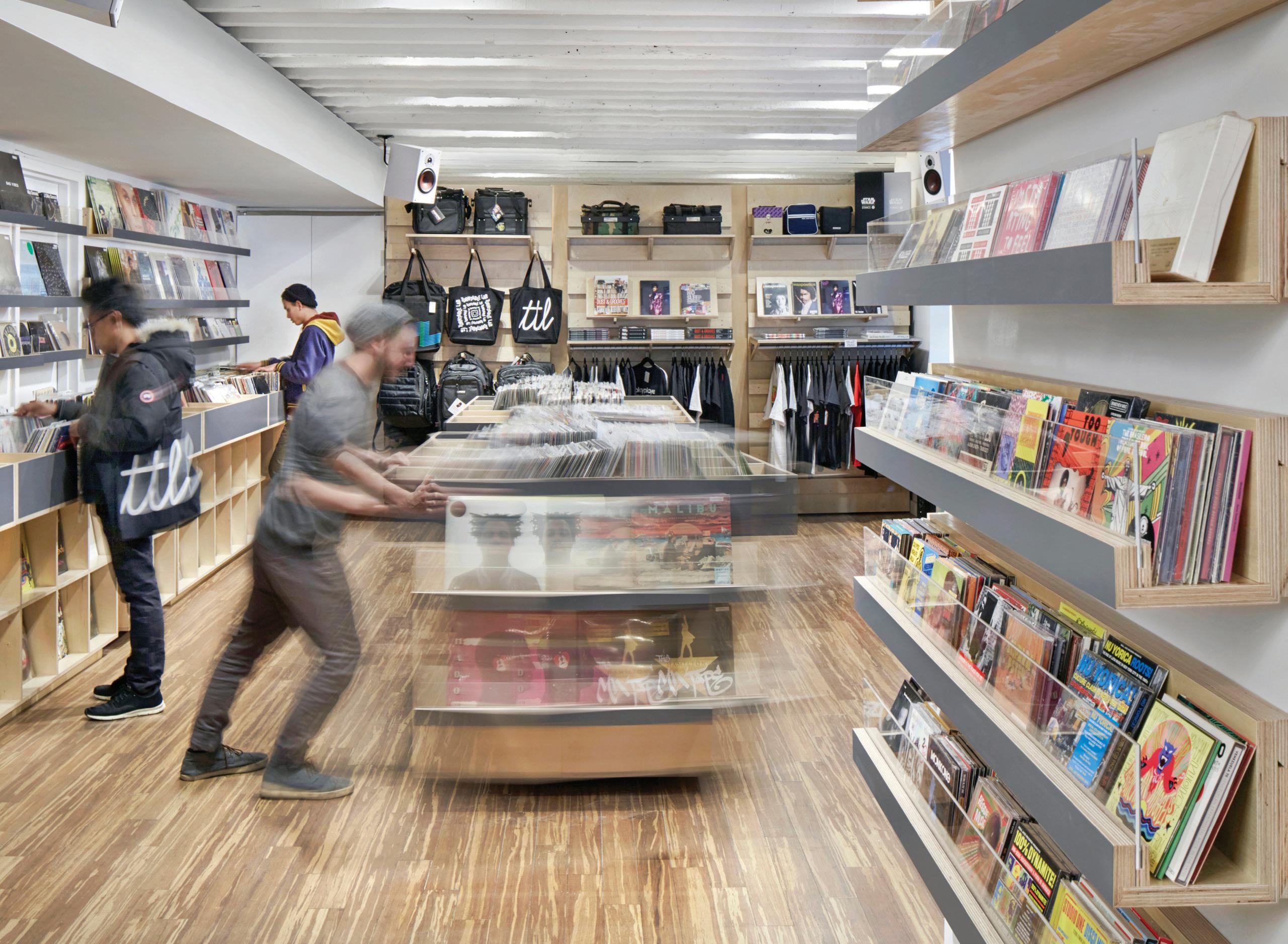
We worked closely with Turntable Lab to develop a universal cleat system with a family of interchangeable shelves, hooks and display rails to suit the requirements of existing and future merchandise. This allows the store manager to quickly rearrange displays and feature new items as they come in. Mobile tables and a mobile display wall at the back of the store allow the floor to be opened up for DJ performances and record release parties. Throughout the store, a simple yet refined palette of cool grey, natural wood tones and finely detailed plywood edges allows the merchandise to stand out from the details of the high-tech audio equipment to the colorful covers of the vinyl records.
Display insert Angled stands management trough Vertical cable management trough Horizontal cable Display brackets Display hooks Display shelf Utility hook Display rails Display bins Storage cabinetry Wall cleat system
In the new space, TTL is organizing even more events, broadening its music offerings, and continuing to build a community of listeners, designers, music nerds and performers across the city and around the world. For us, this is another step forward in exploring how this flexible approach and systems-thinking creatively support projects at different scales and within diverse industries.
Turntable Lab Storefront
111
With mobile displays and a detachable back wall, TTL can transform to host record signings, DJ sets and other events.
Solar Pavilions
Client: SolarOne
Location: Jersey City, NJ; New York, NY; Miami, FL
Completion: 2006, 2007, 2008
Photography: Keith Sirchio
How can flexible construction systems produce spaces that are as adaptive as they are engaging?
113
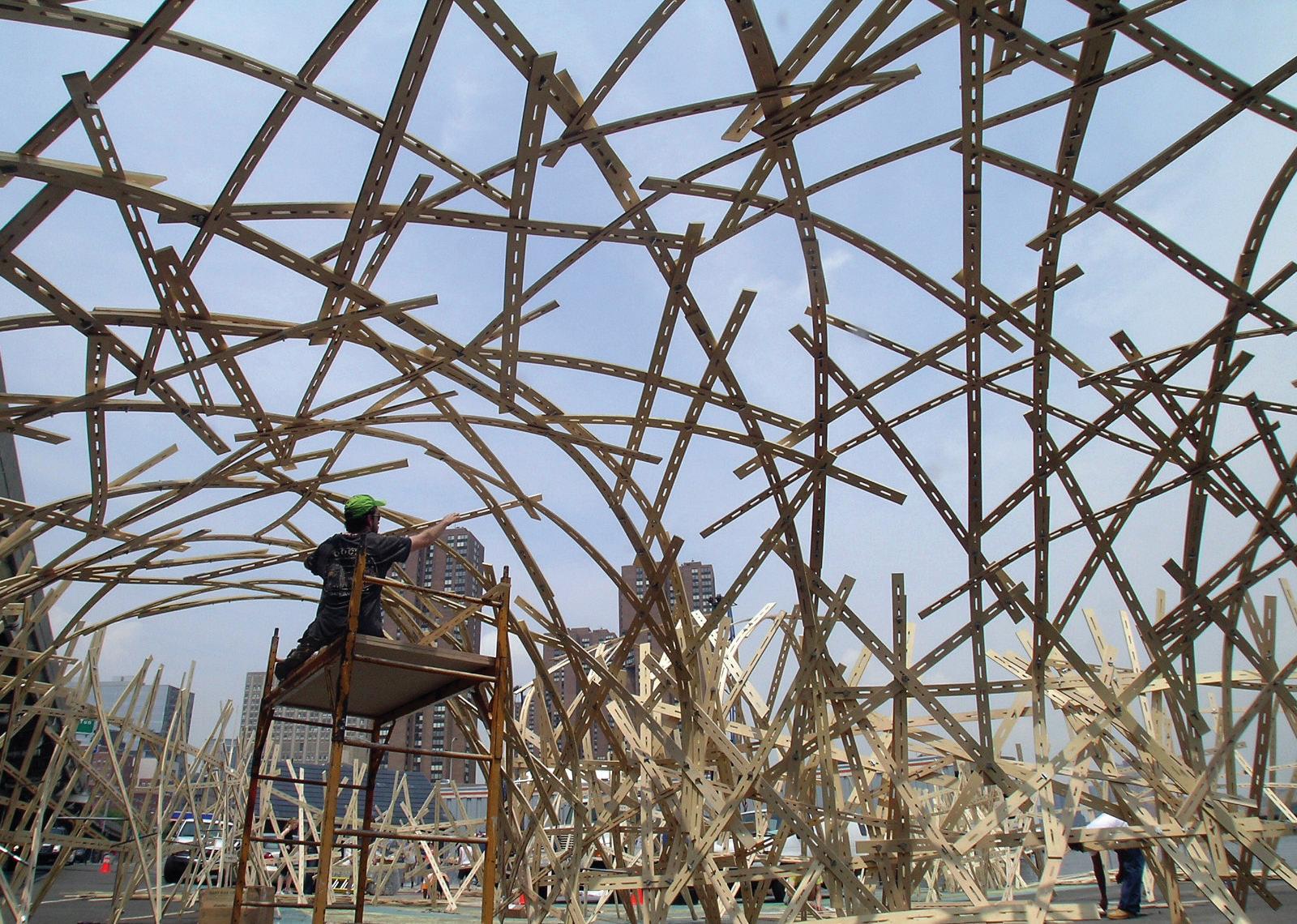
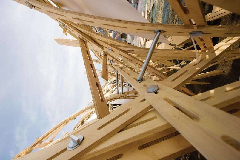
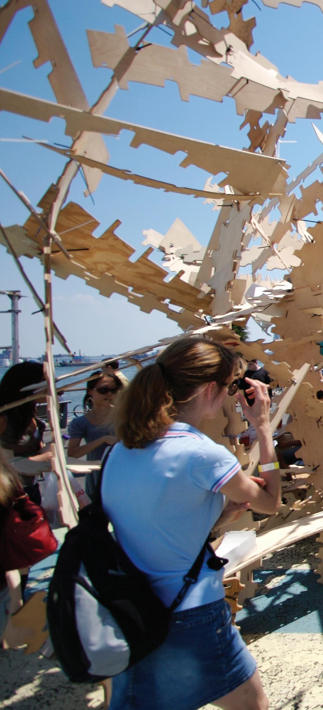
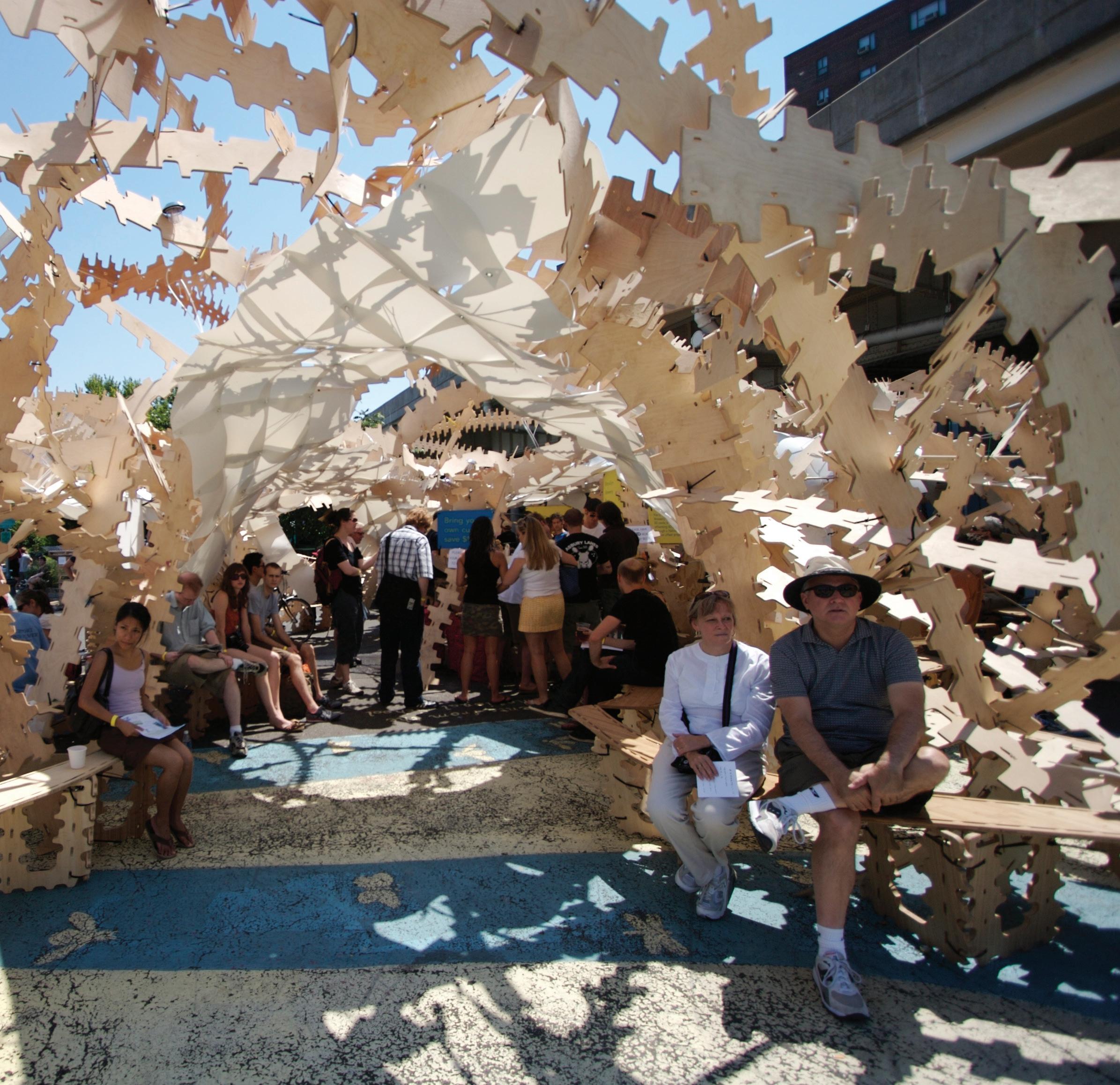
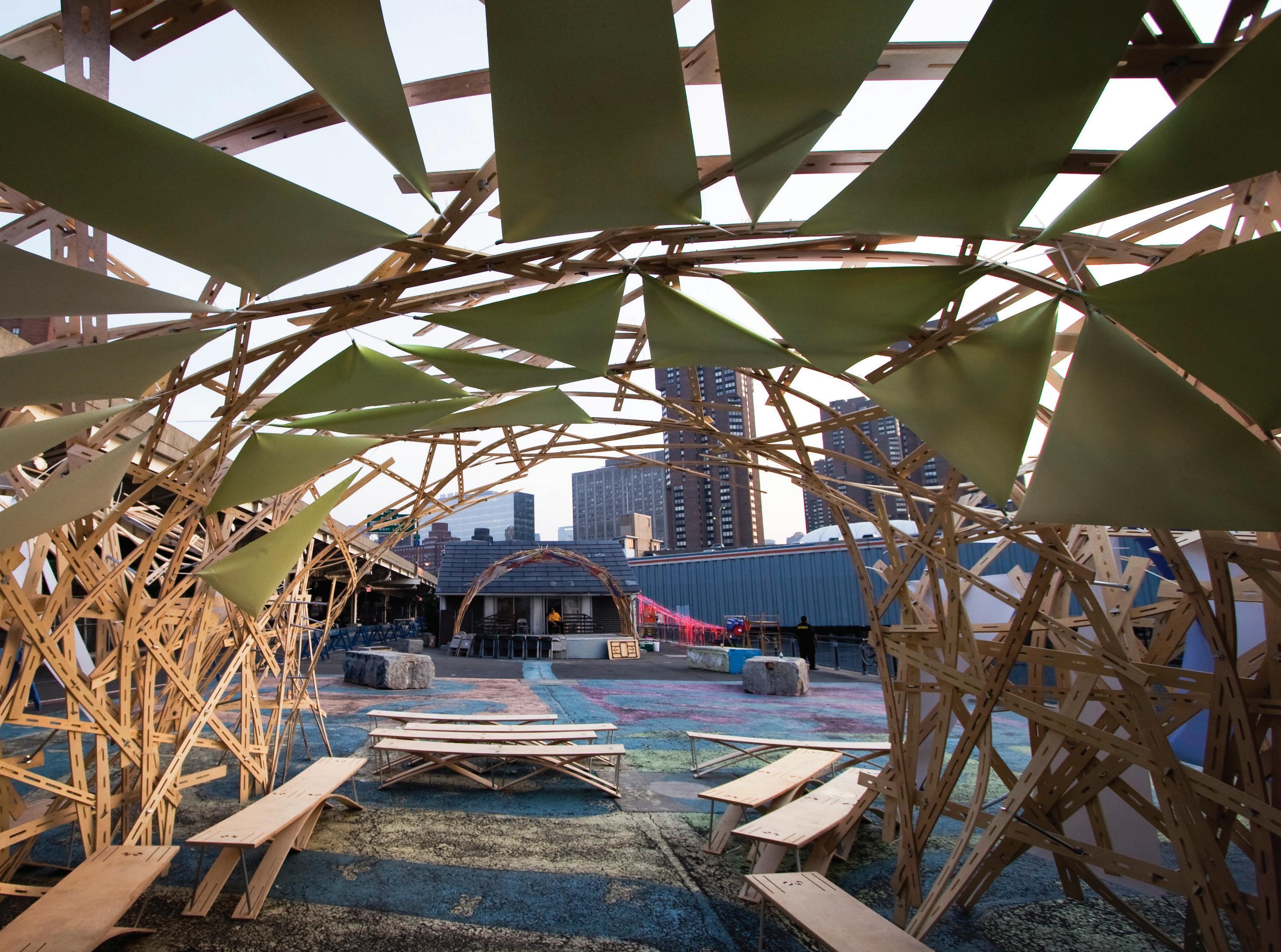
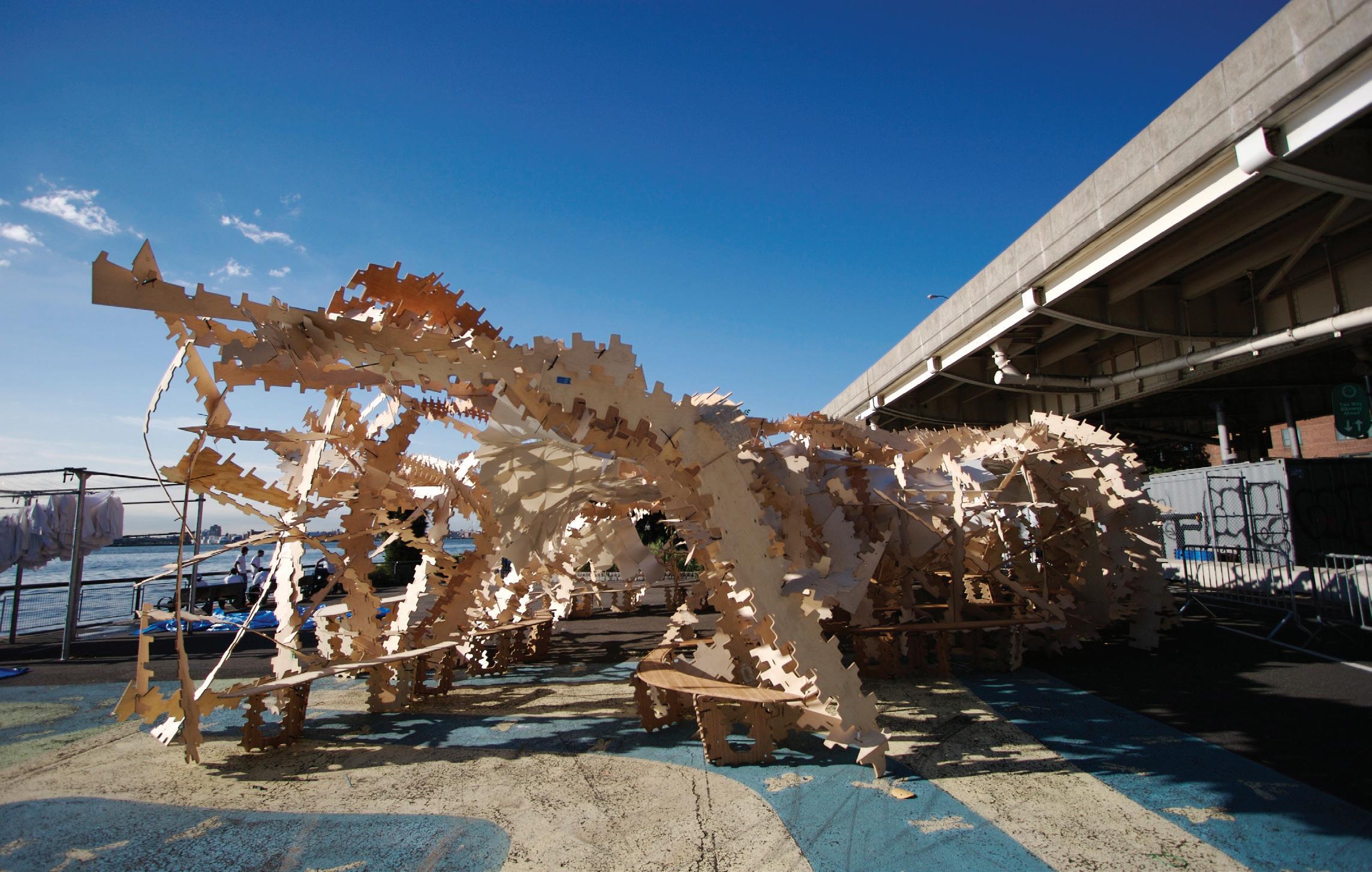
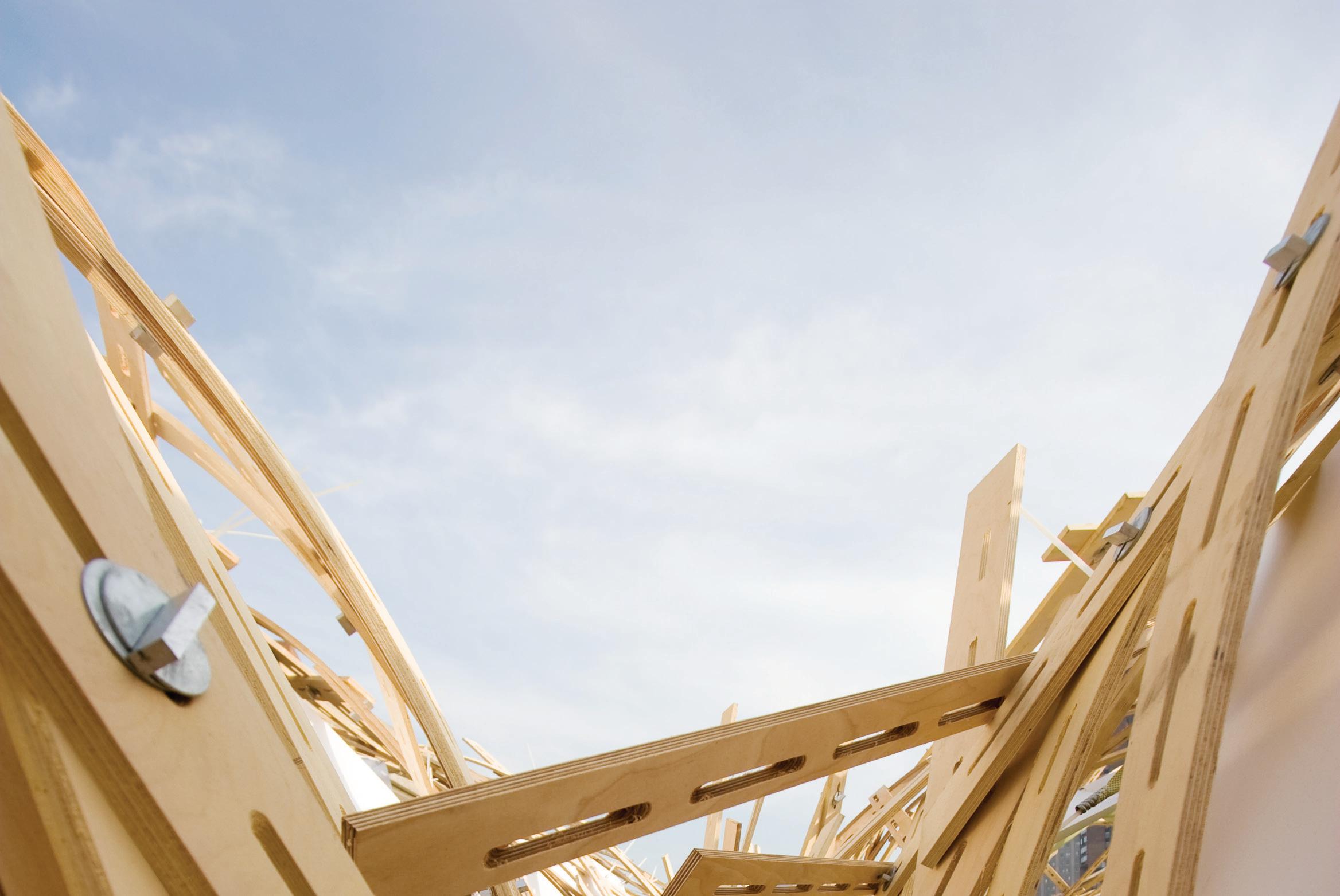
 Created for the 2009 CitySol festival, Solar Pavilion 3 was constructed with 2,500 slotted strips of milled plywood, woven together and joined with aluminum fasteners.
SITU’s inaugural design project—a series of three temporary pavilions—explores how flexible construction systems can produce spaces that are as adaptive as they are engaging. Our goal was to create reconfigurable structures, while minimizing costs and environmental impact. Designed as participatory projects, the pavilions traveled to various locations across New York City, New Jersey and Miami, where we collaborated with the local communities to build a unique pavilion at each site.
Solar Pavilions
115
The first pavilion was a cellular structure made of thousands of cardboard tubes of various lengths and diameters bolted together, producing an organic, patterned effect. Tilting the columns away from and toward the sun created an engaging interplay of light and shadow on the ground.
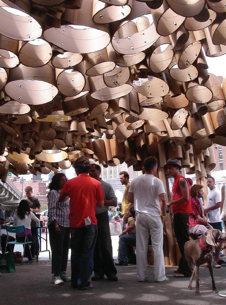
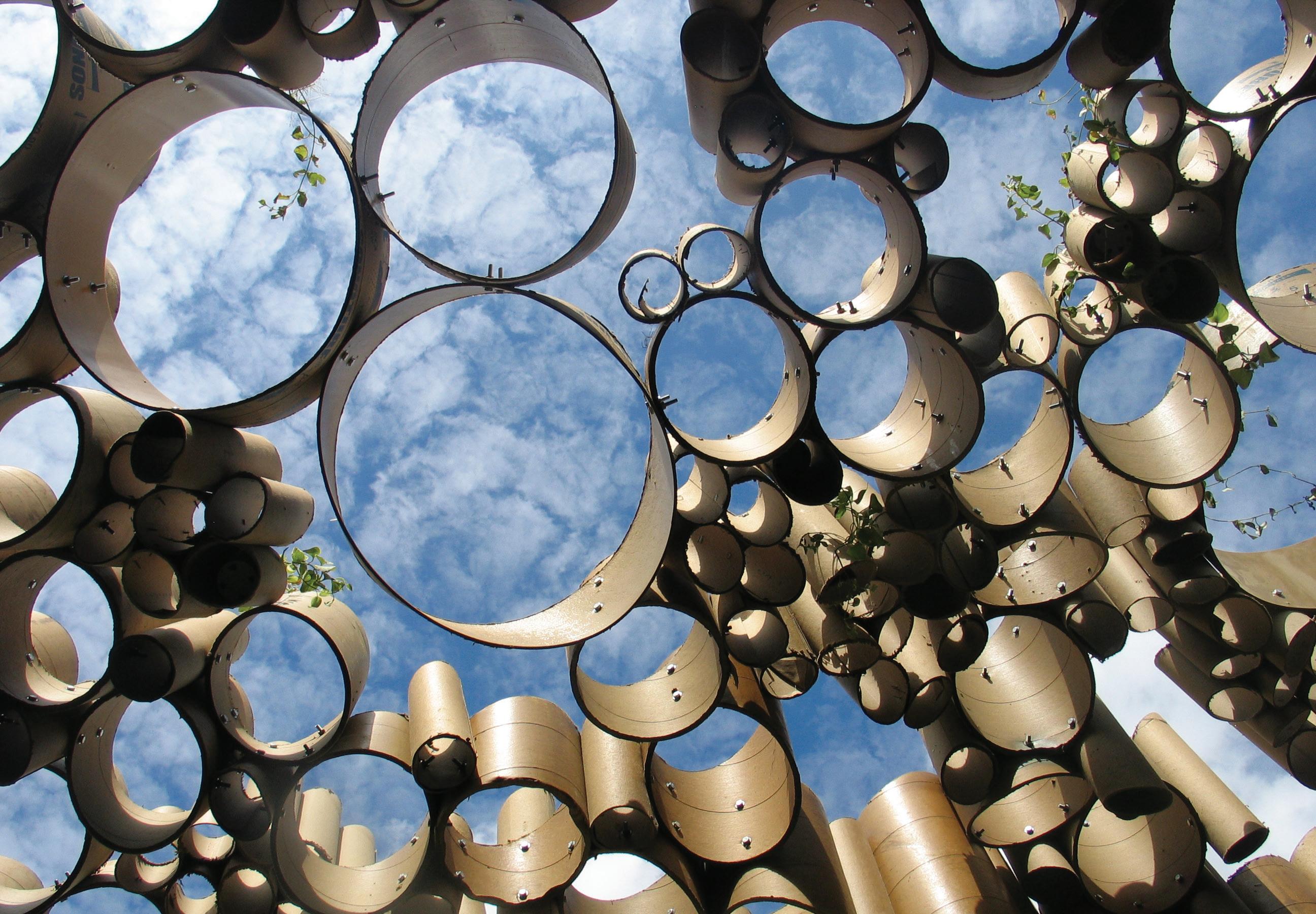 For passive solar orientation, the tubular columns of Solar Pavilion 1 are all tilted slightly northward with the tops of each tube placed at a sharp angle away from the sun.
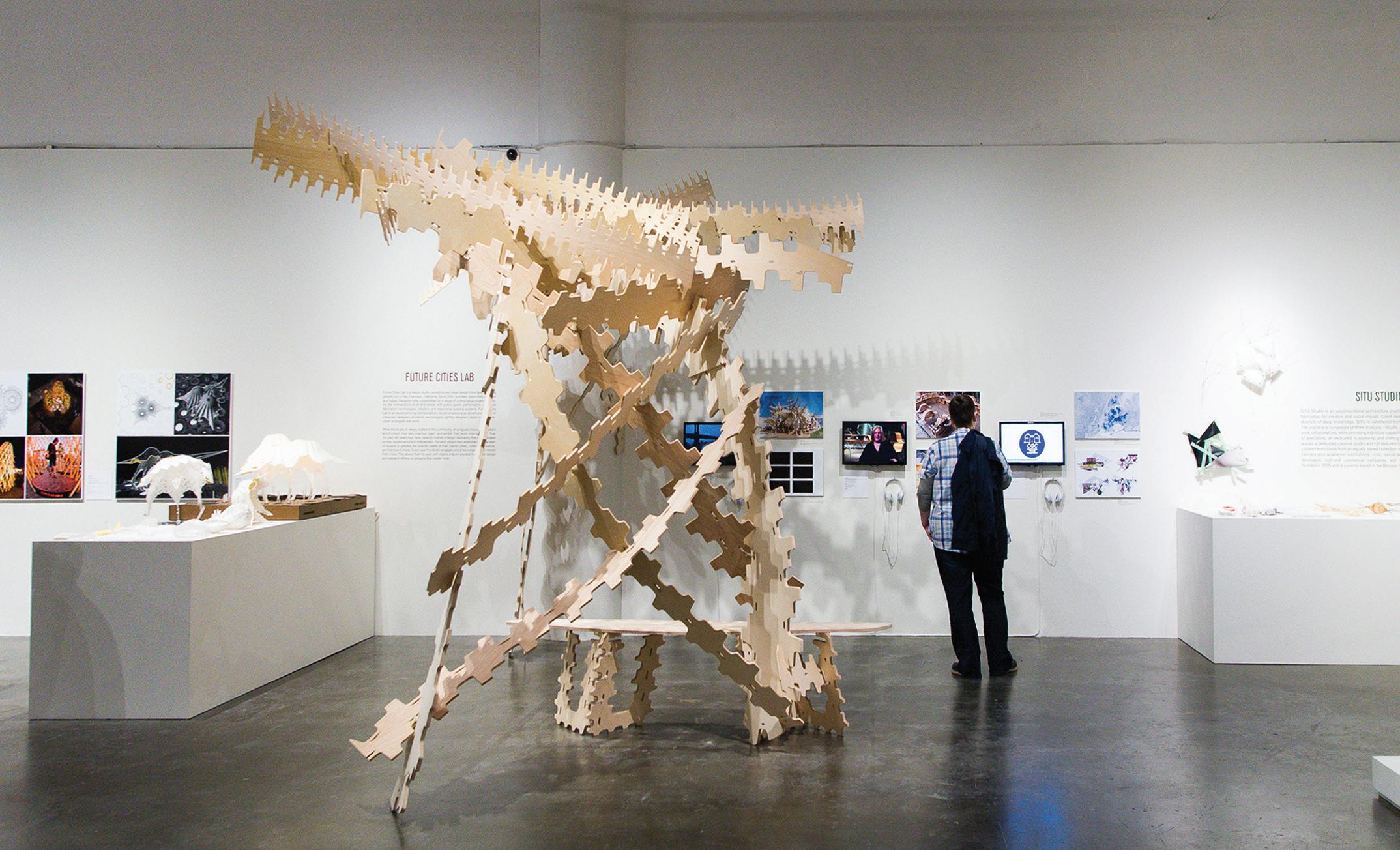
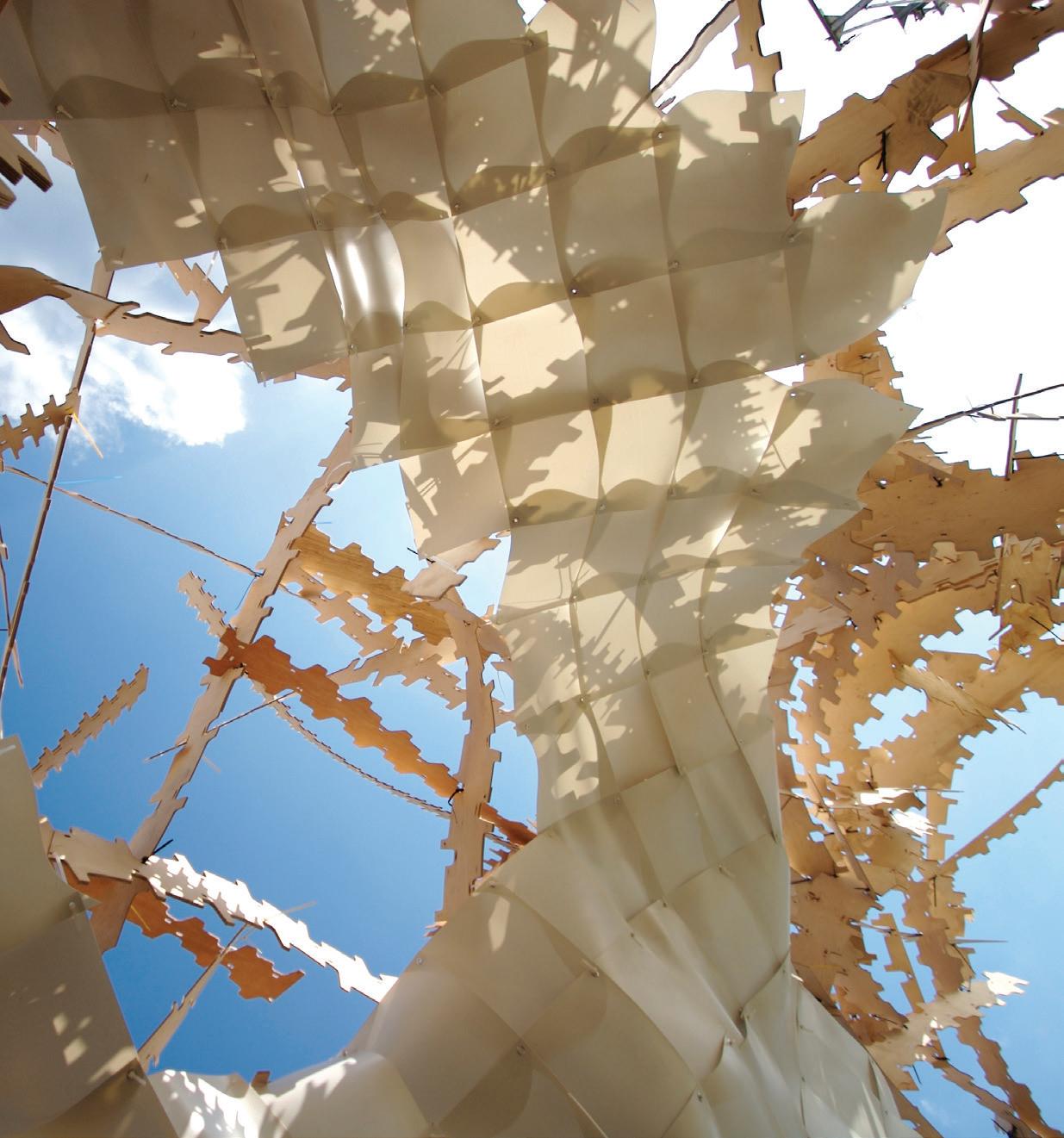
For the second pavilion, we developed a construction system that explores the elasticity of plywood. Leveraging a continuous connection profile along each piece’s edge, any two pieces can be notched together at any point and are held in place using a flexible tie-strap connection.
Solar Pavilions
117
With Solar Pavilion 2, an array of scalelike panels made from eco-friendly corn starch plastic are suspended beneath the structure, providing shelter from sun and rain.
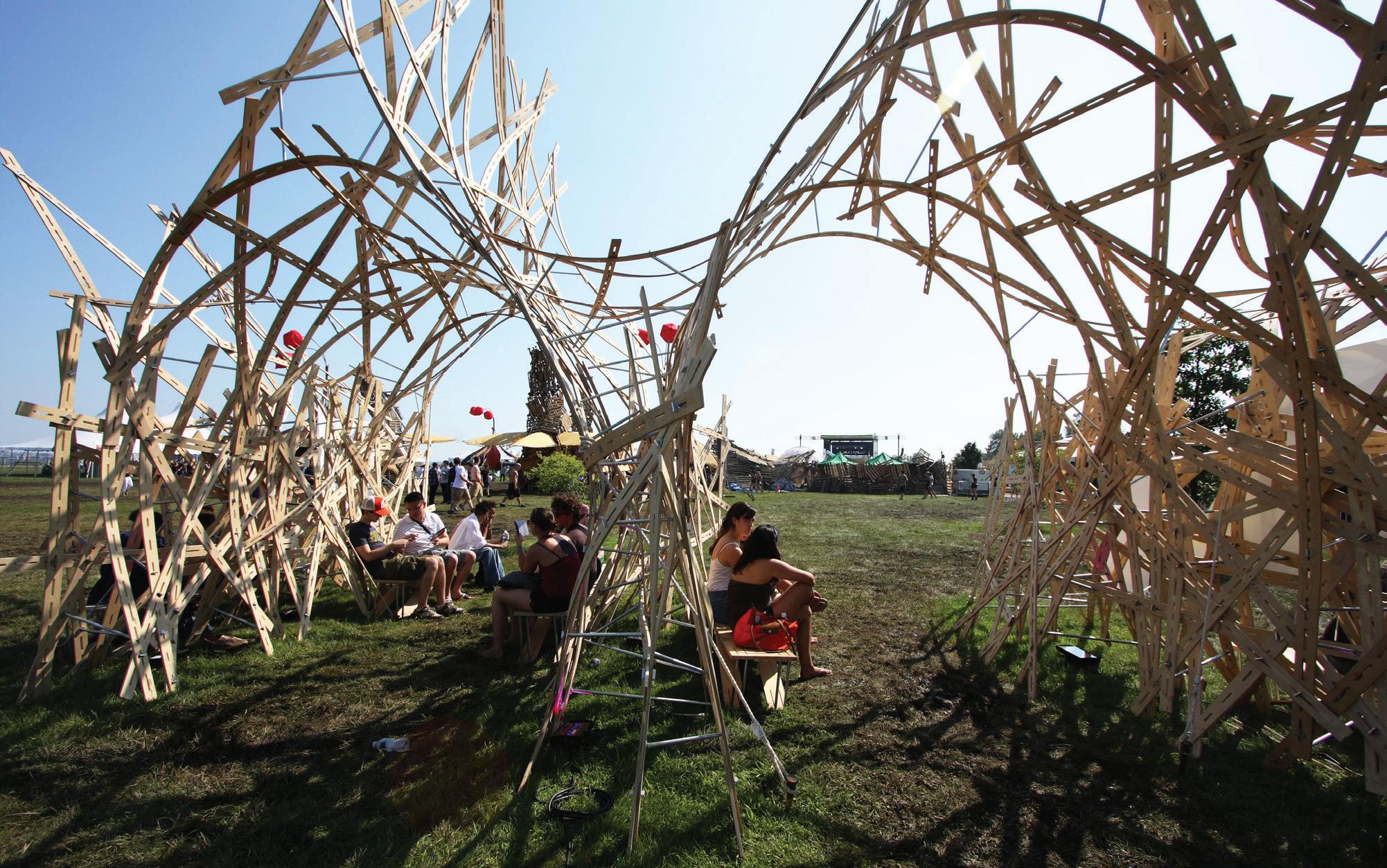
 Solar Pavilion 3 at CitySol in Stuyvesant Cove Park, NYC
The structure of the third pavilion emerged from 2,500 slotted strips of plywood woven together. Biodegradable vinyl fabric stretches between the plywood, providing structural cohesion and shelter from the elements.

Though developed over a decade ago, the series reflects themes of participatory design and flexible systems that continue to shape our practice. In June 2017, the solar pavilions were featured in a sevenmonth exhibition at the Museum of Craft and Design in San Francisco, and we’re delighted that this early work is still inviting questions as to the importance of imagination and play in architecture.

Solar Pavilions
119
In 2017, Solar Pavilion 2 was featured in the “Architectural Pavilions: Experiments and Artifacts” exhibition at the Museum of Craft and Design.
Client: Brooklyn Museum

Location: Brooklyn, NY
Scope: 9,700 sq ft
Completion: 2011
Photography: Keith Sirchio
reOrder
Reconfiguring the scale, volume and order of the Beaux Arts tradition creates a playful and diaphanous experience at the Brooklyn Museum.

121
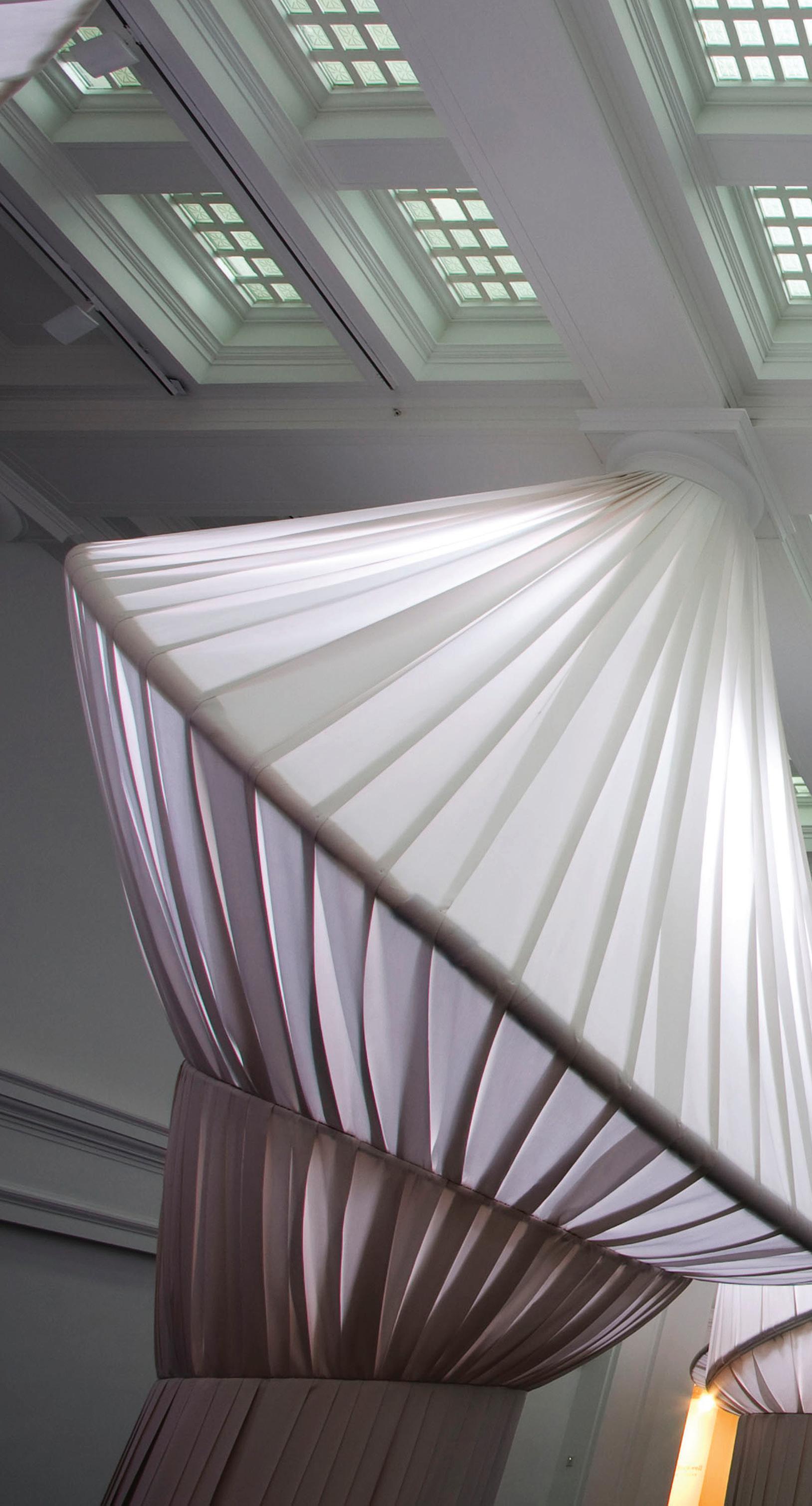
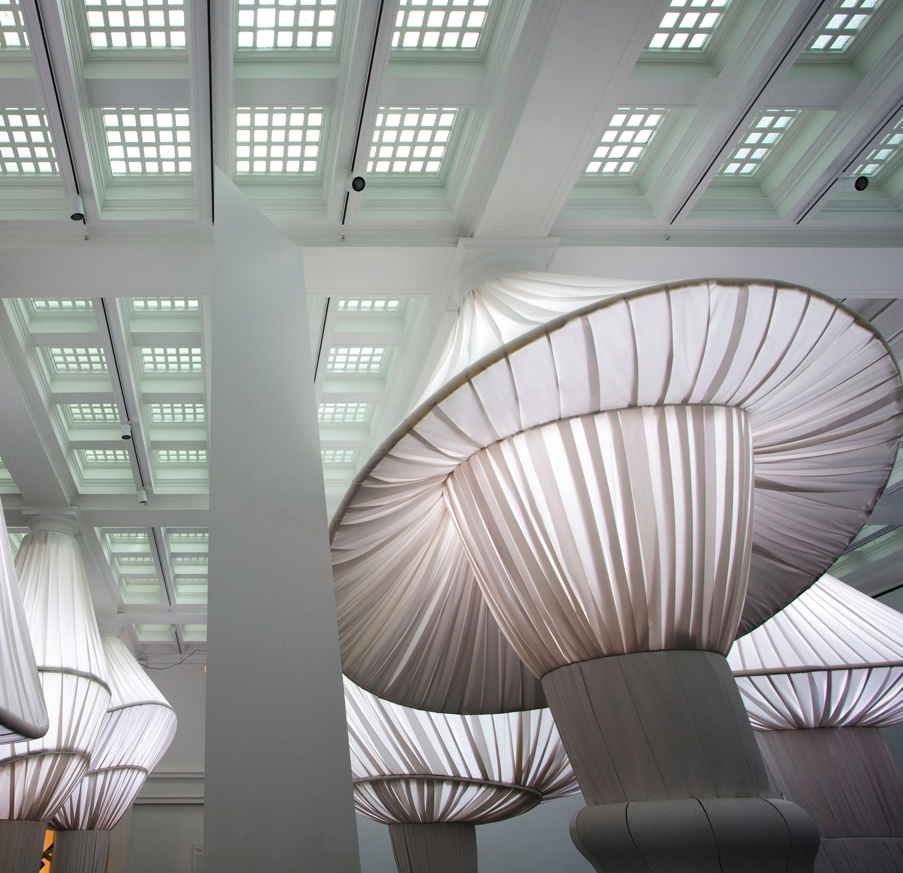
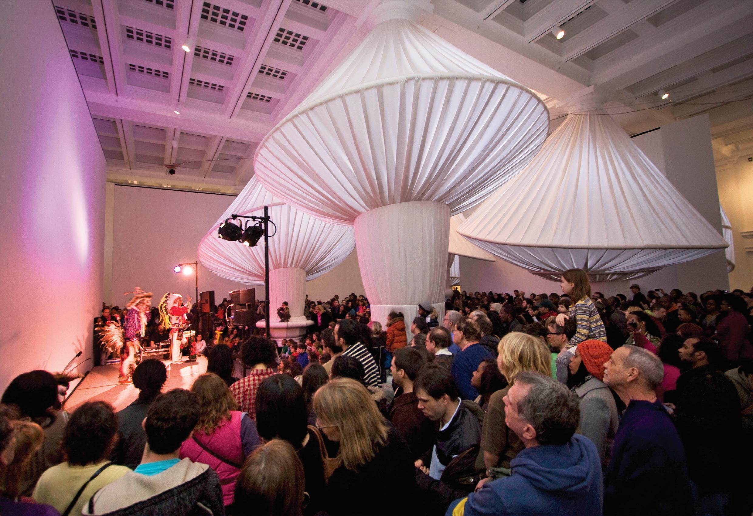
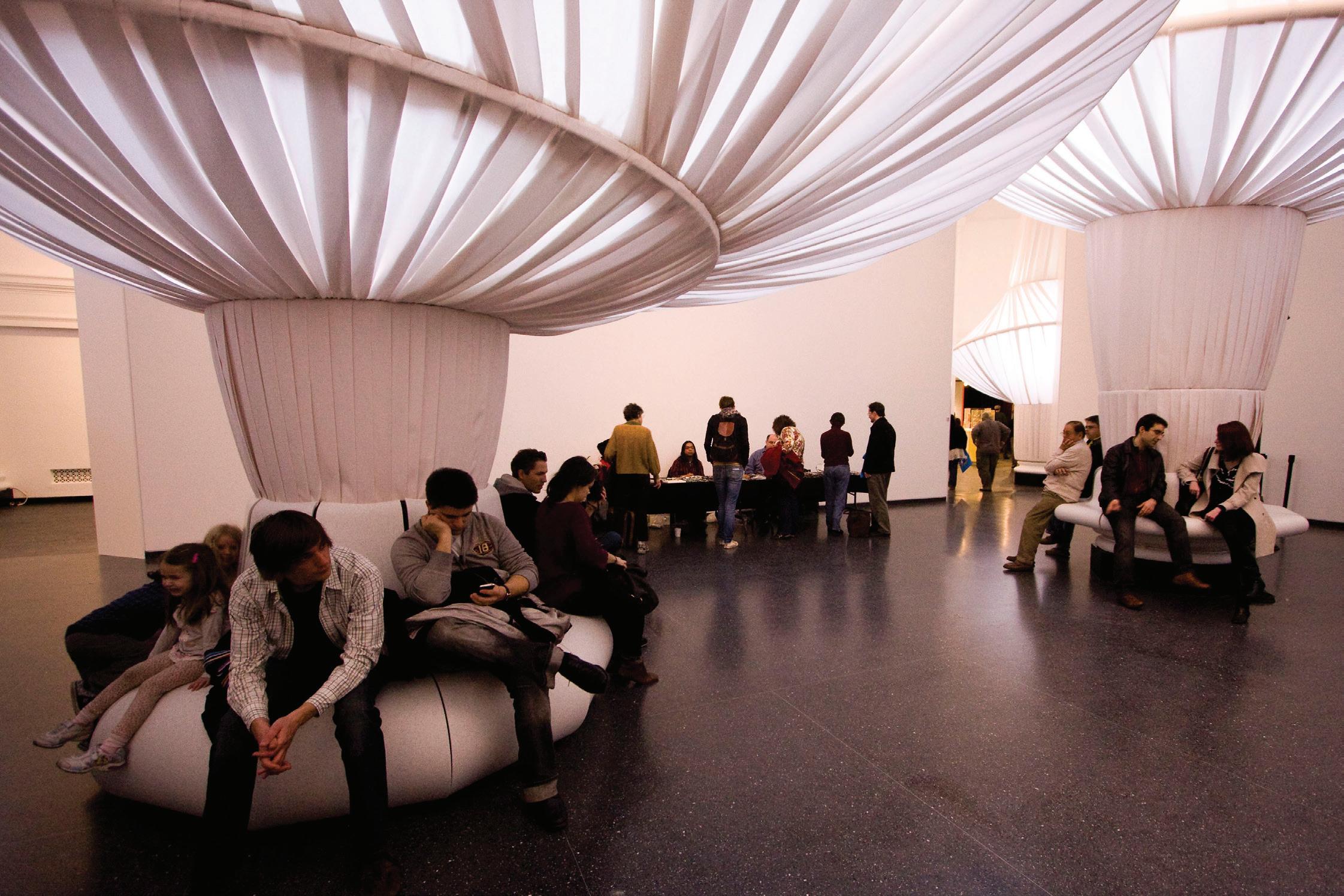
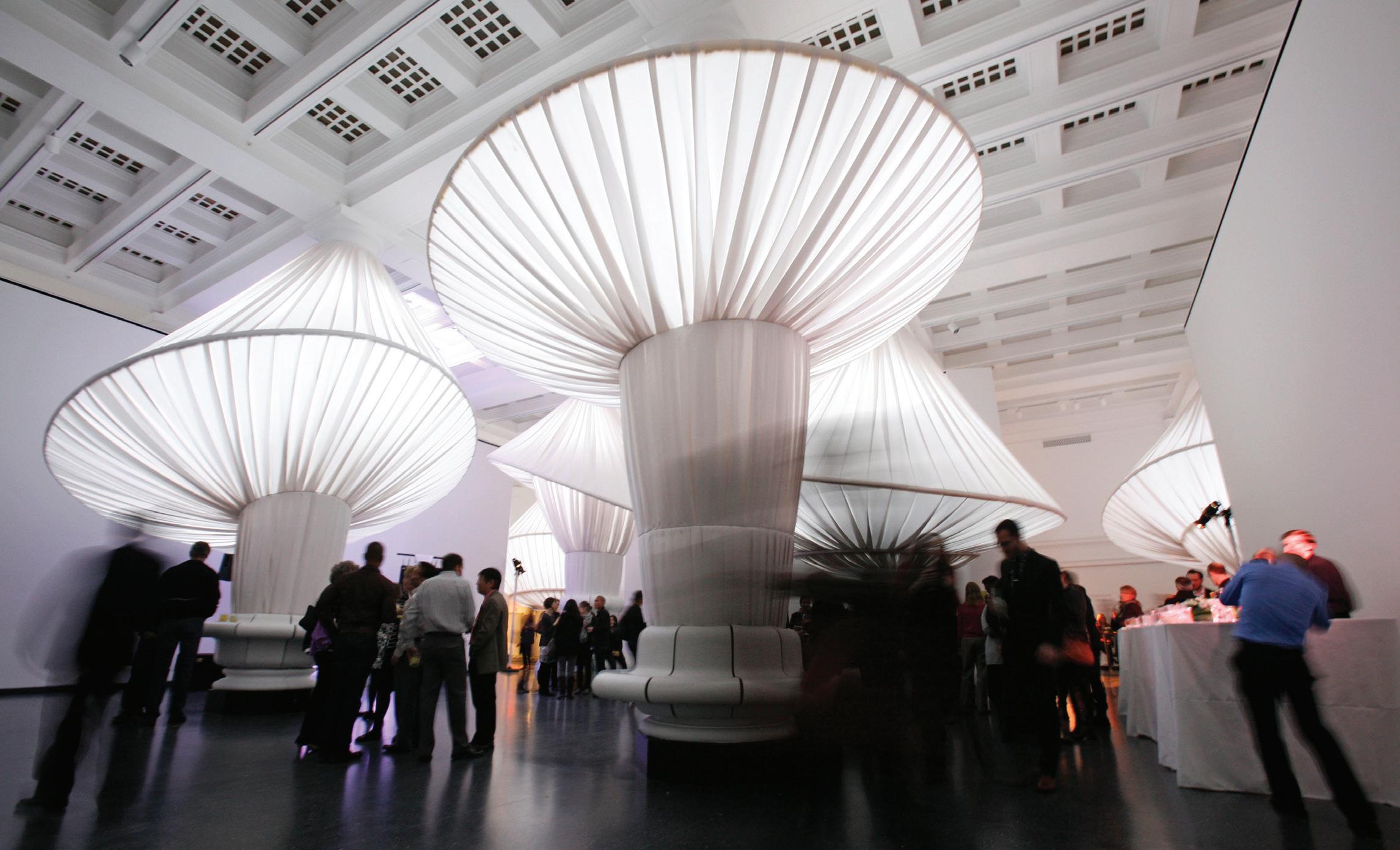
reOrder introduces a playful and diaphanous experience to Brooklyn Museum’s colossal Great Hall by altering its scale, volume and architectural order. Tasked with re-imagining the iconic McKim, Mead and White–designed space, this installation catalyzes its historical environment into a highly flexible space, capable of accommodating a wide range of programs and events, while also serving as an informal venue for visitors to sit, read and explore.

A system of flexible canopies, thermoformed furnishings and plywood armatures, reOrder introduces a new logic to the experience of the Great Hall and creates a unique forum for public interaction and assembly.


reOrder
123
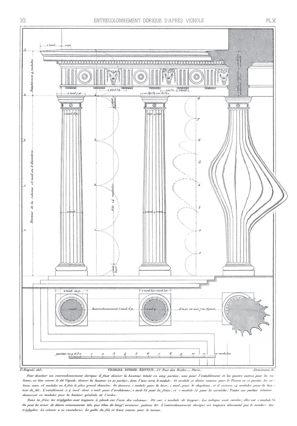
reOrder plays with the ideals of proportion and ornament that figure so centrally in the original Great Hall, which embodies the order, structure and harmony typical of the Beaux Arts–era. Our design—augmented by a new set of ordering principles that challenge the colossal scale of the space and the regularity of its grid—transforms the ornamental logic of the classical order in service of the complexities of a contemporary institutional program.


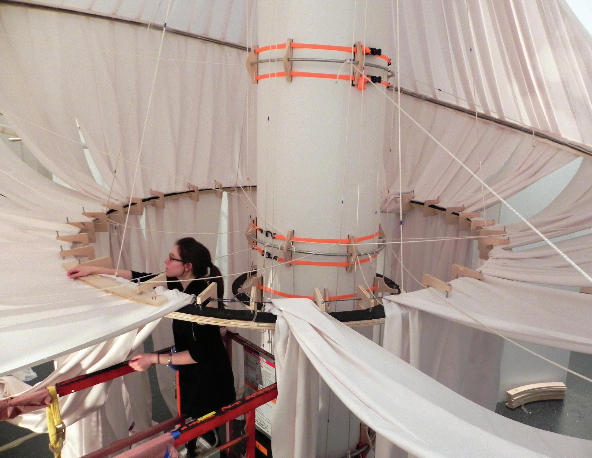
Building upon techniques developed in the textile industry for folding and gathering, a system of flexible fabric canopies disrupt and animate the columns that once ordered the space. These artistic interventions, combined with thermoformed benches and tables, create a unique forum for public interaction and assembly within this ever-evolving institution.


reOrder
125

Recognition
SITU has received numerous awards and honors, including grants from the John D. and Catherine T. MacArthur Foundation, Open Society Foundations and Oak Foundation, Interior Design Best of Year in 2016, 2014 and 2011, and the President’s Citation Award from The Cooper Union.
Select grants and awards:
Honorees, FastCompany Innovation by Design Awards
Best Workplace Design, Google Humboldt Campus, Sunnyvale, CA
Best Design for Social Justice, Turnout NYC
Design Award of Merit, SARA NY
Google Humboldt Campus, Sunnyvale, CA
President’s Citation Award, The Cooper Union
Recognizing outstanding achievement in field of architecture
Grant Renewal, Open Society Foundations
Spatial Practice as Evidence and Advocacy (SPEA)
Grant Renewal, Oak Foundation
Spatial Practice as Evidence and Advocacy (SPEA)
Interior Design Best of Year
Best Green Innovation of 2016: Solar Canopy › with Brooklyn SolarWorks
Grant Recipient, Open Society Foundations
Spatial Practice as Evidence and Advocacy (SPEA)
Finalist, Fast Company Innovation by Design Awards City Solutions: Invisible New York
Grant Recipient, John D. and Catherine T. MacArthur Foundation Spatial Practice as Evidence and Advocacy (SPEA)
Grant Recipient, Oak Foundation Spatial Practice as Evidence and Advocacy (SPEA)
Interior Design Best of Year
Youth Education: Design Lab, New York Hall of Science, NY
The Architectural League of New York: Emerging Voices
Interior Design Best of Year
Large Exhibit/Installation: reOrder, Brooklyn Museum, NY
National Science Foundation EAR-1028768
Instrumentation and Facilities: Development of an Integrated Serial Grinder and Photo-Imager for 3D Fossil Reconstruction.
Pl: Professor Adam Maloof, Industrial Partner: SITU Studio.
Award for Excellence in Design
The Art Commission of The City of New York Flight 587 Memorial
2023 2018 2017 2016 2015 2014 2013 2012 2011 In
SITU’s
publications
The New York Times, The Economist, Wired, Fast Company
The Atlantic
The Nation, Architectural Record and The
Newspaper.
addition,
work has been featured in
including
,
,
Architect’s
127
www.situ.nyc Office Brooklyn Navy Yard, 141 Flushing Ave Bldg 77, Suite 508, Brooklyn, NY 11205 (718) 237-5795 main


 Historic photo of the house integrated into the landscape


 Before: Floor plan of existing layout and entry from the parking area
After: Floor plan of proposed visitor center, which expands the building footprint and transitions the core functions into a covered plaza space and outdoor gardens


 Section of the visitor center, showing the gradual transition from the interior offices to the exterior gardens


 2022 Turnout sites overlaid on a map showing the concentration of NYC cultural institutions in 2021.


 Turnout Queens featured performances
Grafitti Workshop at Turnout Bronx.
Lunicorns at Fiesta Pride at Turnout Staten Island


 Prior to design, SITU spent 5 weeks embedded with the Lab to observe, talk, participate in activities, document and analyze workflows and space implications, and ultimately produce concept drawings and guiding principles for the design work ahead.


 The Skylounge provides an open retreat space, as well as a gathering space for meetings and events.


 The WarHall—a hallway of dedicated huddle spaces—promotes informal work display and collaboration.


 Conduit Ceiling Grid Curtain Power Cable Folding Tables
Light Fixture Stage Lights Projector
Presentation
Stacking Chairs
Ceiling Panels Mobile Wall Mobile Sign Wall Panels Rug
Mobile Lectern Low Cabinet Media Cabinet Tall Cabinet
Performance
Classroom


 Hardware
Cabinet Edges + Doors
Pin-up + Acoustical Ceiling
Rug
Curtain Wood Veneer
Metal Frames
Electrical Conduit
Photo by Gregg Richards


 Our design combines two passive cooling systems to address the site’s arid climate, as well as solar control which minimizes heat gains and maximizes evaporative cooling.

 Composed of a system of interlocking cells, the modular design is outfitted to receive solar panels, which would power lighting at night.


 Located at Queens Plaza, the 2 1/2–acre terrace sits on the fifth floor between two 30-story commercial towers.


 The Village Center
The Eco-Industrial District
Cabins
Townhomes


 Cottages
Hillside homes
Family homes (smaller)


 At the Treehouse, visitors explore gravity, shape and air resistance.

 The Studio hosts a collaborative design activity called Happy City, where visitors learn to construct circuits while building a model city.


 More than a one-off solution to eco-friendly property owners, the canopy was envisioned as a pathway to extend solar power across New York City’s neighborhoods.


 The school occupies floors 2-7 accessed via stairs on the ground level. The building is shared with other tenants, including commercial offices and restaurants.


 Created for the 2009 CitySol festival, Solar Pavilion 3 was constructed with 2,500 slotted strips of milled plywood, woven together and joined with aluminum fasteners.


 For passive solar orientation, the tubular columns of Solar Pavilion 1 are all tilted slightly northward with the tops of each tube placed at a sharp angle away from the sun.


 Solar Pavilion 3 at CitySol in Stuyvesant Cove Park, NYC
