
8 minute read
1. Getting Started


Prismacolor on Stonehenge paper, 14"x 11". Colors used: Carmine Red, Tuscan Red, Peacock Green.
Average Distance, Simpler Shapes This rosebud is a good example of how to get started with a simpler subject. It is another standard view of a rose, but it's less complex due to fewer open petals. When picking a subject at first, it's best to keep it simple! Learning the basics with less-complicated drawings such as this one will help you gain necessary skills. There's nothing to be gained by trying something too complicated right off the bat, like the example on the next page. That will do nothing but frustrate you. A simple drawing like this rosebud is still very satisfying, and it can teach some valuable lessons. In time you can graduate to a full vase of flowers! Average Distance, Complex Shapes This is a standard view of a rose using only three colors. It's not always necessary to use a big palette or lots of colors to make something look real. A simpler approach is often just as effective. This drawing may seem simplistic, but it’s complex as far as the shapes go. Overlapping petals can be a challenge, so studying photo references is crucial. Each petal has its own set of elements to capture, and the lighting will be different for each one.
Advertisement
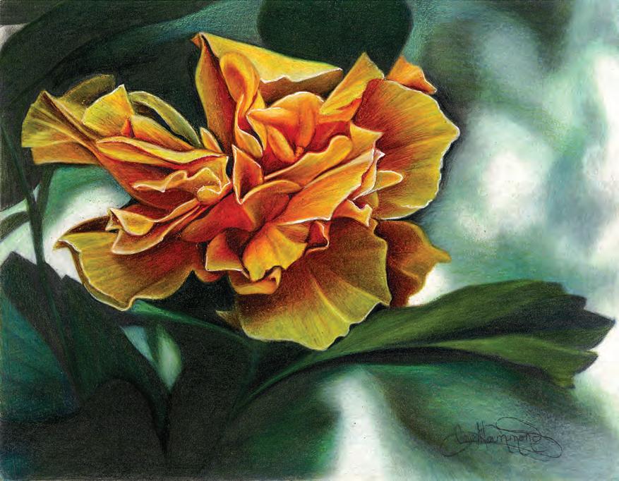
Prismacolor on Flannel White Artagain paper, 14"x 11". Colors used: Carmine Red, Poppy Red, Tuscan Red, Neon Orange, Grass Green, Chartreuse, Sunburst Yellow, Burnt Umber.


A Vase Full of Red Roses, Prismacolor on Stonehenge paper, 14"x 11". Colors used: Carmine Red, Poppy Red, Crimson Red, Tuscan Red, Salmon Pink, Olive Green, Limepeel, Dark Green, Sky Blue Light, Black, White.
Practice, You’ll Get There! It takes practice to get to this level. Don’t attempt something with this much detail and complicated shapes until you learn the techniques in this book. Follow along page by page, doing the lessons in order. I created the projects so each one takes you a step further than the one before. Learning slowly, and taking things one step at a time, will give you the best results.
Learning FROM LEE
• Keep it simple! Don’t start with complicated subject matter, and start with fewer colors. • Look for shapes, values (lights and darks), highlights, shadows, and colors. • Practice projects in the order that they appear.
CHAPTER 1
Getting Started
Starting any new art technique can seem very daunting, especially when you see all the possibilities and aspects of the medium you need to think through and understand. So where do you even begin? If you go to an art-supply store, you may see what looks like thousands of colored pencils, with many different types and many different brands. While each one of these pencils can be used, they are not all the same! Each brand is formulated differently, and therefore, will produce different results. It's not one-size-fits-all.
For this book, I will be using just one good brand that is the easiest to find in stores, and that is Prismacolor. I do not recommend running out and buying the largest set, however. A beautiful drawing can be achieved using just a few colors. Get to know how to use the pencils before you get too involved in hundreds of colors.
Neutral Tones This drawing of a sparrow was done with just three colors of neutral tones. To enhance the drawing, I used a brown-colored paper to make the white stand out. Look for reference photos that lend themselves to this monotone approach. Practicing with a limited number of colors is a great way to start! That way, you can concentrate on technique and not get confused by a myriad of colors.
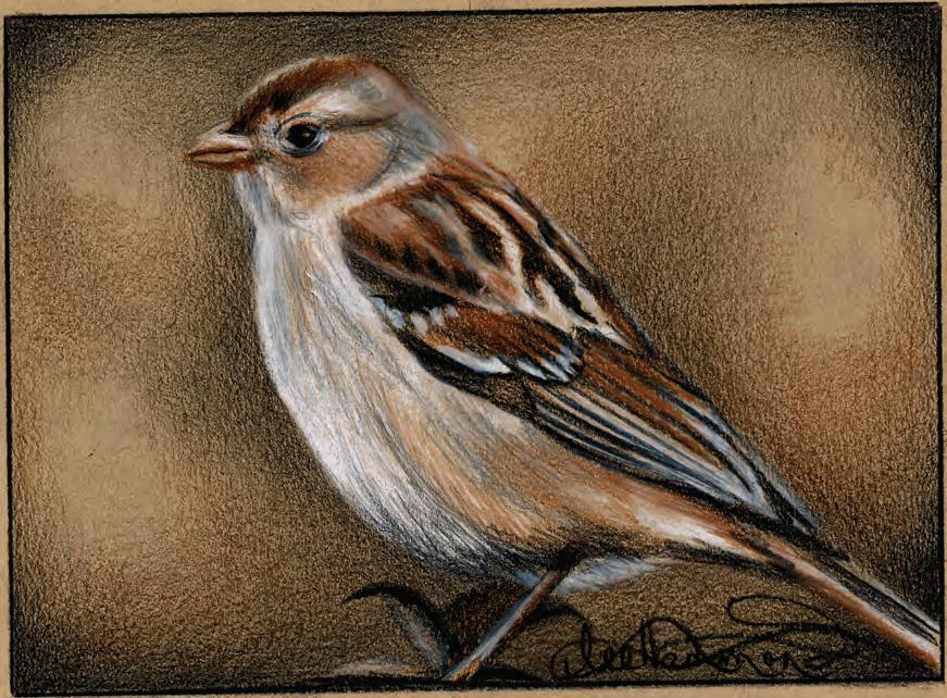
Sparrow in Brown Tones, Prismacolor on Strathmore Toned Tan drawing paper, 5"x 7". Colors used: Sienna Brown, Black, White.
Drawing a Cherry Tomato
This project gives you practice with layering and burnishing. Most of the time, both techniques are used to create realism. Draw the value scales here with layering first to get familiar with the colors. I have broken the scales into warm colors and cool colors (more on this later). When using burnishing, you will still start with the lightest colors, or undertones, then build on them.
MATERIALS
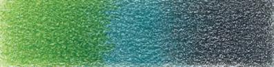
PAPER Stonehenge COLORS Sunburst Yellow Poppy Red Crimson Red Apple Green Aquamarine Cool Grey 50% White OTHER TOOLS Mechanical Pencil Warm Colors Left to right: Sunburst Yellow, Poppy Red, Crimson Red. Cool Colors Left to right: Apple Green, Aquamarine, Cool Grey 50%.


1 | APPLY LIGHTEST COLORS 2 | DEEPEN COLORS
After a light drawing with a mechanical pencil, start with the lightest colors, Sunburst Yellow, and Apple Green. Apply an even layer of these colors as shown in the example. Be sure to leave a little round spot of the white paper for the highlight. Layer Poppy Red over the yellow. Add Crimson Red to create darker red tones as shown. Don’t use firm pressure yet. This is where form and dimension start to take shape by creating shadows. It’s now looking round, not flat. Apply another layer of Apple Green to the leaves to fill them in. Lightly layer in the shadow beneath the tomato with Aquamarine.

3 | BURNISH COLORS TO FINISH
With firm pressure, repeat steps 1 and 2, burnishing the color, completely covering the paper to help the surface look shiny. Use the lighter colors to blend edges, overlapping them. You don’t want to see where one color ends and another begins. Deepen the leaf edges with Cool Grey 50%. Add white for highlights. Lightly layer grey into the shadow below, then add a light touch of Crimson Red. Look at my example for placement of the colors.
Drawing an Orange
A border defines this drawing's edges, while layered warm background tones make the orange stand out. Heavy layering keeps it from looking too shiny. Once I applied the lighter colors, a light layer of a darker color created the peel texture.
MATERIALS
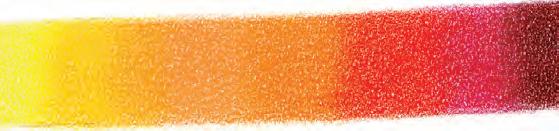
PAPER Stonehenge COLORS Canary Yellow Orange Salmon Pink Poppy Red Magenta Tuscan Red Limepeel Black OTHER TOOLS Mechanical Pencil Ruler Craft Knife Warm Colors Left to right: Canary Yellow, Orange, Salmon Pink, Poppy Red, Magenta, Tuscan Red. Cool Colors Left to right: Limepeel, Black.


1 | APPLY LIGHTEST COLORS
Draw a circle the size of an orange with a mechanical pencil (you can trace a glass). Draw the stem. Lightly layer the orange with Canary Yellow, then Orange, as shown, using a circular motion to start the peel texture. Leave the bottom edge yellow. Draw a shadow below with Tuscan Red. 2 | DEEPEN COLORS
Add Orange to the peel with circular motions and Poppy Red to the edges. Don’t lose the light edge at bottom. Add Limepeel to the stem. Add light Magenta lines to the creases radiating from the stem, leaving yellow highlights. Add Magenta to the shadow below.
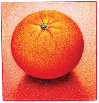
3 | ADD BACKGROUND AND TEXTURE TO FINISH
Draw a box around the orange with a ruler. Leave more room at the bottom than the top for good composition. Layer Salmon Pink evenly over the background. Deepen the bottom corners. Add Magenta to the orange in small circles, making it darker along the edges. Once all color is added, use the tip of a craft knife to lightly scratch in texture with a circular motion to reveal lighter color below. If you take off too much, simply add color back with the same approach. Add a small amount of Black to the stem. Layer Magenta on the shadow below, allowing it to fade out.
Learning
FROM LEE
• Practice color value scales to warm up. • Layer with a sharp point to create textures.
• Burnish with a dull point for glossy, smooth surfaces.
• Use a craft knife to add additional texture.
CHAPTER 3
Composition, Color, Shapes, and Shading
Many elements go into a good piece of art. It doesn’t happen by chance. An artist must fully understand certain principles and know how to apply them when creating a piece of art that is well balanced, interesting, and pleasing to the eye. It’s more than selecting a cool reference photo. I take thousands of photos, but only a few will fit my criteria for turning them into works of art. In this chapter, I will guide you through some of the necessary elements you will need to apply to your artwork—composition, color, basic shapes, and the five elements of shading.
Hibiscus, Prismacolor and graphite on Bristol paper, 11" x 14". Colors used: Canary Yellow, Orange, Poppy Red, Tuscan Red, Apple Green, Aquamarine, Dark Green, Black, White, White Gel Pen.
Versatility of Colored Pencil This drawing shows the versatility of colored pencil. It started as a graphite drawing designed to be in black and white. As an experiment, I colorized it with colored pencils when it was completed and sprayed with fixative. For a bit more impact, I added a touch of white gel pen to some of the edges.


