
6 minute read
2. Basic Techniques


CHAPTER 4
Capturing Your Image on Paper
Advertisement
One of the most challenging aspects of drawing can be creating an accurate line drawing. Being accurate with your shapes will always give you better results in the end. Artists since the beginning of time have created methods for obtaining accuracy in their shapes when drawing out their preliminary sketches. I will list a few tricks from the old masters.
Artistic License Compare my drawing to its reference photo on the next page, and see how much liberty I take with my art, even though I started with accurate line drawing. Also note that it’s a combination of layering and burnishing. The plant is glossy, so it's burnished. The background is dull, so it's layered. The background was an exercise in patience, for it took hours of layering, and plenty of pencil sharpening to look gradual and even. To do this, I blurred my vision as I worked to see any irregularities forming. This helped me see where I needed to fill in, to keep everything looking smooth.
A Colorful Vine, Prismacolor on Stonehenge paper, 13" x 9". Colors used: Yellow Chartreuse, Lemon Yellow, Neon Orange, Neon Pink, Orange, Poppy Red, Scarlet Lake, Tuscan Red, Aquamarine, Spring Green, Grass Green, True Blue, Ultramarine, Lavender, Black, White.
CHAPTER 6
Drawing Lovely Leaves
Leaves are some of the most interesting things to draw in nature. They’re full of unique elements that can challenge you. No two are alike, and each species of plant or tree differs in the type of leaves it has.

Capturing Details One of the most challenging aspects of drawing leaves is capturing details like edges and veins. A good photo reference is important. Getting the right color and focus can make all the difference. This drawing is from a photo reference I took after raking my yard. I had an entire barrel of dead, brown leaves, but when I peered into the barrel, the patterns of them lying on top of one another caught my eye. So, I took many photos of them. Once I transferred the photos to my computer, I was able to adjust the saturation of color and enhance the gold tones. Dead, brown leaves now came to life in an array of golds and reds. After some creative cropping, the perfect artistic photo reference was born for this piece.
Autumn Leaves, Prismacolor on Stonehenge paper, 14" x 11". Colors used: Lemon Yellow, Canary Yellow, Sunburst Yellow, Orange, Goldenrod, Burnt Ochre, Gold Ochre, Sienna Brown, Terra Cotta, Tuscan Red, Black Raspberry, Dark Brown, Chocolate, Dark Umber, Limepeel, Olive Green, Apple Green, Black, White.

3 | ADD MID TONES
Add Spring Green to the background at right, and to the lower part of the leaf. On the upper part of the leaf, layer Mineral Orange. Add a small amount to the lower tip of the leaf also. On top of the Mineral Orange, add Carmine Red to deepen the color. Extend Sienna Brown under the leaf as a shadow. Use a vinyl stick eraser to lift color out from the light veins. Go over them with Cream.

4 | FINISH WITH BURNISHING
Lightly burnish Cream over the entire leaf. The surface of this leaf is not grainy looking, so the layering technique will not finish it. But it's also not a shiny leaf with all the colors appearing bright and vivid. It's a dull, waxy-looking shine, so Cream makes the colors fill in and appear a bit muted. For the last stage of the leaf, create the little spots of color on the surface with Tuscan Red. Dull them down with Cream again by lightly going over the top of everything with a dull point. Use Cream to burnish the veins and the edges of the leaf. Finish the background colors by layering in more of the Yellow Chartreuse, Spring Green, Grass Green, and Sienna Brown.
CHAPTER 8
Drawing Beautiful Flowers
Few things create artistic inspiration like flowers. For centuries, artists have been drawn to their beauty. Whether Monet's gardens or the close-ups of Georgia O’Keeffe, floral art has been seen in museums and galleries as long as they've existed. Flowers offer endless possibilities to an artist through their unique shapes, magnificent colors, and thousands of species worldwide.

Shades of Blue, Prismacolor on Stonehenge paper, 14" x 11". Colors used: Sky Blue Light, Aquamarine, Light Aqua, True Blue, Ultramarine, Violet Blue, Indigo, Chartreuse, Black, White.
Simple and Complex
Flowers can range from extremely simple in their shapes and colors, to complicated textures featuring multiple colors and plenty of blooms on the plant.
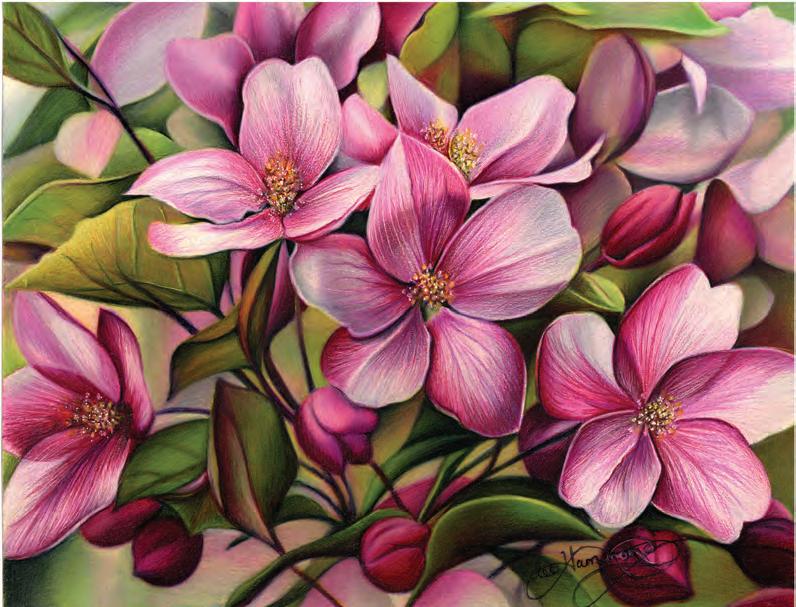
Complex Crabapple Blossoms Many overlapping flowers create a challenge. Each blossom must be drawn individually with all elements of shading applied. With this much overlap, the edges become the key issue. Study your subject for light and dark edges. Look for the V’s within the recessed overlaps of surfaces to give it more depth. The background here is important as well. The background shapes are heavily burnished, making them look out of focus. The foreground flowers are layered (burnished first with White, then layering on top). This way I could also scratch out texture. Texture and detail are in crisp focus. This combination of focus and blur is the way our eyes see things. Only the things you're directly looking at are in pure focus. Everything else is blurred. Had I placed the same detail and crispness into all the flowers, depth would have been lost. For even more depth, I added a small number of white dots with a gel pen into the flower centers.
Flowering Crabapple, Prismacolor on Stonehenge paper, 11" x 14". Colors used: Pink, Neon Pink, Process Red, Magenta, Lilac, Lavender, Black Cherry, Black Raspberry, Yellow Chartreuse, Limepeel, Marine Green, Dark Green, Cool Grey 50%, Cloud Blue, Black, White.
Simple Tulip This is a good place to start when you're a beginner. The egg shape of the flower and the long cylinder of the stem provide a good refresher on the basic shapes we covered earlier. The flower was drawn using the layering technique, since the petals are not highly shiny. Layers of color created the porous, more matte finish of this flower.
Pink Tulip, Prismacolor on Stonehenge paper, 8" x 5". Colors used: Pink, Neon Pink, Process Red, Magenta, Black Cherry, Yellow Chartreuse, Limepeel, Marine Green.
Birds Are Fascinating Subjects
Whether they be up close, flying away, on the land, or over sea, birds are fascinating subjects. With there being literally thousands of species to choose from, located in every country on the globe, there is a never-ending supply of subjects waiting for you.
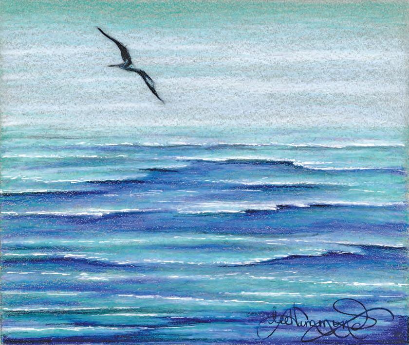
Over the Sea, Prismacolor on Storm Blue Artagain paper, 7" x 8". Colors used: Light Aqua, Aquamarine, True Blue, Ultramarine, Cool Grey 90%, Black, White, White Gel Pen.
Capture a Feeling Birds tell such a story for the viewer. Just like this drawing. Even though there is very little detail to this seagull, it gives you the feeling of flying. Even with just the suggestion of the bird’s shape, you see every aspect of it in your mind. That’s what good art does for its viewers. It takes you to a place where your mind can fill in the blanks with your imagination. That is why art never looks the same to any two people. I hope you have fun drawing birds and will add them to your pile of things to draw.
Learning FROM LEE
• Try different views from close-up to distant. • Soft pastel can sometimes be used for an undertone. • Remember the color wheel and use complements for contrast. • Bird feathers resemble flower petals in their shapes and overlapping surfaces. • Use many techniques and tricks, such as scratching, for capturing textures. • The farther away something is, the lighter it will appear.


