




It’s all in St. Louis. No need to shop for plumbing fixtures in Chicago, Los Angeles, or New York.
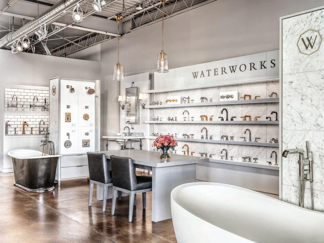

Walk into and you’ll begin to experience kitchens and bathrooms differently. For over 10 years, we have brought the unexpected to our region. Unique brands and unlimited creative possibilities continue to make us the number one choice for designers, builders, contractors, and homeowners. What you thought about fixtures is fictional; visit us to immerse yourself in The Best.
St. Louis’ Experiential Kitchen and Bathroom Gallery BY APPOINTMENT ONLY
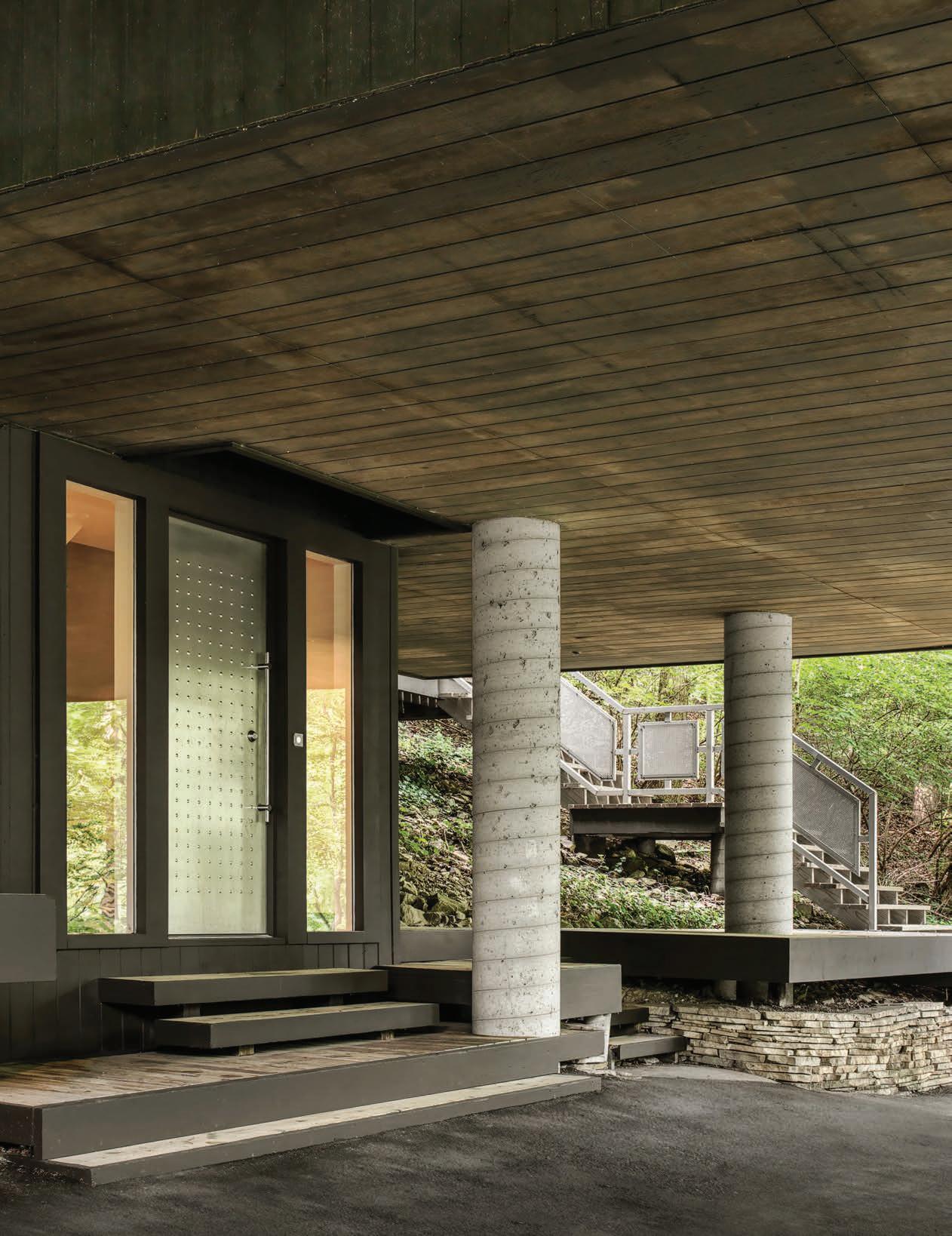

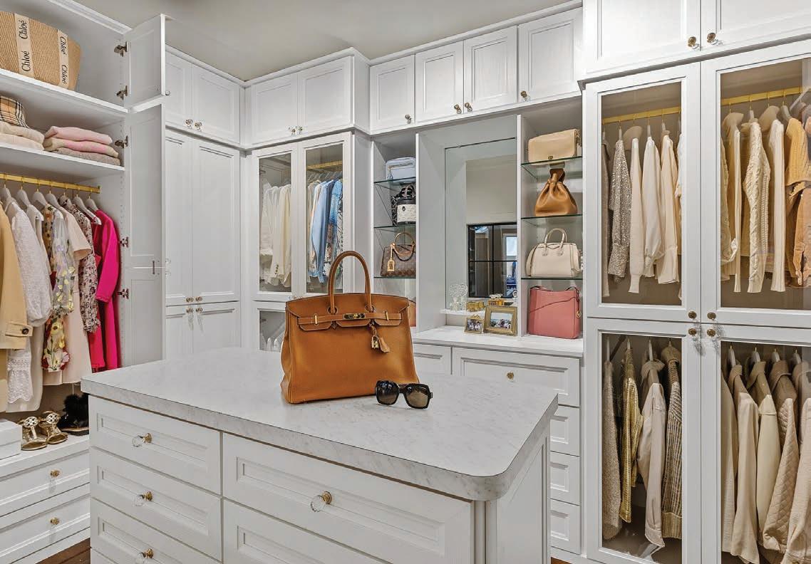
TRANSFORMING YOUR SPACE INTO A LUXE BOUTIQUE HAVEN
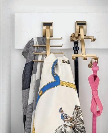
The modern closet has transcended its functional roots, becoming a luxurious, boutique-inspired space that reflects personal style and elegance. This trend mirrors a growing desire to bring the refined atmosphere of high-end retail into the home, and Saint Louis Closet Co. is at the forefront of this transformation, offering tailored solutions that turn ordinary closets into chic, sophisticated retreats. A boutique-inspired closet evokes the allure of a luxury store—where every item is organized, beautifully displayed, and infused with a sense of refinement. Far more than just a storage
solution, these closets are designed to make a statement, creating an environment that’s as polished as it is personal. Saint Louis Closet Co. understands this vision, providing custom closets that capture both the aesthetic and functional elements of a high-end boutique. The boutique-inspired closet is more than just a trend; it’s a reflection of how we want to live—surrounded by beauty, order, and personal expression. Saint Louis Closet Co. brings this vision to life, combining expert craftsmanship with innovative design to create spaces that are as luxurious as they are functional.
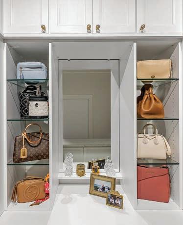
One of the hallmarks of this trend is the use of glassfront cabinets. These sleek, transparent features allow you to showcase your prized possessions, whether it’s designer handbags, elegant shoes, or a carefully curated collection of blouses. Glass-front cabinets not only add a touch of sophistication but also make it easier to view and organize your wardrobe.
Saint Louis Closet Co. offers a variety of glass-front options, seamlessly integrating them into custom designs to elevate the overall look and feel of your space. Luxury hardware is also key to achieving the boutiqueinspired look. Just as high-end stores are defined by their elegant details, your closet can exude a sense of opulence through polished hardware, premium woods, and thoughtful accents.
Louis Closet Co.
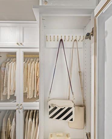
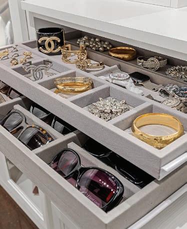
Saint Louis Closet Co. specializes in these luxurious touches, ensuring that every element of your closet is both visually stunning and highly functional. Velvet Jewelry Drawers further enhance the boutique-like atmosphere. Specialized spaces allow you to showcase your wardrobe in a way that feels both practical and glamorous.
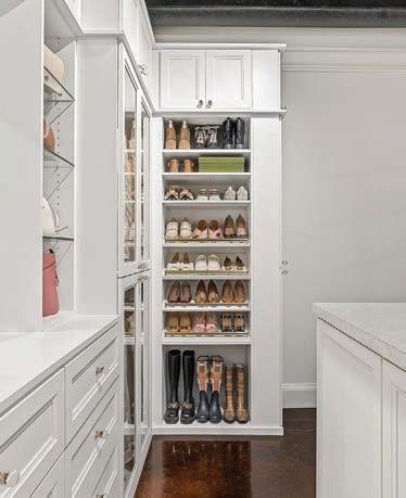
Whether you’re highlighting your favorite jewelry, displaying your most-loved shoes, or creating a dedicated space for seasonal accessories, Saint Louis Closet Co. designs tailored solutions to meet your unique organizational needs. By incorporating adjustable shelving, high-end accessories, and specialized storage, they create a closet that’s as versatile as it is stylish.






PUBLISHER
Craig Kaminer Craig@slmag.net
EDITOR IN CHIEF
Christy Marshall EditorSTL@slmag.net
DIGITAL CONTENT EDITOR
Grayling Holmes DigitalSTL@slmag.net
ADVERTISING
Cortney Vaughn Cortney@slmag.net
Rachel Sokolich Rachel@slmag.net
Karen Palmer Bland Karen.palmer.bland@gmail.com
CONTRIBUTORS
Writers
Alexa Beattie
Craig Kaminer
Christy Marshall
Design
Jon Feagain
Photography
Richard Nichols
SOPHISTICATED
Eric Williams
Bridget
Greg Butrum
Jason Yann




In January 1985, my wife and I met in Florence, Italy where we were students studying abroad at the University of Michigan. Over the years, we visited Italy multiple times: When I was the North American publicist for the Italian Government and returning to Florence and Tuscany with friends and kids, traveling as far north as Venice and as far south as Sicily, but we are always lured back to Florence. Now it seems like home.
Most recently, we spent a month living in an apartment on the Arno River two bridges west of the Ponte Vecchio. Each day we lived like Florentines — some days with specific itineraries and others just roaming historic neighborhoods. Regardless of the number of days we have spent in Florence, it never gets old. Each day is an adventure reliving the history of the Medici and walking in the shoes of Masaccio, Donatello, Ghiberti, Brunelleschi, Verocchio, Leonardo da Vinci, Botticelli, Ghirlandaio, Michelangelo and Raphael.
Before our last trip, we watched the Netflix series “Medici the Magnificent” and I re-read the Agony and the Ecstacy by Irving Stone about Michelangelo and Vasari’s Lives of the Most Excellent Painters, Sculptors and Architects. More than ever before, I had a great sense of how Florence became the center of the Renaissance and one of the great wonders of the world.
So when I returned home to St. Louis, I couldn’t help but wonder how I could leverage my fascination with how the Medici consciously set out to make Florence the center of the art world to create a spark for creative greatness in St. Louis. The first thing I did was to focus more of our content on art and architecture, interior design and fashion as if to play a small role in the patronage of all things beautiful.
Then after a conversation with Kevin Kenney from the Interior Design Center it hit me: We should honor the best architects, interior designers and builders as a way to elevate their work and put it front and center to our audience, to those who can afford to support their great work in the city and their homes. That’s how the SOPHI Awards was born, SOPHI which is short for SOPHISTICATED, and an award presentation on par with the Oscars. We designed a stunning trophy, attracted great sponsors and committed to hosting our first year event at 21c, which is itself a world-class contemporary hotel and museum in a historic building downtown.
The fantasy of doing something the Medicis would appreciate was quite a leap of faith. It was bold and a little crazy, but in the long run, it has proven to be what St. Louis was looking for. Almost 300 entries were submitted, our event at 21c sold out, 10 great nationally acclaimed architects and designers signed on as judges, and some of our great civic leaders agreed to host the awards ceremony. The Medici would be proud.
Now we are planning the 2025 SOPHI Awards and launching Sophisticated Traveler to lead trips to some of the destinations we have written about, and in response to what our engaged readers have asked if we would do.
Many thought the Medici were crazy to focus so much of their wealth on art, architecture and building. But during the span of three generations, the Medici family transformed Florence into a city everyone wants to visit, again and again. There’s a lesson to be learned here. Many families fought against the Medici and even wanted to expel them from the city. But in the long run, the vision the Medicis had paid off. The wealth the arts created for the city endures six centuries later.
I hope the SOPHI Awards, our commitment to philanthropy, our media properties and newly launched travel company, inspires St. Louis as the Medici inspired the world. And yes, I hope you enjoy the pages to follow featuring the finalists and winners of the SOPHI Awards in our first ever Design Issue.
I would love your feedback.

Craig M. Kaminer, Publisher craig@slmag.net
By Alexa Beattie / Photography by Richard Nichols
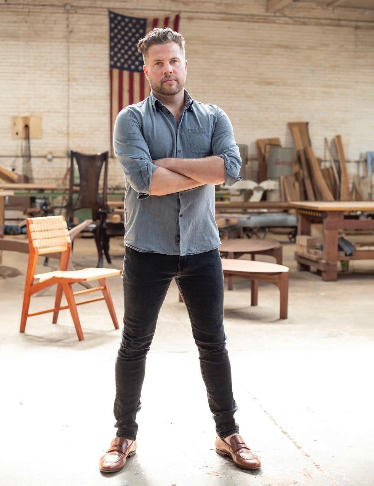
On a gravelly patch of North St. Louis, outside a gritty old warehouse, there’s a little cluster of trees. One of them is an olive. Another – a blossoming, divinely scented frangipani. The last (aside from a little fig seedling with a promising future) is a 40-year-old lignum vitae – one of the world’s slowest-growing trees with wood so dense it sinks in water. All three are in giant pots which, when the days shorten and temperatures dip, will be forklifted inside to wait out winter under grow lights. These are master woodworker Martin Goebel’s “house plants.” Before you even go inside, you get the picture: This guy has a way with trees.
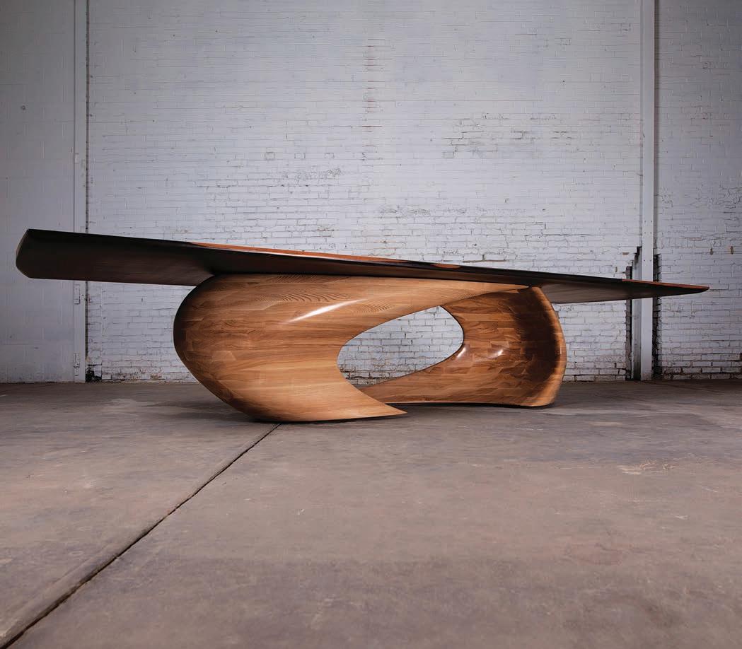
But the trees Goebel mostly deals with are not exactly living. Since 2011, Goebel & Co. has been producing the finest forms of luxury furniture with wood from all over the world, including Missouri. And, for an operation currently of three people, its reach is remarkably far flung. At this point, his chairs and tables, credenzas and coffee tables can be found in all corners of the globe. Yes, you can pick up one of his cutting boards at a handful of boutiques in Ladue, but somewhere in northern Zambia is a
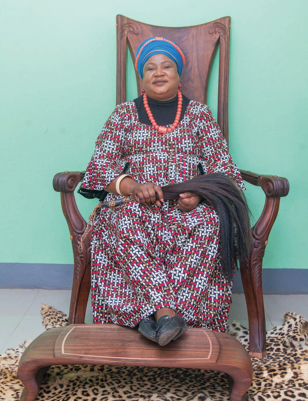
black walnut throne (inlaid with fresh Zambian copper) which he happened to make for Her High Chieftainess, Melambeka of the Lamba tribe, back in 2020.
In person, Martin Goebel is a lot younger than you expected him to be. It wasn’t that he sounded old on the telephone, but that the deep knowledge of his process and the profound reverence for his “raw material” felt of a different era, when form was not sacrificed for function, and beauty and process were first concerns.
“It’s like Christmas morning,” is how he describes the arrival of raw timber: Maybe there are 17 trunks of Michigan sugar maple on the truck. Or maybe a monkey pod from the Panama Canal coming via Vietnam where it was initially processed. Or perhaps it’s a 20,000-pound rosewood – a little road weary after its trip, all the way from East India. Using portable saw mills, the trunks are cut, and the sections hauled inside to rest for 18 to 24 months. Moisture readings are taken, and the “logs” – like bottles in a wine cellar – are diligently rotated. “They need to dry as slowly as humanly possible,” Goebel said. “That way, you prevent cracks and warp.”
If Goebel hadn’t found his high school German class so boring, his life could have looked quite different. “Woodworking took place at the same time, and I thought that sounded a lot more interesting.” He skipped out on that modern language and started applying himself with gusto to a very different sort of curriculum. One of his first projects? A Queen Anne-style candle stick. “Some little threelegged thing.” (You just know he’s being modest). “I realized I had an aptitude,” Goebel said. “It was never difficult for me.”
After he graduated from high school, he went to UMSL for a BFA in Studio Fine Arts. He then dropped out and spent the next few years producing furniture in his (German) grandparent’s twocar garage in Frontenac. But he wasn’t making step stools. Already he was receiving orders, producing beautiful, custom pieces – credenzas, desks, tables, and so on. He returned to UMSL eventually, and the degree he received there, got him a ticket to Rhode Island School of Design (RISD) where he obtained an MFA in furniture design.
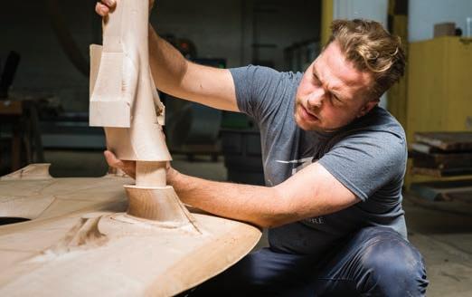
“You tailor a piece of furniture like you tailor a fine suit,” Goebel said. It’s a good analogy: His completed pieces do look silky. In his hands, tables and chairs have a satin liquidity brought about by an acute understanding of the ways in which different woods behave. “The wood needs to relax.” He was running his palms over a huge table made of tulip poplar, invisibly seamed and sublimely grained in “ribbons” of light and dark. “It’s a hybrid process of digital design, traditional handicraft and automated manufacturing, all done here in our own facility,” he said.
Sometimes, Goebel explains, it’s the burl, or irregular growth pattern, in a piece of wood that makes it unique. A pretty blistering
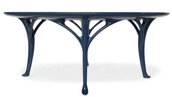
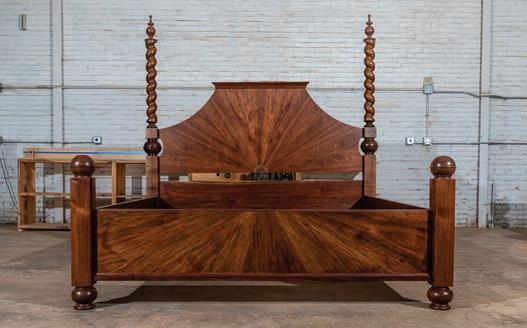
may show up in one of his coffee tables; little “clouds” in a night stand. “We work with the tree,” he said. “And we are creating an old-world product.” He means no plywood, no plastic. He means his furniture would be entirely “understood” by the 16th Century shopper looking for a bed, a dining table, etcetera. (Half of Goebel’s top-end work is sold – with non-disclosure agreements – to celebrities and high-profile sports people).
While a lot of Goebel’s furniture is shipped to faraway places, a lot of it stays at home. In 2021, when the Muny’s 140-year-old swamp oaks were giving up the ghost, he was the one to take them down. It didn’t end there: Goebel processed the trees and, among many other wooden features, made a conference table for the theater company. The spirit of those beloved old swamp oaks, in other words (and thanks to him), very much lives on.
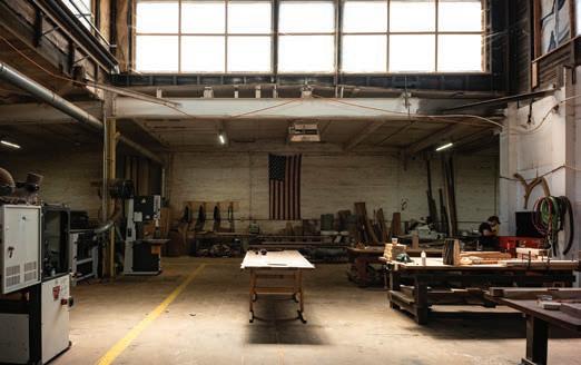
So, yes, Martin Goebel has been living and breathing timber for most of his life. And he’s been tasting it, too. This “woodsman” speaks to the flavor of sawdust like an oenophile, and with a similar thrill: White oak is “vinegary.” Cherry is “sweet with a beautiful aroma.” And red oak “makes you think of cat urine.” When Goebel gives a tour of his giant, 15,000-square-foot workshop, he brings a spray-bottle along. As he passes certain boards – certain raw slabs and slices of rather ordinary looking wood – he gives a quick squirt. He looks a bit like a schoolteacher pronging his recalcitrant students back into their chairs. You wonder what he’s doing exactly. But as the rubbing alcohol works its magic, black Mexican Ziricote turns out to have chestnut-colored veins; Wenge reveals its little gray pores. And the African Zebra shows its stripes. sl

By Alexa Beattie / Photography courtesy of The Rep
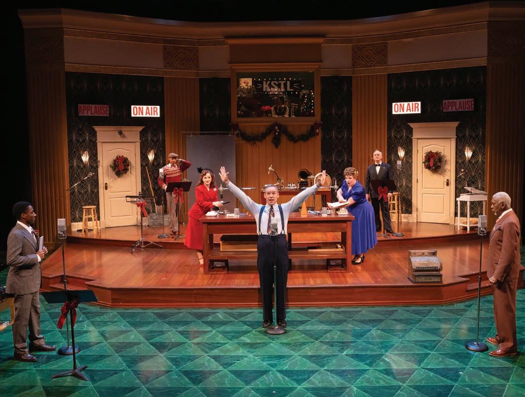
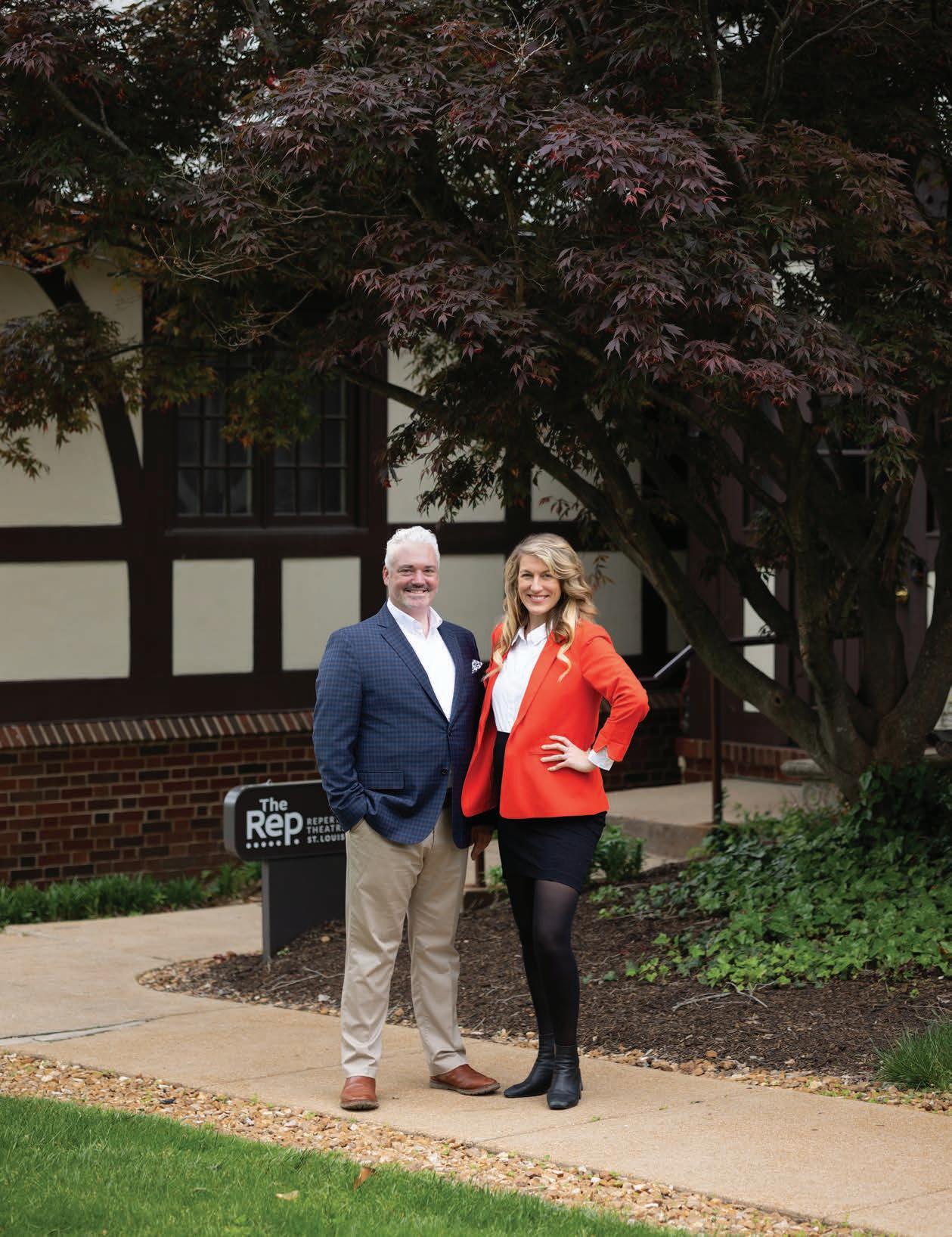
The new dynamite duo heading up the Repertory Theatre of St. Louis can drop some serious names. Artistic Director Kate Bergstrom, for instance, has shared a stage with Annette Bening and Danny Williams, managing director, starred in a Westport County Playhouse production years ago of Our Town headed by – of all people – Paul Newman. (Joanne Woodward was the artistic director, by the way). To boot, last year, the Rep’s Annual Holiday Experience was headlined by St. Louisan John Goodman. He gave an interview on stage and, fittingly, read T’was the Night Before Christmas. But they don’t mean to brag; this is simply the water they swim in.
The pair has only worked together for a few months. While Williams joined the Rep in 2022; Bergstrom (heavily pregnant when we spoke) came aboard last May 13. It was time for a change: The company, Williams said, had been suffering from a dwindling audience base. The pandemic was partly to blame. But so, perhaps, were the plays themselves which may have had a narrower appeal than the new season picks. After cutting last season short, the theater launched a Rally for The Rep campaign, an emergency fundraiser. The community did indeed rally and a total of $2.6 million was raised.
“We’ve hit our stride artistically the last year and a half,” Danny says. “We are aiming for more resonance with audiences by offering a true array of what theater has to offer.”
Bergstrom’s full title is the Augustin Family Artistic Director, a role underwritten by that theater-passionate St. Louis family for the past 20 years or so. It’s a prestigious appointment: When the position was vacated by Hana S. Sharif in 2018, a nationwide search was conducted. Bergstrom was selected from close to 100 applicants and then three finalists. She has an MFA in directing from Brown University; she said her life changed forever after seeing a production of Our Town directed by David Cromer in L.A. (Helen Hunt was the stage manager).
Her own acting career began in eighth grade when – on a bit of a whim – she went along to addition for Peter Pan. While she may have had designs on the lead role, she was offered the part of Captain Hook. “A whole new world opened up. I felt so held in that space,” Bergstrom says. “The audience’s surprise and delight – being able to give that to them – was like nothing else in the world.”
Williams’s brush with Newman gave him a “taste of glamor,” which lured him toward his career like fish to bait. “Eartha Kit was in the audience, for instance. Mike Nichols, James Earl Jones, Diane Sawyer! Getting up close to all those legends backstage? There was nothing like it.”
But while the passion for bright lights coursed (and still courses) in Williams’s veins, he fell – quite willingly – into the administrative side of things. “I have a super power for organization,” Williams says.

And there’s quite a lot of that needed in this theater company since Emerson Studio Theater, a new black box space seating 125 beneath the Main Stage, opened in October. “We’re calling this ‘adventurous theater,’” Williams says of the flavor of plays to be staged here. By that, he means plays which challenge established conceptions, shake up preconceived ideas. The Roommate by Jen Silverman will run through November 17. Gracie Gardner’s Athena, kicks off 2025 on January 15. Remaining in the 2024-2025 fourplay season on the 900-seat Main Stage are Million Dollar Quartet Christmas based on the book by Colin Ascott, Clyde’s by Lynn Nottage; and Ken Ludwig’s Sherwood: The Adventures of Robin Hood.
“We’re hoping to cultivate a younger base,” Williams says. “If you’ve never been, come. If you came and didn’t like what you saw, come back.”
A dizzying amount of organization, as well, goes into the Rep’s annual trip to London. Over the course of a week, sometime
around Memorial Day, 30 or so theatre aficionados see nine different plays in and around that city. Everyone stays at a hotel centrally located in Bloomsbury where conversation – pre- or post-performance – naturally turns to the art of theater and then – perhaps more profoundly – shared values and the discovery of larger meaning through art.
“This trip really brings people together in meaningful ways” Bergstrom says. “All ages, all types of theater, all kinds of people –doctors, artists, lawyers. It’s beautiful.” She noted that this summer, the group even took in ABBA Voyage in the ABBA Arena in London’s East End. “It’s a transformative experience,” says Williams.
If passion is a necessary ingredient for excellence, then – winter aside – the forecast for Webster Groves in the coming months is looking rather rosy.
“We have three tenets: excellence, relevance and extraordinary experience,” Bergstrom says. “That’s what you can expect.” sl



November
1 Join the Journey Gala, Little Bit Foundation, thelittlebitfoundation.org
2-17 Jewish Book Festival, jccstl.com
8 STAGES Applause Gala, stagestlouis.org
8 Girls Inc. 18th Annual Strong, Smart & Bold Luncheon, girlsinc.org
8 Best Buddies Champion of the Year 2024 Gala, bestbuddieschampion.org/stlouis
11 Hearth and Soul unveil their Holiday 2024 Window, hearthandsoul.com
11 The Black Rep Gala, theblackrep.org
17 Toasting in Teal Survivors’ Celebration Brunch, sloca.org

21 Friends of Children with Cancer annual Luncheon and Fashion Show, friendsofkids.org
23-24 John Burroughs Unique Boutique, jbsuniqueboutique.com
December
6 Ladue Chapel Nursery School Holiday Mart, laduechapelnurseryschool.com
7 Cardinal Glennon Foundation, Glennon.org Christmas House Tour, Glennon.org
7 2024 Print Bazaar on Cherokee Street, cherokeeprintbazaar.com
10 Repertory Theatre of St. Louis’ Holiday Benefit, repstl.org
13 YWC A Metro St. Louis Leader Lunch 44, ywcastl.org
21 Veiled Prophet Ball, vpstl.org
28 Fleur de Lis Ball, Fleurdelisstl.org


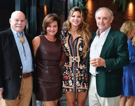

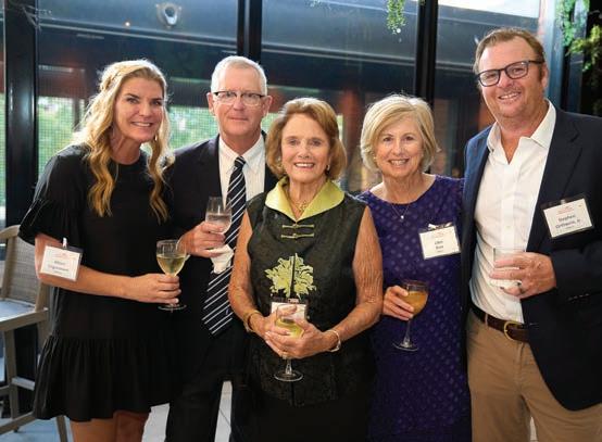
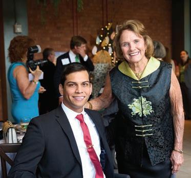
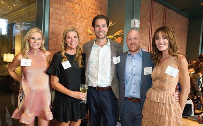
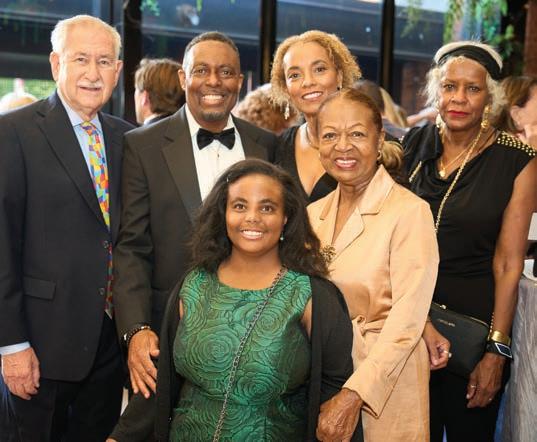
The Shine the Light Gala showcased the community’s strong commitment to empowering people with disabilities to live their best lives. By the end of the night, the event had raised more than $350,000, soaring past its original goal of $50,000. Founded in 1970, Paraquad champions equity and independence for people with disabilities through services, partnerships, education and advocacy.
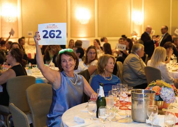

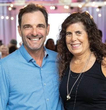


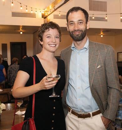


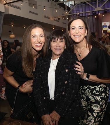
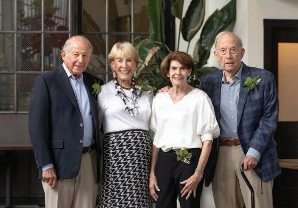
More than 200 guests packed The Hall at Olive + Oak in Webster Groves on September 15 to celebrate the Harvey Kornblum Jewish Food Pantry and to honor Earl Kessler and Al Siwak, the founders of Pallet Partners, which has raised hundreds of thousands of dollars over the past 25 years to benefit children, families, and seniors who have experienced food insecurity. Kessler and Siwak, both 90, have been friends since childhood. As adults, Kessler ran his family’s business, Artistic Furniture Co., while Siwak headed up Paramount Headwear Co. The largest food pantry in the region, the Harvey Kornblum Jewish Food Pantry annually serves more than 15,000 individuals from 72 different zip codes throughout St. Louis County.


Friday, November 15 · 1-2pm PALM Health unites experts in medicine and wellness for optimal health and longevity. Our seminars are free and open to all. Contact us at reception@palmhealth.com or 314-801-8898 option 1 to reserve your seat or receive a recording.



The Great Forest Park Balloon Race, presented by PNC Bank, returned to Forest Park’s Emerson Central Fields, Sept. 20-21, 2024. It is one of the longest-running hot air balloon races in the United States and one of the only races that takes place in a large metropolitan city. The tradition began in 1973 with a handful of hot air balloons and a few spectators. Today, the internationally renowned event welcomes more than 50 of the nation’s best hot air balloon pilots and thousands of spectators annually.


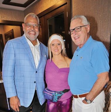
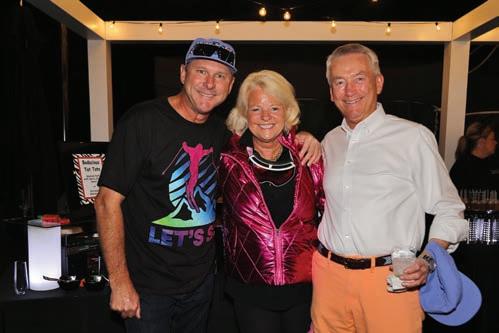
Revelers and ski bums alike joined Stifel Chairman Ron Kruszewski for his annual US Ski Team Aprés Ski Party at his Huntleigh home on September 21 where Silver Medalist Jaelin Kauf, the greatest alpine skiers of all time Mikaela Shiffrin, and halfpipe silver and gold medalist Alex Ferreira were on hand to promote the team and raise more than $1,000,000 from Kruszewski and his friends. Skiers past and present dressed in 80’s ski togs mingled among some of St. Louis’ Who’s Who.





by Diane
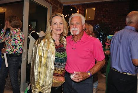

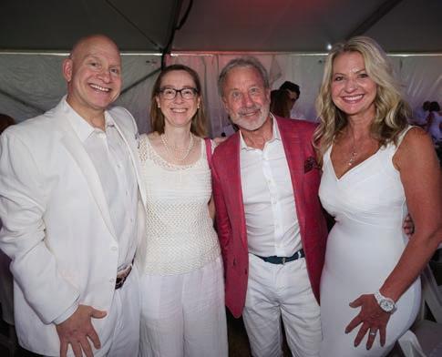


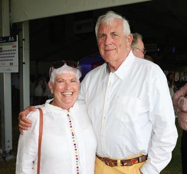
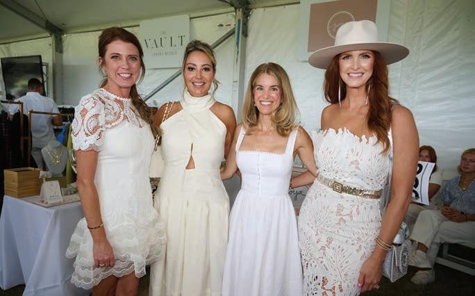
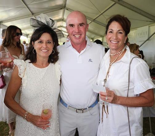

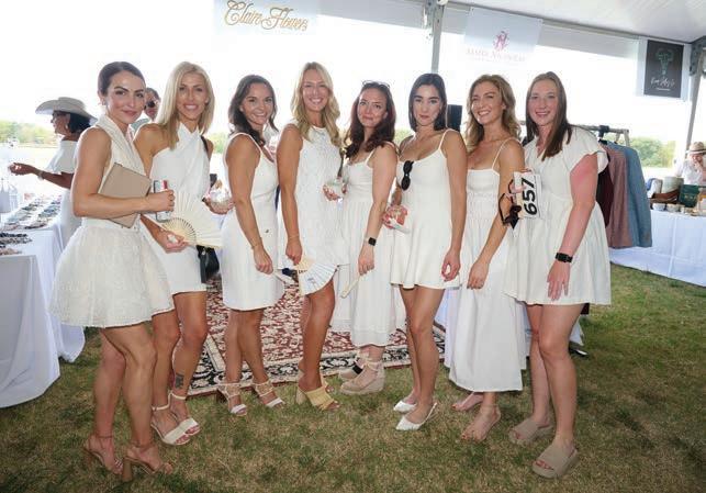
The annual Glennon Gallop, held on September 21 at the picturesque August Busch Polo Club, brought together the community to support The Danis Pediatric Center at SSM Health Cardinal Glennon Children’s Hospital. Attendees enjoyed an exciting polo match, live music, gourmet food, and an elegant atmosphere, all while raising vital funds for pediatric health care. The event celebrated the spirit of giving, with generous contributions helping ensure that children receive the care they need, regardless of their family’s ability to pay.
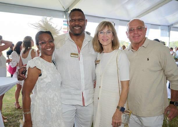
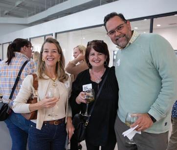
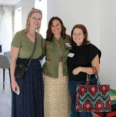
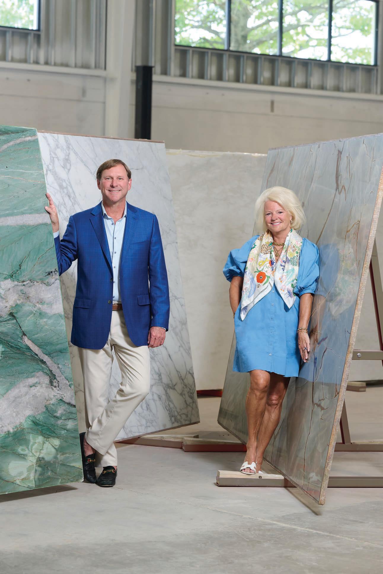
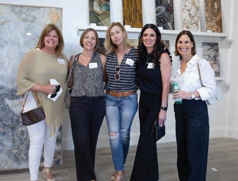
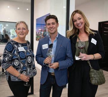
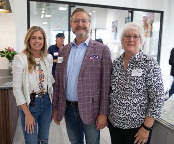
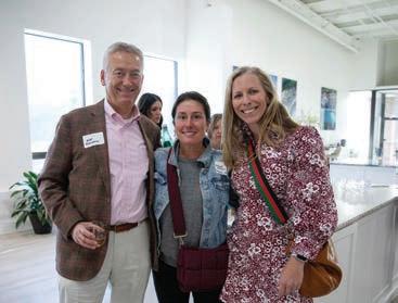
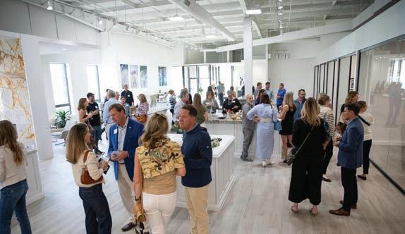
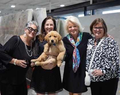
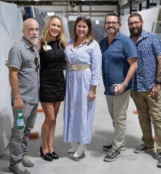
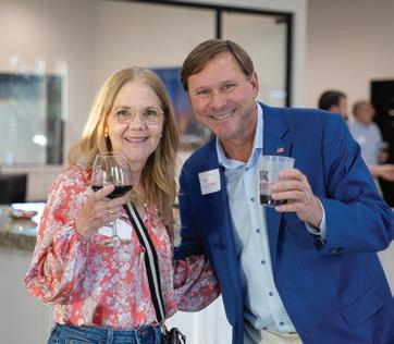
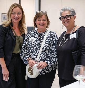
Following a complete renovation of the former Virginia Tile showroom in Dielmann Industrial Court, Virginia and John Howell hosted more than 100 architects and designers for the Grand Opening of Two Rivers Stone Boutique on Oct. 3. With catering by Butler’s Pantry and media partner Sophisticated Living, guests enjoyed walking the warehouse with a huge selection of semi-precious, onyx, quartzite, marble, granite and other stones from around the world hand-selected by the Howells.



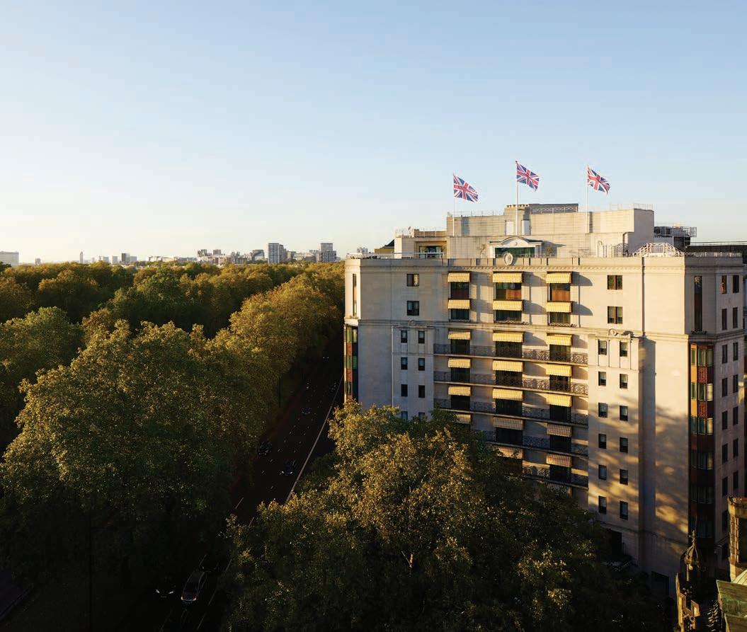
Sister properties 45 Park Lane and The Dorchester in London's posh Mayfair district bordering Hyde Park provide guests with distinct interpretations of the royal treatment.
Written by Bridget Williams / Images courtesy of The
I will readily admit to being an occasional ardent Anglophile. A storage tub in my attic holds yellowed newspaper clippings from the wedding of Charles & Diana: a testament to the rapture the spectacle inspired in my seven-year-old self. Whimsical wallpaper in my foyer is emblazoned with bowler hats and British flags, and an accent pillow in my living room reimagines a famous portrait of a young Queen Elizabeth in profile from a punk rock perspective. So, imagine my delight when, while strolling The Mall, a tree-lined royal road leading from Trafalgar Square to Buckingham Palace, a polite bobby asked us to wait for a moment before crossing at a corner. Our compliance was rewarded moments later by a backseat nod from King Charles himself as his car turned down a street in front of us...my idea of a magic kingdom moment!
During this London holiday, I wasn't the only one to have foggy childhood memories rush to the forefront with the suddenness of a pie to the face. After taking the Eurostar from Paris to London and exiting the Tube to see characteristically grey skies, we approached the 10-story building at 45 Park Lane (dorchestercollection.com/london/45-park-lane) in London's
posh Mayfair neighborhood, designed by a team of Modernist champions that included Walter Gropius (founder of the Bauhaus school and architect of the MetLife Building in New York) when my fiancé suddenly remembered walking by this spot on multiple occasions with his family as a child and getting up onto his tippy toes to try and see what was going on behind the curtained streetlevel windows. The intrigue was undoubtedly heightened when he lived in the city during his boarding school years, knowing that the prestigious address was the hippity-hoppity home of the London Playboy Club (1965 until 1982).
In 2011, 45 Park Lane was given an extreme makeover inside and out to become a suitable sibling to its sister, The Dorchester (dorchestercollection.com/london/the-Dorchester), one of London's most iconic hotels since it opened in 1931. While not quite a regular, the late Queen Elizabeth was a long-time fan of The Dorchester, having attended her first charity ball there and using the property for an event to formally announce her engagement to Lieutenant Philip Mountbatten, who later held a "media-friendly" stag night in the hotel's Park Suite before taking the raucous party private at the Belfry Club.
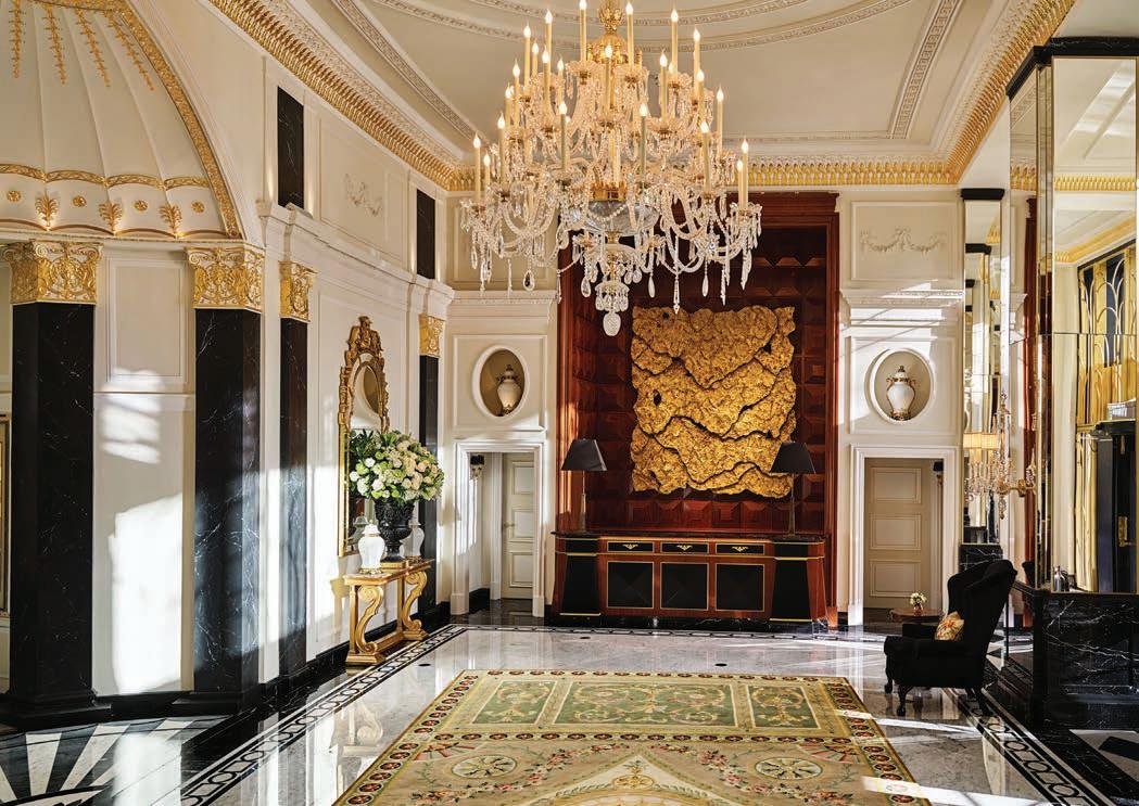
Though both fall under the 5-star Dorchester Collection umbrella, 45 Park Lane and the Dorchester are dissimilar siblings in their aesthetics. However, their shared DNA is evidenced in terms of top-notch service and amenities.
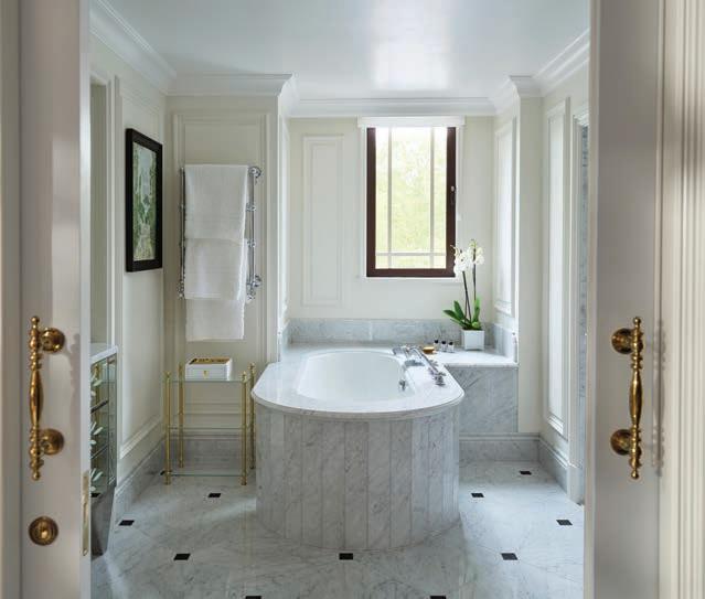
London-based architecture firm Paul Davis + Partners added metallic grille accents to the precast concrete exterior of 45 Park Lane that lend a slightly subtle Art Deco flair, with renowned French architect-designer Thierry Despont (1948-2023) running with the theme for the clubby interiors chock full of an evolving collection of Blue-Chip artworks by contemporary British artists in both public and private spaces. Each of the 45 guest rooms overlooks leafy Hyde Park. The view from our sexy Curzon Balcony Suite, with a whopping 1,100 square feet, a dining area for six, and a separate living room, allowed us to see all the way to Wellington Arch. The sensual interiors were highly detailed, with raised sisal plaid carpet, Tiffany blue velvet paneled walls, oversized floor lamps with shades bound in leather to match an upholstered closet wall, and a cute branded purple rubber duckie to keep you company while soaking in the deep bathtub. The room was also exceptionally quiet without a hint of street noise from Park Lane.
There are two restaurants on the property. Just off the doubleheight lobby is Cut at 45 Park Lane by Wolfgang Puck, the celebrity chef's debut European eatery. We started dinner with our first-ever tasting of British bubbly, a 2019 predominantly pinot Classic Cuvée from Rathfinney Estate in Sussex. Apparently, as we learned from head sommelier Davide Bottoni, climate change is
gradually expanding the possibilities for viticulture in the UK. The Negroni trolley pulled up to our table just in time to steer the table topic to something lighter, including the Italian sommelier's recent road trip along Route 66 with his brother and parents. After careful consideration, I opted for the chestnut-infused variety, a riff that imbued the classic cocktail with a smoother finish.
For the main course, we had the world's red meat literally at our fingertips as our server presented a tray with cuts hailing from the US, the UK, Australia, and Japan. Our perfectly prepared steaks paired wonderfully with a red wine from Judeka, an organic/ biodynamic winery located in the southeastern area of Sicily.
Ascend a flight of stairs to reach Sushi Kanesaka, an exclusive Michelin-starred omakase-inspired experience offered to just nine guests in two evening seatings. Also tucked away above the lobby is intimate Bar 45, sitting alongside The Dorchester's swanky Vesper Bar as the pinnacle of Mayfair hotel bar luxury, offering all the beautiful people sipping unique cocktails from bespoke glasses.
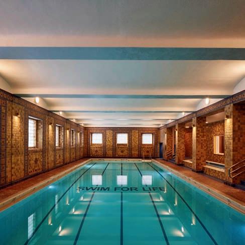
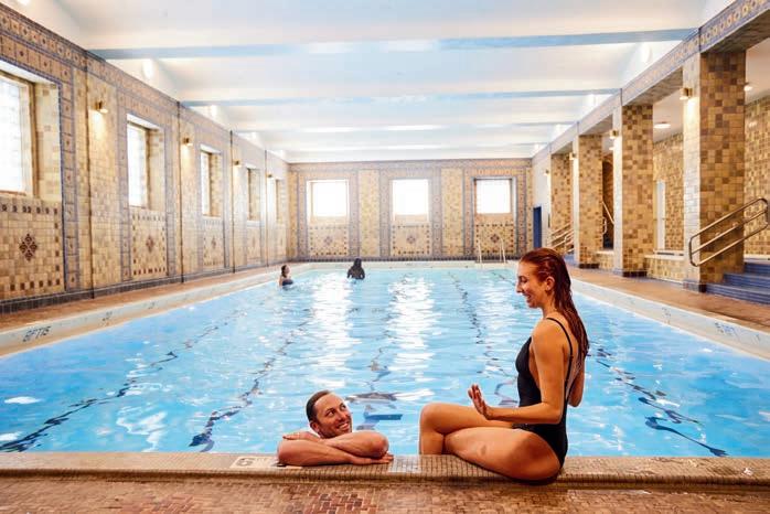
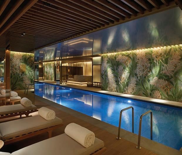
45 Park Lane's spa and wellness center is a subterranean respite from the bustle of the city. The complex's centerpiece is a 20m lap pool dramatically illuminated to highlight the intricate tile mosaic depicting oversized hyacinth. Sprawling and well-equipped, 007 would feel right at home perfecting his physique in the gym's ebonized interiors while his paramour luxuriates in the warmly lit spa, enjoying treatments designed by Dr. Uliana Gout (a respected thought leader in evidence-based aesthetic medicine) with products from ishga that harnesses the power of Scotland's pure seaweed.
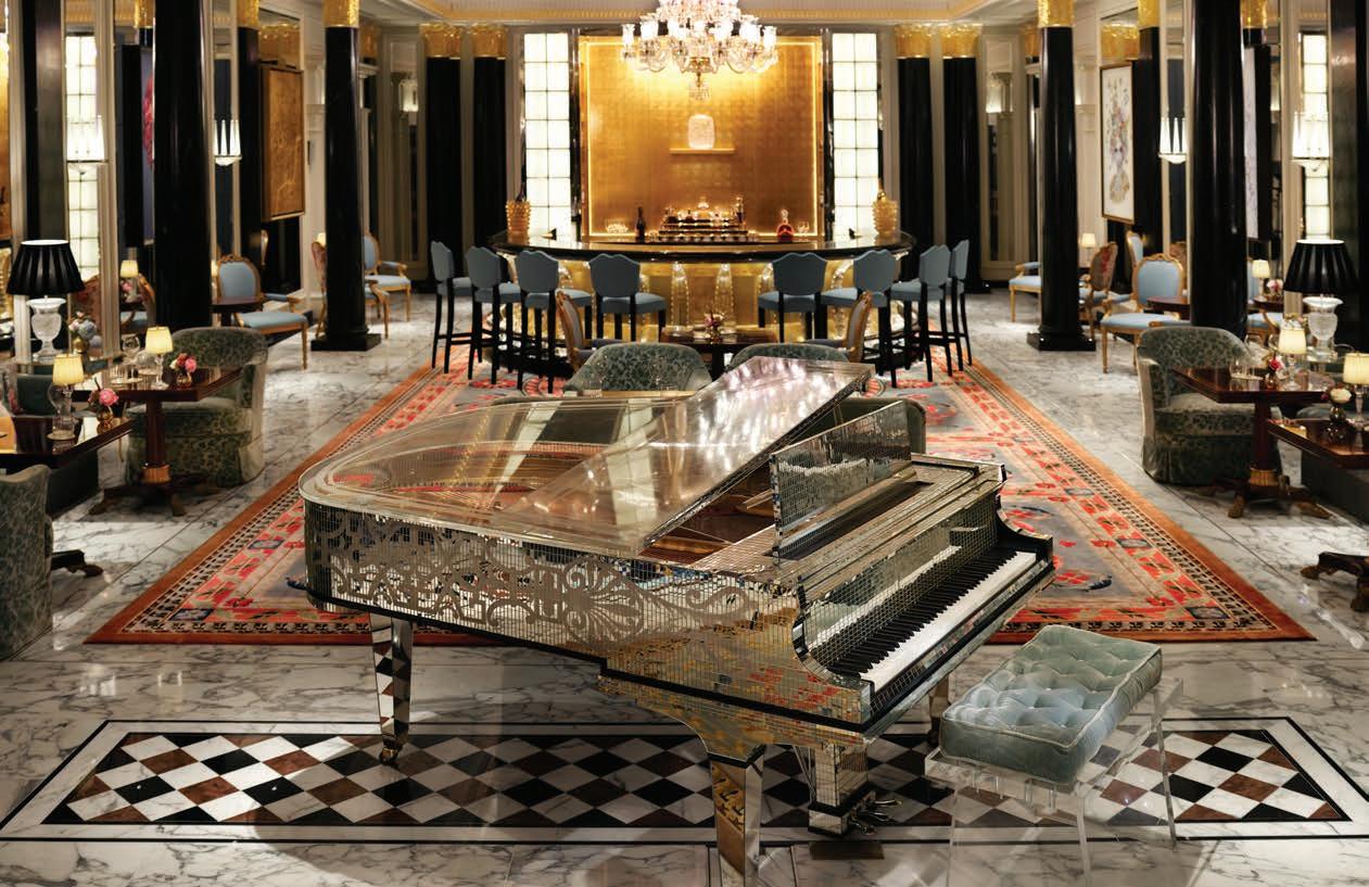
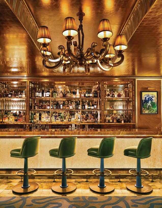
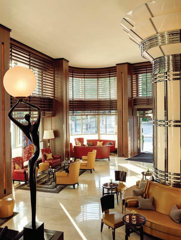
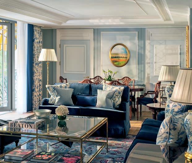
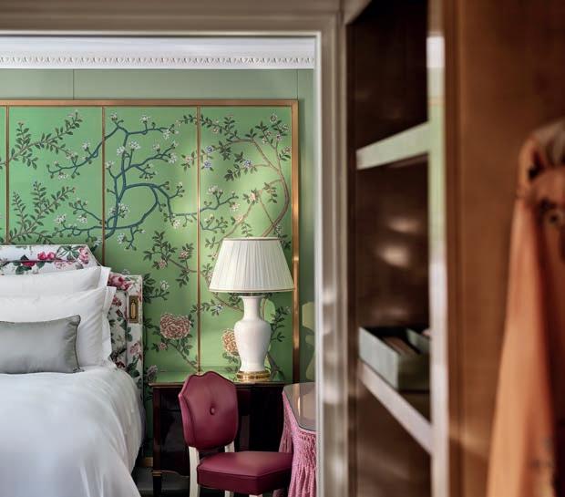
As hard as it was to leave the chic confines of our suite at 45 Park Lane, we decamped to The Dorchester for a few nights, with the doorman at the former insisting he transport our bags for the short transfer. I hadn't been to The Dorchester in over a decade, and as soon as I stepped inside, the familiar feeling of an eternal spring washed over me. A pair of omnipresent urns positioned at the start of the Promenade spurred the moment of déjà vu. The vessels' burgeoning blooms are refreshed every three days, so there's never a less-than-perfect petal present.
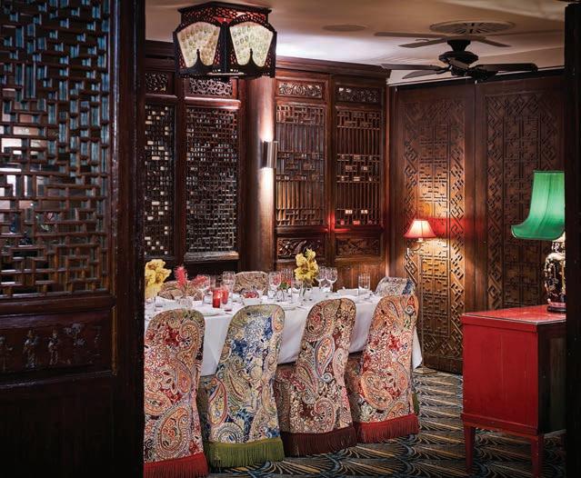
The Promenade has been the place for high tea and leisurely lunches with Niçoise salad tossed tableside for nearly a century. Glasses clink against the backdrop of a pianist tickling the ivories of a grand piano covered in mirrored mosaic tiles that once belonged to none other than Liberace. Composite columns of black marble with gilded capitals separate mirrored wall panels from which an eclectic art assemblage is displayed. A contemporary collage by Maria Rivans highlighting the piercing gaze of a young Elizabeth

Taylor (who considered the hotel a second home in the 1960s), and an oversized rendition of a Machin stamp depicting a young Queen Elizabeth created by Ann Carrington using more than 1,000 motherof-pearl buttons, overlays youthfulness upon the ornateness, which culminates at a gilded and bespoke Lalique bar crowned by a Baccarat chandelier. The sumptuous setting, formal and fabulous, is perfection for people like me who fully embrace pomp and circumstance.
Determined to age with grace without looking old (a reality this 50-something traveler can relate to), guestrooms on four of the eight floors were under renovation during our stay. Our third-floor room, recently redone, boasted a spring-like palette in shades of green and yellow with a proliferation of patterns that called to mind the bold and beautiful interiors of The Greenbrier.
Befitting a property of its stature, the food and beverage options are plentiful, from the three-Michelin-starred Alain Ducasse at The Dorchester to Cake & Flowers, whose tagline is "Where Beautiful Blooms Meet Outrageously Good Cakes."
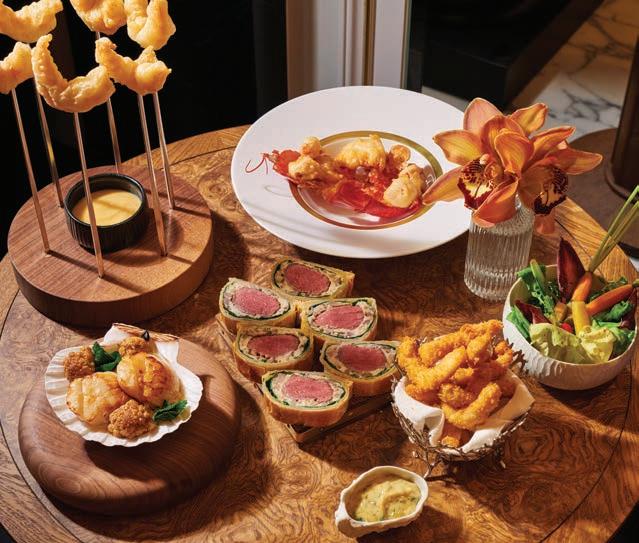
We were thrilled to try The Grill by Tom Booton, which, when it opened, made Booton the youngest chef appointed to helm the kitchen in a 5-star hotel (he was 26 at the time). Still baby-faced at 31, Booton invited us into the kitchen following our meal, where his staff was putting the final touches on preparations for an event at Royal Ascot the following day. The Colchester native is clearly confident without being cocky, citing a work-hard ethic instilled by his parents and an understanding of the need for time outside of the kitchen as the bedrock of his success in what can be a grueling industry.
Bypassing formal training for time in renowned kitchens starting at the tender age of 15, Booton's menu at The Grill is, in his words, "simply plated, precise plates of food using beautiful ingredients." Booton was also given authority to refashion The Grill's interiors, and even the playlist, to reflect his upscale British grill classic fare and comfort dishes. If you can't get there for dinner, don't miss one of Booton's favorite dishes—the truffled egg soldiers—at breakfast.
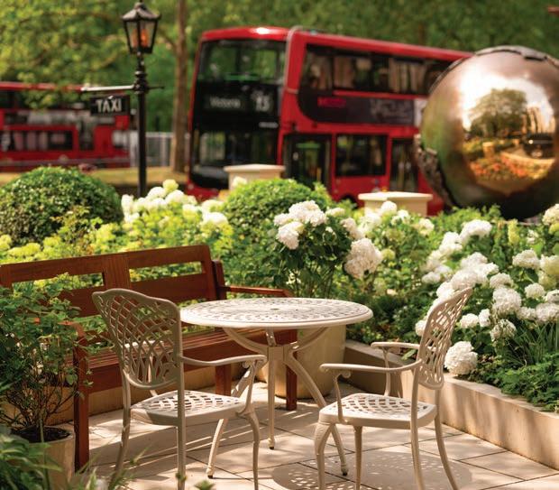
Just beyond the hotel's landscaped forecourt, in which stands The Dorchester Sphere , a bronze sculpture by Jill Berelowitz commissioned to celebrate her late Majesty Queen Elizabeth II's Platinum Jubilee, is the English capital's affluent Mayfair district, offering ample world-renowned shopping, theater, entertainment and tourist attractions. If you're feeling inspired by all The Dorchester and 45 Park Lane art, head to the National Gallery (nationalgallery.org.uk), where Van Gogh: Poets and Lovers is on display through January 19th.
The Victoria & Albert Museum (vam.ac.uk) is hosting F ragile Beauty: Photographs from the Sir Elton John and David Furnish Collection through January 5th and NAOMI IN FASHION, an exhibition exploring the career of fashion model Naomi Campbell through April 6th. For the ultimate art-lovers experience, book a bespoke walking tour with a chauffeurdriven car through the concierge at 45 Park Lane. The royal treatment, indeed. sl
Compiled by Bridget Williams
A modern form of armor, the talisman tendencies of these pieces serve as a contemporary way to protect and empower ourselves through fine jewelry.


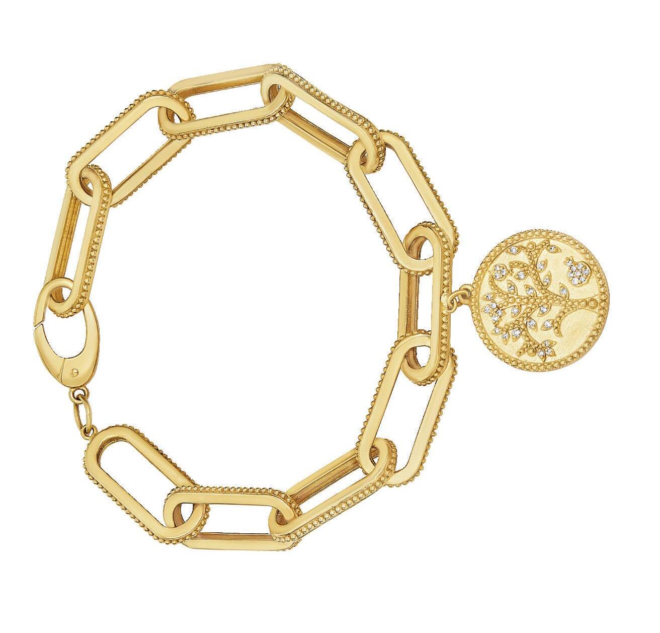


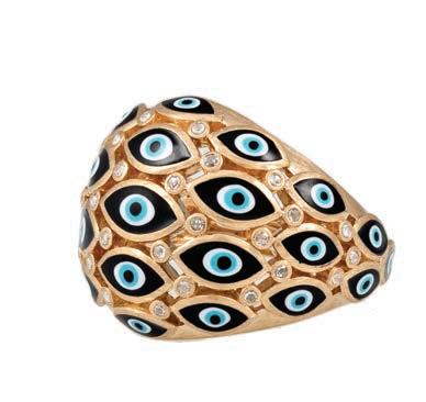


This page, clockwise from top left: In Louis we trust. Louis Vuitton Les Gastons small tag pendant in yellow gold and titanium ($3,600; us.louisvuitton.com). Heavenly Vices Charming Miniatures luck rondelles ($1,500; heavenlyvicesfinejewelry.com). Walters Faith Dora large clover charm ($4,950). Available through Ylang Ylang in St. Louis and waltersfaith.com. Anita Ko pavé diamond Baby Whistle pendant with marquis diamond ($8,825; anitako.com) Guita M treated opal bead necklace with detachable pendant ($3,250; guitam-jewelry.com) Jacquie Aiche enamel eye and diamond dome ring ($6,875; jacquieaiche.com) Marie Lichtenberg “Tutto Passa” (Everything Passes) bracelet ($24,460). Available through Diamond Cellar in Nashville and marielichtenberg.com. Hargreaves Stockholm Nomad “book” can be worn as a bracelet or folded to wear as a pendant (hargreavesstockholm.com) A reminder that anything is possible…Retrouvai Pig Fantasy signet ring ($3,980; retrouvai.com) Buddha Mama huggie earrings. The company donates proceeds from the sale of their 20k gold pieces to Tibet House and Kristi House, a non-profit center that provides the needs of child victims of sexual abuse and sex trafficking (buddhamama.com). From Lisa Dahlen, this ancient Roman denarius (90 BC) features a depiction of a rotund Pegasus. Bacchus, the god of wine, is featured on the reverse ($4,320; lisadahlen. com) Protect pendant from Jane Win Jewelry. The snake symbolizes wisdom, power and healing.($928; janewin.com) A tree is a universal symbol of strength and growth. Tanya Farah tree of life bracelet (tanyafarah.com) Capolavoro personalized Love Lock bracelet ($25,500). Available through Clarkson Jewelers in St. Louis and capolavoro.com. Opposite page, clockwise from top left: Scapular necklaces from Marie Lichtenberg (from $3,440). Available through Diamond Cellar in Nashville and marielichtenberg.com.
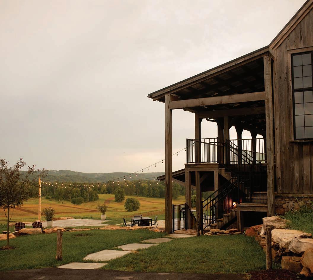
The all-inclusive Windy Hill Farm & Preserve in rural East Tennessee is an ideal place to explore and unwind.
Written by Bridget Williams / Images courtesy of Windy Hill Farm & Preserve
Nearly a quarter-century ago, Knoxvillian George Sampson fulfilled a long-held dream by acquiring 650 acres nestled into a horseshoe bend of the Tennessee River near Tellico Lake in Loudon and named it Windy Hill Farm for the near-constant breeze that rustles the treetops of a hill crowned by a water tower. Initially used as a working cattle farm, the property began a transition towards sustainability in 2014 when Sampson's grandson, Steven Brewington, a newly minted UT graduate who'd spent many childhood summers on the land, spearheaded a new round of investment aimed at operating the property in a more environmentally friendly fashion.
Over four years, as they sold off the herd, pasture was converted to dense native warm-season grasslands interspersed with fields of millet, oats, and sorghum (kinds of food quail find particularly tasty) to create an upland preserve. The restoration project led to a rebound of the area's endangered Northern Bobwhite quails, and the property became one of the few in the
South specializing in quail hunts. Because hunters, who are led on tailored, guided hunts, harvest birds regularly from October to March at Windy Hill Farm & Preserve, it's necessary to supplement the wild populations with pen-raised quail, a common practice at quail hunting lodges across the South. Windy Hill welcomes canine companions in several dedicated pet-friendly rooms, so you can bring your own four-legged bird finder or die-hard lap dog. Curious about quail hunting but have never tried it? Windy Hill has hosts of experienced guides and can even equip you with a shotgun and ammo.
Evidence that the ideas of capitalism and conservation can be complementary, Brewington gradually transformed the property into a boutique all-inclusive resort with luxury accommodations, an upscale restaurant, and a host of build-your-own-adventure activities on land and water that cater not only to wing shooters during hunting season (fall and winter) but also to those interested in just enjoying the respite offered by a few days in the great outdoors.
Seating adjacent to the Wilder terrace
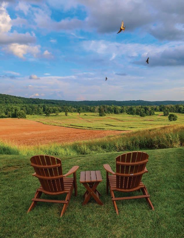
The property includes more than two miles of shoreline along the Tennessee River with a dock to launch kayaks and paddleboards.



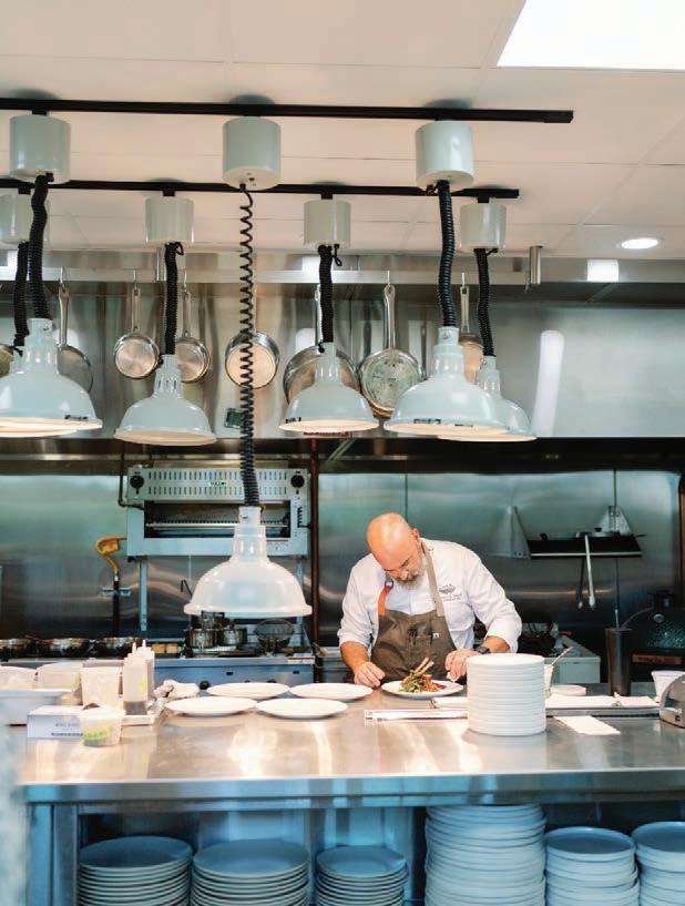
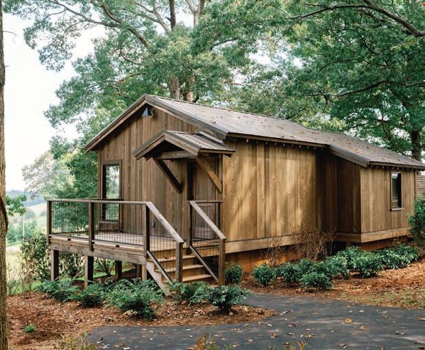
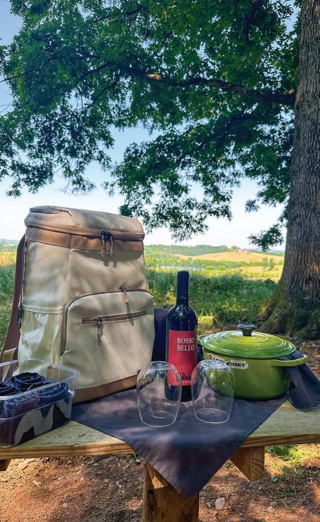
An easy four-hour drive from my home in Louisville, I could feel my blood pressure lower as soon as we turned onto the twisty rural roads in a region frequently referred to as the "Lakeway to the Smokies." The Watchhouse, perched atop a ridge with views spanning fields, woodlands, and the foothills of the Smokies, is the property's hub of activity. The main level hosts the reception desk, a small shop, and a vaulted living area with a balcony overlooking the lower-level terrace of Wilder Restaurant, where guests enjoy three included meals daily. As soon as we began to unload our bags, I was immediately reminded of why I love traveling in the South: everyone seems to have an innate sense of hospitality.
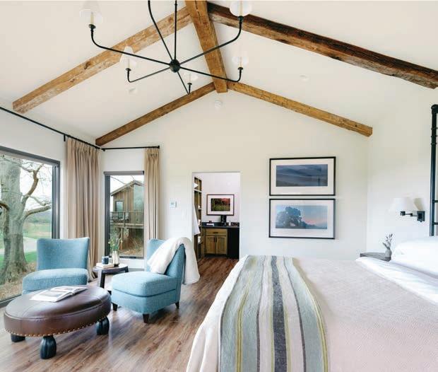
Lodging is spread among nine individual Water Tower Cabins grouped around a communal fire pit, the hotel-style eight-room Lodge, or the five-bedroom Farmhouse. The layout of each cabin is identical, with a vaulted ceiling accentuated by rough-hewn beams and a wall of glass along the backside (my favorite feature) that frames the pastoral and river views. One morning, I opened the
drapes and was surprised to find a rafter of wild turkeys checking out their reflections. With a pair of comfy chairs centered in front of the pane, it would be the perfect place to spend a day catching up on all that reading you keep promising yourself you'll do. The "quiet" interiors were outfitted in colors reflective of the landscape—I could imagine the paint chips with names like "baled hay," "morning mist," and "field grass." The cloud-like bed was dressed in velvety soft sheets, and the bath towels were oversized and plush, all luxurious little things that evidence attentive ownership.
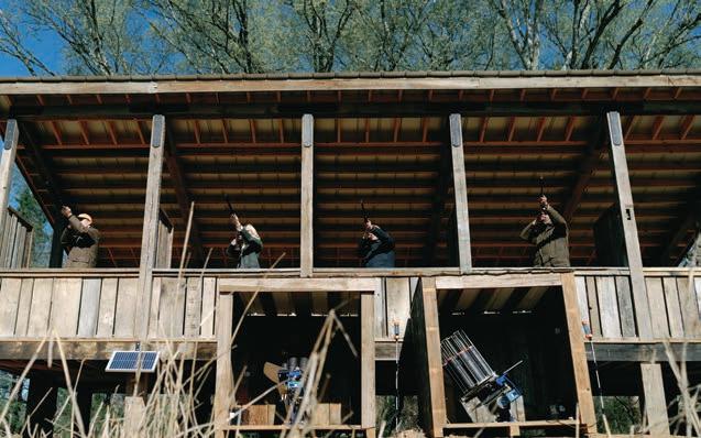
Each guest is given a golf cart to explore the property, although we did most of ours on foot, hiking all five miles of designated hiking trails. Guests can purchase a pass with unlimited access to standard activities, including biking, beekeeping and honey tasting, forest bathing, kayaking and paddleboarding, garden tours, stretching and mobility classes, archery, and axe throwing. The fabulous Cindy Jones led our chosen activities—forest bathing and five-stand sporting clays. I chose the former on a lark, assuming that my fiancé

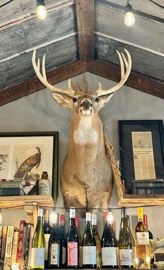
and I would be unable to stay silent or present for the duration of the mindfulness trek. Still, thanks to Cindy's guidance, we quite enjoyed the ecotherapy excursion, which ended with sharing a pot of tea while a 45 played softly in the background in the cutest activities cabin. After talking with Cindy about everything on offer, I do regret not opting for the wine hike and beekeeping, the latter of which Cindy is particularly passionate about.
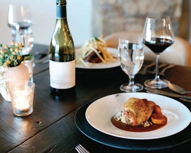
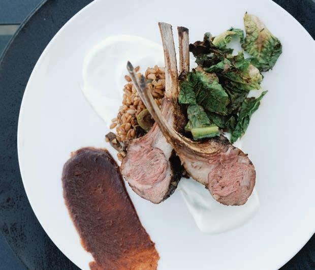
Meals at Wilder restaurant were an absolute delight. Affable Executive Chef Ben Warwick is a Knoxville native who has been at the property from its beginnings as a luxury resort. His kitchen, supported by a sizeable on-site garden, turns out wellproportioned plates full of interesting ingredients handled with a light touch and infused with global influence. "We have a lot of activities on site, so I never want guests to leave the table feeling like they need to take a nap," he remarked.
At dinner, we sampled rabbit, lamb, and quail and were surprised to find a few of our favorite Oregon pinots on the

interesting wine list. Service was sweet and sincere, and we enjoyed the authentic interactions. During a quiet period at lunch, we presented a couple of culinary challenges, which Warwick happily accepted and excelled. Our visit coincided with Windy Hill's regular Friday summer concert series on the Wilder patio and under the branches of a majestic tree someone fittingly described as the "Jerry Bruckheimer tree." Wilder is open to the public, and the patio was packed with locals enjoying a special concert menu that included one of the best burgers I've had in recent memory. Larger concerts are staged on Windy Hill's Granary Stage.
Even though I had more than my fill at dinner, I looked forward to returning to our cabin each evening, knowing the firepit would be ablaze and s'mores kits at the ready. It was a sweet finish to our sleepaway camp for grownups experience. sl
Windy Hill Farm & Preserve is open for reservations Thursday through Sunday. Rates start at $475/night for a lodge room and $700/night for a cabin, including daily meals for up to two people (windyhillfarmtn.com).
Compiled by Bridget Williams
When it comes to earrings, a dangle can be a drop, but a drop cannot be a dangle. Whether you prefer the subtlety of a stationary drop earring or the swinging drama of a dangle, we’ve rounded up something for everyone.

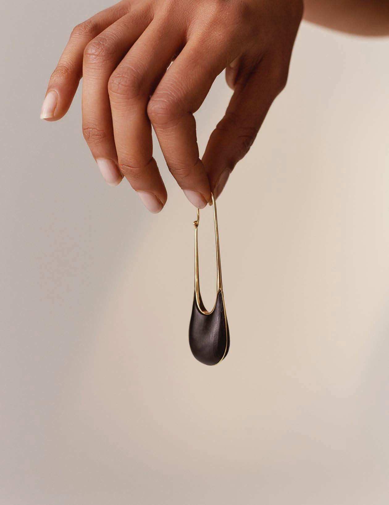
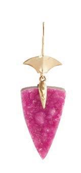
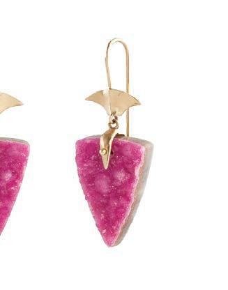
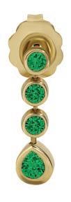
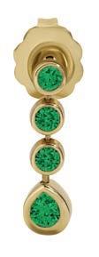
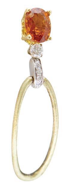
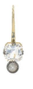
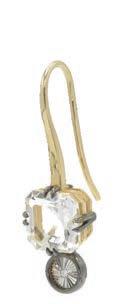


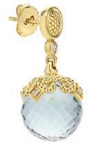
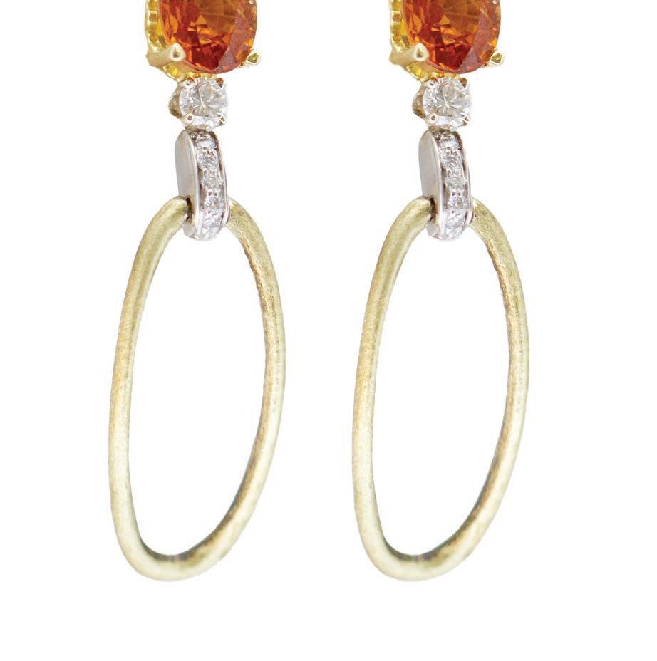


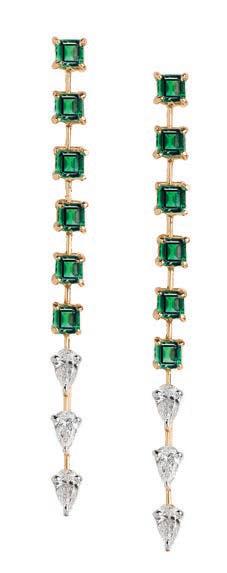

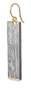
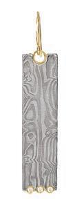
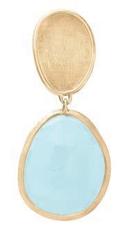
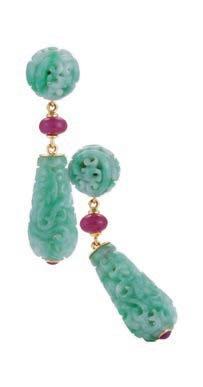


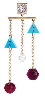


Annette Ferdinandsen Arrowhead Cobaltoan Calcite drop earrings ($1,540; brokenenglishjewelry.com). Bondeye Jewelry Highlight earrings ($2,395; bondeyejewelry.com). David Yurman petite pavé heart drop earrings ($1,650). Available through Moyer Fine Jewelers and Reis-Nichols Jewelers in Indianapolis, Davis Jewelers in Louisville and davidyurman.com. Picchiotti diamond and emerald chandelier earrings ($72,500). Available through Moyer Fine Jewelers in Indianapolis, Clarkson Jewelers in St. Louis and picchiotti.it/en. Chris Ploof Damascus dangle earrings (chrisploof.com). ITA Jewelry Sempiterno dangler earrings ($2,700; itajewelry.com). Jonne Amaya Baby emerald dangle earrings ($570; jonneamaya.com). Kavant & Sharart Twist Kaleidoscope double disc earrings ($9,250; kavantandsharart.com). LAGOS Studio Prasiolite Ball Drop Earrings ($6,500). Inquire about availability through Richter & Phillips Jewelers in Cincinnati, Moyer Fine Jewelers and Reis-Nichols Jewelers in Indianapolis, Diamond Cellar in Nashville and lagos.com. Marco Bicego Lunaria drop earrings with aquamarine ($1,600). Available through Reis-Nichols Jewelers in Indianapolis, Davis Jewelers in Louisville, Clarkson Jewelers and Simons Jewelers in St. Louis, and us.marcobicego.com. LÖF The XL Marionettes earrings ($11,600; lofjewellery.com). Albarré Jewelry garnet earrings ($3,900; albarre.com). Mikimoto Morning Dew Black South Sea Cultured Pearl Earrings ($7,600). Available through Reis-Nichols Jewelers in Indianapolis, Diamond Cellar in Nashville, and Clarkson Jewelers in St. Louis. Tejen Rock Sugar stick earrings ($12,200; tejen-collection.com). Ritique emerald and diamond line drop earrings ($9,290; ritique.com). Seaman Schepps Canton drop earrings in jade and ruby ($5,450; seamanschepps.com). Suzanne Kalan bespoke earrings (suzannekalan.com). Terzihan Epoca Gaia Index earring ($4,185; terzihan.com). Opposite page: KINRADEN IONIC MPINGO statement earring ($1,610; kinraden.com)

Compiled by Matthew Cottrell
Vanquish, Aston Martin's V12 flagship sports car (MSRP from $430,000), was unveiled to great fanfare on a Venetian lagoon amidst the starlit backdrop of the Venice International Film Festival. Vanquish will be Aston Martin's highest-performance sports car in its core product line-up and its most exclusive, with production limited to no more than 1,000 examples annually. Unique in this portfolio, Vanquish is the sole model to feature a bespoke, Aston Martin-developed 12-cylinder engine. Revived for the first time since 2018, this will be the third Aston Martin generation christened with the vaunted Vanquish nameplate.
In September, Audi of America announced an extensive refresh for the 2025 Audi A3 and S3 sedans, with all models arriving with standard quattro® all-wheel drive paired to 7-speed S tronic transmissions, increased power, chassis upgrades, and the addition of advanced torque-vectoring rear-axle technology from RS 3. The new interior inlays accent upgraded interior materials and
technology, with the 10.25" digital instrument cluster now standard. Wireless phone charging pad and door panel lighting options are now available, along with the Audi App Store upgrades that permit popular apps to be loaded directly into Audi's MMI. A top-view camera will also become available during the 2025 model year.
The very first BMW X5 was driven off the BMW Group Plant Spartanburg line in South Carolina on September 1, 1999. Since then, nearly 3 million X5s have been assembled there, destined for markets worldwide. The company is marking a quartercentury of creating the Sports Activity Vehicle Category with a limited-edition BMW X5 Silver Anniversary Edition (MSRP $79,900). Lime Rock Grey metallic paint, 20-inch M Star-spoke wheels, extended Shadowline trim, carbon fiber interior trim, and Silver Anniversary Edition badging distinguish the X5 Silver Anniversary Edition. The Standard xOffroad Package includes 2-axle air suspension, underbody protection plates, and four drive modes calibrated for various terrains.


In September, Bentley launched the fourth-generation Flying Spur (MSRP from $280,000-estimated), the most powerful Bentley sedan ever. Built around Bentley's new "Ultra Performance Hybrid" powertrain, the true four-door supercar is capable of silent progress in pure EV mode for up to 47 miles or when more spirited driving is warranted, calling on the Bentley V8 to pass the 0-60 mph benchmark in just 3.3 seconds–half a second quicker than its predecessor. Inside the spacious cabin is an all-new seat design that features 3D diamond quilting. New driver instrumentation graphics complete the package of design enhancements, while the acclaimed Bentley Rotating Display with its choice of 12.3" high-definition display, three analog dials, or an unbroken side of handcrafted veneer is as an option.
Unveiled at Range Rover House during Monterey Motoring week in August, the 2024 Range Rover SV Carmel Edition (MSRP $370,000) is an ultra-exclusive model curated by SV Bespoke, showcasing the pinnacle of Range Rover brand's luxury bespoke personalization service. Inspired by the lush greenery and ocean cliffs surrounding Carmel, California, the special edition features


a bespoke Satin Green exterior, complementing a Sequoia Green and Perlino leather interior. A 606hp V8 Twin Turbo engine powers each vehicle. Buyers will receive Titleist Professional club fitting experience for two at Titleist's Performance Institute in Oceanside, California, or Acushnet, Massachusetts, and two custom sets of clubs (putter through driver). The Del Monte Forest Conservancy will receive a portion of the proceeds from each sale.
Maserati's new super sports car, the GT2 Stradale (MSRP from $243,000 – estimated), made its world premiere at The Quail, A Motorsports Gathering, during 2024 Monterey Car Week, flanked on the display stage by the MC20 Icona, making its North American debut, and MCXtrema. The GT2 Stradale, the roadlegal version of Maserati's GT2 race car, shares the same Nettuno twin-turbocharged V-6 as the MC20 (but weighs 132 pounds less), with performance amped up to 631 horsepower and a top speed of 210 mph. According to the company, the Stradale zips from zero to 62 mph in just 2.8 seconds. At the launch, David Grasso, Maserati CEO, said, "The Maserati GT2 Stradale is a product that can fulfill the requirements of the most discerning enthusiasts, a new creation that expresses the brand's entire essence."

The 2025 model year specification of McLaren's 750S offers enhanced optional specifications and new levels of colorful visual personalization, including 12 new pre-configured themes for the MSO Contrast Pack created by McLaren Special Operations (MSO). For 2025 model year cars, the Stop/Start button on the 750S changes to Papaya orange, McLaren Racing's traditional color. It was first seen in the M6A Can-Am racer in 1967 and adopted by the McLaren Formula 1 team during the 1968 championship.
Mercedes-Maybach continued its series of special editions with the world premiere of the new Mercedes-Maybach S 680 Edition Nordic Glow (MSRP $339,000) at Pebble Beach. The MANUFAKTUR individualization program is crafting the exclusive model solely for the U.S. market and is strictly limited to 50 units. Inspired by the aurora borealis and the Arctic Circle, the unique exterior features a custom two-tone Northern Lights Violet Metallic / Moonlight White Metallic paint finish. The cabin features hand-stitched MANUFAKTUR Rose Grey Exclusive Nappa leather with intricate Amethyst Grey contrast stitching. There are high-pile trunk and floor mats with an embroidered Mercedes-Maybach logo and Rose
Grey Nappa leather piping. An "Edition Nordic Glow 1 of 50" badge adorns the center console. Among the extensive features are a refrigerator for rear seat passengers and Maybach champagne flutes.
The Porsche 911 Turbo (Type 930) redefined what was possible when it debuted in 1974. It brought turbocharging technology –which Porsche initially used in race cars such as the 917/10 and 917/30 – to the roadgoing 911, a unique design, and a nearly unparalleled level of daily usability for a sports car. Porsche is commemorating the 50th anniversary of the 911 Turbo with an exclusive special edition of the sports car icon based on the current 2025 911 Turbo S. The interior and exterior of the "911 Turbo 50 Years" adopts design touches from historic 911 Turbo models, with an optional Heritage Design Package further enriching the throwback look. For the first time on a 911, the anniversary model is adorned with Turbonite, a color exclusive to Porsche Turbo models. At the 1973 International Motor Show (IAA) in Frankfurt, Porsche presented the 911 RSR Turbo concept with seat centers and side bolsters in Black Watch tartan. In the anniversary model, "MacKenzie" tartan upholstery graces the same areas. sl


Longines Mini Dolcevita ($3,900). Available through Richter & Phillips Jewelers in Cincinnati, Moyer Fine Jewelers in Indianapolis, Davis Jewelers in Louisville and longines.com.
Oyster Perpetual Cosmograph Daytona, 40mm, white gold and diamonds ($73,000). Available through Richters & Phillips Jewelers in Cincinnati, ReisNichols Jewelers in Indianapolis, Davis Jewelers in Louisville, Diamond Cellar in Nashville, Simons and Clarkson Jewelers in St. Louis, and rolex.com.


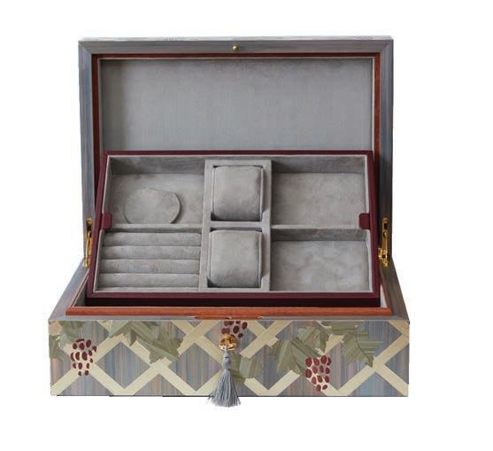
One-of-a-kind straw marquetry jewelry box by Lison de Caunes. Price upon request (lisondecaunes.com/en)

Vietri “Poppy” Siciclian terra cotta head ($860; vietri.com)
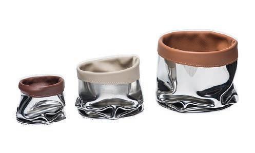
A trio of mirror-polished stainless steel and leather catchalls from the French craft concept store Empreintes ($1,962; empreintes-paris.com)

Assael Angel Skin coral and diamond bow ring (price upon request). Available through Diamond Cellar in Nashville and assael.com.
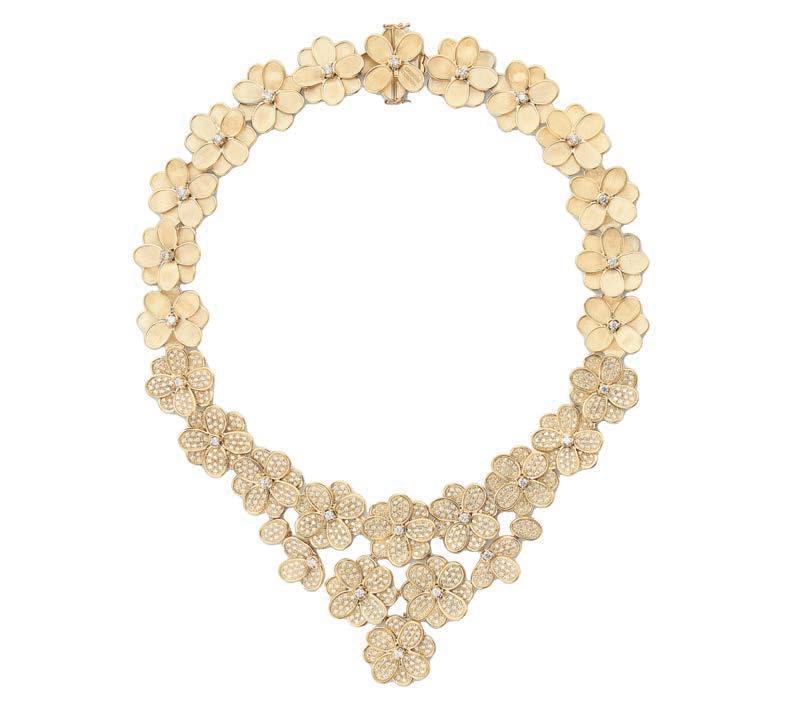
Marco Bicego PETALI 18K Y statement Necklace with Diamonds ($77,650.00). Available through Reis-Nichols Jewelers in Indianapolis, Davis Jewelers in Louisville, Diamond Cellar in Nashville, Simons Jewelers and Clarkson Jewelers in St. Louis, and us.marcobicego.com.



The new Racing Sport Diamond Ultra is the world’s most expensive Apple Watch case ($20,000). The case features 5.6 carats of VVC diamonds, 1068 in total, with each stone set by hand. Limited to 10 pieces worldwide (goldenconcept.com)
Mercedes-Maybach has released a collection of six unisex fragrances in collaboration with INCC Parfums. The sides of the vessels, which can rest on an elegant wooden base, are finished with polished aluminium, on which the Maybach logo and the name of the fragrance are engraved ($395/each; maybach-luxury.com)
MCM Limited Edition Parfum with hand-applied Swarovski® crystals ($1,800; mcmworldwide.com)


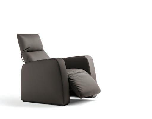
For the cinephile, the Pillow Cinema Armchair by Poltrona Frau offers unparalleled relaxation with its fully adjustable headrest, backrest, and footrest. Upholstered in luxurious Pelle Frau® leather his chair features a cooling/heating drink holder, wireless charging, and USB-A ports (poltronafrau.com/us/en).
Minimalist style with maximum listening options.
The Tivoli Audio Music System Home (Gen. 2) merges Hi-Fi streaming capabilities with smart home conveniences. Tivoli Audio's analog past has inspired simple hands-on controls, such as the tuning dial and volume/source knobs. However, it offers a full-function remote control or, when streaming, control audio via your smart device ($750; tivoliaudio.com)
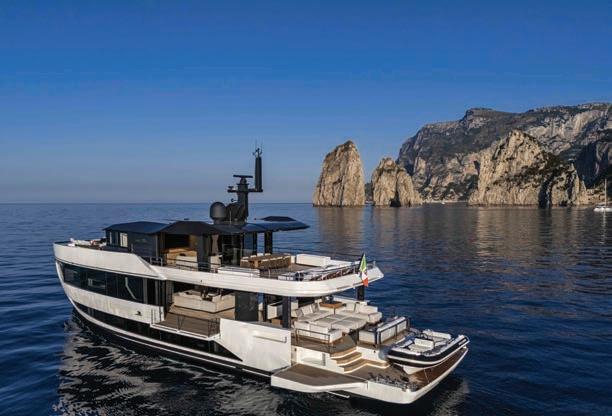

Named “Motoryacht of the Year” by the Robb Report, the A96 BY ARCADIA YACHTS is a 30-metre crossover yacht with five cabins that blurs the lines between sea and sky. Interior spaces are decorated with natural, eco-friendly materials, the design embraces soft lines and furnishings with a pleasing handfeel, and the sleek curves and dark lacquered surfaces conjure up an Art Deco mood (base price from $11m; arcadiayachts.it/en/yachts/a96-overview-en)
Next best thing: Exclusive Yachts is a membership club that aims to eliminate the challenges of owning and operating a luxury watercraft while delivering personalized yachting experiences. Memberships from $40,000 initiation and $70,000 annual fee (exclusiveyachts.club)
For ladies who lounge in luxury: cashmere knit trousers from Brunello Cucinelli, often referred to as “The King of Cashmere” ($4,995; shop. brunellocucinelli.com)

UK home fashion label Buster + Punch have teamed up for a capsule collection that unifies the best of both brands. The Cocotte is available in two sizes: 24cm ($349.99) and 28cm ($439.99; thestaub.com)

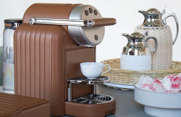
x Stéphane
Parmentier Collection leatherbounded Nespresso machine ($5,200; artemest.com)
Chess Set from Alexandra
is made in England with a flocking-lined Tiger Oak veneer box with signature fastenings. Set includes 32 Staunton-style wood chess pieces in Verdigris green and golden yellow lacquer and 24 semi-precious malachite and motherof-pearl draughts playing pieces ($11,890; alexandrallewellyn.com).

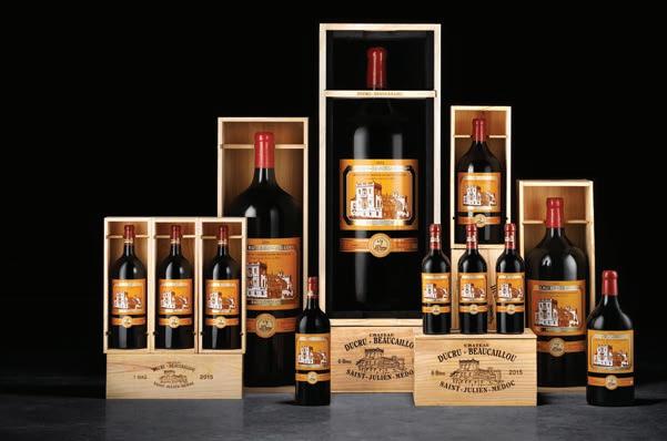
Released just once a year in limited quantities, Château DucruBeaucaillou's Celebration Collection brings together the equivalent of 100 bottles of wine including 21 bottles of the Maison’s estate wine, DucruBeaucaillou with less than 33 units produced per year ($28,000 - $35,000). For purchase information contact Accueil@ducru-beaucaillou.com.
Penfolds new Cuvée Brut Champagne, a combination of pinot noir, pinot meunier and chardonnay, is made in partnership with Champagne Thiénot and presented in a vibrant gift box painted in the signature Penfolds red ($275)



The Antero from Monday Motorbikes is a capable mountain bike designed with full suspension and a center mono shock. The design is intended to keep the wheels on the trail and the rider in control ($3,099, mondaymotorbikes.com)

From The Little Car Company, the Ferrari Testa Rossa J is a 75% scale reproduction of the Ferrari 250 Testa Rossa – developed and built from the original drawings kept in Ferrari Classiche. Limited to 299 examples, this battery-powered mini marvel boasts four driving modes, and a top speed of 50mph. (From $100,000; hedleystudios.com)
Louis Vuitton golf bag ($22,600). Available at select Louis Vuitton stores, 866.VUITTON, and louisvuitton.com
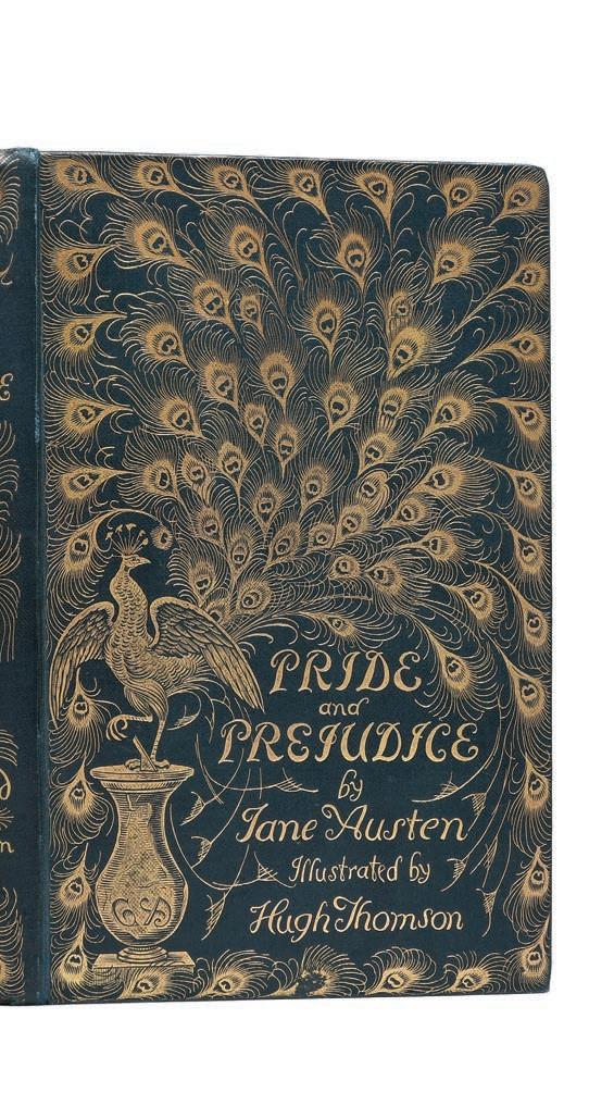
With shops in Mayfair and Chelsea, Peter Harrington Rare Books is one of the leading rare book dealers in the world and the largest antiquarian book dealer in Europe, stocking hundreds of first editions from some of the most famous literary works (peterharrington.co.uk)
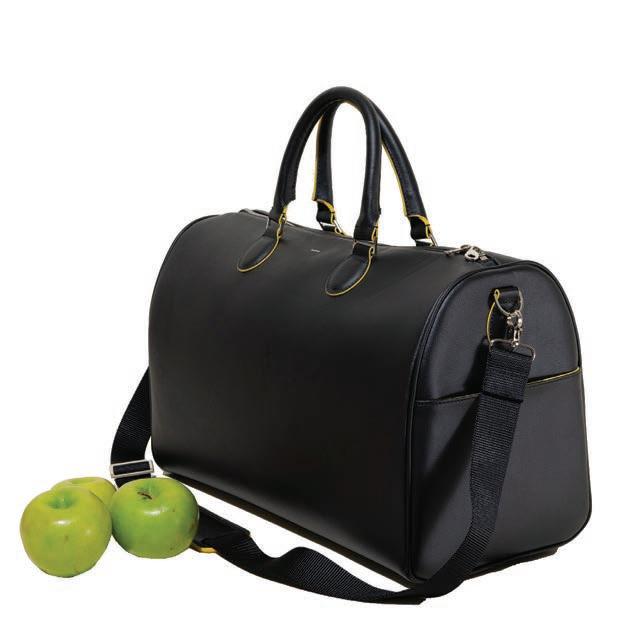
Allegorie Black Gala Cruiser is crafted from natural apple peel and plant-based materials ($575; allegoriedesign.com)

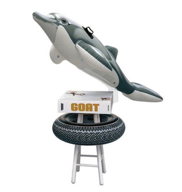
Taschen’s GOAT. Champ’s Edition ($15,000), Limited Champ’s Edition (No. 1–1,000), signed by Muhammad Ali and Jeff Koons, with four gelatin silver prints and the Jeff Koons sculpture Radial Champs (taschen.com)
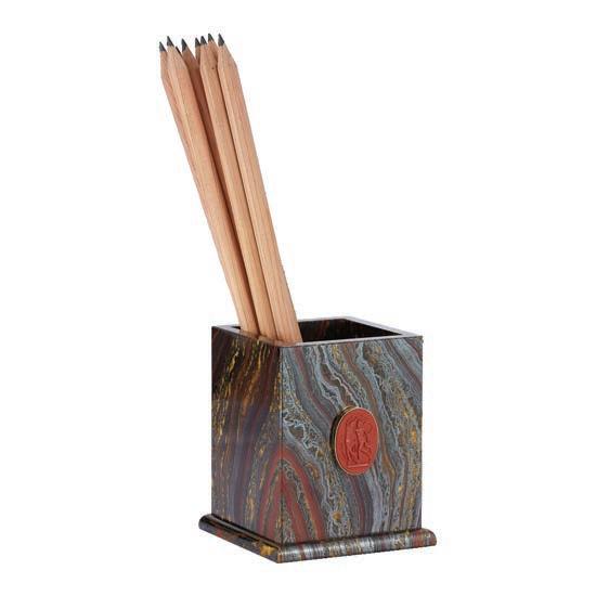

For 300 years, the prestigious Bordeaux Maison Château Ducru-Beaucaillou has prided itself on welcoming friends and family for an unforgettable experience in Saint Julien.
Written by Bridget Williams
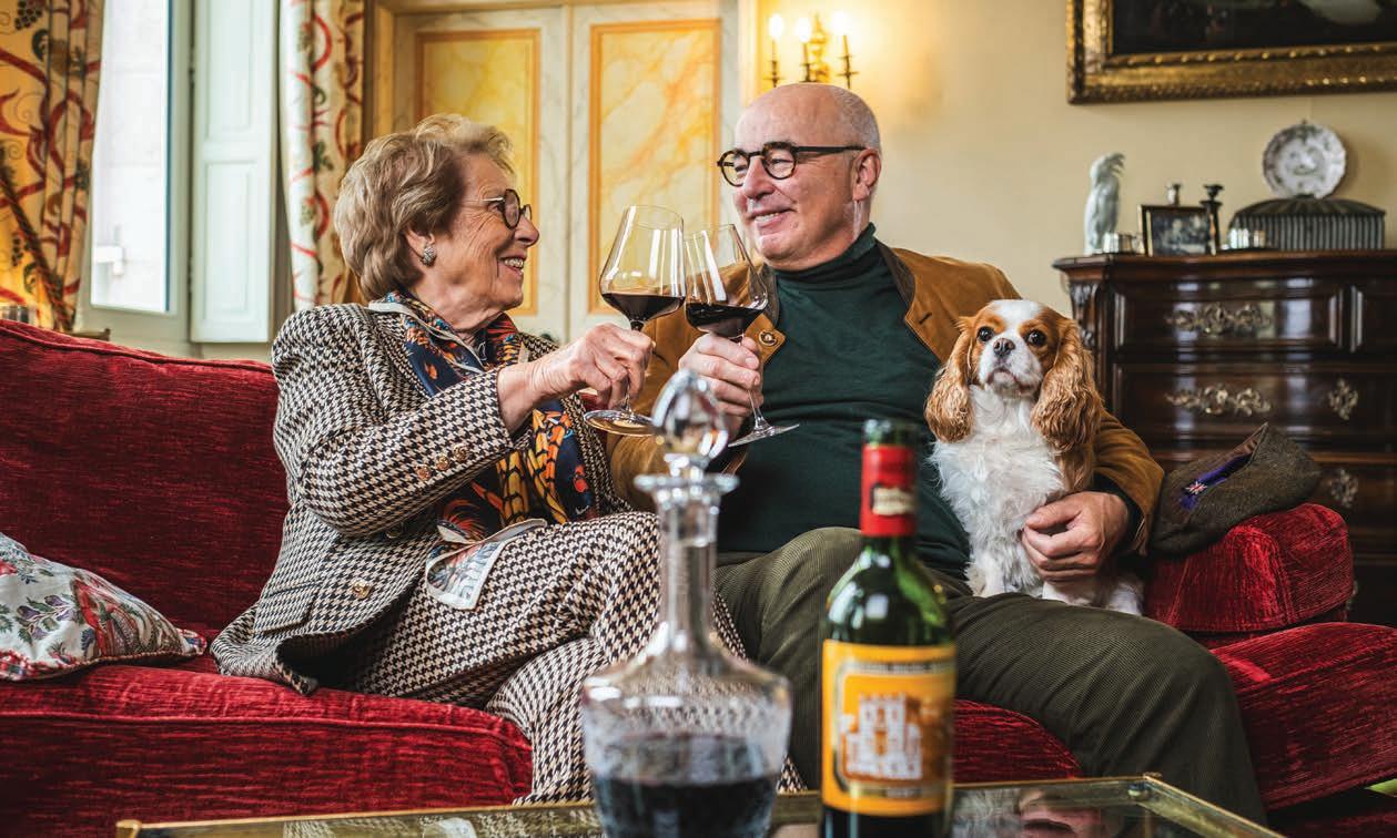
Everything in this house is a memory.
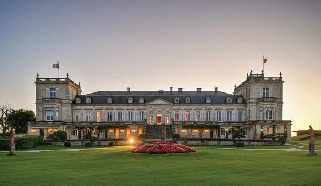
Amidst a vast estate of more than 250 acres in the vineyards in the Saint-Julien appellation in the Médoc region, where soils comprised of gravel, marl, and pebbles have produced wines of grace and elegances from before the Napoleonic classification of 1855, sits the jewel of the Ducru-Beaucaillou estate: an impressive building in the Directoire style.
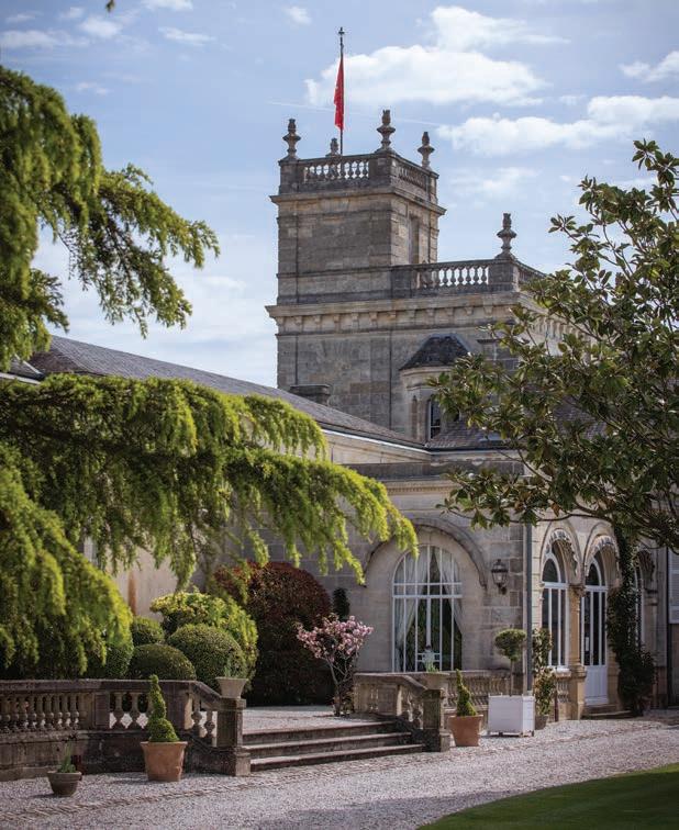
Commissioned by Bertrand Ducru in the 1820s, Parisian architect Paul Abadie's creation boasts a raised ground floor that gracefully follows the natural level of the land, gently sloping towards the banks of the estuary, on which the heavy traffic in the 19th century offered the spectacle of a navy constantly on the move. Two Victorian-era towers, designed by Michel-Louis Garros, winner of the Grand Prix d'Architecture in 1887, impart a majestic configuration upon the original structure.
Surrounding the château is a twelve-acre park conceived by landscape architect Eugène Bühler, a disciple of Michel-Louis Garros. Century-old trees, flower beds, winding paths, a pond, a vegetable garden surrounded by rubble walls and planted with trellised pear trees, and a beautiful wrought-iron greenhouse define the parklands. Statues of Diana, Bacchus, and Demeter are spread among a trio of terraces, positioned so that their faces bask in the sunlight that nourishes the vineyards.
Since 2003, Bruno-Eugène Borie, whose father Jean-Eugène spearheaded a modernization of the property that catapulted Ducru-Beaucaillou's reputation to the highest level in Bordeaux, continues a legacy that traces back to the Age of Enlightenment.
The genesis of that intellectual movement is alive and well in Bruno-Eugène, a man of insatiable curiosity and a diverse roster of interests. He introduced sustainable viticulture to the vineyard and contemporary art and design into the chateaux.
Keith Haring, Carl André, Christian Boltanski, Annette Messager, Claude Viallat, Jean-Pierre Raynaud, and Jean-Marc Bustamante are among the roster of artists warmly welcomed to Ducru-Beaucaillou. "My passion for contemporary art, cultivated during visits to the CAPC in Bordeaux, has greatly influenced Ducru's identity," said Bruno-Eugène, adding that one of his favorite recent collaborations was with Alain Ellouz, who created a stunning alabaster stone light that holds a double magnum of 1982 Ducru. "Art challenges us, much like winemaking, to push boundaries while honoring tradition," explained Bruno-Eugène. He asked Jade Jagger to create the "La Croix Ducru-Beaucaillou label," and he selected famous Parisian decorator and founder of Maison Sarah, Sarah Poniatowska–a descendant of the admired monarch, Stanislas II of Poland–to lead a refreshment of the château's interiors in advance of the estate's 300th anniversary, resulting in a harmonious marriage of classicism and modernity.
Not only is France the world leader in wine production, but wine has also always been an essential part of the French "savoir vivre" culture, translating into an effortless ability to live with elegance. In 2010, the 'gastronomic meal of the French' was inscribed by UNESCO on its Representative List of the Intangible Cultural Heritage of Humanity. At Ducru-Beaucaillou, when you step inside the château's kitchen, you glean that the
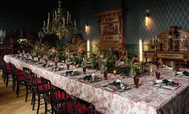
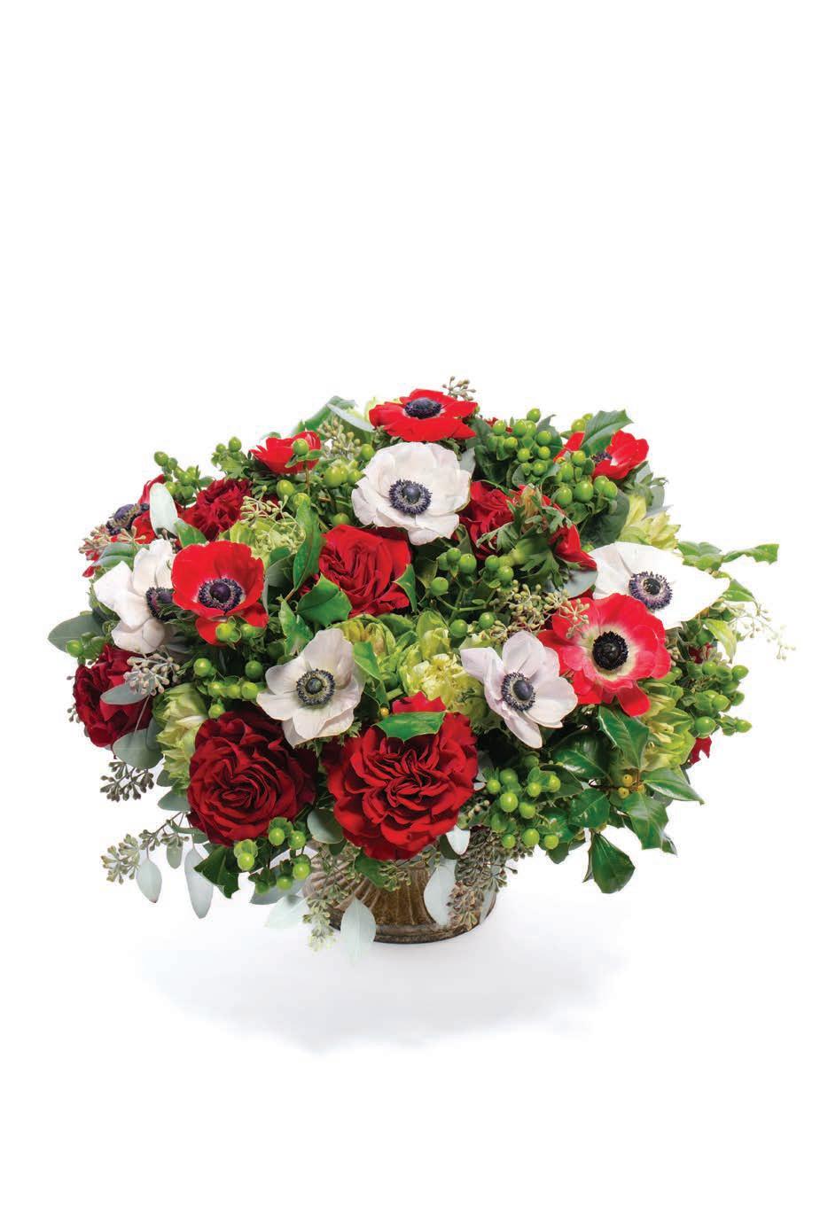
rituals of the table are heavy with memory, meaning, and mood. Bruno-Eugène remarks that he cooks because he can't forget. As he tends a simmering pot-au-feu concocted with vegetables from the garden, he feels the watchful eye of his grandmother. He feels at home in the kitchen and relishes interpreting the local gastronomy without pretense. Rivaling Bruno-Eugène's gastronomic fervor is his wife Frédérique's affinity for floral design and tablescapes, which result in grand seasonal displays in the formal dining room. The grandeur of the estate is tempered by the graciousness of Bruno-Eugène and Frédérique, who are hands-on hosts in their home.
A proud steward of its Second Growth (Deuxième Cru) status from the 1855 Classification of Bordeaux (one of 15), Ducru-Beaucaillou's reasoned approach to viticulture is grounded in heritage and refined through science. Bruno-Eugène regards nature as a "subject of law." Therefore, every procedure in the vineyard respects the entire ecosystem and is innovative and precise in its execution. For instance, the vineyard employs mechanical weeding, judicious grass cover, manure, and quality composts to eliminate herbicide and chemical fertilizer use. "Sustainability is not a new concept; it has been an obsession for vignerons for centuries," said Bruno-Eugène. "At Ducru, it's a mission embedded in every practice, every vintage, and every project we undertake."
We had the opportunity to ask Bruno-Eugène a few questions about the French art and legacy of hospitality in general and his approach in particular.
SL: How would you characterize the French philosophy of entertaining? B-E: In France, each province and city has its own social customs. Bordeaux is steeped in English culture (300 years) and cosmopolitan influences due to international trade. The city has long been animated by foreign merchants, with trading posts from the Hanseatic League (Bremen, Lübeck, etc.), Scandinavians, the Irish, and even Spanish and Portuguese.
As a result, Bordeaux's philosophy of entertaining is deeply rooted in the art of sharing and savoring life's pleasures. It's not just about the food or the wine—it's about creating a warm, welcoming environment where conversation flows as naturally as the wine. Meals are enjoyed at a leisurely pace, giving time for flavors, stories, and company to be fully appreciated.
In Médoc culture, every meal is a celebration, with meticulous attention to detail, from the choice of wine to the presentation of dishes. At Ducru-Beaucaillou, our family-owned estate embodies this philosophy. We believe that every gathering is an opportunity to share not just a meal but the rich stories behind our wines. Our diverse selection of vintages reflects our commitment to showcasing the evolution of our wines over time. Each wine tells a chapter in the story of our estate, contributing to an experience that is both refined and deeply personal.
Every event at Ducru-Beaucaillou is an invitation to explore these stories, savor the nuances of our wines, and enjoy a tradition of hospitality that values both the small details and the lasting impact of genuine connection. We are open to serving the most exclusive champagnes, white wines, and more.
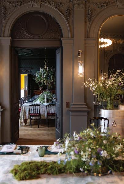
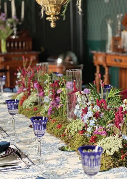
SL: What is your earliest memory of cooking/entertaining?
B-E: One of my earliest memories of cooking comes from the harvest feasts at Ducru-Beaucaillou when I was a child. Helmut Seidel, a former WWII prisoner who decided to settle here with his family, became our estate chef, cooking for over 200 people twice a day during harvest time. The smell of hearty dishes like pot-aufeu, poule au pot, or bœuf en daube au vin de Médoc simmering in giant cauldrons is something I'll never forget. Those moments gave me a deep appreciation for how food brings people together.
I also fondly remember the grand formal dinners my parents occasionally hosted for important foreign visitors in the château's grand dining room. These elegant black-tie affairs were filled with exquisite table linens and Limoges porcelain—my father invested in the renowned Haviland porcelain factory—alongside rare silverware and glassware. Every detail was a testament to their love of beauty and tradition.
The dishes were classic staples of haute bourgeoisie cuisine: fresh white asparagus with mousseline sauce, fresh salmon from the estuary grilled and served with béarnaise sauce, tender Pauillac milk-fed lamb with homemade pommes dauphine, veal Orloff, a generous cheese platter, and for dessert, either an ice bombe or peach Melba.
My father meticulously selected and prepared the wines, ensuring perfect pairings. The champagne was often Krug, whites from Domaine de Chevalier or Bonneau du Martray, and reds from our own estates (Ducru-Beaucaillou, Grand-Puy-Lacoste, and Haut-Batailley), elevating each course into a celebration of taste.
Growing up on the estate, I developed a close relationship with the vineyard, sensing its rhythms and feeling the impact of nature. Playing among the vines, I developed a fusional relationship with the land. Like our vignerons, I could feel the vineyard's rhythms when the east wind, the September sun, and the cool
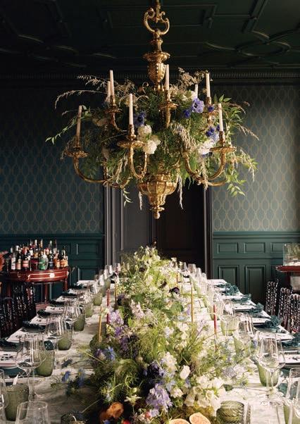
nights ripened the Cabernet Sauvignons, when too much rain would fall, or when the vines would bud. This connection to the land has shaped my approach to hosting and winemaking alike.
SL: Do you prefer large or small gatherings?
B-E: I appreciate both.
Small gatherings allow for personal conversations and a more intimate atmosphere, while larger celebrations reflect the grandeur of the moment.
At Ducru, we host both types of gatherings. Smaller events are perfect for honoring our 300-year legacy, creating meaningful connections with guests, and ensuring they experience the depth of our history and hospitality.
We also love grand celebrations, like the Médoc Food Festival at Beaucaillou, which we host annually for 500 guests. A gargantuan menu and a fine selection of wines—a perfect moment to explore the estate and experience the art of living at Ducru-Beaucaillou.
SL: Describe your perfect dinner party.
B-E: My ideal dinner party would be at Ducru-Beaucaillou, in our beautifully restored Great dining room. It would be a mix of friends, colleagues, and wine lovers from around the globe with great wine and seasonal dishes. Conversation would flow, but there would also be quiet moments to take in the surroundings—the vineyard, the château, and the company.
Recently, we hosted an extraordinary Michel Guérard dinner executed by his Chef, Stéphane Mak, which was pure enchantment. We reviewed Michel's iconic creations. Every dish was a masterpiece, the balance of each dish and the flavors were nothing short of sublime. We served our finest wines, including vintages from 1961 and 1955. It was a perfect evening.

SL: Do you have a signature dish?
B-E: I have many dishes I enjoy cooking, but my signature dish is Canard du Médoc en deux façons: thighs in a civet stew and breasts roasted with root vegetables. This traditional Gascon preparation is close to my heart and reflects my love for French cuisine and attention to detail. I'm happy to share the recipe with you:
Recipe for Canard Rôti en deux façons
The Day Before CIVET
1. Take two farm-raised ducks.
2. Remove the thighs (legs) and cut them in half.
3. Remove the wings.
4. Marinate the four wings and four legs in Médoc red wine with aromatics (carrots, celery, leek, bouquet garni, onion, shallot, garlic, peppercorns, cloves, and salt).
DUCK STOCK
1. Break two duck carcasses into four or six pieces.
2. Add the necks and brown everything in duck fat.
3. Add the same aromatics and sweat gently.
4. Cover with water and simmer for 2 ½ to 3 hours.
The Day Of PREPARATION OF "LES CUISSES EN CIVET"
1. Remove the leg pieces and thighs from the marinade and brown them in duck fat.
2. Flambé with a small glass of Armagnac.
3. Cover with the marinade and simmer for 1 ½ hours.
4. Set aside the duck pieces and strain the marinade.
5. Thicken the sauce with brown roux and adjust with spices and salt.
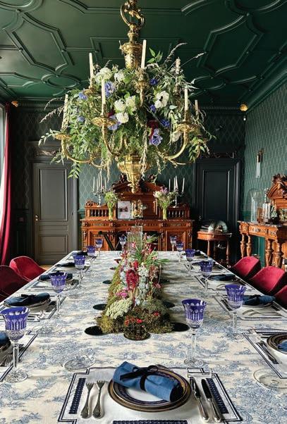
6. Add sliced black olives, pearl onions, diced ham, and mushroom caps.
7. Cook for 15 minutes, then return the duck pieces to the sauce and cook for another 15 minutes or more.
8. Serve with croutons
ROASTED DUCK LEGS WITH ROOTS AND OLIVES
1. Cut carrots, salsify, parsnips, celeriac, and turnips into large pieces.
2. Sweat them with two chopped shallots and bacon bits in duck fat.
3. Add duck stock and small green olives.
4. Meanwhile, brown two duck thighs in duck fat.
5. Place them on the bed of root vegetables and cook for 30-40 minutes.
6. Thinly slice the duck fillets. Cover generously with vegetables and olives.
This dish represents the "state of art" I admire in great French chefs like Michel Guérard, Alain Senderens, Paul Bocuse, or Joël Robuchon. Their dedication to technique, flavor, and perfection inspires my approach to both cooking and winemaking. I love the fine attention to detail—the balance of flavors, the slow development of textures, and the harmony that comes with perfecting such a recipe.
Pairing this dish with Château Ducru-Beaucaillou is the ideal way to complement its flavors. A radiant, extremely elegant, and perfectly balanced vintage like 2015 pairs beautifully with the civet, while an older vintage such as powerful 2010 enhances the roasted breast with its refined notes.
This meal is a perfect union of land, tradition, and craftsmanship, representing the best of French gastronomy and the spirit of our estate. It's not just a meal, but a celebration of the craft that defines both our wines and our table. sl
Our
2025 Concours Calendar is required reading for car collectors and motoring enthusiasts.
Compiled by Matthew Cottrell
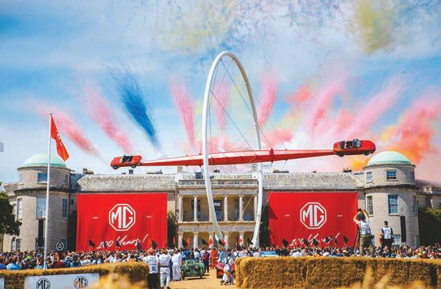
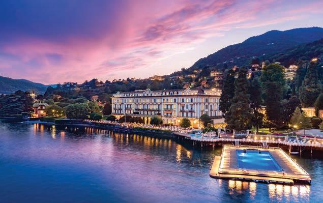
Concours d'Elegance, derived from a French term meaning "competition of elegance," traces its roots to 17th-century France, when aristocrats paraded their horse-drawn carriages through their estate grounds and Parisian parks on summer weekends. Today, the oldest motoring beauty pageant still in existence is the Concourso d'Eleganza Villa d'Este, first held on the grounds and gardens of the storied Villa d'Este Hotel on Lake Como in 1929. The Pebble Beach Concours holds the distinction of becoming America's first
JANUARY
19 Arizona Concours d’Elegance at the Scottsdale Civic Center ; arizonaconcours.org
FEBRUARY
2 Motorcar Cavalcade Concours d’Elegance at the JW Marriott Miami Turnberry Resort & Spa in Aventura, FL; motorcarcavalcade.com
15 Concours in the Hills presented by Phoenix Children’s Foundation; phoenixchildrensfoundation.org/signature/concours
27-3/2 ModaMiami at the Biltmore Coral Gables; modamiami.com
MARCH
9 30th Annual Amelia Islands Concours d’Elegance at the Golf Club at Amelia Island; ameliaconcours.com
APRIL
25-27 La Jolla Concours d’Elegance at La Jolla Cove; lajollaconcours.com
27 3rd annual Delray Beach Concours d’Elegance; delrayconcours.com
May
TBD Concourso d’Eleganza Villa d’Este, Lake Como, Italy; concorsodeleganzavilladeste.com
2-5 The Greenbrier Concours d’Elegance; greenbrierconcours.com
3-4 Keels & Wheels Concours d’Elegance at the Lakewood Yacht Club; keels-wheels.com
30-6/1 Greenwich Concours; greenwichconcours.com
JUNE
TBD Exposition of Elegance: Classic Cars at Cheekwood in Nashville, TN; cheekwood.org
TBD Philadelphia Concours d’Elegance at the Simeone Foundation Automotive Museum; Philadelphiaconcours.com
TBD Goodwood
1 Valetta Concours d’Elegance in Malta; vallettaconcours.com
3-5 London Concours; londonconcours.co.uk
12-15 Highlands Motoring Festival in Highlands, NC; highlandsmotoringfestival.com
15 30th annual Rodeo Drive Concours d’Elegance; rodeodrive-bh.com/
and arguably most famous car show when it debuted in 1950. More than just a car show, many of these events, which take over golf courses, country clubs, and private estates, have become multi-day lifestyle events, melding myriad passions from fashion, fine dining, and retail. As the car collecting world continues to mature, the evolution of these events challenges the establishment to offer a diverse audience new ways of connecting with all facets of the motoring world. sl
6-12 68th annual Porsche Parade in Oklahoma City, OK; porscheparade.org
10-13 Goodwood Festival of Speed; goodwood.com
12 7th annual Concours d’Elegance at Copshaholm; concoursatcopshaholm.org
18-20 Keeneland Concours d’Elegance, Lexington, KY; keenelandconcours.com
25-26 Concours of Elegance Germany at Gut Kaltenbrunn on Lake Tegernsee; concoursofelegancegermany.com
TBD Lake Tahoe Concours d’Elegance; laketahoeconcours.com
13-16 Rolex Motorsports Reunion; whatsupmonterey.com/events/monterey-car-week
15 The Quail, A Motorsports Gathering; peninsula.com/en/signature-events/events/motorsports
16 Concourso Italiano; whatsupmonterey.com/events/monterey-car-week
17 Pebble Beach Concours d’Elegance; pebblebeachconcours.net
SEPTEMBER
TBD Artomobilia in Carmel, Indiana’s Arts & Design District; artomobilia.org
TBD The Bridge Hamptons; thebridgehamptons.com
TBD The Dayton Concours d’Elegance at Carillon Park; daytonconcours.com
10 The New York City Concours, Madison Avenue & 72nd Street; thenycconcours.com
OCTOBER
TBD Audrain Newport Concours & Motor Week; audrainconcours.com
TBD Chattanooga Motor Festival: chattanoogamotorcar.com
TBD Hilton Head Island Concours d’Elegance; hhiconcours.com
TBD 5th annual Ft. Lauderdale Concours at Superyacht Village; ftlconcours.com
NOVEMBER
TBD Concours Wynn Las Vegas; lasvegasconcours.com
DECEMBER
TBD Palm Beach Concours; palmbeachconcours.com



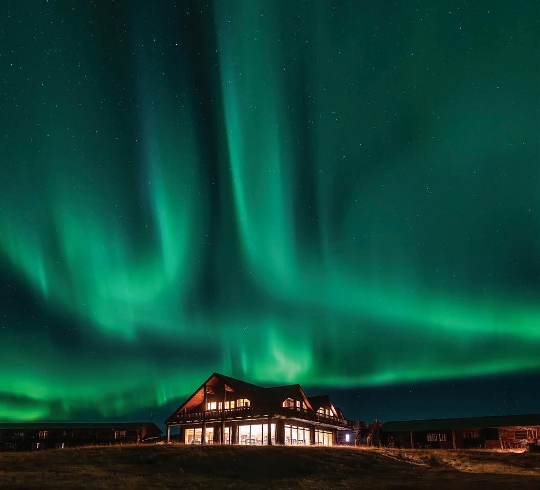
Hotel Rangá is an ideal base for exploring the marvels within Iceland’s famed Golden Circle
Written by Claire Williams / Photography courtesy of Hotel Rangá
Looking out over Mýrdalsjökull, Iceland's fourth largest glacier atop the volcano Katla, spanning roughly the size of Chicago (230 square miles), if you're not taken aback by the striking landscape of the black volcanic rock mountains veiled by melted patches of white ice and the thick tunneled walls within the ice cave (formed by the glacier meltwater), you're sure to be humbled by a sensation of smallness. Standing on a glacier whose genesis has BC written after it and has lived and evolved through a time we can only imagine, you become aware that our experience in this lifetime is just a blip. We were lucky enough to witness the glacier when a rare ring shape had formed within the ice (the glacier is constantly changing with ice melting, making each visit unique), creating a picture-perfect aperture to survey the vastness below.
As an American, I'm no stranger to feeling small in a country of sprawling and impressive National Parks and cities with skyscrapers towering above one another. However, Iceland's terrain feels otherworldly in terms of its raw and seemingly untouched natural features and the fact that it doesn't resemble
anywhere else (evidenced by the many sci-fi movies like Star Wars and Interstellar filmed there).
Only a few worldwide destinations merit a double dip on one's bucket list, but Iceland is undoubtedly worthy. Here's why: the mainland of Iceland is only a few degrees south of the Arctic Circle, creating a dichotomy of summers when the sun never sets and winters full of dark and starry punctuated by the occasional aurora borealis. Thus, the island nation, about the size of Kentucky, is worth two visits to experience the drastic differences due to seasonality.
We touched down in Reykjavik near the end of May and were lucky to experience the beginning of summer in Iceland. The sun barely set, but we still needed a jacket to ward off the remainder of winter's lingering chill. At the fringes of Reykjavik's metropolitan area, nature grabs the spotlight, with ancient lava fields covered in spongy moss and mountains in the foreground. We made our way to the south to Hotel Rangá (hotelranga.is), a roughly two-hour drive from Reykjavik in the township of Hella and an ideal location for less driving and more access to the island's marquee attractions.



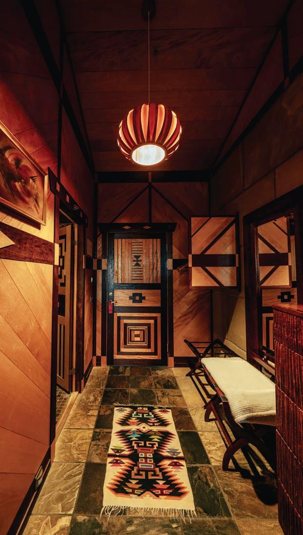
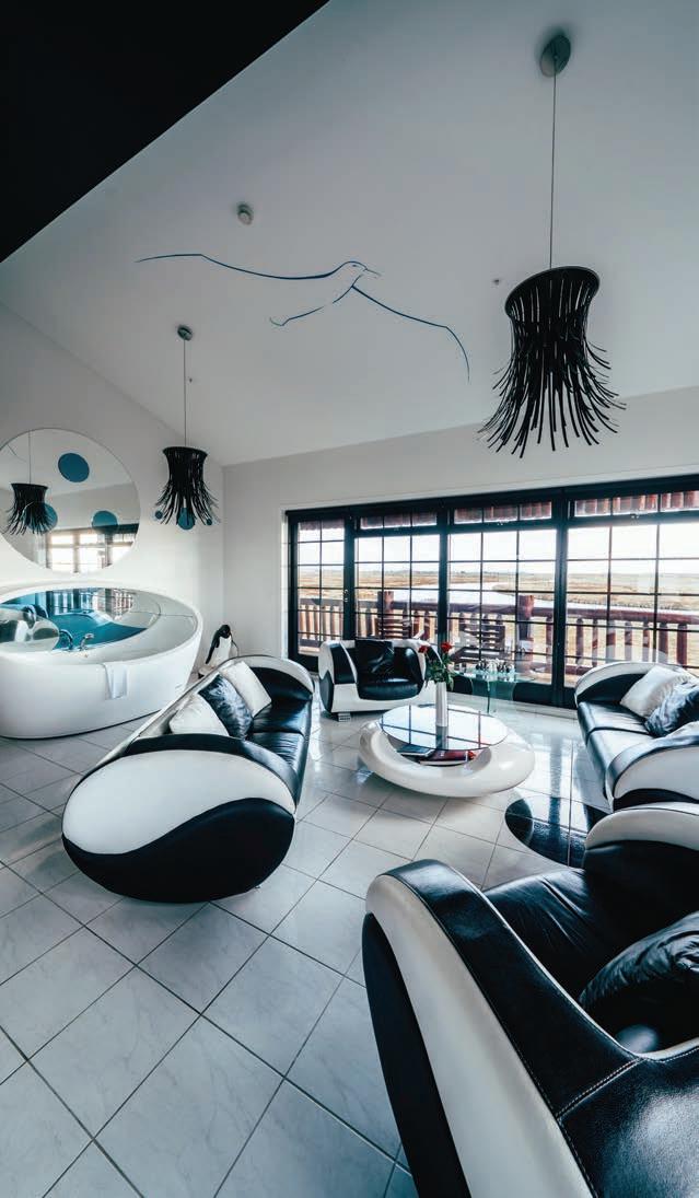
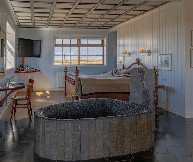

Arriving at Hotel Rangá, the sprawling ranch-style hotel, resembling a hunting lodge, sits alone amid a vast landscape that's bleak in a poetic sort of way. Owner Friðrik Pálsson greeted us at the front desk, standing next to Hrammur, a taxidermy polar bear standing on its hind legs so that one can truly appreciate all eight feet of the largest terrestrial carnivore. This moment of surprise is one of many in a hotel where the owner's idiosyncratic tendencies shine through in the whimsical design.
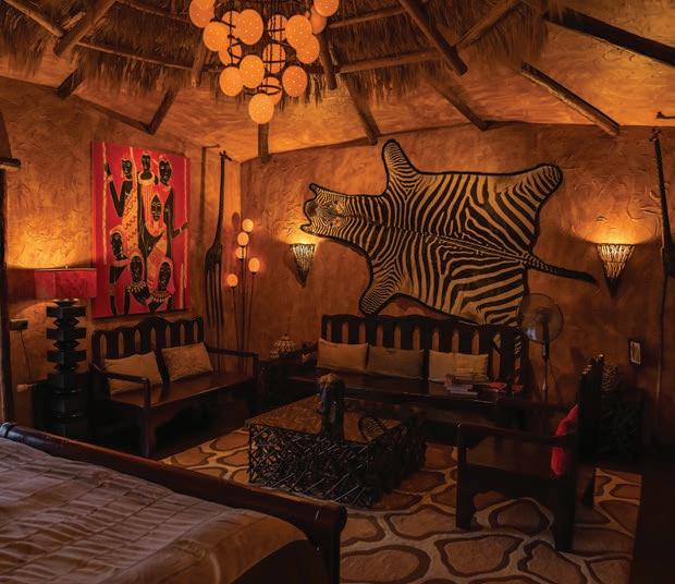
Hotel Rangá has 51 rooms, including eight suites individually decorated in homage to each continent. My favorite is the Iceland suite, which has a moveable breakfast nook via a rotating floor and a cozy comforter on the bed resembling a giant Icelandic sweater and knitted by local artists. After completing the commission, the artisans made it very clear to Pálsson that it would be their first and last giant sweater. Pálsson pointed to several of the hotel's 150 original artworks en route to our room. Most are attributed to local artists and derive inspiration from Iceland and its history. Cookie cutter it is not; a sense of place is palpable everywhere. From the moment I crossed the threshold, I was overcome with a feeling of "home," although I'd never been there.
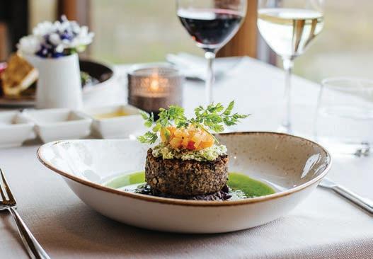
Before dining at Rangá Restaurant, a drink at the bar is a must for an education in Icelandic gin and whiskey. As a native Kentuckian, I was pleased to find out the hotel has the largest whiskey selection in Iceland. One local specialty I grew fond of was an Icelandic single malt variety from Flóki Whiskey. Smoked with sheep dung, this whiskey's flavor profile is reminiscent of peated whiskey.
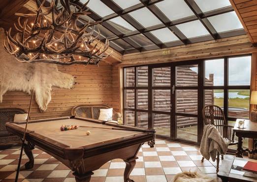
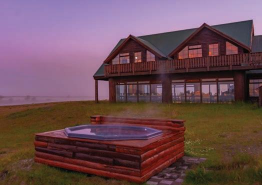
Rangá Restaurant offers modern Nordic cuisine with elevated local proteins such as salmon and lamb, but also more out-of-thebox (for non-Icelanders) options such as a reindeer carpaccio with truffle oil that I think I ordered for almost every meal. Rangá's diverse menu means guests don't need to search for dining elsewhere, which can sometimes be difficult in this sparsely populated region.
Hotel Rangá is positioned on the banks of the East Rangá River, a hot spot for salmon fishing and Iceland's most productive salmon river system for two decades. Several geothermal hot tubs dot the landscape outside the guestrooms and are ideal for quiet contemplation of the vast grasslands, reminiscent of the Great Plains. Enjoying the various health benefits of bathing in thermal baths is an Icelandic tradition dating back to settlement in the second half of the ninth century.
In addition to facilitating guests' access to Iceland's greatest hits, Pálsson is also on a mission to be a leader in innovation among independent Icelandic hoteliers. The newest addition to the amenities at Hotel Rangá is an unassuming wooden house built adjacent to the hotel. Inside, Pálsson spared no expense in tricking out the interior with the best telescopes in Iceland. The observatory's retractable roof makes it ideal for enjoying the Northern Lights and other celestial bodies, and on clear nights, a local astronomer takes guests on an engaging tour of the heavens. Cap off the experience with a starry night cocktail in the hotel bar.
Hotel Rangá embodies a passion project at every level, with Pálsson's ardor for his home country's culture, cuisine, and natural beauty wonderfully celebrated in details both great and small.

The advantageous timing of our trip, with its extended hours of daylight, offered more time to explore in Southcoast Adventure's (southadventure.is) "Super Jeeps," which are standard 4x4s highly modified to power through various terrain and weather conditions that can turn on a dime. Adventure-ready accouterments were necessary as bumpy, paved roads gave way to dirt roads before there were no discernable roads at all.
By some estimates, Iceland has 10,000 waterfalls, so many that passenger "oohs" and "aahs" subsided after a few hours. We marveled at the colorful houses lining the roads, resembling early Fisher Price "Little People" houses. Because it was lambing season, these scenes were even more idyllic with ewes and their frolicking offspring. The purity of Icelandic sheep's lineage, an essential part of Iceland's heritage and a key to survival is credited to centuries of isolation and a total absence of contact with others.
Bouncing along in dune buggies through the badlands of Rangárþing Eystra, on the south coast of Iceland, we seemed like mere ants in the face of the surrounding mountains' verdant valleys interspersed with the occasional waterfall, including Skógafoss and Seljalandsfoss, the latter of which is the height of an 18-story building.
One of Iceland's most impressive waterfalls is Gulfoss, a doubletiered cascade plunging 105 feet into a canyon of the Hvítá River. It is a part of Iceland's Golden Circle, a route that also includes the Thingvellir National Park and the Geysir geothermal area. If you find yourself on the Golden Circle and can plan your trip far enough in advance, book a table at Friðheimar (fridheimar.is/en), an attraction in its own right. This family-run, tomato-to-table restaurant has


guests noshing everything tomato, fresh from greenhouses that do double-duty as dining rooms. And if the tomato soup bar and fresh bloody Mary's weren't enough, they also have a wine bar.
On our final night, we had the pleasure of having an intimate evening in the Caves of Hella (cavesofhella.is), ancient man-made caves whose origins are shrouded in mystery but were likely built by some of Iceland's first settlers. In the caves, you're regaled with local ghost stories and Viking lore. The acoustics were perfect as Pálsson's daughter, Ingibjörg, treated us to a private concert of Icelandic songs (and a few of her original compositions) as we sipped on local liquors and nibbled regional delicacies, including Greylag geese.
A familiar theme on this trip, within the belly of the Caves of Hella, I once again experienced moments of awe and smallness. As I surveyed the towering human-made sandstone walls, we noted areas where 9th-century settlers carved their loved one's names into the wall, not unlike contemporary teenagers cementing their affection on a tree trunk tree in a park. How would they react, I wondered, if they knew their love letters in stone would remain for us to ponder over a thousand years later, leading us to speculate on their identity and daily lives?
ouring Iceland presents a privileged glimpse of our world in some of its rawest forms, seemingly untouched by human intervention. Such stark and powerful beauty inspires deep thinking that puts everything into perspective. In my case, it was the realization that you get 76 summers and winters if you're lucky. I hope that fortuitous fate allows me to designate one of those winters for a return trip to the "land of fire and ice." sl
“Talent wins games but teamwork and intelligence wins championships.” Michael Jordan
In the pages that follow, you will see the winning works of local designers, architects, builders and artisans. For Sophisticated Living’s first-ever SOPHI Awards, we invited individuals to send in their finest work. Since this isn’t the only design awards game in town, we weren’t sure how many would actually enter.
We were, in a word, stunned. By the last deadline day, 266 entries had been submitted. So many people took up the mantel that we had to double the number of judges reviewing and assessing the applicants.
But as Jordan, the legendary Chicago Bulls player, points out: It’s a team effort. It may start with the inspiration of the designer or architect (or the exceptional talent of one player) but the execution is achieved with the help of many, many others. It’s the design associates, suppliers, cabinet makers, carpenters, upholsterers, painters, masons, lighting designers, electricians, plumbers. It’s the person artfully laying tiles or installing carefully crafted hardwood floors. Or that determined soul who spends hours scouring the internet and vendors for the perfect piece to complete a room. It’s the architect who finesses every detail of a blueprint to create something that soars beyond the client’s imagination. It’s the builder who converts those plans into reality. It’s the landscaper who basically ices the cake by creating surroundings which enhance what everyone else has done. It’s the woodworker who crafts a piece of art. It’s the photographer who captures the beauty with a click of the camera.
It takes more than a village to create a masterpiece.
It takes a city.
I can honestly say that it is the magazine’s privilege to celebrate all the talent in our area. Each month we feature a house; this month we get to recognize 50. A year from now when we launch our second year of awards, it will undoubtedly be more.
I want to personally thank each of the judges for so diligently (and may I point out fairly quickly) undertaking the task of evaluating the entries. It was a daunting task and they did it seamlessly.
But above all, I want to congratulate each one of the winners and finalists. As you will see in the following pages, the competition was fierce. And you are only seeing the three or four that scored highest. In most cases, the margins between placing and being a runner up was miniscule. A half point. A point. I’ve always known the depth of the design talent in this town was impressive. The following pages only confirm that.
The entries were breathtaking making my job so much harder on picking which pictures to feature and the hardest of all, which makes the cover.
I thank every entrant. Your fine work has made our debut into the awards world a resounding success. I can’t wait until 2025.

Christy Marshall, Editor in Chief EditorSTL@slmag.net

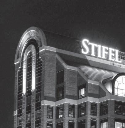




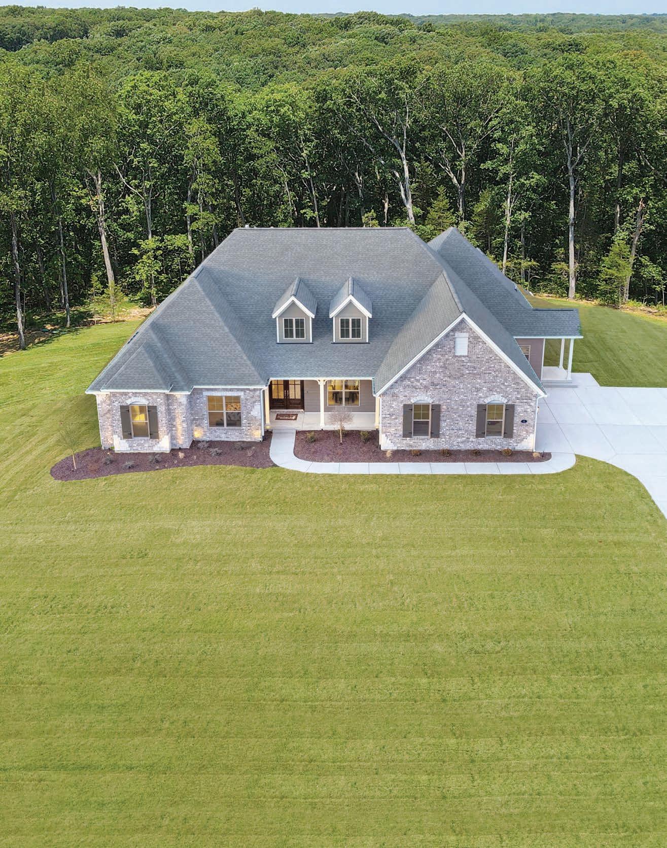
Come tour our Nantucket display home at Del Creek Crossing — the stunning home featured in the SOPHI Awards! This private community is located in the acclaimed Wentzville School District. Enjoy the convenience of city water and high-speed internet while relishing in the serenity of this secluded location.
Fischer & Frichtel builds stunning single family homes and detached villas in master-planned communities and intimate enclaves throughout St. Charles and St. Louis counties. We would love to build your dream home. Please call or visit us today!
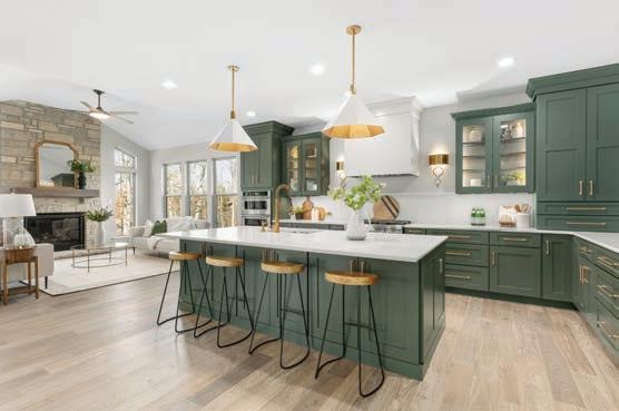



Before starting her own firm in San Francisco 17 years ago, Margaret Ash honed her skills and curated her style by designing for Kelly Wearstler, Amanda Nisbet, Elizabeth Baurer, Kendall Wilkinson and Meyer Davis Studio. Now located in Nashville, TN, with offices in SF and New York, the eponymous firm specializes in full-scale residential and commercial projects. The designs reflect carefully curated diverse influences. Ash’s projects have been published in Architectural Digest, Wall Street Journal, and Sotheby’s Home, among others.
CJ Lotz Diego has been on staff at Garden & Gunn magazine for the last decade. A graduate of the Indiana University, CJ has worked for a variety of publications including Rolling Stone, Field & Stream, Indiana Magazine, as well as St. Louis Magazine
As she always says, her name rhymes with “boats.” She recently edited the Art cover package of Garden and Gunn and an upcoming travel cover package. A longtime student of design, she penned the G&G article “Beautiful, Layered Maximalism: Why the Trend is a Southern Tradition.” She also wrote “Life Lessons in the Garden with Bunny Williams.” An experienced judge, CJ assists in the judging of the magazine’s annual Made in the South Awards.
A pioneer of minimalist modernism, Joe D’Urso is known as a master of minimalist design, credited with being among the first designers to use industrial materials in his residential interiors. Born in Newark and based in New York, D’Urso studied interior design and architecture at the Pratt Institute, graduating in 1965. He attended Manchester College of Art and Design (now Manchester School of Art) in England before returning to New York and working as an assistant to designer Ward Bennett, a pioneer in the transformation of industrial materials into home furnishings whom D’Urso credited with inspiring his own “total design” approach. D’Urso went on to become a Fellow of the Royal College of Art in London and began his own practice, D’Urso Design in New York in 1987. In the 1970s and ’80s, he became well-known for his spare interiors and embrace of industrial materials such as rubber floor tiles, restaurant stoves, gym lockers and marine hardware, all set against stark white walls.


Jamie Gauker is the owner and lead designer at J. Gauker Interiors located in Carmel, Indiana. She opened her company in 2003. Active in the design community and a supporter and volunteer for the Greater Indy Habitat for Humanity Women’s Build, Jamie was part of the design team for the Indianapolis Monthly Dream home in 2010 and 2012. She has headed a team of women for over six years to help fundraise and help build homes for first-time homeowners. She believes good design reflects not only beautiful spaces but also ones that are fully functional for the homeowner. Jamie’s favorite thing about design is how color and textiles can make you feel. She tries to find the one element that brings a room together. For the past two decades, Jamie Gauker has served clients on the North Side of Indianapolis and the areas of Carmel, Fishers, Geist, Noblesville and Zionsville.
While pursuing his Master of Architecture at Columbia University, Matthew Hufft received his first commission – a new house, in his hometown of Springfield, MO, for his parents. Working on a project 1,000 miles away, Matthew recognized the positive impact crossdiscipline collaboration can bring to design. As he worked through construction with builders and craftsmen, the vision for Hufft began taking shape. Since founding Hufft, Matthew has guided the firm’s growth in every facet. What began as a small residential studio is now an internationally recognized design practice, amassing nearly 100 project awards nationally and internationally. Matthew decided early on to add custom fabrication to the practice, greatly enhancing the collaboration and delivery of high-touch items in each project. He has served as the lead architect and Principal for more than 500 projects and has also mentored close to 100 employees as they progress their skillsets and careers. Matthew’s passion for community development has included assessing strategic real estate investments that have potential to innovate the housing market and enhance their surrounding neighborhoods. In 2023, he added the role of ‘professor’ to his resume and co-taught a parametric design studio at the School of Architecture & Design at the University of Kansas.
Tom Konopiots, Vincere, Ltd.
Tom Konopiots is a principal of Vincere, Ltd., a full-service, luxury residential interior design firm based in Chicago, IL. but works on projects across the country. Vincere creates highly personalized homes


that are elegant, beautiful and livable, with a focus on principles of scale, proportion and form. As one of two principals of Vincere, Tom has overseen projects throughout the Midwest, as well as in Los Angeles, Naples and Tampa, Fl. And Lake Geneva, WI, among other locales. Vincere was recently published in LUXE Chicago Magazine and the firm was also selected to design the main living room of the 2023 Lake Forest Showhouse. Prior to joining Vincere, Tom held positions as COO and CEO of two futures brokerage companies. He holds an MBA from the University of Chicago. A member of the Design Leadership Network, Tom immerses himself in all aspects of the design world, which is his true passion — both as vocation and avocation.
Armed with a BA in Interior Design from Marymount University, Sallie Lord founded Greyhunt Interiors (GHI) — named after her sons, Greyson and Hunter, in 2009. Since then, Sallie has been named a top designer in the DC, Virginia, and Maryland area and made it onto the Best of Virginia and Loudon list multiple years in a row. She recently won an award for her room at the Indianapolis Decorators Showhouse and has been named a Hot Talent by Home and Design Magazine. Greyhunt Interiors’ work has appeared in Architectural Digest, Elle Décor, Homes & Gardens, among other publications. GHI has offices in Chantilly, Va., and Indianapolis, Ind.
Architect Kate Dundes Shattan is partner and co-founder of the New York City firm of Gustavson/Dundes. She received her Bachelor of Arts from Washington University and her Masters of Architecture from the Massachusetts Institute of Technology. Established in 1985, the New York-based firm has provided a comprehensive range of architectural and design services to both residential and commercial clients for 37 years. Attention to detail has been, and continues to be, a critical component of the firm’s philosophy and a primary reason for its continued success. Clients have included both large corporate entities such as Morgan Stanley, JCPenney, McDonald’s, Estée Lauder, Sheridan, and Liberty Travel, as well as a broad array of residential projects, primarily in New York, Connecticut, Long Island, and New Jersey. The residential practice includes complete renovations of pre- and post-war apartments, townhouses, and loft spaces. The firm also specializes in designing new suburban and country homes, as well as renovations, additions, and accessory buildings.


It is frequently crucial to maintain the architectural integrity of properties, while redesigning them to meet the needs of today’s families. The integration of both contemporary and classical features is frequently a key part of the design process.
A native of Kansas City, Marshall Watson received his Bachelor of Arts from Stanford University. Watson founded his design firm, Marshall Watson Interiors in 1986. A subtle blend of transatlantic and American design philosophies suffuses his work. Classic is his hallmark. Though richly layered and often romantic and elegant, his work always showcases a touch of the unexpected and is noted for its “calm and lightness of being.” As his client base has grown globally, his passion for researching and delving into each culture has only expanded his ability to be site specific and locally attuned. Over the years, Watson’s work has graced the covers of and been frequently featured in many publications, including Architectural Digest, Veranda, House Beautiful, Luxe, House and Garden, Traditional Homes, and the New York Times. He has also been featured in New York Spaces, Metropolitan Home, The Chicago Tribune, as well as being a regular design columnist for the Southampton Press. He also received Traditional Home’s “Designer of the Year” award and has been featured on Luxe’s Gold List. Watson has designed three bestselling furniture collections for Edward Ferrell + Lewis Mittman, and is currently working on his fourth. He also recently launched an outdoor rug collection with Doris Leslie Blau titled, “ELEGANCE OUTDOORS.” Watson resides in Manhattan, and spends weekends at his home in East Hampton.
Eve Wildrick Design was founded in 1961 by Suzanne H. Binswanger, who was joined by her daughter Eve B. Wildrick in 1976. Headquartered in New York, the company works with clients throughout the East and West Coast, with a focus on spaces that are 50,000 square feet and under. A trained art historian, Eve began her career purchasing antiques and artwork for corporate clients. Today, as President of Eve Wildrick Design, she blends her art history background with a keen understanding of architecture and project management to create innovative designs that are both functional and inspiring. Eve Wildrick Design counts The Yale Club NYC, Hotchkiss School and the Sherry Netherland, among the firm’s other clients.



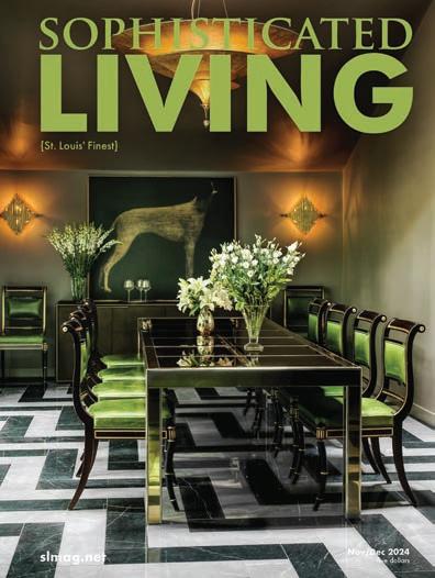
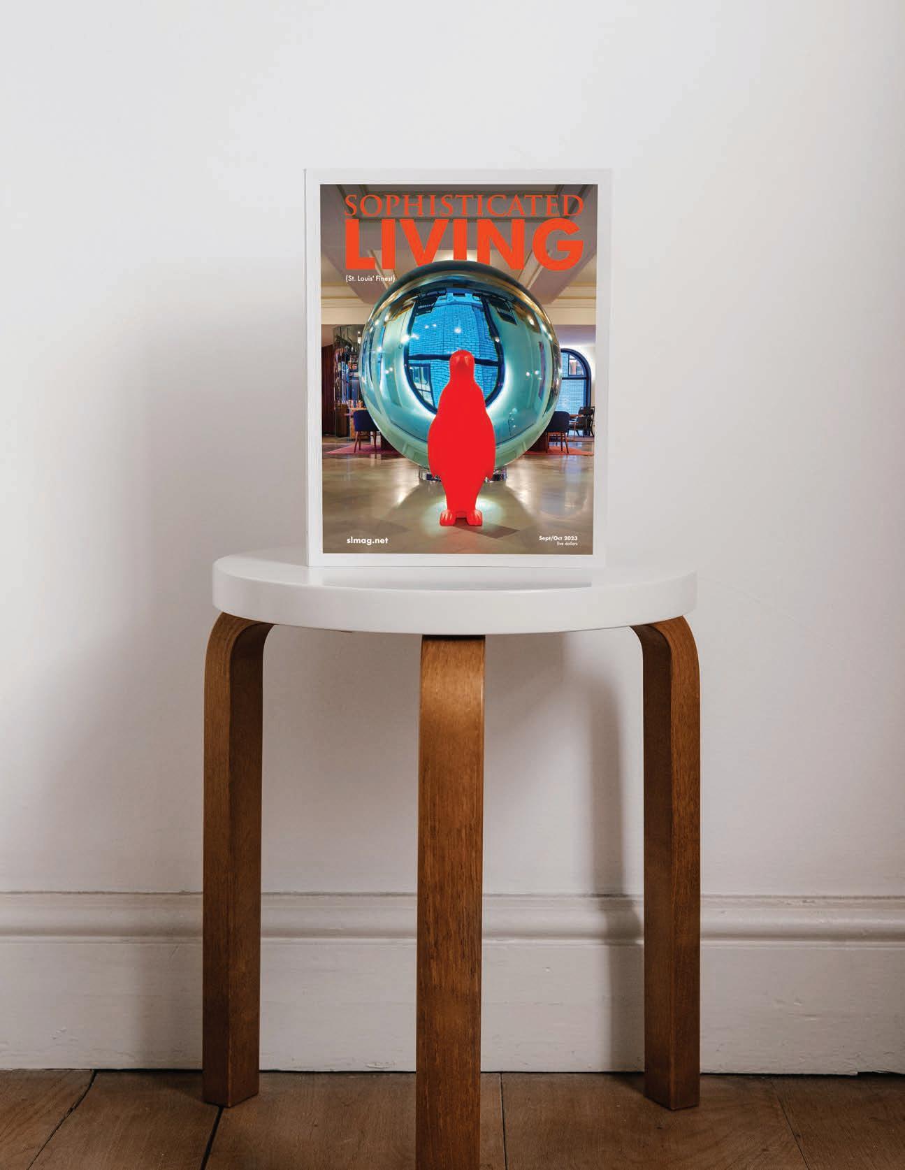

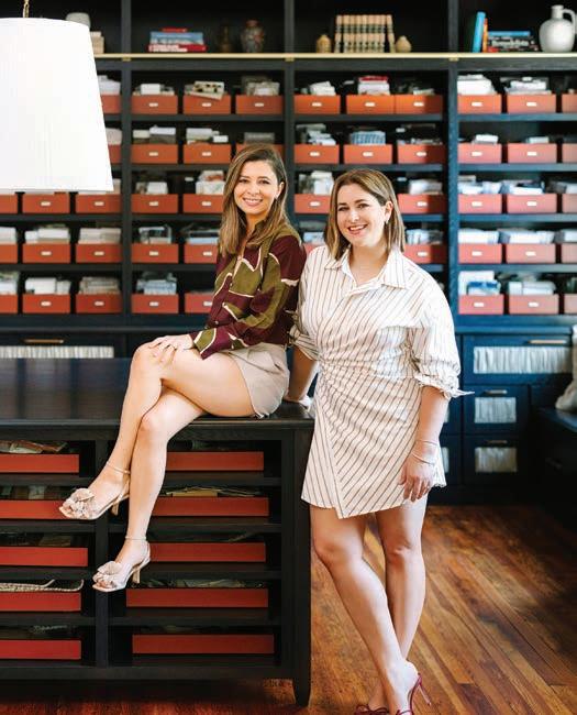



By Christy Marshall
As we have said repeatedly, St. Louis has a great depth of talent. A number of firms are decades, even generations, old. HOK. Mitchell Wall Architecture & Design. Castle Design. The Lawrence Group. But every year, there are young designers graduating with their degrees or others, long out of college, who recognize an inherent
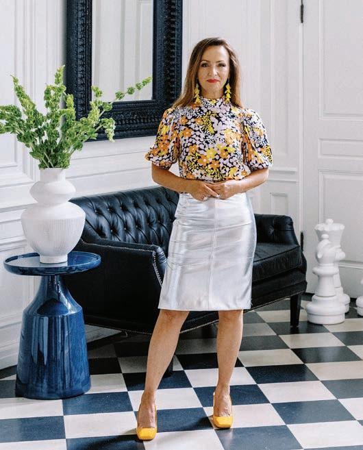
love of — and talent for — the craft and start working in the field. Some begin as assistants or interns in larger design firms. Some entrepreneurial souls move on from there to hang out their own shingle and to launch their own firm. We wanted to highlight a few we consider to be well worth watching.
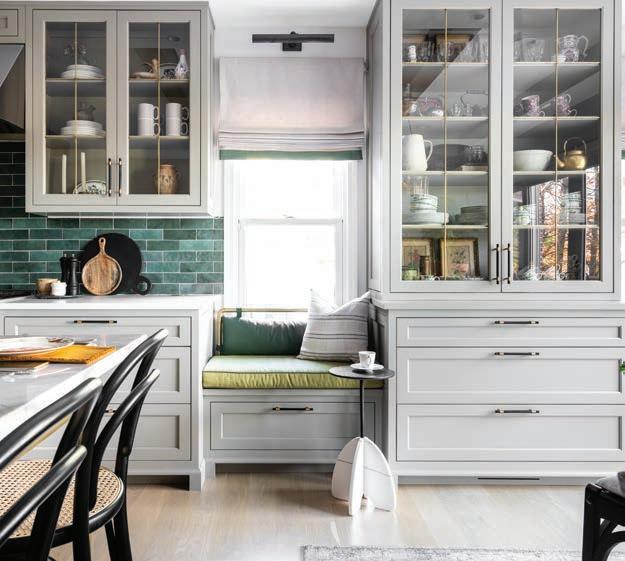
Maria Hogrefe and Channing Krichevsky, C&M Design
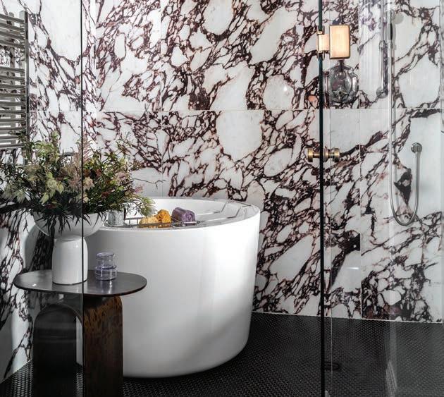
Channing Krichevsky and Maria Hogrefe are co-founders and principal interior designers of C&M Interiors. They met in design school at Maryville University. They became fast friends with ideologies that beautifully aligned. They both believe that the most beautiful spaces are a little bit imperfect, authentic materials are of top priority and the client should stand front and center. At 23 (Channing) and 22 (Maria), the duo decided over a pitcher of sangria that building a company and creating a design world that was solely their own was their shared dream. In 2016, C&M Interiors was formed with goals that are ever evolving and expanding into the future. Currently, the team is working on growing their national presence and gaining client trust across the nation with aspirations of international work and forming a truly bespoke lifestyle brand. Here at the magazine, we have been struck by the number of times they went to existing experts to pick their brains and get their advice. It’s paid off.
An active designer for the past decade, Chelsea Smith graduated with a Bachelors of Design from Chicago’s Harrington College of Design. She has headed her own firm for the past seven years. Chelsea Design comes with a deep bench. On staff is her design assistant, Christopher Amburn; her head of fabrication, Sindy Obremski, and then there is her husband, builder Konnor Sincox of Wise Bros Contracting Services. Chelsea works with all builders but a number of projects have been executed by Wise. Growing up in an unsettled family life, Chelsea says she “filled pads of grid paper with line drawings of floor plans and home exteriors and she dreamt of living in the homes of real estate magazines. Design was a healing force in my childhood … I honestly adore everything about design. I love that it is a form of therapy and that it can rejuvenate your soul. A renovation of your home can single-handedly upgrade your everyday life.”
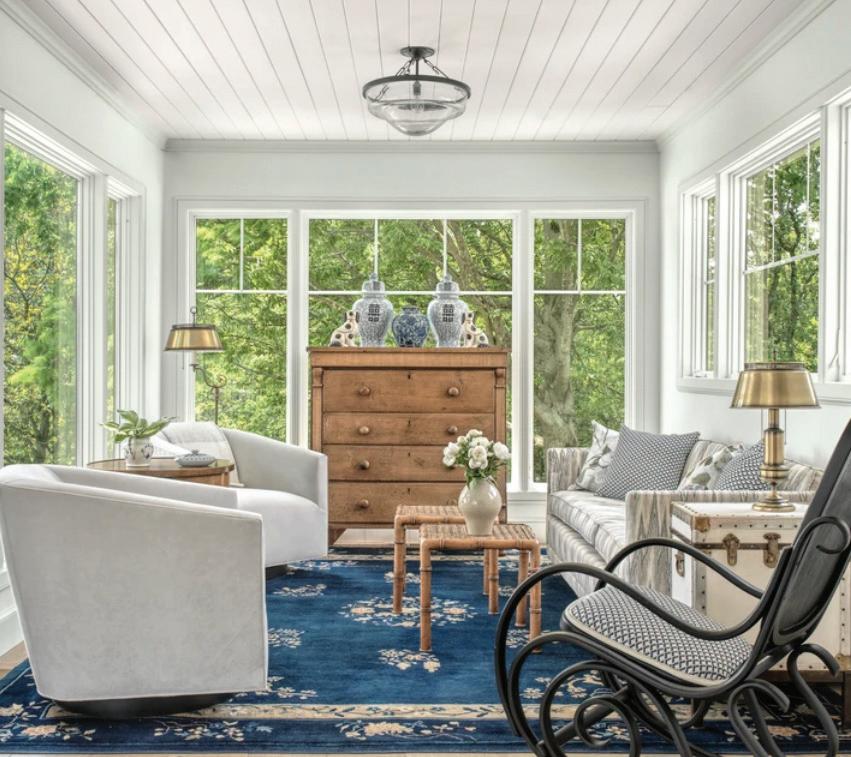
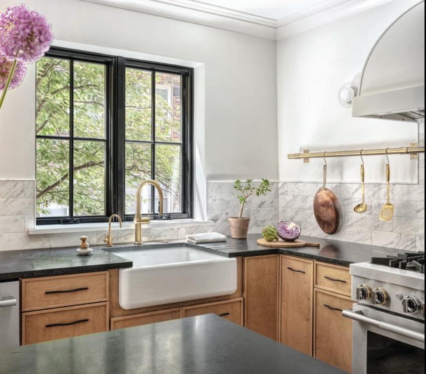
Aisling Leonard, Ash Leonard Design LLC.
If you are looking for a bit more international expertise, Ash Leonard may well be your cup of team. She grew up in Dublin, completed her design training at the Dublin Institute of Design in 2006, and then started designing for clients in Dublin, Boston, and for the past 14 years, here in St. Louis. The Leonard approach? “The clean, defined lines typical of Dublin’s Georgian architecture are reflected in my preferences for the home, while the strong connection to the past and the importance of family are reflected in my use of heirloom pieces that truly personalize a space,” Ash says. “As a designer, I have brought a fresh perspective, and new ideas, to problems that clients have thought insoluble, or outside their budget, changing their homes in ways they hadn’t imagined.”
Rebekah Moore Murphy and Katherine Moore, Murphy + Moore Designs
Sisters Rebekah Murphy and Katherine Moore have partnered together to start Murphy + Moore Designs. Their creative beginnings included being surrounded by architectural plans as their parents loved building homes and pouring over all the details. There were always wallpaper samples, textiles and blueprints laying on their dining room table. Rebekah co-founded the company, Stone Hall Cabinetry, and feels her “third child” was the designing and birth of the cabinetry showroom. Both Rebekah and Katherine have been focused on cabinetry design work, winning awards and being featured in multiple lifestyle publications. Murphy + Moore Design is dedicated to designing and decorating the homes for their roster of clients. To quote Rebekah, “We live and breathe interior design and architectural space planning.”
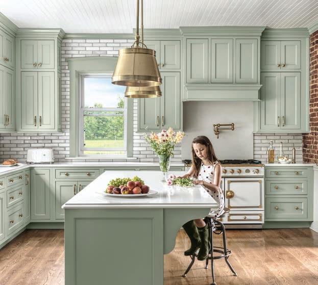

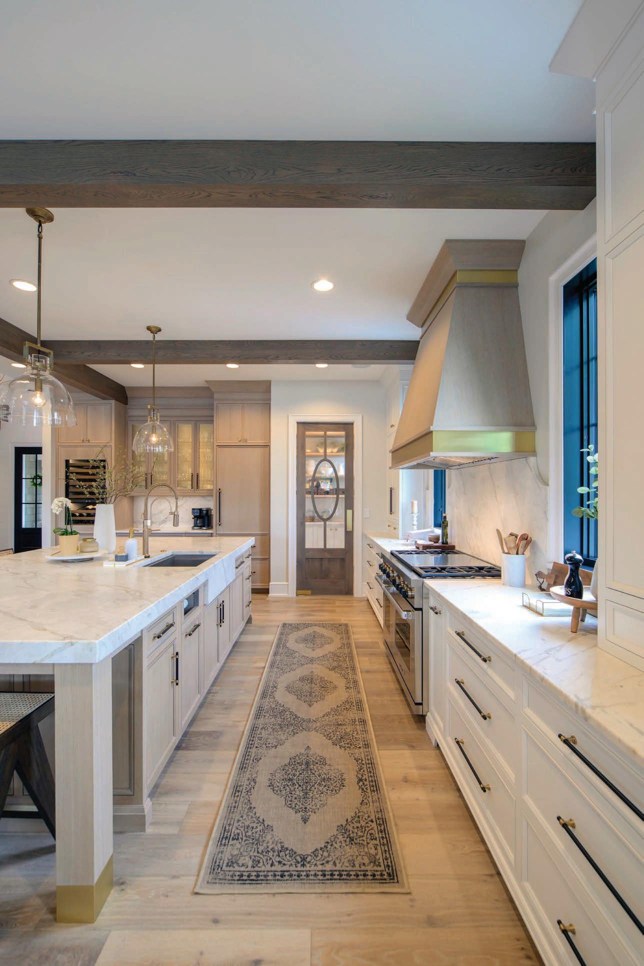

Susan Sherman
Co-Founder and now Chair Emeritus of The Saint Louis Fashion Fund and co-founder of MERCH
If you want something done in this town, you call Susan Sherman. A native of Jacksonville, Florida, she studied classical ballet for a dozen years, graduated from the University of Georgia with a degree in journalism before working in broadcast news in Atlanta and Paris. She and her husband, David, lived overseas for three years from 1989 to 1992. They moved to St. Louis a year later and ever since she has considered herself a “cultural ambassador” for the city. She and David, who works in finance, have a son who recently graduated SCAD in Industrial Design and lives in St. Louis, and their daughter is a senior social media strategist for ALO in Los Angeles. In St. Louis, Susan Sherman has been a key player in the development of the Contemporary Art Museum of St. Louis and has served on numerous boards including Center of Creative Arts (COCA), Grand Center, Opera Theatre of St. Louis (OTSL) and American Ballet Theatre (ABT) in New York. Today she is the chair of the Saint Louis Fashion Fund, which she co-founded with three other women in 2014 and is now celebrating its 10th Anniversary. The intent of the organization is to reclaim the city’s rich fashion history and “to make St. Louis an epicenter of fashion again.” Fashion is a $7.7 billion dollar industry in St. Louis. In 2019, she co-founded MERCH, an experiential retail concept that brings high fashion brands to our city.

Andréa Purnell
Community Collaborations Manager, Saint Louis Art Museum
Andréa Purnell has built a career facilitating arts engagement to empower communities and improve well-being. She joined the Saint Louis Art Museum in 2017 and currently serves as the Community Collaborations Manager. Her major contributions at SLAM include co-curating the groundbreaking exhibition “The Culture: Hip Hop and Contemporary Art in the 21st Century” in 2023; engaging as a key curatorial liaison to the community during the 2018 “Kehinde Wiley: Saint Louis” exhibition; the co-development of the Staff Programming Opportunity Team, a program that encourages staff input and promotes diverse thinking using institutional collaboration with fresh perspectives, and the inception and implementation of the Five Pillars Community Engagement Initiative, a city-wide project in conjunction with The Culture aimed at engaging communities beyond the museum walls using multi-disciplinary presentations inspired by the five pillars of hip hop. In addition, Purnell has maintained a successful career as an actor, writer, director, and stage manager with the Groundlings Theatre in Los Angeles. She has performed with the San Diego Repertory Theatre, St. Louis Black Rep, New Line Theatre, New Jewish Theatre, and as Roxanne in St. Louis Shakespeare Company’s “Cyrano De Bergerac”. Purnell holds a Bachelor of Arts degree in Communication Studies from Fontbonne University, a Master of Fine Arts degree in Arts Management and Leadership from Webster University and serves on the Regional Arts Commission of Saint Louis, the Florissant Disability Awareness Commission, and the Independence Center Board of Directors.


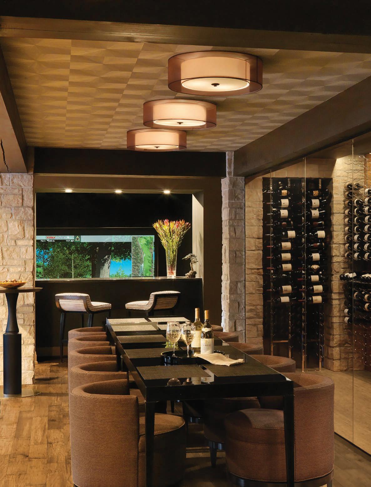

“We couldn’t have done this without you” is an overused expression, but in the case of the sponsors who helped make the SOPHI Awards a reality, it is 110 percent true.
From the first call by Kevin Kenney of the Interior Design Center who suggested we consider doing this, to the many others who agreed to sponsor the SOPHIs, you got involved, invested in us, spread the word. The resulting 266 entries and 300 tickets sold was due in large part to you.
Thanks to Keith Sauro from KC Design who shared his experience doing a similar event in Kansas City and giving us the encouragement to “go for it.”
After we agreed to produce the SOPHI Awards, I went to some of the leading trade associations to see if they wanted to be involved. They turned us down saying that they had their own awards and didn’t want to compete with us. I was disheartened by the lack of support and community, but after a few calls to many of you, we were inspired to move forward.
Special thanks to our sponsors...


Thank you to Susan Sherman of Fashion Fund and Andrea Purnell of The Saint Louis Art Museum and RAC for your support and enthusiasm for making the SOPHIs better than we could have done alone. Special thanks to Sam Foxman and Evntiv for everything they have done to make tonight so unforgettable.
But of course, we want to thank absolutely everyone who entered their projects in the SOPHIs and bought tickets to the event itself. We truly wish we could have given everyone an award as there were so many wonderful projects entered. But alas, the 10 national judges have spoken. We have learned a lot this year, and we will certainly reach out to you for your input to make next year’s event better.
But most of all, we hope we have done you proud and made the SOPHIs something everyone will look forward to year after year!


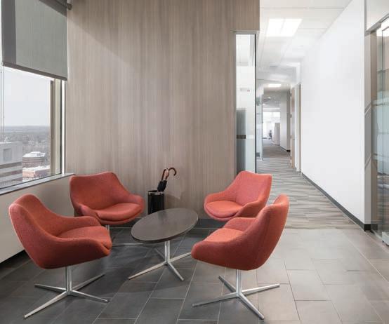
Showrooms
AUTCOHOME APPLIANCES
MARC
KDR DESIGNER SHOWROOMS
PREMIER
WALBRANDT
WORKING SPACES
JCR DESIGN GROUP
DESIGN COLLECTIVE
KELLY JOHNSON DESIGN
YOURS BY DESIGN
Kitchen & Bath
Furniture
Textiles
Appliances
Home Automation
Flooring
Residential & Commercial
Environments
Design Services
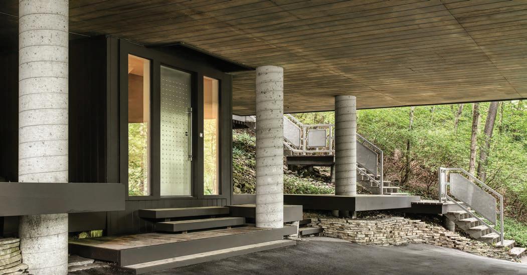
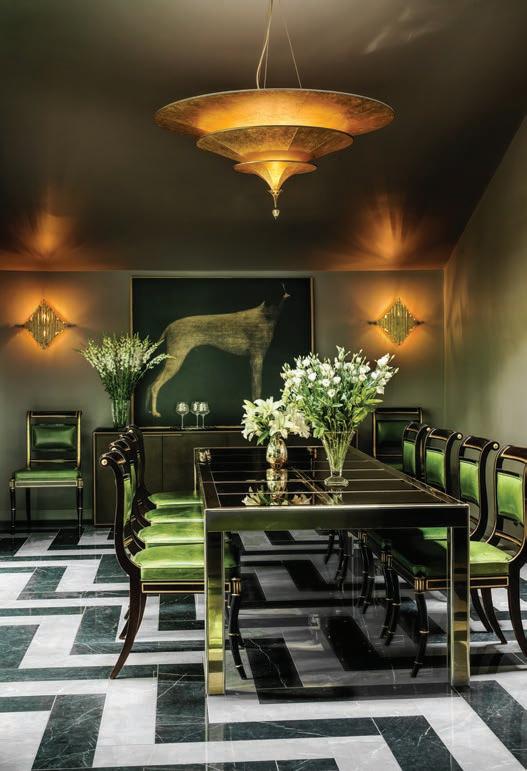
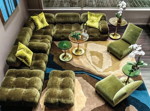
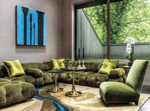
WINNER Designer: Ken Stückenschneider, Stückenschneider Decoration and Design
Lush modernist furnishings are contrasted against Brutalist modern architecture. Comfortable Italian modern furniture mixed with classic American mid-century modern pieces as well as moderne antiques soften the lines with soft luxurious fabrics in an autumnal palette to connect to the outdoors. Large scale family entertaining now seamlessly occurs in this 1970s concrete home built in a forest. Photography by
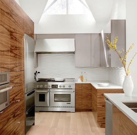
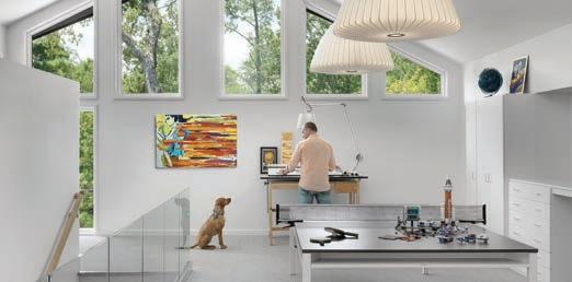
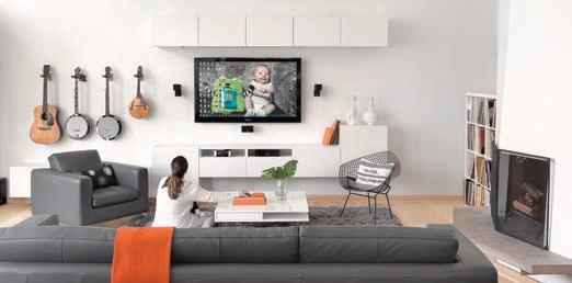
FINALIST Architect: Thomas Wall, Mitchell Wall Architecture & Design
These homeowners always planned to expand their 2,700-square-foot home with an addition. When the husband/architect started planning the addition in 2016, his goal was to create a space that would match the style of the house, while providing a place for storage and room to entertain. The plans included a new master suite, expanded laundry room, a powder room, a second-floor multipurpose room, a guest room with bath, a new basement with a playroom for two young boys, an entertaining space for the grownups, an additional bathroom and unfinished storage space. Once complete, the home was more than 5,900 square feet. The home’s largest family space is the loft-style multipurpose room on the new second floor. The renovation also includes a modern pool and outdoor living area with plenty of space for summer cookouts and entertaining. Photography by Alise O’Brien Photography
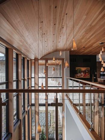
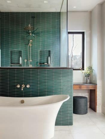
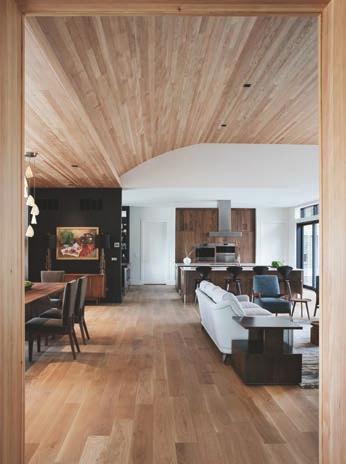
FINALIST Designer: Kim Taylor West, Studio KTW / Architect: Susan Bower, Bower Leet Design
The interior spaces of this modern house are warm, comfortable and inviting. Details include a custom-designed dining table and chairs, home office desk and cabinets throughout. A mixture of clean lines and soft curves work together in a peaceful way. The limestone from the exterior was utilized on some interior walls and the main fireplace. The large kitchen includes three islands and accents of stainless steel. The primary bath features gorgeous green glass tiles and walnut cabinets. Lighting selections enhance all of the spaces and work in hand with the natural light. Window treatments and lighting are on smart home technology systems for ease of use. A mix of textures create a cozy environment in a large home. Photography by Carmen Troesser
Category 2 Residential Interior Design - Under 3,500 Square Feet
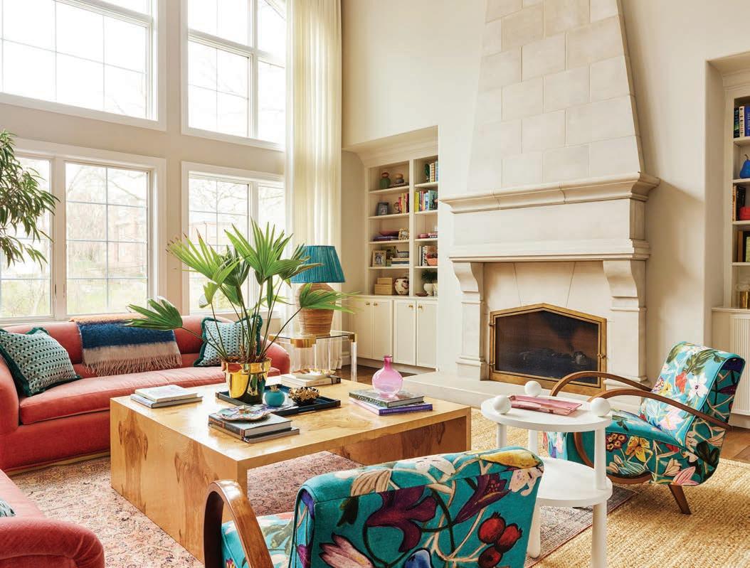
WINNER Builder: Chouteau Building Group / Designer: Amie Corley Interiors
In closing the book on the middle school years, this family home needed a refresh for their high school and college bound children and for the family’s love of entertaining. The desire was to create vibrant and joyful spaces that not only make you want to stay, but make you want to smile.
Upstairs, the daughter’s bedroom is calm, charming and tailored to this young woman’s wishes. The en suite bathroom beams with hand cut floorto-ceiling tile in a checkboard of polished Blue Celeste and honed Thassos marbles. The custom cabinetry is graced with lattice work in harmony with the tile. Unlacquered brass Dash fixtures by Waterworks add a touch of nostalgic elegance. The one-time playroom was transformed into a teen’s entertaining and studying dream room replete with a custom bed nook with a trundle for guests, a built-in desk nestled into the light flooded dormer alcove and a lounge area perfect for cozying up for a movie or a good book. Photography by Ashley Gieseking
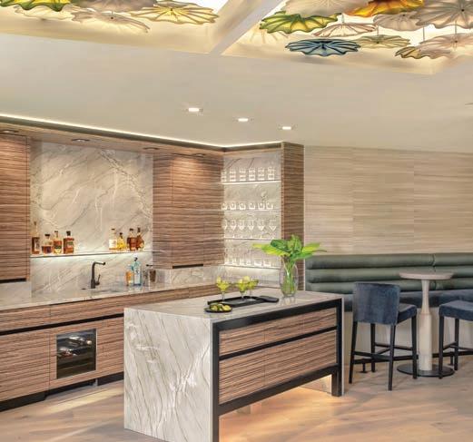
For this finished lower level, the client requested a sophisticated, inviting ambience that was light yet moody with a bit of an artistic flair and a space that encouraged everyday small-scale enjoyment, yet gracefully serviced large catered events. The square footage, originally planned to include a service bar, kitchen, gentleman’s study and lounge areas, was challenged with the client’s request to seat 45 for dining. A bespoke art glass ceiling is the focal point upon entry. A concealed galley kitchen behind the service bar provides support for entertaining. Adjacent to the service bar is a long banquette with bistro tables and barstools. Walls and columns are covered in banana leaf. A bold chunk of backlit blue agate on the wall dramatically echoes the glow of the delicate art glass ceiling. When it’s party time, the furnishings play double duty as an oversized sofa table becomes dining for eight, as does a desk in the gentleman’s study. Swivel chairs spin around to dine at the short banquette or are paired in couples, all with the assistance of stackable acrylic chairs kept resting in storage along with a portable round dining table for eight. Photography by Alise O’Brien
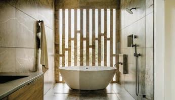

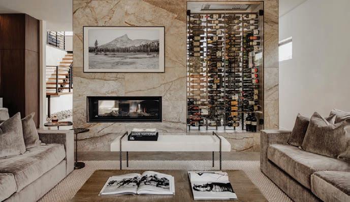
In 2014 when George Kaiser donated $350 million dollars to create the world’s largest public park in Tulsa, the surrounding neighborhoods started to change. What was once a blighted area suddenly evolved into a popular place to live. The problem was that not many of the houses were suitable for young families. When we were approached to design this home, we had to accommodate a lot in a small footprint. Creating a three-story home on a diminutive lot presented a lot of challenges. In response, we used as much of the space as possible. The client wanted a two-car garage which we knew would dominate the front elevation, so we had to make sure the entry was profound enough to capture your attention. An open-concept floorplan provides visual connections between the living room, dining room, and kitchen with a two-sided fireplace and custom wine refrigerator defining the spaces. Expansive windows and the introduction of natural elements to the interior truly bring the outside in for this young family. Photography by Toni Li
Powered by a brand that offers what no other can and whose ethos is founded on trust, stability, integrity, and longevity, Berkshire Hathaway HomeServices Luxury Collection Specialists pair invaluable knowledge with exclusive access to advanced tools and vast global connections.
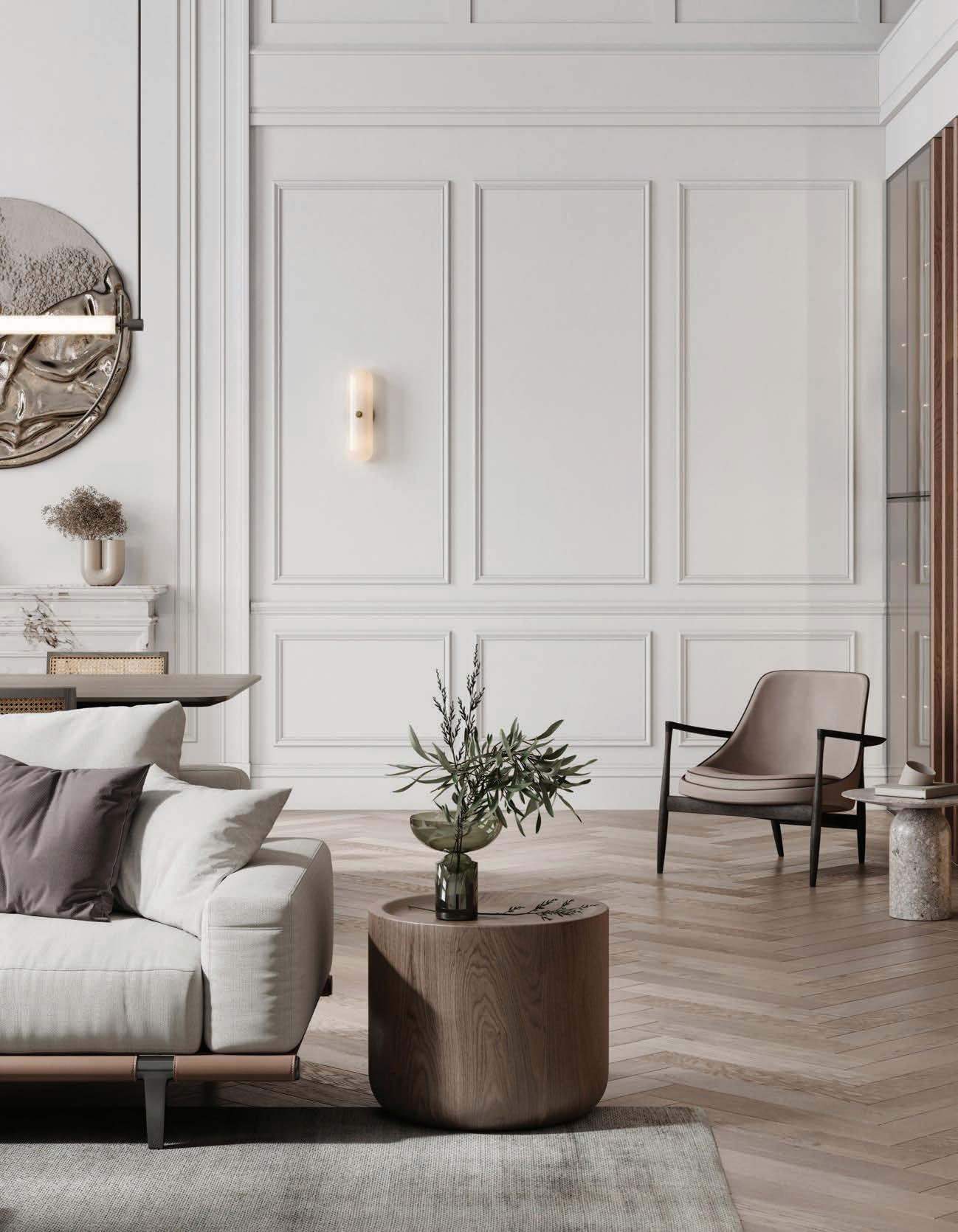


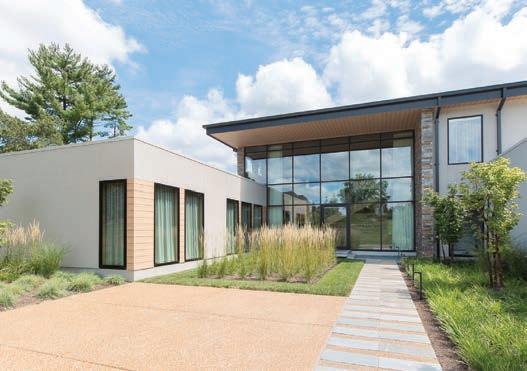
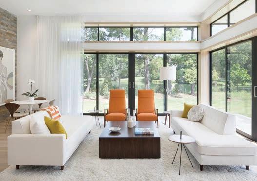

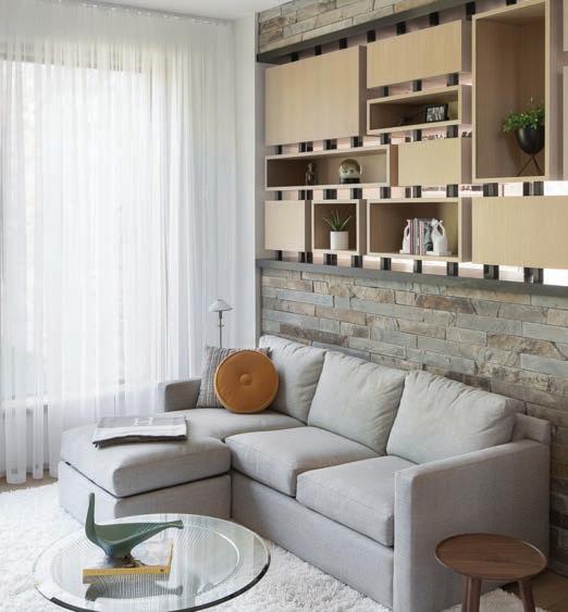
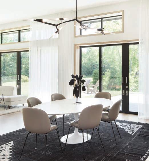
The client approached the architect to design a custom home for them based on the Mid-Century Modern aesthetic. Among other parameters, one element was paramount: They wanted two separate owner’s suites located at different ends of the house from one another and as far apart as possible. It only made sense to develop a plan where each person had their own wing with the common spaces occurring at the confluence of the two. The floor plan for the house was developed from three intersecting planes of stone: one representing the first suite’s wing, one perpendicular to that plane crossing the common spaces and a third running in the same direction as the first extending to the second suite. When you approach the house, the first thing you see is the common plane carrying the cantilevered stairs up to the guest suites on the second floor. This massive wall of stone is perforated with openings providing access to the various spaces. The result is this glorious contemporary home, immaculately decorated and designed with a New Century of Modernism in mind. Photography by Megan Lorenz Judges’ Comments: “Challenging project. Entry is stunning. Needs of client well met.” “Nice project. You can tell

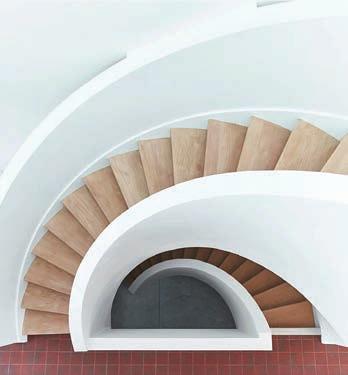
FINALIST Architect: Thomas Wall, Mitchell Wall Architecture & Design / Designer: Tatiana Bilbao, Estudio Tatiana Bilbao / Builder: Emily Rauh Pulitzer of the Pulitzer Arts Foundation in Partnership with Steve Trampe of Owen Development
Inspired by the environmental and social innovation of the traditional dogtrot, this house uses room-sized passages to define private, semi-private and social spaces. On the ground level, the great room of the home is flanked by the bedroom, bathroom and kitchen. The result is a comfortable synergy of public and private space. The great room is defined by its expansive views, an elevated ceiling and a sense of sociability, while the more private spaces offer intimacy. The lower and upper volumes of the house are stacked and rotated, revealing upper-level outdoor patio opportunities and lower-level shaded porches. The stacked dogtrot house allows us to create gradients of privacy which allows families flexibility in ways to use the exterior and interior spaces to simultaneously create a home and connect with the surrounding community. Adjusting the structure of this glorious home to accommodate the extremes of St. Louis weather presented some challenges. For 30 years, the developers of On Olive remained faithful to their vision of an architecturally significant residential neighborhood in the heart of the Grand Center Arts District. Photography by Attilio D’Agostino Judge’s comment: “Nicely composed and executed house.”
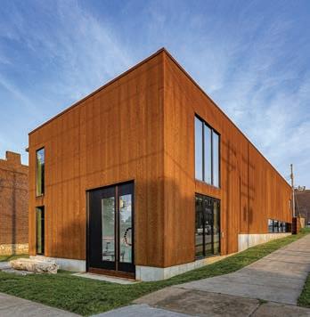
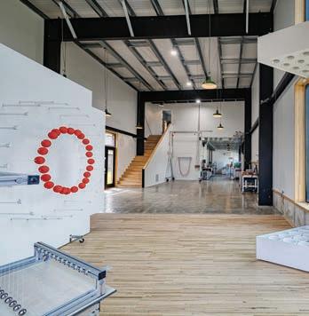
FINALIST Architect: Derek Hoeferlin, derek hoeferlin design
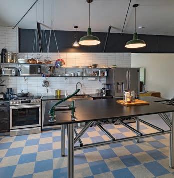
Completed in 2021, the client for this 4,300 square foot live-work studio is an artist who designs, programs and builds kinetic sculptures that are pattern-based in concept. Other than the foundation and superstructure, the client built the majority of the house himself. Uniquely requesting the majority of his house be dedicated to a workshop, it challenges a typical domestic notion of what a large “house” should be. Sited in the Forest Park Southeast neighborhood of St. Louis, the project is constructed as a series of pre-fabricated steel structural bays clad in a weathering steel rainscreen over rigid insulation and metal framing. The material choice of oxidizing steel is a contemporary counterpoint to similar adjacent brick tones. The interior amplifies the exposed large-scale steel structure with a jet-black, gallery-white and galvanized-silver color palette, providing generous double-height work spaces for the client to build and test out his kinetic designs on polished concrete floors. The sculptures are displayed in a copiously daylit-washed front gallery space, set on wood floors economically salvaged from unused 18-wheeler tractor-trailer beds. The more private second floor living spaces contrast the rest of the project with a more domestic concept that is compressed in scale with a colorful material palette. Photography by Sam Fentress Judge’s comment: “Great project. It appears to meet the clients’ needs but uses design restraint.”
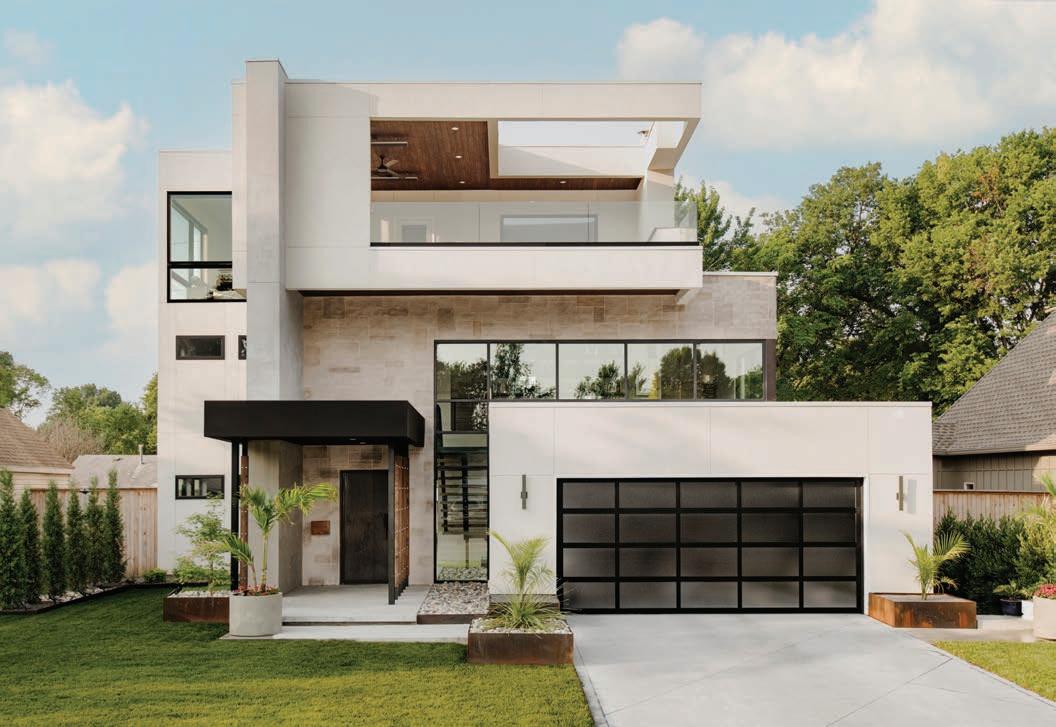
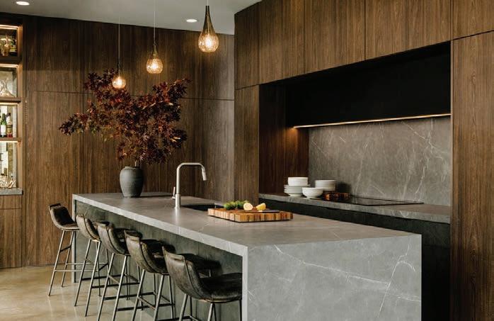
In 2017, George Kaiser, founder of BOK Financial Corporation and a billionaire, funded the world’s largest public park in his hometown of Tulsa. While the area had been blighted, it quickly turned into a popular place for young families to live. The assignment for the architectural firm was to create a 3-story house on a very small lot. Since the client wanted a 2-car garage, the architect determined that the entry was profound enough to capture one’s attention. The third-story patio gave the family views of the neighborhood. The open-concept on the first floor provided visual connection between the living room, dining room and the kitchen with a two-sided fireplace. Three bedrooms were placed on the second floor; the third floor was dedicated to the primary suite. Photography by Toni Li
Judges’ Comments: “Attractive and effective space planning, really taking into account the requirements and challenges of the building site. Warm and inviting modern home.”
“This is a stunning project? Very impressed and beautiful. I don’t know the clients’ goals but I can’t imagine they weren’t met.”
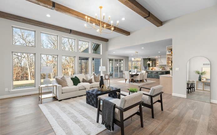
Builder: Fischer and Frichtel Homes
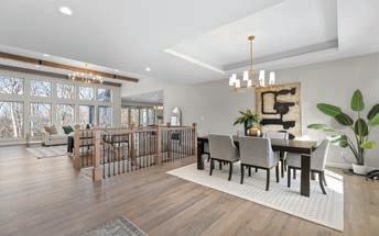
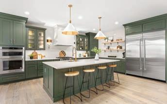
The builder purchased a 120-acre, park-like piece of land in St. Charles County to develop into a new home community with 32 homes on multi-acre homesites. The mission was to build a display home that would best illustrate life in this strikingly unique community. However, it was a balancing act to build a home that would showcase estate living in the woods, while making sure it could be used as a display center. The spacious Nantucket ranch with three-car, side-entry garage seemed like a natural choice. The design team chose a light color brick and stone exterior and placed it on a 3-plus acre, corner lot, which was landscaped as a large, level yard backing to an existing wooded area. The first thing visitors notice when they enter the home is the wide-open floorplan and 12-foot ceilings in the great room and dining room. The kitchen is connected to a hearth room with a vaulted ceiling and a large breakfast area with a spectacular built-in breakfast bar/wet bar. On the other side of the breakfast area, a glass wall with sliders opens to a spacious screened in patio. The main floor also includes a private study, luxurious primary suite, two guest bedrooms, laundry room, family foyer and cook’s bath. All are adorned in a neutral color palette with tides of light-colored wood grain. Photography by David Hughes
Judges’ Comments: “Creative and welcoming plan for the sales center. Really liked the use of color in the kitchen. Floor plan is flexible and is well situated for ‘estate living in the woods’ with more urban amenities.” “I really like the green cabinets.”
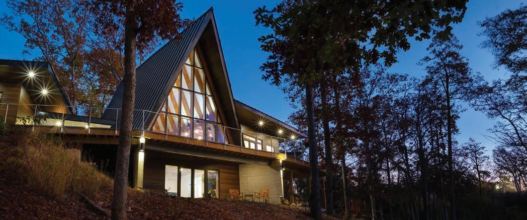
FINALIST Architect: Thomas Wall, Mitchell Wall Architecture & Design
Nestled within the tranquil embrace of a secluded forest on the shores of a serene lake, this contemporary A-Frame emerges as a harmonious blend of modern architecture and rustic charm. A bold departure from its traditional counterparts, this home boasts wings extending outwards and angling back to embrace the panoramic views of the surrounding nature. Floor-to-ceiling windows line the front and back, allowing natural light to cascade into the open living space and offering uninterrupted vistas of the lake, while the steeply pitched roof ensures the gentle patter of rain resonates through the cozy interiors during storms. Photography by Alise O’Brien
Judge’s comment: “This is a beautiful exterior home. I would have loved to have seen more of the interior and to learn more about the project and goals of the client.”
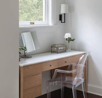
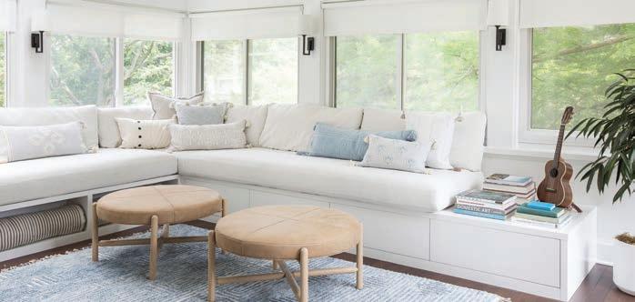
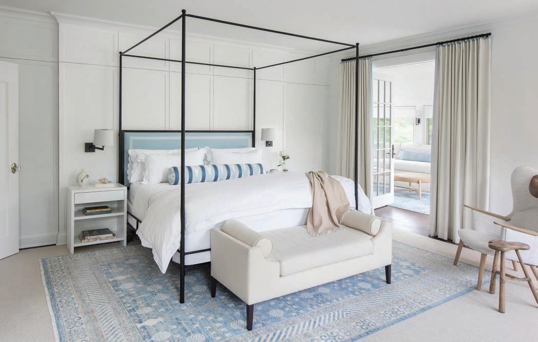
WINNER Designer: Lauren Sweet-Schuler, Studio Sweet-Schuler
Drawing inspiration from their summer house in the Hamptons, the client wanted a primary suite that combined the blue and white traditional likings of one partner with the contemporary style of the other. In the center of the room sits an iron canopy bed in front of a custom-paneled wall to create a soft grid and focal point. Embroidered custom Matouk bedding and a custom bolster sit against the custom upholstered headboard with tape border. Vibia wall-mounted swing arm sconces offer reading light by night, and beautiful lines by day above the custom made beside tables. Left and right of bedside tables are hidden his/her closet doors with the same paneling and base. The custom wool drapery has a soft blue stitched flange on the top and leading edge that continues the hints of blue from around the room. Across from the bed are “his/hers” auxiliary pieces. For her, a custom designed make-up vanity of maple with a spun prominent leg detail, a radius marble top and Ghost chair from Kartell provides a beautiful soft space for pampering. For him, the Mama Bear chair in a Weitzner textile with leather head pillow and bronze floor lamp by Vaughn with an antique Chinese stool adds a casual lounge space to read or play the guitar. Anchoring the traditional bed and modern chair is a one of a kind blue and white woven Oushak pattern rug. French doors open to an en suite sunroom with windows on three sides. This space was designed to reflect their beautiful Hamptons home, and be a place to relax in a sun-filled escape. A custom built-in bench with open storage underneath, as well as touch-latch drawers for hidden storage provides daybed seating with custom cushions and a mix of blue and white pillows for relaxed Hamptons home feel. Photography by Megan Lorenz Photography
Judge’s comment: “Lovely, sophisticated, smart blend of styles.”
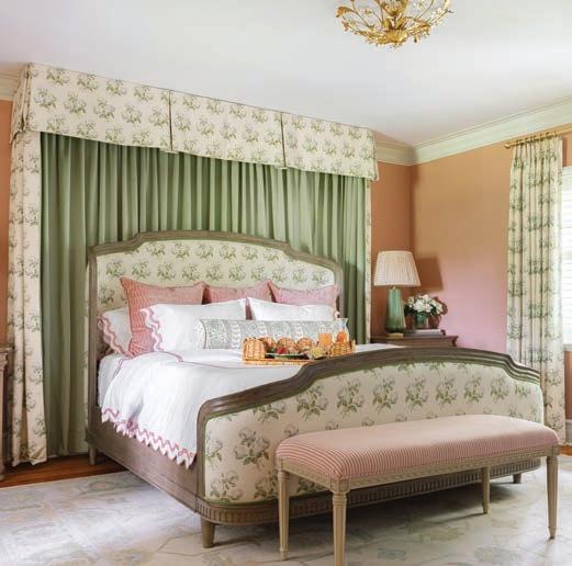
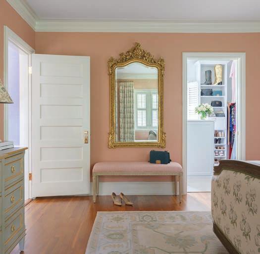
The goal in this stunning bedroom was to create an oasis for our clients that was filled with elegance and romance. This “Bridgerton” inspired primary suite combines the perfect blend of textures and finishes. The design team was very selective with the color palette. First, they chose the main hues, which include pale blues and greens, soft corals, delicate florals and creamy whites. Adding a touch of deep coral in a textured velvet adds depth and sophistication and ties to the wall color. The custom canopy is the star of the entire space with its elegant floral fabric, lined in the loveliest shade of green. It frames the upholstered headboard flawlessly. Each piece of furniture was chosen to reflect the age of the home, but with an added modern flare. The timeless lighting, striped bench, gold-accented dresser, and gilded mirror all add the perfect ambiance. Photography by Lisa Mitchell
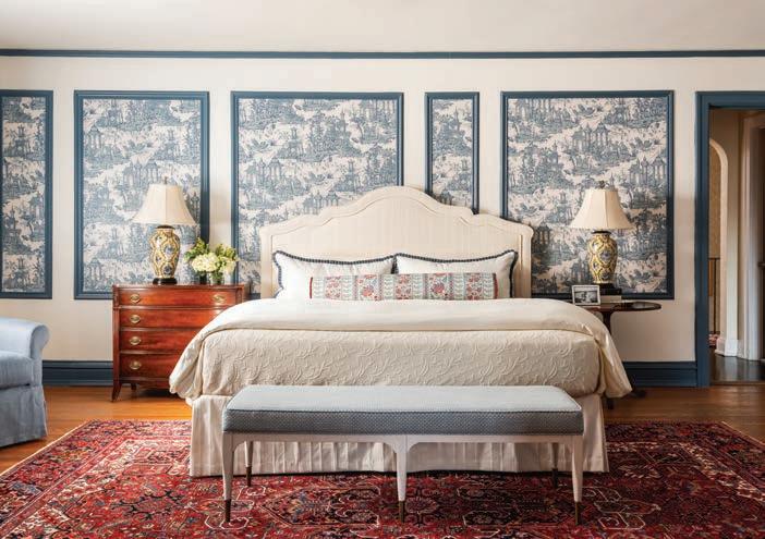
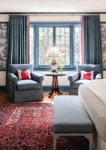
The clients live in a historic home and it was imperative to them that they honor its architecture and heritage. The design team was tasked with using an heirloom rug and a couple of antique tables in their bedroom.The rug served as the color inspiration and the designer sourced furniture styles and patterns that were reminiscent of the past while allowing the room to feel refreshed. Photography by Karen Palmer
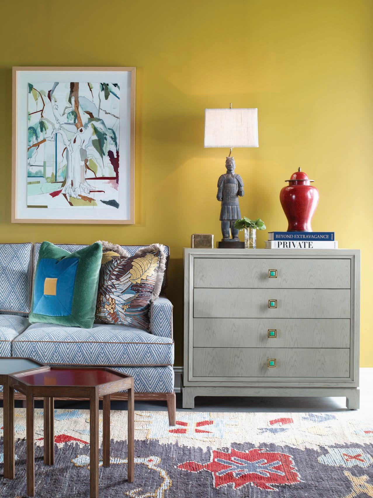

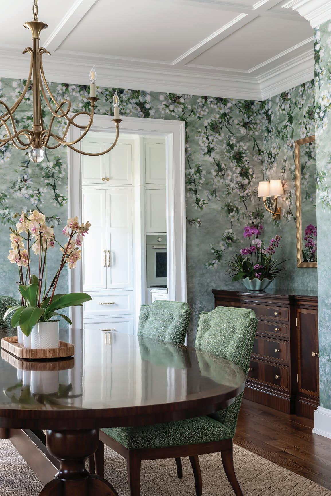
INTERIOR DESIGN CONSULTANT
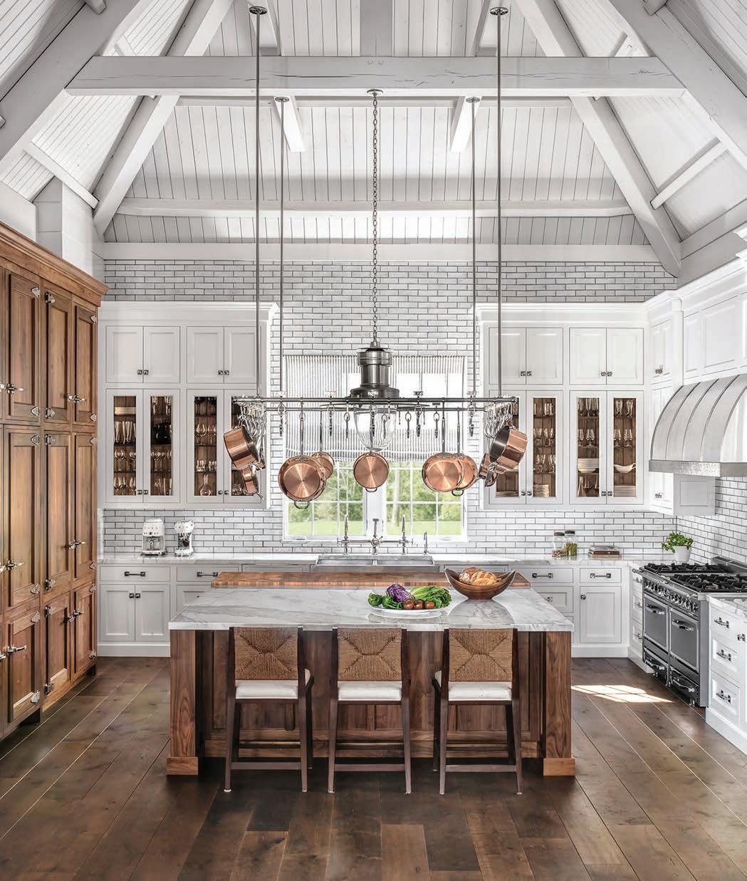
WINNER Designer and Builder: Bobby Slavin, Slavin Homes
The entire house was a gut rehab. Two structural beams were added to accommodate an oversized Ann-Morris pot rack in the center of the room.
The English scullery kitchen design was inspired by British designer Christopher Peacock. One wall is cabinetry, made by Plato Woodwork of Plato, Minn. The Viking 10-burner stove is backed by marble subway tiles. The bespoke hardware protecting the wood corners of the walnut butcher block was produced by Wilmette Hardware, Ill. The breakfast nook features a banquette bench made in Chicago and covered in a Holly Hunt leather, and a classic Saarinen Tulip table. The walls were covered in a walnut cove paneling discovered the design in the St. Ambroeus, a restaurant
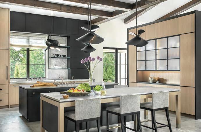
The design objectives centered around celebrating the large area with 12-foot ceilings, enhancing exterior and adjacent interior views and maximizing functionality and storage while balancing proportion and symmetry. The challenge of limited wall space was resolved through the creation of standalone cabinet forms. These forms compensate for the scarcity of walls and serve as pieces of functional art. Each standalone unit addresses distinct needs, bringing together an ensemble that befits both gatherings and daily family life. The cooking hearth is enveloped in black oak paneling with a bevel edge encompassing a 60-inch range, microwave and convection steam oven, all concealed behind its façade. Its counterpart, the cleanup/prep Island, boasts a workstation-style sink, dishwasher and trash cabinet. A raised dining table-cum-island seats five while also housing a warming drawer. The crown jewels of this design narrative are the Hutch Islands. The tall Hutch Island bridges the divide between the kitchen and living room, offering Butler pantry storage on one side and a refreshment bar. The pantry wall was framed in with pocket doors, blending its function with the surrounding design elements. Photography by Alise O’Brien
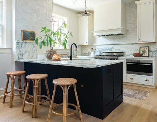
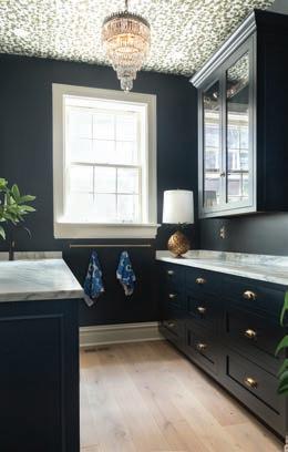
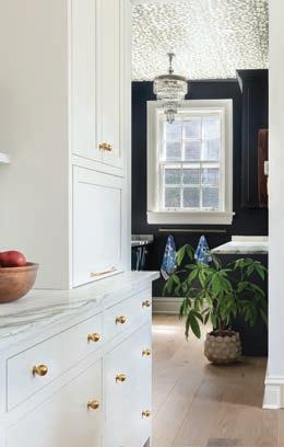
This kitchen remodel was truly a transformative project. The design team’s intent was to give this family. a place to cook and entertain with a beautiful and functional design. Being an older, historic home, it had nine different doorways leading into the kitchen area. So, the designers needed to be thoughtful and creative with the new layout. First, they eliminated several of the doorways to allow for more cabinetry and removed an awkward back staircase to maximize the square footage. Then the designer added added all new cabinets lining two of the walls, as well as an island to form a center peninsula, which added incredible function and openness to the space. The next challenge was to maintain historic character, while modernizing the space. She chose a timeless color palette and finishes that stayed true to the age and style of the home and added all new appliances for the resident chef. The full height marble splash adds a bit of luxury, but also feels like it’s been there forever.
Photography by Lisa Mitchell
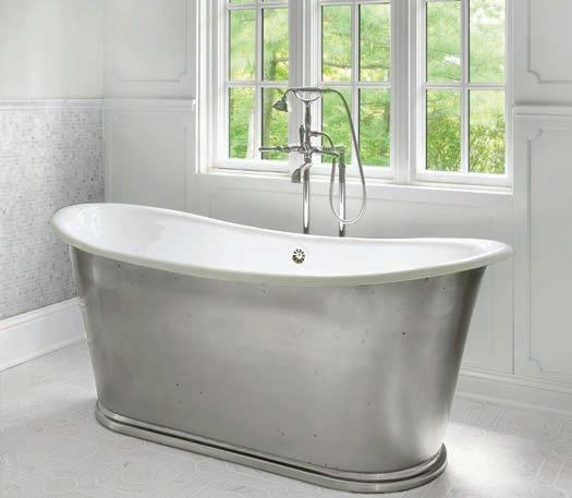
Bath
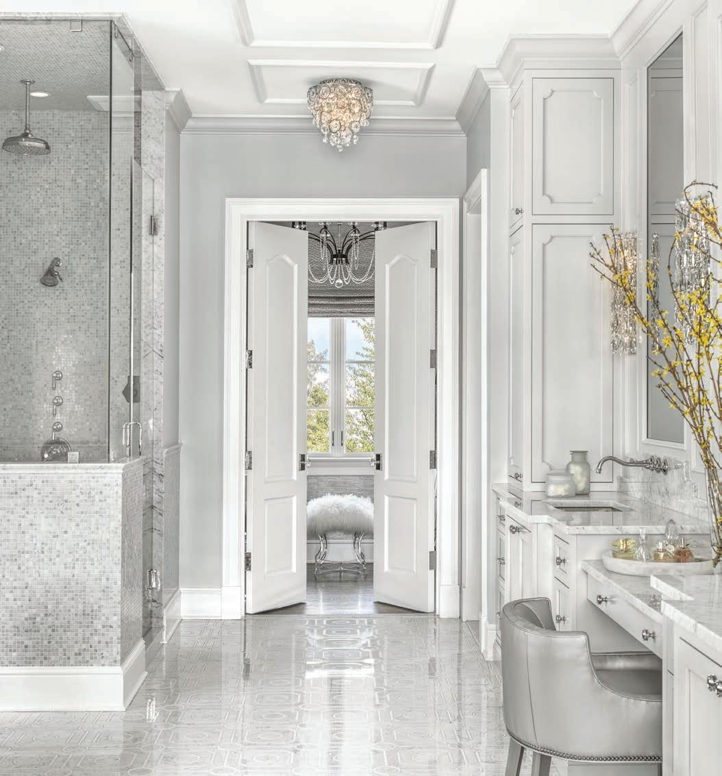
WINNER Designer: April Jensen, ADJ Interiors / Architect: Fendler + Associates / Builder: Priffti Construction
Part of the second phase of a whole home renovation, the original primary suit was dated and small. The design team were tasked with expansion of square footage, but also creating a serene respite that included a bedroom and primary bath to match the grandeur of the rest of the home. With a spa-like color palette, tile on all the walls, custom mirrors and cabinetry, glam finishes and the use of multiple textures, the primary bedroom and bathroom provide an escape from the world. Photography by Alise O’Brien
FINALIST Designer: Lauren Sweet-Schuler, Sweet-Schuler Studio / Architect: Jenny Gossow
Stepping into this bath is like stepping into a luxury hotel suite. Every turn has modern amenities with traditional fixtures to create a space that is relaxing, elegant and understated. The first view is of the beautiful Waterworks cast iron bathtub with wall-mounted polished nickel tub filler, also of Waterworks and art from the homeowner’s personal collection, against a white marble wall. The custom walnut floating vanity in a graphite stain has integrated pulls and creates great contrast to the soft white stone and walls. The Robern medicine cabinets have a custom-designed walnut frame, with a built-in transom and mirror to match the glass transom above the bathroom door. Waterworks faucets in polished nickel and petite sconces by Flos add a formality and traditional feeling to the modern lines of the vanity elevation. The zero-entry shower for two continues the same floor that is in the main bath, but in a smaller tile for a seamless transition. The dual shower allows each user to select their preferred shower pieces by Waterworks for a truly custom luxury shower experience. Photography by Megan Lorenz

FINALIST Designer: Janelle Helms, Karr Bick Kitchen + Bath
The clients wanted to add an entry from the primary bedroom to their existing hall bath. This would allow them to use it for an en suite and guest bathroom. The design team did this by shifting the hall door to the center of the entry to allow for large vanities on either side of the door. The new plan allowed for a separate toilet room and spacious shower opposite the vanity wall. In addition to changing the layout they wanted to update the finishes while staying true to the age and style of their home. The walnut cabinetry, marble countertops and brass plumbing fixtures achieve this by adding elements that are just as beautiful today as they were a hundred years ago. The green tile that is carried throughout the space is the perfect pop of color. The black and white patterned floor tile along with the floral and caramel wallpaper combination all came together to allow the designer to create a truly lovely bathroom. Photography by Lisa Mitchell
WINNER Designer: Kelly Johnson, Kelly Johnson Design
Designed for identical twin girls, this bunk room at the family’s farm is their home away from home most weekends. The clients requested a room that would serve as both bedroom and playroom, include ample storage and reflect their daughters’ carefree personalities. The only restriction was to avoid the use of pink or purple, as each color is used exclusively to identify each of the twins. A playful wallpaper adorned with multi-colored cats establishes the whimsical tone of the room. The bunk beds and trim throughout the room are painted the same shade of vibrant blue as the “blue cat” and included integrated drawer storage in the bunk steps and frame. The cat wallpaper is complemented by multi-colored polka dots on the bedding and rug. Sunshine yellow draperies are accented with multi-colored pompom trim, also applied on a lampshade. Wooden cat chairs serve as functional decor at the craft table and a mirror resembling a string of pearls hovers above the dresser. The end result is a delightful blend of childlike wonder and practical design in a setting that feels both magical and grounded. Photography by Alise O’Brien
Judge’s comment: “What
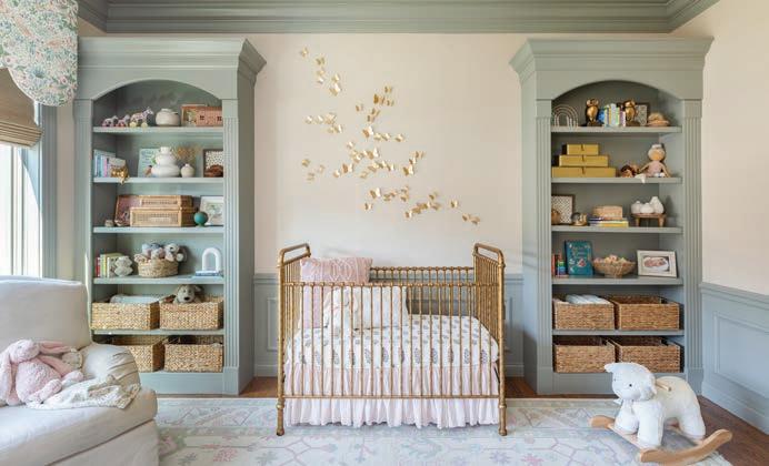
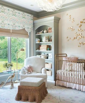
The transformation of what was formerly a dark home office into a stunning nursery is a heartwarming and creative project that met the needs of our clients. The expectant parents needed a nursery close to their first-floor master suite, which led to the conversion of the existing office. However, creating an entrance between the master suite and the office required some creative thought and the designer collaborated with the construction team to add access to the nursery. The intent was to influse the room with texture and beauty, but also allow it to be a space where this little one can grow into. The use of grass cloth wallpaper on the walls added texture and sophistication to the space without overwhelming it. The designer had the dark molding painted a soft green paint to complement the overall look. The bubble light gives a touch of glamour. The butterfly art above the crib serves as a unique and captivating focal point. Every fabric, piece of furniture, and decor from the changing table to the custom rug, was carefully chosen to ensure the nursery is not only beautiful but also practical. The design was created with an eye toward longevity, allowing the family to enjoy the nursery for many years to come. Photography by Lisa Mitchell
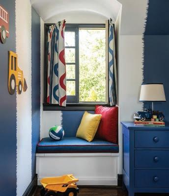
Designer: Joni Spear, Joni Spear
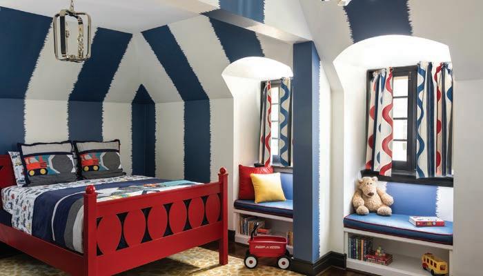
The existing office had no door and was located at the end of a long dark hallway that had been painted black by the last homeowners. First order of business was to lighten the hall and create a wall space for functioning doors. The awkward architecture of the room with three alcove windows, slanted ceilings and built-in bookcases proved an inconvenient location for furniture placement. The designer opted to place the bed against the wall so the two-year-old wouldn’t fall out. The solid wood bed and nightstand were constructed in the U.S. and painted in vibrant shades to match the bedding and custom roman shades. The amazing irregular wall stripes were inherited from the previous homeowner but were also black and proved too dark for a toddler. Both the designer and the client loved them and decided to have them re-painted in a daring blue. The fabric used on the windows counterbalances the wall stripes. Window seats and a built-in toy storage were constructed to make use of the alcove windows. Now, the room is not only fun and bright, but functional. Photography by Karen Palmer
Judge’s comments: “Bold and cool. Nice problem solving with a few space concerns. Will be great for the kid to group up, just change a few accessories like the truck details, and it’s still a room to grow older in. Love that the furniture was U.S.-made; smart custom details.”
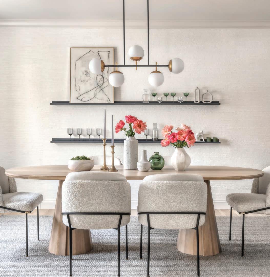
WINNER Designer: Morgan Brown, Emily Castle Design
It’s said that an all-neutral space can be one of the toughest to design. That clearly wasn’t an issue with this project, as the homeowner wanted to lean into the monochromatic idea and all it has to offer. The vision was clear and simple: Create a neutral, family friendly space and environment for both family and friends to enjoy. Both the homeowner and the designer worked seamlessly together, bouncing ideas off one another, to make this vision come to life. Layers upon layers of varying hues of creams encompass the space while subtle pops of greys and blacks in the finishes were selected to break it up and add depth. Texture was something the homeowner mentioned she loves and wanted to highlight in the space, so selecting fabrics such as linens and velvets were important. From the textured upholstered dining chairs to the natural rug and the hand-woven wallpaper, a sense of warmth and richness is created. The light oak dining table, brass details in the accessories and lighting and green glassware and plantings all bring touches of the surrounding environment indoors. Thoughtful choices in the neutral color palette, layered textures and subtle touches and nods to the outdoors, helped create a calm and comfortable environment that the homeowners, and their guests, can enjoy for years to come. The initial vision may have been simple; however, the end result is simple yet significant. Photography: Alise O’Brien
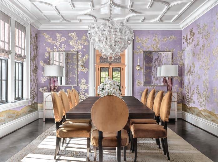
FINALIST Designer: Kelly Johnson, Kelly Johnson Design
The objective for this generously sized dining room was to create a dramatic yet inviting space that radiates a blend of elegance and luxury. A standout feature of the room is the hand-painted floral mural, graced with glistening metallic botanica. The mural, in soft lavender tones complemented with gold, bronze and cream accents, dominates the color palette for the room. Intricate ceiling moldings add architectural interest, while the cascading chandelier of glass orbs creates a contemporary and opulent focal point. Whiskey-colored velvet dining chairs harmonize with the golden bronze metallic accents in the wallpaper as do the cognac-colored silk accent threads in the abstract patterned rug. Soft metallic accents are repeated in the paired chests and mirrors at the end of the room. The finished space intertwines traditional elements with a contemporary flair, resulting in a room that is fresh, invigorating and sophisticated. Photography: Alise O’Brien
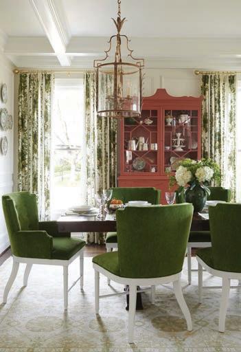
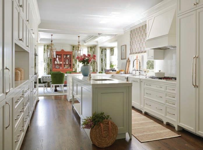
FINALIST Designer: Amy Studebaker, Amy Studebaker Design
Olive Avenue’s dining room exudes an approachable elegance that creates a comfortable, elevated experience for any dinner guest. Rich velvet tones anchor the space’s traditional interior when unexpectedly paired with a coral, lacquered hutch and timeless brass lighting. Photography & Styling: Max-Kimbee, Natalie Warady
Judge’s comment: “Gorgeous. Lovely use of fabrics and furniture. Must be so fun to host here. Love that it’s right off the kitchen, where everyone wants to be!”

By Julie Lane
2024 is coming to a quick close. It seems to have been a whirlwind for me and my family. Our oldest graduated from college, our youngest completed her first college internship over the summer ... and we sold our house! Yes! The house that we painstakingly spent a year gutting to the studs, renovating the layout and adding an addition (that included more foundation than I could ever have imagined) to create a home that we truly loved. We spent seven happy years hosting our family holidays and friends for parties. So, many have asked why we decided to sell our home now when we have plenty of time before our new home is built. The simple answer: The time was right! I talk with buyers and sellers everyday asking when they should sell and buy! So many confusing headlines regarding the state of real estate in our country. Some states are experiencing an abrupt slowing of their market, while others remain brisk.Depending on where you get your news, the reports range from out of control mortgage rates to stabilizing and lowering interest rates (we all need to come to grips that we will most likely never see 2% interest rates).
Every real estate market is local! St. Louis is a great place to purchase a home. We have some of the best schools in the state and region. We have large corporations here with strong roots that
support our community. Our St. Louis region has been ranked in the top five for business startups. St. Louis is home to the best fans in professional sports as we support our Blues, Cardinals and St. Louis SC teams. I could go on and on.
Our local market is strong. Of course, there are many distractions that cause one to worry if they are making the right real estate decision for their future. No one has a crystal ball. But, selling right now in most instances is a sound choice. Purchasing your next home is a sound choice. Make sure you consult a professional Realtor to help guide you through the minutia of contracts, negotiations, municipal and legal aspects of every deal. A seasoned Realtor should be able to give you valuable advice specific to your needs. Though it is good time, does NOT mean that it is an EASY transaction.
My husband, girls and I are looking forward to building our next great home here. I am glad that I had a good Realtor and that we weighed our options and made the one that made sense for our future. We are currently renting in Clayton (another great STL area) and reliving our days of ‘city’ living prior to having kids and responsibilities. But, that is for another time. sl
AVALON PLACE Fantastic business/lifestyle opportunity! Ripe with potential for a new caretaker. The charm and grandeur of this property offer a canvas for conferences, retreats, weddings/receptions or other hospitality events. As you enter the hall through the large custom wood doors and walk thru the main floor, notice the exceptional woodwork and stained glass. The large stone fireplace at one end fills the hall with warmth. A second level mezzanine offers a second bar and additional seating. Six sets of east facing french doors lead to multiple levels of outdoor entertainment spaces overlooking the MS. River Valley. Set on 14+ acres of walking gardens, quaint paths and water features. An outdoor pizza kitchen is in addition the commercial kitchen attached to the hall. In addition to the hall, the property includes a 4 bed house with spectacular views of the valley and an “overlook” With an alter/stage for outdoor weddings or music. The possibilities are endless! Your vision can become reality!
LISTING PRICE
$2,100,000
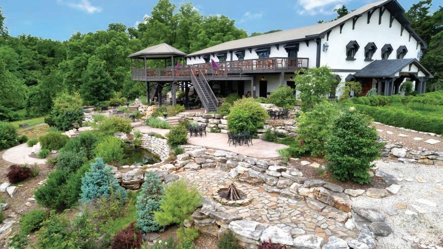
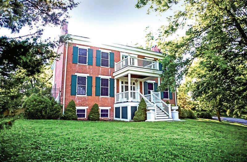
RACKHEATH HOUSE This is Rackheath! This wonderful home sits on the bluffs of the Mississippi River on 4+ acres with incredible views of the river valley. The home was built in 1860 and has been updated and re-sized to accommodate todays lifestyle. The first floor has an amply sized living/dining combination, a green house w/hot tub and kitchen with center island. Additionally the first floor has a bedroom with it’s own full luxury bath and a common sitting area. The second level has 2 more bedrooms each with it’s own bath and a common area/sitting/tv room with incredible views on 3 sides. The large outdoor patio area has views of the grounds and are of an English garden, landscaped and manicured shrubs, pathways and statuary. Can you find the secret garden with the oversized chess set? This is a must-see property! LISTING PRICE $775,000


a prominent riverboat captain, Cedarcrest began its life as a plantation home and quickly became the archetype for a number of houses built in the Mississippi River Valley. This is a fantastic opportunity as a family home, corporate retreat location, or just your home away from home. The home is complete with 7 bedrooms, each with it’s own full bath. The home has a commercial kitchen and an owners suite with it’s own kitchen in the lower level. The private grounds feature Victorian gardens, a pool and pool house with changing rooms, a bathroom, and a fireplace. The property has an abundance of entertaining areas including upper and lower level patio areas. The home has most recently been used as a bed and breakfast and is still configured as one or it’s easily used as a residence. This is a must-see property.
LISTING PRICE $1,200,000

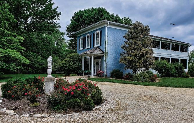


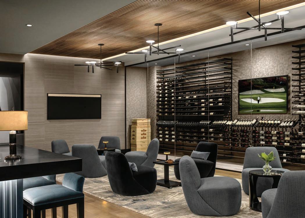
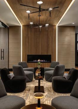
Designer: Kelly Johnson, Kelly Johnson Design
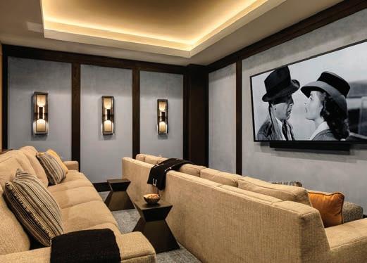
The swanky, sexy speakeasy in this home is a destination of its own. Upon descent, guests are enveloped in a dark, moody blue retreat where every surface has received attention to detail. The first focal point is a chic bar finished in glossy peacock blue with a scalloped front and black granite waterfall counter. Petite polished nickel lamps grace the countertops, posh blue-velvet barstools line the bar face and dim ambient lighting bathes the space in twilight. Blue-gray raffia wallcovering adds dimension to the walls extending into the wine lounge where an acoustical wood-slatted ceiling warms the room and introduces a linear texture that cascades down the fireplace wall, contrasting with the softer, rounded shapes of the furniture. Spanning the length of the glass-walled wine cellar, sleek blue and black furnishings are arranged in three cozy groupings on top of a linear abstract rug for sips of Chardonnay and shared secrets. Just beyond the whisper is a viewing area with motorized, convertible seating, bluevelvet walls and architectural sconces. A peacock-and-black powder room continues the mood of this alluring space. Photography by Alise O’Brien Judge’s comments: “Brilliant project! Well-done!” “Extremely well
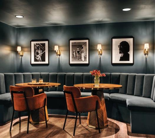
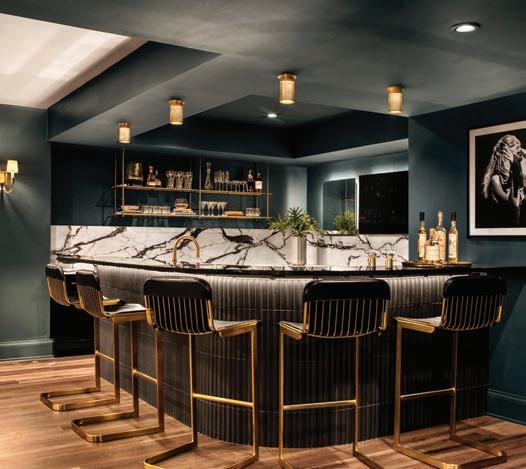
FINALIST Designer: Laurie LeBoeuf, Emily Castle Design / Architect: Schaub Projects Architecture & Design / Builder: Andrew Singer
Recalling the golden days of Hollywood, this stunning lower-level bar and lounge pays homage to the glamorous and sophisticated interiors of the silver screen. Here, the stage is set with a beautiful curved bar clad in a fluted black tile, complemented by dark forest green walls, and topped with a deco inspired countertop and perforated brass lighting. Rich furnishings, like the bold black leather and brass barstools wrapping the bar, create a centerpiece worthy of everyone’s attention. Once an unused storage space, the design team worked together to create a layout separating a family friendly movie, snack bar and bunk room area with a separate hidden speakeasy lounge fit for fun and entertaining. Challenged with creating a cohesive plan, all while designing a distinct separation between the desired usage of space, the designer set out to provide the homeowner with a new fully finished and functional lower-level design for all ages to enjoy. The color palette, gold and glass sconces and velvet upholstered furniture helps get the atmosphere just right. A custom upholstered banquette built by Jente Woodworking serves as comfortable place to gather, accomplishing an end-result that feels exactly like the Art Déco hideaway the homeowner desired. Photography: Alise O’Brien “This is done really well! The colors are so rich and the space is moody. Fantastic job!” “Sexy and moody bar vibe, with rich deep colors that seem to hit the client’s requirement perfectly.”
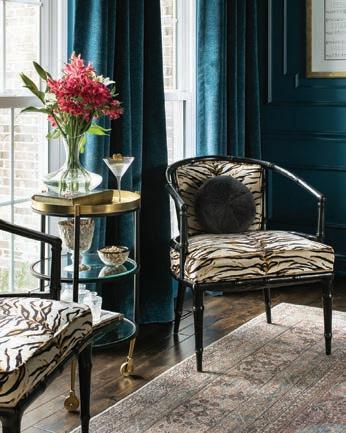
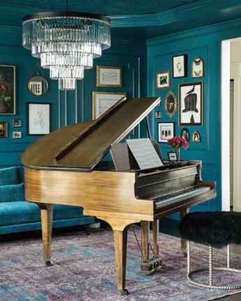

FINALIST Designer: Ellie Redders, Ellie Redders Interiors / Builder: Chris Susic, IAF Remodeling
This room was previously a traditional dining room but it was rarely used. The homeowner wanted a space that was more functional for their family and also created a curated, fun and interesting mood. Focusing on their love for music, an antique piano became the primary focus with a large crystal chandelier anchoring the space. The walls and ceiling were lacquered in a rich hue with matching drapery that set the mood of an old piano bar. Art is framed throughout the space in various shapes and sizes that add interest and texture. Whether playing the piano, or just relaxing with a cocktail, this space has become the perfect, versatile space that the homeowner dreamed of. Photography by Megan Lorenz Photography Judges’ comments: “This is a lovely project. The colors are perfect.” “Thoughtful and attractive repurposing of a rarely used space into a destination.”
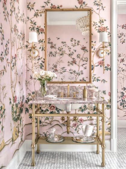
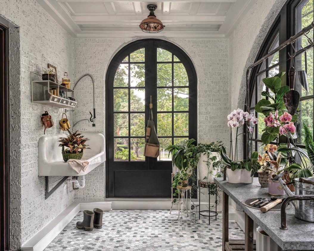
CO-WINNER Builder: Chouteau Building Group / Designer: April Jensen, ADJ Interiors / Architect: Fendler + Associates
Being an avid gardener, the homeowner needed a space to care for his large collection of orchids and house plants. The existing sunroom was transformed into a functioning greenhouse. The brick was limewashed to match the exterior of the home. The existing doors and windows were painted in Sherwin Williams’ Caviar to harken the feel of vintage ironwork and to add a strong contrast to the soft colors and marble flooring. An antique enameled cast-iron sink was sourced from a local architectural salvage shop to bring the perfect potting station to life. Photography by Alise O’Brien
Judges’ comments: “What a lovely and inviting space.” “Super cute and inviting greenhouse.”
CO-WINNER Designer: Laurie LeBoeuf, Emily Castle Design / Architect: Paul Fendler, Fendler + Associates / Builder: Minton Homes
Tucked behind an impressive grand stair, this powder room welcomes guests into a chic space surrounded by elegance. Relaxed, warm and inviting, the space is washed entirely in pink. The pale peony blush hue, adorns the walls with beautiful blooms, birds and branches, much like the homeowner’s very own secret garden. The design team was given the task to reconfigure the existing small water closet in this space to feel more appropriately scaled in size. Square footage was taken from an adjacent coat closet, to create a private room providing a more cohesive layout. Using repurposed pink marble that had previously been in the primary bathroom, the powder room was covered in a wallpaper sourced from the Rosewood Miramar in Montecito, California. Alabaster wall sconces by Regina Andrew frame the ornate gold mirror, while the antique brass vanity from Palmer Industries adds a timeless glint of luxury, further enhancing the refined brass faucet by Kallista. The chandelier by Visual Comfort, showcases classic elegance with its unique teardrop crystals, giving off a beautiful sparkle with the sunlight streaming in. Photography by Alise O’Brien Judges’ comments: “What a beautiful room. Thank you for sharing.” “Stunning and fresh powder room, with great touches, interesting sourcing and thoughtful execution.”
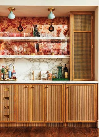
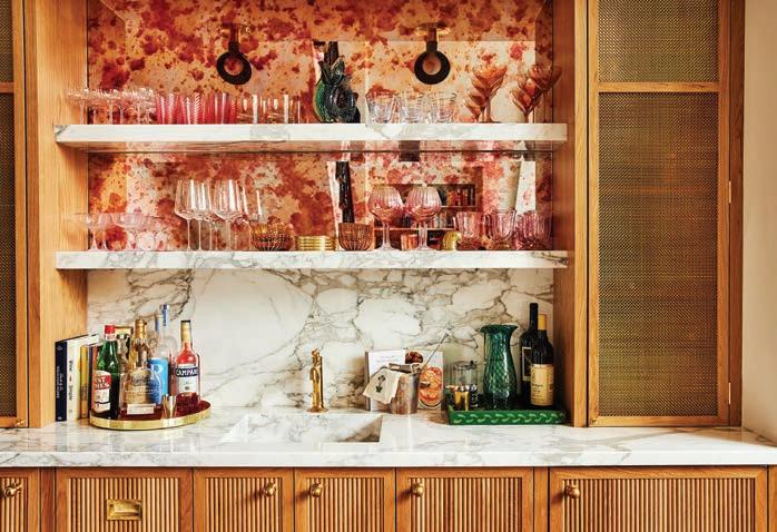
With the renovation of the surrounding spaces, the underwhelming wet bar needed new life befitting of the family’s tastes, maturing household and penchant for entertaining. Given its placement between the dining room and family room, it was an opportunity to make this quiet little alcove shine. Pink antique mirrors were set as the upper backdrop, atop the Calacatta Oro countertop, backsplash and shelves. Custom-reeded white oak cabinetry with unlacquered brass grilles provide warmth and elegant function to this fully stocked bar. An ice maker and beverage cooler round out the features tucked into the cabinetry. The unlacquered brass faucet is the Dash by Waterworks. Every detail was tended to from the seamless integrated stone sink to the discreet appliance ventilation disguised into the toe kick. Cocktails are served with a cheerful blush at this moody bar. Photography by Ashley Geiseking
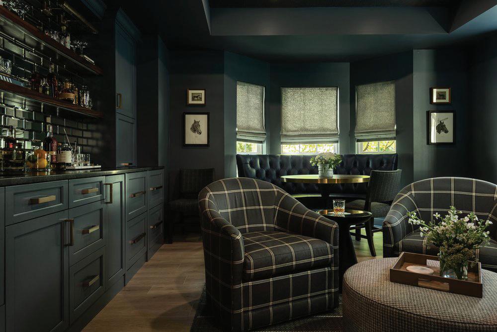
During COVID, this family decided that if they were going to be stuck at home, they should make the most of it and create their own moody retreat, a place for the family to gather and feel like they were somewhere else. It also became a safe haven for their adult children. Our clients had big goals for their new room. What used to be a dining room was tasked to be become an extensive bar with all of the accoutrements, a comfortable seating area and a game table where they can eat and play games. The Men’s Club vibe was accomplished with plaid, houndstooth, stripes and leather. Grass cloth adorns the ceiling to add more texture and color saturation. Water had to be run to the room to accommodate a sink and ice maker, which were important to the family. Beverage drawers are hidden behind cabinet panels and a coffee maker hides behind a door on the countertop. Even after the height of COVID, the family still gathers as much as possible in their retreat. Photography by Karen Palmer
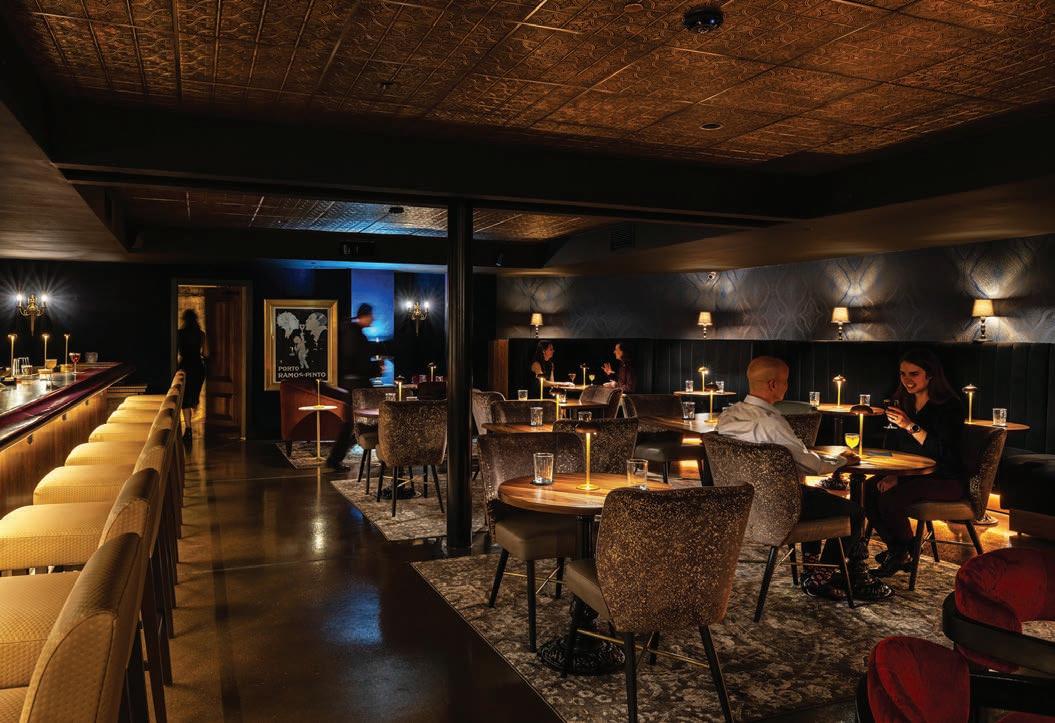
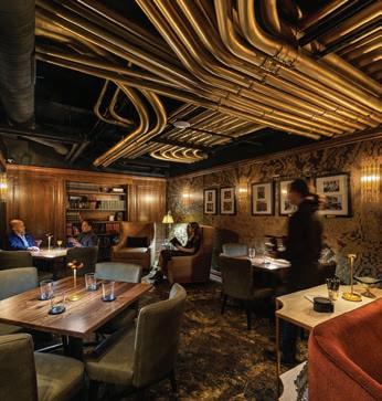
None of the Above is an ornate speakeasy located deep beneath City Foundry STL. As an exploration of the harmony between old and new, painstaking effort was taken to restore the flooded industrial basement into an opulent, immersive hospitality experience. None of the Above’s atmosphere is heightened through experiential design. A key focus of the design was for guests to interact firsthand with the industrial heritage of St. Louis. The entrance, located behind an unmarked door at the heart of City Foundry, leads visitors to an elaborate series of tactile switchboards upon arrival. This switchboard array is the speakeasy’s true secret door, inviting guests to follow a series of winding tunnels and reclaimed graffiti art beneath the Foundry to reach the bar proper. This approach to the entry experience does more than just build anticipation; staff are given more control over the flow of guests through this design, allowing NOTA to maintain its high standard of quality through carefully managed operations. The main bar area is a triumph of design, balancing warmth with sophistication to create a singular atmosphere. Keeping with the speakeasy theming, the decor harkens to an intimate 1920’s aesthetic. The design team incorporated a selection of found objects throughout the space to further enhance the lush atmosphere; a unique accent table, vintage light fixtures, and historic photography further enhance the bar’s singular character.
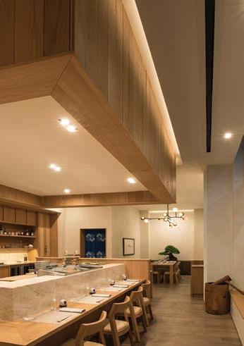
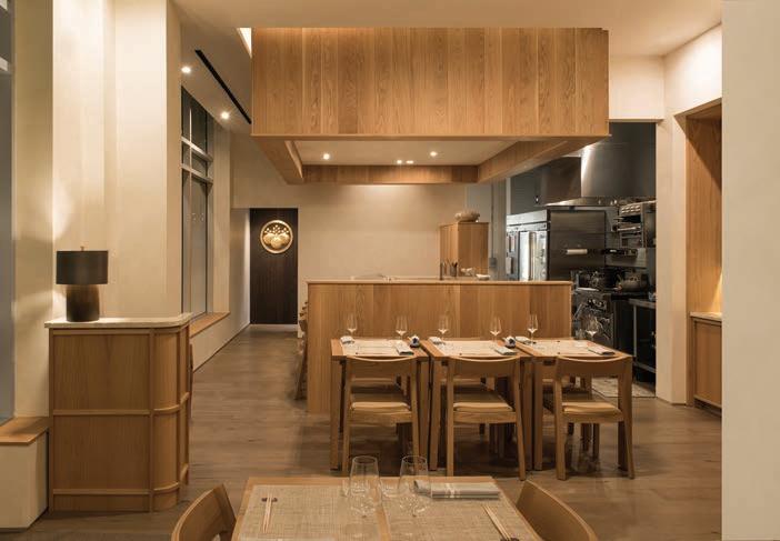
Nobu Kidera is one of the most celebrated sushi chefs in the world. When his family relocated their large flagship restaurant, Nobu’s, to a 964-square foot space in a busy University City neighborhood, it afforded the design team the opportunity to reimagine a traditional approach by fusing classic Japanese design, art and gastronomy into a new, intimate and unique atmosphere and experience for their guests. Photos © 2024 Donald J. Fedorko of ImprovEyes Studio
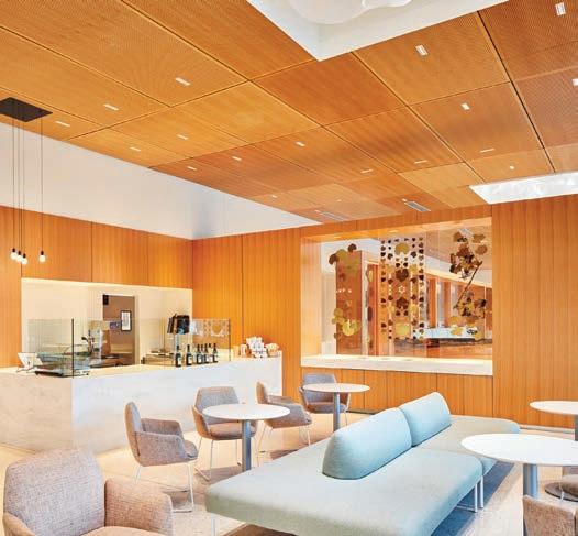
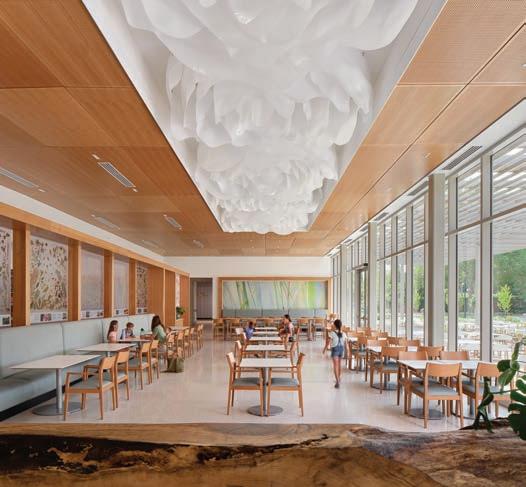
This Café and Restaurant carried on the main building design concept to introduce Biophilic Design themes and messaging that supported the Botanical Garden’s mission and to blur the boundaries between the interior and outdoors. As one enters, the Café and Restaurant’s main rooms feel like they are an extension of the outdoors. Since the Café and Restaurant were operated by the same vendor but simply offering grab and go versus sit-down options, the design deliberately blurred these interior lines of demarcation; a partial height, screen wall provides physical separation, but allows full visual experience. The ceiling plane and its design elements float through like a cloud above. A limited life tree that had to be taken down for the project was repurposed into a log bench designed for both function and “art.” An off-cut of the log became a community table in the main dining room. With the need to define spaces, as well as screening less visibly desirable views, the concept of surrounding the main room with botanical imagery. With the excitement of this concept, the Garden took on their own project, creating a screen that encapsulated their famous lotus pads in resin and allowed one to view the pads top and back sides, as they resemble a sea-like creature. Photography by Wesley Law and Casey Dunn.
The holidays will be here before you know it....and Colonial Marketplace is your one-stop shop for everyone on your list! With over 20 unique boutiques, great food, and best-in-class services, you can eat, shop, and experience – all in one place.


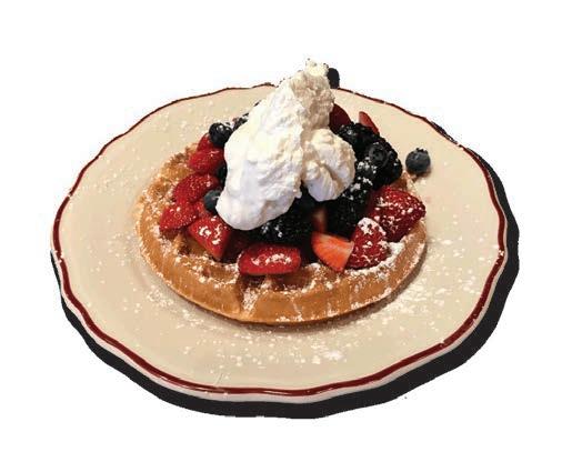

and


Nutrition IVs and Injections to promote healthy body and mind. Injections $29-$59 IVs $84-$229

Brightside Flannel Lined Workwear Jacket $188

Weatherproof leather combat boots by ZILKA featuring a side zipper, quilted back with mini studs, and a lug heel. $275


Smoothing Anti-Frizz Blowout Butter $35

Medical Weight Loss Therapy with Semaglutide. $350/month


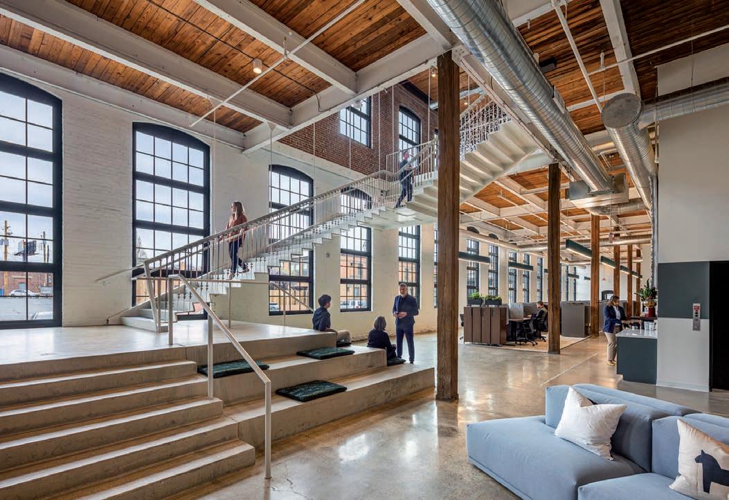
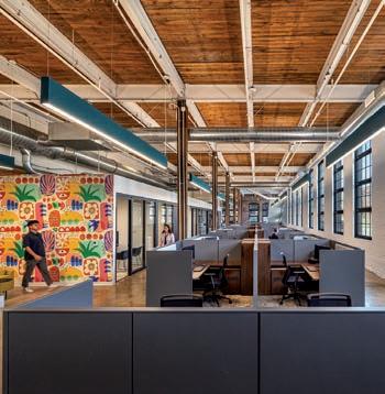
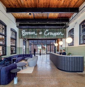
A transformation of the historic stove factory into a contemporary loft and tech-inspired office hub. This building, dating back to 1910, had been vacant for nearly 50 years. Housing 140 staff members from one of Missouri’s largest law firms, this revitalized structure stands as a beacon of renewal. Featuring 48,000 square feet of daylit, renovated space, the building boasts spacious interior courtyards, onsite parking and an innovative post-pandemic workplace layout. Embracing its location in The Hill neighborhood, the new headquarters offers a range of amenities, including open collaboration areas, a fitness center, deposition rooms, an art gallery and a mezzanine lounge. From a library with gaming functions to an event space, each area is designed to foster creativity and collaboration. With a focus on creating connections, the design integrates unique elements such as indoor/outdoor spaces, an airstream trailer meeting room, putt-putt greens, and other environments to foster collaboration. With inclusive design features like accessible parking and training spaces, it fosters a sense of belonging and supports diverse needs, setting the stage for further community growth. The building is designed with customizable space for tenants to personalize and adapt, utilizing existing wood roof decking for ceilings to add value for the owner and empower occupants to create a unique environment that enriches their workspace economically, fostering diverse expressions of creativity and individuality while enhancing the community’s aesthetic and cultural fabric.

Originally a fuel-and-service station constructed in the mid-twentieth century, this building had experienced many lives over the decades and was in need of restoration. The conceptual objective for this project aimed to uncover and celebrate the gritty character of the service station while simultaneously infusing the interior with fresh, updated spaces appropriate for creative collaboration. Early analysis of the existing structure determined that a reductive strategy would be the best design approach for this project. Interior finishes including a low ceiling grid, carpeting and gypsum board were completely removed, revealing high ceilings, masonry walls and the original concrete slab. The original traces of the service station at both the floor and walls were embraced and preserved for the story they tell. Adjacent these elements, clean casework, paneling and screen walls delineate spaces with a contemporary language. New windows and doors throughout fill the interior with ample natural light and provide connection between interior spaces and the surrounding neighborhood. The restrained interior palette primarily consists of wood, including Baltic birch and Douglas fir species, adjacent white textured tile and painted white walls. The spaces are punctuated with high-contrasting black lighting, plumbing, and hardware fixtures and finished with a collection of classic modern furniture. Exterior Photography by Sam Fentress; Interior shots by Miranda Kimberlin
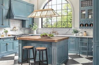
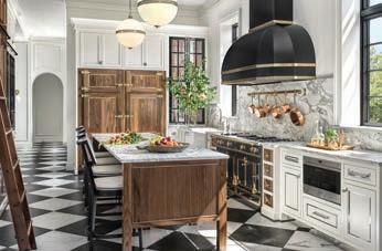
FINALIST Builder: Randy Renner Jr., Period Restoration / Designer: Stone Hall Cabinetry
Built in 1928 as Meyer’s Market, the small grocery on Clayton Road was owned and operated by four generations of the Meyers family before closing in 2020. We undertook an extensive renovation of the historic Tudor Revival structure, returning the exterior to its original distinction with a new slate roof and mahogany store-front style windows that admit an abundance of natural light. To transform the interior into a modern showroom on the first floor and second-floor offices, numerous alterations were performed, including the restoration of 14-foot-high ceilings, framing and detailed millwork, fresh interior finishes and thorough plumbing and electrical upgrades. Photography by Alise O’Brien
build. design. consult
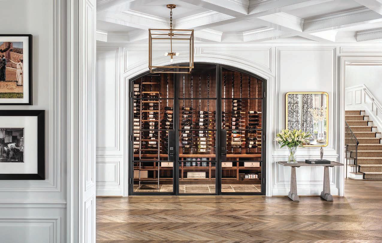
We offer comprehensive design services, collaborating closely with architects from the initial concept to the final product. Our creative process integrates modern construction techniques and goes above and beyond current performance standards.
We seamlessly transform visions into reality while prioritizing efficiency, sustainability and functionality.
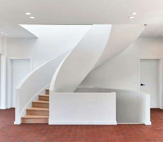

TEAM BEHIND ON OLIVE
TATIANA BILBAO, EMILY RAUH PULITZER, STEVE TRAMPE, AND MITCHELL WALL

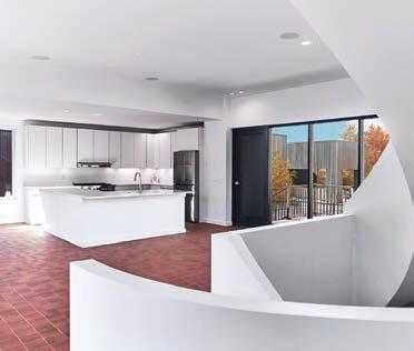
3838 OLIVE STREET ON OLIVE - CONFLUENCE HOME
4 BEDROOMS | 4 FULL BATHS | 3,510 SQ. FT.
On Olive is a contemporary housing initiative with little precedent. The developers have brought together four of the finest international architects working today to design homes for single-family housing within a 3.5-acre urban landscape. The homes are thoughtfully placed throughout the development linked by meandering paths leading to private parks, dotted with curated historic artifacts, pollinator gardens, a resort-like pool with a tanning deck, fire pit, grilling and dining cabana, clubhouse, and fitness center. The Confluence home is designed by award winning architect Tatiana Bilbao. This dramatic, twostory stacked residence features high ceilings, tall windows, two private outdoor terraces, and a stunning half-spiral staircase illuminated by light spilling from the high windows of the upper floors and skylight. On Olive blends distinctive designs with a connection to nature and community. Schedule a private tour today to see the vision for a new way of living.



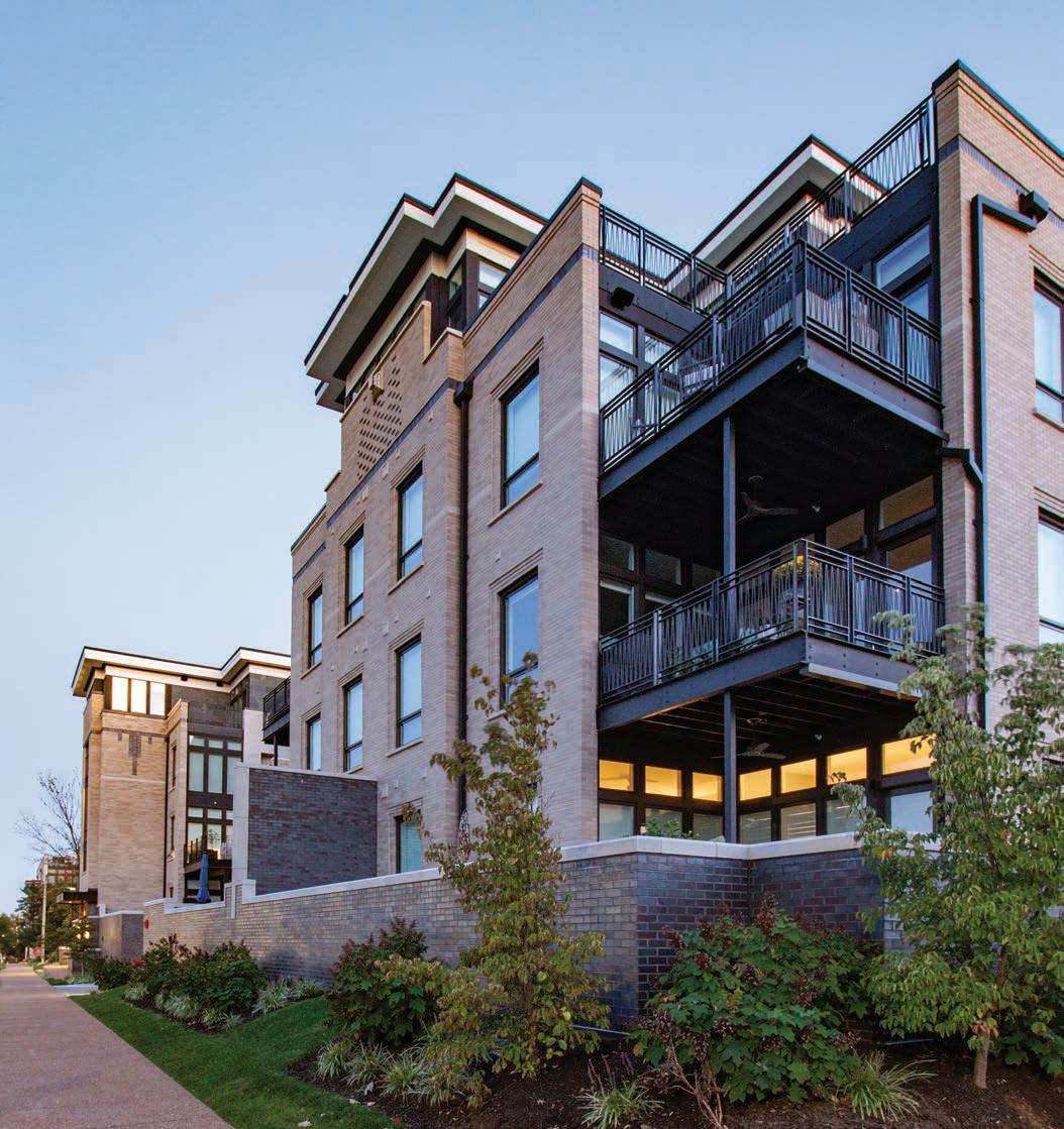
Located along picturesque Madison Avenue in historic Downtown Kirkwood, The Barclay and Hutton condominium complex is the final completion of a full block of new residential buildings designed for a single client. Each building is unique in its layout and details, but they all share a single palette of materials for a harmonious blend of brick, slate, and steel. The Barclay and Hutton’s spacious terraces draw inspiration from the traditional Kirkwood porch and fostering a strong sense of community among friends and neighbors. The 26 residential units within the two buildings form a new community where modern living meets neighborly bonding. Our architectural design for all of the new buildings along this street capture influences from the Art Deco era, as well as the Arts & Crafts styles that grace the charming streets of Kirkwood’s most notable historic streets. This allows blending the past and present seamlessly, infusing the buildings with a touch of timeless grandeur. The contrasting lines and tones of the building’s architecture elegantly complement the traditional kiln-fired brick, ornamental steel, dark slate, and meticulously hand-selected Ipe wood details, establishing a stately and welcoming presence that will embraces residents within in a comfortable place to live. Photography by Tyler
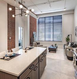
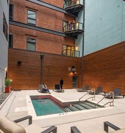
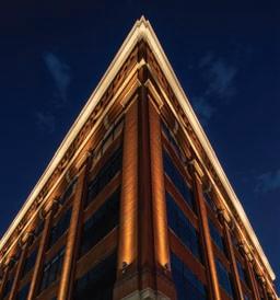
Located in the heart of a major downtown area, this adaptive reuse of a six-story building from offices to a 78-unit multifamily building with amenities is helping to transform the downtown fabric. This project is two distinct buildings with an enclosed atrium. The original building was completed around the turn of the 20th century, and then the modern addition was completed in 1986. The main design goals were to transform this historic building into a unique urban dwelling experience and to enhance the exterior presence of the building from the street, the atrium, and the rooftop. Critical to this design strategy was the removal of the atrium roof and allow the floor plates to have daylight on both sides. This allowed for the deep floors to add another set of units to face the courtyard. Due to challenges with removal of the existing steel in the atrium the team decided to keep the structure in place resulting in a superstructure with added vertical wood look trellis elements which enhances the courtyard experience. The first-floor main lobby and lounge space is visible from the street helping to activate both the inside and outside. The pool area is in the new open air atrium space. A major part of the design strategy at the interior and atrium was to add new materials alongside exposed existing materials that were previously hidden. The dwelling units have a variety of interesting experiences tied to the building’s history such as tall and exposed structure ceilings, exposed brick and concrete, and varying views of the urban area. Another critical design strategy was to leverage the location with a great gameday experience. The penthouse rooftop provides an atmosphere where residents can watch the game within the comfort of the interior lounge while also experiencing the gameday energy of the adjacent sports stadium from the deck area. Photography by Matt McFarland
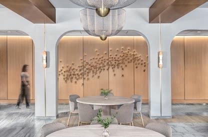
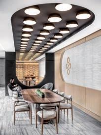
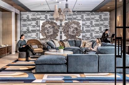
The client wanted to create a truly exceptional residence reflecting modern sophistication through every detail of the space— from artwork and amenities to furniture and finishes. The interior design draws inspiration from the dynamic world of pop culture and the chic elegance of mod fashion. Iconic images of Marilyn Monroe, Muhammad Ali, and Audrey Hepburn grace the living spaces, creating an ambiance that is simultaneously timeless and contemporary. The interior architecture creates a tailored experience with curved forms effortlessly guiding you through the spaces. A soft color palette informed the interiors with rich textural materials, warm wood tones, metallic accents, and charcoal elements providing a slight contrast. Upon entering, your gaze is immediately captured by a striking chain link sculpture suspended above the entry vestibule. This jewelry-like art installation with gradating metallic tones, sets the vibe for the style that awaits within. Strengthening the design concept, the team carefully curated the interiors with warmth and personality, adding modern surprises and delights throughout. A customized waterjet cut graphic installation of Audrey Hepburn, made from recycled bottle flooring, rests above the entry vestibule and is only visible from the secondfloor balcony. Prioritizing health and wellness, amenities include an indoor fitness center that seamlessly extends to the exterior with cutting-edge equipment. Festoon lights hang above, creating an inviting atmosphere for residents to embrace an active lifestyle. Step onto the pool deck, where a spa, barbecue area, and captivating fire pits create a haven for social gatherings and relaxation. Outdoor amenities include multiple courtyards with two outdoor pet areas adjacent to the luxurious interior pet spa. The carefully designed layout invites residents to connect with nature, fostering a sense of community against an elegant backdrop. Photography by Alise O’Brien
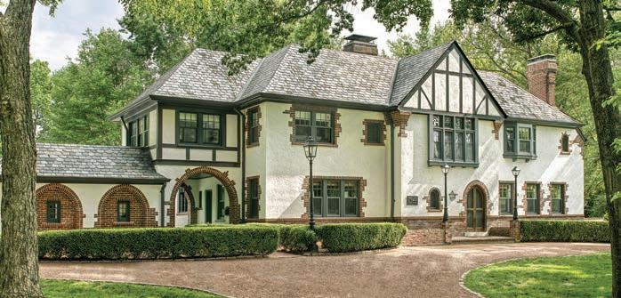
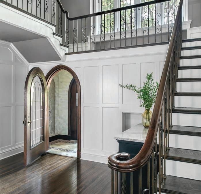
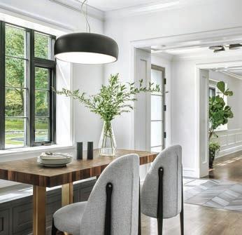
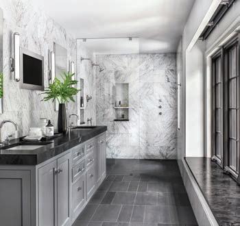
The primary objective for this extensive historic renovation and addition was to seamlessly integrate generous new living spaces into the existing 1920s-era Tudor style architecture. The front exterior facade remains primarily unchanged with only minor refreshes including paint, new house numbers and landscaping. The exterior of the house, however, proudly expresses an expansive two-story addition enclosing cozy living spaces on the ground floor and spacious bath, laundry and dressing areas on the second floor. The harmonious marriage of original architecture with new addition results in a completed restoration where the new respects and enhances the old. While the residence’s exterior endeavors to remain faithful to the home’s original era, the interior of the residence expresses fresh, updated spaces flooded with natural light. New windows and doors with minimized divided lights provide ample visual connection between interior spaces and the beautiful surrounding landscape. Reconfigured ground floor areas encourage free-flowing spaces and allow for an open, gourmet kitchen for owners who enjoy cooking and entertaining. The new primary bathroom suite in the second-floor addition is filled with natural light and finished with a neutral palette of porcelain tile and natural stone. Details throughout the residence include a rich, end-grain walnut countertop at the kitchen prep area that is echoed at the opposite end of the kitchen as a banquette tabletop. A timeless palette of natural materials is consistently deployed throughout the ground and second floors, including natural stone of Carrara and Calacatta appropriate to the era of the home. Lowprofile lighting serves to avoid obstructing views of the landscape. Chevron and mosaic tile are utilized in smaller quantities at specialty areas including the powder room and wet bar area. Photography by Alise O’Brien
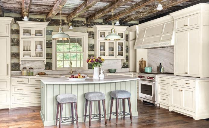
Few places feed the soul like a cozy log cabin in a picturesque lake setting. Calm and peaceful, this 100-acre country estate creates the idyllic weekend getaway for a busy, city-dwelling family of five. The property features two historic log cabin structures, dating back to the 1850s, that were skillfully combined into one expansive home. The homeowners set out to transform the already beautiful property into a space that reflected their own personal aesthetic. While honoring the cabin’s rustic features, they wanted to create a bright and airy space that was as tranquil as the pastoral surroundings. To achieve this goal, the design team started with subtle, yet vital architectural changes. A wall was removed to open the kitchen and dining spaces while large-scale picture windows were added to take full advantage of the vast lake views and provide much-needed natural light. A fresh take on a traditional farmhouse workspace, the kitchen was designed to be graceful yet approachable with a handcrafted feel. Custom brass details and cabinetry hardware from Waterstreet embellish the space, while Urban Electric’s hanging pendant provides an industrial touch. From the inset doors to the tongue-and-groove paneling, the cabinetry accentuates authentic craftsmanship and has been expertly incorporated into the exposed log cabin walls. The design team was thoughtful in selecting organic materials, such as the Mykonos honed quartzite countertops and backsplash, which blend seamlessly with the home’s natural wood and stone structures. Photography by Alise O’Brien
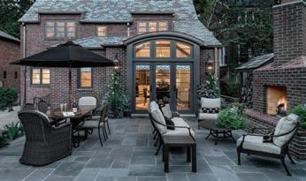
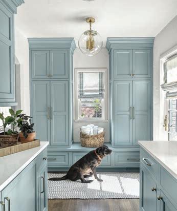
The original home was erected in 1930. The original footprint was approximately 1700. The goal was to create a first-floor plan that would encompass a larger kitchen and eating area, laundry room and mud room along with a first-floor primary bathroom. Like all additions and renovations, the biggest challenge is to blend both the inside and outside seamlessly. Some of the ways this was done inside was through plaster work throughout the entire addition; hand-hewn beams made to match what was in the original part of the home; creating a kitchen, bar, laundry/ mudroom and bathroom design that is not only timeless but respective of the original architecture of the home, and a brick veneer with a matching slate-and-copper roof design. Photography by Alise O’Brien
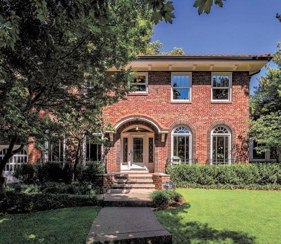


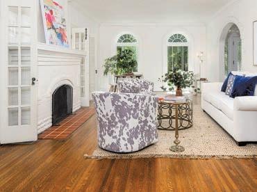


$2,150,000 | 4 BEDROOMS | 5 FULL BATHS | 4,386 SQ. FT.
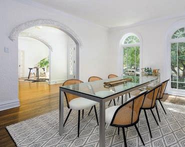
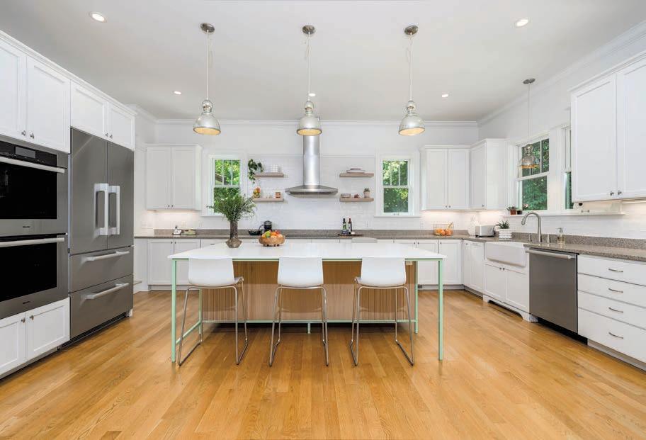

This exquisite 1920's Clayton home, set on nearly half an acre, offers timeless elegance with modern upgrades. Ideally located near top schools, hospitals, Wash U, and Forest Park. The home features new windows, ornate plaster moldings, and hardwood floors throughout. The foyer opens to a formal dining room with butler's pantry/ mud room access and a living room leading to a charming sunroom. A well-designed two-story addition includes a spacious kitchen with Miele and Wolf appliances, a center island, and a family room with a gas fireplace and French doors to a travertine patio. The main floor has a full bath. Upstairs, the primary suite boasts an expansive closet, a dual vanity bath, and a large shower. Three more bedrooms share two full baths. The fenced backyard includes a built-in Lynx grill, perfect for outdoor entertaining. A partially finished lower level with a full bath provides extra living space. Newer roof. Attached two-car garage.


{The
Worlds Finest}
Be the story and live like a Florentine with the Sophisticated Living publisher next October.
Highlights Include:
Experience exquisite accomodations, the best guides, globally recognized food & wine experts, personal shoppers, and a specially curated itinerary developed over 41 years living under the Tuscan sun.




•Exclusive tours not available to tourists
•Art historians & artisan guides
•The best vineyards for wine and olive oil
•The best authentic restaurants

This experience will certainly outdo Stanley Tucci’s Searching for Italy.
For more information and to reserve just one of 5 spots per week (20 total for October 2025), email Craig Kaminer at craig@slmag.net.
$10,000 per person excluding airfare and alcohol, but includes lodging, meals, excursions and gratuities.
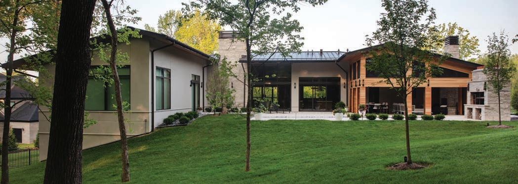
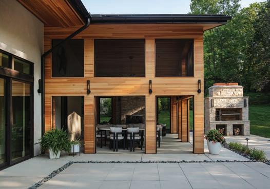
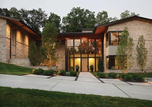
WINNER Designer: Kim Taylor West, Studio KTW / Architect: Susan Bower, Bower Leet / Landscaper: Bob Wilhelm, Poynter Landscape Architecture & Construction
The intent was a custom home with landscaping that was modern and incorporated universal design. The clear challenge was the property being on a large hill. From the beginning concepts, we were challenged to design a backyard with no deck or retaining walls. The patio needed to be on the same level as the main house and have no steps. The parking also needed to be on the main level while the entry level needed to provide a flat entry for people of all abilities. Solutions included a circle drive in the front with a parking area at the same level as the front door. Large pavers and rocks were used in the front and back to create a modern walk area with drainage and style. The front courtyard was created with large limestone walls that have open mouth bronze drains that create a waterfall drainage effect. The back yard incorporated a large outdoor living room with fireplace and phantom screens. The Argentine grill provides an entertaining focal point and great memories for the owner who grew up in Argentina. The tall trees in the front and back balance with the minimal shrubs and modern simplicity. The interior elevator ensures that anyone at any stage in life may enjoy all areas of the house and yard. Photography by Carmen Troesser

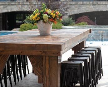
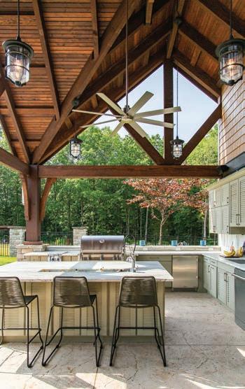
FINALIST Designer: Clay Deschler, Shelton Landscape and Maintence
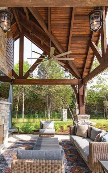
We gave this client’s front landscape a complete refresh with new paver walkways, boulder steps, tiered boulder retaining walls and new planter beds. The landscape design was done with a simplistic approach, incorporating trees, evergreens, small grasses and a few flowering plants for a pop of color. The color tones in the hardscape elements were chosen to help complement the light, neutral exterior of the home. Photography by Ty Smith, Studio 724
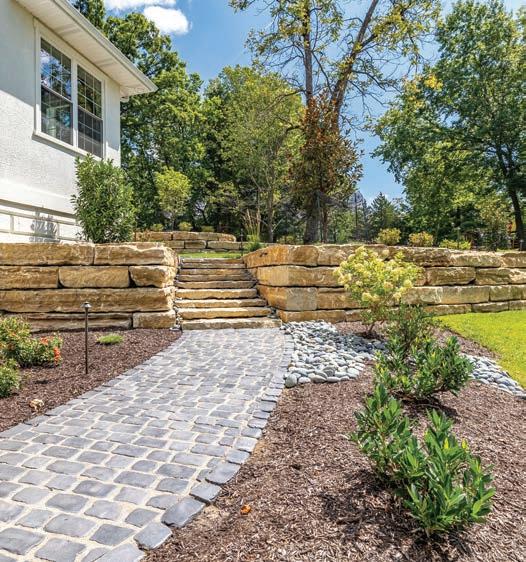
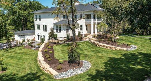
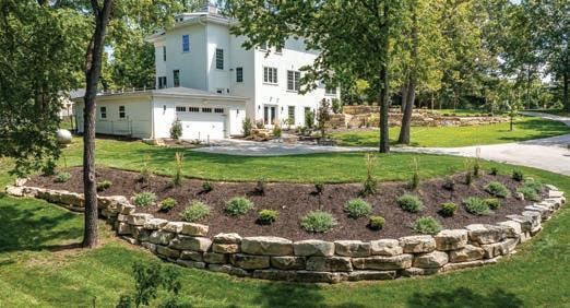
FINALIST Designer: Kim Taylor West, Studio KTW / Landscaper: Bob Wilhelm, Poynter Landscape Architecture & Construction
Collaboration was the key to this large project. The interior designer, landscape architect and building architect created a rustic resort environment for large parties and daily living. We had many challenges trying to incorporate indoor and outdoor spaces on three levels. Boulders and stones from across the state were used with a variety of native plants. Features include custom waterfall, pool, hot tub and two dining areas. The pool house has an outdoor kitchen, dining table for 16, living room, laundry room, full bath and outdoor shower. Photography by Kim Dillon


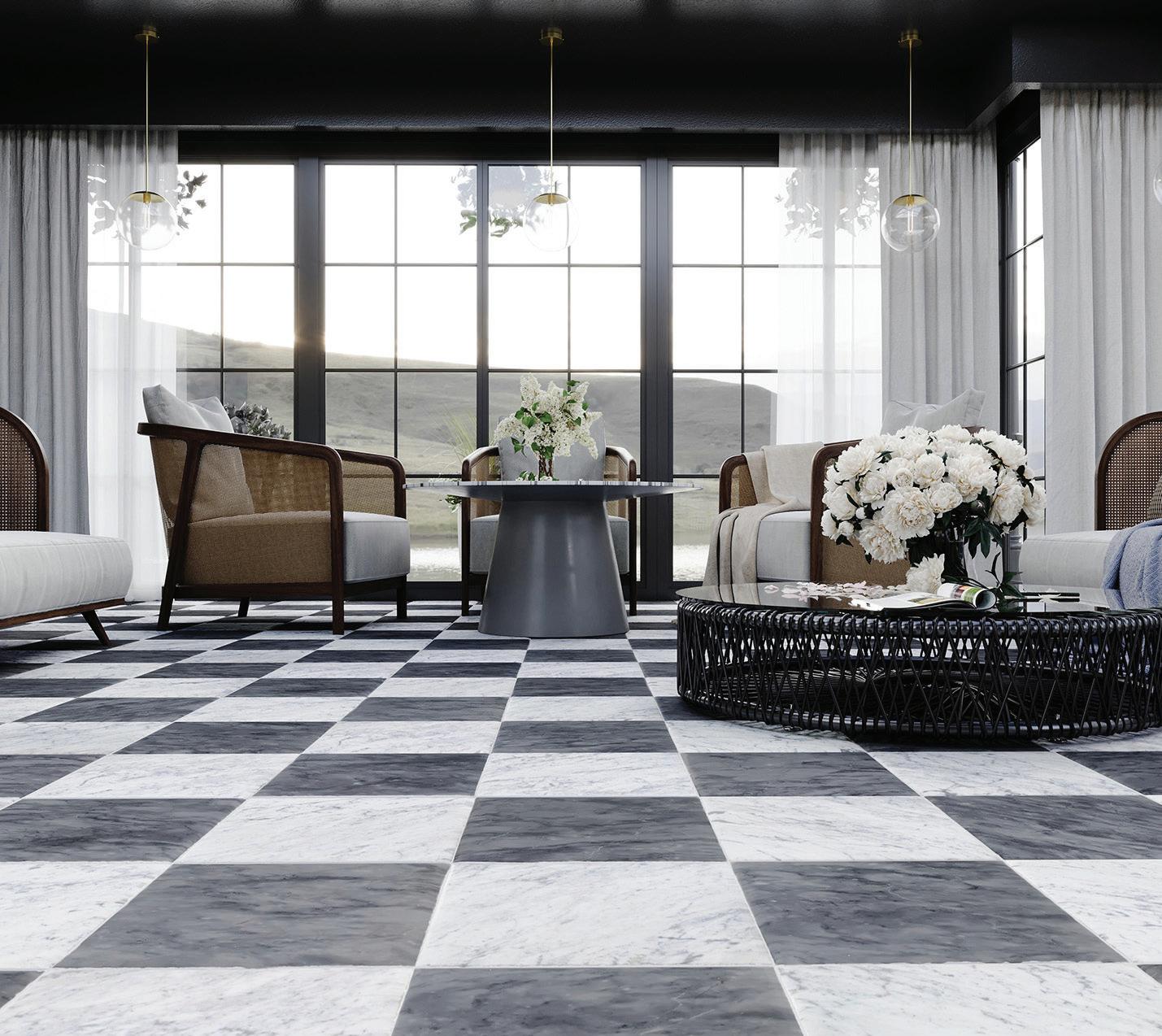


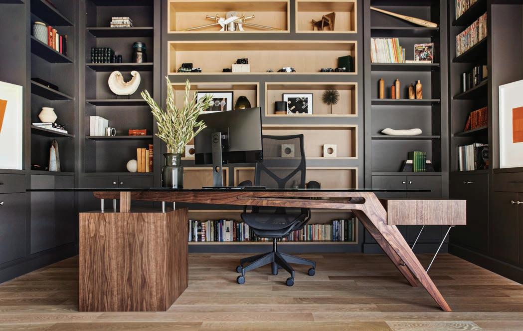
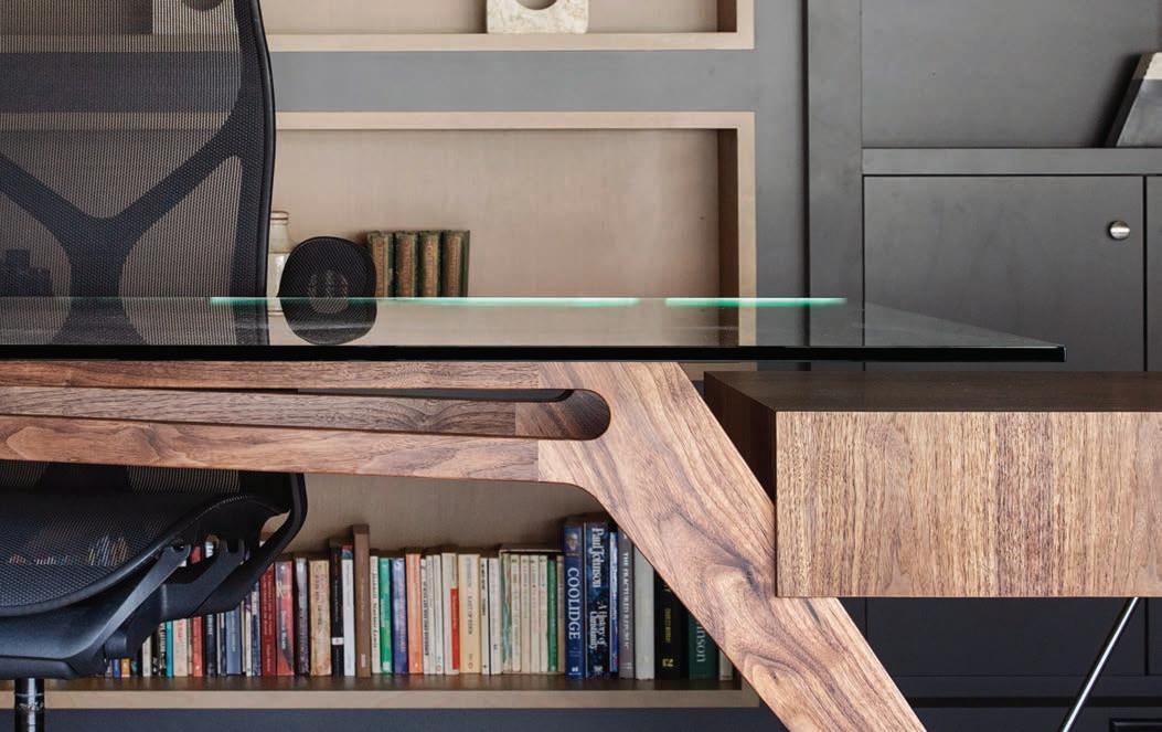
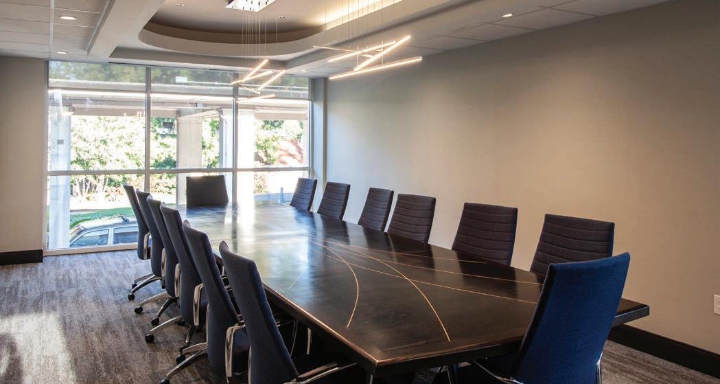
FINALIST Fabricator: Martin Goebel, Martin Goebel Furniture
When The Muny began their Second Century campaign, it was necessary to cut down the iconic trees that had been planted on stage since the beginning. Knowing the impact of the loss, the woodworker salvaged the wood and incorporated it into our renovation work for the administration and back of house project. Renovation work redesigned all of the functional aspects of the historic theater from the dressing rooms to the wig shop to the costume department. As part of the renovations, the main office spaces were also completely overhauled, including the large conference room. The lumber from the famous trees was then made into a custom-board room table featuring inlay design strips along the general theme of the original Art Deco building. Photography by RJ Hartbeck
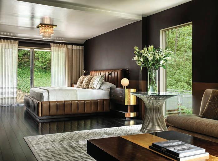
FINALIST Designer: Ken Stückenschneider, Stückenschneider Decoration & Design
Lush modernist furnishings are contrasted against Brutalist modern architecture. Comfortable Italian modern furniture mixed with classic American mid-century modern pieces as well as Moderne antiques soften the lines with soft luxurious fabrics in an autumnal palette to connect to the outdoors. Large scale family entertaining now seamlessly occurs in this 1970s Brutalist concrete home built in a forest.
Photography by Alise O’Brien
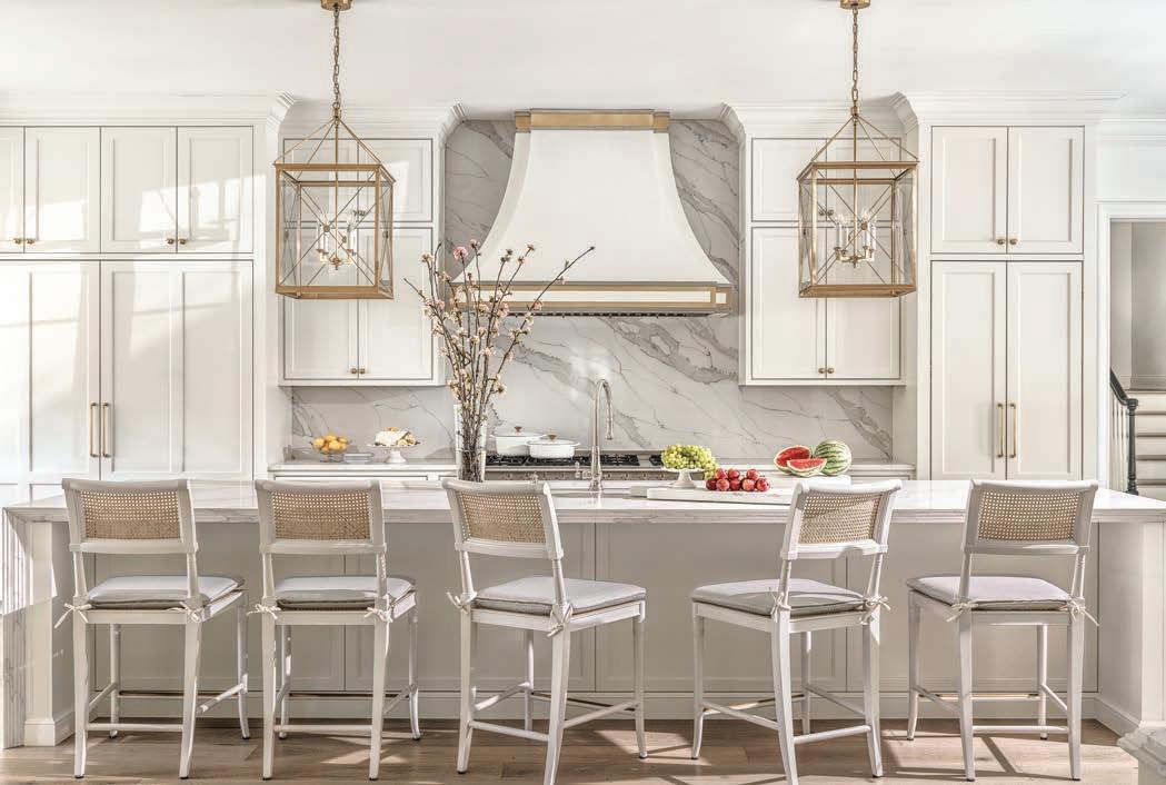
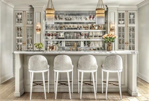
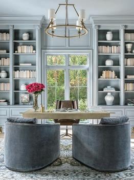
WINNER Designer: Laurie LeBoeuf, Emily Castle Design / Architect: Paul Fendler, Fendler & Associates / Builder: Minton Homes
Fully encompassing its traditional style, this 1990’s home was completely transformed from a dated, traditional house to something fresh with clean lines and simpler architectural details. As part of an overall transformation, the design team fashioned a stately, two-story brick house with breathtaking views of a sweeping lawn and lovely gardens. Stone trim, arched openings and windows were removed, and a new custom railing at the entry was added. Inside walls were removed, rooms were reconfigured and each space was planned with well thought out details. The same aesthetic continues on the interior, where the designer focused on filling the large spaces with comfort and character. An elegant entryway, grand stairwell, formal dining room, bar and library fill nearly half of the main-floor, while the rest is devoted to a large living room, den and open-concept kitchen. A light-filled breakfast room is tucked next to the kitchen shaded by a towering magnolia tree. Throughout the home, traditional millwork and architecture is offset by transitional, clean-lined furnishings. The aesthetic was inspired by the California hotel, the Rosewood Miramar. The designer was able to give the homeowner the neutral backdrop and foundation that they desired, while working in subtle hints of color and warmth in various locations. To ensure comfort flows from room to room, the designer threaded natural materials throughout. White oak appears in planked floors, while masterfully detailed ceilings, warm white cabinets and select furnishings all play a role in allowing this home’s warmth and beauty to shine. Photography by Alise O’Brien
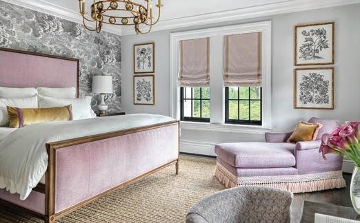
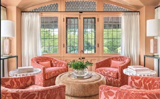
This century home, built in 1910, boasts outstanding architectural details including generous millwork, tall ceilings, and large original windows. An addition 10 years ago provided updates to the kitchen and bathrooms and more square footage by incorporating a very unconventional floor plan. The objective was to create a functional flow through the house by determining the best use of each room so there would be a cohesiveness to everyday living. The challenge began at the front door, which lacked a proper foyer and bisected a long living room. The strategic division of this linear room ingeniously accommodates a clear passageway from the front vestibule to the deeper parts of the home. This arrangement establishes symmetry and balance and also provides intimate seating for relaxation and entertainment without obstructing flow and movement through the space. A soft palette of pastels establishes a sense of joyful calm and graciousness. Oversized artwork is used to punctuate the room with drama and balance the black-framed windows. Twin abstract patterned rugs incorporate all of the neutrals, pastels and black accents of the room, creating a unity within the space. A standout feature of the dining room is the hand-painted floral mural, in soft lavender tones with metallic accents which are repeated in paired chests and mirrors at the end of the room. A previously forgotten sunroom with terrazzo floors and abundant natural light was sterile and uninviting. Bold color adds coziness with salmon-colored walls, windows and groin-vaulted ceiling. Lounge chairs in cut-velvet coral were arranged in a conversational circle to give this room purpose as a tucked-away space for conversation or contemplation. A cheetah patterned velvet ottoman echoes the whiskey-colored dining chairs in the adjoining room. Photography by Alise O’Brien
Judge’s comment: “I’m biased toward old houses and this one beautifully upgrades a classic while retaining character and personality. Smart use of space, makes this feel so livable and welcoming. Gorgeous attention to detail.”

Designer: Anne Marie Boedges, Anne Marie Studio
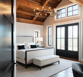
The modern farmhouse style was maintained throughout. The view was the most important aspect, as the original 100-year home on the site was torn down for this new home to be built. The view had to match the same sunset and sunrise and the flow had to make sense for this younger family’s needs. The surrounding 800-acres filled with rolling hills and wild turkeys so the style of the modern farmhouse with clean details throughout struck the designer as the perfect style to encompass the home. Large windows framed in black was highly important in the overall scope of the design. A challenge and also one of the best details in the home was the use of exposed trusses and timber framing. This resulted in many unique ways to think about venting, plumbing, electrical and other rough-in elements. The designer sourced hardwood floors for both the main level and second floor loft. The kitchen, which is open to the great room, incorporates built-in appliances and custom-designed cabinetry with a soft white paint and a naval blue island. Just outside the mudroom, there’s a timber-framed walkway with twinkle lights for traveling back and forth to/from the four-car garage with a loft and additional sleeping quarters. The first floor incorporates the primary suite; the lower level houses a bar, shuffleboard, poker table and theatre room. Photography by Nicole Miget Photography

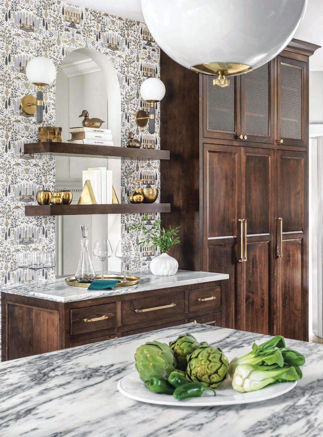


REGULAR HOURS
MON. - SAT. 10AM-6PM | SUN. 12PM-5PM
HOLIDAY HOURS NOV. 29 - DEC. 23 MON. - FRI. 10AM-7PM SAT. 10AM-6PM | SUN. 12PM-5PM

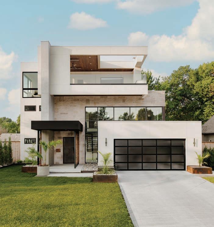
WINNER Architect: Thomas Wall, Mitchell Wall Architecture & Design
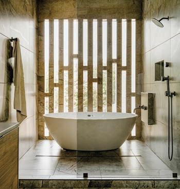
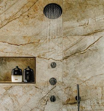
In 2014 when George Kaiser donated $350 million dollars to create the world’s largest public park in Tulsa, the surrounding neighborhoods started to change. What was once a blighted area with families choosing to live elsewhere suddenly became a popular place to live. The problem is, not many of the houses there are suitable for young families. When we were approached to design this home, we had to accommodate a lot of programming in a small footprint. Creating a three-story home on a diminutive lot presented a lot of challenges. The client wanted a two-car garage which we knew would dominate the front elevation, so we had to make sure the entry was profound enough to capture your attention. An open-air third-story patio with a cantilevered corner provides views heretofore unavailable in the area. An openconcept floorplan provides visual connections between the living room, dining room, and kitchen with a two-sided fireplace and custom wine refrigerator defining the spaces. With three bedrooms on the second floor, we were able to use the entire third floor to create a primary suite with an elegant bathroom and separate walk-in closets. Expansive windows and the introduction of natural elements to the interior truly bring the outside in for this young family. Photography by Toni Li
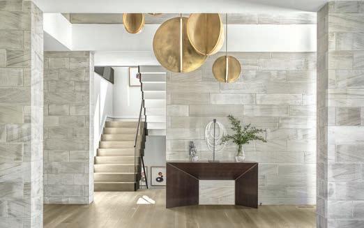
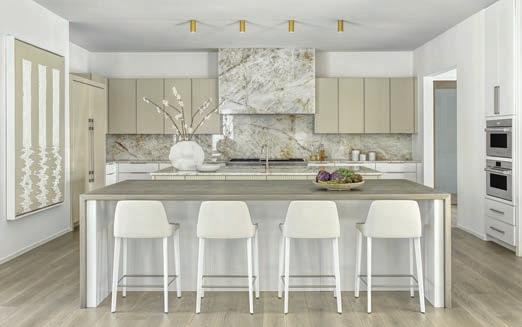
This contemporary home is truly one of the smartest homes we have ever been a part of. Not only is the automation throughout the house cutting edge, but the design itself is a testament to ecological design. With a marriage of technological advancement and thoughtful interaction with the surroundings, this home could satisfy the most ardent of environmentalists. This project is sited on a lot that sat vacant for over 40 years because no one else could make it work. However, with a little ingenuity and effort, we were able to find a solution that not only met all of the family’s needs but also was perfectly suited for the property and its topographical challenges. Featuring four bedroom suites on the second floor and an in-law apartment on the ground floor, an open concept floor plan, and amazing views to the front and back, every room was designed to capture the natural surroundings. Large floor-to-ceiling windows adorn the primary suite and living rooms with carefully calculated overhangs to permit light in during the winter months while providing shade in the summer. The lower level features a home gym, sauna, home office (enclosed by a wine cooler on two sides), golf simulator, and a walk-out pool with a hot tub and infinity edge. Geothermal heating keeps the house in a constant state of comfort, and sensors on the roof adjust the color temperature of the interior lighting throughout the course of the day to match the occupants’ circadian rhythms. Photography by Alise O’Brien
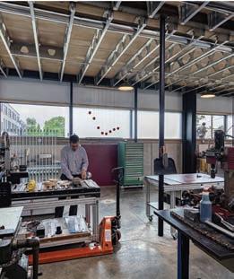
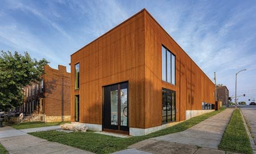
Completed in 2021, the client for this 4,300 square foot live-work studio is an artist who designs, programs and builds kinetic sculptures that are pattern-based in concept. Other than the foundation and superstructure, the client built the majority of the house himself. Uniquely requesting the majority of his house be dedicated to a workshop, it challenges a typical domestic notion of what a large “house” should be. Sited in the Forest Park Southeast neighborhood of St. Louis, the project is constructed as a series of pre-fabricated steel structural bays clad in a weathering steel rainscreen over rigid insulation and metal framing. The 100-x-30-foot-long rectangular form relates to the surrounding historic late-19th and early-20th century architectural context. The material choice of oxidizing steel is a contemporary counterpoint to similar adjacent brick tones. The short elevation respects and aligns with the front faces of the neighboring row housing. The longer elevation, similar to other buildings along this stretch, holds the edge of the site boundary next to the sidewalk. The more private side-lot of the project is utilitarian in experience and scope, utilizing the double-wide lot for outdoor work and leisure. The interior amplifies the exposed large-scale steel structure with a jet-black, gallery-white and galvanized-silver color palette, providing generous double-height work spaces for the client to build and test out his kinetic designs on polished concrete floors. The sculptures are displayed in a copiously daylit-washed front gallery space, set on wood floors economically salvaged from unused 18-wheeler tractor-trailer beds. The more private second floor living spaces contrast the rest of the project with a more domestic concept that is compressed in scale with a colorful material palette. The entire first floor is dedicated to workshop and gallery spaces, while the smaller second floor is for the kitchen, living room and a small office, bedroom and bathroom, with access to an outdoor balcony and the flat roof. Photography by Sam Fentress

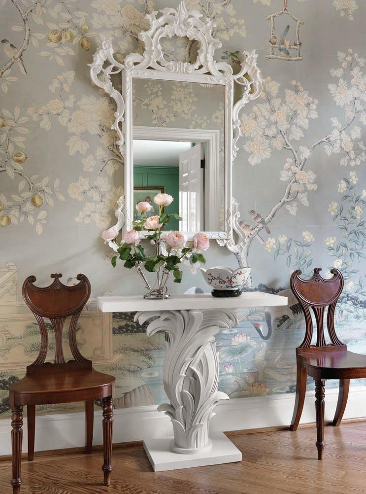
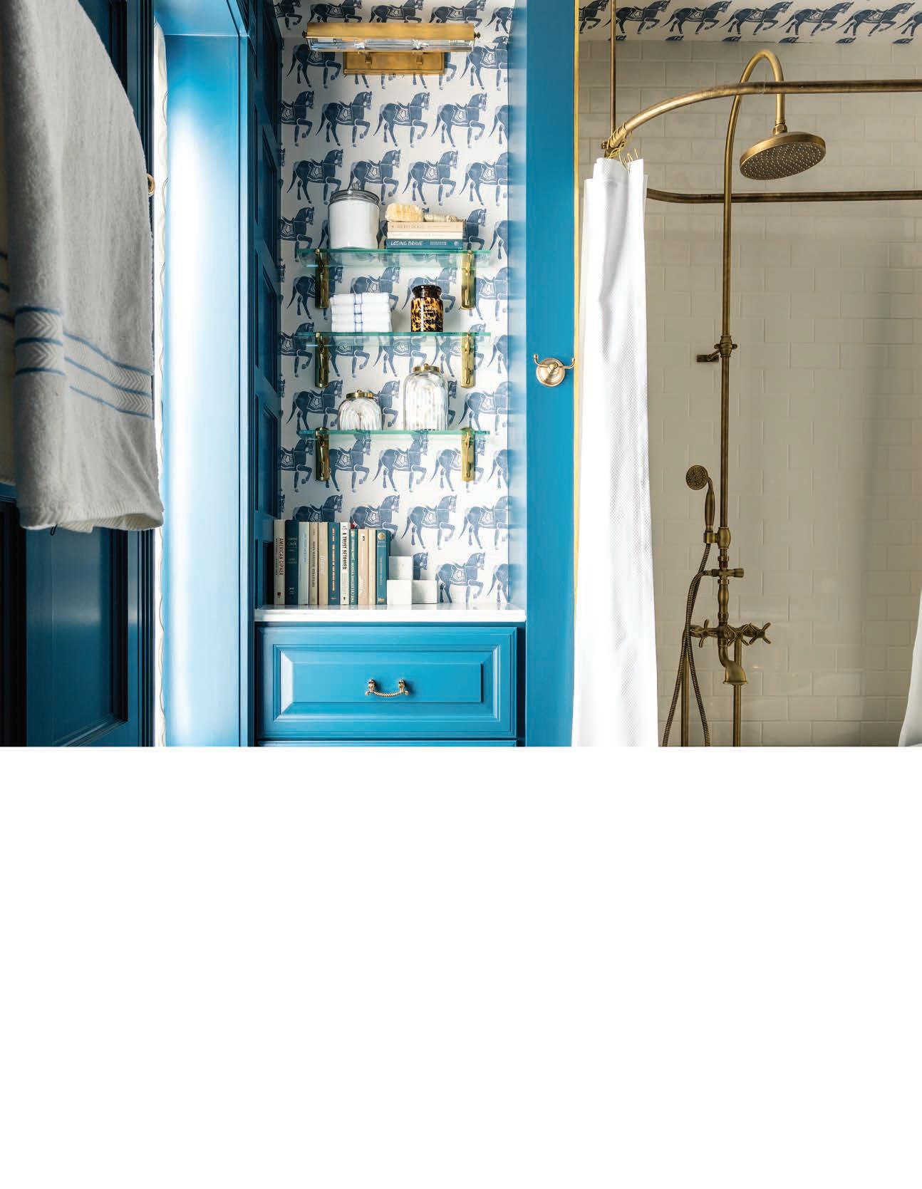
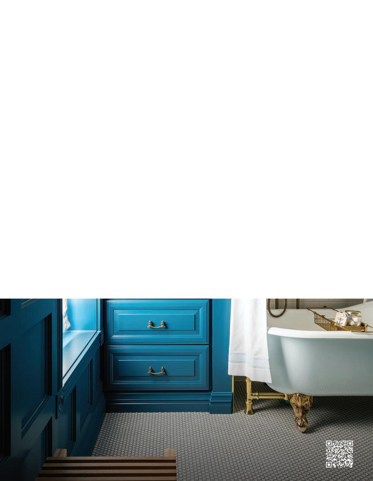

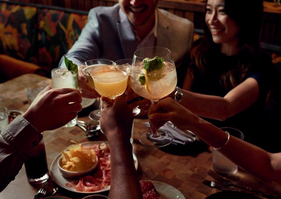

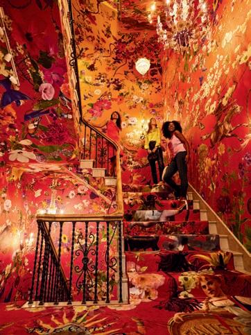

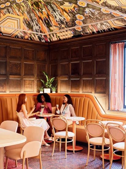
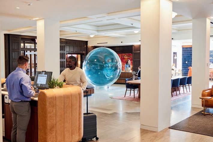
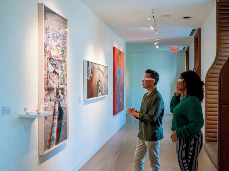
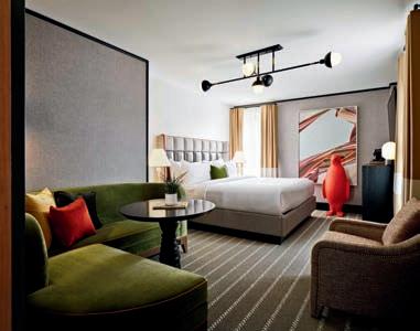
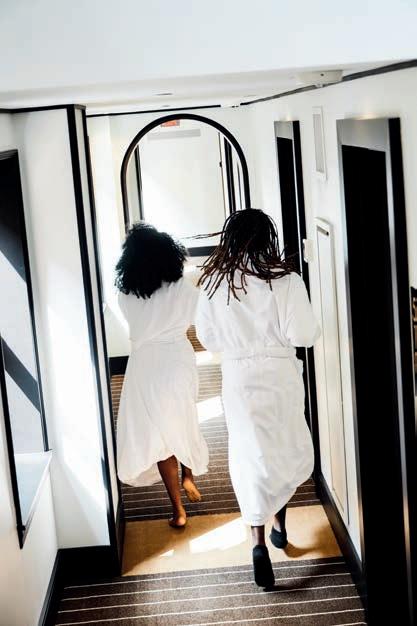
21c St. Louis is the perfect road trip destination for the curious traveler. This historic hotel, housed in a 10-story YMCA building in downtown St. Louis, features a 173-room boutique hotel, contemporary art museum, Idol Wolf restaurant, Good Press café, and Locust Street Athletic and Swim Club, a fullservice wellness center. With over 14,000 square feet of exhibition and event space, guests can immerse themselves in contemporary art at every corner.

