THE COLLECTIVE'S ROAD SUCCESS
HOW SPROUT BRANDED DC'S


HOW SPROUT BRANDED DC'S


I think it’s a pretty awesome story about what happens when the branding aligns with the building’s operations and lifestyle.
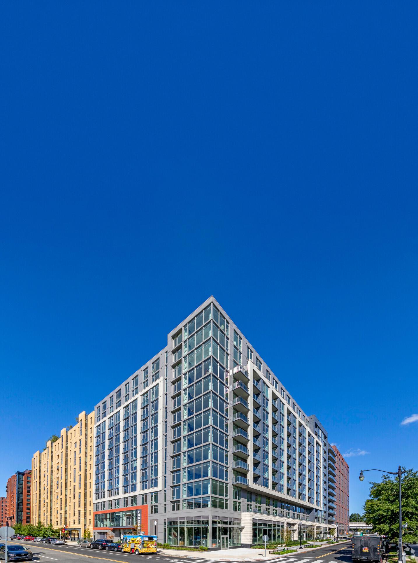

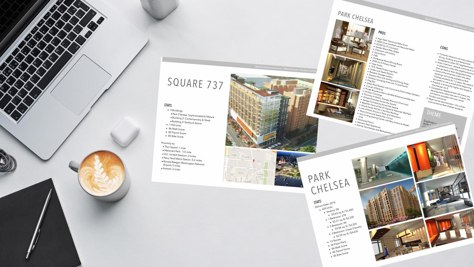
The Collective is a three-building apartment community located in the newly revitalized Capitol Riverfront area in the Washington, DC area. Overall, The Collective has a total of 1,140 apartments with 103,000+ square feet of amenity space, making it one of the largest residential properties and amenity collections in the United States.
The challenge when approaching a community of this size was that it was designed so the buildings could operate together, but have the opportunity to function as individual apartment communities if needed. So, while each building is totally unique with its own style, amenity package, and interior finishes - it also needed to function together.
In this work book we will outline the steps Sprout Marketing used in the branding process of The Collective.
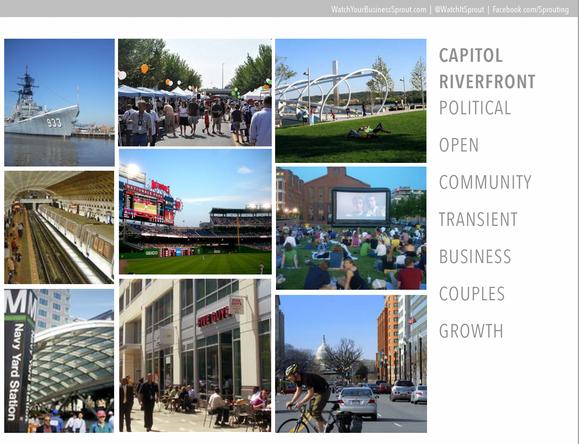
The Collective was in an area that was undergoing revitalization, so it was important to know the ins and outs of the neighborhood in the past, present, and future What would life be like here? Utilize Google Maps to look at things like employers, restaurants, and more. It allows you to create a vision of what the day to day life could be like for your future resident.
It's not just about knowing who your competition is, but knowing exactly what will set you apart. Don't simply compare your offerings, but also compare the overall style, message, and customer touch points. The apartment communities near The Collective were about being “ new ” or spoke to offerings, so we decided to speak to the heart.
3
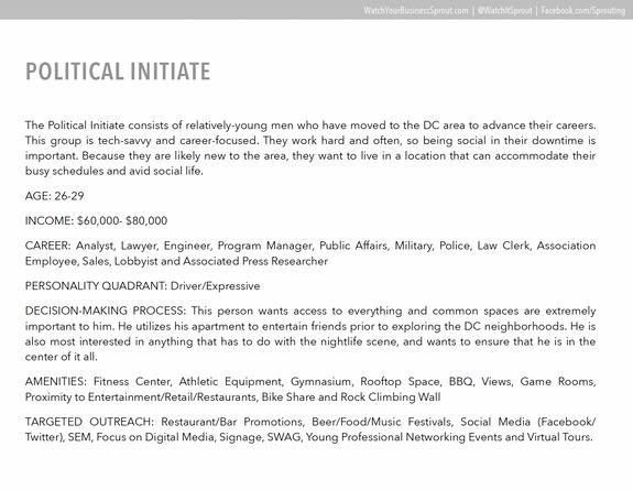
Understand the various types of people in the area and what they are looking to get out of life. We roamed the DC streets for The Collective, but you could easily do this on social media. Craft your perspective avatar who could live at your community. It helps when designing to speak to someone, even if they aren't technically real.

4
Don't forget about your timeline. It's easy to get caught up in branding, but remember the more time your assets sit on the market, the more money is flying out the door For The Collective, we were working with three different timelines so it was crucial to keep things moving but not sacrifice the overall design

What's the name of your community?
If no name is decided, jot down overall ideas you want the name to incorporate.

What's in the neighborhood?
Include employers, grocery stores, restaurants, shopping, activities, and transportation.
What are 5 words that best describe your community?
Describe your community's amenities, unit features, and style.


Let's craft some avatars! Give them a name, age range, profession, and explain a typical day!
Community name, website, and what makes your community better
Include timeline, who is the ultimate decision maker, and who is involved in review.


What colors do you like? What colors do you hate? Why?
You can circle or x-out any of the swatches below.
What fonts do you like? What fonts do you hate? Why?
You can circle or x-out any of the font options below
Are there any elements you want to see in the brand design?
This could be an element inspired by the name, location, offerings, or something more abstract Check all that apply:


Jot down anything else that may be important. Include any ideas already discussed or thrown out, other brands you like, etc.

Naming your community can be a hard task because it can be difficult to come up with original ideas and even harder to get everyone on the same page For The Collective, it was essential that the name and logo told the story of the community without any explanation at all.
We discovered through our research that many of our target audience avatars really just wanted to be part of a community. Many of the other apartments in the area were focusing on the “what” or the “how”, we wanted to focus on the “why”. We knew the community would offer the best-of-the-best on every level, so we had to communicate why having all that mattered.
Below you will find how we approached the naming process for The Collective.
Start with a blank document for your brainstorm
Jot down the first name you think of that fits the meaning you want to convey Plug that into a thesaurus and start jotting down the other options.
As you see other options, thesaurus those as well and keep the list going. You can also plug those words into Wikipedia and then you can get other inspiration ideas such as names of historical individuals, locations, elements, animal names, books, fictional characters or places, etc.
Continue to jot down everything into your brainstorm document.
Then you can start categorizing your favorites, but don't delete anything from the list.
Then, share your favorites at the top with your team and the full brainstorm below
We settled on “The Collective” because by definition collective means: Agroupofentitiesthatshareoraremotivatedbyatleastonecommon issueorinterest,orworktogethertoachieveacommonobjective.
The Collective gives them an opportunity to thrive together It allowed us to weave together the three unique communities both in operation and in opportunity Residents of one building could access the amenities of another, they could make connections and network with residents from different buildings, and they have everything they need inside and out to achieve their dreams.
For The Collective, we wanted to combine an icon with typography that spoke to the meaning of the word and the relationship of the buildings:
3 rectangles in the icon
3 lines connected in the typography

Each community was designed to have its own name, font, and color palette to speak to its unique identity. The Collective brand would be added at the end to show that these communities are part of the master brand:
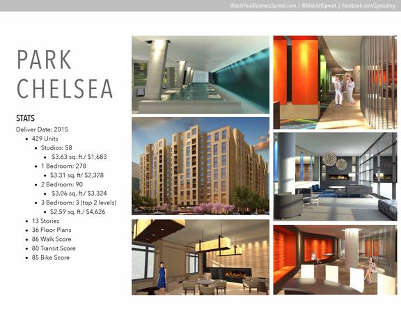
Park Chelsea: Sophisticated with vibrant and elegant interiors and features.
Agora: Contemporary with bright, minimalistic, and sleek interiors and modern amenities.
The Garrett: Earthy, industrial-chic interiors with amenities for an active lifestyle.
KEEP YOUR CIRCLE TIGHT
BE BRUTALLY HONEST
AGREE INTERNALLY BEFORE SHARING FEEDBACK
PICTURES SPEAK LOUDER THAN WORDS



The key to a good messaging strategy is making it something that everyone involved in your community can resonate with, from your residents to your employees and partners. At The Collective, the foundation of the brand was that this community allowed everyone involved to thrive. It's not just about convenience, it's the opportunity to conquer.
Once you have your main tagline, everything else can fall into place:
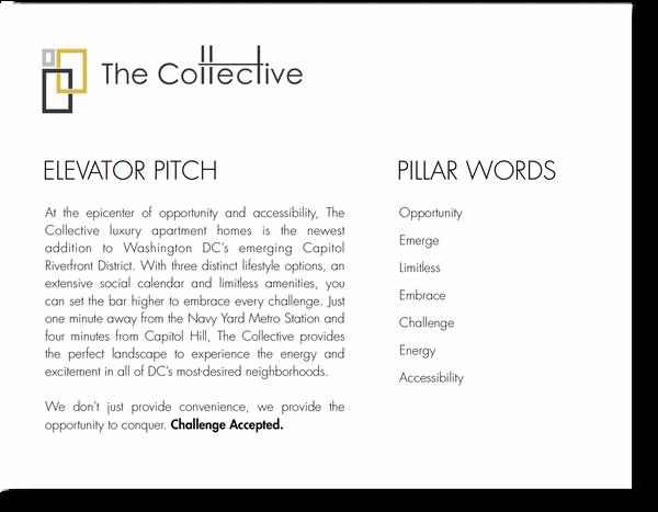
Elevator Pitch: The one paragraph that tells you everything you need to know about the community.
Pillar Words: The core values that make up this brand
Marketing Campaign: The main marketing message that we would blitz the market with.
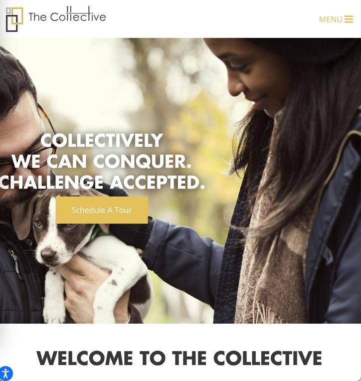
The idea behind the “Challenge Accepted” campaign is to speak to the individuals who are constantly challenging themselves to go to that next level - not just meet, but exceed every challenge that comes their way. For the residents of The Collective, there is nothing that can't be achieved. Through the exchange and connectivity at The Collective, each amenity or feature allows you to reach another level of your own success from health, career, adventure, and so much more


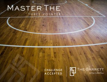
What matters most to your target audience? How does your apartment help them achieve that?
Who you are
Who you are not
Where are you located, what do you offer, what makes you better, why does it matter?

Once all the pieces were in place, we simply just put the puzzle pieces together. We designed an apartment collateral package that was branded for The Collective as a whole along with a few pieces unique to each community.
This allowed WC Smith to easily...
Build consistency of their brand even with other partners like 30 Lines, their website partner. Use the core messaging to inspire retention campaigns and fuel referrals
It’s clear that the WC Smith team brought this message to reality. Their operation is like a theme park from their resident events, expansive amenity areas, and top-notch team that goes above and beyond the essentials.
As a result, they were able to have
Lower marketing spend per door
70+% resident retention rate Insane number of resident referrals

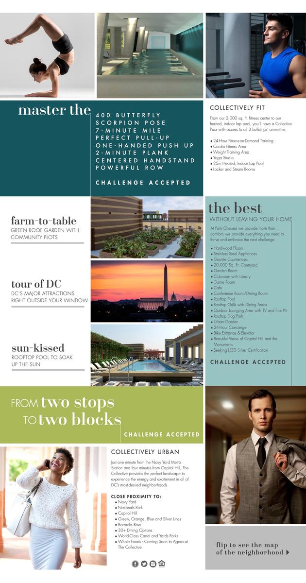



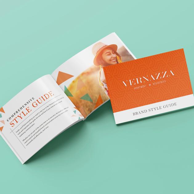

Utilize Sprout’s team of expert designers who know the multifamily industry inside and out. We can help you craft the perfect brand design for your community, whether it's a new lease-up or a renovation.
Whip your floor plans, site map, or neighborhood map into shape. These supporting assets help bring your website to life and gives prospects a great visual before making a move!
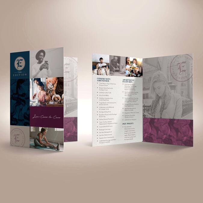
After a prospect visits several communities in one day, how will your community be remembered? We offer a variety of print collateral options to continue the nurturing process.
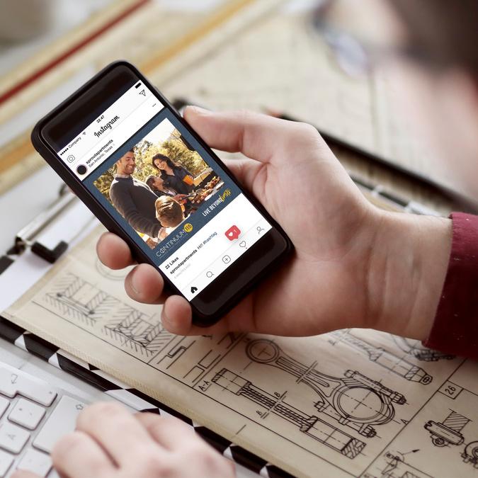
Boost your marketing and retention game by utilizing our digital design services. Our custom-made social graphics and website advertisements help support your brand awareness.
