



CONTEMPORARY FARMHOUSE
AESTHETICS CREATE AN
ELEGANT FAMILY HOME






Home design stories, inspiration and thoughtful architecture on the West Coast of Florida—from Anna Maria Island and Lakewood Ranch to Sarasota, Venice and the Barrier Islands.

Located west of the Trail, Pomelo Place is a historic neighborhood with an eclectic mix of houses from different styles and eras. Single family homes from the 1920s, Spanish colonial architecture and old Florida-style cottages coexist alongside freshly-renovated properties and new construction. It was the ideal neighborhood for Jeff and Corey Talbot, a couple looking to build a home that was uniquely suited to their needs, one where they could put down roots and raise their young family.
Castilow is a general contractor and the president of Vertical Design + Build, a custom home building firm. Leonardo Lunardi is the principal architect of Lunardi Architecture. Both men are based in Sarasota and have worked on a handful of projects together over the years. One of their earliest collaborations was a California contemporary style home in Southside Village that finished construction in 2014. Ten years later, Castilow and Lunardi sit down and revisit this project through the lens of time.
 COVER Late architect John Potvin’s creation is realized by Murray Homes and AND Masters Collective. THIS PAGE Contemporary Pomelo Place residence, photography courtesy of Murray Homes and AND Masters Collective. Vertical Design + Build and Lunardi Architecture reflect on their Southside Village collaboration, photography courtesy of Vertical Design + Build.


 WRITTEN
BY
KATE WIGHT, PHOTOGRAPHY BY RYAN GAMMA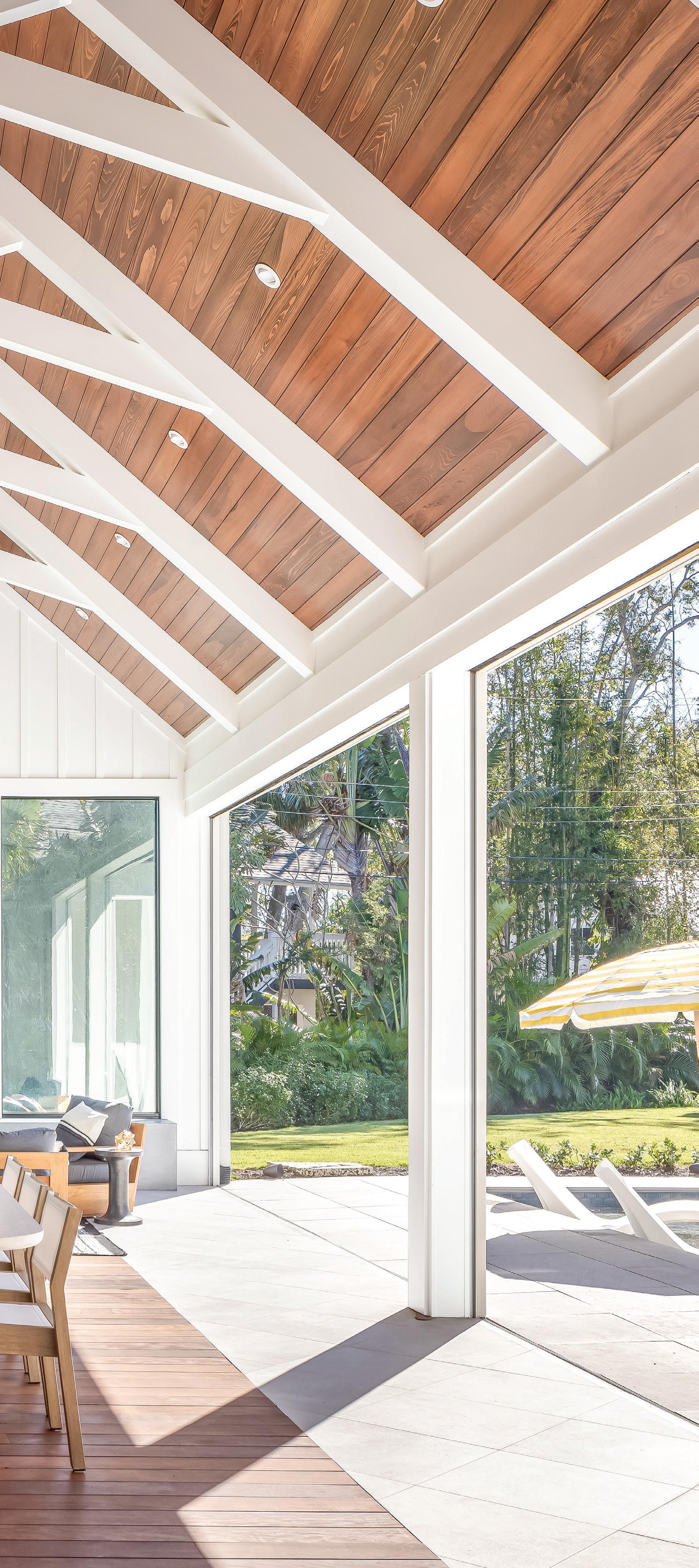
This spread: The design of Pomelo Place is elevated (sometimes quite literally) with impressive visual elements like the cathedral ceiling in the outdoor kitchen and dining area. The modern farmhouse architectural style worked well with the pie-shaped lot the house was situated on.
How deeply personal touches made this contemporary farmhouse in Pomelo Place a dream home like no other.

LOCATED WEST OF THE TRAIL, POMELO PLACE IS A HISTORIC NEIGHBORHOOD WITH AN ECLECTIC MIX OF HOUSES FROM DIFFERENT STYLES AND ERAS. Single family homes from the 1920s, Spanish colonial architecture and old Florida-style cottages coexist alongside freshly-renovated properties and new construction. It was the ideal neighborhood for Jeff and Corey Talbot, a couple looking to build a home that was uniquely suited to their needs, one where they could put down roots and raise their young family. Jennifer Masters is an interior designer and the owner and founder of AND Masters, a bespoke design firm with a presence in Sarasota and New York City. “Corey Talbot and I are both members of the Junior League of Sarasota and we became close traveling back and forth to St. Petersburg together for a two-day conference,” Masters shares. “In the fall of 2019, she said she would love to see if we could potentially work together on the new home she and Jeff were planning to build. They invited me to the house where they were living at the time and we walked through it together to find out what wasn’t working for them and talked about their dreams and aspirations for the new space.”
Steve Murray is the President of Murray Homes, a family-owned Sarasota business that specializes in building and remodeling custom homes.
“Some friends of ours lived in a house in Pomelo Place and they were looking to move,” Murray says. “When they put it on the market, my wife Bev was the listing agent. The Talbots ultimately bought the property. They decided they wanted to tear down the existing structure on the property and completely rebuild which was where our introduction came in.”
With their designer and builder secured, the Talbots still needed an architect who could help them translate their vision from idea to reality. Murray knew just who to call.
“I’ve worked on over twenty houses with the architect John Potvin over the last twenty years,” Murray says. “I told them that John is a great individual. They got on extremely well with him and obviously signed on with him. They already had Jen Masters on board as interior designer who I hadn’t worked with be-
fore, although I had come close a couple of times. I was excited to work with her because she’s very talented. The other person we wanted to bring into the mix was Mike Gilkey, a fantastic landscape architect. And so the team started to form.”
The Pomelo Place neighborhood features a diverse array of architectural styles from many different eras which gave the Talbots the freedom to push their own home design into an unexpected direction. “The contemporary farmhouse style of architecture was something that Corey and Jeff had resonated with early on,” Masters says. “That was definitely a directive to John to take with and run.”
“It’s a little bit of a departure from regular Florida design and that’s great. That’s what I like to do,” Murray adds. “But at the same time, there’s longevity in the design. Fads come and go but classic remains. You have to have classic architectural proportions and detail that allows structures to be timeless, and this house has a completely timeless feel.” While there are nods to the modern farm-
house aesthetic inside the home, the Talbots worked with Masters to blend some of their favorite interior design styles. “They have a love for midcentury modern pieces and they have a love for pieces that are relaxed and comfortable but refined,” Masters says. “They wanted some industrial moments with touches of concrete, and things that were made by hand were also really important to them. The design was really a true blend of a lot of styles, so we had to take all of those styles and find a common thread between them.”
In the foyer, you get a preview of the kinds of details you can expect to find as you move throughout the house. Instead of a rug, Masters had a stone marble mosaic installed in the floor to add a little formality and create a sense of arrival. The foyer leads into the formal living room which is where you first start to see the combining of interior design styles. The metal window frames have an industrial edge, but the transoms keep the space feeling residential instead of urban.

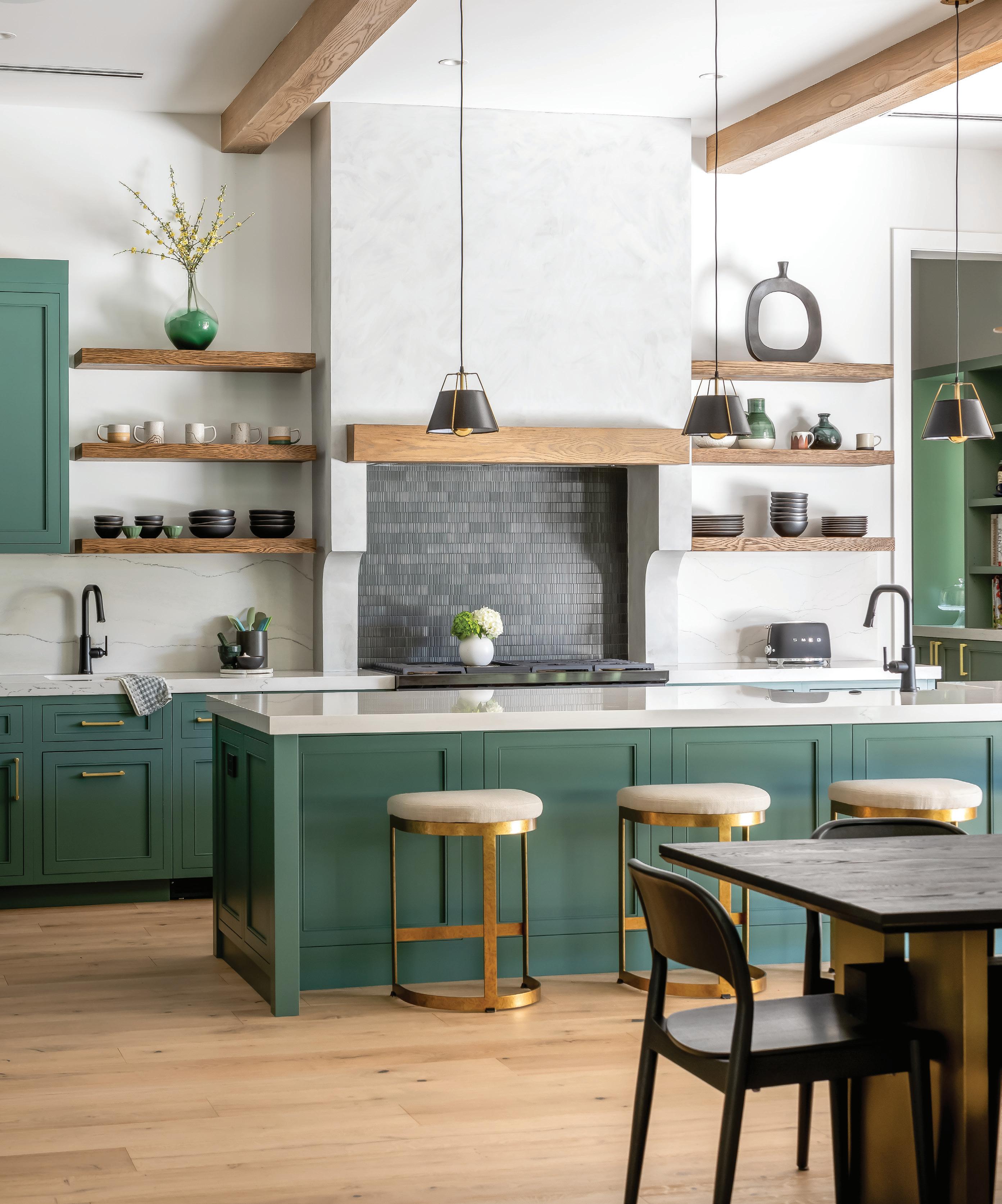

Meanwhile the ceiling beams, which are stained a little darker than the white oak flooring that runs through the home, have more of that rustic farmhouse flair. Those beams continue into the kitchen, where design styles continue to mix and mingle.
“The cabinetry is all a modified Shaker-style which speaks to that modern farmhouse look,” Masters explains. “But then we brought in a lime wash on the interior wall that divides the living and dining rooms and incorporated it again over the hood as a reference to the exterior concrete wall. So those are the industrial touches that were introduced in a very subtle way.”
The kitchen has a serene simplicity to it which is made possible by the addition of a butler’s pantry.
“The butler’s pantry was a design decision early in the floorplan. The Talbots didn’t have a formal dining space in their plan, nor did they want one, and so their dining area is very open to the kitchen,” Masters says. “We discussed lots of different options on how to keep
the kitchen clean and uncluttered and this was our solution.”
“We’re doing more and more butler’s pantries these days,” Murray adds. “They allow for the communal part of the kitchen to be enjoyed while the clutter can just be hidden away. For a room that’s not necessarily meant to be seen, the butler’s pantry is a visual feast. The narrow room is lined with shelves and cabinets that are a few shades darker than the cabinetry in the kitchen. Corey had bookmarked a photo of a cafe with floors she loved, and that image served as the inspiration for the custom mosaic tile here. Wall-mounted brass light fixtures added character and related to that cafe feel.
As you step out of the butler’s pantry and into the kitchen, you’ll see an outdoor kitchen and dining area. The Talbots may not have a formal indoor dining room, but the outdoor one is undeniably a showstopper. Like the foyer this space featured a built-in rug element, this one crafted from ipe wood. The glass walls on either side and glass-
continued on page 14
Over the span of four decades, architect John Potvin transformed the landscape of Sarasota with his unique perspective and artistic flair. The Talbot home was the last project of his storied career. “John had just an incredible energy to him where he was just always the biggest personality in the room.” says Steve Murray. “Unfortunately, after he had designed this home, he was diagnosed with pancreatic cancer and didn’t have very long to live and passed away,” Murray continues. “He was a good friend of mine and he was a fantastic architect and a great colleague. Obviously when you build over twenty houses with one guy you get to know them. You get to know their architecture and the kind of vibe he put into the design and the kind of energy that he had all the way through the process. All of that survives now through the structure and through the actual building process. We definitely feel that he’s still here because we see him all the time and interact with him all the time through his work.”
Architect:
Interior
John Potvin Builder/Contractor: Steve Murray of Murray Homes Design: Jen Masters of AND Masters Kitchen Cabinets and Bathroom: Sarasota Architectural Woodworking Carpets and Flooring: International Wood Floors Landscape: Michael A. Gilkey Pool: WaterDesigns
Photographer: Ryan Gamma Photography
backed fireplace at the far end, create the sense that you are truly immersed in nature. But the most breathtaking architectural element is the vaulted ceiling.
“There’s no second floor on that part of the house, so it allowed us to be very high and very steep in pitch. It really was an area where we could do what we wanted in order to achieve the look they were looking for,” Murray says. “I think it’s one of the best outdoor spaces we’ve ever built because of the lack of constraint that we had that gave us the ability to have this high, peaked Cathedral ceiling.”
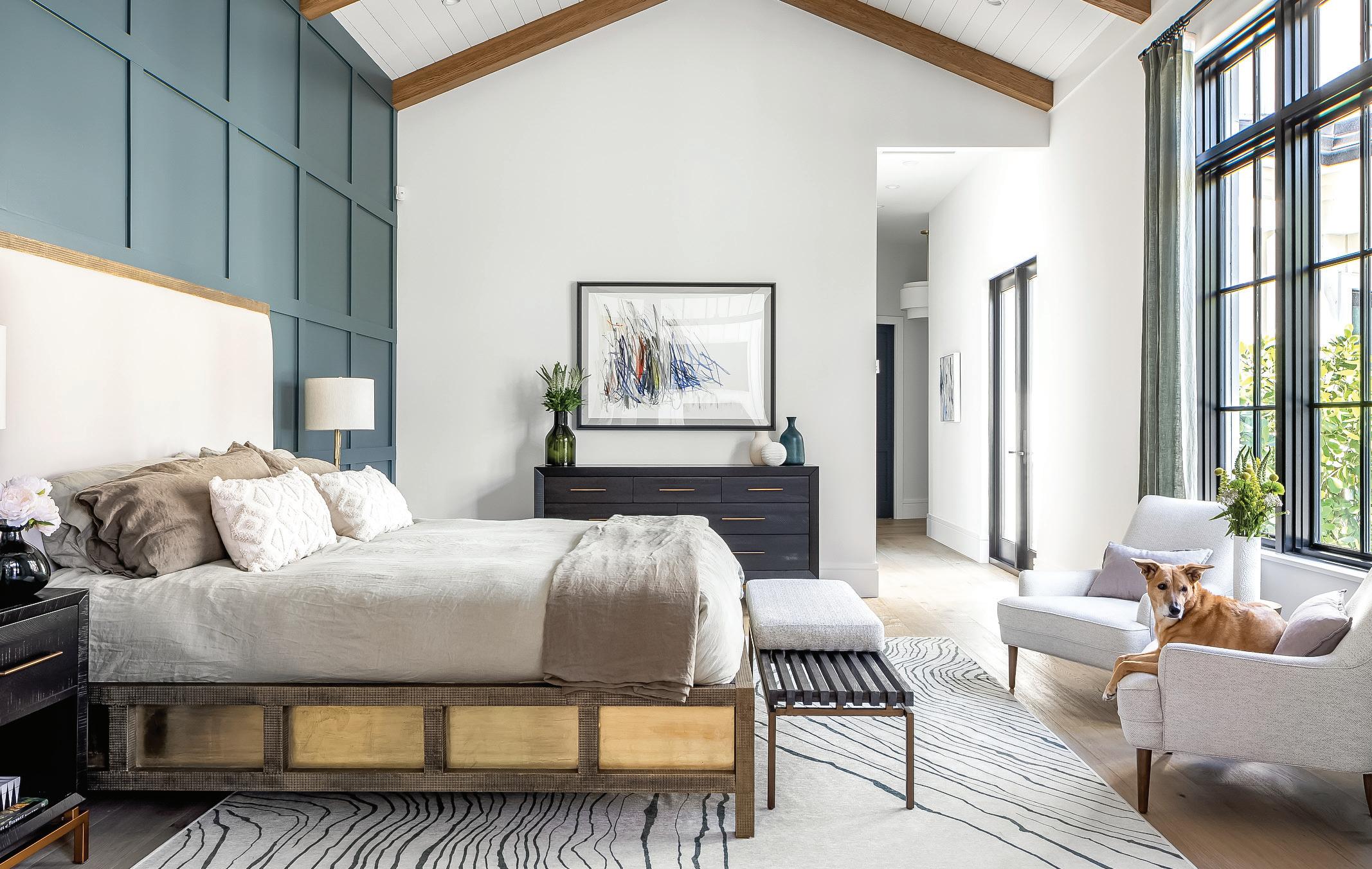
Everywhere you turn in this house, you’ll find interesting and unique details that tell the story of the people who live there. The master bedroom is anchored by a handmade brass bed that will age and develop a patina over time. Corey’s
office has layers of visual interest, from the whimsical wallpaper to the starburst pattern in the ceiling. Hand-glazed concrete tiles add pops of pattern and color to the upstairs powder room. These hyper specific details are expressly tailored to the Talbots’ taste, something that’s not always possible when building a new home.
“This house is designed for their family to live in for the next 20 or 25 years, which is always lovely for us. When someone is only going to live somewhere for a year or two you don’t really feel that they’ve got 100% of their soul into the design. But when someone says we’re going to live there for 25 years and the kids are going to grow up here, it changes how you design.” Murray says. “The Talbots knew how they wanted to live in the house and how it was going to operate, and so every
Murray Homes, 2900 S. Tamiami Trail, Suite #1, Sarasota, 941-906-7000. murrayhomesinc.com. AND MASTERS Collective, 630 S Orange Ave Suite 200D, Sarasota, 941-706-3300. andmasters.com
area was specific to how they wanted it for them, as opposed to having one eye on resale. So that was great, because it took away compromise. Compromise is a terrible thing for design because you end up not doing anything very well. When you take that out of the equation, you’re then dealing 100% with personal choice and the right way to do it for you and you end up with a better product. All the houses that I’ve been involved with that have taken this very singular approach to design and interior design and finish, they have been inherently better by the feel of what the product is. They take on a personality of their own. I think that was achieved in this house.” SRQH&D


“I’ve worked with a lot of architects over the years and there are a few I’m excited to work with time and time again,” says Grant Castilow. “Leo definitely falls into that category.” Castilow is a general contractor and the president of Vertical Design + Build, a custom home building firm. He’s talking about Leonardo Lunardi, the principal architect of Lunardi Architecture. Both men are based in Sarasota and have worked on a handful of projects together over the years. One of their earliest collaborations was a California contemporary style home in Southside Village that finished construction in 2014. Ten years later, Castilow and Lunardi sit down and revisit this project through the lens of time. “The clients for this project were a husband and wife,” Castilow recalls. “He was a doctor, so the location appealed to him because it was so close to Sarasota Memorial Hospital.”
Builder Grant Castilow and Architect Leonardo Lunardi and the art of collaboration WRITTEN BY
THE LOCATION IN QUESTION WAS A LOT IN SOUTHSIDE VILLAGE, a mixed residential and commercial neighborhood located a mile south of downtown Sarasota. Popular with families and young professionals alike, the neighborhood is known for its green spaces and walkability. The streets are lined with mature trees that cast their shade over a diverse array of housing options including historic bungalows, Mediterranean-inspired villas, modern architecture, and single-family homes that have been built over the past several decades. Quiet residential streets soon give way into a flourishing shopping district largely centered around the intersection of Hillview Street and Osprey Avenue. This lively business hub is teeming with shops, from high-end galleries to trendy boutiques to beloved local eateries.
The aesthetics and amenities of Southside Village make it a desirable place to live, and that was true back in 2014 as well. Properties were hard to come by, and the one that the clients had purchased was not one that would be easy to work with. The lot was pie-shaped, which means it was narrower in the front and wider in back. Irregularly-shaped lots like these can be difficult to design for, especially if your clients have particular needs.
“Privacy was a big concern for these clients,” Lunardi says. “They wanted a serene outdoor space they could enjoy, and they wanted it to feel secluded.”
That was easier said than done. At just over a quarter acre in size, the lot wasn’t exactly small but it wasn’t particularly spacious either. It would be difficult to foster a sense of solitude and separation with neighboring properties snugly tucked against each side of the property line. The lot was also located near the boundary where the quiet residential neighborhood gave way into the hustle and bustle of the commercial district.
The property was just a few hundred feet away from the iconic local gourmet grocery store Morton’s Market. On the one hand, delicious snacks would only be a short walk away. On the other hand, the frequent comings and goings of customers would quickly ruin the illusion of a remote retreat in the backyard.
Ultimately, Lunardi spelled out a solution by designing what was essentially a U-shaped house. The bottom of the U would face the main road, while the legs of the U would extend toward the backyard, creating a space for a semi-enclosed private courtyard behind the house. The only thing that kept the house from being a true U-shape was the addition of an attached garage on one side. With the design completed, the project began moving forward at a fast clip.
“I remember being on a tight timeline,” Castilow says. “I think they wanted to be in the house for the holidays.”
“Was it a wedding?” Lunardi interjects.


“Yes!” Castilow says. “That was it. We absolutely had to be done in December because there was a family wedding.”
“I think they were also very firm on the budget,” Lunardi says.
“That’s right. What’s that saying? You can have it done, fast, good, or cheap, but you can only pick two,” Castilo says. “Obviously I’m always going to do a good job, so usually the compromise has to come on timeline or budget.”
“But this time there was no compromise,” Lunardi concludes. Because it had been so long since they had worked on the project, Castilow and Lunardi pulled out old plans, pictures, and documents to refresh their memories. Castilow made an unexpected discovery along the way.
“According to this, the city approved the permits in February of 2014 and we wrapped up the project in December of 2014,” he says. “Can you believe that?”
“There’s absolutely no way you could do it that quickly now,” Lunardi agrees.
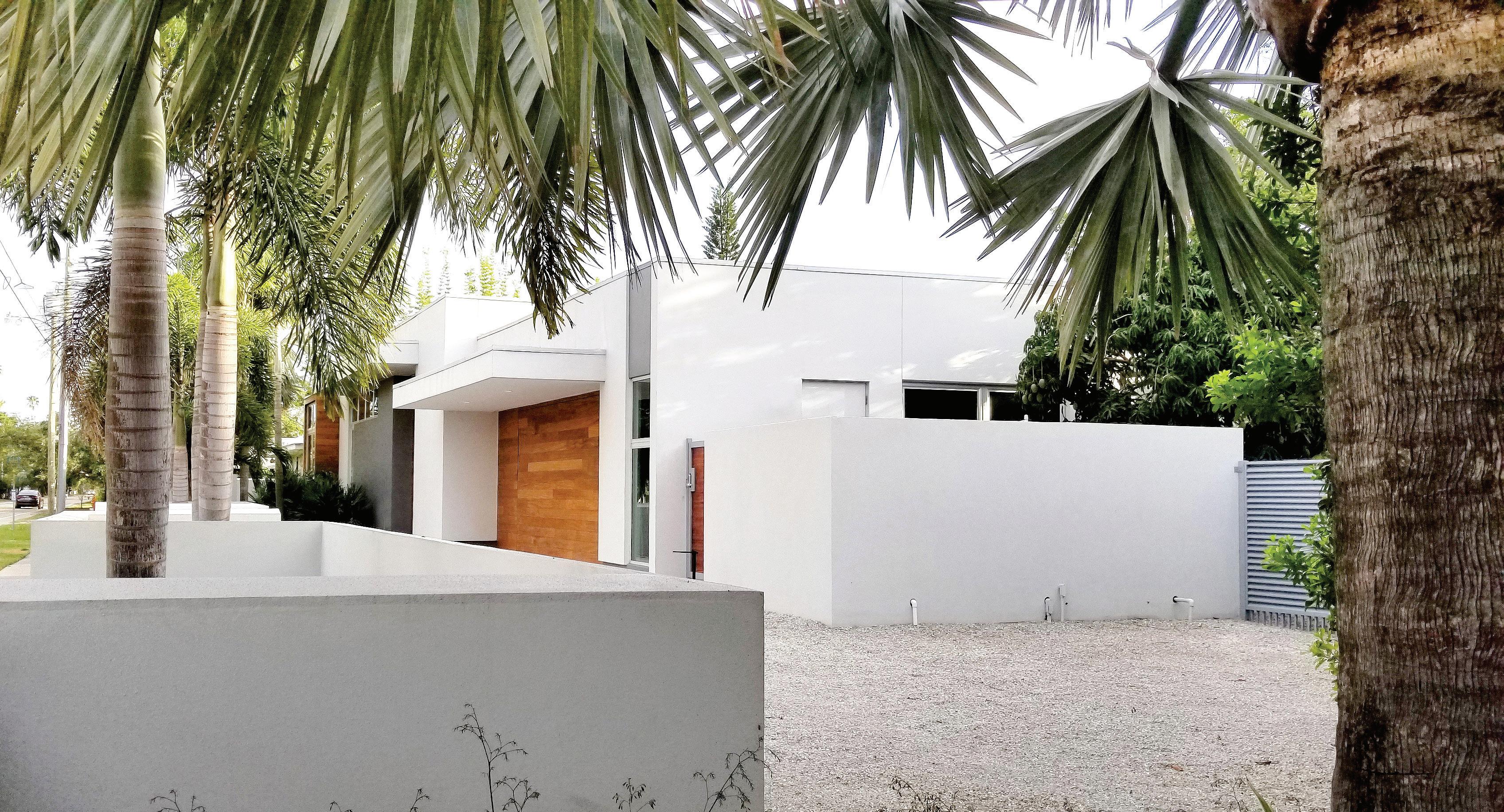
The Southside Village home is an example of California contemporary architecture, a style that began to emerge in the mid-20th century. California contemporary design is characterized by clean lines, innovative construction techniques, and an emphasis on sustainability. Homes designed in this style often feature open floor plans and indoor-outdoor living areas and utilize natural materials like glass, wood, and
stone, details which can all be found in this home. While an increasing number of contemporary homes have been built in the Southside Village neighborhood over the past ten years, this was one of the earlier examples.
“When you look at this house through the lens of what’s going on today, it has the elements you’d expect from a contemporary house. But Leo was really ahead of his time,” Castilow says. “A lot of the things he did here were not things people were doing back then, like the recessed lighting bars in the living room or the accordion glass doors that lead out to the courtyard. Now you can get things like that from multiple suppliers, but back then you could maybe get them from one vendor or you had to get them custom made.”

Contemporary architecture often utilizes geometric forms, whether it’s in the form of straight lines and rectilinear shapes or curves and organic silhouettes. The Southside Village house takes the former approach.
“I was looking at the plan and you put a lot of corners in here,” says Castilow. “I think I counted 41.”
“You must have only counted the ones outside,” says Lunardi. “Because there were a lot more than that.” But while the house is quite angular, there’s a sense of movement and ease to it that is palpable even in photographs. The already-spacious indoor living area becomes even more expansive when the glass doors are folded away to create a seamless transition out into outdoor space. When you step into the courtyard, you see it is



bordered on both sides by the stems of the U-shape. The left side holds a master bedroom suite, while the right side features office space. The massive sliding glass doors on either side contribute to the feeling of openness, ensuring the courtyard is private without being penned in.
Inside the house, you’ll find large windows in nearly every room. The one exception is the kitchen, which loses its one exterior wall to the attached garage. It still gets ample natural light though,
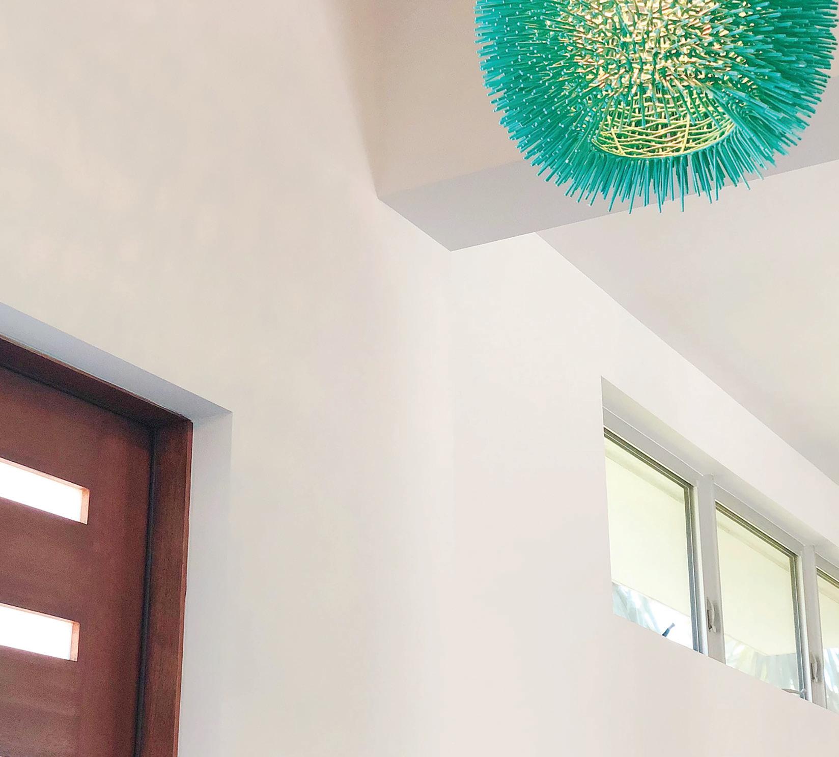
thanks to clever design choices. The wall that separates the kitchen from the foyer doesn’t go all the way to the ceiling, which allows light to filter in from the clerestory windows in the living room. “Skylights have kind of a bad reputation, but I like using them to bring light into a room,” Lunardi says. “The quality of them is much better than they used to be.” Here, the skylights beam sunlight onto dual dichroic pendant light fixtures which adds an interesting and ever-changing visual element to the space.
Lunardi’s favorite detail, though, is on the exterior of the home. “One thing I really pushed Grant for was to do the cantilever in the front of the house,” Lunardi says. “Do you see when you look at the garage, how it looks like the building is almost floating above the ground?”
“That was our biggest conflict on the project,” says Castilow. “I thought you were crazy.”
“I still can’t believe you actually went for it,” Lunardi admits. “I don’t know how I convinced you.”
“You wanted to do it all the way around the house but you’ll notice I put my foot down,” Castilow says.
“That’s okay,” Lunardi says. “I got my way in the place where it was most important.” At the end of the day, what is their biggest takeaway from this trip down memory lane? “Looking back, I’m actually really happy about how this design has held up over time,” Lunardi says. “I’d love to look back on it in another fifteen years to see if it still feels this timeless.” Castilow adds, “I’m realizing that I’d really like to work with Leo again. It’s been too long. But no cantilevering this time.” SRQH&D
Vertical Design Build, 3232 S Tamiami Trail, Sarasota 941- 263-4999, verticaldesignbuild.com Lunardi Architecture, 1855 University Pkwy, Sarasota, 941-928-6953, lunardiarch.com


