8 minute read
Brandevoort Studio, Spring 2007
from Stoa: Volume 0
Brandevoort Studio
Third Year, Spring 2007
Advertisement
Project Brief
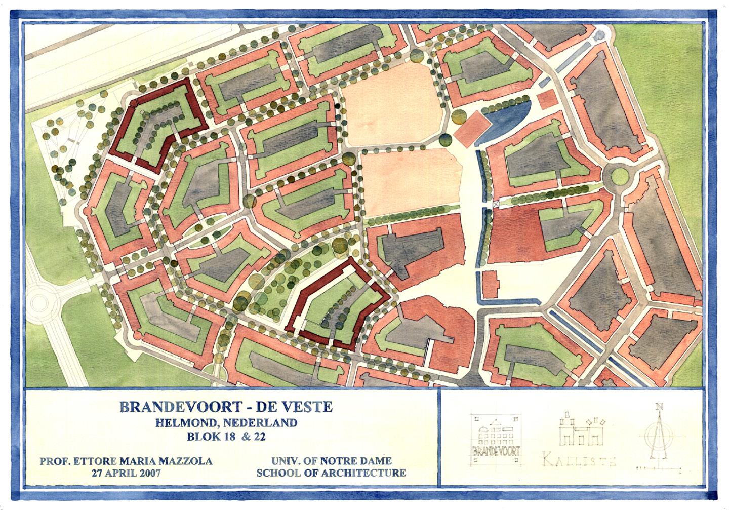
Brandevoort, once a dismal farmland, is now a city of 17,000 inhabitants located in the south-west of Helmond, Netherlands. When Helmond first acquired the area in 1995, a ministry committee saw its potential for urban and economic development and decided to build a new city. After many design entries that sought to transform the area into a modern city, the project was ultimately awarded to “new town traditionalists” Rob Krier and Christoph Kohl in 1996 for their vision that emulated a typical Dutch city in the Brabant style. Krier and Kohl designed the master plan of Brandevoort from scratch, but the ministry invited local architects to create the edifices of the buildings to generate growth and jobs. The architects’ designs strayed from the traditional language and the results were so poor that potential buyers of the homes lost interest. And so, in the Spring of 2007, as Brandevoort was under construction, Professor Ettore Mazzola, along with his studio class, was invited by Krier and Kohl to design two lots of the new city to more accurately align with the rules of the design tradition.
The studio project aimed to create a consistent architectural scheme with the traditional aesthetics and functionality that is typical of the region. Prof. Mazzola and his students spent three days researching and documenting on-site in Brabant, Helmond, Eindhoven, Thorn, Hilvarenbeek, Heusden, and—of course—Brandevoort. As they continued to examine the flaws of the original proposal, the team wished to generate designs of classical harmony. Communication between the studio and the community was essential throughout the project; Prof. Mazzola believes that a successful city should be built by its citizens, not the architects. Buildings of residences and shops, therefore, were all designed with consideration of human needs. In just four weeks, the project— including forty-one townhouses of Lot 18 and forty-three of Lot 22—achieved great success after a final review with Krier, Kohl, and two invited local designers: Erik Aarts and Frank Altpeter. The development committee later granted construction approval to these student designs, which Krier and Kohl adopted and further developed into their full remodeling project. At this point in time, the construction phase of Lot 18 has been completed.
Text by Leighton Douglass, Joan Ngai and Xiaoyu Rayne Zhu
Professor
Inviter and Developer
Students
Ettore M. Mazzola
Rob Krier Christoph Kohl
Joanna D. Bea Tricia M. Bertke Noemie A. Brand Laura C. Bresnahan Christopher R. De Chiaro Krista L. Dumkrieger Melissa Grisales Christopher P. Huffer Kevin J. Kelly Chun-Li Lin Thien-An Nguyen-Vu Kaitlin M. O’brien Jonathan M. Olvera Christopher C. Reidy Rebecca A. Sigman Laura A. Van-Batenburg-Stafford
Master Plan, Painted by Krista Dumkrieger

Block 22 Aerial, Painted by Christopher DeChiaro
Kevin Kelly
Design Technique
For the Brandevoort Studio project, understanding the local context and placement of a building within that context are extremely important, as for most Notre Dame studio projects. Part of the studio travel included visiting local towns and villages to better study traditional brick details, dormer elements, glazing to masonry ratios, and entry door details. A valuable take away from the Notre Dame education is that students are encouraged to create buildings that fit into the local environment. Our studio’s designs applied the precedent research from our on-site observations, which allowed (in my opinion) for a successful project.
The watercolor renderings and elevations the studio produced provided a rich and illustrative background to aid the presentation of our designs. The rendering style that the University promotes helps to create drawings that are artistic and evocative at the same time. This rendering style was also appropriate for detailing and rendering the extensive brick patterns that the studio utilized to elevate our designs.

Block 18 completed, View along the Hertogsveld

Block 18 Aerial View, Painted by Thien-An Nguyen-Vu
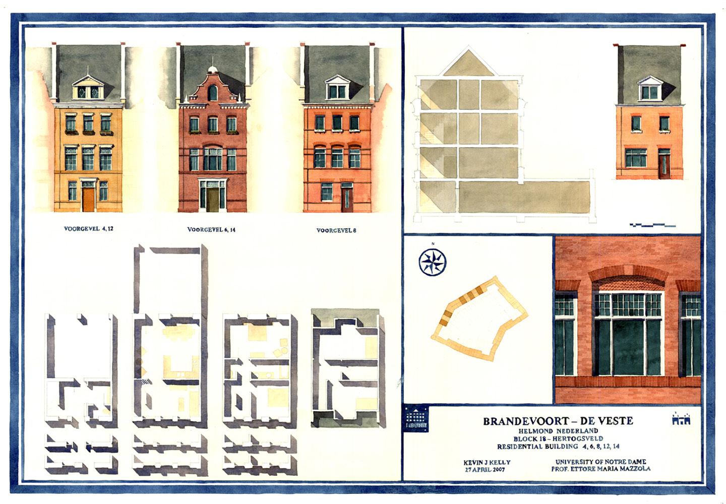
Block 18 Lots 4-6 8-12 12-14 Elevation, Plan, Section, and Detail, Kevin Kelly
Kevin Kelly
Project Specifics
I thoroughly appreciated the fact that this studio project had “real” clients and was an opportunity for us, as students, to have our designs actually built. It provided insight into what students could expect after graduation, especially with respect to development constraints, working and designing in teams, and presenting to clients. Even though the focus of our junior year is ‘Rome’, this project still followed the same strategy as our other studio projects that year (and during all our years at Notre Dame) – studying local context and precedent, multiple iteration of design and development, refinement of those options, and creation of presentation material. This is a process that has followed me into the professional world; I’m grateful for the Notre Dame curriculum that promoted the process in the first place.
I encourage students that work on studio projects with real clients to listen to the clients and stakeholders, and to understand how one’s preconceived notion of what a community or town needs may not be correct. I found myself surprised by how residents were using ‘shared’ spaces such as the streets, entry stoops, and interior courtyards as both private, semi-private, and public spaces. It wasn’t until I spent extensive time in other cities that I realized this is the urban norm.

Perspective of Block 18, Painted by Jonanthan Olvera
Kevin Kelly
Beyond the Project
Looking back, this project was one of the closest experiences I had during my studies at Notre Dame to the architecture profession. I applaud Professor Mazzola for providing this experience to my fellow classmates and me.
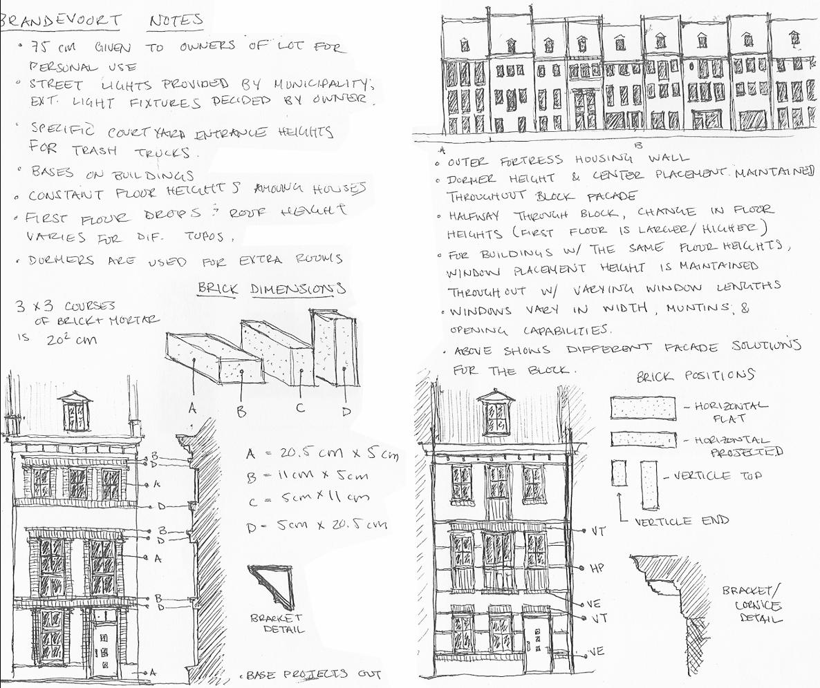
Sketches and Notes, Kevin Kelly
Lee Lin
This summer, Stoa Magazine was able to connect with alumnus Lee Lin (‘09). During our conversation, Lin shared his memory of the 2007 Brandevoort studio project, as well as his experience of practice in the greater architecture field over the years.
Project Review
Arriving in Brandevoort after months of study in Rome, Lin was particularly intrigued by the change to an architecture style with a more vertical nature, and enjoyed visiting the surrounding towns and studying the traditional architecture of the region. He claims that being on-site facilitated a study of how people live their lives, which then inspired a design approach that was based Rome, the way that the professors really of 3ds Max, but I now realized that at the
on not only purely aesthetic effects, but also end-user lifestyle considerations.
During the design process, Lin focused on mediating the verticality of the Dutch buildings, the narrow spaces, and the comfort of interior spaces. He opened up the building plans across floors, and played with different staircases to integrate the floors more smoothly for the residences.
The buildings at the corner of Block 22, which Lin helped to develop, were one four-story single-family townhouse and two three-story single-family townhouses. The townhouses have more elaborate street facing façades with street access, simpler garden facing façades finished with stucco, and basic openings that give focus to the inside garden, letting the lifestyle and the interior of the block
Reflection on the Notre Dame Education
Lin believes that while methodological trainings are important, it is the aesthetic sense he gradually gained over the years in Notre Dame—the understanding of the proportion, the meaning of beauty, the principle behind the ratio, the history of classical architecture, the classical training on the nature of beauty— that he is able to carry with him to the practice.
“At Notre Dame, what we have is truly invaluable,” Lin says. “During the year in understood this rational beauty with a reason or a story behind every shape was fascinating and inspiring. As an aspiring modernist in college, I found it challenging, but, in reality, the training helped, and was extremely useful in my career. I wanted, so eagerly, to learn CAD and SketchUp; I wanted to be an expert speak for themselves.
end of the day, the Natural Sense of Beauty programmed and infused in you is what can guide you through your career.”

Perspective of Block 22 Interior, Painted by Laura Van Batenburg
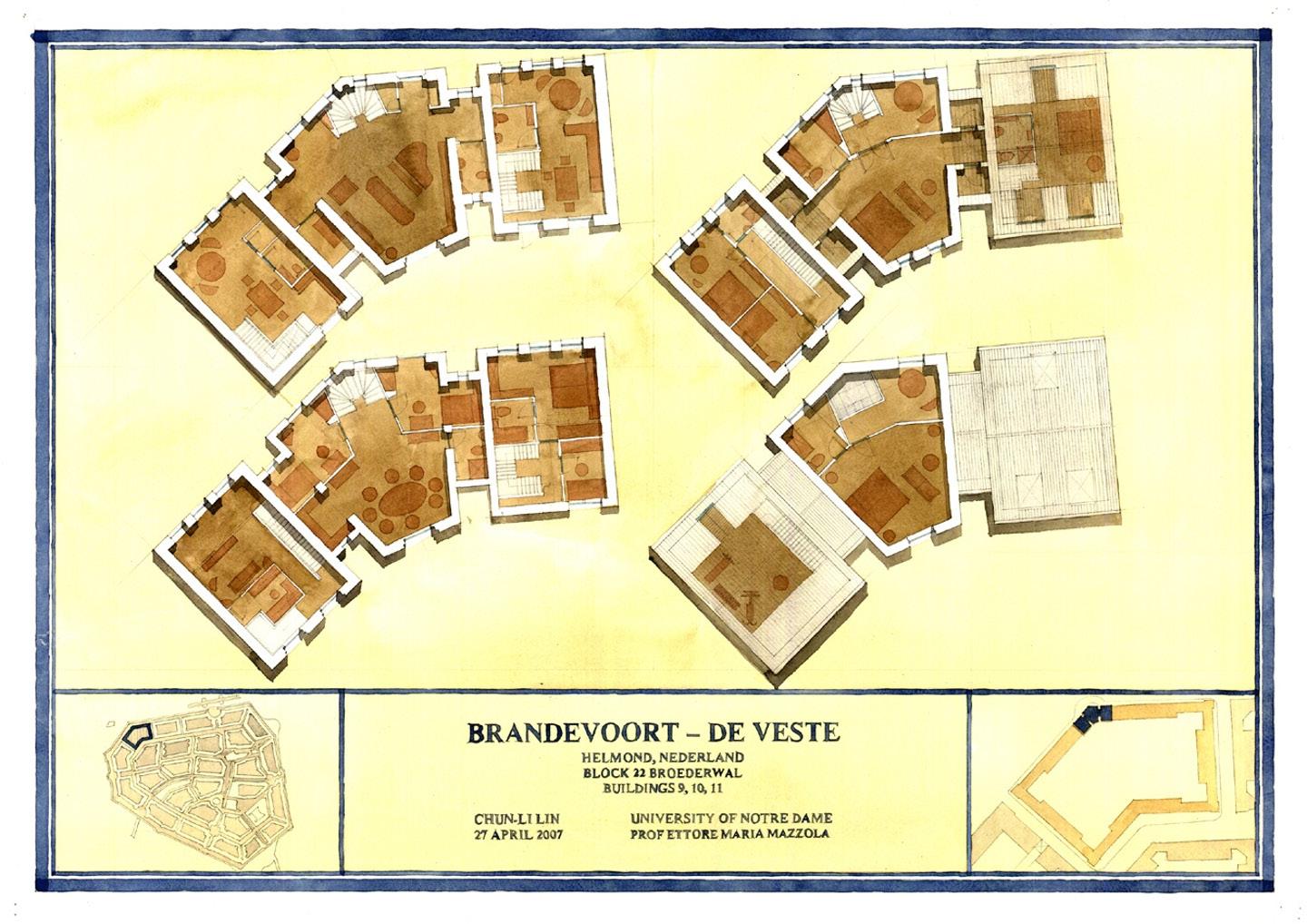
Block 22 Lots 9-10-11, Lee Lin
Lee Lin
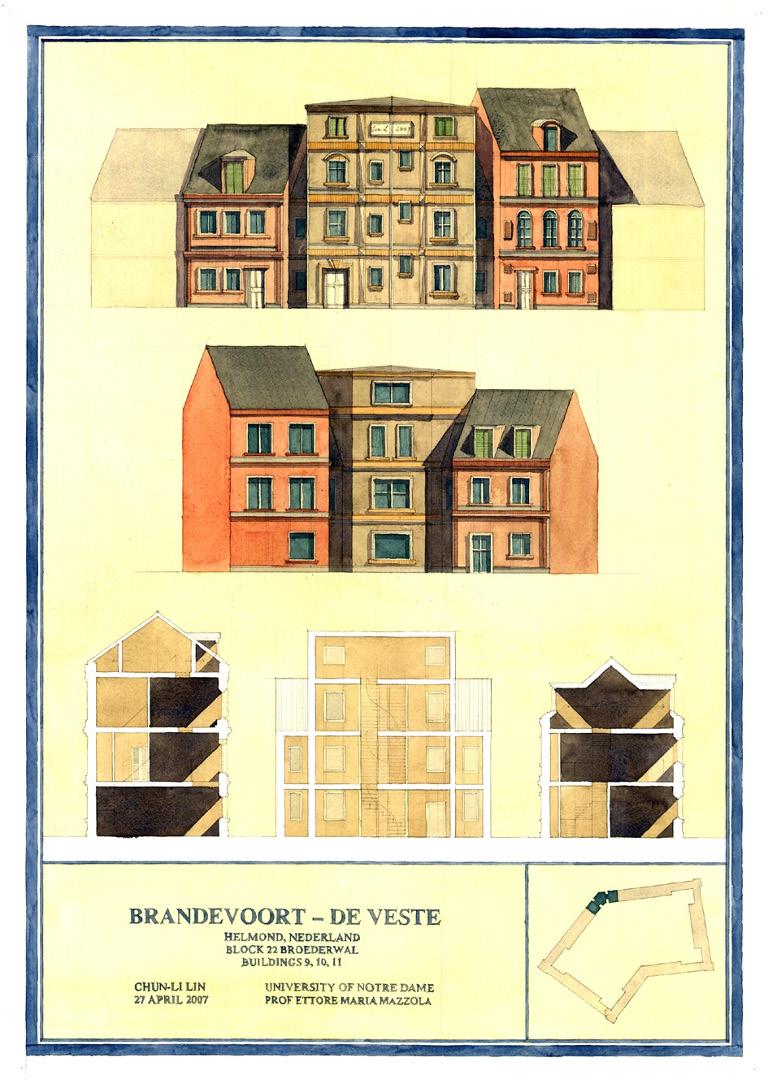
Block 22 Lots 9-10-11 Elevation and Sections, Lee Lin
Lee Lin
Tips for Students: Presentation
at the beginning.
Lin says that architecture schools provide students with the opportunity to practice their communication skills—essential skills for any career. He thinks that the unique architecture critique culture, where students are asked to present their projects in front of a group of jurors, provides architecture students real practice of communication skills over years. business development at various architecture firms including MAD, ATKINS, and BLINK, Lin offers current students some personal tips and tricks on presentation.

Sketch and Notes, Lee Lin Start off strong; grab the audiences’ interests
With his experience in project managing and
Don’t start slow; an architecture presentation is not a movie that is two hours long and takes years to make. You need to grab their attention from the first second. Find what drives the audience, the end-users, and the people. What do they care about?
The client or developer can hire any designer in the world to make an aesthetically beautiful design. Thus, oftentimes, how you make that connection with the person—the audience of the presentation—makes a big difference. You have to study first: What is the essence of the project? Who are the targeted customers? What is the project direction?
Find and establish some “connecting points” with the end-users and the audience.
Talk about the building, but not only about the building. Aesthetic decisions are pretty subjective, but when it comes to lifestyle— how people live, how people interact—the design decisions become more substantial. A project needs those substantial touch points. In architecture schools and architecture practices, there is a rich amount of design thinking on form and beauty that goes into the projects, but to make a compelling presentation, the architects need to translate the design thinking to the language that the audience understands: you can use relatable factors such as travel, everyday experience— something that is clear and understandable to everyone.
Text by Xinyuan Sam Zhuang


