Yvette Coppersmith, Abstraction (paysley), 2024, oil and sand on jute, 113×97.5 cm
This issue, Sullivan+Strumpf takes great happiness in marking our 20-year anniversary. As we reflect on two decades working at the forefront of contemporary art, we offer our most heartfelt thanks to the artists, collectors, industry leaders, colleagues and friends who have contributed to our history. We could not have done it without you!
In this issue, we honour the work of the late Ms D Yunupiŋu with Marwat, an exhibition completed ahead of the artist’s sudden passing in late 2024. The artist was at the very height of her practice, and we will miss her dearly. Wayilkpa Maymuru makes her debut with Maŋgalili Origins, an exhibition of highly detailed paintings on bark; Free Form: Contemporary Abstraction places focus on the artists in our stable who integrate the theories of abstraction into their varied practices; For Melbourne Art Fair 2025, Tony Albert continues his Conversations with Margaret Preston series with Reclamation; Gregory Hodge and Clare Thackway bring us closer to the technique of Hodge’s intricate practice in an intimate in-conversation; Gemma Smith and Alexie Glass-Kantor offer an engaging exchange about the artist’s work in Encounters at Art Basel Hong Kong; the Gadigal/Sydney gallery will present an exhibition from the estate of Sydney Ball with a focus on his Structures, Infinex and Chromix Lumina series; Kirsten Coelho and curator Erica Green offer a thoughtful and considered exploration of Coelho’s practice ahead of her forthcoming solo exhibition at our Naarm/Melbourne gallery; Chloe Borich speaks to Julia Gutman’s life in the third person at the Art Gallery of Western Australia, a momentous work by the artist recently acquired for the gallery’s permanent collection; and Claire Summers speaks with Candace Richards, curator of Kerameikos, about the exhibition at Chau Chak Wing Museum and the work of Kirsten Coelho and Glenn Barkley in its curation.
The gallery will also present In My Prime, an exhibition of artists from outside our stable, giving us an opportunity to connect our audience with an exciting line-up of young and talented artists in Jess Cochrane, Emma Creasy, Nicholas Currie, Angus Gardner, Julian Martin, Chris Mason, Stefan Mau and Naoise Halloran-Mackay.
As you read on, we hope you will find works that invite contemplation, encourage curiosity and ignite joy. Thank you again for your engagement and support.
Jo+Urs
The Water Understands
Miguel
Angelo Libarnes, Leah Bullen, Michael Cook, Tamara Dean, Keg De Souza, Phillip George, Shaun Gladwell, Gregory Hodge, Anna Madeleine Raupach, Douglas Schofield, Angela Tiatia
13 Dec 2024 - 16 Feb 2025
Curated by Ben Rak
Manly Art Gallery & Museum
West Esplanade Reserve, Manly, NSW
Open 10am - 5pm, Tue - Sun | Free entry
@magamnsw magam.com.au
Gregory Hodge, Seascape, 2024 acrylic on linen, 200 x 160cm Photography Gregory Copitet
Quick Curate
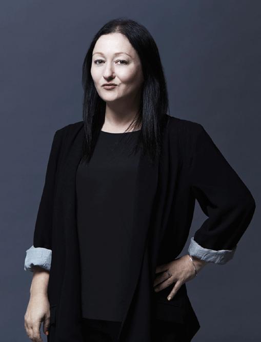
Elsa Bryant
08
Ms D Yunupiŋu
Marwat
18
Wayilkpa Maymuru Maŋgalili Origins
28
Free From: Contemporary Abstraction
34
Celebrating 20 years with Sullivan+Strumpf
38
Tony Albert
Melbourne Art Fair 2025
44
Gregory Hodge & Clare Thackway In conversation
54 In My Prime
58
Gemma Smith & Alexie Glass-Kantor In conversation
62
Sydney Ball Structure, Infinex & Chromix Lumina
72
Kirsten Coelho & Erica Green In conversation
82
Julia Gutman life in the third person
88
Candace Richards The Last Word
ELSA BRYANT COMMUNICATIONS AND SALES ASSISTANT
AT THE BEGINNING OF LAST YEAR, I had just settled in at Sullivan+Strumpf and I quickly learned that the art world comes back from holidays sprinting onto the green grass of a fresh year. We’re given little time to look at the clock and wonder what the year will bring before we’re standing at the booths of local and international art fairs, the vital beating pulse of the contemporary art ecosystem.
At home in Naarm/Melbourne, we kick off the year with Free Form— an exhibition of contemporary abstraction featuring artists across our stable. I’m looking forward to seeing how these diverse works interplay and communicate with each other across our Collingwood space.
We open the doors of our Gadigal/Sydney gallery with the late Ms D Yunupiŋu’s Marwat downstairs and Wayilkpa Maymuru's first exhibition with S+S, Maŋgalili Origins in the upstairs gallery, two exhibitions of distinct practices on bark, telling different personal stories of origin.
Our Singapore team remain steady within the bustle of Singapore Art Week, moving from an offsite exhibition at the art/dining concept, Appetite, to a stellar return to Art SG and then S.E.A Focus 2025 with the brilliant Tiffany Loy.
In February we welcome Melbourne Art Fair. I had my first MAF last year and despite knowing this city like the back of my hand, stepping into the bustling hive of contemporary art I felt teleported elsewhere. I can’t wait to see our solo presentation of works by Tony Albert, an artist whom I have observed must have superpowers to juggle so many inspired projects at once.
The works I have selected for this Quick Curate are potent with energy, resonating with me at this time of a burning new beginning. With a brave spirit we lunge into the future with renewed desire.
Elsa Bryant, 2025. Photography by Phillip Huynh.
Daniel Crooks, Path #3, 2024, unique ink drawing sequence, acid-free gel ink on 100% cotton rag, 76 × 56 cm
Dawn Ng, Spring in Jupiter and Mars, 2024, lightbox, 160 × 35× 12 cm, Edition of 5 plus 2 artist’s proofs
Lee,
Gemma Smith, Time, 2020, acrylic on board, 136 × 117cm
Marion Abraham, Escape To The Country, 2023, oil on linen, 182 × 198 cm
Lindy
Frozen , 2024, flung bronze, 120 cm diameter, 26 elements
Sydney Ball, Lumina XV, 2013, acrylic on board, 29 × 24 cm
Tiffany Loy, Colour Tension 0 1, 2024, hand-dyed and woven Abaca, 120 × 90 cm
Tony Albert, Unpacking History (Disconnect), 2024, acrylic and vintage appropriated fabric on canvas, 185.5 × 155 cm (framed)
Polly Borland, Untitled (Bug and Mouth), 2023, lenticular print, digital print on rice paper (unique state), 102× 8 3× 6 cm
We are devastated to share news of the sudden loss of Ms D Yunupiŋu who was a loving, caring, and generous soul to everyone in her life. Daughter of Muŋgurrawuy and sister to Gulumbu, Nyapanyapa, Barrupu, Djerrkŋu and many other distinguished siblings including her two brothers, who both received the award of Australian of the Year. This family’s impact on Australian art, music and politics cannot be ignored. Despite losing her husband, the famed yiḏaki master, Mr D Gurruwiwi, she continued to work tirelessly supporting her beloved family. Ms D Yunupiŋu’s family have given their permission for her final body of work to be exhibited posthumously. The following text was penned in late 2024, prior to her passing.
Ms D Yunupiŋu
Ms D Yunupiŋu, Galiku, 2024, natural earth pigment on paper, 76.4 x 56.7 cm
D Yunupiŋu, Galiku, 2024, earth pigments on stringybark, 169 × 104.5
Text by Sally Brand
Artwork photography Aaron Anderson
ONE MORNING ON MY WAY INTO WORK, I heard an interview with a violin prodigy who described talent not as a mysterious force or innate ability but rather a matter of time. People with talent ‘learn faster, forget slower’, he said. Travelling down the parkway, I meditated on our society’s obsession with the speed of knowledge. In the emerging era of AI, this speed has only accelerated along the information superhighway. It was 150 years ago that the Overland Telegraph was completed providing faster communication between Australia and the rest of the world. This was followed by the introduction of radio 100 years ago and the internet 30 years ago. Each of these technologies has radically reduced the amount of time that messages, information, and ideas can be shared. We’ve harnessed materials out of the Earth and expended great energy to learn faster. How fast can we go? Google recently announced a breakthrough in quantum computing with a new chip that can process complex mathematical equations in less than five minutes that previous supercomputers could not complete in 10 septillion years.(1) Without question, in the early 21st century we have the tools to learn faster, but do we have the talent to forget slower?
Sally Brand is a Balanda writer of Latvian, Irish and Scottish descent living on the lands of the Ngunnawal people in Canberra.
Ms D Yunupiŋu was a senior Yolŋu woman who commenced her artistic practice late in life. Her first exhibition in 2022 at the age of 72 led to major acquisitions by private and public collections. Drawing on her extensive cultural knowledge and Yolŋu worldview, over a few short years, Yunupiŋu’s practice evolved through narrative driven figuration to refined abstract line paintings. This latest exhibition, Marwat, features paintings and larrakitj (memorial poles) that push the medium to its limits and dramatically innovate Yolŋu traditions of mark marking. By such accounts, it may appear that Yunupiŋu is an overnight success. True to the adage, her success is built on a lifetime of learning. Furthermore, Yunupiŋu’s practice is grounded in millenia-old Yolŋu traditions that endure today through the passing on of knowledge through song, dance and storytelling, ancient forms of human innovation.
Yolŋu art practice is connected to and extends deep time. It is a practice maintained and innovated over generations and highly attuned to the conditions of its making. The resulting artworks make you stop, command you to listen, they have an important story to tell.
Yunupiŋu’s paintings and larrakitj are exceptional examples that tell of the extensive trade between Yolŋu and Makassan fishermen that existed for centuries prior to late 18th-century British arrival on the Australian continent. With her marwat (hair) brush and pigments gathered from the Earth, Yunupiŋu’s paintings assert the connectedness of Yolŋu to the world and all living things. They dispel the myth that Aboriginal people were isolated and detached from external influences prior to British colonisation. The interconnected threads that weave across her painted surfaces recall the cloth sails of Makassan boats that have been shredded at sea by cyclonic winds. In Yunupiŋu’s hand the power of the wind that splits apart the woven threads is palpable. As is the endurance of woven cloth that can withstand such destructive forces. When I look at her paintings, I feel the force of the wind on my cheeks. I see the cloth come apart and stay tethered together. I appreciate how each woven thread is strong when held in relationship with each other.
For Yolŋu, galiku (cloth) is a gift from the Makassans. Maintained over centuries, Yolŋu’s respectful provenance of Makassan cloth is important. To both incorporate and distinguish Makassan ways of life, demonstrates Yolŋu as incredibly sure of their place in the world. This confidence and conviction Yolŋu also assert in the nationally significant Yolŋu Bark Petitions (1963), The Barunga Statement (1988) and The Saltwater Collection (c. late 1990s). The uniqueness of Yolŋu art and understanding of its relation to others is a specificity that stands in stark contrast to today’s amorphous ‘cloud’ storage systems and anonymity of AI. Using her talent to learn fast, forget slowly, Yunupiŋu’s paintings impactfully pierce through the contemporary static with a strong sense of individuality and connectedness to the world.
First Nations people often attest that country has the answers. In southeast Australia, the Wiradjuri teach and share the philosophy of Yindyamarra, to walk slowly, be respectful, to seek to understand. In living on this country, I seek to incorporate this way of thinking, being and living into my world view. Yunupiŋu’s practice exemplifies Yolŋu generational storytelling and sustainably embodies vast caches of knowledge. As well, Yunupiŋu’s works are an elegy on the impact of colonisation and abiding strength of First Nations peoples and cultures. Her works inspire and challenge us to pause, reflect, slow down, know who we are and how we are connected across time. This cannot be done quickly and is essential to finding our balance and peace in increasingly divided times.
EXHIBITION DATES
30 Jan – 22 Feb 2025
Ms D Yunupiɲu: Marwat
Sullivan+Strumpf Gadigal/Sydney
Ms D Yunupiŋu, Galiku, 2024, natural earth pigment on paper, 85×58.5 cm
Ms D Yunupiŋu, Marwat, 2025, installation view, Sullivan+Strumpf Gadigal/Sydney. Photo Aaron Anderson.
Ms D Yunupiŋu, Galiku, 2024,earth pigment on paper 193×280 cm, 13 panels
Wayilkpa Maymuru
Wayilkpa Maymuru is a Yolŋu artist of the Maŋgalili clan. Her work references the settlement of her homeland Djarrakpi (1) by ancestral heroes, their story of death, rest and re-birth to the sky. Djarrakpi (Cape Shield) is a site of the ancestral burial ground called the Yiŋapuŋapu.
Text courtesy Buku-Larrŋgay Mulka Centre. Artwork photography Aaron Anderson. Opposite: Wayilkpa Maymuru, 2024. Courtesy Buku-Larrŋgay Mulka Centre.
IN WAYILKPA’S WORK, THESE MOTIFS are layered with sacred designs that refer to the sand patterns of Djarrakpi and the starry Milky Way. Typical of Yolŋu philsophy, her work speaks to a wholistic appreciation of the cycle of life, an acceptance of ultimate destiny and a continuous spiritual connection to country, both land and sea. In parallel with this broad concept are the stories of sacred animals (including the Guwak (Koel cuckoo), Freshwater crocodile, sandcrab, possum, Kingfish) and mystical bodies (such as thunder clouds) that influence and instruct the natural world, each with unique symbolism and purpose.
The death/rest/rebirth of the two Guwak brothers, the founders of Djarrakpi for the Maŋgalili clan of Yolŋu, initiated the first rites of mortuary for these people and the utilisation of the Yiŋapuŋapu a low relief sand sculpture designed to keep any contamination of death at bay, to cleanse the bones of dangerous spirits held within the body tissue. Further to this concept is a notion of cleansing over time, the soft tissues of the body returning to the mother (earth), the bones laid bare and clean for the final rites of passage back to the Maŋgalili reservoir of souls. In traditional mortuary ceremony for this clan, the last act is to catch and eat Yambirrku (parrot fish) and dispose of the bones in the ceremonial sand sculpture for the crabs to pick clean overnight. An example of a metaphor for this cleansing is in sacred paintings depicting Mirriya or Gunyan crabs picking the bones of a fish carcass on the beach. The totemic Mirriya feeds on the ancestral remains of the Yambirrku. The miŋy’tji (2) for the sandscapes of Djarrakpi both adorn and surround the crabs.
Wayilkpa
Maŋgalili Story, 2024, larrakitj, 182×26 cm, 230×24 cm and 238×21 cm
Djarrakpi is located at the end of a remote cape on the western side of the Gulf of Carpentaria. Here exist several extremely significant landmarks for the Maŋgalili, subtly referred to in Wayilkpa’s paintings and larrakitj. For example, on top of a sandy rise, above the sand dunes is said to be the ‘dangerous’ site of the Guwak’s Yiŋapuŋapu at Djarrakpi. The maternal Thunderhead cloud is Waŋupini. This is shown in its feminine shape as the anvil shaped wet season cumulonimbus(3) . Another metaphor for the soul’s journey from life to death to rest to rebirth: the saltwater flows to the horizon where it is taken up as water vapour by the feminine thunderhead cloud which carries it as the pregnant maternal shape to the escarpment. Here, it gives birth through rain.
Her paintings have a complex symbolism, they represent ancestral stories in symbolic narratives, often composed in bands. Similar elements occur across the paintings, with different but related meanings. Similarly to her father and grandfather, her art is a means to communicate ideas and knowledge to an external audience and a means of ensuring the continuity of ancestral law.
1. Located at the base of Cape Shield, the northern perimeter of Blue Mud Bay.
2. Miɲy’ti means sacred clan designs.
3. Cumulonimbus clouds, also known as thunderclouds, are a type of cloud that can produce heavy rain during the wet season.
Wayilkpa Maymuru painting, 2024.
Courtesy Buku-Larrŋgay Mulka Centre.
Opposite;
Maymuru,
( 3 )
( 1 )
( 2)
(1) Wayilkpa Maymuru, Maŋgalili Story, 2024, larrakitj, 182 x 26 cm (2) Wayilkpa Maymuru, Maŋgalili Story, 2024, larrakitj, 230 x 24 cm (3) Wayilkpa Maymuru, Maŋgalili Story, 2024, larrakitj, 238 x 21 cm
FAMILY HISTORY
Wayilkpa is descendant of a family of important artists. Her cousin is Naminapu Maymuru White and her father is Banapana, Narritjin Maymuru’s second son. In the mid 1970’s Banapana helped his father establish an outstation on Maŋgalili land at Djarrakpi. Like his brothers and sisters, he was urged to watch his father painting after school and, taught by this great artist, developed into a fine artist himself. In 1978 he and his father spent three months as Visiting Artists at the Australian National University, Canberra.
Narritjin Maymuru’s life encompased some of the major events of Australian and Northern Territory history. He was a great intellectual and ceremonial leader. Within his community he was often called on to assume the role of mediator, bringing disputants together. Above all he was an artist with a passion for making things.
Narritjin’s earliest surviving paintings and carvings were completed for the anthropologists Ronald and Catherine Berndt in 1946, and in 1948 and 1952 he produced a number of works for Charles Mountford (who led the American–Australian Scientific Expedition to Arnhem Land in 1948). By the early 1960s he had become one of the most prolific and renowned Yolŋu artists.
Banapana was able to achieve a profile as an artist in his own right before he died at the young age of 39. Narritjin’s family was blighted by the death of many of his children in a short time and his own passing shortly before Banapana. Although surviving members of the family carried on the legacy, it was not until Wayilkpa was in her forties that she began to paint seriously. Inspired by her artistic family, Wayilkpa began focusing on her own practice in 2018. With works depicting the epic narratives related to her Maŋgalili Clan group and carefully painted with an extreme eye for detail and with the finest line work, she continued to develop her own unique style during 2024 by immersing the narrative in a tapestry of stars.
OUTSIDE STORY
In ancestral times, the Guwak men, Munuminya and Yikawaŋa, sitting under the shade of the sacred Marawili, instructed the ancestral koel cuckoo Guwak to lead the Maŋgalili people to the new home established for them at Djarrakpi. Having seen the people settled in their new homeland, they announced to the Maŋgalili their farewell, that they would travel out to sea, to a place in the sky, and become stars shining out of the night sky. Their journey began by paddling down the Milŋiyawuy River. In the bay, at a place of significance, strong winds developed and a wave from the ancestral turtle capsized the canoe the men drowned. This place is the site of Yiŋalpiya, the freshwater crocodile’s nesting place. It is also the spirit source for Maŋgalili people.
The Guwak Men received several rescue attempts. A special log Milkamirri or Bandumul, containing mangrove worms offered itself as assistance. Ŋuykal, the ancestral king fish, is also manifest in this form. Even the rock cod they had caught for their journey offered assistance, as did Dhäla the sea creature. It was to no avail; the men had destined themselves as offerings to the night sky where they and subsequent Maŋgalili souls are seen today in the Milky Way.
These Maŋgalili souls attain their celestial position by means of possum fur string, Burrkun, that connects Djarrakpi at the site of the Marawili tree to the night sky. Miliyawuy or Milŋiya as the Milky Way is also looked upon as the nesting place for the ancestral crocodiles Yiŋalpiya.
The night bird Guwak became lonely, he set out to find his friend Marrŋu, the possum, to talk to. During the day he found him in several places, but Marrŋu would not talk to him because it was daylight. Ever since, the Guwak only calls at night as he knows this is the only time that Marrŋu will answer him. During his travels that day, as he flew along the coast, he saw Ŋuykaland. Feeling hungry, he called out, “Ŋuykal, if you will jump out of the water onto the sand, I will give you some land.” Ŋuykal did so and was gobbled up by the Guwak. At long last he came to Djarrakpi and in the moonlight he saw the sacred tree on the cliff. Tired, it was with great relief that he landed in the top of the tree and noticed the Gunyan playing in the sand at the foot of the cliff, running from their holes through the parallel lines of foam led by the ebbing tide. He sat looking about and heard a noise it was Marrŋu inside the hollow tree. He sent Garanyirrnyirr, the cicada, down the tree with a message to Marrŋu who came up the tree to the Guwak and they spent the night talking about the sacred places of the Maŋgalili.
They then sent Garanyirrnyirr with a message to Nyapiliŋu and asked her to come with them into the Maŋgalili country. The possum travelled ahead and led a path for them to follow. Before the Guwak and Nyapiliŋu came together at Djarrakpi, when they met at the sacred possum tree, Guwak had already travelled extensively with Garanyirryirr, his messenger, and named sacred places for the Maŋgalili.
Wayilkpa Maymuru painting, 2024.
Courtesy Buku-Larrŋgay Mulka Centre.
EXHIBITION DATES
30 Jan — 22 Feb 2025
Wayilkpa Maymuru: Maŋgalili Origins
Sullivan+Strumpf Gadigal/Sydney
Having seen the people settled in their new homeland, they announced to the Ma ŋgalili their farewell, that they would travel out to sea, to a place in the sky, and become stars shining out of the night sky.
Wayilkpa Maymuru, Maŋgalili Story, 2024, bark painting, 42×73 cm
Wayilkpa Maymuru, Maŋgalili Story (detail), 2024, bark painting, 69×56 cm
Wayilkpa Maymuru, Maŋgalili Story, 2024, bark painting, 96×51 cm
Typical of Yol ŋu philosophy, her work speaks to a wholistic appreciation of the cycle of life.
Wayilkpa Maymuru, Maŋgalili Story (detail), 2024, bark painting, 40×49 cm
Wayilkpa Maymuru, Maŋgalili Story, 2024, bark painting, 42×36.5 cm
Wayilkpa Maymuru, Maŋgalili Story, 2024, bark painting, 66×36 cm
Free Form is a celebration of contemporary abstraction as we know it today. Bringing together key voices working in the genre, the exhibition features work by Yvette Coppersmith, Daniel Crooks, Lynda Draper, Kanchana Gupta, Gregory Hodge, Lindy Lee, Tiffany Loy, Lara Merrett, Marrnyula Munuŋgurr, Dawn Ng, Gemma Smith and Jemima Wyman. Traversing painting, sculpture, ceramics, photography and video work, Free Form delves into multidisciplinary expressions of abstraction, considering the ways the genre has evolved in the context of recent times. Text by Chloe Borich.
Since the early 1900s, abstraction has been central to the story of modern art. Founded in response to the limitations of traditional academic painting, abstraction provided an experimental methodology to unpack the formal qualities of the medium, rather than its subject matter. The genre focused on the sensorial elements of painting, placing emphasis on colour, shape, line, form, texture and gesture — dissolving the rigid boundaries of representational imagery. By honouring these fundamental components, it became associated with moral virtues of order, purity and simplicity, untethering itself from the physicality of reality.
Illuminating new possibilities and otherworldly ideas, artists viewed abstraction as a vehicle to transcend the material world, tapping into notions of the soul and universal truths beyond the visible world. Bridging the space between the somatic and the metaphysical, abstraction enabled artists to develop new ways to navigate and capture the essence of modern life beyond figurative interpretations.
As demonstrated by the works exhibited in Free Form, the early origins and methodologies of abstraction are still relevant today, yet they’ve come to find new meaning in contemporary practice. Over time, the materials and mediums used to produce abstract art have diversified and progressed with technology. Conceptually, artists are more directly engaging in a political, social and cultural context. The prominence and influence of abstract painting has remained ever present. The medium’s rich history reverberates in the lyrical compositions of Yvette Coppersmith that invite viewers on a nuanced journey through colour, texture and rhythm, evoking the spiritual strands of transcendental painting. Investigating the physicality of paint, Kanchana Gupta’s series Open and Close (2024) layers oil paint onto lace, then pulls and burns it away to reveal a cast of the material. This process creates a poetic throughline to her hometown of Patna—a centre for lace manufacturing in India—and her adoptive homeland of Singapore. Similarly looking
Kanchana Gupta, Open and Close #19, 2024, Oil paint skin burnt and stripped off French machine made lace, 84×64 cm (framed)
to the surfaces of textiles are new works by Gregory Hodge that oscillate between abstraction and figuration, layering personal source material with gestural marks and obscured historical motifs from architecture and interiors, which coalesce in vivid collages guided by wavering, crisscrossed lines. Blending abstract expressionism with environmental activism, Lara Merrett's manyana matters (2023) (named after the Manyana Matters Environmental Association in which she’s a key member) exemplifies her use of the ‘soak-stain’ technique to visually interpret our oneness with nature as something to be cherished and protected. Sharing ancient stories that long precede the foundations of abstraction, the bark paintings of Yolŋu artist Marrnyula Munuŋgurr depict sacred Djapu clan designs: a cross-hatched grid pattern that refers to the freshwater landscape of their homeland in Waṉḏawuy, and the structure of fish traps set by ancestral hunters. Munuŋgurr’s Djapu Miny'tji (2024) continues her family’s legacy and knowledge while bringing forward her own designs in the process. Returning to the rules of colour theory and pure abstraction to determine the methodologies of her work, Gemma Smith builds series guided by these factors. Coordinate (2024) highlights the interplay of chance and control through the accumulation of translucent layers interrupted by a final layer of singular colour.
The sculptures of Free Form show the varied evolutions of traditional materials. Daniel Crooks presents Object No.10 (2024), a twisting spiral of individually stacked plywood pieces that rises out from and then returns to the wall, representing a two-dimensional computer-generated image of the artist’s body in motion that results in an abstracted threedimensional self-portrait. Conjuring corporeal forms of a different kind, Lynda Draper's Apparition (2024) brings ancient materials into the present, depicting a textural hand-built ceramic form with ethereal orbs of blown glass blooming from its interior, toying with illusions of pareidolia. Lindy Lee’s Mirroring Heaven (2023) is a signature flung bronze artwork that involves the artist entering a meditative state before throwing hot molten metal onto concrete to create the chance sculpture, inspired by the calligraphy practice of ‘flung ink’ painting practiced by Zen Buddhists. Whereas Tiffany Loy borrows from her background in industrial design to explore the potential of thread by weaving dense and intricate sculptures, playing with perceptions of volume, depth and geometry as shown in her piece Structural Gradient II-1536 (2021). By harnessing new digital mediums, artists use pivotal developments in technology to translate the world around them. Illuminating ideas of time and impermanence, Dawn Ng’s video work The Earth is an Hourglass
(2024) captures the decomposition of frozen blocks of ice, coloured by vibrant pigments that resemble the earth’s surface as seen from space. This 20-hour-long process is compressed into a mesmerising 20-minute portal, speaking to the spectacle of the climate crisis that grows more urgent every day. In static contrast, Jemima Wyman’s hand-cut collages Haze 24 and Haze 26 (2024) gather digital photographs of smoke clouds rising from universal acts of protest and confrontation, forming nebulous landscapes (or smokescapes) that mimic the abstract shapes found in camouflage. Through their startling vivid surfaces achieved by meticulous sourcing, cutting and archiving, Wyman encourages us to bear witness to political challenges that continue to face contemporary society.
Exploring the unique visual language of several key contemporary artists working across Australia and internationally, Free Form shares fresh perspectives on abstraction. The sensorial elements that underpin the genre are distilled and amplified through a reimagining of materials and mediums, cultivating space for a new field of ideas to be sown.
Yvette Coppersmith, Arc-en-Ciel, 2023 — 2024, oil on linen, 92×122 cm
Daniel Crooks, Object No.10, 2024, plywood and stainless steel, 134 x 29 x 34 cm
Gemma Smith, Coordinate, 2024, acrylic on linen, 137×117 cm
Jemima Wyman, Haze 24, 2024, hand-cut digital photos, 104×140 cm
Lara Merrett, manyana matters, 2023 ink and acrylic on cloth and linen, 220×300 cm
Gregory Hodge, Precious Things, 2024, acrylic on linen, 92×60 cm
Lynda Draper, Apparition, 2024, glazed ceramic and blown glass, 53×47×33 cm
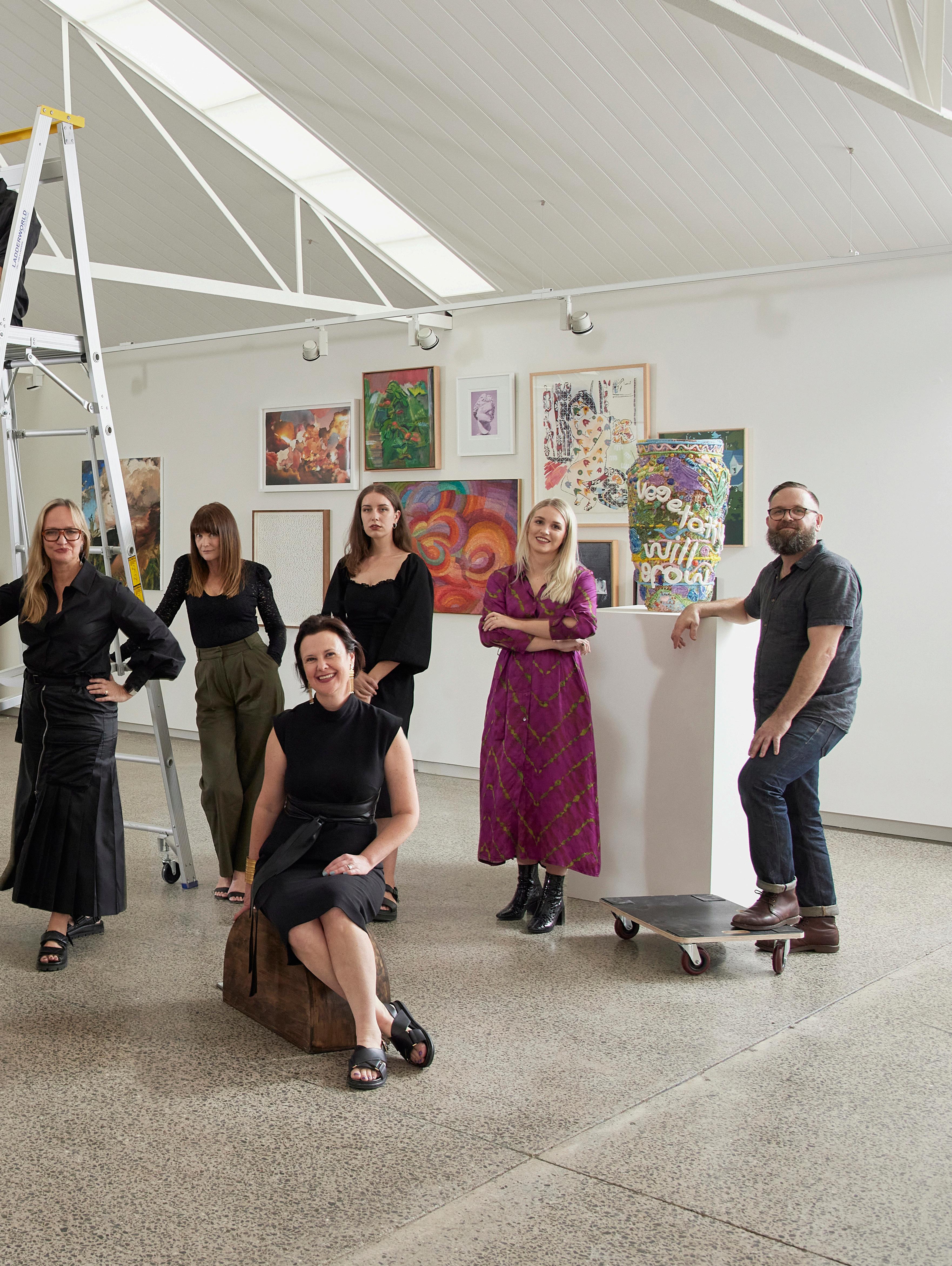
Sullivan+Strumpf Sydney and Melbourne teams, 2023. Photography by Sean Fennessy.
Celebrating 20 years of Sullivan+Strumpf
marks the 20 year anniversary for Sullivan+Strumpf, a most significant milestone for the gallery. We are delighted to celebrate this chronicle of landmark moments that we have shared with you over the last two decades. We look forward to all that 2025 has in store and the 20 years to follow.
1996 Ursula Sullivan and Joanna Strumpf meet working at eponymously named Eva Breuer Art Dealer, a gallery in Woollahra, Sydney.
2004 Lease taken on first gallery space in Paddington, Sydney for Sullivan+Strumpf Fine Art.
2005 The gallery opens in March, with a catalogue exhibition.
2006 Participates in Melbourne Art Fair.
2010 Participates in first international art fair, Art HK International, which would later become Art Basel Hong Kong.
2011 Participates in the inaugural Art Stage Singapore.
2011 S+S moves to a newly acquired building in Zetland— the now beloved Sydney HQ.
2013 Participates in the maiden edition of Sydney Contemporary with a booth featuring a single, large-scale painting by Sydney Ball, October Fields.
2016 Launches a permanent gallery space in Singapore at the Gillman Barracks, with the exhibition Arrival.
2020 Publishes first issue of S+S Magazine.
2022 Expands gallery operations in Melbourne on Rupert Street, Collingwood, debuting with Remark, an exhibition by celebrated First Nations Australian artist Tony Albert.
2024 Participates in several local and international art fairs, including debut presentations at Frieze London, and The Armory Show, New York; relaunch of a bricks-and-mortar presence in Singapore with Singapore Studio (the Gillman Barracks space was closed in 2020 due to the COVID pandemic); marked the unveiling of several significant public artworks and offsite exhibitions from across the artist stable; and presents an extraordinary program of solo and group exhibitions across three gallery spaces
Above: Ursula Sullivan and Joanna Strumpf, 2024. Photo Brogan Chidley.
Interview Claire Summers
Tony Albert in his studio, 2024, photo Daniel Sherrington
TONY ALBERT
RECLAMATION MELBOURNE ART FAIR 2025
For the 2025 edition of Melbourne Art Fair, revered artist Tony Albert continues his beloved Conversations with Margaret Preston series. These new works, though part of a series commenced in 2021, show Albert push further into his dialogue with Preston’s appropriated iconography, embodying a new sense of autonomy and a patient reckoning with what her works have meant historically and what they continue to mean today through reinterpretation and reclamation.
CS The works in your Melbourne Art Fair presentation represent an ongoing conversation with the works of Margaret Preston. What was the original instigator that sparked your interest in entering into this dialogue with her legacy and its errors?
TA The work actually came out of the COVID lockdown. I was at home, with her collection of works and utilised that time to go through it, to look at things, things that I hadn't seen for a long time. There's a huge collection of fabrics, tea towels, cushion covers by Preston that weren’t necessarily artwork driven. So, in uncovering all of those tangible objects, I could feel the potential of how I could utilise them within my own work. At the same time, I had been looking a lot closer at the ideas within her work and the framework of unravelling a lot of these things came into play. I was thinking about questions and ideas of national visual identity coming from Australia through Indigenous art. And I've always maintained that I loved her thinking, and I loved what she was doing. For a female artist, I think with that innate sensibility of space and place she was on the right track. The interesting thing with her practice is that with the appropriated works, she started to bring the outside in. She produced homewares, curtains and cushion covers and when those things happen from an elite level in the art world, it filters through to this appropriated, non-autonomous low brow object. There’s that great scene in the movie Devil Wears Prada about Cerulean Blue, and how it filters down to the bargain bin following decisions made at a very top tier level. So, whilst Preston was making work, the carry-on effect was this other perception within the mainstream, broader society of how we live with, how we intertwine, how we utilise Indigenous art as an aesthetic within the home. Décor became this epicentre of mass appropriation, the utilising of visual iconography without any consent, or resale royalties, or collaboration. That's where I felt that an entry point was to a wider conversation about appropriation: through Preston who is really recognised, not only for the work she does, but for the use of appropriation. I actually think the conversation we’re having now is more important than the fact that it happened. She was an amazing painter. Her vision and ideas for the time she was working in were way more forward thinking than anyone else. So, my Conversations with Margaret Preston series is not a trashing of another artist or anything like that. I would like to think that through this series, it is a dialogue between her and I. Even though she's not alive and I’m making up her answers and replies. It's a very beautiful dialogue we have with one another about the really important issues.
CS It would be really interesting to see how she might have learned from her own decisions today, and how she might engage with your practice. As you continue the series and explore it further, what new elements reveal themselves as you continue along?
TA I give myself more autonomy over her work. [Laughing] I’ve come to feel like we're such good friends that I start to alter and change things more liberally. In her very early works, the replication was very sincere, and it was done with a sense of knowing and understanding. I'm utilising someone else's work to unravel these conversations. I've grown in my confidence of changing things around if I need to and playing with the composition. The interesting thing about the works I’m exhibiting at Melbourne Art Fair is that I'm starting to intervene with the backgrounds in ways that represent the wood and playing with them a lot more. There are more elements of myself than just the fabrics and the utilisation of the appropriation within them. I think that progression is also natural for artists.
The older you get, the more confident, the more stability you have–these things always elevate and change the work. For me, these Melbourne Art Fair works in particular are a next step towards that integration.
CS I do want to talk about that idea of appropriation, which is really important in this series. It is a buzzword, but this series definitely subverts the idea of appropriation. It seems wielded not with a misguided air, as we often encounter it. Instead, you've created this two-way exchange through an appropriation of your own, which we experience as reclamation. Can you speak to the function of appropriation in this work?
TA In Preston’s works there are elements that are literally from Aboriginal stories and histories–she's taken marks, designs, and reused them in her own way with a lack of understanding, a lack of clarity in who we are as Aboriginal people. These designs are taken from one end of Australia to the other and belong to so many different groups of Indigenous people. When you unravel her story and look at her the art historical side of it, you can align it with the history of artists traveling to Europe, traveling overseas, to encounter different ideas of colour, of light, of shape and design. That exchange is so intrinsic to the way other countries work. Preston’s view was that all of that was here in Australia and that it lay with First Nations people. There was thought and conceptual framework behind what she was doing. I think her saving grace was the fact that it was one part of an incredible body of work which included exquisite paintings and wood block prints of native flowers which, again, were looking back at Country. White people should be doing that: looking at the space, the place that you're in. Sydney Ball did it beautifully with his use of light and colour. I always look at the colours of his paintings, and I know they're Australian. It shows that there are really amazing thinkers that connect to Australian visual history in a non-appropriative way. Preston straddled both of them at a time where appropriation wasn’t considered in the same way it is now.
CS I'm not interested in banishing everything that's potentially problematic from my life, because if you did, you'd never engage with anything. Rather, I’m interested in figuring out how to be in discussion with it and how to be critical of it, while also appreciating it in context or subjecting it to reinterpretation. I think this series of work does an excellent job of doing that. Which leads me to ask about your idea of legacy in art making. What is the importance of legacy in your own practice or in the practice of others?
TA For me, legacy is the rewriting of our truth or telling historical truth. There is an emerging global push that is coming out of Australia of Indigenous art being represented through people who have broken down doors of institutions. It's an ongoing conversation. We're getting closer and closer to this idea of what is historical truth, who is telling the history, and what perspective of history is being told. We know that history, when it's written by the victors, takes on a certain point of view that is not necessarily based on truth. Through these works I hope to open that up. I do like the idea of the progression of change and how where we sit at this present moment might not resonate in another 10 years, and if it doesn't, it means that we've overcome these hurdles, and we've understood things differently. That's my dream, and that's my goal: that these works end up becoming redundant because we’ve made enough progress for them to become so.
FAIR DATES
20 Feb – 23 Feb 2025
Tony Albert: Reclamation
Melbourne Art Fair 2025
Melbourne Convention and Exhibition Centre
CS What new learnings do you hope people might gain from engaging with these works?
TA An understanding that there's nothing sinister behind them. They're moments in time. It’s about broadening the conversation and the vernacular. It’s about knowing and understanding how huge this issue was. I've always maintained with my work that it isn't about sweeping these things under the rug. It’s about examining how, in a cultural sense, society treated Aboriginal people, framed Aboriginal people, utilised Indigenous imagery. To understand who these people were is so incredibly valuable to us to this day in unpacking why we think the way we do about Aboriginal people in this country. It has so much to do with how these objects stood in the cultural conscience and represented us as people. I like to break that in a way. It's kind of mischievous. I'm not okay with people just refusing to think that these errors were part of our existence. They are important symbols of an era of time, but maybe the labelling of them should reflect the historical truth attached to them. It's uncovering truth and making sure people are aware moving forward, because if we don't have the opportunity to learn from our mistakes, we will be fated to make them again.
Tony Albert, Reclamation (Waratah and Banksia Arrangement), 2025, acrylic and vintage appropriated fabric on canvas, 185.5×155 cm (framed)
Tony Albert, Reclamation (Landscape), 2025, acrylic and vintage appropriated fabric on canvas, 185.5×155 cm (framed)
Tony Albert, Reclamation (Still Life), 2025, acrylic and vintage appropriated fabric on canvas, 185.5×155cm (framed)
From a studio in Paris, Gregory Hodge and Clare Thackway, wife and fellow artist, invite us into a dialogue about Hodge’s forthcoming solo exhibition at Sullivan+Strumpf Gadigal/Sydney. Empowered by an intimate knowledge of Hodge’s work and process over years of close observation, Thackway leads us through the meaning of gesture, colour and depth to bring us closer to the intricately woven worlds within Hodge’s revered practice.
GREGORY HODGE & CLARE THACKWAY
In Conversation
“... the experience of looking at complex woven colour in tapestry, they are not these brilliant things, but they are made with bright threads.”
Gregory Hodge, Cubby (detail), 2024, acrylic on linen, 230×160 cm
CT What I initially notice in these paintings is the boldness of the mark making. The comb through feels thicker. Some passages look like rattan bistro chairs and then other sections resemble tweed. Complex multicoloured latticing.
GH Previously, I was really interested in the mimicry of tapestry, but then I got carried away with what painting can be. In earlier work the importance of colour underneath wasn’t as critical as the thread-like mark. I was using sponges; they didn’t reveal as much. With the tools that I am using now the drag has a much stronger sense of removing paint. It’s how I achieve the grid-like pattern.
CT Your marks don’t stick to a warp and weft. If this was fabric, we would have a sense of up and down, side to side. Whereas your lines dance around, they pinwheel.
GH The structural logic necessary to how a tapestry is made has a rigid set of parameters, my marks don’t have that. There is a certain openness and playfulness in the directions of the marks. I try to have moments where they spin, are horizontal or diagonal, they butt up against each other. I think about them more as a collage, as if fabric has been cut up and stuck on.
CT It’s a collage of marks. Can you talk about your process with colour? There are moments where there is a red/green dance and over here there is a yellow/purple dance. Your eye moves around within these little colour pockets.
GH All the colour comes from the underpainting. That’s been a real progression for me. I do the initial mapping of the composition with highly pigmented bright colours. More recently, I have introduced other processes, two or three more passes in the underpainting, almost pixelated or pointillist diffusions, so hot colours become softened. The final process is the suggestion or illusion of a weave over the top. Those marks, made with translucent blacks to browns to purples, are a pulling away that reveals all the activity underneath. All the colour is from behind. I love how in painting, light can come from the back. I think about the experience of looking at complex woven colour in tapestry, they are not these brilliant things, but they are made with bright threads.
CT You’re taking bold colour risks. They’re pulsating. Sometimes I look at them closeup and think, "Woah, how did he get to that?”
GH I get confused about the colour when I am making them. It’s quite exciting. They’re painted on the horizontal and vertical. Often when I take it off the table, I get to see things I haven’t seen for the first time. I’m often surprised. Sometimes colour combinations don’t work, and that’s ok. I think what I’m really excited about is what happens in the space of moving around them. I love that.
CT There’s something that happens from three metres away, they read so differently to one metre away. That takes quite a lot of confidence I think to make a painting like that.
GH Often when you’re looking right in at a detail of a figurative painting, you see the brush work but its clearer the closer you get. In my paintings you find the image when you step back. It reveals itself at a distance and then it dissolves into abstraction the closer you get.
CT Is there anything you are trying to do in this show that you haven’t done before?
GH My previous work was a conversation about trompe l'oeil, now it is about this surface, about things embedded. Everything has been pressed into the surface.
Technically, there’s not as much masking as there used to be. I used to mask off different tonal territories so the edges between things would be sharper. Tonal ranges in these new paintings bleed into each other, the edges are softer. In these new paintings, I’ve kept some of the tiny marks from the hot underpainting untreated, covering them with tape. At the end of the painting, I pull the masking tape off and there are these little bright colourful moments.
They hint at how gestures used to operate in my previous paintings. The gestures used to be the primary motif, stand in front, interrupting readings of landscapes or interiors, hovering on the surface. These little pops of colour appear to sit on top, but they come from behind.
CT They feel like little sound interruptions or glitches. You went from big gestures to tiny ones but in fact they take up so much space. Can we talk about the imagery? Forest scenes, a child (our child), a dog, building a forte, your old studio shed at ANU, seascapes, interiors (of our apartment)…
GH A portrait of you. I just needed to have some sense of ownership over the images. That was important. I’ve taken photos of things that are in my environment. But also, the forest, the seascape, the interior, they reference the 16th century Hunts of Maximilian tapestries in the Louvre where big genre scenes play out in the landscape. The imagery is a vehicle to test out the kind of painting I want to make.
They also reference painters. This year I was at the Cité Internationale des Arts researching French 19th century painters such as Vuillard, Bonnard and the Nabis group and their relationship to historical tapestries. The kinds of imagery they used, like a Vuillard interior or landscape, a Bonnard window, play a big role in the kinds of imagery I chose.
CT So, you are referencing these painters who have referenced tapestries. Vuillard has an all-over-ness to his paintings, they seem to be treated in a similar way. There’s patterning within the painting. A wallpaper operates the same way as a tablecloth. It’s in the size of the mark. There is an airiness between the marks. GH They’re not crisp, they have a blur. He has an all over treatment, patterned fabric, the wall, the floor and the flesh. I love that about them because that’s what tapestries do, too. That’s what I think about in my paintings.
Gregory Hodge, Come Together, 2025, acrylic on linen, 200×160 cm
Gregory Hodge, Cubby, 2024, acrylic on linen, 230×160 cm
“I’m so affected by being here (in Paris). I spend time looking at paintings in the Musée d’Orsay or the tapestries in the Musée Cluny and then going back to the studio, trying to work out how to do something in paint”
GH The all-over-ness of these marks are from corner to corner. Everything’s treated with this mark.
CT But in your paintings, you’re not handling everything in the same way. You set a rule system for yourself but then you break it. There are these daubing, thick black marks in the tree that I’m not seeing in the other paintings. You keep making and breaking the rules.
GH I think that’s true. I love that kind of painting. I make and adapt tools as a way of problem-solving how to make a kind of mark. I’m so affected by being here (in Paris). I spend time looking at paintings in the Musée d’Orsay or the tapestries in the Musée Cluny and then going back to the studio, trying to work out how to do something in paint but also push it out of a kind of trickery or mimicry.
CT They’re not operating like tricks anymore.
GH It’s not about trickery, they’re not trompe l’oeil paintings. There are no shadows.
CT You’re moving more into representational painting. I want to ask you whether there is a sense of allegory, or narrative, and if not narrative, is there something you want to put in the work?
GH I like the idea of making abstract and figurative paintings, concurrently. I think there’s a lot of freedom in that.
It’s not about direct narrative, it’s about feeling. They are everyday snap shots. As I said, the imagery is a vehicle for me to make the kind of paintings I want to make. They can operate as more than one thing. I think in the way they’re painted, the way the light operates, that they’re light filled.
CT They are more than everyday images, they are more sublime than that, they are not banal. I think there is a sense of nostalgia to them, a real sense of love.
GH There’s a real sense of love in them. And I chose them for that. But then I also think about how I keep it quite…
CT Private?
GH No, it’s not private. It’s something more special than that.
CT Sacred?
GH They’re personal. I think about how they operate without the abstract gestures. In a way there was always a hint of a narrative or a story. In the last five years I’ve used gestures as a way of concealing an image. And without that, the paintings are much more, laid bare. I feel reallyopen about them. The way they’re painted. It’s not just all about technique.
CT You’re showing more of yourself maybe. You always say to our kids that what you do is about colours and feelings. What would you like the viewer to feel or experience?
GH Even though the images are more literal, I think about them the same way as abstraction. They’re slow paintings. You don’t get them all at once. You discover things in them. I love that about the experience of looking at certain paintings, of seeing something that doesn’t come at you all at the one time. I like the slowing down. They’re about the experience of looking.
EXHIBITION DATES
27 Feb — 29 March 2025
Gregory Hodge
Sullivan+Strumpf Gadigal/Sydney
Gregory Hodge's studio, 2024, photography Gregory Copitet Gregory Hodge, Night Window (detail), 2025, acrylic on linen, 200×160 cm
Gregory Hodge, Evening (detail), 2024, acrylic on linen, 160×230 cm
13 Mar — 05 Apr 2025
In My Prime Sullivan+Strumpf Naarm/Melbourne
Curated by the team at Sullivan+Strumpf Naarm/Melbourne
IN MY PRIME features a curated selection of artworks from artists at a precipice moment in their careers. Chosen for their unique perspectives and diverse practices, this exhibition presents a range of mediums, styles, and subject matter — reflecting the dynamism of contemporary art.
The authors of these artworks are undeniably in a prime position, titillating our sense of possibility ready to be discovered, explored and celebrated. The title itself is a playful nod to the courage and vulnerability required to participate in the arts, and a reflection on the evolving nature of artistic careers. It's an acknowledgement of potential, progress, and the thrill of what’s to come.
Our intention is to provide a platform for potential , to show new works and build meaningful relationships within Melbourne's creative community , inviting artists, collectors and curators to experience a sense of discovery. We’re sparking new conversations, embracing potential, taking risks and celebrating the journey.
2. Julian Martin, Untitled , 2022, pastel on paper, 38 × 28 cm. Courtesy of the Artist and Arts Project Australia
3. Stefan Wirihana Mau, Tū , 2024, acrylic with sand on wooden panel, 122 × 162 cm, photography Jenna Hall
4. Chris Mason, Untitled , 2022, glazed earthenware, 16 × 20 × 17 cm. Courtesy of the Artist and Arts Project Australia
5. Nicholas Currie, personally I was there, 2023, acrylic on canvas, 200 × 140 cm
6. Angus Gardener, Assembled 1, 2024
7. Emma Creasey, The Exchange, 2024, oil on canvas, 60 × 60 cm.
8. Jess Cochrane, Champagne and Gossip at Hotel Costes, 2024, oil on canvas, 80 × 75 cm
GEMMA SMITH in conversation with ALEXIE GLASS-KANTOR
Gemma Smith, Artspace, 2025, photography Anna Kucera
Artist Gemma Smith and Curator Alexie Glass-Kantor have collaborated since 2001, beginning with Around Around, a project with the New South Wales Government Architects at the Department of Public Works building in Chinatown. Over the years, they have partnered on notable exhibitions such as Against the Amnesiac Lifestyle Showroom (Gertrude Contemporary, 2006) and Superposition of Three Types (Artspace, 2017). Now, in 2025, they will present new work at Encounters, Art Basel Hong Kong’s sector for large–scale, immersive installations.
AG Your work has always been a proposition for the body, extending beyond formal abstraction. The theme for Encounters this year, As the World Turns, explores how we maintain awareness of time and keep turning toward the world, even when under strain. You often approach painting with no fixed endpoint, yet you set certain parameters—almost like you’re “gaming” the process. How do you balance that tension between openness and rules?
GS I like to start with open-endedness, feeling that a painting might branch in multiple directions. It reminds me I’m not entirely in charge, that the painting can have its own agency. At the same time, I often end up bossing it around, imposing constraints I’m not even fully aware of. There’s a soft battle between allowing the work to surprise me and trying to shape it analytically. Sometimes I follow a line of thought, then deliberately sabotage it so I can stumble onto something new. If I’m falling into familiar patterns of making, I might paint over everything or reverse my method, creating space for an unexpected outcome.
AG You and I have spoken previously about the daily fascinations that enter your studio such as colour swatch books, podcasts, and even four-leaf clovers you collect. I saw this at Artspace and witnessed the flow of your practice and I acknowledge that this was a semi-public residency where other artists, curators, and visitors could drop by. How does the context of the studio — and in the circumstances of Artspace, a more public environment — influence your work, or is it more subtle?
GS It’s rarely a direct, one-to-one impact. I once made a colour swatch book by matching paint to leaves, bark, and rocks, which honed my eye for minor shifts in hue or tone. The collecting of four-leaf clovers helps me to really look at my surroundings. These forms of attentiveness feed into my painting, even if I’m not consciously referencing clovers or colour samples. At Artspace, though, the studio wasn’t purely private, people would walk in and immediately see these large canvases stapled to the wall. I usually protect my process until I’m ready to analyse it, but at Artspace I had to switch between an immersive, playful mode and a more critical stance whenever someone arrived. It was simultaneously energising and disruptive—there was no rotating or hiding the work, so I had to remain fully in the moment.
AG Early in your career, you created smaller paintings and sculptures like the Adaptables or your translucent boulders, which required viewers to move around them to perceive each layer of colour. You also worked on public commissions: one was a 250-square-meter ceiling piece at Brisbane’s Supreme Court; another was a more improvisational foyer wall painting at the Museum of Contemporary Art Sydney. Then at Artspace, you have had large canvases—around three by four meters—pinned to the wall. How has your relationship to scale shaped your process?
GS The Supreme Court project in 2012 was highly technical, an upscaling of a 2008 painting. By contrast, the MCA commission in 2018 let me respond to the conditions of the space in real time, which felt closer to my studio method. At Artspace, I had to devise new ways to keep the paintings open-ended because they were stapled to the wall in a semi-public setting. It was physically demanding, I was on a ladder, painting at arm’s length, and I couldn’t just rotate the canvas or set it aside for a year. The scale meant each piece felt like a total environment. Visitors to Artspace would see these surfaces and assume a level of completion, but I wasn’t ready to stand back critically — I still wanted to be immersed. It brought to mind something George Saunders says about the need to be two different people in the creative process: one is fully engaged, the other judges. If someone comes in too early, it forces me into that judging role prematurely. Still, I’ve always gravitated to scale.
Alexie Glass-Kantor. Photograph Zan Wimberley.
AG Let’s talk about your Shadow Paintings specifically. You use matte and gloss in layered ways, creating a topographical surface that only becomes evident when the paint dries or the light shifts. How do these works come together?
GS Each canvas is primed until it’s completely smooth, then I lay down one colour a day using translucent acrylic. I use a wide brush that I’ve modified by cutting off the ends, so it leaves a blocky stroke instead of a thin, calligraphic line. Because I’m perched on a ladder, I can’t see the whole composition until I step back and it’s dry. Sometimes I’ll paint gloss medium on a matte layer (or vice versa). These layers are transparent, so I don’t see the outcome immediately. Those distinct areas of gloss or matte become a map for the next move — maybe I fill them with opaque colour or layer over them again. It’s half-planned, half-discovered, a way of letting unexpected compositions emerge.
AG Where does the idea of “shadow painting” come from?
GS It goes back to work I started in 2009, looking at gestural grounds. I might paint flat colour over a single gesture in one painting, or leave only the gesture visible in another, so one became a “shadow painting” and the other a “reverse shadow painting.” Eventually, I separated the underpainting logic from the overpainting. These paintings use translucent gloss and matte as a way to allow layers to form independently of the original brushstrokes. The gestures vanish until you look from the right angle and I work into these matt or gloss areas to further layer, reveal and hide over multiple stages.
AG At Encounters in Hong Kong, viewers won’t have just one vantage point. Your practice often involves spatial awareness — like those earlier sculptures that compelled people to move around to see every facet. In a large, busy fair setting, how do you hope people engage these paintings?
from all angles, so there’s no single, fixed perspective. That suits the notion of As the World Turns — a sense of ongoingness and seeing something new each time you pass by.
AG Reflecting on your career, what has most surprised you about your ongoing relationship with painting?
GS That it remains so generative. I’ve been exploring gestural grounds for 15 years, and it still feels inexhaustible. There’s reward in sticking with a framework while continually altering it — scaling up, sabotaging a composition, trying ever more complex methodologies. It’s exciting that I can keep surprising myself after all this time.
AG That openness to discovery resonates with As the World Turns: rather than turning away, you’re finding fresh ways to re-engage. Even your deliberate sabotage is a form of renewal, reflecting how time passes, and we adapt.
GS Yes. Each painting becomes a conversation between my initial openness and whatever structure I impose, so it never settles into a single approach. If I sense it’s getting predictable, I might disrupt it and see what happens next. It’s akin to staying curious in the face of change—there’s always another turn to make.
GS I like the idea that you can’t grasp them fully with a single glance. My sculptures demanded physical movement, and these big canvases do something similar but in subtler ways. The works feel physically immersive at close range and coalesce into more structured compositions from a distance. The layering of colours shifts with the viewer’s position and the lighting. Hong Kong will have crowds coming
Gemma Smith, Compression dissolve (detail), 2024, acrylic on canvas, 300×400 cm
Gemma Smith, preliminary drawings for Encounters, 2024.
FAIR DATES
28 Mar – 30 Mar 2025
Gemma Smith: Encounters
Art Basel Hong Kong 2025
Hong Kong Convention and Exhibition Centre
Gemma Smith, Compression dissolve (detail), 2024, acrylic on canvas, 300×400 cm
Gemma Smith, Compression dissolve, 2024, acrylic on canvas, 300 x 400 cm
Sydney Ball Structures, Infinex
Chromix Lumina &
In March 2025, Sullivan+Strumpf will celebrate its 20th anniversary and the gallery’s long-standing representation of one of the country’s most revered abstract painters, Sydney Ball. A founding artist of the gallery, Ball joined Sullivan+Strumpf in 2005 and remained an integral part of the gallery until his passing in 2017. In recognition, an exhibition featuring three key series from Ball’s career will be on show in Sydney — Structures, Infinex and Chromix Lumina. Sydney Ball’s career over five decades was marked by a relentless pursuit into the expressive potential of abstraction. His artistic output defies easy categorisation; it is at once bold, lyrical, and rigorous. While each series shows monumental shifts in his approach, they all share a common thread: an enduring fascination with the emotional and intellectual resonance of colour. The works on show offer the opportunity to experience the evolution of Ball’s artistic practice throughout his time with Sullivan+Strumpf and demonstrate his ongoing, ever-expanding exploration of colour and form. Text by Tiffeny Fayne.
Infinex Expanding the Possibilities of Form
By 2010, Ball was entering a new phase with the Infinex series. Returning to ideas first explored in the Modular paintings of the 1960s, the Infinex works reached a new level of complexity and sophistication. Ball reimagined the relationship between form, space, colour, and light to create geometric forms that engage in a dynamic, almost spatial way, shifting in and out of the picture plane.
The Infinex paintings are characterised by colour fields, often segmented by hard-edged geometric shapes that define and redefine the space within the canvas. The flatness of the surface is an important element, emphasising the immediacy of colour as an experience rather than as an illusion. There is no narrative, no figurative reference—just the pure, unmediated encounter between the viewer and the painting.
For Ball, the Infinex series was a continuation of his belief in the architectural potential of painting. These works are ‘architectural geometry in space,’ as he describes them, with their intricate interplay of shape and colour offering a tactile, almost physical presence. They embody Ball’s belief that colour abstraction can do more than simply represent a world of form; it can create a world of its own.
Chromix Lumina
The Evolution of Colour
Structures
Abstract Architecture
At the turn of the 21st century, Ball embarked on his Structures series, a body of work that would redefine his approach to abstraction. Inspired by the inner logic of architecture— particularly the minimalist principles of figures like Mies van der Rohe and Zaha Hadid—Ball sought to merge the worlds of abstraction and architectural form to create direct and beautifully simplified forms. The work suggests the vastness of a building or the serenity of an architectural interior without overtly referencing physical structures. The result is a body of work that engages with the purest principles of abstraction yet is imbued with a profound sense of place and presence.
By 2015, as Ball’s health began to decline, his artistic vision expanded in new, radical directions with the Chromix Lumina series. Collaborating with Urban Art Projects (UAP), he embraced new materials such as aluminium and automotive enamel, enabling him to continue working on a large scale despite physical limitations. These later works represent his deepening engagement with light, dynamism, and the emotional potency of colour.
In Chromix Lumina, Ball presents colour as the very substance of the work to create paintings that seem to pulse with energy. With their radiant glow and refined, minimalistic forms, these works are not merely visual objects; they are moments of pure perception, where the boundaries of the medium seem to dissolve. Through his luminous palette, Ball conjures a world of chromatic energy, challenging the viewer to experience the work viscerally.
Sydney Ball in his studio, 2015
Sydney Ball, A Mountain For The Philosophers Eye, 2005, acrylic on canvas, 110.5×123 cm
Sydney Ball, Azanex, 2007, acrylic on canvas, 183×210 cm
Sydney Ball, Zamitex, 2009, acrylic on canvas, 107.5×122 cm
A Legacy of Colour and Form
Sydney Ball’s contribution to abstract art lies not only in his mastery of colour but in his ability to transform the language of abstraction into an experience that transcends the visual. From the architectural purity of the Structures to the dynamic energy of Chromix Lumina, Ball’s work continues to speak to the essence of human perception and the profound impact of colour on our emotional landscape.
This exhibition marks not just a celebration of Ball’s extraordinary time with Sullivan+Strumpf, but a reminder of Syd’s enduring impact on contemporary art. It invites us to engage with his works not as static objects, but as vibrant, ever-evolving encounters with colour, space, and light. In this way, Ball’s legacy continues to inspire, challenging us to see the world around us — and within us — in new and unexpected ways.
EXHIBITIOIN DATES
03 Apr – 03 May 2025
Sydney Ball
Sullivan+Strumpf Gadigal/Sydney
Sydney Ball, Chromix Lumina #8, 2015, automotive enamel on aluminum, 141×201 cm
Kirsten Coelho and Erica Green IN CONVERSATION
EG Kirsten, it’s so nice to be with you here in your marvellous garden studio in Adelaide. Artist studios are always so interesting. I’d like to talk with you about your work generally, and also about your upcoming exhibition at Sullivan+Strumpf, Melbourne, which will feature your installation Ithaca
Ithaca premiered at the Samstag Museum of Art in 2020. It’s a mysteriously translucent and haunting work, comprising a considerable number of your exquisite ceramic vessels displayed together on a single large plinth. The title, Ithaca, of course references Homer, Ancient Greece, and the legendary island home of Odysseus. What is your interest in the tales of Odysseus and Ithaca?
KC Thank you, Erica. I’ve been really captivated by the story of The Odyssey. I feel it offers up so many metaphors for contemporary life, both on a personal level and on a broader societal level. I left my home when I was six (my parents separated) to go and live in another country with my mother. The ideas of home, loss and nostalgia have become ongoing themes throughout much of my work. I wanted the work, Ithaca, made only in white porcelain, to almost be a floating ghost city – something seen from afar, that is elusive. It took Odysseus twenty years to return home. He encountered and endured so much on the way and when he returned, much had changed. I think many of us have experienced something like this on some level.
EG Ambitious installations identified with a narrative and (perhaps) historical concept have become a feature of your practice, and I’m thinking particularly of your extraordinary installation Transfigured Night, presented for the 2018 Adelaide Biennial, Divided Worlds. You also recently participated in the Kerameikos exhibition at the Chau Chak Wing Museum in Sydney, and that work similarly draws on the Odysseus legend.
Kirsten, what is it about storytelling and history that has so inspired you? It could be seen as an unusual conceptual marriage or fusion, given that your works – the individual ceramic objects that you make – are clearly underwritten by a deep love of formalism and ceramic tradition. They are very aesthetically nuanced and uniquely subtle works, and certainly not illustrative in an overt way.
KC I think objects themselves have, throughout history, been the traces and locators of experience. Pottery is one of the very few items discovered on archaeological sites that is used as dating evidence – it is one of the longest-lasting materials through millennia, and also records the hand of the potter. These sherds are the remnants through which we imagine and understand the past. Often museum collections and/or non-curated spaces like our homes have objects that traverse all kinds of social, cultural and material histories which are then placed together – this creates a new kind of narrative and personal history that is told through objects. Alongside this is also the everyday exploration and joy in the use of one material – porcelain. This clay has such a rich history in itself and can create juxtapositions between the precious and the commonplace within groups of objects. I’m also excited by the potential of porcelain visually as a material. It has its own inner bloom (to quote painter John Honeywell, following a recent conversation between Coelho and Honeywell in Brisbane for Coelho’s exhibition with Phillip Bacon Galleries). It’s softness, tonal variability, opacity, glaze and light response make it such a compelling clay.
EG Could you perhaps describe Ithaca, both how it appears physically in the gallery space and how you conceived the installation and then set about developing the work? For example, each object has its own individual identity, yet when placed together, they collectively become something else. It’s intriguing. KC Ithaca is composed of 43 porcelain objects. Each object takes its origin from pieces I have seen in museum collections in Greece and Italy — they’re not direct replicas but interpretations. Alongside the objects are several porcelain columns which speak more to architectural elements of ancient and contemporary cities. Pairing the columns with the objects is a way to talk about the interior of a dwelling and the exterior — the housing — in one work. Each object is made with an expectation of how it is going to relate to the whole as well as the individual pieces around it. I wanted the objects to combine to create the sense of a mythical city — Ithaca — as though you are approaching it from afar. With the wonderful assistance of then-Samstag Associate Curator Joanna Kitto, we designed a very specific pedestal for the work to sit on. It was coated in white plaster by a Venetian plasterer to emphasise this idea of a city on an escarpment — approachable and unapproachable simultaneously.
It's a work that requires space around it, so that you stand back from it, to have a sense of horizon but also be able to get up close to see each object. Ithaca also reflects my ongoing fascination with the permanence and impermanence of the ruin.
Ithaca is composed of 43 porcelain objects. Each object takes its origin from pieces I have seen in museum collections in Greece and Italy—they’re not direct replicas but interpretations
EG When thinking about your Ithaca exhibition at Samstag and my conversations with you, I was reminded that Ithaca opened during COVID. It was a very disrupted time for all of us in the arts, and for artists especially. However, following the rescheduling of your exhibition, we were able to host a modest public launch which featured a live musical response to Ithaca called Penelope that your partner, Derek Pascoe, devised and performed. Could you discuss Derek's creative response to your work at Samstag?
KC Derek and I are deeply engaged in each other’s practices. There’s a tacit acknowledgement of the influence we have on each other.
We had the unique experience of driving across central Australia a few years ago while listening to The Odyssey as an audio book. It was something like 30 hours long. That experience spoke to us individually in different ways. Derek has had a long fascination with James Joyce’s Ulysses and has just completed a musical work in response to that. I think what struck Derek about Penelope’s story was the fact that by day she was weaving a shroud for Laertes (Odysseus’s father) and by night was pulling it apart, trying to stave off a potential future she felt powerless to control. Derek thought this aligned in some ways to the Sisyphean nature of pottery.
10 Apr — 03 May 2025
Kirsten Coelho
Sullivan+Strumpf Naarm/Melbourne
EG Finally, Ithaca was conceived as one of a series of Samstag-commissioned solo exhibitions by a small cohort of South Australian artists connected closely with the late Khai Liew. Yours was the first iteration, and we have since had artists Julie Blyfield, Helen Fuller, Bruce Nuske and (soon to come) Frank Bauer. I know that Khai had a special relationship with you. Could you talk about how he has perhaps influenced your practice?
KC Khai Liew was many things to me—a profound creative force, mentor and friend. Encouraging me greatly, he was a very generous person, supporting many artists wherever and whenever he could.
Khai taught me to always find your anchor in your work, to enjoy it and your community, and to strive and innovate. He treated those around him with constant kindness, compassion and respect. The things I learnt from Khai are deeply embedded in my practice. I miss him very much.
EG Thank you, Kirsten. Here we are in late spring, poised no doubt for an interesting year ahead. It has been a great pleasure, as always, to chat with you in your studio. Each time I speak with you, I see something new about your wonderful practice and learn more about the rich art of ceramics. I wish you well and thank you for your wonderful garden apricots.
KC Thank you, Erica, and thank you for all your support and encouragement. This ongoing series highlighting the practice of material-based artists in South Australia at the Samstag Museum of Art has been very generative and has allowed me and other artists to create expansive new work. I’m very grateful.
Kirsten Coelho, Elegy for Twelve Maidens, 2024, twelve porcelain objects, satin glaze, 35×60×60 cm
Kirsten Coelho, Ithaca, 2021, 43 pieces porcelain, satin and matte white glaze, dimensions variable
Kirsten Coelho and Erica Green, Director, Samstag Museum of Art, UniSA, November 2024
Text Chloe Borich
Portrait and exhibit Rift Photography
Julia Gutman’s life in the third person (2024) marks the artist’s debut institutional solo exhibition at the Art Gallery of Western Australia (AGWA). Presenting a monumental jacquard weaving, measuring three metres in height and fifteen metres in length, the work signals a new era of experimentation for Gutman who continues to push the boundaries of her textile-based practice. Recently acquired by AGWA, the work will now enter the gallery’s permanent collection.
Julia Gutman has the natural ability to synthesise several ideas at once. In conversation, she transitions fluidly between the resources currently in play at her studio: a new book, an old film, a chance meeting with a man who makes music boxes in Amsterdam. On the text line, her thoughts follow a similar trajectory across far corners of the internet: vintage photographs of human pyramids, a painting by Eugène Delacroix, an ironic meme about human behaviour. What remains constant throughout these revolving points of reference is Gutman’s ongoing interest in the ways we perceive others and ourselves, and how these relationships inform the ways we perform our selfhood. Preluding the conception of Gutman’s life in the third person, the artist rediscovered Hans Christian Andersen’s fairy tale, The Shadow (1847). It tells the story of a man whose shadow detaches itself from him, goes on to live an autonomous life and eventually overthrows him. In a strange slippage of identity, the man is lost to a more convincing version of himself. Despite its imaginary origins, the premise of the fable warns against the very real danger of our image being used against us, of our shadow becoming unfixed.
Life in the third person explores these ideas of doubling through a fragmented landscape littered with
allegory. On the left, two people sit back-to-back, a pose simultaneously supporting one another yet facing in opposite directions, their features almost indistinguishable. In the centre, four figures use a sheet to toss a singular limp body into the air, recreating the spectacle of control portrayed in Francisco Goya’s The Straw Manikin (1791 – 2) and the rhetorical idea of a “strawman argument”—where one presents a distorted version of another’s argument only to refute it. On the right, two entangled figures wrestle violently, one pressing a sword against the other’s neck, minor characters taken from Jan Willem Pieneman’s Battle of Waterloo (1824). Using her own likeness, Gutman stands in for each figure, a portrait not of herself, but of her image.
When approaching the jacquard weaving in person, it appears to float. Suspended in the glowing warmth of an orange room, the work is anchored by bricks that once formed the walls of the old AGWA building. Its materiality isn’t immediately obvious, though as the eye travels, a softness registers; the rise and fall of draping fabric. Made on an industrial loom at the TextielLab in the Netherlands, Gutman’s hand remains ever present, translated from digital drawings and bespoke threads selected by the artist that mimic the palette and physicality of her studio practice. Mohair embroiled with gold shimmers across the work’s surface, which changes texture with varying treatments from the loom. Threads become loose to form details of patterned garments, a figure’s hair and clouds in the sky. Others are cut free and left dangling in a state of untethering. Circling the back of the work, a new doubling reveals itself: a mirrored image of the front, another shadow, pulsating in neon hues.
Portrait of Julia Gutman, Art Gallery of Western Australia, 2024
CURRENT
Until 16 Feb 2025
Julia Gutman: life in the third person
Art Gallery of Western Australia
Julia Gutman, life in the third person, installation view, The Art Gallery of Western Australia, 2024.
Julia Gutman, life in the third person, 2024, jacquard weaving, 300×1500 cm
Julia Gutman, life in the third person, installation view, The Art Gallery of Western Australia, 2024
Xiaolong
A limited edition available through the National Gallery of Australia Proceeds from aquisitions of the collection support the National Gallery of Australia
A jewellery collection by Lindy Lee and Pallion
THE LAST WORD Candace Richards
Interview Claire Summers
Photography Jacquie Manning
Above: Candace Richards at Kerameikos in the Chau Chak Wing Museum, 2024. Next page, left to right: Kirsten Coelho with Elegy for Twelve Maidens, 2024; and Glenn Barkley with corpusvasorumfisheventhorizondeadcityremix, 2024.
Ceramics is an ancient art form, one with a presence in every culture’s history and defined by both ornament and function. This history is referenced in both the title of this exhibition and in the commissioning invitation for the participating artists. Can you provide further detail on the historical threads that underpin Kerameikos: The Potter’s Quarter?
My background as an archaeologist and an ancient and social history curator informed the ways we developed this exhibition. The inspiration for the title and invitation to artists drew on the communal ways potters worked in the past. Kerameikos is a Greek word that means of or for pottery, and is the name applied to the geographical areas (aka ‘city quarter’) of pottery production. In Athens, the physical evidence of pottery production in the kerameikos are obscured by the later cemetery and its monuments, and the city’s monumental public buildings and walls – which are readily visible when visiting the archaeological site today.
Archaeological investigations of pottery production across
the Mediterranean (and elsewhere) have revealed the immense physical and social resources needed to create this enduring functional art form. Ceramics were not something that were easily able to be produced alone; the skills they require from shaping to firing, are passed on from masters of the art and learnt over decades, and the creation of new works would have been an inherently social experience. In the contemporary world, the social aspects of pottery production have, in many circumstances, become limited particularly with advances in wheel and kiln technology. In bringing together seven contemporary artists to explore the historic collections of the Chau Chak Wing Museum during a weeklong residency, we wanted to recreate the social aspects of the ancient “potters’ quarter” and aimed to foster knowledge exchange and dialogue between the artists as well as curatorial teams.
Though this ancient tradition forms a part of the exhibition’s foundation and the practice of many of the participating artists, the works and narratives of the exhibition are still decidedly contemporary. What new understanding about ceramics can be gleaned from this fusion of the classical and the modern?
Each of the artist’s invited to participate in Kerameikos were asked to respond to the collections of the CCWM with a new body of work. They were able to explore the breadth of materials, cultures and disciplines that make up the roughly 400,000 items of cultural, historic, and scientific importance. What never ceases to amaze me when working with artists is the way they can bring these influences and history into the present, infusing them with their own personal narratives and perspectives on the world around them. Each of the final works in the exhibition draws upon different forms and materials from the collection, but are revealing of each artist’s personal histories and offers a new understanding of contemporary and ancient artistic process.
Ceramics is one of those artforms that has this deep meaningful connection to history, but is a perennially contemporary medium due to the choices of the artist at work. Being part of this project, from the initial stages of research and ideation through to completion of the artists works, has opened my eyes to just how many decisions go into their final forms. When looking at ancient ceramics it’s hard to see exactly how many individual choices go into each piece: what clay to begin with, selection of tools to help shape and finish, where to turn the shoulder, neck or rim, what type of handle or features to add, how to finish the piece with perhaps burnishing and/or slip or added pigments and glazes or the thickness of, to name a few before even getting to the selection of decorative scenes and motifs. These decisions are what make each piece unique and each are influenced by the expertise and experiences of the artist. In contemporary ceramics these decisions may be more or less apparent depending on the way the artist chooses to reveal themselves and their process. This project has been revealing for understanding the practice of ancient artists, and has allowed me to re-examine the ancient ceramics within the collections with a new perspective.
While the artist frequently references the history of material culture, Glenn Barkley’s ceramics also embody many tropes of modernity through his engagement with pop culture and contemporary politics. How did this duality of Barkley’s work resonate with your curatorial premise?
Barkley’s ability to infuse forms based on distinctly ancient styles with literary, pop-cultural, political and museological references and his astute sense of humour sets him apart in contemporary ceramics. His experience working with the material culture and reinterpreting historical references for modern audiences is at the heart of the curatorial premise of Kermameikos. Barkley’s interdisciplinary playfulness reminds me of ancient Athenian ceramics, particularly of the middle first millennium BCE, when potters and pot painters similarly drew inspiration from politics and popular culture of contemporary society. Their works reflected the tragic moments and seriousness of daily life as well as the humour, silliness and mirth that make up our existence. Barkley’s work is part of a continuum of social reflection in ceramics that stretches from the ancient past to present.
The relationship between beauty and function is thoughtfully referenced by Kirsten Coelho’s porcelain works. Though a contemplation on everyday rituals and routine, these vessels incarnate a dream-like allure. What distinguishes Coelho’s forms in the contemporary Australian landscape?
Coelho’s works are a masterclass in complex simplicity. Her exquisite porcelain creations often pick up cues from ancient forms and in this installation, Coelho recreates distinctive style elements like the high slung handle of a kyathos (cup like ladle), and the shape and alternating horizontal and vertical handle of an Athenian owl skyphos (drinking cup). Her ability to create perfect forms that speak so closely to their original functionality can only be achieved through her deep understanding and masterful artistry of the medium. The precision seen in her works and their quiet beauty invite speculation and the kind of deep engagement that museums seek to offer all of their visitors. In Elegy for Twelve Maidens the dream-like allure (as you so aptly describe) of her forms capture the viewer’s attention, allowing them to reflect on Coelho’s intended themes of domestic violence and the epidemic of violence against women that was just as much a part of ancient society as it is our own. The installation is incredibly moving and its social and artistic complexity subtle – the distinctive signature of Coelho’s work.
The exhibition design of Kerameikos features a selection of colours, one assigned to each artist, which has been seemingly applied with a paint roller with deliberate imperfections in its application. What informed this visual quality of the installation?
Catseye Bay Design, directed by Dr Sarah Jamieson, did a fantastic job on Kerameikos. Sarah’s practice is distinctly process driven and as soon as she came on to the project she started by exploring all of the different meanings of kerameikos and the qualities of the artist’s works to offer a compelling and decidedly contemporary installation. In conceptualising the exhibition, we were particularly interested in finding a way to represent the physicality of the ancient potter’s quarter, where artists would work in interconnected workshops, often overlapping through history. To achieve this Sarah developed a layout and colour palette that would allow for each artist’s installation to be readily identifiable and yet complement each other to create the contemporary potters quarter in the museum. The imperfect application of colour, expertly achieved by the museum’s exhibitions team, reinforces the temporary nature of the exhibition and underlines the artistic processes so often obscured when viewing modern or ancient works in a gallery. We captured Sarah’s reflections on the design process, alongside each of the artists as part of the audio tour of the exhibition.
To your mind, what is the most important proposition made by artists working in contemporary Australian ceramics? What does this say for the future of the art form in this country?
Australian contemporary ceramics is an incredibly diverse and rich field. Over the past decade, perhaps, there has been a distinctive uptake in ceramics across the spectrum of its application, from public classes to hand-made homewares for every-day use, to cutting-edge works displayed, and collected by, galleries throughout the country. And, the public appetite for the medium has certainly not yet found its depth. To me, as a non-specialist in contemporary art (or art-history for that matter), it is a world that seems ever expansive and is constantly being reinvented, or perhaps reshaped is better phrasing, through artistic drive and desire. It certainly feels like there is a place for everyone in ceramics and the social, economic and environmental challenges of the next decades need the recognisable, experiential and experimental medium of ceramics.