6 minute read
Elevating Spaces A
DESIGNER JOHN MCCLAIN TRANSFORMS A NEW-BUILD CALIFORNIA HOME INTO HIS PERSONAL PARADISE, USING NEW SURFACE MATERIALS AND HIS OWN SENSE OF COLORFUL ORDER
BY JENNIFER WILLIAMS
PHOTOS BY ZEKE RUELAS
fter spending more than half of the pandemic living and working in a 940-square foot condo with his family, John McClain realized he needed more space to do it all.
So the creative director and CEO of John McClain Design began looking for a space with multifunctional potential that checked important boxes: more space, more design potential, and a home where he could incorporate his eponymous design office.
“I took it as my opportunity to design, feature, and showcase my love of lux materials and undiluted design vision,” he says. “It was a place where I could really bring my vision to life.”
After months of searching, McClain found a series of new homes that were being built by a Los Angeles builder in the San Fernando Valley suburb of North Hollywood. The all-too-common cookie cutter interiors did not faze McClain, who looked past the sameness and saw the opportunity to put his design stamp on a larger home that checked all the boxes. “It was too good to pass up,” he says.
McClain loved the first level of the four-level home, with its separate entrance that easily could be converted into his new Los Angeles office. And while the home was full of plainness — buildergrade white walls, cabinetry and light fixtures — McClain was not deterred. “I saw it as a blank canvas for me to really create exactly what I wanted.”

He recalls the walkthrough before the final closing, when the builder was showing the various fixtures and finishes throughout. “I stopped him and said, ‘Let me spare you the sales pitch, this entire kitchen will be gutted shortly after we move in.’”
True to his word, soon after he closed on the house, McClain went about removing the things he did not like and replacing them with what he loves.
Fast forward to the home today. All new wood flooring was added throughout the entire four levels of this “Modern Loft Bungalow,” with every wall, stair rail, and ceiling sanded and repainted, and loads of design details were added to truly make this home the couples’ cup of tea.
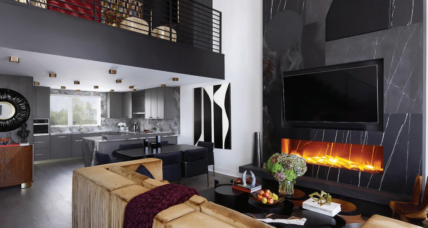
McClain knew he needed something to add a dramatic focal point to the living room while also bridging the wall space from the living room to the loft above, and this custom porcelain slab and leather fireplace was the key. McClain’s love of simplistic but impactful shapes is evident in the fireplace design while also an ode to his love of Mid-Century and Art Deco genres.
The fireplace insert itself is actually water vapor mist; and McClain added selenite logs to create a one-of-a-kind fireplace. The fireplace ledge is cantilevered on the left and extends across to the adjacent wall on the right for additional living room seating.
In the center of the room is a bespoke Industrial glam chandelier that also is easily seen from both the living room and the loft.

A Focus On Surfaces
As you make your way into the kitchen, McClain’s take on a waterfall edge is the angular countertop material backed by brass on the end of the peninsula. “This detail really emphasizes my love of geometry, mixed metals and drama,” he says.

The countertops themselves are actually large-scale porcelain slabs that very realistically resemble real marble through the manufacturing process. In fact, the countertop was the very first selected for the house, says McClain. “It was love at first sight when I spotted these slabs across the stone yard. I knew I had to have them. When I learned the slabs were porcelain, I was doubly pleased. Not only are they overwhelmingly beautiful but also the pinnacle of practicality. I don’t have to worry about placing a hot pan on the counter or surface stains.”
In fact, McClain says he likes to scare his guests by placing a hot pan directly from the oven onto the countertop, only to demonstrate how truly durable it is.
“We have witnessed the full evolution of countertop materials in my lifetime,” he says. “We have seen butcher block or tile turn to laminate, Corian, granite, quartz and now porcelain slab. Each evolutionary step has improved upon the last and as technology and availability advance, so too does the selection and number of brands to choose from.”
“Over the last several years we have seen the large format tile trend explode,” explains McClain. “At this year’s Coverings convention, it seemed a veritable contest as to who could manufacture the largest possible slab. The variety of vendors and designs has also increased exponentially. We saw traditional marble patterns, floral designs, metal inlays and lots of texture. Clients have been very accepting and excited towards this trend as it offers both stunning aesthetics and incredible durability.”
“The lack of grout lines is also an added plus,” he continues. “Our greatest challenge with this trend has been finding fabricators and installers willing to work with this material. Many fabricators do not have the proper equipment, procedures, or knowledge to work with large-format porcelain. Many installers are reluctant to work with any tile larger than 48x48 due to its weight and the requirement for extra workers on the job. We hope as the products gain in popularity and momentum additional companies will adapt and educate their trades to work with this material.”
“We find the type of material selected for the kitchen counter tops often dictates the quality of finishes elsewhere in the home. While granite countertops may have been a high-end selling feature 20 years ago, today we are tearing them out due to preference towards quartz or porcelain slab. While there is still a faction of our clientele who prefer the beauty and uniqueness of natural stone, we do our best to educate our clients on the benefits and challenges of each material type. Marble can be soft and susceptible to pitting and stains. Quartz is highly stain-resistant but cannot be used in high heat situations. Porcelain is both stain- and heatresistant, but there are fewer fabricators familiar working with this product.”

TODAY’S PANELS IN DESIGN

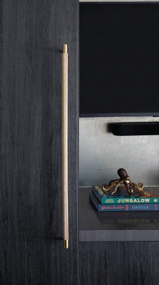
The home’s cabinetry is a fresh take on the Shaker style with smaller-scale door fronts. The refrigerator wall is clad with a charcoal-stained veneer wood
CONTINUED ON PAGE 28 › that also extends around the corner of the kitchen to create an architecturally pleasing design and balance. It is also a trick to the eye to make the kitchen feel larger. The upper and lower cabinets each received different hardware with brass pulls on the bottom and black knobs on the top.

McClain says that paneled walls and surfaces have come a long way, and are being sought out in higher-end projects today for their luxurious and state-of-the-art materials and finishes. “This almost always includes paneling the appliances and creating practically seamless counter tops and back splashes,” he explains. “Very often, in lieu of selecting a contrasting backsplash tile, we create a selfsplash, continuing the countertop material up the walls to produce a unified and dramatic effect.”
“Wood paneling walls have also increased in popularity,” adds McClain. “This is not your grandpa’s den paneling from the 1970s but rather a modern and sleek interpretation, adding texture and interest to your space. The “shiplap” trend of a few years ago may have kick started the creation of new ideas when it comes to paneling. This was quickly followed by wallcoverings made of paper-thin wood veneers in precise patterns, a variety of applied moldings, and the current tambour wood craze we are currently seeing. We predict this trend will advance via large format veneers either book matched much like marble or paneling applied to the walls in Mondrian-like geometric patterns.”

Making our way up to the loft, McClain explains that he designed this space to be a throwback to the swanky lounges of the past. Reds, oranges, golds, and even blues play together to make this color-filled, patterned space unique. Custom cabinetry brings the kitchen design upstairs (both spaces are visible from the living room) while also housing a refrigerator and icemaker for easy cocktails.
FAR LEFT: MCCLAIN’S DESIGN DOESN’T STOP ON THE INTERIOR OF HIS HOME. THE PATIO OFF OF THE LOFT PROVIDES A PANELED PRIVACY SCREEN AND TOUCHES THAT REFLECT HIS STYLE WHILE EMBRACING THE OUTDOORS.
LEFT: PANELED WALLS AND SURFACES HAVE COME A LONG WAY, SAYS MCCLAIN, AND ARE BEING SOUGHT OUT IN HIGHEREND PROJECTS TODAY FOR THEIR LUXURIOUS AND STATE-OF-THE-ART MATERIALS AND FINISHES.
The play on pattern starts at the fully draped wall that not only adds softness and drama, but also camouflages the slider that leads to a patio just off of the loft. The custom hide area rug is a cousin to the drapery panels in color, but instead features small squares and rectangles, overlapping circles made of sustainably sourced cowhides are used. A classic dark red leather chesterfield sofa brings the throwback feel home.

McClain took the opportunity to purposefully combine his home and office in California, using materials and ideas he loves. “In the end, I wanted to create a stunning and cohesive collection throughout the space,” he says. “One that my family and guests find thoroughly comforting and pleasant.” s p
John McClain is the creative director and CEO of John McClain Design, a residential and commercial design firm with offices in California and Florida. He is an associate with ASID and a member of NKBA. He is the author of the book The Designer Within, available on his website and Amazon. McClain also hosts The Designer Within podcast and blogs about design issues on his website: johnmmclaindesign.com

Special moments make memories!
uniboard.com

COLLECTION


