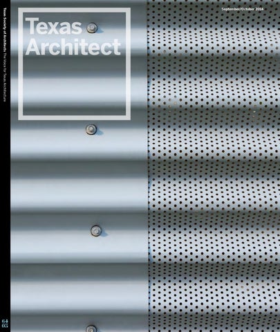
(Preview) Texas Architect September/October 2014: Design Awards

Page 1

Texas Society of Architects The Voice for Texas Architecture

64 05

September/October 2014


75th Annual Convention and Design Expo 6–8 November 2014 George R. Brown Convention Center, Houston

Keynoters Neri Oxman, MIT Media Lab Alex Steffen, IDEO More than 100 continuing education sessions, 30 tours, and a sold-out Design Expo with 275 exhibitor booths Online Registration Ends October 30 Intern and student members receive free registration before October 2 www.texasarchitects.org/convention


Contents Departments

More Online

2014 Design Awards

9

texasarchitects.org

Editor's Note 12

Contributors 15

Of Note 22

An Interview with Brooke Hodge Catherine Gavin

42

66

86

Perforated House Ben Koush

Big Tree Camp Brantley Hightower, AIA

Mestizo City Phil Zimmerman, Assoc. AIA

Calendar

The Vision of Paolo Soleri Charlotte Friedley

25

Recognition

46 (Almost) AllAmerican Home Stephen Fox

70

90

La Hacienda Casitas Michael E. Allex, AIA

Thinkery Ingrid Spencer

Portfolio: Living Walls Christopher Ferguson, Assoc. AIA

50

74

94

121

Green Lantern Alan G. Brake

Pearl Brewery Redevelopment Miriam Sitz

Dallas City Performance Hall Aaron Seward

78

98

Munday Library Gerald Moorhead, FAIA

Hughes Warehouse Adaptive Reuse Jen Wong

82

102

Temple Dining Hall & Booth Student Center Brett Koenig Greig

Zilliant Canan Yetmen

28

Products 33

Essay: Where's the Architecture? Igor Siddiqui

Do Ho Suh Charlotte Friedley

110

Profile: Ron Stelmarski, AIA Audrey Maxwell, AIA 133

Trends and Marketplace 136

Backpage

54 Hog Pen Creek Retreat Frederick R. Steiner

58 Ottmers Residence Jack Murphy, Assoc. AIA

64 05

62 SK Ranch Catherine Gavin

9/10 2014

Texas Architect 5


Placemaking at 500 Chicon

The Placemaking Program at Chicon Street is an opportunity for interested vendors or manufacturers to participate in making the new home of Texas Architects a more sustainable, beautiful environment in order to live up to our mission and meet the 2030 Challenge. This program will allow you to place your product or service directly in front of our membership as they visit our Austin office for meetings and events. As a partner in our Placemaking program you will also be given a menu of benefits to choose from that range in value from $5,000-30,000.

Are you a supplier of any of the following products or services, or ones similar? Exterior Landscaping Lighting Furniture Gates Sunshades Green Power

Interior Window Shades Acoustic Control Lighting/Controls Energy Star Appliances HVAC Zoning

Get more information online: texasarchitects.org/placemakingprogram


Editor's Note The Pool Pavilion is one of four buildings perched on a hillside at SK Ranch by Lake|Flato Architects.

Notes on a Jury

PHOTO BY ROBERT RECK PHOTOGRAPHY.

by Catherine Gavin

T

he 2014 Texas Architects Design Awards jury recognized 16 projects among 221 entries as outstanding examples of design in the state. Jurors Marlon Blackwell, FAIA, of Marlon Blackwell Architect in Fayetteville, Ark.; Andrea P. Leers, FAIA, of Leers Weinzapfel Associates in Boston; Tim Love, AIA, of Utile in Boston; and Mark Reddington, FAIA, of LMN Architects in Seattle collectively emphasized quality and clarity of design intent as they chose this year’s recipients. They also paid attention to and sought out what makes Texas architecture unique. For Blackwell, a fidelity to craft and thought stood out among the award-winning projects. “Things seem to be well resolved and well detailed,” he said. “[There] is not a lot of formal gymnastics, just good, sound building.” He noted
"Here, you have space, and it really gives character to the buildings. They have an amplitude and generosity and relationship to the natural environment." that the awarded projects reflect regional tectonics — stone walls, floating roofs, and the Mesianinspired steel-frameworks typical of the houses — and likened the heavy and light feelings of the buildings to their roots in vernacular sheds and stone homesteads. “We talked a lot about how wood met concrete,” said Love. Strong material

palettes are found throughout the group, from the residences to the institutional and cultural buildings. And while he admitted a twinge of guilt for recognizing so many houses (there are seven of them), it didn’t last long. “It is where architecture with a capital A happens,” he said. For Leers, her impression of Texas regionalism focused on the integration of architecture and landscape. “The projects strike me as generously horizontal in occupying the land,” she commented. “Here, you have space, and it really gives character to the buildings. They have an amplitude and generosity and relationship to the natural environment.” Reddington echoed this sentiment, noting that the group looked for projects that addressed their sites in smart ways. From breathtaking views of the Hill Country to transparency on a city block, they all appropriately and creatively engage their environments. Blackwell concluded that ultimately, the jury sought to identify quality. He said: “The idea or challenge of architecture is to make a really good gesture and then not get in the way of that gesture as you develop [the project] into something tangible, keeping the final outcome as true to the original sketch or idea as possible. When you can do that, in my mind that results in the best projects.”

9/10 2014

Texas Architect 9


Products by Rita Catinella Orrell These green roof and wall options not only allow building owners to visibly demonstrate a dedication to sustainability, but also provide employees and the public with cleaner air, better acoustics, and a generally more pleasant environment in which to work, live, and play.

Tournesol VGM3 Tournesol tournesolsiteworks.com

28 Texas Architect

Tournesol’s VGM3 is a 100 percent recycled plastic planting module attached to stainless steel rails mounted to a wall or structure. Shown here surrounding a rooftop koi pond for a multifamily residential community in Singapore, the modules are available with an optional stabilized growing medium for peak plant performance. A wide variety of plants can be used in nearly any horticultural condition, and each planting module is available with a 4" or generous 8" soil profile. Stainless steel hanging brackets need no screws or fasteners, install quickly on planted modules, and allow for removal and maintenance off site. The rails carry the load and are mounted to either the wall or a framed substructure.

9/10 2014

Versa Wall GSky gsky.com

Designed by Gensler and completed in 2011, this office building in Plano, Texas features 485 sf of GSky’s Versa Wall system designed to be the centerpiece of the building’s cafeteria. In addition to being a talking point, the green wall also provides cleaner air and a calmer environment for employees to relax in. The client wanted to have plant design flexibility, which made GSky’s Versa Wall System a natural fit for the project. GSky’s patented Versa Tray System utilizes 4" potted plants, which means plants can be easily swapped out to add seasonal accents for holidays and special events.

Interior Living Wall System Green Over Grey greenovergrey.com

According to the living wall design firm Green Over Grey, their installation in the new Desjardins building in Lévis, Canada houses the tallest interior living wall in the world. Inspired by views of the St. Lawrence River, the green wall is intended to be a tangible representation of the financial company’s commitment to sustainable development. The green wall system, made of 100 percent recycled water bottles and plastic bags, will provide employees with cleaner indoor air and better acoustics. The 15-story wall is fully hydroponic (i.e., soil-free) and incorporates more than 11,000 individual plants. The building is on track to receive LEED Gold certification after its completion in September 2014.


Tecverde Vertical Gardens GreenGrid System

Poliflor

Green Grid Roofs

poliflor.net/en/

greengridroofs.com

Wall Mounted Screens Greenscreen greenscreen.com

Greenscreen offers planters, wall-hung trellis panels, freestanding trellis panels and fences, and custom planting elements. Approximately 450 sf of greenscreen planted with Honeysuckle was selected for the North Central Community Health Center in Austin. Opened in 2012, the 55,000-sf, LEED Silver clinic was designed by The Lawrence Group with landscaping by McKinney Landscape Architect. Two green wall applications are used at the site: a large, wall-mounted green wall facade, and a smaller, post-mounted freestanding panel. Shown here is the entry walkway adjacent to the parking area.

GreenGrid offers a large palette of vegetative green planting options in a variety of depths and can be customized to fit curves and odd angles. Unlike layered-style and hybrid systems, GreenGrid modules remain modular once they are installed, allowing for easy access to the underlying waterproofing system. For the 10,000-sf Atlantic Wharf project in Boston, completed by CBT Architects and landscape architects Halverson Design Partnership in 2010, Green Grid Roofs provided their standard sedum extensive GreenGrid System and standard intensive GreenGrid system with ornamental grasses.

Tecverde Vertical Gardens, patented by Italian-based Poliflor, can be used for indoor and outdoor applications. The vertical garden system is based on a self-supporting, insulated, and fire-resistant panel. The Poliflor’s Flexiverde system consists of a mat containing an aggregate mix and composed of two layers of special geotextile sewed to create cylindershaped compartments. The gardens have an average depth of 25 cm and can be controlled by an automated system. Shown here is an interior green wall using the Flexiverde Vydro system in the Masemba media company office designed by architect Stefano Riva.

9/10 2014

Texas Architect 29


Membership Benefit Gift Subscription

Did you know? Joining AIA or renewing your membership entitles you not just to your own one-year subscription to Texas Architect, but also to a gift subscription to share with whomever you wish.

Go to www.texasarchitects.org/membergift


Essay Where's the Architecture?

PHOTOS BY GIORGIO ZUCCHIATTI. COURTESY VENICE BIENNALE OF ARCHITECTURE.

by Igor Siddiqui

T

he 14th Venice Biennale of Architecture, titled “Fundamentals,” was curated by the Dutch superstar architect Rem Koolhaas. The international exhibition’s two main venues — the Giardini with its 30 pavilions and the nearly 350-yard-long Arsenale building — contain Koolhaas’s tripartite curatorial scheme. In the Central Pavilion at the Giardini is the main exhibition, “Elements of Architecture,” while the surrounding nation pavilions examine the curator’s theme “Absorbing Modernity: 1914–2014.” Meanwhile, in the Arsenale the highlight is “Monditalia,” a focused sampling of Italy conducted through a series of invited research projects. “Elements of Architecture” underscores the biennale’s explicit orientation toward research. The exhibition scrutinizes 15 building elements — including wall, floor, ceiling, staircase, elevator, and toilet — isolated as fragments according to their individual origins, histories, and mostrecent transformations. Such a curatorial strategy expands upon Koolhaas’s lifelong fascination with the impact of generic products on architecture (in his seminal 1978 book, “Delirious New York,” for example, he examined the influence of elevators, escalators, and air conditioning on the development of the skyscraper), but also echoes the insights of 20th-century critics like Sigfried Giedion and Reyner Banham. Each element occupies a single room, a capsule filled with archival artifacts, prototypes, full-scale mock-ups, videos, illustrations, and an abundance of text. As thorough and compelling as the exhibited material is — crowd favorites seem to be the energygenerating disco floor, the historical collection of

Top The history of door handles is presented in the “Elements of Architecture” exhibit. Right Preservationist Charles Brooking’s collection of 17th–19thcentury English windows is also featured.

9/10 2014

Texas Architect 33


Essay Right “Utopian

Tours,” a collection of paintings and posters shown in the Korean Pavilion, examines architecture’s role in the construction of national identity. Bottom Designed by Alex Lehnerer and Savvas Ciriacidis, the Bungalow Germania is a full-scale reconstruction of a Bonn Republic-era Chancellor’s Bungalow.

34 Texas Architect

9/10 2014

curatorial theme as a comprehensive research project, the installation manages to activate architectural space as central to questions of national representation and identity. Perhaps the most successful examples of research as a generator for spatial experience are found in

the exhibition “Monditalia.” Through a series of focused research projects about Italy, ranging in subject matter from the island of Lampedusa and its role in global migration to the legacy of Italian discothèques, the exhibition presents ample information and data but feels immersive rather than

PHOTOS BY ANDREA AVEZZÙ. COURTESY VENICE BIENNALE OF ARCHITECTURE.

toilet models, and the MIT-developed prototype for a motion-triggered heating system called Local Warming — some may be troubled by the seemingly marginal role that architects have played in the evolution of these elements. For the first time in the biennale’s history, the curator has also taken leadership in determining the direction of the exhibitions in the national pavilions. Koolhaas asked each participating country to reflect upon its own modernization over the past century, with outcomes that vary in criticality, confidence, and curatorial innovation. Standouts include exhibitions in the Korean, Swiss, and German pavilions. The recipient of the Golden Lion for the best pavilion, the Korean exhibition stages a reunification of North and South Korea through a combined collection of projects from both sides of the border. The Swiss Pavilion, curated by Hans Ulrich Obrist, explores the legacies of English architect Cedric Price and Swiss sociologist Lucius Burckhardt in a continuously changing environment that refreshingly feels more like an interactive laboratory than a gallery. The existing architecture of the German Pavilion is meanwhile augmented by the superimposition of the full-scale reconstruction of the Chancellor’s Bungalow, ubiquitous in German media during the Bonn Republic era. Without taking on the


75th Annual Convention and Design Expo 6–8 November 2014 George R. Brown Convention Center, Houston

Keynoters Neri Oxman, MIT Media Lab Alex Steffen, IDEO More than 100 continuing education sessions, 30 tours, and a sold-out Design Expo with 275 exhibitor booths Online Registration Ends October 30 Intern and student members receive free registration before October 2 www.texasarchitects.org/convention


Essay Left Open spaces of the Swiss Pavilion serve as a stage for the presentation of archival documents, workshops, and performances. Bottom “Monditalia” features a series of focused research projects dealing with Italian politics and culture. The fascinating section “Dancing Around Ghosts” is dedicated to discos.

36 Texas Architect

9/10 2014

this biennale has been conceived just as much for reading as for visiting. This may be fitting, given its research-based format and the necessity for broader dissemination. However, in the age of digital technology, such insistence on the printed book’s central status comes across as strangely anachronistic. An architectural biennale that accentuates the presence of graphic design in this way — but also highlights engineered systems, industrial products, and interior components instead of a series of notable buildings — may have one wondering, where’s the architecture? By dissecting buildings into constituent elements, Koolhaas’s exhibition reveals architecture’s inextricable connection to its allied professions and industries, demonstrating just how powerful and enduring design innovations at the scale of repeatable details, components, and parts really are. Their impact, the exhibition argues, is not only on brick-and-mortar buildings, but also on architecture as a body of knowledge. Igor Siddiqui is an assistant professor at The University of Texas at Austin School of Architecture.

PHOTO OF SWITZERLAND’S PAVILION BY ANDREA AVEZZÙ. PHOTO OF “DANCING AROUND GHOSTS” BY GIORGIO ZUCCHIATTI. PHOTOS COURTESY VENICE BIENNALE OF ARCHITECTURE.

didactic. The integration of film, dance, theater, and music festivals with the architecture exhibition — another first for this year’s biennale — contributes to this experience. The spatial treatment of these creative disciplines within the exhibition is somewhat disappointing: Dance performances are contained within clearly marked stages, as are films within conventional projection screens. This is especially surprising considering the innovation with which performances and media have been integrated into the same exhibition spaces for previous art biennales. For those familiar with Koolhaas’s previous research projects, visiting this biennale may seem like walking through one of his extra-large books. “Elements of Architecture” was, in fact, developed as an exhibition after the book had already been conceived, inverting the conventional exhibitionto-catalog relationship. The original book appears throughout the show in different formats: enlarged on a stand, wall-mounted with pivoting pages, and as a series of digital projections. Its omnipresence amplifies the exhibition’s overwhelming reliance on text and contributes to the overall sense that


Placemaking at 500 Chicon

The Placemaking Program at Chicon Street is an opportunity for interested vendors or manufacturers to participate in making the new home of Texas Architects a more sustainable, beautiful environment in order to live up to our mission and meet the 2030 Challenge. This program will allow you to place your product or service directly in front of our membership as they visit our Austin office for meetings and events. As a partner in our Placemaking program you will also be given a menu of benefits to choose from that range in value from $5,000-30,000.

Are you a supplier of any of the following products or services, or ones similar? Exterior Landscaping Lighting Furniture Gates Sunshades Green Power

Interior Window Shades Acoustic Control Lighting/Controls Energy Star Appliances HVAC Zoning

Get more information online: texasarchitects.org/placemakingprogram


2014 Design Awards 42

70

98

Perforated House

La Hacienda Casitas

Hughes Warehouse Adaptive Reuse

LOJO Architecture Ben Koush

bcWORKSHOP Michael E. Allex, AIA

Overland Partners Jen Wong

46

74

102

(Almost) All-American Home

Pearl Brewery Redevelopment

Zilliant

Lantz Full Circle Stephen Fox

Lake|Flato Architects Miriam Sitz

Gensler Canan Yetman

50

78

Green Lantern

Munday Library

John Grable Architects Alan G. Brake

Sasaki Associates Gerald Moorhead, FAIA

54

82

Hog Pen Creek Retreat

Temple Dining Hall & Booth Student Center

Lake|Flato Architects Frederick R. Steiner

Andersson-Wise Architects Brett Greig

From expansive beautiful ranches to an ephemeral, colorful light installation, we are pleased to present the Texas Society of Architects 2014 Design Awards. Sixteen projects were selected from among 221 entries. Collectively, the jury made a point of looking for superior design projects reflective of a regional architectural expression. This year’s jurors were: Marlon Blackwell, FAIA, of Marlon Blackwell Architect in Fayetteville, Ark.; Andrea P. Leers, FAIA, of Leers Weinzapfel Associates in Boston; Tim Love, AIA, of Utile in Boston; Mark Reddington, FAIA, of LMN Architects in Seattle.

58

86

Ottmers Residence

Mestizo City

Vincent Snyder Architects AIA Jack Murphy, Assoc. AIA

Muñoz & Company Phil Zimmerman, Assoc. AIA

62

90

SK Ranch

Thinkery

Lake|Flato Architects Catherine Gavin

Koning Eizenberg Architecture (Design Architect) and STG Design (Architect of Record) Ingrid Spencer

66 Big Tree Camp

Tobin Smith Architect Brantley Hightower, AIA Left John Grable, FAIA,

94 Dallas City Performance Hall

Skidmore Owings & Merrill (Design Architect) and Corgan (Architect of Record) Aaron Seward

designed the fire pit at the Green Lantern as “an innocuous organizer that does not interrupt the view.”

9/10 2014

Texas Architect 41


42 Texas Architect

9/10 2014


2014 Design Awards

Perforated House by Ben Koush

Project Perforated House, Houston Clients Laura and Jason Logan Architect LOJO Architecture Design Team Matt Johnson, AIA; Jason Logan; Josh Robbins Photographer Luis Ayala, AIA

T

he Perforated House, designed by Houston-based LOJO Architecture as firm principal Jason Logan’s own dwelling, is a mash-up of virtuoso formal composition, a multifaceted conceptual program, and some trickedout detailing that comes together in a compelling mix. The house sits on a 50 ft by 132 ft lot in Houston Heights, a community known for its actual and faux-Victorian houses. The two short sides of the lot face east and west, and the long sides face north and south. The house, which is 20 ft by 100 ft, occupies the southernmost portion of the parcel, leaving the northern section open for garden space. The house is almost entirely clad with horizontally corrugated metal sheathing, echoing the texture of the narrow-profile washboard siding on several nearby houses. Houston Heights deed restrictions mandated that the house sit on a two-ft-tall pierand-beam foundation. The steel understructure, which the architects call the “chassis,” allows the front 10 ft or so of the house to cantilever so as not to damage the roots of a mature sycamore tree. The first level of the two-story house is framed in steel, partially exposed inside to allow for a continuous north-facing window wall along the living and kitchen areas. The second story, mostly bedrooms, is framed in wood. Circulation space in the house is restricted to the south-facing side to create a thermal buffer. Windows on that side are reduced as well to avoid heat gain. The garage, opening to an

9/10 2014

Texas Architect 43


alley at the rear of the lot, kicks out to the north to create a triangular open space that is used as a mechanical yard for air conditioning equipment. The Perforated House is literally and thematically perforated. It is a radical reworking of the vernacular southern dogtrot house — historically, two single-room log cabins separated by a breezeway and covered by a continuous gabled roof. From the 1920s through the 1950s, modern architects usually avoided such lowly cultural references. This rigidity relaxed in the 1960s when postmodernists took up the study of signs and realized that historical typologies carried with them some of the most readily digestible content and meaning. In Houston, Renzo Piano’s poetic incorporation of continuous porches at the Menil Collection in the 1980s and Brett Zamore’s Shot-Trot (shotgun + dogtrot) houses of the 2000s were but two of the most publicized examples of this approach, which has now become one of the key strategies of reconciling modernist design with history in Texas. LOJO teases out the underlying logic of the dogtrot building type so much that the result becomes almost the prototype of a new house altogether. Adherents of the “more is less of a bore” theory of design, the architects commented “in the Perforated House, we said ‘if one is good, then four are better,’ quadrupling the dogtrot’s singular breezeway.” They casually stacked and staggered four dogtrots over two levels to ensure they would be in close proximity to the maximum number of rooms. These breezeways are mostly glassed in on one or more sides and become visual

The house is almost entirely clad with horizontally corrugated metal sheathing, echoing the texture of the narrow-profile washboard siding on several nearby houses. extensions of the interior rooms to which they are appended. This creates an almost Loosian series of multilevel, interlocking enclosed and open spaces. (The one seemingly arbitrary design move — raising the floor at the living room a few steps up — was done to enhance this spatial richness and counter what the architects described as the “bowling alley” effect of the long, narrow house.) The exterior of the house continues the perforated theme quite literally. Most of the corrugated metal cladding at the western, street-facing elevation was perforated, with some expense and ingenuity, to shade and screen the entryway and front-facing windows but still allow views out. The architects found perforated flat metal panels that they then had corrugated to match those of the rest of the house. This prominent use of corrugated metal cladding is just one of the latest examples of the “Tin House” movement and the proliferation of the material as Houston’s modern take on regional architecture. In the Perforated House the mix of Hee Haw and the Bauhaus is handled with remarkable assurance by the architects. LOJO has managed to citify a rustic building type and in the process pay homage to Houston’s longrunning Tin House movement. Texas Society of Architects 2014 Design Awards juror Marlon Blackwell, FAIA, summed up the house well when he said, “I enjoy seeing a clearly articulated idea and proposition for the house, in this case perforated not just in the skin but as a mass that allows breezes to go through and also allows for void spaces you can occupy.” Ben Koush is an architect and writer in Houston.

44 Texas Architect

9/10 2014


Opening spread One the four dogtrots in the house doubles as a street-facing front porch lined with a cedar rainscreen. Opposite page top and bottom The breezeways penetrate the house and are visible from the interior. Partially exposed steel framing on the first floor allows for larger than usual north-facing windows, which open onto the garden.

12 9 7

8

2 2 10 1

6

5

4

3

1 11

This page left and right The metal cladding at the front of the house is literally perforated for views outside.

SITE AND FIRST FLOOR PLAN 1 BREEZEWAY 2 ENTRY 3 KITCHEN 4 DINING ROOM 5 LIVING ROOM 6 OFFICE 7 SIDE YARD 8 DECK 9 GARDEN 10 GARAGE 11 MECHANICAL 12 GUEST PARKING

9/10 2014

Texas Architect 45


50 Texas Architect

9/10 2014


2014 Design Awards

Green Lantern by Alan G. Brake

Project Green Lantern, San Antonio Clients George and Lori Becknell Architect John Grable Architects Design Team John Grable, FAIA; Matthew Martinez; Javier Alonso; Krystal Sepulveda Photographer Dror Baldinger, AIA

W

ith clients who embraced progressive design and sustainability, architect John J. Grable, FAIA, had some of the key ingredients for making a strong residential project. Add to this the selection of a difficult site with unrealized potential, and the result is the award-winning house the architect calls the Green Lantern. When his clients were shopping for a house, Grable convinced them to give an existing 1940s ranch-style house another look. The conventional house addressed the street in a conventional way, but ignored the sloping site and views of the flood plain. So Grable taught his clients to see the site differently. “They were willing to go completely modern, but they also wanted to be as green-minded as possible,” he said. So, rather than demolish the existing house entirely, Grable took a more nuanced — and labor-intensive — approach, saving about half of the house and salvaging materials from the demolition to incorporate into the new structure. He relocated the main entry from Crescent Street to Harrison Avenue on the triangular lot. The Green Lantern is a house that reveals itself gradually as the visitor moves through its spaces. “It is a highly episodic house that at first glance seemed like it had almost too many moves for a single-family residence, but the closer we looked the more we liked it,” said Texas Society of Architects 2014 Design Awards juror Tim Love, AIA. “We began to discover that all of those episodes had to do with a very clear idea of how the interior spaces open up to the landscape. And, even more than that, we could start to see that the spatial sequence through the house and the views that you got, even internally, of the architecture were very thoughtful.” Grable compares this nonlinear sequence to music. “We think of this house as jazz, not four/ four time,” he said. The architect’s close attention to the landscape, which includes mature trees, is evident from the start. Visitors climb up a stepped and staggered

9/10 2014

Texas Architect 51


Opening spread The Green Lantern house embraces the landscape and carefully modulates temperatures with sun shading and ample cross-ventilation. The stucco portion of the home, on the left, was part of an original 1940s ranch-style house that was on the site. This page clockwise from top Visitors cross a

bridge over a natural lap pool to enter the house. Inside, glass walls offer expansive views of the sloping site and city beyond. A spiral staircase leads up to one of a series of roof decks, while other roof areas are covered with vegetation or photovoltaics. The architects preserved existing trees on site, which keep the building cool during the day; at night the house glows like a lantern.

52 Texas Architect

9/10 2014


SITE PLAN AND FIRST FLOOR PLAN 1 ENTRY 2 LIVING ROOM 3 OFFICE 4 KITCHEN 5 MEDIA ROOM 6 BEDROOM 7 BATHROOM 8 MASTER BEDROOM 9 MASTER BATHROOM 10 PATIO 11 POOL

11

9

8

1

5

2

3

7

10

6

7 4 6

path to a bridge that passes over a natural lap pool. Crossing the bridge, visitors pass under a set of overhangs and sunshades, which are used throughout the house to mitigate the harsh Texas sun and soften the

Grable took a more nuanced — and labor-intensive — approach, saving about half of the house and salvaging materials from the demolition to incorporate into the new structure. boundaries between indoors and out. Visitors enter a small foyer, which opens into an expansive living and dining area with floor-to-ceiling windows, a room that leads down to a lower sitting area with sliding glass walls overlooking the pool and deck. The extensive use of glass and operable walls allows the house to transform from a series of enclosed rooms to an expansive garden pavilion. The bedrooms are housed in the reused portion of the ranch house, while a second-floor sitting area and a series of roof decks reveal additional views of the landscape and the city beyond. The “green” in Green Lantern can be interpreted in many ways, but sustainability, and energy efficiency in particular, were a priority for both the architect and the clients. Grable used a combination of passive and high-tech

strategies to make the house sit as lightly on the land as possible. Ample crossbreezes and sun shading, oversized ceiling fans, and the house’s thermal mass allow the house to remain comfortable into the early afternoon without air conditioning. The multi-plane roof is covered with a combined assortment of photovoltaic panels, which provide approximately 65 percent of the house’s electricity, and green roofs, which add to the passive cooling strategy and absorb runoff. Other materials include concrete with fly ash and sustainably harvested woods. The project is aiming for LEED platinum certification. The movement of air and the shifting of light through trees and sun louvers create a constantly changing and highly sensory experience. The material palette mixes industrial materials concrete and steel with warm woods, but many of the concrete surfaces are left rough, showing their board forms or leaving aggregate exposed. This tactility adds to the rooted feeling of the house. “The Green Lantern, I thought, was in many ways a great way to take a rather large house and create a more elastic relationship between the interior and the exterior through the way in which he uses the frame to lighten spaces to bring the outside in,” said juror Marlon Blackwell, FAIA. “It has an ephemeral quality, which is unusual for a house of this scale. It almost disappears into the site.” Alan G. Brake is executive editor of The Architect’s Newspaper.

9/10 2014

Texas Architect 53


2014 Design Awards

Pearl Brewery Redevelopment by Miriam Sitz

Project The Pearl Brewery Redevelopment, San Antonio Client Silver Ventures Architect Lake|Flato Architects Design Team David Lake, FAIA; Jonathan Card, AIA; Jonathan Smith, AIA; Marc Toppel, AIA; Todd Wascher, AIA; Jeremy Fields; Chris Krajcer; John Byrd, AIA; Graham Beach, AIA ; Lewis McNeel, AIA; Raina Tilden Photographers Casey Dunn Photography and Lara Swimmer

I

n crafting the redevelopment master plan for the historic Pearl Brewery, Lake|Flato Architects catalyzed the revitalization of a previously neglected section of San Antonio’s urban core. The highly successful project strikes a delicate balance at the intersection of past and present, form and function, and residential and commercial spaces. The Pearl’s origins date back to 1881 with the founding of the J.B. Behloradsky Brewery. After decades of beer production, the facility closed its doors in 2001, leaving a sprawling 22-acre campus vacant on the northern edge of downtown San Antonio. Silver Ventures purchased the property and in 2002 commissioned Lake|Flato to begin planning for the area’s transformation into a vibrant mixed-use development through strategic repurposing of historic buildings and thoughtful new construction. The growing mixed-use village currently includes 340 residential units, 115,000 sf of office space, 70,000 sf of retail space, 50,000 sf of restaurants, 40,000 sf of event space, and 60,000 sf of educational space. Construction is underway in the iconic 1894 brewhouse for two additional restaurants,

74 Texas Architect

9/10 2014


9/10 2014

Texas Architect 75


Opening spread Native plant xeriscaping, a reconstruction of an historic welcome sign, and Il Sogno restaurant flank the north entrance to the complex. Il Sogno's new building was constructed to mimic an original granary facility, and water catchment cisterns, such the one visible to the right, irrigate the complex's landscaping. This page left and right The mixed-use Lab Building houses offices on the upper two floors and street-level retail and restaurants. Salvaged gears have been repurposed as decorative details in the spandrel panels.

a meeting facility for 500, and a 120-room boutique hotel. Beyond the borders of the complex, the Pearl has attracted additional urban infill, with independent residential and commercial projects rapidly surrounding the periphery of the complex. For more than a decade, Lake|Flato has served as urban designer of the Pearl. An initial historic survey of the property by Ford, Powell & Carson Architects and Planners determined some 250,000 of the 400,000 sf of existing buildings to be “worthy of adaptive reuse and historic in nature,” explained David Lake, FAIA, founding partner of Lake|Flato. “Then, we found uses that were compatible with the buildings,” he said, citing two of the site’s initial successes: the Pearl Stable event center, a round building that formerly housed the brewery’s draft horses, and the Full Goods Warehouse, a modern reinterpretation of an existing storage building that recalls the district’s industrial past. The material palatte selected for new buildings — D’Hanis brick and terra cotta — contrasts with the yellow brick of older buildings and reinforces the idea of the complex developing over time. “The new structures complement the old warehouse buildings,” said Lake. “They’re not in competition with the yellow brick of the historic architecture.” Texas Society of Architects 2014 Design Awards juror Marlon Blackwell, FAIA, noted: “These newer buildings happily defer to the old. They don’t try to get in the way, and there’s really a condition of resonance between them.” Likewise, the scale of the original structures dictates modern-day development. “We determined a critical height from one of the tallest parts of the brewhouse and decided new residential buildings shouldn’t be higher than that,” said Lake. Throughout the grounds, rainwater harvested from four on-site catchment receptacles irrigates the landscaping, which was designed by Rialto Studio. Home to one of the state’s largest solar energy projects, the Pearl Brewery employs low-level illumination techniques to reduce light pollution, and three of the newly constructed or renovated facilities, including the Full Goods Warehouse, are LEED Gold

76 Texas Architect

9/10 2014

Restaurants, retail properties, and outdoor spaces throughout incorporate artifacts from the bygone days of the brewery into their interior design. Certified. Within the complex, street widths were decreased to promote pedestrian traffic, and juror Tim Love, AIA, commented on how the “network of open spaces [creates] a level of surprise and prospect as you move through the district.” Lake|Flato also designed the terminus of the Museum Reach extension of the San Antonio River, which borders the Pearl Brewery to the west. “We suggested that the developer contribute land to the San Antonio River Authority,” explained Lake, which allowed for the creation of a series of waterfalls and a 300-by-80-ft wetlands area and lake that seamlessly integrate with the riverside stage of the Pearl Amphitheater. Restaurants, retail properties, and outdoor spaces throughout incorporate artifacts from the bygone days of the brewery into their interior design. “Our goal is to emphasize the authenticity of these places,” said Allen Sikes, design and construction manager for Silver Ventures. “We want these buildings to be brought back to life and used — to respect the history, but celebrate it and allow people to really enjoy it.” Juror Andrea Leers, FAIA, noted the “real sense of vitality and energy within the grouping,” which has aided in the growth and redevelopment of the surrounding neighborhoods. Lake|Flato’s master redevelopment plan for the Pearl Brewery motivated the intelligent and cohesive restoration of a historically significant area. “It really enriches in a meaningful and important way that whole section of the city. It relates to the River Walk, it reuses some existing buildings, it creates new public exterior space, and it adds in new infill,” said juror Mark Reddington, FAIA. “It all adds up to this really terrific project.” Miriam Sitz is a student at the Columbia University Graduate School of Journalism.


This page clockwise from top left Patios pro-

vide an industrial-inspired setting for al fresco dining. A network of connected but open breezeways enjoy natural light from the roof monitor, and in a nod to the industrial past of the brewery, the artistic circular light fixtures were made from filters used in the brewing process. In the Can Plant Apartments lobby, decorative touches like metal gates and intricate tilework were modeled after similar details found in the historic brewery.

PEARL BREWERY SITE PLAN NEW BUILDINGS RENOVATED BUILDINGS EXISTING BUILDINGS

9/10 2014

Texas Architect 77


94 Texas Architect

9/10 2014


2014 Design Awards

Dallas City Performance Hall by Aaron Seward

Project Dallas City Performance Hall, Dallas Client City of Dallas Architects Skidmore, Owings & Merrill (Design Architect) and Corgan (Architect of Record) Design Team Skidmore, Owings & Merrill: Jeffrey J. McCarthy, FAIA; Leigh S.

Breslau, AIA; Nancy A. Abshire, AIA; Gabriel Wong, AIA; D. Stnton Korista; Corgan: Brian George, AIA; R. Kirk Johnson, AIA; Will Mitchell, AIA; Rachel Wittman Photographer Hedrich Blessing Photographers

A

mongst its neighbors in the Dallas Arts District, the Dallas City Performance Hall, the first phase of which opened in 2012, appears staid, even conventional. But a closer look reveals an elegant, orderly composition of spaces rendered in a few straightforward materials that is easy to understand, comfortable to use, highly functional, and economical enough to have been fully funded by a city bond program. The Chicago office of Skidmore, Owings & Merrill, in collaboration with the Dallas office of Corgan, worked with the City of Dallas to determine the program for the performance hall. It had to serve the needs of a revolving cast of small- to medium-sized performing arts groups, handling everything from Broadway shows and jazz performances to symphonies and choral recitals. In order to complete the building in a timely and budget-conscious way, the team decided to divide the project into two phases. Phase One includes a 750-seat proscenium theater, an airy lobby with room for receptions and small performances, backstage support spaces, and an event space on the balcony level. Phase Two will include two smaller theaters, an art gallery, a cafe, and rehearsal and classroom spaces. In plan, City Performance Hall’s support spaces are arranged around the theater. “The layout originated from the interior of the hall itself,” says R. Kirk Johnson, AIA, director of sustainable design at Corgan. “It is a European shoebox theater, basically a rectangular-shaped volume with flanking support spaces.” Theater consultant Schuler Shook and acoustic consultant Jaffe Holden determined the volume and sightlines of the interior of the hall and worked

9/10 2014

Texas Architect 95


with the architects to design the materials and surfaces to ensure the highest quality acoustical performance. In order to make the space flexible enough to handle amplified music, which requires absorption of sound waves, and acoustic music, which requires dispersal of sound waves, the team employed a dynamic system of 13 wool serge banners. The banners, which are double-layered with an air gap, can be rolled out for amplified performances or folded up for acoustic ones. White oak panels in the ceiling are set at an angle that is mathematically determined to optimize the movement of sound through the space. The stage is also equipped with wooden reflectors that help project sound out into the house. The team worked together to design the wooden seating and the blackened metal railing, all for best acoustic performance, and separated the balcony from the wall in order to keep sound moving around the space. The predominant material of the building — you can tell this at 1,000 yards — is concrete, and it is used everywhere for both structural and architectural purposes. In most places, the walls are 18 in thick, though that goes down to 12 in thick in certain interior sections. Inside the hall, the team took advantage of the material’s highly valued plastic properties to create an acoustical surface by using a variegated board-forming tech-

FLORA STREET

1

The entire space looks out on Flora Street through full-height glass walls, reminding visitors of their relationship to the arts district and the city. ROUTH STREET

JACK EVANS STREET

2

3

4

5

5

6

9 7 5

8 7 5

ROSS AVENUE SITE PLAN AND FIRST FLOOR PLAN 1 LOWER LOBBY 2 UPPER LOBBY 3 HALL 4 STAGE 5 STORAGE 6 GREEN ROOM 7 DRESSING 8 WARDROBE 9 LOADING

nique that leaves random impressions in the surface. The resulting finetooth grain of the expression is highly textural and helps disperse sound throughout the hall. The heavy mass of the concrete walls also helped the facility achieve an NC15 acoustical rating, an exacting classification that renders the hall deaf not only to the building’s mechanicals (an under-floor ventilation system, by the way) but also to jetliners taking off and landing at nearby Love Field. The concrete/white oak/blackened metal theme continues throughout the building’s public and circulation spaces, which front and flank the hall. The lofty lobby space juxtaposes two prime design moves of the hall’s interior: The wooden panels in the ceiling are fabricated in the variegated “board-formed” expression, while the walls are smooth. The entire space looks out on Flora Street through full-height glass walls, reminding visitors of their relationship to the arts district and the city. The Texas Society of Architects 2014 Design Awards jury commended the project as a well-resolved theater and a successful urban building. “Much of the lightness that you find on the exterior, you also find on the interior,” noted Marlon Blackwell, FAIA. “They are really in dialogue with each other.” Juror Andrea Leers, FAIA, appreciated the building’s rigor, while Mark Reddington, AIA, described the project as a “terrific execution of an idea of how to put an arts performance space in an urban setting.” “We wanted to enhance visual connectivity to the neighborhood,” says Johnson. “We felt like we had an opportunity to delineate an urban edge and ground it to the streetscape, to create a gateway into the arts district. Ultimately, what we selected was to have public circulation be very visible, with lots of daylight, and framed views to the exterior.” Aaron Seward is managing editor of The Architect’s Newspaper and editor of its Southwest edition.

96 Texas Architect

9/10 2014


Opening spread While the theater and acoustical consultants determined the layout of the theater, the architects selected the materials — concrete, white oak, blackened steel — and worked out a variegated board-forming technique for the interior of the hall, producing a textured wall surface that keeps sound moving throughout the space. This page clockwise The circulation and other public spaces use the same material language as the interior of the hall. The stage and fly loft provide flexibility for a number of different performances. The variegated texture of the interior walls is reflected in the ceiling panels of the lobby. The performance hall looks out onto Flora Street through full-height glass walls. The wood panels in the theater ceiling are angled for ideal acoustic performance.

9/10 2014

Texas Architect 97


Membership Benefit Gift Subscription

Did you know? Joining AIA or renewing your membership entitles you not just to your own one-year subscription to Texas Architect, but also to a gift subscription to share with whomever you wish.

Go to www.texasarchitects.org/membergift


Experimental and unique systems define Austin-based Ten Eyck Landscape Architects’ elegant living walls. With projects in a variety of climates, the firm excels at creating site definition perfect for its context.

Portfolio: Living Walls 110 Ten Eyck's Vertical Gardens

Christopher Ferguson, Assoc. AIA

9/10 2014

Texas Architect 109


Portfolio

LIVESTRONG FOUNDATION SECTION SCREEN WALL AT BUILDING 1 SCREEN WALL 2 WINDOW 3 ARBOR 4 PLANTING AREA 5 MASCAGNIA MACROPTERA VINE 6 SALVAGED CONCRETE WALL 7 COURTYARD 8 PARKING AREA

2

3

1

5

4

7

6

8

Ten Eyck's Vertical Gardens by Christopher Ferguson, Assoc. AIA

Ten Eyck's genius is in blending the transition between architecture and garden through clever reinforcement of natural systems that offer shade and water. cast-concrete fountain rests in a planting area, waves of water lapping over its edges gently as if to whisper a tune complementary to the quiet hum of street traffic beyond. A salvagedconcrete seat adjacent to the fountain is cool to the touch. Surrounded by young trees, it offers a moment of intimacy, removed from the main circulation path that defines the entry to the building. A simply detailed, steel vine wall (developed in collaboration with Lake|Flato Architects) chases one side of the facade, stop-

110 Texas Architect

9/10 2014

ping just short of the fountain and turning at a right angle to provide another small courtyard space defined by a playful porosity. On the most oppressive of summer days the garden thrives, thanks to the sensitive planning and planting of Christy Ten Eyck and Ten Eyck Landscape Architects of Austin. Over 17 years, the practice has built up a diverse portfolio of projects that vary by scale, locale, and program. Yet there is a consistency in this body of work that stems from a fundamental desire for regional placemaking. Spaces are organized to facilitate social interaction and proportioned to feel comfortable. Ten Eyck’s genius is in blending the transition between architecture and garden through clever reinforcement of natural systems that offer shade and water. The vine screen at the Livestrong Foundation is a compelling testament to those ideals, just one of several successful “living wall” systems Ten Eyck has implemented in recent years. Its webbed, steel mesh, which disappears when viewed from a distance, allows the native vines a foothold to hover, drape, and dangle. The result is a composition that feels

HAND DRAWING BY CHRISTINE E. TEN EYCK, COURTESY TEN EYCK LANDSCAPE ARCHITECTS.

It’s about 20 paces from the sidewalk to the glassy entrance of the Livestrong Foundation’s corporate headquarters in East Austin, but even in that short distance, people are often overcome by a great temptation to simply sit and stay awhile. Dappled sunlight filters through a canopy of leaves overhead, while a low,


Opposite page Sketch of the living wall at the Livestrong Foundation in Austin. This page clockwise

vine wall and layered planting at the Livestrong Foundation provides protection from the adjacent parking lot, creating a cool and comfortable courtyard patio. At the Phoenix Convention Center, three steel saucers connected by a bronze rain chain are a playful way to irrigate the living wall using water harvested from the building's air-conditioning units. The living wall creates a lush backdrop to this urban plaza and integrated seating design.

PHOENIX CONVENTION CENTER DRAWING COURTESY OF TEN EYCK LANDSCAPE ARCHITECTS. COMPLETED IN COLLABORATION WITH A DYE DESIGN, LANDSCAPE ARCHITECT OF RECORD FOR THE PROJECT. PHOTOS BY BILL TIMMERMAN.

from top left The

both celebratory and understated, a backdrop for courtyard activity while also a showpiece for the plantings themselves. This idea resurfaces at the Phoenix Convention Center in Arizona, here incorporating a novel water-harvesting system fed by condensate from the building’s air-conditioning units. Three enigmatic steel saucers connected by a bronze rain chain are poised atop one end of the gently sloped wall, a whimsical gesture that further emphasizes the point of water collection. The assembly of the vertical gabion wall below allows red granite rocks to conceal an inner cavity of lightweight planting soil, seed mix, and filter fabric. Three-inch steel pipes puncture the layer of granite at random, serving as plugs that easily receive native plantings. Once inserted, the vegetation is irrigated with harvested water and left to overtake the surface area of the wall at its own discretion. A second seep-wall system can be found in nearby Mesa, Arizona, at Arizona State University’s Polytechnic Academic Campus. Here, Ten Eyck addressed a need to return the ecological function of water flow to the

1 2

PHOENIX CONVENTION CENTER SECTION RAINWATER AND CONDENSATION SEEP WALL 1 TROUGH 2 RAIN CHAIN 3 CONCRETE WALL 4 STEEL PIPE PLANT PLUG 5 ROCK FILL 6 ENKAMAT ATTACHED TO WIRE MESH W/ PLASTIC ZIP STRIPS 7 WIRE CLOTH MESH PANEL 8 RAISED PLANTER 9 SEATWALL 10 BLOCK-OUT DRAIN 11 LIVING WALL SOIL MATRIX

4 3 11

5

6 7 7

9 8 10

9/10 2014

Texas Architect 111


Portfolio

ASU POLYTECHNIC CAMPUS SECTION BIO-SEEP WALL 1 WOVEN WIRE CLOTH 2 LIVING WALL SOIL MIX 3 IRRIGATION LATERAL 4 ENKAMAT ATTACHED TO WIRE 5 COMPACTED GRAVEL 6 CONCRETE FOOTING 7 DECOMPOSED GRANITE 8 NATIVE PLANTS 9 STEEL POST 10 STEEL PIPE BRACE

site, which suffered constant flooding prior to intervention. By organizing four comfortable courtyards around academic programs that feature outdoor learning areas and a performance area, the once-paved-over, 21-acre former air force base was transformed into an

Ten Eyck’s living wall systems are characterized by a sense of delight and restraint, a timelessness imbued with the values of their contexts.

112 Texas Architect

9/10 2014

Christopher Ferguson, Assoc. AIA, is an architectural designer at Andersson-Wise Architects in Austin.

1

2

9

9 4 10

8

7 5

6

PHOTOS BY BILL TIMMERMAN.

“oasis of learning” that capitalized on reinterpreted natural forms such as tinajas (depressions in bedrock formed by running water, often below waterfalls), arroyos (dry, flat creek beds that fill during heavy rains), and seeps (areas where groundwater reaches the earth’s surface) to channel storm water with elegance and efficiency. Today, populated by native canyon plantings and a bioremediation pond, the Desert Riparian Wetland Court features the free-standing 52-foot-long seep-wall as the sunken courtyard’s centerpiece.

Back in Austin, the desire to retain water is replaced by the need to retain earth at a Tarrytown residence. The new home, resting on a small hill and bounded by a tricky site, received a series of lush, terraced gardens in order to navigate a grade change that allowed a curved, gravel and concrete drive to conceal a sub-level, front-facing garage and half basketball court. Instead of loadbearing rock, a trinity wire basket and tie-back system used soil and planting material to retain earth. This enabled the surface area of the wall to be completely planted to prevent erosion and aesthetically soften the vertical surfaces. Ten Eyck also restored a neighboring creek bed with riparian planting and added a floating, circular ipe wood deck and winding retaining wall planted with maidenhair fern and columbine. Ten Eyck’s living wall systems are characterized by a sense of delight and restraint, a timelessness imbued with the values of their contexts. Yet the living walls remain just one outlet for this office’s brand of sensitive place-making, and these spaces, like Ten Eyck itself, are worth revisiting time and again.

3


Opposite page left and right At Arizona State University's Polytechnic Academic Campus, a bio-seep wall rises behind a circular concrete harvested water feature and bench in the Desert Riparian Wetland Court. The palette of regional plantings is employed thoughtfully throughout the project, creating a collage of scales, colors, and textures.

1

2

8

8 3

PHOTOS CLOCKWISE FROM TOP LEFT BY LISA LENNON, PAUL HESTER, AND JUDEEN TERREY.

4

This page clockwise from top left In Austin

at a Tarrytown residence, Ten Eyck utilizes a trinity basket and tie-back system to retain the earth in a way that allows the vertical surfaces to receive planting. The arcing driveway of gravel and concrete is highlighted by the lush layers of the living walls. The terraced approach to this landscape solved several grading issues with layers of texture and soft planting.

5

6

9

7 TARRYTOWN RESIDENCE SECTION STEEL MESH BASKET RETAINING WALL 1 TRUSS WALL CAP 2 PLANT PLUGS 3 SOIL NAIL 4 BACKFILL W/ APPROVED TOPSOIL AND SEED MIX 5 NATURAL/UNDISTURBED SUBGRADE 6 CONCRETE DRIVEWAY 7 COMPACTED SUBGRADE 8 STEEL MESH RETAINING WALL/TRUSS WALL 9 PEA GRAVEL JOINT

9/10 2014

Texas Architect 113


75th Annual Convention and Design Expo 6–8 November 2014 George R. Brown Convention Center, Houston

Keynoters Neri Oxman, MIT Media Lab Alex Steffen, IDEO More than 100 continuing education sessions, 30 tours, and a sold-out Design Expo with 275 exhibitor booths Online Registration Ends October 30 Intern and student members receive free registration before October 2 www.texasarchitects.org/convention


Profile: Ron Stelmarski, AIA A Cultural Shift written by Audrey Maxwell, AIA photography by Perkins + Will Dallas and Julie Pizzo Wood

The Perkins+Will (P+W) Dallas lobby offers a crisp, vaguely corporate feel. Step into the office of Ron Stelmarski, AIA, however, and you’ve entered another realm. The walls are plastered with hand sketches, renderings, and inspirational clippings. Catalogs of the firm’s work are stacked haphazardly on shelves, models vying for any remaining space. Peel back the layers, and you might find the anonymous white walls of the original office. Stelmarski is unapologetic. Indeed, he seems to revel in the seeming disarray. As it turns out, this is exactly why he was brought to Dallas: to shake up a tidy, straightlaced office that had high profits but inconsistent design standards. By 2011, the former Dallas-based firm of Collins Reisenbichler Architects, which was acquired by P+W in 2002, had built a solid business model. Now, leadership felt, it needed a liberal infusion of design to boost it to the standards of the national P+W brand. The company needed someone with design chops, stamina, and boundless passion. Stelmarski fit the bill. He had spent ten years in the company’s established Chicago office, working on

a diverse array of projects from branding, to skyscrapers, to master plans. There he operated in an environment of high design under the tutelage of Ralph Johnson. Texas, in contrast, resembled an uncharted frontier. Stelmarski became design director of the Texas practice and, once settled in Dallas in 2012, faced the task of transforming the 130person Dallas office and the 30-person Houston

The company needed someone with design chops, stamina, and boundless passion. Stelmarski fit the bill. office. He remembers grappling early on with the enormity of the challenge. How was he going to reverse the mindset? His Southern counterparts were reactive, their efficient processing of projects perpetuating the status quo. He needed to tip the scale toward creativity and mold a new design-focused office culture. Ultimately, he decided to put his words into action. The poster on his door says it all: “The only way to do it is...to do it.”

9/10 2014

Texas Architect 121


Previous page A Chicago transplant, Ron Stelmarksi, AIA, is the design director of P+W Dallas. Right He has pushed the office in a new direction with design at the forefront of the cultural shift.

He set himself to task. “I want to create great, exemplary projects so I can say to everyone: Hitch onto this,” he explained. There was no better way to show the value of good design, he thought, than to amass a collection of successful buildings. His uninhibited zeal has lead to long hours and extreme multitasking. He travels constantly between the offices, trying to keep his

Stelmarski argues that, as the redefined value system takes hold, emphasizing a designbased practice, the cultural balance will continue to shift from reactive to creative. hands in as many projects as time will allow. “I just want us to get to a baseline and then start to get even more creative,” he said of his mission. “Once people here are working on projects that gain notoriety, it will become a feedback loop.” Stelmarski hasn’t stopped there. He is slowly tearing down the walls — both figuratively and literally — in an effort to overhaul office culture. Signs of progress are visible

122 Texas Architect

9/10 2014

everywhere. A portion of one floor has been converted to open office space, fortress-like cubicles replaced with low benching systems. Foam-core boards scattered throughout the office function as interactive pin-up space for employees. Underutilized before, models have resurfaced, and Stelmarski is capitalizing on their collaborative nature. He becomes animated when describing one model for a recent pursuit, one of many traits that indicate his influential leadership: His passion is contagious, clearly contributing to the engagement and galvanization of staff. Stelmarski aspires to develop a pride in ideamaking once again. That will mean both elevating design and making the creative process less intimidating. He has already expanded opportunities for dialogue through regular group discussion and project critiques like the Design Advocacy Group. By encouraging individual input, he hopes staff will stake a claim in the process. He admits they are still a corporate firm, saying: “There’s a certain level of quality that comes with some sameness. Everyone is trying to find their own identity but also make sure it’s not just about them, it’s about P+W.” Stelmarski argues that, as the redefined value system takes hold, emphasizing

a design-based practice, the cultural balance will continue to shift from reactive to creative. Three years after his arrival, a revamped portfolio of P+W buildings is taking shape in Dallas. An office tower for The Richards Group will contribute to the densification of Uptown, while Fire Station 27 adds color to the Park Cities. A new student complex for Bishop

The walls are plastered with hand sketches, renderings, and inspirational clippings. Lynch High School in East Dallas is also under construction. Each is the initial product of an ambitious cultural shift being crafted by Stelmarski, who is out to prove that good design is also good business. Attention remains focused on his progress, yet he remains calm and collected, conceding only slight anticipation: “We’ve had a few years now to let things simmer. What finally gets cooked up and served — you wonder what it’s going to look like. I hope it’s good.” Audrey Maxwell, AIA, is a partner at Michael Malone Architects in Dallas.


Profile: Ron Stelmarski, AIA

This page clockwise from top left Stelmarski encourages model making; the team uses this series of massing studies to quickly test different design ideas. He often draws this sketch when explaining working environments where design is valued. A temporary pinup space, filled with design inspiration, renderings, and project references, now occupies a prominent space in the P+W office.

9/10 2014

Texas Architect 123


Backpage

Heatherwick Studio’s UK Pavilion was completed for the Shanghai World Expo in 2010.

Provocations at the Nasher

O

n September 13, the Nasher Sculpture Center opens its third exhibition dedicated to architecture — previous shows were dedicated to the work of Renzo Piano and Norman Foster. “Provocations: The Architecture and Design of Heatherwick Studio” details the iterative process of the wildly creative London-based firm of Thomas Heatherwick. Jed Morse, chief curator of the Nasher, noted

that the exhibition was something the institution couldn’t pass up. “Heatherwick’s work has such a sculptural sensibility," he said. "It made

136 Texas Architect

9/10 2014

PHOTO BY IWAN BAAN.

“Heatherwick’s work has such a sculptural sensibility. It made a lot of sense to us.”

a lot of sense to us.” Morse and guest curator Brooke Hodge are both pleased with the dynamic breadth of materials in the show. “We wanted to capture how the studio works,” noted Morse. Drawings, models, prototypes, 1-to-1 sections, and films all illustrate the projects. The wealth of materials speaks not only to Thomas Heatherwick’s prolific production but also to the studio’s creative process; Hodge’s emphasis is on representing how Heatherwick and his team think about their projects. “The studio is really like a laboratory for problem solving,” she said. “They start each project with a question, or provocation, and then work through many iterations to come up with the best way to answer that question.” Aptly titled, Provocations runs through January 4, 2015.


Turn static files into dynamic content formats.

Create a flipbook
Issuu converts static files into: digital portfolios, online yearbooks, online catalogs, digital photo albums and more. Sign up and create your flipbook.