Colby Gregory colbygregory.com colby@colbygregory.com @colbyg.jpg 832-472-4961
About Me
Hello! My name is Colby Gregory, and I am a visual design specialist focused on bringing my creativity and love for wildlife to the world. My designs have inspired impactful visuals that communicate a powerful message. I specialize in forms of print media and imagery.

I graduated from Texas A&M University, Corpus Christi with a BA in Graphic Design in May 2023, and have been involved in several local non-profit volunteering opportunities to create rebrand campaigns alongside American Advertising Federation. I was also the President of the Graphic Design Student Association from 2021-2023. I have a huge passion for all things creative, and have done lots of freelance and real work for Corpus Christi- Parks and Recreation, Texas A&M University, and more!
CONTENTS Table of Current Converse Texas Sealife Center San Francisco Zoo Adapt Manifest Canon Magazine Ad Campaign Website Rebrand Campaign Zine Booklet App Catalog
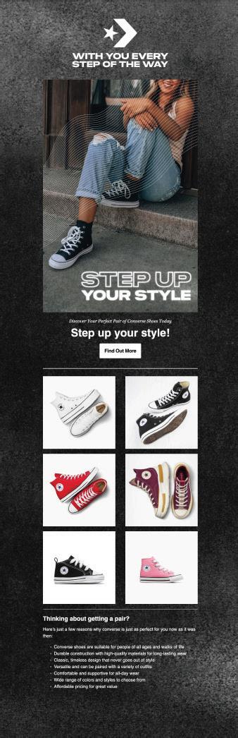
Converse
Ad Campaign
Overview
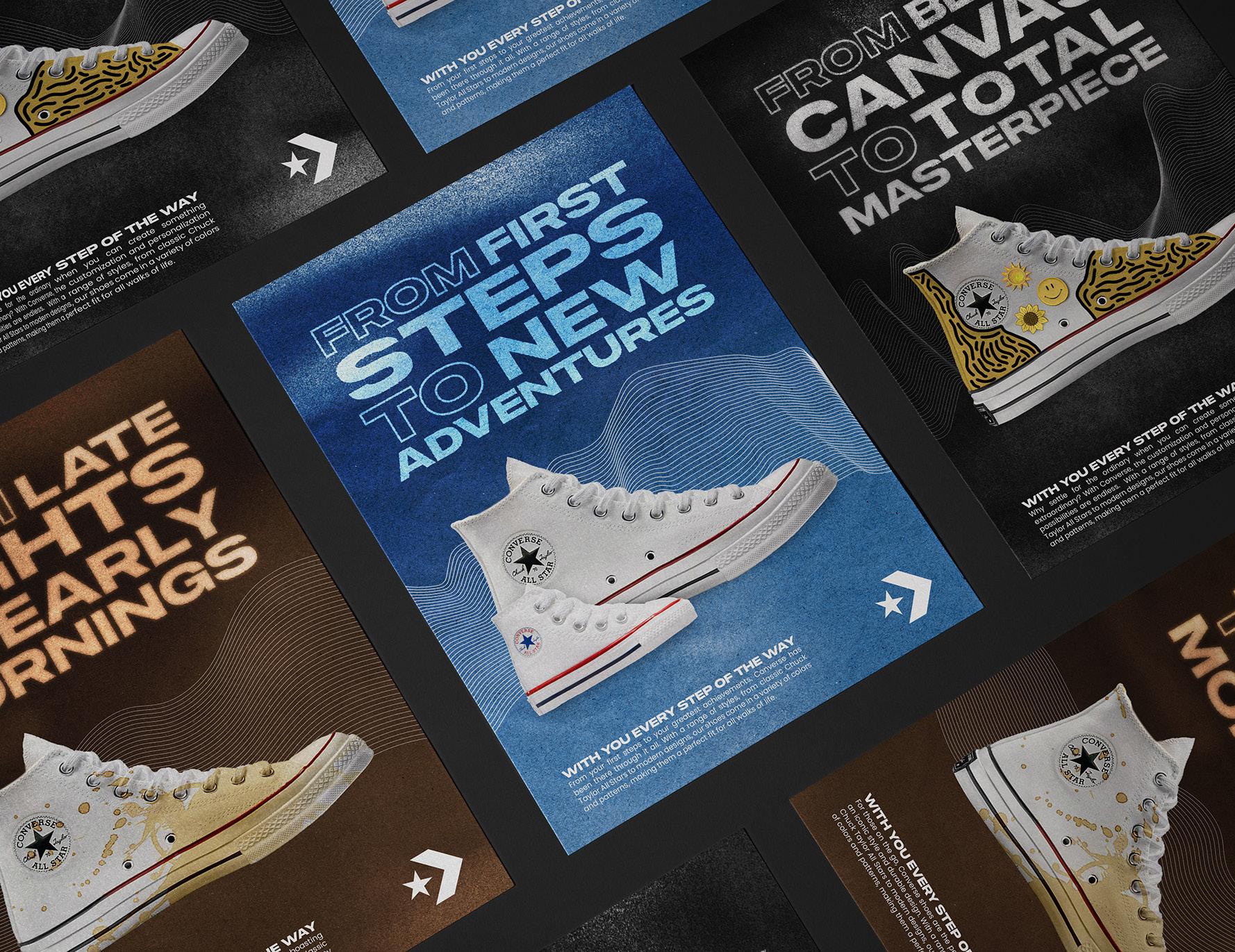
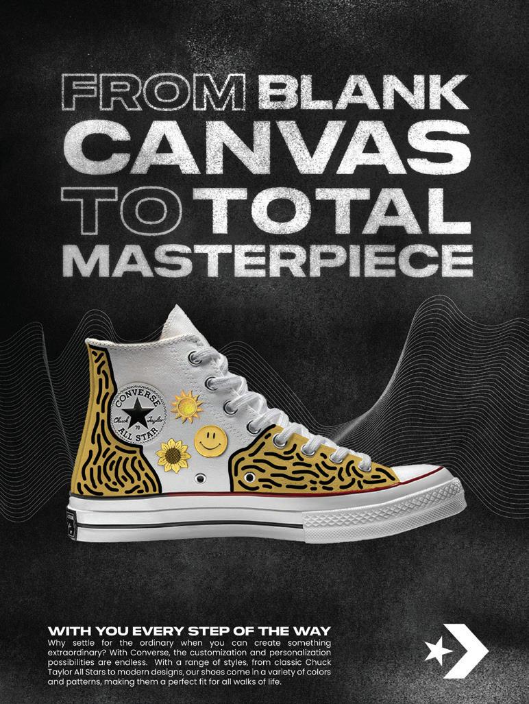
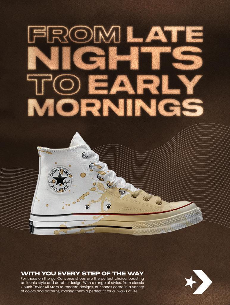
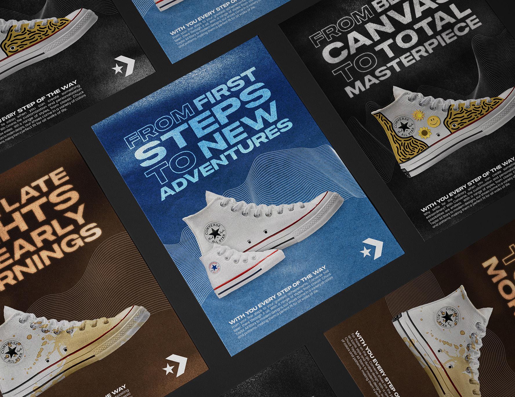
To create an emotional and engaging advertising campaign that showcases how Converse has been a reliable and supportive brand for people as they grow up and experience major moments in life.
Solution
The key message of the campaign is that Converse has been with people every step of the way as they grow up and face significant milestones in life. The brand has been a constant companion and has provided comfort, support, and style throughout the journey. The tagline “With You Every Step of the Way” will be the central message of the campaign. It will be prominently displayed in all ads and serve as a reminder of how Converse has been a constant and reliable presence.
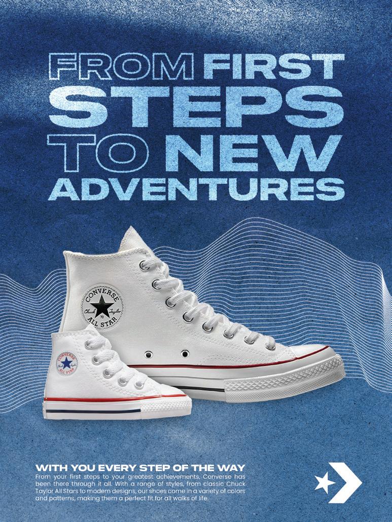
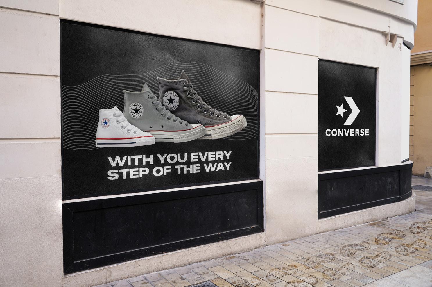
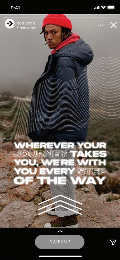
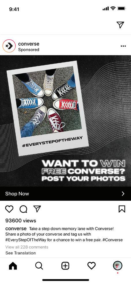

Converse Campaign Print Ads Store Signage Social Media
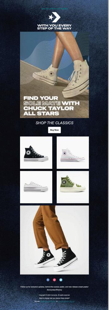
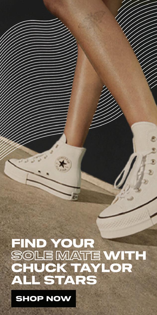


Mailchimp Digital Banner Ads
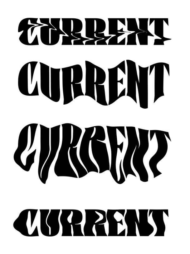
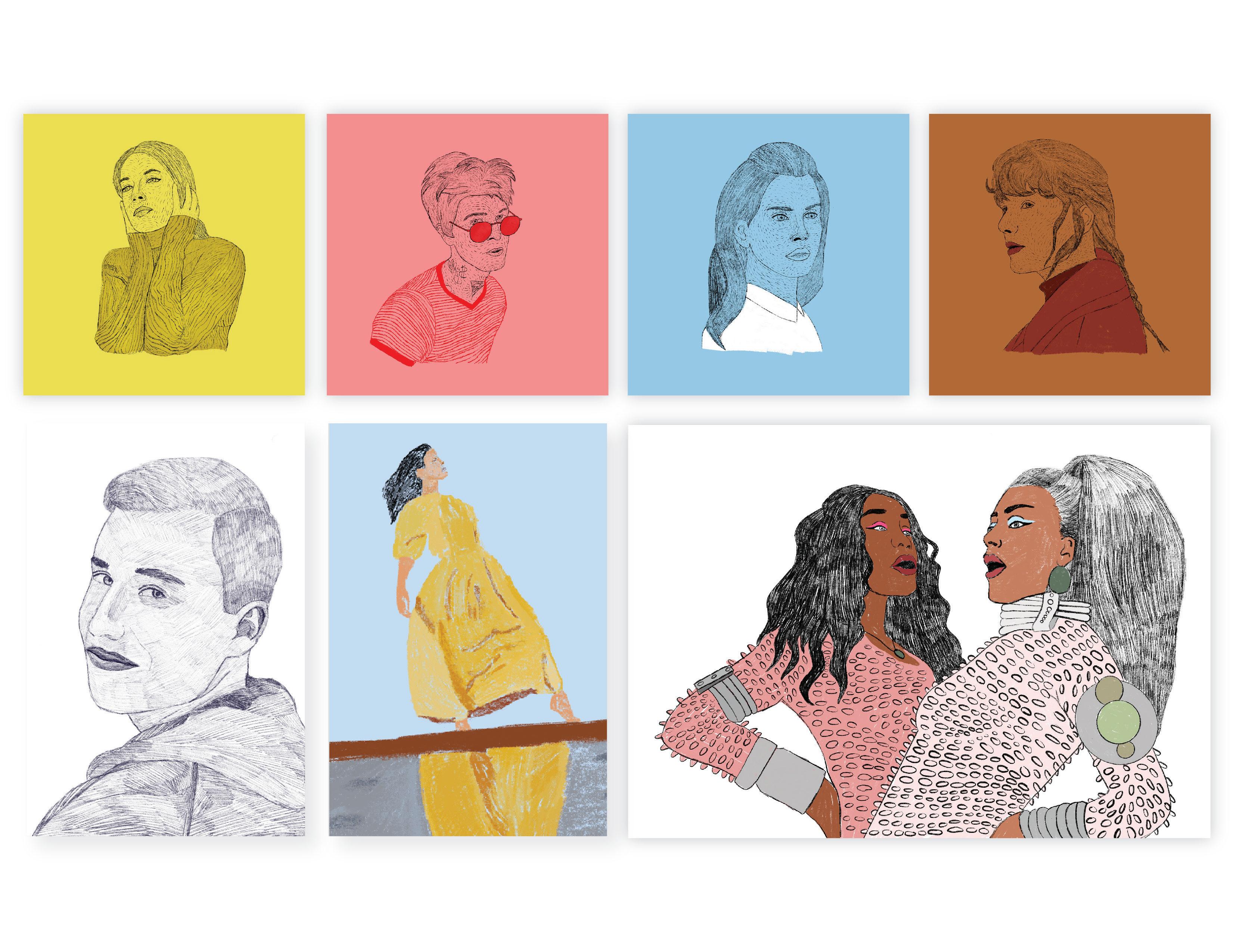
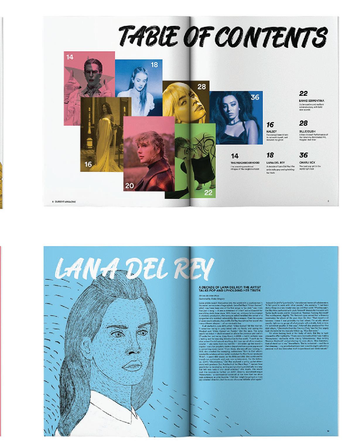
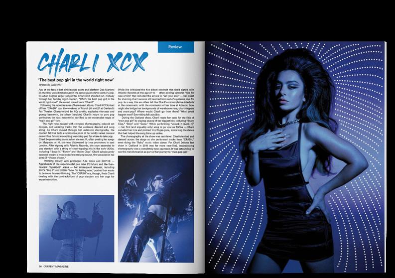
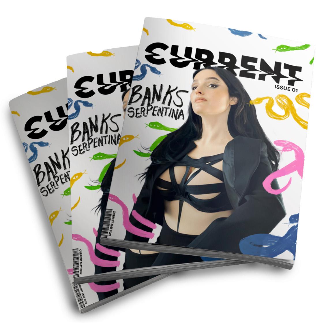
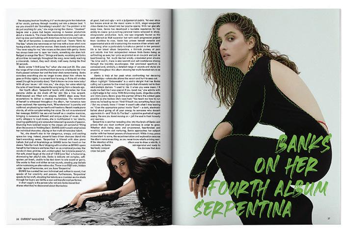
Current
Magazine
Overview
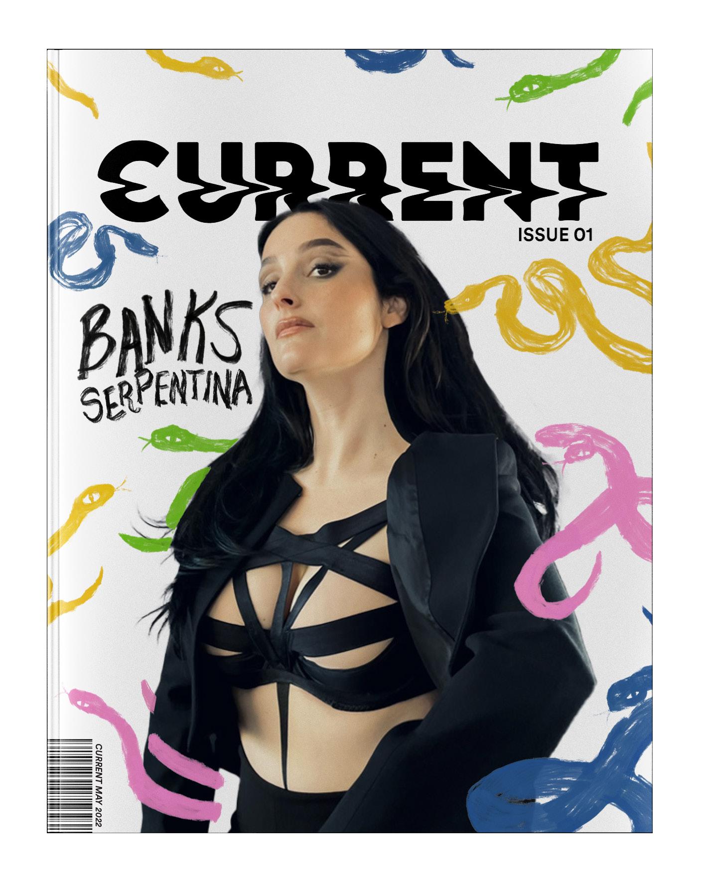
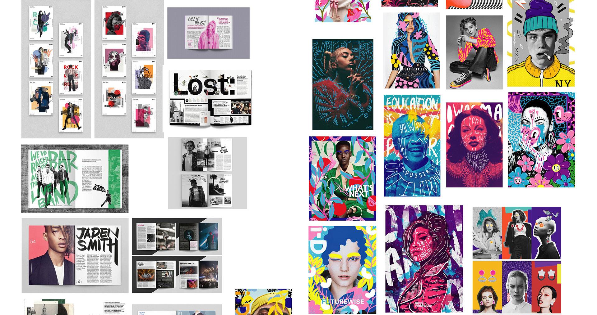
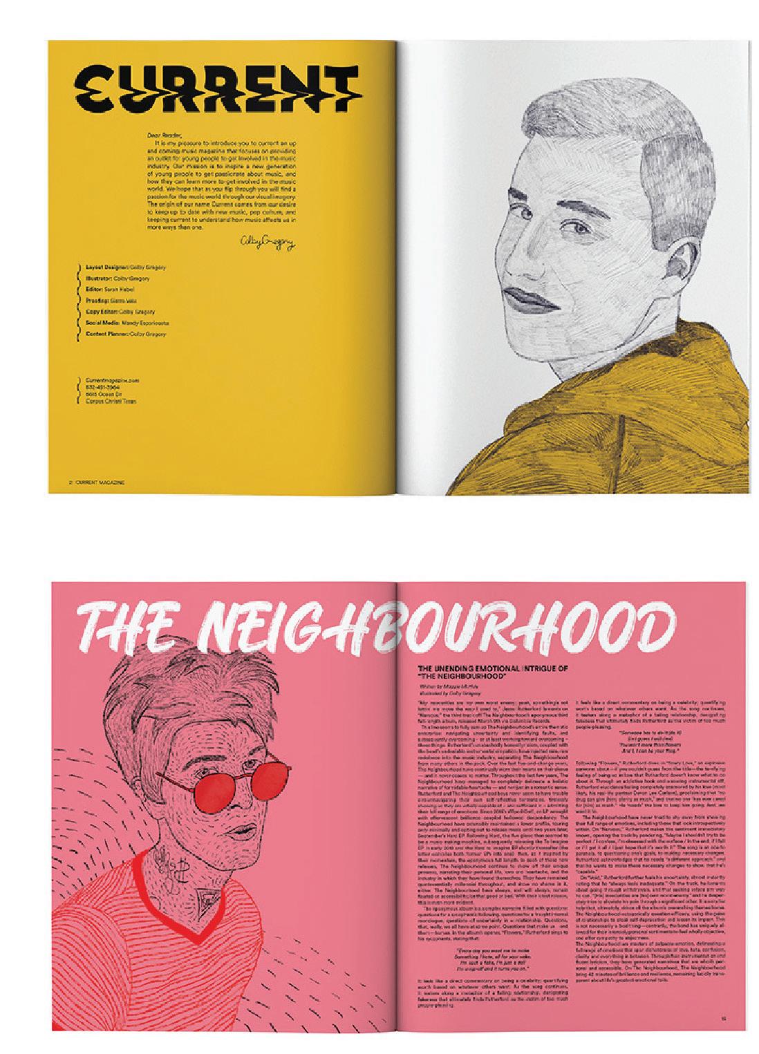
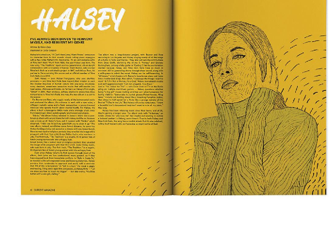
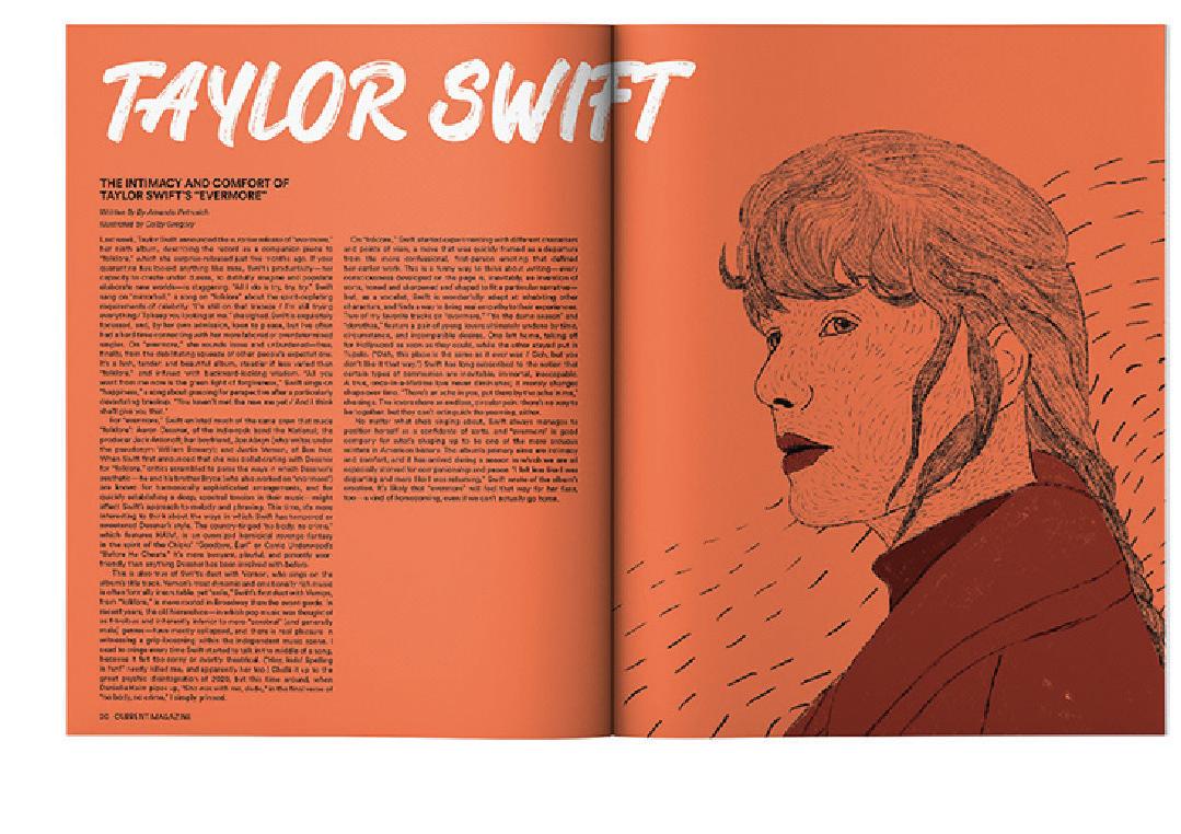
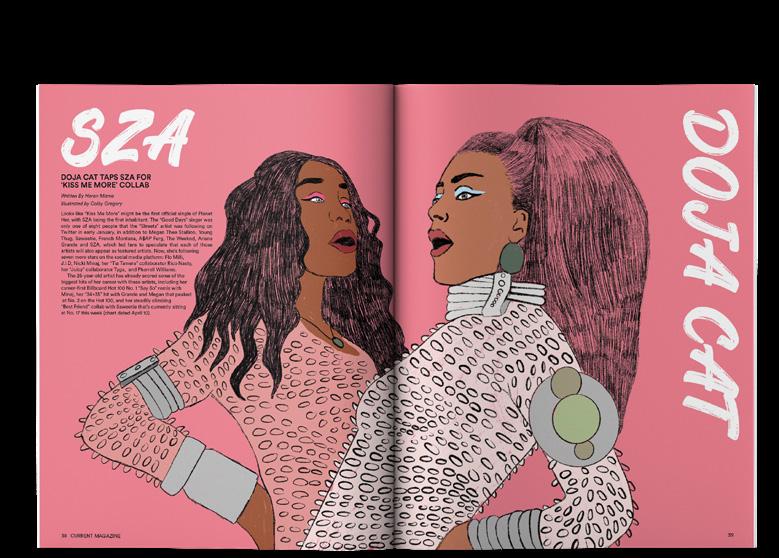
Current Magazine is a music magazine created for a younger audience that may feel out of place in the music industry. Large music publications often will shy away from talking about women, pop music, and new topics. Current, just like its name, was created to solve this issue and to get more young people to read about their favorite digital music artists in print.
Solution
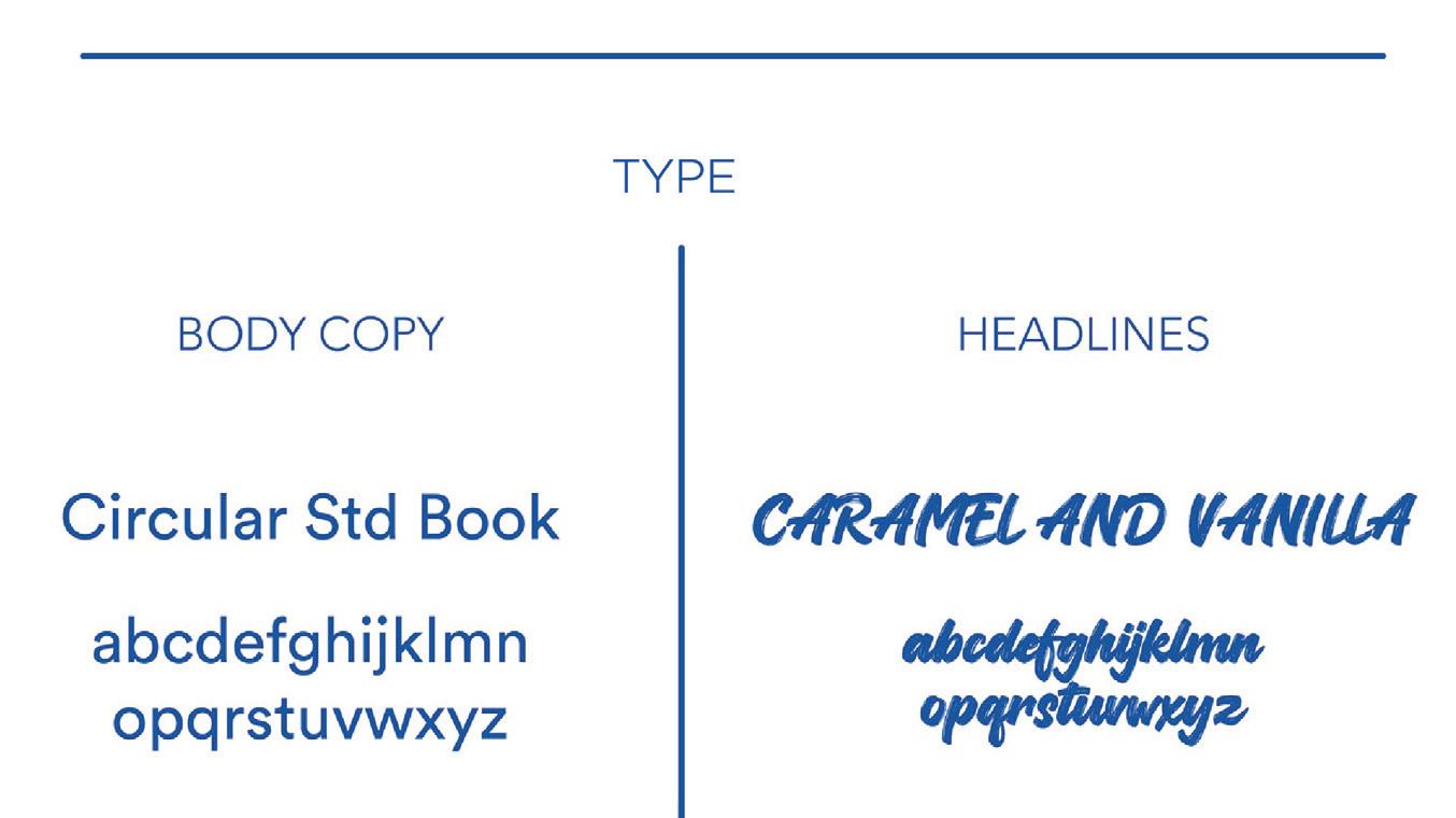
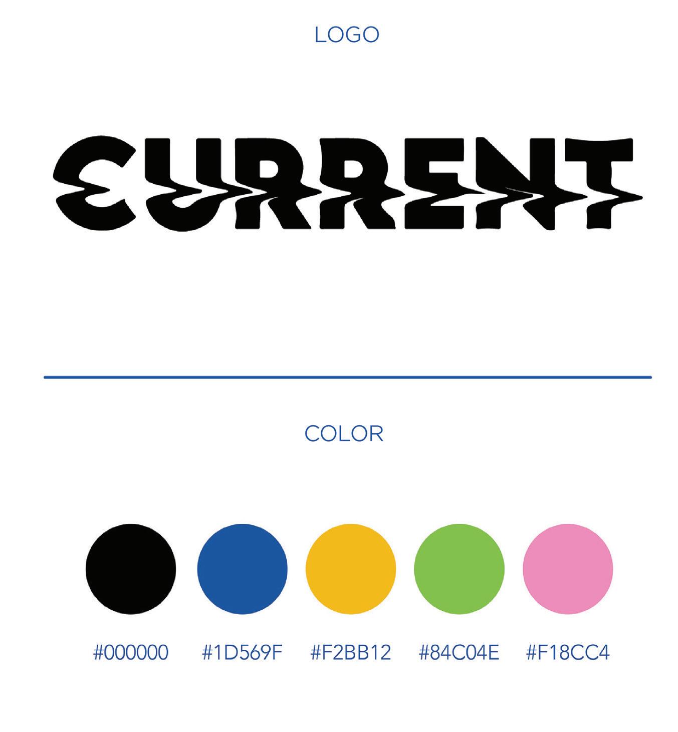
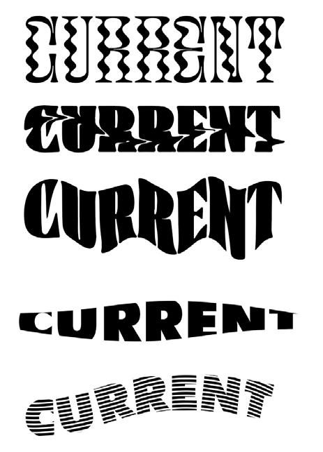
The result is a 40-page magazine that more accurately depicts pop and indie music using bright colors and hand-done digital illustrations trying to connect with the target audience. This magazine is a collection of content representing music in a post-pandemic world and how we have transferred to a digital music age.
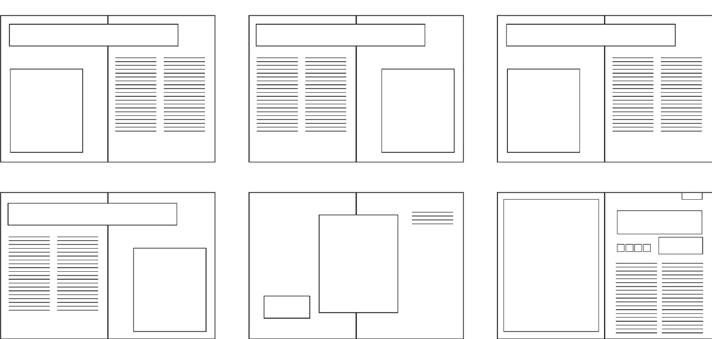
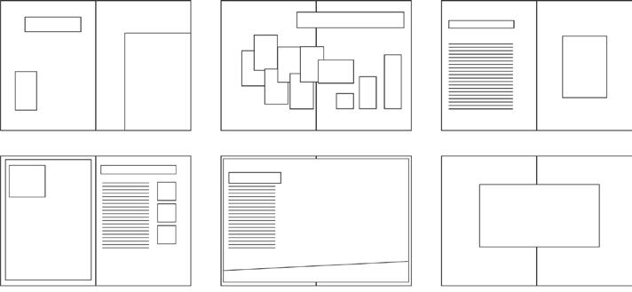
Flatplans
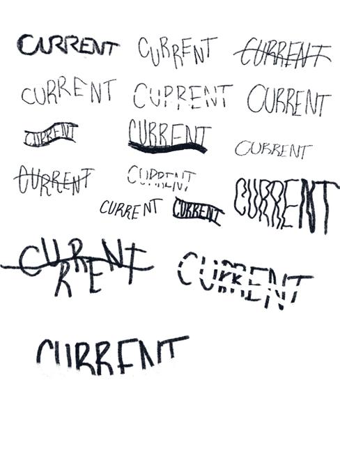
Current Magazine
Digital Logo Sketches Moodboard
Current Magazine
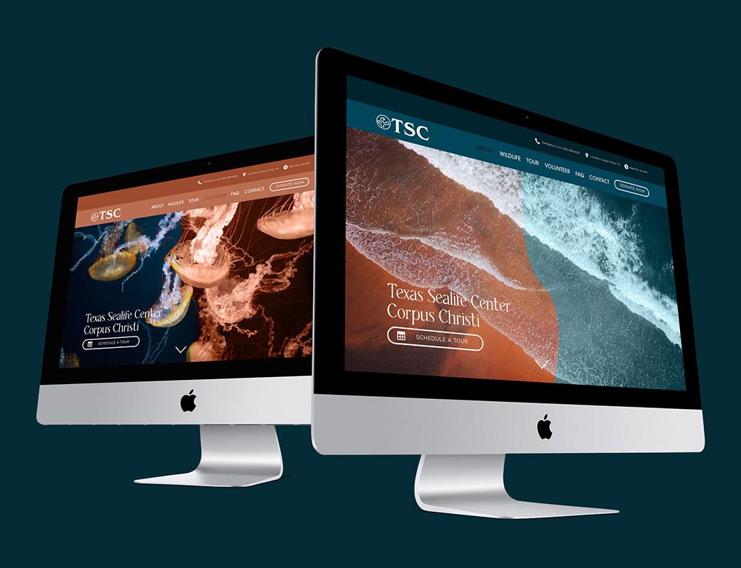
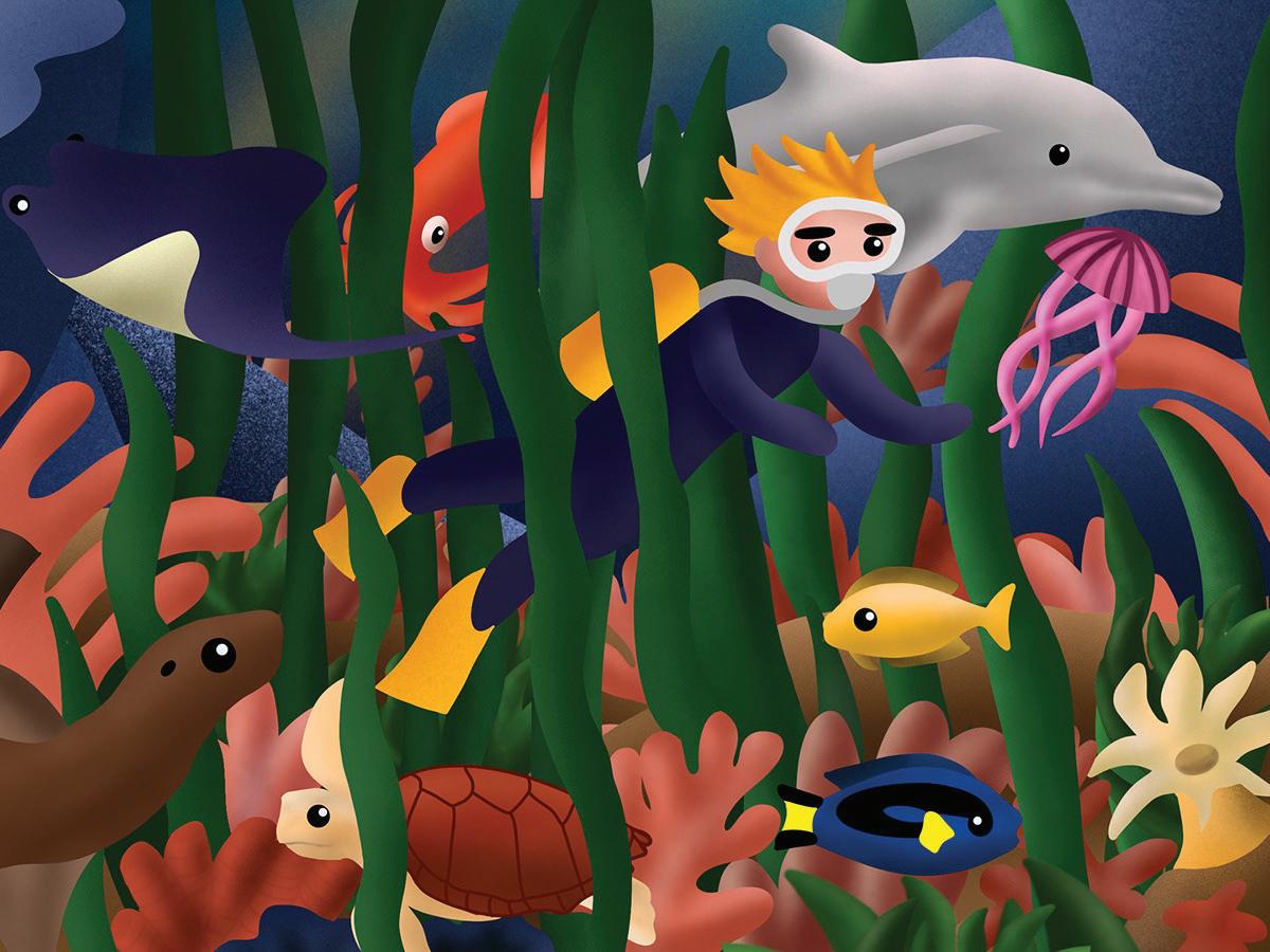
Texas Sealife Center
Website
Overview Solution
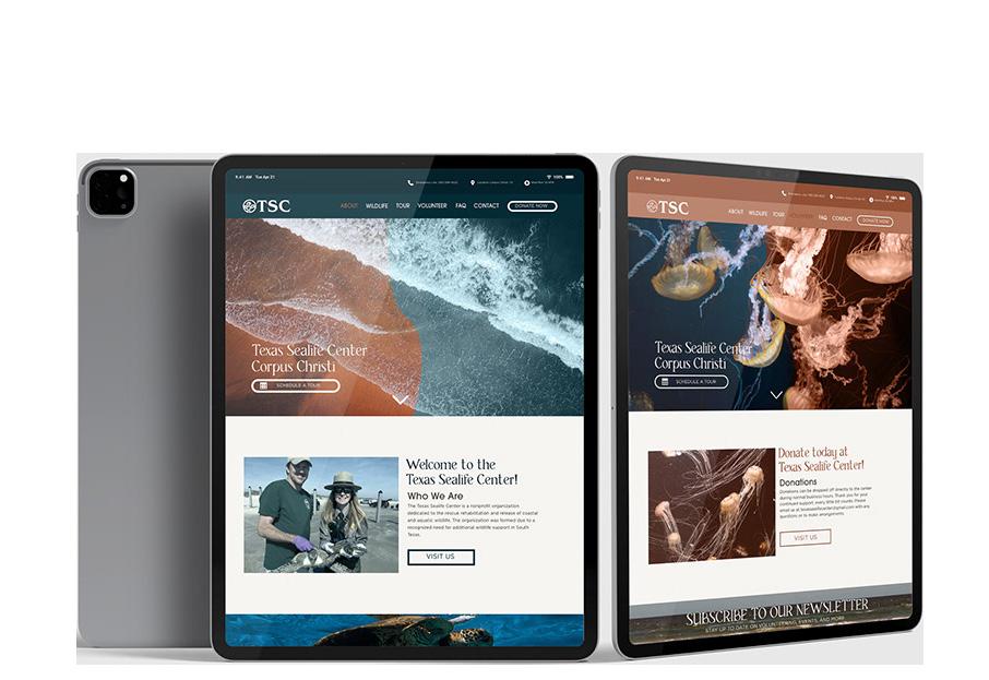
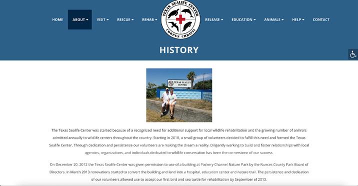
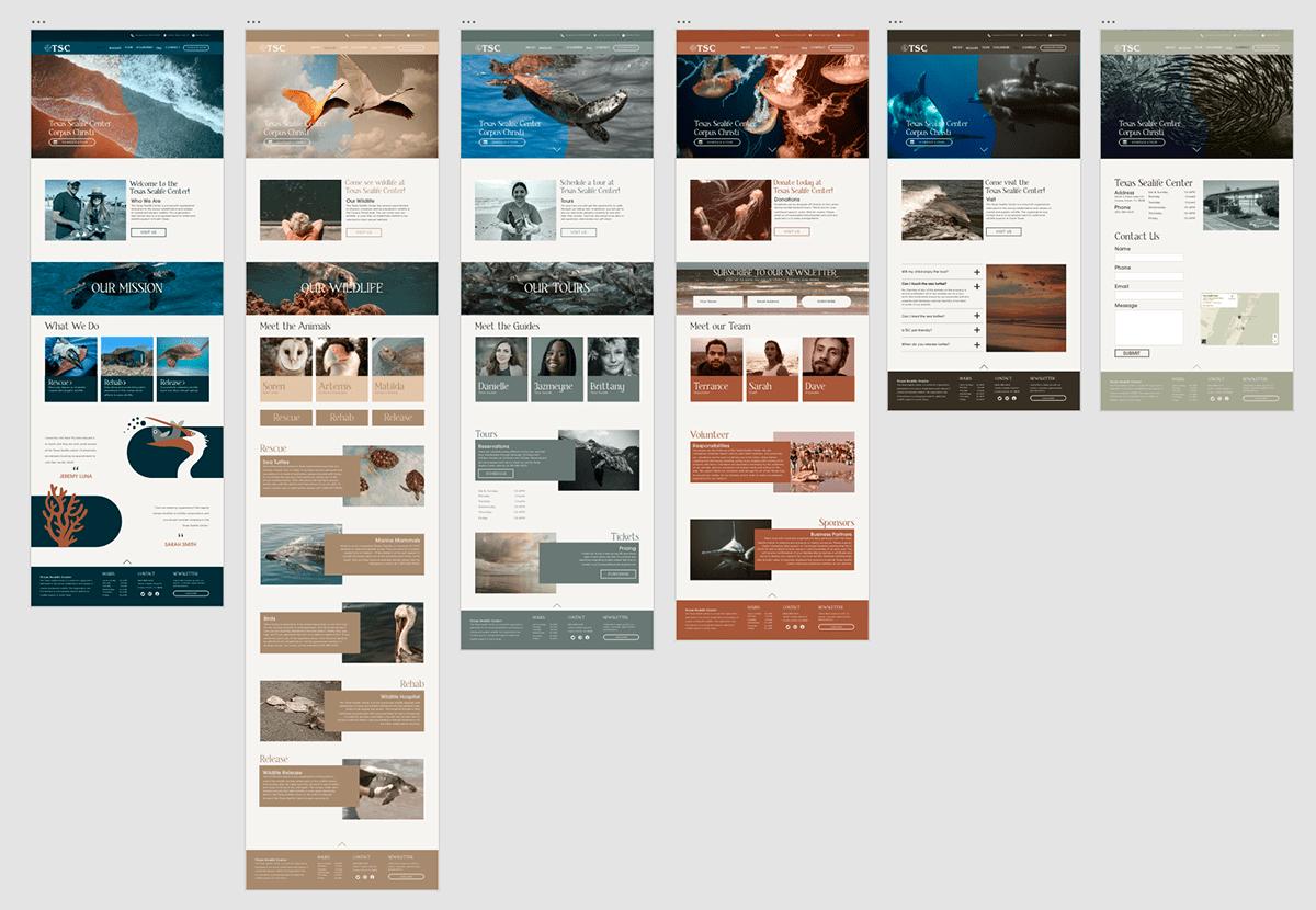
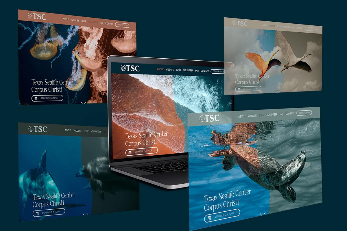
I set out to elevate the UI/UX of the Texas Sealife Center website. I did a rebrand of the Texas Sealife Center and created a website with responsive design that easily transitions from desktop to tablet to mobile. In branding the TSC, I wanted to create natural earth tones that represented the local Corpus Christi feel. I tried to refocus the original website’s primary purposes to push the user to schedule a tour and donate right from the homepage where from the previous website, it was difficult to find where to donate.
The rebranded website not only elevates the User’s ability to quickly find the information at a simple glance at the header but also has more engaging elements such as hover states to keep the user engaged in navigating the website. Overall the new colors, pictures, and an elevated UI/UX experience represents their nonprofit in a more functional and elevated way.
TS C TS C
UI/UX REDESIGN GOALS:
1. Simplify Logo, and create new color pallette.
2. Treat photos to establish cohesiveness.
3. Push donations, volunteering, and scheduling tours.
Existing Website Prototype

Texas Sealife Center
Link
COPY HEADLINES Gotham abcdefghijklmn opqrstuvwxyz abcdefghijklmn opqrstuvwxyz 9D5B40 0D2C36 DDC6AC B0B1A1 F5F4F1 3E3830 Sunset W ave Sand M ossy Foam Earth
COLORS LOGOS BODY
Desktop Screens
San Francisco Zoo
Rebrand Campaign
Overview
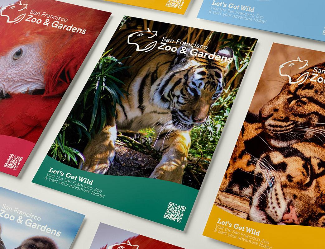
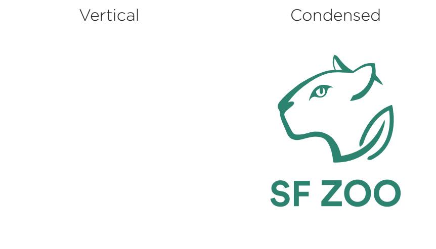
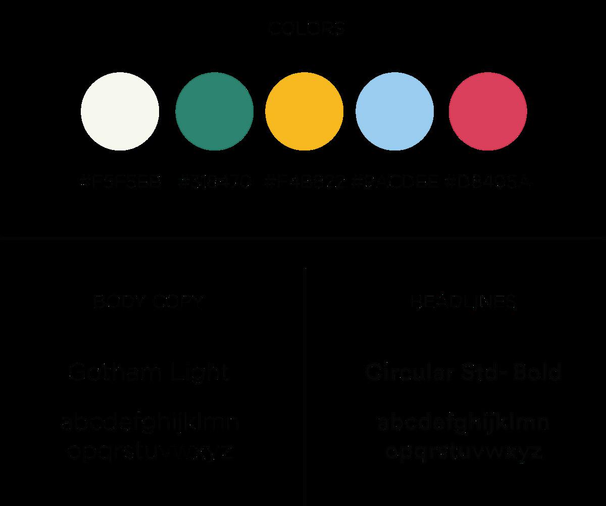
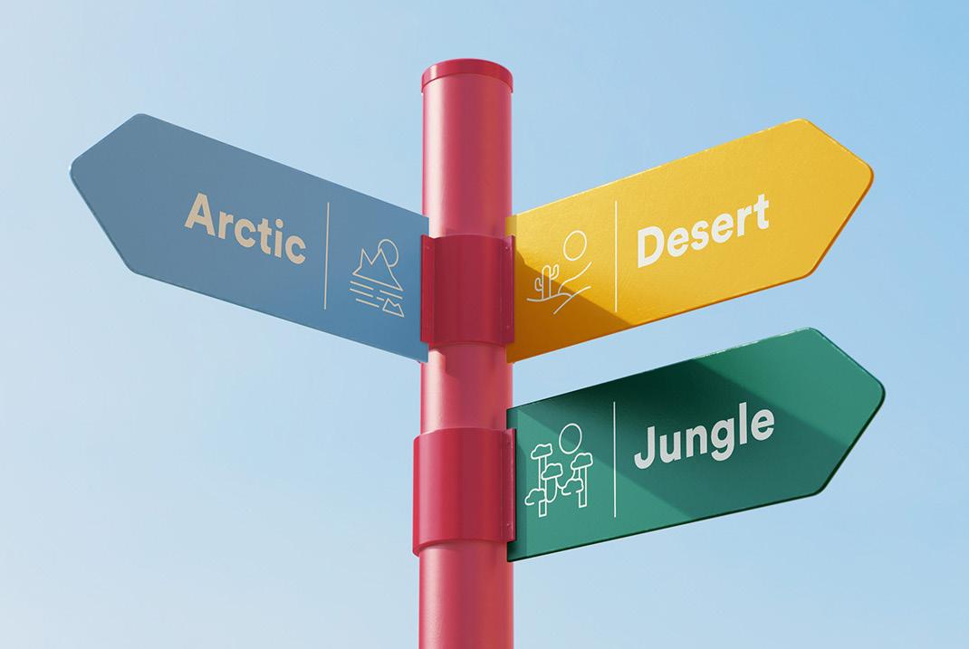
I wanted to create a brand redesign that would be more family-friendly and help advertise to the general public of San Fransisco. Using brighter colors, and photography, the rebrand promotes a space where anyone of any age can come and learn about wildlife and be inspired to participate in conservation efforts.
Solution
The rebrand builds on a modern look, and employs an updated brand voice that can still push education and conservation while positioning the zoo up to be an accepting place for all to come and learn.
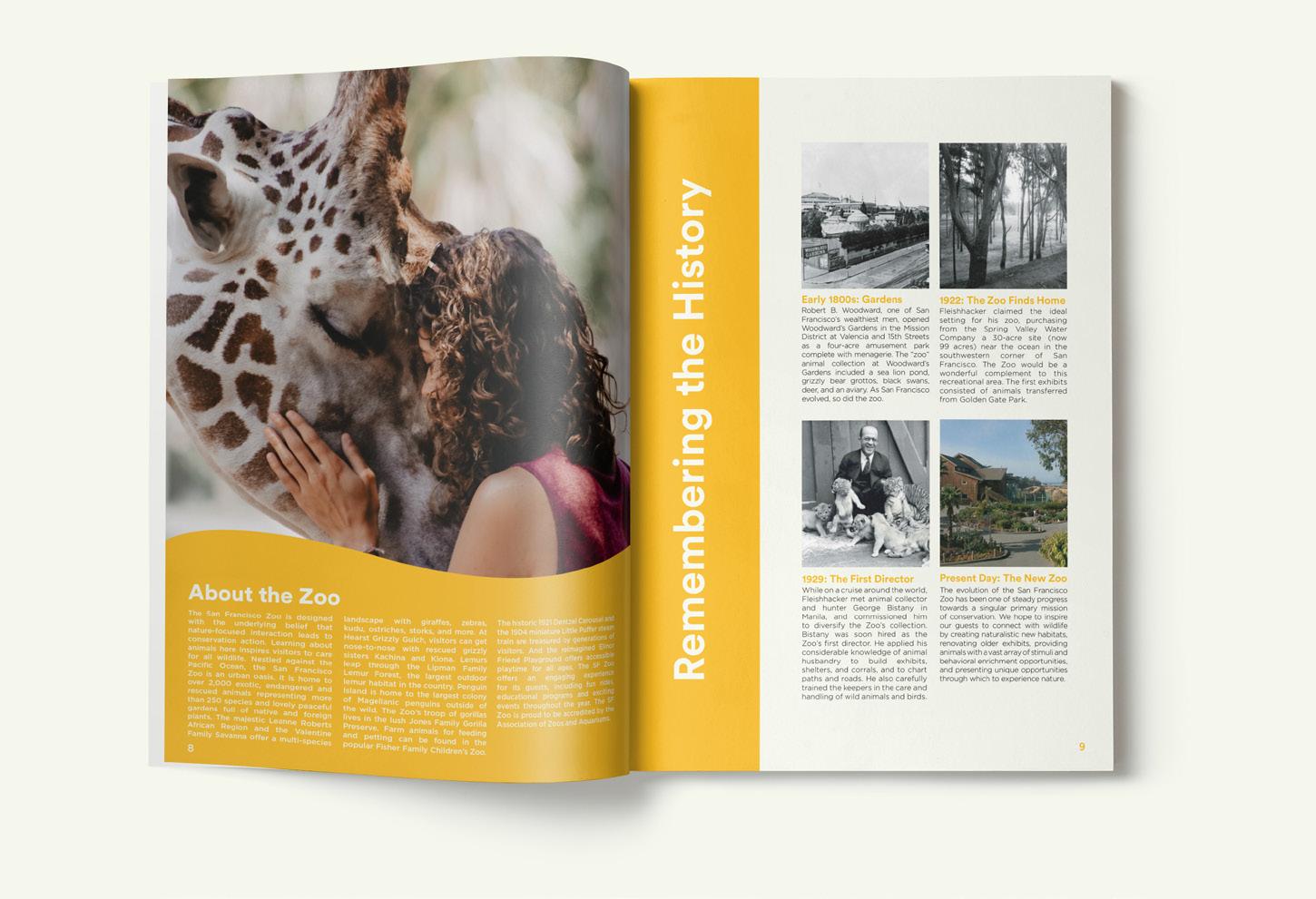
About the Zoo

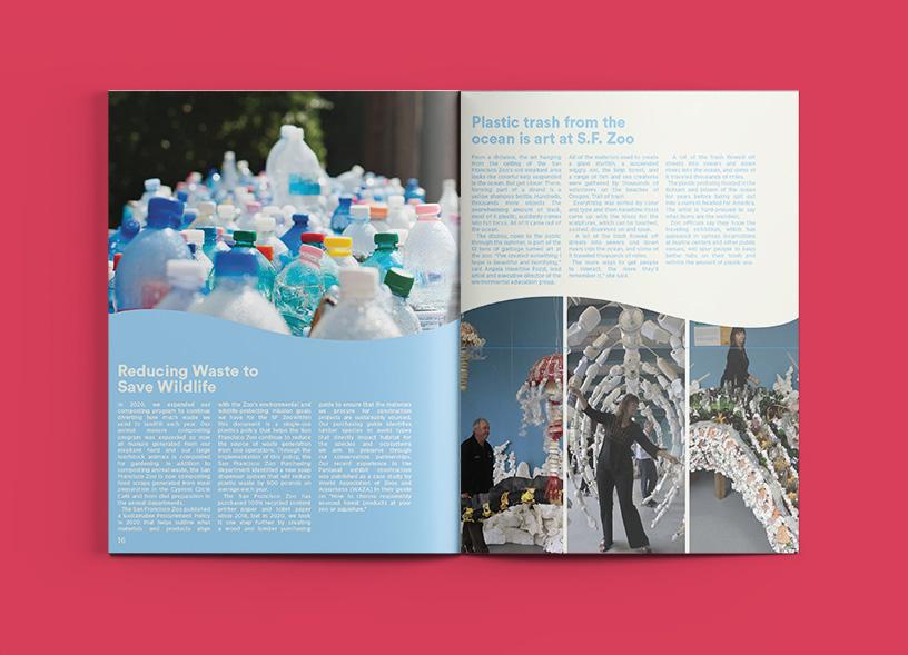
The San Francisco Zoo is designed with the underlying belief that nature-focused interaction leads to conservation action. Learning about animals here inspires visitors to care for all wildlife. Nestled against the Pacific Ocean, the San Francisco Zoo an urban oasis is home to over 2,000 exotic, endangered and rescued animals representing more than 250 species and lovely peaceful gardens full of native and foreign plants.
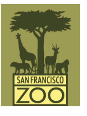
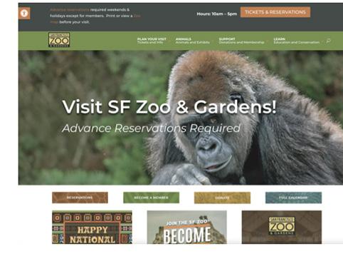
Existing Brand
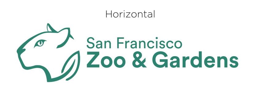
San Francisco
Zoo & Gardens
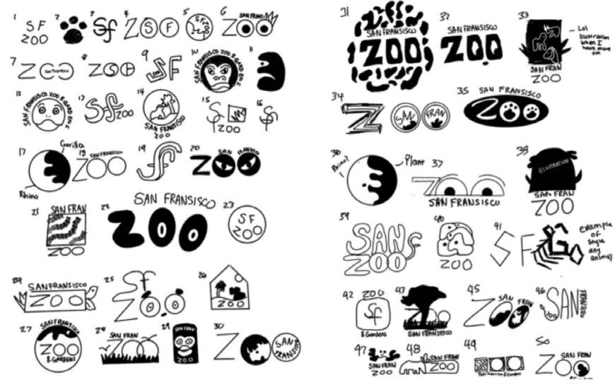
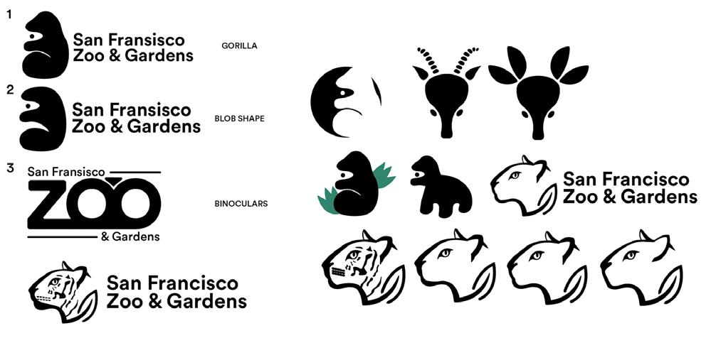
Rough Concept Sketches
San Francisco Zoo

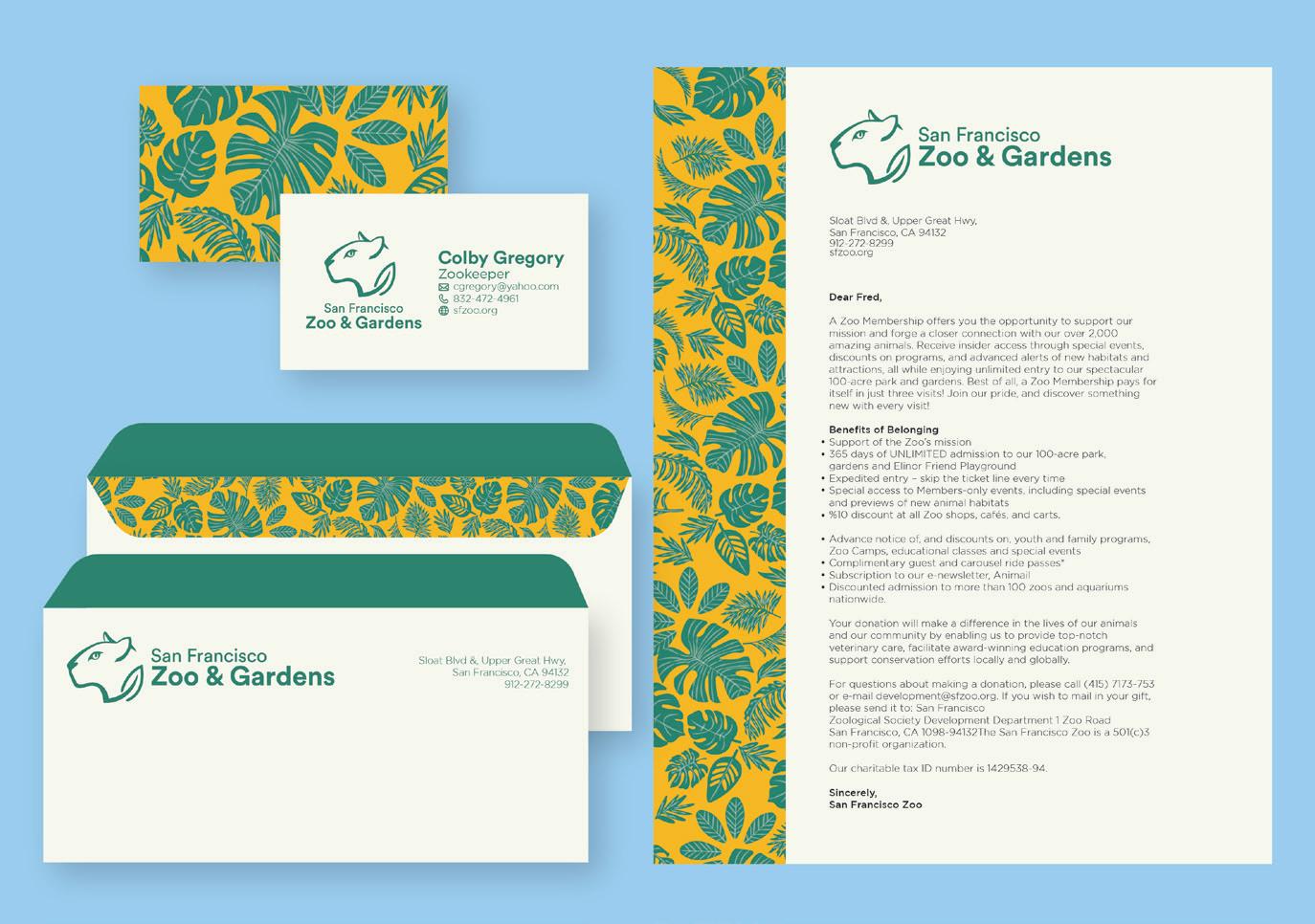
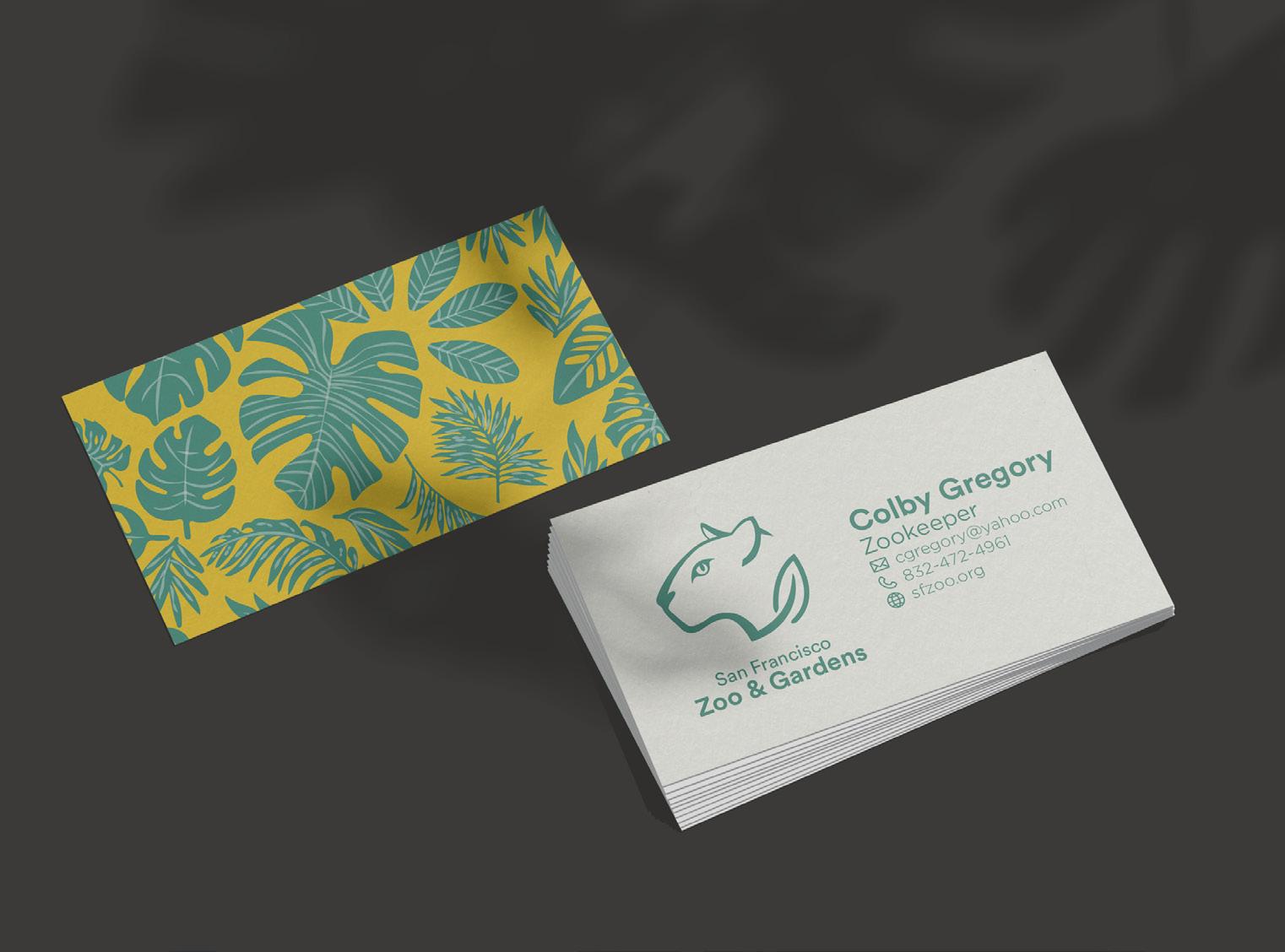
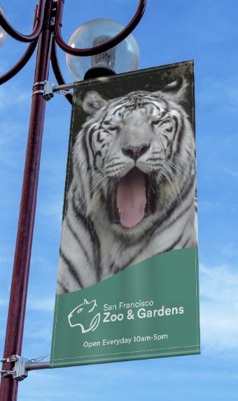
Zoo Business Cards Banners
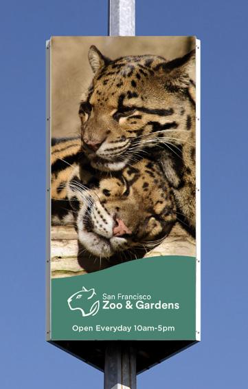
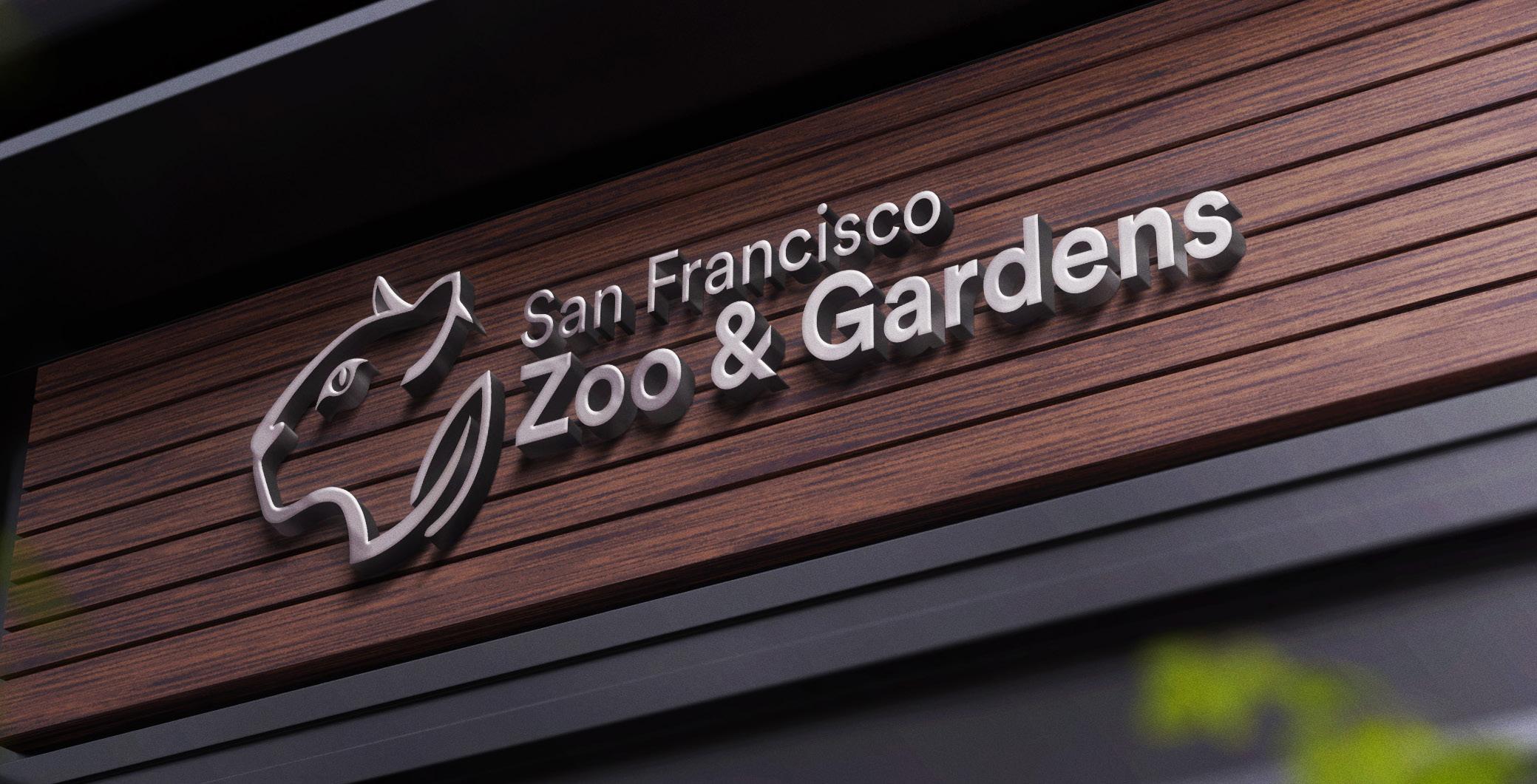
Zoo Signange
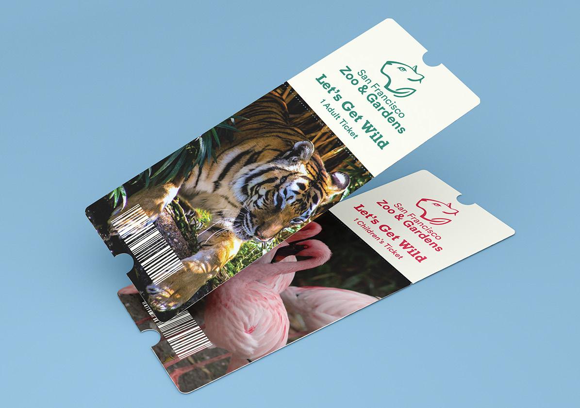
Zoo Tickets
San Francisco Zoo
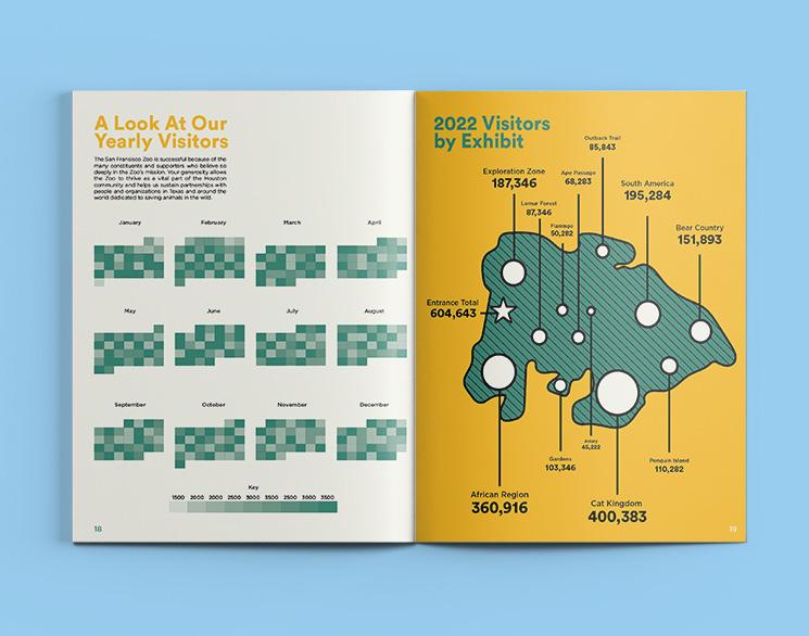
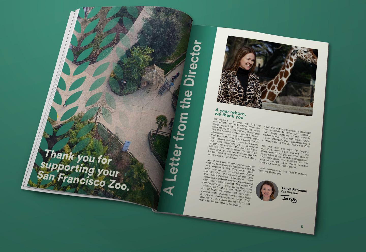
Annual Report Mockups
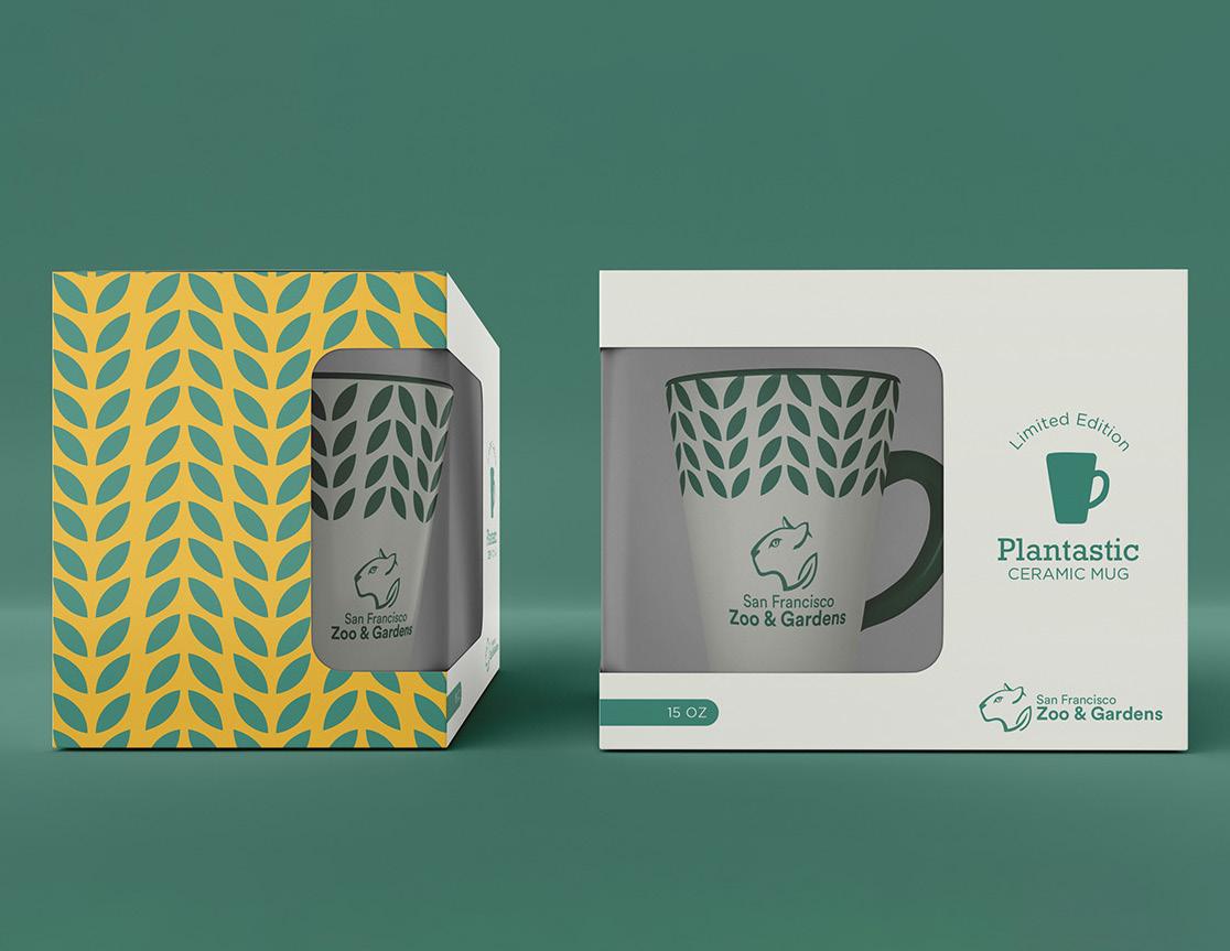
Mugs
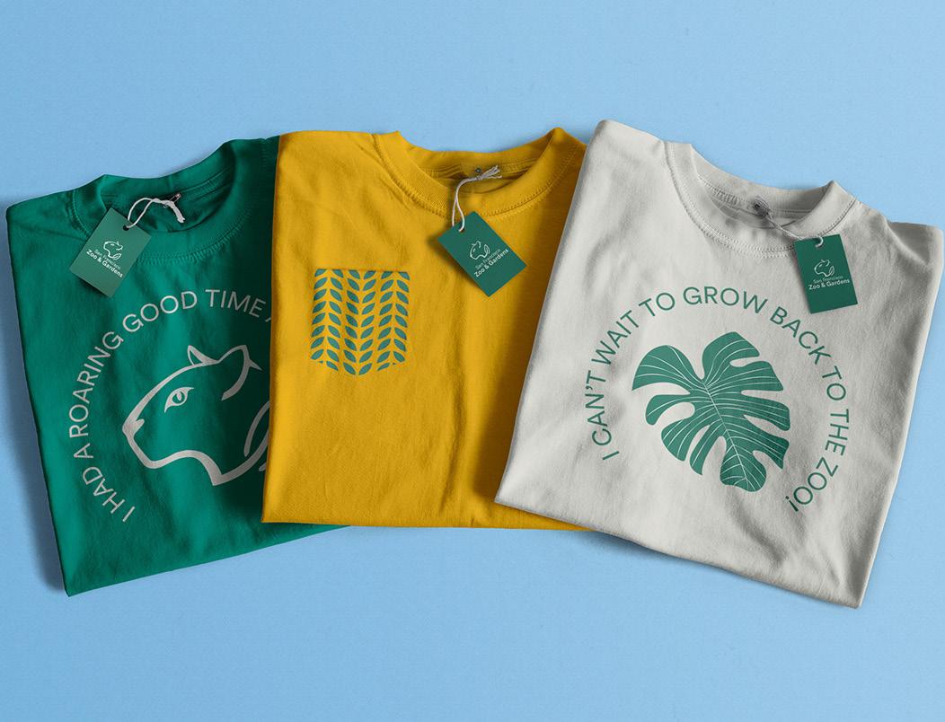
Giftshop Shirts
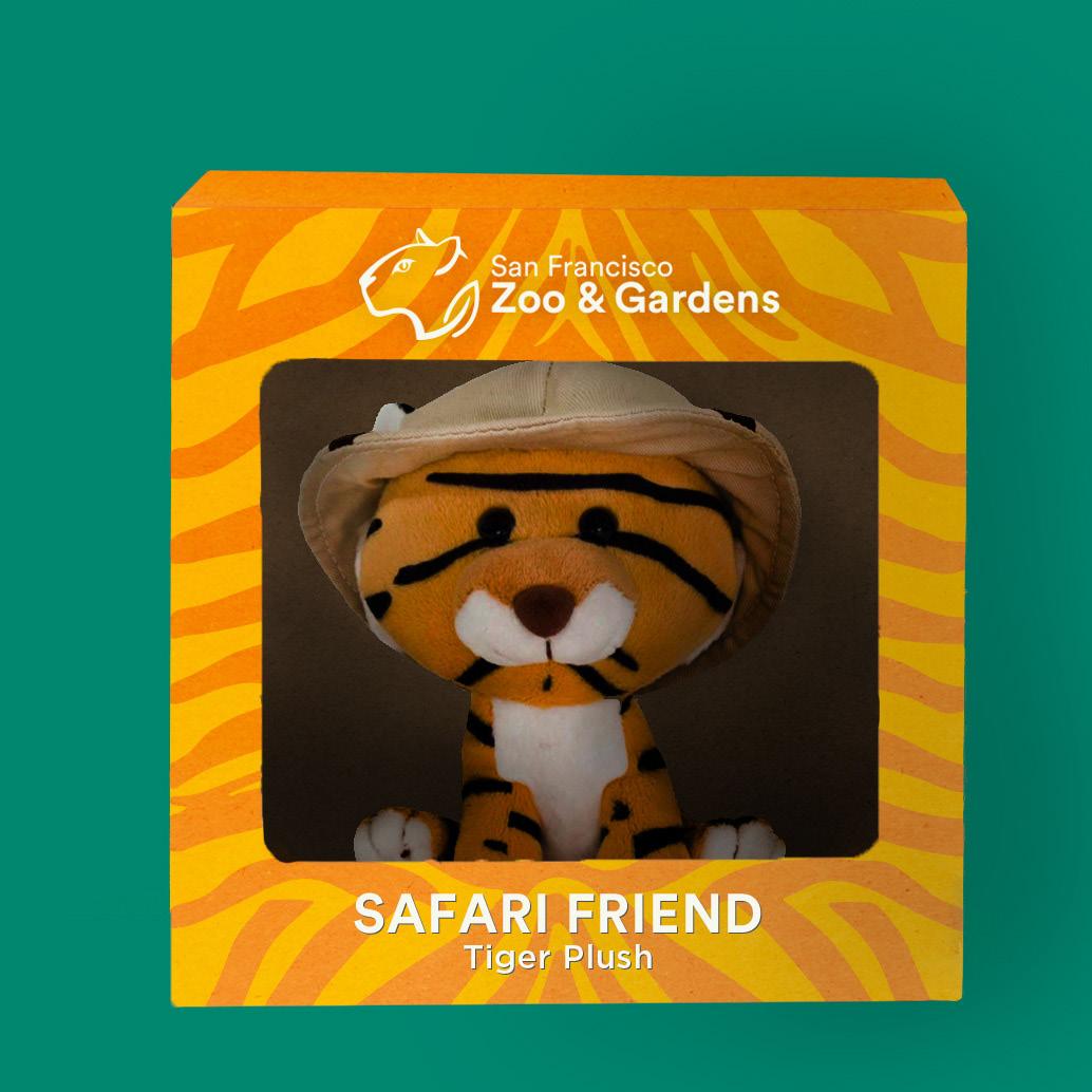
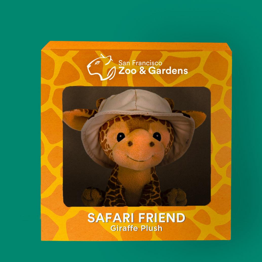
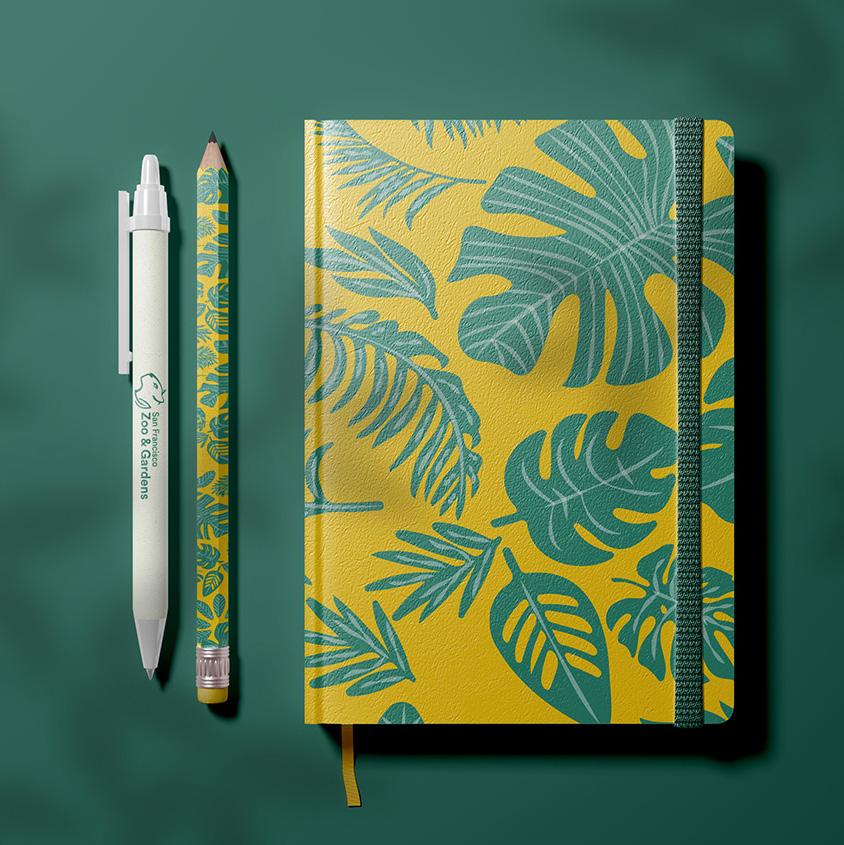
San Francisco Zoo Toy Packaging Toy Packaging Journal
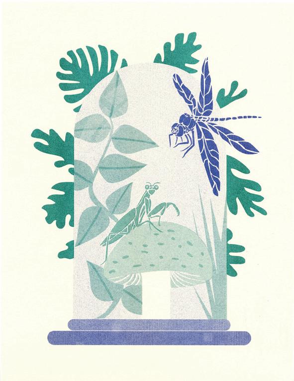
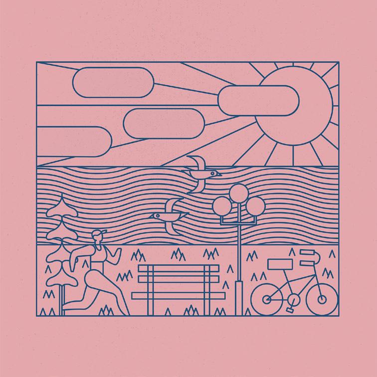
Adapt
Zine
Overview Solution
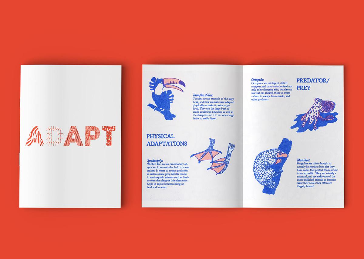
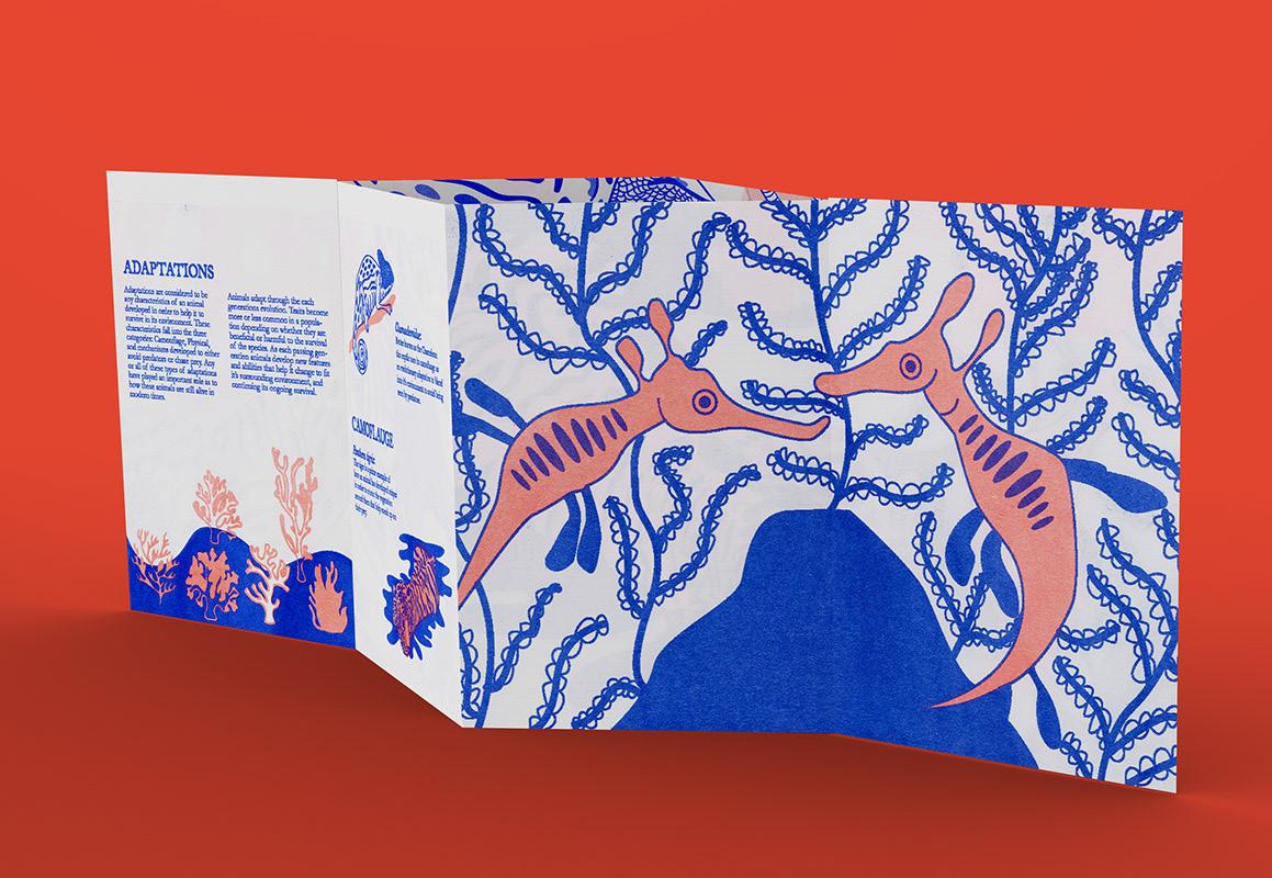
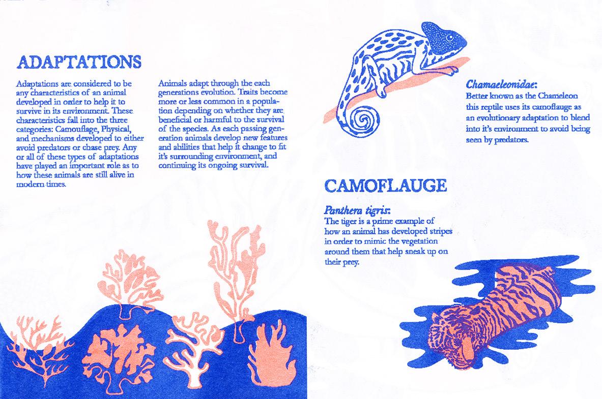
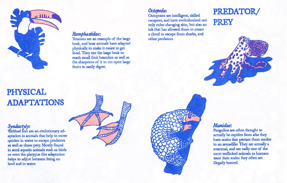
In this project, I created a zine based on animal adaptations and how they evolve. My project goals were to create custom illustrations representing each adaptation and provide accurate facts about each transformation included in the zine.
The final product is a 11x17 zine and poster using custom vector drawings using illustrator and used InDesign for the layout. The finished product was then printed on a Risograph printer in just two colors: medium blue and fluorescent orange.
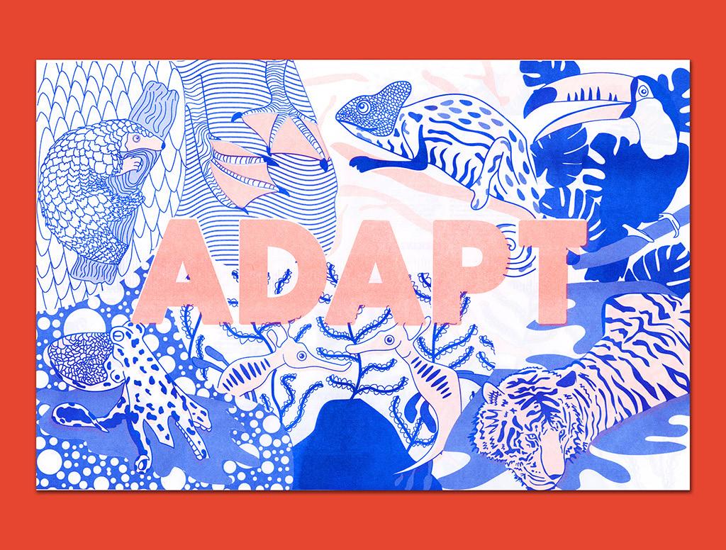
Adapt Zine
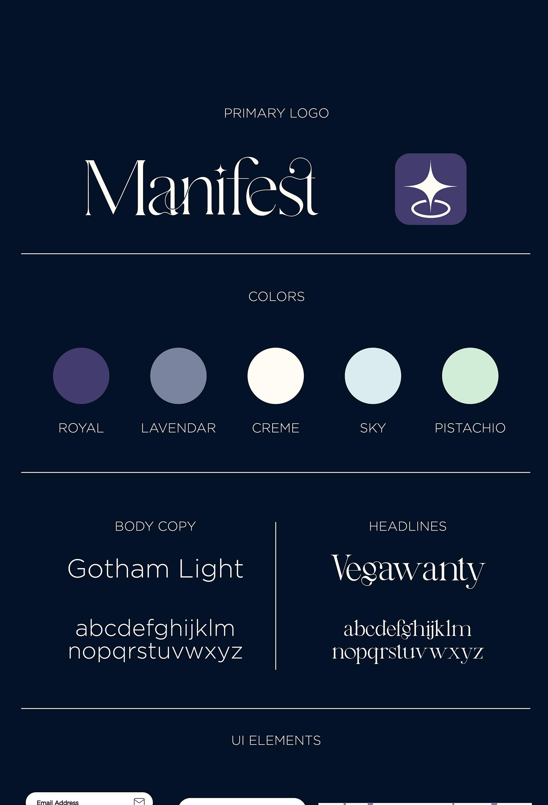
Manifest
App
Post Graduates need guidance in regional opportunities to access information such as Housing, Jobs, and Social Lifestyles in the desired region.
Problem Solution
The solution is an app that helps users visualize their lives and achieve their goals. They can get their dream job….live in their dream place….see what their social life could look like, and even look at the real, local maps in the area to plan out where to eat, for example, or where to go to a local bar!
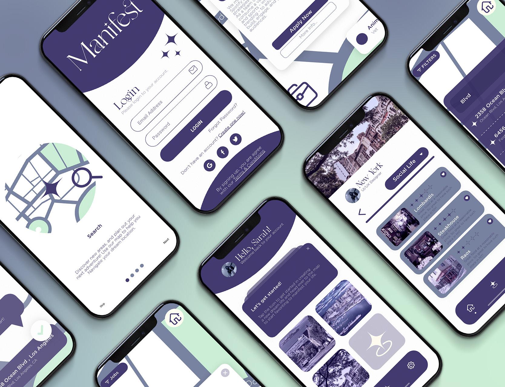
Phone Mockups
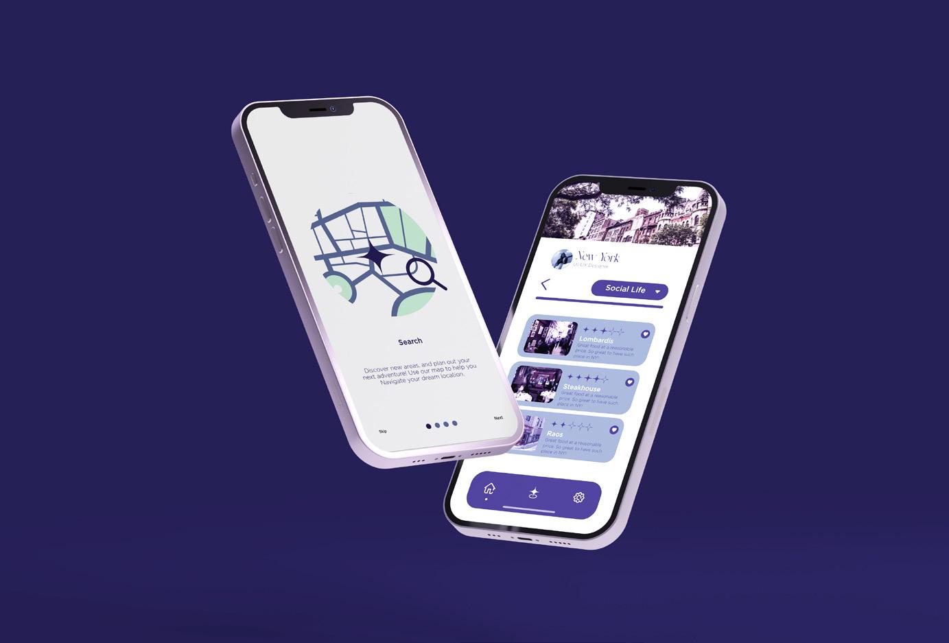
App In Use

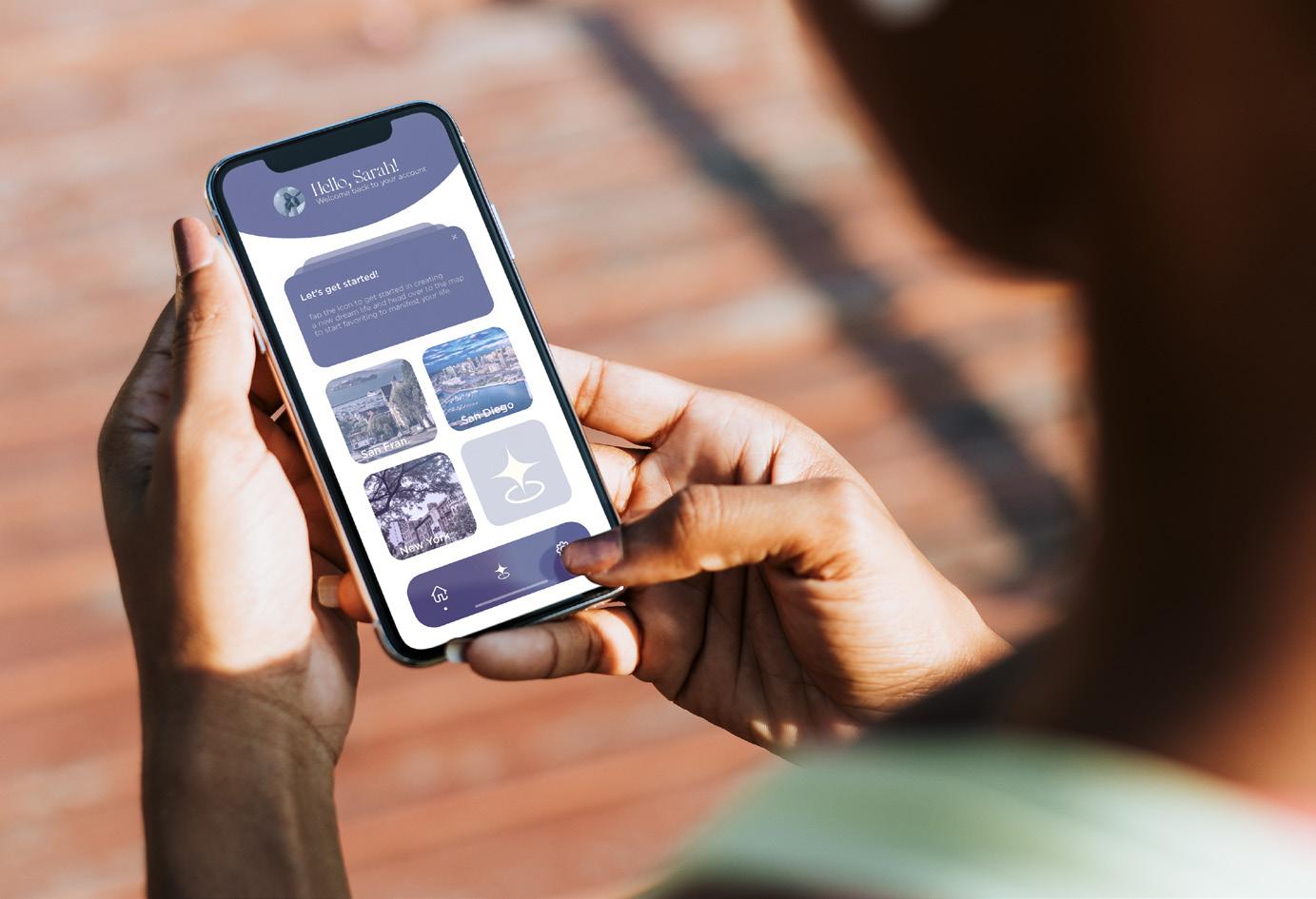
Manifest App
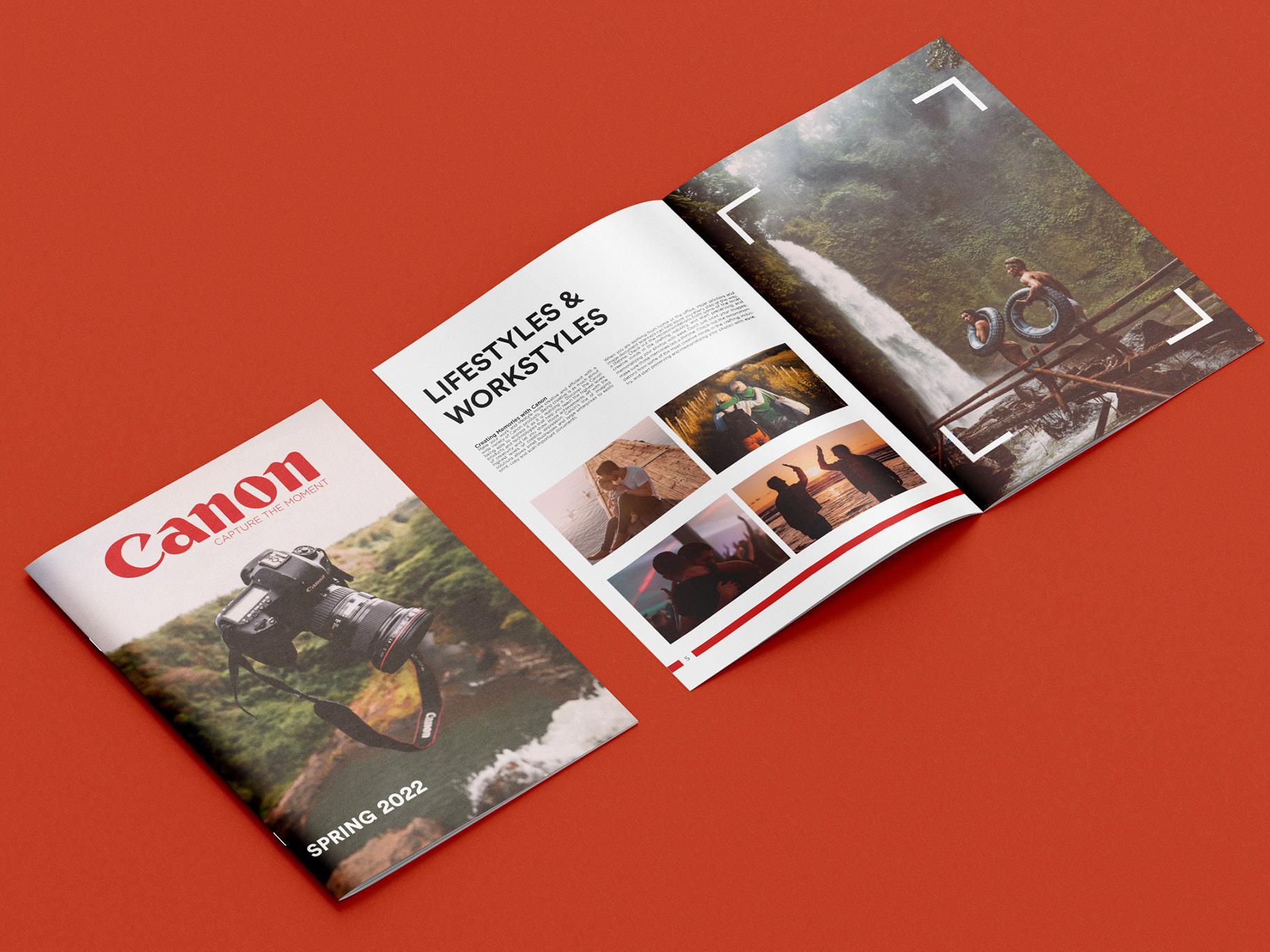
Canon
Catalog
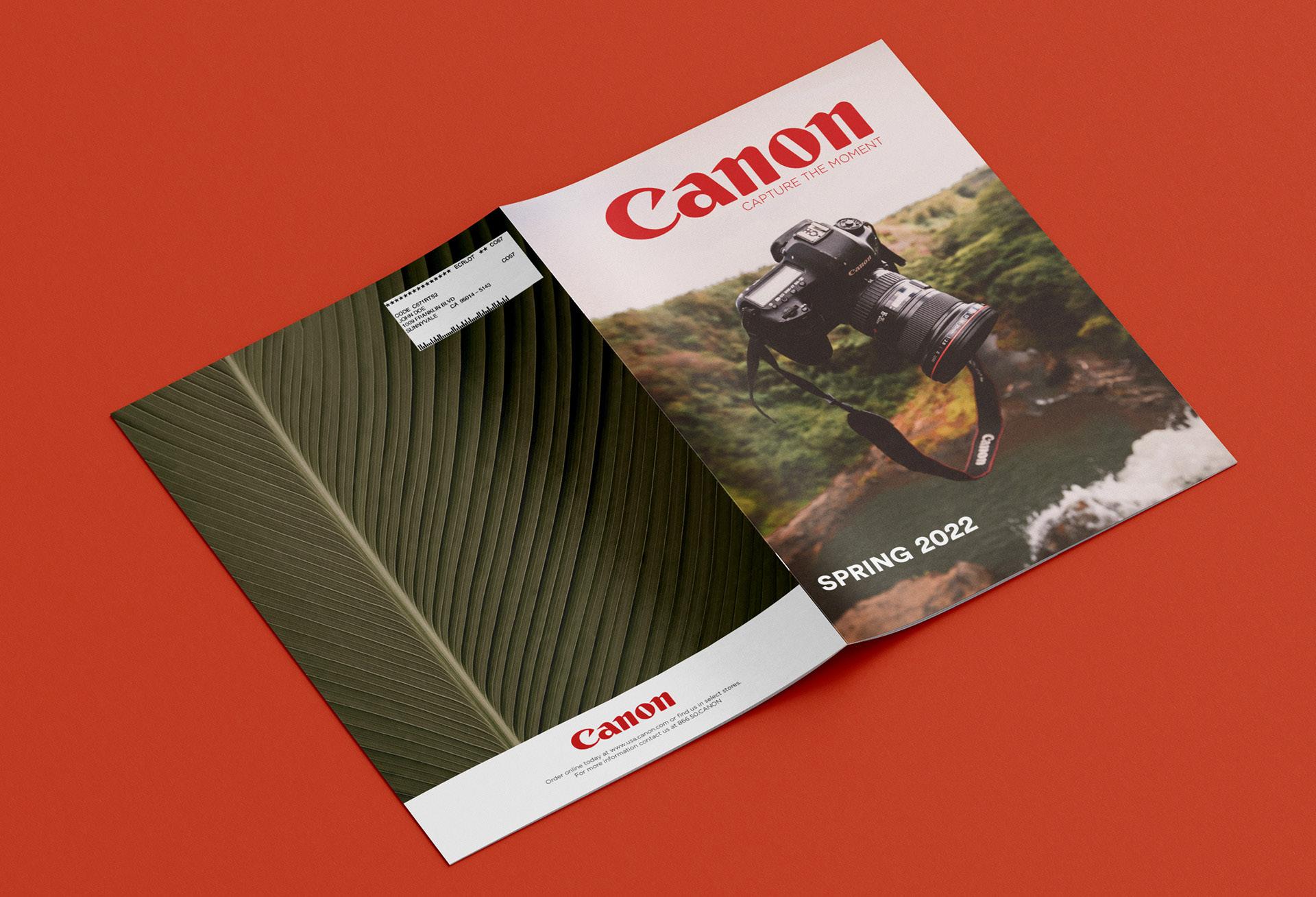
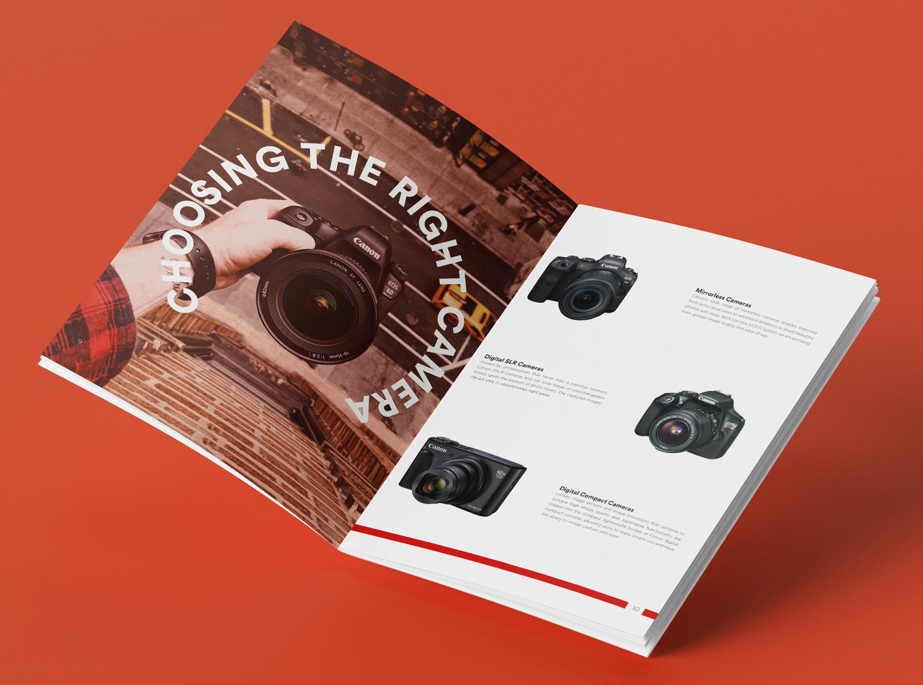
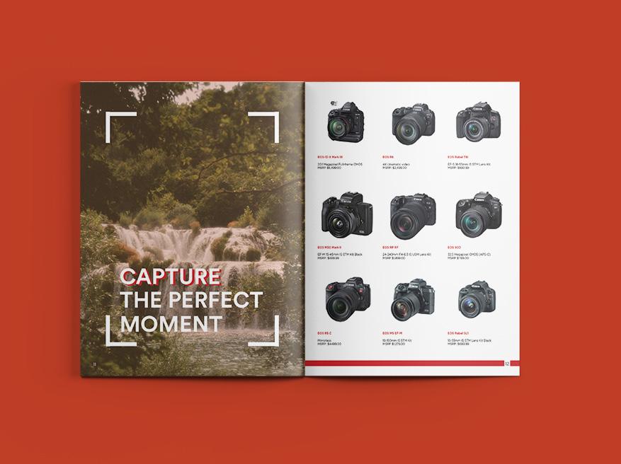
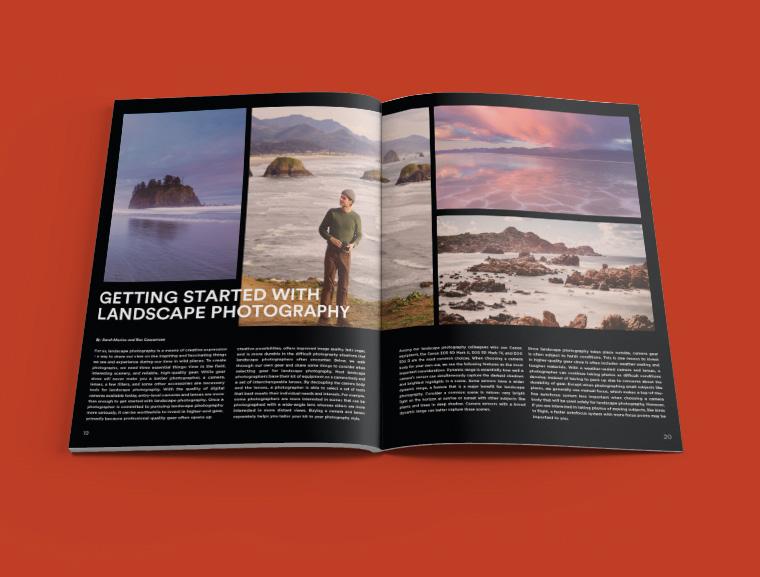
Overview
In this project, I created a catalog for Canon to highlight their products and help sell the lifestyle of being a photographer and what it means to shoot with Canon.
Solution
The final product was a full print catalog inspired by their original red branding, using a combination of photography, and grids the layout was created in order to best represent Canon. In this project I pushed myself to stick to their existing branding, and work within a restrictive project scope with given assets.
Catalog
Canon
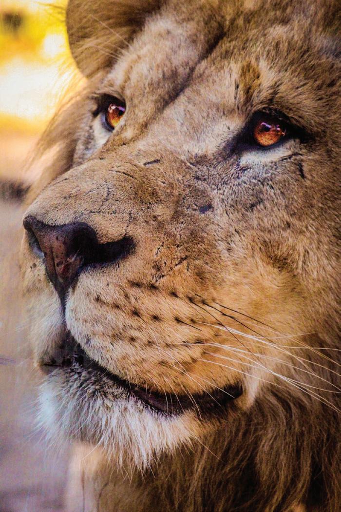
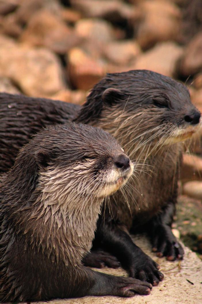
 Photography
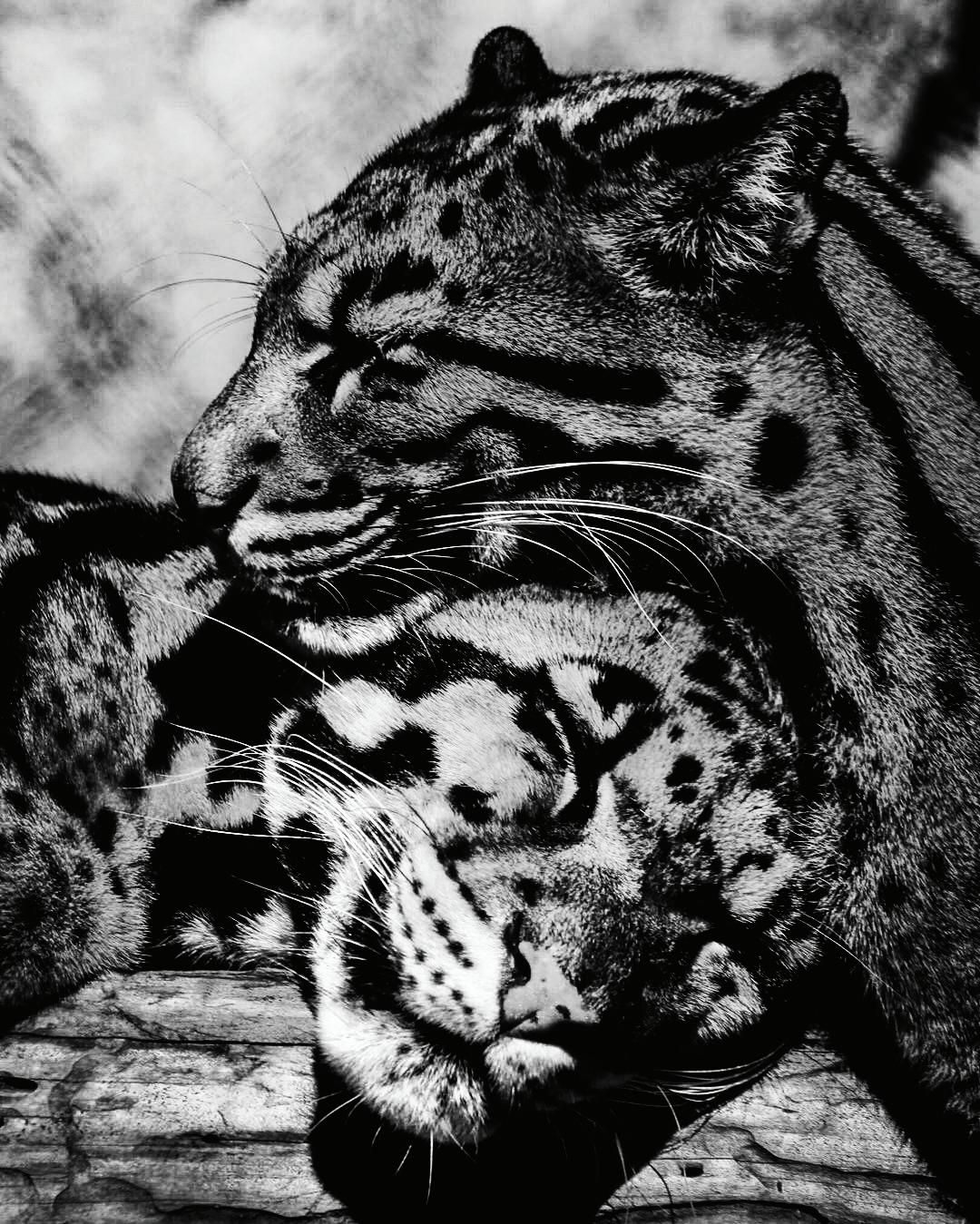
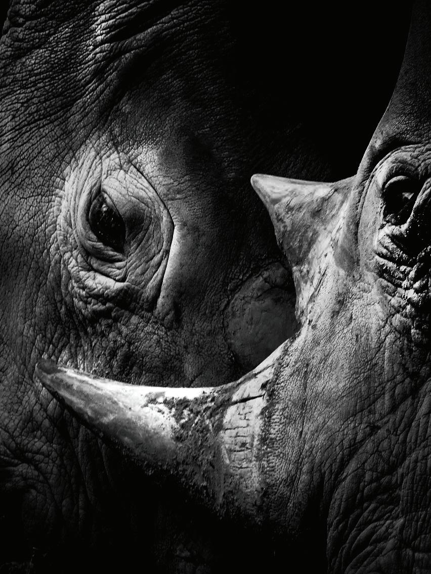
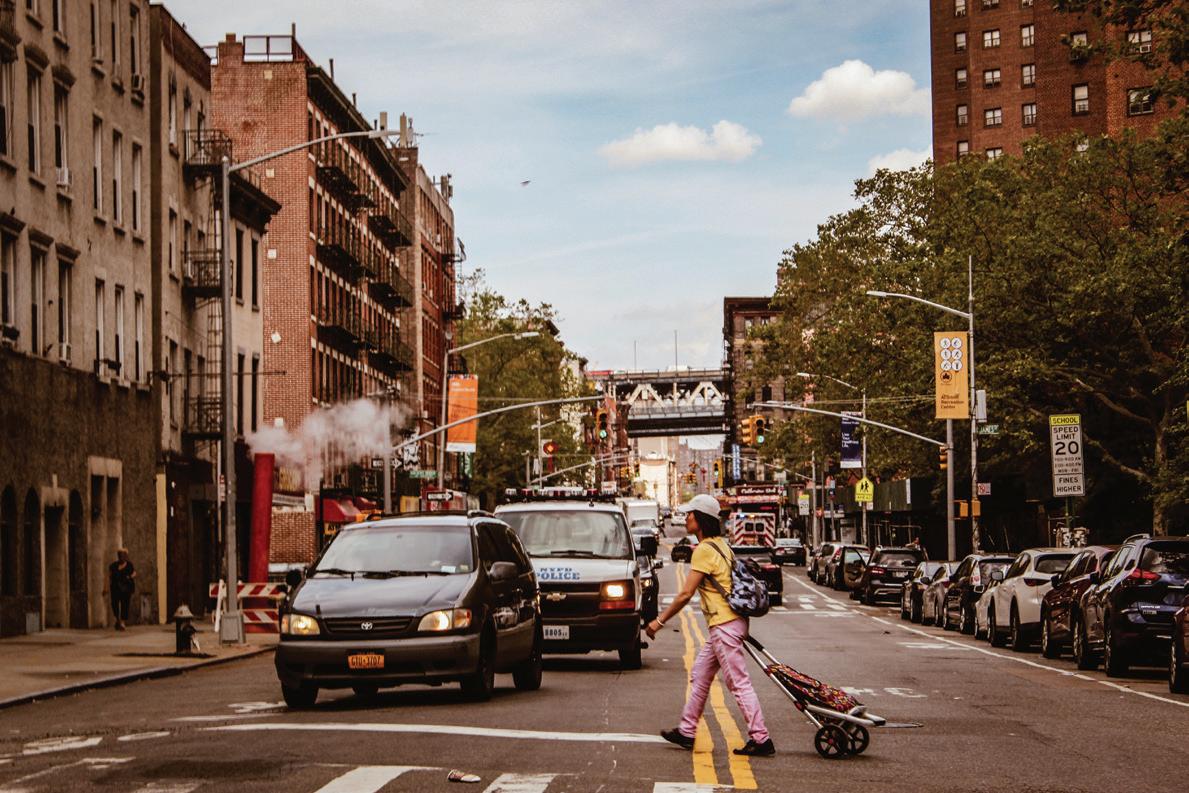
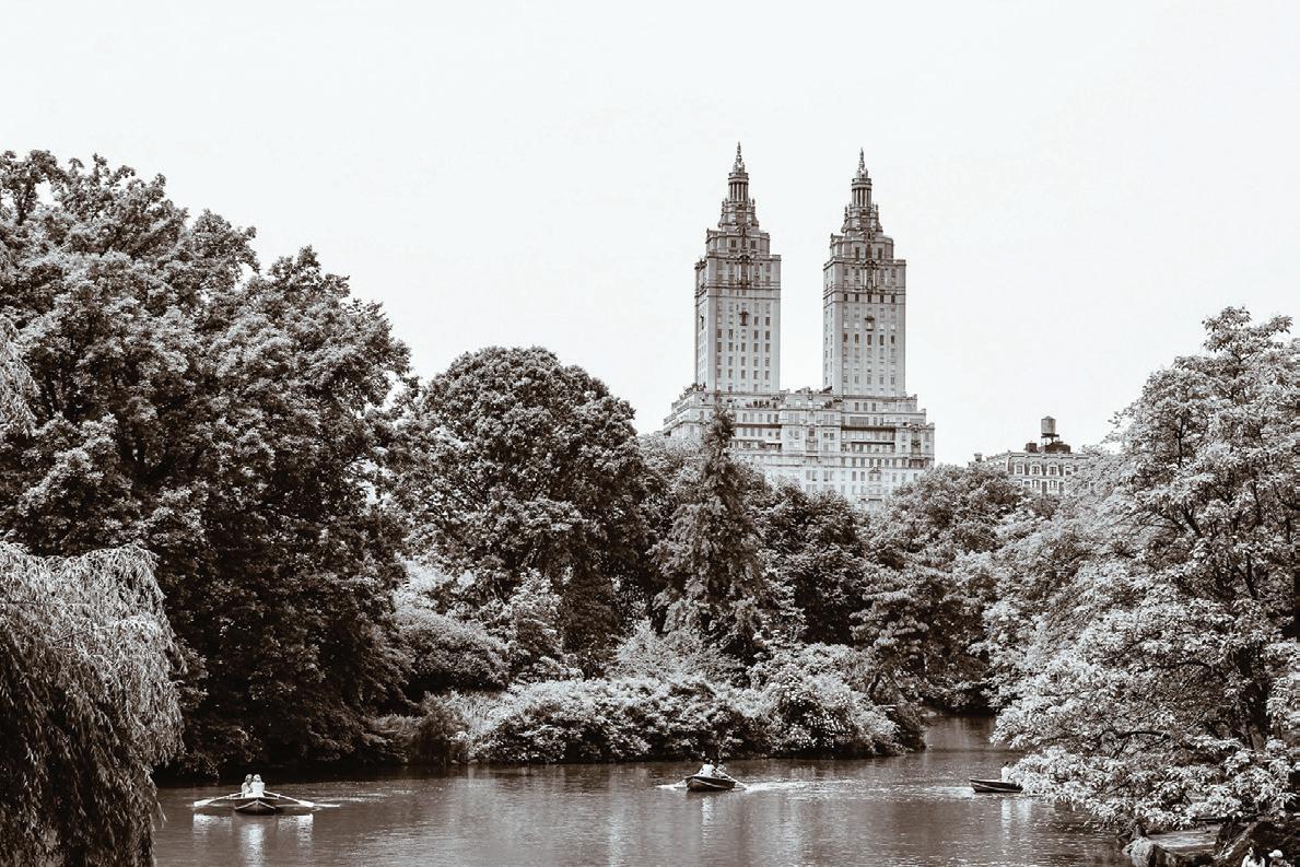
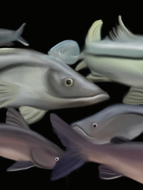
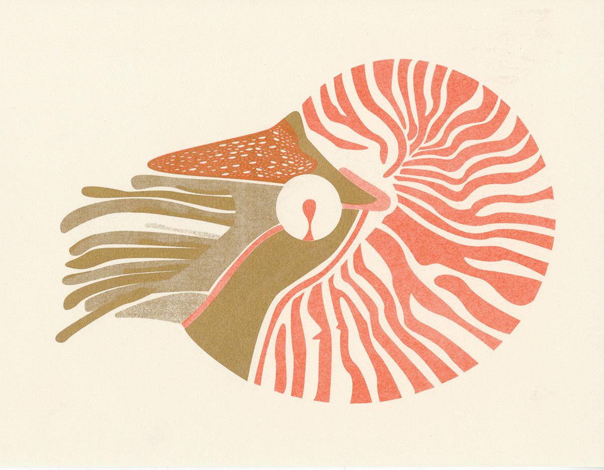
Illustration
