noahiscreative.com
@outlook.com
@noahiscreative
noahcreative
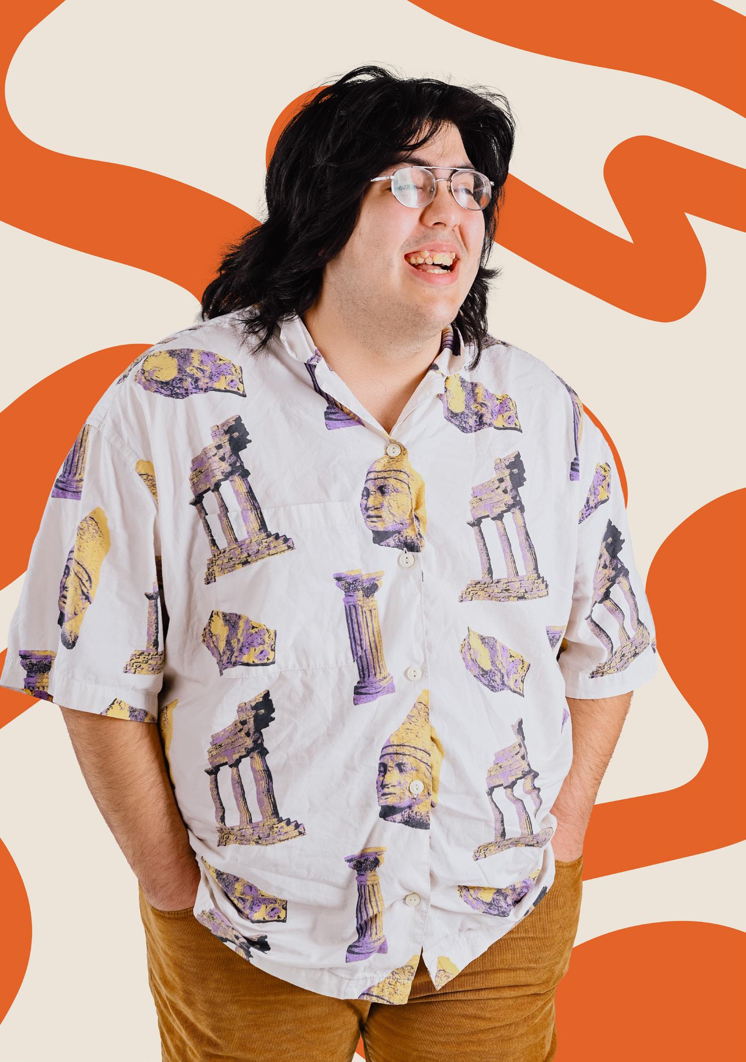
Hello, I’m Noah!
I’m a practicing artist and designer getting my BFA in Painting and Printmaking. I am currently en route to preparing my BFA thesis show. I see graphic design and fine art as two worlds that I can live between, constantly pulling one side into the other. I have a love for editorial and print media that has led me to several jobs as a layout designer, page editor, and eventually senior graphic designer. Aside from getting my BFA, I am also the creator of ¡LA ACTIVISTA!, a monthly newsletter sharing information regarding public environmental policy and culture in South Texas and the Costal Bend.
CONTENTS
Fashion Illustration Series
Illustration & Ephemera
Anna Sui Spring 2022 Catalog
Case Study
Publication & Branding
¡LA ACTIVISTA! Newsletter
Case Study
Publication & Branding
FREAK Magazine
Publication
Zine Research
Case Study
Publication & Ephemera
Illustration Samples
Illustration
Fashion Illustration Series
Brief
This project was formulated as a series of digital illustrations to assist in finding a direction for creating a body of work in my BFA Thesis show. These illustrations would eventually become both a series of large-scale acrylic paintings as well as a set of postcards. I was inspired by 90’s magazine covers, publication, collage, nostalgia, and fashion.
Solution
In order to build a body of work for my BFA thesis, I was heavily inspired by 90’s fashion and magazines. I created each illustration, keeping in mind my use of color, shape, pattern, and pose. In order to create striking compositions, I used a range of poses to help support the aesthetics I am referencing.
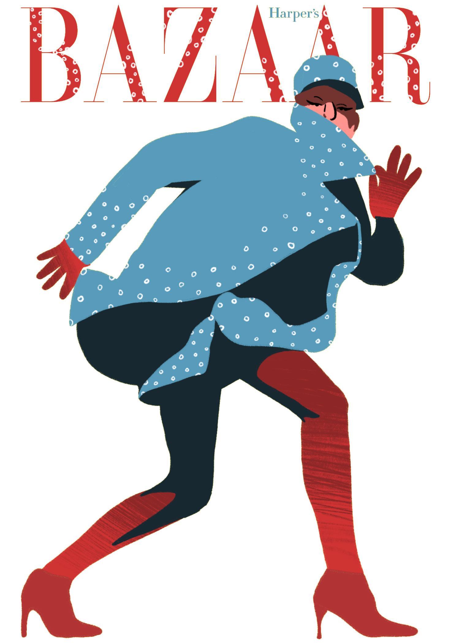
Illustration Series
Fashion
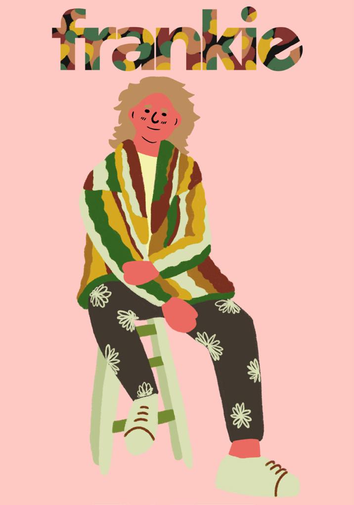
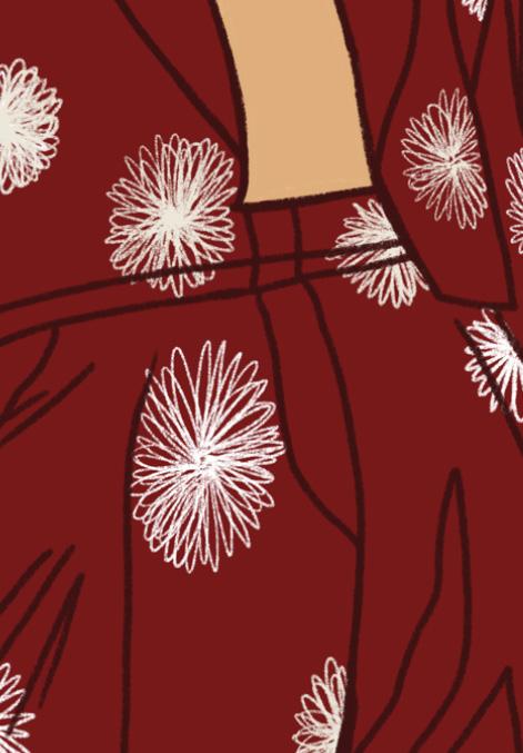
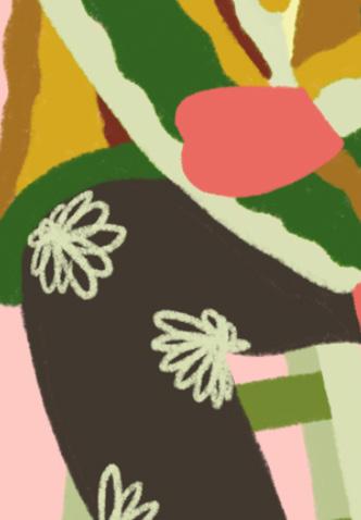
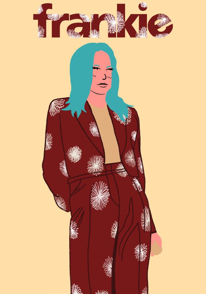
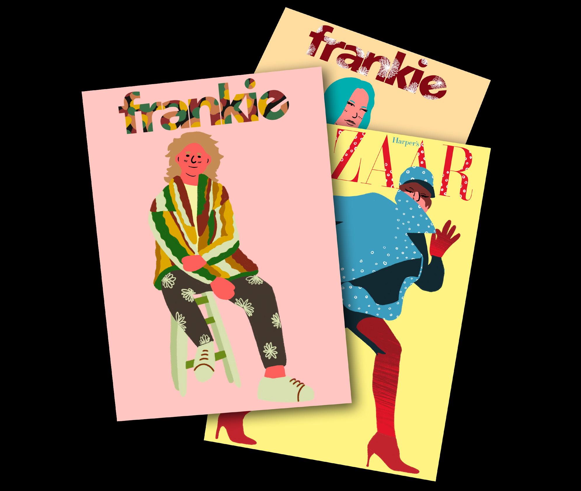 Illustrations as Postcard Art
ANNA SUI Spring 2022 Catalog
Description
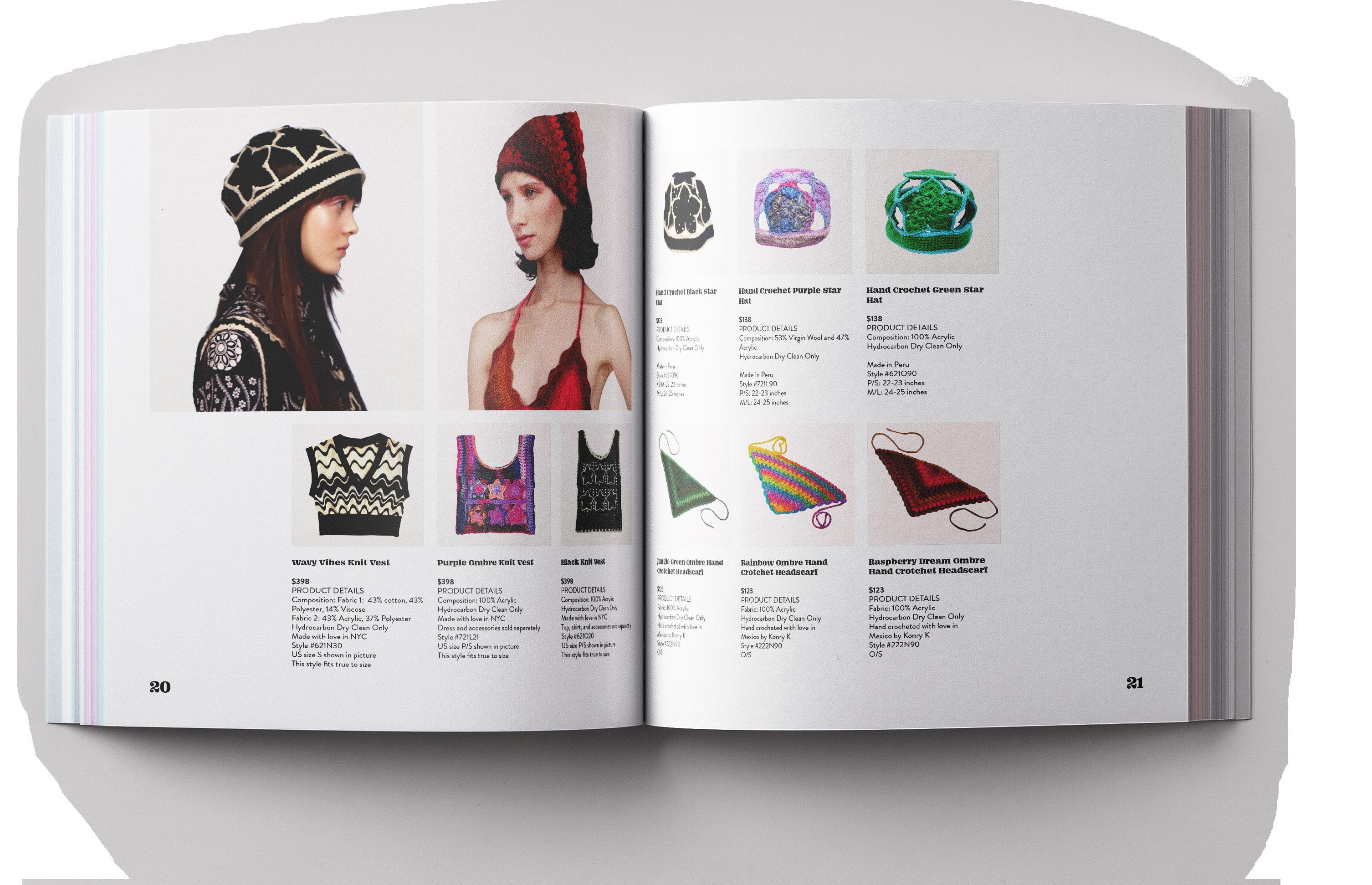
I was tasked with creating a 12 page catalog for a brand or product. I chose to create a catalog for the ready-to-wear spring Anna Sui collection. The fashion designer, Anna, is dedicated to craft and concept in her designs and is known for vintage styles and research in aesthetics of the late 20th century.
Process
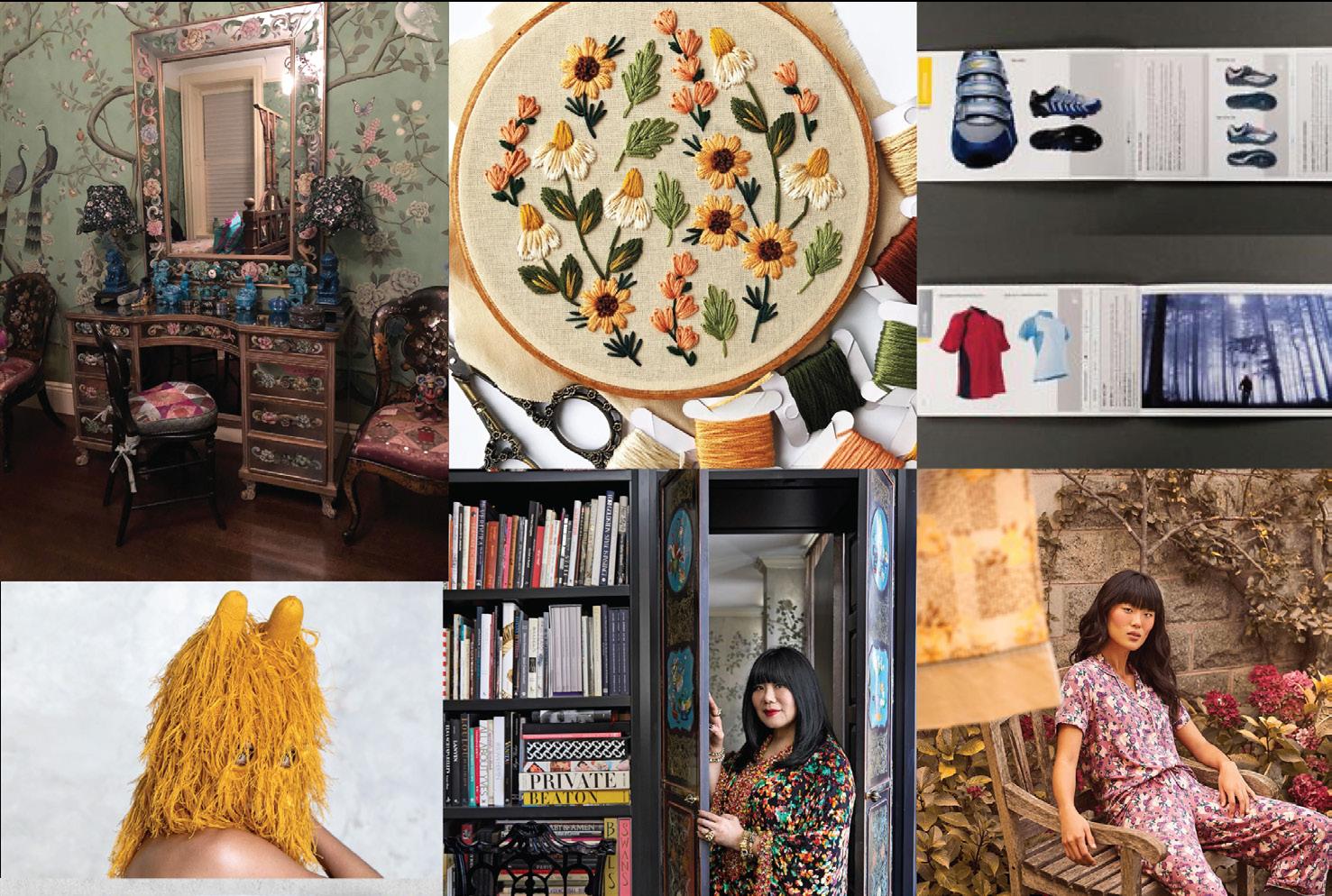
I wanted to find colors and type that would best reflect Anna’s new collection. I chose colors that appeared most in her clothing designs as well as some neutrals that were common in her lifestyle photos. As for type, I chose a decorative serif with fun elements within the letter forms to communicate Anna’s inventiveness and creativity.
Type
1234567890
Degular Medium 11pt
Body Copy
AaBbCcDdEeFfGgHhIi
JjKkLlMmNnOoPpQq
RrSsTtUuVvWwXxYyZz
1234567890
1234567890
Degular Medium 9pt
Description Copy
AaBbCcDdEeFfGgHhIi
JjKkLlMmNnOoPpQq
RrSsTtUuVvWwXxYyZz
1234567890
FatFace
Header
Choices Initial Mood board OhNo
15pt
AaBbCcDdEeFfGgHhIi JjKkLlMmNnOoPpQq RrSsTtUuVvWwXxYyZz
Subhead
OhNo FatFace 13pt
AaBbCcDdEeFfGgHhIi JjKkLlMmNnOoPpQq RrSsTtUuVvWwXxYyZz
Anna Sui Spring 2022
Catalog
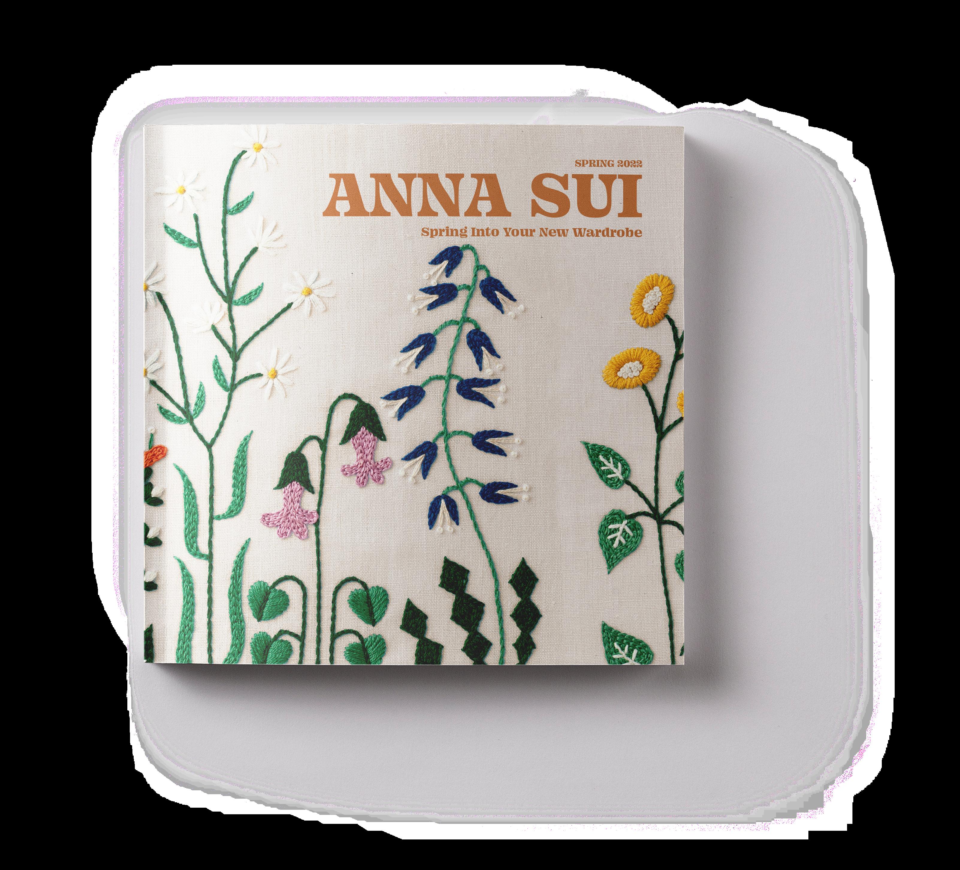
Catalog Front Cover
Solution
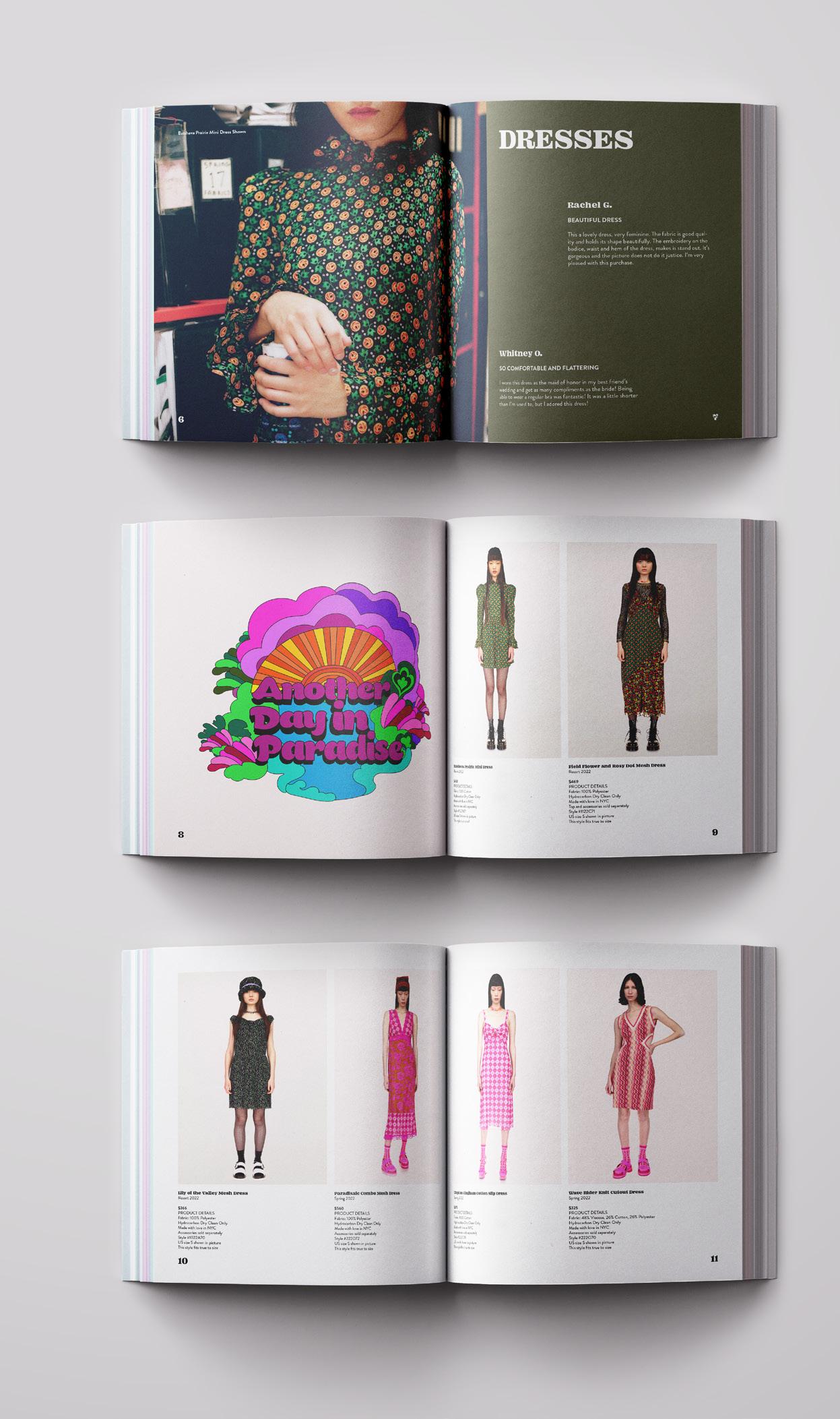
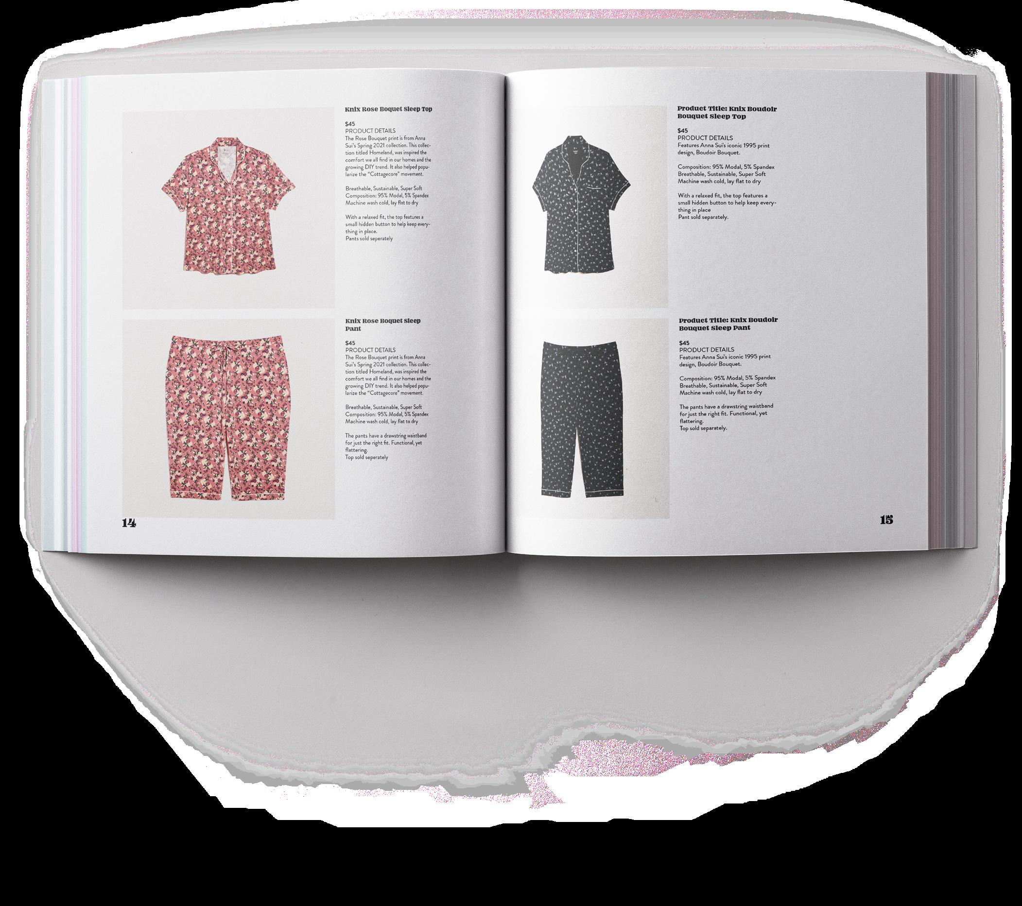
For the Anna Sui Spring/Summer 2022 catalog I collected assets and watched documentaries she has been a part of to gain a better understanding of her aesthetic. After preliminary research and defining the style she achieved in her collection, I used similar textures and patterns that may have popped up and included them in the finalized catalog. In addition, I also included reviews for relevant products on the pages for different sections such as dresses, intimates, and knitwear.
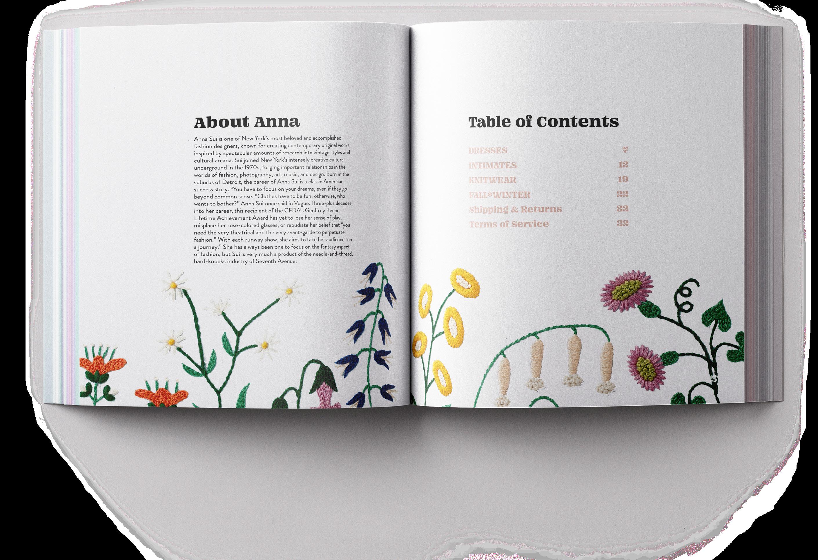 Anna Sui Spring 2022 Catalog
¡La Activista! Newsletter
Description
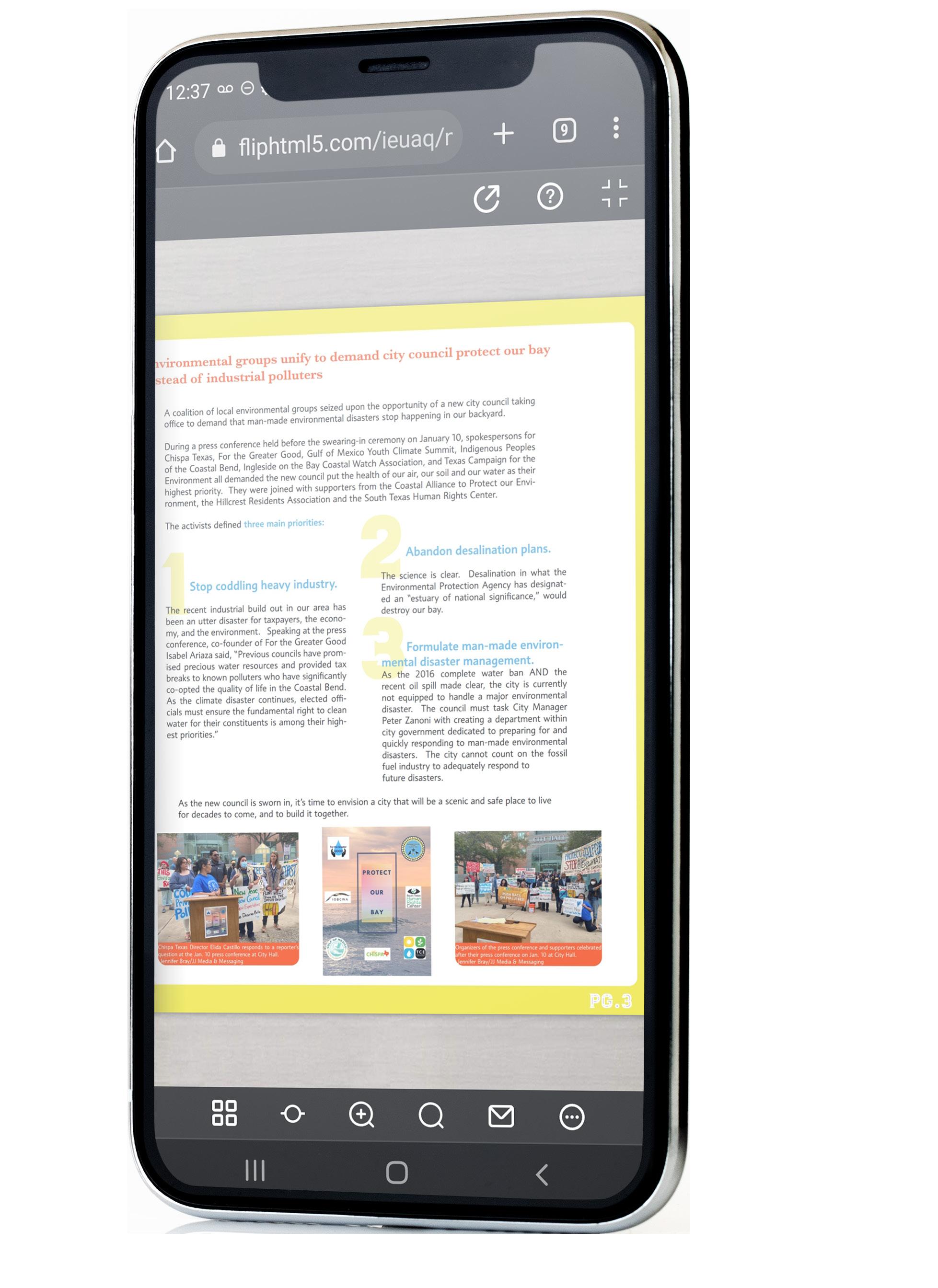
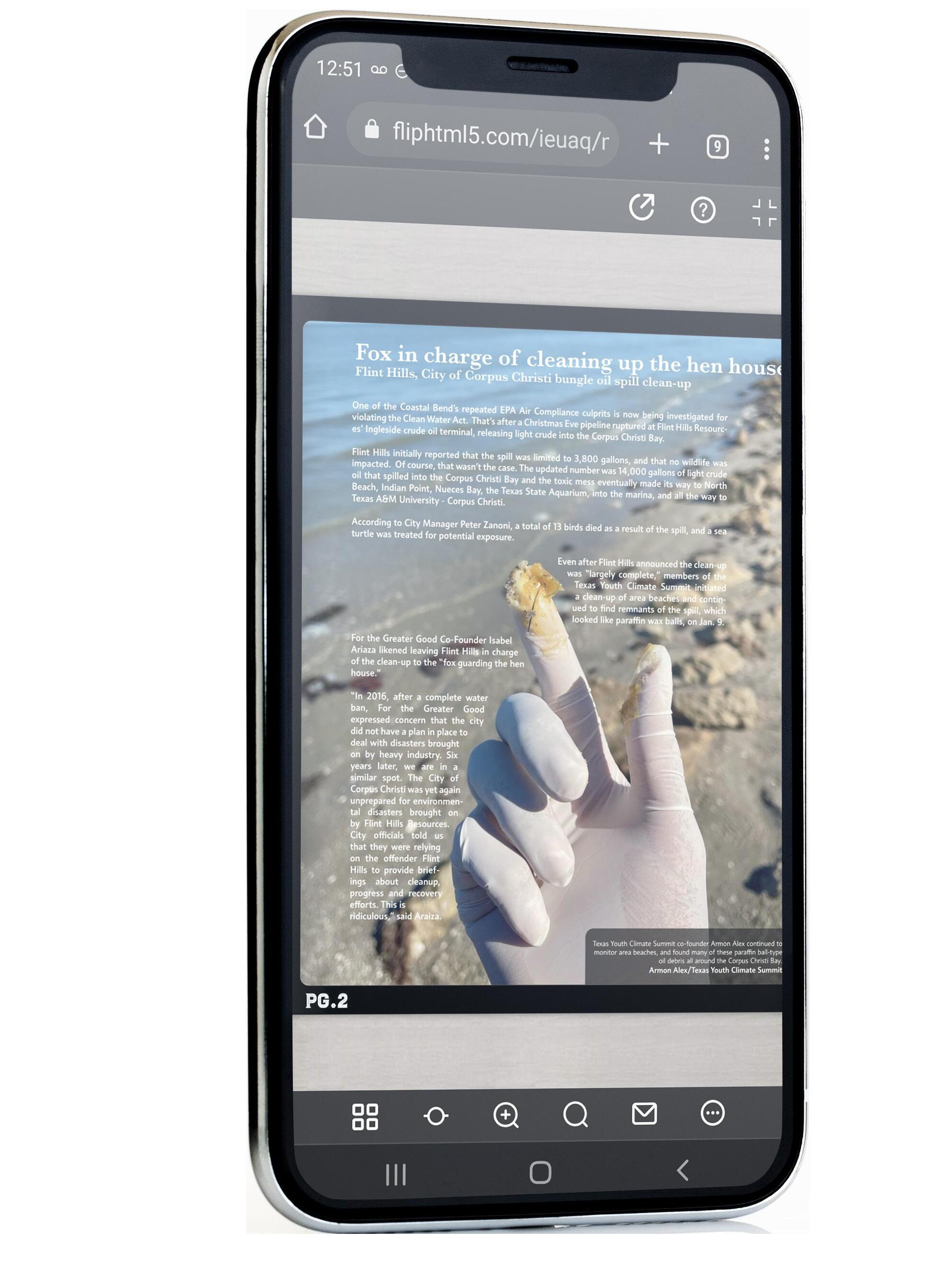
This is a monthly newsletter I was hired to create for local Non-profit organizations in the Costal Bend that goes out to people in all of South Texas.
Branding
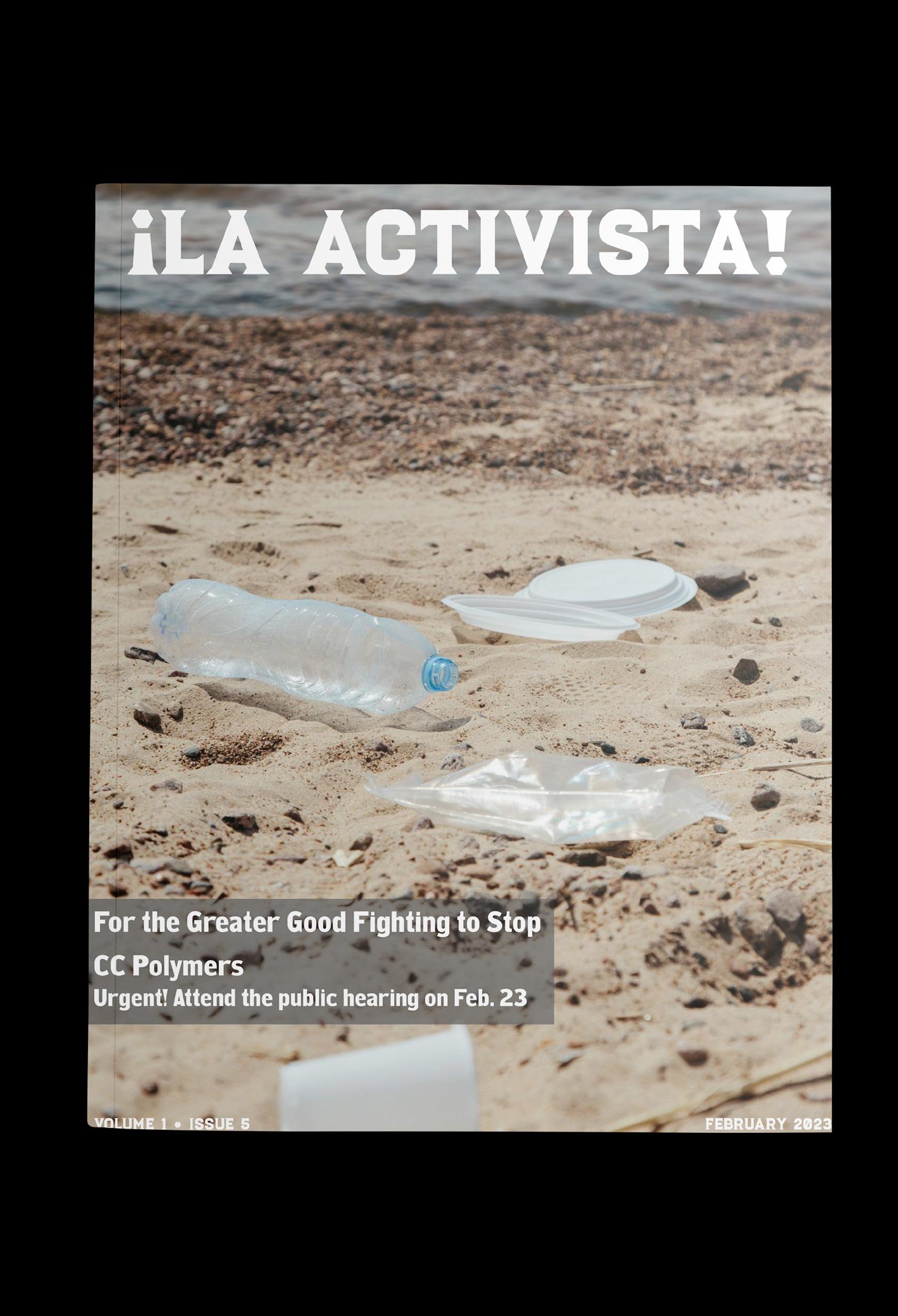
The title of the newsletter, ¡La Activista! References our perspective as an activists and the use of the Luchador type ties back to our community as it is a Latinx made publication. I used the main color from each of organizations’ logos to create this bright and attention grabbing color palette. I also chose simple typefaces for the copy to highlight the pops of color that are used in headlines.
The Brand

¡La Activista! Newsletter
Process
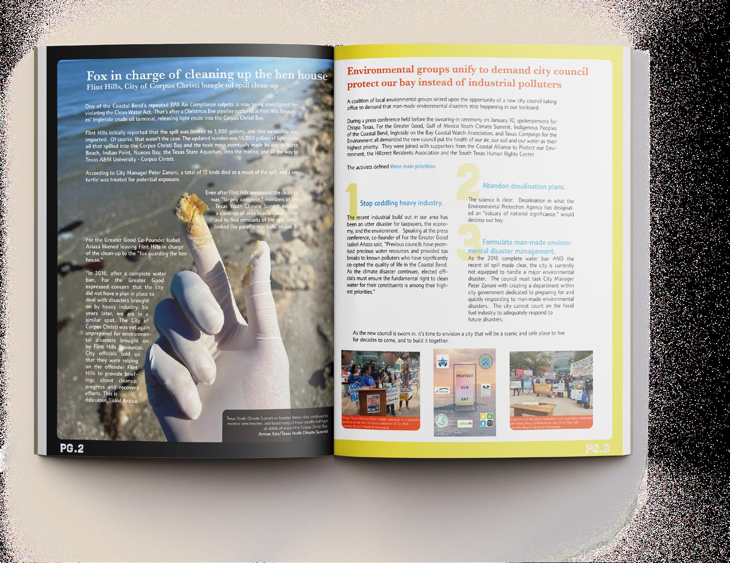
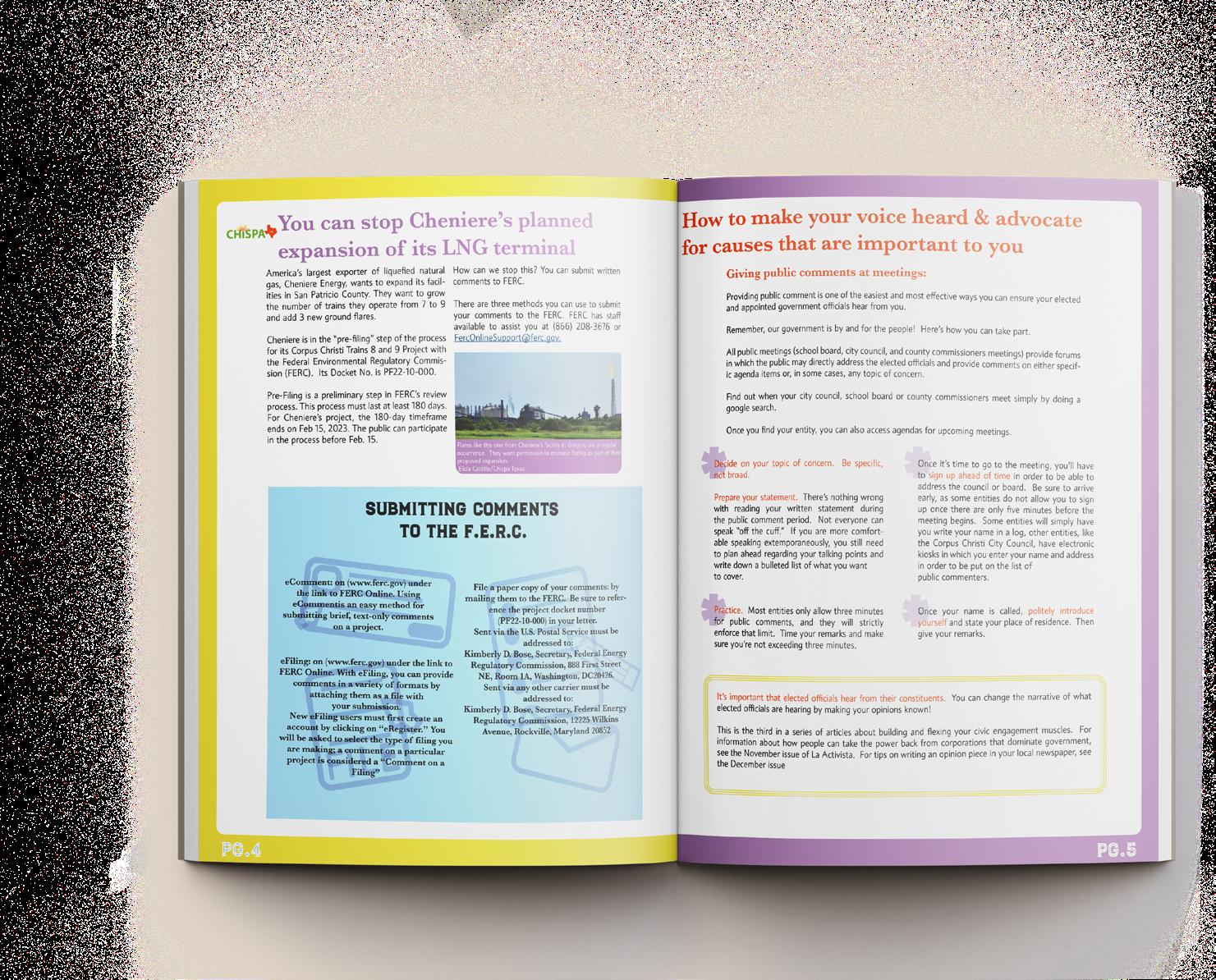
For the covers, I have included an image within a border that highlights our biggest story every month. I also left room in my design to include covers that are a full bleed image when an issue is particularly serious. The omition of extra color helps portray that somber tone. On the inside, I create clean spreads that best highlight the information in the copy. Occasionally I will design a page with no extra color, full images, and text wrapping in order to add more variety. I used punctuation and numbers in tandem to create visual interest with spreads that feature lists, or section within a story.
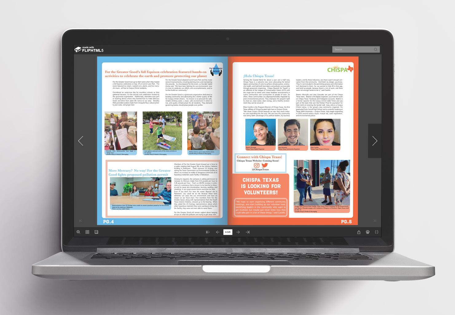
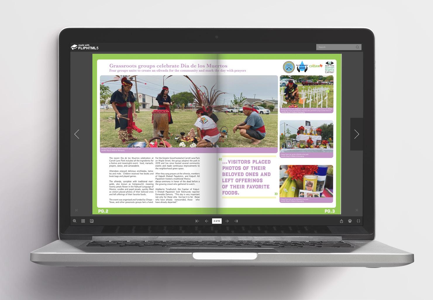
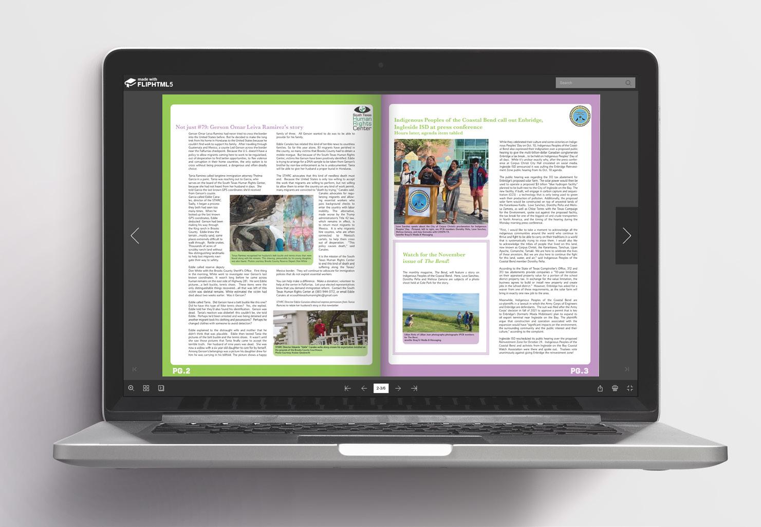
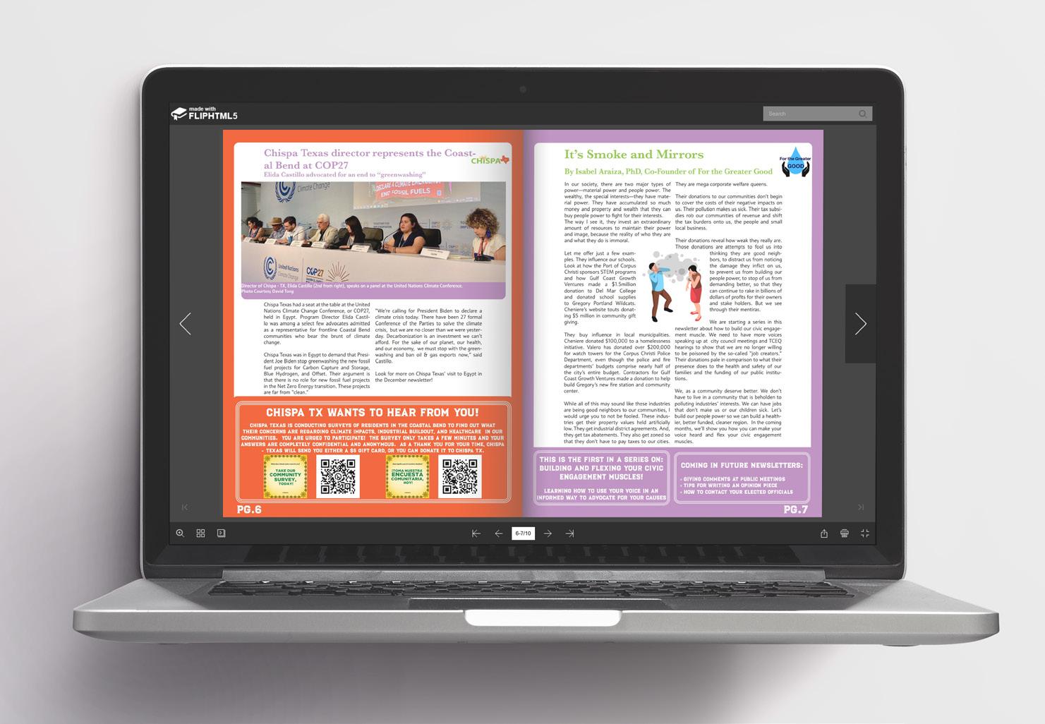
¡La Activista! Newsletter
FREAK: The Art of Horror and Alternative Fashion
Description
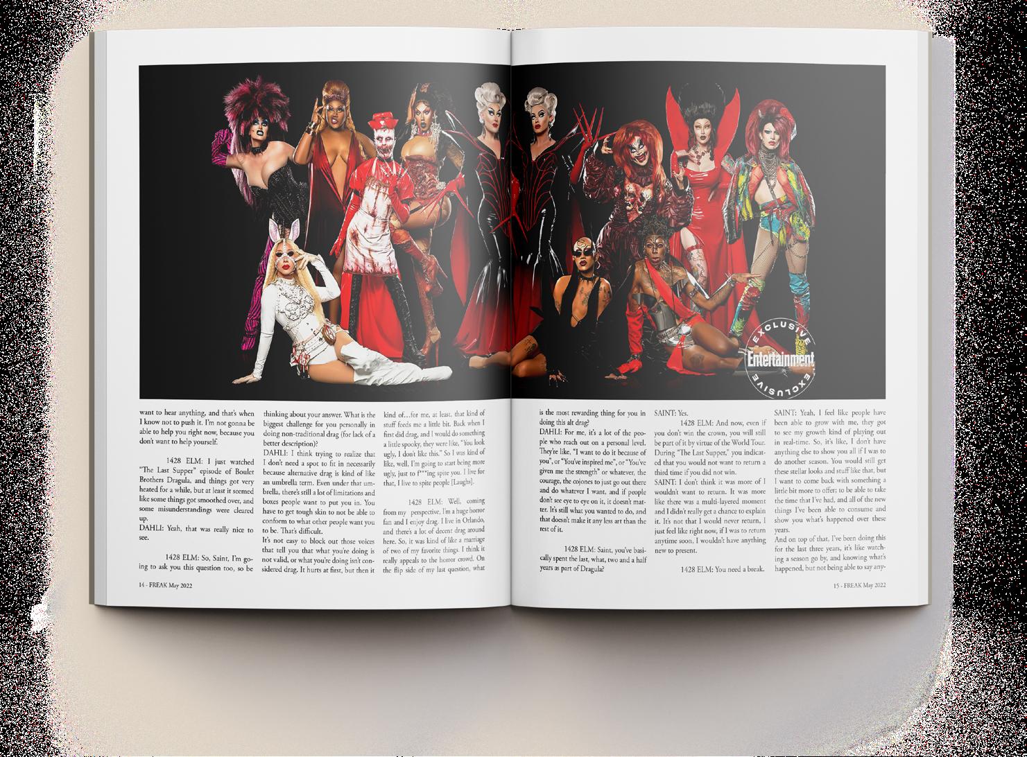
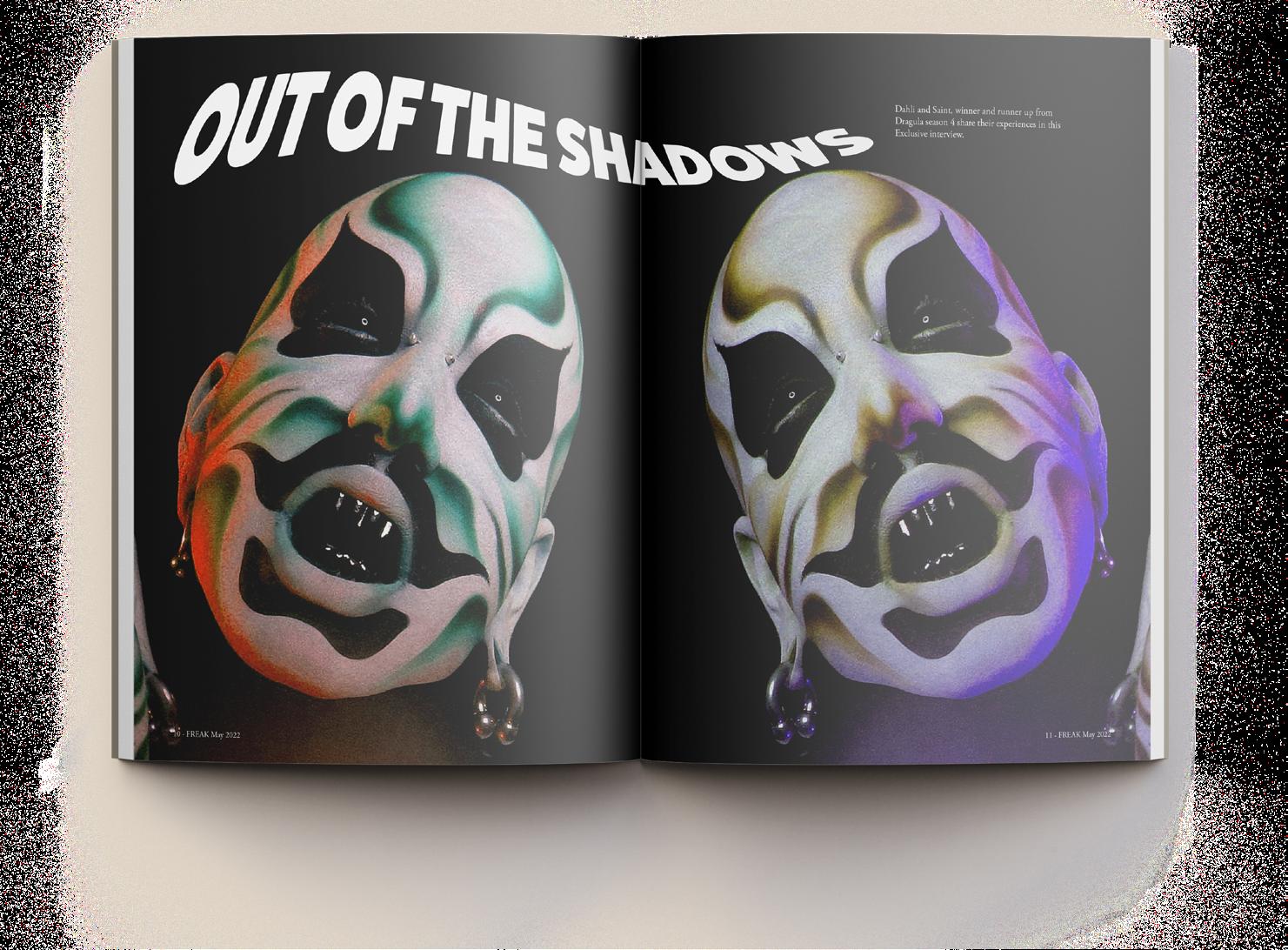
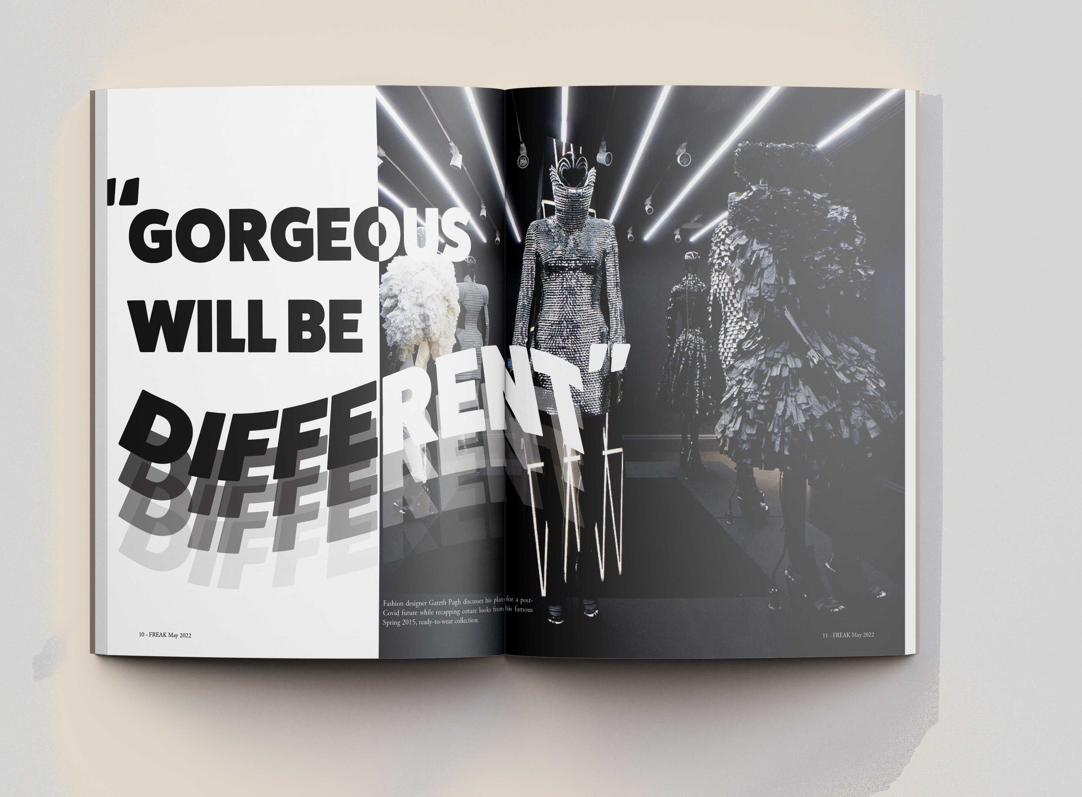
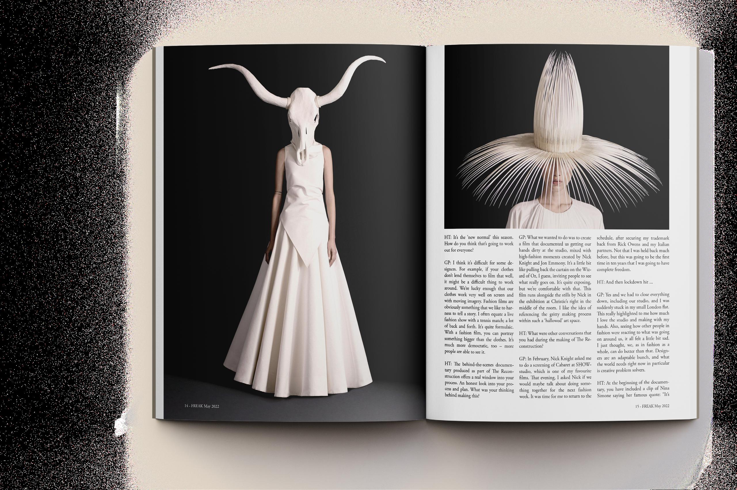
I chose to focus on the horror and alternative fashion subculture. I collected stories regarding fashion and horror and their reach in media for a 24 page magazine.
Process
When thinking about a logo, I pulled some elements that I felt would elevate the logo without it being cliché. I made a variation with color and a reversed out option. I also wanted to create feature spreads that felt editorial and clean.
Logo

FREAK: The Art of Horror and Alternative Fashion

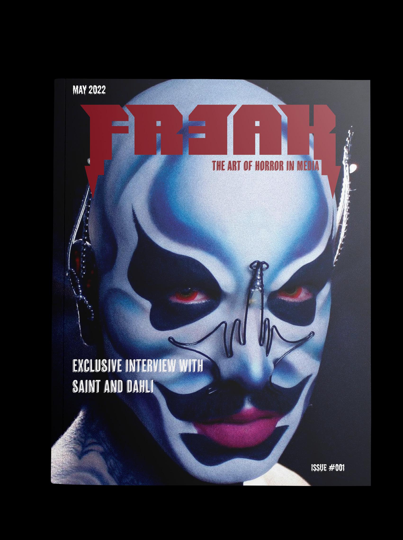
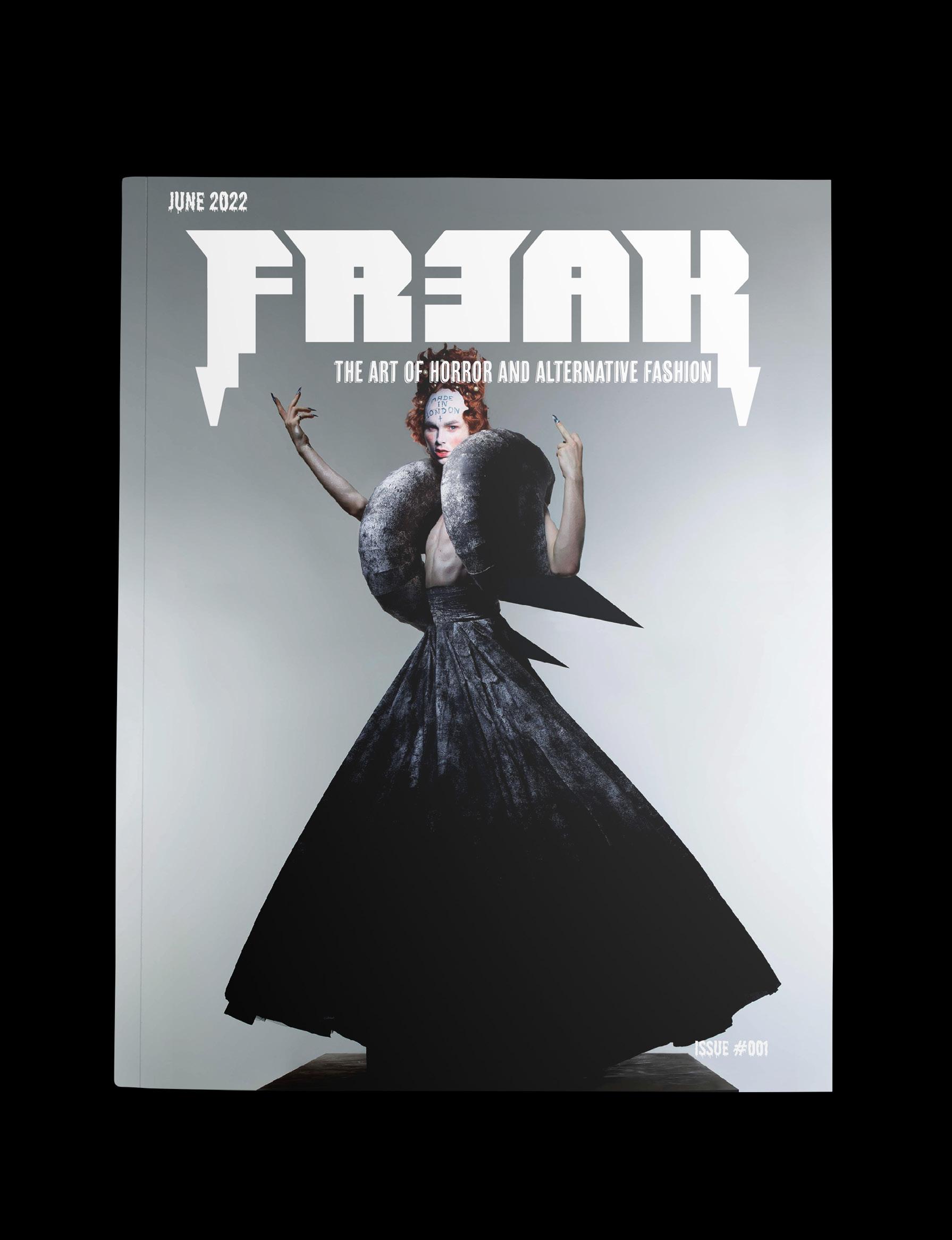
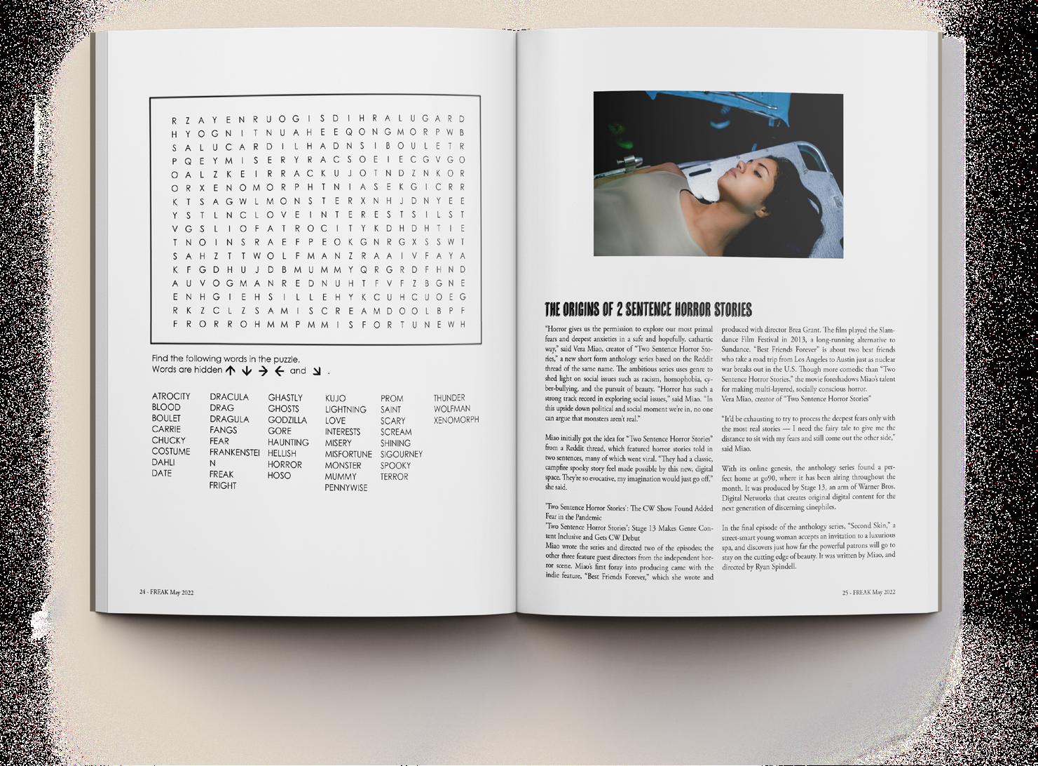
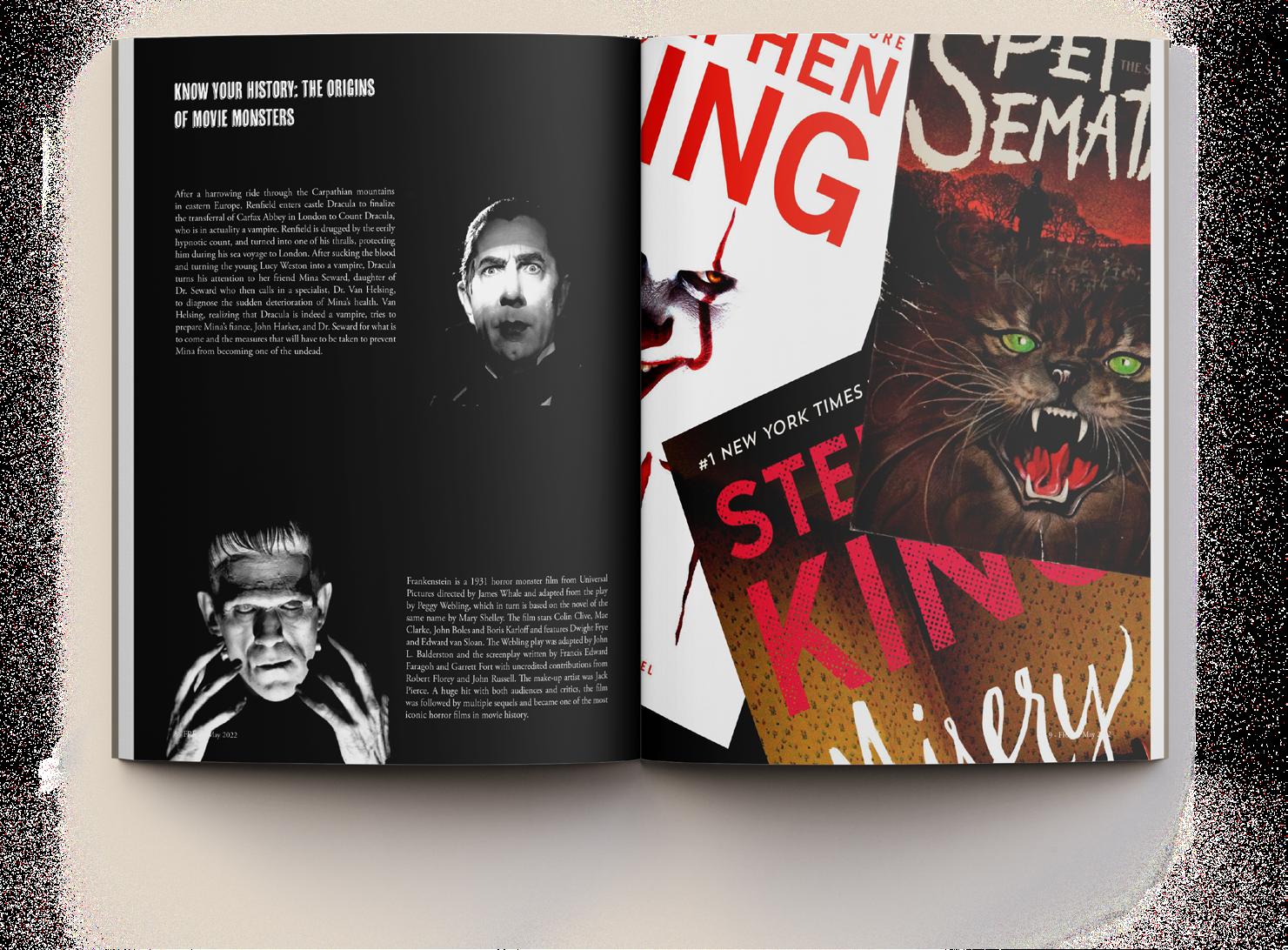
FREAK: The Art of Horror and Alternative Fashion
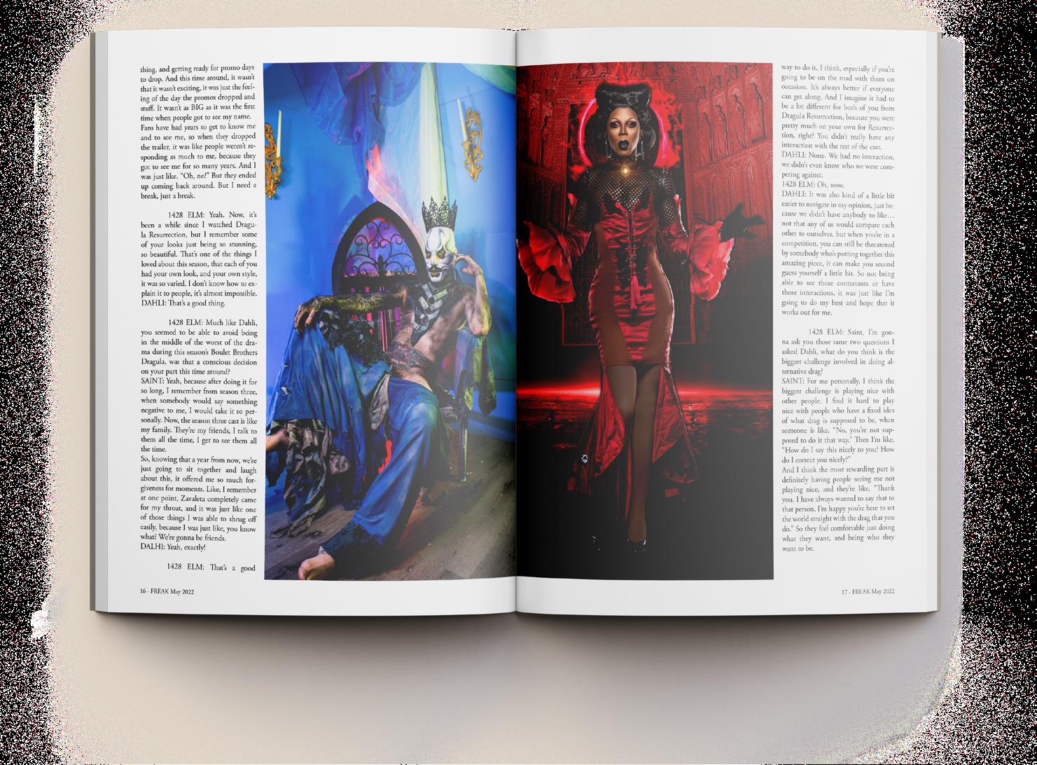
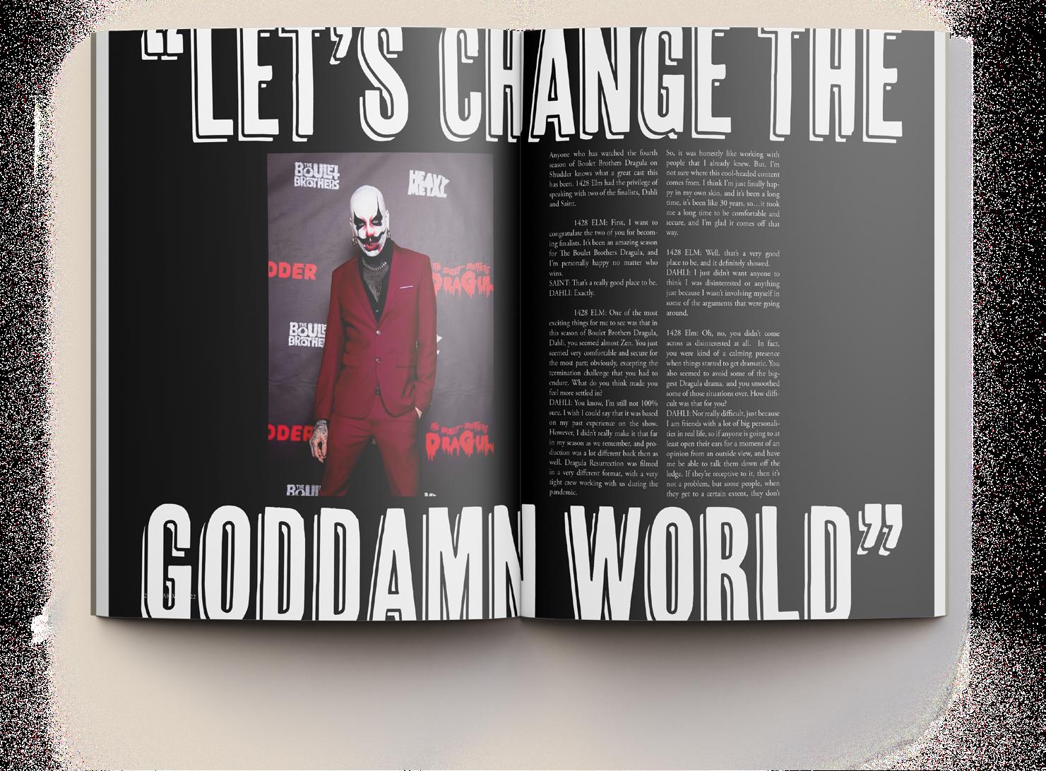
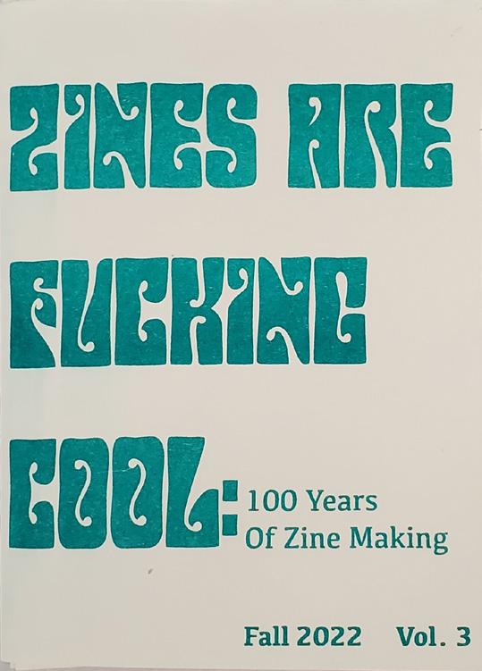
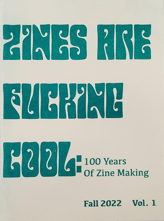
Zines Are F cking Cool
Description
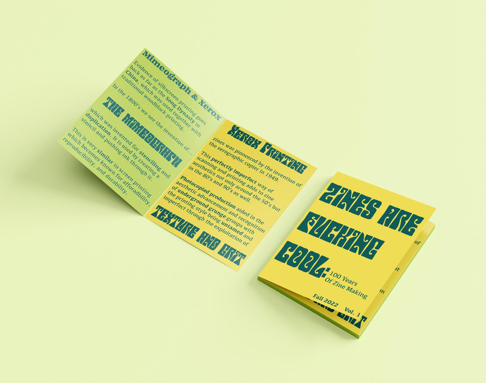
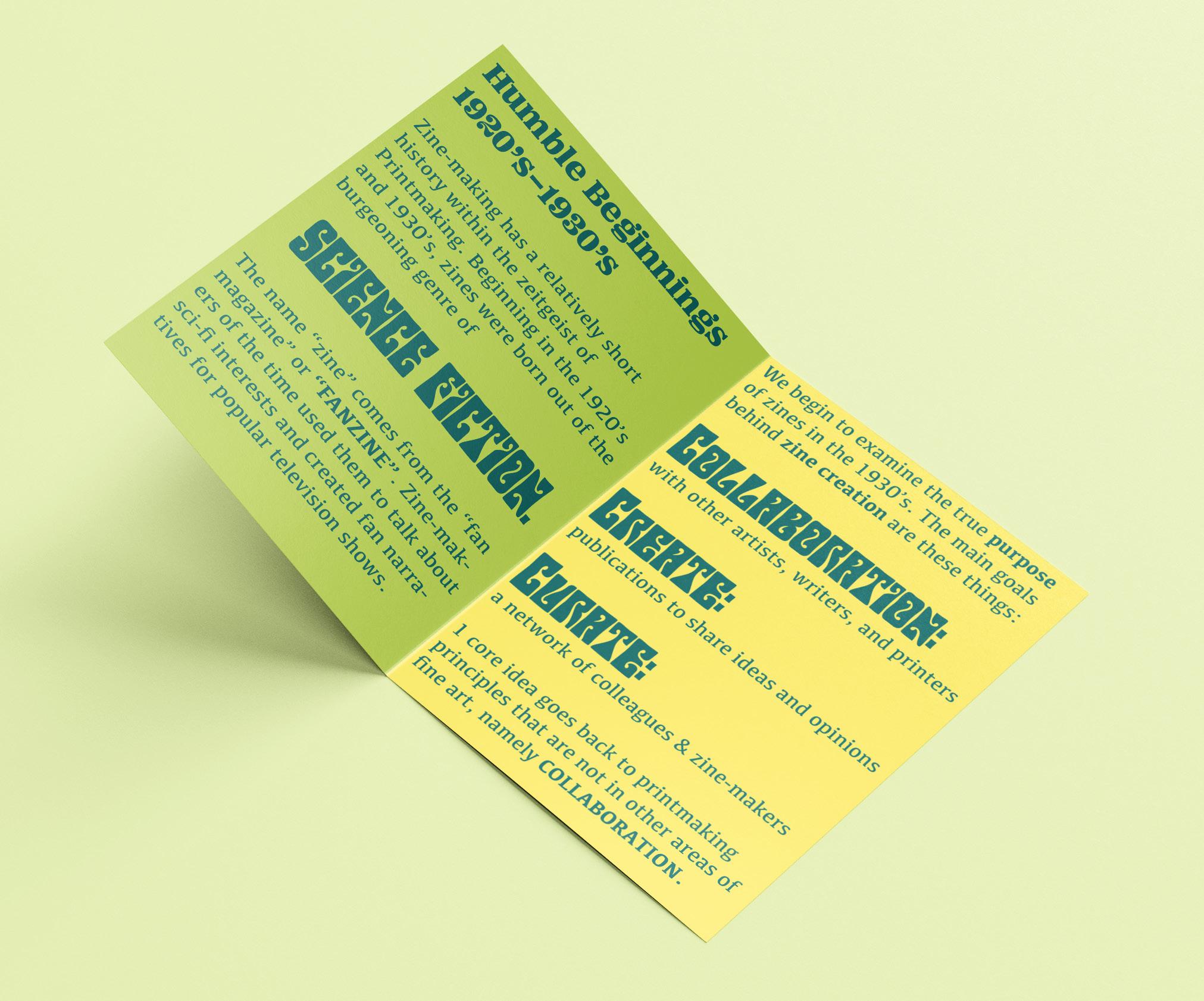
As a McNair Scholar and I decided to conduct research on zine making and the history of zines. It was very important for me to conduct research that is both relevant to my field as a fine artist, and helps show that research exists in all fields, it just looks different depending on the field.
Research
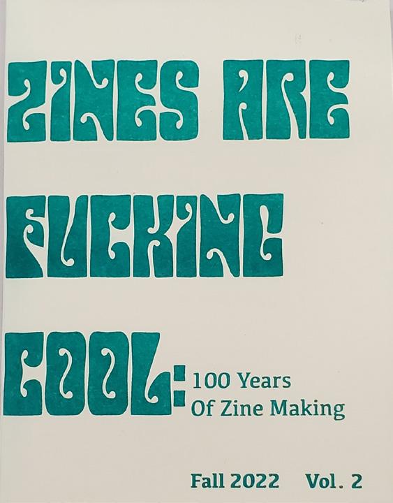
I developed a literature review on all of the current literature on zine making, and from that research I developed a series of zines for my advanced printmaking class as a response to literature and techniques that would have been used in the 1990’s for the creation of zines.
Zines Are F*cking Cool
Ephemera
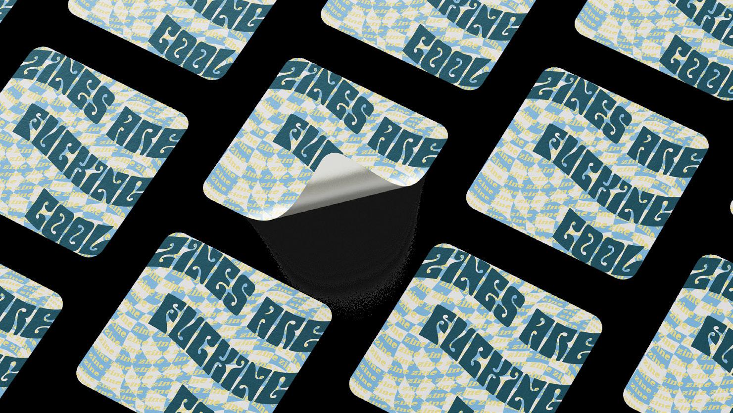
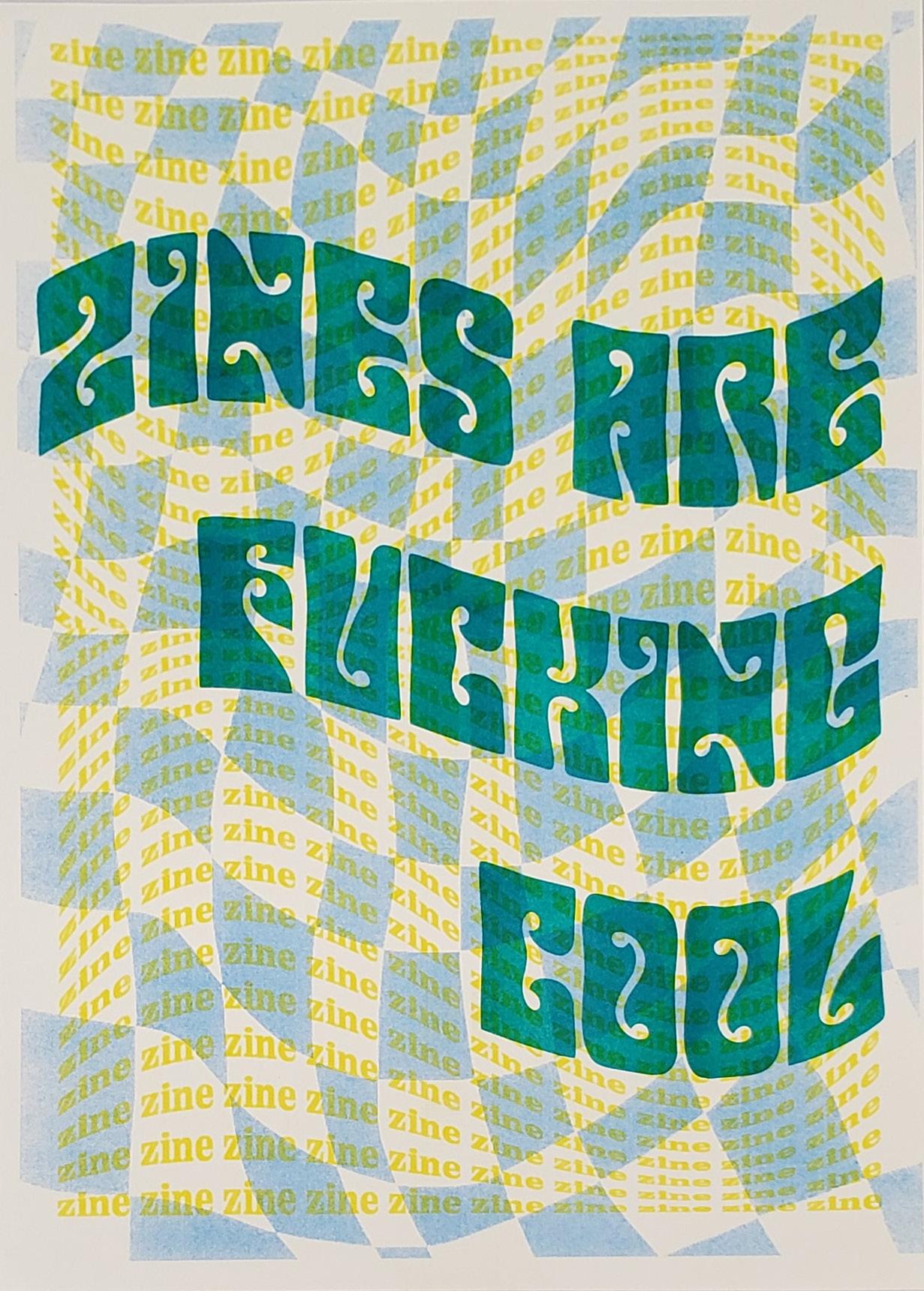
In addition to a 3 volume zine series, I also created ephemera for my research in order to turn it into a campaign. I included merchandise designs like stickers and a poster to go along with the zines themselves.
Solution
I ended with a work highlighting the research I had done over the semester; along with ephemera, I created a campaign that exists as a reaction and response to the information I collected. It shows what research is in creative fields, and proves that art research should be taken seriously in academia.
Risograph Printed Poster Risograph Printed Zines
Illustration Samples
Artist Statement

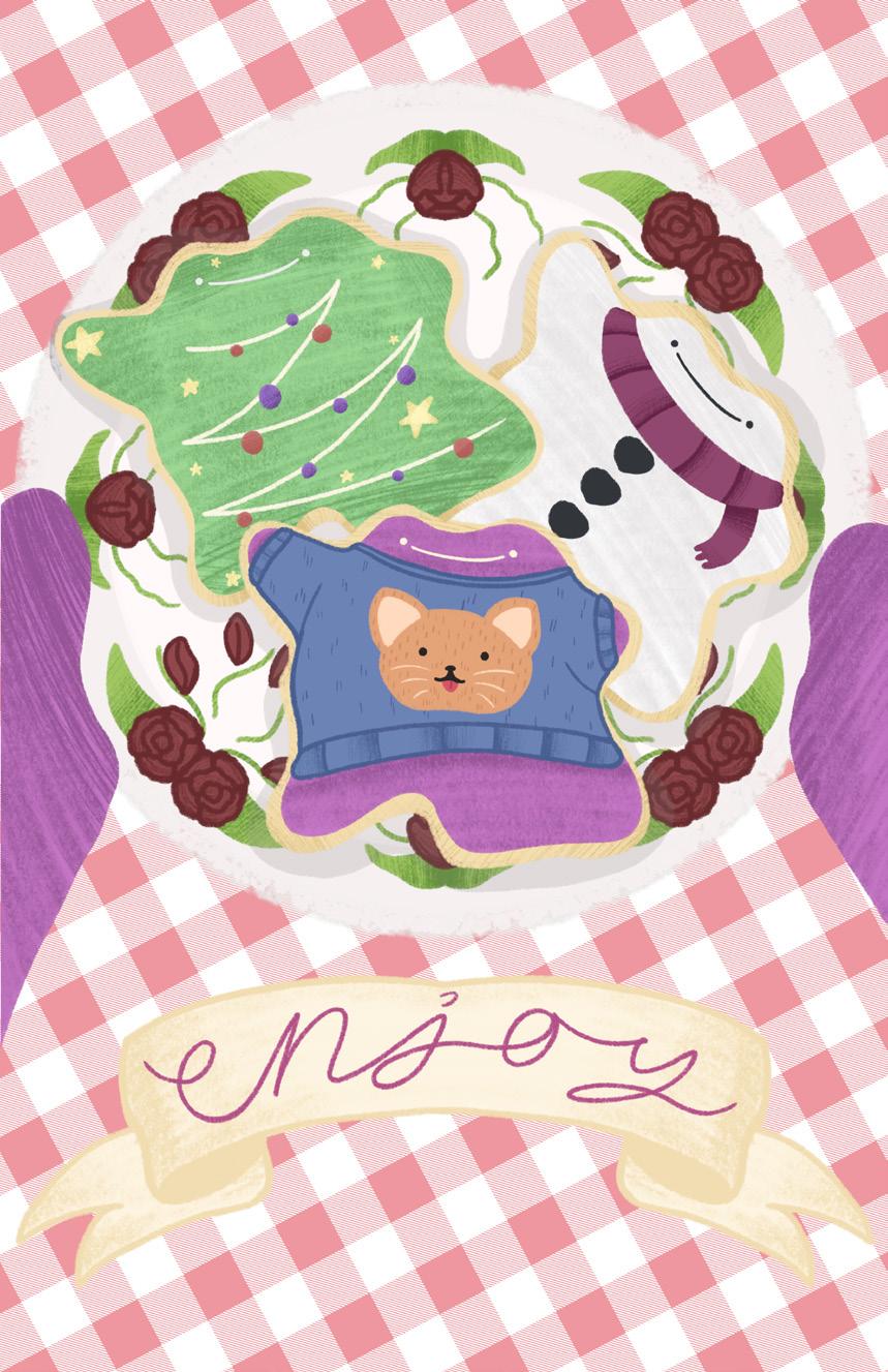
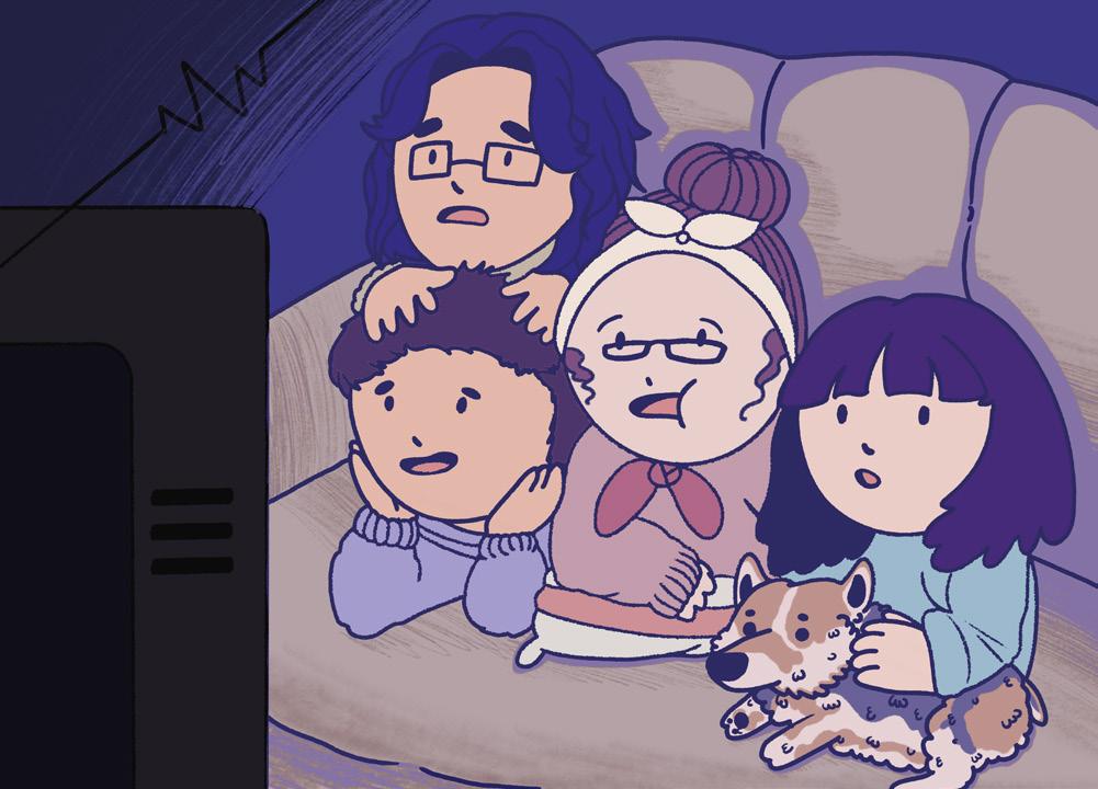
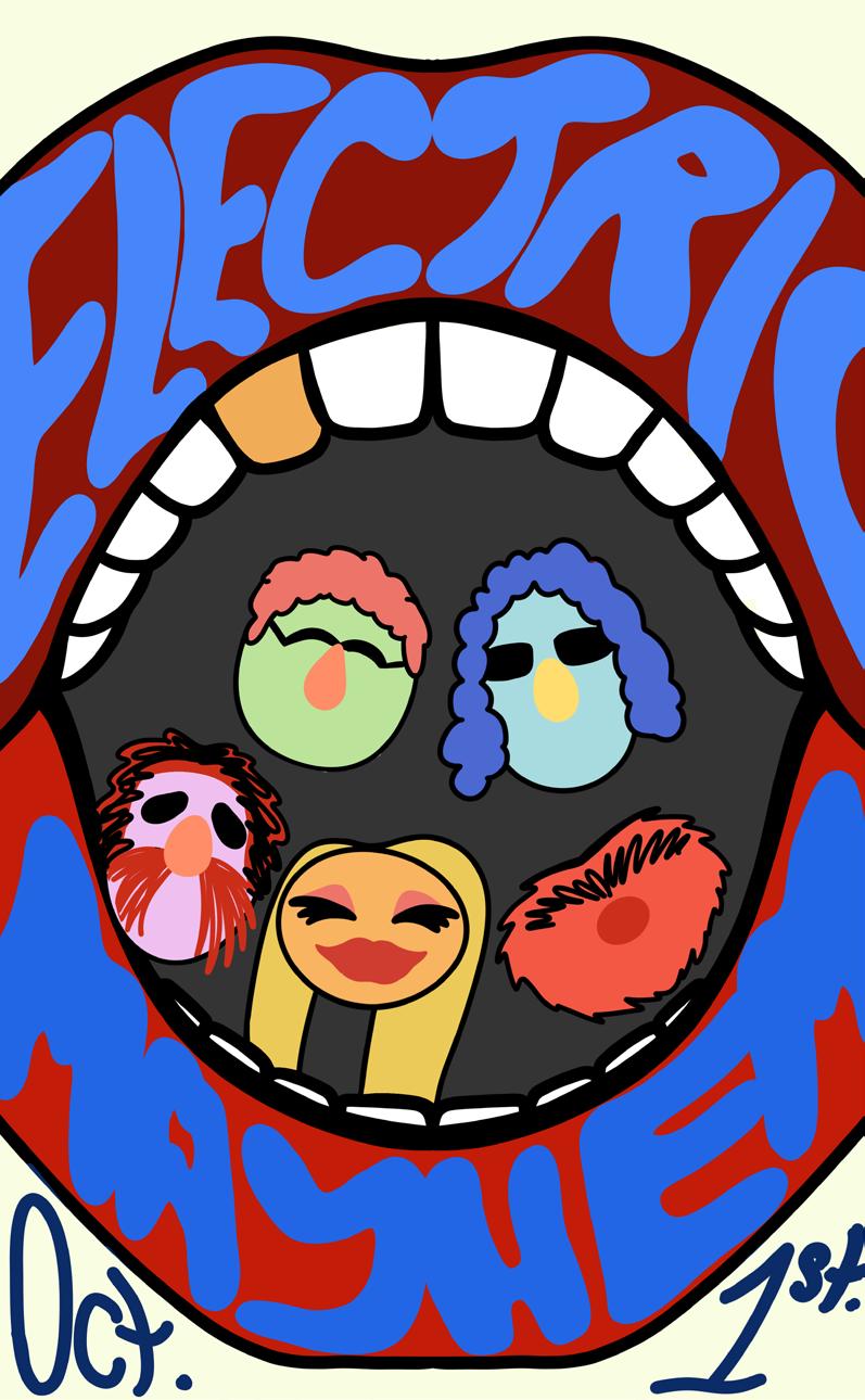
Here I have gathered a collection of some of my favorite illustrations. I always try to have a range of styles I can implement in my illustrations, from simple characters, to more fully rendered pieces. I enjoy using texture in many of my illustrations to add interest and bring a sense of fun to my work. I enjoy drawing small creatures and ghosts especially.

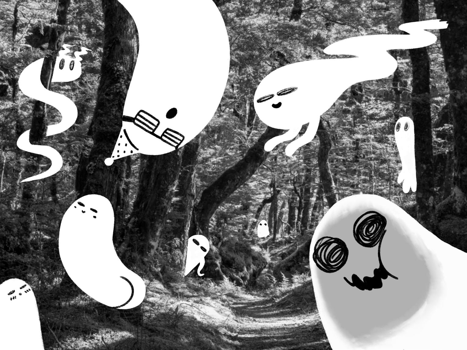 Illustration Samples


 Illustrations as Postcard Art


 Anna Sui Spring 2022 Catalog


 Illustration Samples
