About
Hello,
Sarah is a highly motivated graphic designer who is deeply passionate about her work and raising awareness. She believes that design can be a powerful tool for communicating important messages and bringing about positive change in the world.
She is committed to using her skills to help those in need and is constantly seeking out new ways to contribute to important causes. When Sarah is not designing, she can be found exploring nature, taking photos, or spending time with her family.

Mood
Mobile App Design
Overview
Mood is an original mobile app concept for college students who struggle with mental health and want to focus on selfcare. When signing up for an account, the user will indicate the college or university they are attending. Mood uses this information to offer the student a more personalized self-care experience, providing them easy access to university resources, connecting them with other users, and even allowing them to link their app with their University
Solution
The Mood mobile app was designed with the intention to reduce the stigma of seeking help for mental health and promote a more open campus environment for all students.
 Sarah Hebel
Collaborative design with Mandy Espericueta
App Goals
1. Track emotions and actions
2. Guidance towards the users self-care journey
3. Inspire and motivate college students
4. Customization within the app
Competitors
Mood’s competitors are Habitica, Finch, and Youper. These apps are self tracking and feel better apps. The competitors are unorganized, overwhelming. Mood is different because it is simple, organized, fun, and targets college students.


Target Audience
The target audience is college students who are struggling with mental health. Mood targets students who might be too shy or afraid to ask for help. The app encourages students to express themselves and to visit the counseling center.
Research
After interviewing college students, it was made clear that many students are afraid to go to the counseling center. There were a few students that didn’t know where the counseling was. With Mood, we want to target students who are too afraid to open up or too scared to visit the counseling center. We want students to know where the counseling center is and that it is a safe place to open up.
Habitica Finch YouperUI Standards
Copywriting
Mood uses youthful, relatable, casual, and safe messaging to relate to college students. The app avoids using negative language and always uses uplifting and encouraging copy.
Characters
Mood uses characters to capture different emotions. Mood avoids using sad charcters, but has a variety of characters to display a variety of emotions. The user is able to change their character at any time. Their character will help guide and support throughout their self-care journey.


Scan here to experience the app!
 Character Illustrations by Sarah Hebel

Alzheimer’s Store
Rebrand Overview
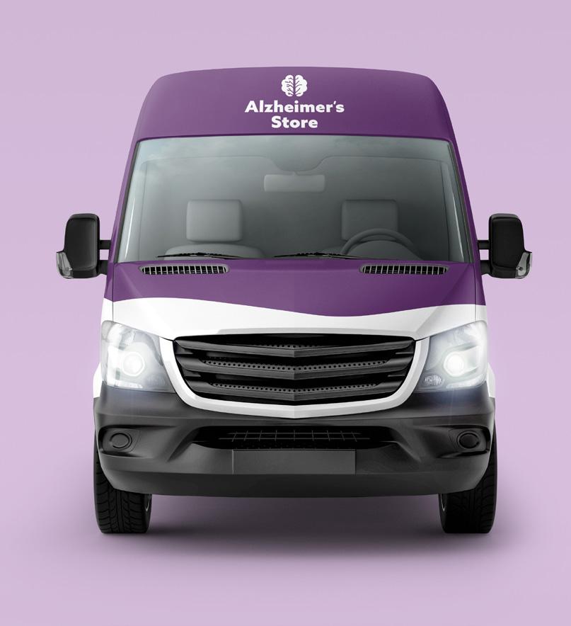
The purpose of The Alzheimer’s Store’s rebrand is to change the direction of the brand’s focus and objectives. Along with selling products, The Alzheimer’s Store needs to lean into educating the audience and spreading awareness.
The recognizable color palette is friendly and caring. The overall goal for the Alzheimer’s Store is to focus on spreading awareness and helping those that have loved ones with Alzheimer’s with relatable and positive messaging.
 Sarah Hebel


Packaging


The goal of the toy products is to keep the Alzheimer’s patient’s mind occupied and stimulate their senses, such as touch, sight, and hearing.


Annual Report


Lovely
Magazine Overview
Lovely has devoted itself to publishing stories covering body positivity and diversity for women. We hear the stories of women and we are here with open arms for support. We cover many things in Lovely like defining body positivity, words of affirmation, tips, and more. Our overall goal is to create a safe place for women and to let them know that they are lovely as they are.

Solution
To help women on their journey to find love within their bodies, we created a soft and friendly brand. Soft words and round shapes are used throughout the magazine. It was important to use many pinks and whites throughout the magazine to make the overall tone sweet and welcoming.
Sarah Hebel
Competitors
Many body types and sizes are not accepted by society. These expectations can lead to poor mental health, body dissatisfaction, and unhealthy behaviors around food and exercise. Plus, Diversity Woman, and FabUplus are competitors for Lovely. Some of Lovely’s competitors lack diversity. Lovely is more inclusive and helps women love their bodies.


Moodboard
It was important to incorporate many shades of pinks and soft colors. Body positivity and diversity are the most important factors for the magazine. It is important to show women who are confident with their bodies and to show a diverse group of women of all shapes and sizes. Stories, photos, and illustrations included in the magazine are powerful and telling.


Headline- Peace Sans
Subhead- Azo Sans Medium
Body Copy- Loos Wide Regular
Sarah HebelLogo Digitization


During my conversations with peers, I discussed my brand and how I wanted a lot of round shapes. Then the idea came to make the logo round and to play with the letter ‘y’.
Story Ideas
Filters on social media

Body positivity, self-reflection, and self-love

Quiz that gives you an affirmation
Women of color, how they’re effected Lizzo, Yitty collection
Step 1) Have a body Step 2) Go to the beach


South Texas Botanical Gardens & Nature Center
Website Overview

The South Texas Botanical Gardens & Nature Center is a beautiful place to connect with nature, located in Corpus Christi. The gardens offer a variety of resources and activities, including parrot talks, “rep-tales,” and more. The website redesign focused heavily on organization and the use of bright, lively colors to capture the fun and beauty of the gardens. The goal was to create an easy user experience for the target audience, while also highlighting all there is to do at the gardens. Overall, the redesigned website is a vibrant and engaging representation of the South Texas Botanical Gardens & Nature Center.
 Sarah Hebel


Rise Up + Recover
Overview
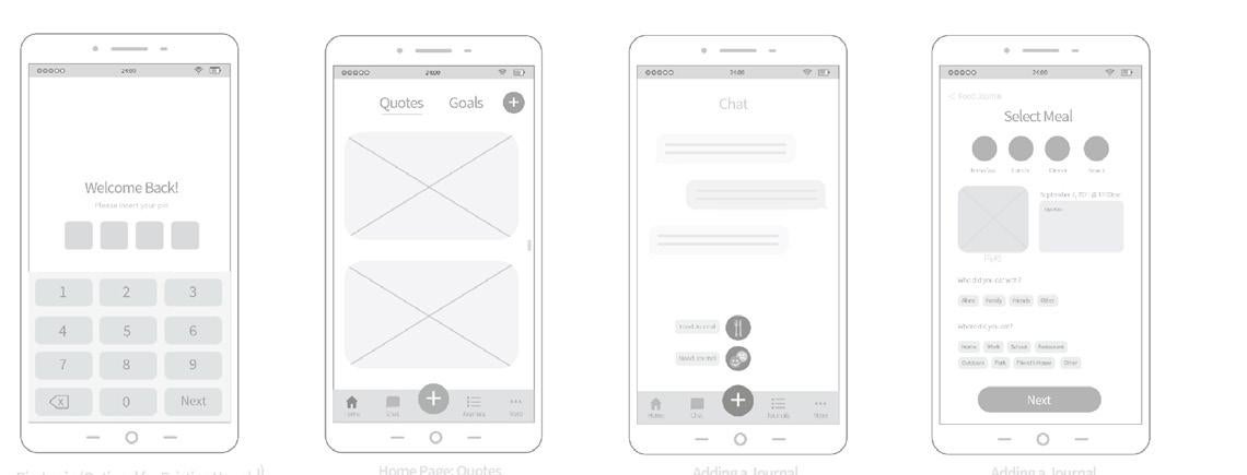
Rise Up + Recover is a smart companion for managing your journey to recovery from eating disorders including anorexia nervous, bulimia nervosa, binge eating disorder, and AFRID. This app is also intended for people with general eating, weight, and shape concerns. The purpose behind the redesign for Rise Up + Recover is to update the app to be more friendly and motivating to those who struggle with food. We want to encourage users to keep coming back to the app to log their journey.


App Goals
1. Help people who are struggling
2. Get users to share their logs
3. Inspire people who are struggling
4. Gather loyal users


Design for Non-Profit

CBWF TOKC
Triumph Over Kid Cancer
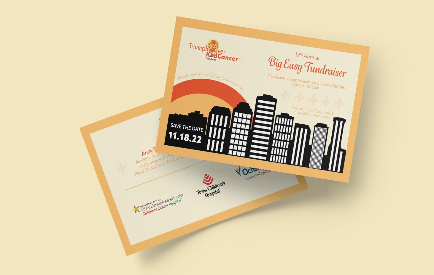
Triumph Over Kid Cancer (TOKC) is a foundation that is dedicated to improving the lives of children with cancer by raising their spirits, raising the public’s awareness, and funding research to improve the treatment and survivability of pediatric cancers.

Coastal Bend Wellness Foundation
The Coastal Bend Wellness Foundation (CBWF) is a grassroots, community based non-profit organization taking on causes to fill gaps in services that no other agency provides. Current services include primary health care, mental health and substance abuse programs, infectious disease testing, education and linkage to treatment, and youth education to provide information on the dangers of drug use.
Sarah Hebel TOKC: Fundraiser Invitation CBWF: Business CardTriumph Over Kid Cancer


Coastal Bend Wellness Foundation


 Sarah Hebel
CBWF: Breast Friends Program Insert
CBWF: Testing Card
CBWF: Pink Diva Ball Ticket
CBWF: Phases Flyer


