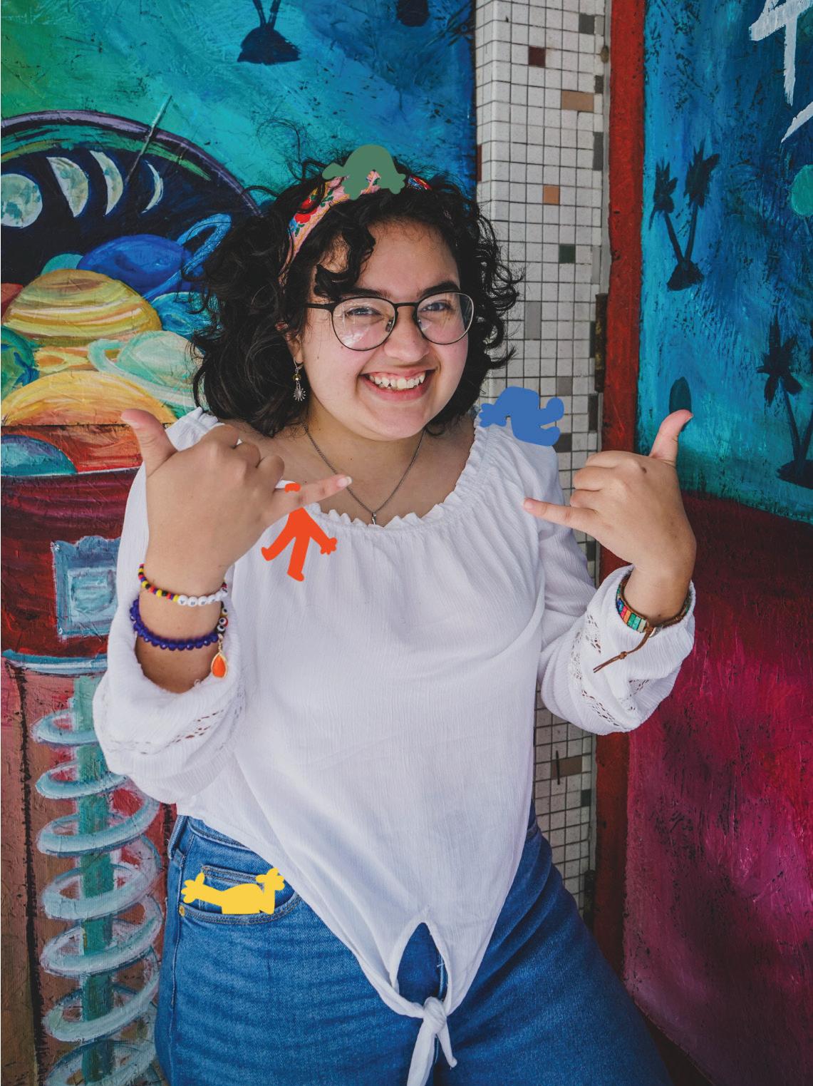
Hi!I’m Sierra, and I’m a Graphic Designer, an Illustrator, and an Animator. I understand that a part of what makes Graphic Design so successful is how the public interprets it. That’s why I take feedback very seriously in my work and continue to try different variations and look at it from different angles. This is only possible through others feedback and cooperation as a team. I’m a designer with a fresh style that consistently works to find the best solution for the project at hand.
Able Sociable Curio Curious Iona Passionate Cooper Cooperative Meet the
Crew:
My Works
Traveler’s Tavern
App Rebrand | Case Study
Beetles Catalog
Seasonal Gel Polish Catalog
Alebrije’s Around Us
Educational App for Display
Born to Ride
Lettering Lookbook
Machismo Campaign
Awareness Campaign | Case Study
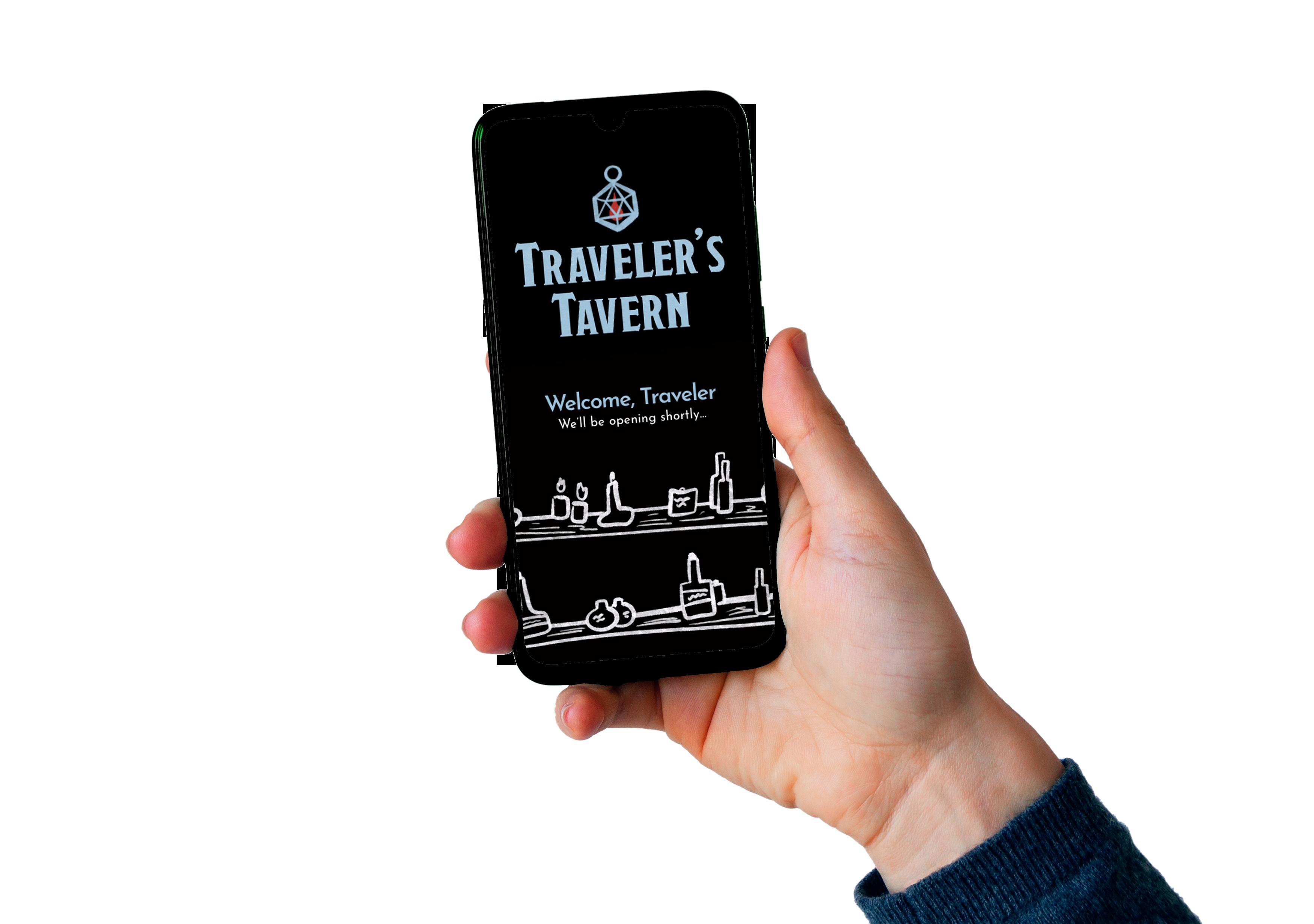

Try the app yourself!
Traveler’s Tavern
App Rebrand | Case Study
Project Type
Mobile App
Deliverables
App | Set of Illustrations | Print Ad Series
Overview
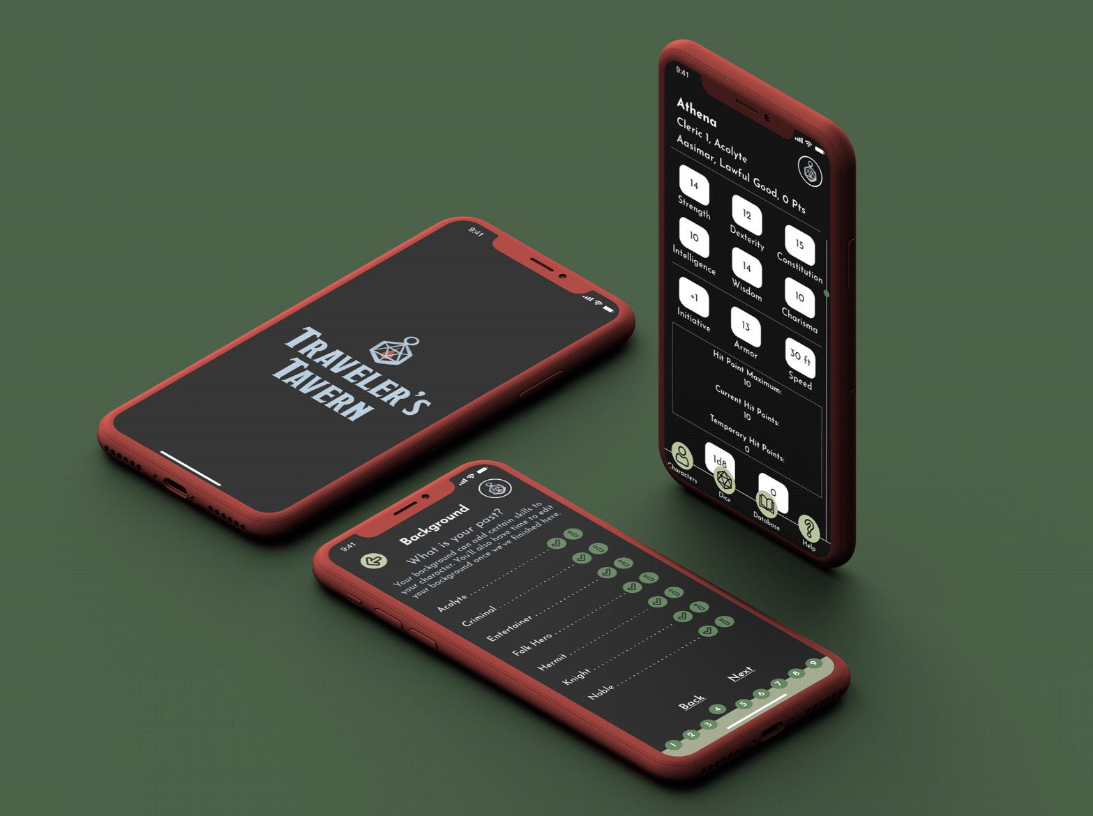
Traveler’s Tavern, originally known as Fifth Edition Character Sheet, is more than just an app, it’s an experience. Follow along with the Barkeep as he helps newcomers learn the ropes, and assists returners with their character building. Traveler’s Tavern allows all players to create their character as quickly as possible, while also utilizing a database for information to avoid flipping through multiple player guides.
Solution
When I was creating Traveler’s Tavern, I thought out everything that I would want to see most when using a D&D app. As a fan of the classic Tabletop game, I used my own experience and the research of others to create a unique experience simplified to an app that you can’t find anywhere else on the app store.
App Rebrand Case Study
Up
Mock
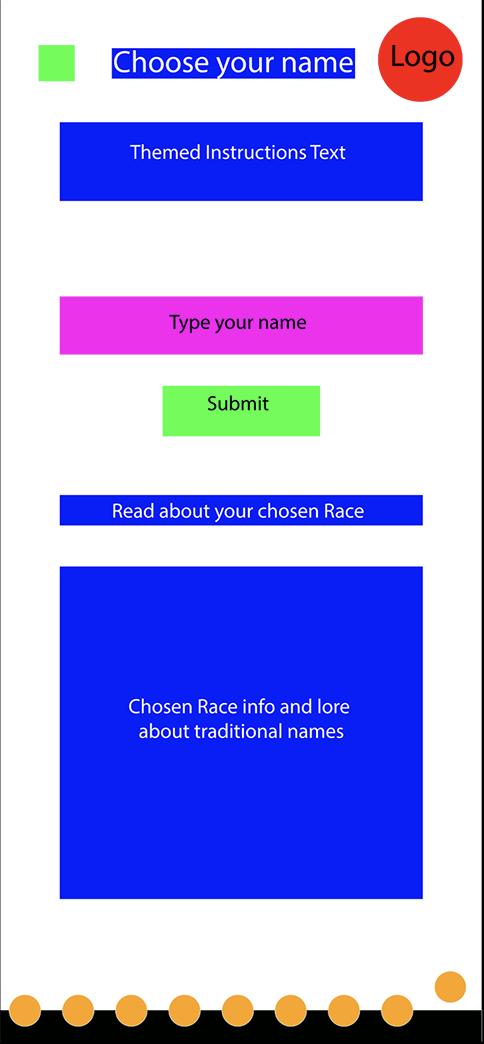
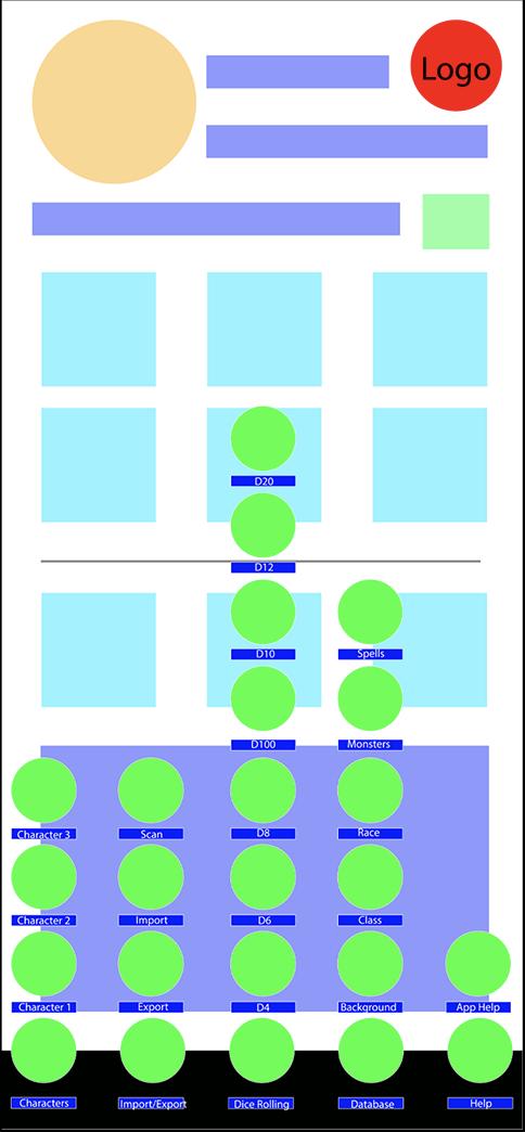
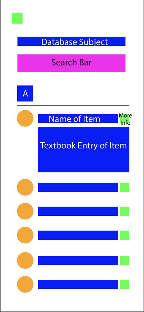
Examples of wireframes

Problem
Fifth Edition Character Sheet, was as the uncreative name suggests. Just a character builder for a fifth edition version of Dungeons & Dragons. One of the reasons why I chose it though was the ability to customize a lot of the elements, and the wide array of choices. The main issue was the UI and the overall drab feel for it.
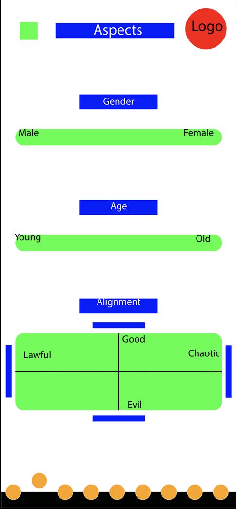
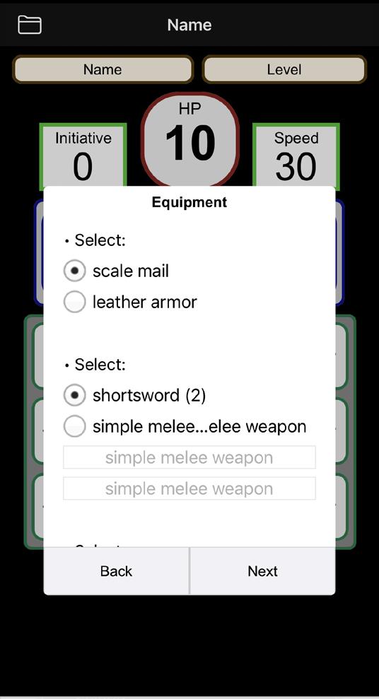
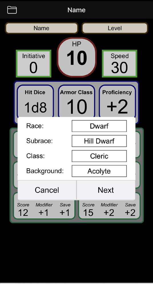
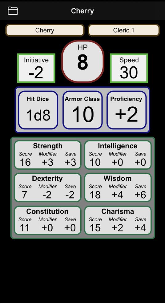
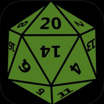 Screenshots from the original app
The original app’s icon
Research
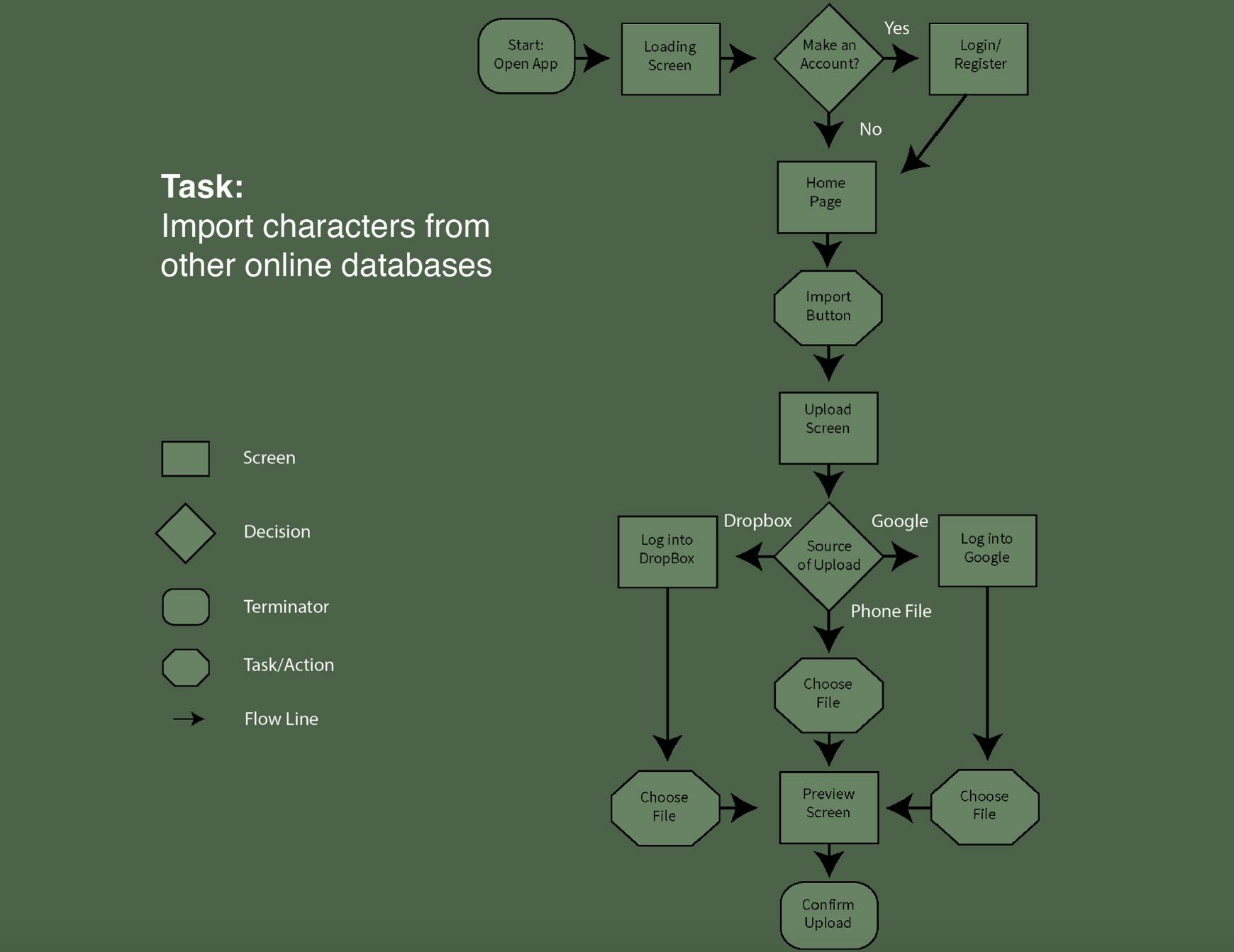
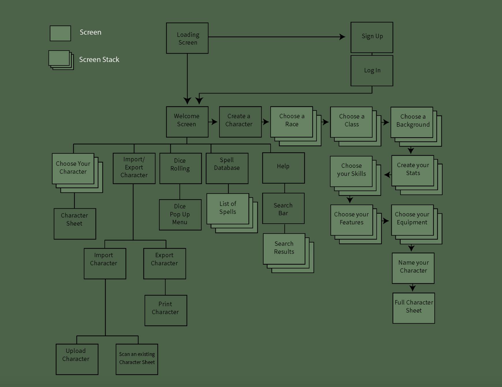
As this one of my first major UI/UX projects, I needed to make sure that my data was all in line before I jumped in headfirst. I spent hours focusing on the sitemaps and user flows to best hone in the way the app worked. I also spent time focusing on the target audience, however it wasn’t diffcult as the target audience was very similar to me and my friends. Using live studies and User testing was very useful when it got to the testing stages. And I didn’t just research Ui/UX during these times, I also tested if my data sources and information was enough for both beginners and experienced players. The audience for D&D is vast and wanted to make sure everyone could understand and find what they needed.
App Rebrand Case Study
User Flow
Site Map
Creating the App
Traveler’s Tavern was made with the idea of being an experience, and not just an automated character sheet. Playing off of the “cliche tavern” theme that so many D&D campaigns use, I created a persona for the app called the Barkeep. Both new and old user can enjoy their fun dialogue, and feel a mysterious familiarity with their tone. I also created my own illustrations and animations for splash and loading screens in the app. Throughout the user flow, you can see different explanantions on every race, character class, and so forth. If you already know what you want, it’s as quick as a two taps and then you’re on to the next step. On top of the character creator, the user can utilize the navigation bar to access databases and a set of dice.
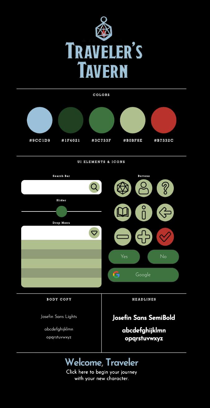
Brand Standards
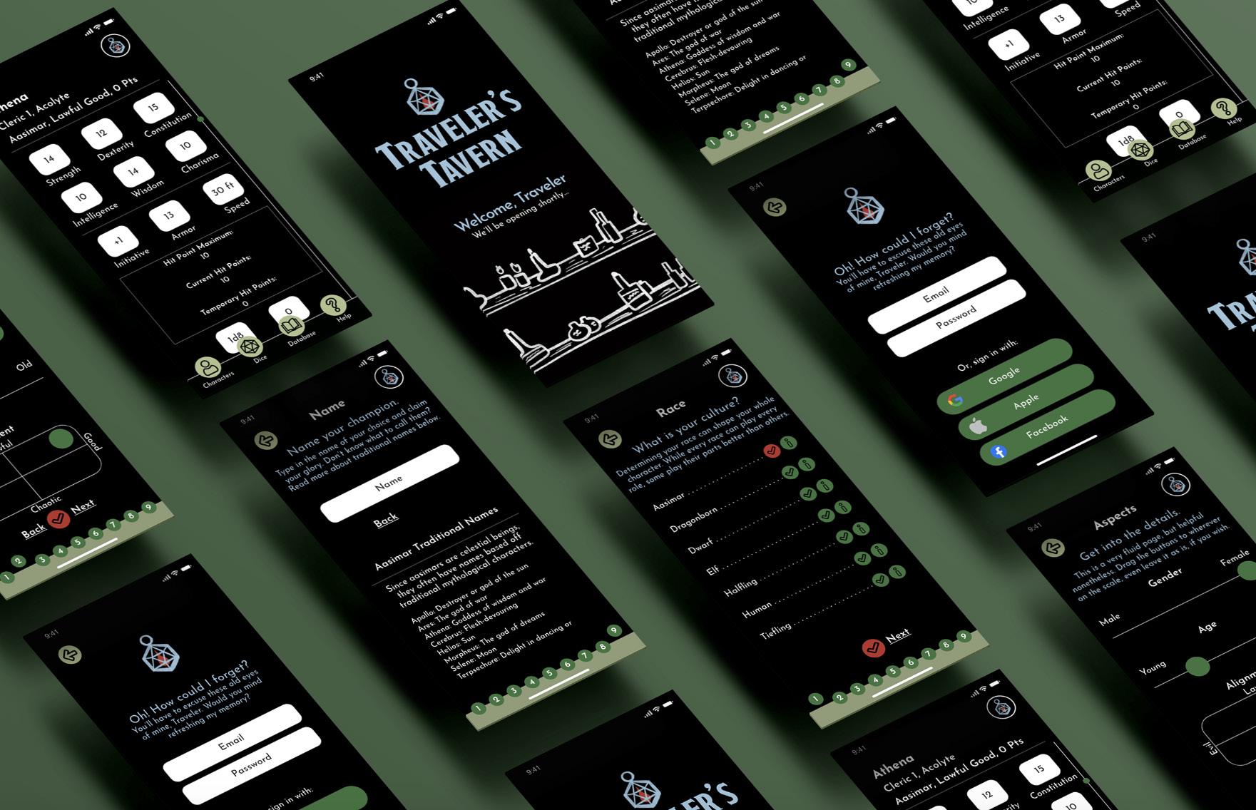 An overview of a few screens
Advertising
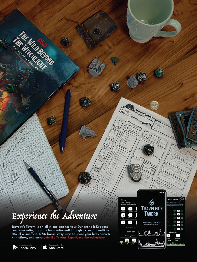
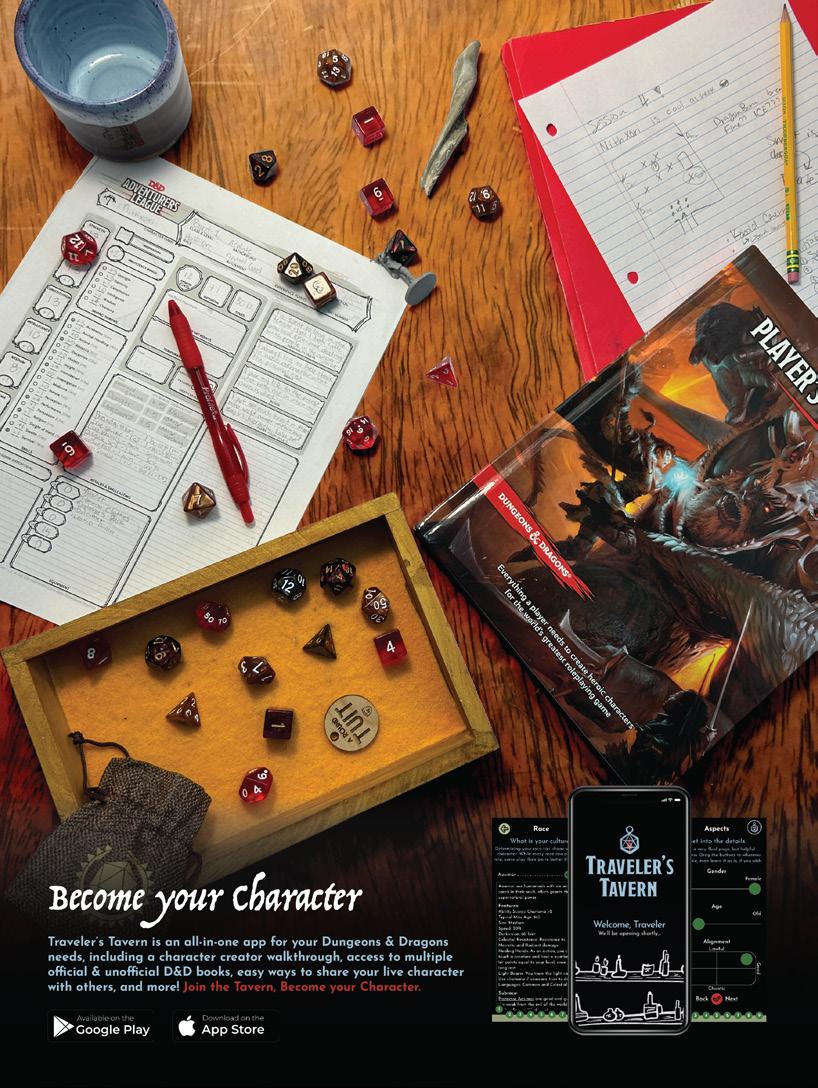
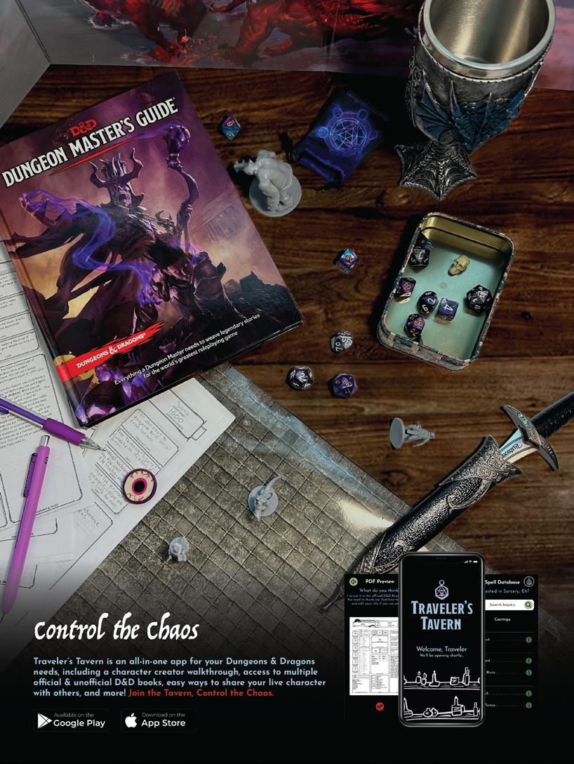
As rare as it is, I thought print ads could best advertise the app itself. These ads help show an example of what a classic and standard game of D&D might look like from the player’s view. The first ad is targeted towards Dungeon Masters, or the people in the game who create the stories and who help move the players along. The second ad is targeted towards a general audience of players, and the last ad is used to focus on the fantasy/adventure of the game. Each ad contains a set of dice, some real notes from my own campaigns, and an official D&D Beyond book that pairs best with the scene. While I took these photos myself, I edited it best to create a cohesive yet unique atmosphere. These ads would be seen in publications such as Game Informers, Arcadia, and Dragon, which are mainly for gamers and those interested in D&D already.
App Rebrand Case Study
Print Ad 1
Print Ad 2 Print Ad 3
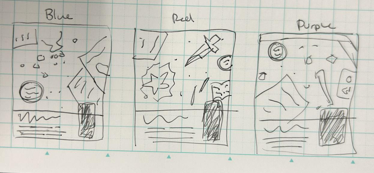
Sketches
Beetles Catalog
Seasonal Gel Polish Catalog
Project Type
Print Publication
Deliverables
16 Page Print Publication
Overview
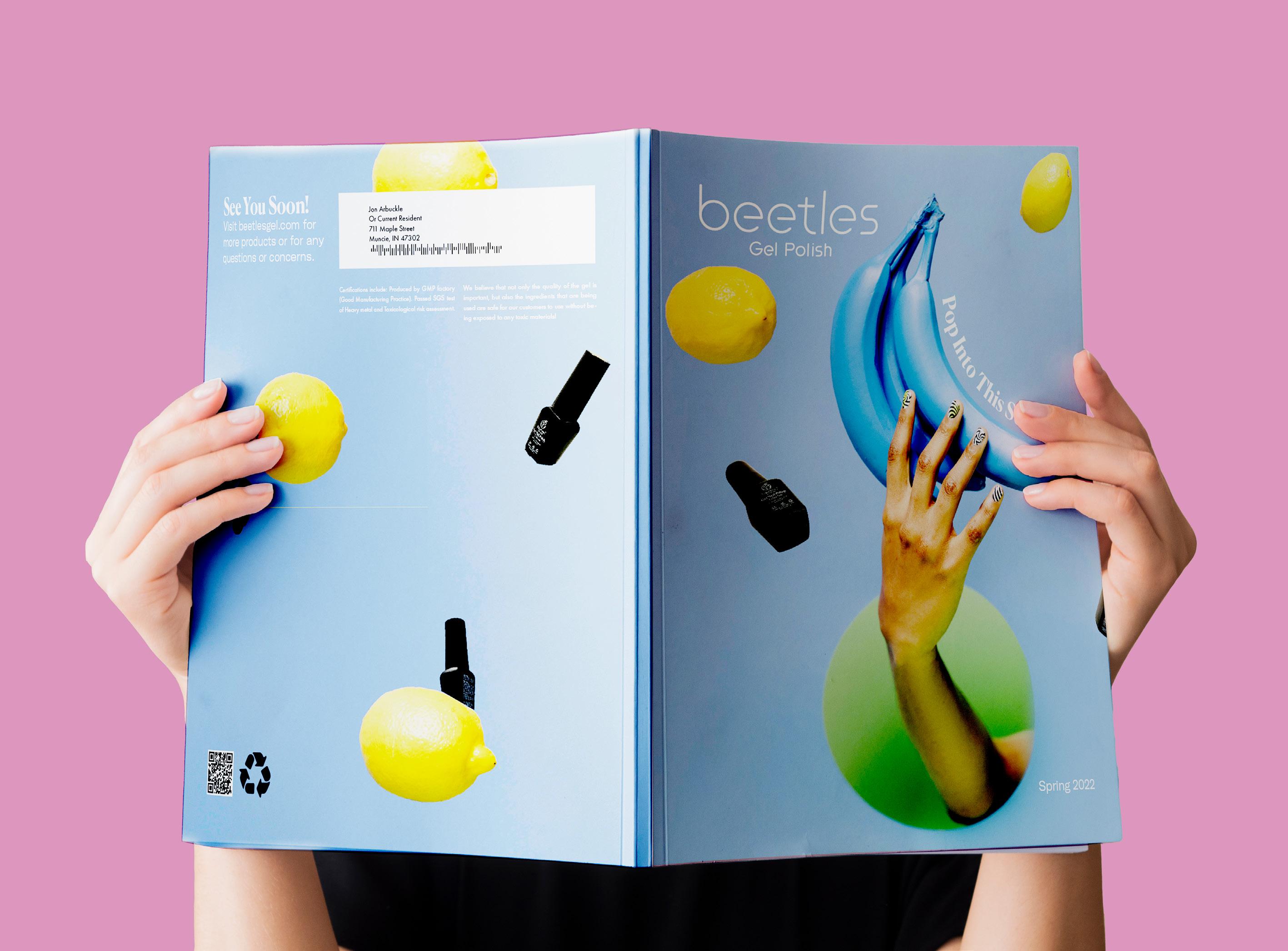
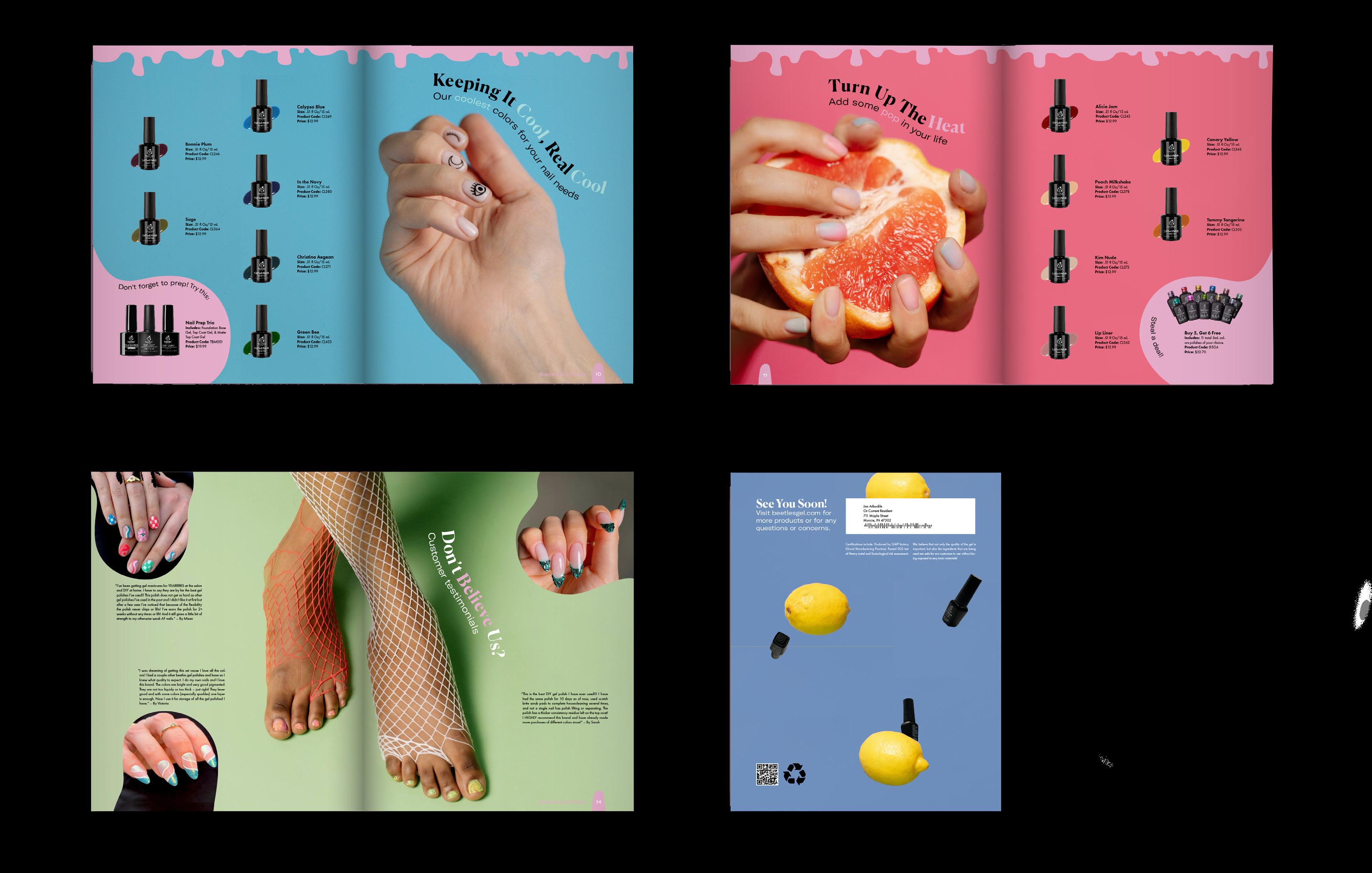
Beetles Gel Polish is a beginner friendly company that creates quality gel polish for everyone. They pride themselves in their affordable prices for professional worthy polish, as well as their kits that contain a series of colors and palettes.
Solution
I created a stylish and modern catalog that contains images of actual gel polish nail styles, as well as includes a walk through of how to use gel polish for beginners. The vibrant colors show off the true colors from their polish and creates a captivating publication to be sent to both experienced nail artists and at home hobby-ists.
your
Flip
through on
own!
Project TitleSeasonal Catalog
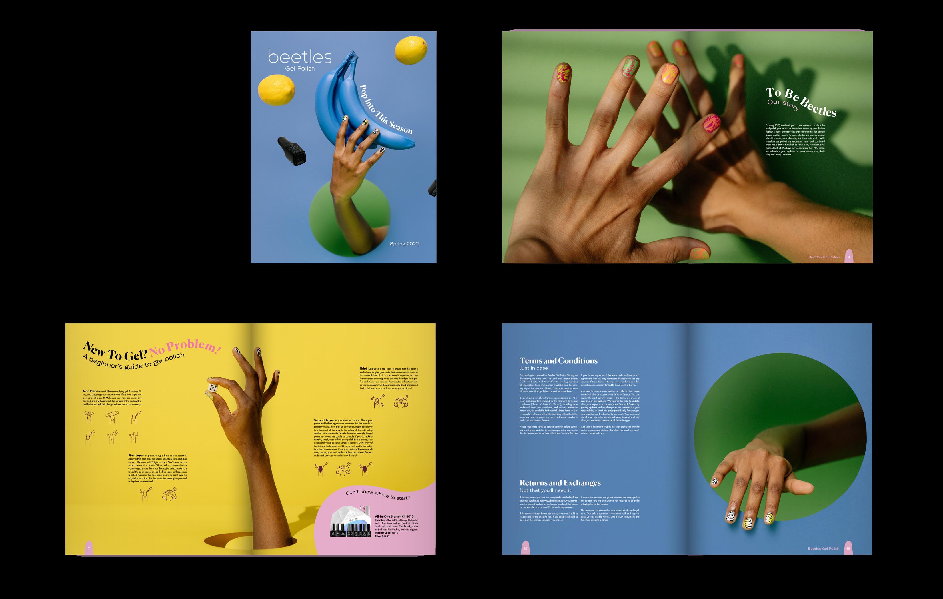
Example Spreads
Project TitleSeasonal Catalog
Try the app yourself!
Alebrije’s Around Us
Interactive Exhibition Educational App
Project Type
Display App
Deliverables
App | Set of Illustrations
Overview
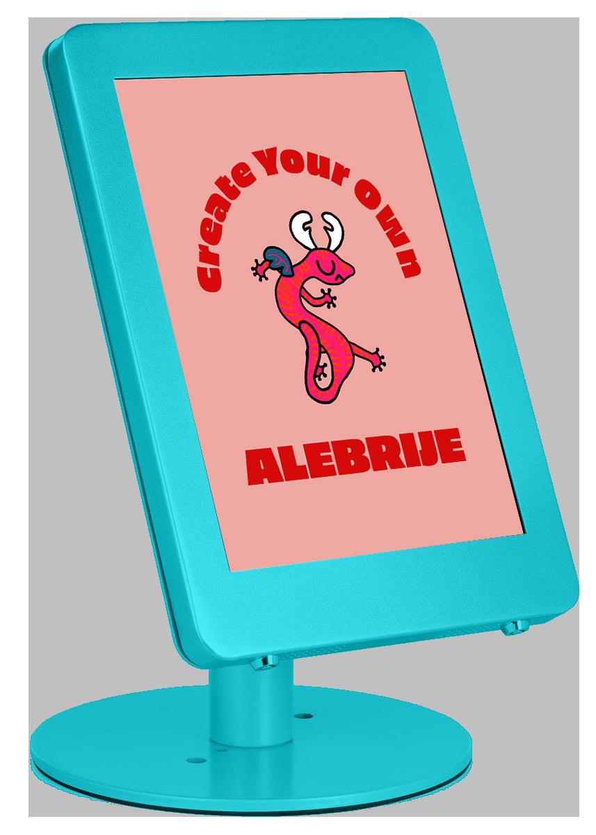
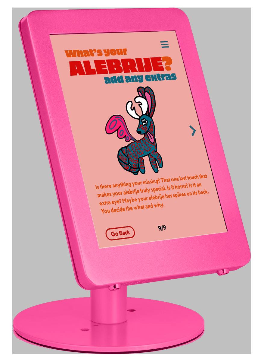
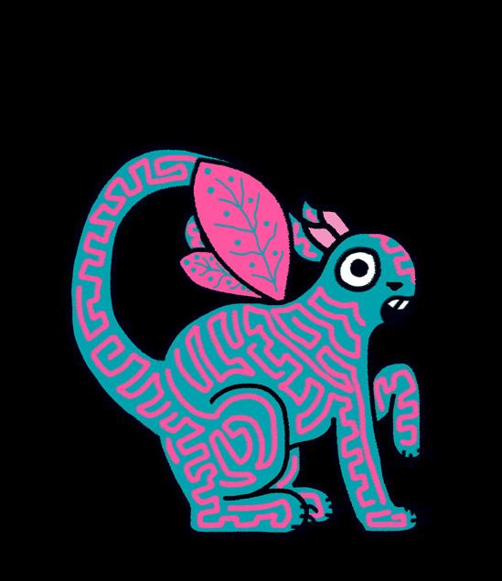
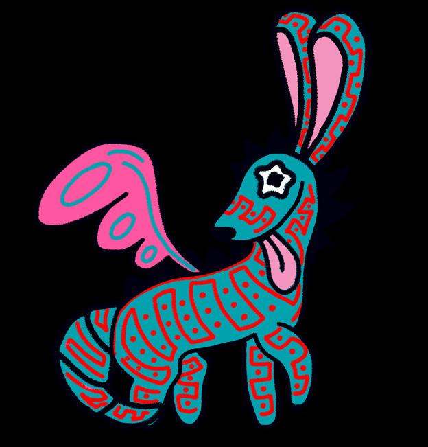
Alebrije’s Around Us is an educational app that is meant to both teach the history and significance of Alebrije’s, while also showing the joy in creating your own.
Solution
Utilizing a texturized illustration style, I created a series of alebrije’s that act as an example for others when they create their own. All parts have been separatley and can be switched out in the app. On the other hand, the app has an abundance of research and animation behind the reasoning of Alebrije’s and their history.
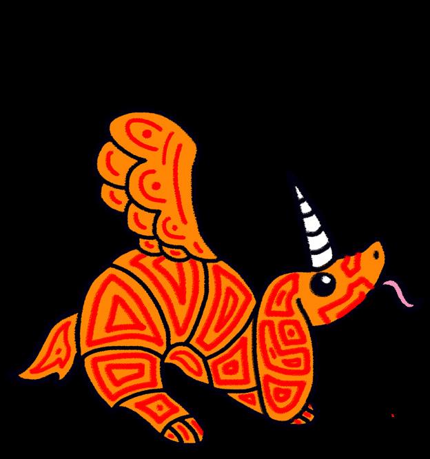
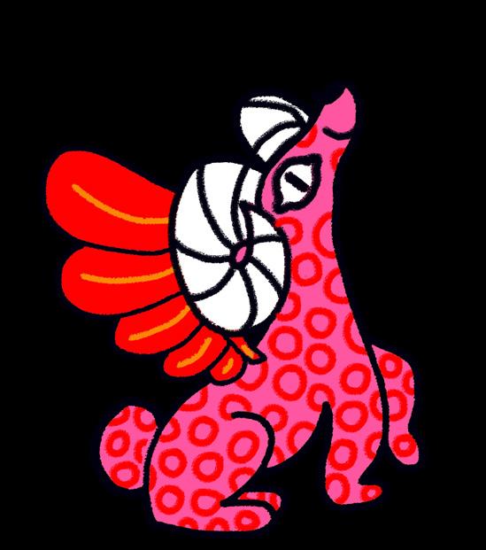
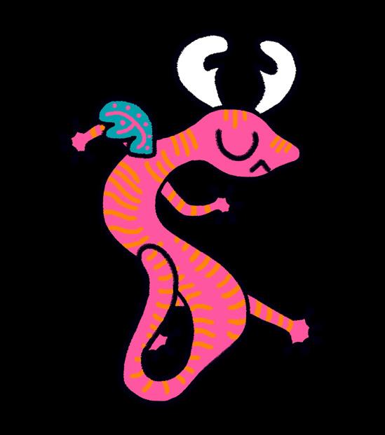
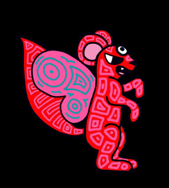
Interactive Exhibition Educational App
Illustration Set
Born to Ride
A Lettering Lookbook
Project Type
Print Publication | Social Media
Deliverables
16 Page Print Publication | Original Typeface | 1 Carousel Post
Overview
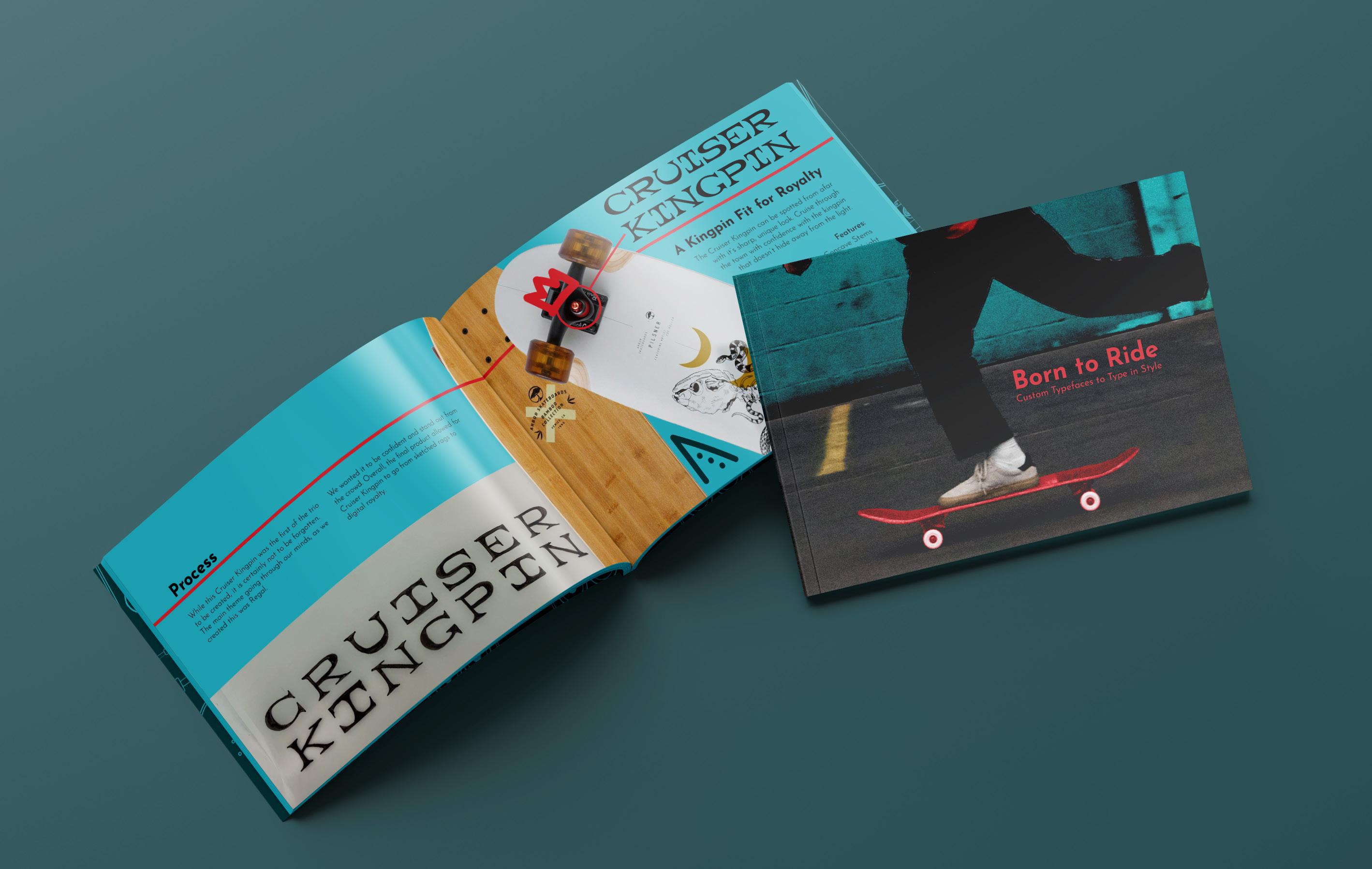
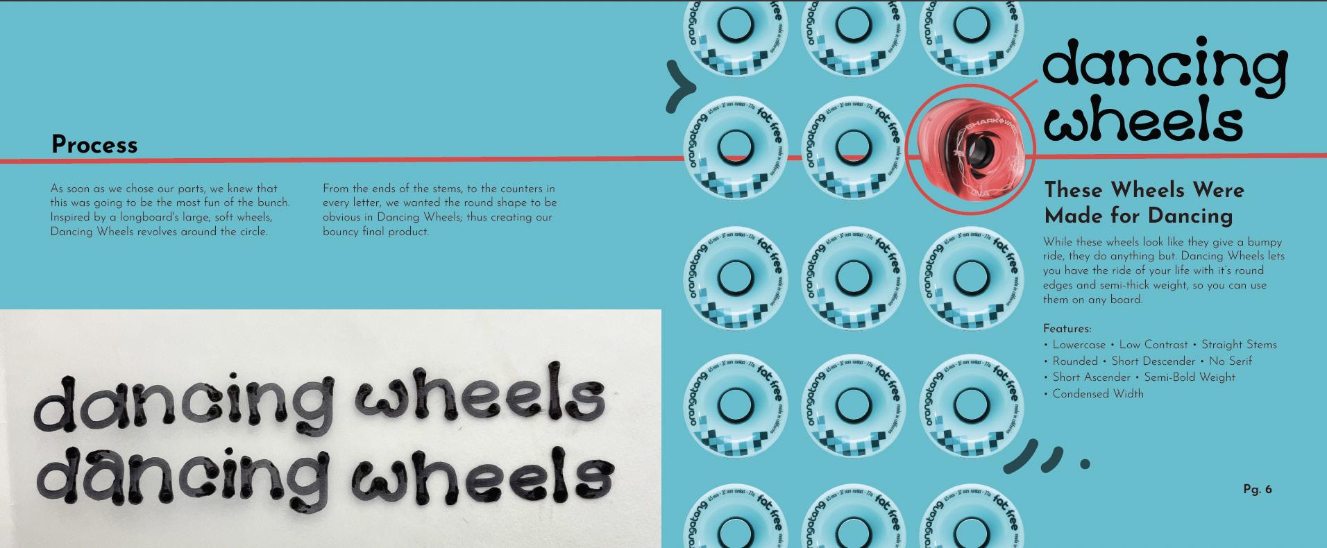
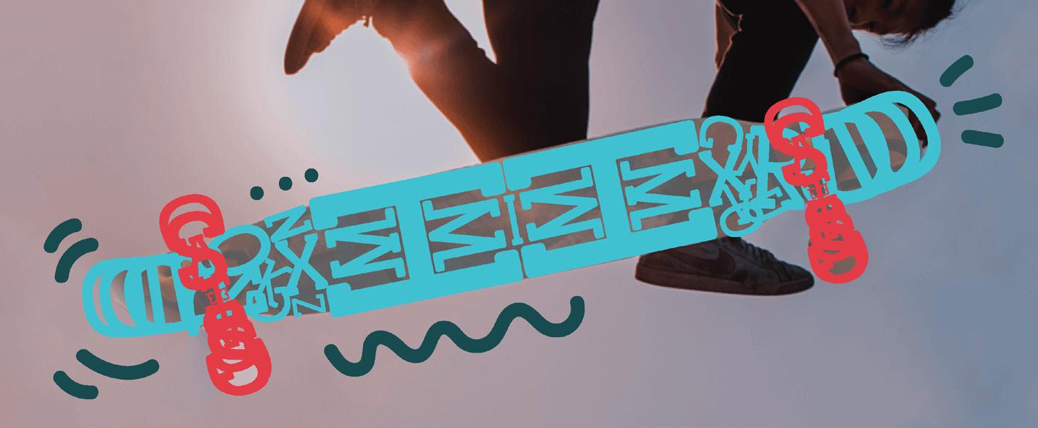
Born to Ride is a lettering lookbook based like a skateboard parts catalog. All title typeface names have been named with thematic vocabulary, and each spread showcases the features and example of the typeface.
Solution
While staying on theme to the “Skater” theme, I doubled down on the idea that this lookbook be designed to look as if we were selling the parts themselves. Utilizing original elements and markings, I designed a dynamic lookbook that both enagges the audience with fun graphics, while emphasizing the custom typefaces throughout.
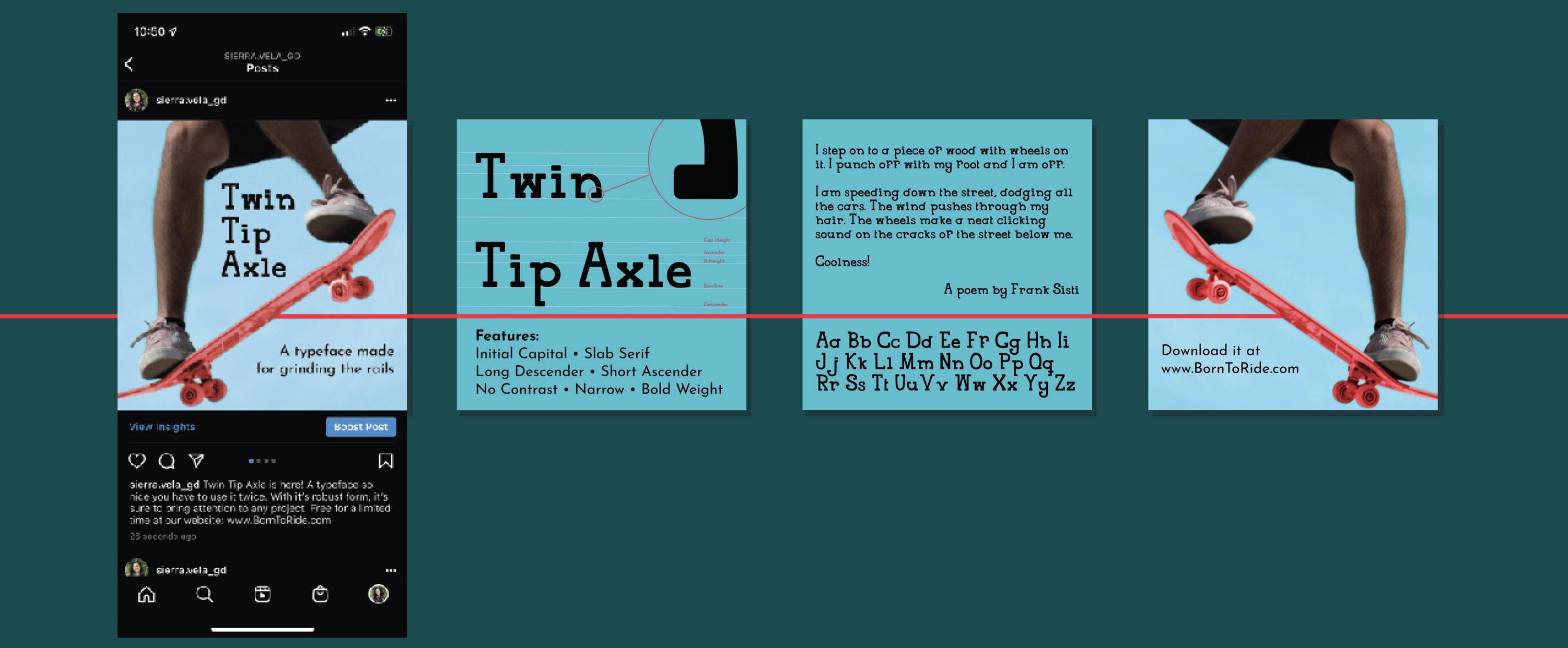
Expanded Typeface: Twin Tip Axle
Aa Bb Cc Dd Ee Ff Gg Hh Ii Jj Kk Ll
Mm Nn Oo Pp Qq
Rr Ss Tt Uu Vv Ww Xx Yy Zz
Lettering Lookbook
Sample typeface spreads
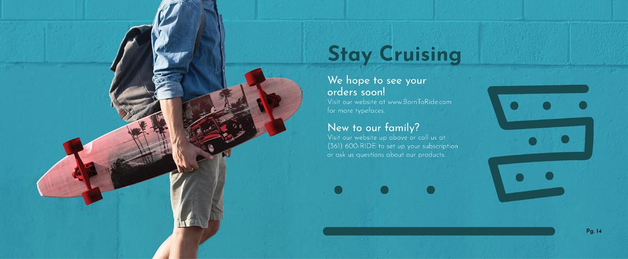
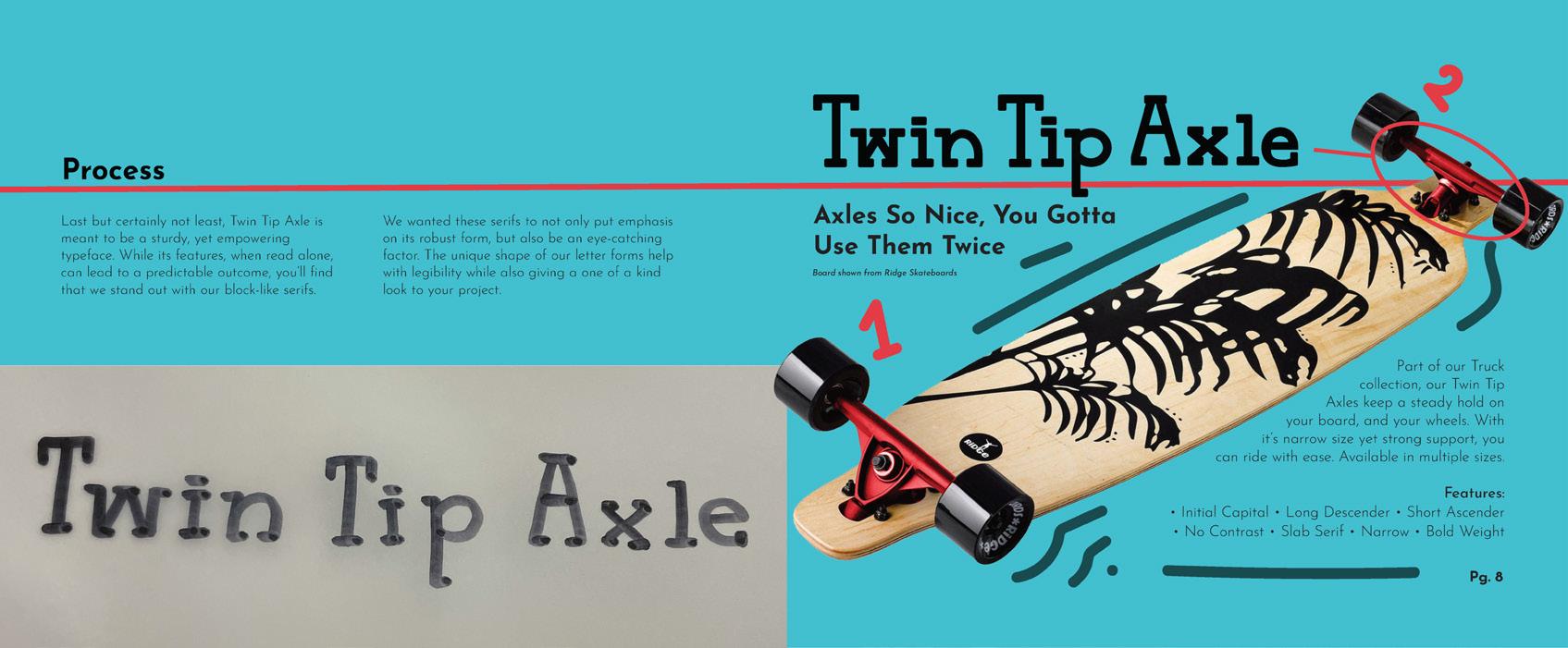
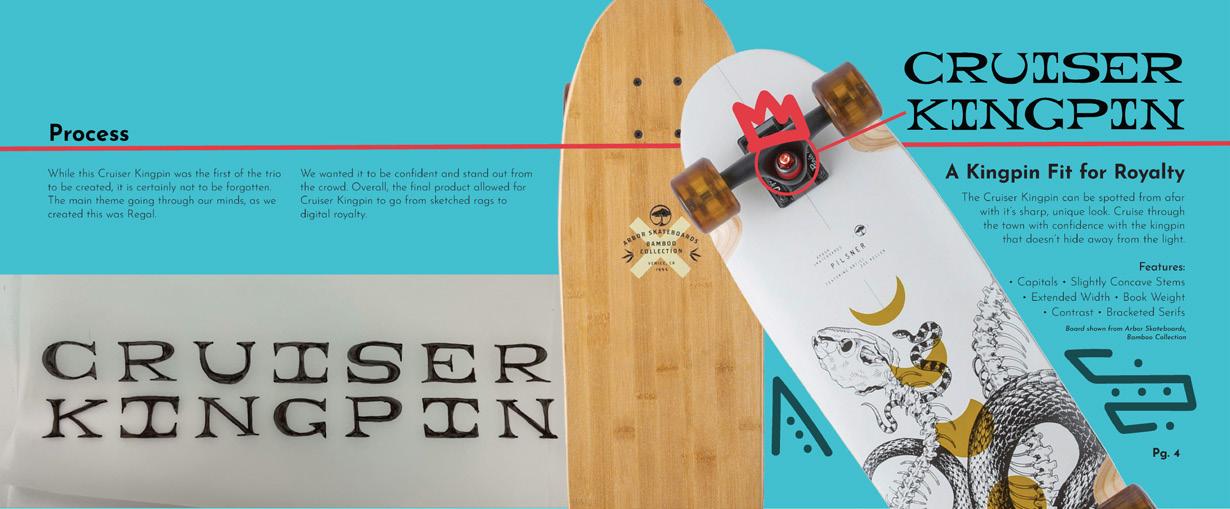
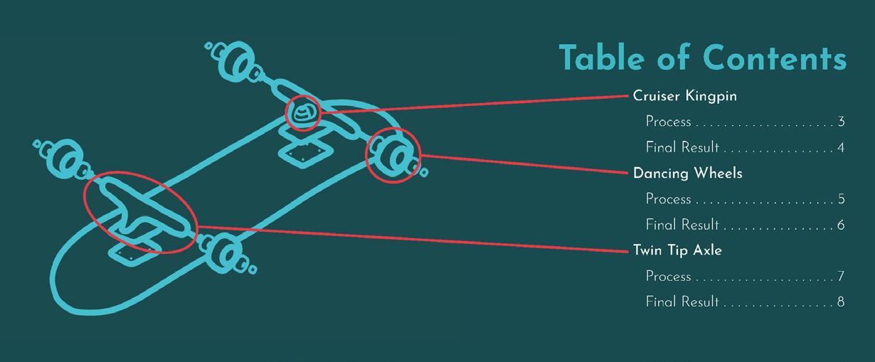
Example spreads
Social Media Mock Up
Project TitleLettering
Lookbook Flip through at your own pace!
Experiemntal Poster with Type
Machismo Campaign
Awareness Campaign | Case Study
Project Type
Awareness Campaign
Deliverables
Poster | Informational Brochure | Social Media | AR Component
Overview
In partnership with the Purple Door, a non-profit organization made to help victims & survivors of domestic violence, Be Strong Enough is a campaign made to bring awareness to the harmful effects of hyper-masculinity around the Coastal Bend.
Solution
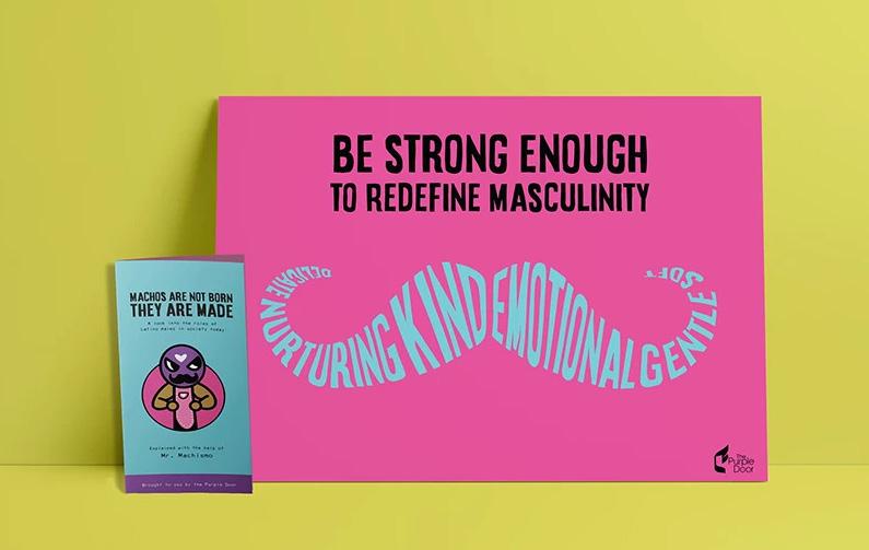
We were free to take it in any direction we pleased, as long as the main concept was awareness. I focused on our Hispanic population in Corpus Christi, and created a unique and cultural campaign based on Machismo, a spanish term loosley translating to someone who is extremely masculine.
Awareness Campaign Case Study
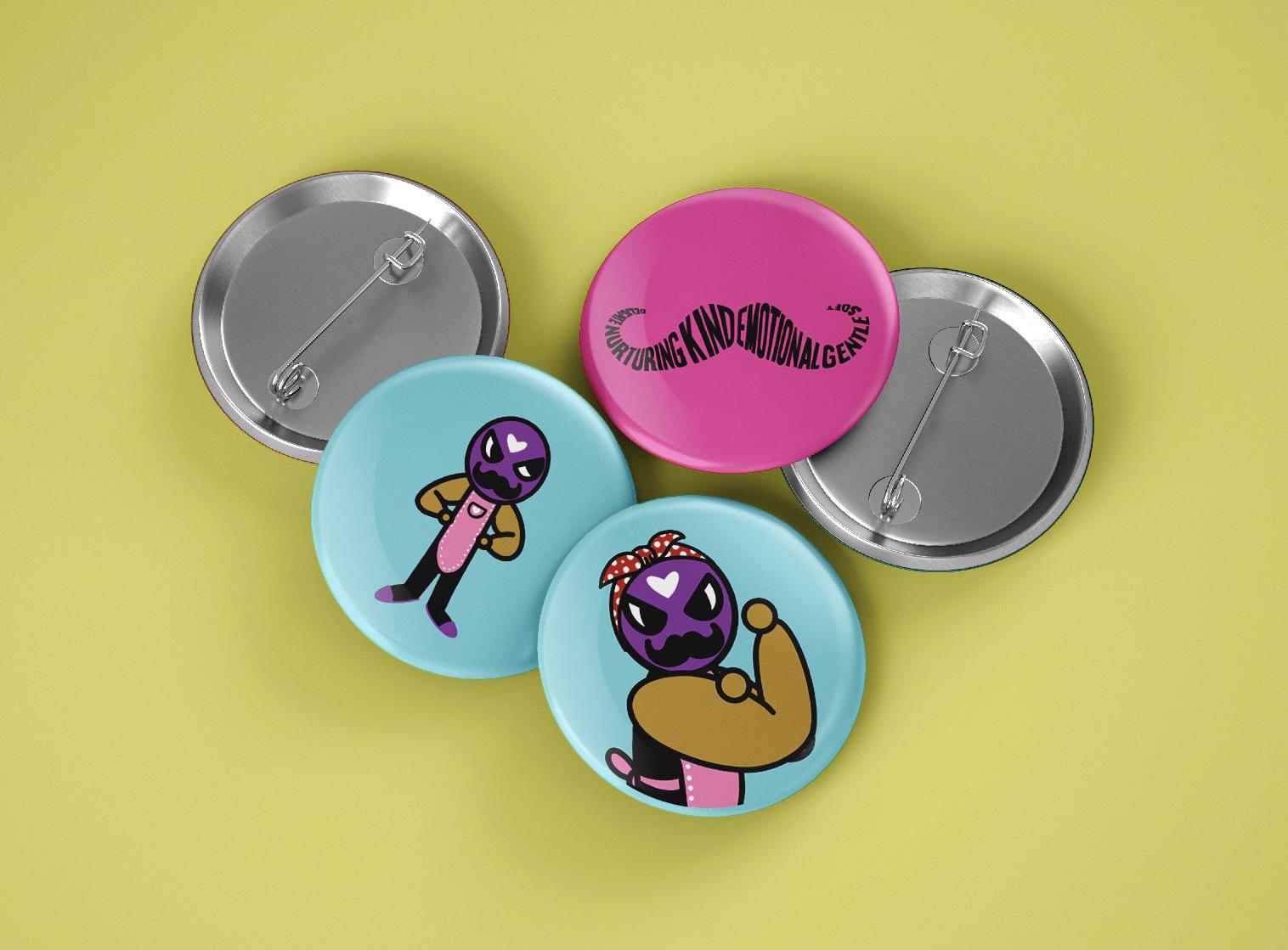
Button Mock Up
Mr. Machismo
Problem

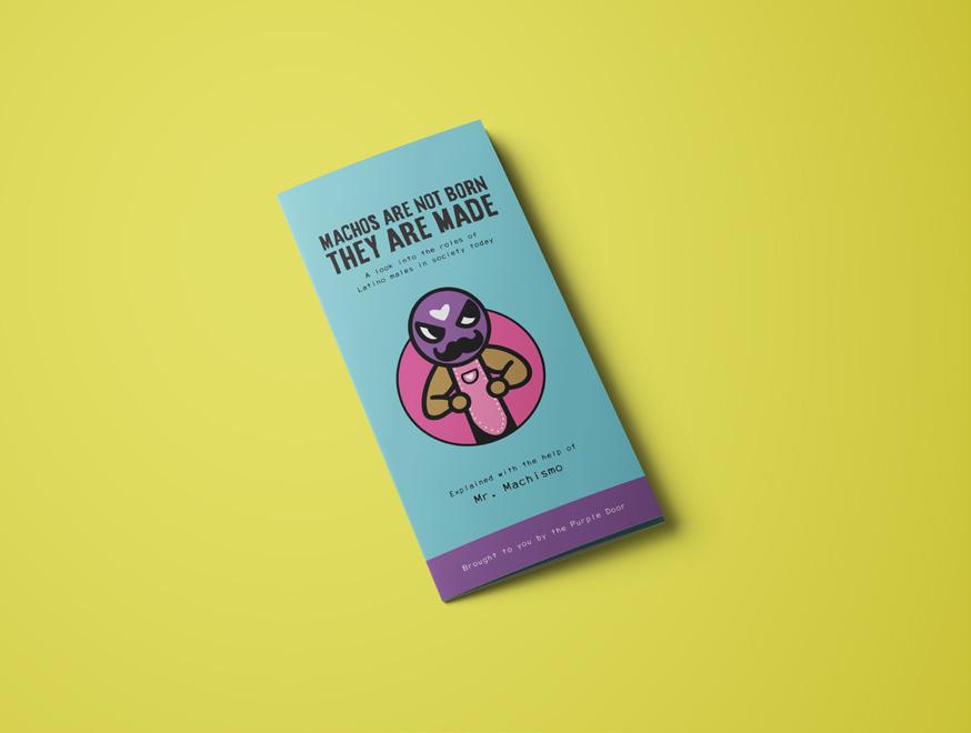
Machismo’s basic definition could be summed up to the sense of having “manly pride” in the Hispanic community, but it’s a very open term to many people. To the older generation, it could mean being “man enough” to provide for & protect his family; however, to the younger generation, it could mean a father who comes home to beat his wife. Be Strong Enough is a campaign targeting these definitions and asking men to look at themselves and help redefine the term.
Brainstorming
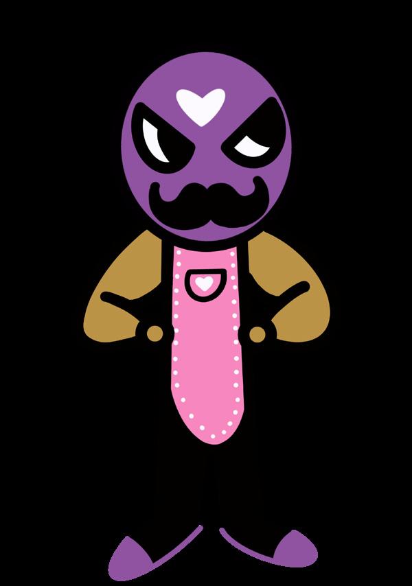
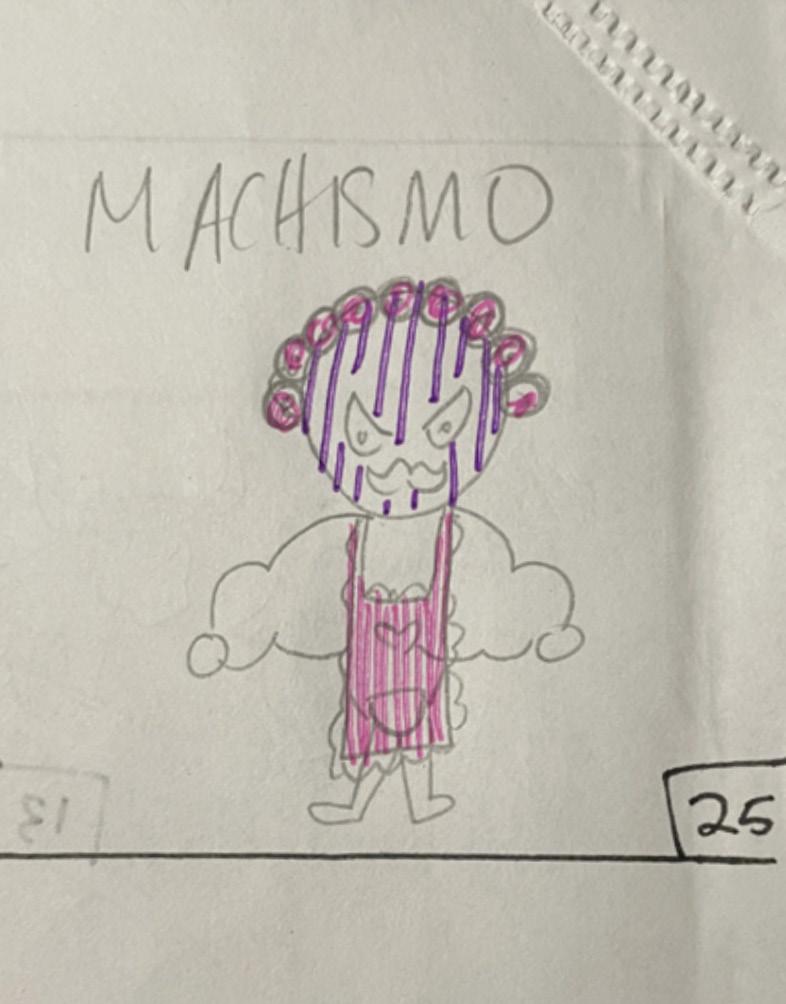
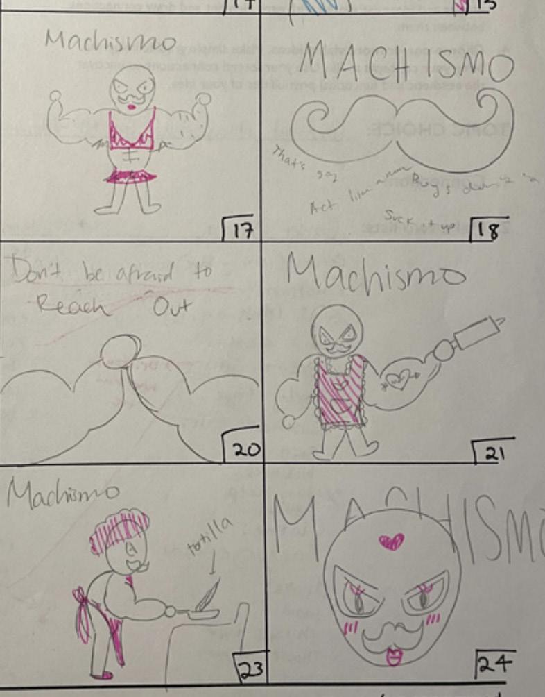
Upon being given the project, I performed extensive research and note-taking from Purple Door to learn more about the psychological and cultural effects of Machismo. One major issue I knew I was going to face was that the audience would feel like they were being called out. To avoide this, I set out to create a symbol of a new definition of “Machismo”. To the left, you can see a series of beginning sketches of who will later be known as Mr. Machismo, who is the face of the campaign.
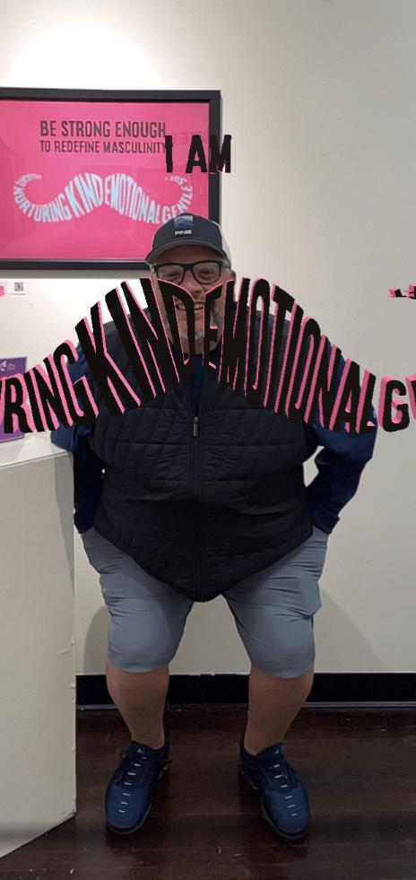
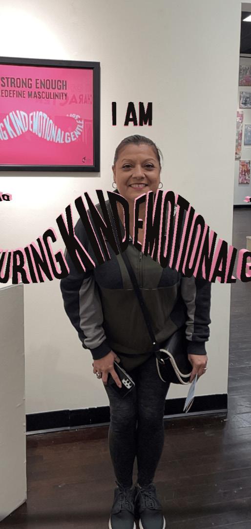
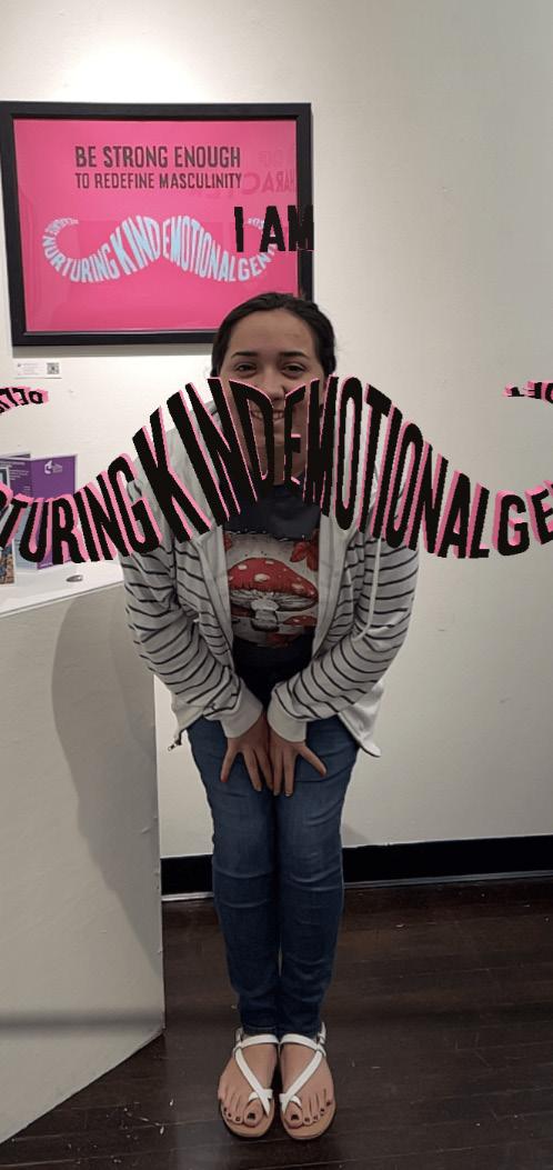

 AR example, try it yourself!
Mr. Machismo sketches & final
Creating the Campaign


The main target audience for this campaign was the Hispanic male population in south Texas. Knowing this, I utilized bright colors that you would commonly see in the Hispani community for festive occasions, such as pink, yellow, and blue. Of course, I also had to add in the signature purple for the Purple Door. The type has a rough texture to it to create a hand-written/painted tone to the campaign. Lastly, Mr. Machismo himself. He’s a luchador, a noticeably buff one, who has the classic “macho” mustache. While these are all very stereotype masculine traits, he’s also wearing purple slippers, a pink apron, and adorns a heart on his mask. The idea of Mr. Machismo is that he’s so masculine that he not afraid to take on more “feminine” traits, because he knows who he is and doesn’t need to prove himself. The entire campaign’s goal was to open the conversation with an eye-catching color palette as well as a fun mascot, to show that talking about Machismo doesn’t need to be scary.


Awareness Campaign Case Study
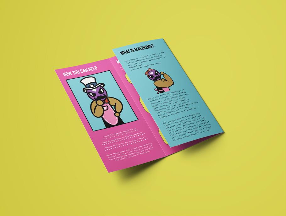
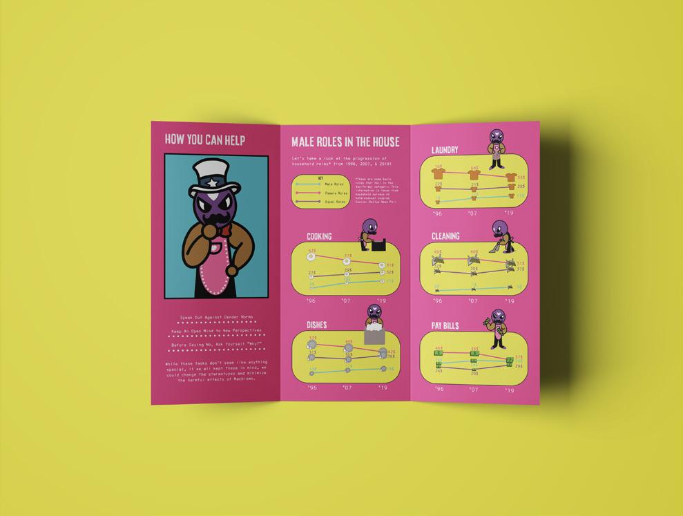
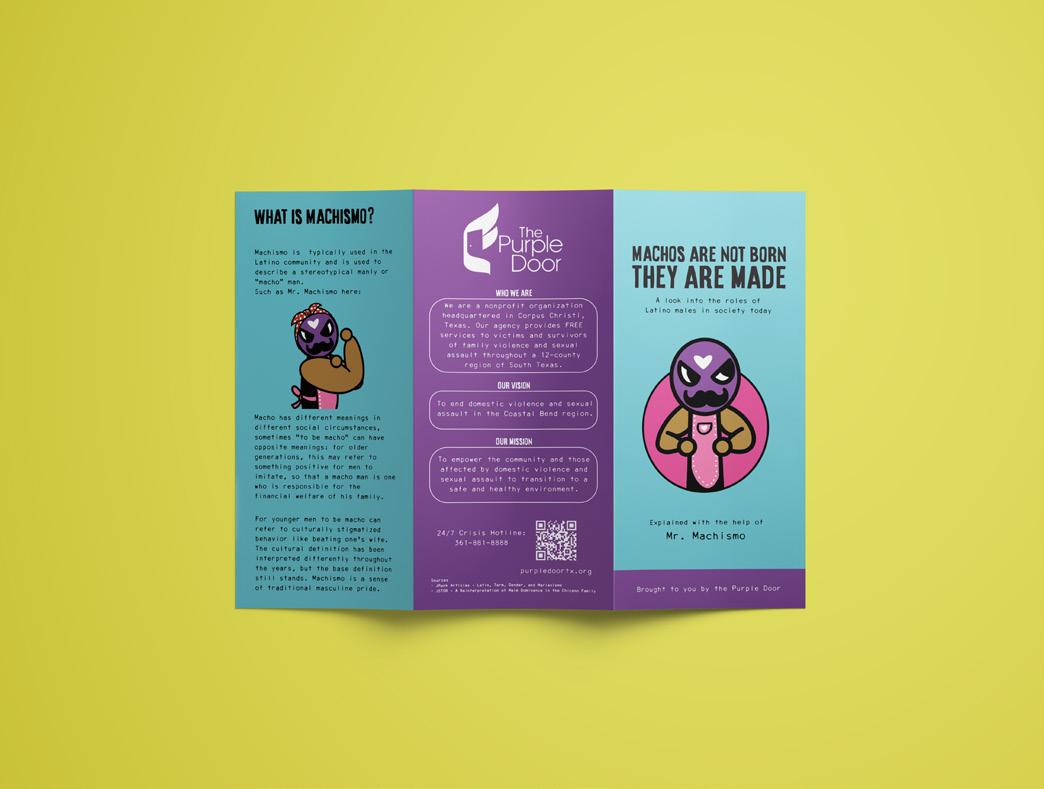
Brochure Mock Ups
Exhibition Social Media
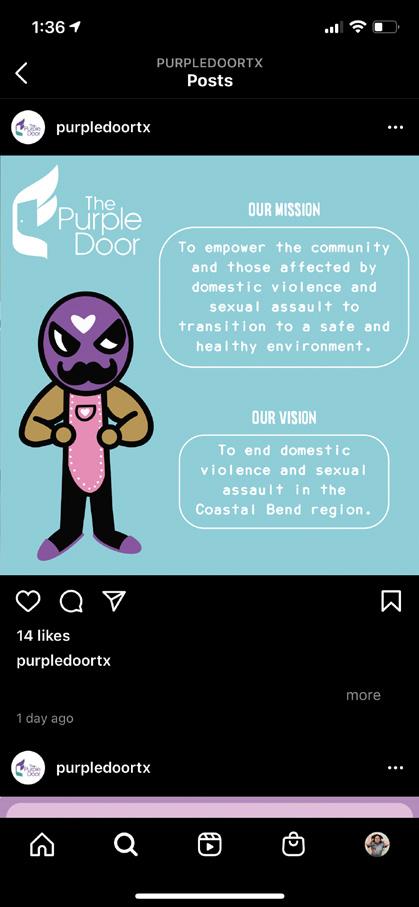
Purple Door Social Media
Thanks!


 Screenshots from the original app
The original app’s icon


 An overview of a few screens


 AR example, try it yourself!
Mr. Machismo sketches & final


