contact
architectural & urban designer with the capacity to work & translate across scales tannervargas16@gmail.com www.mightytype.xyz/xyz www.instagram.com/tbv.jpg
SPECIAL ISSUE
design as an agent for tangible change: social producer, urban challenger, spatial liberator.
TANNER BLAKE VARGAS


Tanner Vargas
phone by request email tannervargas16@gmail.com site www.mightytype.xyz/xyz work www.issuu.com/tannervargas
I am trained in architecture and urban design. I come from a small farm town in north Texas, and use my lived experience to inform work in both rural and densely urban contexts, especially regarding the urban/rural divide and minority populations. I am a positive, inventive, and adaptable team player with a devotion to meaningful work. My design interests include social infrastructure, spatial commoning, and methodology. My work explores the potential for architecture and urban design to become active advocates for change, underscoring their unique capability to enact tangible justice and cultures of care. Threaded through each effort is my design purpose.
ADOBE
After Effects
Illustrator
InDesign
Photoshop
Premiere Pro
AUTODESK
AutoCAD
Revit (working)
MAPPING
ArcGIS
Elk
OpenStreetMap
QGIS (working)
MODELING
Maya Rhinoceros 3D
Grasshopper
Sketchup
RENDERING
Enscape
Lumion
V-Ray
OTHER
Grant Writing
Microsoft Suite
Modelmaking
Photography
Video Editing
Public speaking
Sketching
Spanish
Education
THE UNIVERSITY OF MICHIGAN
Post-Professional Master of Urban Design, 2022
4.0/4.0 | summa cum laude | MUD student prize involved in NOMAS, MUDSA, graduate student instructor, received Tinker Field Research Grant for travel to Argentina
RENSSELAER POLYTECHNIC INSTITUTE
Professional Bachelors of Architecture, 2021
3.7/4.0 | magna cum laude | creative writing minor involved in AIAS, NOMAS, dean’s student council, canstruction, studied abroad for six months at UN-Córdoba in Argentina
Experience
EXTENTS
Ann Arbor, Michigan
Archi-Urban Designer, May 2022-October 2023
Assisted in design research for the adaptive reuse of abandoned Detroit schools, primarily in a housing core prototype to be replicated across similar conditions; planned a campus to connect neighborhood hubs; aided graphic design for Gradient publications.
THE UNIVER SITY OF MICHIGAN
Ann Arbor, Michigan
Graduate Student Instructor, Spring & Fall 2022
Chosen competitively based on time management, organizational, and communication skills. Assisted in teaching two core undergraduate architecture courses in theories and methods. Created syllabi, prepared lesson plans, attended weekly lectures, led weekly discussion sessions, and gave a class-wide lecture.
DONATE LIFE NYS
Troy, New York
Graphic Designer, May-August 2018 & 2019
Designed graphics for social media, marketing, partnerships and pamphlets to raise awareness and advocate for organ, eye, & tissue donation in New York. Online engagement increased during my position, and I learned firsthand how the non-profit operates.
THE MIGHT Y TYPE
www.mightytype.xyz
Founder/Owner, August 2017-present
Began a personal website for writing, photography, and architecture which later expanded to include an online design shop with silk screen prints, apparel, & designs.
BUNDY, YOUNG, SIMS & POTTER
Wichita Falls, Texas
Architectural Intern, May-August 2017 & July 2019
Contributed to projects of various scales in visualization and rendering, CAD drafting, schematic designing, and site visiting; worked on large private residences and public buildings, often with partner Rick Sims advising.


WATERFRONT URBANISMS
FALL 21/ detroit, michigan
UM/ urban design
MUSEUM OF MEDIA AND MULTIPLICITY
FALL 20/ queens, new york
RPI/ architecture
MUSEUM OF SCIENCE FICTION AND REALITY
SPRING 20/ albany, new york
RPI/ architecture
SOCIAL HOUSING FOR SOCIAL ARTISTS
SPRING 18/ troy, new york
RPI/ architecture, landscape
DIGNIFIED MODELS FOR CULTURAL RESILIENCE
SPRING 22/ san salvador, jujuy, argentina
UM/ urban design, landscape
SUBVERSIVE SPACE IN CLOSED CONTEXTS
SPRING 21/ jackson, mississippi
RPI/ architecture, urban design


unknown urbanisms studio professor
MCLAIN CLUTTER
GINA REICHERT collaborators
DONGDONG SHU
KEJIE WANG
How do we know cities? What tools do urban actors use to make a city ‘knowable.’ and how do those constructs and technologies inform our sense of place and purpose in urban life? In an effort to uncover potential futures for Detroit’s beloved riverwalk, local histories and layered studies reveal a dis-aggregated riverfront in transition. Fragmented land ownership, hopes for a continuous riverwalk, industrial pollution and uneven access points make the old Uniroyal tire factory site uniquely capable of holding multiple speeds, vectors, and typologies for a heterogeneous riverfront. An intimate understanding of urban velocity becomes the critical design factor. How can urban design facilitate a heterotopia of speeds, enclaves, relationships, and moments? Why is it needed?


GIS analysis of the site’s catchment reveals a patchwork composition of splintered zones and spatial types, which reflects an uneven developmental approach toward various urban vectors and bodies engaging the site. The motor city has more speeds in play than just the automobile.
A study on riverfront activity reveals that recreational activities dominate the postindustrial area. The map relates frequencies of jogging, biking and fishing to zones of investment or activity, such as parks and greenways. A study on access reveals how and when these activities are experienced, with emphasis on commute times and corridors of industry or recreation. A study on environments gives specificity to potential activities and user scenarios, layering networks of social infrastructure with tree canopy coverage and demographics.
The mapping exercise provided grounding terms for the eventual design: vectors, enclaves, and moments. Vectors, such as a driver, travel to various urban enclaves in search of distinct moments. Each vector has a set of common types it orients itself towards, such as a car and drive-thru.
In an effort to make room for more moments and balance priority across multiple vector speeds, the site was treated in three major moves. First, the urban grids are extended. Second, the river’s edge is adjusted to disrupt the linearity of the riverwalk and form an island. Third, the existing parks are linked and connect to a planned greenway which connects the river to inland communities.


[1] drives to site
The urban vector is drawn to a series of nodes within a greater context of transit and typology.
Mapping spatial conditions with mode of travel allowed various publics and routes to emerge. Enclaves of activity and familiarity point to these publics, their spatial nodes, and the routes tethered to each. The urban fragment and continuity are therefore connected, not opposed, and form the urban fabric through which many distinct vectors— each with their own desires and demands— navigate. This project focuses on three critical vectors: driver, rider, and walker. The larger design is therefore built from the smallest of scales—feet on pavement, bell rings on bikes, friendly horn honks—and imagines an urbanism of multiplicity.
After the original study, our team was concerned about how many “stops” the riverfront engenders, but over time we came to value the change of speed; stopping or slowing down pace; redirecting velocity for alternate reflection.
The ground floor became a pixelated grid of various vectors and framed moments. Diverse modes of access, enclave, and activity make room for planned and unplanned engagement along the rearticulated street (now kinked to promote speed change) and double canals (intended to form pockets of privacy amid public space). Each vector is carefully considered and in conversation, across multiple levels and programs.

[3] rents cycle, rides up
[2] walks through site
[6] drives from site


The riverwalk is redirected towards less linear ends, with multiple green avenues made accessible through the new river’s edge. Vectors are given unprecedented care, with cantilevered bike paths and hidden enclaves forming a heterotopia of types and potential interactions. Redirections become highlights; chances to gain new perspective. The island acts as a fuzzy threshold between urban and natural ecologies, an ecological relief to the urban density which surrounds it.


This project is interested in both enclaves and commons, and how they might be simultaneously stitched together in moments and individualized in others. We believe that access is a relative term, and the most diverse types of urban commons consist of dynamic thresholds in open and closed networks of exchange. By emphasizing the vector, we place value on the ways in which we move through urban spaces.


This project argues that a series of individual moments along continuous vectors might paint a better picture of dynamic collectivity; that overlapping individualities might emphasize that which connects us: the nonlinear, elastic realities of sociality and space.


media study studio
professor MARCUS CARTER
collaborator MADISON IRISH
How can media be spatialized? Stim (the mixture of program, building, and its support structures) and Dross (the undervalued residues of the metropolitan machine) are sites of inquiry. The context is industrial with a history of both creative and commercial trades. The result is a context of historic factory remnants and modern creative industries, with plans for a green network along Newtown Creek. The SDSC inspires new methods of media engagement through a site-driven series of temporal interactions, where traditional notions of authorship and participation are upended to form new perspectives of past, present, site, & self. Visitors assume unprecedented levels of control over their perception and engagement; artists curate dynamic experiences rather than static pieces, each designed to produce infinite perspectives that lead to reflections beyond the present tense.
The site's location along Newtown Creek provides an opportunity for physical connection to media and its relation to temporality, mataeriality, and engagement.
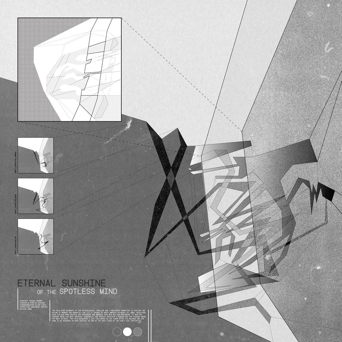
The design originates from an exploratory exercise involving the spatialization of nonlinear film structure through abstract compositions. The film, Eternal Sunshine of the Spotless Mind, has a unique structure of looping time jumps to a central spine; as the main character erases his memory in order to move onto the future, both new and past relationships are revisited, exploited, and unexpectedly intertwined. Sequence, framing, and rhythm are explored as tools for spatial organization.
The larger project’s desire to look backward and forward at cultural patterns (of media innovation) and contextual trends (in site pollution) reflects this research. The film’s strategies of concealing, revealing, and choreographing between varied bodies and pockets of time are explored in order to create a nonlinear and entirely unpredictable method of circulation. As visitors experience each ephemeral exhibit, perceptions of site conditions, self image, and shared community may find new perspectives and latent connections.


Visitors are elevated to the second floor upon entry, and travel from the site’s south end (of existing construction) to the north end (of proposed construction). The proposal can be analyzed using two modes of spatial and circulatory organization: Circuit 1, the “immersive” circuit, and Circuit 2, the “experiential” circuit, aiming to challenge typical museum statics and directionality.
Circuit 1 has a strategic, specified path for visitors to follow with brief moments of respite. This choreographed system of elevated bridges takes them to a large “black box” with a dynamic, semi-transparent screen, before dropping them onto the ground for Circuit 2, existing as a flexible field of temporal ground networks. Visitors may then experience grounded perspectives of past exhibits, or explore alternative views on the exhibits they just experienced. There is no set “order.”


The museum links to a green network along Newton Creek that aims to revitalize the area with social, ethical, and environmental initiatives. Framed perspectives, interactive elements, and temporal installations at the SDSC bring awareness to site histories of creation and pollution. Its creative past and industrial present can be engaged, linked, and questioned through exhibits on pollution, progress, and purpose.
The design’s insistence on forming multiple perspectives comes from our approach towards the three silos at the heart of the site. Instead of demolishing them, we use them as industrial remnants; tools to consider the history of the site and its potential futures.
In the silos, for example, atmospheres between the second-level bridges and ground-level silos are changed as people move through and interact with them. Only the third and final silo reveals both parties.
In the first silo, bridge visitors unknowingly affect the ground atmosphere with each step. In the second silo, visitors on the ground level interact with an exhibition that affects the bridge atmosphere. In the third silo, the bridge becomes transparent so that both atmospheres can see each other and interact simultaneously, all without having to touch. Each visit, therefore, is anomalous and dependent on the collective as much as the individual. The major variable for repeat visits is no longer what’s “on display,” but the novelty of each new visit’s experience.


Exhibits are activated upon engagement, which could range from directly touching designs to simply entering the space. Artists have full agency on how they address relationships between the context and media futures, with tectonic elements and framed views constructing a nonlinear sequence of concept and circulation.


integrated design development museum studio professor JILLIAN CRANDALL collaborator
ALANNA DEERY
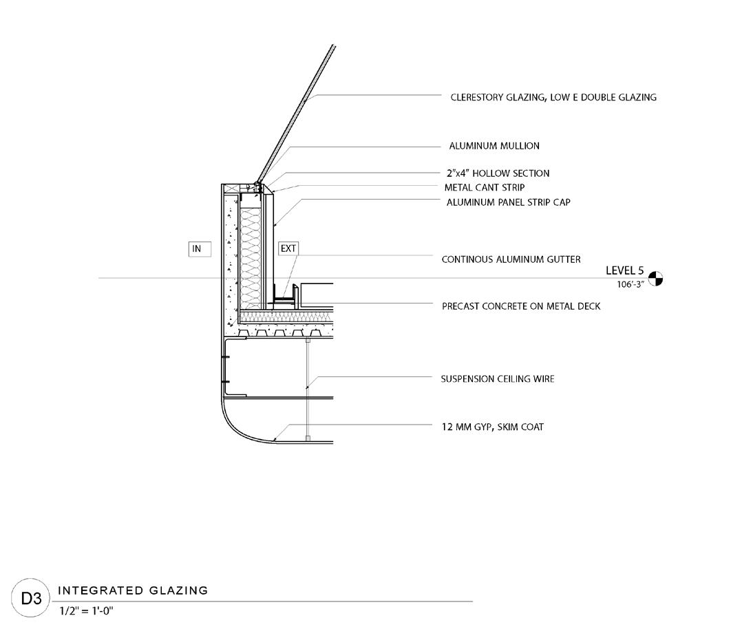
How can space challenge perception? Science fiction, culturally and architecturally, is often concerned with anthropogenic transition: how civilization progresses, technology expands, or familiar experience warps. X Continuum, a museum of science fiction for downtown Albany, New York, speculates on a post-digital society by digitally manipulating physical transparency. Materiality and virtual reality merge in a project deeply concerned with orientation. Exterior forms and projections draw visitors to the interior experience, where virtual distortion leads to inward reflection. Although the focus of the studio was in construction assembly and design development, we aimed to create a building of futureforward introspection that cleverly engages passerby without needing to provide a ticket.

An inverted circulation drives the series of carved forms and exhibit experiences. Visitors enter at one of two end cores before meeting in an elevated lobby, where views are warped as they descend to the depths of a domed theatre. Glazed context views are less frequent with each level, and as matter becomes augmented, the line between spatial reality and science fiction blur beyond comprehension.
Immersive gallery spaces wrap around the open atrium as tracked walls and projectors gradually transform the interior from clean canvas to digital dystopia. These fluid walls emphasize horizontality by utilizing running striations to carve space, and as visitors progress down the warped ribbon, factual matter blurs with augmented fiction. Traditional exhibits are traded for theoretical experiences that imagine possible futures beyond known matter.
Though its content excels in closed environments, the project is limited in its ability to operate beyond an autonomous space for individual introspection related to digital futures.
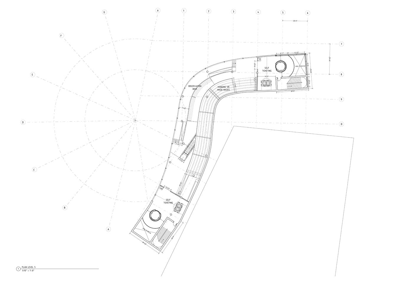


Walls, floors, and ceilings change both physically and perceptionally as visitors travel through the descending, nonlinear circulation. Digital applications are emphasized with tectonic elements, spatial constrictions, and selective perforation.




integrated design schematic housing studio professor YAEL EREL collaborator ULIAN CHOW
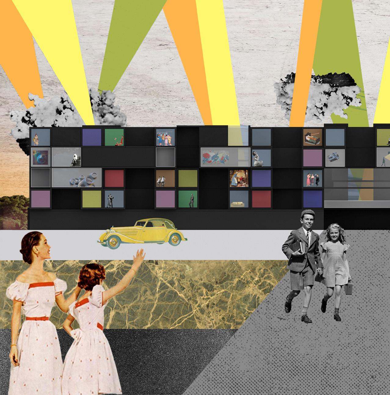
What is the art of living? This collective housing complex is designed to challenge typical relationships between public and private, opaque and transparent, prefabricated form and focused frame. Artistry is the central program, with three subsequent masses reflecting it: housing, museum, and studio. Living and social conditions are suited for artists, with both individual and collaborative work-living spaces nestled throughout the complex. Large museum spaces interject themselves throughout the units and studios, giving non-residents the ability to walk through the collective and observe art as it is made, exhibited, and lived. The housing units also exist as their own art frames, detailing the everyday performances of life. Each artist designs their own space, and the shared kitchen becomes a social stage—their life is as much art as the things they create.


The comedic repetition, like a field of social pixels, considers each box as a canvas. Each unit is visibly and physically part of a larger network, letting each artist design their life around and within social space accordinh to their comfort and curiosity. Visitors and residents alike may travel from unit to exhibition to studio with varying modes of transparency, able to experience the complex and surprising connections between life, art, and community.
Focus was placed on theoretical prospects over technical elements, so this design could use structural revision in unit aggregation. This proposal may also be at the mercy of the artists who live there, but such friction could also be considered its greatest strength. Each artist exhibits their life as work, and work as life. The cooperation in co-living becomes the main exhibition in spatial organization and interior expressions at once.

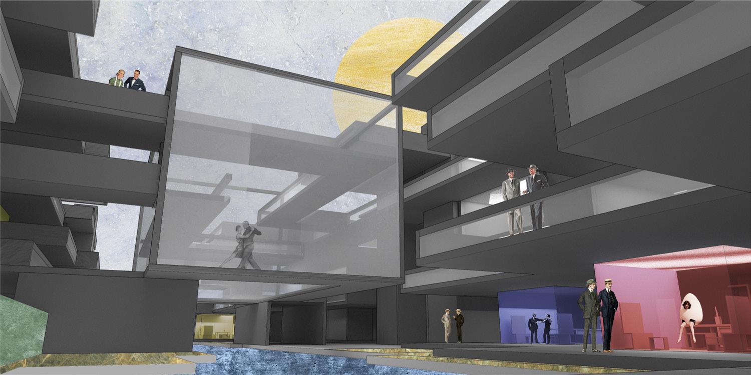
This collective housing is designed to challenge typical social relationships between collective and introspective space, using the concept of “frame” as a tool to observe and inspire with agency.
Artists have varying connections to private and public spaces: at the scale of each unit (shared kitchen, private bedroom) and larger community (studio space, exhibition halls). The social condition of the shared kitchen is most public, near public paths, with operable privacy screens in the bedrooms furthest from the shared kitchen.
The repetition of semiprivate living pixels is interrupted by irregular forms of the shared public. Workshops, exhibitions, galleries, and third spaces interject the mundane comedy of everyday life.


The method of assembly reflects the core principles and questions of the project: how do things come together, and how can we define (or possibly redefine) the relationship between materiality and sociality through an architectural concept?
Notions of display, secrecy, exploration and collaboration are explored through the tension between prefabricated living modules and the irregular exhibition spaces that slip between them. The arrangement of (repetitive) living space and (irregular) public space become design tools for collective and individual expression. Exhibition spaces and living spaces utilize similar materials toward different ends, with both framed moments and irregular serendipities forming an experience of deep connection and reflection. The spaces slip with intention.
As both viewers and artists circulate, the emphasis on one over the other is lovingly lost. The architecture encourages its inhabitants to form latent connections between the artists’ work, life, and immediate context. Spatial conditions therefore challenge the traditional definition of “art,” and architecture’s place in relation to it.
 air flow illustrated in red path lines as it travels through the top level of kitchen units; high & low pressures marked (+/-) respectively, with (0) signifying updrafts


propositions embodied design studio
professor JEN MAIGRETHow can co-design empower and anticipate? Alto Comedero, the southernmost neighborhood of Argentina’s northernmost city San Salvador, is home to the indigenous Organización Barrial Túpac Amaru. The OBTA secured government funding to self-build a neighborhood. Their novel approach to political organization and material production allowed cultural structures to emerge from surplus—a swimming pool, dinosaur park, schools and more redefined their sense of place. They gained power, then lost favor with a newly elected government, and were criminalized wtih a total freeze of national support. This project aims to reimagine OBTA’s fate in a speculative design scenario. How can urban design co-produce resilient fabrics capable of withstanding tense sociopolitical shifts in a long-term project regarding historically marginalized people?
1 Co-Production of Architecture + Culture

A close study of indigenous architecture and building practices can inform potential translations to modern contexts. Vernacular methods of labor and maintenance arose as a common thread between the assigned region of Luapula, Zambia and the eventual site of Jujuy, Argentina.
Three major interests drive the work from Zambian vernaculars to contemporary Argentina: the coproduction of architecture and labor, the role of labor and communal knowledge in that process, and the ways natural buffers can be used to inform social and spatial organization.
This project argues that, together, the three encourage more resilient urban fabrics in the face of crisis or outside opposition.
2 Role of Labor + Communal Knowledge
3 Natural Buffers + Social Thresholds
Defining Resilience through Design
This project seeks to define resilience along slower, softer, more socially focused means. It presents urban design as an active agent in the long-term development of cultures of care.


Alto Comedero is San Salvador’s largest and most densely populated neighborhood, primarily by indigenous peoples. To the south is “El Cantri,” a cheeky play on “country club,” founded and developed around 2003 by the Organización Barrial de Tupac Amaru. The OBTA was a direct response to socioeconomic crises (stemming from the military coup, Dirty Wars, and return to democracy) that promoted labor rights activism.
Workers unions formed, OBTA branched off as a separate faction, and began organizing for federal funding. Milagro Sala negotiated funds under the Kirchner government, leading to the OBTA adopting a cooperative model in order to receive funding and build the first round of homes quicker and cheaper than expected. This led to increased government support, with savings reinvested towards communal infrastructure and amenities. They became politically active, forming a party and winning seats by 2015 when the political landscape shifted. Local governors now despised the organization and its power, with a top-to-bottom conservative shift in 2015 enabling the imprisonment of Milagro and criminalization of the entire organization. All funding and developments were halted, leaving the indigenous OBTA unsupported (and in some cases demonized). The pool is now dry, with hundreds of homes left halfbuilt.
 courtesy of Laura Gonzáles Vidal

the original barrio plan highlights canals in bold lines, with each housing phase in different colors.

This proposition takes inspiration in the OBTA’s self-organization and the scope of design they achieved, looking for ways to provide a better outcome for their original goals. The conditions at play aren’t just unique to Argentina; these major shifts and responses often occur in other situations and contexts. Too often, a community or organization’s hope for success rests on single points of failure at the discretion of top-down tethers that are constantly shifting between allies and antagonists. How can this timeline be altered by design advocacy?
This proposition turns back the clock, entering the conversation the moment the first wave of funding was received. It pulls apart priorities forced upon Milagro and the OBTA in Scenario A, the reality, in order to respond differently in a speculative Scenario B, the proposition, where the organization’s original priorities are not weighed down by timelines and short-term economics from outside tethers. Their story reveals how dependent architecture is on politi-economic power structures, and the influence they have over urban spaces and ‘othered’ populations. It is a fragile balance that can be transformed through design that values more embodied cycles of care and communal maintenance.


An eco-urban network of linked relationships sees the agency of designers meeting the goals of users. Taking aspects from the Zambian studies in natural thresholds and maintenance culture, this plan centers urban logic on the connective system— here an acequia, or social canal— as the driver for spatial organization and cultural resilience. Spaces for communal use, from cultural centers to recreation and religious zones, are distributed for maximum access and future expectancy. Thresholds inform constant negotiation, with resiliency measures in practice.

Scenario B uses two existing ditches as acequias—a communally-operated water stream that engenders mutual aid and collaboration, especially in times of crisis—as the guiding design principle. Streetscapes are entirely informed by both acequias, as homes and communal buildings all relate intimately to the running water and all they signify. Housing plots aim to connect as much as possible while retaining the highest degree of design agency possible; they are able to play with different scales and materials coming from the factory campus and labor labs, deploying various typologies across the barrio as they see fit. The OBTA maintains material and expressive control; homes can be composed at various scales beyond the single type in Scenario A so as to explore different ways of living and laboring with dignity, pride, and care. Social infrastructures are emphasized both as a placemaking tool and source of resilience.
The factories now directly relate to the streetscape and school system—no longer a segregated or negative urban zone, but rather a source of pride, prosperity, and knowledge production. Elevated pathways encourage exploration and education, with green space and exhibition parks (light and dark green respectively) becoming part of an encouraging landscape for exchange. The collective makes use of design with their own agency.
FACTORY CAMPUS PARQUE DE TUPAC AMARU
Scenario B seeks to diversify the power structures at play in the original scenario so as to instill more balance and voice in the process. Expanded leadership visibility, additional support organizations, and redefined priorities are liberated from time crunches and economic pressures. It instead prioritizes the long-term development of cultures of care that maintain the ideals at the heart of OBTA while simultaneously preparing them to respond to the unpredictability of outside tethers and political antagonists.
Homes essentially attach themselves to the diverse canal systems as they travel downhill from west to east, connecting back to the original existing canals. The urban fabric is informed by pedestrian access along these canals, removing priority from the automobile to pedestrians and ecology. The factory and educational campuses remain at the center, attached to the widest canals and running parallel to the bracketed acequias. Each of the major elements are attached to the three widened acequias.
The Labor Lab is an incubator makerspace in action, where new tech is pushed to its limits and future factories explored. In Scenario A, the main unit was brick; something common and widely known. Stone laying, for example, can be taught and explored as a specialized skill that would fare much better for those seeking sought-after skill jobs (especially if funding ends and factories are closed).

 initial crisis federal response return to crisis shift in federal powers
FACTORIES

silo metallurgy
labor lab
future factory education textiles brick factory + yard
Urban design has the power to instill resilient fabrics of care and connection. These can be informed by natural buffers (like acequias) that become active thresholds for communal maintenance and the co-production of architecture and culture, which, over time, might instill diverse sources of resilience.
Design has the capability to advocate for daily practices which are slower, social, spatial, and more culturally sustainable due to the reunion of labor and architecture which can then lead to connective negotiations of space, place, and identity.
This is the value of the acequias; why they became the central component to the urban design. Acequias require responsibility, communication, and understanding, especially in times of crisis. The nature of acequias encourage the maintenance of all those things, leading to a community that is more connected and therefore resilient. Democratic systems emerge and acequia members are responsible for cleaning their portion of the ditch. That is where social and cultural exchange takes place, often intergenerationally, along the sound of water moving slowly. The acequia system is a mutually managed, meditative, and socially sustainable practice that brings people, resources, and histories together in the name of something much deeper, larger, and meaningful than the canals might first suggest.
This becomes the new network; a cyclical relationship between people and place, where urban design frameworks utilize natural thresholds as social drivers.
middle scale co-living
small scale single family
large scale housing

HOUSING

A central node of the campus is the labor lab, a hub of collaborative ideas and futurethinking energy. In many ways, its outputs are the bedrock of social and material resilience.


undergraduate design thesis professor
CHRISTIANNA BENNETT advisor
JILLIAN CRANDALL
What is queer space? This thesis aims to subvert traditional structures of power, formally and sociopolitically, in order to reclaim space for queer people in a stubborn landscape. In subverting the physical and ideological typologies of a catholic church and military armory, the proposal utilizes familiar forms to house unwelcome identities. The adjacency of spirituality and weaponry act as reimagined mechanisms for covert queer protection. Drawing upon decades of queer codes, theories, and forms, the design theorizes ways in which a jeopardized minority population may covertly, then over time overtly, inhabit typologies that are traditionally harmful to them. Queer theories and design thinking guide a reimagined design timeline that liberates architecture to become a conscious force which designs, builds, protects and transforms the proposal during and after construction.


Kate Thomas’ 2021 lecture, “Lesbian Arcadia,” became a foundational source of inspiration for the project, especially in the elastic term “shimmer.” The project began with an exploration of how architecture might be able to encourage and represent shimmers—the interplay between light and shadow, recognizable and unknown, or that which is always-becoming. These study drawings extrapolate geometry from the enigmatic ‘shimmer’ from the film Annihilation and spatialize the queer sounds of SOPHIE. The value of indeterminate spaces and relations grew from this study, eventually informing the project’s acceptance of spatial in-betweens and ephemeral instabilities.
The thesis became critical of static linearity in fields like cartography and aims to uncover the repercussions of their considerations in search of new ground. A quantitative mapping of the US under the lens of LGBTQ rights and protections, specifically situated in the larger “site” of the bible belt, reveals connections between physical institutions and legislative codes, both of which concern the discipline of architecture. Though lines are clear in maps, the gradients of queer intolerance are not so distinct (like the abstract relationships in early study drawings).


These maps, sourced from the HRC, were made in 2021. As of 2023, the landscape has become even more intolerant towards queer expression and this project demands revisiting with the wave of anti-queer violence and fearmongering we now face.
In a timeline diagram below, construction phases are represented alongside local reactions in order to realistically project a future in which architecture becomes an agent for protection as well as change.
Over time, the building may shift its attitudes from covert to overt operation. What may start as two community leaders finding a need may turn into a concerted effort to make tangible change for queer populations. As in any community, rumors are bound to spread. Target populations may begin to take note. As programs get up and running, word is spread and protection must begin. Once the armory is constructed, a larger network may emerge. The landscape becomes its own kind of ally, as well, with all project processes capable of holistic integration.
This timeline is what inspired the start of the final review, in which I “presented,” or “performed,” the project as if I were pitching the proposal to a board as a literal church, using architectural conventions and coded design. Even academic standards are queered.


SECRETIVE RECLAMATION
[covert] subversion of policy


DEFENSIVE RECLAMATION
[overt] subversion of space


SALVATION + CELEBRATION

GRATIFICATION + CONSIDERATION
reclaim restore reform
queer sanctuary joyous subversion baths + pleasure gardens interstitial pleasure design armory hub collective dispersion
The three typologies are arranged strategically, phased to grow through the site while creating conversation within and underneath the context of their typological precedents. The typical scale of these typologies—grandiose, intricate, expansive—is, notably, not sacrificed.
The programming of each typology is more fluid than fixed, with abstract definitions relating to larger experiences. They are pointedly divided into three: reclaim, restore, and reform. In the development of the site plan, which took many iterations and continues even today in exploration, I kept exploring the notion of “shimmer.” From the inverted shadows and surface reflections to the relational glow between building and landscape, the notions of color, hue, statics and slippage aim to be played with.
A mechanism of protection is at play in plan. What conventions are typical, and how might an architect insert protective measures of coded legibility to protect the programs and people inside (both during and postconstruction)? If the context loathes its contents, who is entering, and how?

SANCTUARY MONASTERY ARMORY
The phased progression of construction phases is intimately connected to the typology and its use scenarios; reclaiming sanctuary, restoring peace, and reforming the landscape.

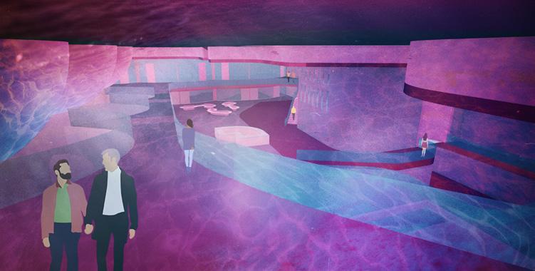
In the interior of the armory, light and shadow are explored as filters. An aquatic shimmering is filtered through hover baths, while fortified wall punches add diffuse light. The queer design and community work together to collaboratively enact change in the vein of design and dispersion; there can be traveling events, entertainment, lectures...
The work spaces on the first level are used by democratically elected leaders of the community who work together to collaboratively enact change in the vein of design and dispersion. The sanctuary acts as a space of spectacle and reflection, sometimes simultaneously, while the monastery meets housing/health needs.
In presenting the thesis defense, I used coded forms and architectural norms as if the final jury were a “board,” and the gradient of covert versus overt was at its most extreme. If the legislative agendas of Mississippi, the quantitative mapping relating to the larger region, and the documented queer experiences of the city of Jackson are any indication, this subversive pitch strategy is crucial to the viability of this proposal having any chance at being built and helping queer folk in the city and satellite small towns. In order to get such an affront built, albeit as a theoretical suggestion, the subversion must extend to policy. Alternate phasing timelines outline either public or coded details, depending on who is reading.
The thesis defense began with realistic drawings only showing those parts of the project visible to the “everyman.” The twenty seconds of excruciating silence, after the “regular” items were presented and I ceased speaking, were effective according to the jury, who were understandably worried after the pause. By presenting the project in this way, as “fakeout,” the critique extends across multiple levels of architectural design and representation.


In terms of renderings, this one had a signal as well; the man in higher definition is one of those unknowing “passerby,” while the two shrouded figures behind his view are “in the know.” A community member points out the secret entry to a new sanctuary attendee. I used this image as the “last slide” of the first presentation—the pivot point between the narrative—because it is the exact pivot point of entry in the project.
Points of entry became a critical design question, as lines of ‘inclusive v exclusive’ are blurred given the nature of oppression. This shows a gradient diagram of two different passerby and their relation to the building’s only main entry. In dotted blue is the everyman, maybe on their daily walk, who happens to pass by the site. Seeing a church elevation, bell tower, and likely open doors, they come in, see the altar, and leave, having satisfied their curiosity. In pink, however, is the intended audience of the proposal: those that do not fit under the heteronormative umbrella. This is their space in a world not designed for them. In order to control this point of entry with nuance, the plan opts for a “faux altar,” in which only those “in the know” pass through, drawing on decades of queer coding and community building. In other words: If you know you know.
If you know, you know.


In order to get such a divisive project built, critiques on normative conventions—architectural, representational, sociopolitical— must be formed. The tools, codes, and conventions of the oppressor can effectively become the defenses of the oppressed.
Though harmful realities of the present landscape must be addressed, the proposal holds hope that the defensive tactics will only be temporary, and the designs being dispersed from the armory may effectively, over time, work to challenge and change the metaphysical landscape.


The project was developed first in section. Though a traditional catholic church plan was used as reference, the design began by playing with the sectional traditions of sanctuary. First, orthogonal sharpness was softened through perforation and curvilinearity in a language of embrace and enlightenment. The predominant source of light, which often filters in horizontally through stained glass, was challenged by creating multiple angled skylights to let light filter in from above. The geometry of the dome is carried down into a stage pit, which runs below a nontraditional descending nave.
Pleasure gardens act as an intermediary between internal/external and exclusive/inclusive. Spaces here can be used for communicating, luxuriating, or loving. This exterior space can also at times be open to allies, so that they may support and enjoy the proposal without infringing on sacred space. The gardens can accommodate multiple agendas at once; a picnic and reunion, for example, call for gradients of privacy. It’s not and/ or, but both/and. The pivot point from monastery to armory turns the corner, both literally and figuratively, from safe haven to defensive center. The juncture of soft and hard; sanctity and self; community and curvilinearity; highlight the embrace of spatial transformation.

The gardens negotiate a fluid range of activities and user groups by employing flexible thresholds. Communal and personal zones are negotiated with nuance, using landscape and architectural elements to engage each program with a range of acoustic, visual, and ephemeral elements.


The “queering” is carried out onto the landscape and used as a filtering mechanism. Waterways flow from a coded entry past the exedra, receding under the monastery & reemerging to snake through a protected landscape before resting directly under the baths. Gentle mounds offer visible and occupiable protection depending on their adjacencies. Trees are the primary source of visual covertness, planted strategically to limit eyesight views and/or signal coded entries, like the one directly under the faux altar from the left street into the exedra gardens. Plantings, such as flower beds and trimmed hedges, offer flexible, ecologically architectural spaces for informal intimacy and formal enjoyment.
What began as a social argument soon branched towards formal (in the typologies addressed), then representational (in the shimmerings of queer design), and eventually political (in the suggestion of how such a subversive project might be built in a landscape that loathes it).
This thesis aims to open a door of inquiry into what it means to intersect queer ecology with architectural convention, and in effect, subversion. What does it mean to queer design?
 soften dig surround


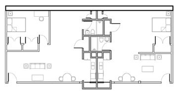


extents architecture principals
MCLAIN CLUTTER CYRUS PEÑARROYO collaborators
AXEL OLSEN
DEANNA BARIS


Design work explores the adaptive reuse of abandoned Detroit schools. Project scope includes schematic planning, campus design, diagramming, systems research, physical modelmaking, & urban research. Shared cores and playful conduits become low-budget, high-impact prototypes for other abandoned structures. Cores include all major utilities for two adjacent units. Conduits, plates, and materials highlight shared infrastructures & encourage collectivity.


thank you


