development journal
Jenny Robinson Caring Home
A survey carried out during the research phase aided an understanding of the associations and experiences of existing care homes.
Responses in relation to memory and sensory experiences helped to reinforce the importance of their consideration within the design.
In particular, the smell of familiar foods gave a sense of comfort, therefore kitchens across the Complex were placed to allow the scents of cooking to evoke feelings of nostalgia.
Personal objects, furniture, music and films, tied people to memories of loved ones, time and place, enabling residents to display and store belongings is fundamental to the Residence apartments.
2 Caring Home
Survey
What smells/objects are nostalgic to you?
- lentil soup
- a home cooked meal scent is nostalgic in relation to my relatives actual home
- salty sea air, bonfires/coal fire, cold winter air
- a particular plastic smell from a favourite doll’s coat. a coal fire. the smell of a new penguin paperback book
- certain perfumes I remember when I was younger, skin so soft spray (remember it from holidays), christmas ornaments
- a smell that reminds me of christmas ... maybe pine
- incense in a church. candle smoke when blown out. hot water bottles. coal fires. pillow cases as christmas stockings. standing in the terrace at celtic park. ralgex muscle spray at the football. homemade chips fried in lard
- talcum powder from my grans house, leather from my grandpas glasses case and a newspaper my grandpa would read every morning
- armchairs
- momentos brought in by resident from their home to care home i. e. photos, items of furniture etc. shows their life
- photos are probably the most evocative
What reminds you of your loved ones/favourite place/home/ memories?
- wool blankets, smell of soup
- smell of favourite food
- a favourite song
- music often reminds me of them
- watching black and white films with my grandpa
- being at home, places we used to visit, the beach and coastal walks, theatres
- dumfries, my bedroom
- going on a walk out to the park with my pram and getting ice cream from the shops next door to their house
- the arran ferry. kildonan on arran. lossiemouth lighthouse. rankins cafe at north queensferry. cafe gandolfi in glasgow. celtic park. playing football in east kilbride. walks in kelvingrove park. watching my son perform at the traverse, oran mhor and lyceum theatres. the coastal path in dalgety bay. my beautiful wee border terrier finn. cousins reunions
- holiday destinations (arran and aberfeldy), my mum making a heart shape out of the toast crumbs left on my plate
- photos, music and objects. also locations associated with them before they went into the home
- paintings on the walls
3 Development Journal
Model Making


Exploring the existing forms through a quick sketch model gave a physical understanding of the relationships between forms and proposed functions.
The simple open forms allow people to bend and look inside the interior, a technique replicated in the final 1 : 200 site context model.
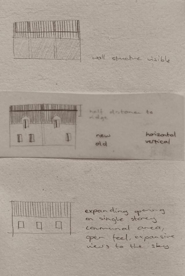
Exposed roof beams contrast against the remaining solid roofs, creating a more obvious entrance and focal point to the courtyard building.
4 Caring Home
Testing the introduction of ruination as an entry to the Residence
Building the existing forms of the Complex

1 : 100 scale model of the threshold gave an idea of the geometric patterning of the exposed roof beams, opening and closing views depending upon perspective.

The 1 : 50 detail of the Residence extension helped understand the patterns of cast shadows, and the relationships between old and new volumes.

6 Caring Home
1 : 50 model showing the impact of light upon mood
1 : 100 model

3D Modelling
Faithfully modelling the existing structures aided in gaining an understanding of their construction, and developed my 3D modelling skills in Vectorworks. Elements of the models were built in Rhino, final visuals were then rendered in V-Ray for SketchUp.
Modelling the roof beams across the Complex improved the understanding of roof-lines, aiding to inform the arrangement of rooms below.
Paying attention to the patterning of window and door placement was useful when laying out the entryways between apartments and the extension. The cutting of new doorways were placed not to disrupt the buildings visual integrity.
8 Caring Home

Detailing windows, roof-lines, beams, chimneys, stepped gabling, columns and the arched gateway gave an in-depth understanding of the sites character. Historic forms and patterning inspired custom furniture, FFE specifications and modelling of bespoke fireplaces.
Periodical site visits were fundamental in understanding the Complex, revealing new details with changes in vegetation cover and the gradual dismantling during its on-going refurbishment.
Due to restricted access to site, the models were informed further by gathered floor plans, photos, drawings and maps.

10 Caring Home

Residence
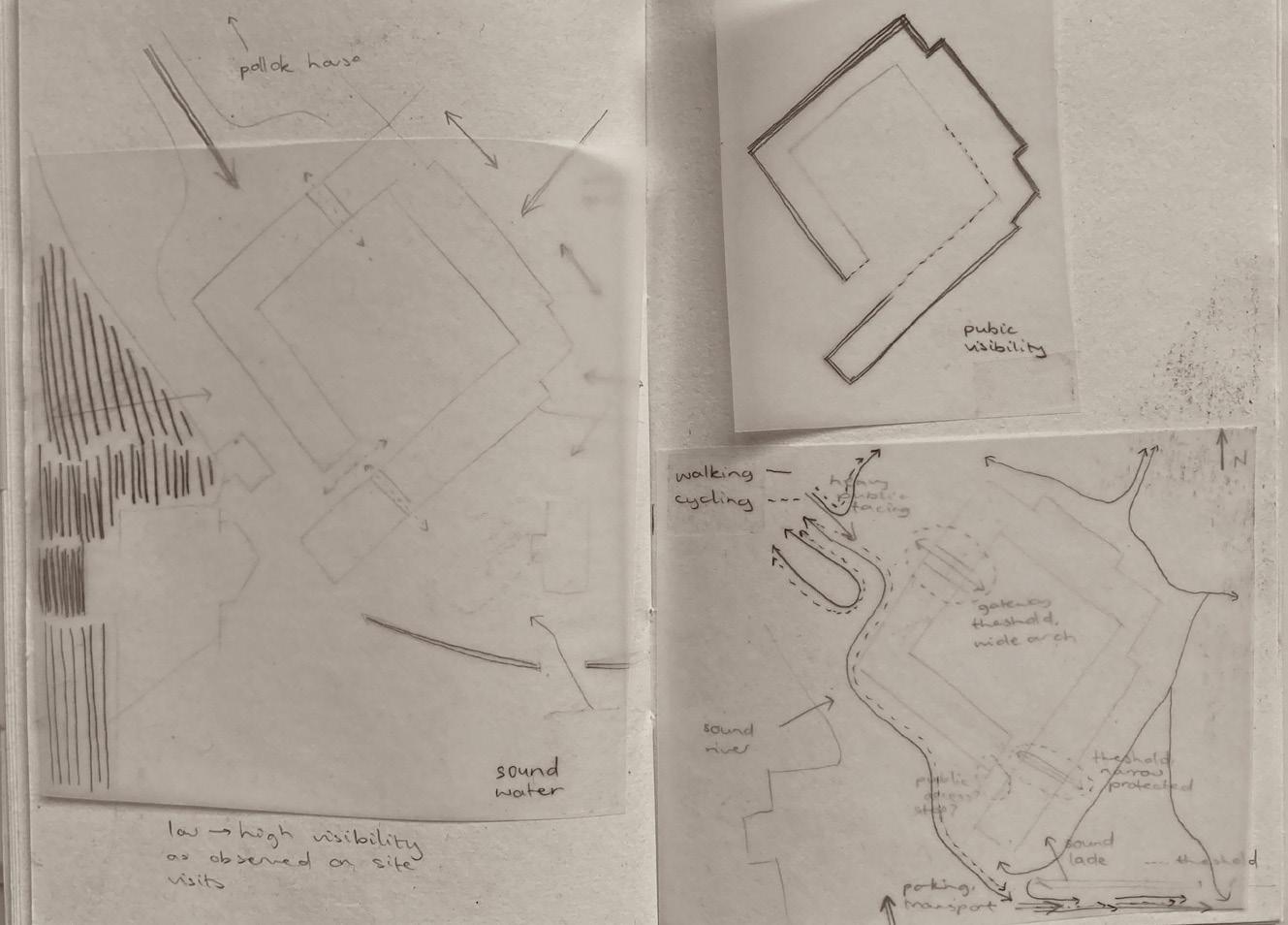
Understanding the access to the site and differing levels of visibility from public pathways was found during site visits. The exposure of areas within the courtyard buildings helped the placement of private/communal areas, the southern-most point was therefore a convenient and clear place for the proposed Residence entry.

Exploring the exposure of beams during deconstruction, inspired the proposed threshold ruins.

12 Caring Home
access, visibility, views and sounds
Mapping
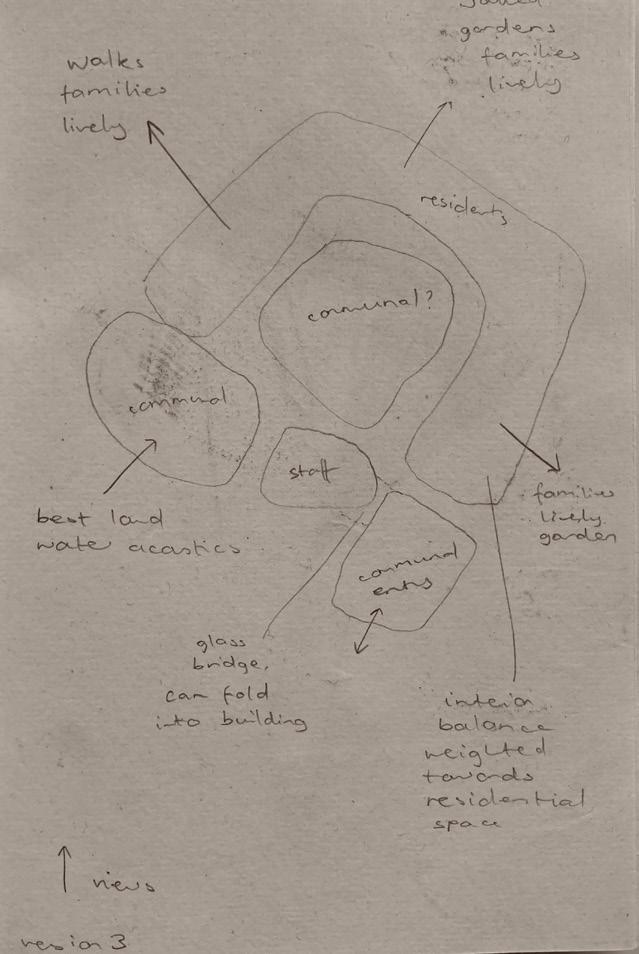
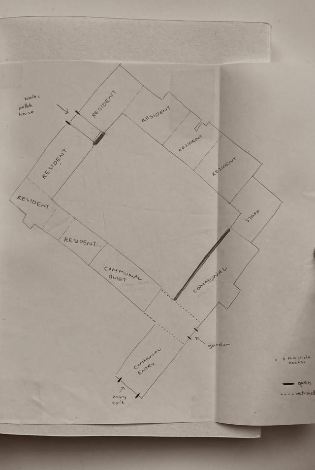
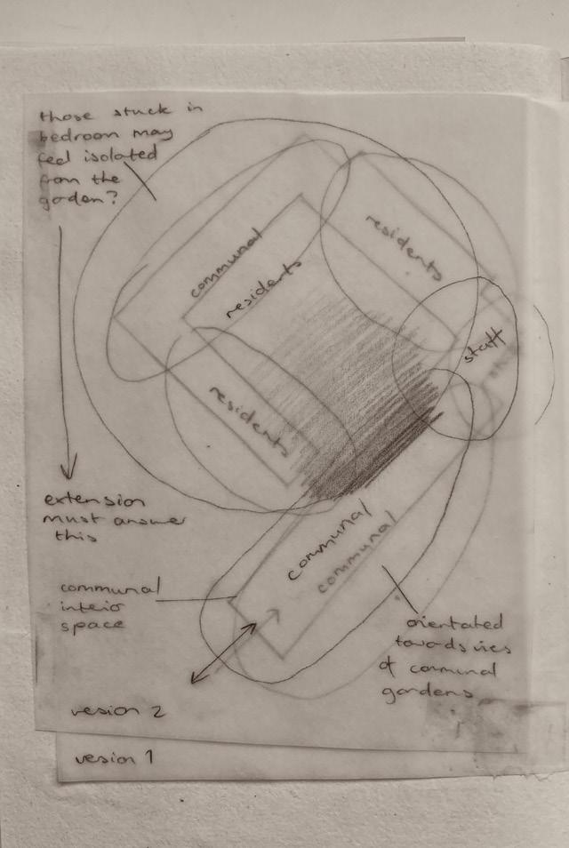
Zoning was grouped by inhabitant profiles, diagrams delineated the arrangement of private and public spaces. Considering the volume given to apartments and communal areas, and how the surrounding views/sounds may impact the experiences of these spaces.


13 Development Journal
Selection of zoning diagrams
The Extension
Drawing connecting lines between existing window and door apertures inspired the angular structure of the extension. Testing varied rotations created new perspectives upon the old courtyard, twisting to align with South facing sun and creating minimal shadows.

14 Caring Home
Exploring potential forms for the extension
The initial forms tested varying orientations, changing relationships with the existing buildings. Iterations alter the balance between interior and exterior space, later designs aimed to retain the open width of the courtyard while balancing the need for indoor activities/circulation.


15 Development Journal
Diagrams exploring the connections between existing apertures on the ground and first floors
Testing orientation
Pushing out the sharp western corner increased the amount of accessible and usable space.
Testing the basic forms in Virtual Reality confirmed that it maintained the openness of the courtyard and views across, while drawing people around at new angles.


The addition of an external overhang allows people to shelter from the rain and sun.
Considering sun, shade and rain, impacting activities and need for shelter
16 Caring Home
Testing the overhang from an interior perspective
Initial construction, detailing and pathways
Considering the methods of constructing a structural frame in steel informed later iterations in Glue Laminated Timber.


The layout of the courtyard garden extended lines from the arched gateway, creating paths aligned with adjacent doorways across the courtyard.

17 Development Journal
Testing the spacing of balustrade railings, balancing the needs for views across while maintaining privacy depending upon perspective.

Introducing structural elements to the angular form. Initial tests were made using steel beams, which were then replaced with Glue Laminated Timber for a warmer natural feel.

18 Caring Home
Pushing back the columns and beams to reveal the intersection created a more interesting form. Aligning window frames with the structural frame created the need for more window panels, and felt constrained.
The final framework is pushed out further, creating a cloistered pathway enveloping the extension. This allowed for larger glazed panels, with frames aligned to disappear depending upon viewpoint. Aiding feelings of openness and composing new views of the existing structure.


19 Development Journal
Sanctuary
Initial layouts tested adding wrap around bookshelves to the building, providing a library space, but little space for seating.
However, the creation of a space for reading and relaxing would create an additional place for inhabitants to spend time, while still providing access to books.
External access to the toilet reduced corridor space, and allows people comfort breaks while out on walks.
Introducing a small area of planting helps create privacy for those inside.
Selection of floorplan tests


20 Caring Home
Cutting a new entrance doorway created an interesting pattern, where the opening intersected with a blocked up window. These geometric forms related to the original stepped gabling, inspiring the graduation of the interior brass threshold.
A linear window was added to the roof, aligning with the existing arrow-slit window to create narrow beams of light and views to the sky.


21 Development Journal
Adjusting the shelving heights to allow wheelchair users to comfortably reach
Geometric intersection at the new entry
Testing the introduction of a linear rooflight
Cutting a large opening utilised the rooms positioning directly above the river, creating a new viewpoint looking across towards the opposite bank. Exploring this intervention in 3D revealed a new perspective towards the adjacent Water Therapy Spa, creating a further sense of enclosure.

22 Caring Home
Exploring potential cuts, patterning and proportions, aligned in relation to the existing structure

Testing the placement of openings, considering the existing, orientation of views and privacy


23 Development Journal
Water Therapy Spa
The processes and activities of inhabitants preparing for swimming led diagrams and explorative layouts for the spa. Various arrangements were tested, the final room divisions align with the roof beams, creating continuity and highlighting their sculptural forms.


24 Caring Home
Mapping approach and visibility from site visits
Diagrams and layouts beginning to order and place activities
Moving the reception created a more inviting entry. The addition of a walking platform to the Northern area of pool took away too much of the water and was removed.
Ensuring the accessibility of every space was a challenge, accommodating wheelchair spacing within the angular forms required careful planning and reference of suitable dimensions for disabled friendly swimming pools. The initial ramp design had to be lengthened to accommodate the correct gradient, creating a graduated journey into the water.


25 Development Journal
Selection of layouts, and modelling the roof beams
Testing the creation of a dividing threshold between the changing area and pool. The 3D model gave a sense of standing in the corridor, at the intersection of undulating roof beams, drawing people towards the water. The long narrow glimpses through the spaces increased the sense of privacy, dramatising the movement between zones.


26 Caring Home
Modeling the view between the threshold and the pool
The depth of the pool was originally higher than in the final proposal, with views only to the sky through the existing sash windows.

Initial considerations of the pools construction, taking inspiration from the 'sky pool' at the Embassy Gardens flats in London. The structure is supported by steel beams spanning the existing walls, keeping the pool separate from the lade as it flows underneath.

27 Development Journal
Virtual Reality
Virtual reality was fundamental in confirming the idea to visually connect the pool to the river through the existing lower opening. Experiencing the ability to bend down and adjust eye-level revealed views down the White Cart.
Final designs converged upon the ideal height to enjoy this perspective while in the water, lowering the floor of the building to below ground-level allowed this.

28 Caring Home
Testing the dimensions of the pool, adjusting the eye-level of swimmers to align with views of the river
Initial tests introducing a long horizontal window. The final window design spans the opening vertically and horizontally, maximising the views above and under water.


29 Development Journal
Community Cafe
The activities within the space originally separated the kitchen as a staff only area, however providing diners with an open kitchen increased the sensory experiences of cooking and eating, and provided space where community workshops can be held.

Ensuring the layouts were suitable for wheelchair users impacted the initial layouts, altering the number of tables and chairs, the spacings between furniture and the orientation of the central kitchen.


30 Caring Home
Selection of floor plan tests
The layout below tested the placement of seating across the windows facing onto the Community Garden. This made the space between tables and the toilet/storage area tight, creating a corridorlike pathway. The final layout retains maximum symmetry across the space, making it feel more open.


Aligning the kitchen with the entryway doors emphasised the Cafe's function in inviting people to cook together.

31 Development Journal
Developed model of the entryway view looking in towards the central kitchen
The initial domed pendants chosen for the cafe obstructed views between the dining area and central kitchen, and so were replaced with more flat Nunoko lights.

32 Caring Home
Testing the proportions of new windows, with the addition of shelving for spices

Testing the addition of new glazed openings, using the space of an existing doorway. These were removed from the final design as they distracted from the proportions of original windows.


33 Development Journal
Community Garden
The existing grounds where the Community Garden is located is an underused grassy area with no clear function. Researching maps of the site revealed former pathways linking between the old orchard and walled gardens. The proposed design took inspiration from these routes, allowing people to walk along paved paths as originally intended.

1934/35 Map

34 Caring Home
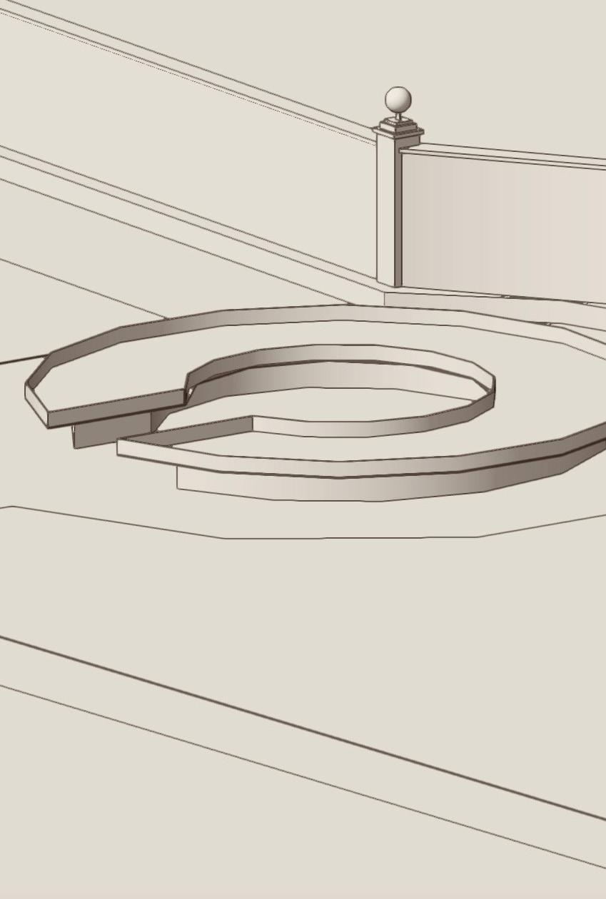
The large circular area on the 1935 map becomes the centre of the proposed garden, a raised bed accessible for wheelchair users. Initially the raised bed was designed as a large circular form, creating difficulty in accessing central planting. The developed design places plants within a reachable distance, and allows people to face each other and socialise. This aids the function of workshops, leaders may present from the centre and help those gardening around the peripheries.


35 Development Journal
Initial layout
Developed form of the raised bed


