Degree Show Catalogue 2023
 GLASGOW SCHOOL OF ART SCHOOL OF DESIGN
BA (HONS) SILVERSMITHING AND JEWELLERY DESIGN
GLASGOW SCHOOL OF ART SCHOOL OF DESIGN
BA (HONS) SILVERSMITHING AND JEWELLERY DESIGN

GLASGOW SCHOOL OF ART SCHOOL OF DESIGN
BA (HONS) SILVERSMITHING AND JEWELLERY DESIGN
Welcome to the 2023 School of Design Degree Show at the Glasgow School of Art.
In your hands is one of a dozen graduating catalogues that have been lovingly assembled for each of our exhibiting programmes in the School of Design for their shows this year. Within these sheets you will discover the exciting work of our graduating students in image and text, alongside reflective snap shots that capture the energy, and concentration within our studios in the run up to this exhibition.
We believe making a physical catalogue to accompany our excellent digital on-line showcases is both important and relevant. Research has revealed what we intuitively knew, that making, and art is good for our mental health and can positively improve the quality of life by alleviating symptoms of anxiety, depression, loneliness and even dementia. In our busy lives, we all spend an increasing amount of time in digital environments, yet we remain alert to the important of reinforcing a balance between the virtual and the real in our teaching and specialist practices.
In the 1850s the Glasgow Government School of Design changed its name to The Glasgow School of Art, while in the same time John Ruskin, the most influential critic of the Victorian era, spoke of an education where the ‘hand, the head and the heart’ were interconnected. As you will witness, those values are still very much alive and true today.
We hope that this guide accompanies you on your journey be it at our Glasgow degree show, or at later events in London and that the work reflects the passion and attention of our students, as well as the care of the staff who have guided them.

To all our graduating students on behalf of all the staff, academic, administrative and support, we wish you every success in this, the exciting start of your careers. Please continue to stay in touch with us, remembering us in your hearts and minds, as we will you.
Professor Stephen Bottomley MPhil RCA, MA Design, BA Hons Head of the School of Design

As part of their degree, all BA Hons School of Design students submit a substantial piece of written work to the Department of Design History and Theory (DH&T) and a synopsis of every one is included in these pages. Students may opt for either a shorter (5,000 word) or longer (10,000 word) submission, the latter being a third of their overall degree submissions. In addition to the two lengths, there are three different modes of submission; essay/dissertation; critical journal (exploring the author’s studio practice in a larger critical and cultural context); or curatorial rationale (an in-depth proposal for an exhibition with its subject and venue the choice of the author). All DH&T staff are involved in the supervision of Honours submissions, which is on a one-to-one basis, and it is always a pleasure to guide what is always a wide range of fascinating and challenging projects.
DH&T is independent of studio, with its own external examiner, and upholds a principle of free subject choice. Therefore, while some write on topics directly concerned with their studio practice, others explore topics that seem to have no bearing on it, often personal interests or socio-cultural issues. This does not mean they are unconnected with studio, however, as the creative process is one of thought and all these submissions are deeply thoughtful, often informing practice in intangible, but significant ways.
Finally, congratulations to everyone who has submitted this year. On behalf of all in the Department, good luck in whatever the future holds.
Contemporary studio jewellery and silversmithing continues to challenge perceived boundaries, using the artifact as a way of evoking a response to social and cultural issues such as gender, relationships, politics and the environment. There is also an appetite to explore beautiful objects and the pleasure they bring to daily life.
Each of this year’s graduates has developed their own personal voice, interrogating the subject specialism to develop a collection of new and engaging pieces to be enjoyed, handled and worn.
With special thanks to all of the academic and technical staff in the silversmithing and jewellery department
Academic staff
Michael Pell
Marianne Anderson
Andrew Lamb
Silvia Weidenbach
Technical staff
Nigel Munro
Shona Guthrie
Maciej Sankowski

‘Perming Your Ears’ (Basil Fawlty, Fawlty Towers, BBC 1975-1979) is a collection celebrating the ceremony of getting ready. My final collection plays with dichotomy between the intimacy of getting ready and the absurdity of the circus. Links are made between these two entities- stripes to represent highlighted hair and circus tents, shapes mimicking spotlights and the outline of the face. At the centre of my collection, is the hair roller, used as the main symbol of ‘getting ready.’ This object, which would ordinarily be used to make individuals presentable is transformed into an ornament to adorn ourselves. SLS nylon is used for its lightweight property, allowing me to create jewellery on a larger, surreal scale whilst still making it functional. ‘Prêt, Pas Prêt’ is a series of bonnets, modelled on a highlighting cap. Digital manipulation was used to produce a stripes and dots pattern on two of the bonnets, mimicking both the original highlighting cap and roller surfaces. Intimacy is brought into the design by using (unnatural) silk for the remaining two bonnets. The striped interior lining is a concealed element, creating a secret connection between the wearer and the maker (myself).
Under the skin is a collection of brooches developed from the concept of pain and trauma. The brooches become an intent of translating an emotional state into 9 main physical wearable objects, representing different stages of trauma and how most humans process it. The collection is composed of cylindrical shaped silver hollow structures, with a hidden compartment on the inside, a metaphor of the human state, linear and simple on the outside but complex on the inside. In the traditional sense jewellery serves the purpose of conveying certain symbolism or status toward the outside world. In this instance the lack thereof and the simplicity of the design to the eye of the observer creates a special sentiment for the wearer alone. When worn, the wearer can choose to show and share with an audience the back of the brooch, or keeping it for themselves. The collection is an echo of social behaviour encouraged within our society, to show the attractive aspects of ourselves and share those with the world, while we are encouraged to hide those less appealing and possibly hurtful and damaging, keeping our most vulnerable parts to ourselves. Under the skin aims to open a conversation and awareness regarding mental health and how individual but similar humans experience are.


Carnivorous plants have a fascinating and visually pleasing method of adaptation. Due to the nutrient deprived environments they reside, these species have adapted their methods of obtaining that nutrition, becoming meat eaters. The focus of the designs is on the Drosera species, which have perfected ways of attracting their prey through vivid colours that mimic flowers and pungent scented nectar, whilst still shooting out separate flowers for the benefit of pollinators. The wet and viscous tentacle ends are what stick to the insects, capturing and enveloping in order to digest and flourish. The collection plays with the idea of trapping the wearer in the same way the plant entraps its prey, through temptation; this is done visually with coloured elastics and resin dipped wire, placed onto structures made from silver and stainless steel. The elastics are tied one by one and trimmed to various sizes, becoming plant like creatures which move in a fluid and graceful manner. The viscous coloured spherical elements, located end of each tentacle, entice the viewer into wearing and thinking about ingesting them. Each little carnivorous creature has its own personality, achieved through choice of colours and finishes, that alter the way in which you act whilst wearing them.
My practise is made up of mould making, casting, and film making. The objects I create often become the inspiration for short films starring the work. My research is focused on the iconography of money and the way symbolism is used to forge a distinct national identity through an everyday object like a coin. One aspect of the work is a personal exploration into the narcissism and pursuit of material wealth present in popular culture and the internet. Our faces, repeated. Creating a cult of personality is quickly becoming an essential practise or artists and makers who want to see commercial success. Especially as a jewellery maker, your clients are often purchasing the small part of you that went into that piece. The work could also be read as a satire of Royal pageantry and old ideas of power. Following the Royal Jubilee and Death of Queen Elizabeth, my work became more focused of the idea of performance. The performance in these displays of wealth seem increasingly more bizarre and otherworldly in a civilisation facing existential threats like the climate crisis. The Diana plate in particular is a response to the current shifting of the idea of the Royal family as a decaying colonial power into something more resembling keeping up with the Kardashians.
This body of work is an exploration of pockets and the everyday objects in them. Made in relation to identity, my work looks at personal collections and the things that people carry on their person. Motivated by the value we give to our possessions and the normality of the everyday rituals that come with them. I have captured this throughout my work using a combination of personal found objects along with findings gathered from research into the things that people use in day-to-day life. Creating precious objects through sentimental value, reaffirming the relationship between the maker, viewer and wearer. Using mostly nonprecious materials, the value originates in my source material research, which was gathered from friends and family members, where this bond already exists. Incorporating the findings into vibrant pieces, this work holds the stories of people and their lives and past. The viewer is encouraged to contemplate such influences in their own pocket collections and is left with questions regarding the stories behind each piece. What things are essential to me, but not to others?

What is the narrative behind this piece? And how much of this is a proclamation of their identity.


My aim within my practice has been to bridge the gap between the worlds of jewellery and fashion, by combining fabrics and metals to create a range of intriguing and striking pieces. The interplay amongst the hard and soft textures has aided me in pushing boundaries in the contemporary jewellery world. In addition to this, have been heavily inspired by the intricate details and elaborate designs of the Victorian era fashion style and paid close attention to the flamboyancy and ruffles that decorated this time period. Playing around with the scale, shapes and textures of the ruff collars has stimulated the cutting-edge unique designs that I now create. The sleek metal forms contrast with the fabrics whilst creating a sense of drama and self-assurance. The collection has been designed with an editorial aesthetic in mind, speaking to the modern wearer that would value the creativity and individuality of the pieces. Jewellery is more than just a decoration on the body. It is an extension of the wearer’s personality and a tangible form of self-expression. My goal has ultimately been to create wearable pieces that evoke a sense of wonder and curiosity. Staying true to my vision, have produced bold and elegant designs that truly test the current contemporary scene and what is possible in jewellery making.
An investigation and reflection of domestic space and the walls which encase and enclose our private lives. Mackay has created a study of form and texture through her vitreous enamel work that reflects the various layers that make up our most familiar of canvases – our own home. Intrigued by the visual evidence of lived lives in a building that is at once both private and yet shared; scraped floors, chipped paint, the ripped wallpaper of many people that have called the same space home. Using photography and collage to study the home which in turn were developed into objects, this research brought into light the broken and damaged parts found within the lived space. Mackay has developed works that mirror the human interaction within these domestic spaces by playing with experimental enamelling techniques and a creative use of form evokes the identity of architectural space. The work remains abstract as singular pieces yet familiar as the collection when viewed as a whole plays with scale and perspective focusing on the often-ignored parts of a room. Using steel, silver, copper and vitreous enamel Mackay crafts her wearable art pieces in a way not dissimilar to how we build upon and impact our own homes with layers of paint, disguised mistakes and hidden structures.
Contemplating the Afterlife. Through my practice, have considered the role of the afterlife in our earthly existence and contemplated such questions as, is this life an afterlife of a life we have lived before? My visual inspiration came from a jade ring-shaped object called Bi. Bi is an ancient Chinese artefact often used as a burial object to assist the deceased in their journey to the afterlife. For myself, the ideology of an afterlife is routed in time. Lives, how many of them are unknown, pivot around time. The cyclic nature of the torus in my collection represents the cycle of death and rebirth that all material things undergo. Each torus has its own individual story told through intricate patterns and textures. use the act of meticulously creating each detail repeatedly as a meditation that brings a timelessness to the making process, mirroring the ongoing journey of an afterlife.

Offering a surrealist and materialised vision of water frozen in its movement, like a snapshot in three dimensions, this collection captures the subtle reliefs of the waves and currents in the form of both functional and sculptural objects and vessels. Each piece is designed through the union of both contemporary and traditional silversmithing techniques to transform this body of work into windows that visualise the water which surrounds us all on this earth, like images captured to represent physical water. Using a palette of precious metal as well as combining contemporary materials within the making process helps to highlight the contrasts of the light, reflections, and shadows of the aesthetic visuals seen through my observational research of water. Drawing on the experience of being in front of the sea or ocean, where you stand in silence and enjoy the rhythm of the waves and the infinite colours of the water, offering a moment of contemplation, my collection is faithfully titled, The Memory of Water.


This collection of eating utensils celebrates spice and the ways in which we interact with hot food. The chilli and its significance in different cultures is the driving inspiration for the body of work and its influence can be seen throughout. The colours observed in chillies have inspired a visual scale of heat to be incorporated into the work: black oxidisation for a charred and burnt finish, bright red to envisage inflammation and silver to mimic blinding, white hot pain. Through various forms and textures, the pieces provide a visual translation of fiery tastes, the sensation of heat felt on the tongue and, ultimately, collate to form a synaesthetic dining experience where spice equals nice. Cutlery acts as a direct link between materiality and the human body. Through the act of eating, the diner engages with the object and perceives it not only in sight and touch, but in taste also. Techniques such as raising and etching have been utilised to create unique forms which explore a sensory dining experience where pain meets pleasure. The group of work aspires to deliver a punch, carry a bite, and leave your tongue sizzling.

My practice is derived from my deep appreciation of contrasting materials and the environment that surrounds me. The collection, For The Love Of Concrete, is comprised of both wearable and sculptural objects as a homage to brutalist architecture. Within my work I use photography as a primary tool for exploration, allowing me to visually dissect construction techniques of brutalist buildings in Glasgow and the North of England. Through analysis of my images have transformed the characteristics of these buildings into pieces of hand held architecture. The collection places emphasis on juxtaposing precious metals with materials from the urban environment. Allowing me to develop a deeper awareness and understanding for materiality. Using scoring and folding alongside texturing techniques, have been able to create harsh lines and geometric shapes, that play with the viewers perception. Each piece is made up of multiple, modular components mimicking the external structure of buildings. My collection, For The Love Of Concrete, is designed to reinforce and appreciate the individual craft of mid century architects and celebrate the power of brutalism.
This body of work is born from a love of a small enclosed beach on the East Coast of Scotland, and a sketchbook. An abstract approach is taken through an indirect translation of sketches onto metal. As opposed to a photographic mimic of nature, these pieces are the result of a three dimensional response to expressive drawings of the area made from tangible found objects, visual sources, personal experience and memory of the area. A desire to capture the feeling of being present on this beach at dusk was the inspiration for the drawings which then came together to fabricate this finished collection. Through metal forming and texturing, this series of work represents small fragments of the tangible and intangible beauty found within the bay. The silver pieces display an organic and natural take on visual details of this coastal area. Oxidisation of the silver is utilised to accentuate an image of pattern and texture, and the technique of engraving is used to create striking, yet subtle fractures of light in an attempt to recreate the feeling of reflection on the surface of the sea. Chasing and Repoussé are also implemented to create three dimensional form, bringing life and depth to the work.

My practice recites the story of my health. Being type one diabetic, my work tells of my relationship with sweets and sugar. The mouth and teeth; the consumer and victim. This collection Bittersweet highlights my love for sweeties meanwhile emphasising the detriment they cause to my health. Sugar and sweets have damaged my teeth while being my saviour in a life-or-death situation, an addictive, harmful substance but a reliance for me. Type one diabetes, dependant on sugar to stay alive, a first-hand battle with the substance. My work involves replicating sweets and candies as wearable objects, Cutesy, nostalgia driven memories informed by the perspective of sugar from a person with type one diabetes. In my pieces have used real human teeth, decayed and rotten, alongside parts and full tangible medical instruments to bring in the narrative of my medical status.
This collection is a contemporary novel into the inner workings of my mind when overwhelmed by emotions. The body of work is generated from painting and drawing exaggerated shapes taken from needlework and hand-weaving processes as a form to self- soothe. During this project, I explored the boundaries of combining different materials to represent the feelings I experience. Through laser cutting acrylics as a base to support the detailed mother-of-pearl shapes, merge them together with neon threads, embellishments of silver and hand-woven wire objects to create a fusion of vivid, complex structures. Through analysis of sources used in my DHT essay, explored the history of needlework and its attachment to femininity. Throughout the essay, I questioned the reality of what needlework does for women, discovering that it is a tool to communicate and generate a space to think freely. It helps build relationships, bonding people through conversations held within its space; it creates a place of safety and peace to figure out the ways of life. This is blended into the degree collection to celebrate the beauty of free thinking whilst trying to understand my emotions and identity within the 21st century.
As more and more people start keeping pets, the forms of pets have become more diverse, such as Tamagoko and electronic dogs. This collection investigates and explores more forms of pets as jewellery. The collection reinforces the close connection between humans and pets through the wearability of necklaces and brooches. The wearer can experience longer companionship and closer contact between the pet and the human body in the form of jewellery. By removing the cuddly skin of the pet and placing the furry fur inside the skull, the collection explores more forms of pets, while at the same time discovering and considering whether people’s love for pets is only about their cuddly appearance. Would people still love their pets and want to keep them if their cuddly skins were replaced by hard, cold metal skulls? The collection also explores whether the relationship between humans and pets is only superficially functional or whether there is a deeper spiritual attachment. The collection also showcases the unique personality and presence of each pet through different metal techniques such as brushed metal, reticulation, polish, white-burned, stone setting and enamel, etc, in the hope that the viewer can understand and feel the uniqueness of each living being.

The ‘Un-Paisley’ is a series of objects revolving around the shape India calls the ‘butta’, Scotland the ‘paisley’, and I, like my mother, the ‘mango’.

This shape personifies the duality of the narratives within colonies and highlights the repercussions of colonialism in a so-called ‘post-colonial’ world. Through its popularity within craft and trade, as the Kashmiri shawl, the shape provided the first seeds of the industry before and through India as a colony. And, through its immoral journey to the West, rooted in imperialistic ideas of ownership within Scotland, the shape, appropriated as the ‘paisley’, was the touchstone of domestic industries, providing many people, especially women, with an opportunity at financial independence. At the same time, whilst the western-world seemed to benefit from this motif, in India, the native industries were decimated.
‘Un-Paisley’ takes the forms of vessels and body adornments made from metal and silk thread; it combines traditional metal-smithing techniques with those from textile crafts. This collection was developed while contemplating the idea of imperial ownership as I resonate with the shape’s immaterial sense of post-colonial narratives.


This foundation collection, entitled Metric, explores the tactility of objects and draws attention to materials often undervalued or overlooked. The work seeks to elevate materials and processes more commonly associated with industrial applications and traditional practices through a contemporary reinterpretation. This ongoing collection of works utilises traditional techniques and industrial materials to create modern, thoughtful pieces for people who cherish meaningful objects. My contemporary designs all begin and end with the same thing: curiosity and meticulous attention to detail. Each piece is unique and utilises a monochrome colour palette to amplify the surface details. This minimalist approach showcases the sculptural forms that are instrumental in the centre of each piece. The domed enamelled surfaces bounce and scatter light penetrating through the mesh, creating a spectrum of shadows that shift as they come into contact with the body.
0.152 is a series of wearable pieces that also function as lids for a collection of vessels. Each piece contains three component parts; a chased or press-formed mesh sheet, and vitreous or wet process enamel encapsulated in a sterling silver circular surround.


0.2 is a pair of sterling silver drinking cups with an 18ct gold plated press formed mesh structures at the centre.
0.8 is a series of large experimental brooches consisting of layers of various gauges of enamelled steel mesh and perforated sheet.
As the core concept of the final year degree work draw inspiration from the mysteries of the universe and the beauty of the unknown to create otherworldly forms that reflect the complexity and wonder of a natural, yet distant, world. These pieces emerge from an enquiry about how other intelligent lifeforms would try to spread the knowledge they’ve gathered, in hopes of it being passed on to another life-to-be. Through my work, I seek to merge art, science, and technology and by utilizing processes such as rapid-prototyping, press forming, and structural colour through heat patina, try to push the boundaries of what can be achieved from the convergence of these fields. One of the key elements of my work is the use of flame colouring as an entropic effect, a visual representation of the universe’s inevitable march towards chaos and disorder, realized through an oxymoronically controlled heating of the metal. Via the use of various materials and techniques which bend and manipulate light, I aim to capture the viewer’s attention, inviting a sense of awe and even slight doubt as to the reality of these pieces. The works’ sense of uncanny familiarity, geometry turned organic, Earthly but not quite, brings forward a universal quality of life, nudging at our sense of individuality on this blue dot. In hopes of offering new insight, this collection invites its audience to push past what was thought to be achievable, and reach beyond into the unknown.
This collection explores the ideas of gift giving through crocheting. The patterns from the crochet have been dissected and emulated to look like flower petals. The connection of loops and knots from the crochet symbolises the connecting of people. Flowers are a universal gift and can come in various different forms for various occasions, they are given to loved ones to help communicate human emotions, joy, affection, appreciation and even apologies. This collection is intended as a gift to your loved one and spark these emotions. From these patterns the petals have been assembled together to make flowers. The materials, silver and acrylic have created structure for these pieces to be held together and creates contrast between the soft textiles of crocheting and the organic matter of flowers. These pieces are to be given to people so that when worn, the giver is always present and connected to the wearer.
My practice sets out to capture the essence of movement. Drawing from experiences and struggles of both theoretical and physical feelings of ‘stuckness’, my work is driven from the subsequent reclamation of such setbacks. Music provides a sense of liberation, which is reflected in the jewellery. These influences are not explicit in their representation, but rather invite the viewer to interpret them in their own way. Rhythmic patterns and melodic references embody motion, and the beauty of the fleeting moment. Structures that flow and interplay with one another are combined with materials that contrast. Creating harmony and dimensionality, the work itself has elements of sensory stimulation whilst being worn or interacted with. The tactile nature of jewellery is honoured, and compliments the wide perception of self-liberation and freedom which is embedded throughout the work. Physically driven from music, and conceptually from subsequent feelings, my work sets out to encapsulate such sentiments that are not palpable, but similarly shared between every viewer and wearer. The jewellery represents momentum and progression, and the work is a testament to moments of stillness, moments of loudness, and moments of moving forward.

The jewellery showcased at the graduation show is a product of a journey of exploration into the intricate concepts of belonging and its antithesis, not belonging. The aim is to capture the essence of what ‘home’ truly means using forms and colours that convey feelings associated with the chosen topic. The importance of freedom, learning to allow oneself into the unknown and stepping away from one’s comfort zone allowing chance to be part of the creative process, is an integral part of the concept. This necessitated that using alternative solutions to the jewellery, such as wearability and the connection of different parts, become a crucial design element. Precious (recycled silver) and non-precious elements (copper, lacquer paint) are used simultaneously. The past and the present are blurred as silver, sourced from scrap pieces collected throughout the years, was melted and reimagined into new pieces. Also, space is expressed ambiguously in its positive and negative facets and, in most pieces, it is what is cut and left out that becomes the central focus. In the realm of art and design, in-betweenness allows for the exploration of the unique connection between the body, the wearer, the maker, and the viewer. Through my work, I encourage dialogue and ask questions using jewellery as a tool for conversation.


Incubus
The ‘Fantasy Incubus’ collection is my in-depth rendering and explanation of the elements and colours in erotic dreams. Dreams are the hint and satisfaction of desires. The strong collision between erotic dreams and human desires allows dreamers to reach intracranial or even physiological orgasms. The unknown plot and characters in dreams are surprising, and dreamers can also be any characters. Compared to completely restoring erotic dreams, this collection tends to capture individuals, such as an object or a creature. Dreams often appear in the form of fragments, so try to supplement them with emotions and fantasies, which refer to various characters that often appear in my past erotic dream experiences and recreate them. Simple elements such as tentacles, Vagina and female breasts are the main elements I emphasize and combine them with Asian erotic art culture. Using multiple colours of collage and overlay to express complex levels and colour gradients, mainly using metal casting, enamel, 3D printing, fabric design, bead embroidery, forming a dreamlike and bizarre effect, in order to create the diverse moist and delicate thoughts and stories under the desire and passion, depict some hidden but impossible fantasies, and turn abstract concepts and desires into concrete and visible images and objects.
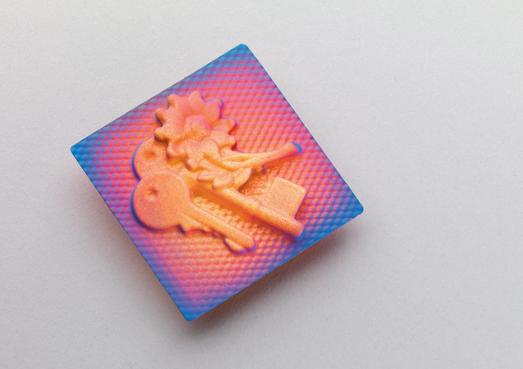
Cover image: Abigail Pontefract
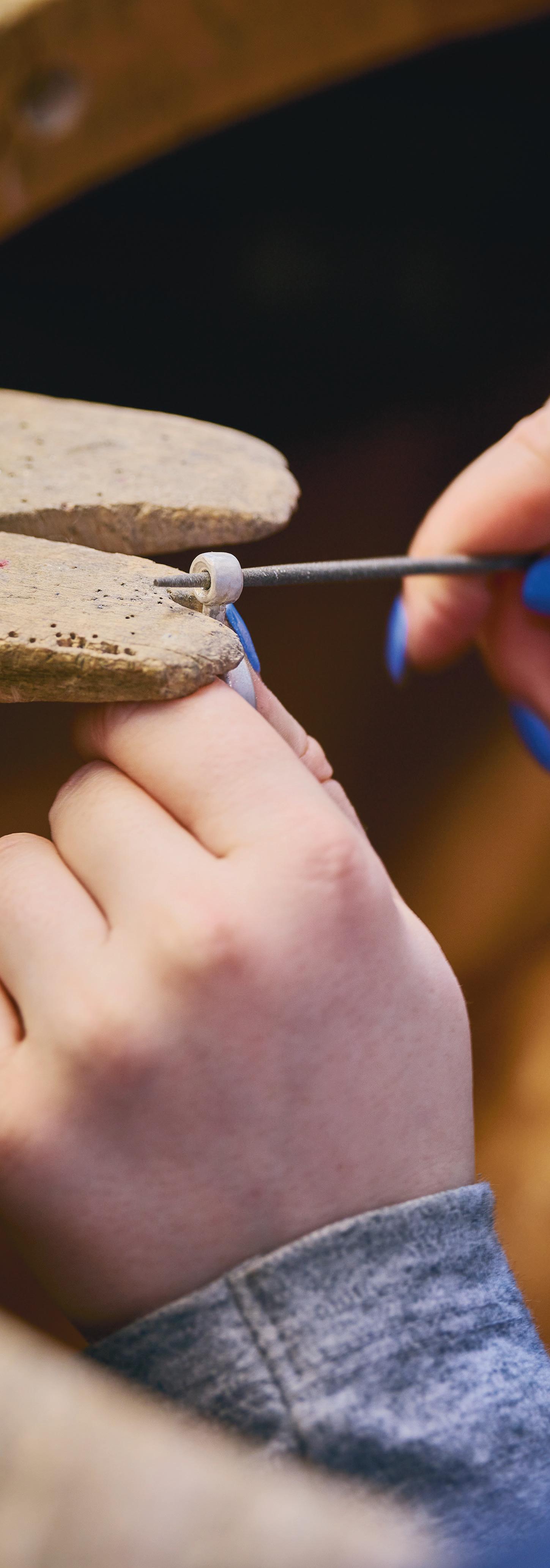
Studio and student work photography: Shannon Tofts
Design: Kat Loudon and Phoebe Willison
Headline typeface: Rules by Freddie Guthrie

Printed by The Newspaper Club on 55gsm improved newsprint.
All work shown remains the property of the designers and may not be reproduced in print or any other media without written permissions. Contact details for all work is provided on each page for any enquiries.