process “ “

rachael mackay
obscura
Obscura from Camera Obscura - The Camera Obscura is believed to be the first camera in history. Rather than taking photographs, it focuses light through a pinhole lens and projects the image onto a screen. The device is a predecessor of cameras for both still and moving images.
Obscura from Obscure - meaning “not discovered or known about”, much like the hidden tunnel and cinema which are part of this proposal.

CONTENTS 1 Overview 3 The North Rotunda 4 The South Rotunda 3.1 Introduction 3.2 Entrance 3.3 Cafe-Bar 3.4 Film Museum 4.1 Introduction 4.2 Atrium 4.3 Cinema 4.4 Snack Bar 4.5 Film Booths 2 Zoning 2.1 Site Model 2.2 Zoning Diagrams 2.3 Zoning Plans 2.4 The Journey 1.1 Key Considerations 1.2 Poster 1 11 13 25 35 43 51 53 57 65 71 73 75 81 91
When designing this space, I had several key considerations. The first was the buildings themselves.
The Rotundas were built between 1890-95, providing shelter to the lift shafts and stairways which led down to the base of the tunnel. Originally, the buildings had no ground floor, with the external doors leading straight down to the tunnel. Over time, the buildings have been through several regenerations, including a restaurant and casino at the North and an ice cream parlour and theatre space at the South.
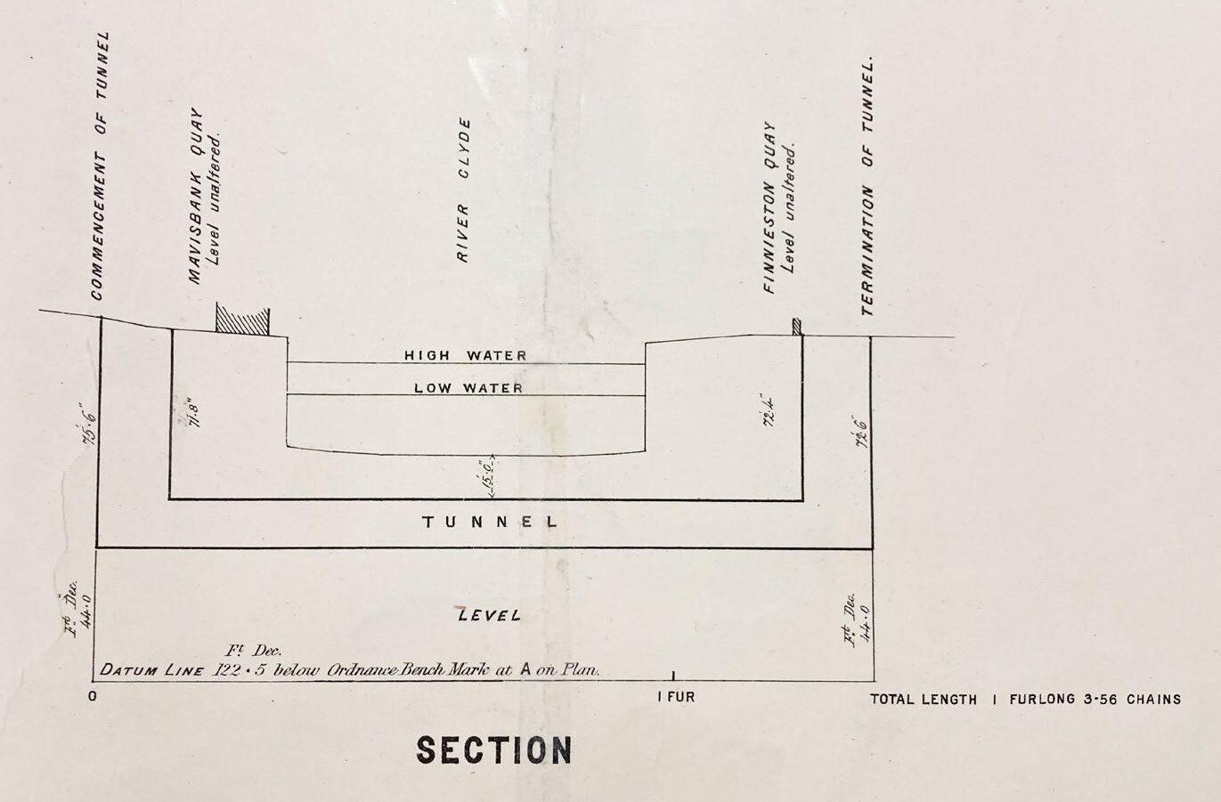
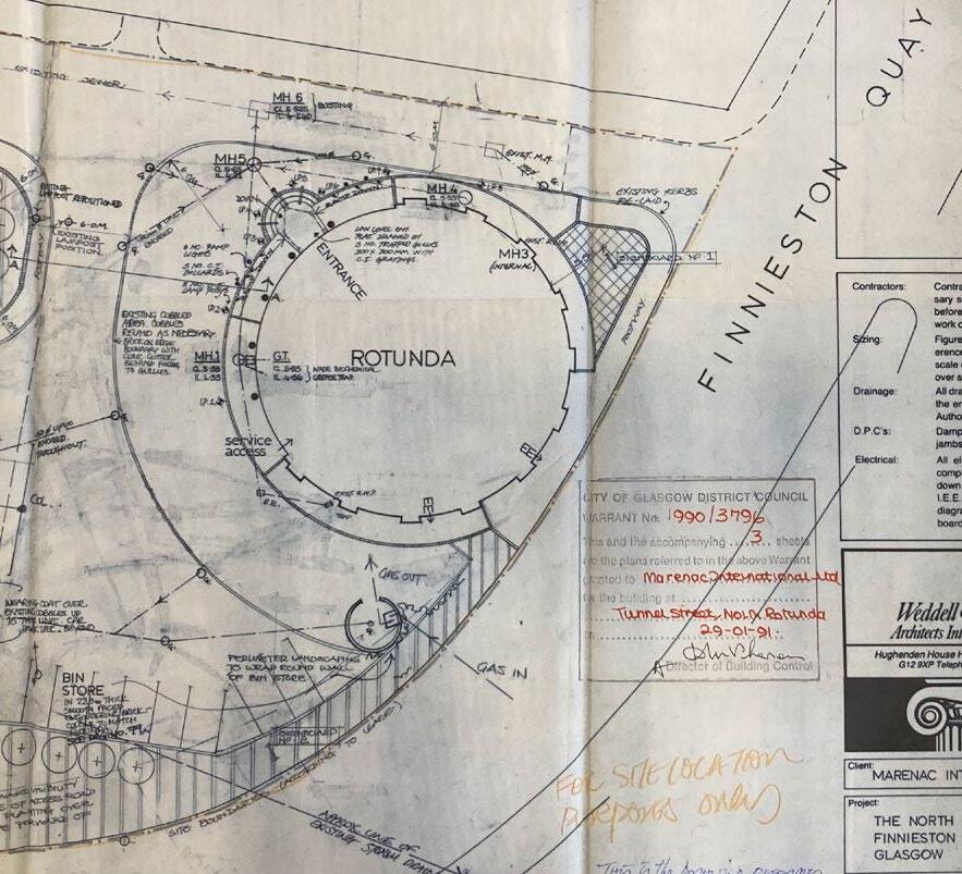
To get a better sense of how the Rotundas were designed in the past, I viewed old plans at the Mitchell Library. Here, I also found information on the Harbour Tunnel, alongside original drawings from 1888, before the tunnel was built. The visit allowed me to better understand the history of the Rotundas and Tunnel, and how their interiors were designed to make best use of the round buildings.
1 overview 1 process journal
1.1 key
2 obscura
considerations
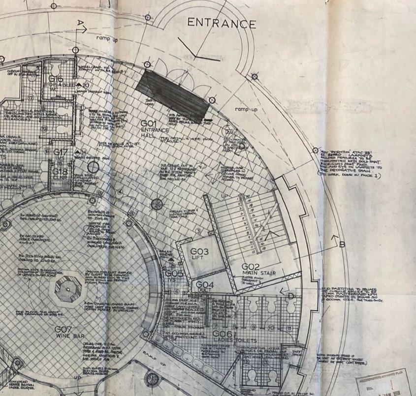
Technical drawings from the Mitchell Library
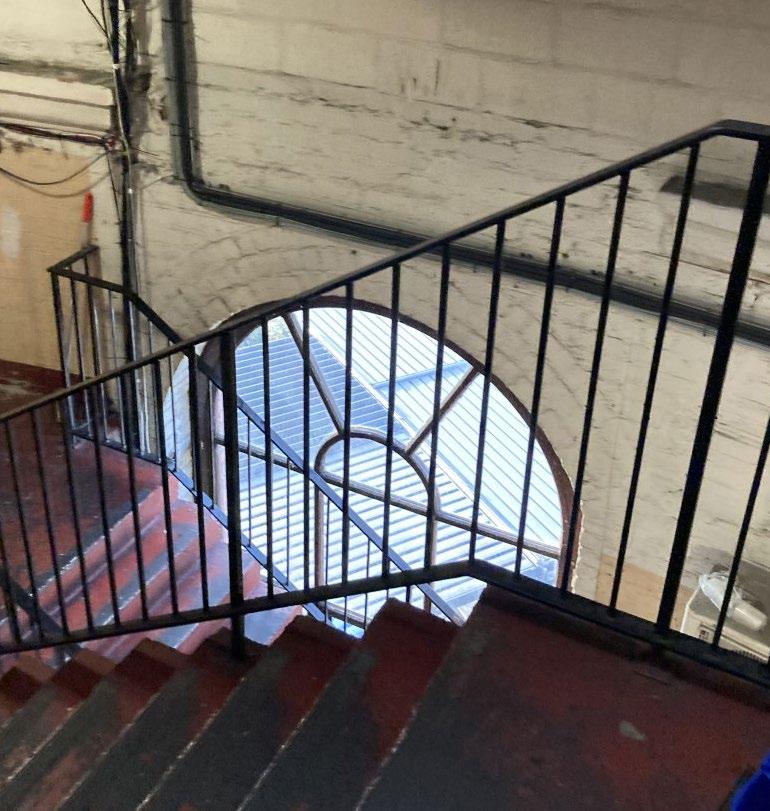
I made several visits to the Rotundas themselves, and was able to get a behind-the-scenes tour of the North Rotunda. This helped me gain insight into how the building had changed over time, and how effective the interior design was in creating a welcoming space which is also respectful to the original building structure.
I also located plans for both the North and South Rotundas, which provided me with the key dimensions of the buildings, and detailed how the South Rotunda is currently designed. The plans and site visits did not explain where the entrance to the tunnel is located, however from old photographs and a section marked ‘Scottish Water Plant Access’ on the South Rotunda plan, I was able to estimate that the tunnel is accessed only from the South Rotunda.
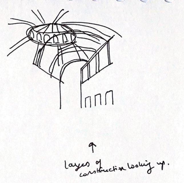
I chose to fully redesign the buildings and tunnel access, removing all existing floor levels and interior walls. This allowed me to design the interiors to best suit the spaces involved, and meant that I could make the best use of the Rotundas external structure to highlight the history of the buildings and bring natural light into the space.
Read more about the history of the buildings and my site visits in the Research Journal.
1 overview 3 process journal
Existing section drawing of the South Rotunda
1.1
key considerations
Images from my site visit
obscura 4
The next key consideration I had was the entry and exit points of the buildings.
The North Rotunda is currently open all day, situated in an entertainment-focused area which is busiest during evenings and weekends. It has the easiest access to and from the city centre, with nearby train station, bus stops and adjoining car park. The South Rotunda is an office, and the building and it’s surrounding areas are busiest during weekdays, often less busy than the north side of the river. It is for these reasons that I have chosen the North Rotunda as the central entry and exit point for my proposal.
It is also important to note that some visitors may not want to navigate through the tunnel to the cinema and back, therefore the South Rotunda includes a smaller, discreet entry and exit point.
1 overview
5 process journal
The second central consideration was how the hidden aspect of the proposal could manifest in the design.
The proposal includes an element of secrecy, which I aimed to create through splitting the design into hidden and public areas. Through speaking to others about the Rotundas and Tunnel, I found that many people knew of the North Rotunda, but that few were aware of the South Rotunda and the tunnel connecting the two buildings. For this reason, alongside the fact that the North Rotunda was to be the entry and exit point for the proposal, I chose to keep the North Rotunda’s film museum and cafe-bar open and known to the public, and the tunnel experience and South Rotunda’s cinema and film space hidden, accessible only to those who are aware of their existance. This means that the tunnel and cinema are discoverable within the North Rotunda, with hidden clues leading visitors to unearth the secret. Signage surrounding the South Rotunda is discreet, and it’s interior remains a mystery until visiting.
This also comes with the awareness that, over time, the cinema and tunnel will become more widely-known, through social media and wordof-mouth. However, the experience will change with every visit, and the feeling of secrecy and discovery will remain.
1.1
key considerations
6
obscura
A third key consideration when beginning the design process was for the spaces to feel inclusive and welcoming to all.
I aimed for the space to be as inclusive as possible, showing films which represent the diversity of the world in which we live. The space should feel welcoming and comfortable, allowing everyone the chance to explore their place both in the space and in the world of film.
Part of keeping the space inclusive is ensuring that it is accessible by both stairs and lift, and that spaces are easy to navigate and inhabit by all.
Tickets, food and drink should be fairly priced to accommodate those with lower budgets, without compromising the experience. This would be maintained through higher ticket sales of less expensive tickets and the use of lower-cost materials during construction.
7 process journal
1 overview
Increasing Importance
Hierarchy of Areas Within the Space
Cinema
Museum Cafe-Bar Snack Bar
Booths Tunnel
Rooms Kitchen WCs Entrance
Film
Film
Staff
1.1 key considerations 8 obscura
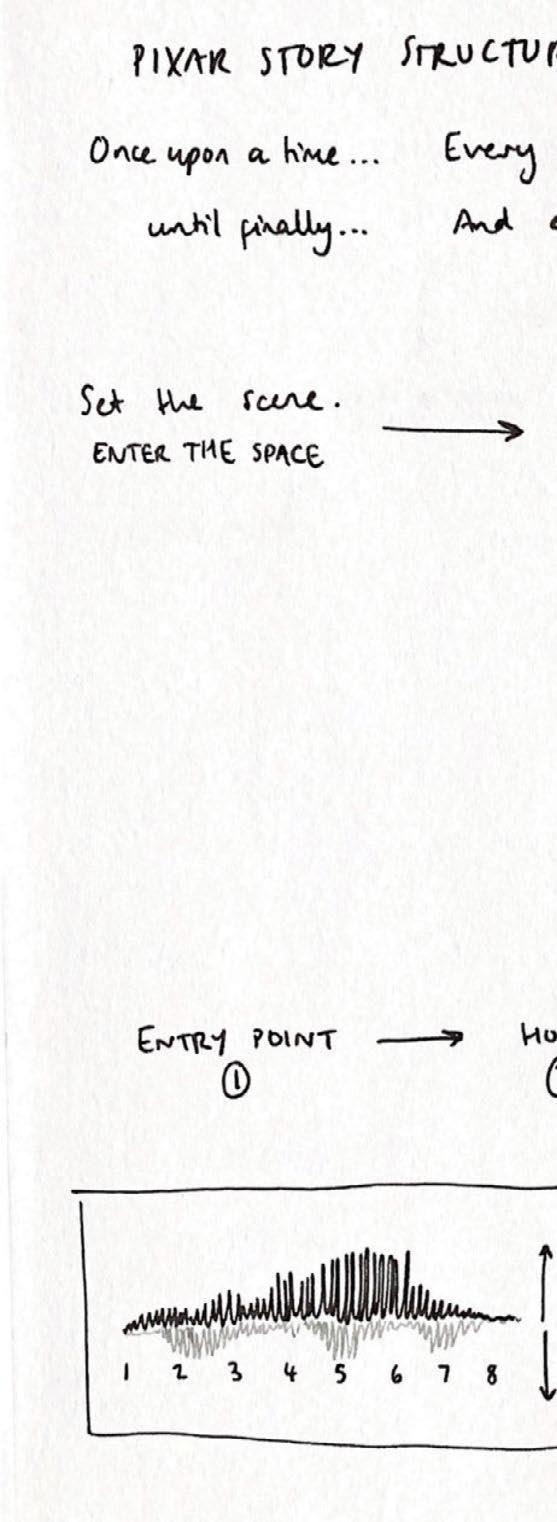
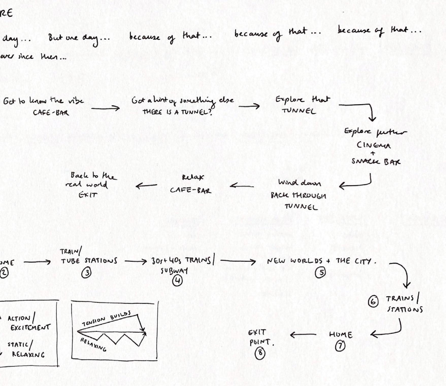
A final consideration for the project was the idea of a journey, both literal and metaphorical.
Similar to character journeys shown in film, visitors travel through the space from entry to exit, both on a physical and emotional journey. How film and spatial design combine these literal and metaphorical journeys adds to the visitors’ and audience’s experience of the story.
Films set on modes of transportation allow the temporality of the journey to dictate the plot and emotional experience of the film.
The journey on a train can be likened to the journey of the characters, with a beginning and end, and a set journey duration. The journey of a character within a changing world is comparable to the journey of a train through a changing landscape.
This led to the design of train interiors and subway stations informing my own design, especially for the tunnel and the film booths in the South Rotunda.
I also began to look at the space as a film, with a beginning, middle and end.
1
9 process journal
overview
1.1 key considerations 10 obscura
11 process journal
1 overview
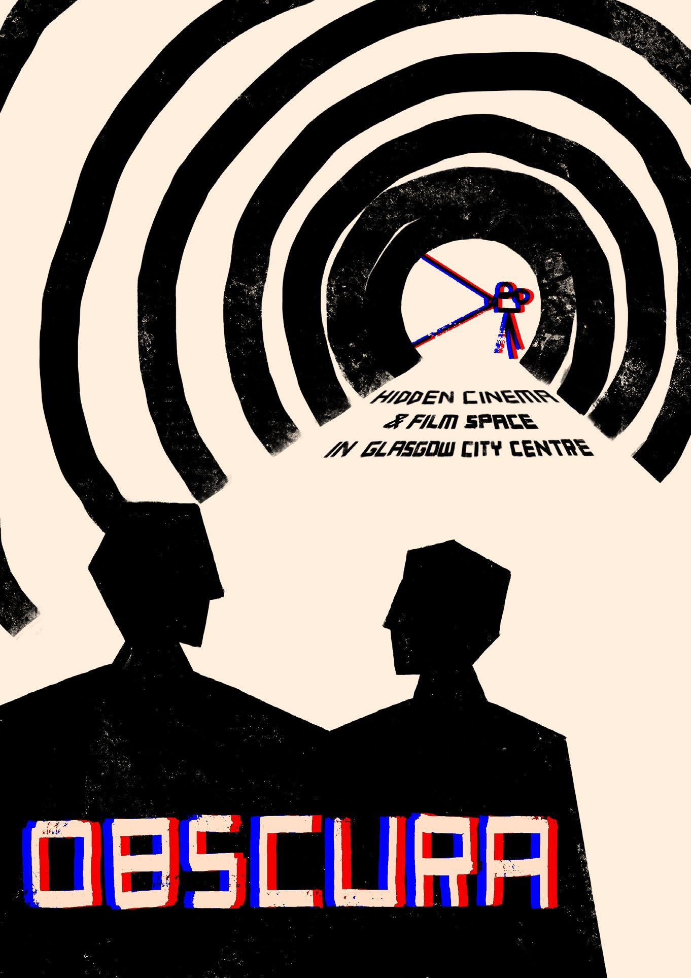
My poster design advertising the space
This was created near the beginning of the design process to help communicate three key elements of my project:
Hidden - the drama and mystery of the space, emphasised using bold silhouettes and abstracted shapes.
Cinema - the film-focus of the space, emphasised by creating a film-like poster inspired by Saul Bass posters for Hitchcock films, and using 3D effect showing a movie projector and the project title.
Connection - the social aspect of the space, emphasised by the two people conversing as they travel through a tunnel to the film space.
1.2 poster 12 obscura
2 zoning
13 process journal
2.1 site models
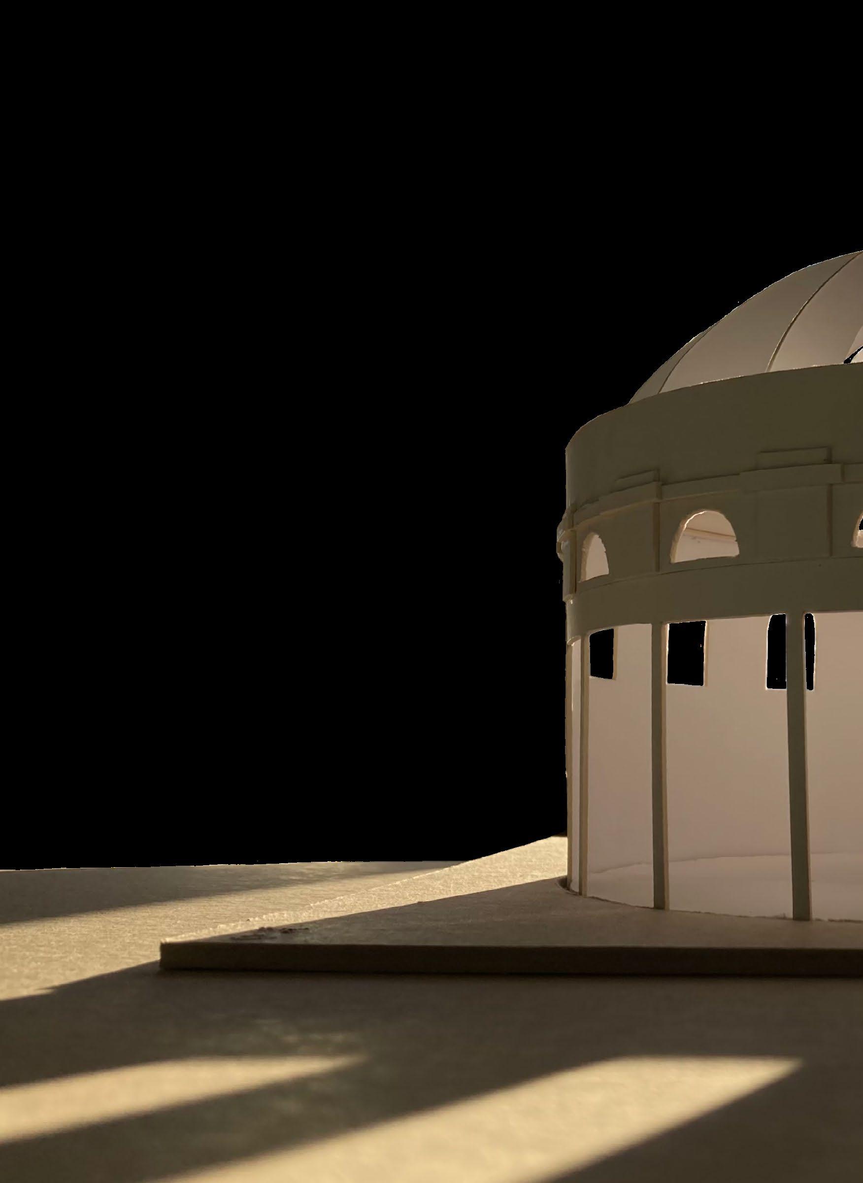
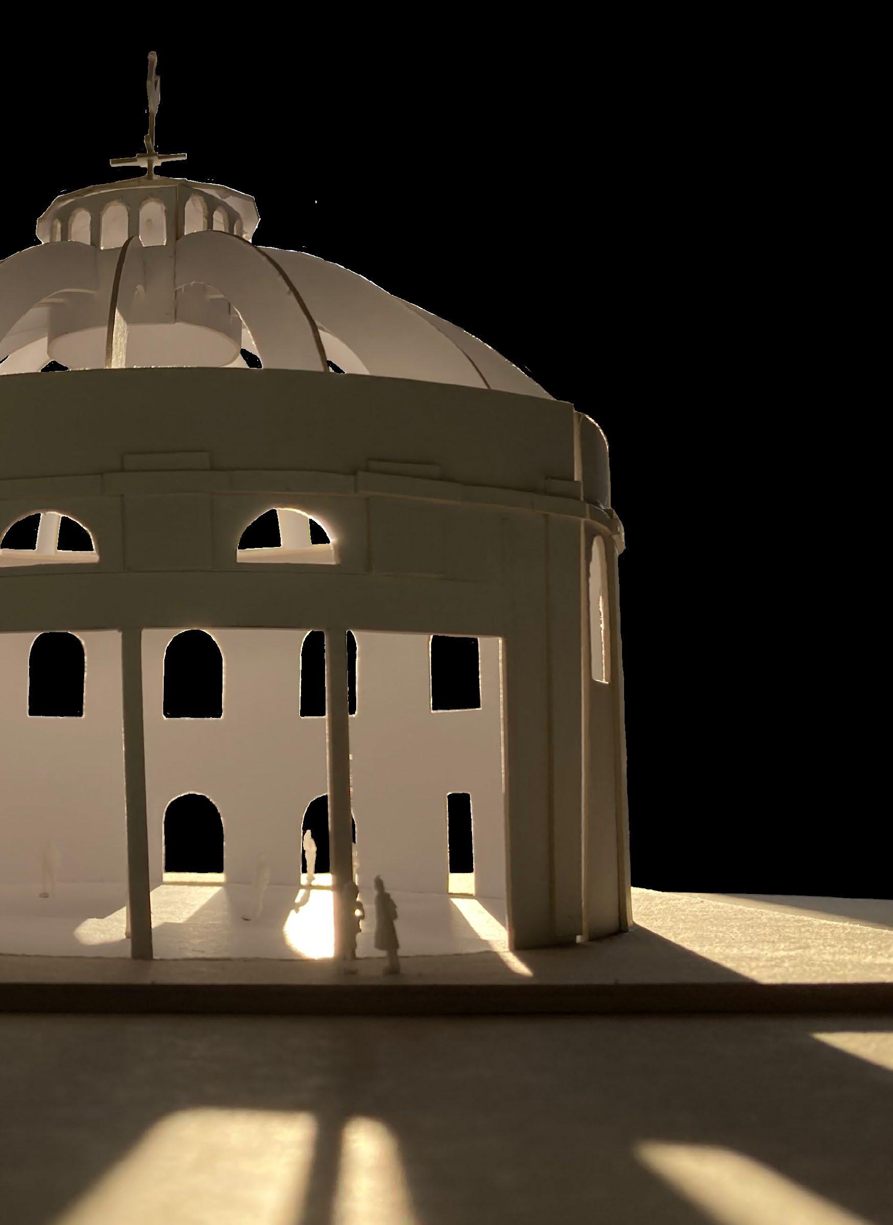
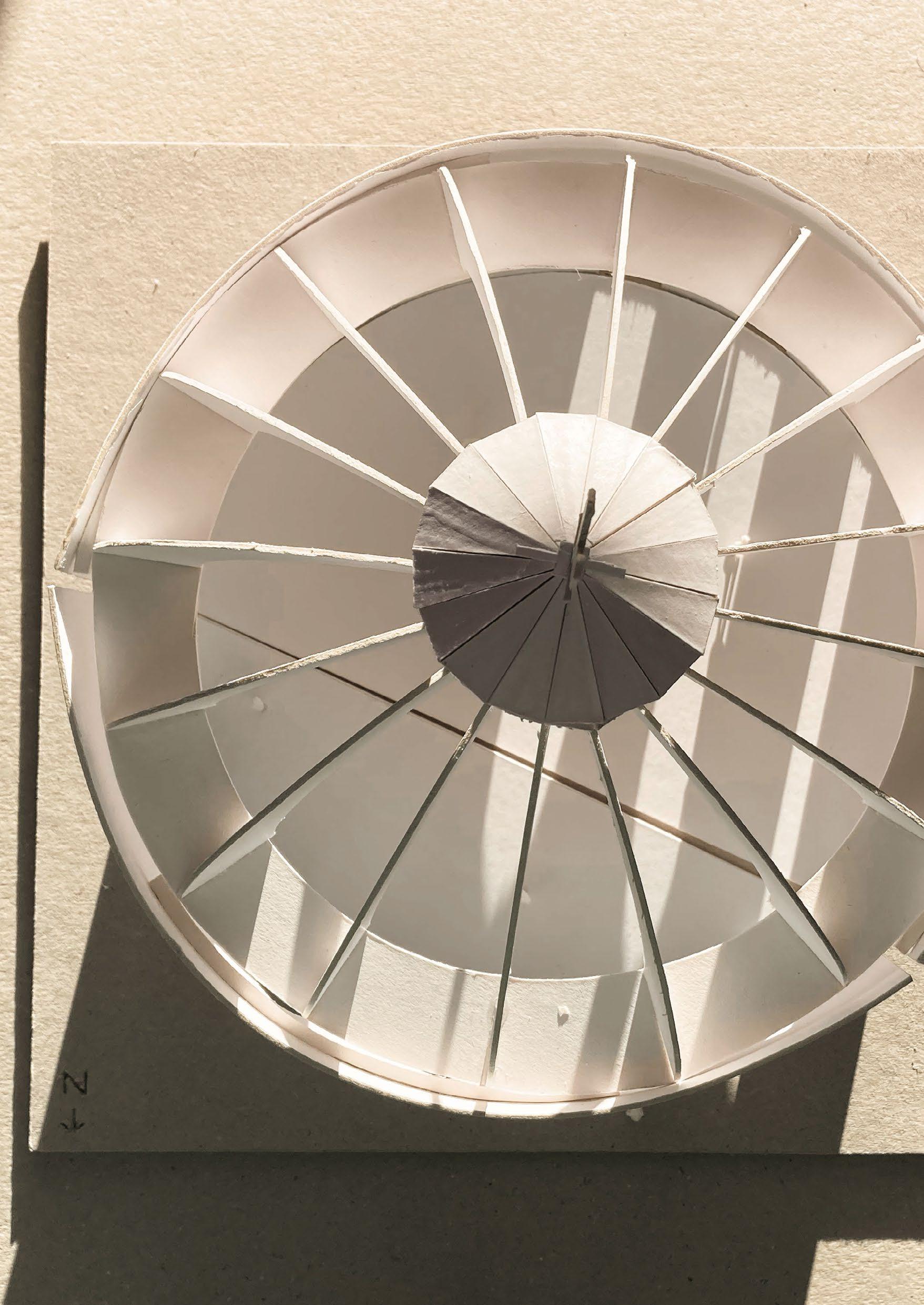
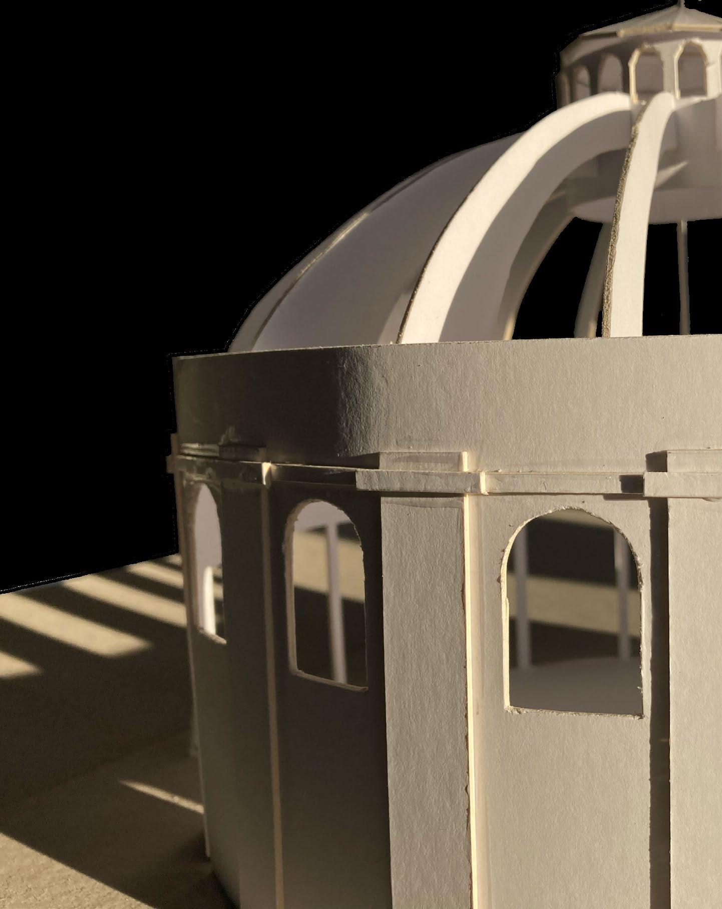
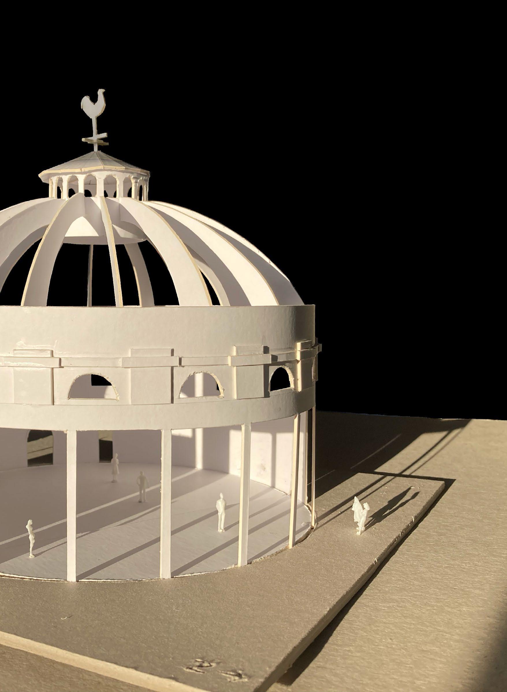
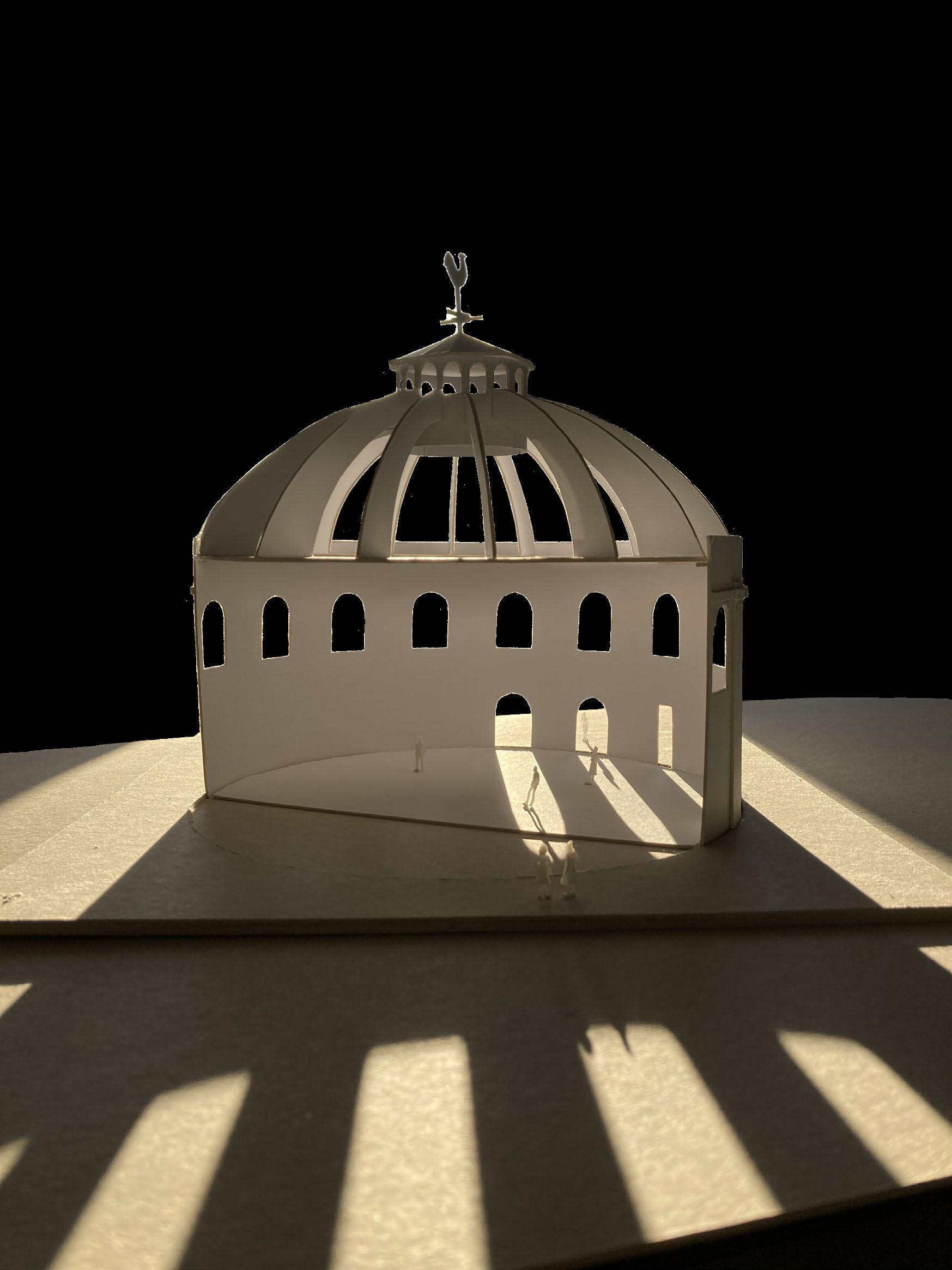
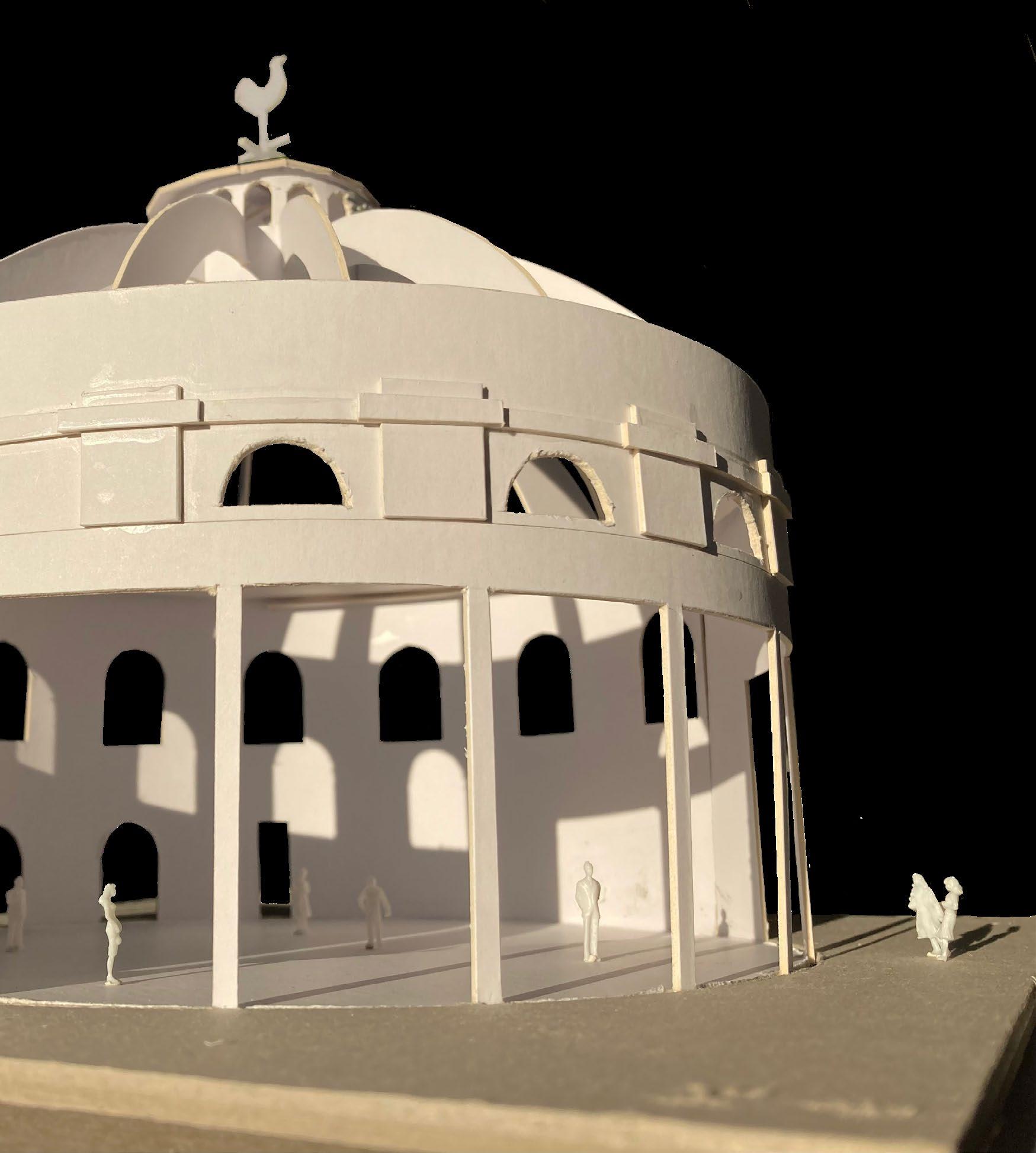
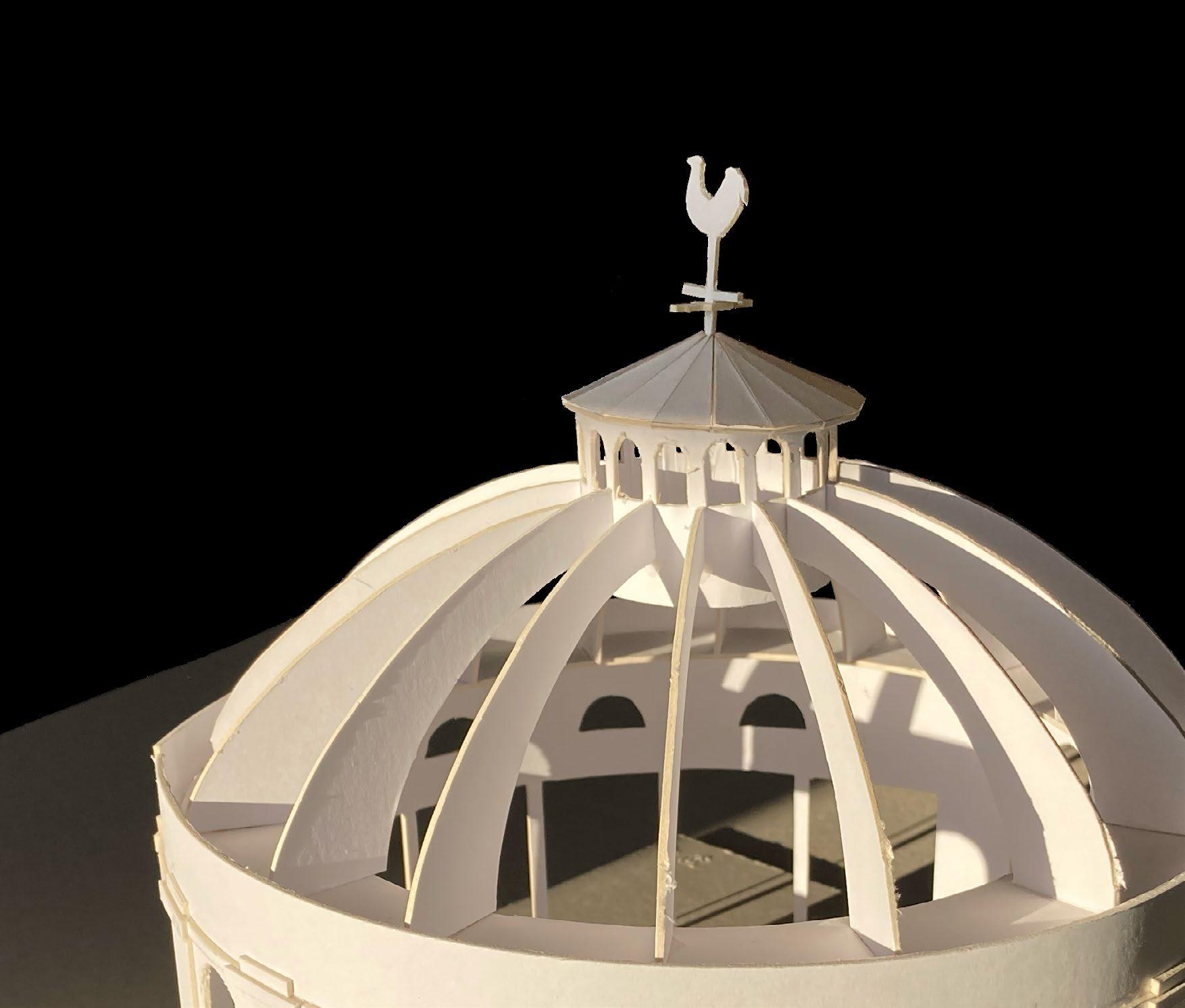
Creating and using a site model to get a better understanding of the scale of the buildings
14 obscura
2 zoning
15 process journal
2.1 site models
The model has a scale of 1:100
16
obscura
2 zoning
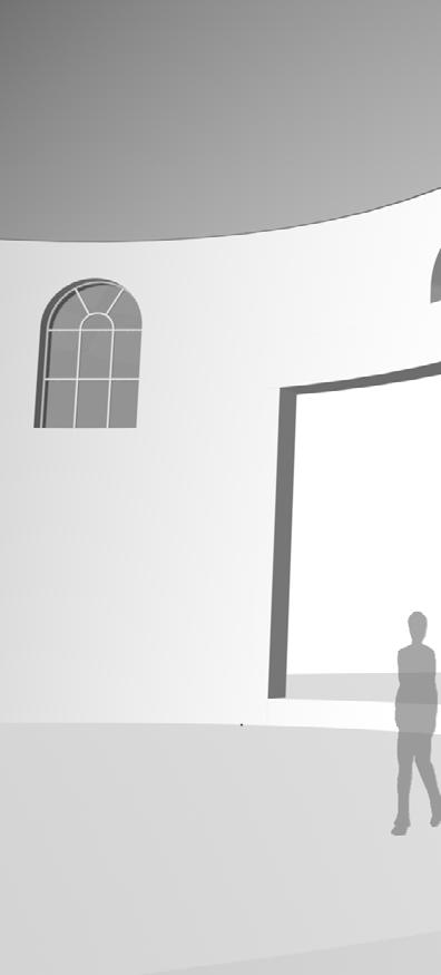
By positioning scale figures in the model, I found I gained a better understanding of the scale of the buildings. This helped me to zone the two Rotundas across several floors.
17 process journal
2.1 site models
18 obscura
2 zoning
19 process journal
2.1 site models
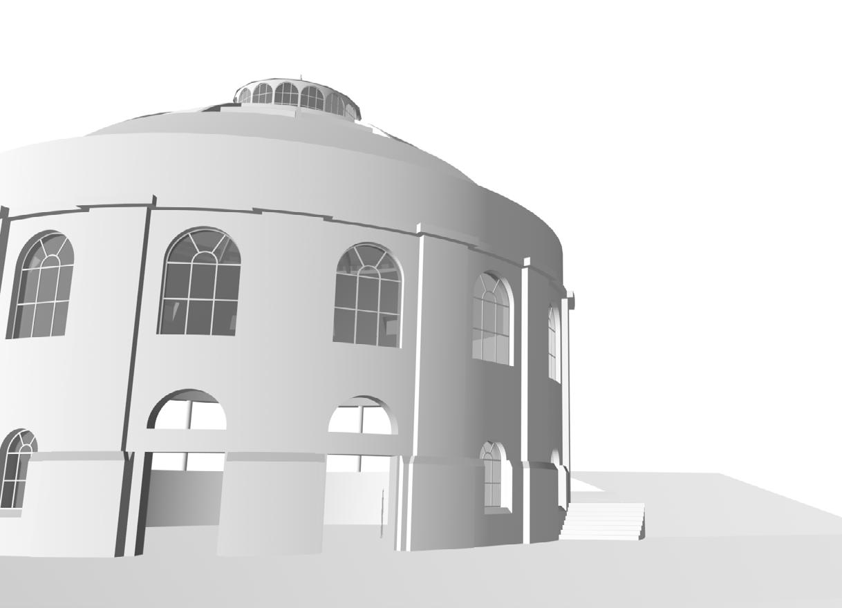
This model is based on the North Rotunda. Though the North and South Rotundas are almost identical, there are some differences. The South Rotunda sits on an incline, resulting in part of the ground floor being underground. Extra roof windows have also been added in the recent renovation of the South Rotunda.
20
obscura
21 process journal
2 zoning
2.1 site models
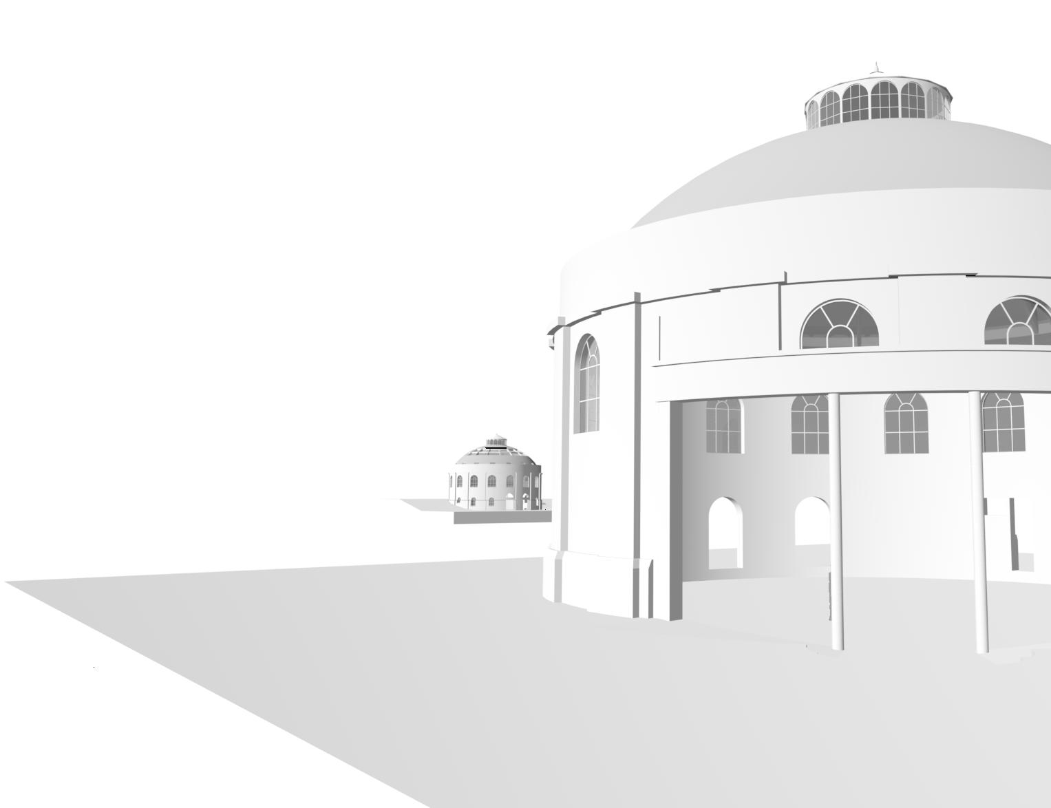
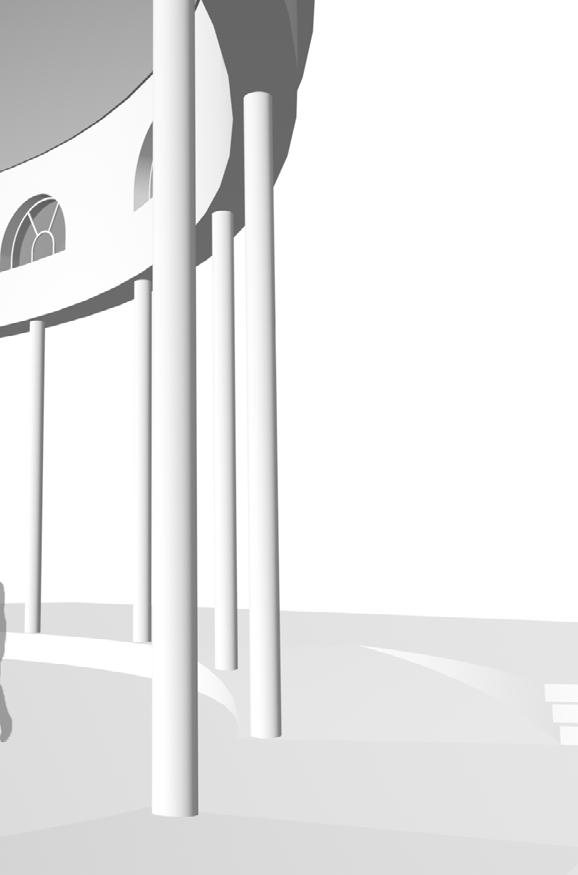
Original model of both Rotundas and Tunnel

Using measurements from plans and site visits, I recreated the buildings and tunnel in Vectorworks.

22 obscura
2 zoning
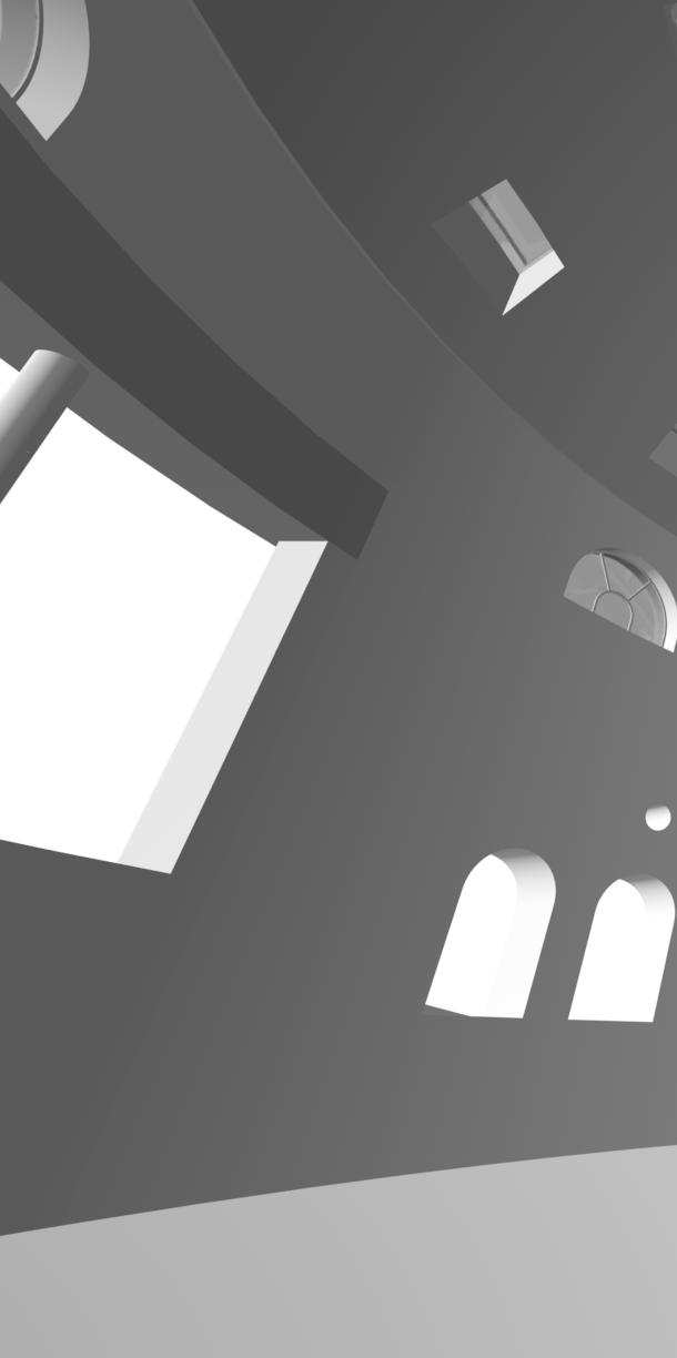
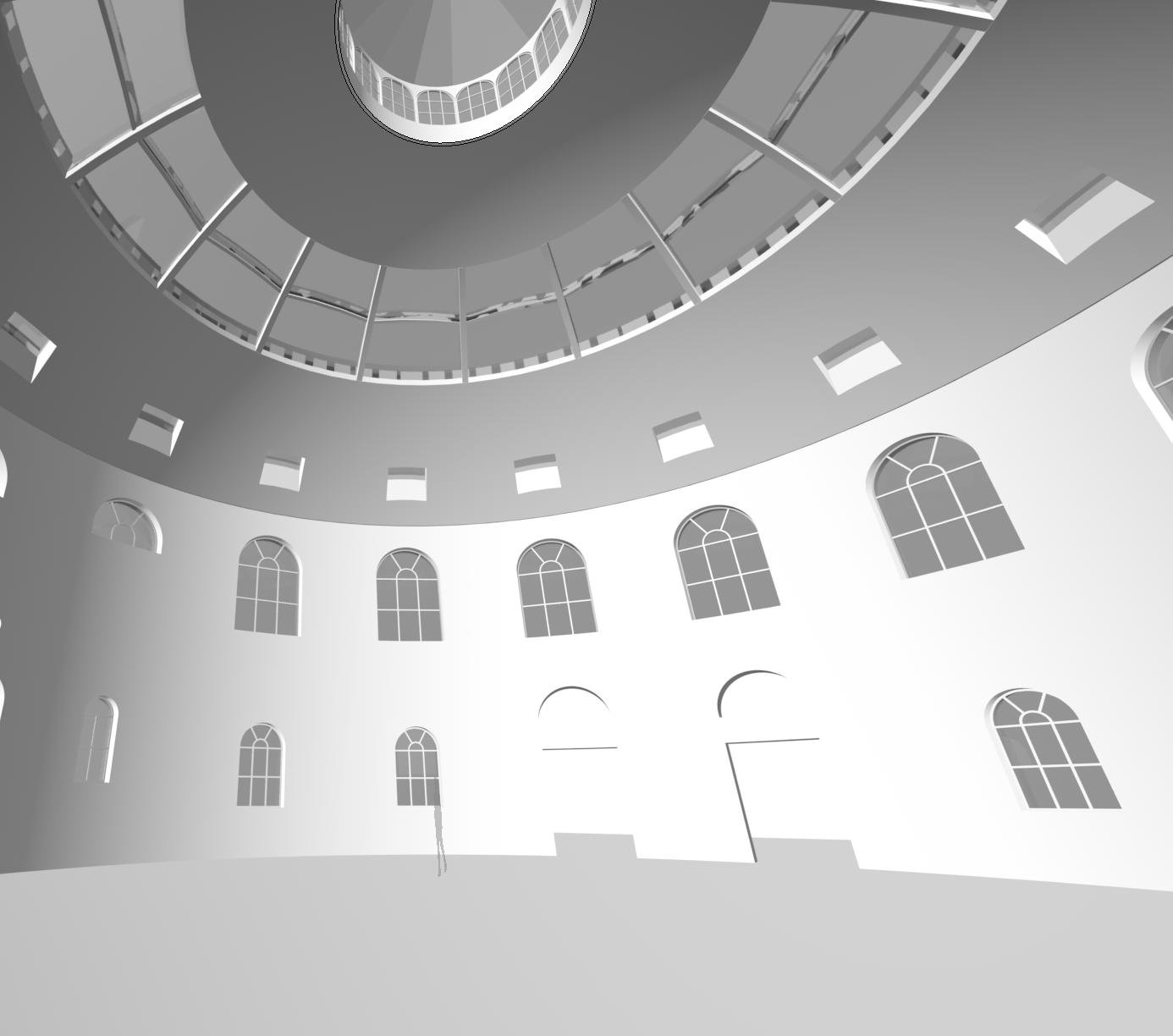
This model became the base for the later models I made. Using VR, I was able to ‘visit’ the buildings to get a better sense of scale before and after zoning the spaces.
23 process journal
2.1 site models
24 obscura
WCs Film Library Film Museum
Cafe-bar
Entrance
Snack Bar
Main Screening
Space Film Booths
WCs
12pm 3pm 6pm 9pm
25 process journal
NORTH SOUTH 2 zoning
12am 3am
2.2 zoning diagrams
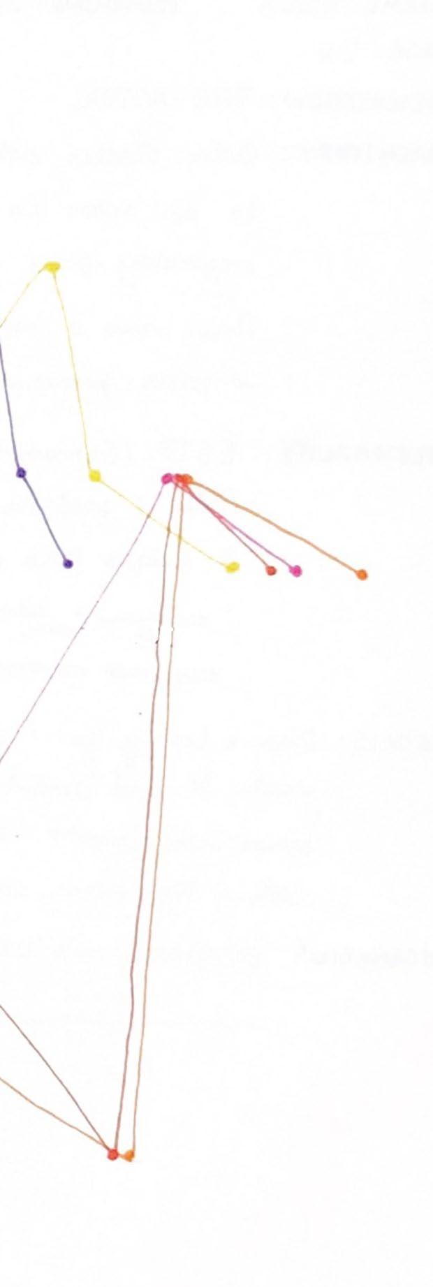
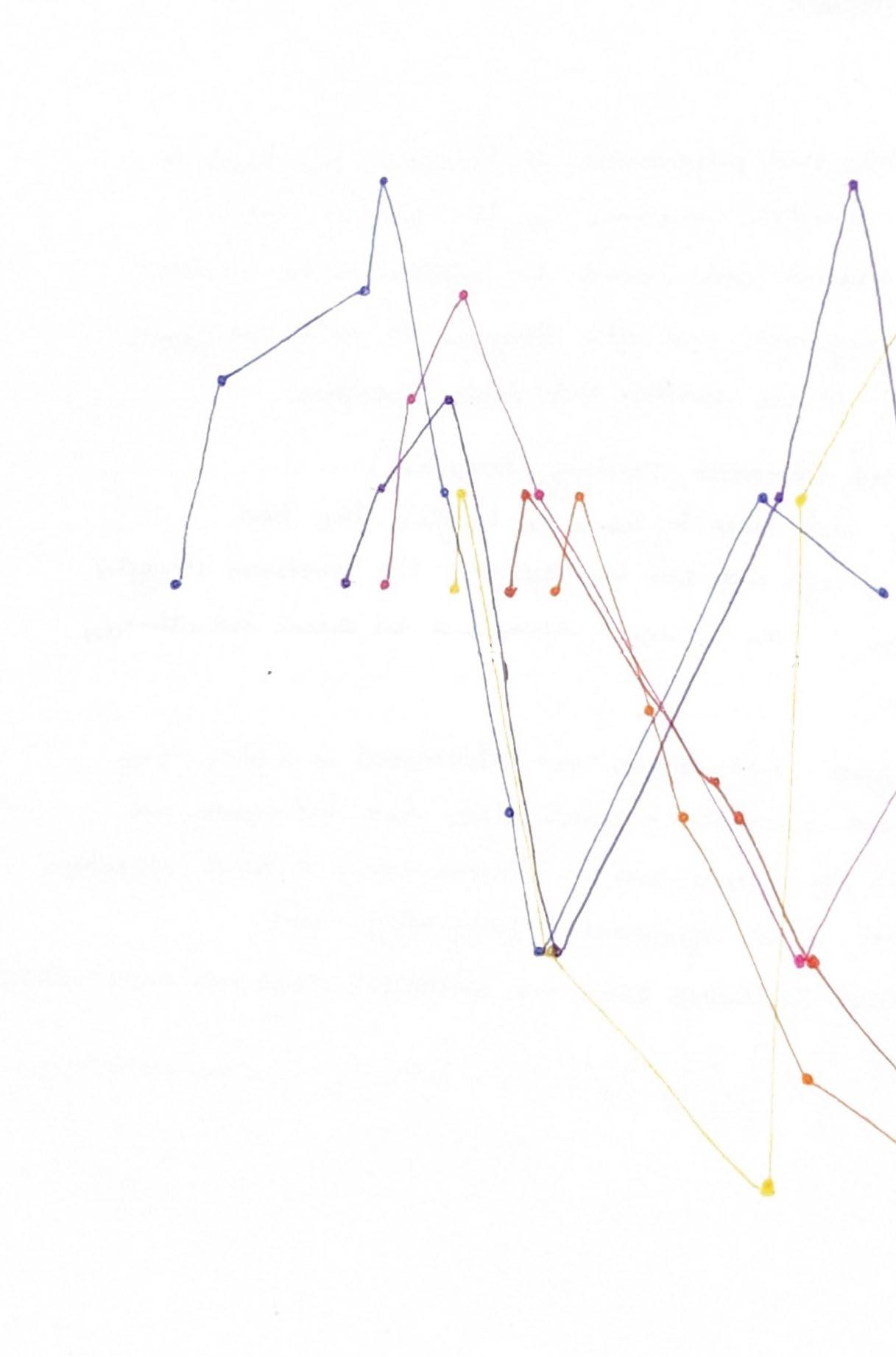
Plotting user journeys within the space over one day
The Explorer
The Thinker
The Artist
The Writer
The Talker
The Actor
Plotting the user journeys allowed me to gain a better understanding of the hierarchy of the spaces, and of which spaces should be easily accessed from one another.
26 obscura
27 process journal
2 zoning
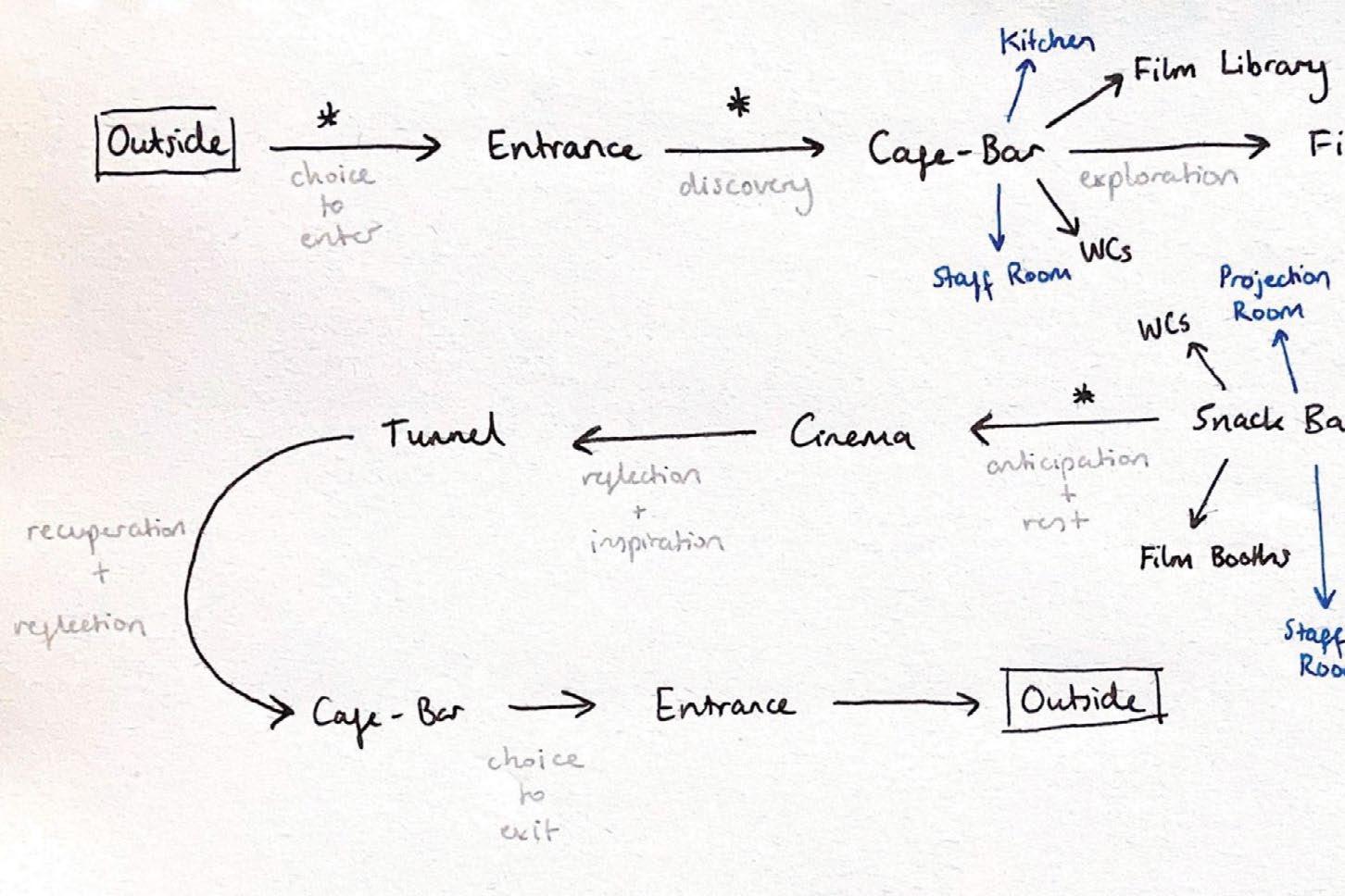
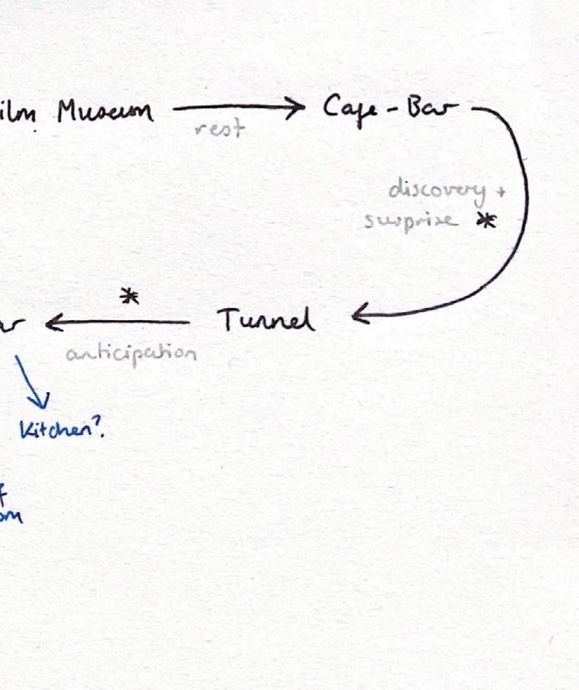
The core user journey is shown in black ink, alongside the emotional experience of each transition between spaces, shown in grey. Staff spaces are shown in blue.
28 obscura
2.2 zoning diagrams
2 zoning
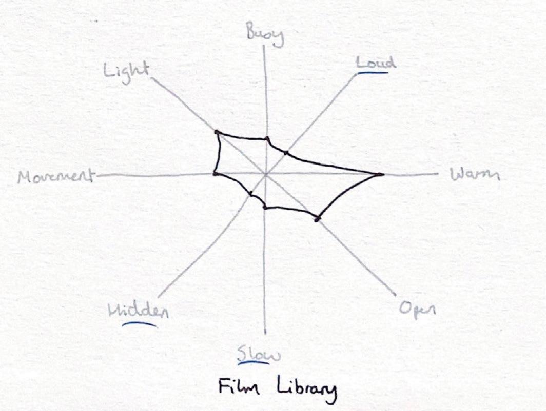
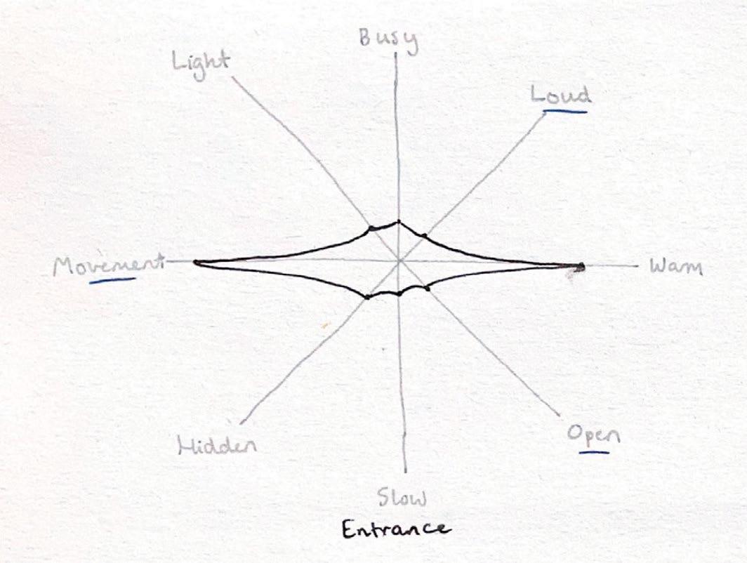
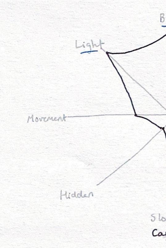
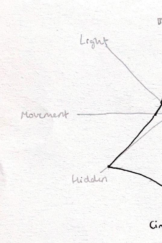
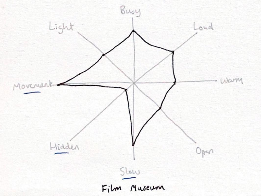
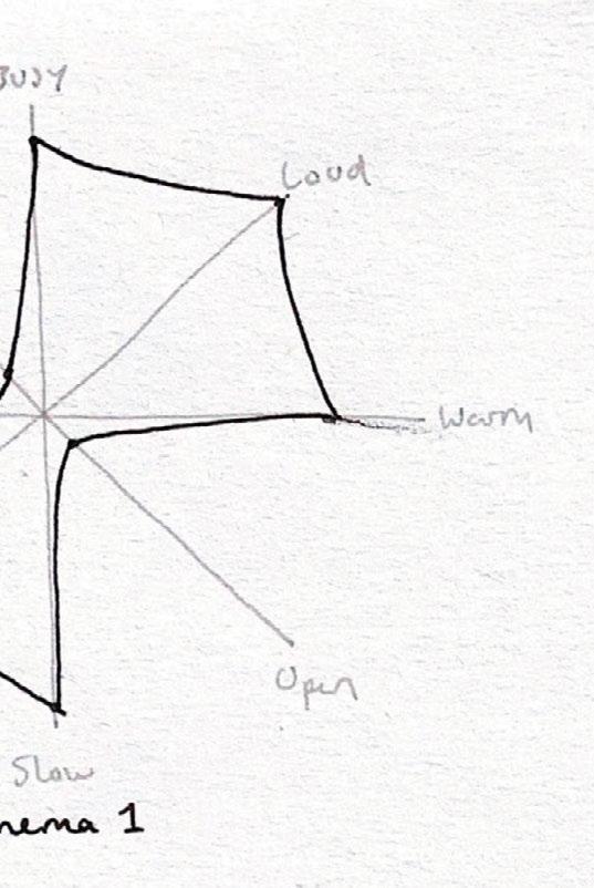
Diagrams mapping key elements of each space
29 process journal
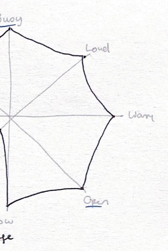
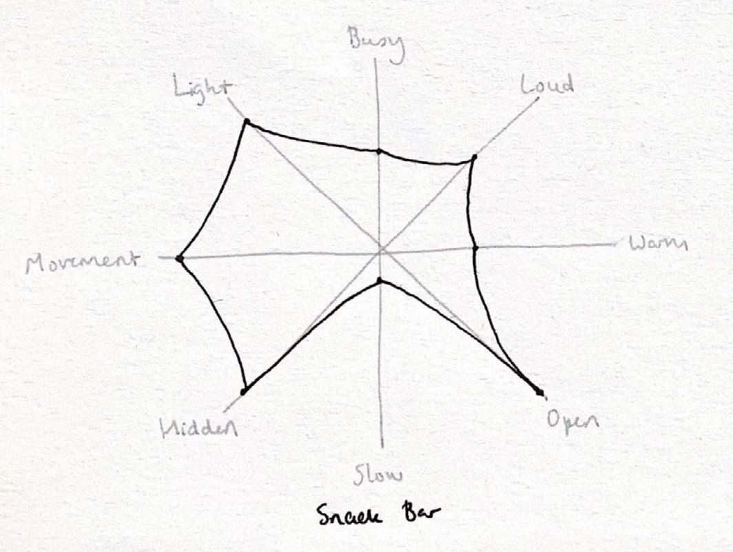
2.2 zoning diagrams 30 obscura
2 zoning
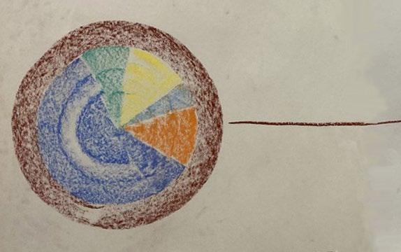
Original zoning plans marking proportions for each area
Entrance
Cafe-bar
Exhibition Space
Film Library
Open Area/Snack Bar
Main Auditorium
Smaller Auditorium
WCs
31 process journal
2.2 zoning diagrams
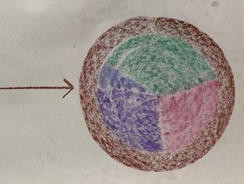
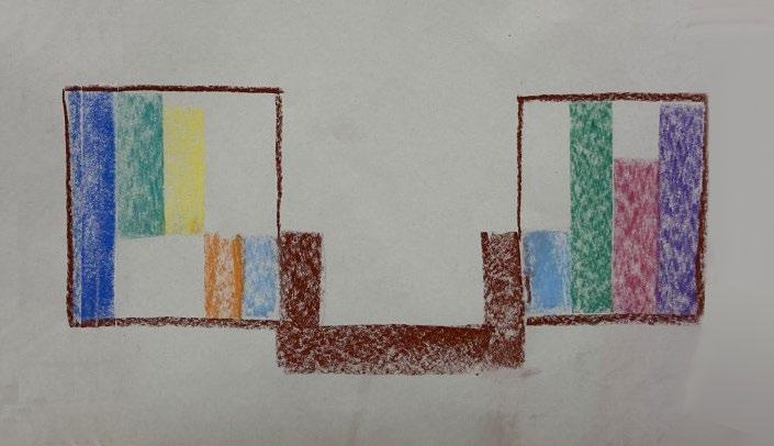 Rough sketch marking balance of levels for each area
32
obscura
 Entrance
Cafe-Bar
Film Museum
Film Library
WCs
Tunnel
Snack Bar
2
33 process journal
Cinema Film Booths WCs
zoning
2.2 zoning diagrams
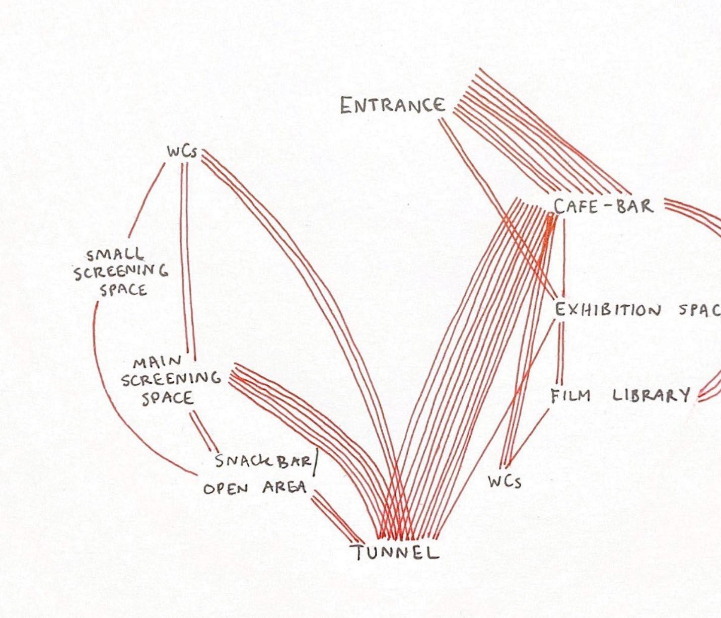
Exploring connections from user journeys between areas
Each line represents a journey shown on the chart of user journeys over time. Clear connections can be seen from the entrance to cafe-bar, cafe-bar to tunnel, and tunnel to screening space and snack bar. Within my design, the most strongly connected areas should be in close proximity or easily navigable from one to the other.

34 obscura

35 process journal
2 zoning
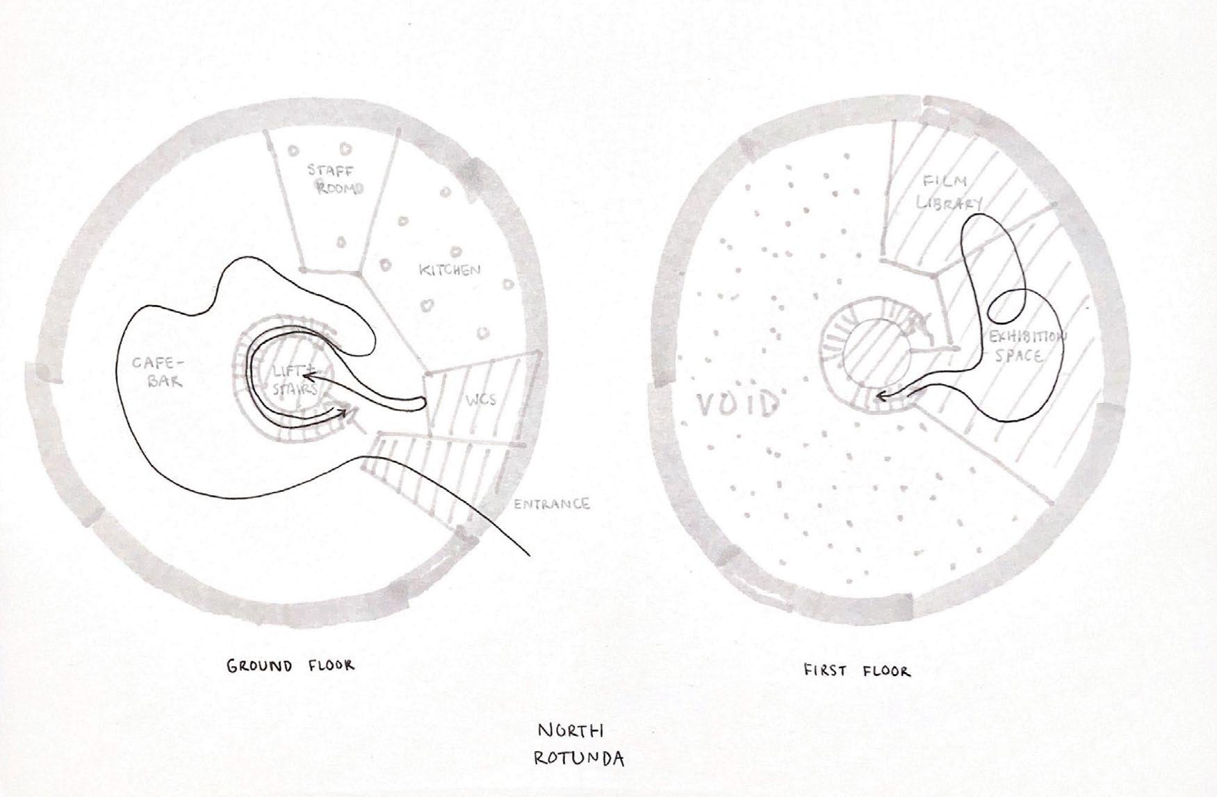
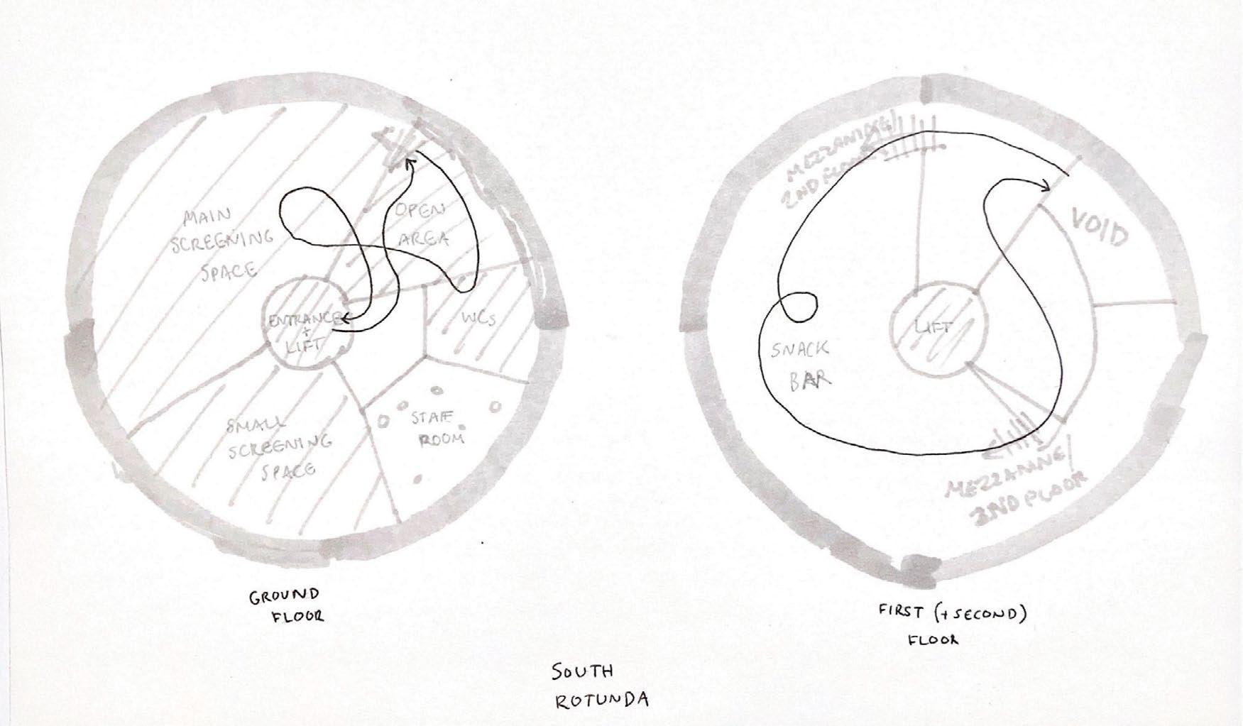
Original zoning plans for ground and first floors of both Rotundas
Black lines show an example of a journey throughout the space. Striped areas are visitor-focused, whereas dotted spaces are staff-focused.
These sketches helped to inform the basic layout of the two buildings.
36 obscura
2.2 zoning diagrams
Original vertical zoning for both Rotundas and Tunnel
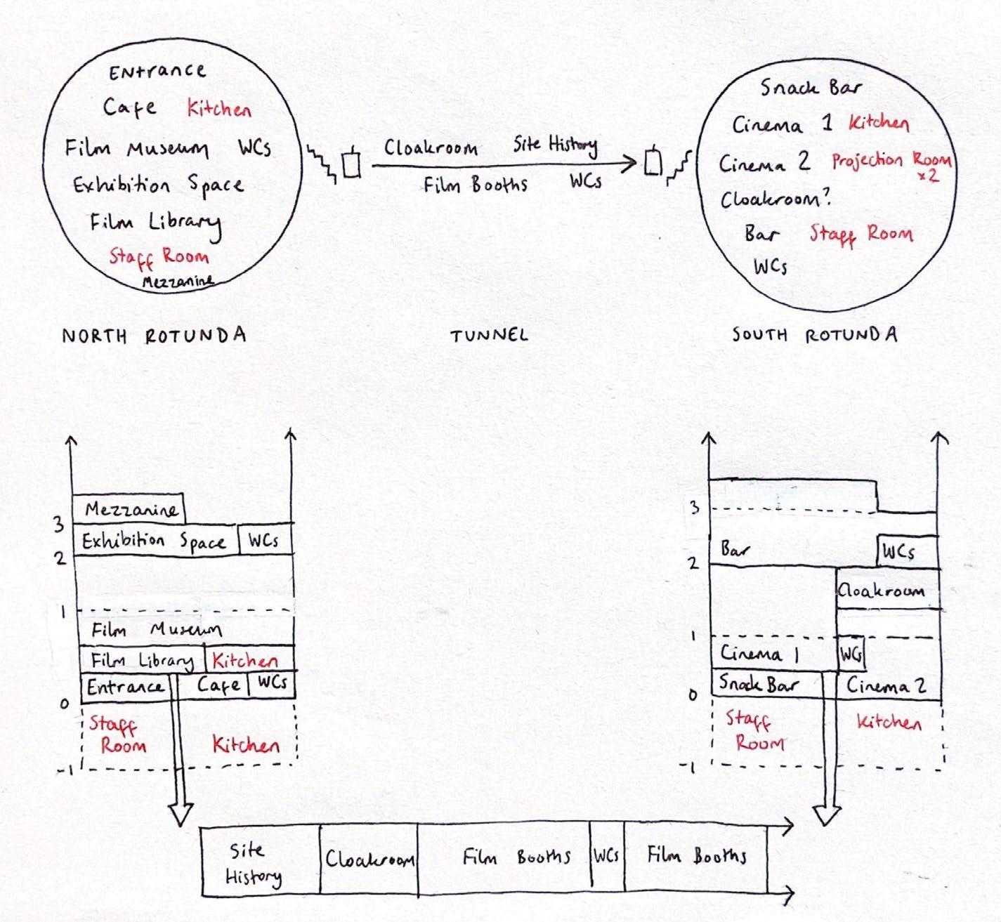
37 process journal
2 zoning
2.3 zoning plans
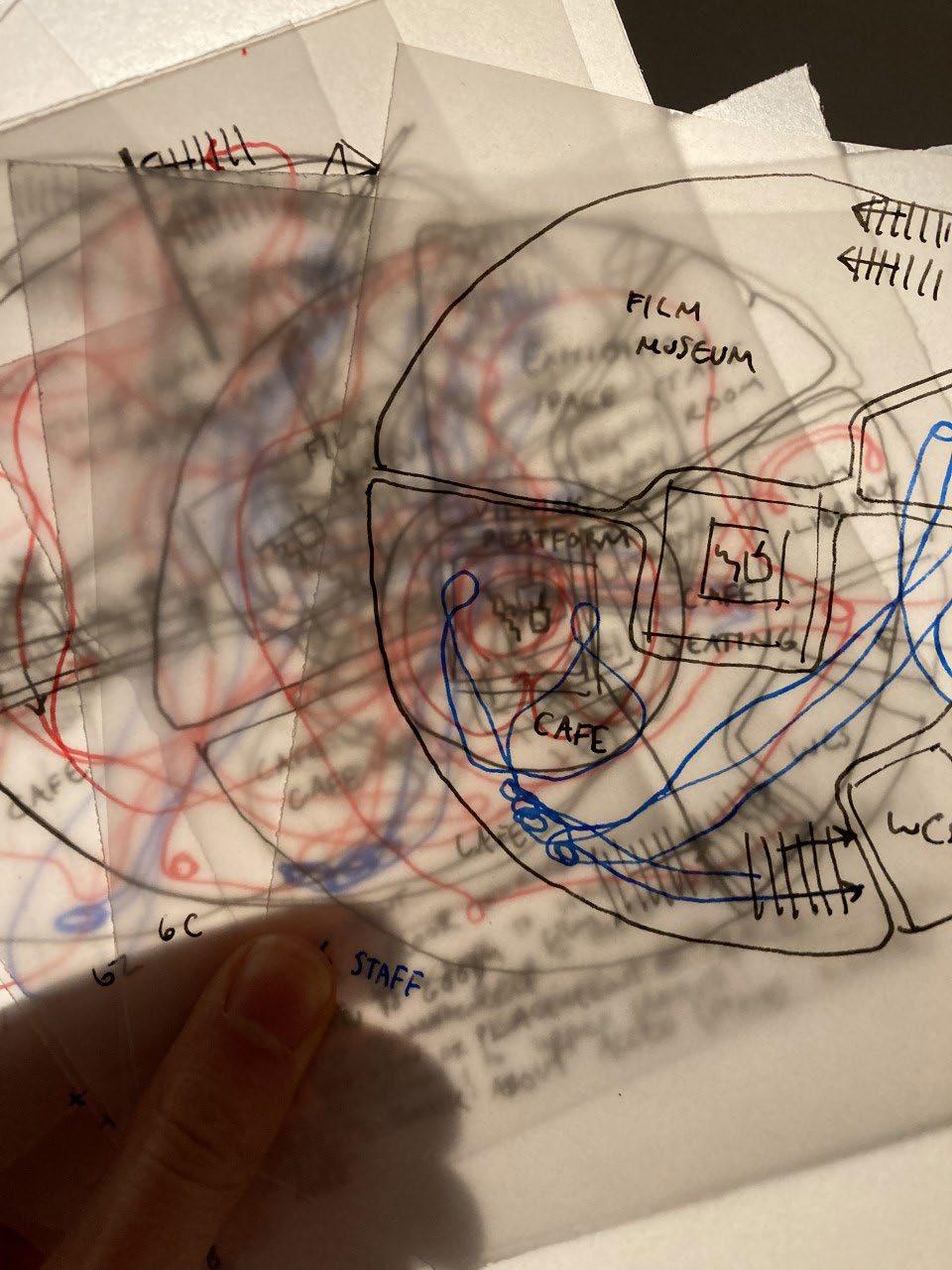 Zoning plans on tracing paper
38 obscura
2 zoning
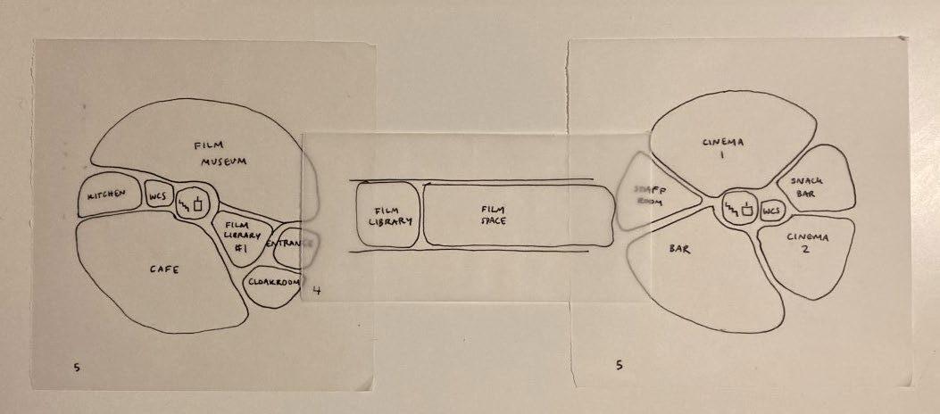
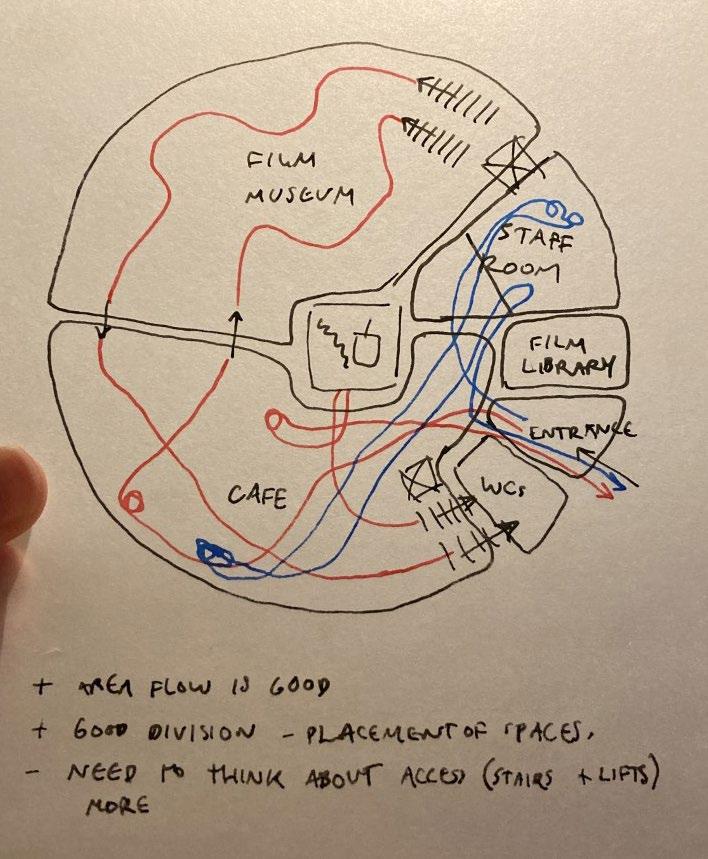
39 process journal
2.3 zoning plans
Developing zoning plans for the North Rotunda

Due to the large scale of the buildings, the zoning plans had many iterations. I aimed to keep the buildings open and accessible, with central lift shafts and stairways. Another key aim was to make the best use of the existing windows and doors of both Rotundas.
Social spaces including the cafe-bar and snack bar require the most light, whereas spaces for watching films need to be able to be darkened. As the film museum includes exhibits alongside projections it requires a better flexibility, so this is split across the ground floor and basement of the North Rotunda.
40
obscura

41 process journal
2 zoning
2.3 zoning plans

Sketches exploring where a central lift shaft and stairwell might serve each floor of the North Rotunda Sketch showing floor levels and central stairs in both Rotundas


42
obscura
2 zoning
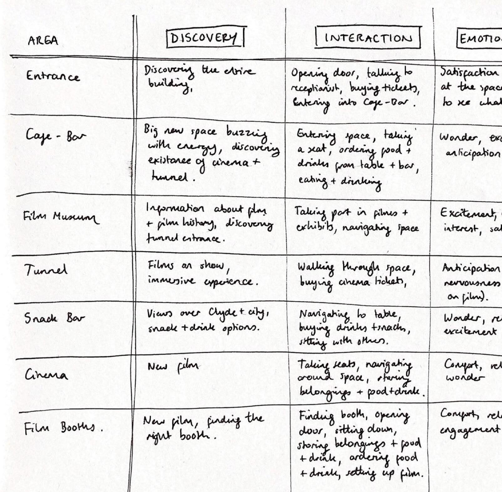
After creating initial zoning plans for the buildings, I decided to remove some secondary spaces from the design, including the film library and a second cinema auditorium. This allowed me to focus on the primary areas and create a more cohesive concept.
43 process journal
2.4 the journey 44 obscura
2 zoning
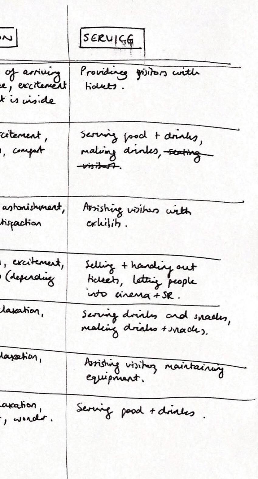
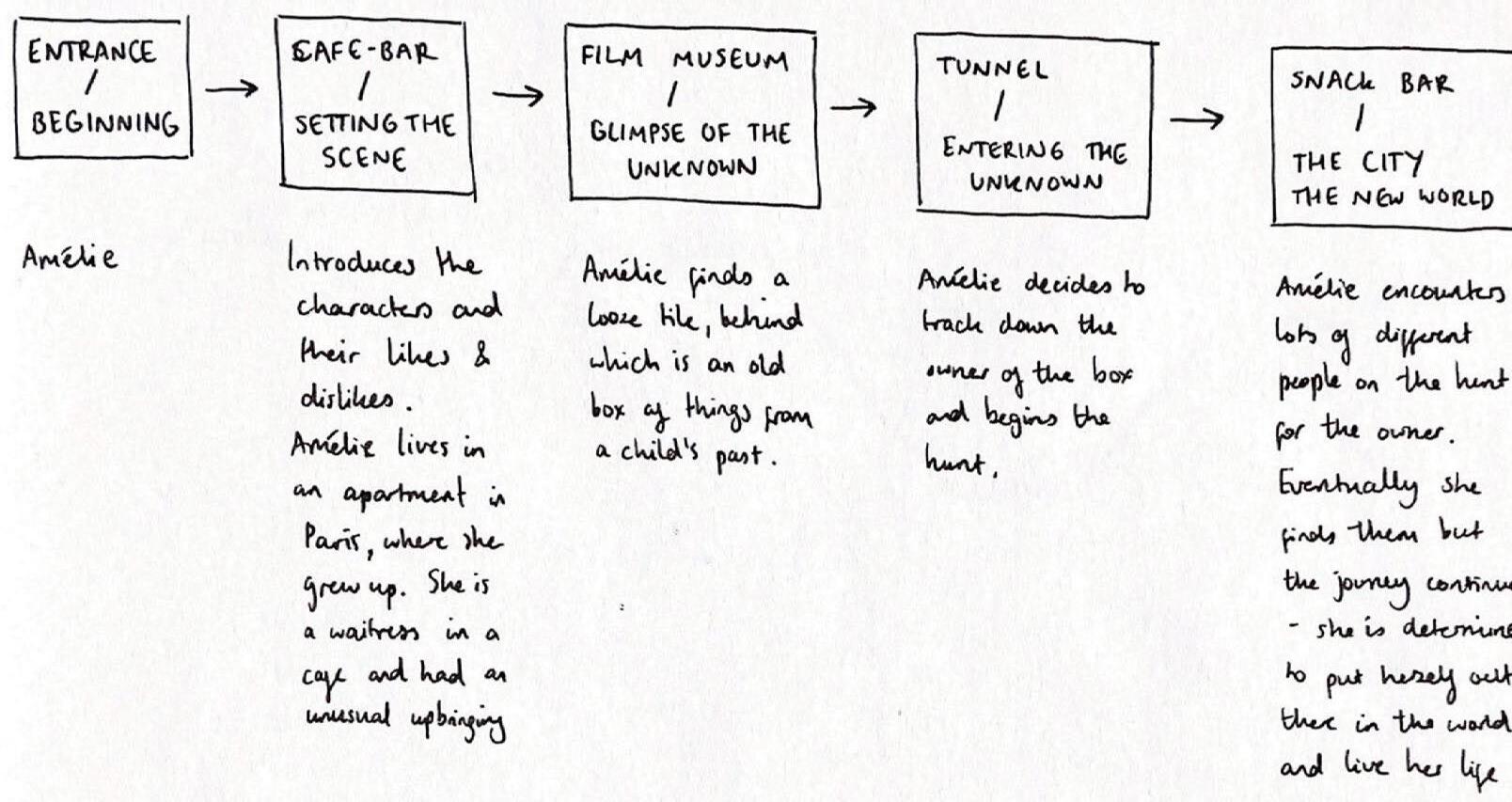
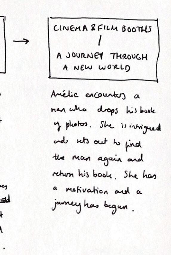
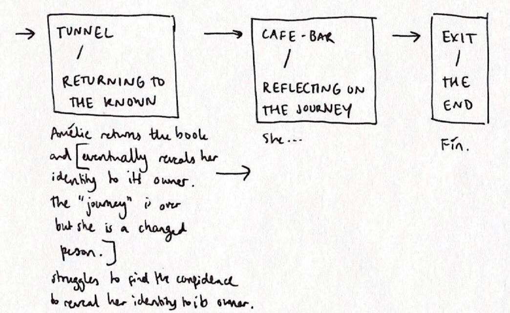
Mapping the journey through the buildings against a classic story structure and the plot of Amélie
This helped create a cohesive user journey, with a more fulfilling emotional experience.
45 process journal

2.4 the journey 46 obscura
2 zoning
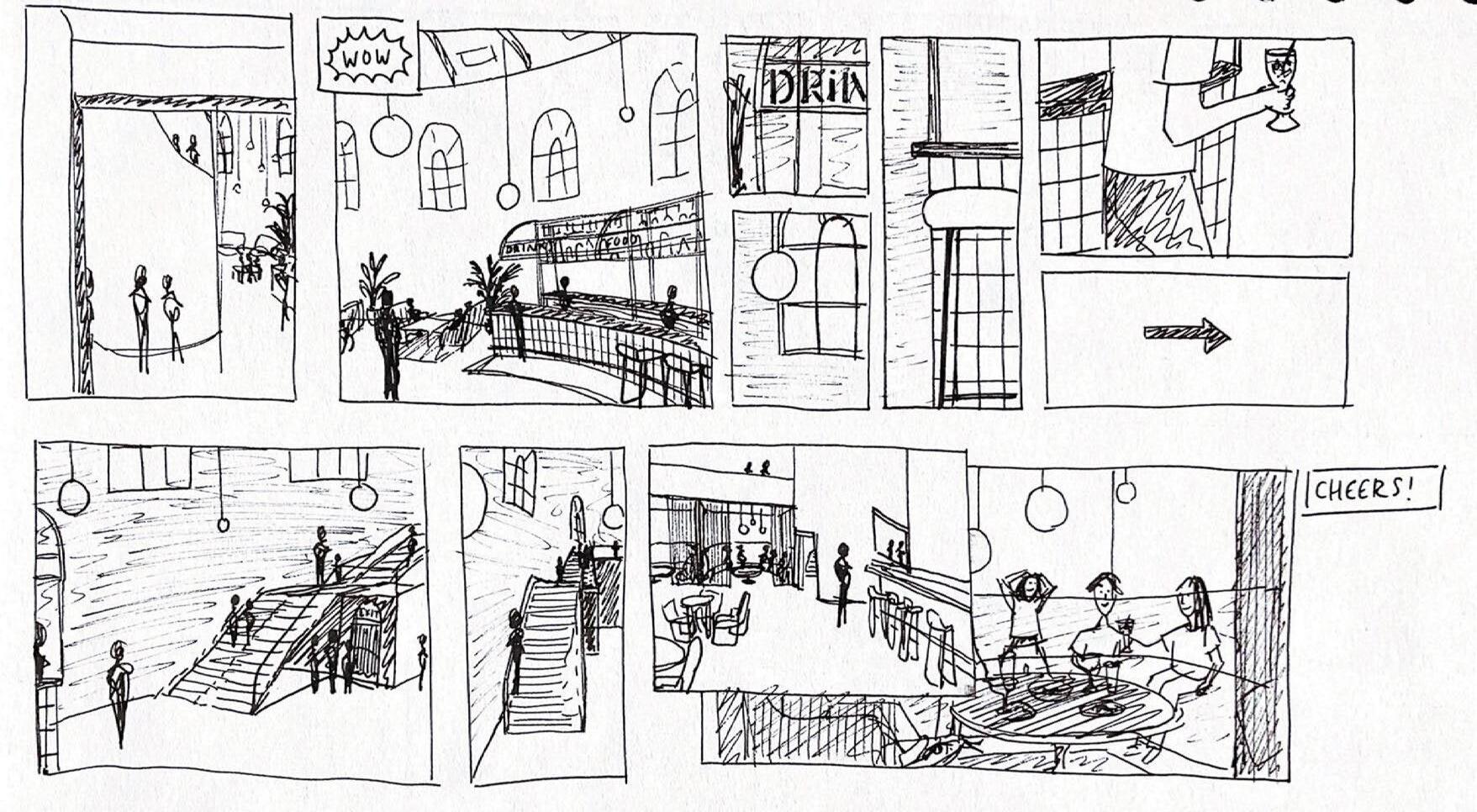
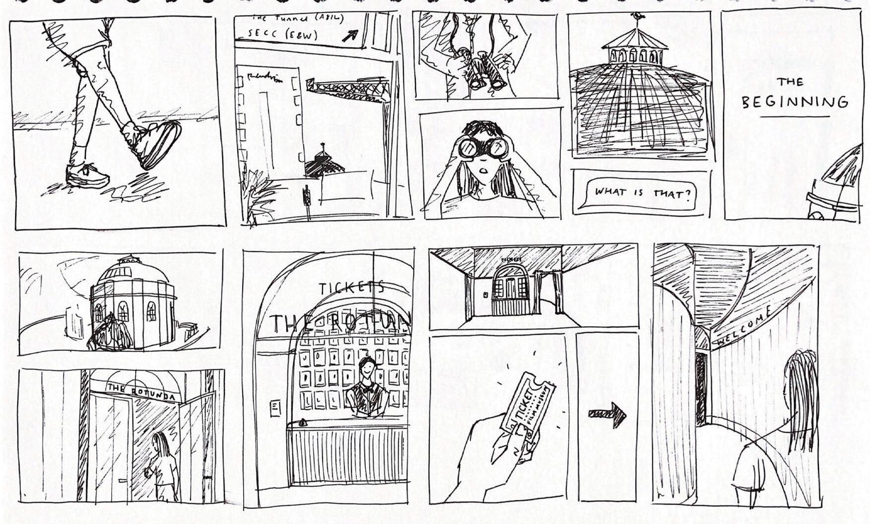
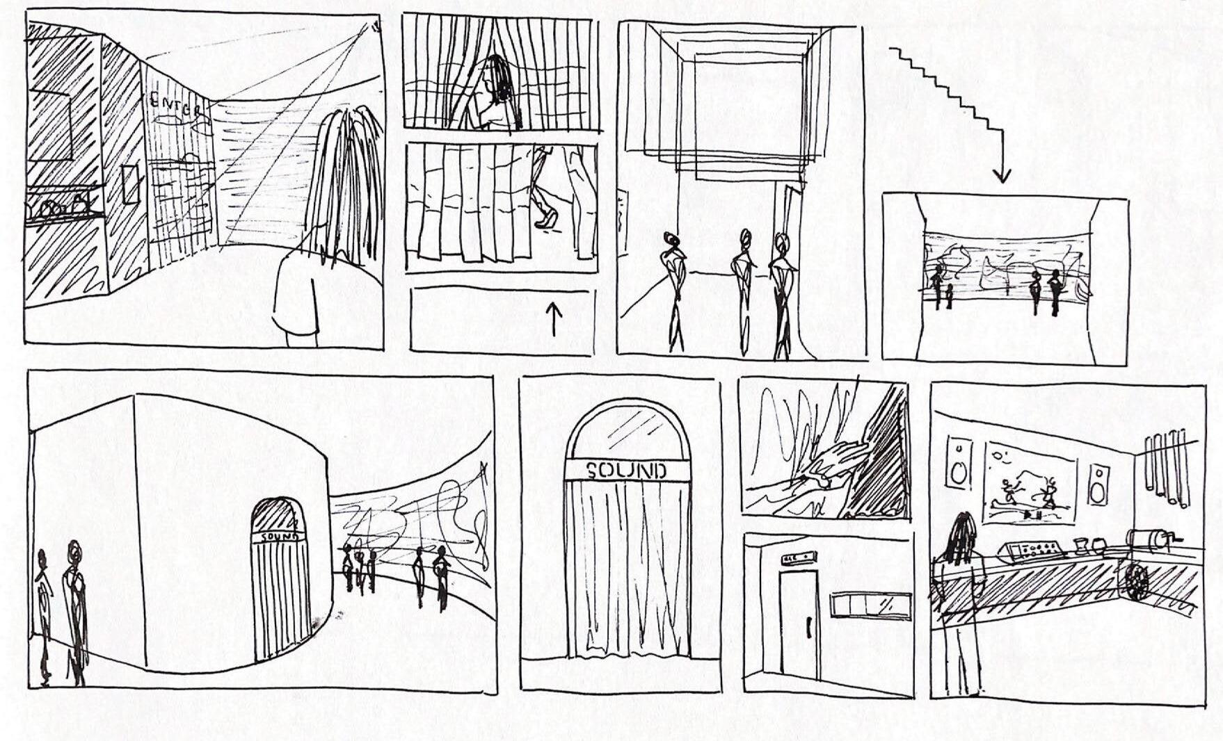
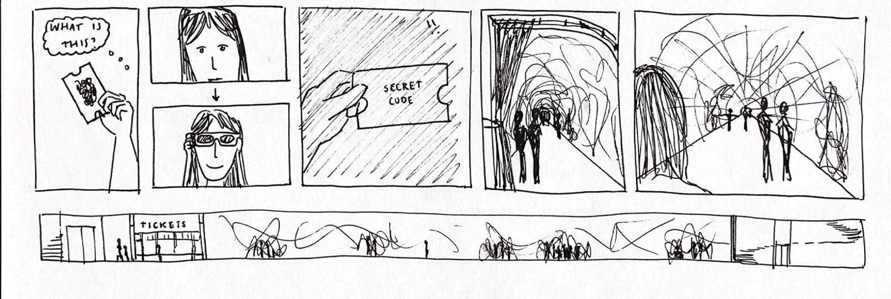
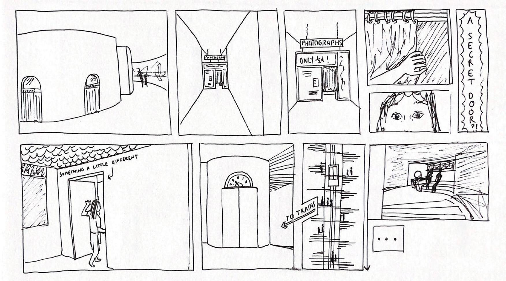
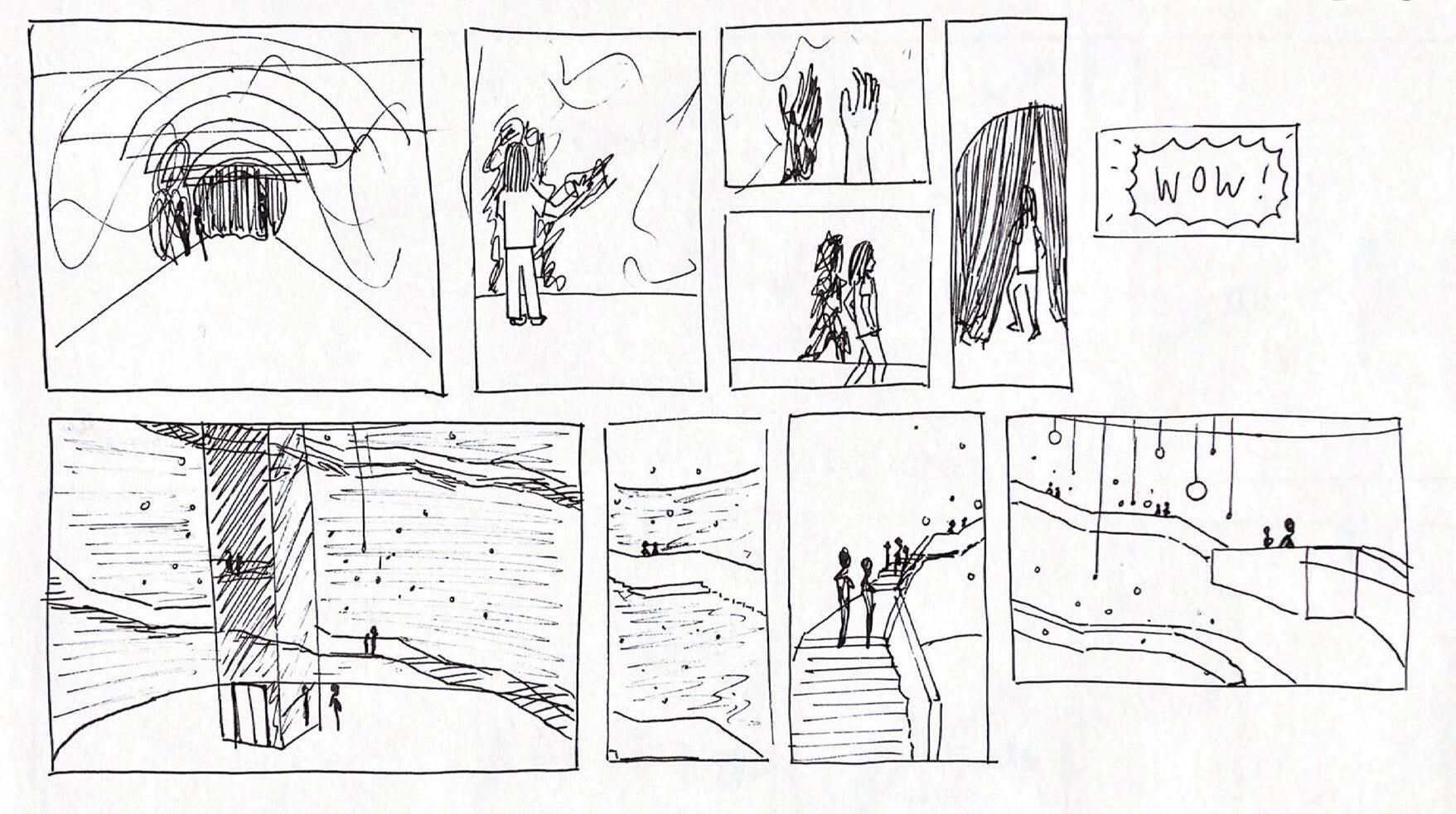
Storyboarding a journey through the space
47 process journal


2.4 the journey 48 obscura

49 process journal
2 zoning
The storyboard helped me gain a better understanding of how the spaces relate to one another, and how they might look. I stopped the storyboard here to focus on each space individually.


50 obscura
2.4 the journey
3 North rotunda
Upon considering interiors in film and film’s place in my own life, I came to the realisation that an important aspect of film is the idea of home. This informed the design of the North Rotunda, as I aimed to create a welcoming space which people would enjoy spending lots of time in.
Home - in this case meaning the feeling of being at home, in a space either physically or mentally in which people feel safe and able to be themselves - is something which I believe can make any film, including those with challenging subjects or themes, apporachable from a foundation that is comfortable and often nostalgic.
This made me question what makes both the characters and audience feel at home within a film.
Considering the concept of “home” in some of my favourite films, I formed a better understanding of how the feeling of being at home can be created within a physical space. I aimed to use this inspiration to create a more welcoming, comfortable design.
https://pin.it/3ZVxJcr
Scan the QR code to visit my pinterest board of inspiration.

51 process journal


or something’s
3.1 introduction obscura 52
Home /həum/ (noun) someone’s
place of origin, or the place where a person feels like they belong
3 North rotunda

53 process journal
Proposed Plan for the Ground Floor of the North Rotunda
3.2
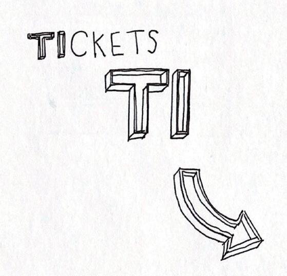
entrance
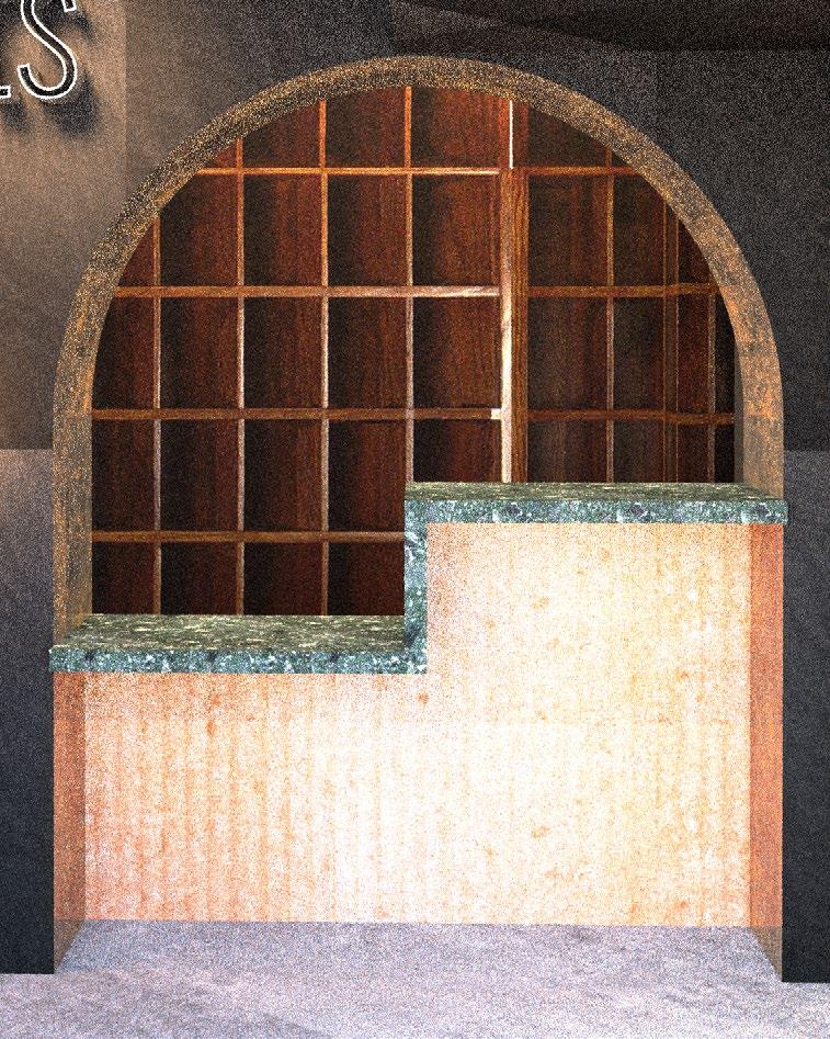
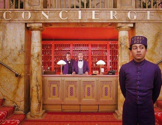
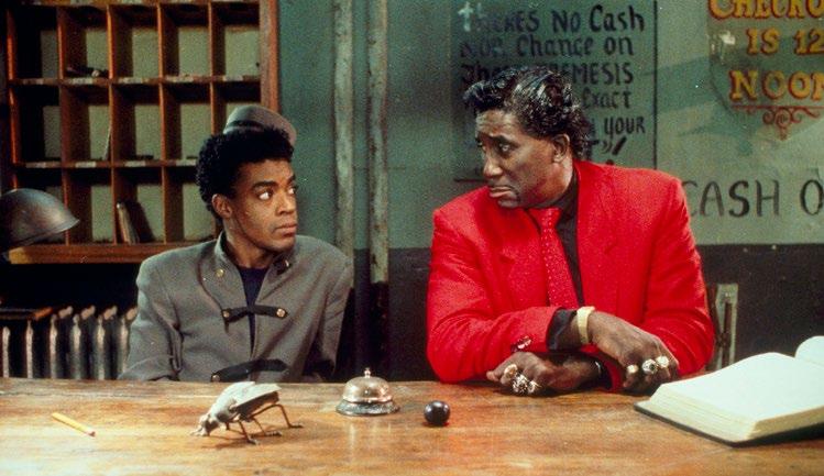
The reception desk was inspired by the hotel lobbies in both The Grand Budapest Hotel and Mystery Train. 54
obscura
3 North rotunda
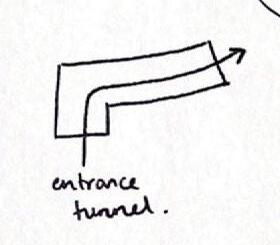
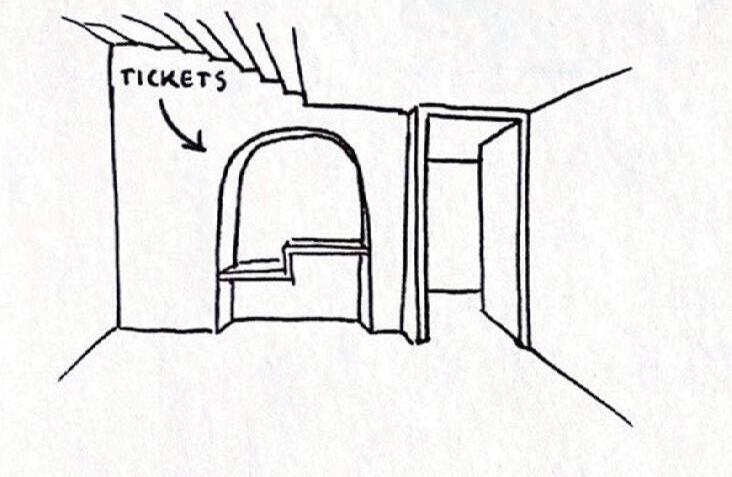
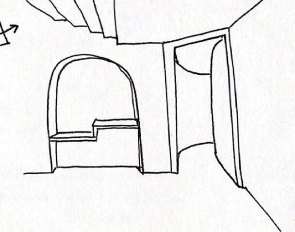
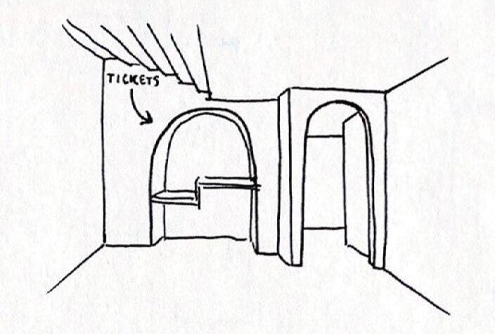
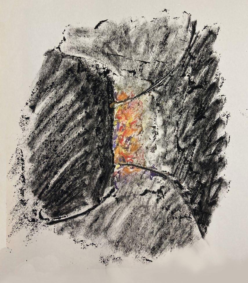
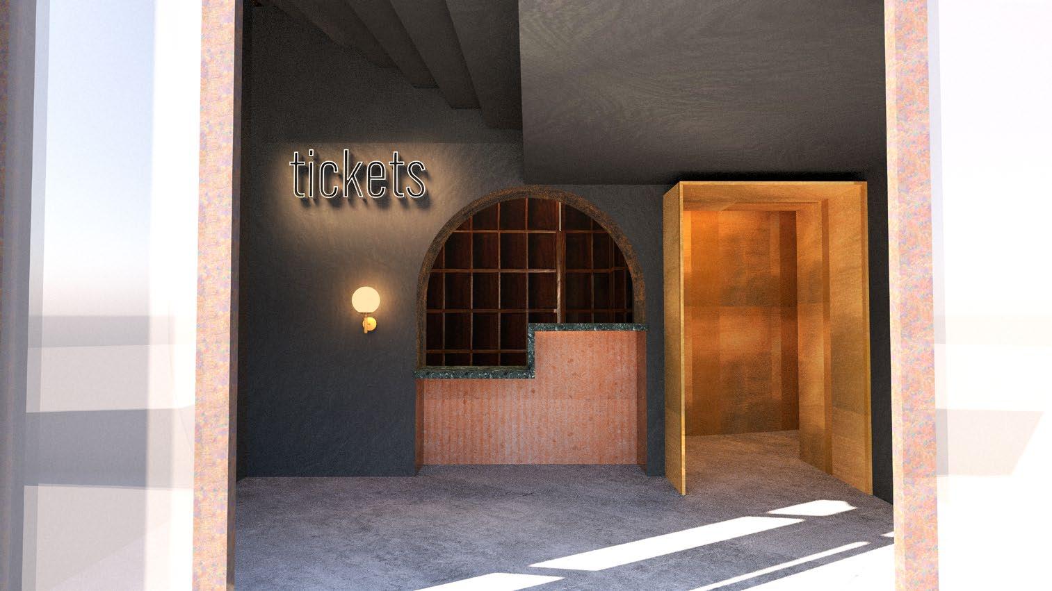
I aimed to create an inviting, intriguing entranceway into the space. The darker walls and passageway curving out of sight give the space a more mysterious atmosphere, whilst the bright gold doorway welcomes visitors towards the cafe-bar in the centre.
55 process journal
The rectangular doorway contrasts with the curving wall of the reception desk and emphasises that this is a new and exciting space. It juts out from the wall, welcoming visitors to the core of the building.
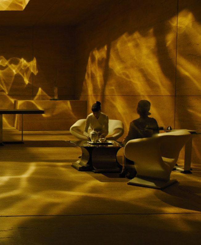
The water-ripple lighting was inspired by the production design and cinematography of Blade Runner 2049.
3.2 entrance
56
obscura
3 North rotunda
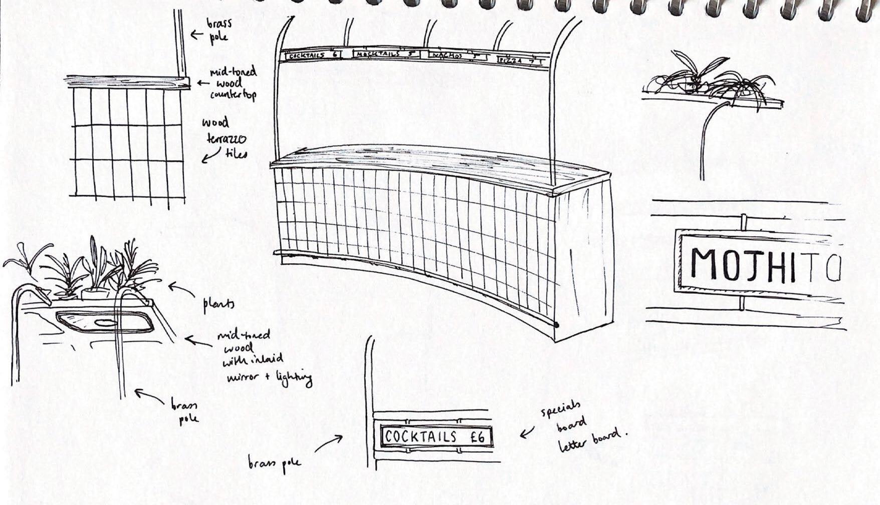
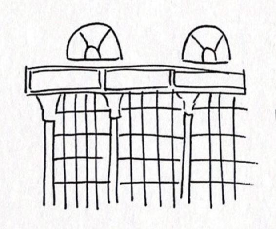
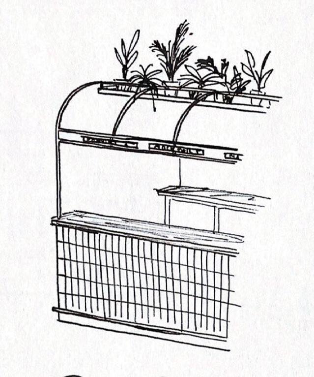
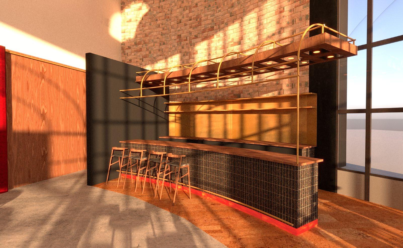
The bar design was inspired by the form of the Rotunda’s exterior. The tiles are reminiscent of the rectangular windows and the brass pole gantry is influenced by the cast iron columns and steel girders.
Sketches for the Ground Floor Cafe-Bar

57 process journal
I chose to use environmentally conscious materials including wood terrazzo tiles and cork tile flooring.

3.3 cafe-bar obscura 58
3 North rotunda
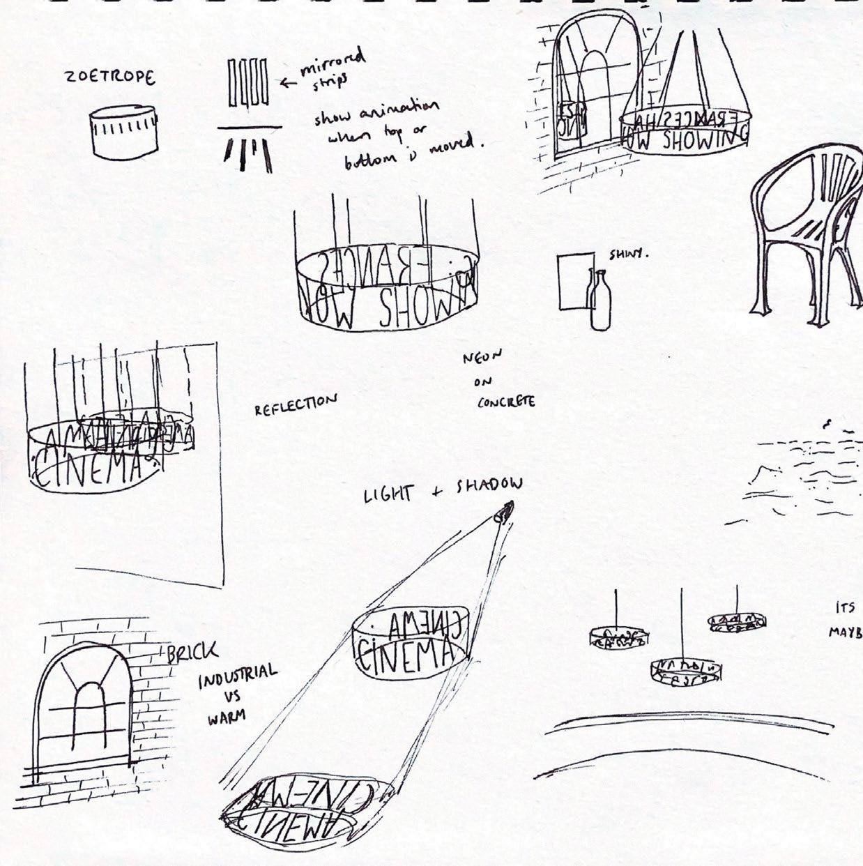
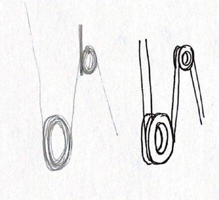
Sketches of a lighting installation idea for the cafe-bar
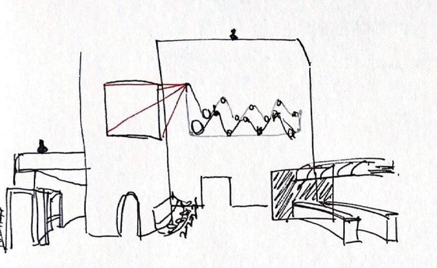

Light shining through film reels spells out ‘obscura’ on the wall, and the film moving through the reels is also projected onto the central core of the building. I chose not to show this in my final design as I wanted the design focus to be on the cafe-bar.
59 process journal
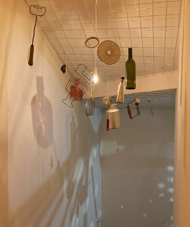
This was also inspired by an exhibit on the influence of Avant-Garde in film.
3.3 cafe-bar obscura 60
3 North rotunda

61 process journal
Proposed Plan for the First Floor of the North Rotunda
3.3 cafe-bar 62 obscura
Proposed Plan for the Second Floor of the North Rotunda
3 North rotunda
Sketches exploring ideas for seating booths in the cafe-bar
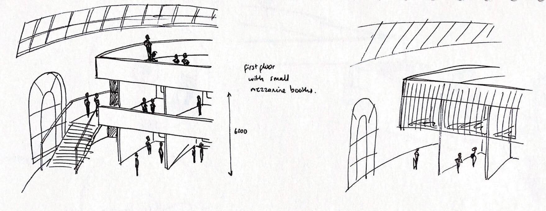
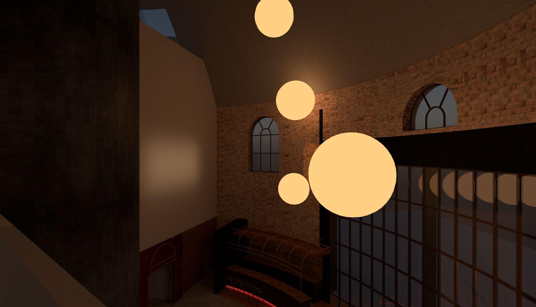
I wanted the upstairs cafe-bar to feel more relaxed than the ground floor, where visitors can feel comfortable and welcome for long periods of time
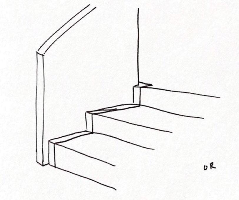
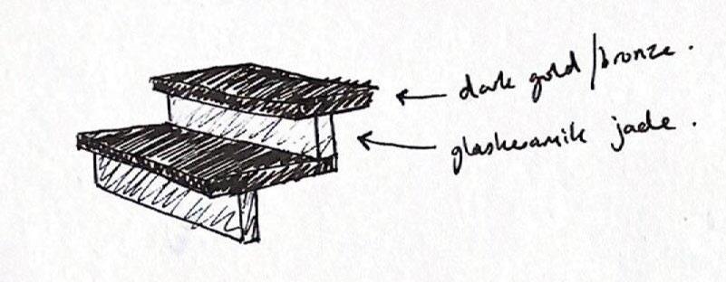
Original stair detail for feature stair
63 process journal
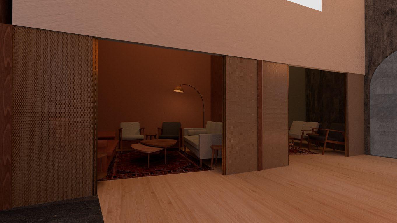
The final seating booths, day and night

3.3 cafe-bar
64
obscura
3 North rotunda
Initial sketches for the entrance and ground floor level of the film museum
I wanted the museum to be directly accessible from the cafe-bar, with wide entrance doors welcoming visitors to the space. I chose to split the space across the ground floor and basement as this allowed better lighting options for exhibits.

65 process journal

3.4 film museum 66 obscura
3 North rotunda

The materials throughout the North Rotunda were inspired by details including the red velvet seats and brass box offices of classic cinemas.
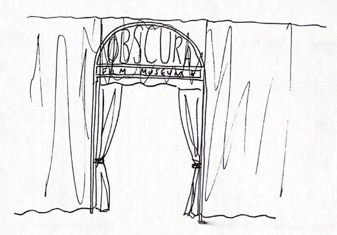 Sketches for the film museum entrance
67 process journal
Final plan for the Basement of the North Rotunda

3.4 film museum
68 obscura
3 North rotunda


69 process journal
3.4 film museum

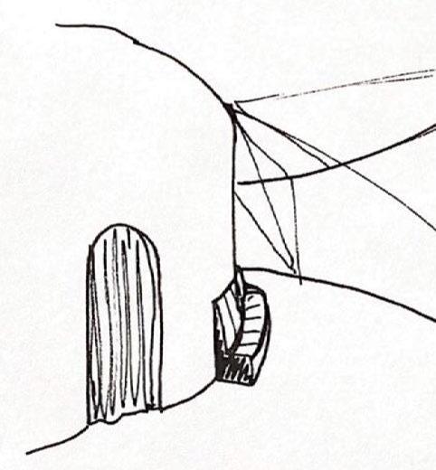
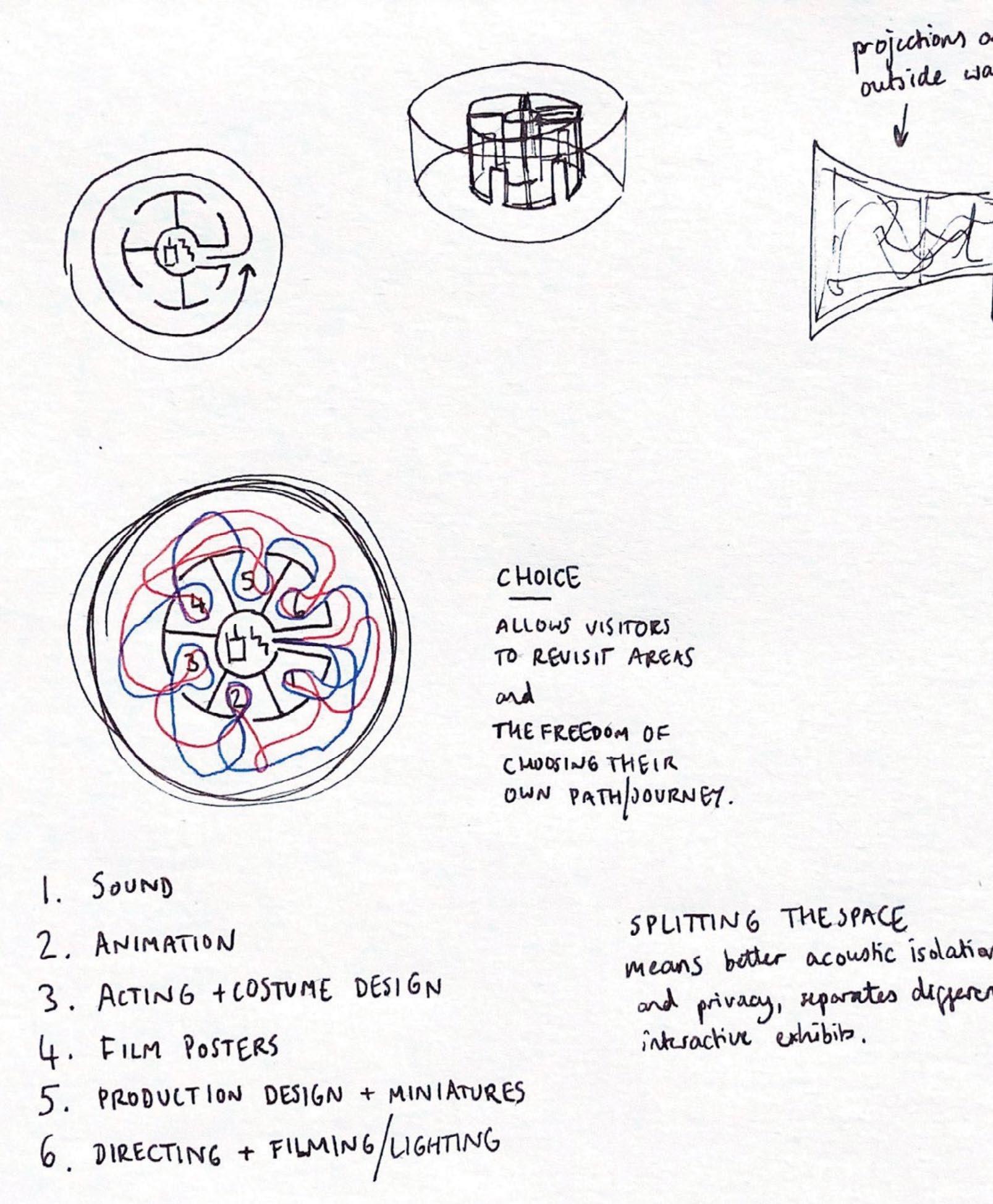
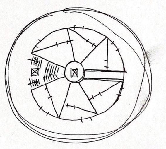
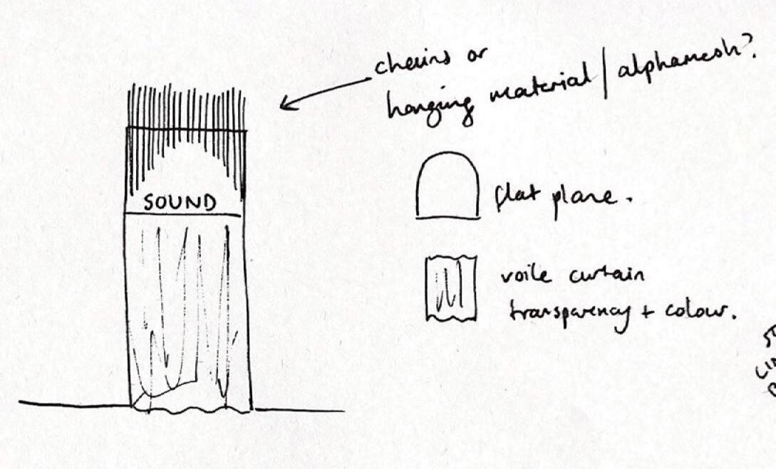
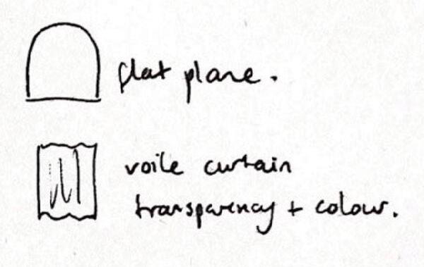
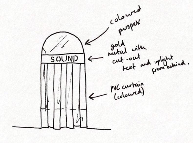
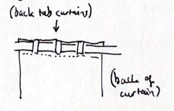
I wanted the separate museum rooms with the coloured curtain doors to create a sense of excitement and encourage visitors to explore on their own route.

Sketches and notes exploring ideas for the film museum


70
obscura
4 south rotunda
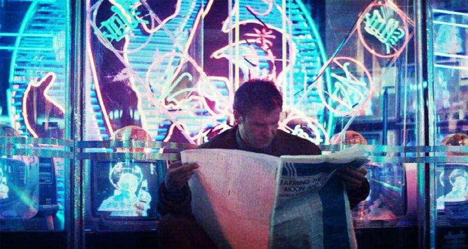
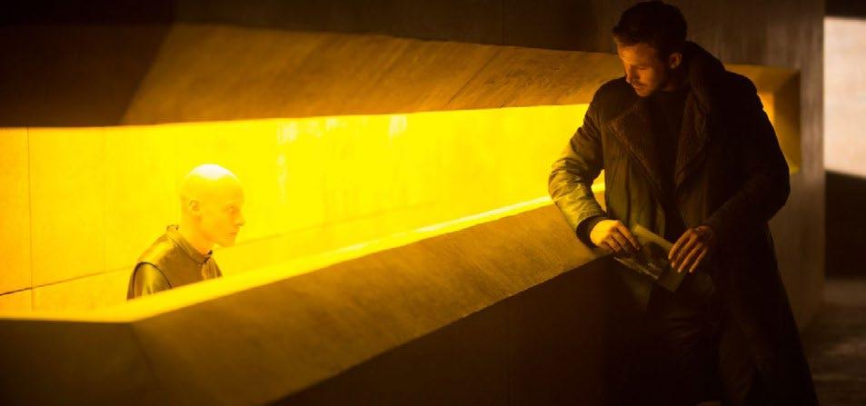
The South Rotunda was inspired by the futuristic worlds depicted in films of the past, especially Blade Runner (pictured below). I found the contrast between old-fashioned and futuristic objects and environments interesting, and wanted to evoke that contrast in the design.
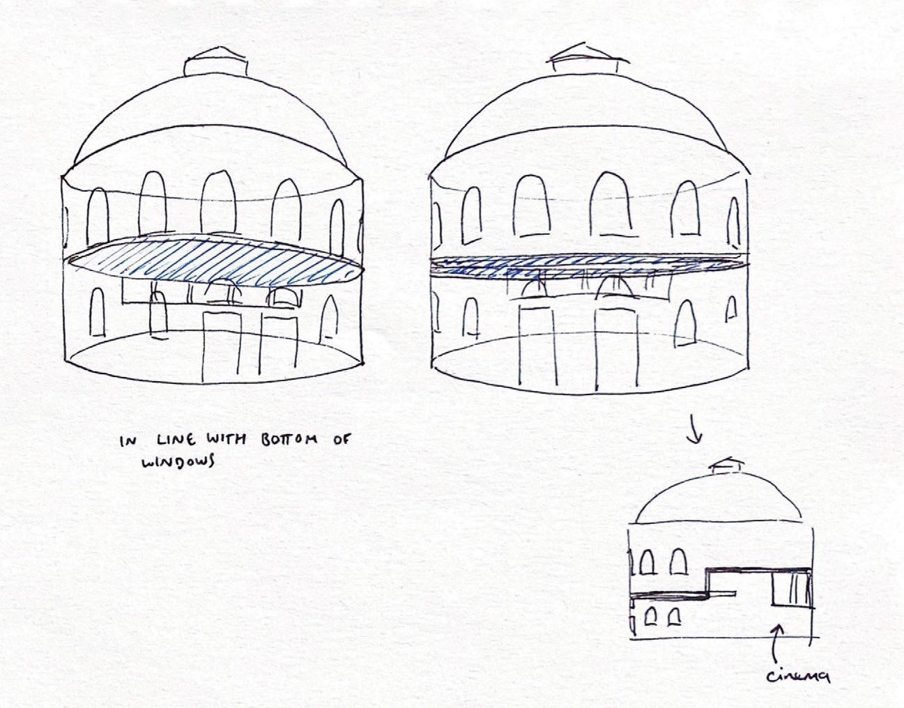
As the building sits on a slope, the ground floor is partially underground. This made the floor ideal for the cinema, as the smaller windows could easily be darkened by curtains, and the larger windows could be utilised for the social and circulation spaces instead.

71 process journal
Sketches experimenting with floor levels in South Rotunda


4.1 introduction 72 obscura
4 south rotunda

73 process journal
Proposed Plan for the Ground Floor of the South Rotunda


4.2 atrium
74 obscura
Sketches exploring ideas for the atrium on the ground floor of the South Rotunda
4 south rotunda

Sketches
exploring layout and floor level of cinema


75 process journal
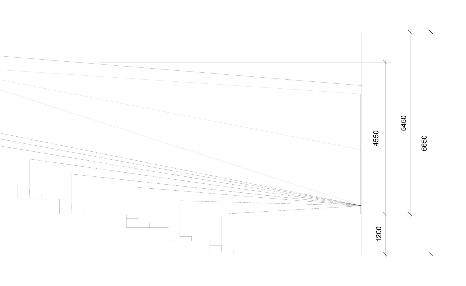
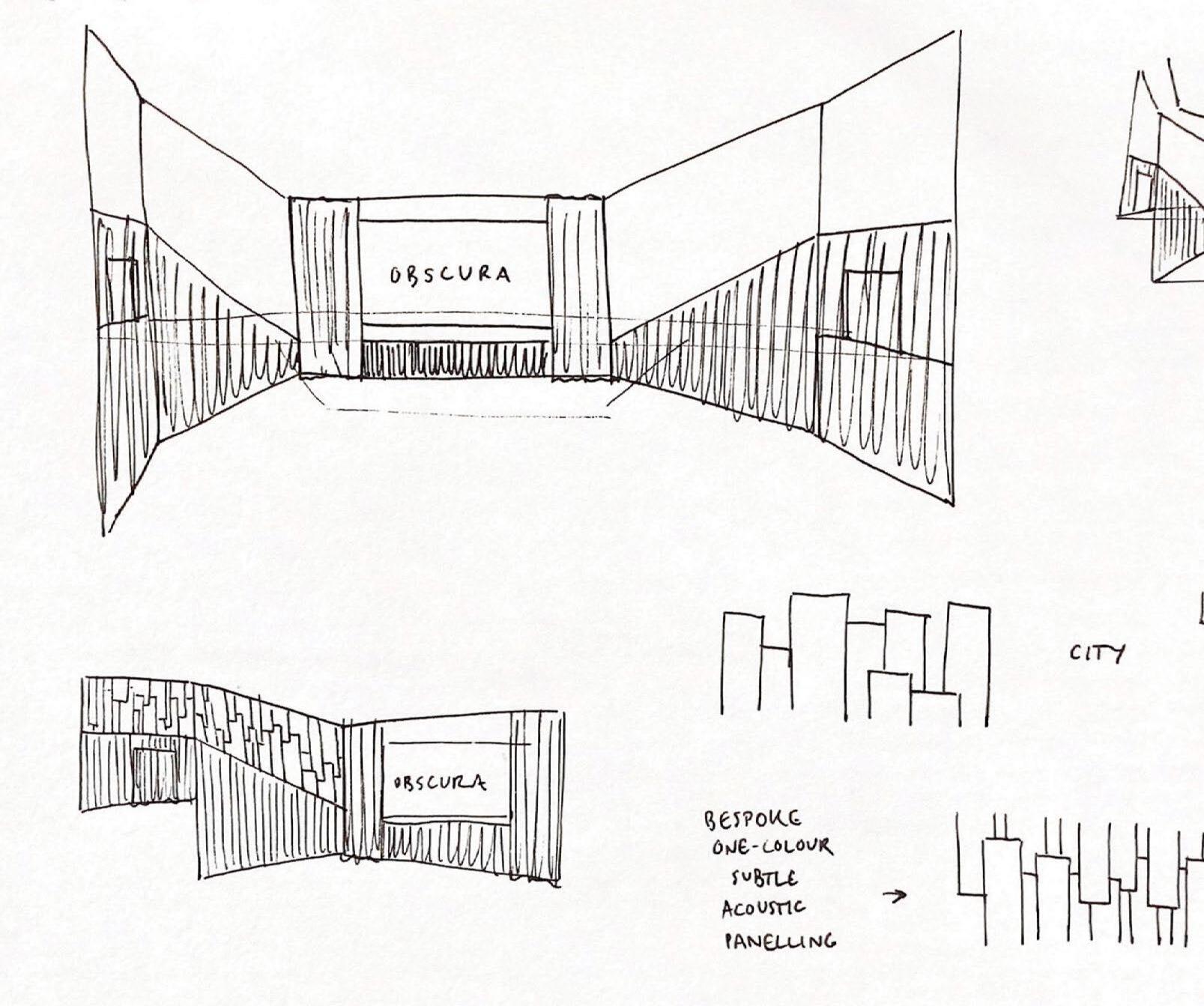
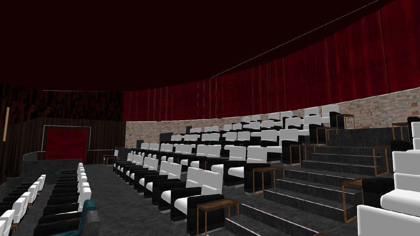
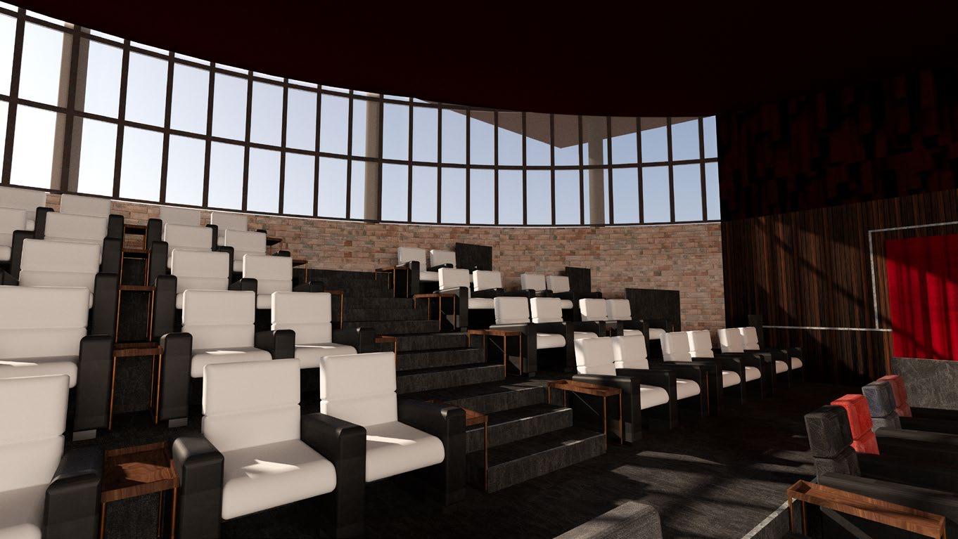
I aimed to make the cinema an exciting space whilst focusing attention on the cinema screen. The seating is located at the curved wall, with angled walls directing the audience’s attention towards the film. The entrance doors open out onto a central seating row, allowing wheelchair users a better view of the screen. The seating, cinema screen and projector are positioned with the audience’s comfort in mind, meeting requirements for field of view and sightline clearance. The angled walls and sloped ceiling also allow better sound absorption.
Vectorworks technical drawing detailing projector, wall and ceiling heights alongside sightlines of the audience on each row.

4.3 cinema
76 obscura
4 south rotunda

The acoustic wall is inspired by Inception, where the city environment is manipulated and buildings rise out of the ground and sky.

77 process journal
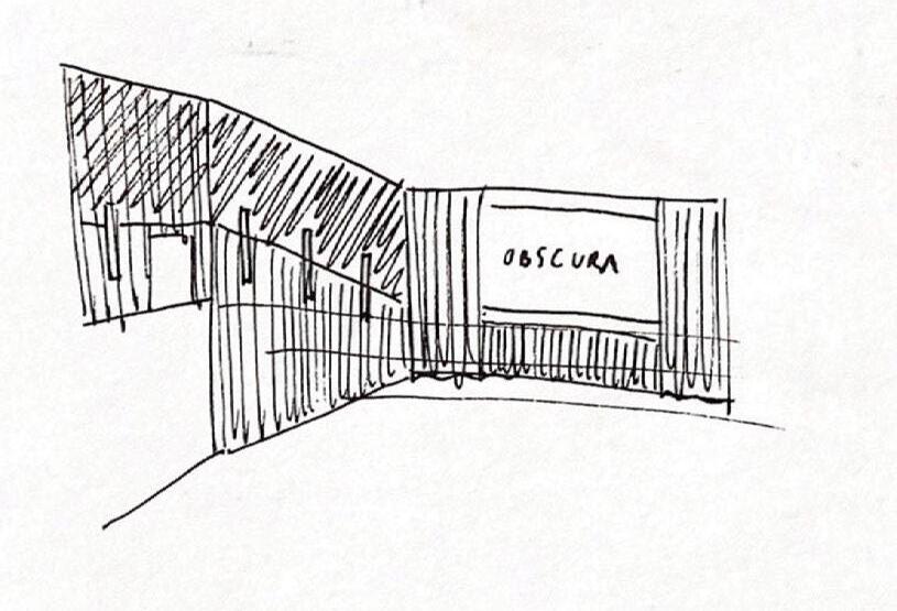
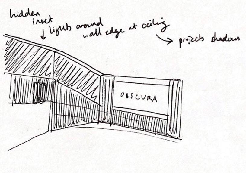
Sketches for the stairs and consistent lighting


4.3 cinema
78 obscura
4 south rotunda


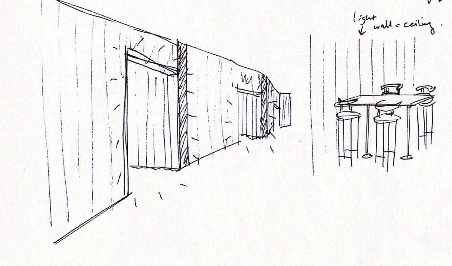
I aimed for the lighting to be warm and subtle. I chose inset strip lights around the edges of the ceiling, which create highlights and shadows on the acoustic wall, exaggerating its form. Vertical strip lights allow sufficient lighting for the audience to find and take their seats.

79 process journal
As the film begins, these strip lights dim as the curtains close around the windows at the back of the auditorium. The curtains across the screen then open, building up anticipation before the film begins.


4.3 cinema
80 obscura
4 south rotunda

81 process journal
Proposed Plan for the First Floor of the South Rotunda


4.4 snack bar
82 obscura
Sketches for lighting throughout the South Rotunda
4 south rotunda
Initial sketches of window detail


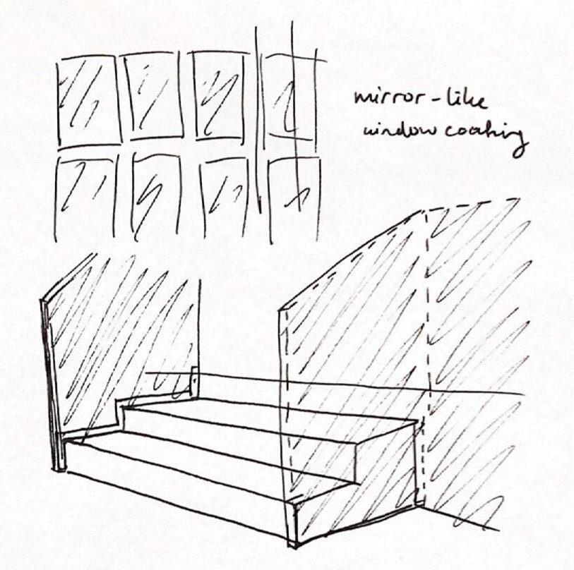
As the snack bar is an evening-focused space, and the South Rotunda is a hidden part of the proposal, I wanted the windows to be mirrored from the outside, creating mystery and intruige for passers-by.

83 process journal
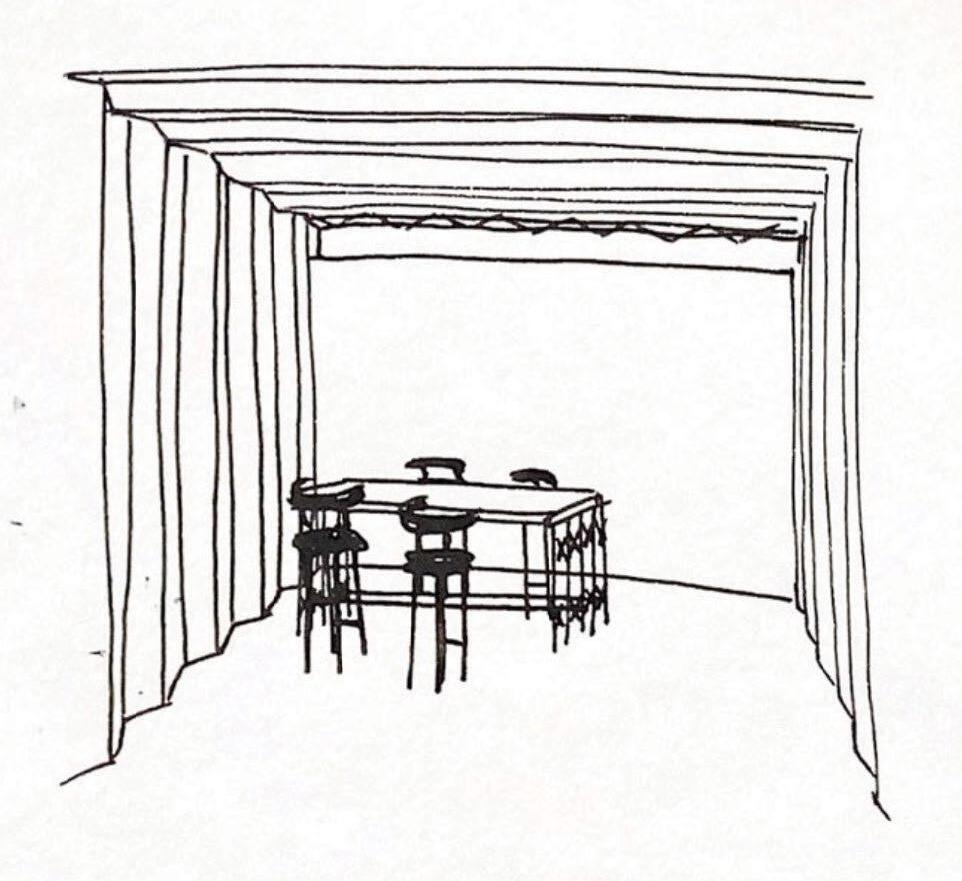
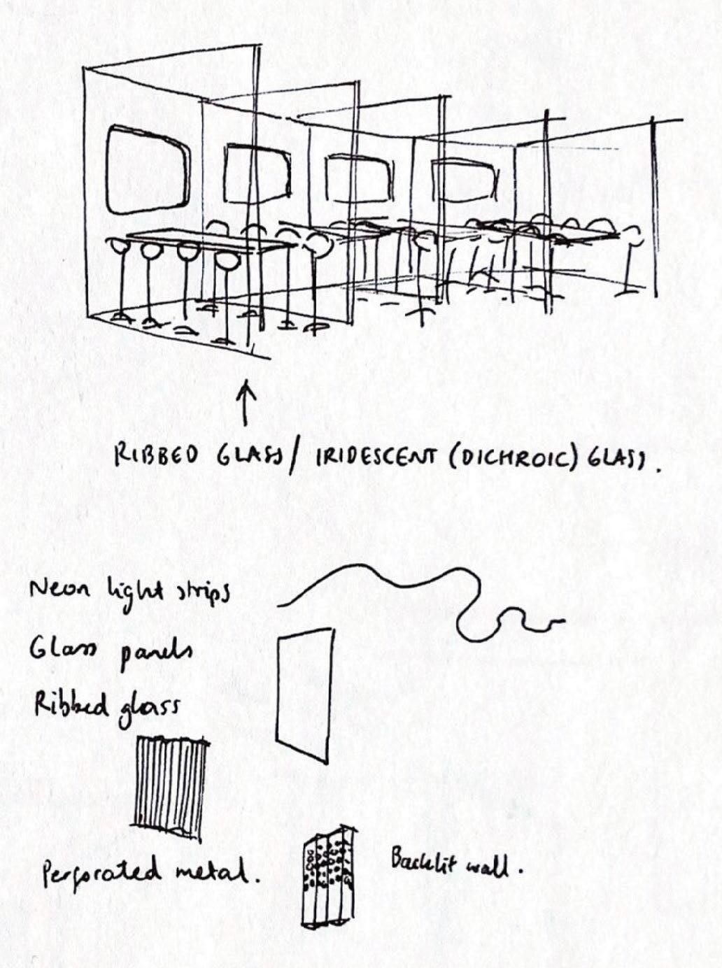
I wanted the Snack Bar to be the central space in the South Rotunda; an open space where people can socialise in groups of all sizes. The space was inspired by futuristic cityscapes in film, and I intended to create a range of different seating and standing areas evoking streets and alleyways of a city at night.

Sketches for the bar


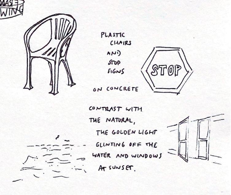
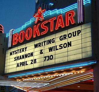
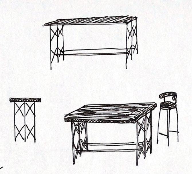
The bar was inspired by petrol stations lit up at night, and classic cinema signage.


4.4 snack bar
84
obscura
4 south rotunda

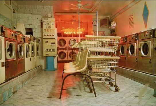
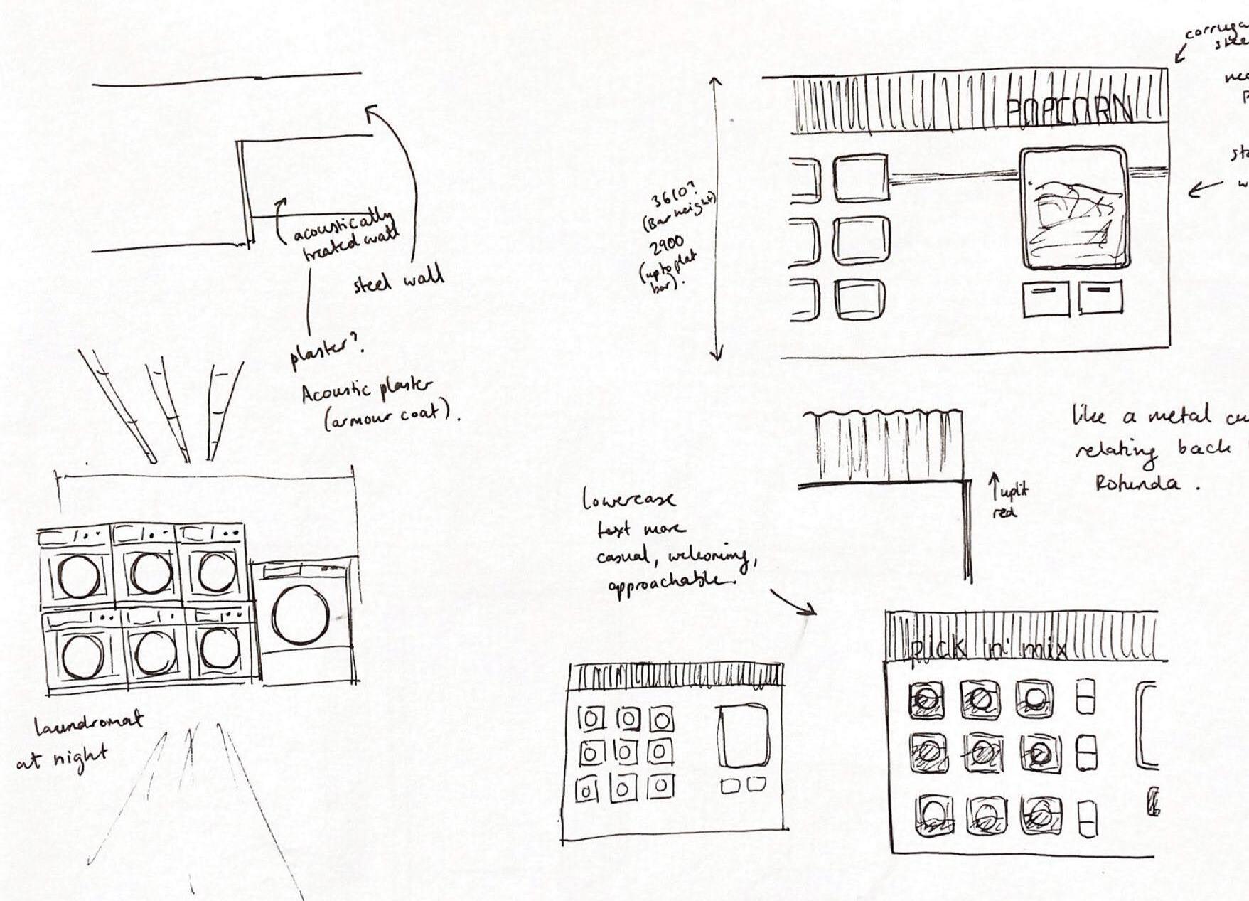
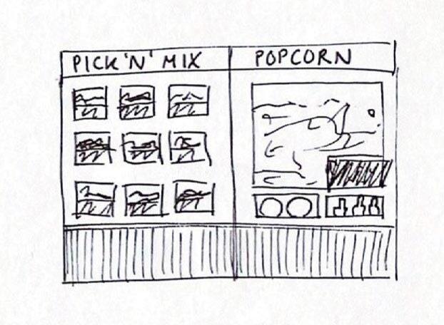
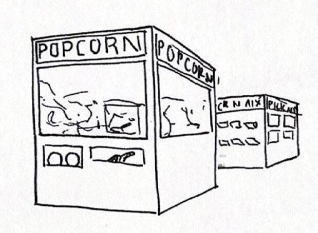
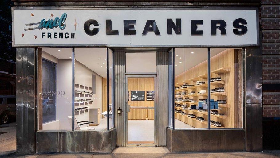
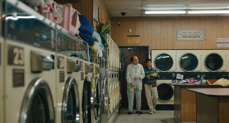
The popcorn stand is inspired by city laundromats at night. The contrast between new and old, light and dark, and rough and shiny was interesting to me. I was drawn to the combination of the bright neon glow and the regular pattern of stacked washing machines, and wanted to replicate this in the design. This was also inspired by the laundromat in Everything Everywhere All At Once.


85 process journal
Sketches for the popcorn stand


4.4 snack bar
An Aesop storefront which I found interesting for the contrast between industrial and sleek design

Everything Everywhere All At Once

86
obscura
4 south rotunda

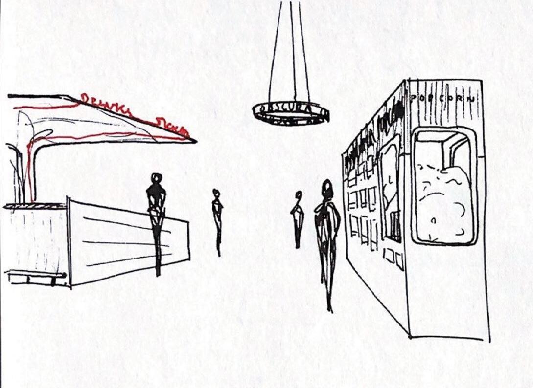
The snack bar is a busy space where people are always moving, where groups to come together before or after a film for drinks and snacks late into the night.
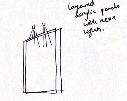
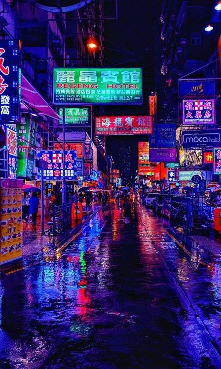
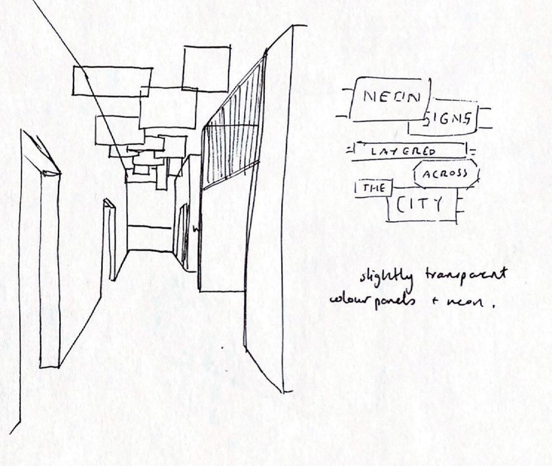
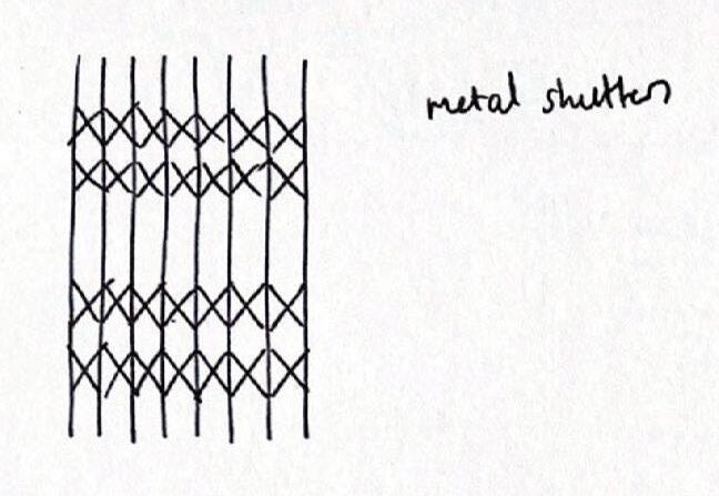
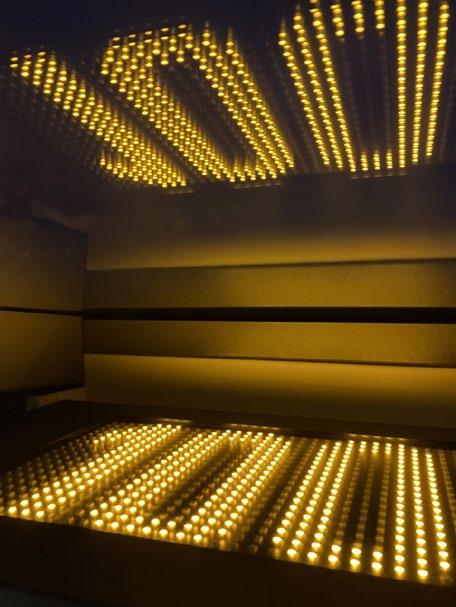
The corridor towards the seating booths, WCs and lift is inspired by the neon signage of large cities at night. I designed an abstract version of this with coloured PVC and spotlights.

87
Sketch of the snack bar and popcorn stand
process journal
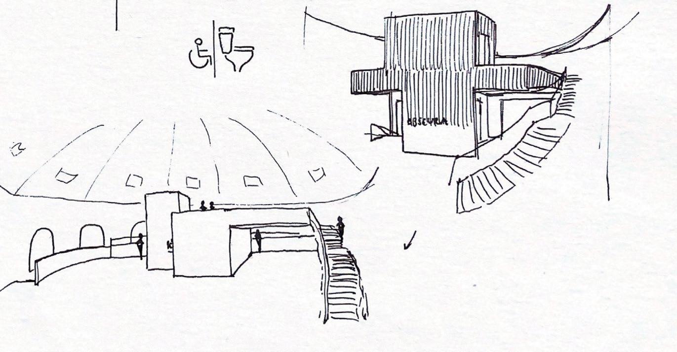
Sketches for the corridor and seating booths


4.4 snack bar
88
obscura
4 south rotunda
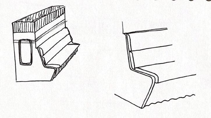
Sketches for snack bar booths


Blade Runner 2049

89 process journal
The snack bar booths in the South Rotunda are designed to almost be the opposite of the seating booths in the North Rotunda. These booths are desiged to feel more private than the rest of the snack bar, but still full of energy and life. The window at the back of the booth is inspired by Blade Runner 2049, letting slits of coloured light brighten the stairwell beyond.

snack bar 90 obscura
4.4
4 south rotunda

91 process journal
Proposed Plan for the Second Floor of the South Rotunda
4.5 film booths
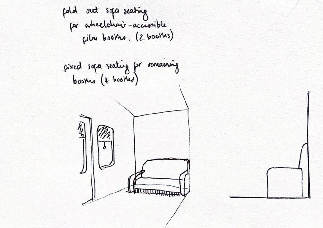
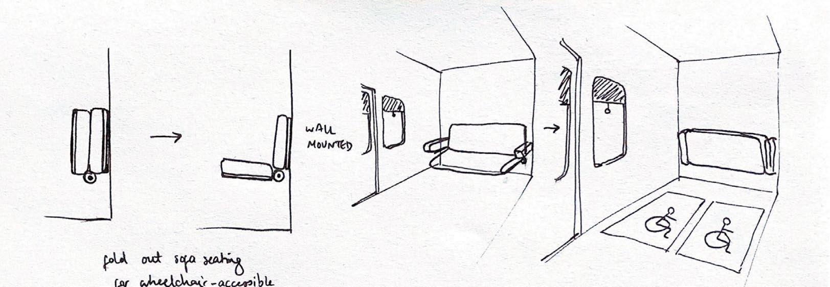
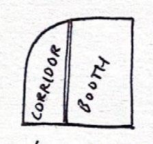
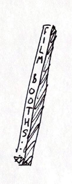
Initial sketches for the film booths

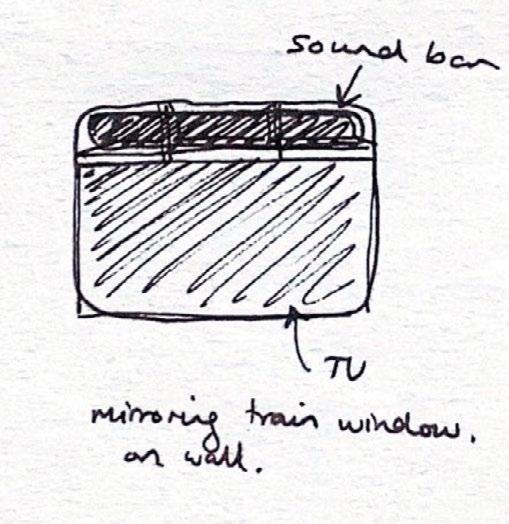
2 of the 6 booths are wheelchair accessible with fold-down sofa seating.

92
obscura
4 south rotunda
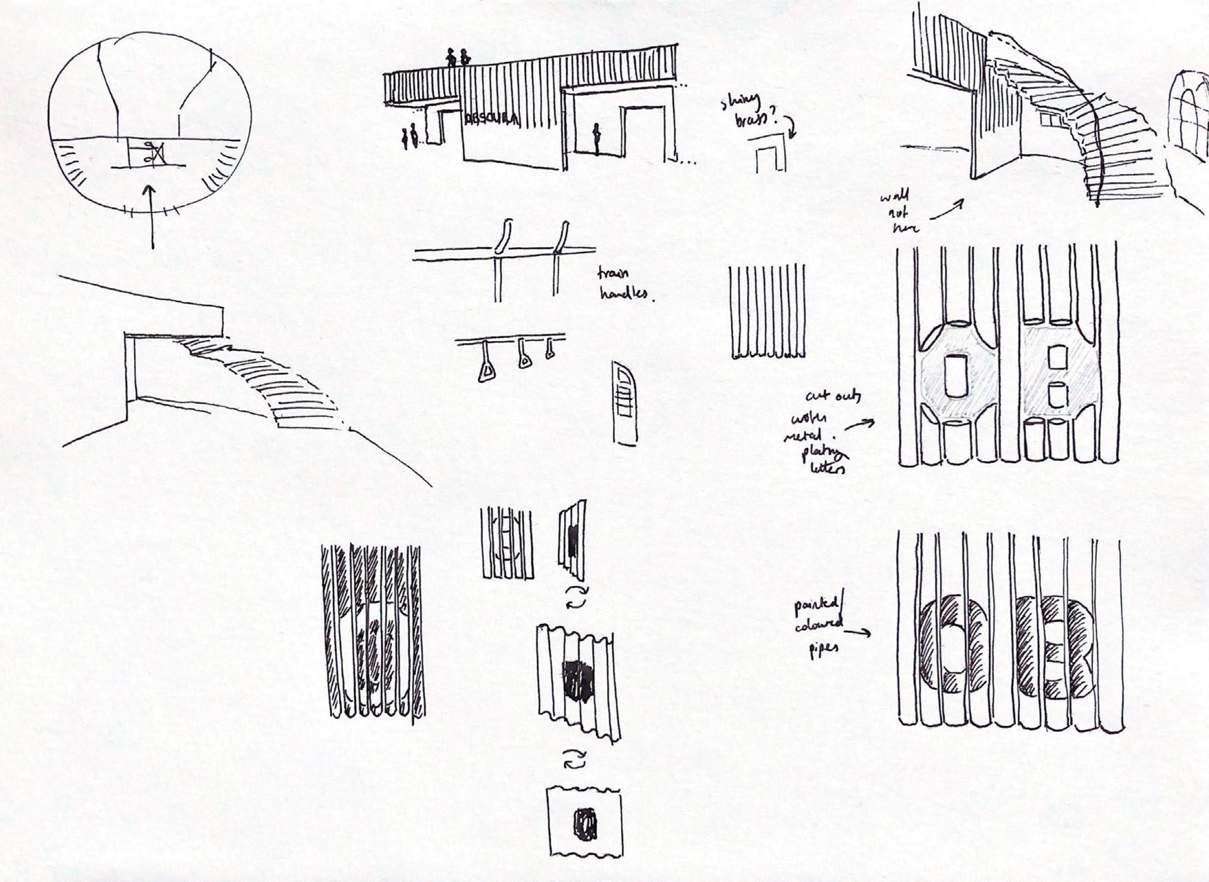
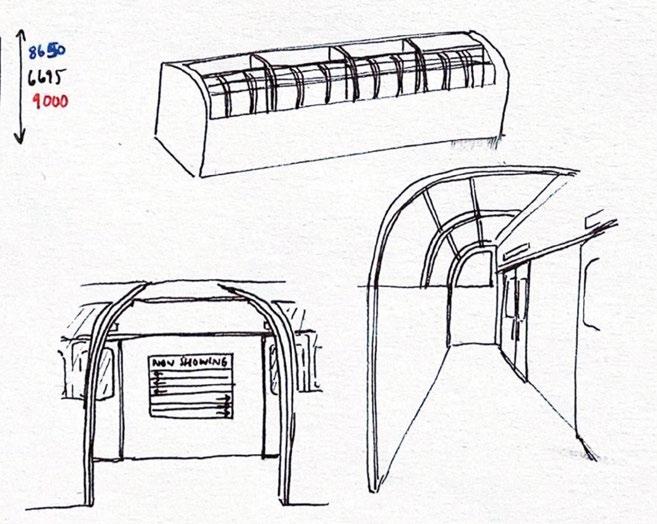
Sketches for film booths

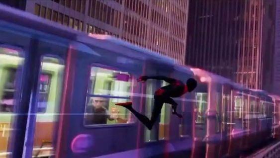
Spiderman: Into the Spiderverse

93 process journal
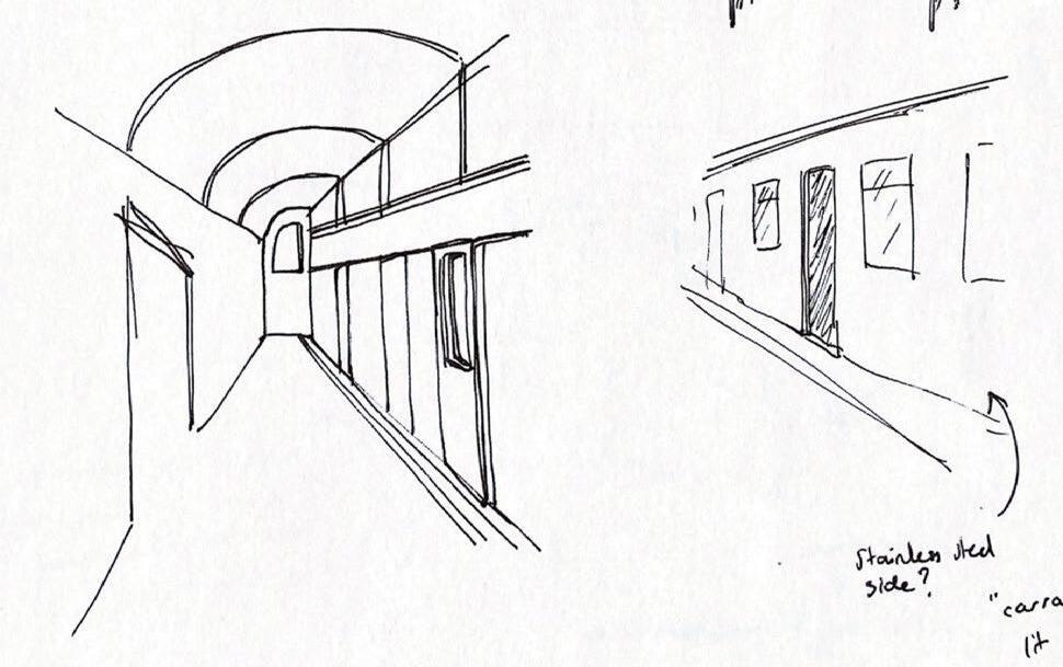
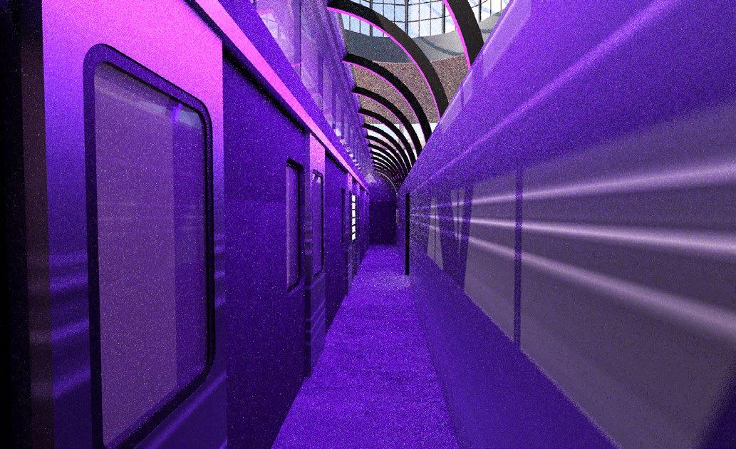
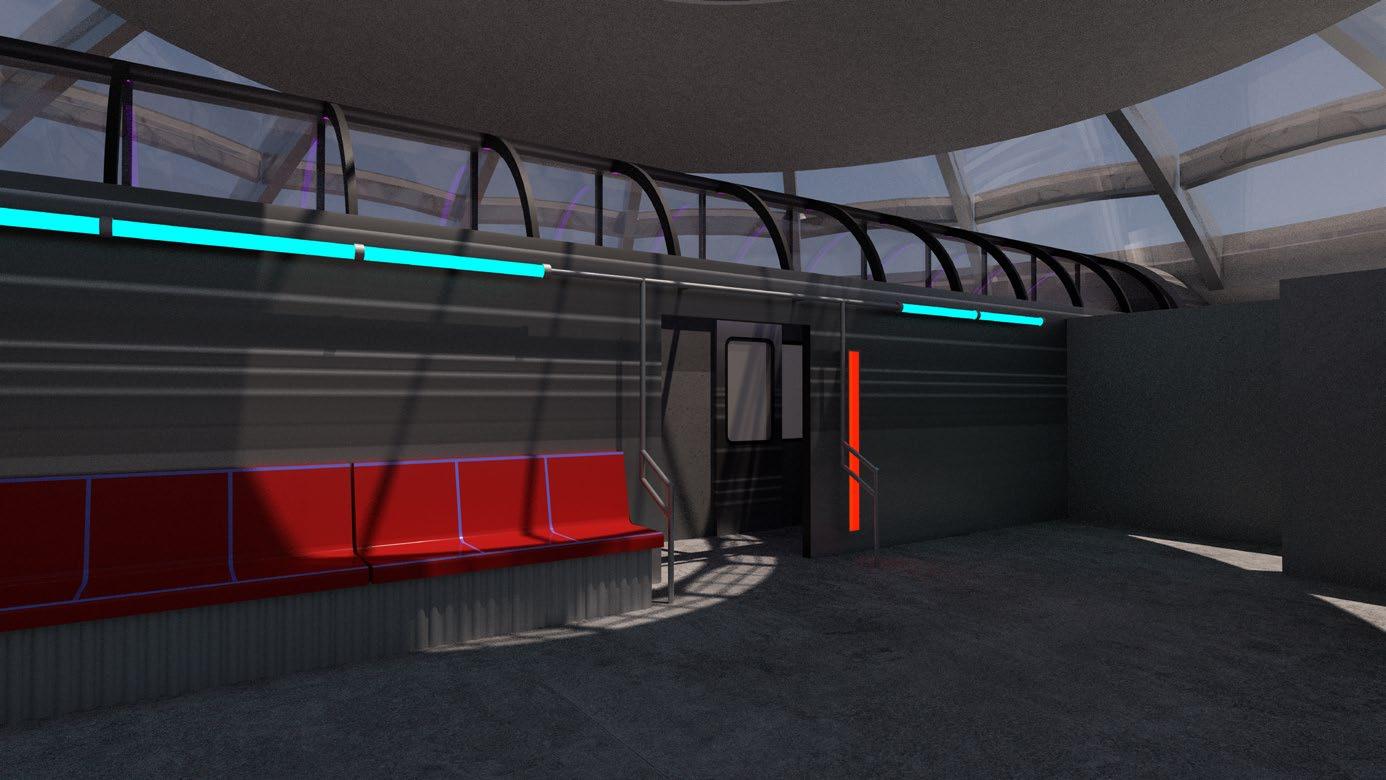
The film booths were inspired by the concept of a journey, both physical and metaphorical. The experience of travelling through the space is comparable to both the experience of watching a film and the experience of taking a train through a new place. I took inspiration from Spiderman: Into the Spiderverse and New York subway trains to create a space which feels new and exciting as well as being somewhere enjoyable to sit and watch a film in private.


4.5 film booths
94
obscura
4 south rotunda
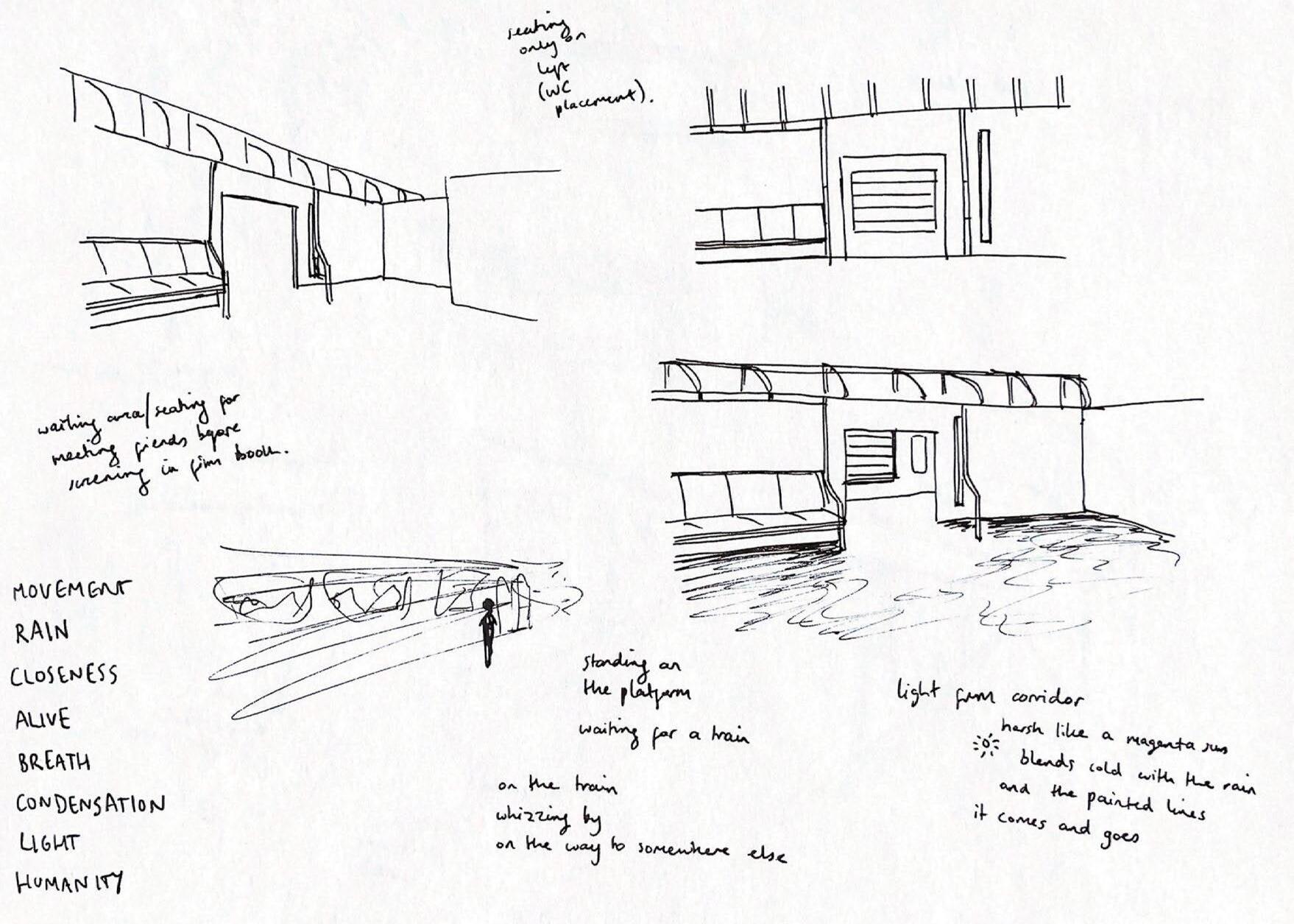
Sketches of the corridor space


Initial render of the corridor

95 process journal
4.5 film booths

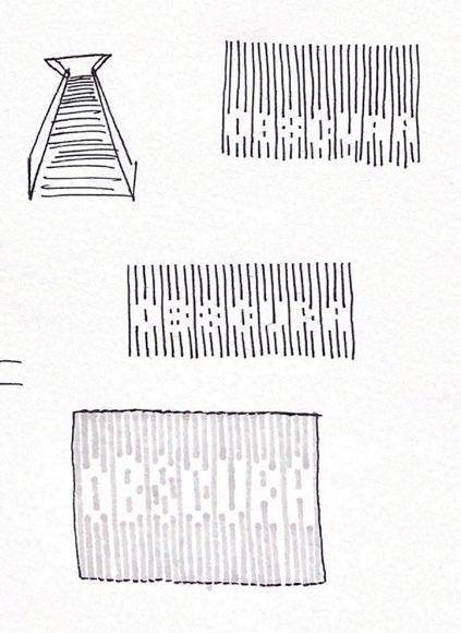
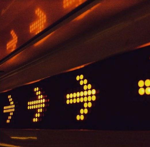
Signage inspired by digital train signage

Initial render of the exterior of the film booths


96 obscura
see the final proposal in the portfolio...


 Rough sketch marking balance of levels for each area
 Entrance
Cafe-Bar
Film Museum
Film Library
WCs
Tunnel
Snack Bar


 Zoning plans on tracing paper


 Sketches for the film museum entrance

