
7 minute read
State of the Art


state of theART
STUDENTS GET CREATIVE – AND COMFORTABLE – IN THE ART ROOM
Advertisement
—By Brendan J. O’Brien, Director of Communication
Warmth and comfort and safety. A little sanity, perhaps. Peace of mind. Some inspiration. These are things we look for in our favorite, most sought-out spaces. For decades, the Prairie art room has served as a sanctuary for students seeking a refuge where they can decompress and create.
“One of the things that’s really important to us is that the students feel at home in this space,” said Vicki Schmitz, Art Department Chair. “They should feel they can come over here and be themselves.”
Even as Mother Nature has continued to tinker with her drizzles and her snow flurries this spring, creativity is blooming in the art room.
And the blossoms are as beautiful as ever.
Students across all three divisions recently placed an impressive 10 pieces in the Wisconsin State Art Show held in Madison from March 12th-25th, and three Upper School artists also earned Silver Key recognition in the national Scholastic Art competition.
These are just the latest accomplishments for a Visual Arts Department that continues to produce.
“I always feel incredibly motivated to make sure our program is at the highest standard,” says Vicki Schmitz, Art Department Chair. “Whenever I talk to people who knew Dave [Drewek] or Kevin [Pearson] they have such wonderful things to say about who they were as people and teachers. So, to me, it’s important we have a strong, well-rounded program that – even if we’re not doing the exact same things they did – it’s trying to reach that caliber and the standard they set.”
Recently, we sat down with Schmitz in her favorite space, the Upper School art room, as she looked at the aforementioned pieces and provided us with some background on their creation.

THe arT room offiCe by TyLer
sTaHL ’22: Tyler has been applying to different art schools and, one day last fall, said, “I need a drawing of an interior space. And I need it tomorrow.” So I told him to just sit down in the office and draw the office. This one is super special to me because there’s my desk and there are some pots and pans that were hung from the ceiling by some advisees a few years ago and that’s my lunch box. All of this stuff has a little story to it and I think people appreciate this piece because it just looks very lived in. It’s a spectacular drawing.
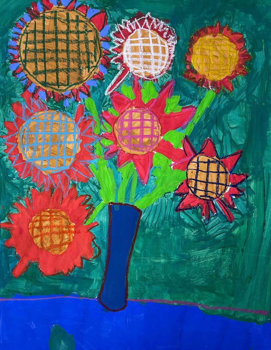
sunfLoWer by georgia piTTs,
1sT grade: This is one of my favorite lessons Katie White does with the 1st grade students. She talks about Van Gogh and they use his sunflower paintings as a starting point. She gives them some parameters with the inspiration, but then really lets them have a lot of choice and voice when it comes to things like patterns and colors.
sHrimp by simon
TroCke ’22: This is from another AP student and stemmed from an assignment last fall when I brought in a bunch of gourds and pumpkins and we did some still life work. The student was really pleased with it and I was as well. This student’s work tends to be really conceptual so the fact they can balance the technical with the ideas, I think they are really coming into their own. It’s really pretty and the colors are spot on and the little bits of brushwork make you want to keep looking.

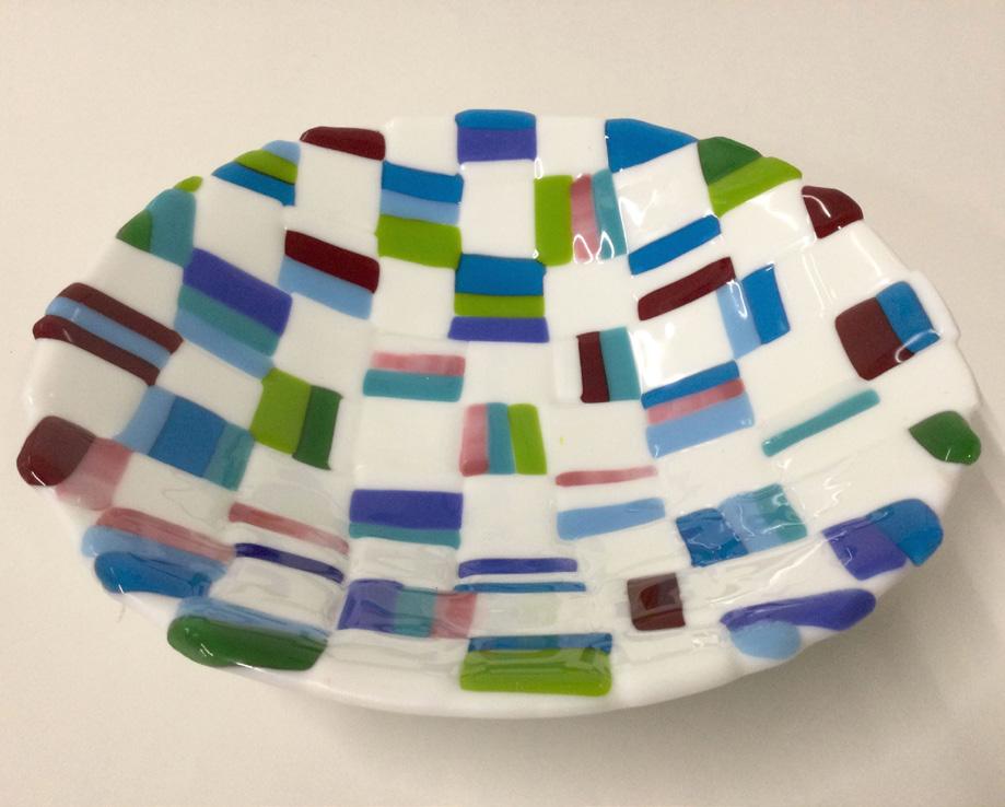
sLumped boWL WiTH CoLor sWaTCHes by emma degrooT ’22:
For this, students cut apart sheets of different colored glass and lay out their design before a two-step process in the kiln. One thing about glass – there’s a lot of behind-the-scenes work. I’m looking at this and thinking, man, that took a lot of time. Hopefully one thing students are walking away with is an appreciation for what goes into making a piece of art.
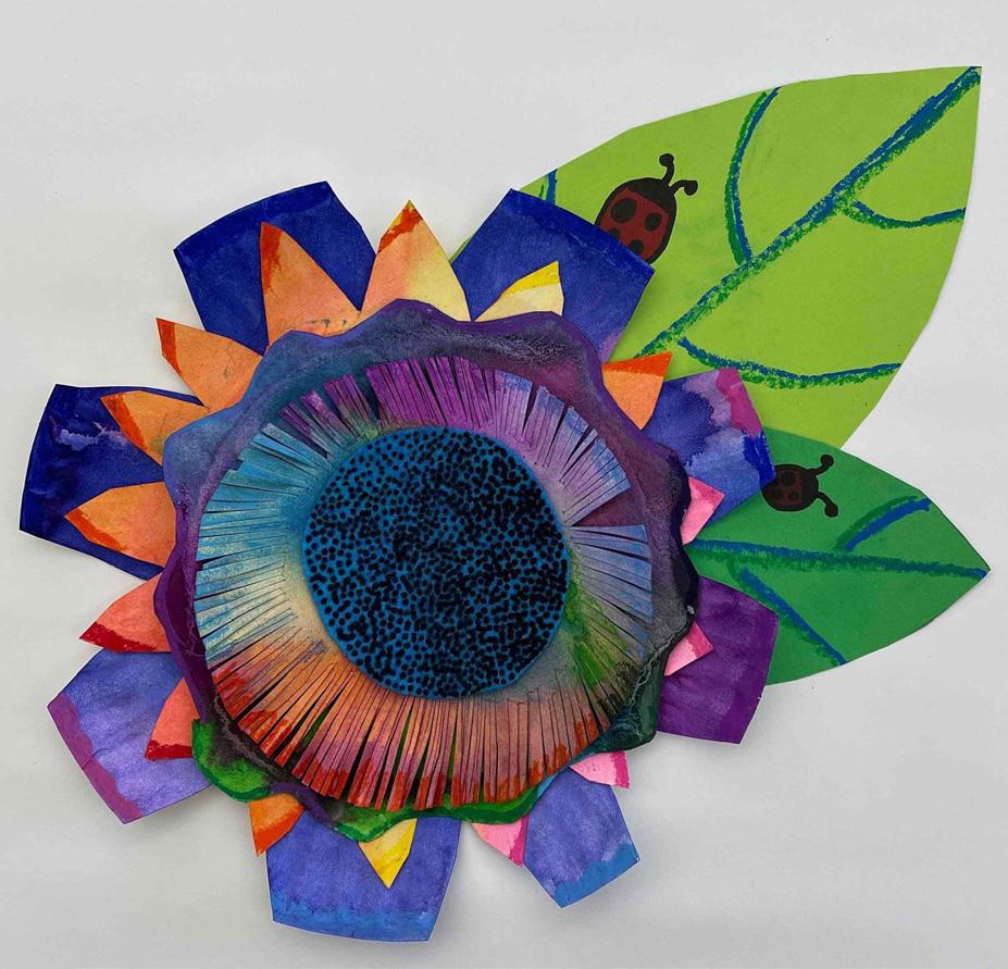
fLoWer by giuLiana farbo,
2nd grade: Another thing I love about the Primary School program is Holly [Wolf-Mattick] and Katie work with the kids using a variety of materials. They don’t do just drawing or just painting. This is a nice example of really putting a lot of things together to show kids art doesn’t have to be just one thing. It can be multimedia.
sgraffiTo boWL by saraH koker ’23:
This was one of my favorite pieces from ceramics first semester. It’s called sgraffito: you paint a layer of glaze onto an object you’ve made and then scratch through it to create an image. This is a bowl and she’s created the image of the bear inside.

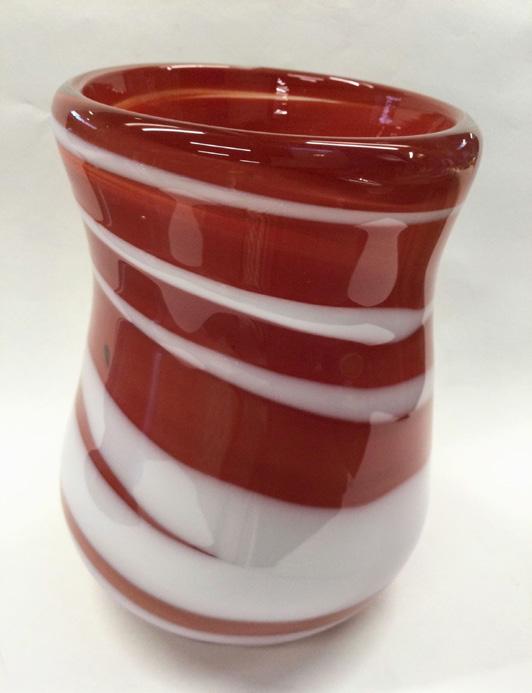
Candy Cane Vase by madeLine
neLson ’22: Because I’ve watched Holly demo and work with the kids I really get the feel for when they’re turning the pipe – like that swirl you see. They turn the pipe to keep it hot, but the way the swirl goes in there it just has this dynamic feel. Even though it’s a solid, static piece, it has a sort of chasm energy to it.
bLue Café painTing by eLLie
JossarT ’22: AP Studio is our most advanced visual arts course and this year there are eight kids in the class. It’s where you spend a year building a portfolio, say twenty pieces, and then send it out. Ellie’s portfolio is really investigating architectural spaces, both interior and exterior. So you can see this one looks like it’s a sort of rainy, cool outdoor scene with the cooler colors contrasted with a really warm indoor color scheme to make the café appear very inviting.

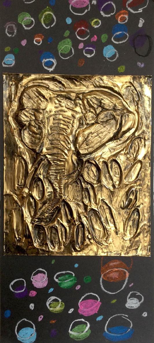
meTaL reLief animaL porTraiT by Juana raimondi,
4TH grade: This is a 4th grade project where they take this thick metal foil and do these textural relief images of animals. And that’s a neat way of bridging drawing and painting into sculpture because the material is a little three-dimensional and it’s something the kids don’t really work with until 4th grade. It’s this special new introduction, a little more sophisticated, as they get towards the end of Primary School.
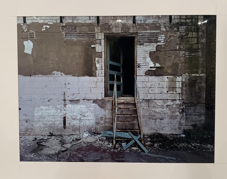
unsound TeaL door by CaLLaHan
poLzin ’23: I really love the title of this one. I have no idea where this place is, but it’s a cool photograph. I saw this picture and I know who took it and I thought, “Okay, where did he find this thing? What was he doing when he came across this?” To know kids are outside of the building thinking about art, it’s like, “okay, that’s cool.’”
generaTionaL inspiraTion by
emmeTT sanTaLuCia ’24: Prairie used to have a darkroom which we’ve reconstructed into a screen printing area. We didn’t want to let go of photo, we just wanted to bring it into the present with a focus on digital photography. The photography class has four main units and one of them is portraiture which you see here. This really does look like a genuine interaction, as if they’re almost getting ready to pose, but instead of showing the posed picture, the student chose this moment either right before or right after, which is far more authentic capture.

CoW ink WasH by CLara baTes ’22:
We open the semester with an ink wash, which is basically a simplified version of painting where you take ink and water it down to different levels to make it darker and lighter. In classic overachieving Prairie student form, Clara did three cows instead of just one. But this one was her favorite.


sHip draWing by mason sanTaLuCia ’22: This is from another one of our AP students. I think he’s going into some sort of video game design, and he has these drawings where in each one he can explain to you who the characters are, where they’re at in the game, who’s battling who and why – behind each work is a story. And it’s a long one. His drawing skills have improved so much this year. The level of detail and contrast just gets better every time. This one I like because the longer you look, the more surprises you come across.
TexTure box by aLex marek, 8TH grade:
This is a slab box that Izzi [Buikus] does with the kids. It’s really focused on texture and a few of the technical skills of slab building. I think in some schools it’s easy to do a pinch pot a hundred times and that’s as far as they go with clay. This is a nice advanced project for the Middle School level that gives them a taste of what they might experience in Upper School.


