4 minute read
GRAND OPENING
MATT FAJKUS ARCHITECTURE RENOVATES A MID-CENTURY MODERN HOME SO PERFECTLY THAT THE ORIGINAL ARCHITECTURE AND THE NEW DESIGNS ARE SEAMLESS.
By Lauren Jones | Photography by Charles Davis Smith, Leonid Furmansky and Twist Tours
Advertisement


TWIST TOURS
AA MODEST MID-CENTURY MODERN HOME IN Austin’s Brentwood neighborhood has been carefully restored and expanded by Matt Fajkus Architecture. The tree-lined community, just north of the University of Texas at Austin campus, was developed post-World War II with compact bungalows, many of which were purchased by returning GIs.
“A lot of the existing houses in the neighborhood are historic,” says architect Matt Fajkus. Many of the homes are relatively small with carports, but as the trees have grown, the area has become nicer over time. “It’s going to become even more prime real estate,” he adds due to its central location.


CHARLES DAVIS SMITH
Homeowner Ron Rendon, who has an appreciation for mid-century architecture, relics and overall style, purchased the single-story home a decade ago, and hired Fajkus and his colleague, Sarah Johnson, in 2015 to preserve and add-on to his beloved home. While he loved its character, he realized it was time for an update.
The existing house was a two-bedroom with carport, featuring highly compact storage, no walk-in closet for the owner’s suite and claustrophobic ceiling heights. While the completed home, which was finished in time for the AIA Austin Homes Tour in 2018, is a mere 1,567 square feet, the architects have added a proper master suite with a dual vanity and bathtub, plus an office and generous patio with an outdoor shower.
“We always try to renovate in a way that is true to what was there,” Fajkus says. Modernism first arose in Europe 100 years ago and is characterized by stark, boxy homes with steel and glass, while mid-century modernism, a design movement inspired by it and led by those such as Charles Eames, Frank Lloyd Wright and Florence Knoll, leans on more natural materials, such as stone and wood, and includes low-slung roof lines and bold color.
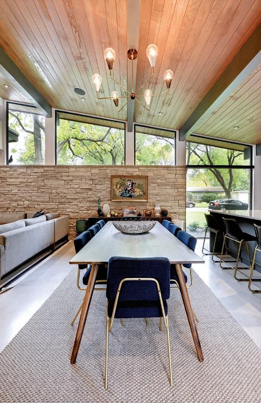
To “give more breathing room” to the home, the original roofline was raised over the kitchen, dining and living areas, creating clerestory windows that give way to the canopy outside and are a favorite feature of the homeowner. The kitchen is now open to other living spaces and flanked on either side by floor-to-ceiling windows. Throughout the home, small windows were replaced in the same fashion, and three narrow, vertical windows in the living room filter in light while creating an interesting exterior feature. Using materials that transition from the exterior to the interior, tongue-andgroove interior paneling extends to the patio and limestone walls are exposed in the living area.
LEONID FURMANSKY

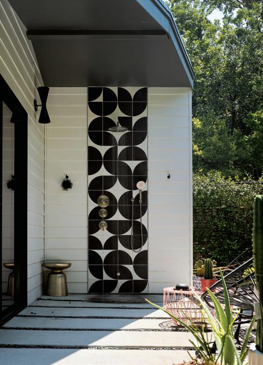
The open concept living room, dining room and kitchen was kept minimal and accentuated with calming blue accessories, while the adjacent bookshelves hold collections in a riot of colors. Polished concrete and minimalist painted gray millwork act as a background for the cast cement tile backsplash in the kitchen. This same tile is repeated as a privacy screen on the patio and on the outdoor shower. “We wanted something that would pop and by using the same tile on the patio area, it blurs the lines from the inside to the outside,” Fajkus says.
The trapezoid site, which includes a five-foot setback and 10-foot easement, left the architects with an odd triangle off the master suite. The solution? Sliding glass doors open to a private courtyard with an outdoor shower that is hidden from view due to the sloping roofline.
Another favorite element is the bookshelf, which was Rendon’s idea to include in the home. “I can look over and see the history of the things I’ve curated over the years,” he says. “It’s my personality up there.” Rendon has collected hundreds of items, including more than 50 vintage Air India statuettes. “I got obsessed,” he said. He even has the hard-tofind three-and-a-half-foot version. “I’m only missing one more piece and it’s made from Swarovski crystal.” Due to the large number of statuettes, Rendon has peppered them throughout the whole home. “They’re everywhere you look in the little corners through each interior room,” he adds. Rendon also has many books, including fiction, non-fiction, and rare design and architecture books that are placed on the bookshelf alongside photos of his friends and family.
While Rendon’s collection is impressive, his crown jewels are his signed Bobby Kennedy campaign poster that he found
LEONID FURMANSKY


LEONID FURMANSKY

on Ebay, plus an heirloom painting that once hung in his parent’s home in the early 1970s in New Mexico. “My mom passed away last year, so when I got that it was amazing but also heartbreaking,” he recalls. The piece was damaged during the Austin snowstorm in February 2021, but luckily, he was able to restore it fully.
Overall, the home is a modern expression of mid-century design, perfectly capturing Rendon’s spirit, his love for his collection and featuring high-end architecture and interiors work. “It was so great to have Matt and Sarah on my team and I’m also grateful to have worked with designer Joel Mozersky, who consulted on the project,” says Rendon. u

MATT FAJKUS ARCHITECTURE
512-432-5137 | mfarchitecture.com


