3 minute read
Human Experience Scorecard www.arcskoru.com 11


4.3. Scoring Approach
The overall Arc Performance Score is based on the comparison of the given project with the existing green buildings around the world and hence uses the existing dataset to evaluate. The Arc Performance Score is based on a three-level structure using five categories. It uses three types of information in addition to measured performance data for each category: 1. Normalizations for floor area, occupancy, schedule, and outdoor air temperature. 2. Key parameters, critically including the greenhouse gas emissions factor of grid supplied electricity. 3. A Reference Set of green building projects around the world
Advertisement
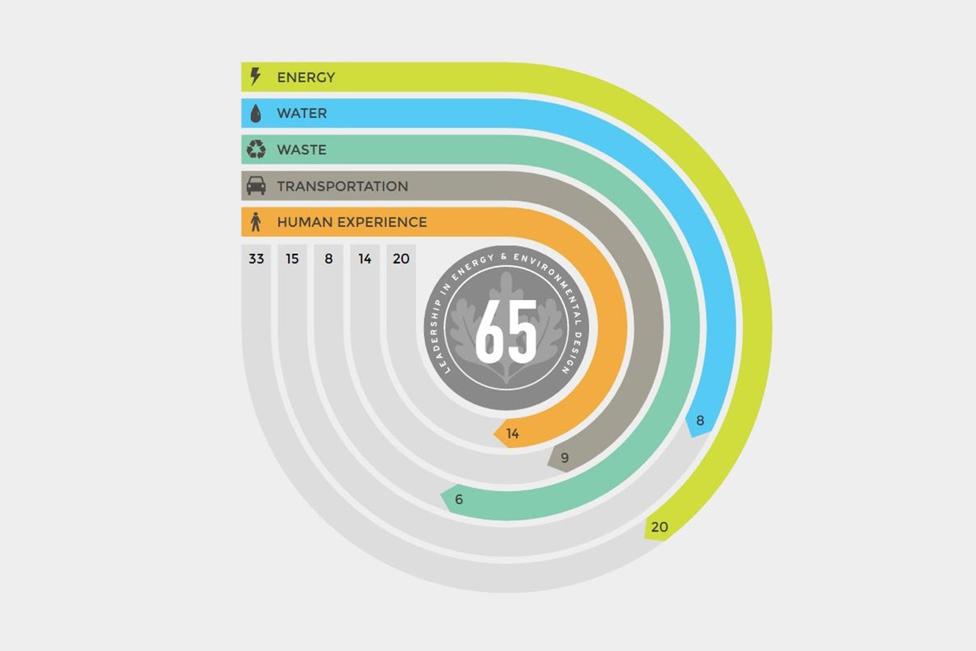
Score Structure The overall Arc Performance Score is a 0-to-100 metric. It is not limited to whole numbers and fractional scores are allowed. Performance categories include Energy (33%), Water (15%), Waste (8%), Transportation (14%), and Human Experience (20%).
Fig 04: Sample scorecard of Arc
Source: www.arcskoru.com:
These weights are based on priorities established in the LEED v4.1 rating system, and, consequently, these reflect the expressed values of the LEED Steering Committee and USGBC membership (USGBC 2015). The result is a composite 0-100
value for any project, each category, and each metric. Minimum data requirements to generate an Arc Performance Score for use with LEED include: • ≥12 consecutive months of whole project energy consumption data • ≥12 consecutive months of whole project water use data • ≥1 survey for whole building waste generation and diversion from landfill per year • ≥1 survey of occupant commuting per year • ≥1 occupant satisfaction survey and measured carbon dioxide (CO2) and volatile organic compound (VOC) concentrations
4.3.2. Scoring Categories
The Arc Performance Score is evaluated under the five categories: Energy, Water, Waste, Transportation, and Human Experience.
4.3.2.1. Energy POINTS: 33 12 month energy usage is evaluated in this category. A data template is provided which needs to be filled with the energy usage for each month. This data is then evaluated to visualise a score under this category. Low energy use and Carbon emissions result in a higher score.
Fig 05: Energy Scorecard Fig 06: Water Scorecard
Source: arcskoru.com Source: arcskoru.com:


4.3.2.1. Water POINTS: 15 12 month water usage is evaluated in this category. A data template is provided which needs to be filled with the water usage for each month. This data is then evaluated to visualise a score under this category. Low water usage results in a higher score.
4.3.2.1. Waste POINTS: 8 In this category, at least one waste analysis needs to be provided which includes the weight of waste generated and waste diverted from landfills. This
helps visualise the score for this category. Low waste generation and high waste diversion results in a higher score.
Fig 07: Waste Scorecard Fig 08: Transportation Scorecard
Source: arcskoru.com Source: arcskoru.com:
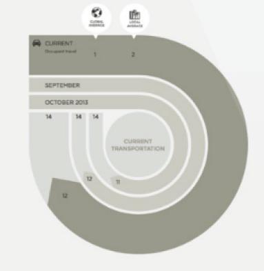
4.3.2.1. Transportation POINTS: 14 For this category, a survey needs to be conducted of the occupants as well as the visitors. It evaluates the distance travelled and the means of transportation opted for the same. The distance traveled is then converted to carbon emissions, so lower the emission higher is the score.
4.3.2.1. Human Experience POINTS: 20 For this category, a survey needs to be conducted of the occupants as well as the visitors. It evaluates the occupant’s satisfaction. In addition to that, at least 1 air quality sampling test needs to be conducted for CO2 and TVOC data for every 25,000 sf. Samples need to be collected from PID sensors or lab testing and formulated into a datasheet. This helps visualise the score that gets better with higher occupants satisfaction and better indoor air quality.
Fig 09: Human Experience Scorecard

Source: arcskoru.com


