
66 minute read
Laying technologies
Decoupling holds the key Progress Profiles
PRODESO HEAT GRIP XL SYSTEM is the revolutionary electrical heating system for floors and coverings that provides warmth only where desired in few minutes; it’s a cost effective, time and energy saving solution.
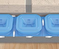
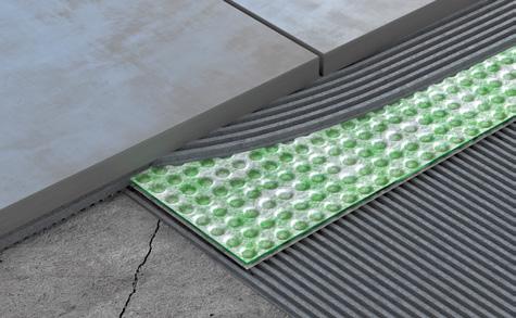
The polypropylene membrane, with uncoupling, waterproofing and vapour management features, has an 8 mm thickness and is provided with a non-woven thermowelded polypropylene fabric on the back side. The new membrane’s design suits to any floor or existing surface, optimizing its performances; its new structure allows a perfect fixing of the heating cable and a crack-bridging ability five-times more than the previous systems.


Moreover, the rounded square shaped reliefs are provided with truncated almost square based pyramid cavities that transfer the loads from flooring to the support. The reliefs are designed to easily hold the Prodeso Heat Grip Cable only where required. The heating cable, with its new 6.5 mm diameter, is provided with many electrical resistors connected in parallel. In case of cable damage, only the involved resistor stops, not interrupting the heating transmission of the entire system.

Raimondi
E-FOX & LAB330 by Raimondi: battery-operated vibrator and bridge wet saw for large format tiles
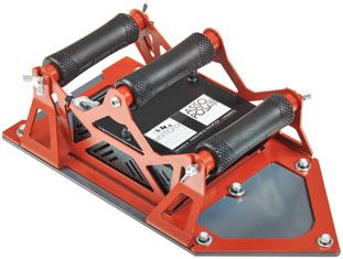
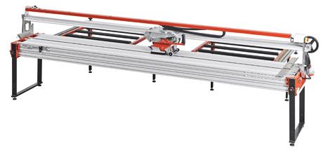
Large format tiles are getting more and more popular and lead towards refinement and widening of the dedicated range of tools. Among the recently introduced products we mention E-FOX and LAB330. E-FOX is the brand-new battery-operated large format tiles vibrator provided with selectable vibrating surface. Vibration is essential to remove the air underneath the tiles and thus pursue the so-called full-coverage; which is essential to prevent cracking once tiles are installed. E-FOX performs this task with maximum effectiveness. The battery (up to 200 m2 vibrated with a single charge) makes it very practical to use. The large vibrating area (21x41cm) results in maximum speed and therefore productivity. The vibrating area can be reduced to 15x15cm with ease; this makes E-FOX perfect even for use on small surfaces (for instance steps). Lightweight (5.3 kg with maximum vibrating area and 3.3 kg

with reduced vibrating area) and provide with three handles E-FOX is perfect for both wall and floor use. It comes with a padded bag (with handles and shoulder strap) for storage and transport. LAB330 is the bridge saw (water-cooled diamond blade) specifically designed for performing straight cut as well as 45° mitre cut on large format tiles up to 330 cm in length. The mitre cut can be performed on tiles up to 160 cm wide (can be widened with dedicated accessories) and 320 cm long. Performing cuts with a water-cooled diamond blade gives a very high level of finishing. LAB330 is equipped with 2 side benches equipped with a counter-square, powerful 2.2 Kw motor and Ø 200 mm diamond blade. LAB330 is the ideal solution for those looking for the right mix of ease of use, production capacity, quality of both straight and 45° mitre cut without the need to make excessively demanding investments.
Montolit
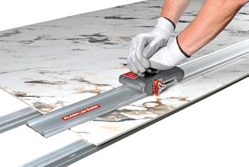
Brevetti Montolit presents FLASH LINE 3 the third generation of manual cutting system for all extra-large sizes (from 0 to 340 cm).
The new equipment, created in collaboration with the “Politecnico di Milano”, consists of an incision trolley, modular rails and nibbler, all inside in a practical and strong “cordura” bag.
The futuristic incision slider, made of die-cast aluminum, slides on the guide bars thanks to three wheels in anti-friction material, but the “Real Heart of the system” it’s Revolution 3WD, that’s consist in a loader that supports the incision wheels, it is a polygon made of aluminum alloy, of aeronautical derivation, that houses three wheels of different diameters: 8, 12 and 20 mm all with surface treatment in Titanium to ensure greater smoothness and durability. The tiler can select the most suitable wheel for the work to be done, with a simple rotation of the support, without using specific equipment. The three engraver wheels are naturally able to deal with any kind of porcelain stoneware, ceramic or glass without problems, but the user will have the right to choose the most suitable tool according to the type of material, (its consistency / compactness or surface finish) to guarantee precise cuts with a better finish and obtain a “workmanlike execution”, following


the indications of Montolit technicians and above all his instinct and experience. The three aluminum modular guide bars, each 120 cm long, are positioned directly on the slab to be cut without any particular fixing system; the grip is obtained thanks to the special silicone strips placed on the contact surface and the fixing increases with the power of the pressure exerted on the slide carriage. The clamps or suction cups are completely useless (unique and internationally patented system). The operation of the incision it’s facilitated by the ergonomic handle that allows the user a total control and always optimal pressure. At the end, with the nibbler consisted in a double splitting system, the separation is carried out along the traced incision line. By visiting the website www.montolit.com it is also possible to discover all the other equipment supplied for working professionally with large ceramic big formats.
Ferrari&Cigarini
COMPACTLINE: to customize special pieces with fast production and increase of profit.
It is confirmed the success of the Compactline, that has been designed by Ferrari & Cigarini to guarantee the same qualitative standards, already consolidated in the cutting, profiling and rectifying machines, applying the same knowhow on smaller and easy to use machineries. Compact line is proposed, in particular, for showrooms, workshops and resellers of ceramics, marble natural stone

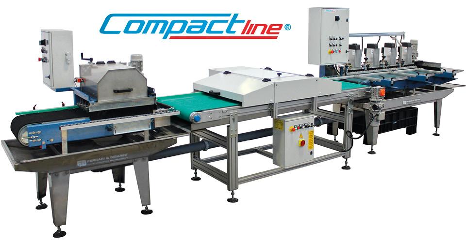
and building materials who, through the use of these machines, would be able to provide a further service to their customers, cutting the delivery times in half by being able to create directly slabs, mosaics, anti-slip grooves, pre-cuts, special pieces (triangle, rhombus), skirting, jolly, polished marble plinths in straight edge, half bullnose, bullnose in ceramic porcelain.
profilpas
When it comes to renovations, those on balconies and terraces are certainly among the most frequent interventions.
For this purpose, and obviously also for new constructions, Profilpas has designed CERFIX® PROTEC, a complete, functional and modern range for the protection and finishing of these outdoor spaces.
Among the many available models, there is Protec CPGV, a perimeter draining profile in colour-coated aluminium, composed of a visible vertical part which covers the tile border and allows the outflow of rainwater, and a protruding part with holes to guarantee the further drainage of the water seeped under the tiles. CPGV can be used with tile thicknesses up to 12,5 mm, is available in 5 modern finishes and is provided with special accessories for the creation of outside corners, inside corners and junctions.
For outdoor spaces such as balconies and terraces, Profilpas also proposes WPstop 3, a waterproofing, uncoupling and anti-fracture membrane, to be installed before the laying of the floor. The lattice of communicating channels allows the vent of vapor pressure, thus making the membrane suitable for the installation on moist screeds and accelerating construction time.
The integrated use of Protec CPGV and WPstop 3 ensures an optimal protection of balconies and terraces and, consequently, a longer duration over time. There is also the possibility to choose other models of profiles, different in shape, material and dimensions, and other kinds of membrane to satisfy the most varied customer needs.
Protec CPGV


Protec CPGV + WPstop 3 WPstop 3

NEW: Cerfix® Protec Flex, bending profiles for balconies and terraces




CONTENTS
3 6 12 14 20 24
26 30 36 38

EDITORIAL - Yet another magazine? INTERVIEW - A winning interior design “SKEMA” PHOTONEWS - Pietre d’Arredo for “Borgo dei Castelli Romani” TRENDS - Colors & Surfaces: waiting for the future FRESH TALKS - OR.NAMI: eclecticism on wallpaper PHOTONEWS - The Founder’s Office, Abu Dhabi PROJECTS: Casa Bures, Barcelona: transformation and conservation Cosentino surfaces at The Leonardo, South Africa A historic residence in Montreal MATERIAL MIX - Products gallery
COVER PICTURE: Shou County Culture and Art Center by Studio Zhu-Pei
Photography:Schran Images • Full article on: https://www.materialicasa.com/mc-en/ projects/shou-county-culture-and-art-center-by-studio-zhu-pei/
Gian Paolo Crasta
Sabrina Tassini
Sabrina Tassini

SURFACES INTL ADV LIST:
Dural........................................................11 Eco Design ......................................... 19 Original Parquet............................4/5 Pietre D'Arredo..................................... 1 TILE INTERNATIONAL'S ADV LIST (Upsidedown!).............................22
6A winning interior design “SKEMA”
20 OR.NAMI: eclecticism on wallpaper


26 Project: Casa Bures, Barcelona
• YET ANOTHER MAGAZINE? •
Gian Paolo Crasta - g.crasta@tiledizioni.it
THE ANSWER IS YES.

AS ALREADY MENTIONED IN OUR EDITORIAL IN TILE INTERNATIONAL, In these unprecedented times, THE PAGES THAT FOLLOW product launches, and will also be a we’ve specifically chosen to make REPRESENT useful tool in the hands of designers further investments, so as to provide all stakeholders in the coverinA NEW CROSS-MEDIA looking to create effective, eclectic moodboards. gs industry - especially internatio- PRODUCT TO ADD TO As we travel from Abu Dhabi to Montrenal buyers, importers and distribu- OUR STABLE OF al via Johannesburg and Barcelona – in tors - with a fresh viewpoint and a showcase of the new coverinLONG-STANDING TITLES keeping with the true spirit of this allnew publishing venture – we take regs that are increasingly emerging aders on a voyage of discovery of the alongside more traditional ones. “international surfaces” used in some of
We’re aiming to provide a platform for the latest trends, innovative projects and the industry’s movers and shakers, with a fresh, dynamic angle, in line with current technical and
being developed at the moment, we met one of the leading international manufacturers of laminate coverings and explored the multi-faceted world of designer wallpaper, through the vision of a promising Italian creator and producer. We also take a look at a selection of increasingly advanced, high-performance materials that are venturing into the design arena with a variety of stand-out features for next-generation residential and contract environments. Our coverage will help keep dealers up to date on the latest the latest and most interesting architecture and interior desiWe’ll be doing so by means of this printed magazine, com- gn projects. Lastly, we share a study of colour trends carried bined with Tile International, and – as from 2021 – an Engli- out by Azzolini Tinuper, a Milan-based practice specialising in sh-language web portal, dedicated newsletters and social me- colour design: it’s an exclusive project aimed at capturing the dia channels. stylistic inputs poised to make waves in the architectural mate-
aesthetic standards. By way of an initial insight into the vibrant array of materials UPSIDEDOWN ! rials world in the near future. ✕
Sabrina Tassini


PRODUCTS
SURFACES INTL: You have a wide product range: what particular strengths does it have and why can it be seen as innovative? RAFFAELE FERRARA: Skema covering systems range from high-quality laminates to premium wood species, via acoustic control systems for walls and ceilings, raised technical flooring, outdoor WPC decking, resilient SPC flooring and wood composite coverings such as Lumbertech
and Evertech: all these solutions are the result of constant research and are tangible expressions of the Innovation and Evolution that underpin our company philosophy. Driven by an evolutionary force that makes them highly expressive, the materials we produce are designed to go beyond the confines of standard floor, wall and ceiling coverings, to become full-blown interior architectural features. One of the aspects that make our products so innovative is their engineering, which is done using patented, high-te-
A WINNING INTERIOR DESIGN “SKEMA”
Established in 1992 in Ponte di Piave, in the Italian province of Treviso, Skema stood out for its new approach to materials right from the start, specializing in the production of pre-finished floating laminate flooring with an HDF base. From that day to this, the company has never stopped evolving, and over the years has become a focal point for people looking for all-round solutions. Its mission revolves around enhancing the sense of well-being generated by human living spaces, by introducing new covering systems that offer practical solutions to everyday needs. The company’s established leadership is also widely recognized by its professional target market of dealers and architects, with whom it keeps in close touch at all times. This even carried on during lockdown, in the form of online initiatives, such as training courses and virtual events, designed to boost relations with customers and prospects.
We discussed Skema’s vision in particular and current trends in this market segment i n general, with Raffaele Ferrara, the Group’s Marketing & Project Manager.
We’ll be launching a materials-driven programme designed to enable users to compose their own coverings however they want them, so that they can use them for partition walls, wood panelling and small coordinated interior design items.

Raffaele Ferrara
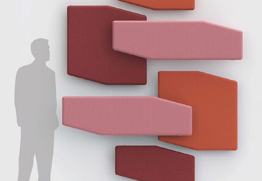
ch processes that keep raising product performance to ever higher levels. And what’s more, these products are all designed for adhesive-free installation. SURFACES INTL: What new products and projects are you focusing on at the moment? R. FERRARA: We’re focusing on new concepts, in the form of high-tech, high-performance, aesthetically advanced finishing solutions for the professional market, under the aegis of SKEMAidea, a Group division geared towards design, innovation and environmental welfare, which was set up about two years ago under the creative direction of the architect Franco Driusso. We’re focusing on patented coverings for acoustic control, both rigid and textile, and new releases such as Trametes, which give us a route into the world of architecture and acoustic upgrade projects. But we’re also channelling a lot of effort into Vero Legno, a parquet project that puts a fresh slant on traditional designs under the Linea YLES brand, while also continuing to develop wood and non-wood products for raised covering systems, to make it easier to install technical equipment underneath them. We also intend to set coverings free from the static, two-dimensional model to which they are traditionally confined. In
fact, we’ll be launching a materials-driven programme desi- In terms of application, however, our materials cut across mulgned to enable users to compose their own coverings howe- tiple segments with ease, although our main avenue of busiver they want them, so that they can use them for partition wal- ness lies in the residential and functional renovation sector. ls, wood panelling and small coordinated interior design items. We also take care of shop-fitting projects, for which we harness the power of materials to create brand-specific designs
MARKETS, APPLICATIONS AND SALES CHANNELS when required; and we handle complete finishing or renovation projects for workspaces. Lastly, we work with the furnituSURFACES INTL: Which areas and markets are you most acti- re industry, as suppliers of floor and wall coverings for design ve in? Would it be fair to say that your collections are partly in- concepts for well-known Italian furnishing brands. This gives fluenced by these? us the opportunity to look behind the scenes at products beR. FERRARA: The main sources of inspiration for our approa- fore they are launched, which also provides a rich seam of crech are the German-speaking and Scandinavian markets, whe- ative stimuli. re the culture of adhesive-free, wood-derived products ori- SURFACES INTL: What are your main physical and virtual saginates: the Skema range is actually more closely attuned to les channels? the North European than the Mediterranean tradition of bu- R. FERRARA: Skema products are currently sold exclusively ilding, which still tends to favour coverings of mineral origin, through physical showrooms, all of which are carefully sesuch as ceramic. And the stylistic approach lected and approved. Some of these are speof the Nordic countries, which are famed for We follow the stylistic apcialist flooring dealers, whereas others are turtheir preference for pale, soft colour palettes proach of the Nordic counnkey furnishing suppliers, such as contractors, and strongly nature-inspired material effects, is the main source of inspiration for the creation of our collections of floor and wall coverings. So our inspiration is a willingly chosen constraint for us, but it’s also a way of matries, which are famed for their preference for pale, soft colour palettes and strongly nature-inspired materather than specialist furniture shops. Their geographical coverage spans Italy, Europe and, for some years, also Asia, the Middle East and America. The reason we still prefer traditional distribution channels to e-commerce – despiking ourselves stand out in Italy and abroad as rial effects, is the main sourte the fact that we realize it is vital to take care the leading Italian company specializing in this ce of inspiration for the crea- of our digital activity in order to foster our user specific segment. tion of our collections of flo- base and keep in direct touch with market ta-
or and wall coverings.
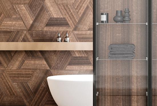
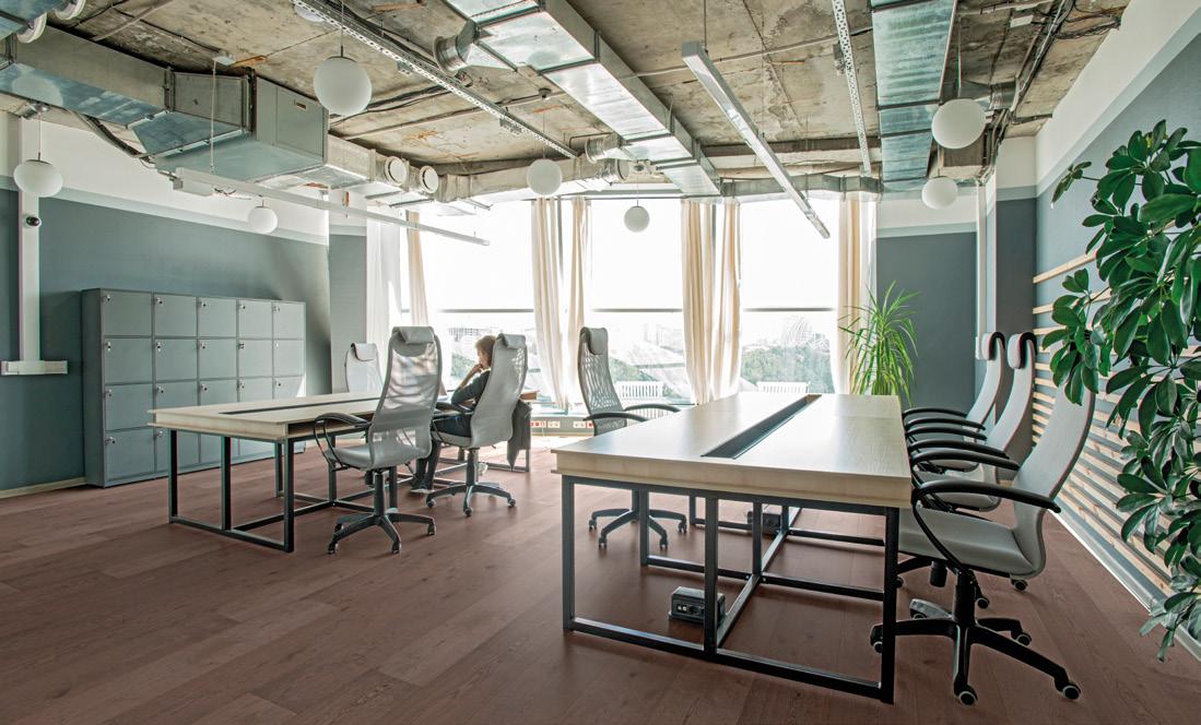
Realizzazione showroom Who’s Perfect (Monaco di Baviera) by Arch. Franco Driusso. Collezioni: EVERTECH, AKUSTIKA, TEKNA

Lumbertech
Trametes
Yles
stes – is that we are firm believers in the importance of providing support through expert intermediaries between the company and the final customer, all the way through the process of transformation and installation.
TRENDS
SURFACES INTL: Which materials are most in demand on today’s market and which do you think are most likely to gain ground in the future? R. FERRARA: The type of floor covering that is
The type of floor covering that is most in demand at the moment is wood, but not strictly in terms of the material itself, more in terms of its appearance. We have seen demand shift away from traditional organic materials towards synthetic materials that combine an organic appearance with high functional performance.
most in demand at the moment is wood, but not strictly in terms of the material itself, more in terms of its appearance. Parquet, for example, now accounts for the least substantial share of Skema’s sales, because it has been overtaken by laminates and synthetic or engineered floor coverings, which have seen considerable growth, on the back of increasing interest from the market. Over the past two years, we have seen demand shift away from traditional organic materials towards synthetic materials that combine an organic appearance with high functional performance. This is partly due to the ceramic in-
dustry, which has helped raise the status of imitation wood and made professionals and users more willing to reconsider their feelings about technological materials, such as laminate, which were seen as little more than stopgap solutions until 10 years ago. SURFACES INTL: Which key features do you think finishing materials need to have in order to meet the requirements of the residential sector effectively? And which are the key features for the contract sector, HoReCa, etc.? R. FERRARA: The message from the residential market is loud and clear: the most important features that finishing materials for residential applications need to have are life-like aesthetic effects – especially when it comes to imitation wood – practical performance in terms of everyday care, and impeccable environmental credentials in terms of the supply chain. In fact, we’re seeing that even end-users care more and more about sustainability and health nowadays. On top of these features, safety is a priority for the HoReCa sector, for operators and customers alike, so there’s a preference for strong, fire-resistant and non-slip materials. This sector also gives high priority to materials that are easy to turn into customized, coordinated finishing systems. Our flooring lines, for example, are fully harmonized according to seven unique colour codes to enable professionals to develop totally customized moodboards. SURFACES INTL: What trends can we expect to see in the coverings industry in the near future and what direction do you plan to move in? R. FERRARA: For the next few years, we think that trends in covering materials will still be linked to everything that derives from the natural world and to the sensory properties of the source materials, with a clear preference for matt and tactile surfaces. Pending the consolidation of this trend, we’re focusing our efforts on our ability to be “futur-rustic”, in other words to imbue new finishing projects with ever more creative and technological content that caters for future contingents, while remaining rooted in organic matter.
SUSTAINABILITY
SURFACES INTL: More and more consideration is being given to environmental sustainability in interior design: how does the concept of eco-compatibility translate into Skema’s everyday activities? R. FERRARA: The environment is a key concern for Skema. The company takes green issues very seriously, and this has prompted us to adopt an evolutionary process that involves our products, workplaces, materials and the energy we use. UNI EN ISO 14001 certification testifies to the sustainability of our processes, products and infrastructure; FSC and PEFC certification shows that we only use wood from sustainably managed forests; and GREENER certification demonstrates our commitment to clean energy. We also have A+ and CAM certification for use in projects where traceability is a requirement. Furthermore, contrary to what you might expect, modern vinyl flooring can be highly eco-sustainable thanks to the use of new technologies combined with inert materials and polymers certified both at source (on emissions) and in residential use. ✕
BEST IN INTERIOR DESIGN
TILE INTERNATIONAL, SURFACES INTL & MATERIALICASA MAGAZINE



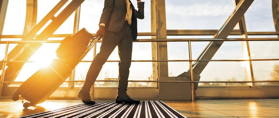
Duraway individual entry mat systems custom-made to order
DURAL EXPANDS THE DURAWAY PRODUCT RANGE WITH HEAVY-DUTY VERSIONS
The proven product range is now being expanded with an
exceptionally robust prod-
uct: Duraway XTRA is especially wide, flat and heavy-duty in addition. Therefore, the new floor mat is
They prevent dirt in indoor and outdoor areas, withhold moisture and provide a distinguished and representative look. Entry mats have a wide variety of functions. To make sure these functions are guaranteed for the long-term, responsible planners need to select the right products to match the place of use. With Duraway XTRA, Dural has developed a solution for highly burdened surfaces: the self-supporting mat for semi-public and public area withstanding up to 12.5 tons per 100 square metres.
Building the basis of the new entry mats are 60-millimetre wide grooved aluminium profiles which are anti-slip as a result. Depending on the need, the inserts consist of toothed PVC rubber strips to remove coarse dirt and drain moisture, and watertight polyamide fibre textile strips to remove finer dirt. Each individual aluminium profile is combined with an elastic profile, allowing customers to roll up the mat for easy transport or thorough cleaning.
In spite of its high load-bearing capacity, Duraway XTRA is very flat at only 14 millimetres and can therefore be un-

obtrusively integrated. The mat is installed either flush with ground level in prepared openings fitted with a 15 millimetre high aluminium installation frame or exposed onto the substrate. The entry mat system is custom-manufactured according to customer specifications.
With Duraway XTRA, Dural offers a heavy-duty yet visually appealing entry mat system for business facilities. It not only provides planners and architects with an easy choice of product for highly frequented and heavily burdened areas, but also offers easy handling after installation thanks to its intelligent design.
Extra flat, extra wide and extra robust: Duraway XTRA is suitable even for especially demanding and highly frequented areas of application, such as car showrooms or airport terminals.
DURAL GMBH Stefanie Görtz, Südring 11D-56412 RuppachGoldhausen T. +49 2602 9261-629, S.Goertz@dural.de www.dural.com
COSA INTERESSANTE 2 sulla quale fare il focus bla cla jbeqfewfkg w feGEEGASCfbfd -jfhdekwjfewjbfekjf ejfemfnfenbfewjbfefmdf. kjqerffhvfmhfejhfkhf,nfejnfen jfjkhefkje

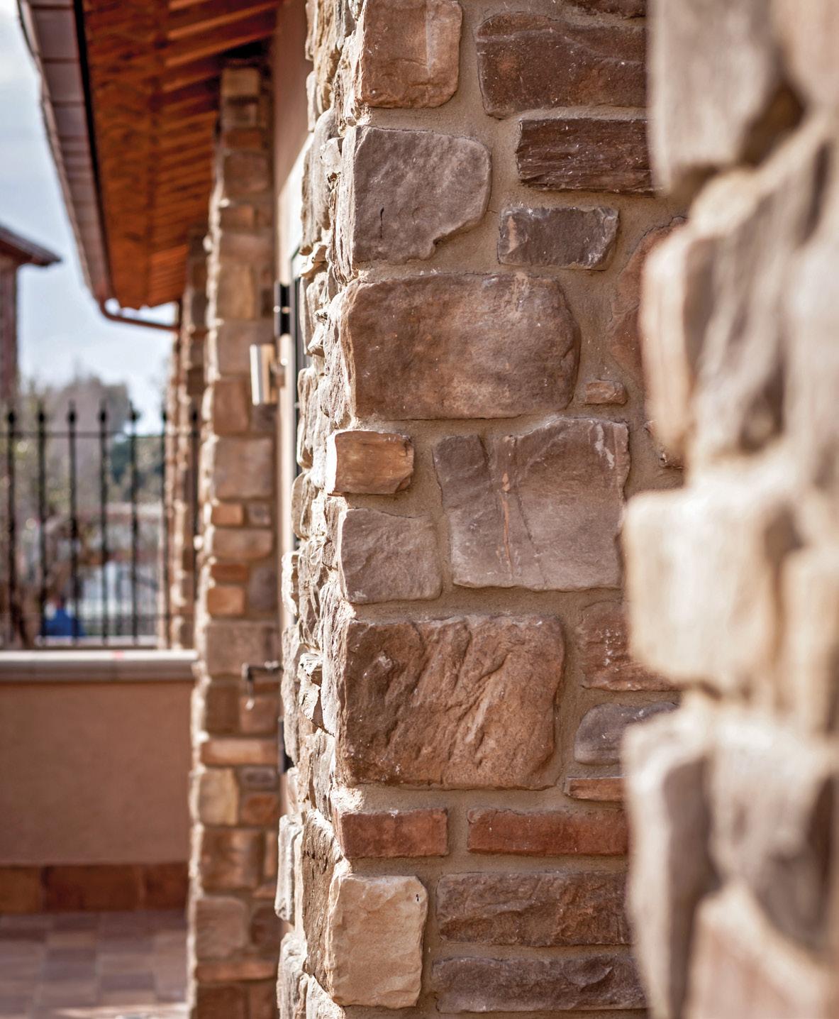
BORGONOVO, PIETRE D’ARREDO FOR “BORGO DEI CASTELLI ROMANI”
In the stunning historical setting of Frascati - Rome (Italy), a magnificent residential complex is born: the Borgo dei
Castelli Romani.
The 2G Costruzioni Company has chosen Pietre d’Arredo to embellish over 8000 square meters of walls. Borgonovo is the model selected to recreate the spectacular masonry surrounding the countryside of Rome. Pietre d’Arredo, with its several models and combinations, has brought into the present the culture of stone and with it the tradition of building as well as the extraordinary skillful of the artisans sculpting and moulding the stone. Pietre d’Arredo is one of the few companies worldwide that implements autonomously all stages of the production chain, from the selection of the stone for the realization of dies and moulds, up to the production of the stone itself, of the adhesives, of the grouts and of all the necessary complementary products. The innovative manufacturing technique allows for minimum waste and the accurate definition of surfaces makes it a perfect substitute for natural stone, limiting extraction from the quarry, thus respecting and protecting the environment. It protects the building enclosure from weather conditions and fortifies thermal insulation systems, thus improving living comfort. It also facilitates application because of its lightweight. The Pietre d’Arredo finishing elements accurately reproduce shapes and colours of natural materials, giving life to amazing and refined decorative opportunities and original architectural elements. Extremely versatile facings designed for indoor and outdoor use, creating a warm and cosy atmosphere that envelops and inspires you. Desires turn into matter, for lovers of all classical things and fans of the contemporary.

COSA INTERESSANTE 2 sulla quale fare il focus bla cla jbeqfewfkg w feGEEGASCfbfd -jfhdekwjfewjbfekjf ejfemfnfenbfewjbfefmdf. kjqerffhvfmhfejhfkhf,nfejnfen jfjkhefkje
- COLORS & SURFACES WAITING FOR THE FUTURE
Materials, colours and textures are the essential elements that set the style of surfaces. What mood can we expect for the near future? Materials are poised to catch the wave of trends to turn them into fresh, new inspirations.
The architects Paola Azzolini and Paola Tinuper, the owners of the firm of the same name, which specializes in colour design, have presented a series of colour trend studies based on NCS®© (Natural Colour System) codes.
RIFLING TIME

iconic purple
1

2
VEINING TIME

everlasting red
WEAVING TIME
endless orange
3

4
TEXTURING TIME
undated yellow
The top four colours - ama-
ranth wood, everlasting red, endless orange and updated
yellow - are warm, inspired by natural materials and cut timelessly across different interior design trends.
The project is based on a precise method for surveying colour trends across various sectors of industrial production.
The photographs and poetics of Matteo Cirenei inspire and guide the surface design of four timeless expressive worlds, each combined with a colour:
• Rifling (amaranth wood), a recurrent geometric pattern from classical architecture: • Veining (everlasting red), an eternal organic pattern, borrowed from nature; • Weaving (endless orange), a pattern linked to human craft, which creates structure; • Texturing (antique gold), a biological pattern, and the skin that covers all matter.
The result is Timeless Surfaces: trends for surfaces that reinvent themselves in step with the new possibilities opened up by technology and unexpected combinations with other surfaces.
Architecture thus guides this outline of trends, through an aesthetic project embracing timeless patterns, colours and materials. ✕
Chiara Bruzzichelli
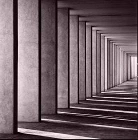
1. RIFLING TIME
“Light and matter. ‘Sundials’ is my longest, perhaps even an endless, project, because it represents a state of equilibrium in the form of an image, deliberately recreated even when it does not exist in reality. I use architecture because it enables me to step back from reality and recreate spatial figures that you can lose yourself in, as all meaning associated with place and environmental situation is erased. I let my emotions flow by channelling them into plays of light and form. It’s a very intimate task, which goes well beyond representing architectural details. I could do the same thing with rocks or other natural elements, but the world of design fascinates me, and it’s always challenge and a tribute at the same time, because I nearly always use buildings designed by masters of modern architecture or very well-known contemporary buildings.”
Matteo Cirenei, photographer
1
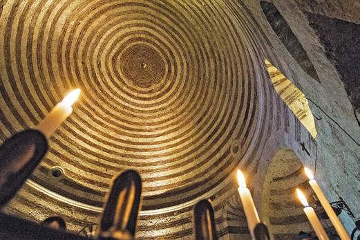
SAN GALGANO (SIENA) THE HERMITAGE OF MONTESIEPI - THE SWORD IN THE STONE
Microlinee concentriche
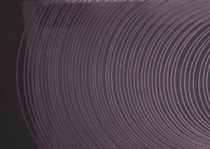
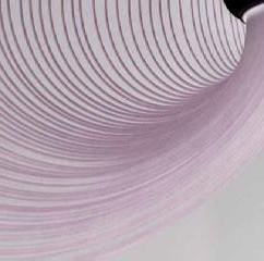
INSIGHT replica di righe differenziate con ritmi diversi fino a creare effetti uniti vibranti The Rotonda di Monte Siepi is a circular chapel that houses and safeguards the famous sword in the stone. It was built after the death of Galgano, who, being redeemed after a dissolute life, spent his final years here in prayer.
The dome is made up of concentric circles and alludes to pagan symbolism, because it has a circular footprint like the ancient temples. The building has always been strongly linked to the Knight Templars and this is why it is still thought, even today, to be one of the possible hiding places of the Holy Grail. The church is built on a hill and tests have shown that there is an empty chamber in the floor beneath it, but permission to excavate it has never been given. So what that chamber may contain remains a mystery to this day.
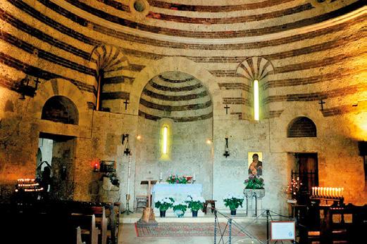
photo:: https://confraternita-sangalgano.it
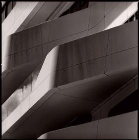
2. VENING TIME
“Sundials mark the passage of time with the shadow they cast on the surface of the substance they are set in. In the same way, architectural works leave their mark on the space we move around in: they are not only places to live in, they are aesthetic objects. This is what I have sought from architecture. The emotion that springs from the multiple plays of light that a solid form is capable of generating at any given moment in the day. It’s as if the world stopped for a moment, and in deepest silence, these buildings revealed something of themselves, something different each time, with an ephemeral aesthetic, that I have to find as I explore space and time. The light, which is sometimes blindingly bright, accentuates the details and the material, while shadows serve as a counterpoint, and sustain the new life that the photographic image manages to grasp from the physical reality of the building. Photography thus gives architecture the properties of a crystal, by recreating a balance of forms that can only be generated by interaction with light, and this momentary, purely aesthetic, ecstasy is, if you like, a snapshot.”
Matteo Cirenei, photographer
2

Macrovena liquida

SPERIMENTAZIONE deposizione di ossidi per creare effetti di profondità diversa
PALAZZO DELLA CIVILTÀ ITALIANA, ROME
The Palazzo della Civiltà Italiana, also known as the Palazzo della Civiltà del Lavoro or simply the Colosseo Quadrato (the Square Colosseum), is one of the emblems of the EUR district of Rome and one of the architectural icons of 20th century Rationalist Architecture. It was built as part of the Rome Universal Exhibition in 1942 (whose Italian initials – Esposizione Universale di Roma – gave the district its name). What strikes you as you move through the interior, are not only the passages through spaces that expand in width and height, but also the types of stone laid as floor coverings, especially the infinitely veined book-matched marble. This creates patterns and shapes that are reminiscent of Japanese art one moment and Cubist art the next. These priceless, irreplaceable designs that nature creates with the colours and vein patterns of marble are then crafted by human hands to generate feelings at every corner and on every surface of the interior.
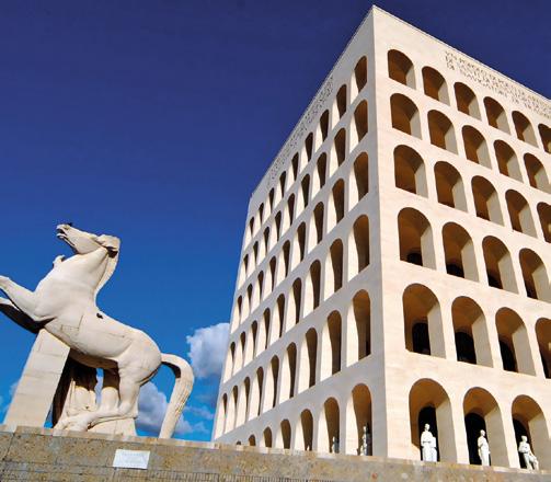
photo:: www.turismoroma.it
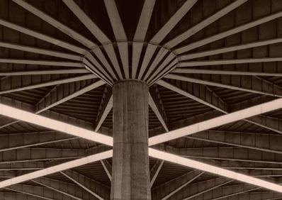
3. WEAVING TIME
“My research into the work of Pier Luigi Nervi was prompted by the sense of electric shock that ran through me as I looked at photographs of the time, showing the work of the great structural engineer, and by the realization that many of his most important works now lie semi-abandoned. The works he designed and built are a unique example of the technical solutions he conceived in the field of structural architecture as an expression of modernity – hence my idea of documenting them not only descriptively, but also by interpreting the special aesthetics spawned by his pioneering, through graphic images."
Matteo Cirenei, photographer
3
INSIGHT lavorazione della superficie per creare effetti simulati di fibre intrecciate di natura diversa

Intreccio trasparente
photo:: https://www.ecns.cn/
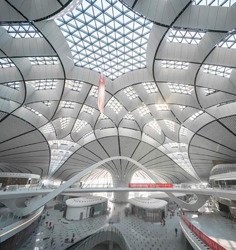
Operating since the end of September 2019, Beijing Daxing International Airport consists of a central body with six branches diverging from it: five of these accommodate the boarding areas, while the sixth connects the terminal to the outdoor area. It is a multi-storey building in which the colour white
and the natural light that comes in through the countless, immense glass panels are the real masters of this archi-
tectural work. Zaha Hadid’s unmistakable style is also plain to see in this design, with its abundance of smooth curves and interweaving elements. If you look hard at the structure, you get the impression that
the metal used to build its skeleton suddenly turns in-
to liquid and starts flowing from the central body towards the furthest parts of the periphery, in an endlessly elegant movement.

photo:: https://image.architonic.com/
4. TEXTURING TIME
“What you notice about the creation of my images is the slowness of the gaze. It’s an approach to photography in which the bulkiness of the equipment and the sequence of mechanical operations that are typical of large-format camera equipment has a major influence on the reading of space, which I internalize, as a photographer, before committing the image to film with the final shot. Using the tripod is a must, as are the long exposures due to the small iris aperture and the use of very low-sensitivity films to get really clear negatives, which can be enlarged a lot: the majesty of the photographed architectures is best expressed with extra large prints, where the details of the structural forms and the textures of the materials come out in all their beauty.”
Matteo Cirenei, photographer
4
Deep texture

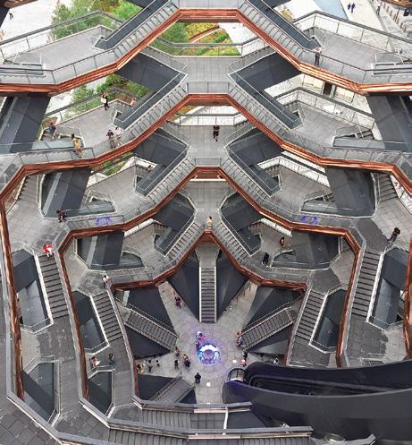
photo:: https://upload.wikimedia.org/
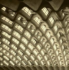
THE HONEYCOMB ARCHITECTURE OF THE VESSEL, NYC
In Hudson Yards, which runs from Chelsea to Hell’s Kitchen, in the west of Manhattan, The Vessel - a 46 metre honeycomb tower designed by London-based Heatherwick Studio - was officially inaugurated in March 2019. This gigantic “interactive” piece of architecture, designed to be climbed and explored, with its 154 fli-
ghts of connecting stairs and nearly 2,500 individual pas-
sageways on 80 levels, offers a whole kilometre of elevated walkways, overlooking the public garden. The result is a new way to experience New York City and admire its futuristic skyline. The architecture is composed entirely of stairs,
with a steel, bronze and concrete frame, coated with copper-coloured paint.

photo:: https://www.hudsonyardsnewyork.com/ INSIGHT sovrapposizione di texture in spessore a pattern stampato per creare effetti tridimensionali di diversa trasparenza
Sabrina Tassini OR.NAMI: ECLECTICISM ON WALLPAPER
Gabriella Fusillo

Based in Reggio Emilia (Italy), Or.nami is a specialist designer and manufacturer of contemporary wallpaper. Since making its official début at Paris Design Week in September 2018, the company has been using wallpaper as a medium for creating mural artworks that amount to infinitely more than just wallpaper. Passionately committed to enhancing residential and contract environments, it creates distinctive personalized patterns, imaginative colours and subtle lines to accommodate every need.
We met Gabriella Fusillo, the brand’s Creative Director, to delve deeper into the eclectic universe of Or.nami and explore it through the eyes of its founder.
SURFACES INTL: The name ‘Or.nami’ makes a statement that clearly describes the brand’s mission: could you tell us a bit more about the concept behind it? GABRIELLA FUSILLO: Or.nami is a project. It springs from passion and the desire to bring something beautiful and creative into the world. It springs from the experience we’ve built up over many years, from research and from the continuous study that lies at the root of every single graphic that we conceive, design and produce. The name ‘Or.nami’ derives from the now distant, constructed language known as Esperanto. The word means ‘to decorate’ and that is exactly what I try to do every day through my designs. SURFACES INTL: How do you intend to differentiate yourselves in the interior coverings market? G. FUSILLO: Every single graphic is the result of careful study, where colour is king. And while colour might be an adornment for many people, for me it’s the essence. It’s the vital element. It’s the judge that determines juxtapositions, perceptions, tints, gradations and contrasts. That’s why I decided to work with the NCS method right from the start. Every single colour is coded and the colour combinations are the result of a perfect blend of personal taste and objective system. Or.nami also stands out for the top-quality substrates, printing method and “raw materials” it uses, which are invariably of very high resolution so as to obtain an impeccably defined printed design. SURFACES INTL: From dreamlike scenes to geometric prints, via foliage motifs in multiple forms, Or.nami wallpapers seem to have no stylistic limits. What is your main source of inspiration? What is the starting point for the brand’s collections? G. FUSILLO: I see myself as a free person, I don’t always follow the trends and fashions of the moment. I try to transfer what you might call “the guidelines” into different contexts, which might be more classical or far-removed from the common vision of the present.
I don’t have any specific source of inspiration, but I’m extremely curious, I keep myself up to date by doing research, and I travel when I can. And I also love combining different trends: it’s an approach that always yields spectacular results with powerful graphic impact. SURFACES INTL: What is your primary target market and which sales channels do you focus on? G. FUSILLO: Or.nami creates graphic designs but it welcomes synergies with architecture firms and designers too. The creative group liaises a lot with professionals, who get in touch with us to create a mood and put together a “programme” that does not stop with the choice of graphics, but goes well beyond that. So it becomes a single team that deploys its skills for a single


purpose, namely to study ideas together and work on specific projects. Obviously Or.nami also has an extensive traditional sales network, both nationally and internationally, and our work can be seen in lots of stores, boutiques and showrooms. SURFACES INTL: What types of wallpaper are most in demand at the moment? And what differences are there between the residential and contract segments? G. FUSILLO: The residential segment comes to us for the unique care we provide. This is a very demanding clientele, who insist on quality and are receptive to proposals from us. They have a preference for custom projects, which start from a specially drawn sketch and go onto encompass a colour study. The contract segment is equally demanding but always works to a budget. So what we do for this segment is different. The graphics we work on can be customized but the design almost always involves repeatability of the subject. The two segments are very different, but both are very interesting and very rewarding on the creative front. SURFACES INTL: Wallpaper has seen a lot of ups and downs since the 1970s: it was once an essential feature of home interiors, before sinking into a long period of dormancy. What has caused this renewed interest in wallpaper and how do you think it might stay in vogue in the years to come? G. FUSILLO: After a period of total minimalism, when less is more was the order of the day, wallpaper is enjoying newfound popularity. This is because there’s a growing appetite for colour and because people want to start decorating their living space again and personalize it from every point of view. Wallpaper is going through one of its most beautiful and significant moments. It’s no longer just seen as a wall covering, it’s now nothing less than a design icon and all-round decorative medium. And like all interior finishings, its fundamental role is to interact with all the other design features. The way in which furniture and finishings interact speaks volumes about the people who choose them and the atmosphere they love most. And it’s because of this expressive power that I think wallpaper will remain a key interior design trend for a long time to come. URFACES INTL: Made-to-measure solutions and customization are becoming more and more dominant in the world of interior design and are taking market share away from mass production: how does this concept translate into your business? G. FUSILLO: Like in the fashion industry, there’s a growing need
The technological innovations that have affected the industry have also opened us up to many more fields of application. So wallpaper has been released from the traditional confines of living-room and bedroom walls and found its way into wet environments such as bathrooms too, thanks to fibreglass backings.
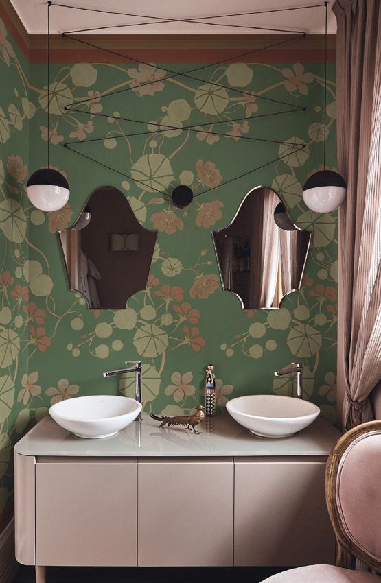
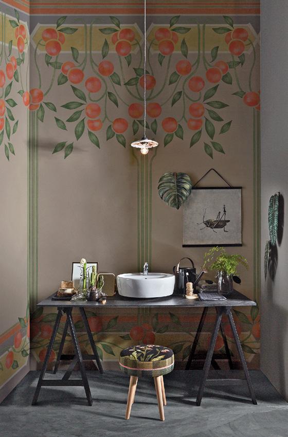
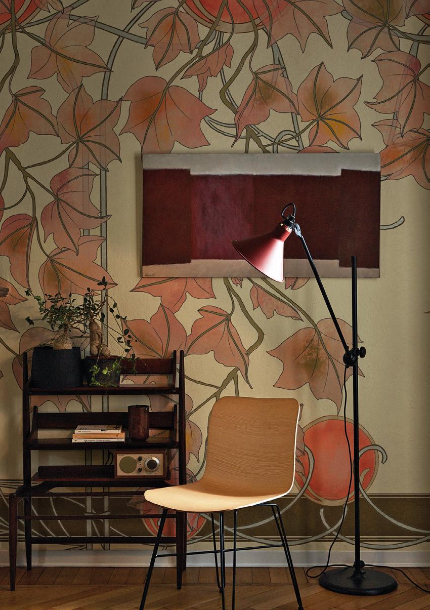

for personalization as a response to the massification of taste caused by globalization. People want things they feel are their own, not things they feel have been imposed on them from the outside, especially in their homes and in what they wear. Or.nami offers various technical substrates on which to print. This means that customers not only get designs tailored to their needs, but can also choose from a wide range of substrates for printing the finished product. Digital printing has obviously had a big effect on this process, and has opened the doors to increasingly made-to-measure wallpapers. Whereas printing used to be done by traditional series production, customization systems have made it easier than ever to produce tailor-made wallpaper that opens up unprecedented scope for creative design. The technological innovations that have affected the industry
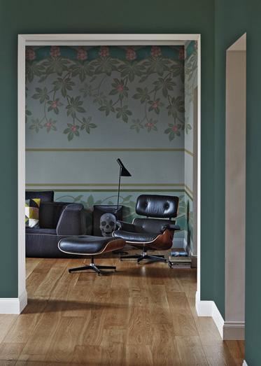
have also opened us up to many more fields of application. So wallpaper has been released from the traditional confines of living-room and bedroom walls and found its way into wet environments such as bathrooms too, thanks to fibreglass backings. In fact, it has spread into entire interior design schemes, resulting in a host of much more imaginative compositions. SURFACES INTL: What new developments do you have in store for autumn winter 20/21 and what are your goals for the near future? G. FUSILLO: We’ll be launching a new capsule collection in December, and soon after that, in April 2021, we’ll be one of the exhibitors taking part in a show-installation in Brera as part of the Fuorisalone. We’re actually working on a whole range of new creative projects at the moment, but that’s all I’m willing to say about them for now! ✕

COSA INTERESSANTE 2 sulla quale fare il focus bla cla jbeqfewfkg w feGEEGASCfbfd -jfhdekwjfewjbfekjf ejfemfnfenbfewjbfefmdf. kjqerffhvfmhfejhfkhf,nfejnfen jfjkhefkje
THE FOUNDER’S OFFICE, ABU DHABI
Abu Dhabi, a modern metropolis located on an island in the south-east of the Persian Gulf, just off the mainland of the Arabian Peninsula, is the capital of the United Arab Emirates and the country’s centre of government and administrative operations. The Founder’s Office takes its name from Sheikh Zayed bin Sultan Al Nahyan, the Founding Father of the United Arab Emirates, the driving force behind the country’s formation and its president until his death in 2004.
It was built to house the department tasked with organizing the celebrations to mark the 100th anniversary of the Sheikh’s birth.
The Sheikh was always known as an enlightened president, so the office, designed by the Bluehaus Group, was designed to uphold the values of wisdom, respect, determination, loyalty, sense of national belonging and self-sacrifice that Zayed bin Sultan Al Nahyan had shown during the years of his presidency.
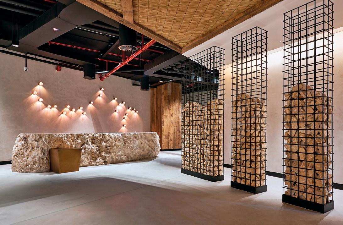
The interior is a large open space, whose sandy-coloured decor brings to mind the colours of the nearby desert.
Even the corridor wall features a long sand-filled glass panel, which evokes the appeal of the dunes that lead visitors to the main hall. The warm tones and natural materials alternate with grey, minimalist furniture, which brings a contemporary touch to the overall effect.
The ceilings were created using the ancient Bedouin “Al Sedu” hand-weaving technique, which is listed by UNESCO as an expression of Intangible Cultural Heritage.
The real stand-out feature of the office, however, is its reception area: behind the large countertop, made of a giant stone from the nearby Jabal Hafeet mountain, the spotlights that make up the wall lighting are arranged to represent the constellation that adorned the sky on the night of the Sheikh’s birth.
Material: To punctuate the extensive shelving, woven ceilings and other furnishing complements, the designers needed a neutral surface that would connect the spaces and maintain this warm, velvety effect: so they chose Microtopping®, a cement-based polymer coating by Ideal Work®, which creates a contemporary environment with high visual impact, in a thickness of just 3mm. Since the solution can also be used on vertical surfaces, the designers used Microtopping® as a wall covering in the corridor, to complement the warm colour of the sand. Deployed in a neutral tone, Microtopping® is the perfect match for natural materials, such as wood or rope, and elegantly enhances a limitless range of furnishing complements and accessories.

THE TRANSFORMATION OF A HISTORICAL AND LISTED 19TH CENTURY BUILDING OF BARCELONA INTO 26 EXCLUSIVE RESIDENCES OF THE 21ST CENTURY WITH HIGH-QUALITY COMMON AREAS, WHILE PRESERVING ITS ORIGINAL RICH HERITAGE. INTERIOR DESIGN PROJECT BY ESTUDIO VILABLANCH + TDB ARQUITECTURA.
THE BUILDING
Casa Burés was built between 1900 and 1905 by the Catalan architect Francesc Berenguer i Mestres, a close collaborator of Antoni Gaudí. The building was named after its first owner, Francesc Burés, a businessman with one of Spain's most successful textile companies. The building has 7.700 square meters distri-

Photo credit: Jordi Folch & Jose Hevia
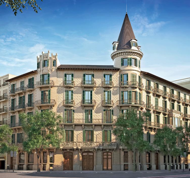

buted over six floors and is listed since 1979, enjoying the highest protection category as cultural heritage. The building was nearly abandoned for some years and some original elements were vandalized.
After three years of a careful restoration work by the best artisans, Casa Burés has emerged as one of the most represen-
tative Modernist-style buildings in Barcelona. The modernist architectural and interior original elements were respected and restored because of both regulatory requirements and a high sensibility of all the stakeholders: developer, city authorities, project team, and the artisans and restoration experts involved in the works.
INTERIOR DESIGN
The interior design project had two goals: to recover and highlight the building's original decorative elements, and to adapt the housing to contemporary regulatory and functional needs in terms of distribution, technology, safety, accessibility, comfort and community.
There was a key and strict strategy: all the original architectu-
ral and decorative existing elements were restored, while new materials were added when needed. The new materials should not compete nor imitate the original ones.
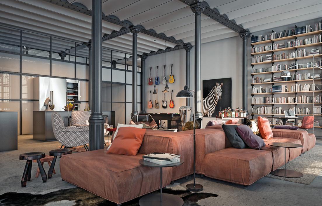
The team defined three interior design concepts for this residential building matching the intrinsic qualities of each existing space: three lofts and the basement common areas recovered their original industrial character; two palatial residences were carefully restored respecting the existing modernist elements, and 21 flats were conceived as contemporary residen-
ces with rich original elements. The conceptualization included design and definition of materials and finishes (pavements, coatings, colors, kitchens, bathrooms, doors, lighting project, furniture, etc).
LOFTS AND COMMON AREAS
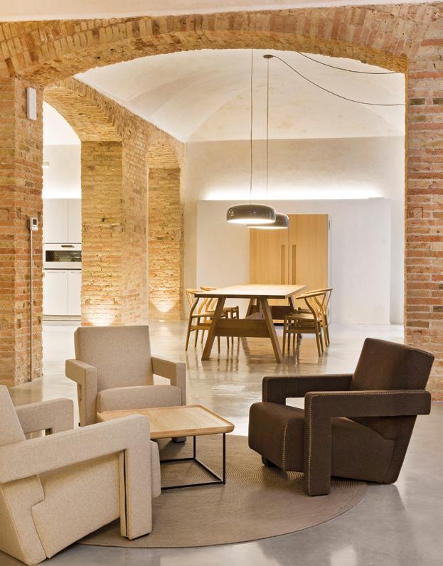
The ground floor and the basement were originally used for Burés textile industry. They did not have a modernist decoration, but a strong industrial personality. The new interior concept recovered this industrial character: big open spaces wi-
th high ceilings, concrete floors, iron columns and old brick walls were left uncovered, kitchens and furniture that stren-
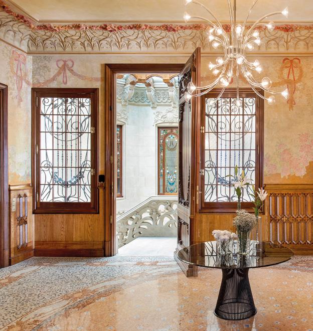
gthen the industrial character. The ground floor was transformed into three lofts and the basement into amenity areas for community use (a swimming pool, a spa, a gym, a cellar, an open kitchen, a terrace, spaces for social events), recovering their original industrial aesthetics. Palatial residences The original Burés palacelike residence, located on the main floor, was split into two 500 square meters magnificent flats. Being the richest floor in terms of decorative modernist ele-
ments, all of them were carefully restored into the noblest flats (mosaics and marquetry in pavements, stained-glass windows, frescoed walls and ceilings, wooden decorative
elements, ceilings with reliefs). The original elements were restored, while new materials were added when needed. The new materials and furniture pieces were equally refined but silent, not very ornate, light and with colors in harmony with the space, in order to highlight the valuable historic elemen-
ts and not compete neither imitate them, facilitating a silent integration in the space.
APARTMENTS & ATTICS
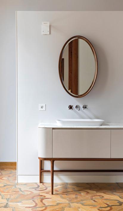
Flats located in the upper floors, originally conceived for rent, were transformed into 16 apartments and 5 attics. These 21 residences combine strong original modernist spaces with more contemporary ones. The old elements were found
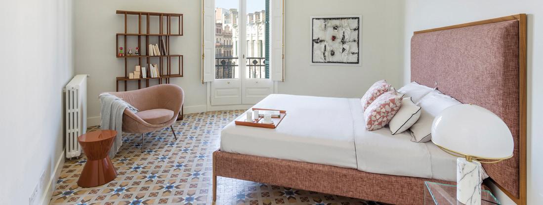
in the spaces located in the crown of the building that faces the façade; these original elements were restored. In the interior areas of the flats, where the original elements didn't exist or couldn’t be preserved, the decision was to incorporate new materials that would allow the contrast between old and new ones: white color and oak wood were added as main elements in order not to compete, but to highlight and contrast the original decorative elements. ✕
ESTUDIO VILABLANCH & TDB ARQUITECTURA
Estudio Vilablanch
• Vilablanch is an interior design studio founded by architect Elina Vilá and interior designer Agnès Blanch in 1999 in Barcelona.
Since then, the studio has carried out a broad range of interior architecture projects for residential, commercial and offices, for both spaces of great heritage value and spaces of new construction. Over 20 years, Vilablanch has been consolidating its reputation as a reference interior design studio, featured in the media on numerous occasions and participating in competitions, conferences and a variety of other events. Leading companies have placed their trust in the vilablanch team, such as Sony, Grupo Puig, Gallina Blanca,
Mediapro, Álvaro Palacios, Solvia or Bonavista Development, just to name a few. One of its most prestigious residential projects is Casa
Burés in Barcelona, which has received numerous national and international awards and recognitions.
TDB Arquitectura
• The architect Juan Trias de Bes opened the professional studio
TDB Arquitectura in Barcelona in 1992. He is the architect of such institutional works as the University Hall of Residence in Sarriá (Barcelona), the headquarters of the Academy of Medical Science of Catalonia and the Balearic Islands, the central office of Grífols
Laboratories, the Mandarin Oriental Hotel in conjunction with Carlos
Ferrater in the Paseo de Gracia (Barcelona), the Sant Cugat campus of ESADE University and the new Translational Surgery Research
Center, among others.
SOUTH AFRICA: COSENTINO SURFACES AT THE LEONARDO
THE LEONARDO IS A FUTURISTIC SKYSCRAPER LOCATED IN THE RICH SUBURB OF SANDTON, THE NEW BUSINESS CENTER OF JOHANNESBURG THAT ALSO HOUSES THE LARGEST EXHANGE ON THE AFRICAN CONTINENT. WITH ITS 55 FLOORS, 234 METERS HIGH, IT IS CURRENTLY THE TALLEST BUILDING IN SOUTH AFRICA, EXCEEDING THE PREVIOUS RECORD HOLDER (THE CARLTON CENTRE) BY ELEVEN METERS.

The construction started on November 17, 2015 and, according to the original design, the tower was intended to reach a total height of 150 meters. Currently the building is for mixed use: 232
apartments and 8 luxury penthouses occupy the first 41 floors, while on the following 11 there are commercial offices. The last three levels of the building host a 2,100 square meter penthouse with a to-
tal view of the city, marketed for 180 million Rand (about $ 9.6 million), a figure that ma-

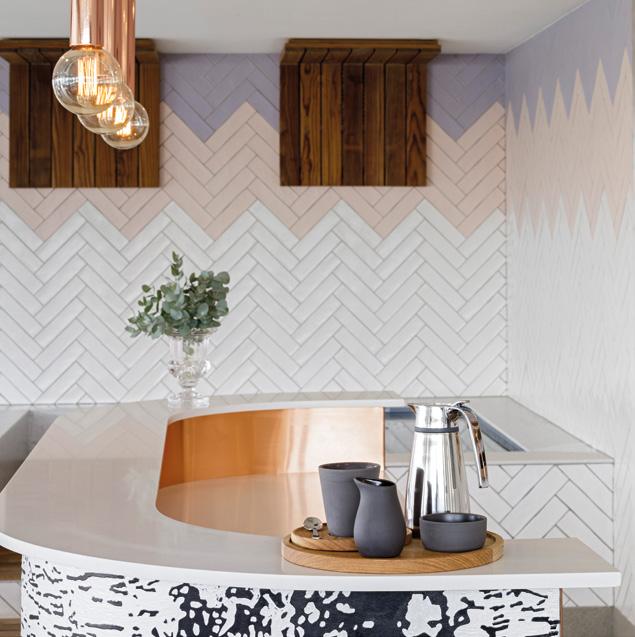

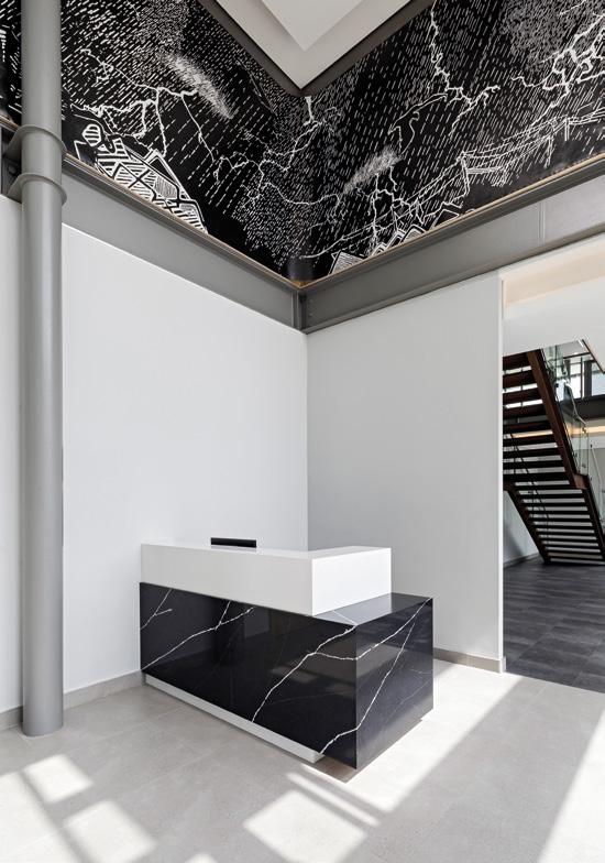
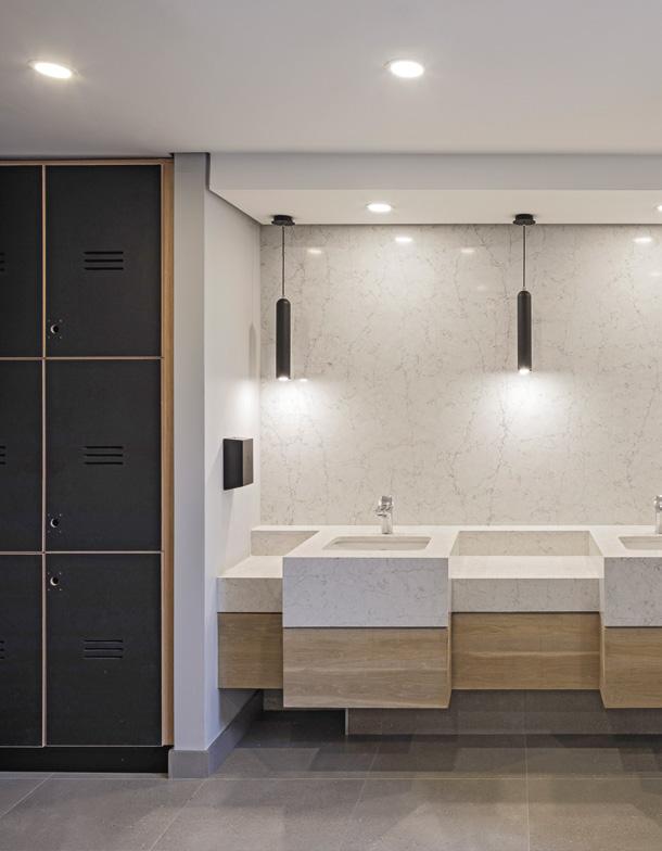
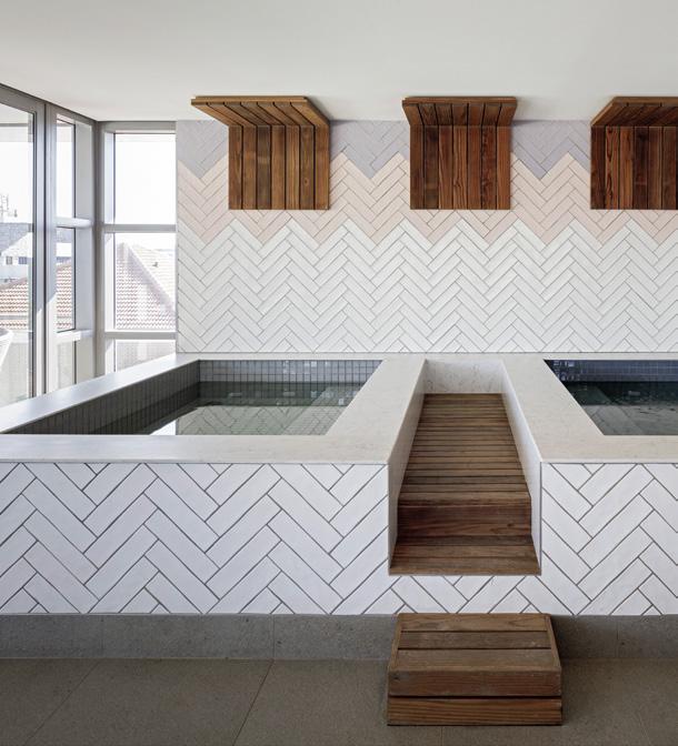
kes it the most expensive property on the real estate market in South Africa. With a total investment of 2 billion rand (about $ 107 million), the building includes also four levels of underground parking, a large conference center with 9 meeting rooms, a spa with pool, several food services and shops at street level. As part of the prestigious architectural project, Gruppo Cosentino has provided its innovative materials Dekton® and Silestone® for the different internal and external environments of the tower. In particular, 30.000sqm of the ultra-compact Dekton® surface were used to cover the large ventilated facade, chosen in the 8mm thickness and in the light and elegant Gada
shades, part of the Natural Collection that evokes the typical quartzite combination, with its satin and limestone finishes. The high resistance to UV rays, thermal shocks, scratches and stains, as well as the excellent low porosity, dimensional and chromatic stability, make Dekton® the perfect solution for complex architectural contexts such as the Leonardo, which required the material fixing on a Curtain Wall. A skilful mix of Silestone® quartz, in different colors and thicknesses, was used for the coating of the lobby on the ground floor and of various elements of the skyscraper’s internal areas such as columns, kitchen tops, bathroom tops and bar counters, giving it a high stain resistance and a final aesthetic result of great impact. ✕
THE LEONARDO:

Construction period: 2015 - 2019 Customer: Legacy Group Location: 75 Maude Street, Sandton - Johannesburg (South Africa) Architecture & Interior Design: Co-Arc International Architects Structural Design: Arup Cosentino materials used: Dekton® Gada (on the facade), Silestone® Blanco Orion, Silestone® Cemento Spa, Silestone® White Storm, Silestone® Eternal Emperador, Silestone® Eternal Statuario, Silestone® Eternal Pearl Jasmin Thickness: 8, 12, 20 and 30 mm
A HISTORIC RESIDENCE IN MONTREAL
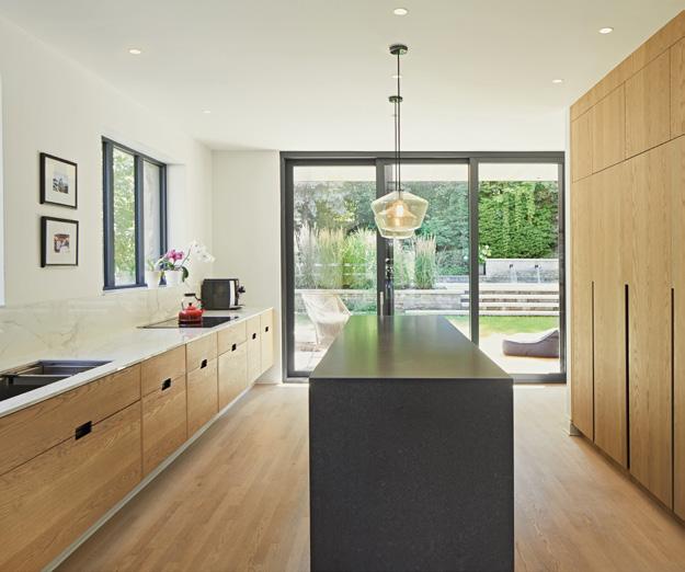
THE MAIN INTENTION OF THE MAISON AVE COURCELETTE PROJECT, LOCATED IN THE OUTREMONT BOROUGH IN THE HEART OF MONTREAL AND CURATED BY THE YOUNG FIRM SALEM ARCHITECTURE, WAS TO IMPROVE THE RELATIONSHIP OF THE INTERIOR SPACES WITH THE LARGE EXTERIOR COURTYARD WHILE HIGHLIGHTING ELEMENTS DATING FROM THE ORIGINAL CONSTRUCTION.
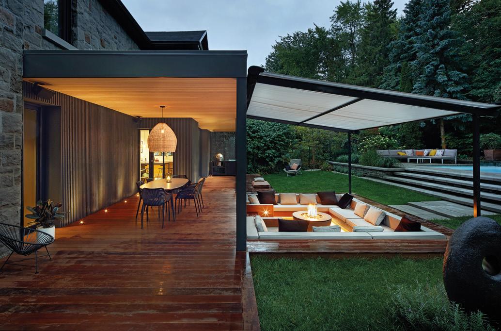
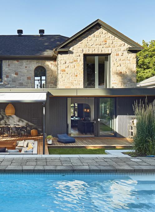
The living space has been generously opened to the outside so that the kitchen can be extended under a new canopy on the rear facade facing south. This canopy has a dual function as it redu-
ces solar gain in summer while allowing occupants to enjoy a covered space.
The new openings in the existing walls allow natural light to also diffuse into the central space of the house. The fluidity of the ground floor plan is enhan-


Photo credit: Phil Bernard
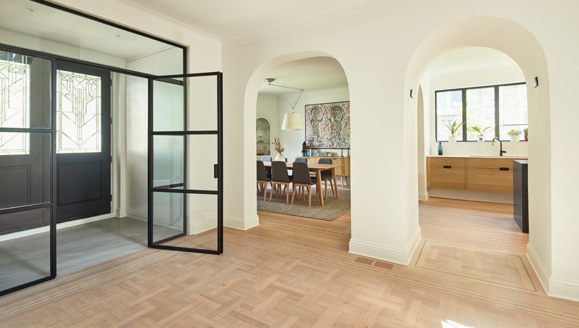

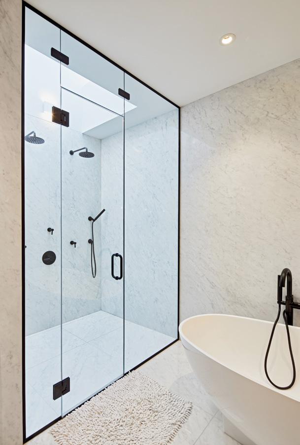
ced by this light as well as by the sculptural articulation of the staircase in the center of the residence. The landscaping, in separate areas, offers owners the opportunity to enjoy the backyard while having a variety of experiences and atmospheres. An exterior sunken living room, covered with a retractable awning, allows the family to enjoy a warm space and offers a different perspective on the courtyard and on the many mature trees around the perimeter of the site.
ENHANCEMENT OF ORIGINAL ELEMENTS AND MATERIALS
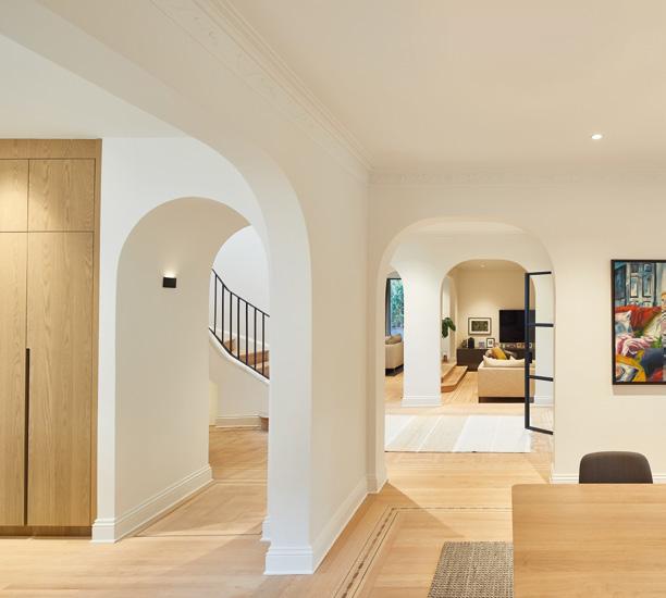
The architect, Jad Salem, along with the owner, paid particular attention to ensuring that the transformation of the resi-
dence was respectful of its original character. Thus, each intervention has been done in such a way as to highlight certain details dating from the initial construction of the house, in 1947. The new arched openings follow the same configurations as the existing ones. The railing of the central staircase has been treated in a minimalist way in order to direct attention to the curves around the staircase as well as the rounded openings in the ceiling. The original wood floor, which incorporated careful details, has been maintained in some rooms and a precise arrangement of the colors of the new floor ensures a harmonization between the new and the existing finish. The new cladding, on a portion of the rear facade, is soberly juxtaposed to the original stone of the house, using fine wooden elements laid vertically. These same elements are used to serve as an openwork sidewall to offer privacy from neighbors while allowing light and vegetation to filter through. The stones of the facade, which were replaced by the new sliding glass doors, were also kept so that they could be installed in a possible extension of the house. ✕
-NEW MATERIC SOLUTIONSFOR INTERIORS & ARCHITECTURE
New floor and wall covering solutions make up the current design panorama with their unconventional and highly creative character, ready to define all different atmospheres and meet the project requirements of today and the future. From vinyl to resin, from parquet to carpet through mosaics, metals, wallpaper and cork: here is a rich variety of surfaces to compose and complete domestic, commercial and HoReCa interiors.

SpazioMetallo
SpazioResina
XXX

xxxx

SpazioCemento
SPAZIOCONTINUO BY LITOKOL
SPAZIOCONTINUO: excellent wear resistance, low maintenance and minimal thickness, so that you can renovate interiors without costly, radical building works. The thickness is just 2mm for overlaid application, and the resin-coated surface is uniform and homogeneous. The resin is water-repellent, suitable for use with underfloor heating and offers endless scope for customization thanks to a range of over 2000 NCS and RAL colours. Applicators benefit too, from the product’s ease of use and short cycle times. Spaziocontinuo comprises two flooring lines, SpazioCemento and SpazioResina, which can also be used on walls, and two specific wall covering lines: SpazioChiaroscuro and SpazioMetallo, which offer infinite freedom for imagination and creativity.

KREOO MARBLE
FOLIUM is the first decoration of the SIGNUM collection designed by SebastianoZilio, which reinterprets the use of travertine in the interior design world in a graphic key, in all its different shades. A new dimension of use for this natural stone, used since the time of the ancient Romans, played on the elegance and sobriety of the material, expressing a balanced concept of ancient and natural luxury at both sight and touch. In Folium, the organic detail of the plant’s world shapes the stone and becomes a decorative element. Through the engraving, the architectural elements that make up the structure and the rib of the leaves are enhanced and imprinted: pure, stylized, non-invasive signs that dialogue with the texture and natural colors of travertine. The textures STONE CITY and ZEN designed by MarcoPiva for Kreoo are born from the incessant search for new possible interpretations of marble. Stone City is a texture evoking the skyline of a metropolis, represented with spatial simplicity and volumetric rigor, in a figurative urban grid of stone, with a playful contrast between different depths and heights. Zen's lines are a celebration of the sinuosity of nature, the softness of the sea waves or the dunes of a desert of sand, an asymmetrical fluidity that instills a feeling of calm tranquility and connection to the earth. A refined modulation enhanced by the processing of the material at different depths, with a play of reliefs that interacts with the veined textures of natural marble.

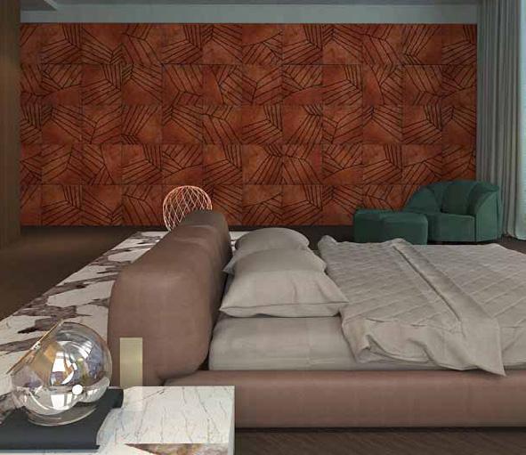

BESANA CARPET LAB PRESENTS "BLEND"
Besana Carpet Lab, Italian leader in textile flooring, presents the new BLEND collection. Blend represents functionality, design and uniqueness. Traditional in manufacturing, and contemporary in design, Blend, abstract yet narrative, seduces and captures as if it were painted. The products are made with quality yarns and capable of creating unique shades and hues with multiple colors, making each piece unique. The rugs are made exclusively to measure, according to the dimensions requested by the customer. All items guarantee fireproof and the absence of harmful emissions because of the organic components of the materials used. The Blend collection is designed for both the residential environment and the contract sector, in fact responding to the different needs of each customer: strong resistance, high quality, large quantities and customization possibilities.
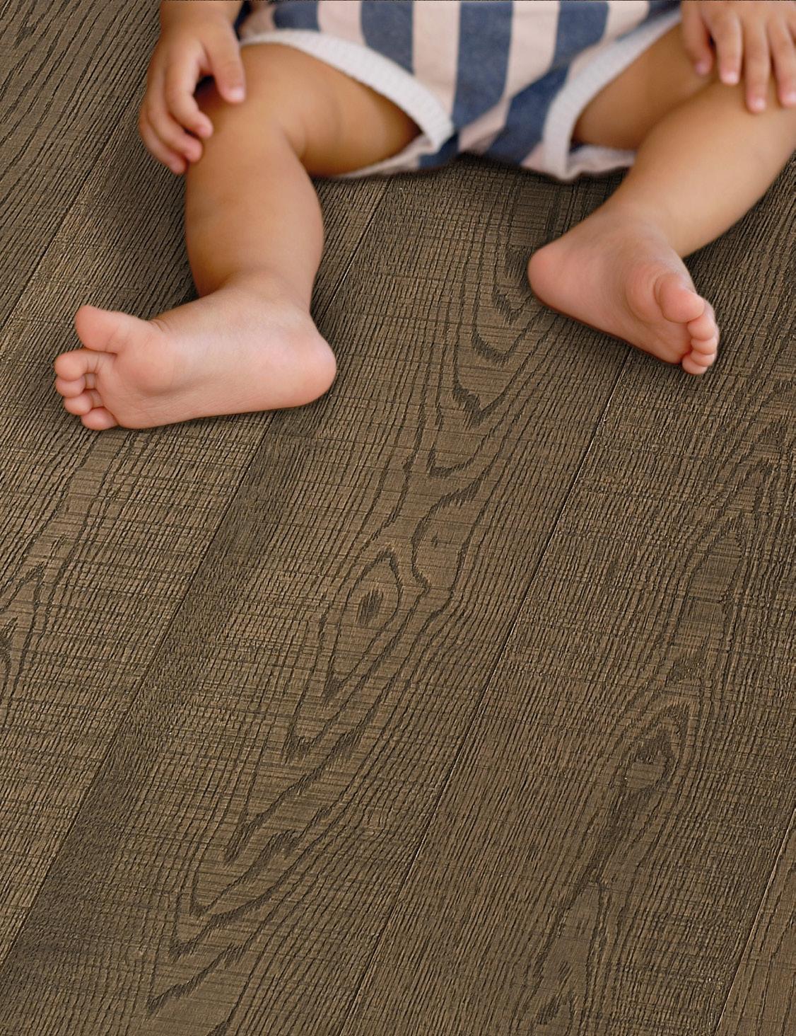
ORIGINAL PARQUET ASEPTICA®
ASEPTICA® is a revolutionary product specially designed to take care of people’s health with its effective, long-lasting coating, which reduces bacterial load by up to 99.9% on the surface of the brand’s wood flooring, made exclusively in Italy. The ASEPTICA® coating is suitable for use in small, medium and large private houses, as well as in public buildings and hotels. It protects the flooring without changing the latter’s appearance or the characteristics of its finishes in any way, including its colour stability and resistance to the action of chemical and mechanical agents. Original Parquet has chosen to use this new, certified, anti-bacterial finish on all variants of its CORPORATE line at no additional cost, so as to ensure safety and hygiene, while remaining in line with customers’ needs at this difficult time.
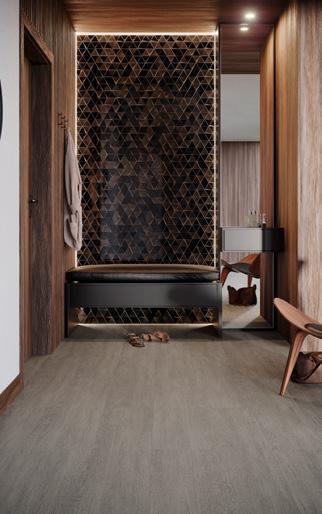
LINKFLOOR: THE NEW VINYL FLOORING BY PORCELANOSA
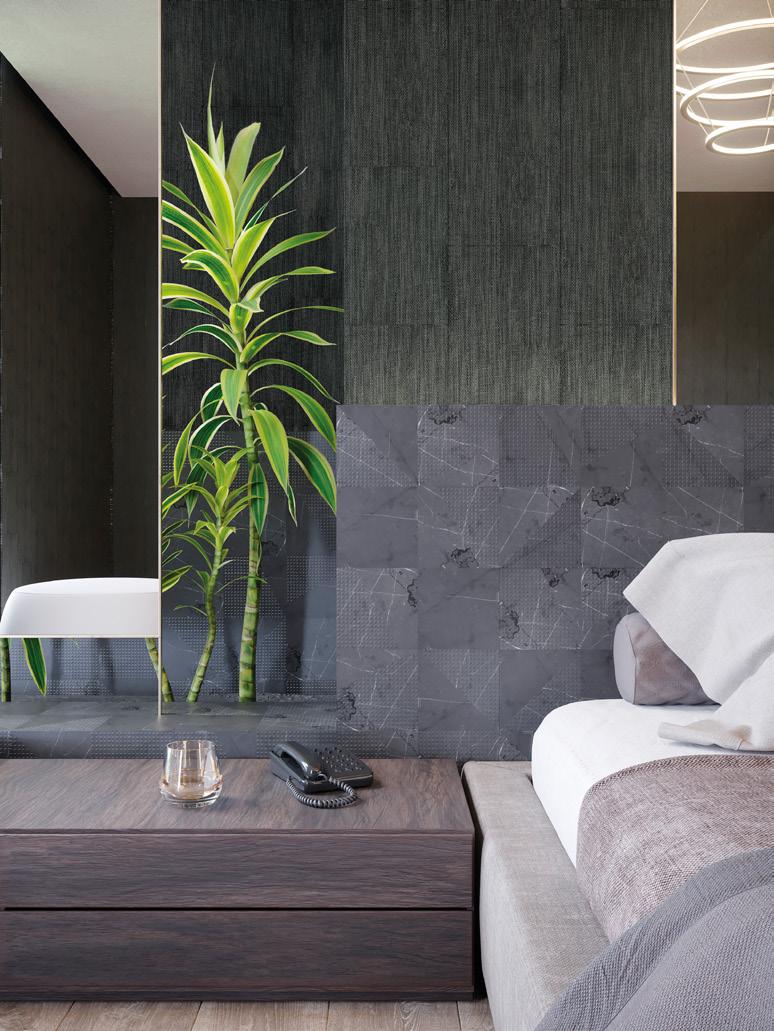
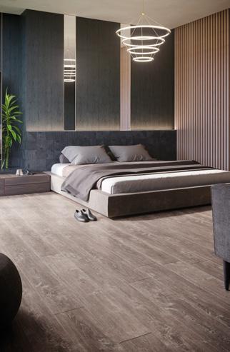
PORCELANOSA Group launches an advanced vinyl flooring on the market, which is highly abrasion and shock resistant, unalterable to the effects of water, chemicals and stains. LINKFLOOR - this is the name of the new product - offers a good choice for interior renovations, for its easy laying too. Regarding its style, the design increases the lightness of walls and floors thanks to the woven look and the warm colors based on wood, stone or texture. On the practical side, the resistance and the versatility of its design allows the installation in both indoor and outdoor spaces. 13 collections to cover floors and walls of hotels, offices, restaurants, kitchens, bathrooms or bedrooms. It can be installed as a wall covering (Contract or Wall Contract), or as a floor (Roll Contract, Empire or Hotel Air) in a “floating” way by using the Lock system or by gluing. Its formats include both planks and rolls, which can be used as floors or to cover interior areas of contract or residential projects. Vinyl flooring is generally a type of flooring characterized by an internal layer of polymer, which usually combines polyvinyl chloride (PVC) with another natural material such as stone or wood. Wood and plastic compounds are known as WPC, while stone and plastic compounds are SPC. Pure PVC is usually known as LVT (luxury vinyl flooring). Various types of surfaces that give Linkfloor its look cover the inner layers of polymer. They are usually covered with textile fabric or decorative paper to imitate the appearance of stone or wood. The wear layer of the vinyl floor is made of transparent PVC. During the manufacturing process, a UV treatment is applied to the wear layer to improve its resistance to abrasion, scratches, stains and bacteria.
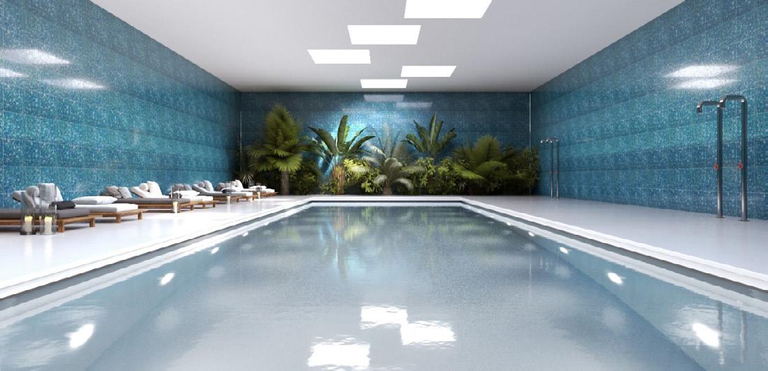
NEW ORVI GLASS SURFACES
Orvi presents the BRISÉ collection, rooted in age-old glass-making traditions from central India. Large sheets of coloured glass are broken into small pieces, then diligently reassembled, section by tiny section, for an overall effect that recalls the glass-tiled mosaics of Europe’s medieval churches and cathedrals. Belying the precise composition and skilled craftsmanship required to create these shimmering surfaces, the resulting patterns seem almost organic in structure. From single colour designs to tone-on-tone and multi-coloured collages, each one shines with understated elegance, embellishing any space with an iridescent, kaleidoscopic quality.


BERRYALLOC LAUNCHES NEW WATERPROOF LAMINATE FLOORBOARDS
ETERNITY LONG is BerryAlloc’s latest collection of laminate flooring for residential and commercial environments. The range has a deep texture that replicates natural wood, complete with cracks, knots and grain patterns, and is also quick to install and easy to look after. Available in a long floorboard format - 2038x190x12mm - Eternity Long has a class 33-AC5 wear resistance rating and offers all the benefits of a natural wood floor with none of the downsides: it is resistant to scratching, wear, impacts from dropped objects and heavy foot traffic. The technical performance of this laminate flooring collection is further enhanced by patented HYDROPLUS® TECHNOLOGY, which gives the floorboards a special, fully waterproof coating. This upgrades their final performance and makes them suitable for installation even in kitchens and bathrooms, without any risk of water penetration.
BISAZZA: A NEW MOSAIC LINE IN COLLABORATION WITH FORNASETTI
BISAZZA presents a new mosaic collection created interpreting FORNASETTI'S creative language and collaborating with the Milanese Atelier, internationally recognized for its unique decorative style. The encounter between these two excellences of the Italian design originated four mosaic patterns, decomposed and recomposed, experimenting with new surfaces, wide proportions and unusual light reflections. Thanks to the collaboration between Fornasetti and Bisazza, both the brilliance and transparency of glass mosaic tiles and the refined combination of sixty shades of color restored and enhanced the “Fornasettian” uniqueness. The decorations (ORTENSIA, BOCCA, SERRATURA, SOLI a CAPRI), for the first time made in large formats, impetuously join any living space, transforming it into a unique environment with strong personality. Specifically, the patterns reproduce some of the most iconic figures of Fornasetti universe: the mouth, the mesmerizing gaze portrayed behind a keyhole, the enigmatic and refined face of the muse of Piero Fornasetti; the opera singer Lina Cavalieri who, in the decoration Ortensia, timidly seems to emerge from an explosion of pink and blue petals. In the decoration Soli a Capri, a set of radiant suns, which ironically portray the face of Piero Fornasetti, illuminate a background in blue or gray shades.
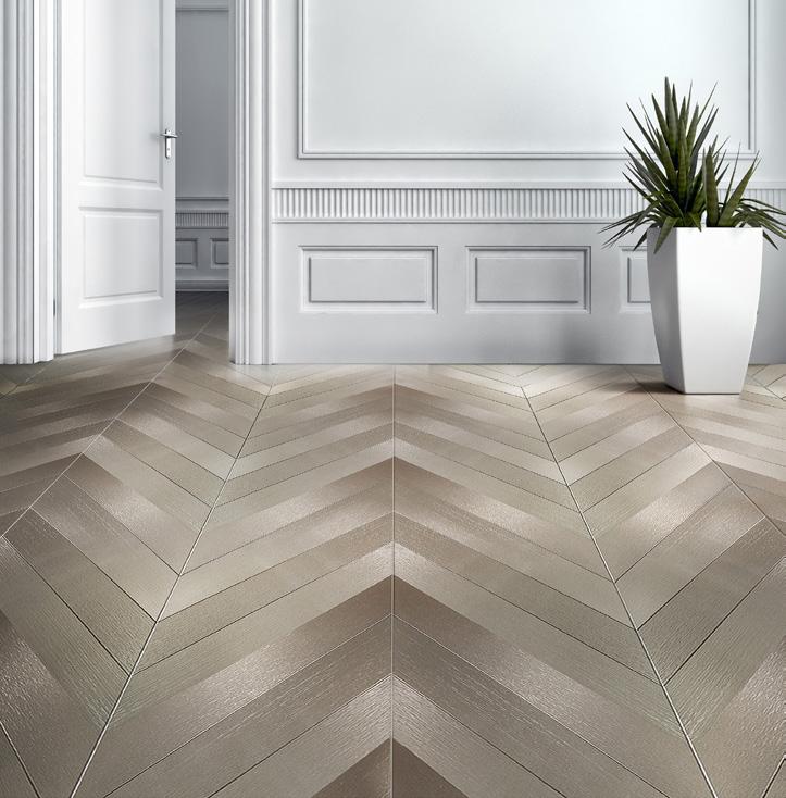

DVNE® SUSTAINABLE ALUMINIUM
The DVNE®
L.A.T. - LUXURY ALUMINUM
TILES COLLECTION originates from DVNE® aluminium alloy. Belonging to the 5000 Peraluman group, this is one of the highest-quality alloys on the market, which owes its uniquely iridescent, textured surface to its exceptional purity. Unlike most alloys on the market, DVNE® is smelted using hydroelectric power: this is a conscious, environmental choice, consistent with our commitment to making DVNE® 100% recyclable. From decorative walls for offices, homes, cultural spaces and hospitality venues, to façades and outdoor coverings, DVNE® is eclectic, lightweight, slim-gauge and outstandingly versatile in terms of both installation and applications. Like in a work of art, designers who use DVNE® L.A.T. - Luxury Aluminum Tiles can make formats and colours interact in constantly unique and differing ways, giving rise to dedicated patterns and coverings, especially, but not only, in largescale projects of broad scope. DVNE® comes in 16 colour variants and two choices of finish: gloss, identified by the suffix B, and matt, with the suffix ARC.
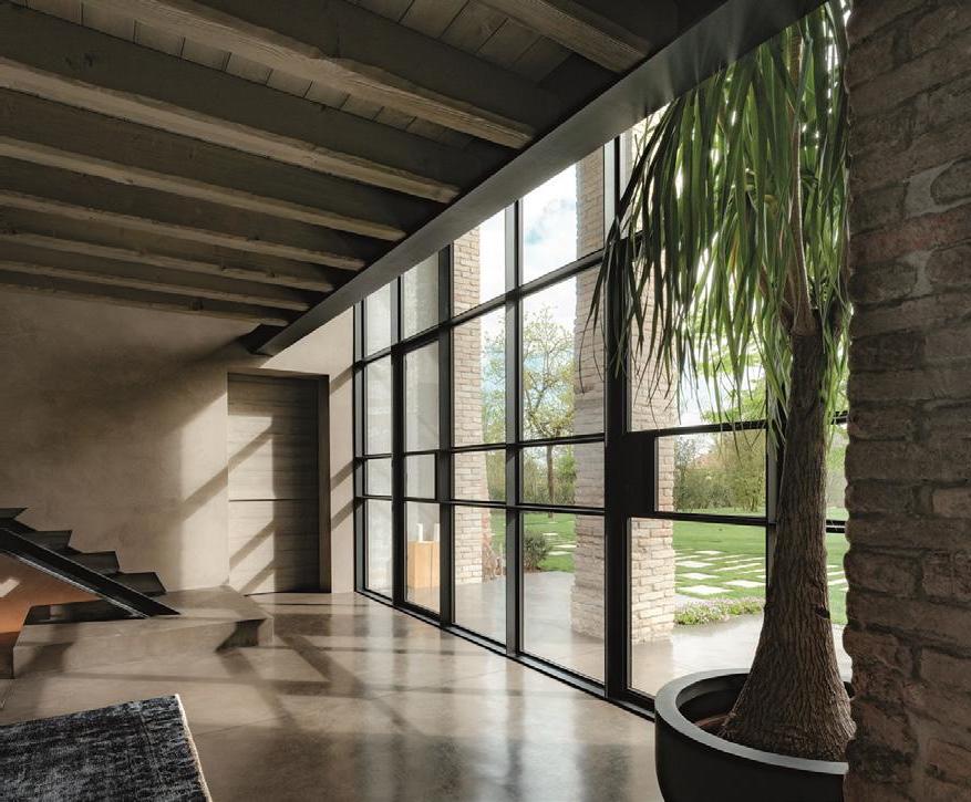
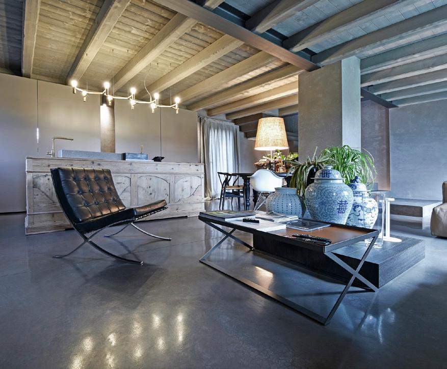
ISOPLAM® PRESENTS SKYCONCRETE® , THE LOWTHICKNESS CONCRETE FLOOR
The industrial mood has now established itself as a true contemporary classic. Among the materials of this trend, there are certainly the low-thickness cements, which ensure higher strength and durability performances than resins do. SKYCONCRETE®, the continuoussurface concrete floor, is an important innovation. As a recent result of the research and development of Isoplam, a Trevisobased company with over 40 years of experience and internationally well-established, Skyconcrete® can be used for internal or external flooring with only 4 millimeters of thickness, combining excellent resistance properties, industrial style and wide customization potentials with 36 different color versions. Skyconcrete® is good for every type of environment, but in medium and high traffic contexts the combination of aesthetics and toughness of the new creative cement Isoplam can be extremely useful. The tests carried out during the research and development stage demonstrate indeed excellent resistance to mechanical stress from compression, bending and wear, besides good thermal resistance and water repellency. The performance of the material is confirmed by a choice made by the important interior design company Gaber: Skyconcrete® covered over 1000 square meters of its new showroom in the province of Treviso and 500 square meters of offices. Isoplam® cloudy effect lent an industrial style to the spaces and met the need to move freely objects and pieces of furniture without ruining the surface.
CEMENTORESINA BY KERAKOLL
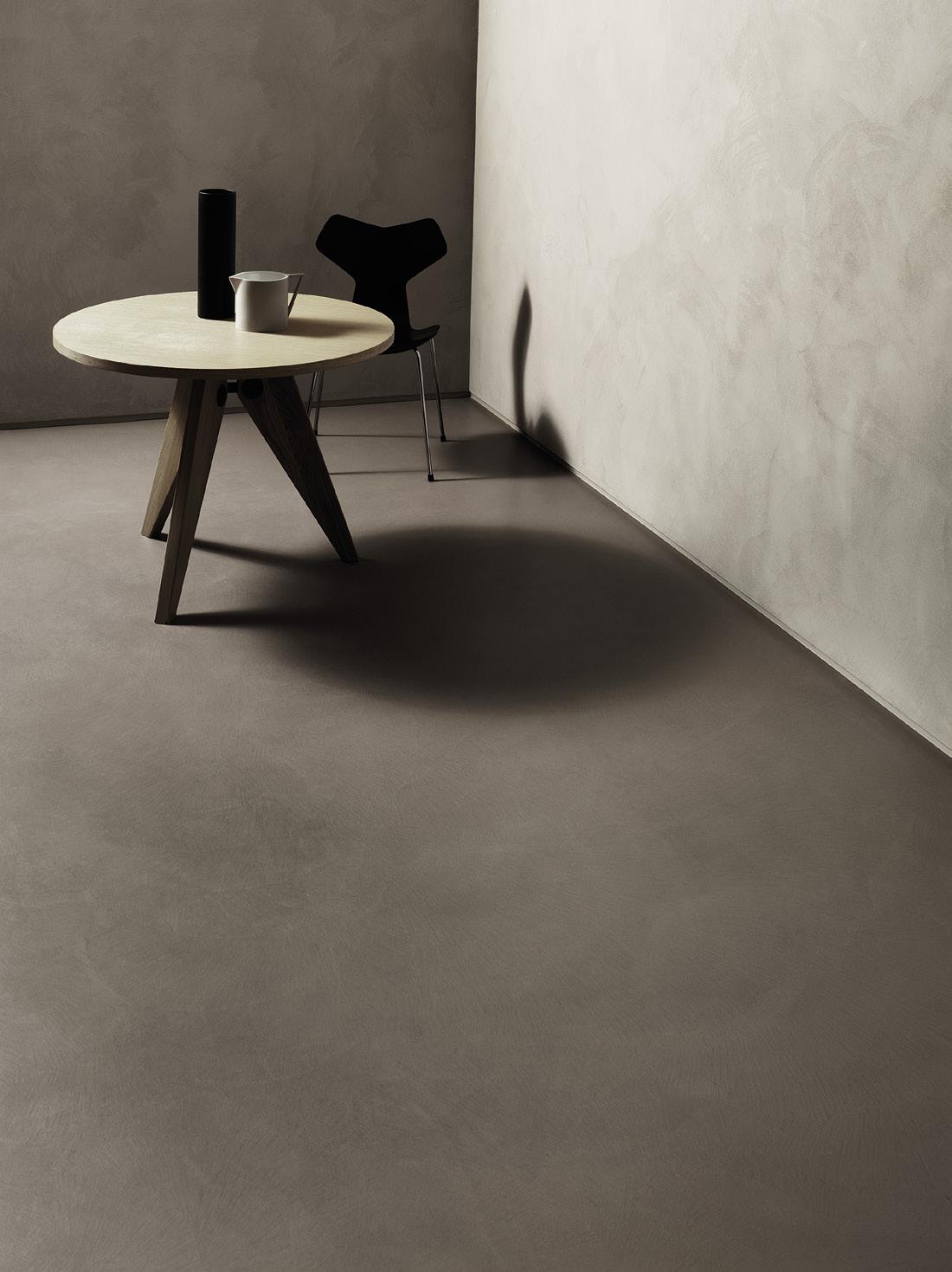
It is now possible to renovate floor and wall coverings without recourse to invasive demolition and reconstruction work, because there is a new solution, just a few millimetres thick, for laying a new covering over an old one. CEMENTORESINA is an innovative material developed by Kerakoll Greenlab laboratories, which yields a surface that has unrivalled durability compared with other low-thickness continuous floor coverings. Cementoresina is suitable for indoor applications (floors, stairs, spas, Turkish baths and shower trays), for every room in the house and for commercial environments subject to heavy foot traffic, thanks to its superior impact resistance. The texture of Cementoresina offers high aesthetic quality, featuring wrinkles, chromatic marbling and undulations that derive from the imperfections of a handcrafted product. It is deeply textured and refracts the light in striking ways that redefine the style and design of interiors, creating an elegantly evocative atmosphere. Cementoresina has a warm, soft finish that is silky to the touch. Cementoresina is available in the 10 exclusive, sophisticated colours of the Warm collection. These tread an elegant path all the way from white to black, via rich neutrals and natural tones, where each colour has its own distinct identity but gains an even deeper complexity when combined with other colours in the range.

DEL SAVIO 1910: THE NEW PALLADIAN FLOORING
Del Savio 1910 reinterprets a centuries-old artisanal tradition, the PALLADIAN FLOORING which originated in the northeast area of Italy, to hybridise it for the global market. This project, lead under the art direction of the Zanellato/Bortotto studio, aims to celebrate and reaffirm the uniqueness, the authenticity, and the value of craftmanship. As the creative directors of the project, the duo Zanellato/ Bortotto decides to involve two other studios in the project. Mae Engelgeer is a Dutch textile designer, and David/Nicolas is a Lebanese interior and art design studio. These diverse approaches enrich our creative perspective and emphasise the countless virtues of marble, together with its versatility. These collaborations gave birth to nine collections, three by each designer, which make use of ten different types of marble. All materials are Italian, and the tradition of some of them is deeply rooted in the Friuli Venezia Giulia region, such in the cases of the Grigio Carnico and the Fior di Pesco Carnico. All these natural stones are produced and worked in Pordenone, in the headquarter of the Del Savio company. The slabs of the collection, characterised by thinness and lightness, could be customised to obtain versatile and personalised products. The ten marbles could be also combined to just as many types of cement, to realise a wide range of patterns.

NESITE PRESENTS CORK RAISED FLOOR
For its extraction it is not necessary to cut down any tree, its environmental impact is zero and it has excellent mechanical and physical characteristics: CORK is a material historically linked to the world of design, thanks also to its "green" orientation. Nesite, an Italian company specializing in the production of raised floors, reinterprets it today for interior finishes, presenting a collection of cork surfaces in twenty different finishes, also customizable. Cork is available in several sizes and with a thickness of 4 or 5 mm. Thanks to the honeycomb structure, it’s able to absorb sound waves (over 50% more than the laminate) and improve the acoustic comfort of the rooms. Comfortable to walk on, cork does not attract dust (it is antistatic) and is waterproof, with excellent response even to chemical agents.

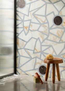
THE NEW WALLPEPPER WALLPAPERS FOR AUTUMN

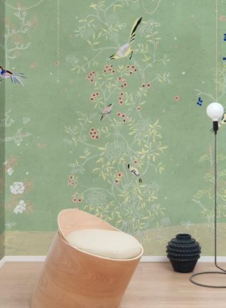
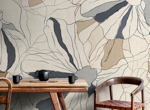
WallPepper® Group presents the new wallpaper collections designed to warm domestic and commercial environments during Autumn 2020. Among these, AMBIENTE, KRONOS and LEVANTE stand out: nature, the Orient and past eras inspire them. AMBIENTE is a collection of graphics evoking the beauties of nature, its elements and its ‘inhabitants’. A succession of images expressing seasons, suggestive landscapes, exotic and ancient places made of colors, plants and flowers with a unique charm. KRONOS is a ‘history’ bringing on walls the fascination of the past. This is a timeless, sensitive and exciting collection to experiment special combinations and create intriguing contrasts with contemporary furniture. Architecture, wainscoting, frescoes, textures, ancient decorative traditions, images reinterpreting real places: Kronos is an unexpected journey through ‘quotes’ and past atmospheres from the world of art. LEVANTE is a time travel, between floral paradises and idyllic scenarios
evoking nature, culture and the magical atmosphere of the Rising Sun. A collection full of charm and mystery, which lends on walls the exoticism and poetry of distant lands, creating amazement in contemporary interiors. WallPepper®, Levante collection, interprets the rich oriental heritage: typical gardens, natural landscapes, symbols and icons of Asian culture retrace the decorative and figurative traditions


