
8 minute read
Add Fuel Sparks a Lagos Masterpiece


Renowned artist Add Fuel made sparks fly in Lagos with his stunning new mural adorning the walls of the Mar d'Estórias shop. Sophie Sadler went to watch him at work and talk about the language of traditional tile design.

Advertisement
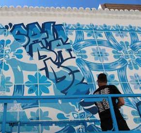
It is the end of May and people are starting to venture out of their houses. There is a spattering of people on the dusty streets of Lagos enjoying the warm evening. On one of these streets opposite the cultural centre is an incongruous sight: two men wearing gas masks suspended on an automated platform using spray cans and stencils to create a stunning vision of blue shapes contained within a series of ‘tiles’ painted onto the white walls.
The spectacle has generated a small gathering of people including LAC's president Nuno, the curator of the project and a fan of the celebrated Cascais artist Add Fuel AKA Diogo Machado. He tells me that when Mar d'Estórias asked him to find an artist to paint a new mural he immediately thought of Add Fuel, believing his work would be a good fit for the old traditional-style building.
Having approached Add Fuel in his somewhat alarming mask, he told me I must wait for him to finish his day's work. His intense focus whilst spraying symmetrical patterns onto the wall with stencils made me feel nervous about talking to him. But I was happy to sit back and watch the performance. He was previously a graffiti artist, though he insists not a good one, and seeing him at work is like watching a legitimate version of the undercover artform.
The symmetrical patterning and tessellations of the mural are familiar, originating from the tin-glazed ceramic azulejos that are such a common symbol of Portugal and can be seen in many churches and public buildings.
The platform squeals as it is raised up and down, and Add Fuel and his assistant, wearing black T-shirts emblazoned with his moniker, peel off the tape which has formed the neat borders of the tiled motifs. The process is an impressive piece of theatre.
It is a relief when Add Fuel finally takes off his mask and approaches me. As Diogo, he is very warm and friendly, and he apologises for keeping me waiting.
His website hails him as a master of reinterpreting the language of traditional tile design. So what language do tiles speak? “It is a language of aesthetic and colour,” Diogo tells me. He becomes animated. “It comes from the 17th and 18th Century tile design in Portugal, which is defined by the colour blue and shapes reminiscent of wood and iron-work. It is semi-baroque and the visual element comes from the Moorish influences in Portugal.”
With a degree in Graphic Design from Lisbon's IADE (Institute of Visual Arts, Design and Marketing), Diogo spent a few years working in design studios in Portugal. It was followed by an eight-month stint in Munich, Germany.
The graphic design training enabled him to be comfortable working with computer programmes and media. “My background allowed me to be familiar with notions of perspectives, balance, composition, typography. It was important as a basis from which to develop my artistic practice.”
Since 2007, he has been focusing exclusively on his artistic work. Starting under the full name Add Fuel to the Fire, he first created a cast of slimy, eccentric and joyful creatures, influenced by a variety of interests ranging from video games to comics, animation, sci-fi, designer toys, and urban visual culture.
From where did his love of tiles and history derive? “Being Portuguese it is in my blood. I grew up seeing these patterns from the cobbled streets to tiled facades. It has been a visual element present in my life since I was young.”
He has been working on his drawing style for some time. In 2008, he shortened his moniker to Add Fuel and began redirecting his focus towards tile designs which combined traditional decorative elements with his own contemporary visual referents – therefore creating a hybrid with new forms which reveal an impressive complexity and masterful attention to detail.
“Shifting my practice towards the tile aesthetic happened at a point in my career when I started as an artist and freelance illustrator. I had a project in my city of Cascais. I started to think about what I could do with this project that would define me in my city and as Portuguese, and how can I connect my work to that?”
The project was on a building façade so Diogo mixed his drawing style with a tile aesthetic – it worked. “I started to develop my style from that point. I studied ceramics and made tiles using different techniques. I tried hand painting tiles and still create works of art with ceramic tiles, so it was an interesting journey which is still evolving.” Within the patterns he incorporates his personal drawing style, which he had been working on since being a graphic designer: heart designs are integrated into the traditional models. He points out a reference to the way the Japanese depict eyes in their cartoon characters, heralding back to his interest in this medium.
Although he admits to focusing more on traditional patterns in this particular work, there is a break where the repeating shapes appear to be torn apart with a gash. This fissure contains the word Saudade (‘missing’) in typography, recalling his graffiti career.
Diogo does not want this work to be known as a ‘Covid-19’ themed work; however, he admits that during the time of planning the word saudade seemed particularly pertinent. “During this time, everyone has missed something and things will never be the same again.”
His upcoming wedding is testament to this. Planned for next month, it is being held on a property on the river to the south side of Lisbon. It will be a smaller and more intimate event than previously planned.
He has travelled all over the world creating works of art and tries to incorporate elements of their culture into his project. When he goes to an exhibition or a festival he always asks the organisers to send him examples of their traditional patterns. “All cultures have patterns, even if it is not in tiles it could be in clothing or tapestries. Patternation is connected to all cultures and I re-interpret their cultural idioms into my style.”
How does he go about creating something as sophisticated as this work? It starts at a fundamental level by getting the dimensions of the wall. He then creates a digital mock-up by actually drawing patterns into an iPad. When he arrives at the site, it comes down to calculus to get the correct proportions. “It is a very mathematical process,” Diogo explains.
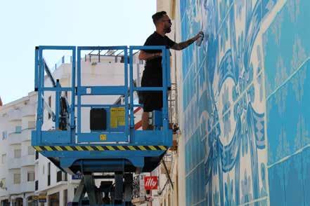
On arrival at this site in Lagos, he found the wall-height was taller than he was told, so he had to include another row of stencils to fit the wall. “Sometimes this happens, and I need to adapt to the space.”
His most memorable achievement? He was invited to create a 40-metre wide ceramic panel at Avenida Infante Santo in Lisbon, which has a historical connection to tiles. The panel defined him as one of the Portuguese artists most recognised for their work with tiles, something he is justifiably proud of.

Miami USA 2019
Critics may argue that Diogo’s works are a pastiche of classic formalism. But a closer inspection of his designs reveals a plethora of original motifs and characters brimming with deep emotions. By exploring a wide range of both handdrawn and digital techniques in the fields of drawing, painting, ceramics, and printing, his practice creates an interesting juxtaposition between the old and the new, between heritage and modernity.
He points to his nearly finished work, explaining how tomorrow he will create a build-up of layers. This creates a visual illusion known as trompe-l'œil, which tricks the viewer into thinking they are looking at a 3D image. This multi-layered pattern challenges the viewer's perception and invites multiple possibilities of interpretation.
Besides the numerous public art interventions Diogo has created in various countries, he has also been showcasing his work on ceramic tile panels. He exhibits and sells his work in reputed galleries and museums around the world, including two in the US and another in France. He admits the murals don't pay all the bills. He also works with museum collaborations and his fans can keep track of his art on his website.
The Add Fuel brand is dependent on the grand master, his studio and mural assistant Adrião, who is still tidying up lines on the mural, and Diana, his office-based project manager.

2019 SUPER SKETCH (with Antonyo Marest) Leewarden Netherlands
Does he see himself as an ambassador for Portugal? “I don't see myself like that but if I can make more people aware of this beautiful art form I am happy.”
After we say goodbye, I reflect how, until now, Lagos may have been missing architectural references to its proud heritage. This clever artist has Added Fuel and history to the Lagos streets.
+INFO: www.addfuel.com
Did you know...

1
Azulejos first came to Portugal in the 15th Century when parts of the Iberian Peninsula were still under Moorish rule.
2
Although many assume the word is a derivation of azul (Portuguese for ‘blue’), the word is Arabic in origin and comes from az-zulayj, which roughly translates as ‘polished stone’.
3
It is believed that the blue and white tones represented (and continue to represent) Portugal’s maritime history and its role during the Age of Discoveries.
4
Cobalt blue is a pigment that includes the active ingredient cobalt oxide. When applied to a raw glaze in proper proportion and fired, it creates a deep blue colour commonly known as cobalt blue. Blue decorations required the discovery of suitable pigments and their local availability or procurement through trade routes. They are an ornamental art form, but also had a specific functional capacity like temperature control in homes.


