Selected Works
@ Tulika Shrivastava
Tulika Shrivastava is an Architect turned designer, who often engages herself with explorations across disciplines as part of her design process while working on projects that vary from Interior design, Curating experiential experiences, Product Design to Graphic Design and more. Being a multidisciplinary designer, she brings to the table her individualistic outlook, experimentation, and deeper understanding of layers with expressions of these thought processes in
Put Simply Manvi & Kunal Residence Greater Than Laung Elaichi El Barrio Deco in Delhi
/ Branding & Packaging Ongoing / Styling
Moodboaring
/ experience
/ branding
/ branding
/
/ typography
reserach
/ 36
Deco Type Series Explorations inType Bookbaggage Adapt dont Ignore Abhinav & Mansi's Wedding Arise Solutions 2022
and
Ongoing
design 2019
& visual identity 2020
& visual identity 2020
visual identity 2020
&
2020
days of type 2020 / spatial idenity & design 2021 / magazine design 2021 / visual identity 2019 / branding & visual identity
Put Simply Skincare
K-beauty Skincare Brand that focuses on simplifying skincare.

Brand Color Swatches
Neutral Brand Colors with an Accent of green that denotes and marks the brand presence as being being vegan and creulty free.
Put Simply Green (Accent Color)
PutSimply White Put Simply Balck
Product Patterns
Patterns for all product packaging are designed taking inspiration from their respected nomenclature and what they offer for the skin.
PENTYLENE GLYCOL, CENTELLA ASIATICA EXTRACT, CERAMIDE NP, ALLANTOIN, BEHENYL ALCOHOL, PORTULACA OLERACEA EXTRACT, POLY C10-30 ALKYL ACRYLATE, POLYGLYCERYL-3 METHYLGLUCOSE DISTEARATE, DECYL GLUCOSIDE, TROMETHAMINE, CARBOMER, ACRYLATES/C10-30 ALKYL ACRYLATE CROSSPOLYMER, SODIUM STEAROYL GLUTAMATE, POLYACRYLATE CROSSPOLYMER-6, ETHYLHEXYLGLYCERIN, ADENOSINE, XANTHAN GUM, t-BUTYL ALCOHOL, TOCOPHEROL, ROSMARINUS OFFICINALIS (ROSEMARY LEAF EXTRACT


and Marketed by
Pvt. Ltd
Friends
Care
For address, refer to Marketed by Be at The Sun Sunscreen Broad Spectrum Moisturizing Sunscreen SPF 50+ PA++++ Lightweight White Cast Free Non-Greasy Made from good ingredients with good intentions WATER, DIBUTYL ADIPATE, PROPANEDIOL, POLYMETHYLSILSESQUIOXANE, DIISOPROPYL SEBACATE, DIETHYLAMINO HYDROXYBENZOYL
BENZOATE,
CAPRATE,
GLYCOL, CAPRYLYL
Manufactured by Kolmar Korea Co. Ltd 22-17, Sandan-gil, Jeonui-myeon, Sejong-si, Korea- 30003 Imported
Apothecure Wellness
A-147, First Floor, ew
Colon New Delhi, India- 110065 RC No.: RC/COS-003085 Customer
hello@shopputsimply.com +91 88829 3166 www.shopputsimply.com
HEXYL
ETHYLHEXYL TRIAZONE, NIACINAMIDE, METHYLENE BIS-BENZOTRIAZOLYL TETRAMETHYLBUTYLPHENOL, COCO-CAPRYLATE/
DIETHYLHEXYL BUTAMIDO TRIAZONE, GLYCERIN, 1,2-HEXANEDIOL, BUTYLENE
METHICONE,
feel thats suited for all skin types. This high performance moisturizing formula blends in effortlessly, leaving skin white cast free and grease free. Its sensitve skin friendly and non-comedogenic, your skin will ove it through sunshine and rain. Advanced UV Filters Our unique complex of superior sun filters chosen for their high performance on the skin, photostability and skin friendly benefits Cica calms redness + soothes Ceramides protects barrier + hydrates Niacinamide firms + tightens When To Use Put on your sunscreen 15 minutes before you step out and re-apply every two hours. How To Use Take generous amount and massage over exposed skin, avoiding the eye area. Patch Test Recommended. For external use only Avoid direct contact with eyes. Discontinue use & consult a doctor if irritation occurs Reef Safe & Oxybenzone Free 1.69 fl oz 50ml All Skin Types Made in Korea We're social! Find us on www.shopputsimply.com putsimplyofficia Tag us on Insta with hashtags #BeattheSun #SwitchtoACleanRoutine #PSILoveYo
New generation filters for unbeatable sun protection, all year round. The super trio of Tinosorb M, Uvinul T 150 and Uvinul A Plus provide broad-spectrum UV protection with an ultralight

Caution For external use onl Avoid direct contact with eyes. Discontinue use onsult a doctor irritation occurs Manufactured by Kolmar Korea Co. Ltd Korea- 3000 Imported & Marketed by Apothecure Wellness Pvt. Ltd A-147, first floor, New Friends Colony, New Delhi, India- 110065 Customer Care hello@shopputsimpl com +91 88829 31668 www.shopputsimply.com For address, refer to marketed by Replenish your skin's moisture levels and prevent water loss. A no-frills, hydrating, ightwe ght, gel moisturizer that absorbs easily without clogging the pores. Supporting your tired, flaky, overworked skin's barrier. How to use : Take sufficient amount and massage over clean and slightly damp skin until it is absorbed. When to use Everyday as per your skin s need. Remember to use Keep it in your bag Keep it at your dresser / vanity Set a reminder on your phone Soothing • Calming • Nourishing Water Dam(n) Moisturizer Cica • Niacinamide • Shea Butter Panthenol 1.69 fl oz 50 ml All Skin Types Made in Korea


Get Your Greens Cleanser pH Balanced Gel Cleanser for Supple Skin Hydrating •Purifying •Soothing Mugwort Cica • Green Tea Neem 4.05 fl oz 120ml All Skin Types Made in Korea Made from good ingredients with good intentions WATER, DISODIUM COCOAMPHODIAC ETATE, COCO-BETAINE, SODIUM COCOYL ALANINATE, GLYCERIN, ACRYLATES COPOLYMER, 1,2-HEXANEDIOL, ARTEMISIA PRINCEPS LEAF EXTRACT, CENTELLA ASIATICA EXTRACT, BUTYLENE GLYCOL, SQUALANE, PANTHENOL, CAMELLIA SINENSIS LEAF EXTRACT, HYDROXYACETOPHENONE, ETHYLHEXYLGLYCERIN, TROMETH AMINE, MELIA AZADIRACHTA LEAF EXTRACT, SODIUM HYALURONATE, ALLANTOIN, MELIA AZADIRACHTA FLOWER EXTRACT, TOCOPHEROL, GLYCYRRHIZA GLABRA (LICORICE) ROOT EXTRACT, CURCUMA LONGA (TURMERIC) ROOT EXTRACT This hardworking yet gentle cleanser will clean off the day's impurities while maintaining your skin's pH to reveal your best skin. Use it every day to clean out your pores, hydrate and enhance your skin barrier function. Cica strengthens soothes Neem detoxifies + soothes Mugwort moisturizes + calm Green Tea protects + soothes When To Use Everyday as per your ski need How To Use Take a oin-sized amount and gentl massage it into face and neck with water in circular motion. Rinse thoroughly. Patch Test Recommended. For external use only. Avoid direct ontact with yes. Discontinue use onsult doctor irritation occurs. Manufactured by Kolmar Korea Co. Ltd 22-17, Sandan-gil, Jeonui-myeon, Sejong-si, Korea- 3000 Imported and Marketed by Apothecure Wellness Pvt. Ltd A-147, First Floor, Ne Friends Colony New Delhi, India- 11006 RC No.: RC/COS-00308 We’re Social! Find us on www.shopputsimply.com putsimplyofficia Tag us on Insta with hashtags: #BeattheSun #SwitchtoACleanRoutine #PSILoveYou Customer Care hello@shopputsimply.com +91 88829 31668 www.shopputsimply.com For address, refer to Marketed by
Deco in Delhi
A digital archive of the last few remnants of Art Deco surviving in the facets of Delhi as an attempt to document its adaptation before it disappears completely.

Laung Elaichi

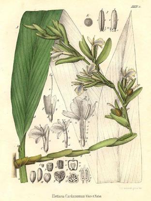
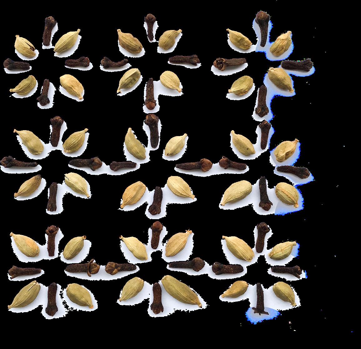
Laung Elaichi is an upcoming luxury organic sweets brands. The design direction went with the name, exploring and creating patterns from laung and elaichi.

Begum Semibold heading
Deepawali
victory of light over darkness, knowledge over ignorance, good over evil, and hope over despair


The festival night of Diwali coincides with the darkest, new moon night and celebrated throughout India regardless of religion and faith.
Begum Regular
body type


^
>
Corners of the cards inspired from the tip of a laung
Mithai Boxes
El Barrio
El Barrio is a backpackers hostel that, as the name suggests, takes inspiration from the barrios of Spain
Swatches
Spanish culture, architecture and lifestyle together create the color palette for the brand. Pastel bright colors create a warm and comfortable yet playful and inviting brand language
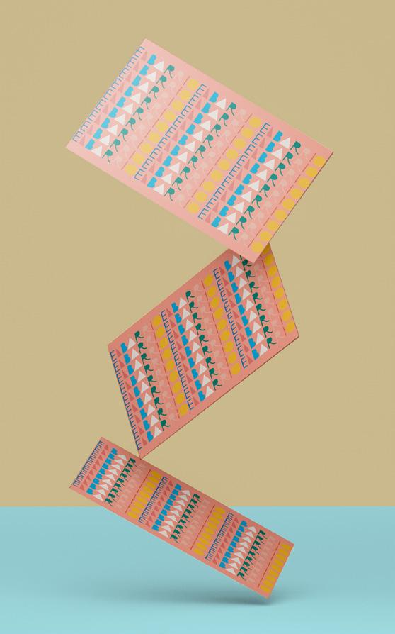


Patterns with Brand Identity letters inspired from Spanish Tiles


^
Arise Solutions
A Simplified business and IT training solutions company that enables business in Automating Business Intelligence.
^ Favicon ^ Secondary logo

Color Swatches
Malibu, being a shade of blue builds trust hence serving as the primary brand color. White and Fair Pink are the lighter secondary base colors to support Malibu.

<
Adapt dont ignore
An event magazine promoting Adaptive Clothing (clothing for the physicaly diabled) in the mainstream market in an attempt to make it as accessible & off the rack as they are for everyone else.

Neug Asia heading

Akzidenze Grotesk
body type
Swatches
Color scheme for the magazine forms itself from the colors- Blue, Green & Yellow - seen used in Diabiled friendly signages around the world. All three colors being bold and eclectic, Black & White are used along side to create a balance.
Graphic Language for the magazine. Illustrations of adaptive clothes >


Greater Than
Bottle Bag


Salt LIme Ricky Bucket Bag stitched to open up as a cocktail-at-home experience. The experience had 2 potli’s - yellow & green, for nimbu and mirchi, each & and vial of salt. To incorporate the touch of copper (as the brand language suggests), pear pins in copper wear used to pin everything together.

> Base detail to hide side stitches
with Designkari
< in-house prototyping
^ > color sampling
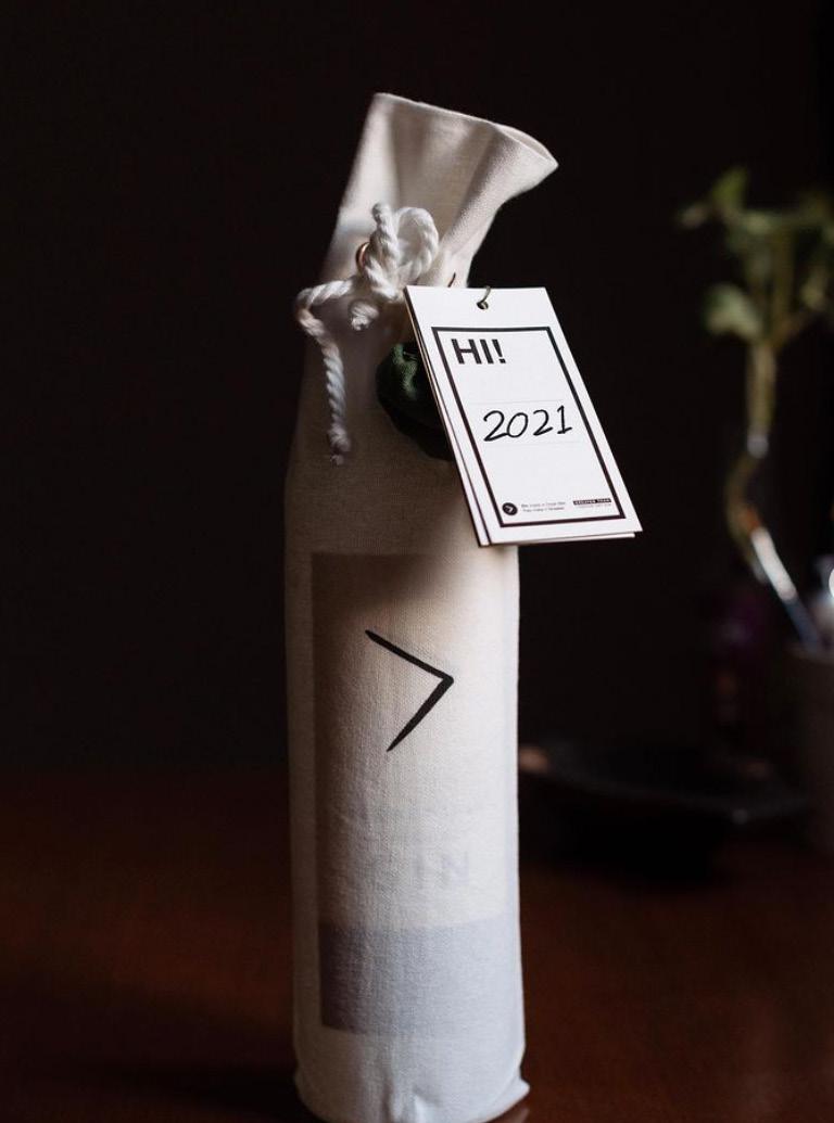

 Picture Credits :
Radhika Agarwal
GEC Press Kit

Gift anything, but the Bottle. We created a Bar-at-Home press kit folded inside a handy, ready to take, fold pouch. Pouch opens up to a custom made Oak wood Bar board charred in Shou Sugi Ban technique to achieve the black color of the brand language. Next to the board are housed bar knife & a stirrer.
<
Fabric Pouch in black canvas on the inside

>
Fabric Pouch in white Canvas outside & black canvas inside, held together with overlock stitch along the edges.

< Bar Board Charred with Shou Sugi Ban technique

Powder coated matt black knife & stirrer. Brand logo screen printed


>

 Picture Copyright : Gin Explorers Club
Event Space

A muslin light box floating on a flat pack kiosk structure designed while keeping in mind the temporary nature of events, reducing assembly time and making transporation and storage easier.

Iteration 1/ For an overall modern, tech & Industrial outlook Iteration 2/ For a lowkey, homegrown feel


Deco Type Series
As a collaborating artist with DecoInDelhi, the series breaks down and tries to understand the influence of Art Deco on typography. It’s evolution, characteristics and how it influenced art and design at the time. 5 Art Deco buildings were selected to study the typography on their facades.

Imperial Cinema, Paharganj
Paharganj, home to Delhi’s numerous neon signs, is home to the Imperial Cinema, with its vertical jazzy signage. With it’s high modulation, asymmetry, angular shapes, and a heavy elongated characters, it reminds of the 1920s & 30s

Tall and thin letters, varying crossbar heights, rounded apex and vertex are significant to the 20s and 30s. Additionally, the use of speed whisker, used as an underline for the typeface, was intensively used during the era as a common contemporary symbol of speed.


 Mohan Niwas, Roop Nagar
x-height
Filmistan
Filmistan stands with its flamboyant facade in subdued orange with the bold blue. The colour composition of the facade synthesises with the playful typography. The typeface gets its distinct character with an unpredictable play of curves and angles along with a sleek elongated look

Baseline

Typography


36 days of typography | 2020
Pattern explorations with letters from 36 days of type
^

Abhinav and Mansi's Wedding
Taking inspiration from the geometries and the rich relationship of mughals with their florals seen across disciplines from their textiles, garden, and architecture, the logo is a representation of the inlay work that is organic, yet symmetric in nature.

M K Residence Interiors
Ongoing
In a play of traditional and contemporary, the house redefines luxury in a celebration of Indian craftsmanship and techniques.


^ Wallpaper Illustration (WIP)


^ >
Bone Inlay Bar Counter Top illustration (WIP)
Mood Boarding & Curation
>
Terracotta Tiles paired with Indian handmade tiles
lippan work on wall paired with Udaipur Spider Green Marble and Cstome print tiles >


Custom design and printed tiles

>
+91 96541 00901 tulika@ourordinarythings.com ourordinarythings


 Picture Credits :
Radhika Agarwal


 Picture Copyright : Gin Explorers Club


 Mohan Niwas, Roop Nagar


