Urban Home Austin-San Antonio October/November 2014

Page 1

CELEBRATING INSPIRATIONAL DESIGN AND PERSONAL STYLE

TIMELESS DESIGNS TASTING MENUS THE ART OF THE EXHIBITION www.UrbanHomeMagazine.com

1 4 O C T / N O V

HOME AUSTIN-SAN ANTONIO URBAN


Woodworking at its finest

TRADITIONAL ... TUSCAN ... OLD WORLD ... CONTEMPORARY ... MODERN ... COMMERCIAL ... FURNITURE

KINGWOOD HAS PRODUCED IN EXCESS OF 5000 KITCHENS AND RELATED PROJECTS IN ITS 40 YEAR HISTORY. WE HAVE OUR FURNITURE GRADE CUSTOM CABINETRY DESIGNS GRACING HOMES THROUGHOUT TEXAS AND THE UNITED STATES . . . FOR ADDITIONAL INFORMATION PLEASE VISIT OUR FREDERICKSBURG SHOWROOM. 401 South Lincoln Street

Fredericksburg, Texas 78624

830.990.0565

www.kingwoodcabinets.com


Pool Maintenance: • Personalized Pool Service • First month free with 6 month commitment

(210) 251-3211

Pool Remodeling Specialists: • Pool Re-Surfacing • Equipment Repair and Replacement • Coping, Tile, Decking and Rockwork

Custom Pool Design and Construction www.artesianpoolstx.com


FROM THE EDITOR

Interior design styles have many names: contemporary, traditional, rustic, retro, French country… the list goes on and on. But what about timeless design? To marry two or more styles, combine old and new, incorporate a lot of homeowner personality, and then carefully edit the details to create the perfect space is just what the designers in this issue accomplished. This timeless design has no restrictions or limits, is durable and sustainable, and will remain beautiful and fashionable as time goes on. When Royce Flournoy of Texas Construction Company set out to build his personal home, he called on his colleagues at FAB Architecture. They had collaborated on many projects before, and Flournoy knew that their combined visions would result in architecture that ages gracefully and allows furnishings and art to remain in the forefront. The result is a blend of traditional and modern design that also fits well within the context of the neighborhood. An Austin high-rise breaks from the modern and minimalistic mold thanks to David Wilkes Builders and Mark Cravotta Interiors. The addition of a brick wall running the length of the condo, along with furniture and accessories that seem to have been curated over time and from around the world, combine to form an elegant yet comfortable arrangement with a hint of masculinity. Challenged with a steep lot and a set of Texas Tuscan floorplans when his dream was to go strictly modern, one homeowner called on Element 5 Architecture to resolve the problems. The finished home is sleek and soothing with sweeping vistas and classic, warm finishes and materials that will stand the test of time. Designer Chelsea Kloss’ selection of slate, bamboo and limestone provide an organic foundation that is punctuated with contemporary art. As we stroll through our favorite museum’s latest exhibit, we rarely think about the process involved in making that exhibit a reality. The planning, design and execution are actually just as interesting as the art itself. San Antonio’s McNay Art Museum is currently exhibiting the coveted Intimate Impressionism from the National Gallery of Art – one of only five showings worldwide, and in Austin, the Harry Ransom Center has displayed a selection from their collection of over 5,000 boxes of David O. Selznick’s “Gone With the Wind” archives in honor of the classic movie’s 75th anniversary. Their experts explain the processes involved in acquiring and showcasing everything from paintings to the fabulous “drapery” dress. San Antonio’s food scene has two relatively new restaurants with a decidedly new dining concept. Mixtli and Nao both feature tasting menus that rotate regularly to showcase a different region of Latin American cuisine. Mixtli focuses on Mexico’s 31 states, while Nao delves into the many regions of South America. They’re culinary vacations and history lessons all rolled into a delicious meal. I wish you wonderful, crisp autumn,

Trisha Doucette

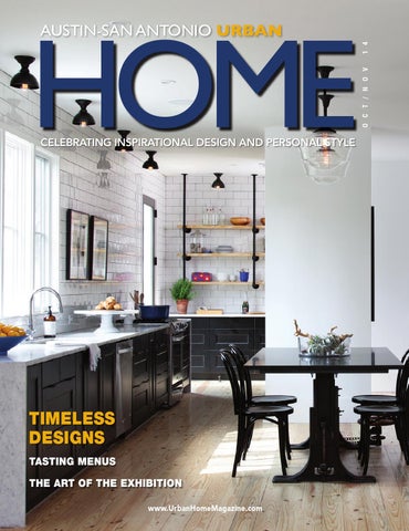
On The Cover: A white backdrop, clean lines and simple materials, both inside and out, are offset with touches of black and colorful artwork in this builder’s personal home. Page 20

8

URBAN HOME AUSTIN – SAN ANTONIO

urbanhomemagazine.com


2014 | VOL. 9 | NO. 5 Publisher Louis Doucette Editor Trisha Doucette Contributing Editors Dolores Davis – CG&S Design-Build Bill Evans – ABOR Catrina Kendrick – Catrina’s Ranch Interiors Contributing Writers Claudia Alarcon, Beth Bond, Julie Catalano, Mauri Elbel, Dana W. Todd Photography Paul Bardagjy, Tre Dunham, Ryann Ford, Jody Horton, Tommy Kile, Thomas McConnell, Jennifer Siu-Rivera Strategic Media Placement Diane Purcell Advertising Sales Sandy Weatherford, Gerry Lair, Janis Maxymof Business Manager Vicki Schroder Design and Production Tim Shaw – The Shaw Creative Printing and Direct Mail SmithPrint Phone 512.385.4663, Austin - 210.410.0014, San Antonio Fax 830.981.8887 Address 10036 Saxet Drive / Boerne, Texas 78006 Email louisd@urbanhomemagazine.com Website www.urbanhomemagazine.com Urban Home Magazine Austin-San Antonio is published by Big City Publications, LLC. Advertising rates available upon request. All rights reserved by copyright. No part of this publication may be reproduced in whole or in part without the express written consent from publisher. Every effort is made to assure accuracy of the information contained herein. However, the publisher cannot guarantee such accuracy. Advertising is subject to errors, omissions and or other changes without notice. Mention of any product or service does not constitute endorsement from Urban Home Magazine. The information contained in this publication is deemed reliable from third party sources, but not guaranteed. Urban Home Magazine does not act as an agent for any of the advertisers in this publication. It is recommended that you choose a qualified remodeling, home furnishings or home improvement firm based on your own selection criteria. Urban Home Magazine, does not act as an agent for any of the realtors or builders in this publication. It is recommended that you choose a qualified realtor to assist you in your new home purchase. Urban Home Magazine will not knowingly accept advertising for real estate that is a violation of the Fair Housing Act. All real estate advertising in Urban Home Magazine, is subject to the Fair Housing Act that states “We are pledged to the letter and spirit of U.S. policy for the achievement of equal housing opportunity throughout the nation. We encourage and support an affirmative advertising and marketing program in which there are no barriers to obtaining housing because of race, color, religion, sex, handicap, familial status or national origin.”

© Copyright 2014 by Urban Home Magazine. All Rights Reserved.


October / November 2014

CONTENTS

cover

20 A Builder’s Home Photography by Ryann Ford

featured homes

28 Palatial Pied-À-Terre Photography by Paul Bardagjy

20

36 Balancing Act Photography by Tre Dunham

highlights

46 Firelight 54 The Art Of The Exhibition

departments Design Trends 42 Mudroom Mania

28

36

Why This Space Works 48 Designer Spotlight: Julie Bradshaw of Bradshaw Designs Commercial Design 52 Bess Bistro New Masters 58 Inspired By A Road Trip Food Design 60 Passport To Latin America

42

48

Fabulous Finds 62 Destination: Historic Texas Cemeteries Contributing Editors 57 Bill Evans, ABOR 64 Savana Schroeder-Beckman Austin NARI & Rodney Hill, NARI San Antonio 64 Catrina Kendrick, Catrina’s Ranch Interiors 66 Advertiser Index

52 14

URBAN HOME AUSTIN – SAN ANTONIO

urbanhomemagazine.com


dare to think outside the box‌ let your dreams become reality.

designers who create a timeless space. . . craftsman that bring it to life. . . cabinetry

|

lighting

|

tile

|

countertops

ALL UNDER ONE ROOF. modern

|

contemporary

|

302 E. Nakoma, San Antonio, TX 78216

transitional |

(210) 384-2588

|

www.nhousedb.com


A

When you’re an in-demand builder, By MAURI ELBEL

|

Photography by RYANN FORD

BUILDER’S HOME 20

URBAN HOME AUSTIN – SAN ANTONIO

sometimes the most difficult aspect of creating your own home is finding the time to devote to the project. But as Royce H. Flournoy, owner of Texas Construction Company, proves: when you do, there is no reward quite like it. urbanhomemagazine.com


S

itting on a small infill lot in East Austin, Flournoy’s 2,200-square-foot, three bedroom, two-and-a-half bathroom house blends flawlessly into its surrounding neighborhood while exuding a classic, ageless feel. “I wanted to create a structure which had a timeless appeal, lots of natural light and was efficient not only with its use of space, but in its function,” says Flournoy of his personal home completed less than one year ago. Flournoy admits his biggest challenge was fitting the project

urbanhomemagazine.com

into his already jam-packed schedule. The builder planned to assign one of his project managers to oversee the construction, but due to the company’s larger-than-anticipated work load, Flournoy assumed the primary role himself. “The benefit was working with our trade base and being part of the process in a more hands-on role than I had intended with the added benefit of being rewarded with the project as my home at the end of the build,” says Flournoy who reached out to FAB Architecture to help him fine-tune his vision. URBAN HOME AUSTIN – SAN ANTONIO

21


Texas Construction Company and FAB Architecture, one of Austin’s leading design firms, were no strangers to begin with, collaborating on various projects in the past including the renovation of Flournoy’s previous home in Austin’s French Place neighborhood. When Flournoy and his partner decided to sell their home and build another, they began researching houses around Austin. During a local homes tour, they found a home they admired in the colorfully modern Agave neighborhood, coincidentally designed by FAB Architecture. “We began working with the basic concept of the Agave house and quickly found that Royce and his partner’s needs were a bit different,” says Patrick Ousey of FAB Architecture. “A whole new home design began. Royce was very open to our vision.” Both the architect and builder agreed on the initial goal: to create a clean, modern environment. But they also wanted to keep the design within the context of its East Austin neighborhood. Due to the postage-stamp-size lot, Ousey says they decided to keep the form simple. Soon the iconic “house” form took shape. “We chose to use simple materials to reinforce this concept as well as a pure white color palette with bronze tone highlights on the exterior,” says Ousey. Built within the fabric of the existing neighborhood, this modest home remains both contextual and contemporary. “Timelessness is always something that FAB Architecture strives for,” says Ousey. “The simple agrarian form is both traditional and modern at the same time and feels at home in the evolving context of Austin’s changing Eastside.” An unmistakable simplicity drives the design from the moment you approach the house, with the landscaping setting the tone with four olive trees that run parallel to the facade and a level carpet of lawn defines the front yard. The oversized wood and glass door welcomes visitors without exposing too much of the home’s interior to passersby. 22

URBAN HOME AUSTIN – SAN ANTONIO

Flournoy’s two-story gabled house faces the street with a minimal palette of white HardiePlank® siding contrasted with bronze windows with steel detailing and the large front door which provides a warm and welcoming point of entry. Echoing the exterior palette, white walls and ceilings dominate the interior spaces, with thoughtful punches of black, textures and colorful artwork that boldly stand out. Beautifully grained light pine wood floors finished in a clear seal flow throughout the home, providing a neutral surface urbanhomemagazine.com


within the home’s otherwise black and white scheme. The masonry fireplace with its Leuders stone surround anchors the living area. Black shaker-style cabinets pop against the creamy Carrara marble countertops and white subway tiles in the open kitchen, combining to serve as the dominate focal point of the lower level. In the master bathroom, a large shower with a skylight above reflects sunlight against the Carrara marble tile and countertops for an elegant look. Nestled into the roofline, urbanhomemagazine.com

the two bedrooms and flex space are connected by a generous book-lined and light-filled hall overlooking the stairs. The guest bathroom features fabulous, fun contrasts with the black and white re-purposed freestanding tub and well-coordinated patterned flooring. Integrating ample natural light into the home was a priority; however, the design also pays careful attention to the privacy element. “Because of the narrow footprint of the house, natural light URBAN HOME AUSTIN – SAN ANTONIO

23


is bountiful yet privacy was of utmost importance,” says Ousey. “Window placement was very important. We did not want to expose too much of the house to the street.” With that in mind, the stairway was placed along the street frontage opposite the kitchen. High windows allow light to fill the stairway and filter light into the upper and lower levels without exposing too much to the street. The staircase is screened with vertical steel slats which allow light to pour 24

URBAN HOME AUSTIN – SAN ANTONIO

in from above and a low slung steel bookcase engages with the landing, all serving as a backdrop to the dining area. The modern staircase and bookcase were designed by Ousey who had a clear vision from the start on its function and purpose despite Flournoy’s initial hesitation. “It took a little bit of work for me to get on the same page with him,” says Flournoy. “Of course now, it looks like it should have never been anything else. It is a great example of how urbanhomemagazine.com


collaboration brings in different perspectives and if the idea is good, it will make it to the build.� Now the bottom of the stairs adjacent to the kitchen provides an ideal space for storing numerous cookbooks the homeowners often reference at mealtimes. Upstairs, the bookcase connects the television room and master bedroom, facilitating a quick grab of a book to read and relax. The entire project went smoothly from the beginning thanks urbanhomemagazine.com

URBAN HOME AUSTIN – SAN ANTONIO

25


to a seamless collaboration between architect and builder that allowed ideas to flow back and forth freely. Some of the decisions made early in the project were innate, says Ousey, citing the desire to keep the kitchen as the center of focus. But others came later. For example, while browsing an antique shop in Chicago, Flournoy found the perfect piece of furniture to complete the look and functionality of the kitchen –– an antique work bench that could be raised and lowered with a gear device which serves the dual function of a work space and dining table. One of Flournoy’s favorite elements of the home is the white color palette which showcases the design’s clean lines and modern feel while welcoming well-edited punctuations that 26

URBAN HOME AUSTIN – SAN ANTONIO

come from statement lighting and colorful artwork strategically placed throughout the space. “I like seeing how good architecture compliments and creates a back drop for fine furnishings and art,” says Flournoy. “My collection is in its infancy, so as I collect, I was hoping the space would change without a need to change the architecture.” v ARCHITECT FAB Architecture 512.469.0775 | Fabarchitecture.com BUILDER Texas Construction Company 512.451.8050 | Txconstruct.com urbanhomemagazine.com


PALATIAL PIED-À-TERRE RICH AND RUSTIC MEETS WARM AND ELEGANT IN THIS REMODELED DOWNTOWN AUSTIN RESIDENCE By MAURI ELBEL | Photography by PAUL BARDAGJY

28

URBAN HOME AUSTIN – SAN ANTONIO

urbanhomemagazine.com


The high-end residences soaring from Austin’s downtown blocks often adhere to a certain aesthetic: modern, clean-edged, and occasionally, unapproachable.

B

ut leave it to designer Mark Cravotta and builder David Wilkes to create a stunning space that effectively marries modern and traditional with a brilliant balance of custom creations and vintage finds. “I’m the first to admit when it comes to design, I’m not a purist,” says Cravotta. “I love to mix styles. I’m a fan of the unexpected. I never want a room to look too new. Ideally, I want it to look as if it were carefully collected and curated over time –– even if it was not in actuality.” When a semi-retired bachelor purchased a 4,208-squarefoot home as a pied-à-terre in the Four Seasons Residences, the downtown Austin high-rise designed by architect Michael Graves, he wanted a place that felt like home. The sprawling three bedroom, three-and-one-half bathroom home complete with a media room boasts spectacular panoramic views of Lady Bird Lake and Austin’s iconic downtown from balconies connected to the main living area and master suite as well as floor-to-ceiling windows wrapping the spacious condo. Inside, the design is a surprising mix of traditional ranchstyle elements and modern finishes, resulting in space that is unapologetically masculine yet elegant and timeless. “I love the way it feels warm, rich and artful yet totally comfortable and accessible,” says Cravotta. “This is a place where you want to plop down in every room of the home.” The client’s primary residence is a ranch outside of Austin where he spends the majority of his time, but he also enjoys the arts and entertainment scene a downtown lifestyle affords. “This client has lived all over the world and has sophisticated taste so I wanted to design a home for him to not only reflect his personality, but also the new cosmopolitan vibe that’s starting to arise in Austin,” says Cravotta. “The most important

urbanhomemagazine.com

URBAN HOME AUSTIN – SAN ANTONIO

29


30

URBAN HOME AUSTIN – SAN ANTONIO

urbanhomemagazine.com


objective for the client was to have a fun and comfortable place to entertain. Together we strived to create a space where guests would be drawn in and want to linger.” Since this is a second home, there weren’t any existing items to incorporate into the design, which provided a blank canvas for Cravotta to fill with thoughtfully selected pieces. “We cast a wide net, scouring the world for beautiful and interesting pieces and then composed those pieces into an environment that felt right for the client,” says Cravotta. “The great room is an example of a space where almost everything is new.” Wilkes, who has a 20-year history of successful collaborations with award-winning architects and interior designers, worked urbanhomemagazine.com

closely with Cravotta to remove walls during the remodel of the expansive space, enlarging the hallway and accommodating for custom furniture pieces and designs. “The wine room was created using part of a hallway and some of the master closet,” says Wilkes of the striking floor-to-ceiling wine wall featuring custom mahogany wood shelving. A warm red- and brown-toned brick wall runs along the hallway, against the wine wall and continues through the living area, furthering the rustic, masculine look that distinguishes this residential high-rise. In order to add the wall without the weight, Wilkes used halfbricks which resemble full bricks and furred out the wall for URBAN HOME AUSTIN – SAN ANTONIO

31


added thickness to achieve the authentic look. “Our stone mason did an amazing job with the installation, making it look as if it had been there for many, many years,” says Wilkes. “I think the brick work gave it such a unique look.” In the kitchen, Wilkes reinforced the ceiling and hung a custom-lighted pot rack in the center. Stainless steel pots float above the island, providing a shimmering focal point in the cleanlined culinary space while cleverly creating additional storage. Throughout the house, there is a clever weaving of old and new. Gravitating toward some of his favorites, Cravotta hand selected pieces from Flexform, Holly Hunt, Jean de Merry, Rose Tarlow, Jim Zivic Design and Blackman Cruz. Most items found throughout the home are new purchases with the exception of certain vintage elements –– the 1950’s 32

URBAN HOME AUSTIN – SAN ANTONIO

German oak and stainless steel night stands; the Gio Ponti cocktail table in the master lounge, the sculptural bronze and glass side table in the study and the 100-year-old Moroccan rug. But a surprising number of items found throughout the remodel are custom-designed by Cravotta himself. For example, the Austin-based designer created both the dry bar and the dining table seen in the great room; the overhead planters and cocktail table on the terrace; the leather-wrapped steel bed and teak dresser in the guest room; the small bronze side table in the media room; and the distinctive bed and bench in the master bedroom. Upon entering, an ageless charm captivates you. Cravotta especially loves the entry featuring a spectacular 1940’s Italian breakfront thought to be by Ico Parisi as well as the custom touches like the handmade drapery seen in both the master urbanhomemagazine.com


urbanhomemagazine.com

URBAN HOME AUSTIN – SAN ANTONIO

33


bedroom and lounge crafted by a talented Brooklyn-based artist. Unexpected specialty finishes command attention throughout the home, from the hand-made gray-on-gray square paper covering the master bedroom wall and unique ceiling treatments to the impressive wine wall and entry walls covered in soft linen. “We used a lot of specialty finishes,” says Cravotta citing eye-catching selections such as the handmade plaster wallpaper imprinted with a shagreen pattern on the great room ceiling and hand-painted wallpaper in the media room made to resemble a starry night sky. Decorative art lighting, sconces and suspended fixtures provide a playful and effective glow throughout each room –– from the pendants floating above the bar made of bronze castings of hand-turned burl wood bowls to the bronze sputnik-inspired 34

URBAN HOME AUSTIN – SAN ANTONIO

chandelier in the master bedroom designed by Jean de Merry. The entry chandelier is a rare example of an early 20th century art deco lighting by the legendary Swedish maker Orrefors while the dining room chandelier is a one-of-a-kind vintage brass and glass fixture from the 1960’s that Cravotta found in Los Angeles. “In this home, the decorative lighting provides both warmth and intimacy,” says Cravotta. “They also play dual roles in and of themselves as both furnishing and art.” v BUILDER David Wilkes Builders 512.328.9888 | Davidwilkesbuilders.com DESIGNER Cravotta Interiors 512.499.0400 | Cravottainteriors.com urbanhomemagazine.com


AWARD-WINNING INTERIOR DESIGN custom homes • lofts spec homes • commercial Stephanie J. Villavicencio, ASID Texas Registered Interior Designer

512.443.3200 www.bellavillads.com

We’ve got great glass

www.VentanaMan.com 512-388-9400 1609 Chisholm Trail #100, Round Rock


BALANCING ACT By JULIE CATALANO | Photography by TRE DUNHAM

Perched on a hillside in the Great Hills area of Austin, the spartan structure with its clean lines and minimalist style belies the welcoming warmth within. The design challenge was to give a busy professional a contemporary abode that would also be a homey haven after a hectic day. And then there was that lot. 36

URBAN HOME AUSTIN – SAN ANTONIO

urbanhomemagazine.com


urbanhomemagazine.com

URBAN HOME AUSTIN – SAN ANTONIO

37


N

ick Mehl, AIA, principal at Element 5 Architecture in Austin, chuckles at the memory of first seeing what he describes as “a hilly, complicated site. Our rule of thumb is that if you can walk down the property without having to hang on to something, it’s buildable. You could barely walk down this property.” The client had gone to Mehl and fellow principal Jay Bolsega, AIA, with the survey and a set of architectural drawings that came with the lot for a suburban Tuscan style home. But he wanted a “strictly modern” divergence from a traditional home to be custom built on this very challenging site. “He had seen a house on our website which is also very modern and sits on a steep hill,” says Mehl. “I guess we’re the steep hill specialists.” It also had to be extremely low maintenance, affordable and suitably cool for a single executive and avid cyclist who often has friends over to relax after long distance rides. Mehl and Bolsega were up to the challenge. Fortunately, once they got farther into the oddly-shaped .82-acre lot there was a more level area to build the two story, 2,600-square-foot, 38

URBAN HOME AUSTIN – SAN ANTONIO

four bedroom, three bath home, with minimal landscaping (nothing to mow) and a three-car garage with a carport. “The most important cost-savings measure was to orient the house so that it’s long and narrow and runs parallel with the contours of the site,” says Mehl, who also saved money by “carefully winding the driveway down the site and avoiding cut and fill of greater than four feet.” The exterior was finished in EIFS (Exterior Insulation and Finish Systems) synthetic white stucco offset by massaranduba siding, a rich hardwood from the Brazilian rainforest. Juxtaposing the sleek and the soothing continued indoors, in a style that Austin designer Chelsea Kloss, owner and lead designer at Chelsea+Remy Design, calls “organic contemporary. It was important that things were unfussy, durable and modern but with warm organic elements.” Like the floor — carbonized strand-woven bamboo in Natural from Simple Floors, which is not the same as traditional bamboo floors, explains Kloss. “With the strand method the bamboo fibers are actually woven into an adhesive base which forms a stronger product. When you urbanhomemagazine.com


put it all together it creates a really warm palette.” The flooring continues throughout the house, with tile only in the bathrooms and laundry room. For Kloss, the showstopper of the house is the natural stone fireplace in the spacious, open plan living/dining great room area. “It was originally designed to be just a sheetrock fireplace, but the owner really wanted it to stand alone as an architectural detail.” That was achieved by installing Wall Ledge Split Face stone from Stone Solutions, a natural slate material that houses a linear fireplace by Spark Modern Fires. “You have all these sleek, clean windows surrounding it which can become a little bit hard and cold, so we balanced that by incorporating texture floor to ceiling.” Kloss used window film from Sunbusters for the numerous energy-efficient Jeld-Wen® standard size windows. “You can imagine with this many windows on a hillside we get a ton of heat and light. The beauty of window film is that it cuts down on cooling costs, protects your fixed finishes like wood and cabinets, protects your furnishings, reduces glare and enhances the view.” And what a view: The great outdoors is right outside the great room, where guests can enjoy deckside Texas Hill County vistas amid cedar and oak trees — the same view the homeowner has from his master bedroom. Mehl set the kitchen into an alcove off the great room. “We do that in a lot of homes. You’re mostly doing work in the kitchen, it can get cluttered and noisy, so we’re trying to get away from having it all in one big room.” The striking, ultramodern staircase was another special urbanhomemagazine.com

URBAN HOME AUSTIN – SAN ANTONIO

39


request from the homeowner. Working with a tight budget required compromise: custom-cut limestone slabs grace the first flight of stairs; the second flight switchback features the bamboo flooring stair steps. Neutral wall colors like Sherwin-Williams® Shoji White is a signature modern trend, says Kloss, that “allows for your own memorabilia, accessories and artwork to really stand out. People are moving away from different paint colors in each room and towards that white/grey/silver combination that’s very popular right now.” The same countertops — Silestone® in White North — were used 40

URBAN HOME AUSTIN – SAN ANTONIO

throughout the house for continuity. “It’s a contemporary tool that creates a similar story as you travel through the home.” Kloss also used horizontal lines — considered to be calming — on the staircase railing, the light fixture over the dining table, the direction of the fireplace stone, and the kitchen backsplash tile. “Even the hardware on the kitchen cabinets is horizontal. It’s a subtle way to control a mood.” The kitchen also showcases watercolor-oncanvas works by Austin artist Maria Martin (mariamartinart. com), adding bursts of color to the neutral palette. Mehl says there is “definitely a lean towards modernism all over the country, even in unexpected places like New England. Younger people in their 20s, 30s and 40s want something sleek and modern.” And contrary to popular belief, they don’t have to sacrifice warmth and comfort for it. “The best moment,” says Mehl, “was when I brought potential clients to this house, and as soon as they walked in they thought it was the most livable, most inviting home they had been in. We’re a fan of modernism here and feel like it’s a view of the future.” v ARCHITECT Element 5 Architecture, PLLC 512.473.8228 | element5architecture.com DESIGNER Chelsea+Remy Design 512.786.9065 | chelsearemy.com urbanhomemagazine.com


DESIGN n TRENDS

MUDROOM

MANIA By DANA W. TODD

We may think of the kitchen as the only workhorse of our home, but that sort of thinking discounts the value of the most important room in today’s houses for keeping the family's clutter under control – the mudroom. Mudrooms didn't enter our lexicon until about 1950 and even then did not reflect the prominence of today's mudrooms in our residences. Often overlooked in older homes or, if they existed, functioning simply as small areas off the back entrance to remove shoes, mudrooms have grown in size and stature to serve as nose-to-the-grindstone rooms for those of us fortunate enough to have them.

THOMAS MCCONNELL

T

hree busy families in Central Austin needed a command and corral center for all their “stuff” – soccer balls, pet food, laundry, backpacks, and all the daily items that make a family tick. With the help of CG&S Design-Build, the homeowners reclaimed underutilized space adjacent to their back door entrances or added square footage through a renovation project. The tweaks to such small areas of their homes belie the large impact these new mudrooms exert on their quotidian living. The new mudrooms function both as transitional areas between indoors and out, and serve as central work hubs for the families’ needs. CG&S Design-Build’s Stewart Davis designed two of the projects. The first home is an older home that lacked a mudroom, plus the family’s belongings were “sprouting” from all locations in the house because of the overall small square footage. The homeowners also accessed the backyard through the kitchen door, an unwieldy traffic pattern that made it hard to keep the kitchen in pristine shape, as family members often dropped belongings at the door. 42

URBAN HOME AUSTIN – SAN ANTONIO

THOMAS MCCONNELL

urbanhomemagazine.com


TOMMY KILE

TOMMY KILE

TOMMY KILE

The CG&S team devised a plan to use the existing laundry/ sewing room and added a mere 61 square feet of new floor space to it, including an entrance door from the carport and another one from the dining room and attached deck. The new mudroom serves as an important workspace off the existing dining room and kitchen but can be closed off via a pocket door when the family doesn’t want their visitors to see the space. Open custom maple cabinets with cubbies hold each family member’s possessions and closed cabinets contain the unruly items they don’t want displayed. The cabinetry also provides seating for slipping shoes on and off and surrounds the laundry area to provide storage for detergent and sewing urbanhomemagazine.com

supplies. To the right of the washer and dryer stands a sewing station for mom. Old-fashioned laminate countertops coordinate with the nearby kitchen’s soapstone counters, and 12” x 24” porcelain floor tiles look like limestone but are more durable, less expensive and maintenance-friendly in this workworthy space. “The space turned out so nice the homeowners mostly leave the space open,” says Davis. “It began as being a hidden part of the house, but they are so proud of it they use the open shelves to display collections and photos.” Davis worked with another family to design an opulent mudroom to secure specific locations for the trail of things URBAN HOME AUSTIN – SAN ANTONIO

43


TOMMY KILE

scattered around the house, adding deluxe finishes such as Ann Sacks tile as a backsplash, glossy painted lacquer-like custom cabinetry, and honed granite countertops. “The owner wanted nice finishes with no cutbacks to become a showpiece for the house,” says Davis, who took an underutilized guest bedroom, adjacent small laundry room, and a dark, narrow hallway and converted them into a bright organizational heaven. Recessed, built-in wooden “lockers” hold family members’ daily articles, while a double door storage closet to the left of the lockers provides a nifty place to store bulk grocery items. The mega mudroom now provides plenty of room for options such as a second refrigerator; a laundry center with farmhouse sink; a bank of cabinets; a mail sorting station; pull-out trash and recycling, and laundry storage drawers built into the cabinetry. Davis achieved this functionality without adding any square footage but by better using what the family already had under roof. Marsha Topham, also of CG&S Design-Build, carved a mudroom out of garage space during an extensive renovation of a family’s 1988-era house. By enlarging the kitchen and using some garage space for a total of an extra 180 square feet of space, Topham provided a family-oriented mudroom that now links the garage and kitchen. A multi-purpose command center containing a desk with space for a laptop and bookshelves is steps from the kitchen. Cabinetry, painted slate blue, is a drop-off zone with lockers, 44

URBAN HOME AUSTIN – SAN ANTONIO

hooks and shelves for the kids and a bench below for sitting and removing shoes. “Owners often don’t think about needing a drop-off zone, but once they see it, they have lots of ideas on how to use the space,” Topham says. Down the hallway are the family’s chalkboard wall and a storage closet with a pocket door containing space for much of the family’s supplies, and a dog feeding area and petwashing sink. Granite countertops and 16” x 20” travertine floor tiles laid in a brick pattern keep cleaning to a minimum. Stained alder countertops add warmth and durability. Crown molding throughout the mudroom visually links it with the attached kitchen, which has a similar but larger three-piece crown molding. CG&S Design-Build helped these families turn transitional areas into active rooms that integrate successfully into the rest of their homes’ architecture and decor. While each one is unique to its family, each of these mudrooms shares common traits, such as clutter-control capability and grab-and-go functionality near the families’ private entrances. Although two out of three of these mudrooms incorporate sliding doors to close them off from the public parts of the house, plentiful storage options and beautiful details encourage homeowners to keep the doors open. v DESIGN-BUILD CG&S Design-Build 512.444.1580 | Cgsdb.com urbanhomemagazine.com


A fireplace is iconic during the holiday season, when family and friends get together to share some cheer.

FIRELIGHT

A

By CLAUDIA ALARCON

|

Photography courtesy of COZY OUTDOOR ESCAPES

side from keeping your house warm during cold spells, a fireplace also adds warmth and coziness to any

home. It is a focal point to any living space that invites gatherings around a fire to enjoy conversation, a glass of wine or a romantic evening. However, some may be turned off by natural wood fires due to the maintenance that goes along with them. Thankfully, gas logs make a more than suitable alternative. When it comes to choosing gas logs for your fireplace, there are a few things to consider. The first is whether to use vented or vent free gas logs. Vented gas logs are made for fireplaces that are rated to burn wood and have a gas supply as well. There are also fireplaces that have no chimney, therefore require a vent-free setup. “Vented sets will not be as restricted on the amount of gas used; hence they produce a larger, more realistic flame,” says Travis Ponder, Operations Manager at Cozy Outdoor Escapes. “The majority of the heat from vented sets goes up the chimney, whereas vent-free log sets burn efficiently enough that the damper can be closed and all of the heat can be captured into the room.” This is certainly a consideration if the fireplace is to function as a heating source rather than just a decorative accent. Certain vented gas logs are made to radiate more heat into the room, but the damper must still remain open in order to vent out the smoke. Cozy Outdoor Escapes carries two recognized brands of gas burning logs: Hargrove and Real Fyre. 46

URBAN HOME AUSTIN – SAN ANTONIO

“There are more vented setup options to choose from, and the logs can be rearranged to the customers liking,” adds Ponder. Vented gas logs can also be the less expensive option. However, size and features like remote control, variable flame or electronic pilot ignition can add to the pricing. Installation is similar between vented and vent-free setups, so the main consideration is functionality. Vented gas logs will produce a higher, yellow flame that actually curls around the logs, while vent-free gas logs produce more heat, but the flame is mostly blue and doesn’t touch the logs since these sets need to burn as cleanly as possible. So, if you are going for effect, vented gas logs may be the best choice. If you’re seeking an extra source of heat for your room, choose vent-free. Visit Cozy Outdoor Escapes for more information and a look at their complete catalogue. v COZY OUTDOOR ESCAPES 210.276.0734 | Cozyoutdoorescapes.com

Top left photo: Real Fyre’s vent free gas log set. Bottom right photo: Hargrove’s Kodiak charred gas log set for vented applications.

urbanhomemagazine.com


works WHY THIS

SPACE Designer Spotlight: Julie Bradshaw of Bradshaw Designs

By MAURI ELBEL | Photography by JENNIFER SIU-RIVERA

While the kitchen is known as the heart of the home, remodeling this central space can often be overwhelming. It’s difficult to decide where to begin and how far to go. Fortunately, interior design experts like Julie Bradshaw are there to guide us through the often challenging process. As the owner of San Antonio’s Bradshaw Designs, which specializes in kitchen and bathroom remodels, Bradshaw draws on more than 20 years of experience to help plan and create one dream kitchen after another, tackling everything from maximizing functionality to selecting that perfect shade of paint. When a retiring couple relocating to San Antonio found a home they loved in Olmos Park, the existing kitchen almost prevented them from purchasing it until Bradshaw entered the picture.“The dark kitchen in this home almost blew the deal,” says Bradshaw. “So they agreed to make the kitchen update a top priority.” Read on to discover how Bradshaw applied her design savvy to create a fun, funky and modern kitchen that exceeded all expectations and imaginations. 48

URBAN HOME AUSTIN – SAN ANTONIO

urbanhomemagazine.com


Before the remodel, what were some of the main problems with the existing kitchen? JB: The kitchen was dark. The upper and lower wooden cabinets were stained very dark, and there was no light in the room. Even the windows had stained glass over them. What were the main objectives driving the design, and what were some of the first steps you took to achieve them? JB: Lightening and brightening the space in addition to making the kitchen accessible and functional for all ages was a top priority. We uncovered the windows to let the light in, took all the upper cabinets out and added lots of deep drawers with full extension glides. Designing deep drawers with full extension glides provides more than enough storage for pots, pans, dishes and glassware, which are now within easy reach. With drawers that come out all the way, you can pull out a big pot in the back without moving what is in front. With a drawer (unlike a cabinet), you are actually pulling the items out to you; not having to get down on your hands and knees to dig for them. Removing the wall cabinets lightened up the heavy feel and let plenty of light bounce around the room. And although we ripped out the upper cabinets, we were able to recycle them because they were actually in great condition and had a nice quality so we took good care of them and gave them a new home. When it comes to designing kitchens, do you have a certain philosophy or any guiding principles you generally follow? JB: Clearances, clearances, clearances, and drawers, drawers, drawers are important for function and flow. You don’t want urbanhomemagazine.com

to open the refrigerator door and hit the island. Everyone hangs out in the kitchen so it might as well be beautiful and functional. Our philosophy is every inch counts in the kitchen. We are known for taking a lot of measurements. We give clients a tape measure at our first meeting. You always want to get the maximum amount of storage in the kitchen. This is such a vibrant, happy kitchen. What were your main sources of inspiration when conceptualizing the design? JB: It really looks like a happy kitchen now –– so light and bright. It’s very fresh compared to the dark wood kitchen that existed before. The client is a glass artist so glass was a main theme throughout the space –– from the recycled glass Vetrazzo countertop and the glass tile back splash to the star of the kitchen, the ThinkGlass™ countertop. Speaking of the ThinkGlass™ countertop, how did you come up with this unique solution? JB: This kitchen was just too small for an island, which is the most common feature we add after opening up a kitchen. But because it had a bay window, that is where the seating area wanted to be. So we ended up designing an angled cabinet to take the place of an island –– it serves as a table but functions as an island and then we custom-designed the free-formed shaped countertop to go on top. It’s one thick piece of glass but has an undulating surface rather than being just one smooth piece. It has movement and almost looks like floating water –– it immediately invites you to come over and feel it. It is cool, you can see through it, and it has the same watery movement as the pool outside the window. URBAN HOME AUSTIN – SAN ANTONIO

49


And how did you decide on the cool blue color palette? JB: It was all about bringing the outdoors in. There’s a sparkling blue pool just outside the window and the owners love the color blue so it was a natural choice. The Vetrazzo recycled glass countertop with the bits of aqua-colored bottles was our starting point for the blues. But there are shades of turquoise, indigo and aqua throughout the kitchen. This kitchen features state-of-theart appliances. Is the client a chef/ avid cook? JB: Yes, they both enjoy cooking classes at Central Market and the CIA and often experiment with exotic dishes. Fortunately the home came equipped with high-end appliances including the Viking® range, Viking® hood and SubZero® refrigerator which certainly helped the budget. I love the visual contrasts. Please tell us about some of the finishes in here –– from the unique countertops to the playful blue backsplash and patterned flooring. JB: The unique mix of finishes includes a veneer bamboo storage wall that houses the Miele coffee maker and flat screen television; glass tile and countertops; stainless shelves; and even an unexpected commercial vinyl flooring. The client didn’t want tile or wood so we had to get creative and think of another material that would be durable in the kitchen. The flooring, a gray background color with randomly placed blue circles, is 50

URBAN HOME AUSTIN – SAN ANTONIO

made of star- and circle-shaped pieces that fit together. Having a client eager to try new things and experiment with materials and color leads to a fun, one-of-a-kind space. Tell us about the cabinets in here. JB: The cabinets are a mix of new and existing. The gray drawers are all new and, surprisingly, the modern blue lacquer cabinets were existing. We had a bit of trim removed then lacquered them in a high-gloss blue and added pulls for a bright, modern look. What are your favorite elements of this space? JB: Immediately upon entering this kitchen one feels happy. The sparkling ThinkGlass™ floating countertop is one of my favorite elements because it’s inviting and seems to bring the outdoor pool inside, and looks like floating water which is especially refreshing on a hot summer day. How does this space function for the clients and work from a design standpoint? JB: They love the bright colors and all the storage and countertop space for cooking and just hanging out with friends. This kitchen shows that functional can be fun and artistic at the same time. I loved the finished kitchen as soon as I walked in –– it is even prettier than I thought it would be. It just makes you feel happy. v DESIGNER Bradshaw Designs 210.824.1535 | www.bradshawdesignsusa.com urbanhomemagazine.com


REALTOR’S ADVICE

DECORATING AND DESIGN

WITH ENERGY IN MIND By Bill Evans, 2014 President, Austin Board of REALTORS®

I

t’s no secret that the city of Austin isn’t short of class, creativity and a sustainable mindset. However, a challenge that many homeowners have while designing and decorating their home is combining these three elements for a look that is equal parts curb appeal and energy efficiency. Below are a few design tips that will help you spruce up your home while also adding practicality that will save you money. THE BEDROOM The bed itself can be a big factor in energy efficiency and conservative thermostat use. Consider large throws and multiple layers of blankets and sheets to avoid raising the thermostat and a skirted bed will protect from drafts while allowing ample storage space beneath. Small rugs for tile floors can also help keep warmth inside during the winter as well as heavy drapes for the windows to keep the sun’s heat out during summer. ENERGY STAR®-rated ceiling fans are also a great way to cut down on AC use and add a unique and stylish touch to a room. THE BATHROOM Sink faucets and shower fixtures are an easy update to any bathroom with many styles and finishes to choose from. Consider installing low-flow shower heads that consume less water and electricity for heating. Sink faucets with aerators are an efficient purchase when planning to update your bathroom(s) as well. THE KITCHEN Kitchen appliances come in very sleek and modern designs in 2014 and whether you’re looking for more space for consumables, ovens that can handle multiple dishes or a more powerful dishwasher, there is a set that will match any scheme you have laid out. Just be sure to look for ENERGY STAR®-rated items when designing your new kitchen to save hundreds of dollars on energy costs per machine. EASY CHANGES, BIG RESULTS In the initial phases of redecorating, plan to place furniture away from vents so the air-condition/heating vents aren’t blocked and overworked. When replacing lighting, consider desk or reading lamps to conserve energy as opposed to constantly using overhead lighting. Furthermore, place new light fixtures in the corners of a room to increase the amount of space the light covers. Use LED bulbs to drastically increase bulb life and use less energy. These small design tips will go a long way for your fresh new look and your utility bill. For more information, or more details on a location specific home décor ideas with an energy efficient spin, consult your local REALTOR®. v


COMMERCIAL n DESIGN

BESS

BISTRO:

Tasteful Transformation

I

By MAURI ELBEL

|

Photography by JODY HORTON

n the heart of downtown Austin but tucked away from its bustle, diners sink into plush leather booths and silently absorb the speakeasy surroundings that define Bess Bistro. An Old World charm plays throughout the intimate underground space of the Sandra Bullock-owned basement restaurant housed in the historic 1918 Stratford Arms Building. Original exposed brick walls and beam-and-rafter ceilings hint at the building’s storied past while a new line-up of inspirational dishes foreshadow its bright future. Semolina-crusted artichokes tossed with crispy fried spinach served with lemon wheels and garlic aioli and a steaming bowl of sautéed PEI mussels swimming in a spicy tomato broth are placed before us –– a palatable preview to what lies ahead. The dimly-lit dining room serves as a romantic backdrop as we receive our mains: pan seared diver scallops with sunchoke puree, carrot risotto, heirloom carrots and meunière sauce, and duck breast with sweet potato puree, brown butter roasted salsify, Brussels sprouts and huckleberry demi. Before dessert comes –– a triangular puff pastry wrapped around chocolate and coffee mousse balanced with hazelnut mascarpone ice cream –– it’s obvious Bess Bistro’s refined look and revamped menu looks good on her. 52

URBAN HOME AUSTIN – SAN ANTONIO

It’s been a few years since I’ve dined at Bess Bistro which opened its doors on the corner of West Sixth and San Antonio Streets eight years ago. But revisiting this locally-loved spot reveals an established restaurant that’s not shying away from Austin’s evolving culinary scene. Roman Murphy, Bess Bistro’s new executive chef, is taking Bess in a new direction with his fresh approach to New American cuisine and emphasis on farmto-table cooking with a modern yet playful approach. Murphy, a pre-med major before attending Le Cordon Bleu College of Culinary Arts, has spent the past couple of years working in some of Austin’s high-profile restaurants including Jeffrey’s, Congress and Peché and witnessing the city’s palate mature. On his fall menu, Asian, French and Spanish elements combine to yield sophisticated, well-balanced plates like the chili-crusted hamachi appetizer and savory Berkshire pork chop with caramelized root vegetables and rosemary jus entree. Murphy’s dishes are created with local and seasonal ingredients from area purveyors as well as the restaurant’s Morsels Farm, a one-acre spread just outside of Austin. The building, much like the menu, has also tastefully evolved. Over its nearly 100-year lifespan, the Stratford Arms Building has served roles as varied as a hostel, an apartment, and even a bank with a vault where the kitchen now exists and a drive-up window near the bistro’s entry area. But in the past year, the ambience at Bess Bistro has undergone a transformation with a host of stylish updates and renovations including everything from European artwork and Belgium-imported linens to Bevolo gas lanterns handmade in New Orleans and leathers sourced from Italy and Germany. “Bess still has the sexy speakeasy feel,” says Justin “Raif ” Raiford, director of operations. “It is just a refined version.” Bullock, who also owns Bess Bistro’s sister restaurant, Walton’s Fancy and Staple, has been highly-involved throughout the design since the restaurant’s inception. “From the time when Bess was being developed up until now, urbanhomemagazine.com


Sandra has literally had her hands in every single decision,” says Raiford. “She has hand-picked everything from the leather to the brass elements to the artwork. She has great taste and knows what she wants and how to make it work.” Bullock hand-picked the Belgium linens and modern lace found between the booths sitting along the restaurant’s West Sixth Street side, the crushed black velvet draperies hanging in front of the two kitchen entrances, and the curtains that can conceal diners seated in the private “rockstar” booth toward the back of the dining area. Raiford has worked to execute her vision, creating the distinguished, luxurious ambiance diners now experience at Bess. “I know what Sandra is going for and what she is looking for,” says Raiford, who has witnessed Bess Bistro come into its own in the past year. “Bess has been around for eight years. When it started out, it was more casual, a little more bright and lively.” Once Bess Bistro moved its lunch business over to Walton’s, the restaurant had a chance to fine-tune its dinner experience. “We wanted Bess to be more refined –– to still have a nice luxurious feel but without being stuffy,” says Raiford. “About a year ago, we really began focusing on where we should go and what we should do.” Although the ambience at Bess has grown and matured, the new updates further enhance the building’s historical charm. Descending down the stairs into Bess Bistro, visitors are still greeted with the unmistakable feeling that they’ve entered one of Austin’s hidden gems. “It was a pretty easy transition that came just by making some minor adjustments,” says Raiford of the recent transformation. “We were already in a basement so there is still this dark, sexy, speakeasy feel.” Despite the dim ambiance of Bess Bistro, the restaurant remains aglow thanks to the Bevolo gas lanterns handmade in New Orleans seen on the east and west walls of the dining room as well as the entrance and terrace. “Sandra loved these Bevolo lanterns which are everywhere in New Orleans –– it was one of the design elements she wanted to bring to Austin,” says Raiford of the custom-made lanterns. urbanhomemagazine.com

Custom-made hand-blown Simon Pearce deconstructed chandeliers float above the booths lining the Sixth Street wall. “We thought Bess needed to grow up and define herself,” says Raiford. “We found these special light bulbs that give that orange, warm glow and help achieve the dark, sexy feel we were going for.” Removing the black and white photography that previously hung on the columns now exposes more of the original interior brick, and artwork imported from London, Paris and New York is currently dispersed throughout the restaurant. Other updates include deep lacquered blacks balanced by soft beiges on the interior walls; a Binswanger foxed mirror over the fireplace; diamond tufted leather covering the booths and barstools that were imported from Italy and Germany; and new tableware ranging from hand blown crystal wine glasses and Schott Zwiesel bar glasses to the La Tavola flatware and white porcelain china. “Since the space is dark, we wanted to lighten it up with the bright white china to make the food really stand out,” says Raiford. “The china also has a subtle swirl to it which reflects the warm glow of the lights.” Bess Bistro’s updated rooftop patio bar has been given a fresh look with lush landscaping, a large L-shaped piece of furniture and custom-designed pillows and cushions from Shabby Slips Interiors. Architect Michael Hsu is currently redesigning the building’s facade which will provide a facelift to the front of the building and restaurant. From the decorative tin ceiling down to the rich materials and romantic glow now experienced throughout the restaurant, it’s the design details that have made Bess Bistro blossom into her own. “The design is all about the details,” says Raiford. “Everything from the specific leather that we chose down to the flowers in the front of the restaurant to hand soaps and lotions in the bathrooms to the plateware on the tables. It’s just something you don’t see everywhere in Austin.” v BESS BISTRO ON PECAN 512.477.2377 | Bessbistro.com URBAN HOME AUSTIN – SAN ANTONIO

53


THE ART OF THE

EXHIBITION By JULIE CATALANO McNay Art Museum photography by MICHAEL JAY SMITH

Next time you stroll through a museum, marveling

Photo courtesy of McNay Art Museum. Auguste Renoir, Madame Monet and Her Son, 1874. Oil on canvas. National Gallery of Art, Washington, DC, Ailsa Mellon Bruce Collection.

at the beautifully presented art and artifacts, you might want to give a thought to the million tiny decisions that resulted in that picture perfect experience. It’s an epic journey of meticulous research, planning, design and hard work, but much like art itself, the experts makes it look easy even when it’s not. 54

URBAN HOME AUSTIN – SAN ANTONIO

Photo courtesy of McNay Art Museum. Vincent van Gogh, Flower Beds in Holland, ca. 1883. Oil on canvas on wood. National Gallery of Art, Washington, DC, Collection of Mr. and Mrs. Paul Mellon.

urbanhomemagazine.com


J

ust ask William Chiego, director of the McNay Art Museum in San Antonio, where the coveted Intimate Impressionism from the National Gallery of Art opened at the Stieren Center for Exhibitions in September. The show consists of 68 paintings — intimately scaled still lifes, portraits and landscapes — by Eugène Boudin, Pierre-Auguste Renoir, Edouard Manet, Claude Monet, Paul Gauguin, Vincent Van Gogh and other artists from the late 19th and early 20th century artists working in France. It’s the “intimately scaled” part that dictated the design and installation of this once-in-a- lifetime exhibition — this collection has never toured before and San Antonio is one of only five worldwide stops. Most of the works came from the personal collection of Alisa Mellon Bruce and her brother Paul Mellon, children of Washington DC’s National Gallery founder Andrew Mellon. That’s significant, says Chiego, because “the Mellon children collected for their homes and they really lived with these pictures. They’re modest in size, domestic in scale, and very similar to what Mrs. [Marion Koogler] McNay collected for her home.” The resulting design is almost a homelike atmosphere — just the look Chiego was going for. “In a museum context you do a lot of advance planning,” explains Chiego, including using a threedimensional scale model “with little paper cutouts of all the paintings, arranging them in the model galleries months in advance” to determine layout and positioning. To bring down the scale of the lofty Stieren galleries and ensure that the paintings wouldn’t get lost in space, Chiego and his staff added moldings and wainscoting, then painted the wall in between a warm grey. The exhibition also benefits from the Stieren’s natural light. “It makes the pictures come to life,” says Chiego. For the works painted outdoors, “you’re seeing them more the way the artist saw them.” Every show is different, he adds, recalling one that gave them a few tense moments. The Rodin exhibition in 1994 featured his monumental masterpiece The Thinker. “We crossed our fingers and said a prayer that it would go where it needed to go. It just made it through the door of the gallery by a half-inch.” “The Andy Warhol exhibition was a lot of fun,” adds Rebecca Dankert, associate registrar for exhibitions. “The two largest paintings actually came rolled. We assembled the structure for the canvas, stretched it in place on the floor and then hung it on the wall.” No matter what the show, “above all, you try to make the art stand out, give it the background that it needs. I think when our curators design our exhibitions they want people to get a sense of story or narrative.” urbanhomemagazine.com

DR. WILLIAM CHIEGO

URBAN HOME AUSTIN – SAN ANTONIO

55


The green curtain dress in The Making of Gone With the Wind. Photo by Pete Smith. Image courtesy of Harry Ransom Center.

Movie poster for the original release of the American film classic “Gone With the Wind.” 1939.
 Image courtesy of Harry Ransom Center. Set still of Hattie McDaniel and Vivien Leigh for the drapery dress scene.
 Image courtesy of Harry Ransom Center.

A sense of story certainly drove the design behind Austin’s Harry Ransom Center exhibition The Making of Gone With the Wind in honor of the iconic film’s 75th anniversary. Unlike the McNay show, this one did not have to travel at all: The HRC is home to legendary Hollywood producer David O. Selznick’s complete archives — all 5,000 boxes of them acquired in the early 1980s from the Selznick family. The more than 300 items on display from GWTW barely make a dent in GWTW-related letters, photographs, scene paintings, scripts, newspaper clippings and more. “We went through 40,000 pages of documents, there are at least 10,000 photographs alone,” says HRC film curator Steve Wilson. “We did quick digital photos of everything and rearranged it in chronological order so we could read it through as it was happening.” That turned out to be the highly effective design and layout of the exhibition — visitors are taken through a compelling, “real time” three-year journey from Margaret Mitchell’s bestselling book in 1936 to one of the most popular films of all time through fascinating correspondence between Selznick and seemingly everyone in the world, the endless search for the perfect Scarlett O’Hara, script drafts, notes from the censors, the Atlanta premiere, all the way to the 1940 Oscar ceremony where the movie won 10 Academy Awards. “The challenge was to fit as much as we could into this exhibition,” says Wilson. And then there were Scarlett’s five dresses, including the original “drapery dress” that Scarlett fashions out of green velvet curtains. 56

URBAN HOME AUSTIN – SAN ANTONIO

Makeup still of Vivien Leigh.
Image courtesy of Harry Ransom Center.

“A question we had for a long time was how we were going to display the gowns,” says Cathy Henderson, HRC associate director for exhibitions. There was a discussion of having them under glass in custom made cases, until a casual conversation with a colleague at the Bullock Texas State History Museum revealed that they had had four conical risers constructed for a furniture exhibition. “We had a fifth one constructed to match,” says Henderson. The dresses — three original, two replicas — are displayed in the open, placed singularly among the various sections and giving a thrilling sense of accessibility to visitors. Light levels are kept low to inhibit fading. When the show wraps, all of the documents stay in their frames until the next exhibition is installed. “Eventually everything will come out of the frames to be returned to its proper place in the archives,” says Henderson. “It comes down a lot faster than it goes up.” Both exhibitions run through January 4, 2015. v INTIMATE IMPRESSIONISM FROM THE NATIONAL GALLERY OF ART McNay Art Museum, San Antonio 210.824.5368 | Mcnayart.org THE MAKING OF GONE WITH THE WIND Harry Ransom Center, Austin 512.471.8944 | HRC.utexas.edu urbanhomemagazine.com


DECORATOR’S ADVICE

OUTSIDE-THE-BOX

DESIGN

By Catrina Kendrick, Catrina’s Ranch Interiors

L

ately my design work has become even more interesting and enjoyable than ever. I have had the pleasure of working with some brilliantly talented new clients who have brought me the most stimulating and challenging projects. Two of my clients, a sister and brother team, own rental beach houses in Port Aransas. These small clusters of beach houses are close enough to town to ride over to the shops, restaurants and local pubs on golf carts, which is the favorite means of transportation in Port Aransas. And here comes my favorite part: My clients each bought the cutest, snappiest golf carts that you have ever seen! Her cart is purple and his cart is orange, and they want me to decorate each house to match the golf carts! The exterior of each beach house already does! The main idea for beach rentals is to sleep as many people as you can in comfort. When accommodating these large crews, it is essential to have plenty of dining seating and comfy, but durable, upholstery for the living room TV areas. Each home has four bedrooms and two full baths but no closets. We designed queen-size and twin-size bunk beds with steps instead of ladders, drawers and a built-in closet space to hang clothes. The “Purple House” has an enormous “great room.” I ordered two L-shaped, purple microfiber velvet sectionals for the TV area that can seat at least ten people. Using turquoise as my accent color, I found fabric in purple, orange and turquoise for the pop pillows on the sectionals and an additional hand carved occasional chair from Peru, and on the backs of barstools. There is even a turquoise and purple “washed” finish on the large wooden table and chairs. I love how these colors and fabrics blend together. The “Orange House” will be equally distinctive and exciting. The interiors of both homes have bleached wood floors and walls so here I used gray bleached wood for the color of the rustic pine dining table, chairs, barstools and end tables. The two sectionals in the TV area will be covered in orange leather and are to share an assortment of cowhide throw pillows. The accent chair is a gray brindle wingback. I found a large and wonderful lithograph of a Texas map with a rust colored longhorn in the foreground. The whole house has a rusticcontemporary-western feel, if you can imagine that. Don’t ask me to decorate an orange house without throwing a U.T. longhorn in there somewhere. v So whether it’s a beach house or just your own little retreat, have fun decorating it! If you run out of ideas, call us at Catrina’s Ranch Interiors, where imagination matters. 830.755.6355 / 210.535.3070, Catrinasranchinteriors.com.


THE OWNERS OF AUSTIN-BASED A&K WOODWORKING AND DESIGN CRAFT CUSTOM FURNITURE

INSPIRED BY A

ROAD TRIP By BETH BOND Photography by AMANDA MCKEEVER

M

igrating across the country in 2012, art school grads Amanda McKeever and Khiem Nguyen stuffed all of their belongings into a Toyota Corolla, ready to carve out their shared future. They packed what fit and figured they’d pick up other necessities upon settling in Austin. The promise of creative living in a warmer climate drew the young couple from Boston after they’d earned MFA’s at the Massachusetts College of Art and Design. Both had studied photography; McKeever explored metal work, and Nguyen pursued classical training in woodworking. They meandered on the long drive south, stopping in the arts-centric borough of New Hope, Pa., where the former studio of George Nakashima, a luminary in the American Studio Furniture movement, is open to visitors. With the innovative woodworker’s spare style fresh in their minds and a nearly empty home to outfit, their first collaborative art project as Texans was apparent: designing and building their own furniture. They envisioned a Mid Century Modern look combined with elements of traditional Japanese design, each piece defined by simplicity and clean lines. “The first thing we made was a coffee table, then end tables and side cabinets,” Nguyen said. “We made them exactly how we wanted.” The newly transplanted couple said they couldn’t believe what happened next: People paid attention. “We started Instagramming what we were making and interior designers were reaching out to us,” McKeever said. With requests for custom orders coming in, “suddenly we had to turn everything into a real brand quicker than we expected we would. It’s what we had always wanted.” Thanks to social media and word of mouth among designers, A&K Woodworking and Design was born almost in a flash. Specializing in credenzas, cabinets and other functional case pieces, the talented pair collaborate on designs — often with input from customers as well. Then Nguyen crafts each piece by hand at Edwood Studio Co-Op in East Austin, where woodworkers 58

URBAN HOME AUSTIN – SAN ANTONIO

rent and share tools and equipment as well as a large workspace. The timeline from idea to real-deal business operations was brief, and McKeever makes it sounds like a snap, but every step of the way — building a website, building a brand, building relationships with interior designers and, of course, building large pieces of wooden furniture — required hard work. And it’s paid off. The orders have become steady enough that woodworking has been Nguyen’s full-time work for the past year, and these days he builds two or three larger pieces each month. McKeever handles laser cutting for smaller items such as trinket boxes and candle-lit lanterns, and also shoots photos and promotes their designs. She explains that their sudden success is a matter of commitment to a style that matches a look that’s embraced in Austin. “We’re from the Northeast originally, and up there you see a lot of older Victorian houses,” she said. “And the Mid Century Modern look works really well with houses here. Having our pieces be able to fit into that aesthetic was great. What we love about the fusion of Mid Century Modern with Japanese is it’s this warm, recognizable piece without being too stark. The Japanese element keeps it fresh and keeps it from being outdated. Khiem’s really into handcarved joinery, like dovetailing, and pieces that are put together using chisels will last forever.” A&K cabinets, mini bars and dining tables are in demand, and they’re particularly proud of their latest piece, which looks like a Mid Century record cabinet but incorporates a compartment for a modern speaker system. They keep busy crafting everything from beautifully grained cutting boards, sushi plates and coasters to heavy mantelpieces and custom countertop installations. Raw materials are sourced from local lumber yards, most commonly black walnut, maple and cherry. All A&K pieces are crafted with natural finishes, a nod to Nakashima’s work. “That stop really inspired us because he respects the wood and showcases it,” McKeever said of the studio tour in Pennsylvania. “The style is about keeping things simple and clean and showing what’s beautiful about the wood.” A&K designs are sold at The Tinderbox in Houston and online at Uncommon Goods and Etsy as well as through their website. v A&K WOODWORKING AND DESIGN 860.965.5886 | Akwoodanddesign.com

urbanhomemagazine.com


REMODELER’S ADVICE

UNIVERSAL

DESIGN

Push Pull Open Close

D

olores Davis of CG&S Design-Build explains the importance of form and function in Universal Design. On July 26, 1984 I was diagnosed with Rheumatoid Arthritis. It was a rude awakening for a young, 23-year-old newlywed mother with a newborn baby. SAVANA Arthritis was for old people, I thought at the time. The sense of injustice was acute. SCHROEDER-BECKMAN, President, Austin NARI On the way to relearning how to navigate the physical world, I found out firsthand how important Universal Design concepts are to those with physical disabilities. What I did not know then that I know very well now is that Universal Design was going to become an integral part of my life. So what is Universal Design? Universal Design is a worldwide movement RODNEY HILL, based on the idea that architectural President, environments and consumer products NARI San Antonio should be designed in such a way that they are easily usable and accessible to all people regardless of age, size or physical abilities. When I fell ill I did not “look the part” of someone who had a disability. But virtually everything was difficult to do, like climbing steps, opening upper cabinets, stepping into a tub to take a shower or even opening a door. So whenever I encountered a ramp that I could easily navigate, or opened lower pullout drawers in cabinets, or experienced a walk-in shower with a seat, I was so grateful. These experiences led to my passion for Universal Design. Universal Design is for everyone. And Universal Design is beautiful design, too. Back in the old days when the Americans with Disabilities Act was new and public spaces were required to accommodate (and could not discriminate against) people with disabilities, the design of these spaces were very institutional looking, more function over form. Contemporary Universal Design reverses those rudimentary attempts and allows beauty to be as important as function. The purest form of design sees both of these qualities merge. My life’s journey has taken me from being a victim of a disease and dealing with the limitations of the built environment, to an empowered individual that plays a role in creating better, more accessible spaces through the power of design. The more awareness we can create about these important innovations, the quicker our societies will arrive at a more usable and more aesthetically beautiful world. v To find a professional remodeler who can incorporate Universal Design principles in your home, visit: Austinnari.org or Remodelsanantonio.org.

WE BRING THE SHOWROOM TO YOU. To set an appointment call 512.694.7762 or jdhiebert@pushpullopenclose.com.


FOOD n DESIGN

PASSPORT TO

LATIN AMERICA

By BETH BOND

Look out, Chicago. The fine dining scene in San Antonio may be waging an ambitious rivalry. A town where good eating has long meant traditional Tex-Mex is now home to the type of daring menus more typically associated with the Windy City.

N

AO and Mixtli are perhaps San Antonio’s two most culinarily restless establishments. Both opened within the past two years with similarly bold concepts: their menus are fleeting affairs that change dramatically every several weeks. In that way, they take after famed Chicago chef Grant Achatz’s Next Restaurant, which was the first to approach an in-demand dining experience like a concert or sporting event by selling tickets in advance. Mixtli also sells tickets, and its menu is frequently revamped to feature food from different eras and areas of Mexico. At NAO, the payment transactions are traditional, but the rotating focus on the hyper-regional cooking styles of South America keeps diners on their toes.

NAO

over time will feature foods from each of Mexico’s 31 states. Chef Diego Galicia aims for the dining experience to do nothing less than expand customers’ thinking about Mexican gastronomy. “It’s a lesson for people to know that crunchy tacos — that’s not it,” he said. “Sopapillas? That’s not it. It’s so different region to region. It’s like a rich history lesson, and we want to patch it up and preserve Mexican history.” Mixtli means “cloud” in the Aztec language of Nahuatl, and

MIXTLI 210.535.5076 Restaurantmixtli.com 5251 McCullough Ave., San Antonio, TX 78212 Photography by Casey Howell, courtesy of Mixtli

Dinners at Mixtli (said “meesh-tlee”) are designed to be expansive — and not just because they span eight to 12 courses and 60

URBAN HOME AUSTIN – SAN ANTONIO

urbanhomemagazine.com


like a cloud, this year-old restaurant’s menu temporarily lingers over one region of the country before drifting to the next. The most recent menu was themed on Mexico City’s metro system, offering sophisticated versions of street food sold at particular subway stops. Petite tamales shaped into modernist cubes and artful platings of fresas con crema were so well-received that Galicia extended that menu’s run for an additional three weeks. Currently, the pine trees, snowstorms and ranching culture of the state of Chihuahua serve as inspiration for Mixtli’s menu. Look for a hint of Douglas fir flavor in the gin-based aperitif, a snow-like sorbet for the intermezzo course and beef throughout. For added authenticity, cheeses and butter made by Mennonites in Chihuahua are flown in each week. Innovation and respect for tradition coexist in the 40-by-10foot train car that houses Mixtli. Like other chefs specializing in fine dining, Galicia gets high-tech with liquid nitrogen and other advanced kitchen trickery. But he also uses a 120-year-old grinding stone called a metate to process cocoa beans to make chocolate in-house. He spends a good deal of time researching pre-Hispanic cooking methods to incorporate them into his menus. One of his most prized (and frequently referenced) possessions? His great-grandmother’s handwritten notes from culinary school in Mexico City in the late 1920s. Galicia is convinced that San Antonio can support two restaurants like NAO and Mixtli — plus more. The city’s swell of top-tier restaurants in recent years inspires him. “People are less afraid of doing their own thing,” he said of San Antonio chefs. “The more people open up shop, the better it is for all of us.” Mixtli seats 12 people for dinner each night for $85 each, and advance reservations are required. The Chihuahua menu will be served through October 25, followed by Michoacan: The Soul of Mexico from November 1 through February 23. NAO 210.554.6484 | Naorestaurant.com 312 Pearl Pkwy., San Antonio, TX 78215 Photography by Aiessa Ammeter, courtesy of Nao

Like a hospital with a residency program, NAO (pronounced “nay-oh”) is a high-stakes proving ground for professionals acquiring hands-on experience in the final stage of their education. Though its kitchen is staffed entirely by students of the Culinary Institute of America’s San Antonio campus, its quality is decidedly non-amateur. But there’s more going on than deft execution; the flavors on the plate here reflect intriguing ideas about South American culture. The current tasting menu, designed by Chef Geronimo Lopez, showcases Peru’s Asian roots. The nation has one of the largest Japanese communities outside of Japan, and the regional foodways have merged naturally to form a style known as Nikkei. Lopez describes it as “the beautiful anomaly of Japanese food with the more rustic and plentiful presentation of Peruvian food.” The country is also home to a significant Chinese population, and Chinese-Peruvian food, or Chifa, has become one of its most popular cuisines. Think Chinese cooking techniques applied to ingredients from the Amazon. The special “Asian Roots of Peru” three-course tasting menu ($42) will be available through Monday, October 20. The first urbanhomemagazine.com

course is a choice between solterito, a hominy and fresh cheese salad with pickled red onion, a yellow pepper called aji amarillo and grilled bay scallops; or tiradito uni, made with ahi tuna, sea urchin, tamarind, soy, ginger, green onion, sweet potato and purple potato crisp. The menu continues with either the beef dish lomo saltado or a dish called tacu tacu with aji rocoto cream, chicken cutlet and a fried egg. “Rice and beans is such a staple food for everybody — from New Orleans to the Caribbean to South America,” Lopez said. “Tacu tacu is a rice and bean cake flavored with ginger and topped with a fried egg, and it just makes my day.” The lomo saltado is sirloin with caramelized onions and tomatoes, siyau reduction (a less salty, more vinegar-like Peruvian version of soy sauce), homemade fries and a scallion emulsion. For dessert, there is squash fried dumplings with spiced honey and lucuma fruit ice cream in a dish called picarones con chancaca and lucuma. NAO’s beverage manager, Tim Bryand, handcrafts a signature amarillo punch of Peruvian pisco, aji amarillo, lemon, sugar and pineapple. Beginning October 21 through December 1, Puerto Rican cuisine will be featured, followed by dishes from the Amazon, The Gaucho Kitchen, Modern Mexico and Venezuela – Caribbean Crossroads. “You get to do a little trip without moving,” said Lopez, a native of Caracas, Venezuela. “We try to be flavor-wise and technique-wise as traditional as possible but presentation-wise we want to be more modern.” v URBAN HOME AUSTIN – SAN ANTONIO

61


FABULOUS n FINDS

DESTINATION:

HISTORIC TEXAS CEMETERIES TEXAS STATE CEMETERY

By JULIE CATALANO

TEXAS STATE CEMETERY

GLENWOOD CEMETERY

ST. JOSEPH’S CEMETERY

Their stillness draws thousands of visitors to peaceful oases where some of Texas’ most famous — and infamous — sons and daughters lay. From the humblest marker to the most elaborate monument, these final resting places serve as living history lessons where characters who played a part both large and small in the story of Texas are gone but not forgotten.

62

TEXAS STATE CEMETERY, AUSTIN 909 Navasota Street 512.463.0605 | Cemetery.state.tx.us Photography by W. K. Erwin There are two ways to qualify for burial at Texas State Cemetery: 1) be automatically eligible by law as a state official such as judges, legislators and state board members, or 2) make an outstanding contribution to Texas in some way — art, sports, education, business, philanthropy, literature and the like. “Not everybody is approved,” says Harry Bradley, longtime superintendent of the only official state cemetery in the country, “but people usually don’t apply unless they think they have a chance.” Home to legendary Texas figures like Stephen F. Austin (“the Father of Texas”) and General

URBAN HOME AUSTIN – SAN ANTONIO

urbanhomemagazine.com


Edward Burleson — the first occupant of the cemetery on its founding in 1851 — the 21-acre TSC is just one mile east of downtown’s capitol building. Austin’s hilltop gravesite “is the focal point of the cemetery,” adds Bradley, but governors John Connally, Ann Richards, “Ma” and “Pa” Ferguson and nine others also draw interested visitors, as do such luminaries as author James Michener, folklorist James Frank Dobie, and politician and educator Barbara Jordan. The grounds themselves underwent a $5 million renovation in the mid-1990s, says Bradley, and are “the biggest selling point, better than most country clubs.” Each year more than 15,000 students visit what Bradley calls “an outdoor museum. We teach Texas history by walking through the cemetery.” Open 365 days a year, free guided 45-60 minute group tours are held MondayFriday. Reservations are required; call 512.463.6600. A selfguided audio tour can be obtained at the visitor’s center or downloaded from the website. EASTSIDE CEMETERY DISTRICT, SAN ANTONIO Boundaries: East Commerce and S. New Braunfels 210.215.9274 | Sanantonio.gov/historic/ Photography courtesy of San Antonio Office of Historic Preservation Listed as a National Register Historic District, 103 acres of urbanhomemagazine.com

graves on San Antonio’s east side are a study in diversity — City Cemeteries 1-6, Agudas Achim, African-American, Knights of Pythias, Hermann Sons, Dignowity, St. Joseph’s Catholic, and the Confederate Cemetery are just a few of the mind-boggling array of 31 individual cemeteries. Dating back to the 1850s, members of fraternal and military organizations, business leaders, and some of the most familiar names in the city are found here, including notable King William family grave sites of Steves, Guenther and Groos, and household names like Frost, Tobin, Maverick and Menger. The markers are mostly modest, but there are some standouts: Ludwig Mahncke’s tree-trunk style monument is an example of the Woodmen of the World monuments, fitting for the San Antonio Parks Commissioner; the mausoleum of Clara Driscoll (“Savior of the Alamo”) in the Alamo Masonic Lodge cemetery; and the “Woman with URBAN HOME AUSTIN – SAN ANTONIO

63


Children” statue at the Winn family gravesite carved by Italian sculptor Pompeo Coppini, best known for the heroes cenotaph in front of the Alamo. Ironically, a simple stone marks what lies beneath — by far the most unusual grave in this or any cemetery, that of millionaire oil widow Sandra West, whose last wish was that she be buried in a lace nightgown behind the wheel of her favorite Ferrari. She got her wish, and both driver and car rest forever in Alamo Masonic Lodge cemetery. Guided tours are seasonal; call the San Antonio Office of Historic Preservation or check their website for special events. For self-guided tours, search the website of the Office of Cultural Affairs Neighborhood Tours (saculturaltours.com) for park and walk maps of City Cemeteries Nos. 1, 5 and 6.

GLENWOOD CEMETERY, HOUSTON 2525 Washington Avenue 713.864.7886 | Glenwoodcemetery.org Photography courtesy of Preservation Houston One of the most beautiful cemeteries in the state, the privately-owned Glenwood was established in 1871 along the north bank of the Buffalo Bayou in the style of 19th century romantic garden cemeteries that took advantage of natural features and rural settings. The result is 88 acres of serene, parklike atmosphere with curving paths and stunning statuary — the perfect ambience for the who’s who of Houston and other prominent citizens. “Glenwood is unique in that it has hillsides,” says Richard Ambrus, executive director, “and there are lots of different venues within the cemetery, each with its own style.” Undoubtedly its most famous resident is billionaire Howard Hughes, whose family plot (he’s buried with his parents – bottom right photo) is “rather understated and conservative,” says Ambrus. Other notables include film legend Gene Tierney (Lee), the last president of the Republic of Texas Anson Jones, impresario Edna Saunders, Texas Governor Ross Sterling, and Charlotte Baldwin Allen, known as “the mother of Houston.” Guided 90-minute walking tours are held on the fourth Saturday of February, May, August and November, in conjunction with Preservation Houston (preservationhouston. org) who has been giving Glenwood tours for about 30 years. Admission is $10 per person by reservation, and the very popular public tours “end up selling out every time,” says Jim Par64

URBAN HOME AUSTIN – SAN ANTONIO

sons, architecture walks chairman at PH. “Everybody’s curious about who is buried there.” (Private tours for individuals and groups can be arranged in advance by contacting the cemetery directly.) The bucolic surroundings provide an alluring otherworldly feeling that draws joggers, bicyclists, even (leashed) dog walkers. “Glenwood is a good place to find your center in the middle of all the construction going on in Houston,” says Parsons. “It’s the one thing that doesn’t change.” For further reading: “Houston’s Silent Garden: Glenwood Cemetery, 1871-2009” (University of Texas Press, 2010). v urbanhomemagazine.com


A DV E RT I S E R I N D E X

ASSOCIATIONS Austin NARI www.austinnari.org 512.997.NARI NARI San Antonio www.remodelsanantonio.org 210.348.6274

CUSTOM CABINETRY & DESIGN KingWood Fine Cabinetry www.kingwoodcabinets.com 830.990.0565 N House Design & Build www.nhousedb.com 210.384.2588 Swanx www.swanxcabinetry.com 512.809.6226

CUSTOM METAL WORK Christopher Voss Inc. – Fourth Generation Iron Craftsman www.christophervoss.com 210.843.4332

DESIGNER TILE

Scott + Cooner www.scottcooner.com Austin: 512.480.0436 Dallas: 214.748.9838

KITCHEN & BATH Ferguson Bath, Kitchen & Lighting Gallery www.ferguson.com 210.344.3013

GLASS & WINDOWS Anchor Ventana www.ventanaman.com 512.388.9400 BMC Window Center www.buildwithbmc.com Austin: 512.977.7440 San Antonio: 210.494.8889

HARDWARE Push Pull Open Close www.pushpullopenclose.com 512.694.7762

Parrish and Company www.parrishandcompany.com Round Rock: 512.835.0937 San Antonio: 830.980.9595

LIGHTING Lights Fantastic www.lightsfantastic.com 512.452.9511

OUTDOOR LIVING Big Grass www.biggrassliving.com 210.735.7999

HOME BUILDERS Foursquare Builders www.foursquarebuilders.com 512.944.4520

Cozy Outdoor Escapes www.cozyoutdoorescapes.com 210.276.0734

HOME REMODELING

Timber Town www.timbertownaustin.com 512.528.8112

CG&S Design-Build www.cgsdb.com 512.444.1580

POOLS

Larcade Larcade Tiles www.larcadelarcadetiles.com 210.733.0260

Realty Restoration www.realtyrestoration.com 512.454.1661

Artesian Pools www.artesianpoolstx.com 210.251.3211

FURNITURE & DESIGN

David Wilkes Builders www.davidwilkesbuilders.com 512.328.9888

Designer Pools & Outdoor Living www.designerpoolstx.com 512.561.4211

INTERIOR DESIGN

REAL ESTATE

Bella Villa Design www.bellavillads.com 512.443.3200

Austin Board of Realtors www.austinhomesearch.com

Catrina’s Ranch Interiors www.catrinasranchinteriors.com 830.755.6355 / 210.535.3070 Copenhagen Contemporary Furniture & Accessories www.copenhagenliving.com San Antonio: 210.545.4366 Austin: 512.451.1233 Hopkins Boulevard Imports www.hopkinsblvdimports.com 210.375.3138

Panache Interiors www.panacheinteriors.com 512.452.7773

WINDOW COVERINGS & AWNINGS Austintatious Blinds and Shutters www.austintatiousblinds.com 512.608.0302 Texas Sun & Shade www.txsunandshade.com 512.402.0990

66

URBAN HOME AUSTIN – SAN ANTONIO

urbanhomemagazine.com


Austin’s premier window covering Austi n ’ s pr emier w i n dow cov e r i n g boutique bouti q u e s h owc A sthe i n glatest th e lstyles, Ate st st y le s , & trtechnology e n ds & showcasing trends tec h n o logy At th e 20 14 pA r A d e o f h o m es™

Pirouette® Pirouette® WindowShadings Shadings Window

® Duette Architella® Honeycomb Shades Duette Architella

HILL COUNTRY GALLERIA HILL COUNTRY GALLERIA

HWY 71

2244

2244

620

(512) 608-0302 (512) 608-0302

620

Call Now a FREE Call Nowforfor a free In-Home Estimate or or In-Home estimate Stop by Stop byOur OurShowroom Showroom

® Window Shadings Silhouette® Silhouette Window Shadings

HWY 71

HWY 71

HWY 71

SHOPS AT THE GALLERIA

SHOPS AT THE GALLERIA

Austintatious Blinds & Shutters Austintatious Blinds & Shutters 12918 Shops Parkway, Ste.ste. 700700 12918 shops parkway, Bee bee Caves, Texas 78738 caves, texas 78738

(Located at theatShops at theatGalleria) (Located the Shops the gallery) austintatiousblinds.com austintatiousblinds.com


Turn static files into dynamic content formats.

Create a flipbook
Issuu converts static files into: digital portfolios, online yearbooks, online catalogs, digital photo albums and more. Sign up and create your flipbook.