3 minute read
COLOR ME HAPPY Are you ready to make a statement in your home? Impact Design Resources shares how embracing color can give you that unexpected wow factor


COLOR ME HAPPY
Homeowners are choosing bold hues for the ultimate cabinetry facelift.
Written by Brandy Woods Snow Photography by Dustin Peck
White cabinetry has long been the top choice for many homeowners because ofits ability to complement any decor and to imbue light into a room naturally. But ifquarantine has taught us anything, it’s that our homes should be our happy place—a welcoming landing spot full ofwarmth and vitality. And what better way to infuse life into a space than with a bold pop ofcolor?
Kristie Knorr ofImpact Design Resources says that when clients are looking for ways to make a statement in their home,
she encourages them to embrace color. “A lot has been written about color therapy and the emotions evoked by certain hues. We talk with our clients about making their home a place that does more than just tell their style story. Your home should make you calm and happy, especially when you spend so much time there.”
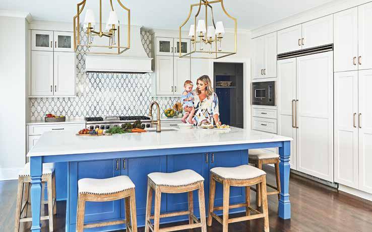
While Knorr and her team have long been selecting shades of grays and blues for cabinetry, they are now seeing homeowners leaning toward bolder choices, in and out ofthe kitchen. “If homeowners are reluctant to go totally bold in the kitchen, choosing a stronger option for the island while keeping the perimeters neutral is a terrific way to add a big splash ofcolor
without overwhelming the space, like we did in this family’s kitchen,” Knorr says. “Painting cabinetry in smaller areas, such as laundry rooms and powder rooms, with vivid hues can add an unexpected wow factor.”
When it comes to the homeowner’s style and imagination, no color is off-limits. It could be the perfect muted shade of orange inspired by a favorite painting, or the classic Farrow & Ball color Cooking Apple Green, so fresh, charming, and light. And for people who are hesitant to use a more daring color but want an exciting neutral palette outside of the traditional white, Knorr says many of the soft greiges are strong options, like the warmer Revere Pewter by Benjamin Moore. For home offices, libraries, and home bars, Impact Design Resources has successfully used dramatic blacks like Iron Ore by Sherwin-Williams or the timeless and intense deep-blue Hale Navy by Benjamin Moore.
Homeowners have unlimited options when painting cabinets versus staining them. While stain reacts to the specific wood species and will look markedly different depending on wood choice, paint colors offer a consistent look and a wider range ofcustomizations. From an unlimited selection ofcolors to mixing those colors with different materials to create an innovative look, the sky is the limit.
Knorr states, “With a fresh splash of color and some unique, personalized elements, a total cabinetry facelift can create tremendous impact in your home’s aesthetic.” u
For more information, contact IMPACT DESIGN RESOURCES at 704-778-6814 or visit IMPACTDESIGNRESOURCES.COM. Knorr worked with Lauren Nicole Designs and Omnia Construction to create this inviting home with many pops of color throughout.
SERVING OUR NEIGHBORS SINCE 1983
DONNA ANDERSON
REBA HATFIELD LUCY BUTLER LEIGH C. CORSO CAY CRAIG GAYLE DALY
CHIP JETTON COURTNEY KARNES KALIE KOIVISTO BRANDON LAWN
HEATHER MONTGOMERY KATHRYN THIGPEN LISA WARREN
At Cottingham Chalk, we put our clients first. Whether that means answering a late-night phone call or walking you through your first home buying experience, we are here for you. For over 35 years, we’ve been helping our clients in the Charlotte and surrounding communities find the home that is right for them. And we hope to be doing it for 35 more.


