4 minute read
DESIGN SYNC
TEXT BY BLAKE MILLER | PHOTOGRAPHY BY CHRIS EDWARDS
DESIGNER CHARLOTTE LUCAS MIXES ONE COUPLE’S INDIVIDUAL AESTHETICS TO CREATE A STUNNING, COHESIVE DESIGN.
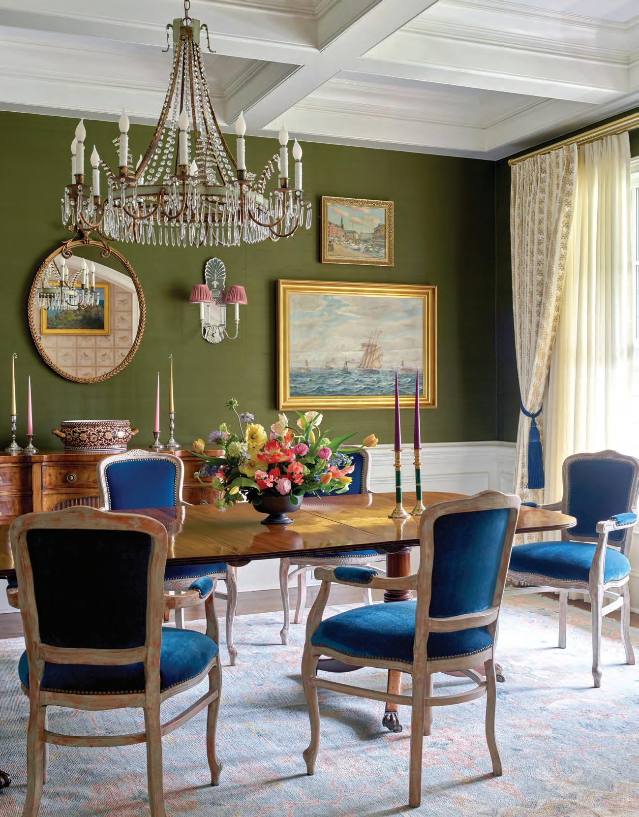
The dining room received a dramatic facelift with the addition of the green silk grasscloth wallcovering by Donghia for Kravet coupled with high-gloss white on the ceiling and trim work. OPPOSITE: Lucas installed a trio of framed custom Gracie panels on the wall, which pull in the other colors of the room. One of the homeowners’ existing antiques anchors the space.


AA DESIGNER’S JOB is sometimes part interior expert, part mediator, often helping couples find a happy medium between differing individual styles. So, when Charlotte Lucas’s clients came to her with a request to marry a love for traditional design with a penchant for modernity, she was barely fazed. “The husband is Danish and leans more modern, but the wife is much more traditional, so a lot of my work was bridging the gap between those two styles and creating an interior that felt fresh and alive for their young family,” says Lucas.
Lucas went with high-gloss paint on the living room walls, which are adorned with an antique mirror and a stunning collection of heirloom china. OPPOSITE: Lucas wanted the wife's office to skew more southern traditional, so she used textured, natural grasscloth by Phillip Jeffries on the ceiling paired with green-blue walls.

BELOW AND RIGHT: Lucas was tasked with designing the nursery as a surprise gender reveal for the couple. So, she designed a little girl's nursery that could age with their daughter. In the bathroom, she opted for classic all-white finishes but added a pop of color and pattern with the addition of the window treatment.

Lucas’s ability to seamlessly combine the two styles was one of the reasons her clients hired her. “Charlotte is so versatile, good at pulling things together, and catering to her clients,” says the homeowner. “She was really diplomatic about the process, keeping some of the things that meant a lot to my husband, but also shedding some of the not-sogreat things.”
To start, though, the home needed updating throughout. “The house had a great floor plan and bones,” says Lucas, “but it was brown town and it felt very dark inside.” A renovation of the kitchen and primary bathroom set the wheels in motion, and the home began to modernize. Then Lucas started working on the entry. “The question we asked was, ‘What do you want it to feel like when you walk through the front door? What’s the statement you want to make, and how does that transition into the dining room, then into the living room and so on,’” says the designer.
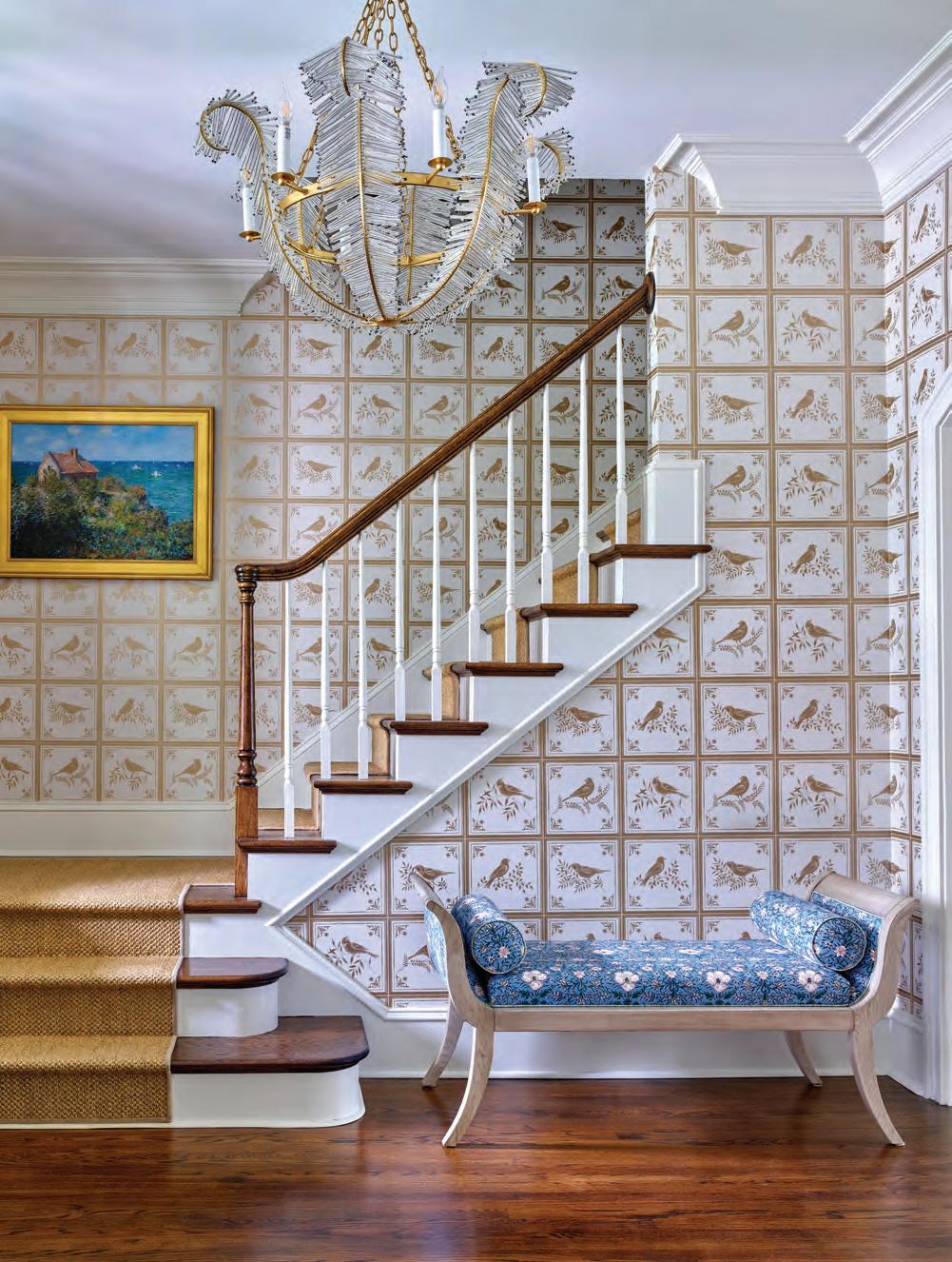
Lucas began with a gold-and-ivory floral wallpaper by Nina Campbell that covers the entire entry and the stairway. “We needed something that would make it feel different from the living and dining rooms, which open to the foyer,” says Lucas. “From that point, we wanted the dining room to feel moodier and darker; we wanted a more sophisticated experience in there.” The dark-green silk wallcovering by Donghia for Kravet coupled with a high-gloss white paint on the trim instantly elevates the dining room to elegant and stylish. Despite each room having its own color palette, all three transition cohesively.
That same smooth transition took place when blending her client’s styles. It was so smooth, in fact, that no one would ever guess it was the biggest hurdle in the project. In the dining room, Lucas used the husband’s collage of ship and

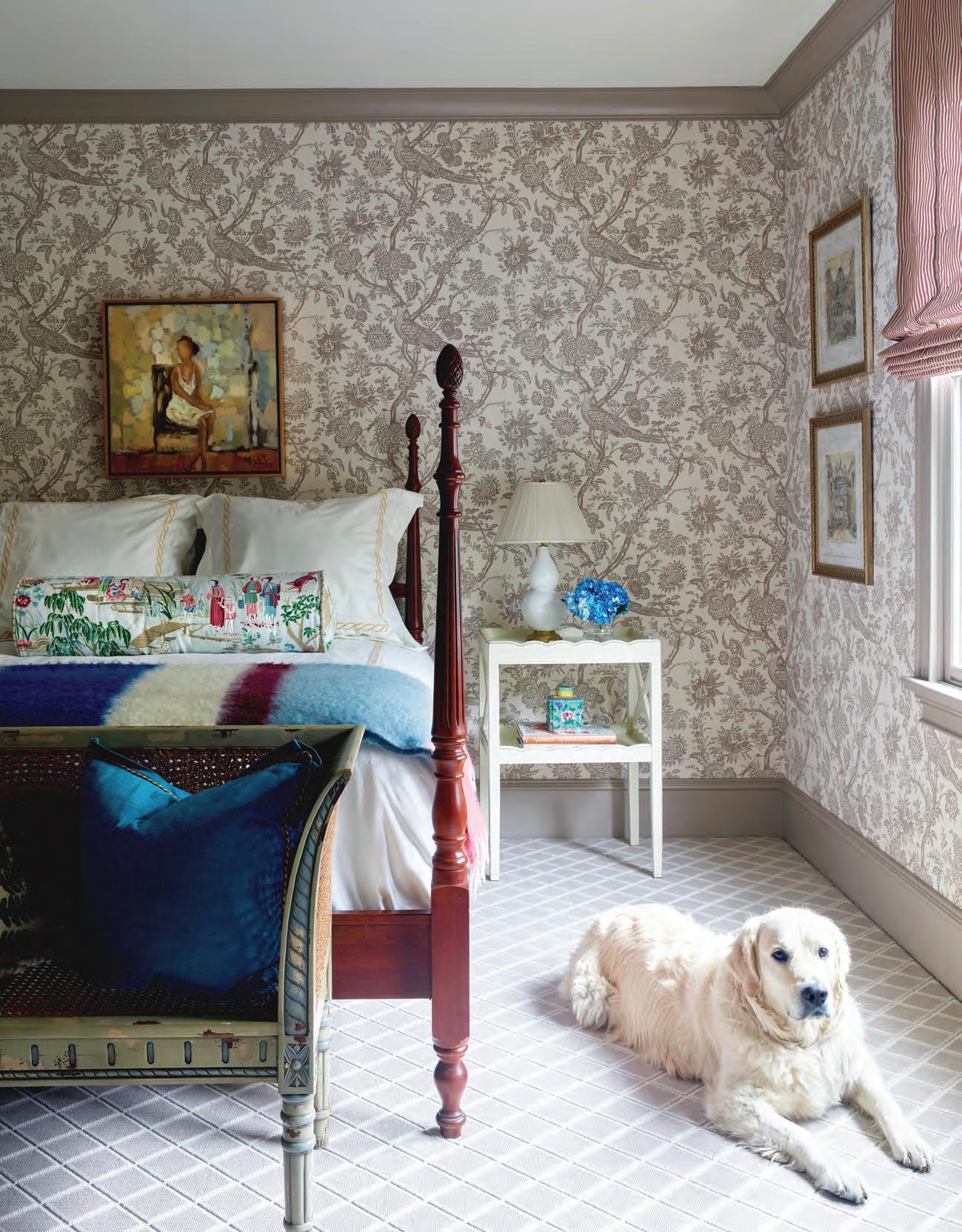
Brunschwig & Fils wallpaper inspired the design of the guest bedroom. The homeowners’ existing four-poster bed was updated with a new set of linens by Matouk and Biscuit Home, as well as the bolster in a Schumacher fabric with Samuel & Sons detail.


ocean landscape paintings, which are family heirlooms, as a focal point. “Never in a million years would I have thought it would work, but Charlotte was like, ‘Let’s just try it and see.’ And now I love it,” laughs the wife.
“I was a very intentional when joining the two styles,” says Lucas. “A lot of the projects we work on require a mixing of styles and time periods. It was fun to have a specific requirement, his style and hers, combined with two different styles of antiques from around the world, and make everything work together in a way that made sense. There’s a fresh, modern-tiered style in this house that they didn’t have before.”
Looking back, it’s clear to the homeowners that Lucas nailed the assignment. “We weren’t sure if we could marry our two different styles, but Charlotte made it possible.”u
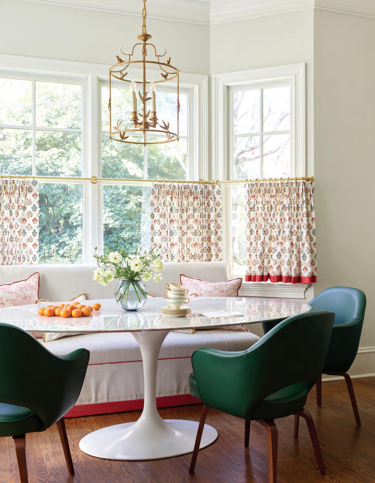
To add warmth to the classic all-white kitchen, Lucas brought in color via the window treatments and custom banquette fabric by Perennials in the breakfast area. A Saarinen pedestal table and leather chairs are from Design Within Reach. OPPOSITE: To create a stunning entrance, Lucas wrapped the foyer in a Nina Campbell wallpaper. A bench by Vanguard in a traditional fabric by Aleta complements the design.


