THE BURRELL COLLECTION: OBJECTS OF DESIRE


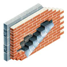
To build the best buildings you have to use the best parts
Award winning Scottish window & door manufacturer providing 'Best Value Solutions' since 1932
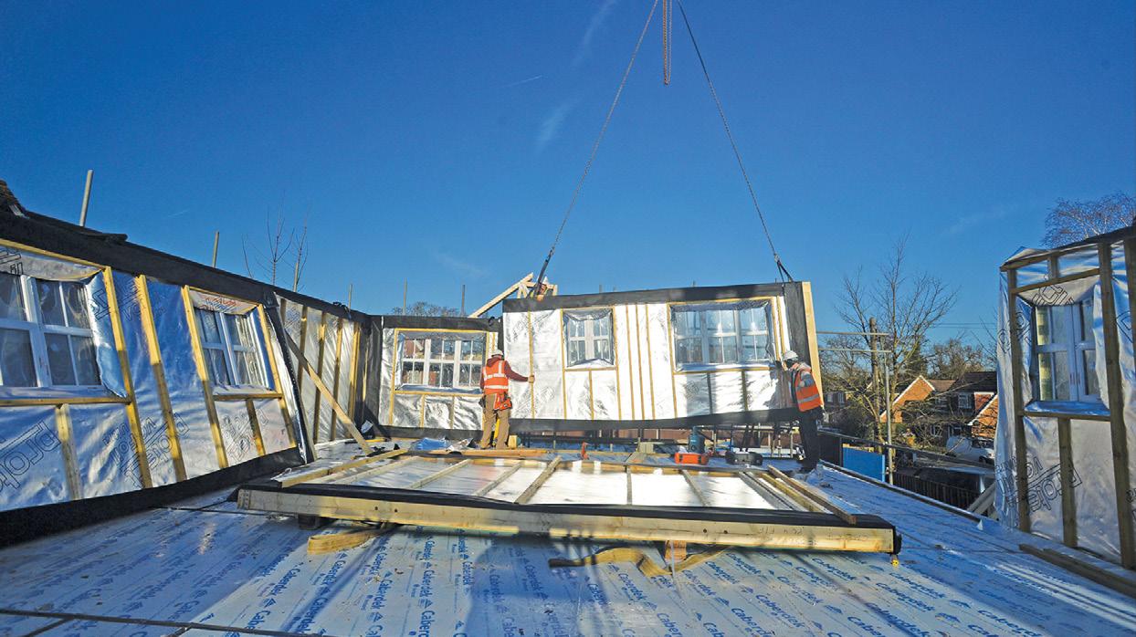
KitFix - the original factory fix fenestration system for offsite construction
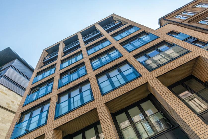
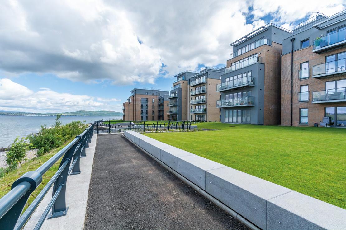
Extensive innovative product range with cost effective low U-values that can assist in net zero targets


Glazed & unglazed FD30 range now available
Dedicated estimating team & account managers
Fully accredited to the latest BSI standards
The theme of re-emergence dominates the spring edition of Urban Realm, as we welcome green shoots of recovery.
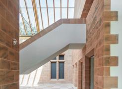
First up is Glasgow’s Burrell Collection (pg 12) which emerges from a five year hibernation. Its transformation has come at the perfect time to reap the dividends of a resurgent leisure economy but has it been worth the wait?

We continue our journey to Paisley (pg 46) via Sauchiehall Street (pg 21) to see how the travails of retail are forcing a reappraisal of how our streets function. Are culture, heritage and entertainment enough?

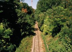
Across the channel we take a look at the Petite Ceinture (pg 38), a dormant line which has become a battleground for a green revolution in the city.
Landscape steals the limelight at the University of Stirling’s Central Campus
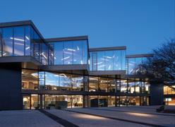
(pg 68) but a new entrance pavilion and improved access show how its true success lies in establishing a new relationship with its setting.
We also pay a return visit to Carbuncle favourite Cumbernauld (pg 82) in the wake of plans to demolish the central ‘megastructure’. A decision which may yet be lamented.
Elsewhere we investigate the importance of retrofitting (pg 54) to meet ever more stringent sustainability goals and recount the unsung timber story of Rogers Stirk Harbour + Partners (pg 88), following the passing of Richard Rogers.
It’s been a breakneck start to the year as we all strive to make up for lost ground but this reassures that whatever challenges lie ahead we have the wherewithall to meet them.
John Glenday, editor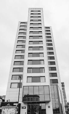

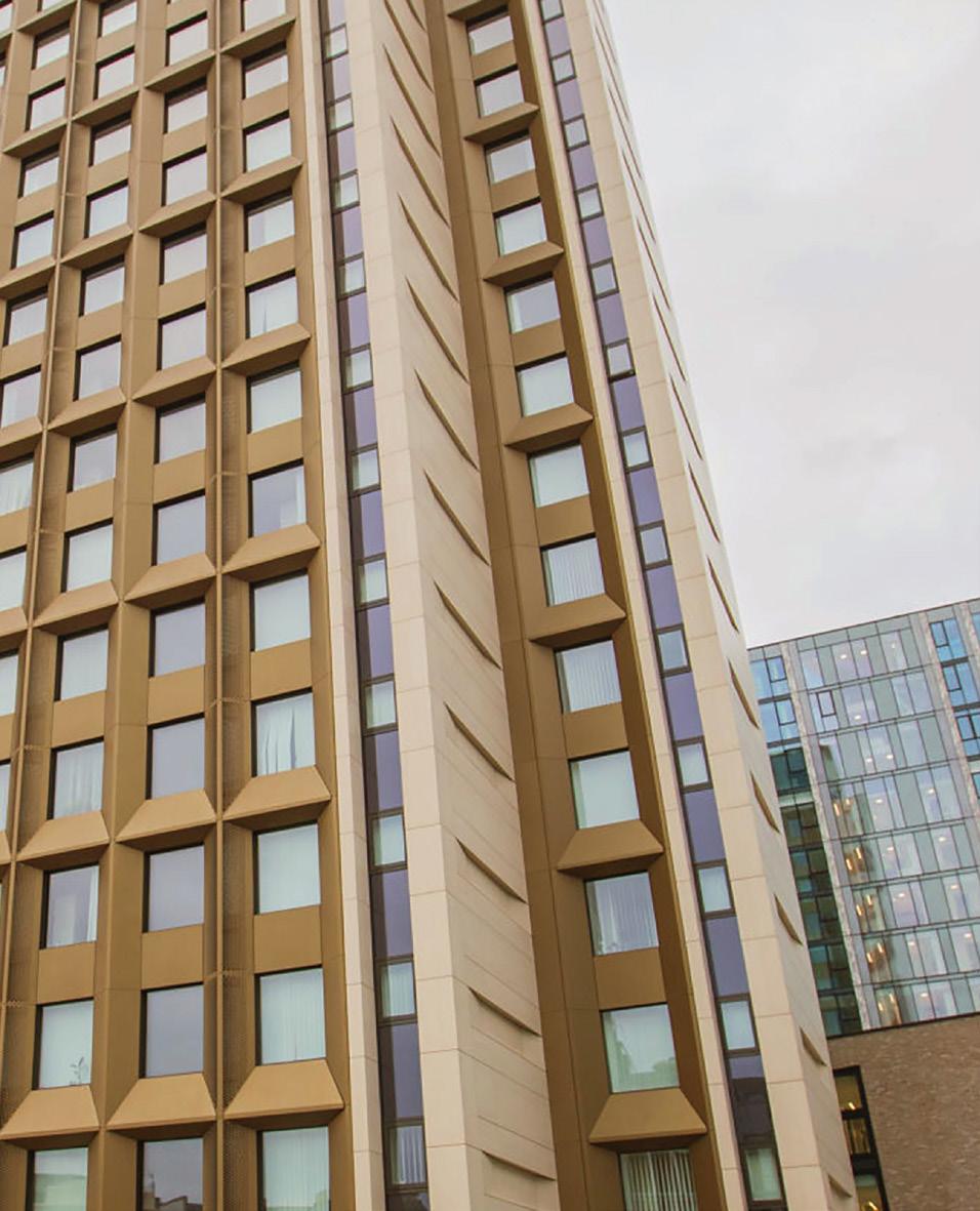
The ultra-compact surface, Dekton® by Cosentino has been selected for use for the Vantage Point Archway Tower redevelopment project in London
Find
25 Year Warranty.
Project Archway Tower Architect GRID Architects Dekton® Surface 3,000 m2 Façade Dekton Danae Natural Collection


Bigg Regeneration has taken forward the next phase of development at Dundashill, Glasgow, with the submission of plans by Stallan-Brand for 79-canalside homes arranged around a sunken garden to complement planned start-up business units.
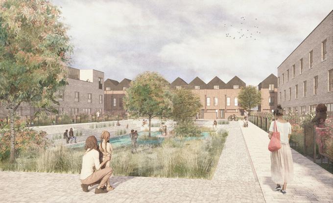
The joint venture body is owned by Scottish Canals and PfP Capital and managed by Igloo Regeneration. It is delivering a broader 600-home masterplan for the hilltop site, seeding a new community around the burgeoning urban sports destination.
Crosslane Residential Developments have appointed Hawkins\Brown to deliver serviced residential apartments on a brownfield site off Ocean Drive, Leith.
Billed as a new form of living Ocean Point 2, adjacent to Farrell’s Ocean Point office block, encourages tenants to use their rooms solely for sleeping in, with a host of communal spaces and facilities offered within the building as part of the allinclusive monthly rent that covers everything from utilities to a gym membership.
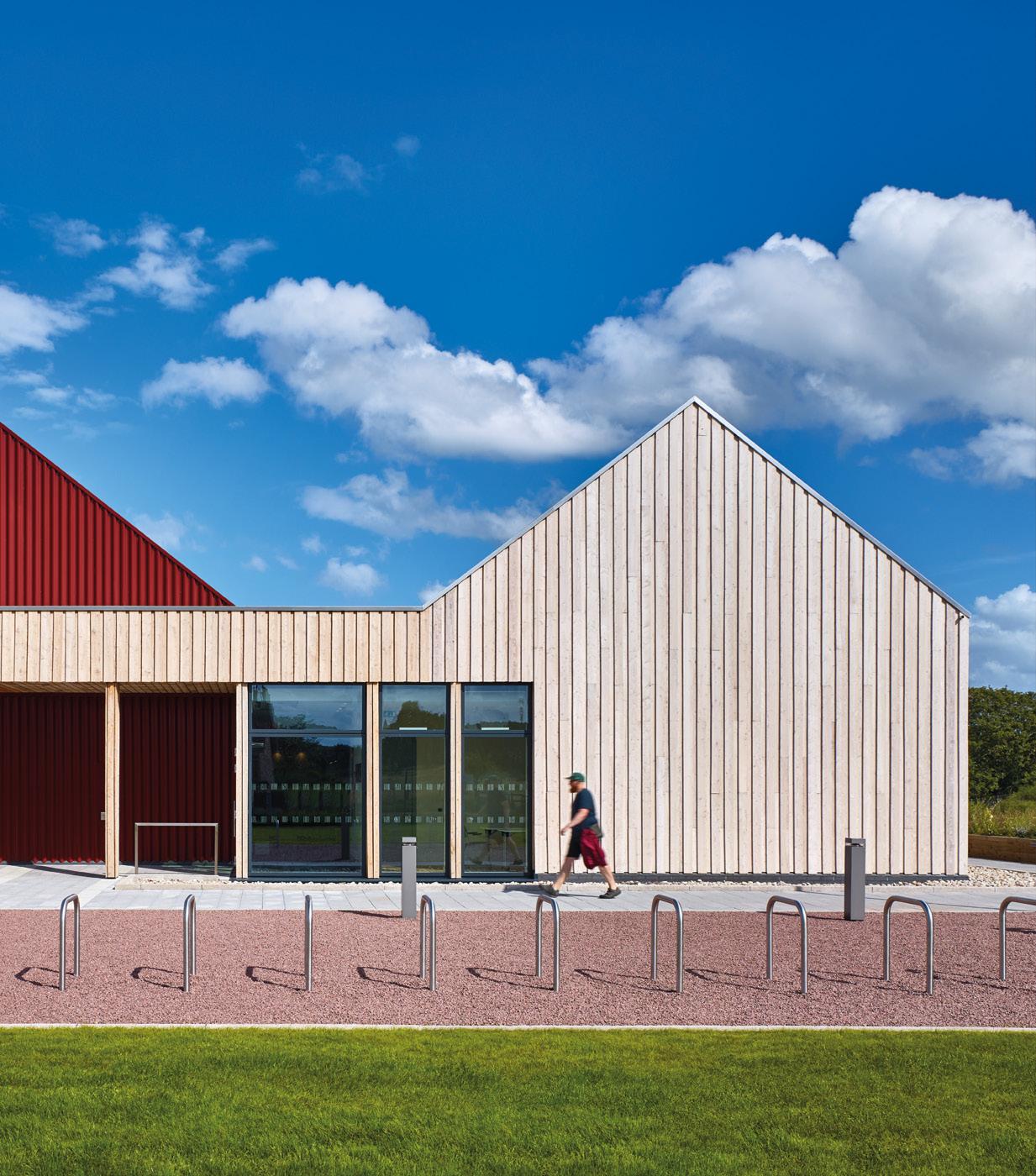
The Royal Zoological Society of Scotland has won approval for the erection of a discovery hub at the Highland Wildlife Park, creating a new gateway to the Cairngorms National Park Comprising an enlarged restaurant and shop with a wildlife and night sky monitoring station the development by Baxter Studio spans three buildings designed using locally sourced and sustainable materials.
Build to rent operator Get Living and Stallan-Brand architects have submitted plans for an intergenerational community on the 7.5 acre High Street Goodsyard site in Glasgow.
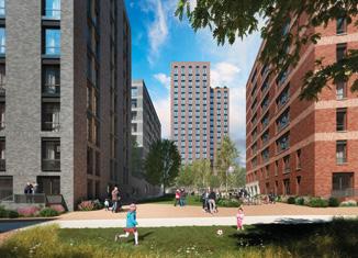
Combining 823 build to rent apartments and 687 student rooms the development will improve connectivity between High Street and Bell Street.
Soller Group and Mosaic Architecture & Design are seeking to erect the second phase of planned office development at Carrick Street in Glasgow’s Broomielaw office district.
Rising through 17 floors the taller element will provide over 270,000sq/ft of gross internal floor space and flank a new public plaza.
DS Architecture has applied to build a detached three-bedroom home adjacent to 20 Hillpark Avenue in Blackhall, Edinburgh.
A sensitively scaled design in line with adjacent properties is planned for the 1930s slice ofsuburbia which includes a mix of mid-century bungalows and more recent development.
Proposals to upgrade Queen’s Park Football Club’s training ground at Lesser Hampden to a fully functioning stadium have been filed by Holmes Miller Architects
Accessed from a glazed black brick entrance pavilion off Letherby Drive the expansion will increase capacity at the Glasgow ground to 1,450 by introducing spectator stands to the east and west, facilitating competitive league and cup matches.
Ardgowan Distillery has released its latest plans for a striking production facility and visitor centre overlooking the Firth of Clyde
The carbon-negative timber and steel structure has already been submitted for consideration by Inverclyde Council and will be built by specialist distillery engineers Briggs of Burton for completion by 2023.
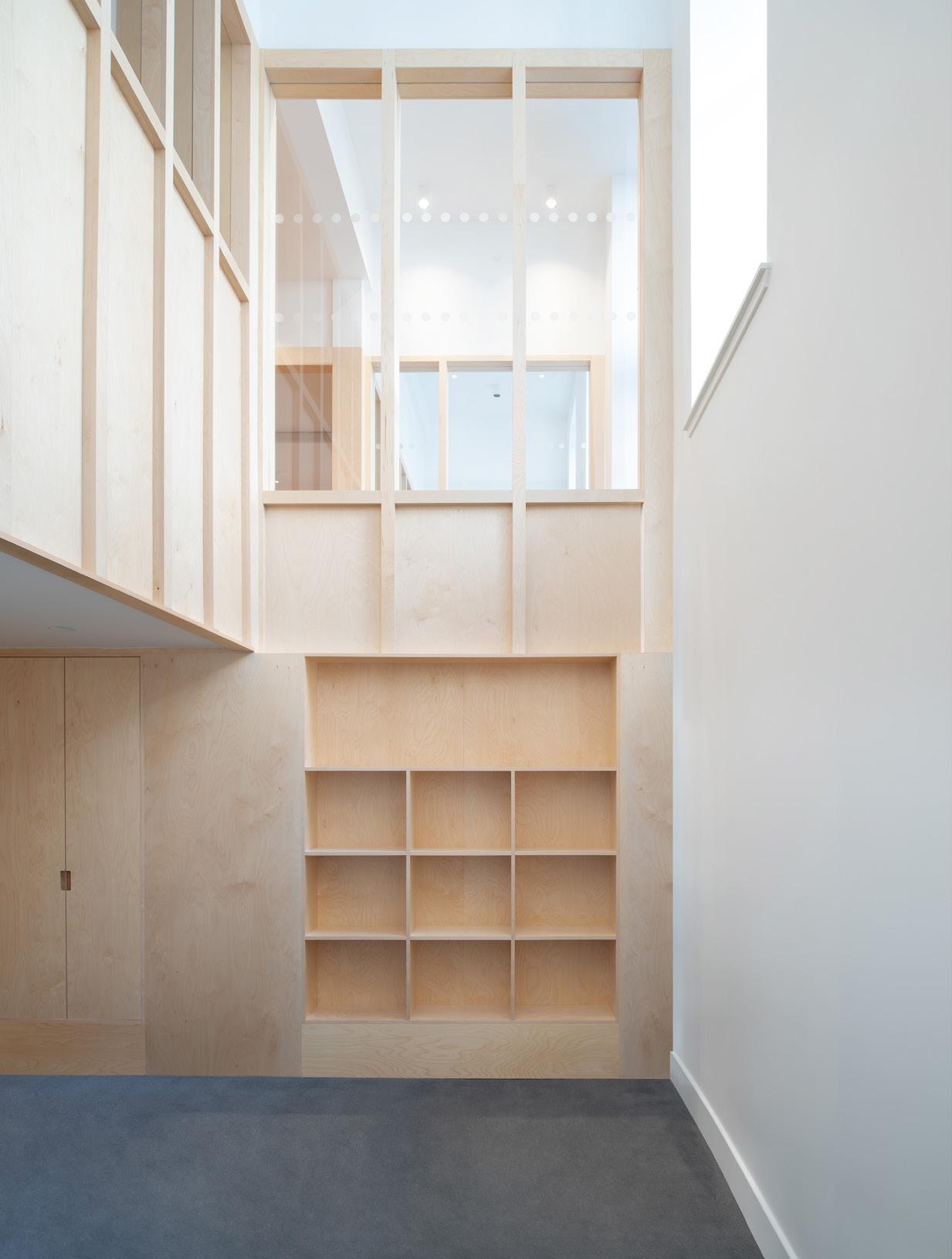
56Three Architects have obtained planning consent for the erection of a modest workshop and studio overlooking Lower Largo Beach, Fife.
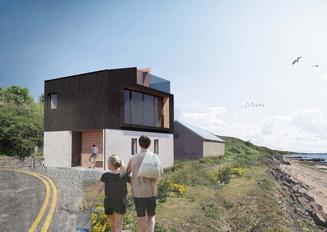
Housing an open plan workshop or garage on the ground floor the property rises via a top-lit stair at the rear to a studio gallery and a sheltered roof terrace above, offering elevated views across Largo Bay.
The wedge plan workshop will bookend the east of the village.
Ladybank Developments and Michael Laird Architects have received planning consent for a student accommodation development at Haymarket Yards, Edinburgh.
The decision clears the way for the applicant, a joint venture between GSS Developments and London & Scottish Property Investment Management, to deliver 153 studio apartments on a 0.16acre site, including a roof terrace and shared gardens.
The City of Edinburgh Council has granted consent to a pilot housing project at Granton Waterfront that will trial the delivery of affordable ‘net zero’ homes.
The Edinburgh Home Demonstrator initiative sees CCG and Anderson Bell Christie Architects team up to deliver 75 homes and three commercial units.
An application for planning in principle has been filed for the expansion of Portree, the principal settlement of the Isle of Skye, to address a chronic shortage of affordable housing.
Rural Design has prepared a master plan for 250 new homes on behalf of
Lochalsh and Skye Housing Association to extend the northern outskirts of the settlement at Kiltaraglen over the next two decades.
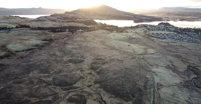
Boasting an elevated setting above the established urban centre, offering expansive views towards the Cuillins.
The University of Glasgow has moved to extend the presence of a temporary modular structure housing the displaced department of mathematics and statistics for a further five years beyond the approved cut off of February 2022.
Several architectural modifications are planned by jmarchitects in recognition of its continued role, centred on the incorporation of white ‘chalk’ text on dark cladding panels to evoke a giant blackboard. This overlaid text repurposes various computational symbols as floor decals and murals applied to laser cut aluminium panels.
Soller Group with Mosaic Architecture & Design have staged a virtual public consultation into proposals for Glasgow’s latest build to rent scheme.
A 1.3-acre site at 144 Port Dundas Road, comprising a third of a city block in Cowcaddens, has been identified for the delivery of the 16-storey apartment complex, heralded as an essential component of efforts to repopulate the city centre.
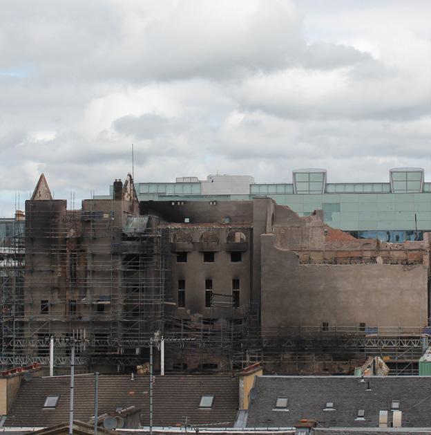
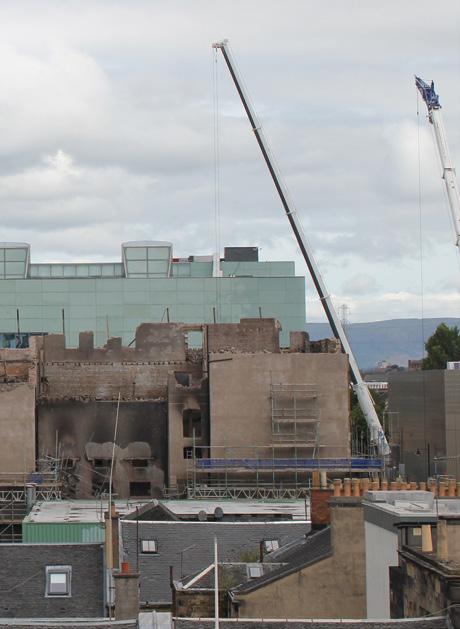
A long-awaited report into a devastating 2018 fire that all but obliterated the Glasgow School of Art has found that the cause of the conflagration remains ‘undetermined’.
The Scottish Fire & Rescue Service says physical evidence relating to the source of the fire was destroyed by the same blaze, rendering it unable to attribute an official cause for the record.
Clydebank Housing Association has commenced delivery of 18 homes for social rent on a former bowling green.
The JR Group has moved on-site with a mix of one and two-bedroom flats at Clydebank Bowling Club for the £3.2m build A design team including Mast Architects Cowal Design and Carbon Futures will help to deliver the project.
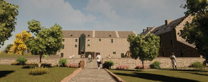
A disused Highland mill is set to give rise to a new distillery under plans filed by Dunnet Bay Distillers and Organic Architects.
The 200-year old property in Castletown will be subject to a £4m refurbishment to accommodate a distillery and visitor centre, a stone’s throw from the
Network Rail has filed plans for a visitor centre and reception hub at the foot of a vertigo-inducing elevated Forth Bridge walk.
Plans led by Arup with WT Architecture and The Paul Hogarth Company call for the UNESCO World Heritage site to be augmented by a reception centre where thrill-seekers can ascend the South Tower via maintenance gantries.
The revised plans take an ‘economical’ approach with a light weight building.
companies current headquarters. Run by husband and wife team Claire and Martin Murray the distillery owns the Rock Rose Gin and Holy Grass Vodka brands, acquiring the mill last year to provide expanded premises to cater for recent growth.
Plans for a net-zero apartment block have been brought forward for Gullane, East Lothian, to replace an unlisted bungalow on Main Street.
Studio IMA (on behalf of B&Y Developments) proposes to erect four, three-bedroom apartments of a height and scale more consistent with its setting, together with private parking and gardens on the 2.5-acre town centre plot. Set back 8m behind the building line the apartments adopt a distinctive roof geometry.
Dumfries & Galloway Council has awarded conditional consent to 89 homes in Locharbriggs Dumfries, on behalf of a registered social landlord.
Dumfries and Galloway Housing Partnership have identified a former haulage depot for the build which seeks to establish a characterful mix of family homes for social rent led by Collective Architecture and main contractor CCG Built around a ‘green-blue’ network of landscaping and SUDS the masterplan works with the existing lie of the land to segregate vehicle traffic along a single ‘High Street’ separate from active travel routes, connecting a sequence of community squares and spaces.
NHS Highland has completed work on the first of two planned community hospital’s in the region, a £20m facility in Aviemore
Badenoch and Strathspey
Community Hospital houses
24 inpatient beds, 12 consulting/ treatment rooms, a minor injuries unit, outpatients, physiotherapy, NHS dental suite, GP services, x-ray facilities the hospital also serves as a base for the Scottish Ambulance Service
Delivered by contractor Balfour Beatty with Oberlanders
Architects and Rural Design the 120 room hospital has been fitted out by furniture specialists
Deanestor
A former shop unit at 49 Cochrane Street in Glasgow, which has lain empty for over a decade, has begun a new life as an accessible headquarters for the Diocese of Glasgow and Galloway, part of the Scottish Episcopal Church.
The 310sq/m commercial space in the B-listed Italian Centre, last in use as an office by Page\Park Architects, has been retrofitted by Graeme Nicholls Architects to provide a flexible environment for working and gathering over basement and ground floors.
Plans for a bespoke farmyard home on the Isle of Arran have been lodged by Inkdesign who intend to clear a dilapidated cottage, oil container and storage sheds adjacent to Ardlui House to make way for a new dwelling.
Occupying an elevated position some 70m above sea level the site offers extensive views to the Holy Isle and Goatfell, with a bank of mature trees sheltering the site to the west. Salvaged stone will be incorporated into the landscape design.
Mast Architects and CCG have returned with revamped proposals to erect 46 apartments for affordable rent in Govan Superseding a prior application from 2021 the latest submission for the 0.26-hectare island car park, which would host two apartment blocks and shared amenity ground with just 15 parking spaces remaining. Both blocks will stand as mirror images of one another with feature balconies projecting from the prominent gushet end. A footpath will connect Golspie Street and Langlands Road.
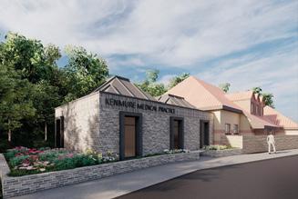
A Bishopbriggs medical practice is seeking urgent additional consultation spaces to meet the needs of a fast-growing population in East Dunbartonshire.
Kenmure Medical Practice on Springfield Road proposes to extend their present premises to increase GP and primary care capacity with three additional consultation rooms.
The proposed single-storey extension by S2 Architecture adopts two small ‘pyramid’ roofs similar to the existing surgery with tall box frame windows forming a civic frontage to the street.
David Chipperfield Architects with 3DReid and Loader Monteith have prepared detailed plans to transform the former Jenners department store in Edinburgh into a 96 bedroom ‘lifestyle’ hotel.
The category A-listed Princes Street building has been acquired by Danish billionaire Anders Holch Povlsen to introduce a boutique hotel on the upper levels while retaining The Grand Saloon below as part of a reimagined retail and hospitality experience.
The St Vincent Crescent Conservation Area of Finnieston could be joined by 15 apartments for Glasgow West Housing Association.
Coltart Earley Architecture has been tasked with repairing a hole in the streetscape by mimicking stone string courses and entrance porticos of its neighbour in addition to solid eave parapets, storm doors and cast-iron work.
The City of Edinburgh Council has launched a consultation into its plans to repurpose a Granton gas holder into a waterfront public space.
Views are being sought on how best to utilise the space after securing funding from the UK Government’s Levelling Up Fund to restore the B-listed frame as the centrepiece of a coastal park.
Part of the 15-year Granton Waterfront masterplan by Collective Architecture the proposals call for a sustainable coastal town to be built with the gasholder standing as the lynchpin of an active travel network and green space.
Works to refurbish and extend a historic B-listed Jute mill in Dundee city centre are to enter a second phase with proposals to restore the Victoria Street/Dens Road ‘sawtooth’ profile to its original appearance.
Again led by James Paul Associates the latest improvements to Eagle Mill will marry preservation of surviving fabric, with ‘robust’ interventions to facilitate its new residential nature on secondary elevations such as Lyon Street
‘Light touch’ changes see windows restored to their original proportions, with additional steelwork supporting the retained wall, behind which an ‘industrial’ walled garden will be located for the benefit of residents.
Plans for an urban distillery in the heart of Campbeltown have been drawn up by Bowman Stewart Architects.
Work has been completed on the development of 23 affordable homes at St Ninian’s Crescent in Paisley on behalf of Link Group.
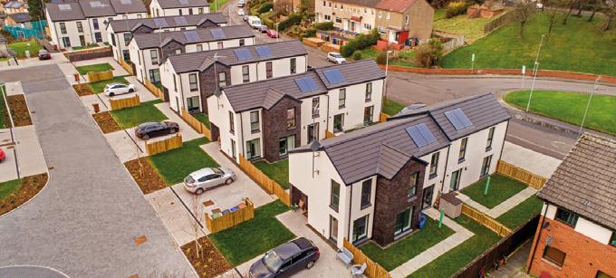
Delivered by the JR Group with Renfrewshire Council and Hypostyle Architects the work comprises a mix of 19
houses and four cottage flats, all of which are occupied.
Built on brownfield land later adopted by the local community as an informal route between shops on Rowan Street and St Ninian’s Road the project maintains this access with improved landscaping.
The Dal Riata Distillery is to be built on Kinloch Road with a capacity for producing 850,000 litres of pure alcohol per year using local barley grown at the historic Dunadd Hillfort Centred on a dramatic still house with floor to ceiling glazing and a viewing gallery overlooking Campbeltown Bay the distillery will hark back to the turn of the 20th century the town hosted no fewer than 30 distilleries.
Scottish Borders Council has shared plans for a £46m replacement for Peebles High School following a devastating 2019 fire.
Stallan-Brand Architects have been brought on board to oversee the new building, which will introduce a range of

educational and community facilities to the town when it opens in 2025.
The tandem build solution is set to break ground later this year, rising on the footprint of an existing rugby field, evoking the form of a ‘country estate’ property typical of the surrounding area.
Link Group has broken ground on 82 affordable homes designed by Stallan-Brand at Upper Achintore, Fort William, as part of an overall masterplan for 319 homes.
Led by the JR Group WGC and TSL Contractors the project will deliver a mix of terraced homes, cottage flats and two wheelchair-accessible bungalows on an elevated 23-hectare site.
Acquired by the affordable housing provider in 2019 the development will provide predominantly terraced housing finished in timber boards.
Plans for an innovative coliving residential home in Aberdeen have been brought forward by Camphill Schools to provide accommodation for charity workers wishing to remain associated with the movement in later life.
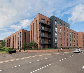
A consultation into plans to redevelop the derelict Shawbridge Arcade on Pollokshaws Road, Glasgow, to provide 71 apartments has been launched.
The Wheatley Group with Coltart Earley Architecture proposes to demolish the 1970s arcade to erect eight new-build blocks of up to five storeys.
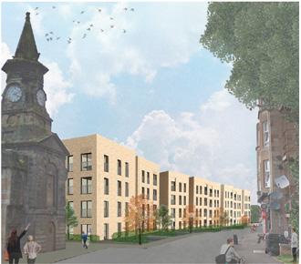
Kelvin Properties have surfaced plans for a ‘gateway to Paisley’ apartment block on the site of a former office block on the corner of Saucel Street and Lonend. Incorporating shared spaces and hybrid office zones the development of 67 apartments by Mosaic Architects comes with solar PV panels and electric charging.
The co-housing community by Taylor Architecture provides 20 apartments with common house features to encourage friendship and companionship among occupants while maintaining their independence.
Feilden Clegg Bradley Studios have trailed plans for a ‘sustainable urban neighbourhood’ in Finnieston , Glasgow, of between 400-425 homes.
A 0.95-hectare site bounded by Minerva Street Finnieston Street and West Greenhill Place has been purchased by Keltbray Developments to accommodate hundreds of build to rent apartments alongside flats for private sale. Focussed on improving pedestrian and cycle permeability to encourage carfree living the development will incorporate a new east-west street and ground floor public spaces and a central plaza overseen by Open to establish a sense of place.
Edinburgh planners have given the goahead to the refurbishment and alteration of a semi-detached villa at Cluny Drive in Edinburgh’s Morningside to take full advantage of a rear garden. DSArchitecture proposes to demolish an existing sunroom and cut a large new opening to the rear elevation. An adjoining annexe will be given a complementary makeover through internal reorganisation, an altered roof and the addition of zinc cladding.
Expanded plans have been aired by Wilson & Gunn for a 10,000 capacity waterfront arena in Dundee that would provide a home for live music, e-sports events, conferences and other events.
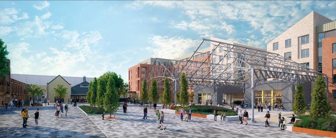
The vision calls for the Mecca Bingo site on the Nethergate to house the arena with an adjoining temporary car park at Yeaman Shore hosting a 70-room hotel, a significant scaling up of ambition from a 2018 proposal for a 6,375 capacity venue alone.
Detailed planning consent is sought for the first phase of a £100m overhaul of the Ocean Terminal shopping mall in Leith.
Detailed plans by Keppie Design with LDA on behalf of the Ambassador Group seek to reimagine the 20-year old retail complex as a community-focused facility by demolishing the north wing of the current building to establish a new outward-facing frontage defined by new retail, leisure and public realm.
Watkin Jones Group has lodged plans for a car-free rental community at New Mart Road, Chesser, with the City of Edinburgh Council.
The brownfield build to rent project replaces former livestock sheds, latterly in use as indoor bowling and football venues, with a mix of homes, student housing and
community facilities.
Led by Manson the work will see a ‘significant’ proportion of iron frames from listed cattle sheds retained and incorporated into the overall development after studies found that the costs of maintenance, repair and upgrade of the sheds were unsustainable.
A public consultation to transform Edinburgh’s Cameron Toll Shopping Centre, currently designated as a commercial centre, into a neighbourhood centre has been held.
3DReid have prepared a radical masterplan for the aging out of town mall, opened in 1984, to take account of fast-changing mobility and shopping patterns. This would see the current site, which alongside the mall comprises two drive-through outlets, a petrol station, service yards and a 1,000 space car park remodelled to face out to the Craigmillar Park Conservation Area
KR Developments and 56Three Architects have opened a public consultation to deliver 230 student bedrooms at South Ward Road , Dundee
A fragmented urban block near Dundee House will be knitted back into the streetscape by establishing a hard edge while retaining an interior courtyard as outdoor amenity.
The Highland Council has brought forward plans to redevelop the Meiklefield area of Dingwall , demolishing 114 existing homes and replacing them with 117 new build properties.
The local authority has enlisted HRI Munro Architects for the rebuild, which will replace ‘four in a block’ properties dating from the 1960s in phases through to 2025.
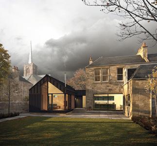
Arnold Clark and Page/Park have opened a consultation to transform a former garage at 1 34 Nithsdale Drive, Glasgow, into a mix of 106 apartments for general sale.
An island site overlooking Strathbungo Junction will be redeveloped by the car dealership and a future development partner to ‘fill the gap’ in the streetscape, including 100% parking
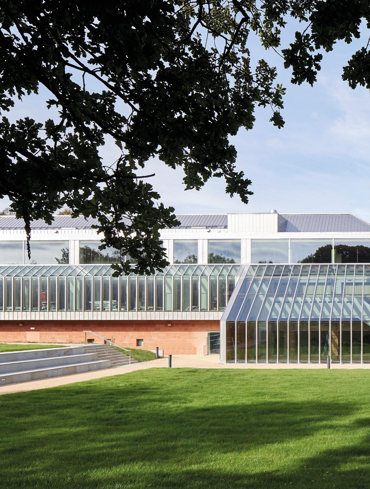
THE RE-OPENING OF THE BURRELL COLLECTION, IN TANDEM WITH THAT OF SOCIETY AS A WHOLE, PROMISES TO REKINDLE A LOVE AFFAIR WITH THE PUBLIC TARNISHED BY LEAKS AND LIMITED DISPLAY CAPACITY. HAS THE IMPERFECT BEEN MADE PERFECT? URBAN REALM SPEAKS TO JOHN MCASLAN TO FIND OUT HOW A GLASGOW INSTITUTION HAS BEEN RETOOLED FOR THE CHALLENGES OF A NEW AGE.
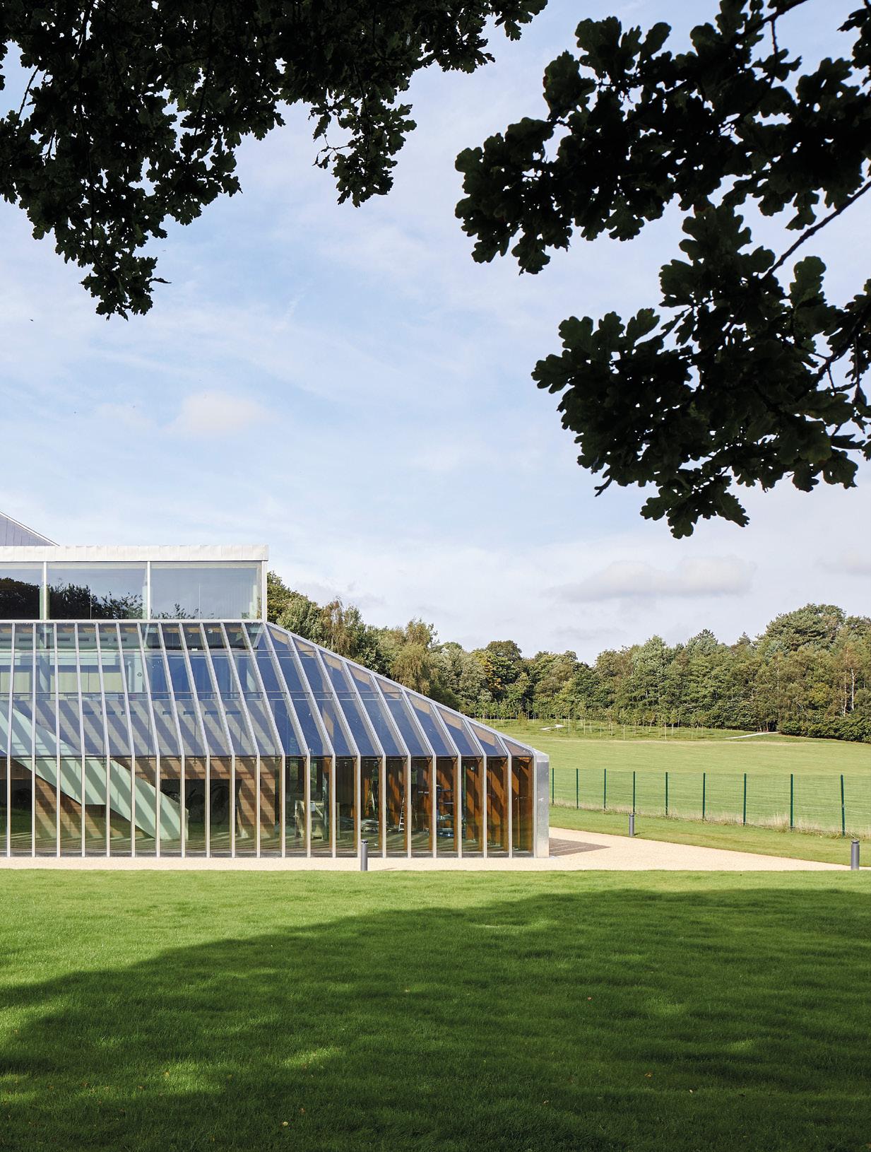
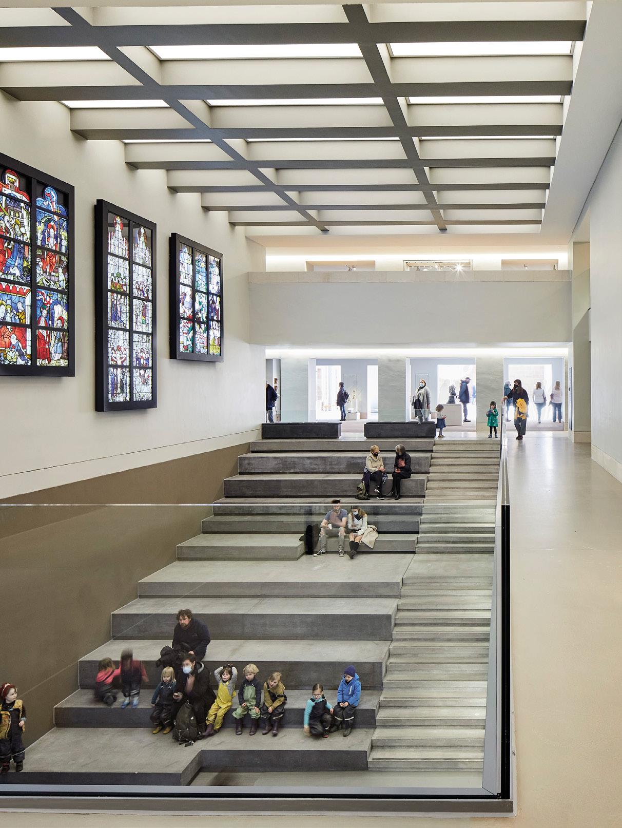
Glasgow’s Burrell Collection has emerged from an extended hibernation in a more expansive form following a £68m refurbishment at the hands of John McAslan & Partners. The A-listed landmark building was widely praised as a jewel in the crown of the city’s cultural offer but suffered in later years from dwindling visitor numbers, unchecked solar gain from expansive glazing and constant leaks.
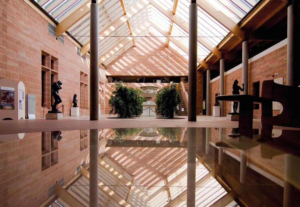
Architectural sentiment has similarly blown hot and cold, a point not lost on executive chairman John McAslan who researched the history of the building thoroughly upon taking on the commission. “It was received phenomenally well in some quarters and less well elsewhere, there’s a rather unpleasant piece written by Michael Wilford (a critique of the Burrell Museum published in The Architect’s Journal in 1983), but it was hugely successful and had a million visitors.”
Referencing John Julius Norwich in the contemporaneous Burrell Collection book of 1983 McAslan points to the large amount of white space that became apparent when looking at plan drawings. “The plan effectively shows up the voids at the elongated entrance, courtyard, lecture theatre and temporary gallery. Why have these voids? The turn into the courtyard is a dead-end and you have the Hutton Rooms around its edge. The lecture theatre beyond it and the temporary gallery beyond that was generally shut because the lecture program was infrequent and the temporary gallery, which is a beautiful space with that
gorgeous eastward louvred pitch, never opened.”
The volume of perceived dead space is cited by McAslan as a contributing factor to the declining popularity of exhibits such as the Hutton Rooms (three furnished rooms salvaged from Hutton Castle in the Scottish Borders) in the dying days of the old Burrell, shunned by visitors because it was ‘on a route that you would miss’ and suffering from a paucity of things to see. “The Hutton Rooms were barely used”, he observes. “There were about five people per day visiting the smallest of the Hutton Rooms and maybe 15 or 20 a day for the biggest. You couldn’t access them. The drawing-room, the biggest of the three rooms with dual access from the Walk in the Woods (otherwise known as the North Gallery), was more embedded in the fabric of the building and more satisfying because it forms the northern edge of the courtyard.”
To address these challenges McAslan cites five principal changes; namely a new entrance, agora, temporary gallery, mezzanine and stores. The new entrance was a particular bone of contention in some quarters with McAslan acknowledging that John Meunier, co-architect of the 1972-83 Burrell alongside Barry Gasson and Brit Andresen, ‘wasn’t particularly supportive’. Meunier broke ranks in 2017 to issue a public appeal urging retention of more of the original fabric, principally the extended entrance sequence and restored Hutton Rooms.
Such sentiments were given short shrift by McAslan who
points to the more pragmatic approach of Gasson, who was happy to entrust the Burrell baton to a new generation save for one esoteric detail. McAslan recalled. “His concern was the planting in the courtyard. Originally, there were four trees. But they died and were replaced by four bushes that he hated because they weren’t looked after. He and Meunier had a falling out and there’s a story that when they both visited the building, at the same time, they danced to avoid one another.”
Ultimately it was client Glasgow Life that mandated much of the changes, with practical necessities overriding romantic ideals, sparking a to and fro with the architect to alight on a middle ground that would be acceptable to all. “There was a lot of pressure on Glasgow Life to do certain things to the building to open it up. Most of which I think were fine and one or two that we didn’t particularly want. They wanted the new entrance to be midway in the building and we said you couldn’t do that because it meant you’d have to prop up the landscape. But we did concede that an additional entry in the corner where the two meet could work axially on the Hutton Rooms on the basis that the original entrance route would remain open.
“The original entrance didn’t work, it really didn’t work. I think that while it was elegant as an architectural entrance there are issues of access. It was a piece of theatre and that’s fantastic. The reality was though that we felt there was no reason that this piece of theatre could not be maintained and supported by
a more straightforward gathering space for group visitors, not necessarily in a linear procession.”
That line of thought has delivered two additional entrances on the lower floor from the cafe and at the base of the central public space (agora). An enlarged retail space and cafe also tick the necessary commercial boxes while opening up the hall to better serve gatherings and collections. The agora makes use of a little-used lecture theatre to house stained glass displaced from the new entrance and it connects to open access stores, a temporary gallery and a cafe on the lower floor. This latter change illustrates the fundamental vertical shift at play in a collection that has always been defined by its horizontal relationship to Pollok Park as the building is made to work harder from the roof to the basement.
Every square inch of the building has been accounted for in the redesign to maximise floor space to house the collection, substantially increasing the 1,800 objects (20% of the collection) that are available to view. “That percentage was too low for various economic and curatorial reasons”, acknowledges McAslan. “It was rare for any rotation of the collections to take place and it meant that the majority of the other seven thousand objects were in storage. Now you get a much more rounded sense of Burrell’s collecting by having more objects on display.”
By opening up the ground floor in its entirety the number of objects on display now stands at 5,500 with the remaining

9,000 items available to view in open access stores and which will be rotated through the main display from time to time. Greater flexibility also permits the temporary gallery to accommodate events, with a conservatoire band making use of the agora for a relaunch dinner. Long-term however it will permit recurring weekend talks and concerts to be hosted, keeping people interested long after they’ve seen the exhibits.
A ‘big win’ for McAslan was the first-floor mezzanine spaces which have gone from a few relatively modest impressionist galleries to utilising the entire floor space as a ‘makers and making’ display which enables visitors to explore the collection through the eyes of the artisans behind the art. This has been achieved by pushing staff rooms up into the eaves and relocating community spaces into an independent wing that is closed off out of hours behind a glass door. “It means that truly the Burrell is now a building of three floors, not one. There was evidence that people coming into the Burrell went straight for the cafe, very few people went anywhere. It had to work harder because whether or not one liked it the presentational and rotational aspects of the building limited the interest of the public. There were 125 thousand visitors in its final year and this was decreasing, not just because it was leaking but because there wasn’t enough to see.
“People had tired of it and the way of presenting art had changed, there needed to be more story-driven exhibits. You
could be sniffy and say the purity of the art is being immersed in other narratives but there’s another story of Burrell the collector and how things were made and where they came from. I think for a younger audience in particular it enriches the story of what is a very eclectic collection. It’s appropriate to try and knit all this together in some way. People say the Burrell collection is world-class. Well, it is world-class but it’s a world-class private collection. It’s not the Metropolitan Museum of Arts, the British Museum or the V&A. It’s an eclectic collection by one guy who bought some ships and bought art to build a collection and it ends at Rodin in the 1880s and has elements within it that may or may not interest you like armour and porcelain and cut glass but when I walked around more recently it struck me, it felt like a collection amassed at auction. You had 23 Deygas, a beautiful Cezanne and early Renaissance tapestries but to create a new audience it needed more.”
An eye-watering repair bill of £25m is cited for the roof and facades as well as modernised energy systems, leaving around £5m to cover all the other interventions. “The first part was repair and energy enhancements”, says McAslan. “The second part was facilitating a large number of objects to be displayed at any one point and for all of those objects to be within the building for rotation, all while protecting the grade A nature of the building. Beyond that was the budget for representing the collection, which is significant and additional.”


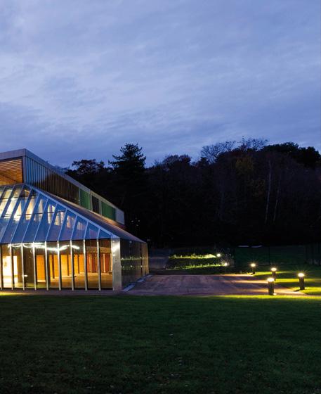
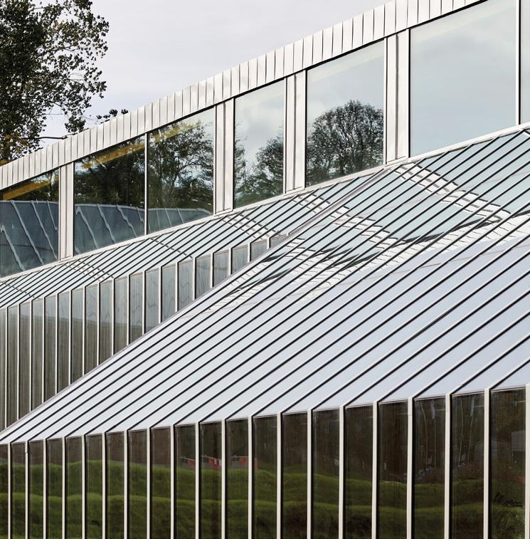
The refit provided an opportunity to upgrade power, heating and lighting while repairing notorious leaks which bedevilled the museum in its previous incarnation. That process saw existing glazing frames retained, saving over 8.5 tonnes of aluminium, part of a package of facade enhancements that have seen the Burrell Collection achieve a BREEAM Excellent rating.
So often buildings are designed to take a back seat to the objects within but the Burrell encompasses a lot of the exhibits within the fabric of the building itself. How did the practice respect the built backdrop? “The embedded architectural fragments add a level of richness. They are very curious things but they sit so beautifully and the Hornby Portal is just magnificent with the sandstone cleaned. In any listed building, whatever we do, apart from removing later accretions, we are impacting the original fabric. We’re not there to be arrogant and try and make it better. We’re there to try and limit damage to the original concept and respect what existed through the change.”
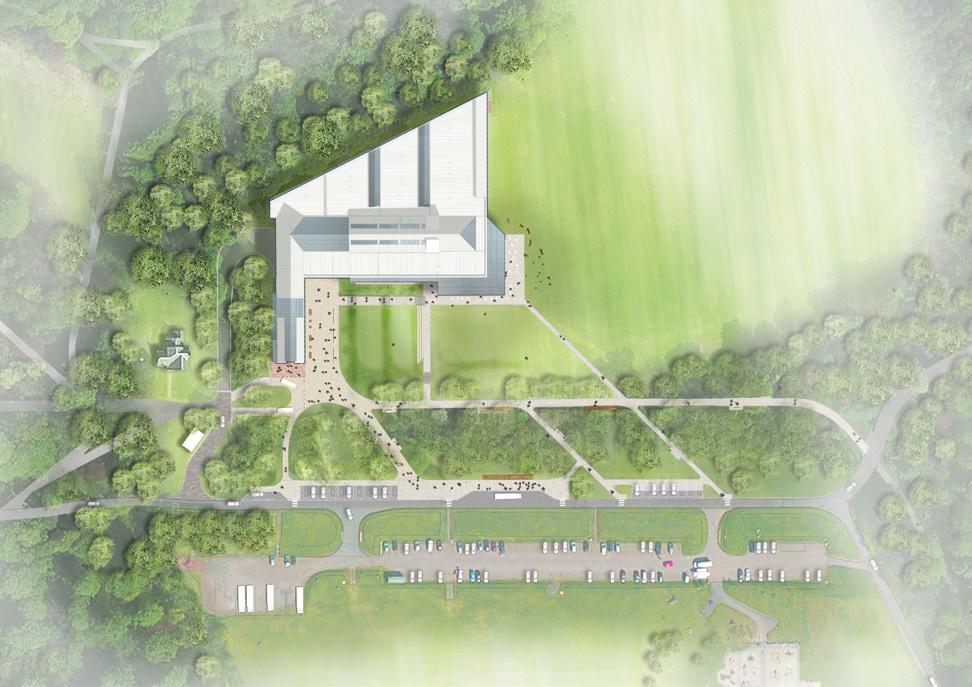
The landscape was always critical to the success of the building with attention drawn to the lush surroundings as much as the objects within. How does the new look Burrell address its setting? “We created a very simple bound gravel terrace to the cafe which I think will work as an extension of the cafe in the summer. Level with the grass there’s a terraced seating area with three lines of stone and benches, you are encouraged to step through the landscape into the building. On the upper level, there is a rolling forecourt or piazza which will host events. It will be an external congregation space, which it didn’t have before.”
Delayed around nine months following a series of pandemic related interruptions the Burrell is opening at the perfect time to
capitalise on a society re-emerging from stasis but it remains to be seen how people will respond, McAslan himself will reserve judgement until he sees the building in use. But bringing logic and reason to bear on a building that suffered as much as benefitted from its extravagant design has created a far more functional museum while retaining the theatrical aspects which made it so unique.
As a counterpoint to the Macintosh’s sorry tale of fire and flood, the Burrell stands as a testament to the fact that no problem in architecture should be insurmountable, ensuring that the rare beast of a building designed for aesthetics over practicality can live on even in today’s cost-conscious world.
Landscape Architect: John McAslan + Partners
Structural Engineer: David Narro Associates
Services / Fire Engineer / BREEAM: Atelier Ten
Façade Consultant: Arup
Cost Consultant: Gardiner & Theobald
Project Manager: Gardiner & Theobald
Main Contractor: Kier
Planning Consultant: John McAslan + Partners
Acoustic Consultant: Sandy Brown Acoustics
Access Consultant: David Bonnett Associates
Exhibition Designer: Event Communication
Catering Consultant: Jo Headland
Retail Consultant: Seeking State
Wayfinding / Signage Designers: Studio LR
WINDOWS AND DOORS
At NorDan we are happy to be the forerunners in the transition to a sustainable construction industry. We try to lead by example - we’ve done it for nearly 100 years.
NORDAN.CO.UK
W R T C E T B D R I E E A H I Y O E N
PATRICK MACKLIN, DEPUTY HEAD OF THE SCHOOL OF DESIGN AT THE GLASGOW SCHOOL OF ART, UNDERTAKES AN INFORMAL SURVEY OF SAUCHIEHALL STREET’S MULTIPLYING VACANT, VOID AND BROWNFIELD LAND TO SEE WHETHER THE AVENUES PROGRAMME HAS PUT IT BACK ON TRACK.
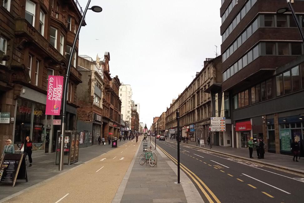
Sauchiehall Street in Glasgow stretches 1.5 miles (2.5km) from the city’s central core to Kelvingrove in the west end. En-route it is criss-crossed by other streets, the names of which evoke flowers, gemstones, waterways, even Hope itself. In recent years, if certain headlines are to be believed, feelings of the latter have been in short supply, however closer inspection offers alternative readings.
Things change. The street’s central section, from the city centre to Charing X, with its mid-nineteenth century shops, offices, recreational spaces, tenement flats and free-standing houses, was once a mere pathway through a willow grove. A casual survey of its current
early twenty-first century manifestation reveals a place in flux, expressed through sharp contrast and surprising blends of occupancy. Presumptions abound that the place enjoyed better days, before being blighted by an undeserved super-concentration of vacant and brownfield sites clustered between the mall in the east and the motorway in the west. Considering ongoing shockwaves from the financial crisis, radical brick-andpixel alternatives to the high-street and, more recently, the impacts of the pandemic, it is astonishing that it persists at all.
Beginning with the 1970’s pedestrianisation of the street’s easternmost blocks, prioritisation of pavement over highway has extended westwards with the recent piloting of the city’s ‘Avenues Project’. As well as introducing comprehensive traffic-calming strategies, this provides a strong connecting thread through the neighbourhood and firmly asserts the importance of people over motorised vehicles. In January of this year a long overdue adjustment to the Highway Code (rules H1–3) gave priority to pedestrians, then cyclists (and people on horseback) at road junctions. In a gridded city such as Glasgow this has a significant impact on the ebb and flow
of people. Despite this, an impressively enhanced linearity remains bisected or awkwardly abutted by perpendicular routes, as a result, navigation on foot or on wheels, is an episodic experience and transitions between its various segments are far from gentle segues.

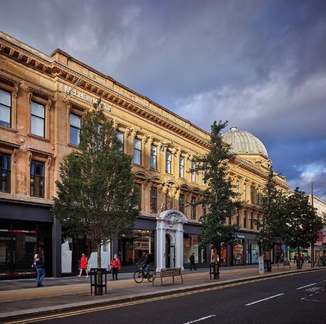
There is dramatic contrast between the north and south sides of the street. Active retail units, banks, barbers, bars, and restaurants are evenly distributed between each. Supermarkets dominate the north side, as do pharmacies. The jewel-like Mackintosh designed tearooms face north. Restaurants and cafés are evenly shared but fast-food is doubly concentrated in the south. The sunny side houses a military museum, ‘Scotland’s Biggest Nightclub’, a university dental hospital, the CCA (Centre for Contemporary Arts), Savoy Market and three gap sites. Newsagents are predominant across the road, one incorporating a Post Office. Nearby, behind the façade of the former La Scala cinema, is one of the few remaining and largest bookshops in the country. Notwithstanding this plethora of activity there is a tangible sense of vacancy here.
Glasgow, in contrast to other cities, has a comparatively small number of its citizens living in its
centre, moreover it has experienced an especially slow return to office working. Considerable numbers of former commuters, at least those able to continue operating remotely are either choosing to do so or are compelled to. As a result, the presence of people may never recover to pre-pandemic levels, this is bad for business, and an unnatural hush descends on the place by early evening. Heading into spring, with the pandemic and associated restrictions further easing, the number of vacant units, ranging in scale from compact to substantial, is haunting. Empty shop units and silent bars sit either in clusters or monumental isolation. Evenly sprinkled Deco era buildings which, last century, housed some of the areas celebrated high-street stores, department stores and banks, including C&A M&S, Watt Brothers and Bank of Scotland, are emptied or may soon be so. In the six years since BHS collapsed eight out of ten of this type of retail space has vanished from our cities.
There is an understandable nostalgia for landmark retail, and department stores especially. They often occupy prominent sites within provincial cities, providing legibility and expression of place, but it is useful to remember that, once upon a time, they might have absorbed the
haberdasher, the milliner, and the perfumier, just as the supermarket consumed the butcher, the baker, and latterly, the candlestick maker. Sentimentality cannot insulate city centres from the impact of the seismic shifts in shopping habits that have only accelerated over the last decade, particularly those of the technologically facilitated variety, and became universal during the pandemic.
Throughout the pandemic the interior was subject to unprecedented levels of attention as vast numbers of people across the world were ordered to stay at home and streets emptied. When we could eventually go out, masked, we tentatively exited our dwellings, like scubadivers leaving submarines, or astronauts departing from the protection of a spacecraft. We were confronted with transformed spaces. As we had physically distanced everything had effectively shrunk, we needed more space to do the same things. Where we could we began to encroach onto the street. This shock has drawn fresh focus on practices such as adaptive reuse and transformation. Students in the Interior Design studios at The Glasgow School of Art focus on both these tactics as sustainable ways to revive and revolutionise the way we use and view our city. This may be through detailed focus >
on compact specialist retail design and acknowledge both implicit and explicit context while folding-in the changing nature of shopping itself. These students express their imaginative concerns and obsessions in other ways too, including through emergent typologies such as inter-generational living or critical co-working, and all within existing building fabric, including substantial, and awkward, heritage buildings, preserving, and augmenting genius loci and reprioritising uses of space. The city’s streets are dissected, the logic of their formation exposed, and inventories are created. Suggested alternative occupancy is defined, ranging in tenor from polite interventions to radical remodelling, the emphasis is on interiority.
These approaches, working with what is there and sensitively retuning, are not new, but have become increasingly urgent. From Lacaton and Vassals ‘never demolish’ provocation to ‘The Dutch Atlas of Vacancy’ (RAAAF, 2014) – an inventory of circa ten thousand publicly owned, unoccupied buildings in the Netherlands – the latent capacity of empty/at-risk buildings is made obvious. The sheer amount of wasted built resource, and embodied energy, hiding in plain sight has reached crisis level. A quite different record of superabundance and its impact can be found in Laura Oldfield Ford’s ‘Savage Messiah’ (originally produced in 2005). Its collaged representations of a particular and complex urban reality find an echo in ‘Reactivate Athens’ (2017), itself an assemblage of critical design proposals for that city, as a means of offsetting some of the shock waves generated by the 2008 economic crisis. Where there are gaps a form of solid collaging such as that found in ‘168 Upper Street’ (Groupwork, 2019) may be an appropriate strategy. This building takes digitally facilitated layering and playful fragmentation to new levels allowing its interior to express itself, unburdened by its envelope.
Glasgow’s ‘City Centre Living Strategy’ targets a doubling of the city centre’s population by 2035 (from 20–40k). As well as places to shop these additional people will need a greater blend of high-quality places to live, work, relax and heal, additional public and green space, community clinics, spaces for experimentation. In city centre locations this is currently a challenge. There are simultaneously too many shops and not enough, too many square metres devoted to consumption and too few devoted to creation. We were bored in the city. We can no longer afford to be.
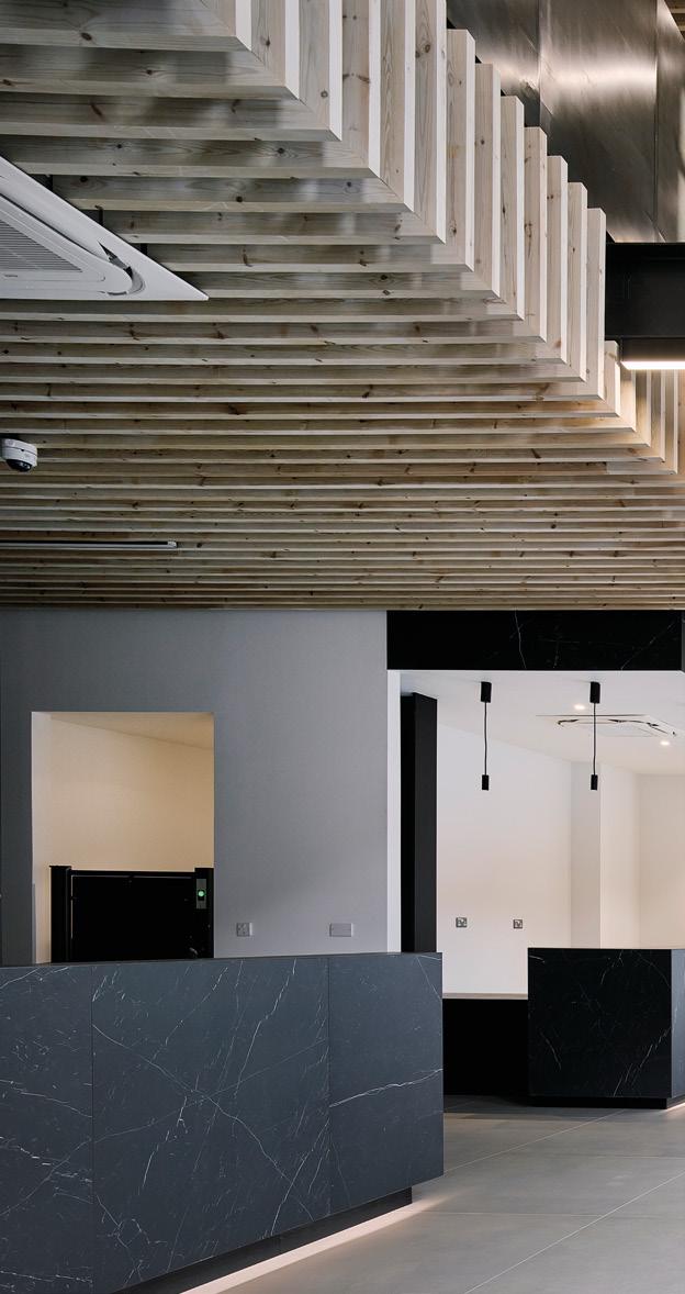
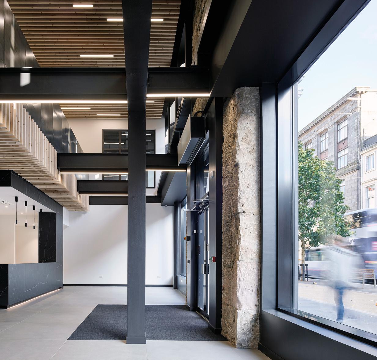

FLEXIBILITY, WELLNESS AND SUSTAINABILITY ARE THE WATCH WORDS ON EVERYBODY’S LIPS BUT WHAT DO THESE OFTEN NEBULOUS TERMS MEAN WHEN TRANSLATED TO THE LANGUAGE OF INTERIOR DESIGN? WE SPEAK TO THOSE DELIVERING THESE ASPIRATIONS TO ESTABLISH WHAT THEY REALLY MEAN.
Anna Lee Senior Interior Designer HLM Architects
How is the demand for adaptable and flexible spaces impacting your work?
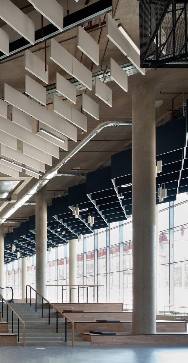
The demand for ‘flexibility’ is huge, the hybrid work landscape will continue to evolve as we’re all re-establishing how we want to work, how teams meet and how the organisation intents to foster their internal culture. However, understanding the degree of ‘flexibility’ is paramount, it is not about making everything ‘flexible’. It is important to work closely with the client to identify the key functions of work that need to be supported and matching it with the right category of spaces.
This way, users can comfortably make adjustments within these zones, whilst there are still design cues to help inform the designed functions and behaviours, as well as the mechanisms in place to manage it. When teams are allowed to solve for themselves what is best for their work patterns, it can be very empowering.
How do we design our environment around wellness?
Given the collective experiences of the last 2 years, designing around wellness, wholistically, is more important now than ever. Beyond providing comfortable environments with good air, light, and acoustic quality that considers our physical wellbeing, it is critical that
>
workspaces also do more to improve our mental wellbeing, reduce stress and provide psychological safety. Things we can do to include space planning strategies to manage the level of energy/activity on a floorplate; fit for purpose spaces to suit different styles of collaboration; good wayfinding and technology tools to reduce user frustration; employing biophilic principles to appeal to our senses, connect us to a more natural state; social spaces to develop sense of community and belonging; providing dedicated areas for respite and reflection. Finally, the quality of spaces that help us live out our hybrid lives – personal spaces such as mothering rooms, prayer rooms, space to take a personal phone call, can make a big difference to employee’s overall wellbeing.
By combining innovative sustainable design with the practicalities of achieving statutory compliance and accreditation, we can generate long term environmental and commercial value for our clients. By adopted the targets and approach set out by the RIBA in their 2030 Sustainable Outcomes Guide, we are determined to guide and influence our clients. We have set ourselves a bold and ambitious goal that all projects designed in our studios will be capable of meeting these targets by 2025. Our aim is simple, to deliver the highest performing buildings which have a positive impact on the lives of those who use them and a positive impact on the world for future generations.
Amy Wootton Architect 56three Architects
The hybrid model of working has challenged our understanding of how a workspace should look and function. The pandemic presented a unique opportunity for our own office to undergo a conflict-free refurbishment. M&E requirements became a fundamental consideration, largely to facilitate hot desking, and creating additional breakout spaces for use during video call meetings, lunch breaks etc. became a priority. More homely features have also been incorporated, such as coffee tables, lounge chairs and decorative planting. This desire to create adaptable, comfortable, and ultimately less commercial workspaces, is a trend we are starting to see externally too, which is exciting.
Inevitably, we have seen increased demand from clients wanting spaces that adapt to users – particularly in commercial settings. There is also an increased appetite for conversion and interior fit-out projects, partially due to behavioural changes (large office / retail spaces becoming redundant), and partially because of the financial risk that >
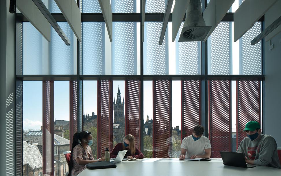

large, new build projects can present. We embrace these projects, as they can offer clients a faster return for less investment, whilst allowing us to flex our interior design skillset. We are passionate about adapting buildings that have become ineffective – creating beautiful, commercially viable and functional spaces as a result.
How do we design our environment around wellness?
Again, this comes back to the idea of creating interiors that work harmoniously with occupants. As a practice offering both Architectural and Interior Design services, we are able to suggest building modifications that ensure adequate space is provided for features such as amenity and natural lighting, whilst minimising and carefully integrating M&E services into environments in the least impactful way possible. We believe that the concept of biophilia is also fundamental to creating healthy spaces, and wherever possible look to include planting in our interior projects. Combined with natural light and ventilation, stress levels can be reduced and performance enhanced.
Kenny Fraser Director Michael Laird ArchitectsWhat project best encapsulates your practice approach?
We would suggest that Brodies LLP’s new Edinburgh home on the top floors of Capital Square in Edinburgh best encapsulates our approach and, in some way, reflects our own values – Considerate, Innovative, Passionate.
Considerate - This project was four years in the making with an excellent client team who were willing to explore the past and learn from previous office designs and how they operated. They took the time to ask their team and learn.
Innovative - Brodies knew that their old (cellular) Edinburgh office restricted their working practices and how they interacted with each other. They were willing to be innovative in exploring new collaborative working practices and to create a space that is intentionally less corporate and reflective of their brand and team culture.
Passionate – There is a clear passion as the team embrace the limitless opportunities in their new home. Within the first few weeks of occupation, we are witnessing a real excitement from the Brodies team as they experiment with each new worksetting and explore every nook and cranny of the new office.
The workplace has been evolving for years and, whilst the pandemic certainly disrupted….well…..E V E R Y T H I N G, it could be argued that it just really accelerated what was
already underway in workplace design….particularly in the technology solutions world.

Now that the ‘dust’ is (hopefully) settling on this pandemic, it is clear that, whilst the ‘virtual’ will always have its place in our workplace, it’s the ‘physical’ and ‘real’ that reminds us what it is to be human and part of a team and is fundamental to our own health and wellbeing.

The move towards more agile worksetting choices has been evolving for some time now. With the quantum leap in comms technology over the last two years, many organisations are now realising that they can really experiment with their teams as to how they will work together in the future.
Change and flexibility is therefore inevitable and very exciting. It brings new challenges and introduces new hybrid concepts of the workplace which blur the boundaries between hospitality, office and home environments.
As interior designers we are finding the furniture supplier industry is playing more of an important design role in this area. This relationship works both ways, is very rewarding and helps balance all of the ergonomics, acoustics, adaptability, costs and ’day two’ service considerations on each project.

The WFH experience has opened people’s eyes to the ways that technology can support us in our work, and where work is done. Businesses are really being challenged to create engaging work environments that draw-in remote workers, and new talent.
Future workplaces will need to evolve from a static form to a more ‘connecting’ experience. The office is becoming a ‘town square-like’ hub energised by the buzz of occupants coming together to connect, collaborate, focus, or simply socialise. Those ‘hub’ spaces will take on a new form with many elements borrowed from home-life and hospitality experiences, bringing welcome comfort and familiarity.
As our world faces resource scarcities and ecological crises, a concern for the adaptability of buildings and the spaces within, is especially relevant. Adaptability allows current and future functions to be fulfilled more efficiently
thus spaces remain longer in service. Interior spaces that can respond to change faster and at lower cost guarantee viability for longer.
That agility (flexibility) will shift traditional thinking. Of course, space’s ability to be rearranged easily as and when necessary, relies on clarity of project vision – A notable example for Keppie being our work on the NHS Louisa Jordan, step-down facility – a fully operational 1000+ bed hospital, conceived and delivered within the existing SEC buildings in only 23 days.
We believe that interior environments should develop with people’s wellness central to the design vision. Businesses whose operations and behaviours focus on health and wellness in a holistic way, attract and retain happy workers and benefit from multi-layered cultural gains.
The embrace of the ‘WELL’ standard sets a performancebased measure, certification, and monitoring framework. As designers, we believe it our duty to encourage healthy habits that support physical and mental wellbeing. One positive post Covid 19 is the elevation of such issues, with employers, developers and operators looking much harder at worker amenities and how these with their business culture function to protect and promote well-being.
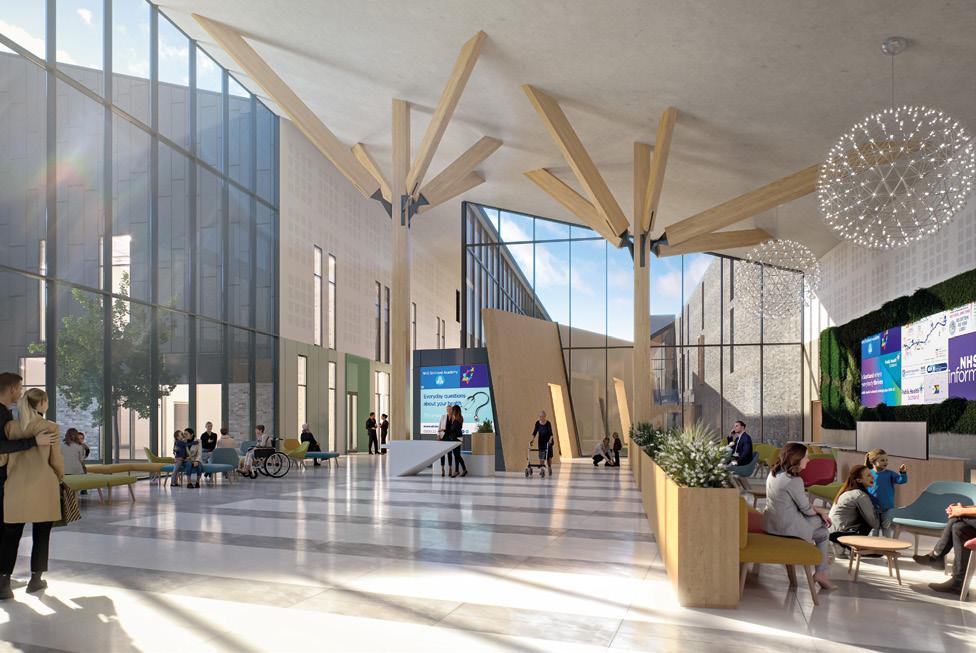

We love a complicated project and our flexible workspace project, ‘Clockwise’ at Commercial Quay is no exception! With almost 30,000 sq ft of former warehouse space to be refurbished, it was not only the complex internal architecture but also the program brief that was complex. A complement of different workspaces was required including meeting rooms, on-site café, independent craft brewery bar and extensive break-out. Modifications over the years had resulted in a mix of contrasting structures, ceiling heights and floor levels across all buildings, making this a challenging project to complete, especially with existing tenants in occupation throughout the build. The de-furbished aesthetic, cool break out, café and bar provide a popular addition to Leith.
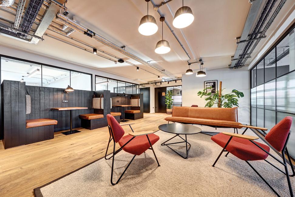
Flexibility for the workforce has been brought to the fore as we transition out of working from home. Occupiers
are looking for different types of space, after the privacy of home working - enter the phone booth and the zoom room! Technology is making most things possible and along with online meeting platforms and advances in internal fittings and fixtures, a touch free world is becoming more achievable. Sustainable interiors should still be the focus and companies producing interior finishes are developing some interesting products with carbon negative being the goal, rather than just carbon neutral.
Sustainability is a fundamental driver for Morgan Architects’ design output. We continue to champion the sensitive and intelligent reuse of existing buildings. This, combined with innovative building systems and a sustainable approach to material specification, has meant each design has sustainability at its core. For each of our interior projects, we utilise every opportunity to re-use and re-purpose existing building fabric and fit-out materials, and take a ‘fabric-first’ approach to future-proofing the buildings we design and refurbish. Our focus is on creating timeless, resilient and sustainable interiors, that also provide delight for their users.
Client: Empiric Student Property / Hello Student

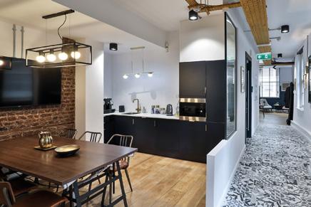
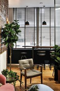
Borough High Street was an office refurbishment project, on which we were engaged to provide Architectural and Interior Design services. On initial consultation, we were asked to re-imagine the spaces available, creating zones - each providing unique functions. Although the space available was largely open plan, we aspired to create distinctive office, dining, breakout, and meeting zones, each expressed by their own aesthetic, and all with a comfortable and homely feel.
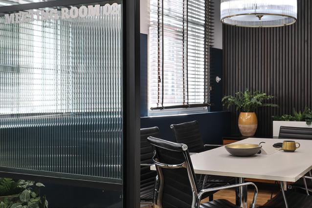
By enhancing original features, such as exposed brick walls, we celebrated the buildings heritage, whilst praying out cable trays to a heritage gold, and specifying vast amounts of planting, gave the space a luxurious, fresh and choreographed feel. Multi-functional furniture punctuates the floor plan, facilitating everything from large, formal meetings to small, casual catch ups.
As well as advising on interiors, we co-ordinated M&E, and suggested how best to adapt existing services to compliment the intended aesthetic. When managing internal partition alterations, we created open, light filled spaces –largely through the extensive use of reeded glazing. We understand that client feels that this refurbishment has been very successful, and that the resulting space offers a broad variety of flexible spaces, within an attractive setting.
14 Alva Street
Edinburgh EH24QG
Tel: 0131 220 3003
Email: info@56three.com
Web: www.56three.com
56three is a design based Architectural and Interior Design Practice with projects covering new build, conservation and refurbishment works throughout the UK. We have an award winning team of architects, technicians and interior designers who are able to provide the full range of architectural services from feasibility through to construction. We work in a collaborative way with relevant stakeholders and planning authorities to embed sustainable solutions providing optimum land and building values, and to deliver the potential for long-lasting and enjoyable places in which to live, work and play.
Glasgow
G2 2SD
Tel: 0141 226 8320
Email: glasgow@hlmarchitects.com

Web: www.hlmarchitects.com
Twitter: @HLMArchitects
Thoughtful design to make better places for people.
We listen and respond to the ambitions of our clients and understand the needs of the people who will use the places and spaces we create. We strive to create places of education that inspire, healthcare environments that nurture, homes that are part of thriving communities, and infrastructure that is sustainable in every sense: environmentally, economically and socially. Our sector-led approach and dedication to retaining our deep rooted regional connections, coupled with a thoughtful approach to design, enables us to differentiate from our peers.
Services:
Architecture
Interior Architecture
Landscape Architecture
Masterplanning
Environmental Sustainability.
James Smith McCune Learning Hub
Client: University of Glasgow
The new learning and teaching hub, which forms the initial phase of this expansion programme, will create a signature gateway building at the heart of the expanded Campus based on active learning pedagogies. The University is undertaking an ambitious expansion programme to further enhance its global standing and provide a positive impact on the community it serves. The design has been inspired and driven by user consultation at every level, emphasising the student experience to provide an environment that is open and accessible for all. Its mixture of lecture theatres, small group rooms, breakout and study areas reflects a growing trend in making faculty areas more bespoke, and focussing general teaching in a shared learning hub that embraces new teaching pedagogies and optimises space utilisation. To fully understand the user aspirations, HLM visited exemplar schemes in Australia with the University, and then trialled new learning pedagogies in a series of pilot rooms in an adjacent building. This has enabled HLM to work with academics to test new approaches such as flipped classrooms and TEAL spaces and define the FF&E and IT needed to support this. The resultant scheme, which opened its doors in April 2021, improves cohesiveness and connectivity across the campus in a building that showcases formal and informal learning and teaching through a welcoming, open environment and encourages students to linger – a sticky campus.
Client: NHS Lanarkshire
The relationship of interior spaces to human experience is an acknowledged central consideration - the important ‘experiential’ factor – equal, if not more important in a future looking hospital. The developing interior design at New Monklands University Hospital places staff, patients, and visitors central to all considerations.
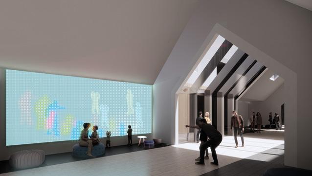

The design establishes a bespoke interior identity inspired by ‘the village’ metaphor, set within the undulating woodland character of the selected Wester Moffat site. An identity symbolic of the diverse local cultures and gathered spaces that flex allowing different functional activities to fuse together. Streets, squares, and gardens are composed to bring diversity of space, green outlook, and personality.
Early in the planning over-arching ‘rules’ set a clarity to orientation and wayfinding. This places staff spaces centrally reducing journey times and affording easy access to external spaces for respite. Throughout the ‘hospital village’ interior spaces embrace opportunities to connect with the outdoors. Campus-wide digital technologies are the baseline, and the design has grabbed the expansive potential digital mediums offer for animating interior spaces - we love the idea of spaces changing; never the same twice, and users able to influence their direct environment?
G2 4RL
Email: info@keppiedesign.co.uk
Web: www.keppiedesign.co.uk
Twitter: @Keppie_Design
We take pride in being extremely easy people to work with and are of course a trusted partner on private and public sector projects. We’re regularly collaborating with exciting people within the biggest names in construction, engineering, architecture, and design across the globe. From Arts & Culture to Healthcare, from Education to Sport, from Finance to Retail - we have a fully exportable skill set that makes a real difference wherever we work. Our global agility allows us to alead and collaborate on a fantastically diverse and inspiring portfolio.
Services: Architecture
Interior Design Planning
5 Forres Street, Edinburgh EH3 6DE
Tel: 0131 226 6991
Email: edinburgh@michaellaird.co.uk
83a Candleriggs, Glasgow G1 1LF
Tel: 0141 255 0222
Email: glasgow@michaellaird.co.uk
Web: michaellaird.co.uk
Twitter: @MLA_Ltd
Instagram: michaellairdarchitects
LinkedIn: Michael Laird Architects
At MLA we believe the interaction of people and place has the potential to transform the way we live and work. By working with our clients collaboratively we create spaces that proudly stand the test of time.
Services:
Architectural Design
Interior & Workplace Design
Strategic Consultancy
CDM Consultancy
New
Client: Brodies, Capital Square, Edinburgh
Scottish Law firm Brodies decided to move from their traditional home at Atholl Crescent in the City’s West End to new, bespoke premises in the top three floors of Capital Square.
MLA were appointed to provide workplace strategy and interior design services to create a flexible, agile workplace that also maximised the amazing views over Edinburgh.
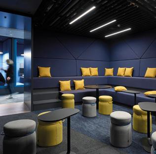
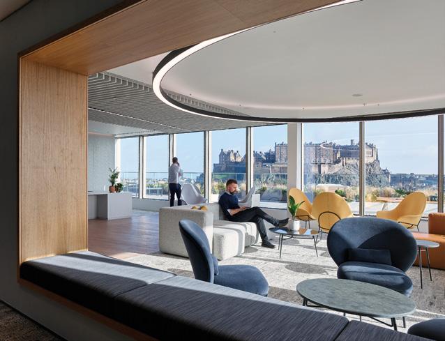
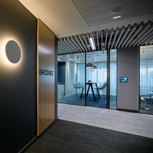
Following a full consultation process with the client, our fit-out provides a rich and tactile workplace environment that is smart, welcoming, brand consistent, and supportive of agile, flexible working.
Workspace is supported by meeting, training & conference rooms, breakout hubs and a café, whilst a bespoke internal stair provides a central focus point that also promotes connectivity between departments.
5 Advocate’s Close
Edinburgh
EH1 1ND
Tel: 0131 332 4200
Email: lisa@morganarchitects.co.uk
Web: www.morganarchitects.co.uk
Twitter: @MorganArchitects
Instagram: @morganarchitects
Linkedin: @Morgan Architects Ltd
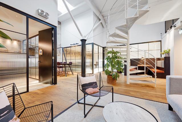
Morgan Architects is an Architecture and Interior Design Practice based in Edinburgh and working throughout the UK. Established in 1995, the practice has recently rebranded and is headed by Guy Morgan and Lisa Morgan. We are recognized as the ‘go to’ Architects for solving building designs in challenging sites; where listed buildings require reworking to ensure their future viability, where planning for new build is sensitive and requires strong relationships with both council and stakeholders, where our passion and hard work leads to us designing buildings and interiors that are rational, interesting and the best they can possibly be.
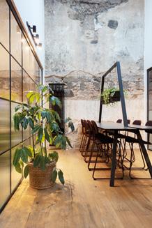
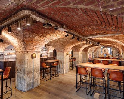
Our brief was to design the first serviced offices in Edinburgh for ‘Clockwise’, the developer’s flexible office operator. The Category ‘A’ listed buildings were originally built as bonded warehouses to store claret, bootlegged via the Baltic states during the Napoleonic wars, and latterly to store whisky until the 1980s. The buildings had to work hard, to support a diverse mix of accommodation notably; hot desking, dedicated desks, and 2 – 12-person private offices whilst also providing exemplary break out-spaces. These included a café, tea preps, both casual and bookable meeting spaces and a variety of touch down points throughout the buildings for casual working and dining. We also converted the impressive brick vaulted space in No. 80, previously a gunpowder store, to an on-site craft brewery bar for a local brewer providing a fantastic additional on-site benefit for tenants and locals alike. Inspired by the stories of the building’s past, we strove to design meaningful interiors with a characterful richness, using natural materials influenced by the rich golden and ruby red hues of the whisky and claret stored here in the past. One of the challenges was delivering this, circa 30,000 sq ft of refurbished office space whilst working around existing tenants.
DISUSED URBAN RAILWAYS HAVE LONG BEEN OBVIOUS CANDIDATES FOR BIKE PATHS BUT A NEW GENERATION OF PROJECTS INSPIRED BY THE SUCCESS OF THE HIGH LINE IN MANHATTAN ARE TAKING THE IDEA UP A LEVEL BY INCORPORATING URBAN FARMS AND LINEAR PARKS. LEADING THE WAY IS THE CITY OF PARIS WITH LA PETITE CEINTURE, A CIRCULAR RAILWAY THAT IS BEING BROUGHT BACK TO LIFE AS THE WORLD’S LONGEST URBAN PARK. MARK CHALMERS PUTS US IN THE LOOP.
It turns out that 2018 was a good time to visit Paris. Covid wasn’t even a gleam in an epidemiologist’s eye and the gilets jaunes hadn’t got into their stride – but it was the 50th anniversary of the événements of May 1968, protests which for a brief moment promised to upend French society.
In July 2018, the Île-de-France was also in the grip of a canicule and temperatures reached the high thirties. I stayed at Louveciennes, a five minute walk from the point where Sisley painted the Seine, and explored the city using the RER system of suburban railways. Later, as the day’s heat dissipated, I wandered along the riverbank to sit under the trees beside the Machine de Marly.
There are over 20,000 Parisians per square kilometre. Paris is twice as dense as New York and five times denser than Berlin or Edinburgh. Europe’s population has grown inexorably, yet city density tended to decrease during the 19th and 20th centuries once railways, trams and finally private cars enabled people to commute from the outskirts. That marked the birth of urban sprawl.
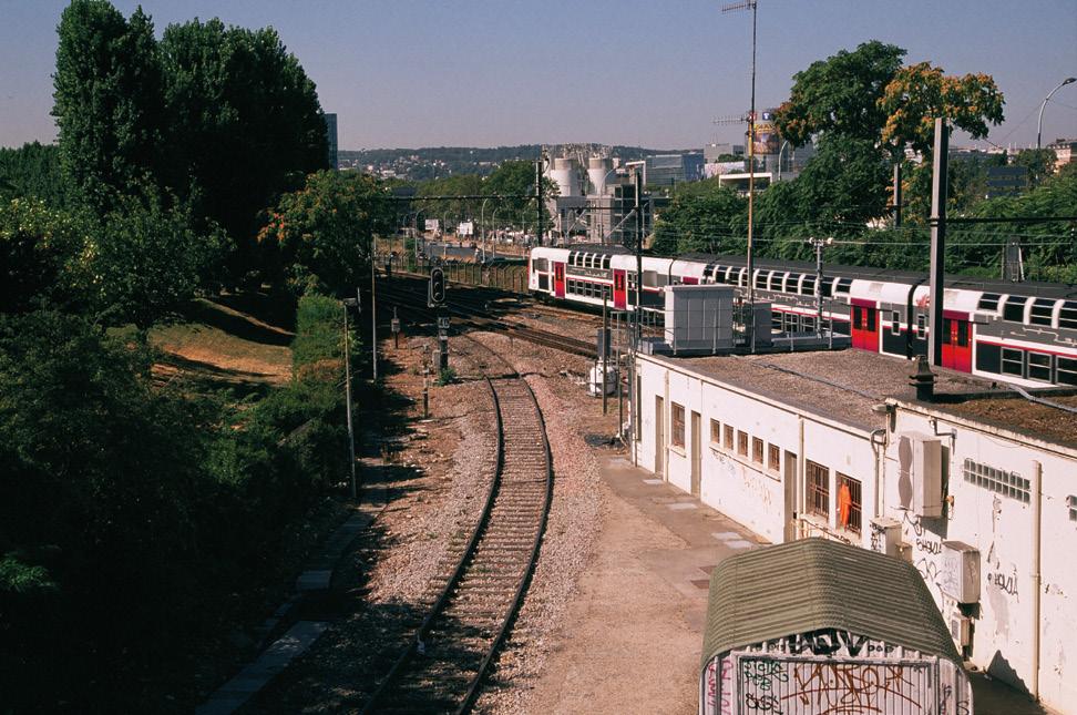
Paris is an exception. Its continued density makes places like Louveciennes precious and the railway network vital. The city’s transport system and green spaces come together and clash where a railway known as La Petite Ceinture, or Little Belt, encircles the city centre. Today its abandoned tracks run along a backdrop of graffiti, construction sites and industrial wastelands.
La Petite Ceinture stretched for 35 kilometres and was built in time for the 1867 World’s Fair. It soon carried 750,000 tons of freight each year, but as Paris expanded, lines radiating from the great railway termini grew busier while traffic on the circumferential Petite Ceinture fell away.
The line switched to passengers instead, and by the turn of the 20th century its trains circled the city several times an hour. The development of new Métro lines put paid to that second life: the Petite Ceinture stopped carrying passengers in 1934, and by 1969 it was hors service. Since then much of it has lain unused and overgrown.
At exactly that moment, a movement emerged from the hype and slogans of May ‘68. The Situationist International promised a revolution of everyday life: the last great, imaginative attempt to find an alternative to consumer capitalism. The Situationists recognised we were in thrall to the spectacle of mass media, and tried to convince us to stop living vicariously through TV celebrities and films from Hollywood. While they failed to make a breakthrough in 1968, their ideas outlived them.
Guy Debord, their leader and prophet, was drawn to the remnant spaces of Paris. He and his comrades invented the dérive as an antidote to the commercialisation of the city. A dérive could involve breaking into a derelict building, exploring an abandoned hospital or wandering through Père Lachaise cemetery. So off they went down back streets and through



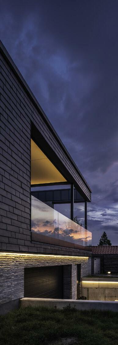
deserted parks, clambering over walls to see what they could discover.
To Debord, “The lessons drawn from dérives enables us to draft the first surveys of the psycho-geographical articulations of the modern city”. He even had a go at re-drawing the city plan. His Naked City map of 1955 was published in the Psychogeographic Guide to Paris, identifying locations which could be explored with a particular frame of mind intended to draw out their ambience.
Most of the remnant spaces which Debord sought out are long gone, built over and developed for profit, like the old slaughterhouses at Parc de la Vilette or the Renault factory at Île Seguin, but stretches of La Petite Ceinture remain as an overgrown wasteland running through, above and below the city.
Inspired by the Situationists, I walked along a back street in the 15th arrondissement until I found a gap in the fence with a glint of railway track far below. I squeezed through, then skidded on my backside down a sheer slope which I knew I’d struggle to climb back up – but I knew there was bound to be an easier way to escape. There always is.
This was one of the long-abandoned sections of the Petite Ceinture. After 1969, much was retained as a railway – firstly for the movement of rolling stock, and later held in reserve
by SNCF, the state-owned railway company. Ten years later, stretches were incorporated into the construction of the ‘C’ line of the RER (Réseau Express Régional), the regional rapid transit system which serves Paris.
Today around 23 kilometres remains unused, extending clockwise from Batignolles in the 17th arrondissement to the banks of the Seine in the 15th. In theory it’s possible to walk along its entire length; in practice that’s tricky thanks to fencedoff tunnels and crossings with live railway lines. For the past fifty years, Paris has been figuring out how to use this unique landbank.
Until recently, La Petite Ceinture was the domain of underground explorers or cataphiles and the graffiti writers who haunt the Métro system. The catacombs run for kilometres through the limestone underbelly of Paris, and one access is a discreet manhole just inside the darkness of a portal to one of La Petite Ceinture’s tunnels.
Gradually the abandoned railway was encroached on by the city. In 2008, a stretch between the Porte d’Auteuil and the Gare de Passy-la-Muette became a sentier nature or nature trail but the mayor of Paris, Anne Hidalgo, had far greater ambitions. She plans to turn the French capital into La Ville Du Quart D’Heure, which sounds much more attractive than a “Twenty-Minute City”. Thanks to Paris’s density, it’s relatively
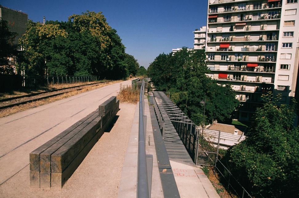
easy to ensure that you’re no more than a 15 minute walk from the shops, school and station.
Hidalgo planned to turn parts of the Petite Ceinture in the 16th arrondissement into a green path, and had ambitions to turn an elevated track in the 15th into a High Line-style promenade. The High Line is an imaginative linear park which re-uses an abandoned elevated railway in Lower Manhattan: it was brought back to life by architects Diller Scofidio + Renfro with landscape designer Piet Oudolf.
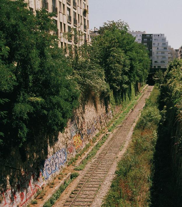
But around the same time as I walked along the Petite Ceinture’s tracks, Anne Hidalgo was locked in a political battle royal over the line’s future. The trackbed and adjacent land are still owned by SNCF, which proposed a joint venture with the Municipality of Paris to develop twenty stations, platforms and tunnels into bars, restaurants and cultural venues, along with green spaces and more footpaths.
This process is often called gentrification, and I was fascinated to see how it works in France, since gentrification has become a term of abuse in the UK. It translates as middle class people moving into an area and driving up property values so that its traditional inhabitants are priced out. Coffee bars, expensive apartments and cycle paths are some of its outriders.
It’s clear that Parisians have reservations about gentrification, too. Firstly, Hidalgo’s proposal drew the wrath of environmentalists and Communist politicians, who saw it as property speculation on the sly. Soon the political centrists joined them, denouncing “an outrageous concretisation and commercialisation”. So the spirit of Guy Debord lives on in Paris.
The mayor was forced to retrace her steps, unheard of for someone who built her career on tactical urbanism, imposing changes which were claimed to be “temporary” but end up being permanent. Those include the pop-up bike lanes which other cities have copied, and proposals to remove half of Paris’s car parking spaces. Hidalgo has become one of France’s most divisive politicians.
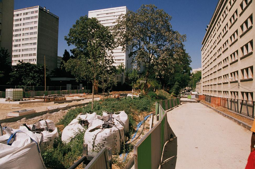
So why are Parisians fighting for an abandoned railway line? Its length, 23 kilometres, makes it the longest urban park in the world. It’s already successful as a green lung, with urban farms which function like allotments, sculpture parks hidden in cuttings, guerrilla gardens tucked away in sidings, nature trails along viaducts and recreation areas for the adjacent HLM flats.
HLM translates as housing at moderate rent, and that cuts to the heart of the issue. As soon as she aligned herself with property developers, Hidalgo was viewed by left-wingers as
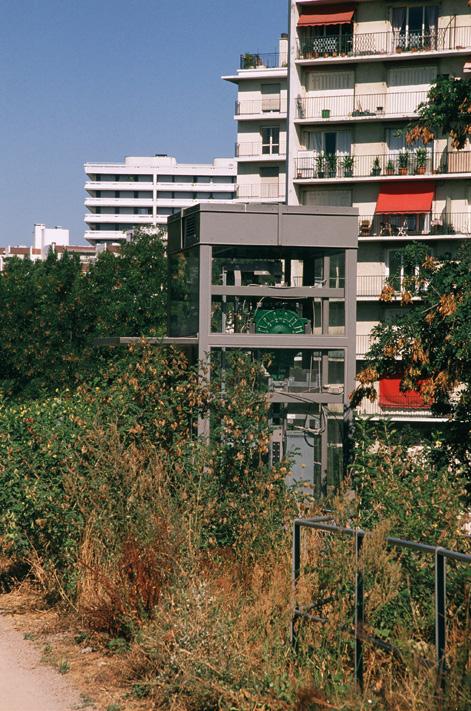
having sold out her socialist principles. But she also took aim at pollution and congestion by using the bike as a weapon in the “War against the Car”. That inflamed right-wingers, too.
The so-called war against the car takes on a new sense in Paris. When I stopped at a Park & Ride near Aulnay-sousBois, all the Peugeots, Citroëns and Renaults were dented and scratched, as if they’d been involved in urban combat. But banning the car is only half the equation: it doesn’t solve the problem of shifting hundreds of thousands of Parisians during rush hour.
Some, like the Association Sauvegarde Petite Ceinture (ASPCRF), would like to see the railway brought back into use as a railway. While the line fell out of use decades ago, demand is steadily increasing. A new tram route shadows the Petite Ceinture for several kilometres, serving the same areas and often within sight of the old railway. The first lesson from Paris is that plans to convert urban railways into bike paths are counter-productive when they could become railways again.
Another aspect is the idea that green spaces have a much greater value to people who live nearby, than for commuters who pass through en route to somewhere else, or for nighttime economy entrepreneurs who could open venues anywhere else in the city. With undeveloped land being so
scarce, can Paris afford to give up its biodiversity for bars and restaurants?

Regardless, Paris is years ahead of Scotland in the re-use of railway corridors. Miles of trackbed lie under-used or simply abandoned, such as the old Glasgow Central Line through Kelvinbridge tunnel and Botanic Gardens station which has been sealed off with spiky fences. In Edinburgh, the old tracks from Murrayfield to Granton and Newhaven, which might one day become Line 2 of the tram system, are currently an underutilised bike path.

The North Deeside Line in Aberdeen is similar, an interrupted path which runs from Duthie Park through Cults, Bieldside and Milltimber, has less chance of becoming an active railway again. Finally the old Dundee-Newtyle Line is walkable in Lochee, but disappears under a retail park to re-emerge beyond the edge of the city at Auchterhouse. All four cities fail to recognise the potential of their dormant railways.
Meantime in Paris, you can still witness the Situationist Manifesto in action. Just as Guy Debord cautioned in the 1960’s, go out and explore – especially leftover places like the Petite Ceinture – otherwise politicians will hand them to special interests and big business, and soon you’ll be reduced from a citizen to a mere consumer.
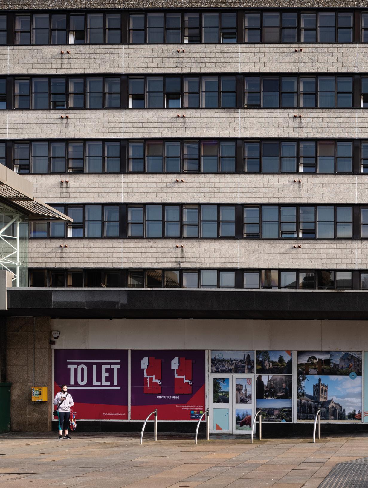
PAISLEY IS WASTING NO TIME POST LOCKDOWN IN PRESSING AHEAD WITH A TOWN CENTRE STRATEGY THAT LOOKS TO THE FUTURE BY BUILDING ON THE PAST. URBAN REALM INVESTIGATES HOW THE LARGEST TOWN IN SCOTLAND IS SQUARING UP TO GLASGOW BY BRINGING OUT ITS ARCHITECTURAL AND CULTURAL BIG GUNS IN RESPONSE TO A HOLLOWED OUT RETAIL CORE.

The much-heralded migration from office to country is opening up new opportunities for small towns to claw back a living from their larger neighbours but what more should our secondary urban centres do to stave off online retail, a brain drain to the cities and shifting work patterns?
Against an inauspicious international backdrop, Paisley is betting on a better tomorrow with Future Paisley, a broad programme of events, activities and investment designed to signal to locals and the wider world that a period of enforced hibernation is now at an end. The Renfrewshire town is one of the first out of the starting gates in responding to the new world order, building on pre-pandemic initiatives such as Paisley 2030 to show that it is back in business as a cultural heavyweight that punches above its population weight.
Current initiatives trace their origins back to The Untold Story, a 2014 bid by Renfrewshire Council to position the town as a bastion of heritage and culture and which acquired real momentum after being shortlisted for UK City of Culture in 2021 and with its green lighting plans for a starchitect museum makeover.
Set against the backdrop of a global pandemic this is
no mean feat, but external forces have undoubtedly taken some of the wind out of these sails, prompting the council to set them billowing again as Alasdair Morrison, Head of Economy and Development at Renfrewshire Council told Urban Realm: “In terms of investment, the world has stood still over the past two years. Lots of things have been delayed simply because of the uncertainty.”
That uncertainty has already had real-world impacts leaving Paisley, in common with all towns, to come to terms with the fact that retail as we know it is a spent force with many more household names set to go the way of Woolworths. A case in point is M&S which shuttered its town centre outlet last year, ending 90 years of operation on the High Street in favour of an edge of town location on Renfrew Road better suited to big-box groceries. The upshot of these trends is that retail will remain a problem, not a solution, in driving footfall and tenancy. Morrison said: “Every Scottish town is going to have to change because they are not going to go back to retail.”
What retail remains is likely to be very different in form, a point illustrated by a drop-in Lloyds Pharmacy in the old Burtons Building that will incorporate NHS services with flats above.
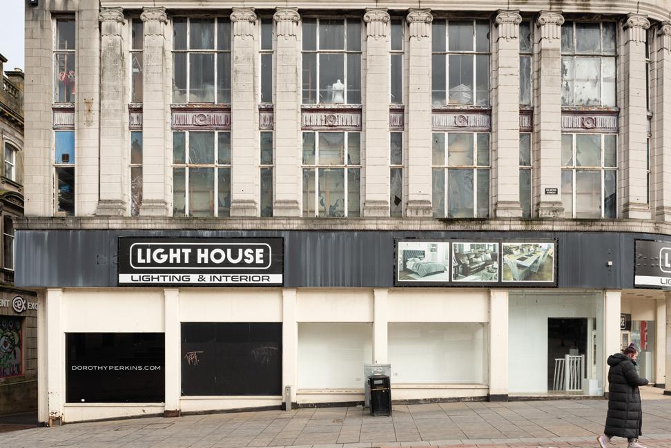
The Paisley Centre, a ghost mall in the making, requires a more substantial intervention. It has borne the brunt of store closures in recent years leaving it a hollowed-out husk sucking life from surrounding streets. Wincing at how the mall came to be during a mania for shopping centres in the 1990s Morrison recalled: “Someone decided they would knock down everything behind the High Street and build a huge shopping mall, the Paisley Centre. It was 300,000sq/ft but has hit really hard times with lots of empty units.”
In a sign of the times, the new owners plan to repurpose the mall, taking it down to the concrete plinth and incorporating the adjacent Marks & Spencer store to provide a mix of smaller-scale retail, offices and leisure across the ground floor and basement with flats above. Morrison observed: “In my view, almost every shopping centre of this scale in Scotland will need to repurpose. There is no demand for this level of retail floor space anymore.”
Large-scale interventions are complemented by smaller-scale work to restore historic shopfronts to their original appearance, although efforts in this direction have thus far been largely piecemeal and subject to grant
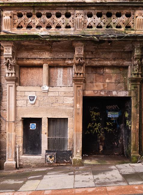
funding and the willingness of owners to engage. “We play a ringmaster role in Paisley town centre because if we didn’t nobody else would,” Morrison explains. “If we didn’t, we’d be in the situation we were in 15 years ago when we were at a low ebb. We had one quality restaurant in the whole town centre, now we have at least four or five with more to come.”
If retail therapy is out of the question what are the options for renewal? For Paisley, a town dripping with an embarrassment of architectural and cultural riches, the answer is obvious, a return to the institutions and grandeur which live on past its industrial heyday. Home to David Tennant, Paolo Nutini and Gerard Butler, Paisley also hosts the UK’s largest independent youth theatre with alumni such as James McAvoy and Richard Madden, helping to put the town on the map. A key part of Future Paisley is PACE Youth Theatre which is teaming up with Pink Architects to refurbish the former New Templar Hall on Sneddon Street to provide a theatre, workshop and cafe.
Having embraced pedestrianisation in the midnineties Morrison concedes that you can’t make an omelette without cracking a few eggs, stating: “It
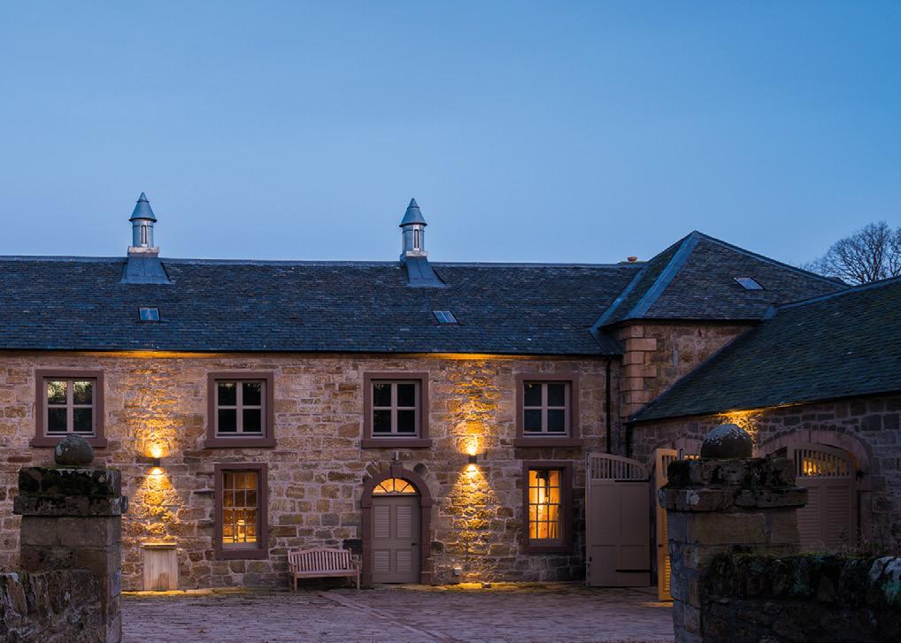


wasn’t universally popular and probably still isn’t but in reality, the alternative of reopening to traffic would be horrendous.” Gesturing to One High Street, a handsome Gothic confection typical of the Victorian munificence of Paisley’s heyday, Morrison says: “It would bring a tear to a glass eye. The owner hasn’t spent a penny in decades and it’s falling apart. We’ve got the power to do a compulsory purchase order but we just don’t have the money. That building will require a seven-figure sum to renovate. We can look at grant funding but it’s difficult for us to justify that politically when an owner has been negligent. The Scottish Government are bringing through compulsory sales orders, you could force a sale but then they might sell it to Joe Bloggs who does nothing with it either. We’re aiming for investment to go into the building.”
One of the principal spurs for investment in recent years has been the insatiable clamour for town centre living which has spurred a variety of private-sector developers to dip their toes in the local market, notably 34 apartments by Nixon Blue and Vellow Wood on Bridge Street opposite the Abbey.
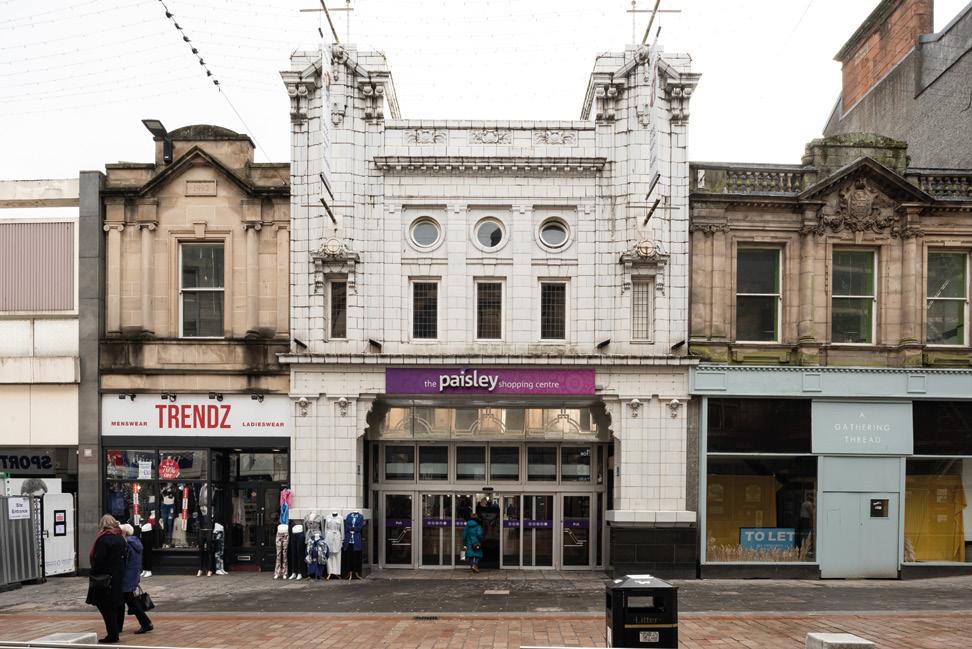
Further along at number 9, is an inauspicious doorway set alongside the unpromising fascia of Bargain
Buys. Belying its low-key presence you will find here a subterranean Aladdin’s cave of treasures in overspill storage from Renfrewshire’s Museum collections
Colin Orr, Senior Communications Officer at Renfrewshire Council, said: “We reckon it’s the only museum store on a high street in the UK. Glasgow has one (the Museums Resource Centre) but it’s on an industrial estate in Nitshill on the edge of town. What we did is to use a massive basement underneath the town centre as our storage facility. People can book a tour to see the collections.”
The one development the entire town is pinning its hopes on is the Museum, an ambitious bid to double the number of objects on display while opening up step-free access to the Coats Observatory. Entering the scarlet entrance hall the expanded gallery opens onto an outdoor garden, framed on its opposite side by the burntout husk of the former Territorial Army building. Close to being salvaged as student flats the project is on indefinite hiatus following the pandemic with the University of the West of Scotland no longer willing to commit to the project, preventing Asian investors from borrowing the required capital to finish the job. It
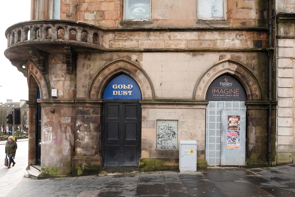
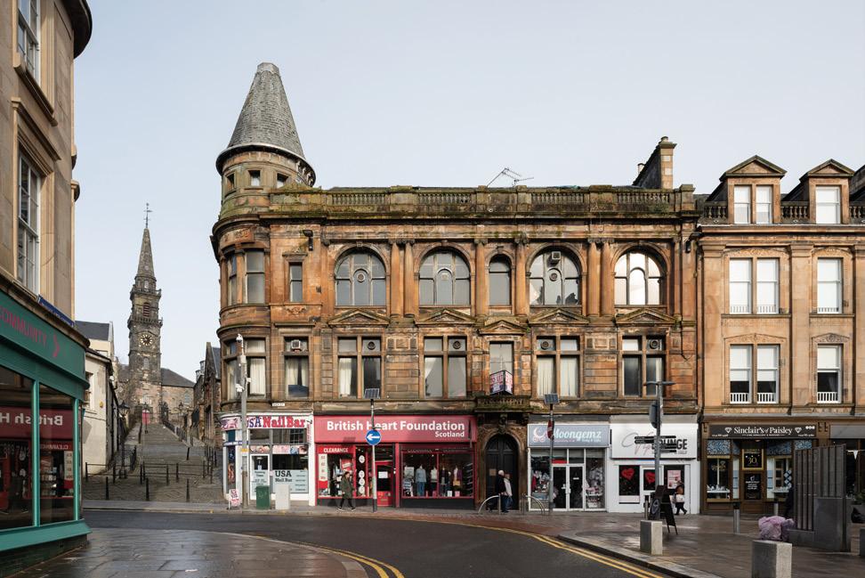
the Coats Church, now a wedding and entertainment venue, with 40+ weddings planned for this year as normal life resumes.
The educational and cultural quarter with the museum, university and Coats Church at one end and the Abbey and town hall at the other stand as ‘dumbbells’ anchoring the town centre in place, with the hope that developing both ends will organically lead to the repopulation of the space between. “The town hall will bring people for one-off events and concerts; the museum will bring people from all over the country all year round.”
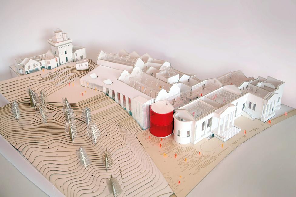
A fitting tribute to the Coats family, who at the turn of the century presided over the world’s third-largest company, with only US Steel and Standard Oil ranking higher in terms of market capitalisation. Turning back to the present Orr points to Barga, a hip bar and cafe specialising in wood-fired pizza and street food named after the town in Italy where a lot of Italian emigrants, including the Nutini family, originated. “It’s the type of place we didn’t have 10 years ago. Walk-in there and it feels like Finnieston,” he says.
Famed for its thread and shawls Paisley is not known
as a riverside town with the White Cart Water largely shunned and culverted - until now. At the town hall, the riverfront was deemed so unimportant that it was relegated to a chair store, something that will finally be put right by turning it into a bar as part of a broader remodelling by Holmes Miller that includes expanding the main auditorium into a 1,200-capacity venue.
Away from the town centre work is proceeding on an active travel route to Renfrew along a decommissioned railway line to the docks via the newly opened Black Cart Bridge. Morrison said: “When it’s all finished, you’ll be able to cycle from Pollok Park to Johnston and down to Ayrshire. You’ve never been able to walk or cycle to Renfrew off-road since the settlement was built.”
A revolution on the High Street is underway as town centres shift from retail, vehicles and offices to leisure, health and wellbeing as part of a more diversified economy, less beholden to the ups and downs of any one sector. In the vanguard of these efforts, Paisley is prioritising culture over consumption in the belief that this represents a more sustainable proposition in a world where it is as easy to shop on the other side of the globe as at the local corner shop.
THE ROLE OF CONSERVATION IN THE CONTEXT OF EMBODIED CARBON IS OFTEN OVERLOOKED IN PURSUIT OF SHINY NEW THINGS, BUT A REAPPRAISAL OF LEGACY BUILDINGS HAS THE POTENTIAL TO REAP A BIGGER WIN FOR BOTH THE PLANET AND OUR BUILT HERITAGE. HERE SMITH SCOTT MULLAN ARCHITECTS DISCUSS HOW NET-ZERO AND SUSTAINABLE DESIGN STARTS WITH WHAT HAS ALREADY BEEN BUILT.
The role of conservation in the context of embodied carbon, net-zero, sustainable master planning, placemaking and good neighbourhood design.
Existing buildings and retrofit are hot topics at the moment. Everyone working in the construction industry is aware of the need to change how building performance is regulated and reduce carbon emissions from buildings. The UK has some of the oldest and least energy-efficient housing stock in Europe, and 80% of homes that will be here in 2050 have already been built. The majority of new homes being built today are also not nearly energy efficient enough, which means we will need to retrofit all 27 million homes to some degree, not just the older ones.
A lot of the current discussion is centered around how existing buildings which are currently seen to be the problem can become the solution to decarbonise our built environment. As well as being a key part of the strategy to address the climate emergency, existing buildings contribute to our sense of place, and provide a deeper level of meaning to an area. Built heritage provides a depth of history and past that enriches a local area, and the new developments around and within it.
For the last few years at Smith Scott Mullan Associates,
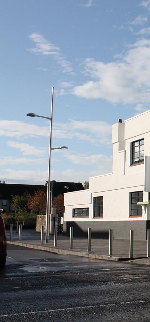
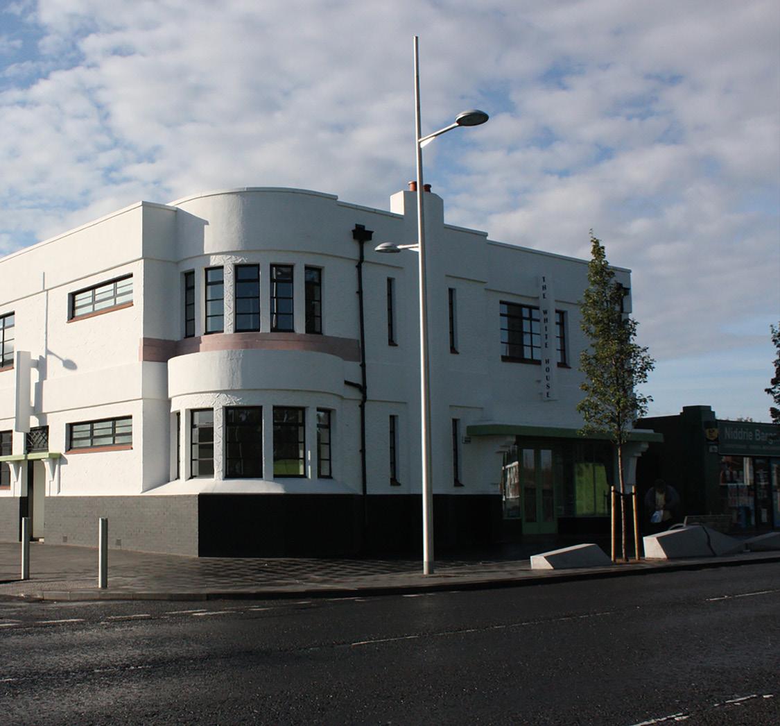
we have been increasing our understanding of how to build to maximise energy efficiency, with a number of qualified Passive House Designers now within our team. Whilst it is very complex and technical, Passive House provides a clear path to achieve energy efficient net zero homes. Retrofitting existing buildings to achieve similar results is a great deal more challenging and complex; and urgent action is required to meet current targets. We should effectively be retrofitting one home every 35 seconds between 2020 and 2050 to stay on track. It is a huge challenge but one that is definitely worthwhile, because of the incredible benefits that existing buildings can bring, that reach far beyond the operational energy aspects.
In the UK, buildings account for 49% of greenhouse gas emissions, and of the annual carbon emissions associated with buildings about 80% is associated with ongoing operational carbon emissions relating to the existing building stock. The remaining 20% is related to the embodied impact of new construction. (LETI Climate Emergency Guide)
As buildings become more energy efficient, the operational carbon of new buildings will significantly reduce, and the embodied carbon will represent a higher proportion of whole life carbon than it used to. Embodied carbon is
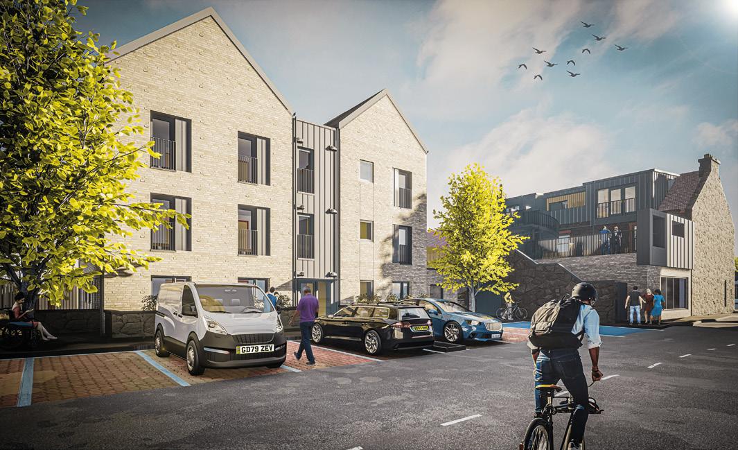
therefore becoming significant and needs to be addressed. The simplest way to reduce the embodied carbon numbers is to refurb and re-use, and not build new. We need to build less. Our existing building stock already contain huge amounts of embodied carbon – discarding this to replace it with new housing would be, when considering the whole life cycle carbon of a building – a huge waste.
At the start of all projects the question should be asked; is a new building necessary to meet the brief, has retrofit and re-use of the existing buildings been considered? We should be upgrading existing buildings to extend their use as a more efficient alternative to demolition and new build whenever this is a viable option. Principle 5 within Designing for a Changing Climate: Carbon Conscious Places advocates retrofitting existing structures first, giving consideration to embodied carbon in place. Creating a place that reuses and considers the life cost of a building. This is even more important for buildings of social significance; it takes years or decades for a building to become emotionally relevant to a local community, and these buildings need to be valued, maintained and enhanced.
Our recent project at Penicuik Town Hall is an example of this approach; restoration and enhancement works were
carried out to repair the historic building fabric, combined with sustainability works to improve its energy performance. The Town Hall is a prominent Category C Listed building positioned at the historic core of the town and is not only important due to its architectural and townscape quality but also due to its civic importance and providing accommodation to benefit the local community in terms of education, health and well-being.
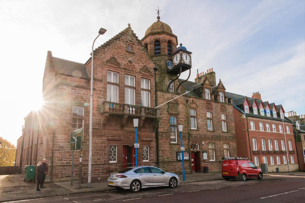
The project involved conservation works and repairs to the external fabric as part of the Penicuik Heritage Regeneration project, a Townscape Heritage and Conservation Area Regeneration Scheme. Conservation works included the sympathetic restoration of the building’s stonework, roofs and windows. Sustainability works addressed the energy performance of the building, replacing gas boilers that were coming to the end of their useful life with a new Combined Heat and Power engine to reduce carbon usage. Photovoltaics were also installed on concealed roof pitches.
Conservation and refurbishment of existing buildings can retain the operational carbon in the repairs, extending the
life of the building and avoiding significant embodied carbon from building new. Use of locally sourced materials and re-use of existing elements where possible can also help to keep embodied carbon low. Penicuik Town Hall is socially an important building with a unique street presence, and it was incredibly rewarding to have been a part of this communitybased project to extend the life of this architecturally and socially important local landmark,
Existing buildings already have a place, identity and history. Using these unique buildings as a starting point to inspire change and development can create successful places and housing with a clear and enriched identity. Designing for a Changing Climate: Carbon Conscious Places (Architecture & Design Scotland) encourages a ‘place-led approach’ understanding and working with the existing fabric, with an existing building at the core to inspire change and placemaking.
At one of our projects in Craigmillar, the existing
» We should effectively be retrofitting one home every 35 seconds between 2020 and 2050 to meet current targets. It is a huge challenge...
«
Category B Listed Art Deco former roadhouse, The White House, was restored and forms a key element of the wider Craigmillar community regeneration currently underway. The refurbishment took care to retain links to the past, and local identity and memories are celebrated within it. On completion, a public exhibition opened in the building to tell the story of the local community, regeneration of the building and Craigmillar. The building is now successfully permanently used by a community café, managed by the Community Alliance Trust, ensuring the building is in sustainable use within the community. Despite significant changes in the area, the White House continues to be treasured within the heart of the neighbourhood, binding the past, present and future of the place.
Further east, our project at Buccleuch Street in Dalkeith reuses an existing building as the catalyst for new development on the site. The existing building addressing the street will undergo a deep energy efficiency retrofit,

combined with a modern extension to the rear. The original retail units will be retained, with new shopfronts and glazing fitted to restore them to their former glory. To the rear of the site, a new building is currently in construction, which will provide six flats to Passive House standard for affordable housing. Common materials are proposed that will link the new and old together, to ensure the new development is woven into the fabric of the area. The old building has anchored the new build to achieve a deeper sense of place, identity and belonging. This project will hopefully encourage further town centre regeneration, increasing the density of the area whilst maintaining the town character.
An increase in density has a sustainable effect as it reduces the impact on green belt, making better use of already existing infrastructure as opposed to generating the need for new, which consume vast amounts of construction based carbon. It also reduces carbon related to travel, by creating small, local communities, with short, usually
walkable, distances between living, working and shopping. There are historic buildings throughout towns and city centres that are vacant and abandoned. High streets with empty units and boarded up windows can very quickly and effectively damage the quality of the area and lead to a sharp decline in condition of a building’s fabric. However, renewed enthusiasm and investment brings opportunities to re-introduce useable space, increase density, safeguard built heritage and revitalise the neighbourhood. These concentrated local communities in turn boost the local economy.
Our Edinburgh city centre project at Springwell House for AMA (New Town) Ltd was a delicate balance of conservation, refurbishment and extension of the Category C Listed existing building alongside new-build townhouses and a lodge house, to form high-end properties for private sale. Maintaining and retrofitting the existing building with significant fabric upgrades, photovoltaic panels and

centralised ventilation systems has reduced the carbon footprint of both the development and the building in use, when comparing to the baseline approaches. This project has played an important role in the regeneration of the local area; providing high-quality city living with easy access to local amenities and public transport. Again, increasing the density of the area with a historic building at the centre, creating a long term sustainable community in the heart of West Edinburgh.
Existing buildings can inspire change, enrich placemaking and are a key part of the strategy to address the climate emergency. A shift in mindset and culture has already begun but needs to be built on further; towards a focus on regenerative, circular, low carbon approaches that identify existing buildings as a benefit, both in terms of numbers (whole use carbon not just operational carbon) and in terms of sense of heritage, character, and spirit that add another level of quality to a place.

Predictions of sea level rise to the end of this century vary but the fact of sea level rise is now accepted woldwide.
A scientific report from Climate Central in 2019 concluded that coastal flooding threats across the globe are likely to be far worse than previously thought. Rising sea levels have long been associated with global warming, but this report shows the impact of the climate emergency and has revealed that vital parts of the UK including in Scotland could be flooded within just 30 years. Scotland`s major cities are likely to be affected. An interactive map shows the impact of the unchecked climate emergency on cities and towns such as Clydebank and Dumbarton, large parts of Falkirk, Perth and Stirling and specific areas such as Leith in Edinburgh.
In their document `Climate change allowances for flood risk assessment in land use planning` the Scottish Environment Protection Agency (SEPA) states that changes in sea level rise are driven by the thermal expansion of the ocean as well as the addition of water through global ice melt. Whilst in Scotland, these impacts are partially offset by isostatic rebound ( the ongoing rise of land formally depressed by the huge weight of ice sheets during the last glacial period) sea level rise will still continue. The document provides the cumulative sea level rise
from 2017 to 2100 . Given that sea level rise will continue well beyond the end of the 21st century, they recommend that an additional allowance of 150mm per decade after the year 2100 be applied where the design life of a development is known to extend beyond that date. The document provides practical information on offshore wave climate and storm surges giving examples . A dockside site in Leith within the Forth River basin area, due for residential development , subject to coastal flooding and therefore a sea level rise of at least 850mm should be allowed for by 2100 at the latest, thus only one lifetime from now.
Predictions for 2050 show that much of Scotland`s coastline, including its major coastal towns and cities, will be subject to the effects of rising seas with seasonal tides much, much higher that at present.
Vincent Fitzsimons, head of hydrology & flooding for SEPA, says: “Mean sea levels around the UK have risen by approximately 1.4mm per year from the start of the 20th century, and sea levels around the Scottish coast are projected to continue to rise in the decades ahead. As a result, sea levels during storm events will be higher, leading to more frequent and severe coastal flooding. …. the “credible maximum” sea
LESLIE HOWSON INVESTIGATES WHAT ENVIRONMENTAL DESIGNERS IN THE UK ARE DOING TO COPE WITH INCREASED FLOODING AND TO PREPARE FOR MORE FREQUENT TIDAL SURGES AND PREDICTED RISING SEA LEVELS ESPECIALLY IN COASTAL CITIES.

level rise anticipated by 2100 is around 2m. Sea level rise will have a significant impact on many coastal communities and assets.
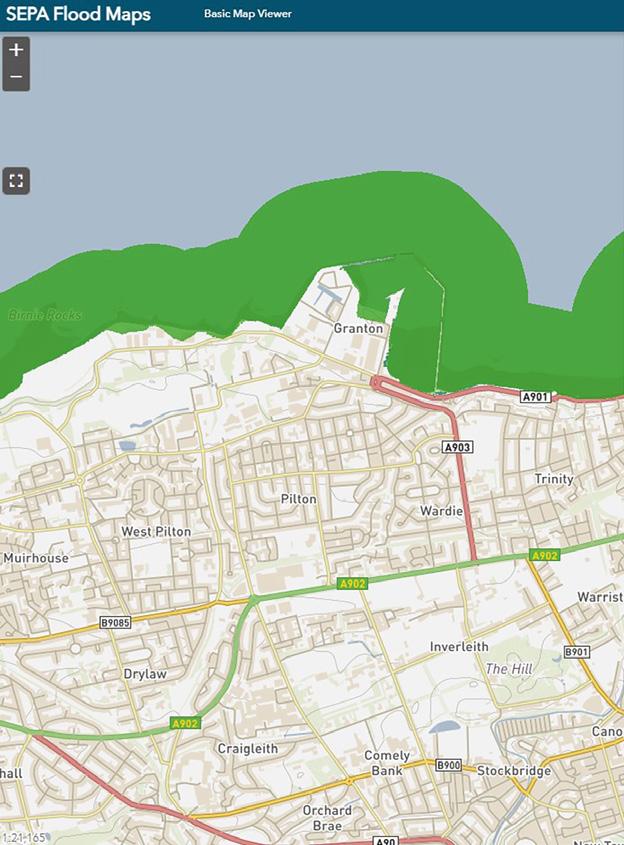
Globally, tidal rise is happening now, with the sea claiming the land in many of the most vulnerable low-lying areas of the world. where the battle with the sea is testing whole populations to come up with defensive solutions. In Bangladesh, for example, local communities are planting mangrove trees by the thousand, as part of a coastal re forestation protection programme.

Elsewhere new designs for levees and dykes and the creation of tidal marsh lands as buffer to the encroaching sea are being created. Worldwide coastal erosion is on the increase due to more frequent tidal surges, resulting from climate change and sea level rises and this is already having an impact on property and lives and bringing the location of future building developments into question. Taking on board current predictions, means that every coastal city in the
world will be at risk including those in Scotland. Here, the 4th National Planning Framework calls for all new developments to make provision for flooding due to higher rainfall but for the moment this excludes rising sea levels, a prospect yet to face. Clearly, central and regional government as well as local authorities have a duty to enact policies to deal with flooding and tidal surges and this should include rising sea levels. Careful consideration is needed as to how best to prepare for and respond to the impacts of sea level rise; building resilience into existing property and assets, moving existing assets away from at risk areas and avoiding placing new property and assets in areas at risk now or that are likely to become at risk in the future, are all important actions to be taken. It is important to plan for a range of future outcomes so that robust decisions can be made as to what is appropriate to do in the present that doesn’t lead to greater impacts down the line,” says Fitzsimon.
Are government, local authorities, development companies and designers in Scotland, taking the likely impact

of future tidal surging and rising sea level seriously enough to future proof planned coastal development or is it too early to worry and how much of a threat is this ? Leading ideas are coming from the University of California, Berkeley. Kristina Hill, programme director of the Institute for Urban and Regional Development (IURD) and associate professor of landscape architecture and environmental planning and urban design, specializes n urban ecology and hydrology in relationship to physical design .
Her primary area of work focusses on adapting urban districts and shore zones to the challenges associated with climate change, primarily tidal rise especially on cities facing the Pacific Rim. This work has highlighted the potentially catastrophic effects of sea level rise and tidal surge on contaminated sites, ground water inundation and ground liquefaction, all issues which will dictate the future placement and design of coastal buildings. She asks how will coastal cities adapt to rising sea levels.

Since we don’t yet know how fast and how high sea levels are going to rise, Hill stresses that our strategies must be ready and be adaptive as conditions change. Rising seas pose multiple dangers. Groundwater rises on top of sea level causing inland flooding. What can we do to prepare? A fundamental principle of landscape architecture -- “dig a hole, make a mound” -- offers a time-tested strategy, she argues. As groundwater levels rise, the “holes,” i.e. ponds and canal systems, can store excess water. They contain and re-direct floods, helping us live with water like the Dutch. The earth from the ponds can be used to build levees called super dikes, with an extra-wide wetland edge on the Bay side. Floating housing on the ponds would protect from both flood and earthquake damage. This strategy would solve both housing needs and environmental concerns, aligning interests that are often opposed while adapting to a changing climate.
In his 1997 blog Sea Level Rise Now ,John Englander , widely respected oceanographer, consultant and leading >
expert sea level, stated that Architects Must Be Leaders in adapting to sea level rise 1997.
“We need to look at the new opportunities that will arise out of the need to design communities of the future, ones that can sustain the increased intermittent flooding as well as the new era when sea level will be much higher than present, essentially permanently. Architects need to be key agents of that change. Whilst we must reduce the warming and climate change as a matter of the absolute highest priority, we are now in a situation where we have to begin planning and effecting adaption in parallel with any efforts to slow the warming. Of all the adaptation issues, rising sea level and the unstoppable shifting shoreline is one of the most challenging.
Over the last several decades architects and engineers have focused on ways to reduce the rate of warming by making buildings more energy efficient. That has helped slow the greenhouse gas emissions associated with warming but we have passed a tipping point with CO2 levels. The planet is in a new state unable to quickly return to the equilibrium of the last eleven thousand years. The melting of glaciers, the rise of sea level and extreme rainfall can be slowed but must now be accepted as a new reality. Many professions and sectors must be engaged in this new effort including the financial sector, planners, real estate developers, engineers, strategic planners, national security, and those responsible for building codes.”
Much is being done and considered worldwide on how best to create coastal developments in the future. Innovative design ideas are being developed to create flood protected buildings, with upper floor living, ground floors and basements being lightly occupied or for car parking in readiness for periods of flooding from tidal surges. The design of building typologies close to the sea are being re thought with the flooding of the lowest levels being accepted and usage being modified accordingly. Coping with rise in sea levels may also mean more development of buildings with water displacement foundations that float upon the rising sea or else are permanently floating which will become the norm in many locations.
Holland has for centuries been battling with the sea and as a result the Dutch have become masters of large-scale land reclamation from the sea. To face the challenge of rising sea levels innovative design solutions have been developed in the construction of shore-based housing and commercial premises close to the sea including entire settlements of floating housing.
“Future proofing” has to be the watch word for any new development large or small on the Scottish coast or facing onto major estuaries, such as the Forth.
All environmental professionals in the UK should be thinking of innovation solutions for coastal protection and in the design of shore-based developments, especially housing settlements; thinking about not only where we build but in what form. At larger scales, any new coastal development
will need to incorporate what might be labelled `lines of defence` against the potential damaging effects of the sea due to climate change. Such measures will need to consider establishing offshore breakwaters and sea walls, setting appropriate ground levels across sites, elevating building levels and raising services
At present almost every city in Scotland has plans to expand along either their river estuaries or shoreline and most are already including flood prevention and protection measures in line with recommendations from such as SEPA. The Granton Waterfront Development Framework 2020
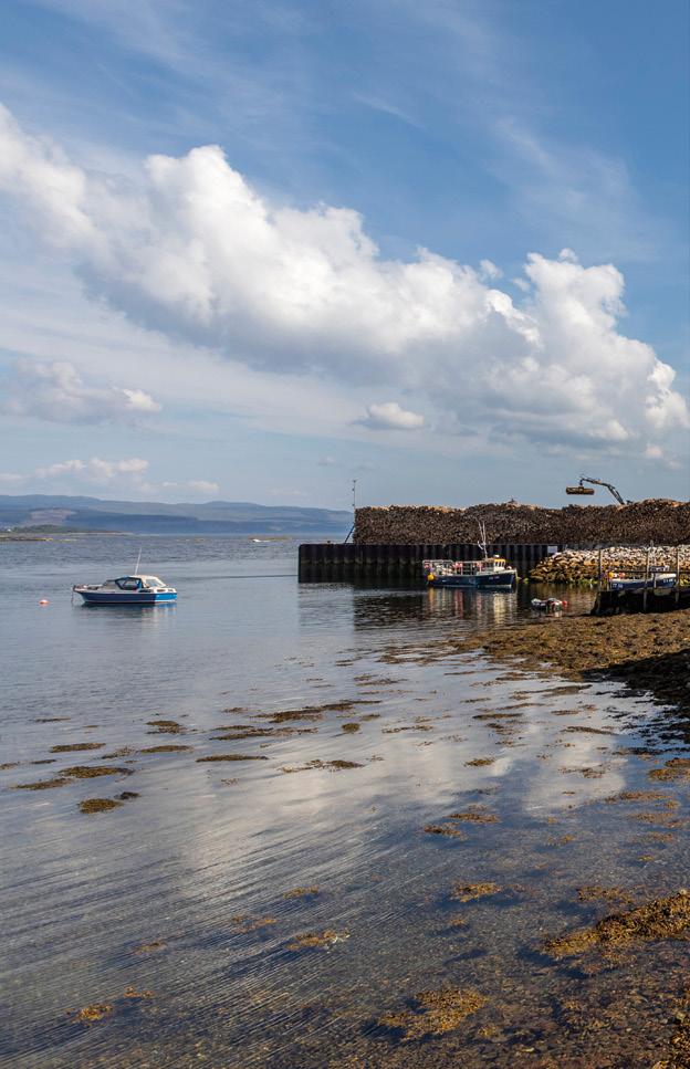
for example, acknowledges the risk of long-term flooding along the coastline and the need for climate resilience, recommending that development should be set back from the shoreline to create a flood resilient coastal park which manages coastal flood risk with specific landscape design features. However, nothing is said specifically about the possible impact of tidal surging nor predicted rising sea levels as such.
There are many technical challenges to be faced which in future will require that Scotland take advantage of global expertise in both civil engineering and building solutions and to develop an understanding of the effects of tidal pressure on
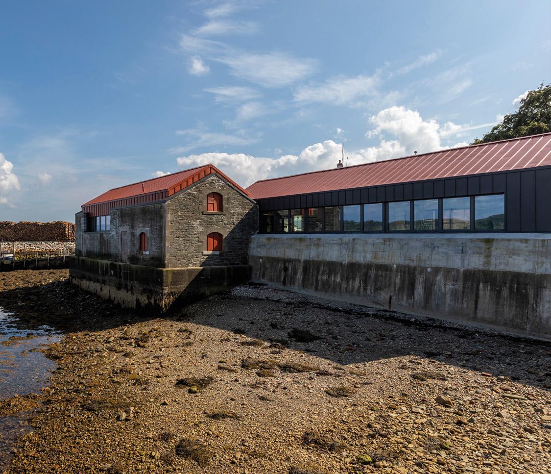
ground water leading to sub ground de stabilization, pollution of drinking water and damage to infrastructure overall.
We must begin planning now for the inevitability of sea level rise and architects will have to play a key role in adapting to this new world with innovative and practical solutions .This is not to present an alarmist view nor a doomsday scenario but means facing reality with innovative design solutions and as far as possible, “future proofing” waterfront developments and architecture by ensuring protection measures are incorporated in the project planning process and which will prove sustainable for the lifetime of each development.
For over 40 years, we’ve been transforming homes with beautiful natural stone from all around the world.

We combine the very latest CNC technology and hand finished craftsmanship to produce the finest surfaces available.
Contact
www.stonecraftedinburgh.co.uk
info@stonecraftedinburgh.co.uk

Sea level is rising in California. Continuous tide gage records show a rise of 20cm since 1854. Last month, NASA predicted that the sea will rise another 20cm by 2050, almost tripling the rate we saw over the last 100 years. Global data also show the rate of rising seas increasing by a factor of about 3. Recent research suggests that even in the best possible emissions reduction scenario that would limit the increase in average global temperatures to the lowest end of predicted warming by 2100, sea level will now eventually rise by 2 meters. It could happen over 80 years or over 200 years, depending on how much we limit carbon dioxide emissions. But it’s coming. Research by the US Geological Survey shows that as sea levels rise, groundwater will also rise within about 5 km of today’s shoreline. Rising groundwater may cause more building and underground pipe failures than ocean waves, and mobilize hazardous materials in soils that have been capped in place near ports and former factories or military bases. The state of Hawaii has already seen a tidal influence on methane
and hydrogen sulfide concentrations above soils that are contaminated from old petroleum leaks, and has issued warnings about the risk of explosions.
In 2018, the state of California issued guidance to public agencies that said the likely increase in sea level by 2100 is between 1 and 2m. It also included the possibility of an extreme rise in sea level of 3m by 2100 if catastrophic rates of ice loss occur in Antarctica. In addition, the guidance recommended a way to incorporate uncertainties into decisionmaking for public projects. This report advised agencies to use the low sea level rise estimate of 1m for projects that are relatively inexpensive and/or temporary, such as walking paths in a park, and to use the extreme scenario for public investments that are expensive and are intended to be permanent. Now the debate is about how we should define “permanent,” and whether that should include neighborhoods of residential houses or just big infrastructure investments like sewage treatment plants and critical highways.
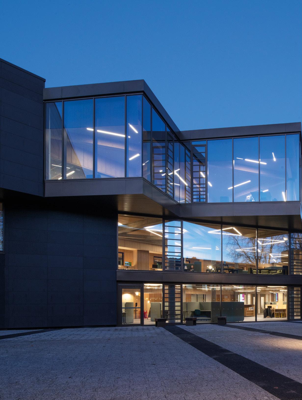
ONE OF THE MOST PICTURESQUE CAMPUSES IN THE COUNTRY HAS ALWAYS BEEN A CUT ABOVE THE REST BUT A NEW FRONT DOOR PROMISES TO TAKE IT TO A NEW LEVEL. WE TAKE A LOOK AT THE LATEST ADDITION TO THE UNIVERSITY OF STIRLING TO SEE EHAT IT SAYS ABOUT THE FUTURE OF CAMPUS LIFE. PHOTOGRAPHY BY PAUL ZANRE.
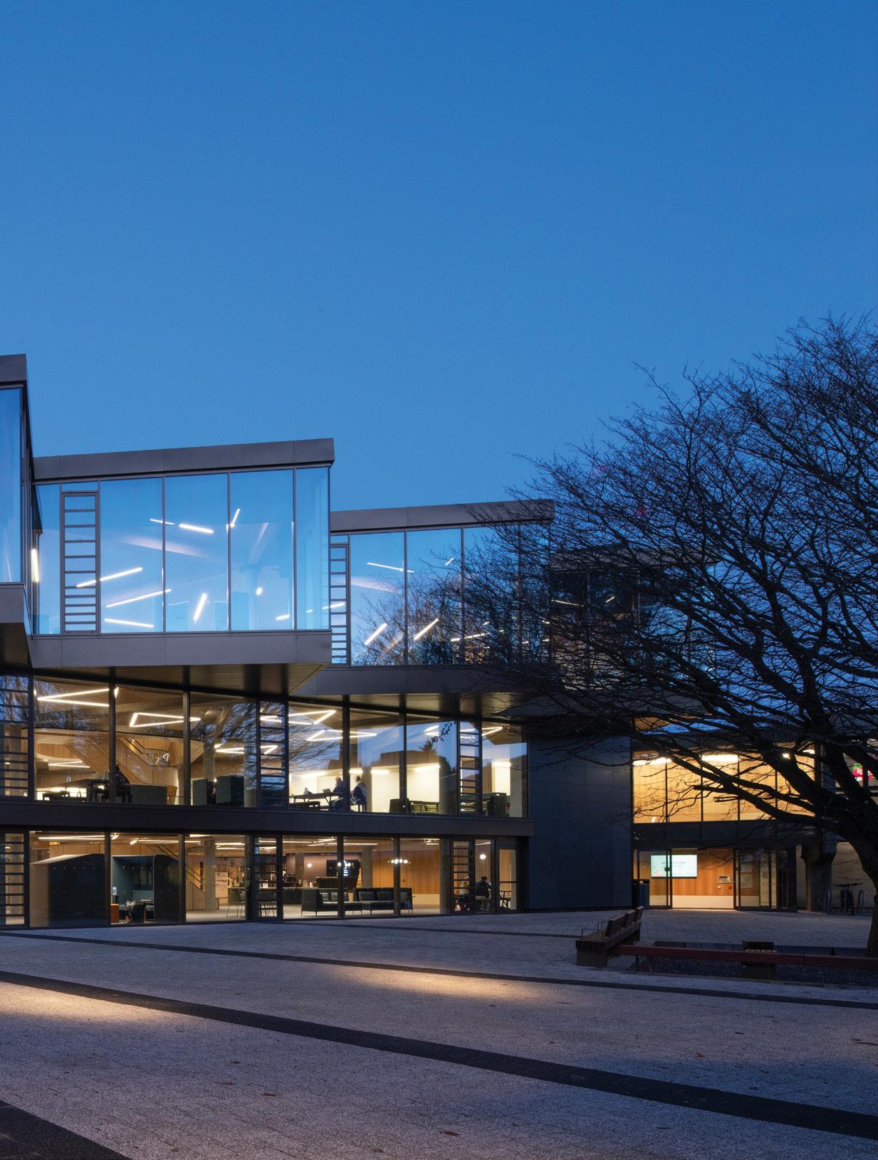

The future of further education is being thrown into sharp relief by the switch to home learning and the University of Stirling has doubled down on its picturesque Airthrey Campus to retain the best aspects of an estate widely held to be among the best Modernist campuses in the country.
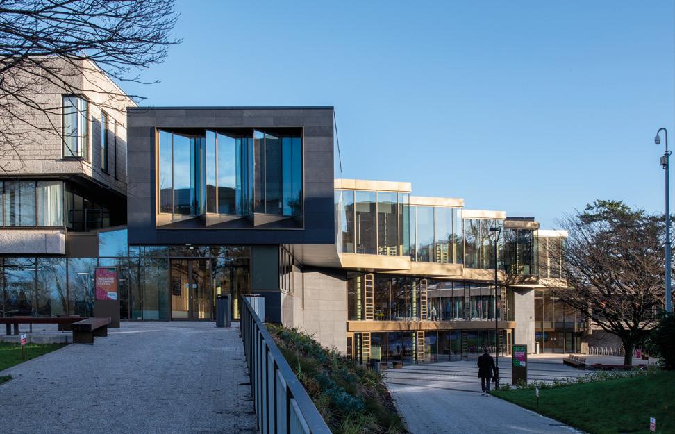
Built 60 years ago and subject to numerous unsympathetic alterations over the decades the university has now turned to Page\Park Architects to undertake more radical surgery to improve access and the learning environment for returning students and staff in a post-pandemic world. Urban Realm took a look at the wedge-plan ziggurat at the heart of campus life to find out how education provision is shaping up in the 21st century.
Campus Central is more than a simple front door. It encompasses a refurbished atrium and pedestrianised forecourt that together are more than the sum of their parts. Inspired by the geography of the Carse of Stirling the project revitalises the library and MacRobert Arts Centre by framing the pedestrianised Queens Court, a generous piece of public realm formed by the relocation of a bus terminus.
Site constraints mandated a fully accessible triangular extension that responds to adjacent late-Modernist buildings and a high-pressure water main crossing Queen’s Court to establish a new front door to the MacRobert Arts Centre. Separately, a glazed atrium created in the late 1990s has been fully refurbished to make better use of the original steel-frame
structure and to open up the volume, improve ventilation and maximise views and light across Airthrey Loch to the Ochil Hills. Further interventions led to the removal of glazed screen shopfronts in favour of retractable shutters and an enlarged cafe.
Detailing the resulting fusion of geography and geometry, Finbarr O’Dempsey of Page\Park architects, told Urban Realm: “The project emerged from 10 years of alternative projects to redevelop the atrium within a wider sustainable master plan. We were well aware of the spectacular landscape setting and the weight of RMJM’s original masterplan, everything we did was in keeping with the spirit of this plan. The original competition team were reluctant to plan anything for the site because it was so beautiful, to begin with.”
You’ve likened the intervention to a river valley, how did you pick up on natural features and how were these translated into architecture? O’Dempsey said: “The campus is planned around an artificial loch that was dug out in the 18th century as the setting for Airthrey Castle estate by Robert Adam. There’s a clear and powerful landscape horizon on all sides below the looming Wallace Monument. You’re always aware that you are at the bottom of a valley. That’s translated to distinctive voids within the building, the central staircase and what we call the slot stair below the new roof light at the junction with the library. We reinterpreted the spatial qualities of those geological features.”
Likened to a gorge or ravine the results are dramatic, with the slot stair lending an almost theatrical quality to the interior design which prioritises a light touch impact on the existing built fabric wherever possible. O’Dempsey explained: “It’s a very practical design that serves two functions. It gives you a bit of room to technically resolve how you meet the library and it gives the south elevation a bit of space.
“There was always a balance to be struck between meeting the university brief and respecting the integrity of the late Modernist architecture. It’s very impressive but has been compromised over the years. We can give it a bit of room and not entirely encroach on it. The skylight gives you a buffer and brings light deep into the north side of the plan, we are essentially tucking underneath and around the structure and its foundations. There’s a balance struck between how close we could get to the existing foundations without compromising them or doing too much underpinning so we brought the grid for the new in-situ concrete structure away from the existing library and the roof bridges the gap between the two.”
So often we see access made as broad and wide as possible, emphasising the horizontality. How did you square that with access requirements? “There’s a 30-minute fire screen to the north side of the slot stair which runs 4.5m either end beyond the void to allow a safe escape route around the stair void. It’s as wide as we could make it and be compliant and it’s not a fire escape stair. Nothing has been compromised to achieve that compression”, says O’Dempsey.
From the unpromising beginnings of a complex leftover space, Page\Park has had to rationalise this inheritance while tiptoeing around utilities. How did the limitations of the site drive the design forward? “They were fundamental to the whole geometry which was a product of constraint”, says O’Dempsey. “The high-pressure water main runs across Queens Court so we had an 8m standoff from that. We used that as the extent of the new footprint with the third-floor offset and cantilevered out to maximise usable floor area. The boundary with the existing library and then the MacRoberts centre on the east side created a triangular wedge shape with the water main.”
Adding complications to these constraints is a multitude of levels and entrances. How do you make sense of what is effectively a three-dimensional jigsaw puzzle? “The new extension tries to untie the existing spatial knots. You have a compressed ground floor in the new extension, responding to the existing levels we were tying into. We couldn’t change level access from Queens Court through to Cottrell Bridge. From level one upwards we begin to pull out and stretch the floor to ceiling heights but still had to tie in with the level three fire escape.
“We created a new entrance on the west facade through some fairly major earthmoving works to create a more civic entrance overlooking the loch. That means people can directly access level two as well as level one from outside the building.”
The result is a bit of an iceberg with the front facade hogging the limelight while the real magic takes place within. Guiding Page\Park’s hand throughout was a desire to ensure

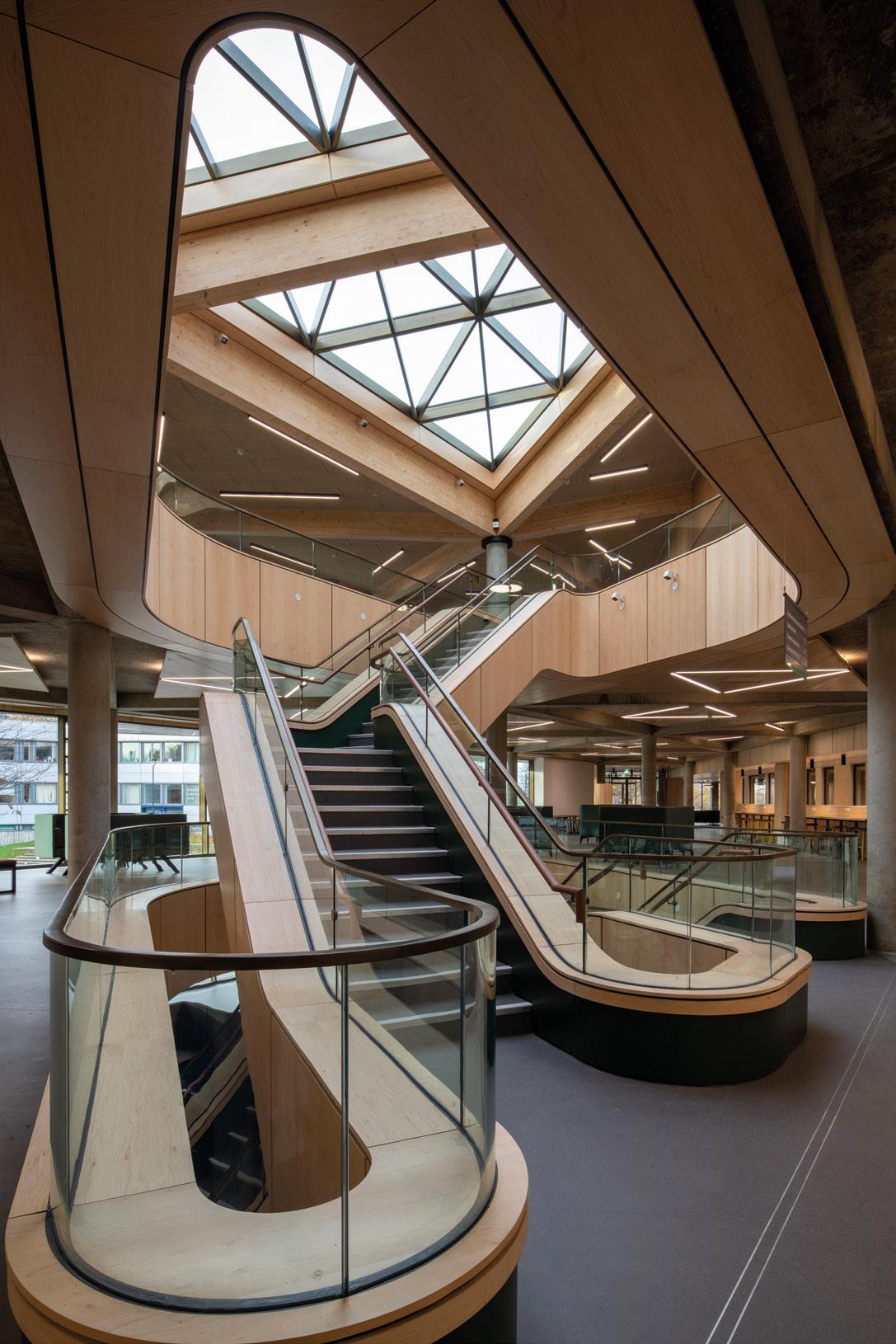
greater longevity of the existing structure while making minimal interventions of their own. “There is so much embodied carbon”, says O’Dempsey. “Although it was less than ideal it was well used and an important setting for generations of students and staff. There was originally an open courtyard garden where there is now a glazed atrium. It was only in the nineties that they put in a roof light, turning an external space into a fully internal one.
“We were trying to restore the spirit of the room at the heart of the space. We’ve restored the garden setting albeit internalised and retained over 90% of the existing structure.”
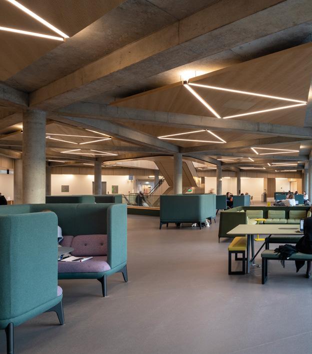
Wearing its engineering on its sleeve with an exposed concrete skeleton on full display the extension makes a statement as the modern face of the campus, building upon the material language of aggregated pre-cast from the late-sixties, portions of which have been replaced by powder-coated panels as at the Cottrell Building. “It borrows heavily in terms of the expressed structure”, maintains O’Dempsey. “We’ve got an insitu concrete frame which we worked hard to distinguish from the library concrete, it’s a lighter mix. It’s not ideal in terms of the embodied carbon but we worked with the structural engineers to reduce the cement content and sourced aggregate locally, principally dolomite from the Northfield Quarry in Falkirk and
sand from Angus near Alloa. A fair bit of thought has gone into how the formwork responds to the overall diagrid to accentuate the triangular geometry.”
More natural materials can be found in the roofscape which makes extensive use of glulam timber, in a nod to the woodland setting: “It’s a bit of a tired analogy but it’s tying into the tree canopy of Queens Court”, says O’Dempsey. “Branching column heads have capping plate details which tie the beams together. Internal beams are fixed to the side of the main beams with his and hers bracket that tucks into the side of the main beams. We had to negotiate charring depths for all the exposed glulam and it was treated with flame retardant to achieve the 60-minute maximum fire rating. Above the glulam, we’ve got a 100mm cross-laminated timber deck that extends out along the south elevation to deal with the cantilever and take the head of the curtain walling and reduce the overall depth. Unfortunately, it’s still under quite a thick band.”
Beyond the architecture, it is the landscape that defines the setting, now newly enhanced at the hands of Raeburn Farquarbowen, (formerly Ian White Associates). “The idea of turning the roundabout and bus station into a new gathering space at the heart of the university is fundamental to the success of the building and is in many ways even more
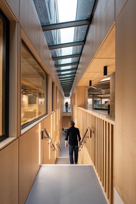
transformational than the building itself. There’s a radial splay to the landscaping in response to the south elevation. We’re lucky to inherit so many mature trees, the building benefits from the semi-mature landscape that it’s grounded in. It feels nested into the campus. It’s very different to the bomb site you often get when starting carte blanche.”
The centrepiece of the remodelled campus is a generous atrium designed to funnel occupants from the first floor to the second floor, and dominated by an expansive sculptural staircase to which all aspects of campus life now gravitate. The grand sweep of the central stair is a sharp contrast with the angular lines of the exterior and encourages vertical circulation through the volume. O’Dempsey added: “The stair is a piece of sculpture that serves as a wayfinding device. If you’re standing on it you can see everything going on in the building all at once. There are some chunky steel stringers in there dealing with eccentric structural forces as we twist between the first and second floors. We made the plinth to the stair a little more solid to hide some of the structure that was needed.
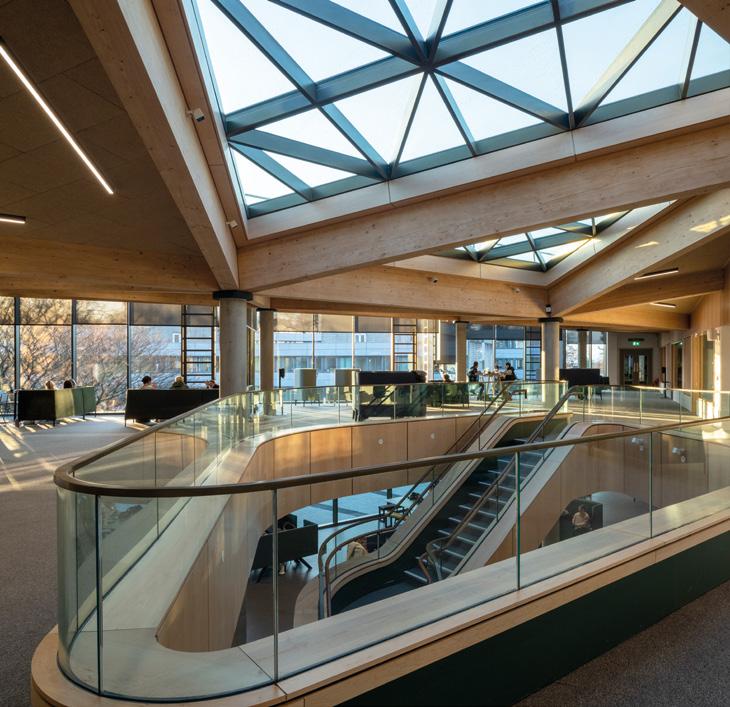
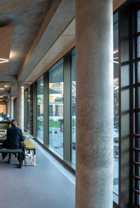
“It will form the backdrop to graduation photos. Lots of people have been asking how many students can stand side by side up and down. I’m pretty confident it will hold but whether it will bounce is another matter!”
In making sense of a campus that had become disjointed over time Page\Park has worked hard to disentangle a Gordian knot of entrances and levels which threatened to detract from the picturesque beauty of its landscape setting. In doing so the university has arrived at a home that isn’t just a pretty face but a substantive commitment towards placing people and social interaction at the centre of further education.
Page \ Park: Finbarr O’Dempsey, Eamon McGarrigle, Ana Teresa Cristobal, Paul Sutton, Christine Turnbull, David Page
Client: University of Stirling
Structural Engineers: Woolgar Hunter
Services Engineers: Harley Haddow
Fire Engineers: Buro Happold
Landscape Architects: Raeburn Farquhar Bowen
Project Management: Gleeds
Cost Consultant: Brownriggs
Principal Designer: Page \ Park Architects
Main Contractor: Robertson Construction Central East
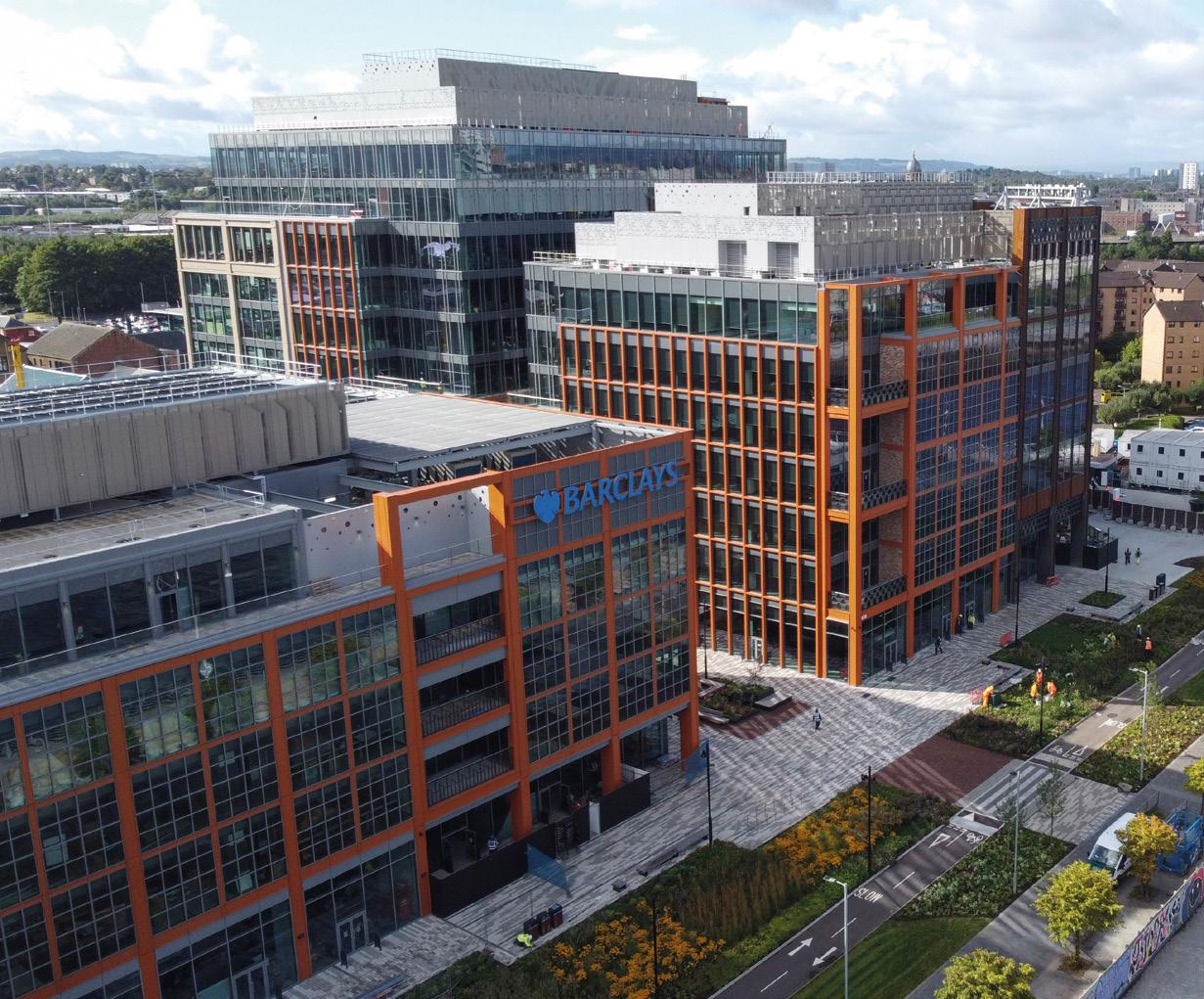
Urban design panels are surprisingly thin on the ground worldwide but Glasgow stands apart with a participatory panel drawing on organisations as varied as the Mackintosh School of Architecture and Historic Environment Scotland. Lauding the most established design panel in Scotland
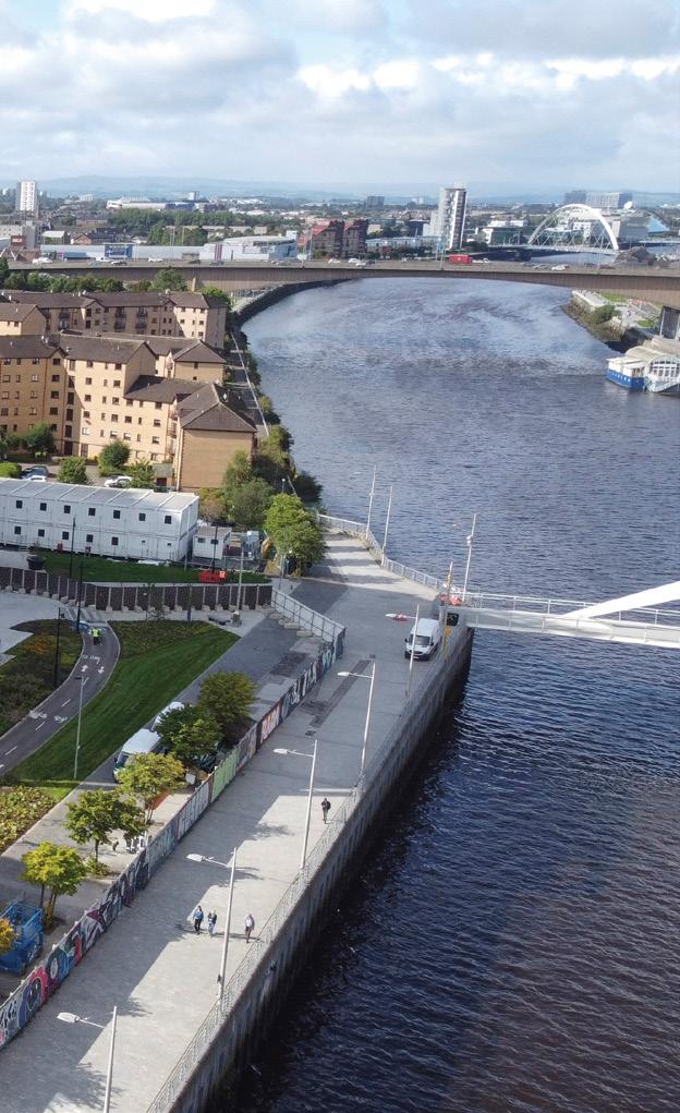
Raffaele Esposito, City Design Manager at Glasgow City Council said: “When I started to look into urban design panels in the UK I was surprised to discover that there are a lot of attempts to create panels, but very few are regularly up and running. Notwithstanding what the Commission for Architecture and the Built Environment (CABE) has been doing down south.”
Building on the groundwork laid by his predecessor, Gerry Grams, Esposito speaks passionately of ‘creating discussions and opportunities to open up design as a process of ideas, rather than a process of individuals.’ But how to marry these ideals in what can be a confrontational process where the interests of applicants and neighbours rarely align. How does the panel foster a more collegiate approach? Esposito acknowledged “It’s been a journey,” but believes today’s panellists embody the spirit of free-thinking like never before, in part spurred by pandemic related changes that have brought in more outside talent.
Esposito says: “What has happened in the last two years is amazing, we’ve moved from face-to-face personal meetings to a digital environment and that has allowed us to bring in people from outside. They are not ingrained in those dynamics that were perhaps more typical of the panel of a few years ago. Even just one new panellist from down south brings a completely different dynamic. It brings the conversation onto a more objective plane.”
An influx of talent is held as introducing a more holistic view where local repercussions are weighed against the impact on the city and the region as a whole. “Being passionate and avoiding individualism is fundamental and that comes down to knowledge,” says Esposito, well aware of the risks inherent in going too far, too fast, on digital.
“Embracing digital is not for everyone. I believe that 90% of our panellists are very comfortable with that format but embracing digital automatically cuts off older people. It’s a bit like what you’re seeing in planning where so many
CIRCLE OF COMMERCIAL IMPERATIVES
DESIGN IS THE BREAD AND BUTTER OF THE GLASGOW URBAN DESIGN PANEL, AN ALTRUISTIC BODY CHAMPIONING ARCHITECTURE AND PLACEMAKING TO DEVELOPERS, DESIGNERS AND PLANNERS. BUT HOW IS ITS WORK BEING SHAPED BY THE PANDEMIC AND BALLOONING INFLATION? LET’S FIND OUT.
consultations are now online, although planning is still trying to retain a hybrid approach.”
To that end, Esposito champions ongoing engagement with communities on the ground, even if only in the form of a site visit, suggesting that more radical options for boosting engagement such as a physical ‘shop window’ for discussions remain off the table for now. Another advantage of digital is reducing the chances of one personality dominating, a realisation that underpinned the shift even before the pandemic. “We were adamant that we didn’t want to stop during the pandemic”, says Esposito: “ To keep the urban design panel going was the most impactful way to demonstrate that the city was not stopping. As long as people were submitting applications, we were still active. The shift to digital was forced but the benefit of it was so obvious that we decided immediately to capitalise on that. Actually, not just to translate into digital the previous format but to embrace all the possibilities that this new tool can give us.”
Embracing technologies such as Vu.City, a planning platform for sharing design proposals interactively and the polling app Slido the GUDP is experimenting with new ways of visualising data and democratising discussions to ensure that everyone’s voice is heard. “There is something else that I believe is extremely fascinating,” observes Esposito, “which is the idea that gathering data gives us the chance to put in place a governance system that allows us to review the effectiveness of the process. Until the lockdown, the process was more empirical because it was based on impressions but now it’s very scientific.”
Will this help in terms of transparency? How can people view the GUDP in action and see not just outcomes but the processes behind decisions made? “We are constantly inviting people to engage, we’re not precious. However, there must be some sort of filtering because we can’t allow everyone to participate.” Is there scope for having a paid position for the panellists? “Would it be appropriate? Absolutely. Yes, because that will increase the professionalism of actors and improve accountability, which is not a small thing”, notes Esposito. “Is there scope? No chance. GCC is not in a financial position to even imagine the possibility of being able to pay panellists. I don’t take for granted that people are giving their time for free.”
I understand that projects put forward for review are voluntary, could there be some system where specific projects are mandated for review? Esposito answered: “Although it’s hosted by GCC, in the planning department this process is independent, it’s not statutory. It’s not like Edinburgh where the panel reviews are directly connected to the planning procedure. In Glasgow, they’re not and they are not because we always wanted to retain a very clear line of demarcation between the process of independent review and the planning process.”
“All the major schemes that recently came to the fore in
Glasgow have been brought to the panel. There is a direct line of communication where critical schemes are invited to the panel. So, it’s not going to happen that a major scheme is not reviewed. I would love to stretch to infrastructure proposals, bridges for instance. There was a connection with A+DS years ago that allowed us to nominate infrastructure schemes for review but that service isn’t provided anymore.”
Outlining what drives the panel, Esposito cites three areas that govern its approach; ethical standards, knowledge
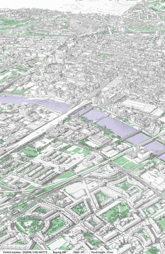
and modus operandi together with the rationale behind it. The first area is addressed by a published governance structure which sets out in black and white what is expected of panellists. “I know that sounds superficial but you know the Latin proverb ‘verba volant, scripta manent’, which means spoken words fly away, written words remain. CABE established that there must be an ethical constitution for designers so we are just literally adopting that approach.
“We have a code of conduct not just for panellists, but
for presenters as well. We are trying to ‘control’ (for the right reasons), every single aspect of the proceedings because we like to believe in the power of doing things in a certain manner to control the output. When I say to control the output I’m not referring to controlling the type of response to a scheme. I’m referring to the fact that we are trying to maximise the benefit for the presenters and the panellists as well.”
At the heart of the panel is knowledge and the difficult >
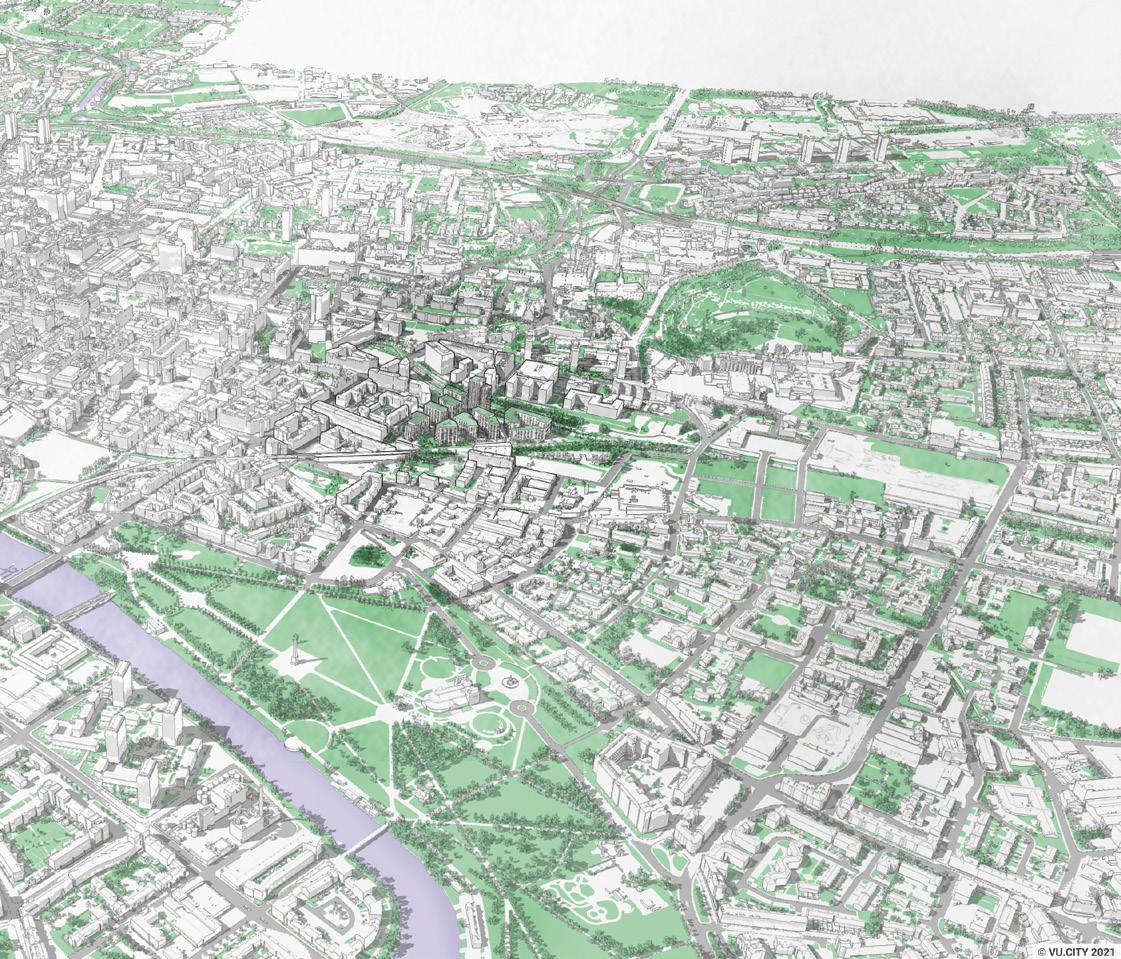
task of finding the best people for any given review where multi-disciplinary panellists can have varying degrees of experience. How do you go about managing different skill sets in a high-pressure environment where every planning application is a potential scandal. “There is the knowledge that we can pull on a session basis to respond to specific schemes. So for instance, if there is a school involved we would like to take on board someone with specific expertise in school design. But there is also the knowledge that needs to grow between panellists.”
Asked about specific projects where the panel has made a difference Esposito wouldn’t be drawn without speaking
to the relevant reviewers and clients but was willing to talk in general terms about recent impacts the body has made. “A large master plan for an area by the river which was presented in 2020 had a connectivity issue because it was completely cut off from east to west by a very large block. The panel was constructive in asking the presenter to rearrange the masses of four or five different residential buildings to create an east-west route. Planning times are huge but it’s being finalised as we speak.”
“You can ask how many times we succeed on that journey, probably a few times. There is a harsh reality out there and it’s becoming harsher as the pandemic
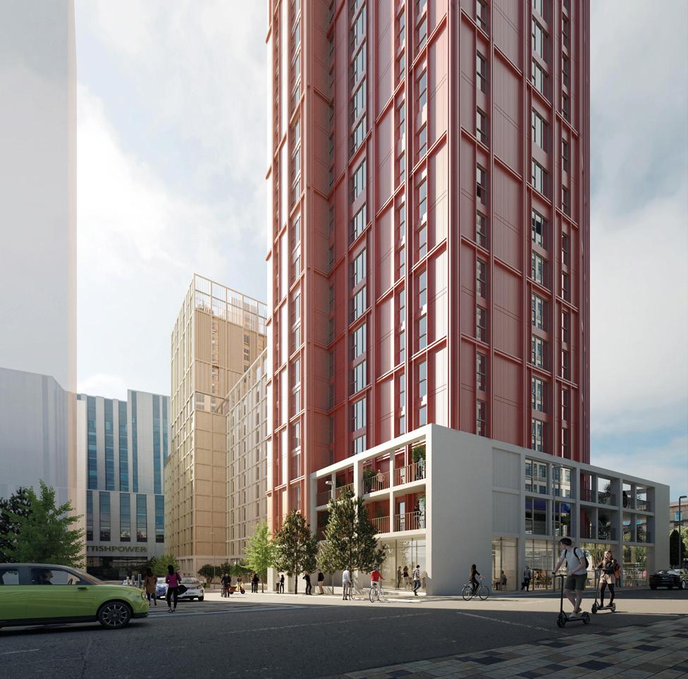
demonstrated. There is an increase in material costs and so construction is becoming much more expensive and therefore defending the product of design is becoming increasingly difficult.”
Can the activities of the panel be opened up for other people to log in and view proceedings and possibly even comment? “At the moment they are not open because they are related to pre-planning applications characterised by extremely high sensitivity from a commercial point of view. These are schemes that are not in the public domain, they’re not even published on the planning website. We want to discuss design at an early stage and there is a planning process there which is
designed to allow communities to have an input.”
Building consensus is a fraught process at the best of times in a profession where opinions can be as varied as the people behind them, especially in something as every day as architecture where anyone who inhabits, passes or visits a building will have their own experiences and preferences. Esposito concedes: “If more people were able to access that thinking process at the very early stages that would be ideal.” If that were the case it might be beneficial not just to the city but to the applicants themselves by motivating them to improve their schemes for the benefit of the economy and society.
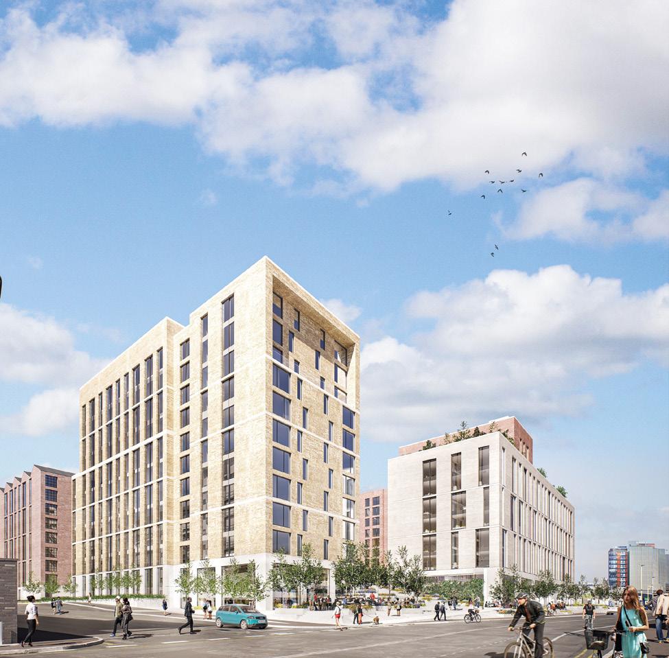
THE DECISION TO DEMOLISH CUMBERNAULD’S ‘MEGASTRUCTURE’ TOWN CENTRE HAS MADE HEADLINES FAR BEYOND NORTH LANARKSHIRE, DEMONSTRATING THE SHOCK AND AWE ITS BRUTALIST PRESENCE STILL COMMANDS, EVEN IN A DENUDED STATE. FORMER PROSPECT EDITOR PENNY LEWIS QUESTIONS THE RATIONALE OF BUILDING A FUTURE BY ERASING THE PAST.
In March North Lanarkshire Council (NLC) announced that they were going to buy back Cumbernauld’s Town Centre and then demolish it. The announcement, which was accompanied with renders of a new replacement ‘Town Hub’, provoked a passionate response from architectural commentators, including The Guardian’s Owen Hatherley who suggested that we ‘trash our modernist heritage on a whim’. I joined the social media battle alongside the Brutalists, NLC were ‘cowardly and wasteful’(Barnabas Calder’s words) and lacking in social imagination (Hatherley) –‘philistines’ I screamed.
I was stopped short when I realised that one of the main justifications that NLC gave for the intended demolition was that Cumbernauld had twice been voted The Most Dismal Place in Scotland (2001 and 2005) as part of the Carbuncle Awards. This was a prize that Urban Realm (then Prospect) had brought to life in 2000. I had a terrible flashback to the ramp of the Town Centre, with a photographer and a frustrated local resident and me handing over the infamous Plook.
In our defence, when The Plook was awarded, our editorial line was that Cumbernauld Town Centre’s problems were not due to the ambitious work of the 1960s architects and planners that built it. Its poor state could only be explained by generalised economic decline in ‘70s, privatisation and poor


management in the ‘80s and ‘90s and finally in the poor/ desperate decision to give planning approval for the Antonine retail block in the 2000s. We thought we were opening the debate, but recently things have gone quiet and the narrative that Cumbernauld is the outcome of bad architectural decision making seems to have largely won the day.
What has become clear to me over the past weeks is that Cumbernauld is too important to become ammunition in some branch of Scotland’s cultural wars. The future of Cumbernauld, and how we choose to develop it, should provide us with a sense of what is possible if we can combine spectacularly creative design solutions with a committed local authority and a population that want change. We might try to address big questions – what do you do with a megastructure when it appears to have failed? Or what is a town centre? To do this would demand a collective effort and a more honest discussion about how we arrived at the current sad situation.
NLC say that their current plans, which involve demolishing pretty much everything (schools, public buildings etc) that was built in the 1960s and 1970s are ‘a vision’ – they do not constitute a concrete proposal. Des Murray, the CEO of the NLC, says he wants to ‘co-produce’ the real plans for redevelopment with local people over time and nothing is set in stone (or concrete). He’s open to the idea of keeping some elements of the structure of the megastructure. Murray even admits that the images of the new proposed Cumbernauld hub are not ‘inspiring’. “I don’t like them. I live in Cumbernauld and I’m looking at them thinking that looks like another shopping centre with more external space,” he says. He doesn’t want the new Cumbernauld to look like another soulless retail delivery point, any more than those of us that want to retain the megastructure. When he is talking about how he is raising the capital revenue available for the redevelopment of North Lanarkshire largest town (£3.5billion over 10 or so years) I feel a bit ashamed about calling him a ‘philistine’ and start to believe that something good might come out of NLC’s plans. Every now he breaks the spell when he defaults to the less convincing narrative that Cumbernauld’s failure can somehow be explained by its experimental architecture, but then he concedes that it’s a weak argument given that several other North Lanarkshire towns, with 19th century cores have suffered an equally dismal fate. In fact, Airdrie (also in North Lanarkshire) was the first venue to pick up the title Most Dismal in 2000.
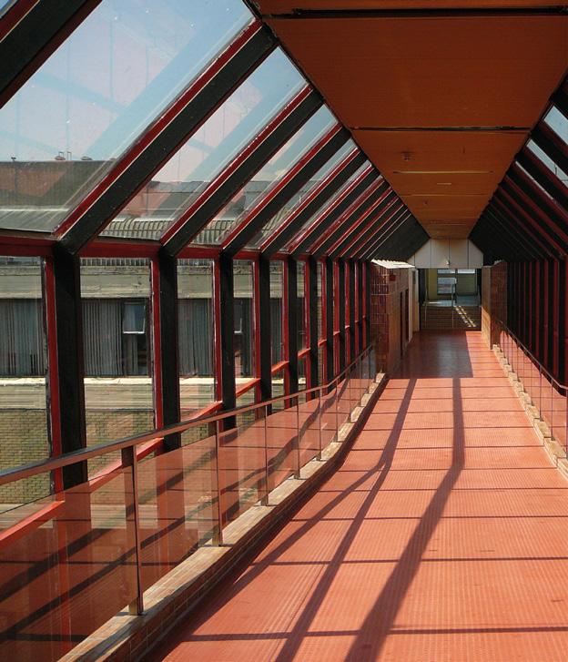
So, as Hatherley says, we need to have serious conversation about our modern heritage. To unpick why post-war architecture (now lumped together under the title Brutalist) has become so unpopular demands a wider discussion about planning and politics and more space. We might also ask why brutalism is very popular among a section of younger culture vultures who are drawn to the Barbican and anything else that smells of what Hatherley calls ‘civic purpose’. Over the past three decades we’ve become quite
good at converting old post-war (and pre-war) concrete blocks into something useful, particularly where land values are high or there is a buoyant housing market. What has proved more difficult has been re-using some of the more ambitious centrally located modernist buildings that don’t easily convert to residential. I have not forgotten how Historic Environment Scotland and numerous charities have failed to rescue St Peter’s, Cardross, one Scotland’s few ‘A’ Listed modernist buildings and I still blush with embarrassment when I recall that Edinburgh (a city in which it is very hard to change anything) allowed for the demolition of the Scottish Provident Building at 4-6 St Andrews Square (1968) by Rowand Anderson Kinnimouth & Paul.
This discussion, its an opportunity to look again at our planning, our media and our public discourse and to escape from the tired narratives that involves blaming every ill on car owner or developers. We should not give up on the public discussion about desperately depressed old town centres and struggling high streets -Covid has made this discussion more urgent. Our economic situation and current planning ethos
are yielding very poor results. There is a lot so chat among politicians and built environment professionals about ‘coproduction’ but in truth there is little genuine democracy left in the planning process. Professionals that should be developing serious design solutions are too often busying themselves performing a role that should be done by councillors, hosting public meetings.
NLC wants to replace our current soulless retail centres with ‘hubs’ where they will draw together all public services in one place, but in this plan we will replace a unitary space owned by the private sector with a unitary space owned by the public sector. One thing we did learn from the period in which Cumbernauld was conceived, is that people enjoy their freedom, we are grateful for the help offered by the authorities, (healthcare, education and welfare) but we don’t want these authorities directing our whole lives. It is wrong to imagine that if you bring all the state’s activities together in one public place you create foundations for community and public life to flourish. Public life takes off in the spaces not occupied by the authorities, where people have the freedom to do things for
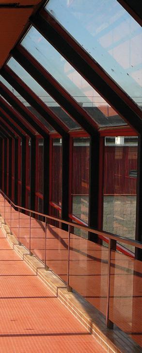
themselves socially and commercially.
At present NLC has its eye on Cumbernauld’s school estate. Just now our schools remain one of the few public institutions in which families and the state share a common purpose and a sense of trust (COVID policies and Scottish Government education policies are already undermining that mutual trust). NLC want to rework all the pre 1996 existing schools as part of their ‘hub’ approach, so that schools would ‘community use’ as well as education. Thankfully this work would not be undertaken as part of a public private partnership, but it could be a big mistake, it might be better to leave schools alone, for political and cultural reasons – and coincidentally for architectural ones.
What would be lost in the demolition of Cumbernauld Town Centre is not simply large amounts of ‘embodied energy’. What would be lost is a real sense that we can make sense of the disappointment that coincided with the end of postwar expansion and deindustrialisation. We started to explore these themes (see Gregory’s Girl) but then sometime in the 1990s we became less literate on the subject of ‘change’ and
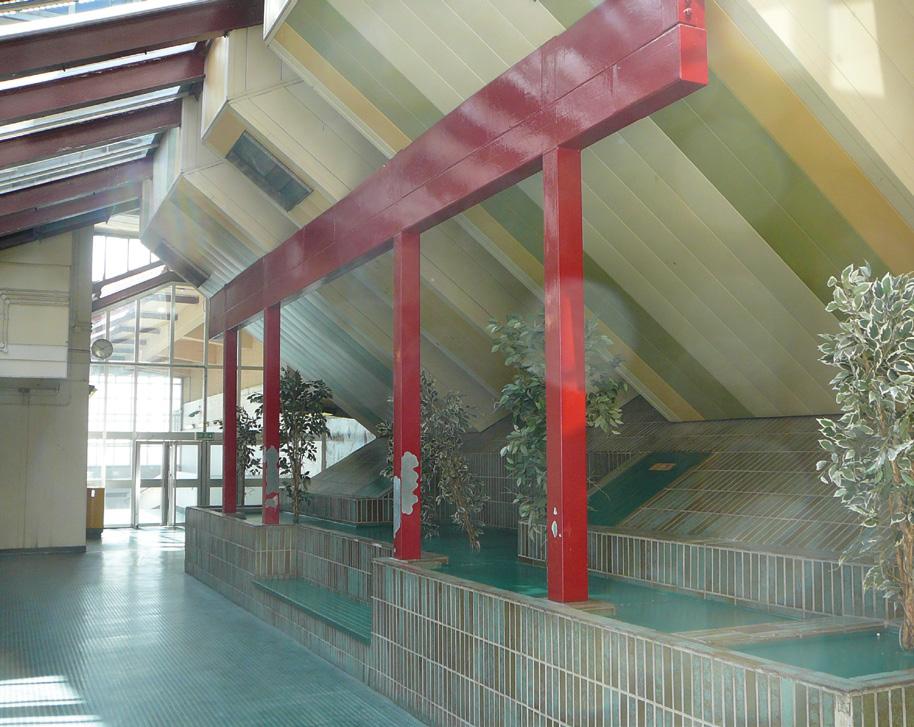
it became inevitable. The idea of the urban renaissance, of the city as the cultural centre driven by retail and then property – trumped our original post war aspirations to encourage regional development and dispersed settlement –were we right? You can’t really discuss Cumbernauld in isolation from the New Town Strategy and the Clyde Valley Plan. Perhaps then we could find a way to untangle political and architectural failings, a task that Reyner Banham set himself in his work on Megastructures in the 1970s.To blame Copcutt’s town centre now for the challenges facing Cumbernauld is an act of denial, but perhaps it’s not entirely surprising as some architects have an annoying tendency to imagine that certain architectural forms can resolve more complex social questions.
This ‘serious conversation’ about our modern heritage needs to include an assessment about what was good about Cumbernauld Town Centre – to remember what was compelling about the original megastructure, before the owners filled in its light wells and put doors on the walkways and entrances. In these ‘co-production’ planning meetings facilitators need to take the time to ask the residents what was
good and worked well about the 1967 centre? Architects need to try to understand why there is so much hostility towards the built legacy of that modern period. Thirdly we need to talk about saving some of the buildings produced between 1945 and 1970, because just now our civil servants and politicians seem to be engaged in a mission to wipe the experience of making them from our collective memory.
The Carbuncle Awards dubbed the town centre ‘a rabbit warren on stilts’. The insult stuck, because after visitors by car enter the centre from beneath the towns impressive but neglected and unlit concrete waffle slab deck and then get lost. The’ stilts’ are impressive giant columns that march along the high spine of the site and rise from the parking/road level to the penthouses at the very top nine-level stepped structure. The centre is dark and disorientating now, but in its original form very little was enclosed, ramps and stairs related to open voids which allowed visitors to look across levels. Access to the shopping was by foot, but the space is public and open, and children could ride their bikes in this new elevated public space.
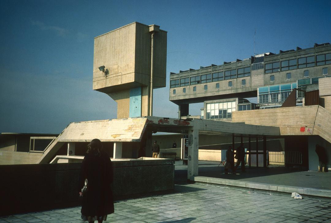
phase, described it as a ‘citadel ‘in which all decks were to be perforated and interpenetrating. Like many of his contemporaries, he was keen to explore new ways of making human settlements. He envisaged the centre in the same way as many megastructures were conceived as having a permanent structural core onto which small less permeant elements, (such as housing units or offices) could attach themselves. In these so-called megastructures a building was not so much an isolated product as a process that could evolve over time.
The designers of Cumbernauld are often accused of adopting a ‘tabula rasa’ approach to planning. Critics of modernism suggests that these modern architects ignored site and context and designed assuming a flat empty terrain. This critique doesn’t really hold- if anything the creators of Cumbernauld New Town were romantics. Locating the new town centre at the top of a hill close to the escarpment, was not technocratic or pragmatic. Landscape architect, Bill Gillespie, inspired by the flowing landscapes of Finland and Norway envisaged a mixture of planting and naturalistic development.
The nature of the housing in Cumbernauld was unlike other New Towns, it was denser with groups of houses clustered together making good use of the changing levels of the site to create interesting sections and settings for modest social housing. The penthouses at the top of the megastructure provided spectacular view over the Campsie Fells, suggesting a new kind of lifestyle in which residents benefits from all the efficiencies of urban life but in a clean and healthy environment.
The story of the design of Cumbernauld is not a cautionary tale, its compelling. Fortunately, Diane Watters at Edinburgh University is working on more than one book on the New Towns and many others are giving lectures and writing about the place. This story should be told throughout architecture schools and in public meetings and particularly by those that have first-hand experience as designers, politician or residents of the original project. We need a national archive, several publications and, most importantly, a lot more public discussion to capture the experience and to see what can be salvaged (literally and metaphorically) before we reach for the wrecking ball.
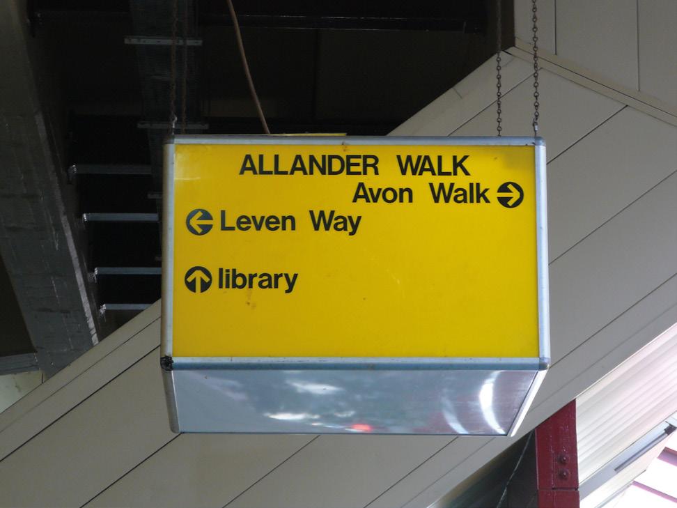
FOLLOWING THE PASSING OF RICHARD ROGERS PETER WILSON, ARCHITECT, WRITER AND FOUNDING DIRECTOR OF THE MASS TIMBER ACADEMY OUTLINES THE HIDDEN TIMBER ARCHITECTURE WHICH UNDERPINS A PRACTICE BETTER KNOWN AS HI-TECH VISIONARIES OF CONCRETE, GLASS AND STEEL.
The name Richard Rogers is generally associated with a type of architecture formed from ‘modern’ materials - concrete, glass and steel. Yet the practices that have borne his name - Richard Rogers + Partners, succeeded by Rogers Stirk Harbour and Partners - have a hugely commendable but largely unheralded portfolio of projects that make exemplary use of engineered timber in hybrid relationships with the ‘high tech’ architecture for which they have been famed. The lineage of these buildings goes back over 20 years, with the developmental thinking underlying the use of modern timber technologies in their design arguably providing a masterclass in the continual refinement of knowledge and application of glue laminated timbers to create highly articulated architectural forms.
Few would argue that Richard Rogers was one of the most remarkable architects of his generation. His impact on architecture was imprinted on the world with the competitionwinning project for the Centre Georges Pompidou in Paris that he designed in collaboration with Renzo Piano*. The relationship between the Centre’s served and servant spaces - and the device of taking vertical circulation onto the outer surface of the building - reappeared in the Lloyds of London building (1978-86) in an even more dramatic machine aesthetic and, much later in the Mossbourne Community Academy (2002-
04), the practice’s first visible venture in the UK into the use of engineered timber in modular form.
The introduction of timber into what has otherwise come to be widely seen as the Richard Rogers + Partners’ ‘hi-tech’ architecture had manifested itself much earlier, however, in the international competition-winning design for the Law Courts in Bordeaux (1992-98). Its precise technological frame articulated once more the ‘served and servant’ conceptual approach and the practice’s continuing desire to deliver transparency of function, this time with the peaks of seven timber-lined and clad conical courtroom chambers piercing the undulating, vaulted bays of the building’s oversailing roof. An extraordinary and much under-publicised urban structure in the Roger’s ouevre, the organisational form of the Law Courts has been reinterpreted in different ways in a number of subsequent projects in which timber has played a prominent role, not least in the Macallan Distillery. It also signalled the beginning of the practice’s interest in creating low-energy hybrid public buildings.
An anonymous, open competition win in 1998 for the new Law Courts in Antwerp took the integration of engineered timber into predominantly steel and glass structures in a new direction - this time within the shimmering stainless steel-clad
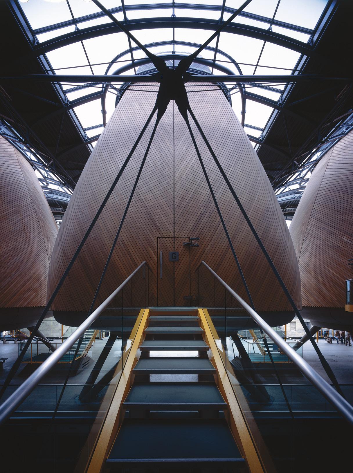
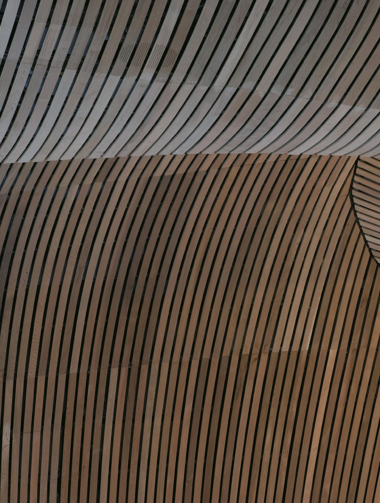
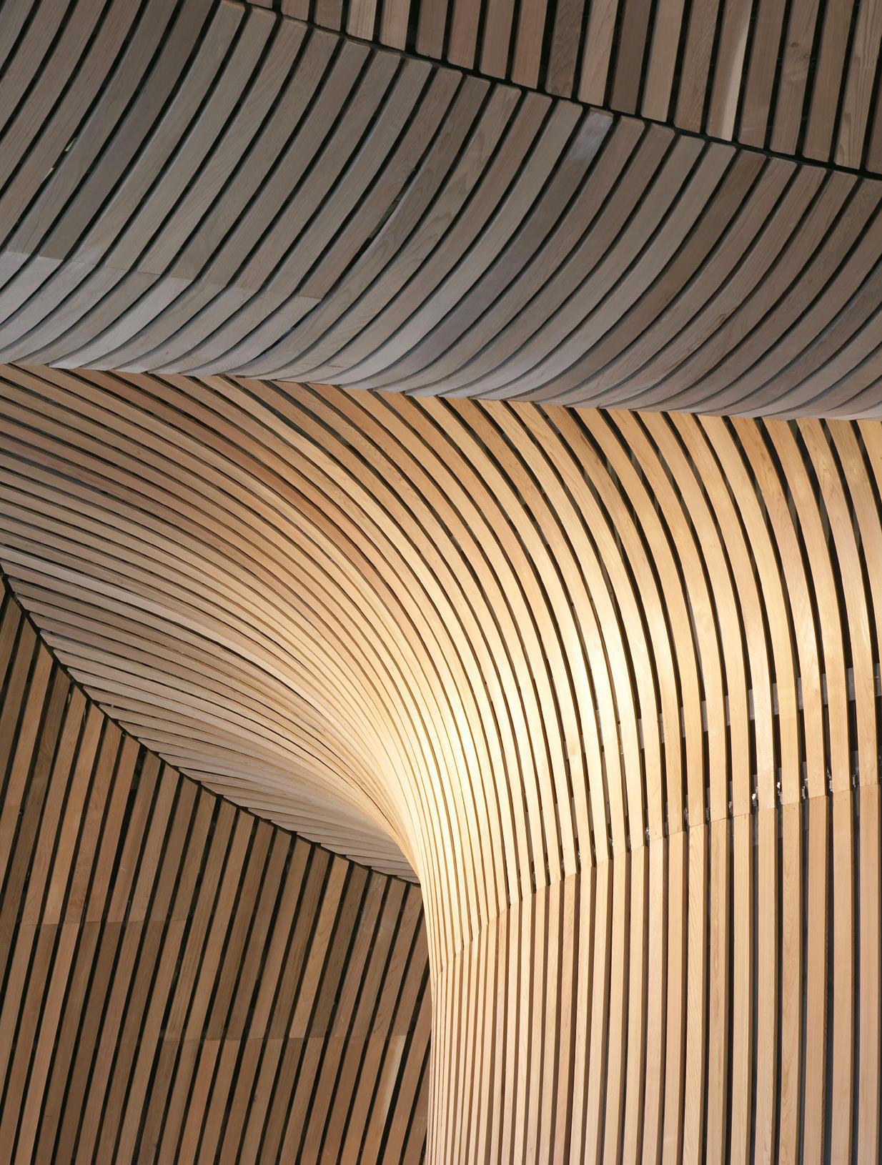 Roof and soffit detail at the Welsh Parliament (Senedd Cymru)
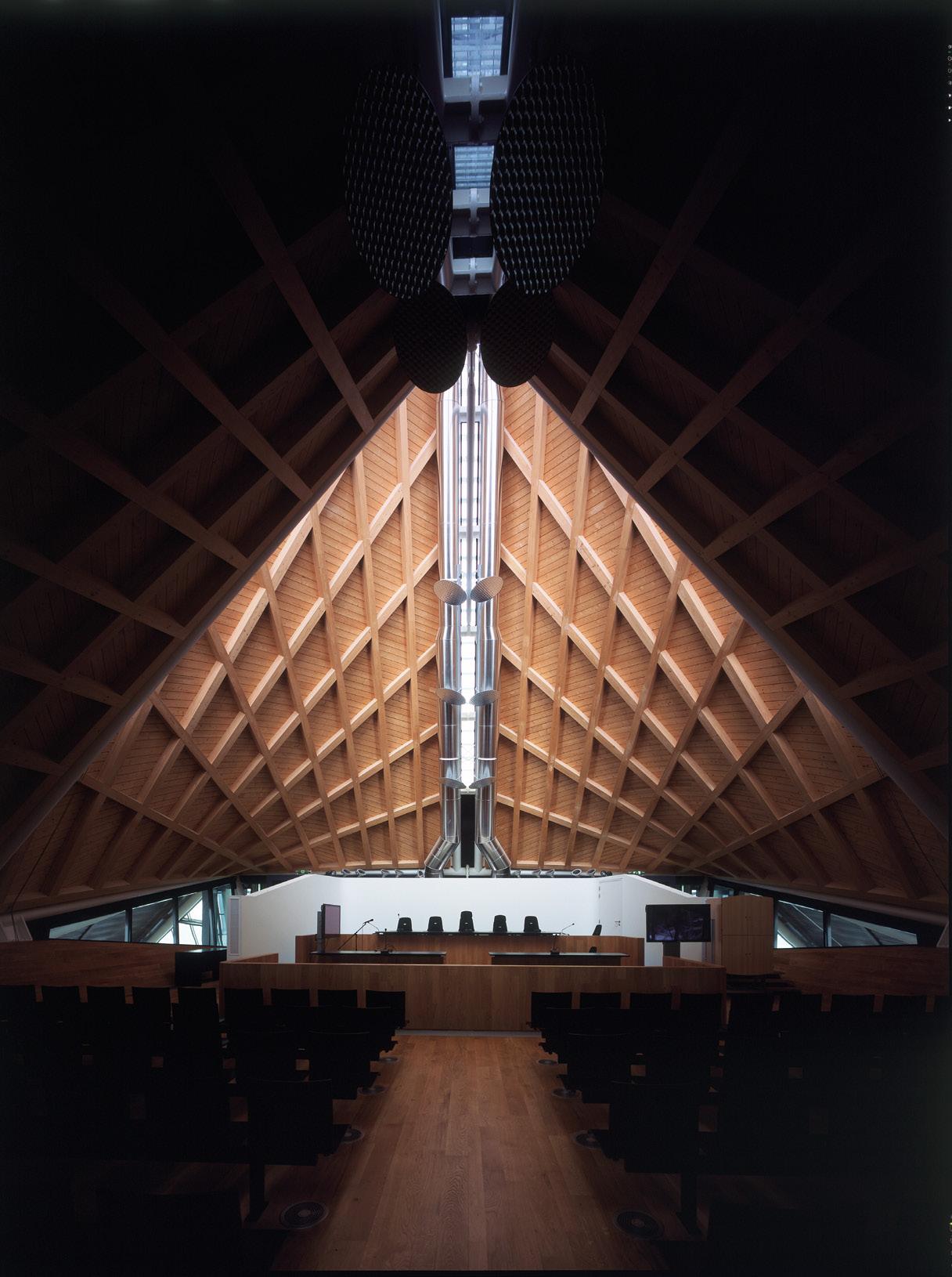
flotilla of roof ‘sails’ that cover eight civil and criminal courts as well as 36 hearing rooms and offices, all arranged in linear form in the building’s six low radiating wings. The roof forms are true hyperbolic paraboloids, prefabricated in four steelframed sections by a shipbuilder and echoed internally by a timber gridshell of glulam beams. Laminated in full lengths, the lamellae of each beam was progressively built up by gluing and screwing the long lengths of timber together and connecting them to the perimeter steelwork. This manufacturing method ensured the long timber strips would accurately follow the geometry of the hyperbolic paraboloid shape of the roof structure. The assemblies, once completed, were floated to the site on barges. Finished in 2005, the Antwerp Law Courts represent one of the practice’s most notable public buildings from the early years of this century.
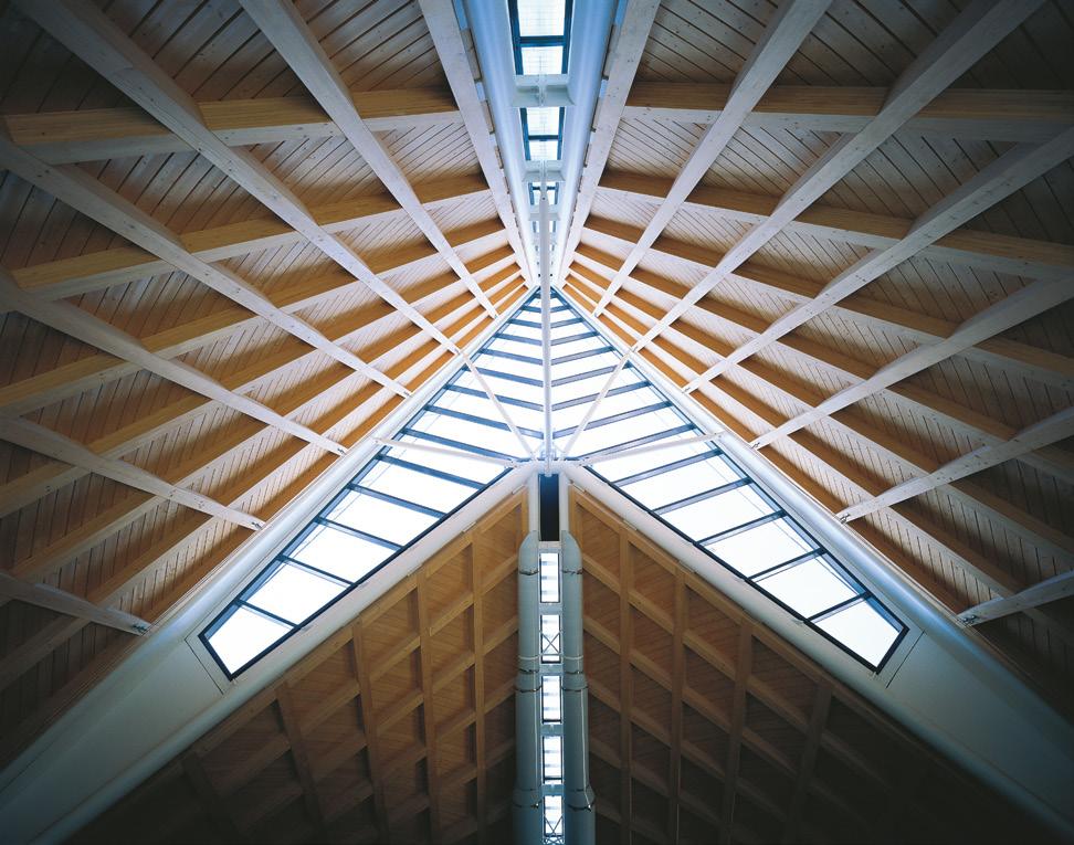
Opened only a year earlier, the Mossbourne Community Academy marked a milestone in the Partnership’s work: an entire building structure formed from engineered timber. The decision to take this constructional route arose in part from the need for a structure lightweight enough to sit astride the
rubbled ground of the demolished Hackney Downs School it replaced. The inauspicious triangular site is enclosed on two sides by busy railway tracks and looks north to the Downs from the third side. The building has two wings that enclose the teaching areas, with the connecting knuckle in the V-shaped plan housing an auditorium. At the time of its construction, the 8,312 sq.m Academy was the largest engineered timber frame in the UK, with the other reason for the choice of material being the use of a natural material to help create an environment that would not feel institutional. The post and beam external frame gives the building a rational, well proportioned presence with each primary beam in the frame supporting the ends of deep secondary beams that run perpendicularly into and through the depth of each wing. The timber is uncovered internally as well as externally, the latter parts with three coats of weatherproofing sealant and capped with hardwood in places that are especially susceptible to the elements. The exposed galvanised metal staircases that lead to each of the Academy’s three floor levels are hung off the internal elevations of each wing’s post and beam structure in a manner reminiscent of the escalators that
provide the theatrical frontage to Centre George Pompidou.
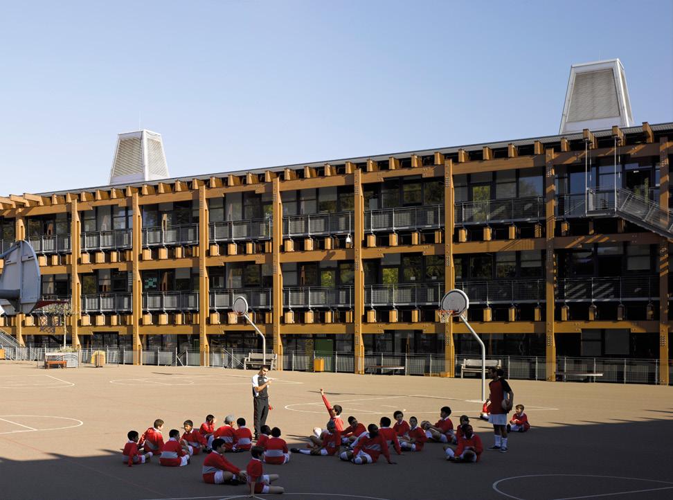
The National Assembly for Wales (the Senedd, 1998-2005) is perhaps the most visible use of timber by the Partnership in a public building in the UK, but can be seen to reprise a theme first begun in Bordeaux - a concave floating steel-framed roof containing six convex, oval indentations, the soffit of its entirety a masterclass in curved, open jointed western red cedar cladding. The ‘funnel’ that sits over the Parliament’s debating chamber rises through the building’s main public level to penetrate the fifth of the six roof indentations is similarly clad and clearly marks the location of the chamber to visitors approaching or entering the building. There is no structural use of timber here, but the presence of the material is a prime feature of the building.

A change of name to Rogers Stirk Harbour + Partners in 2007 saw little change to the lineage of timber utilisation in the practice’s projects, with now-recognisable themes continuing to appear. Schematically, the Bodegas Protos winery in Penafiel, Spain has a sectional diagram similar to the Senedd building: a deep concrete base level, transparent middle and an
undulating roof above. The superstructure this time, though, is entirely of wood. Occupying a triangular site, five interlinked parabolic vaults that diminish in length within the triangular site constraints are each formed from a series of arched glulam beams, surmounted by longitudinal beams held ‘afloat by steel ‘V’-shaped props. These straight beams support further arched beams that are shaped as closely as possible to an inverted catenary curve and on which sit timber sandwich panels and terracotta tiles. In recognition of its structural ingenuity and precision, the building won the RIBAs European Award and was shortlisted for the Stirling Prize on its completion in 2008.
Still in Spain, the Las Arenas development in Barcelona finished in 2011 after more than a decade of work. This transformation of the long disused late 19th century bullring (designed by Lluis Domenech i Montaner) was a massive project in which the building’s perimeter wall was retained whilst the whole of the former interior was entirely scooped out to allow multiple levels to be inserted. The topmost (fifth floor) level is a steel-framed dish housing a multi-purpose space and public deck, over which floats a vast timber gridshell
roof formed from primary and secondary glulam beams and Kerto® (LVL) panels, all connected by flitch plates and dowels to give the appearance of a continuous timber structure. The shallowness of the gridshell (80m diameter and 8.5m deep) required an ingenious engineering solution to prevent buckling and large deflections. As with all the projects discussed here, from the Antwerp Law Courts onwards, the relationship between the practice and the project’s structural engineers produced a dramatic, innovative engineered timber response to a complex technical challenge.
The most recent timber project in the sequence is the multiaward-winning Macallan Distillery at Craigellachie, on Speyside (completed 2018). Here, many of the themes and lessons from previous projects have been brought together to produce one of the largest and most complex timber buildings ever constructed in the UK. Like the Senedd and the Bodegas Protos winery, the sectional transparency and horizontal layering of the building is self-evident from the building’s exterior, as is the organisation of the plan into five linearly-arranged grasstopped domes. Beneath, a magnificent gridshell structure is the
pièce de résistance of the project: the roof is 207 metres long, 13,620sq.m in area and made up of hybrid timber beams in 27m, 12m and 3m lengths. each of which is 200mm thick and, in most cases, 750mm deep. This is no simple repetitive construction, however, but an extraordinarily sophisticated demonstration of advanced timber technology utilising 1,798 separate beams and 2,447 triangular timber decks within an overall roof package comprised of 350,000 bar-coded pieces (including fixings) almost all of which are different. Despite the obvious logistical challenges, the roof was completed within six months of the March 2016 start date, using only 20 installers and two cranes to carry out 4,245 lifts. Any description of the engineered timber structure, however, is wholly inadequate to what the visitor experiences on entering this building and looking upwards: the practice’s 20+ years of experimentation and innovation in the use of engineered timber has produced an exemplar modern timber building, setting a very high bar for others to aspire to.
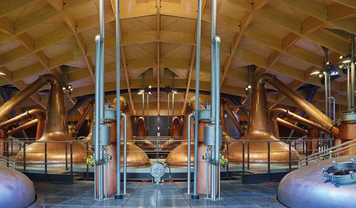
AHR
Tel: 0141 225 0555
Email: glasgow@ahr.co.uk
Web: www.ahr.co.uk
Clockwise, Savoy Tower, 77 Renfrew Street
Glasgow G2 3BZ
Carson & Partners
Tel: 0141 442 0036
Email: mail@carsonandpartners.com
Web: www.carsonandpartners.com
Second Floor, Argyll Chambers
Buchanan Street, Glasgow G2 8BD
jmarchitects
Tel: 0141 333 3920
Email: gla@jmarchitects.net
Web: www.jmarchitects.net
Michael Laird Architects
Tel: 01312266991
Fax: 1312262771
Email: marketing@michaellaird.co.uk
Web: www.michaellaird.co.uk
5 Forres Street, Edinburgh EH3 6DE
Stewart Associates
Chartered Architects
Tel: 01475 670033
Email: info@stewart-associates.com
Web: www.stewart-associates.com
The Studio, 9 Waterside Street
Largs, Ayrshire KA30 9LN
ARCHITECTURE & MASTER PLANNING
Hypostyle Architects
Tel: 0141 204 4441
Contact: Gerry Henaughen
Email: glasgow@hypostyle.co.uk
Web: www.hypostyle.co.uk
ARCHITECTURE SOLUTIONS/ FACADES , FLOOR COVERINGS, CLADDINGS
Cosentino
Tel 01506 432817
Email: scotland@cosentino.com
Web: www.cosentino.com
Unit 2 Kingsthorne Park, Livingston EH54 5DB
BUILDING SOLUTIONS/ FACADES
Porcelanosa
Tel 0141 533 100
Email: braehead@porcelanosa.co.uk
Web www.porcelanosa.com/uk
2 Rocep Drive, Braehead, Glasgow PA4 8YT
Contact: Chris Kerr, General Manager
CONSULTING STRUCTURAL & CIVIL ENGINEERS
David Narro Associates
Tel: 0131 229 5553 and 0141 552 6080
Contact: Amanda Douglas
(Practice Manager)
Email: mail@davidnarro.co.uk
Web: davidnarro.co.uk
Survey Design Consult
Tel: 01563 762468
Mob: 07788247178
Email.craig@surveydesignconsult.co.uk
Web: www.surveydesignconsult.co.uk
Contact: Craig Mackenzie
COMMERCIAL FURNITURE
Rakkaus Furniture
Tel: 01563 501 887
Email: chris@rakkausfurniture.co.uk
Web: www.rakkausfurniture.co.uk
Trinity Business Spaces, 14-18 East Shaw St, Kilmarnock KA1 4AN
CLADDING
RHEINZINK
Tel: 01276 686725
Fax: 01276 64480
Email: info@rheinzink.co.uk
Web: www.rheinzink.co.uk
Wyvern House, 55-61 High Street
Frimley GU16 7HJ
FIRE ENGINEERS
Astute Fire Ltd
Tel: 0131 4458607
Contact: Adam Bittern
Email: adambittern@astutefire.com
Web: www.astutefire.com
LANDSCAPE ARCHITECTS
LDA
Tel: +44 (0) 141 222 9780
Email: kirstin.taylor@lda-design.co.uk
Web: www.lda-design.co.uk
Sovereign House, 158 West Regent Street, Glasgow G2 4RL
LUC
37 Otago Street, Glasgow G12 8JJ
Tel: 0141 334 9595
Email: glasgow@landuse.co.uk
3rd Floor, Atholl Exchange
6 Canning Street, Edinburgh EH3 8EG
Tel: 0131 202 1616
Email: edinburgh@landuse.co.uk
Web: landuse.co.uk
rankinfraser
Contact: Chris Rankin
Tel: 0131 226 7071
Email: mail@rankinfraser.com
Web: www.rankinfraser.com
LIFTS
Lifton Home Lifts
Tel: 0808 115 1370
Email: info@lifton.co.uk
Web: www.lifton.co.uk
Unit4, The courtyard Buildings
Guisley LS20 8L9
LIGHTING DESIGNERS
Eco Lighting Systems
Tel 07780118029
Email: simon@ecolightsystems.co.uk
Web: .www.ecolightsystems.co.uk
3 Kirkdene Place, Newton Mearns
Glasgow G77 5SB
Contact: Simon Taylor
NATURAL SLATE
Cupa Pizarras
Tel: 0131 225 3111
Email: uk@cupapizarras.com
Web: www.cupapizarras.com
45 Moray Place
Edinburgh EH3 6bQ
PHOTOGRAPHY
Niall Hastie Photography
Email: niall@niallhastiephotography.com
Web: www.niallhastiephotography.com
567A Great Western Road
Aberdeen AB10 6PA
SECURITY SYSTEM SUPPLIER
Vuterra 360 ltd
Tel: 0845 658 8345
Email: sales@vuterra.co.uk
Web: www.vuterra.co.uk
3 Ford Rd, Crieff PH7 3HQ
SIGNAGE CONSULTANTS
Sign Supplier
Tel: 0800 133 7555
Email: info@signsupplier.co.uk
Web: www.signsupplier.co.uk
Unit 15 Dale Industrial Estate
Radcliffe, Manchester, M26 1AD
SPECIALIST SUPPLIER OF SUSTAINABLE TIMBER
Russwood
Tel: 01540 673648
Email: mail@russwood.co.uk
Web: www.russwood.co.uk
Station Sawmill, Newtonmore, PH20 1AR
STONE
Dunedin Stone
Tel: 01875 613075
Fax: 01875 615236
Email: info@dunedinstone.co.uk
Web: www.dunedinstone.co.uk
17a Macmerry Industrial Estate, Macmerry, East Lothian EH33 1RD
Stonecraft
Tel: 0131 652 1464
Email: info@stonecraftedinburgh.co.uk
Web: stonecraftedinburgh.co.uk
3 Lower London Rd EH7 5TL
Tradstocks Natural Stone
Tel: 01786 850400
Fax: 01786 850404
Email: info@tradstocks.co.uk
Web: www.tradstocks.co.uk
Dunaverig, Thornhill, Stirling FK8 3QW
TILING
Porcelain Plus
Tel: 01236 728436
Contact: Moira Pollock
Email: moira@porcelainplus.co.uk
Web: www.porcelainplus.co.uk
TIMBER ENGINEERING
Scotframe
Tel: 01467 624 440
Email: inverurie@scotframe.co.uk
Web: www.scotframe
timberengineering.co.uk
Inverurie Business Park
Souterford Avenue, Inverurie AB51 OZJ
Contact: Gillian Murray
VISUALISATION AND FILM
Float
Tel: +44 (0)141 739 8371
Email: info@float.digital
Web: https://float.digital
No. 8 / Second Floor, 200 Bath Street, Glasgow G2 4HG
WINDOWS & DOORS
NorDan UK Ltd
Tel: 01506 433 173
Email: quotes.projects@nordan.co.uk
residential.scotland@nordan.co.uk
Web: www.nordan.co.uk
3 Almondview Office Park, Livingston, EH54 6SF
TO ADVERTISE YOUR PRODUCT OR COMPANY IN THIS SECTION CONTACT JOHN HUGHES ON 0141 356 5333
The West Fraser (formerly known as Norbord) Inverness plant featured in Michael Portillo’s Great Coastal Railway Journey series. The manufacturer showcased how the mill produced wood panels from planted woodland, which are used in construction to create walls, floors, and ceilings.
Tel: 01786 812 921 Web: uk.westfraser.com

Knight Property Group is delighted to confirm it has let Balmoral House in the heart of Aberdeen’s west end to children’s charity, Charlie House. The charity has agreed a three-year lease of the building, which is located on Carden Place. Extending to 3,875 sq ft over four floors, it will provide an ideal hub for the charity’s wideranging support services and will be home to more than 50 staff and volunteers each year.
Tel: 01224 313333 Email: bigbuild@charliehouse.org.uk Web: https://www.charliehouse.org.uk
Siderise Special Products has launched the new SIDERISE® MC System — a decorative mullion liner designed to provide a simple yet robust solution for enhancing the acoustic performance, or acoustic and fire performance, of curtain wall facade systems. The SIDERISE® MC System is an external treatment that is installed over the top of curtain walling mullions where partitions abut. This substantially improves their acoustic performance.
Tel: +44(0)1473 827695 Email: technical.sspl@siderise.com Web: www.siderise.com

The latest development of Kingspan’s unique, self-blended insulation technology, ‘QuadCore 2.0’, is made with a formulation containing a raw material that uses 40% recycled PET. This innovative formulation has satisfied the requirements for a twohour fire resistance in third-party fire tests for both insulation and integrity — making it the first closed cell insulated panel system to ever achieve this rating.
Tel: +44 (0) 1352 716100 Email: quadcore.technology@kingspan.com Web: www.kingspanpanels.co.uk
GEZE UK, has updated its Product Guide and Price List to help architects, architectural ironmongers and specifiers choose the most effective product for their needs. The detailed, illustrated technical guide provides specifiers with essential information about GEZE’s extensive range of door closers, window control systems, sliding door fittings, glass door fittings, and smoke and heat extraction systems.

Tel: 01543 443015 Email: info.uk@geze.com.
Approved preformed cavity tray from the longest-established tray company now celebrating 100 years’ service. The only tray company awarded European Technical Approval. Type X for gable abutments of all pitches, wide cavity range, ready-to-dress flashings. Incorporates features not present on alternatives. Performance warranty for benefit of architect, builder & client.
Tel: 10935 474769 Email: enquiries@cavitytrays.co.uk Web: www.cavitytrays.com
