2 minute read
DESIGN SOLUTIONS
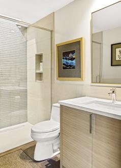
FAR LEFT: The shower’s wall-to-wall glass enclosure, small skylight, curbless entry and simply tiled back wall make the small bathroom feel spacious. The streamlined vanity and largescale wall tiles do the same.
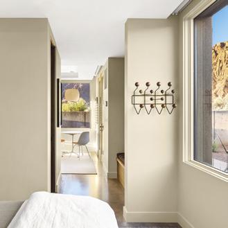
LEFT: Hodson rejected a bulky closet for the short hall separating the bedroom and living area. Instead, he installed a built-in bench with hooks and shelves above it and hidden storage below. “It keeps this space open and airy,” he explains.
BELOW: The small casita welcomes family and friends to this modern home located in Ivin’s Kayenta community.
focused on clean lines and carefully selected furnishings and period pieces. “Every inch counts and every element has to earn its place.”
Zone The Space
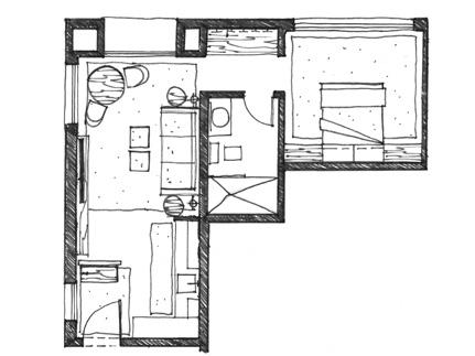
Hodson focused on the functions of the casita —relaxing, eating, sleeping, bathing—and then identified zones in the main living area that cater to these activities. “Decoratively delineating zones makes the overall space feel more interesting and spacious,” says Hodson, who erected a slatted wood wall to form an entry and then used furniture, rugs and art to subtly demarcate the open room’s living areas.
Go Neutral
Scored concrete floors and walls painted in Benjamin Moore’s White Sand flow seamlessly throughout the casita, creating a continuous, neutral backdrop for Hodson’s edited palette of classic walnut, light oak and curated textiles. “You want to establish a lighter-toned canvas to make the space feel more spacious and then add hits of color with accents and art,” the designer explains.
CHOOSE BIG AND FEWER FURNISHINGS (AND THINK MULTI-FUNCTION)
“Start with your large pieces and build around them,” advises Hodson, who anchored the open living area with a clean-lined tuxedo sofa. “It’s large but not bulky,” he says. The main rug is large enough for most of the furniture to sit on it and, unlike a bunch of smaller rugs, it doesn’t clutter the scene. Large art creates a presence, as well. “Itsy pieces make a small space feel junky unless you group them as a single focal point,” Hodson adds. Once his larger pieces were in place, the designer added smaller pieces that don’t litter the space, including small side tables, shadeless floor lamps and a compact table and chairs. Doing double duty, the sofa opens to a bed, benches and ottomans serve as both tables and seats, and the Eames table and two shell chairs function as a charming dining spot, as well as a desk and game table.
Let It Breathe
Banishing bulk, Hodson installed a floating 7-inch deep shelf that serves as a shallow console below the T.V. “It lets the space breathe,” he says. So too do open shelves in the kitchenette. “Upper cabinets would have been way too heavy.” The designer also chose the leggy Eames table and shell chairs, shadeless floor lamps and the entry’s slatted screen to promote an open feel. The same goes for the shower’s glass enclosure and ceiling pockets that conceal roller blinds above the windows.
Create Clever Storage
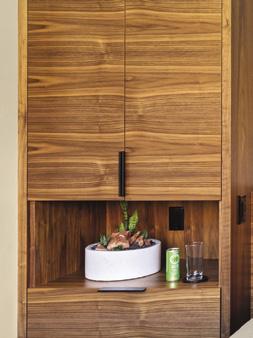
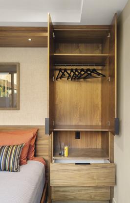
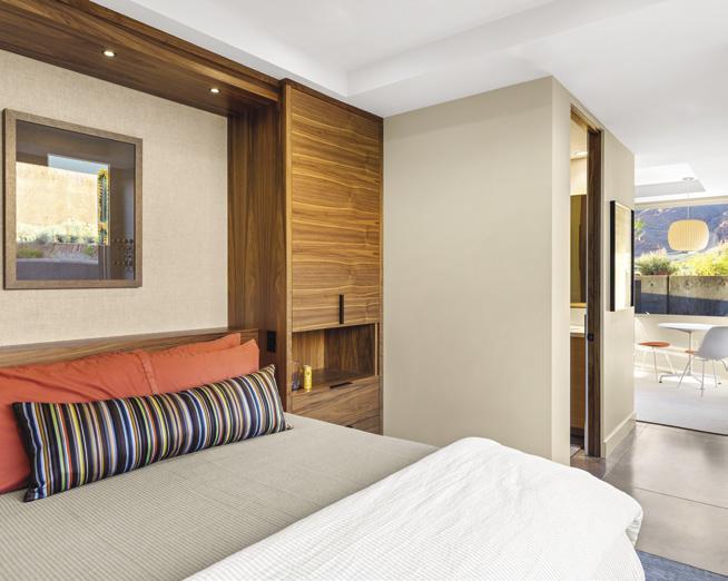
Custom built-ins elevate the casita’s style and usable space. Hodson transformed the bedroom’s headboard wall with bespoke cabinetry defined by a ceiling-height light bridge linking two towers framing the bed, each equipped with concealed, hanging storage, drawers and an inset nightstand. “This is the room’s only storage, so it had to be smart,” he says. In the kitchen, a wall of floor-to-ceiling cabinets provides loads of storage. And because these are vertical and built in, they don’t consume as much valuable square footage.
Design Build Process As Serene As Its Outcomes
