viktória horváth viktória horváth viktória horváth viktória
horváth viktória horváth viktória horváth viktória horváth
viktória horváth viktória horváth viktória horváth viktória
horváth viktória horváth viktória horváth viktória horváth
viktória horváth viktória horváth viktória horváth viktória
horváth viktória horváth viktória horváth viktória horváth
VIKTÓRIA HORVÁTH
UX/UI DESIGNER WITH PRODUCT & INDUSTRIAL DESIGN BACKGROUND
MOBILE NUMBER
+36 30/677-4472
DRIBBBLE PROFILE dribbble.com/vhorvath
E-MAIL ADDRESS
viktoriahorvath95@gmail.com
BEHANCE PROFILE
https://www.behance.net/viktoria-horvath
LINKEDIN PROFILE
https://www.linkedin.com/in/viktória-horváth/
WORK EXPERIENCE
2022-Present: UX/UI DESIGNER Deloitte Digital
2019: PRODUCT DESIGNER TRAINEE Studiumars Ltd.
2018: PRODUCT DESIGNER TRAINEE ARVUS Ltd.
2015: VOLUNTEER DESIGNER UNICEF
LANGUAGES
German (C1), English
EDUCATION & TRAINING
2018-2020: PRODUCT DESIGN
Moholy-Nagy University of Arts and Design, MA
2015-2018:INDUSTRIAL & PRODUCT DESIGN
Moholy-Nagy University of Arts and Design, BA
2012-2015: PRODUCT DESIGN COURSE
PreMOME
2010-2015: GRAPHIC DESIGN COURSE
Béla the Third Art Secondary School
SKILLS
Figma, Adobe XD, Photoshop, Illustrator, InDesign, Jira, Confluence, Miro, Storybook, 3D design, Human-centered design, Design thinking
EXHIBITIONS & RECOGNITIONS
2021: INVITED EXHIBITOR
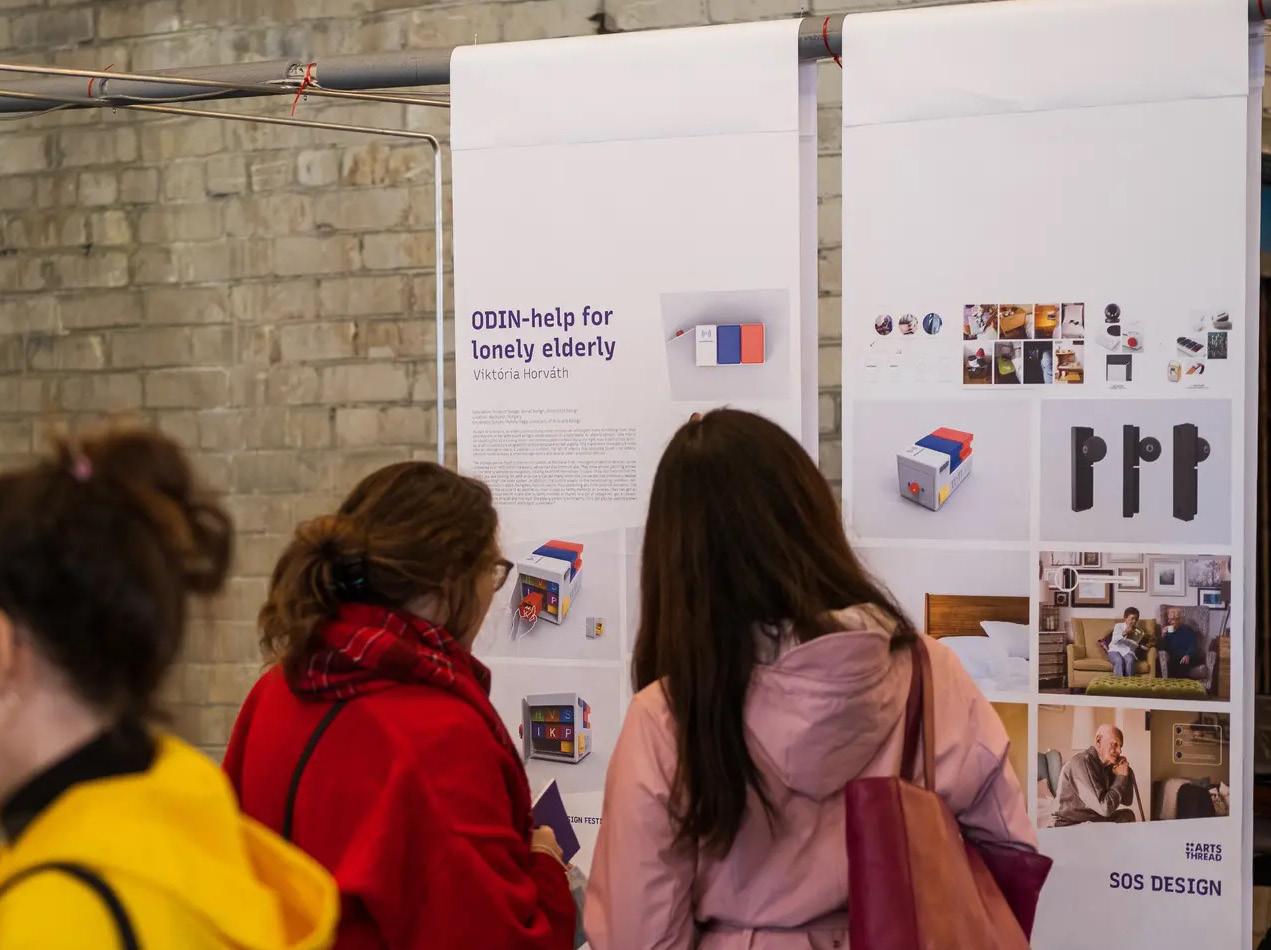
DISAINIÖÖ / Tallinn Design Festival
2020: TOP FINALIST & EXHIBITOR
ARTS THREAD - GLOBAL DESIGN GRADUATE SHOW 2020 In collaboration with GUCCI
2017: INVITED PARTICIPANT
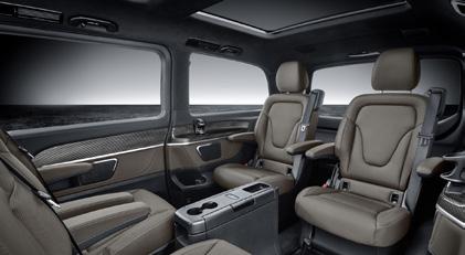
MOME x Mercedes-Benz Collaboration 15th Anniversary - Exhibition
HOBBIES
Running, swimming, horseback riding, sailing, playing with my dogs
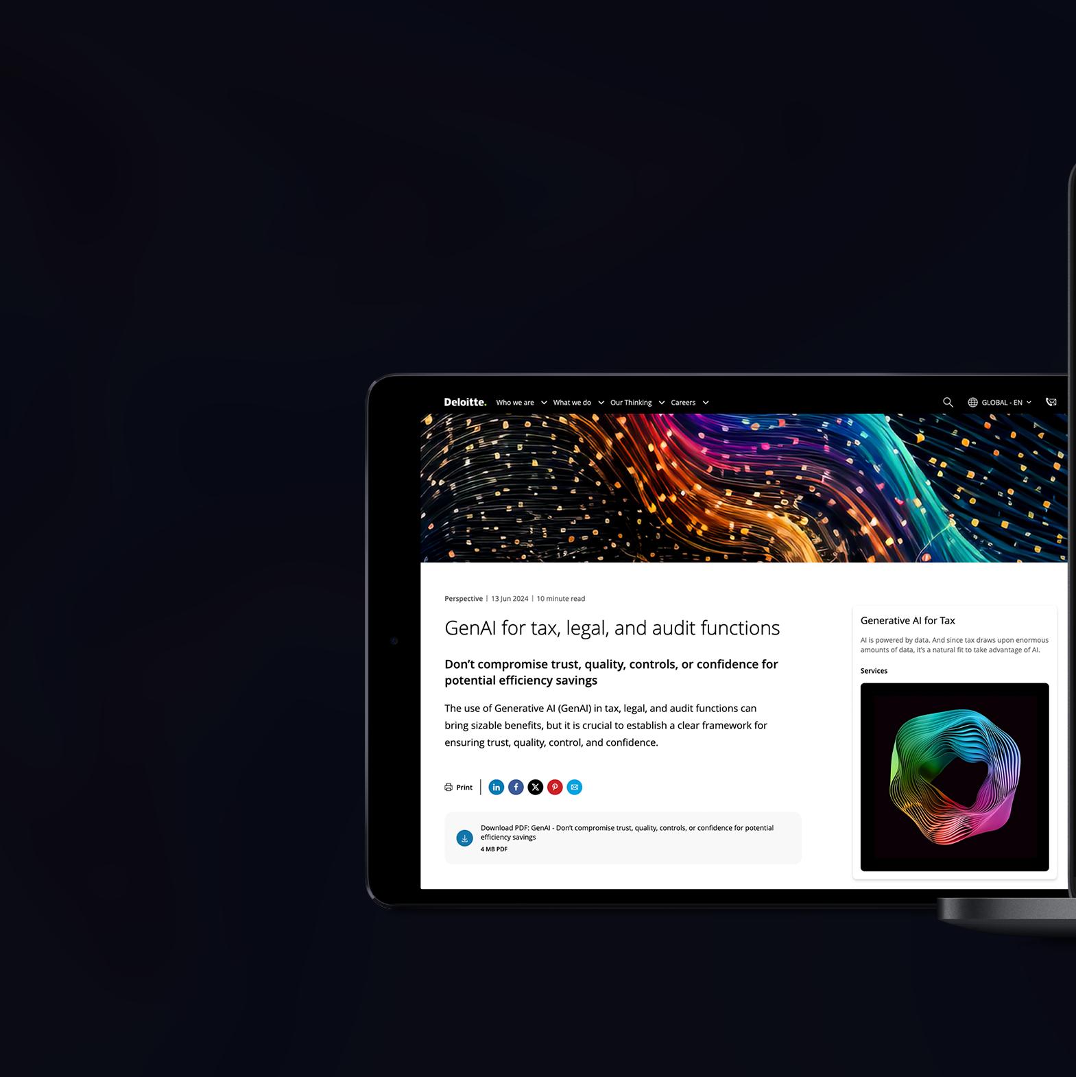
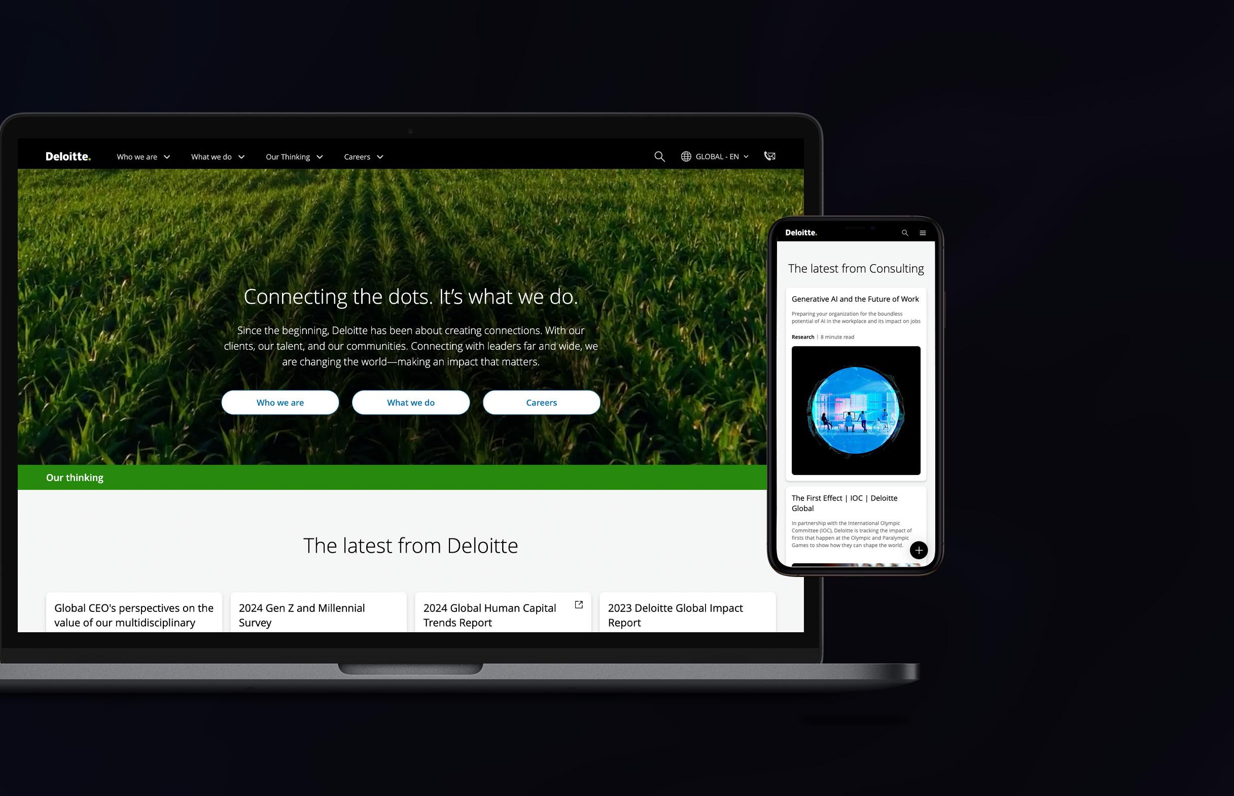
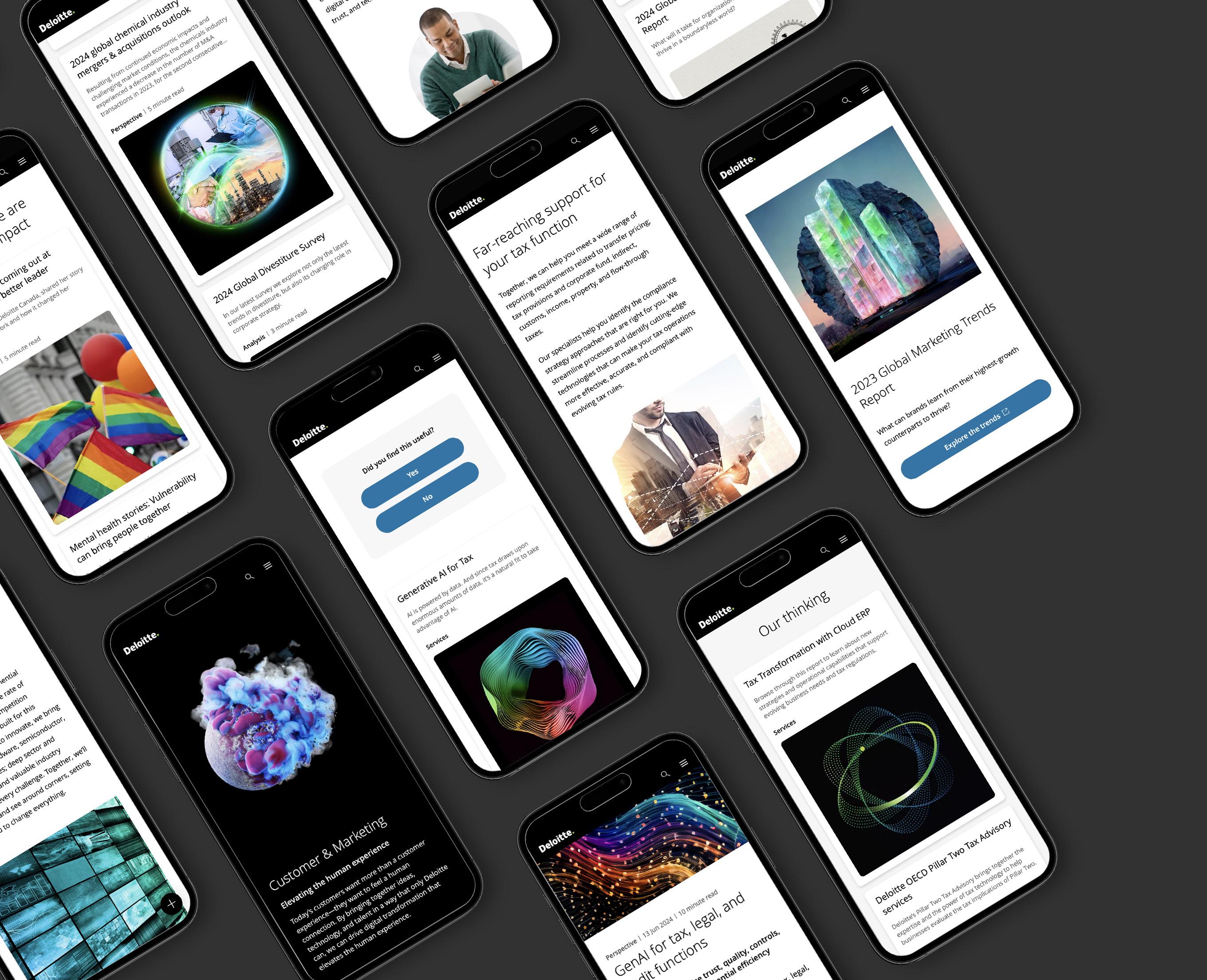
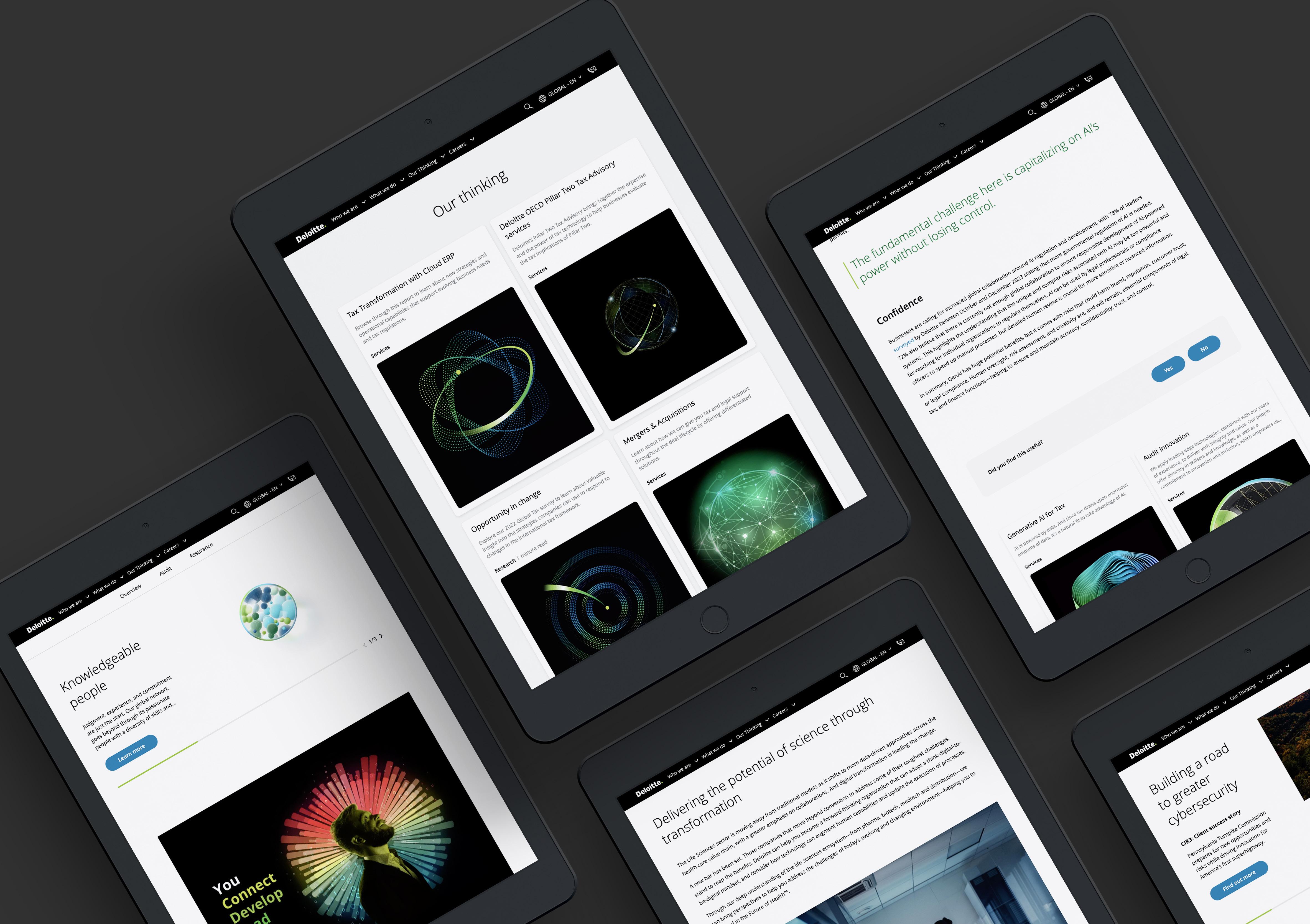
Redesigning Deloitte’s global website UI design project
Outreach project for potential client UX/UI design project
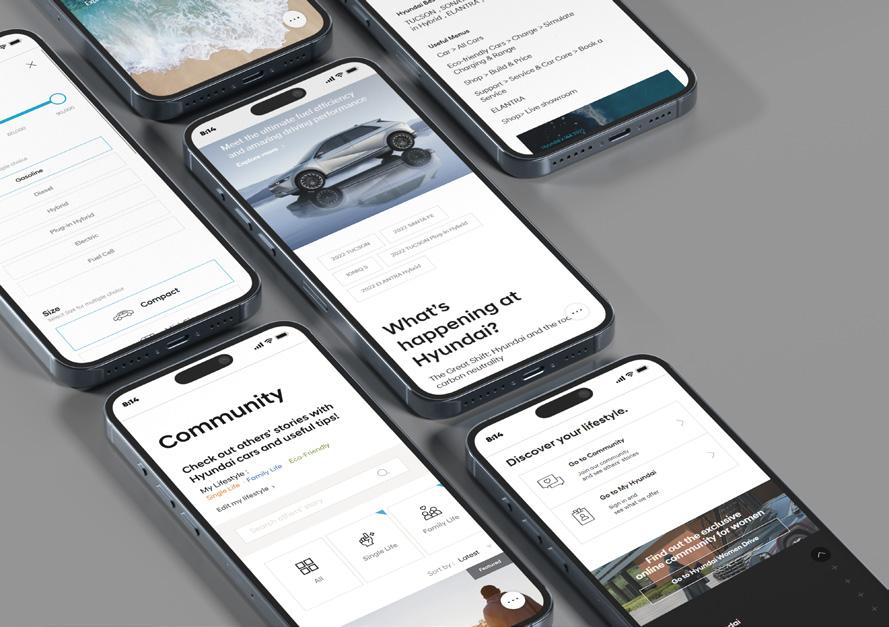
Heuristic Assesment for Hyundai UX research project
PERSONAL PROJECT
Transportation
UX/UI
In collaboration with
In collaboration with
Product design project
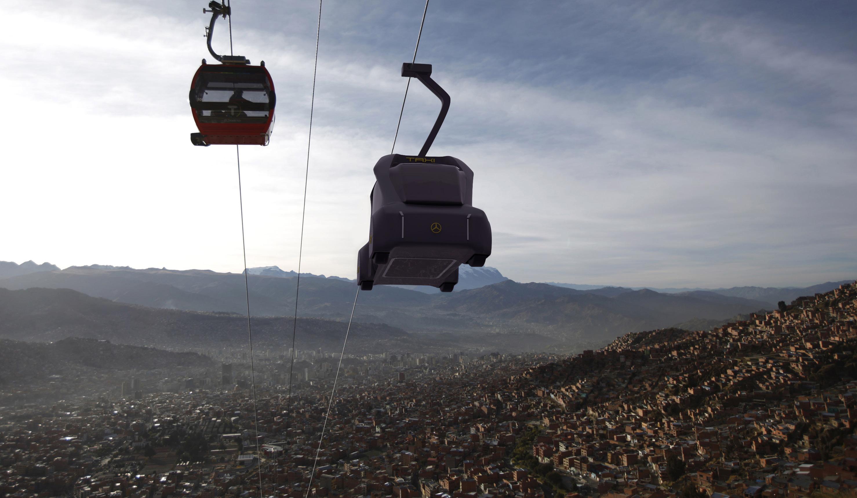
T. E. O. - Project TAXI 2030
design project
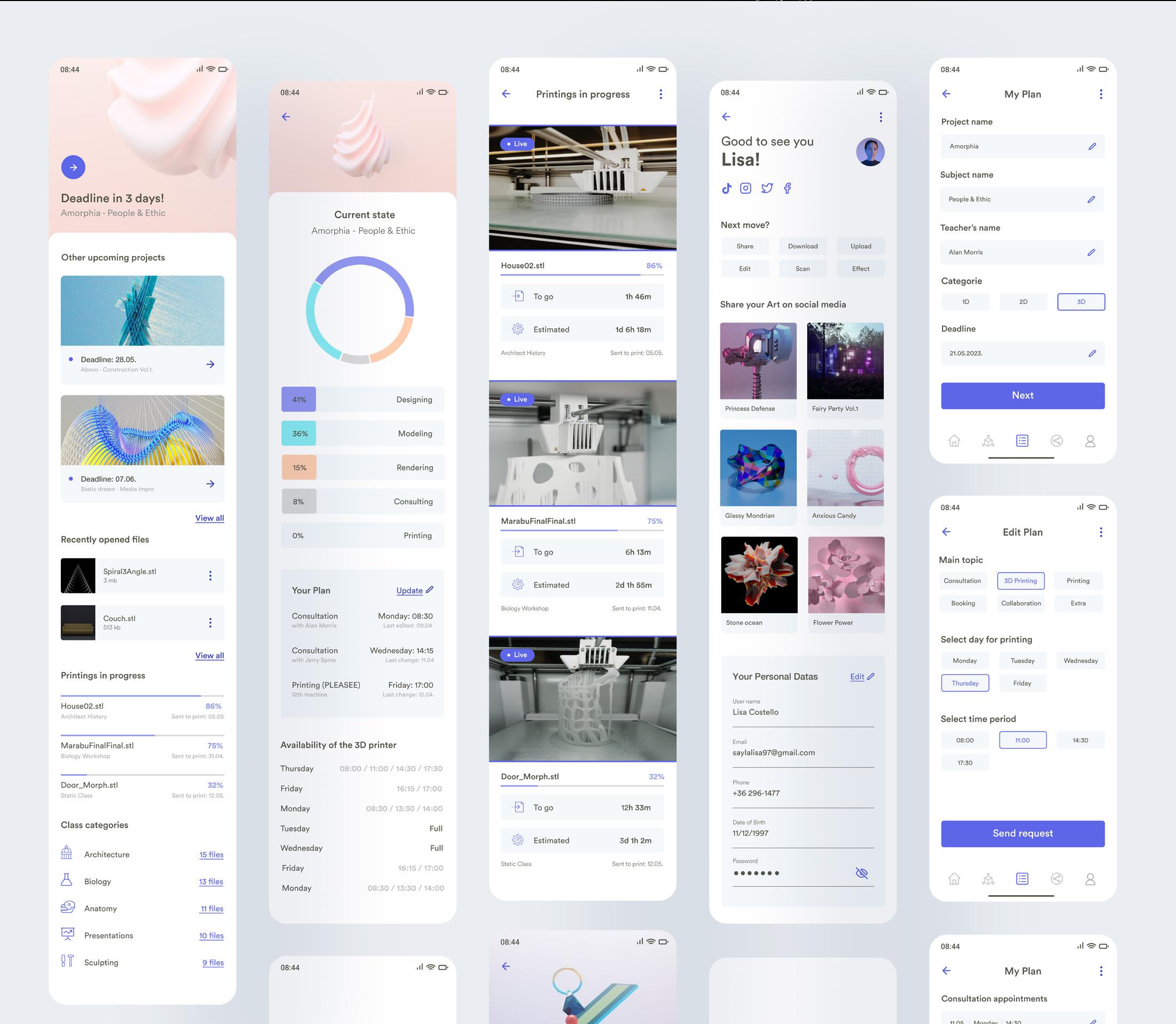
TRIDI - 3D printing app for students
design project
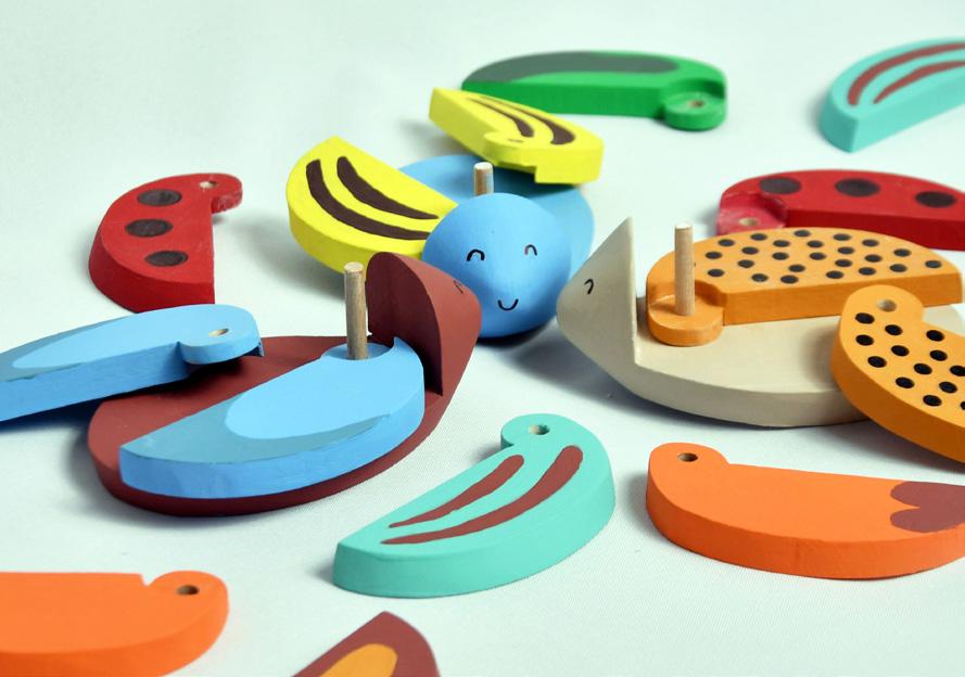
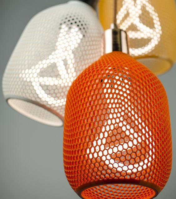
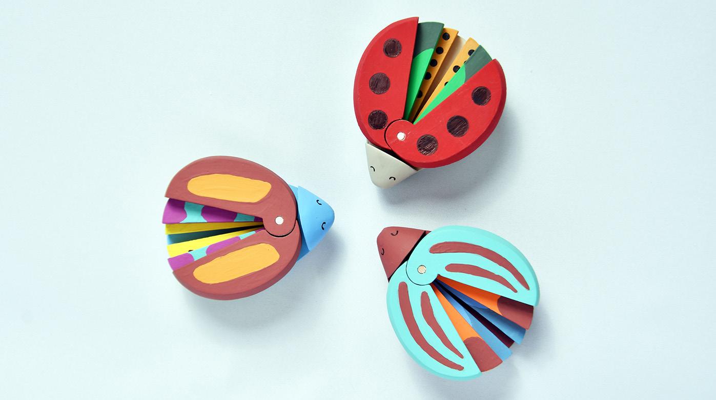
BEETLE PUZZLE - wood toy for little kids
ABOUT
The goal of the project was to redesign and rethink the whole global Deloitte website. Improving its visual approach and user experience in a way, that it will be still fresh and relevant in 2024, because the project was going on in 2022.
CHALLENGE
A big challenge was to bring the lenght of the text and layer pattern in harmony. Since the texts were very specific and had a strict criteria. The negotiations about using shorter or different words due the sake of the right egalization, were sometimes unsuccessfull. Because of that, the egalization and breakpoints of texts are in some cases a bit unbalanced.
MY ROLE
I worked on the project as a UI designer, but had the opportunity to support the team with UX approach as well. My main focus was responsive design, prototyping, also supporting the design system as well. I worked together with UX writers, project managers and other designer colleagues on daily basis, in Agile work methodolgy.
RESULT
A reborned, new global Deloitte website, that serves as a platform for the company to showcase its services and expertise, as well as provide resources and information for (potential) clients in a more userfirendly, accessible and cleaner way. I can show only the final result, the task details are sadly not public.
Client: Deloitte
Project:
My role: UI designer Tools: Adobe XD, Photoshop, Workfront
ABOUT
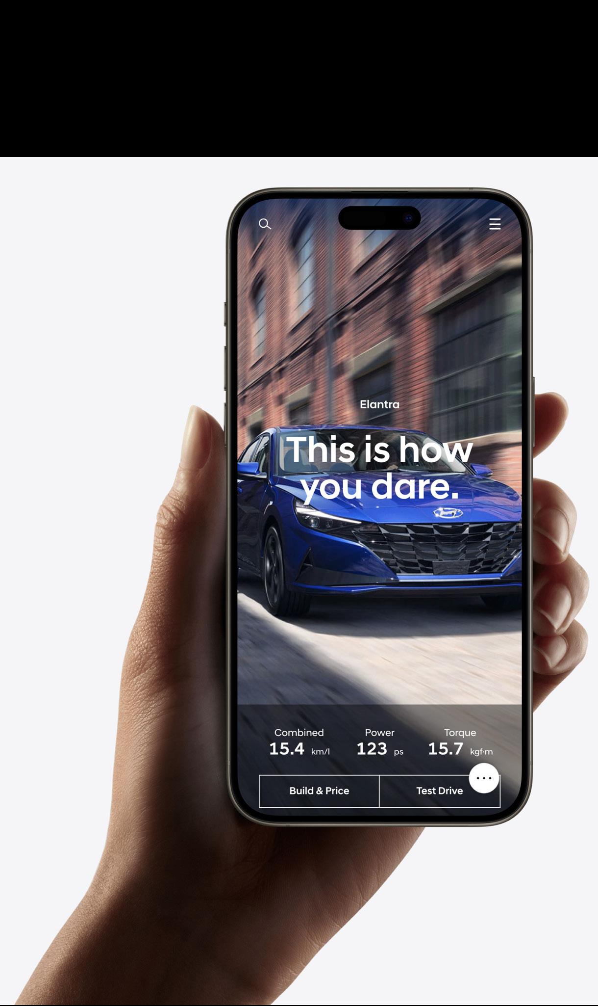
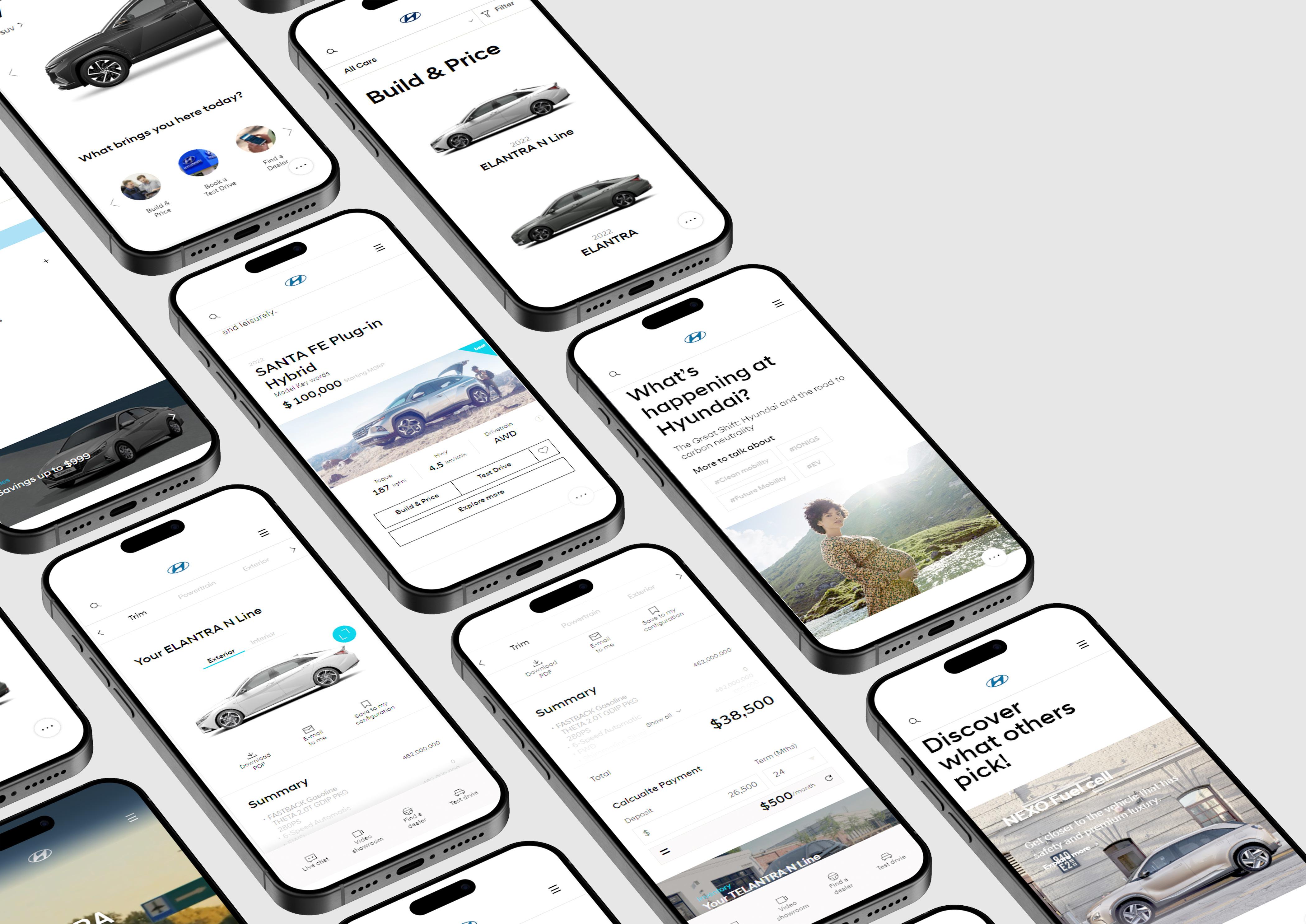
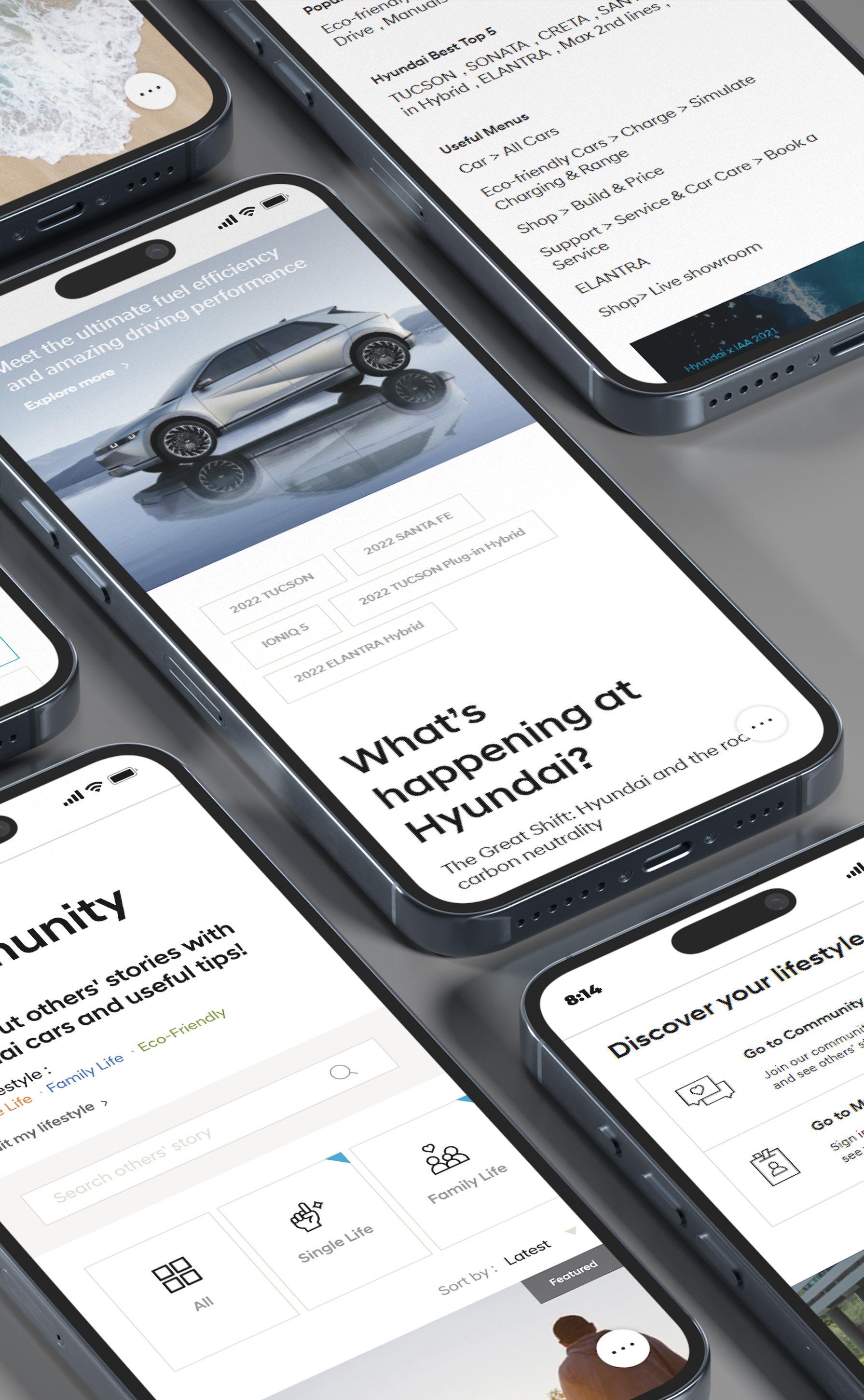
We prepared a dedicated methodology for Hyundai assesment to support the delivery of strategic information and improvements about the new Hyundai website, specially focusing on the mobile device approach.
CHALLENGE
Measuring and calculating in numbers the design itself.
MY ROLE
Being a member as UX researcher, I supported the assesment team. I conducted research and measured Hyundai’s application design, based on Nielsen’s 10 Usability Heuristics. Also cooperated with UX designers from Hyundai, how they can improve the user experience of their website.
RESULT
We presented a heuristic assesment to our client, explained and demonstrated with examples our measurements, recommendations and results.
Client: Hyundai
Tools: Figma (FigJam) My role: UX Researcher
Project: UX Research
Duration: 04.2022-05.2022
METHODOLOGY & APPROACH
Agile workflow and Nielsen’s 10 Usability Heuristics
01 Heuristic approach
Collection of hand-crafted expert’s supporting questions prepared based on 10 Nielsen heuristics.
#1: Visibility of system status
#2: Match between system and the real world
#3: User control and freedom
#4: Consistency and standards
#5: Error prevention
#6: Recognition rather than recall
#7: Flexibility and efficiency of use
#8: Aesthetic and minimalist design
#9: Help users recognize, diagnose, and recover from errors
#10: Help and documentation
02 Automotive specific
General principles for Automotive industry in relation to new Hyundai website. UX audit based on the flows, such as: configurating a car, booking a test drive, booking online consultation, making fininacial calculations, finding a dealer and purchasing a car.
KEY FINDINGS IN UX/UI CRITERIA
Suggestions for Hyundai
- Highlighting more the information about the engine types
- Consider highlighting the most accurate value proposition features
- Pay more attention to colour contrast and placement of the CTA button on the home screen
- Consider change icons for social media platforms to match the fresh design of the new website
- Improving white space over-all mobile version of the website
- Developing the overall aesthetic of the User Interface
- Maintain the consistency across the website (sliders in particular)
- Paying attention to developing the navigation itself (preventing to not being unnecessary complex)
Best Practices from Key Competitors
- Consider adding a visual representation (eg: an icon) to highlight electric cars in the main menu, look at VW USA’s website for a good example in this regard
- Tesla puts great emphasis on highlighting all the unique and value adding features
- VW’s site is a great example of how the right choice of colour contrast, font and text placement contributes to great accessibility
- Refer to Hyundai USA for a readily available best practice regarding the social media icons
- BMW and Tesla a have good practice for mobile version
- Tesla, Mercedes-Benz, BMW have an outstanding overall aesthetic
- Mercedes-Benz, Tesla and Hyundai USA are the best examples in the case of consistency
- BMW (GER) and Tesla are good examples of easy navigation across the page
ABOUT
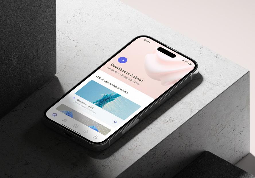
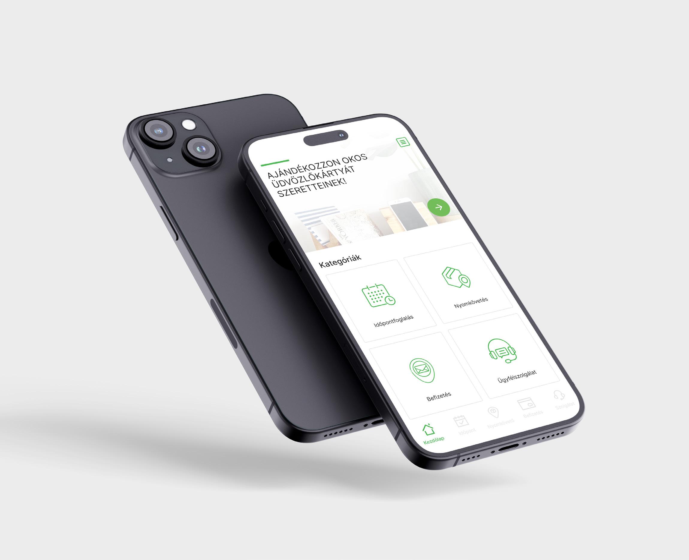
This in-house task was about choosing a hungarian company, and redesigning, re-thinking their application. At the final state, we reached out to them, and presented our approach, how we could help them to improve their digital presence. I choosed a hungarian post companys app.
CHALLENGE
Mostly how to present the results in a smart way, that we won’t get a backlash, that the client would think, that we are rethinking their product, because it is so bad.
MY ROLE
I worked both on the UX and UI part of the task. Since everybody in our team choosed different companys, we worked individually. I did research on the current app’s users (and their painpoints), usability..etc. From UI perspective, I also analyzed how to improve its appearance and usability.
RESULT
A minimal and clean design, a mobile-first product, that prioritize user friendly approach, and reduced steps to reach your goal, without loosing the company’s identity and its function.
Client: A Hungarian Postal Company
My role: UX/UI designer
Project: Redesign
Tools: Figma
Duration: 02.2023-05.2023
RESEARCH ON THE COMPANY
understanding its mission and their goal
1. Getting to know better the company’s profile
The company is focusing on transporting packages, briefs, bills to the adressee. Also providing more services regardnig financial services, package handover, playful opportunities for kids to motivate them to collect stamps, cards.
2. Analyzing the application(s) and the user reviews
They have two applications, the first is providing more services, the second one offers just paying bills.
APPOINTMENT BOOKING
CALCULATOR
CONVENIENCE SERVICES
TRACK
CODE SEARCH
SEARCH
UNDERSTANDING THE CURRENT STRUCTURE AND LOGIC reviewing it from functionality, usability, accessibility and aesthetical aspects
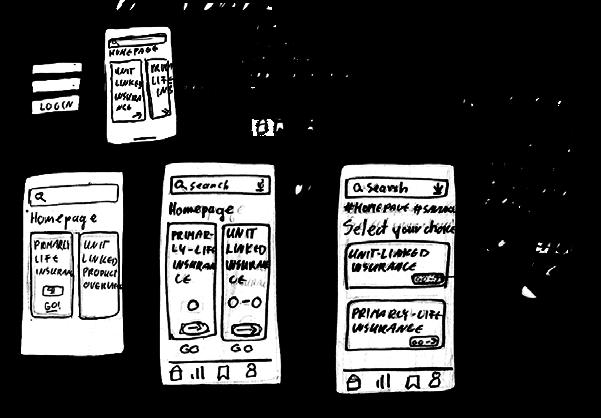
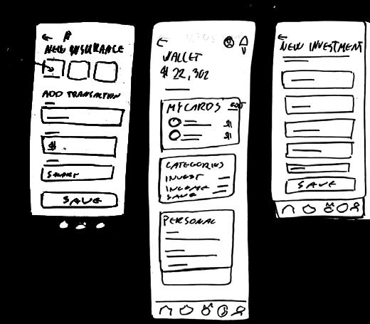
EXAMPLES FROM NEW LOW & MID FIDELITY WIREFRAMES rethinking how to improve its user flows and user interface for easier usability
COMPERING THE ORIGINAL VS. NEW APPROACH
added short explanations on both sides
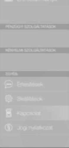
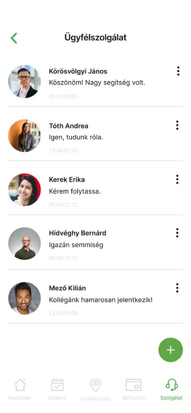
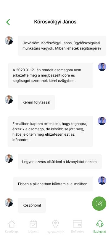
1. CUSTOMER SERVICE
BEFORE
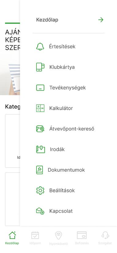
// Hard to find currently
// By selecting the object, the selection-aiding interface covering half the screen
// Impersonal feeling while communicating
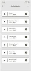
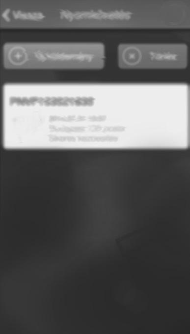
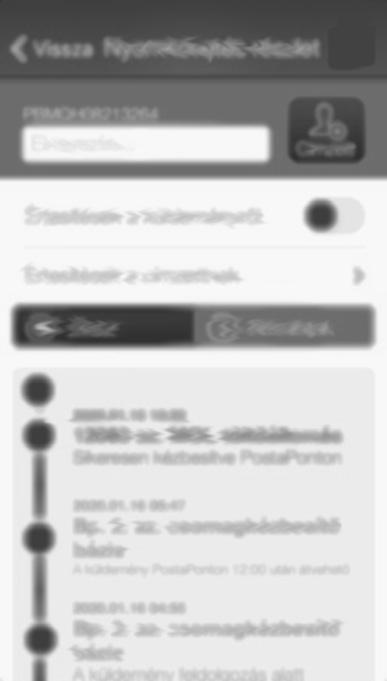
T he original screens are edited and blurred due to not make the company recognizable!
AFTER
// Displays as a default option on the home page
// Building trust with the user through a direct chat
// Request from an employee dealing with a given, specific problem area
BEFORE
// Crowded placement of countless graphic elements
// Due to imprecise contrast, readability and the interpretations are difficcult
// Repeptition of options appearing in the side menu
AFTER
// Clean, understandable interface
// User-friendly colour contrast and font size
// Reconsidered, prioritized options both on homepage and side menu
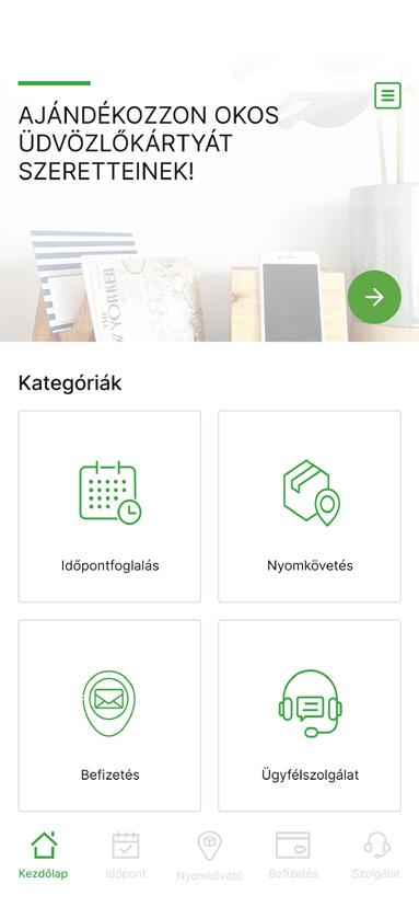
2. OPENING & HOMEPAGE
3. TRACKING THE PACKAGE
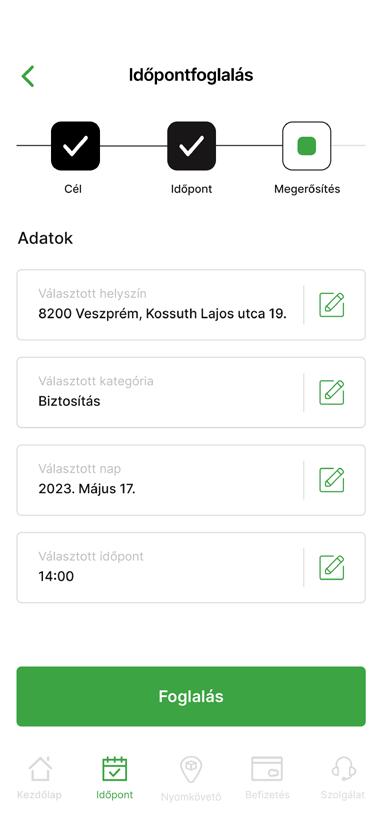
4. APPOINTMENT BOOKING
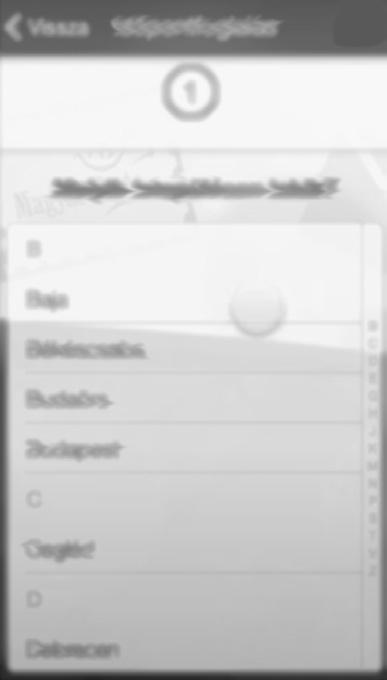
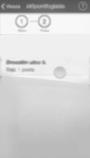
// Lots of steps, which are not relevant in the booking process
// By clicking on „Recipient”, we have to search for them, from the names BEFORE
// You can check only the status of the package and open the „Tracking” by entering the ID or scanning the barcode
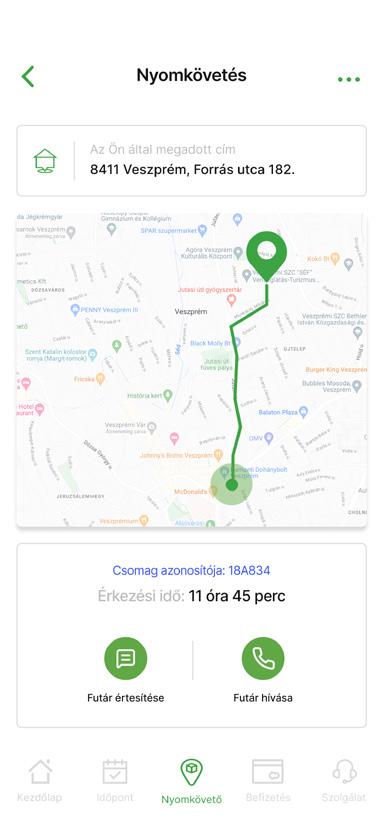
// Entry without scanning a barcode or ID
// Status of the latest status of the current package
// Displaying an updated map and timer
// Possibility of communication with the carrier
// Simplified, and essential easy-to-understand steps and information (only 3 steps)
// By turning on „Location”, the frist step offers us the nearest branch AFTER
ABOUT
Every day, more schools are incorporating 3D printing methods into their curriculums. The benefits of 3D printing for education are, that it helps better prepare students for their future by allowing students to create prototypes without the need for expensive tooling. Students learn about 3D printing by designing and producing models they can actually hold.
CHALLENGE
Creating a mobile platform, that is informative and educational, but creating a visual and user experience for the students, that keeps their attention up the whole time. Making it exciting and fun to use.
MY ROLE
The entire product design from research to conception and visualisation.
RESULT
An app, that helps, supports students to learn and organizing their 3D printing-related projects and tasks. Also, supporting them in exploring the opportunities, that 3D printing holds in itself. Students are able to gain a new, 3-dimensional perspective, while learning also more about sustainability, and expanding their knowledge. TRIDI reminds you about every detail, and offers you tips and chances to make an effective scedule.
Project: Personal
Duration: 2 weeks Tools: Figma, Adobe Photoshop
EMPATHIZE & DATA RESEARCH
Every day, more schools are incorporating 3D printing methods into their curriculums.
THE BASE OF THE STORY OF 3D PRINTING IN OUR DAYS (ALSO IN EDUCATION)
Myths and Past
Much of the reason for the recent upswing in 3D printing use is that it is a simple technology that can be used in applications in all kinds of fields. In its early years, 3D printing presented high entry costs. 3D printer models and materials were expensive.
Reality and Present
In recent years, with improvements and variations in the technologies of both the machines and materials used in them, costs have been coming down, making 3D printing applications more accessible and cost-effective, across industries and education.
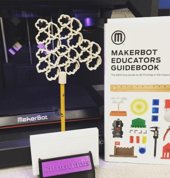
Supporting education with the power of 3d printing: Makerbot
3D printing tools are also revolutionizing STEM education by offering the ability for low-cost rapid prototyping by students in the classroom as well as fabricating lowcost high-quality scientific equipment from open hardware designs.
USER RESEARCH & INTERVIEWS
examples that helped as a guide, later during the process
Where can be found currently printers in schools?
3D printers are now commonly found in classrooms and public libraries. Universities have 3D printers available for students to use in classes and projects.
What are the benefits of involving 3d printing into education system?
1.Creates excitement, being in process.
2. Motivates to participating in the flow.
3. Developing, learning, growing.
4. Educating about sustainability.
Who is offering right now in the market an advanced solution for education?
Companies such as MakerBot offer certification courses in 3D printing applications for both educators and students.
Does the price influence the interest?
With the cost of 3D printers becoming more and more affordable, they are no longer just another technological gadget for students to play with but are now an important and useful educational tool.
USER PERSONA & USER JOURNEY the challenges and needs of the user candidate
GOALS & NEEDS
- she always does experiments with her concepts, sculptures, but she would like to test some of her ideas, which cannot be done with clay
- she wants to keep her ideas, projects on track
- she would like to bring her studies „to life”
FRUSTRATION
- her main frustration is not getting timely response, when she requires something
- getting late because she doesn’t know how to calculate time for printing
CONTROL OVER SCHEDULES
HER DAILY ROUTINE & ORGANIZONG HER 3D RELATED STUDIES AND PROJECTS
7:00 a.m.: checking actual updates on her calculated time plan
PROBLEM STATEMENT
the challenges of studying
- need some motivation to understand the topic, not only learning the text
- need to test their idea but doesn’t know how to do it
- need some organization with their ideas, work, current state
HOW MIGHT WE HELP STUDENTS TO LEARN, PROCEED AND ORGANIZE THEIR 3D RELATED STUDIES AND PROJECTS?
SOLUTION
application, that helps you to print out your work and lesson as part of studying
6:30 a.m.: waking up
7:59 a.m.: going to school 14:10 late lunchtime 12:40 p.m. consulting with her teacher and menthor 18 p.m. visiting the workshop place and working with clay
23:13 p.m.: going to bed, dreaming about new prints
- from the perspective of growth and development, future designers, engineers, and artists all will have been students who have been impacted by 3D printing
- it also educates about sustainability (biodegrable materials, water based polymers)
FEATURE PRIORIZATION
excerpts from the feature priorization
USERFLOW
an example, how the userflow works
LOW & MID FIDELITY WIREFRAMES
UI GUIDELINES playful - infromative - friendly - fresh
FONT - Circular Std.
Bb Cc Dd Ee Ff Gg Hh Ii Jj Kk Ll Mm Nn Oo Pp Qq Rr Ss Tt Uu Vv Ww Xx Yy Zz 1 2 3 4 5 6 7 8 9
INSPIRATION
#FFFFFF #555549
#5D66E8 #F4F8FB
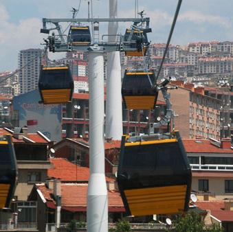
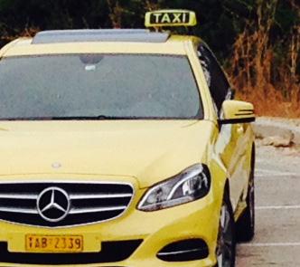
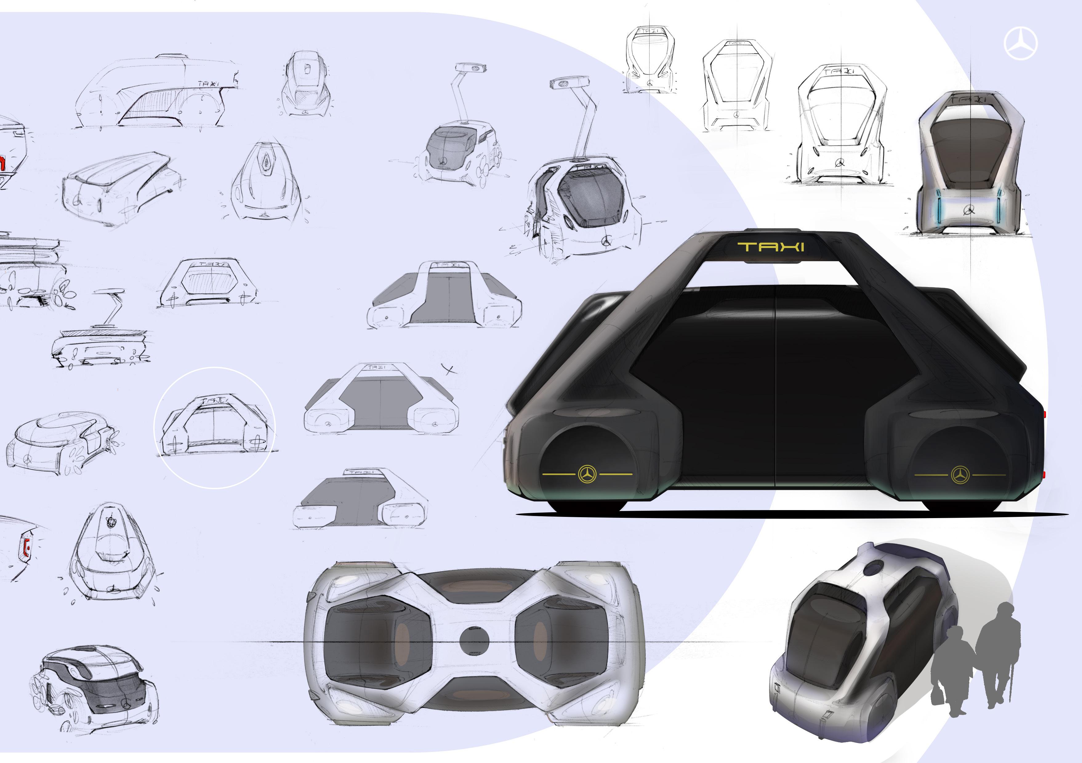
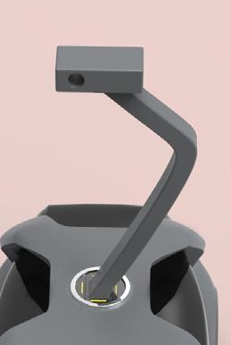
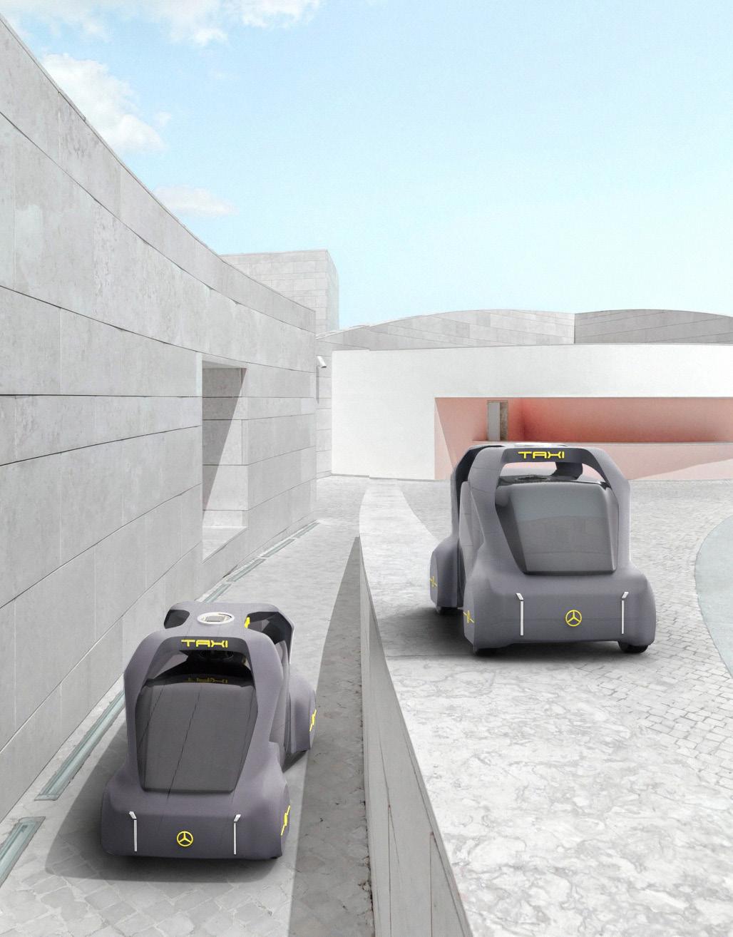
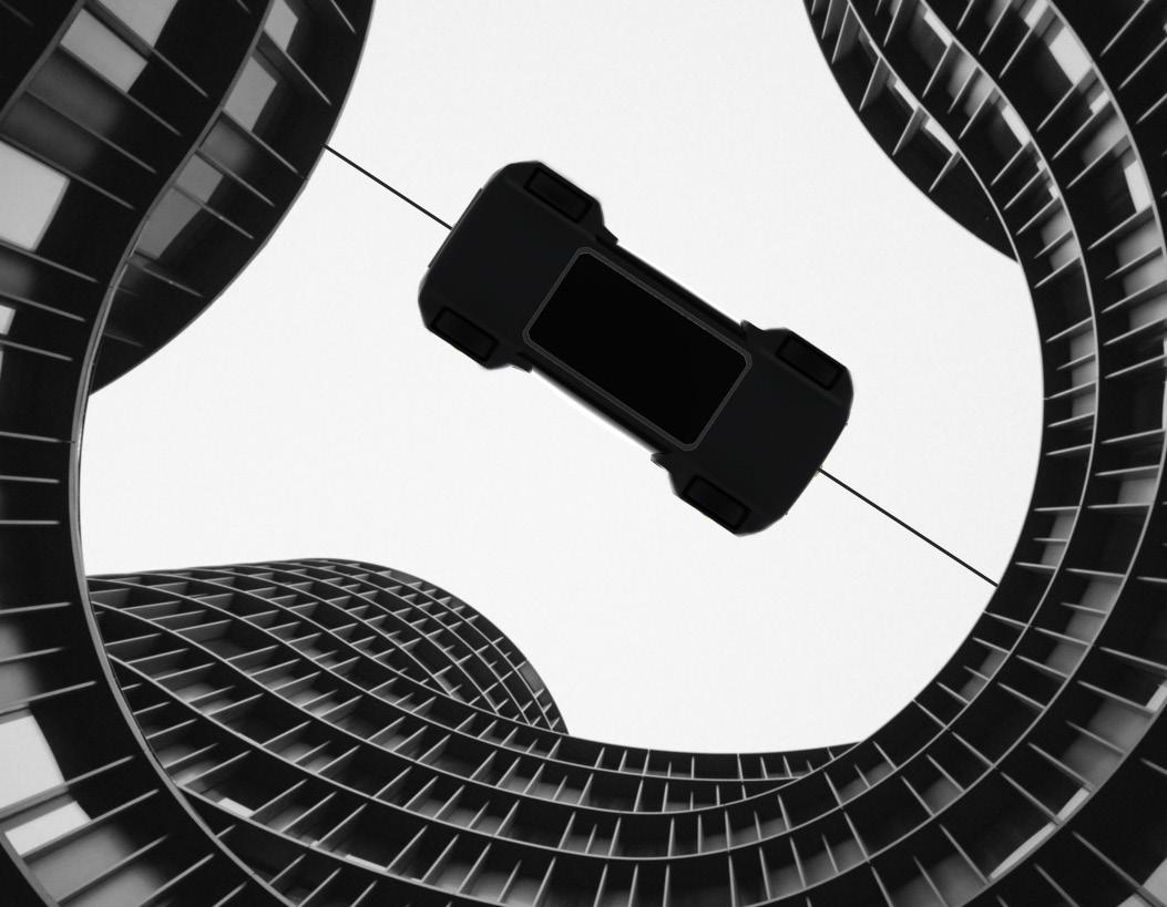
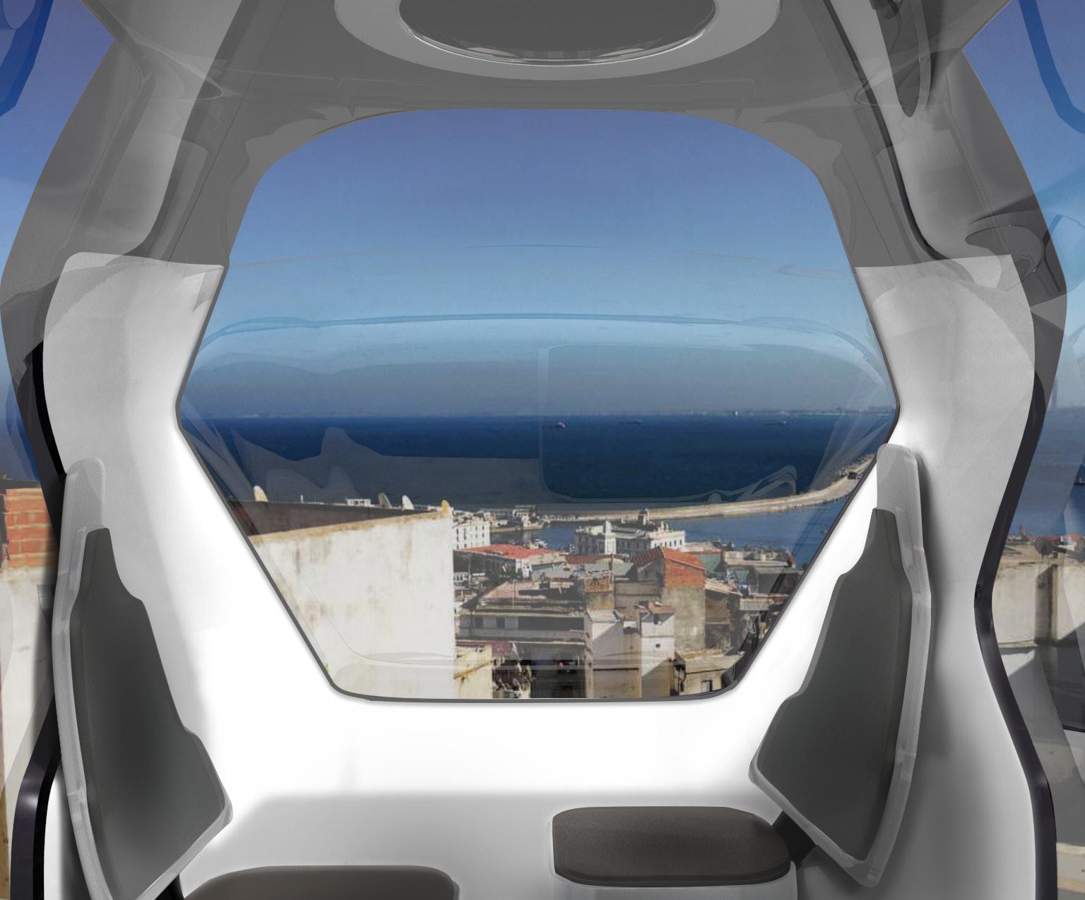
As part of the TAXI 2030 project, I designed a self-driving, electric car, T.E.O., that functions not only as a car, but also as a cable car. This solution makes transport fast and safe, and it is much more an environmentally friendly solution. When the car stops under the cable, an intelligent arm comes - what is connected to the cable - and connects with the hole, which is on top of the car. The car charges, when it functions as a cable car. My inspirations were places in South America, where travelling is challenging and dangerous. Not to mention the rudimentary road conditions.
Consultants: Gabriel Németh, Robert Lesnik, Thomas Salzle, Balázs Lenkei, András Húnfalvi
FIRST IDEA - travelling is dangerous and rudimentary - peope risk their life to reach their destination - places, that are difficult to reach by car
02 INSPIRATION
- cable car system combining with car driving - no traffic, no crowding, no pollution - reduced travelling time
03 RESEARCH, PROBLEM
- the surrounding is dangerous, but popular by tourists - poverty and violent crime, traffic, pollution - places like Brazil, Bolivia and Venezuela
04 MAIN IDEA
KEYSKETCH
SIDE VIEW VARIATIONS
THE BACK IS MORE CLOSED, THAN THE FRONT
SMART GLASS & MATTE SURFACE THE EXTERIOR DESIGN
SIZES & SEATING POSITIONS compared to female and male sizes
the intelligent arm’s connecting point on the car
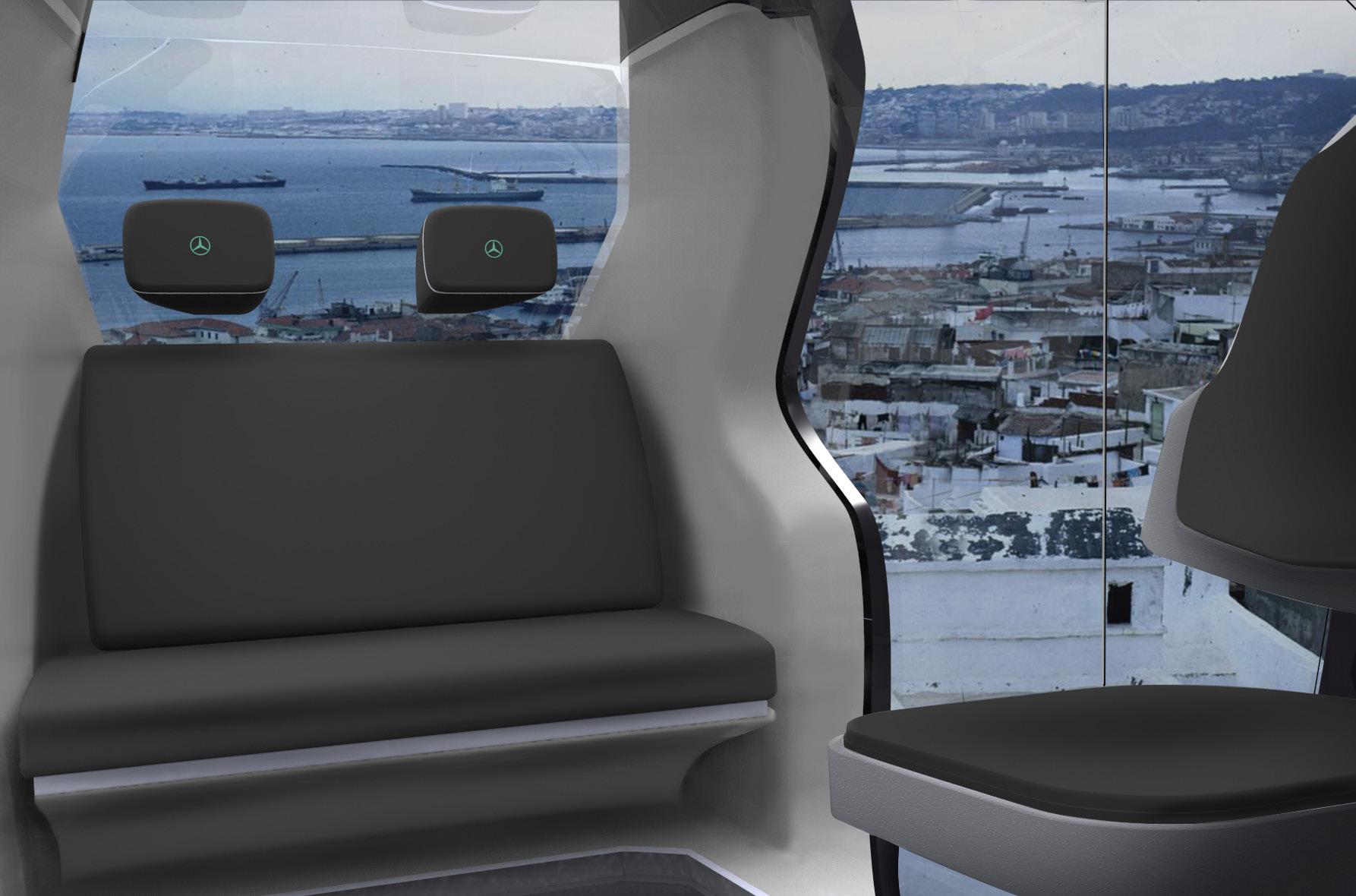
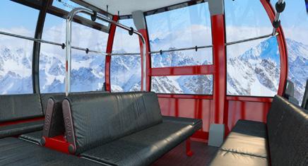
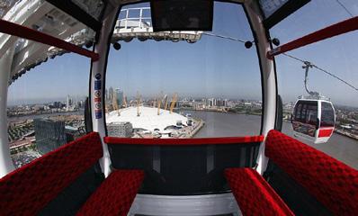
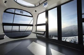
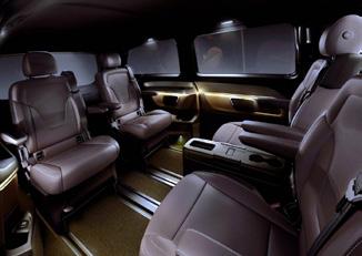
ANALYZING CABLE CAR INTERIORS looking for the most practical and aesthetic solution part of the floor is smart glass, and we can see what’ under the car
FROM THE FRONT
VIEW FROM THE BACK SEAT
1.VARIATION: because not everybody can travel, facing the opposite direction to traffic, the front seats are variable and moveable.
2.VARIATION: we can turn back the front seats, facing with the people who are sitting on the back seat.
the front seats can be folded up (if no one is sitting there, and we can put suitcases, etc. there)
VIEW
SEAT
3.VARIATION:
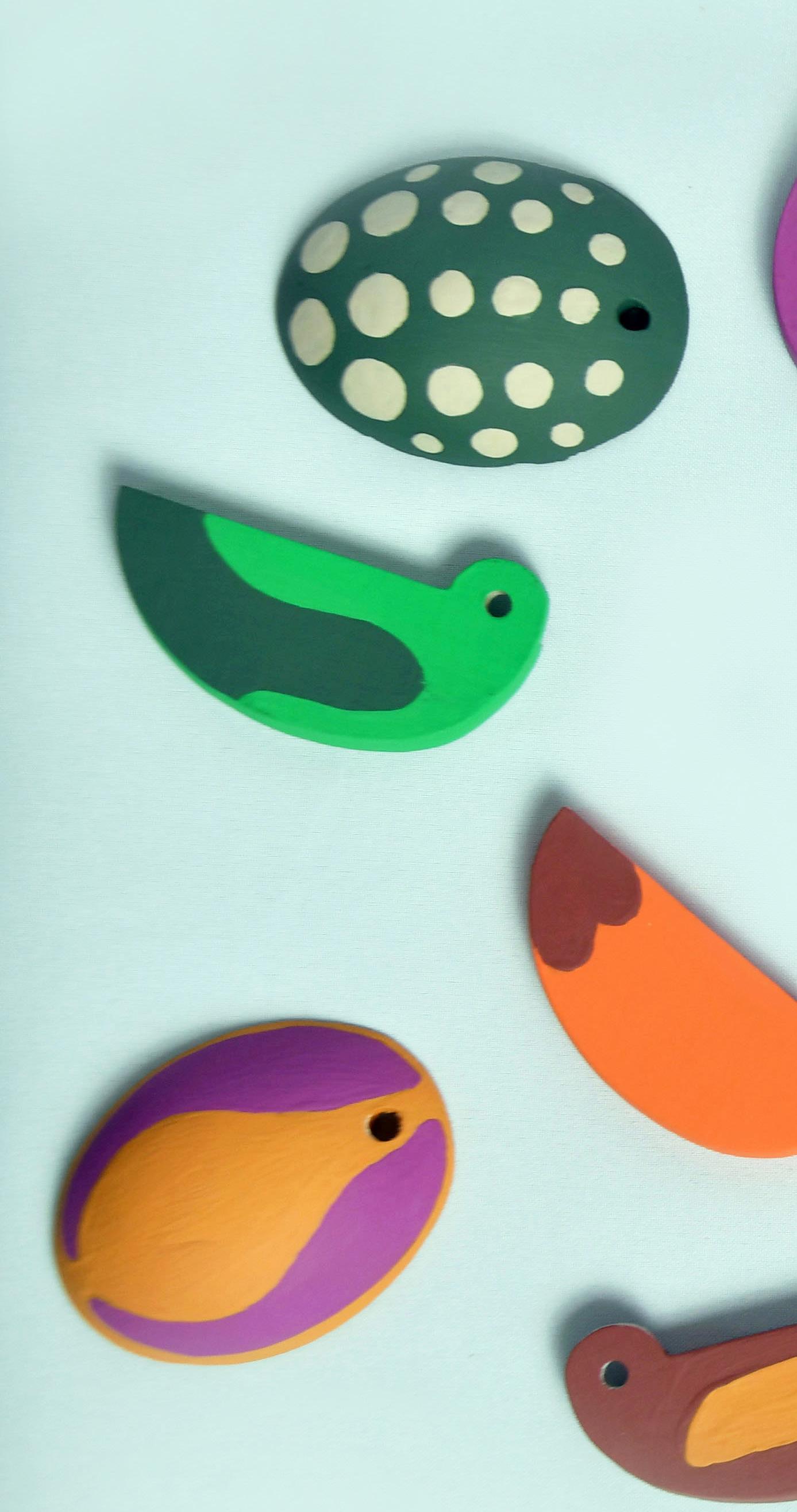
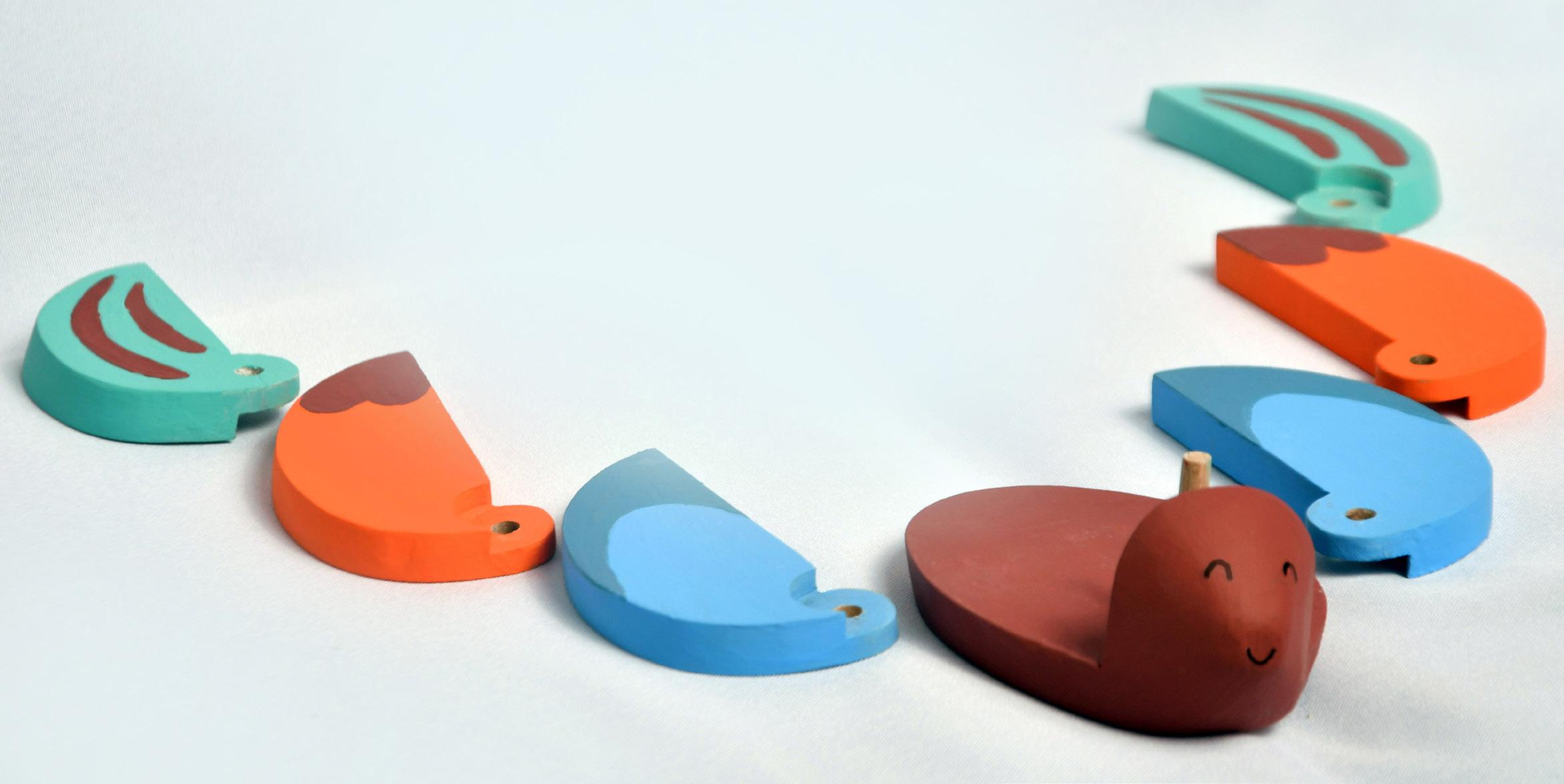
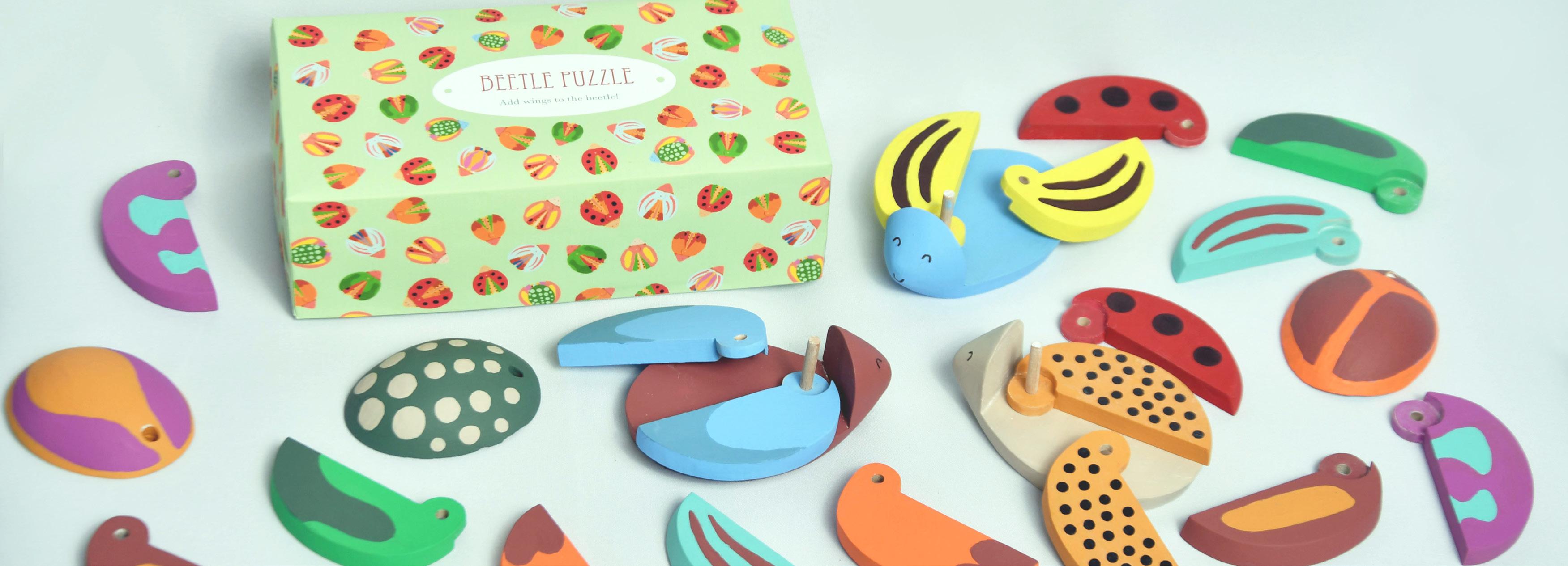
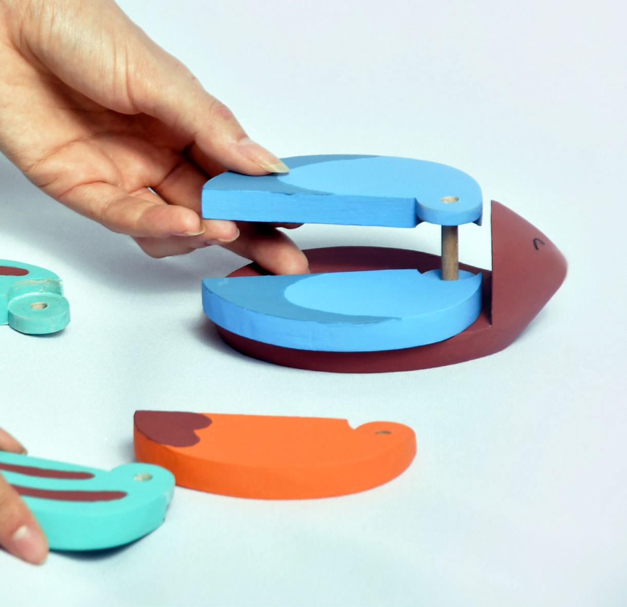
BEETLE PUZZLE is a designed toy for little kids. The various colored, patterned wings are detachabled and commutabled. So you can every time build or make a new beetle. In addition you can the wings pull away, so you can see, what kind of beetle you made.
In collaboration with Supervisors: Zsuzsanna Kis-Gál, Dániel Lakos
MOODBOARD funny + easy + honest
THE DESIGN PROCESS//
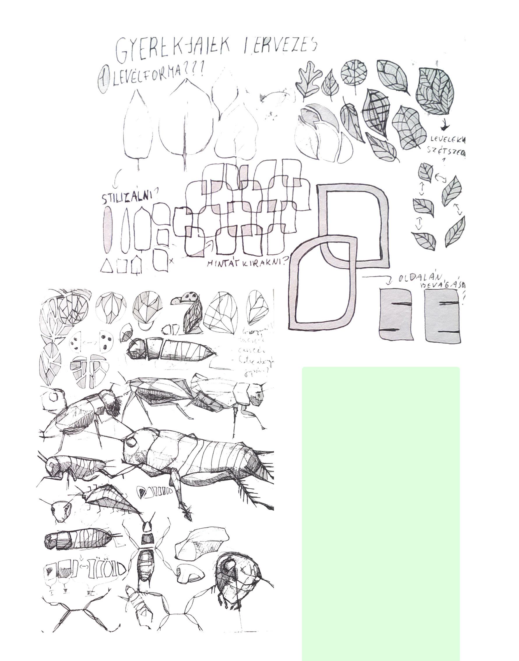
FIRST IDEAS inspirations from the shape of a leaf and bugs
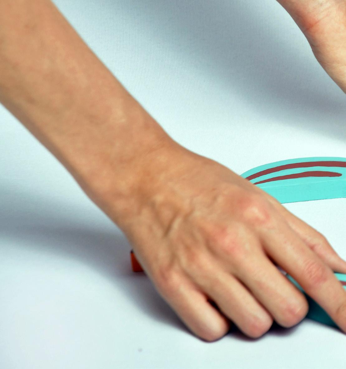
TESTING THE PROTOTYPES with the member of the target group (my little cousin, Albert, 3 years old)
SOME OF MY PROUD MOMENTS
montage of memories
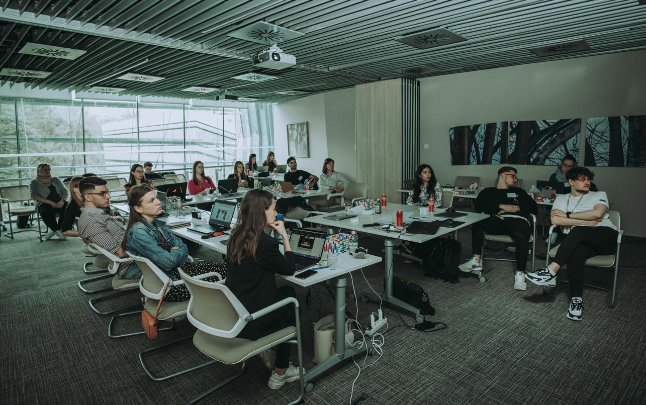
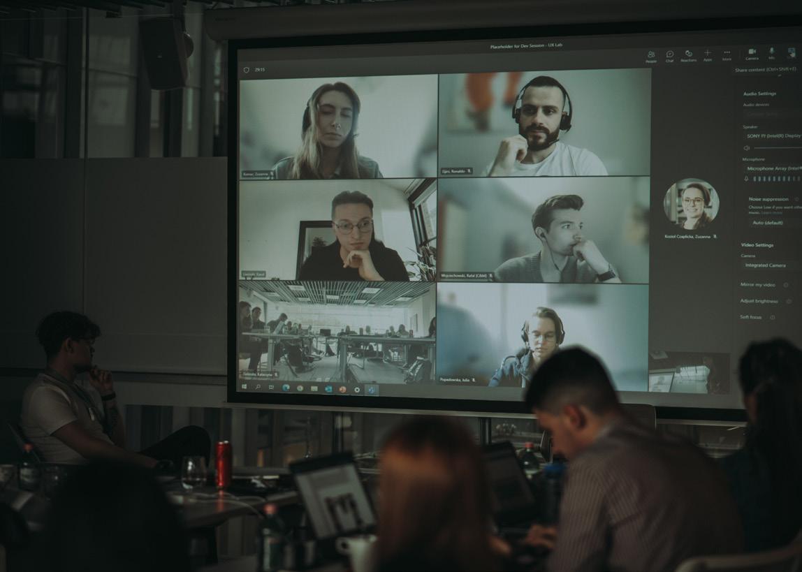
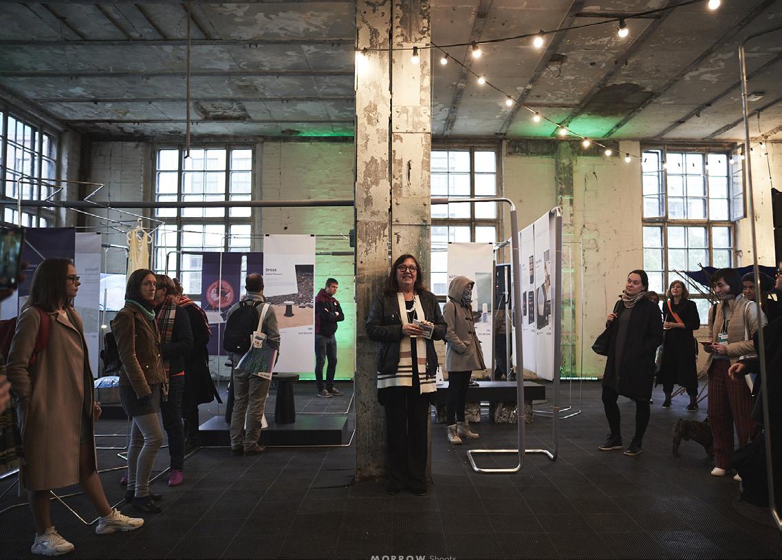
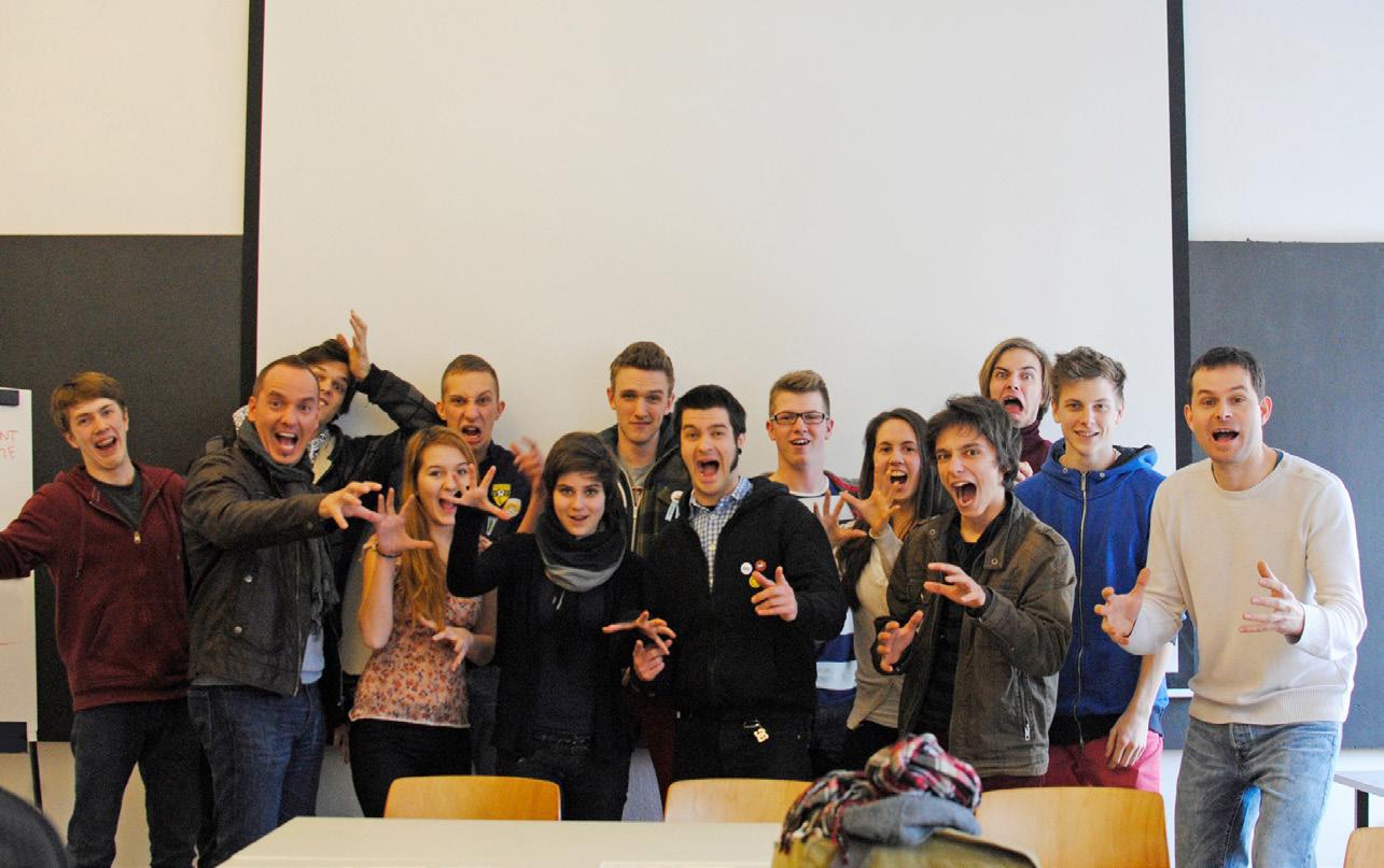
Facilitating at Deloitte’s international workshop „UX Lab” (2022) Invited exhibitor at DISAINIÖÖ Tallin Design Festival (2021)
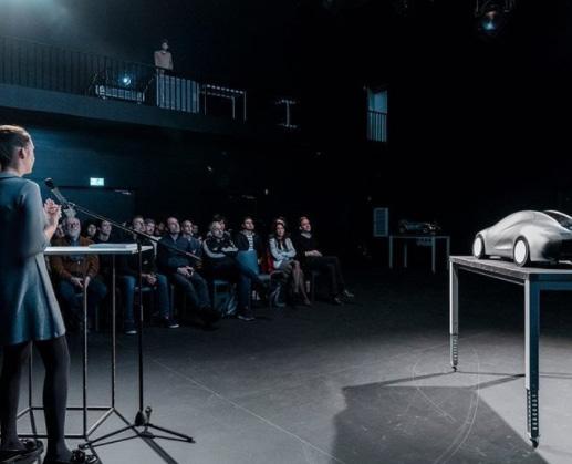
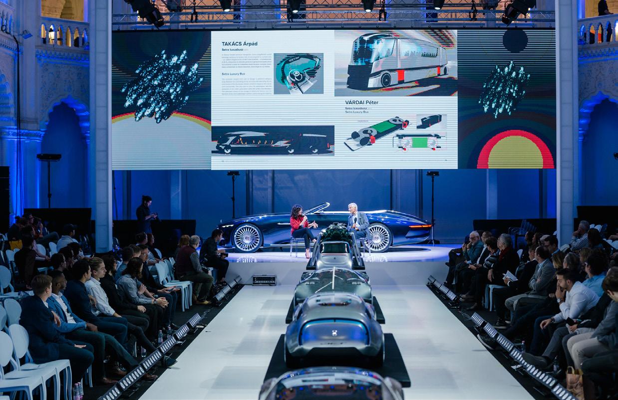
Final Mercedes-Benz Presentation (2018)
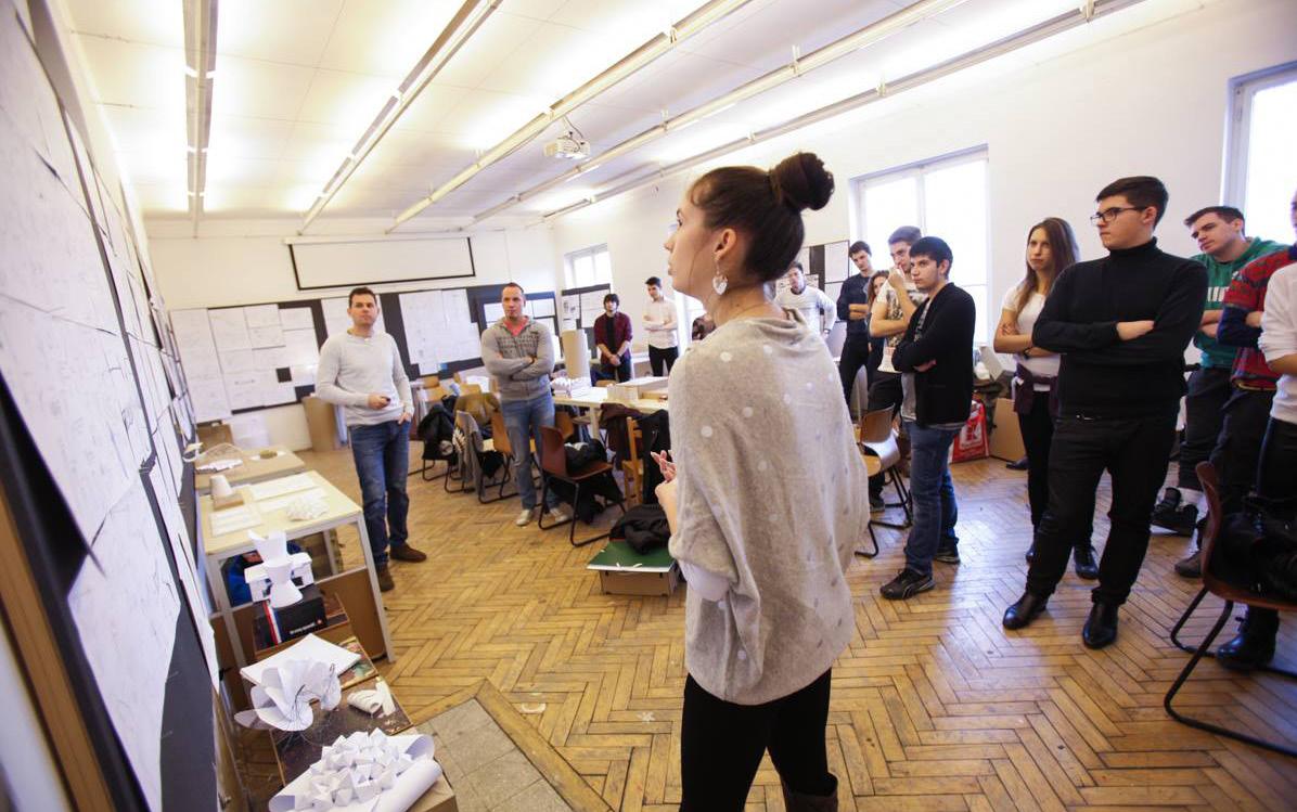
Exposing the Maybach 6 Cabriolette and presenting our students work (2017) Presenting and facilitating at pre-uni course & final „roarr” (2015)
+36 30/677-4472
viktoriahorvath95@gmail.com
https://www.behance.net/viktoria-horvath
https:/www.linkedin.com/in/viktória-horváth dribbble.com/vhorvath
