Visit Jersey Brand Guidelines


May 2024
Visit Jersey Brand Guidelines 2 Contents Brand Strategy Our brand narrative Our brand Our values & personality Experience Pillars Tone of voice How we sound Target segments Brand Elements Primary logo Secondary logo Size and positioning Accurate usage Using the logo online Co-branding Endorsement Sponsorship & Partnership Co-operative Colour Colour palette Colour accessibility Colour imagery Typography Primary typeface Secondary typeface Corporate document format Grids Print Digital Guidelines Our online identity Graphic System Our Graphic System Applying the logo graphic 4 5 6 7 8 9 10 11 12 13 14 15 16 17 18 19 20 21 22 23 24 25 26 27 28 29 30 31 32 33 34 35 36 37 39 40 41 42 43 44 45 46 48 Iconography Photography Categories The Great Outdoors Local Food & Drink History & Culture Responsible Tourism People Creative Style Guidelines Further information

Brand Guidelines
Our brand guidelines have been created to ensure consistent visual and verbal communication to support our brand purpose and strengthen our brand identity across all platforms, including:
• Advertising
• Digital
• OOH
• Collateral
• Jersey.com
• PR
• Corporate Communications
• Events
• Trade partner co-op marketing
The guidelines define logo usage, colour palette, typography, and tone of voice to ensure consistent representation.
Our guidelines will safeguard brand integrity, fostering recognition, trust, and loyalty among stakeholders, ultimately enhancing brand equity and market competitiveness.
Visit Jersey Brand Guidelines 3

Brand Strategy
Visit Jersey Brand Guidelines 4
Brand Strategy
Our brand narrative
Our narrative expresses the ‘emotion’ of Jersey: the power our island has to help travellers refresh, revitalise, reconnect, and rediscover their true self. It is not marketing copy. It is an introduction to Jersey’s unique positioning: an inspirational and emotionally engaging territory that our island can claim as its own.
“Jersey is an island shaped by the sea, where things are revealed – when you’re ready to look.
Like our submerged coastal landscapes that are exposed to Jersey’s fresh atmosphere each day, it’s a place for you to come up for air.
A liberating, joyful experience, where you’re free to reconnect and revitalise. Free to be together. Free to do so much. (Or so little.)
Where you love the past, live in the present and look forward to the future. Where friendships are nourished and bonds are strengthened. And, when the time comes for the tide to rise again, you’re ready to dive back in – with a smile on your face and a freshness in your heart.”
5 Visit Jersey Brand Guidelines
Our Brand Strategy
Our brand
The Jersey brand plus is made up of four components: purpose, positioning, personality and values. Together, these key brand elements play a fundamental role in defining who we are, and strategically positioning the Jersey brand.
Purpose
Positioning
Changing perceptions, shaping the future. Promoting Jersey, enabling tourism growth to create a prosperous and sustainable economy.
Jersey, the island ready for curious minds minds to explore.
Personality
Unexpected | Playful | Authentic | Immersive
Values
Individuality | Curiousity and optimisim | Togetherness | Immersive
Visit Jersey Brand Guidelines 6
Our Brand Strategy
Our values & personality
Brand values are the guiding beliefs that drive our decisions and behaviours. They reflect our attitudes to the world and help anyone associated with Jersey assess whether a given activity is right for the brand.
Our target segments share all our values, but their priorities are different. So, it’s essential we say the right thing, to the right person, at the right time.
Our values
Individuality
Be authentic. Be fearless. Be you.
Natural harmony
Connect with nature, with all your senses.
Togetherness
Share dreams, moments, and memories.
Curiosity and optimism
Love yesterday. Live for today. Look to tomorrow.
Our personality
Unexpected
We do things our way. We’re a little bit French, a little bit exotic and uniquely Jersey.
Immersive
Hearing the roar of astonishing tides, smelling the food that feeds your soul and listening to the silence of the sweeping sand dunes... all waiting for you to experience.
Authentic
We love our island and we are proudly Jersey. We know how to connect and discover what our island has to offer, together.
Playful
We’re freewheeling, fun-seeking, outdoor loving locals who can’t help but give away the secrets of Jersey’s beauty.
Visit Jersey Brand Guidelines 7
Our
Brand Strategy
Experience Pillars
We focus our communication around four experience pillars that reflect the preferences of our target audience segments - The Great Outdoors and Wellbeing, Local Food and Drink, History and Culture, and Responsible Tourism. These pillars create a compelling narrative by highlighting Jersey’s unique features, including natural beauty, cultural heritage, adventure and locally ‘grown’ produce.
The Great Outdoors & Wellbeing
With invigorating and winding paths to untouched bays, a Jersey reset is inevitable. Jersey is a world of calm, serenity and solitude, offering the ultimate retreat with miles of wide open nature.
Local Food & Drink
From land to sea, Jersey is brimming with a bounty of fresh local produce including seafood, dairy and our famous Jersey Royal potatoes.
History & Culture
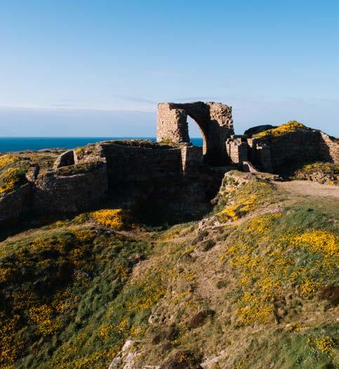
Jersey has a rich history to be discovered. From castles and cliff ruins to World War 2 bunkers.
Responsible Tourism
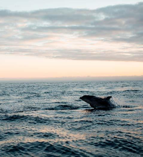
Jersey is a nature lover’s island with headlands to wetlands teeming with birdlife.
Visit Jersey Brand Guidelines 8
Our Brand Strategy
Tone of voice
Our tone reflects the character of Jersey and keeps our verbal and written messages unique, relevant, and engaging.
Our brand personality Our tone of voice principles
Unexpected
We are witty and intriguing. We do it with both surprising content and writing style, deftly dotted with witty wordplay, unexpected sentence structures, and stop-you-in-your track twists that build curiosity.
Immersive
We are sensory storytellers. We draw travellers in with rich stories packed with sense-stirring language that build connections – instantly. We make sure our guests are the ‘hero’ and promises are backed up with ‘proof’.
Authentic
We are real people and natural conversationalists. We’re the friends you chat to about your holidays: warm, casual, unpretentious. We write how we natter, with everyday words and pace. We may use few words, but we use them brilliantly.
Playful
We are fun and holiday-focused. It’s all about the holiday for us. We love our island and we’re proud to share it. Even our writing style is fun, with cheeky humour and a sea-breezy tone.
Visit Jersey Brand Guidelines 9
Our Brand Strategy
How we sound
Need inspiration? Or a little extra guidance? We’ve whipped together a few examples of how our voice sounds –and how it doesn’t.
Not us:
“Jersey’s good living and fine food enjoys a glowing reputation the world over. The island boasts a huge range of places to eat”.
To:
“Discover Jersey’s beaches, browse maps and keep up to date with all the latest news from around the island. You can even meet the locals!”
“From our beach food culture to our luxury restaurants, our compact island packs a rich and colourful larder into its nine by five miles.”
“Want the insider’s guide to what makes Jersey special? Or the low down on where the locals go? Map out your holiday with our tips and tricks, and check out the events that are happening to make sure you don’t waste a minute.”
“Social Hub. Experience Jersey and share your favourite moments”.
“Short breaks. Longer holidays. Where to stay. What to do”.
“To discover and share island tips, stories, events and photos about our beautiful island, check out our website and social channels.”
“If you’re looking for an action packed break, a long relaxing stay or a luxury retreat, Jersey is the place for everyone to feel truly on holiday.”
Visit Jersey Brand Guidelines 10
Our Brand Strategy
Target segments
Capturing the curiosity of our two target segments – Easy Explorers and Moment Makers - is key to our growth, representing a market size of 10 million UK travellers.
But not all Jersey visitors want the same thing. Our research shows what each segment needs and desires.
Easy Explorers
Aged 55 - 74 years
Our holiday motivations are:
• Get off the beaten track
• Visit historic sites
• Be physically active in the great outdoors
• Go wildlife spotting
• Connect with nature / wellbeing
• Enjoy peace and quiet
• Slow down / savour different pace of life
Moment Makers
Aged 25 - 44 years
Our holiday motivations are:
• Indulge in gourmet food
• Relish being in, on, or near the sea
• Relax in luxurious surroundings
• Feel special and spoilt
• Seek out WOW moments to share on Instagram
• Gather stories to tell friends
• Make unique memories
Visit Jersey Brand Guidelines 11

Brand Elements
Visit Jersey Brand Guidelines 12
Brand Elements
Logo
Primary Logo
Our primary logo is a white out version and should be used in the majority of brand communications. The stacked version of our logo should be used wherever possible and the horizontal version should only be used where space constraints apply.
Our logo suite consists of CMYK (Print) and RGB (Screen/Digital) versions. There are two core versions of the primary logo: stacked and horizontal.
Primary vertical lockup

Minimum size

20mm
The ‘J’ marque in all logo versions should never be reduced more than 20mm in height.
Primary horizontal lockup

Clearspace

13 Visit Jersey Brand Guidelines
Brand Elements
Logo
Secondary Logo
The secondary - blue - version of the logo should be used when imagery is not being used and the logo appears on light backgrounds. The blue version has been created to reflect the sea and sky that surrounds the island, giving it life and energy.
The same clear space and minimum size guides shown on the primary logo also apply to the secondary logo.
No other colour variations of the logo should be used.
Primary vertical lockup

Primary horizontal lockup

Visit Jersey Brand Guidelines 14
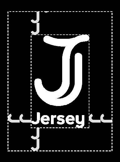
Brand Elements
Logo
Size and positioning
Always ensure that out logo is the right size - never too small or too big. This is worked out by dividing the diagonal length of the page by eight, and rounding to the nearest whole number.
The table below shows the recommended logo heights for common page formats. Always position the logo bottom right or top right on applications.
Logos sit in the bottom, right hand corner. For corporate documents, logos sit in the top, right hand corner.
Please note: In instances where it is necessary for the logo to be situated elsewhere, approval from Visit Jersey’s Marketing team is required.
Logo sizes:
A5 32mm high or 90 pixels
A4 45mm high or 127 pixels
A3 65mm high or 184 pixels
A2 90mm or 255 pixels
A1 130mm high or 368 pixels
Pixel dimensions at 72dpi
Visit Jersey Brand Guidelines 15
Brand Elements
Logo
Accurate usage
The Jersey logo must always be reproduced consistently and accurately to maintain the integrity and strength of the brand.
The following examples illustrate how the Jersey logo should not be reproduced.
Rediscover
Jersey
The island break Jersey is an island shaped by the sea, where things are revealed – to any who choose to look. Like our submerged coastal landscapes that are exposed to the fresh Jersey atmosphere each day, it’s a place for you, too, to come up for air. A liberating, joyful experience where you’re free to reconnect and revitalise. Free to be together. Free to do so much! (or so little). Visit Jersey Brand Guidelines 16
Brand Elements
Using the logo online
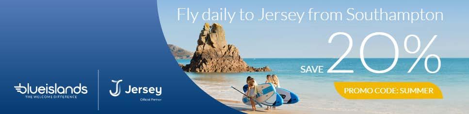
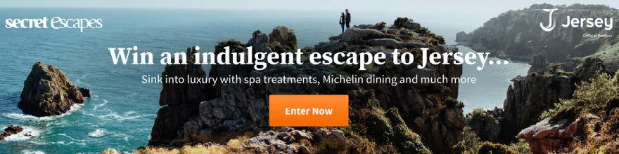
When using the identity online, there are many formats which may mean elements of the brand are cropped. To ensure the logo is always visible it, or the icon, should be positioned at the top of the graphic, ideally top left or top right, and text should be left aligned so it is easier to view and read on screens.
Online Display Advert Examples


Visit Jersey Brand Guidelines 17

Co-branding
There are three co-branding areas - Endorsement, Sponsorship and Co-operative - that apply to organisations that are working with the Jersey brand.
Visit Jersey Brand Guidelines 18
Co-branding
Endorsement
This is where a piece of communication, usually focused around a single subject or event, is endorsed via a visual association with the Jersey brand.
Typically, the request for use of the Jersey brand as an endorsing device will come from an association/ event who wants to benefit from being associated with Jersey. Use of an endorsement in these situations would be on websites, marketing literature and advertising.
The endorsing device consists of a short statement explaining the relationship between the two associations and the Jersey logo. The statement and the logo are separated by a ruled line.


19 Visit Jersey Brand Guidelines
Primary Logo
Secondary Logo Where space constraint apply Preferred use
Co-branding
Sponsorship & Partnership
Sponsorship and partnership endorsements occur when two or more companies come together to jointly sponsor an event.
Sometimes in these situations when the host brand may take the lead, it is typically not possible for Jersey or indeed any other sponsor to insist on any more than a quality logo rendition and respect for clear space specifications. In this sitution the primary stacked white logo should be used.


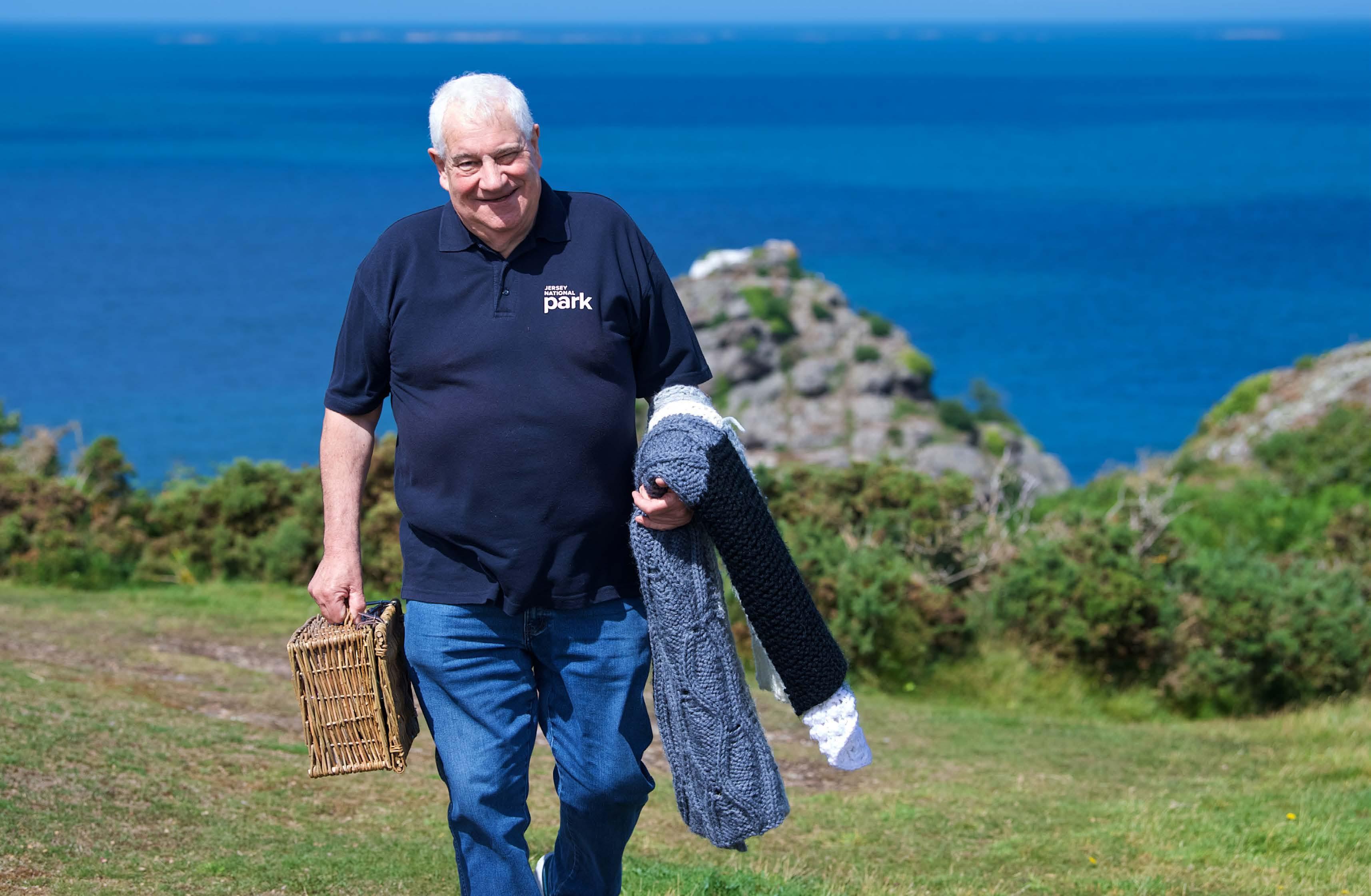


Enjoy a foodie experience in the beauty of the Park


Jersey National Park honourable chairman Jim Hopley, MBE, encourages us to head outdoors and explore the 2,145 hectares of parkland while appreciating a range of local produce

PICNIC IN THE PARK
In partnership with THE Jersey National Park is full of picture-perfect picnic spots. This month, we are inviting you to discover an authentic taste of Jersey, enjoy the natural beauty within the 2,145 designated hectares of the park and nourish friendships while relaxing over a leisurely picnic. This is the third year of Picnic in the Park, and we are pleased to see the initiative continue to grow. We are delighted to be welcoming back in the amazing scenery right on your dorstep. Picnic menus are now available to view online at jerseynationalpark. com and you can place your orders from Thursday. To launch this year’s campaign, we are running competitions in conjunction with the Jersey Evening Post. We have teamed up with some of our wonderful picnic providers and are giving you the chance to win a free picnic to enjoy in 20 Visit Jersey Brand Guidelines
Co-branding
Co-operative
Where the Jersey brand appears in co-operative support of a piece of communication, with varying degrees of visibility that depend on the nature of the relationship and desired impact.
In order to allow the brands to retain their own identity, measurements guidance should be followed, and proportionately sized up or down depending on the end requirement.


Visit Jersey Brand Guidelines 21
Colour

Visit Jersey Brand Guidelines 22
Colour palette
Our colour palette helps to support the abundance of colour and vibrancy that comes through our imagery. It has been created to reflect the seasonality of the island as well as reflect the vibrancy and energy of the island.
Whilst colour plays an important role for the brand, imagery plays the hero role, with colour acting in a supporting role.
Corporate colour
Midnight Blue is reserved as Visit Jersey’s corporate colour. This colour is to be used as the primary colour in corporate documents, as well as on business.jersey.com.
2289
35 M0 Y65 K0 R173 G213 B129 HEX #add581
30
18
0 R182
135 HEX #b64b87 Sky
Pantone 630 C55 M0 Y20 K0 R104 G201 B208 HEX #68c9d0
C99 M21 Y35 K10 R0 G127 B149 HEX #007f95
Field Green Pantone
C
Rich Plum Pantone 7647 C
M85 Y
K
G75 B
Blue
Surf Teal Pantone 7712
141 C5 M20 Y66 K0 R242 G201 B112 HEX #f2c970
7578 C0 M60 Y 72 K0 R245 G131 B83 HEX #f58353
Dune
Yellow Pantone
Sunset Orange Pantone
2117 C80 M64 Y6 K0 R73 G101 B167 HEX #4965a7 Visit Jersey Brand Guidelines 23 Colour
Midnight Blue Pantone
Colour accessibility
Colour contrast between text and background is important to consider, especially on web pages as a low colour contrast will affect some people’s ability to perceive the information visually. The legibility and accessibility of colours is vital and all communications should be clear and easy to read.
Using the Web Content Accessibility Guidelines (WCAG) the colours below show the contrast ratios between colours.
We recommend checking any colour usage prior to publication online, for example: www.color.adobe.com, to ensure that colours reach the AAA standard with white text at 18pt and above, or 14pt bold and above.
Contrast ratio 12.61:1 WCAG 2.1 LEVEL AAA Contrast ratio 1.67:1 WCAG 2.1 LEVEL FAIL
Contrast with black Contrast with white Contrast ratio 12.61:1 WCAG 2.1 LEVEL AA Contrast ratio 4.83:1 WCAG 2.1 LEVEL AA Rich Plum HEX #b64b87 Contrast with black Contrast with white Contrast ratio 13.36:1 WCAG 2.1 LEVEL AAA Contrast ratio 1.57:1 WCAG 2.1 LEVEL FAIL Dune Yellow HEX #f2c970 Contrast with black Contrast with white Contrast ratio 10.85:1 WCAG 2.1 LEVEL AAA Contrast ratio 1.93:1 WCAG 2.1 LEVEL FAIL
HEX
Contrast with black Contrast with white Contrast ratio 3.7:1 WCAG 2.1 LEVEL AA Contrast ratio 5.67:1 WCAG 2.1 LEVEL AA
Field Green HEX #add581
Sky Blue
#68c9d0
Contrast with black Contrast with white Contrast ratio 8.25:1 WCAG 2.1 LEVEL AAA Contrast ratio 2.54:1 WCAG 2.1 LEVEL FAIL
Midnight
Blue HEX #4965a7
Contrast with black Contrast with white Contrast ratio 4.47:1 WCAG 2.1 LEVEL AA Contrast ratio 4.71:1 WCAG 2.1 LEVEL AA
HEX
Contrast with black Contrast with white Visit Jersey Brand Guidelines 24 Colour
Sunset Orange HEX #f58353
Surf Teal
#007f95
Colour imagrey
Colour comes through photography; our logo co-exists with imagery, allowing the colour of the image to breathe through the transparent elements of our logo. Examples below show the colour palette in use through images.

Visit Jersey Brand Guidelines 25 Colour

Typography
Visit Jersey Brand Guidelines 26
Typography
Primary typeface
Our typeface is modern and confident, clean and legible. There are three different typefaces, all from the same family - Proxima Nova.
To purchase and download these fonts, go to myfonts.com, or any other established online typeface retailer.
Please note: You may need to purchase specific font licences, depending on your font usage (web/print).
Headings
Headlines can use both Proxima Nova Bold and Proxima Regular in combination or in isolation. Colour can also be used to add extra emphasis to the messaging.
Subheadings | Introductions Intro paragraphs can be highlighted by using Proxima Nova Semi-bold.
Body copy
Body copy should use Proxima Nova Regular. Quotes
Quotes can be highlighted by using Proxima Semi bold and/or using italics and our accent colour palette to add extra emphasis.
Headings
Proxima Nova Bold Proxima Nova Regular Proxima Nova Light
Subheadings
Proxima Nova Semibold
Introduction paragraphs
Proxima Nova Semibold intro paragraph lorem ipsum dolor.
Body copy Quotes
Proxima Nova Regular Body copy paragraphs Integer ut lorem nec urna imperdiet congue quis sit amet leo. Sed consequat, lectus sed volutpat adipiscing, nisl massa cursus urna, convallis egestas massa neque sed enim.
Proxima Nova Semibold quotes
Proxima Nova Semibold Italic quotes
Proxima Nova Italics quotes
27 Visit Jersey Brand Guidelines
Typography
Secondary typeface
Arial is our chosen secondary font when it’s not possible to use our core typefaces, such as in Microsoft PowerPoint presentations, email signatures or for when you need to type out letters in Microsoft Word and corporate reporting.
Headings
Arial Bold
Subheadings
Arial Regular
Introduction paragraphs
Arial Regular intro para lorem ipsum dolor sit amet.
Body copy
Arial Regular Body copy paragraphs lorem ipsum dolor sit amet adispicing vitae vehicula augue. Etiam viverra purus ac dolor ultrices eget auctor nibh volutpat.
Visit Jersey Brand Guidelines 28
Heading
Typography
Corporate document layout

Heading 1
Heading 2 – Subheading if required.
Heading 3
Body copy Lorem ipsum dolor sit amet, consectetur adipiscing elit. Suspendisse eget lacus eros. Etiam at porttitor risus. Donec ante velit, tristique id aliquet nec, tempus ac odio. Proin suscipit, mauris in volutpat rutrum, leo massa rutrum leo, et vulputate turpis nisi ac justo. Aenean elit sapien, mollis at ultricies quis, auctor sit amet diam. Duis vitae leo ut turpis pharetra maximus vitae fermentum mauris. Maecenas bibendum pharetra ipsum nec dictum.
Donec ut ante nec lacus fringilla fermentum ut sit amet nisi. Pellentesque consectetur ex risus, ac efficitur tortor maximus eget. Phasellus laoreet aliquam varius. Integer molestie blandit est, ut tincidunt elit vehicula eget. Duis sagittis, libero a fringilla pulvinar, nunc lorem dapibus odio, nec euismod ante neque sed urna. Ut finibus nunc eu ligula porttitor bibendum. Praesent ornare sit amet urna eget pretium. Aliquam sodales hendrerit scelerisque. Praesent auctor sem eu molestie mollis. Nunc pretium justo tortor, sed maximus ligula egestas sit amet. Ut quis lorem lacus. Aliquam posuere metus ut elit aliquet hendrerit. Nam euismod eros leo, eget euismod ex consequat eget. Sed pharetra turpis sit amet massa consectetur pellentesque. Vivamus egestas dolor et ligula rutrum faucibus. Nam et dui purus.
Nulla placerat aliquet diam, et egestas lorem lobortis sit amet. Pellentesque at urna tincidunt, congue nisl sed, faucibus velit. In at felis eleifend, ullamcorper nisl at, facilisis nibh. In lectus enim, vulputate eu mattis at, blandit quis tortor. Aenean vitae semper nibh, nec convallis arcu. Aliquam rutrum magna purus, non molestie leo tempus et. Ut et turpis sapien. Nullam pellentesque et nibh sed ultrices. Donec a tempor est. Pellentesque id molestie lacus. Ut nunc lectus, aliquam eu purus ac, pulvinar facilisis sapien.
Duis porttitor, augue nec ultricies sodales, orci nulla sodales purus, eu pellentesque nisi nunc et velit. Morbi sagittis hendrerit risus eget mollis. Sed dictum viverra purus, vitae iaculis purus aliquet eget. Suspendisse potenti. Mauris molestie cursus fermentum. Nullam sed consectetur metus, vel cursus mauris. Aliquam erat volutpat. Sed condimentum neque ut pharetra rhoncus. Integer gravida urna urna, sit amet euismod metus condimentum ut. Nam at consectetur felis, eu vestibulum lacus.
Ut mauris mi, tincidunt in sagittis nec, vestibulum id sapien. Suspendisse et rhoncus sem, quis condimentum lacus. Ut imperdiet nulla eu felis dapibus, et ultrices mauris cursus. Sed non libero tincidunt, mollis nisl eu, ornare lacus. Proin non efficitur orci. Etiam vel accumsan diam. Curabitur imperdiet tortor ligula, vel eleifend mauris condimentum sed. Phasellus vehicula, metus eu tempor vestibulum, justo metus vehicula lacus, at sodales diam turpis vitae libero. Vestibulum tempor elementum mi, eget sodales metus maximus vel. Morbi egestas eros nec turpis accumsan convallis. Nullam tempor tempus nisi, sit amet fermentum tellus aliquet non. Nullam dignissim suscipit lectus, a fringilla est eleifend eget. Aliquam quis cursus augue, dignissim vulputate sapien. Praesent tristique eleifend aliquet. Aenean venenatis condimentum tempor. Maecenas euismod lacus vel hendrerit venenatis.
Use Arial if Proxima Nova is not available.
lockup
Subheading
Font: Proxima Nova (Arial if it is not available).
Case: Sentence case
Justification: Left
Line Spacing: 1.5 line
Heading
• Proxima Nova Bold
• 28pt
• Colour: Midnight blue
Subheading
• Proxima Nova Bold
• 18pt
• Colour: Midnight blue
Body copy
• Proxima Nova Regular
• 11pt
• Black
• Numbers: one to ten in written format, 11 onwards in numerical format.
Logo lockup
• Midnight blue horizonal logo lockup in the top right corner.
1
Visit Jersey Brand Guidelines 29
Logo
Page number
Grids

Visit Jersey Brand Guidelines 30
Grids
Print
Our grid provides an underlying structure that helps all our literature appear clear, ordered and considered. The grid is made up of a series of building ‘blocks’, as shown below. Always the same size, the blocks provide versatility in positioning and sizing text and images.
Sizes
All our grids are based on the same building block principle: the blocks remain the same size on all formats. Only the number of blocks changes from one layout/size to another. This has the advantage of ensuring that defined type sizes are positioned consistently on all formats, covers and text pages.
Visit Jersey Brand Guidelines 31
A5
DL
A4
(6 column grid)
(6 column grid)
(4 column grid)

Digital Guidelines
Visit Jersey Brand Guidelines 32
Digital Guidelines
Our online identity
Whilst our identity online should retain the core elements of the brand, some elements have been developed to adapt to digital restrictions.
Primary online colour
Rich Plum has been identified as the primary online global default colour of the site as this is accessible to AAA standard with white text at for 18pt and above, or 14pt bold and above.
Secondary online colour
Midnight Blue may also be used as the secondary online brand colour for corporate use.
Use of tints and lighter shades of the brand colours should be avoided online.
Digital typefaces
Our core typeface, Proxima Nova should be used for all online material.
Images online with gradient tint
When using images online, more consideration needs to be given to the legibility of text over the imagery.
A gradient tint can be used over the image to ensure that the writing is legible. The gradient is often used for display ads and applied behind over-laid copy to enhance legibility. It is then faded out to 0% for the website.
There is a gradient overlay applied (a tint of black) to enhance legibility and ensure accessibility where needed, particularly on headers and carousel cards. A image gradient can also be added on print images.
For further information regarding digital guidelines please contact marketing@visitjersey.je.
Visit Jersey Brand Guidelines 33
Graphic System
Visit Jersey Brand Guidelines 34
Our Graphic System
This is born out of the flow and movement that’s found within our logo and graphics have been developed to define how this can be used to extend the visual reach of our brand.

Using the master logo artwork, try to create dynamic crops that focus on the movement and rhythm of our brand.
Logo
Rediscover Jersey Press relaese Visit Jersey Brand Guidelines 35 Graphic
graphic
System
Graphic System

Applying the logo graphic
Using the logo as a graphic device has been designed to provide flexibility and consistency across a broad range of corporate applications.


Find out useful and essential information for visitors with accessibility requirements, from getting around during your island break, to accessible toilets and where to find them. Practical and helpful information to find your way around the island. Getting
La Hougue Bie Jersey Heritage is honoured to share with you the tenth oldest building in the world. One of Europe’s finest passage graves set, in beautiful surroundings, where you can learn about life in Jersey’s Neolithic community 6,000 years ago. Rozel Bay Rozel Bay beautiful fishing port nestled in Jersey’s north east, sheltered by green rolling hills and dotted with dinky cafés and harbourside restaurants. Mont Orgueil The castle is known for its stunning views of Grouville Bay and the French coast. Explore the myriad of pathways and viewing points to get the perfect shot steeped in history. St. Aubin Curled around one of the island’s original harbours, the enchanting fishing village of St. Aubin is fascinating tangle of historic houses and steep streets leading to sea view panoramas. lazy stroll will take you past restaurants and bars with harbour views. Corbière Lighthouse Corbière Lighthouse dominates panoramic view of the Atlantic Ocean and often magnificent sunsets. Sitting at the point where land meets sea, built on rocky outcrop 500 yards from the shore and towering 35 feet high. Faulkner Fisheries Get the freshest catch at Faulkner Fisheries, selling live, fresh, cooked, smoked, frozen, dried and preserved seafood. The vivier is nestled inside Second World War German bunker at L’Etacq in St. Ouen. In summer enjoy the famous seafood BBQ which popular with locals From there it’s crosscountry through the Green Lanes past Jersey Zoo and down to Rozel for lunch at the Rozel Pub or the Hungry Man. Cycle the coastal roads past Archirondel and Ann Port with a stop at Gorey for artisan patisseries at The Works, before returning to St. Helier. Jersey’s size makes easy to fit plenty into weekend, choose how you want to spend your island time at jersey.com/see-and-do Jersey Zoo Go wild at Jersey Zoo, the first ever conservation-themed zoo and discover some of the world’s rarest animals (such as Andean bears, gorillas, gibbons, meerkats, Komodo dragons, and flamingos) Listen to talks from the park rangers and learn about the legend that is Gerald Durrell. Jersey War Tunnels Discover the historical importance of the five long years of German Occupation in Jersey during World War II, the resistance, co-operation and eventual liberation from the German Army. View a series of exhibitions in the main tunnel and get puzzle solving in the Escape Room activity. Jersey Seafaris Take rib trip with Jersey Seafaris to one of their incredible destinations: Les Écréhous, Les Minquiers, Carteret, Sark, Portbail or Chausey. Speed along the miles of stunning coastline around and from Jersey, with the chance to spot seals and pods of dolphins and return home to the backdrop of a Jersey sunset. Paddle Board Head down to St. Brelade’s Bay to hire some paddleboards and explore the beautiful south-west coastline of caves and bays taking your time to spot wildlife as you glide through the clear water. No filter needed #theislandbreak Share your experience Find more delicious eating spots with our top picks at jersey.com/eat-and-drink Jersey foodie spots Look for this sign on the map Circular foodie tour Start at St. Helier, cycle west along the cycle track to First Tower, heading inland towards Waterworks Valley. Cycle through this pretty valley turning right along to Route de St Jean where you’ll pass farmer Joe Freire’s strawberry stall buy punnet or two. island activities Surfing The Atlantic swell and tidal shifts, along miles of sand, make St. Ouen’s Beach the perfect place to try your hand at this addictive sport. Join the lineup at local spots: Secrets, Splash and Le Braye or have lesson with one of the talented surf instructors on the island. Book lesson or hire some gear from one of the local schools (Splash Surf School, The Surf Yard or Little Joe’s.) Look for this sign on the map Samarès Manor You’d be forgiven thinking that you had stepped back in time to the 1920s when entering this wonderful Manor, as this was when the garden was originally constructed! Discover the beautiful Manor house dating, back in part, to Norman times. Lose yourself in the botanical and herb shrubbery, wild flower fields and Japanese gardens. ewafronc Corbière Lighthouse #CorbiereLighthouse #theislandbreak In the case of an emergency contact 999 There are guided cycle tours on the island, to find out more visit: www.jersey.com/cycle-tours-in-jersey Should you have any questions during your visit please pop in and speak to member of the team at: The Tourist Information Centre Liberation Station St Helier JE2 3AS T: +44 (0) 1534 859000 E: info@jersey.com Or you can reach us through our social channels: @VisitJerseyCI VisitJerseyCI VisitJersey This guide was produced using sustainable forest materials *Routes correct at time of print February 2019 Routes 2, 3 & 3a Waterworks Valley From the Old Station Cafe on the south coast head north and turn right at Benest Food Hall, then taking left to travel up Le Chemin des Moulins following the trees up passed the reservoir of Waterworks Valley. Take a left a continue following the lane northerly, finally turning left and winding onto Les Charrieres Nicolle. Length: miles 3.2 km Time: 30 minutes approx. Hills: 0 Difficulty: Medium Cycle. Jersey Cycle Guide 2 Routes 4 & 4a St. Aubin’s Bay to St. John Head up the cycle lane north near the Seawold Guest House until you reach Paperclix. Chicane around La Rue du Moulin de Tesson and take right turn up past the Tesson Chapel. Follow Meadow Bank up to Les Charrieres de Malorey and wind round the trees following this lane for a short while. Go straight at the crossroads of Morel Farm and continue following the road north, then turn right onto La Ruette d’Avranches and cruise past Six Rues. Keep north up La Rue du Douet de Rue and then turn right onto La Rue de Bel Air, before reaching Cycle. Jersey Cycle Guide 4 Routes 7 & 8 St. Helier to Victoria Village Start this cycle at St. Helier on Val Plaisant heading north easterly to cross the intersection at Rouge Bouillon and heading straight down Trinity Road. This road continues on to Les Vaux New Road and Grand Vaux, stick to this road until reaching the Grand Vaux reservoir which joins on to your finishing point on Mont de la Rosiere and Victoria Village near the Eric Young Foundation. Length: miles 3.2 km Time: 15 minutes approx. Hills: 0 Difficulty: Easy Cycle. Jersey Cycle Guide 7 Routes 5, 6 & 6a St. Helier to Vallée des Vaux This cycle starts at Liberation Square at the Liberation Statue in St. Helier, heading north via town roads Conway Street and New Street. This will take you through the centre of town where there are plenty of restaurants and bars to enjoy. Take Val Plaisant curving towards Vallee des Vaux, pass Waitrose and continue northerly along the route next to the stream. You can join cycle path here to continue on to the West coast for longer cycle. Time: Cycle. Jersey Cycle Guide 5 Complete Coastal Route Feel free to start anywhere along the route, but for clockwise route head out from St. Helier’s Liberation Square following Victoria Avenue onto St. Aubin’s Harbour westerly. Pass through St. Brelade and down onto the coast at Corbière Lighthouse and then proceed north up the coast road. Cut inland at Les Mielles Golf Course and loop around the Nature Reserve, continuing to bear north. Upon reaching L’Etacq, take the lanes northeast up towards La Grève De Lecq barracks and follow the northern coast road east Routes 1, 1a & 1b Cycle. Jersey Cycle Guide Routes 9 & 10 Liberation Square to the Caesarean Tennis Club Like cycle route 5, this cycle starts at Liberation Square at the Liberation Statue in St. Helier, heading north via town roads Conway Street journeying through the centre of town along New Street. Turn onto Burrard Street, turning left into Bath Street until you come to Millennium Park. The route continues through the park taking Oxford Road all the way to Springfield Stadium, passing through the grounds and onto Springfield Road turning right into Le Geyt Road follow the road around and from here you will see the finish Caesarean Tennis Club. Cycle. Jersey Cycle Guide Useful Information & Cycling Laws Cycle. Jersey Cycle Guide Whilst visiting our island by bike it is helpful to be aware of these local laws. Look out for directional signs like this whilst cycling through green lanes. You must obey all traffic signals You are not allowed to ride on pavements Jersey unless it is signed You must have a bell on your bike by Law in Jersey After dark your bicycle must have white light at the front, red light at the back, red reflector at the back and pedal reflectors Cyclists under 14 years of age must wear cycle helmet at all times. Follow one of a number of cycle routes (shown on the map) which are well sign posted and take in miles of lush countryside and Green Lanes, where pedestrians, cyclists and horse riders have priority over cars and motorists must slow to 15 miles an hour. 1 Corbiere St. ubi Walking Tips & Safety Wear sturdy walking footwear Stick to the allocated routes at all times Please do not litter, our island is protected Bring appropriate gear layers and water Be respectful of nature, birds and wildlife Check the length and difficulty of your chosen route *Routes correct at time of print February 2019 www.jersey.com West Coast Surfing Surfing is ingrained in Jersey’s history. The Atlantic swell and tidal shifts along miles of sand, make St. Ouen’s Beach the perfect place to try your hand at this addictive sport. Join the line up at local spots: Secrets, Splash and Le Braye or have a lesson with one of the talented surf instructors on the island. Here’s where to book a lesson or hire some gear: Splash Surf School, at The Watersplash; The Surfyard, next to El TIco Beach Cantina; Little Joe’s, next to Sands; Le Port Surf School, Le Port car park; or Jersey Surf School, Le Braye Slipway. Explore. West Coast Walking Guide Explore. West Coast Walking Guide Walking Jersey The west is wild and rugged with sublime natural beauty, lots of open space perfect for those who love the sea. Follow our walking guide to understand the ‘Westy’ way uncovering foodie spots, unique Jersey activities and views to replenish your insta-feed. All of our walking routes are reachable via bus from Liberation Station, visit libertybus.je for live departures. Whatever walk you take, #theislandbreak is there for any who choose to look, so get out there the natural and free quality of the west is infectious. Also available are walking guides for east, north and central areas of the island. Explore. West Coast Walking Guide Explore. West Coast Walking Guide Explore. West Coast Walking Guide Explore. West Coast Walking Guide Plémont Bay to Corbière Lighthouse Walk the entire length of Jersey’s Atlantic Coast. Starting at the northern tip of Grosnez Point you will pass the horse racing course of Les Landes with stunning coastal views, before heading down to sea level via the cliff path which curves to L’Etacq. Join Route de Havres to take little break with the fresh seafood at Faulkner Fisheries before continuing along the five mile beach of St. Ouen, either on the sandy beach or via La Grande Route des Mielles and Route de la Pulente using the footpath. The final leg of this stunning walk follows the headland to the peaceful Petit Port, finishing at the magnificent Corbière Lighthouse, surrounded by the sea. Length: 6.8 miles 11 km Difficulty: Moderate Start: Plémont Bay Finish: Corbière Lighthouse Pit stop: Faulkner Fisheries, El Tico Beach Cantina, Sands 1 Sunset Walk to La Pulente This walk is beautiful at any time but particularly early evening finishing with sunset at La Pulente. Begin in St. Peter’s Village (by the church) and join the Railway Walk heading west via Rue de l’Eglise and Mont du Jubilié. This walk then curves south-westerly via Rue du Val de la Mare du Sud, Mont Fondan, Mont à la Brune and La rue de Carrée, taking La Route de Quennevais towards St. Brelade. Next turn right towards the beach down Route Orange, Rue de la Sergente and Mont de La Pulente finishing at the coast. Make sure you head in for a nightcap before last orders at The Koru Arms. Length: miles 6.4 km Difficulty: Moderate Start: St. Peter’s Village Finish: La Pulente Pit stop: Classic Farm Shop, Manor Farm, St. Peter Bus: 2 The Sand Dunes Start this walk across the road from Le Braye Café at the beginning of the sand dune area, a beautiful natural landscape and favourite amongst families, runners and dog walkers. Follow the cleared paths between the dunes reaching the top (bordering La Moye Golf Course), for full panoramic views of St. Ouen’s Bay. Once you’ve had a little rest march back down to Le Braye for well deserved bite at the café on the seaside terrace and a ‘Mr Whippy’. Length: N/A Difficulty: Moderate Start Finish: The sand dunes Pit Stop: Le Braye Café Bus: 22 Val de la Mare Reservoir A circular stroll for the nature lover within. Start and finish this walk at Val de la Mare Reservoir either at the top of the reservoir at La Grande Route de Saint-Pierre or at the bottom at Route de la Marette. Discover the natural wealth of wildlife including flora, fauna and species of birds and wildlife. Spot nesting boxes of owls and little ducklings in spring and summer. Length: 2.8 miles 4.5 km Difficulty: Easy Start Finish: Val de la Mare Reservoir Pit Stop: Les Mielles Golf Club café Bus: 9, 22, 28 4 Coast to Coast South-West Walk Start this coast to coast walk at Le Braye Café (after a hearty breakfast) towards the more sheltered coast of St. Aubin’s Bay. There are some steep sections so come prepared with good walking shoes or boots and plenty of water. Begin on Les Chemin des Basses Mielles joining Le Mont la Brune and La rue Carrée. Take Pont du Val heading north-east via Rue des Sauvalleries towards St. Peter’s village taking pit stop at the garden centre café. Make your way back towards the sea via Rue des Vignes, Le Mont des Vignes and Les Rielle es Ruaux taking in beautiful views of St. Aubin’s Bay along the way and finishing at the beachside Gunsite Café. Length: 3.5 miles 5.6 km Difficulty: Difficult (steep hills) Pit Stop: St. Peter’s Garden Centre 5 Grosnez Castle Ruin Start this peaceful country and coastal walk at Catherine Best, The Windmill heading south-west via Chemin de L’Eglise through St. Ouen’s village and on to Route de Marais. Follow signs for Grosnez and Les Landes Race Course to join La Rue Freuile and Rue de la Pointe entering the path marked with the race course signage towards the coast. Head straight towards the sea following the path with the racecourse on your left the 14th Century castle ruin of Grosnez awaits you. Nestled on the spectacular headlands with the best views of our neighbours Guernsey and Sark, this tear drop shaped arch is stunning sight. Join further coastal cliff paths to continue exploring. Length: 4 miles 6.4 km Difficulty: Easy Finish: Grosnez Castle (Ruin) Pit Stop: Catherine Best Café 8 3 joint venture between Jersey and Jersey National Park West Coast Walking Guide Explore. #theislandbreak In the case of an emergency contact 999 Guided tours are available with local knowledgeable guides, visit jersey.com/guided-walks-in-jersey Should you have any questions during your visit please pop in and speak to member of the team at: The Tourist Information Centre Liberation Station St. Helier JE2 3AS T: +44 (0) 1534 859000 E: info@jersey.com Or you can reach us through our social channels: @VisitJerseyCI VisitJerseyCI VisitJersey This guide was produced using sustainable forest materials Visit Jersey Brand Guidelines 36
Rediscover
Around

Iconography
Visit Jersey Brand Guidelines 37
Iconography
Iconography
Icons play a supportive role in the Jersey identity. They are essential for navigation within digital media such as online or within iOS or Android applications. In editorial literature, icons can be used as a way to designate sections or topics, e.g. seasons etc.
Drawing inspiration from the fluidity and curved form of our logo, our icons reflect the seasonality of the island as well as the vast array of activities that can be experienced on Jersey.


38 Visit Jersey Brand Guidelines
Photography
Visit Jersey Brand Guidelines 39
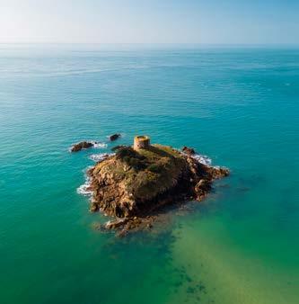
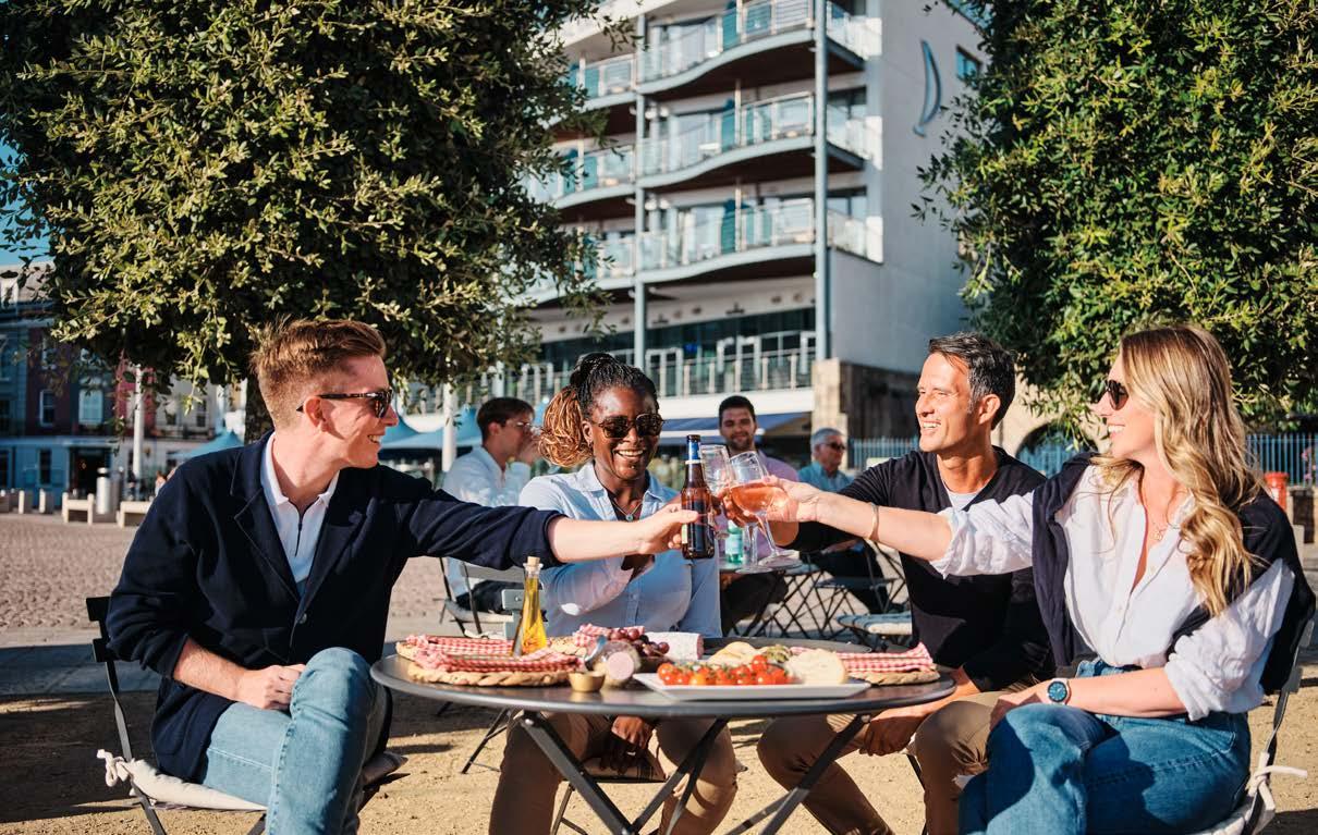
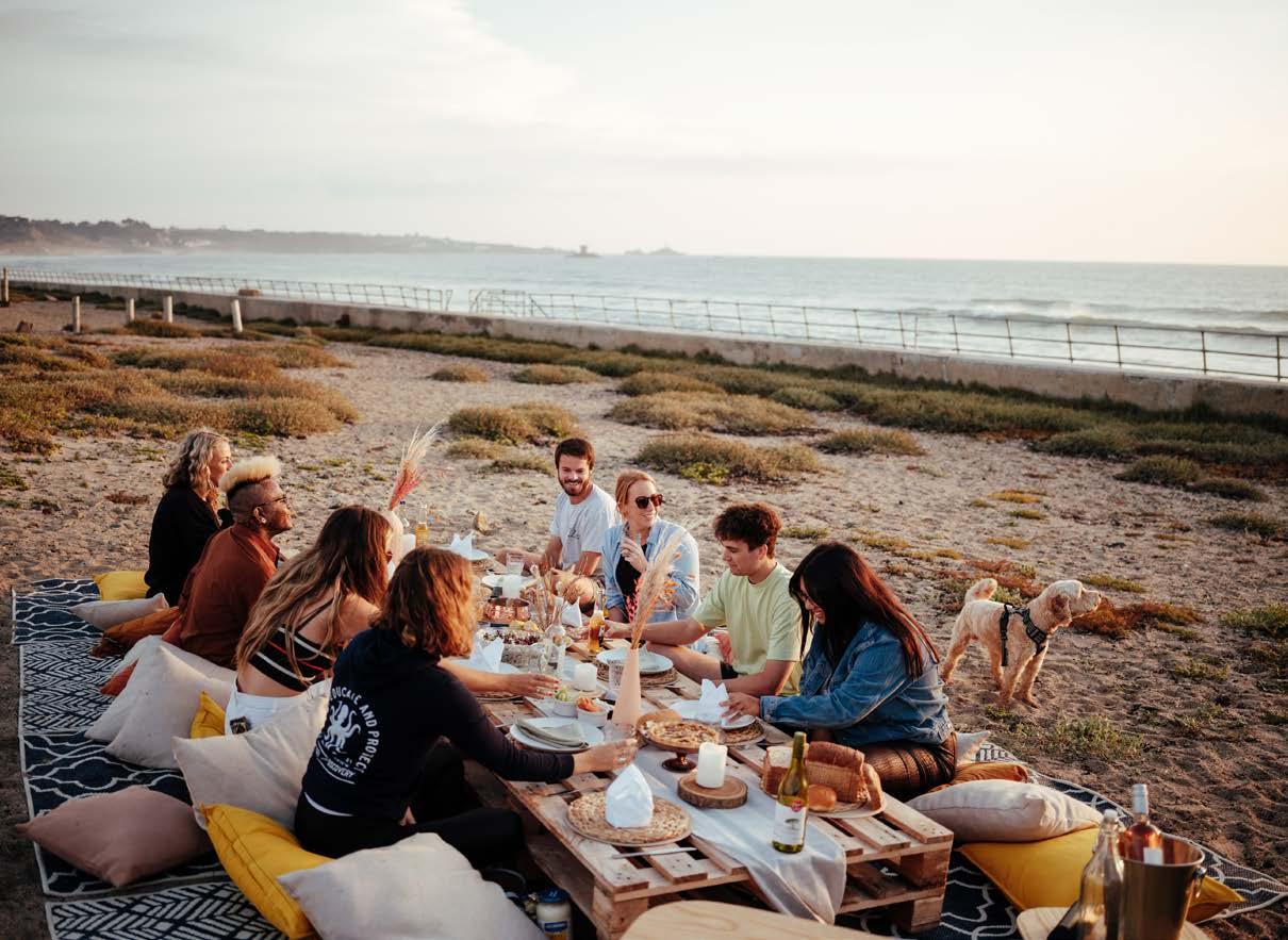
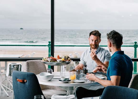
Photography Categories
Our photography style falls into four main categories: The Great Outdoors and Wellbeing, Local Food and Drink, History and Culture, and People, which help us tell stories and inspire in interesting and different ways, depending on the type of application for content that you have need to work with.
When adding to the library, always ensure that you reference these examples and follow the photography principles listed:
• Distinctly Jersey - provide a sense of place
• Captures the uniqueness of Jersey
• Natural, not forced or posed
• Positive, cheerful, and aspirationalhas energy and life
• Overall colours should be bright and fresh
• Adhere to our creative style
Visit Jersey Brand Guidelines 40
Tourism
The Great Outdoors & Wellbeing Local Food & Drink History & Culture
People Responsible
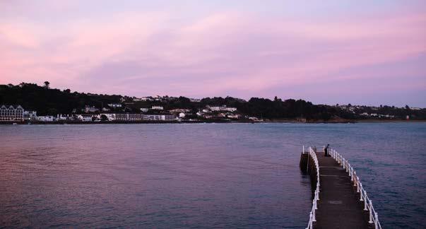
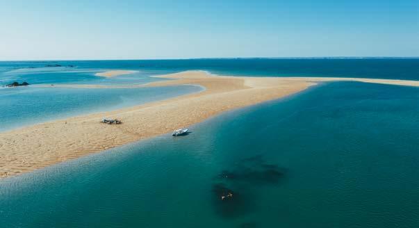
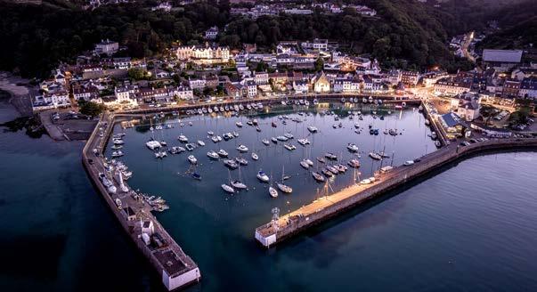
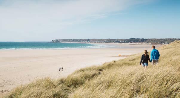
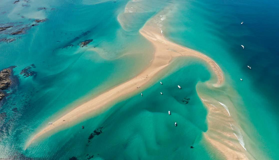
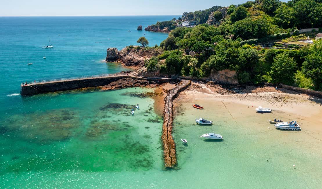
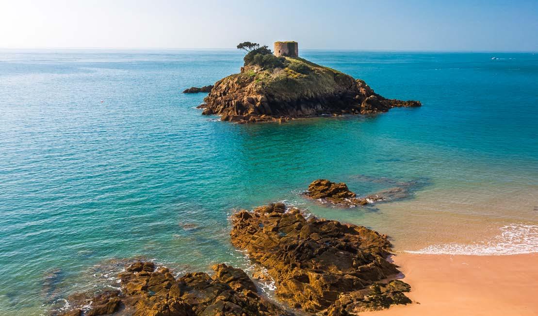
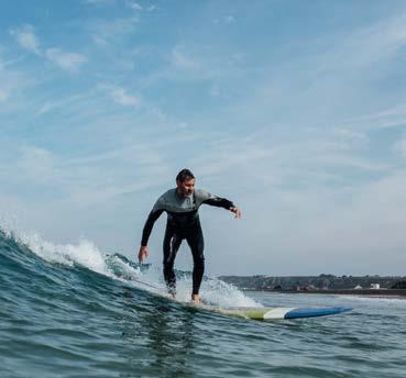
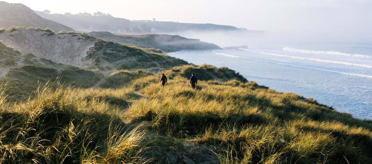
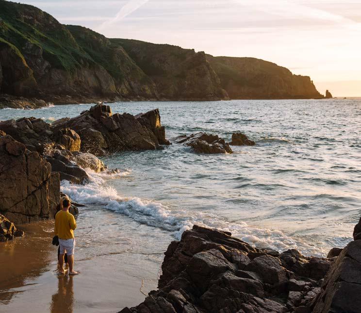
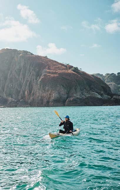
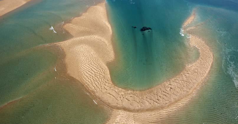
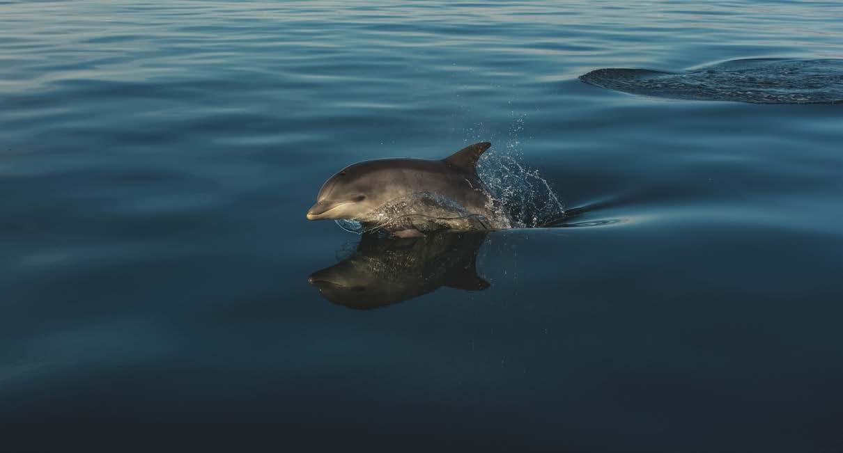
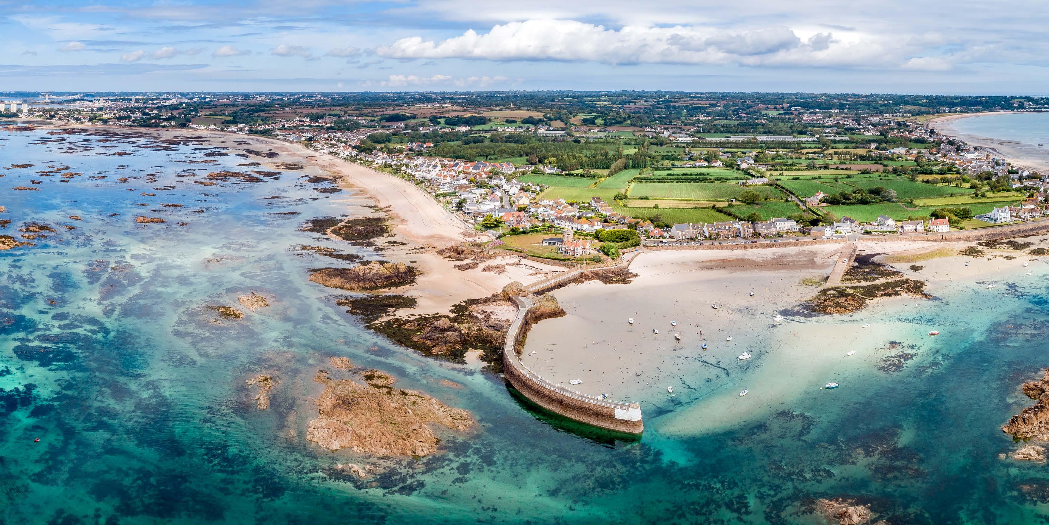
The Great Outdoors
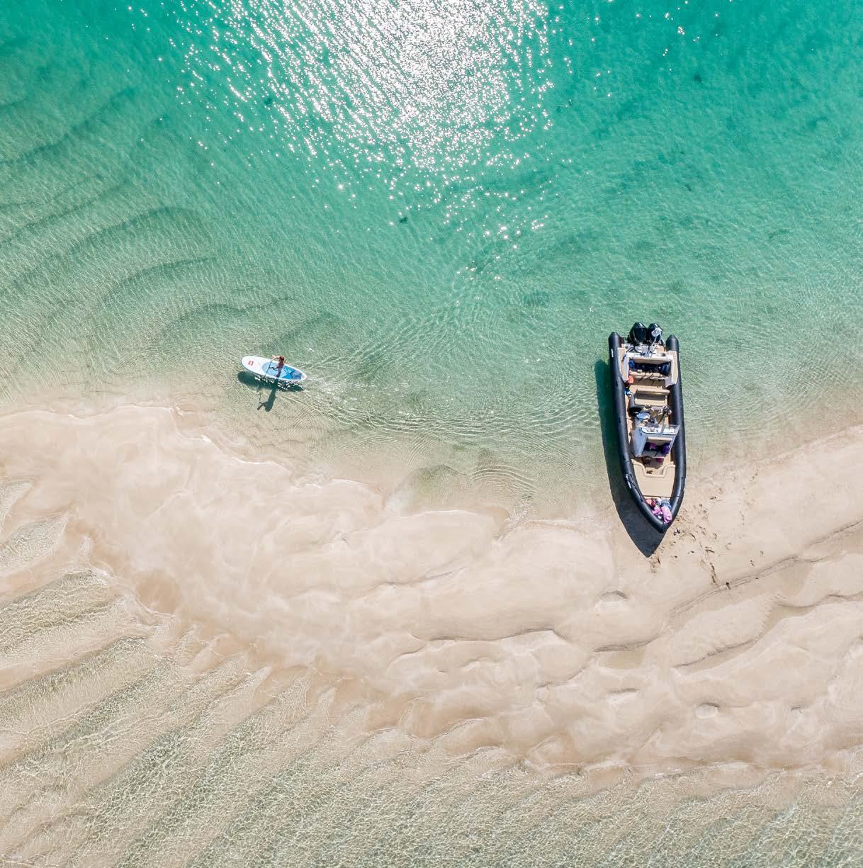
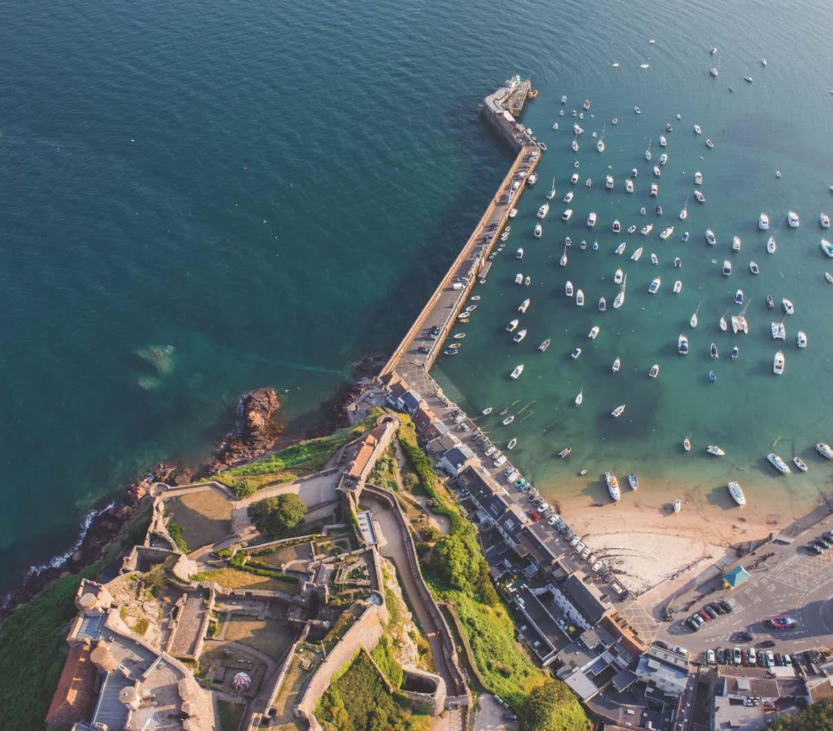
There is so much to do in Jersey from water sports to great coastal walking. Images must have energy and life, be natural not forced or posed and be bright and fresh. Images must be distinctly Jersey giving a sense of place and capturing the uniqueness of Jersey. When people are pictured doing activities, their expressions should be candid, not forced.
Visit Jersey Brand Guidelines 41
Photography Categories
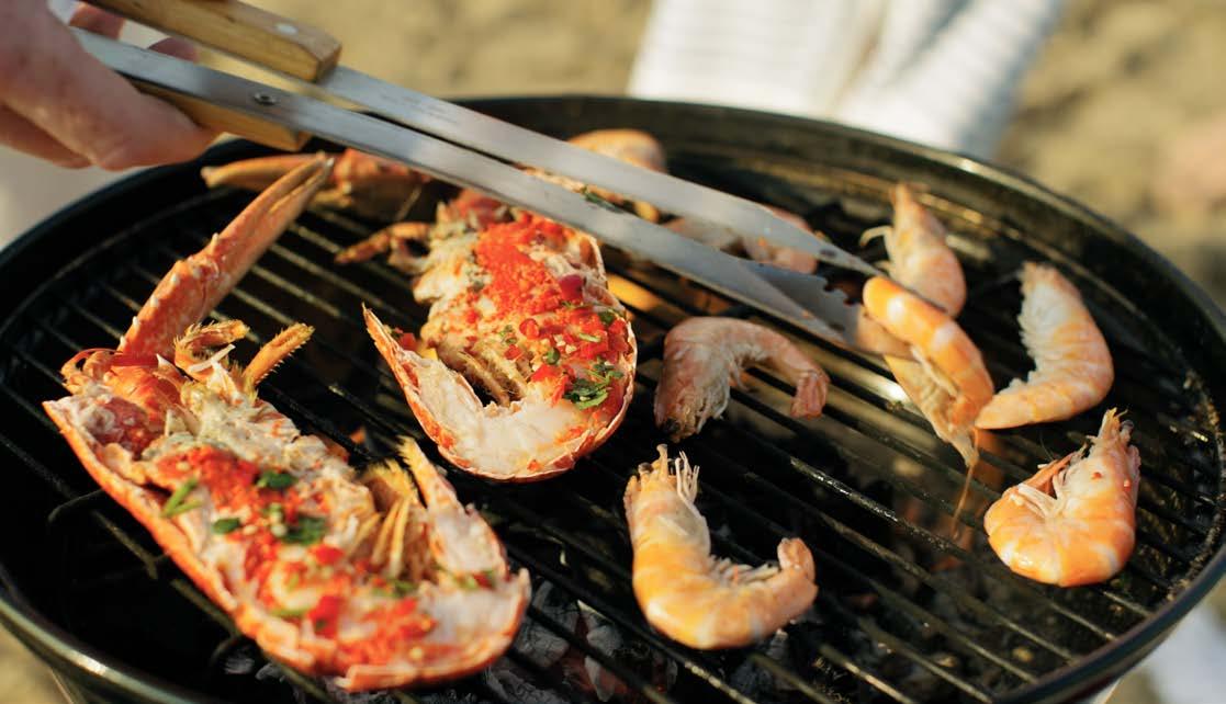
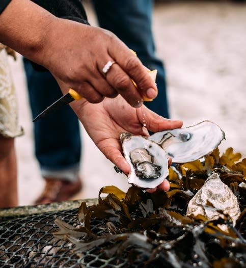
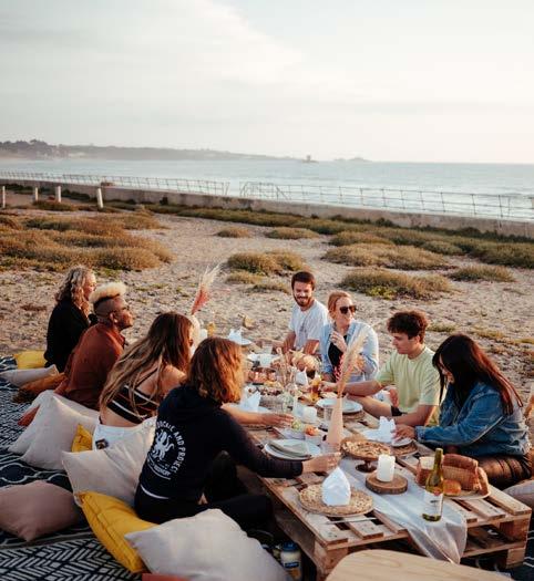
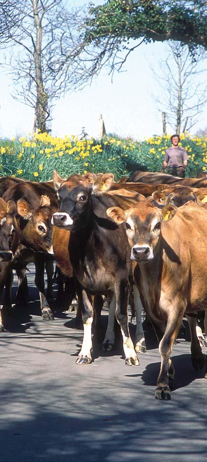
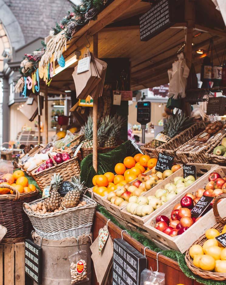
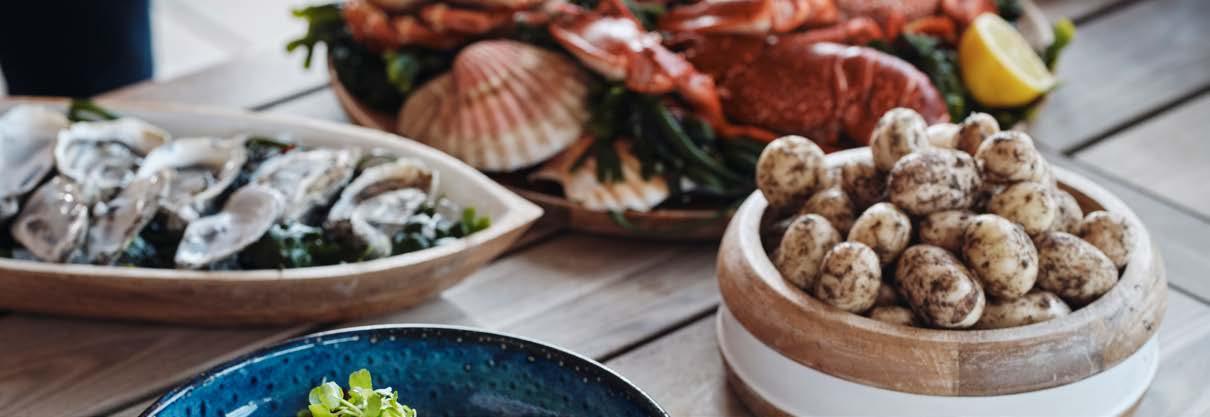
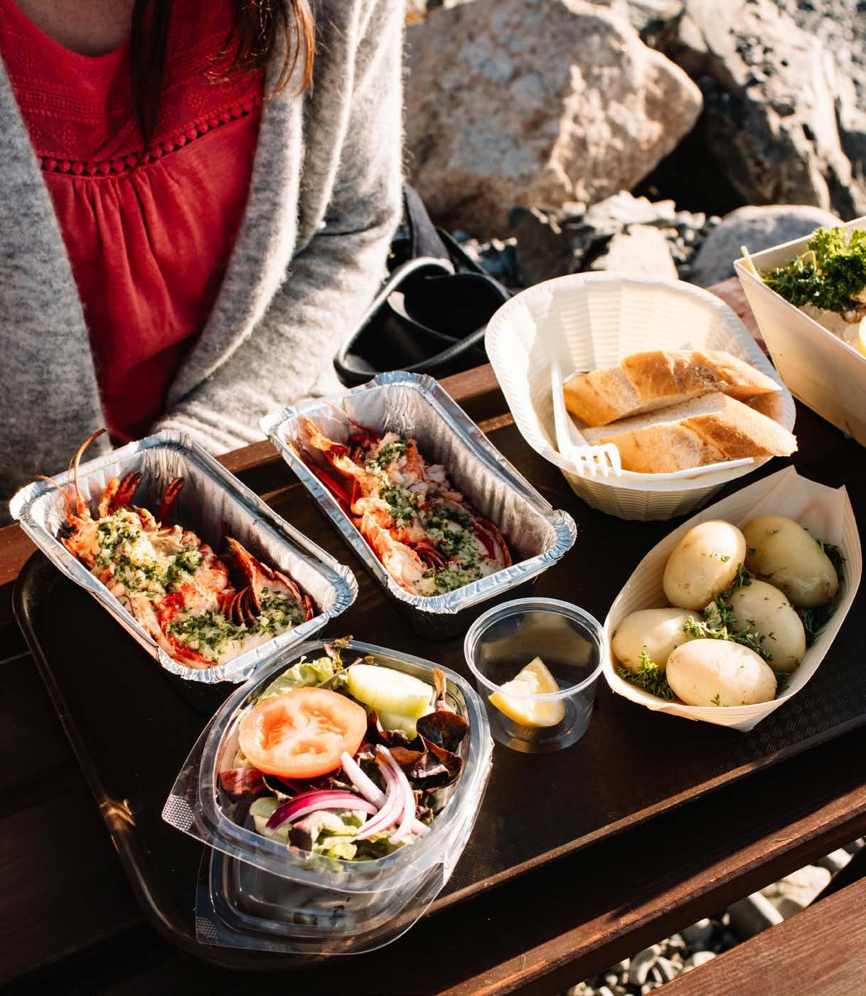
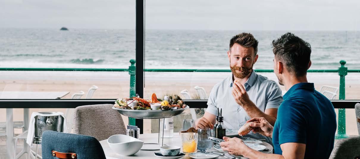
Local Food & Drink
The famous Jersey Royals, the scrumptious seafood, delicious dairy products and hedge veg that make Jersey unique. The colours must be bright and fresh and capture the uniqueness of Jersey produce.
Visit Jersey Brand Guidelines 42
Photography Categories
Photography Categories
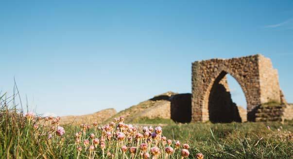
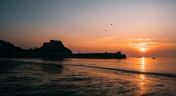
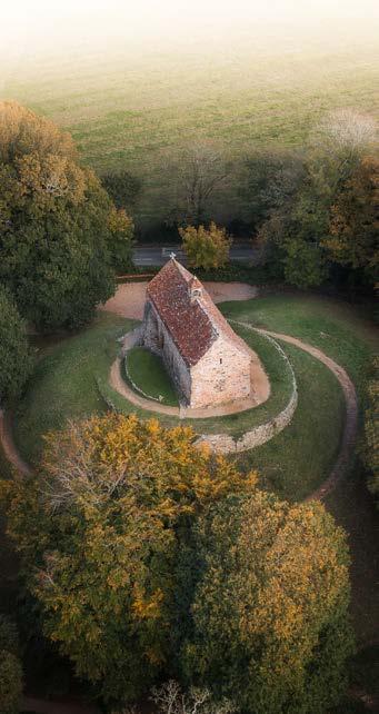
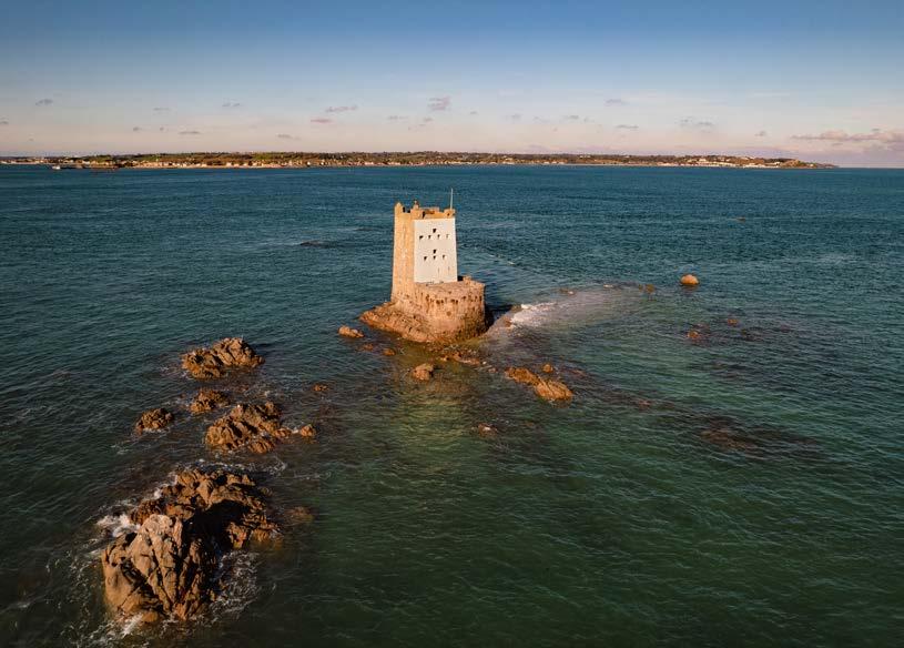
History & Culture
Jersey has a wealth of wonders just waiting to be explored from Jersey War Tunnels to imposing castles and unique museums. Images should capture the imagination and show people really engaged in museums, not just pointing into cabinets.
Externally they must capture the uniqueness of the landmark. Aerial shots can give the images the real sense of scale and drama that is needed to inspire visitors. Models should be representative of our best prospect segments. Images must have energy and life, be natural, not forced or posed and be bright and fresh.
Visit Jersey Brand Guidelines 43
Photography Categories
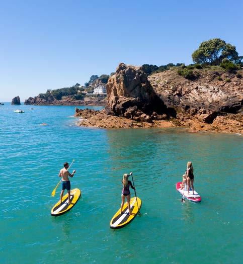
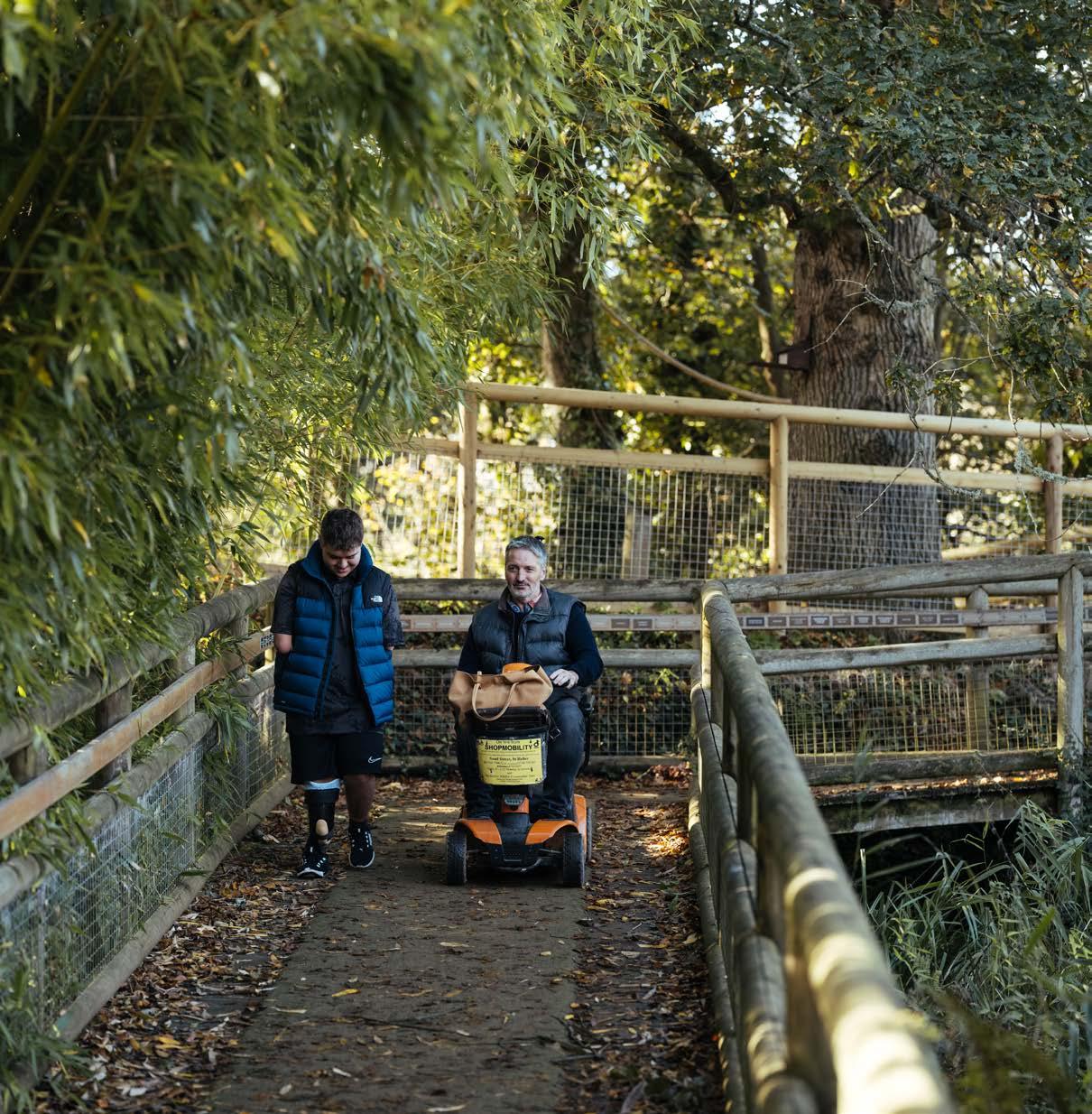
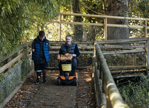
Responsible Tourism
Sustainability is no longer just a buzzword in the industry and we must do everything within our power to ensure that our imagery is representative of the kind of responsible tourism practices that we aim to encourage in Jersey.
Inclusivity is just as important, and the imagery we create should be reflective of this, respectfully incorporating those who might not have been historically featured in destination marketing imagery.
Visit Jersey Brand Guidelines 44
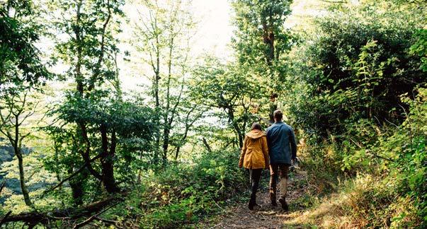
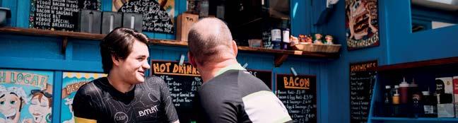
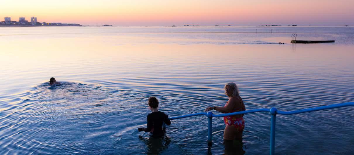
Photography Categories
People
Photography featuring people should represent our target segments, Easy Explorers and Moment Makers, and champion individuality. Images must have energy and life, be authentic, not forced or posed, and be bright and fresh.
Visit Jersey Brand Guidelines 45
Photography
Creative Style Guidelines
Lighting
Fully lit shots (think full sunlight, high noon) can create a fluorescent effect, flattening out all dimensions and causing harsh, black shadows. On the other hand, dappled light gives you depth, texture and drama.
Dawn or dusk can give great, natural, muted hues as well as dramatic, low cross-lighting. Time of day is crucial in ensuring a consistent look and feel across imagery. Ensure ‘bright’ blue sea, sky and sufficient light/sunshine but avoid washed out images by using midday winter sunshine.
Backlit
Back lighting, once frowned upon, now adds to our unorthodox brand styling with its nostalgic glow. The bright spot of light provides warmth and often obscures the subject into a silhouette creating anonymity, mystery and romance. Avoid creating pure black silhouettes with harsh back lighting in order to maintain some subtle colour and detail, whilst ensuring shots are always noticeably Jersey.
Shallow deph of field
Shots created with a shallow depth of field provide dimension and a tangible sense of “being there.” When you throw the foreground and/or background out of focus, it reflects the way the human eye perceives the world and can bring a stronger focus to your subject. Utilise this style across locations to allow viewers a sense of place.
Veiing
Gently veiling the subject through airborne particles such as sea mist, or plantation can bring dimension and a bit of mystery to the shot. Similar to light that is dappling an image, ensure the veiling doesn’t blanket the entire shot (which would end up flattening it). If the veiling effects random portions of the image to differing degrees, you’re left with a nice contrast to the areas left unveiled.
Visit Jersey Brand Guidelines 46
Photography
Creative Style Guidelines
Abstract but noticeably Jersey
Images that are predominantly made up of one part of the colour spectrum take on an illuminated and soothing presence because of the reduced visual noise. Composing imagery based on monochromatic tones can yield equally compelling effects when paired with the right scene. Ensure all locations are still noticeably Jersey.
Detail
Promoting the island to the world means paying attention to the detail. There will be many instances where zooming in on the fine elements of an experience will be needed, such as the catch of the day or a moment in nature. Shallow depth of field, earth tone colour palette, soft edges, contouring light.
Post-production/grade
In general, dial back superficial, primary colours and dial up velvety, earth tones. More impact is derived from photos that have a simple marriage of warm and cool, not overly edited, and avoid pushing to the extreme of “fantasy”, but natural gradations and blended hues within the acceptable realm of reality.
Cropping
It’s important that the image is cropped so that it tells the story you want, and unnecessary details and elements can be left out to ensure the focus is where you want it to be. Centring your subject isn’t essential - sometimes it can be more effective to use the angles and content of the image to help draw the eye to the focal point. Try to leave some breathing room when you crop images and always consider how the image will be used and if text will be added to the image.
Visit Jersey Brand Guidelines 47
Further information
For more information on using the Jersey visual identity please contact marketing@visitjersey.je.
48 Visit Jersey Brand Guidelines
