VMDO Trav el Fellowship


Architects’ travels have long been a core component of their training, whether they are part of a structured academic expedition or a selfdirected excursion. From the “Grand Tours” of the 18th and 19th centuries to Le Corbusier’s Voyage d’Orient, travel has played a major role in the continued development of architectural thought and production. Travel helps build familiarity with culture, enhances the architect’s spatial and technical vocabulary, and contributes a reserve of historical precedent that is key to the continued execution of good design. Travel is an important way to see past architectural successes and learn from them.
The VMDO Travel Fellowship is an annual award that gives young designers the opportunity to pursue unique investigations into architectural topics that are of particular interest to them. The scholarship is intended to support an autonomous and self-directed one-week course of study that complements the work being done in the office environment. Topics of inquiry and sites of study are determined by the applicant.
Upon return, the recipient is asked to share his or her findings and research from abroad through a firm-wide presentation as well as a printed publication. Maria Bninski is the inaugural recipient of VMDO’s Travel Fellowship. What follows is an incisive and rich account of her findings and research exploring the evolution of ceiling architecture in London from the 1500s to present day.
“ The ceiling, the surface beyond our reach, has always been burdened with significant responsibilities.”
- Maria Bninski, “Take the Ceiling,” VMDO Travel Fellowship Submission (2017)
Responding to her challenge to “Take the Ceiling,” Maria unpacks the legacy of this often overlooked architectural feature. Through writing, hand drawings, photography, sound measurements, and acoustical recordings, she rigorously logs measurements and impressions of a dizzying array of London ceilings. From the intricate details of gothic fan vaults and evocative density of brutalist slabs to the expansiveness of open-air structures and sky-lit ceilings, she observes in her log how history, theory, and craft intersect and unfold in London’s busy streets. Through her lexicon, she helps assess where we are now and where we have yet to go. By peeling back the layers of this unexpectedly complex topic with both reverence and revelation, Maria refreshes an overlooked feature that is actually right at home.

One thing was the same. Up and down. Wherever you are on earth, your down eventually meets with everyone else’s down, down at the center of the earth. The ceiling is known by being up, away from us down here. So that was the same.
But the sun was not the same. I had travelled east across an ocean and 13.5 degrees north, and when sunshine came, it came more from the side than from above. And most often it made its way through a near eternity of refractions-- the clouds, the drops of mist, each a tiny instant of resistance and redirection, so that when the sun arrived it was faint and going every which way. Instead of casting shadows it was casting itself about on every side, with so many tiny directions so mixed that it finally amounted to a very soft, still bath.
I have been places where the sun arrives in a much different mood, striking and baking, and plants wait for the winter to try to grow. But here, the soft, confused light was treated like a precious substance, carefully collected by facades and roofs the way water would be in a desert.




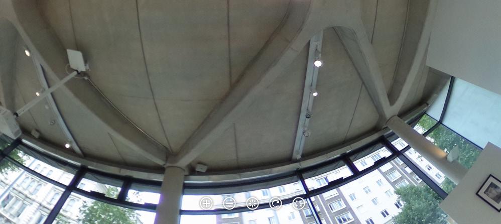
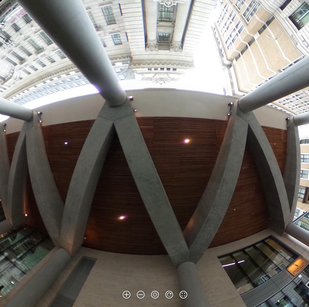
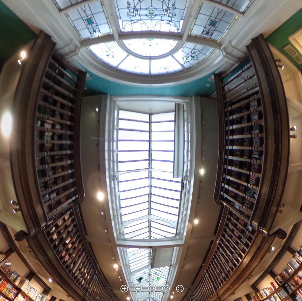
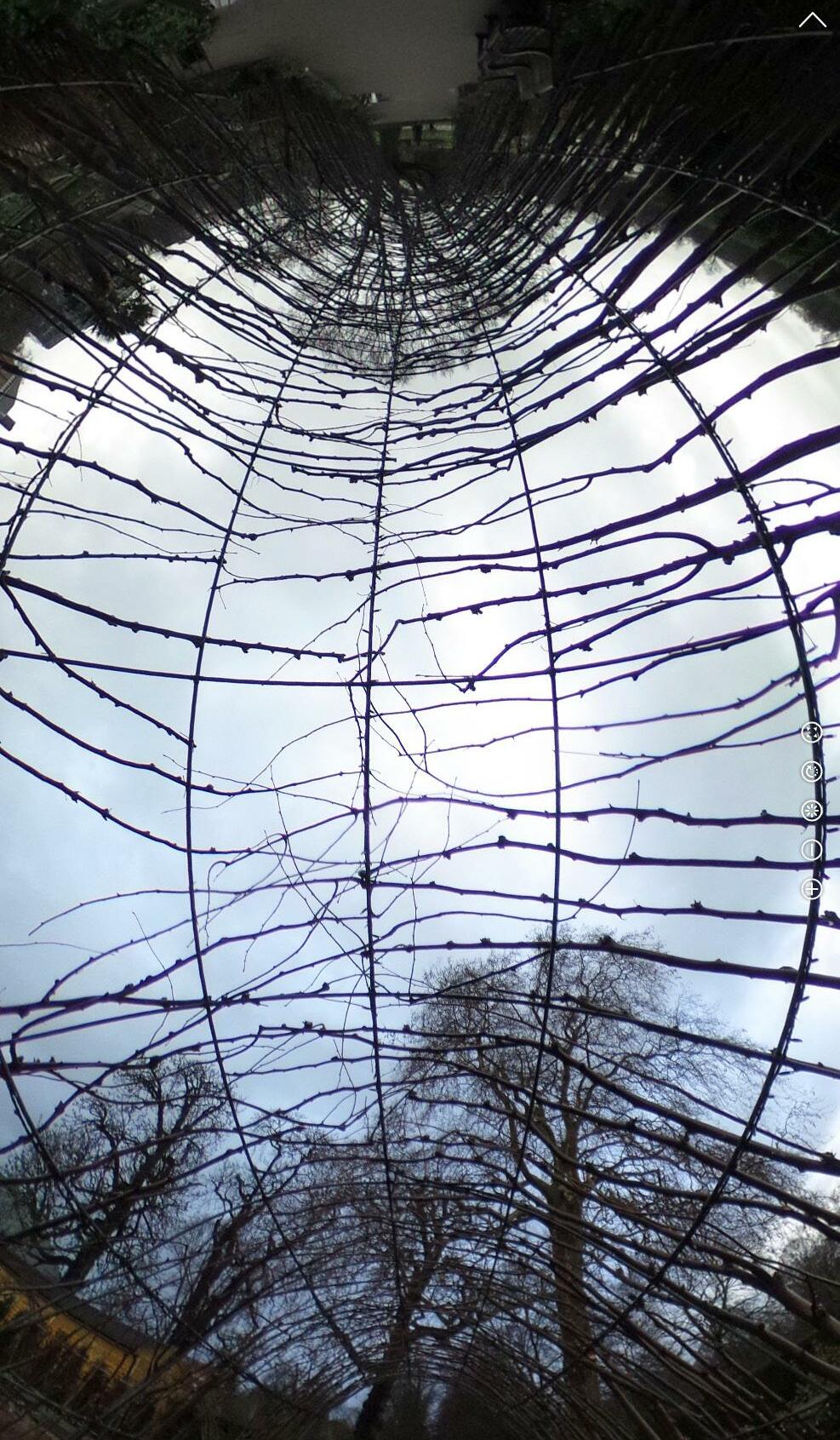









Th 9/14/17 1962 Eero Saarinen
SITE
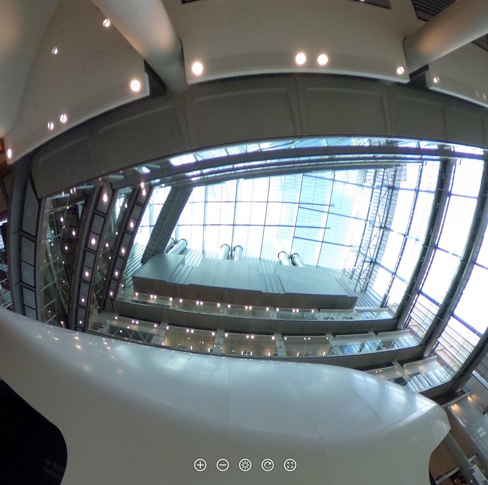
Dulles Airport page 23
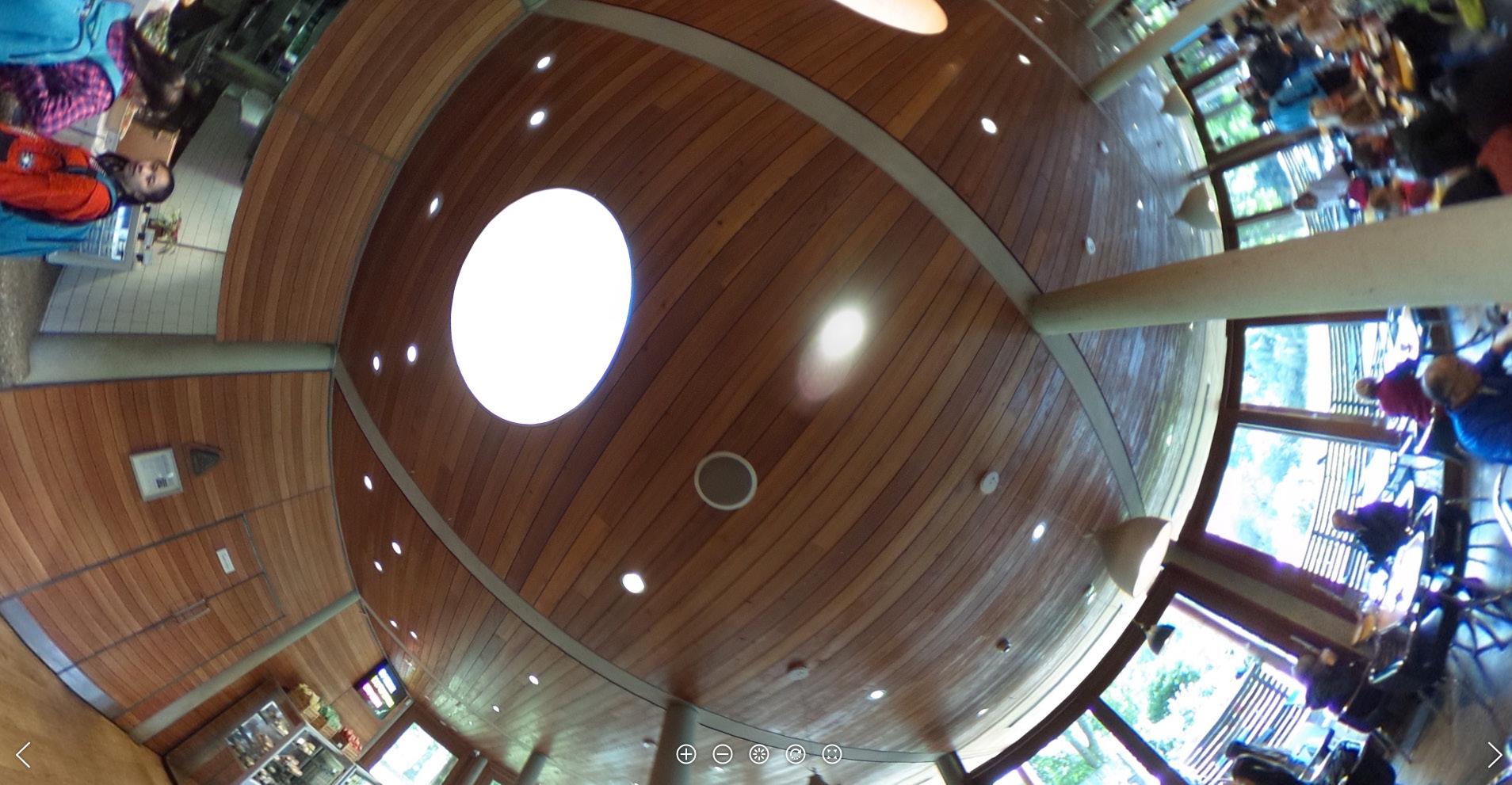
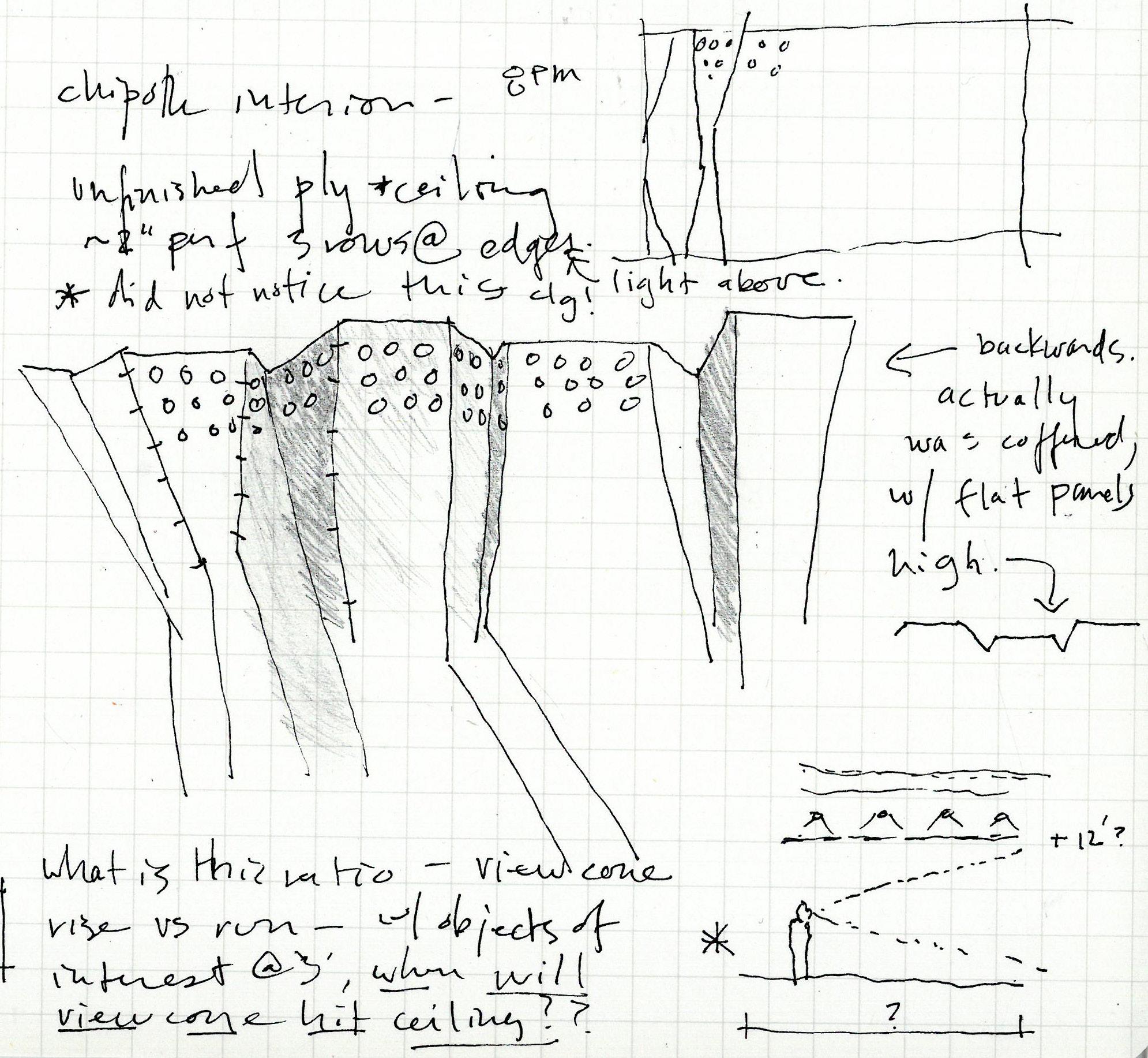
200? unknown Chipotle @ Dulles
F 9/15/17 2008 Rogers Stirk Harbor + Partners Heathrow Terminal 5 page 37 1878 John Wolfe Barry Earl's Court Station Train Shed
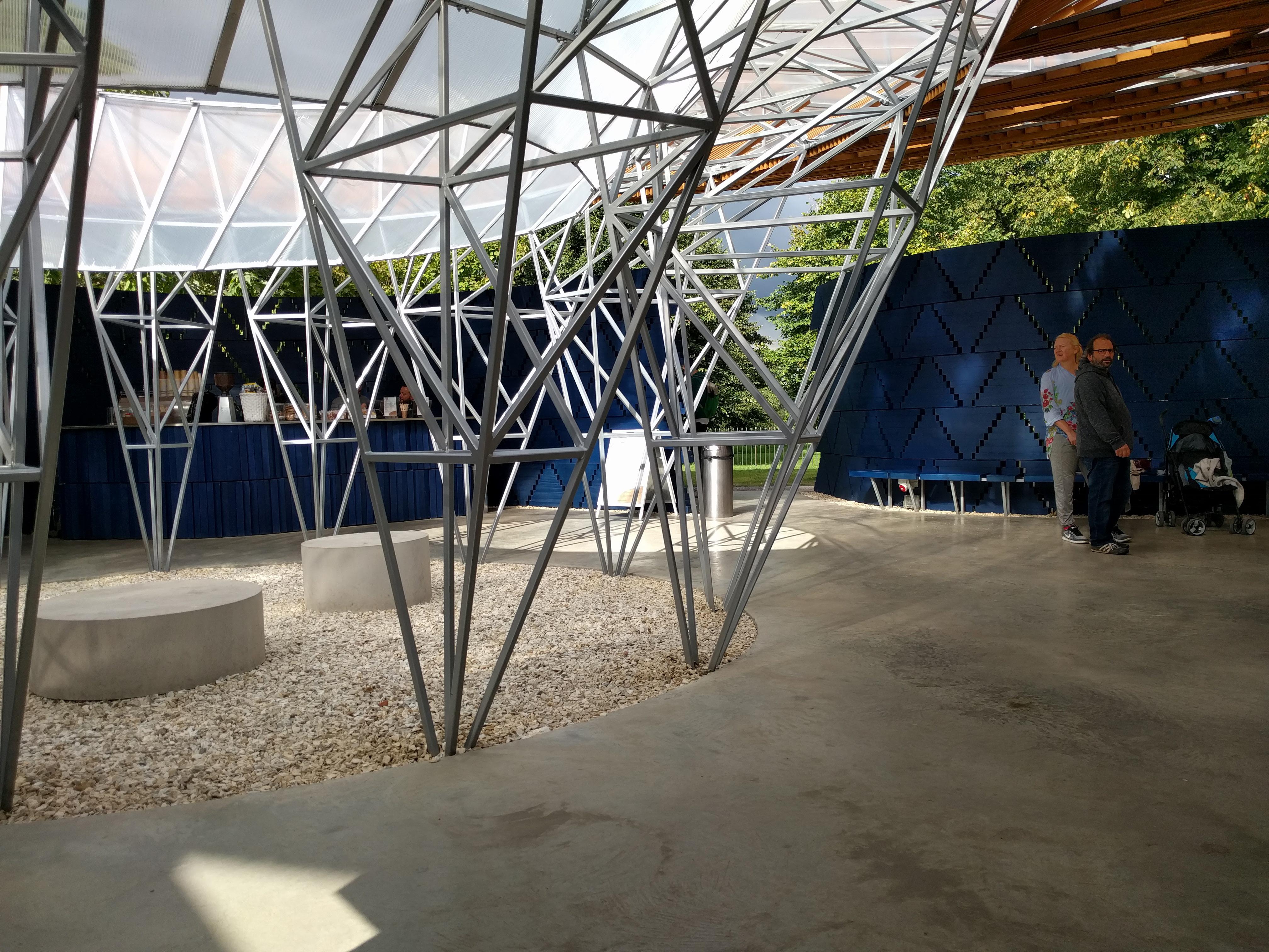
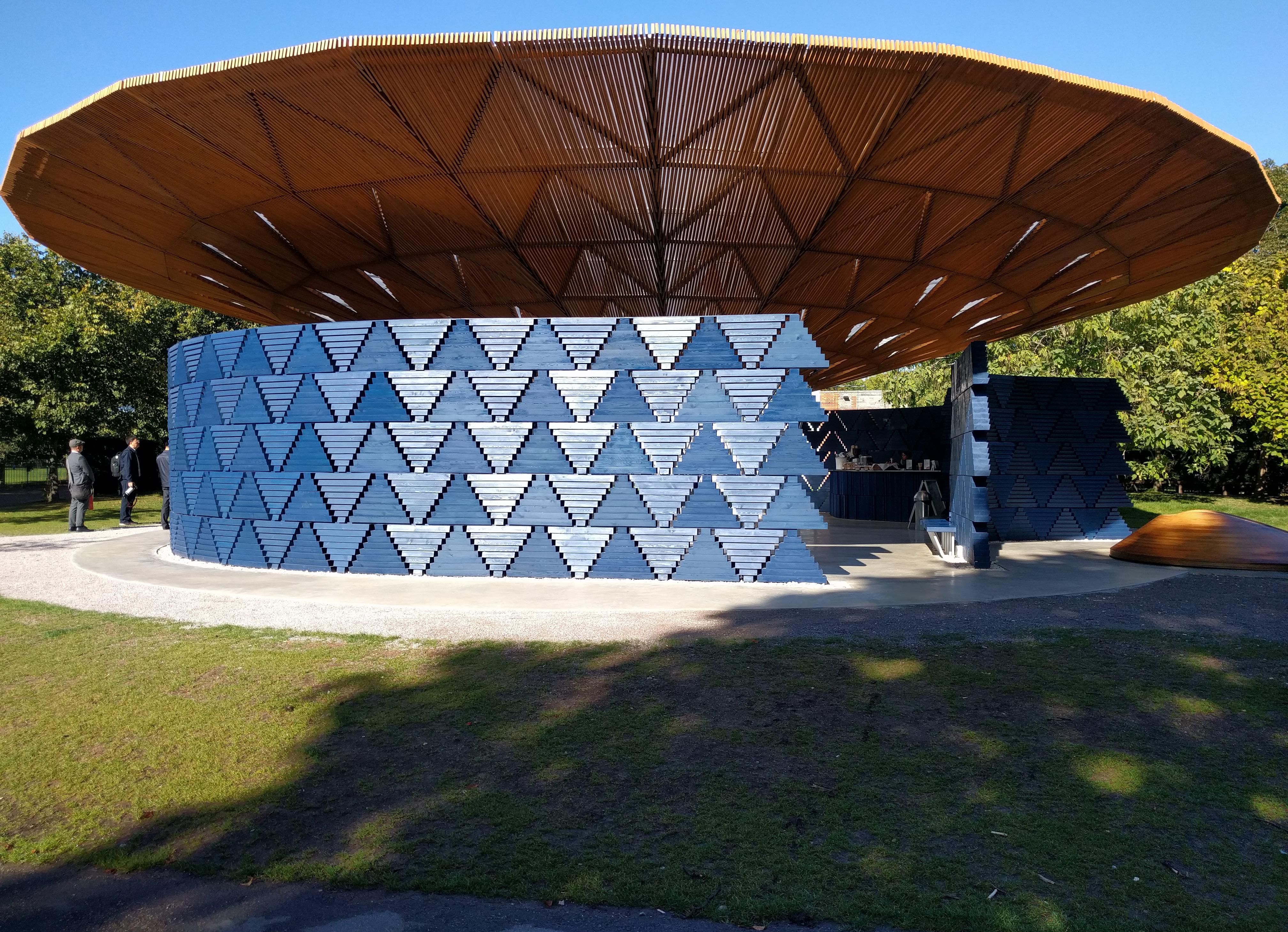
2017 Kéré Architecture Serpentine Pavilion page 47
2004 Studio Downie Royal Geographical Society Extension
Sa 9/16/17 1916 McClaren Group; ColladoCollins Reno 184 Shepherd's Bush Rd
? ? Brooks Counter & Table
? ? Bank underground station
1670 Sir Christopher Wren St. Michael Cornhill
2015 Rogers Stirk Harbor + Partners Leadenhall Building page 43 2016 DSDHA Alex Monroe Workshop
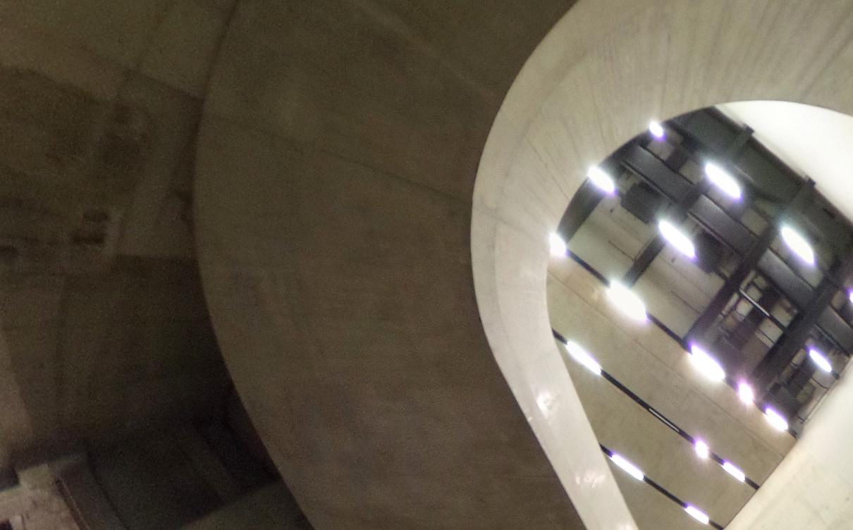
? Underpass @ Tower Bridge Rd.
2011 HOK/PLP
The Francis Crick Institute
2013 Wilkinson Eyre Architects 10 Brock Street
Su 9/17/17 ? ? Hummingbird Deli 1949 Erno Goldfinger Greenside Elementary School 1990 Foster + Partners Foster + Partners Office
Royal College of Art Dyson Building 1730 James Gibbs St Bartholomew's Hospital - Great Hall 2017 Stephen Holl St Bartholomew's Hospital - Maggie's Center
M 9/18/17 2004 Hopkins Architects Inn the Park page 29 Waterloo Bridge
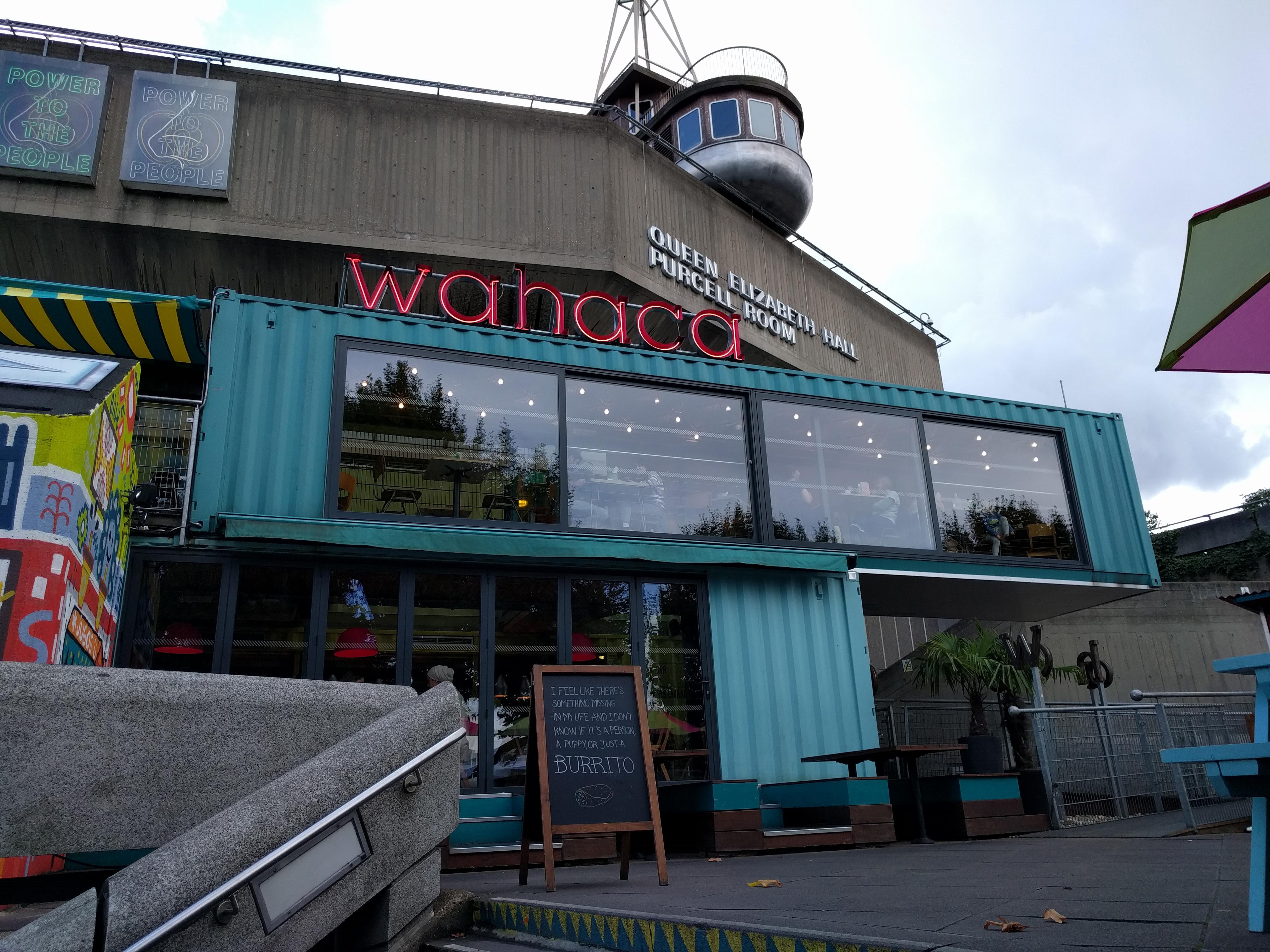
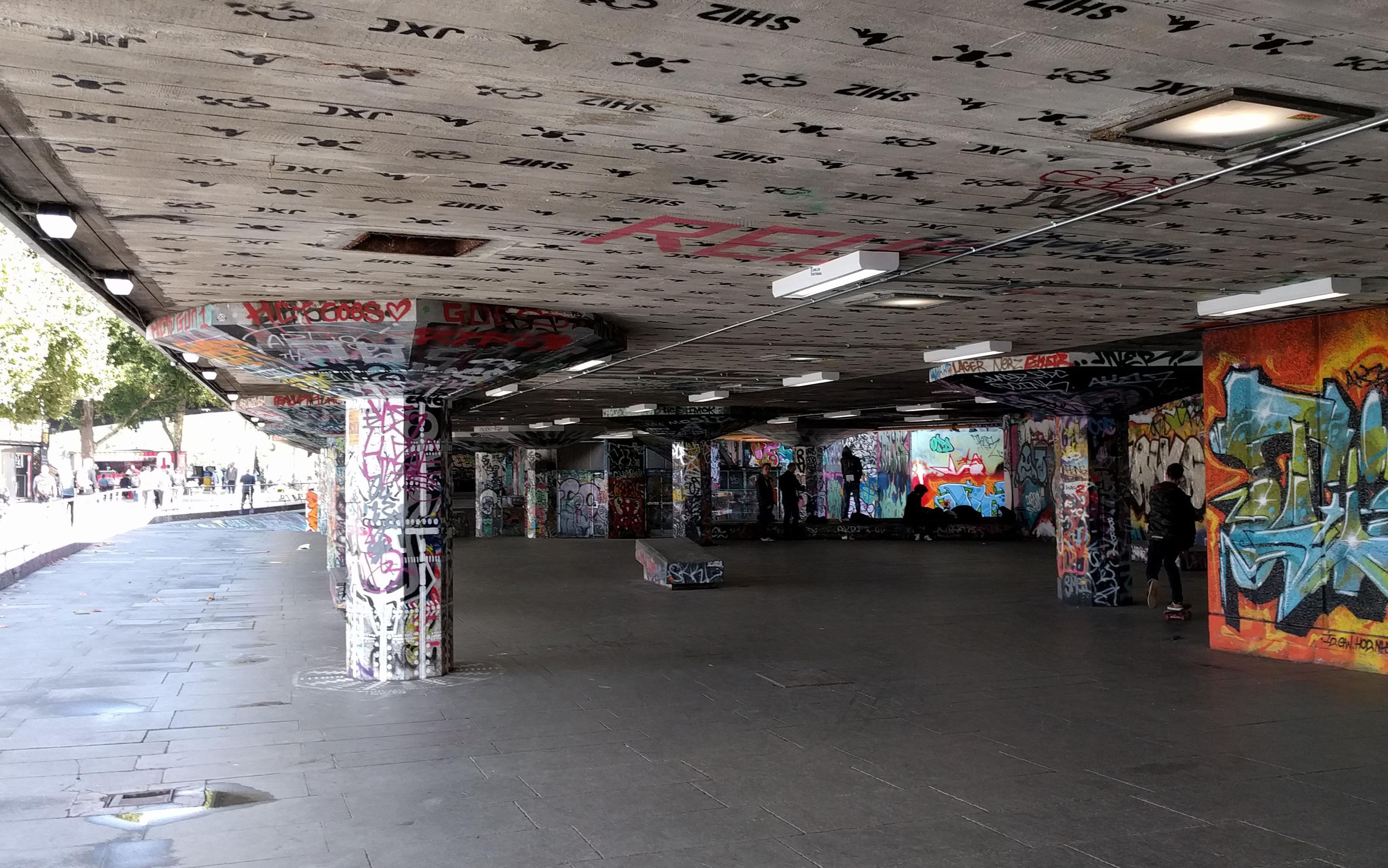
1951 Sir Robert Matthew & Dr Leslie Martin Southbank Centre/Royal Festival Hall 1967 Hubert Bennett/Greater London Council Queen Elizabeth Hall Undercroft 2010s? Wahaca (restaurant)
1976 Denys Lasdun and Partners Royal National Theatre page 25 OXO Building
2017 Mini Living Mini Living Urban Cabin 2000 Herzog & de Meuron Tate Modern Foster + Partners London Millennium Footbridge 2007 Make Architects City Information Centre
Tu 9/19/17 1710 Sir Christopher Wren St. Paul's Cathedral page 17 1932 Ellis and Clark Daily Express Building
1623 Inigo Jones Lincoln's Inn Chapel page 15 1824 Sir John Soane
Sir John Soane's Museum, No. 14 page 19 multiple Night walk around Portabello Rd.
W 9/20/17 2005 David Adjaye
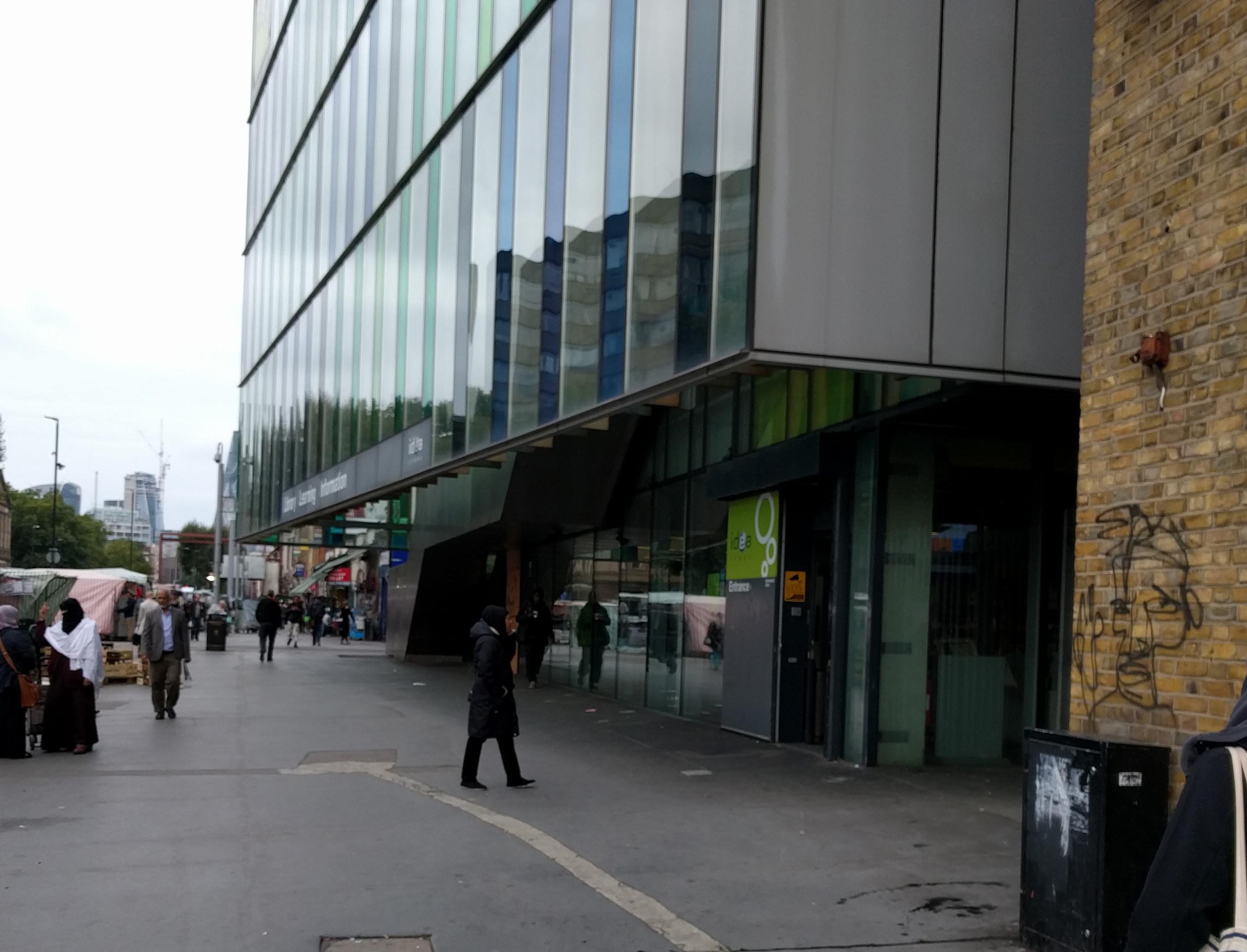
Whitechapel Idea Store page 31 ? ? Whitechapel Tube Stop 1963 Chamberlin Powell & Bon Barbican Complex page 24 2001 RSHP 88 Wood St.
cir 1500 Robert Janys Westminster Abbey, Lady Chapel page 14
Th 9/21/17
1911 Edwin Lutyens St. Jude on the Hill page 21
2015 Bell Philips Architects Gasholder Park page 41
2015 Macaulay Sinclair Dishoom
2017 Coal Drops Yard St. Pancras Lock
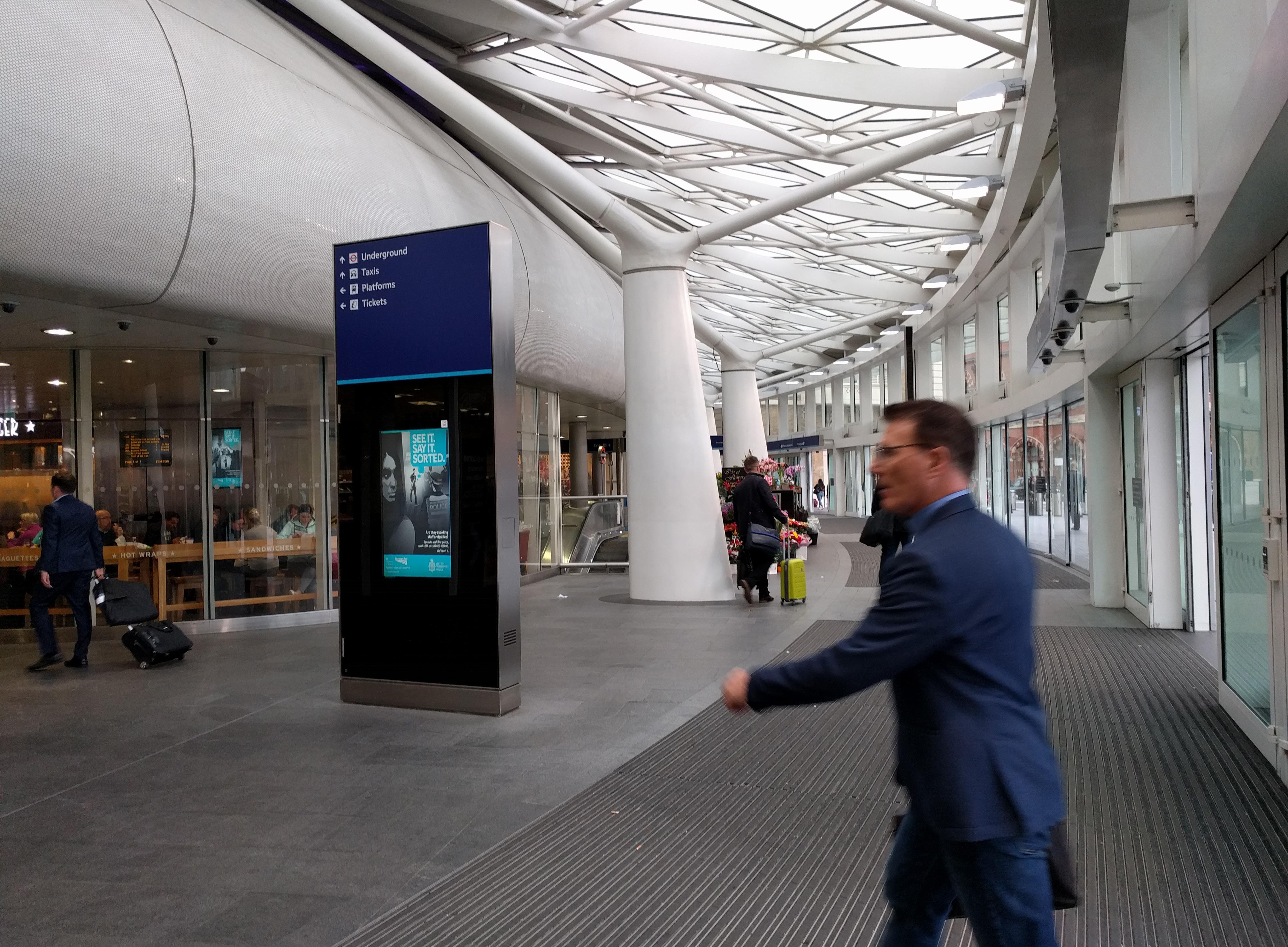
2012 John McAslan + Partners King's Cross Underground Station Concourse
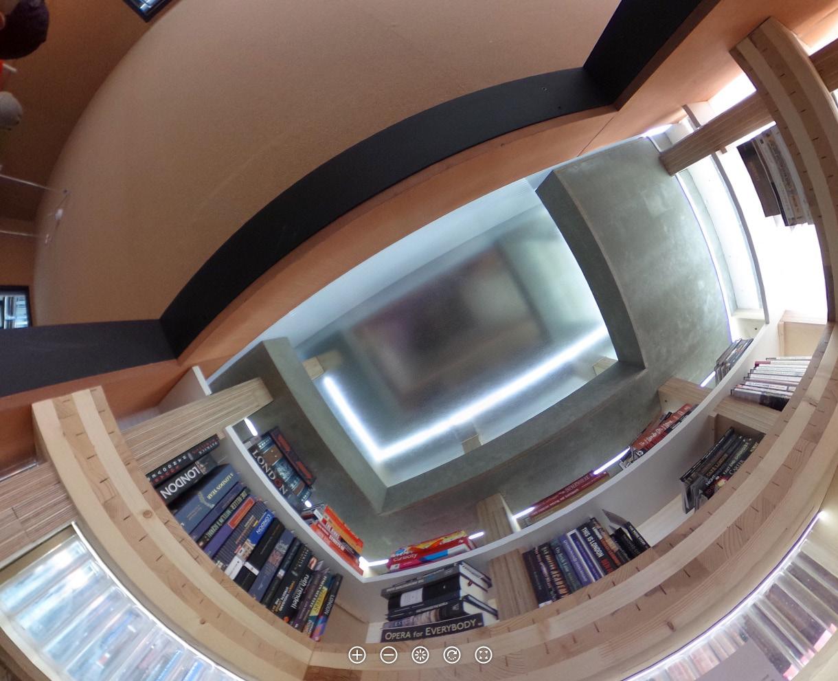
1863 Sir John Fowler Baker Street Underground Station platform 1910 ? Daunt Books
2016 Foster & Partners Apple Store Regent St. page 45
F 9/22/17 2017 Kéré Architecture Serpentine Pavilion
1860 Sir Henry Cole and Captain Fowke V&A Museum
2017 Patkau Architects Ice Skating Shelters
2008 Rogers Stirk Harbor + Partners Heathrow Terminal 5 page 37
W 3/28/18 1962 Eero Saarinen Dulles Airport page 23
R 3/29/18 2008 Rogers Stirk Harbor + Partners Heathrow Terminal 5 page 37
1990s? unknown Royal Trinity Hospital Thrift Shop 1820s? Decimus Burton (?) Orme square Gate Hyde Park
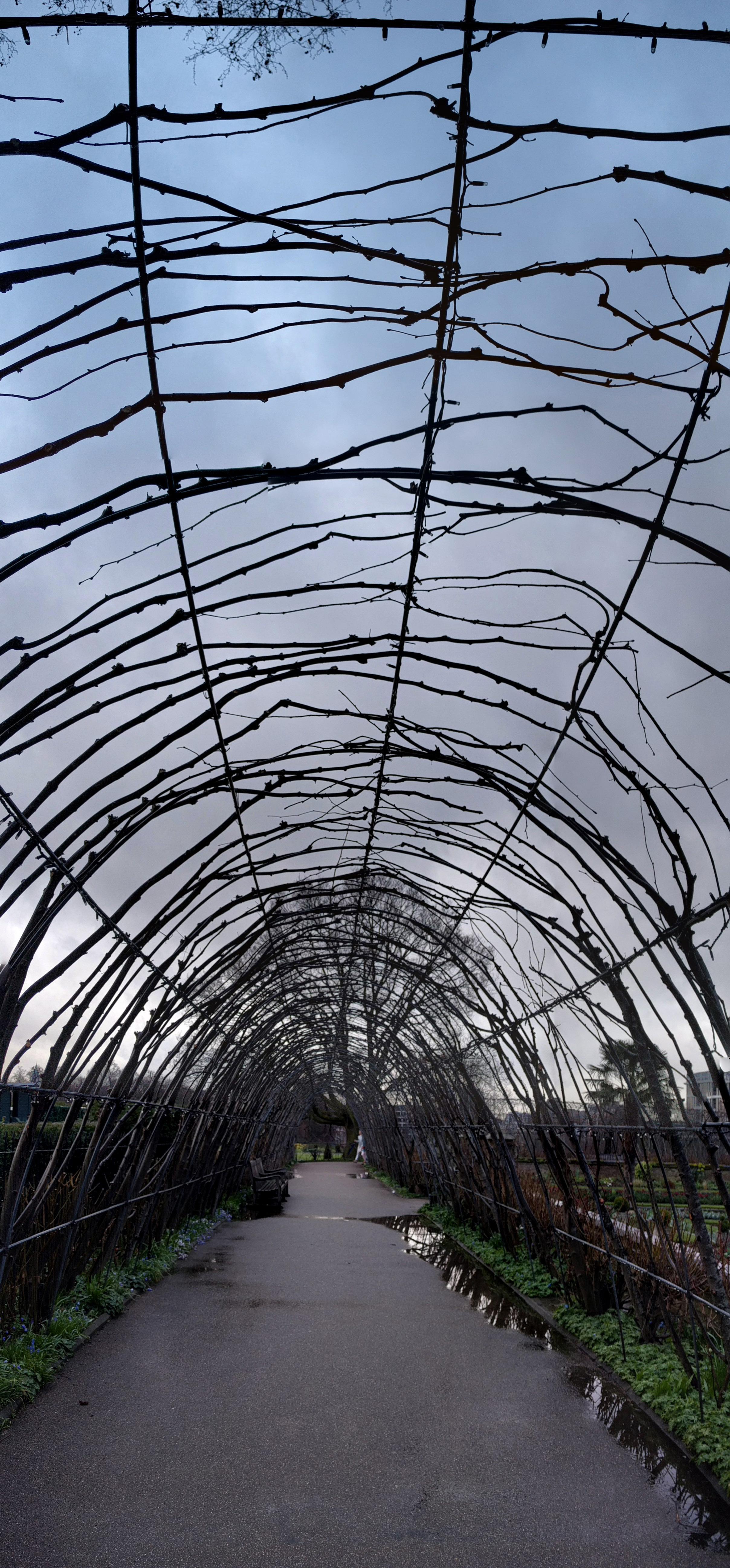
1908 Ernest Law Cradle Walk at Hyde Park
? ?
Light-seeking Pollarded trees, Lindend Gardens Rd.
F 3/30/18 2009 MUMA Daylit Gallery, V&A Museum
Sa 3/31/18 2018 vernacular Construction barrier Curved glass dormer windows
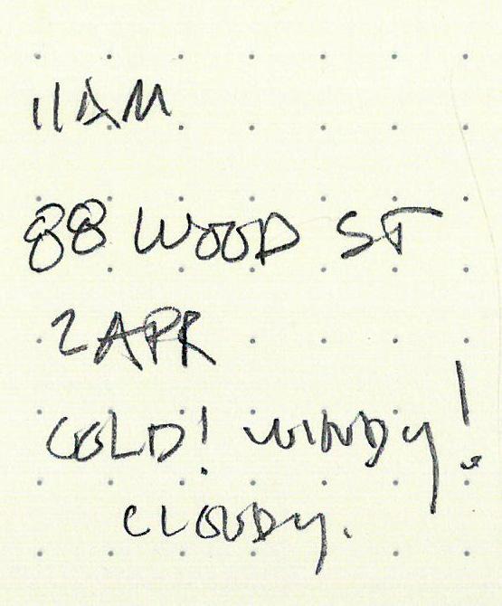
M 4/2/18 2001 RSHP 88 Wood St.
1974 Sir Giles and Richard Scott Guildhall West Wing
1440 unknown, 4th roof in 1953 by Sir Giles Gilbert Scott Guildhall Great Hall page 13
2008 unknown
Bea's of Bloomsbury
2010 Jean Nouvel & Sidell Gibson Arch. One New Change page 35
Pho
Byron Wasabi restaurant All Saints Store Wahaca (restaurant) Marks and Spencer 2017 Foster & Partners Bloomsbury Building 2012 OMA New Court Rothschild Bank
Tu 4/3/18 2000s unknown Tesco @ Isle of Wight
W 4/4/18 1075+ unknown Carisbrooke Castle
F 4/6/18 -2500 unknown Stonehenge page 11
Sa 4/7/18 1999 Hopkins Architects Westminster Underground station 1097 Westminster Stables (former, now cafe) page 11 1097 unknown Westminster Hall page 12
2005 Sarah Wigglesworth Siobhan Davies Studio page 33 2011 Zaha Hadid Architects Roca London Gallery page 39 2016 Studio Weave St. James Market Pavilion page 46
Su 4/8/18 1881 Alfred Waterhouse Natural History Museum 1931 JH Markham Natural History Museum - Whale Hall
M 4/9/18 2008 Rogers Stirk Harbor + Partners Heathrow Terminal 5 page 37 1962 Eero Saarinen Dulles Airport page 23
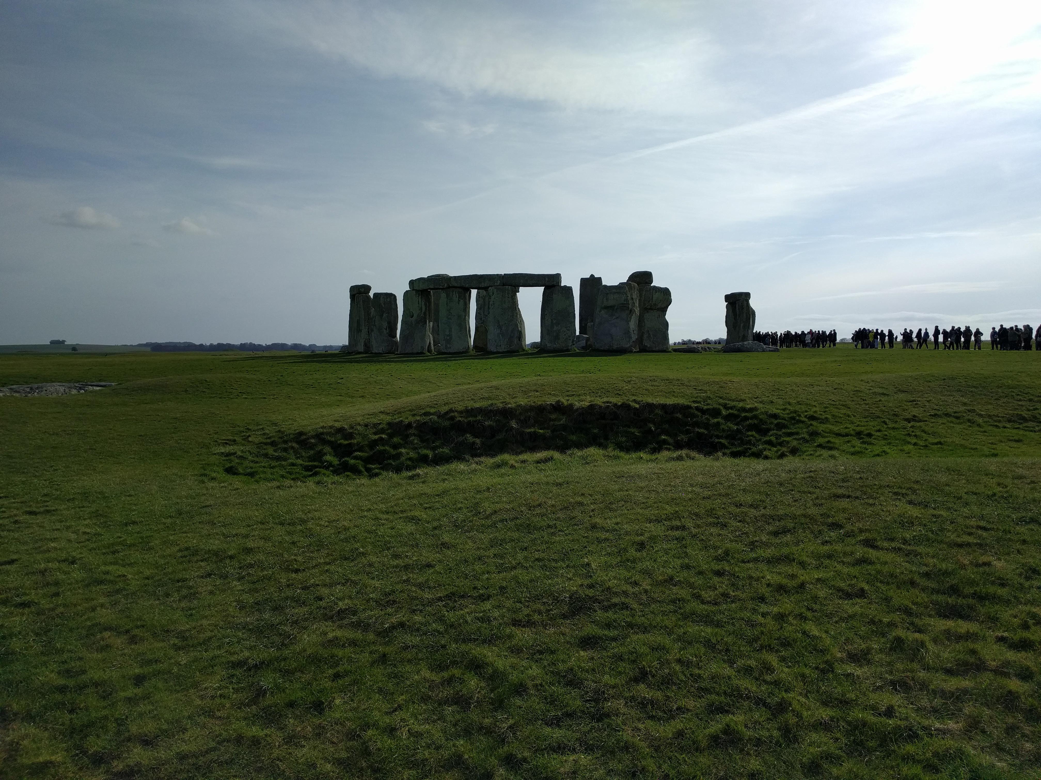
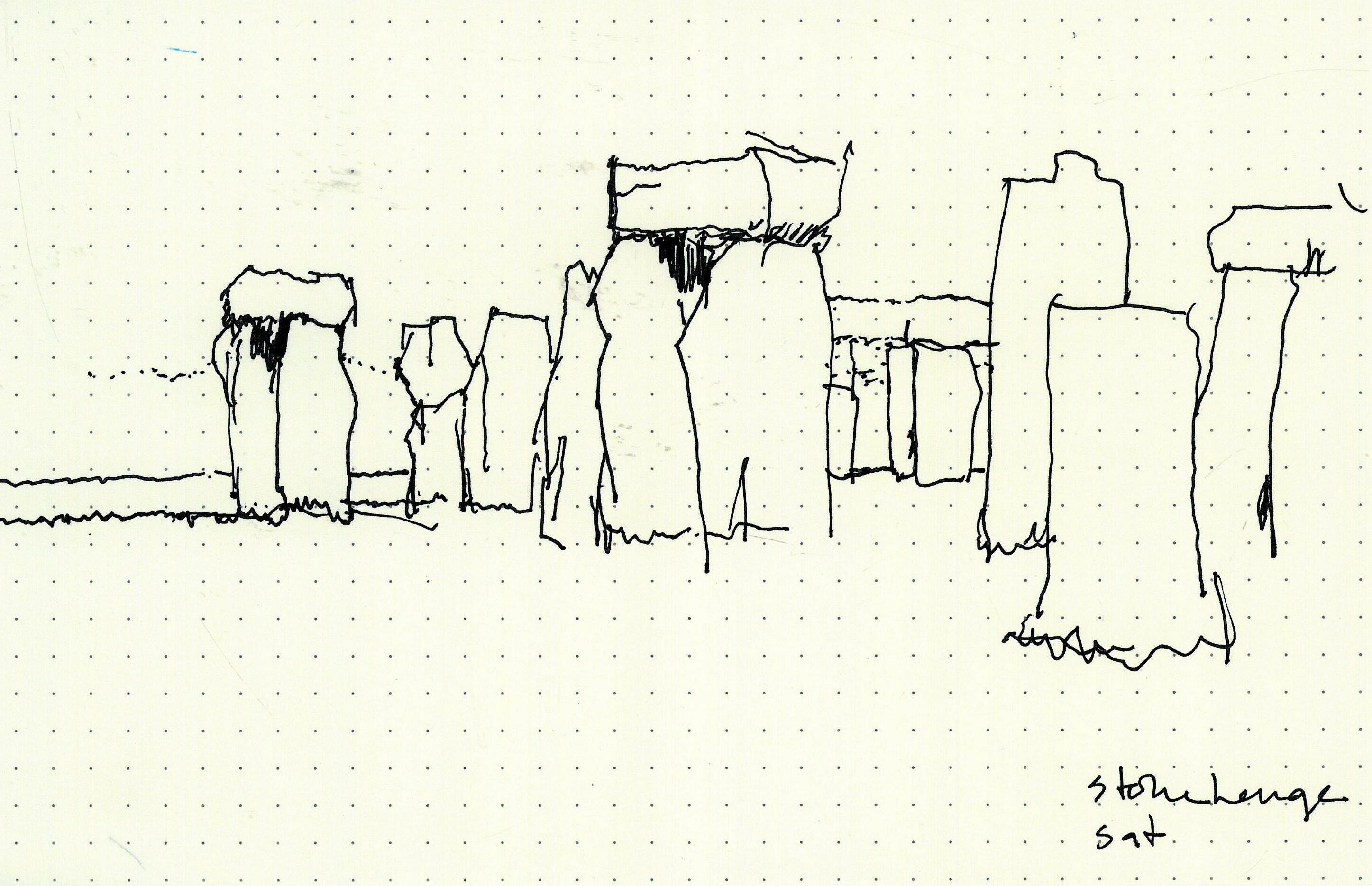
A diagram of the difference between up and down. The most elemental expression of built form as a frame for the sky. A surprise is the power of the subtly rolling topography together with human earthworks to bring drama and focus to the composition of stones. They are on a rise that doesn’t quite obscure the distant horizon, but lifts the stones almost completely above it.
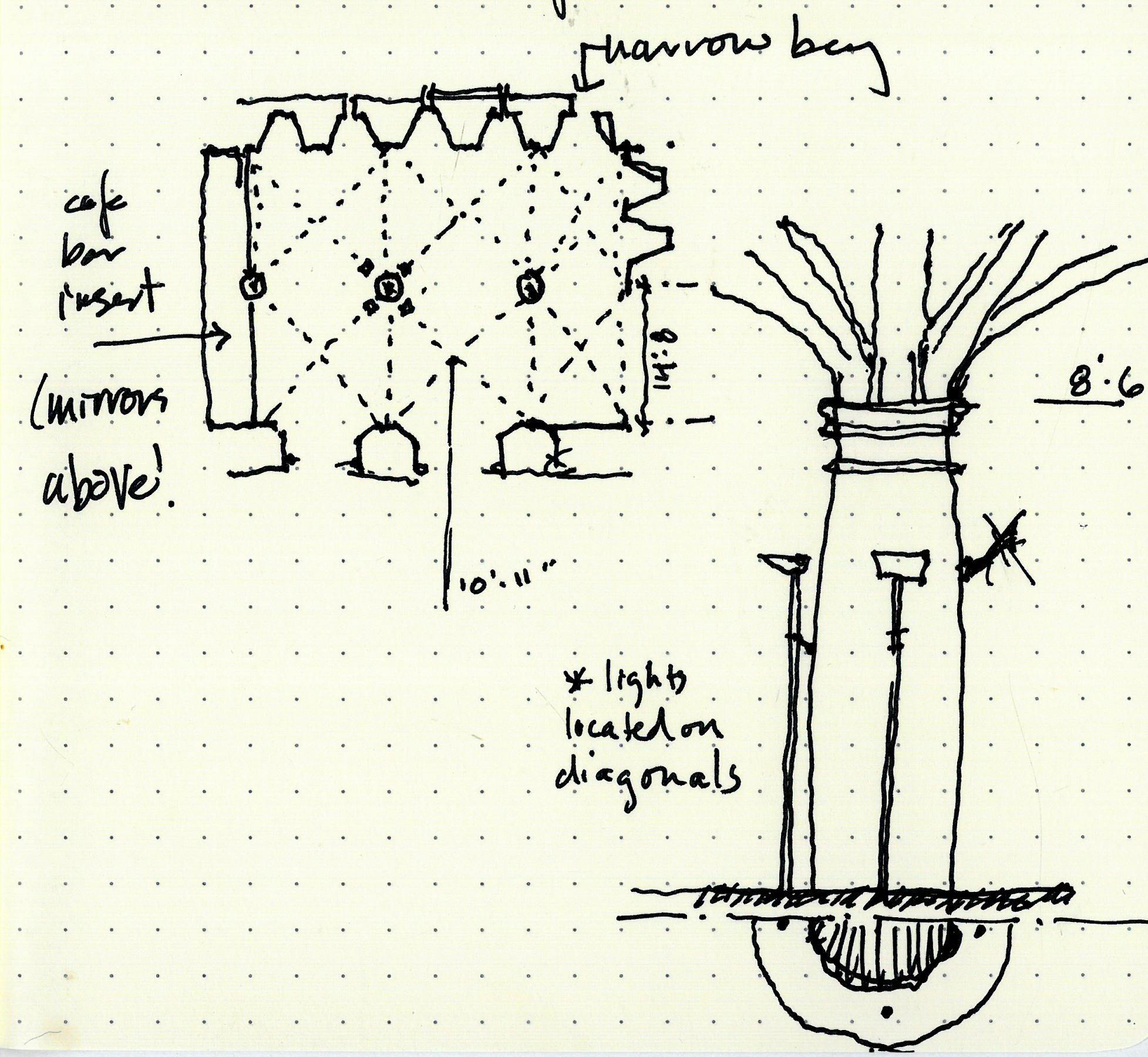
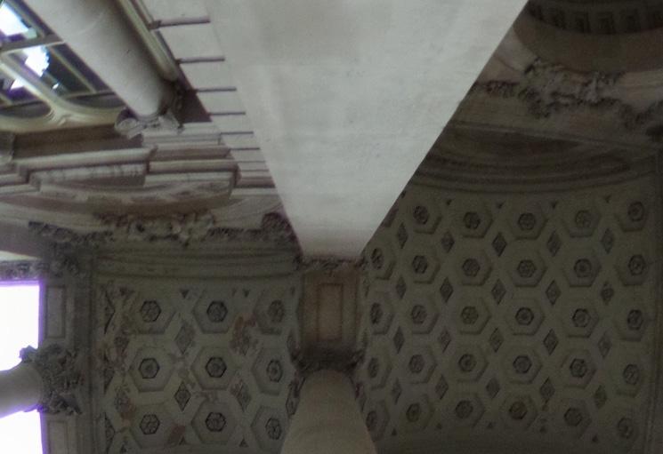
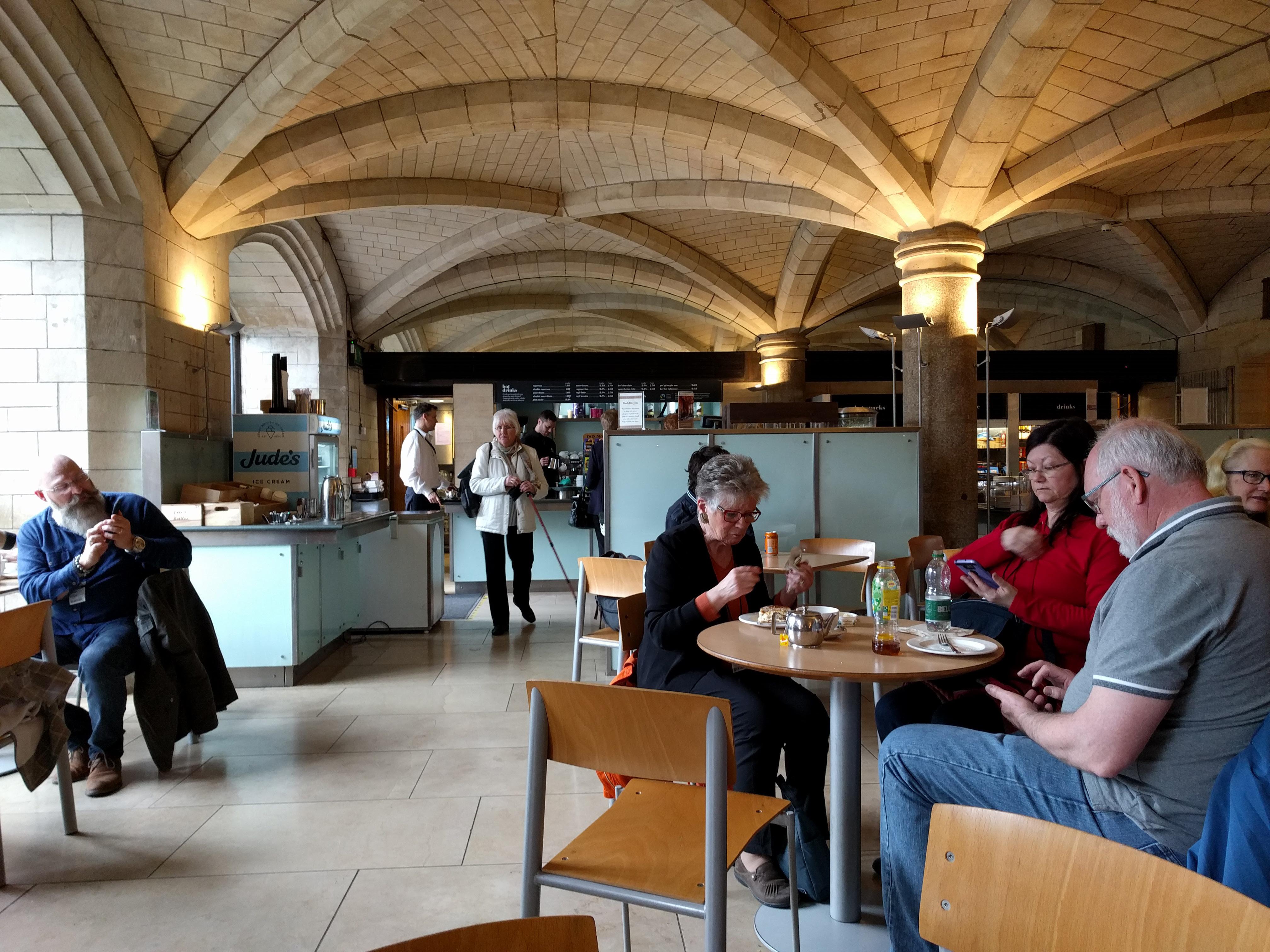
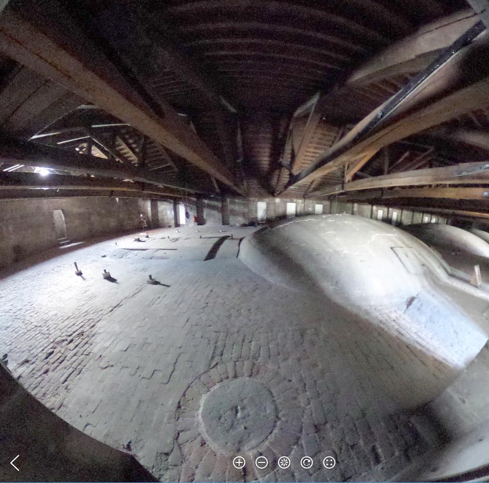
Formerly stables, now a cafe. Surprised at the shallowness of the vaulting; I would never intuit that a masonry form this shallow would stay up.
Mirror at top of wall above cafe service area is fairly effective in making the repetitive ceiling appear to continue. Uplighting placed at quarter points around the columns, about 4/5 way up creates a glow at the location of structural intensity... light fanning outward with structure.
Roof 1393
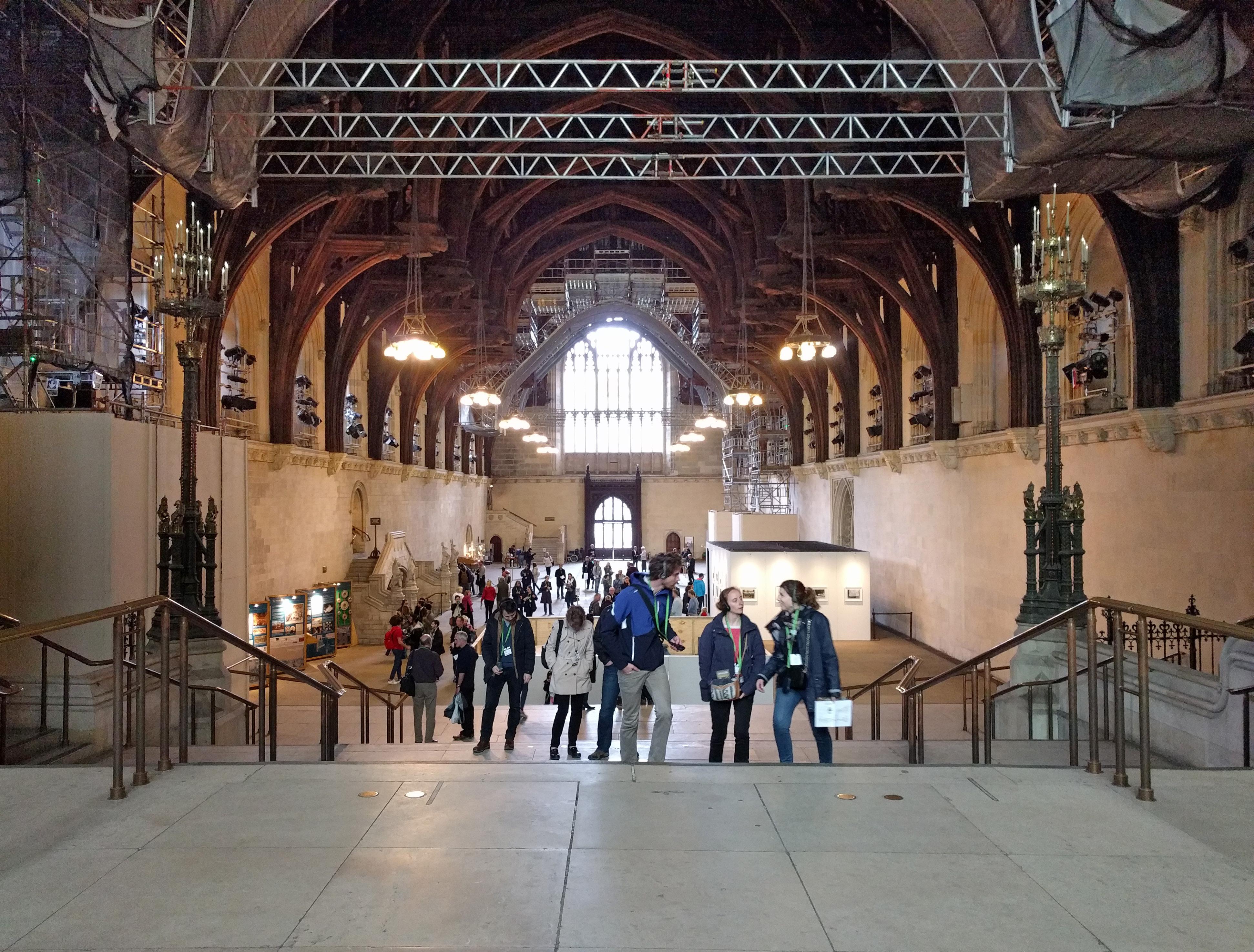
Unknown; H.Yevele & H. Herland 1393

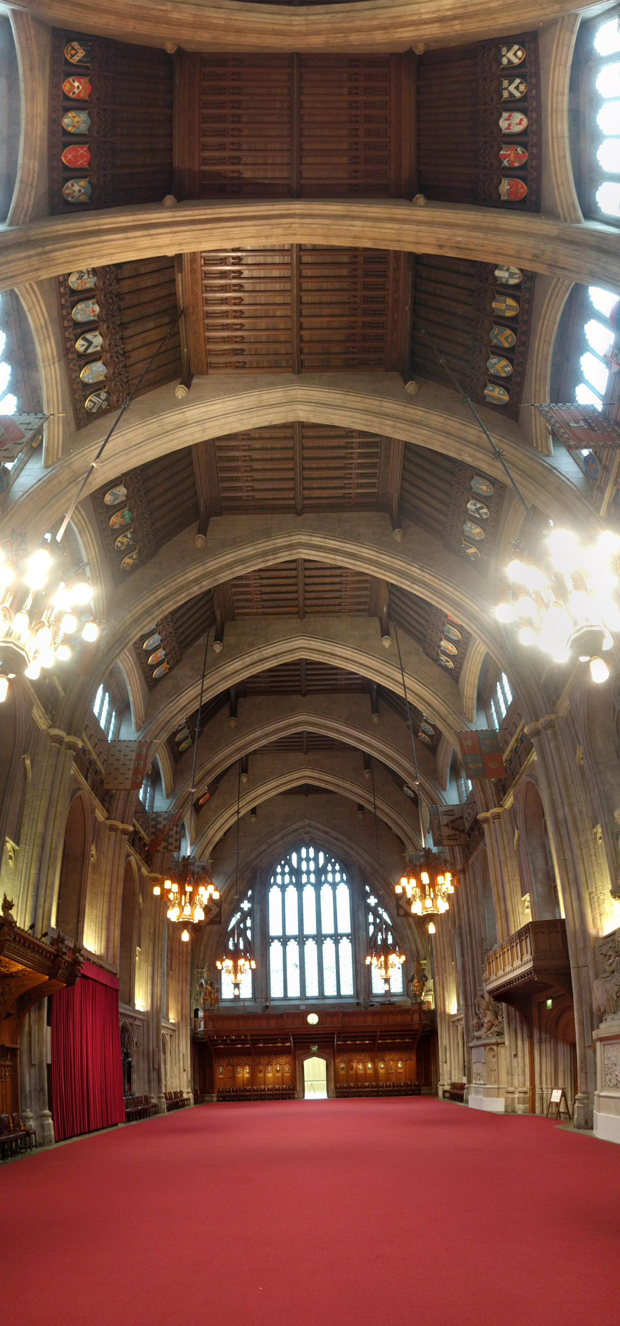
Groundbreaking medieval clear span of over 67’ achieved with timber trusses fabricated offsite and transported by barge and wagon. Lifted up to 92’ for installation. A leap in engineering in service of creating a massive civic room unbroken by vertical structure. The carved angels adorning the ends of the hammer-beams watched Thomas More’s trial, & many others’.
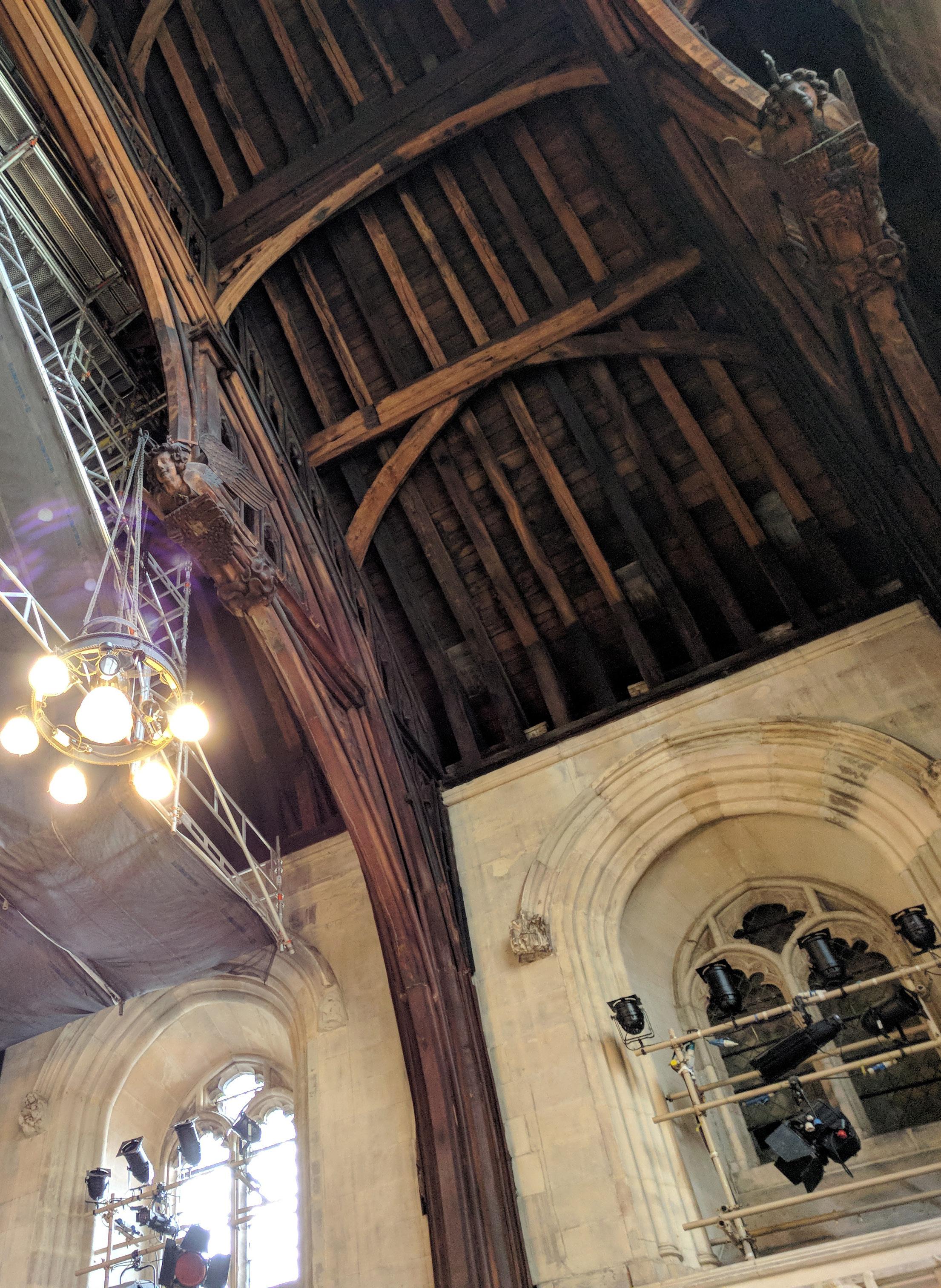
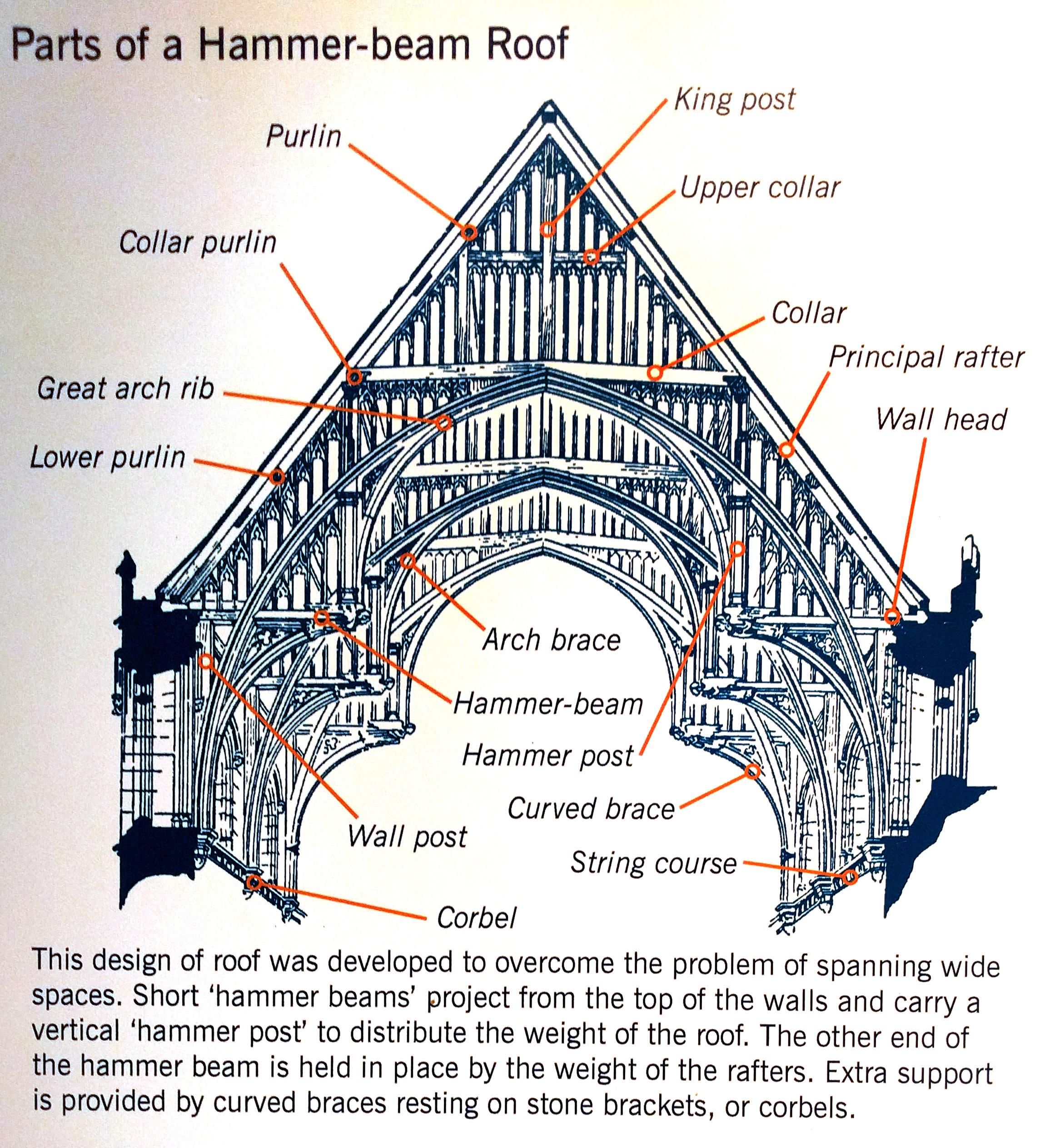
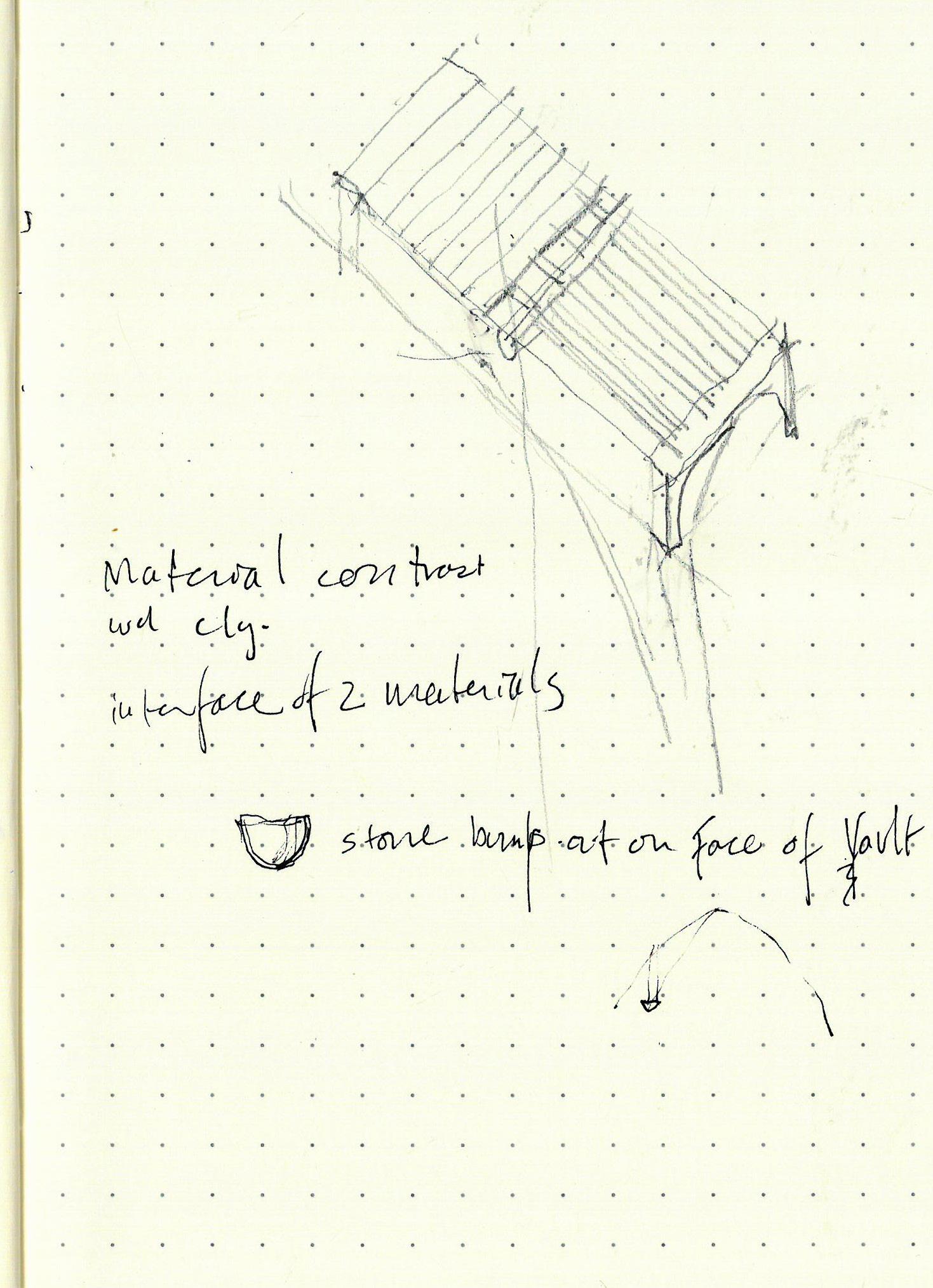
The hammer-beam form involves two major points of bearing at each truss end. So the timber ceiling reaches down inside the simple masonry box, a dark wooden piece-y structure set onto a chalky white stone vessel. Legs of the arches slide almost halfway down the stone face of the walls, whose primary expression is the datum created by the corbelling which receives the trusses. Two systems of contrasting material and form coming together at selective, charged moments.
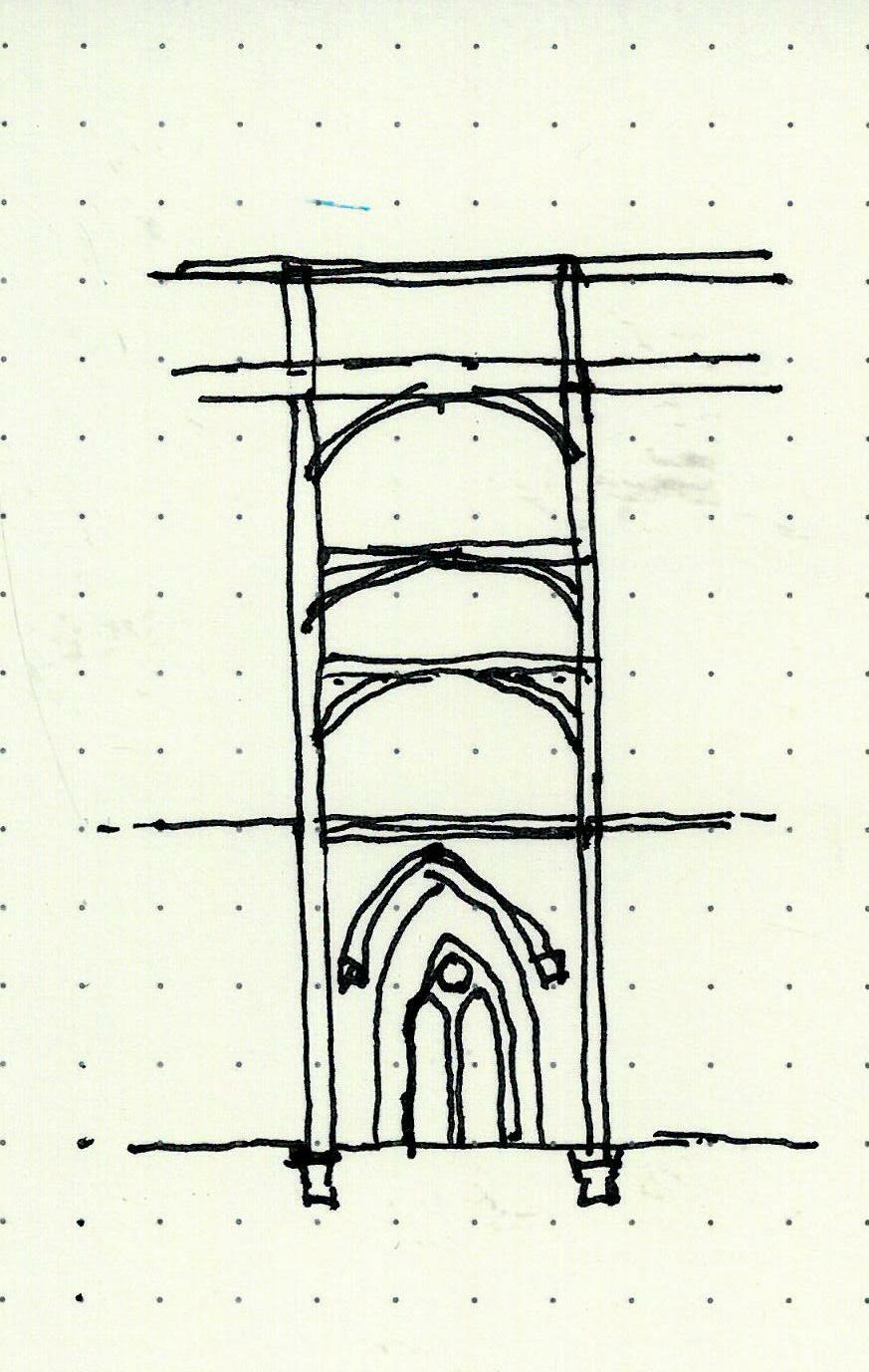
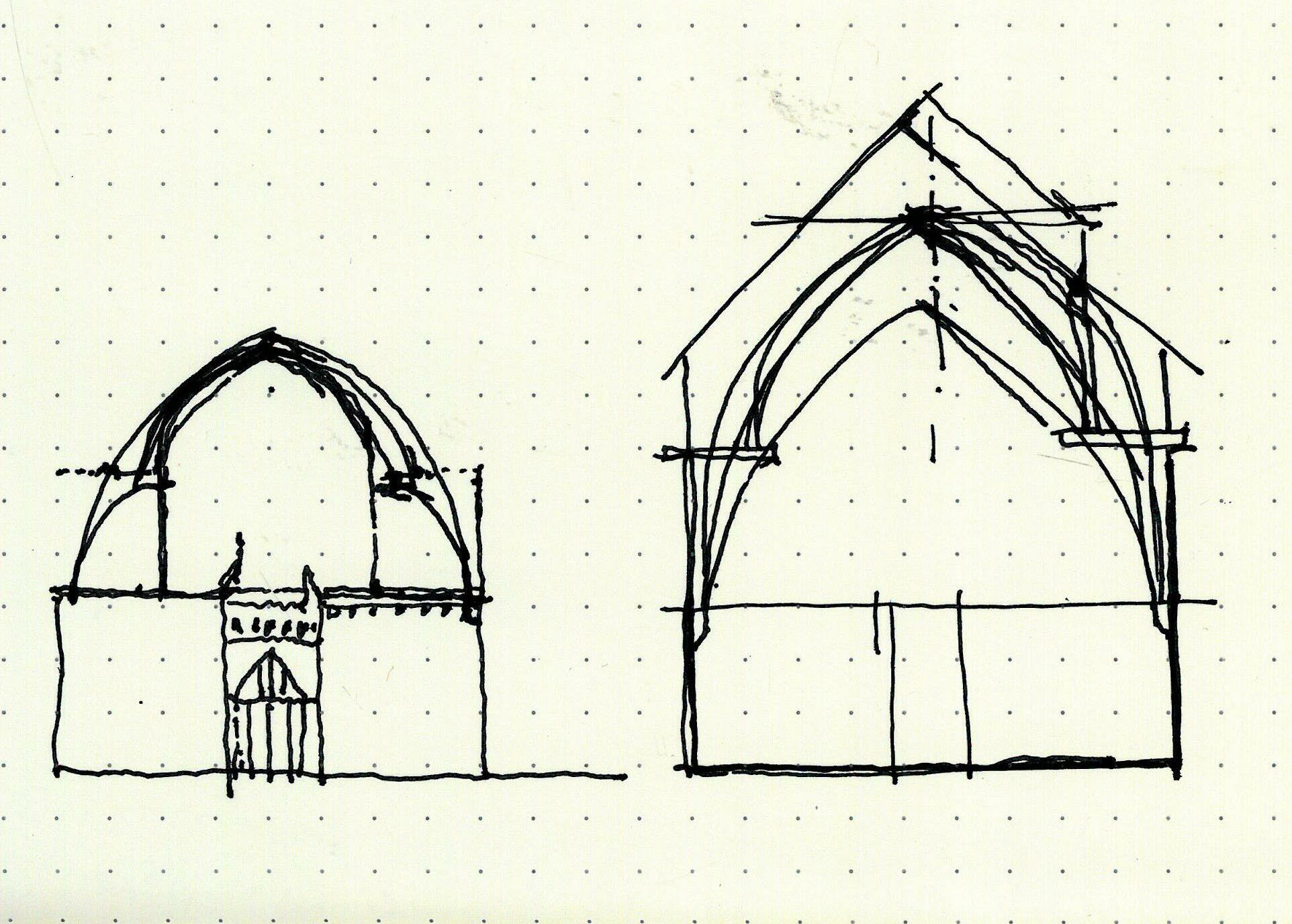

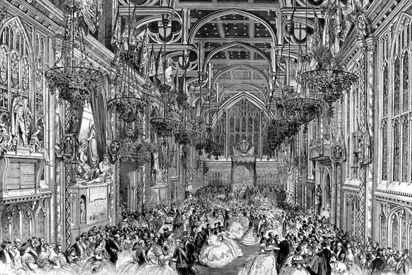
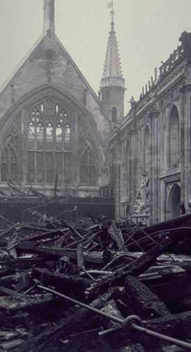
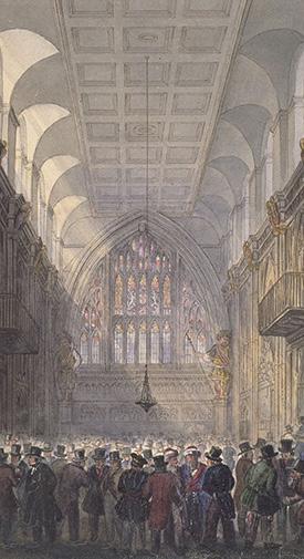

Seat of the City’s government since the Middle Ages. Building has had 4 roofs, current stone arches are an addition of the 1950s, post-blitz. An interesting contrast with Westminster Hall, with wood here as secondary structure, & the stone of the walls brought overhead as primary structure. A somewhat strange, diminutive structural interface between the wood & the stone arches -- two small stone corbels on each face of the arch.
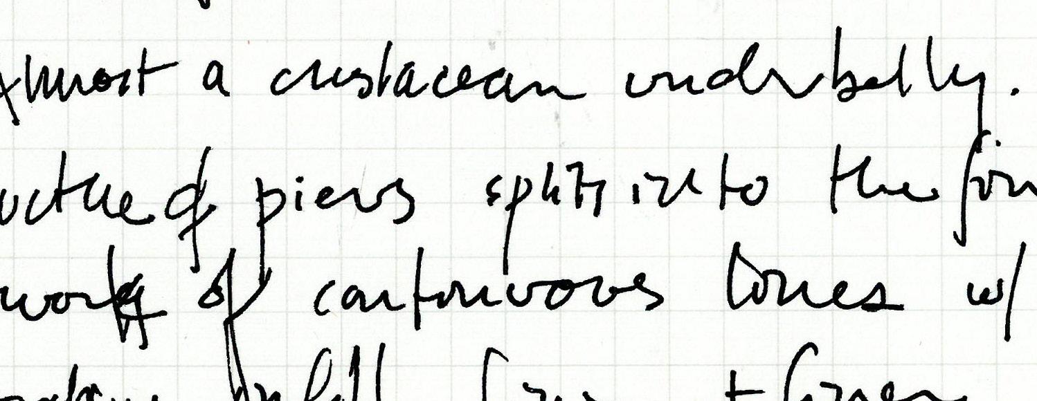
Breathtaking, intricate. Almost a crustacean underbelly. Structure of piers splits into the finest network of continuous lines with decorative infill, finer and finer . . . boundary between line and field, ornament and structure is blurred.
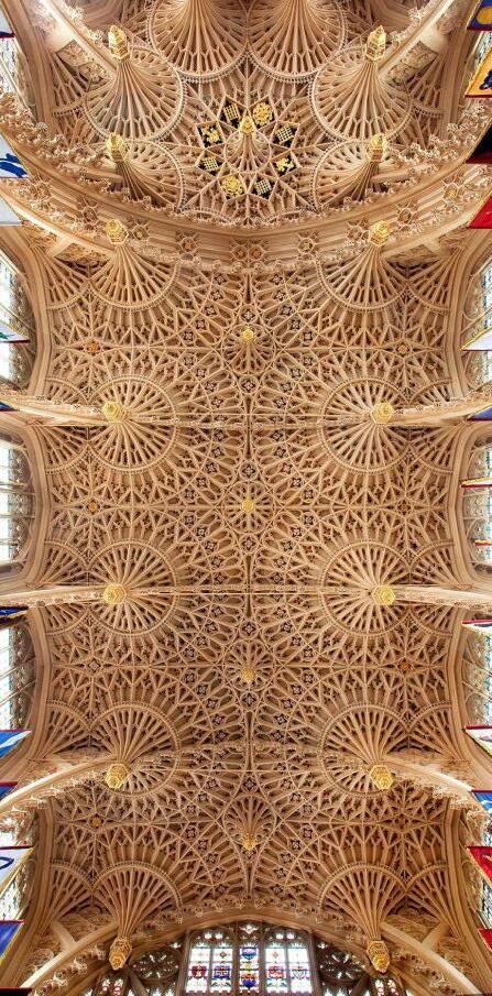
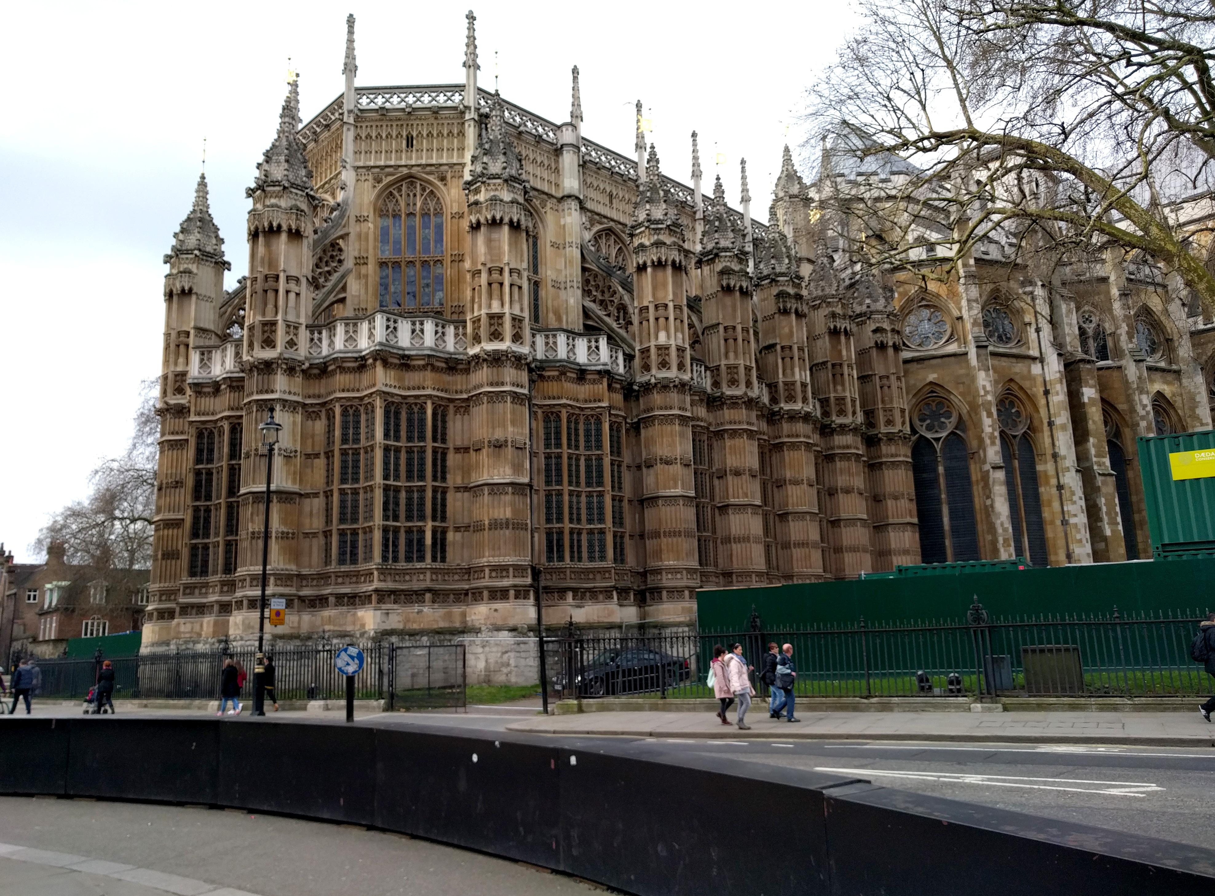
There is a striking minor 7th drama to the pendant fan vaulting... Suggests a qualified perimeter inboard of the wall enclosure, in a sense a counterpoint to the unseen perimeter of buttresses outside. Pendant vault related to hammerbeam?
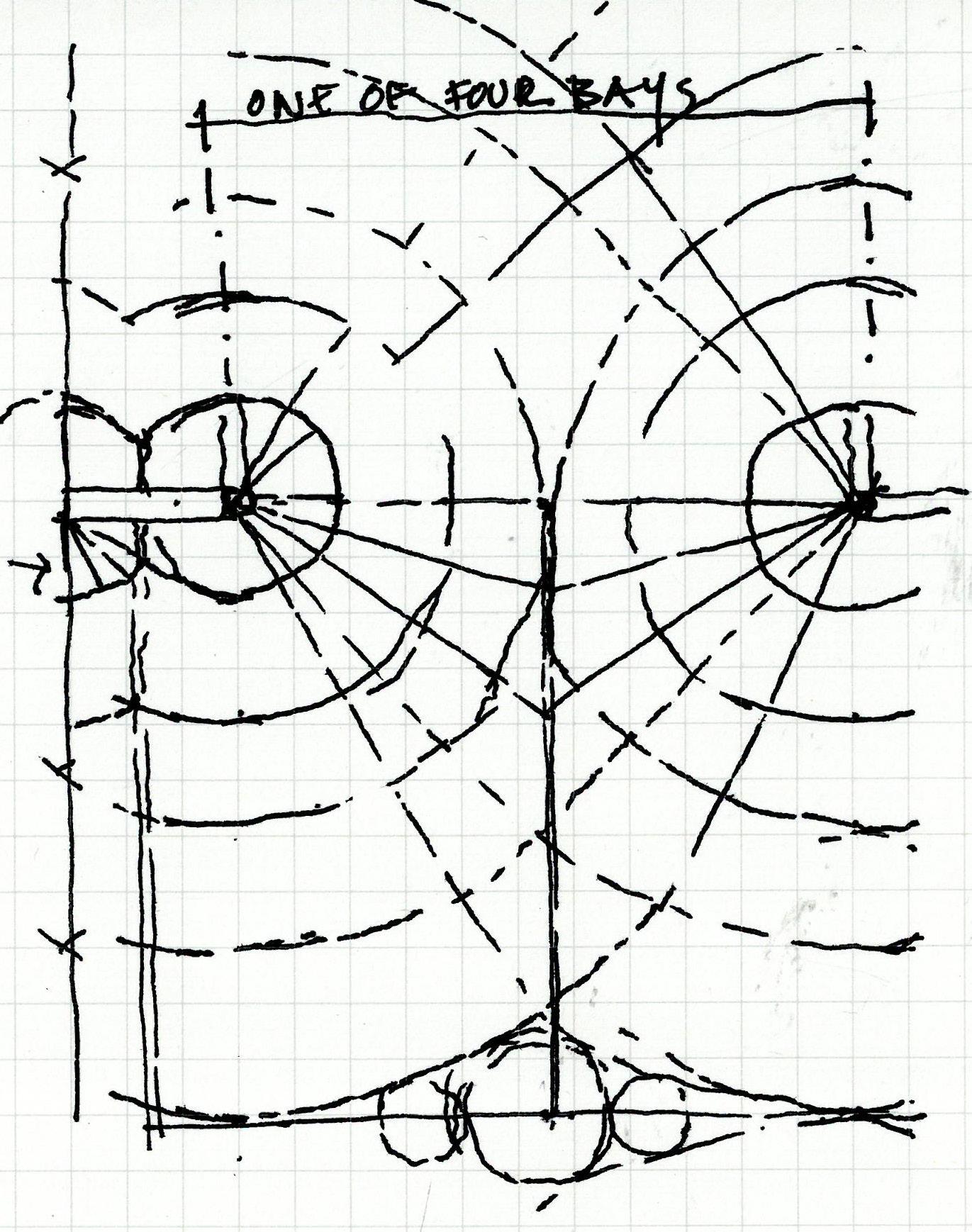
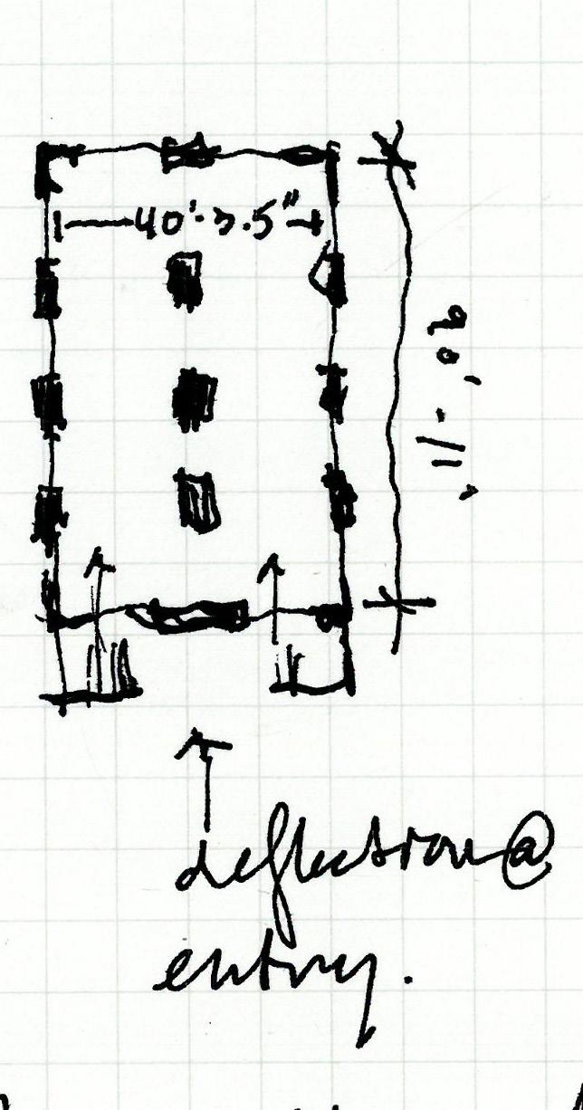
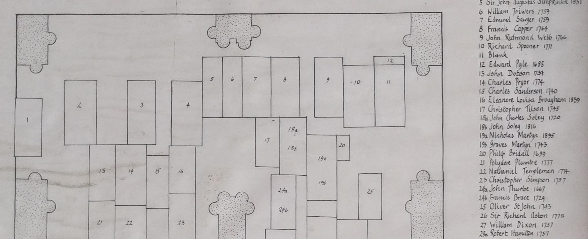
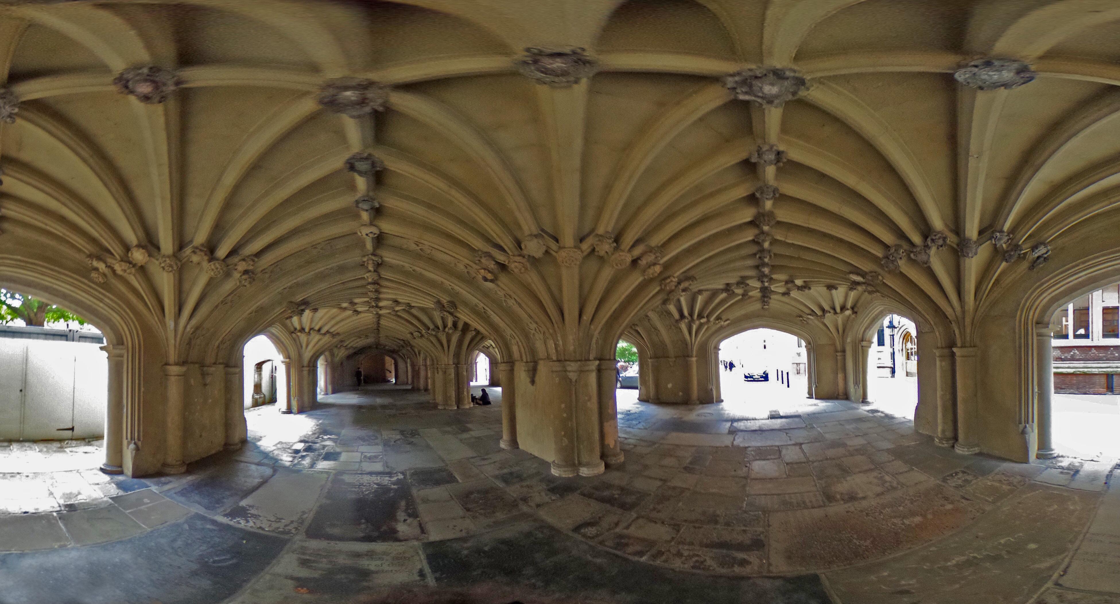
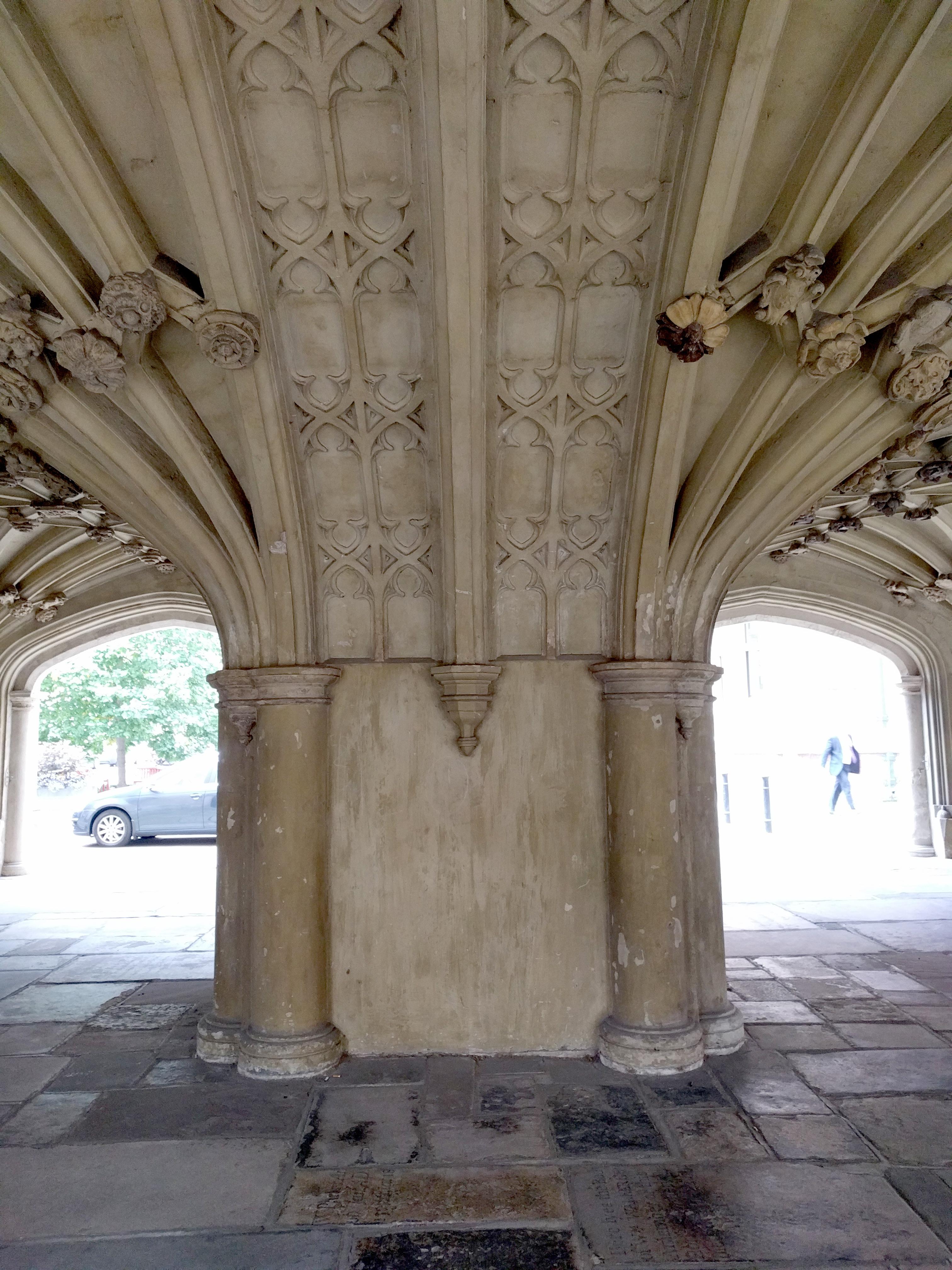
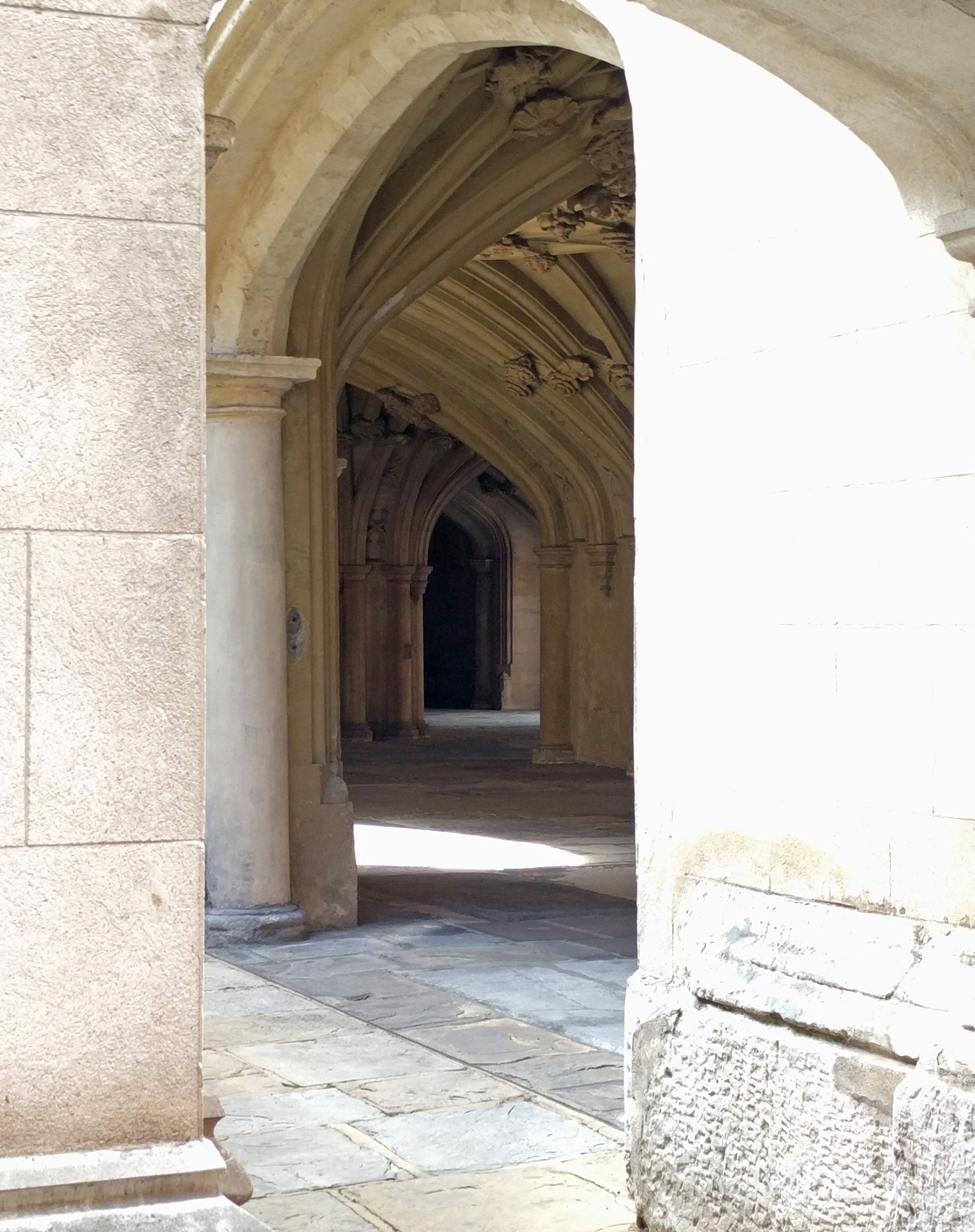
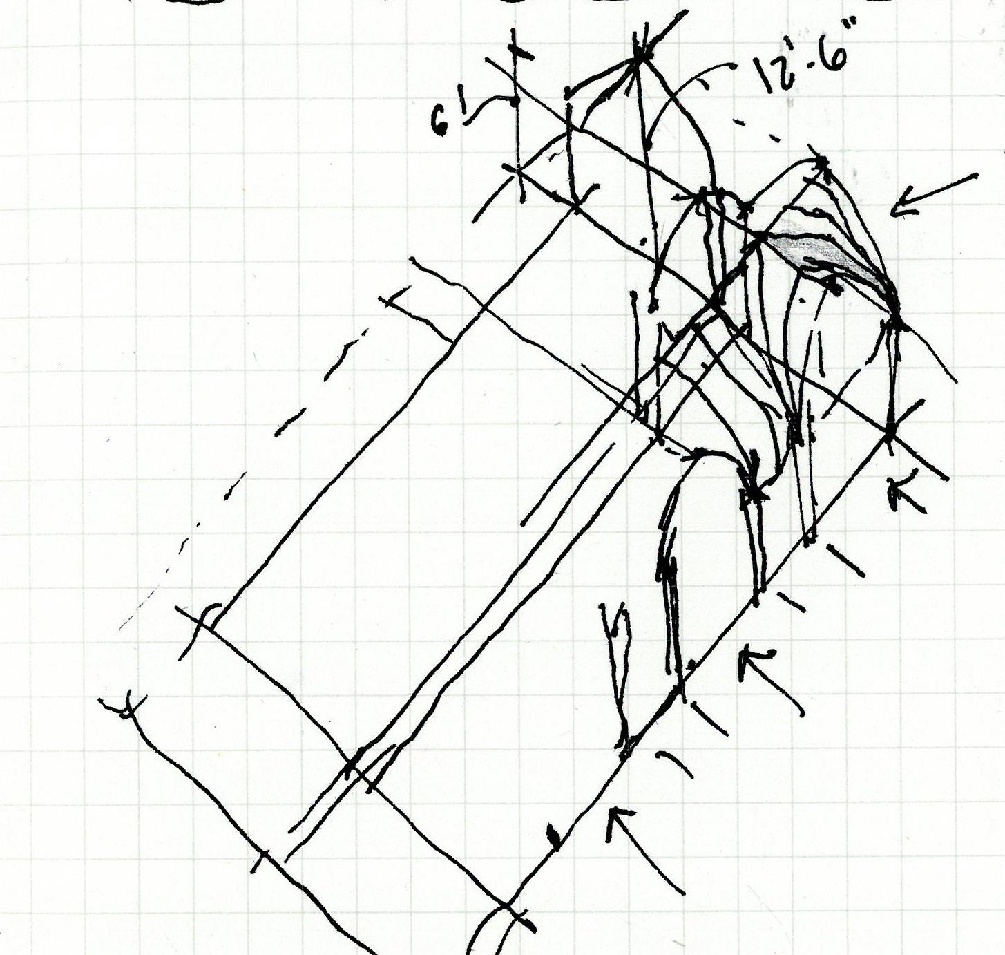
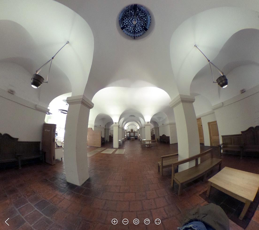
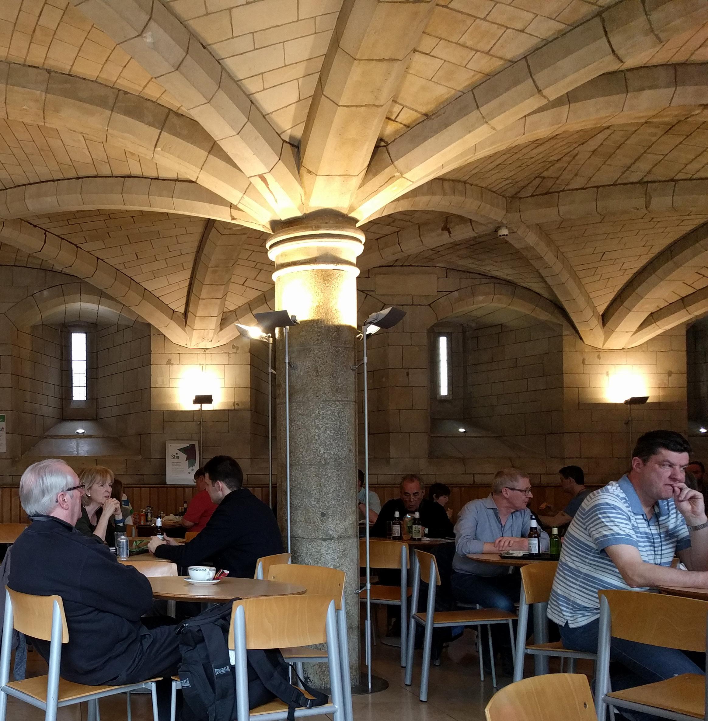
Unique condition of a publicly accessible undercroft at street level. Floor composition completely disconnected from ceiling composition, the hodge podge of gravestones staring up at the symmetrically splaying arches. In person, the scale of ribbing and ornament looks a bit oversized & clumsy to my eye, sparking a sudden fantasy of this as the the ceiling of a much taller space that has somehow sunk almost to the ground. Carved ornaments are placed at every intersection of ribs in the ceiling, modestly covering each joint. Definitely used as a thoroughfare and public hangout, with smoking teen girls sitting on the floor...and the dead buried below.
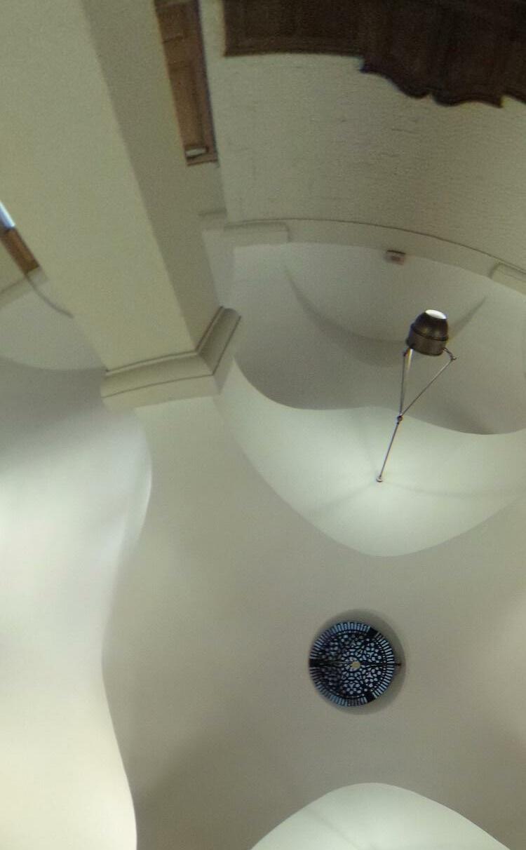
Side aisles feature an oculus at the apex of the groin vault, an opening at the location of structural intensity. Though different in scale, window and skylight share a simple circular geometry.
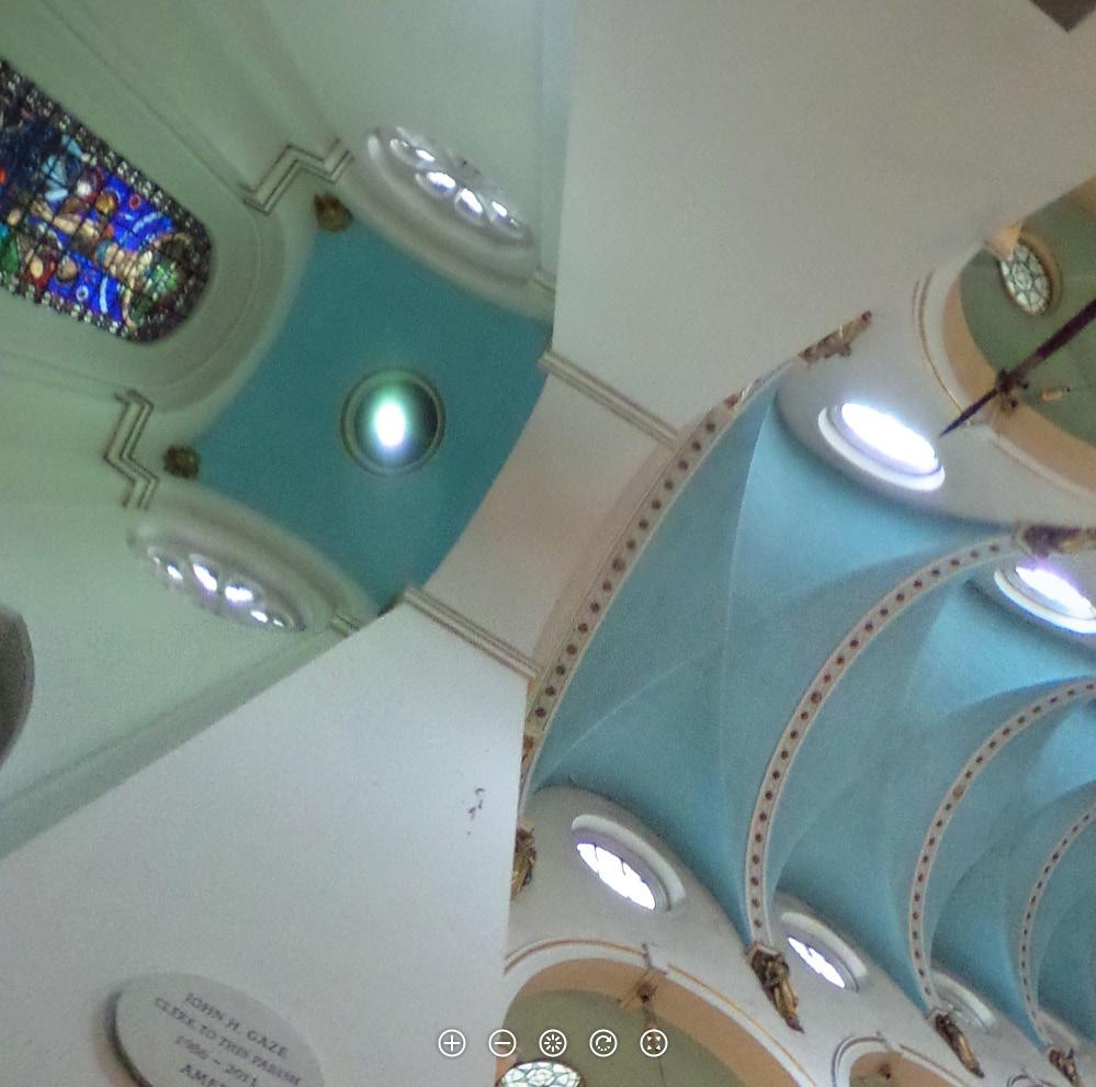
Without actual material contrast, form and color suggest ceiling as something unrelated to wall. Even the arches separating the bays of the nave, while sharing a color with the wall, aren’t connected to the massing of the columns. The opposite of the underbelley effect we see at Lincoln’s Inn Chapel, where form expresses the weight of what’s above smoothly tapering into the vertical support, leg-like.
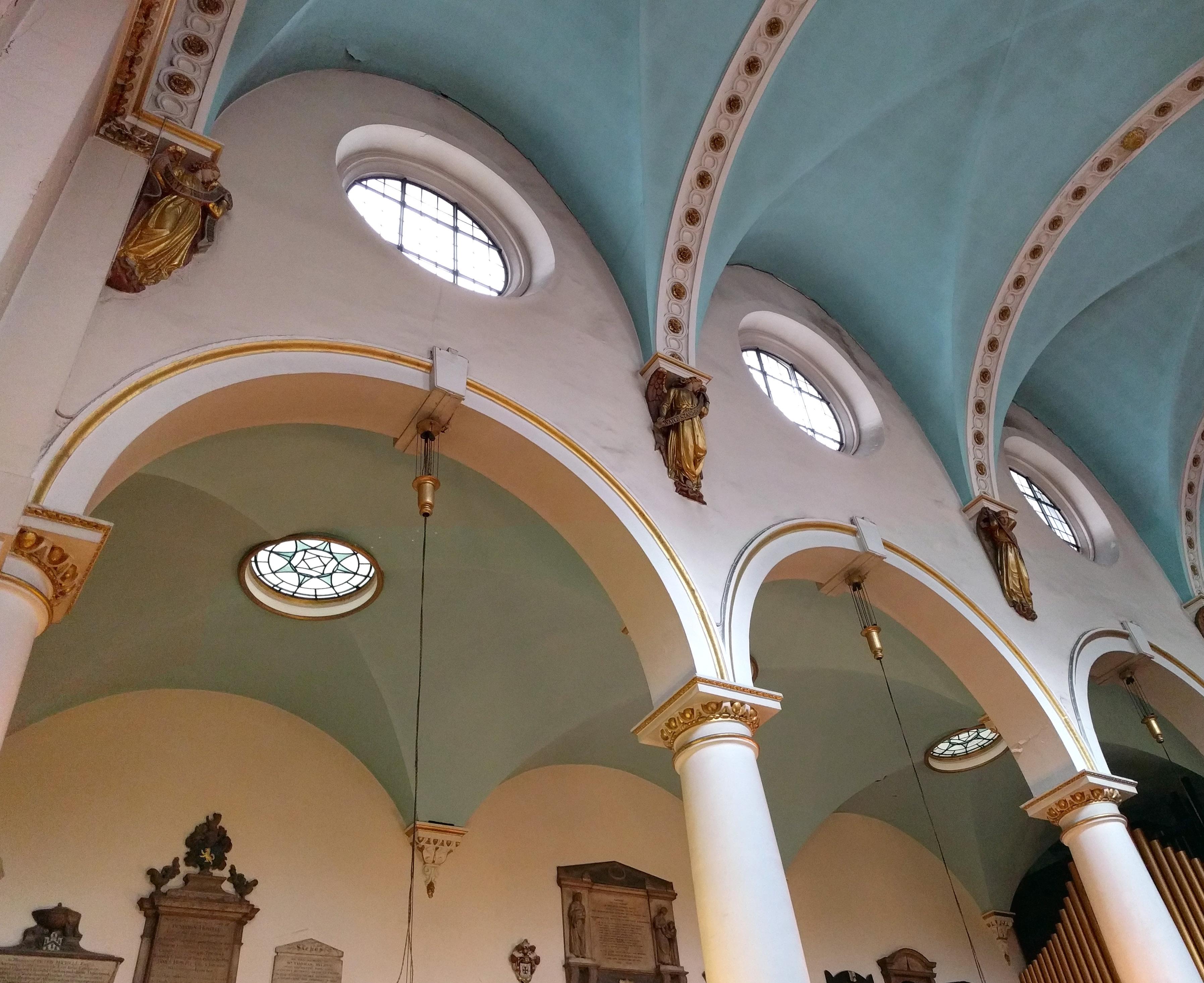
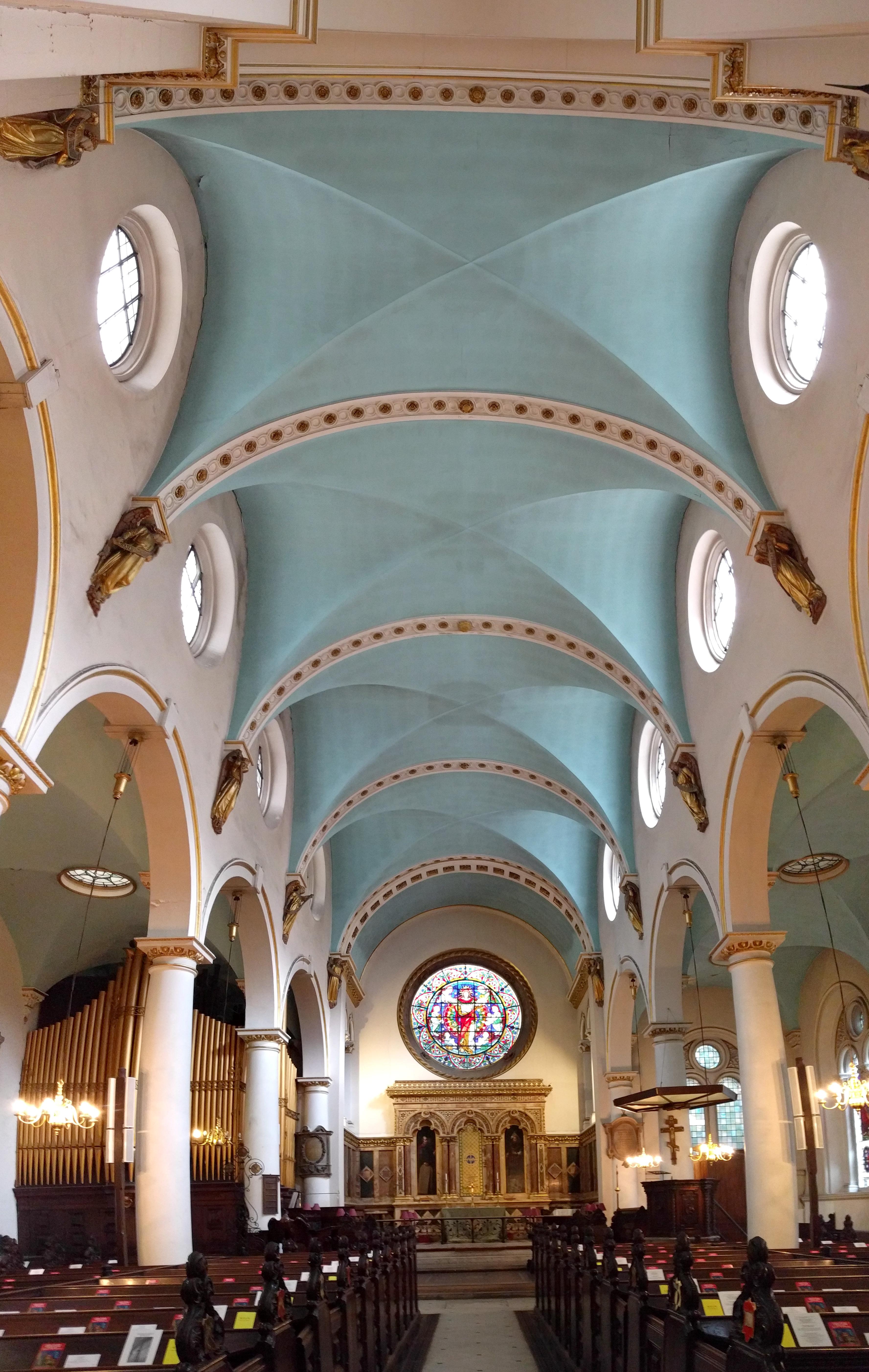
ST. MICHAEL CORNHILL
Sir Christopher Wren

No photos allowed in the sanctuary. A shame because this church is a study in the effect of ceiling color and sheen on the perception of space. The nave ceiling and the quire ceiling are geometrically identical (shallow domes set in square bays), but their surface treatments are practically opposite. In the nave Wren’s original design has been maintained, with the ceiling surface white and unadorned. In the 1860s, the formerly identical ceiling at the quire was completely covered with mosaics of glass tesserae, the deeply colored and gilded pieces unevenly cut to create a sparkling effect. I am stunned by how much lower and flatter the darker, sparkling ceiling at the quire appears. I have
to trace the horizontal lines between it and the nave with my eyes several times to beleive they are actually the same height. I wonder how much of the change in perception is attributable to the darker value of the ceiling, and how much to the scattering of light by the tesserae, which introduces noise into our decoding of shape based on the way light washes across a surface. Information for tourists explains how controversial the addition of the mosaics was at the time of installation, some outraged at the change - “As if a perky French milliner were trying to brighten up a Michelangelo.”
Up in the narrow attic walkways above the cathedral ceiling, I

above & righ T cen T er: Wren’s original ceiling design was of smooth white plaster, with detail and texture reserved for surfaces adjacent to windows, where their shape would be revealed by the wash of daylight entering the church.
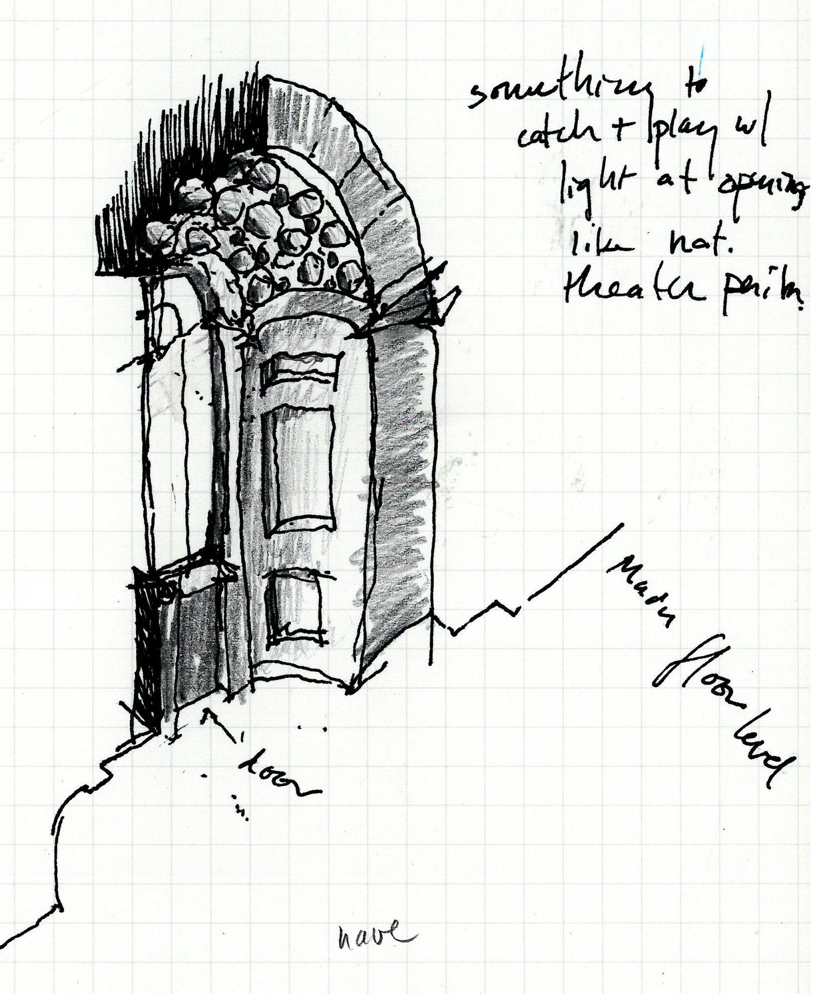
have a flashback to the first revelation, in an undergrad architectural history class, of the separateness of ceiling structure and roof structurethen at the dome of Lombardo’s Santa Maria dei Miracoli. The beginning of a long lesson about the difference between the multiple exposures, demands, and scales of the interior vs. the exterior. St. Paul’s again is a study, with the main dome ceiling (at the scale of the church interior) inhabiting only a small portion of the roof dome, which hasn’t ceased to rule the city fabric outside-regulations regarding sitelines to it generating the massing for gleaming new skyscrapers like RSHP’s 2015 Leadenhall Building.

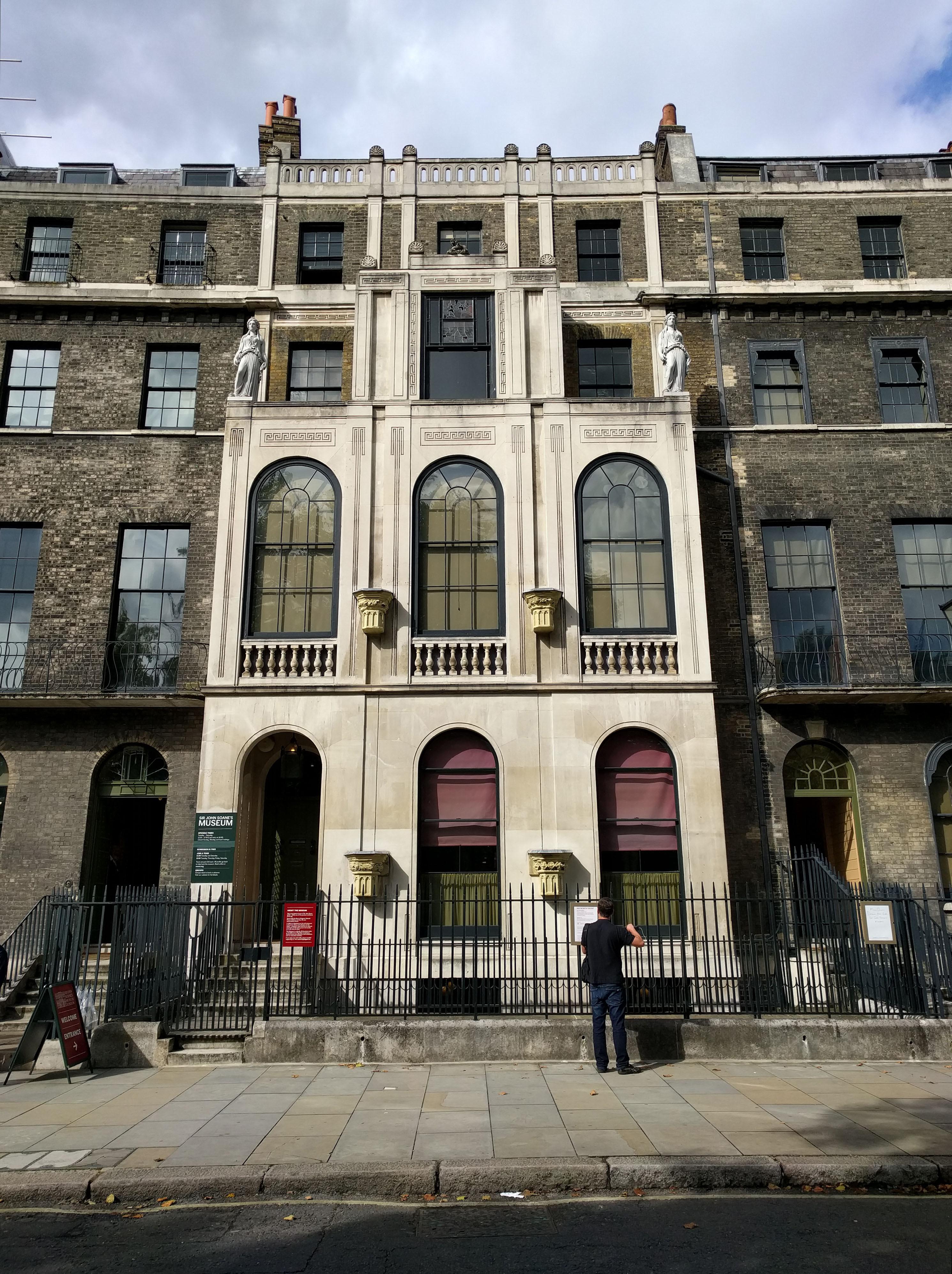
The complexity and intricacy of Soane’s house, the overwhelming prospect of measuring & deriving rules from it regarding dimension, proportion, perception...anxiety that something essential will be missed in a 3-hour visit... and the absurdity of hoping otherwise.
I wonder what Soanes’ process was like. Would his approach be characterized by “techniques” or “rules”? This line of thought leads me to recall a comment by Joe C. a while back regarding design based on a diagram (which I would equate with a rule) vs. designing in perspective... the train of thought begins to fall
into the paradigm of vector vs. raster - the rule, or the pixel. Though I wonder if the pixel is simply the recording of a reality not yet described by rules... rather than incapable of being described by them.

At any rate, a few things begin to become clear. Much of the building’s complexity resides in the ceiling plan rather than the floor plan. The shapes of space in plan are much more simple; at the ceiling elements are introduced to complicate or contradict the geometry defined by the meeting of the wall and the floor. Baffles near the perimter of the ceiling are used repeatedly to obscure the top of a room’s
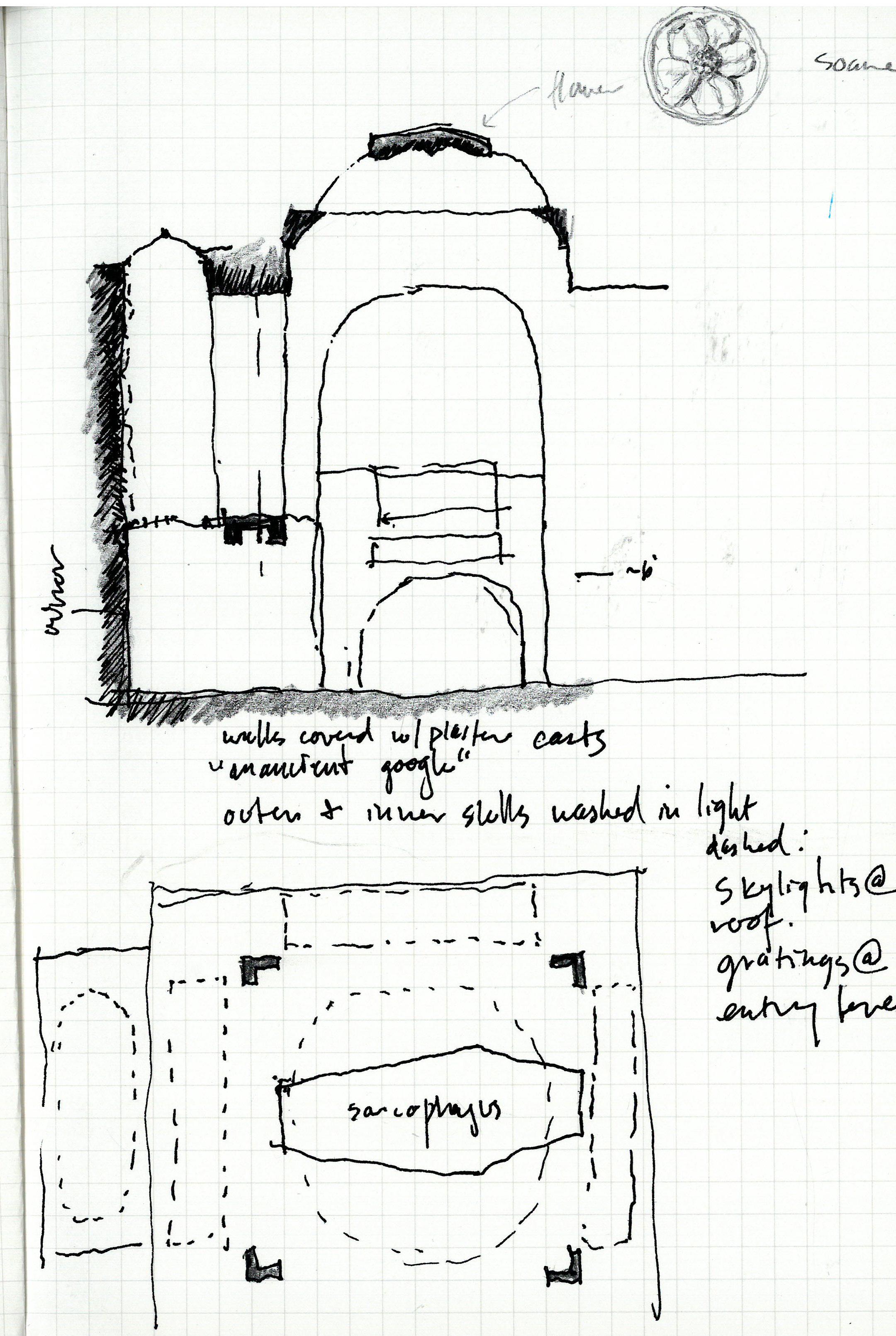
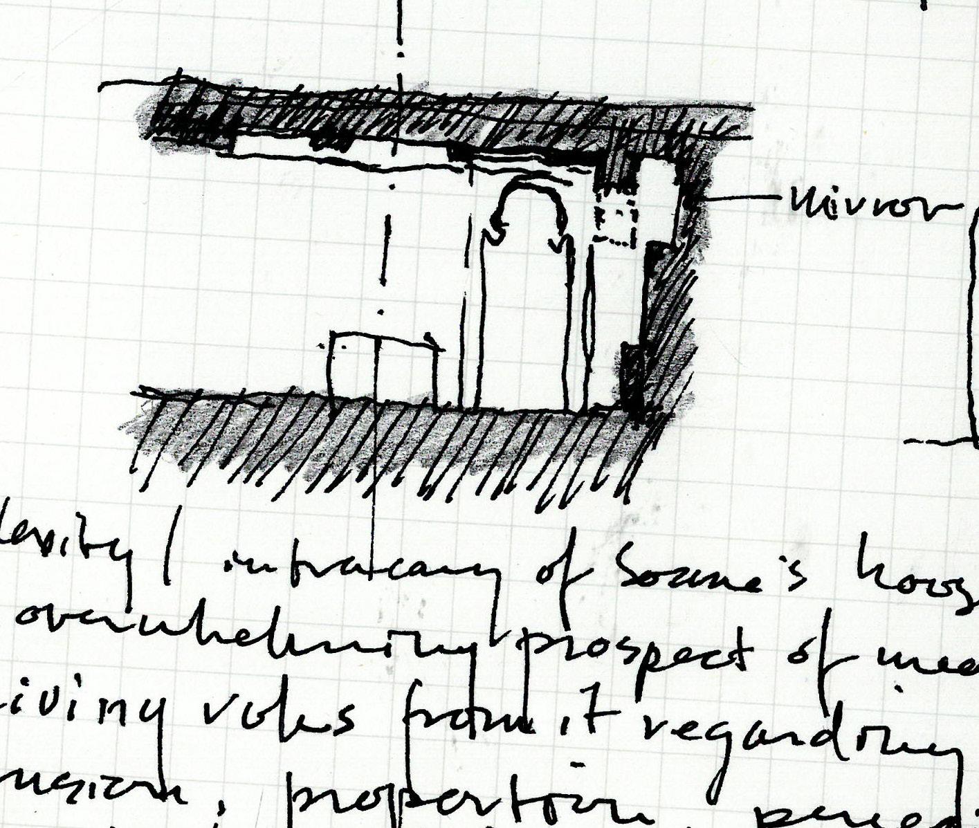
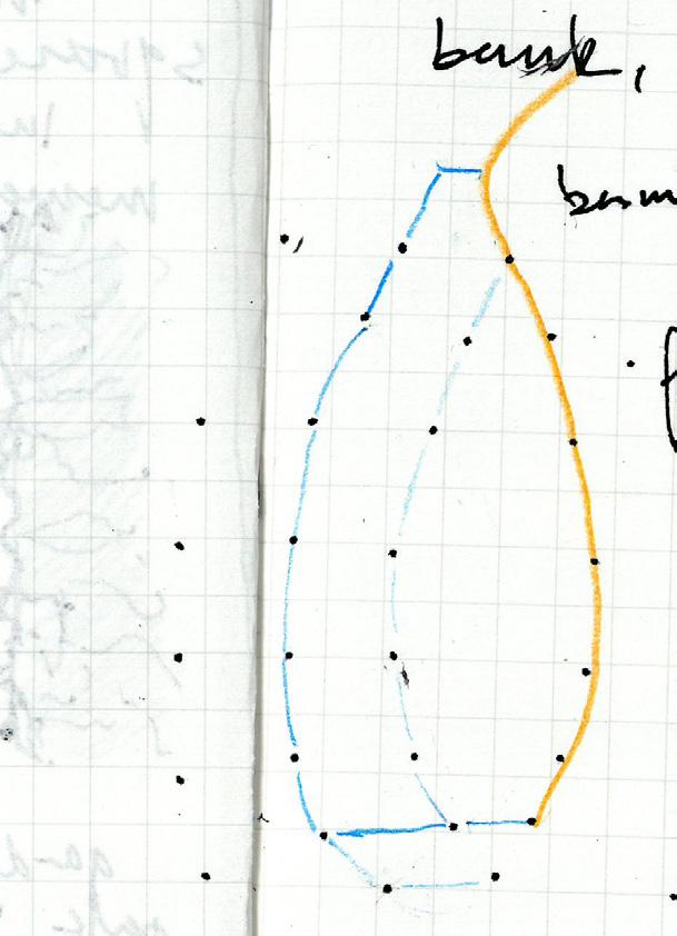
walls. Walls are almost always to be understood as continuing upward, out of sight, and as often as possible washed with light from an unseen source. In fact, rarely are we allowed to perceive two perpendicular opaque planes meeting. There is always a mirror, or a window, or a skylight, or an opening in the wall to say “This is not the boundary. There is more beyond.” The idea of adding “artificial” boundaries to de-emphasize the actual boundary (like a baffle concealing the perimeter of the ceiling) reminds me of the preoccupation in English landscape design with concealing the boundary of property. I particularly remember something
I read about Humphry Repton’s* approach to this -“ . . .a typical device of Repton: the brook has been redirected parallel to the boundary and thus seems like a natural division of the land, pre-existing property boundaries. But the park continues on the far bank for a little way, and thus one boundary, a faux natural one, is overcome to please the eye’s appetite for extent.”
John Macarthur, The Picturesque: Archi tecture, Disgust, and Other Irregualri ties, Chapter 5 “Appropriation.”

(*Humphrey Repton [1752-1818] was an in fluential English landscape gardener who helped originate the idea of landscape architecture as a profession)

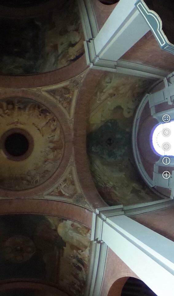
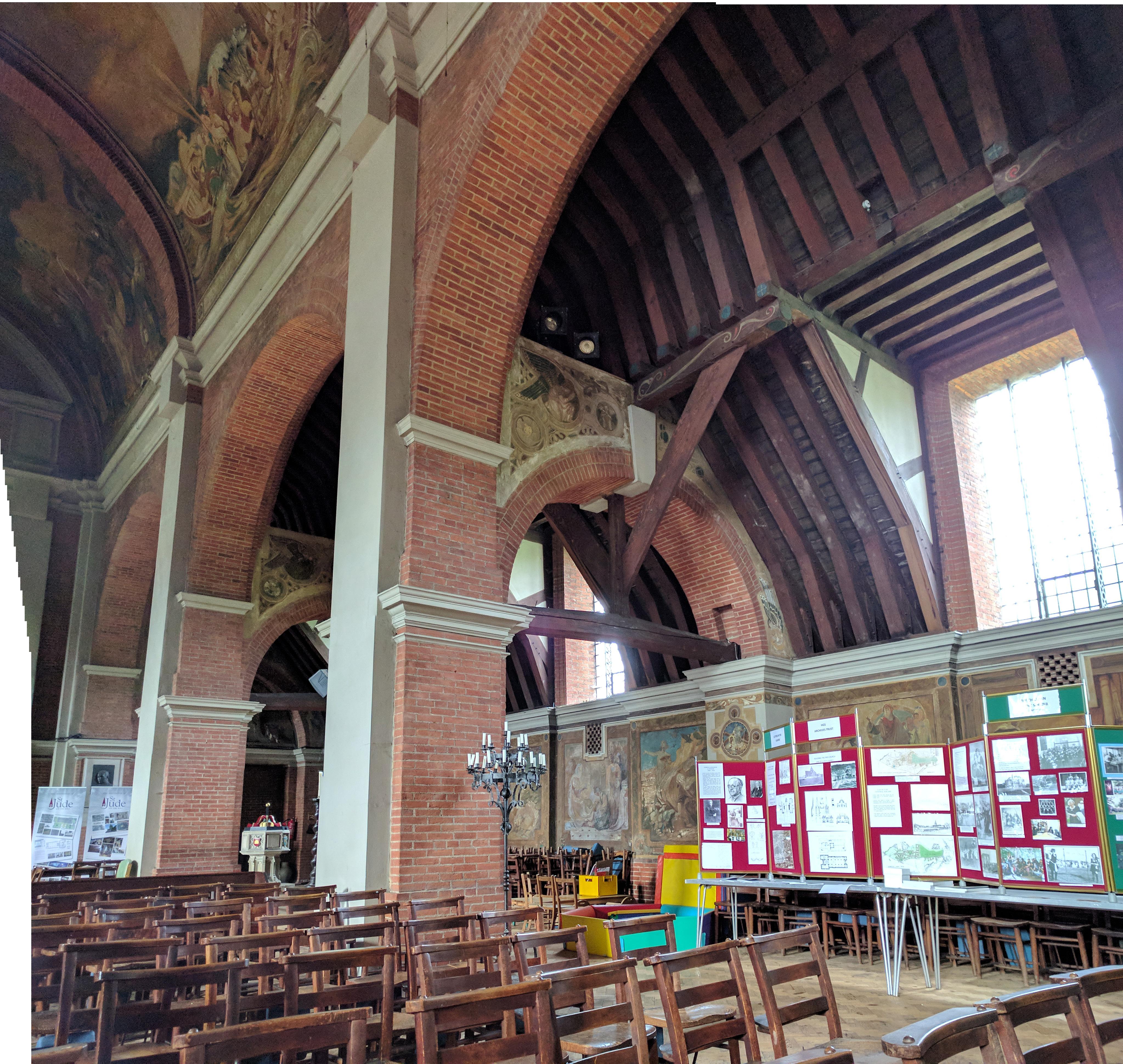
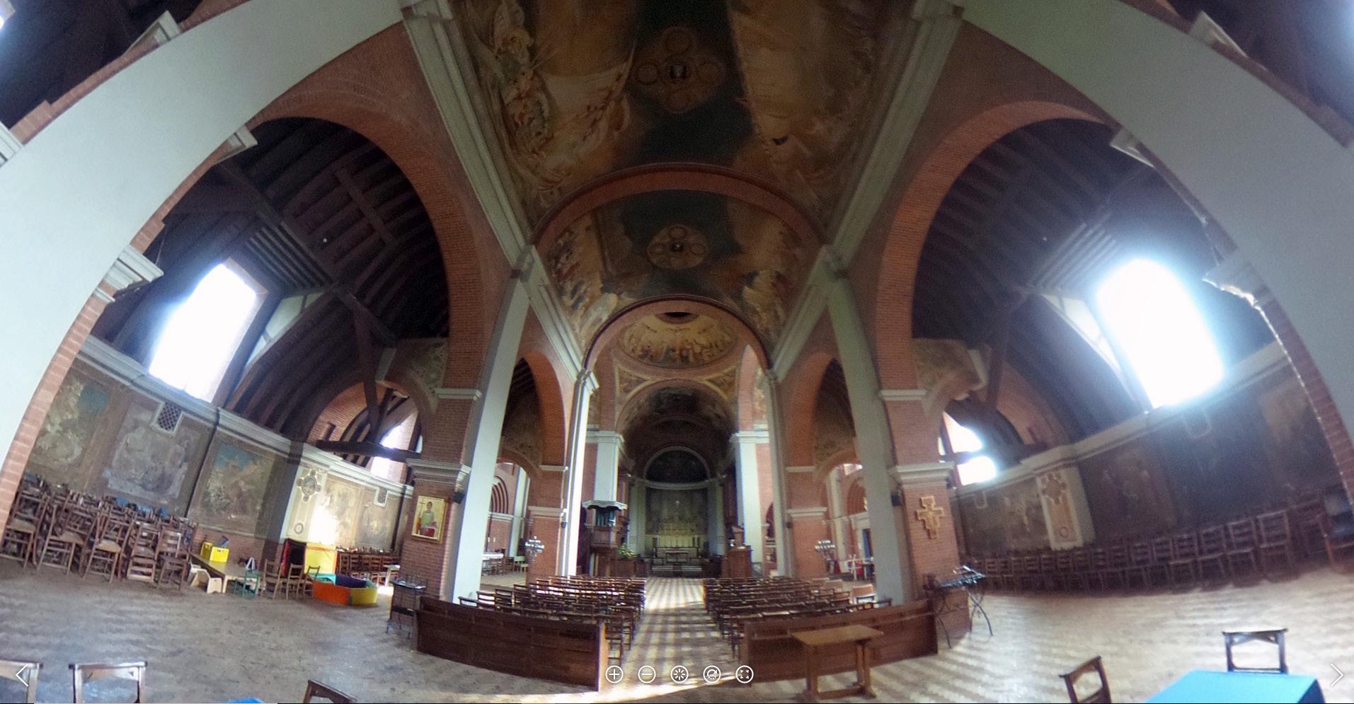
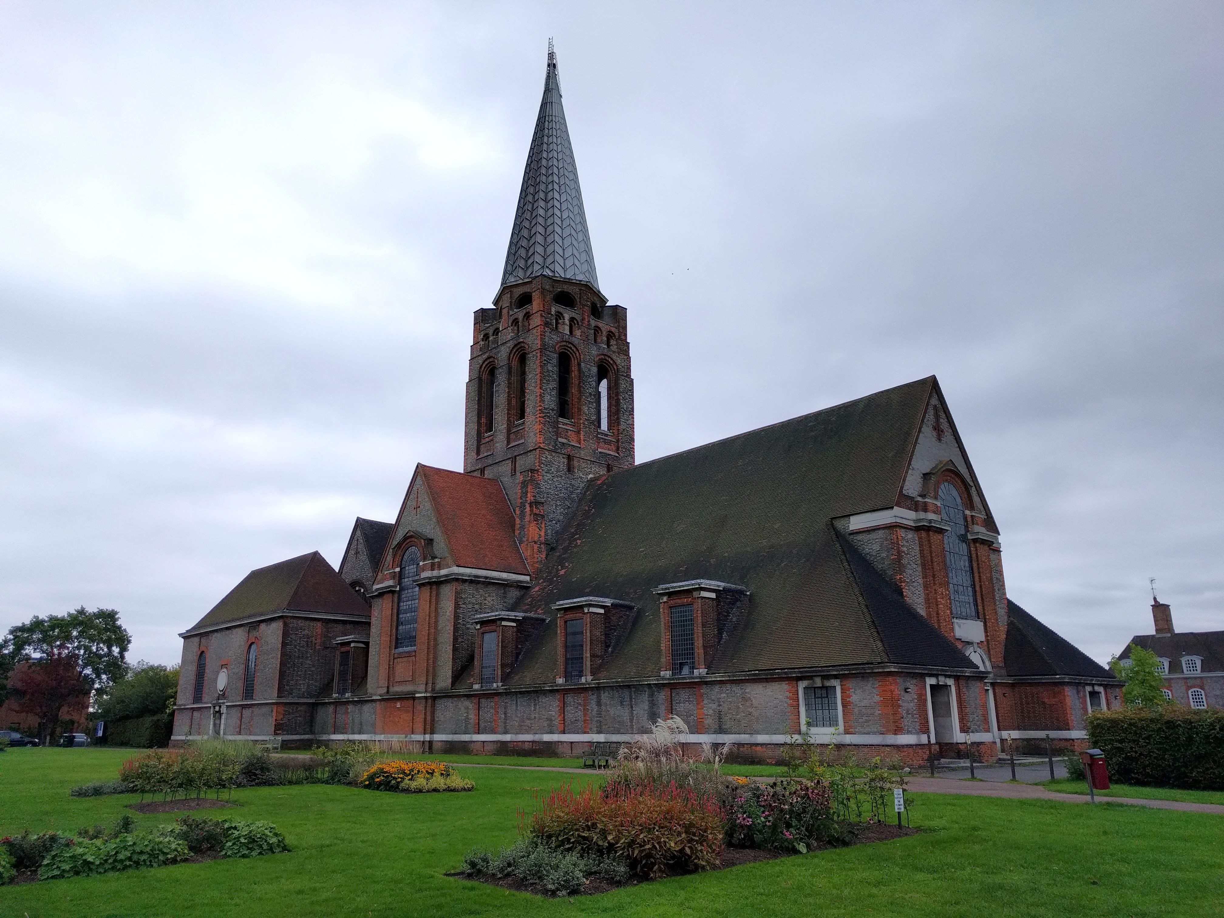
Church located at the central green in Hampstead Garden Suburb, a community planned by social reformers in the early 20th centry to address the crowding and unhealthy conditions of central London. Lutyens designed the interiors to be brick, wood, and white plaster; the extensive wall and ceiling murals were added after WWI by Walter P. Starmer.
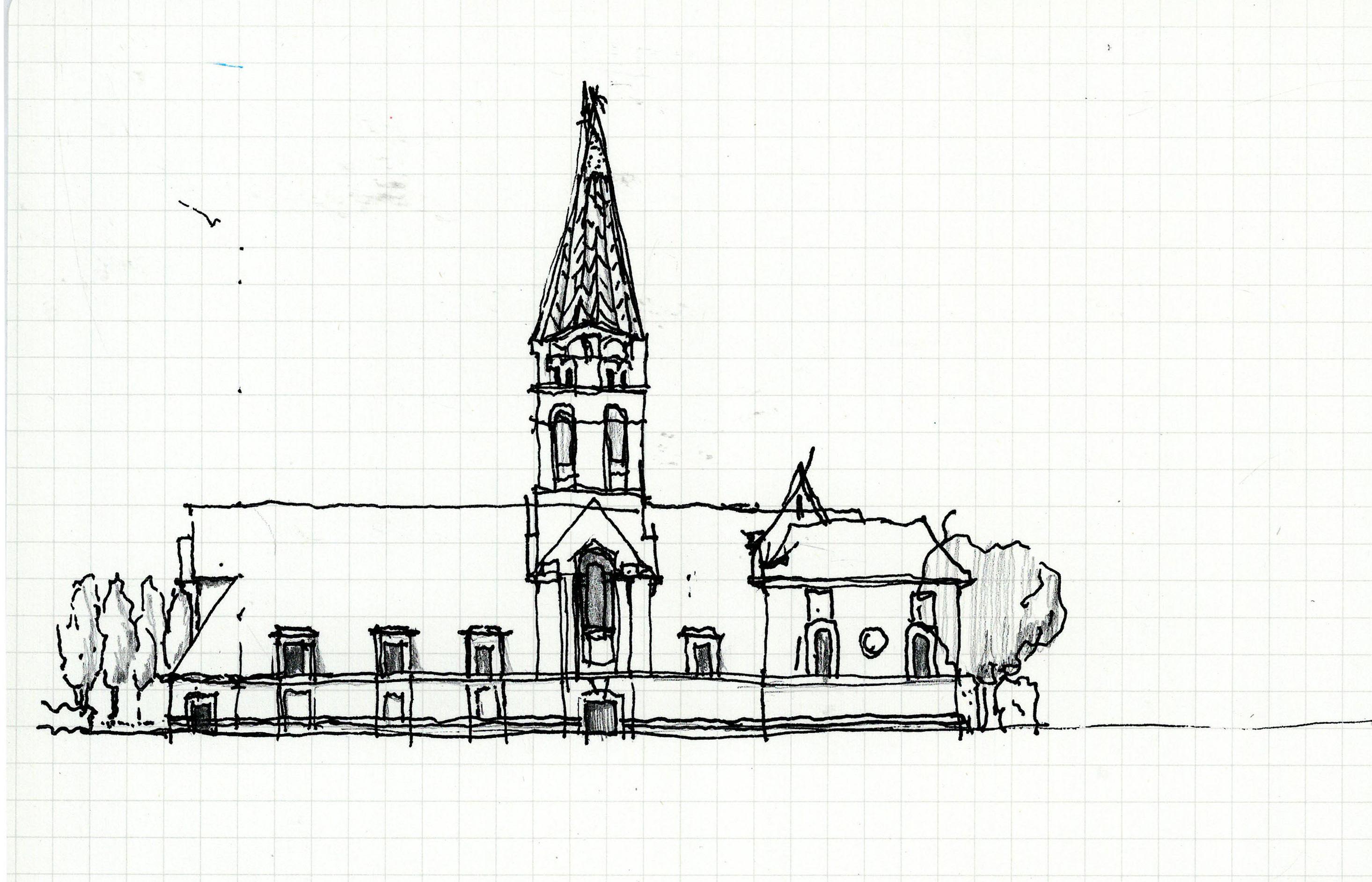
From the exterior, the building’s appearance is undeniably dominated by the massive roof form. Inside we see Lutyens hybridizing this dominance with a church interior in the tradition of St. Paul’s Cathedral, where the ceiling form is undependent of the roof form, and the underside of roof is hidden. To me, the first impression is that of a found ruin, which has had a timber roof constructed over it. But after a closer look, walking into the side aisles, you see that the timber system of the roof overlaps and intertwines with the masonry elements in an unusual way that reveals them as simultaneous, the arches built with niches to receive timber elements reaching down from the roof structure.
The placement of windows adds to the complexity of the space. There are a selected few places where the masonry & plaster walls are given openings: above the entry door and at the ends of the transept. Other than those, all windows are dormers located in the timber structure. As a result, it is not the frescoed plaster ceiling that is washed in light; it is the pieces of the
dormer framing that are given that moment of drama- dynamic, directional light and shadow explaining form and depth. The placement of the brightest element (the window) into the darkest material (wood) introduces a contradiction, or at least a qualification, of the spatial primacy of the nave, choir, and transept.

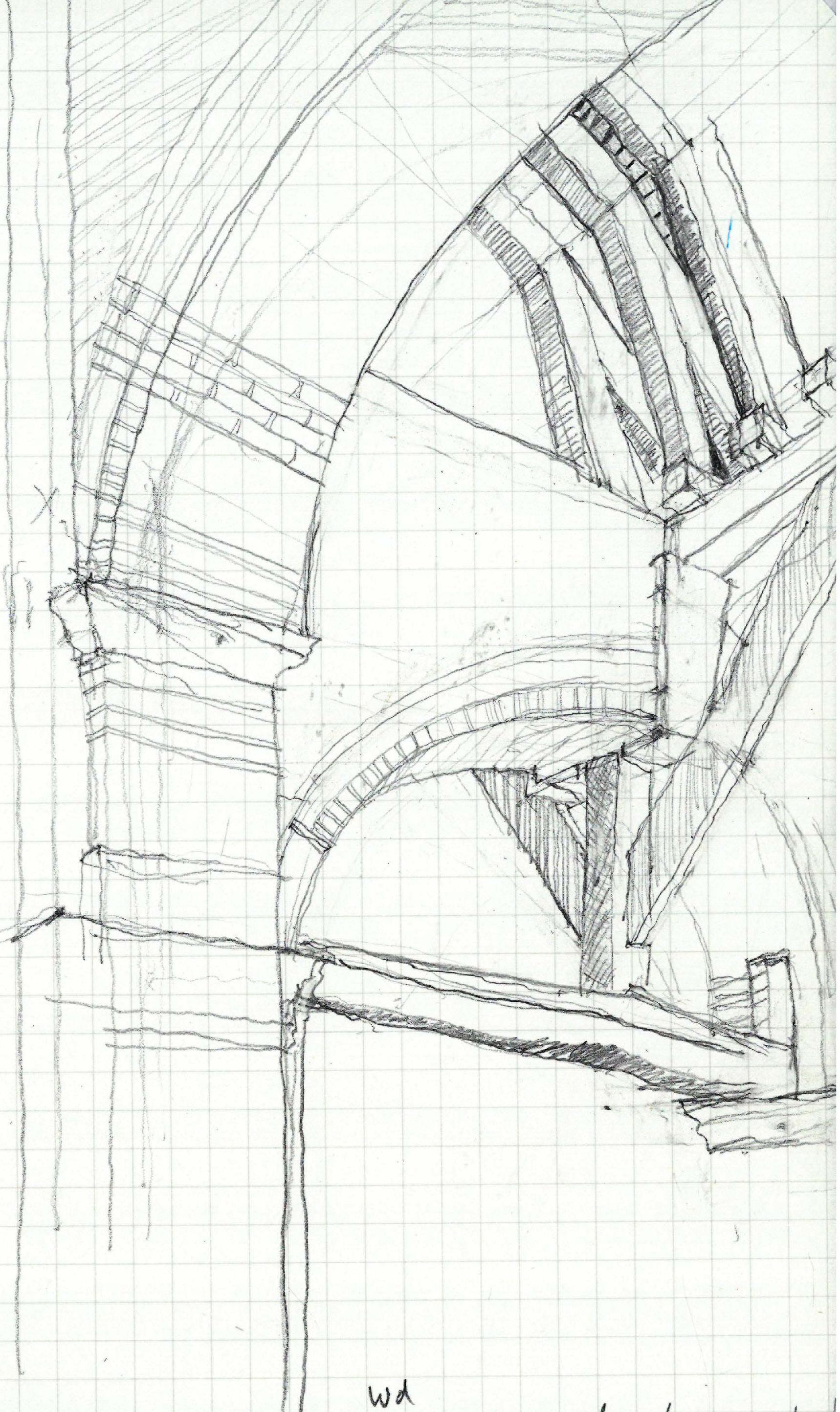
It’s interesting to see the overlay of the muralist’s work as a diagram of his understanding of the two ceiling types, timber vs. plaster. Lutyens’ design had given a sort of equivalence to the timber and the masonry, assigning them the same white plaster infill. Starmer’s work pulls the two apart, treating

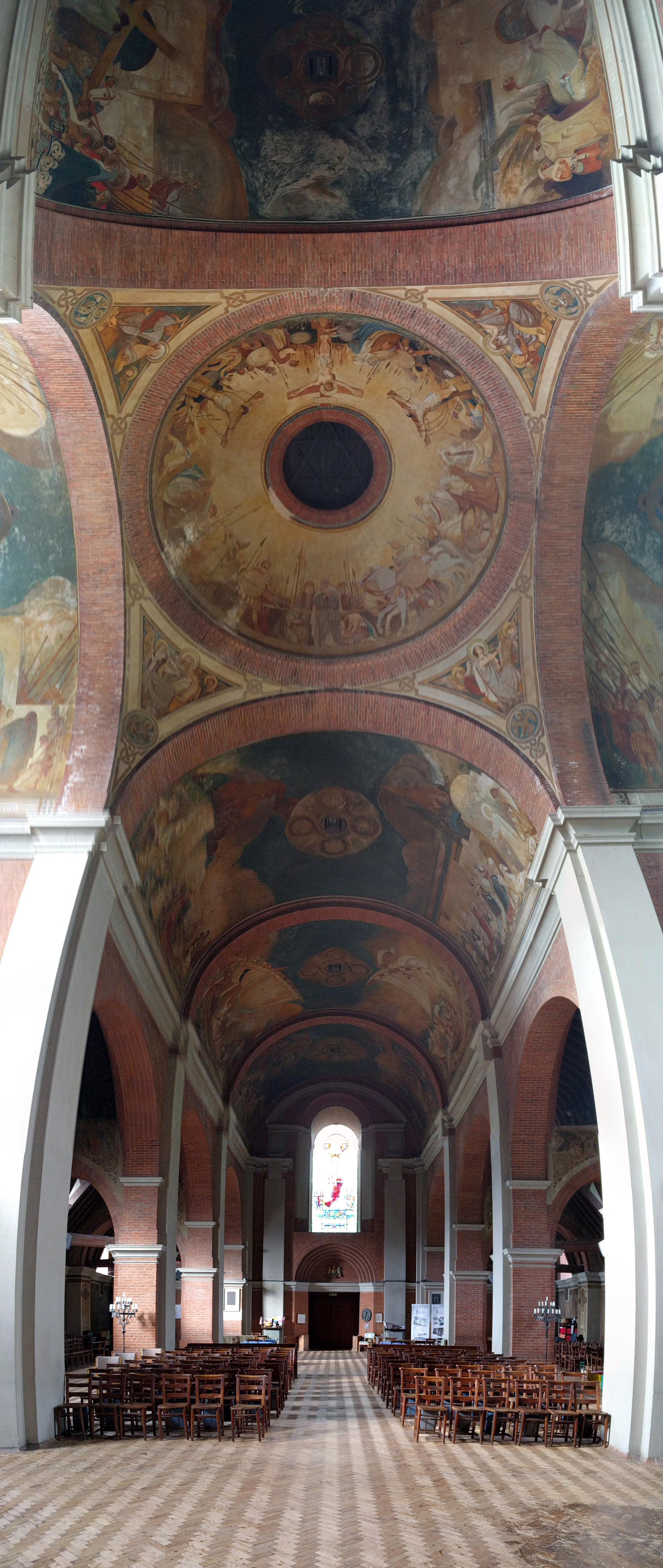
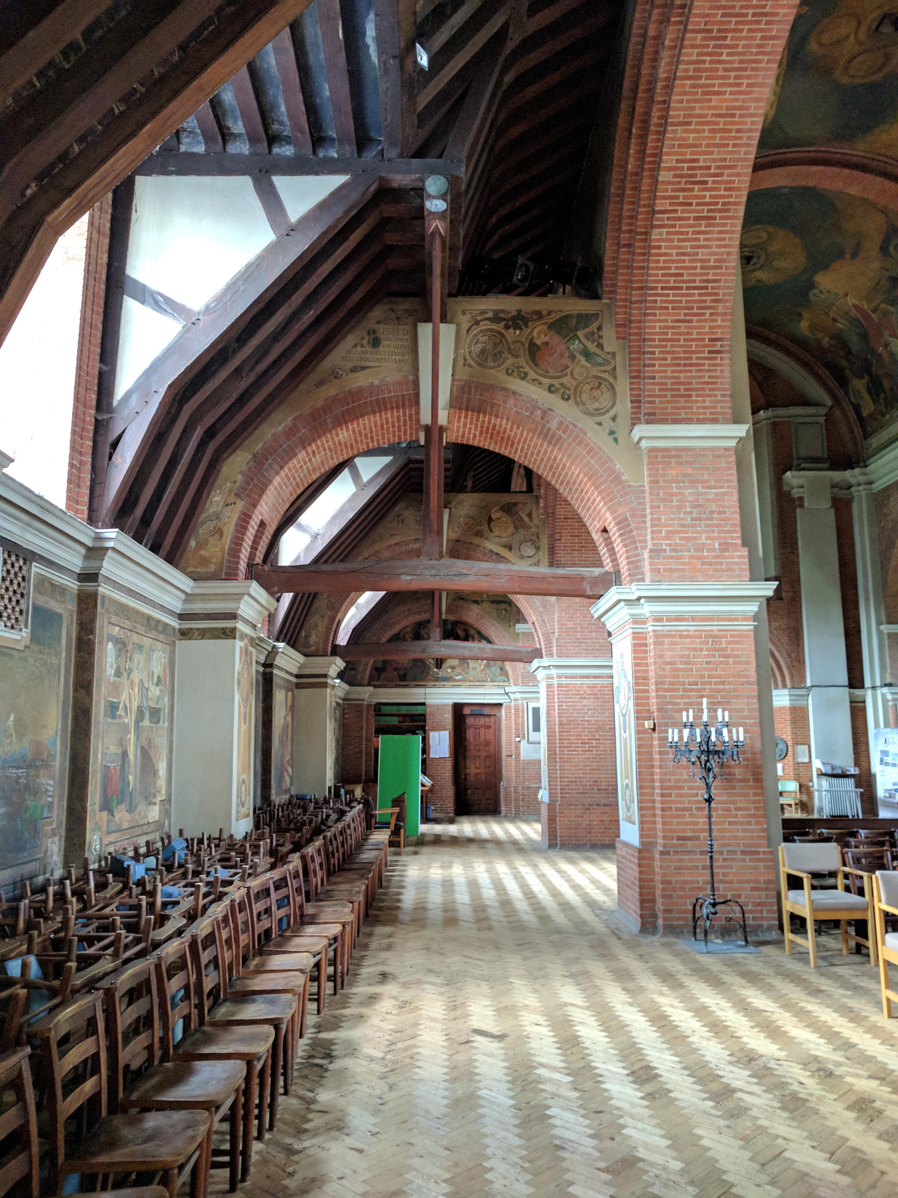
one as an element that “belongs” in the church, and which he thoroughly and enthusiastically embraces as his canvas. The other, which he tentatively treats with a small amount of painted ornament, clearly has a different meaning for him-- seemingly as something perplexingly exposed.
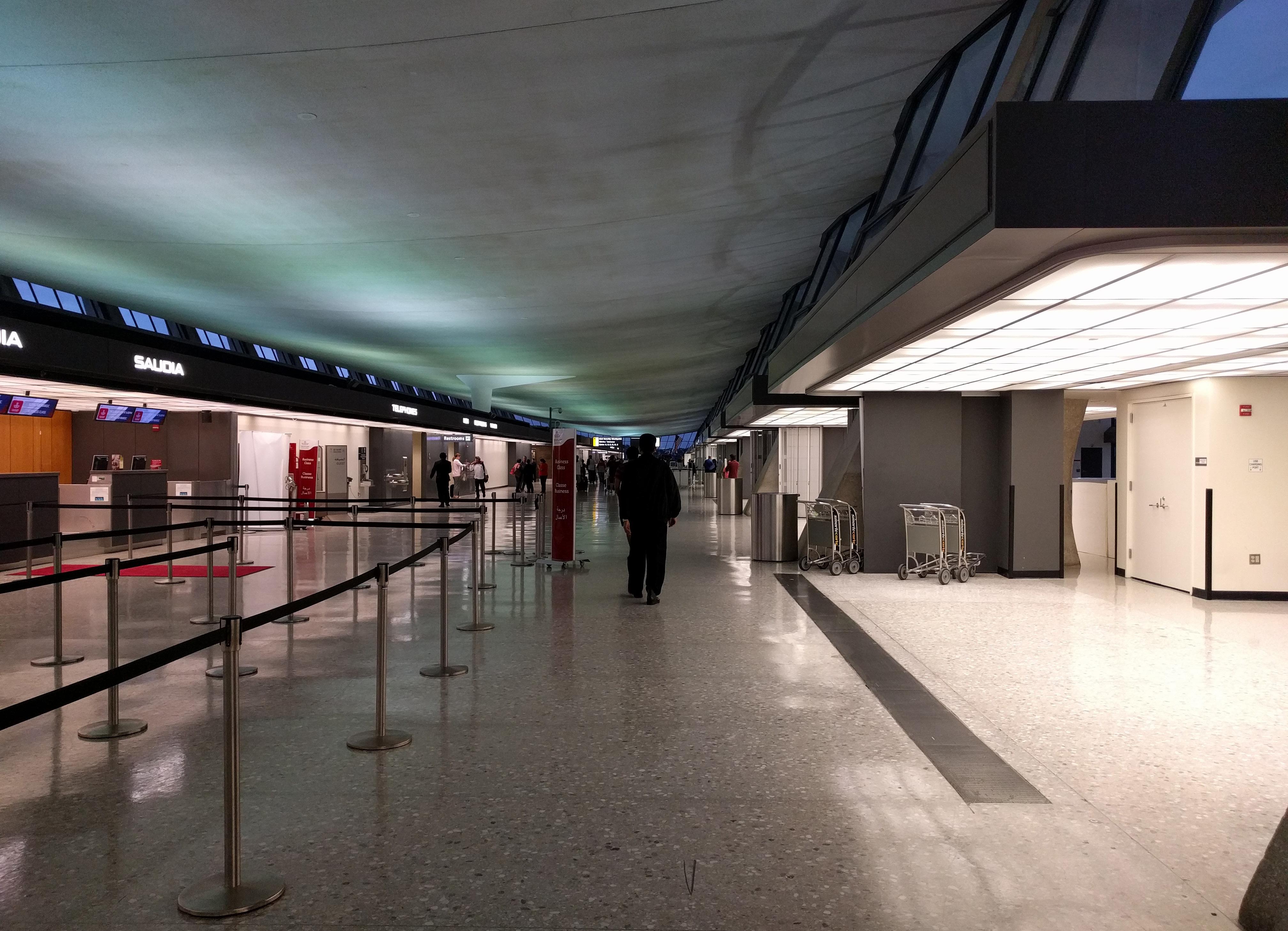
Obviously not in London, but this remarkable ceiling bookended my travels and can’t be omitted.
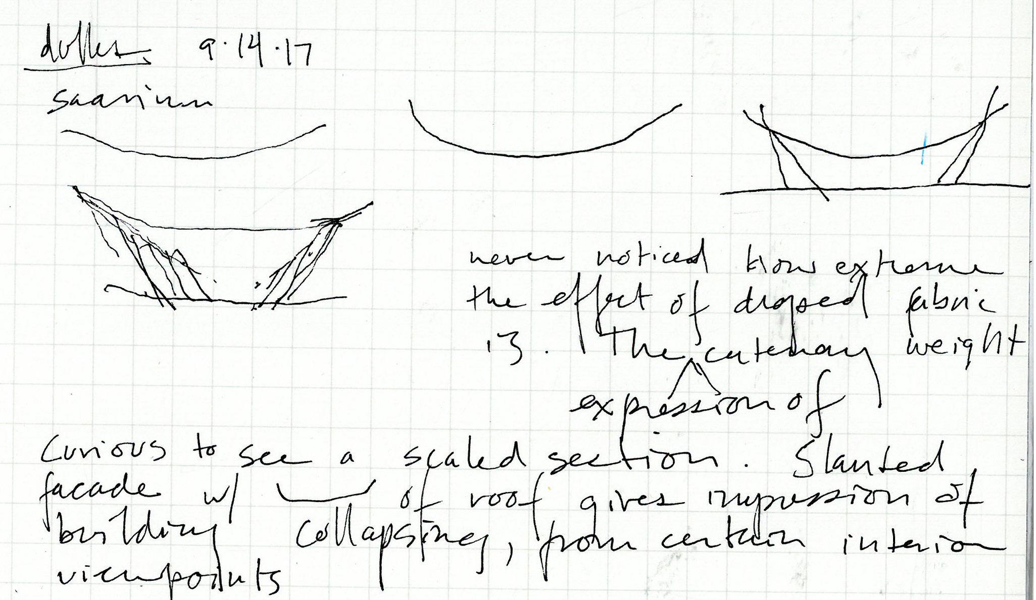
The weighty, fabric-like drape of the ceiling; the difficulty of how a column should meet it breathtakingly solved by the beautiful drama of piers piercing through voids in its surface; the alarming sense of possible collapse communicated by the sloped glazing; the completely sufficient simplicity of the ceiling’s one, structural, idea-- with almost nothing to say about layers, services, or inhabitation (well, other than a couple unavoidable but
aerodynamic rain leaders). The ceiling sails above, with mortals to set up camp below in huddles of glowing check-in kiosks.
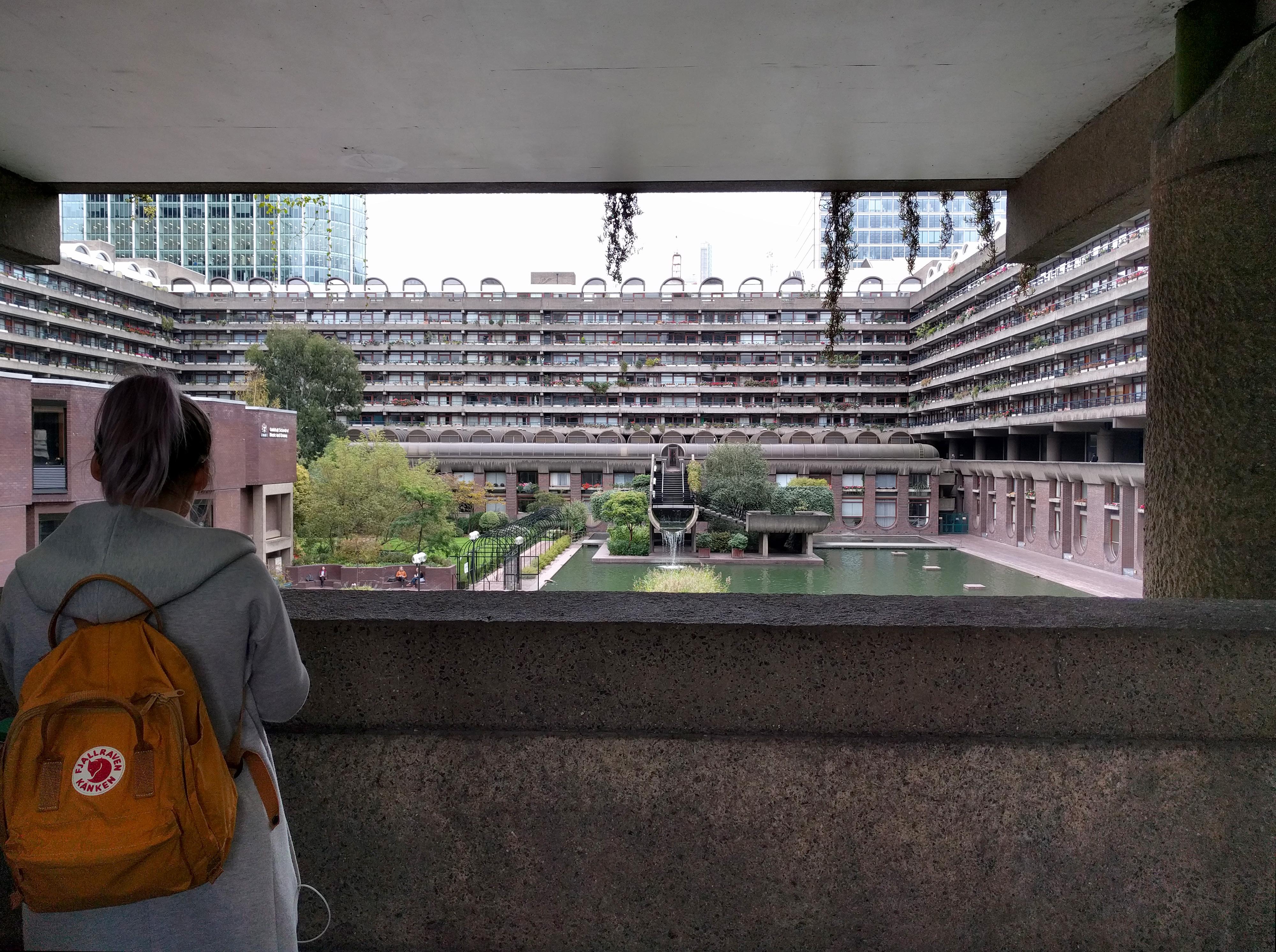
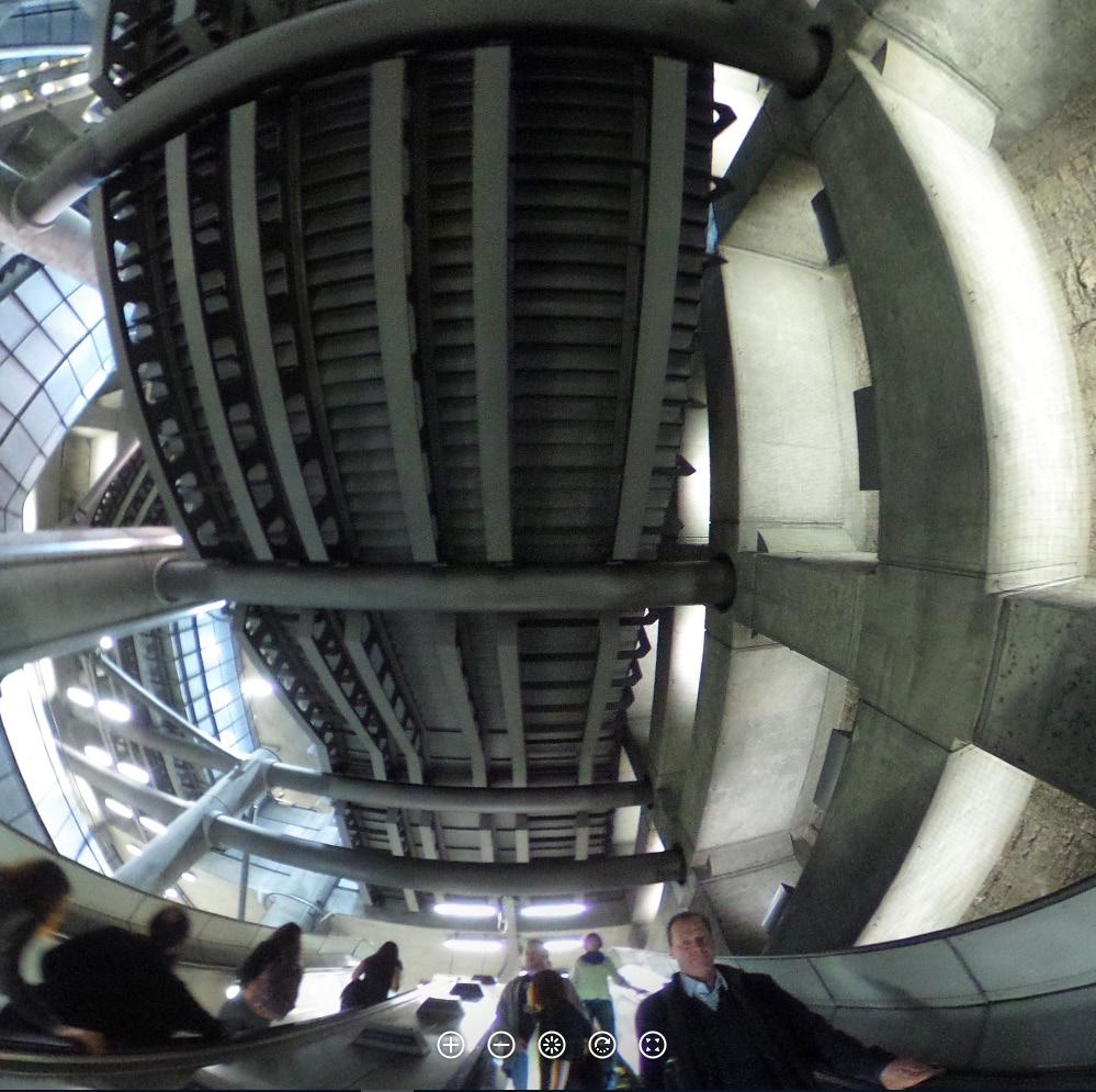
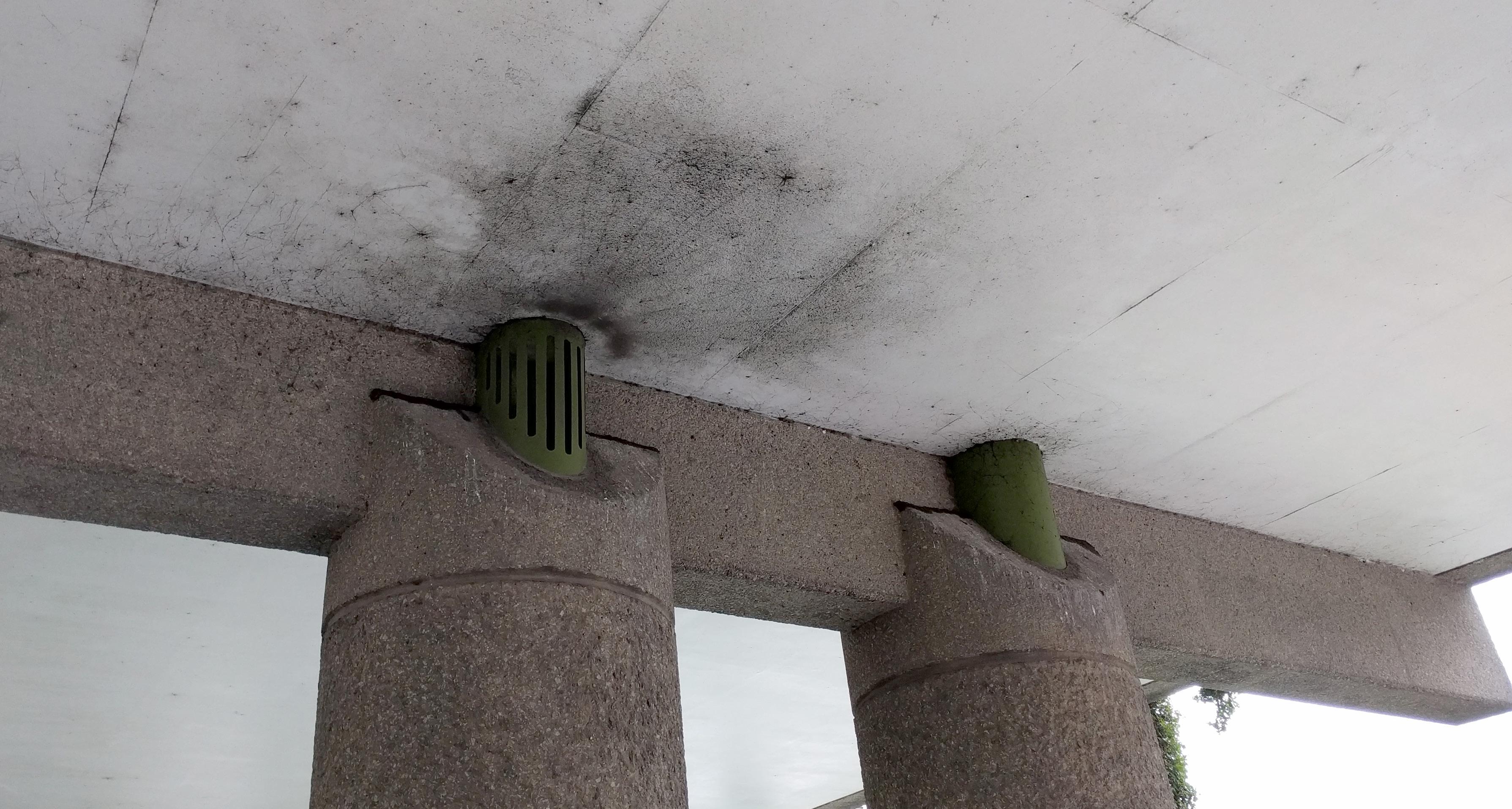
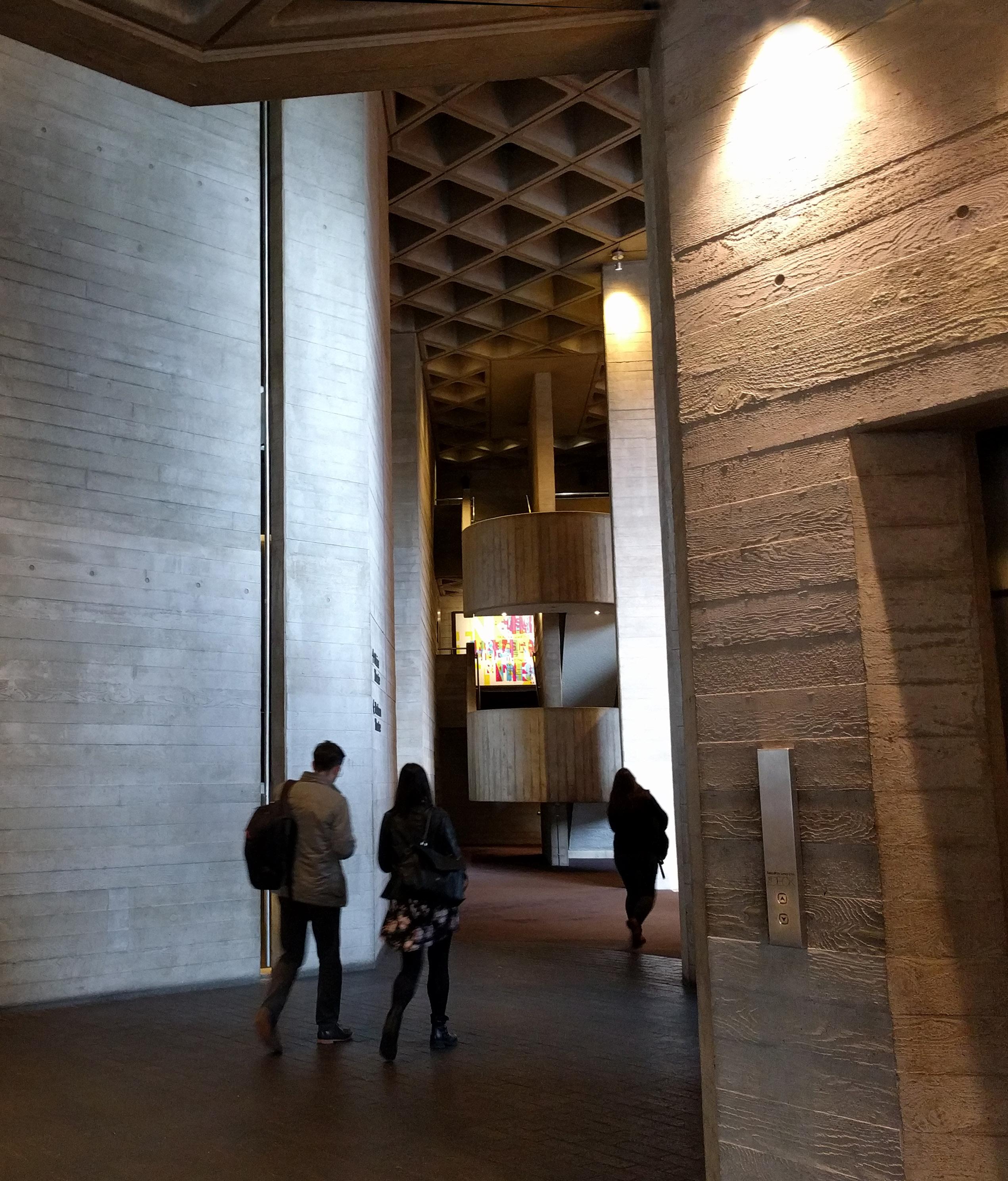
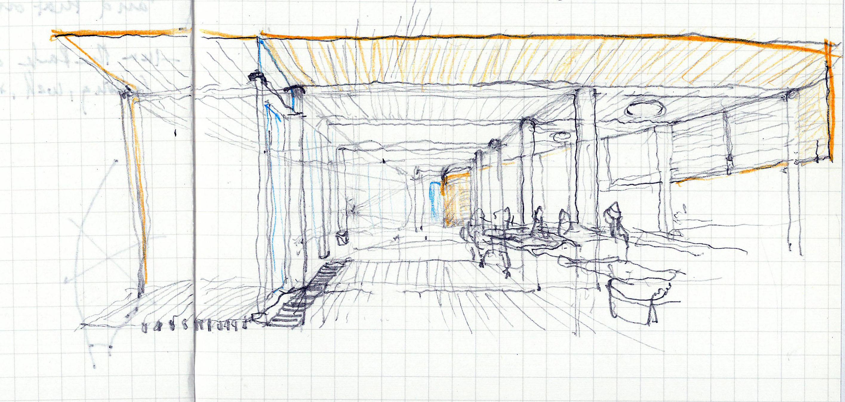
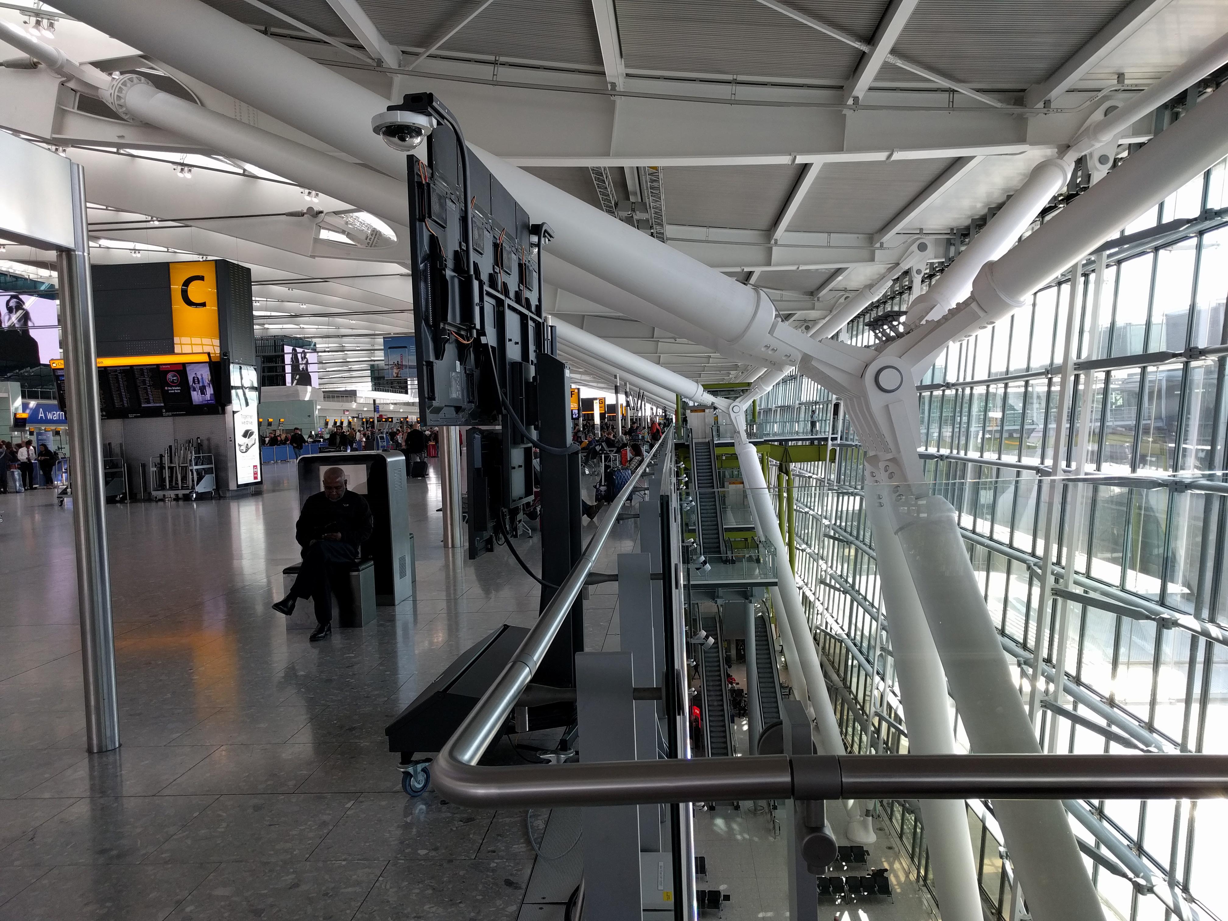
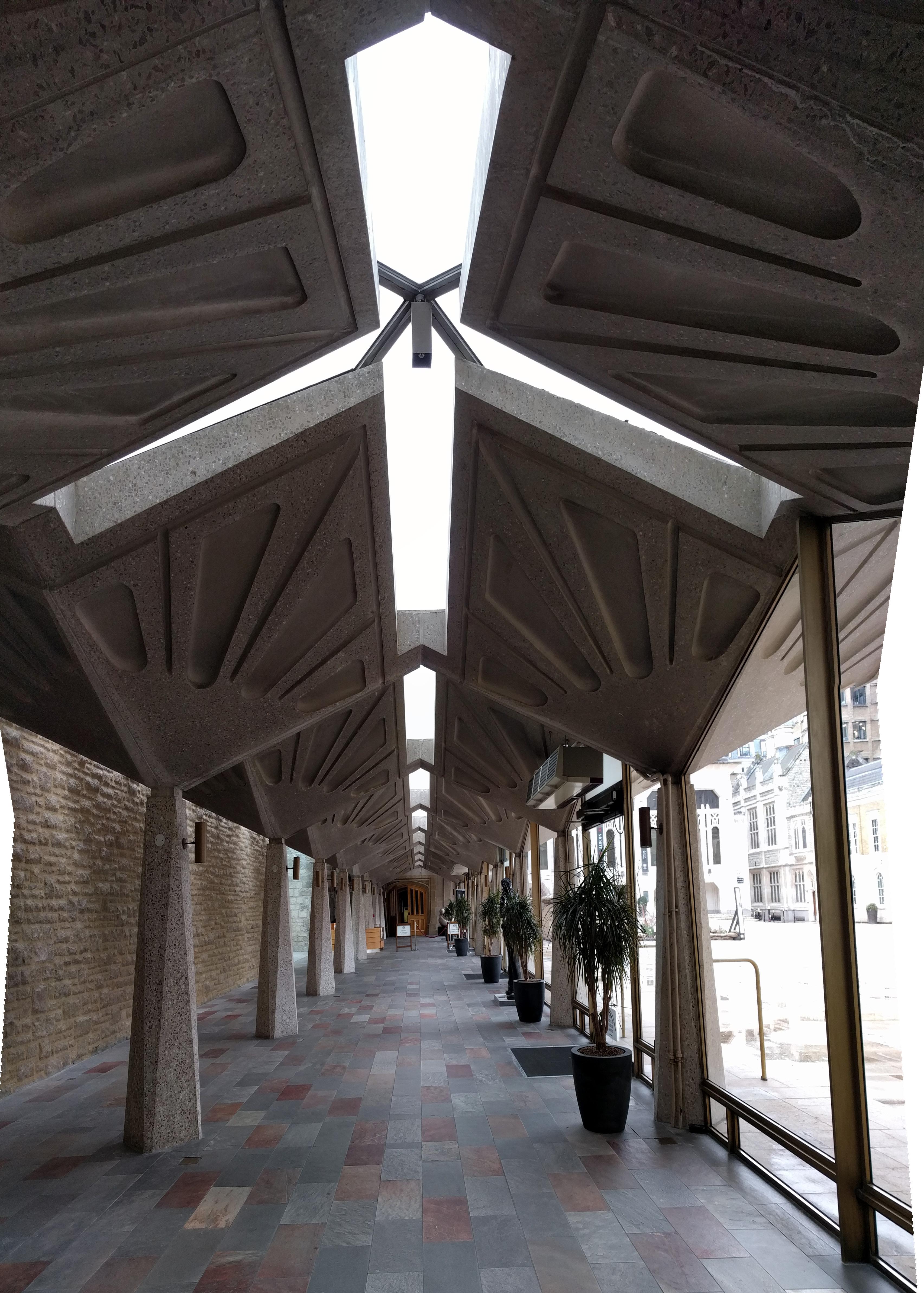
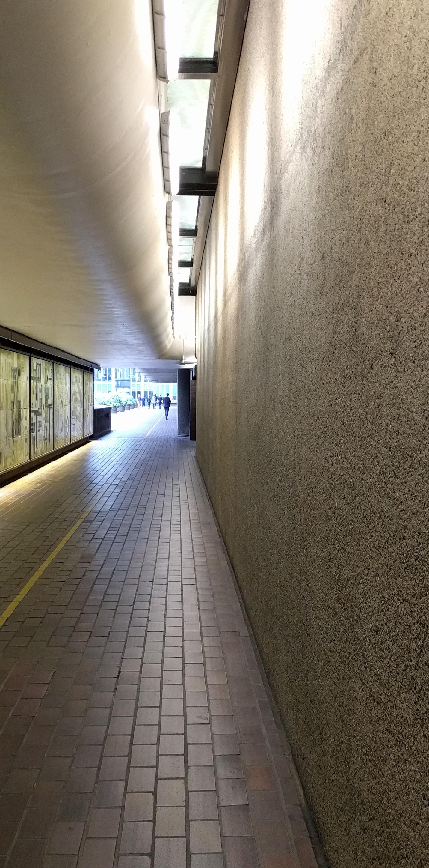
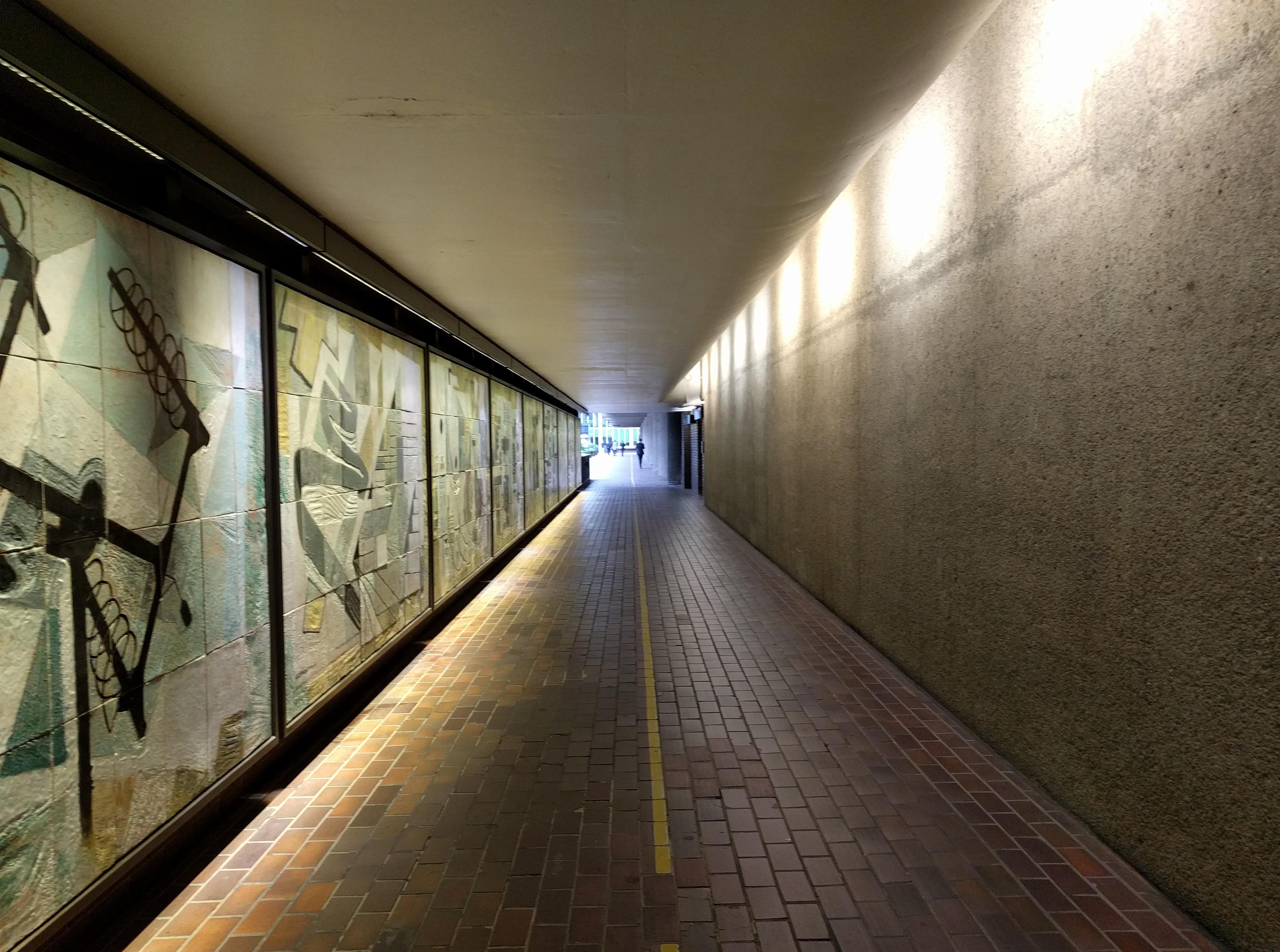
At the elevated walkway, notable use of contrast between smooth white ceiling and hammered concrete finish on column and “loggia” elements to deemphasize the experience of “underneath. In London, when you want to match the sky, you use white paint.

Connection of column to ceiling minimized; instead emphasis on connection to beam. Vertical penetration of services expressed as a diminution of the column, the opposite of a capitol.
Interior ceilings at the Barbican Arts Center (part of the complex)
are totally different from this outdoor ceiling. There, inside, waffle slabs appear; the ceiling expresses its structure and depth, the ground becomes the luminous surface.

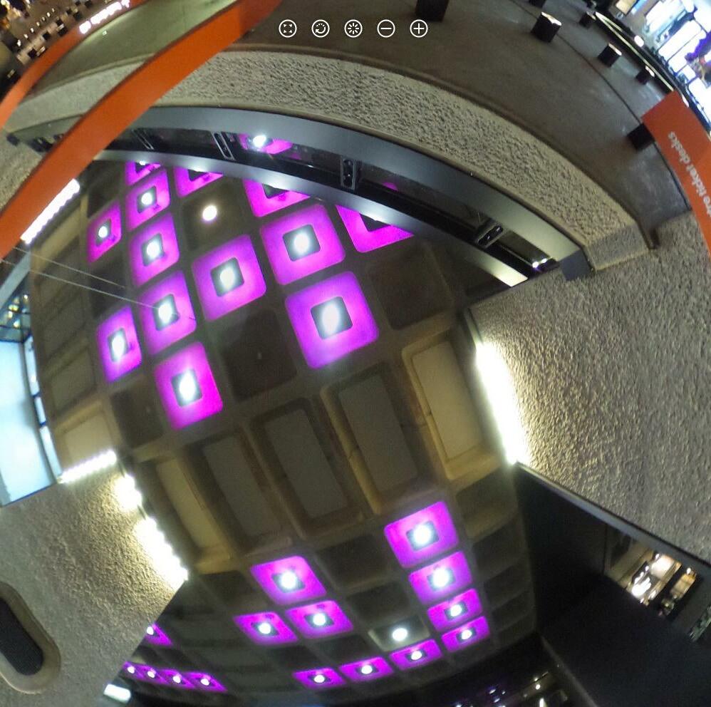
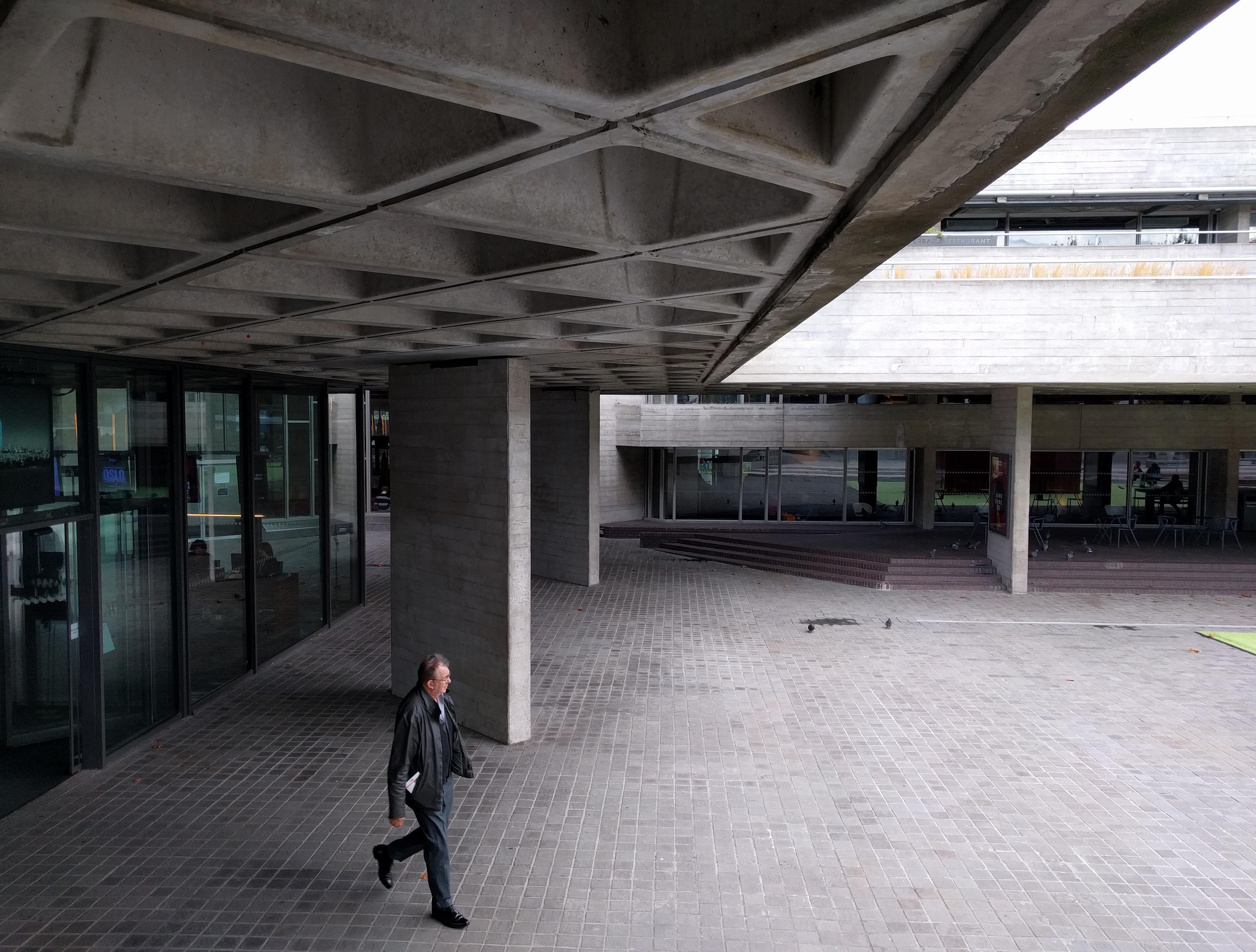
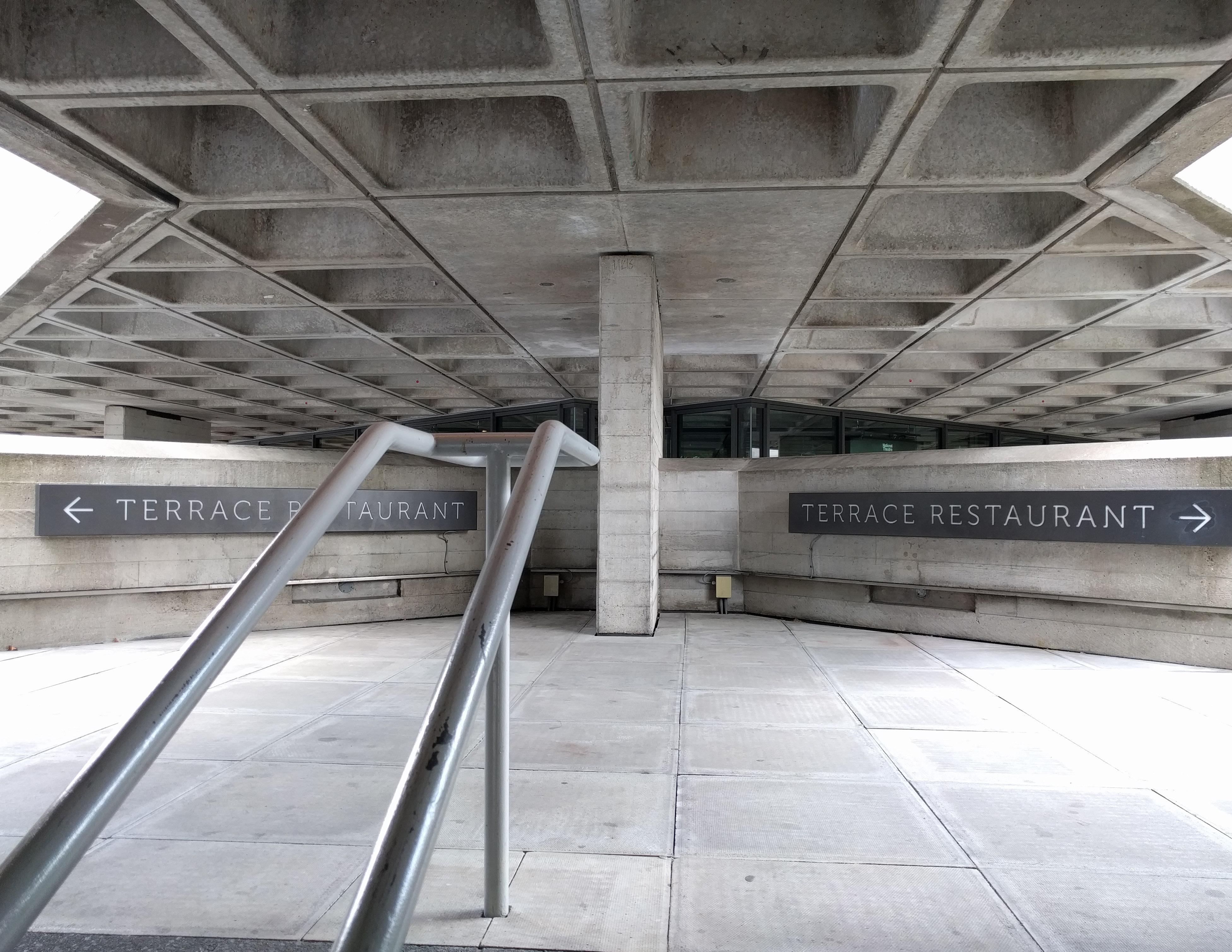
Circulating up an outdoor stair to one of the elevated terraces providing entry to the theater. I see what I came for, board formed concrete and another waffle slab... but my pulse quickens because this one is ROTATED 45 degrees to the slab perimeter! Strangely exhilirating, and a study in the power of rotation. The effect of the rotation is most powerful at the edge of the slab, where daylight falls in a gradient across the rotated faces of the coffers. The effect is almost filigreelike, surprising and delicate at a waffle slab. The coffers are deep enough (2’-2”) that from my seated view on the terrace, only the vertical faces of the coffers are visible.
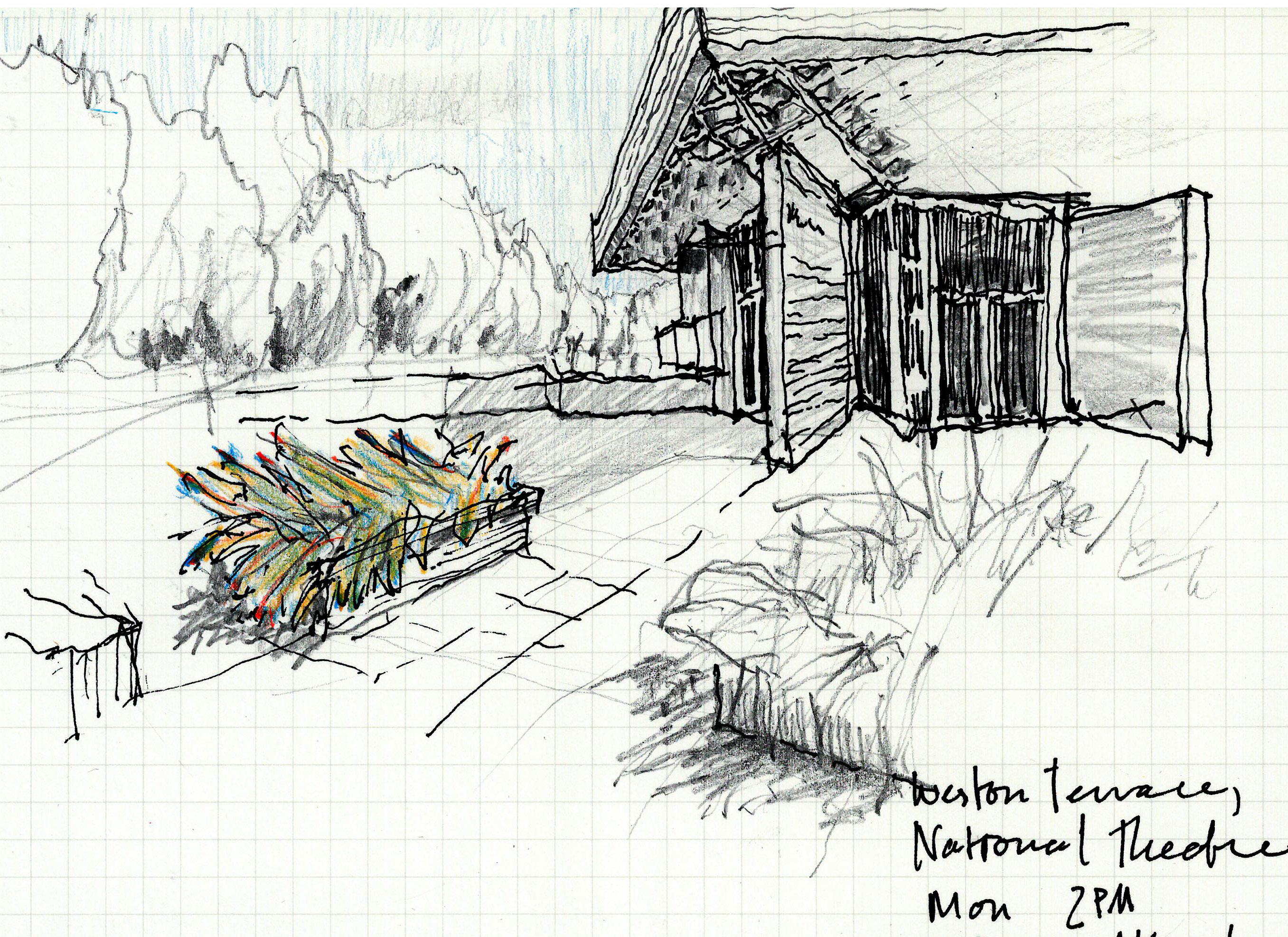
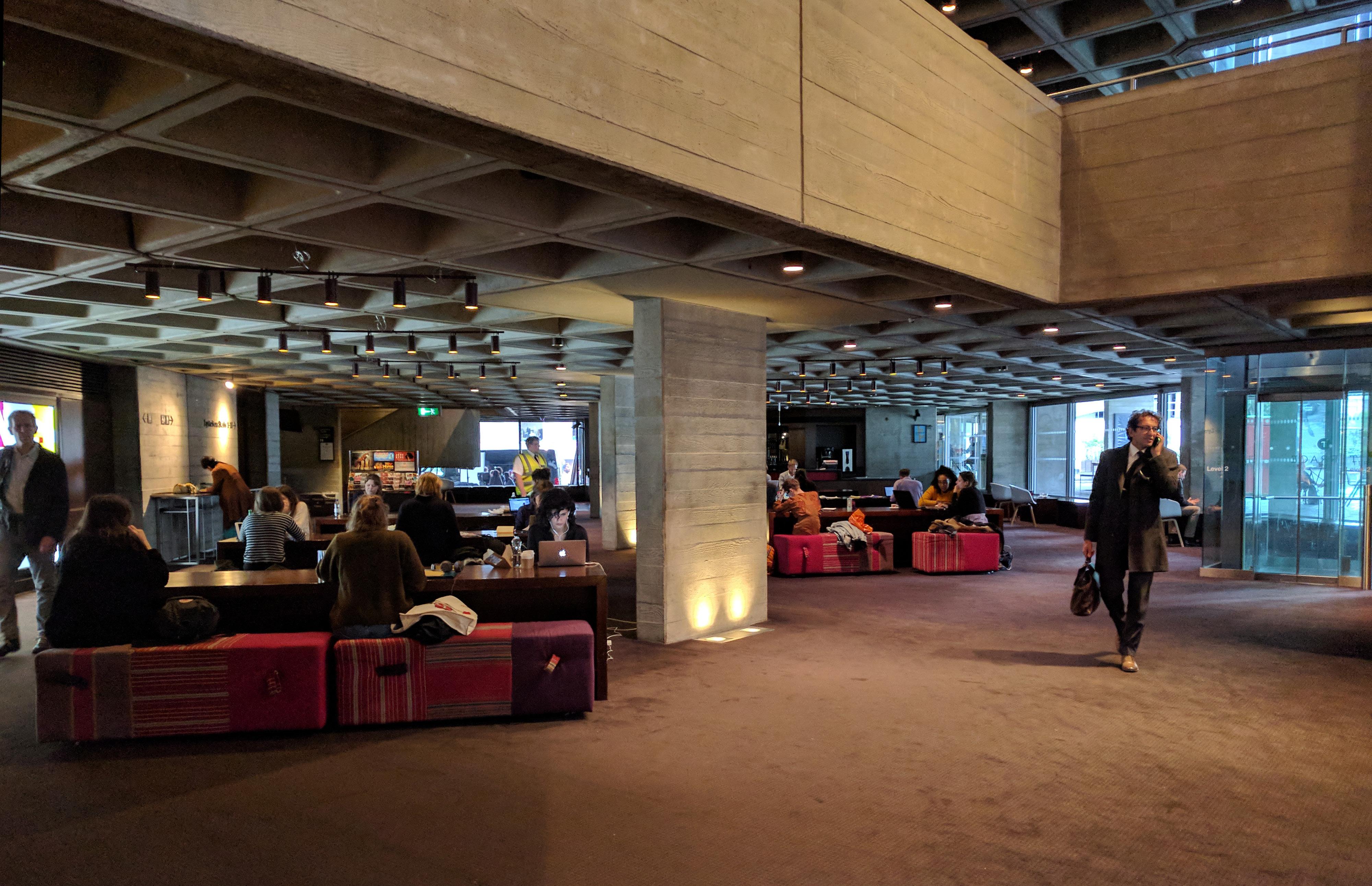
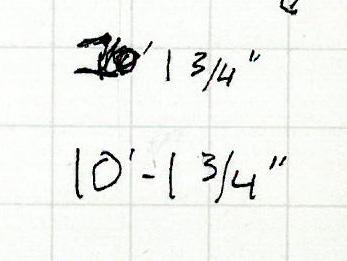
Once inside, many building elements run parallel to the waffle grid, but key long views in the space are once again at 45 degrees to the structure. The shifting orientation of space to ceiling grain is paired with extreme variation in ceiling height: from 6’-11 1/2” at a
stair landing to 26’ in the adjacent lobby. There are double height spaces, two and a half height, three-quarter height.
With ceilings of every height and the mixed orientation cues, navigating the massive complex of lobbies, theaters, and reception areas gives the sense of wandering in a forest.
 VMDO Tra
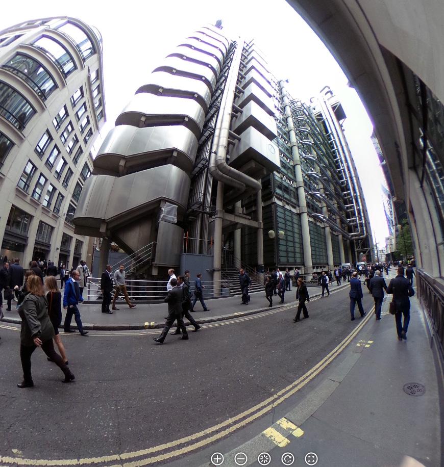
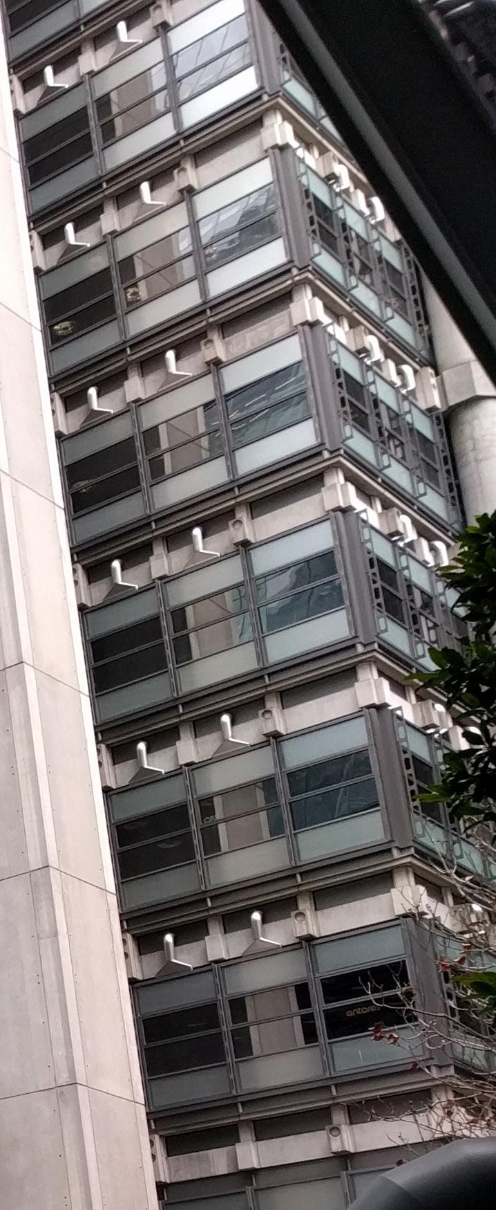
No public access allowed, but it’s still remarkable to view this building if only from the outside. Can’t help thinking of a description I read: “where the Terminator goes to have meetings.” So thorough in its readiness to trade in the idea of facade for the opportunity to show, “I opened it, and look what I found.”
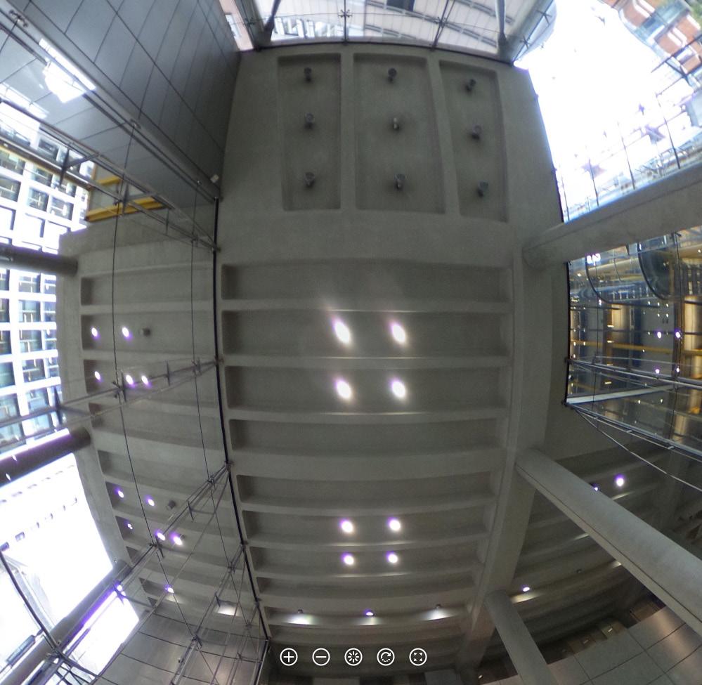
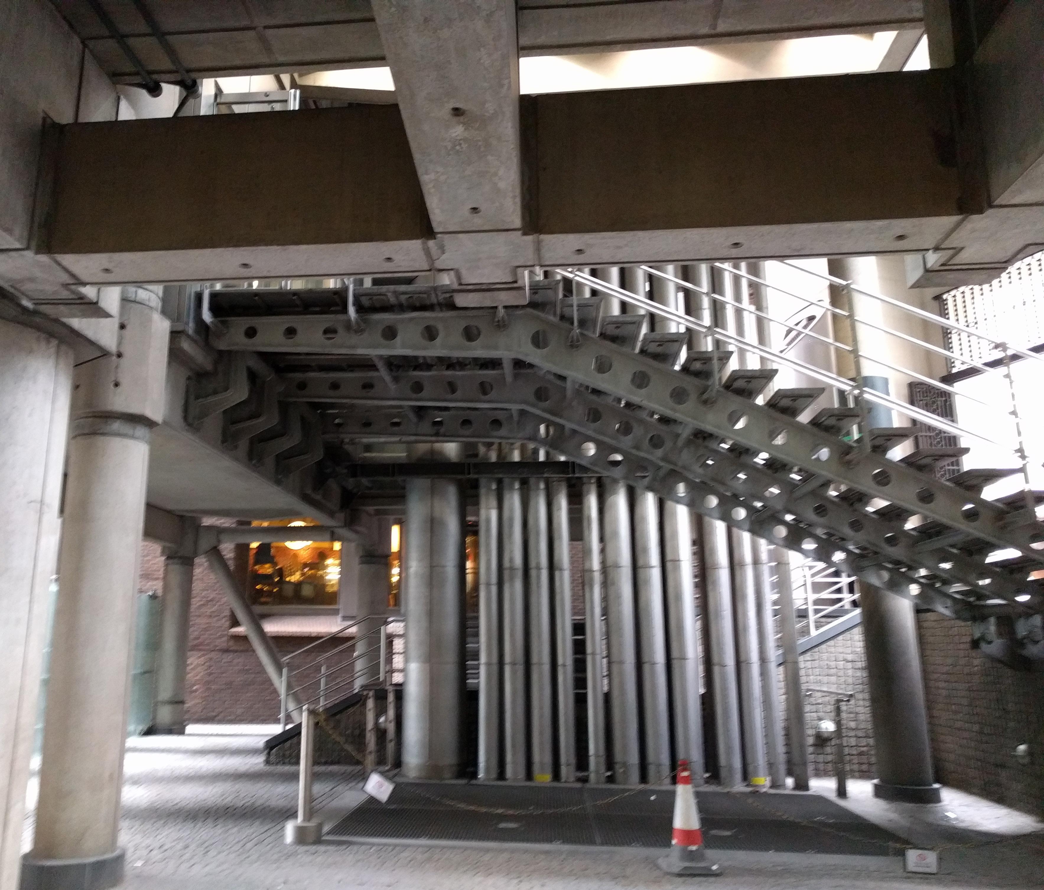
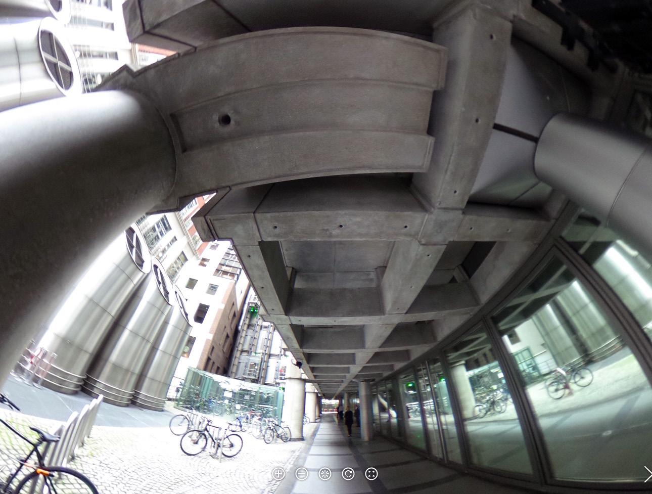
At any rate - yes, external services; yes, connections to the 1977 Pompidou design with Renzo Piano; but also -- look how the concrete grid of the ceiling is a transformation of the grid of the waffle slabs that had been covering more and more of London’s square footage in prior years. No longer a monolithic object. Even in concrete, Rogers makes an articulated frame. Floor slab is held up from concrete beam grid by concrete posts.
The resulting void zones between horizontal structure and floor slab allow for the weaving of services with structure. Light fixtures and column-like chases plug into the square coffers of the concrete grid.
This reads to me like some kind of synthesis of the promise and flexibility of the free plan with a deep-seated urge to show structure. The ceiling is telling the tale of the structure, but not in a way that locks in the partitioning of the space below into the structural bays.

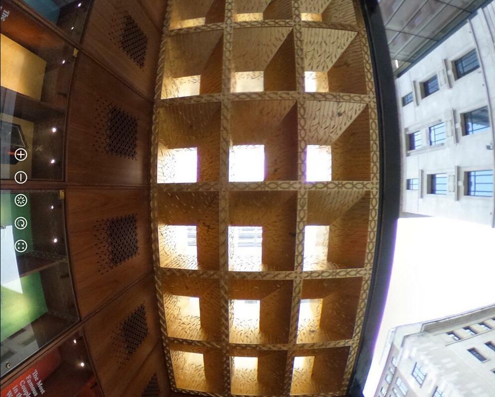
Ceiling, back wall, and floor work together to create the sense of hiding below an undercut stream bank, looking out at the water. Unmatched types of wood used at ceiling and floor doesn’t particularly diminish the effect or create a distraction (I would have been concerned about that in design). Outside, the floor material changes and the exposed
Ceiling, wall, and floor work together to create the sense of hiding below an undercut stream bank, looking out at the water. Unmatched types of wood used at ceiling and floor doesn’t particularly diminish the effect or create a distraction (I would have been concerned about that in design). Outside, the floor material changes and the exposed
vertical and horizontal structure change from concrete to wood; the wooden ceiling infill is the one element that remains constant inside and out. (Continuity emphasized by omitting the mullion at the ceiling surface.)
vertical and horizontal structure change from concrete to wood; the wooden ceiling infill is the one element that remains constant inside and out. (Continuity emphasized by omitting the mullion at the ceiling surface.)
Curious if the structural change is due to fire code, and wood structure would have been preferred inside as well.
Curious if the structural change is due to fire code, and wood structure would have been preferred inside as well.
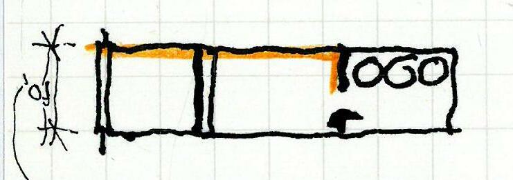
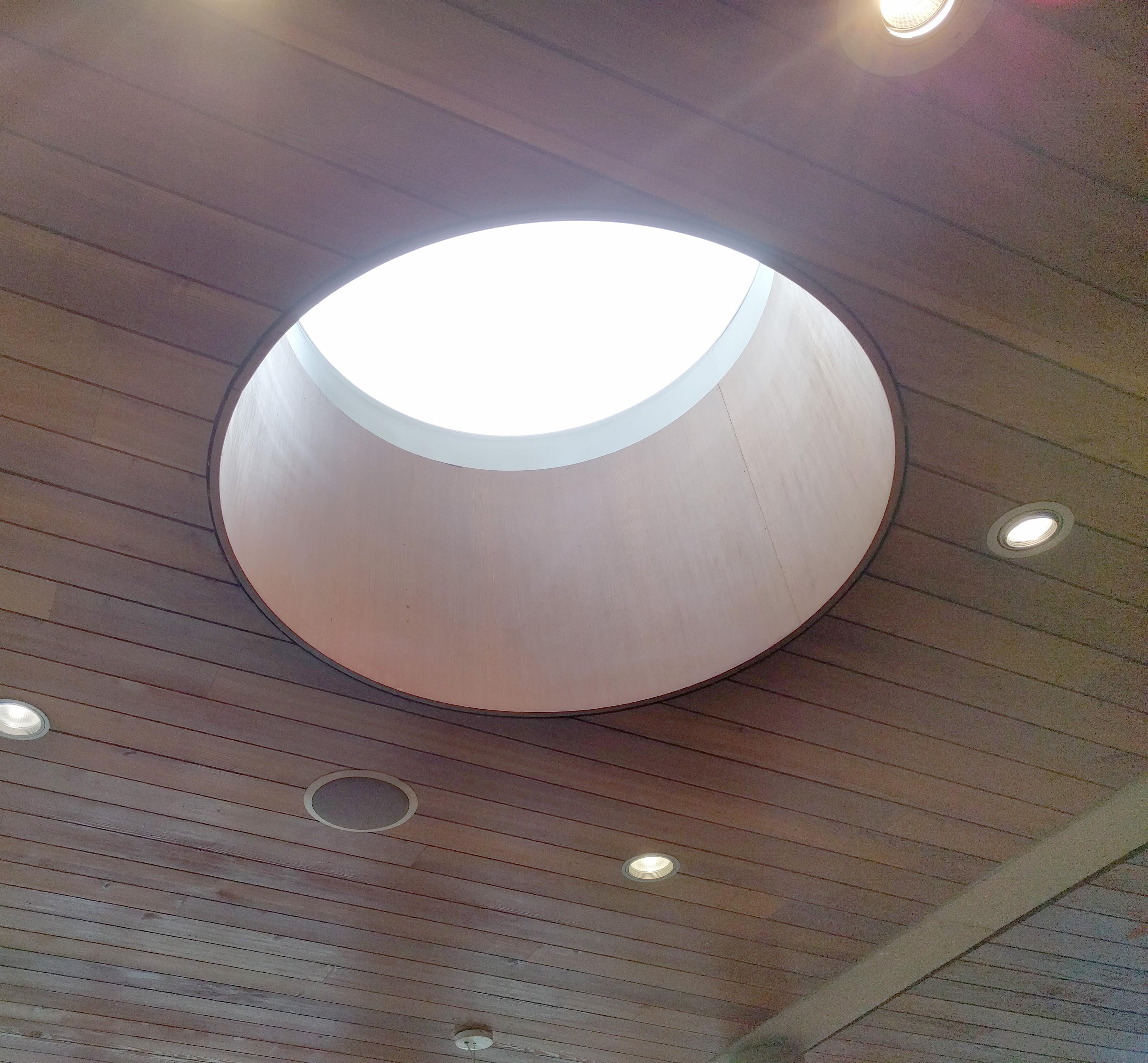
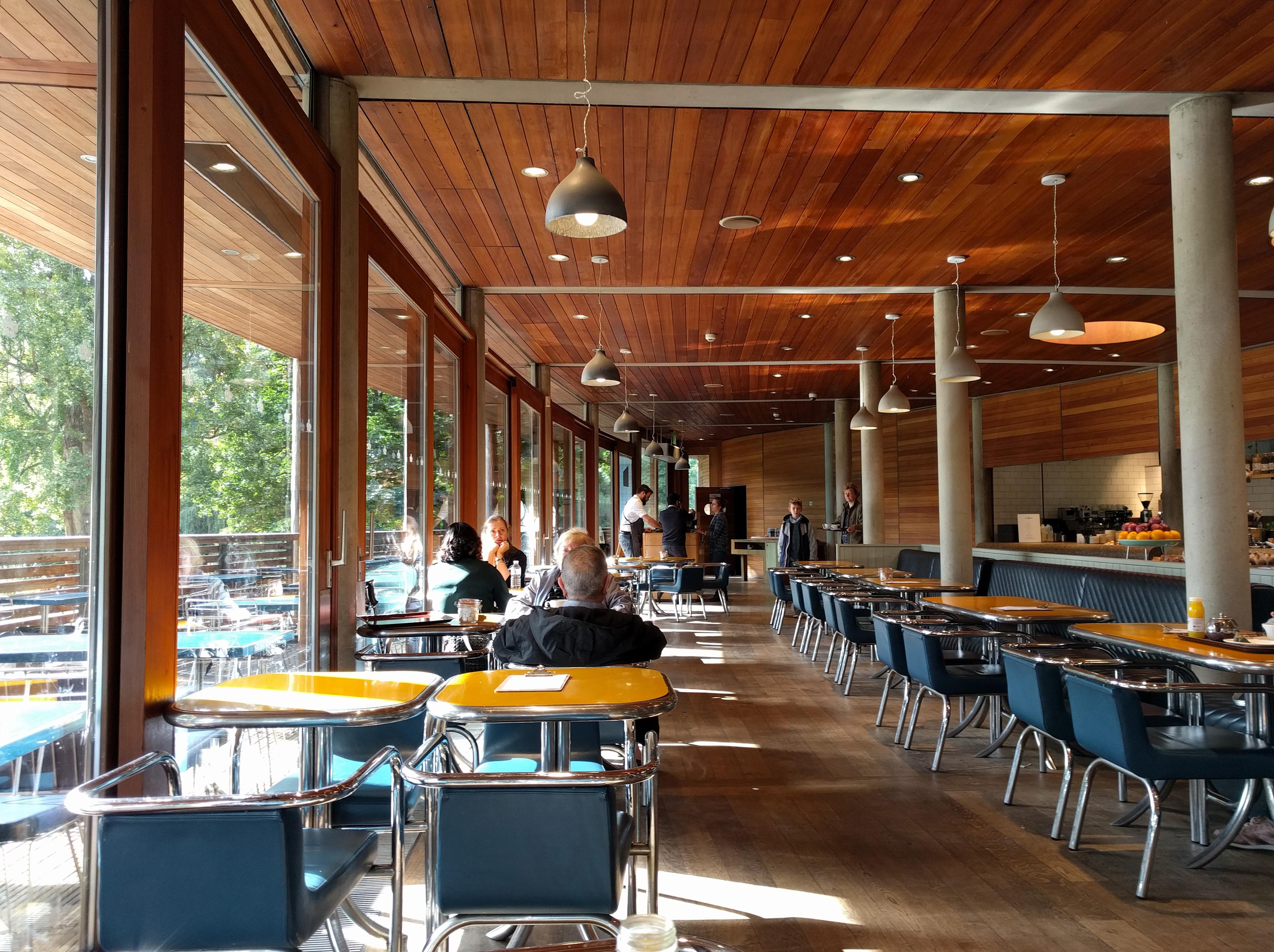
This city’s appetite for daylight cuts through even here, at a little building tucked into a berm - two circular skylights pierce through to bring sunlight to the back of the two deepest bays. These are joined by a dance of light reflected onto the ceiling from the surface of the adjacent pond, when the sun occasionally peeks out.
Adjaye Associates
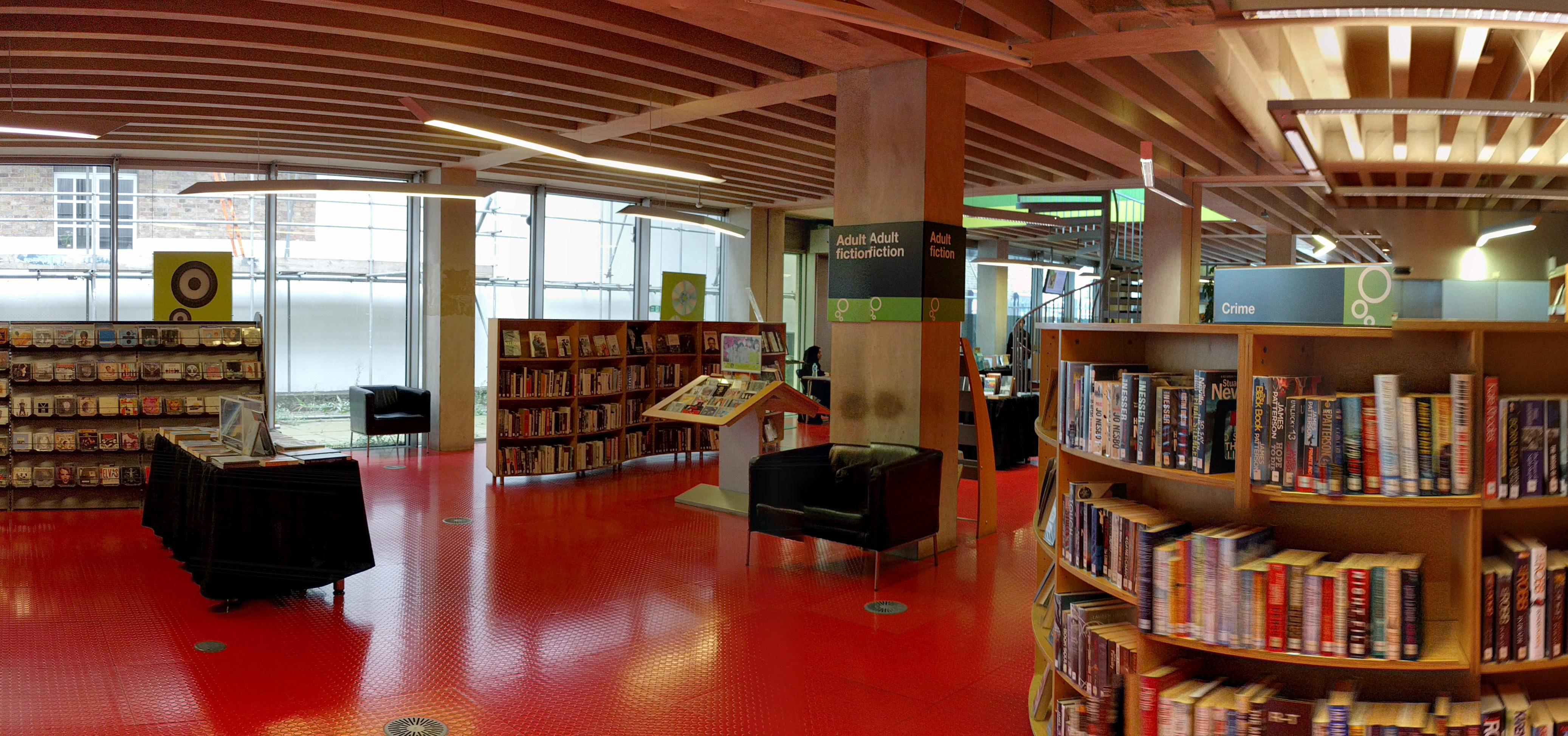
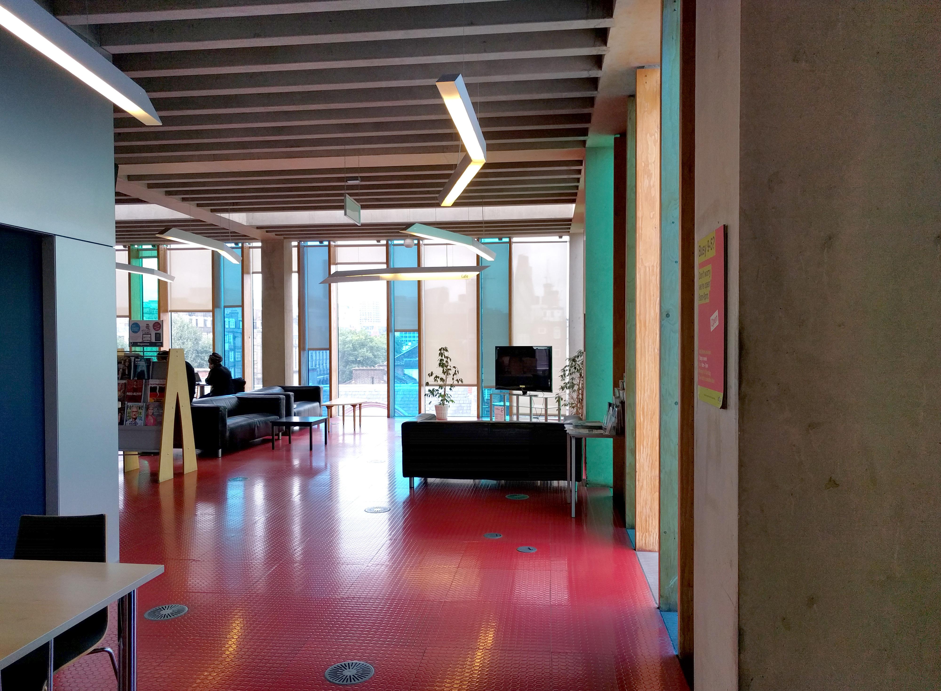
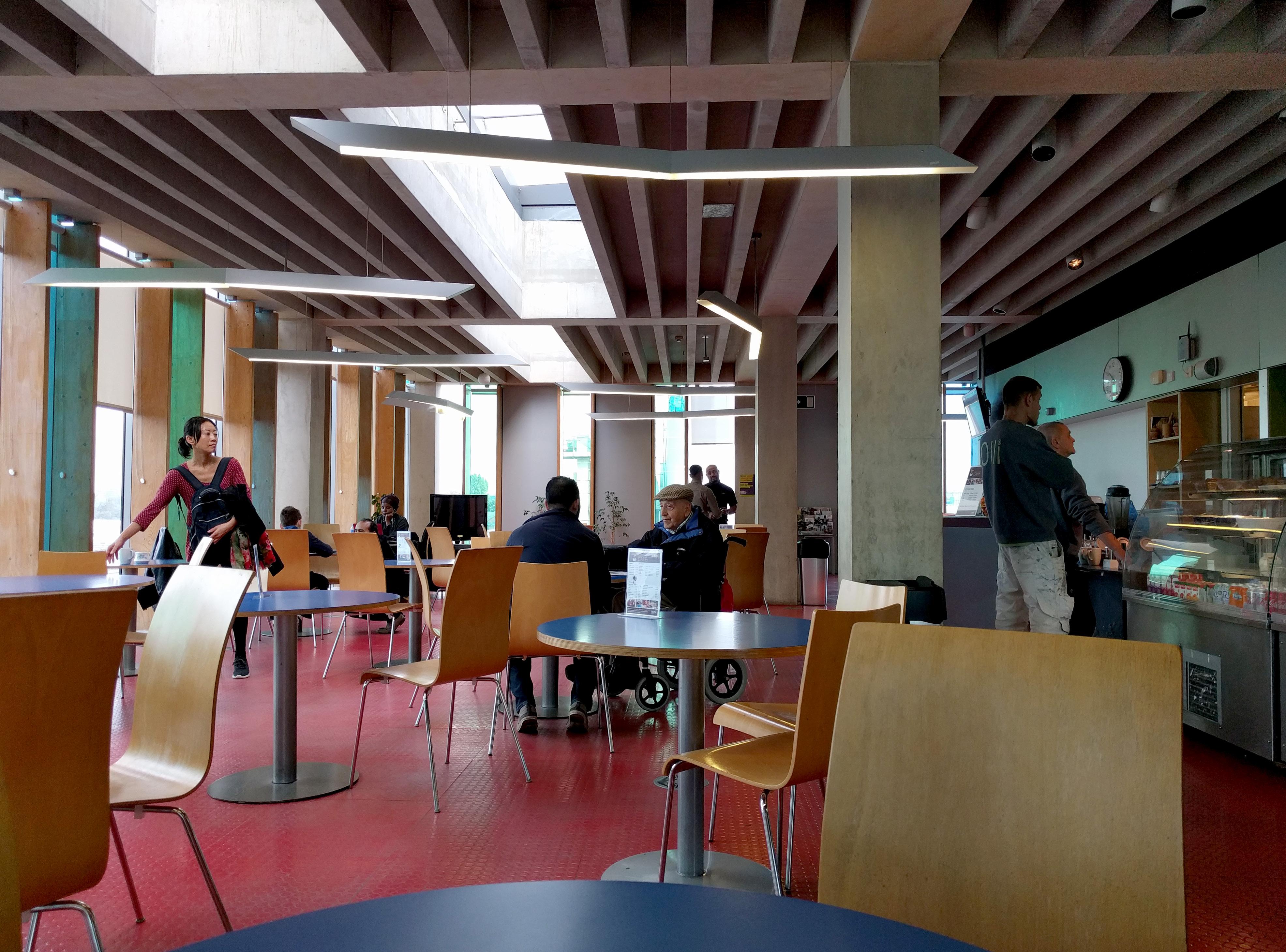
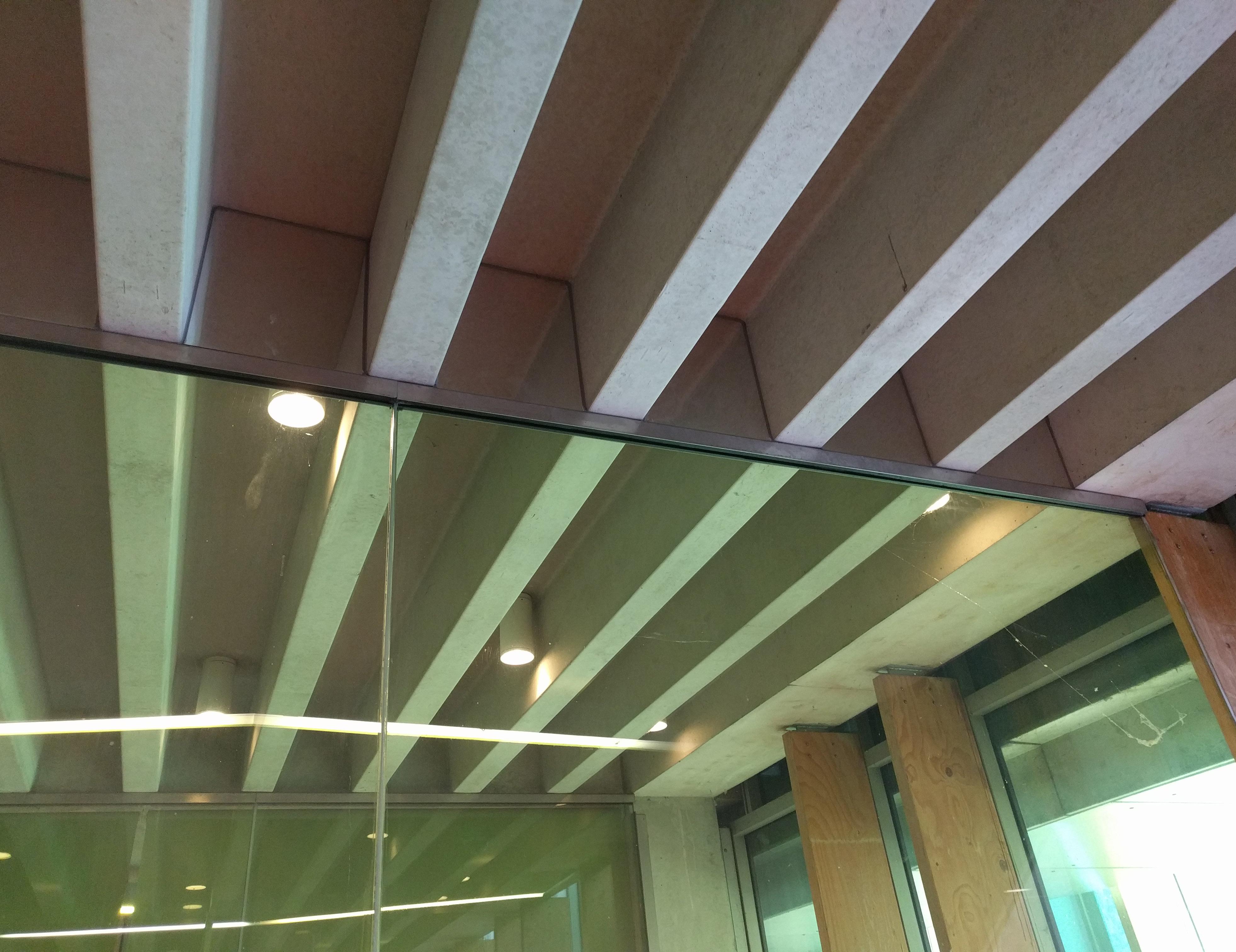
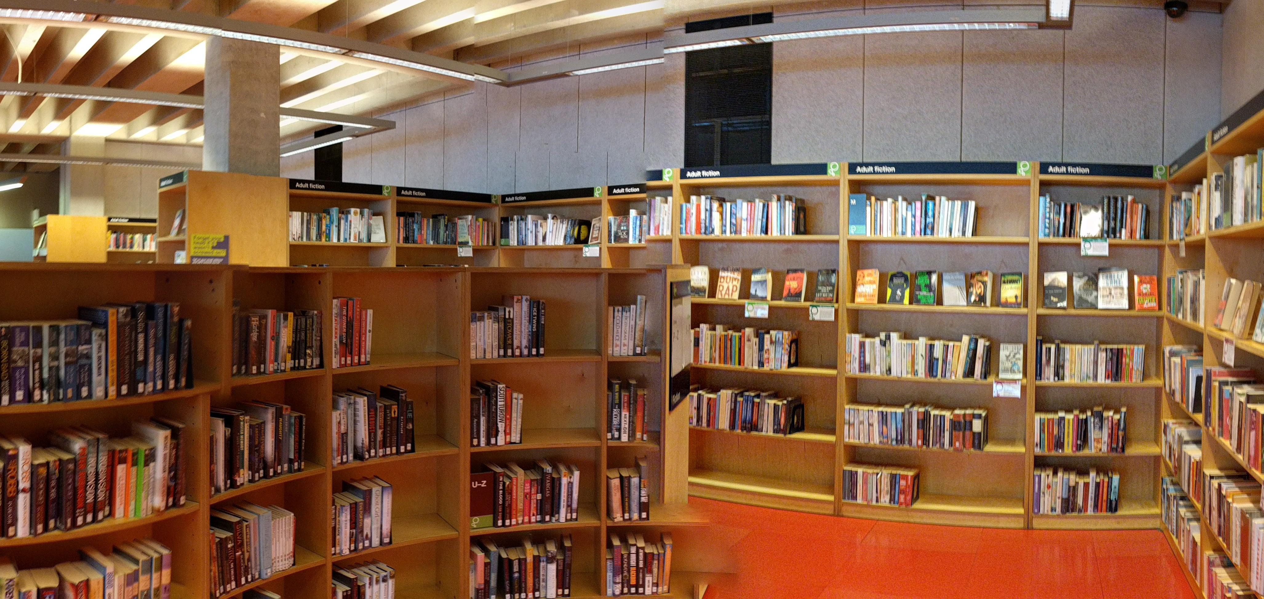
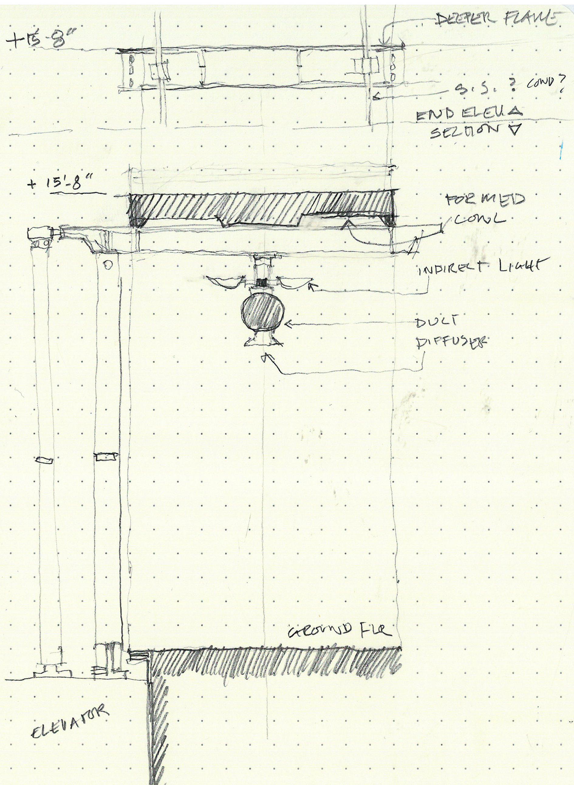
Square and rectangular concrete columns laid out in roughly square bays, with the underside of the ribbed concrete floor slab almost universally exposed throughout the building. Ribs are about 1’ deep and separated by a dimension slightly less than 1’. Tightness of this secondary structure provides a baffle effect at the ceiling; view is primarily composed of the ribs themselves, rather than of the underside of the slab above. This helps conceal and quiet the presence of devices - Smoke detectors, speakers, can lights, attachments for suspended fixtures.
Color play between red floor and ceiling. Almost all fixtures are downlights, and a little bit of a red glow is reflected up onto the concrete. The couple instances of up/down lighting are less successful to my eye, their shapes and the light they cast neither
emphasizing the ceiling geometry nor contrasting with it.
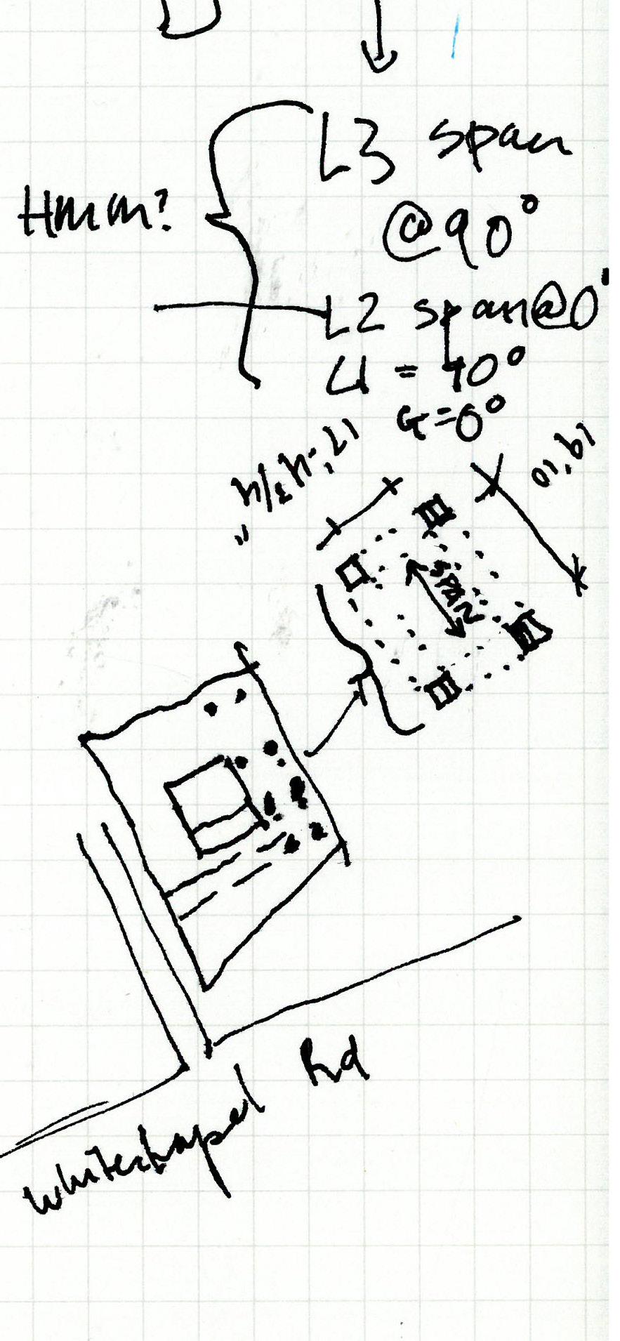
Building is very much a core scheme that you circulate around, especially at the upper levels. That means that the ceiling ribs are viewed on both the parallel and perpendicular, and their direction actually alternates by floor level. Very curious about this, and whether there were structural reasons for it.
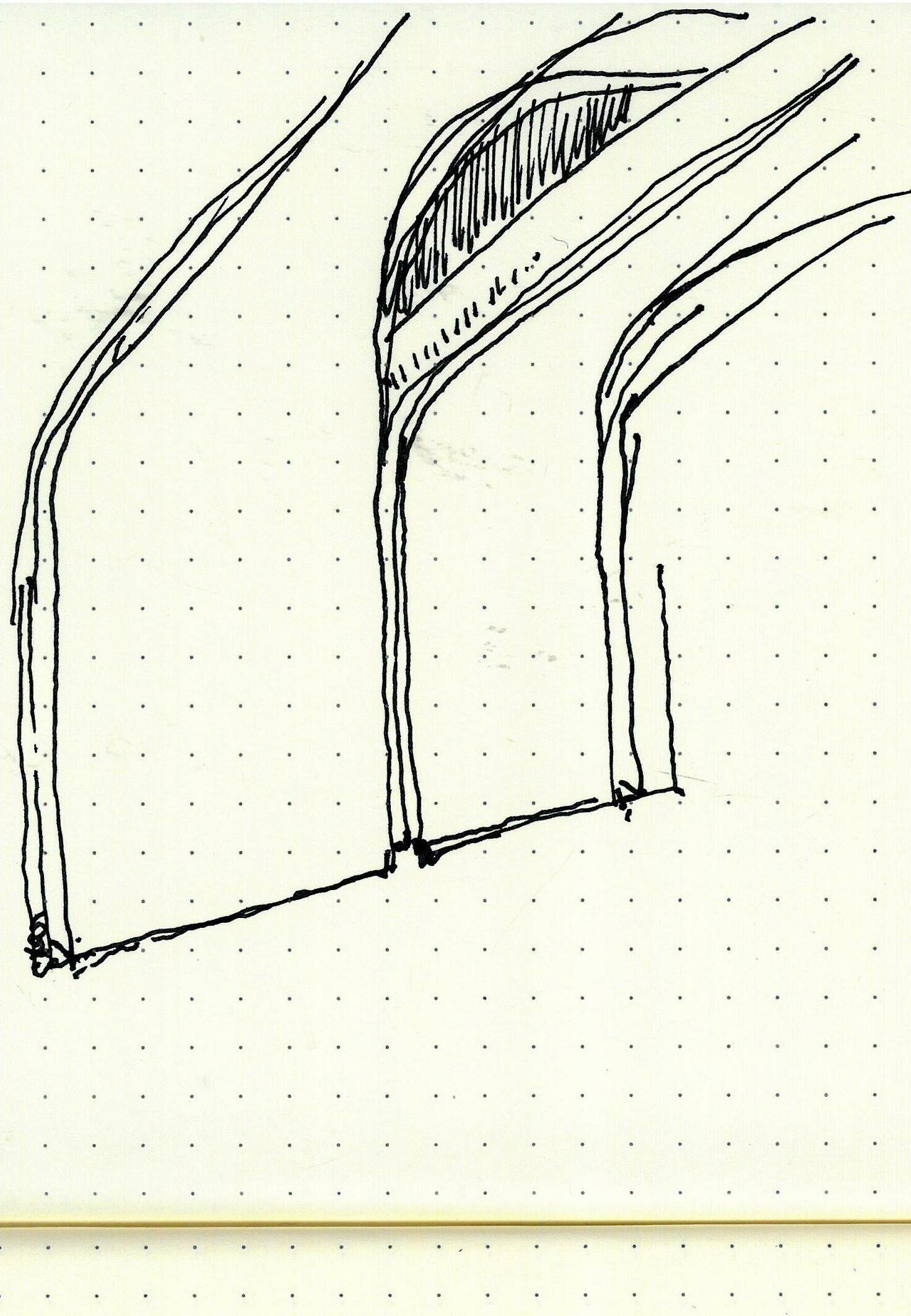
Partitions are not relegated to the primary structural lines, where they could meet the ceiling cleanly at the underside of a beam. Instead, little infill extensions are required between the ribs where partitions intersect the ceiling perpendicular to ribs. Infill is not too noticeable, but a little homemade in appearance when you look at them. Little reveal in wall at bottom of ribs helps make a clean appearance.
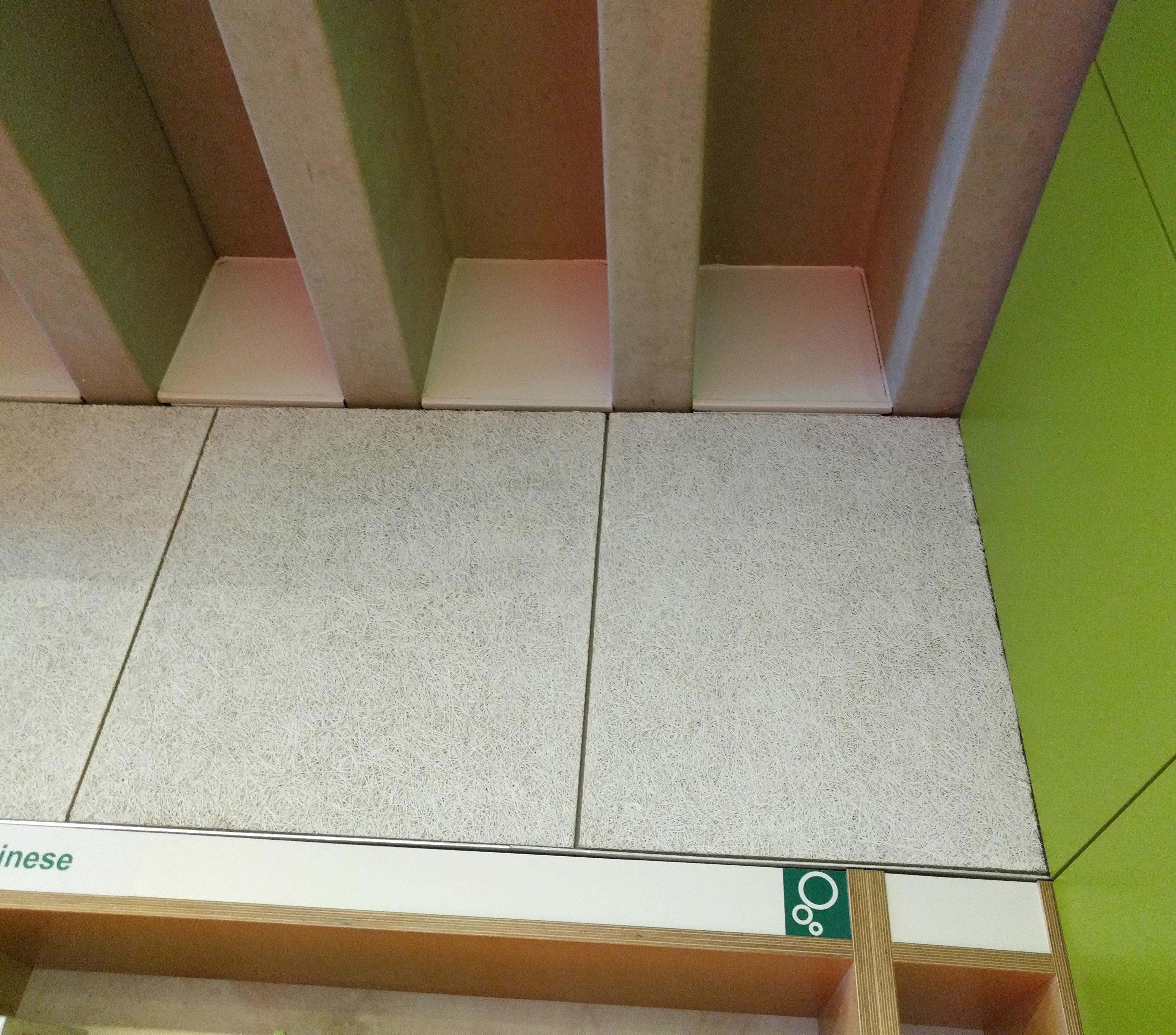
Tectum on walls above the bookcases for acoustic material. Underfloor air.


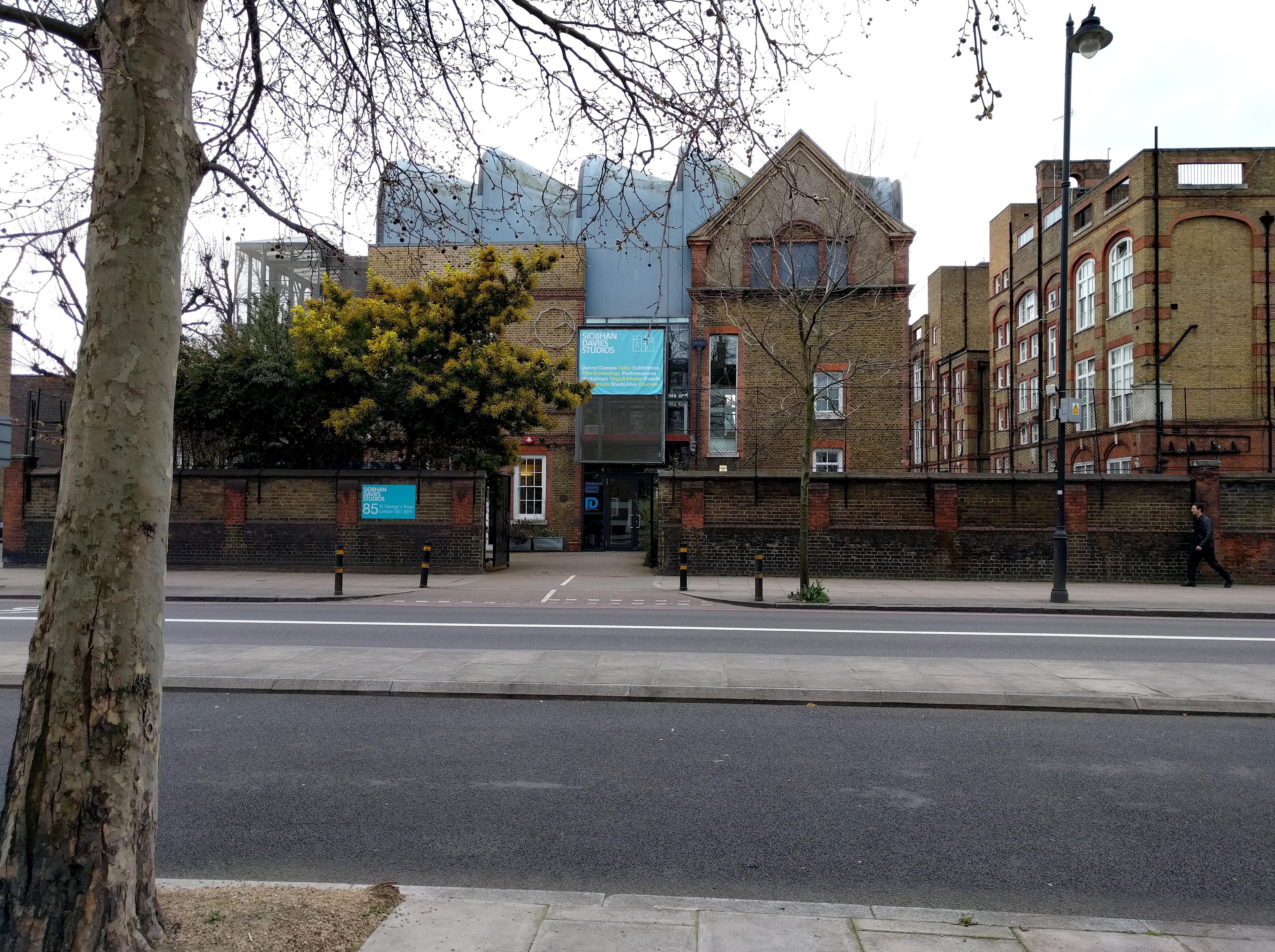
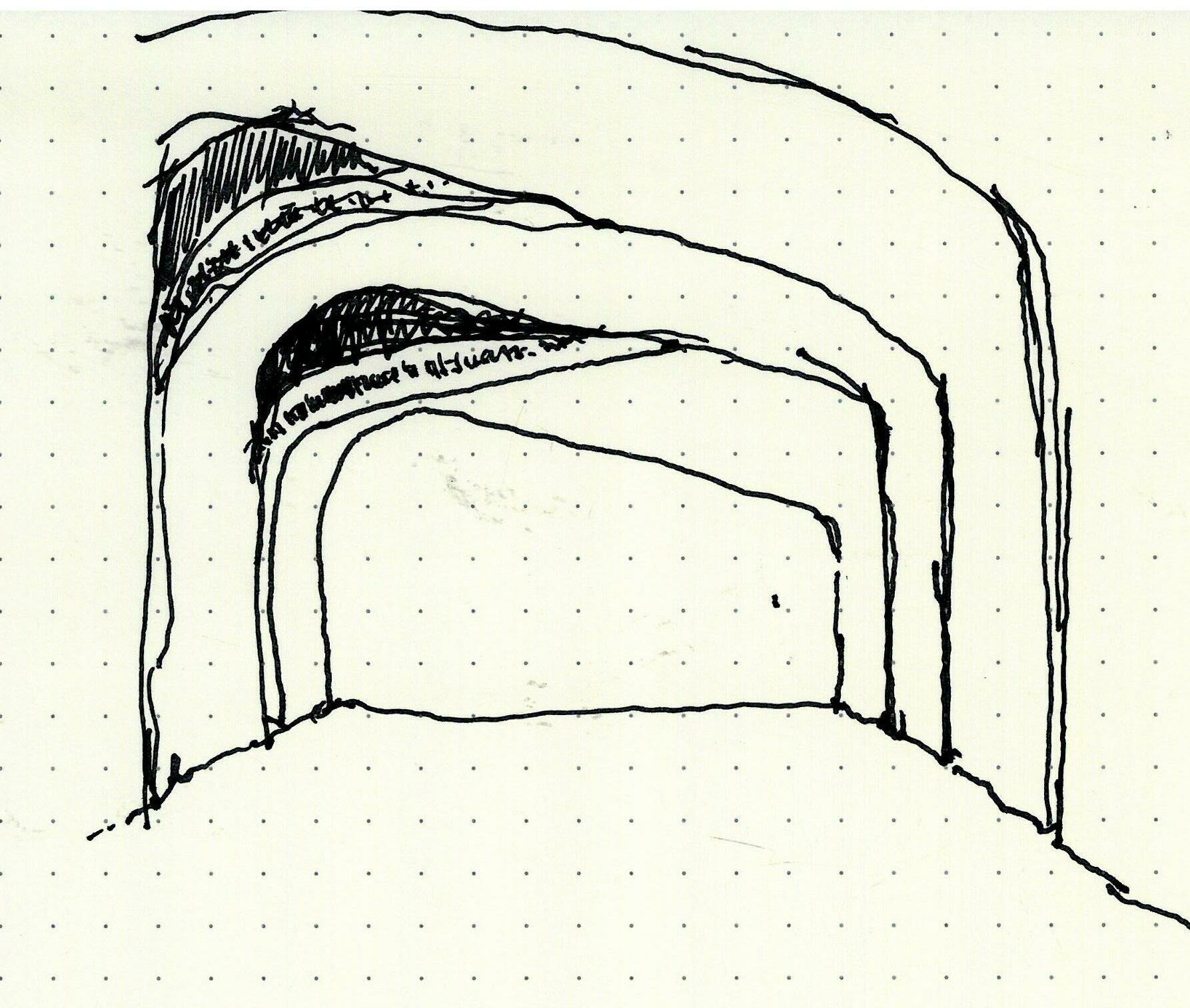 Sarah Wigglesworth
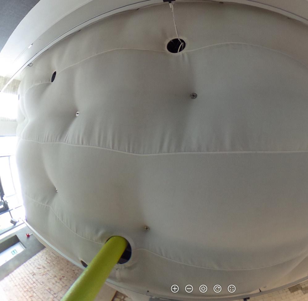
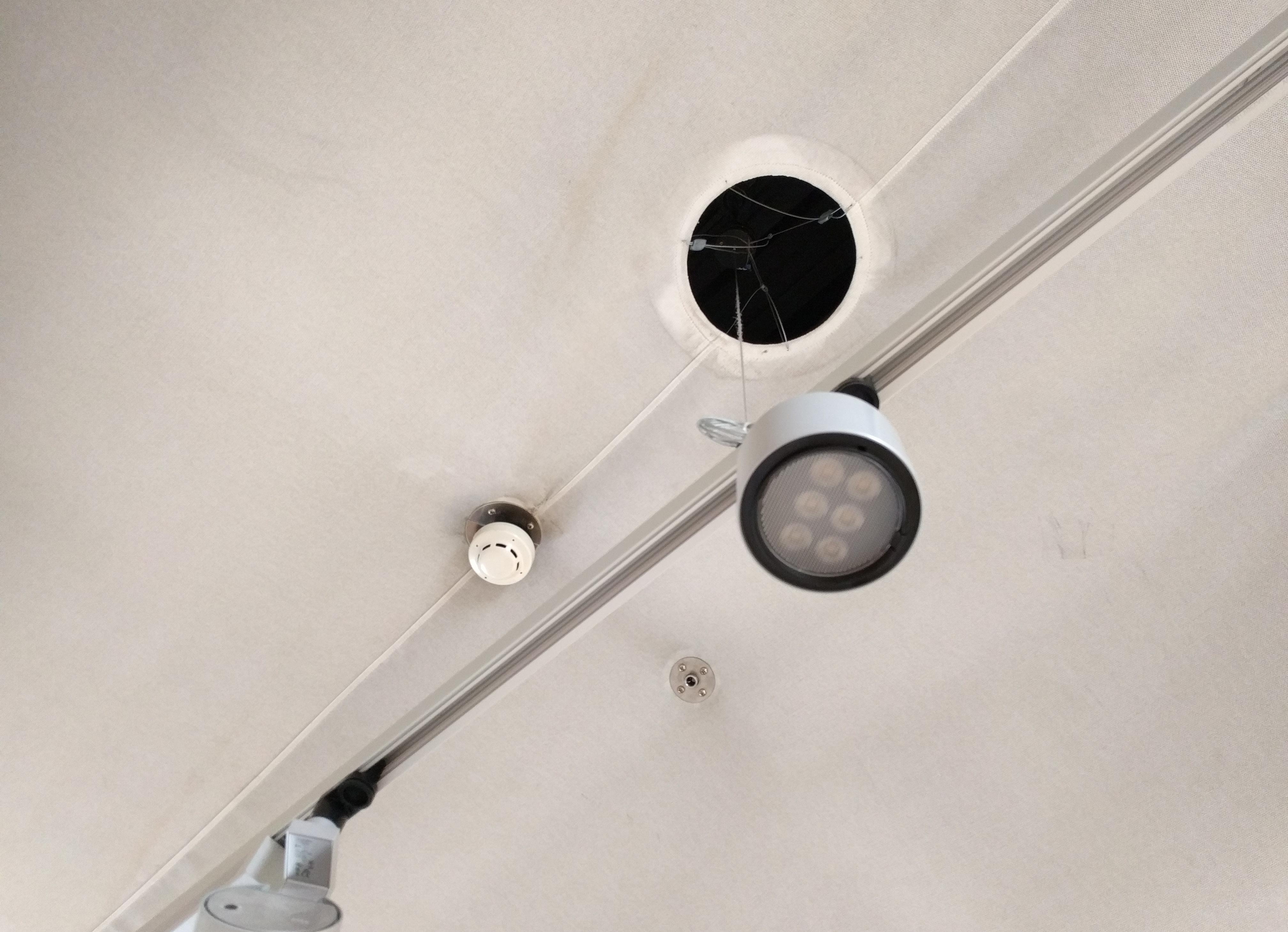
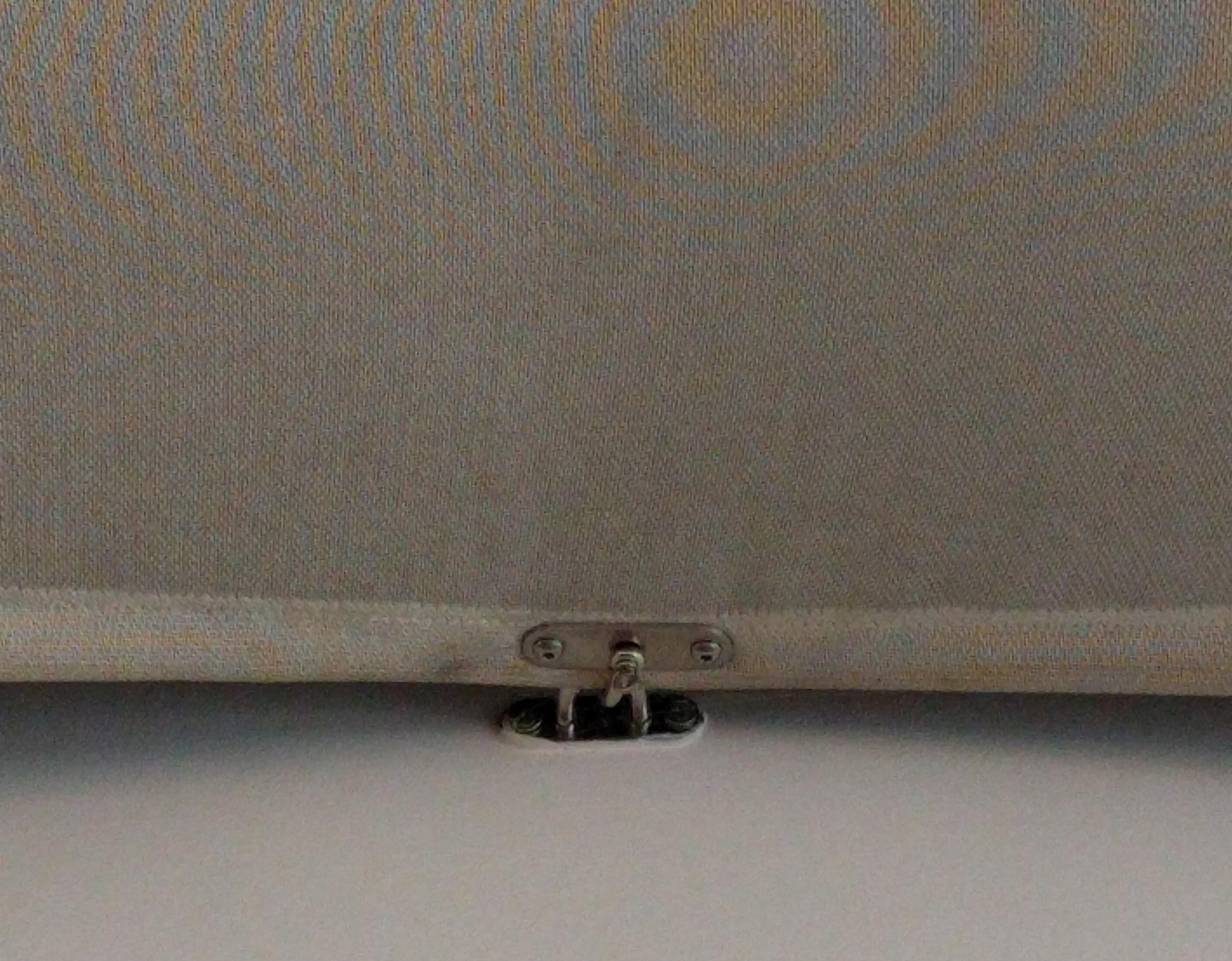
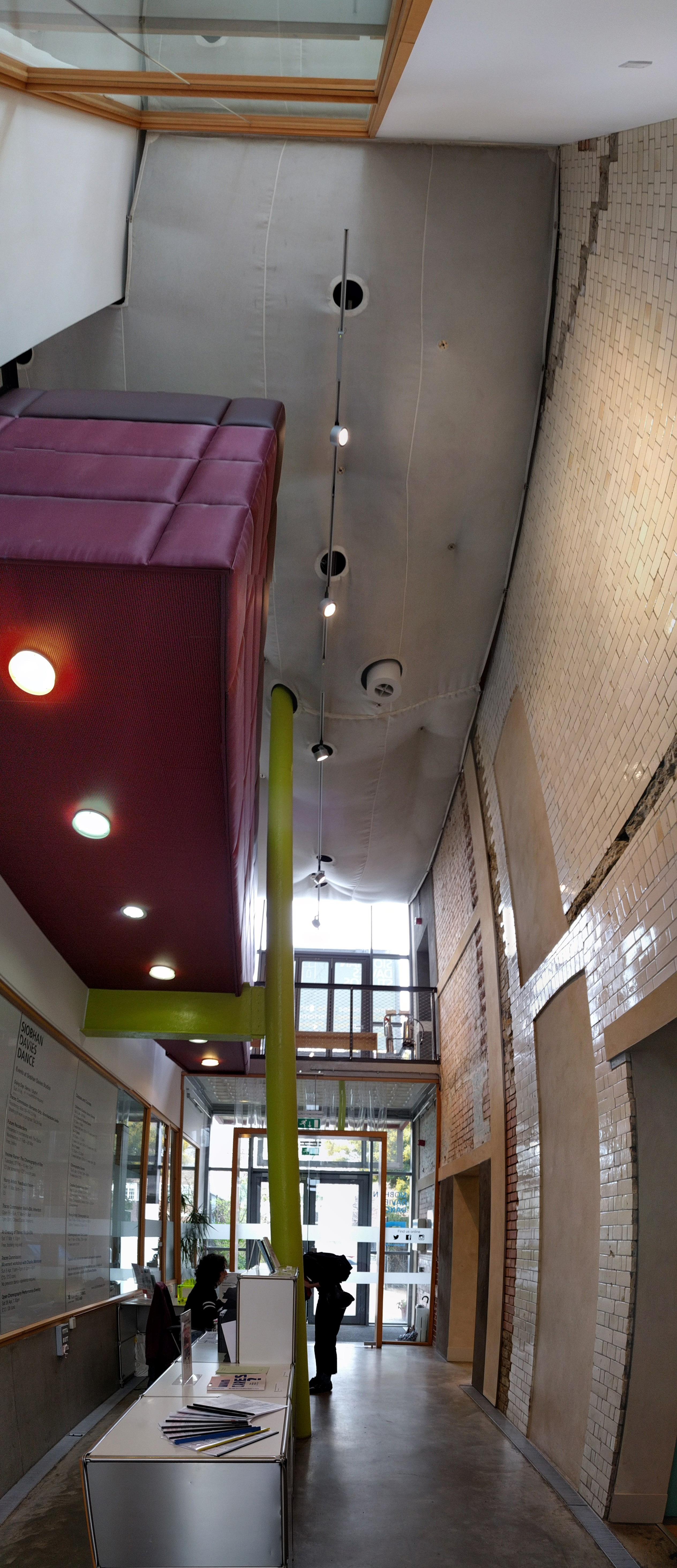
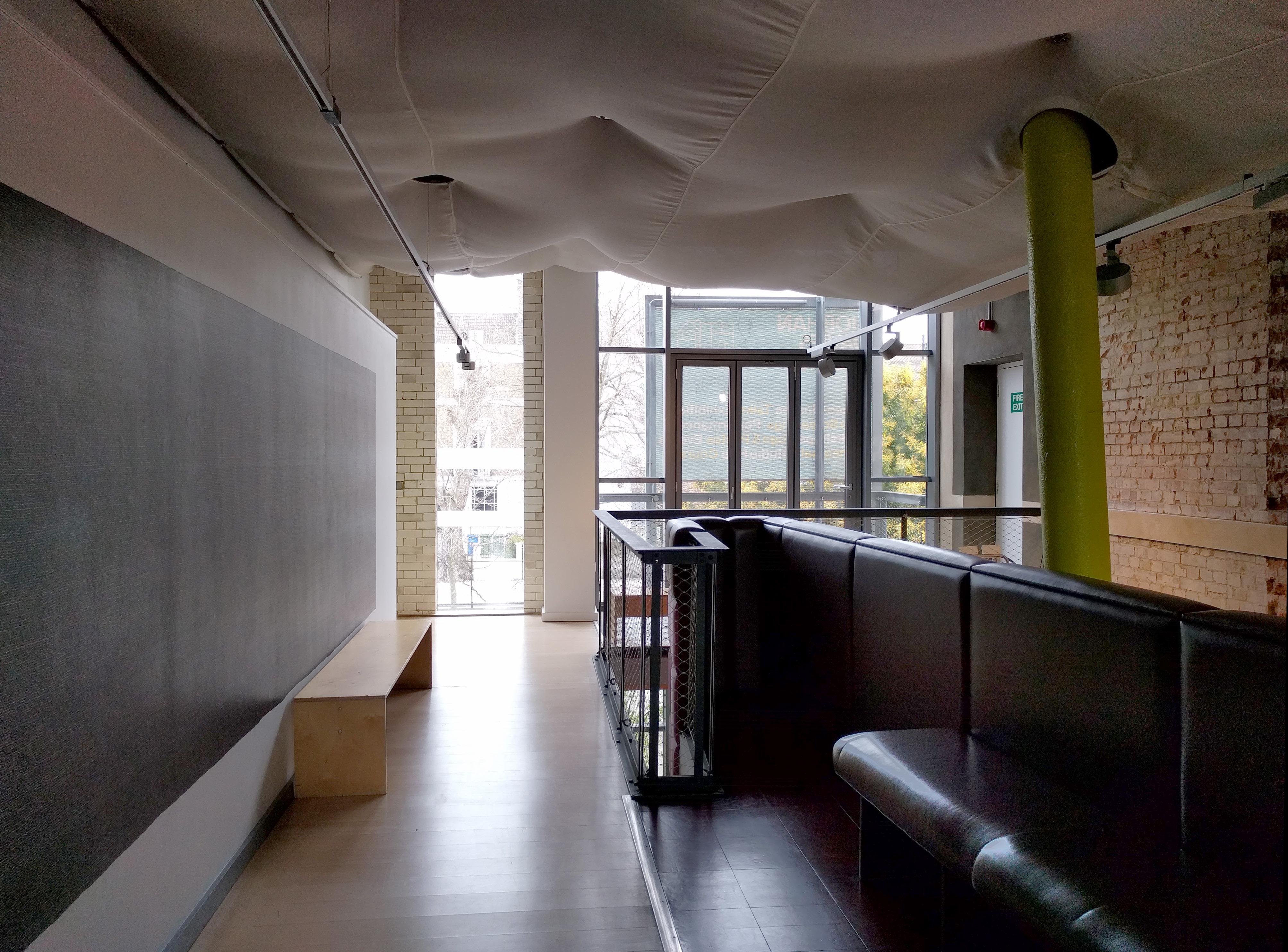
At last, a fabric ceiling. I have been wondering about the potential of fabric ceilings-permeable to air, non-planar, expressive of gravity, light and materially modest, possible to backlight or uplight. But there is also the dust, the unintentional puckering at seams . . . The fabric ceiling at this dance studio shows some of the promise and some of the peril.
Then, at main studio at the top of the building, another remarkable ceiling. Unfortunately the windows in the cracks between the torquing panels are covered up for a video installation, but I can still appreciate the form and the thirst for daylight that seems to drive many architects here to take full hold of the opportunites at a roof-level ceiling that don’t exist at floor-level ceilings.

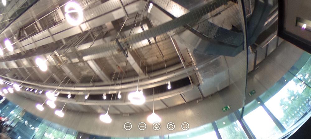
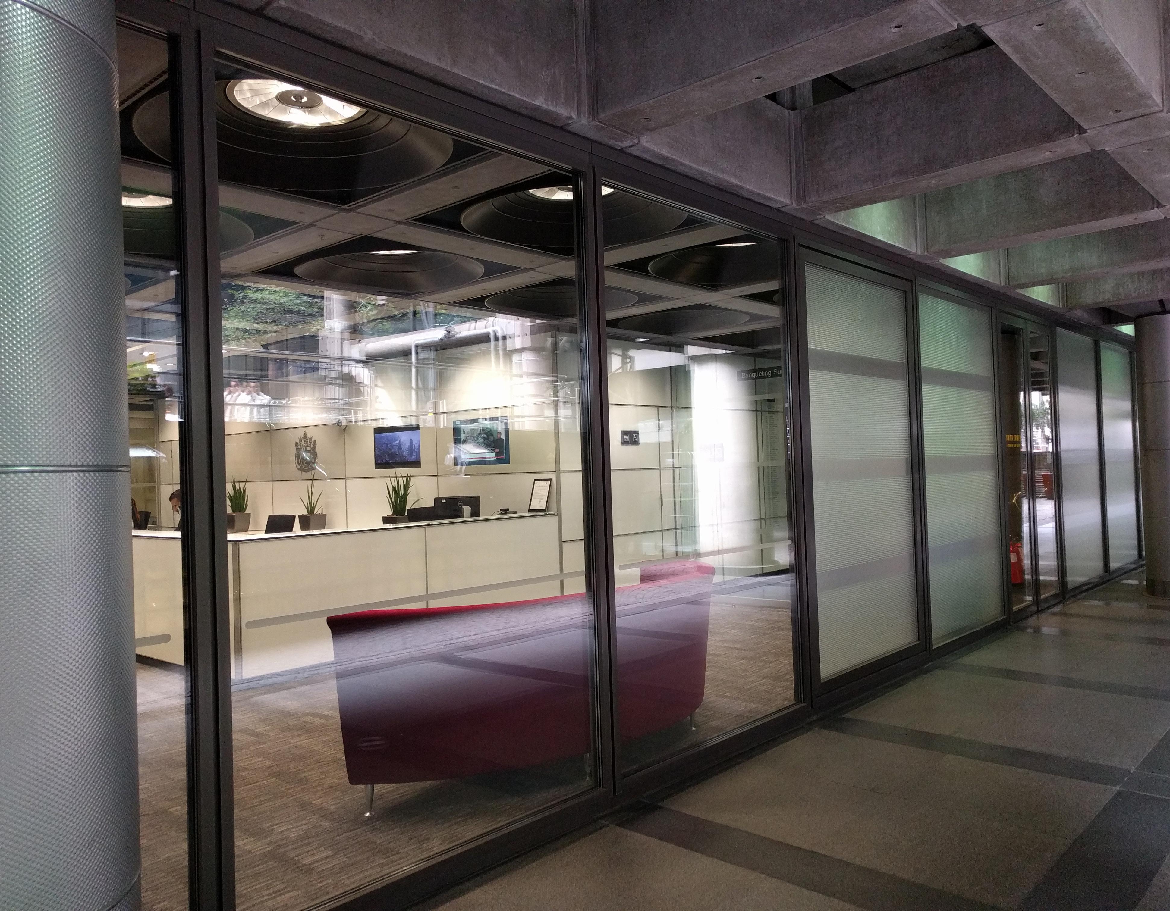
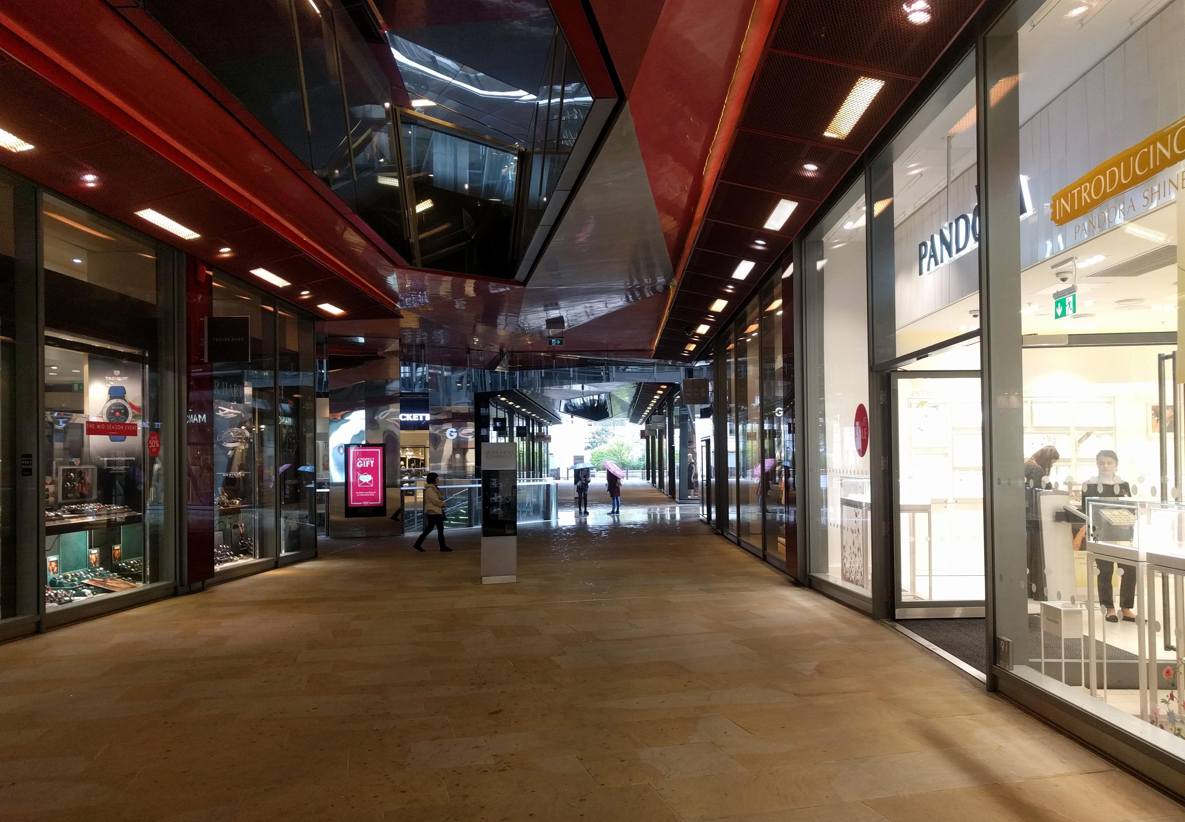
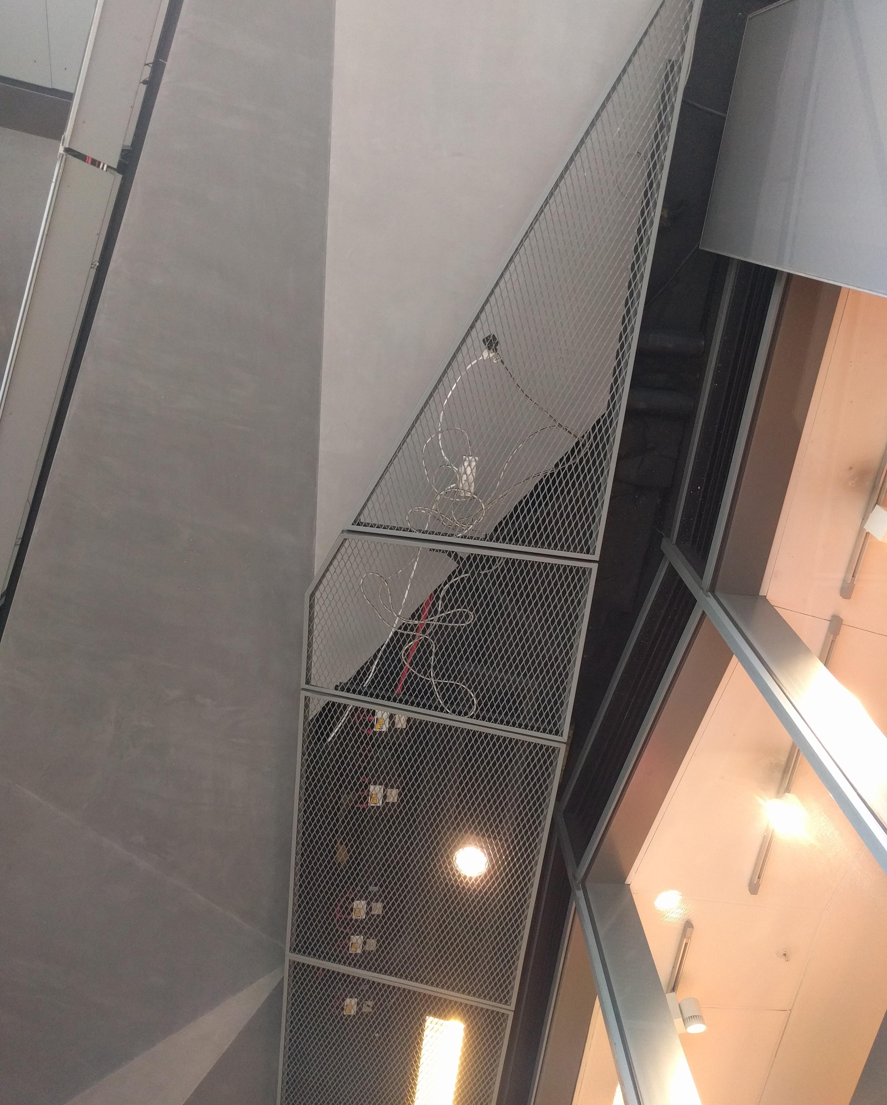
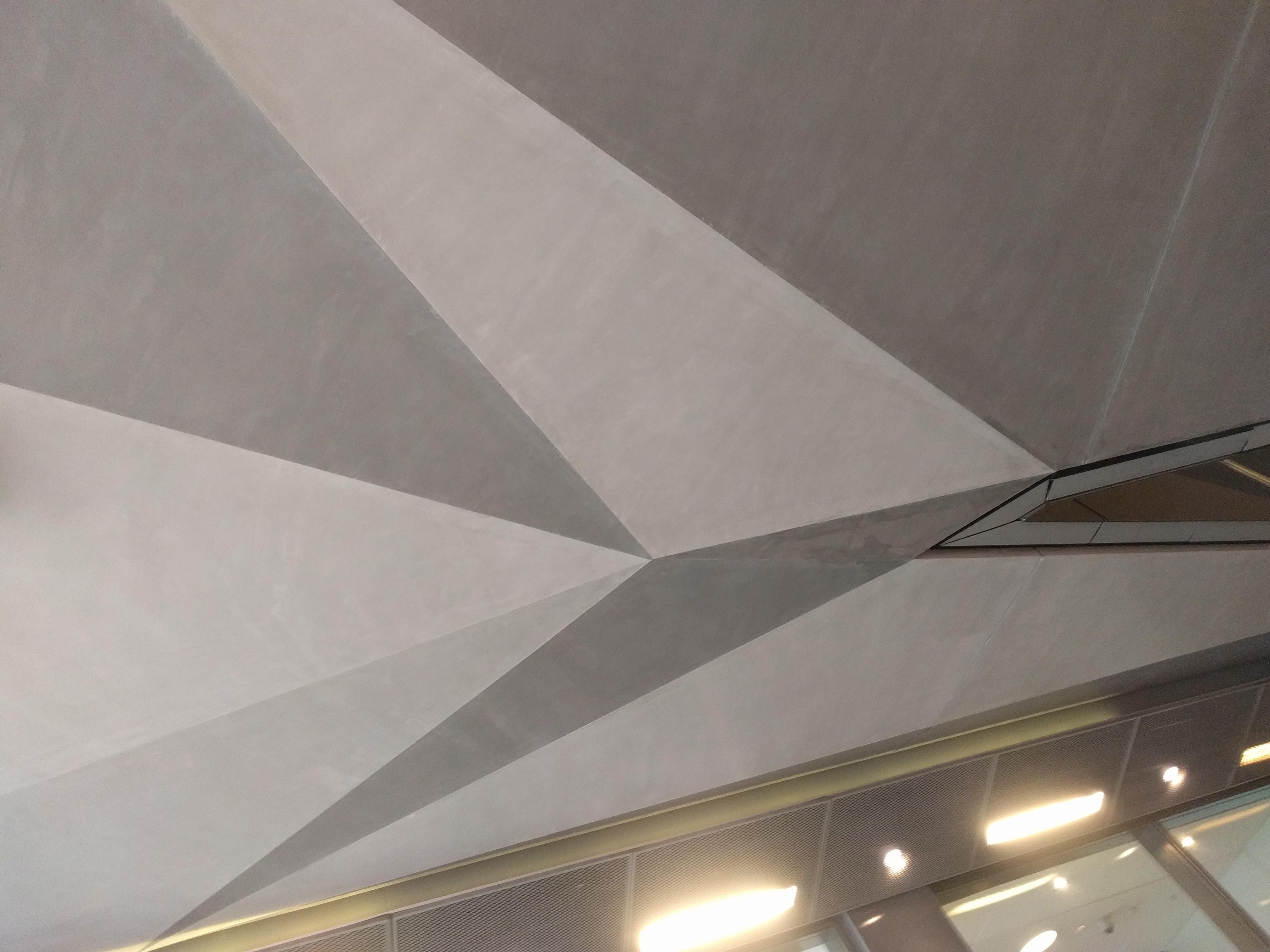
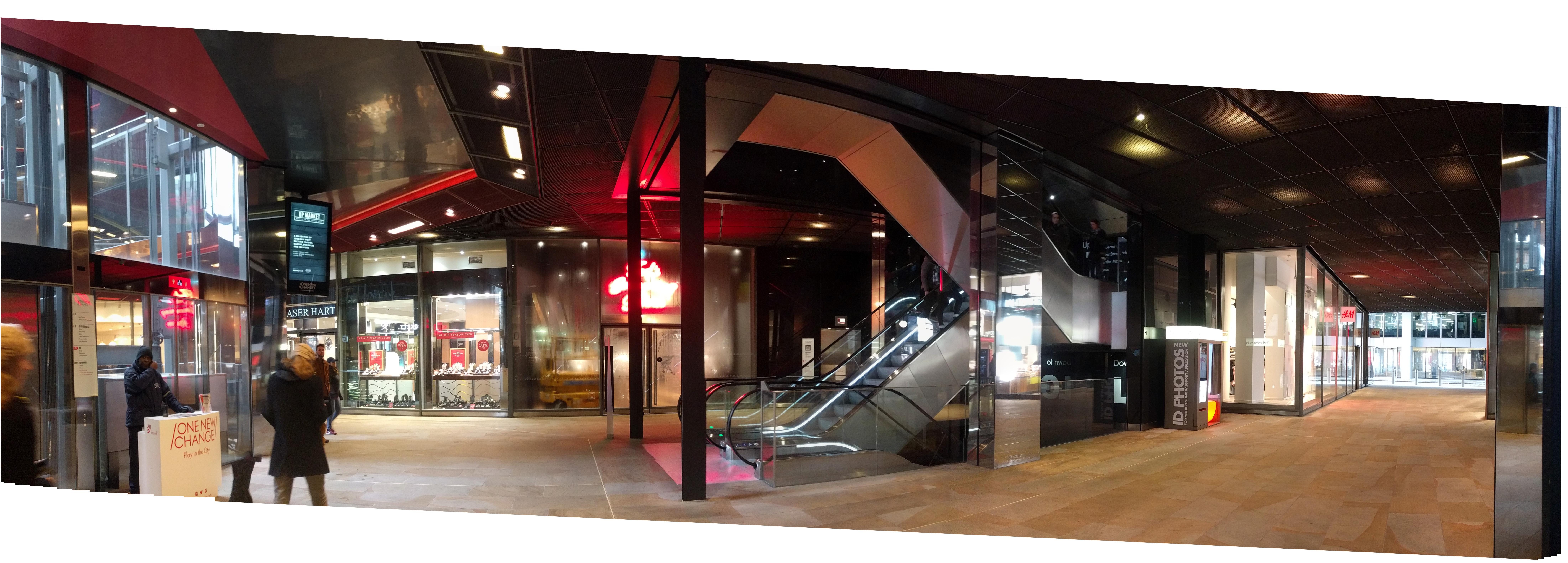
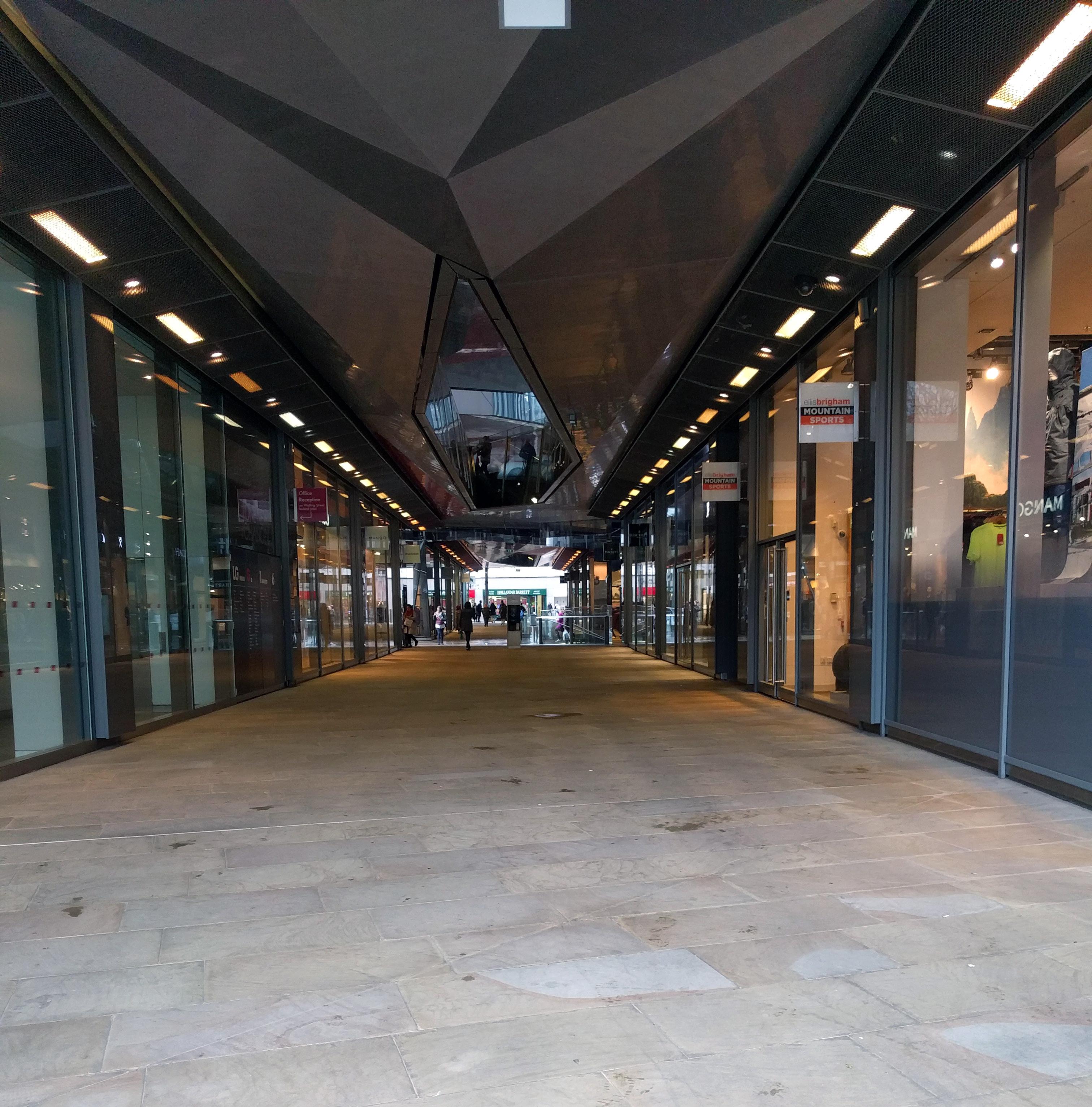
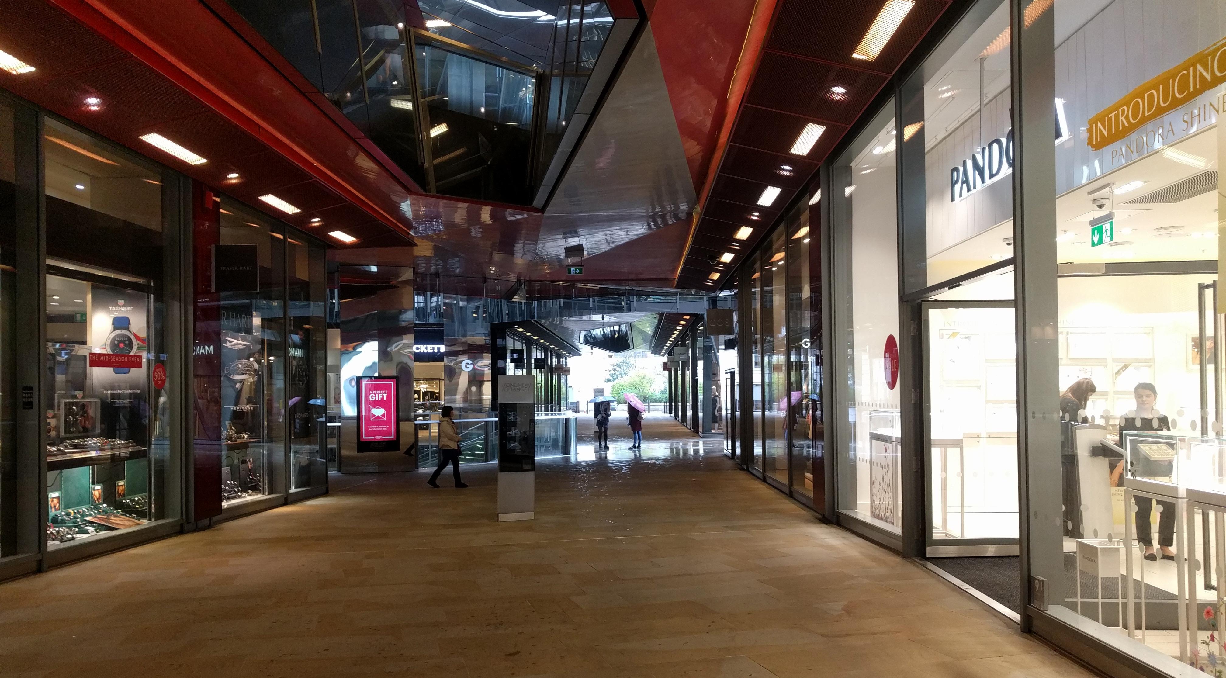
Bold palette of dark and glossy surfaces at ceilings of the openair public circulation - paired with the soft glow of the matte stone floor. This public circulation is minimally illuminated, and vertical structure here is either painted out dark or highly reflective. The stores themselves are left to be the glowing lanterns that line the way.
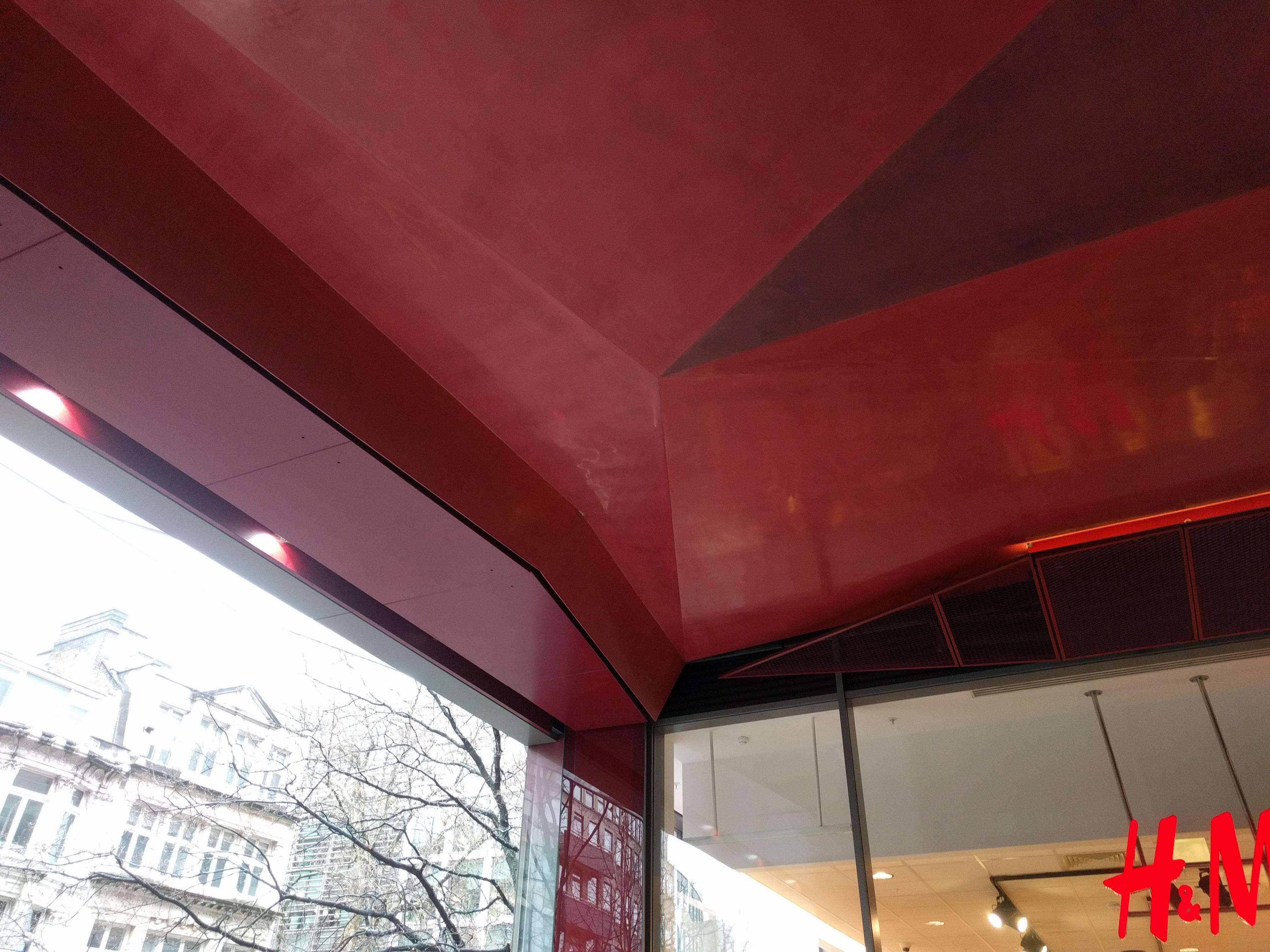
Ceiling is illusionistic. There’s some amount of actual 3D faceting of its surface, but the majority of perceived shapes are “false” facets created with color.
Between the high ceiling of the
main circulation and the lower ceilings of the stores runs a canted zone of expanded metal sheet. It’s colored to match high ceiling but lower, and sloped to to create an alignment with the top mullion of the storefront glass - avoiding the appearance of a conventional bulkhead.
It’s an interesting type of syncopation: color stops at store boundary, but ceiling height extends out. If I saw just a section, I’d assume extension matched the material of store ceiling, but of course it must be independent due to store fit out and turnover.

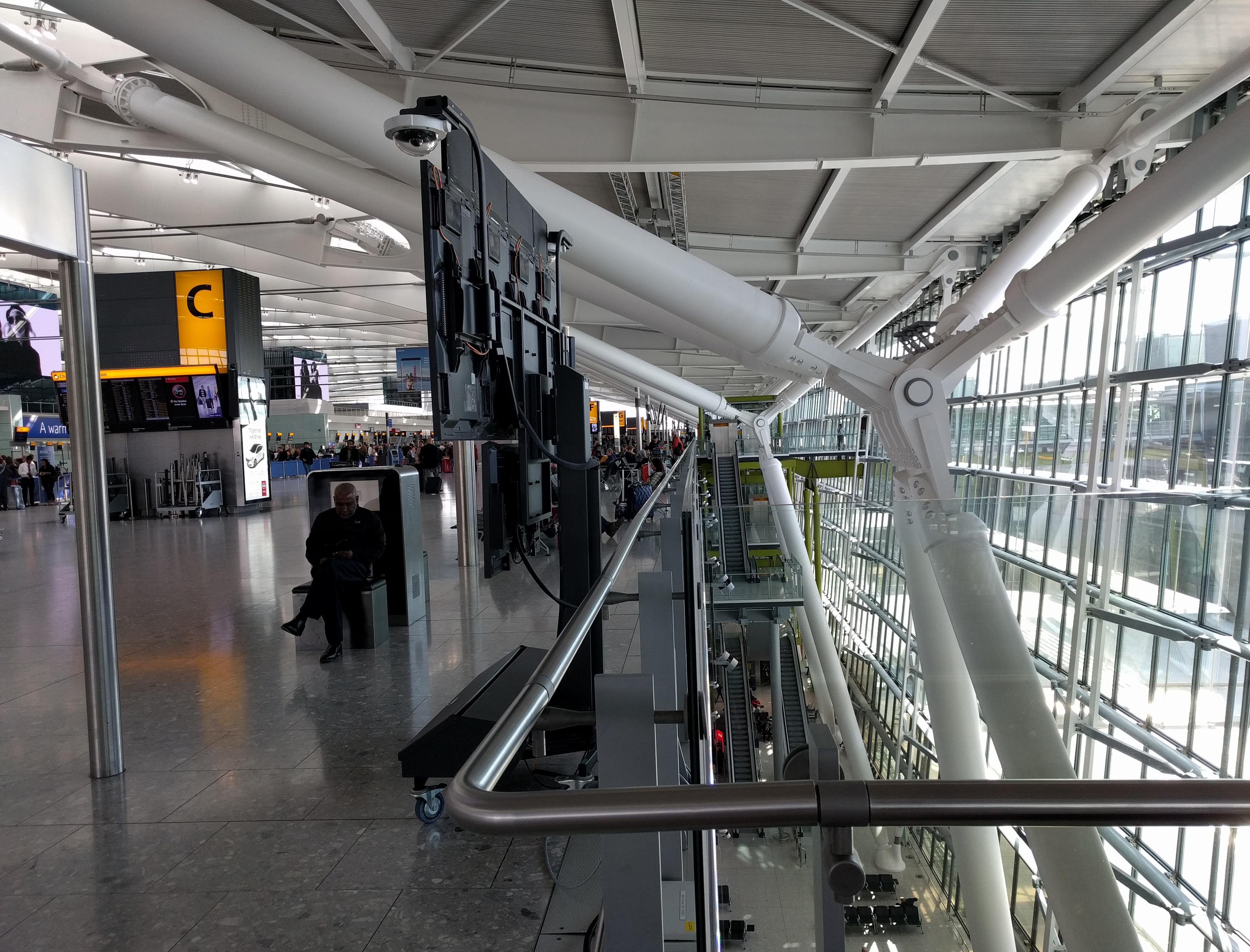
At the enormous clear span (165m) of the entry/exit area, fun to look around while thinking of Dulles’ main terminal. Both are clear-span halls of repetitive bays marching onward, conceptually ready for unlimited repetition, expansion. Then the easy contrasts - the steel arch (with all its pieces of bridging, bracing, cabling on display) held by splaying columns in the building interior vs. Dulles’ monolithic concrete catenary curve, hung from piers outside the glass line. But in the end, both insist on seeing daylight between what is understood as structure and the surface of the “ceiling”. At Dulles that means a void in the ceiling for each pier to pierce through (good to keep those outside). Here, it means slivers of skylight running along each steel arch and making its sides some of the most luminous surfaces in the space. Artificial lights paired with the skylights extending the arches’ luminous quality into the night.
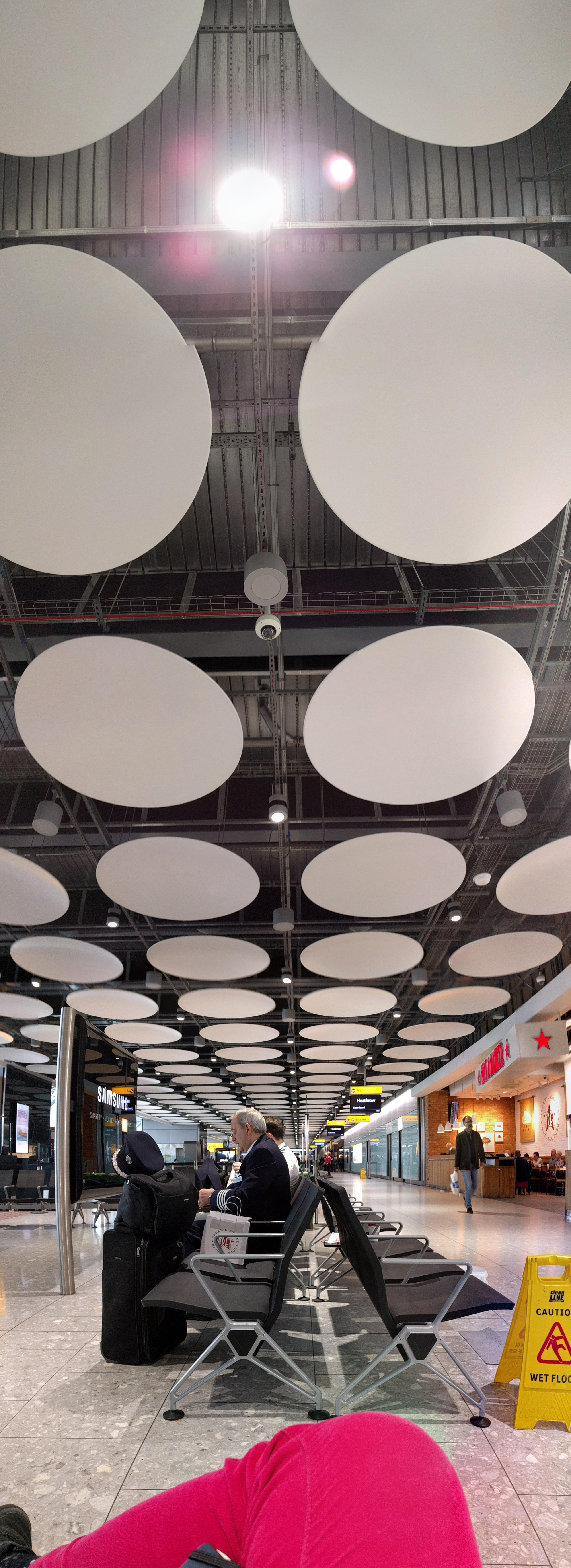
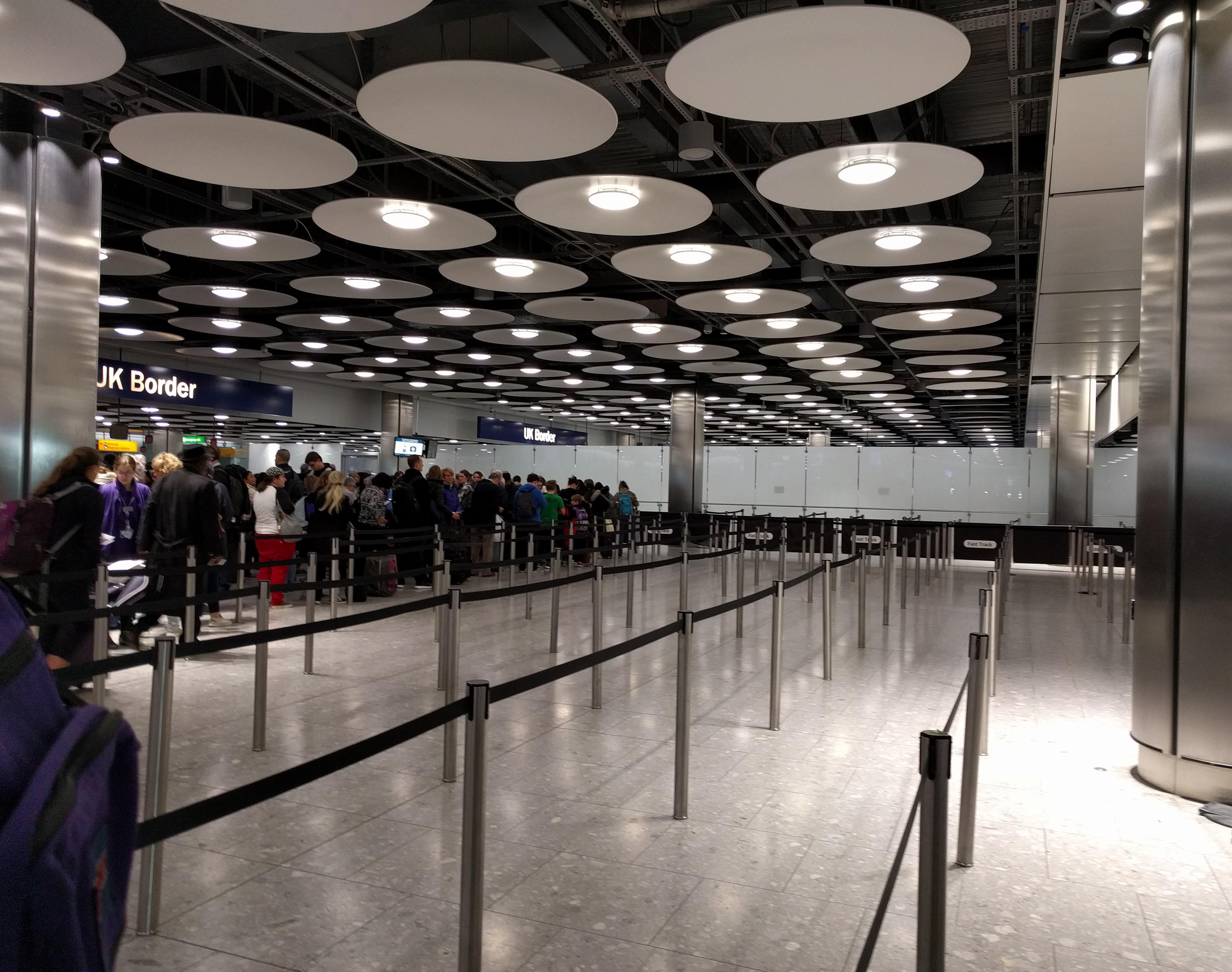
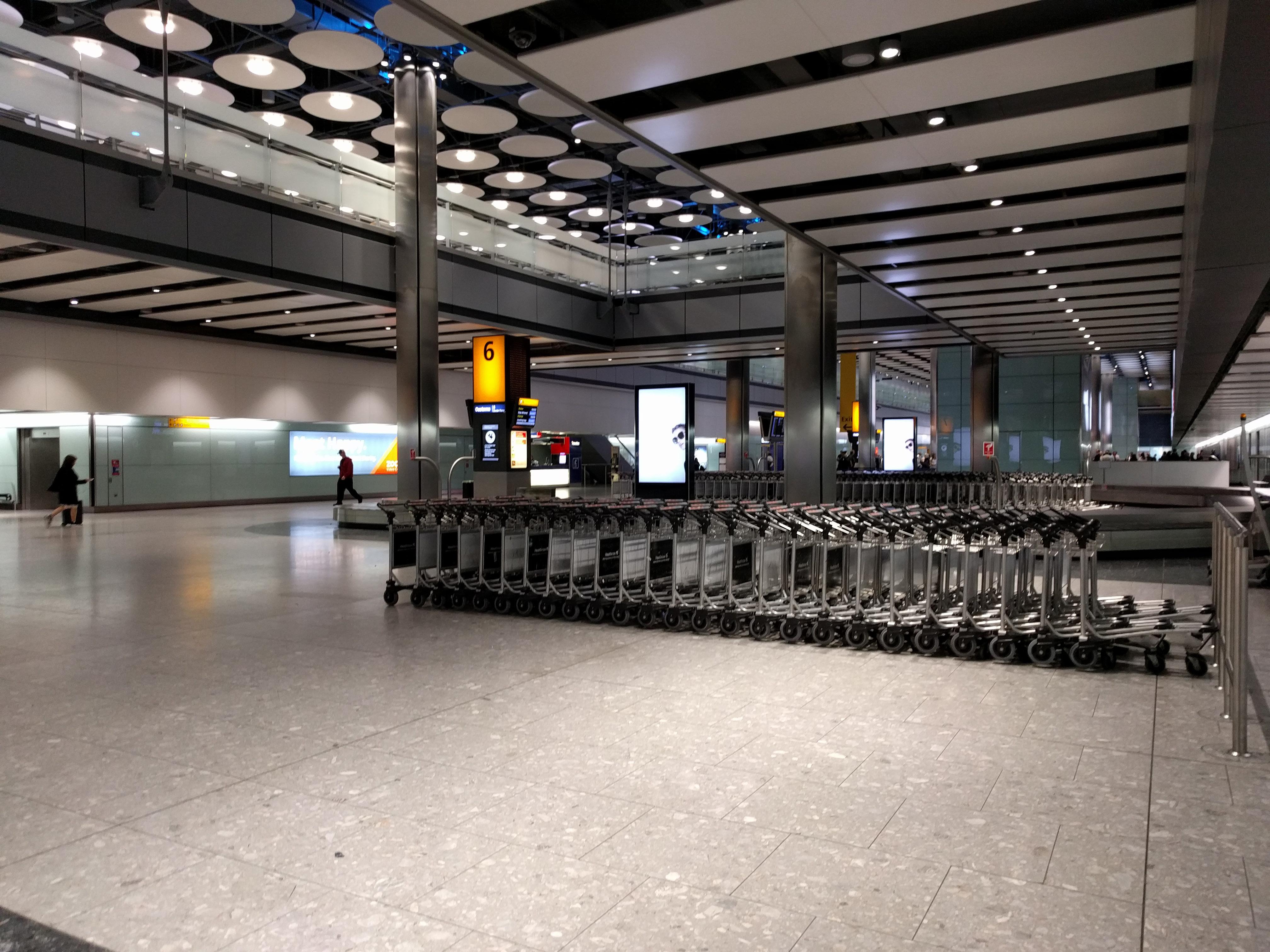
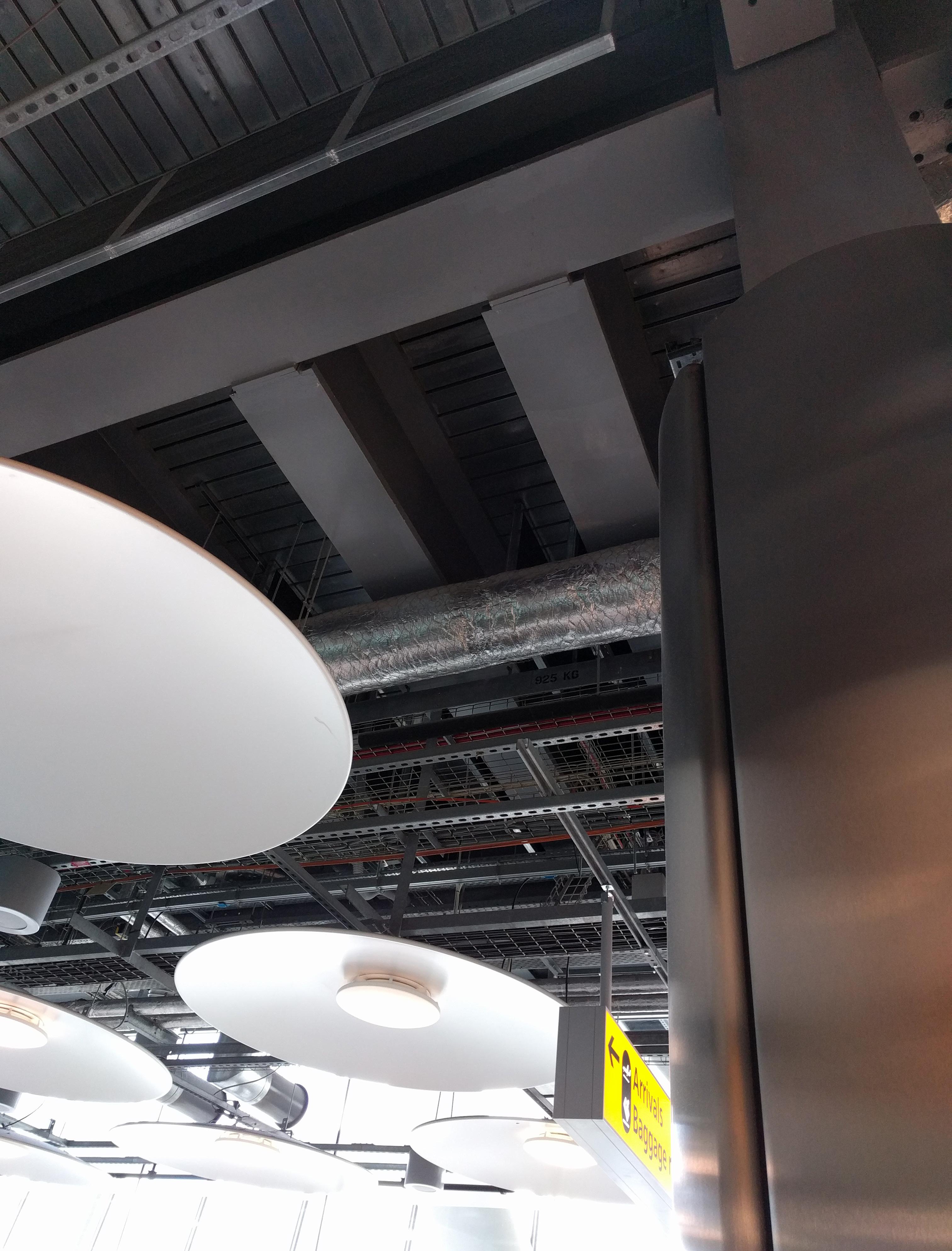
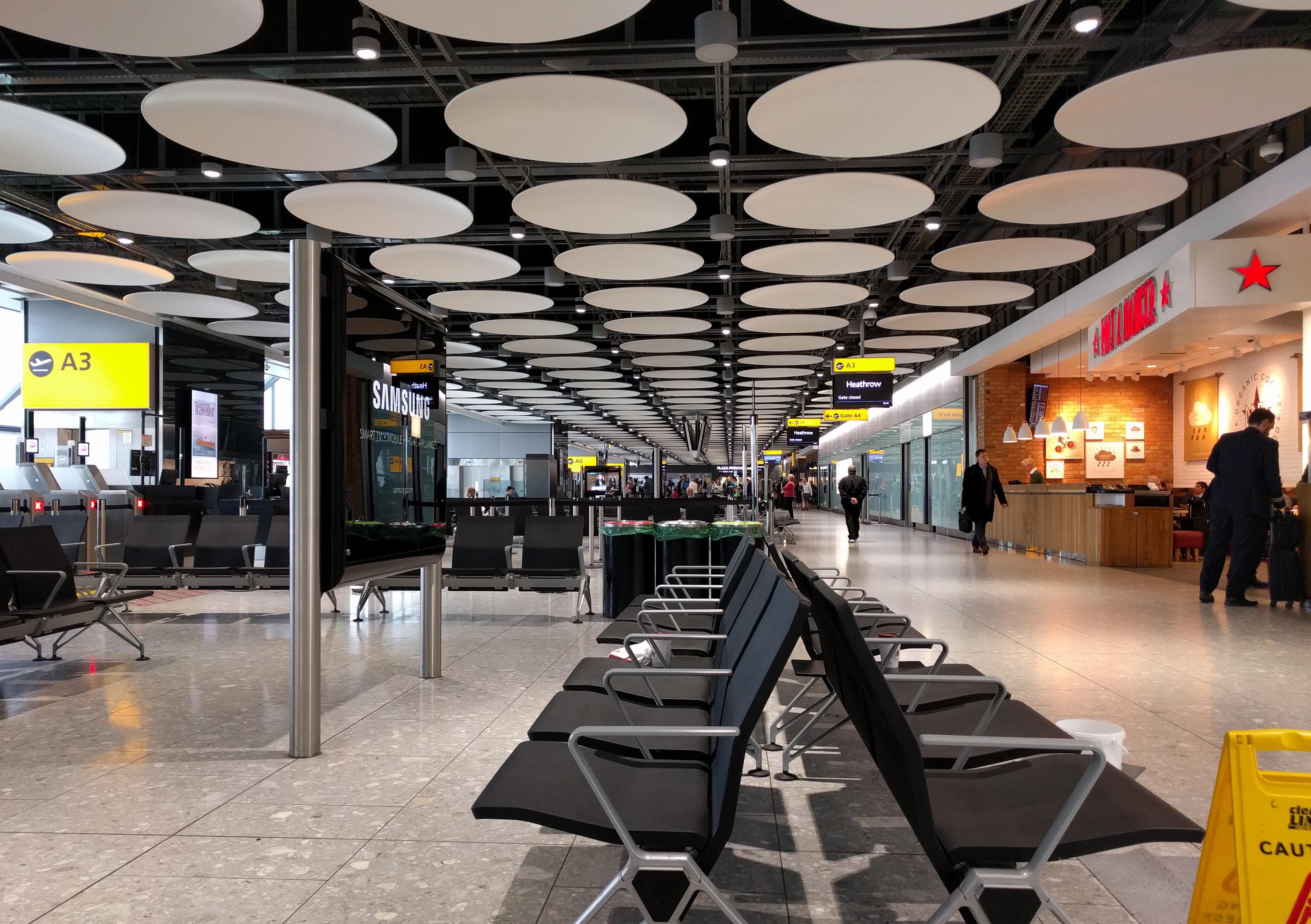
At smaller-scale spaces (often ones with floor-ceilings rather than roof-ceilings), there’s an array of custom panelized ceiling systems, always with white panels. Most distinctive and extensive is the disc ceiling (high pressure cast aluminum panels, 1.8m diameter). Fabricator’s website cites a “loose fit/easy access” concept from the architects, and it does seem that the ratio of surface to void space has been tuned to provide just enough surface to create the sense of a continuous fabric. Downlights are set sometimes in, sometimes outside
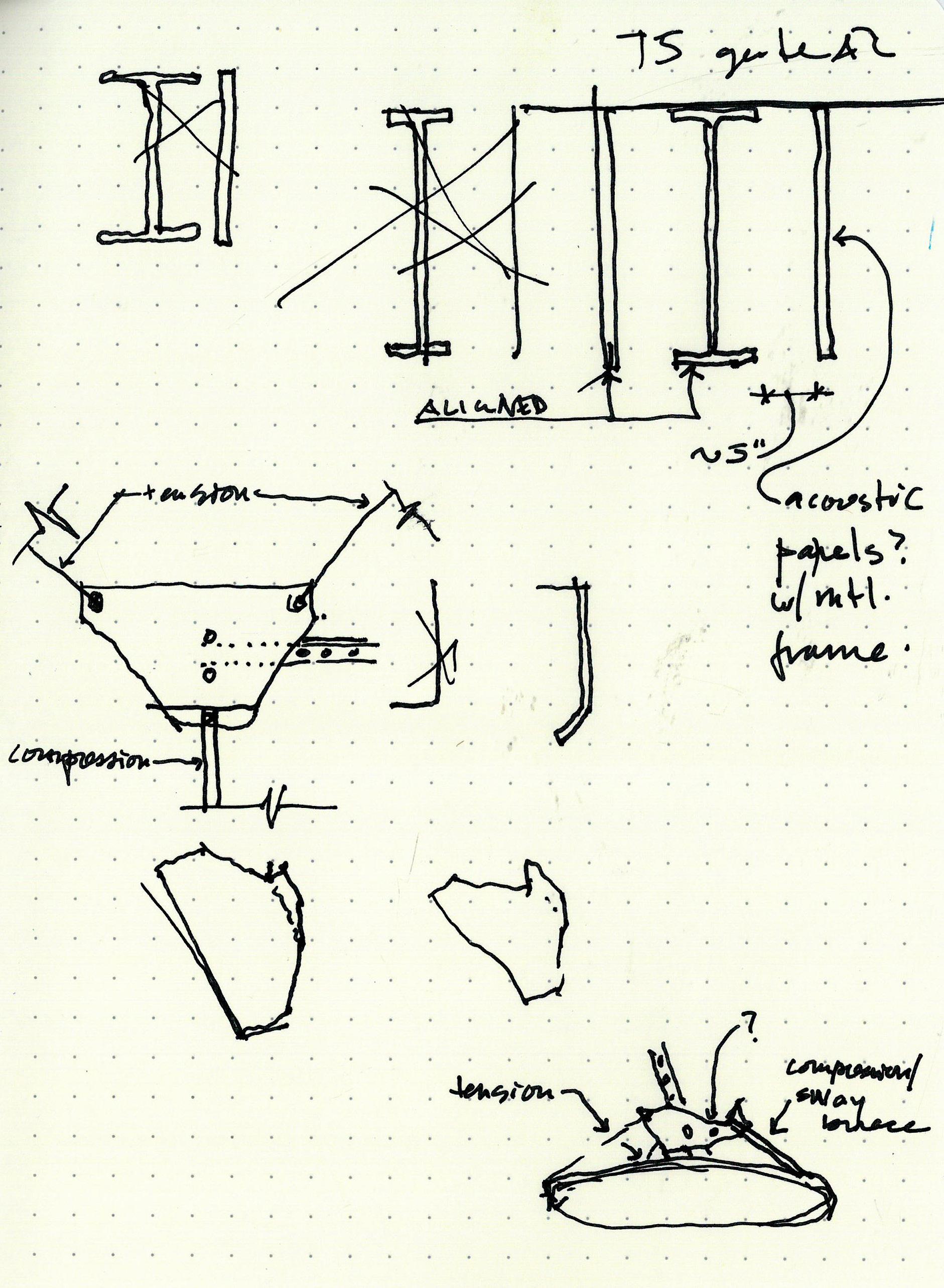
of the disks. But other than selective lighting, devices and services are dealt with in the open areas between disks. To me, this is about more than access: it is about getting all that clutter out of the luminous surface, putting it into a space less prominent in the unavoidable visual hierarchy of light, dark, and medium tones. Unistrut serves as the suspended grid that the disks and most other ceiling elements mount to. Notable to me is the acceptance of a uniform suspended grid, but its separation in section from the “finished” portions of the ceiling, eliminating its visual prominence.
Attachment of disk is via a single triangular plate mounted at its center to the unistrut. Disk is suspended from plate with two wires and one post.

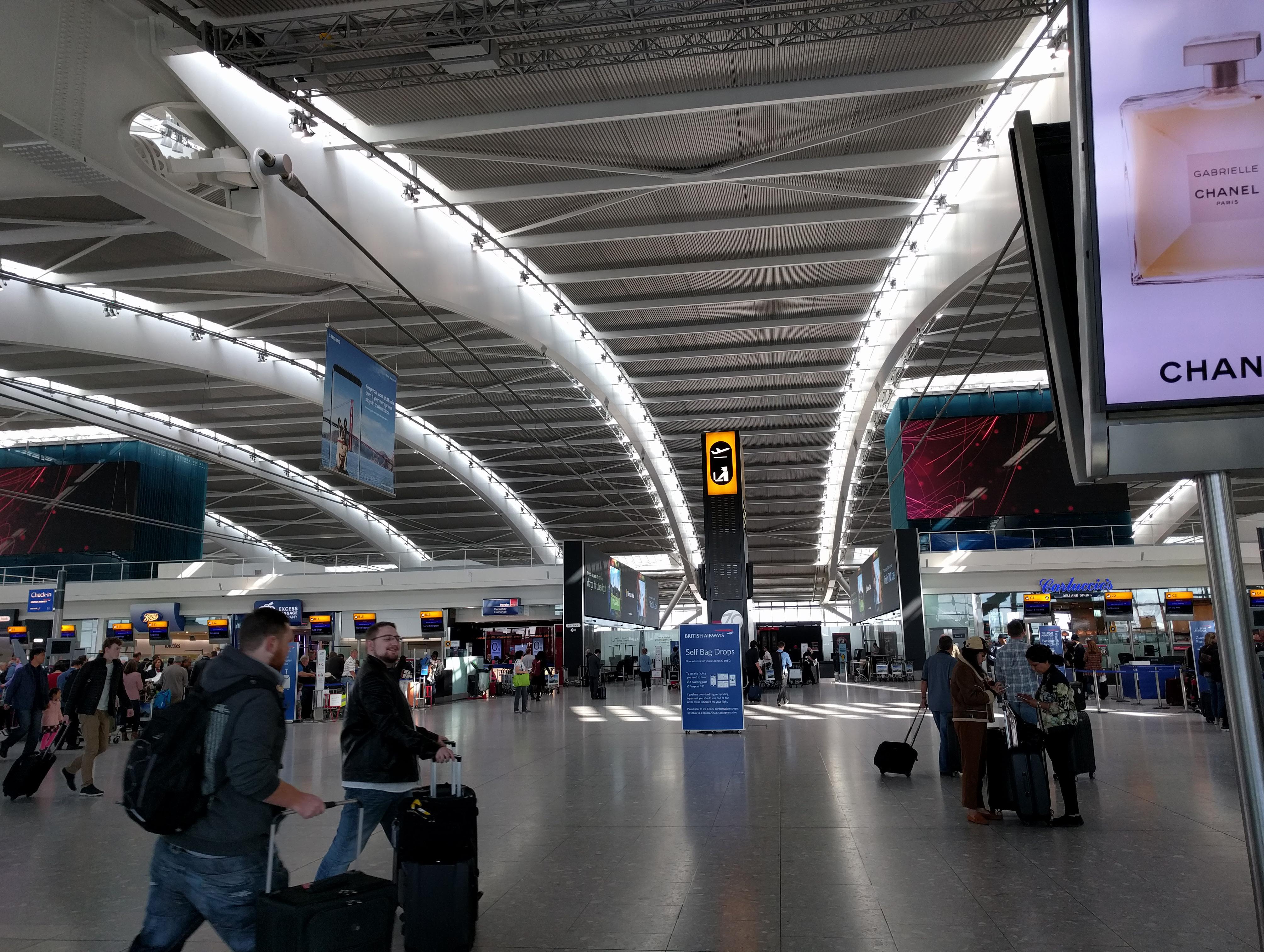
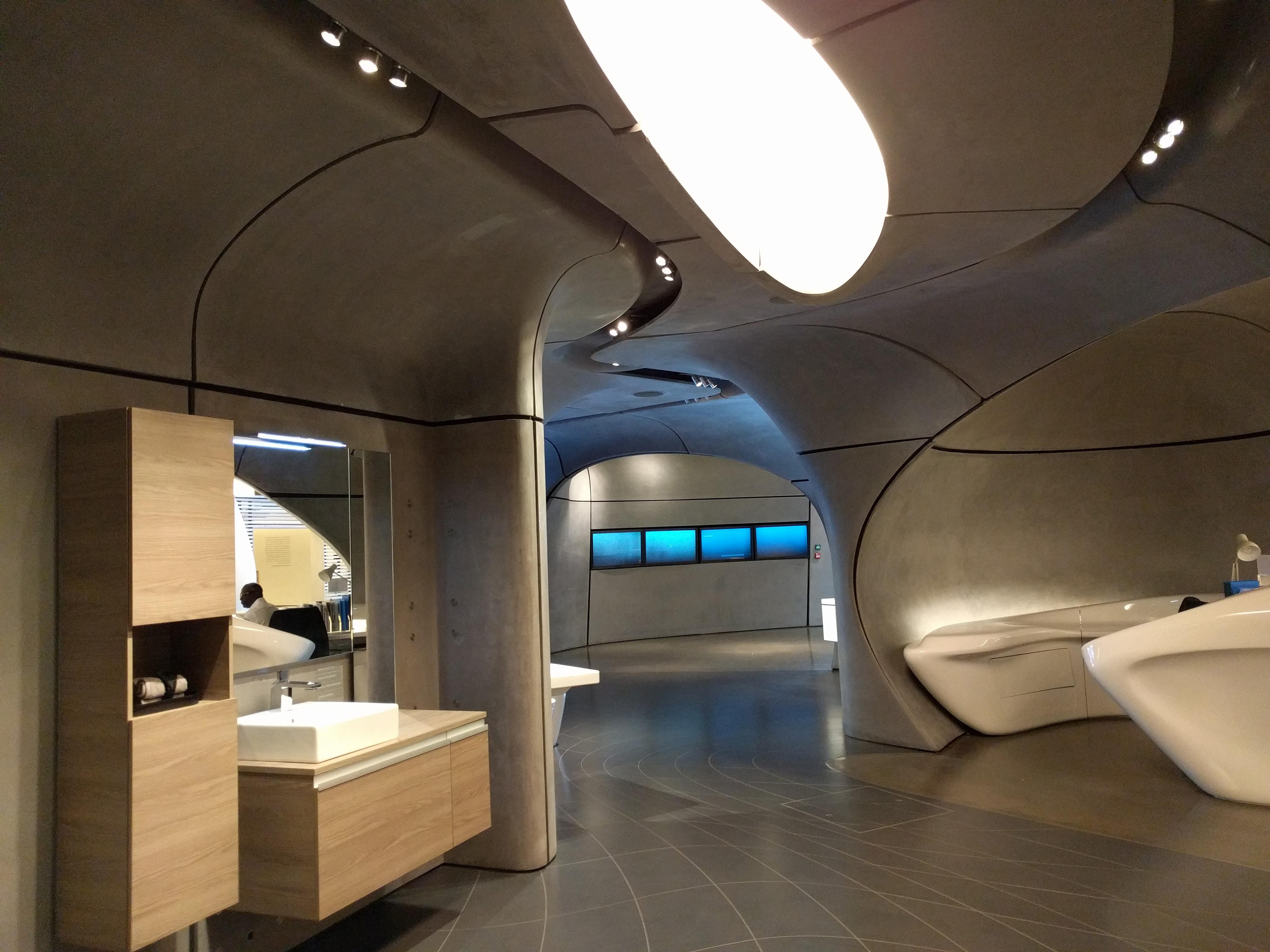
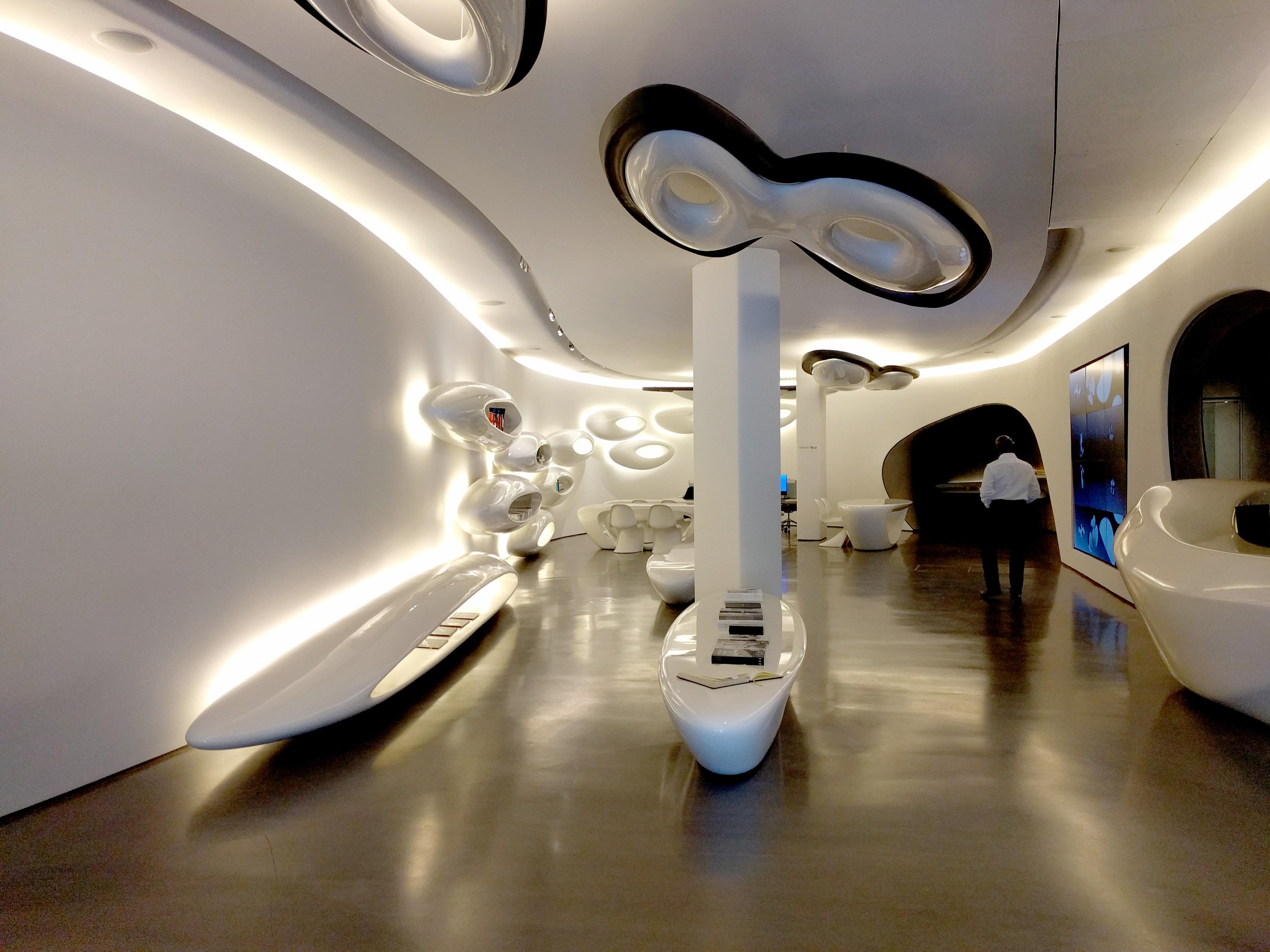

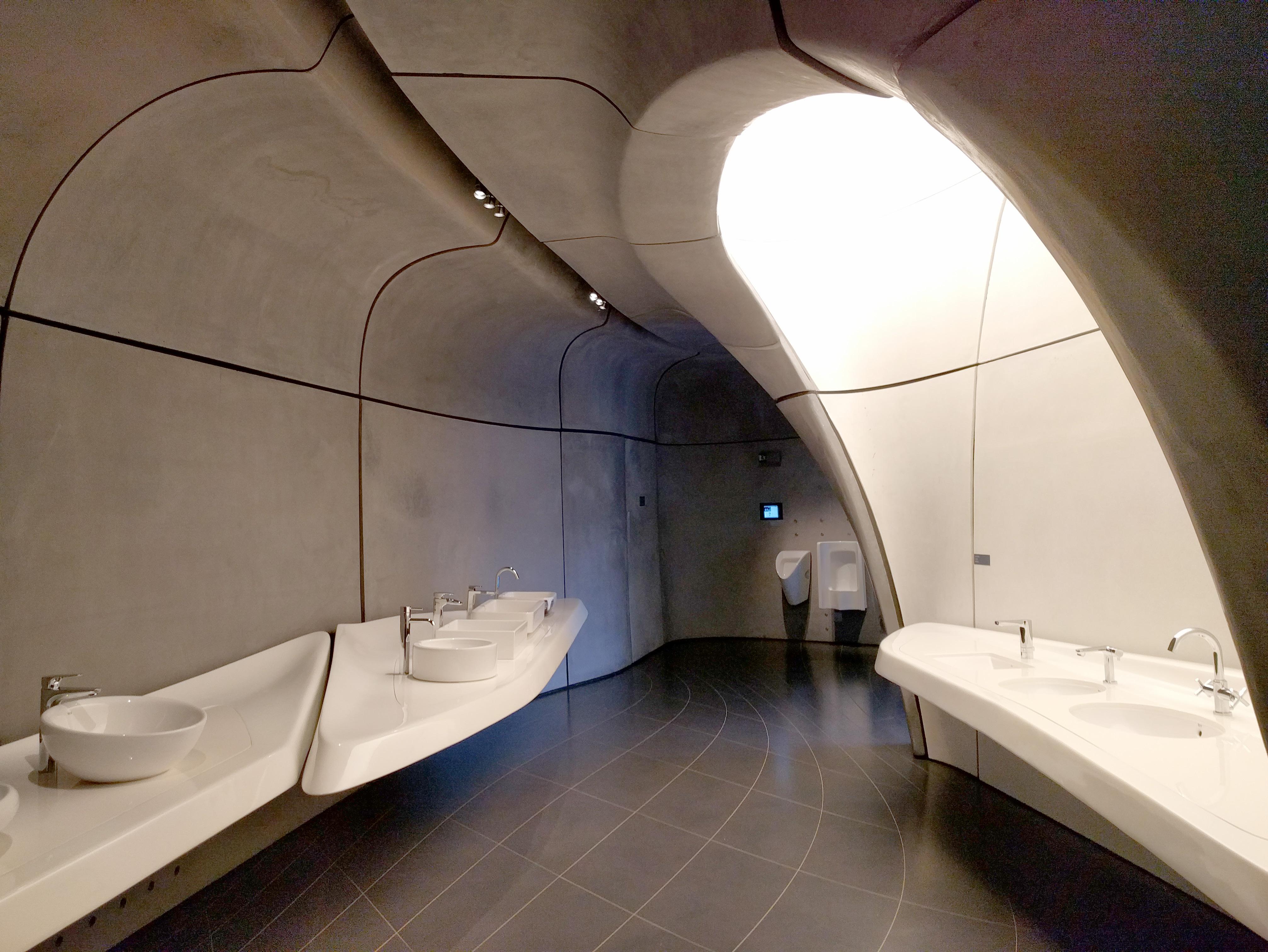
I’m struck by the extremely narrative approach to the ceiling. There is a resistance here to admit a preexisting reality which includes the givens of walls, ceilings, and light fixtures; the space must tell its own story which generates the existence of enclosing surfaces and luminous points.


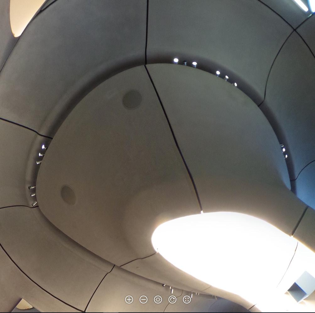
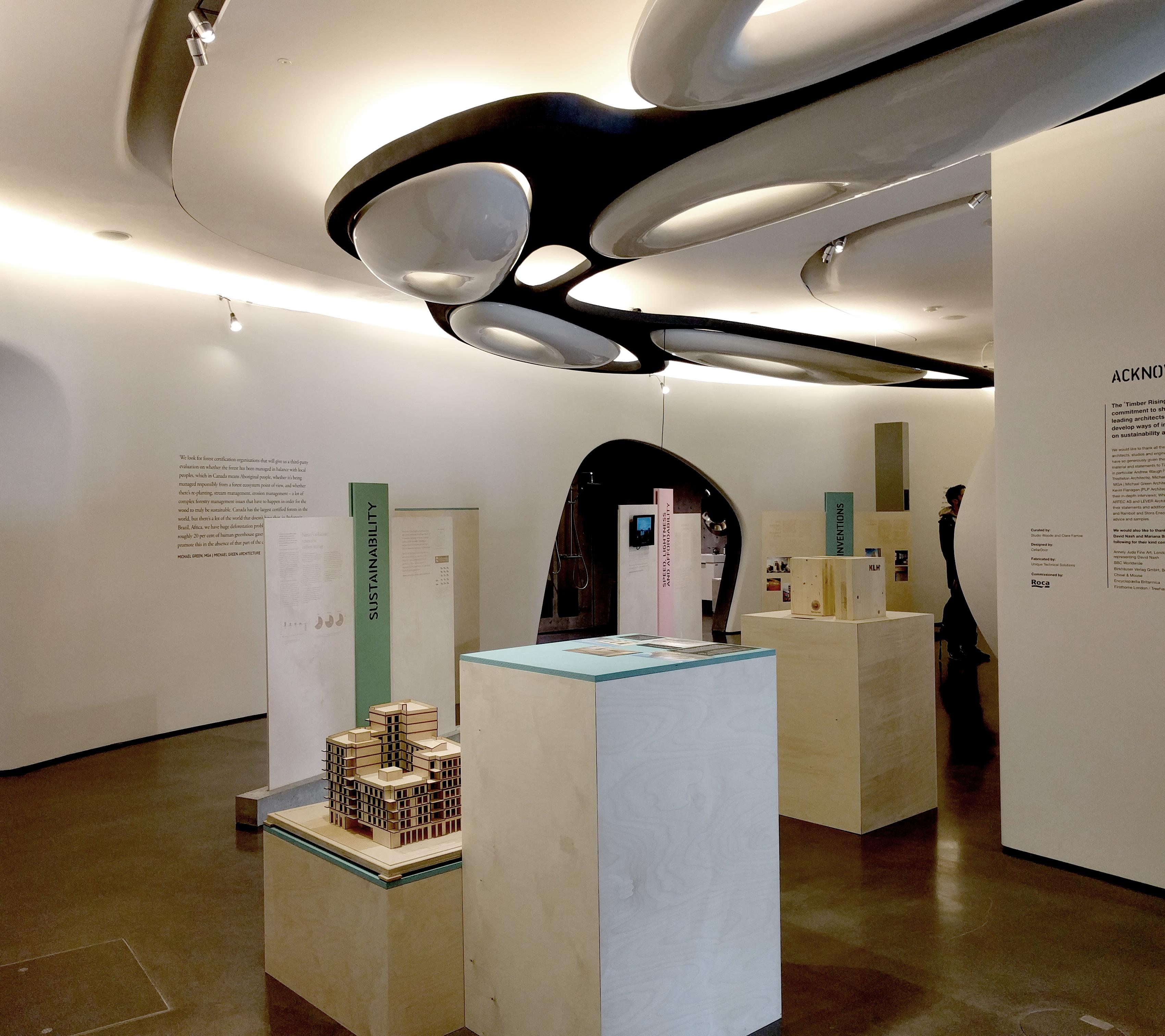
One of the most memorable examples is the mushroom-like wall/ceiling forms which touch down at the center of the smaller, cavelike galleries. These recall strongly for me the form of a pier at a groin-vaulted undercroft, where the ceiling flows down into the pier (or pier reaches upward and outward to form the ceiling), as one organically-connected whole. The expression of wall/ceiling as one material, and the relative autonomy of the floor material and patterning reminds me of the Lincoln’s Inn Chapel undercroft. But here, the solidity of the pier is sliced away to reveal a hollow, white interior almost imperceptibly capped by the (very effective) use of a panel of luminous ceiling, placed so that it is sheilded from distant view. The result is a dramatic hybrid pier/oculus form.
In the larger-scaled spaces, wall and ceiling are declared separate by a perimeter cove light. But this diagramatically useful illumination is insufficient; more light is needed at the center of the room. The answer cannot be recessed can lights; instead, elongated dropletshaped illuminated shelves in one room climb their way up the wall and float across the ceiling, invading rooms beyond similarly in need of additional footcandles at their centers.
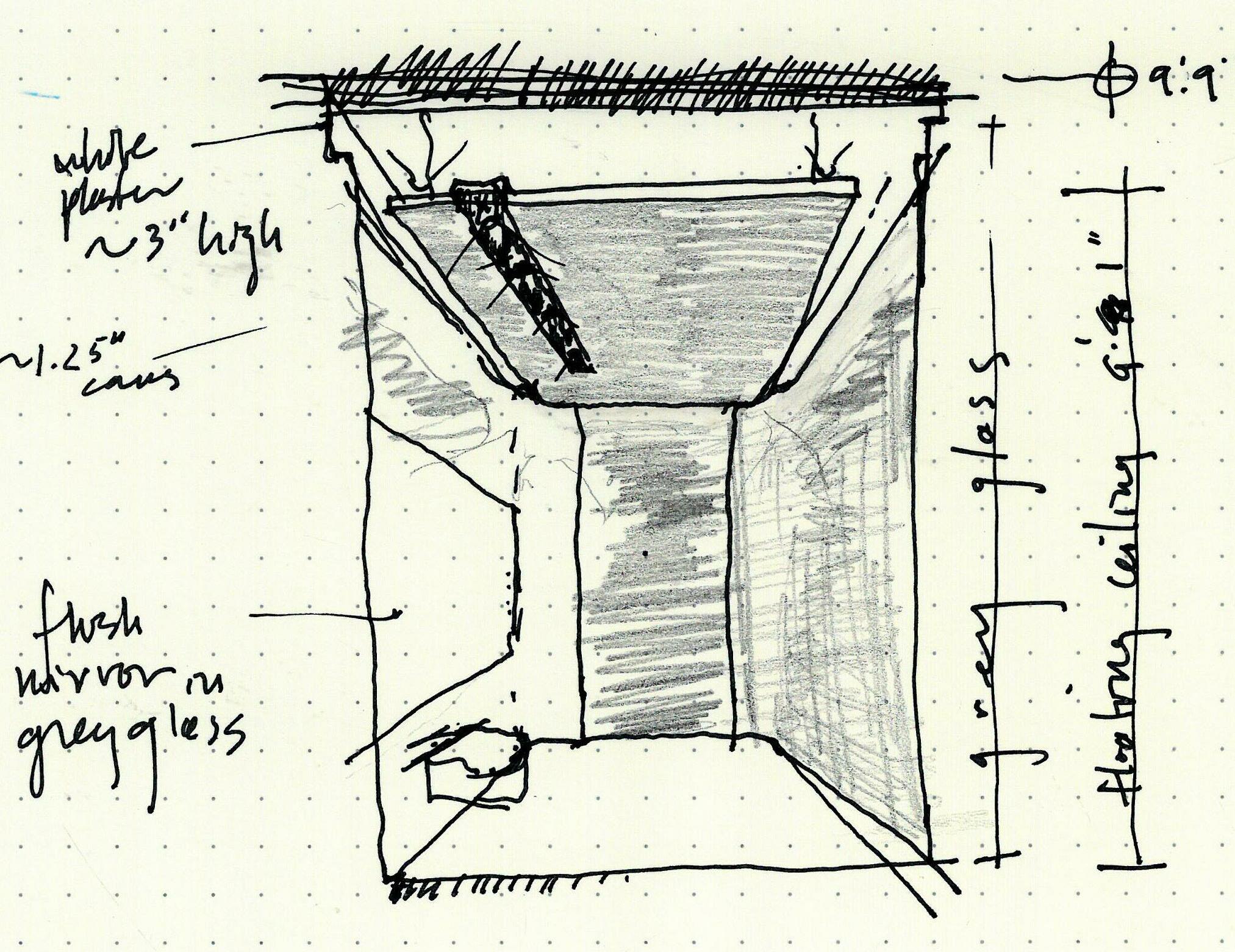
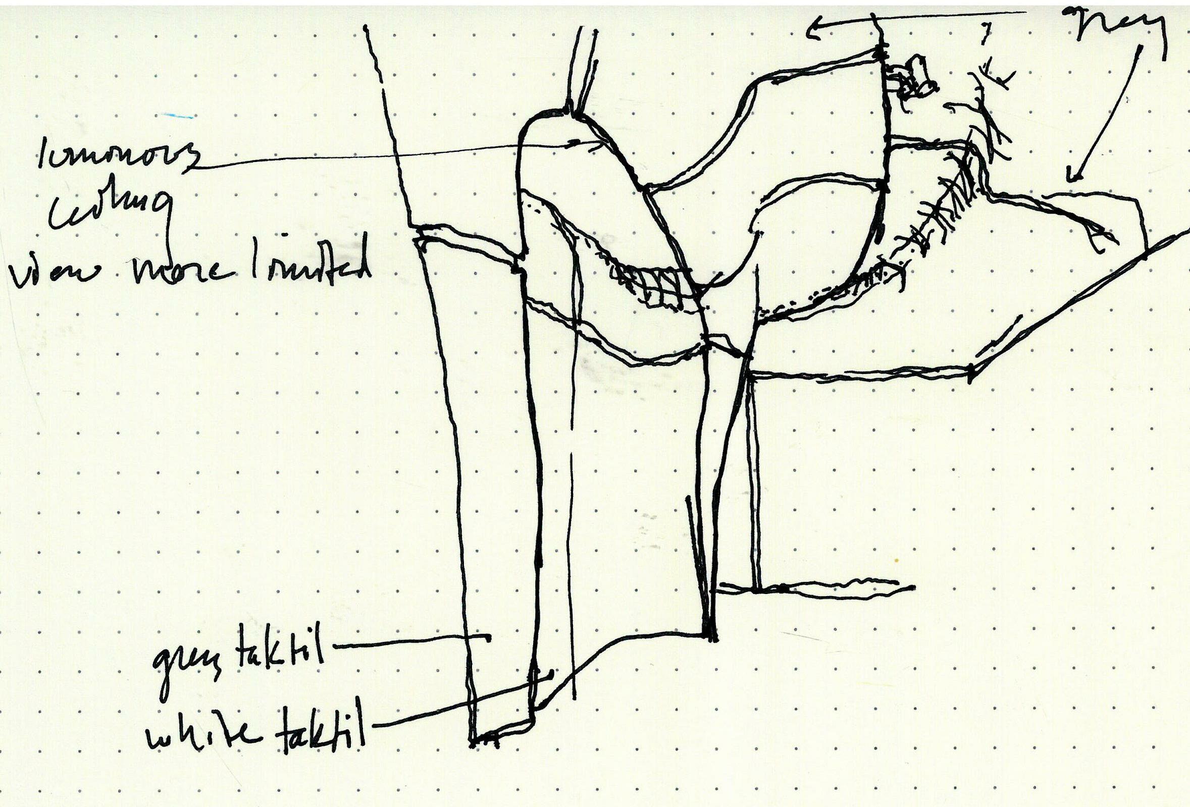

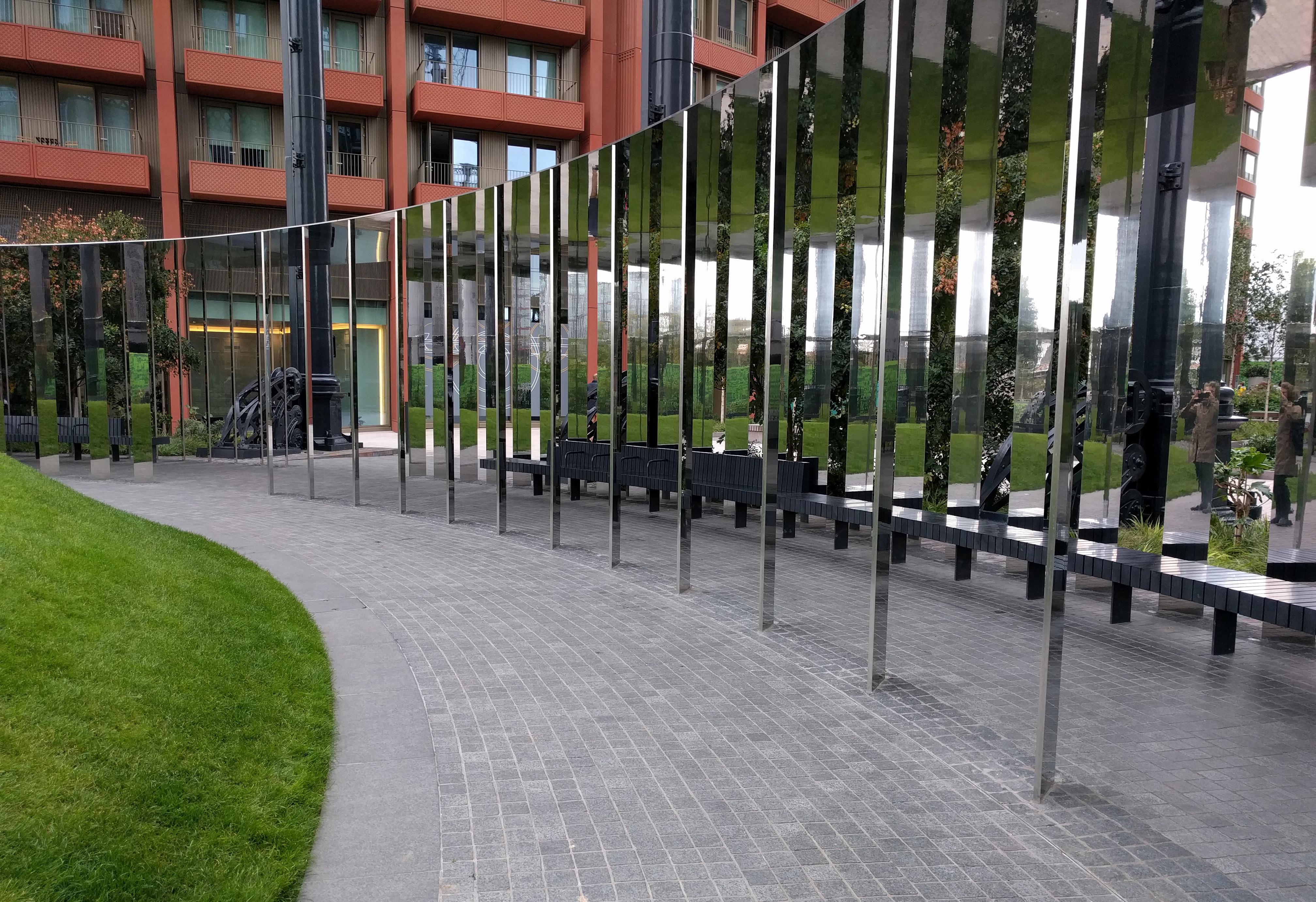
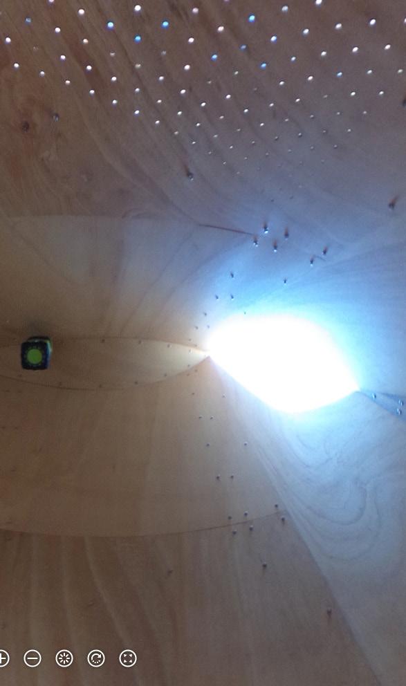
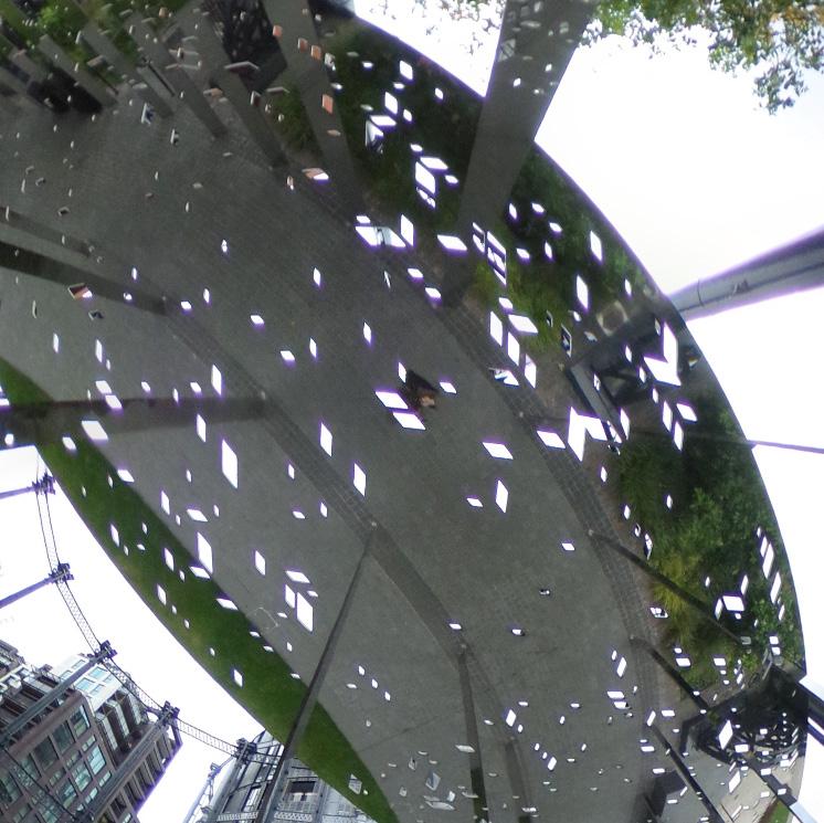
I initially approached this circular pavilion from the north, slightly uphill. The roof is so thin that from this vantage, with the roof close to eye height, it is almost imperceptible. Upon entering, the ceilingscape is the floorscape. An inversion of the childhood game of walking around the house looking down at a hand-mirror for the illusion of walking on the ceiling. The power of peripheral vision and its separateness from focused (foveal) vision is highlighted by the startling experience of someone’s approach along the
walkway being accompanied by the peripheral perception of motion at the ceiling plane. Ceiling is unperforated at the north/uphill side; the tiny geometric openings slowly appear and become more dense as one walks under it to the south/river side. Perforations have the surprising effect of breaking the illusion of depth at the ceiling, revealing it as a thin material object, rather than 3-D space. Thus the spatial experience totally changes even though the ceiling height remains the same.

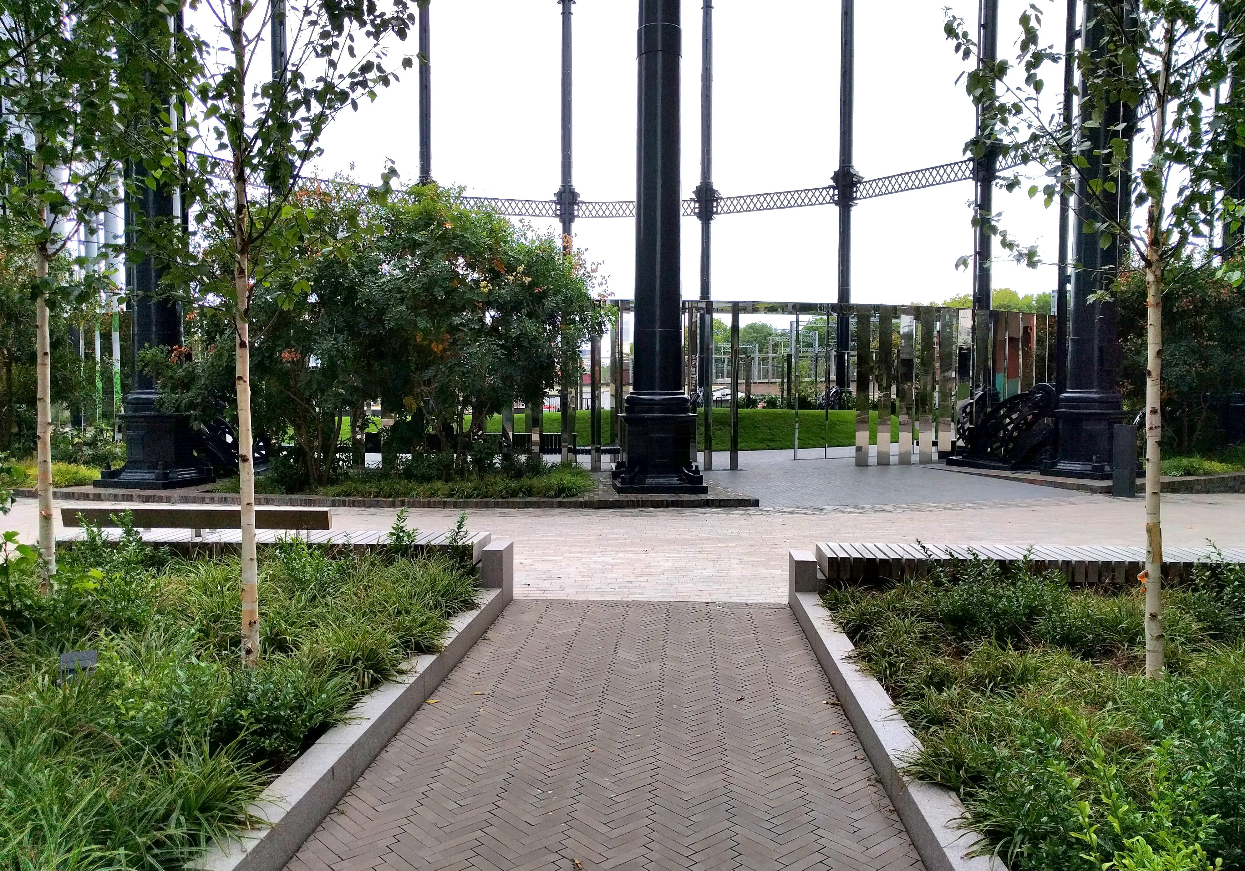


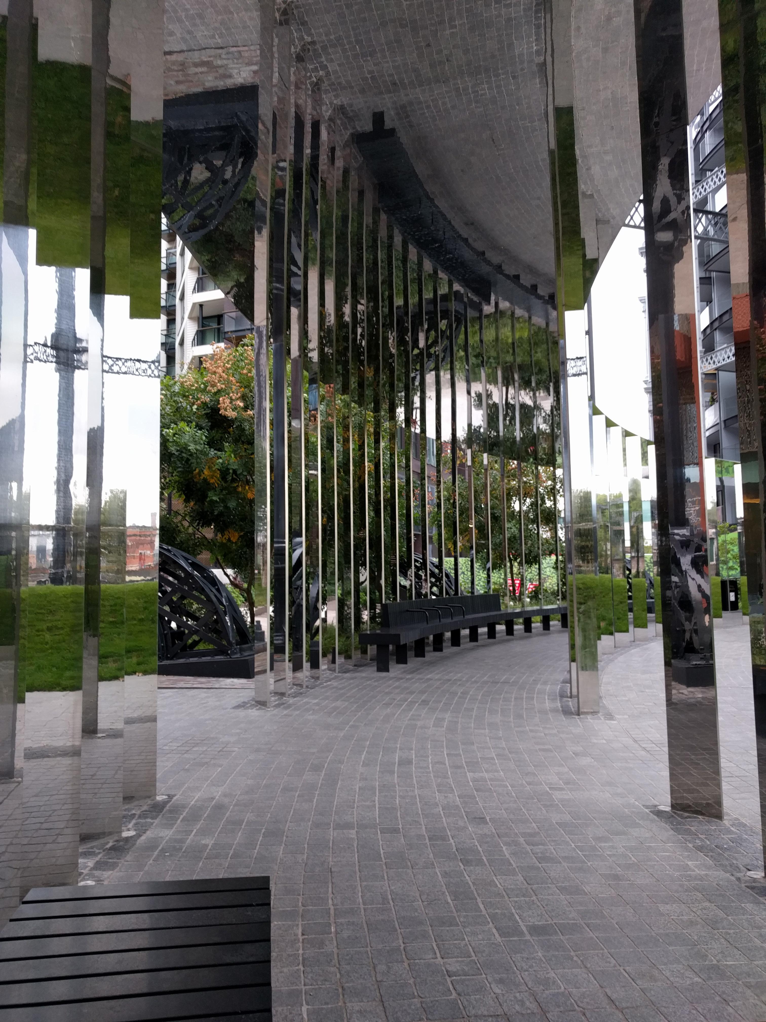
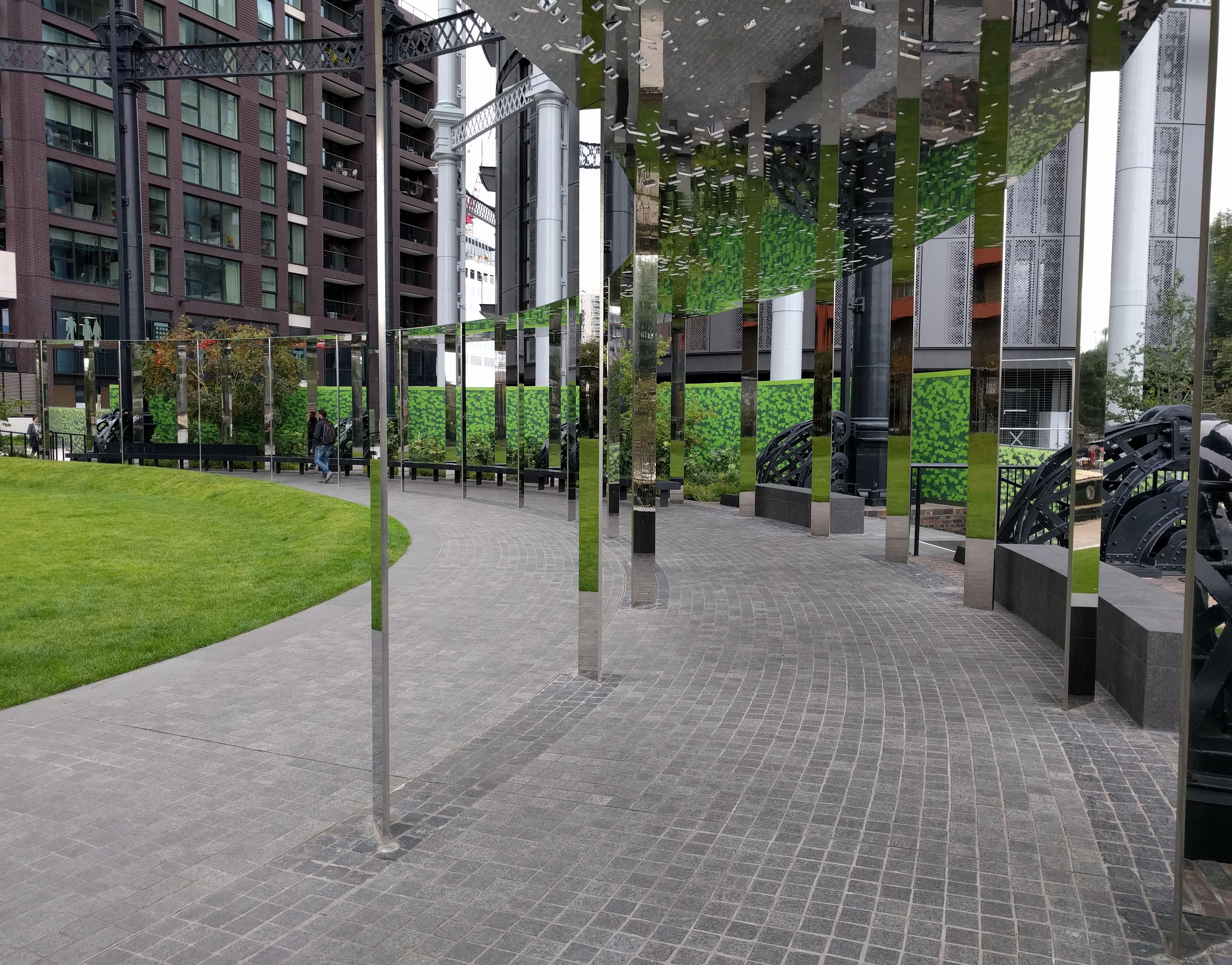 Entrance from canal side, downhill
Entrance from uphill, ceiling barely visible
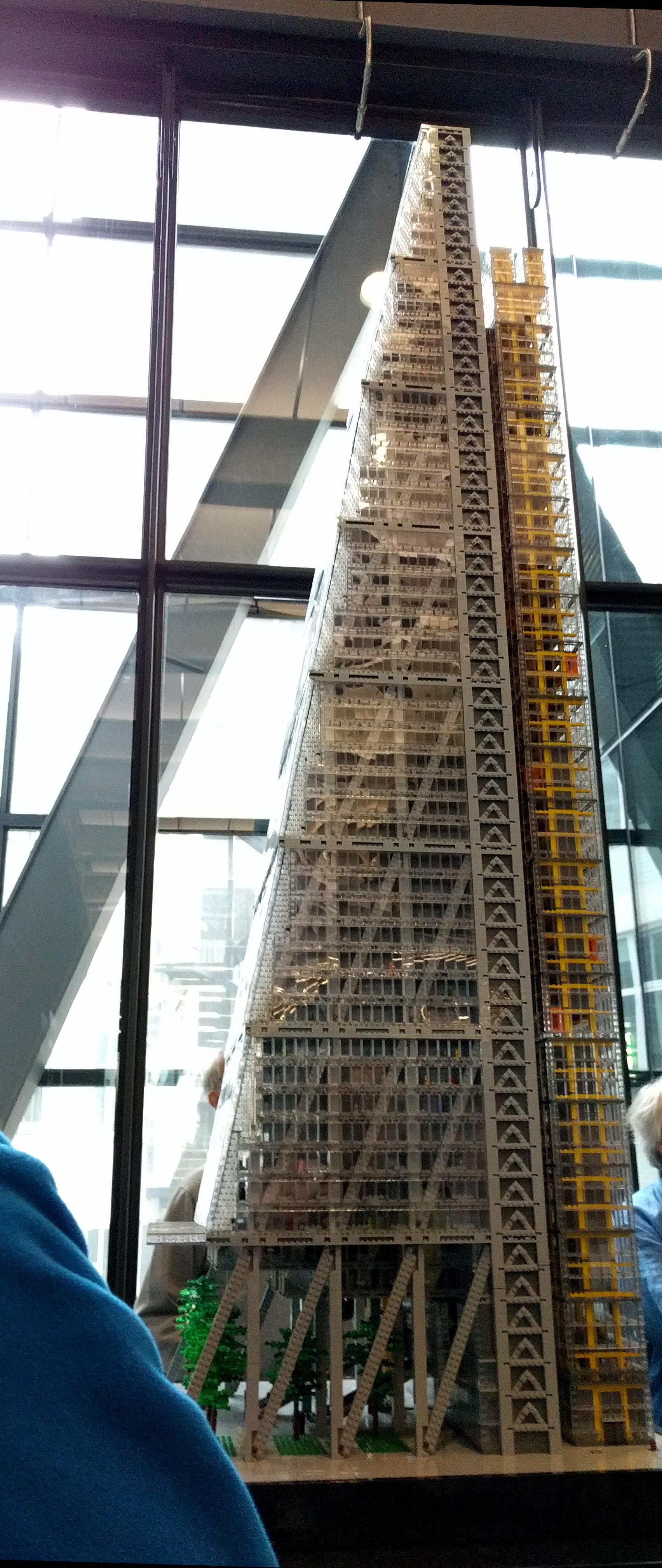
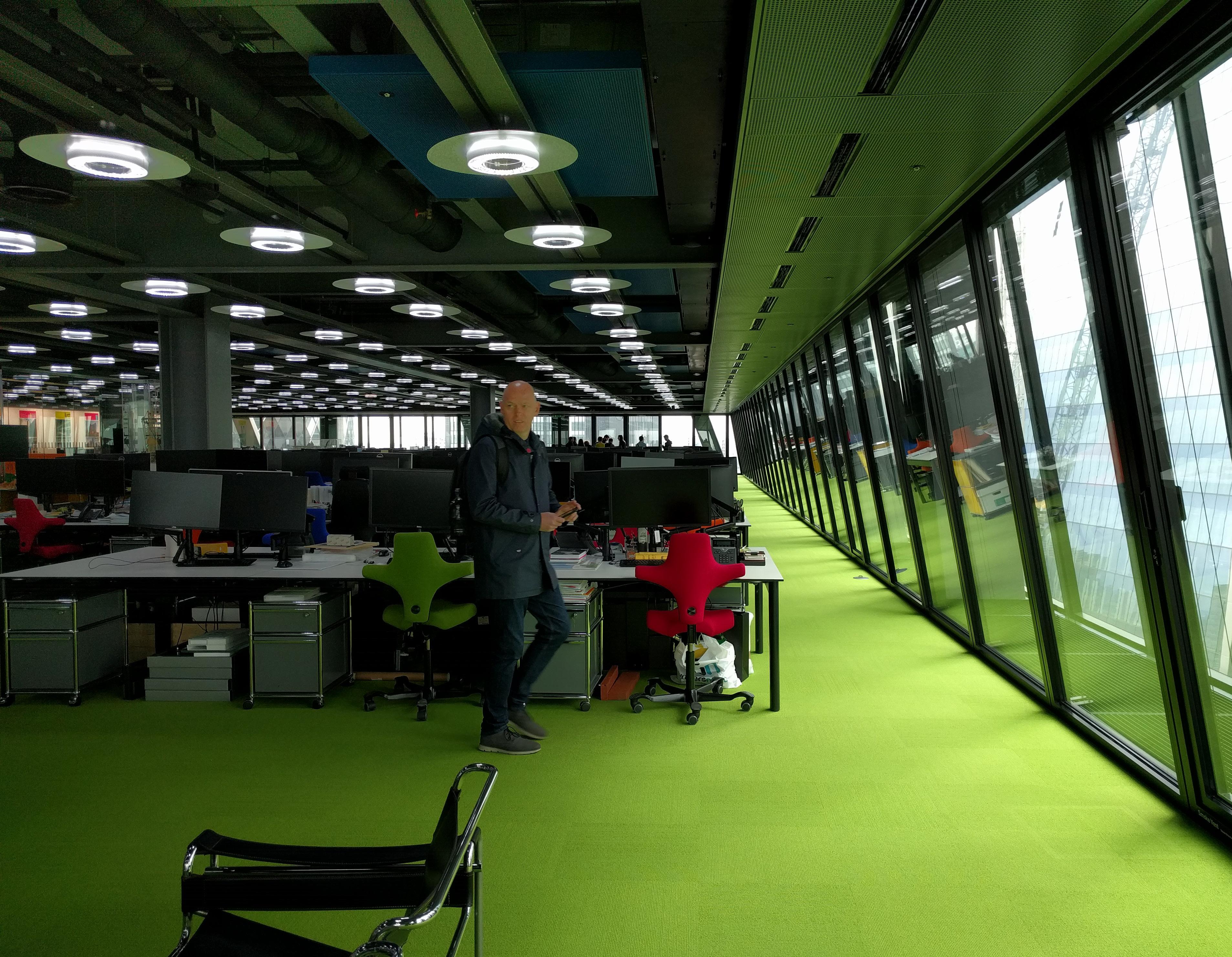
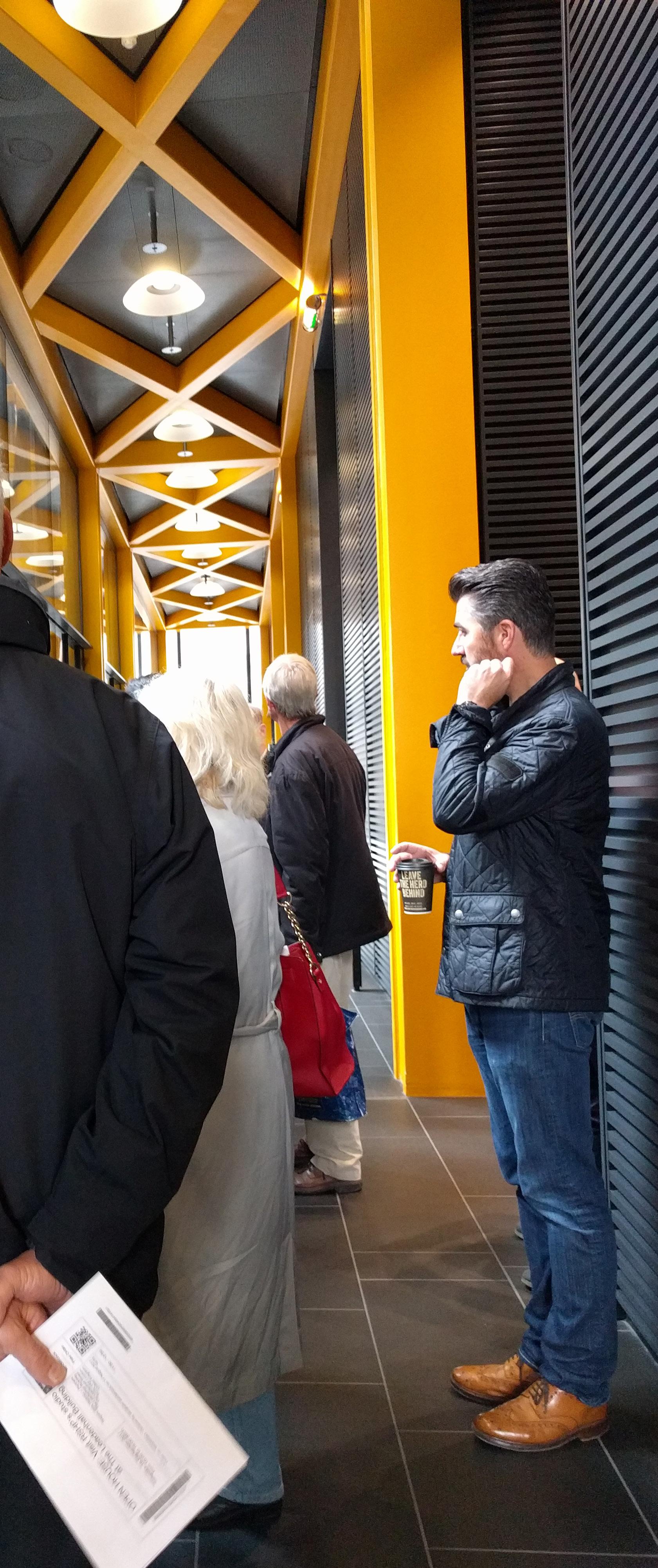
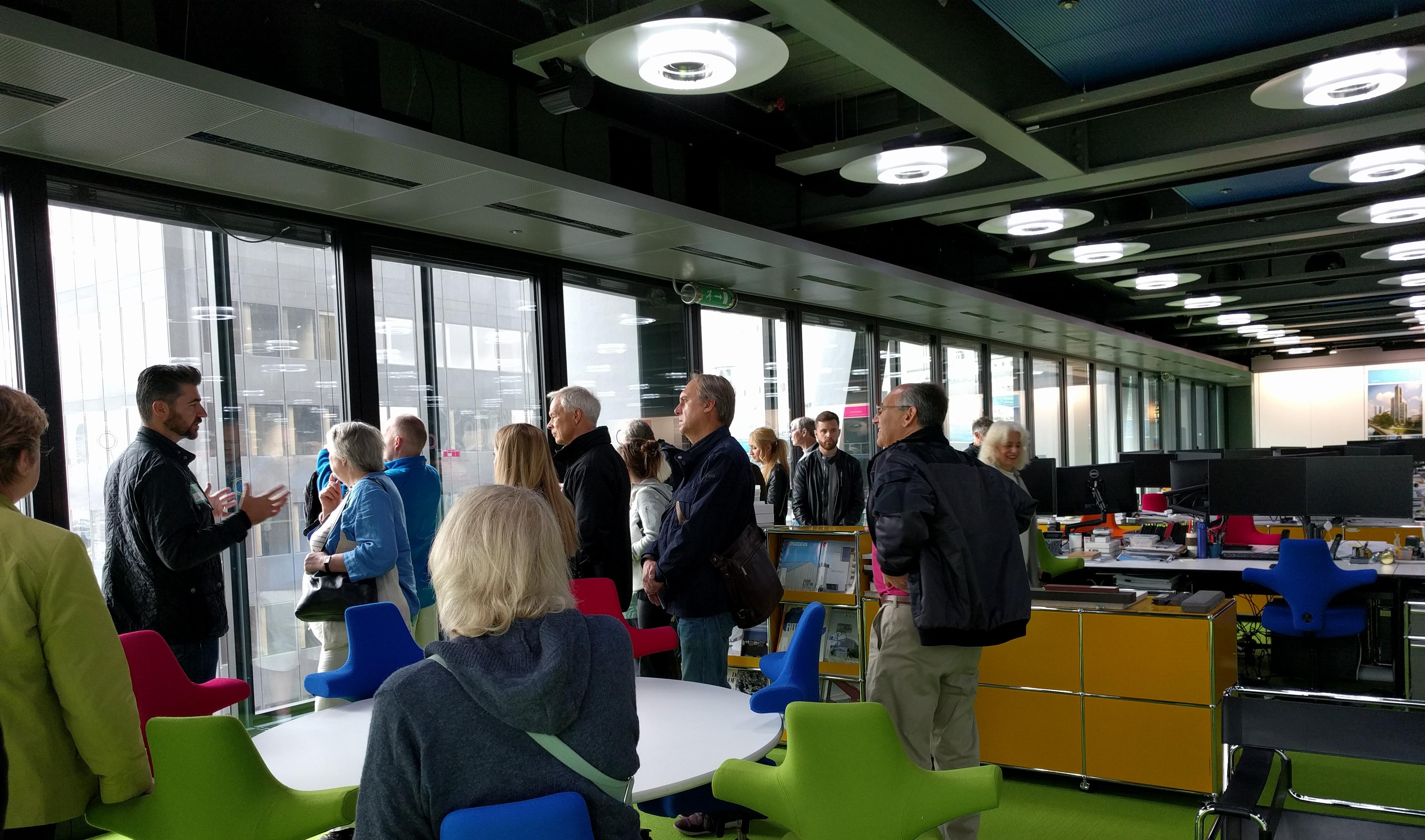
Got a ticket to the Open House London tour of the new RSHP office in the Leadenhall Building (225m tower of their design). A complete treat, staff seeming very excited to share their space, work, & ideas with the public. Building doesn’t follow the central core scheme typical of many towers. Instead, bracing (steel) is moved to the facade; elevators and a mechanical zone line the north side of the building creating unusully large, open floor plates with daylight on three sides & great views.
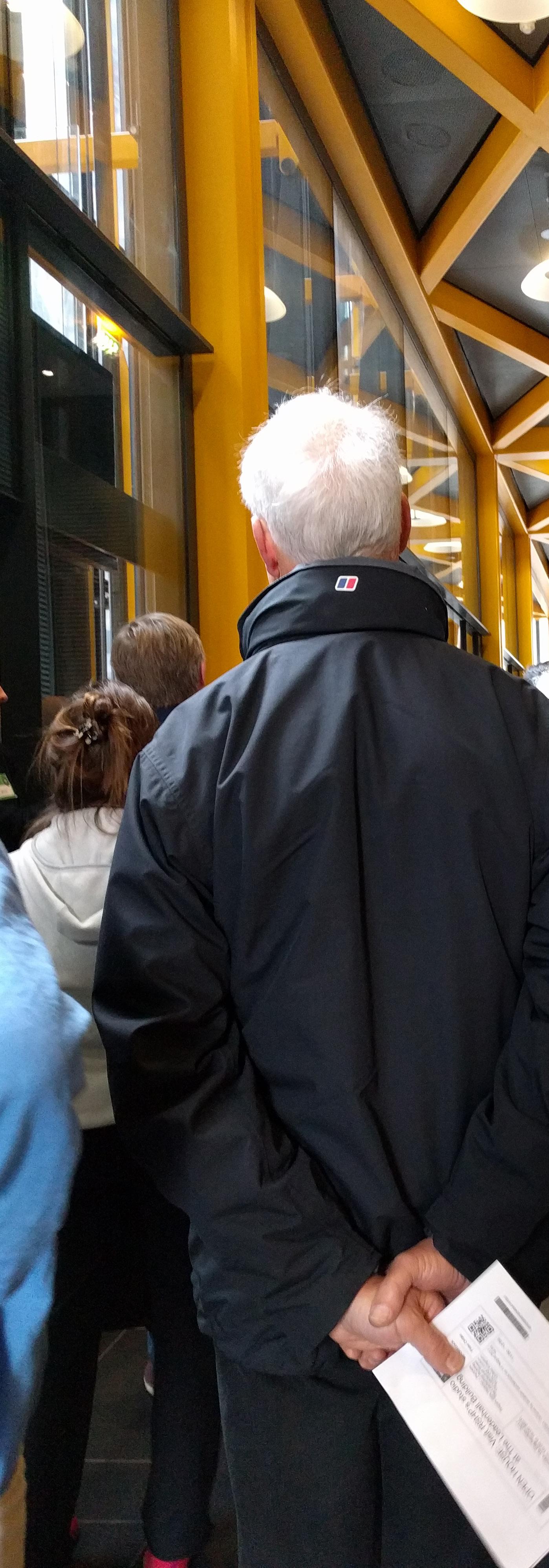
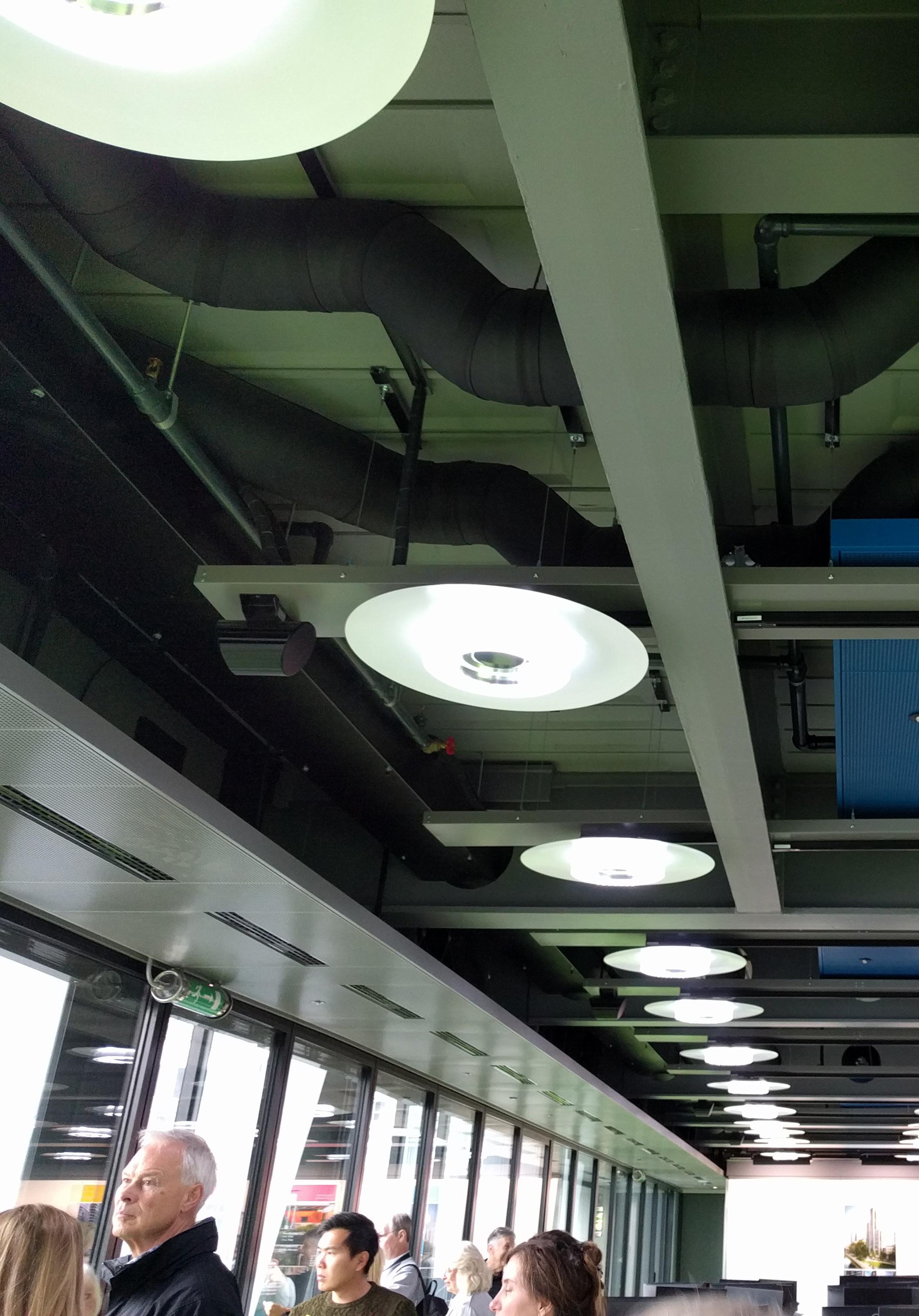
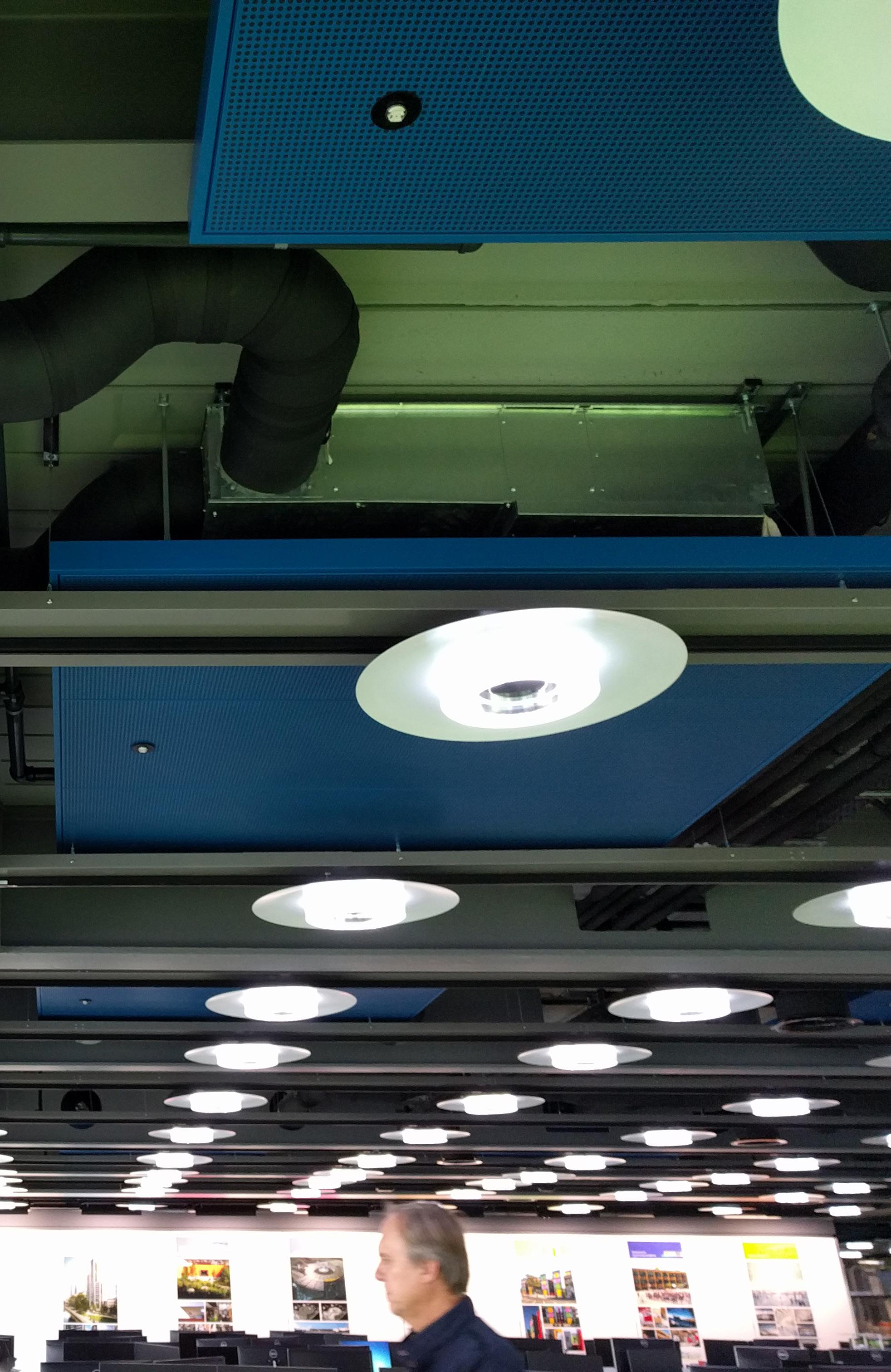
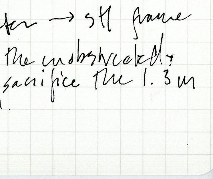
I ask about the open ceiling in the office, which seems to hit a nerve. The architect tourguide instantly starts talking about the ceiling’s prominent status as the visually unobstructed plane in any given space. He says most building tenants have fit out their space with acoustic tile ceilings, sacrificing ~1.3m of height to the plenum and creating a giant white plane as the dominant visual element. RSHP’s office ceiling uses gray structure with some blacks and blues, leaving the perimeter glazing as the most luminous plane in the space (even on a gray day)- intentionally giving priority to daylight and the great views out to the city. Green carpet is a playful pairing with the businesslike ceiling, and is meant to catch the eye of elevator passengers from other floors as they travel by vertically.

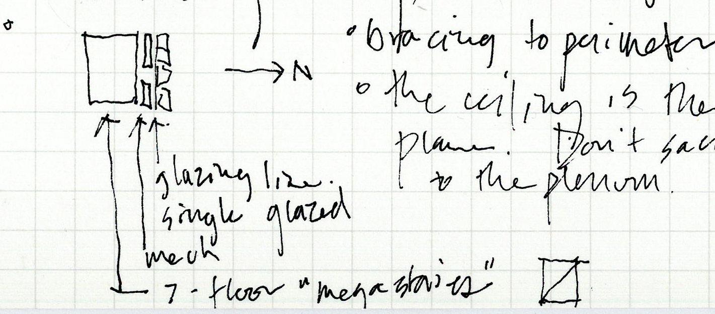
Floor is raised for wiring. Ceiling services are worked through regular web openings in the floor beams (web openings seem to be a staple in new tower construction here). Maybe the economics work with taller buildings since eventually you recapture enough space to fit an additional floor? Disc lights on tracks skim just below the bottom of the beams.

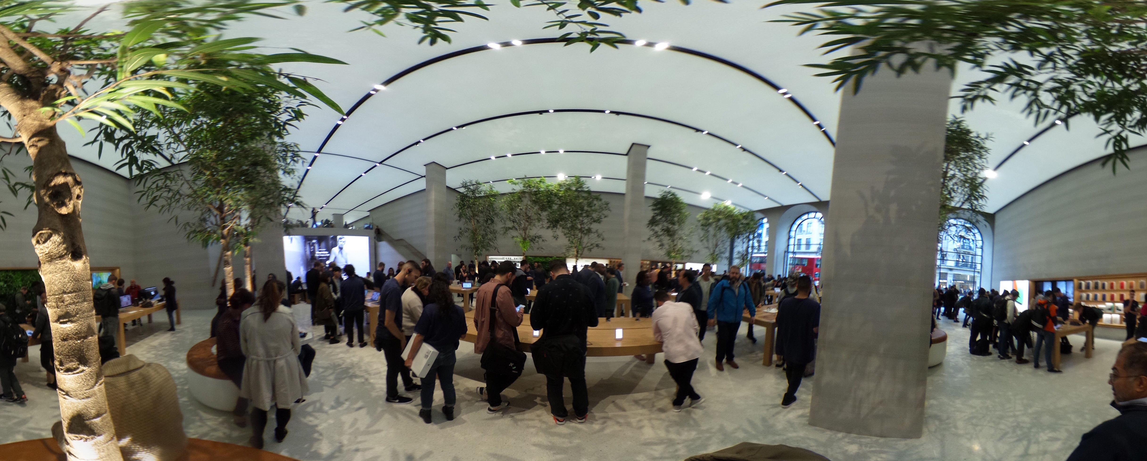
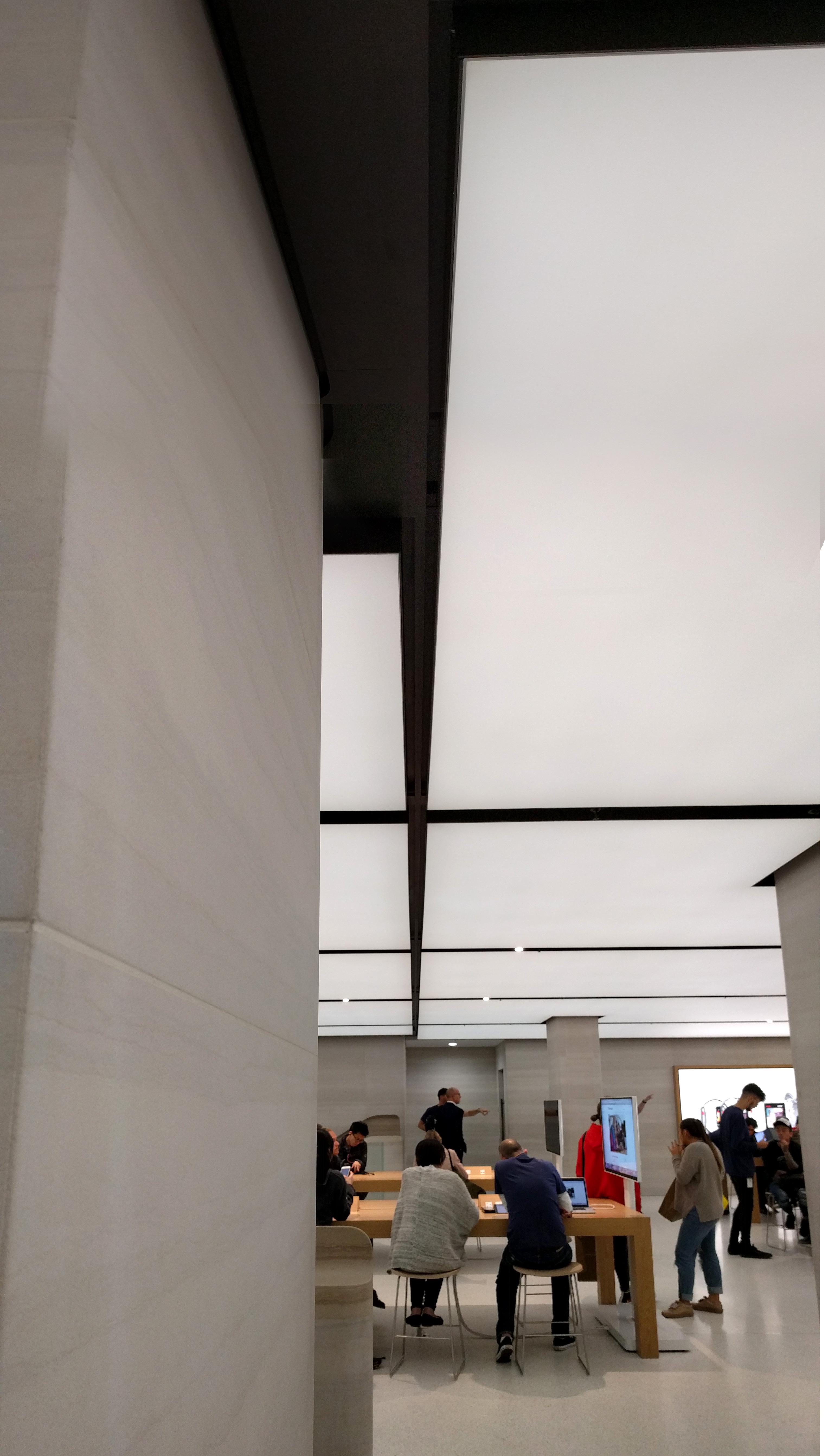
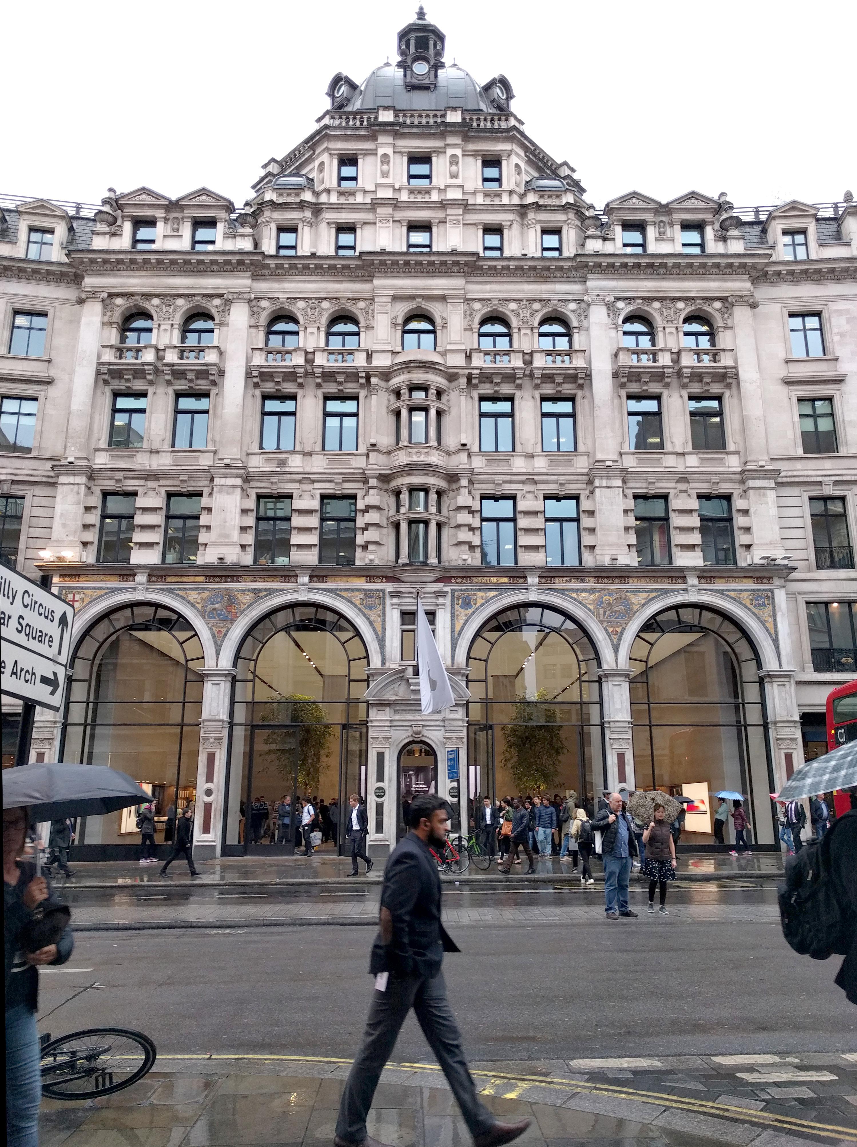
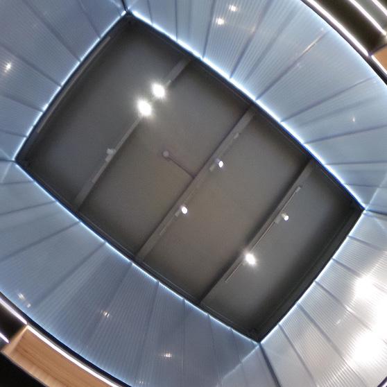
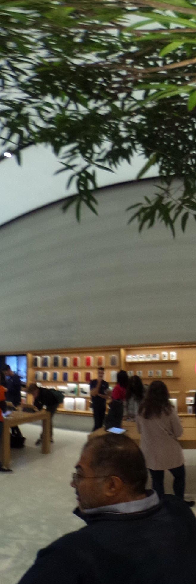
Almost the entire store is covered by a continuous plane of luminous ceiling panels, the longest ones yet installed in the world. Effect is even, diffuse light throughout. The glow of the panels is not too bright to look at directly, but bright enough to make it difficult to perceive their material quality; their perceptible quality is light itself. An oblique, close view at the elevator ceiling shows the weave of the backlit fabric.

The glowing ceiling is eyecatching from the street outside (and, in a space with no vertical access to the roof, addresses
the London desire for daylight from above), but to me the composition does not stand up to the prominent place it has been given. It doesn’t collaborate effectively with any of the other architectural elements to create an understanding of the space. The unimpressive potted trees at the double-height entry don’t help it convincingly carry the role of sky replacement...In a city with a thirst for interior daylight, the Apple Store has installed a flat, glowing screen that is an unsatisfying stand-in for something real.
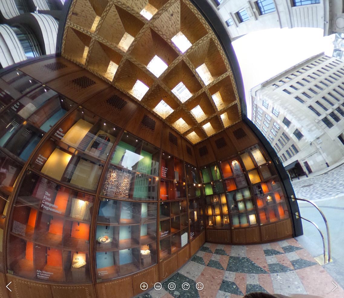
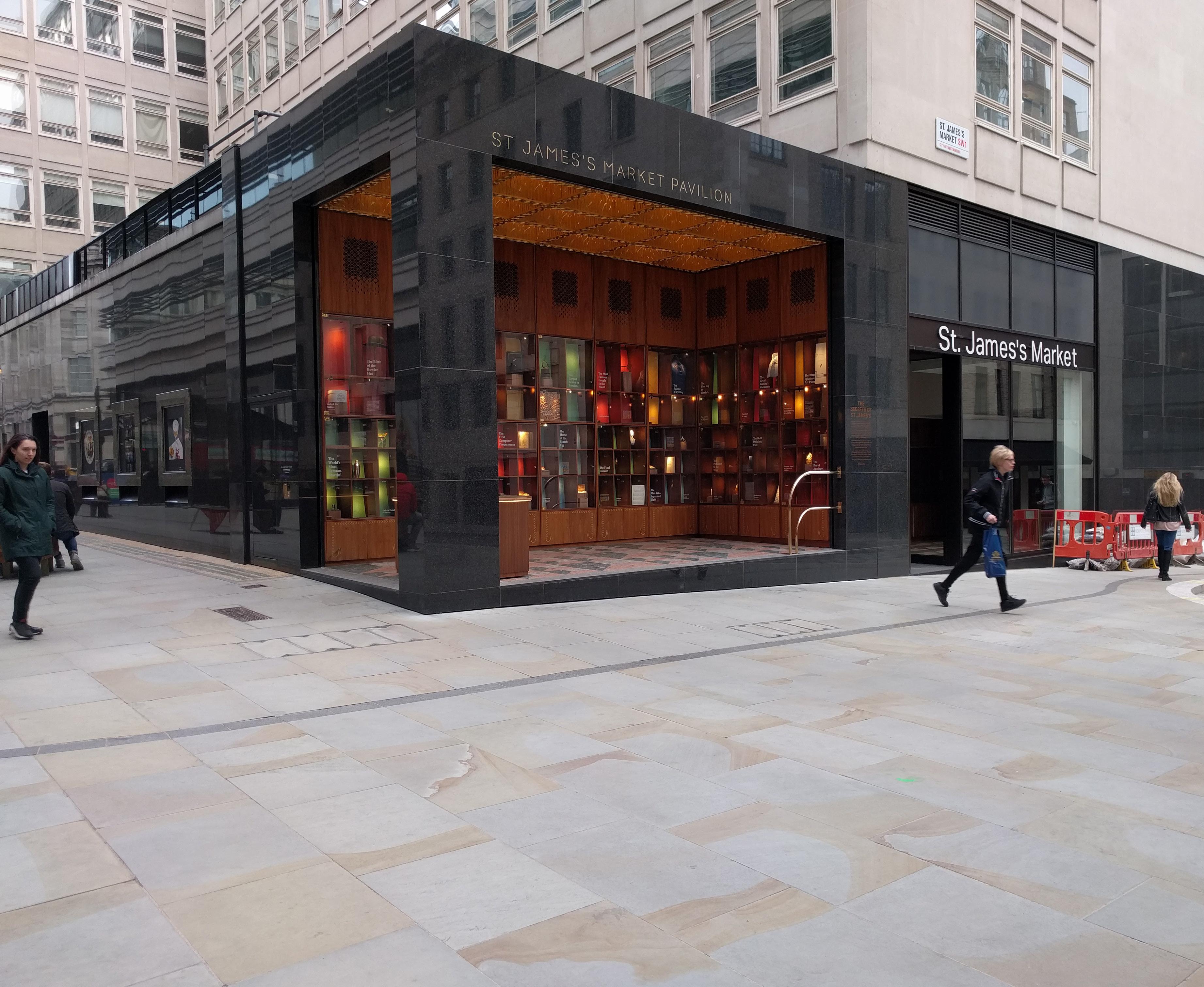
each coffer, the two sides that face the pavilion’s two portals are vertical planes, oriented to catch the gaze of distant viewers, and glowing mysteriously from the wash of daylight from the (yet) unseen skylights. After you’re drawn in by the glowing gilt planes, the view from directly below the ceiling is caught by the faces of each coffer that are canted downward, providing an ornamented surface that can be viewed from “inside,” directly below.
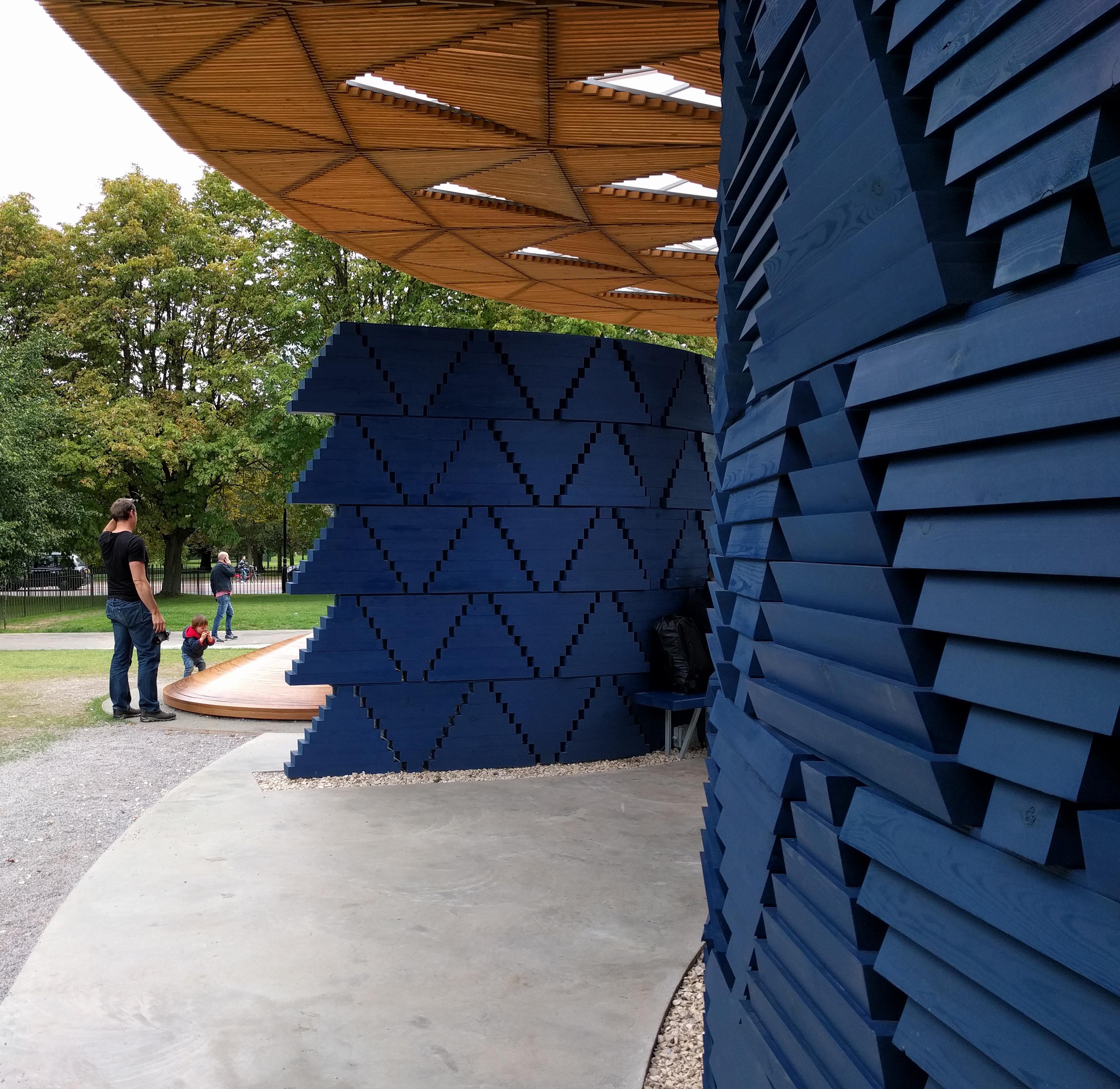

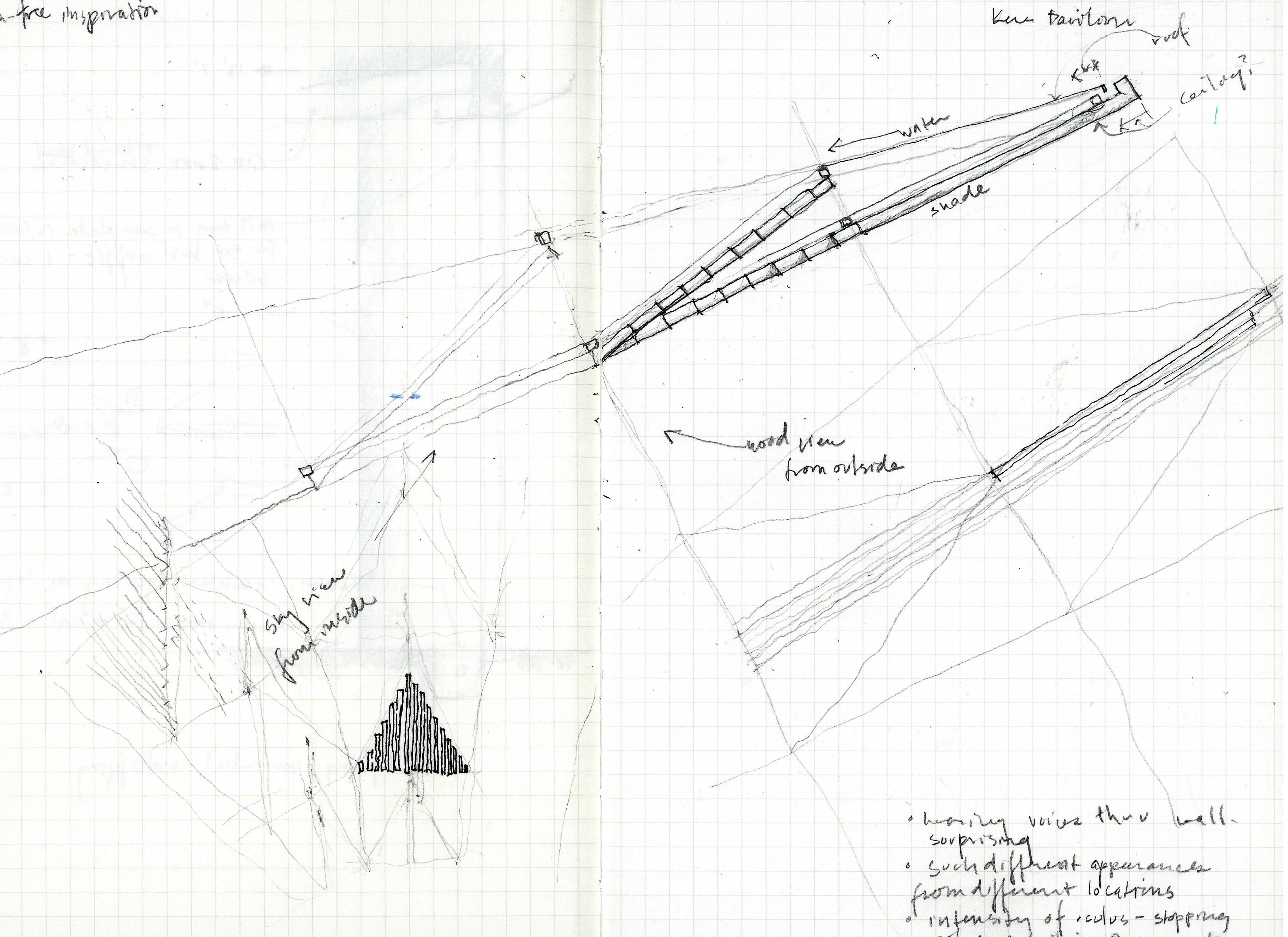
Read Kere’s design statement on the Pavilion just prior to arrival, about the inspiration for the pavilion being a tree in his village. Shade creating a gathering space, and the twinkle in the walls at night signaling gathering, just as in his village one would walk up a hill at night to look for the twinkle of lights somewhere in the darkness that would signal celebration.
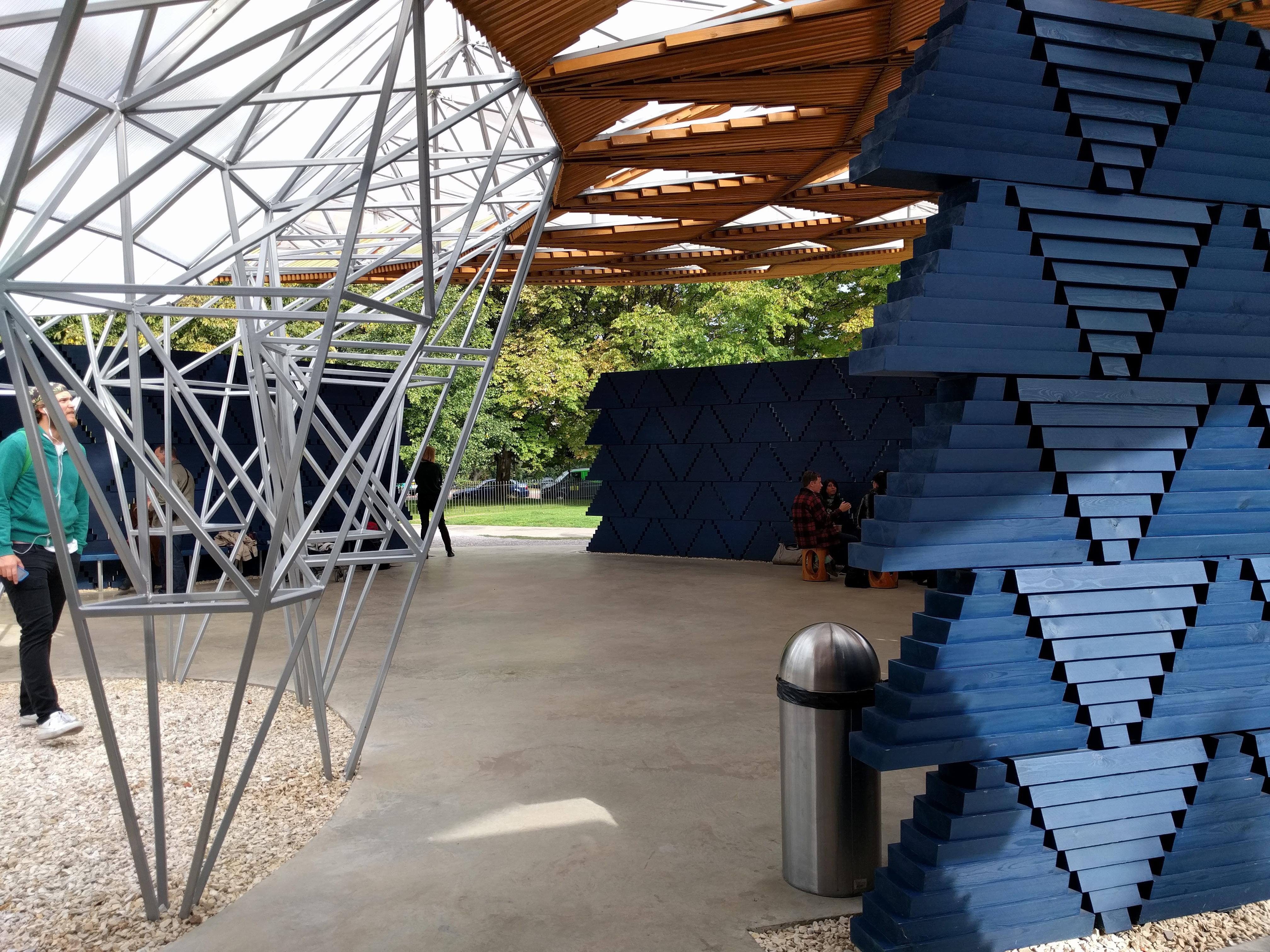
Pavilion deceptively appears simple: four walls, and a roof supported by a central structure. But it is an excellent case study in the application of a ceiling. In very basic terms, the wood slats can be understood as a ceiling applied to the thin tube structure that holds up the translucent roof. Slats appear to be applied directly to the structure . . .but not just smoothly to the bottom chord of the tapered trusses/frame that reaches out from the center . . . Triangular panels bent upward with tips pointing away from the oculus reveal the changing structural depth from below. While the “roof” provides rain cover, the slats provide shade.
To say that the ceiling form “reveals” the structure sounds too directional, too clinical. It’s more of a play relationship than a didactic one. Directionality of the folded triangle panels give the ceiling a very different appearance on approach than from the inside looking out… a way of distinguishing in and out that does not rely on barriers, or on striations. The power of the circle of light at the center is striking, in both direct and diffuse light.

What do you learn when you go on a trip to study ceilings, but then realize you have walked through several rooms and not even seen the ceiling?
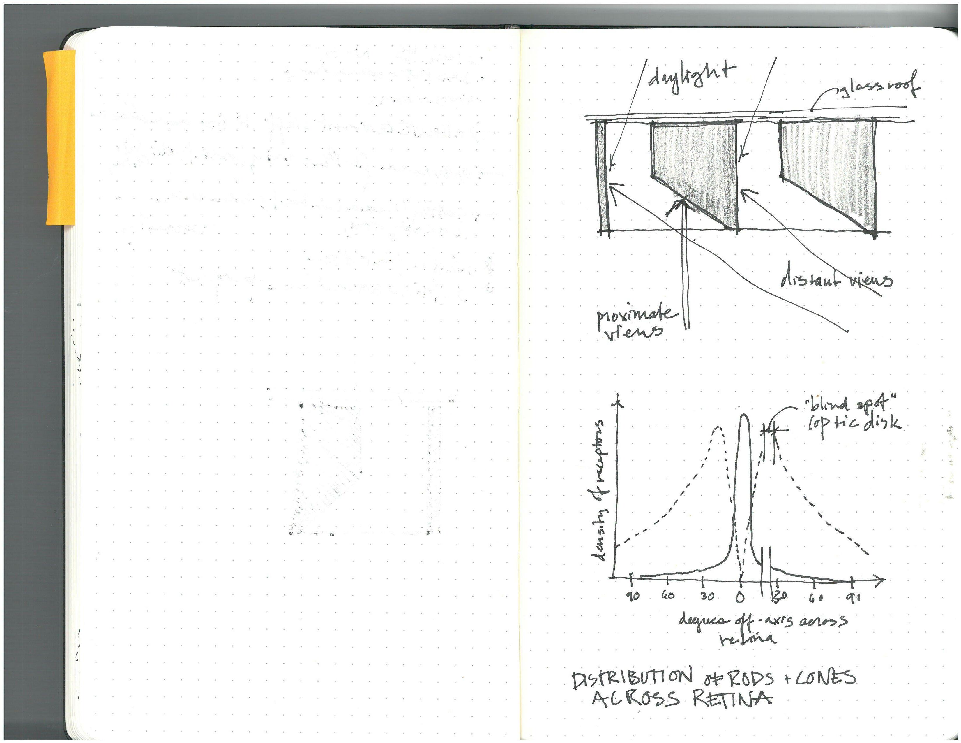
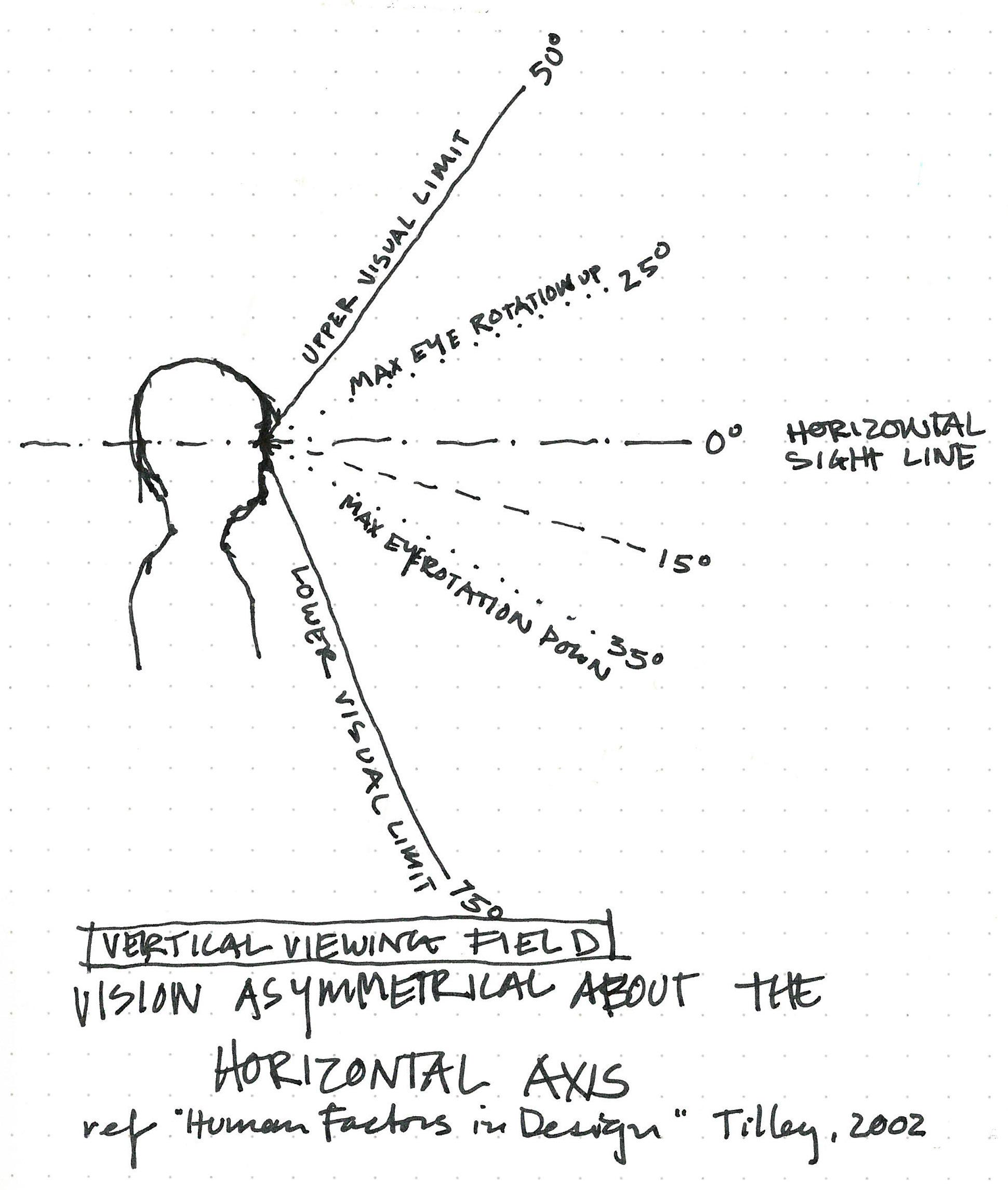
The human field of vision is symmetrical in plan, but asymmetrical in section. Our anatomy priveleges the view of the ground plane over the view of sky or canopy.
The typical “relaxed” sight line is 15° below horizontal,1 and our typical gaze when walking is 10° below horizontal.2
This puts the ceiling most often in our peripheral vision (rather than in our foveal, or “focused,”
vision), and sometimes puts it out of our visual field entirely.
It also makes ceiling height & viewing distance (in plan) critical factors in how the ceiling is seen, or not seen.

These principles are useful to keep in mind, but they take on too much significance without their companion ideathe dynamic quality of bodies in space responding to the environment: “The human eye, in its investigations, is always on the move and the beholder himself is always turning right and left, shifting about.” 3
1 A. R. Tilley, “The Measure of Man and Woman: Human Factors in Design,” 2002.
2 U.S. Department of Defense, “Human Design Criteria for Military Systems, Equipment, and Facilities, 31 December 1974.
3 Le Corbusier, Towards a New Archi tecture, Dover Publications 1986, p. 191.
Grounded ceiling: the opposite of a “cloud” ceiling. Ceiling expressed as an extension or outgrowth of a vertical element that meets the ground.
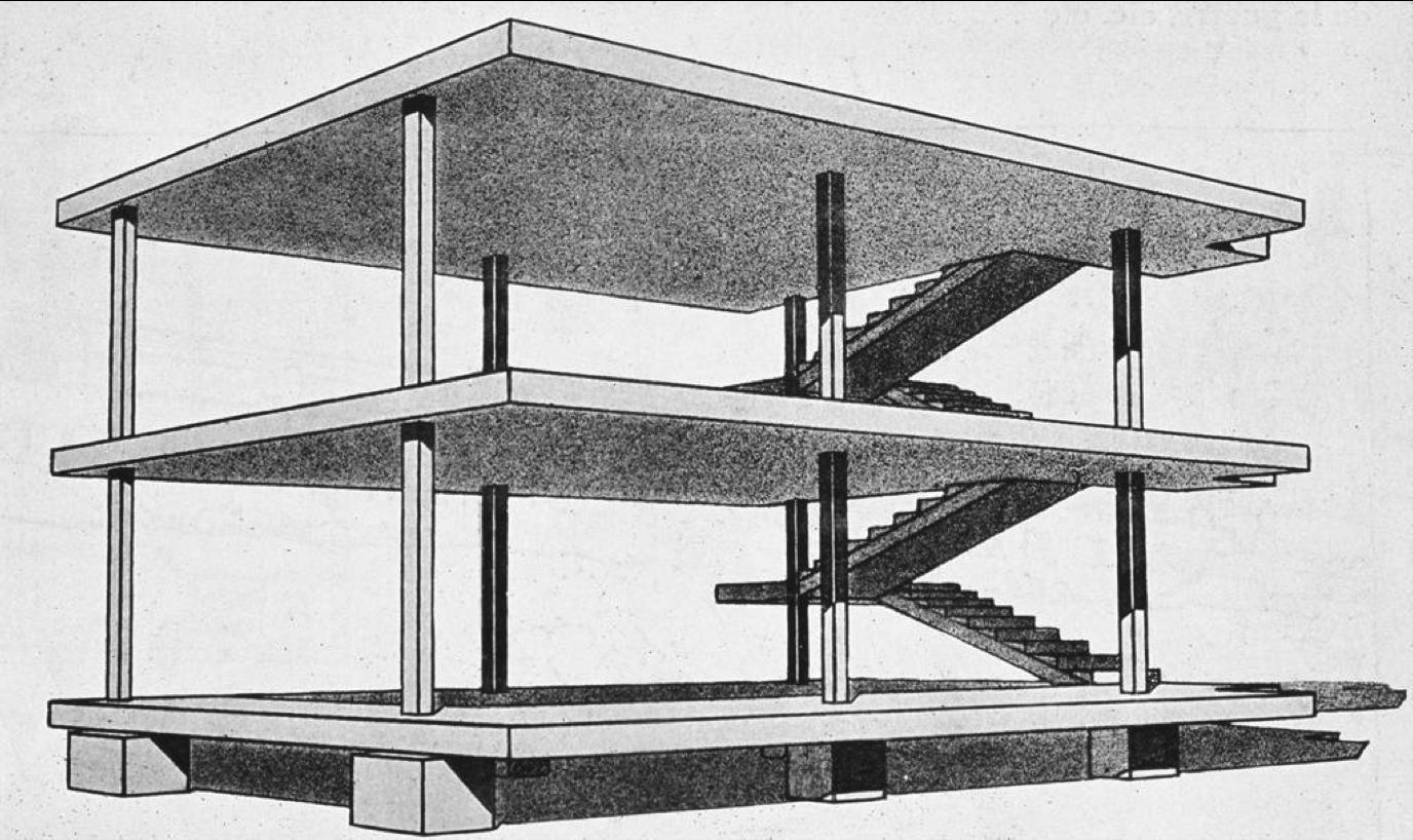
It has seemed to me sometimes that the ability to express this grounding atrophied in much modern architecture. The liberation that came with the free plan didn’t hold equal promise for the ceiling; the ecstatic sweep of the newly freed walls, now merely partitions, scraped clean the ceiling of all expression of force and strain and spread. Too often the relationship of the vertical to the horizontal, the grounded to the overhead, was reduced to the infuriatingly anodine touch of a column to an indifferent, completeley planar ceiling.
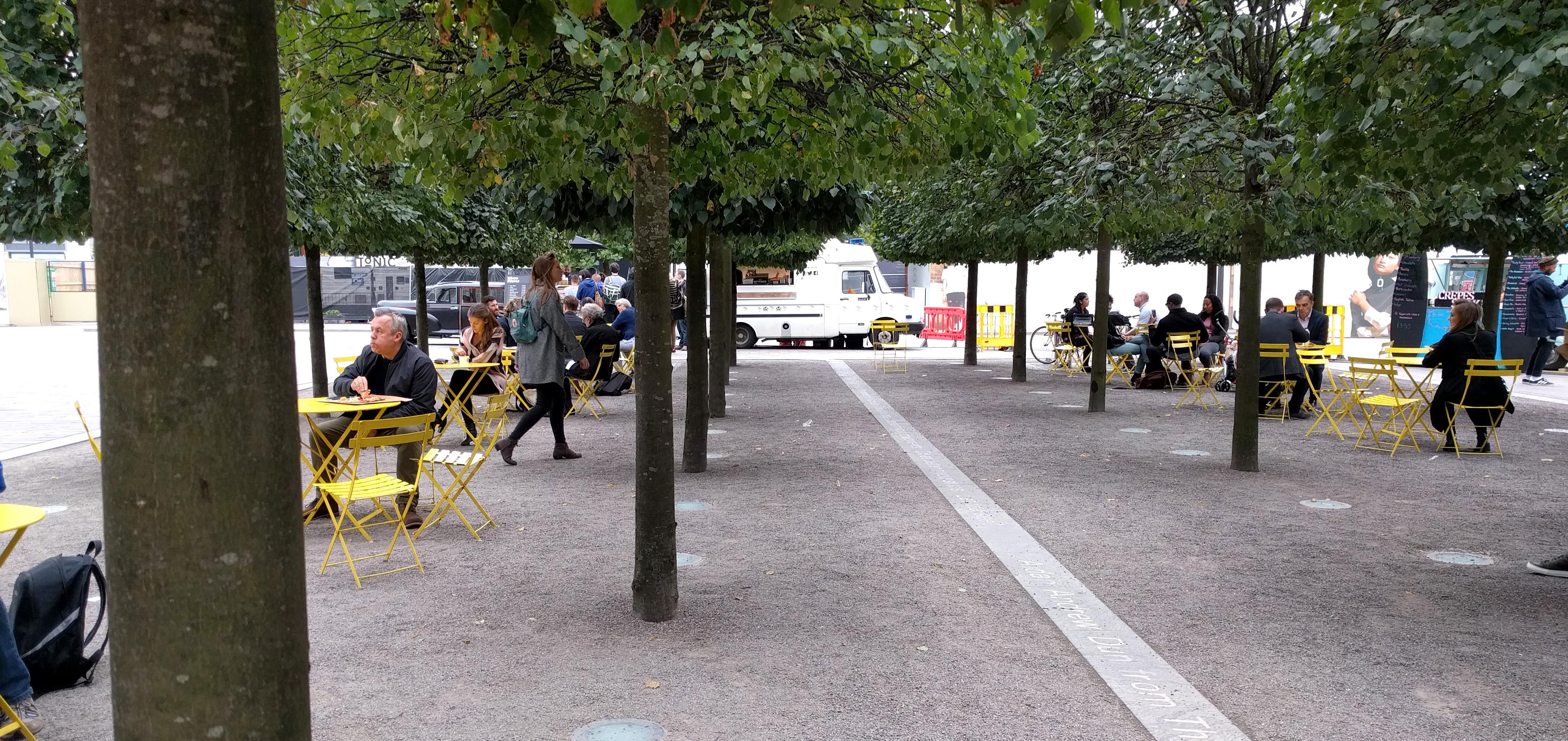
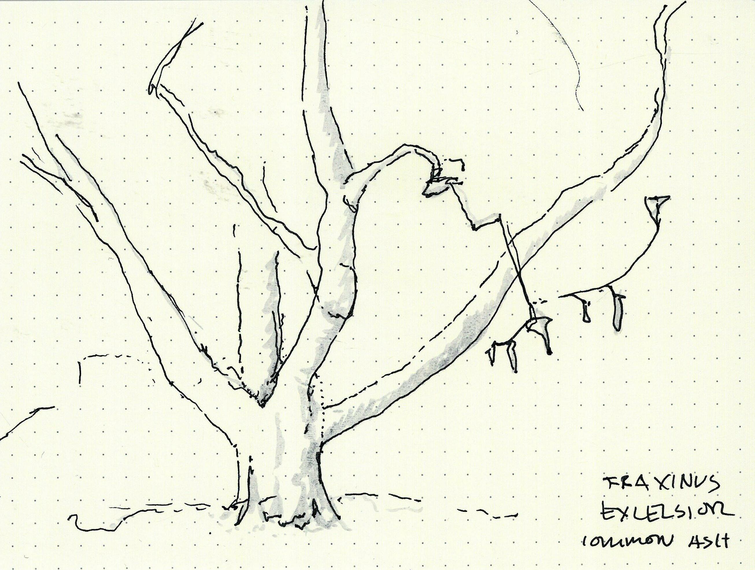
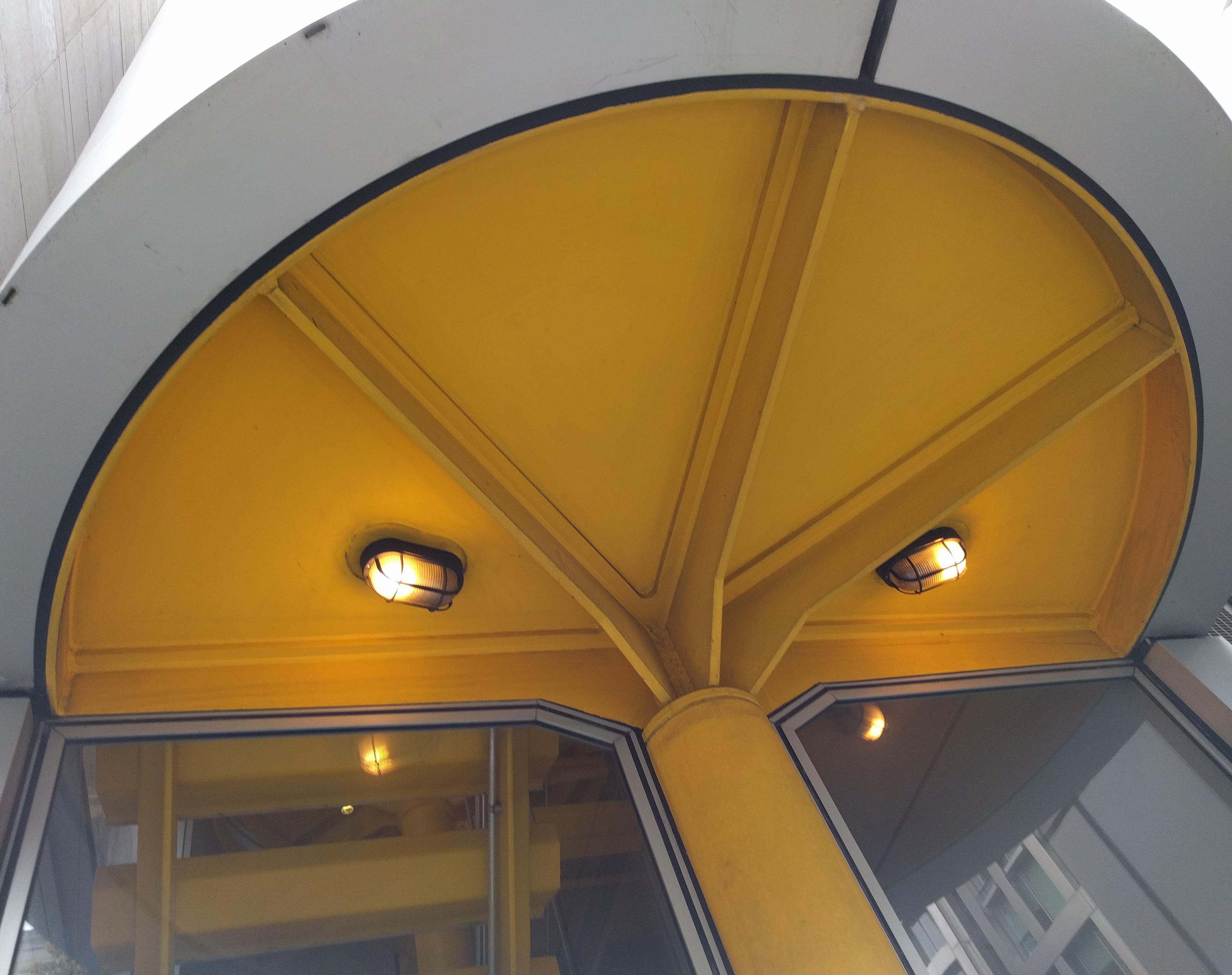
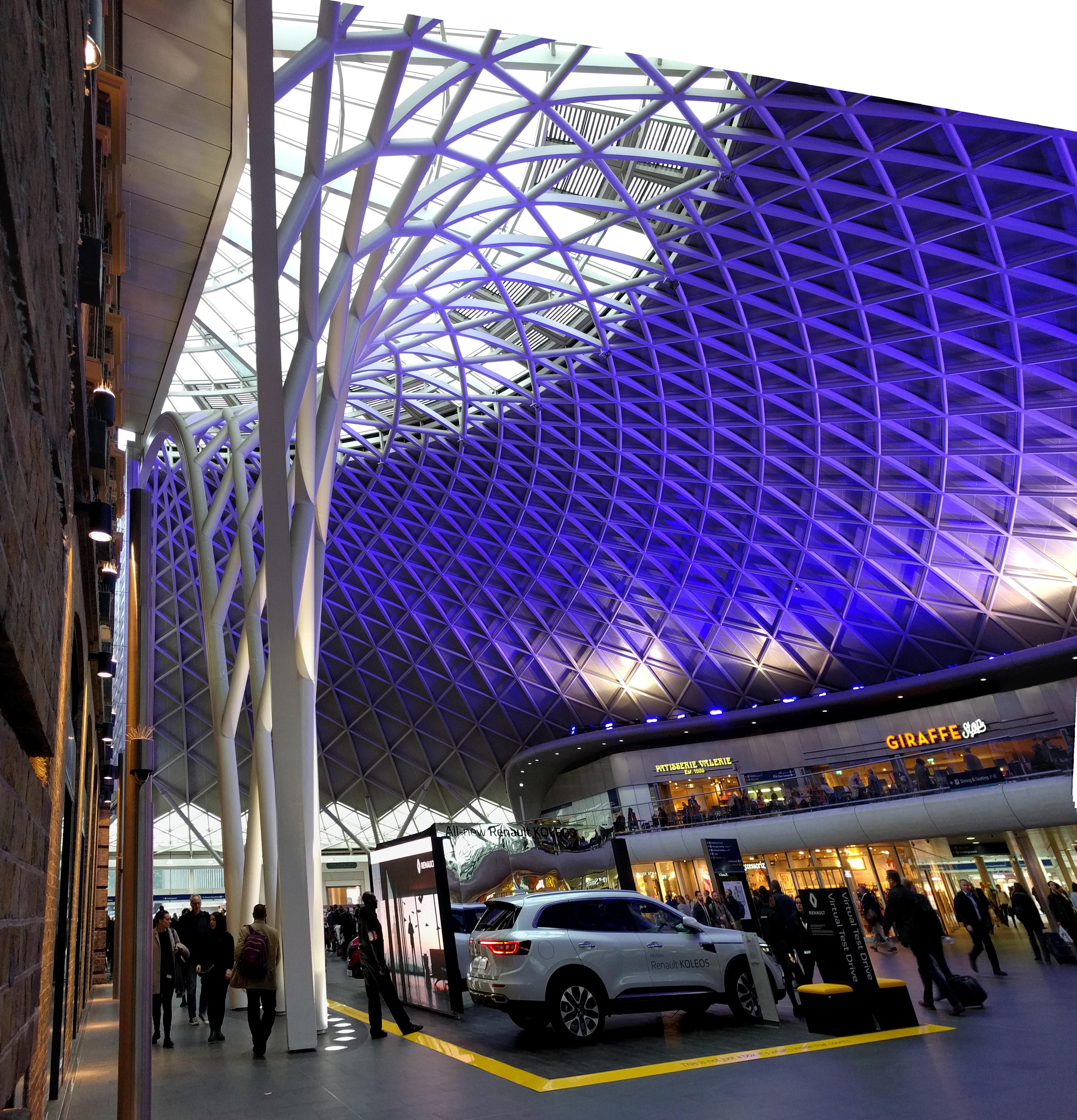
In London I saw an opposing force to this relationless flatness: a recurring return to the arechetype of the radial canopy.
From medieval to contemporary, versions of this form appeared and reappeared, all seeming to reach back to the elemental experience of standing under an impressive tree: the drama and intensity of standing beside, and maybe touching, the thing that is legibly holding it all up.
At Roca London Gallery and the Serpentine Pavilion, oculi are placed at the center of the radial canopy form (in a sense, inside the column / pier / trunk), creating a dramatic coincidence of structural intensity, light, and material contrast. In this context of pervasive use of the radial canopy form, the installation of Patkau’s Ice Skating Shelters at the V&A courtyard is hard not to read as a stand of hollowed-out tree trunks, at the last stage of their once expansive structural and infrastructural significance.

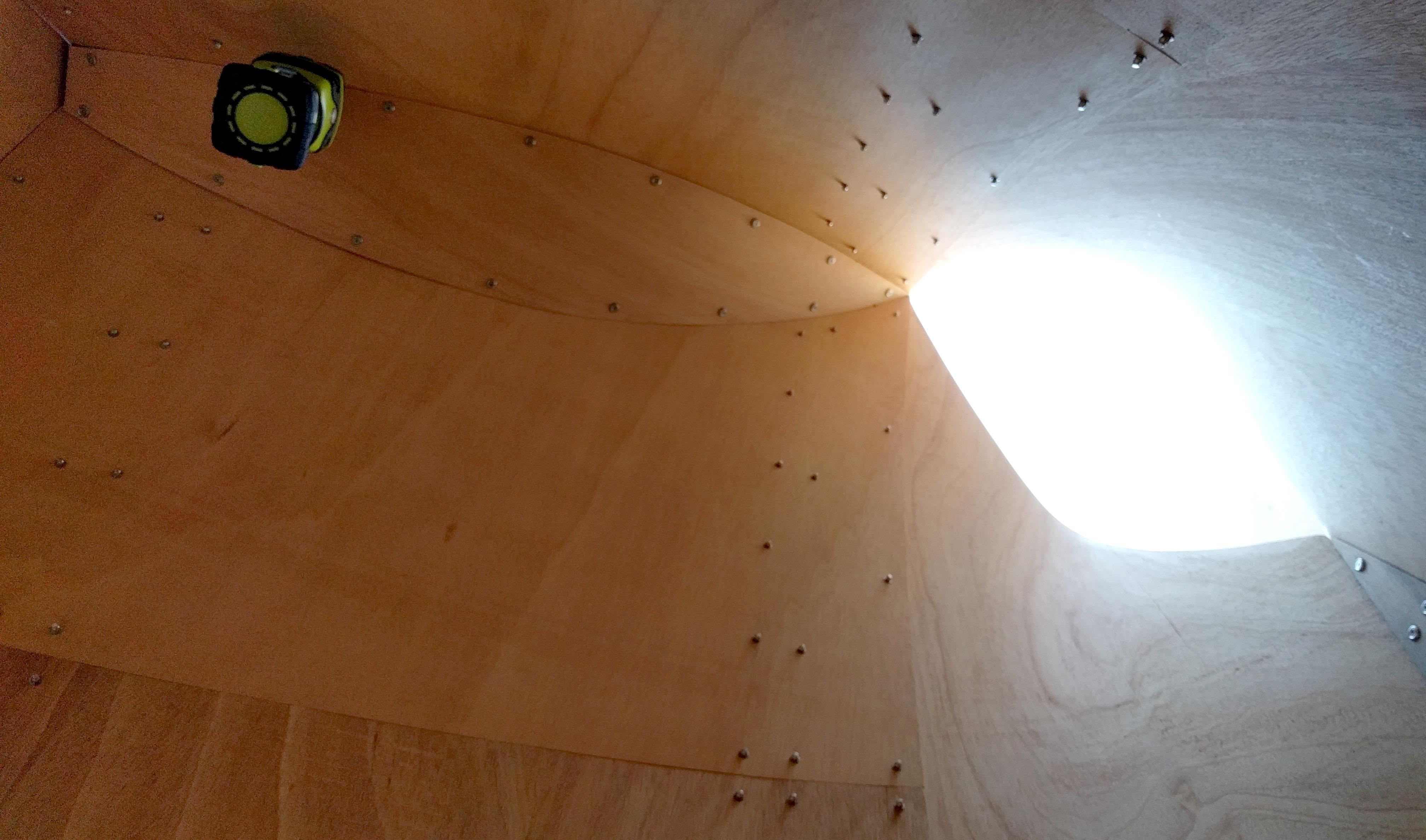
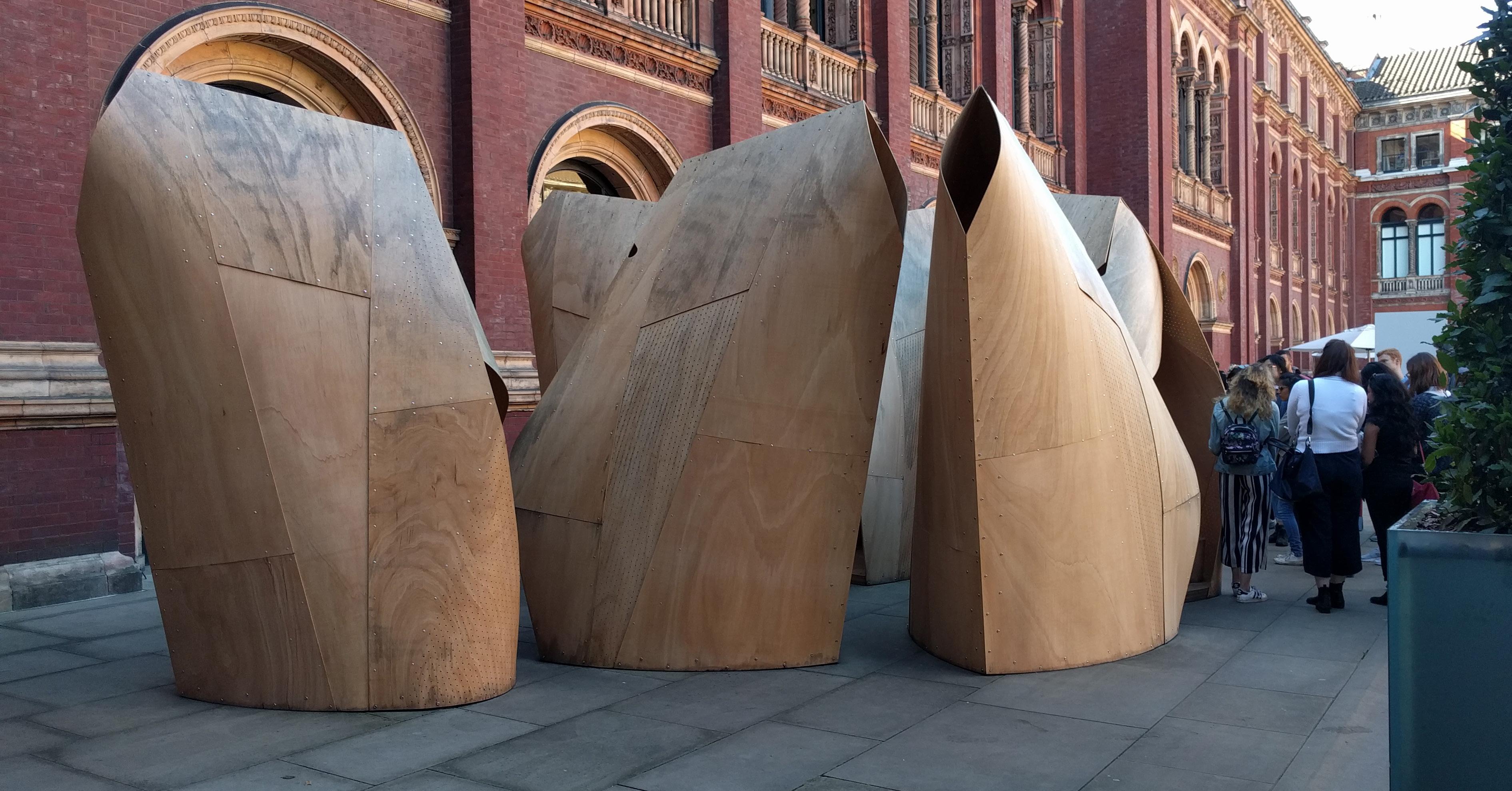

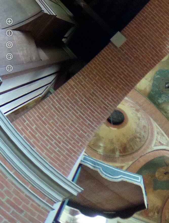
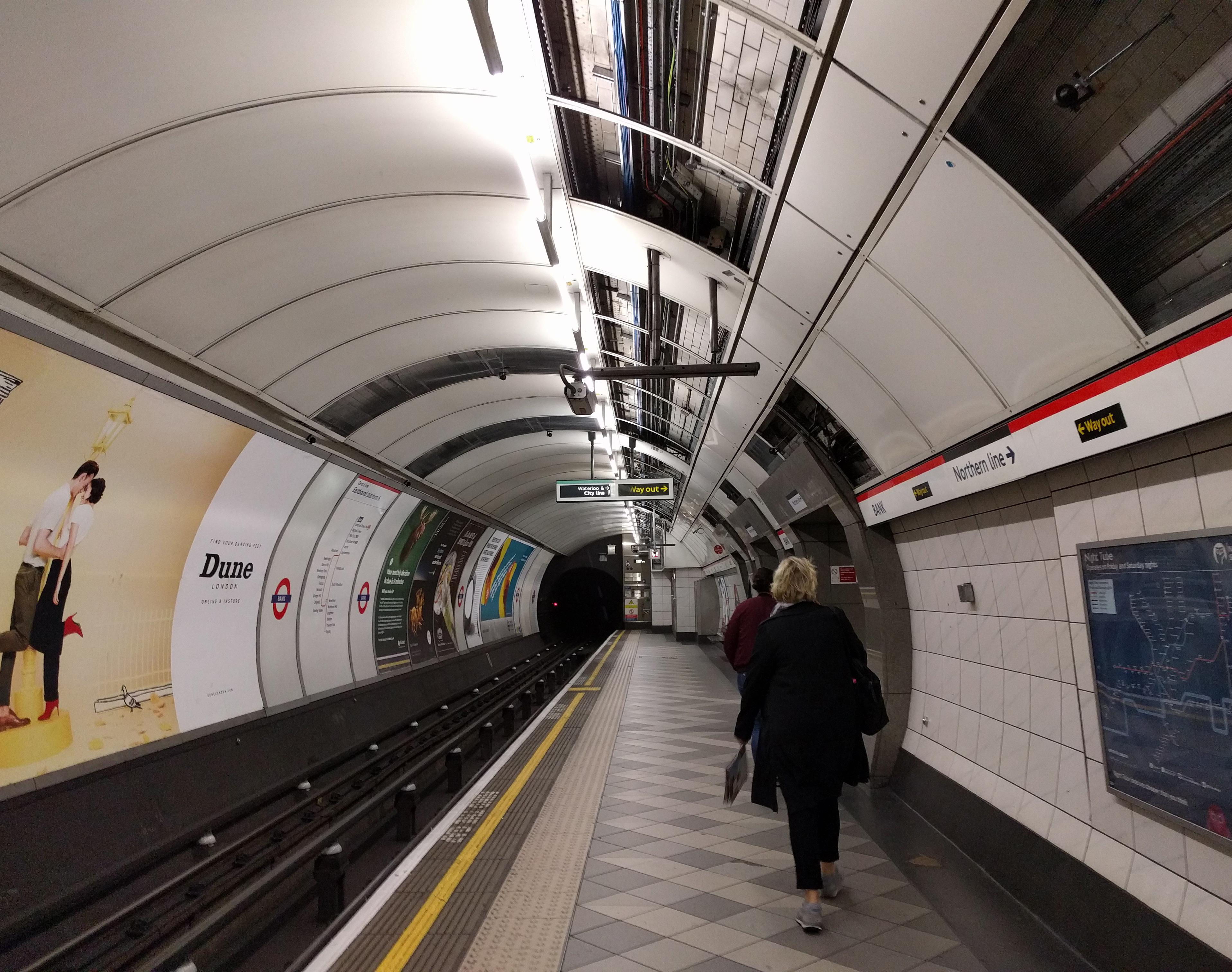
Second type of grounded ceiling: tunnel. London is the site of the world’s first underground railway, and the experience of being in a space where ceiling and walls form a continuous wrapper is part of the spatial DNA of city. The first tunnels were constructed in the early 1860s via a “cut and cover” construction method of trenching and roofing over (see Baker St. Station platform); the deeper tube system replaced this in the 1890s.
It’s interesting to try to parse out to what extent the idea of a tunnel is communicated by material continuity from wall to ceiling, and to what extent

it is a geometric idea. The relationship of wall to ceiling at the 1860s Baker Street platform, for example, is not completely geometrically smooth and continuous – but the material continuity of brick from the walls to the overhead gives a powerful sense of “tunnel.”
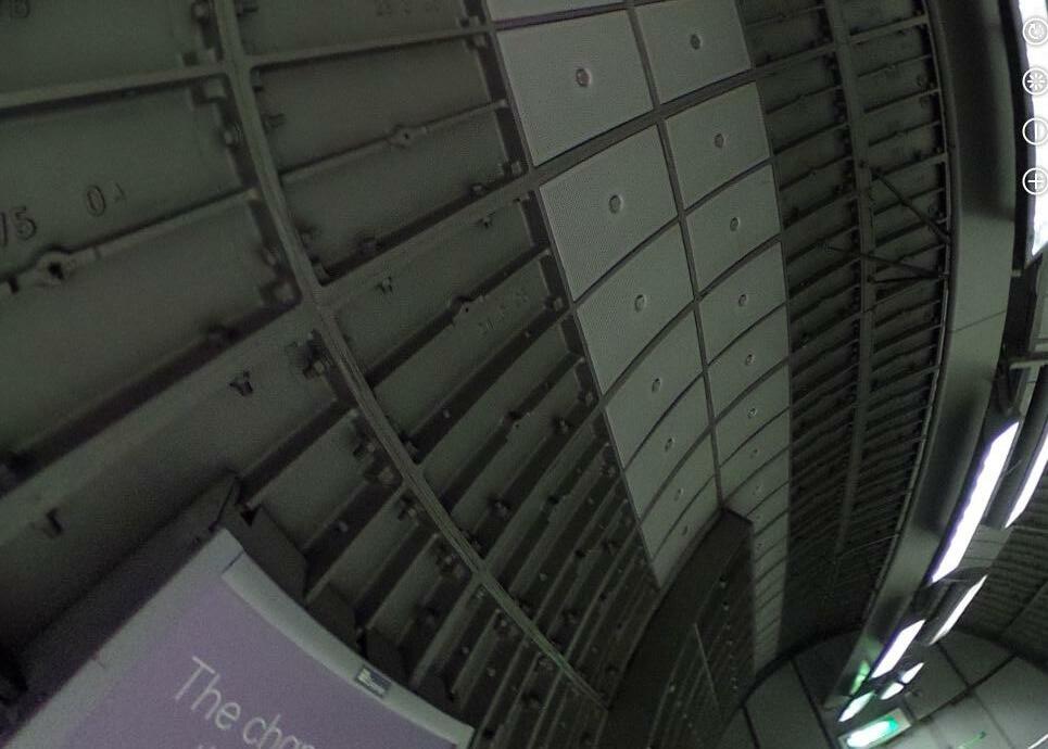
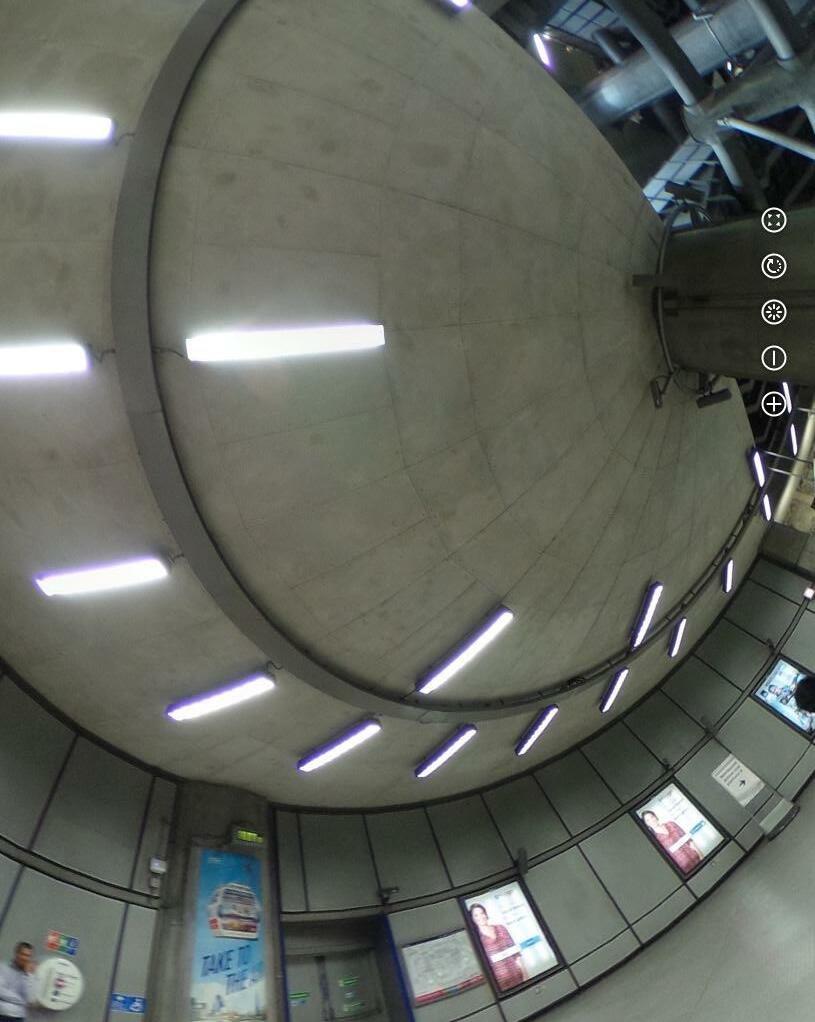
Conversely, a more normative contemporary tube platform (like Bank, pictured), doesn’t feature material continuity from the “beside” surface to the “overhead”surface; moreover it reveals its thinness and layeredness, but the continuity of the curve defining all surfaces except the floor provides the unity required.
Siobhan Davies Studio / Sarah Wigglesworth, 2005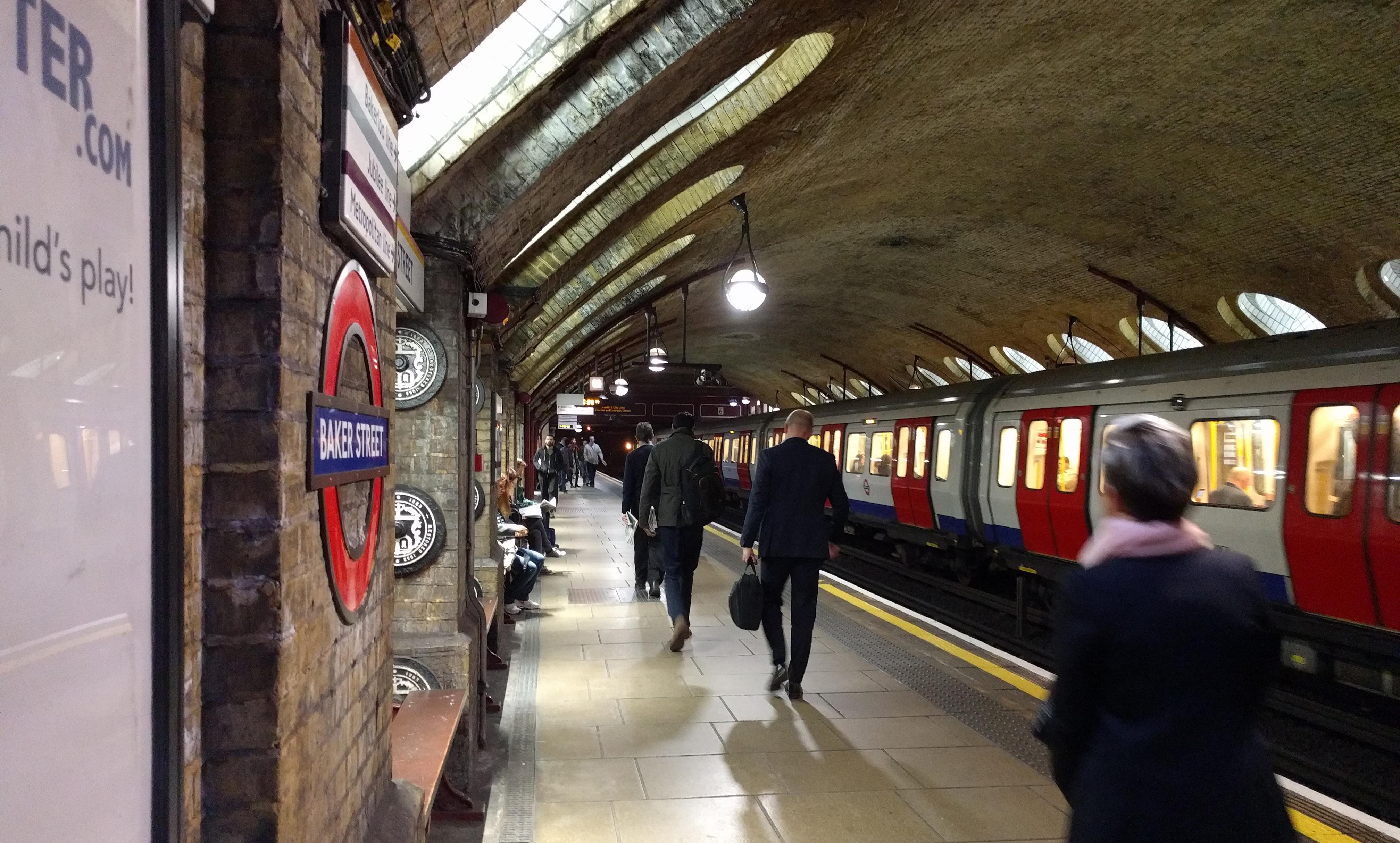
These two terms comprise the title of Section III of FireResistance Ratings - ANSI/UL 263, BXUV. The idea feels painfully obvious: some ceilings are at the underside of a floor, and some are at the underside of a roof.
But how often have you been in a room where you have no idea what is above you? Often the design approach to the ceiling marches upward, unchanged from the lowest floor to the highest; often, sectionally disengaged from the floor or roof structure, it continues to speak only to the interior and provide the same answers, same configurations, and the same services at every floor.
This, desipite the fact that the possibilities and constraints differ at floor-ceilings and roof-ceilings; they have unique answers to the question, “Why is this here?” Their contexts are composed of different materials
and forces. (Feet. Sun. Rain.) The needs of the interior still must be met, but the difference of context means that the possibilities of form and material with which to answer are different. A flower evolved in a completely different forest.
In London, the climate and resulting thirst for daylight at the building interior make a roof-ceiling a zone of special opportunity, and the city’s architecture is extremely responsive to the solar exposure and relative geometric freedom found at the roof. Below, floor forms are manipulated to create passage for daylight as far as possible into the volume of the building. The elements of the the building are organized around the preciousness of something outside the building itself, and as a result give expressive answers to the question, “Where am I?”
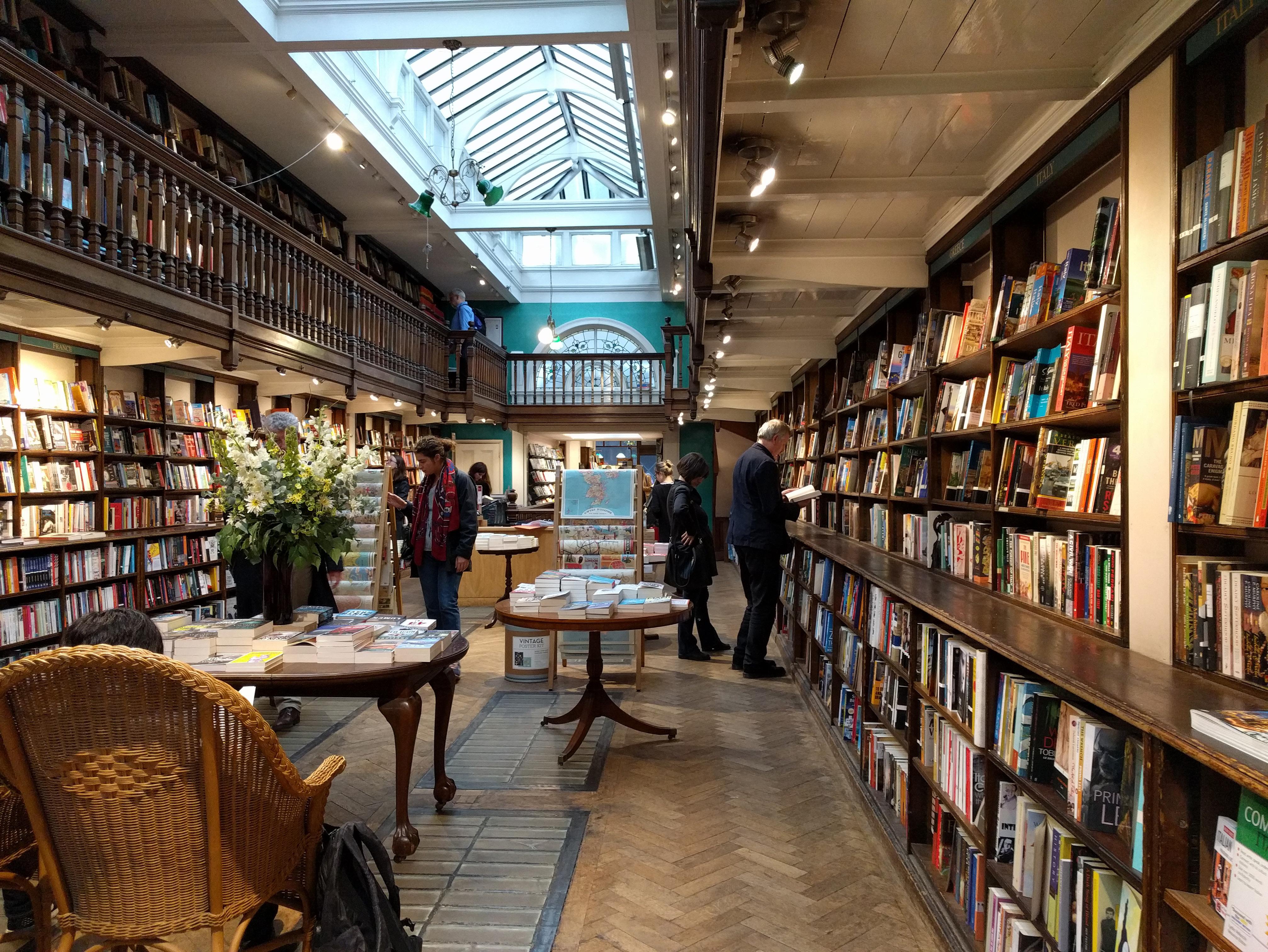
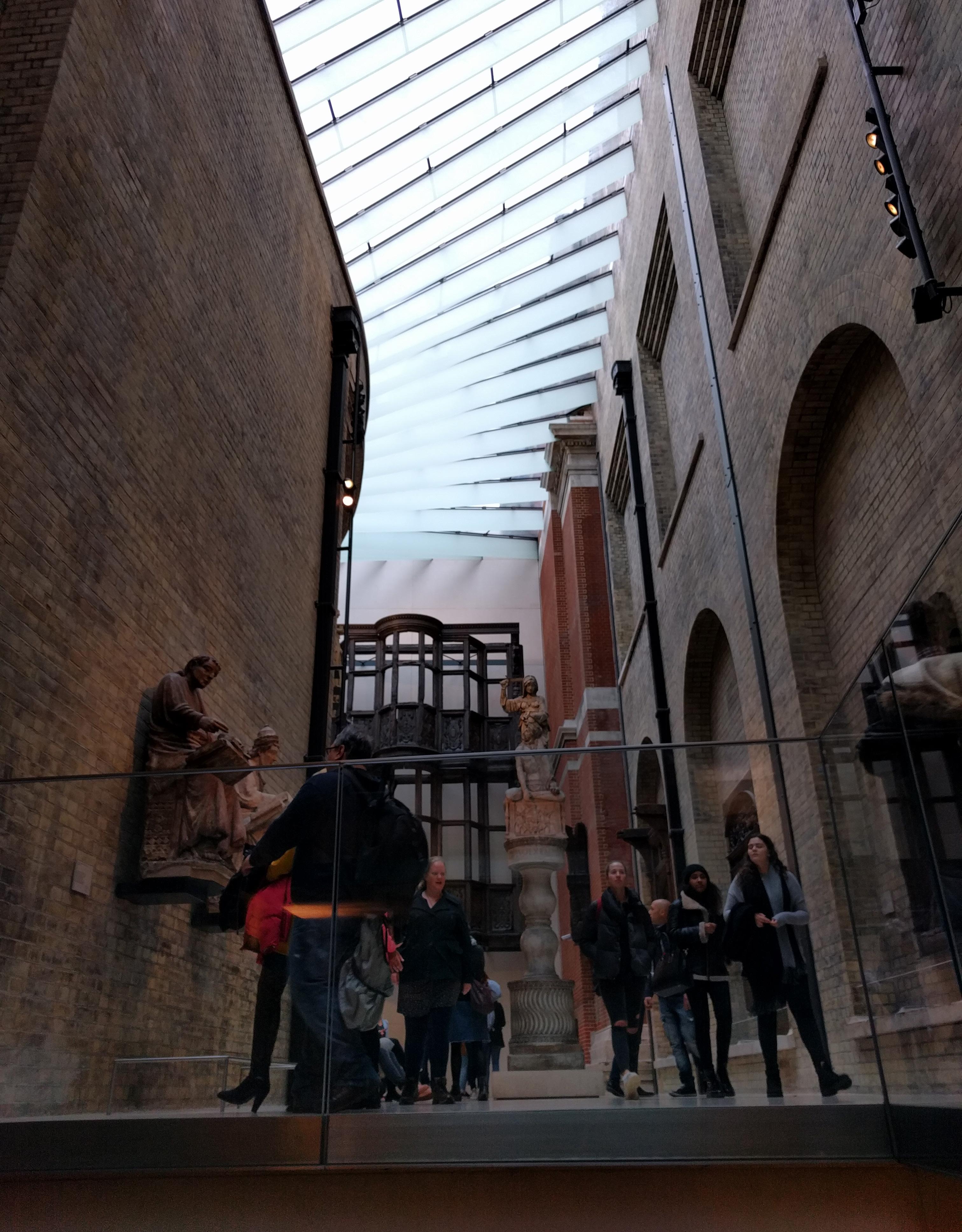
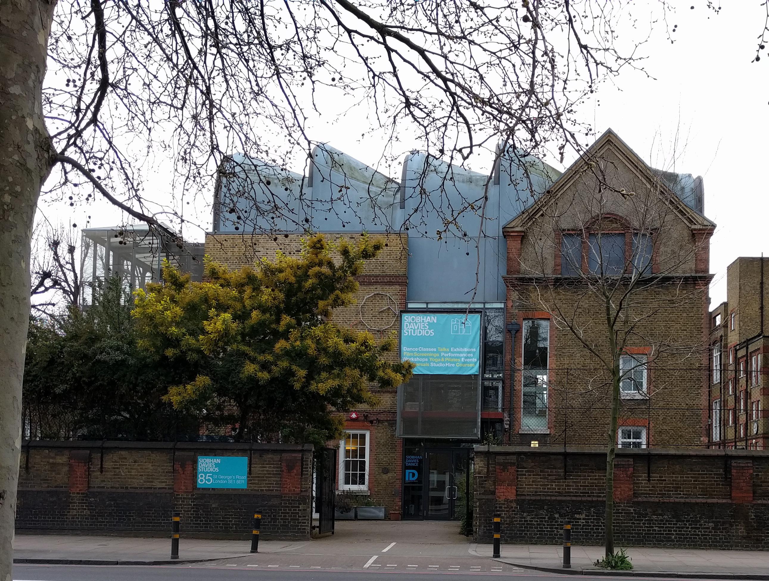
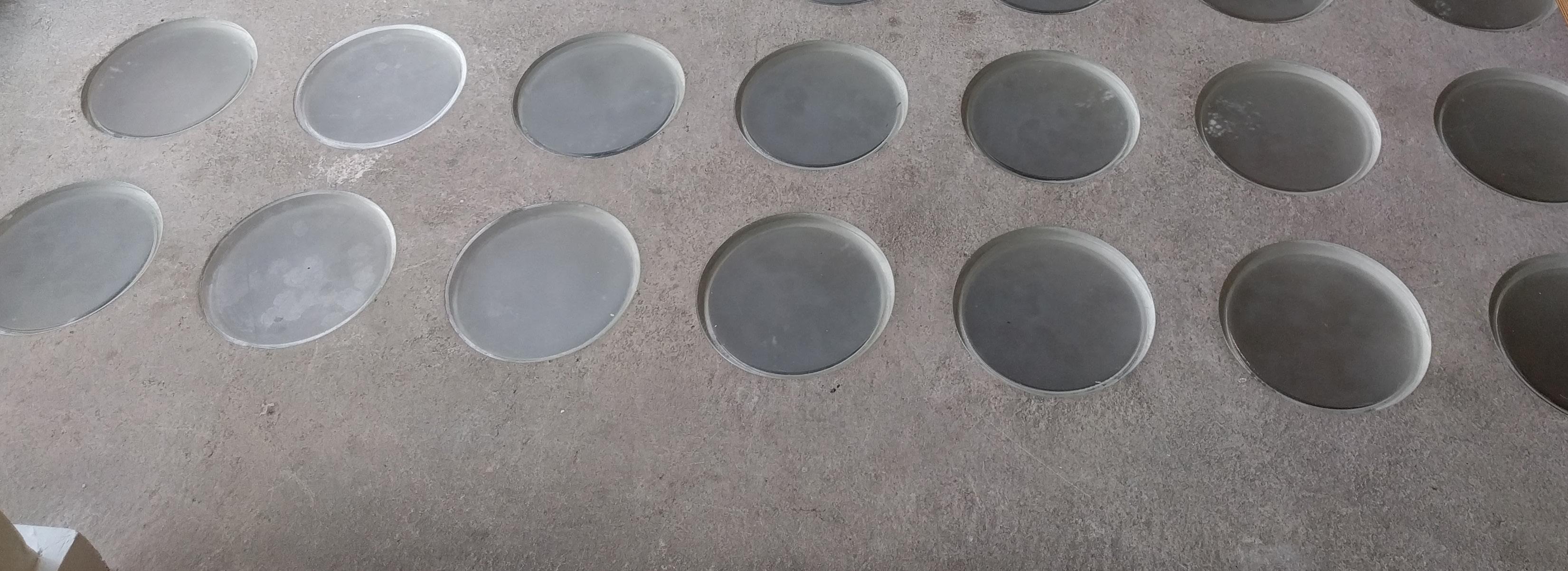
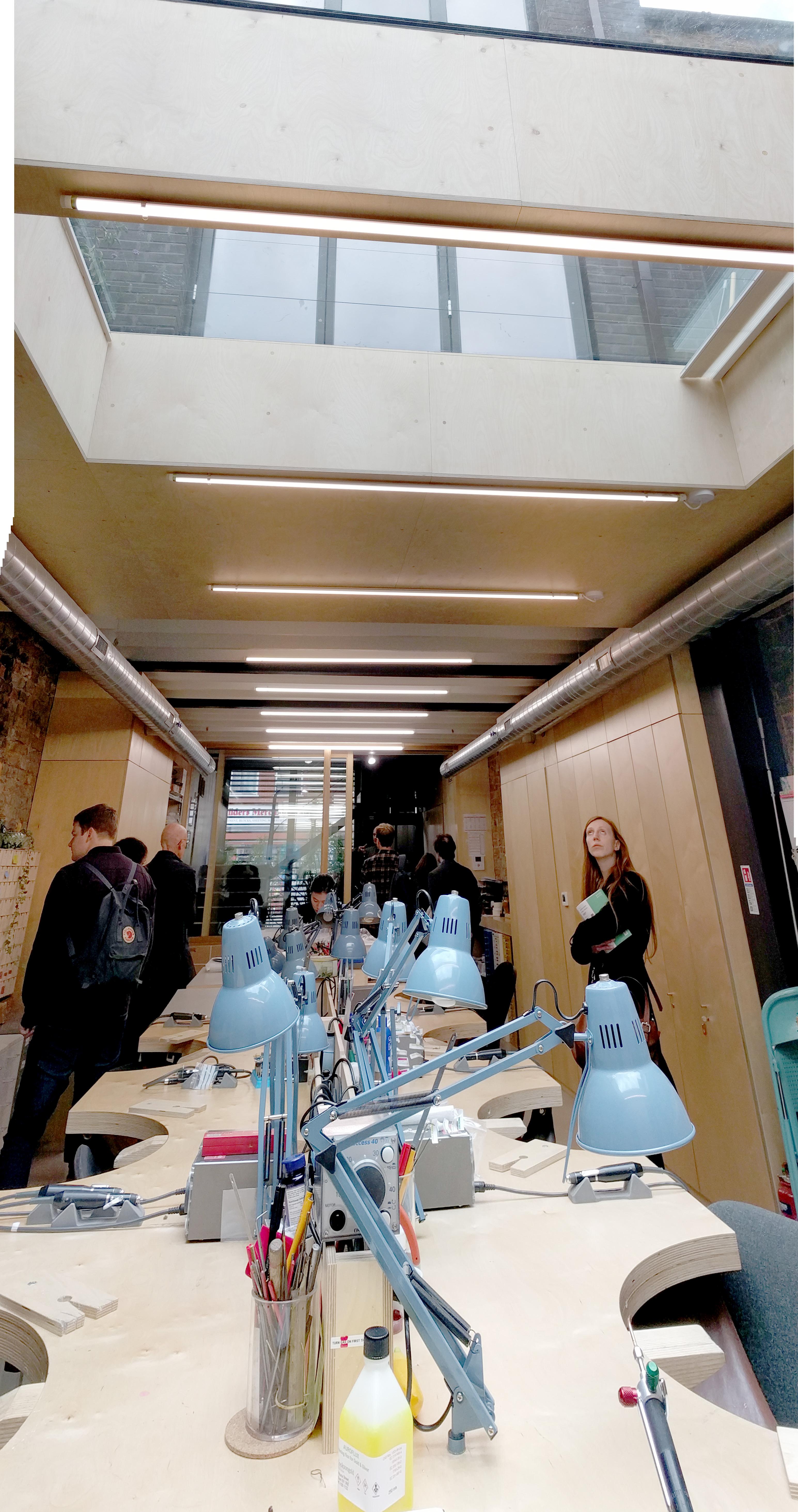 above & boTTom Siobhan Davies Studio / Sarah Wigglesworth, 2005 below Daunt Books / Architect Unknown, 2010
above V&A Daylit Gallery / MUMA, 2009 below Alex Monroe Workshop / DSDHA, 2016
This is about not ending everything in the same place. The perimeter of the ceiling can be composed to conceal, contradict, or deemphasize the boundaries indicated by vertical partitions and changes in floor surface.
There seems to be a thirst for spatial richness and connection (perhaps also a sensitivity to claustrophobia) that drives us beyond accepting the simple coincidence of the ceiling perimeter with the perimeter formed by walls. One familiar version of this is the insideoutside continuity of ceiling (and floor) material iconically identified with mid-20th century modern architecture -- see the L.A. Case Study houses of the 1940s, with horizontal surface “barely cognizant of the glass envelope as it shoots past into the space of the terrace and beyond.”1
This inside-outside material extension visible through glass has certainly been a dominant compositional idea that has had an extended life and persists in contemporary architectural practice. But it’s only one
1 C. Macy and S. Bonnemaison, Archi tecture and Nature: creating the American Landscape, (London: Routledge, 2003) 229.
possibility of many to satisfy the designer’s instinct to pull apart the various perimeters apparant in any given space.
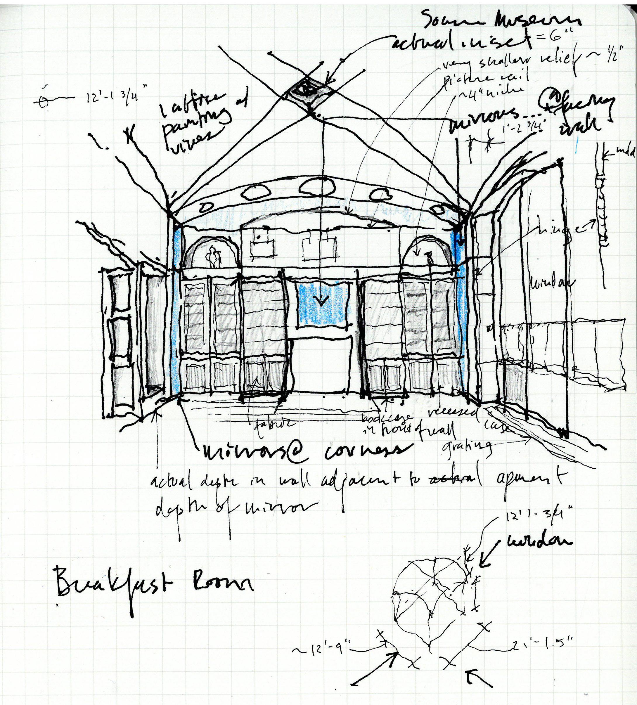
See Sir John Soane’s house for an example of an early 19th century approach to syncopated perimeter. He acheives a sense of extension in an almost opposite way to the Case Study houses. His rooms are packed into row houses and rely on mirrors and a completely rotated approach to the placement of transparency: rather than vertical glass that provides expansive views to landscape, Soane’s glass is often horizontal-- an unseen skylight revealed only by the wash of daylight down onto a wall. He repeatedly insets the perimeter of the primary ceiling form 1’2’ inside the perimeter walls of the room, and introduces elements that obscure views to the top of room walls. Walls and ceiling are not to be seen intersecting; there are always gaps (or illusions of gaps) revealing or suggesting layers beyond. The result is a powerful sense of embeddedness, of interiority without claustrophobia.
Certainly the strategy of decoupling the ceiling perimeter from other boundaries can be
deployed in an unsatisfying way, where the ceiling shape becomes a seemingly arbitrary and thus weak geometry within its spatial context (see any number of blithely applied “cloud” ceilings). To me the power of the syncopation comes from the tension, or at least the relationship, with other elements in the space--whether through
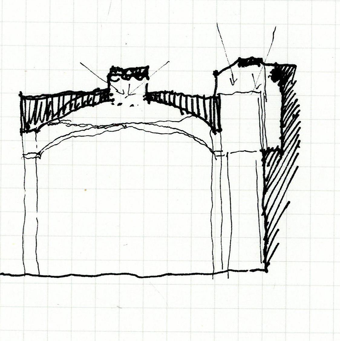
contradiction or emphasis.
Hopefully syncopated perimeter can be a generative idea in helping us reclaim the depth of the plenum, where we must master a palette of elements including both the expansive/continuous (structure, systems) and the discrete or bounded (a room).
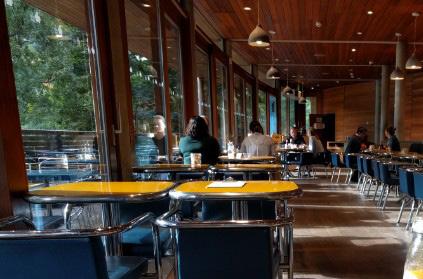
Operating at the scale of the room, the ceiling margin/crop box baffles the view, covering while not necessarily touching intersections the designer wishes to be edited out of the inhabitant’s experience of the space. This is a syncopated perimeter strategy helpful at “open” ceilings, a means to control views of the intersection of continuous systems with the discontinuous space of a single room (as defined by vertical partitions). This intersection is often a weak or awkward point at open ceilings, where neither design nor construction craft have provided for a meaningful or even
neat intersection where piping and structure pierce the wall.
The margin/crop box is typically a horizontal or slightly angled surface constructed just below the bottom of whatever continuous elements are to disappear as they extend out of sight. Other than scale, the strategy is essentially very similar to that of using trim to cover intersections. However, it operates in perspective, coordinated with the elevation of the viewers eye, rather than requiring the actual physical contact typical at trim.
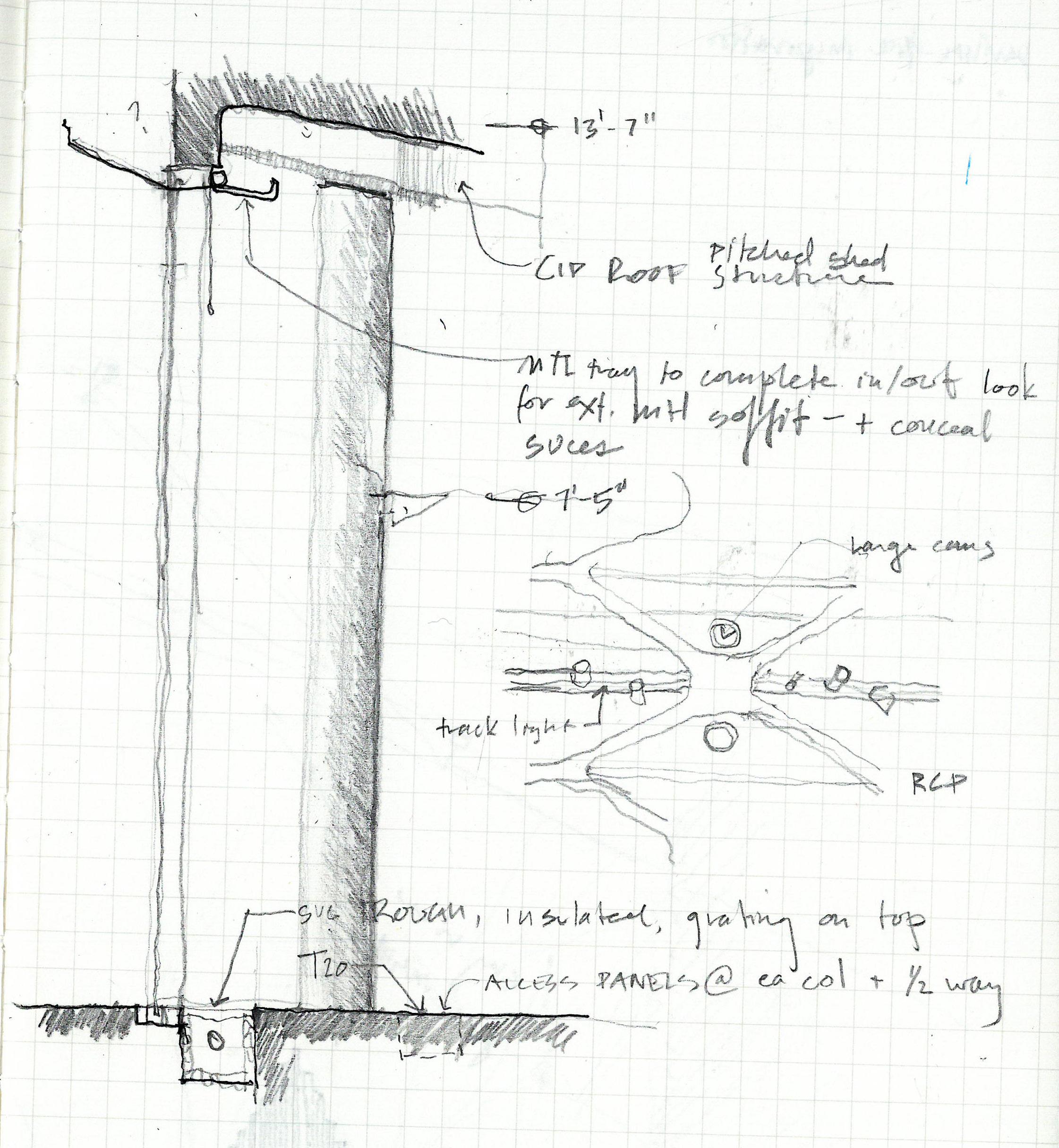
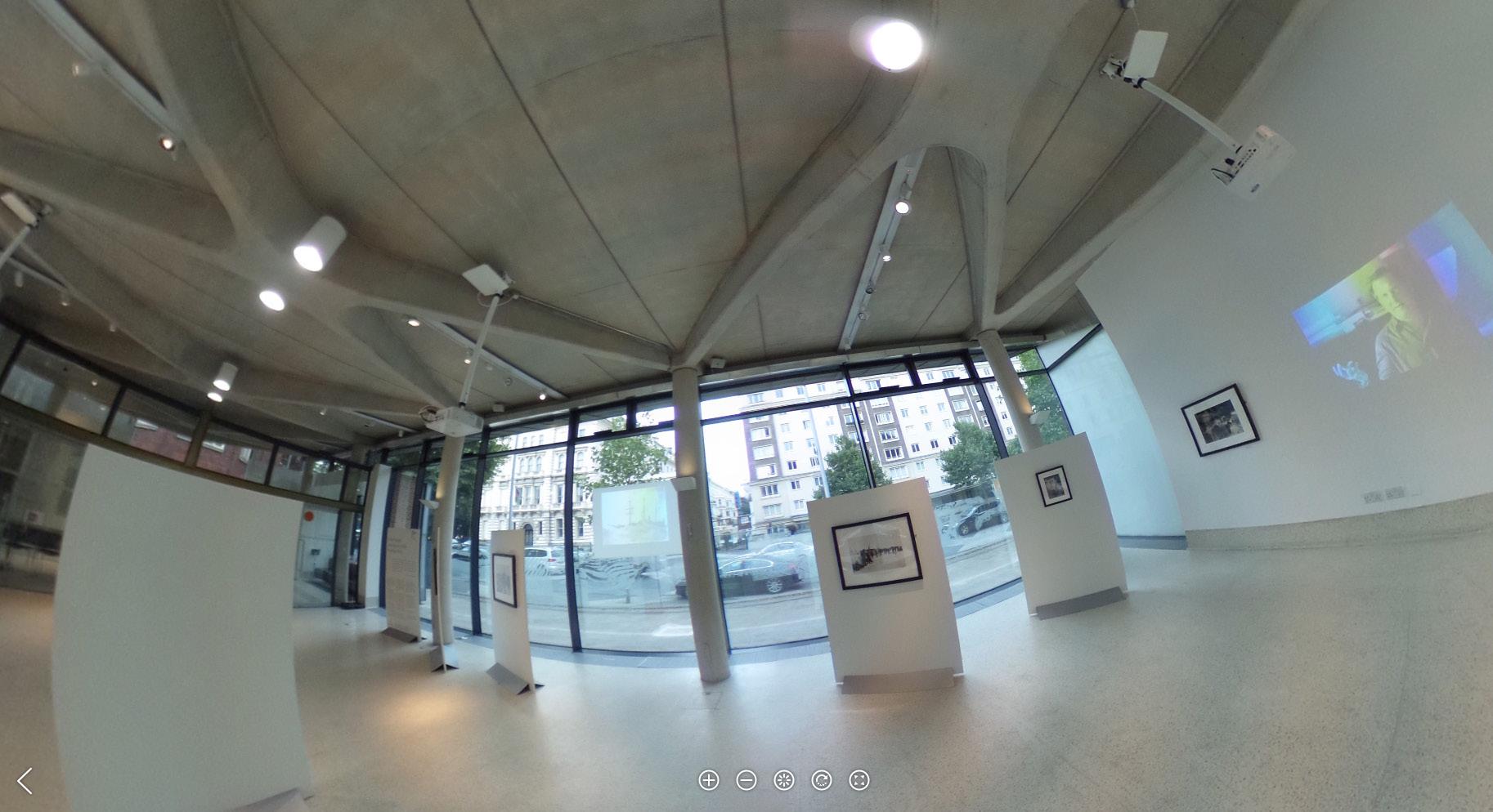
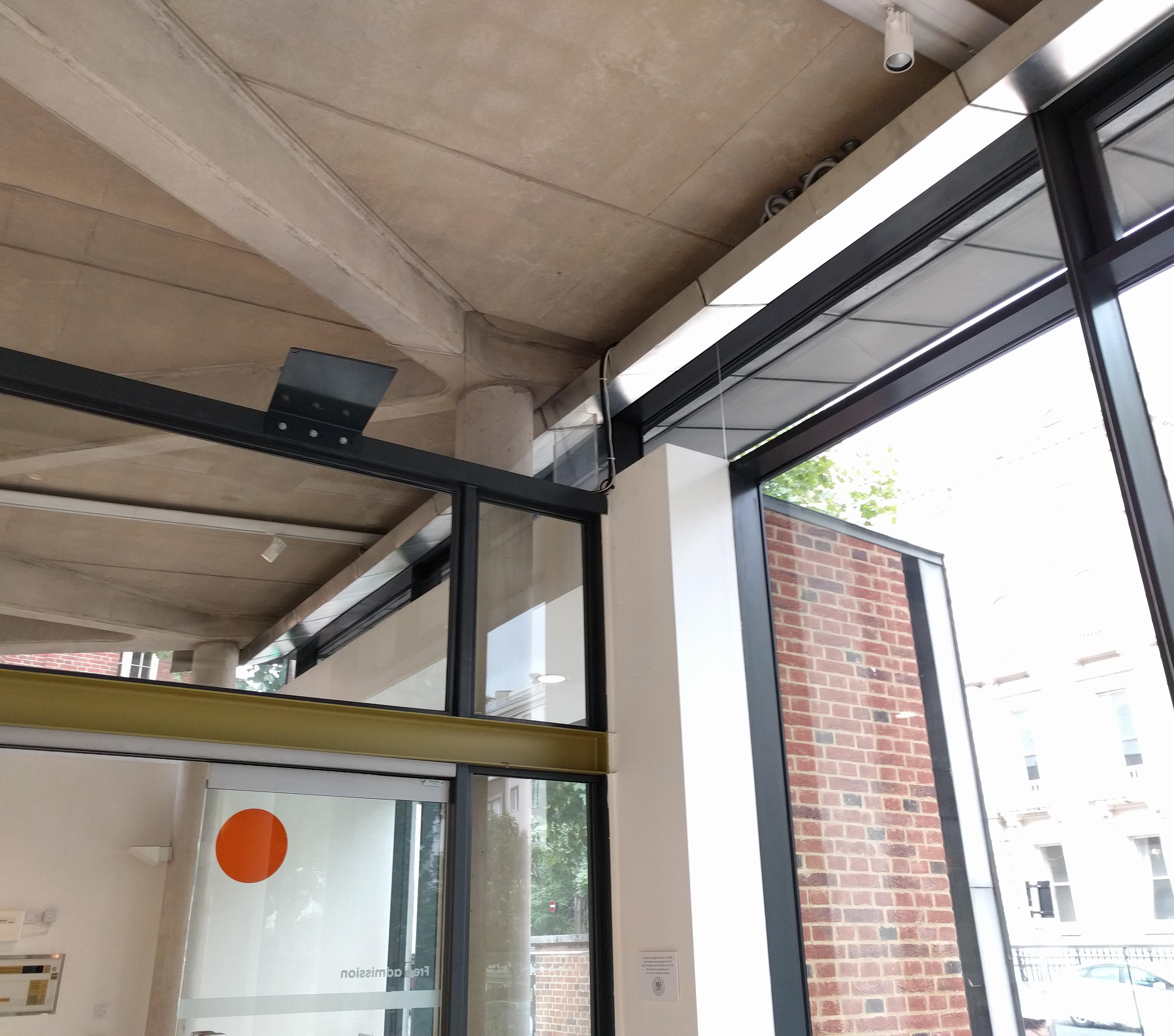 above & righ T : Royal Geographical Society Extension / Studio Downie, 2004 RSHP Office @ the Leadenhall Building / RSHP 2015

Relative Distribution of Rods vs. Cones across the Retina. Solid line indicates cone cells; dashed indicates rod cells. Peripheral vision includes very little color perception.
Keep track of the contrast ratio of the elements in your ceiling. As in any composition, locations of the greatest contrast become focal points for the eye.
At RSHP’s Terminal 5 at Heathrow Airport, I was struck by how well the ceiling design made the myriad of devices in the ceiling “go away” -- by keeping them out of the most luminous surfaces.
Many buildings I visited were not shy about going straight to strong visual contrast (often black/dark gray & white) to control the expression of the ceiling.

The surprising boldness of black and white contrast may be related
to the relatively low acuity of our perception of color and contrast at our peripheral vision, which is often the portion of our vision the ceiling falls into.
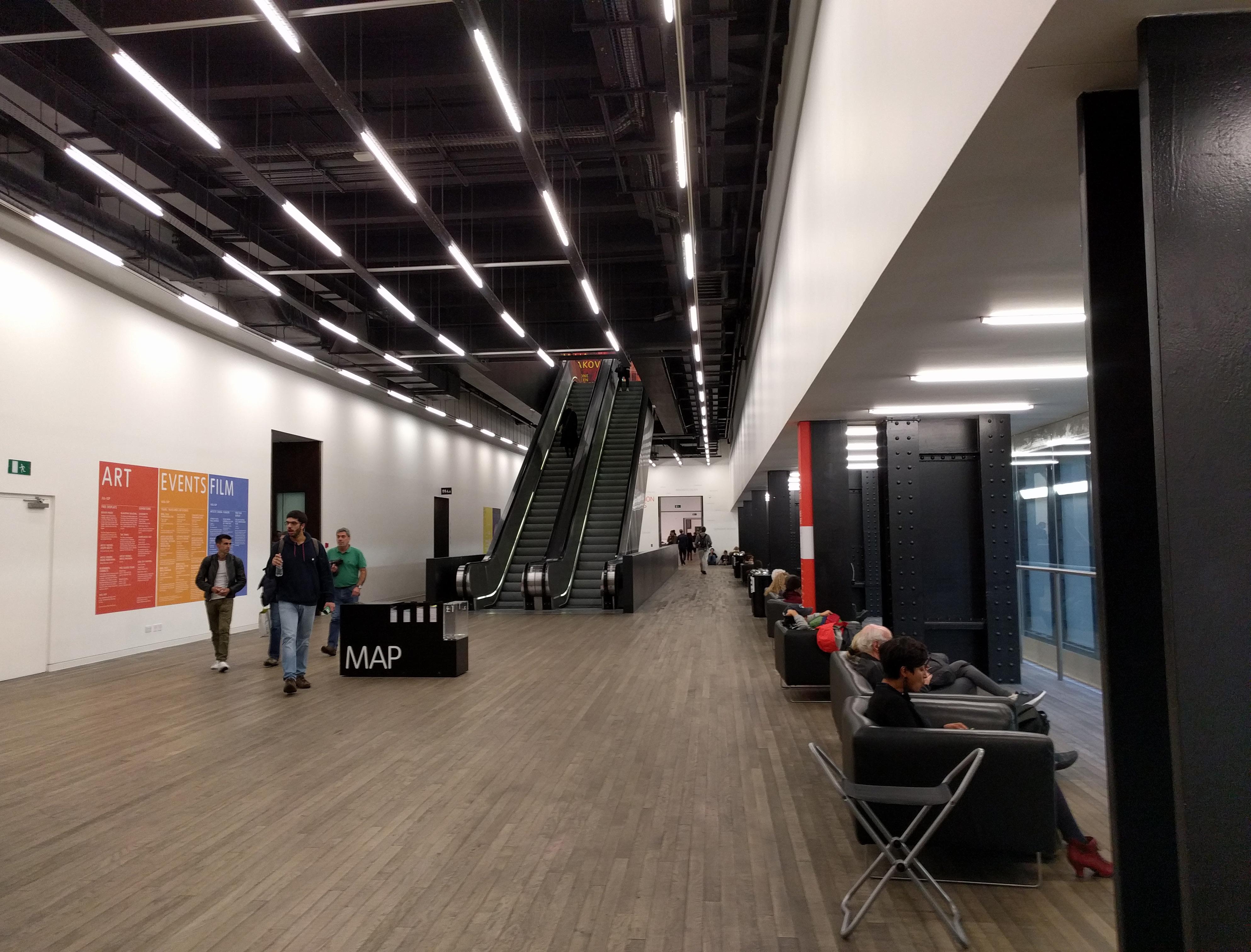
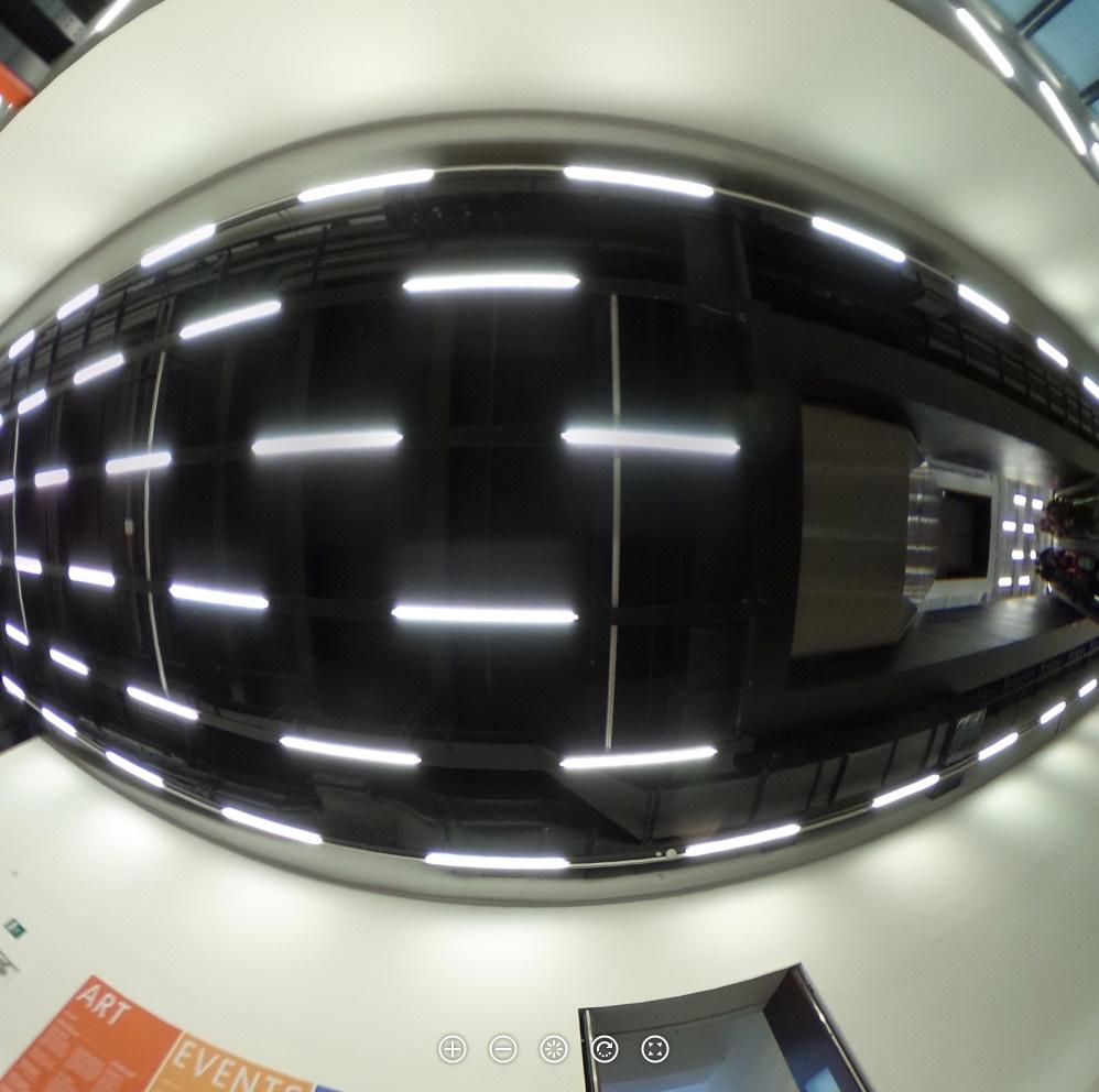
Even the most minimal overlay of elements and create hierarchy, if high enough contrast is used. At the Great Hall at the Tate, bare bulbs mounted on perforated metal run below and perpendicular to the primary structure. Rather than the composition of the sizeable structural or service elements in the open ceiling, the eye registers the geometry of the lighting, which has been laid out to dramatize the length of the room.
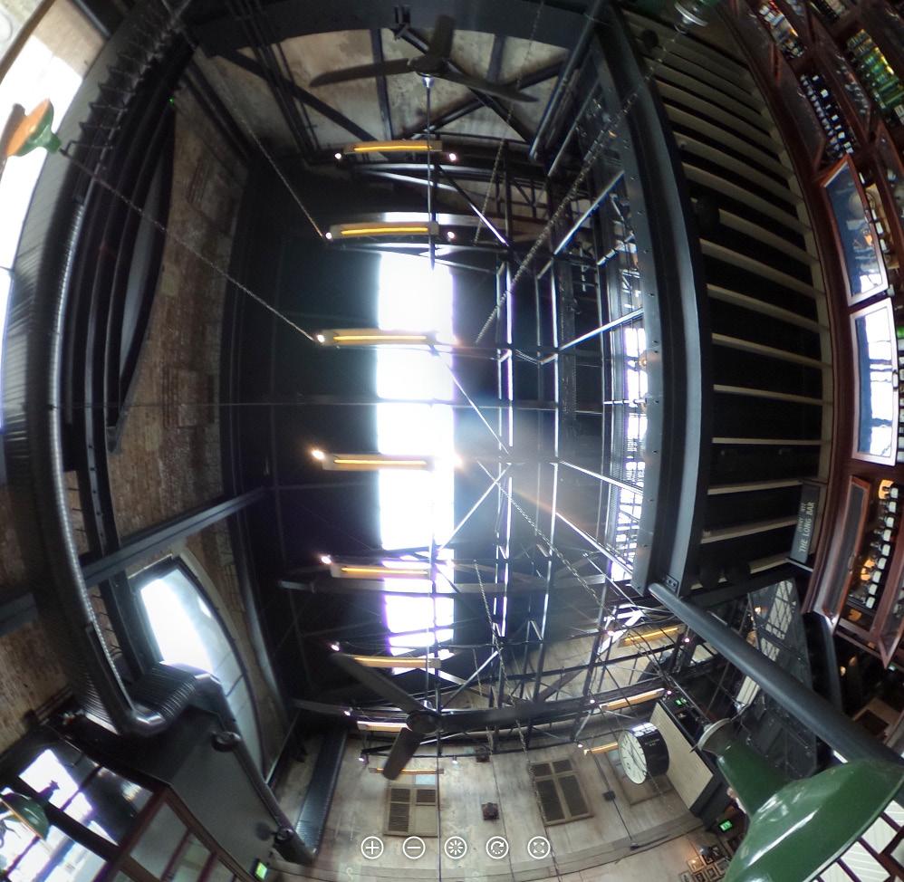
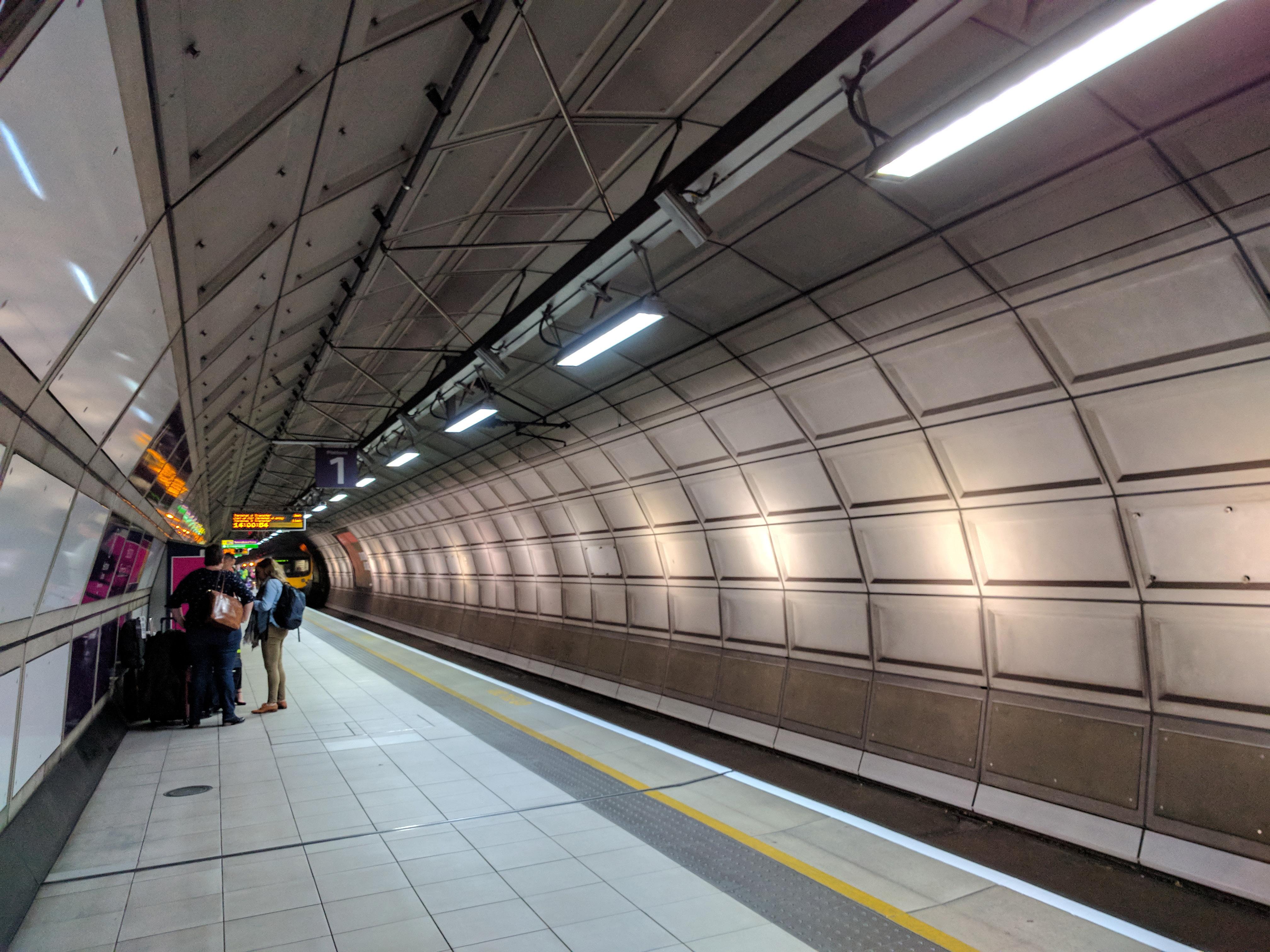
Earl’s Court Station Train Shed / John Wolfe Barry, 1878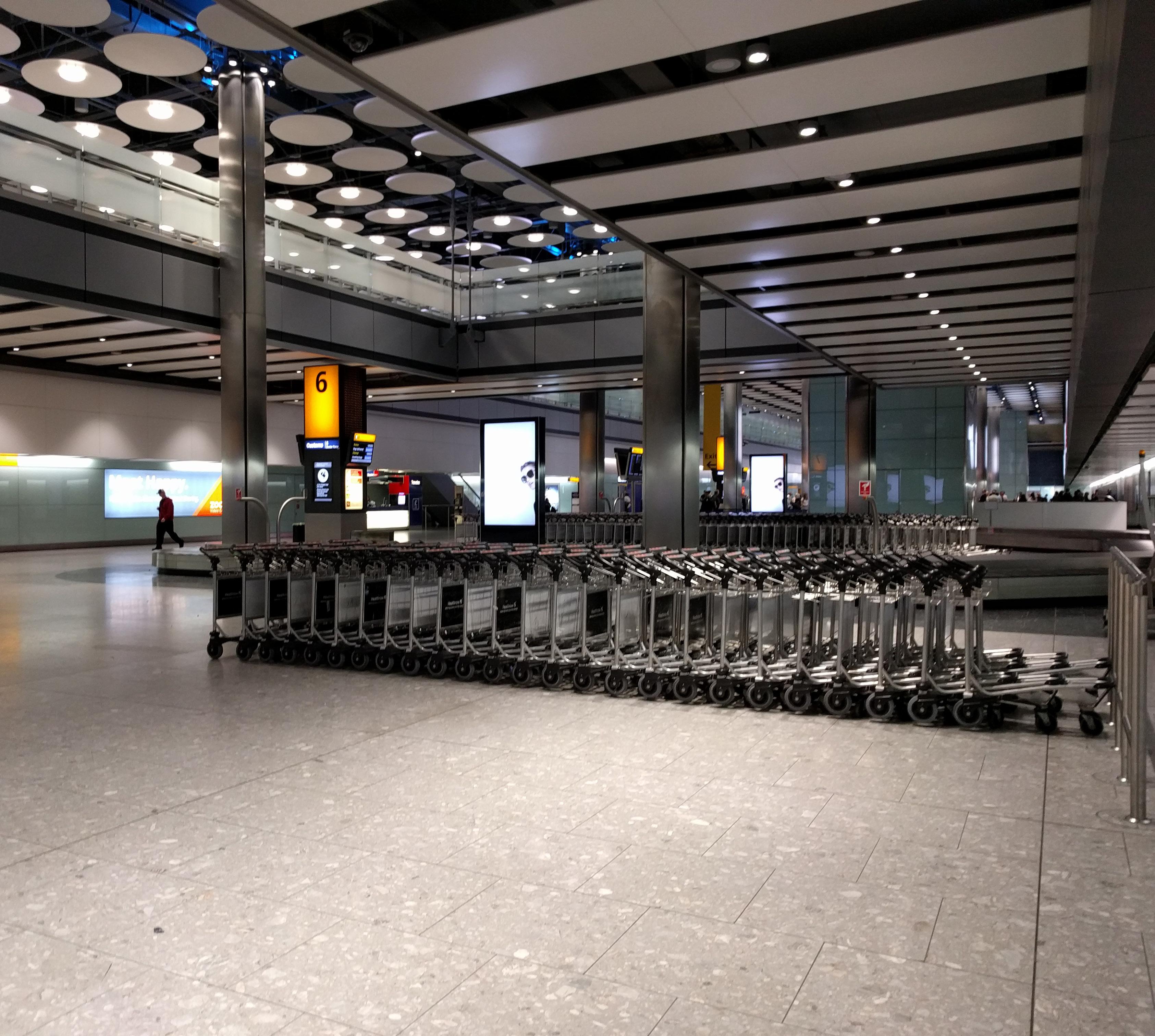
This is a term I read describing the design approach at the suspended disc ceiling at Heathrow Airport Terminal 5 by RSHP. Looking at this ceiling, I understand loose fit to be an idea about the coexistance of multiple systems at the ceiling, and the loosening of the typical spatial relationships among them in both plan and section.
In reflected ceiling plan, the design represents almost an inversion of the “tech zone” idea found in commercially-available suspended acoustic panel ceilings systems. Instead of relying on the gathering of lighting, mechanical, sensors, speakers, cameras, etc into a composed set of zones cut out of the finished
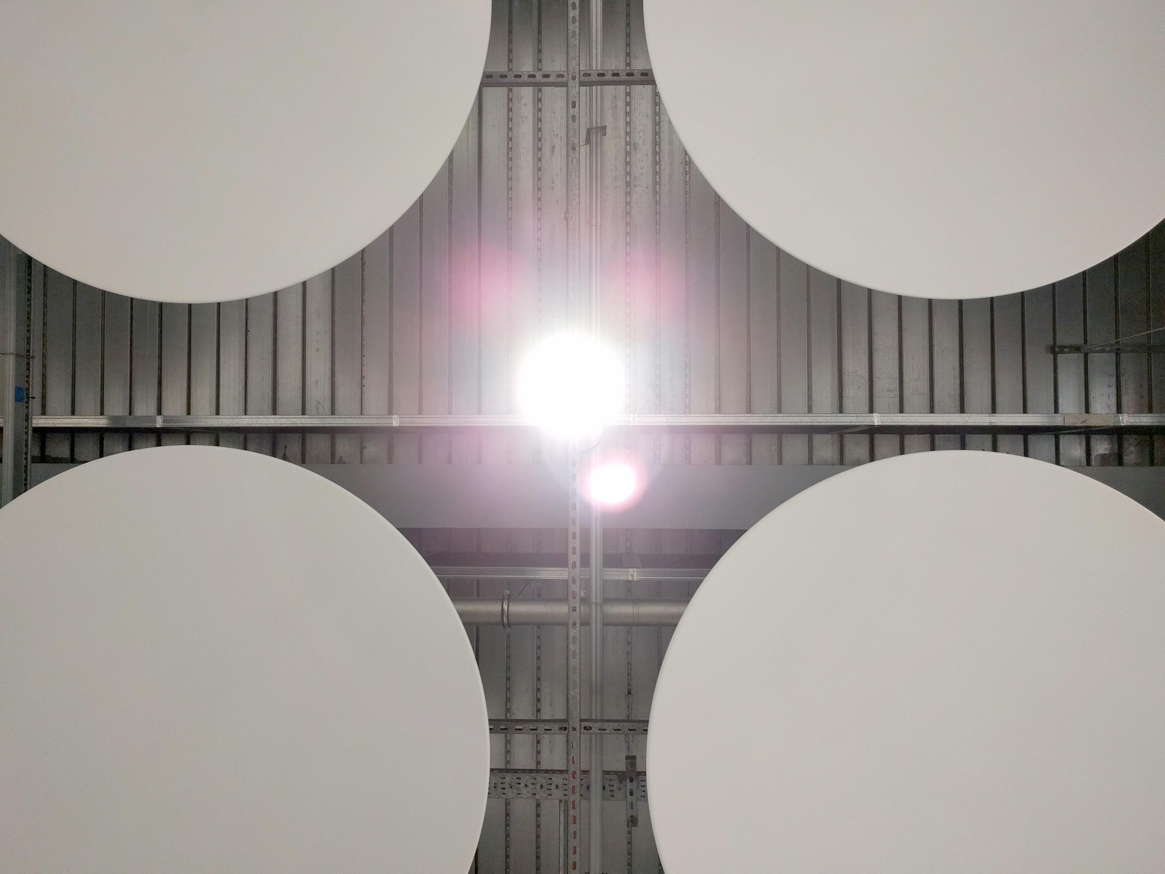
ceiling area, this approach establishes the grid of discs as the “ceiling zones” and leaves the remainder of the ceiling open for placement of lights and devices in the abundant negative space between the discs. A hunch that the diameter of the discs and the dimension of their spacing is related to the space needed for a human body to fit between, and the length of an arm’s reach from the perimeter of the disc to the central mounting plate each is suspended from.
In section, “loose fit” means not only locating the ceiling below the building structure, but hanging elements down from the plane of the suspended grid (unistrut), rather than laying these elements into the grid (the standard approach at suspended ceilings). “Laying in” necessitates condensing at the single plane of the suspended grid all elements requiring visual access or spatial continuity with the room below; Separating the grid and the suspended elements in section permits the elevations (and thus visibility) of all these elements to be finetuned.
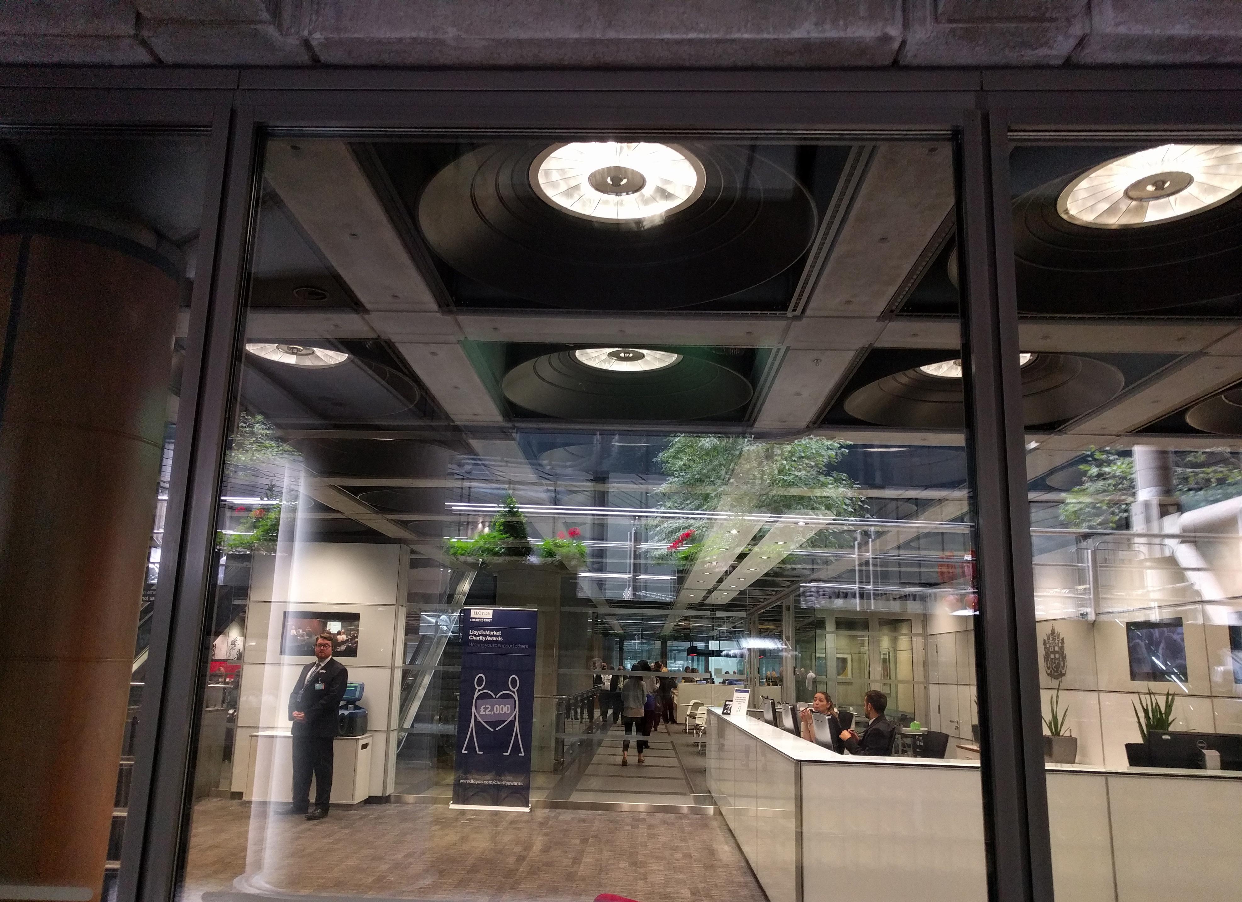
 ABOVE Tight fit: At Richard Rogers’ 1986 Lloyd’s Building, systems interfacing with the ceiling are locked into the grid of coffers formed by structural concrete beams
ABOVE + BELOW “Loose fit” ceiling design at RSHP’s Terminal 5 at Heathrow Airport
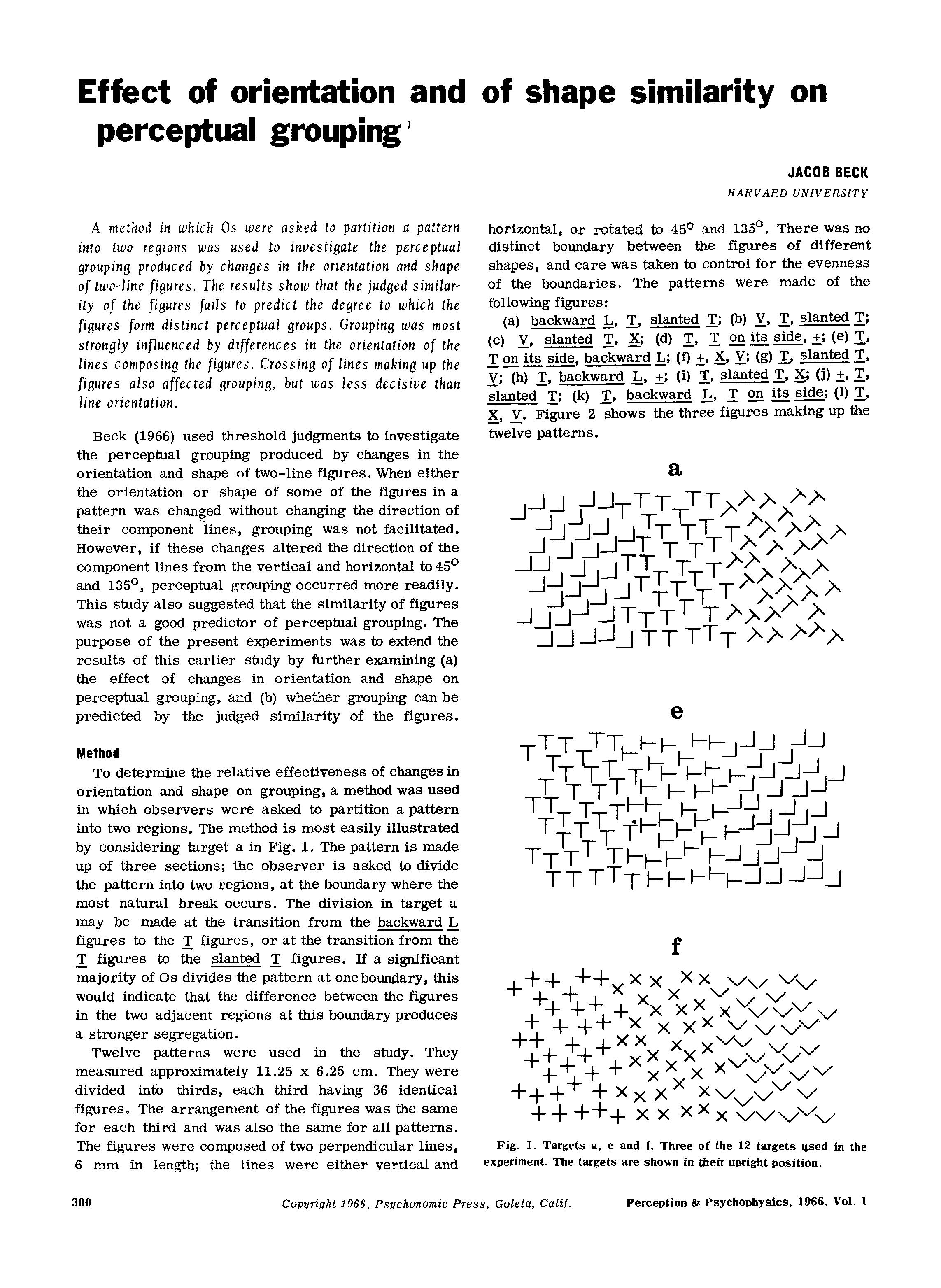
There is something arresting about 45 degree rotation. Precisely unable to resolve into vertical or horizontal, it vibrates in our perception and seems to suggest motion. Its unique quality gets our attention and is a strong factor in perceptual grouping. It also can allow a form to seem to walk in two worlds, the cartesian X and Y of the grid, and the radial universe of polar coordinates, of vectors and distances.
At the National Theater, rotation of the waffle slab grid with respect to the building perimeter produces a surprisingly delicate textural effect: coffer faces with opposite orientations stack up visually in a line -creating variety and contrast worlds away from the homogenous view of same-facing planes normal to a line of sight perpendicular to the grid.
 Ceiling, Stable Block at Westminster Hall / Unknown, 1090s.
Diagrams from Beck’s 1966 perceptual grouping study.
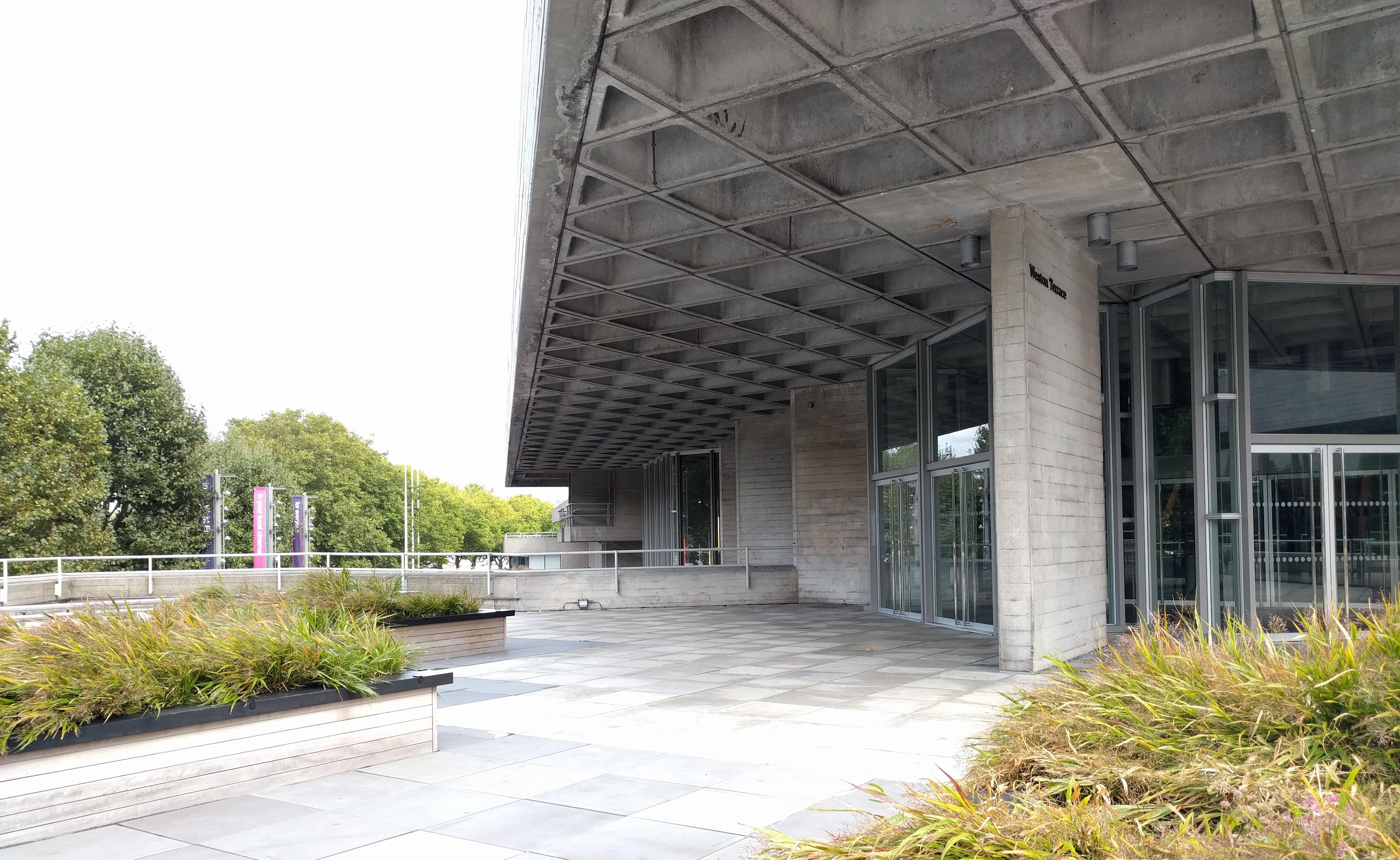

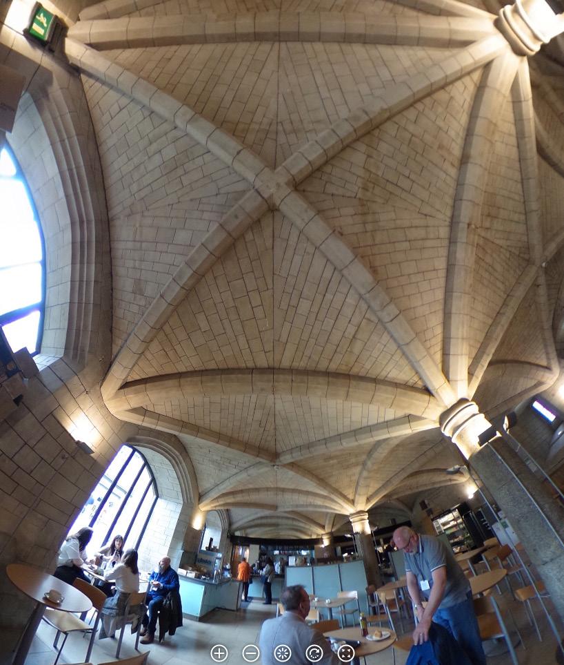 ABOVE: 45° rotation creates alternating light and dark faces of waffle slab coffers at perimeter of the Royal National Theatre. / Denys Lasdun and Partners, 1976. below righ T : A similar effect of alternating light and dark at a larger scale. Mint Hotel / Bennetts Associates, 2010. below le FT : Ceiling at Jubilee Cafe, formerly the “stable block” beside Westminster Hall / Architect unknown, 1090s.
dark light dark light
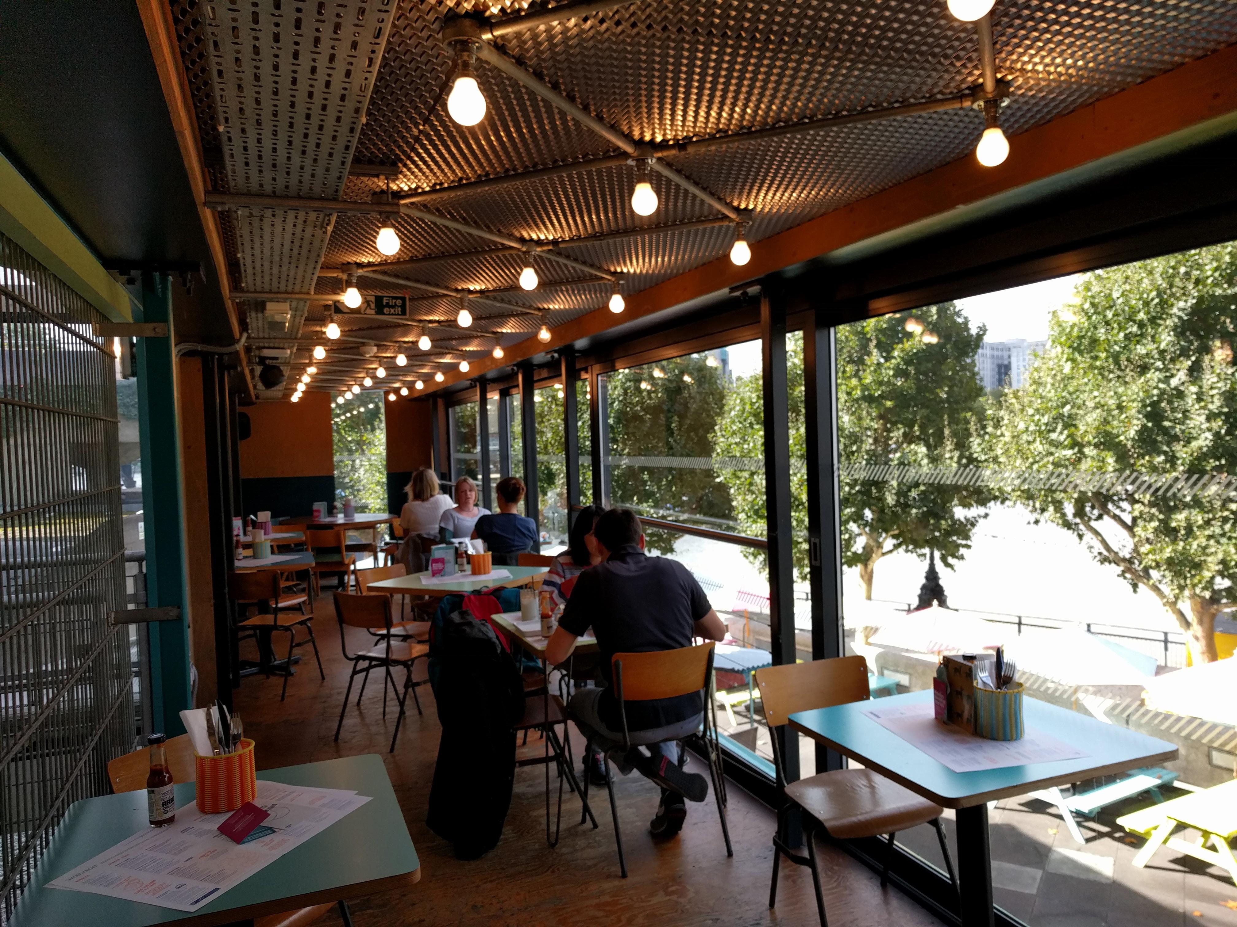
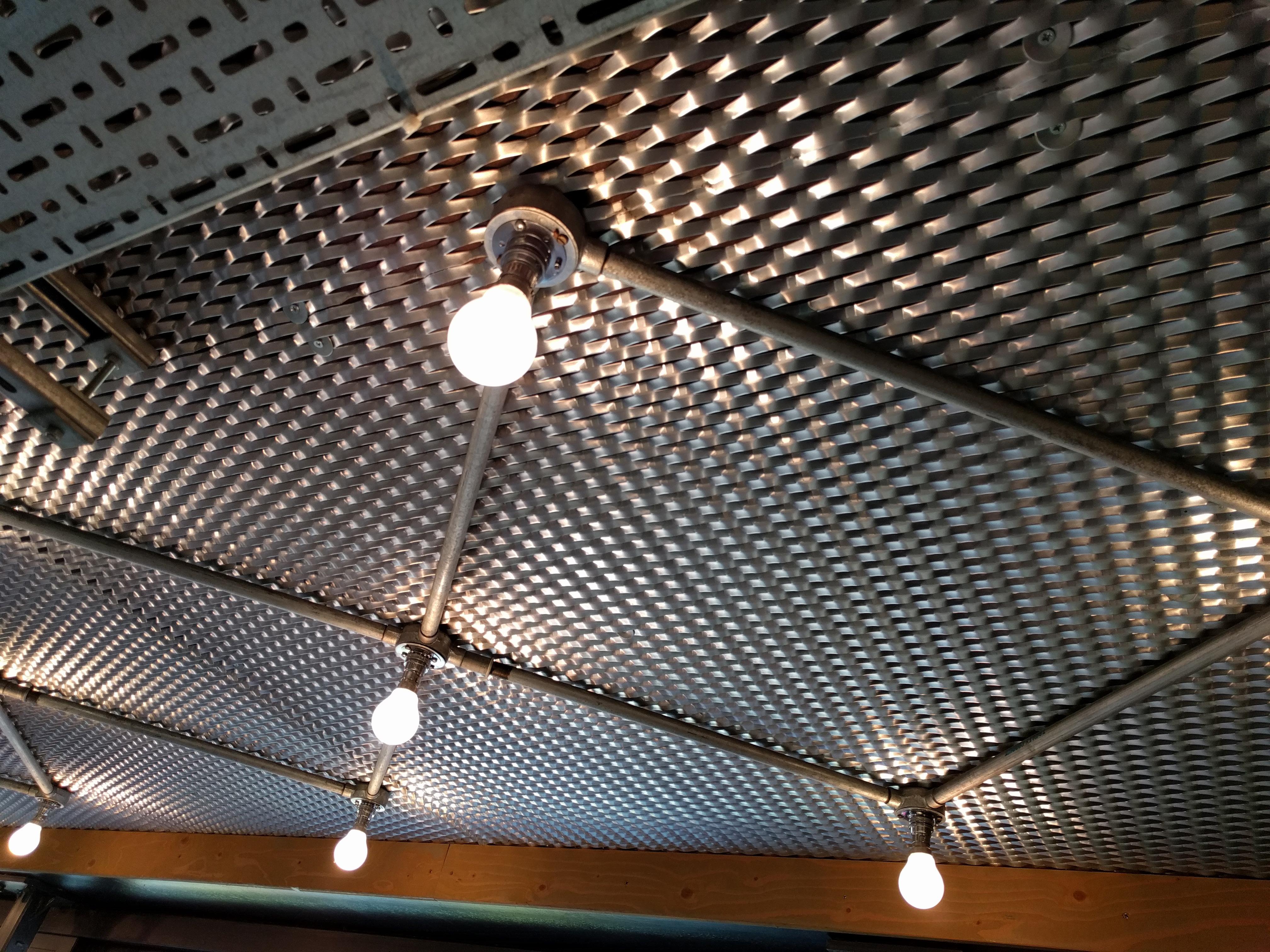
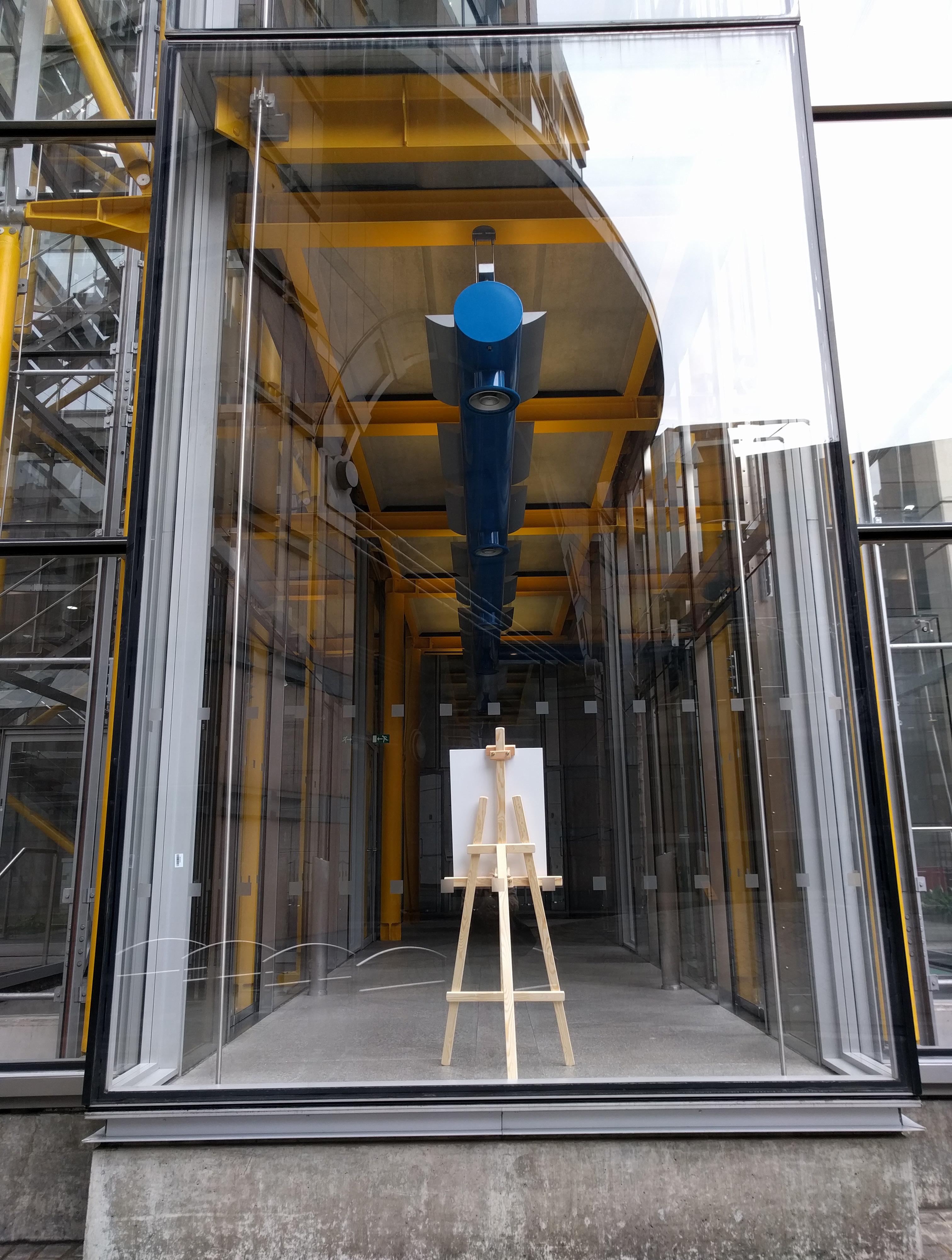
Two threads here. First, the ethic of “revealing the beauty of industrial craft,” described by one of the architects on an RSHP office tour. With ceilings as the site of intensive engineering, there is the desire to expose systems, to share what is so often hidden. Second, the material strategy of using the forms and materials of building systems for ornamental purposes (lots of perforated cable tray used as paneling in London).
The two can be seen as philosophically opposed; for and against Adolf Loos’ anti-
ornament stance in “Ornament and Crime” (1910). But often the two threads are woven together; systems are exposed, and so paneling and bulkheads are made from a materially similar palette, in a sense to not “break the mood.” For most of us, there is a tragic absurdity to applying the term “industrial craft” to what hides above the ceiling tiles. We must be opportunists, revealing systems where we can hope to make them legible and beautiful, and playfully employing industrial ornament where we cannot.
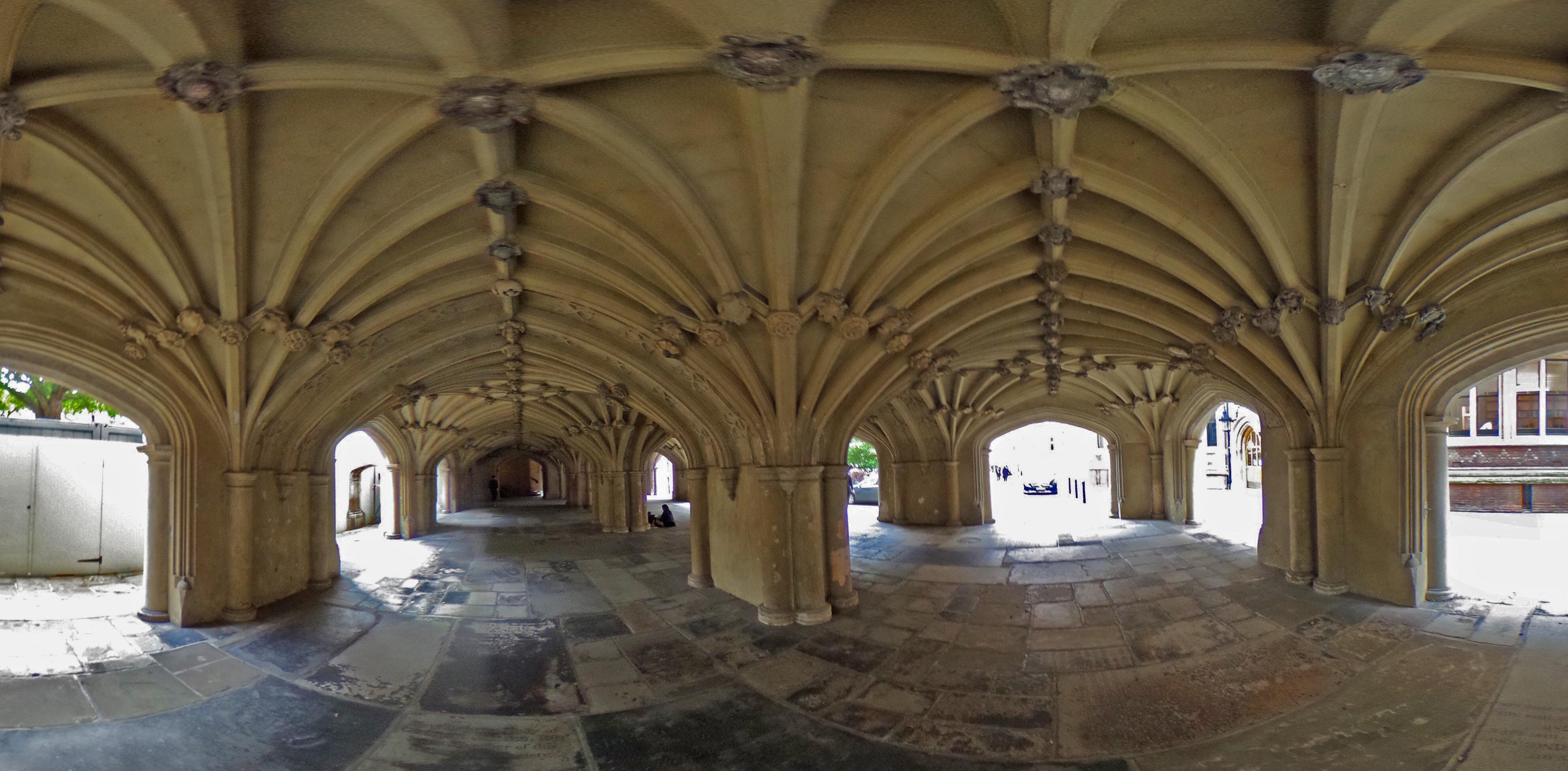
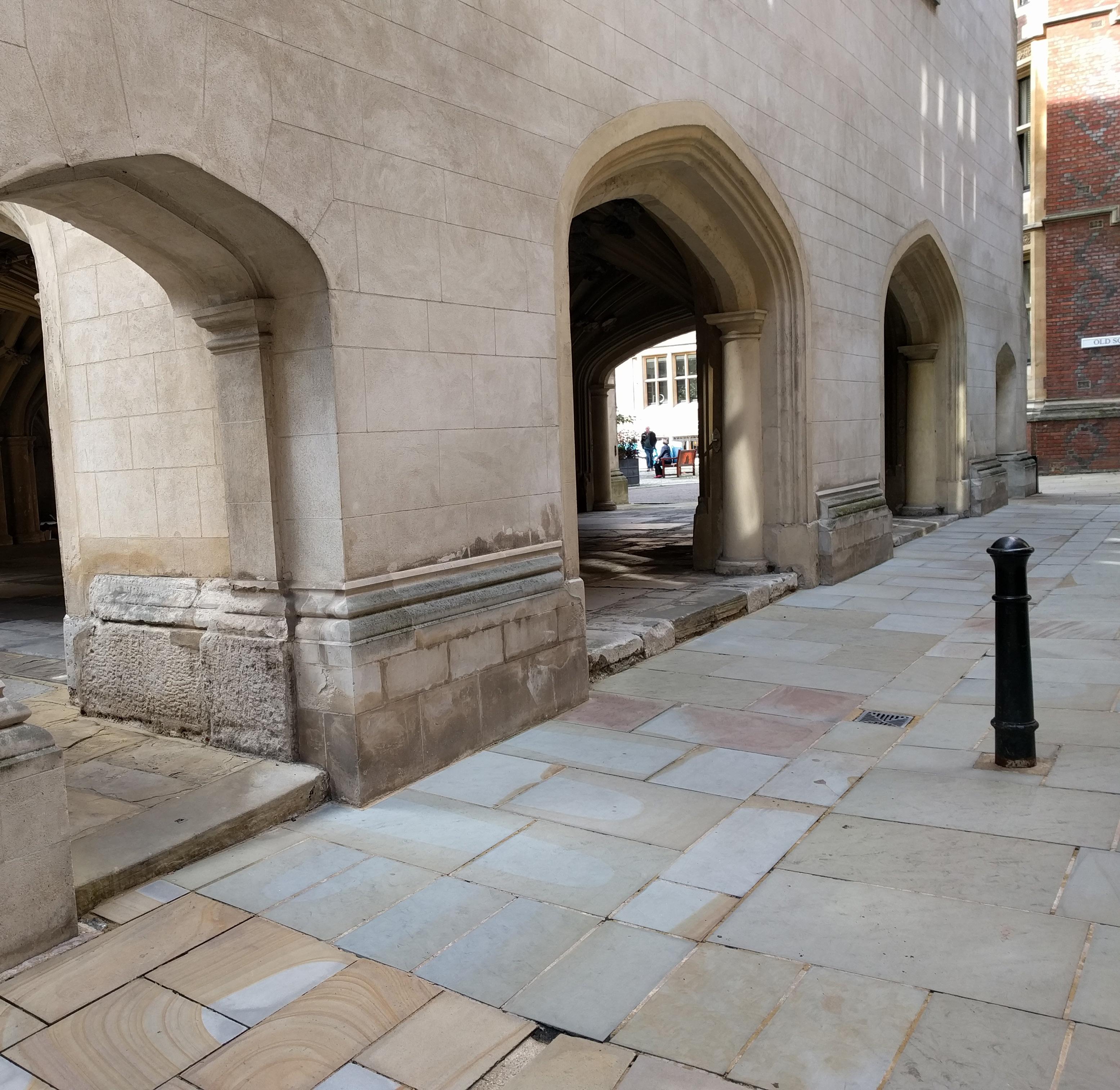
An undercroft is a space whose identity is defined by its position below another, more primary space. Sometimes a cellar, sometimes (below a church) a crypt.
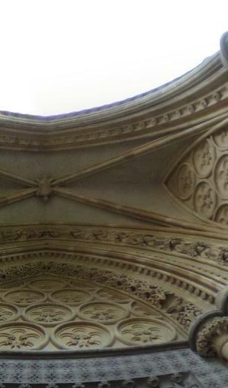
In many cases an undercroft is enclosed, but in London one can find examples of public, open-air undercrofts -- with Inigo Jones’ 1623 Lincoln’s Inn Chapel as a key early precedent. The ability to walk beneath, to easily move between viewing the building exterior and being inside the undercroft, looking back out from it, heightens the awareness of the ceiling as something that is not only “above” but also underneath.
At Lincoln’s Inn Chapel, the material continuity from the building’s facades to the undercroft ceiling clearly contrasts with the continuous public ground that flows around and below, intensifying the identity of the ceiling as an underside of something else.
But overlaid on these cues indicating “underneath,” there is a simultaneous expression of “inside” that comes from the texture, intricacy, and grain at the undercroft ceiling, which contrast strongly with the relative smooth simplicity of the building’s facades.
The undercroft presents a complex dynamic of a simultaneous “below” and “inside.” This contrasts with the pure “below” communicated by the continuous, smooth skin of Future Systems’ Natwest Media Center.
At the exterior walkway below the apartment blocks of the Barbican Complex, the ceiling composition is tuned to contradict “beneath” and “inside” as much as possible: the ceiling is painted white to minimize contrast with the London sky; the connection of the columns to the ceiling is minimized and instead a material affinity with the vertical structure, suggesting an openair, loggia-type ceiling.


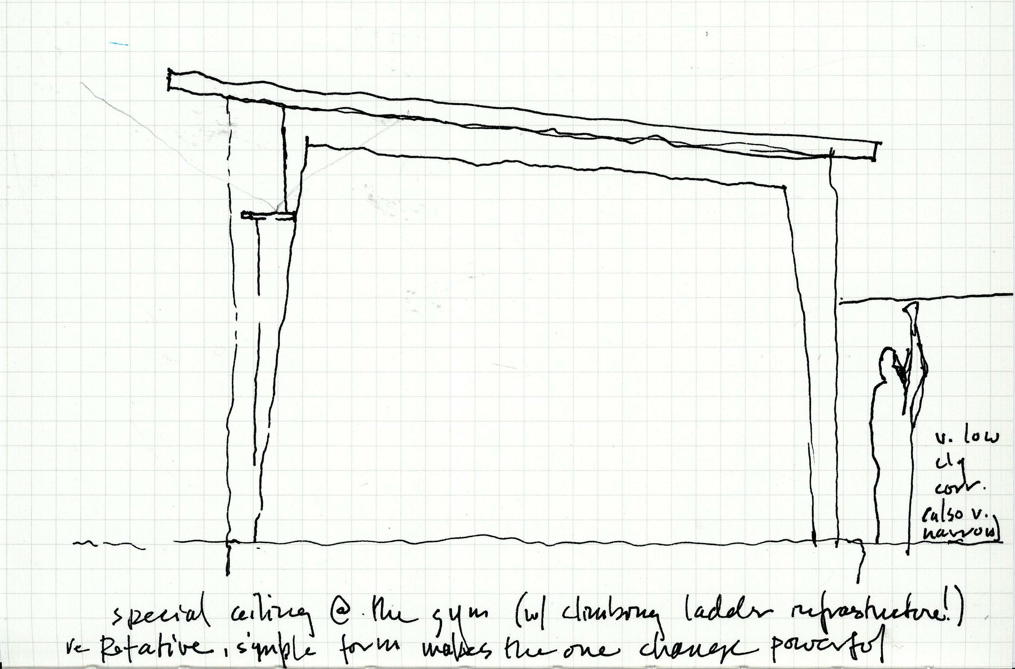
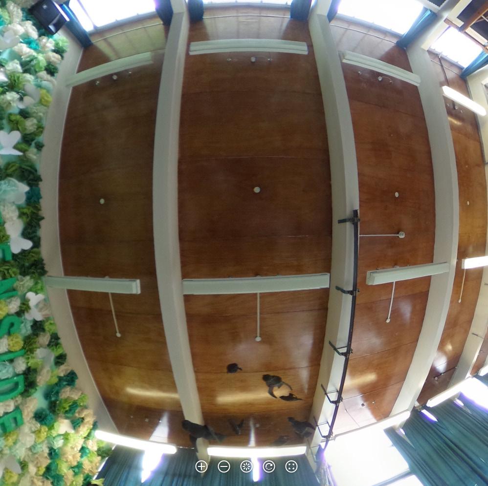
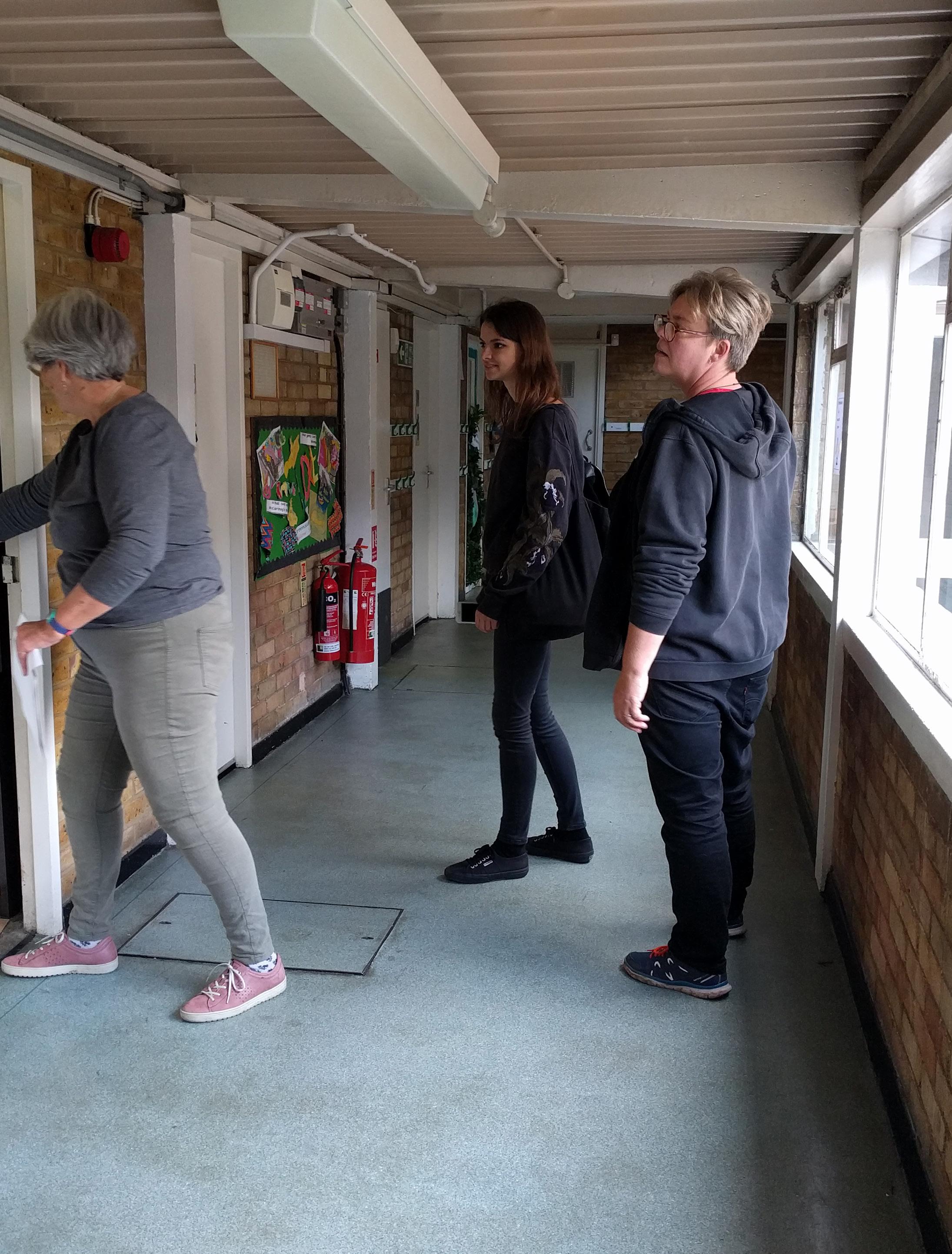
This one is about ceiling height. Visiting the postwar Greenside Elementary School by Erno Goldfinger crystallized something I had been sensing but not yet put into words: the spaces I had been visiting throughout London were collectively both shorter and taller than those in my habitual, daily spatial experience. Greenside features some extreme contrast in ceiling height in service of daylighting the ceiling of the classrooms: corridor ceilings are a touchable 7’, allowing a clerestory to run along the underside of the 11’3” classroom ceiling on the other side of the corridor wall.
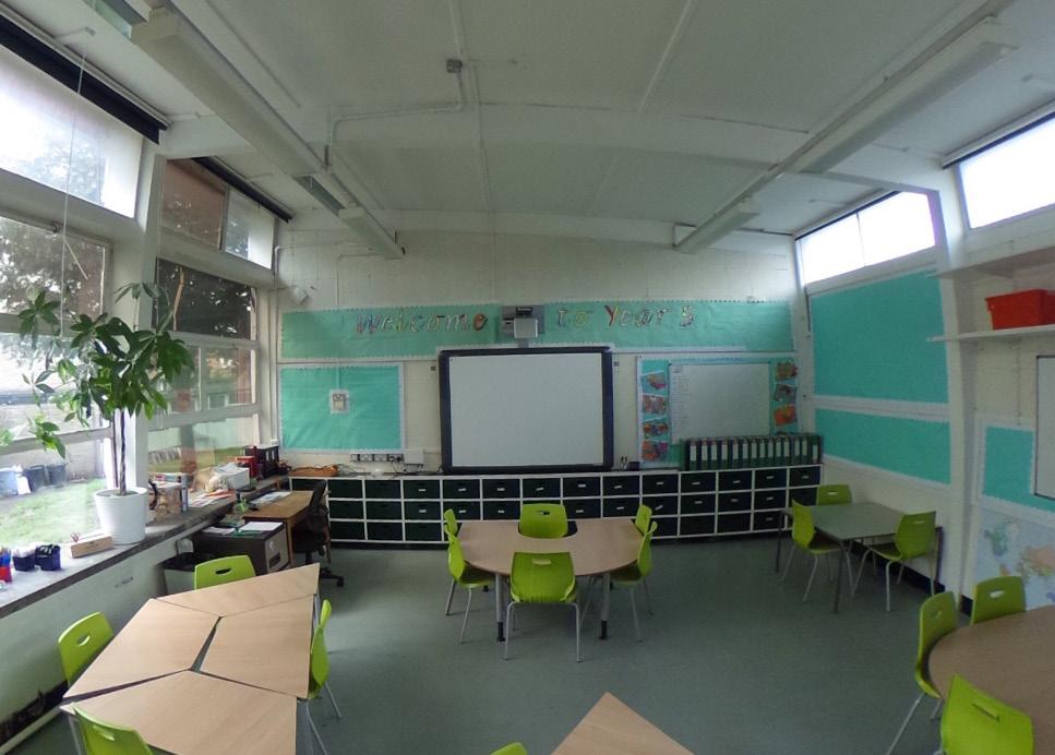
Part of the idea of a deep vertical palette can be filed under the well-worn (but still effective) principle of spatial compression and expansion. But it’s also about absolute ceiling height and a bold, opportunistic

mindset about how to achieve that depth of palette. More freedom in the use of very low ceilings in selective areas seems like it could be a productive strategy. There is a defensive approach it’s easy to fall into, “spending” our ceiling height on a couple special tall spaces and providing something we perceive as “adequate height” everywhere else. Lofty ceilings aren’t always affordable, but maybe the fear of employing ceilings less than 8’ is forcing us into a shallow vertical palette.
What metrics could be used to analyze a design’s the vertical palette? Standard deviation of ceiling height by area; cumulative differential between adjacent ceiling heights along key paths; project square footage per ceiling height; projected occupant hours by ceiling height; maximum room width by ceiling height. . .
